
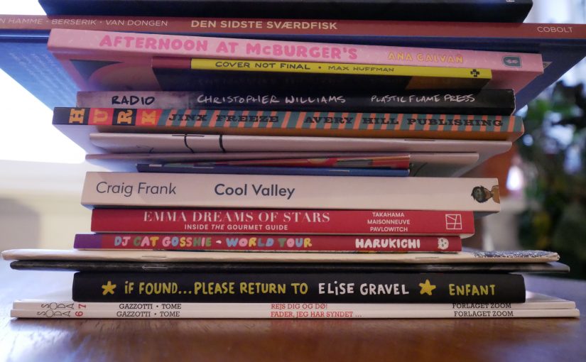
Geez… I done messed up my sleeping schedule again. OK, I’ll read comics until morning? Or something. OK.
| Brian Auger & Julie Driscoll: Open |  |

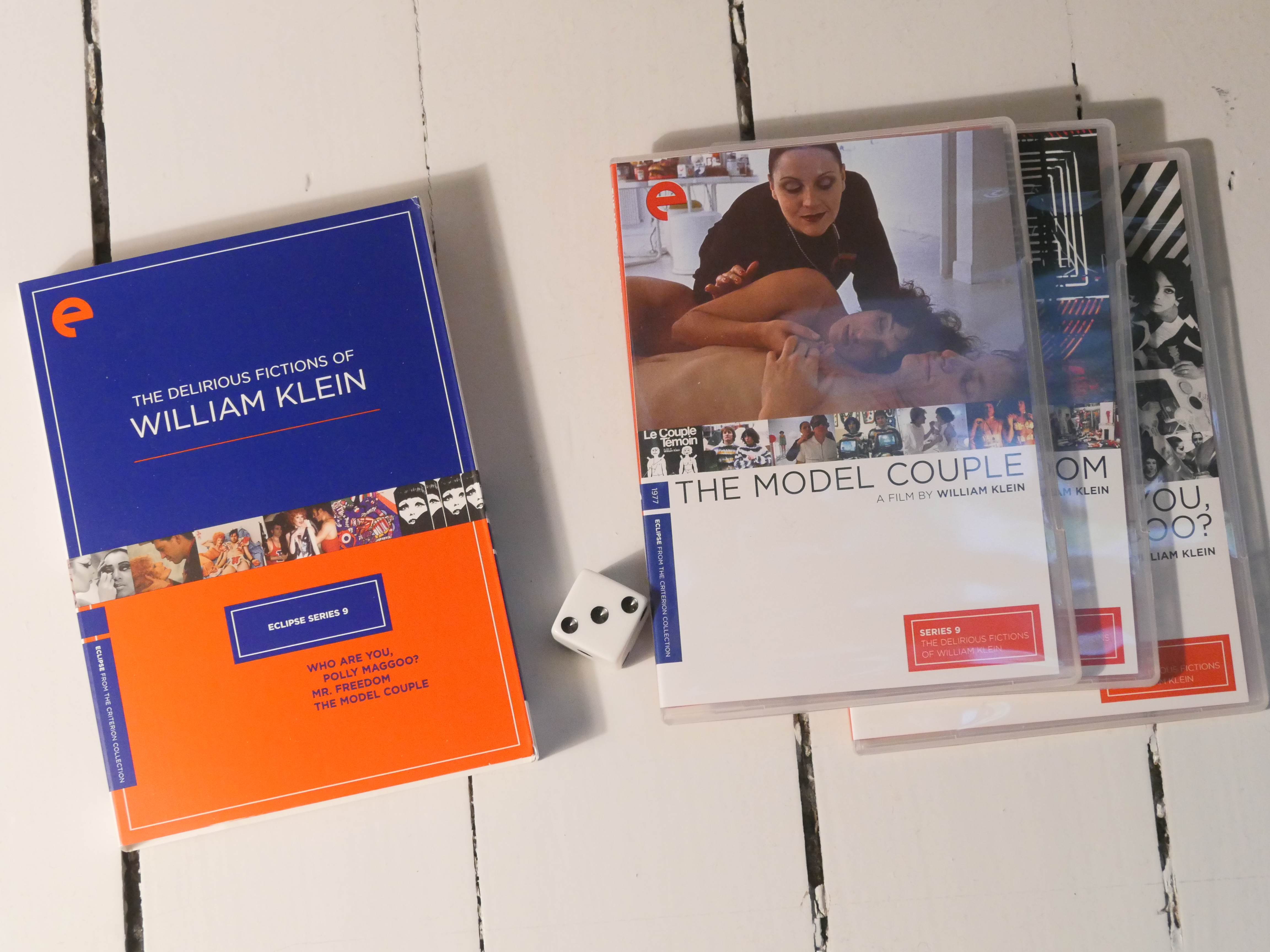
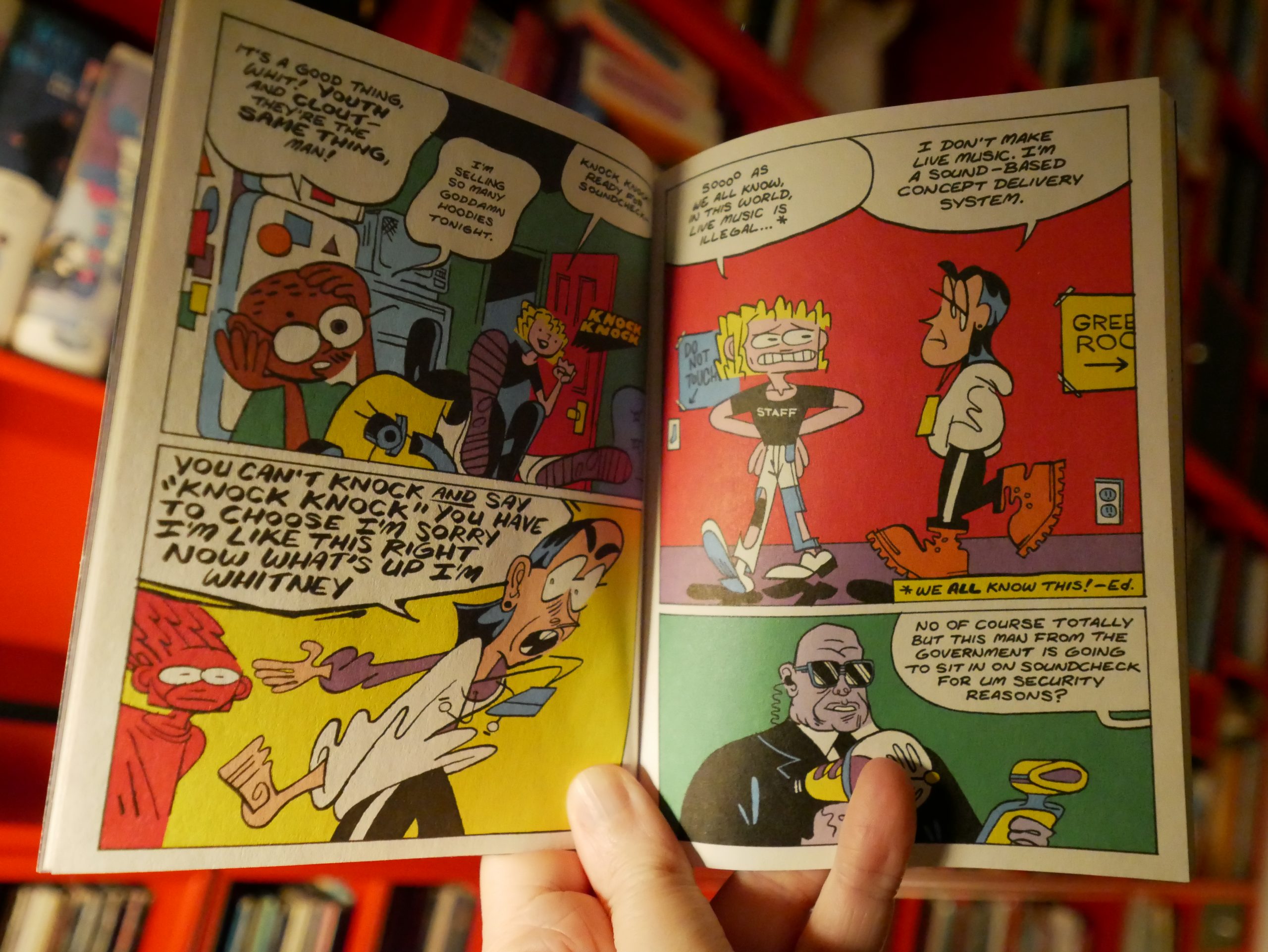
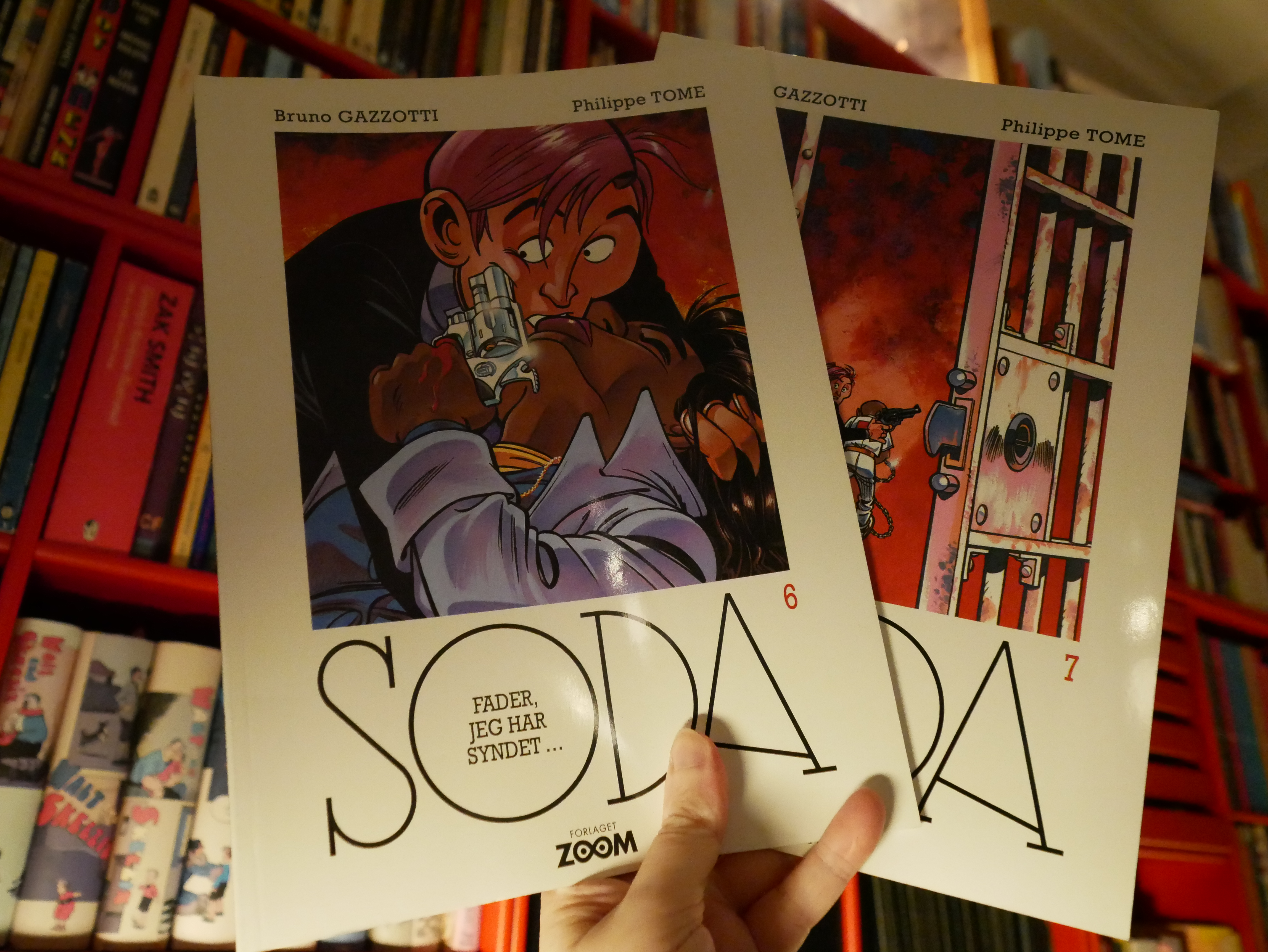
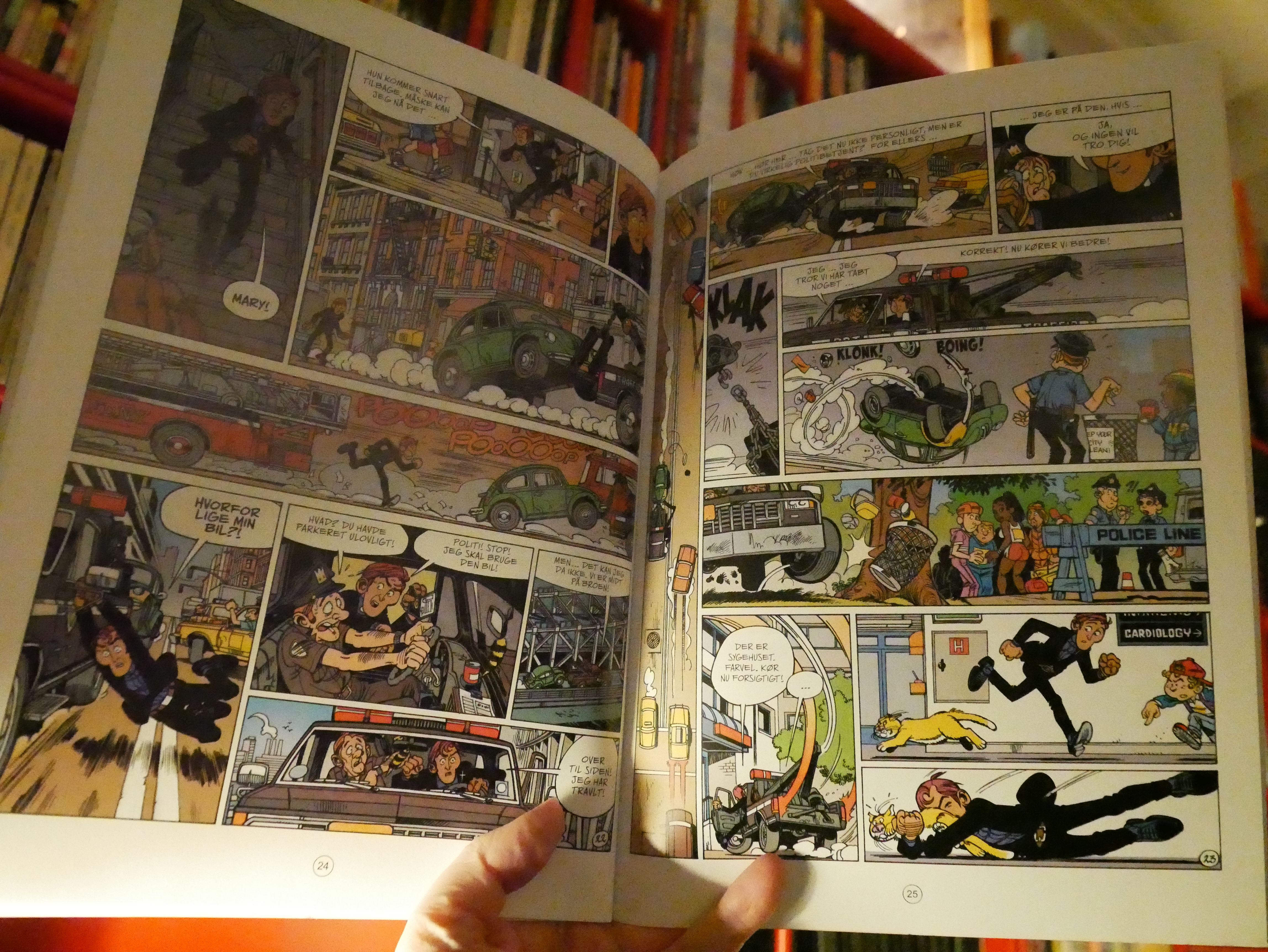
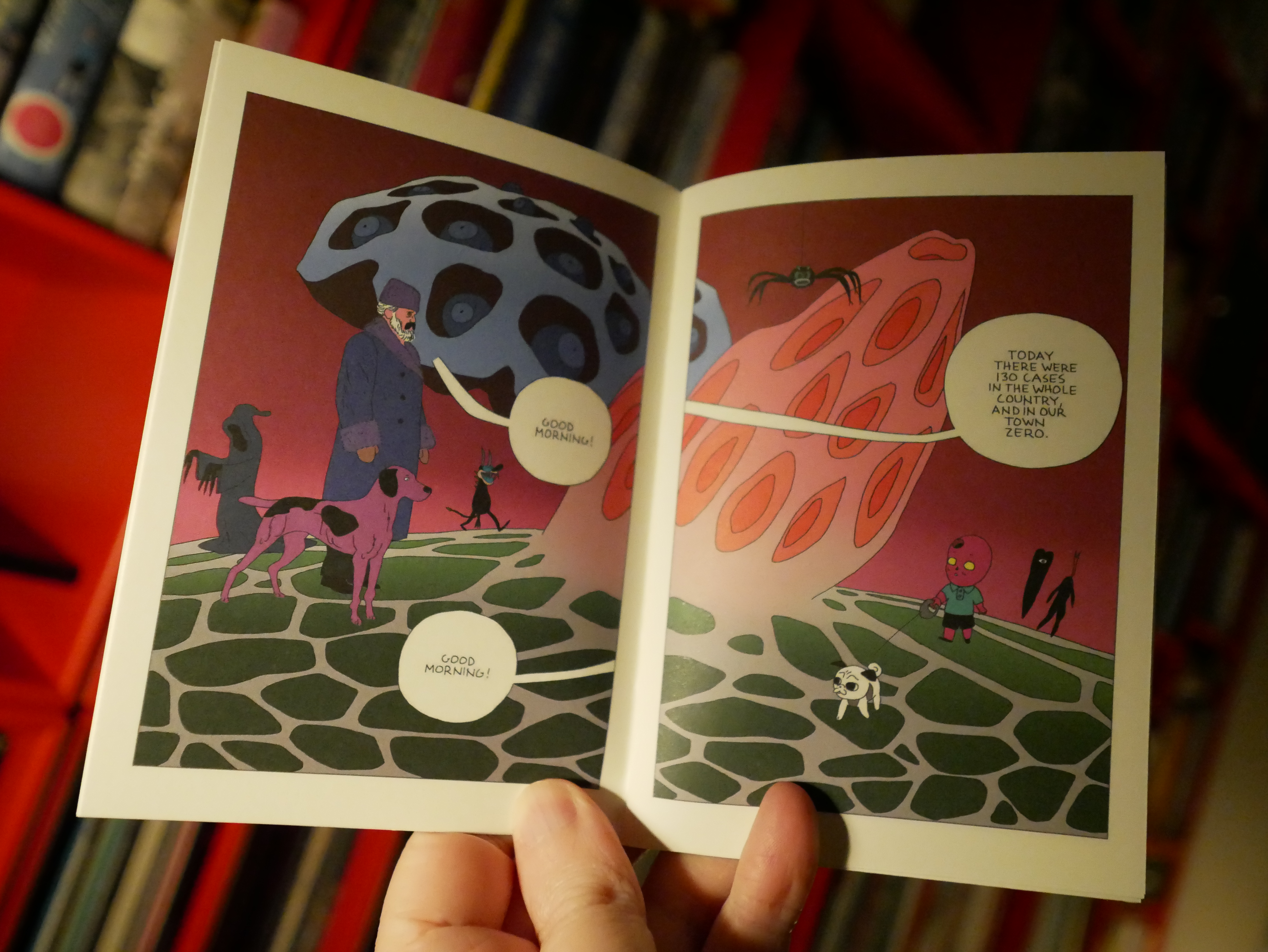
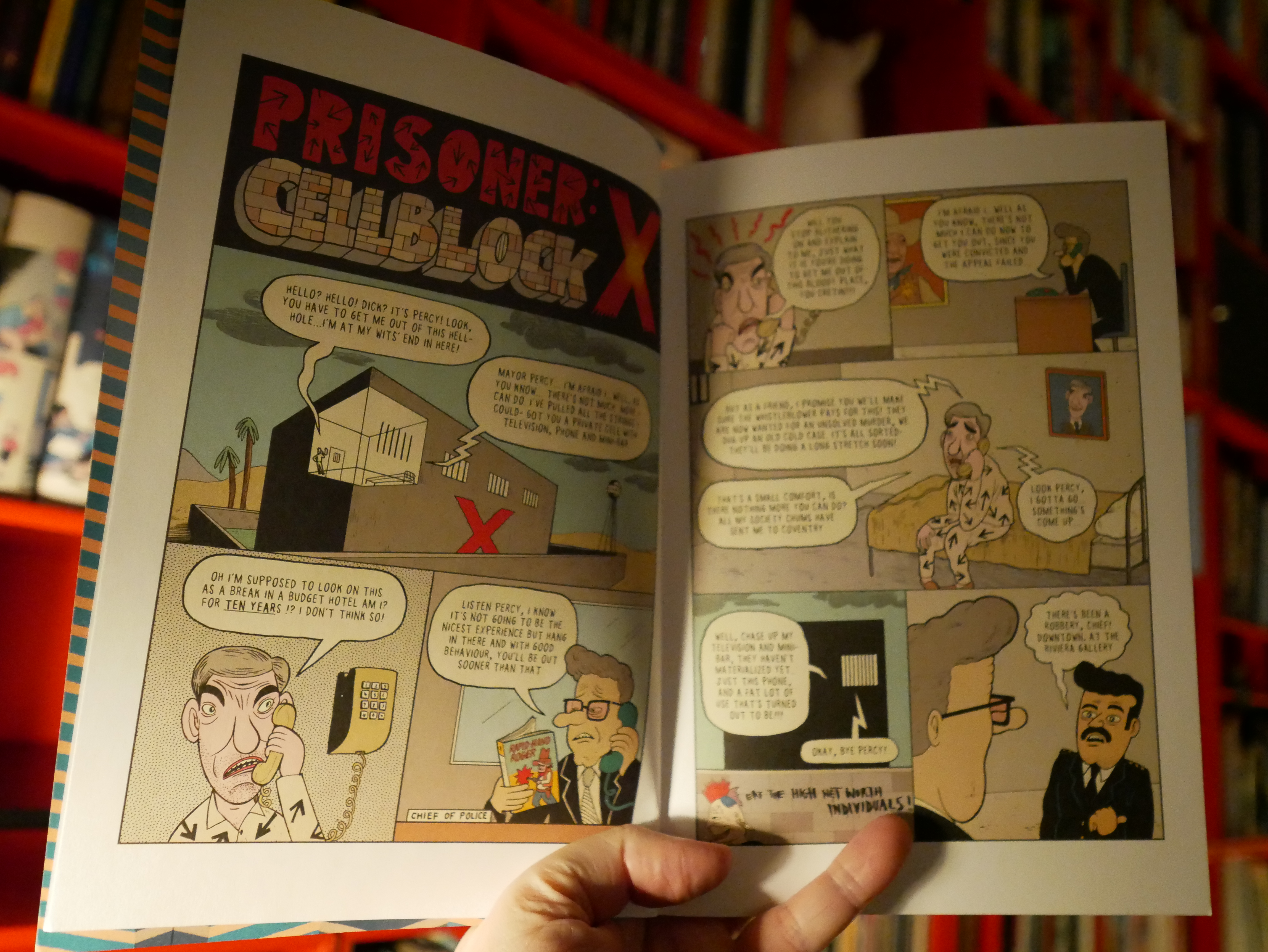
20:05: Soda vol 6 & 7 by Bruno Gazzotti & Philippe Tome (Zoom)
This is a very 80s French(ey) series, and I’ve only read a handful of the albums. They vary wildly in quality…

… but these two are really entertaining. It’s got a dopey high concept — a cop has to pretend to be a priest to avoid disappointing his mother — and hi-jinx ensue.
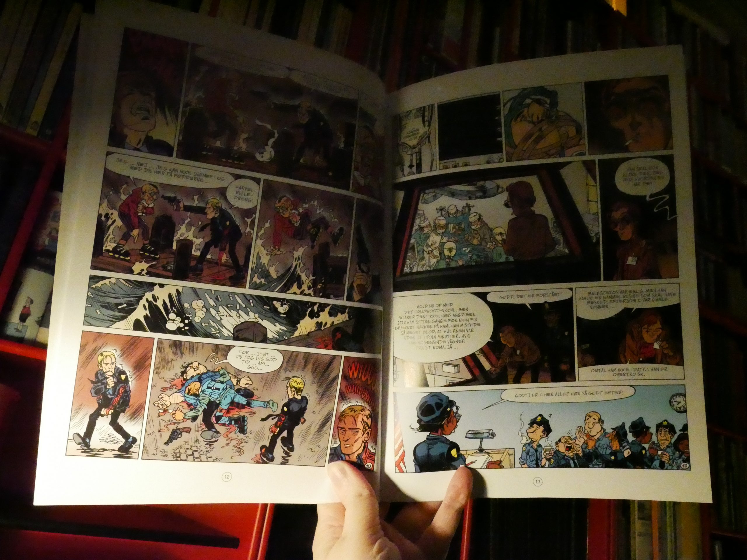
But the plots are satisfyingly convoluted, and it has a nice propulsive quality to it. The artwork’s really, really standard, though.
| John Cale: Music For A New Society |  |

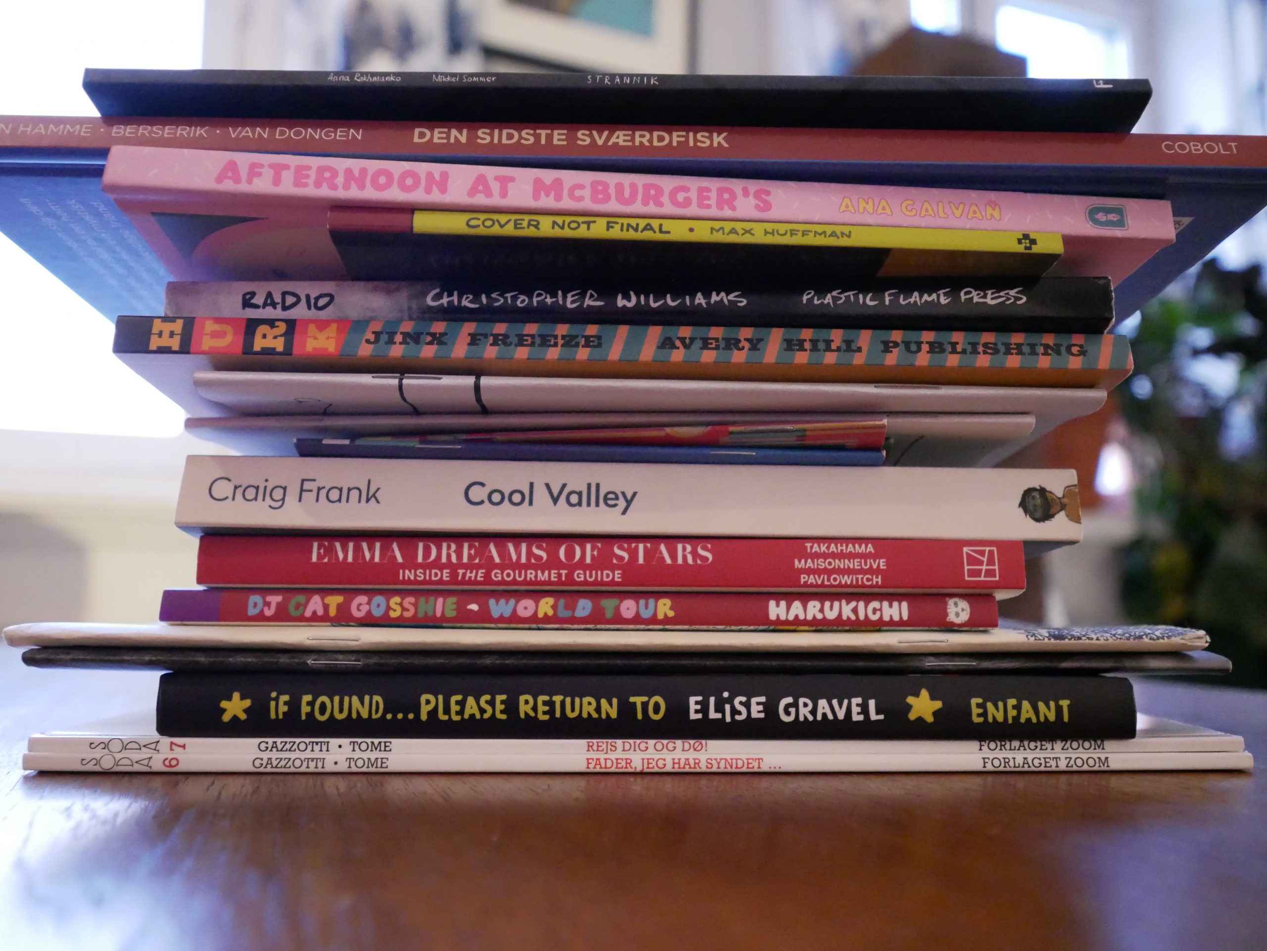
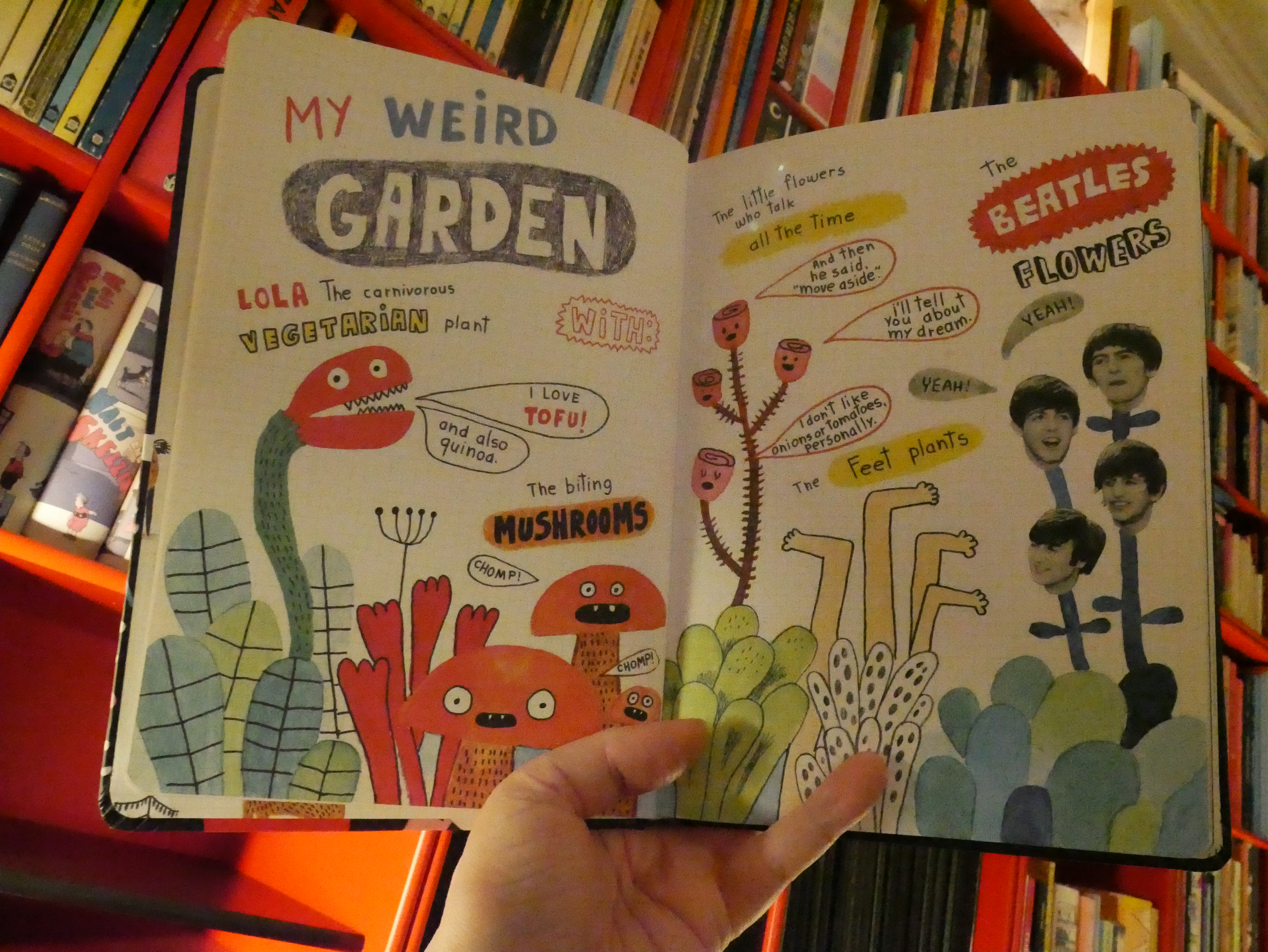
21:27: If Found Please Return to Elise Gravel (Drawn & Quarterly)

This is really cute.
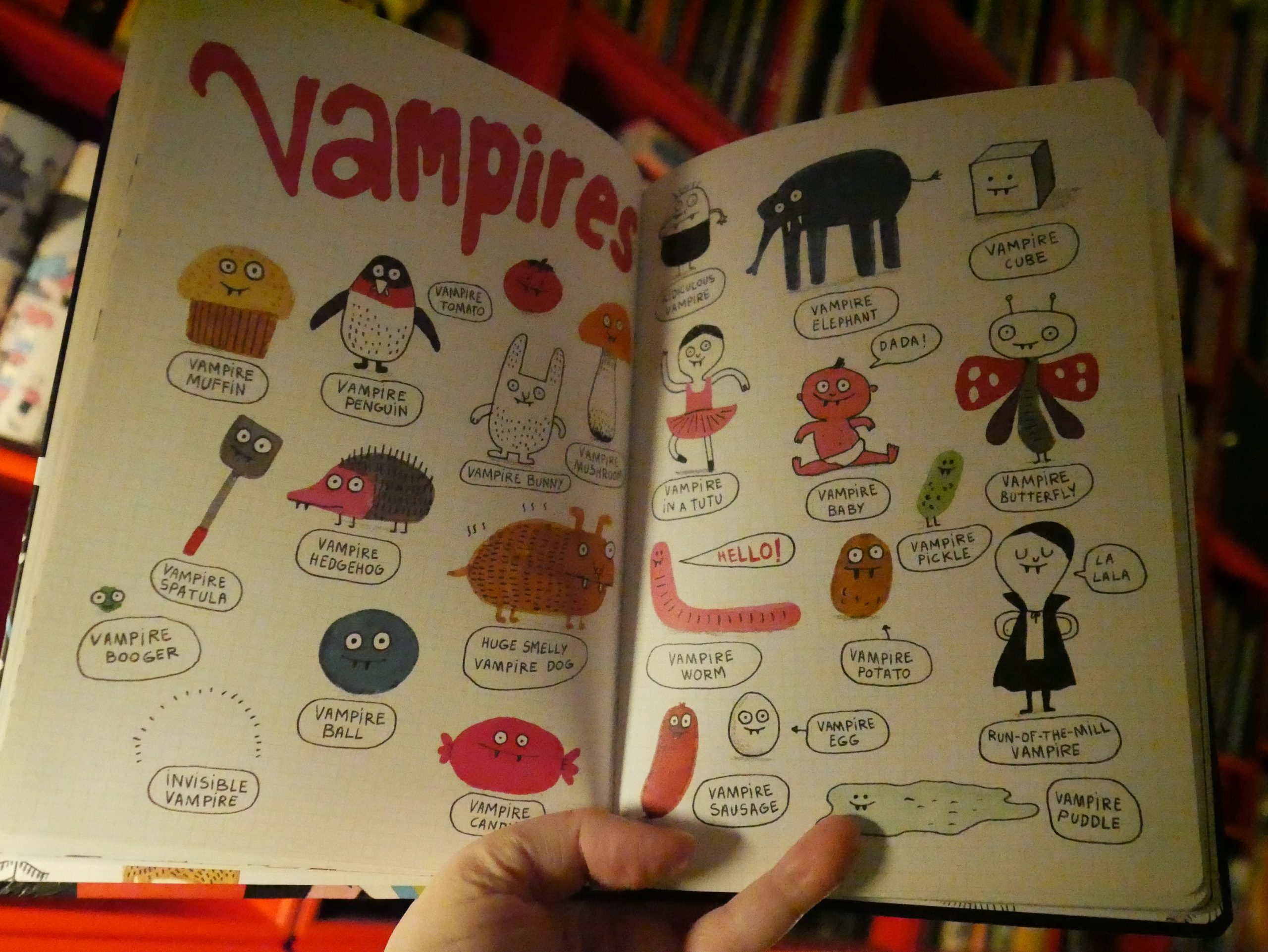
Love the vampire spatula.
| Osees: Levitation Sessions |  |
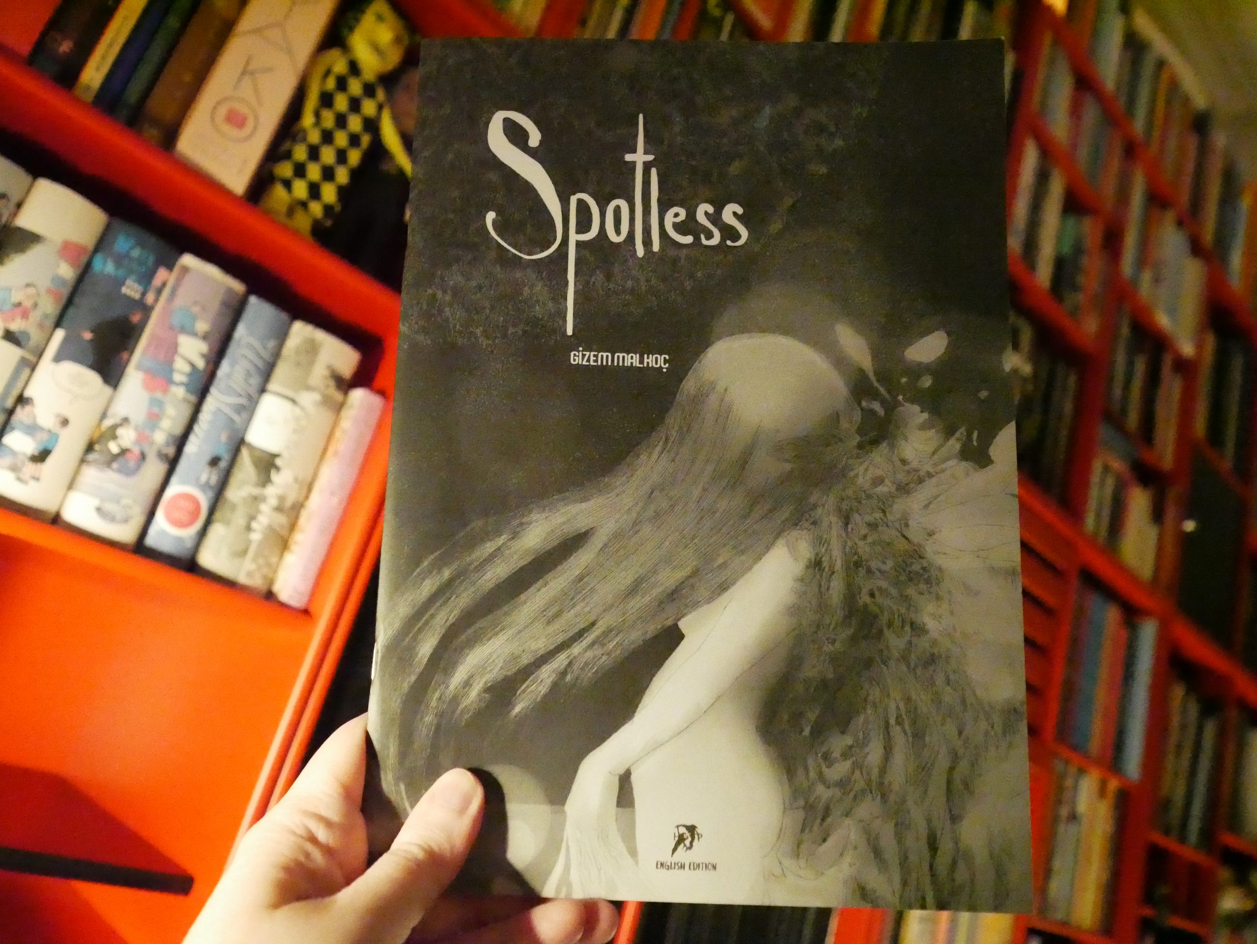
21:49: Spotless by Gizem Malhoc (Hollow Press)
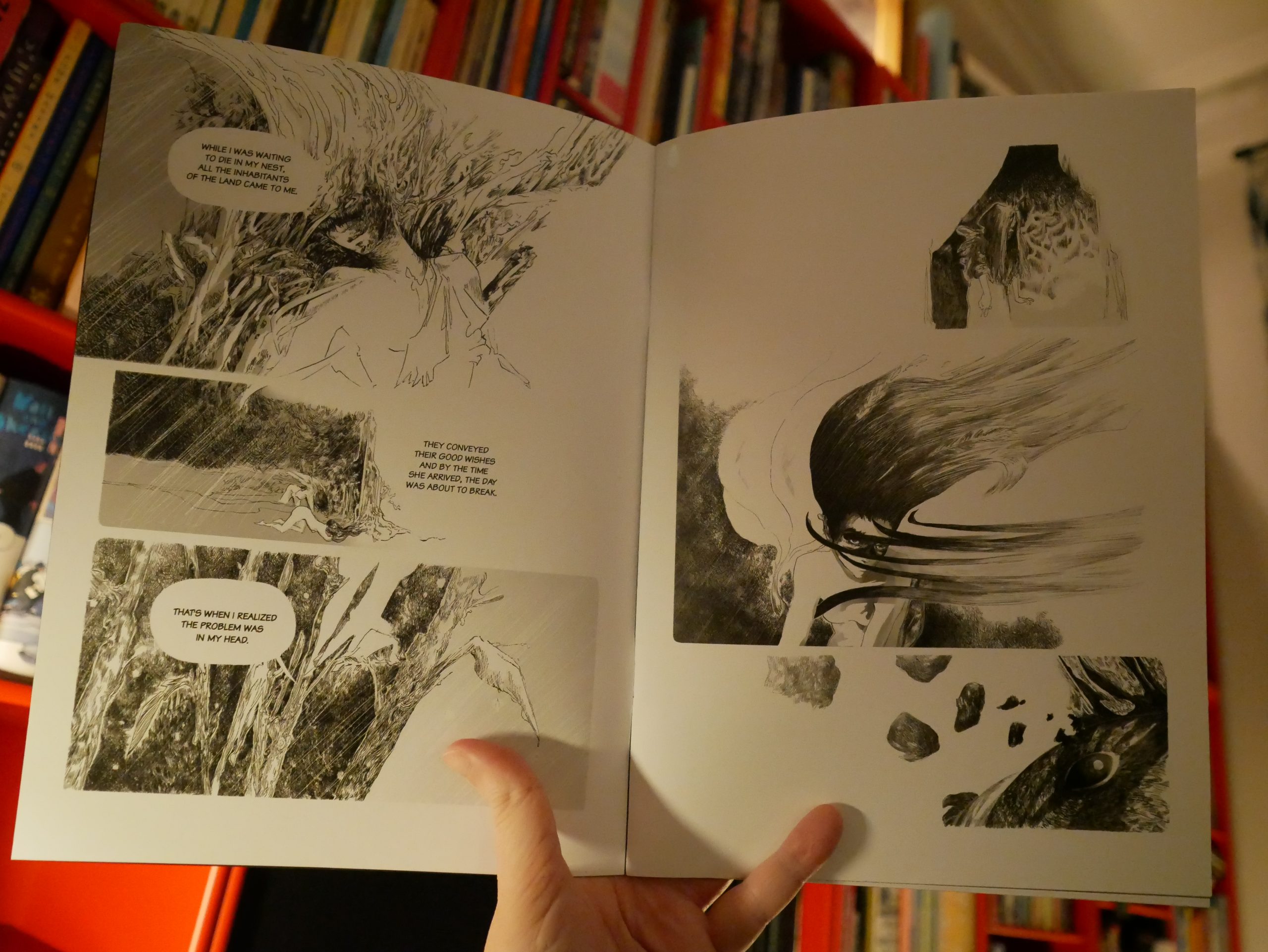
A rare Turkish comic book. It’s pretty neat. It’s got proper mood and interesting artwork.
| Osees: Levitation Sessions |  |
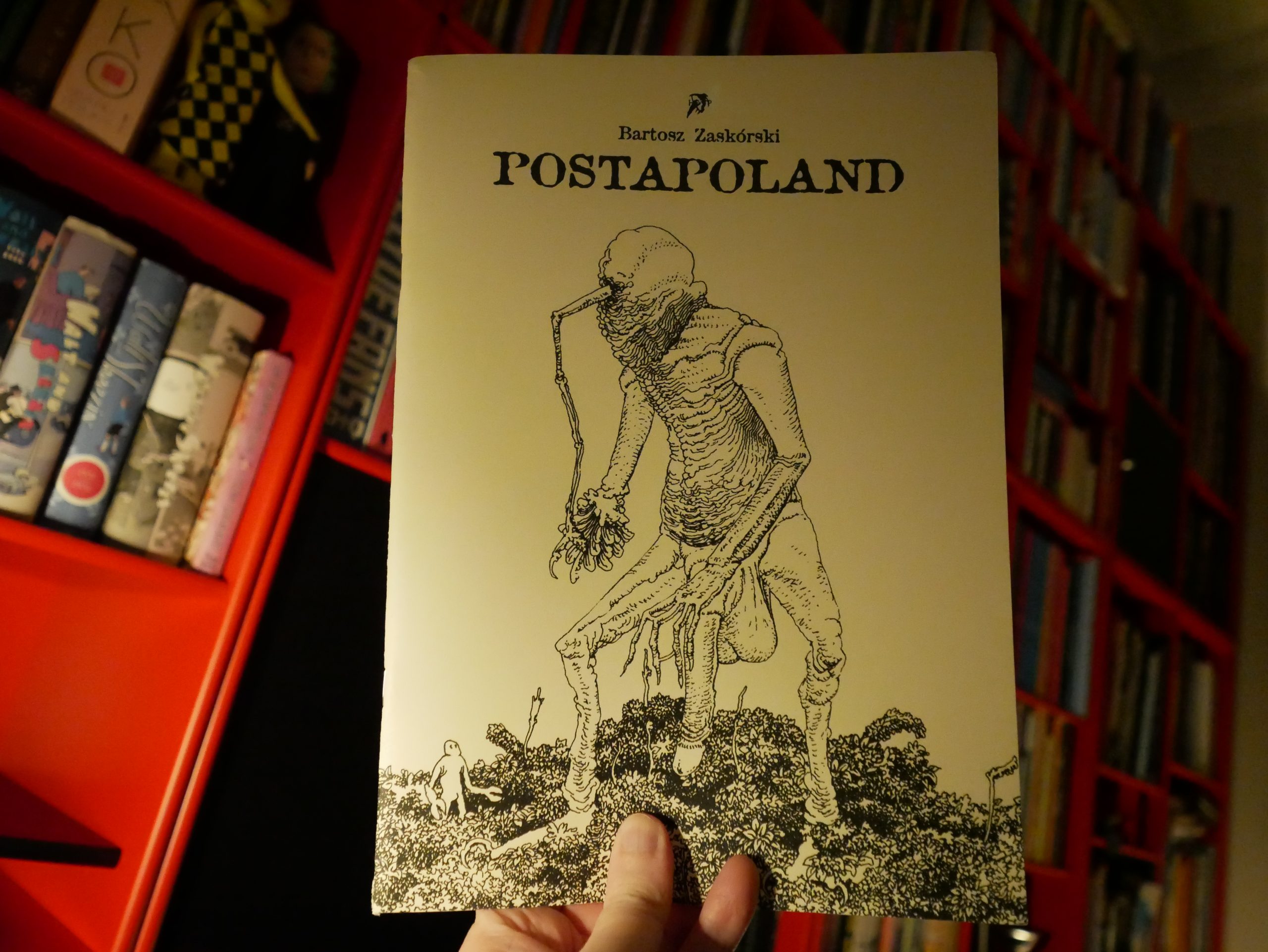
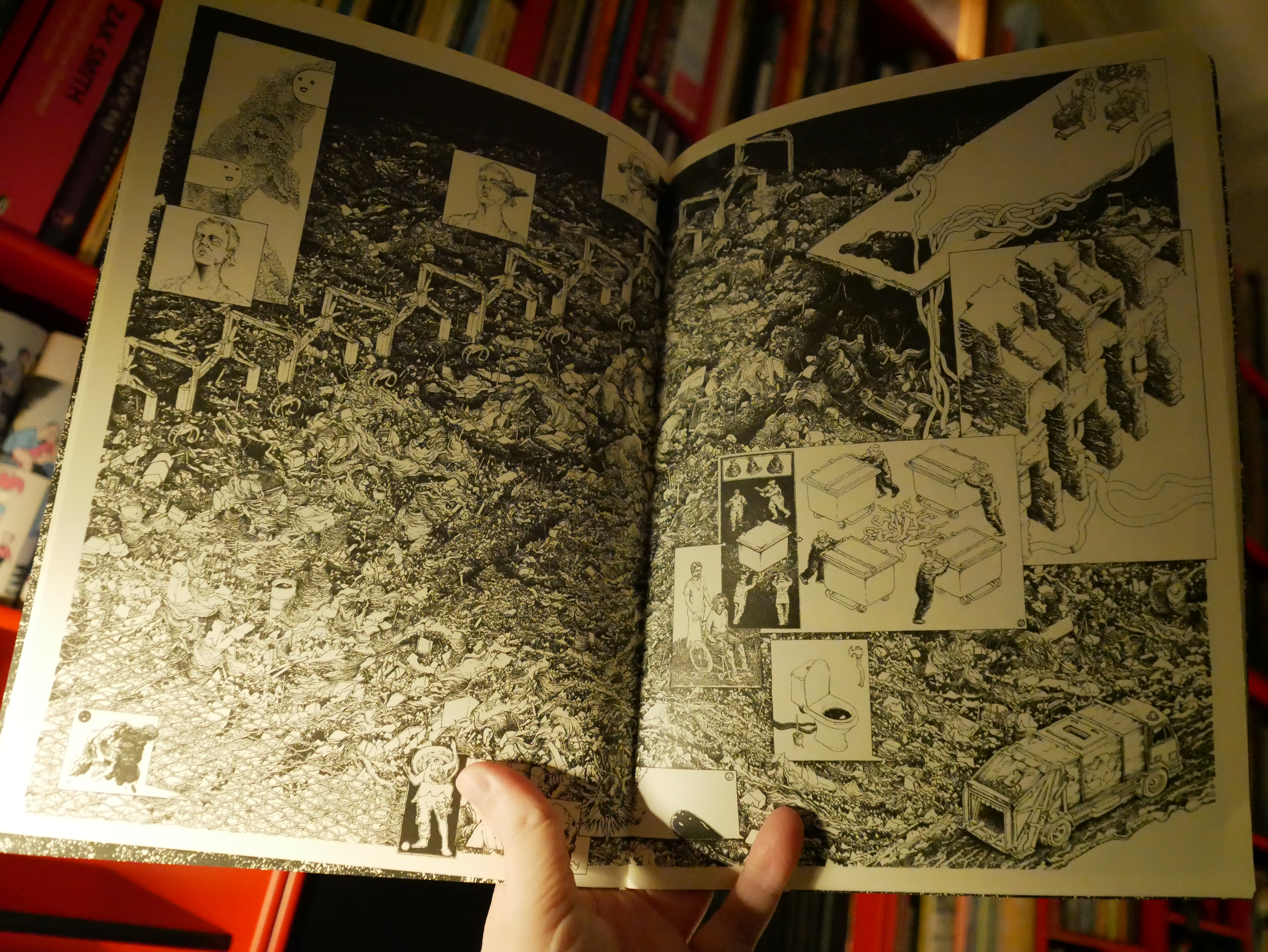
21:57: Postapoland by Bartosz Zaskórski (Hollow Press)
A rare Polish comic book. I love how mid-70s Moebius this is. Awesome.

And it’s pretty funny and oddly moving, somehow.
| Nina Simone: Little Girl Blue |  |
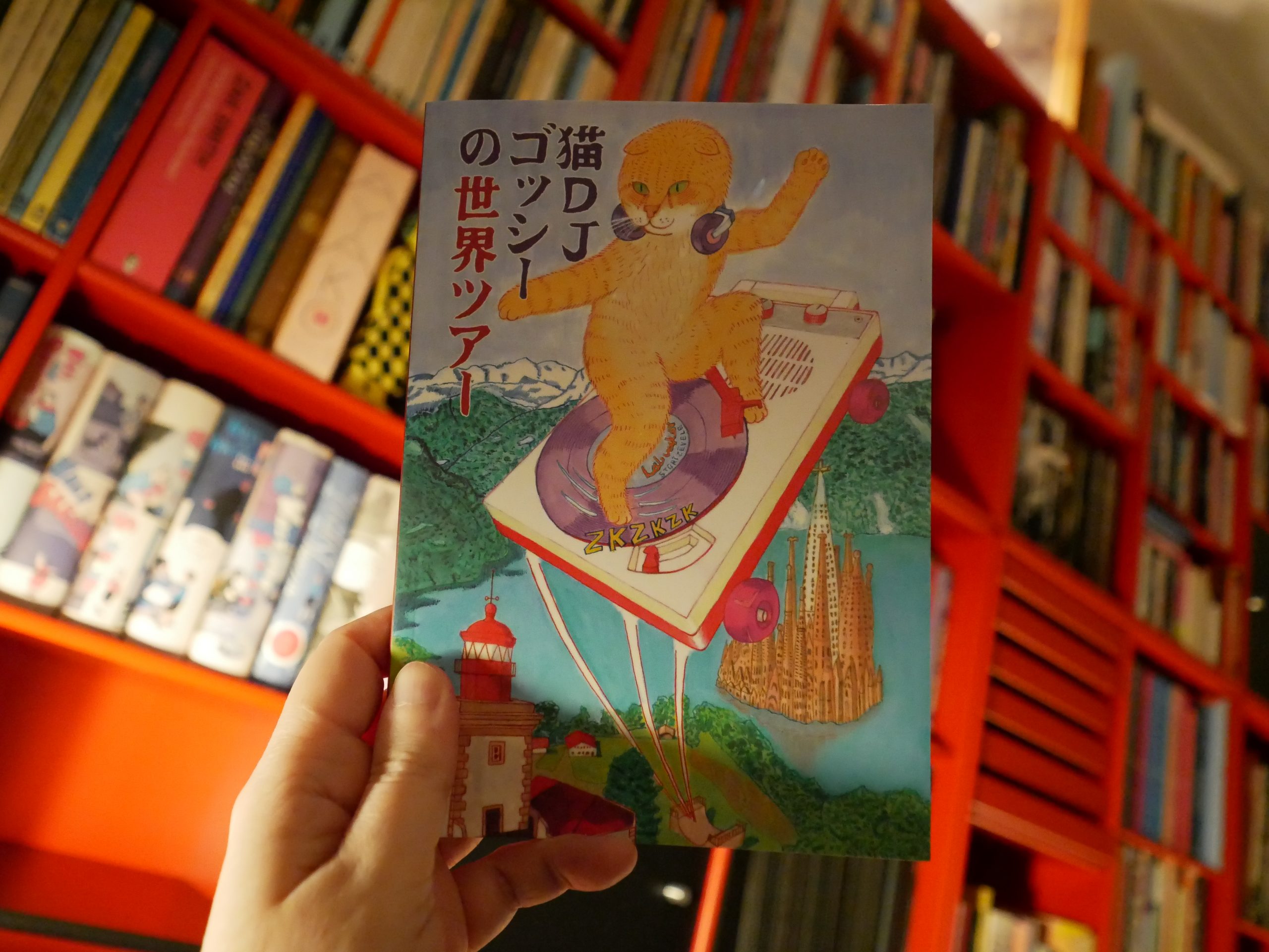
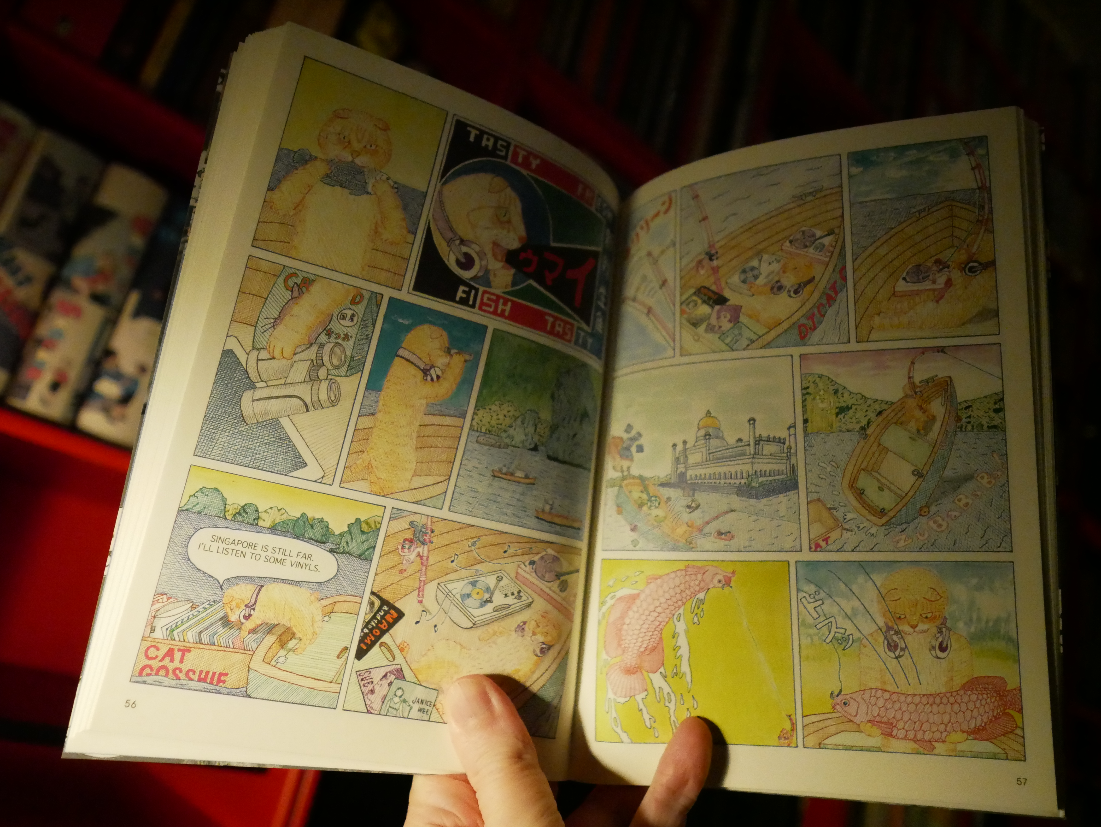
22:09: Dj Cat Gosshie – World Tour by Harukichi (Kuš!)
I got this in the mail out of the blue from those excellent Latvian people at Kuš! (because I subscribe to their mini-comics series). Harukichi’s unfamiliar to me…
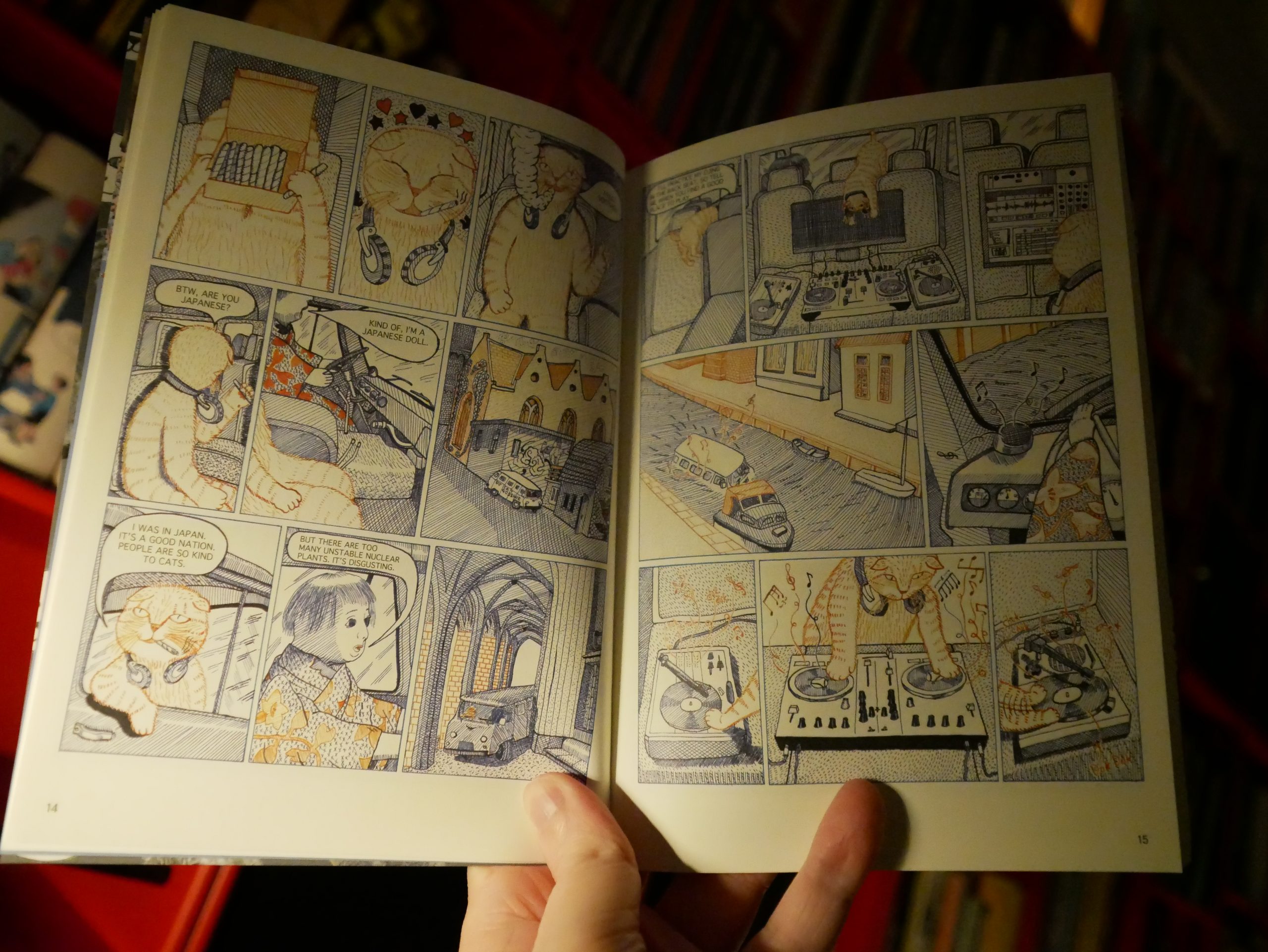
Oh, this looks familiar — I may have read some DJ Cat things in an anthology or something?
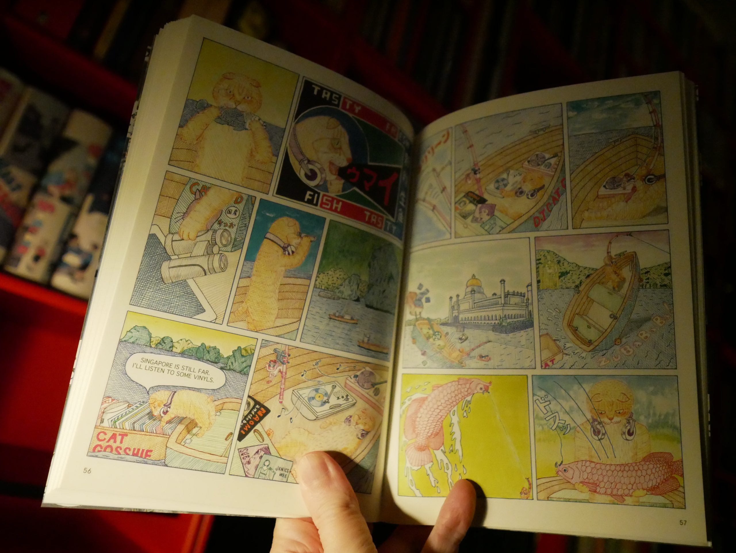
Anyway, it’s a collection of short stories — basically DJ Cat goes to a new country and then some vague adventures happen. (With lots of pot references.) It’s fun. And the art style fits the stories totally.
| JPEGMAFIA: EP2! |  |

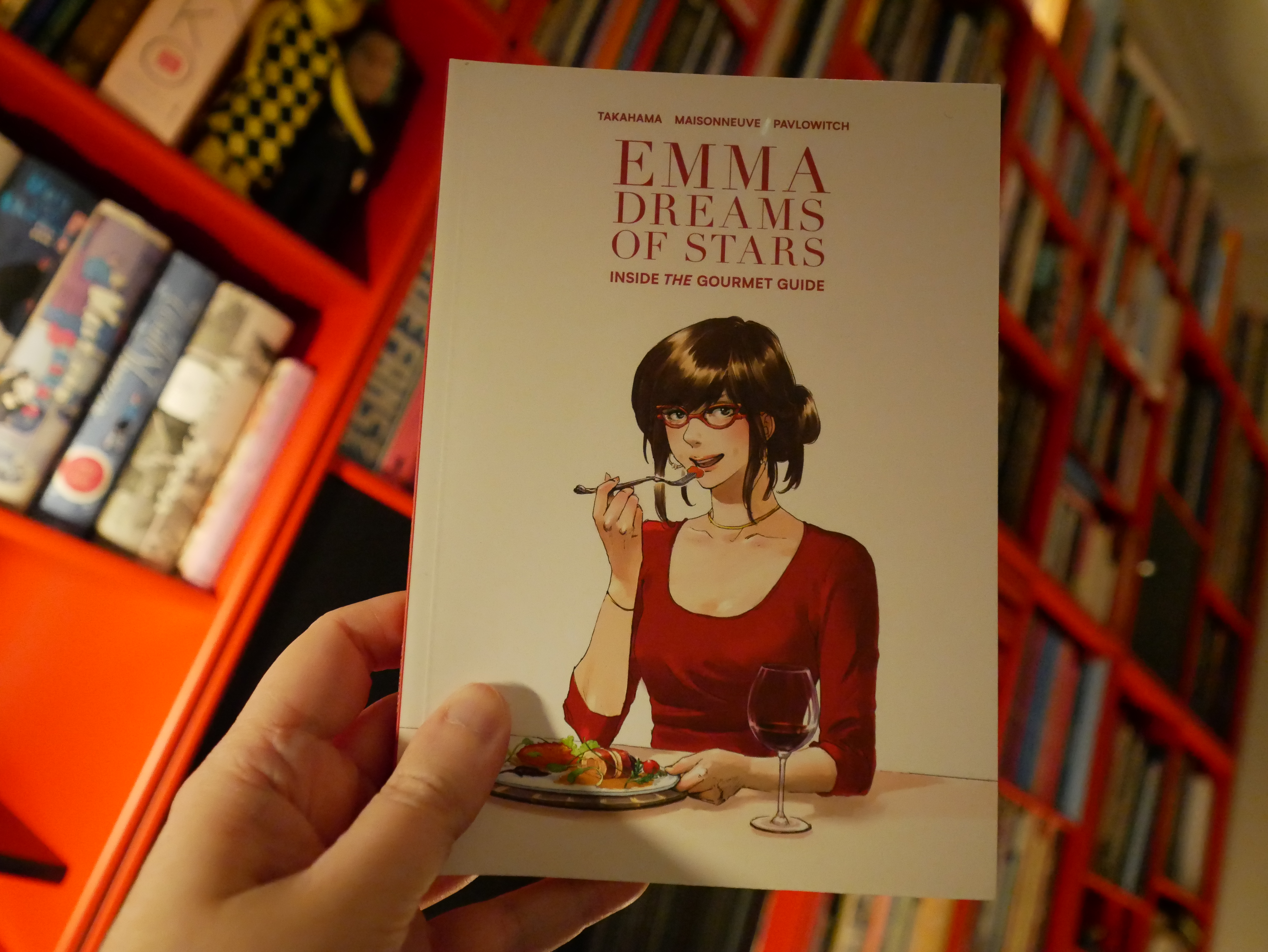
22:37: Emma Dreams of Stars by Takahama/Maisonneuve/Pavlowitch (Kodansha)
This is a bit of a frustrating read. It shifts from being really readable and fascinating to being badly paced and laid out (a couple pages I wondered whether I was reading the pages in the wrong direction) and then back again all the time.

It’s an apparently autobiography of a woman who becomes a Michelin Guide inspector, and there’s pages and pages about how serious and difficult job that is, and it’s totally risible. Did the Michelin Guide finance the book? And there’s the obligatory pages where the boyf is getting on her ass for taking the job so seriously, and it’s *rolls eyes*.
But then there’s the pages of just eating food, and those are really enjoyable to read.
So. It’s a frustrating book to read.
| White Heaven: Levitation |  |
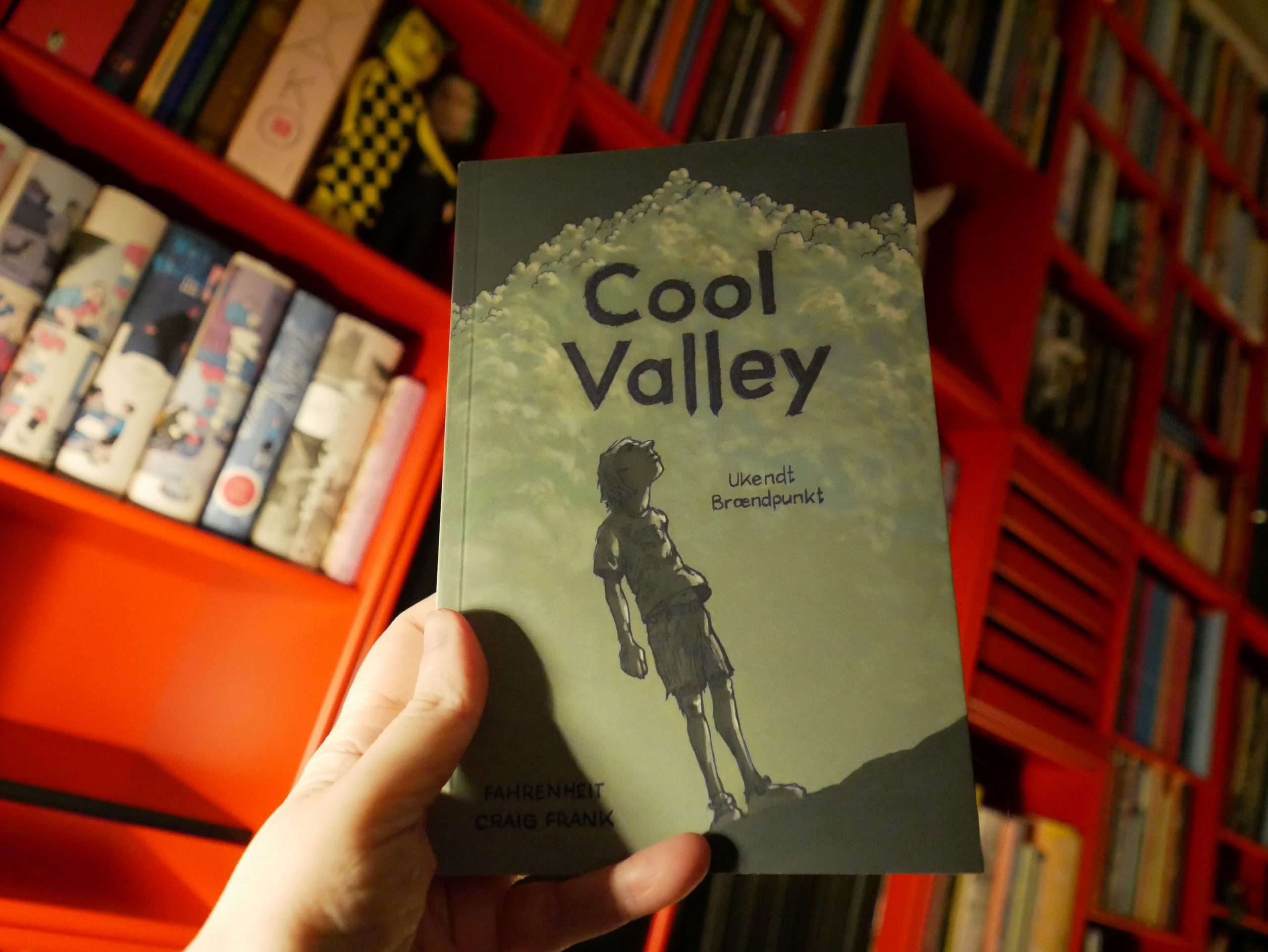
23:40: Cool Valley by Craig Frank (Fahrenheit)
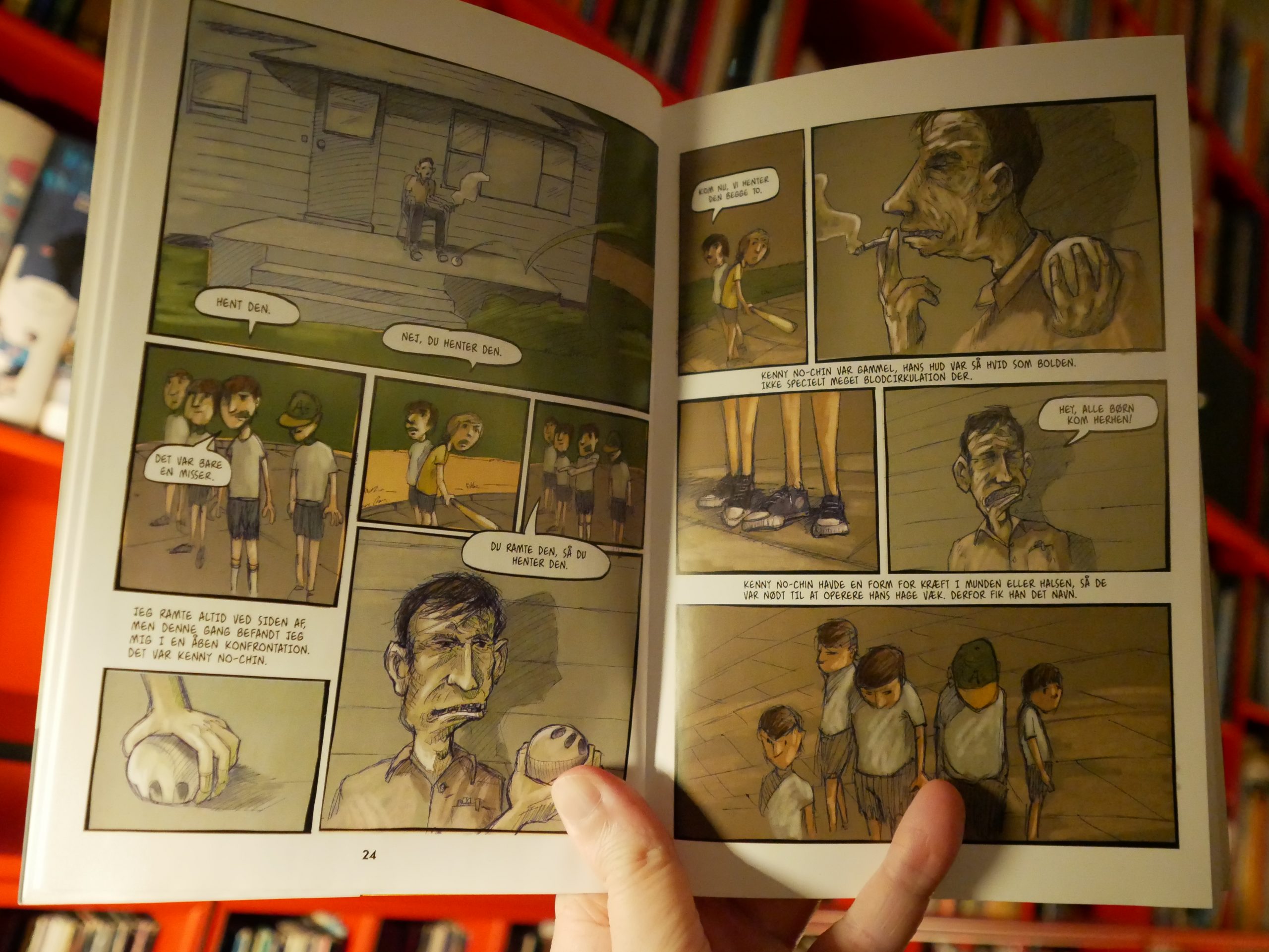
Hm, OK, this artwork isn’t my thing — it’s like an even more bobble-headed version of Jeff Lemire, but sloppy.
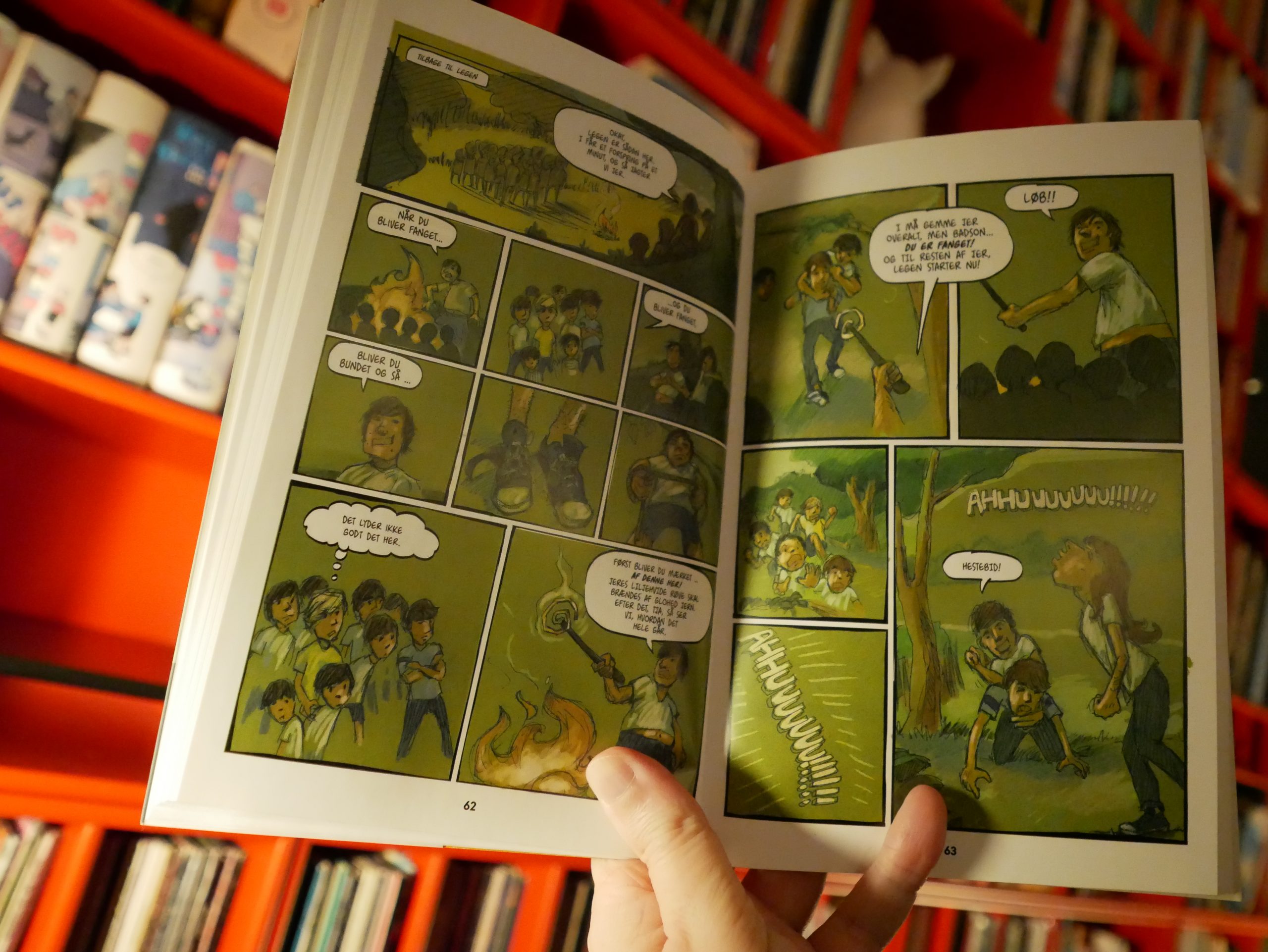
These are anecdotes about being er 12 in 1972, so it’s all violence and death and being in the woods. It feels pretty cliched? And I just lost all interest in this book one third of the way in, and ditched it.
It might just be the artwork — I just found it really offputting.
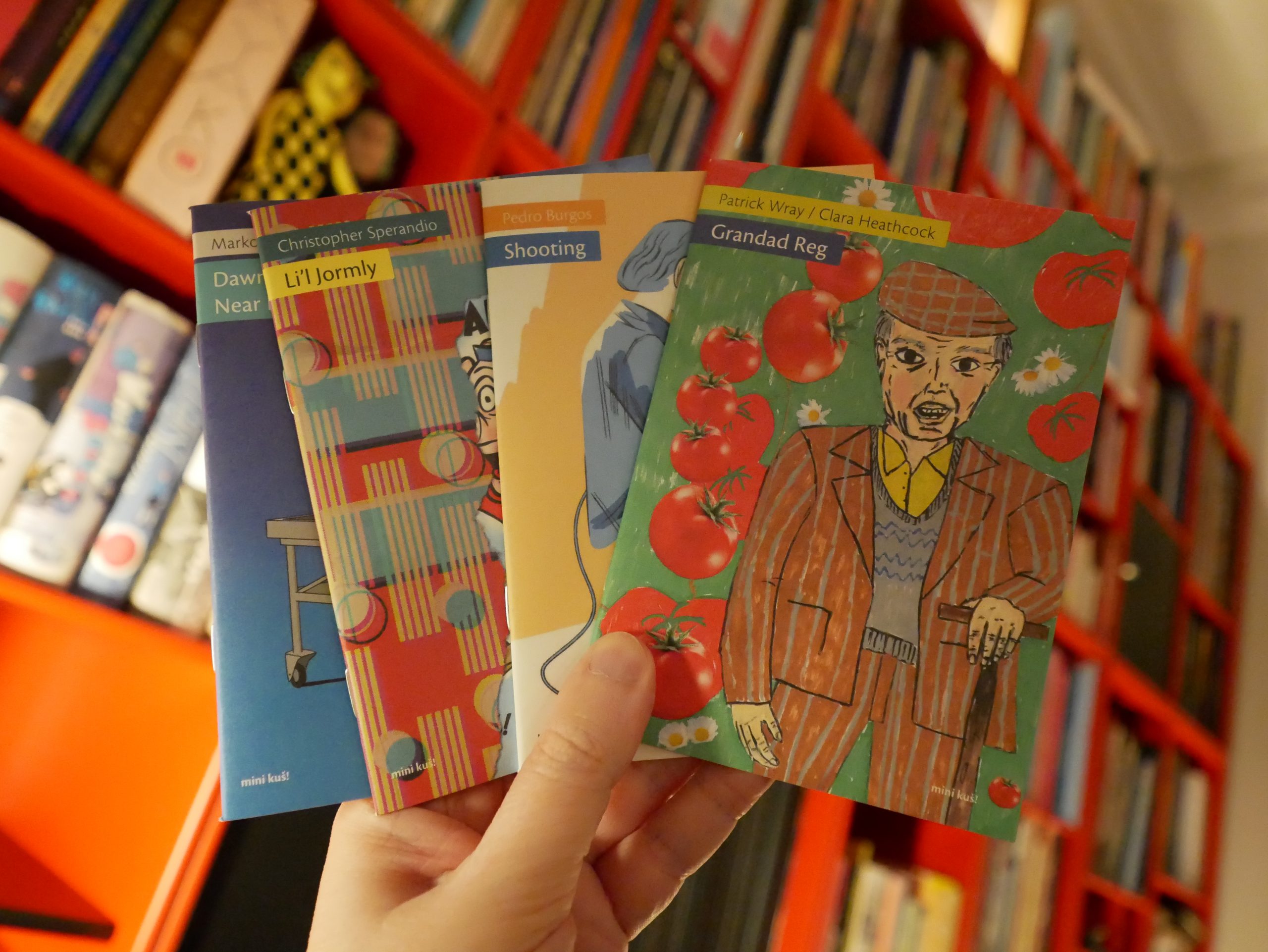
00:18: Mini Kuš #103-106 (Kuš!)
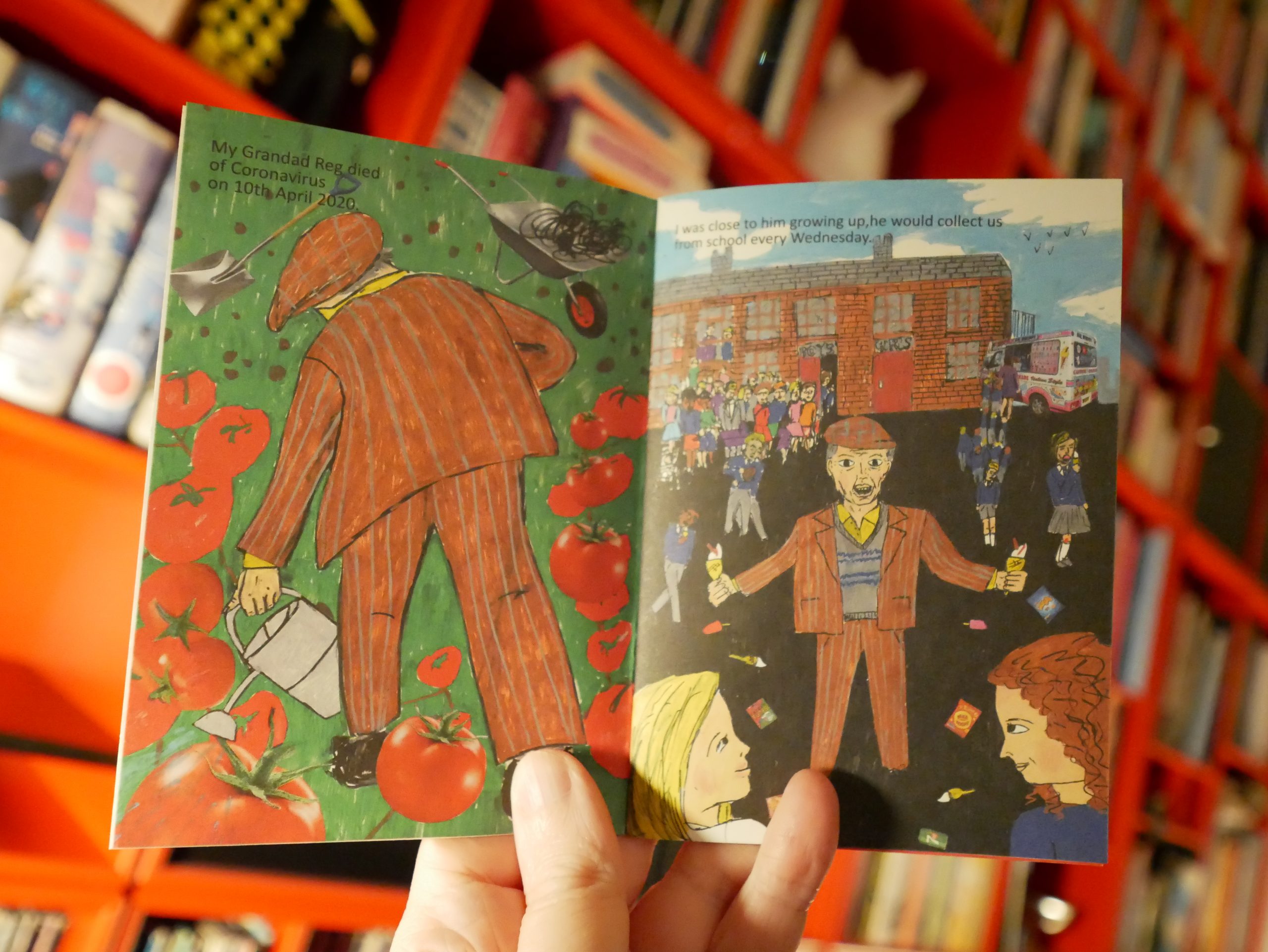
Another good batch… a couple of these are about corona, like this Patrick Wray/Clara Heathcock thing.
Pedro Burgos does a little story about a fashion photographer that manages to be satisfyingly mysterious.

I do not know what this Christopher Sperandio thing is on about.

And Marko Turunen does a thing about corona.
It’s a good little batch.
| Insides: Soft Bonds |  |
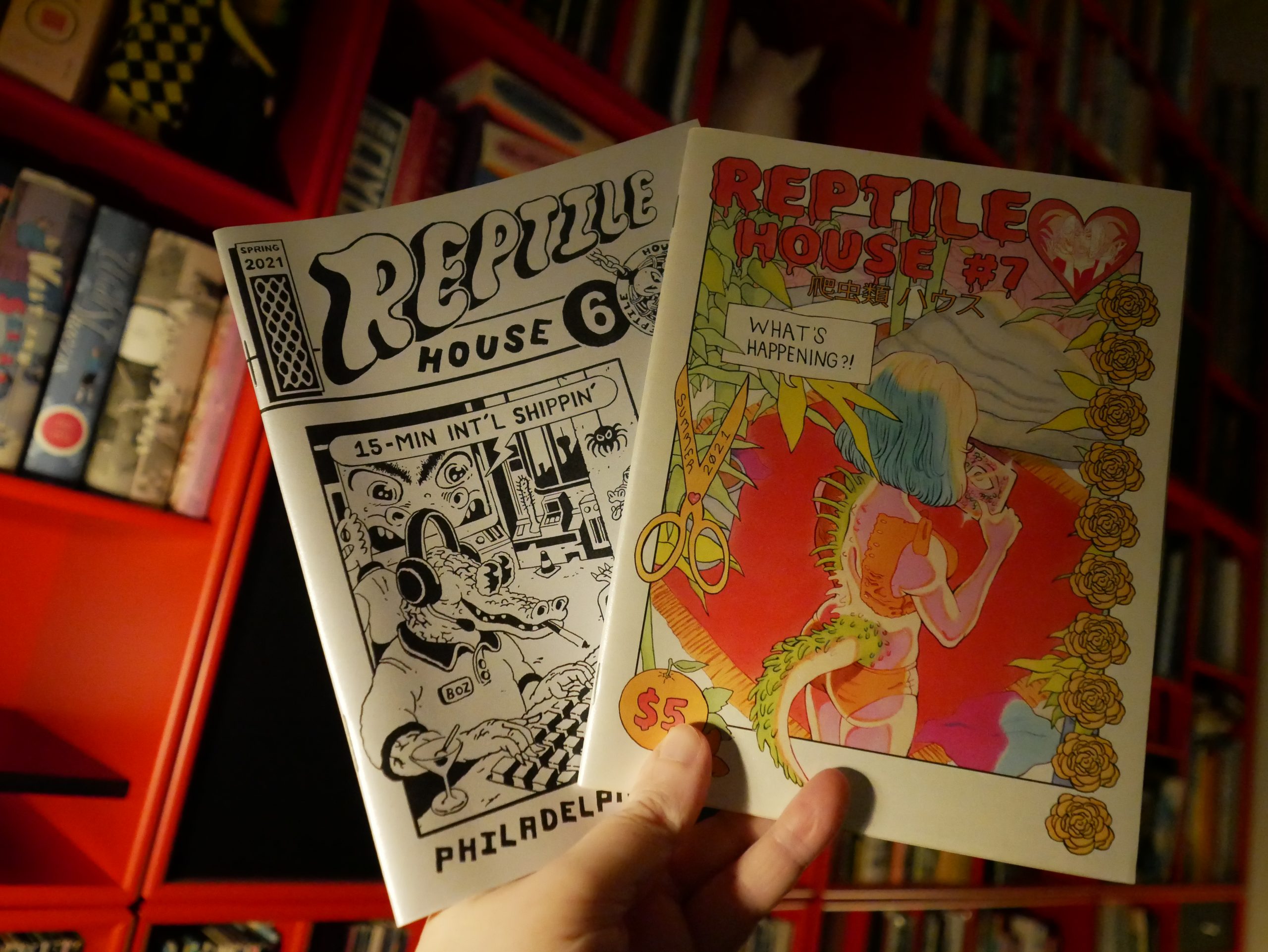
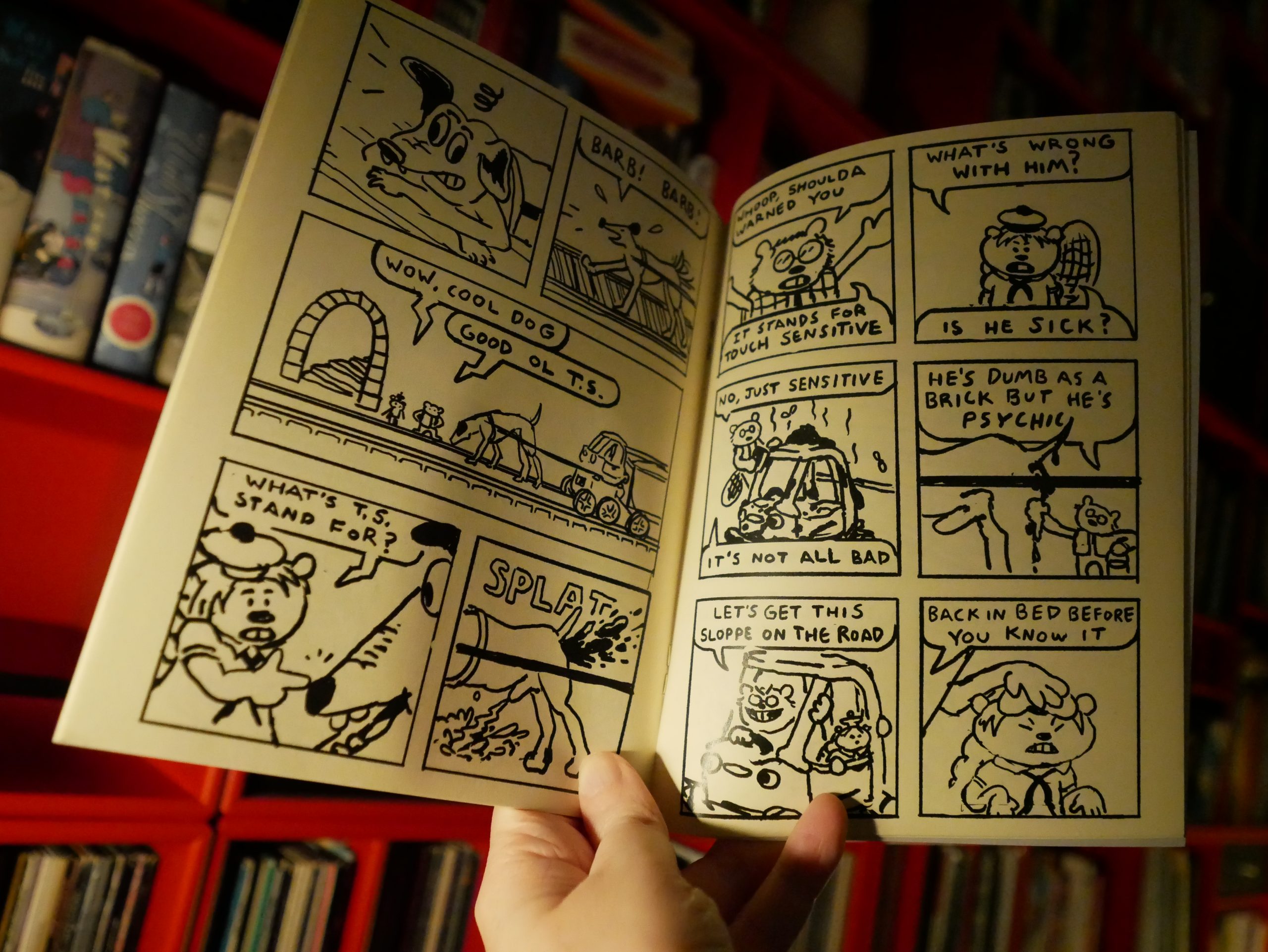
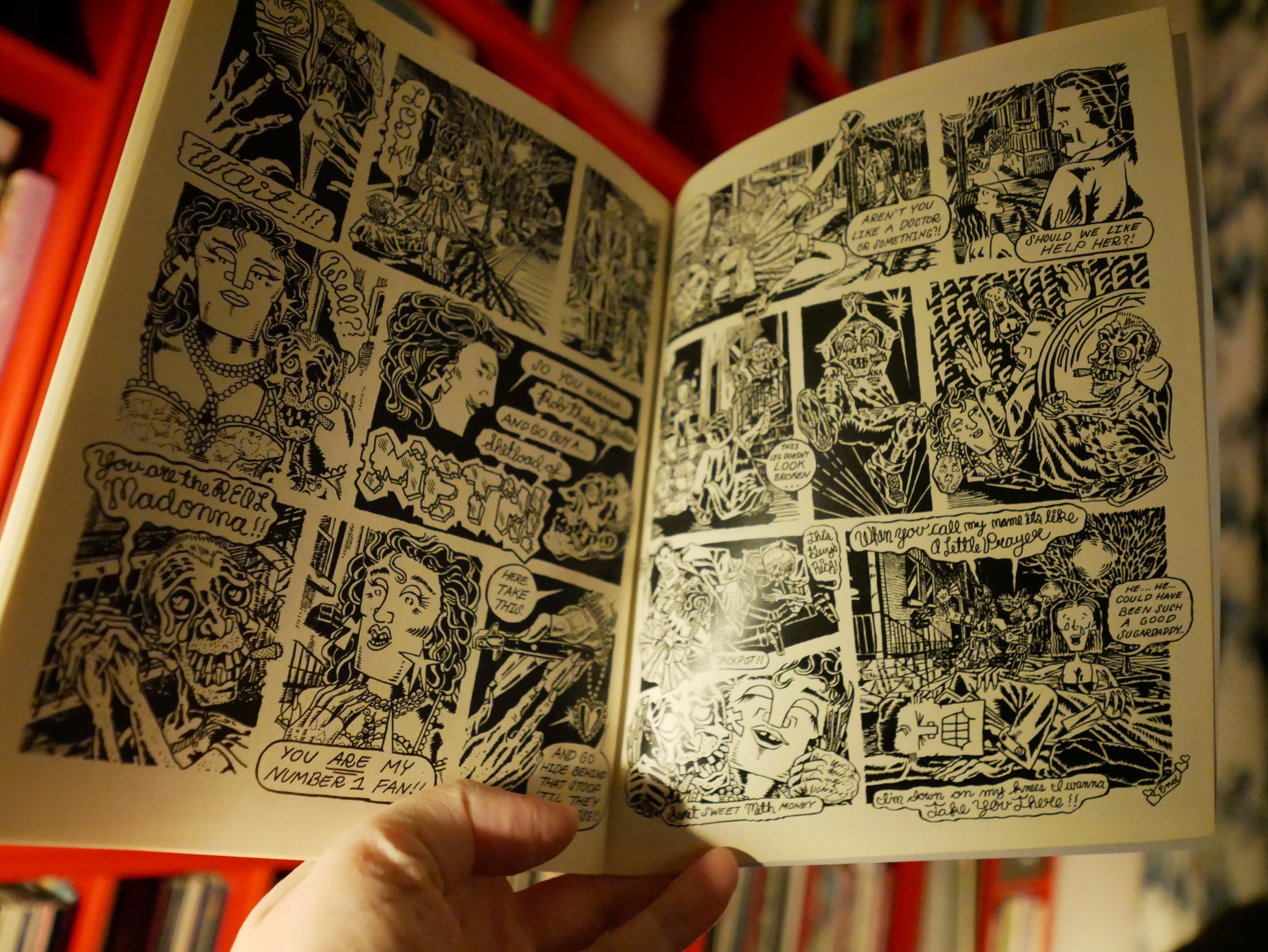
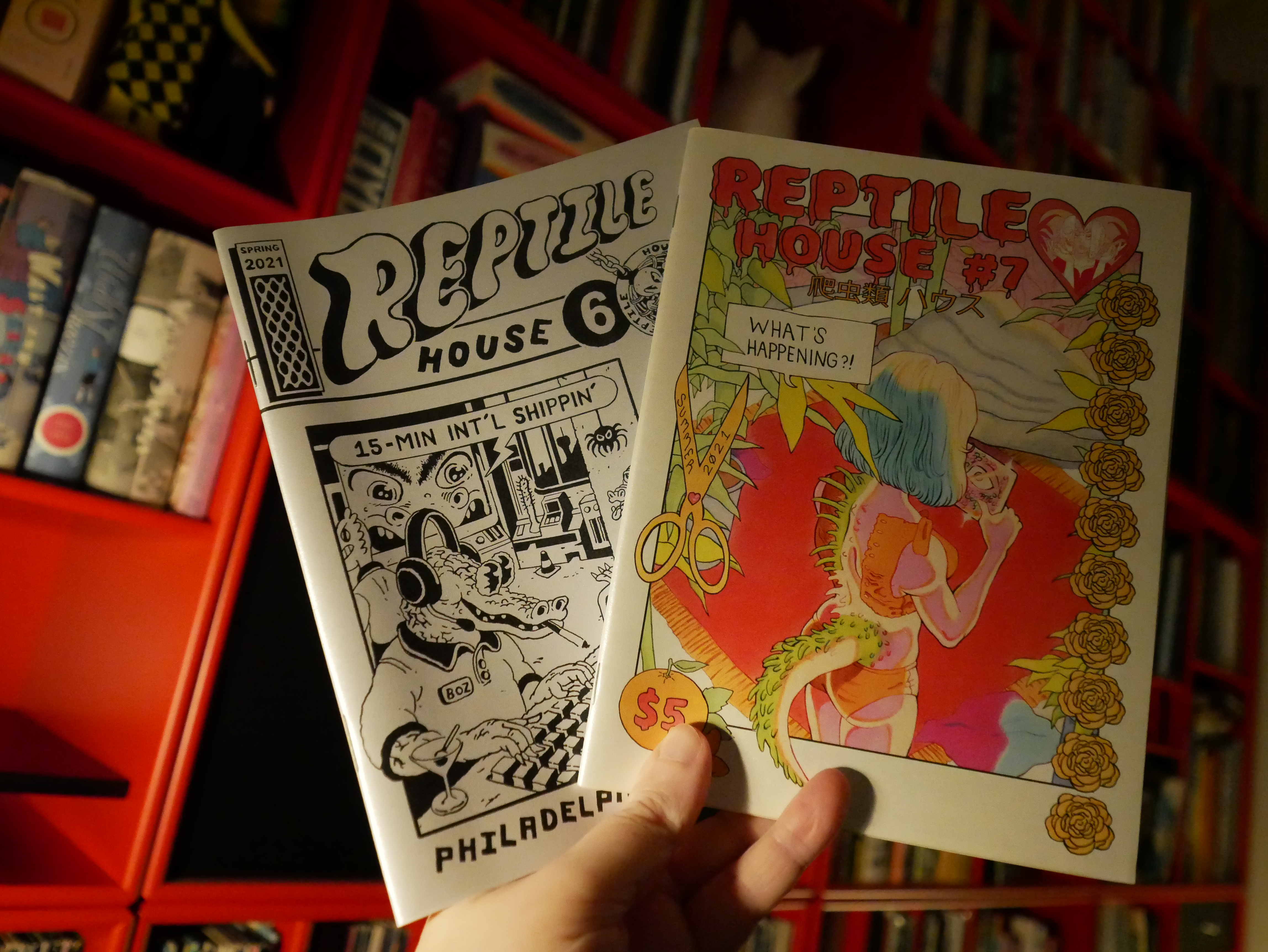
00:29: Reptile House #6-7
They have that annoying “in order of appearance” credits in these, so I have no idea who did what. I mean, I’d have to make an effort and I hate making an effort.
But this is a good anthology. Feels like a throwback to early 90s undergrounds? I mean some of it.
Other bits are more genuinely unnerving.
And I love the shiny cover stock.
00:50: Daze Pause
Perhaps I should take a nap.
| Various: Blue Note Re:imagined (1) |  |
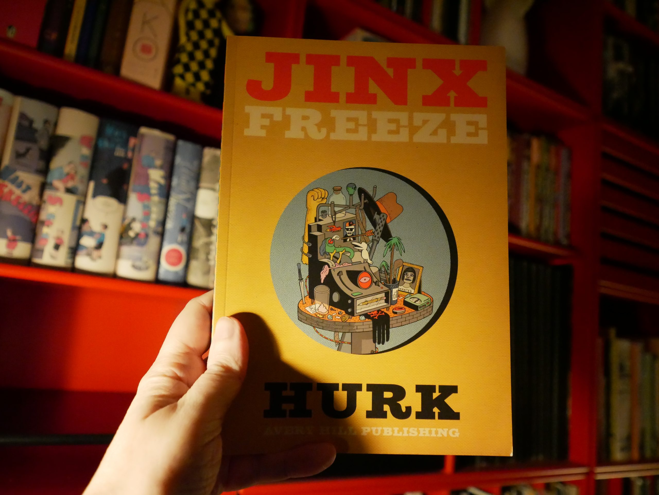
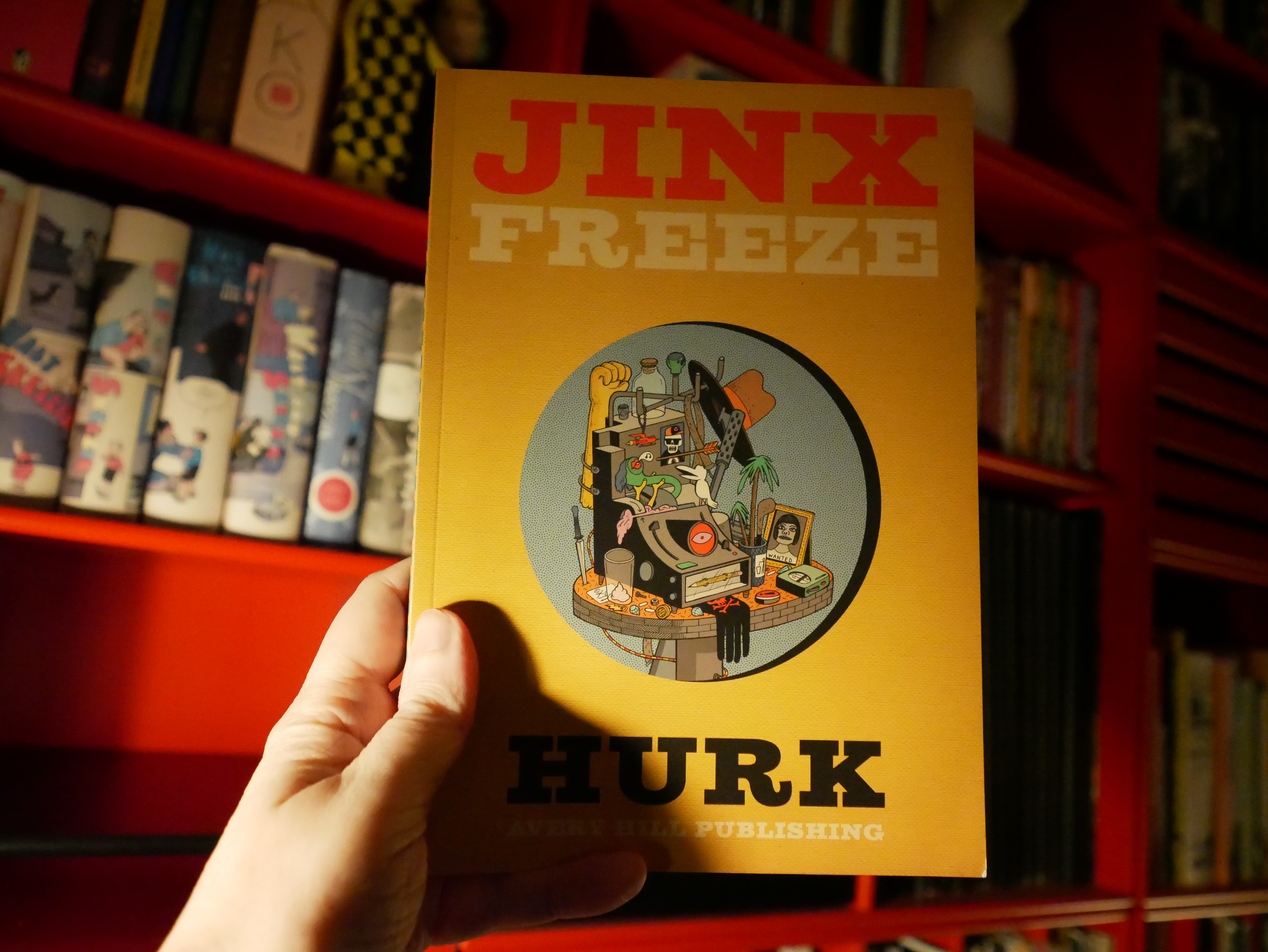
04:40: Jinx Freeze by Hurk (Avery Hill)
I’m awake! I’m awake!
I didn’t really sleep much, though… mostly dozed…

I found this book to be pretty annoying at the start — I just didn’t quite connect with the storytelling; it seems kinda awkward.
And at the start I didn’t know whether this was just a collection of gags and non-sequiturs or a bigger story… and it turns out to be both. That is, many of these things tie into a bigger narrative that, surprisingly enough, turns out to be rather satisfying?
It’s pretty fascinating; the further I got in the book the better it seemed to get, but perhaps that just because I was getting used to the rhythms.
It’s a great book — it reminds me a bit of Eric Haven, I guess?
| Pink Industry: Is This The End? |  |
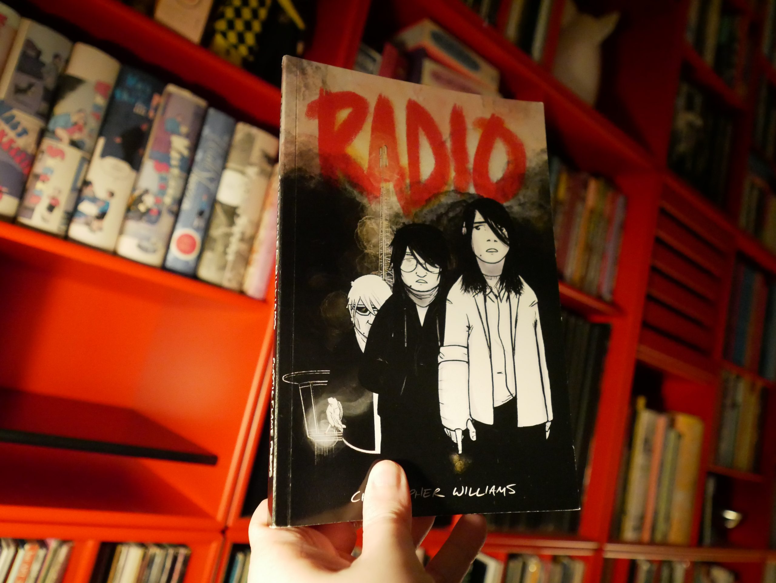
05:50: Radio by Christopher Williams

This book is pretty interesting… I thought it was gonna be psychodrama kind of thing, but then it turns out to be sci-fi.
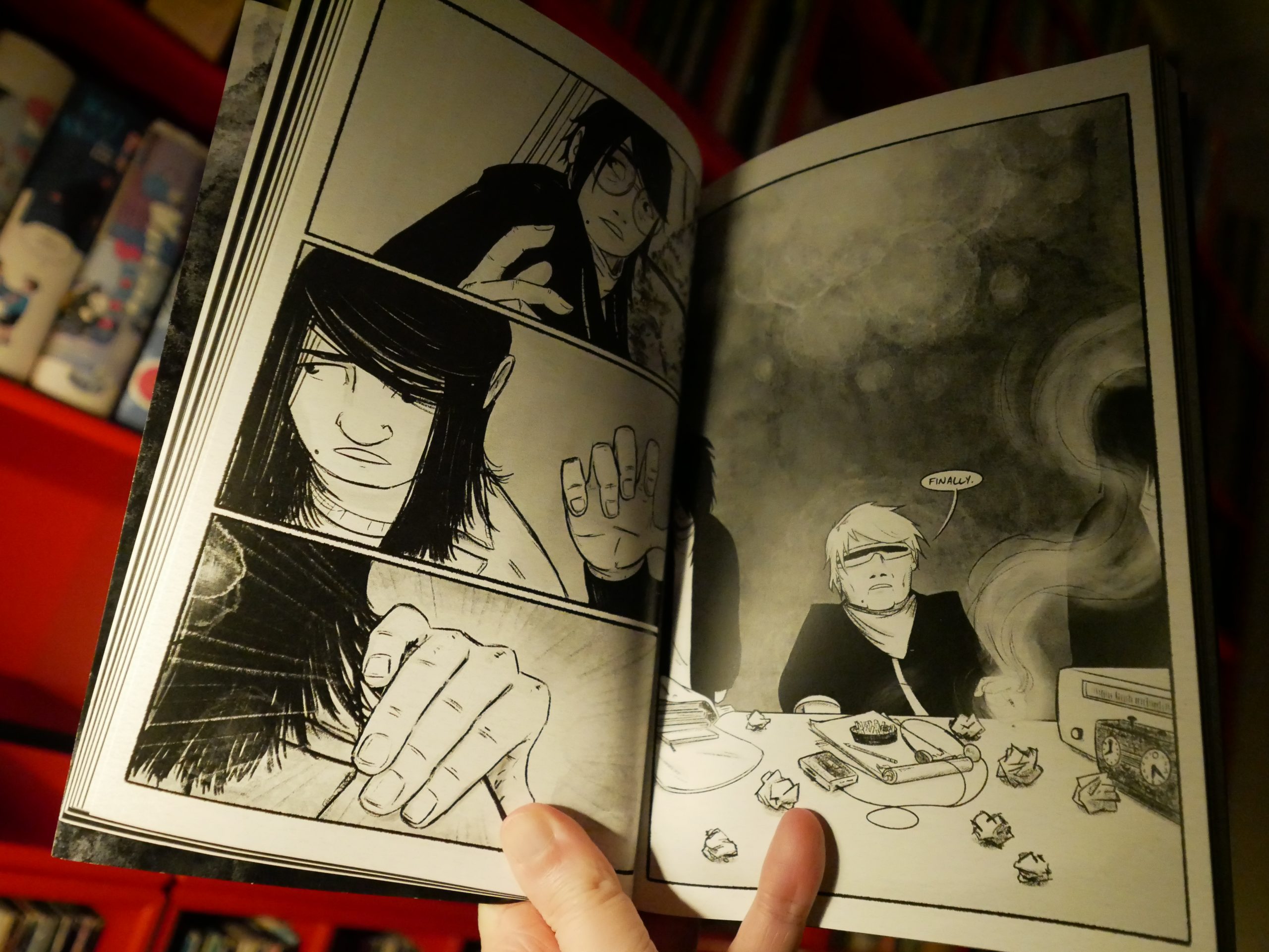
And then it turns out that it isn’t sci-fi, but instead a psychodrama kind of thing!
Well, sort of.
| DJ Screw: All Work, No Play |  |

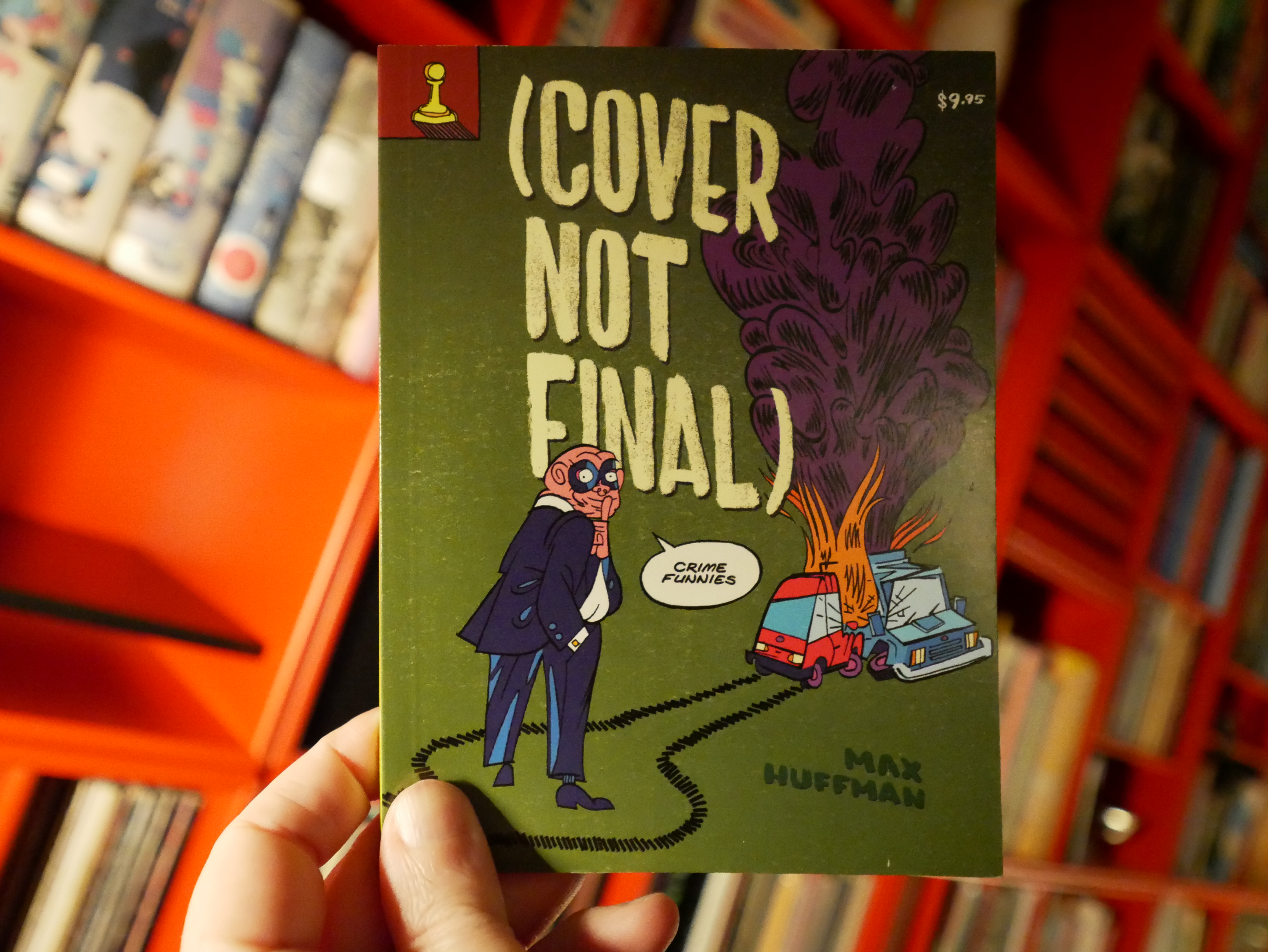
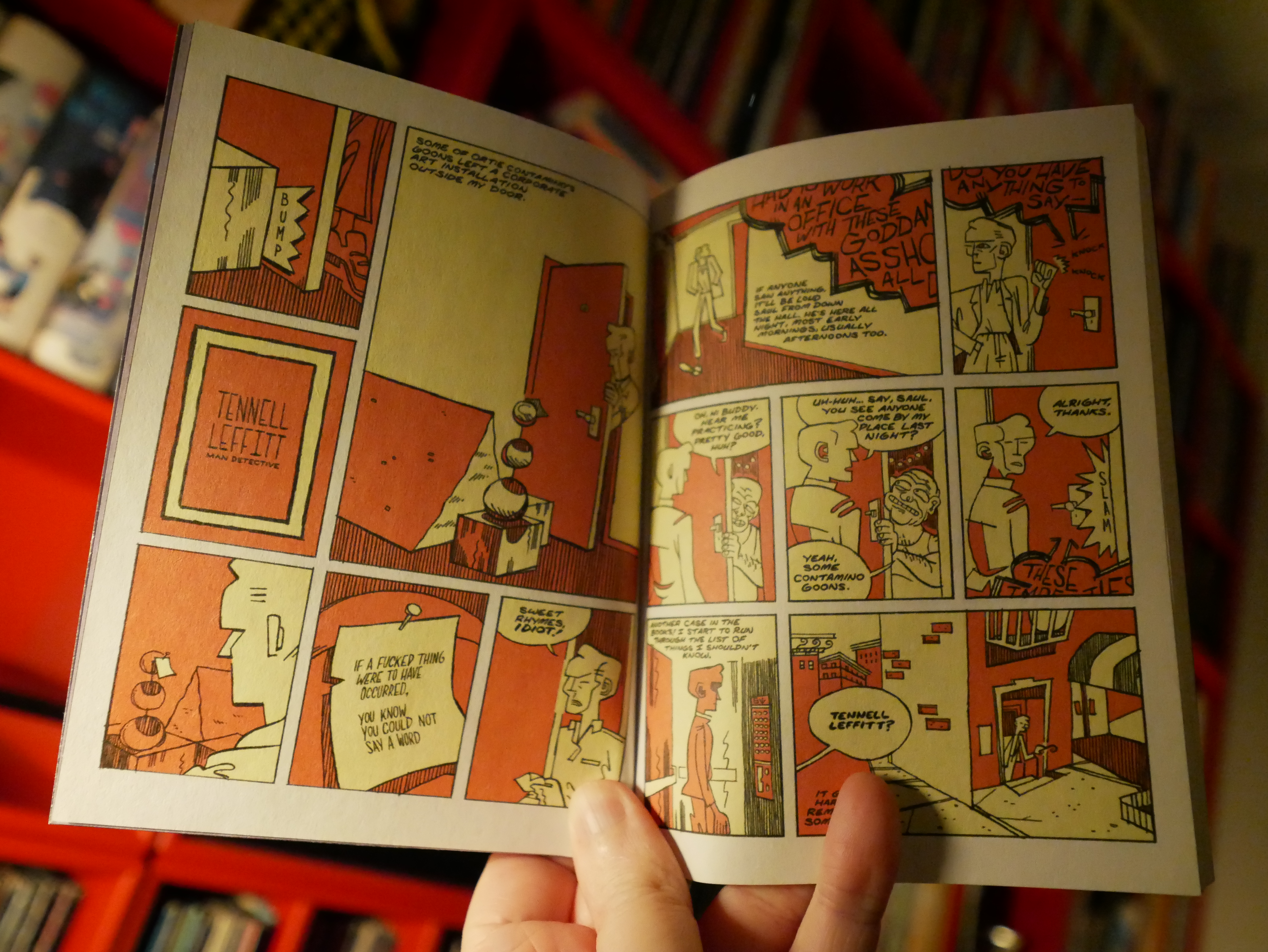
06:12: (Cover Not Final) by Max Huffman (Adhouse Books)
I like the format — it’s like a small paperback (digest?) thingie? But the printing is way weird: Everything is slightly out of focus; all the lines look smudged. I’m assuming it’s printed this way on purpose, perhaps to emulate er 60s badly printed digests? It’s a weirdly unpleasant to read, though.
It’s a collection of short pieces, and it’s pretty funny.
| Black Cab: Take It (Lauer Remix) |  |
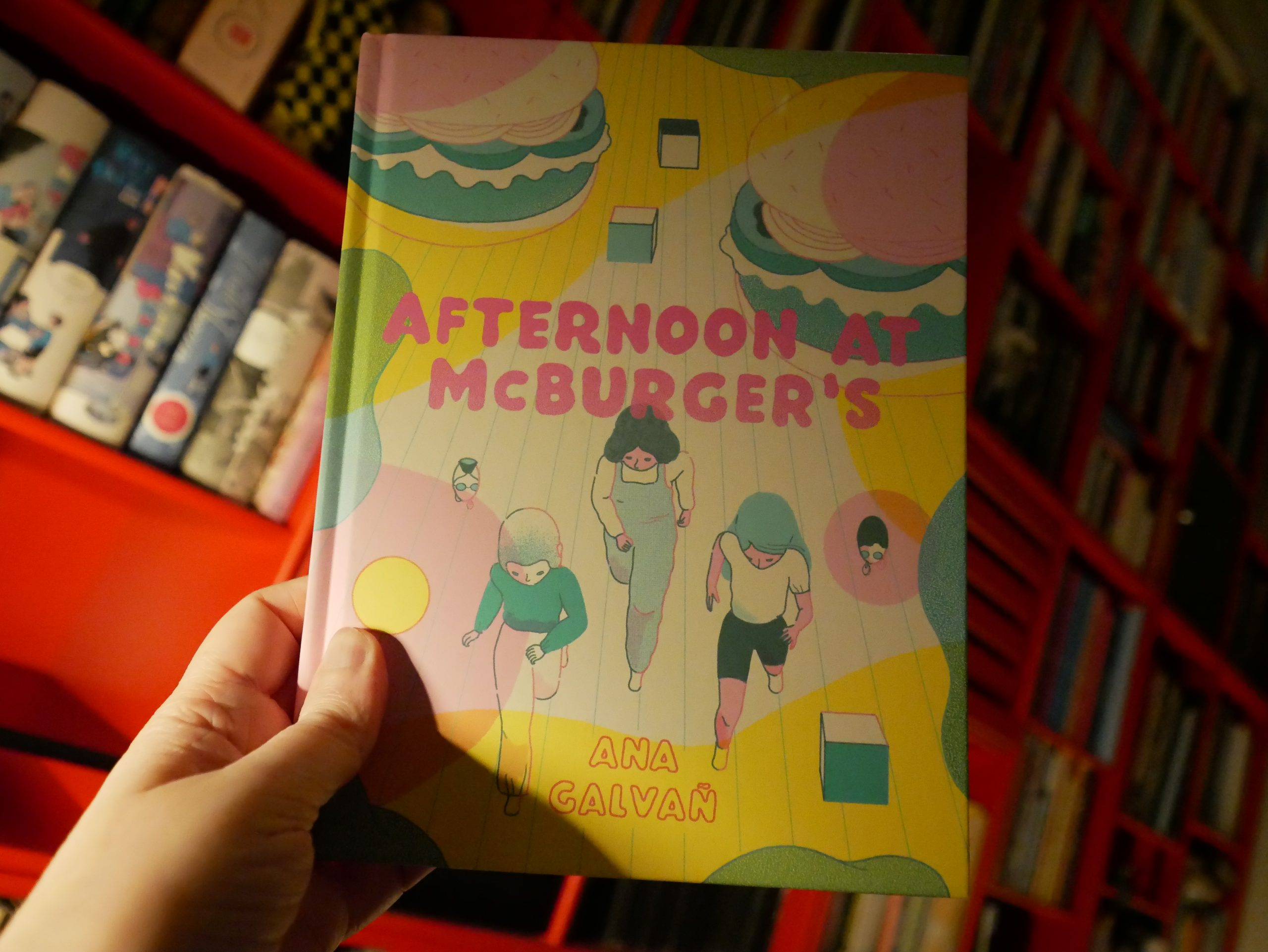
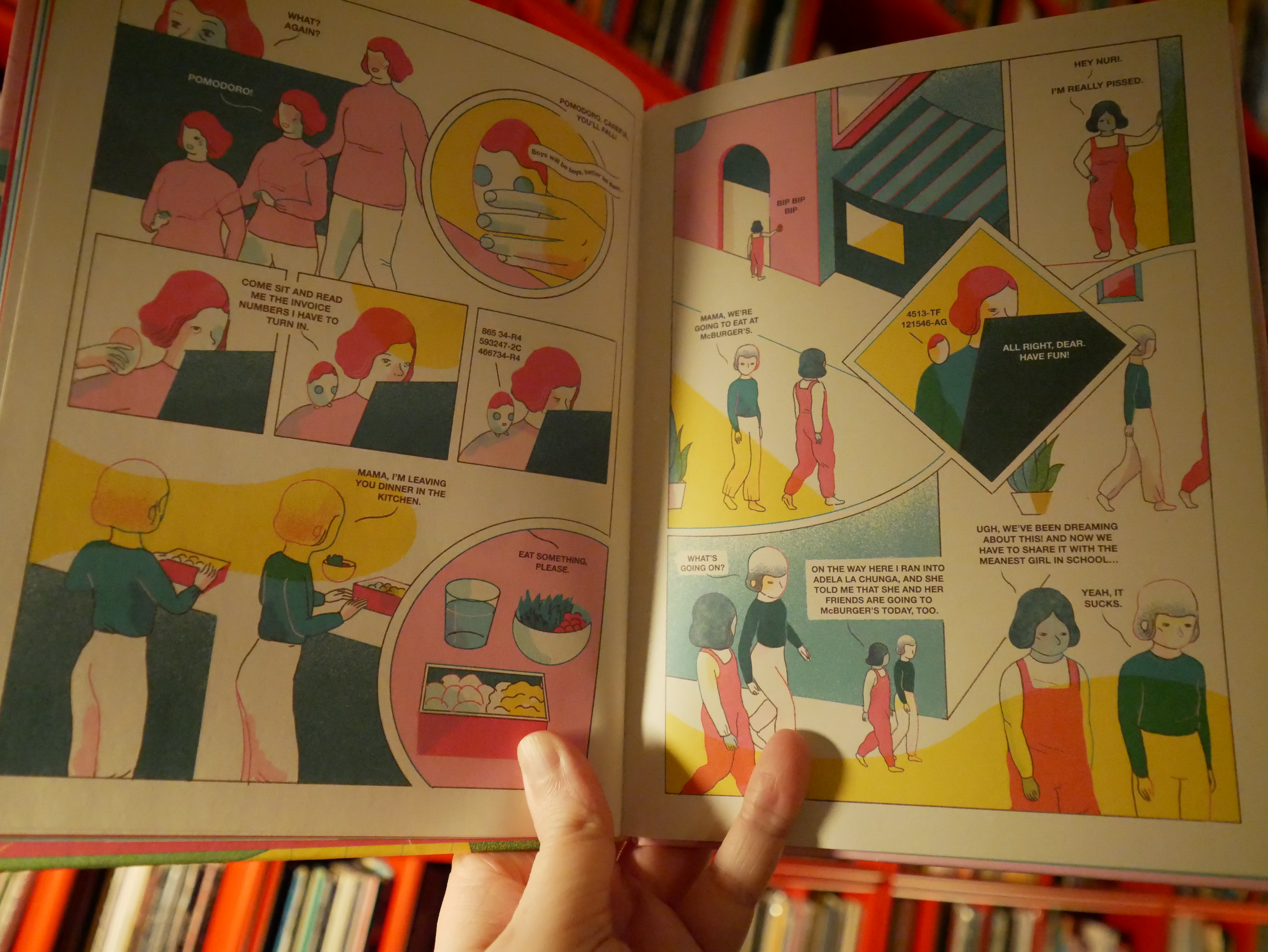
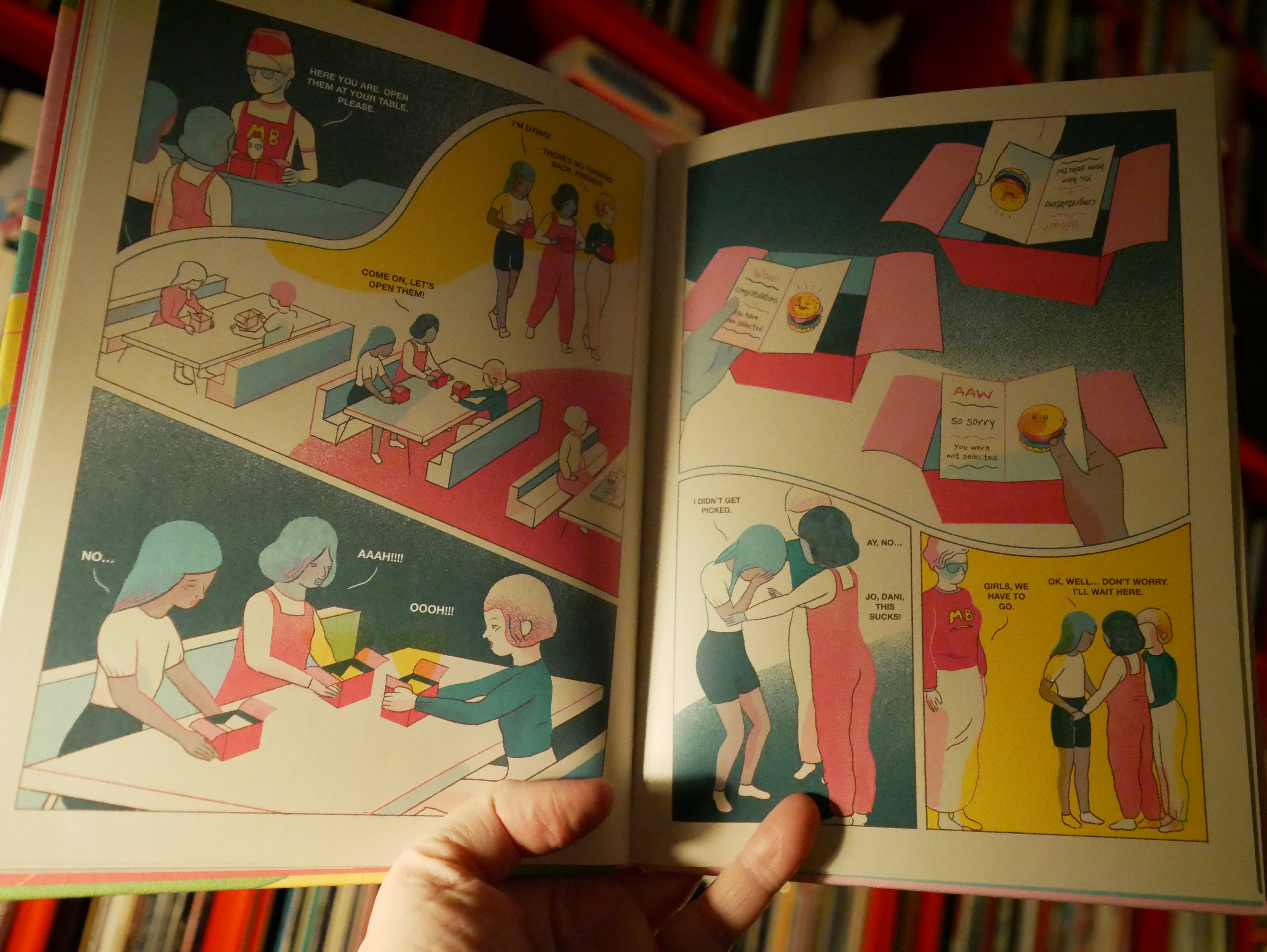
06:35: Afternoon at McBurger’s by Ana Galvañ (Fantagraphics)
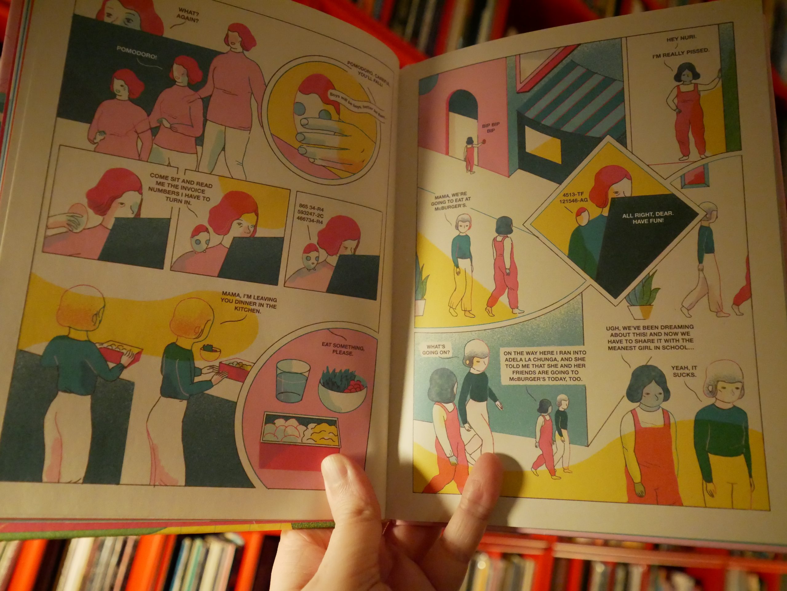
Wow, this is a really intricate book. Well, OK, the story’s pretty simple, but it’s told in an excitingly mind-bending way. I flipped back to previous pages a lot while reading this, and ended up reading the book twice.

And I’m still not quite sure about all the details.
All of that might seem a bit gimmicky, but the book manages to pack a satisfying emotional charge, too. It’s excellent.
| Sylvan Esso: WITH |  |

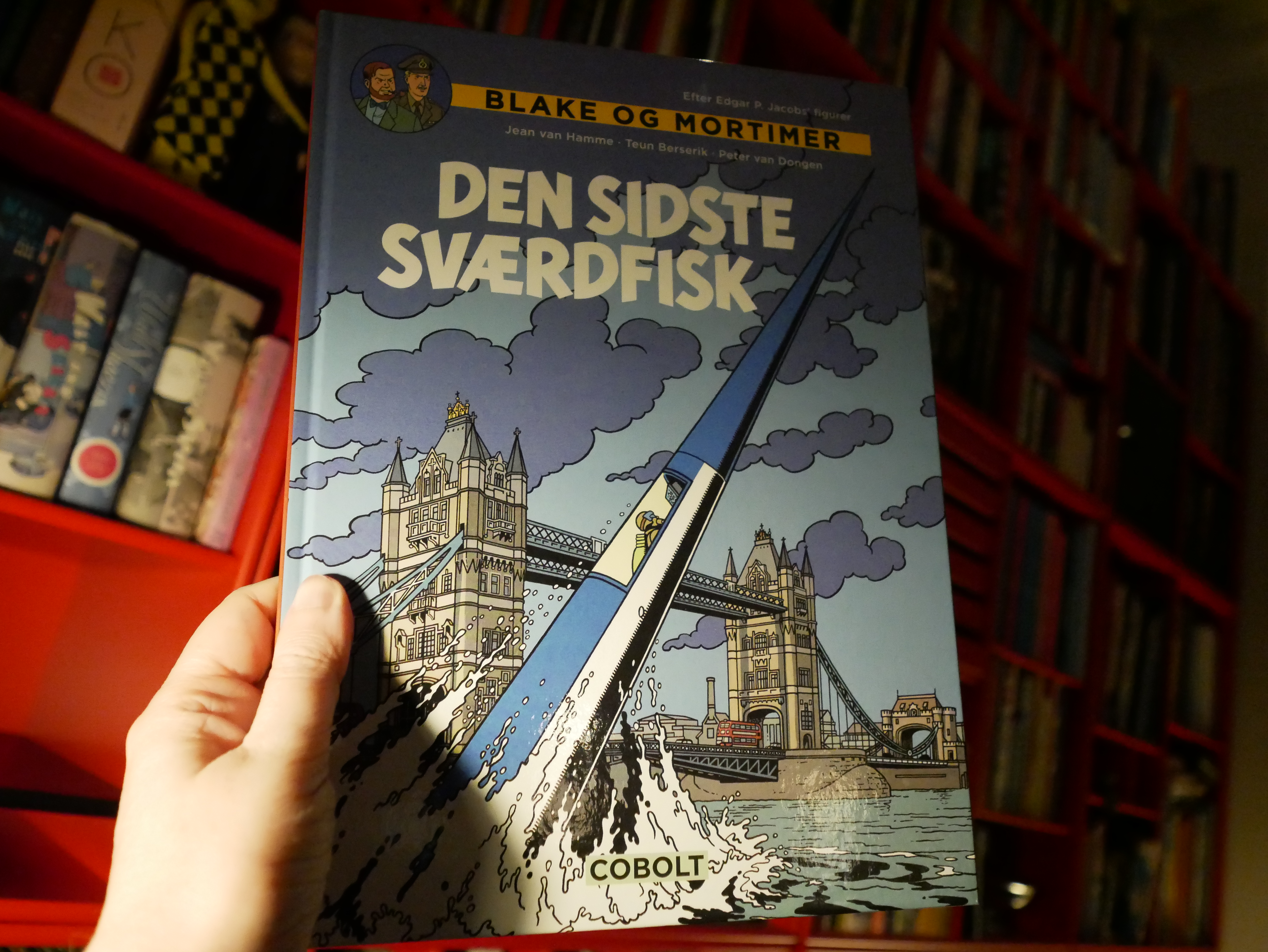
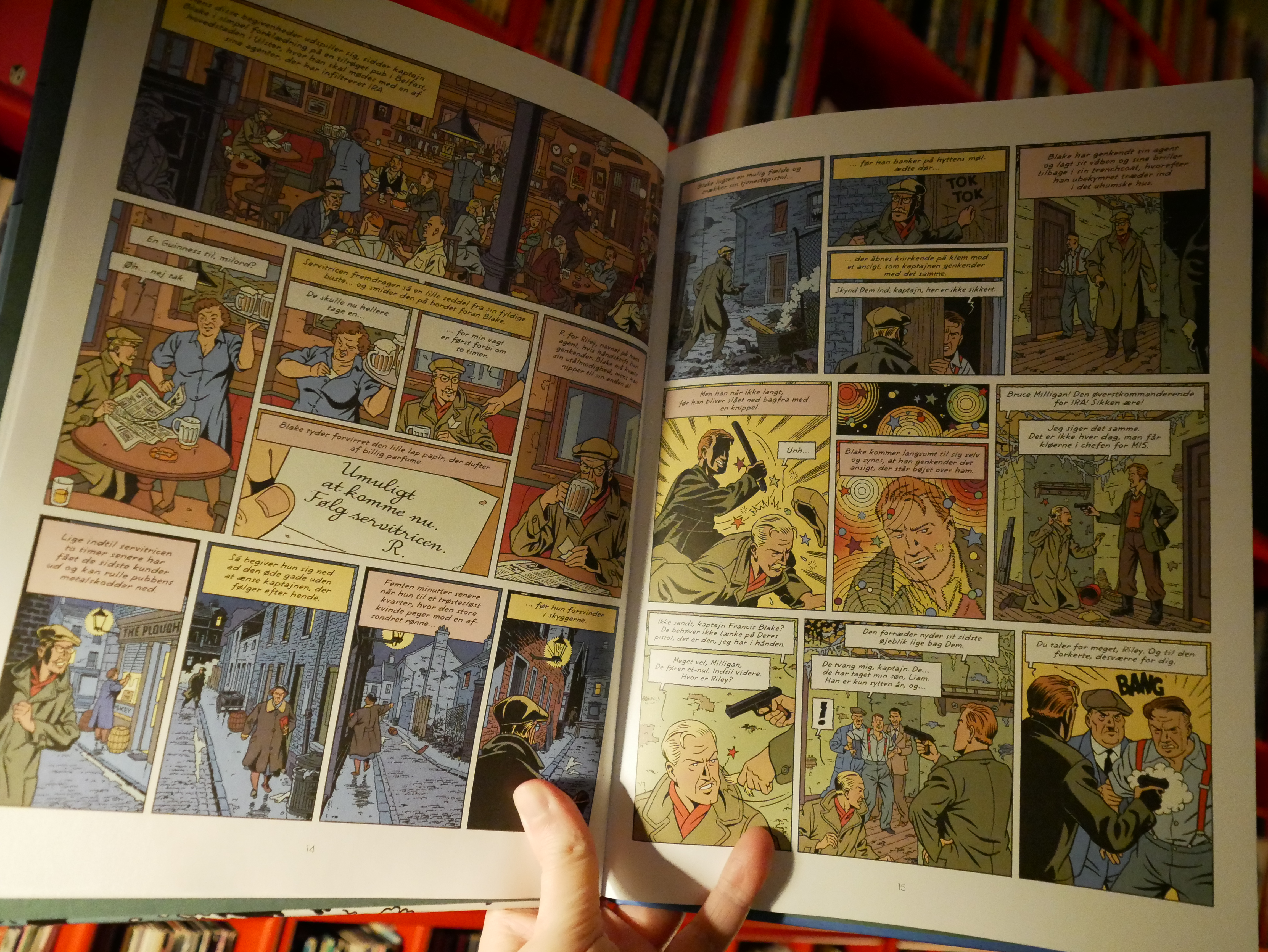
06:53: Le aventures de Blake et Mortimer: Le dernier espadon by Jean van Hamme, Teun Berserik, Peter van Dongen (Cobolt)
I’m not a fan of Edgar P. Jacobs at all — I find his comics to be downright tedious. (And I like the general genres he works in, but I’m just boggled by his popularity.) Even as a child I was all “this is a bit lame, eh?” (Apparently I was Canadian as a child now.) But I was also slightly fascinated by the inhuman qualities of the albums: You take a casual look at the pages and then you go “oh, Tintin! How fun!” and then you start reading it and you discover that it’s apparently been written and drawn by murder bots. Any human qualities a mystery to the bots.
But this is one of those post-Jacobs Blake & Mortimer albums, so I thought I’d give it a shot…
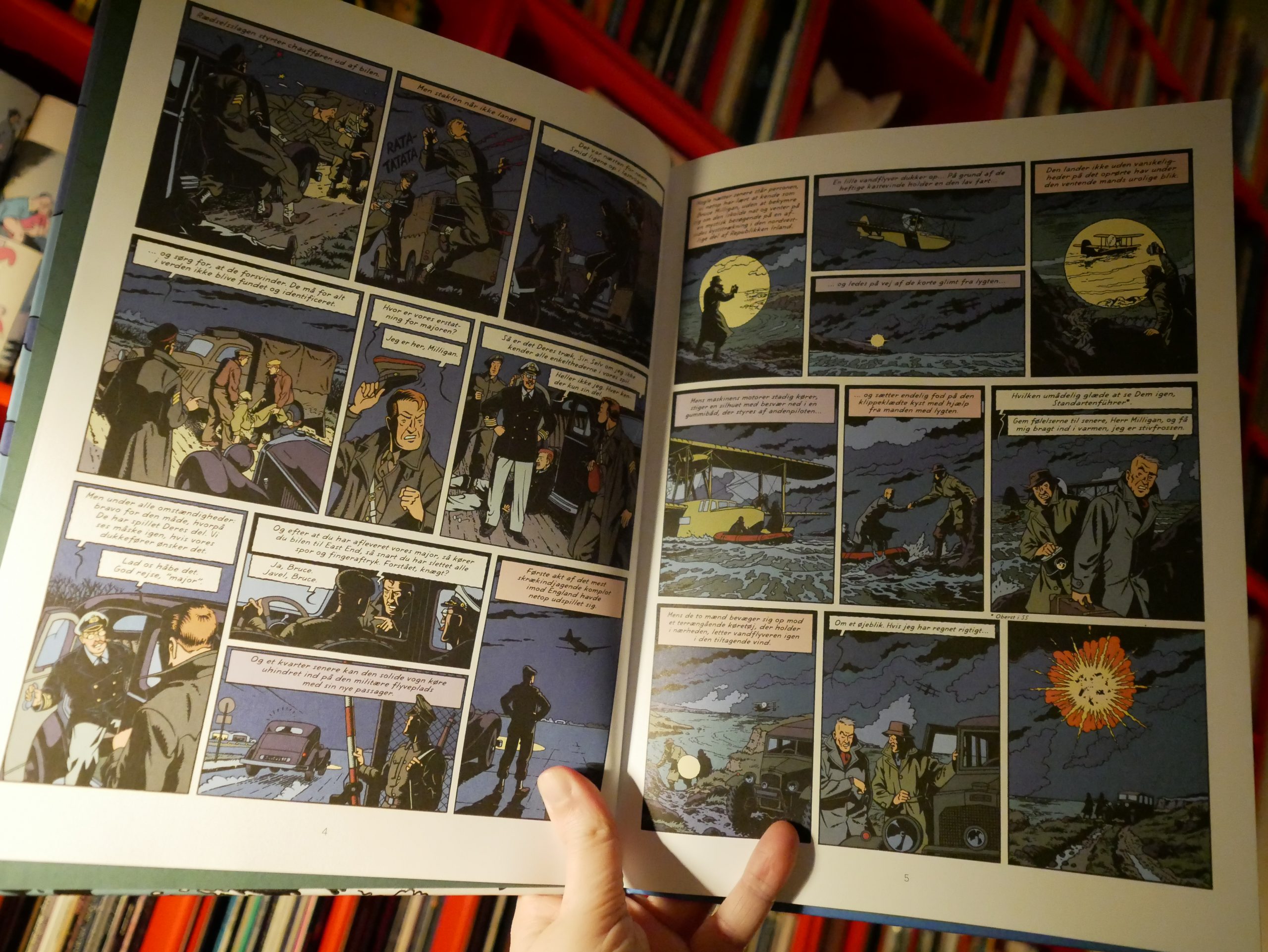
The artwork doesn’t have the same inhuman charm that Jacobs’ had, but it’s fine, I guess?
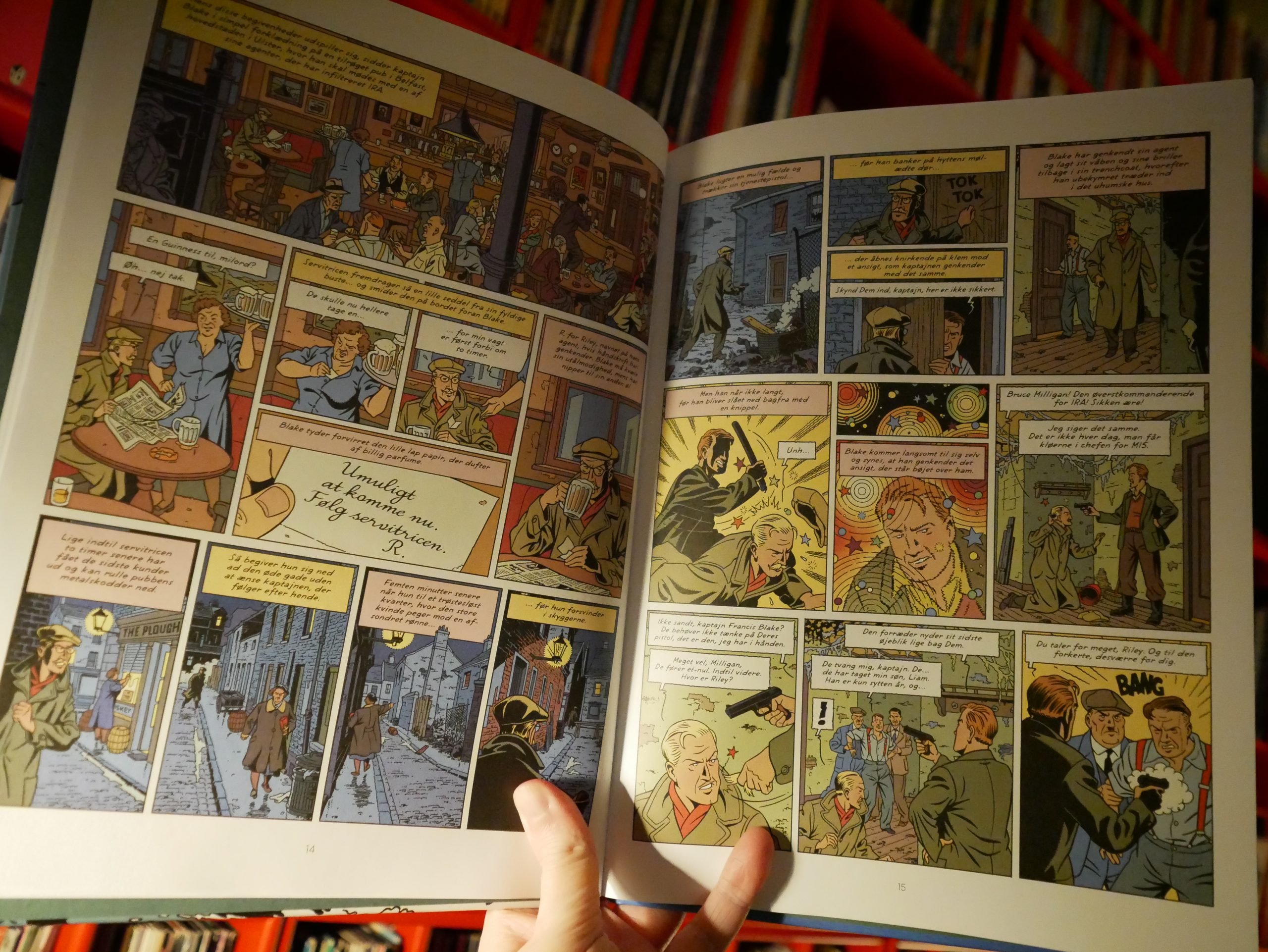
Van Hamme’s storyline isn’t geared toward the Irish market — it’s about Nazi IRA people torturing and killing people by the boatloads. And… it’s pretty boring? But it does have some twists I didn’t see coming.
| Caterwaul: The Nature Of Things |  |
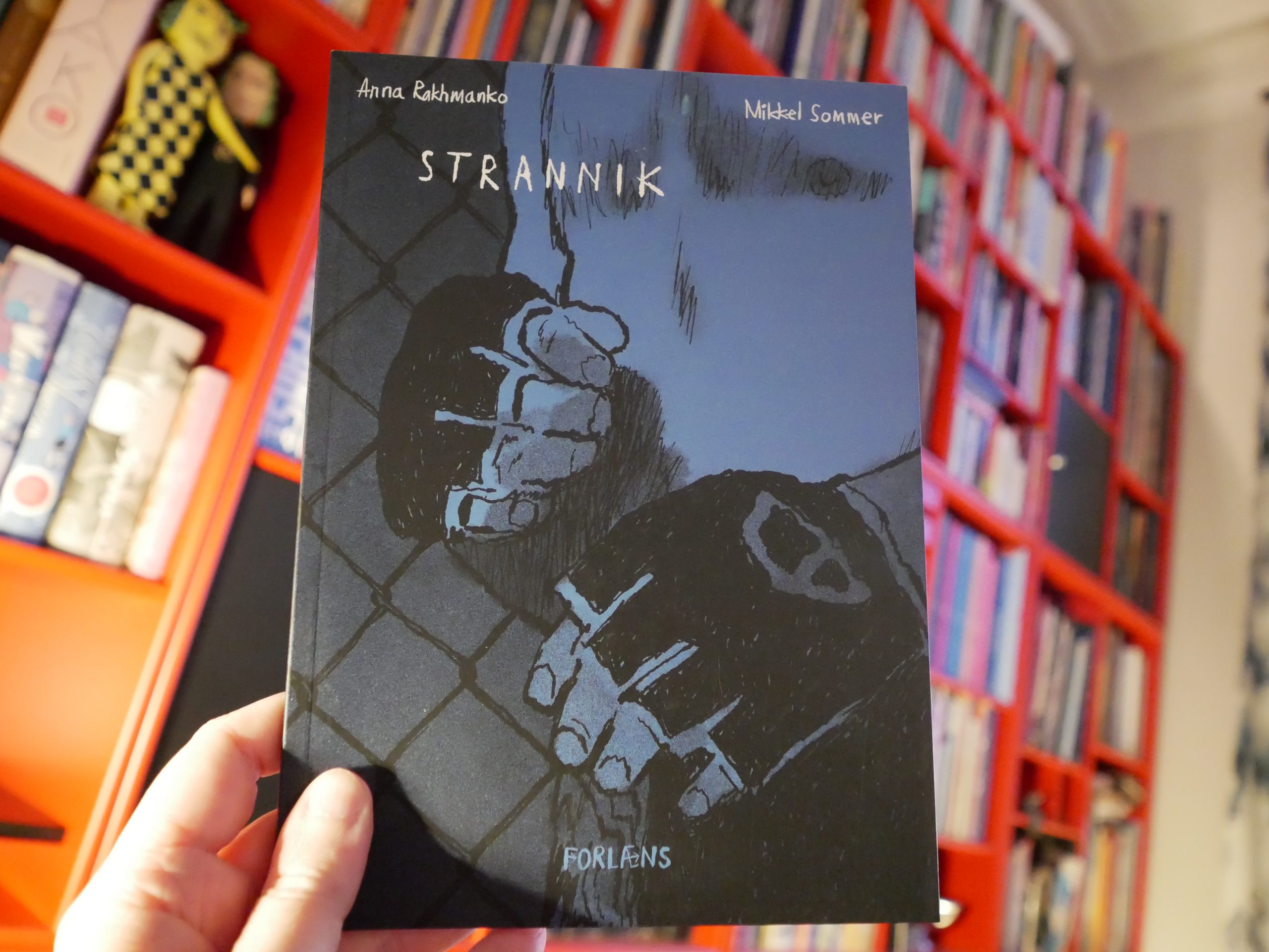
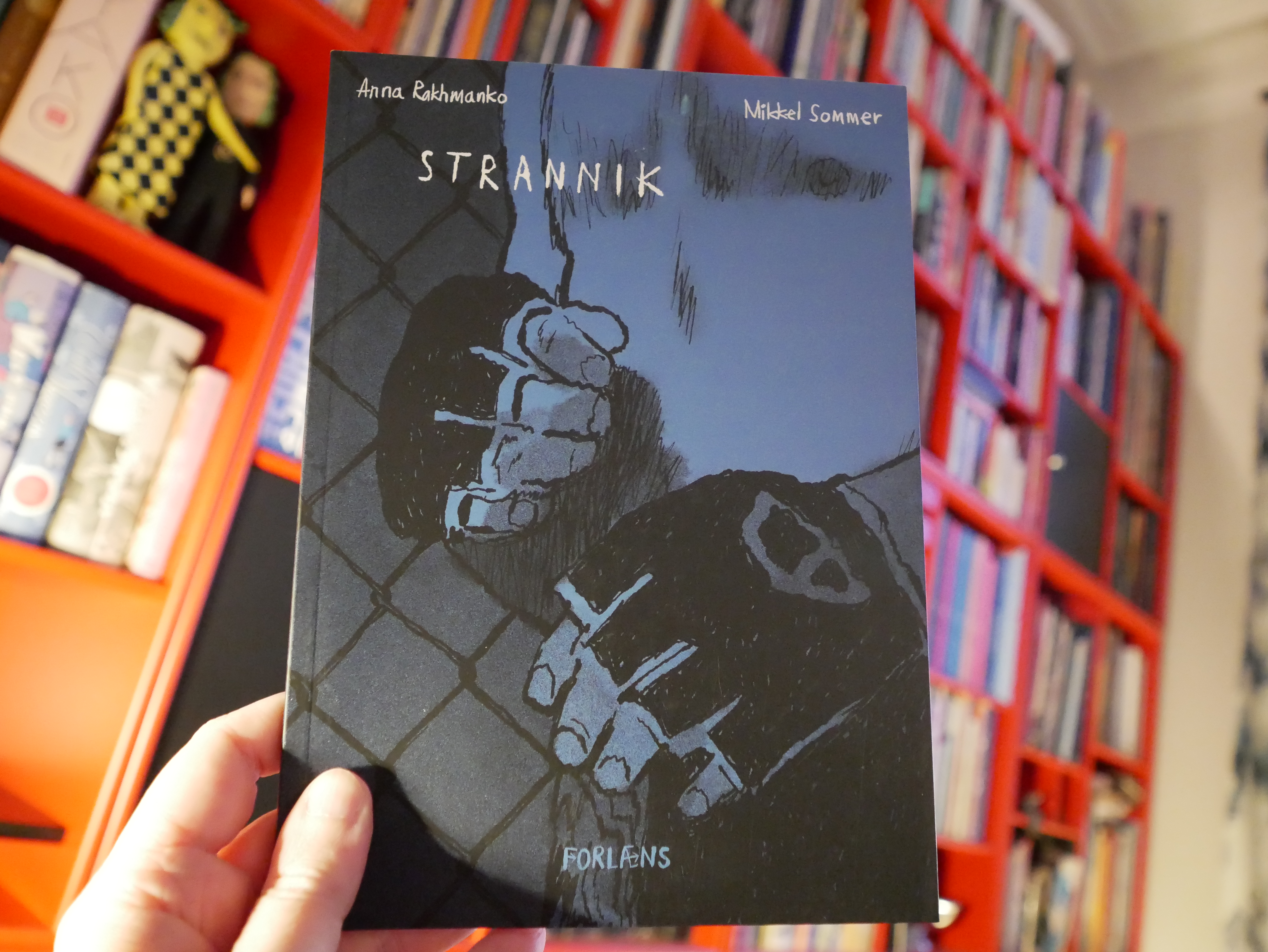
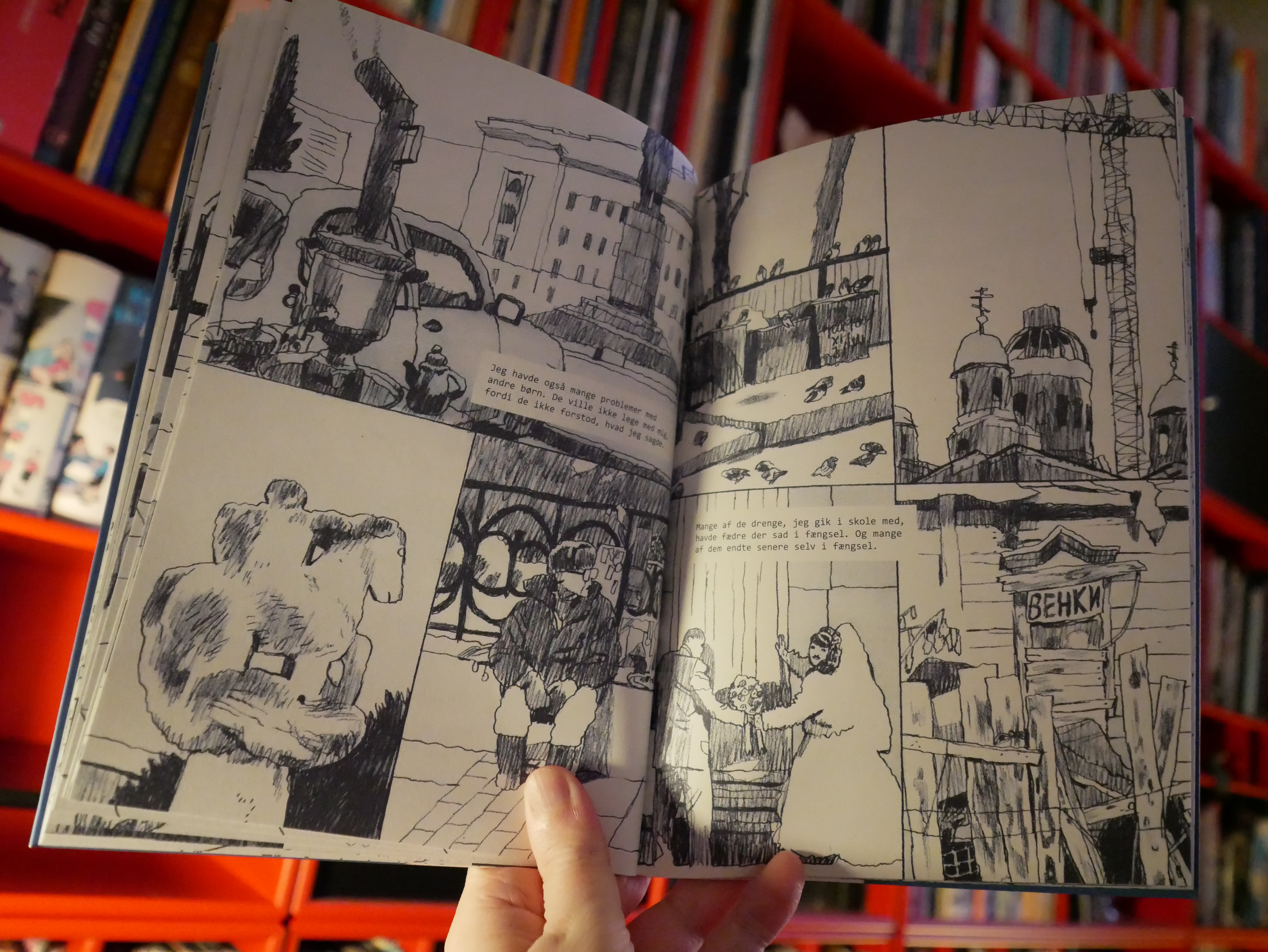
08:21: Strannik by Anna Rahkmanko, Mikkel Sommer (Forlæns)
This is basically just an illustrated interview with a Russian MMA guy…

… but it’s fantastic! The pacing is great and it’s got a great moody mood… and I love the artwork.

08:36: Dawn
Look! It’s dawn!
And I think I’ve read enough comics for er to… night.
It was an odd mixture of comics, but some good stuff, some intriguing stuff, and very little outright bad stuff.
And now I guess I’ll have to go to bed soon. *sigh*


![James Chance - Contort Yourself [Original Version]](https://lars.ingebrigtsen.no/wp-content/plugins/wp-youtube-lyte/lyteCache.php?origThumbUrl=https%3A%2F%2Fi.ytimg.com%2Fvi%2F08lBdha4sB0%2F0.jpg)


)
)

%3A+Black+Tie+White+Noise)
%3A+Re%3ACall+5)
%3A+Re%3ACall+5)
%3A+The+Buddha+Of+Suburbia)
%3A+1.+Outside)
%3A+Earthling)
%3A+Hours)
%3A+BBC+Radio+Theatre+2000)
%3A+BBC+Radio+Theatre+2000)
%3A+Toy)
%3A+Re%3ACall+5)
)
)
)

%3A+A+Message+From+The+Meters+%5BStruttin'+%26+Singles+Bonus+Tracks%5D)


)
)
+People's+Music)
)
)

&album=Wheel+Me+Out+(Long+Version))