*phew* Physical inbox zero!
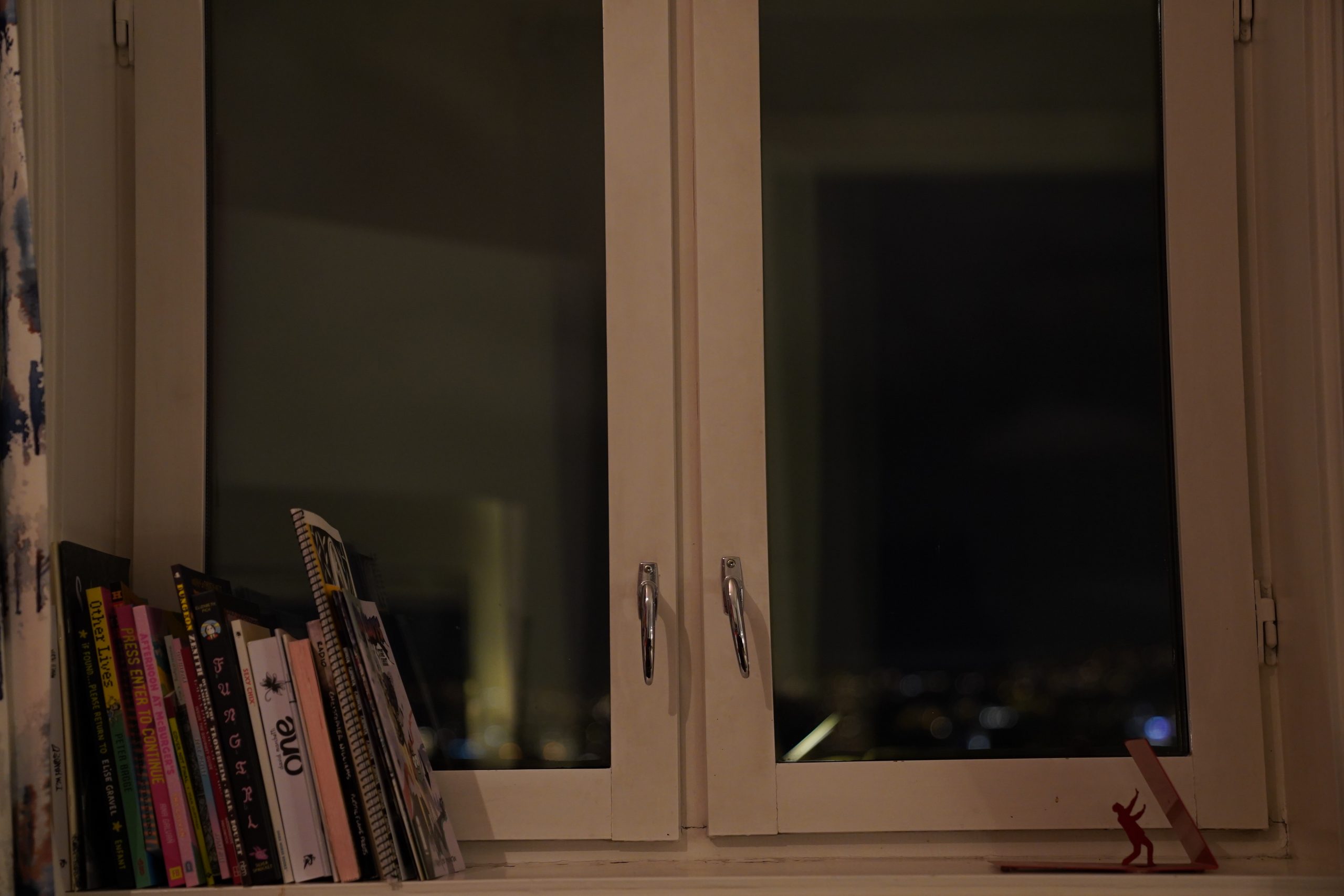
You know all those half-read books spread all over the apt, and that volume of Baron Bean (1918 edition), all those magazines saved for “reading later”, and the newspapers, and the collections of a decade of Ric Hochet comics, and the Criterion blu-ray box essays, and everything? I’ve now read them all! I dud it! 🇺🇸! 🇺🇸! 🇺🇸!
It took me, like, three weeks, and I cheated and read some other books in between, but all those things are now gone. I know, it’s silly to feel some kind of pressure to read stuff like that — and I enjoy reading them, otherwise I wouldn’t — but at some point, looking at that Pogo collection and that Alan Bennett diary that’s been sitting on my nightstand for several years now, it starts feeling… oppressive? In a strange way? It doesn’t make sense, but that’s how it is.
And just as I finished with the last half-read book (“Out of focus: Writings on Women and the Media”), I got several packages of new, fresh comics, so I’m rewarding myself with a comics reading day.
| Bush Tetras: Rhythm and Paranoia: The Best of Bush Tetras (1) |  |

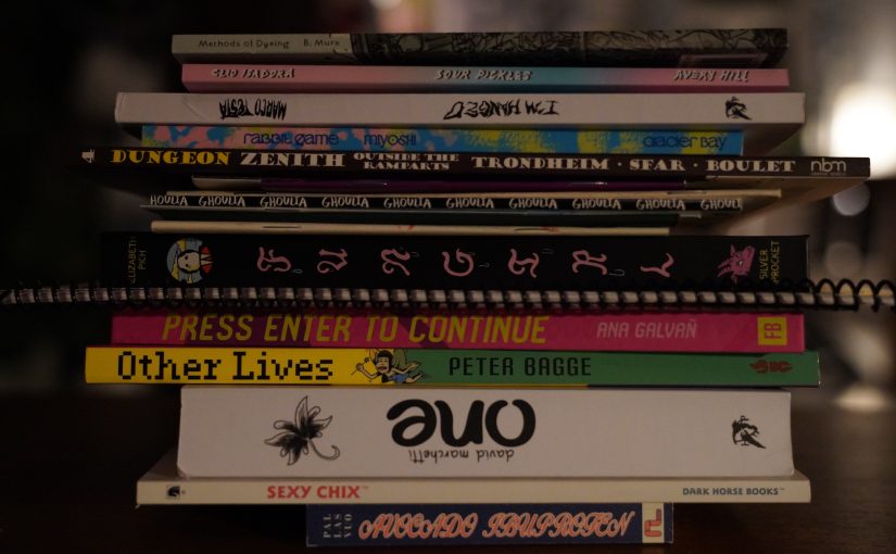
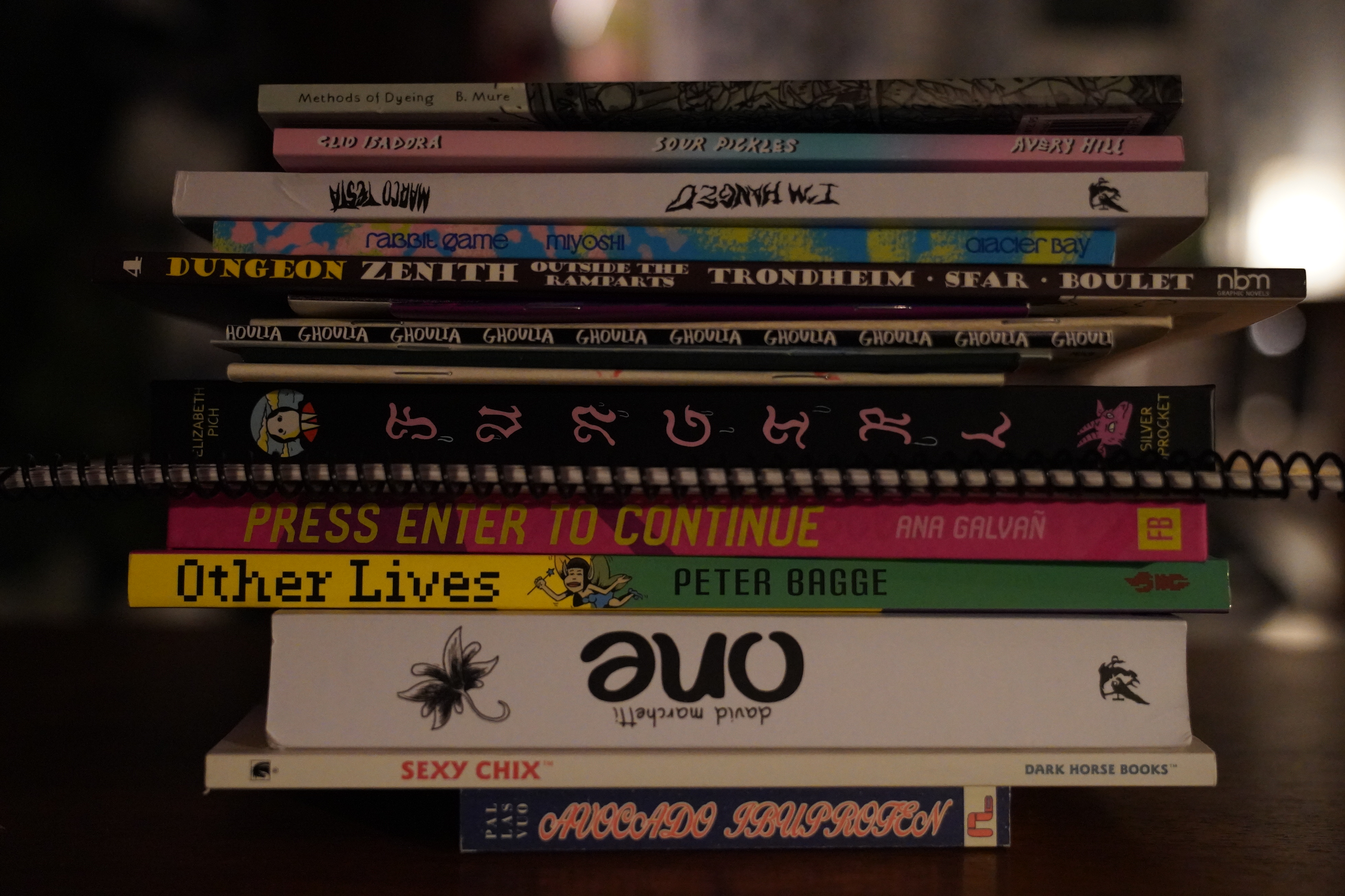
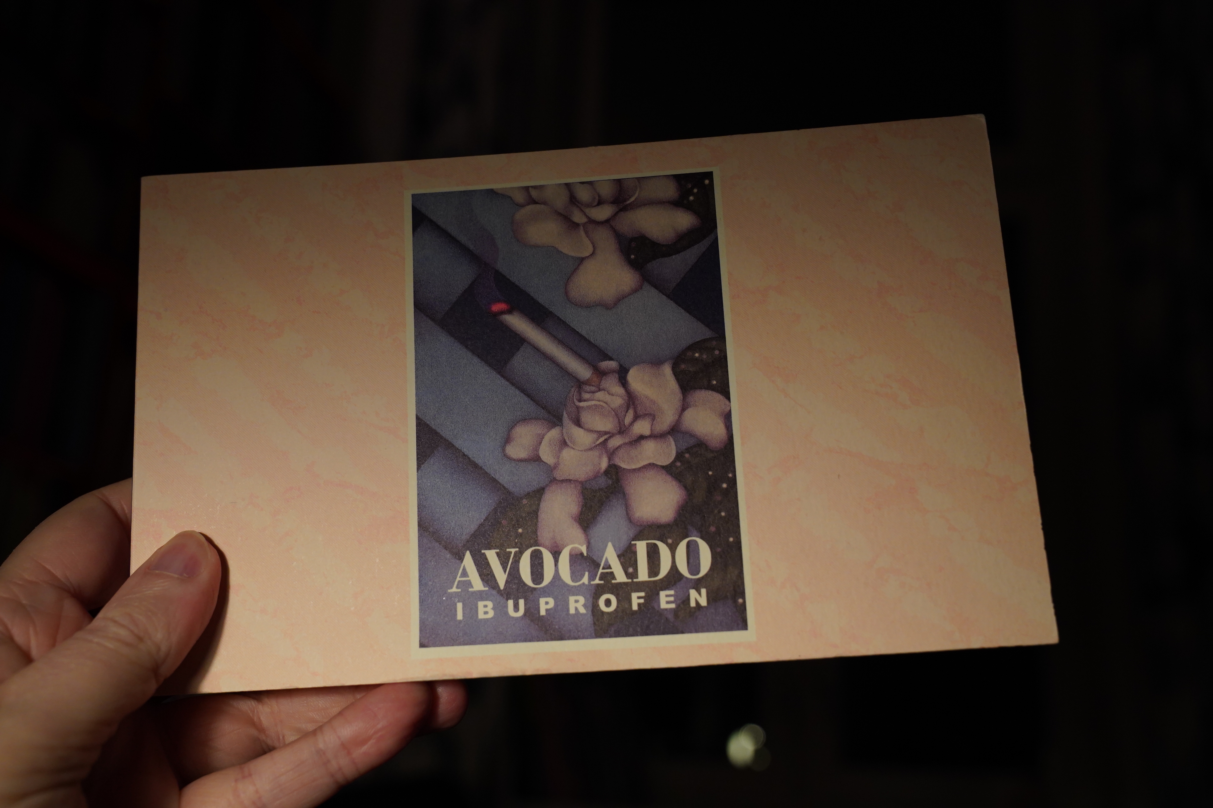
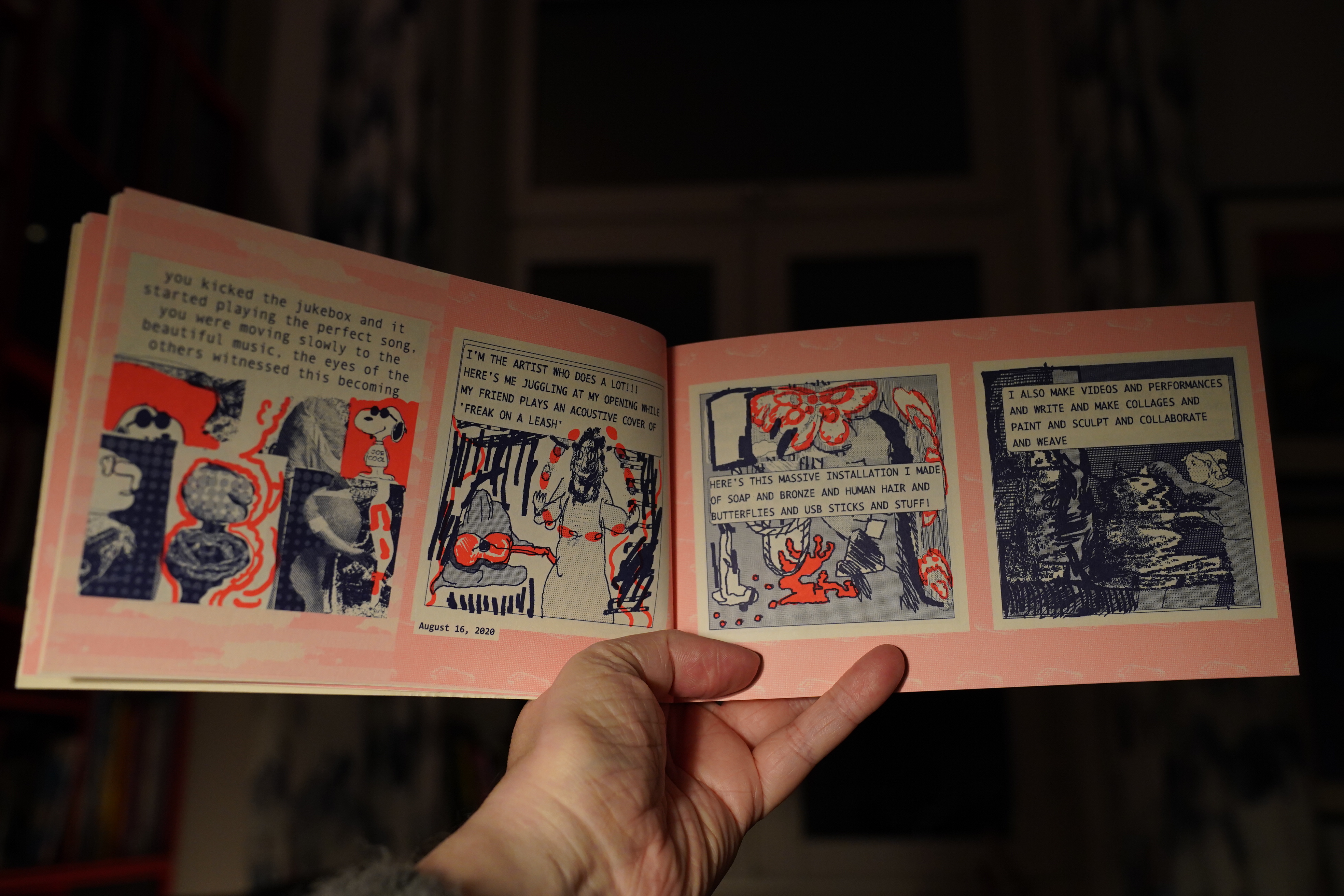
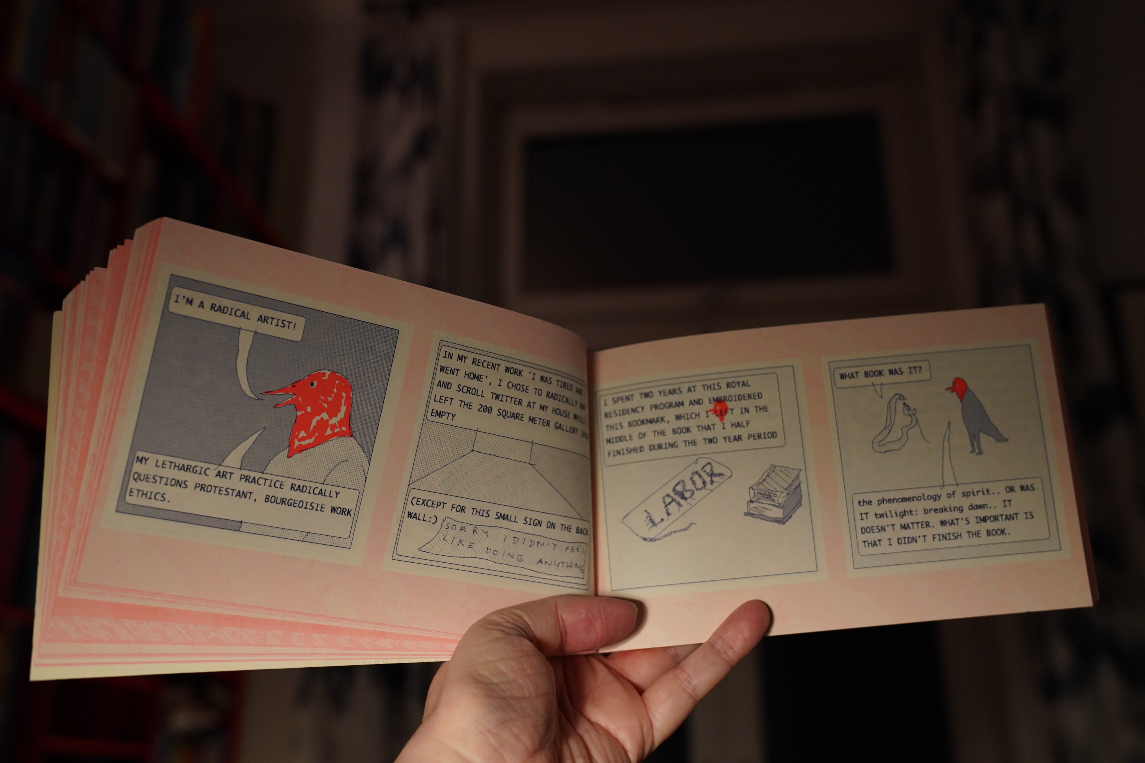
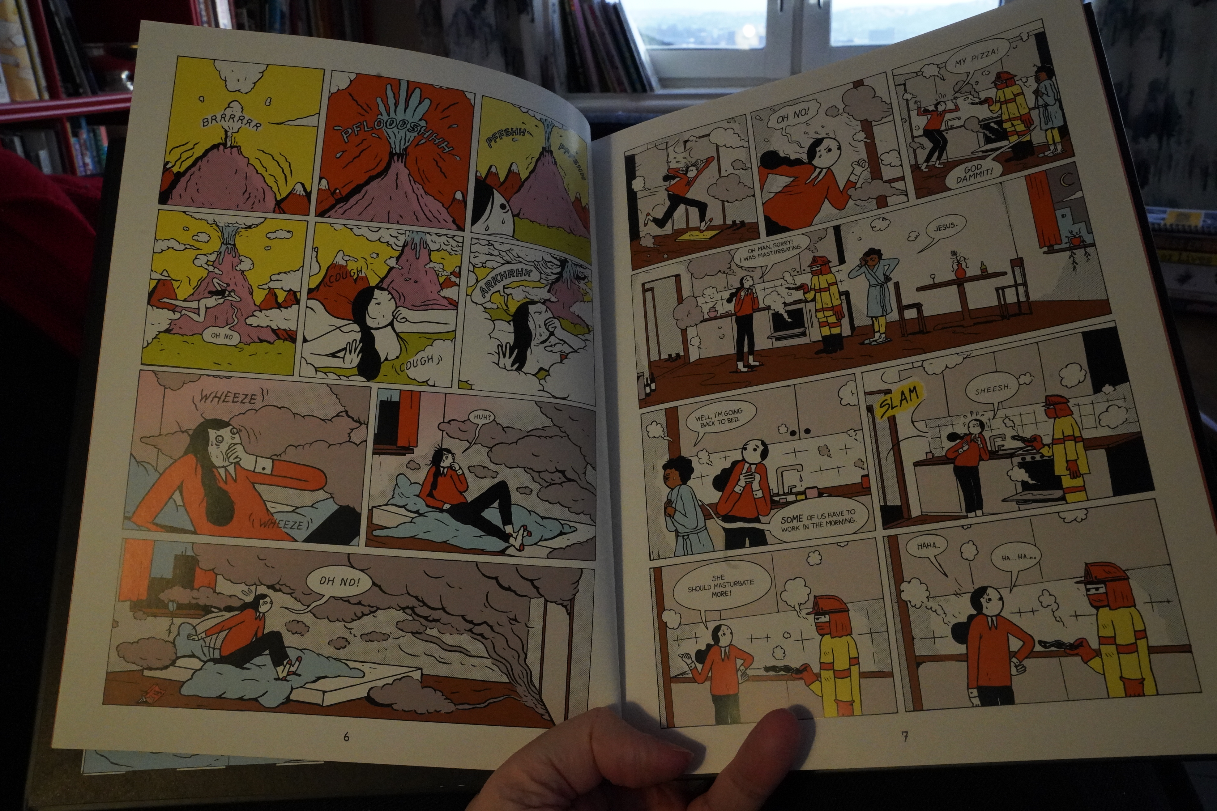
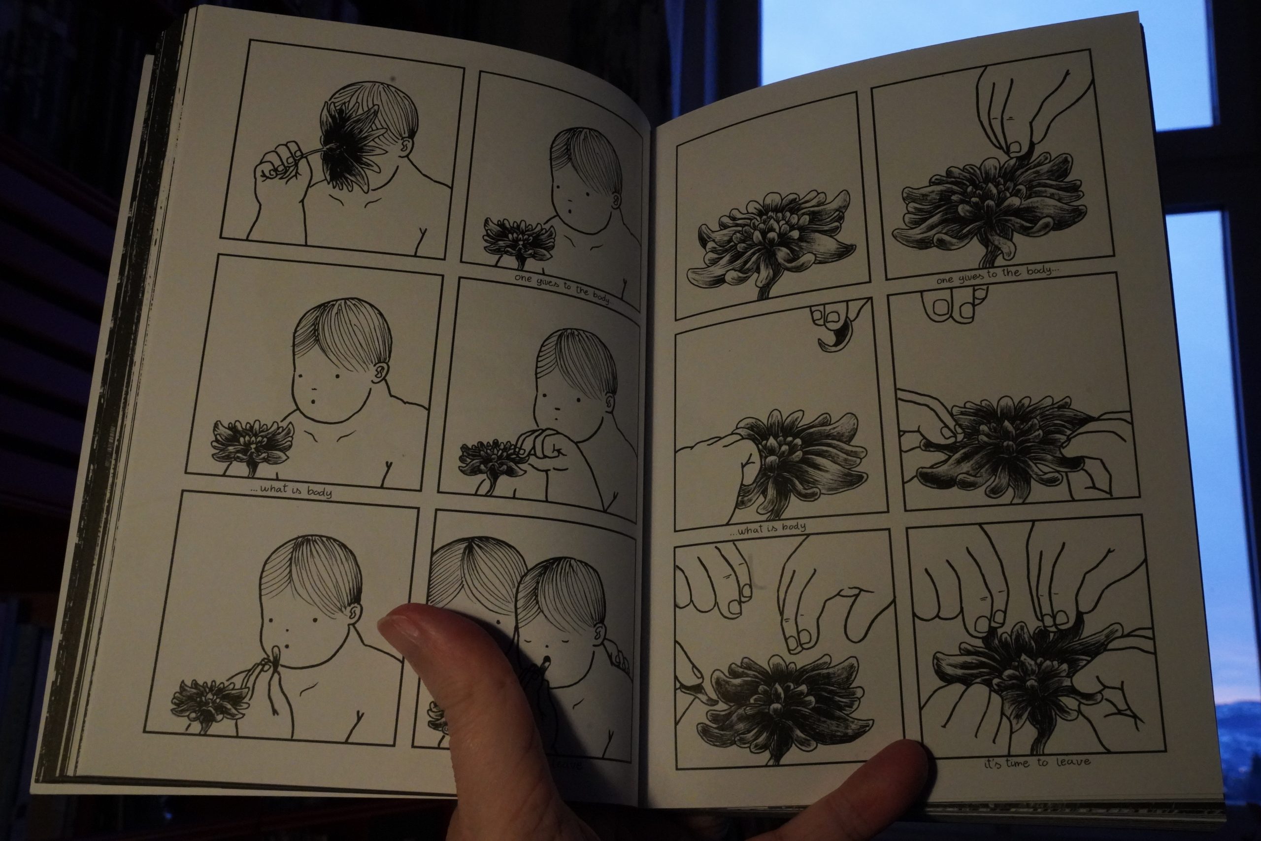
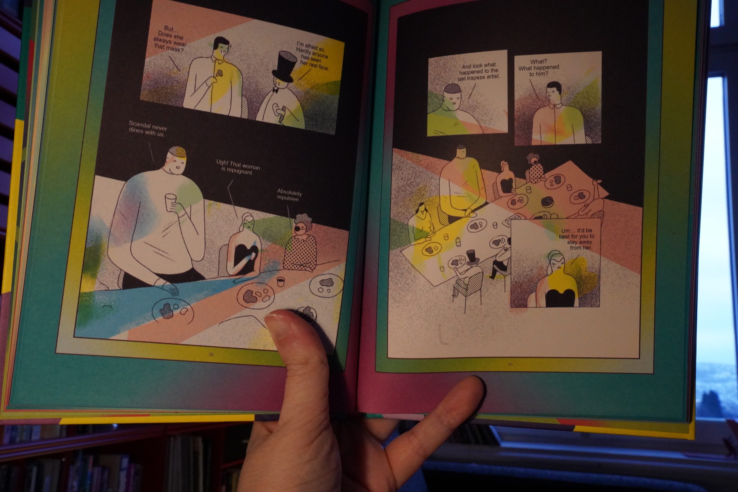
07:41: Avocado Ibuprofen by Jaakko Pallasvuo (Perfectly Acceptable Press)

This is a collection of Instagram posts, which … isn’t my favourite er genre. But I’m always up for some Pallasvuo.
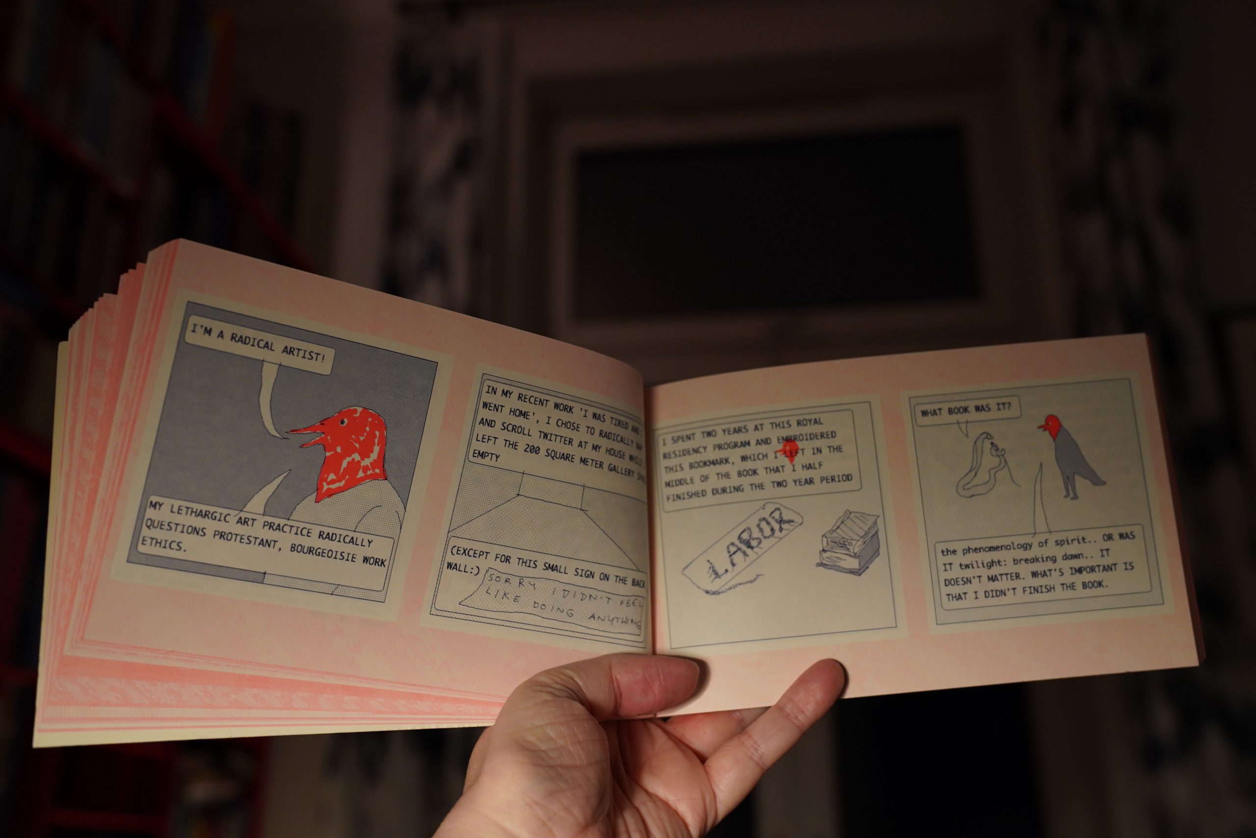
This is really good. It’s funny and it’s affecting.

And it even manages to have a kind of narrative arc, which is very, very unusual for these kinds of things. Excellent.
| Bush Tetras: Rhythm and Paranoia: The Best of Bush Tetras (2) |  |

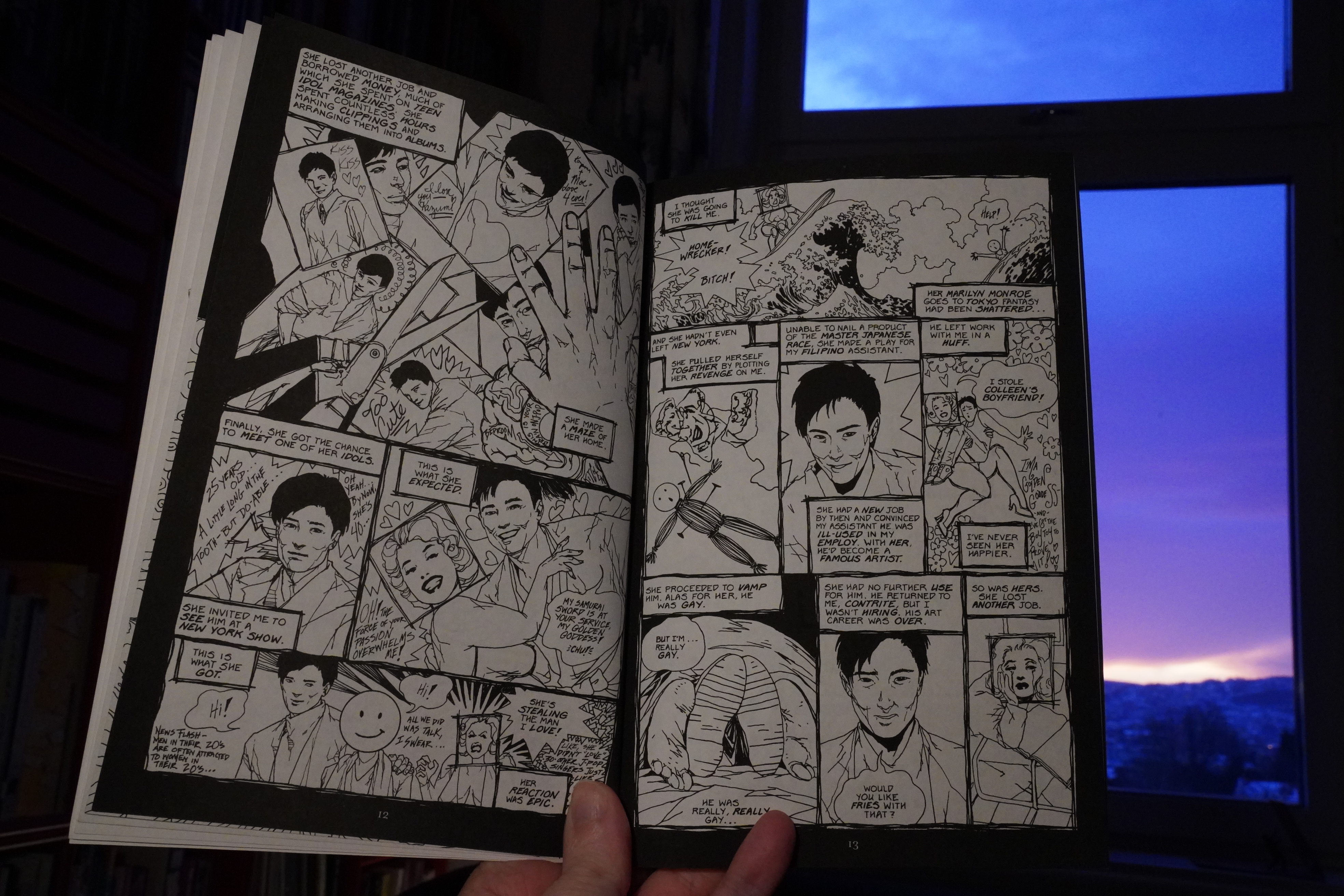
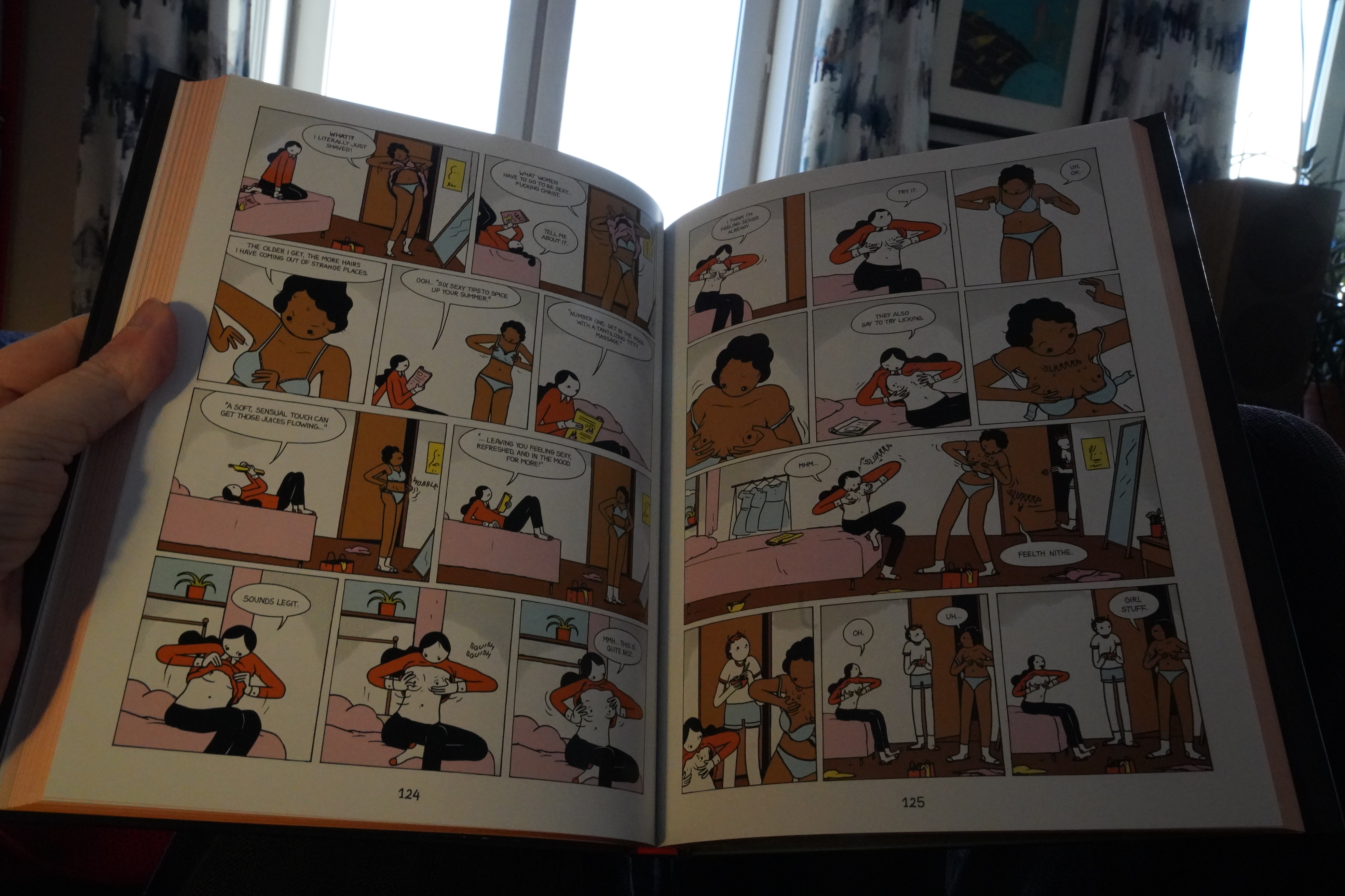
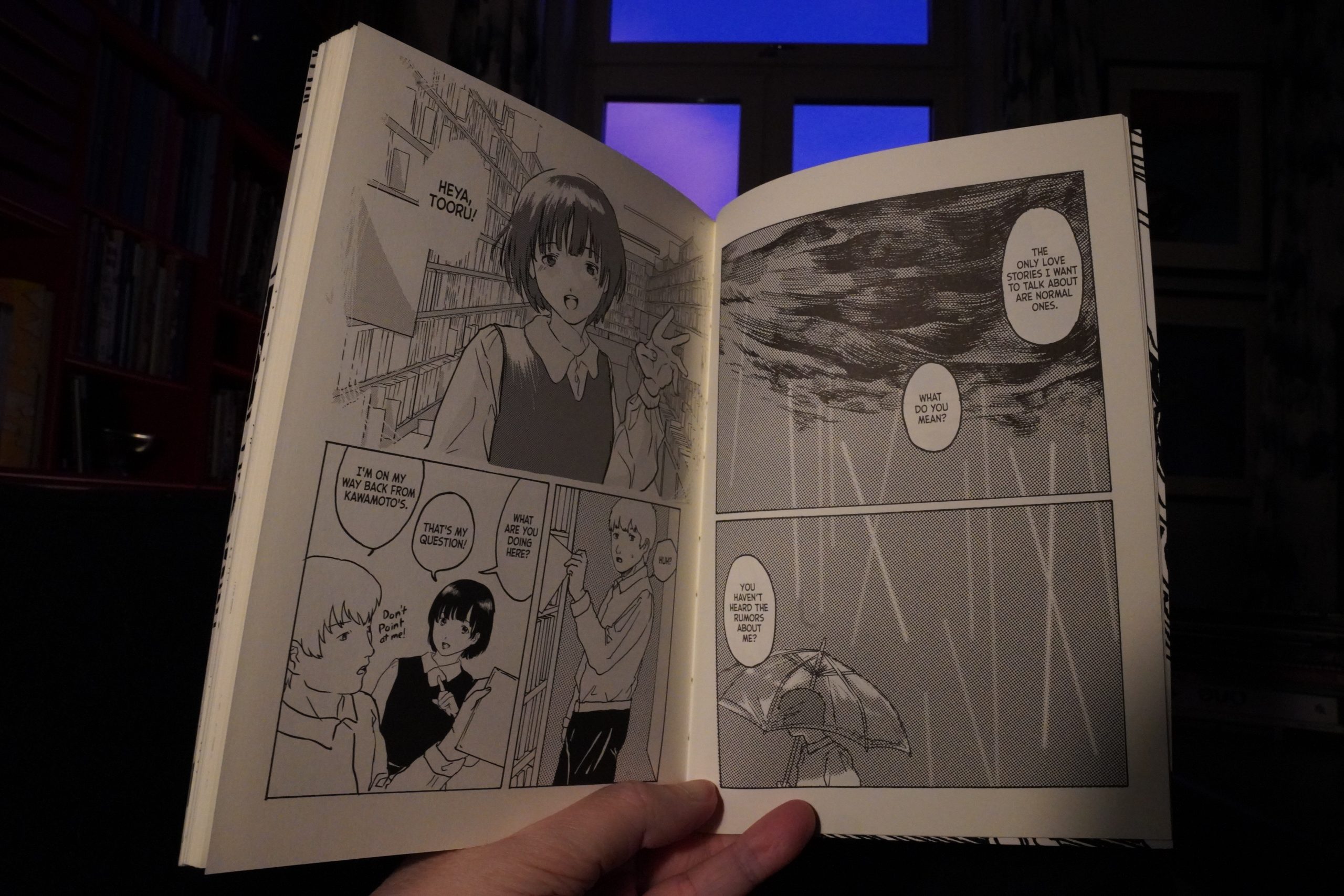
09:02: Sexy Chix edited by Diana Schutz (Dark Horse)
I don’t remember why I bought this. Themed anthologies from mainstream comics publishers are usually really dire, and this is from Dark Horse, of all people. Perhaps there’s an artist in here I was interested in?
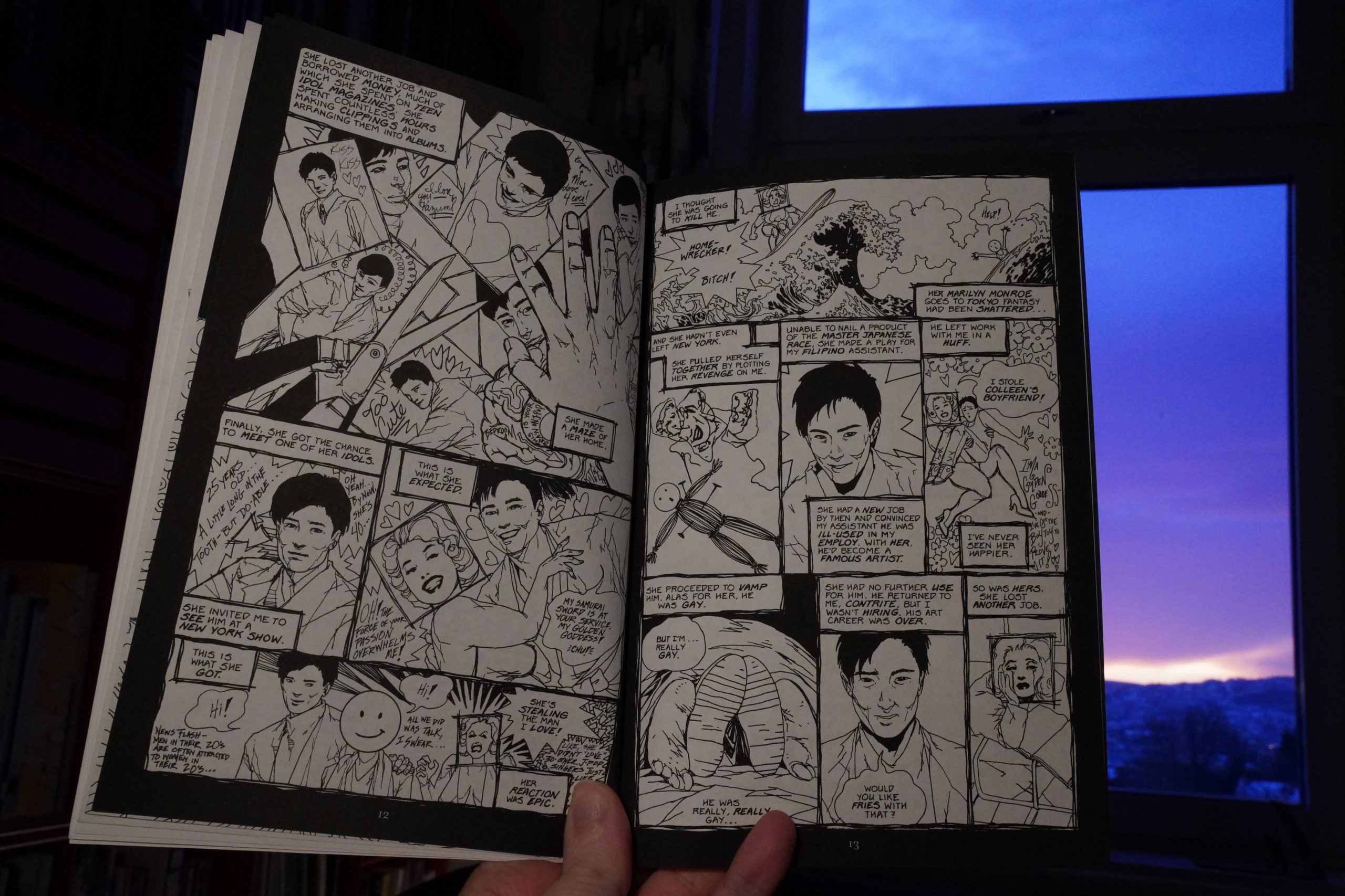
Hm… that’s a very unusual art style for Colleen Doran, and a pretty nasty little story.

Oh, perhaps it was because of this Carla Speed McNeil story. (Which is really bizarre.)

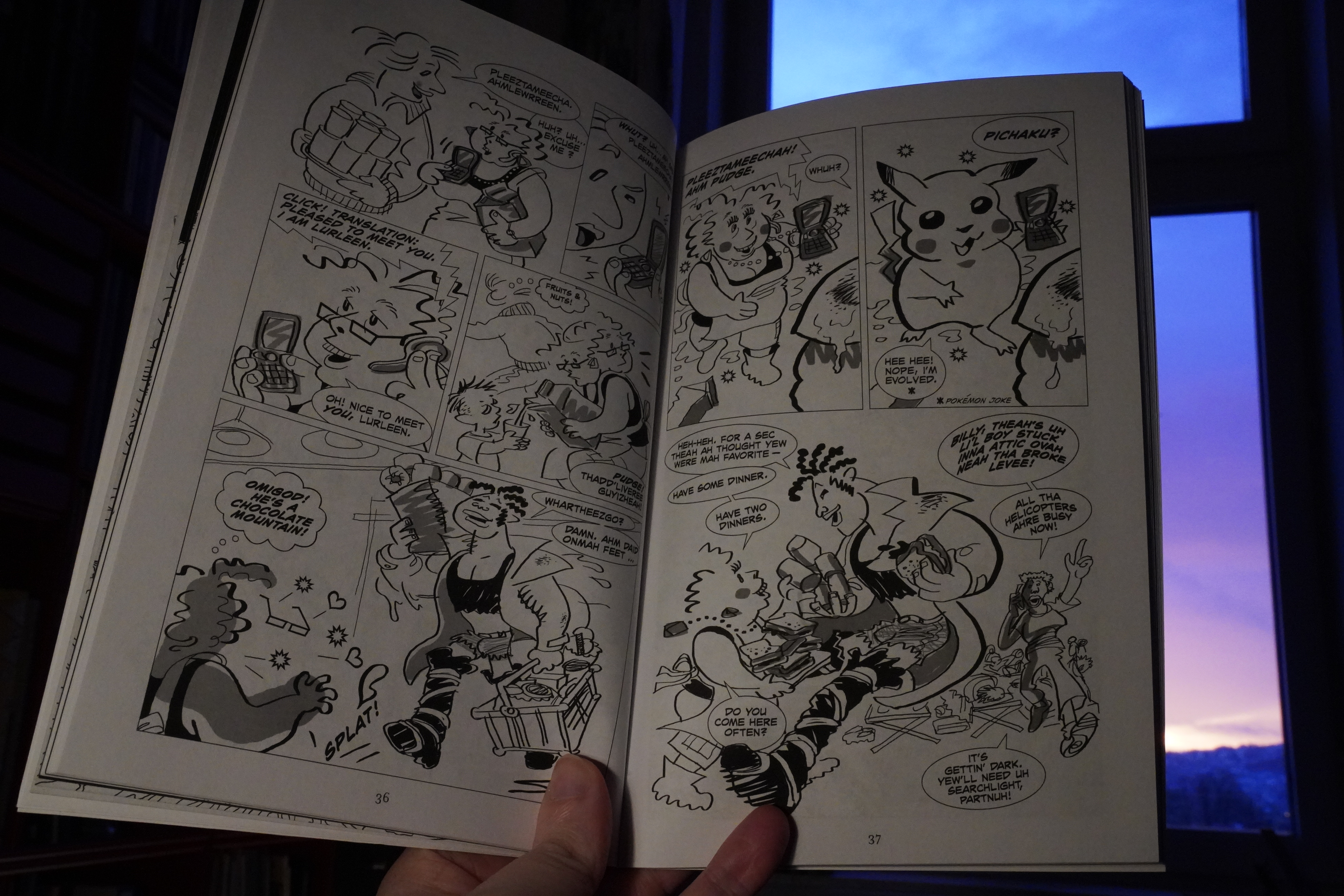
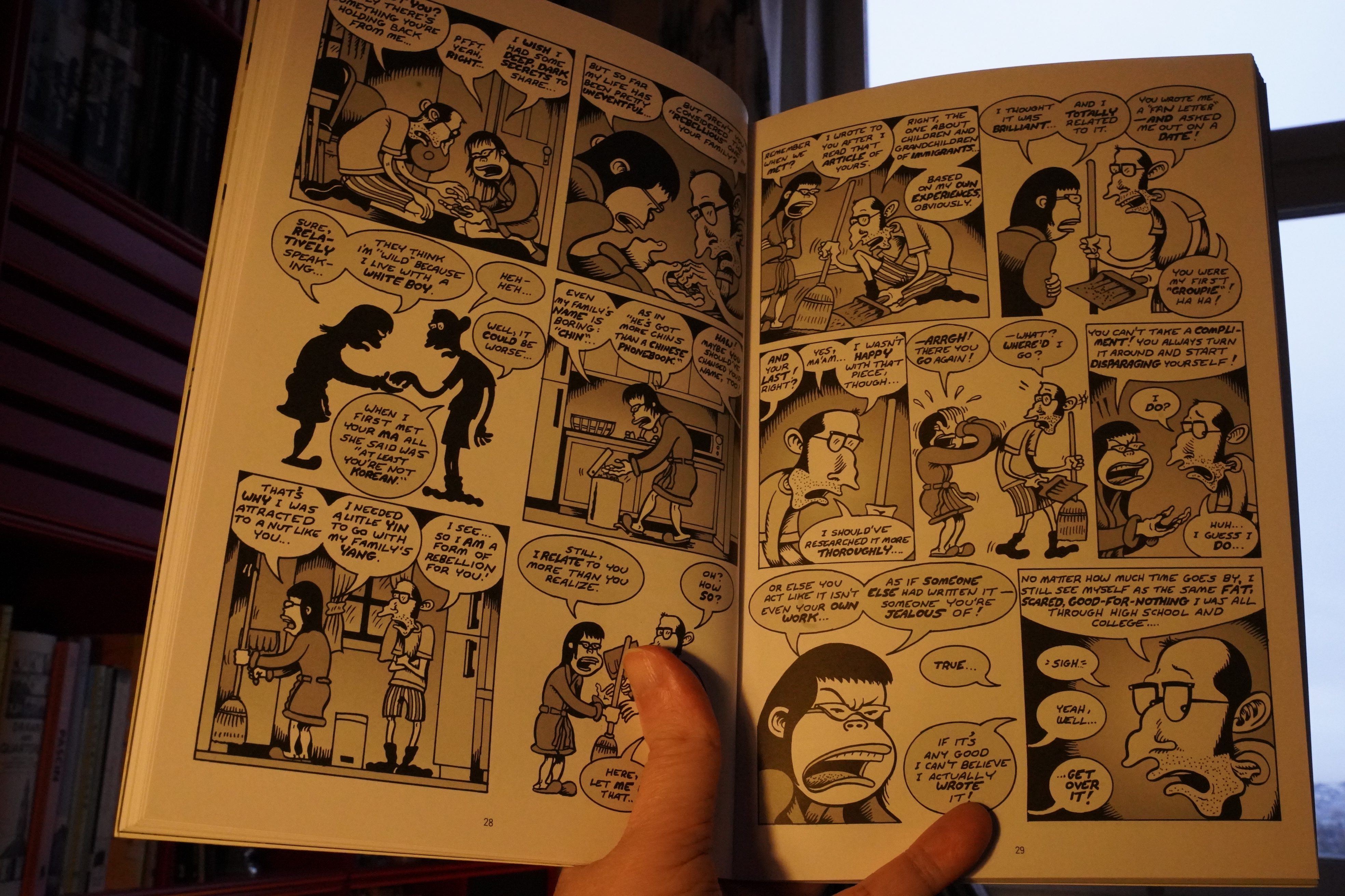
No, this is it: I was finishing the Pudge, Girl Blimp collection from Lee Marrs as part of my Inbox Zero project, and this anthology was mentioned there, and the list of participants seemed interesting. And it is a good list of people — I’d say that I’m a fan of about one third of the people in here? But as I feared, it’s all pretty weak material. What is it about otherwise reliable people that make them do boring stuff when an editor from a mainstream company calls them up? Is it because they think they have to appeal to a wider audience?
Trina Robbins is the virtually the only one that bucks the trend — she just sent in a standard Go Girl story, and it’s the best thing here.
| Martin Hannett & Steve Hopkins: The Invisible Girls |  |

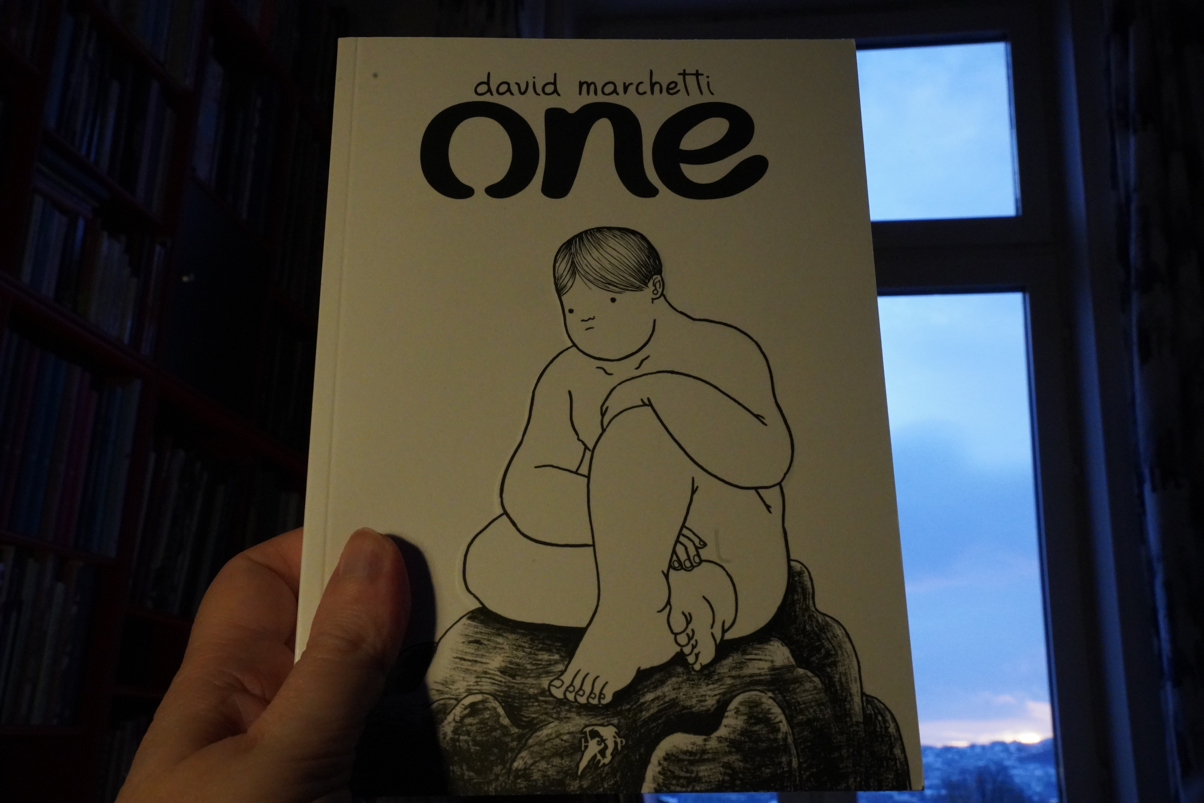
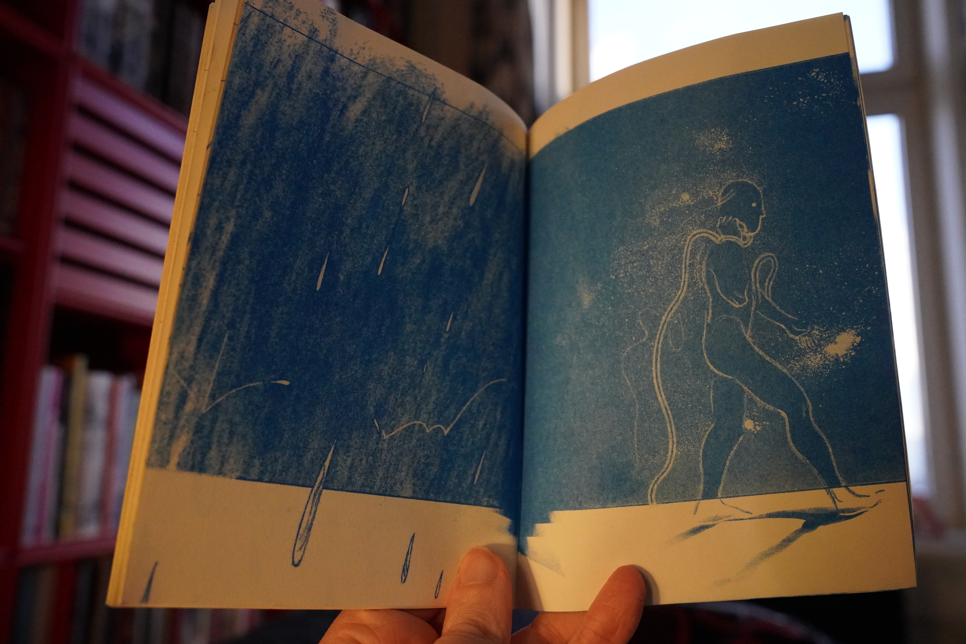
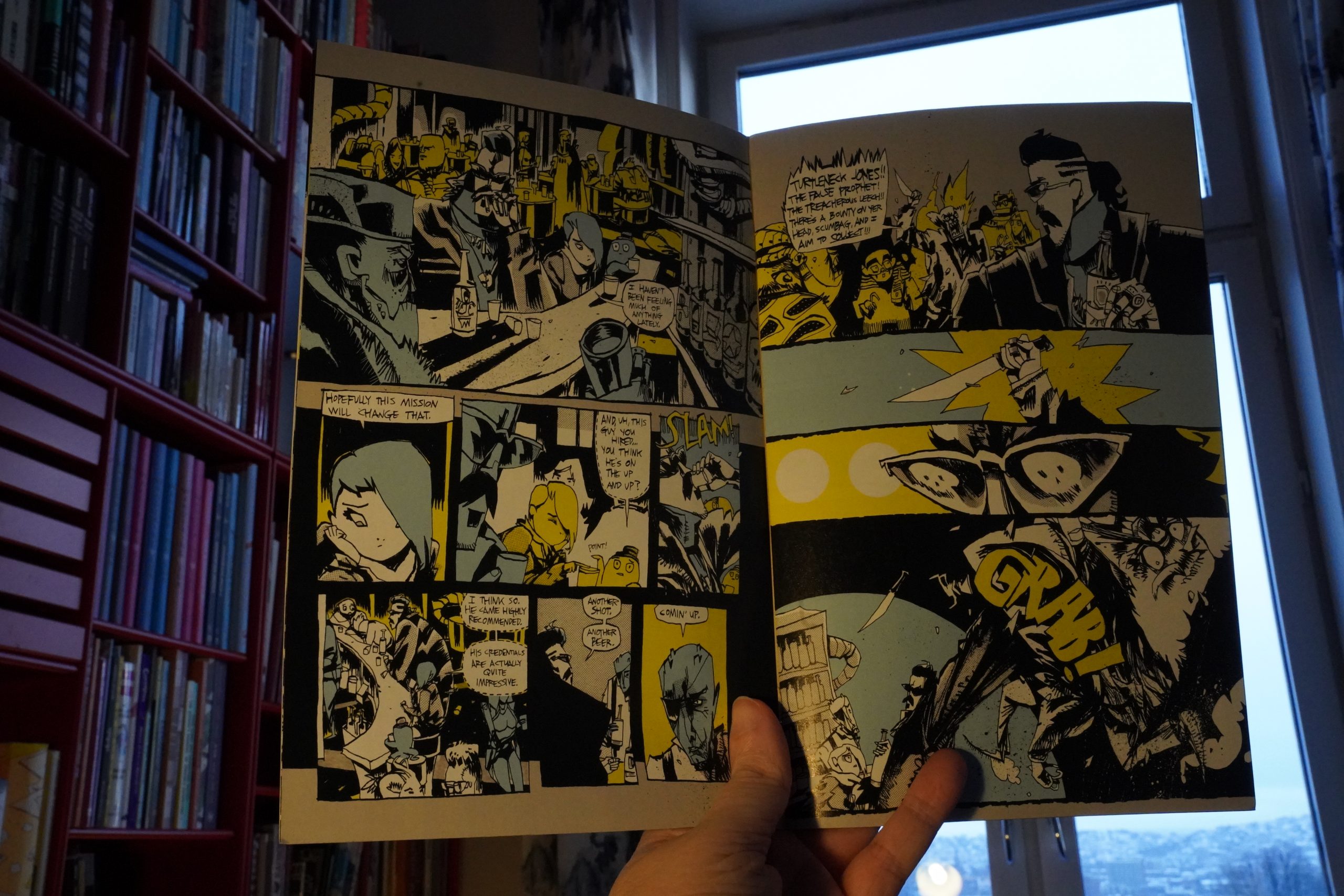
09:40: One by David Marchetti (Hollow Press)
Oh, right, I got a lot of stuff from Hollow Press, too. This is a massive book, like… 350 pages.

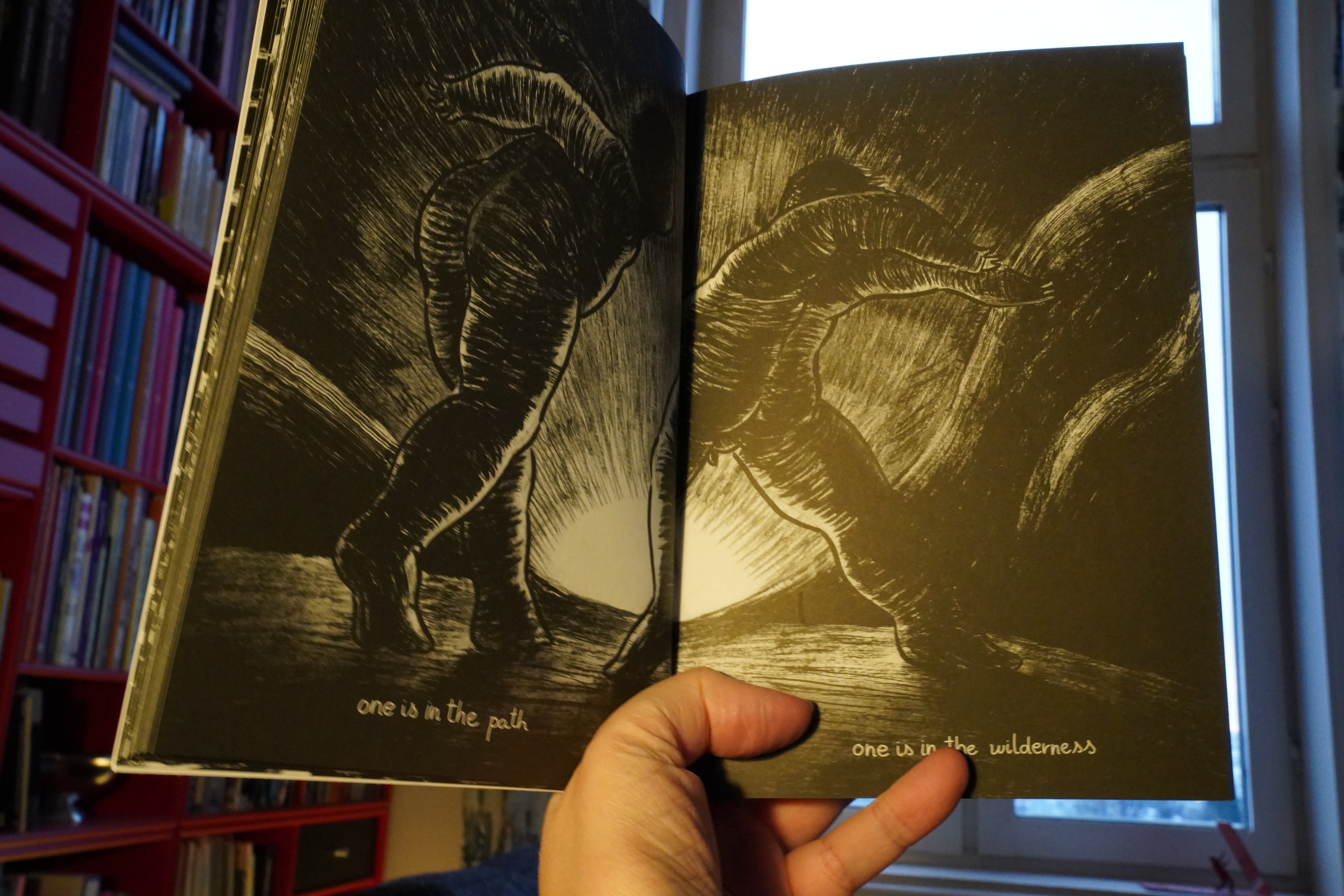
But it’s a brisk read. It feels like so much work has gone into this book for what little time it takes to read, but you know.
This is a narrative of sorts, but it’s very symbolic. I guess the obvious comparison is John Hankiewicz? It’s comics influence by dance.
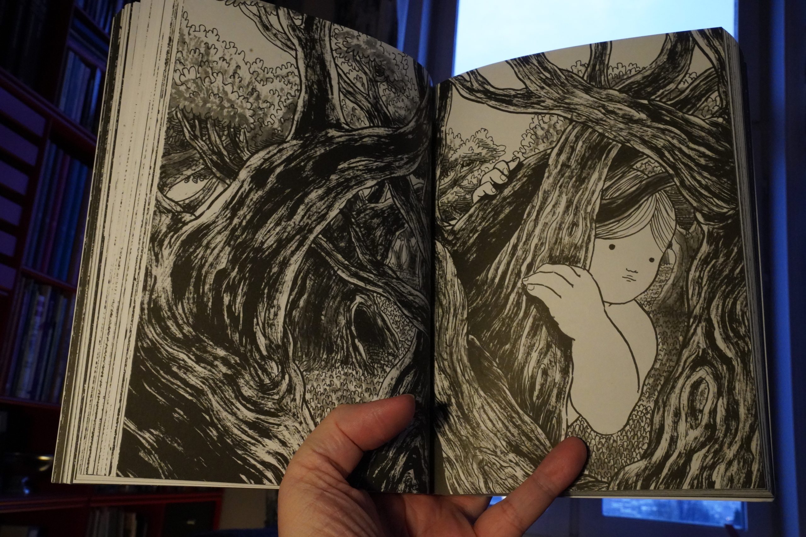
It’s absolutely fantastic. And they still have copies left? And they’re cheap?
| Martin Hannett & Steve Hopkins: The Invisible Girls |  |
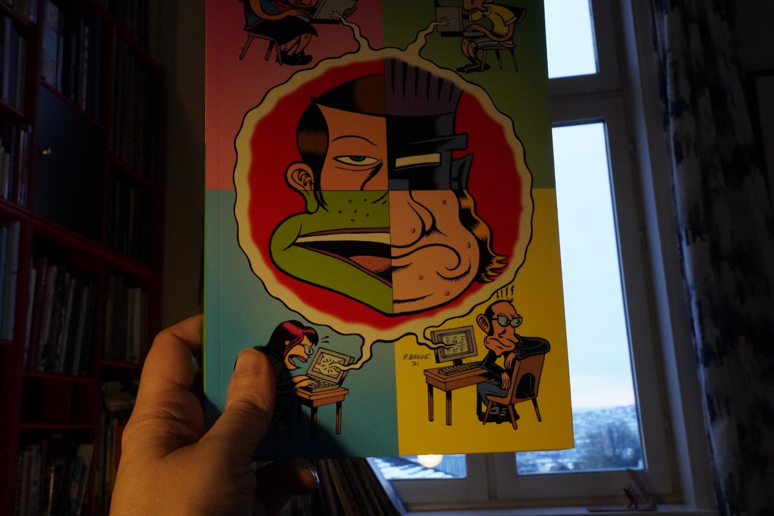
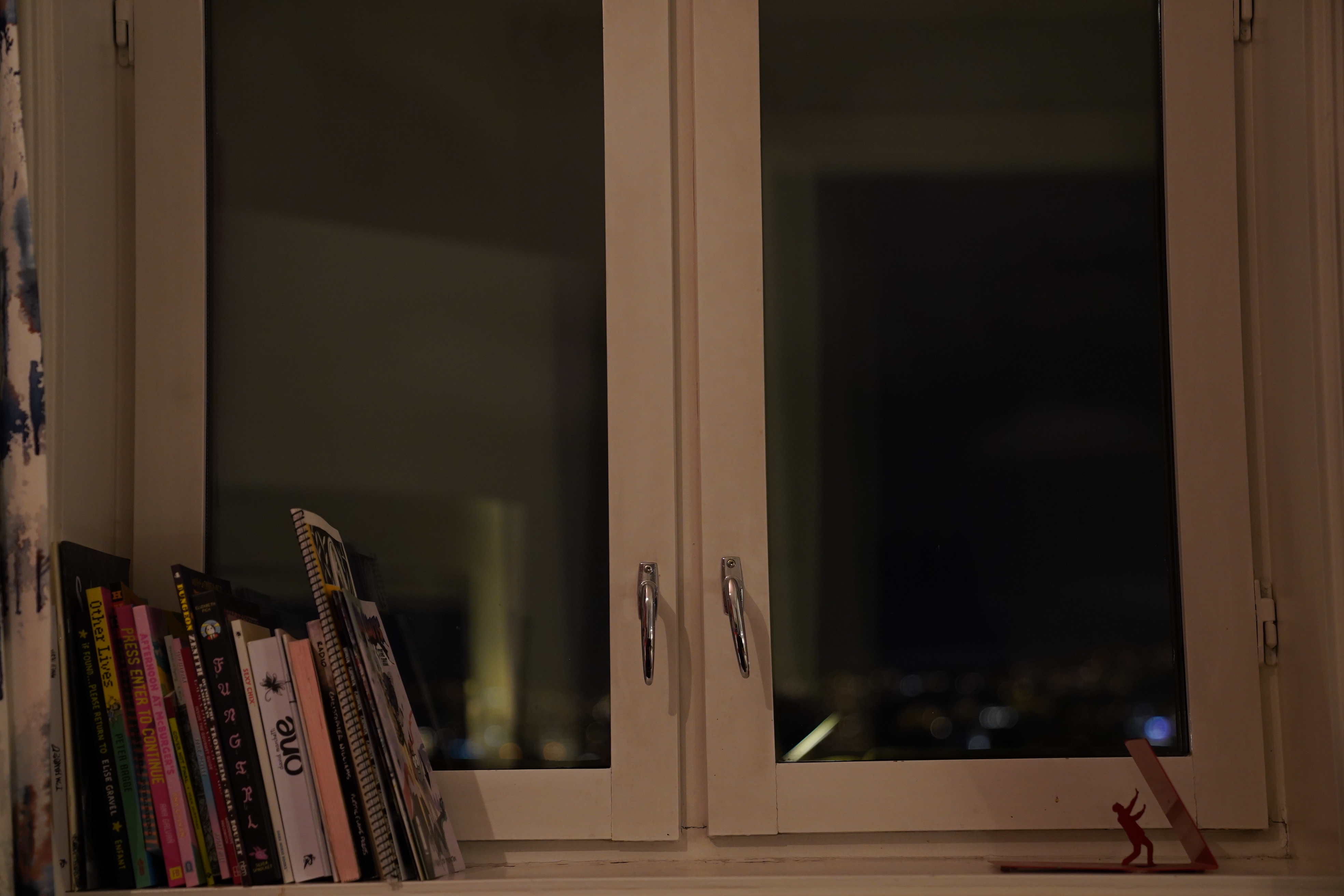
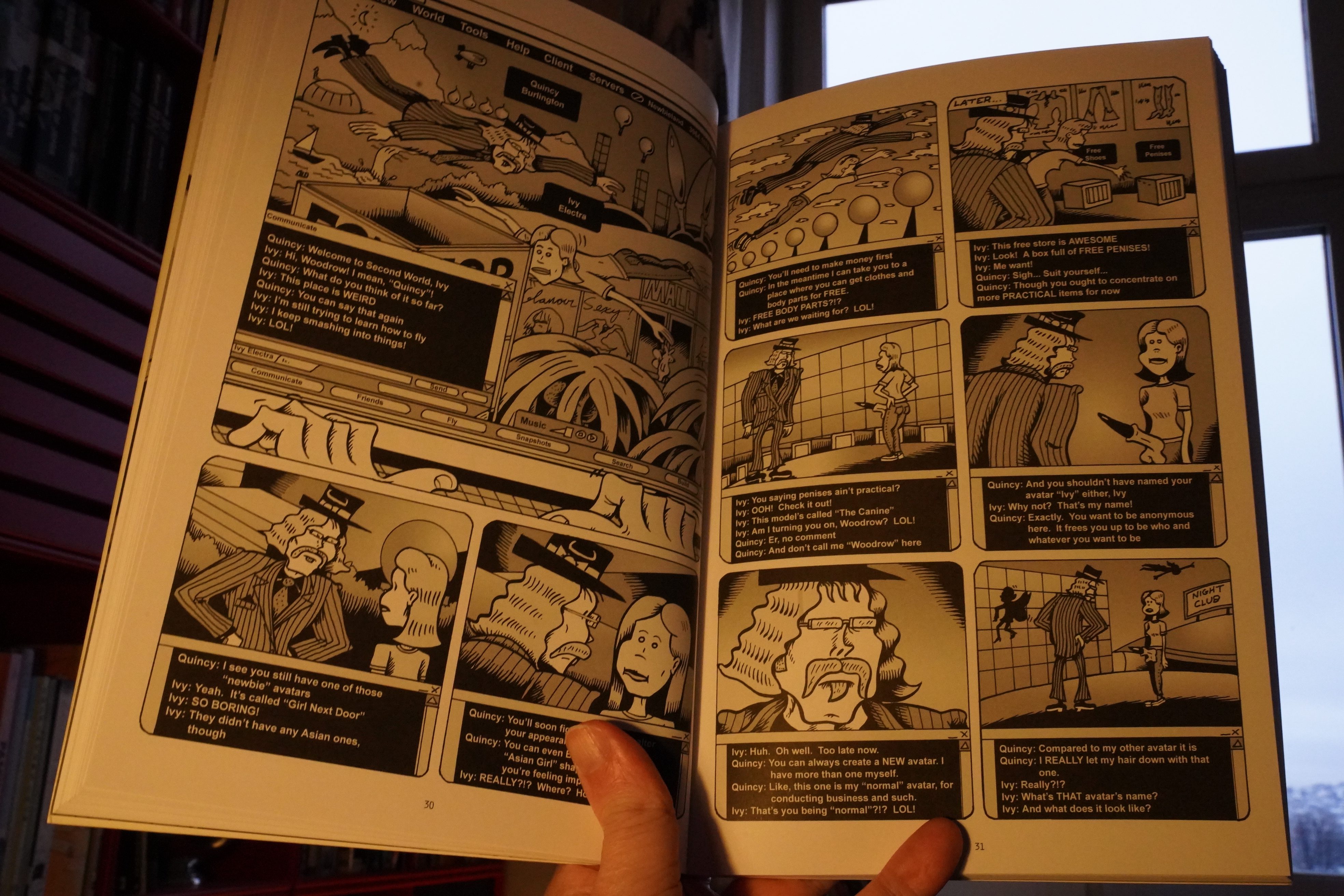
10:09: Other Lives by Peter Bagge (Fantagraphics)
This was originally published by DC/Vertigo a decade ago, which probably explains why I didn’t buy it at the time.

Oops, the white balance apparently flipped to “outdoors”… the book isn’t really that yellow.
Anyway, I’m so used to reading Bagge’s biographies now that it’s jarring to read something in his previous normal mode… which is… everything being like a sitcom: People shouting at each other All The Time and spouting verbiage that nobody in real life would ever say.
But this is a “serious”(ish) book, so there’s not even any gags to go with the pacing. It’s the worst of all worlds.

And, yeah, much of the plot takes place in Second Life I mean World, and it’s brutally tedious.
| Jaimie Branch: Fly Or Die Live (1) |  |
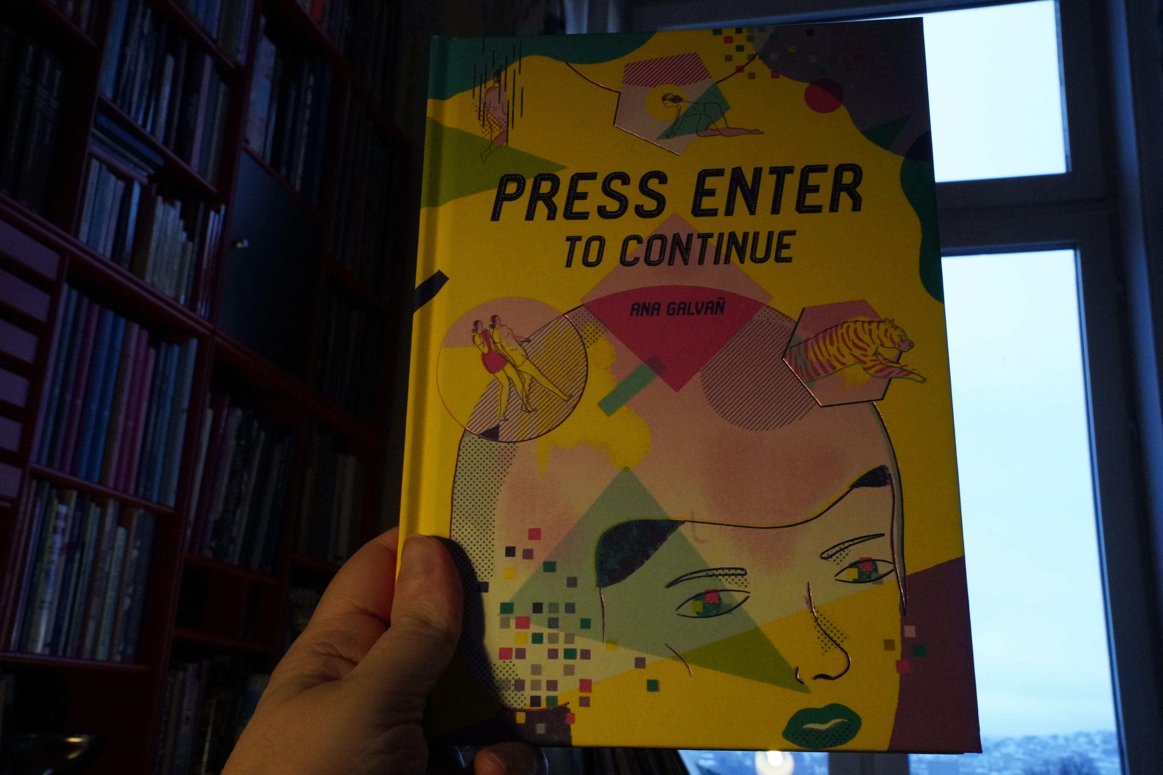
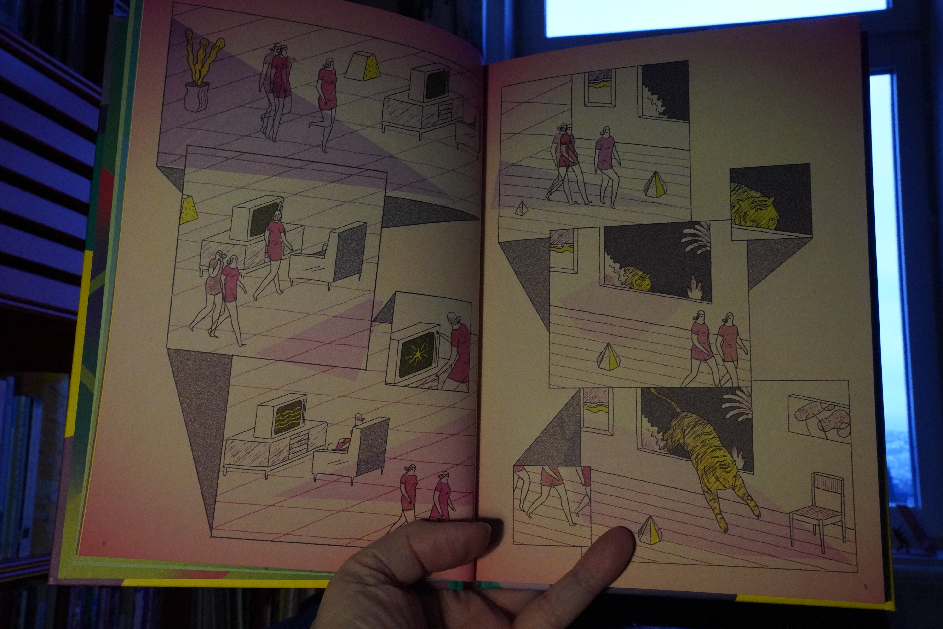
11:14: Press Enter to Continue by Ana Galvañ (Fantagraphics)


I was totally and utterly into this fascinating thing… but then it turned out to be a collection of short stories? I was kinda disappointed, because I wanted more.
And there is more. My initial disappointment dissipated fast, because every story is as intriguing as the next, and the last one (which is also the longest) is amazing.
What a gorgeous, disturbing little book.
| Jaimie Branch: Fly Or Die Live (2) |  |

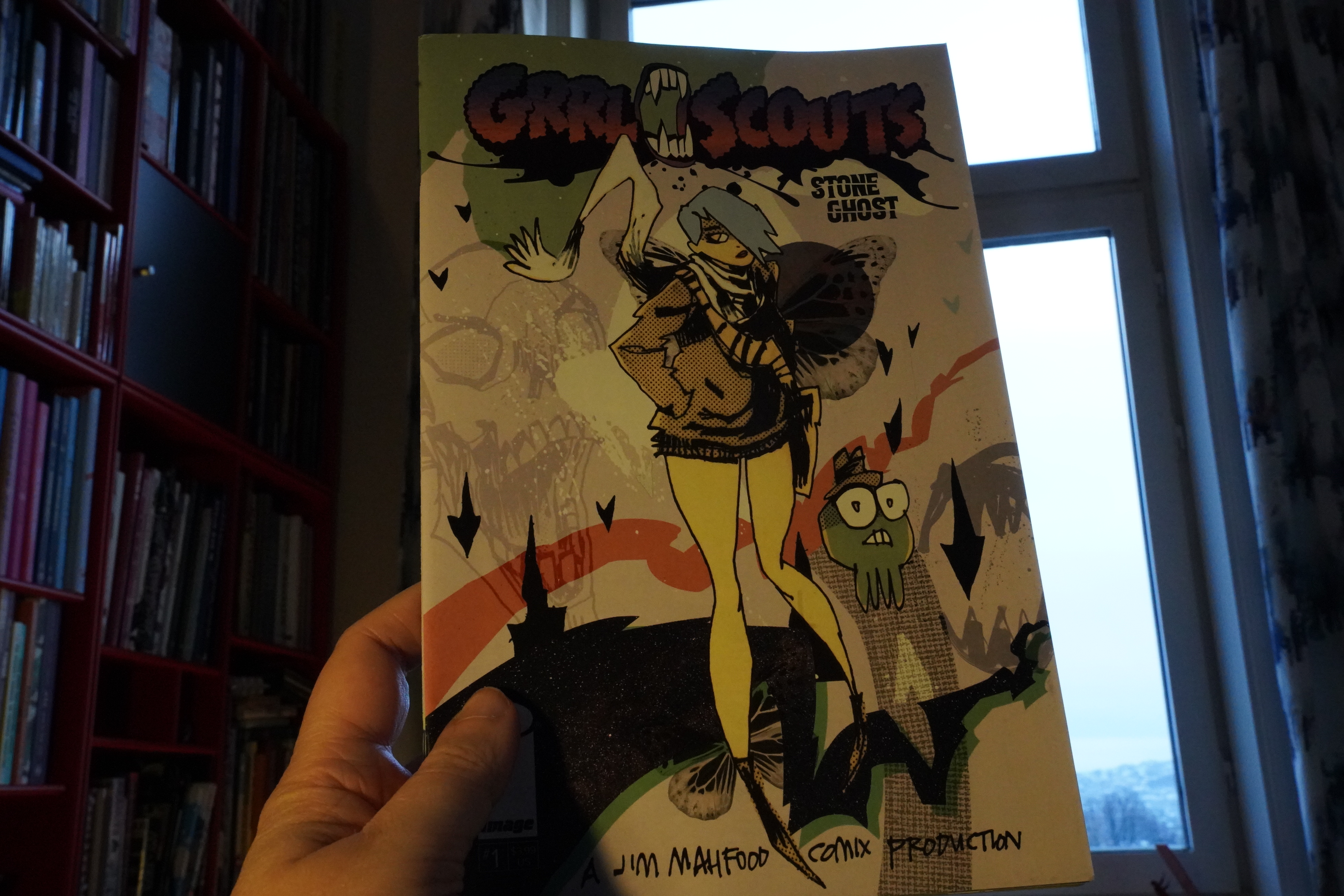
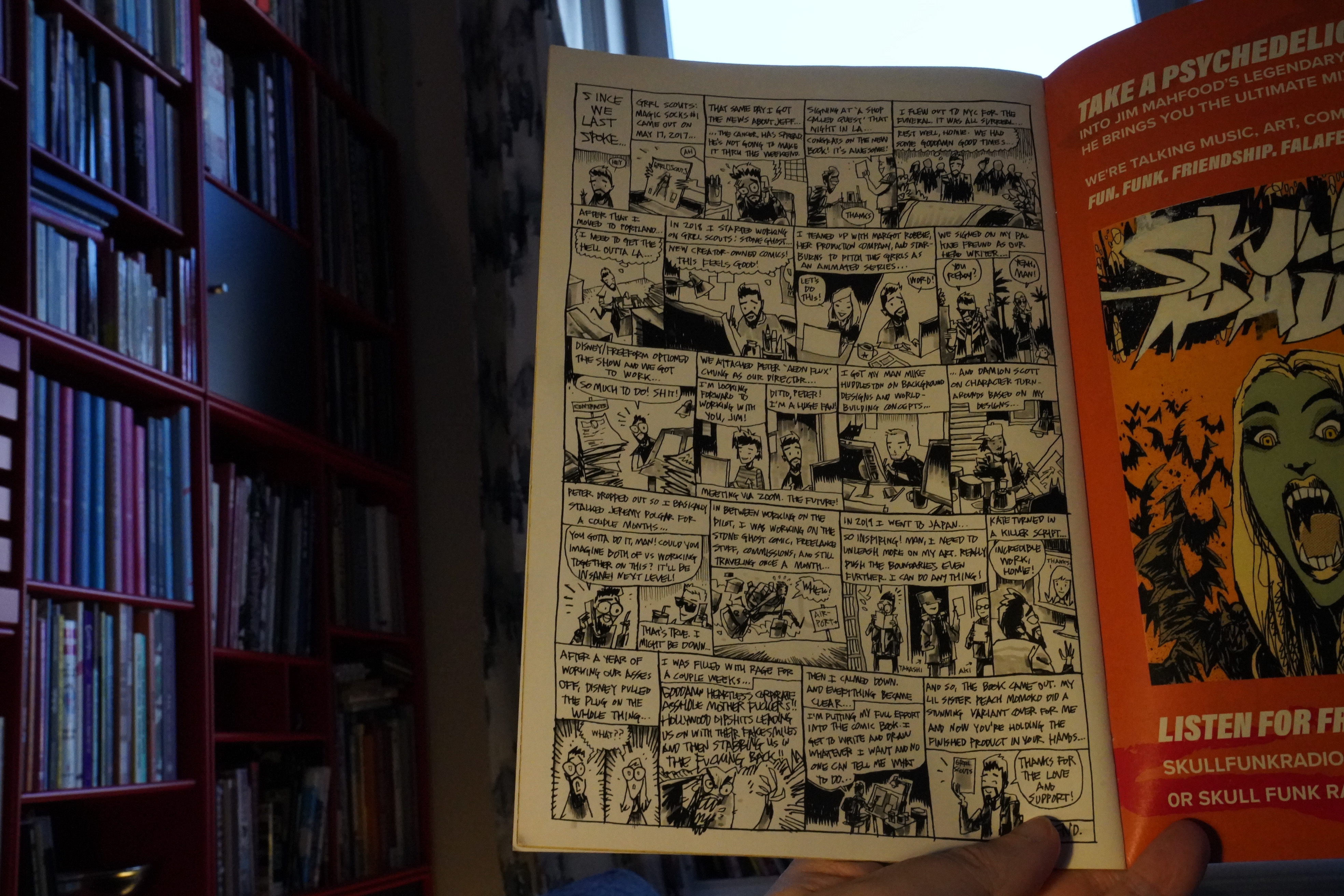
11:39: Grrl Scouts: Stone Ghost #1 by Jim Mahfood (Image Comics)
The previous Grrl Scout series had been kinda… er… hard to totally comprehend, but this is a lot more straightforward. I mean, I liked the insanity of the magic sock series, but this is fun, too.

The explanation is here: Mahfood was working on an animated version of the series, which was cancelled, and… perhaps working in that environment has rubbed off on him? But not in a disastrous way — so many people seem to be churned into mulch by the animation industry, but this comic is still fun.
| Jaimie Branch: Fly Or Die Live (2) |  |

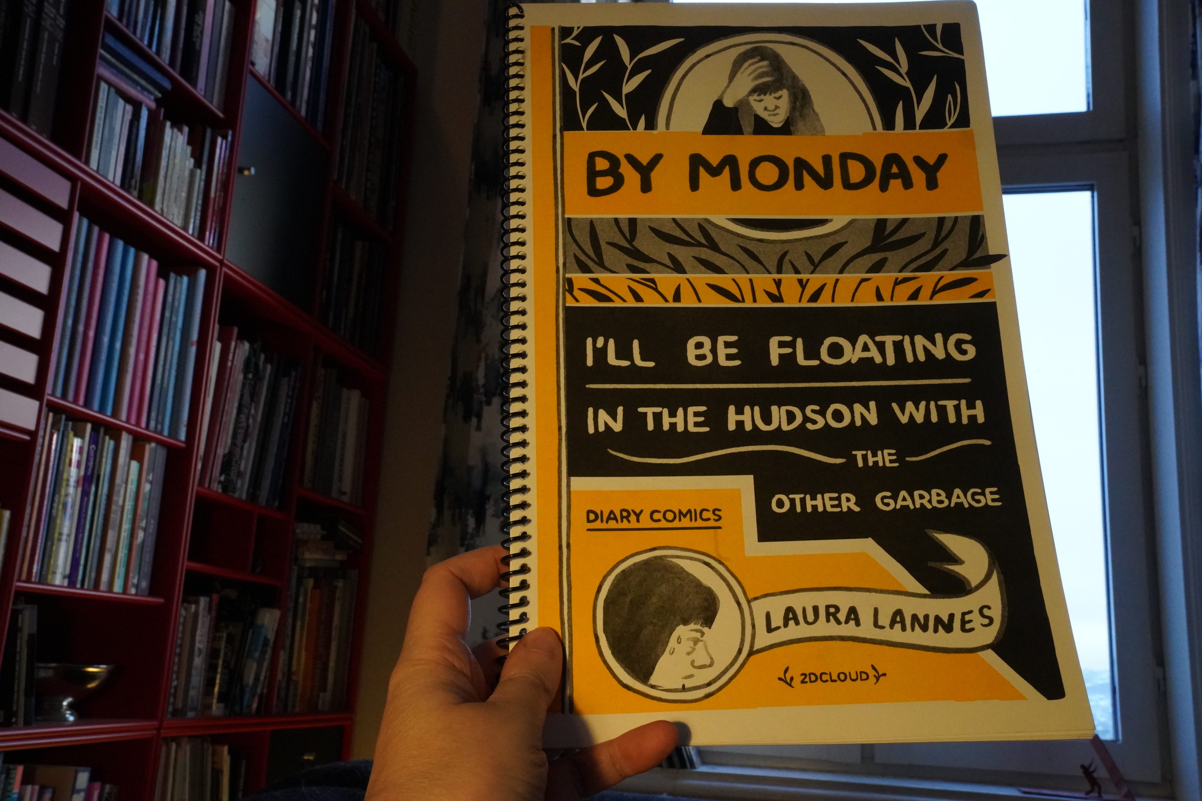
11:53: By Monday I’ll Be Floating In The Hudson With The Other Garbage by Laura Lannes (2d cloud)
What!? A 2d cloud book from 2017? I thought I’d bought basically everything they’d even published, but I missed this one. I got this from Peel Gallery (along with a bunch of other comics)…
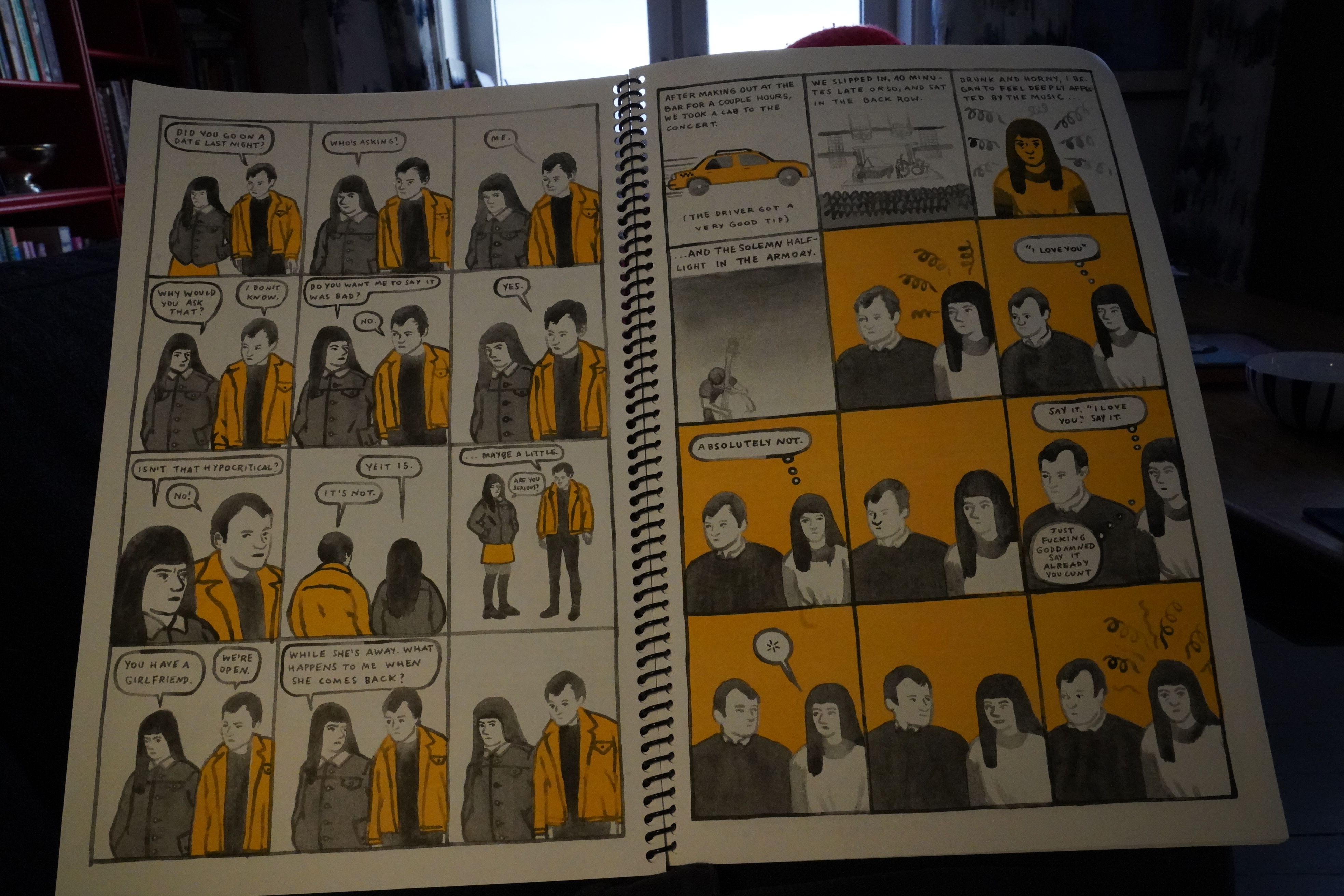
Grr! I hate SMS comics so much!
But then…
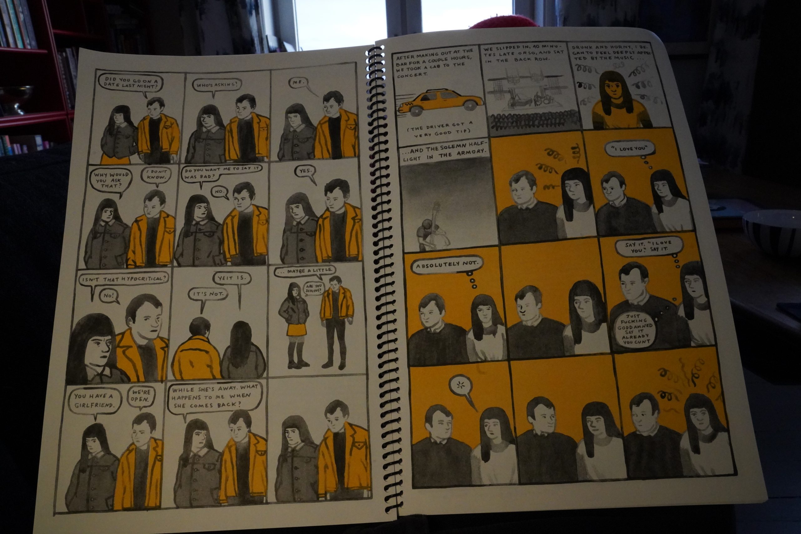
… it turns amazing! I mean, there’s more messaging after this, but it feels more organic, rather than just pages of messaging. This is a funny book, and also heartbreaking, and it doesn’t read like a diary book at all. Did she cheat and edit it afterwards?
Anyway, gorgeous artwork and great storytelling skills. Hm… Unfortunately, she doesn’t seem to have published that much? I’m getting that John, Dear book, at least.
| Alva Noto: HYbr:ID 1 |  |

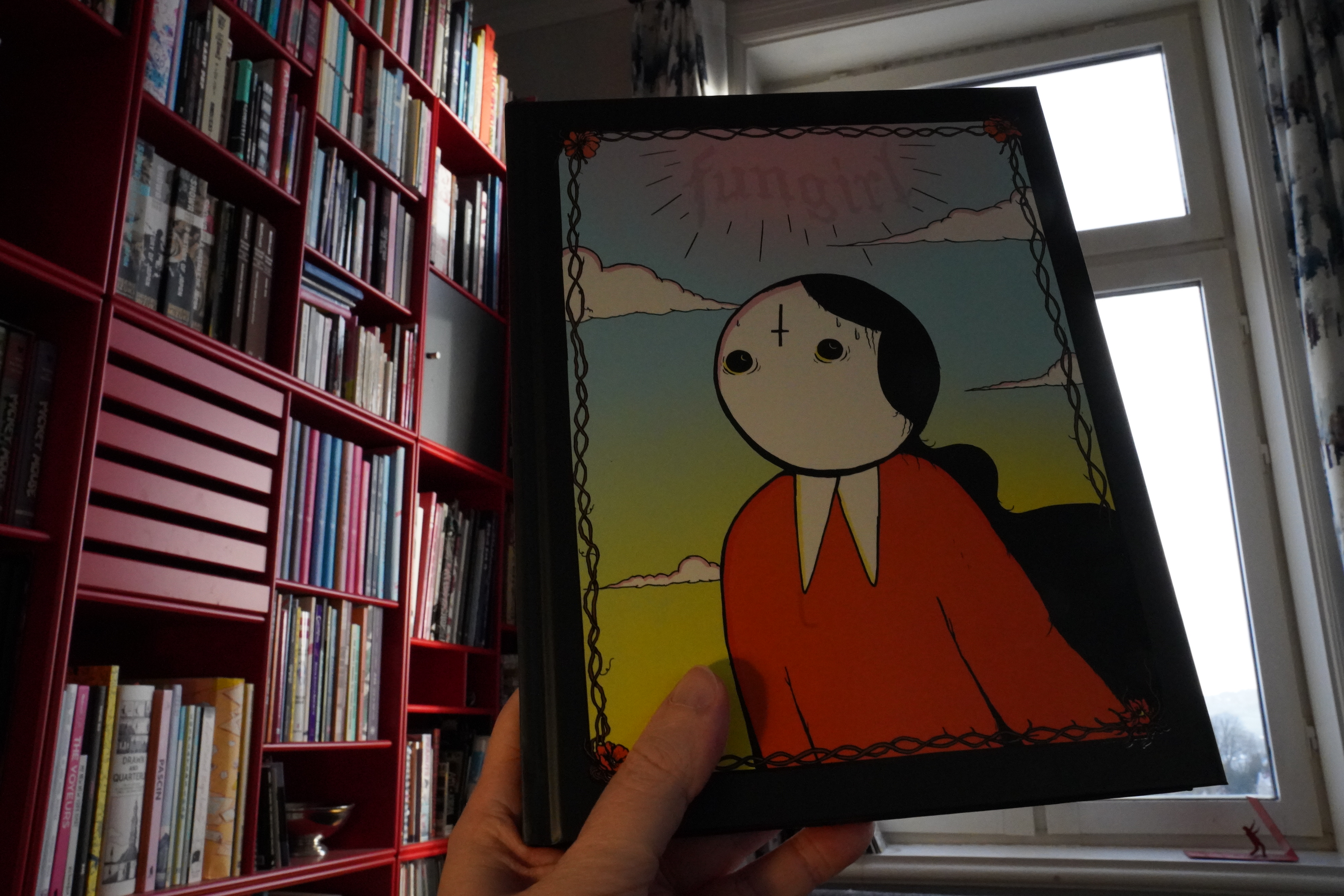
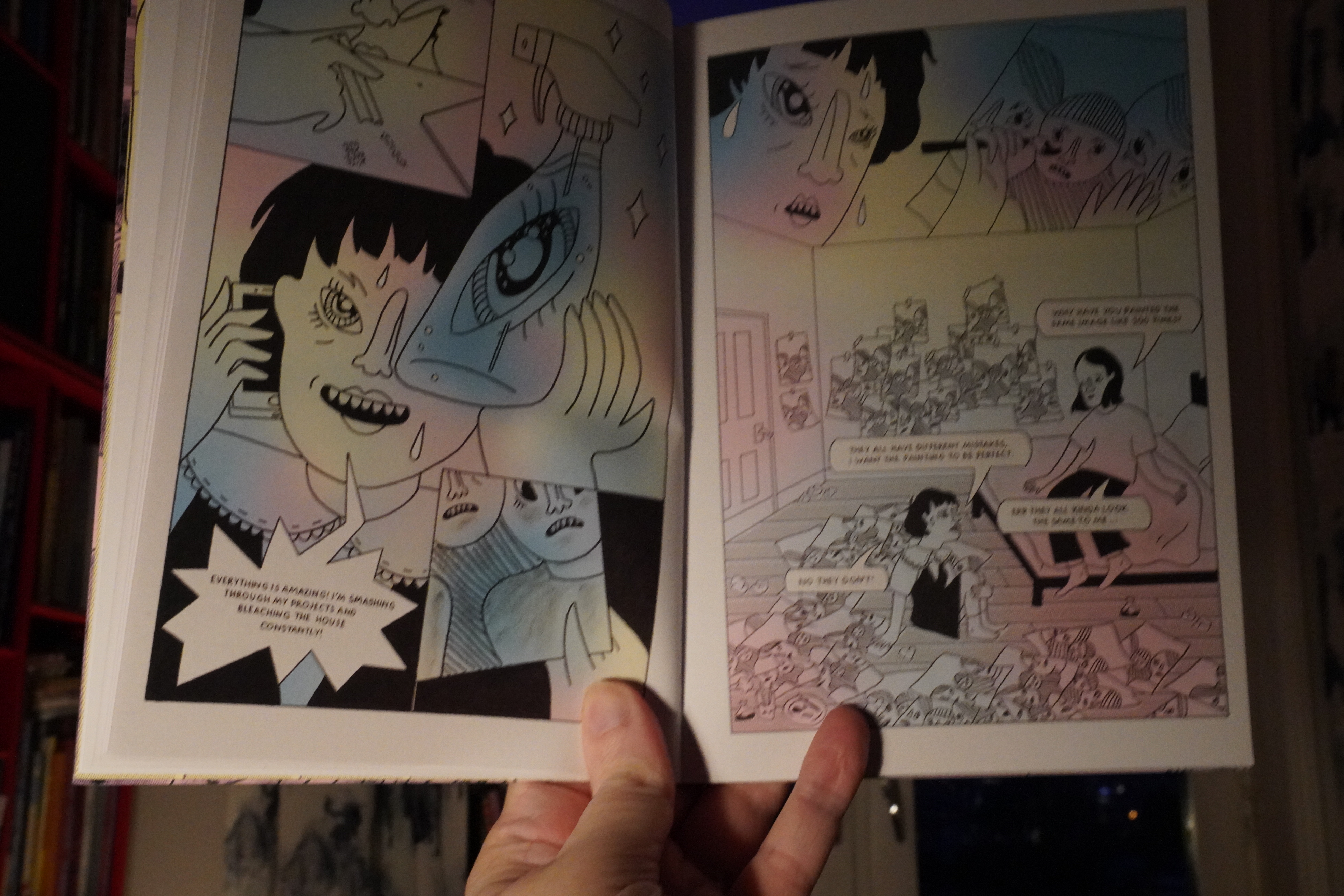
12:44: Fungirl by Elizabeth Pich (Silver Sprocket)
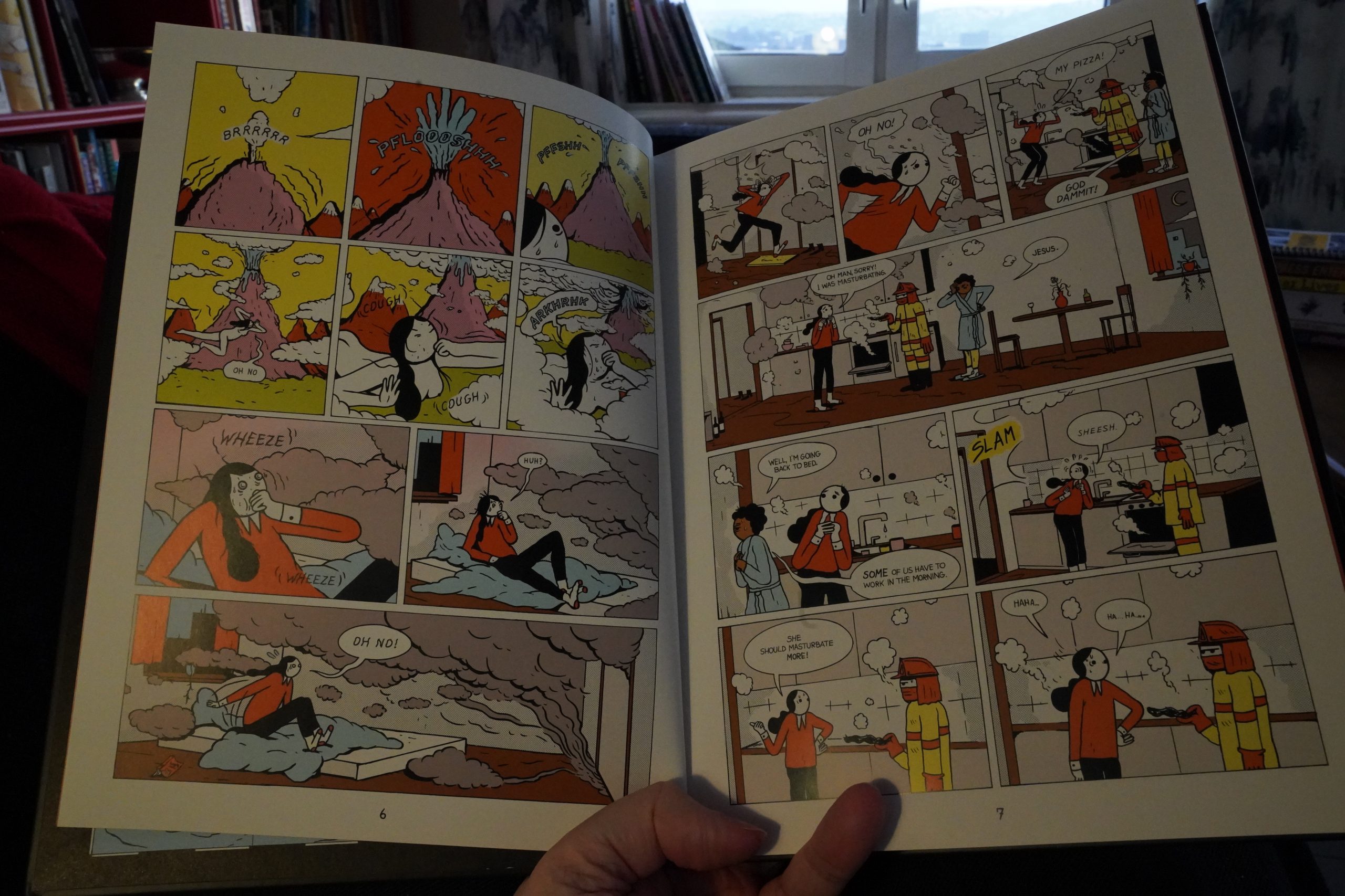
I guess this style reminds me a bit of Michael DeForge? I mean, not overtly, but a bit… Which reminds me: I’ve been checking the “best of”s a bit, looking for DeForge’s latest book (the combined list isn’t done yet?), because… I thought it absolutely sucked, but it still got rave reviews from people that should know better. But that’s normal. The real test is if people leave it off the year-end lists, and there’s only a couple of mentions on the TCJ list, which is scandalously low, so I think people secretly thought the same. I mean, DeForge was so incredibly influential a decade ago, making some really stunning books, but that last book… sheesh.
The other book I was curious about was Chartwell Manor by Glenn Head, and it got one mention (by Joe Ollmann, who also mentioned Heaven No Hell). And again, same thing: It got glowing reviews, but I thought that it was pretty naff.

Anyway! This book! It’s hilarious! It reads kinda oddly, though — it starts of pretty choppy (like a collection of two-pagers originally published on the interwebs), and then develops more of a narrative. So it’s hard to get into, in a way.
But the funny bits are very funny.
Hm… perhaps I should read a bunch of those smaller books I got Peel Gallery while listening to some 7″ singles? Yes.
| Devo: Satisfaction (I Can’t Get Me No) |  |
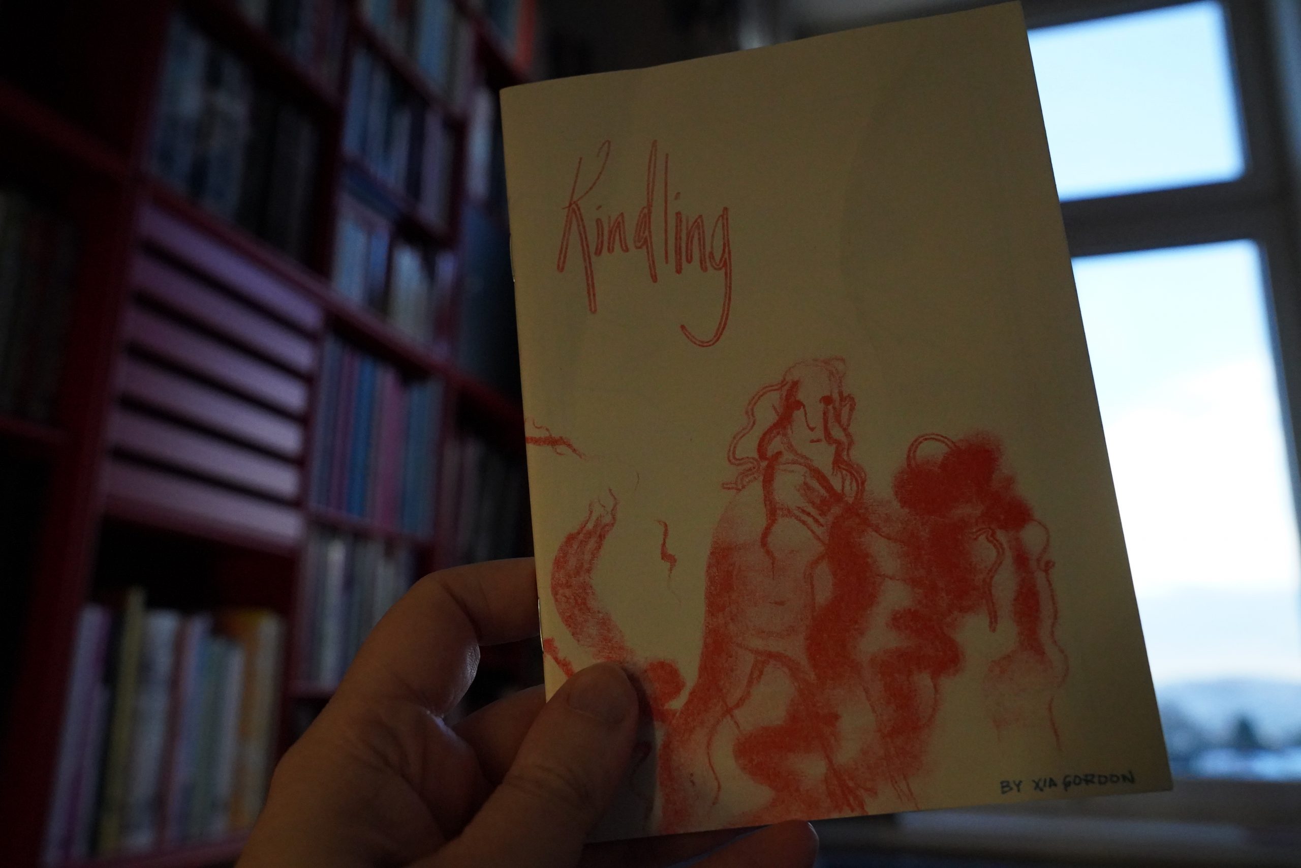
13:58: Kindling by Xia Gordon (2d cloud)

Fabulous.
| The Nix: The Highest |  |
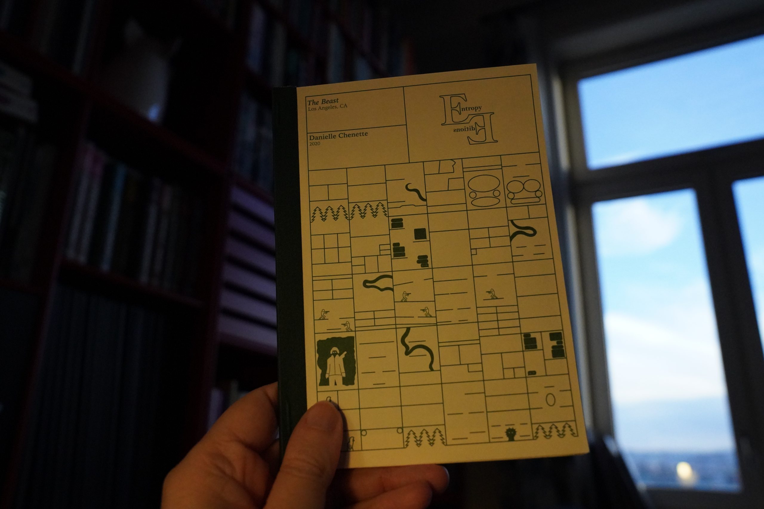
14:01: The Beast by Danielle Chenette (Entropy Editions)
This is a really handsome object.

And it’s fun. But… the story’s a bit pat, innit?
| Ryuichi Sakamoto: Thousand Knives of Ryuichi Sakamoto |  |
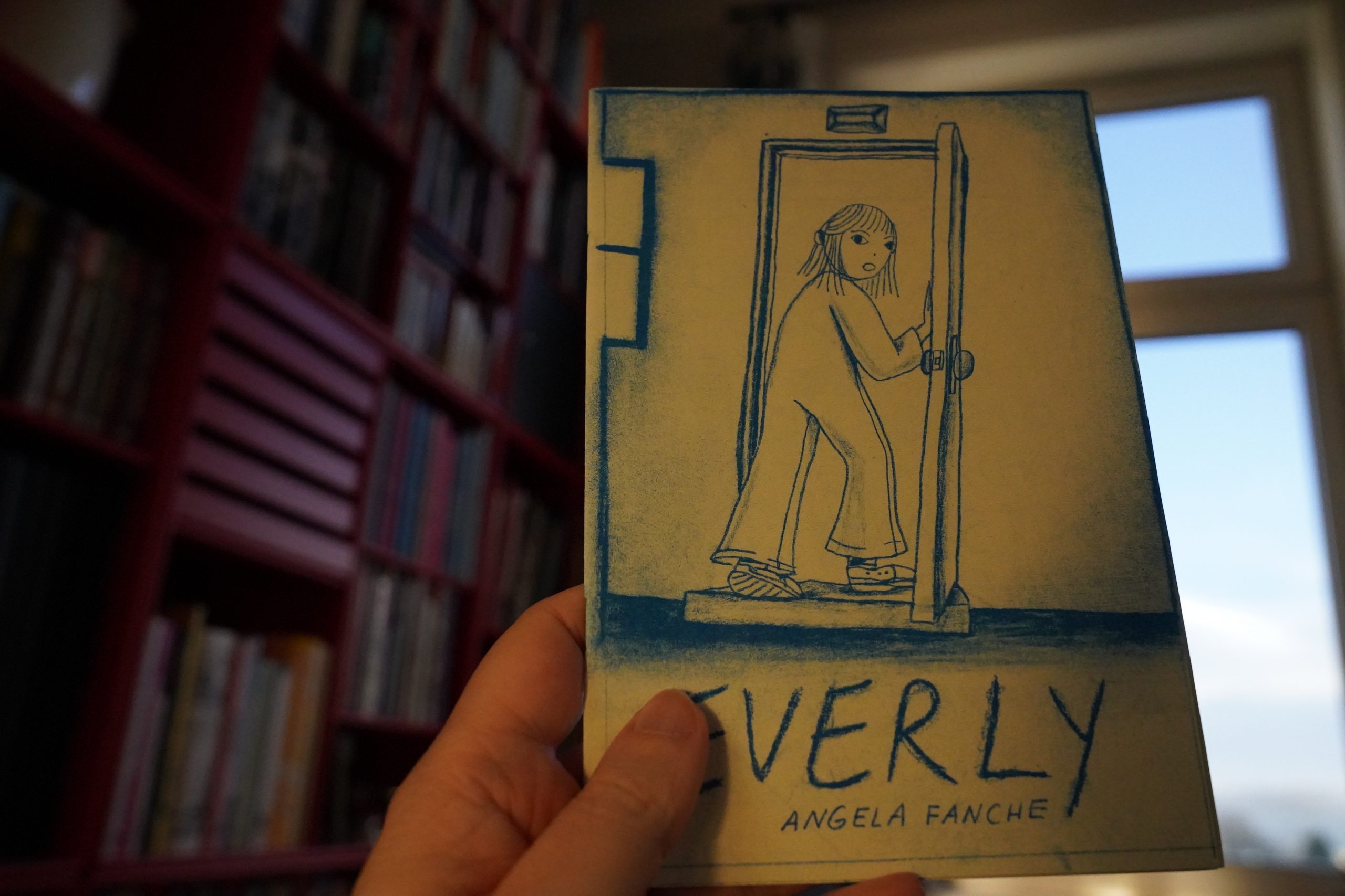
14:09: Everly by Angela Fanche
Pretty cool.
| Cristina: Disco Clone |  |
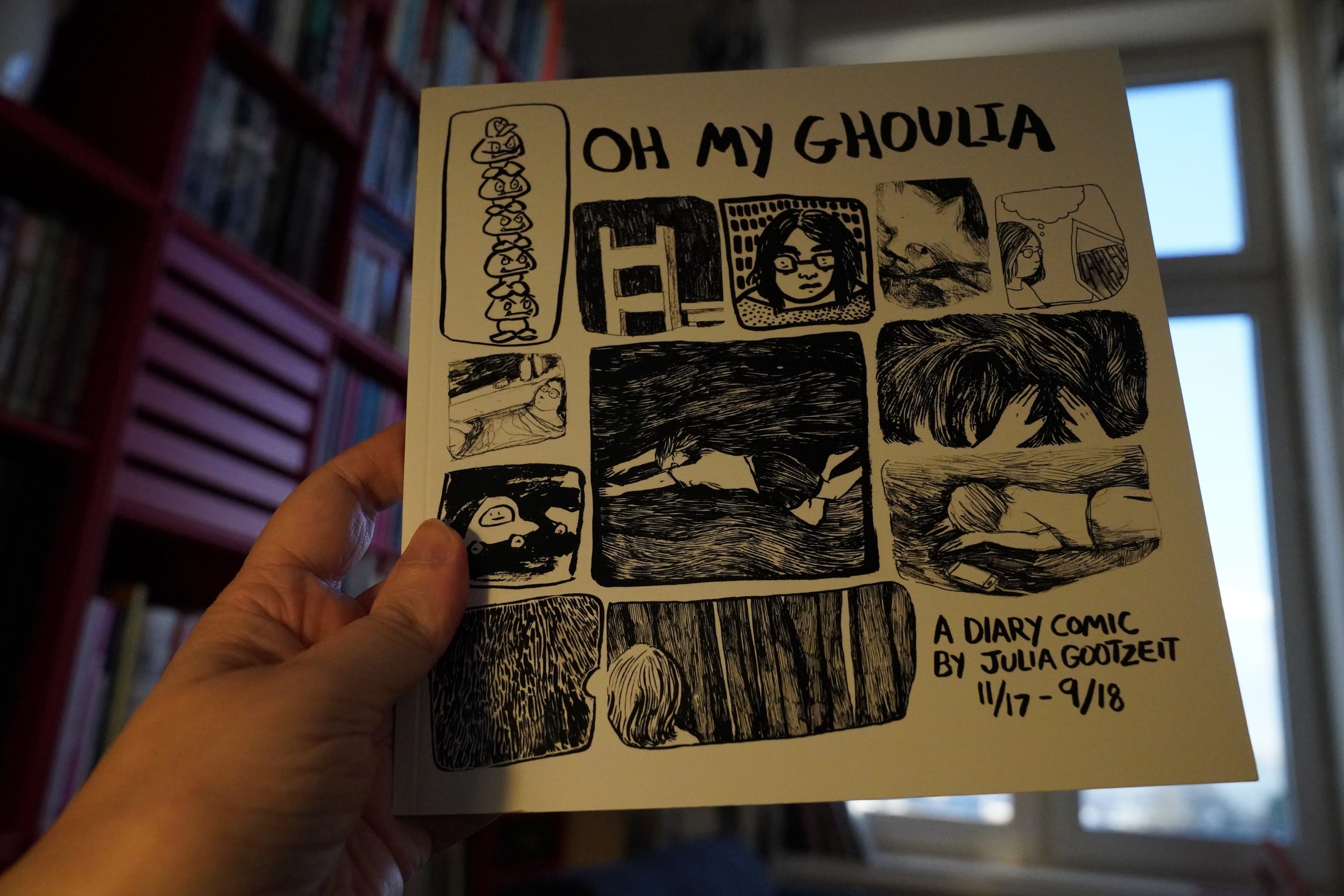
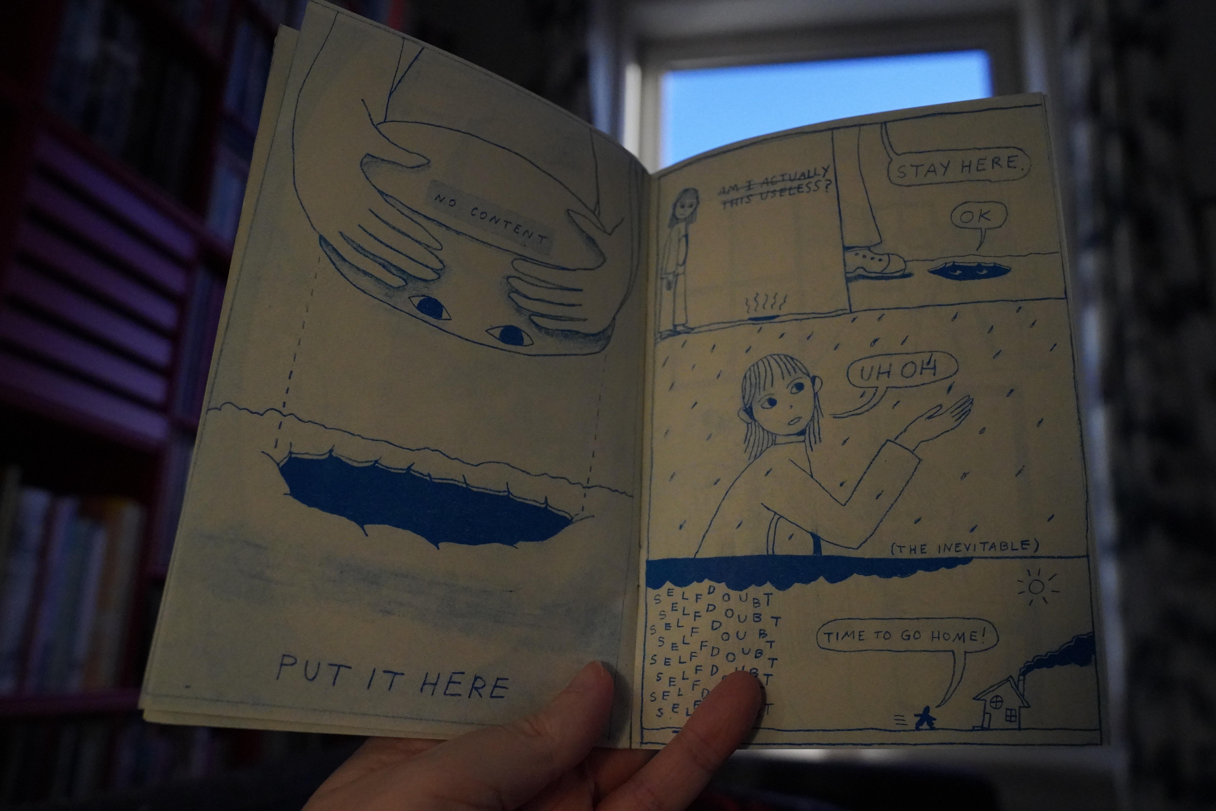
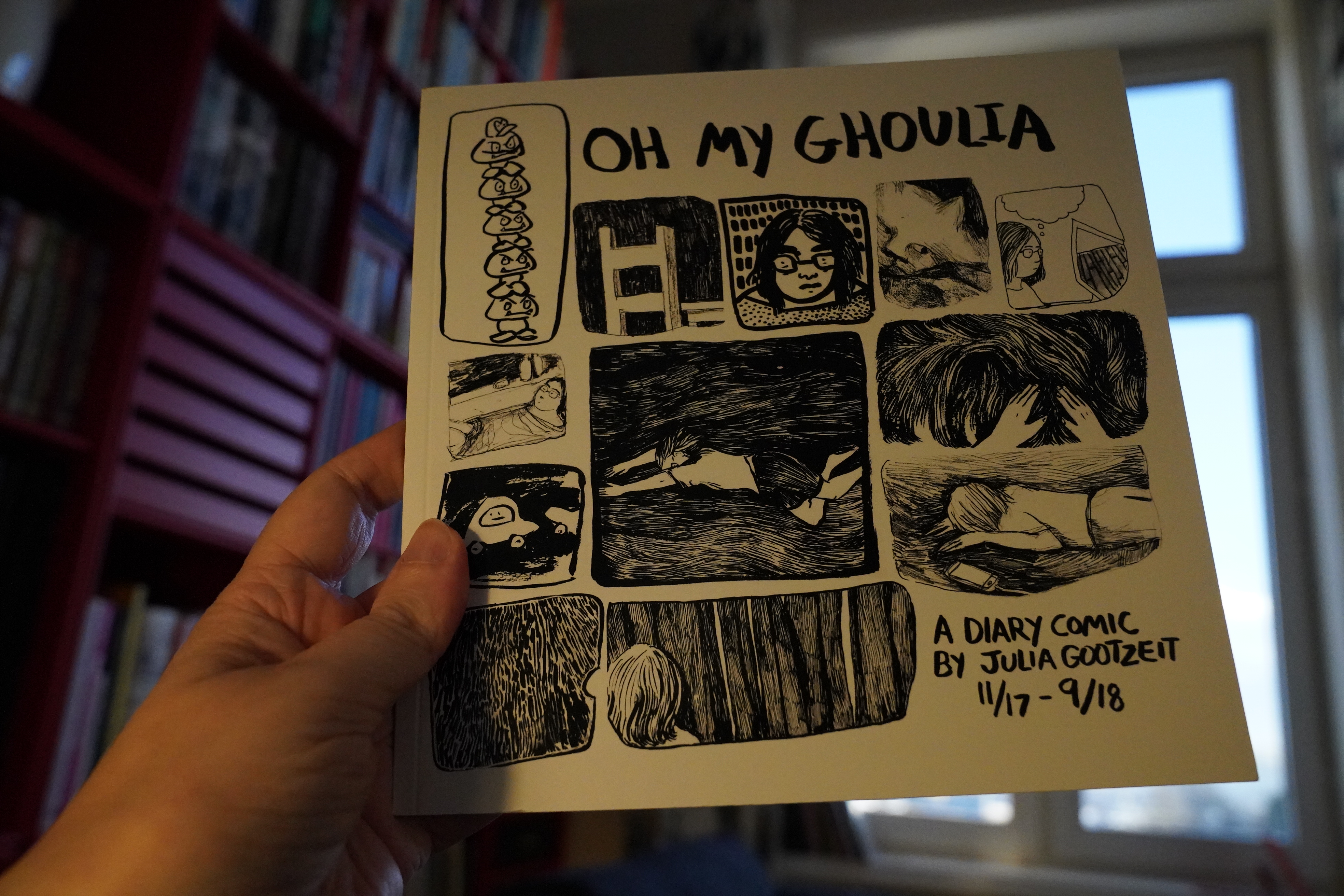
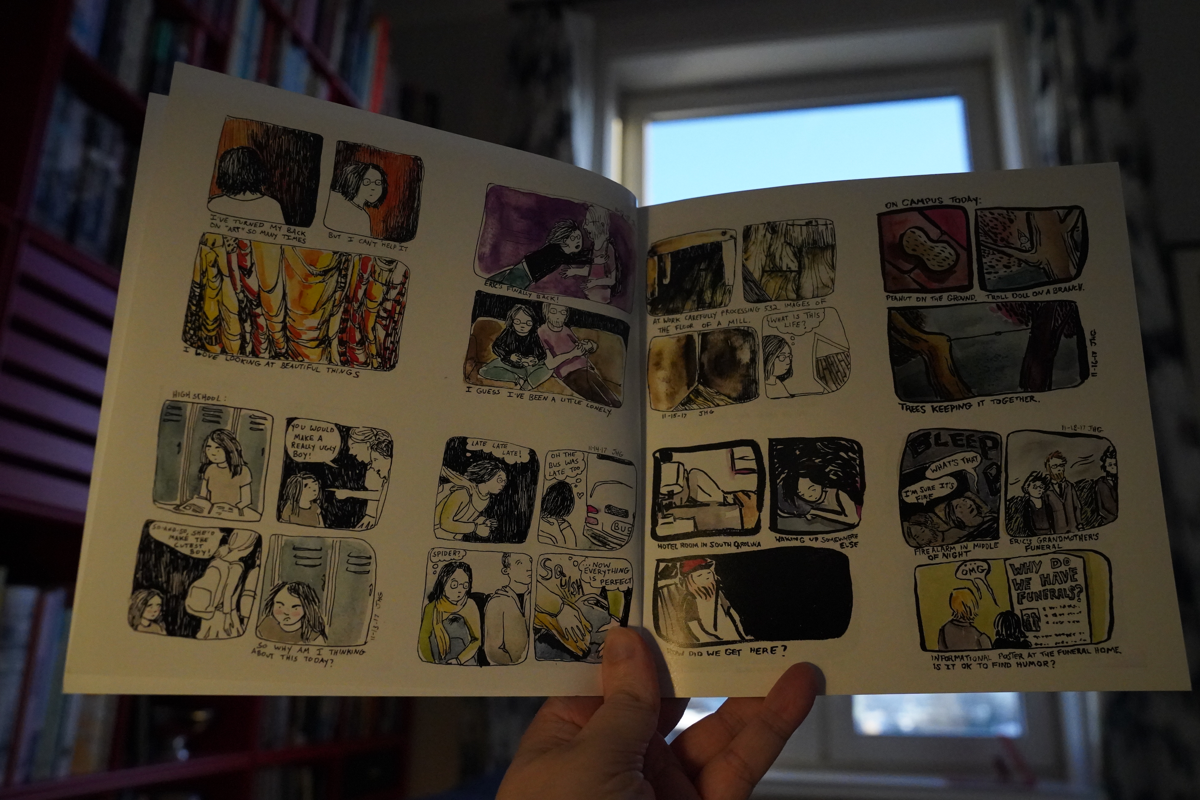
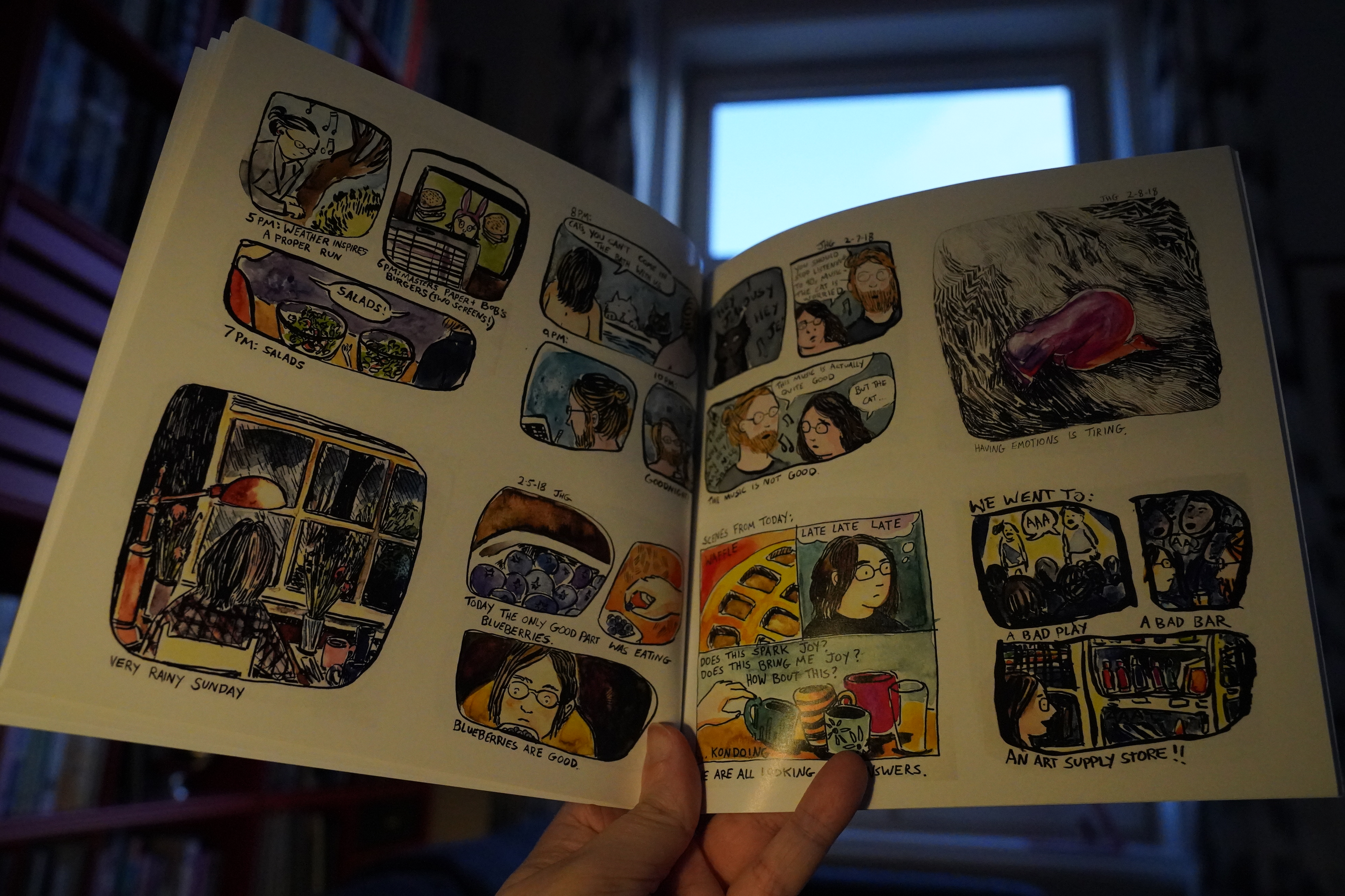
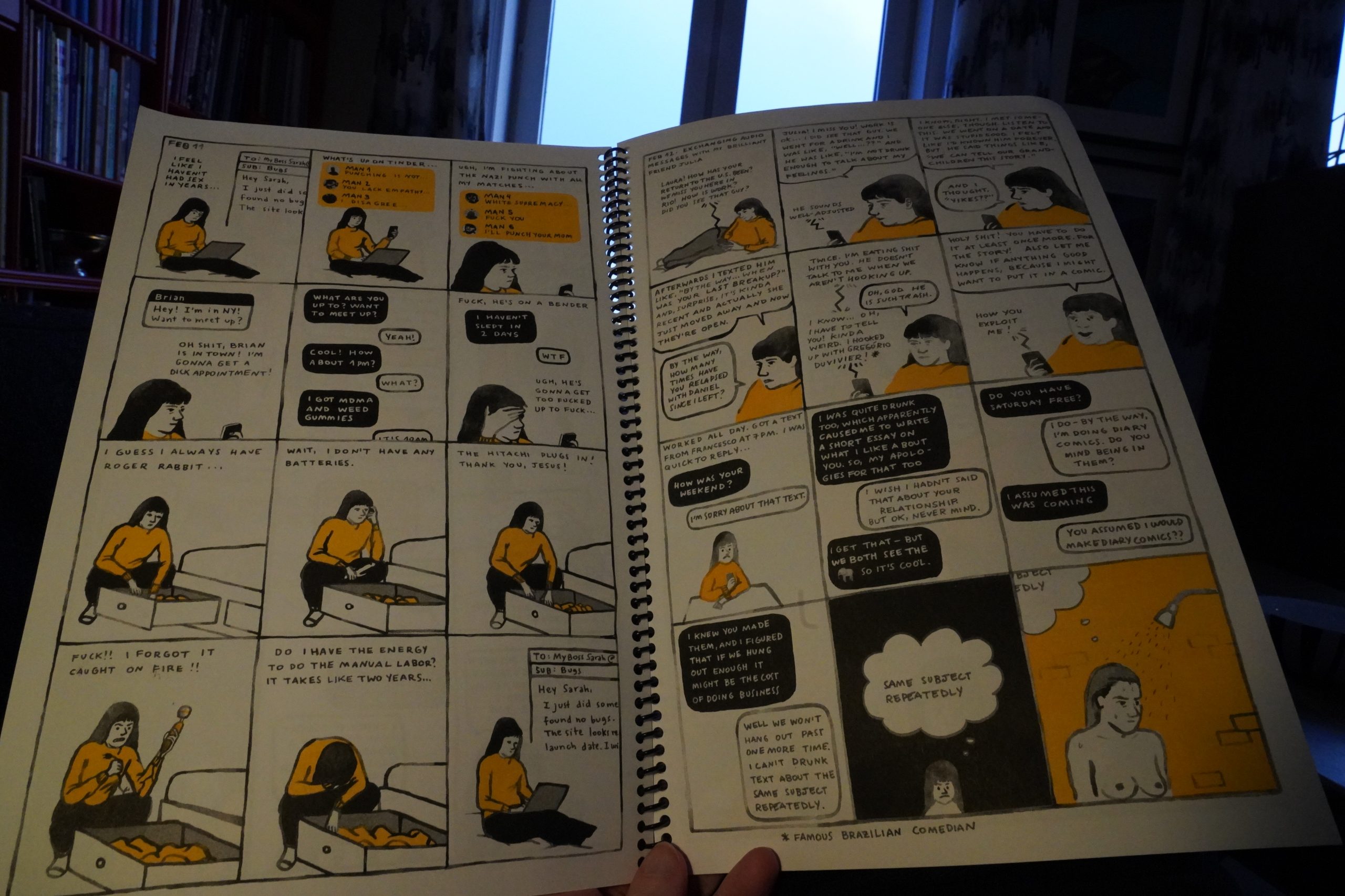
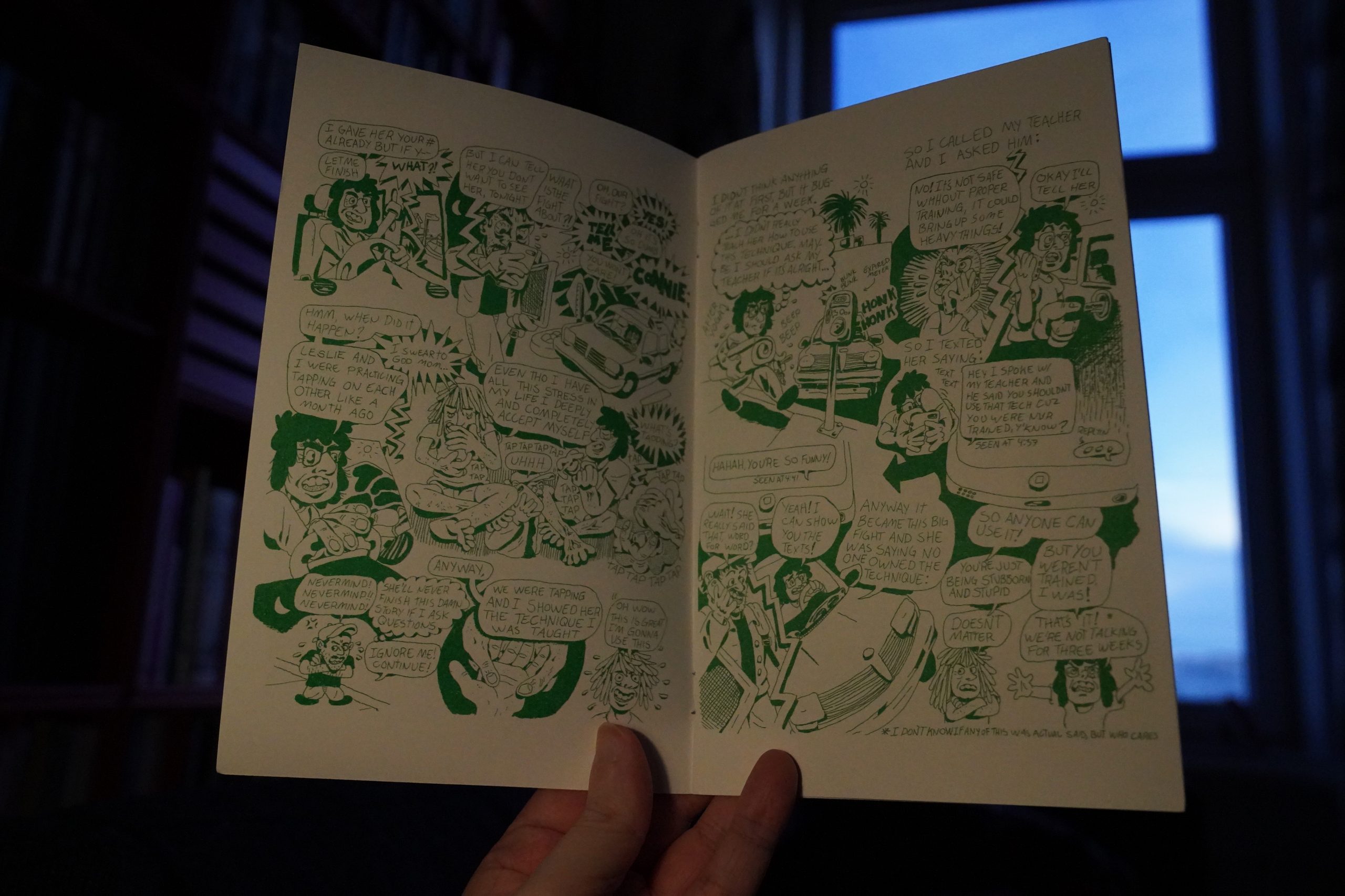
14:14: Oh My Ghoulia by Julia Gootzeit

Now these are real diary comics.

I like the many different approaches to doing the artwork.
| Big in Japan: From Y to Z and never again |  |
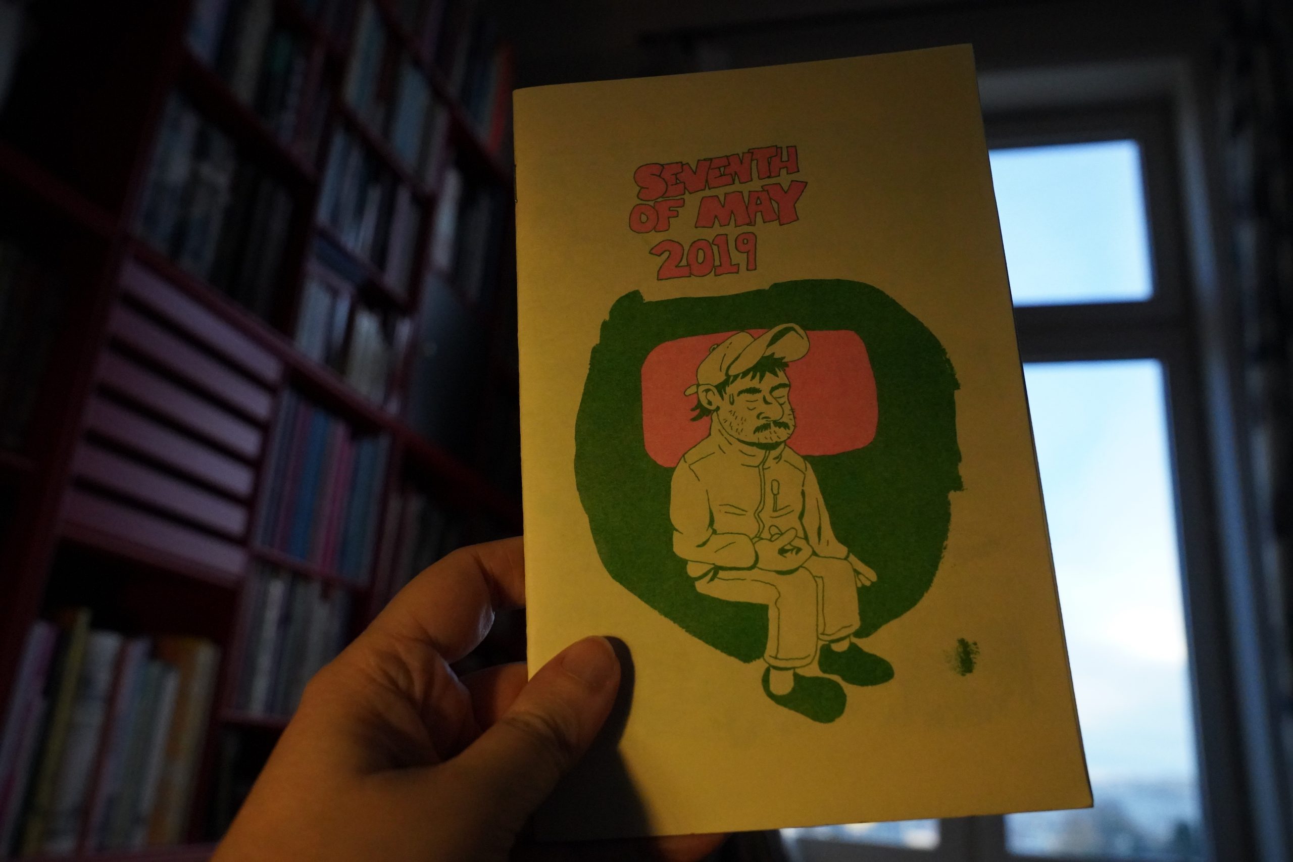
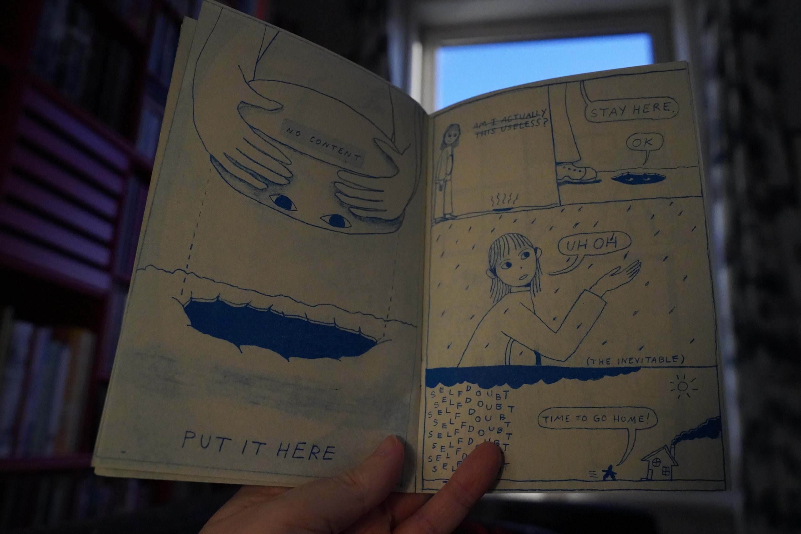
14:40: Seventh of May 2019 by Andrew Alexander
I like it. It’s refreshingly unstructured — it’s just a story of what the guy did that day. Went out for some drinks, met some slightly weird people, talked to his mom on the phone. Feels very free.
| Garçons: Re-Bop (Electronique) |  |
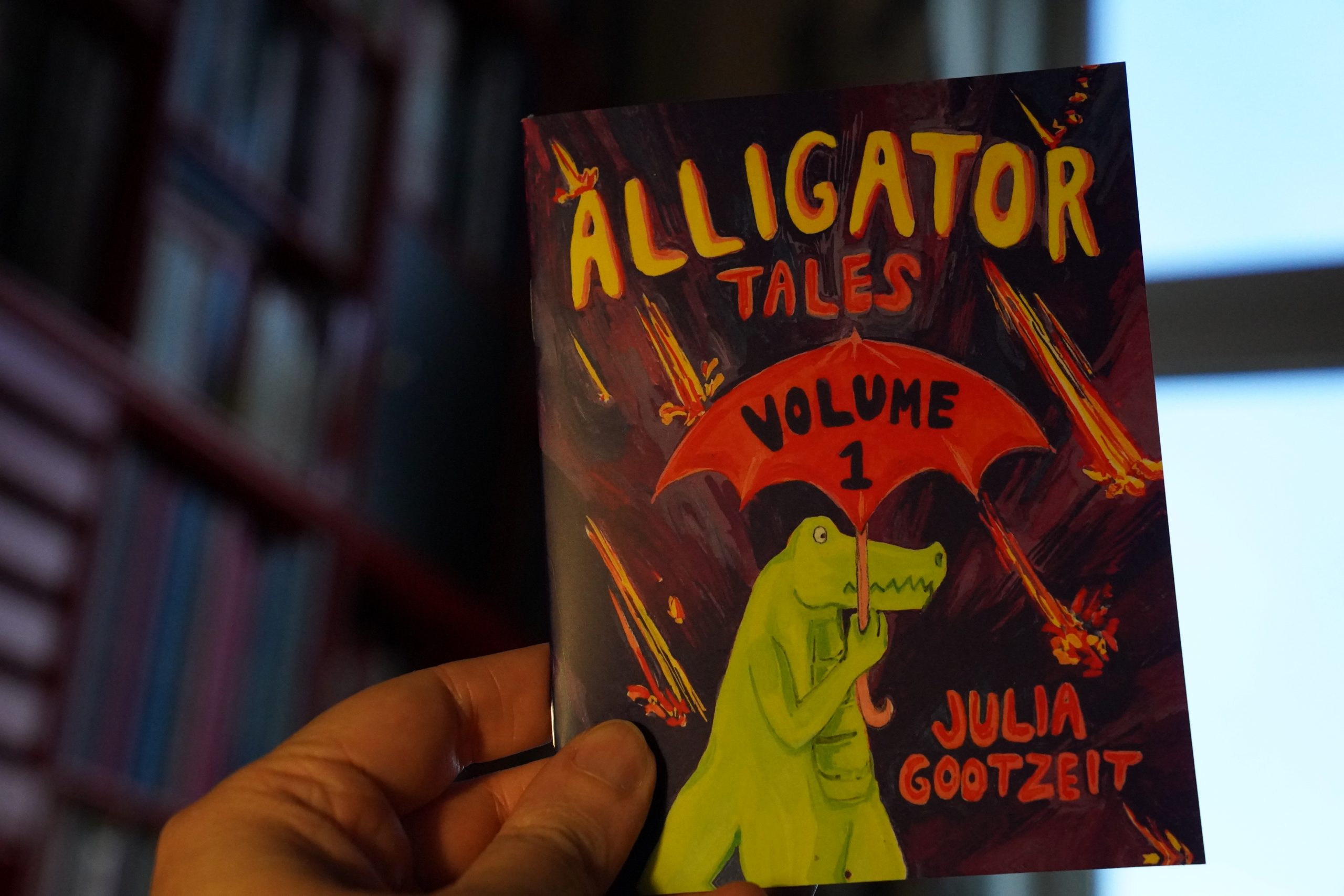
14:50: Alligator Tales by Julie Gootzeit
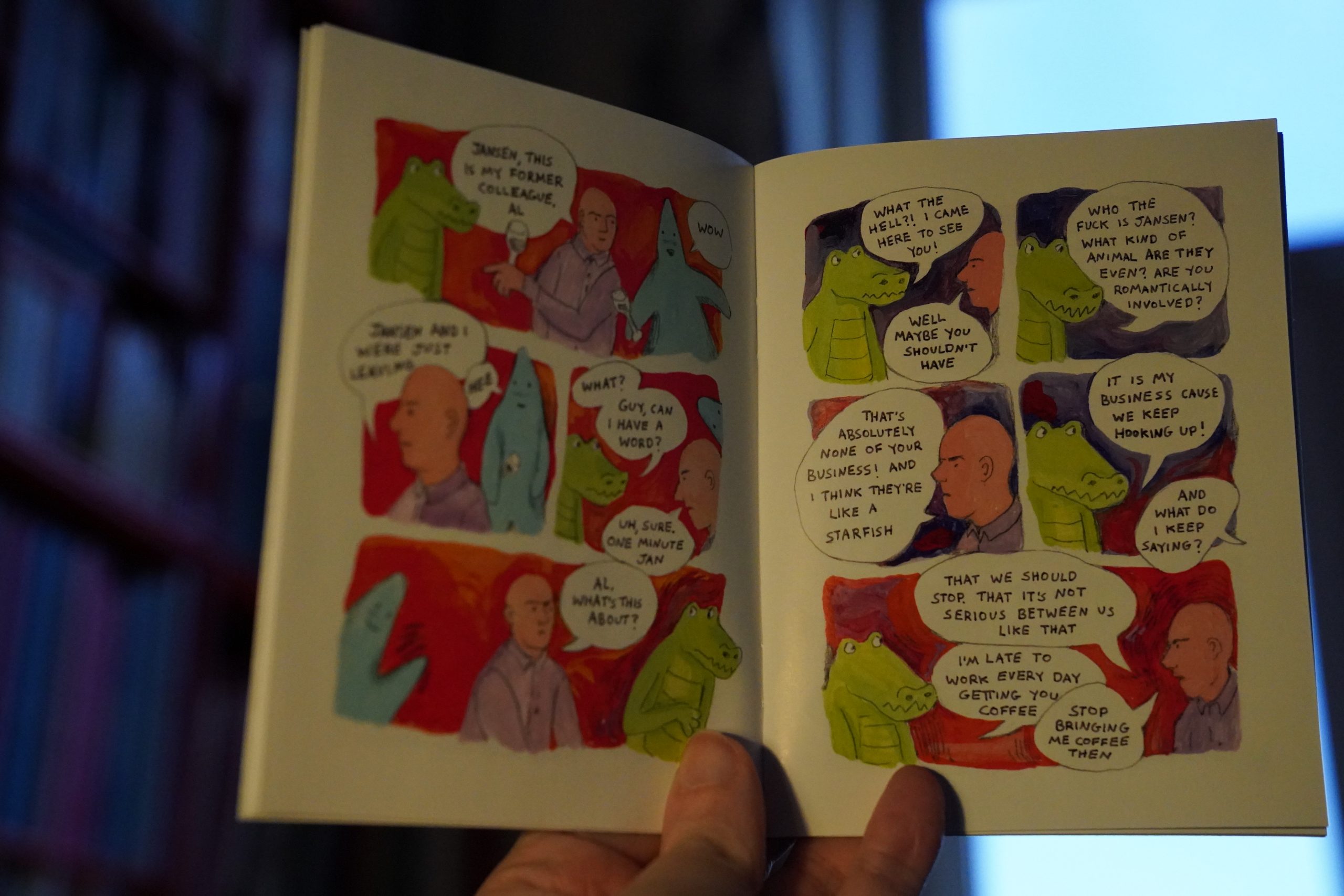
Wistful but fun.
| Don Armando’s Second Avenue Rhumba Band: Deputy of Love |  |
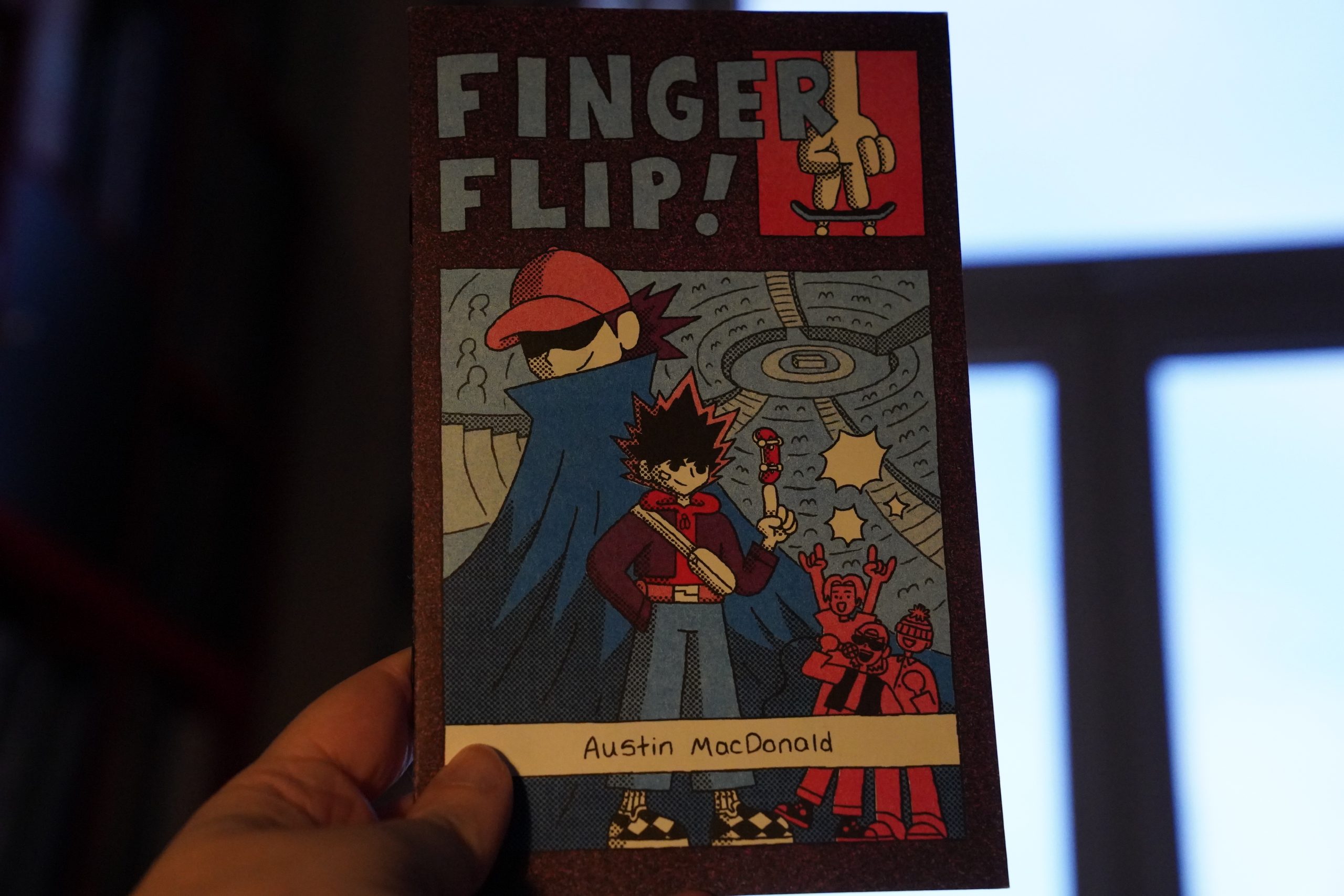
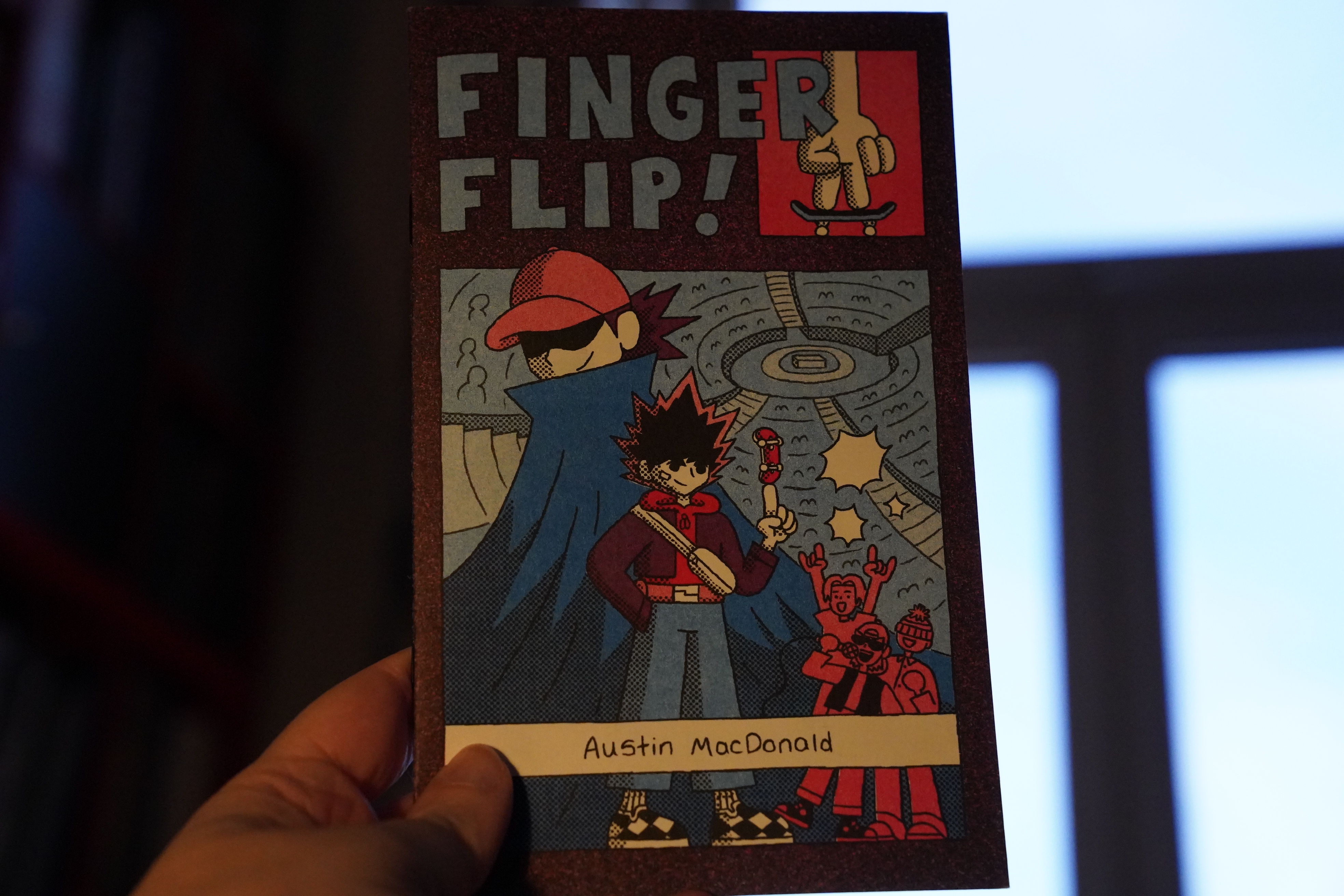
14:55: Finger Flip! by Austin MacDonald
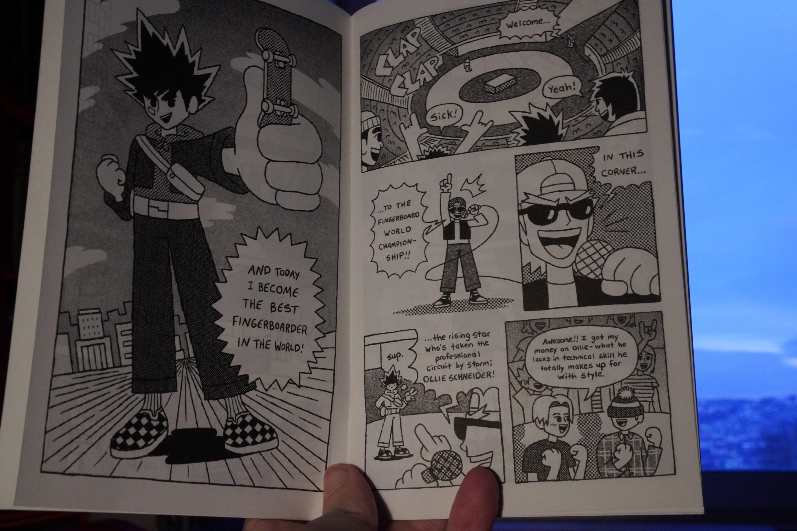
Makes as much sense as any sports, I guess?
Well executed.
Oh, I should make some food now, I think… Be right back…
| David Bowie: Brilliant Adventure (1): Black Tie White Noise |  |
15:17: Dungeon Zenith Vol. 4 by Sfar/Trondheim/Boulet (NBM)
Hey… this is in a larger format than these NBM things usually are. I never quite got why they printed the Dungeon albums so small, but I guess there’s a lot of resistance in the US to the European album format, so…
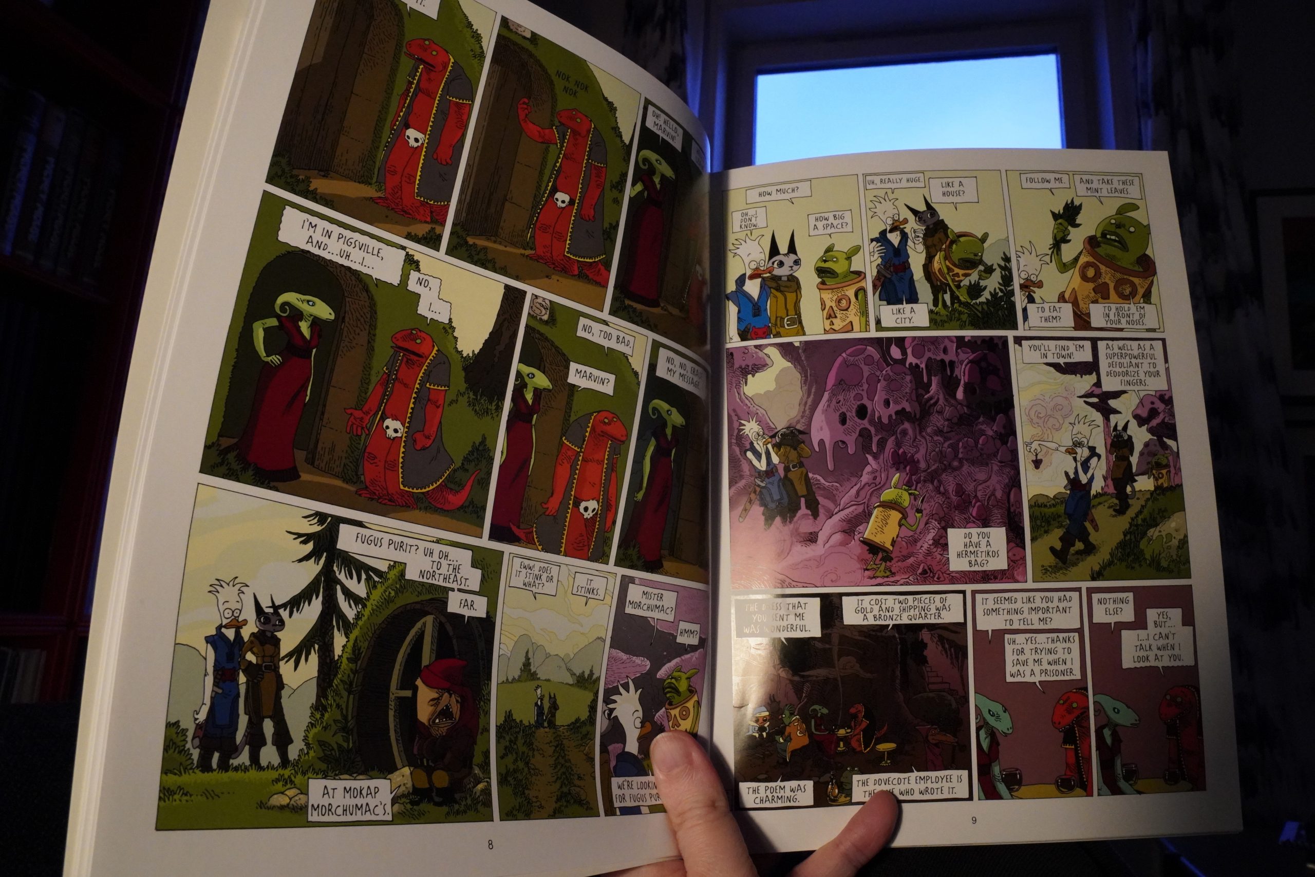
Some of these Dungeon stories have been downers, but the two collected here are pretty light-hearted and silly. And funny.

The second one is more emotional. But very entertaining. In some ways, I think these are better than the original Dungeon books.
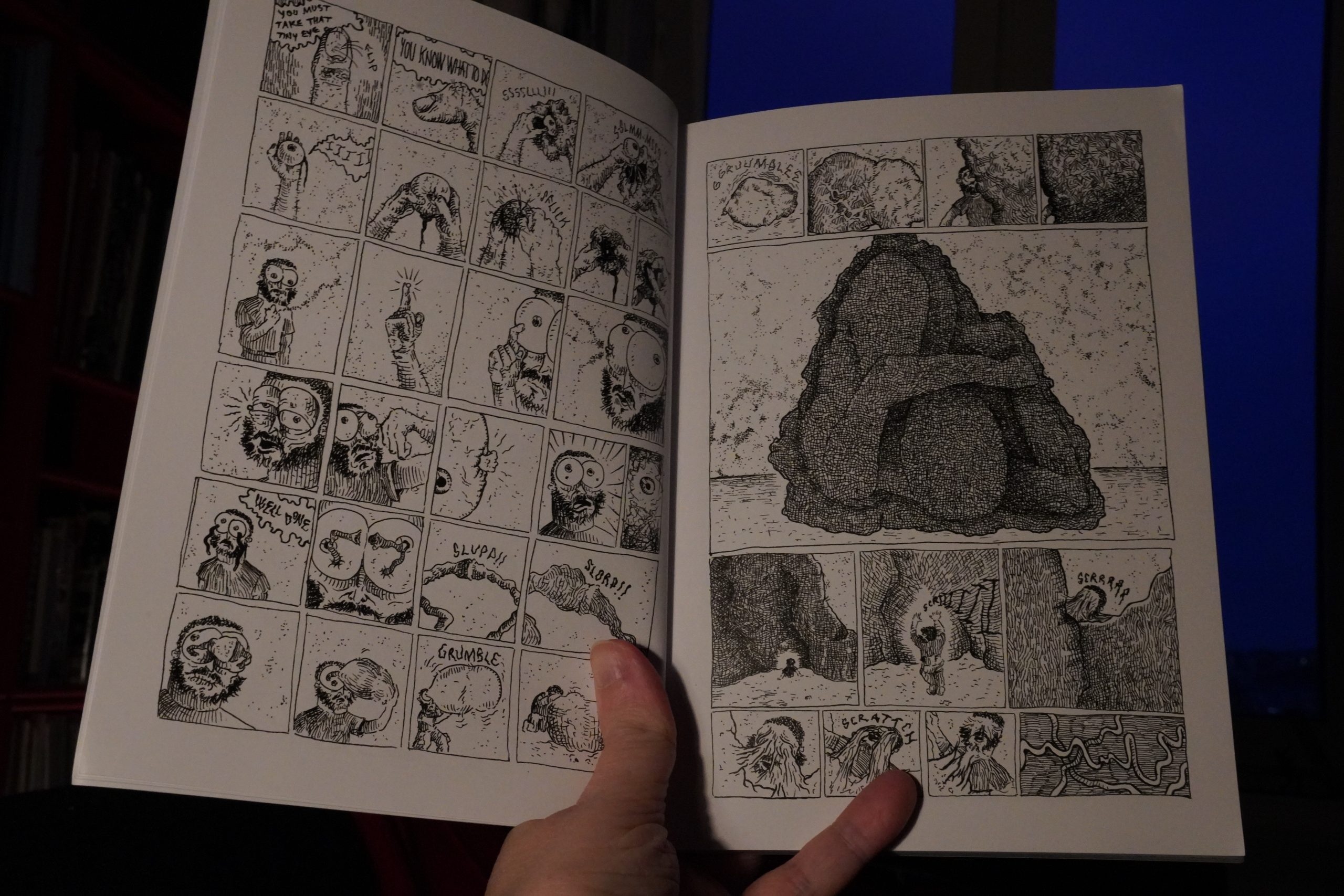
15:59: Rabbit Game by Miyoshi (Glacier Bay Books)
Very odd and dreamlike.

I’m not sure it totally works, though? It feels like it’s aiming for total nightmarishness and it… just doesn’t quite get there?
| Wouter Van Veldhoven: Mort Aux Vaches |  |
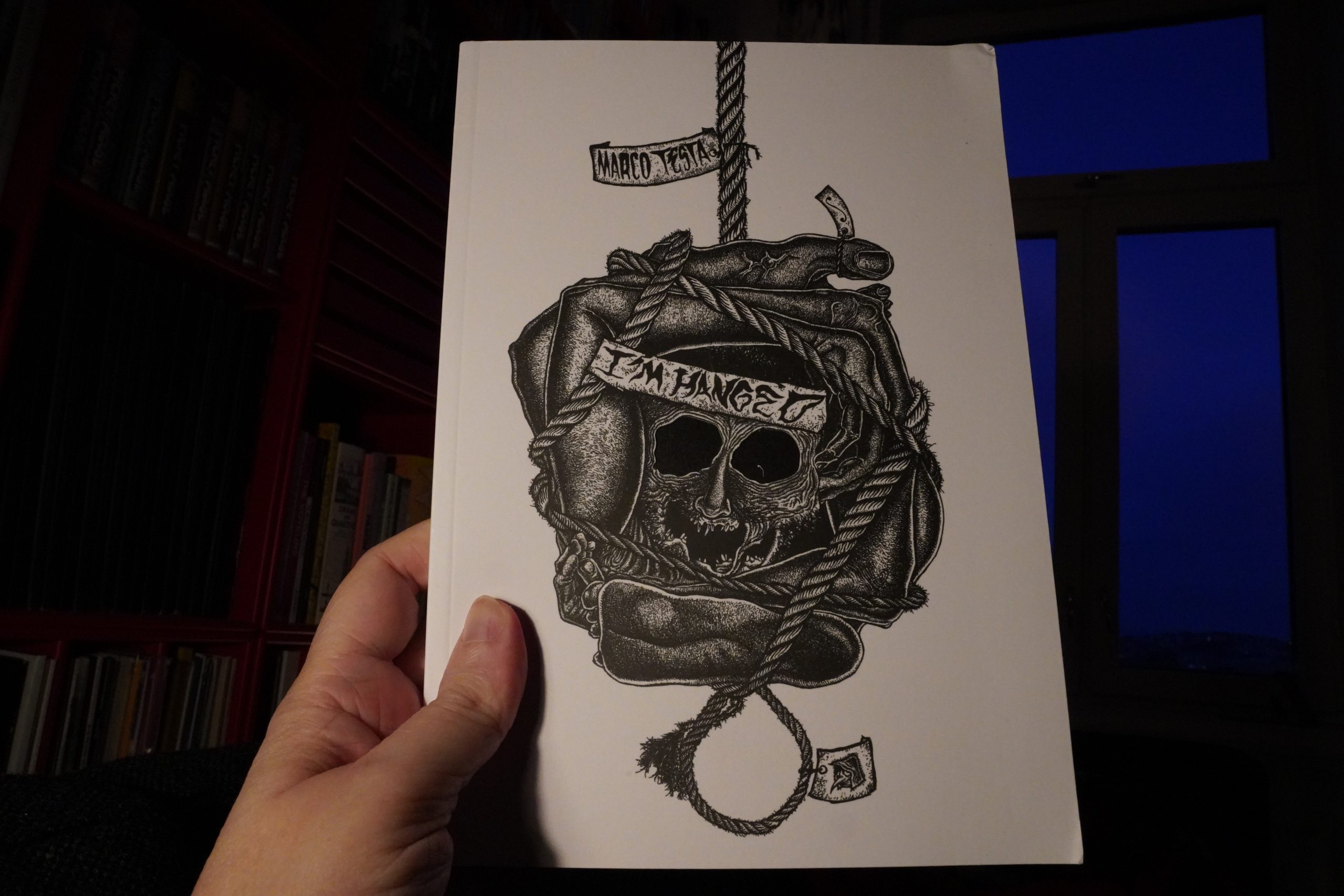
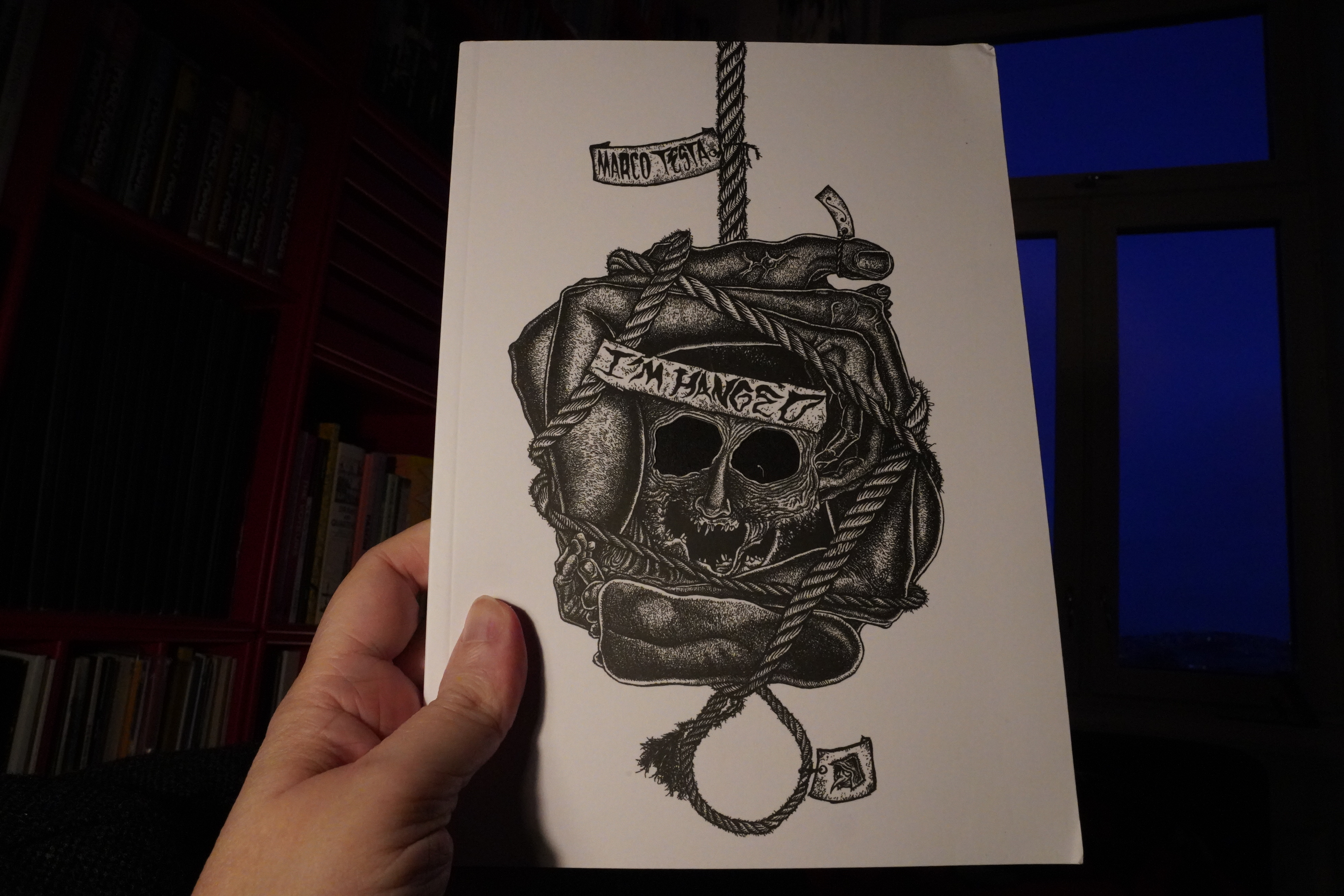
16:15: I’m Hanged by Marco Testa (Hollow Press)
Well, OK, I guess I admire the commitment necessary to do so many pages of this…
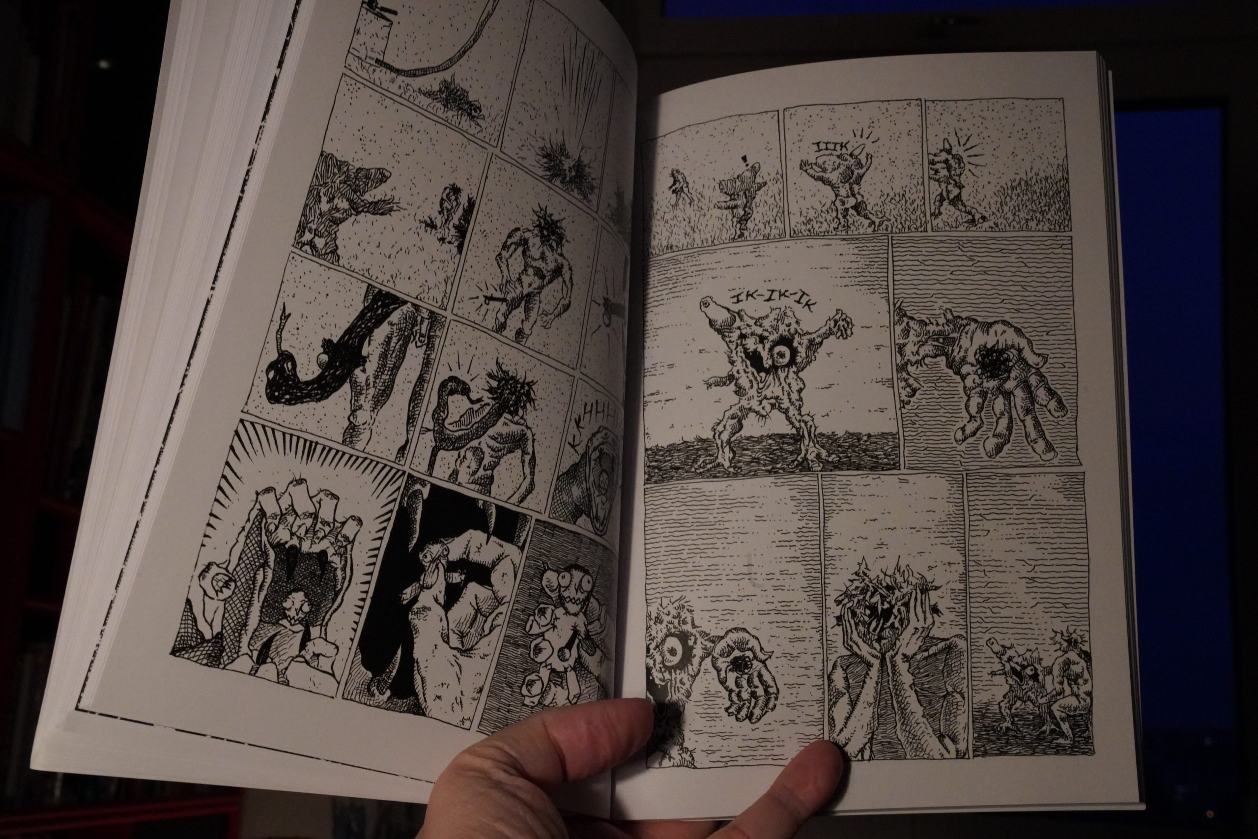
… but I don’t connect with it on any level.
| Richard Strange: The Live Rise of Richard Strange |  |
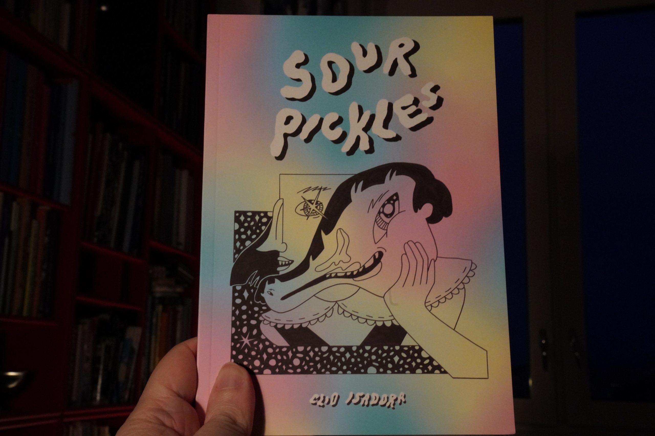
16:28: Sour Pickles by Clio Isadora (Avery Hill)
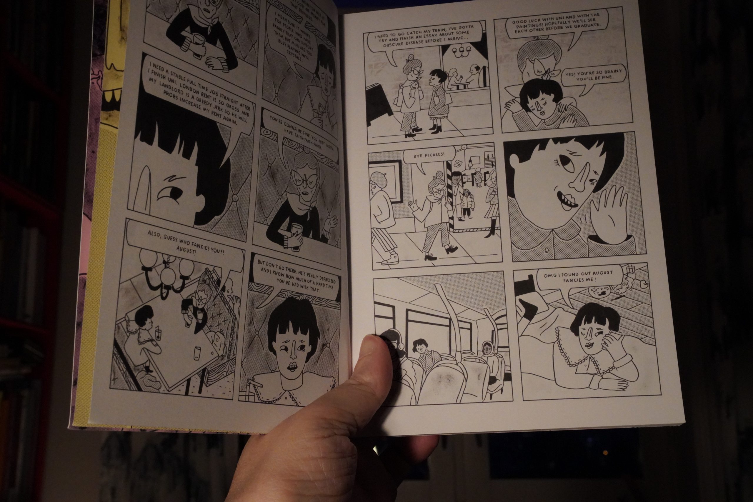
I’m having basic problems with this book — like just telling the characters apart.
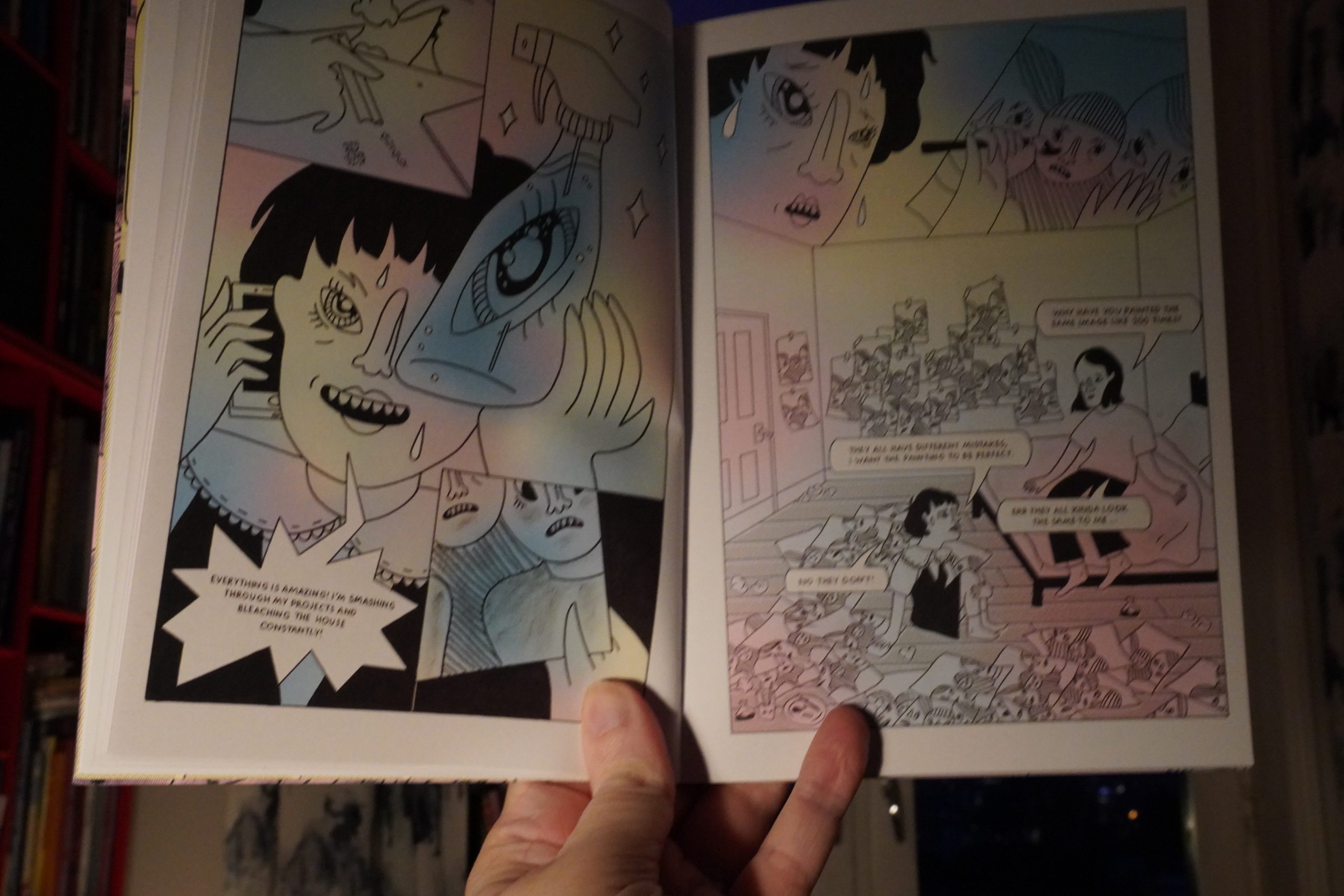
The story’s kinda wonky, too — it’s about these two art students that take speed. But… it’s like… it’s structured as if there’s all these momentous things happening (even with a hair-raisingly pointless race against the clock as the climax), but… nothing interesting happens? And the characters pretty much… have no character?
It’s an odd one.
Or it might just be me; I’m kinda wilting here…
OK, one more and that’s it.
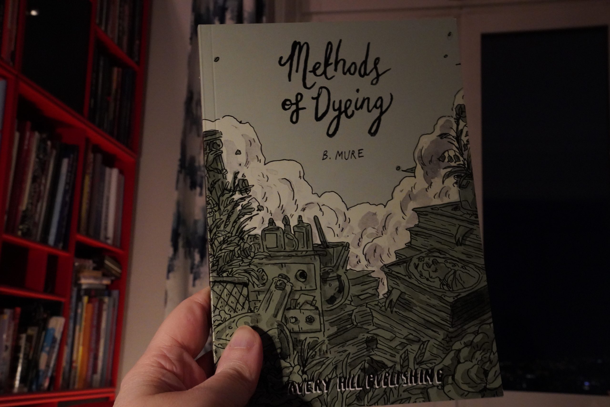
16:56: Methods of Dyeing by B. Mure (Avery Hill)

Very unusual approach to colouring. It shouldn’t work, but somehow it does.
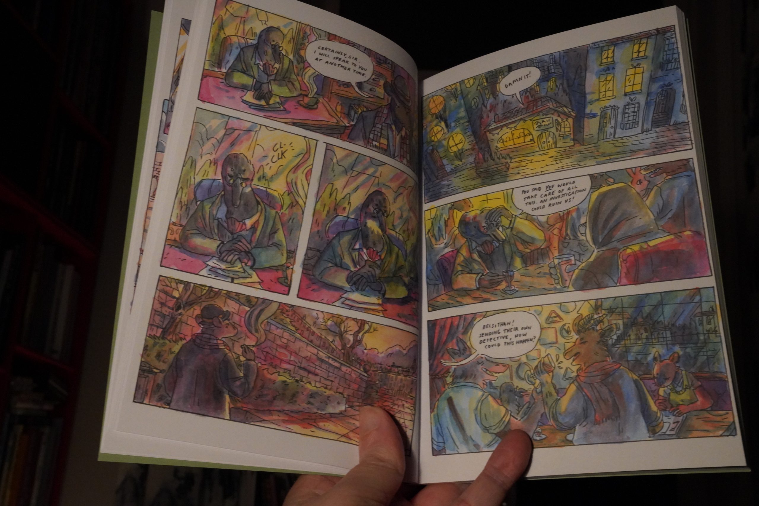
The storyline is a curiously straight-forward murder mystery… but it’s not much of a mystery at all, really. It doesn’t feel like anything much happens? There’s not much detecting? It’s weird.
| Split: Alan Vega, Richard Strange |  |

17:09: The End
And it’s not quite time to go to bed — I got up at 4 this er morning, but reading comics for… oh, it’s only been ten hours? Well, I’m exhausted. Comics are exhausting.
But that was a pretty good batch of comics. I should buy more small press stuff, but I keep forgetting.