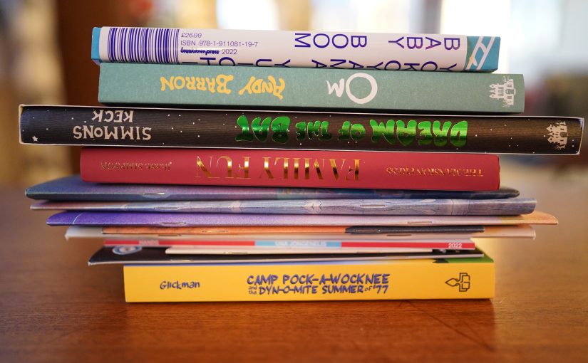

I got a whole bunch of comics from various places before the weekend, and I’m raring to get some comics reading done, even if I’m kinda sorta theoretically busy this week. Let’s see how this day goes — I might have to cut it short and actually, like, do stuff. Let’s hope not! Doing stuff sucks!
And for music… only old favourites. That I haven’t listened to in a while.
| Marianne Faithfull: Broken English |  |
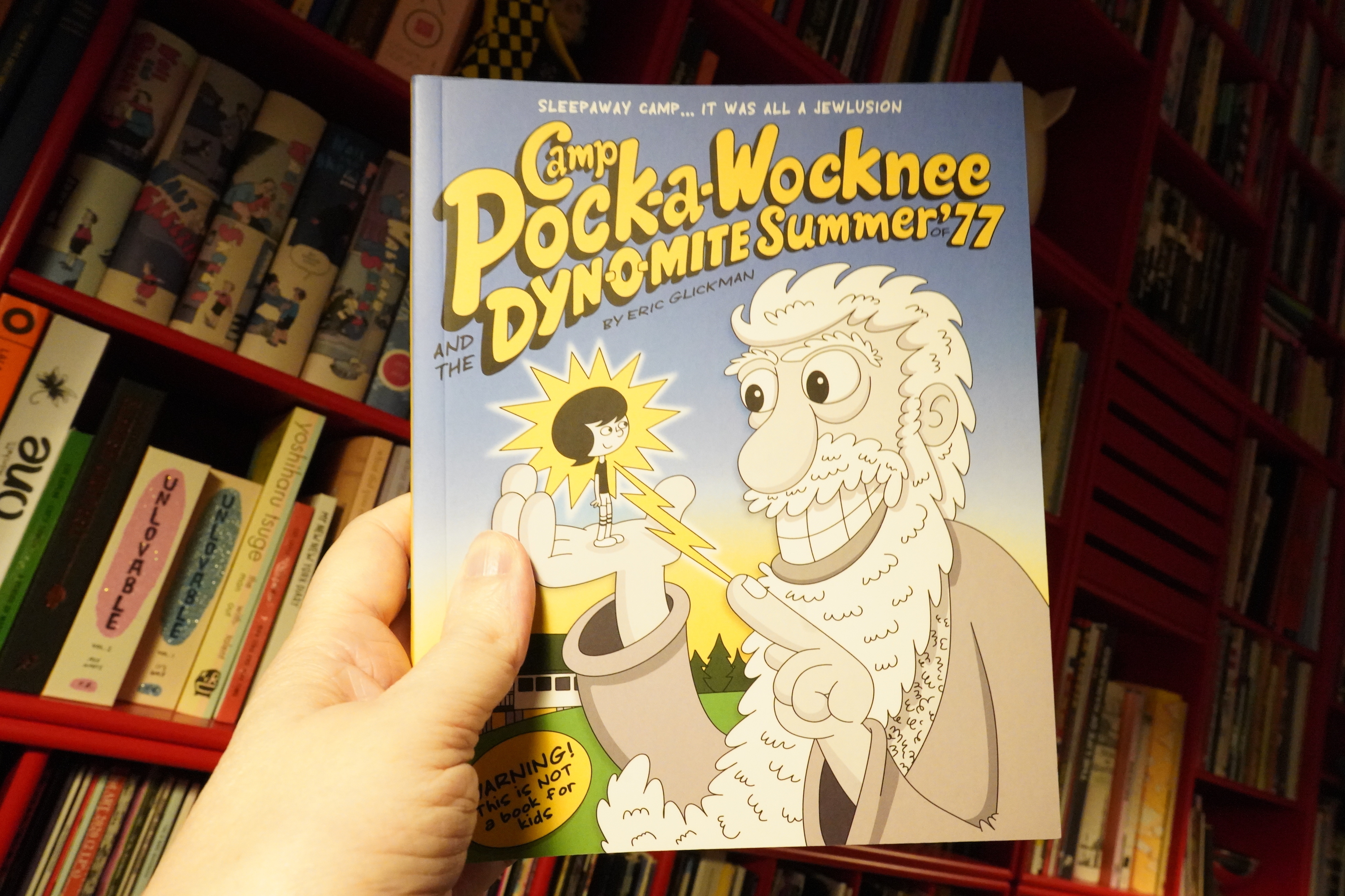
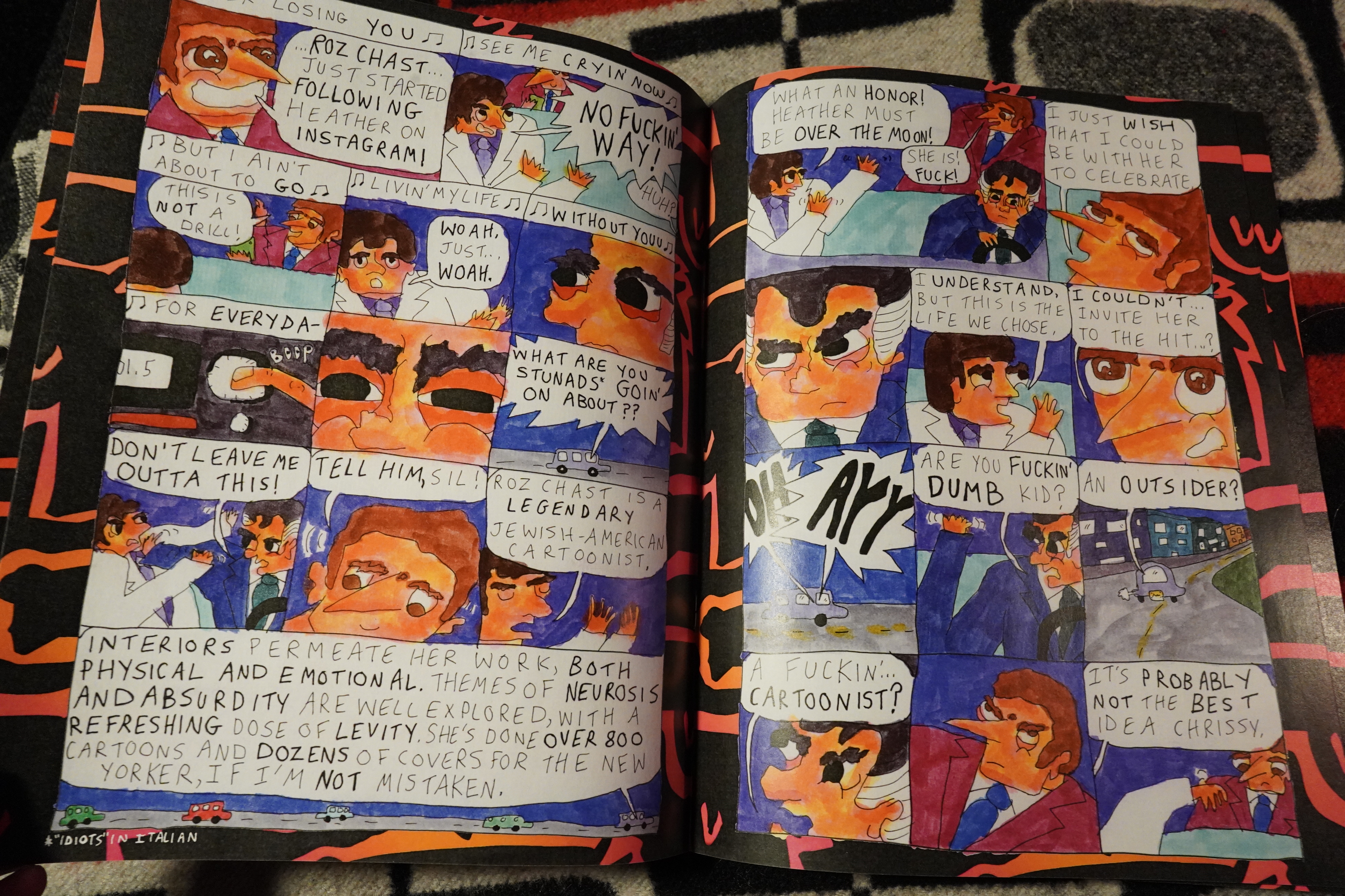
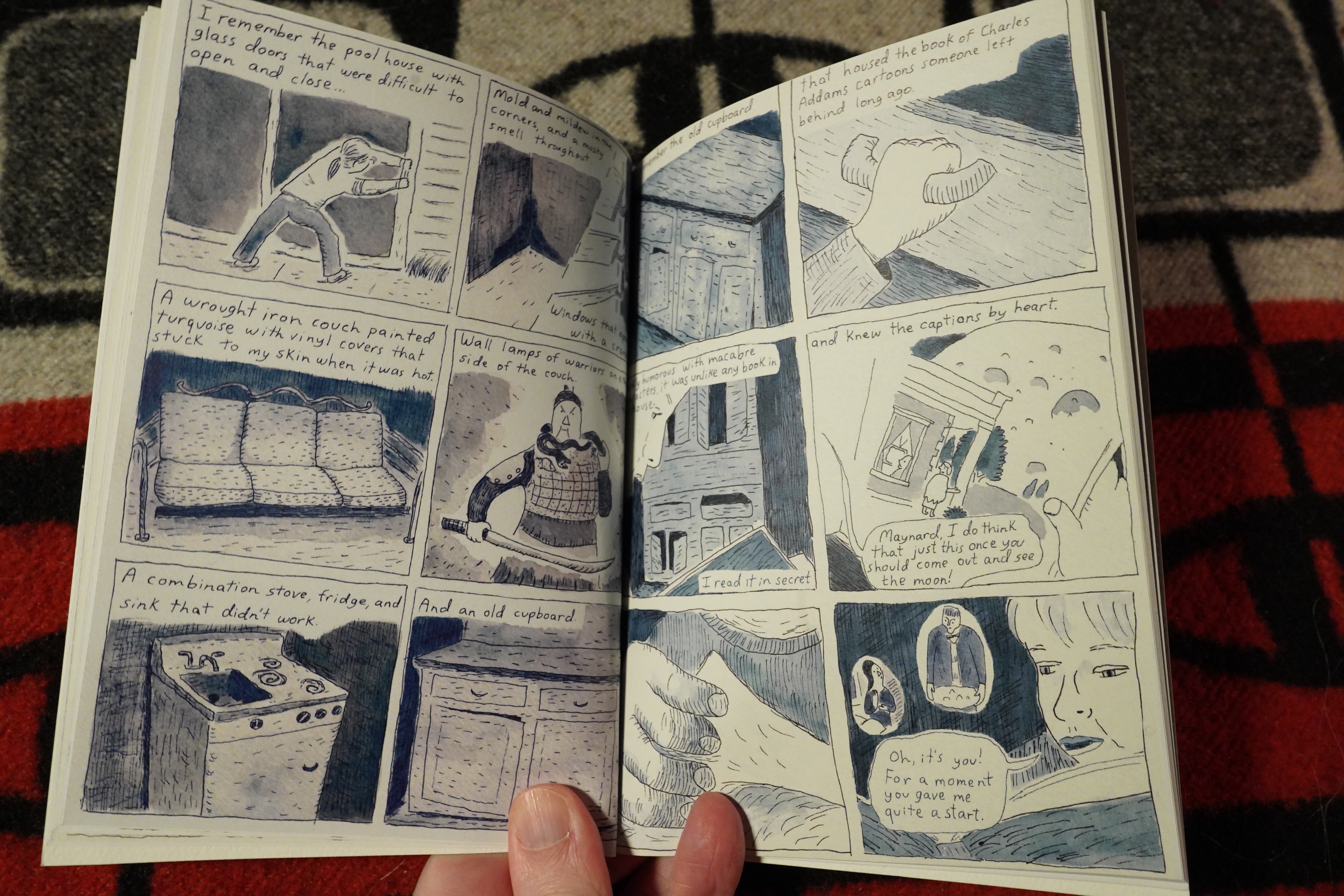
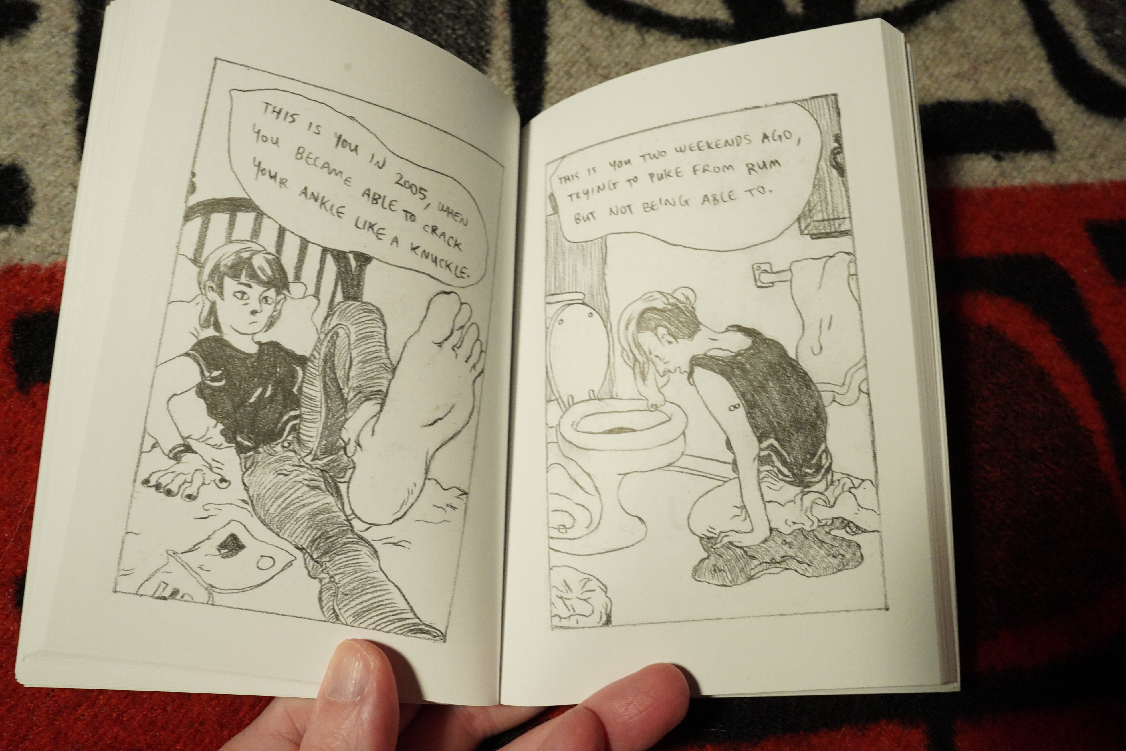
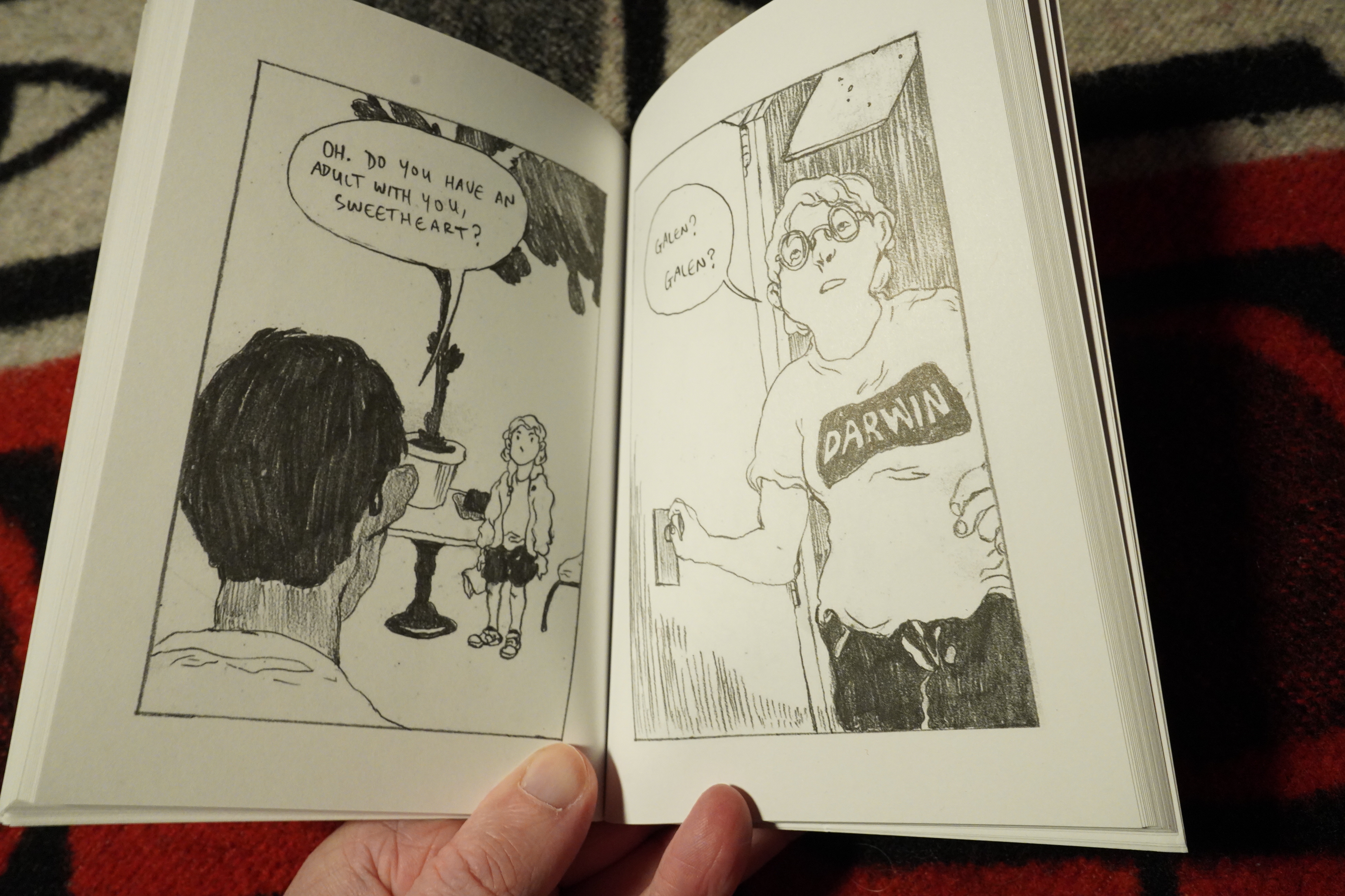
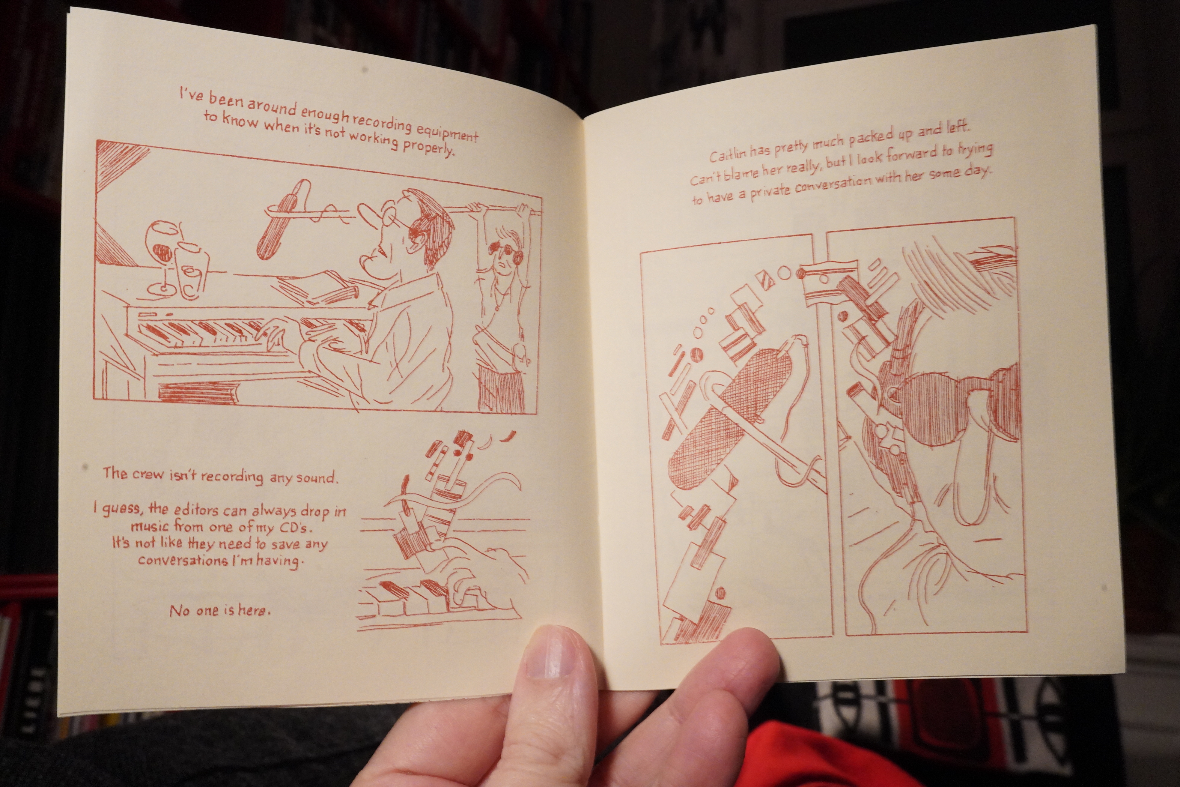
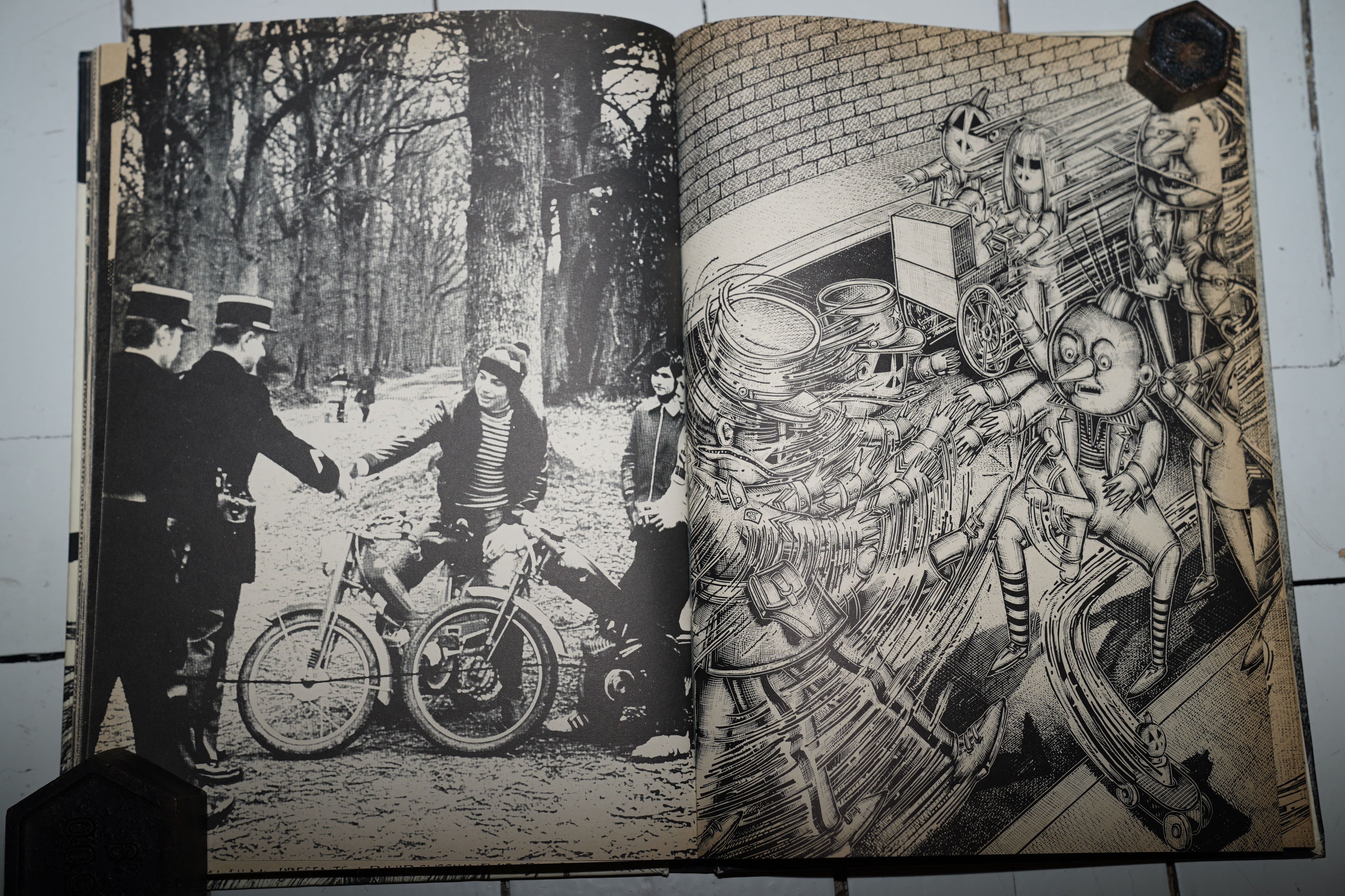
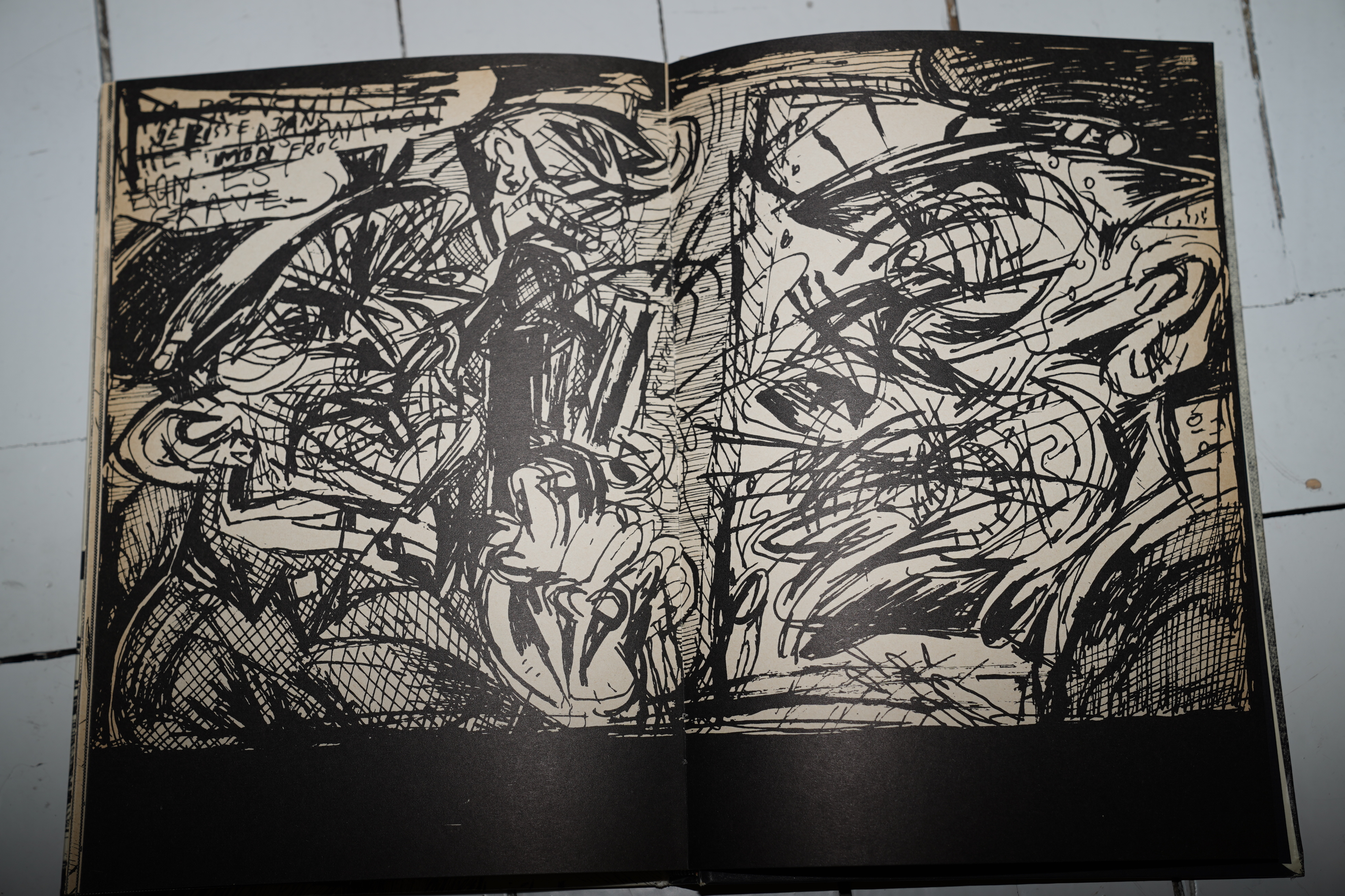
05:43: Camp Pock-a-Wocknee and the Dyn-o-mite Summer of 77 by Eric Glickman (Black Panel Press)
OK, let’s start off with something easy on the brain before diving off into the more er er the other stuff.

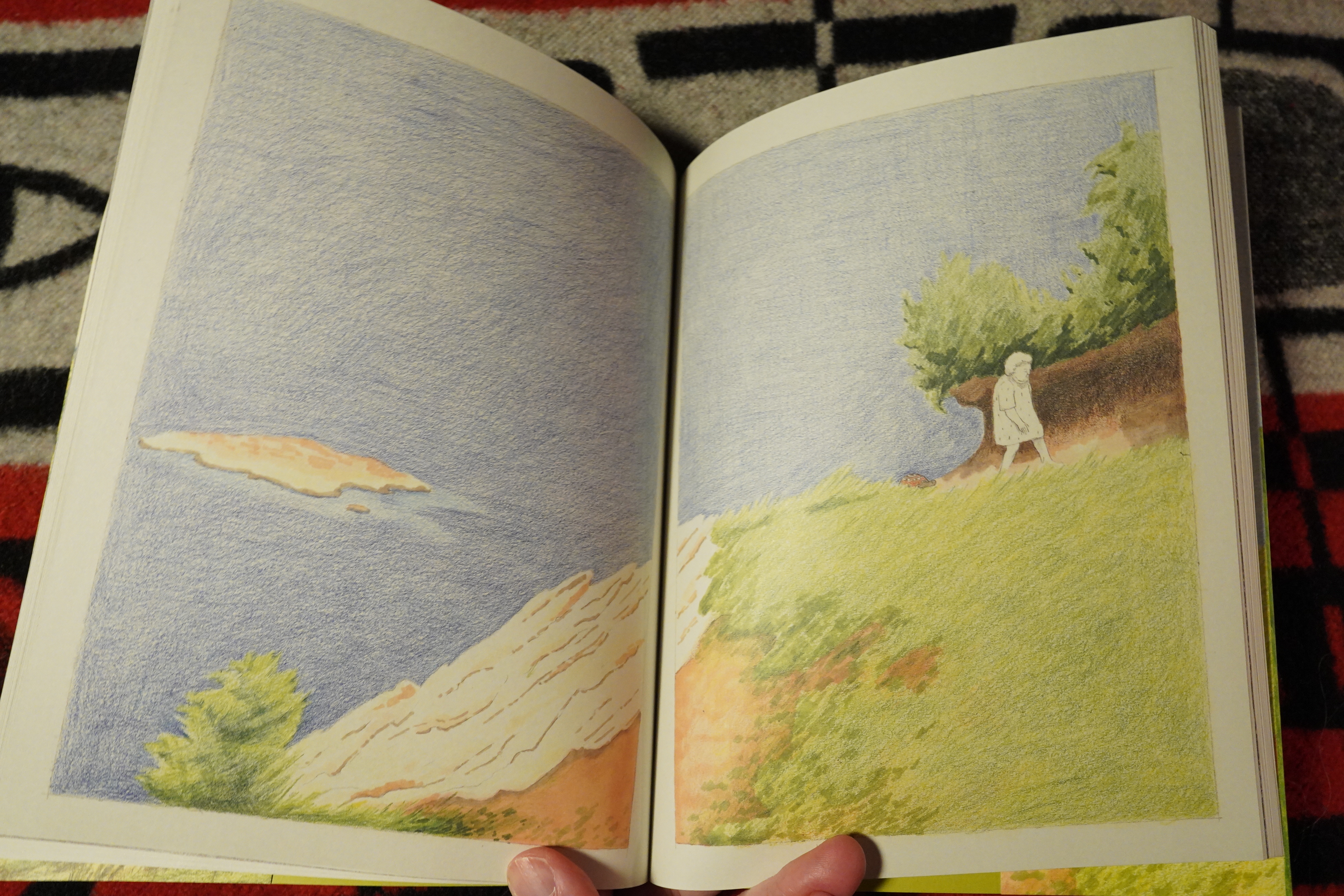
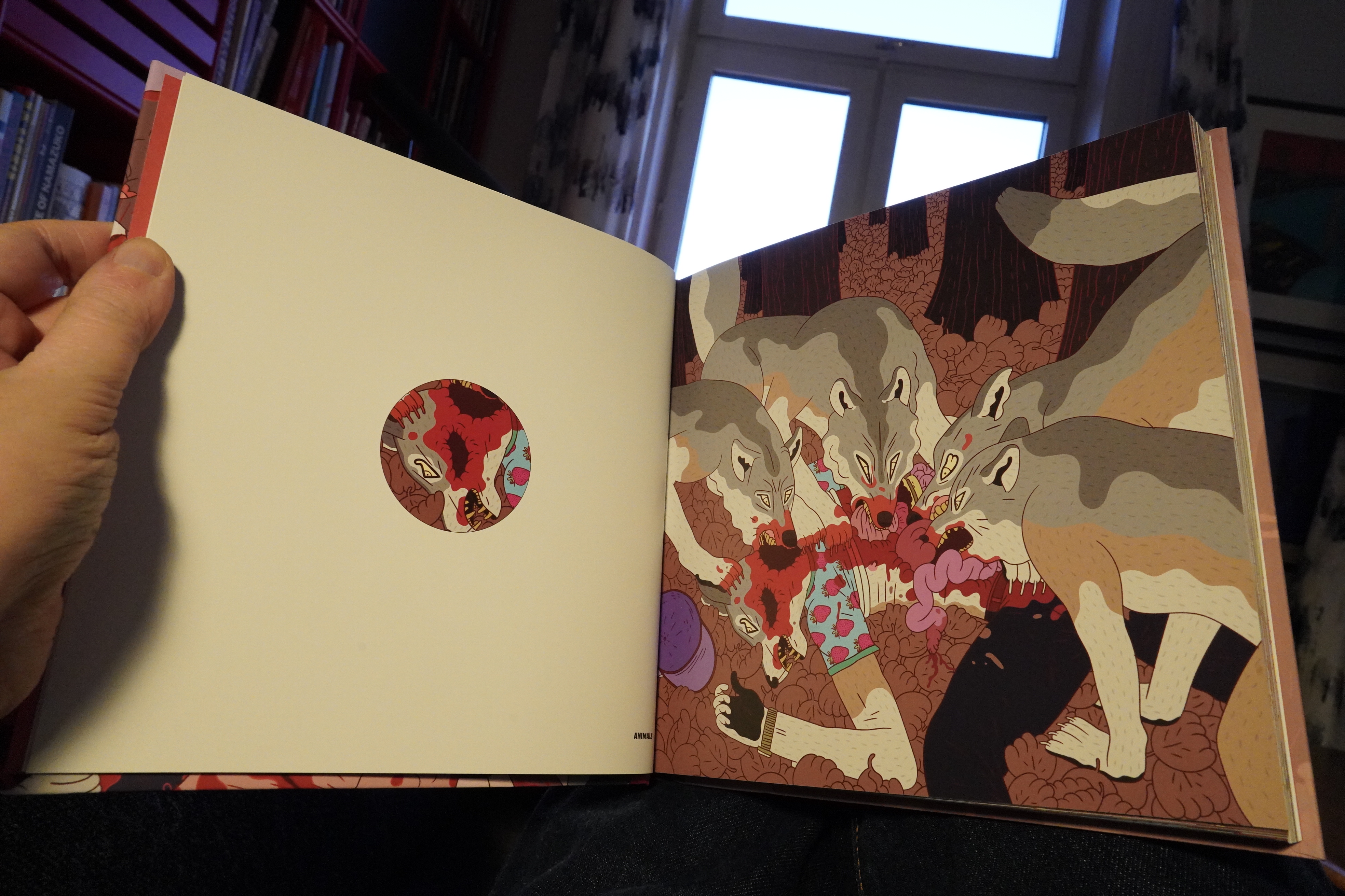
Huh, another comic book about summer camp… I’ve read so many of them by now — it’s one of the Major Subjects of autobio comics. But this time there’s a twist: The author actually liked it at camp! That’s unusual!
As is the artwork: This big-nosed style is pretty unusual to see these days, especially for stuff like this.

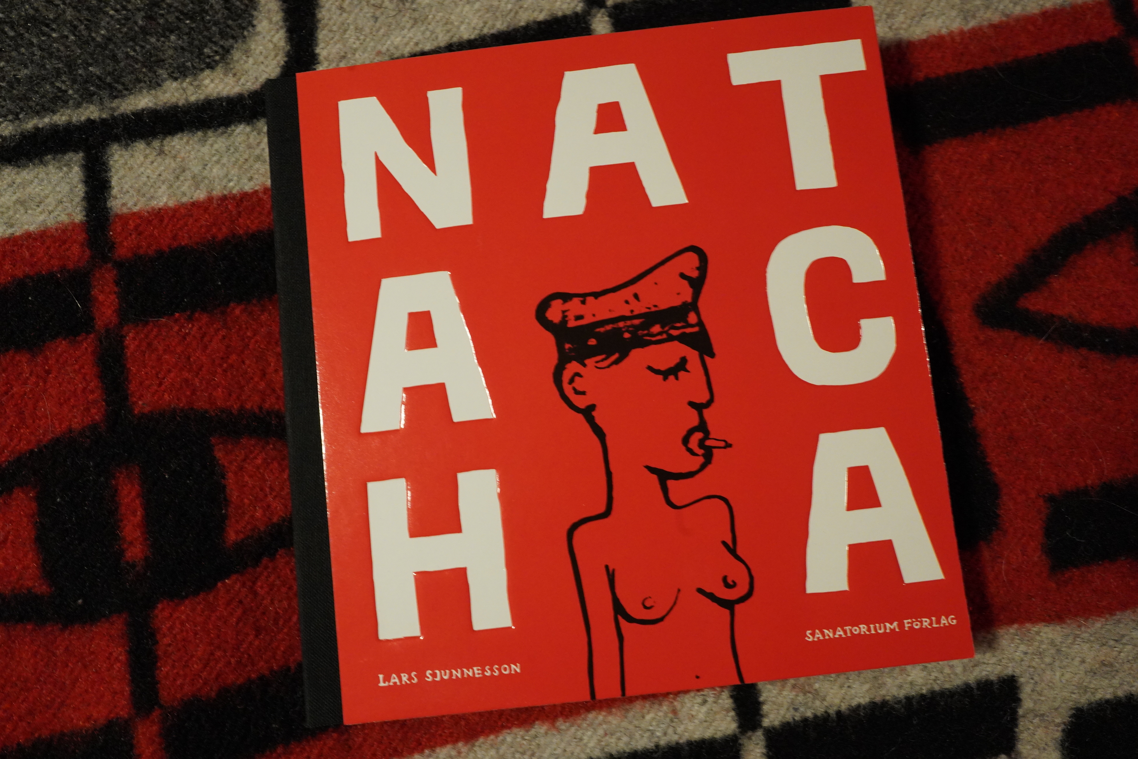
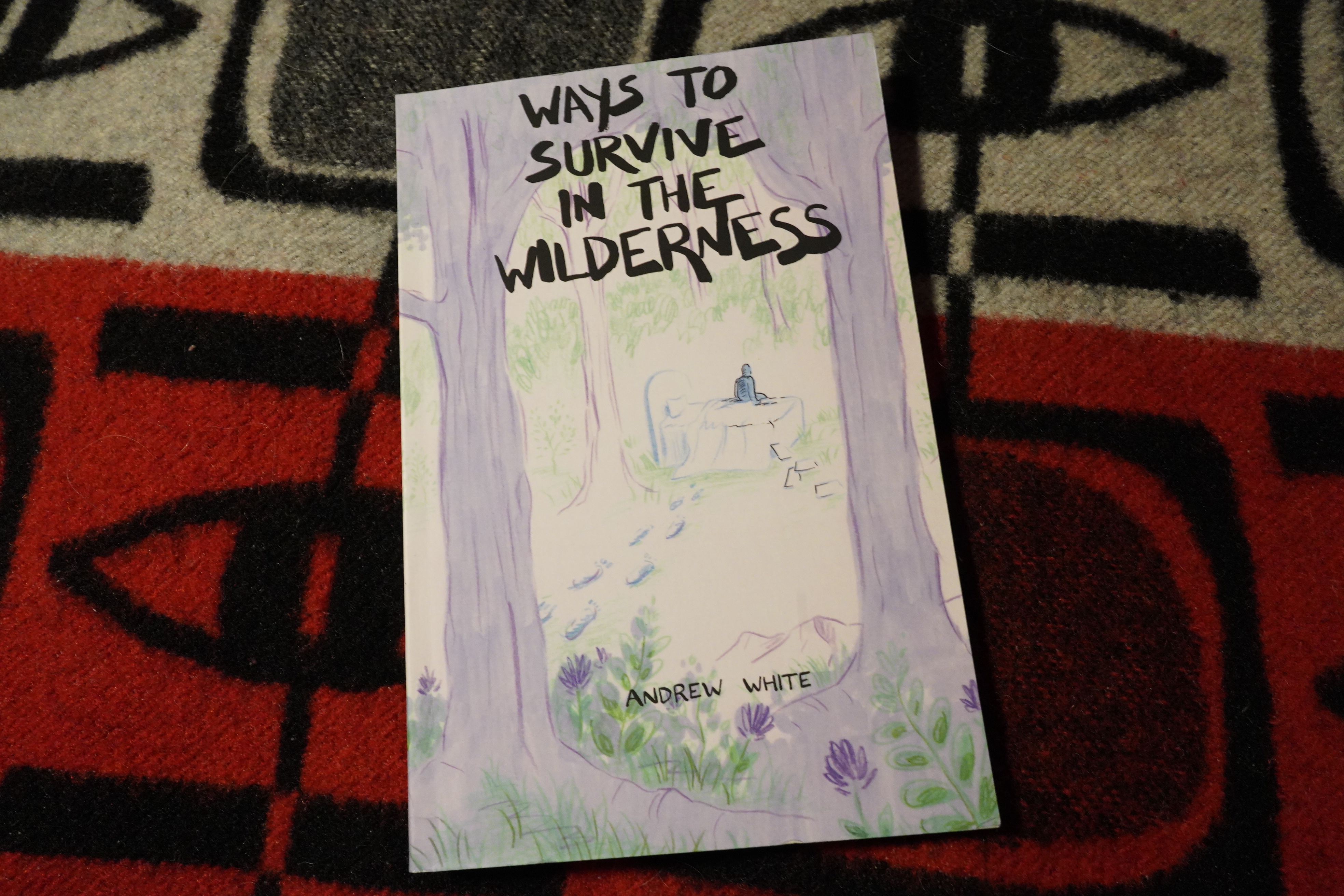
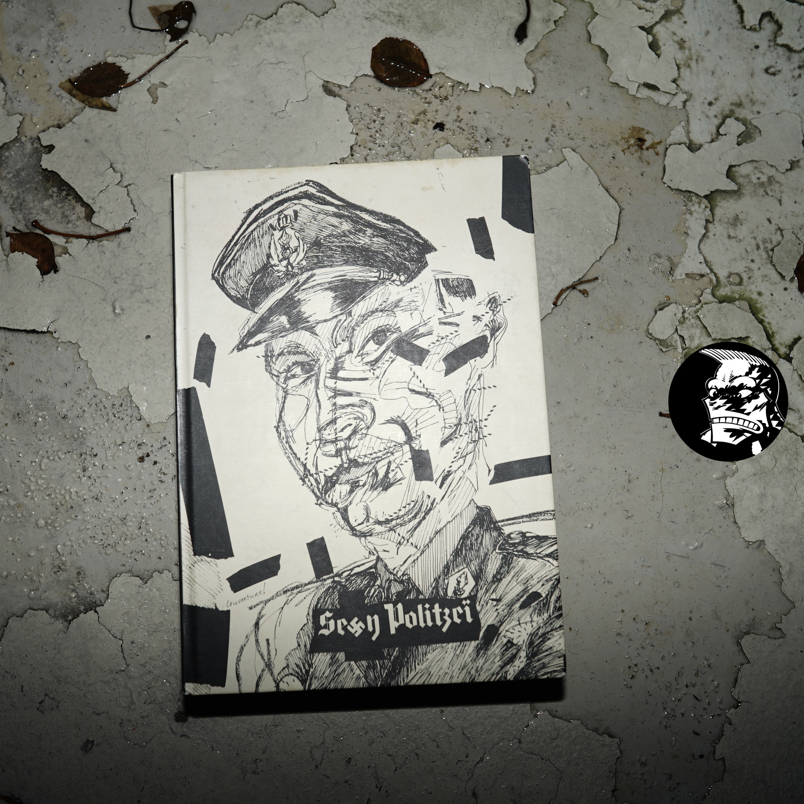
The cover says “this is not a book for kids”, but who is it for?
| Barbara Morgenstern: The Grass is Always Greener |  |
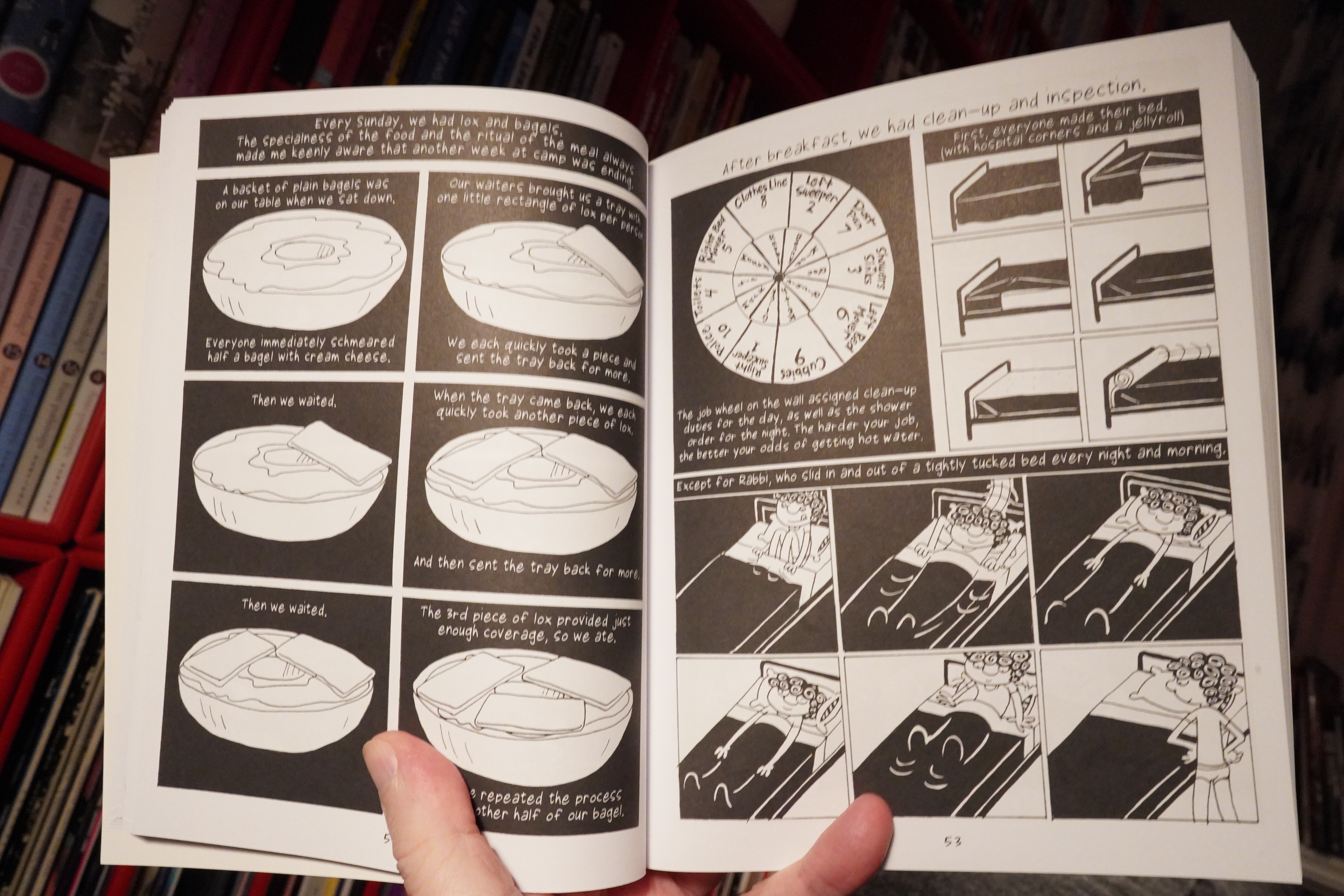
There’s an excessive amount of minutiae here — I think somebody could recreate an entire camp based on this book. But… while sometimes amusing, it’s not very exciting. It’s like reading a blog in book form. OOPS!!! I.e., it’s all navel gazing and 90% is stuff that a sensible editor would go “well, is that interesting for anybody but yourself, though?”
I started skimming after a while… the author is relentlessly pro-camp while describing various batshit hazing rituals and horrifying mishegas of this eight week (!) camp thing. Where did I leave my pearls? I need something to clutch!
| Polmo Polpo: Kiss Me Again and Again |  |

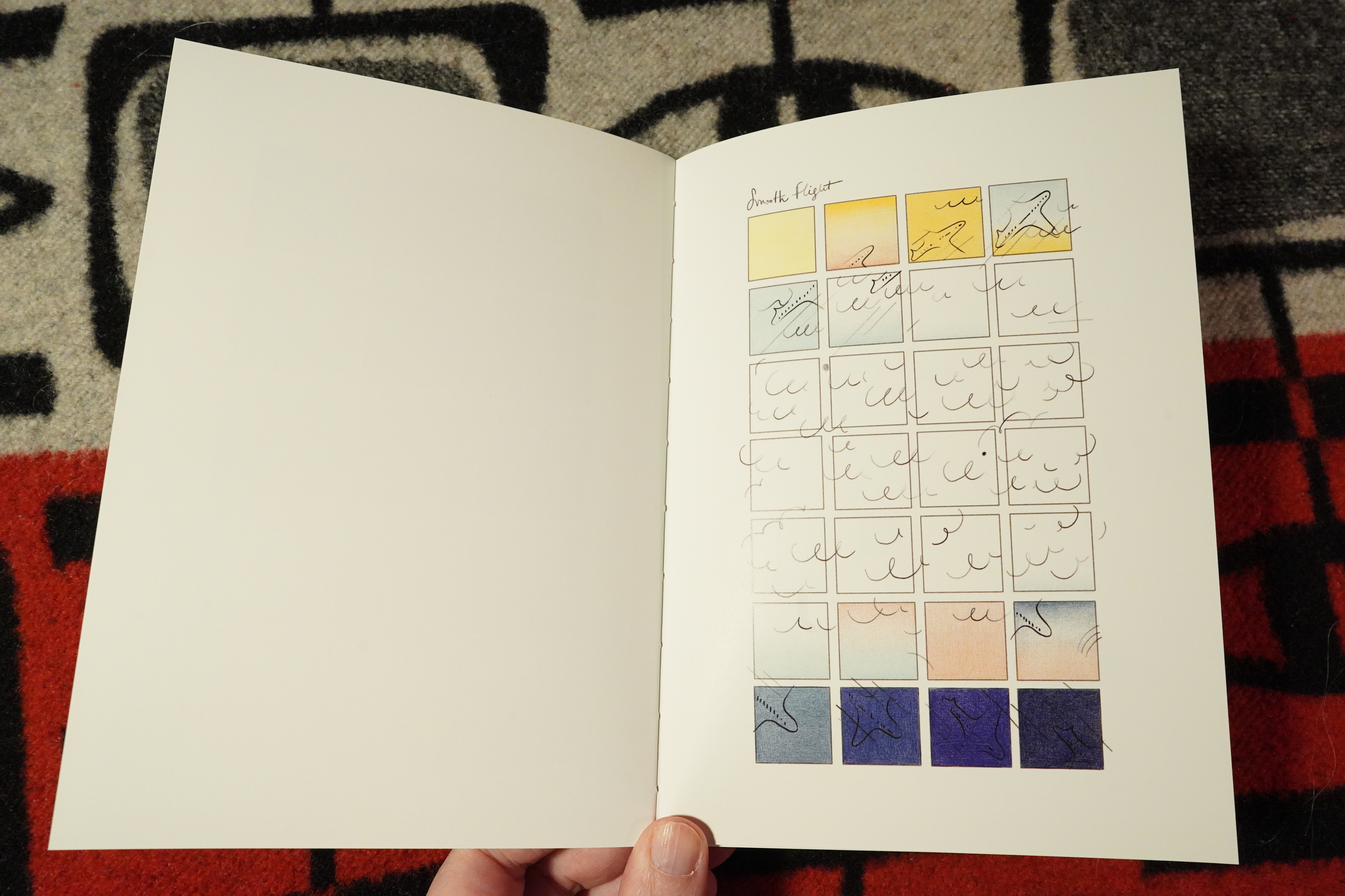
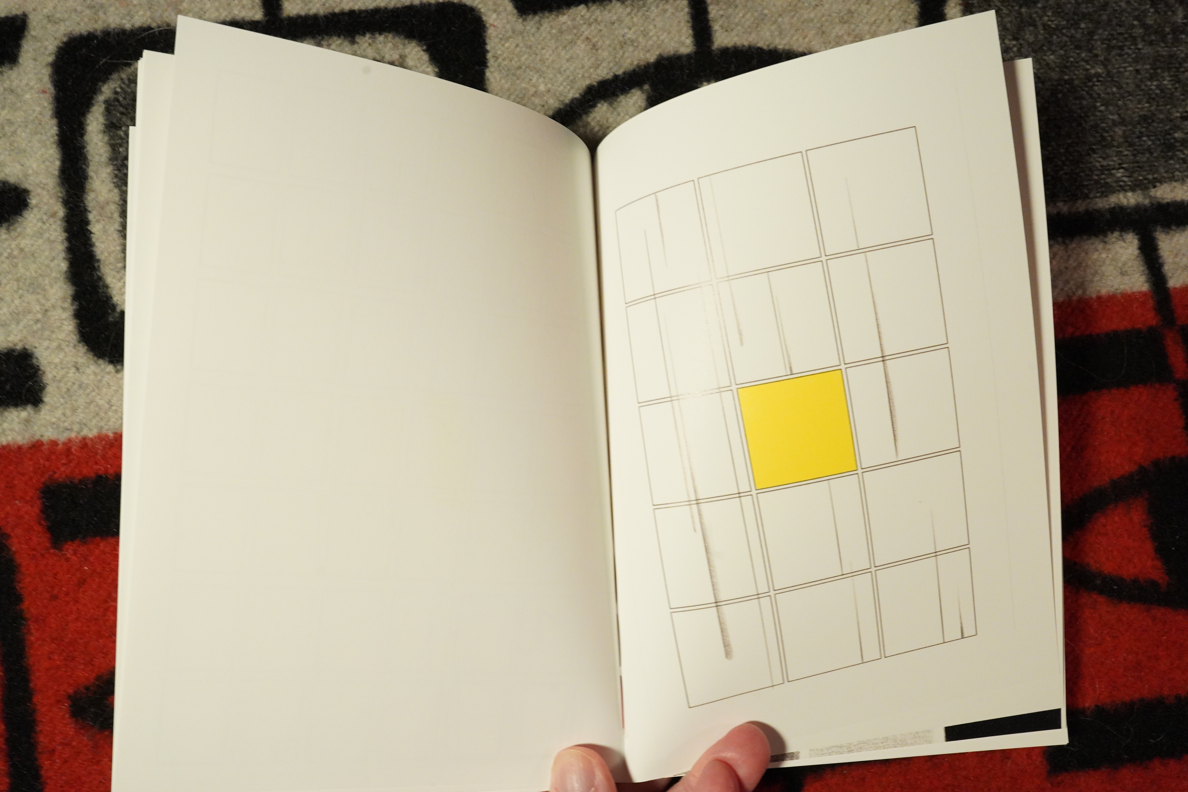
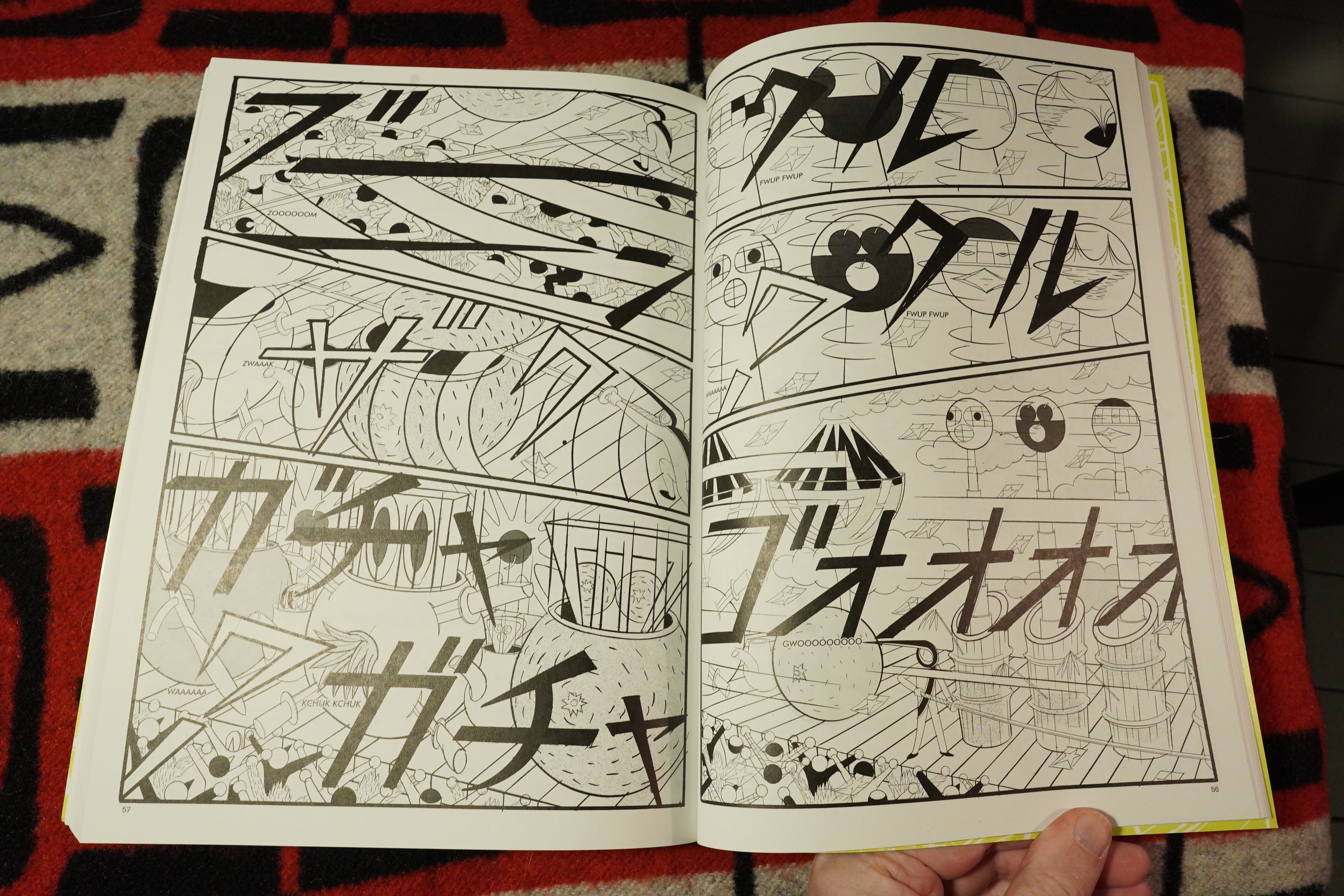
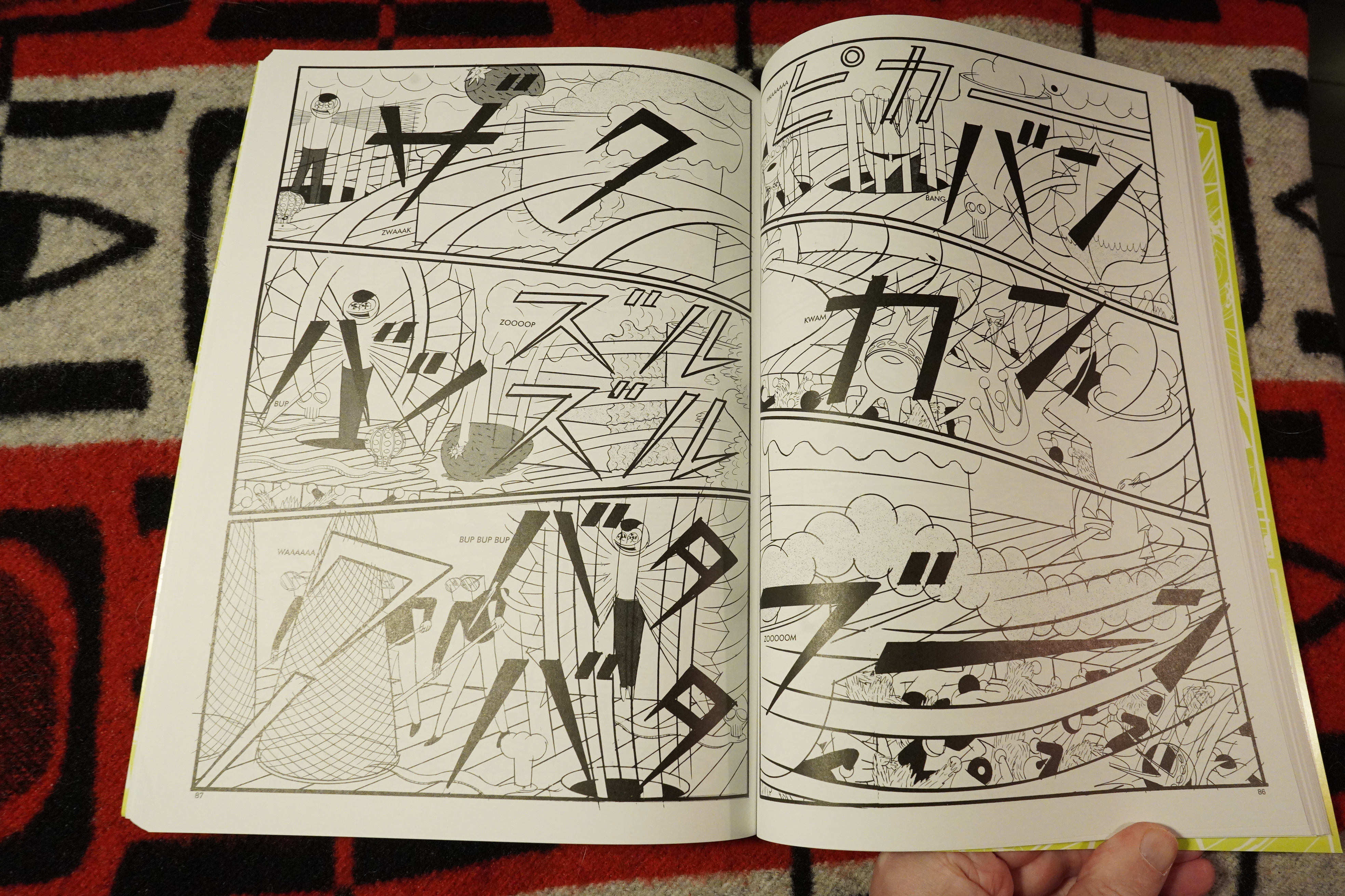
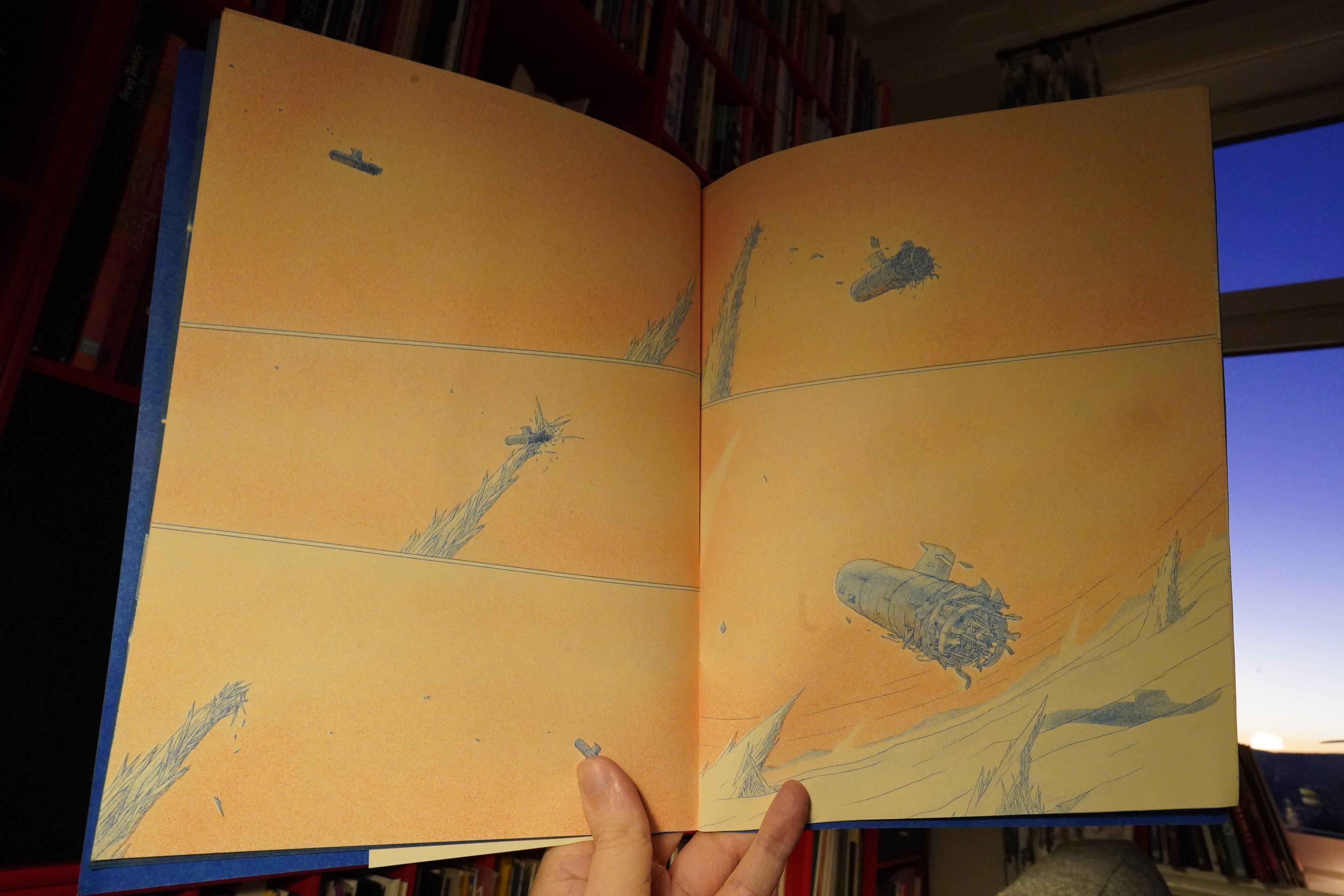
06:44: Baby Boom by Yokoyama Yuichi (Breakdown Press)
*gasp* We had a new Yokoyama book just a couple months ago, and now there’s another one? It cannot be!
This is from the Desert Island Mystery Mail this month. *slow clap*
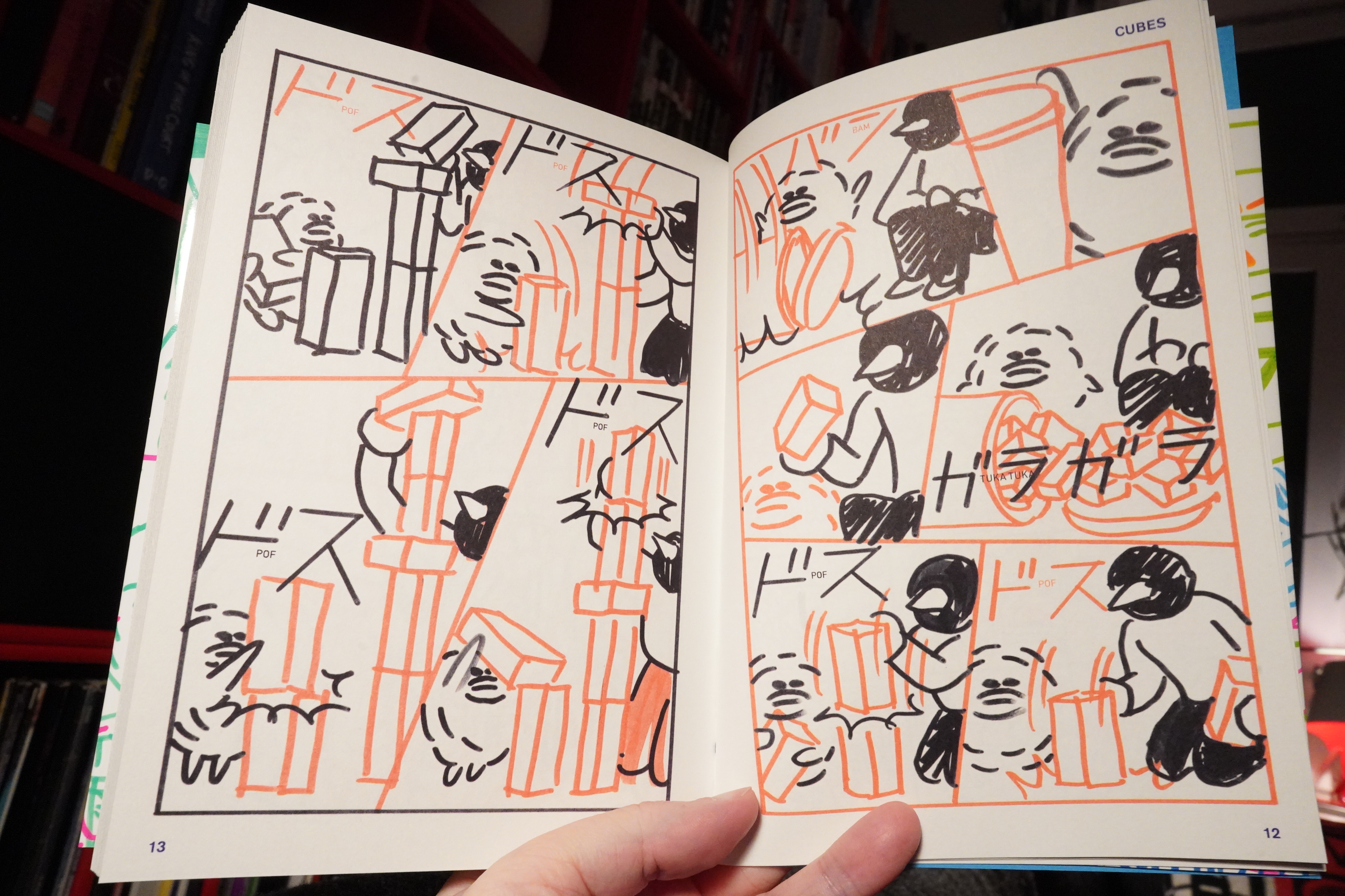
This is very different from Yokoyama’s previous books — he’s usually super meticulous, inhumanly precise (and in black and white). This is more like sketchbook drawings. But still gorgeous.

And the stories are different, too. I mean, in his other books, it’s sometimes pretty obscure what the stories are a lot of the time, beyond propulsion — here it’s mostly very straighforward. Here, for instance, we have the two characters (an adult and a kid, I think) cleaning the apt.
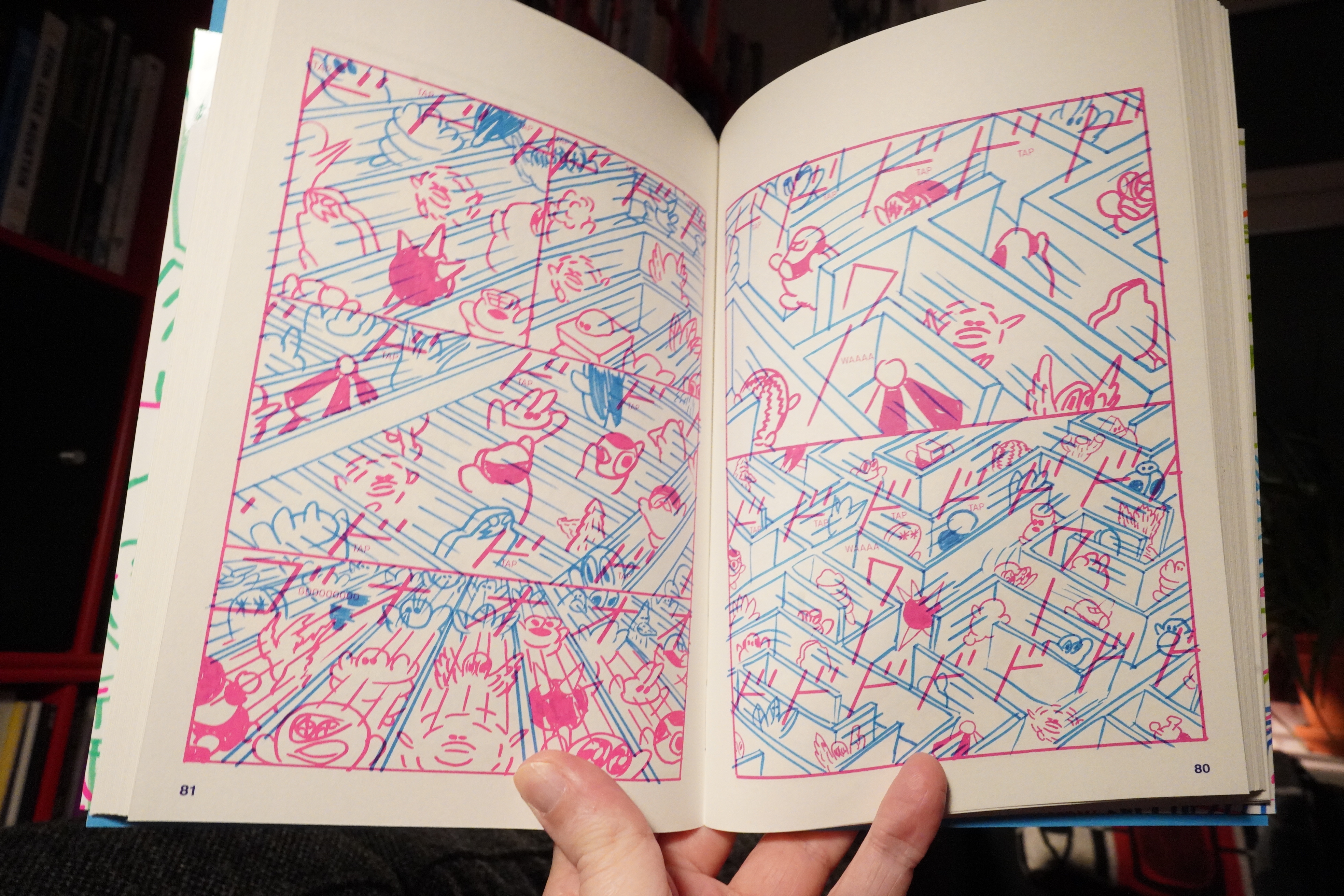
A couple of the pieces are more like (say) Garden — where we get an enormous number of characters dushing around in odd landscaped.
It’s a really cool book, as always, although I can understand that this wouldn’t be the first book to show to somebody new to Yokoyama. It’s more accessible in some ways, but it’s also even more overwhelming in other ways.
Fantastic book.
| Coil: Black Antlers | 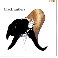 |

07:34: Sunk a Dink #1 by Max Huffman
Also from the Desert Island package…
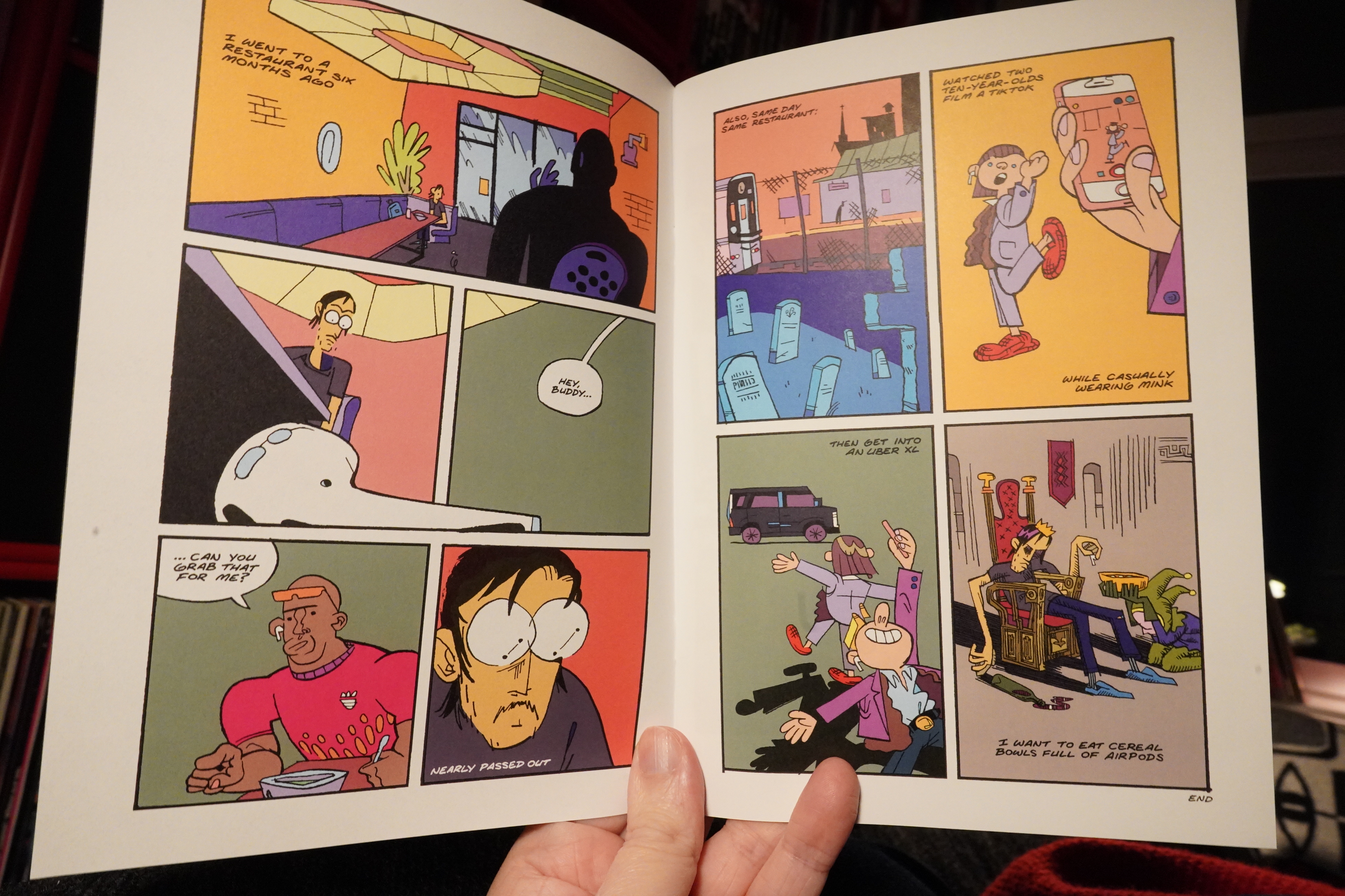
This is a collection of odds and ends mostly published before in various venues?
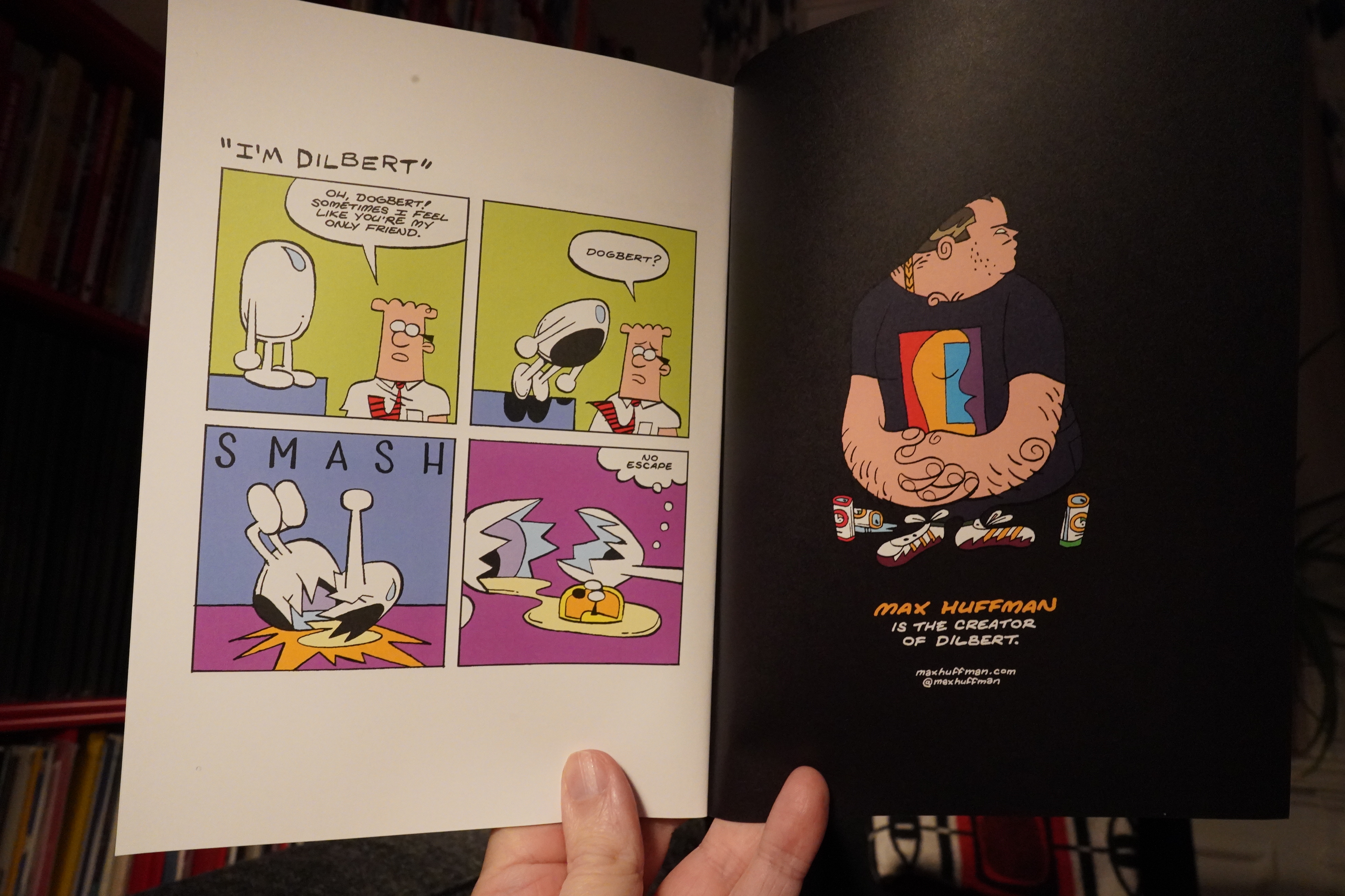
It’s very funny.
| Coil: Black Antlers |  |
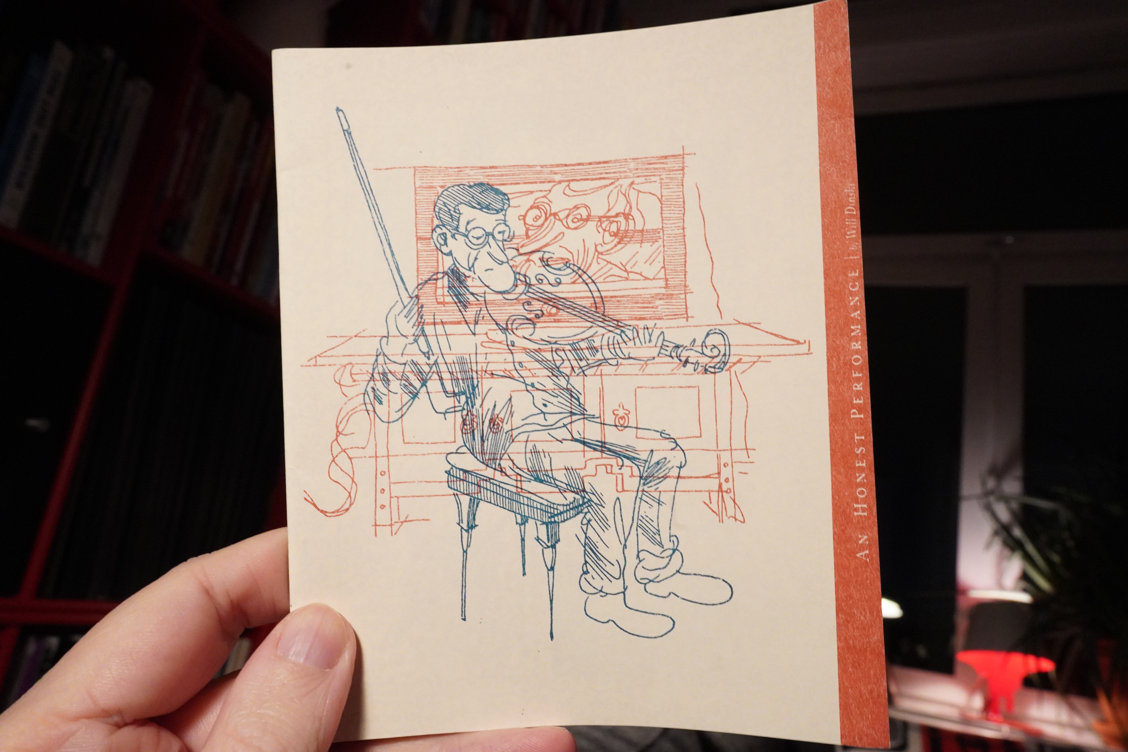
07:40: An Honest Performance by Will Dinski (2d cloud)
2d cloud is back! Most important news of the year! They’ve got four new books out later this year, and I also picked up this little thing that I’ve missed when shopping before, I think…
It’s absolutely wonderful.
| Coil: Black Antlers |  |
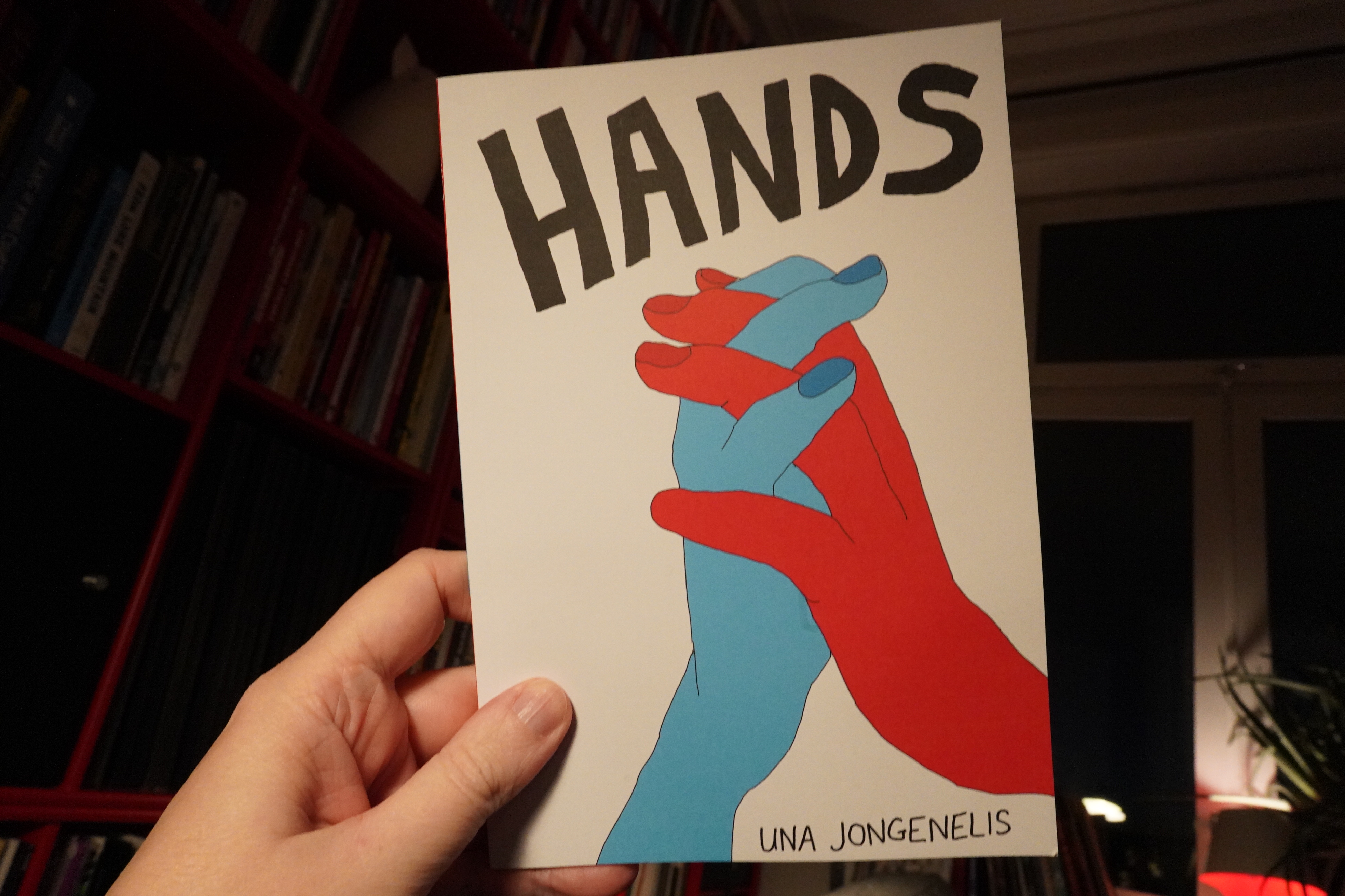
07:45: Hands by Una Jongenelis

I’ve been shopping from the web shop and got this lovely little book…
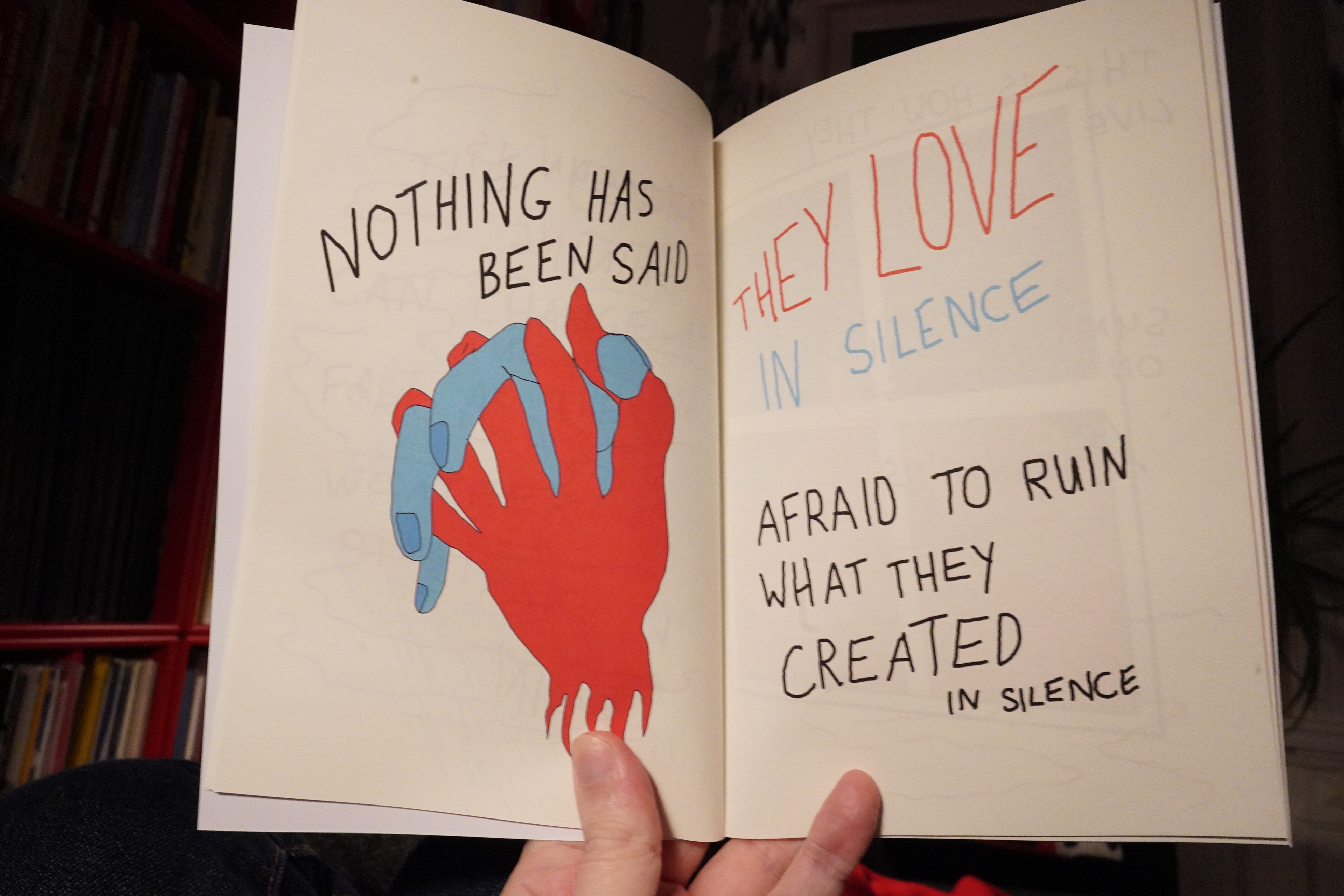
It’s about love and stuff.
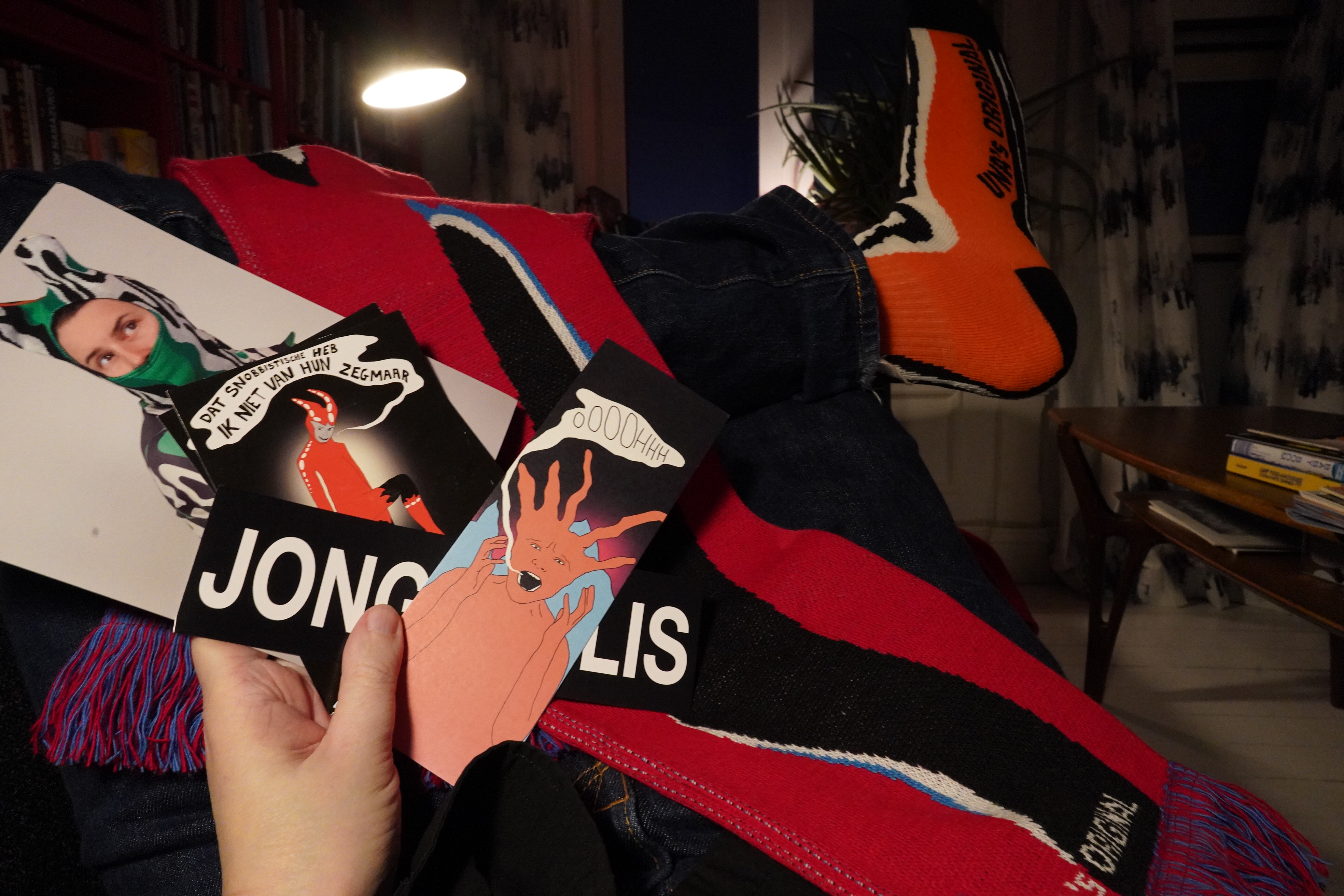
But I also got socks, a scarf and lots of other bits and bobs were included in the package. Class!
| Wildbirds & Peacedrums: Retina |  |
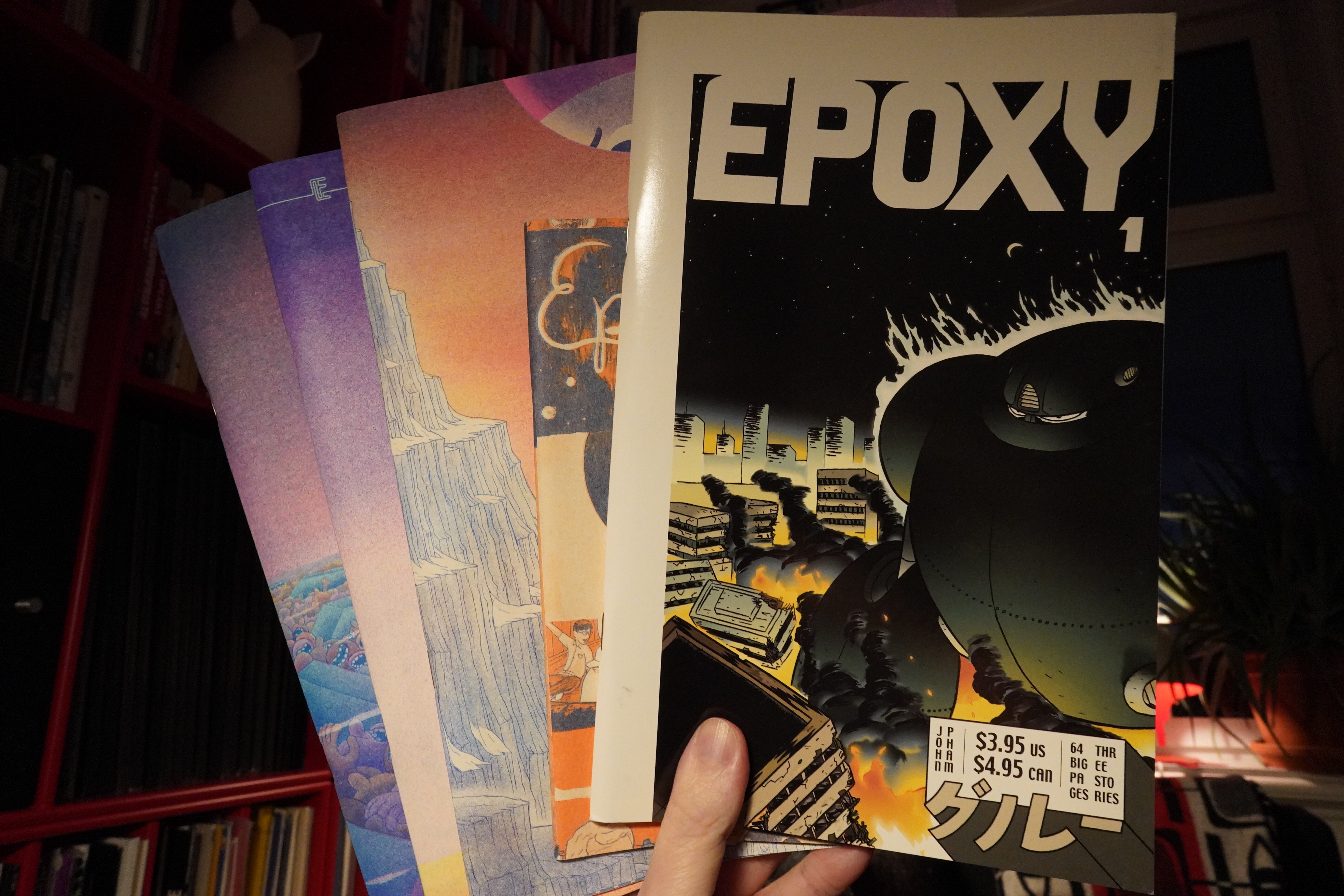
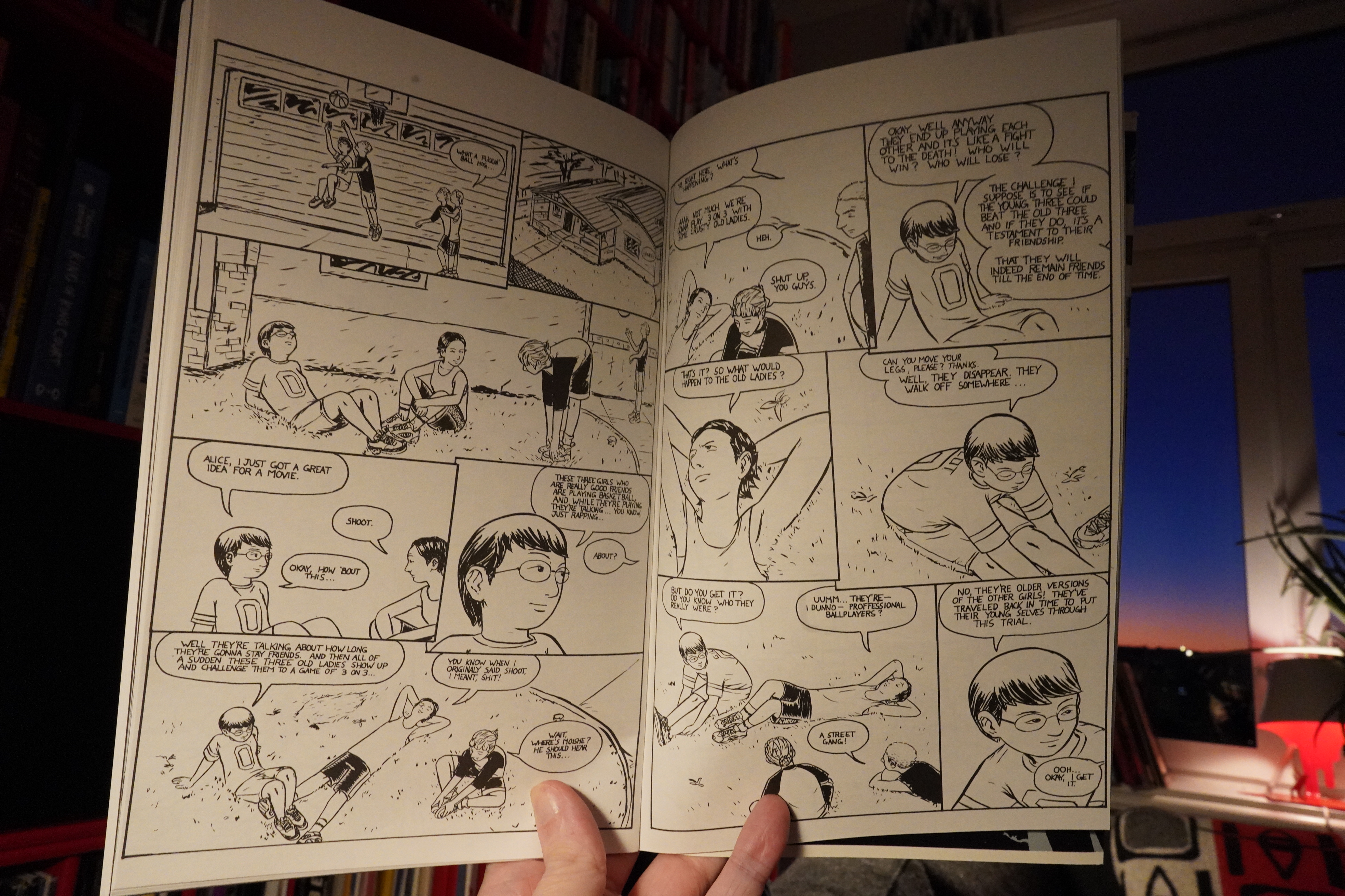
07:58: Epoxy by John Pham
I’ve got #1, #2, #4 and #6 here, and then there’s one I can’t find an issue number in, so I’m missing one issue? Darn!

The first issue is traditionally printed, and is from all the way back in 2000.
This must be where Brian Vaughan got the idea for Paper Girls from?
Anyway, it’s a nice book — it’s three somewhat enigmatic vignettes. I’m not altogether convinced that Pham just ran out of story a couple of times, and that’s why they end kinda abruptly…
Oh! The second issue continues two of the storylines from the first issue. I didn’t expect that, for some reason.
Anyway, the second issue is in a smaller format and… is it riso? I mean, I guess it has to be, but it looks quite odd for riso printing…
The second issue is stronger than the first, and the boxing storyline gets really tense.
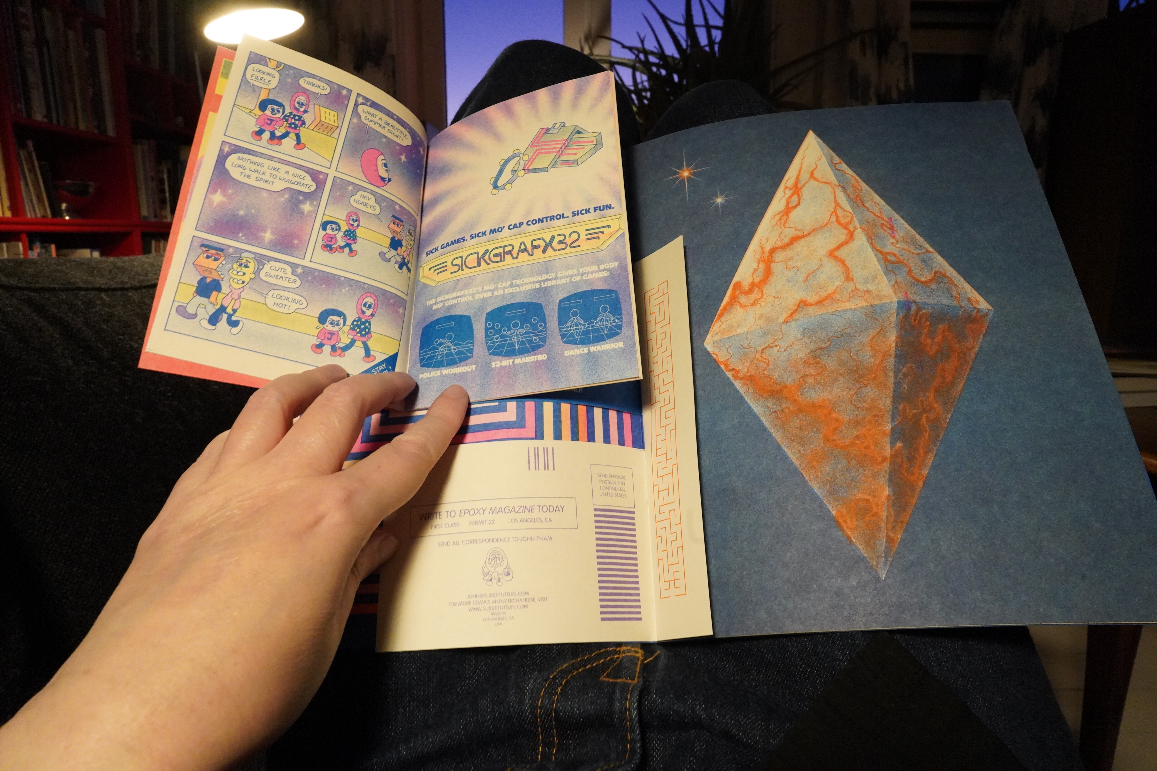
I think I’m missing the third issue? Boo! I wanna find out what happened to that boxer guy… anyway, the fourth issue is riso for sure, and has a little booklet and postcards and puzzles and stuff included.
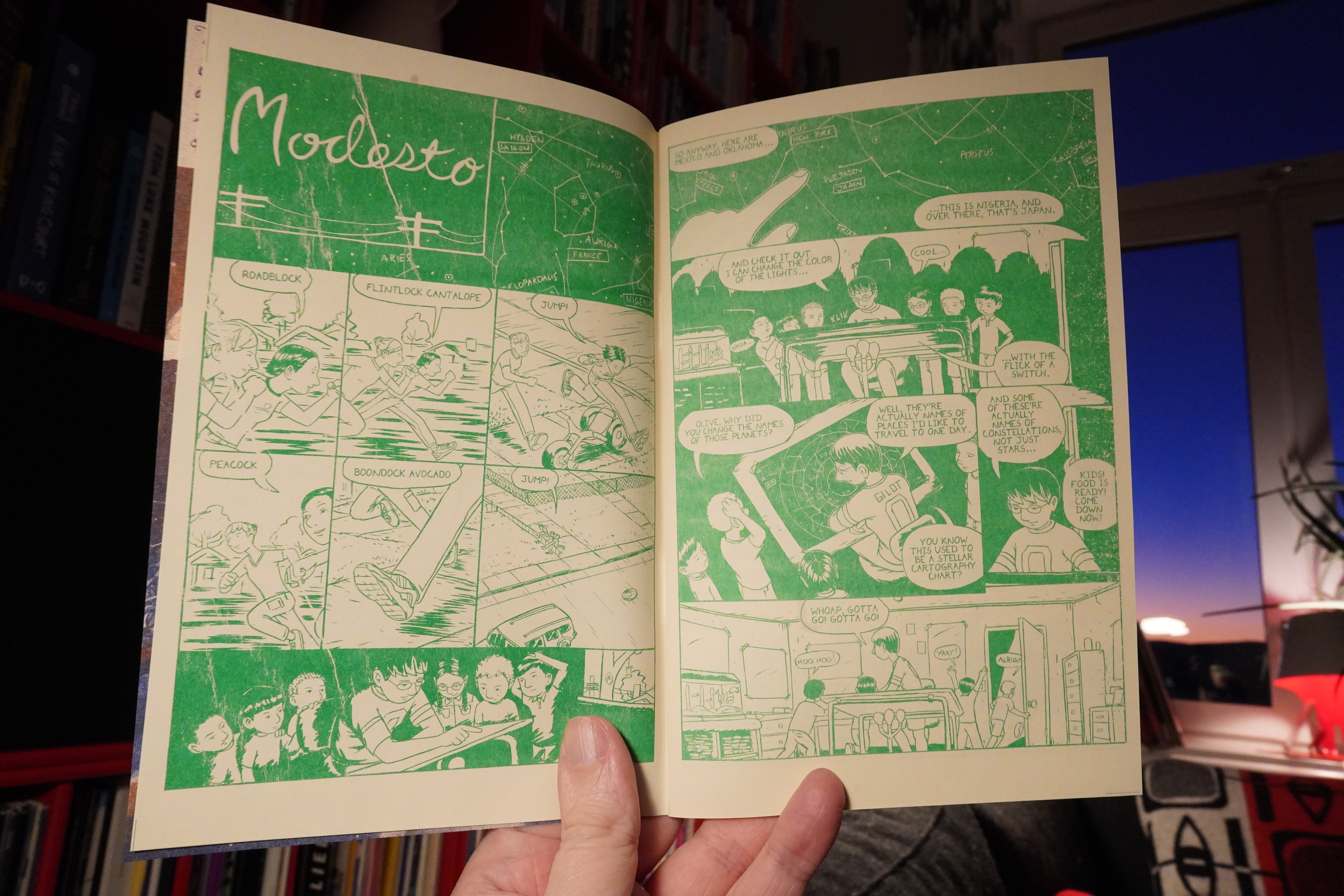
And Pham’s art style has changed completely, as well as his subject matter. There’s no publication date anywhere that I can find, but I’m guessing this is a lot later than the first two issues?

It’s like a fractal of booklets and stuff. This must have been so much work to put together…
The Jay & Kay booklet this time around (about gloompires) is a lot of fun. I think I’ve read all that stuff before, though — there was a collected edition recently, I think?
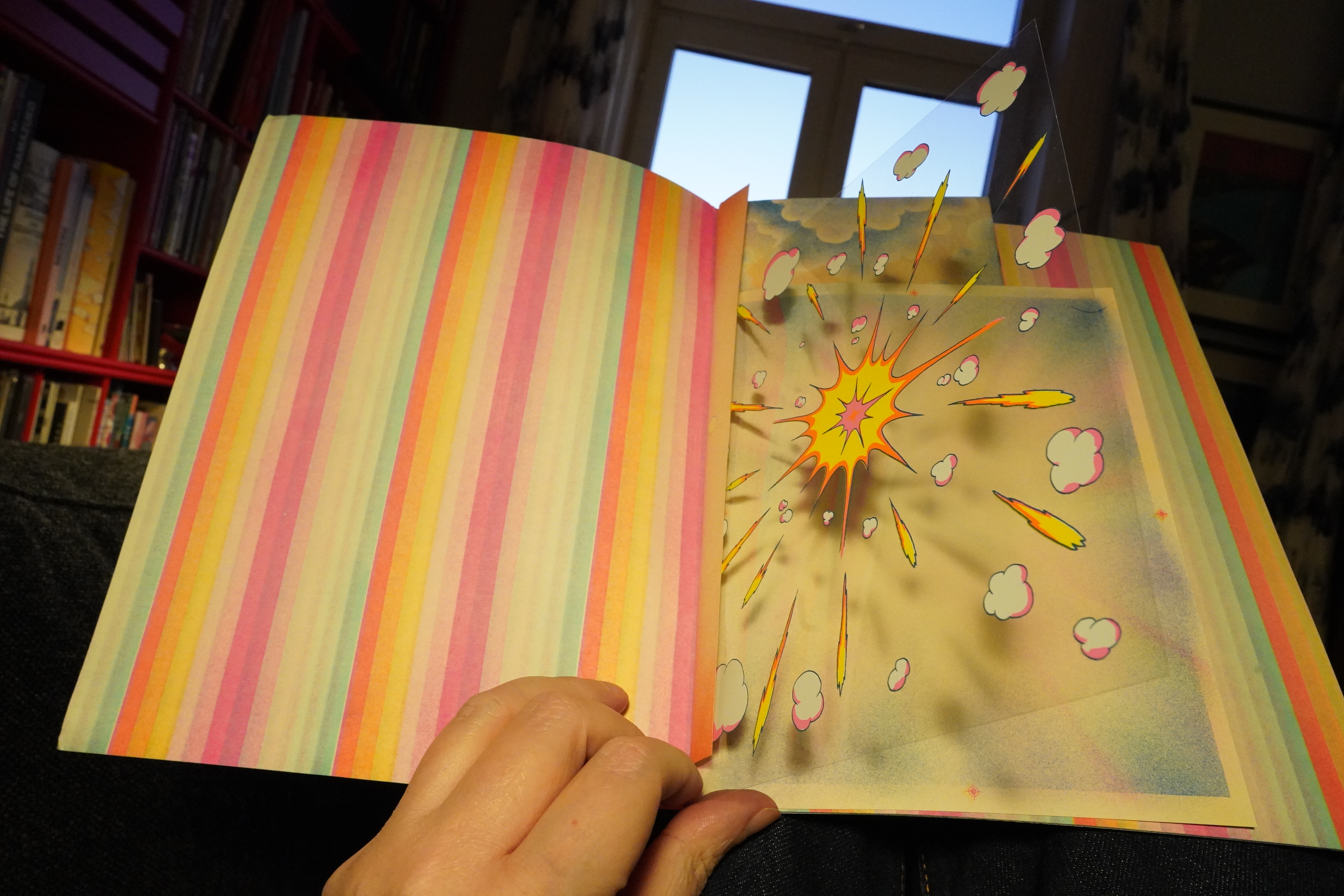
Heh, the sixth issue even includes a cel…
Hm, perhaps what I thought was the fifth issue was really the third and I’m missing the fifth instead?
Anyway, these books are a thrill to read. The obsessive intricate physical formats paired with funny/moving/wistful stories (and attractive, unique artwork) makes these books lovable objects.
| Gang Gang Dance: Eye Contact |  |
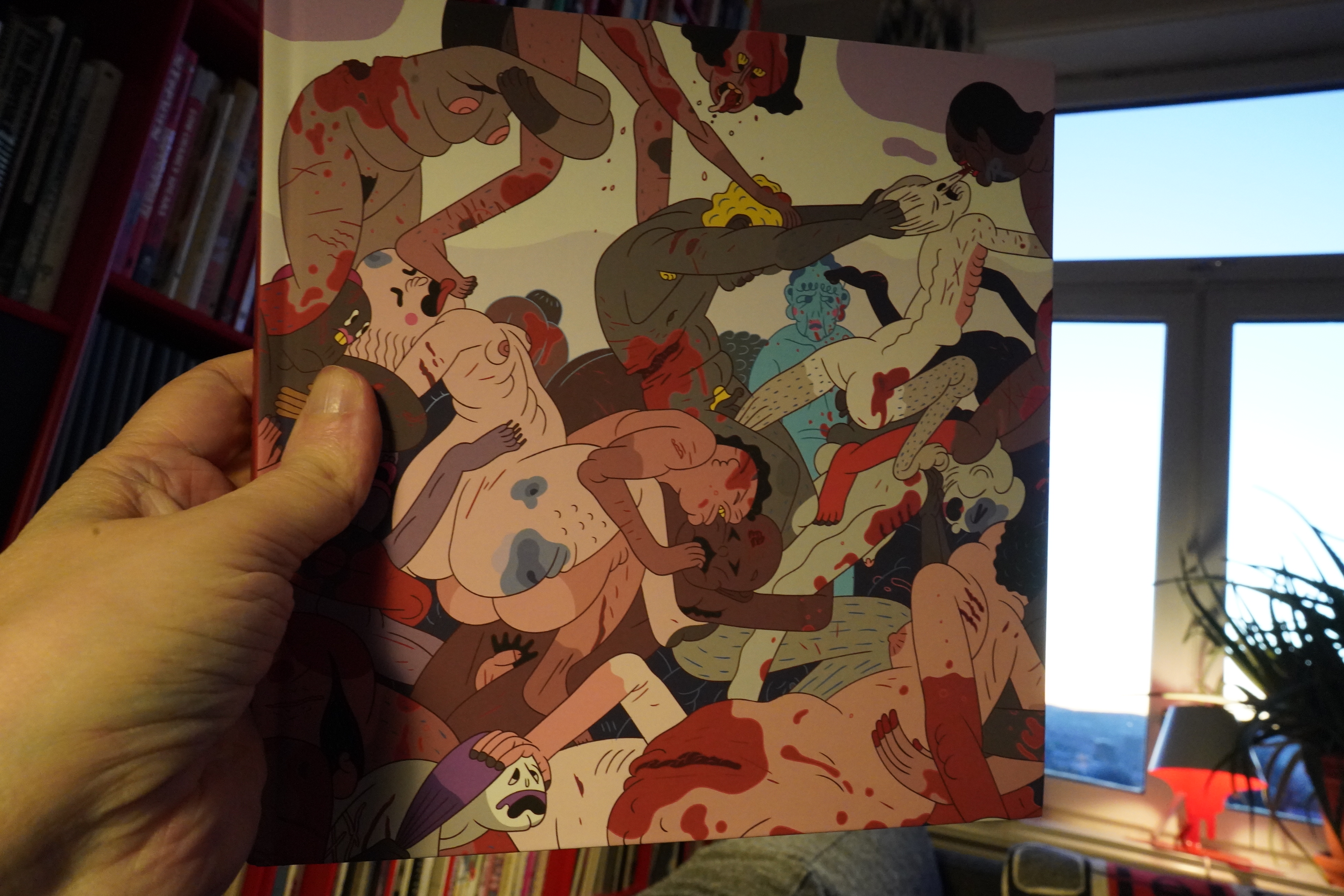
09:05: Family Fun by Jesse Simpson (Mansion Press)
Anyway, I got the Exposies from Mansion Press, along with a number of random books…
Such transgressive.
There’s some comics towards the end of this book, but it’s mostly one atrocity after another (with some interspersed sex bits).
It’s kinda dull.
| Bob Hund: Stumfilm |  |
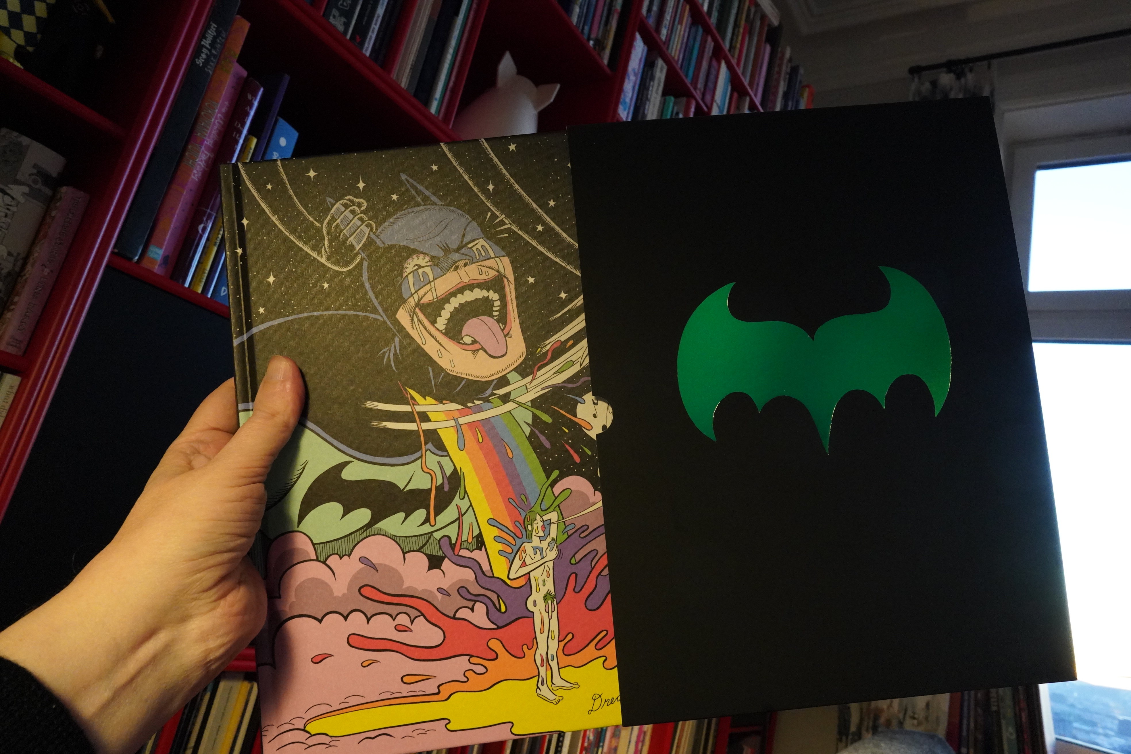
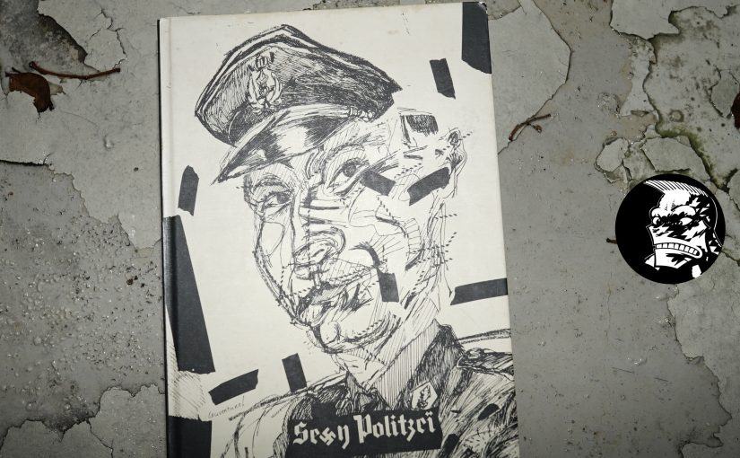
09:15: Dream of the Bat by Josh Simmons & Patrick Keck (Mansion Press)
There’s been rumours about this thing for decades, it seems like, but the collected edition finally here… a very non-licensed version of Batman, if I understand things correctly.

Such transgressive.
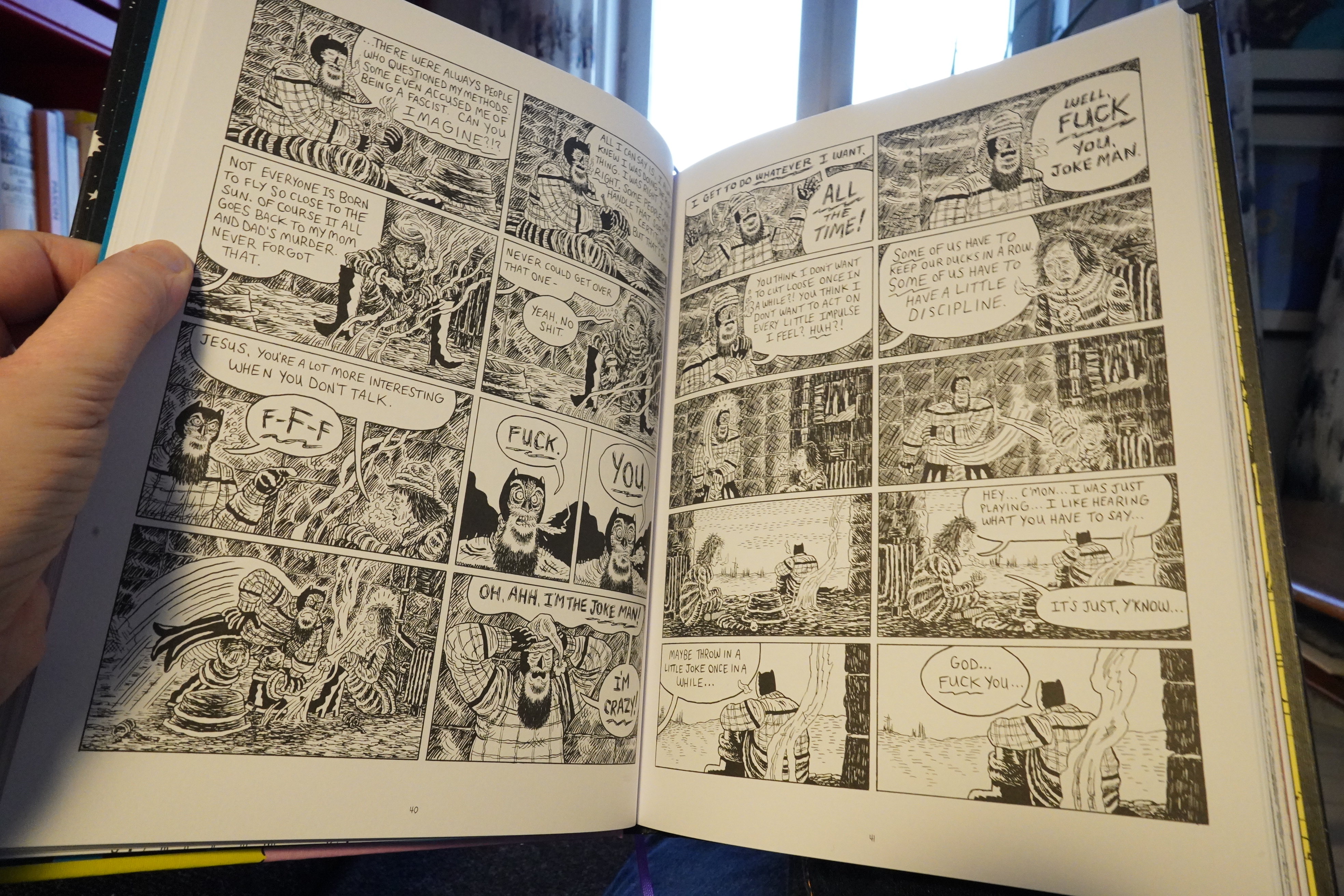
It’s a surprisingly substantial book. But… it’s like… it basically just a standard Batman book. You can’t even say that it has more torture than normal, these days — didn’t The Joker spend several years with somebody elses face stitched to his own or something?
So it’s… eh.
| Boris with Michio Kurihara: Rainbow |  |

09:51: Om by Andy Barron (Mansion Press)
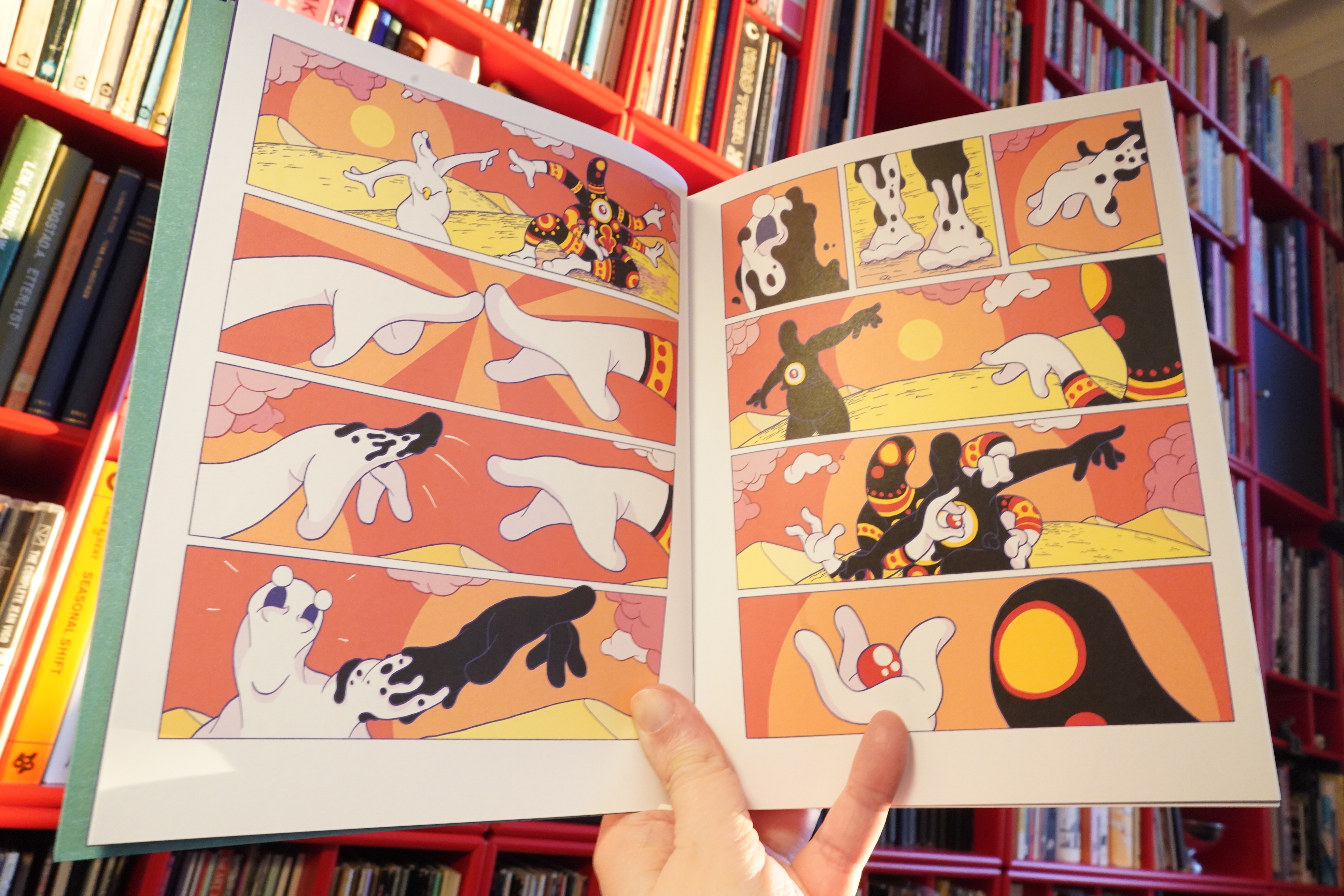
This is… like… spiritual and stuff? These are wordless stories about the cycle of life and er enlightenment and I don’t know what.
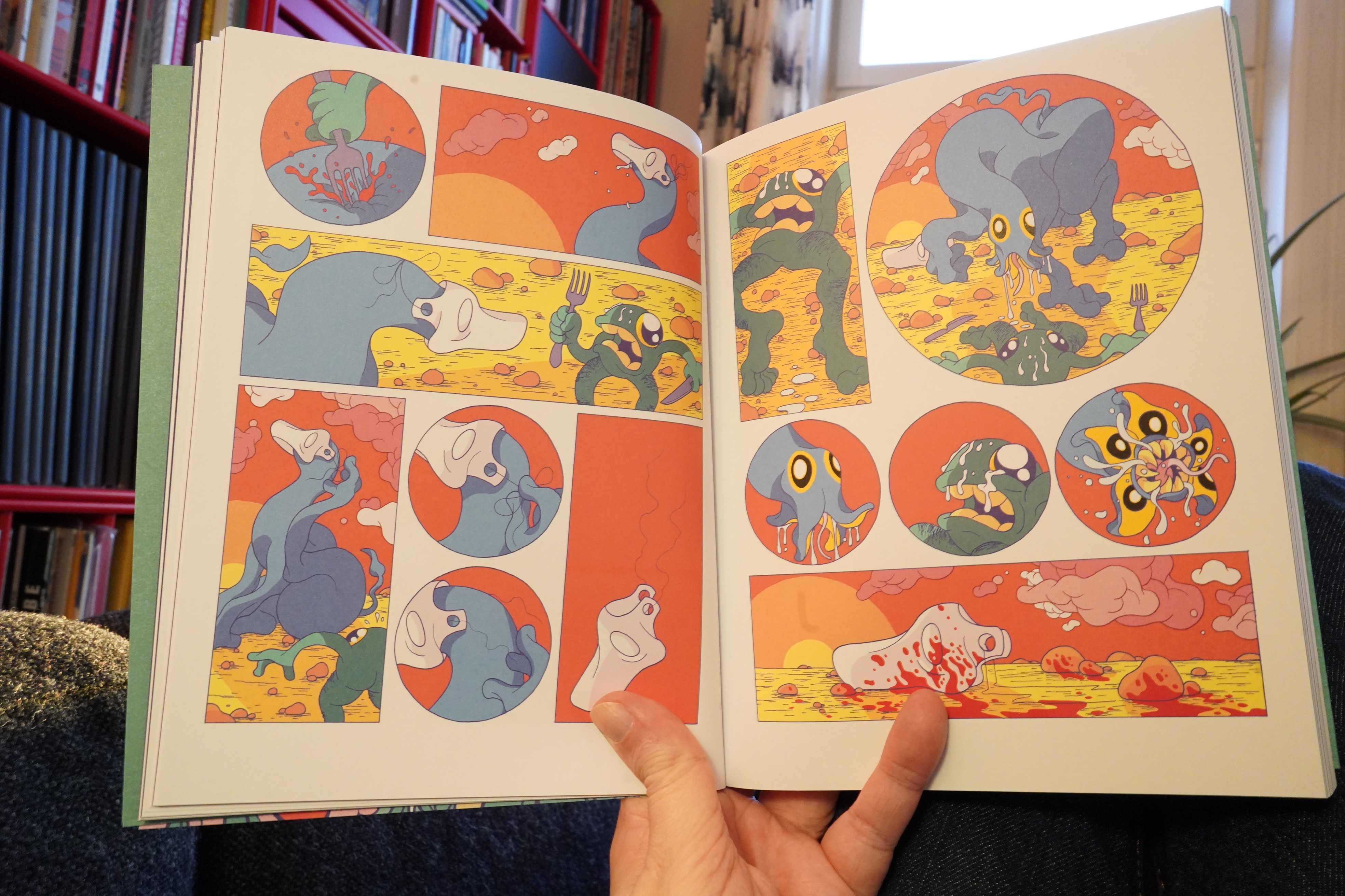
But, since it’s Mansion Press: Such transgressive.
This is totally not my kind of thing, and one vignette after another like this is… OK, I ditched the book halfway through.
And, oops, I really do have some errands to run, so I have to cut this Daze short. *pout*


)

)
%3A+Get+Back%3A+Apple+Sessions)


%3A+Sessions+2)