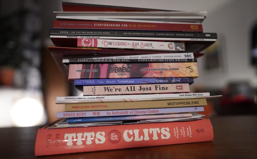
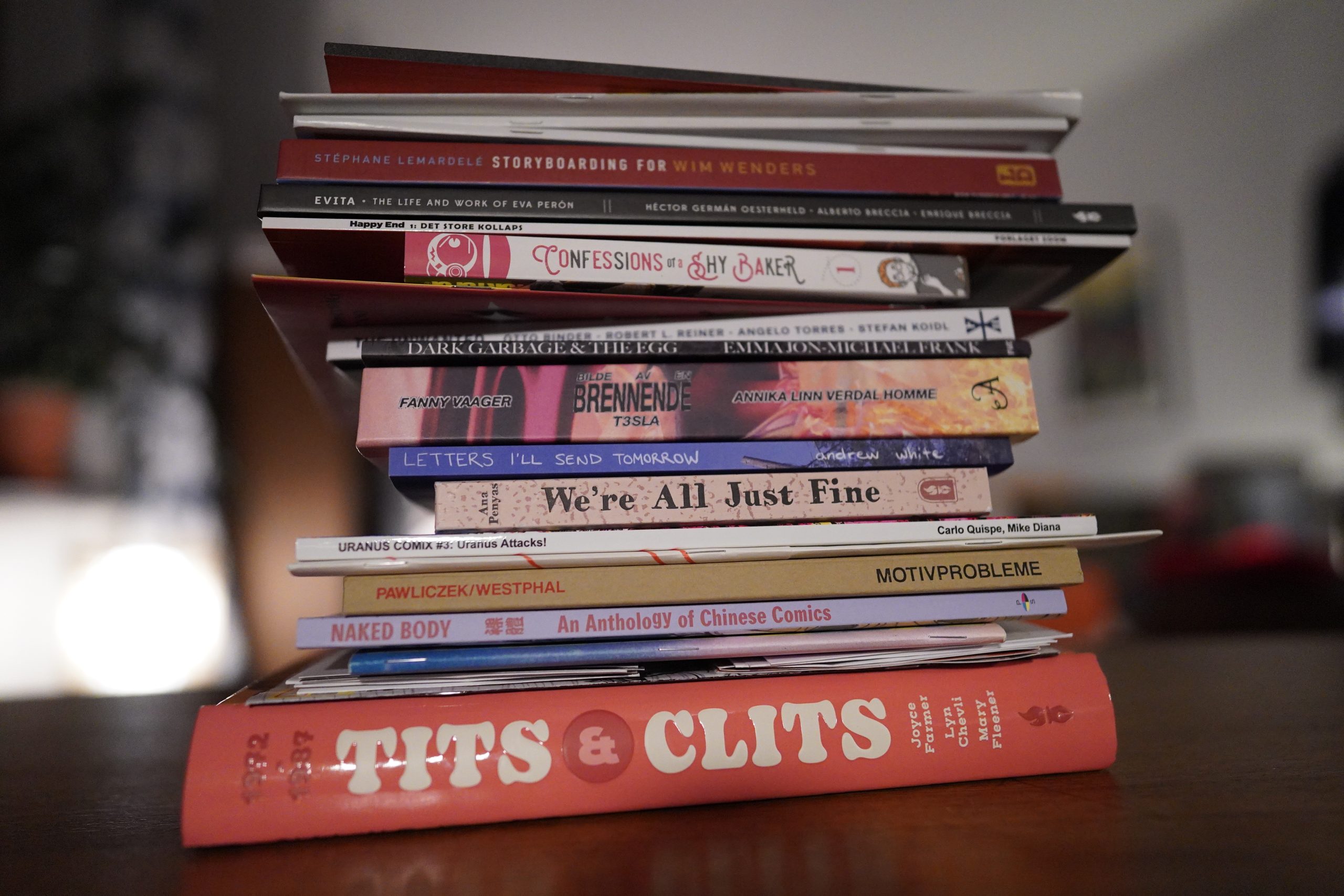
It’s another lovely day, and I’m still stuck here on the couch with my twisted ankle, so let’s do some comics reading. (But I may have to take a nap in the middle because I had The Worst Night of Sleep Ever, for no reason at all.)
Today’s musical accompaniment will be… random new-ish stuff.
| Rachel Grimes, Angélica Negrón, Shara Nova, Caroline Shaw, Sarah Kirkland Snider: The Blue Hour |  |
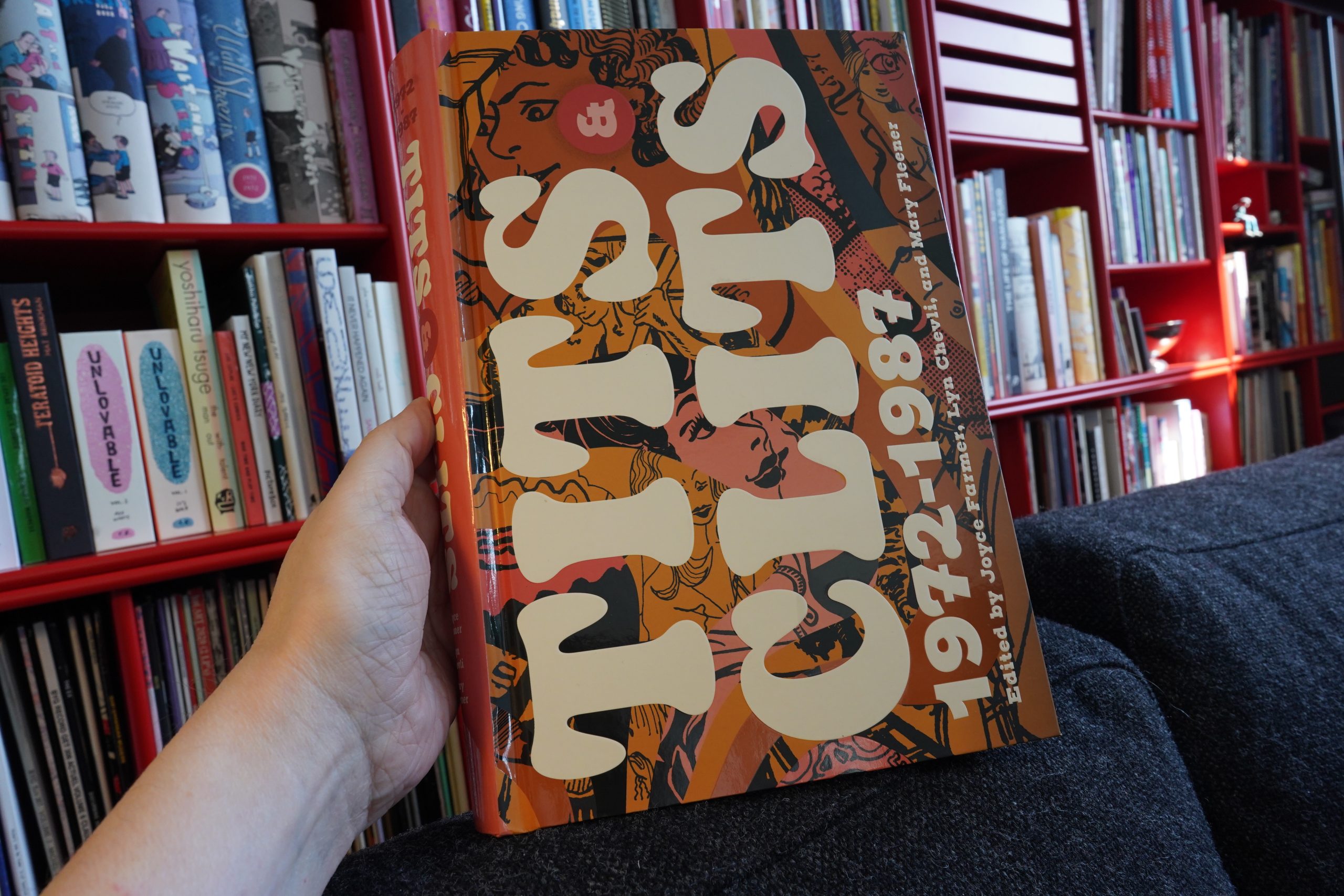
12:52: Tits & Clits edited by Joyce Farmer / Lyn Chevli / Mary Fleener (Fantagraphics)
I read most of this book yesterday — I just have the last comic included in this to go (Abortion Eve). I’ve got almost all of the single issues already, but I’m a sucker for these anthology collections — it’s something of a trend the last few years, right? Wimmen’s Comix, Zap… And I love it — I really enjoy reading pieces in their original contexts.
But I have one question about this one, and perhaps somebody out there has the dish: Why are certain pieces missing?
I guess some people might just have refused to be included (perhaps because of grievances with Fantagraphics? Or the editors? Or perhaps because they Just Don’t Wanna)? Melinda Gebbie’s piece is missing, and a thing drawn by Leslie Sternbergh (written by Brabner).
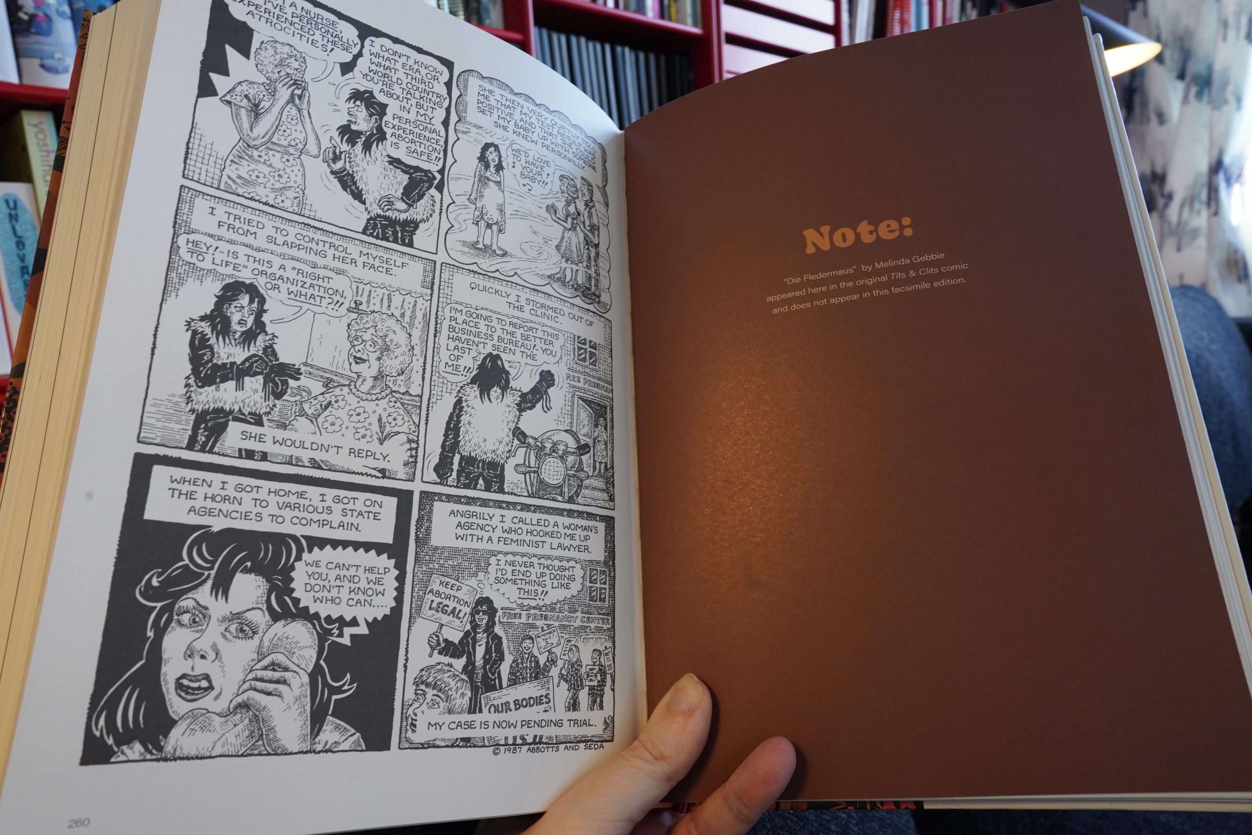
Most mysterious of all is a piece by Dot Butcher — because several other pieces by Butcher are included. So I wondered — were the pieces excised because of content? So I dug out my Last Gasp long box, and… the pieces seem totally inoffensive to me.
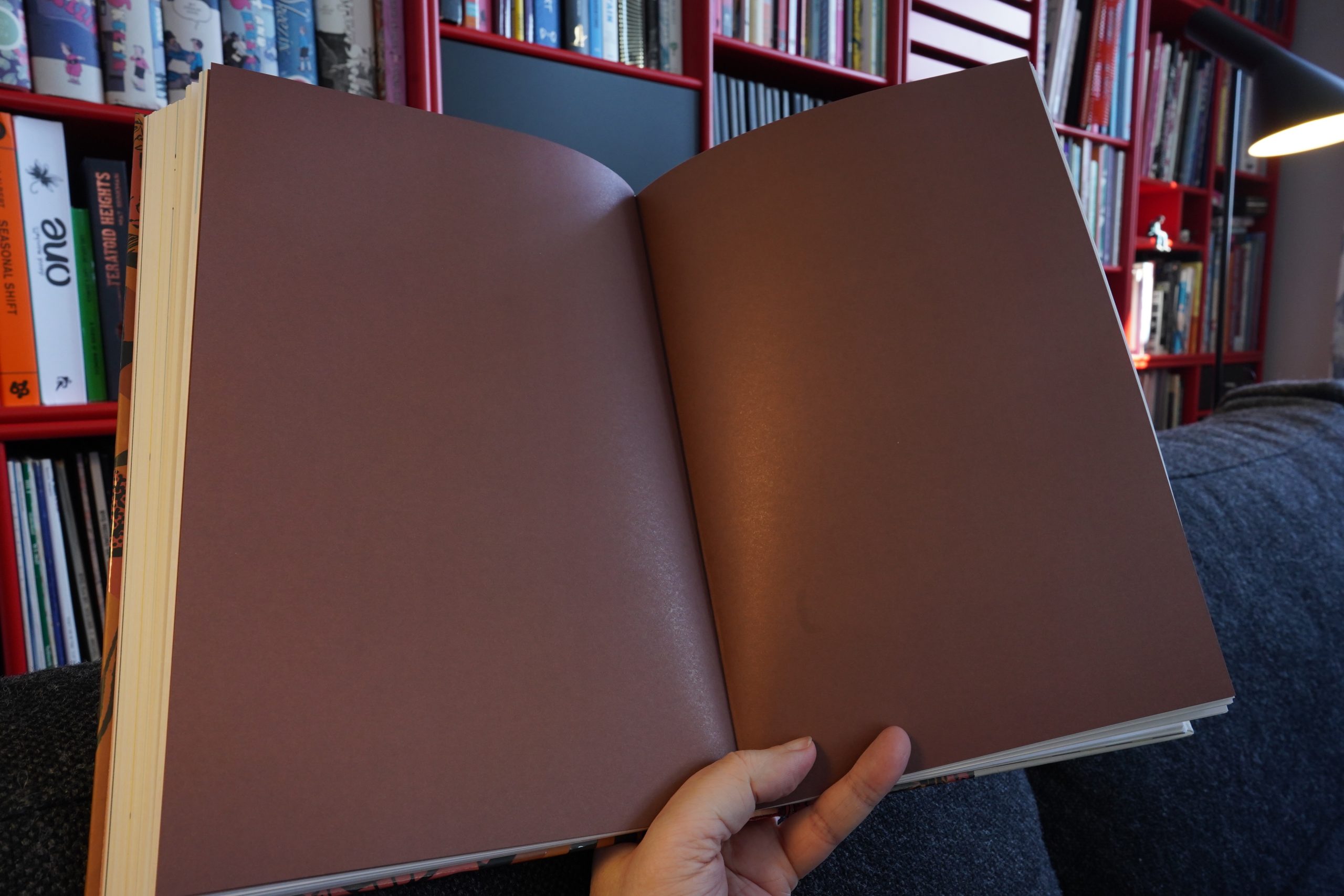
(But I dig that they chose to print the same number of blank, brown pages as the original pieces were.)
OK, Abortion Eve…
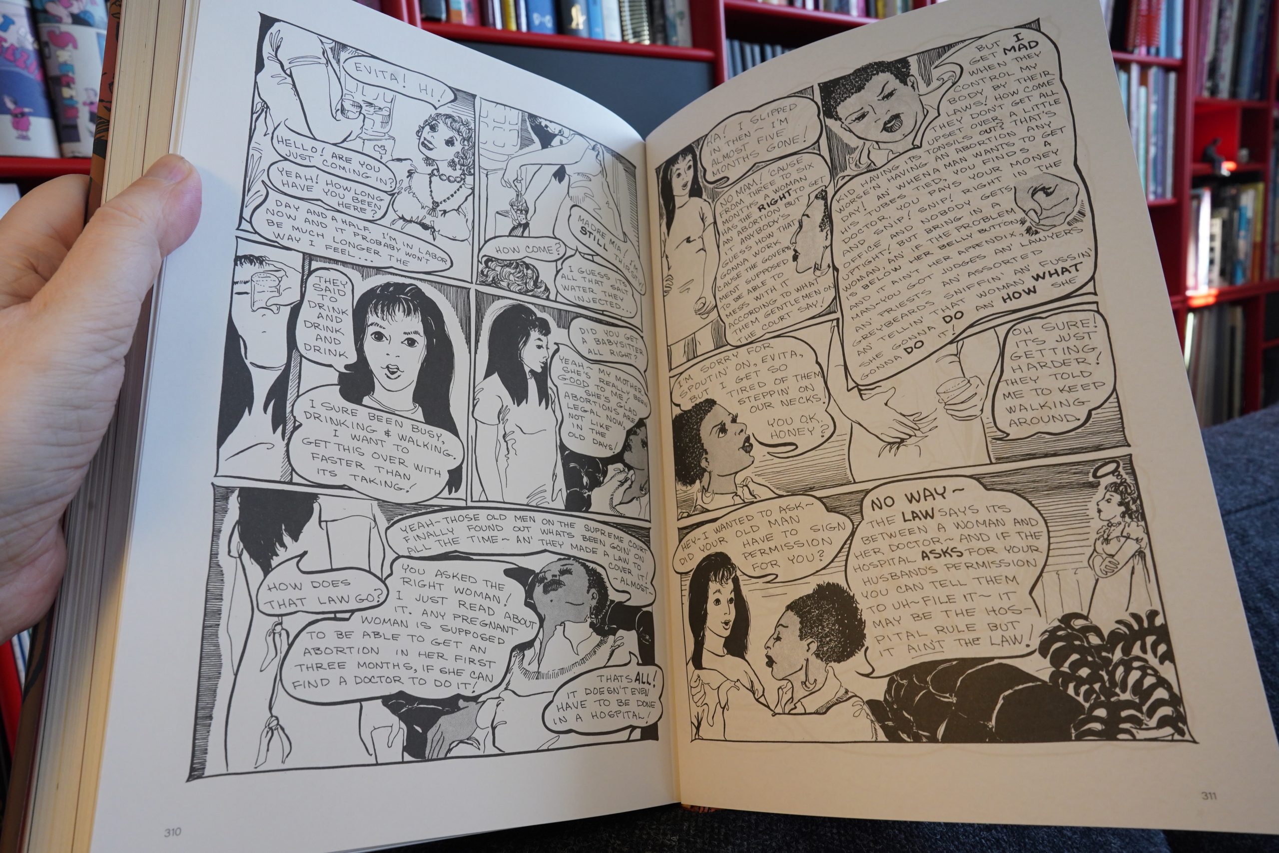
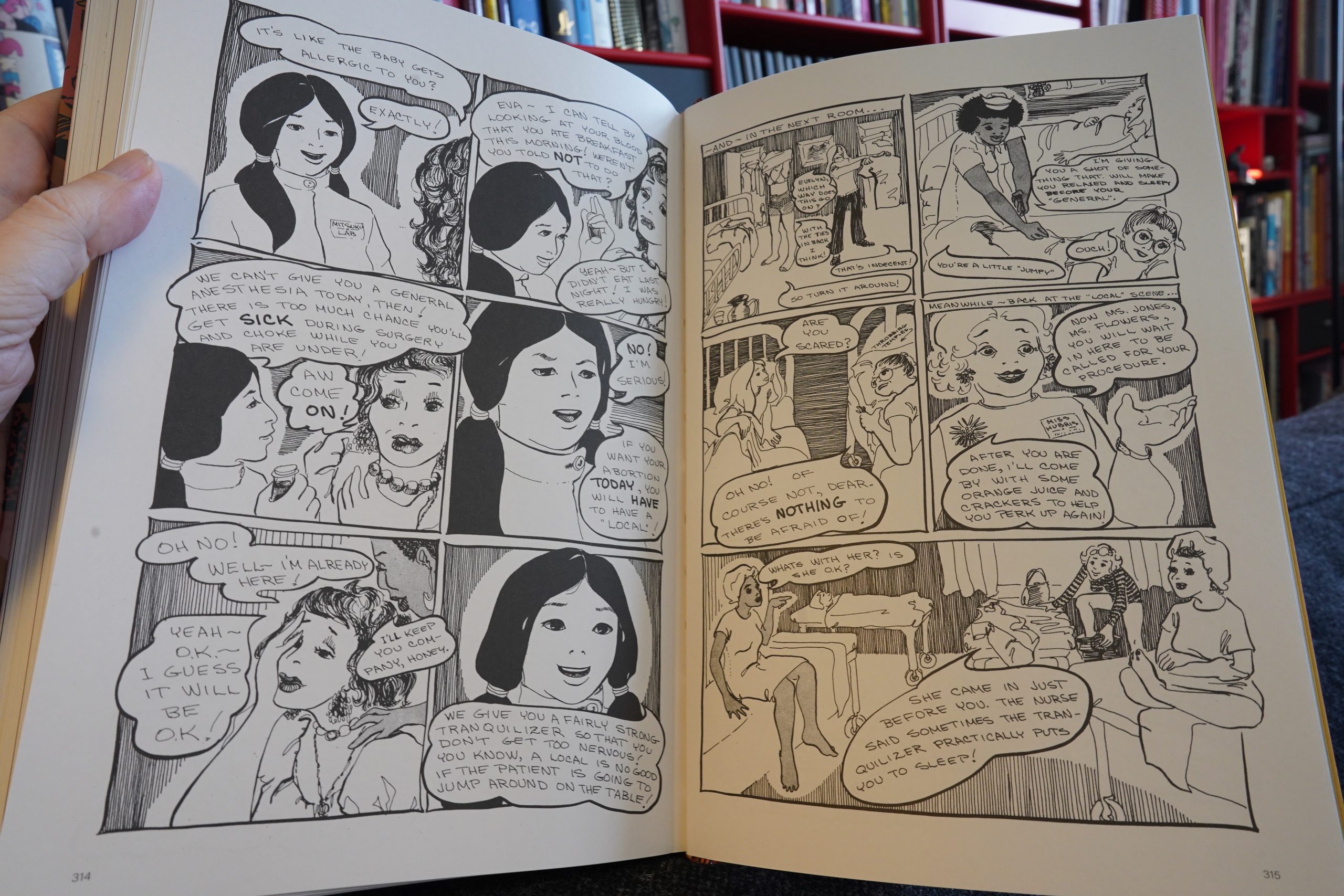
As with many of the Chevli pieces in Tits & Clits, the storytelling here is really rough. The artwork is fine, but it has, like, no flow.
It’s all stop and go. It’s really hard to get into. I appreciate how that they tried to get so much information and option into this book, but it’s tough sledding.
The Tits & Clits issues are a whole lot better than this, though, especially the later issues. The early issues do have a kind of wild charm, but there’s a lot of “whaaa…” going on.
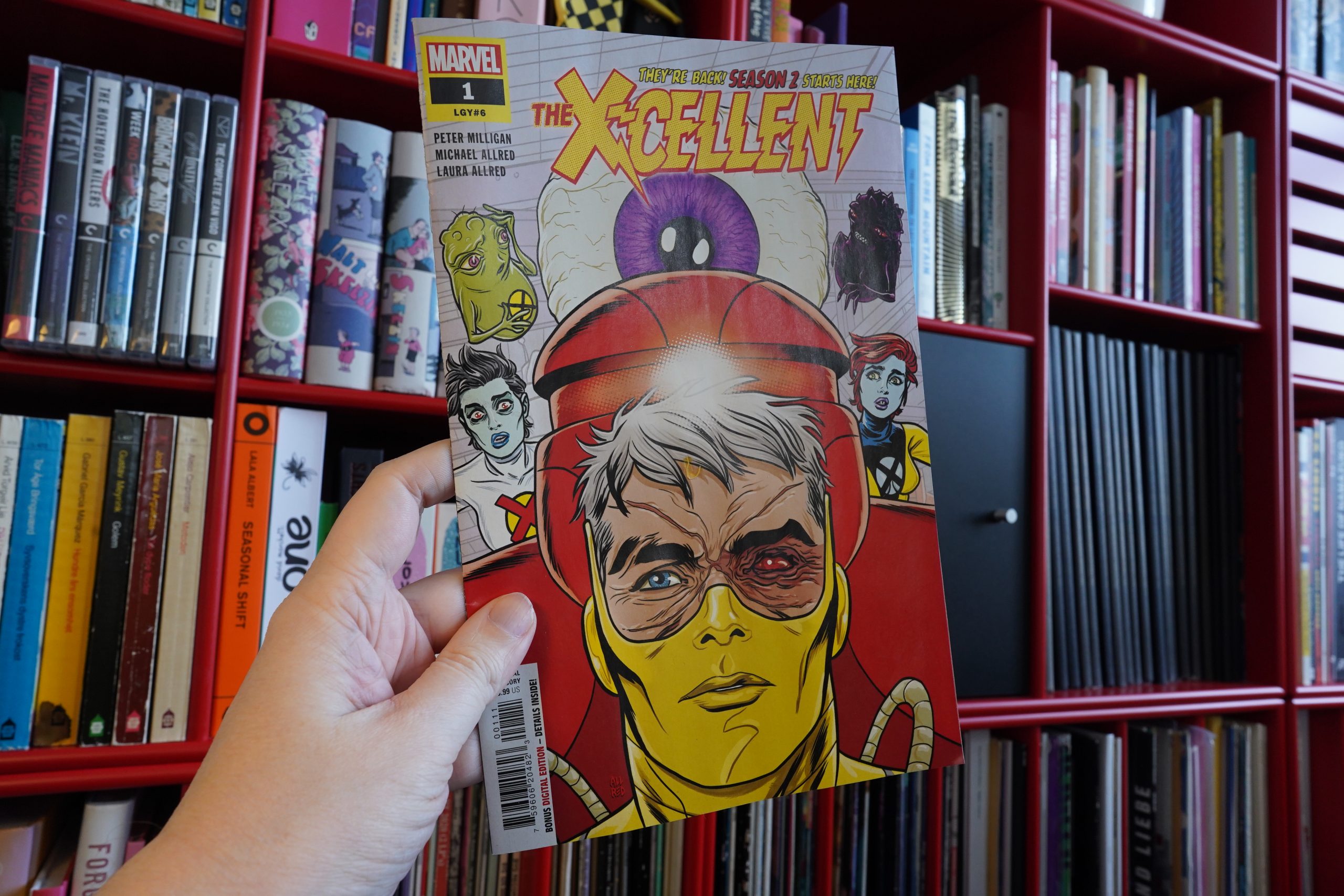
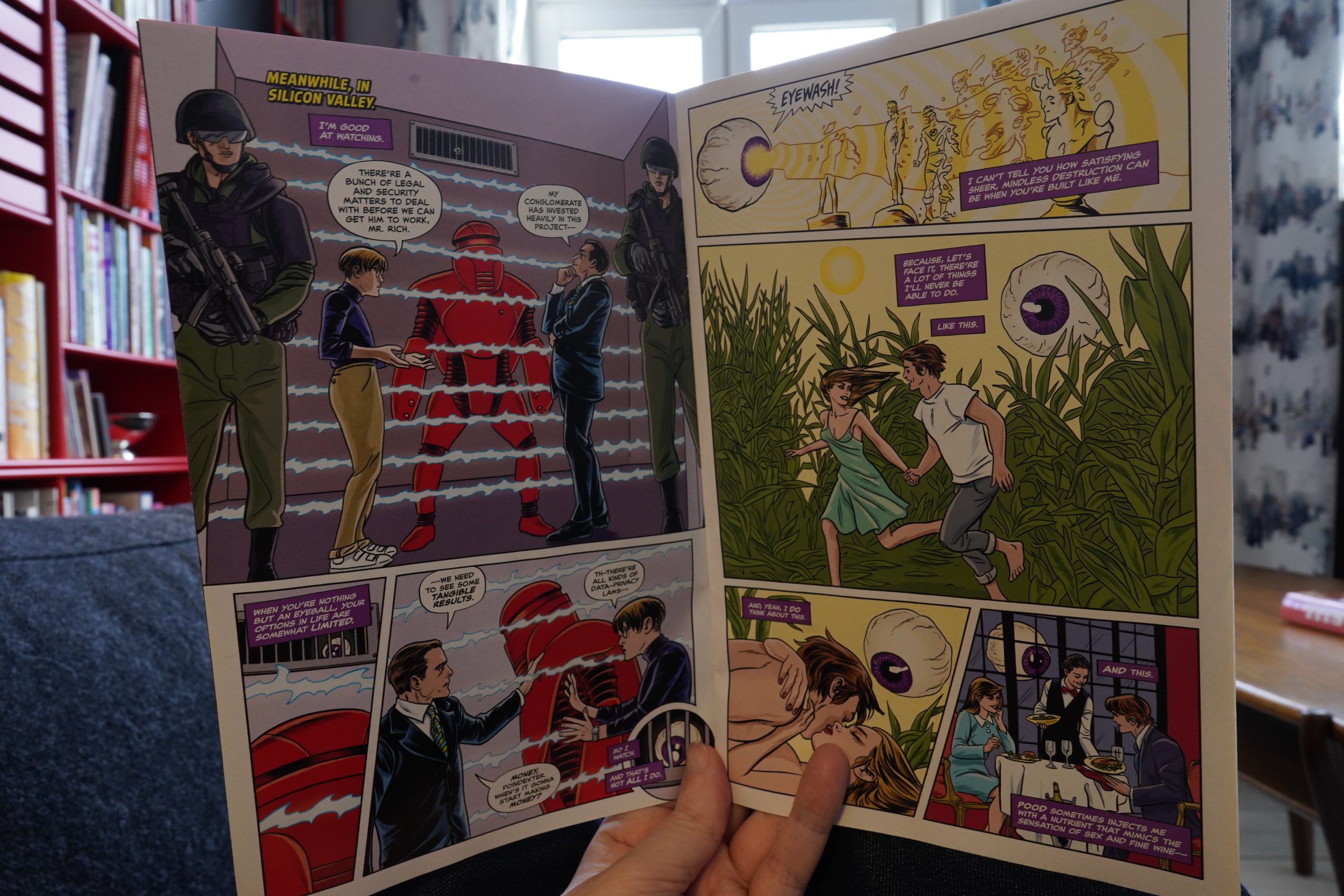
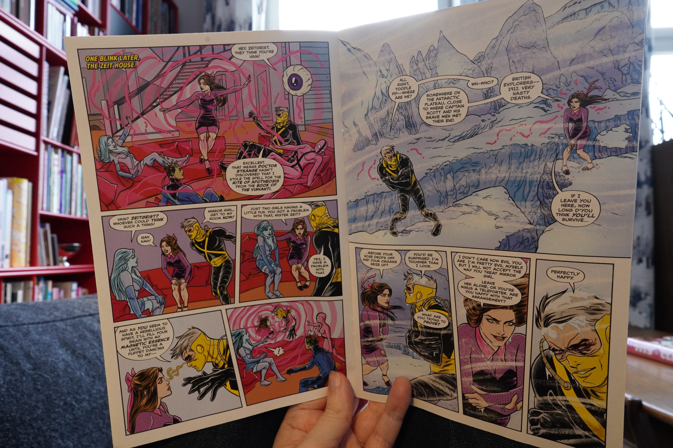
13:31: The X-Cellent #1 by Peter Milligan / Michael Allred / Laura Allred (Marvel Comics)
I don’t think I’ve read whatever this is “season 2” of, so I’m prepared to be confused.
It’s very Pete Milligan, for better and for worse.
So while it’s kinda confusing, that doesn’t really matter — it’s plenty entertaining anyway.
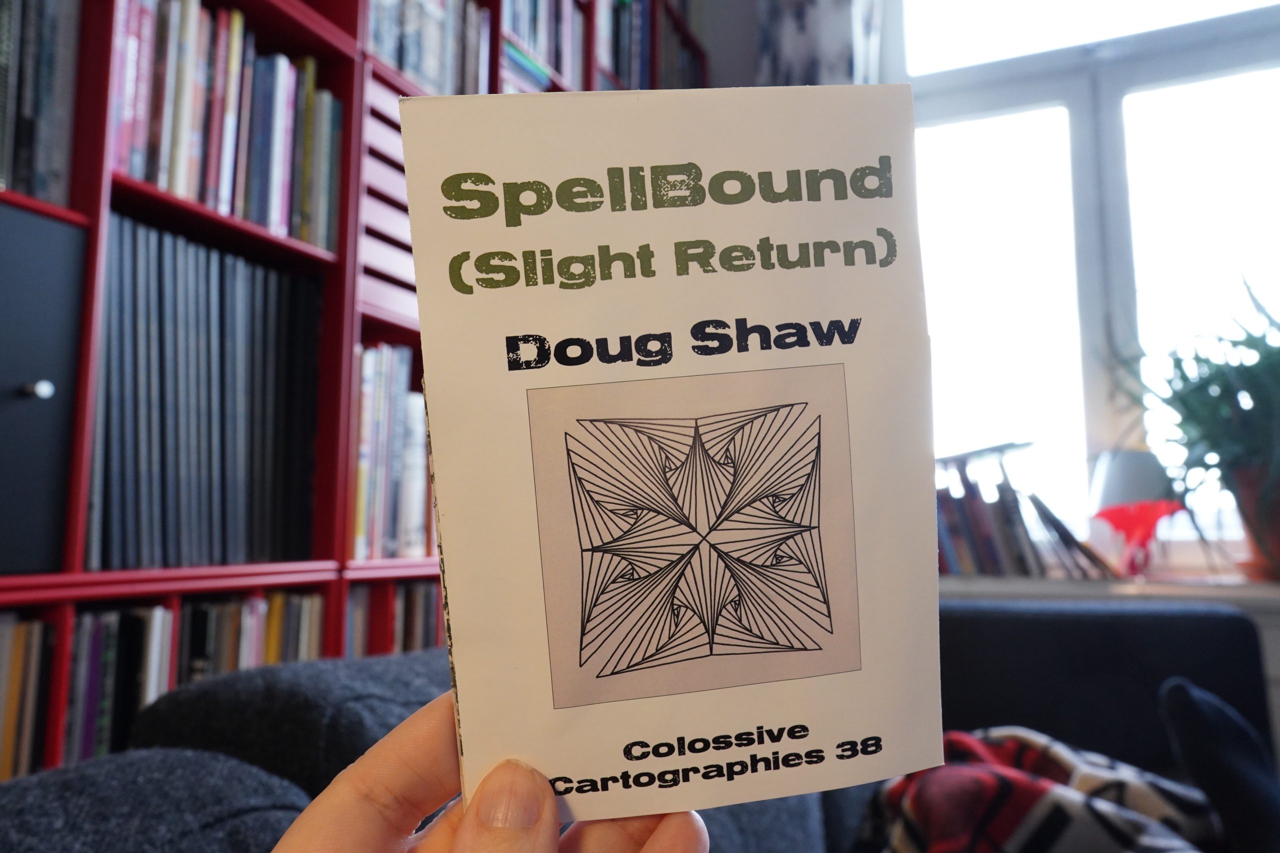
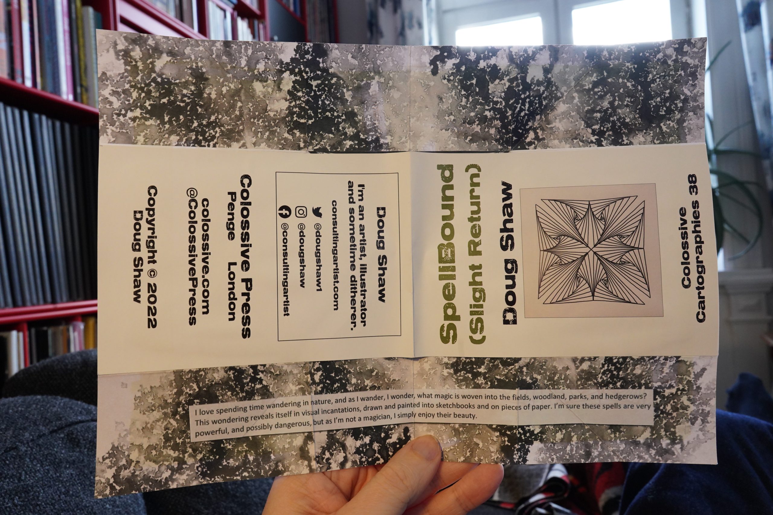
13:47: Colossive Cartographies
I bought a bunch of these “cartographies” without having any idea what that even means.
So they are these little things…
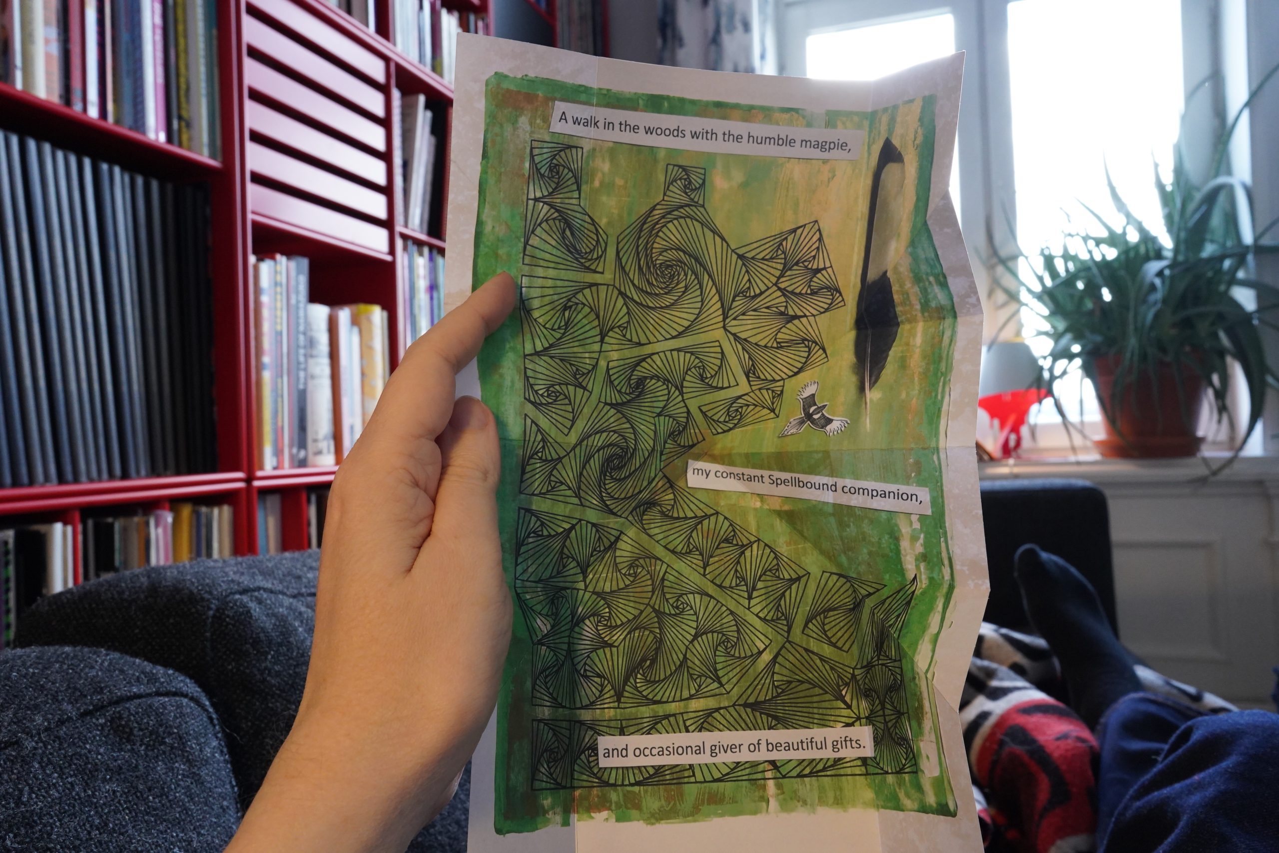
… that are basically one intricately folded sheet?
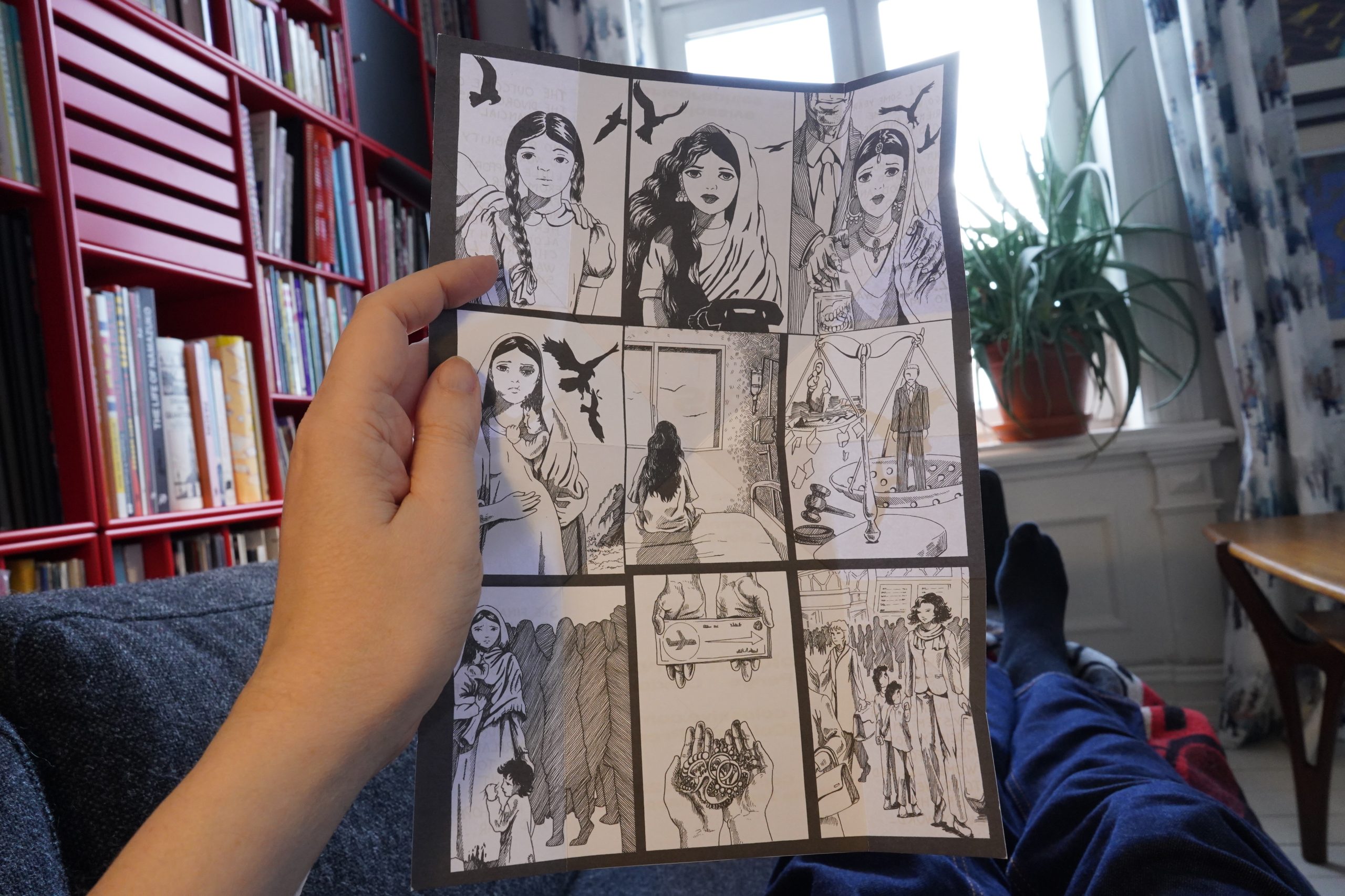
And fold them out, it’s like this on one side…
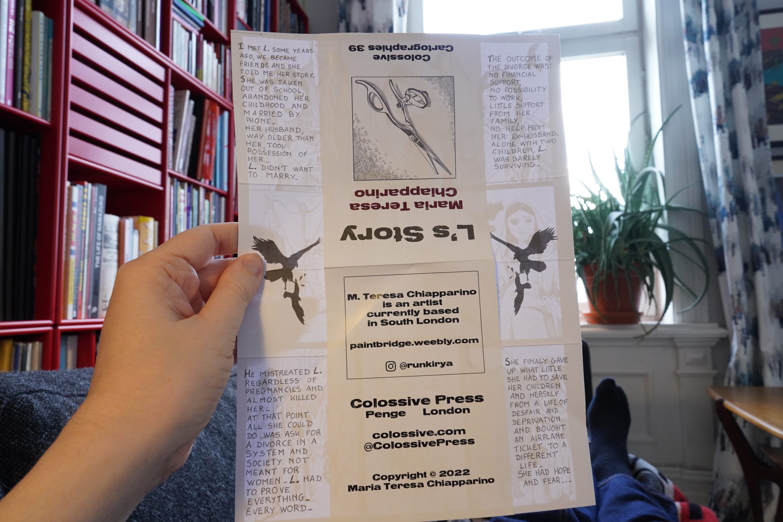
… and this on the other?
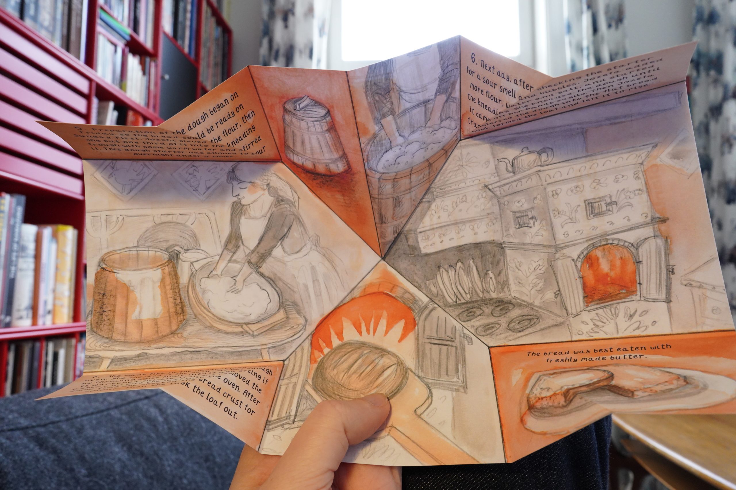
Oh, and there’s more folding stuff going on.
It’s kinda like those “fortune teller” papery things? Hm. No, doesn’t quite seem to work like that…
Some of these are straightforward comics.
With text.
The ones that have artwork that line up with the folds are more fun.
So… strange little objects. It’s a new mini-comic form? They’re very appealing objects, but offer a brief reading experience.
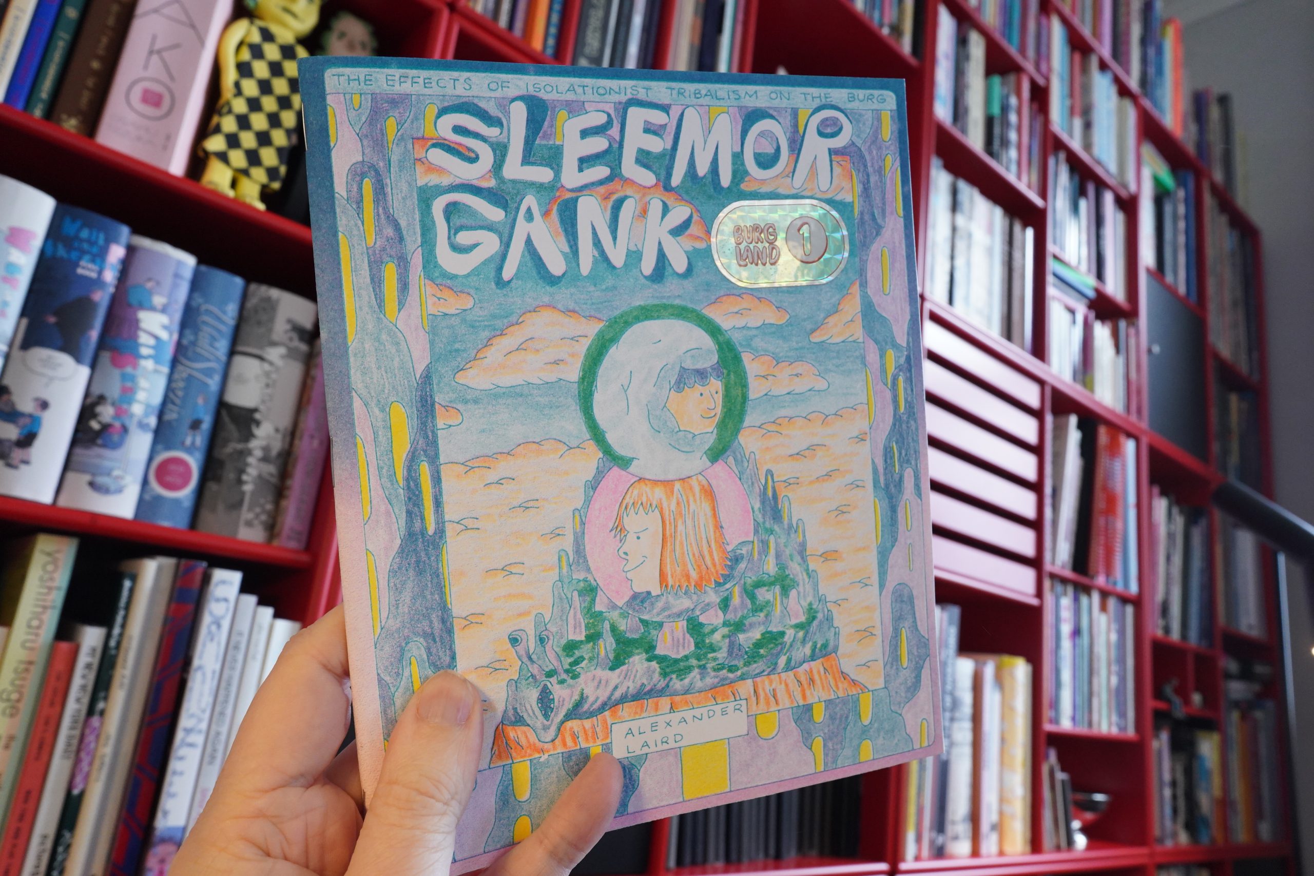
14:03: Burg Land 1: Sleemor Gank by Alexander Laird
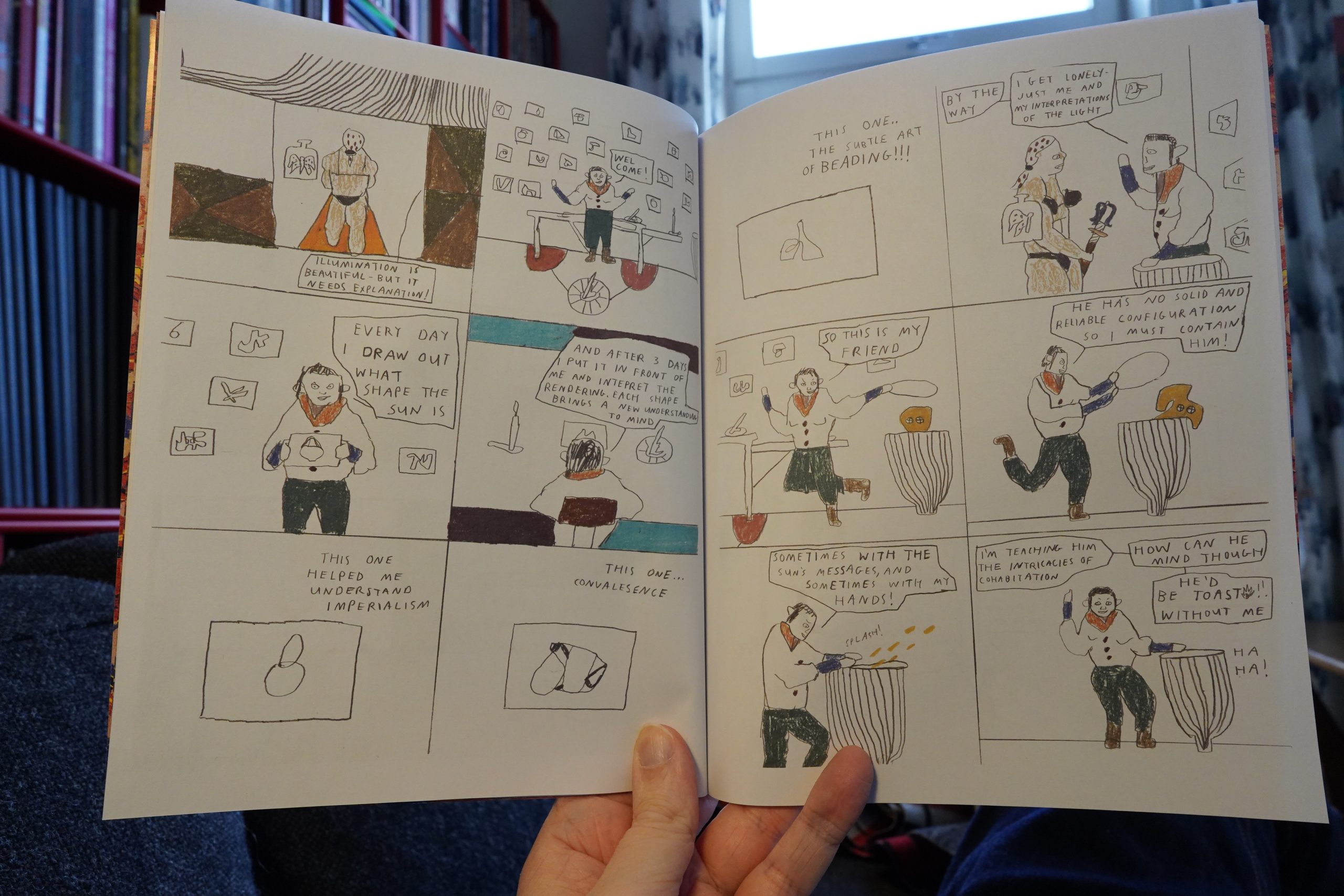
I had planned on visiting a number of shops when I was in New York earlier this month, but I got a virus thing (or something) and spent a week in a hotel room instead. *whine* *whine* But! I did manage to visit Printed Matter on the first day! What a great shop. So many interesting books and objects and things — I bought a lot of stuff. The comics selection wasn’t huge, but I bought some stuff, so let’s see what I got…
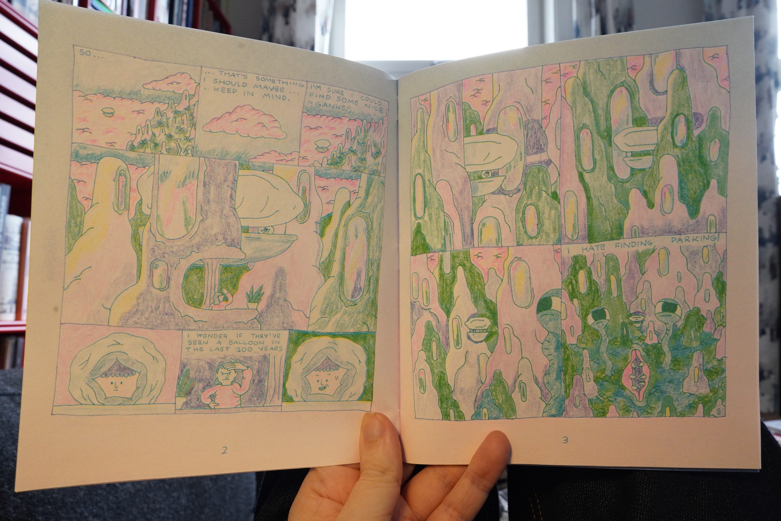
This is a riso printed sci fi kind of thing. It’s fun, and it has a real oddball feel of whimsy — not twee, but just deeply strange. I like it a lot.
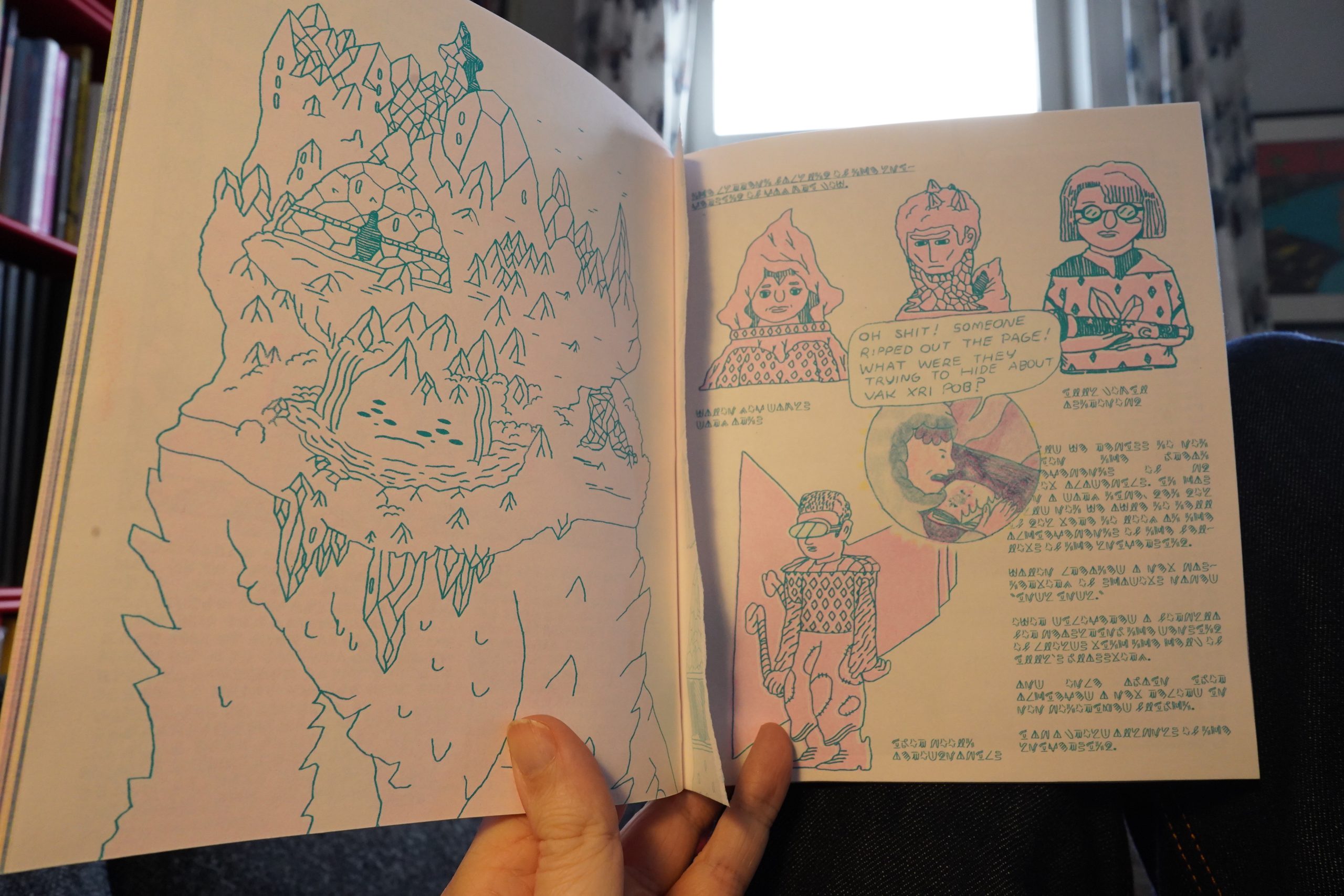
There’s a long section in the middle written apparently written in a made-up language that “excerpts” a found book — complete with ripped-out page and all! I love it!
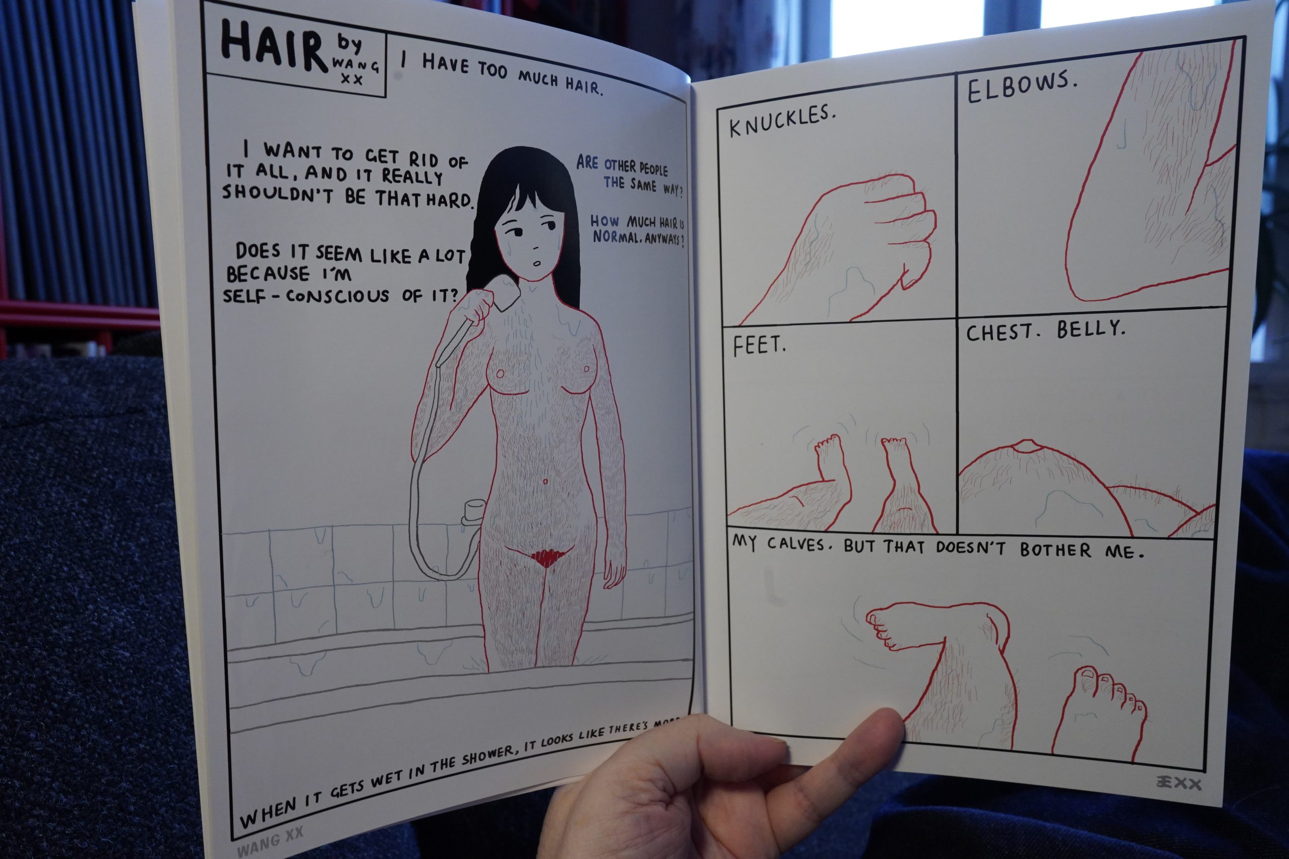
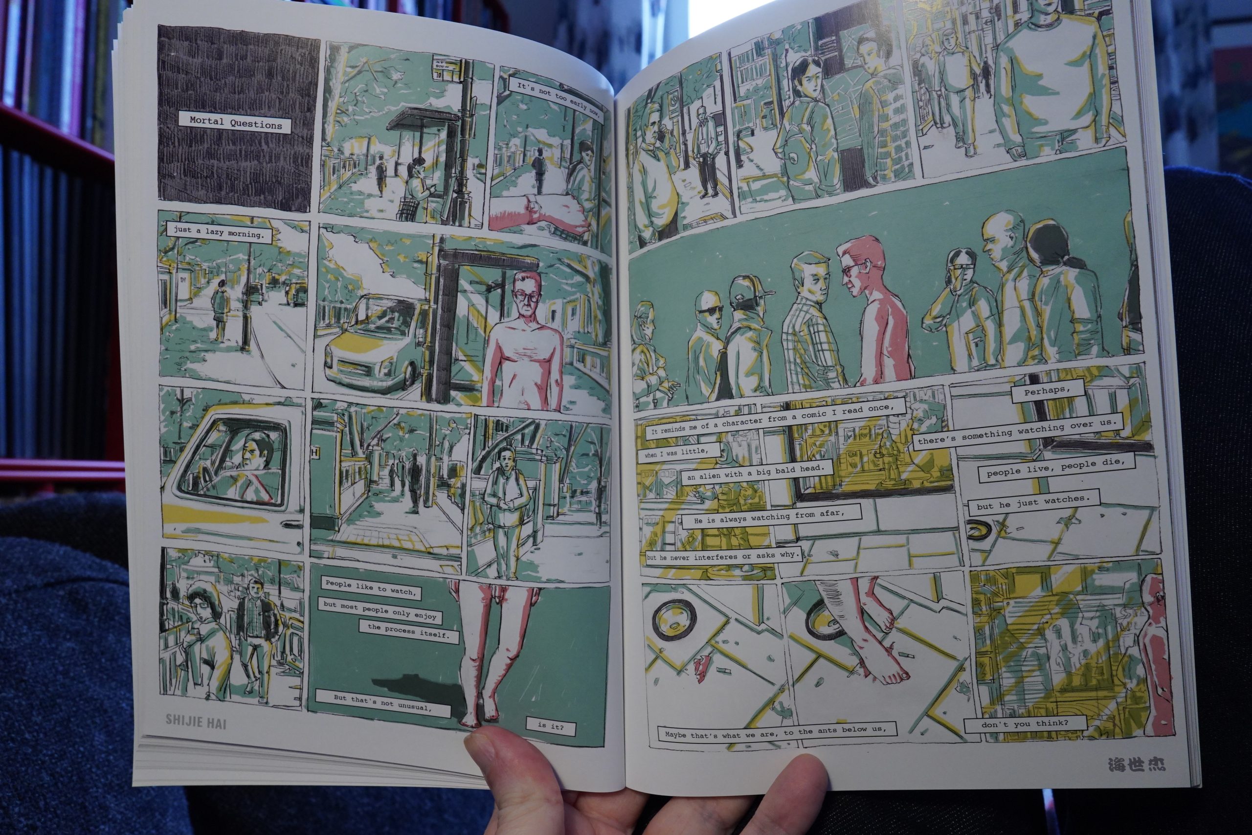
14:18: Naked Body: An Anthology of Chinese Comics (Paradise Systems)
This was originally published (in China) a decade ago, but this is a newer edition. The artists were instructed to make five page pieces, and the characters had to be naked.
The different artists take that in wildly differing directions.
Most go for some kind of joke, though, which is fine.
There’s a huge variety of art styles, but most seem influenced by European comics, I guess. It’s a pretty strong anthology.
| Four Tet: Pink |  |
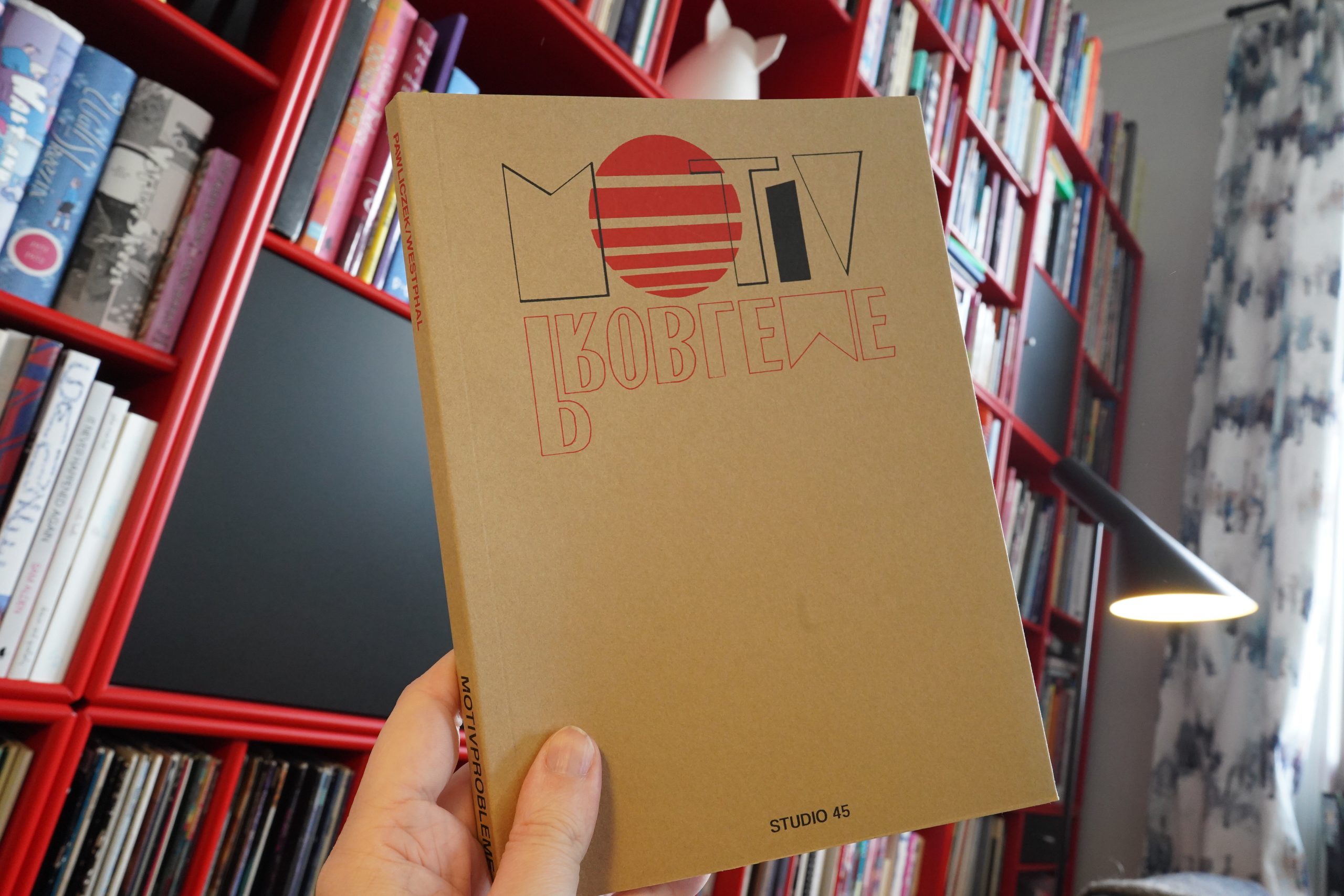
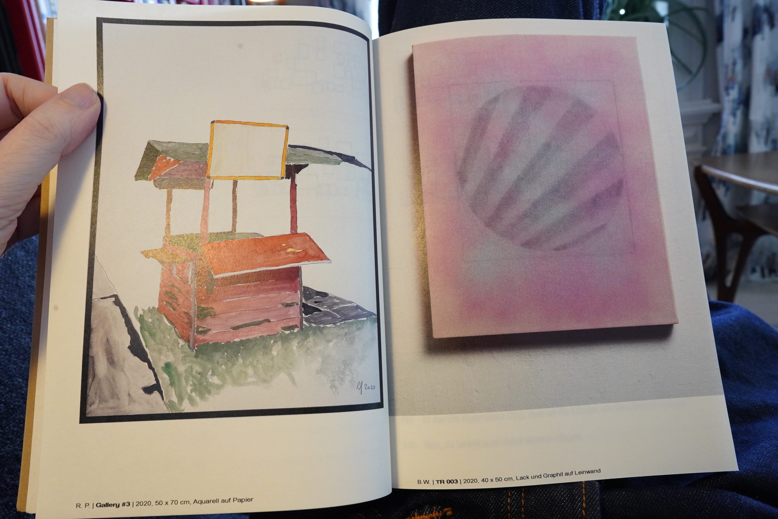
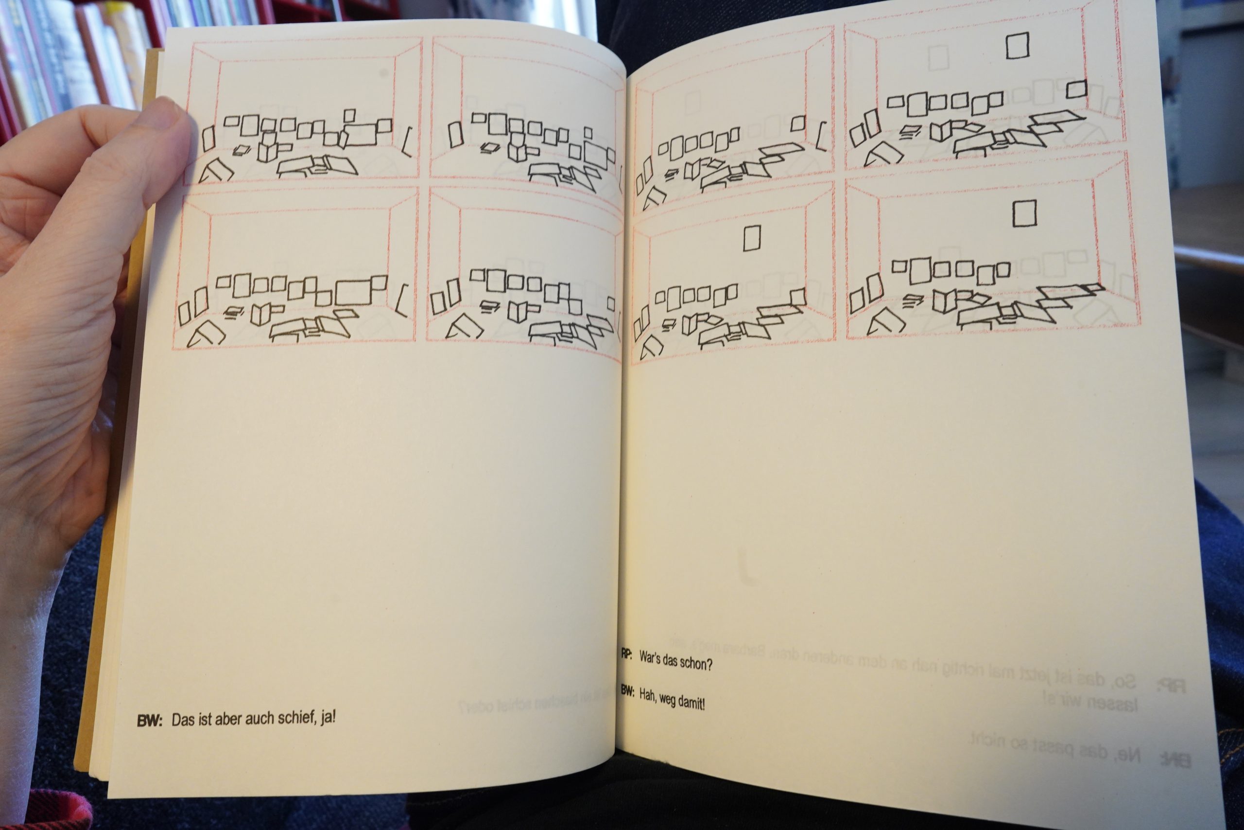
14:38: Motivprobleme by Barbara Niklas / Björn Westphal / Robert Pawliczek (Studio 45)
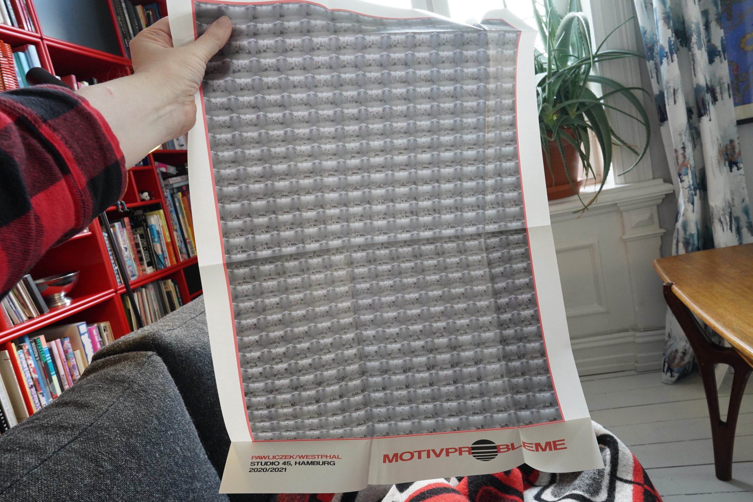
Hey, this comes with a poster… very intricate poster…
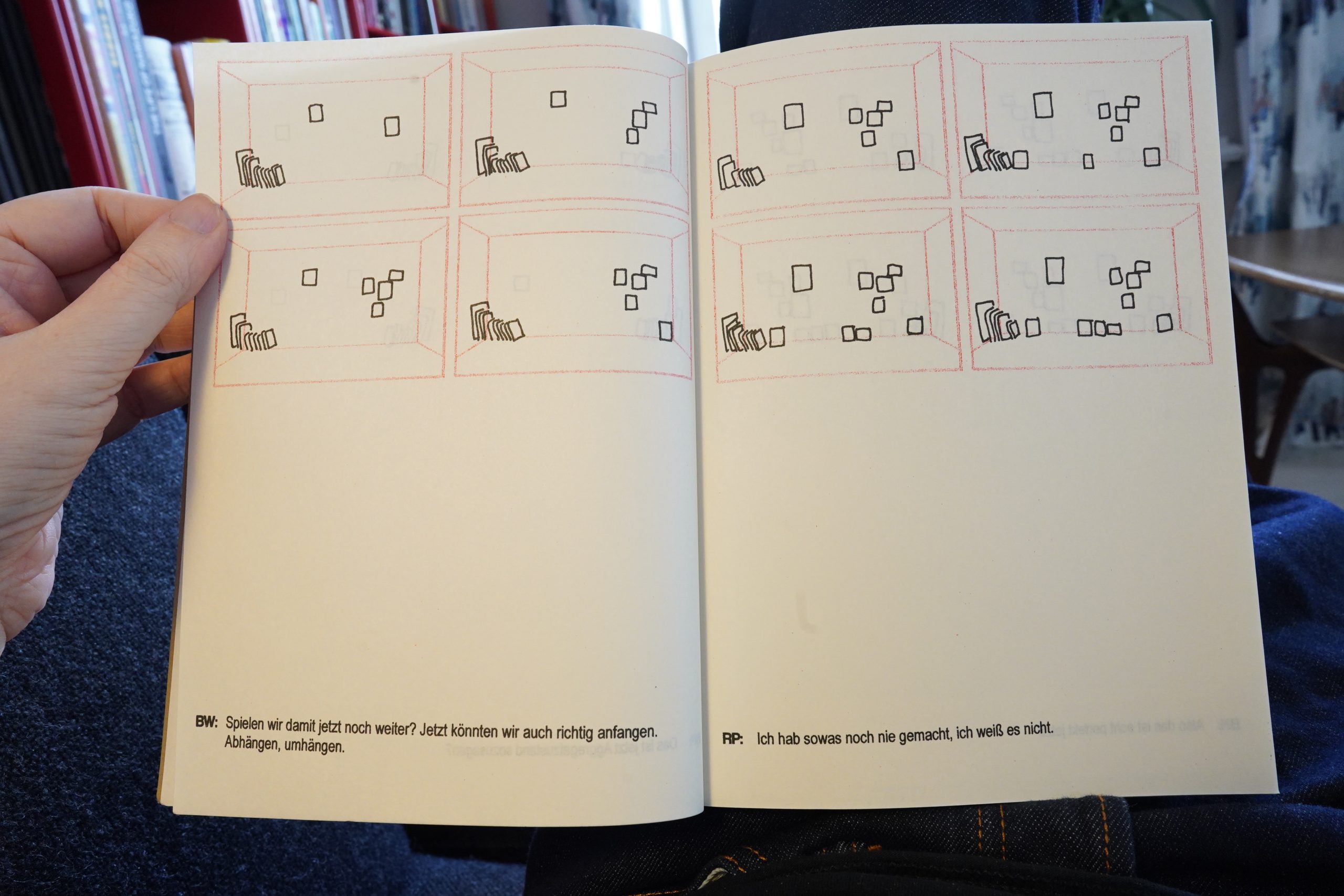
It’s basically a discussion between three people how to hang some paintings on a wall for an exhibition. The discussion sounds very real, so it’s probably a transcription of the actual discussion (which was filmed, according to the text).
And then we also get to see the actual paintings they’re discussing.
It’s… it’s kinda riveting? The different arrangements of the paintings, along with the discussion, and then seeing the paintings… there’s some kind of magical alchemy going on.
I do understand some German, but I used the Google Translate app a lot. Thanks Google!
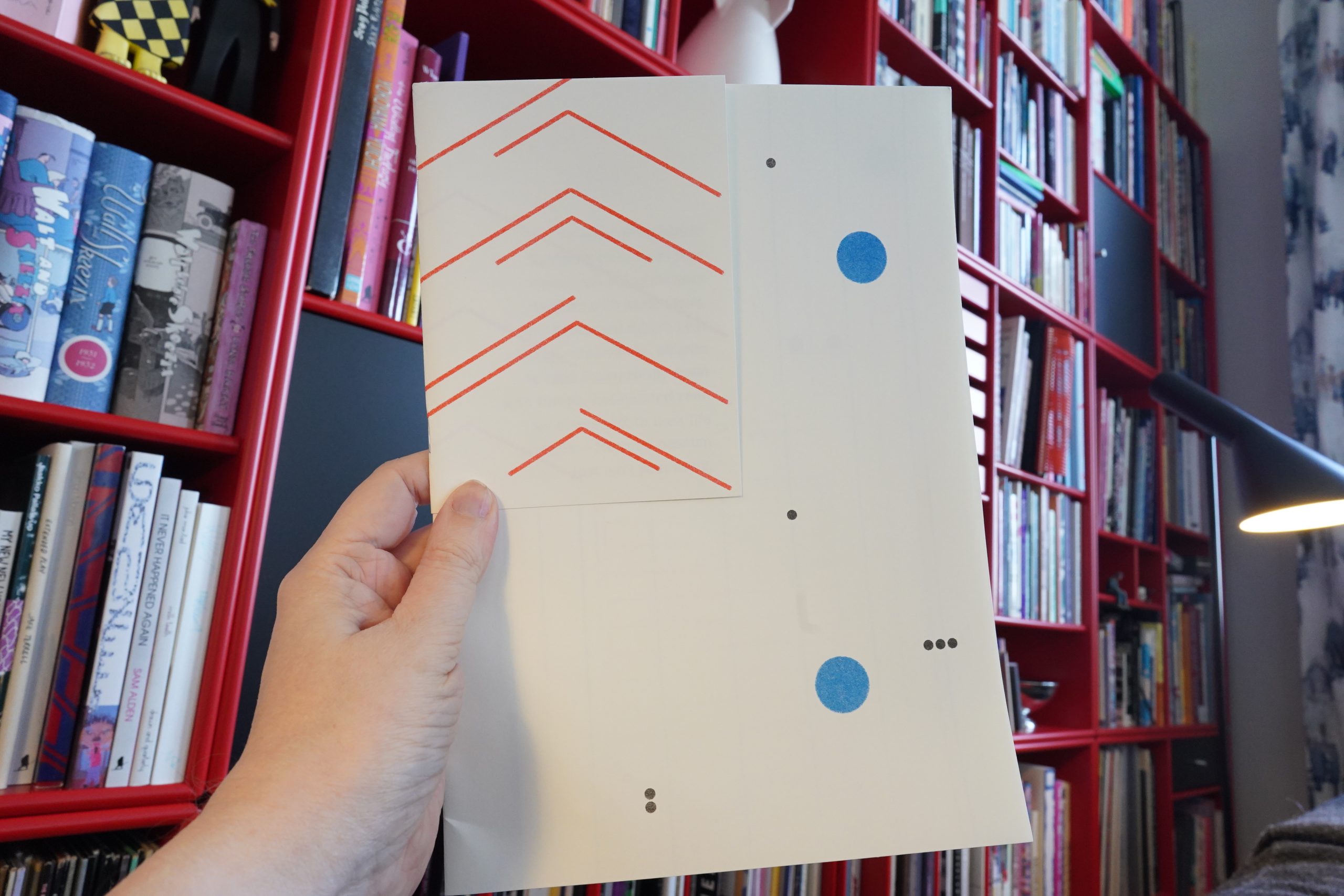
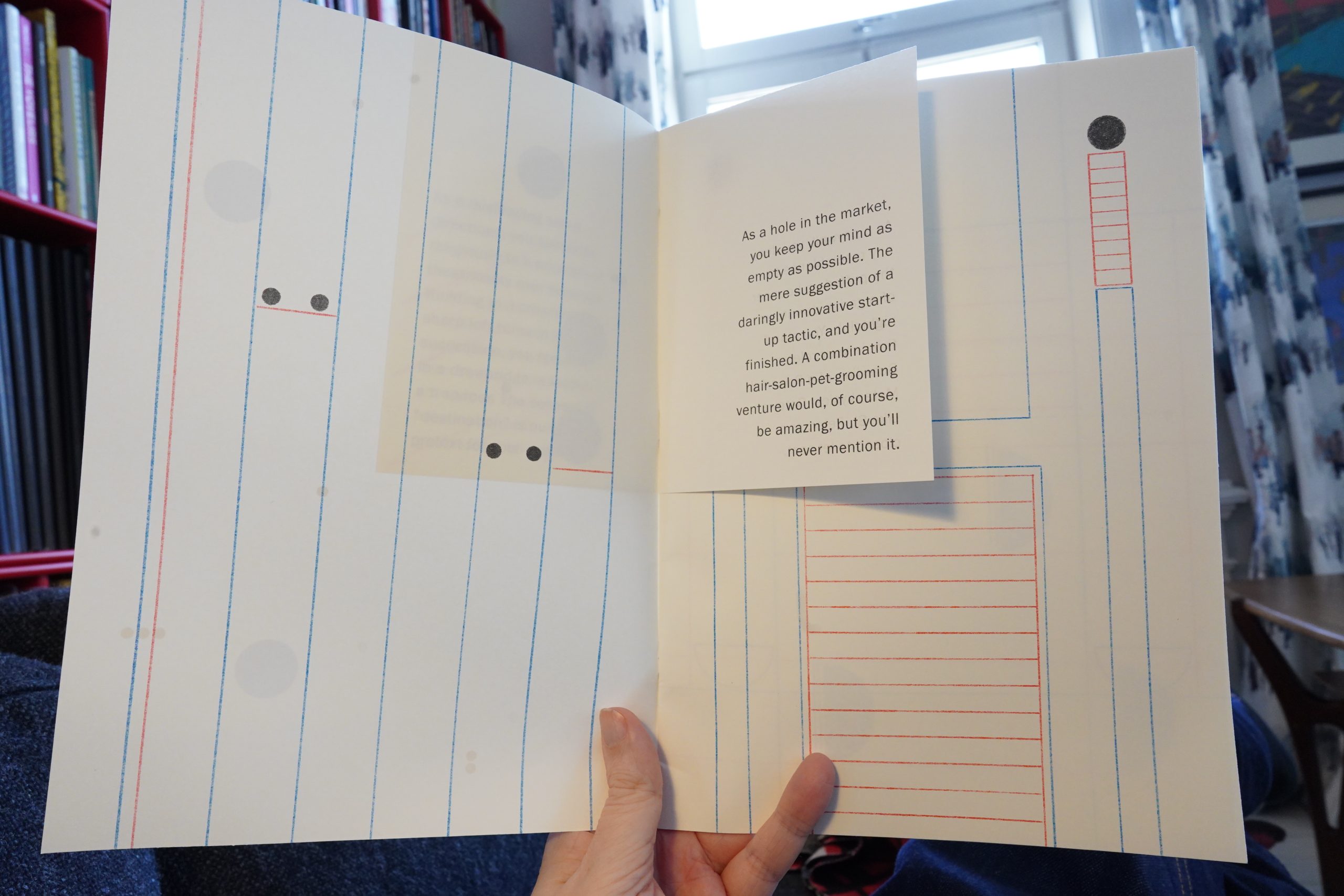
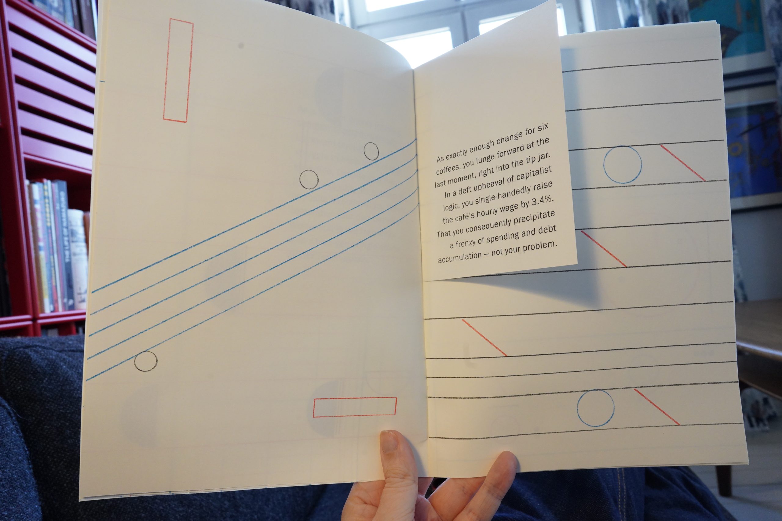
15:02: Molaf Circumflexions by Chloe Lewis & Andrew Taggart
This is a series of pretty abstract, geometrical images accompanied by short texts (mostly jokey) that seem to respond to the images in oblique ways.
It’s pretty funny, and it has a strong mood thing going on. *four thumbs up*
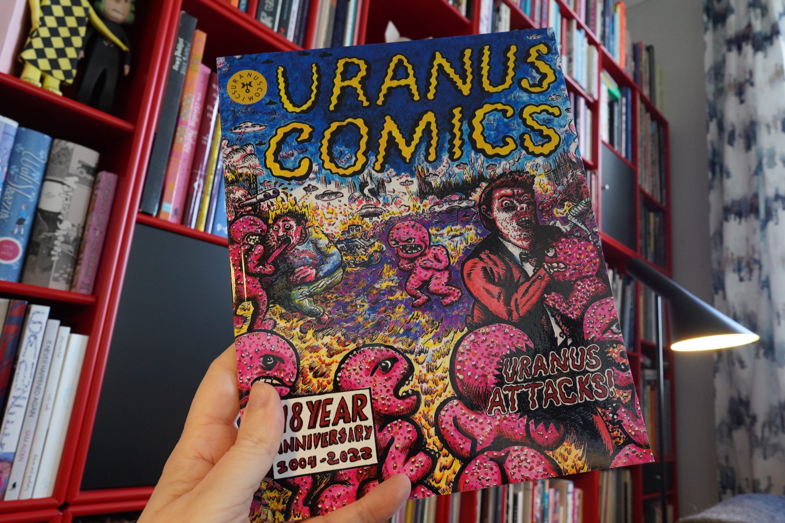
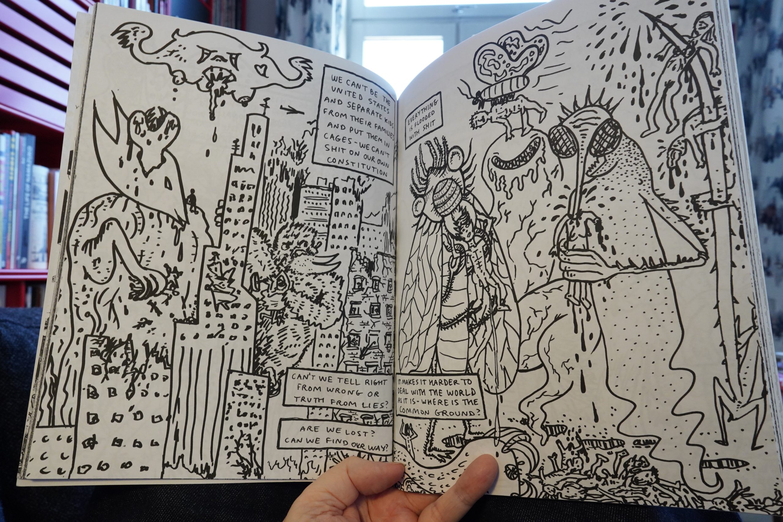
15:10: Uranus Comics #3: Uranus Attacks! edited by Carlo Quispe, Mike Diana
Most of the pieces here are from the two editors (either separately or together), and… this book isn’t at all what I expected. I mean, Mike Diana in a book called Uranus Comics? It’s mostly about Corona and how much Nazis suck, really.
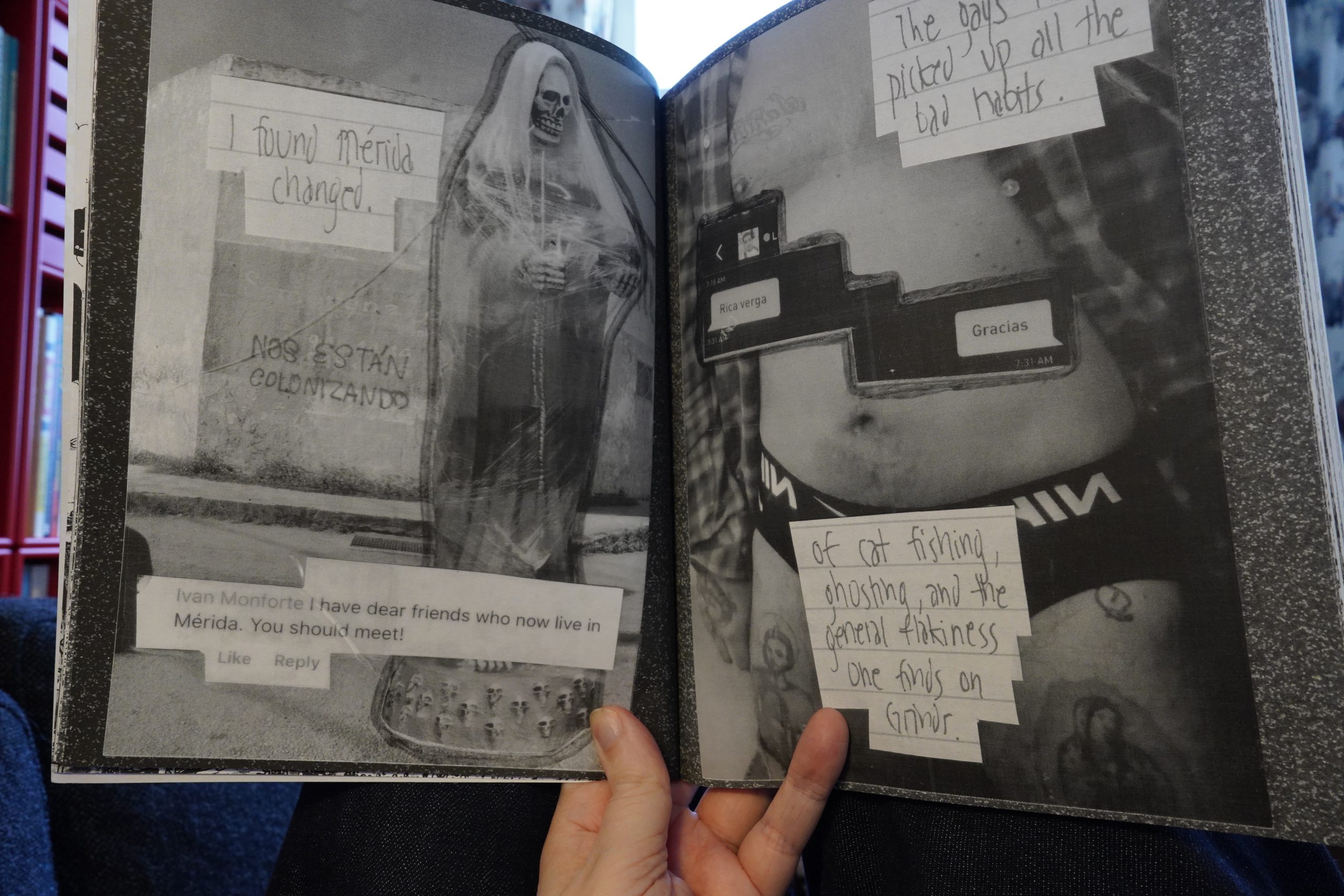
There’s other people in here, too, with very different approaches, and no discernable theme. (Ivan Monforte.)
It’s… it’s really good. (Katie Fricas.) The anthology feels thoughtful and slightly depressed. You can get a copy from here, I guess.
And that’s the last comic I got at Printed Matter.
| Jan Jelinek: SEASCAPE |  |
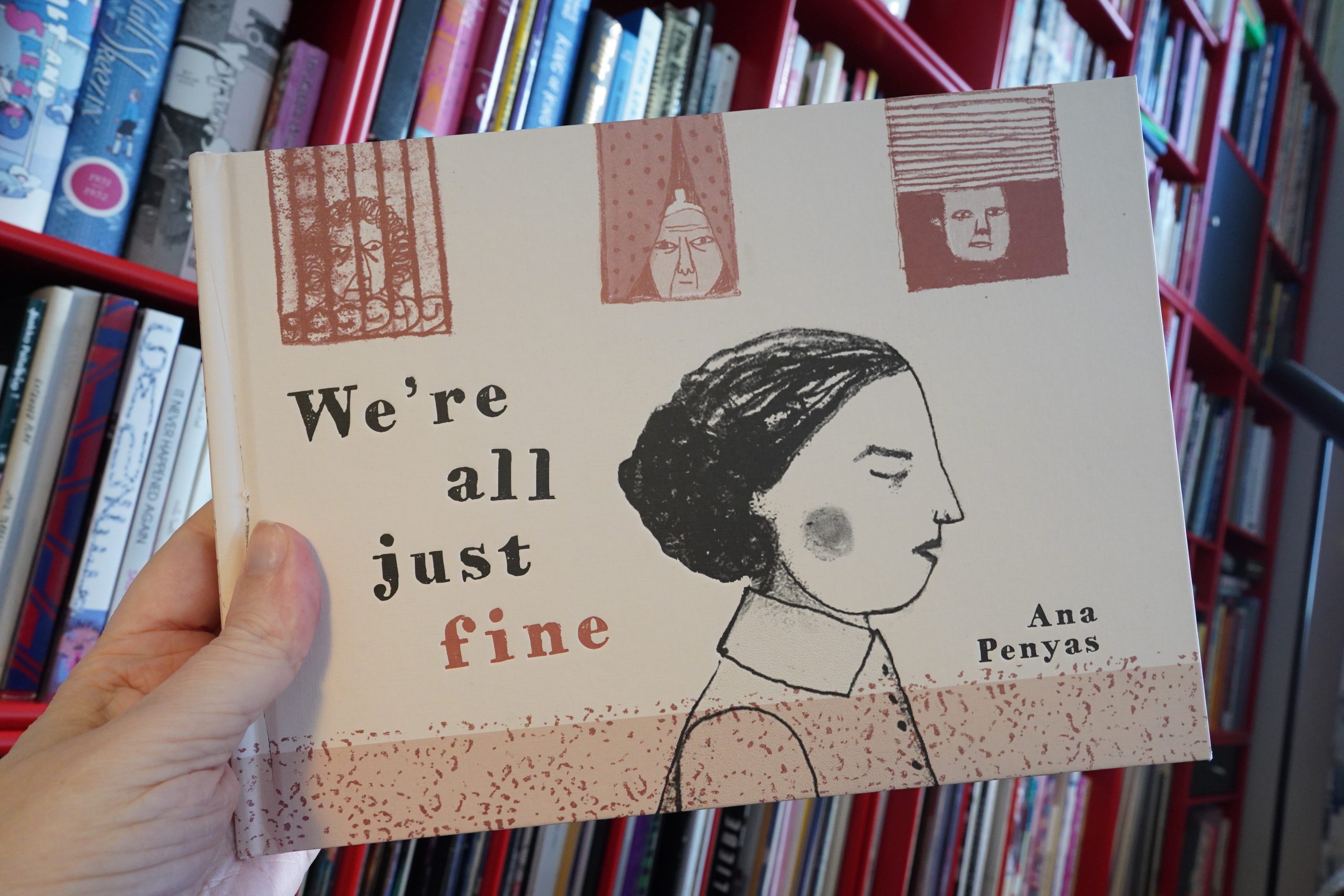
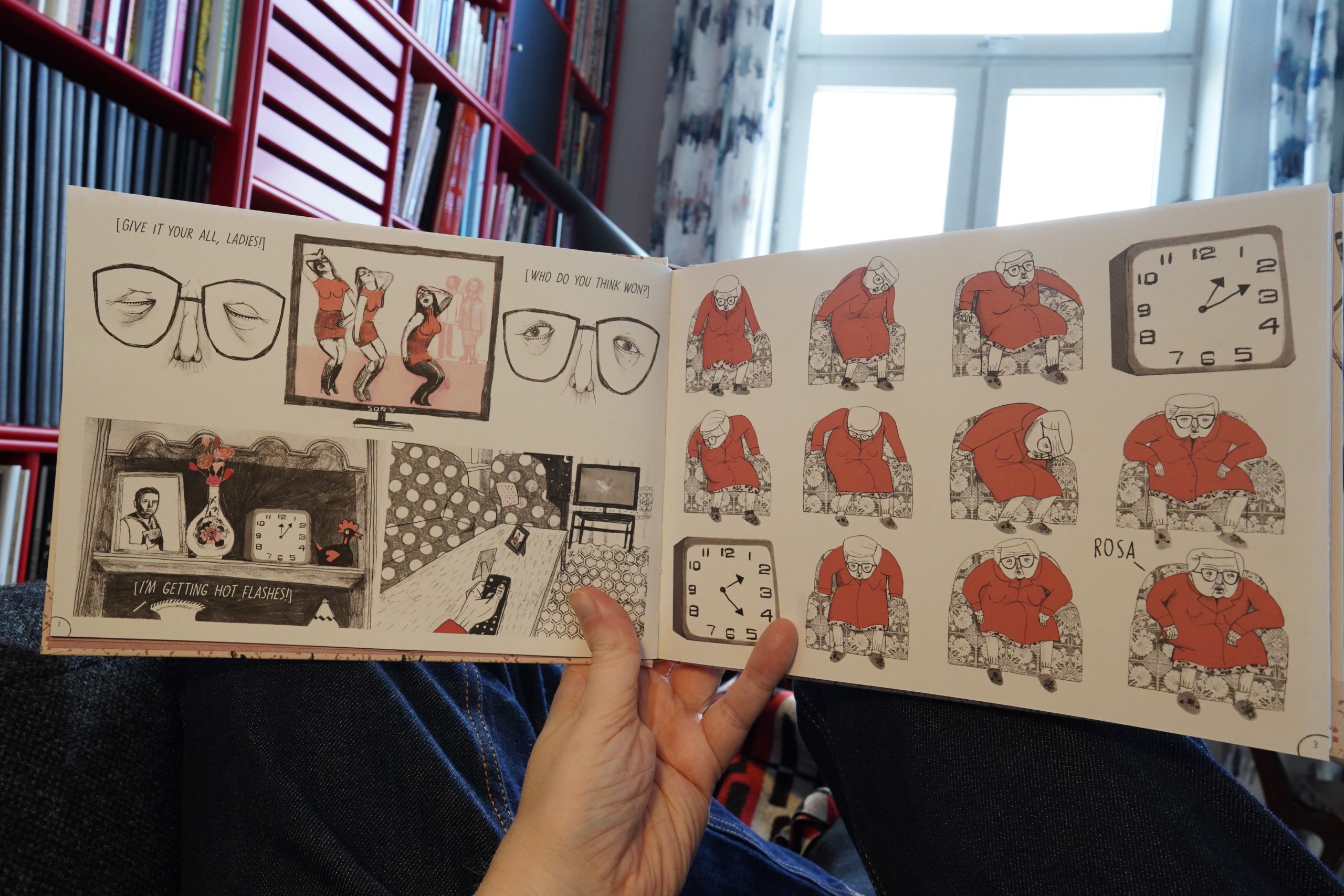
15:52: We’re All Just Fine by Ana Penyas (Fantagraphics)
I feel seen!
Joking aside, this is absolutely fantastic. Penyas gives us a sketch of her two grandmothers’ lives, without resorting to tons of text to explain every little thing to the reader. Instead things flow back and forth in time and space — but not effortlessly. Penyas makes the reader work at interpreting what we’re seeing, and makes it worth it — thereby involving the reader deeply; way more deeply than you’d expect from this short book. After reading this, it feels like we do know these two women, and that’s just an amazing feat.
I guess the book reminds me a bit of the mood in Tokyo Story by Ozu?
| Joan as Police Woman: Damned Devotion |  |
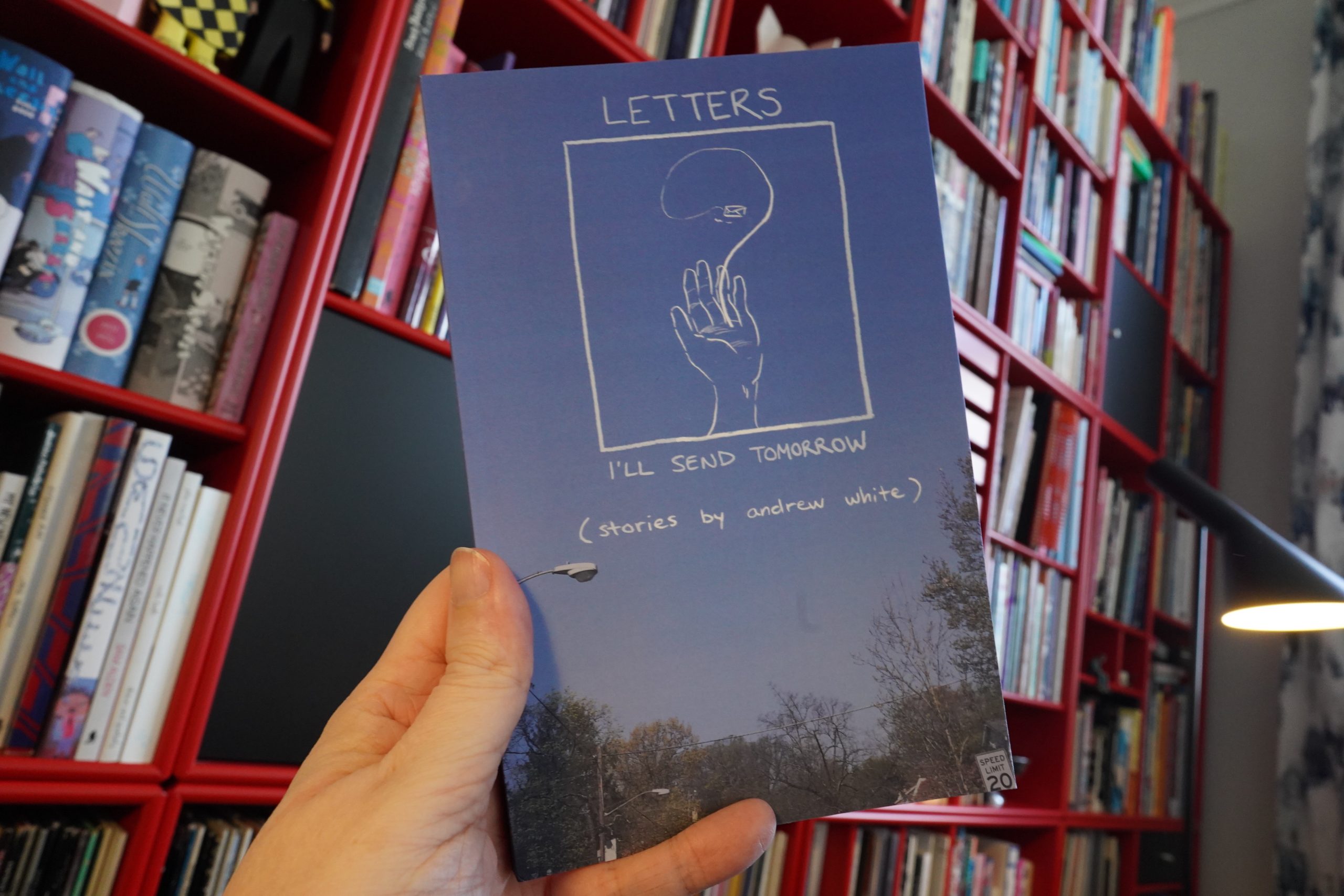
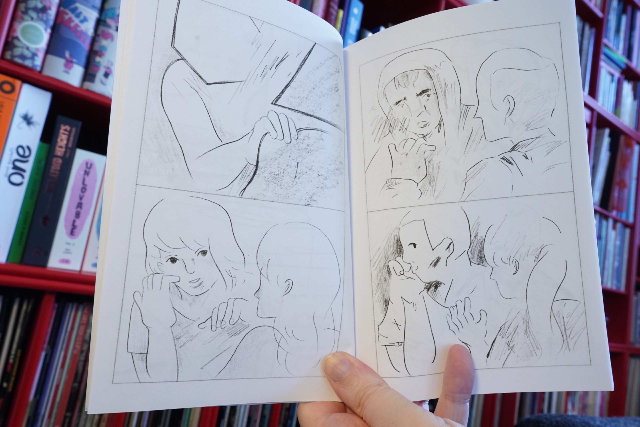
16:22: Letters I’ll Send Tomorrow by Andrew White
This is a collection of minis White mailed out semi-anonymously in 2016 (with some new additional stuff).
As he says in the introduction, the mysteriousness of it all also got into the stories, which are frequently quite abstract.
But it’s really good. As a collection, it has a real cohesive mood, even if the individual pieces are about many different things.
And now I have to take a short break to do some laundry and stuff. Be right back.
| Aksak Maboul: Une aventure de VV (Songspiel) |  |
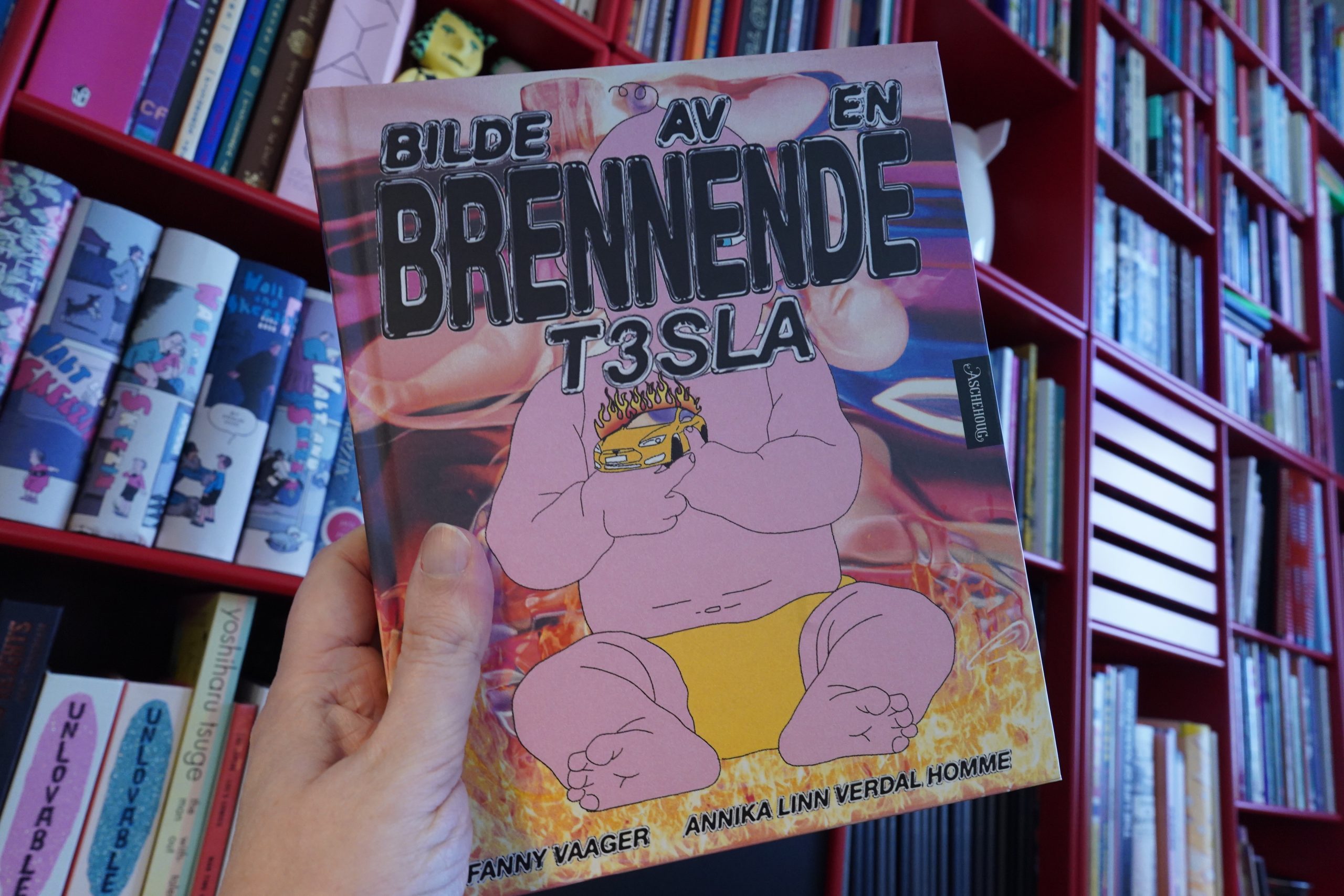
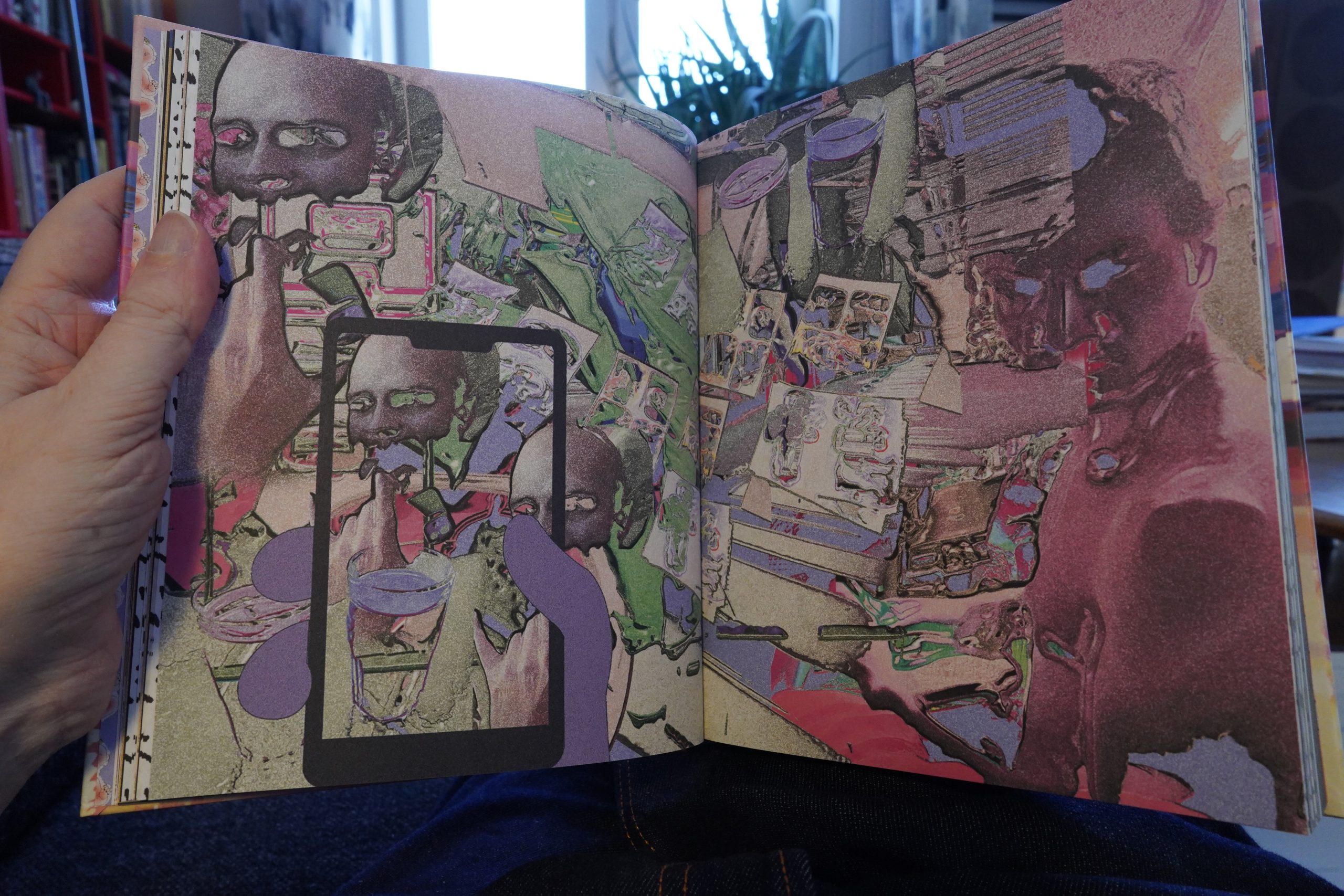
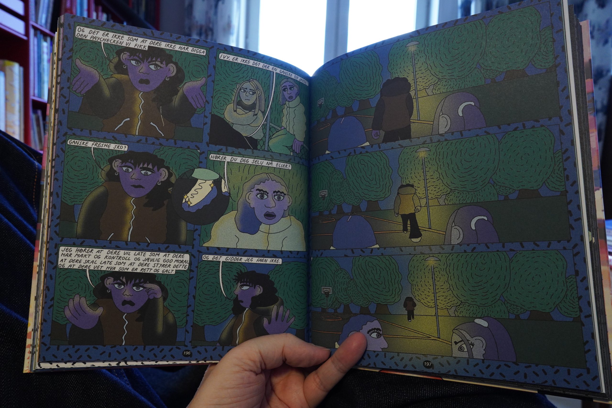
17:10: Bilde av en brennende T3sla by Fanny Vaager & Annika Linn Verdal Homme (Aschehoug)
Back!
The title of this book means “Image of a burning Tesla”, and isn’t that the most beautiful title you’ve heard?
The look here is kinda… er… faux riso? Is there a plugin in Photoshop that makes everything look riso?
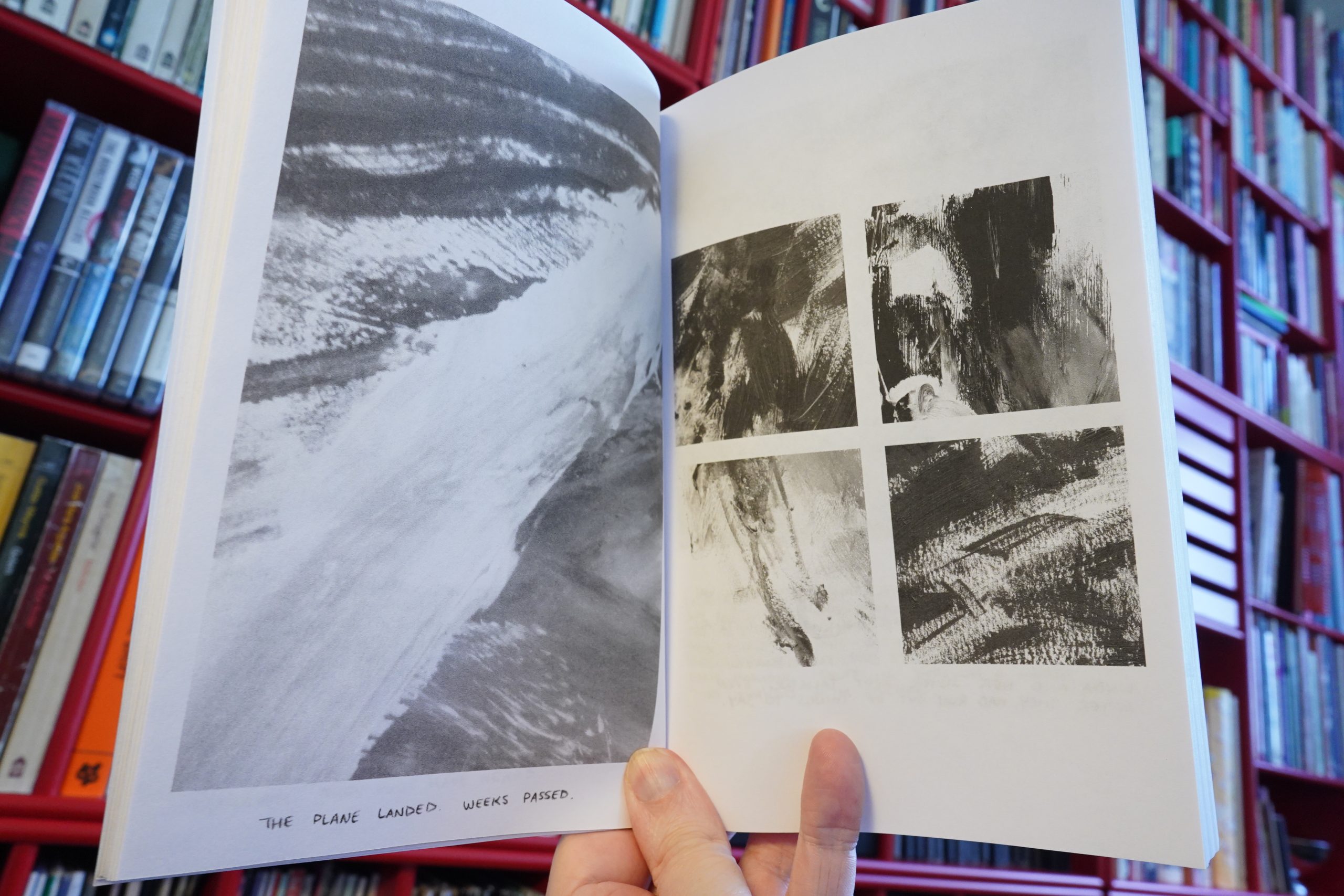
There’s also more mysterious interstitial pages…
Anyway, despite what it looks like, this is a really straightforward story about some Evil Ad People working for Evil Oil Companies using Young Naive Artists to Achieve Nefarious Ends. It feels like very well trodden ground. (Except the subplot about the baby. That’s new!) But it’s quite entertaining nonetheless, and that’s almost all down to the storytelling style, which really works.
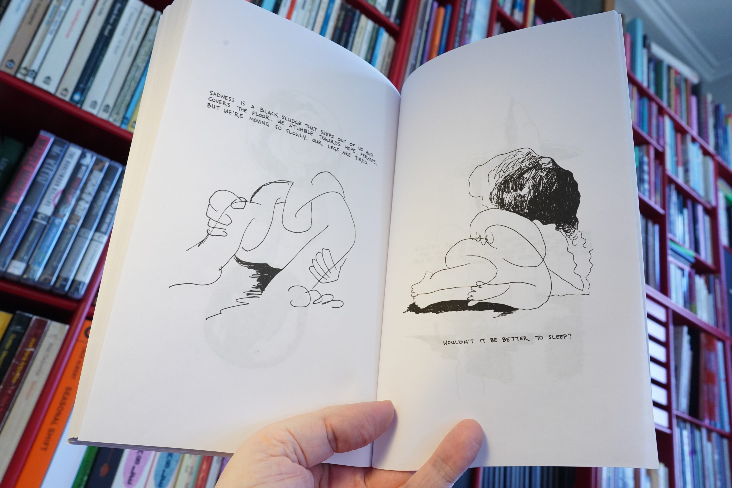
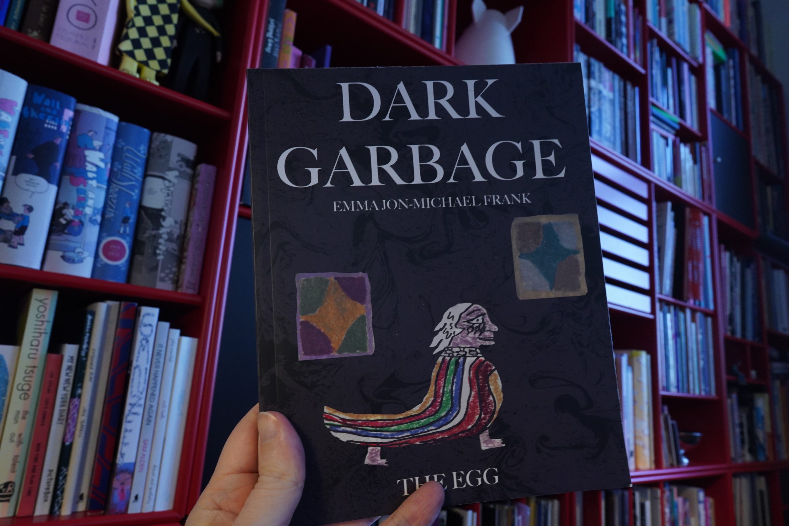
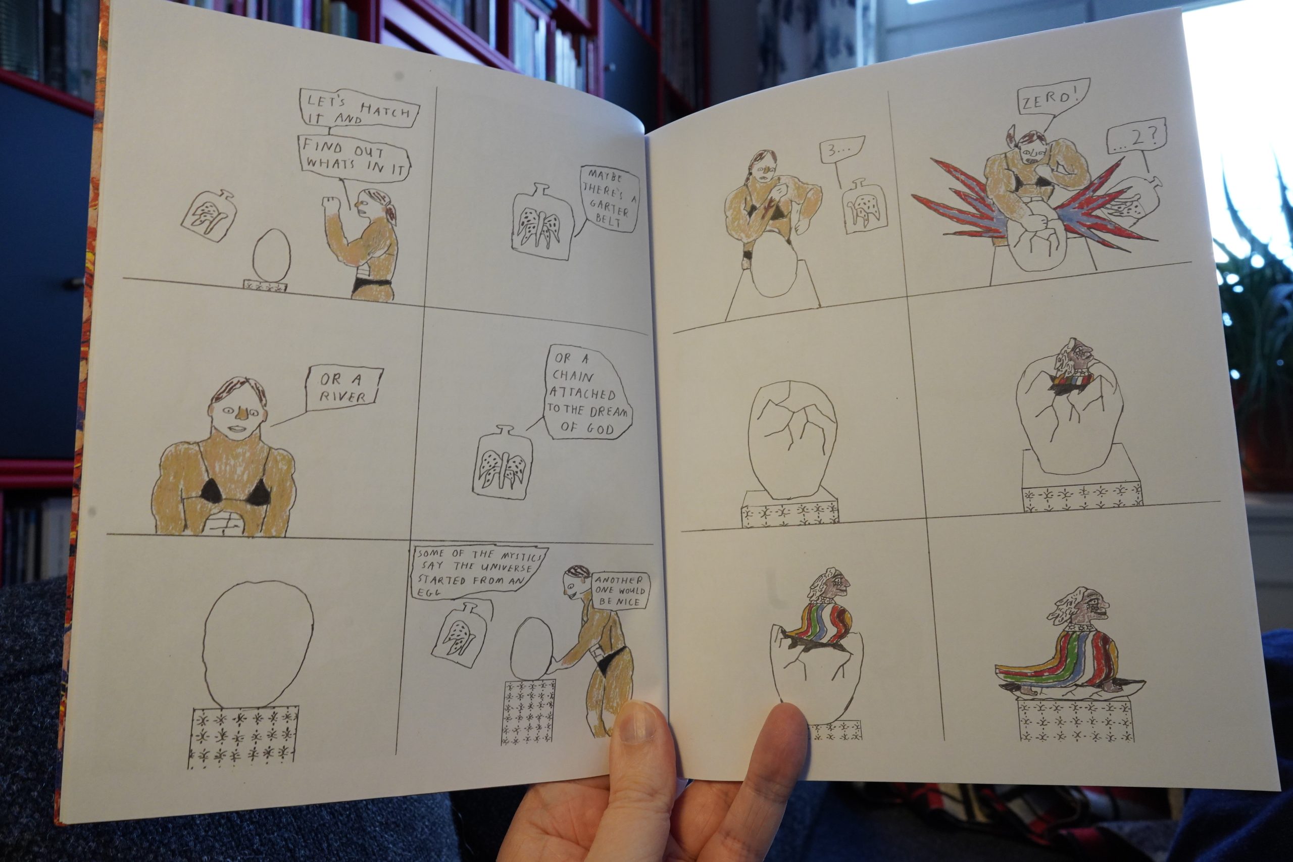
17:46: Dark Garbage & The Egg by Emma Jon-Michael Frank (Floating World)
I have absolutely no idea what this is “about”, but the storyline is easy enough to follow, and is… totally weird. In a good way.
It also helps that there’s an abundance of quite funny one liners sprinkled throughout. I like it.
And now I have to take a nap. Perchance to dream of time buckets.
| Dry Cleaning: Swampy EP |  |
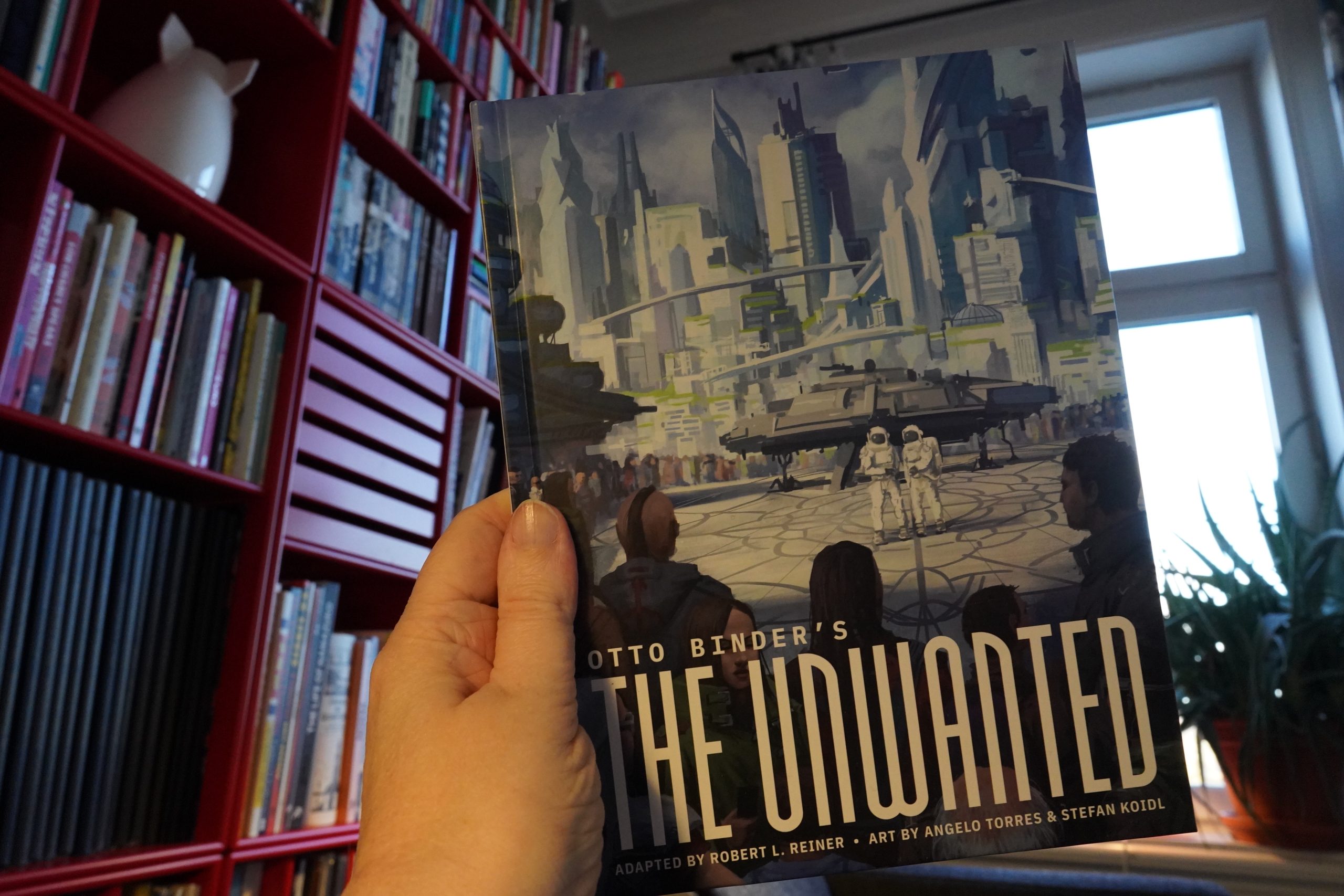
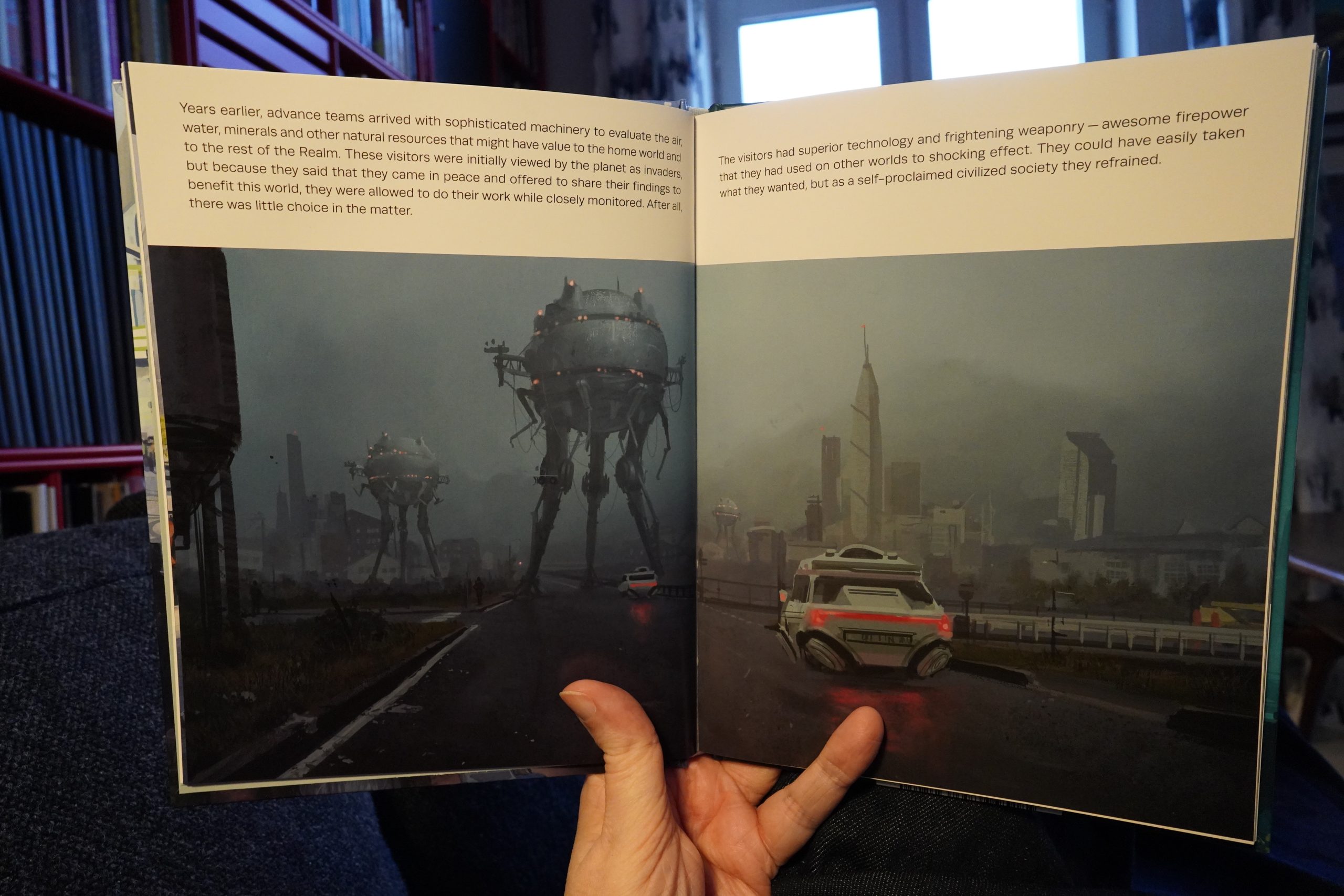
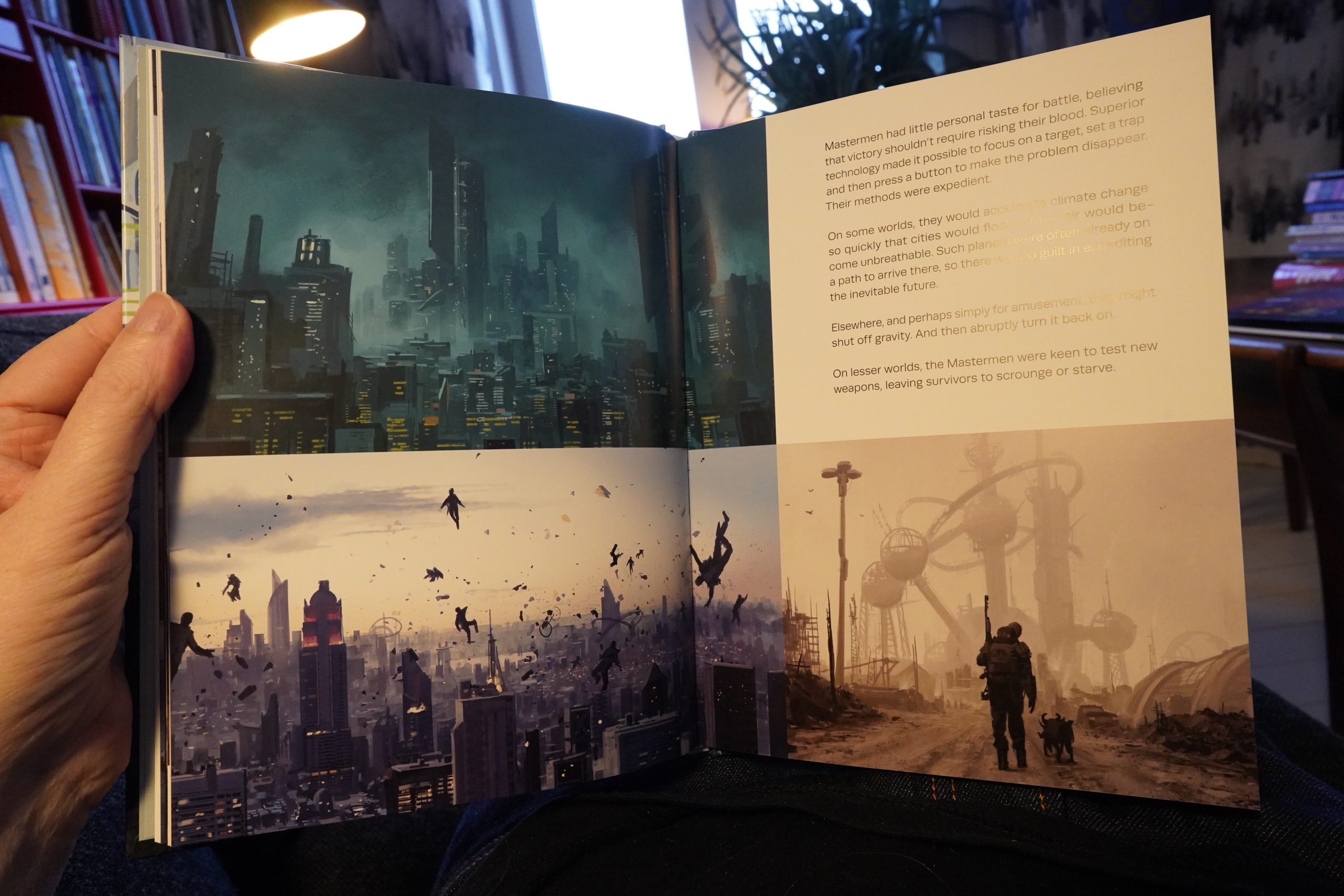
20:13: The Unwanted by Otto Binder/Robert L. Reiner/Angelo Torres/Stefan Koidl (Fantagraphics)
I’m awake! I’m awake!
That was a good nap.
Oh, this isn’t a comic — it’s an illustrated short story, written by comics writer Otto Binder.
The story is fun in an EC-ish way, but man, the writing is bad. Even on a 50s pulp sci fi scale.
The illustrations are nice, though.
I should make some dinner…
| Orbital: Optical Delusion |  |
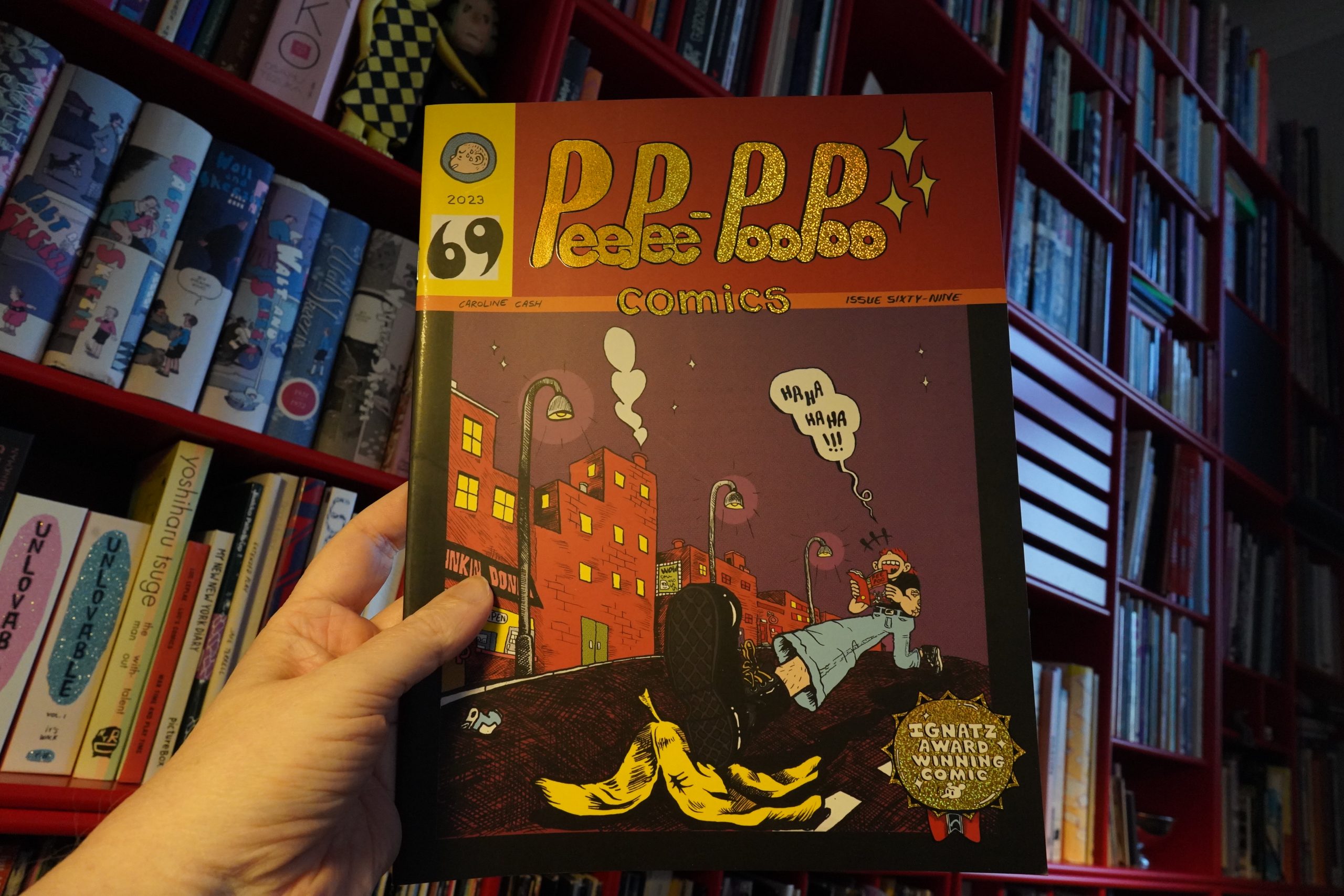
20:50: PeePee-PooPoo Comics #69 by Caroline Cash (Silver Sprocket)
Potatoes on the boil.
This has apparently been self-published before, but now Silver Sprocket are doing a larger edition. That’s something Silver Sprocket does a lot, right, or am I just misremembering? Anyway: Good job, Sprocketses.
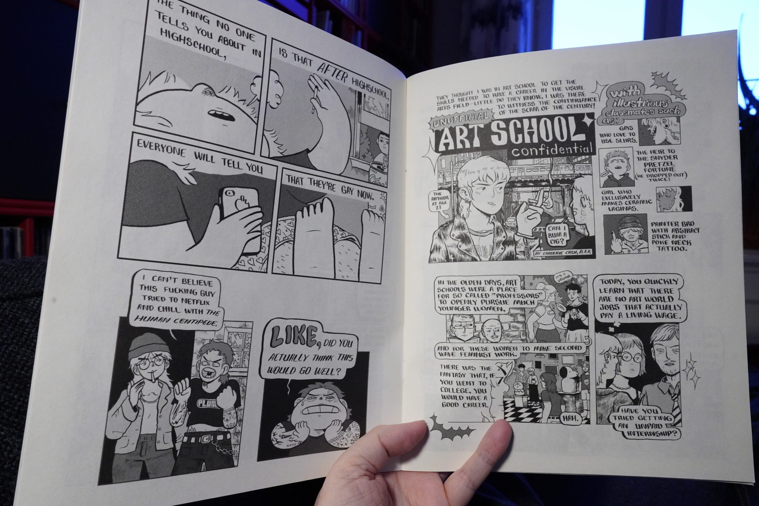
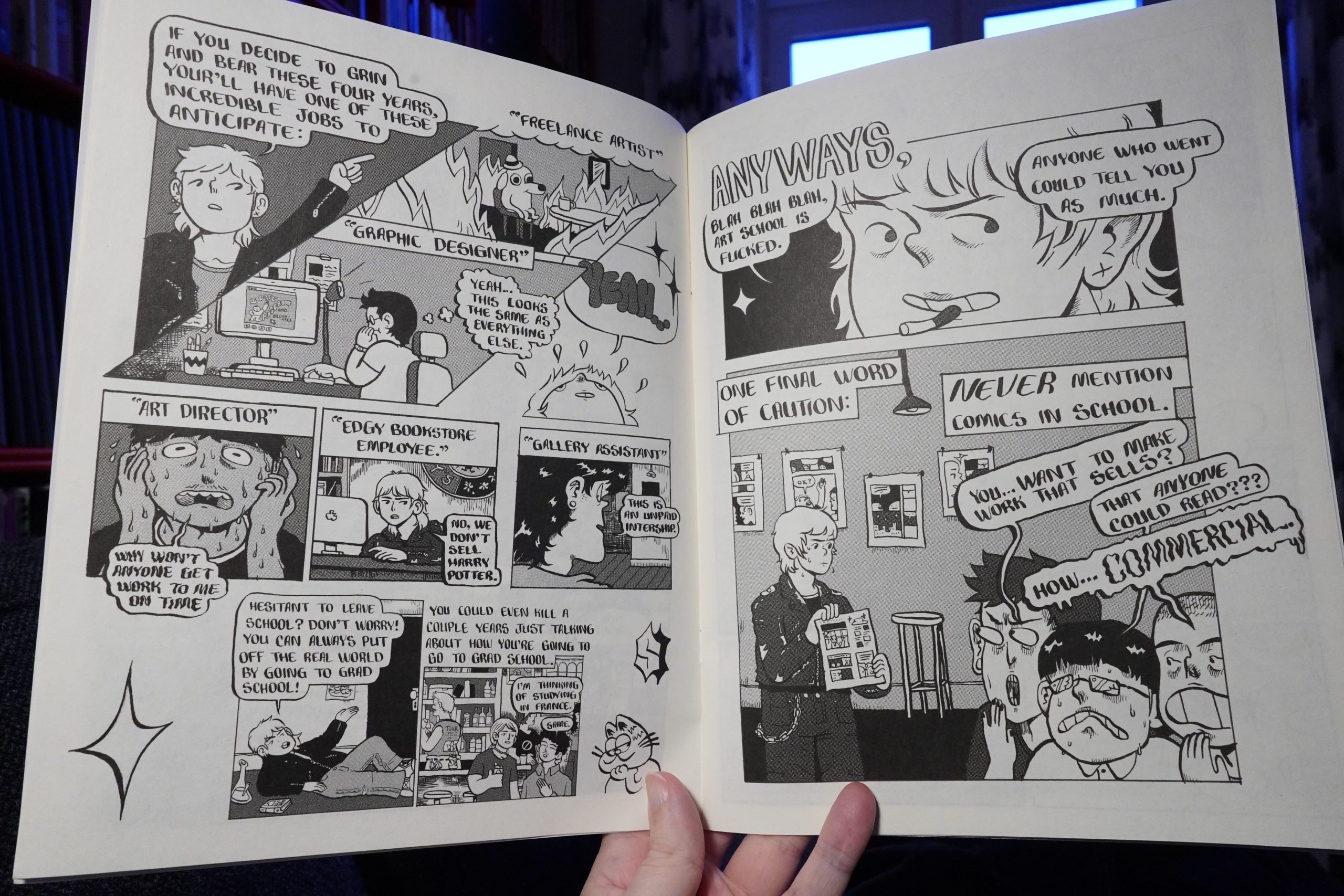
This book has a strange flow — it starts off with a bunch of stand-alone jokes, and then segues into two longer stories, and it took me a while to realise that we were not in single joke territory and adjust my reading.
The artwork is really attractive, and there are good jokes, but the complaints about art school are pretty tired.
Now I should go finish making dinner.
| Movietone: Movietone |  |
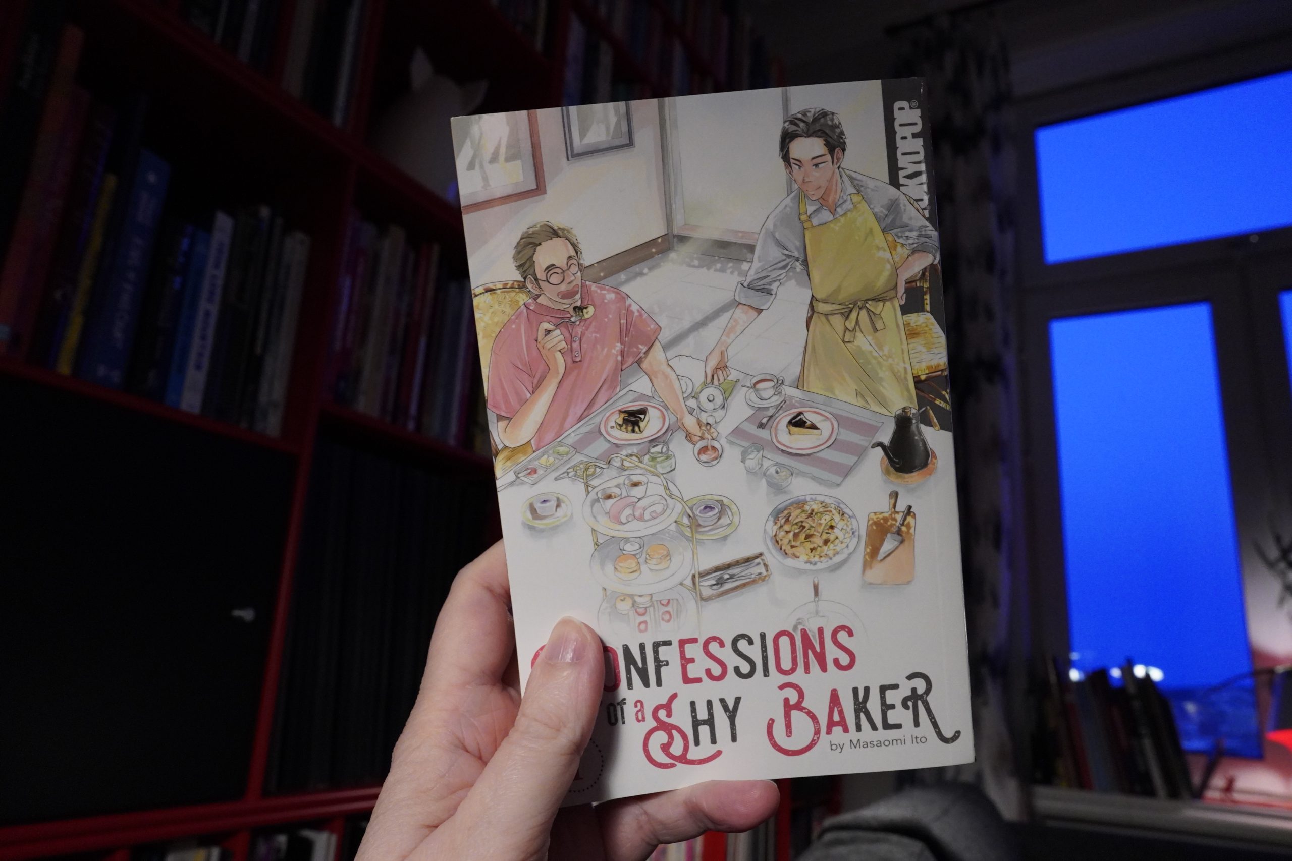
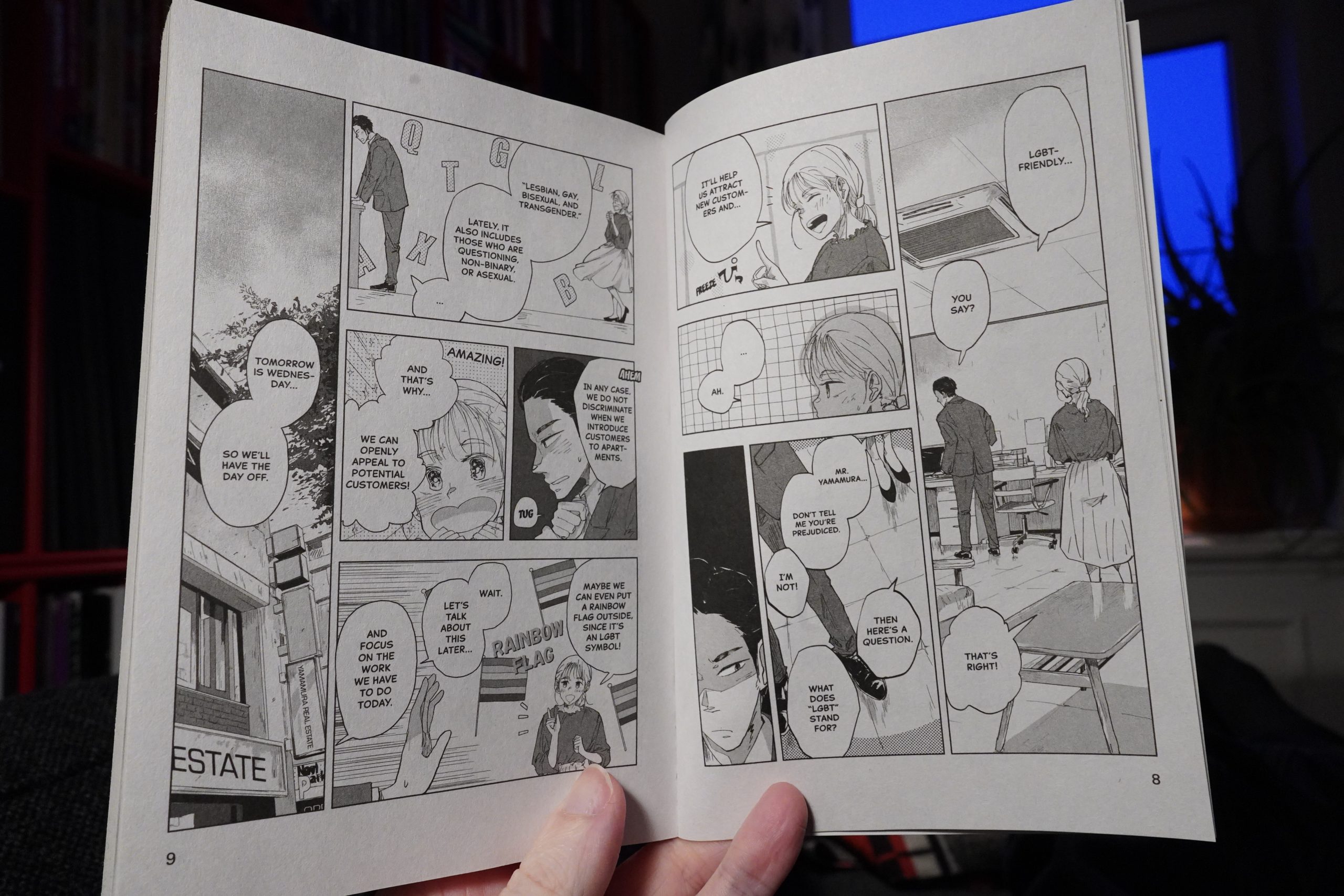
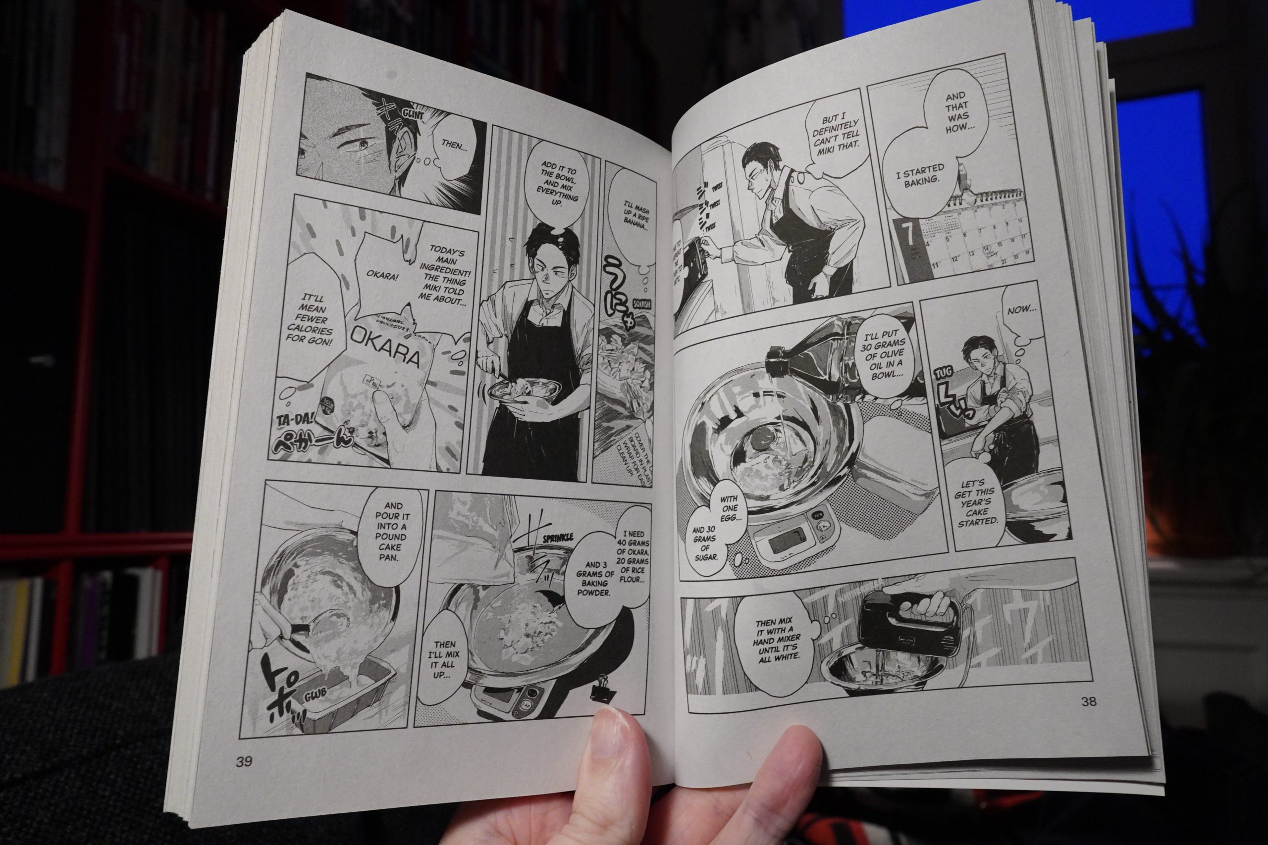
21:27: Confessions of a Shy Baker 1 by Masaomi Ito (Tokyopop)
Food’s nice.
This is really similar to What Did You Eat Yesterday?, but without the charm that series has. I mean, this isn’t bad or anything, but charm What Did You Eat Yesterday? is kinda hypnotic — nothing much happens, but it’s still riveting.
This has a lot more drama, but the drama isn’t as interesting as the drama when Shiro finds zucchini at 60% off and has to use it in seven dishes at once before it goes off.
This book even copies how the other series does the cooking scenes.
It’s totally OK, but it didn’t really hold my interest, and I don’t think I’ll be getting further volumes.
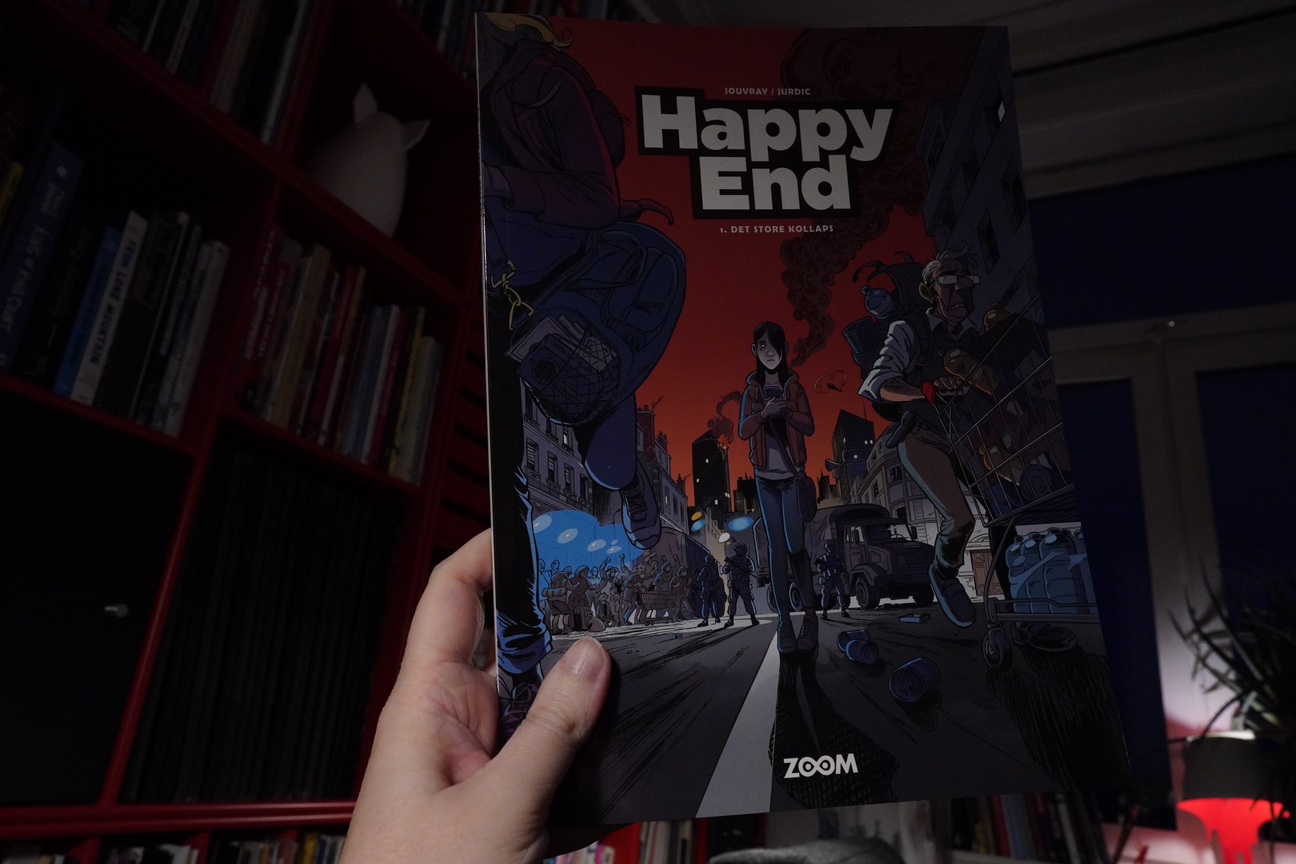
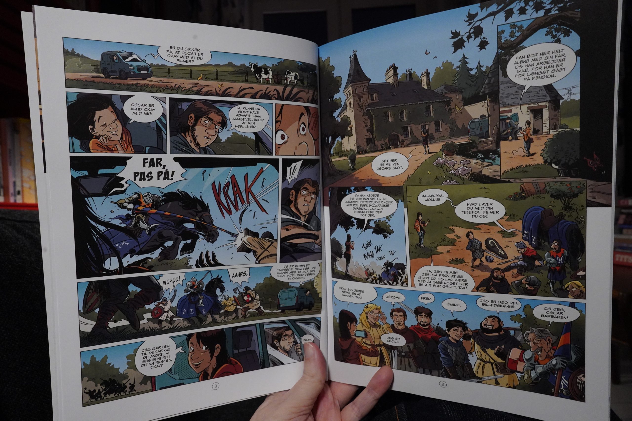
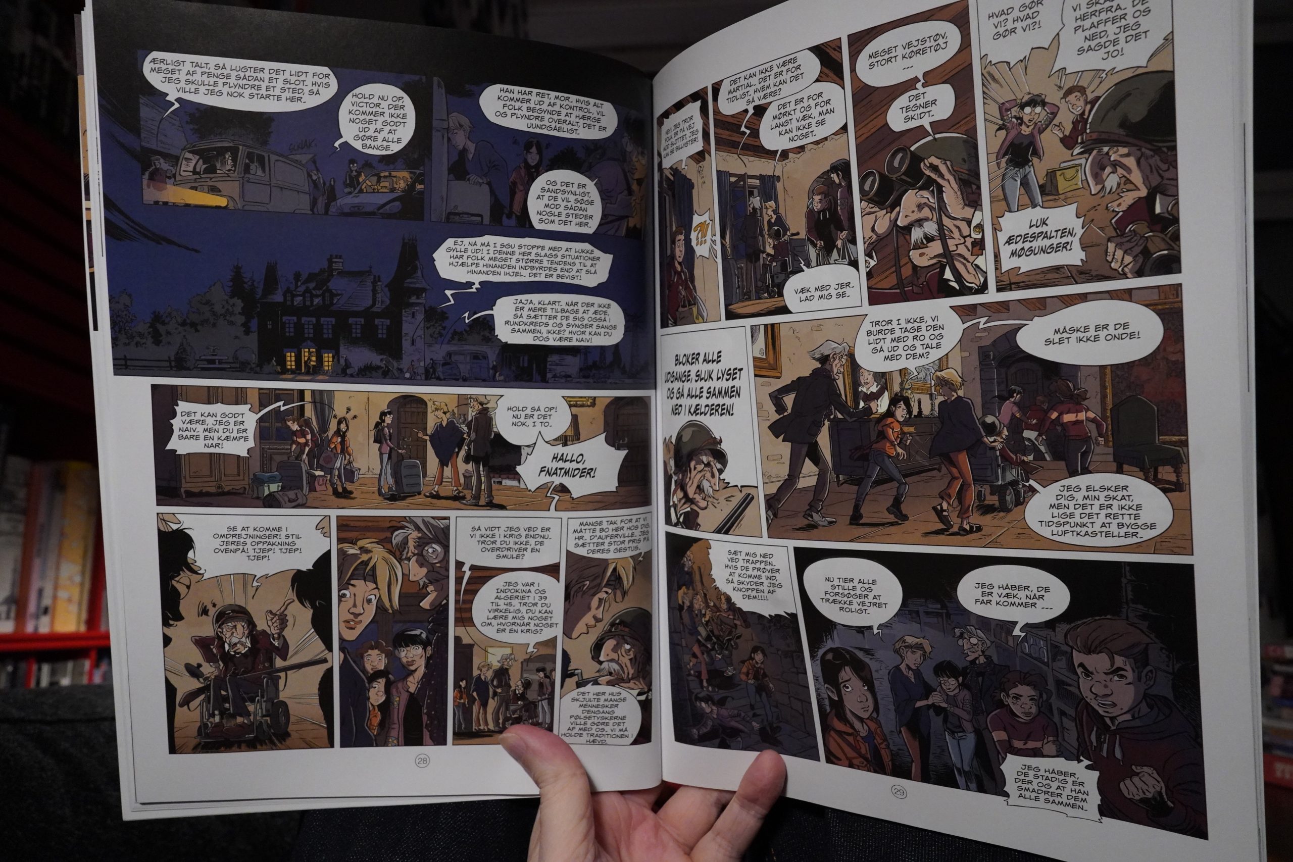
22:10: Happy End 1: La grande panne by Jouvray / Jurdic (Zoom)
This starts off kinda interesting, but then it turns into a drearily realistic take on a post-apocalyptic story. This time around, there’s another economic crisis, and everybody goes WE”RE IN A POST-APOCALYPTIC BOOK, which seems fair.
It’s so boring! Everything is minutely explained, and the only drama here is fake drama, like when that old guy goes gun crazy. I had to bail halfway through, because I was so bored that I literally died. I’m dead now.
| xPropoganda: The Heart Is Strange |  |
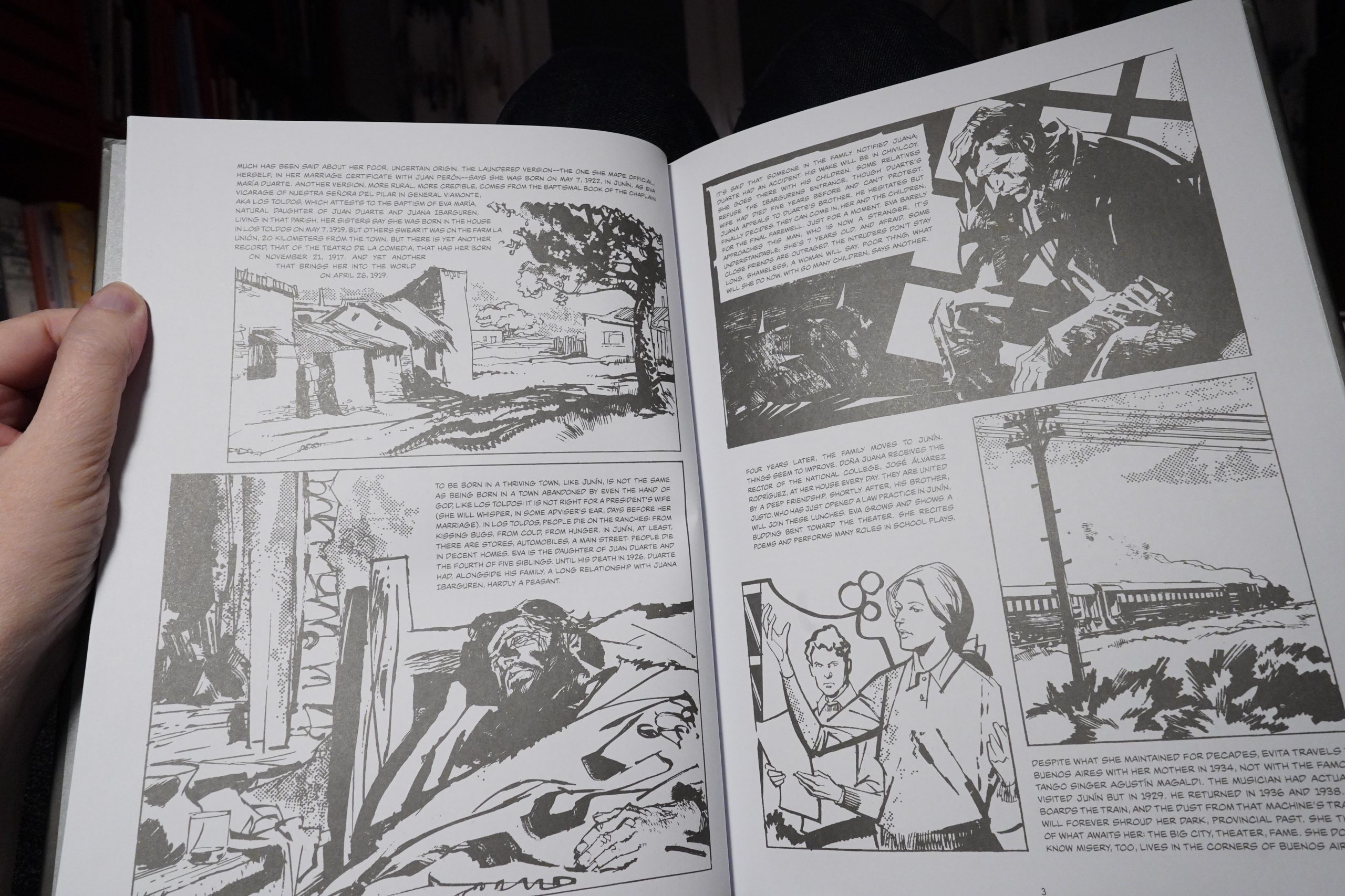
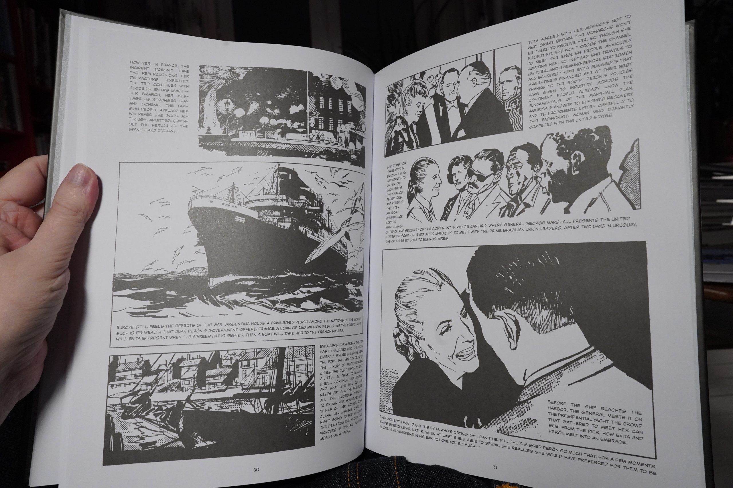
22:38: Evita: The Life and Work of Eva Peron by Osterheld / Breccia / Breccia (Fantagraphics)
It doesn’t seem fair that the first book I’m reading in the afterlife is a comics biography — those usually suck. But I like Breccia’s artwork, so I bought this anyway, and I guess I have to read it now.
Oh, er… Odd choice for ink colour — it’s a slightly reflective, dark grey ink instead of black ink? It’s not very attractive.
And… the text is a straightforward recounting of Peron’s life, which I have zero interest in. As for the artwork, I wouldn’t even have guessed that this was Breccia: It just looks like it was traced from press photos.
This was a lot worse than I had imagined the book to be, and I had very low expectations to begin with.
What kind of hell is my afterlife turning out to be!?
I ditched this book after four pages.
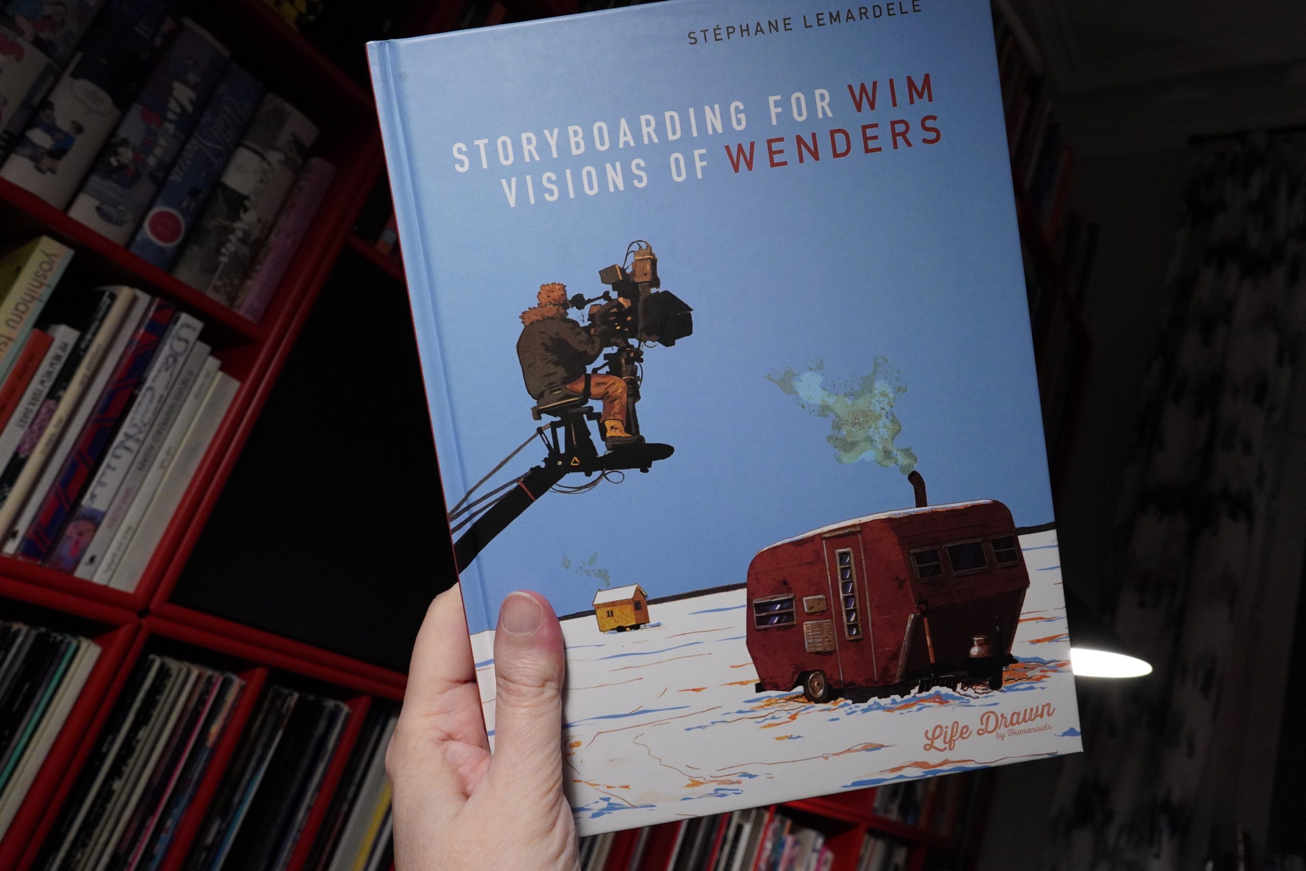
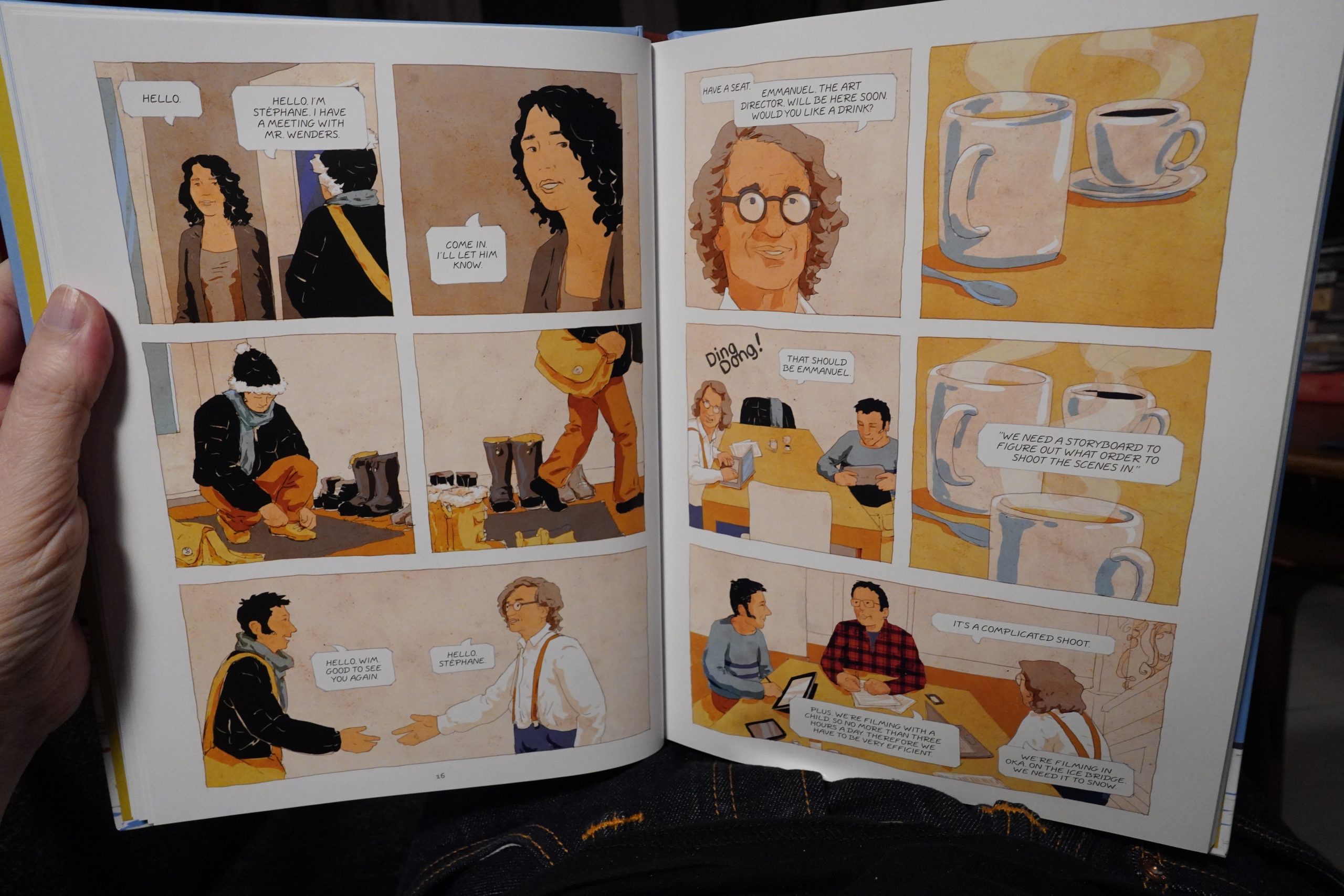
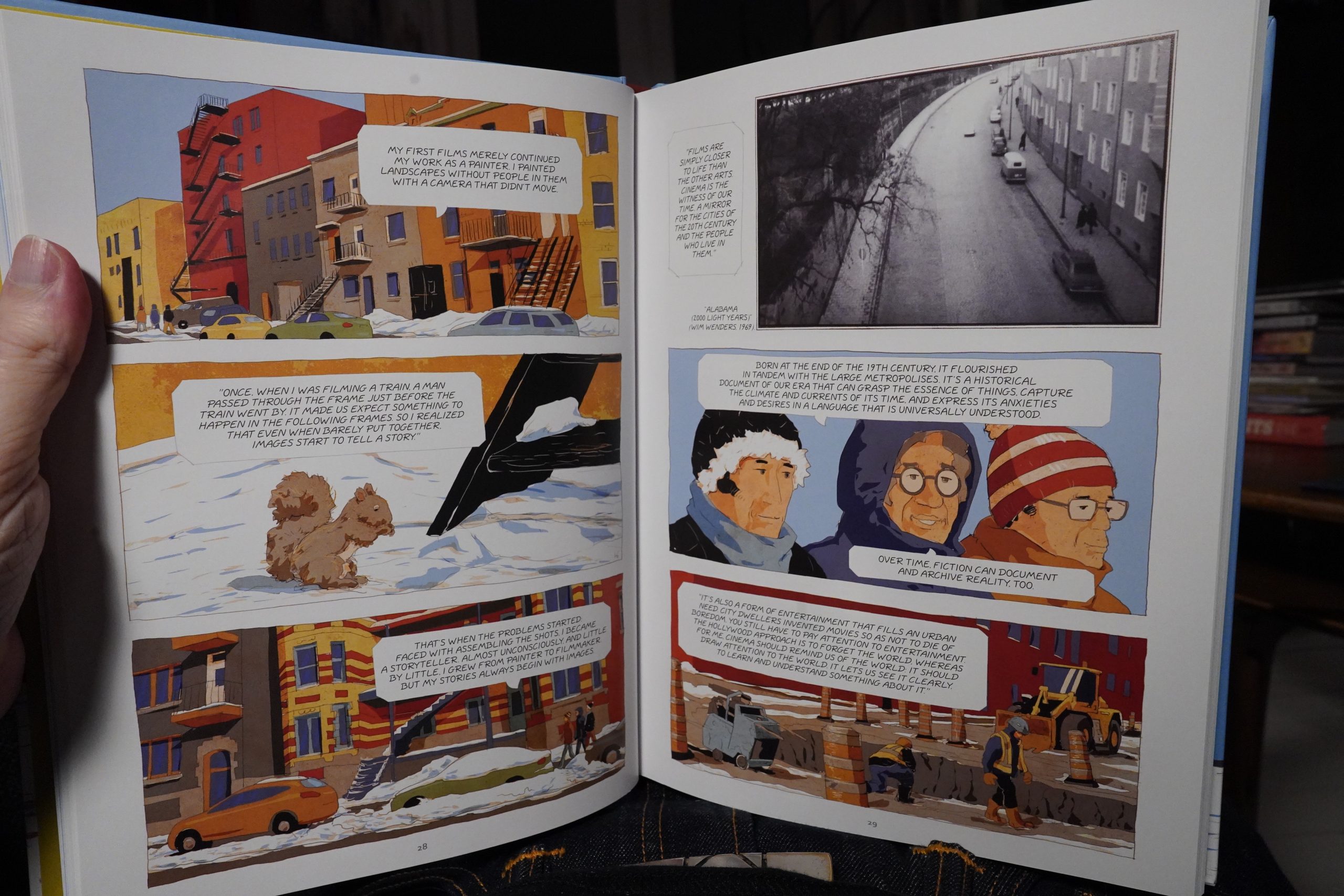
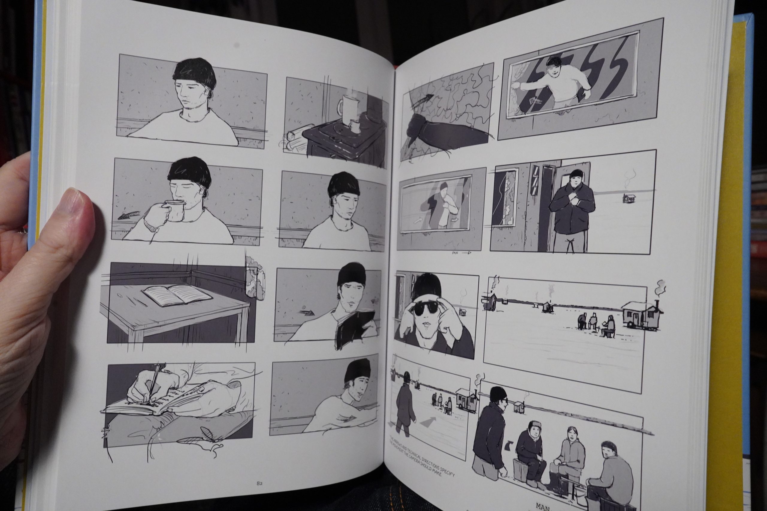
22:46: Storyboarding for Wim Wenders by Stéphane Lemardelé (Humanoids)
I don’t have much hope for this book, either, but I do like (some of) Wenders’ movies, so…
Oh, this is an autobio book about a guy who did storyboards for a scene in Wenders’ 3D movie with James Franco…
Quite a lot of the pages are taken up with Wenders talking about making movies, and unfortunately these pages aren’t really that riveting. The pages that happen on set are more interesting.
We also get to see the finished storyboards.
So… that’s a pretty odd comic book, and I’m not sure it’s altogether successful.
| Public Enemy: It Takes a Nation of Millions to Hold us Back |  |
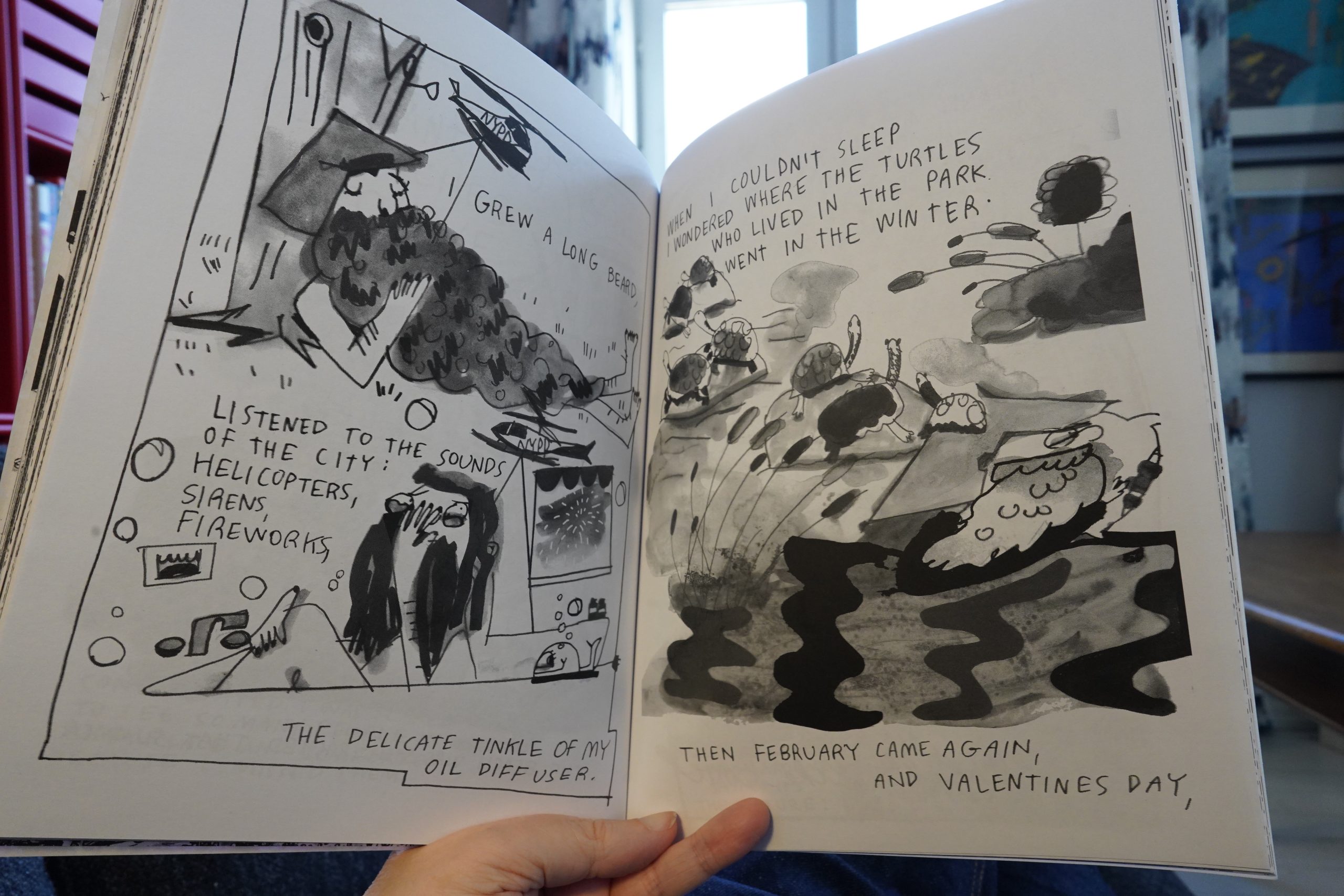
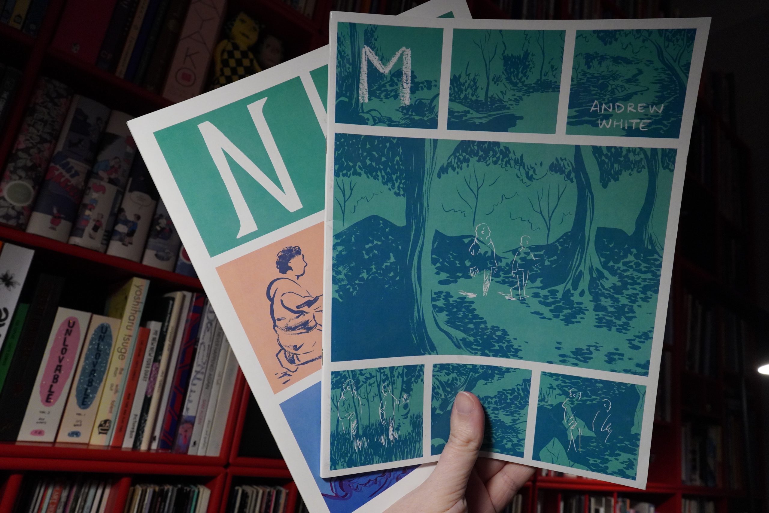
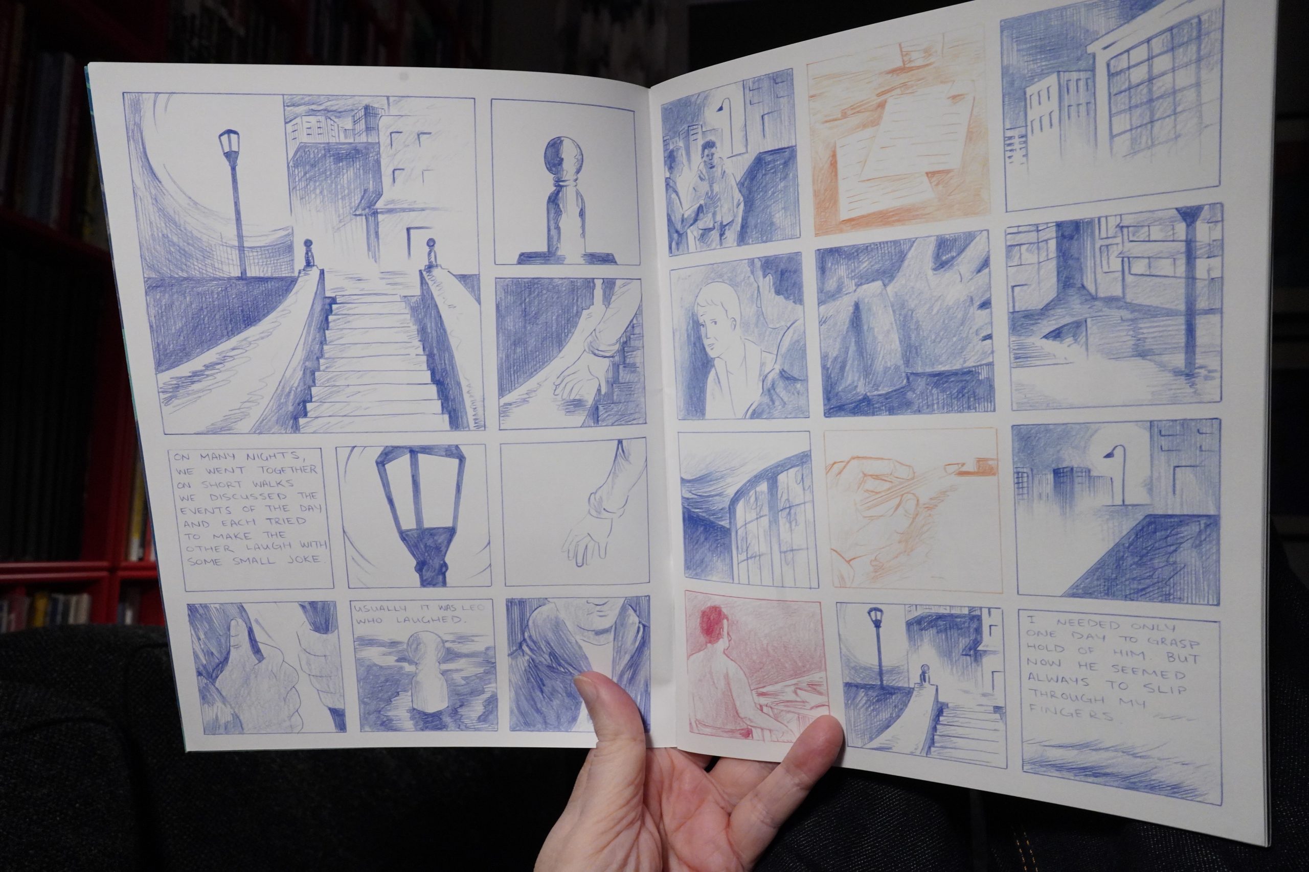
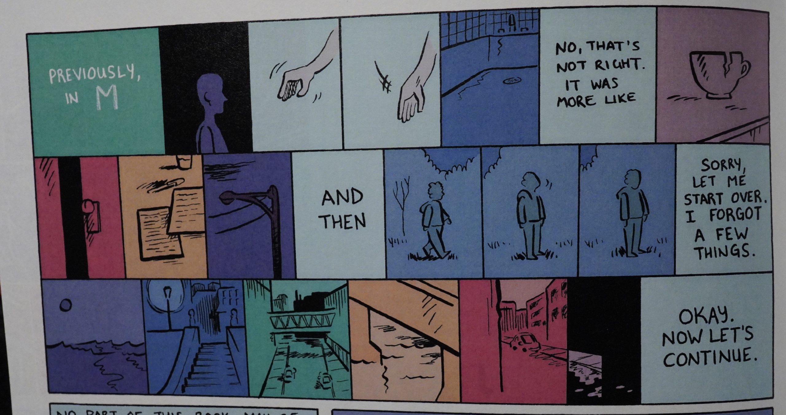
23:27: M / N by Andrew White
OK, I think I’m fading, but the last few comics here weren’t particularly good, so I think I’ll cheer myself up with some more Andrew White books.
I think I’ve mostly read White’s more recent work? These two are from 2013-15 and are quite different from the later work. But still great — perhaps more straightforwardly influenced by alternative comics from the 90s?
Like this wonderful recap of the first issue.
In any case, fascinating and gorgeous.
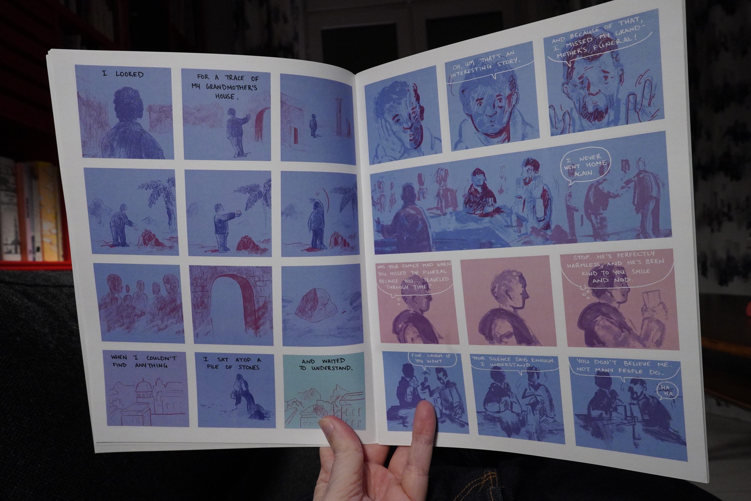
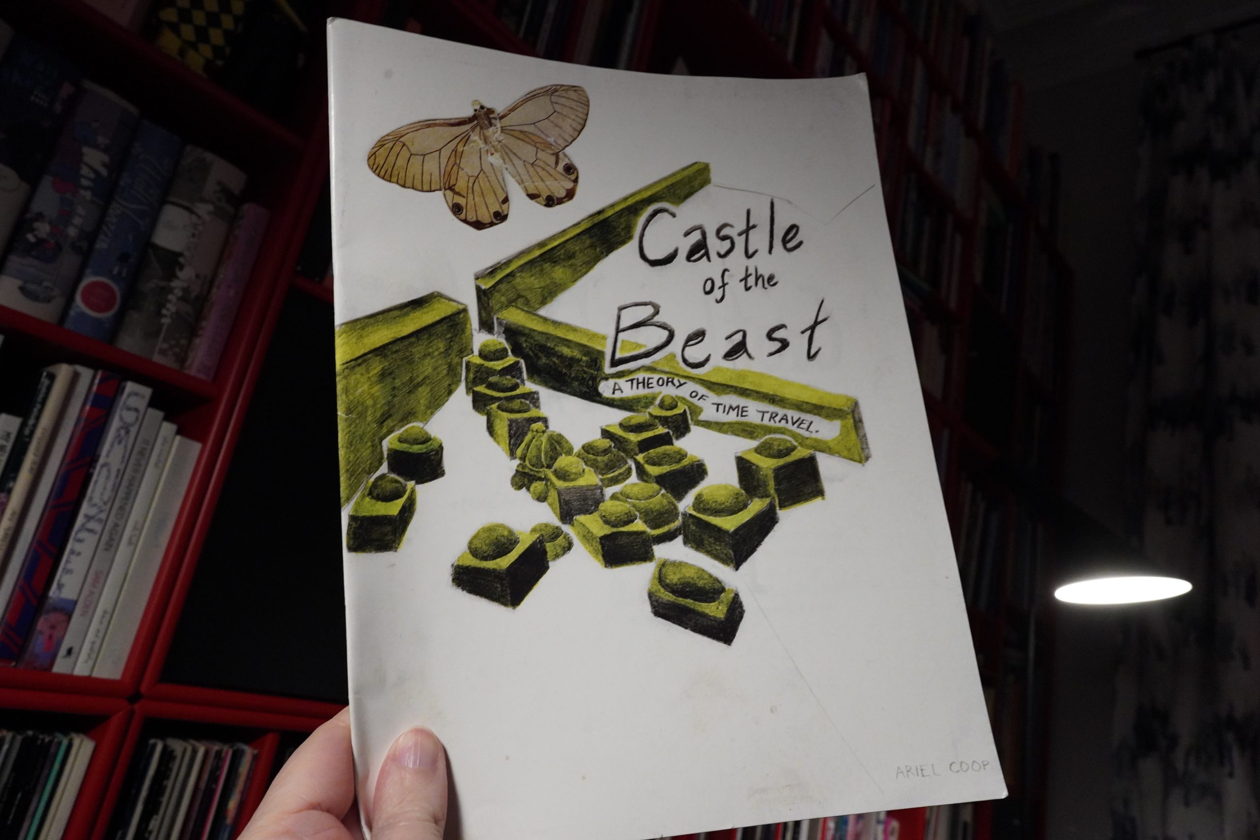
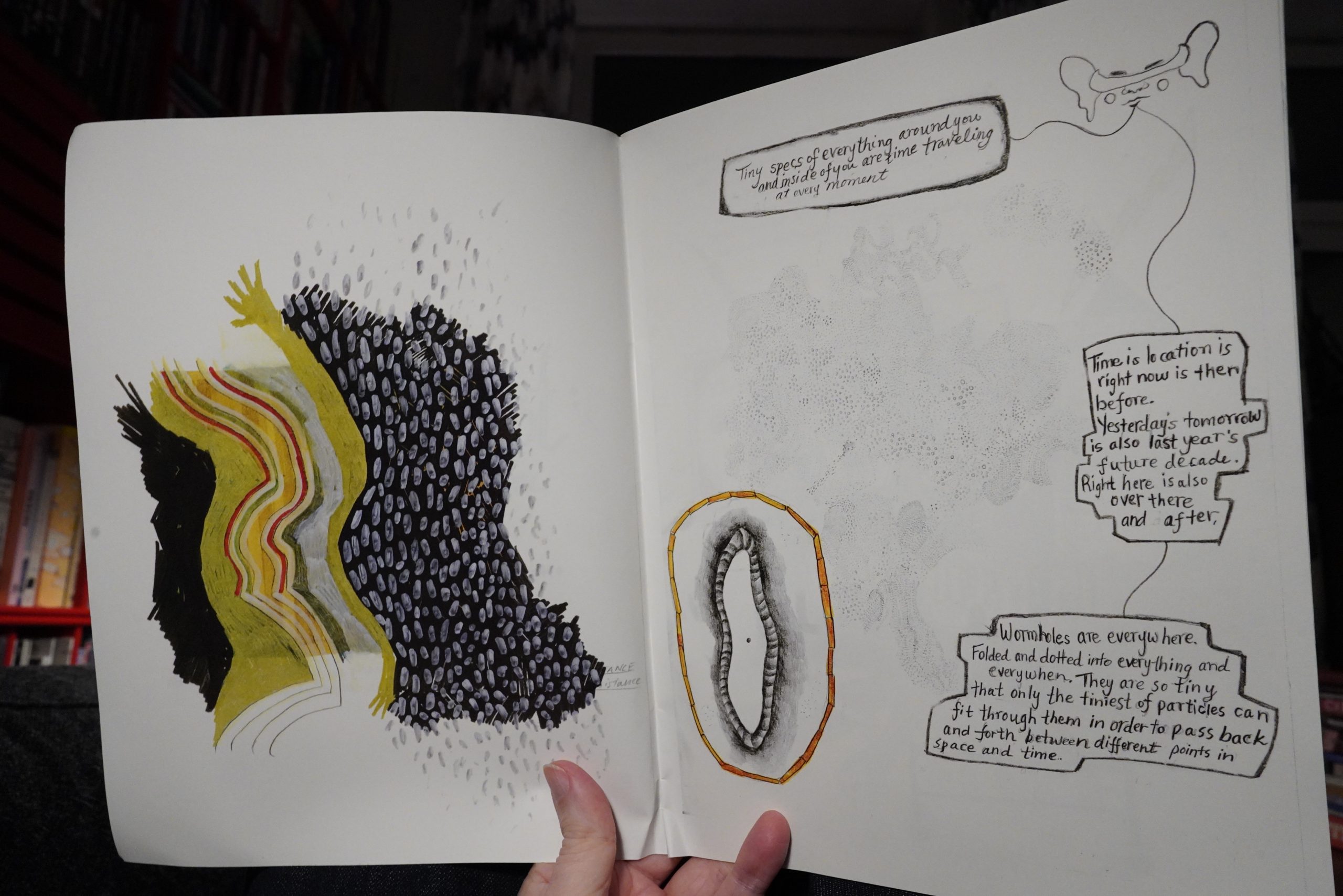
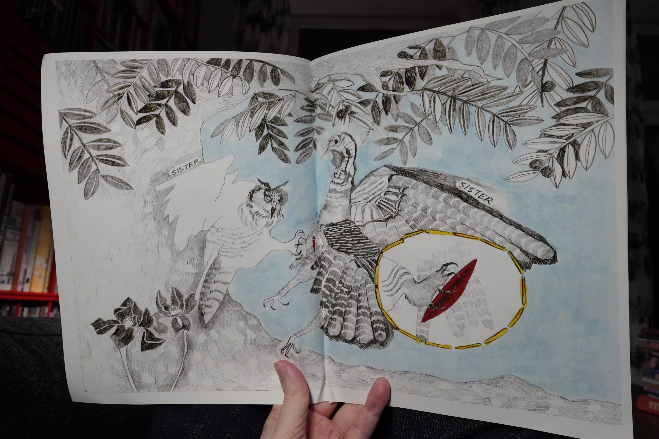
23:54: Castle of the Beast by Ariel Coop
I like the flow this book has… one page seems to flow naturally into the next without too much narrative.
Really good stuff.
OK, I seem to be forgetting, like, what are they called… yeah, words. So I should be going to bed. But just one more
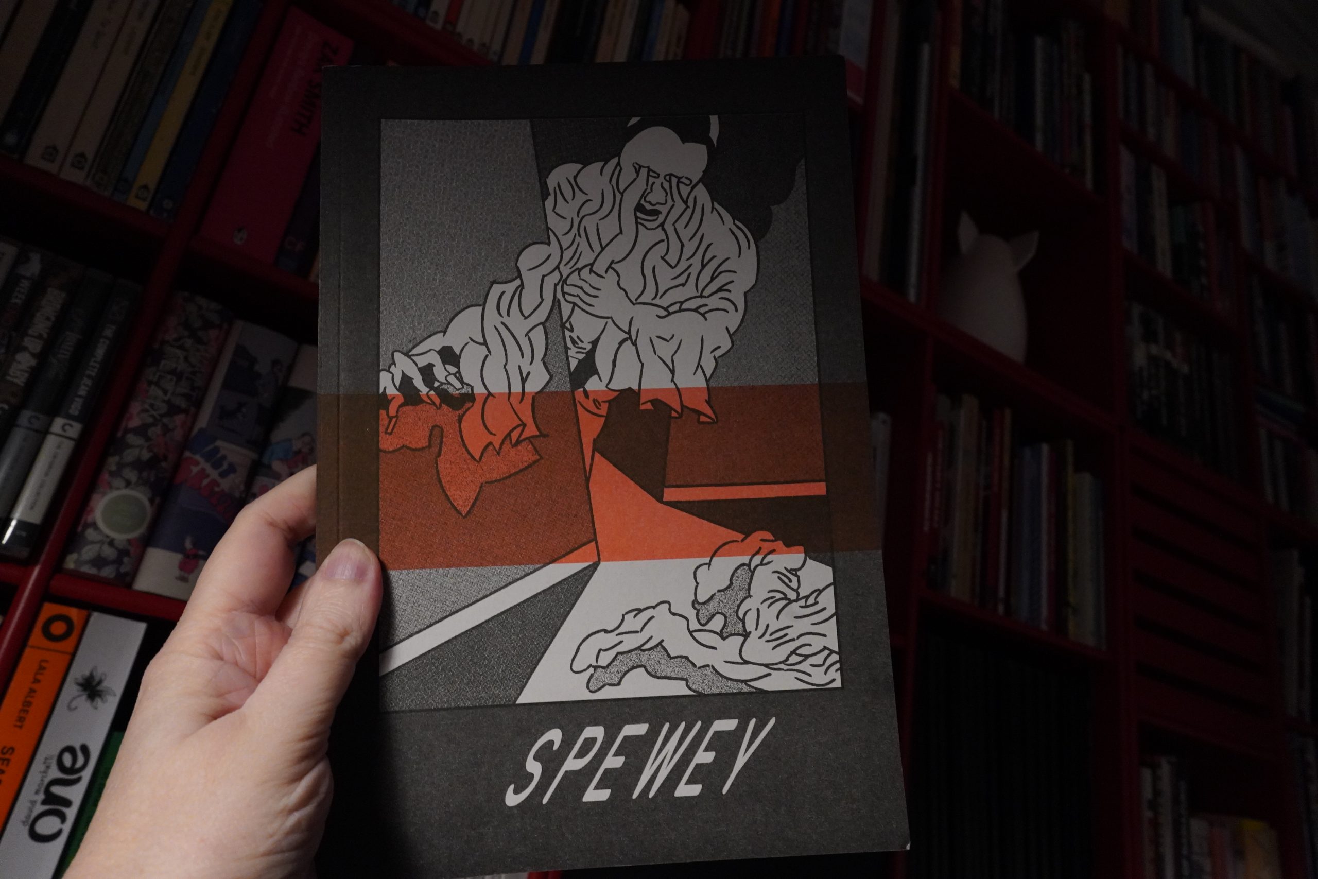
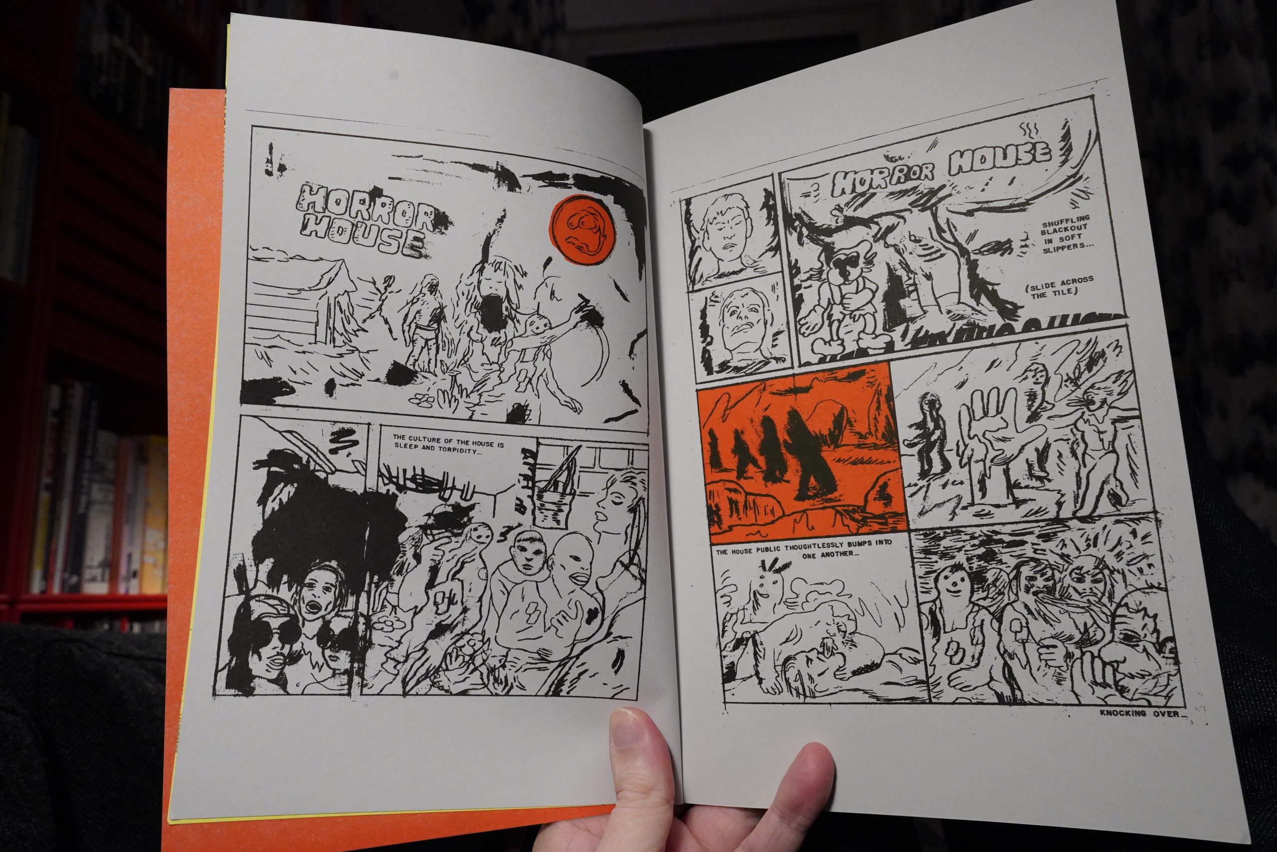
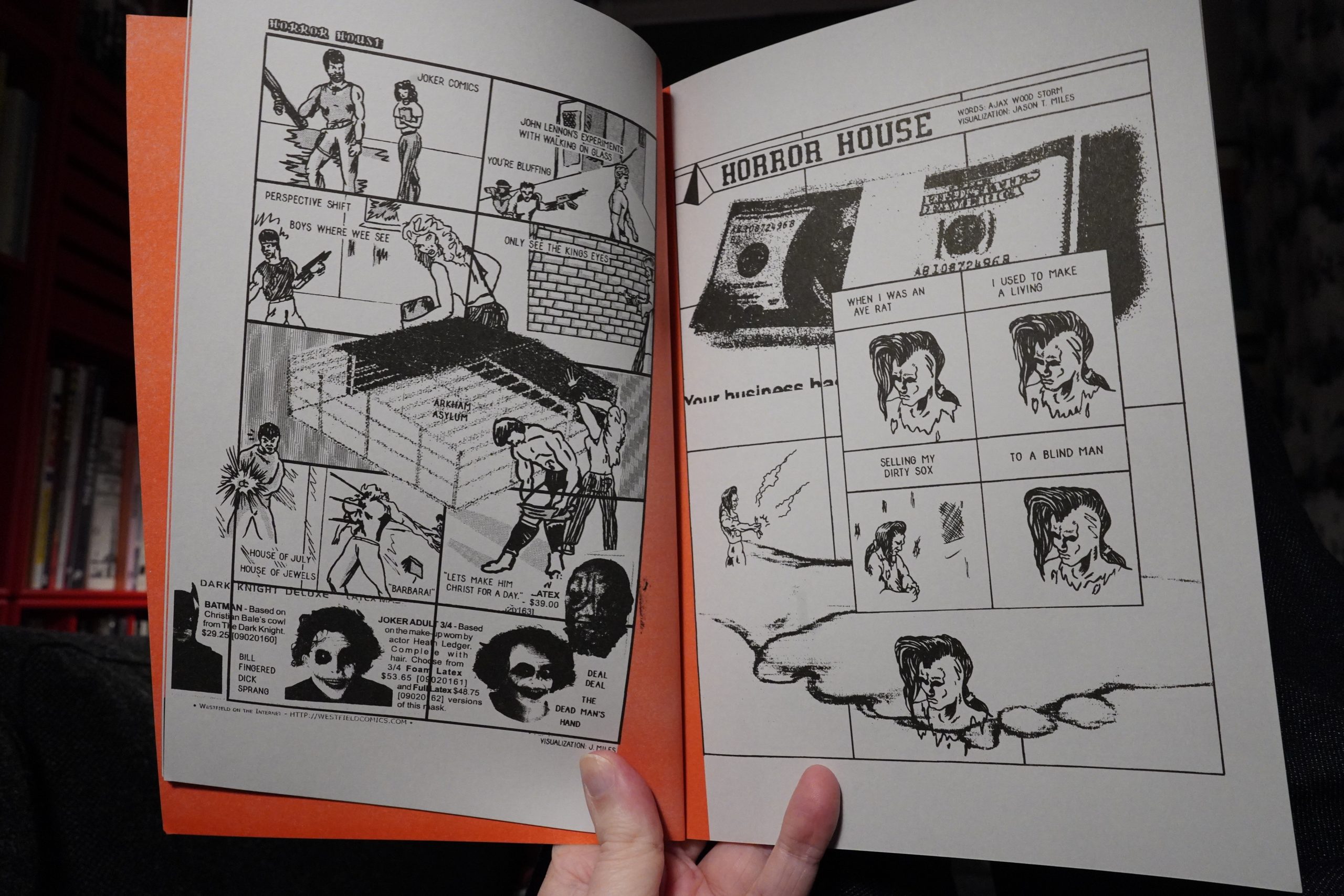
23:59: Spewey by Jason T. Miles
Kinda oblique.
Kinda odd.
| März: Wir sind hier |  |
00:05: The End
OK, I should go to bed and perhaps tomorrow I’ll be alive again. But that was a pretty amazing selection of comics (until I hit the more mainstream books from Tokoypop/Fantagraphics/Zoom/Humanoids). The moral is: Buy more small press comics.
