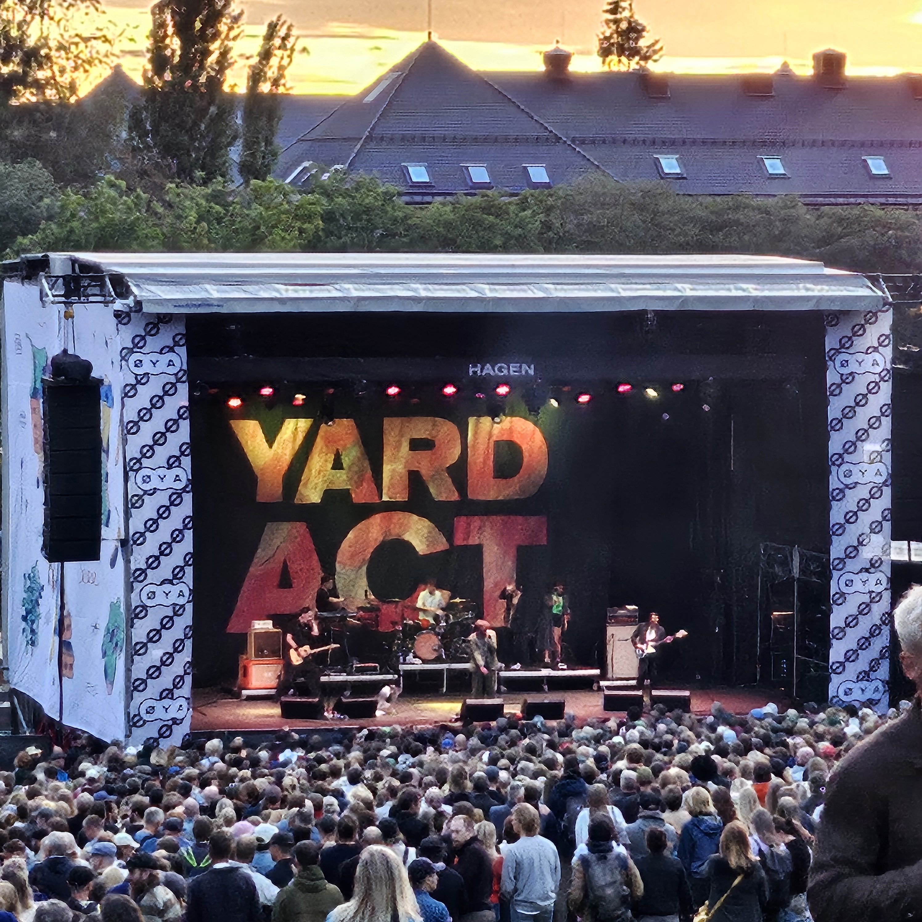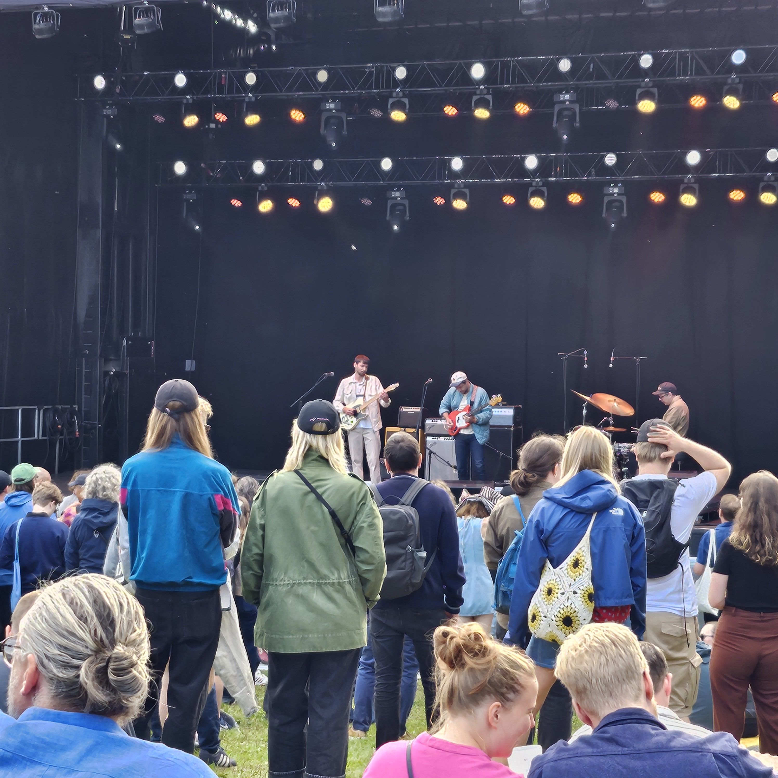
I was going to go to the music festival today, too, but look:
It’s pouring down! So I think I’ll stay on the couch and read the new comics I’ve gotten. And for music — let’s go with popular favourites from the 70s, because it’s that kind of day.
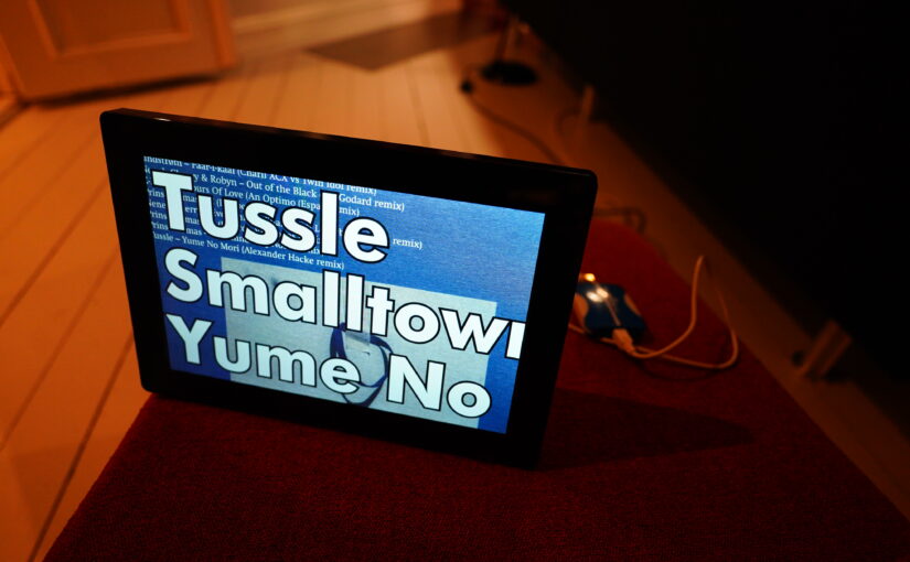
| Various: This Is Reggae Music |  |
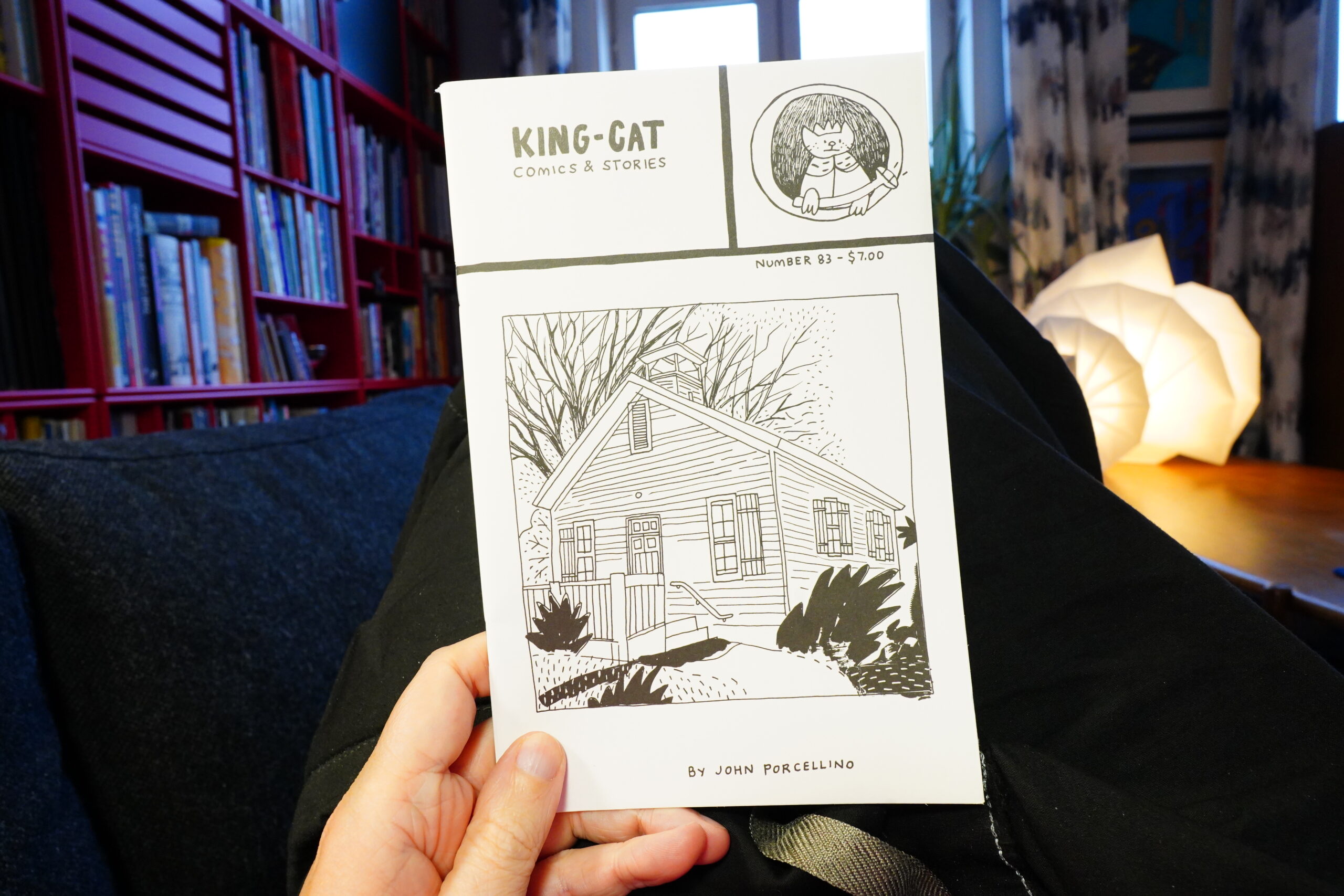
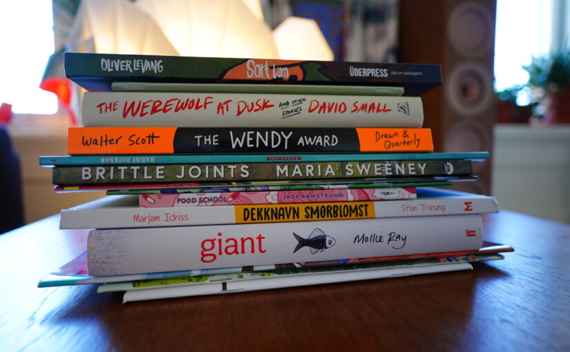
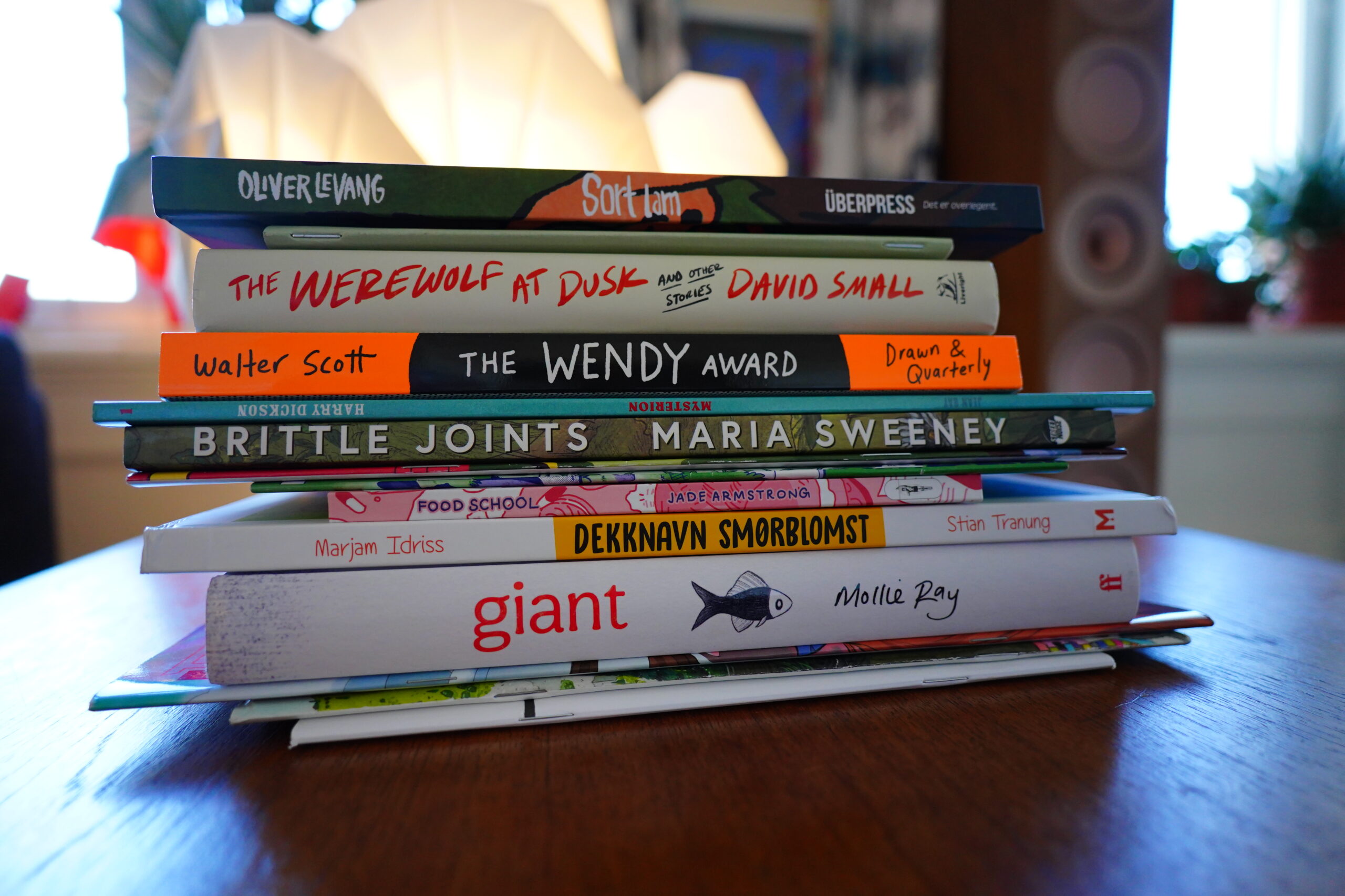
11:44: King-Cat Comics & Stories #83 by John Porcellino
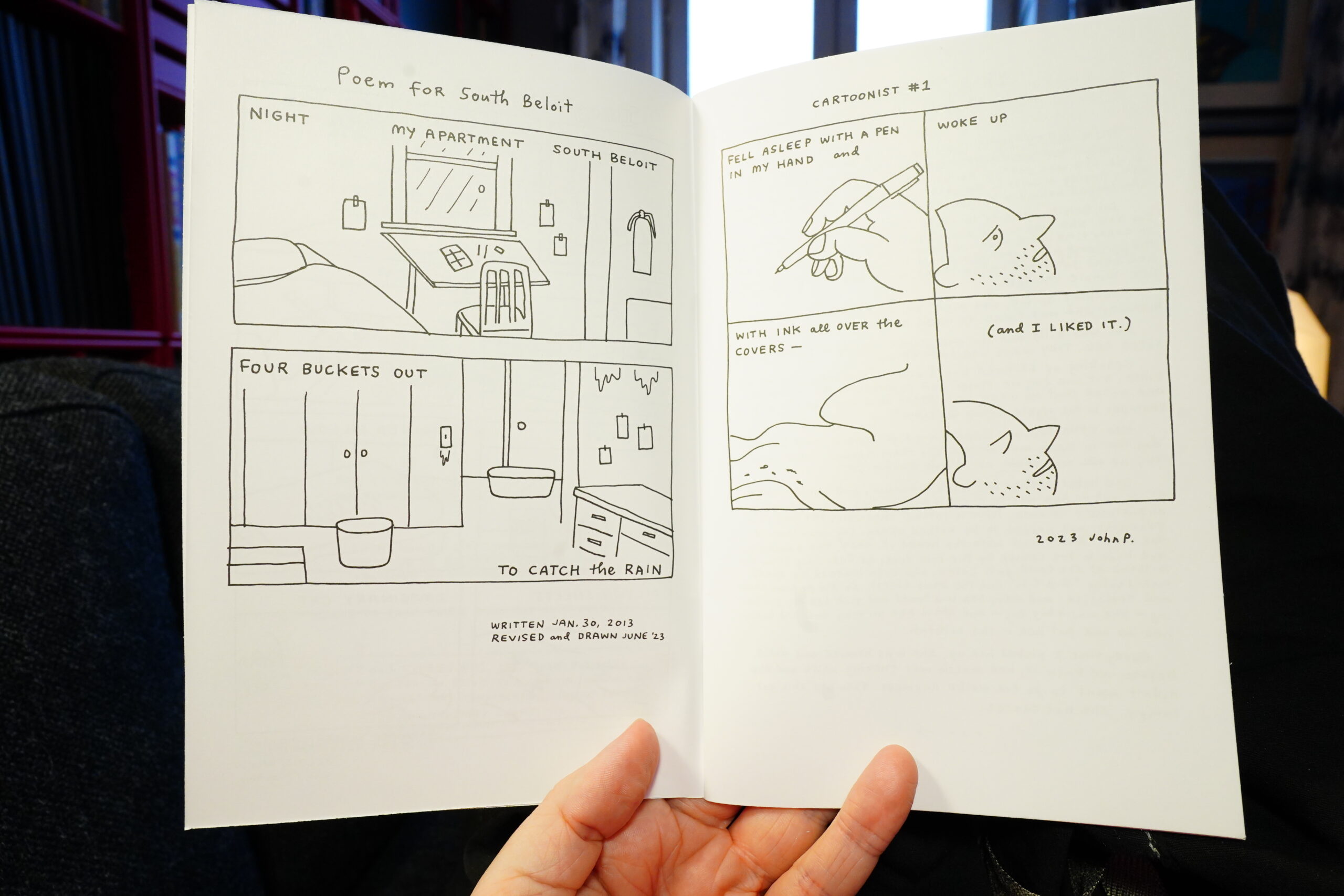
It’s always a good day when a new King-Cat arrives.
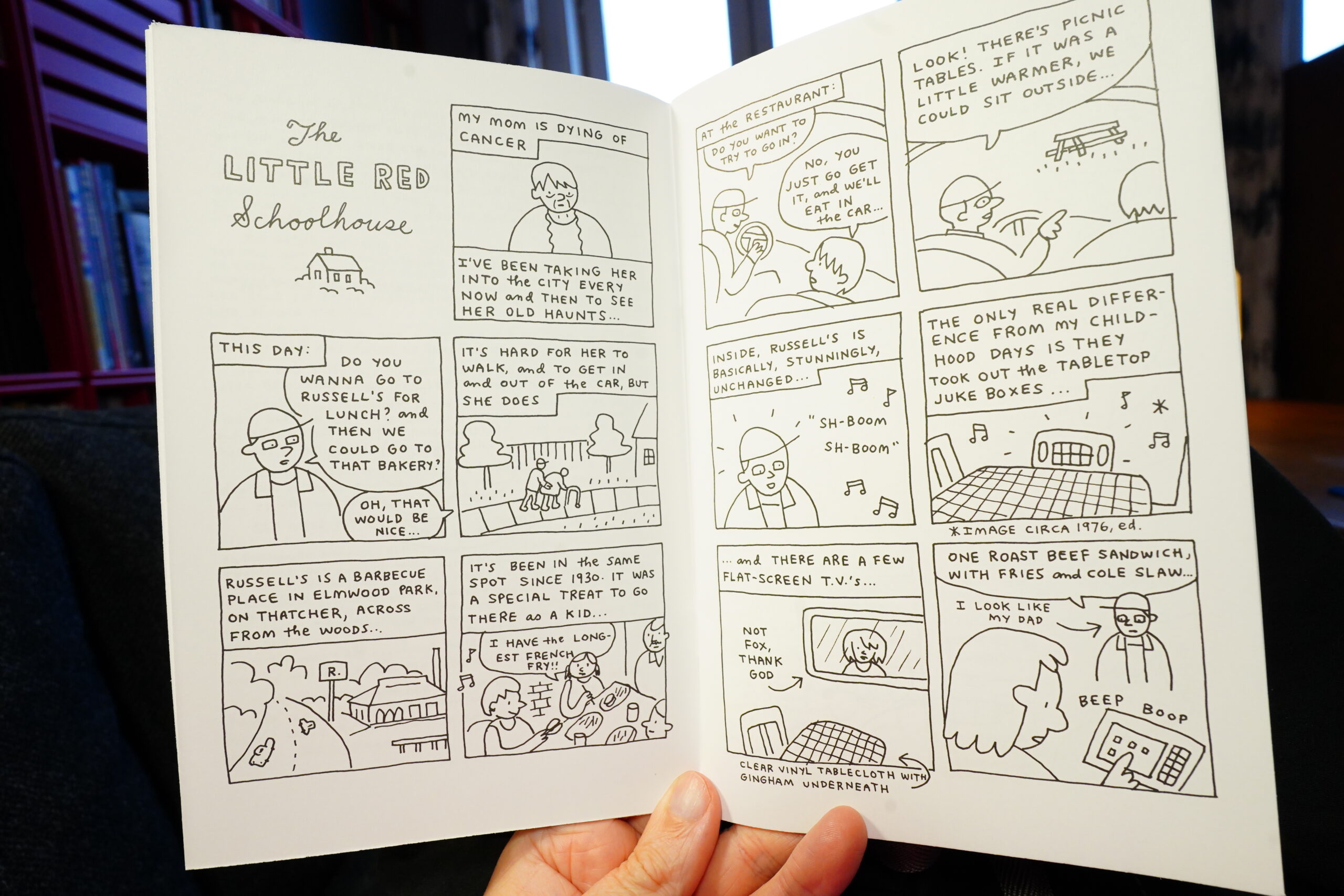
And this is a particularly good one — it’s pretty hefty, and has longer stories (as well as the usual short ones). It’s a wonderful read.
| David Bowie: Diamond Dogs |  |

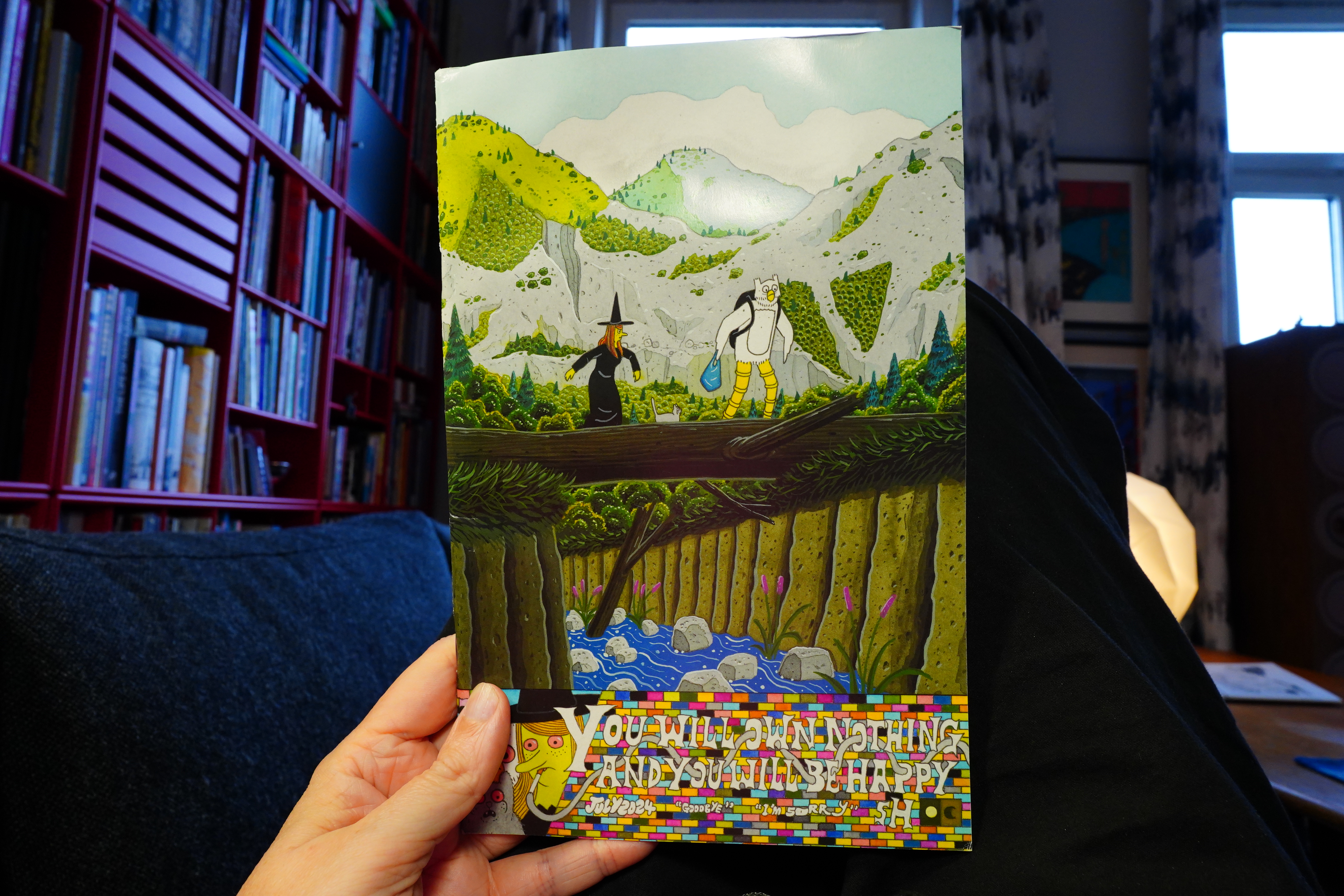
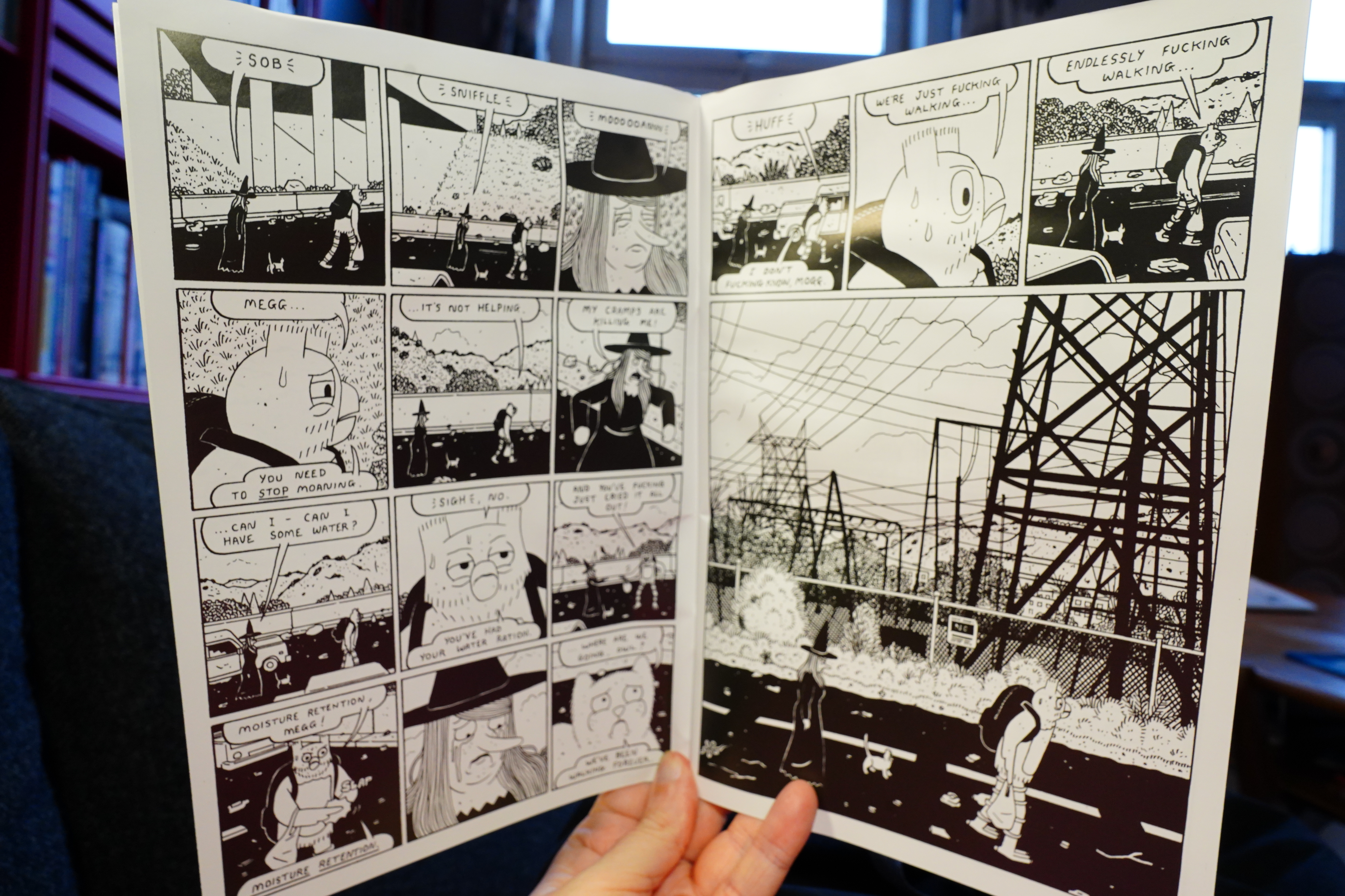
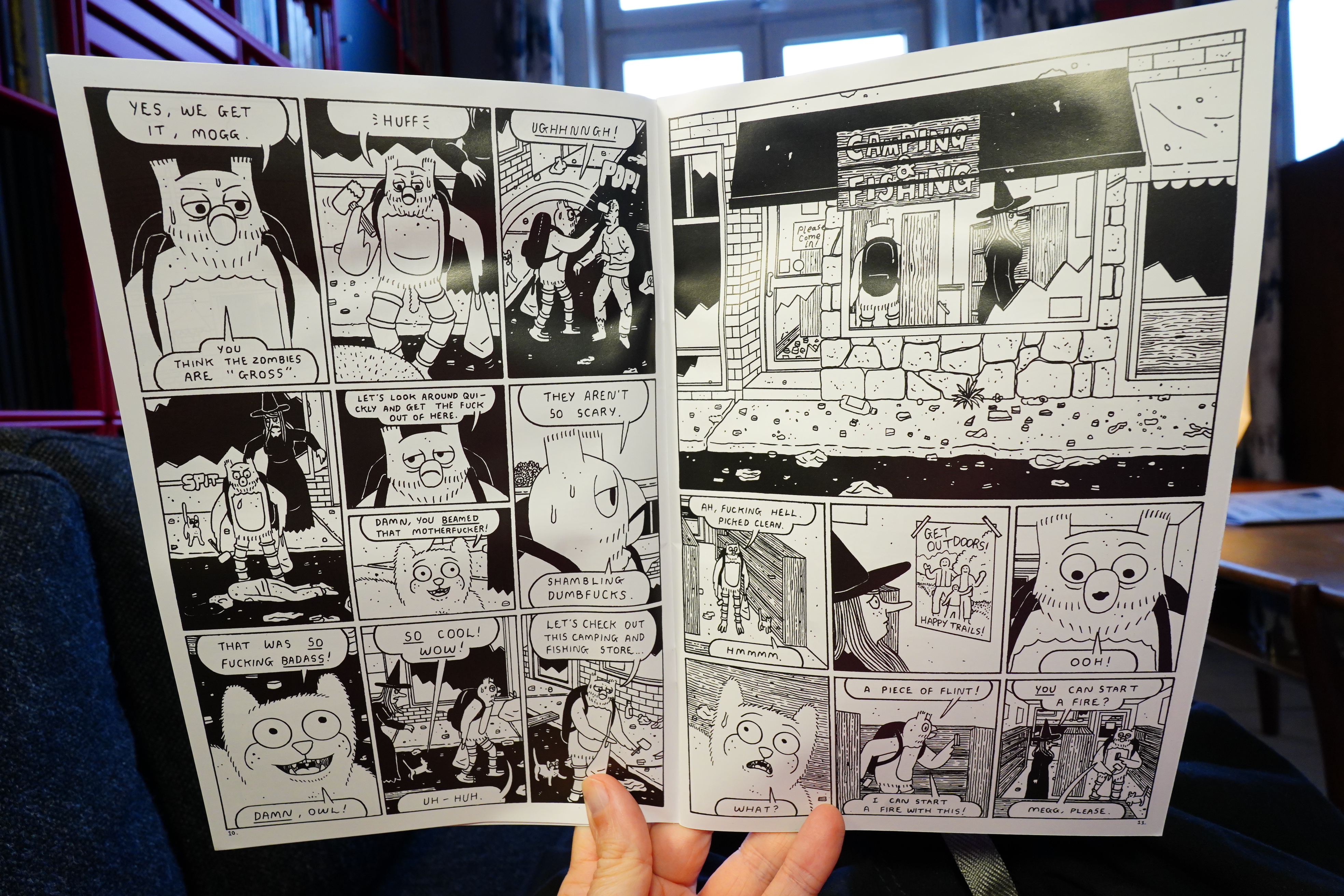
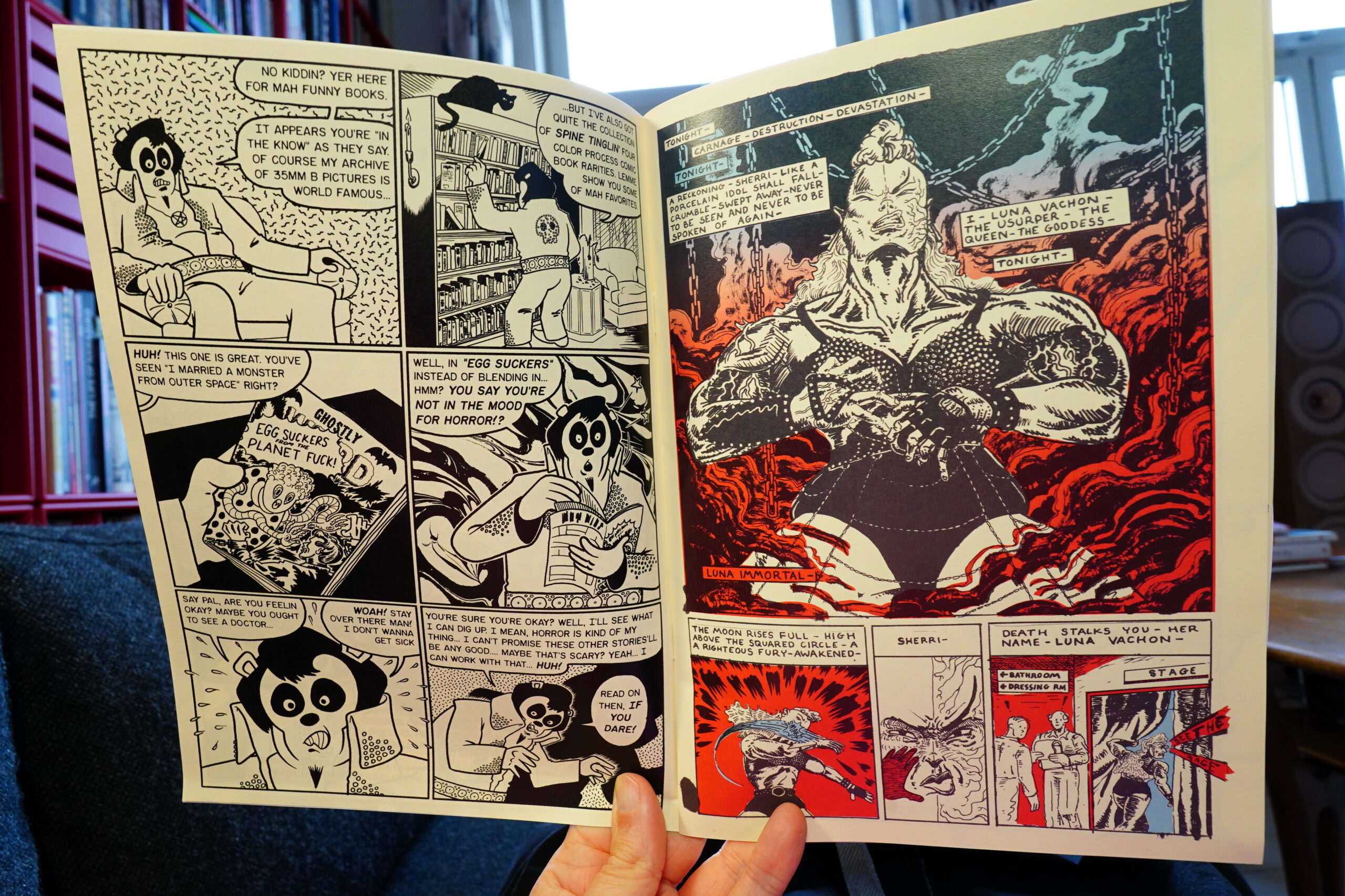
12:01: You Will Own Nothing And You Will Be Happy #3 by Simon Hanselmann
I really didn’t expect #3 to arrive so soon after #2! Nice. (You can get this series from here.)
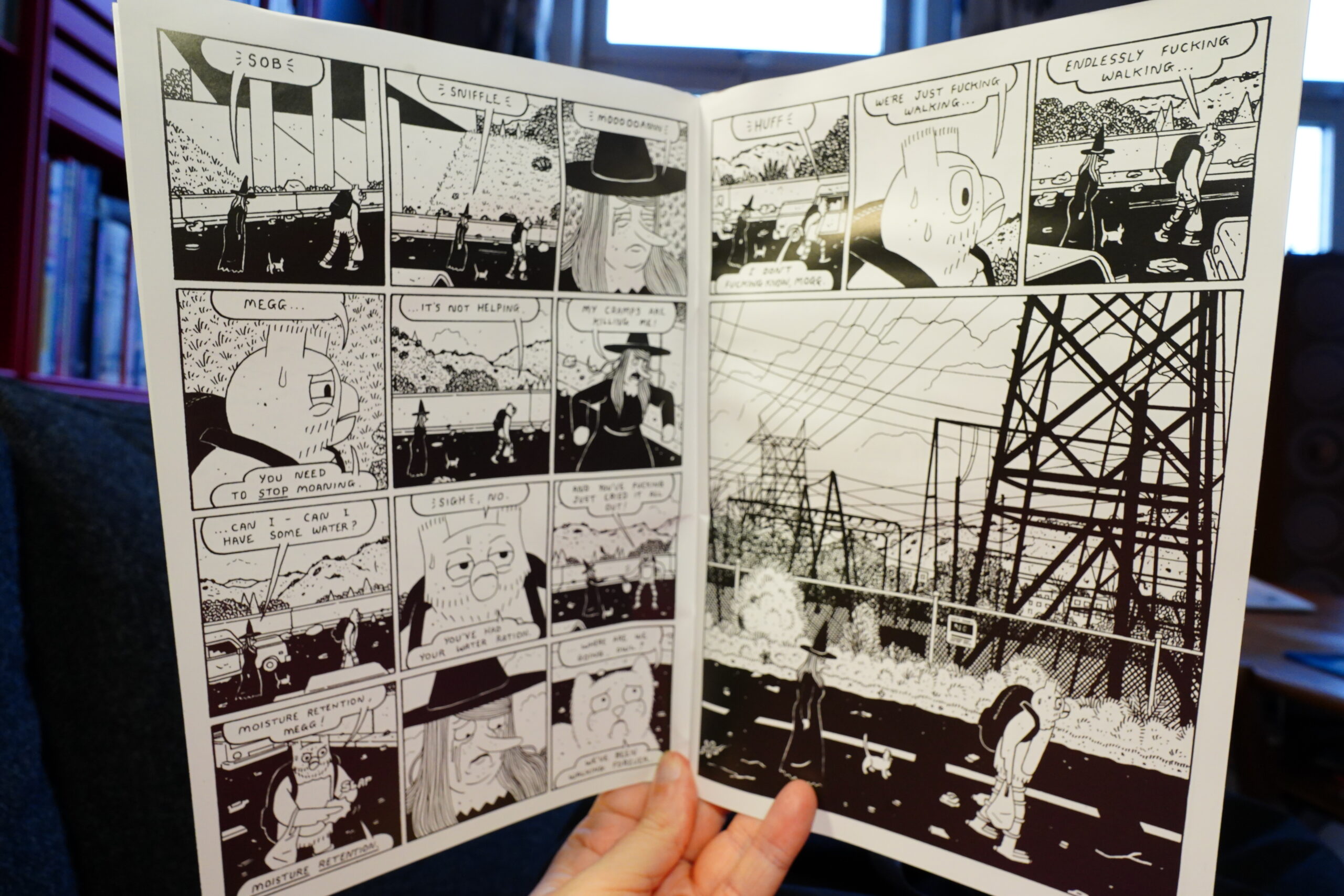
This issue takes even more unexpected turns than I was, er, expecting.
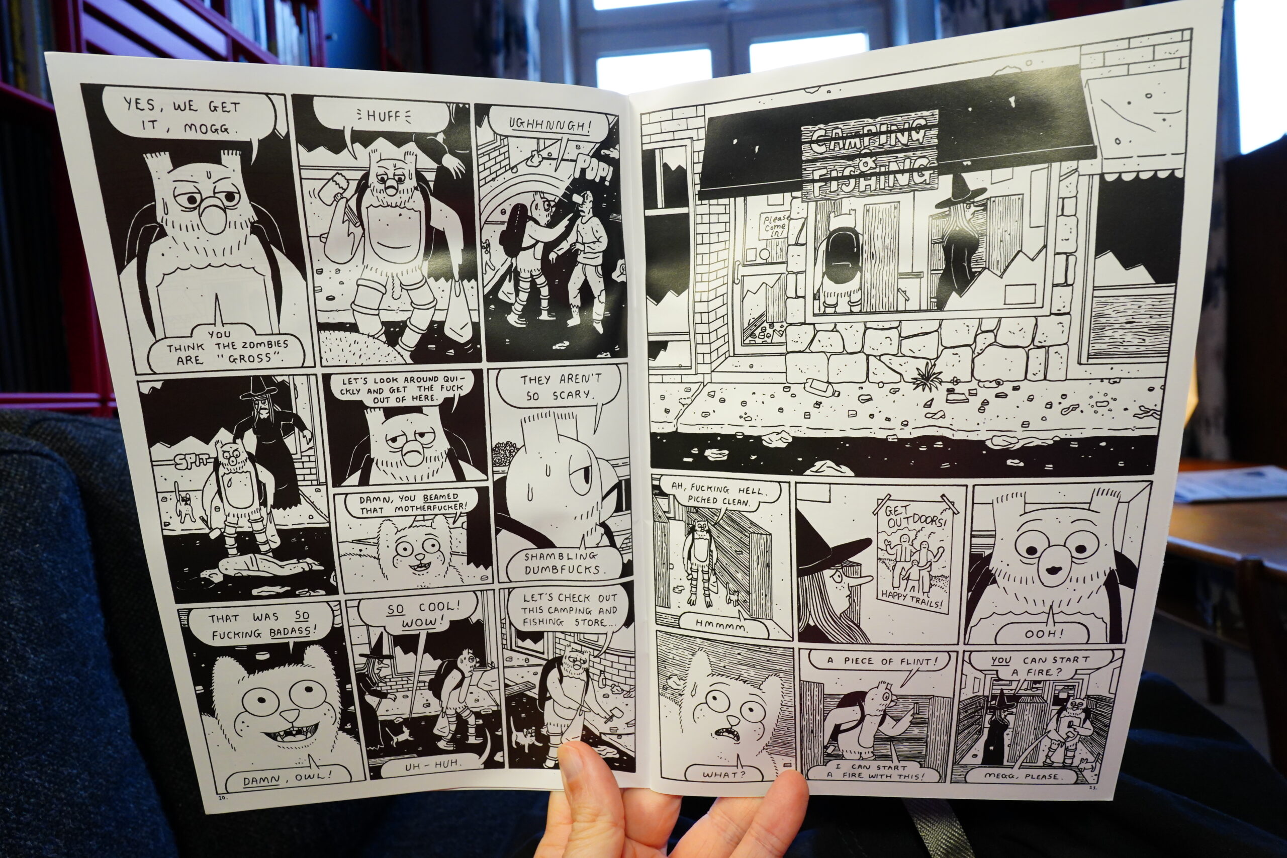
I’m not giving anything way, though! Get it and read it yourself — it’s an extremely strong issue.
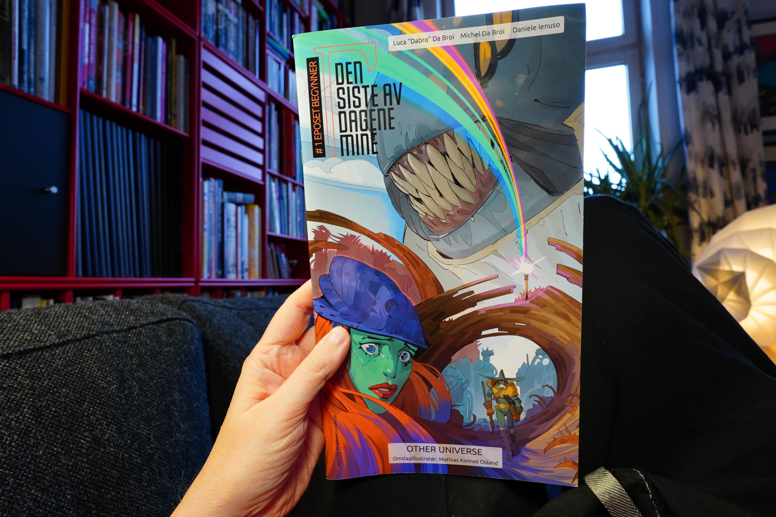
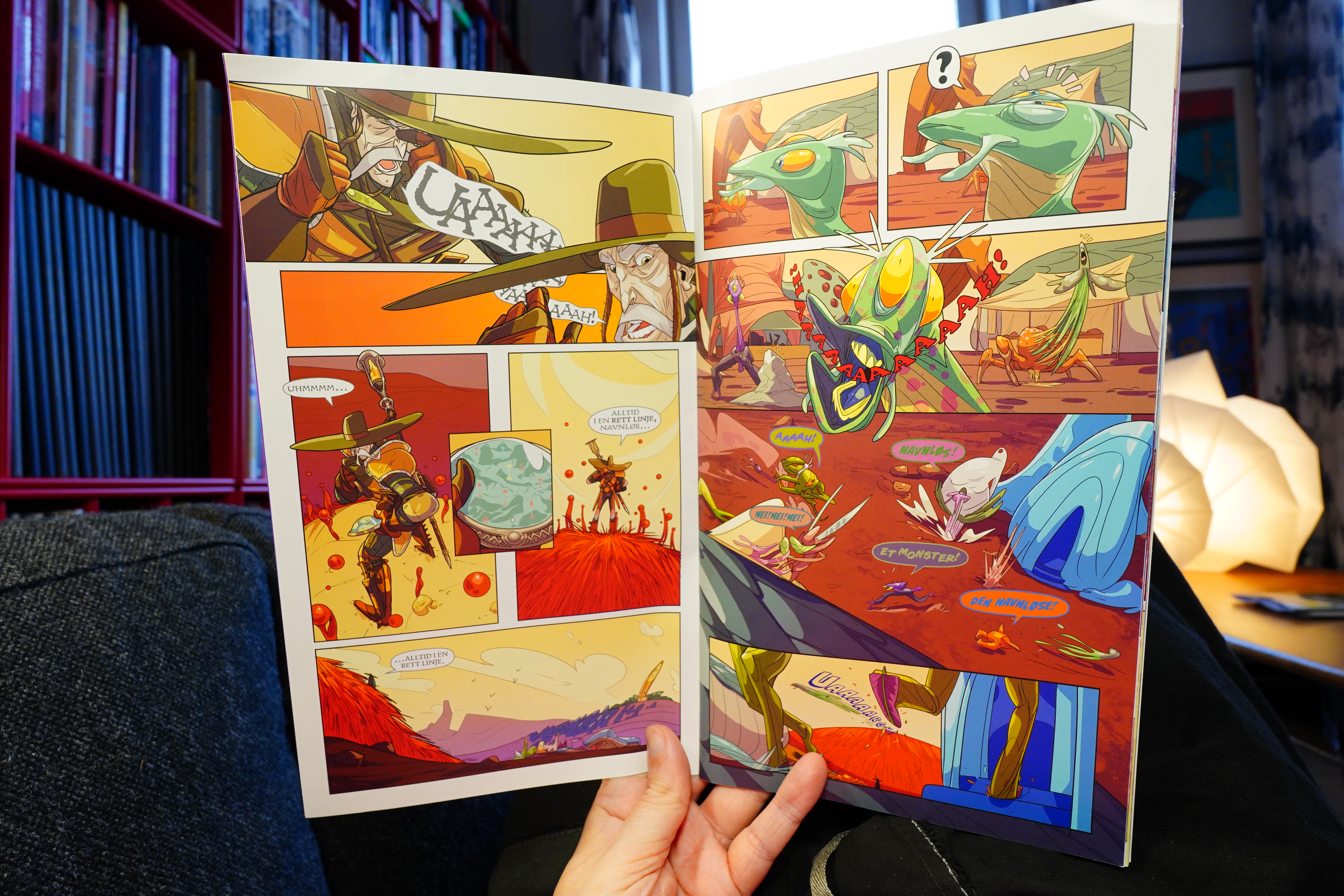
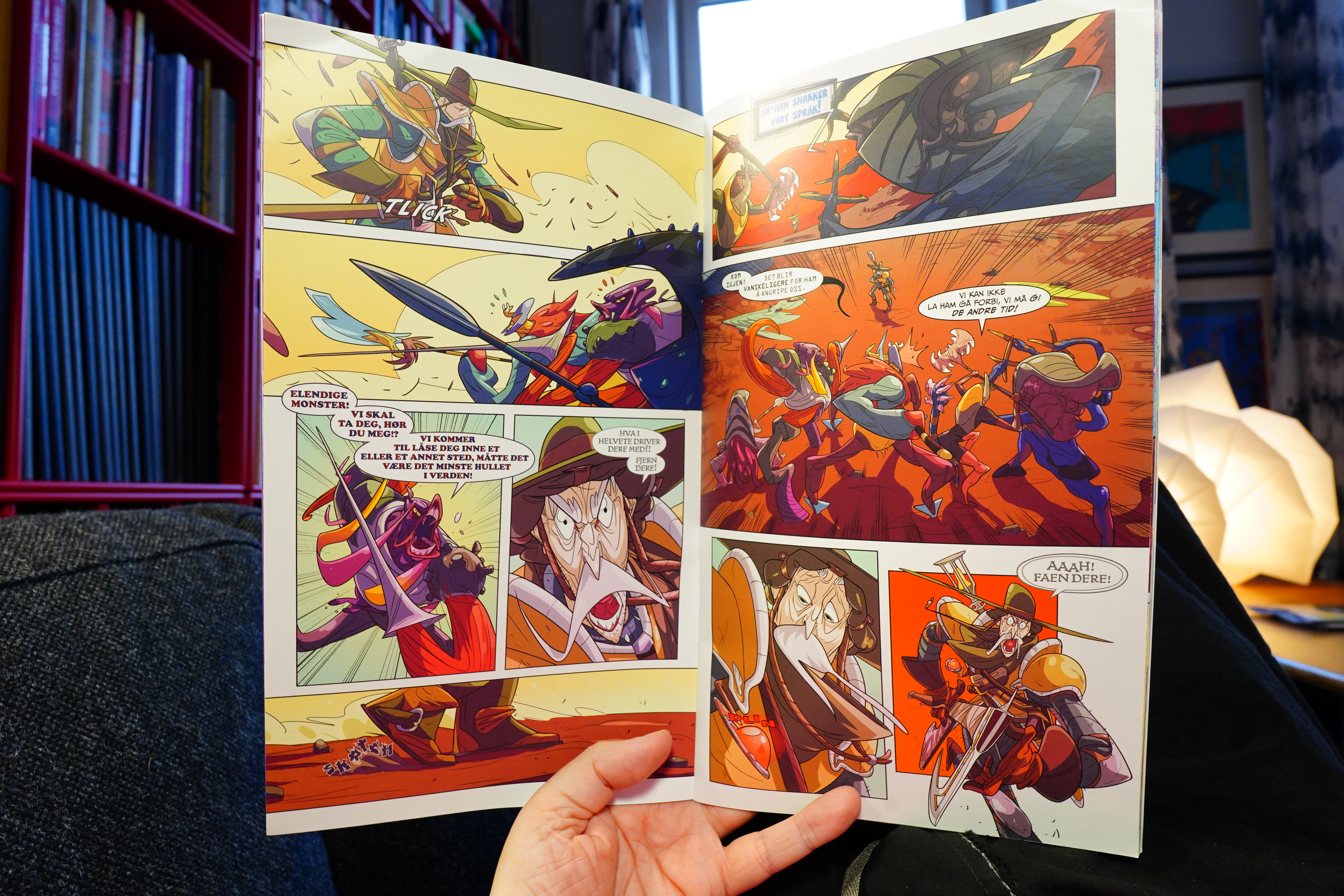
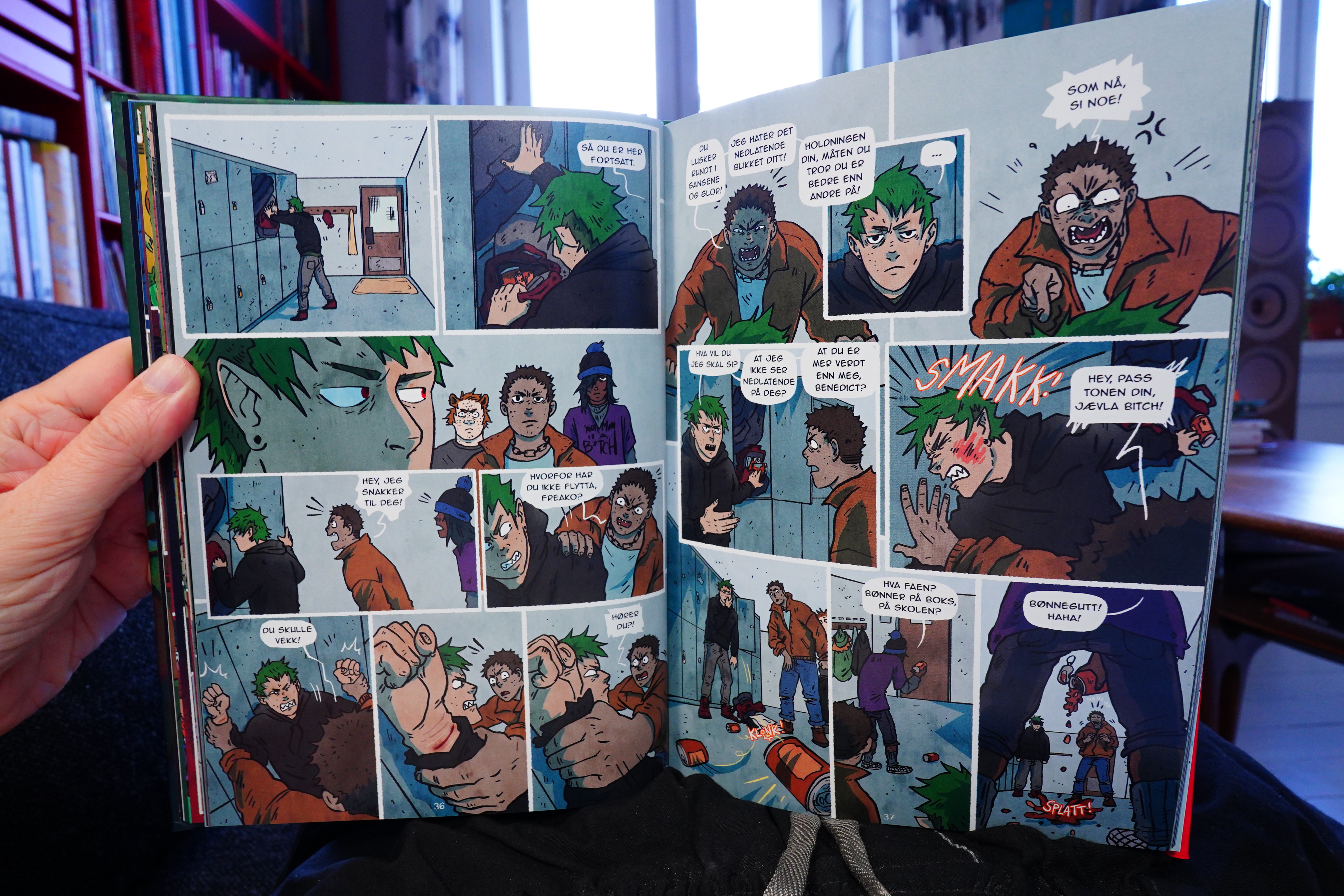
12:32: Den siste av dagene mine by Da Broi/Ienusa

This book is basically just a fight scene with a confusing coda at the end.

I’m not even sure exactly what happened during the fight scene, to be honest.

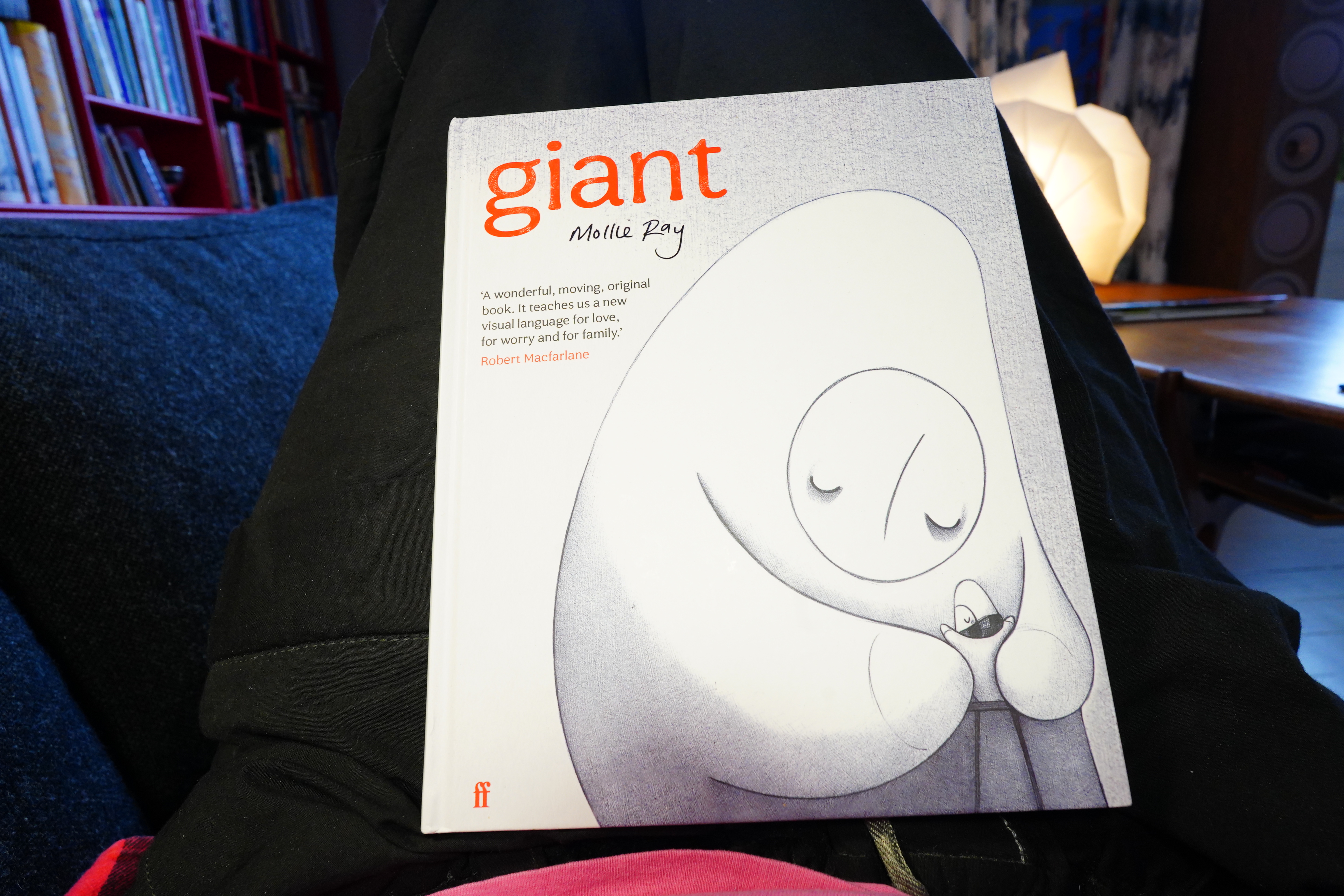
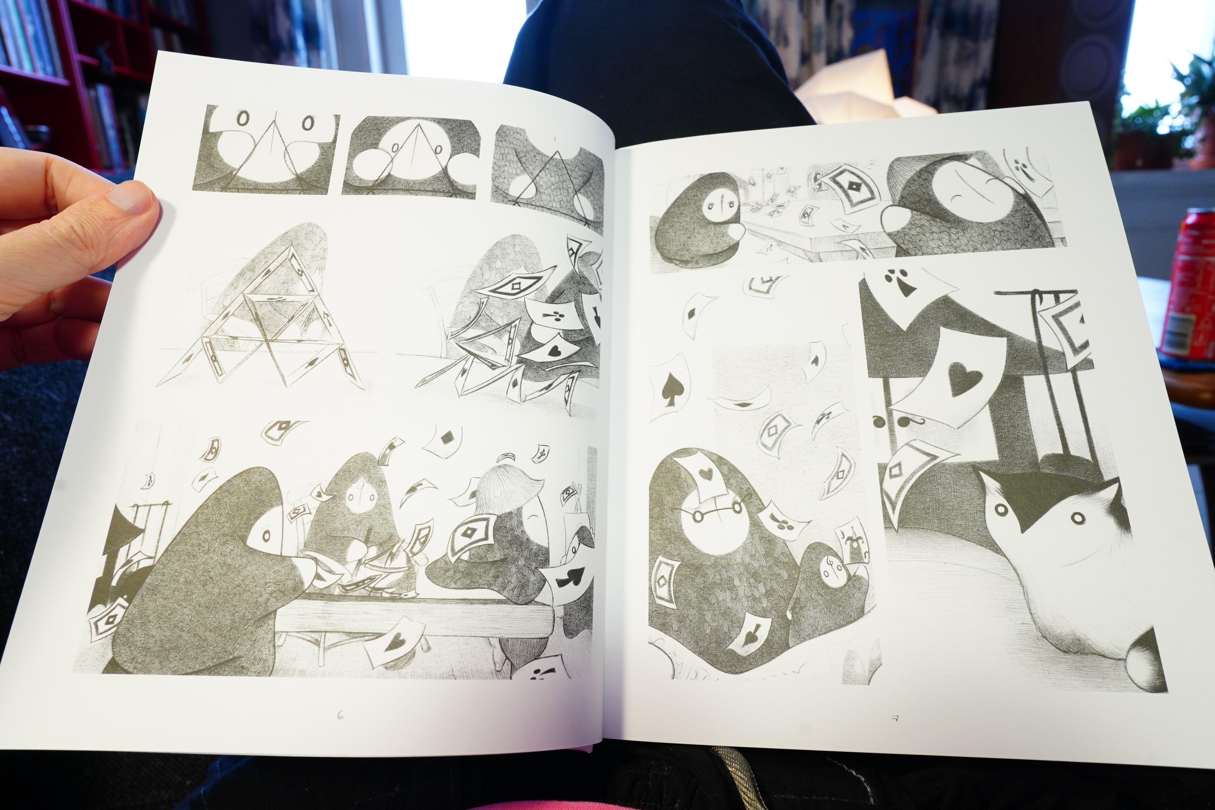
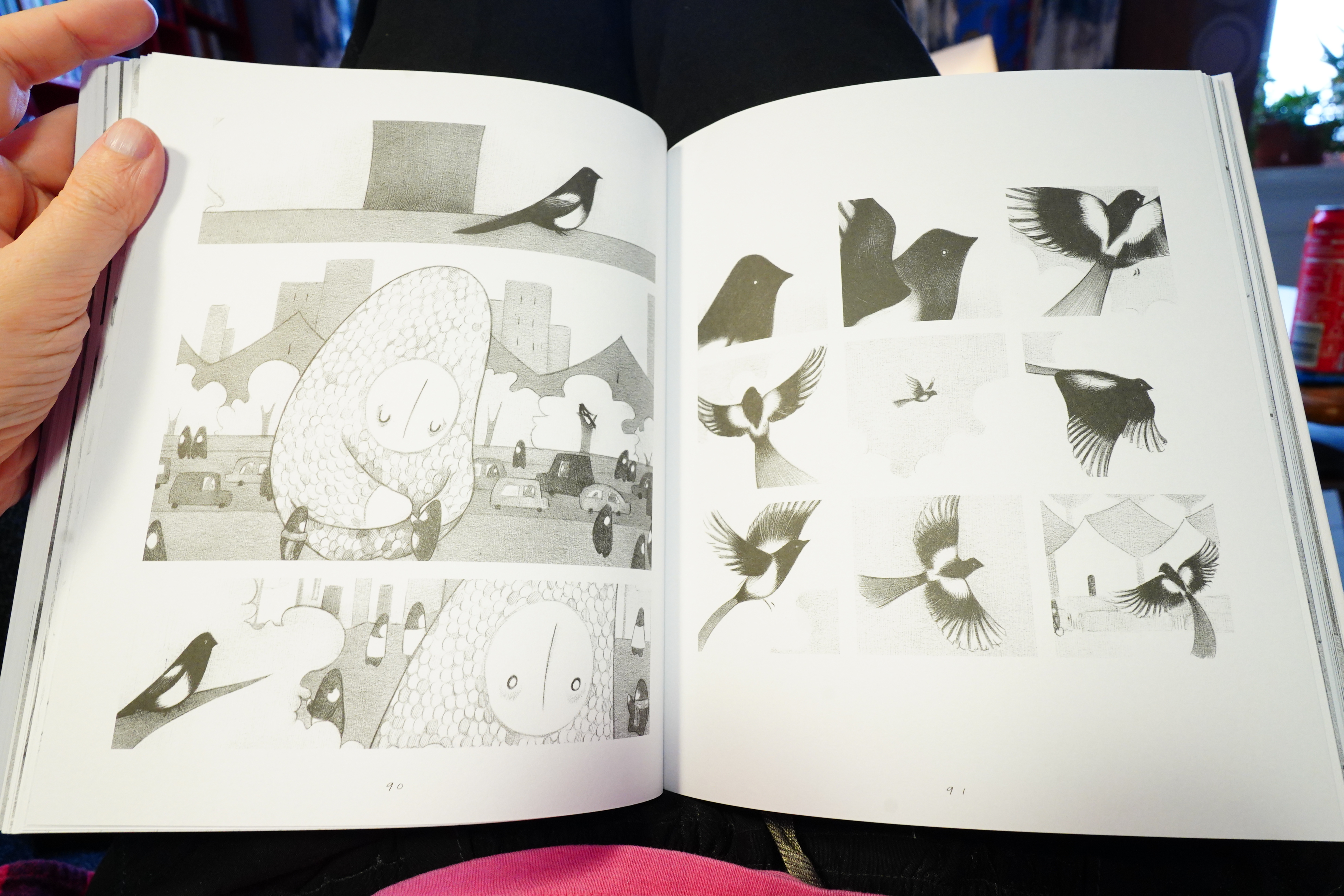
12:40: Giant by Mollie Ray (Faber & Faber)

Ray makes things difficult for herself — not only is this book people by these people who are pretty difficult to tell apart, but it’s also a wordless book.
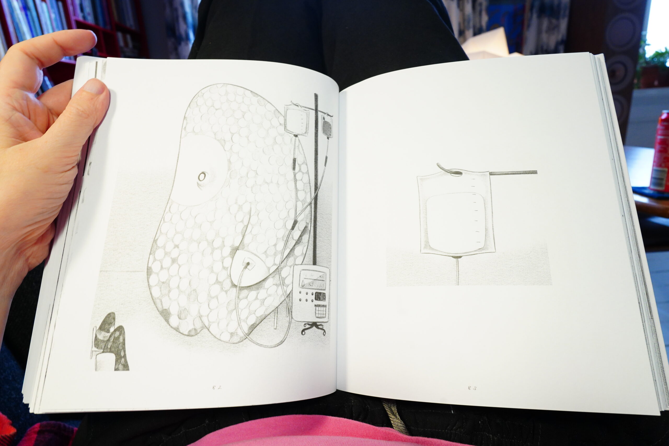
And it’s about a person who suffers from an embiggening disease, so most of the book is about them getting treatment at a hospital. Which is at least original — it’s not all magic and stuff, which you’d imagine.

The artwork’s quite lovely, but I don’t think the book quite works.
| Pink Floyd: Wish You Were Here | 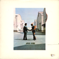 |
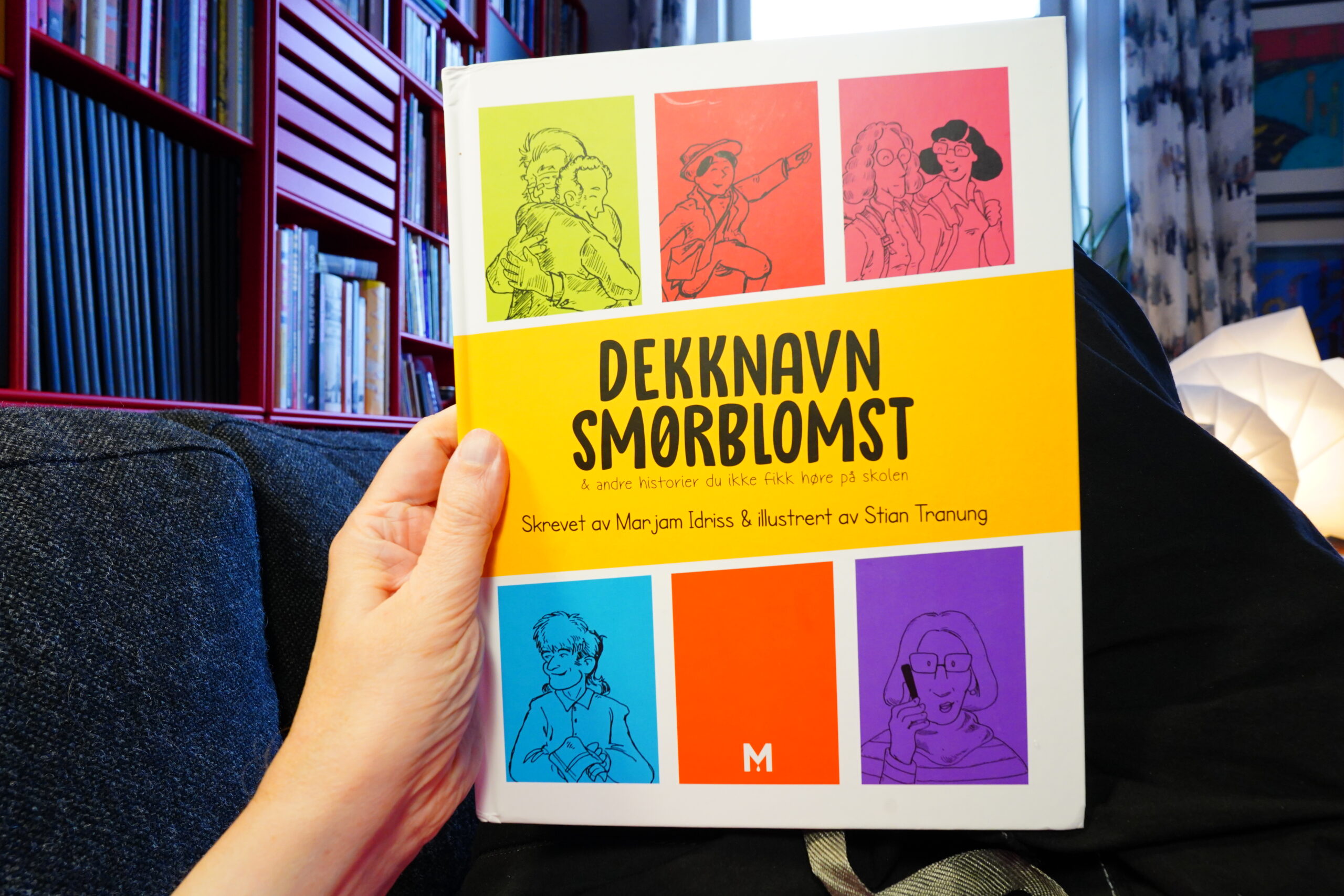
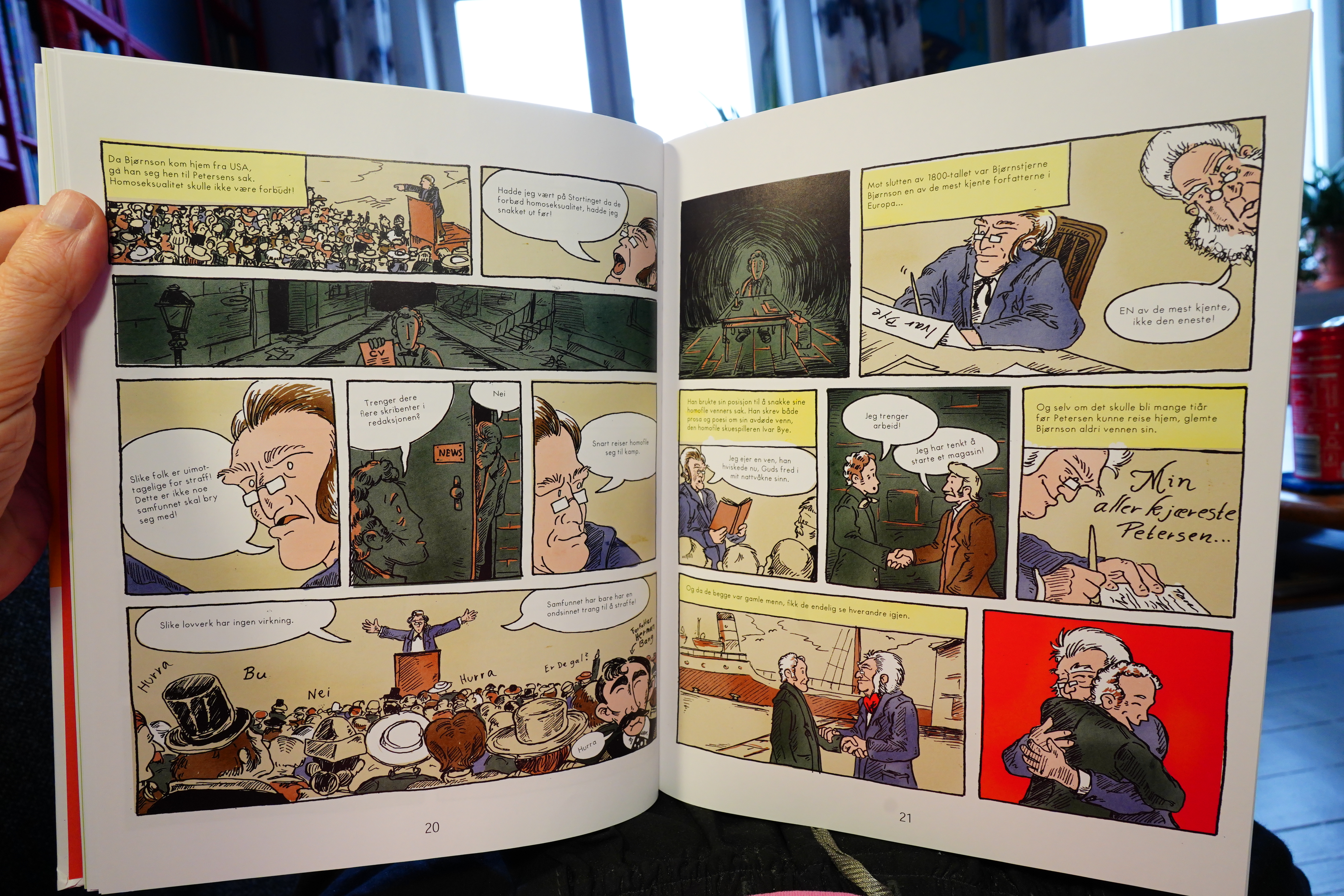
12:52: Dekknavn Smørbloms by Marjam Idriss/Stian Tranung

This book has five short stories about Norwegian LGBT history.

While being heavy on facts and plot, these stories don’t feel like Wikipedia infodumps at all, but are instead lively and amusingly told. Very entertaining as well as edumacational.
| Kraftwerk: Exceller 8 | 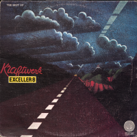 |
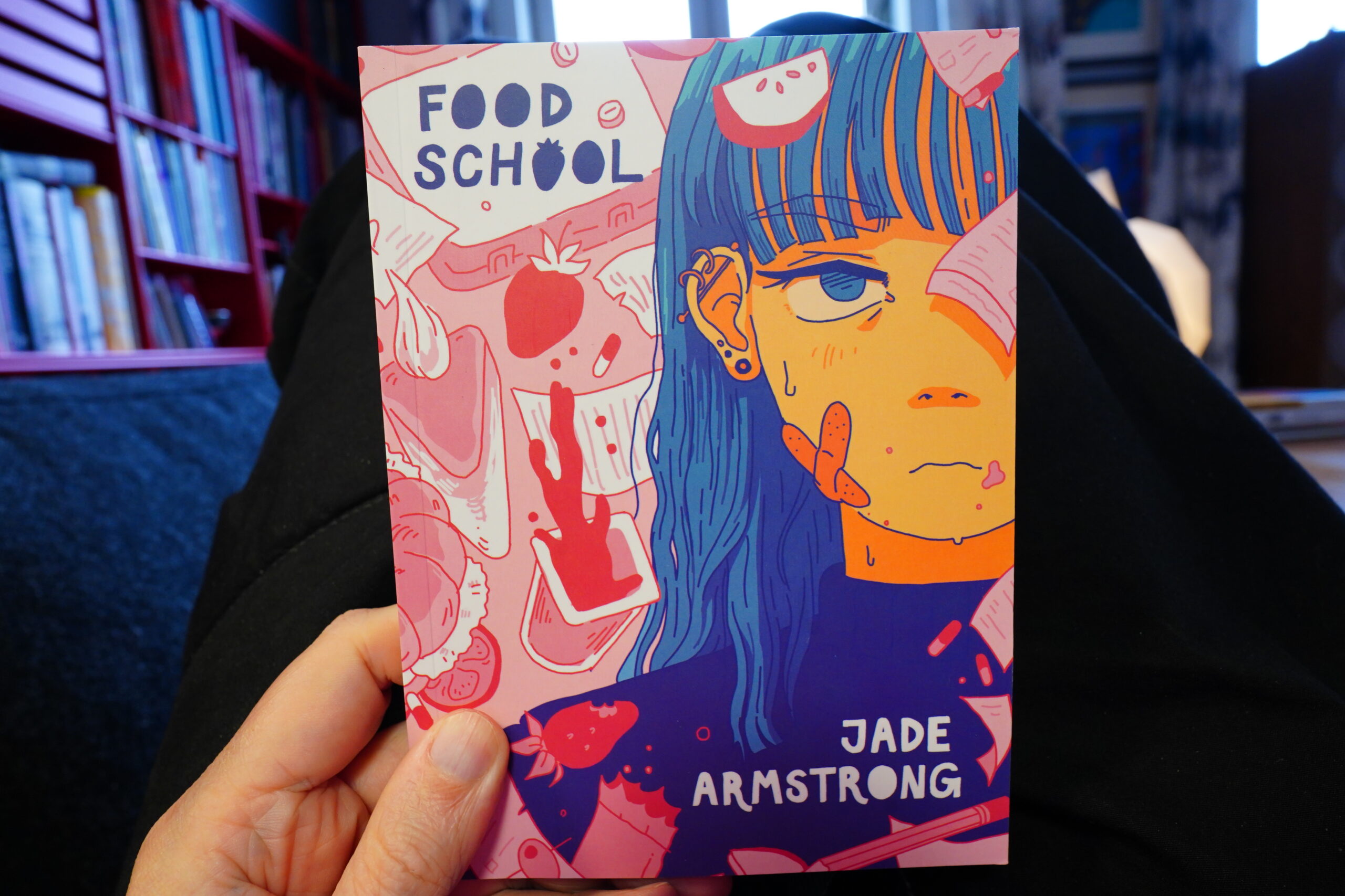
13:34: Food School by Jade Armstrong (Conundrum Press)
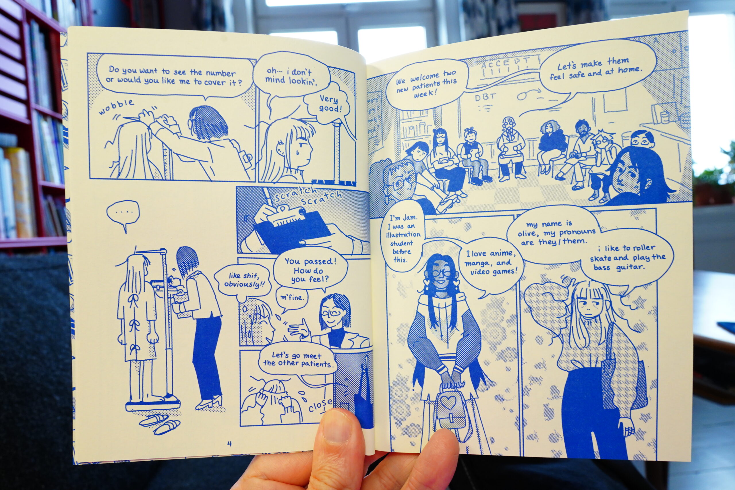
The storytelling is on point — very lively. And an attractive line.
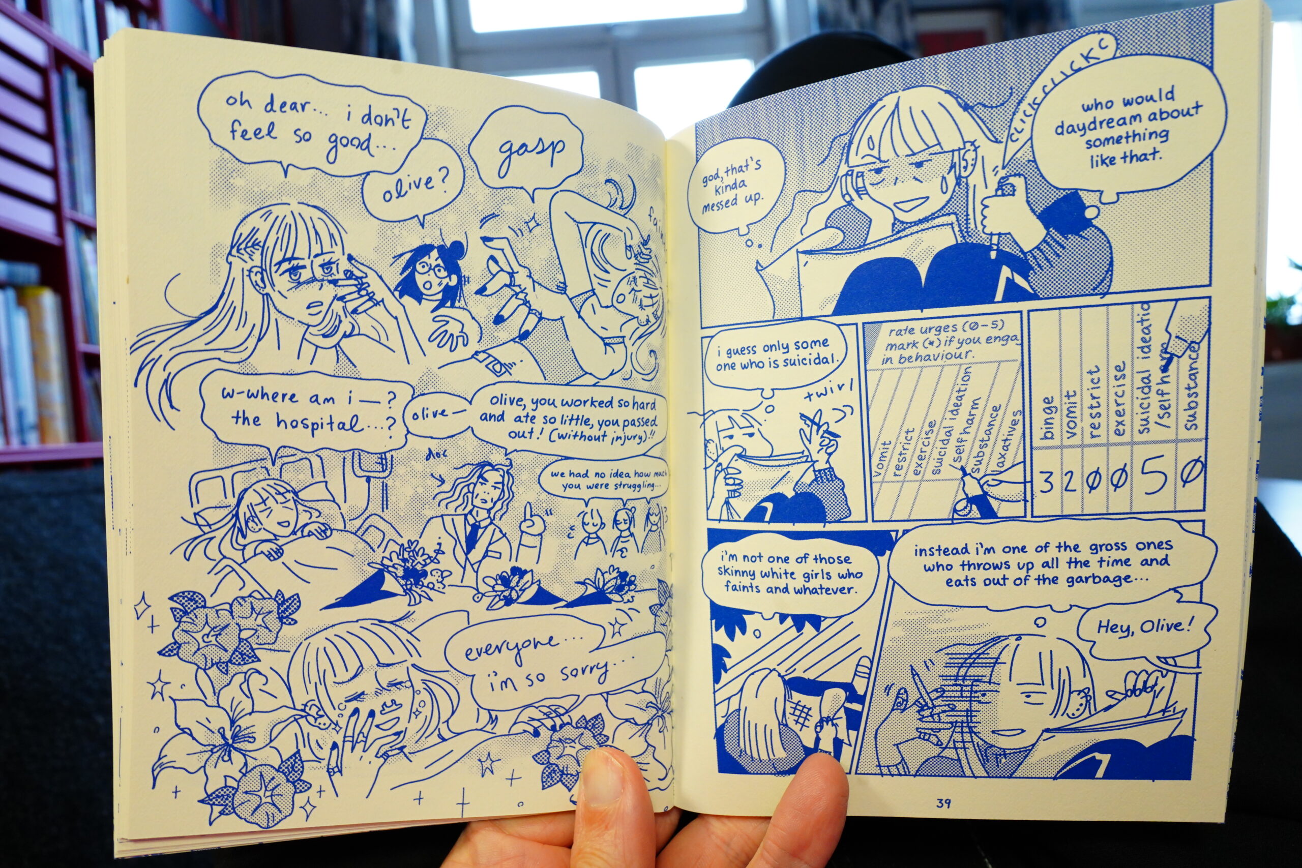
The book is about eating disorders and stuff, but still manages to be really entertaining. And it has a great ending. Good stuff.
| Joni Mitchell: The Hissing Of Summer Lawns |  |
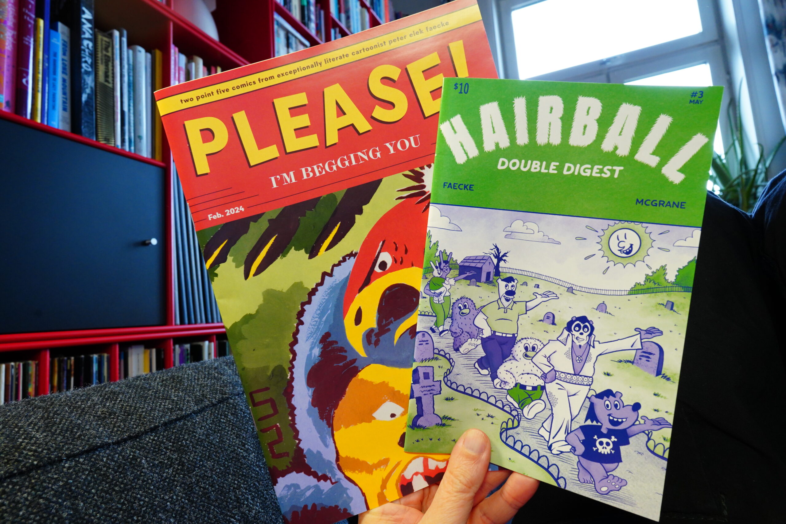
14:31: Please! I’m Begging You & Hairball by Peter Elek Faecke & Madeline McGrane
The first book is a collection of shorter pieces by Faecke…
… and it’s done in an impressive array of styles. It’s fun.
The second book has one story each from the two creators. It’s more ambitious storytelling wise, I think? It’s quite moving.
McGrane’s story is a bit on the confusing side, but it’s got a proper mood.
| David Bowie: Young Americans |  |

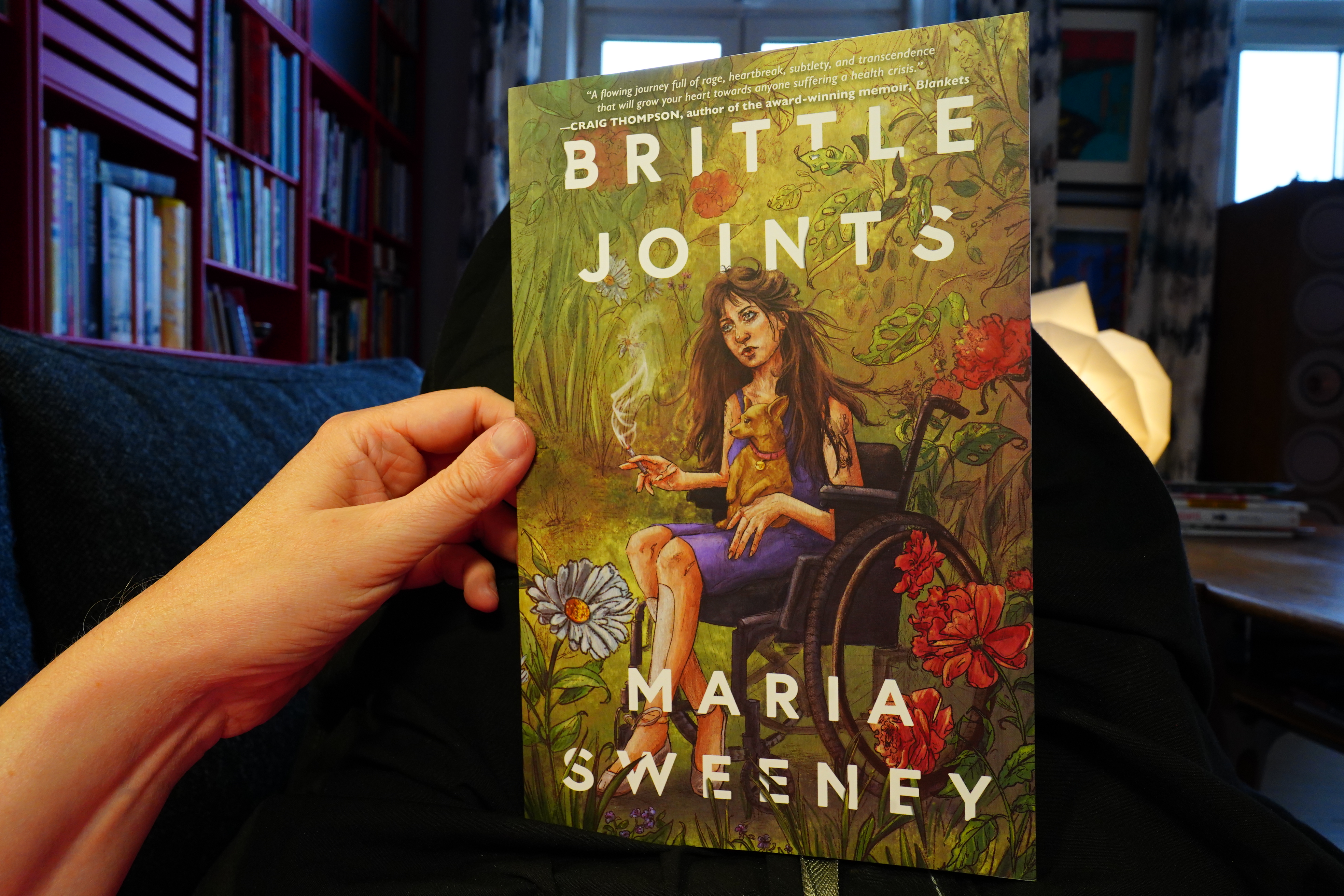
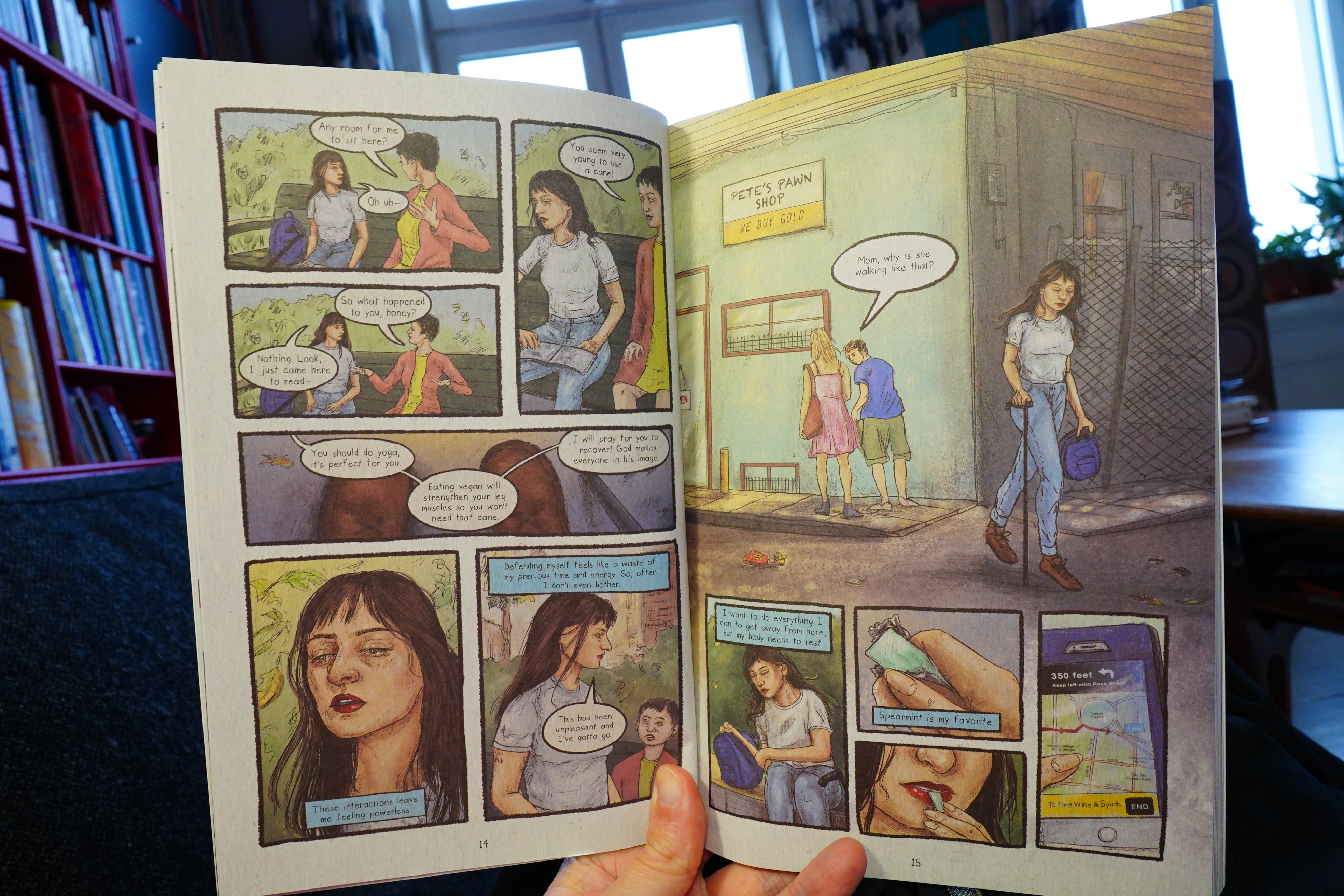
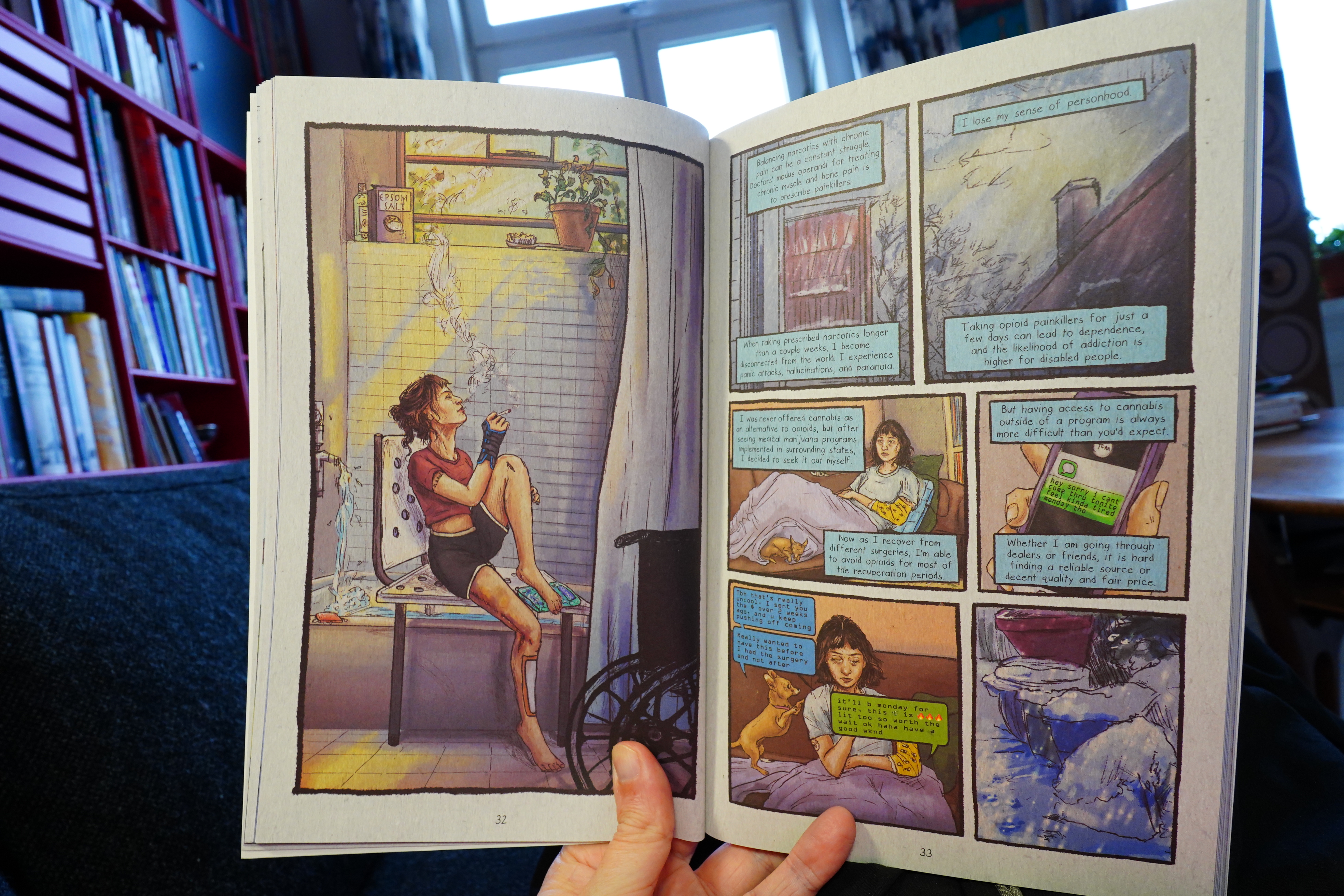
14:49: Brittle Joints by Maria Sweeney (Street Noise)
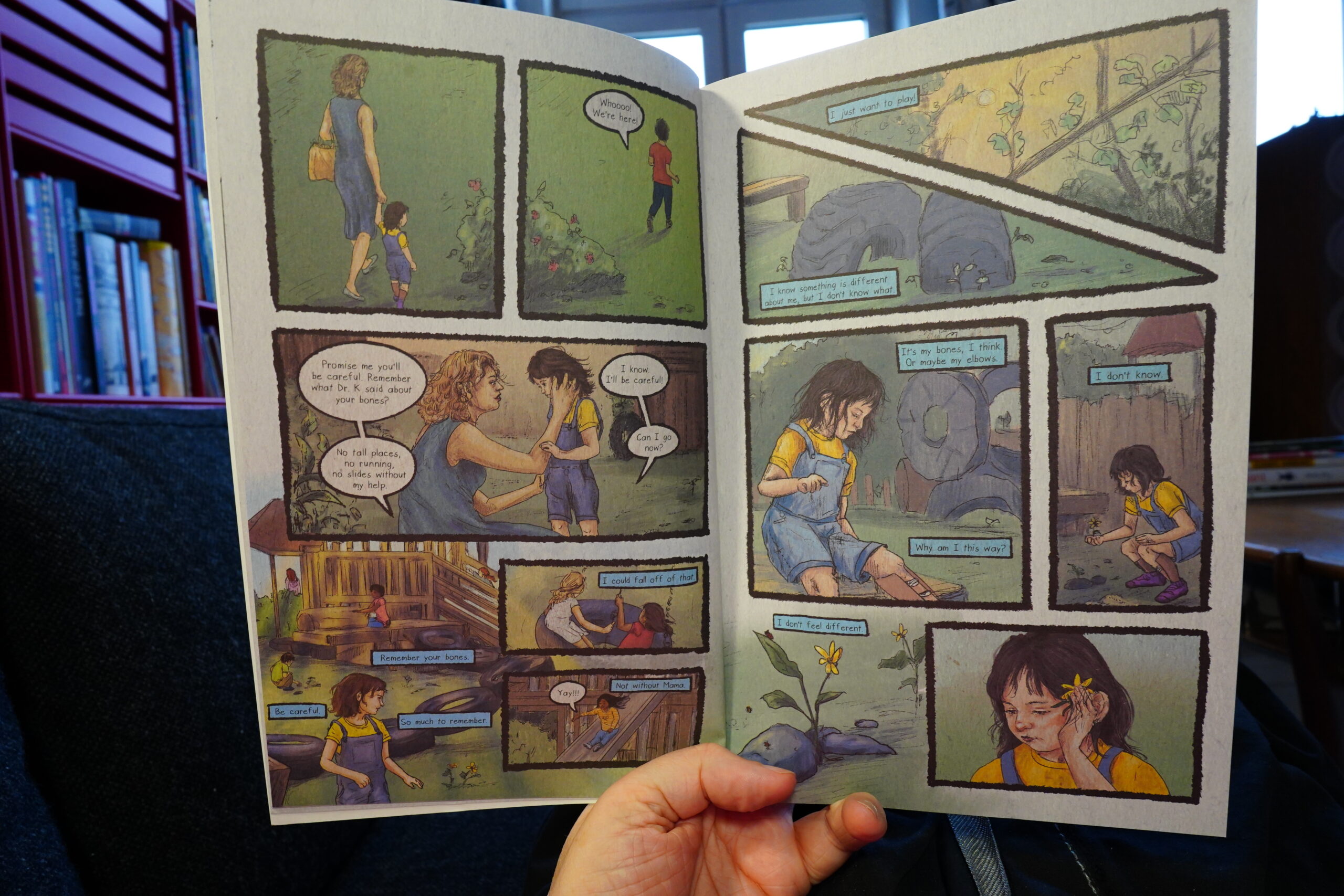
Lovely artwork.

This is a pretty harrowing book about living with a brittle bones (etc) syndrome.
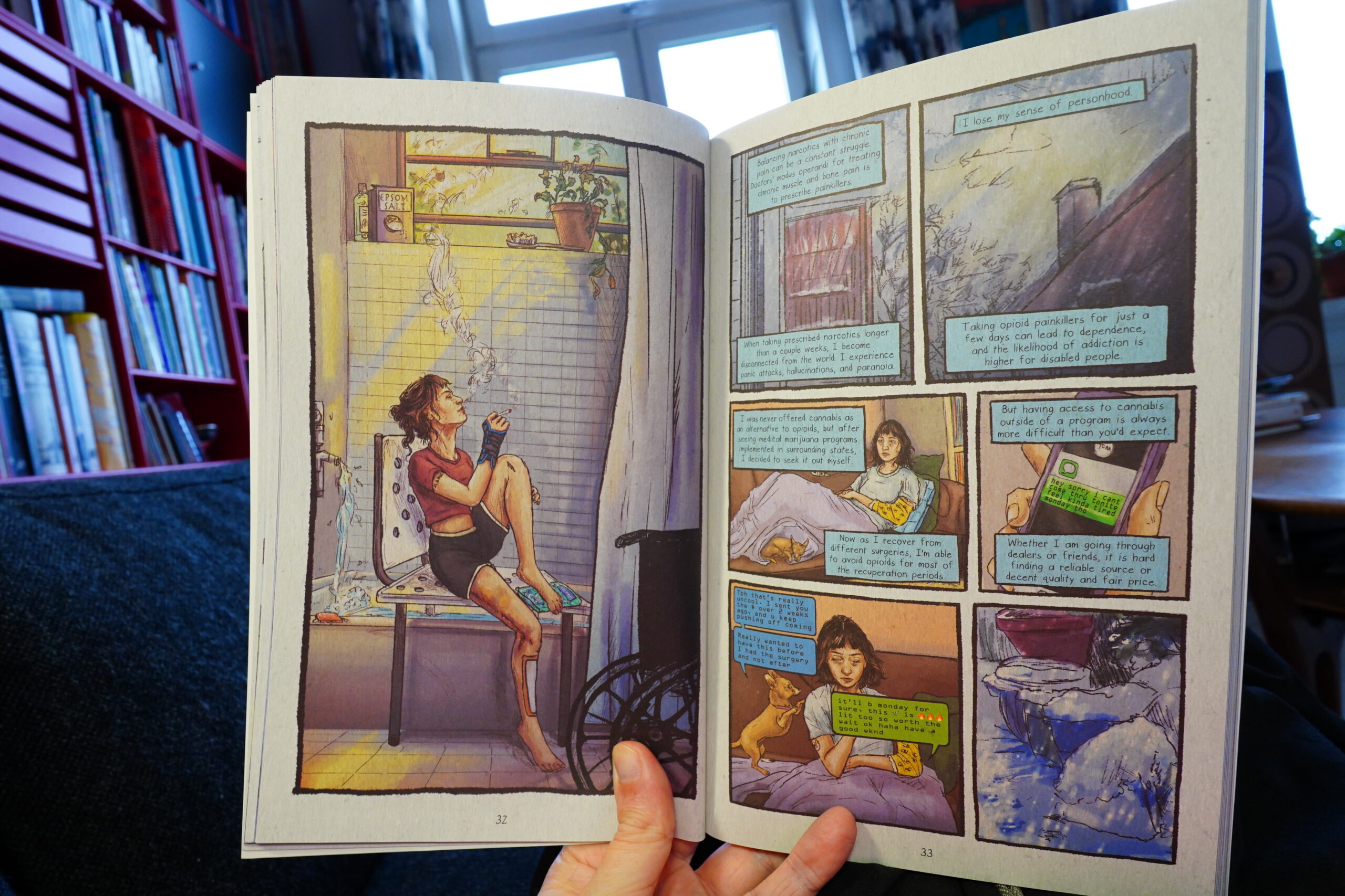
But there’s also many brighter moments. It’s strong work.
And now I have to run some errands. Be right back.
| The Rolling Stones: Black and Blue |  |
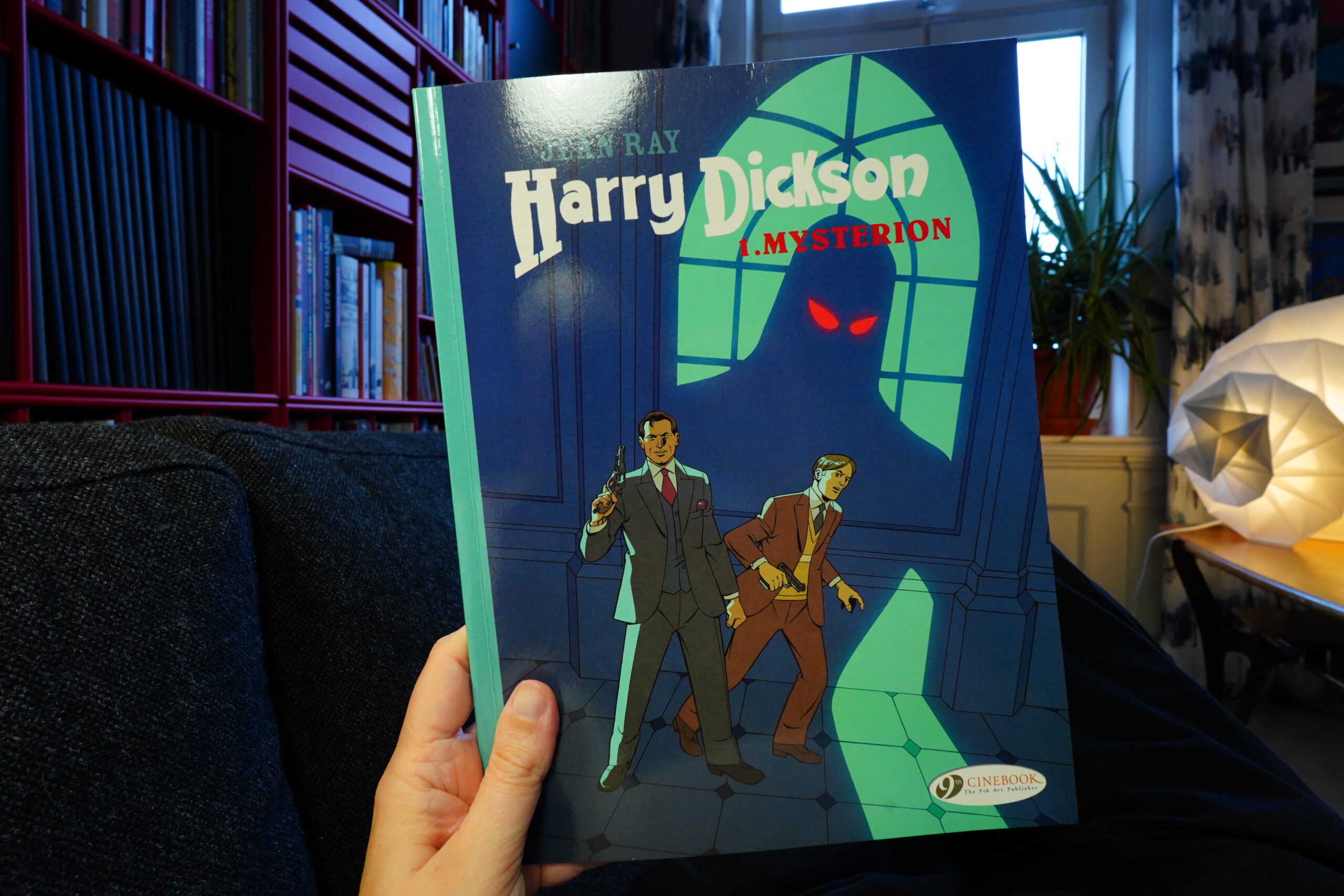
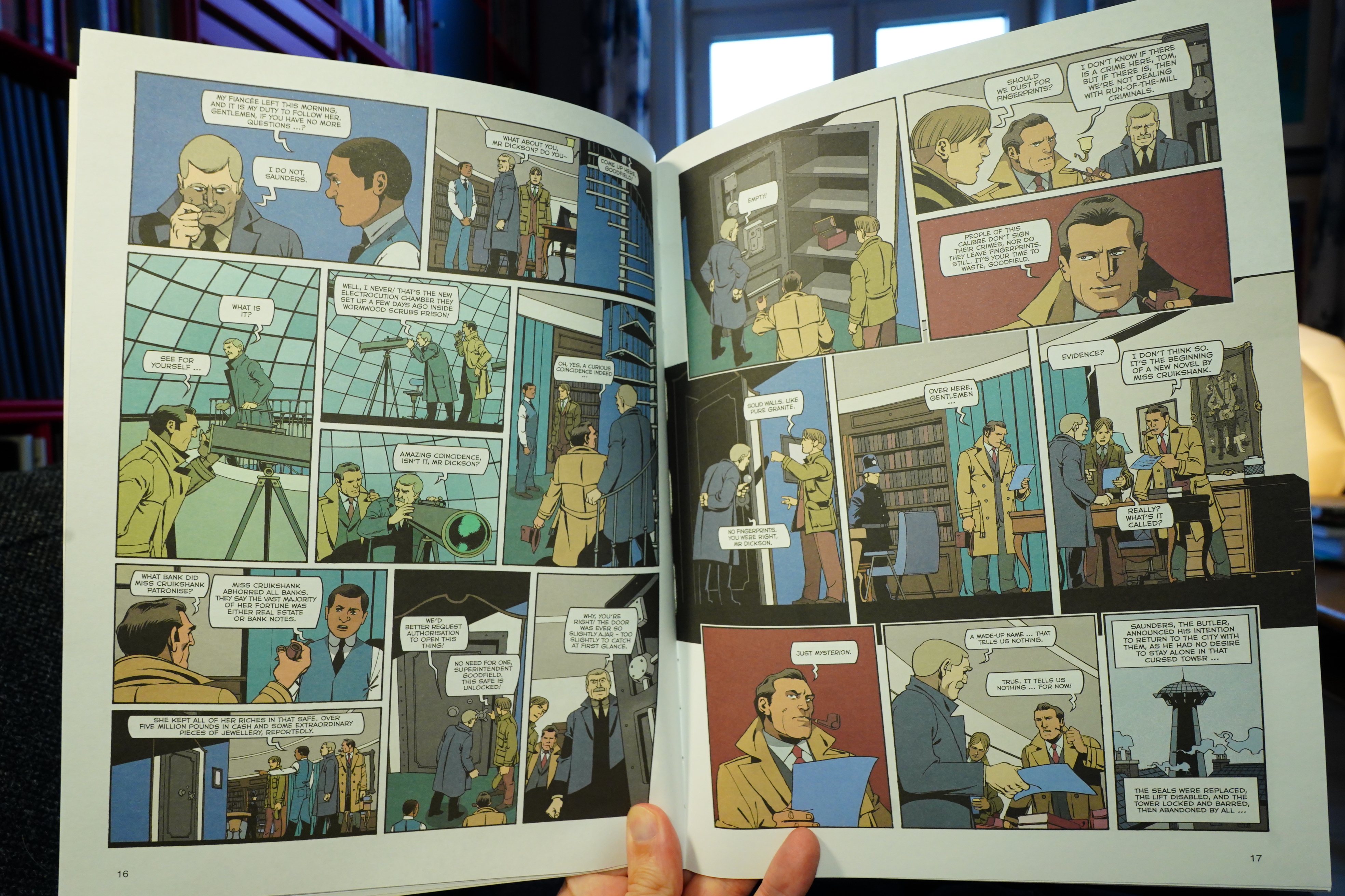
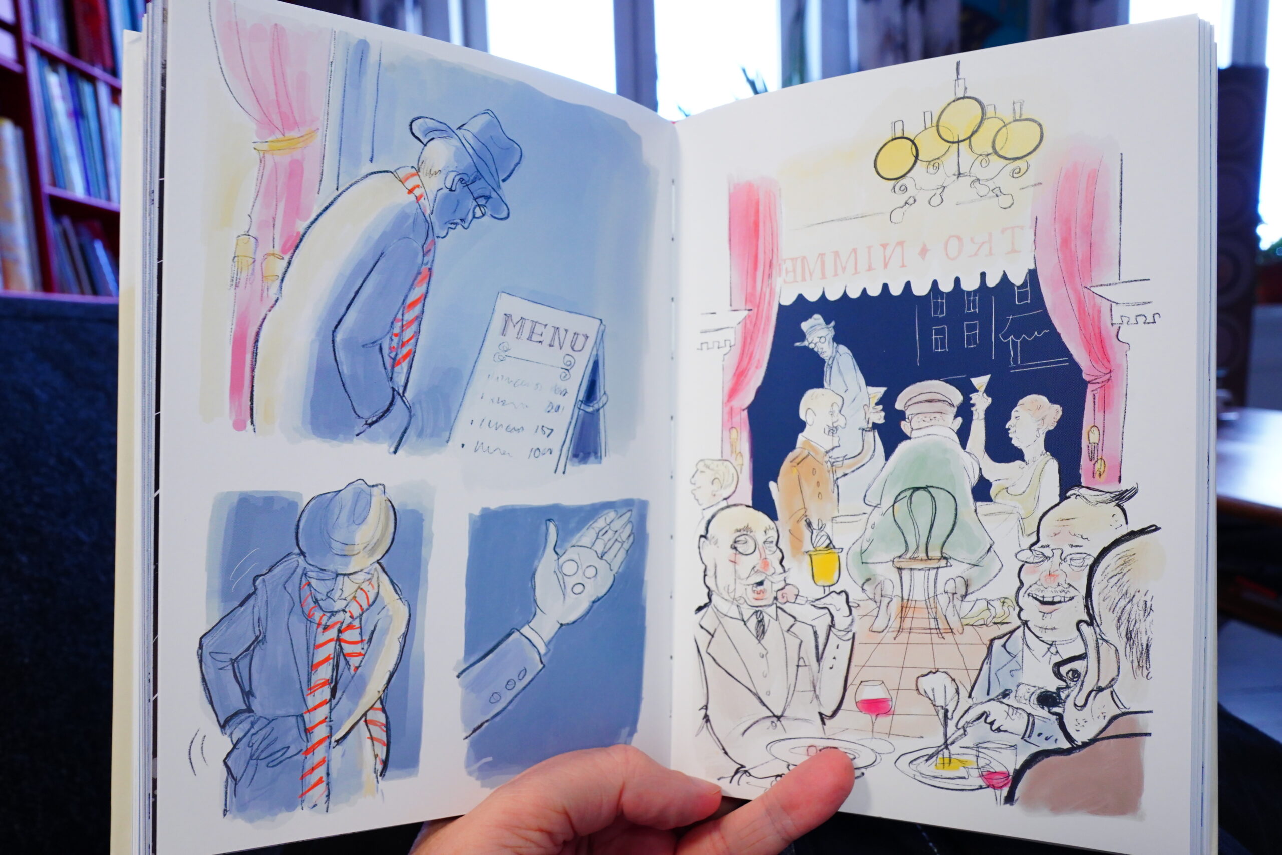
16:01: Harry Dickson 1. Mysterion by Jean Ray, Onofrio Catacchio, Doug Healine and Luana Vergari (Cinebook)
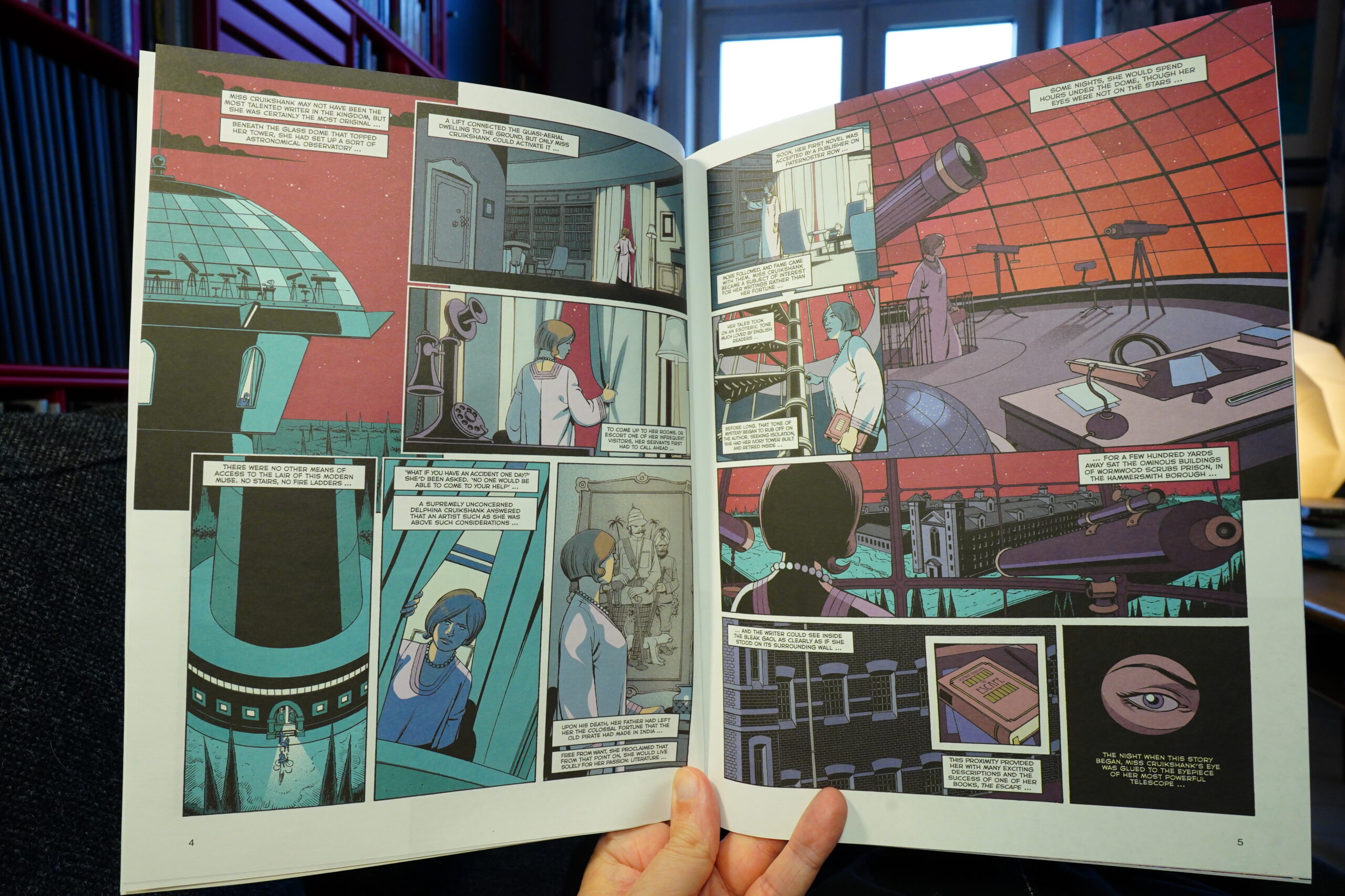
Ooo! Very retro-futuristic!

This is an adaptation of an old mystery novel, and this sort of thing really appeals to me… if it’s well done. And they really give it a go here: The first 40 pages are a lot of fun. They pile on mysterious things in a very satisfying way, illustrated very elegantly. But the last dozen pages are devoted to explaining the mystery, and it’s (to use a technical term) total codswallop: Ray introduces a slew of new complications to try to explain everything, and it’s all just too stupid for words.
So I feel for the people who adapted this — it’s very well done. But they didn’t really have a good mystery to adapt.
| Joni Mitchell: Hejira |  |
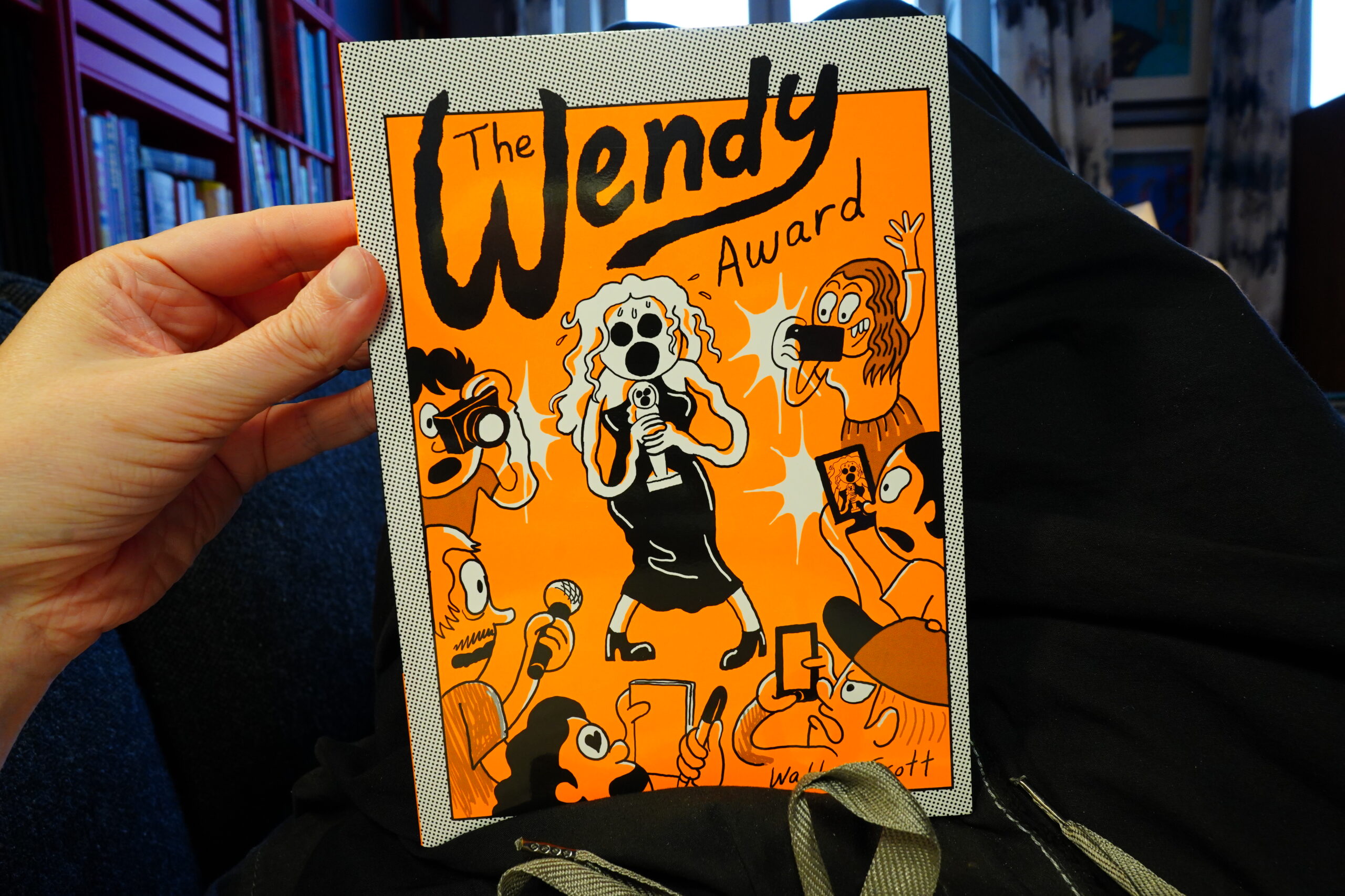
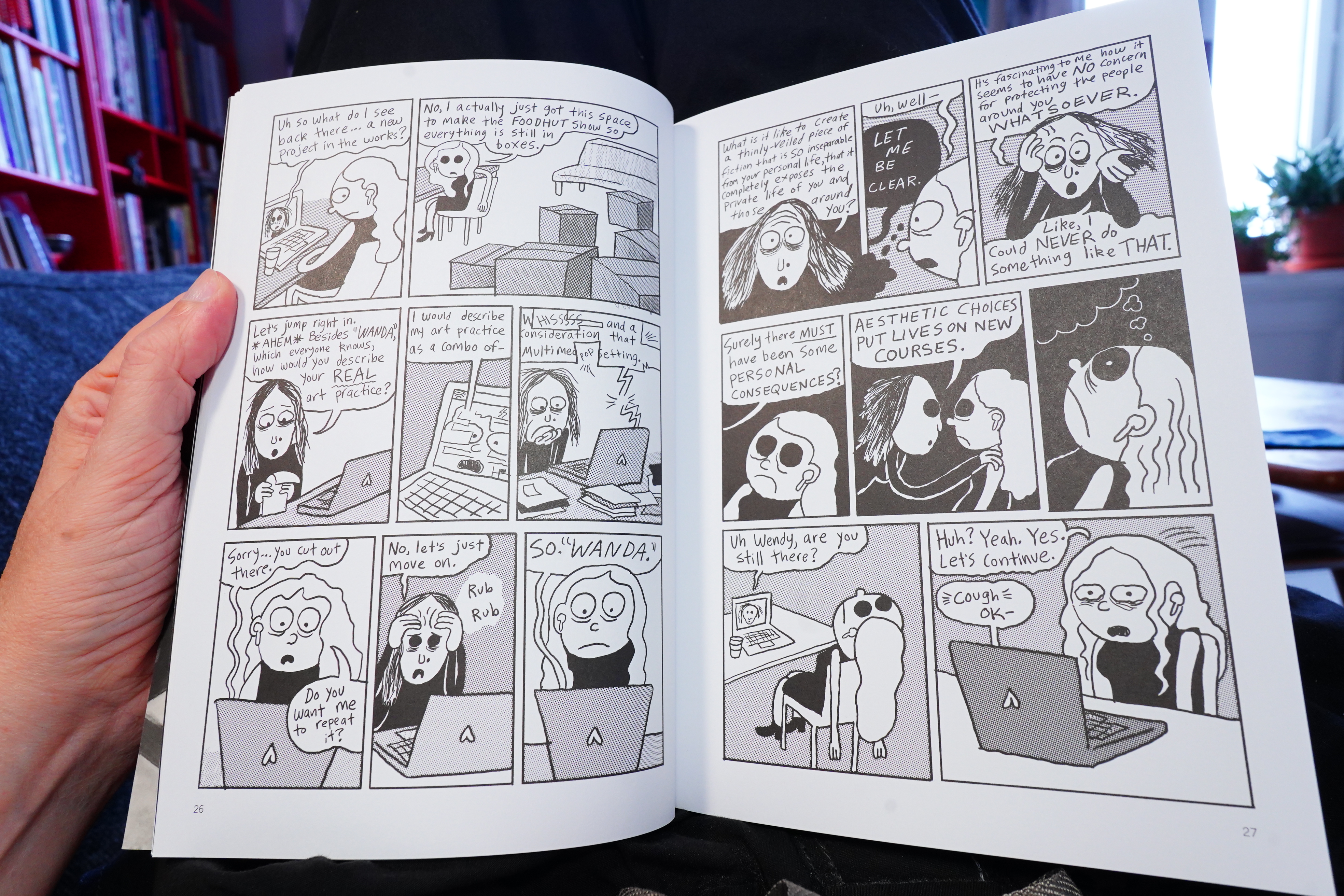
16:43: The Wendy Award by Walter Scott (Drawn & Quarterly)
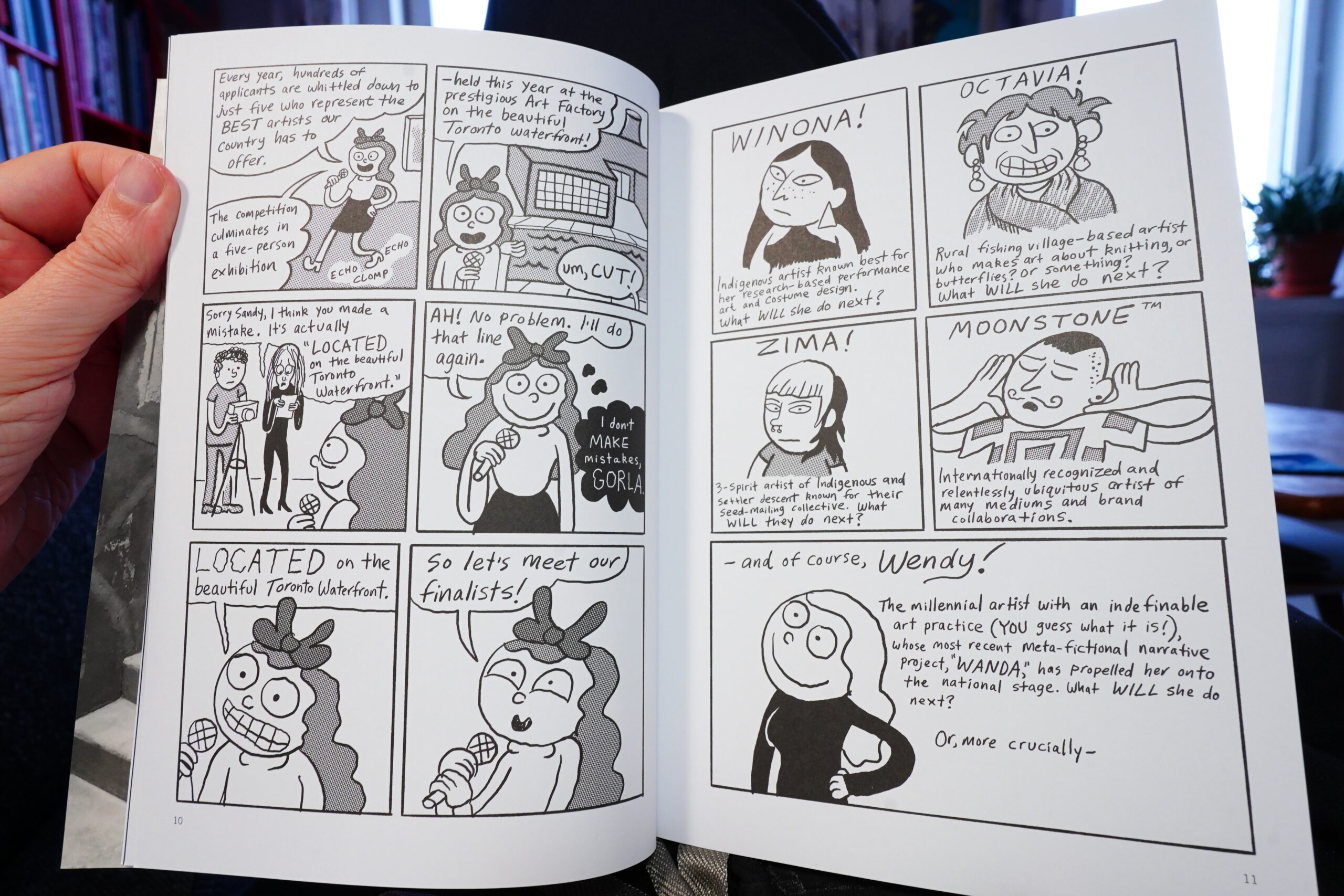
It’s another Wendy book, pretty much the same as the previous ones, I think? Perhaps this is even more bitter…

I guess I just don’t really find this to be as hilarious as it’s meant to be.
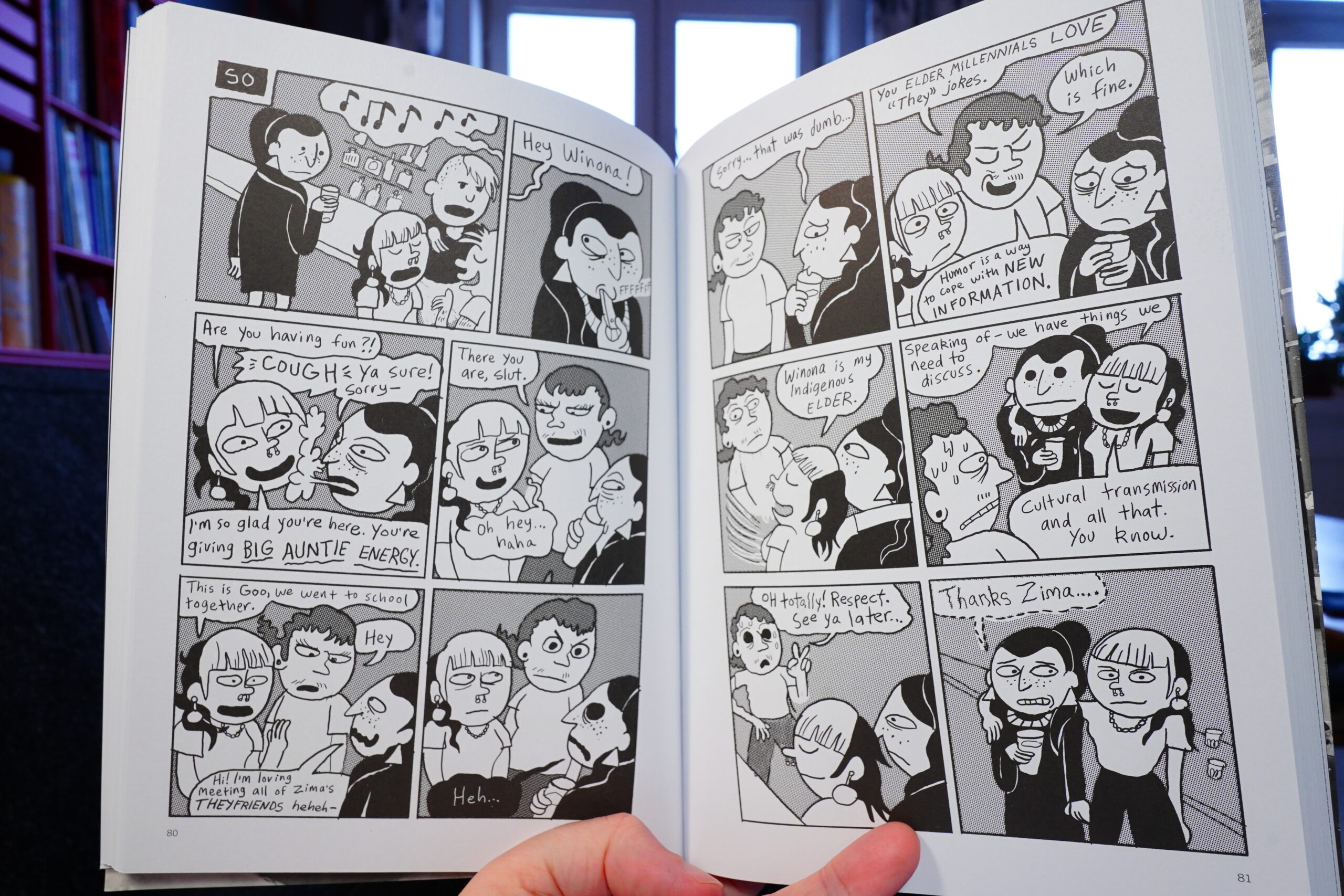
But I mean, it’s fine. I’ll be buying the next one, too.
| Genesis: Wind & Wuthering |  |
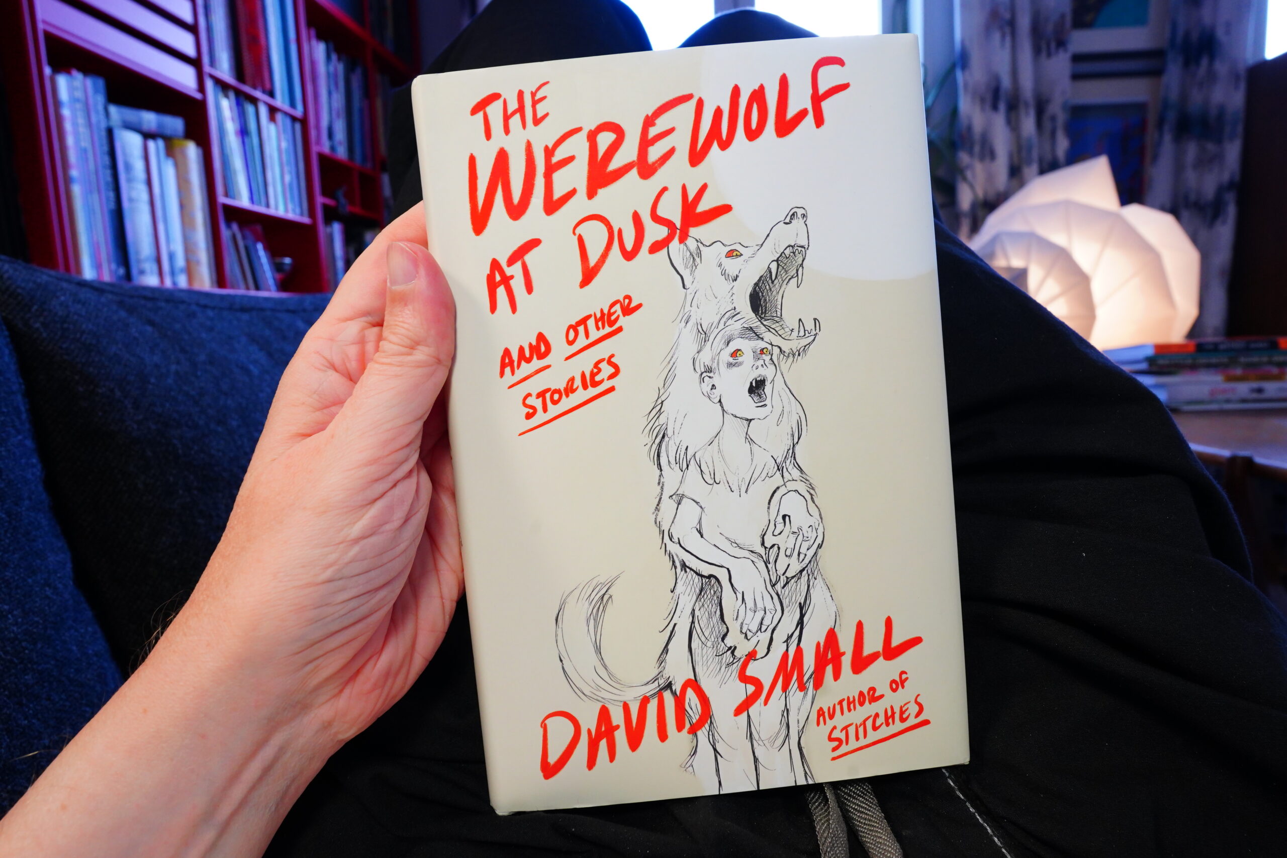
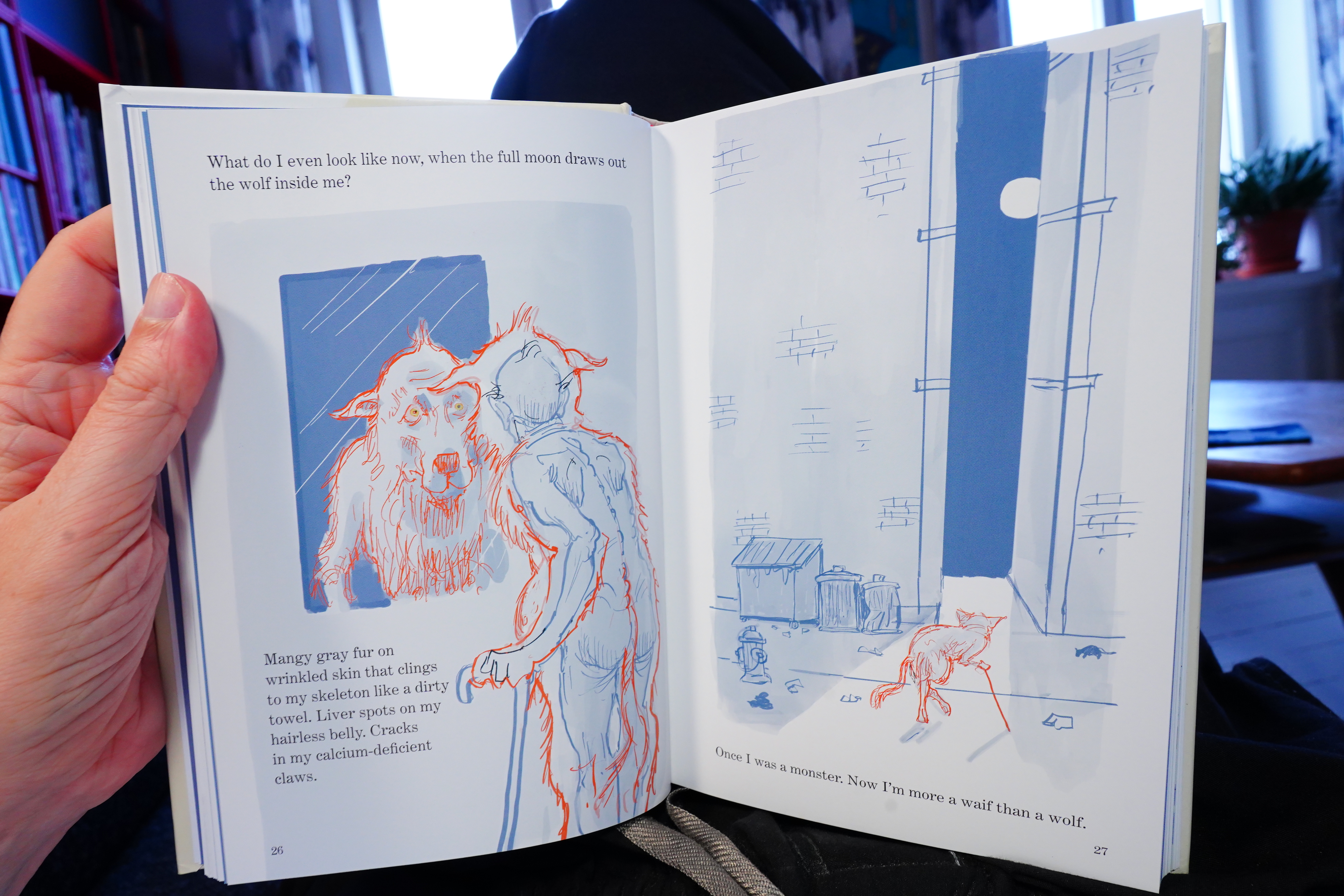
17:51: The Werewolf at Dusk by Davis Small (W. W. Norton)
Speaking of buying books, I have no idea why I bought this one. Perhaps morbid curiosity — I really disliked Stitches.
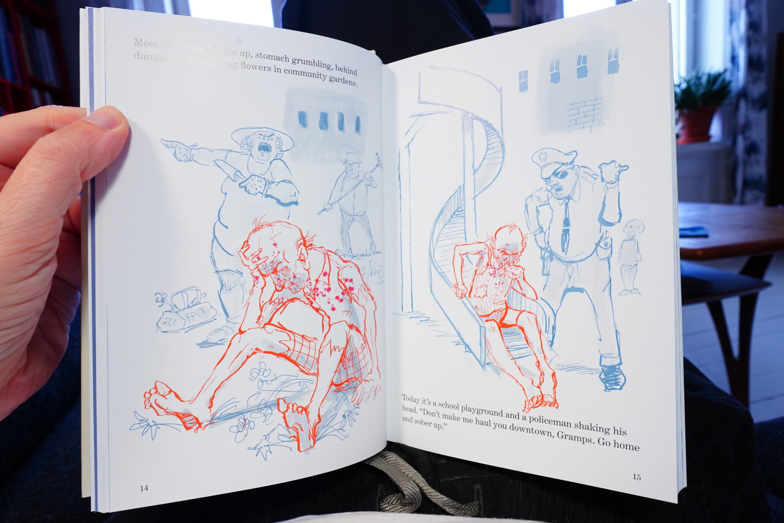
This book has three short stories (one of which is written by Small).
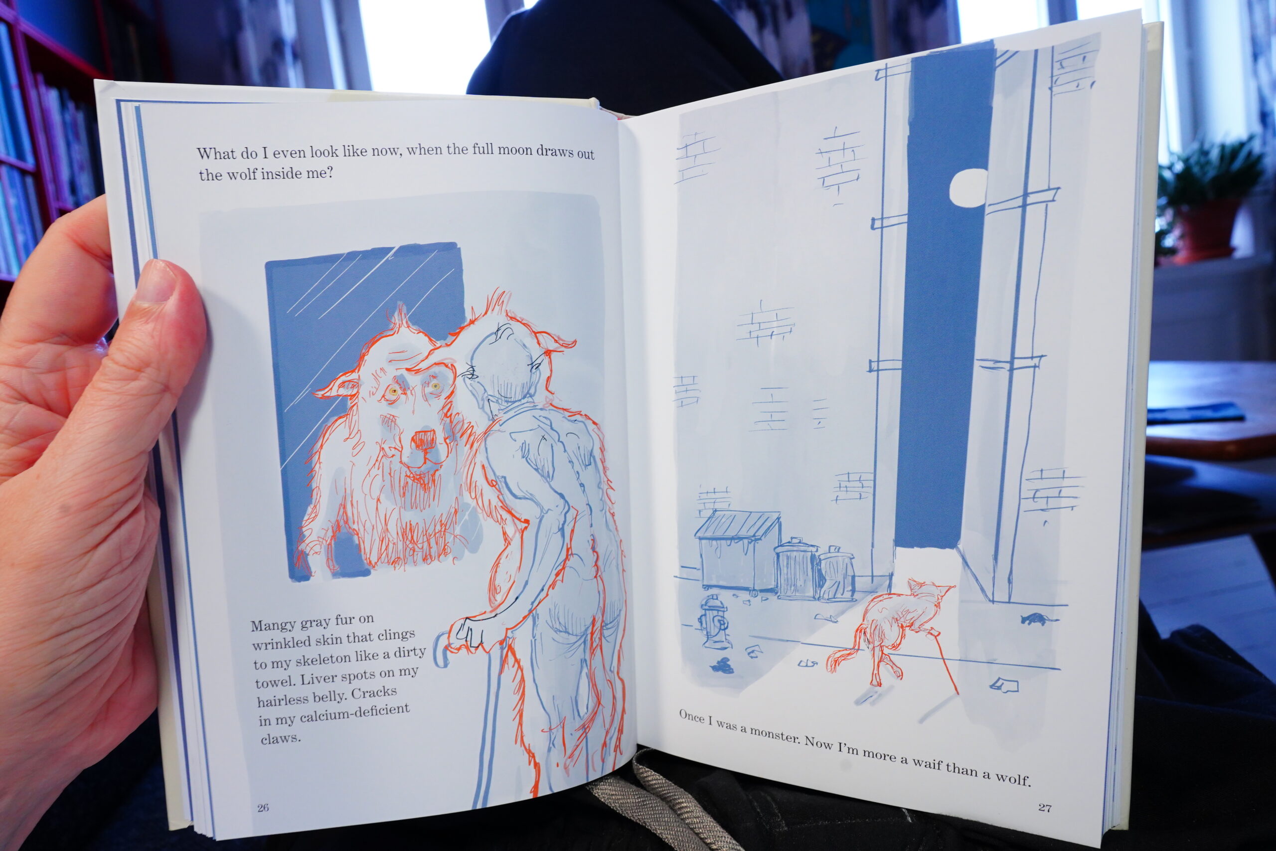
They’re all very er symbolic.
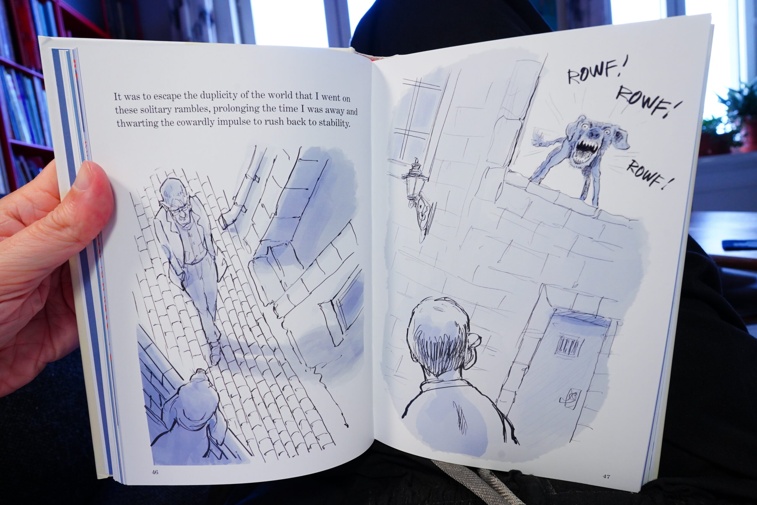
And deeply into Freudianism, I guess.
It’s not very good.

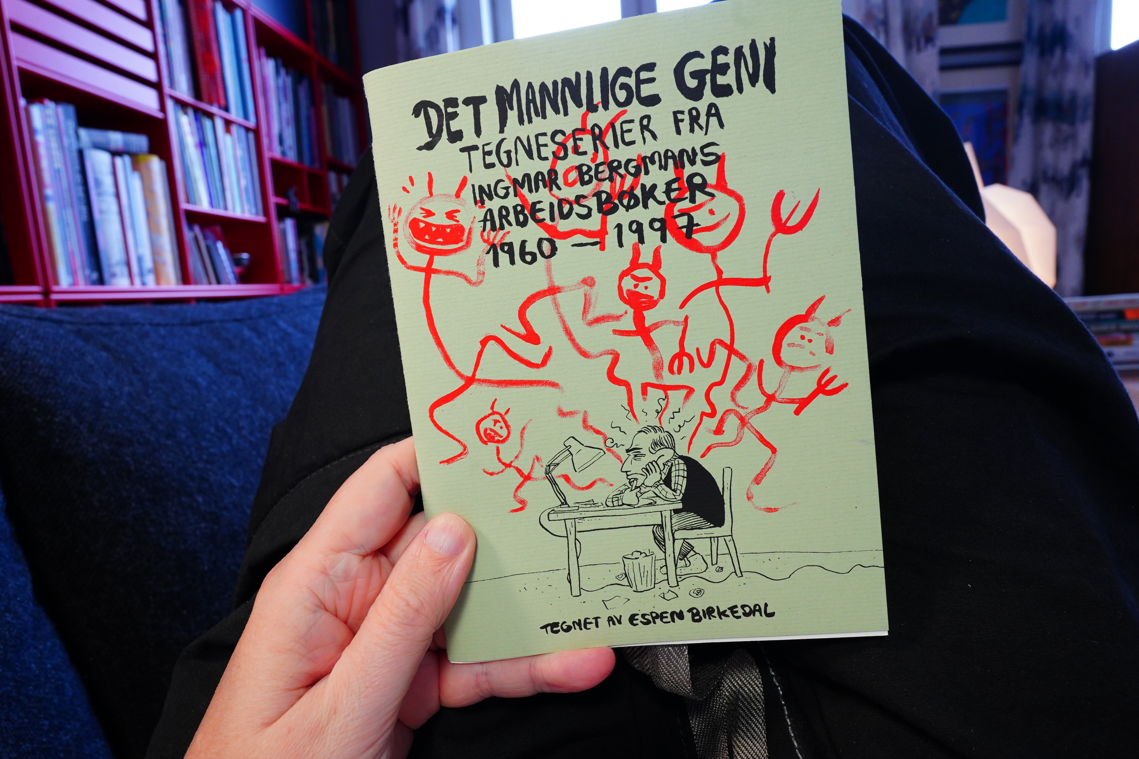
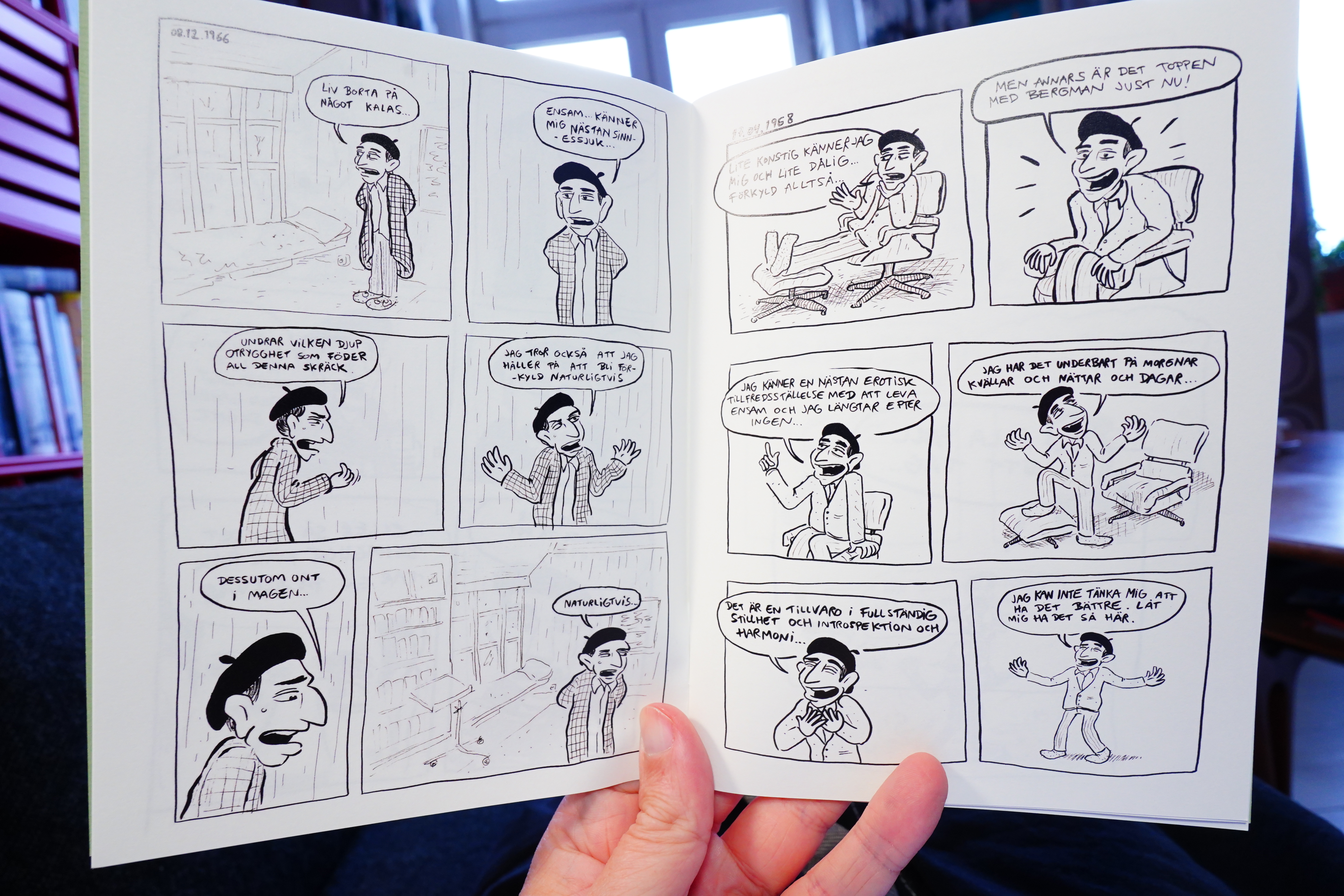
18:05: Det mannlige geni by Espen Birkedal

Heh. This book adapts diary notes from Ingmar Bergman.
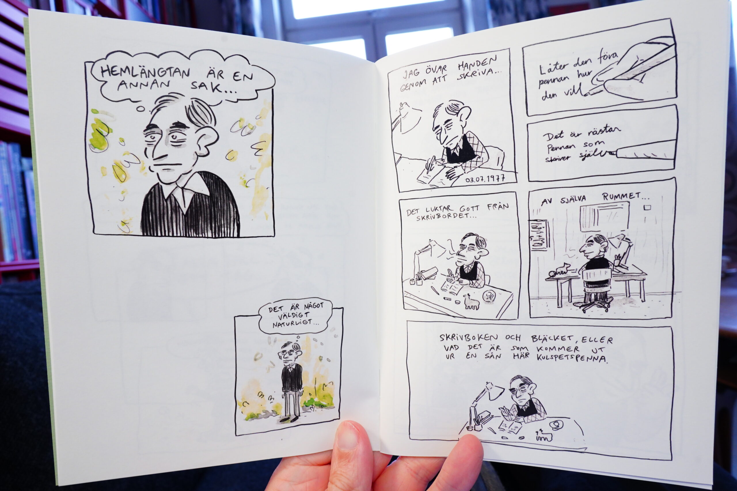
It’s fun, and it’s interesting. It works really well as a little comic book.
| David Bowie: Station To Station (1) |  |

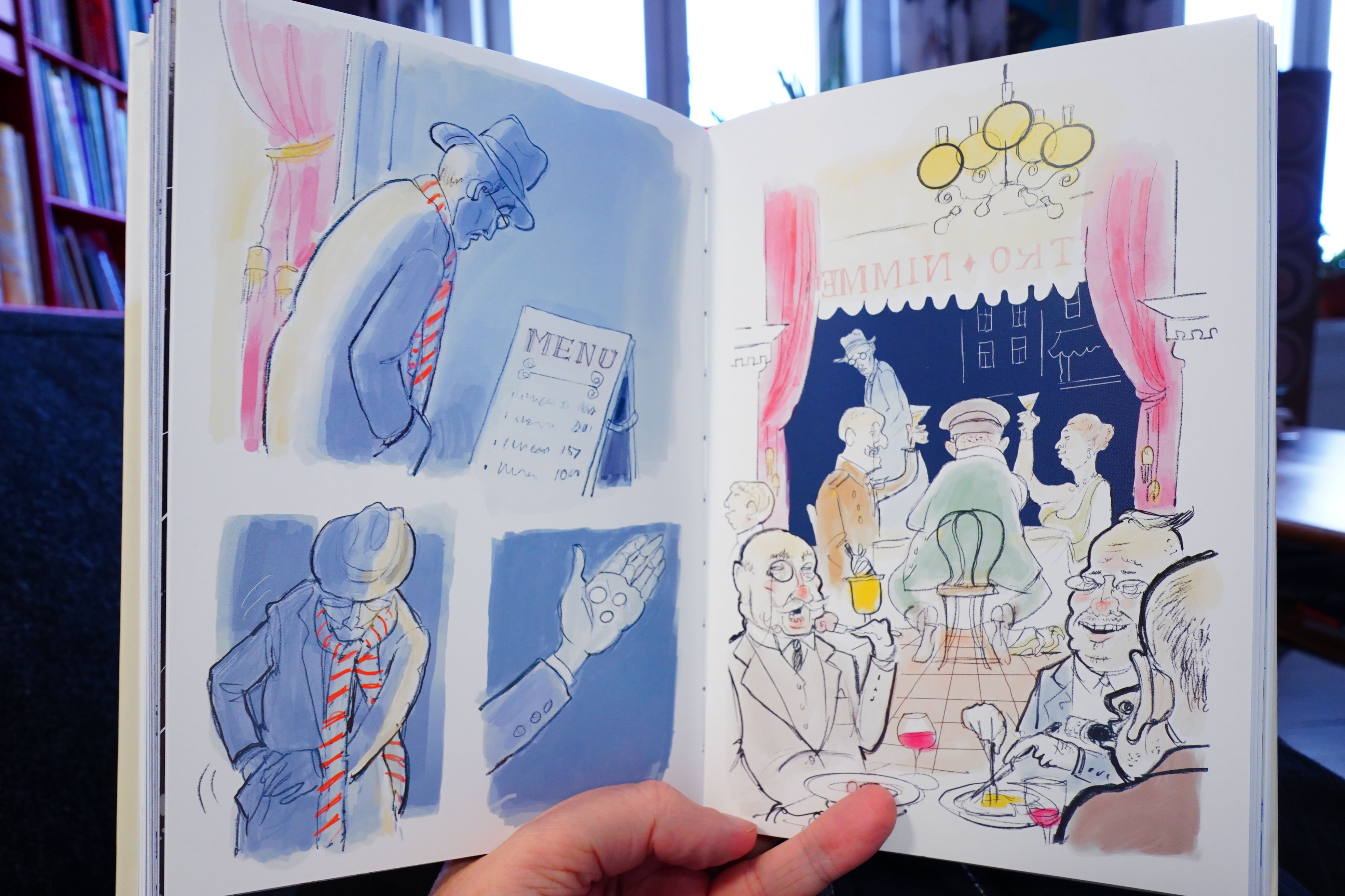
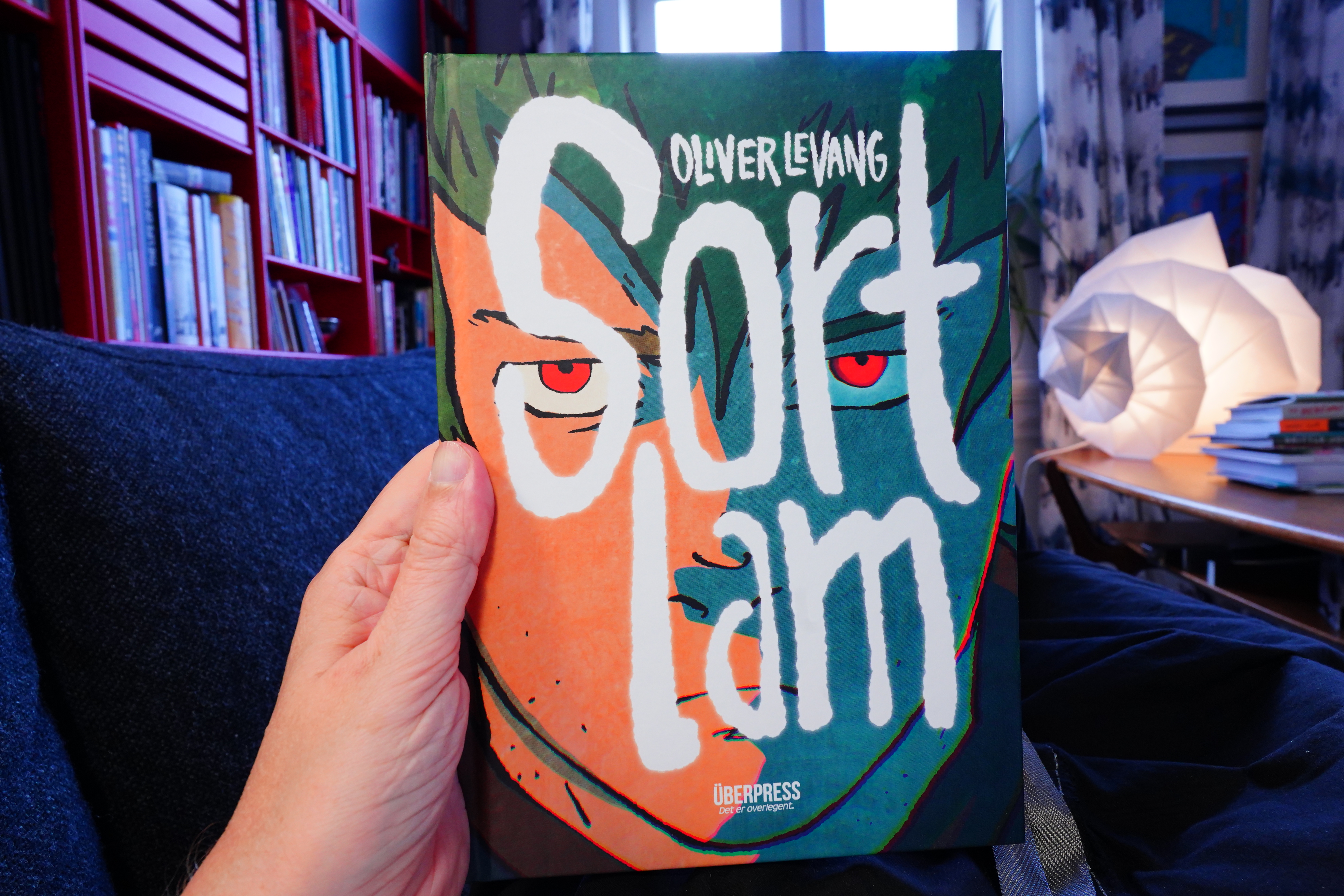
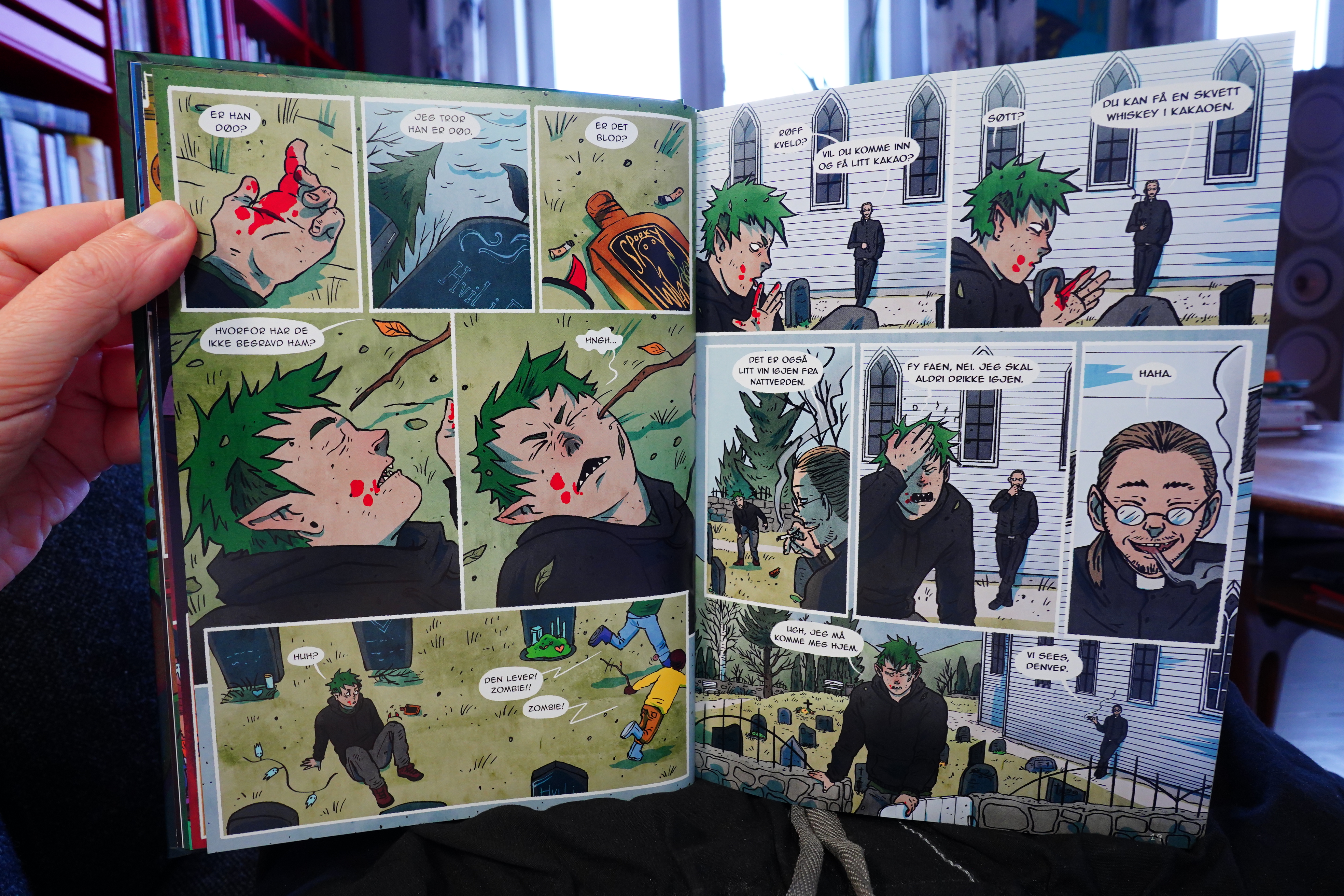
18:13: Sort lam by Oliver Levang (Überpress)

The storyline here is intriguing, and the artwork is attractive.

But it’s hard not to become annoyed with this book. It’s from the “there must be conflict in every scene” school of thought, so no matter what they’re doing, every scene involves people shouting. It’s exhausting.
Still, I’m definitely picking up the next (and apparently concluding) part of this.
| Talking Heads: 77 |  |
18:42: The End
And I think that’s enough comics for today.