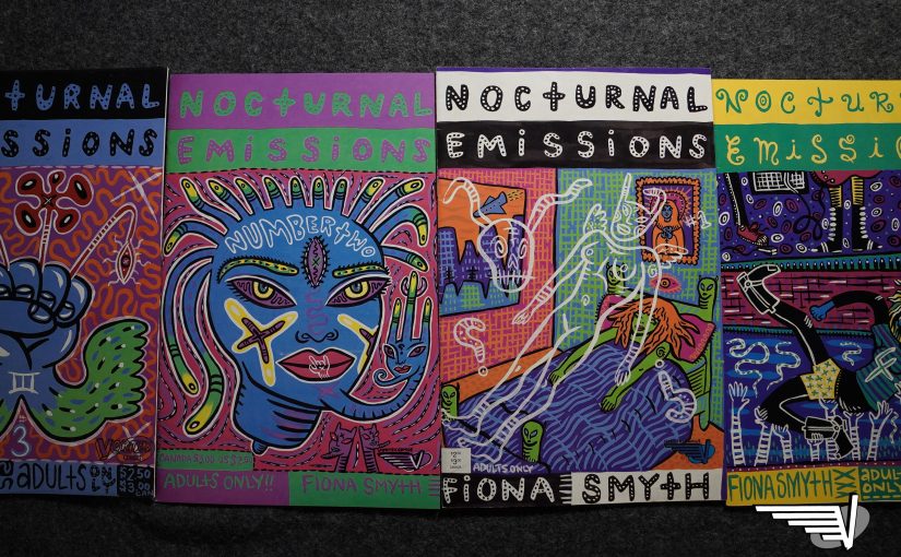
Nocturnal Emissions (1991) #1-4
by Fiona Smyth
Welcome back to the blog that covers all your NASCAR sports racing comics needs. Today we’re… we’re…
HANG ON! THESE AREN”T SPORTS COMICS!
Yes, Vortex had one last hurrah in the midst of all the NASCAR comics they suddenly started selling: Fiona Smyth’s Nocturnal Emissions, and if there’s anything less like a Herb Trimpe-drawn comic about cars, it’s this.
Vortex contains multitudes.

Seth provides the introduction, which makes you wonder: How did this book end up at Vortex instead of Drawn & Quarterly, where both Seth and Charles Brown I mean Chester Brown ended up at? And D&Q had already started publishing Julie Doucet by this time, I think, so it’s all quite strange? Anyway, let’s read the first three pages:
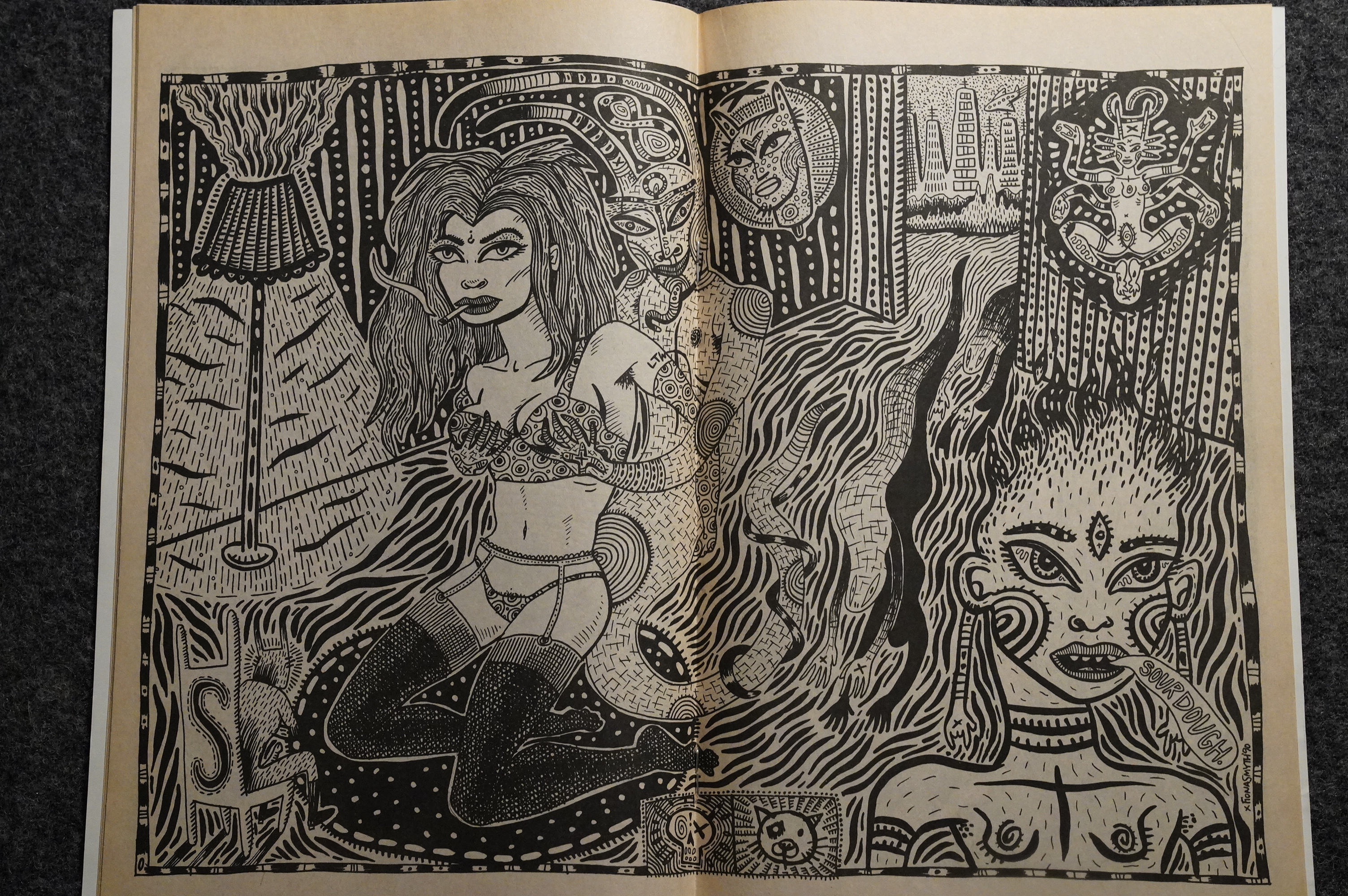
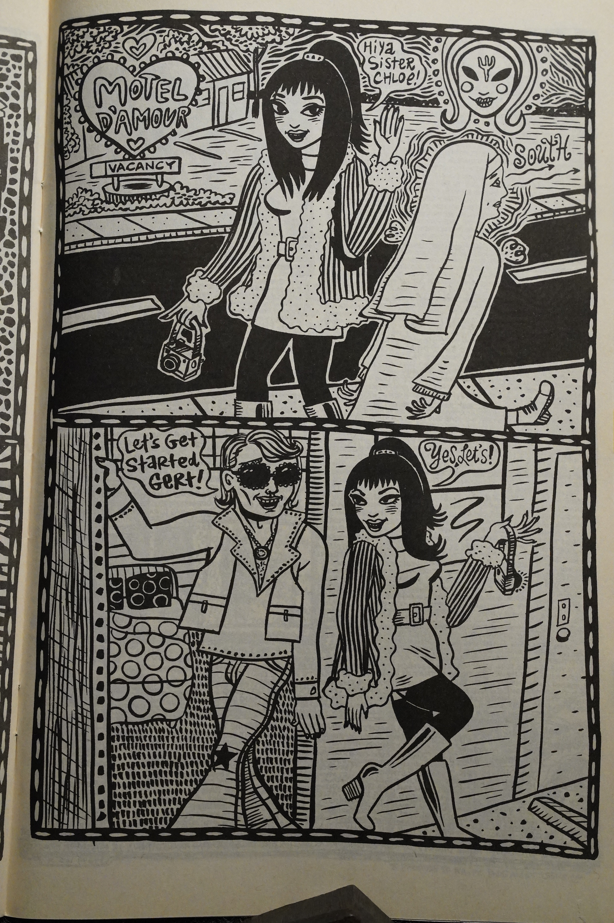
Man, that looks awesome. It’s so strong, visually, what with the expert black spotting and the squiggly lines and the attractive characters. It’s just kinda excessively gorgeous?
These aren’t comics I had to buy for this blog series; I bought them at the time, while being a student. (Except for the fourth issue, which took me years to find.)
It’s one of those comics that’s perfect as a pamphlet: It’s such a joy to stumble onto something as odd and compelling as this, and in book form it’s just not quite the same. (I mean, I’d buy it in book form, too, and I have; this series was collected and reprinted by Koyama the other year, and I bought that one too.)
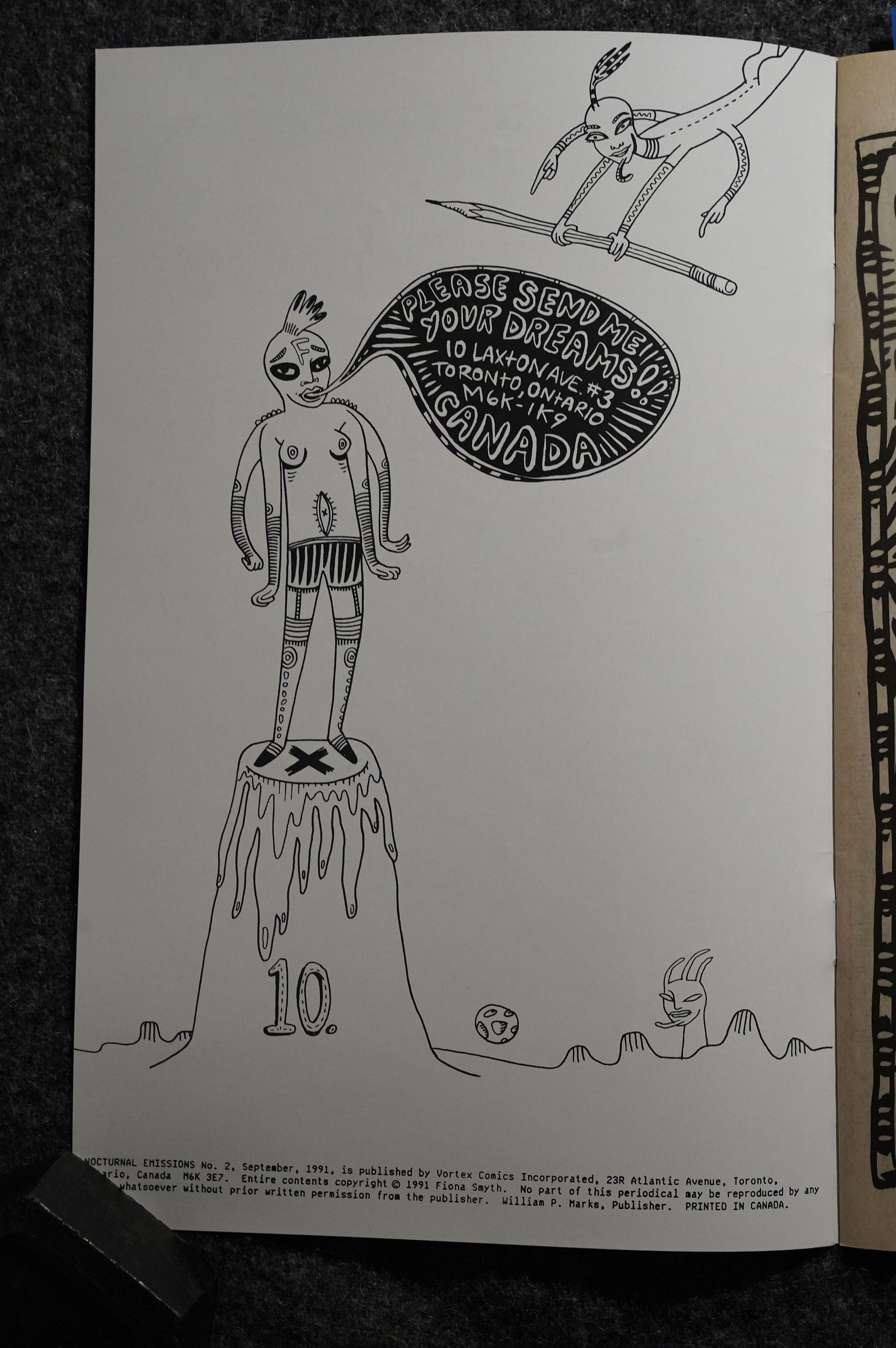
Smyth encourages readers to send her their dreams.
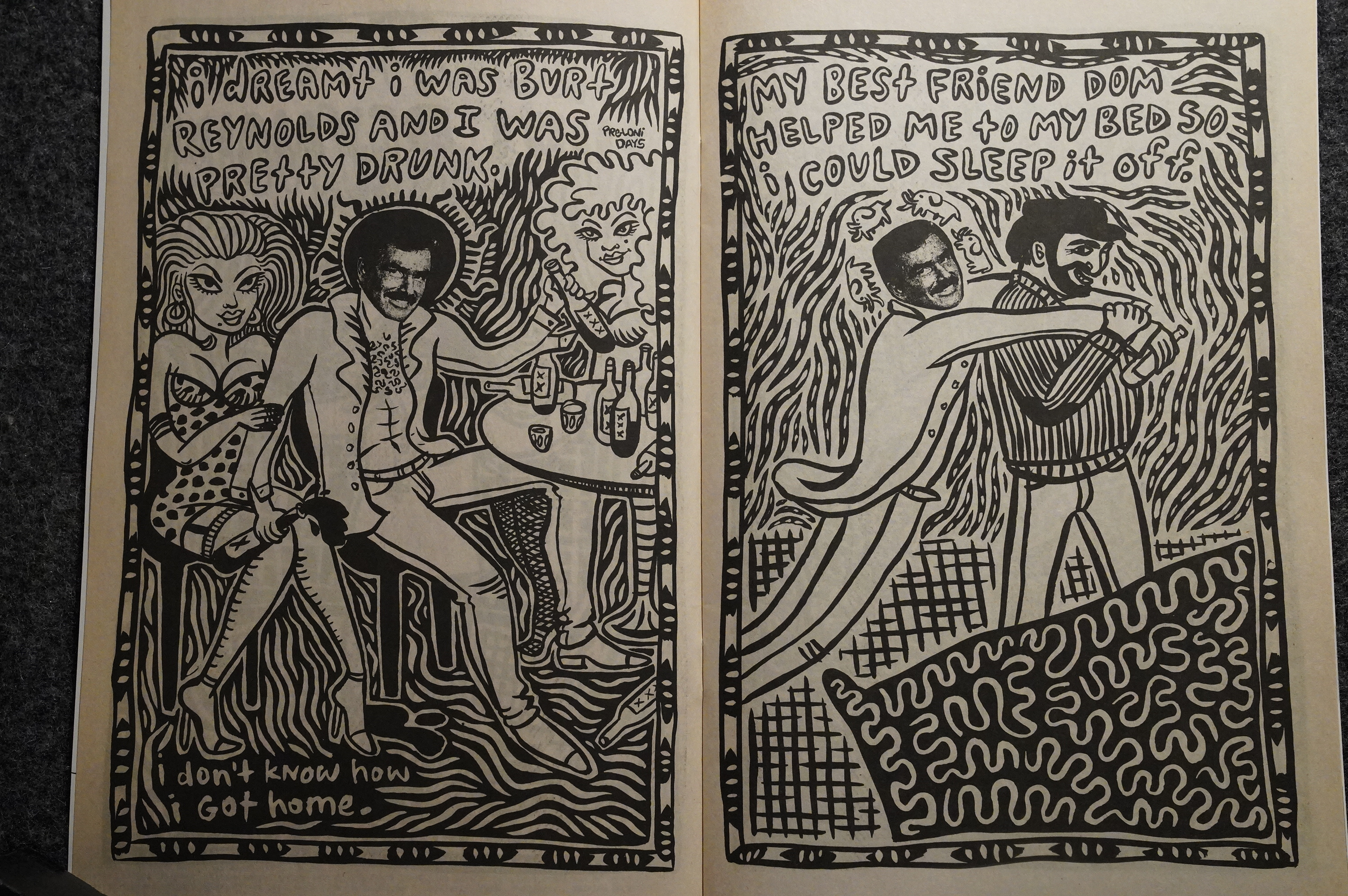
And she illustrates a bunch of her own dreams. Here she is Burt Reynolds, drunk. We all know how that dream ends!
I hadn’t really planned on re-reading this series now since I’ve just read it in collected form, but there’s something irresistible about these comics.
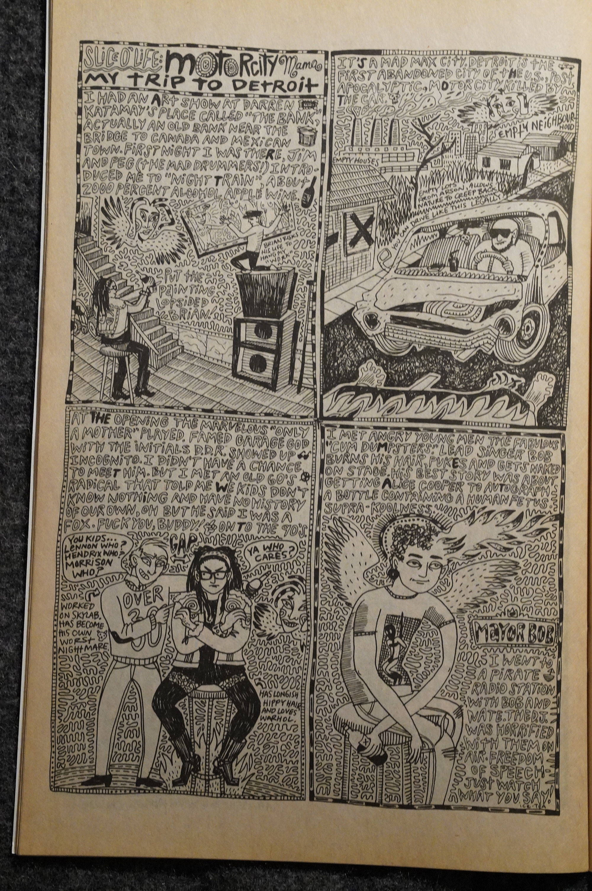
But is that a true story or a dream?
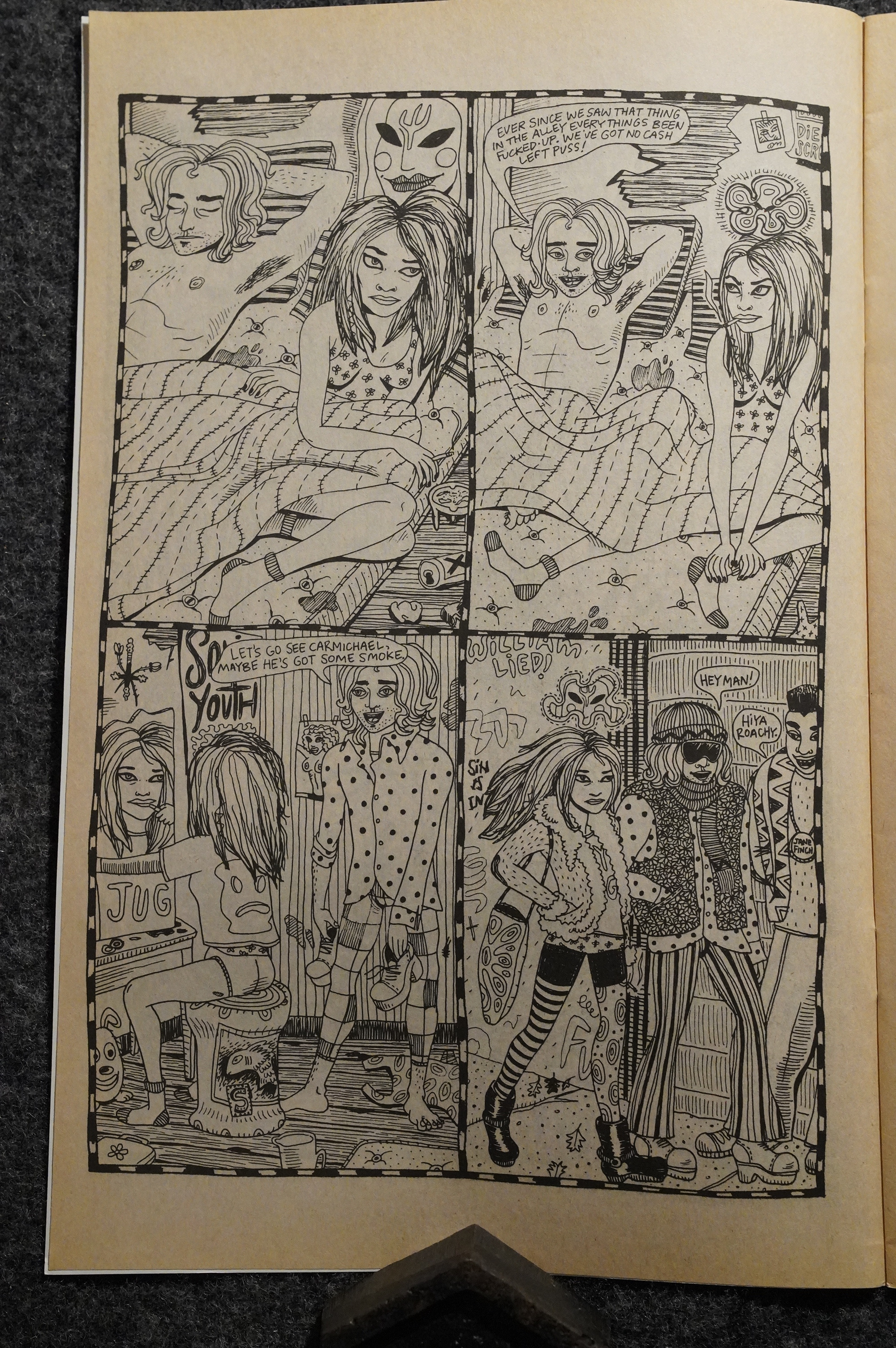
In the third issue we get a longer story (well, part of a story) that seems like it’s older? It’s more scratchy… still very pretty, but very different.
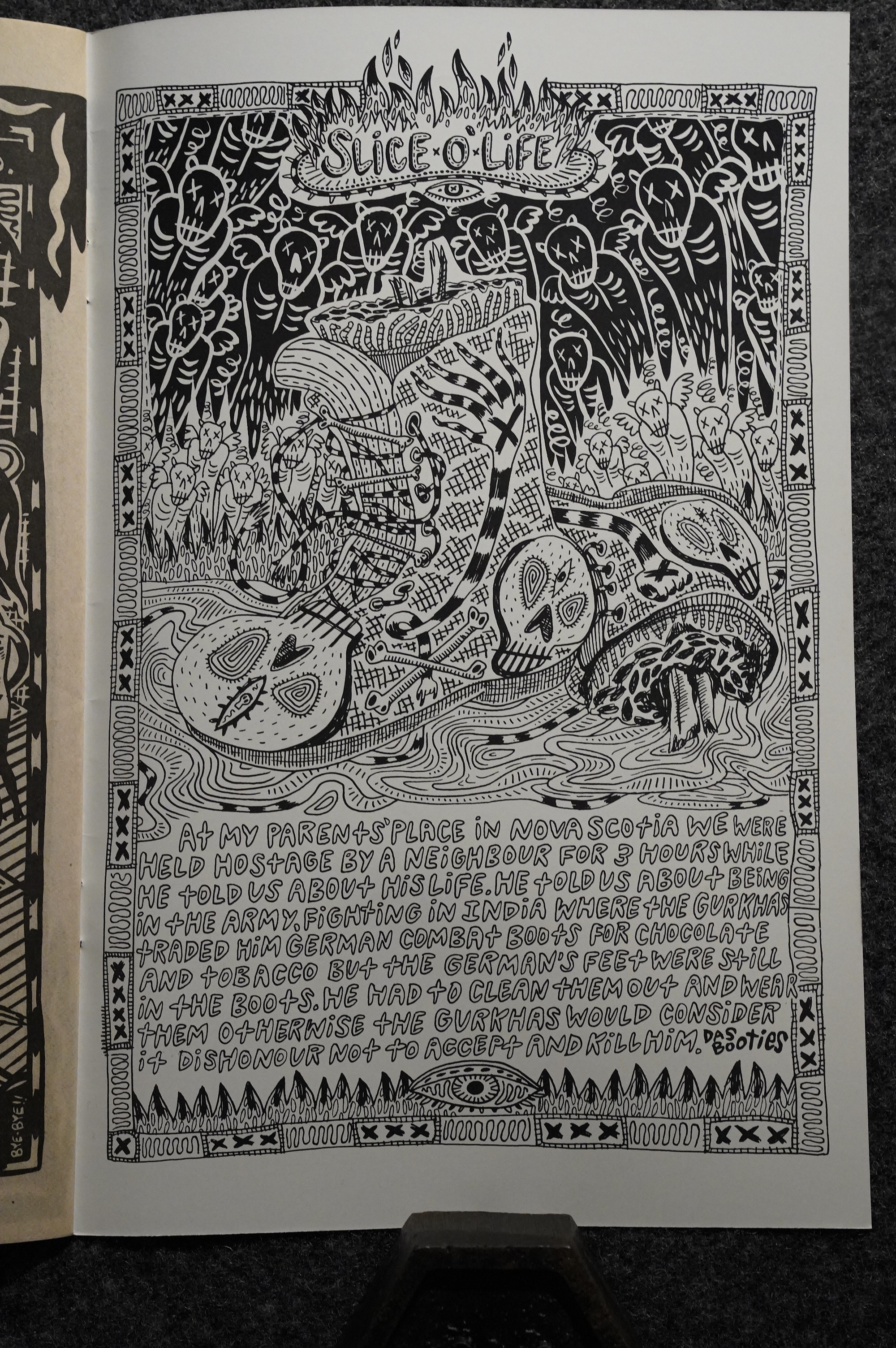
OK, here even I think she’s gone too far: There’s absolutely nothing here for the eye to latch on to. It’s like a migraine on paper, and you have to make your eyes read the text by force. READ THOSE LETTERS< DAMMIT!!!1!
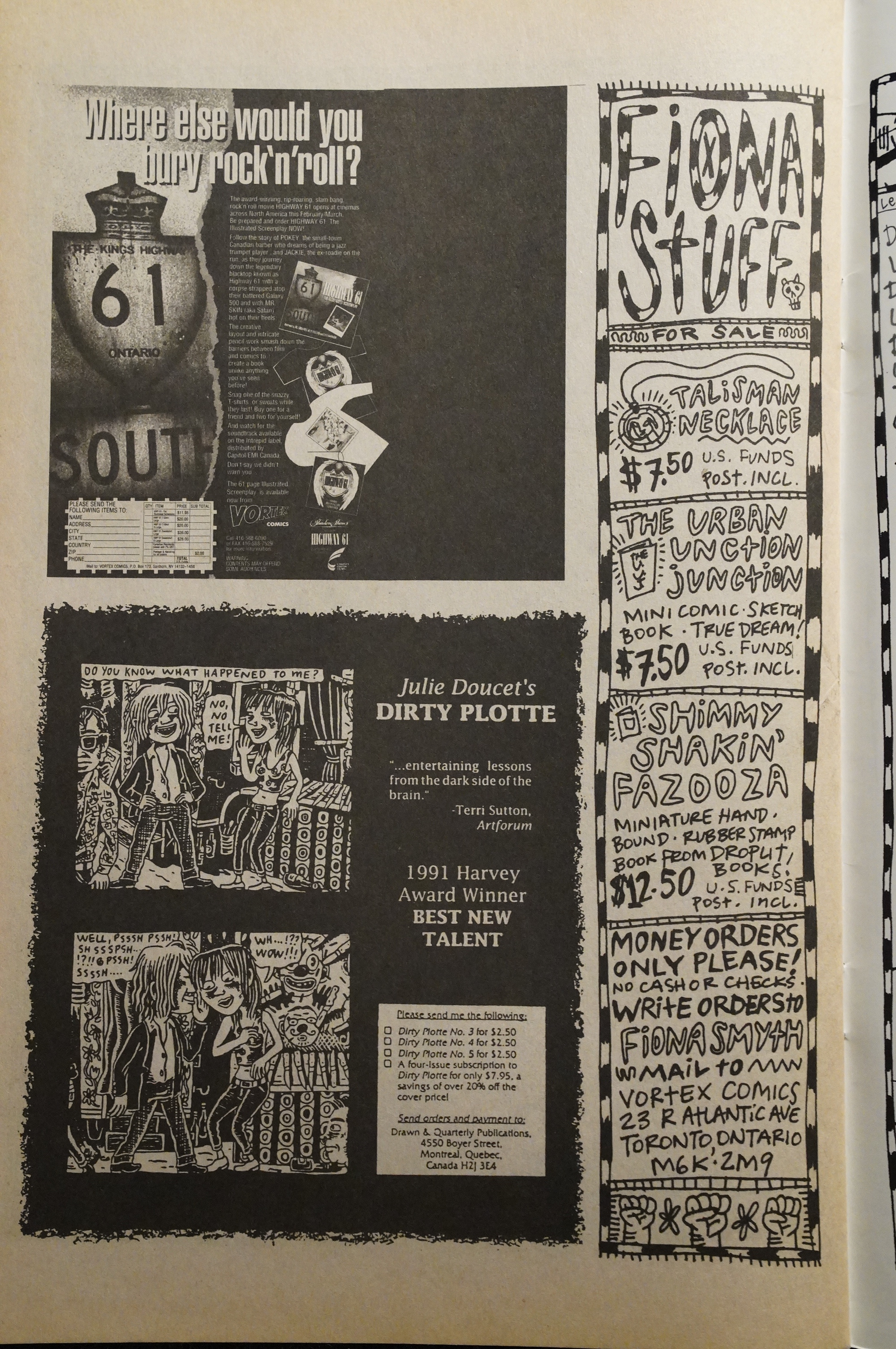
And here we have an ad for Dirty Plotte, which makes sense.
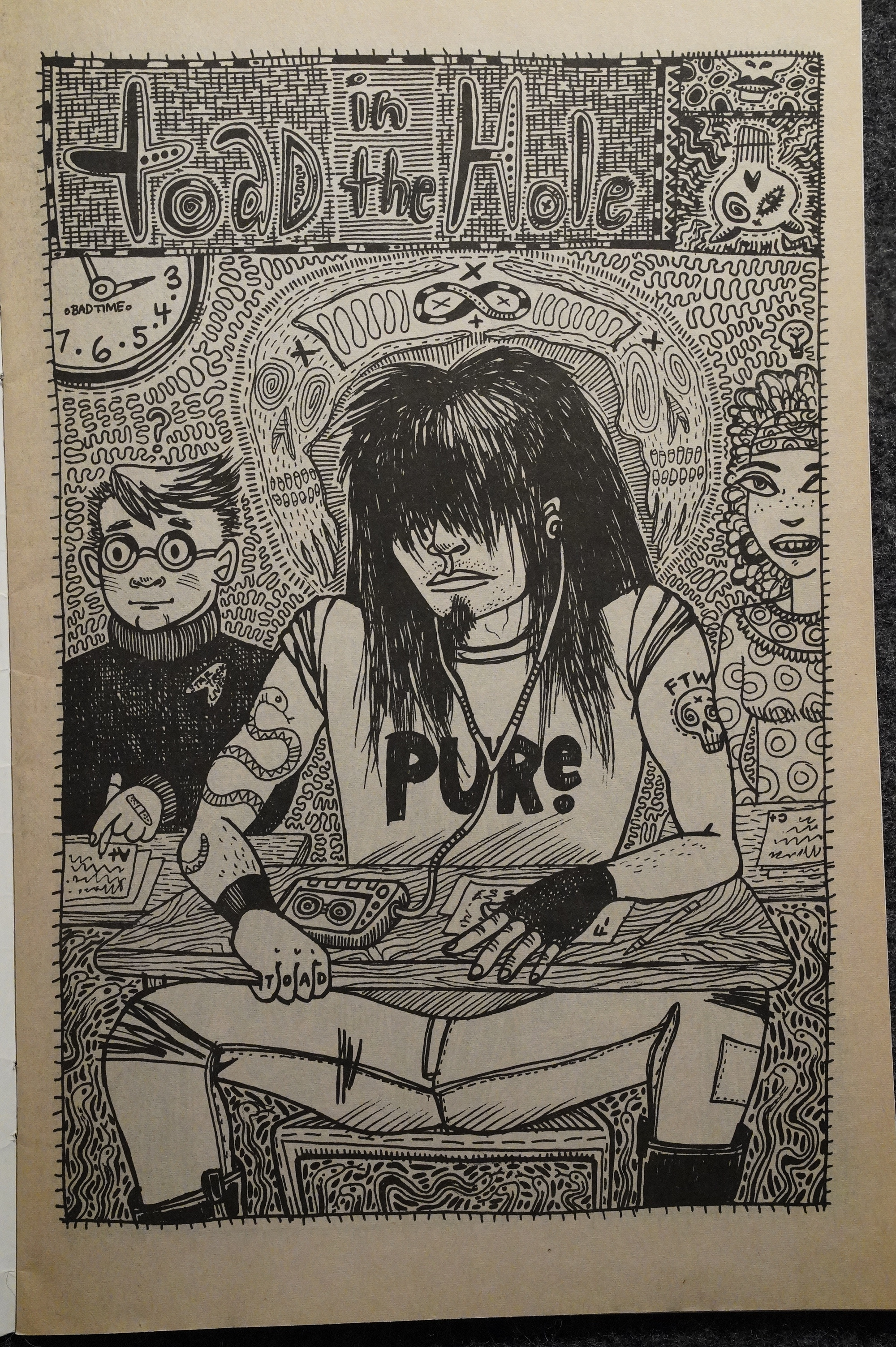
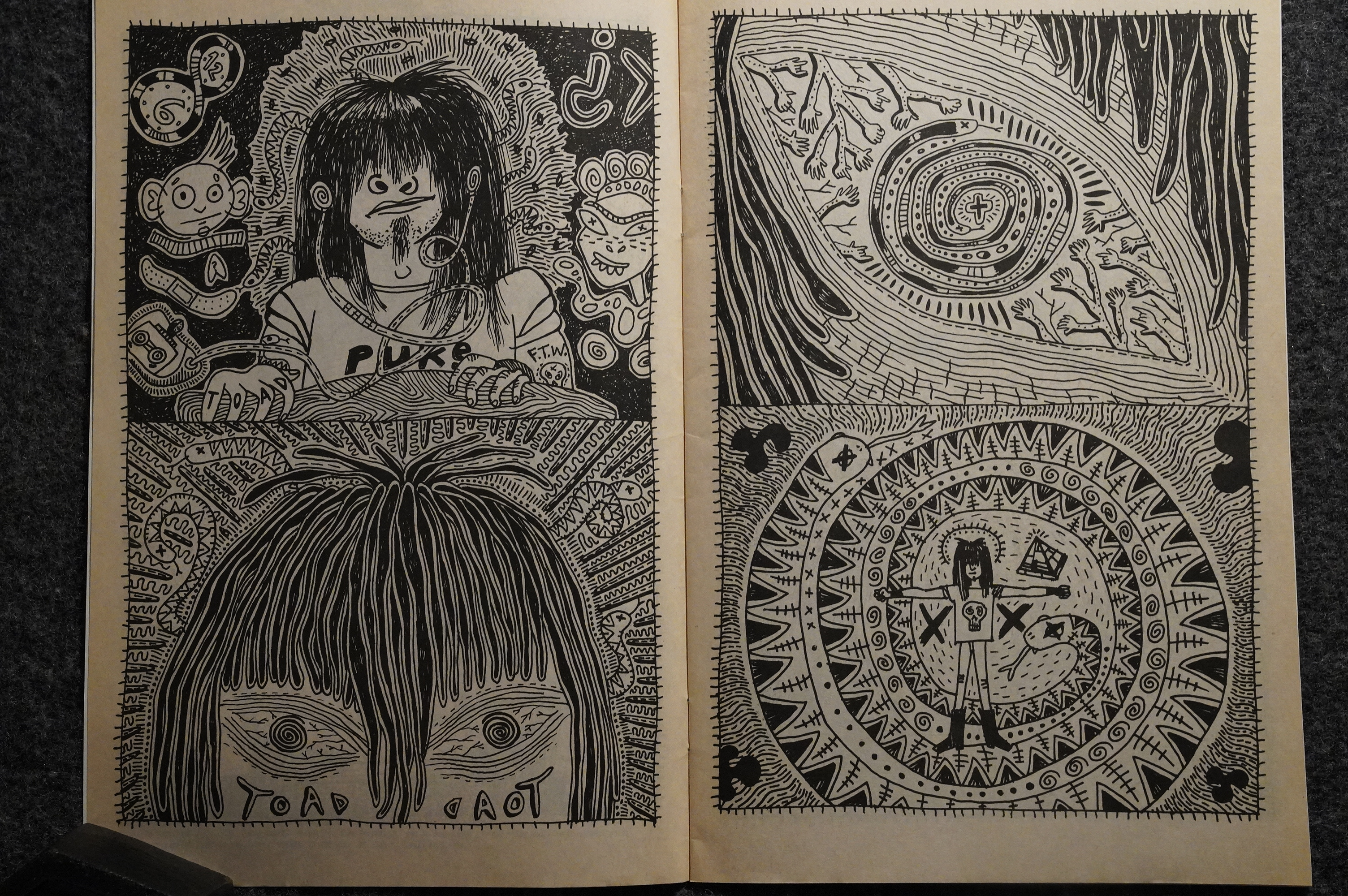
The fourth and final issue was possibly published in 1994, which is a couple years after the previous issue, and has to be the final thing Vortex Comics ever published. It has a different paper stock and no indicia, so I’m guessing they kinda… pushed it out there because they really wanted to, even if they were otherwise out of the comics business.
It’s a good issue graphically, but by this point there’s… four? continuing serials, all pretty surreal, and they all advance by … not very much, so it’s a frustrating read in some ways.
It’s still a pleasure to look at and it’s kinda funny.
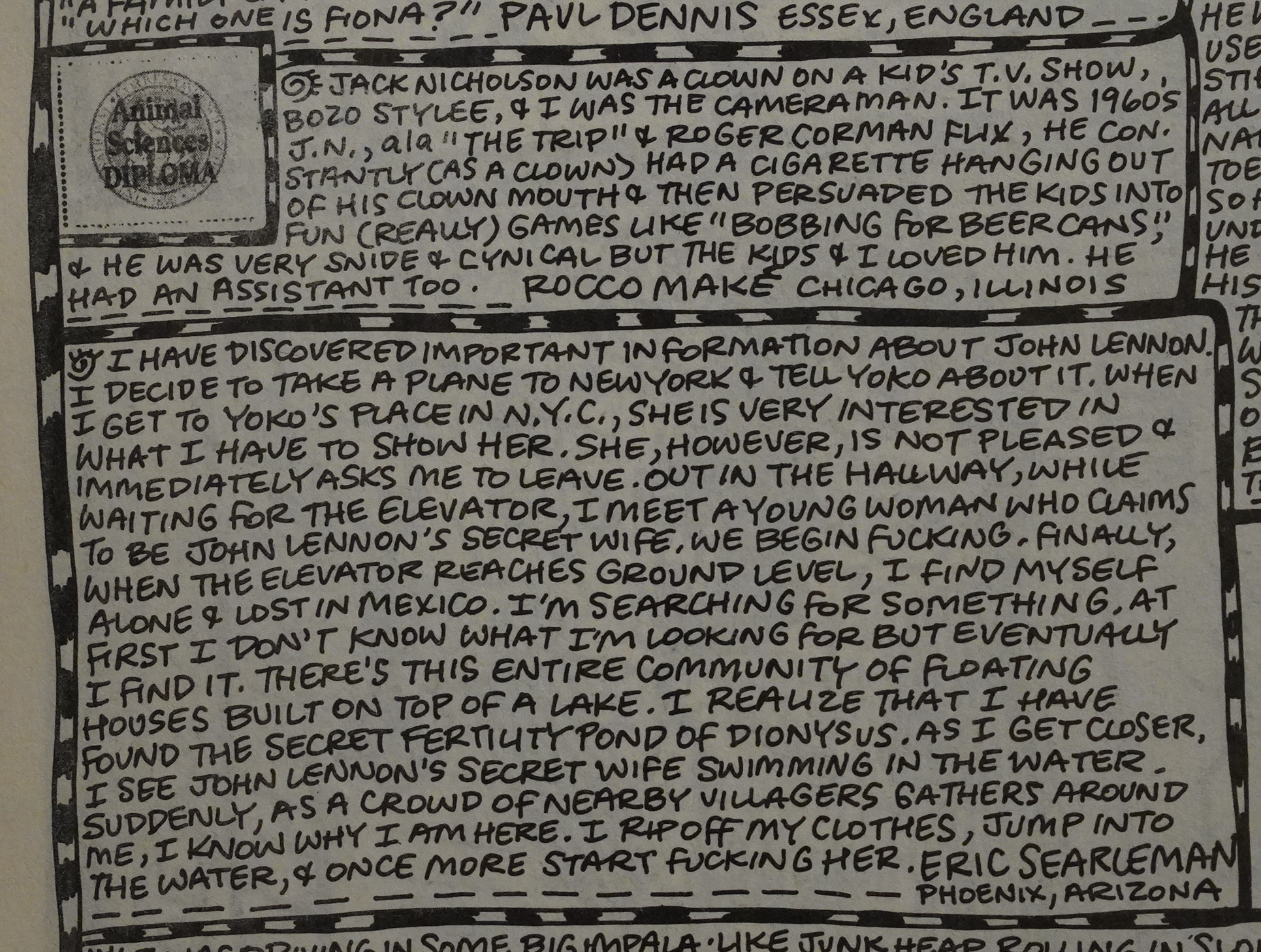
And we get a letters page chock full of readers’ dreams. I’m not sure that’s a real dream, though. Some people!

And you could buy one of her dreadlocks if you had $300.
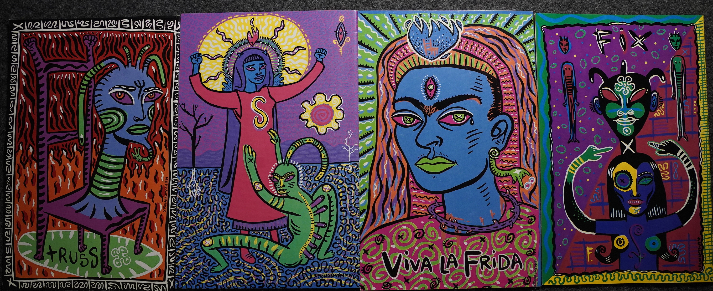
Those are some good-looking back covers.
So: There we are. I love how jam-packed these issues are: Smyth fills up almost every page; no house ads or anything. Now that pamphlet comics are a thing of the past (except for mainstream stuff), these are the sorts of things we don’t see in comics stores any more.
Oh, well.
J. Hagey writes in The Comics Journal #147, page 44:
Toronto artist Fiona Smyth takes great
pleasure in gently invading your dreams and
twisting them into subtle nightmares. In what
she writes, there are two texts. Text I is reac-
tive, moved by indignations, fears, unspoken re-
joinders, minor paranoias, defenses, scenes.
Text II is active, moved by pleasure. But as it
is written, corrected, accomodated to the fic-
tion of style, Text I becomes active too, where-
upon it loses its reactive skin, which subsists
only in patches (mere parenthesis).
The most important aspect a comic can have
is visual style; an immediate impact of its visuals
upon the senses can whet the reader’s mind —
not only as an onslaught to the eyes; the nose
and throat are besieged as well. Fiona Smyth
is just such a stylist.
One might suspect Smyth’s switch from her
bold painting technique to the black and white
of Nocturnal Emissions to be difficult, but she
makes the transition seem only a minor inconve-
nience. Throughout NE the artwork is charged,
firmly packed. It momentarily brings to mind
Julie Doucet’s work (but not in emulation; in-
stead, tangency). Smyth has taken that same
anarchistic, hard-polished gutter as Doucet, but
obviously careened off some fauve/surrealist
cliff. The little pictures are so dense they make
eyes bleed and senses numb. And I do not think
Smyth is sorry for what she has done.
The stories are aggressively anti-narrative in
both presentation and plot. A phenomenon
discussed at length by Roland Barthes seems to
apply. His idea of “drifting” in the text, and the
accompanying pleasure, aptly applies to Noc-
tumal Emissions. While you read along your
mind may take a tangent away from the text bas-
ed on something you’ve read. Contrary to the
usual fears that you are not “paying attention,”
Barthes claims great things can happen, liber-
ating things. The numerous distractions in each
frame of NE become the Story and the plot the
distraction. The flowing lines and the volumin-
ous abberations roam from thought to fantasy
in fabulous simplicity. If any comic illustrates
the beauty of Barthes’s “drifting” it is most cer-
tainly Smyth’s.
The first issue was presented at a gallery showing Smyth’s paintings:
Here’s a review of Somnambulence, the collected (and expanded) edition:
For those new to Smyth, it may take a few dozen pages to get with the flow of her absolutely singular vision, but once they do, I predict they’ll have a hard time putting the book down. Her thick line is extremely clean and intense, and the same is true of the visions she transcribes onto paper — the “intense” part, at any rate.
This blog post is part of the Into the Vortex series.