A while back, I launched an in-depth investigation into a claim that French(ey) comics used to be serialised half a page at a time. Somebody on the internet was clearly wrong (because not even French children are that patient).
As I had never myself seen these anthologies, I had to resort to Google for the proof. In the process, I discovered that there’s kinda not a lot of information to be had about the reading experience of these anthologies. In any case, not in any language I could understand.
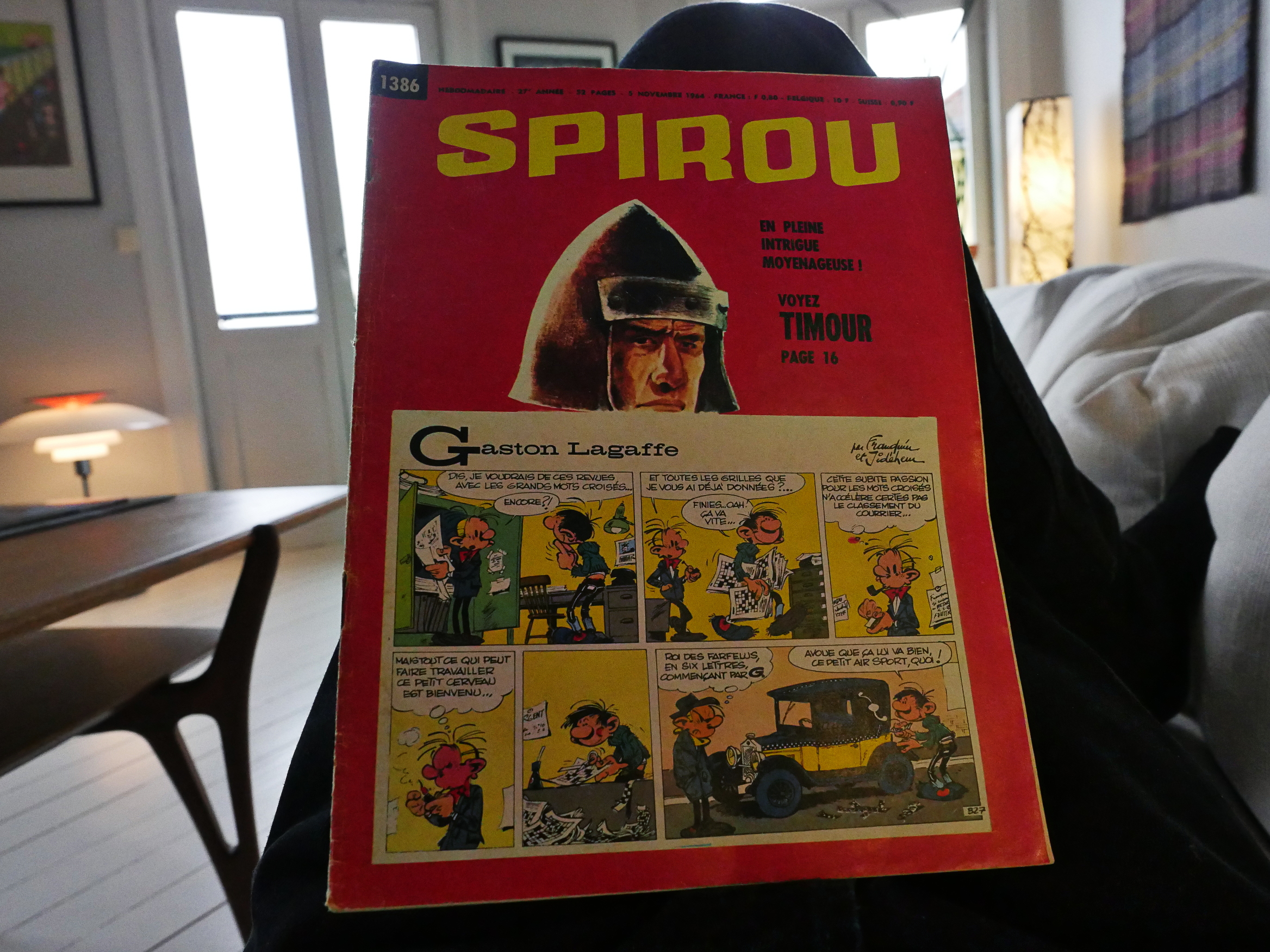
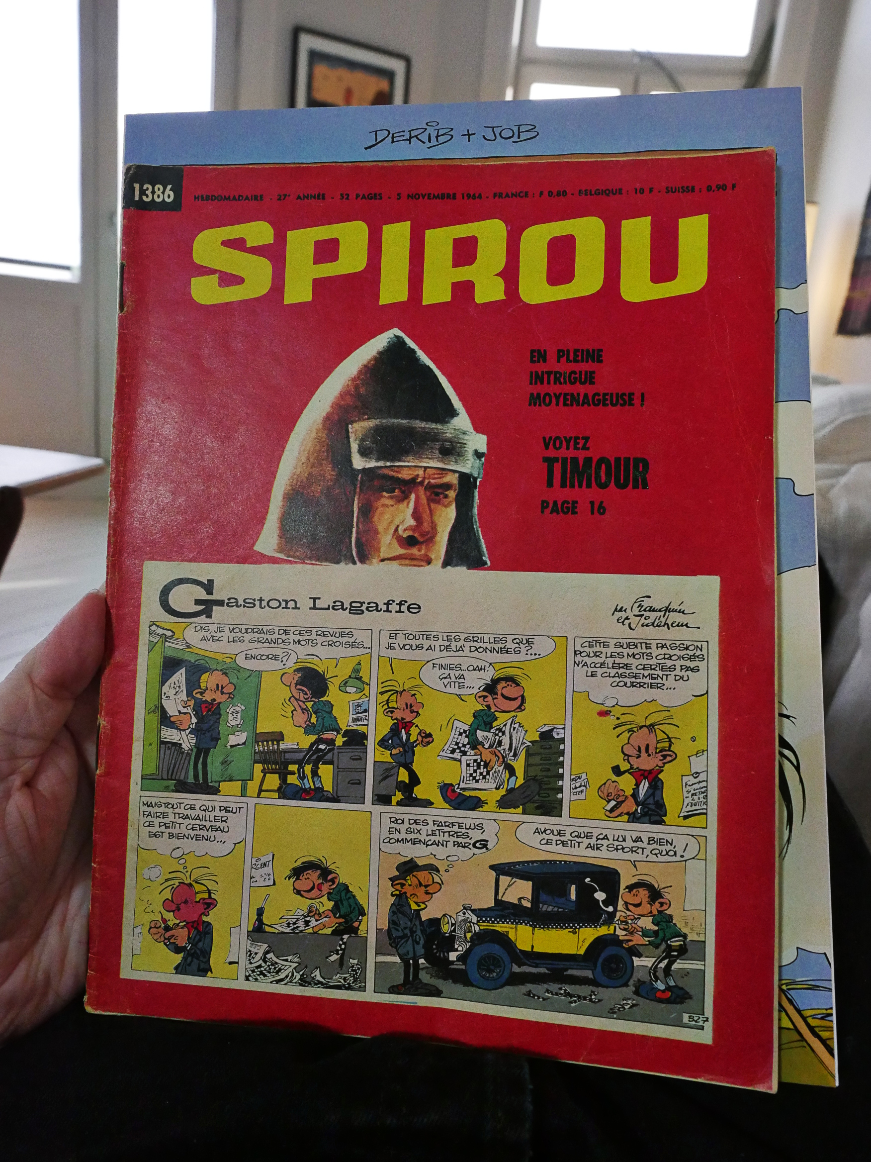
So the other day I happened upon an issue of Spirou (happened upon on ebay, ahem), and I bought it, and now I have it, and now let’s take a look at it. Since basically all the classic Franco-Belgian comics I grew up on originated in these magazines, I’ve always been curious as to how they looked.
The paper is quite thin and somewhat matte. I had also expected the magazine to be smaller, but it’s almost album size:
(A Yakari album behind for comparison.)
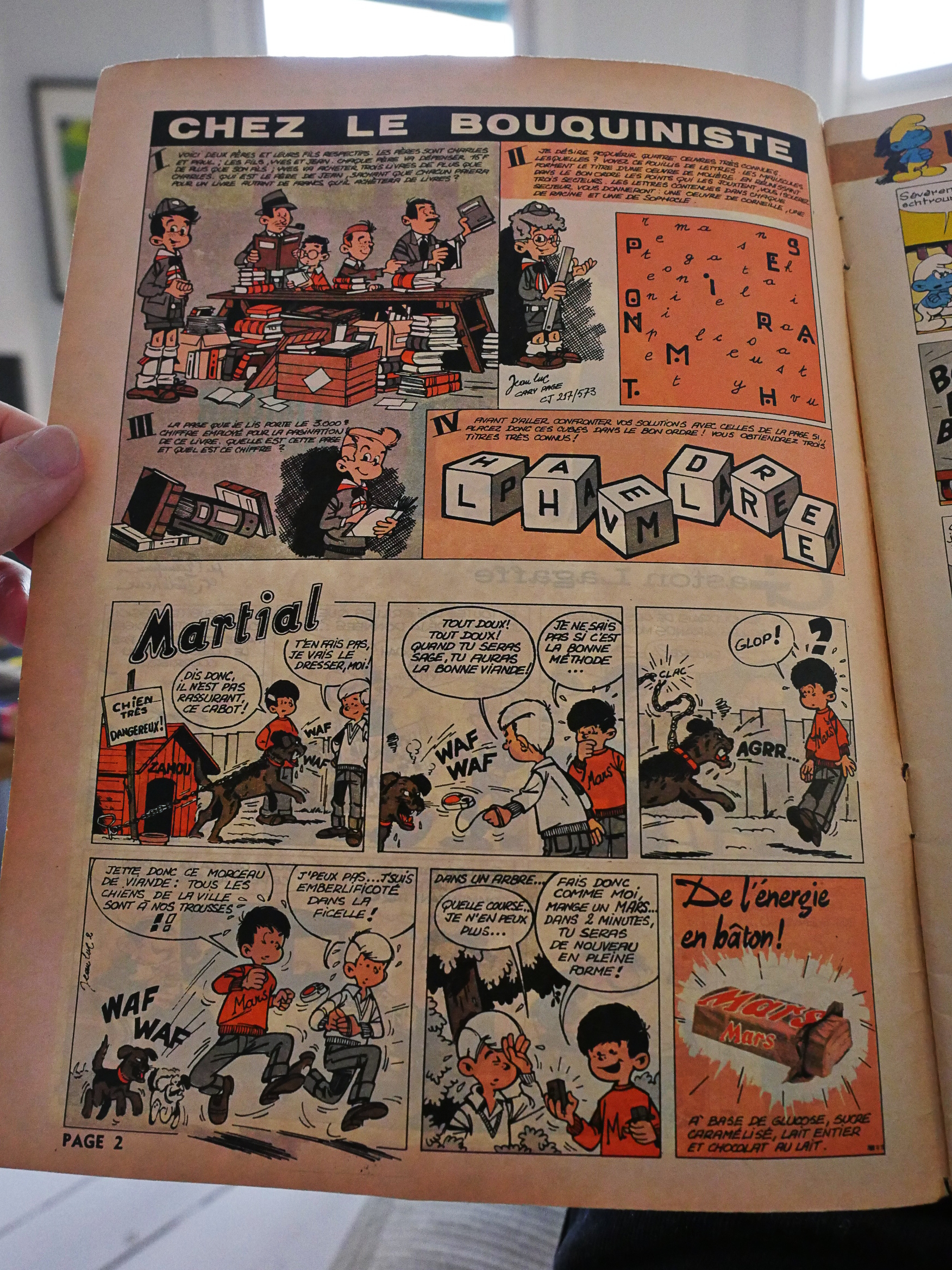
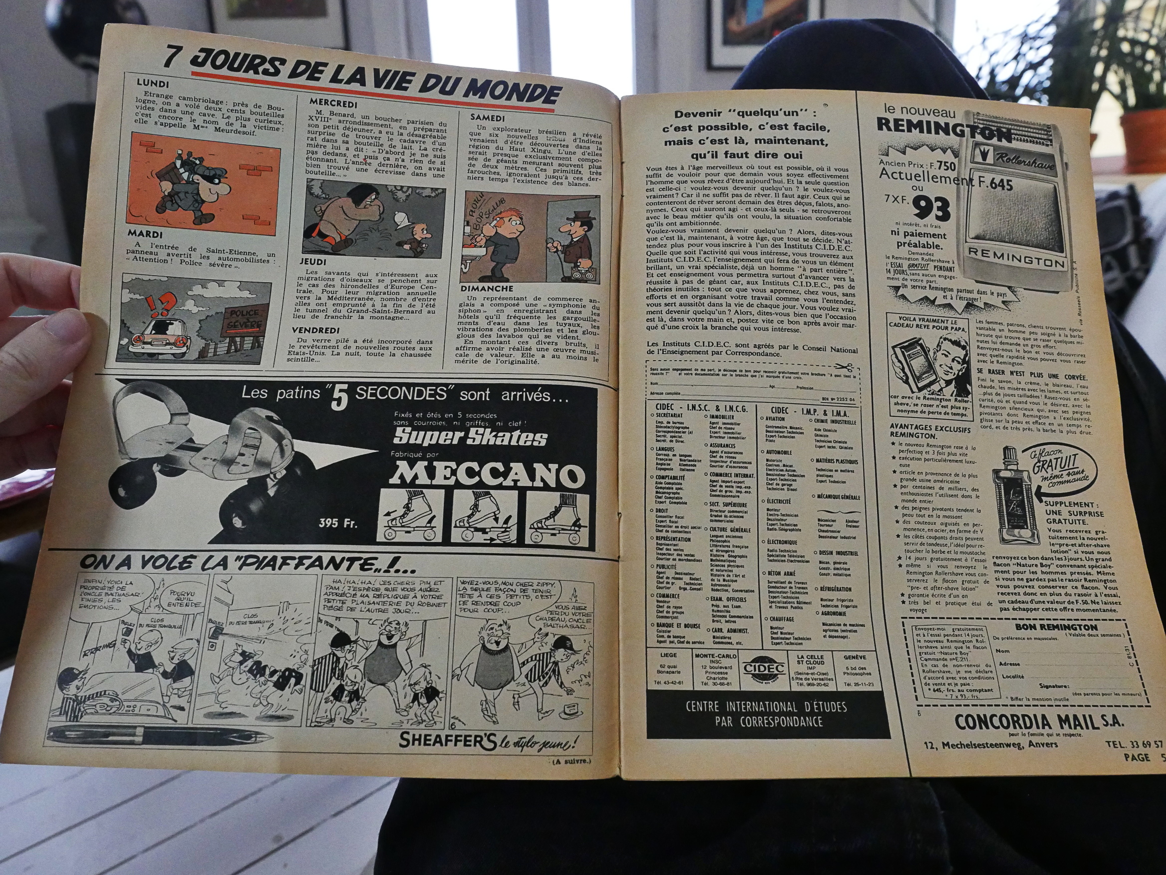
The separation between ads and editorial matter seems, er, not very clear… The top strip is an activity thing, and the bottom one is an ad for Mars.
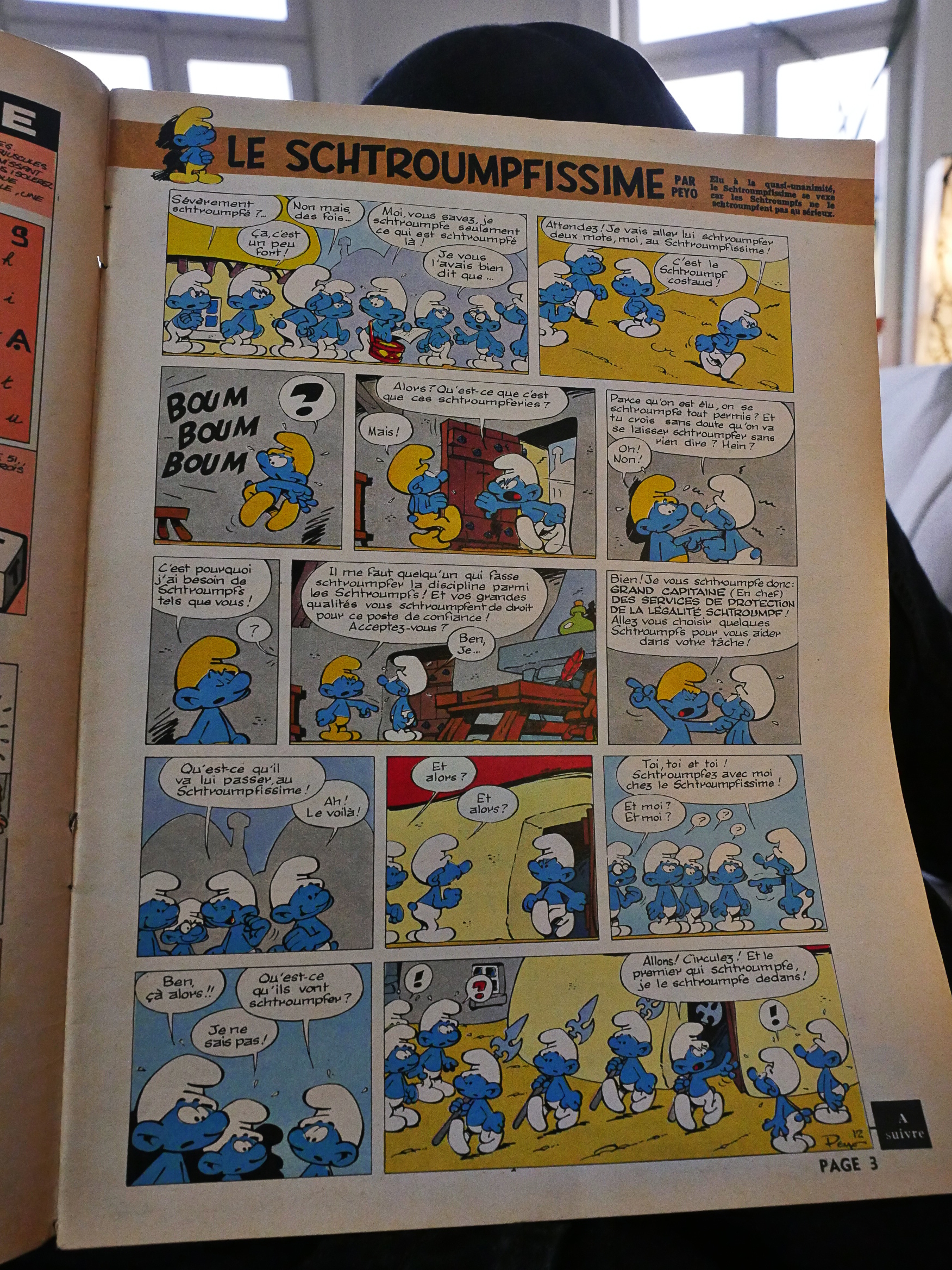
And there’s a wide outer margin where they place the “A suivre” (to be continued) box. Presumably because they want to have a heading for on all the pages, and since the magazine is basically the same form factor as the albums, you get a wide margin, too.
Some of the pages are full colour, and some aren’t. And we only get a single Smurftastic page, so French kids are smurfing patient: It’ll take almost a year to get the entire story.
And there’s a very, very short recap up there to the right.
Nine of the 50 interior pages are non-comics pages, with a mixture of articles about things boys would find interesting and ads for roller skates and after shave.
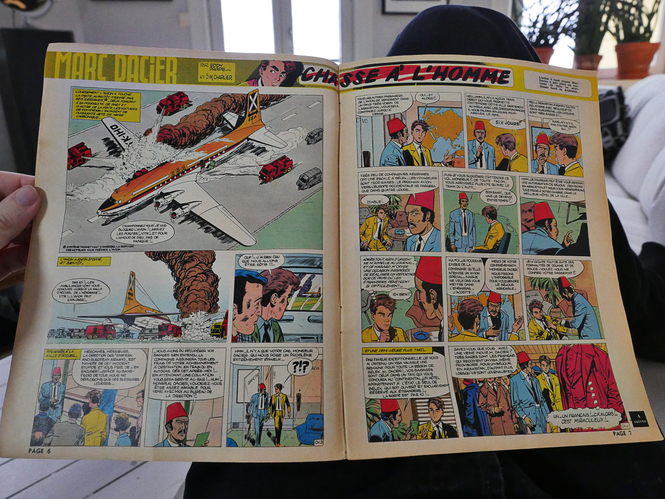
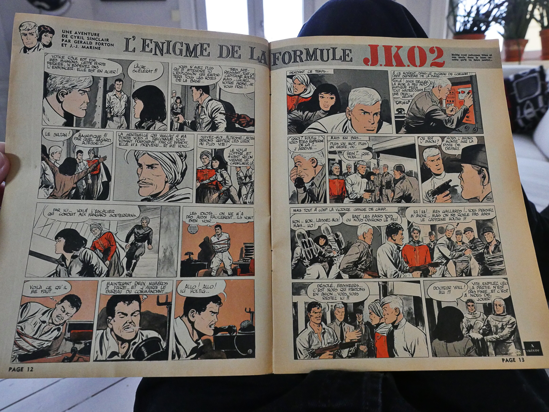
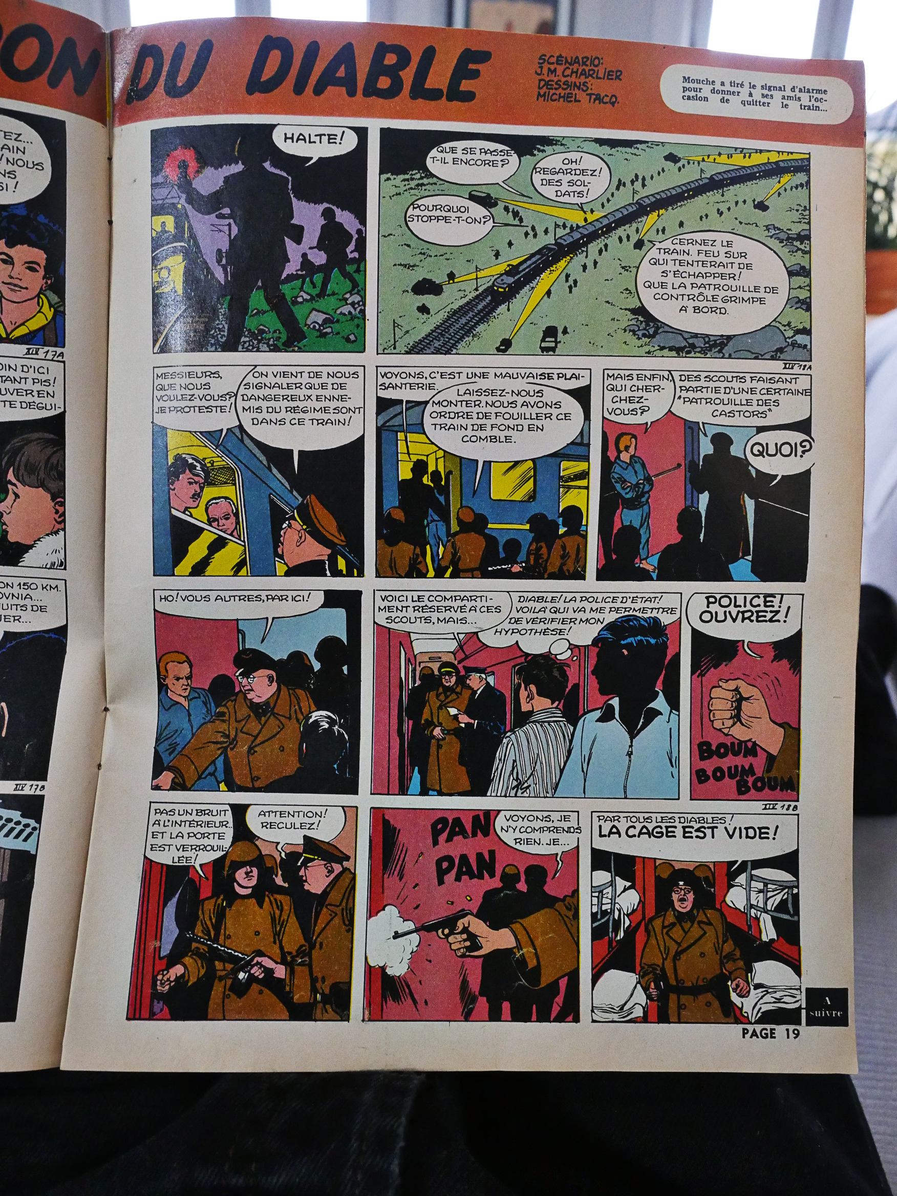
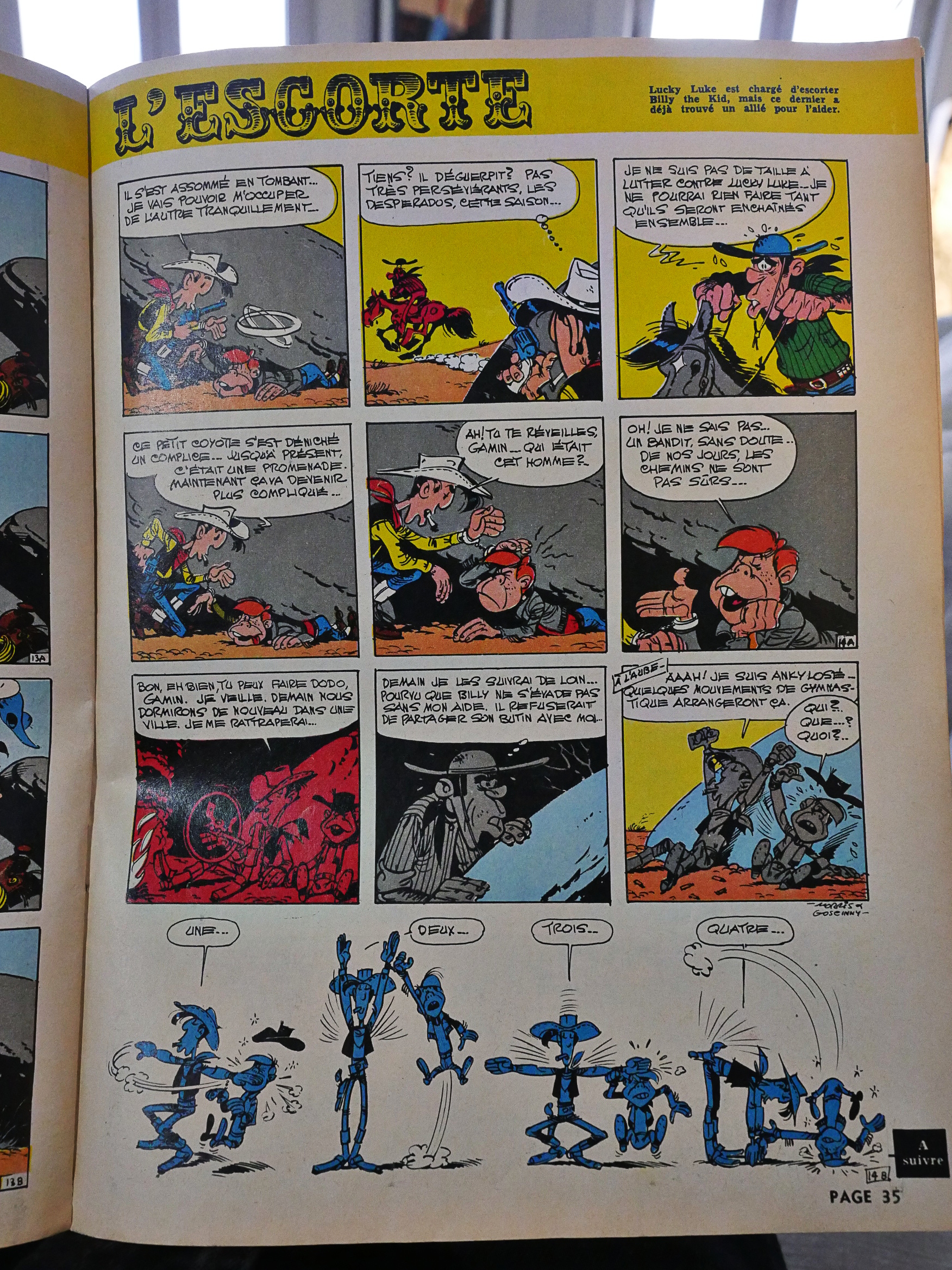
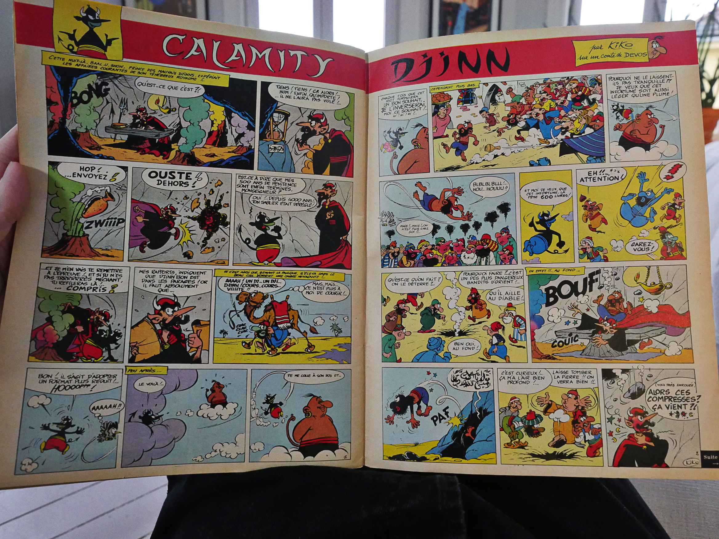
But then we get to the meat of the issue: The BD! And they’re almost all presented like this: A two-page spread with “A suivre” at the end. And I thought I knew a lot about these comics, but most of them are completely unfamiliar to me, like Marc Dacier. I mean, it’s probably not good or anything, but it makes me want to start up my French lessons again…
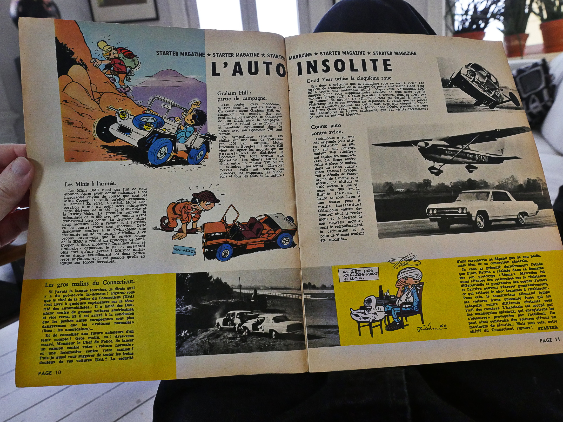
The articles are about sports and cars and stuff like that. With the occasional spot illustration.
Every other double page spread is in red and black instead of being in four colours. I’m not a printing expert, but looking at the signatures of the printing, I think this works out to having printed one side of the paper sheets (before cutting into signatures) in four colours and the other in two colours. So they save some money: Both on colour seps and printing.
OK, perhaps it’s no wonder that I haven’t heard about some of these comics: A few look kinda on the meh side.
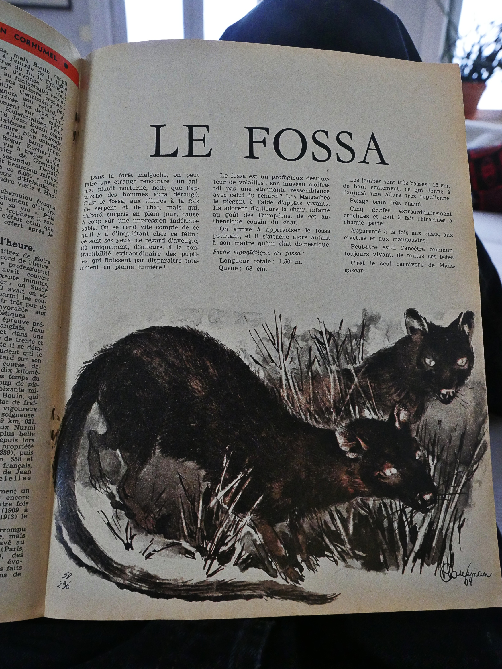
Oh! An article about a cool animal. I didn’t know about the fossa, so it’s very edumacational.
I had kinda expected there to be more of a mix of serials and shorter gag comics, but that’s really not the case: There’s a gag on the front and back covers, but otherwise it’s wall to wall (with one exception) serials.
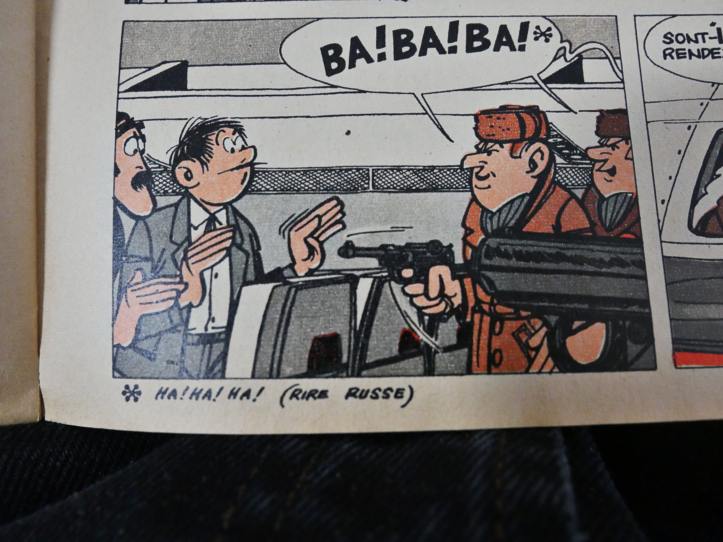
And we learn other languages, too!
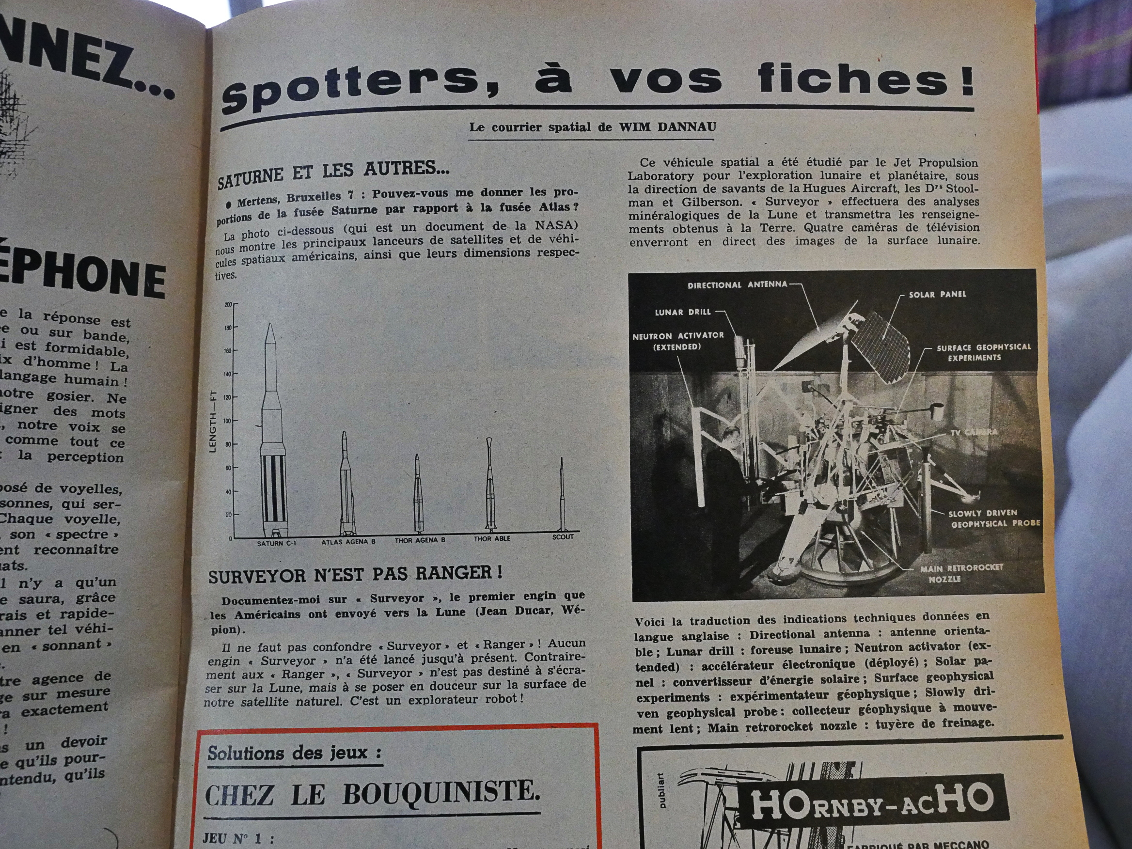
Ooo! Space ships!
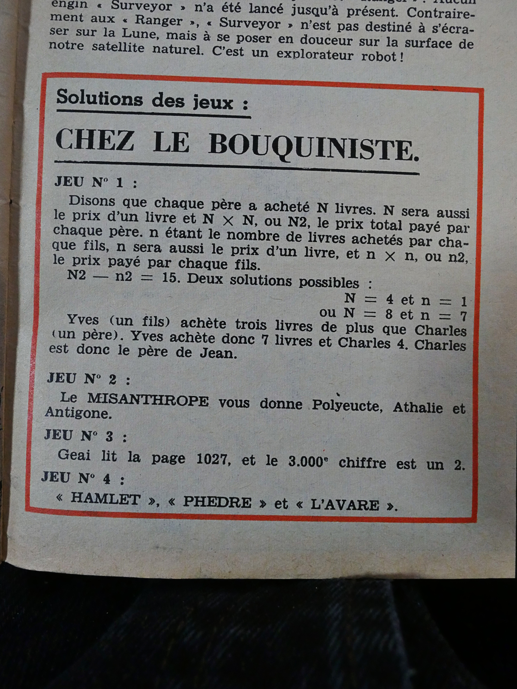
And here’s the solution to the riddles on the inside front cover, in case you wondered. Antigone and Polyeucte are two of the answers, apparently? French kids, man.
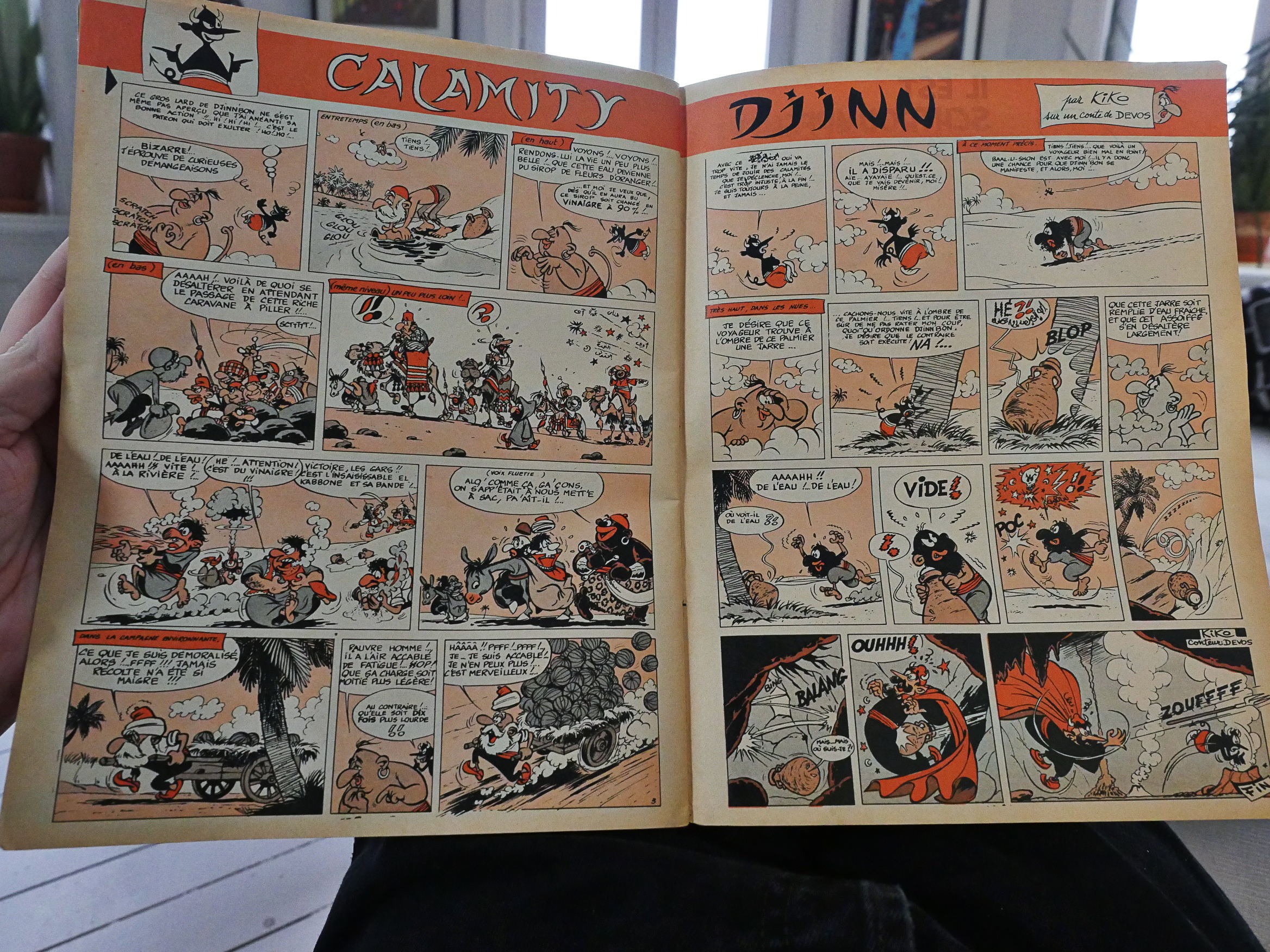
One single strip is allotted four pages…
… and comes to an end.
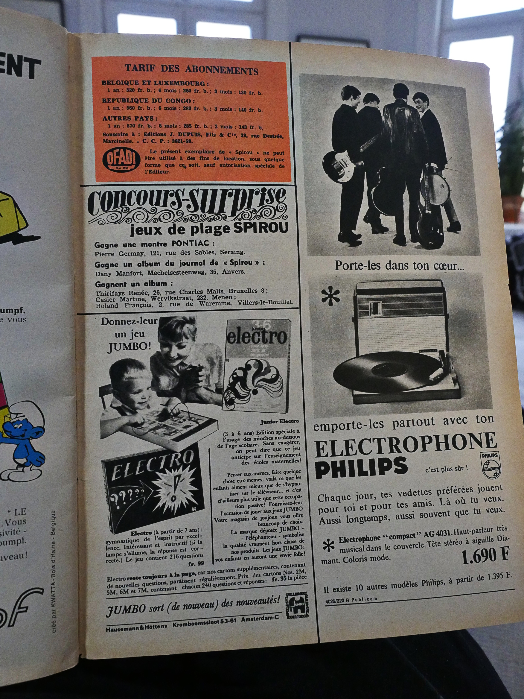
Look at all these cool things you can buy!
Anyway: That’s what Spirou 1386, from November 5th 1964, looks like. I think as we got to the 70s, each serial got more pages so that you didn’t have to wait five months to see how a story ended.
Why these comics were drawn half a page at a time is still a mystery.
