There are many minor problems in the world. Global warming. The refugee crises. ISIS.
But there’s one problem so serious, so controversial, so all-encompassing that nobody has dared discuss it before:
The bad user interfaces on wireless headphones.
This may seem like a minor problem in comparison to other problems, like the fact that most wireless headphones don’t actually work at all, but at least with those you just throw them away. They don’t annoy you on a daily basis.
(By “you” I mean “me”, of course.)
The problem is with those headphones where the hardware people have been unusually competent, but the user interface designers have struck out.
Exhibit A: The Jabra EVOLVE 65
When I’m washing the floors and stuff, I usually drag around a small laptop showing Xena or Star Trek: The Next Generation or something similar. Listening to Data finding his humanity in the Holosuite while the Kardashians (I think that’s what they’re called) are attacking that planet where the aliens have really ridgey foreheads makes dusting behind the sofa slightly less boring.
I guess.
So I needed a lightweight wireless headphone to use while swishing around. And mono is fine, so these seemed idea.
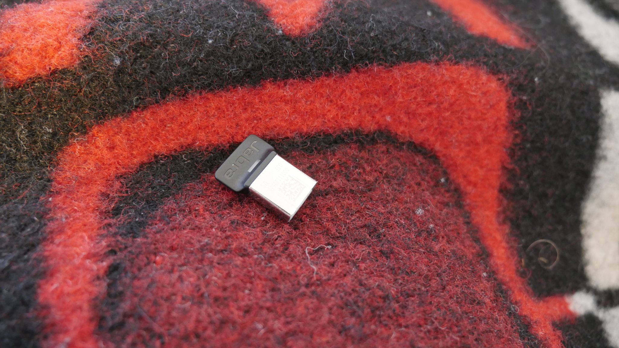
They do bluetooth, but badly. The range is like four meters. But! They come with an NFC dongle:
And with that I get like a ten meter range. It’s perfect! It even makes amusing sounds when I go out of range.
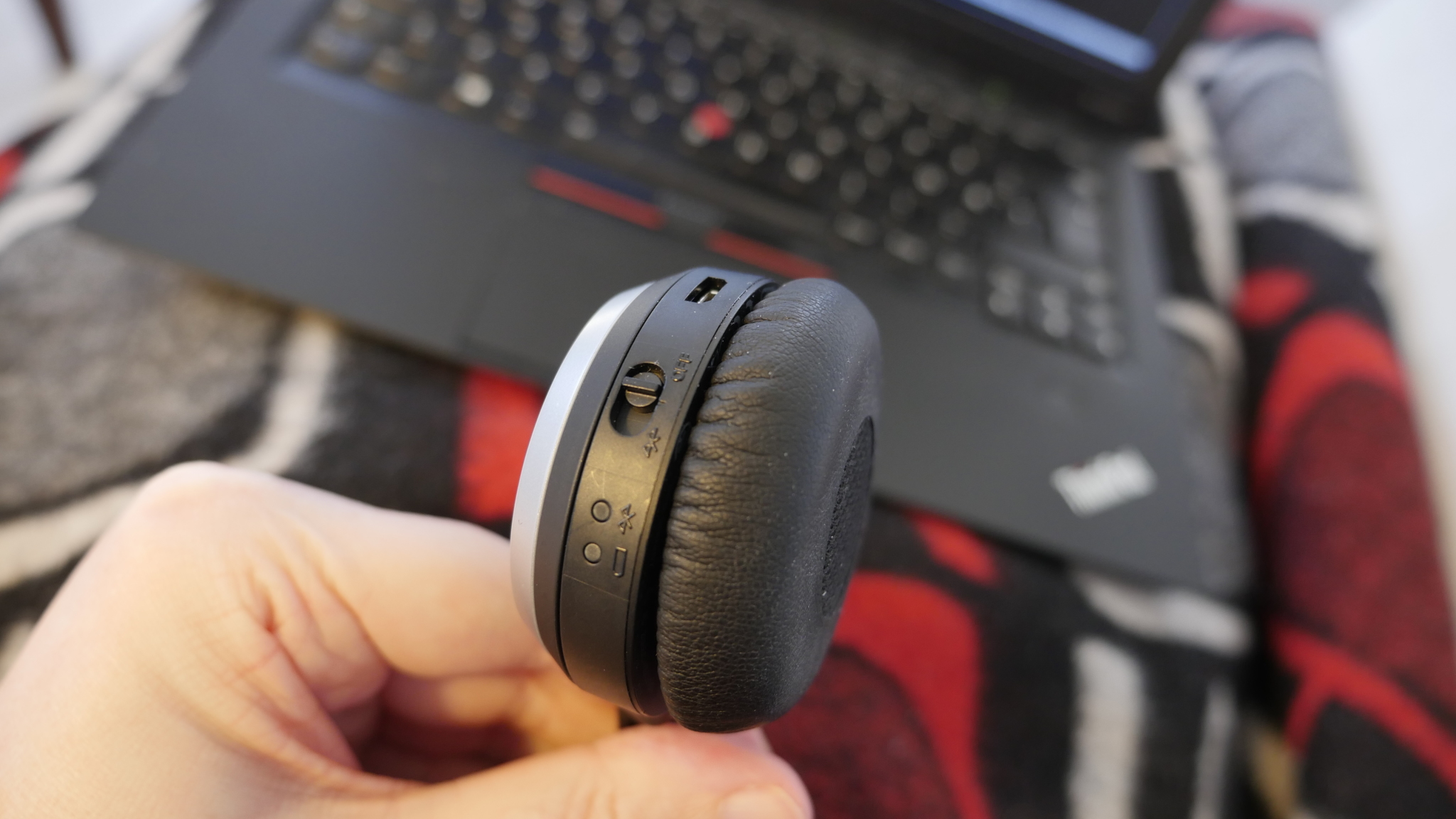
However, this is the UI:
It’s one slider button. In the position it’s now, it’s off. If you flip it to the middle position, it’s on. And if you push it to the third position, it goes into bluetooth pairing mode.
Like er. Pairing is something you do perhaps four times in your lifetime. Switching it on and off is something you do daily. Why make the latter complicated? Whyyyy!!!!
Exhibit 2: The Sony WH505
These aren’t actually wireless. Sure, they have no wires, but they have an mp3 player embedded. No screen or anything, but you can skip to the next song/album/etc, and sounds pretty nice. If you increase the bass, it just seems to make the rest of the range weaker, though, but they’re fine. A bit on the heavy side.
I use them when I walk to work.
But here you have, basically, something that you can switch off and on, and that can play music. So what would you expect them to do when you switch them on? Perhaps… start playing music?
Nope.
To switch them on you slide this thing on the left phone:
Remember not to slide the sliding thing next to it, because that switches the headphones to “speaker” mode, where the headphones turn into the wimpiest speakers possible and annoy everybody around you.
Then you wait about five seconds. If you do anything before that, nothing happens, because the phones haven’t finished booting, or something.
Then push this button on the right phone:
Then a woman will say “play” to you, and you can listen to music.
*sigh*
Every time. Every fucking time.
Exhibit IV: The Sennheiser RS170
As opposed to most of the other Sennheiser wireless headphones, this uses Kleer technology, and they’re great. The range is like 15 meters, through a couple of walls. They sound great, too. And very little latency.
These are the ones I use when I watch TV and movies. I mean, I could just have the TV speakers on, but I just find it more comfy to use headphones. I don’t have to have the volume turned to 11 to understand what people say, and if they’ve decided to suddenly have an explosion with 10x the volume of the dialogue (i.e., most films), I can just tilt the headphones back. So relaxing.
Anyway. Sounds perfect? Right. So here they are hanging on the very nice and convenient charging station.
So since these are wireless headphones, you’d think they’d switch themselves on when you lift them from the cradle?
Ha ha ha.
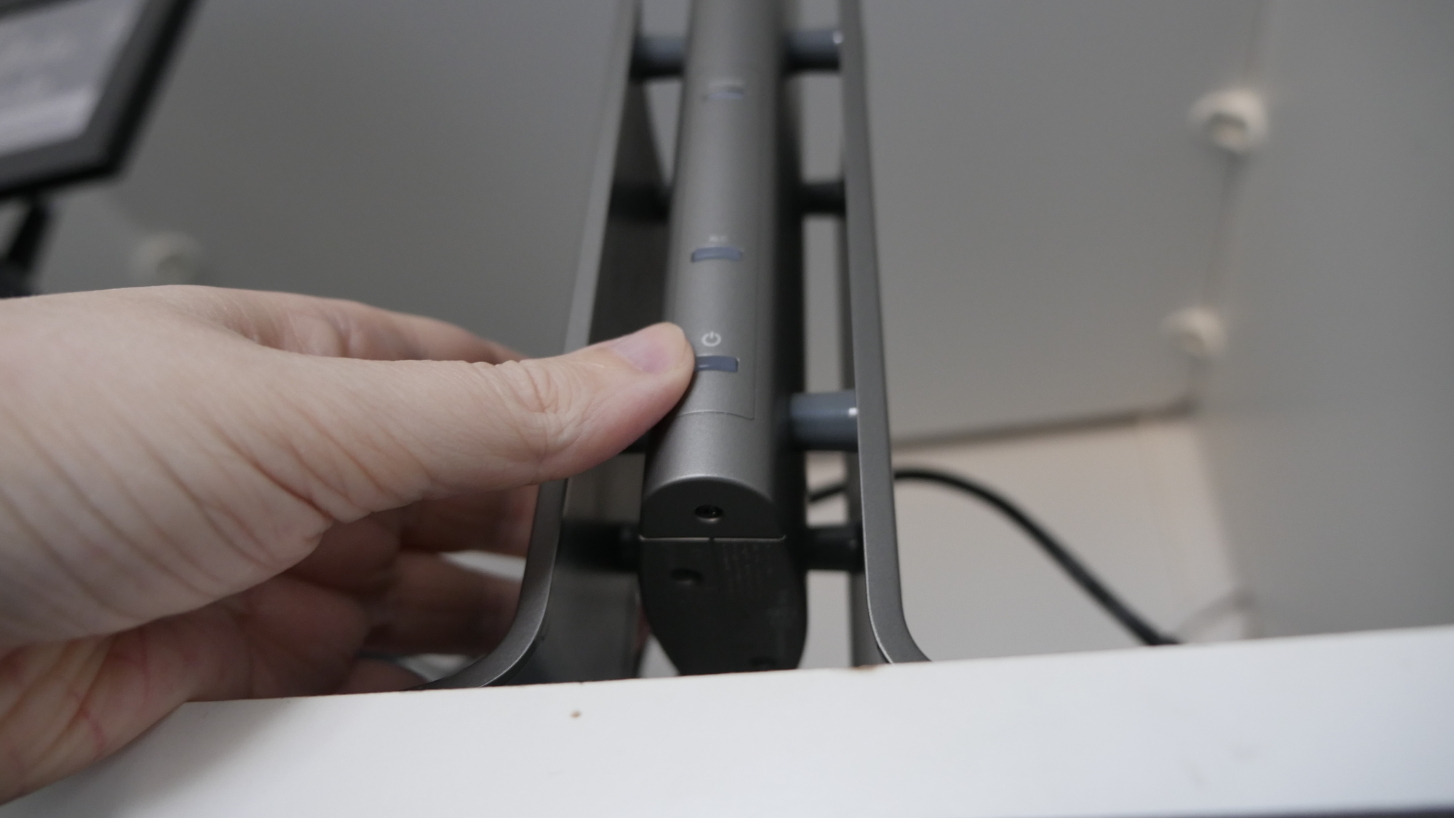
First you push this button on the charging station.
Then you push this button on the headphones, cleverly hidden in the middle of the other buttons:
And then the sound starts arriving. Clever, huh?
About those other handy buttons — the button I reach for with most urgency is the “NOT SO LOUD” button. Do you see where that is?
Yes, it’s the middle one. So I reach up with my left hand, start feeling my way to the larger middle button with a gap besides it, and then I either adjust the balance or I turn the volume down.
Because it’s obviously optimal user interface design to have the balance buttons (never used by anybody more than once) next to the volume buttons (used by everybody every ten minutes).
And the on/off button (which should exist at all) in the middle of the volume buttons.
*sigh*
Well, that’s it. I hope I’ve convinced you that everything is horrible. You can now return to your less important problems and your less pressing issues.







I have the first version of http://www.parrot.com/usa/products/zik3/ and I really like them.