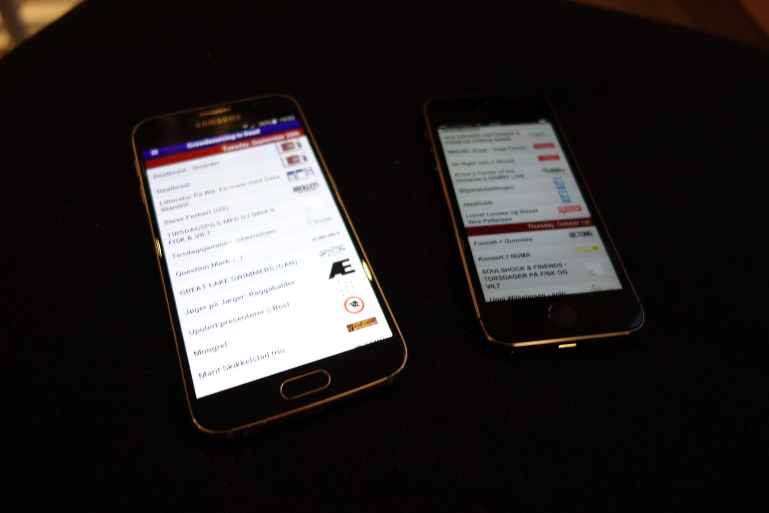
Some weeks back, I decided to appify the Concerts in Oslo web page thingie. Because UX.
It’s a Cordova (i.e. Phonegap) app, so I thought it would be, like, no work at all. And it wasn’t! Until I started thinking about the added opportunities the Cordova framework gave me, like exporting events to the calendar on the phone, and “social media sharing”, etc.
So, as is my wont, I’ve spent far too much time tweaking this thing, but now it’s feature-complete! I mean it! It is! No more twiddling!
But the reason for this post is to kvetch about Apple.
I mean, we all love that, don’t we? NOTHING OF INTEREST BENEATH THIS LINE!
First of all, the submission process is klunky and fiddly. They require you to upload the app via applications that only exist on Apple machines. Google Play does it all via a web interface.
They require you to pay $99 per year for the privilege of having the app in the store. Googple Play charges you $25 once, and that’s it.
The approval process is s-l-o-w. I submitted the app on September 7th.
On the 16th, it was reviewed, and they found that the age settings were wrong, since you can click on things and end up on Youtube, so it should be 12+ only. I checked “infrequent nudity” and resubmitted.
On the 22nd, they reviewed it again and published it. By now, the version submitted was way outdated (see the second paragraphs), so I submitted an update, which was approved on the 28th.
On Google Play, the first approval took about four hours, and each subsequent update takes less than half an hour.
So… three weeks vs. four hours.
Foogling a bit, this seems to be the Apple norm. An app takes between some days and three months for approval, no matter whether the app is trivial or complex.
(This is where the Apple enthusiast says “just goes to show how much better Apple is at vetting apps”. But they’re not really. I can tell from the server logs when they do the testing. The time it takes for the testing to actually start and I get the “your app is approved” mail is usually ten minutes or so. They just wait a week or nine before they start testing.)
And I’m not even a Google fan, but Apple stuff is just so annoying.
The final thing I did today was getting images on high-resolution Apple devices to not look as somebody had smeared vaseline over the glass, then spat on it, and then drizzled soot liberally over it. Or as they call it “scaled it with anti-aliasing”.
Here’s how an Android device (Samsung 6 something) handles images that needs to be upscaled:
Here’s the same thing with 2x images:
Yes, everything looks a lot better with the 2x images, but the upscaled ones aren’t gruesome. They just look like the lo-rez images they are.
Compare this to what a hi-rez Iphone does when upscaling:
The horror! The horror! And with 2x images:
*phew*
Apple obviously doesn’t do this just to be total dicks, although I supposed that’s part of the explanation. They probably do this to force people to actually supply 2x images instead of limping along with lo-rez images. If you’re an Apple enthusiast, you may think this is a good idea. If you’re not, you probably aren’t delusional.

