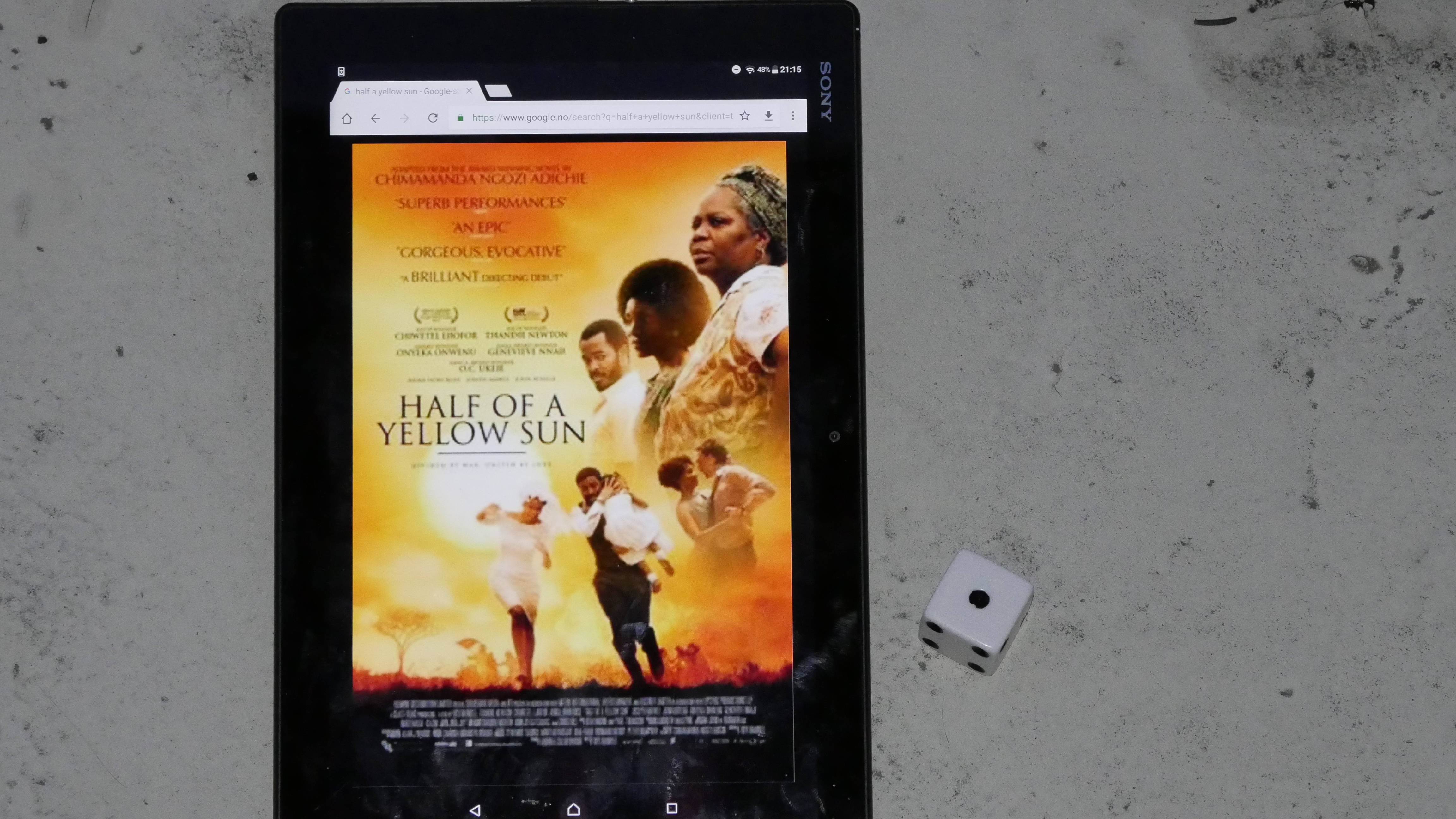
As I’m sure you remember from yesterday, I got an external HDMI screenshotting box to do screenshots while watching films from Amazon Video.
That worked fine, but using an infra-red remote to trigger the screenshots is slightly awkward: The line of sight thing means that I either have to have the (not very pretty) box in line of sight (and pretty close by), or I had to use an IR repeater of some kind.
Yay. More gadgets.
But then I though… “This box can also record video! Let’s try that!”
The upside here would be that I could just play the videos on my normal Linux machine, and everything would, like, work the way I wanted, without stressing with the Ipad, using remotes, switching the source, etc.
Besides: Freedom! DRM is obnoxious! You’re not the boss of me! Etc!
Let’s have a look at today’s experimental set up:
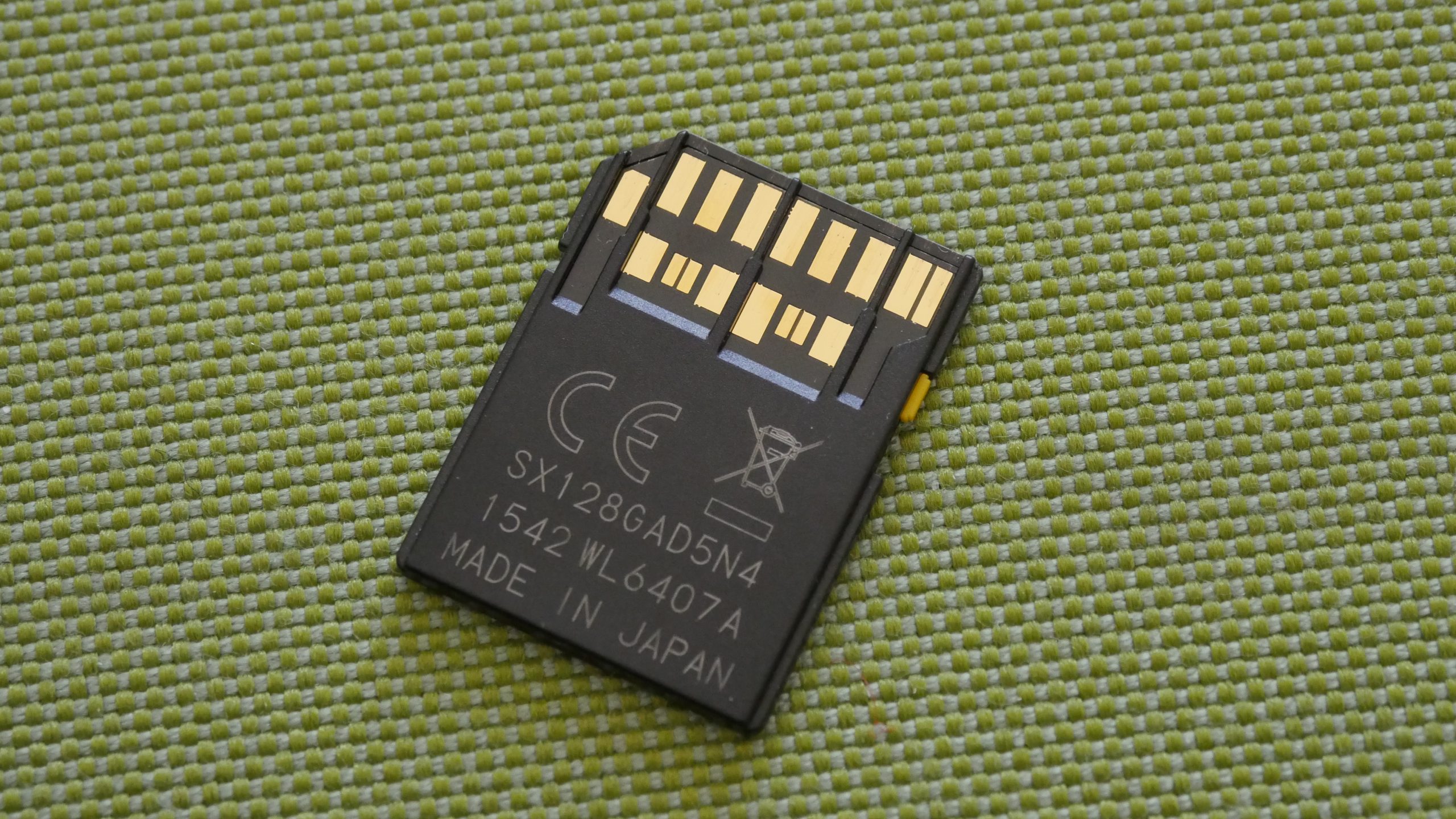
First of all, a nice and big SD card is necessary, since the recorded H.264 (AVC) video files the recorder box creates rather big files. (About 12GB for a film.) So I use my normal filming card for this, which has the added advantage that it’s an UHS-II card (Ultra High Speed: The Second!). Note all the additional contact points on the card.
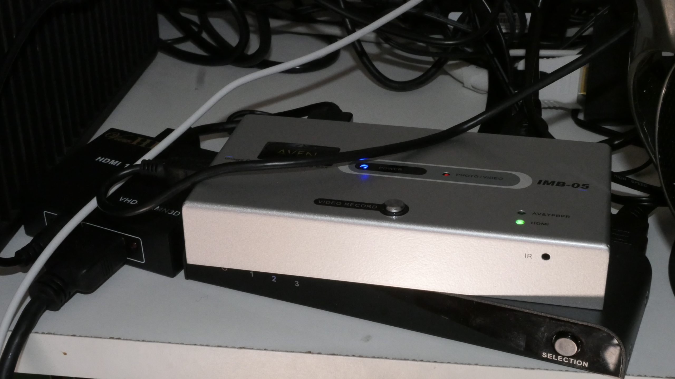
The “HDMI splitter”, the Aven video recorder, and the hated HDMI switch (which I no longer need, kinda).
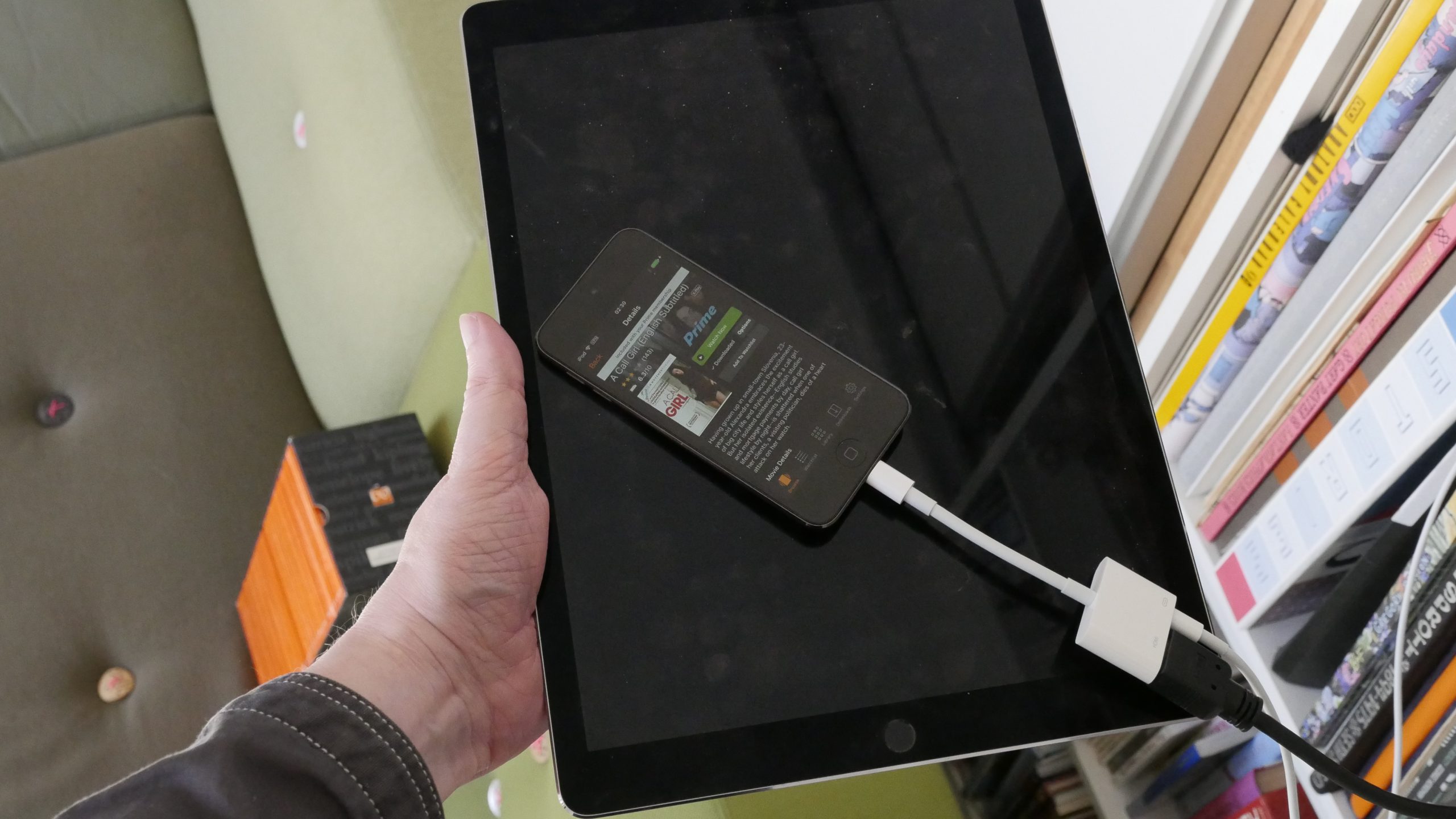
And instead of using my ginormous Ipad, I got a used Iphone Touch (6th gen) cheap. I didn’t know whether that would work, but look how much smaller it is! It’s much more practical than carrying the Ipad around and plugging in here and there…

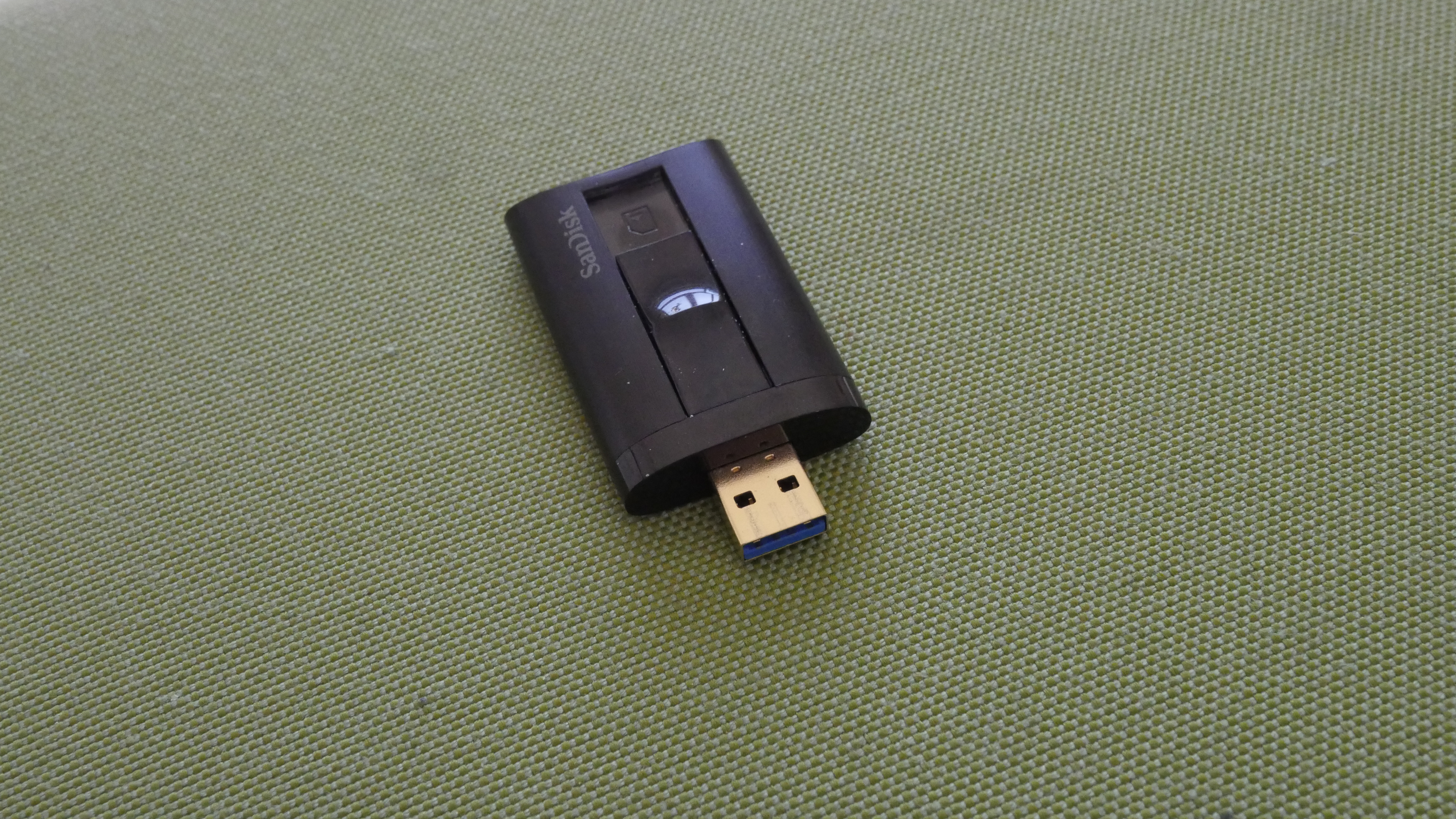
Finally, my USB 3.0 UHS-II SD card reader to transfer the files to my computer. I get about 100MB/s reading speed with this setup, so transferring an entire film takes less than two minutes.
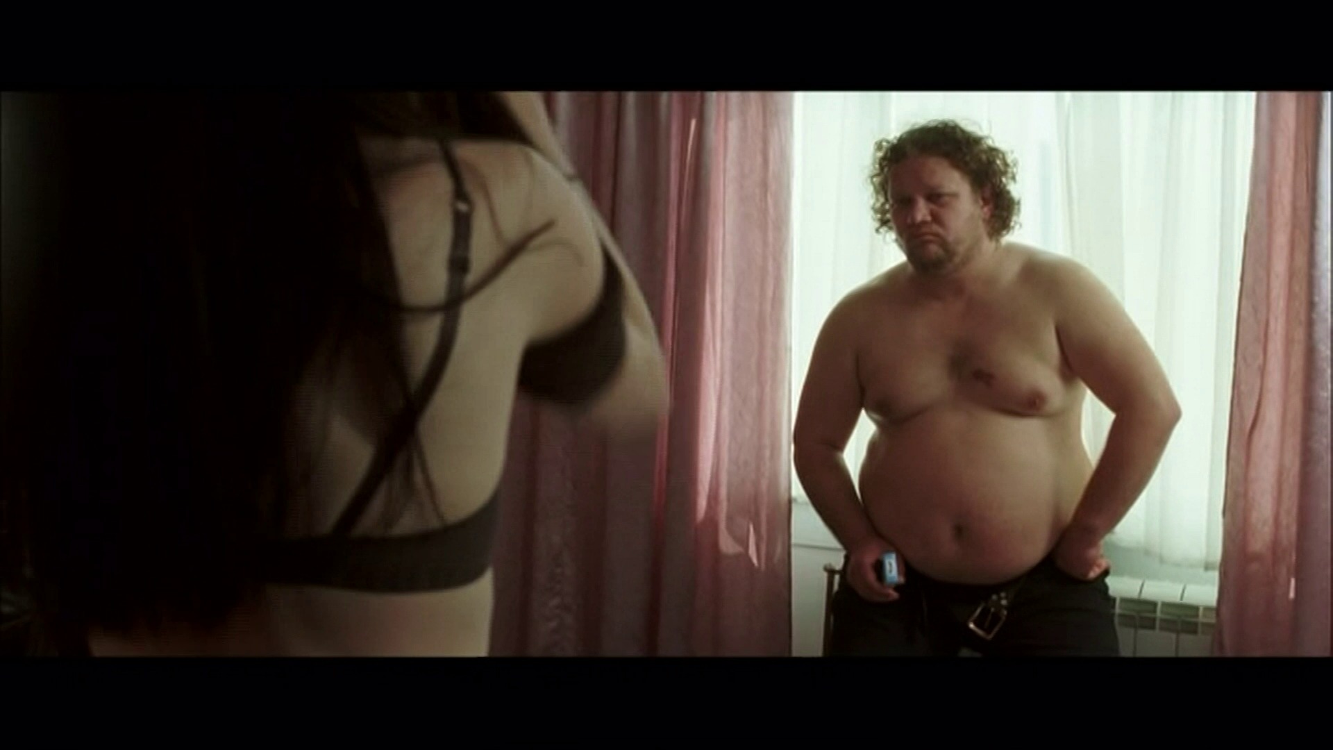
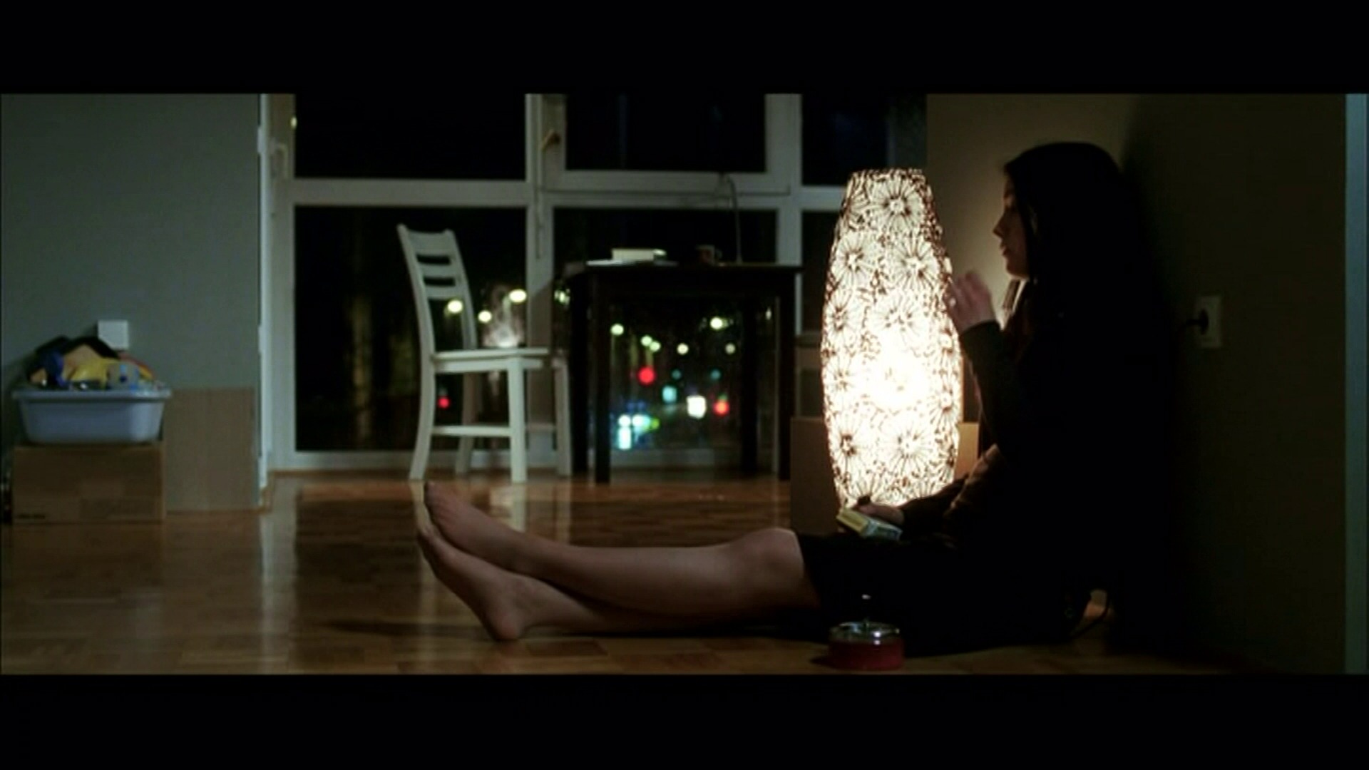
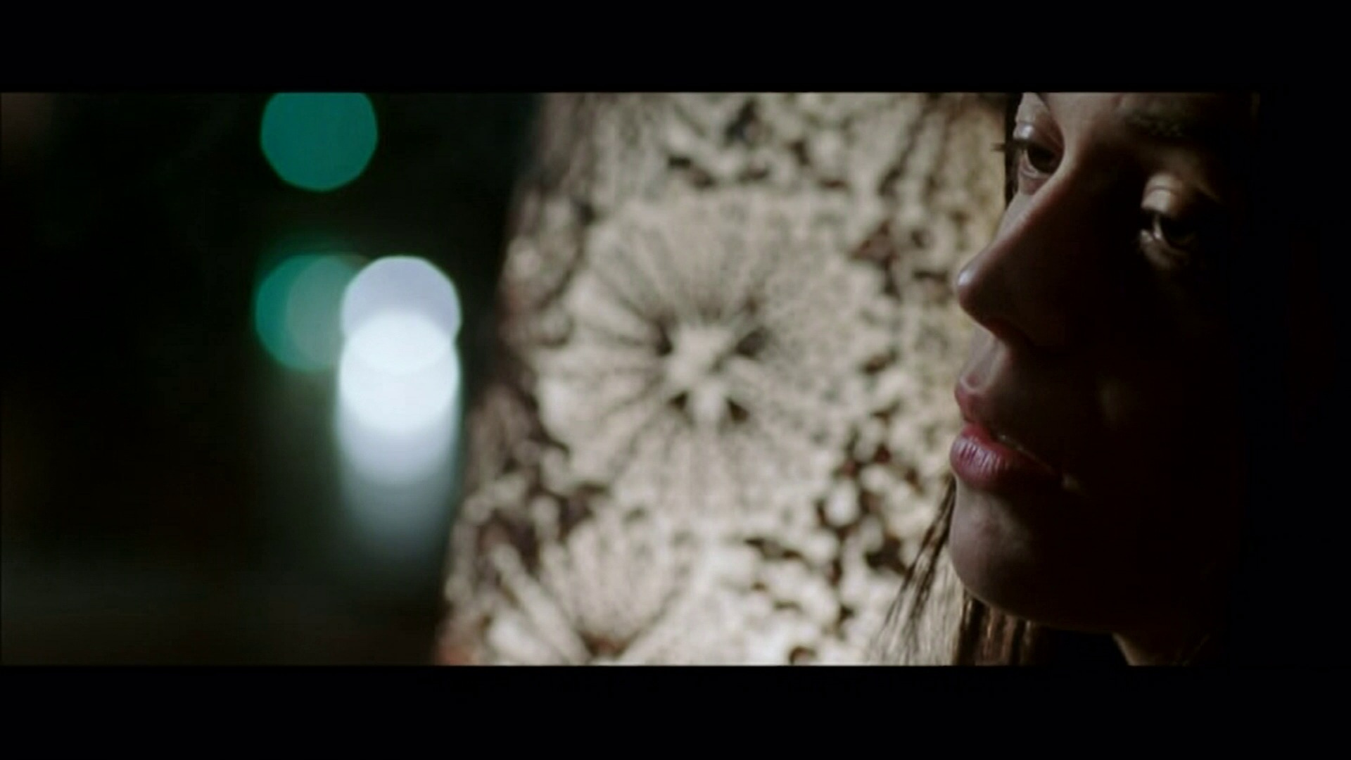
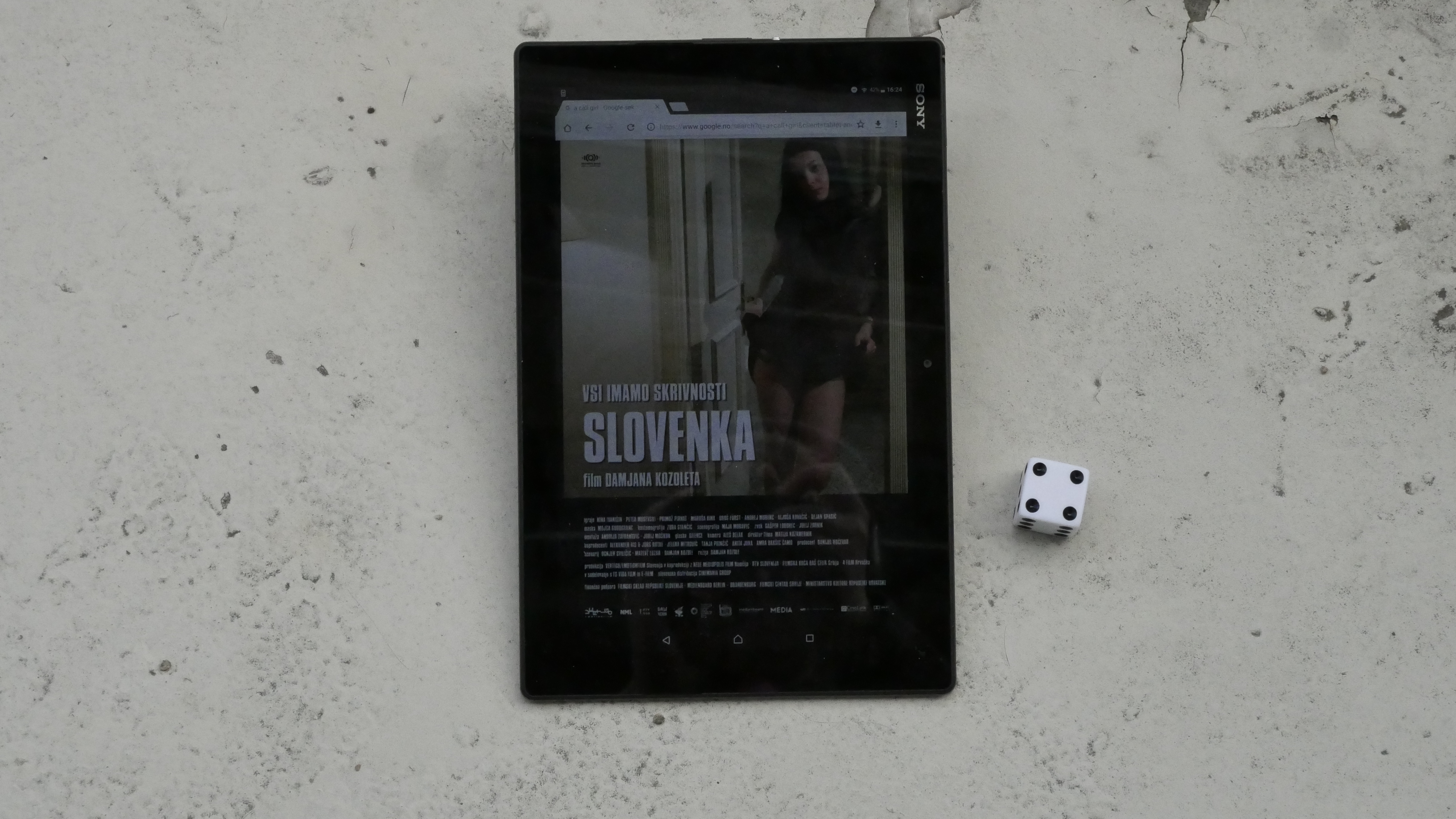
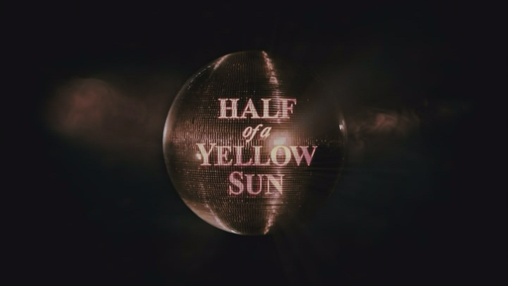
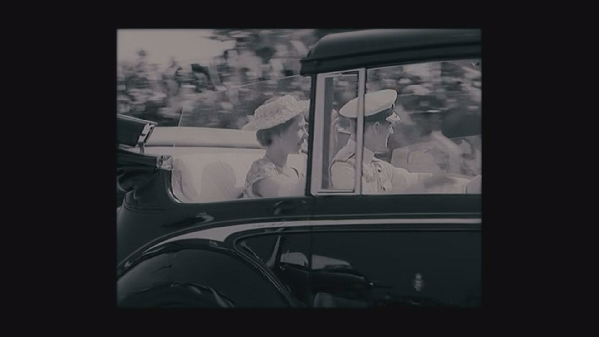
I had a peek at a recorded film (a review of which will be coming to these very pages later today, I guess?) and it looks nice. The video is a bit “soft”, but no more artifacty than the film I watched directly from my Ipad yesterday. We’ll see…
But! I then thought that it would be nice to trim down the recorded bits to the actual film length (since I had forgotten that it was running and there were two hours of blackness at the end of the file), so I loaded it up in LightWorks…
And the exported film had an audio/video mismatch of over three seconds.
Whaaa!?
And that program re-encodes everything, so I didn’t really want to use it, anyway. So I installed avidemux, which had a very strange interface, but managed to chop off the black parts at the end without re-encoding. Very fast.
And the resulting file had a six second audio/video lag.
Wat.
Just about to give up, I found Lossless-Cut, a simple editor written in JavaScript (!) that uses ffmpeg under the hood.
I loaded in the file, set the start and end points in the excellent and easy-to-use editor and clicked “save”. Amazingly fast, it saved the resulting file at 100% of theoretical disk bandwidth speed, and…
The audio/video sync was perfect!
Whoho! Go JavaScript!
 But is this a sensible workflow for watching films? Eurhmn…
Freedom!