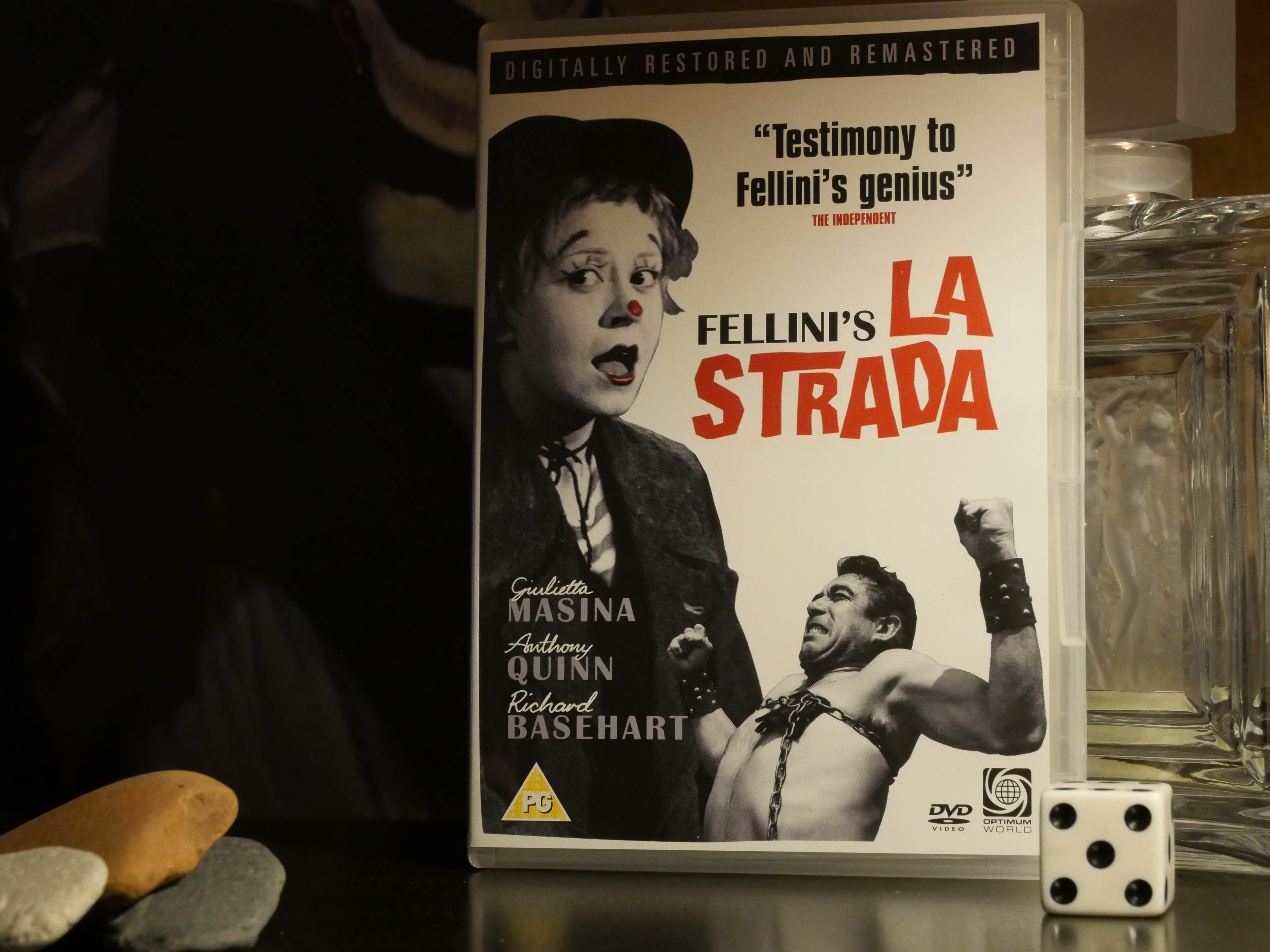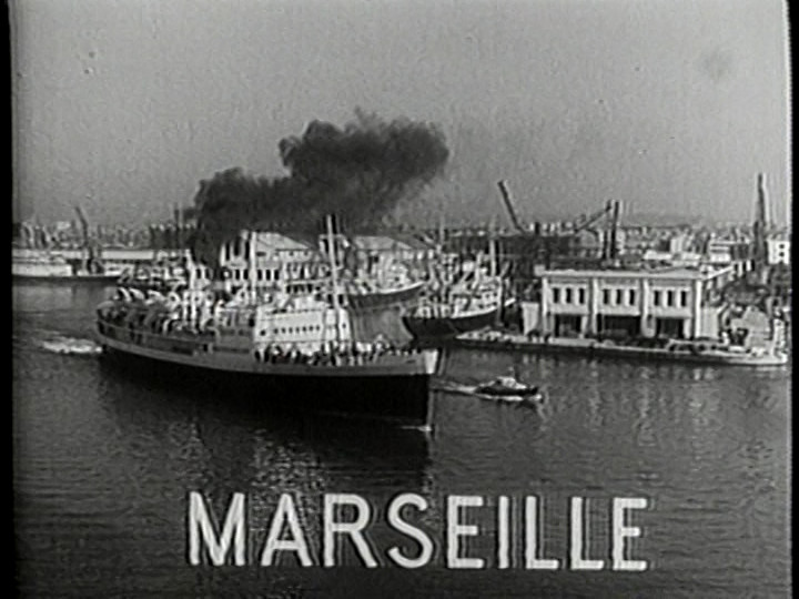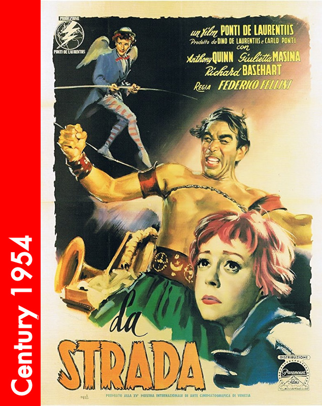
La Strada. Federico Fellini. 1954.


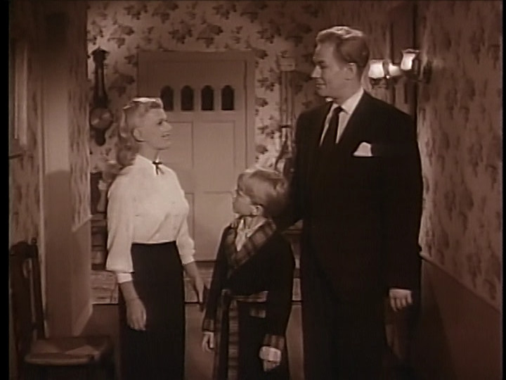
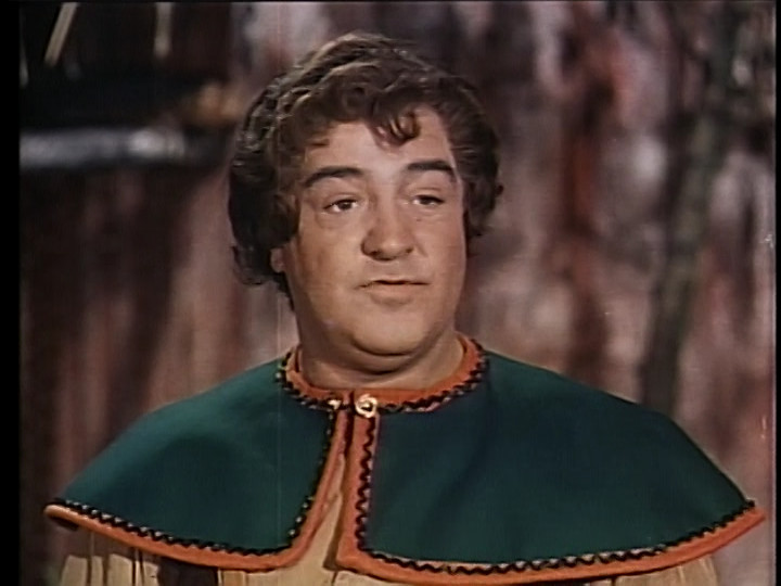
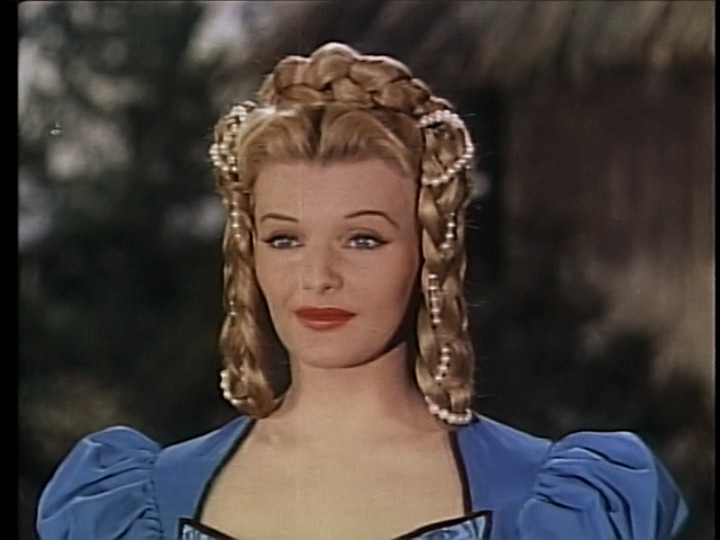
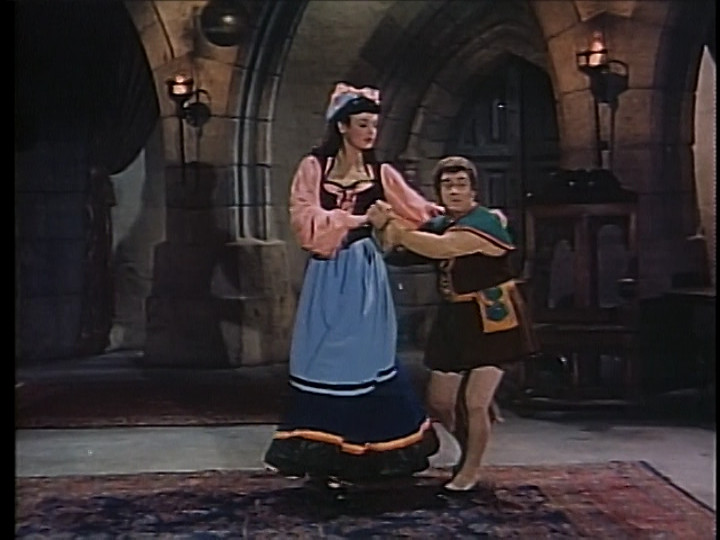
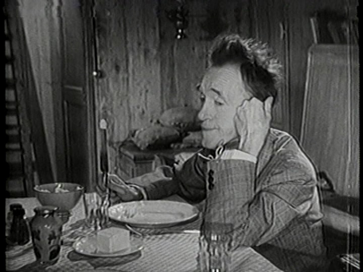
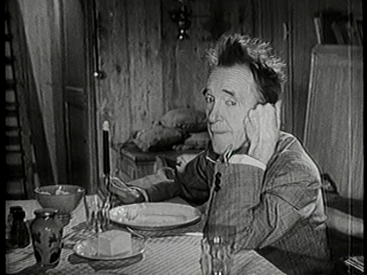
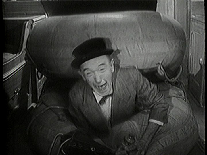
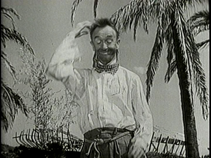
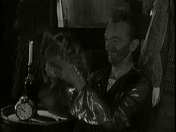
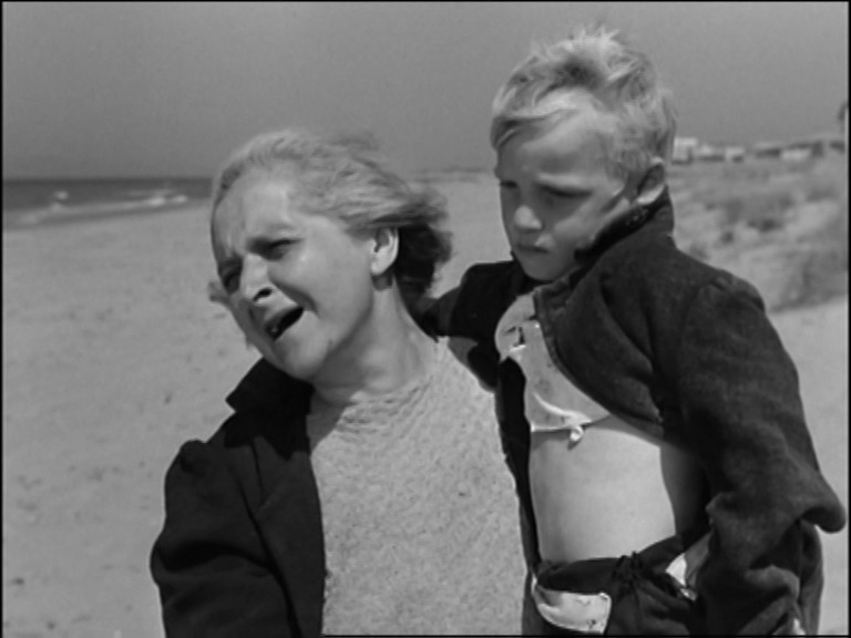
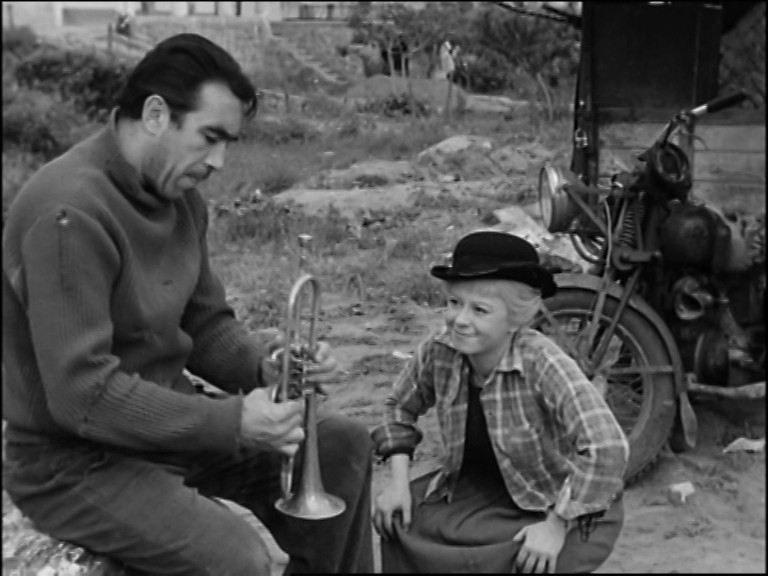
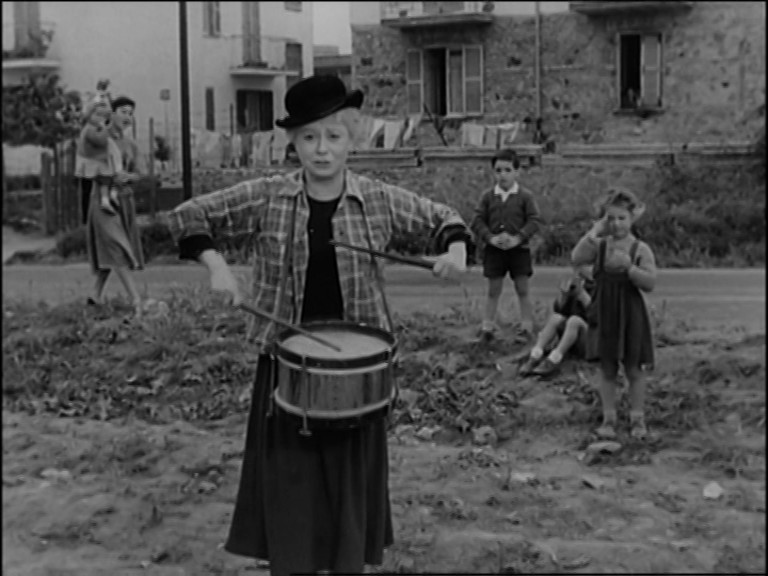
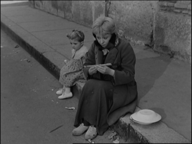
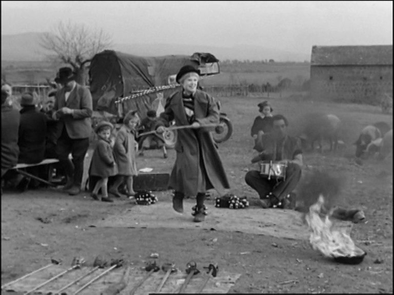
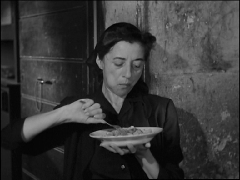
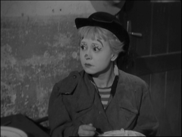
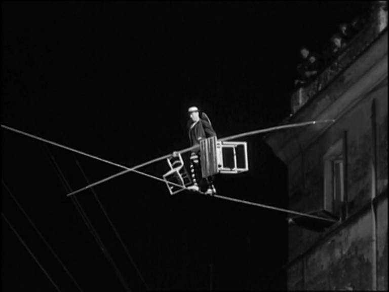
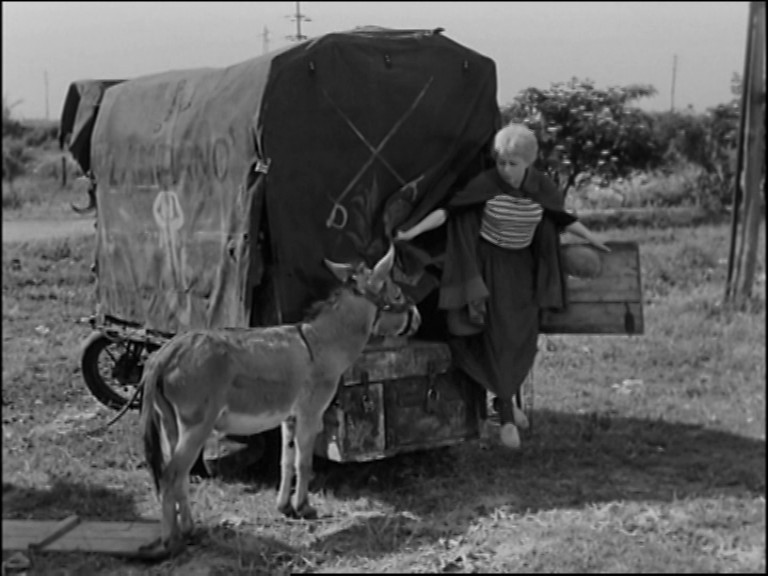
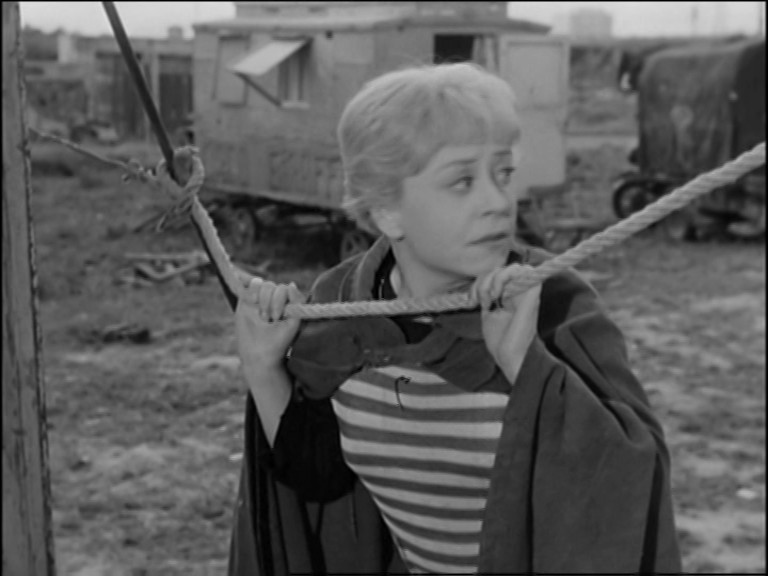
What an odd film. Fellini’s later film are more overtly artificial, but here it’s unclear what the panto-like performance of Gelsomina is meant to convey. Is she supposed to be 14? Slightly er naive? Why does she shift from being naive to knowing so often? Why is she blond(e)? Nobody in Italy are blond(e)? It’s the most befuddling thing about this film.
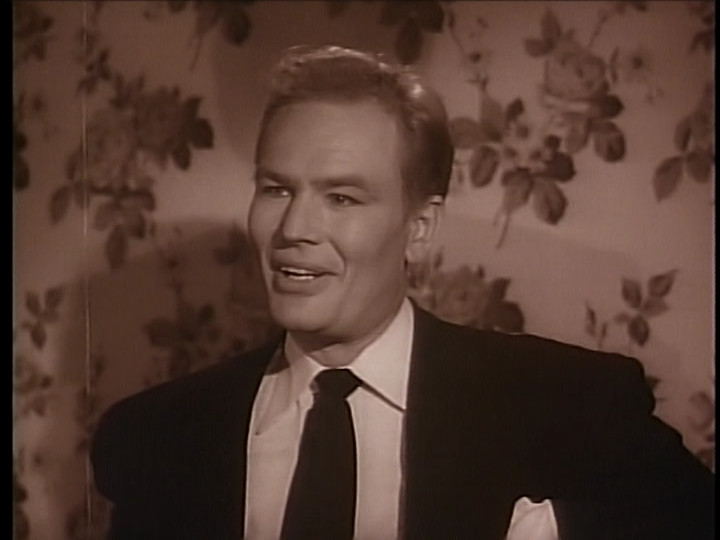
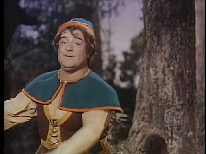
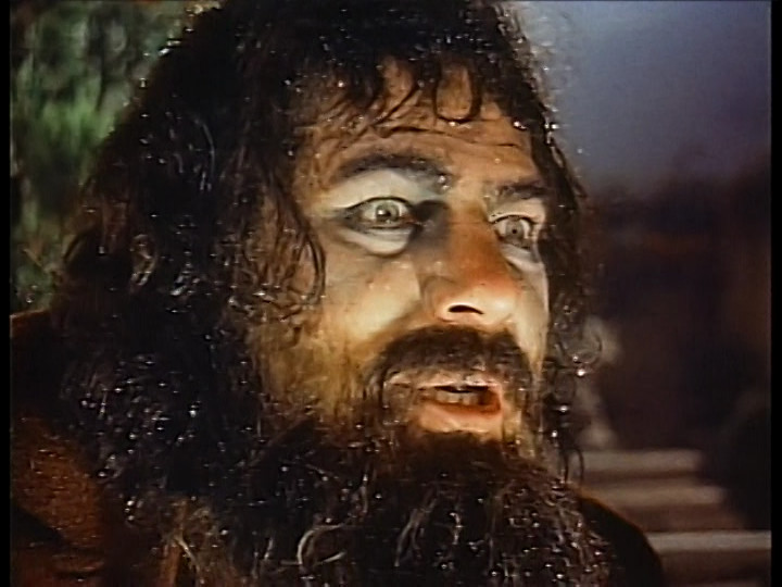
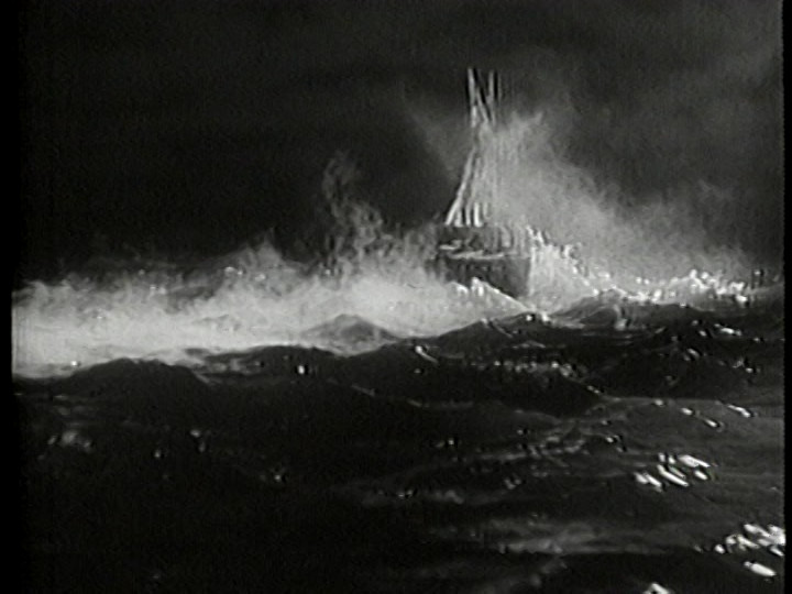
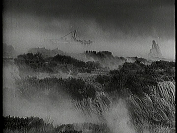
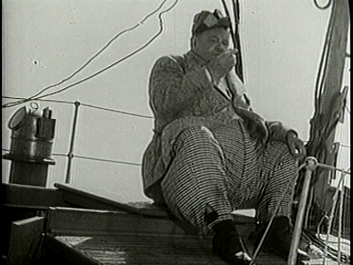
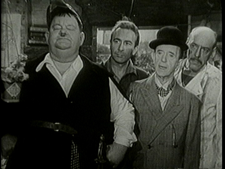
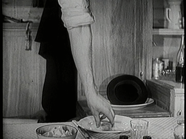
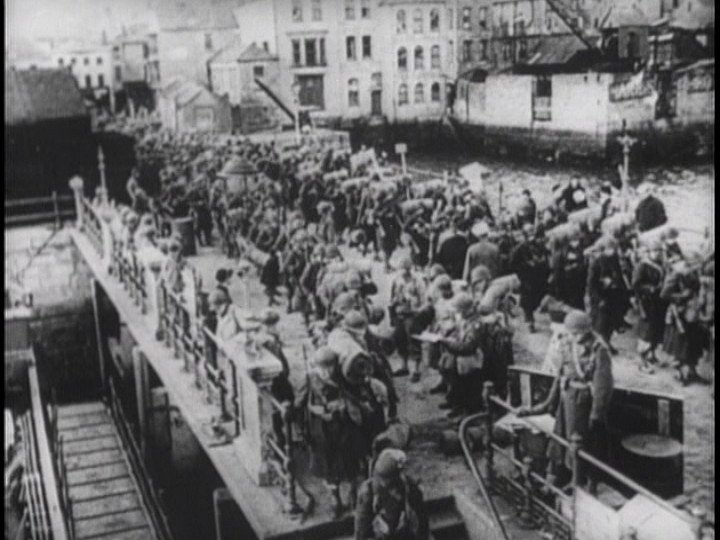
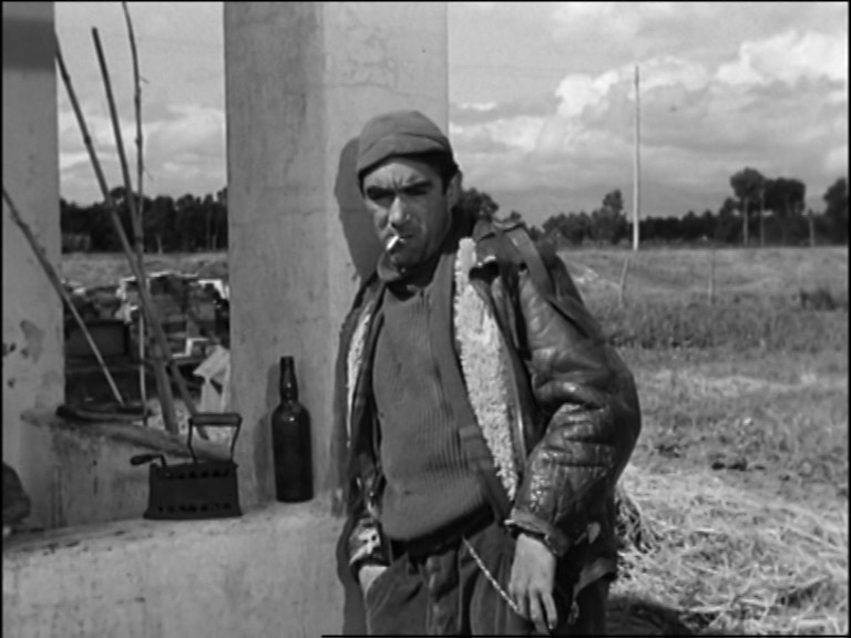
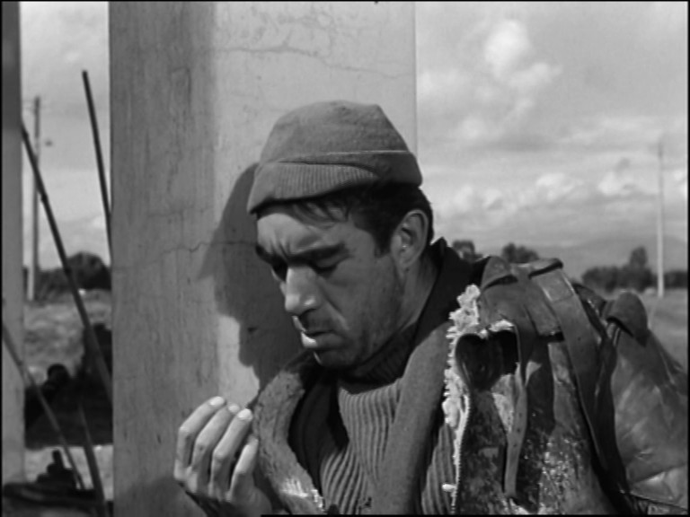
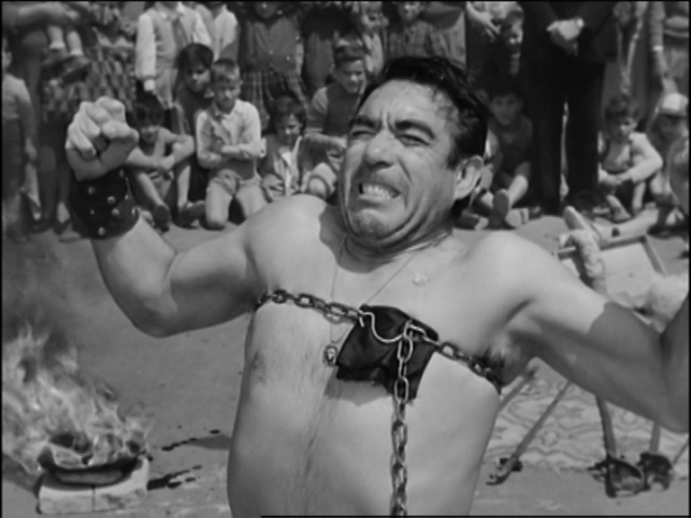
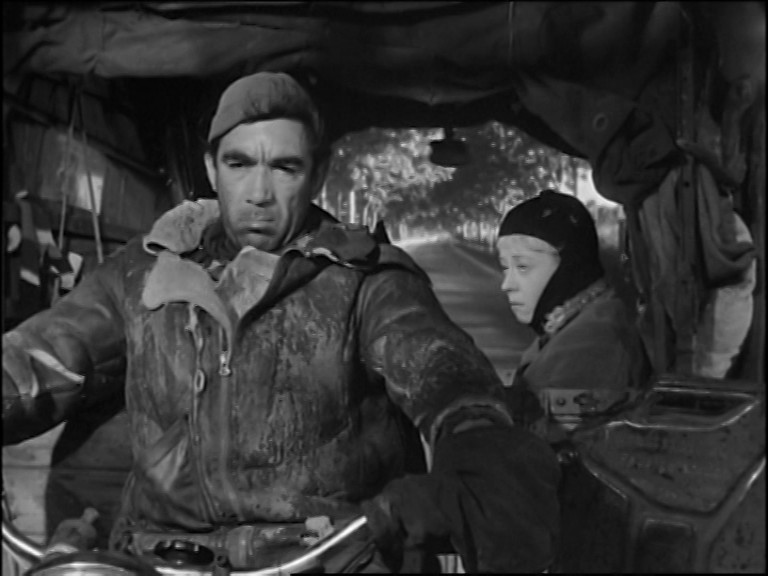
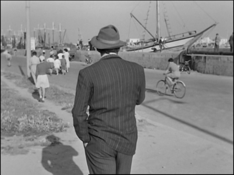
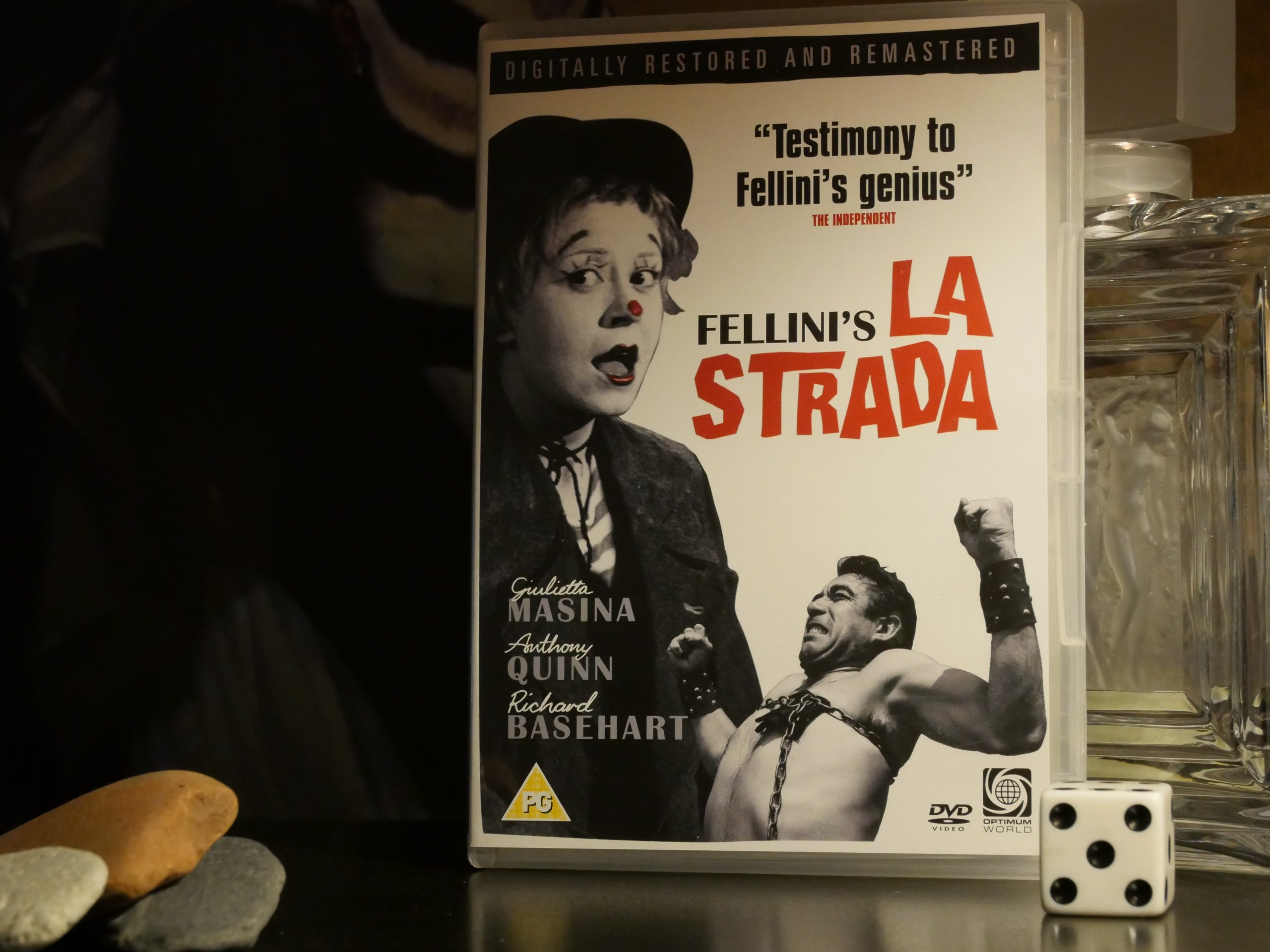
Other than that (I mean, she’s a wonderful wild card in the film) this is (duh!) pretty good. Anthony Quinn is flawless. It’s beautifully shot, and this is a really nice DVD restoration.
This film got the Oscar for “Best Foreign Picture” and rapturous reception everywhere in the world, but not in Italy.
It was apparently a controversial film on its release in there, where people heckled it. “Marxist critics such as Guido Aristarco rejected the film on ideological grounds, particularly objecting to what they considered Christian notions of conversion and redemption: “We don’t say, nor have we ever said, that La Strada is a badly directed and acted film. We have declared, and do declare, that it is wrong; its perspective is wrong.””
I kinda agree. It’s still enjoyable to watch.
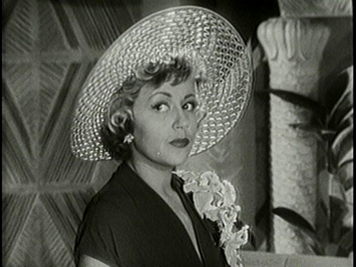
Included on the DVD is a one-hour documentary about Giulietta Masina, who plays the problematic role in this film. It’s really, really interesting.
This blog post is part of the Century series.