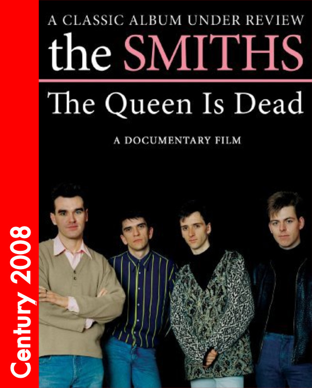

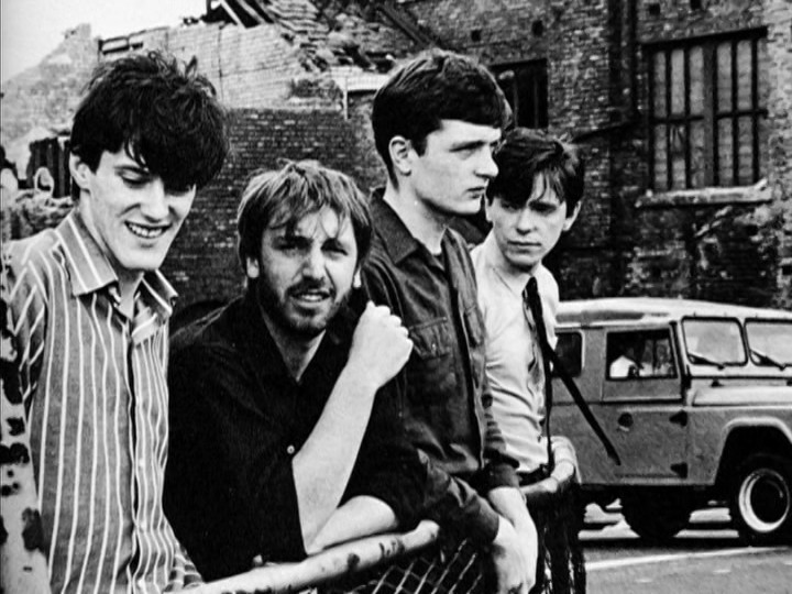
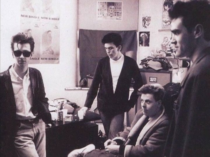

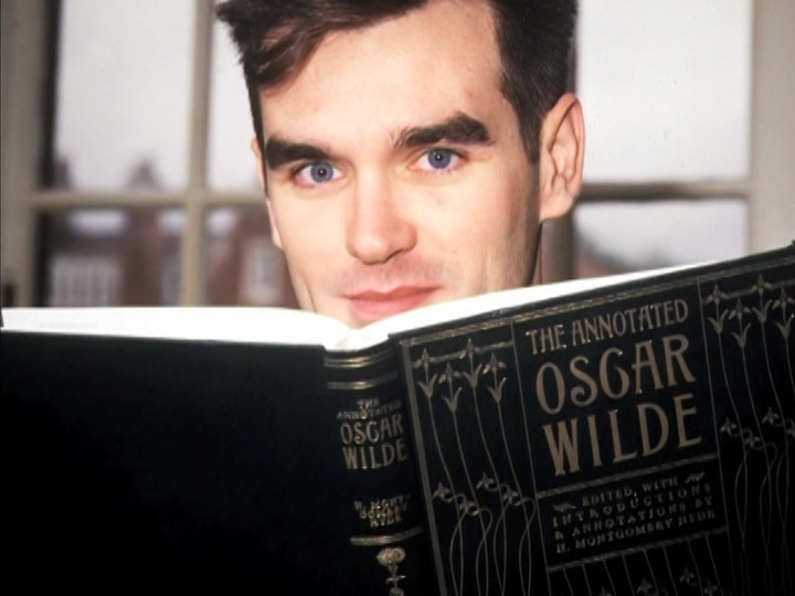
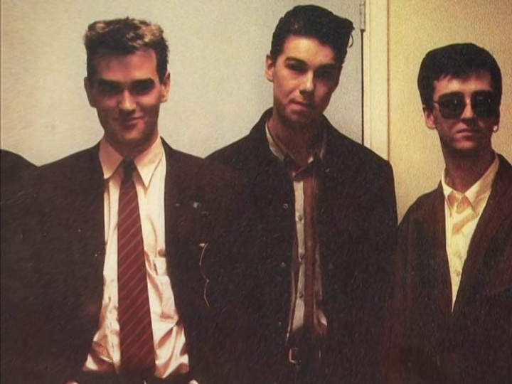
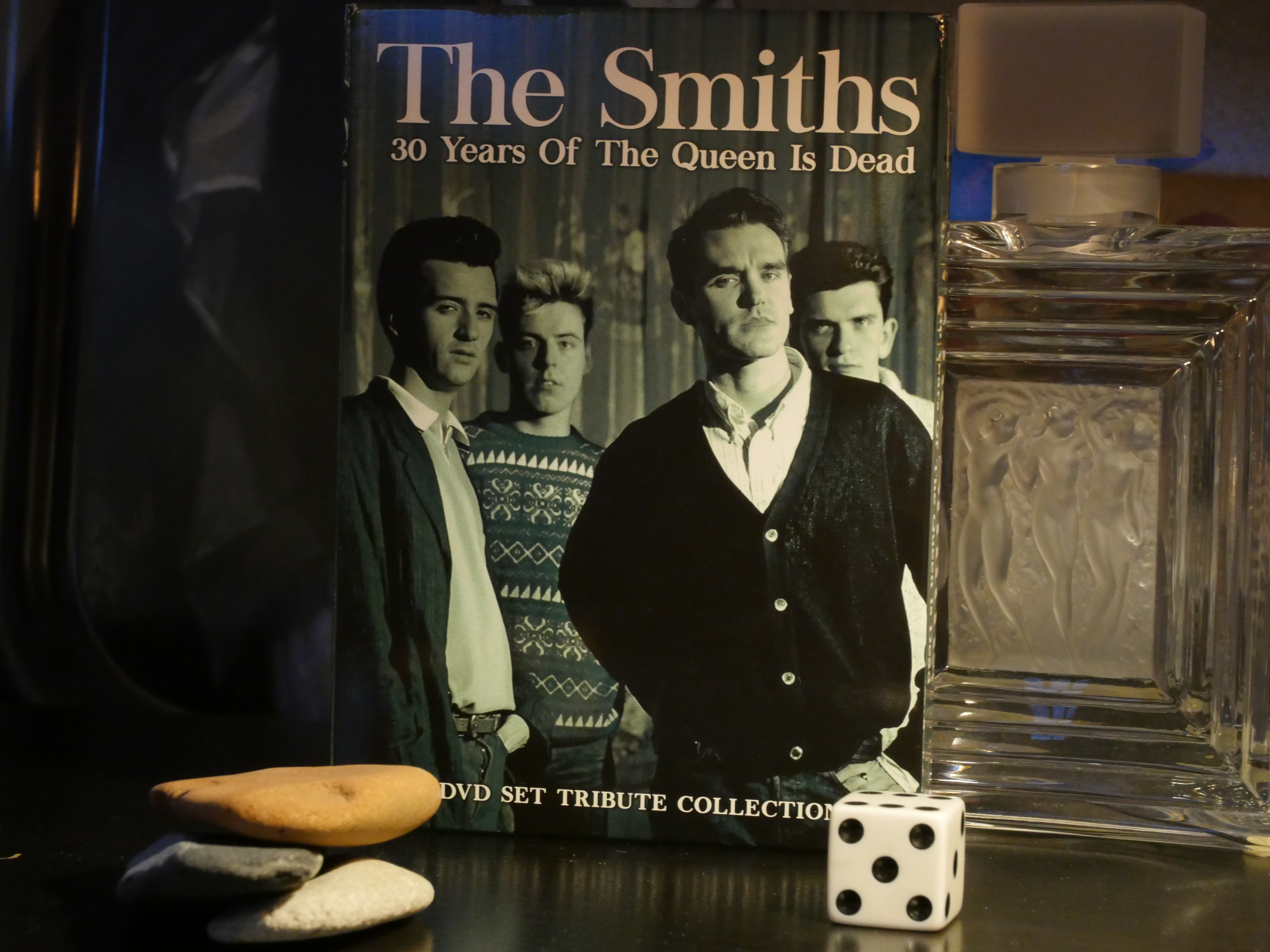
The Smiths: The Queen is Dead. Derek Jarman. 2008.
What’s this then? Oh, it’s an “unauthorised” documentary about The Smiths focusing on The Queen is Dead.
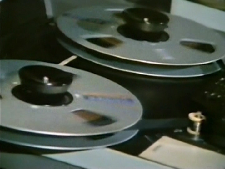
I’ve seen a couple of these before. They’re made on the cheap… But this does actually have The Smith’s songs, so it’s not as no-budget as some of the others.
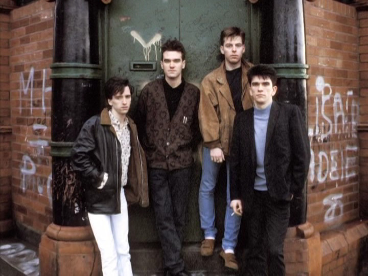
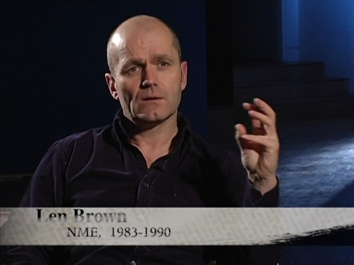
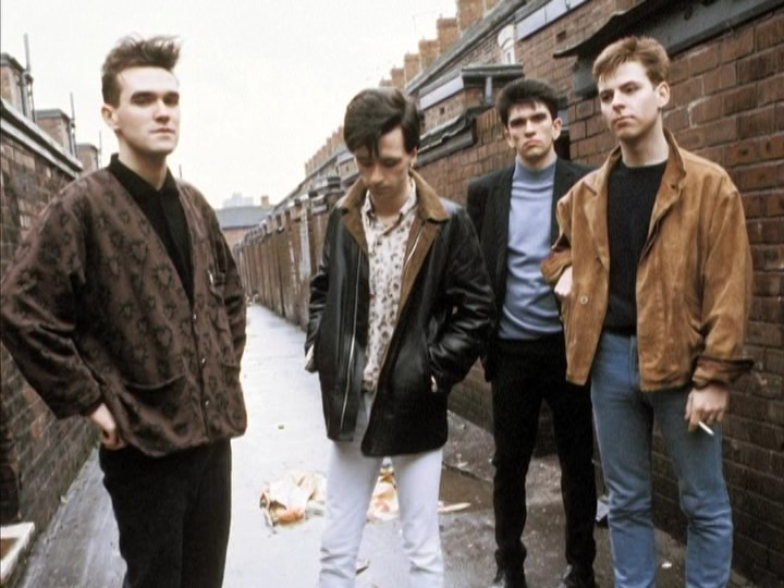
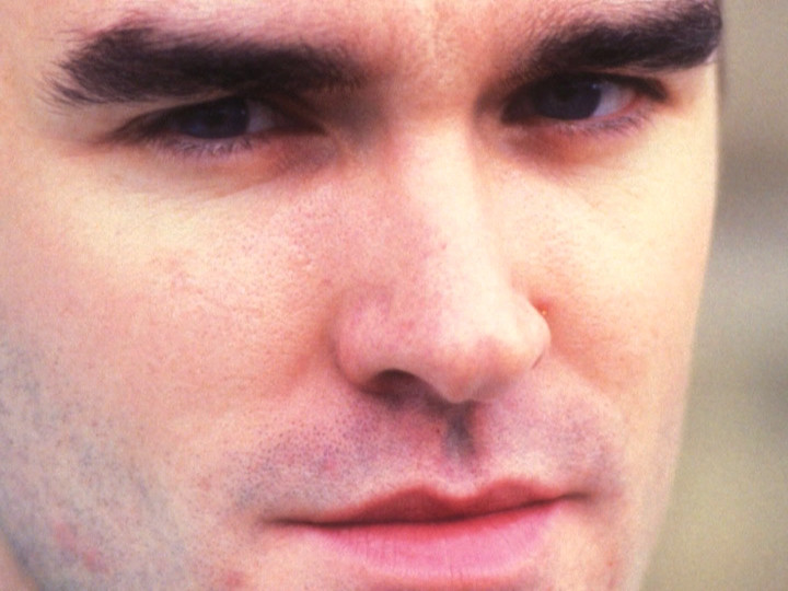
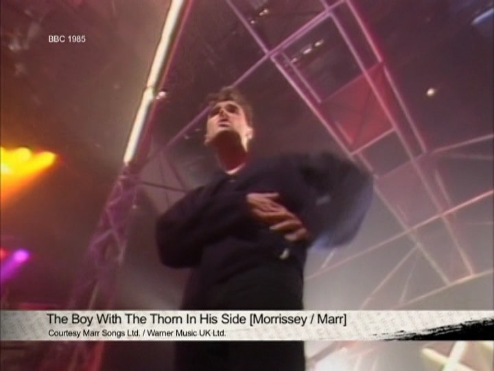
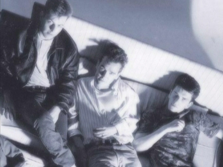
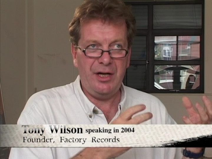
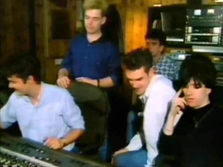
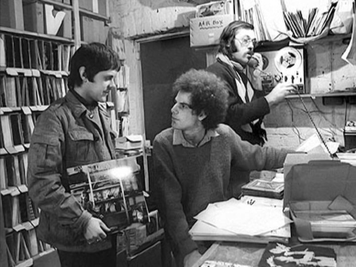
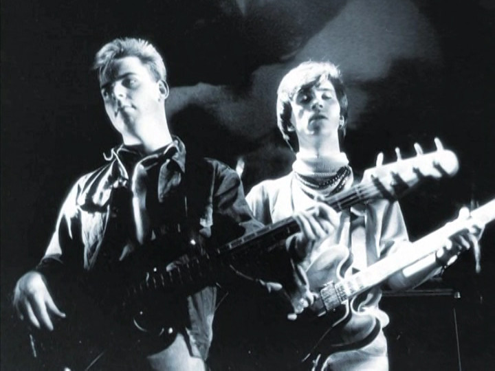
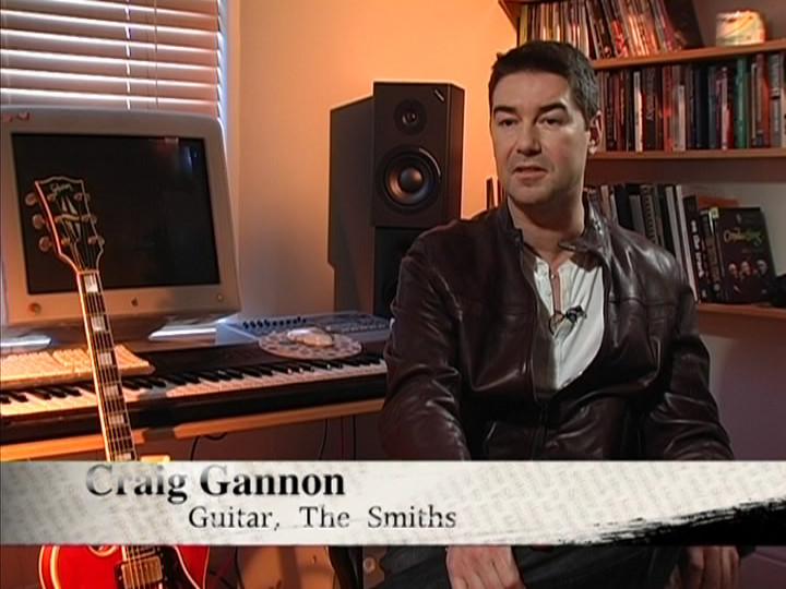
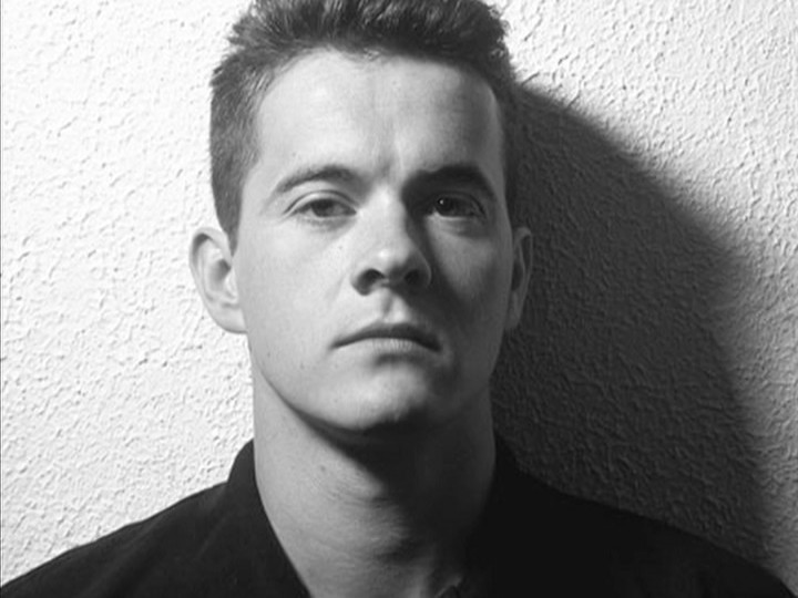
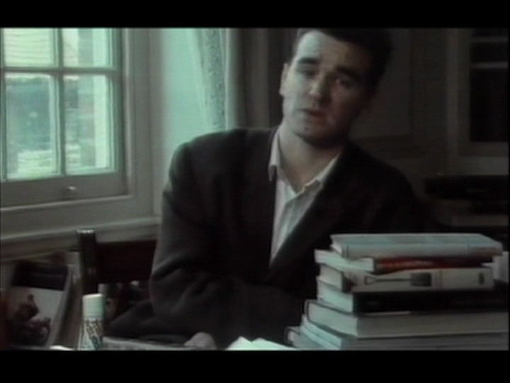
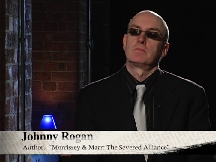
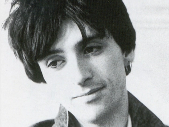
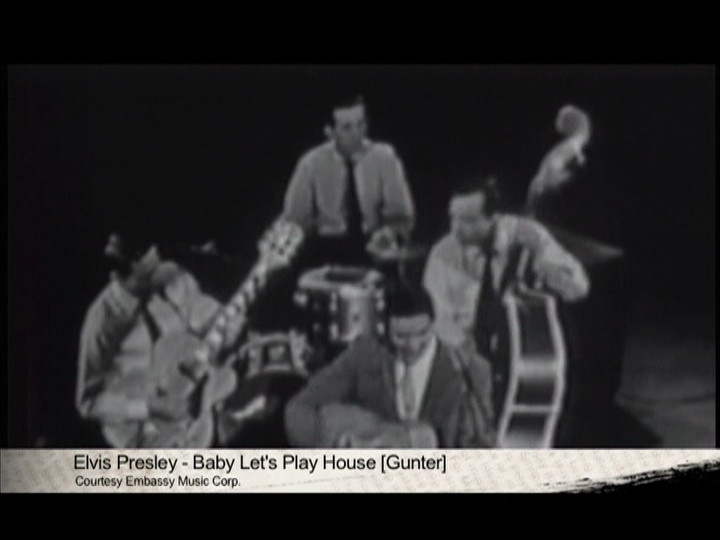
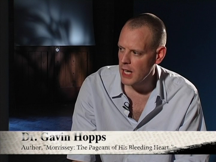
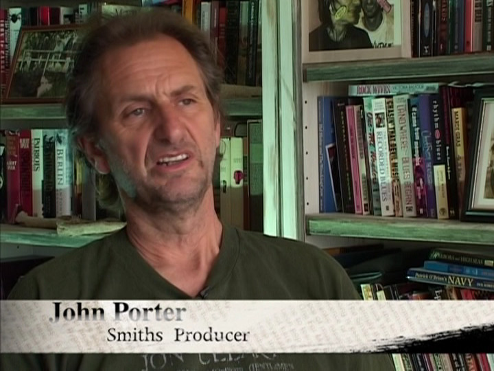
And, of course, nobody from the band appears (except Craig Gannon), and instead it’s a bunch of journalists, producers and other musicians talking about The Smiths.
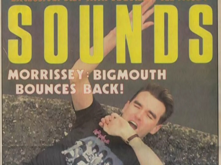
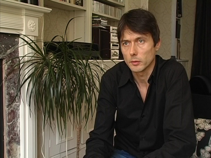
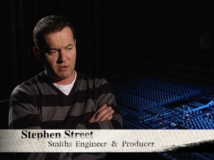
The most interesting bits here is where the producer (Stephen Street) talks, I think. And Tony Wilson drops some fact bombs on money matters: If Morrissey hadn’t signed with Rough Trade, the entire 80s indie scene wouldn’t have happened in the UK, because the money just wasn’t there otherwise.
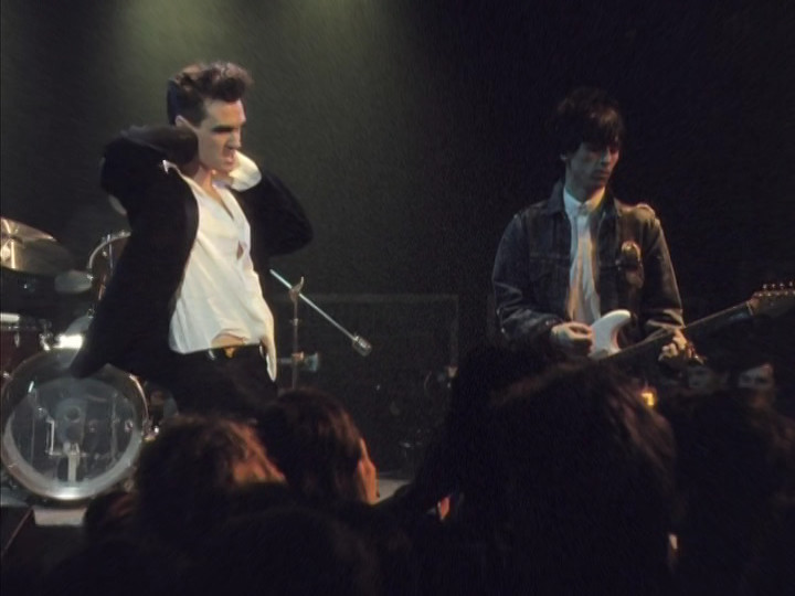
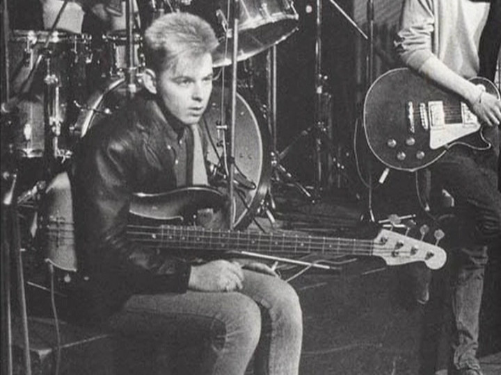
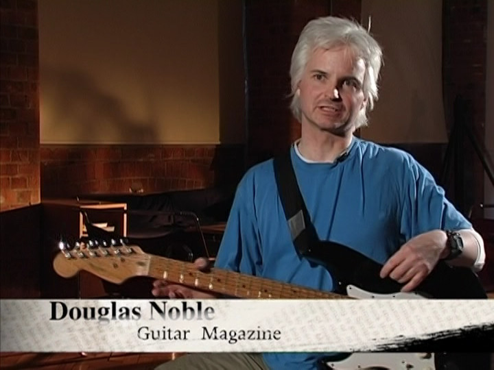
But it’s quite nerdy, and I like that. Especially the guitarist guy who explains what Johnny Marr was doing.
Your mileage may vary. If The Smiths didn’t destroy your teenage years, you may find this painfully boring.
This blog post is part of the Century series.