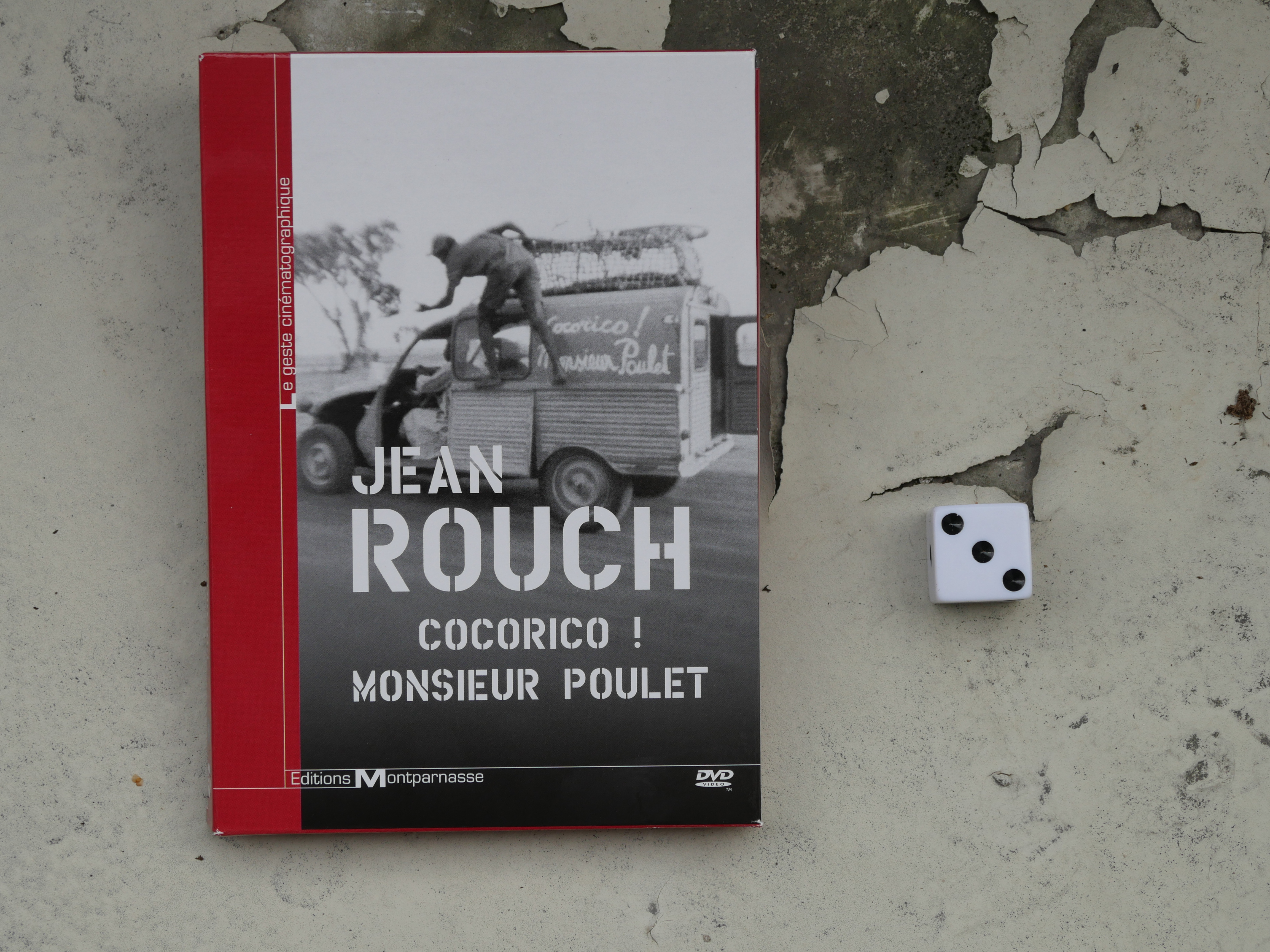
A rare French DVD that includes English subtitles. Which reminds me of this comment on imdb about a completely different film:
Film. It’s just a shame that the French are killing the African film industry. Why is it so hard to get copies of these films???? What acan we do to help African filmmakers break the French stranglehold on their work and distribute their films widely???
This is both completely unfair and cogent at the same time. The reason that there are so many African films available in France is that the French finance an co-produce a buttload of African films. Accusing the French of killing the African film industry is pretty absurd in that light.
But when the French duly release DVDs of these African films, they virtually never include English subtitles, which I just find very strange. Doing so might not increase the number of DVDs sold radically, because the worldwide demand for these films isn’t exactly huge. But it would make it possible for weirdos like me and the person quoted above to sample these films. And it’s not like it’s that expensive to supply subtitles: For a few of these films, after discovering that there are no subtitles, I’ve had to resort to downloading torrents of the films, and they often have user-supplied subtitles.
So the French/African film situation is frustrating for people who have some interest, but don’t know French.
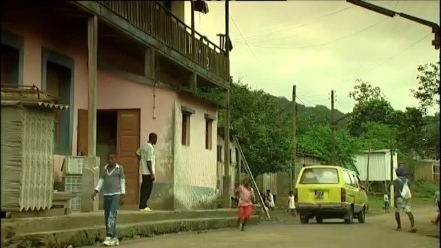
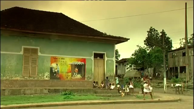
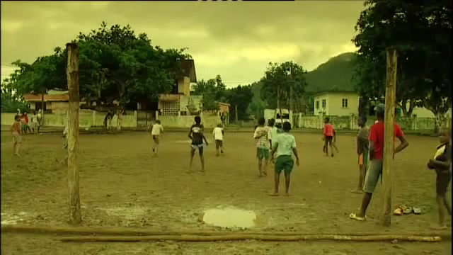
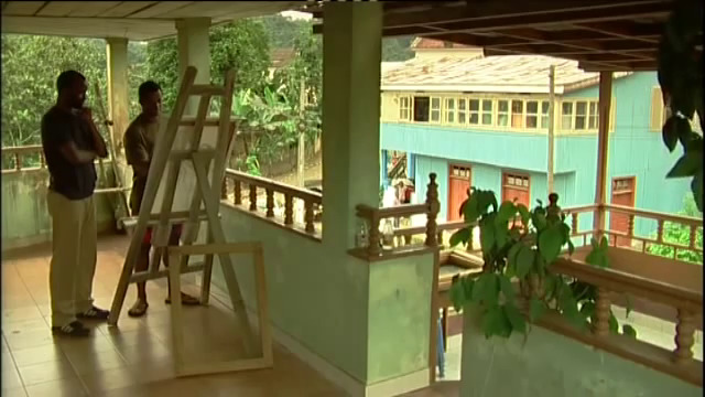
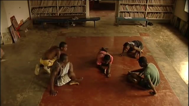
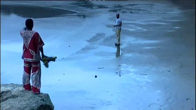
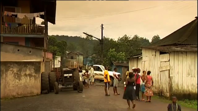
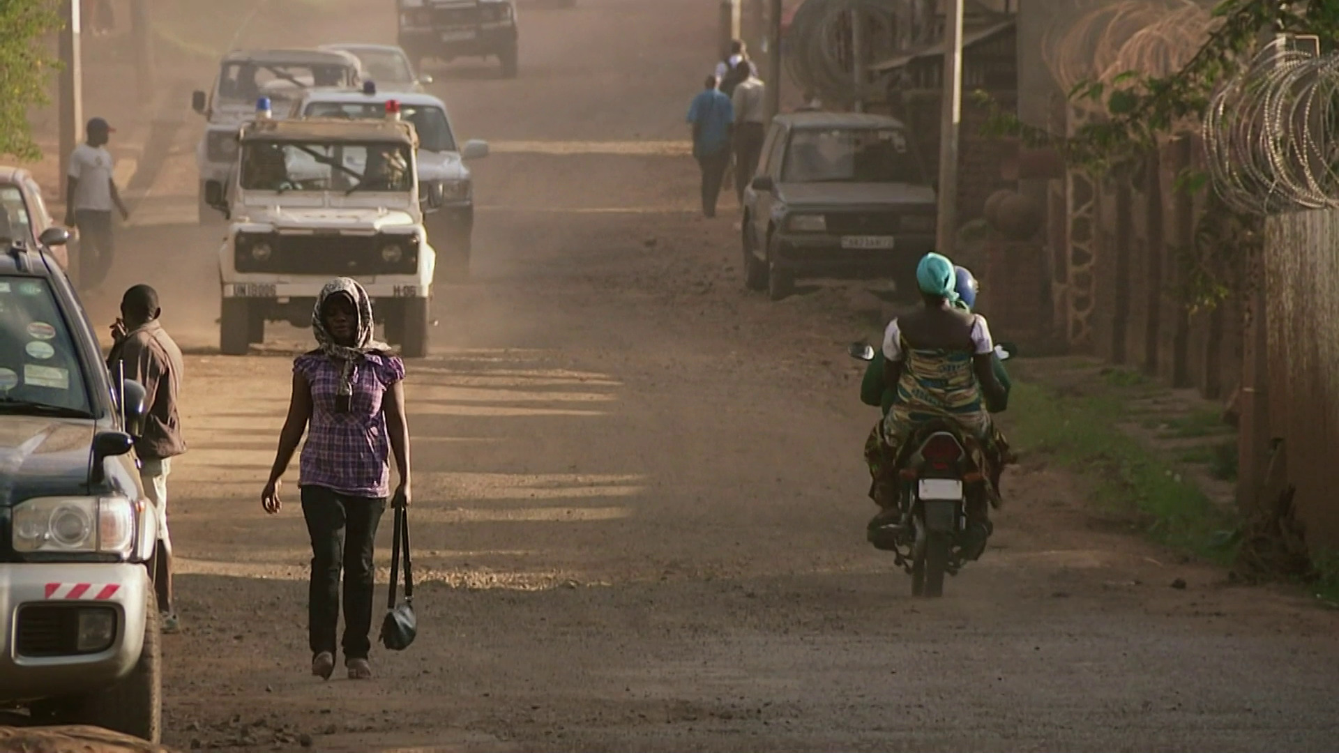
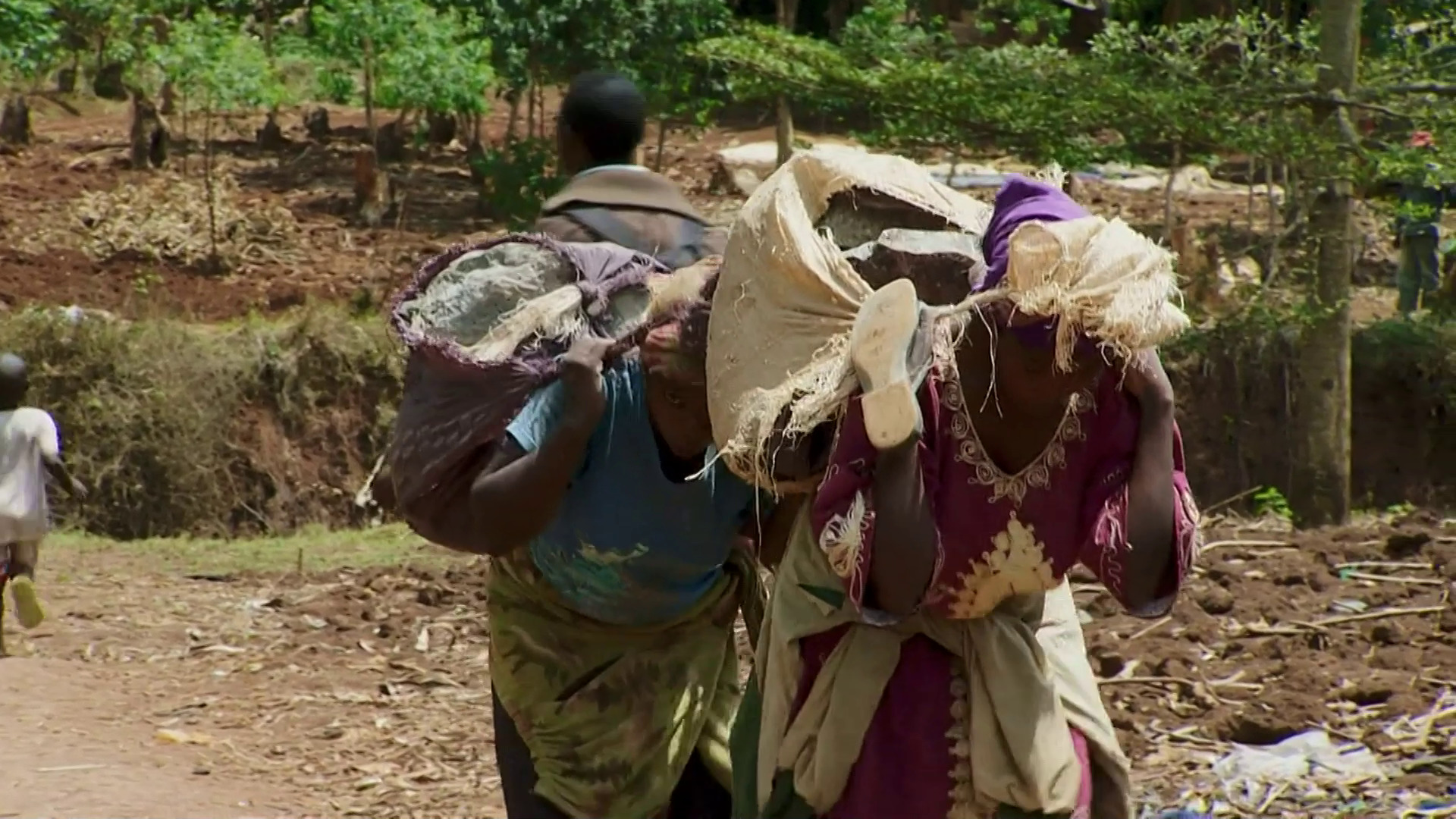
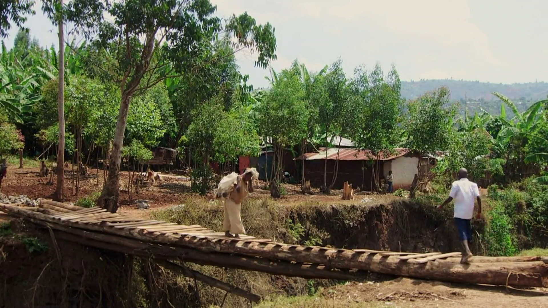
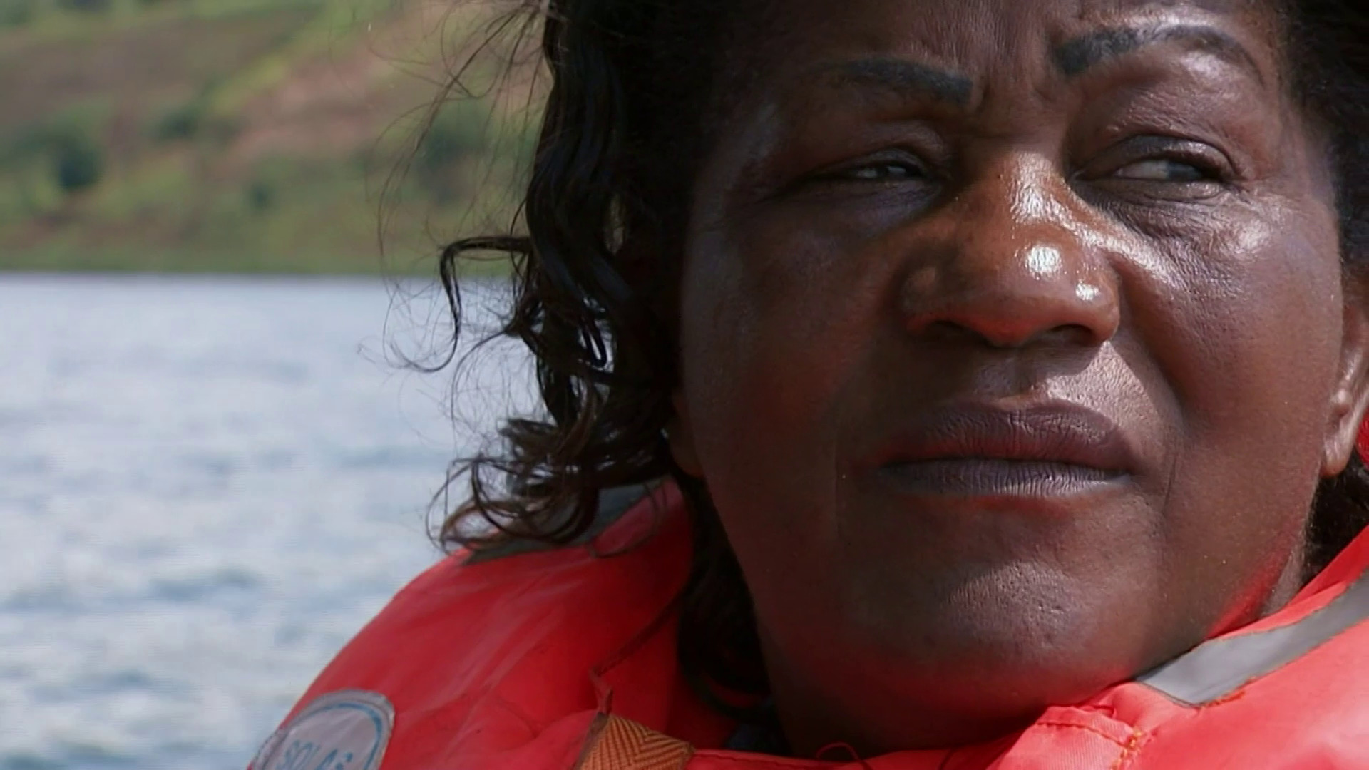
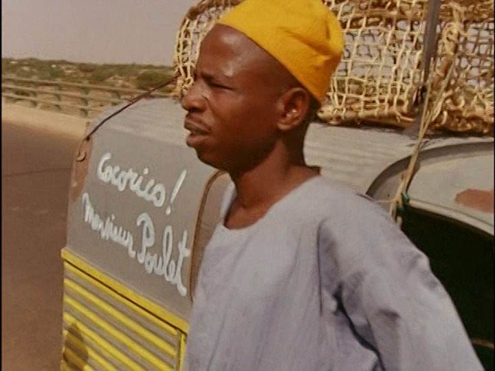
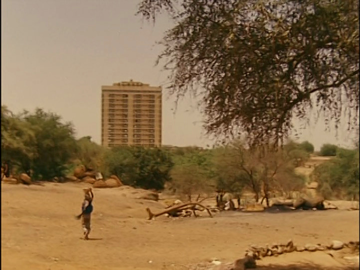
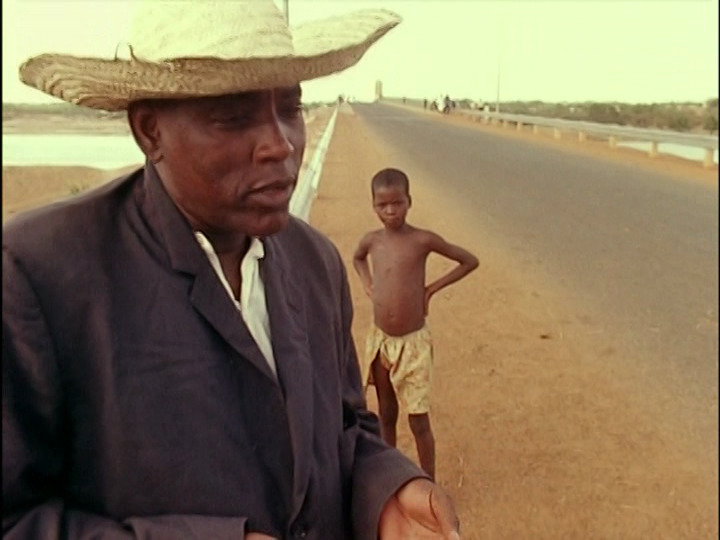
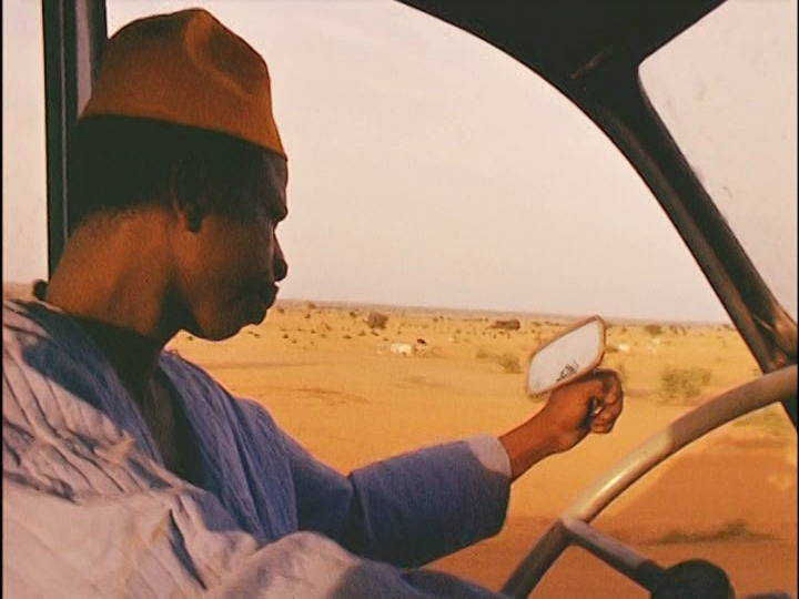
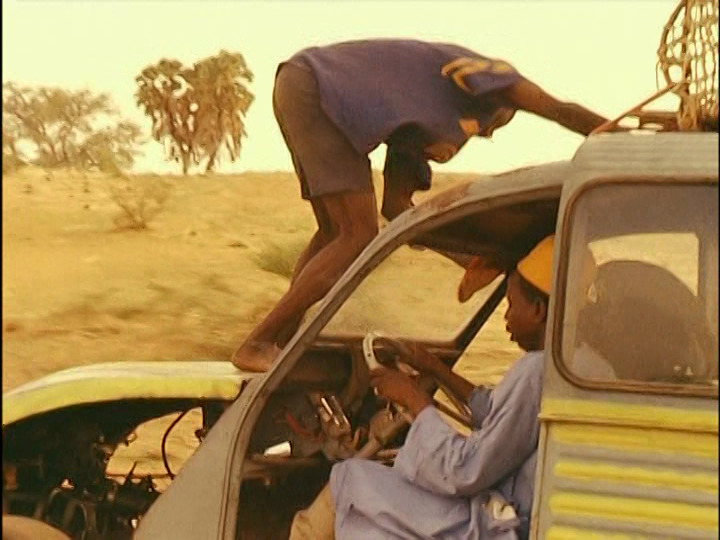
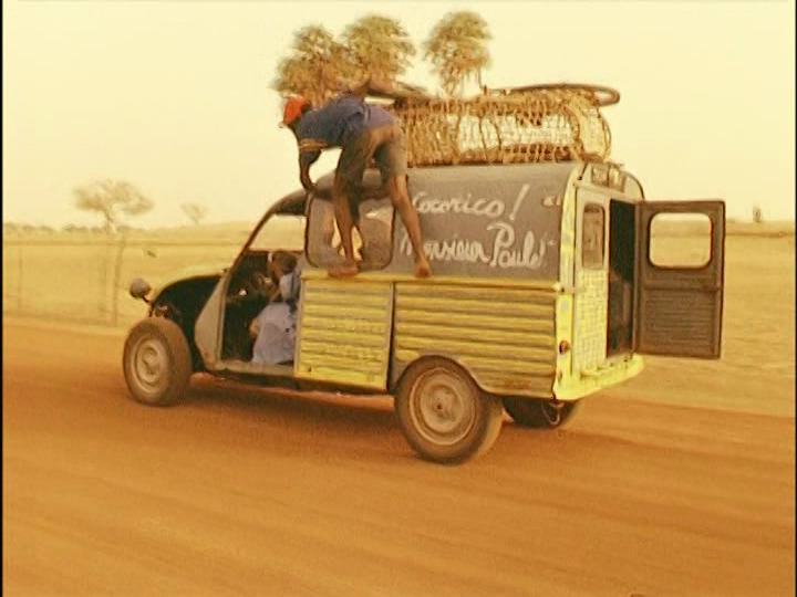
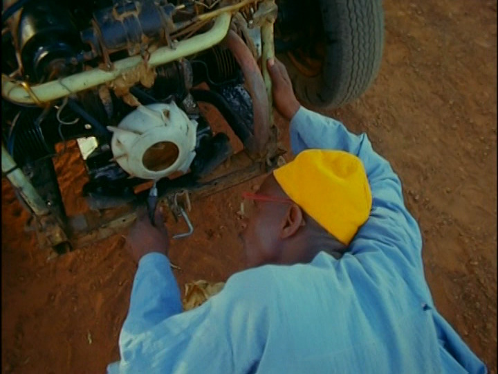
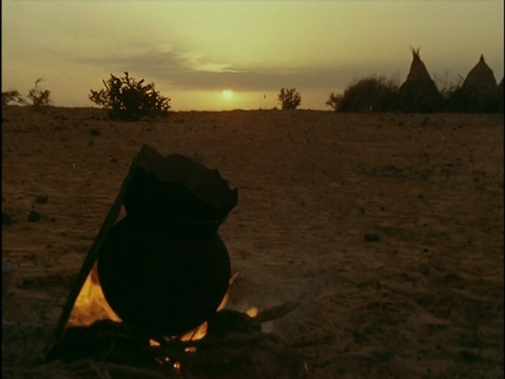
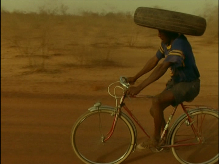
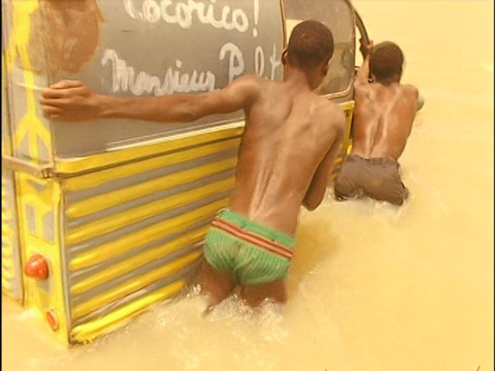
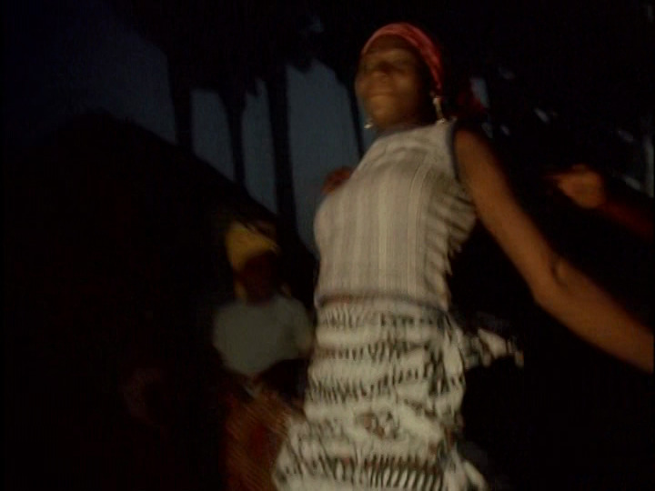
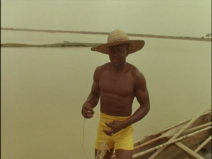
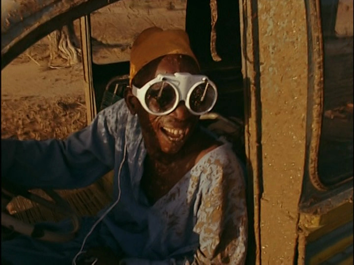
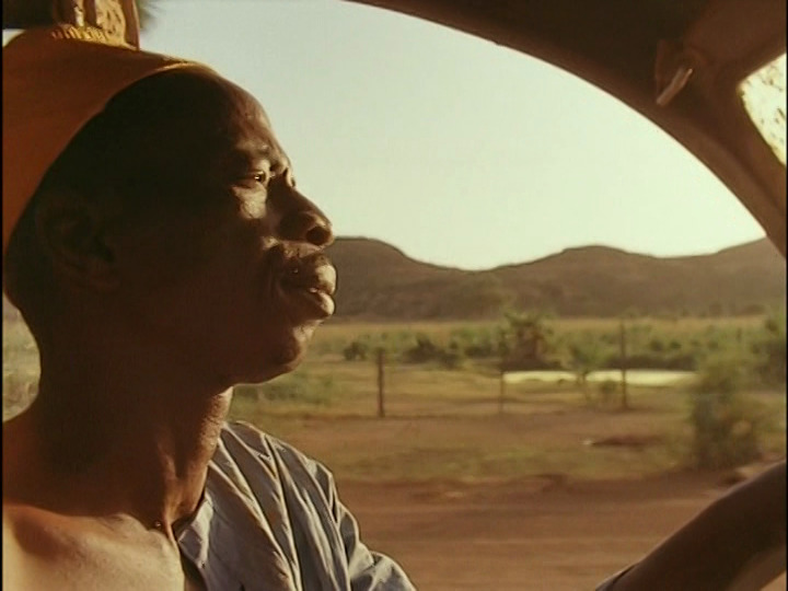
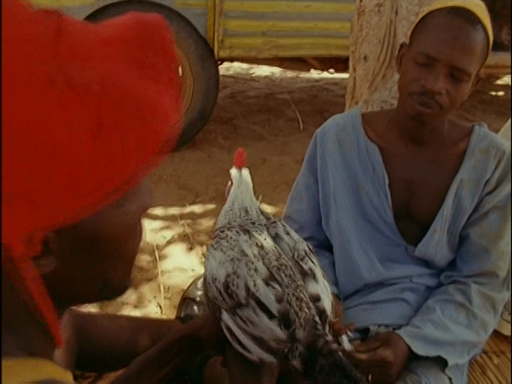
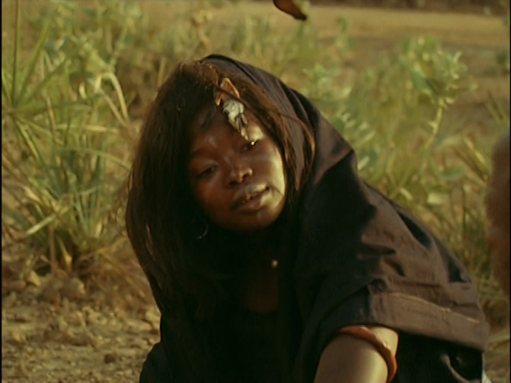
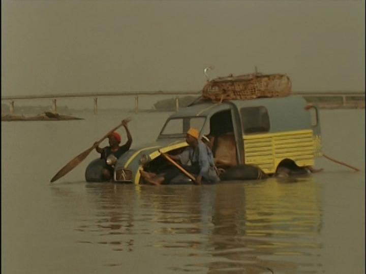
Anyway! This is a very noisy and boisterous French/Niger-ian film from 1974. I think what they’re going for is a classic road movie structure where our intrepid heroes set out on a journey, and then zany, inexplicable things happen.
The problem is just… there’s so much shouting and arguing that it’s offputting. I’m guessing it’s mostly improvised, and I’m guessing the instructions from the director was “take everything to 11! drama! all the time!” And I was exhausted after ten minutes.
It settles down after a while. There are bits that are interesting, but it feels mostly pretty aimless. It reminds me a bit of The Bed Sitting Room, for some reason.
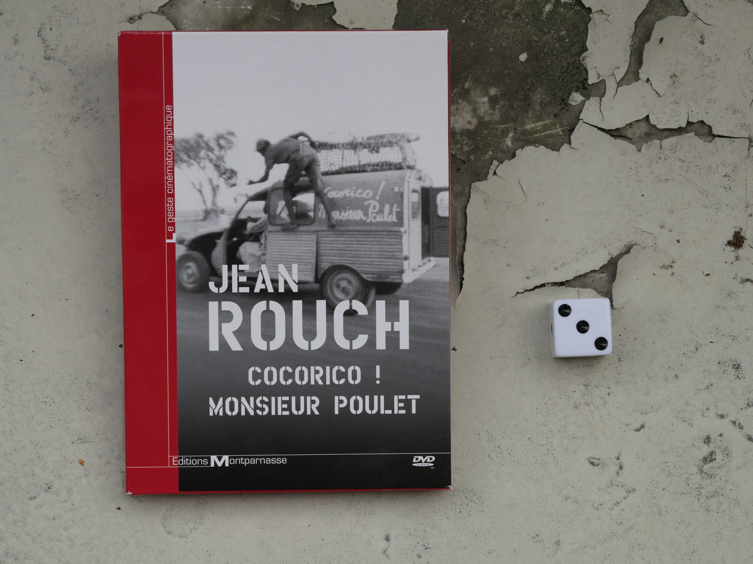
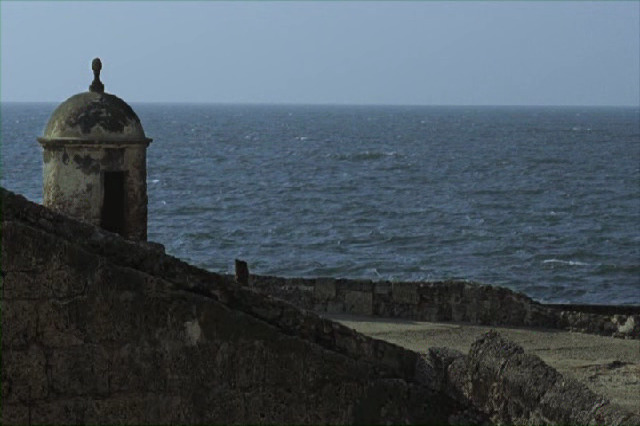
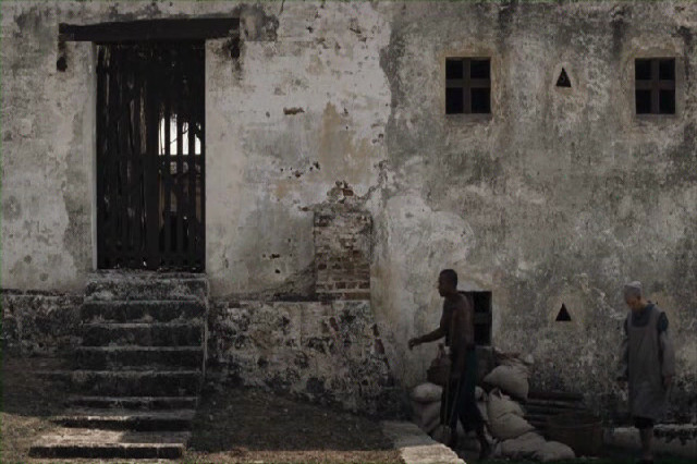
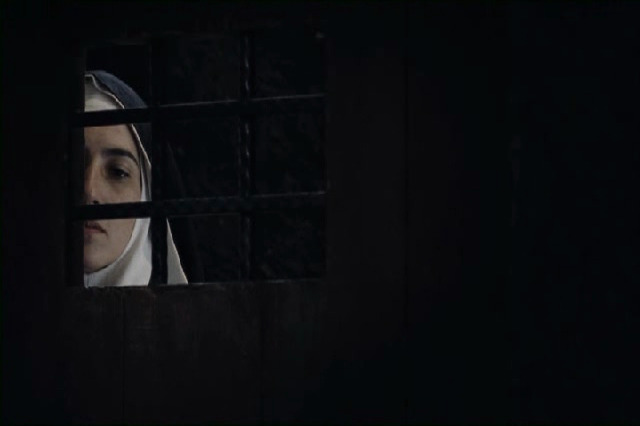
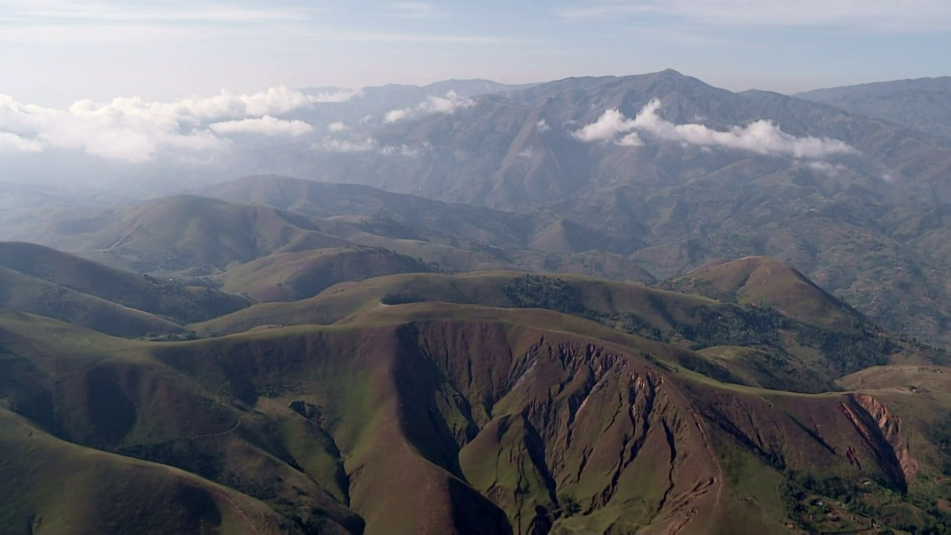
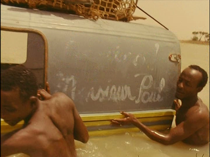
Cocorico! Monsieur Poulet. Jean Rouch. 1974. Niger.
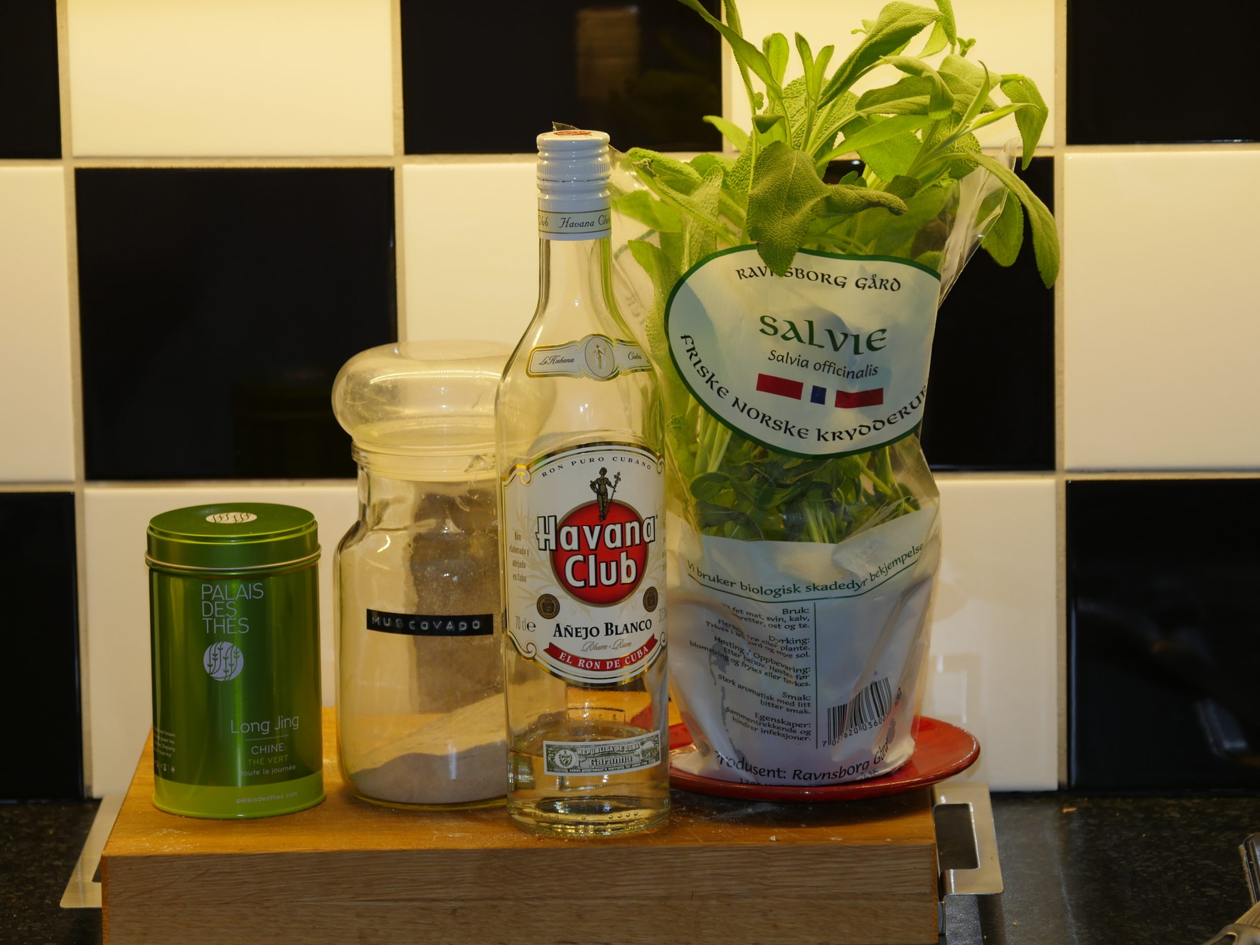
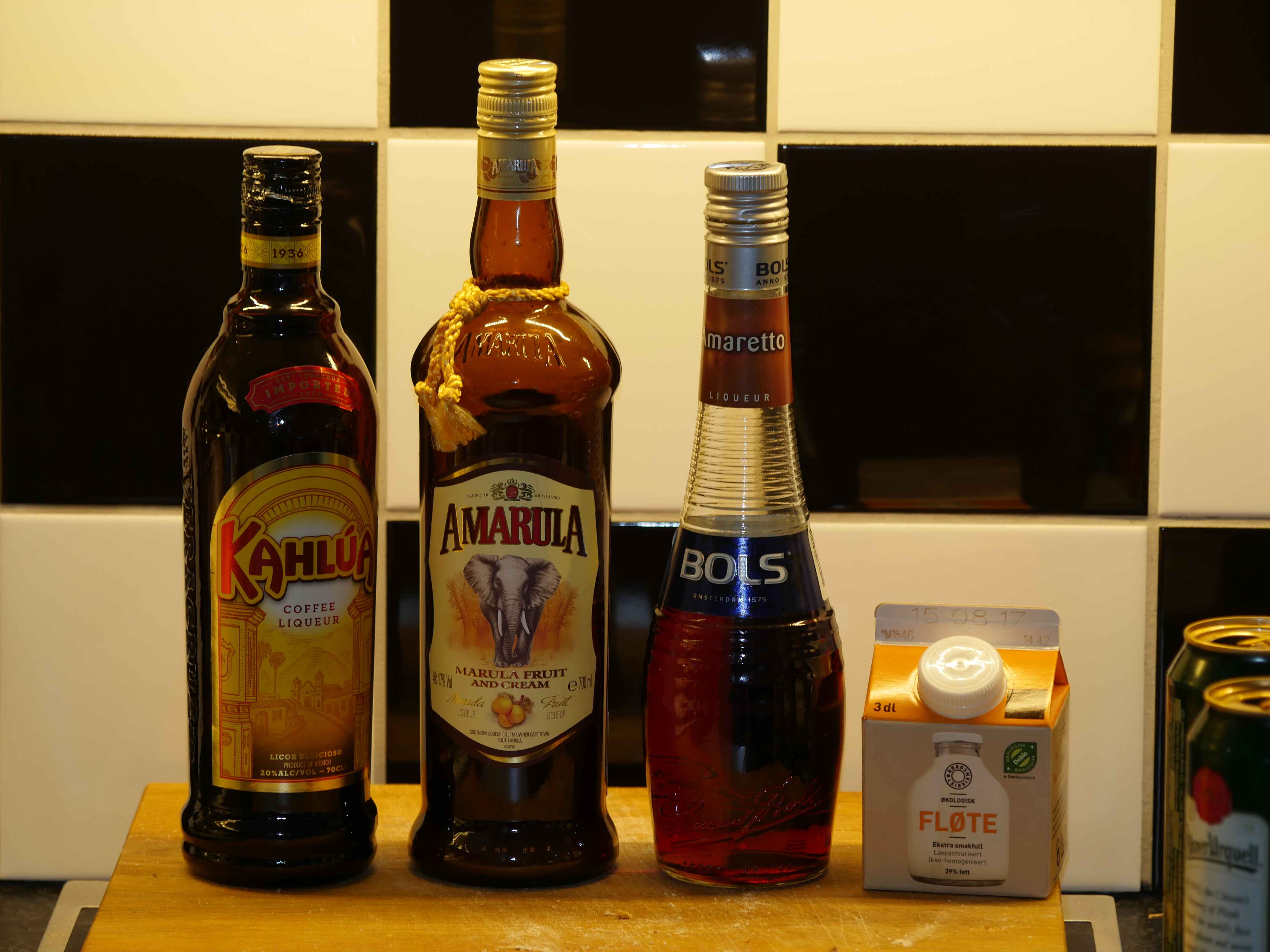
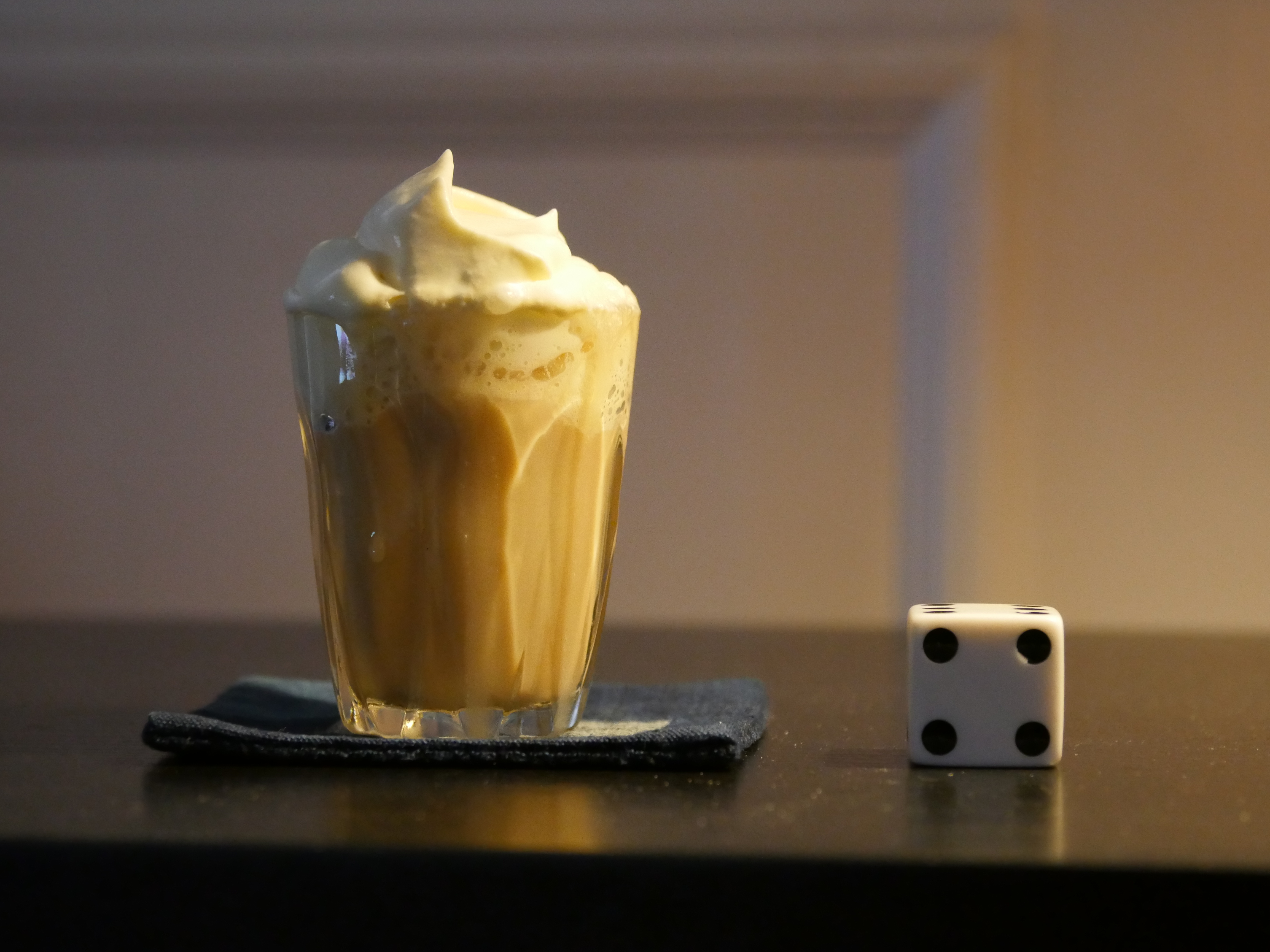
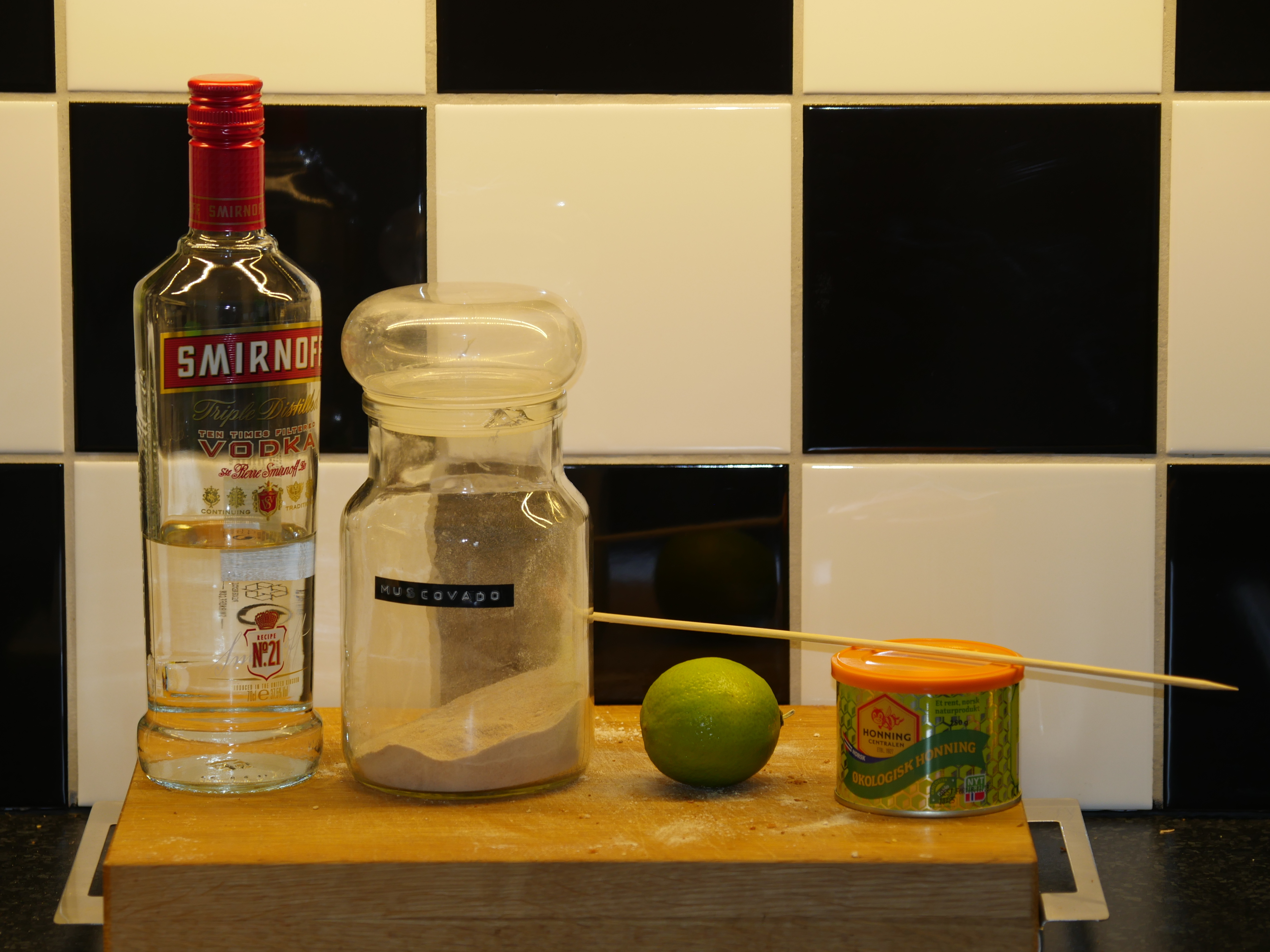
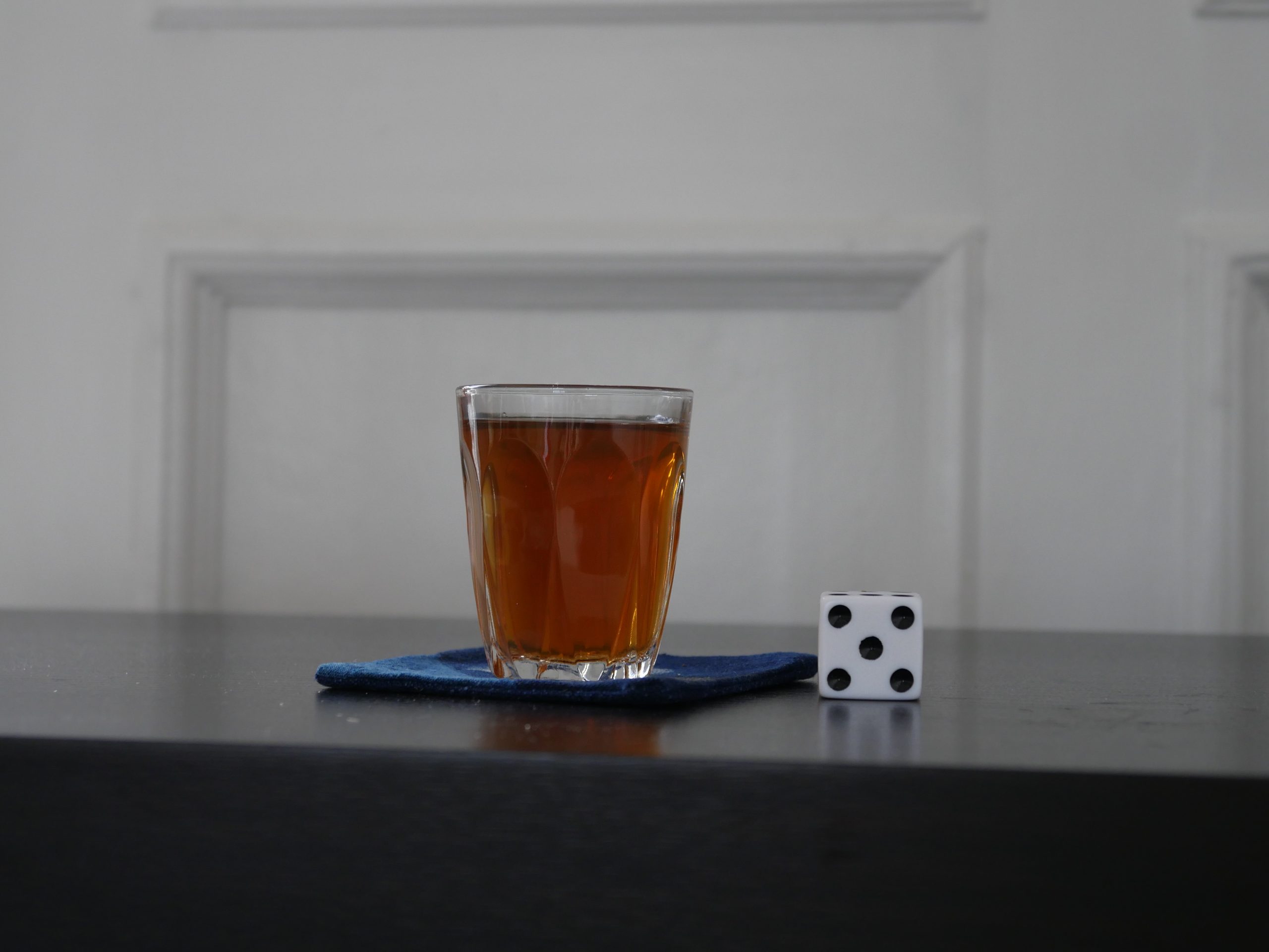
North African Sage n’ Green Tea
- green tea
- sage leaves
- sugar
- rum
Steep the green tea and the sage leaves for five minutes. Add sugar and rum and pour into a small glass.
(I added the rum to the recipe.)
This post is part of the World of Films and Cocktails series. Explore the map.