


Good Sam. Kate Melville. 2019. ☆☆★★★★
Watching Netflix Originals in this way, one by one based on release date but knowing nothing about them, I find myself playing the What Genre Is Netflix Making A Generic Movie In Now? game.
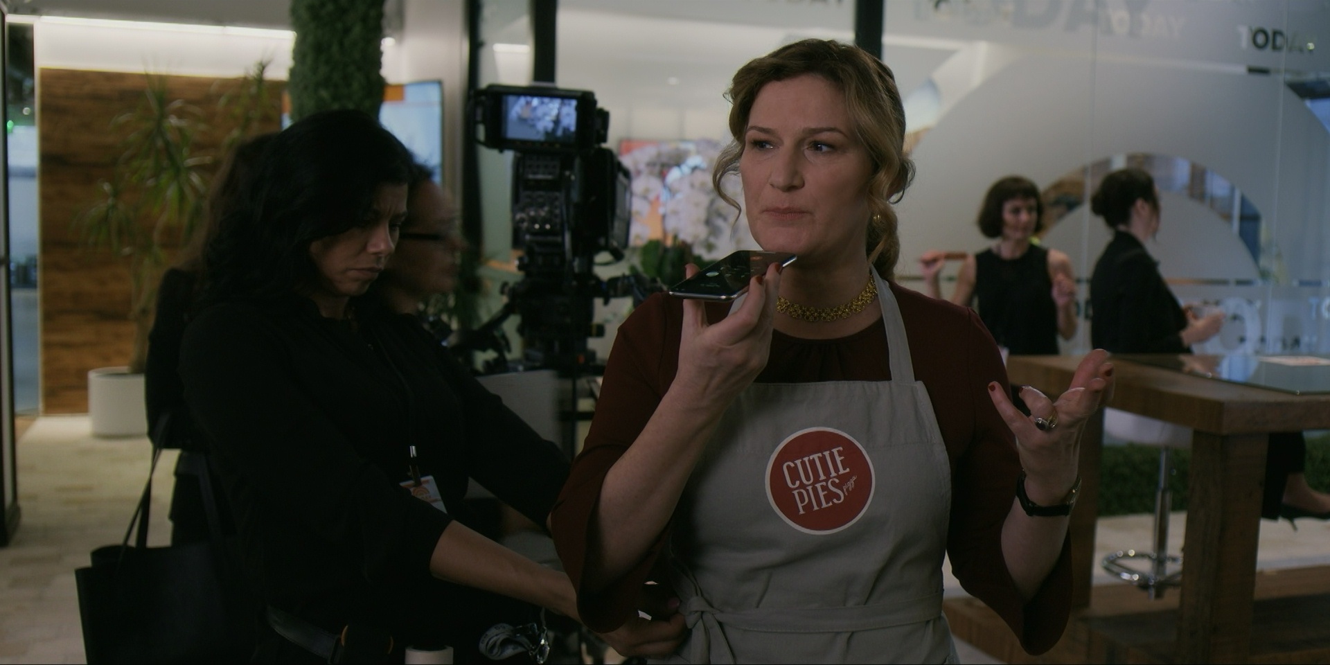
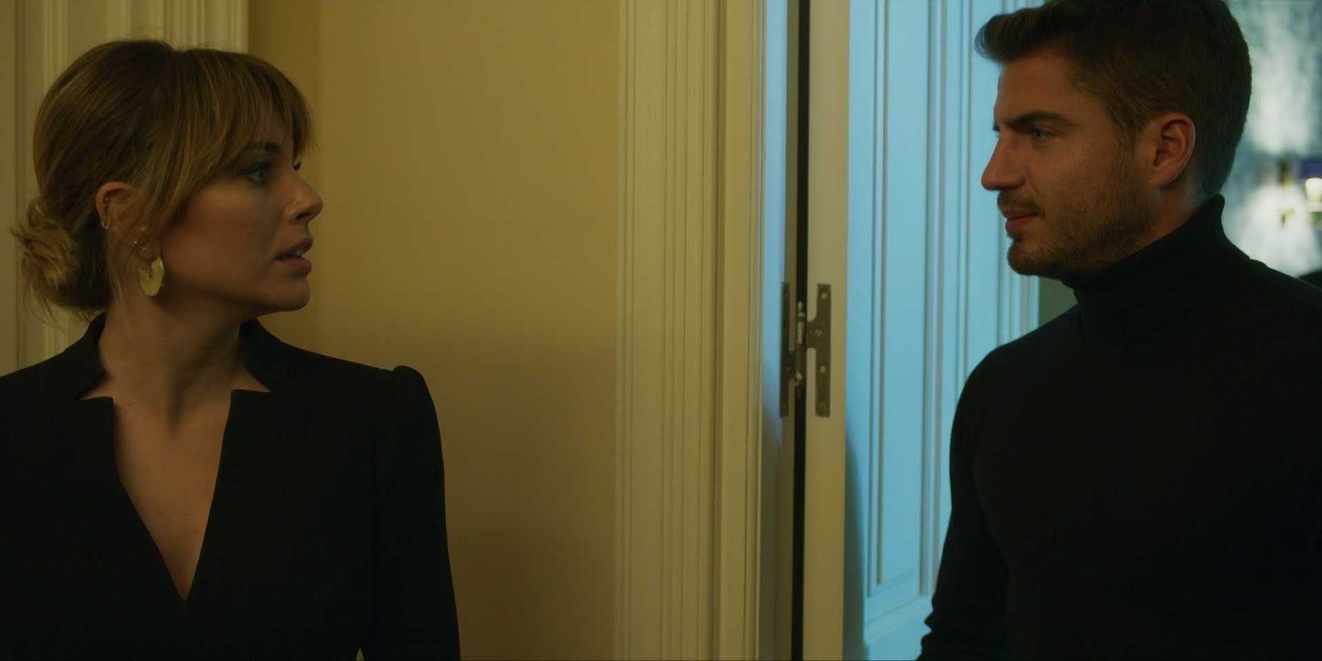
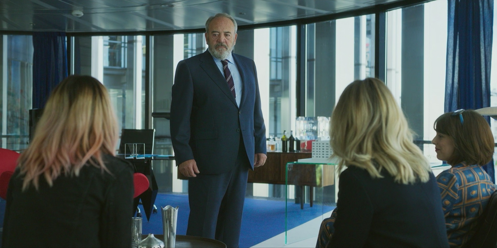
This is about a scrappy TV reporter? It’s very efficient: In the second scene, the scrappy TV reporter is being chewed out by her sergeant I mean managing editor for being too reckless and “it’s gotta stop”. Movies in this genre usually wait until at least the fifth scene to do that bit.
This movie has the odd distinguishing factor of being the first Netflix Originals movie that’s in modern TV format (i.e., 16:9): All the previous ones have been wider. This makes it look even more like a TV series, which I’m going to guess is on purpose. Or perhaps it was made as a TV series pilot?
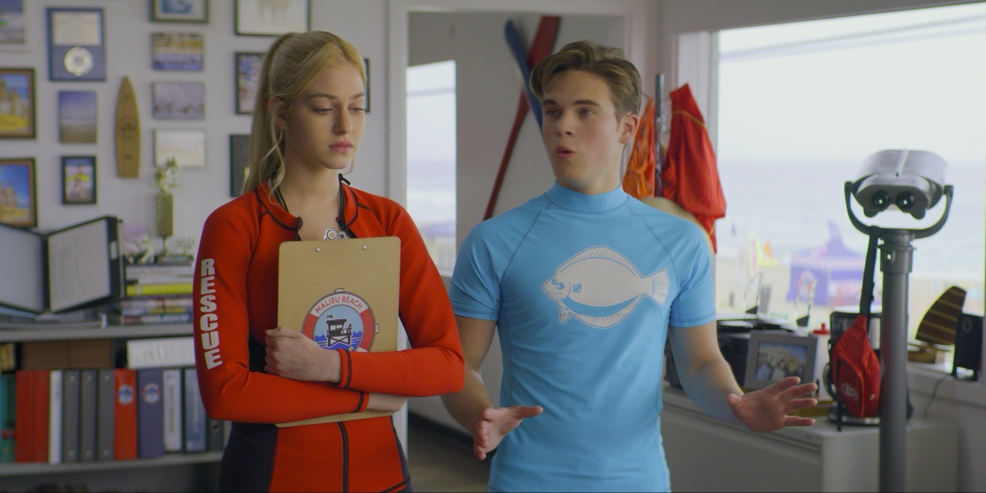
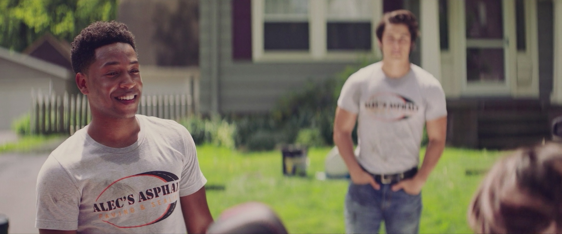
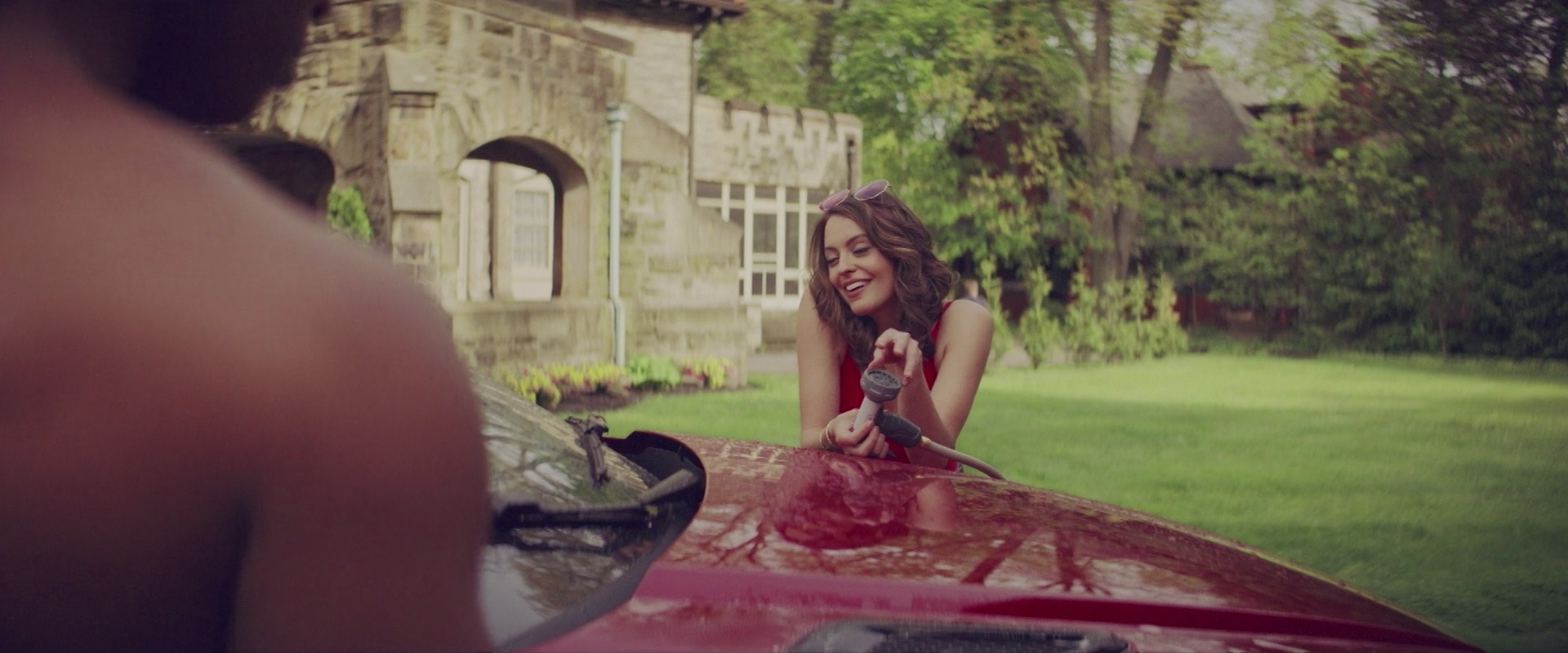
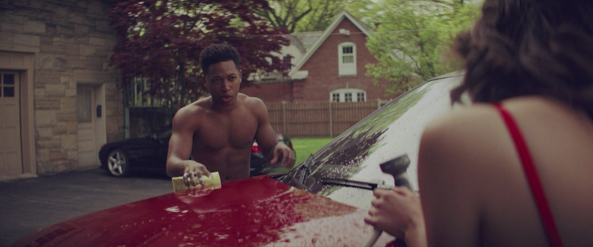
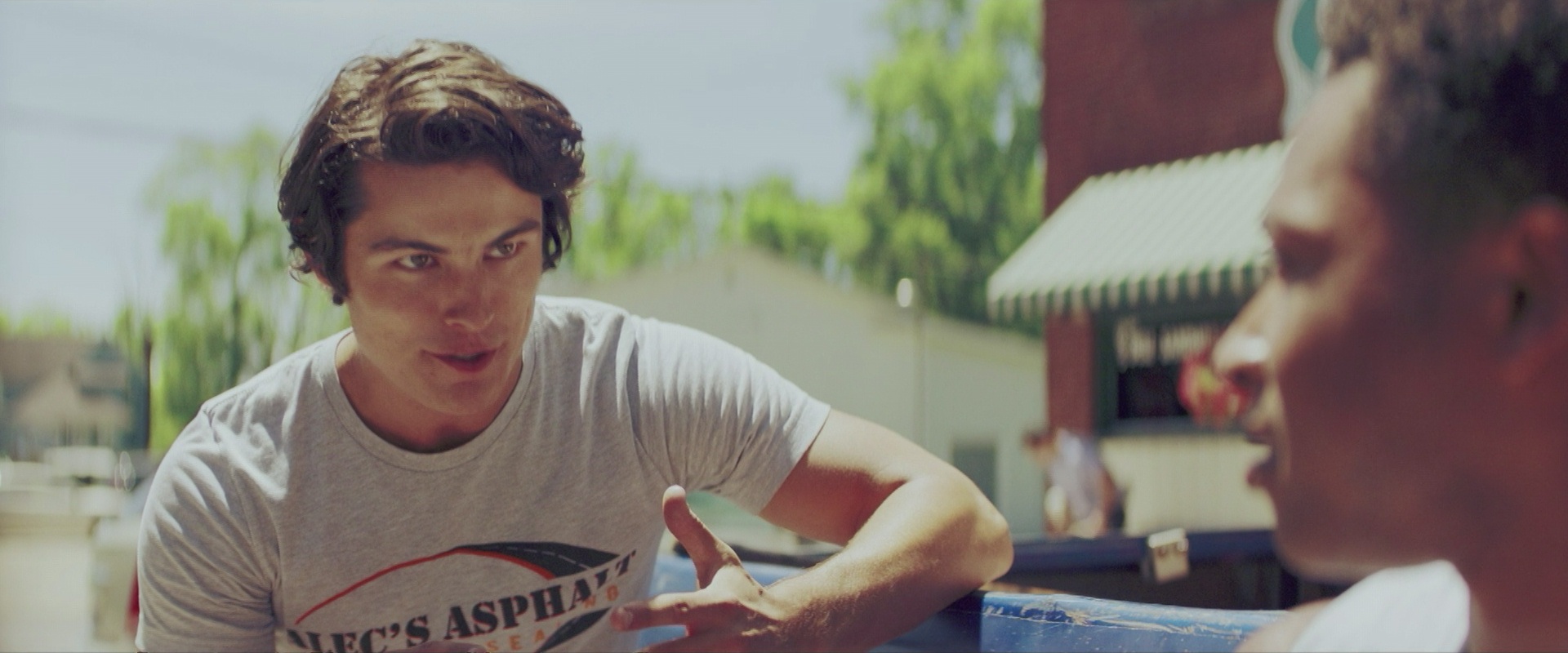
It’s a very Made For TV Movie: The actors are attractive, but not particularly er good; things keep happening without anything being too intense; the cinematography is… there…
There’s also a “mystery” in here, but the solution to the mystery is so obvious that it’s *eye roll*.
It’s intensely pedestrian, but it’s not particularly annoying. I can well imagine that many people would find this a perfectly inoffensive way to spend 90 minutes.
IT”S SO BORING!
This post is part of the NFLX2019 blog series.