So I’m opening packages, and out of an envelope this drops:
Hi, Jack!
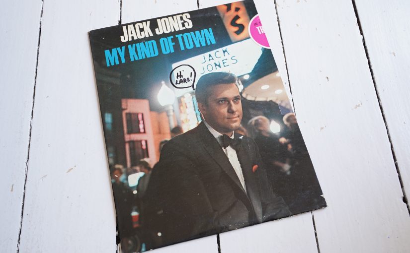
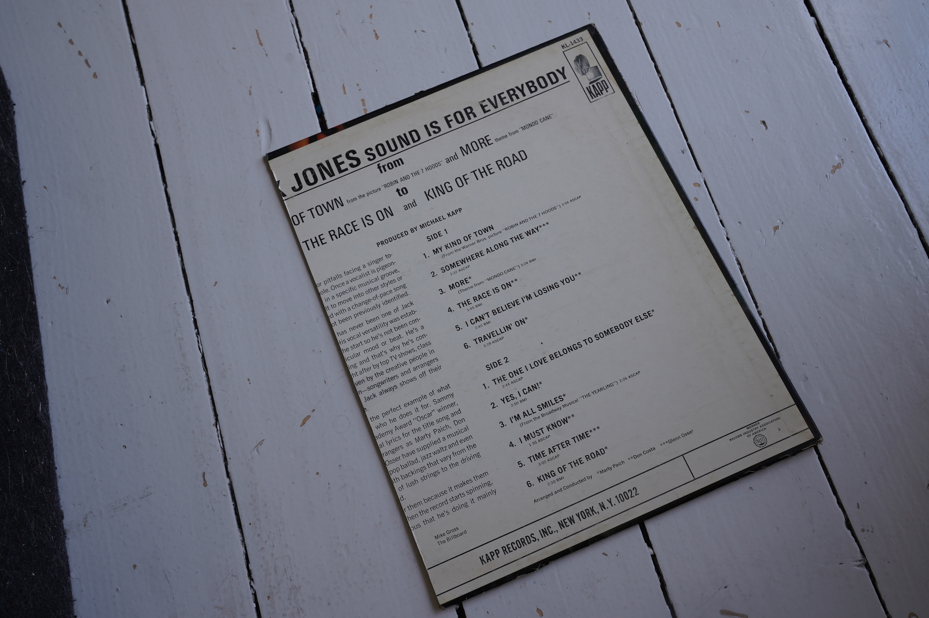
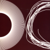
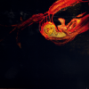
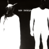
Wut? Oh, it’s a record cover used as packaging:
Reuse before recycle!
(Oh, it was used as packaging for this classic comic by Lee Marrs):

So I’m opening packages, and out of an envelope this drops:
Hi, Jack!
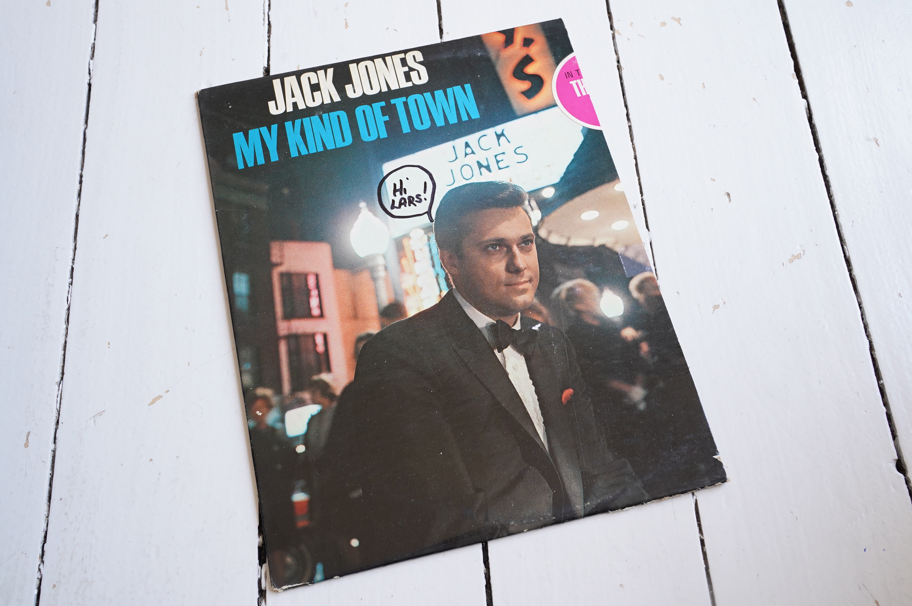
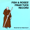
Wut? Oh, it’s a record cover used as packaging:
Reuse before recycle!
(Oh, it was used as packaging for this classic comic by Lee Marrs):
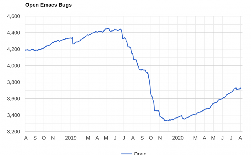
Last summer I went on an Emacs bug spelunking, and set as a goal for me to close (i.e., fix, prod people about, or determine if the bug reports were invalid, etc.) 10% of the open bugs.
I did that twice (which isn’t the same as fixing 20% of the bugs, because the 10% gets smaller each time YAY).
Then I started on the third ten percenter, and… I took a slight break. For half a year. Or more.
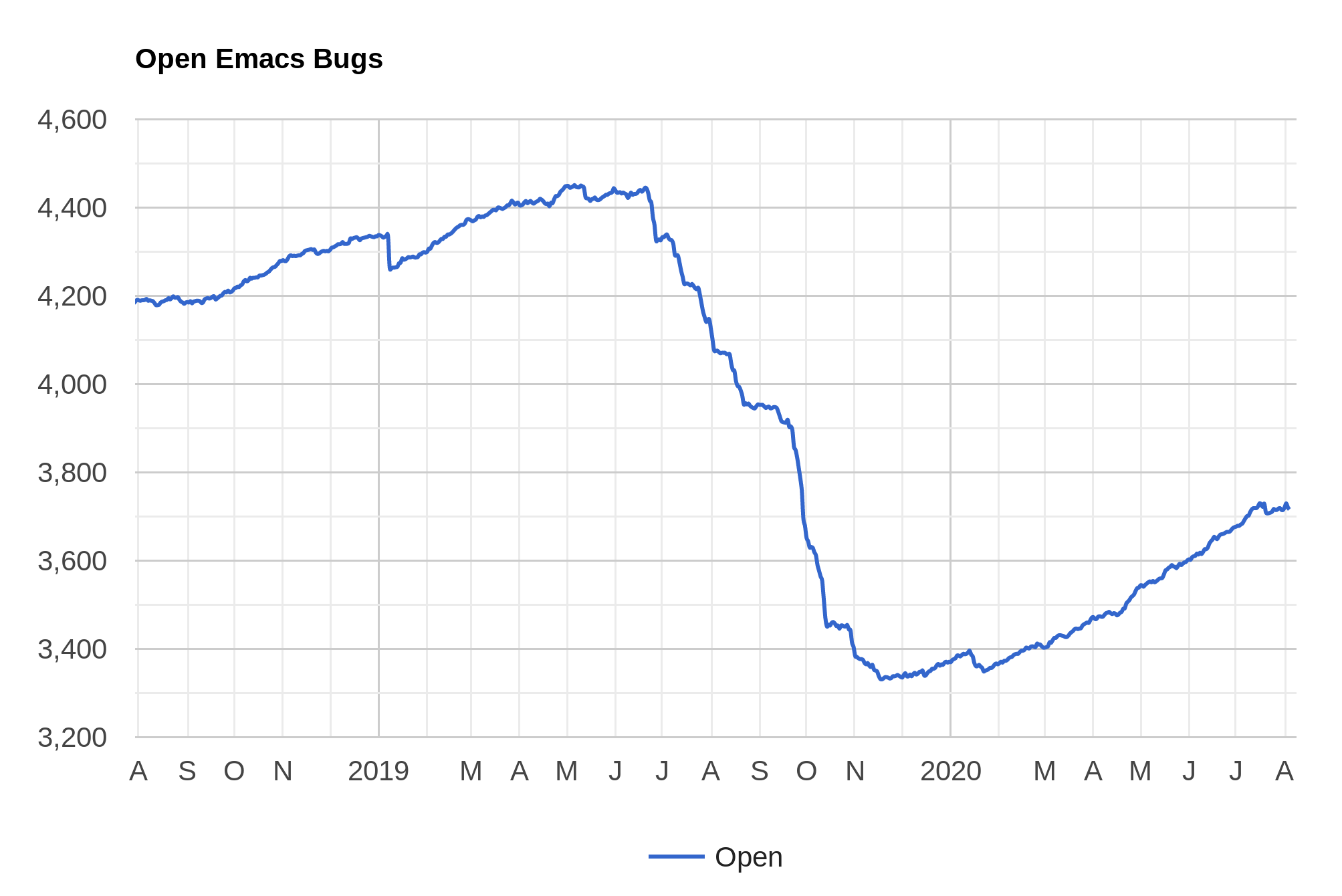
(I suspect that Stefan Kangas took some time off that coincided with me, because he contributed heavily to that descent there…)
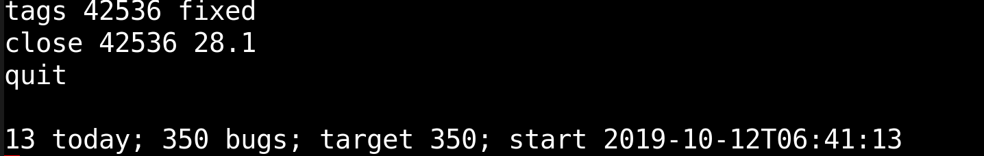
Anyway, I’m back for a while, and (non-humble-brag) I finally finished the third 10%!
I have a tendency to work hard on a specific thing for a while, and then not at all for a while, which is why I’m glad I’m not really a maintainer for anything any more, but can just drop by with a coding blitz now and then…
And, as ever, more people working on Emacs bugs would be nice. Install the debbugs-gnu package, say `M-x debbugs-gnu’ and find some area you want to work on. It can be fun! I promise! For real!
(More bug stats can be found here.)

Looking at the Emacs bug tracker, there’s a bunch of Apple-specific Emacs bugs, and I thought it would be fun to take a look at some of the more trivial bugs. So I wondered what you’d have to do to build Emacs under Macos, and… I found a bunch of people talking about how easy it is, but nobody actually, like, says how to do it. I mean, for somebody who’s barely switched their Apple laptops on.
So since I know naaathing, I’m the ideal person to write this how-to, since people who know everything don’t know what you don’t know.
1a) Install Xcode. This is found in “App Store”, and then search for “Xcode”. Click on the cloud symbol to get it to download. (Just figuring out that took me at least three hours.) It’ll turn into a circle with a square in the middle. That means it’s downloading. It’ll take a while.
1b) Alternatively, just say “gcc” in a terminal. You’ll get a popup asking whether to install command line stuff. Answer yes.
The rest you can do via ssh from your normal Linux machine.
2) Install Homebrew in this insane way:
/bin/bash -c "$(curl -fsSL https://raw.githubusercontent.com/Homebrew/install/master/install.sh)"
It’s a variation on the time-honoured “curl | sh” method. It’ll prompt you for your password, but don’t worry — it’s probably safe.
3) Install the Emacs dependencies and build Emacs. Just cut’n’paste the rest into your ssh session:
brew analytics off
mkdir src
cd src
git clone https://git.savannah.gnu.org/git/emacs.git
cd emacs
brew install pkg-config automake texinfo jpeg giflib\
  libtiff jansson libpng librsvg gnutls
make -j4
./src/emacs
Tada!
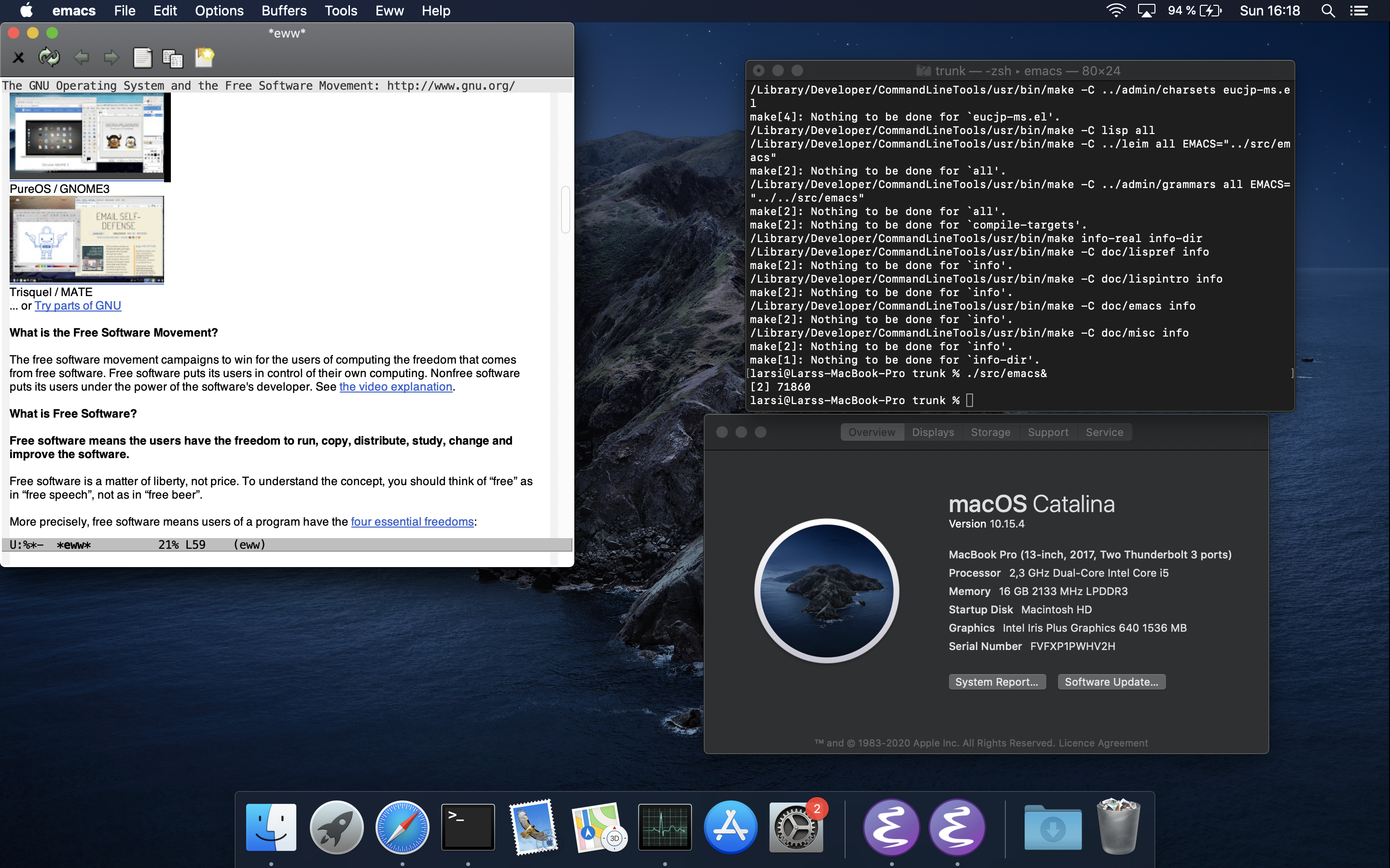
See? It really is that easy, and you almost don’t have to work on the Apple laptop itself. (Although you do if you’re futzing around with display stuff, I guess.)
Go forth and hack.
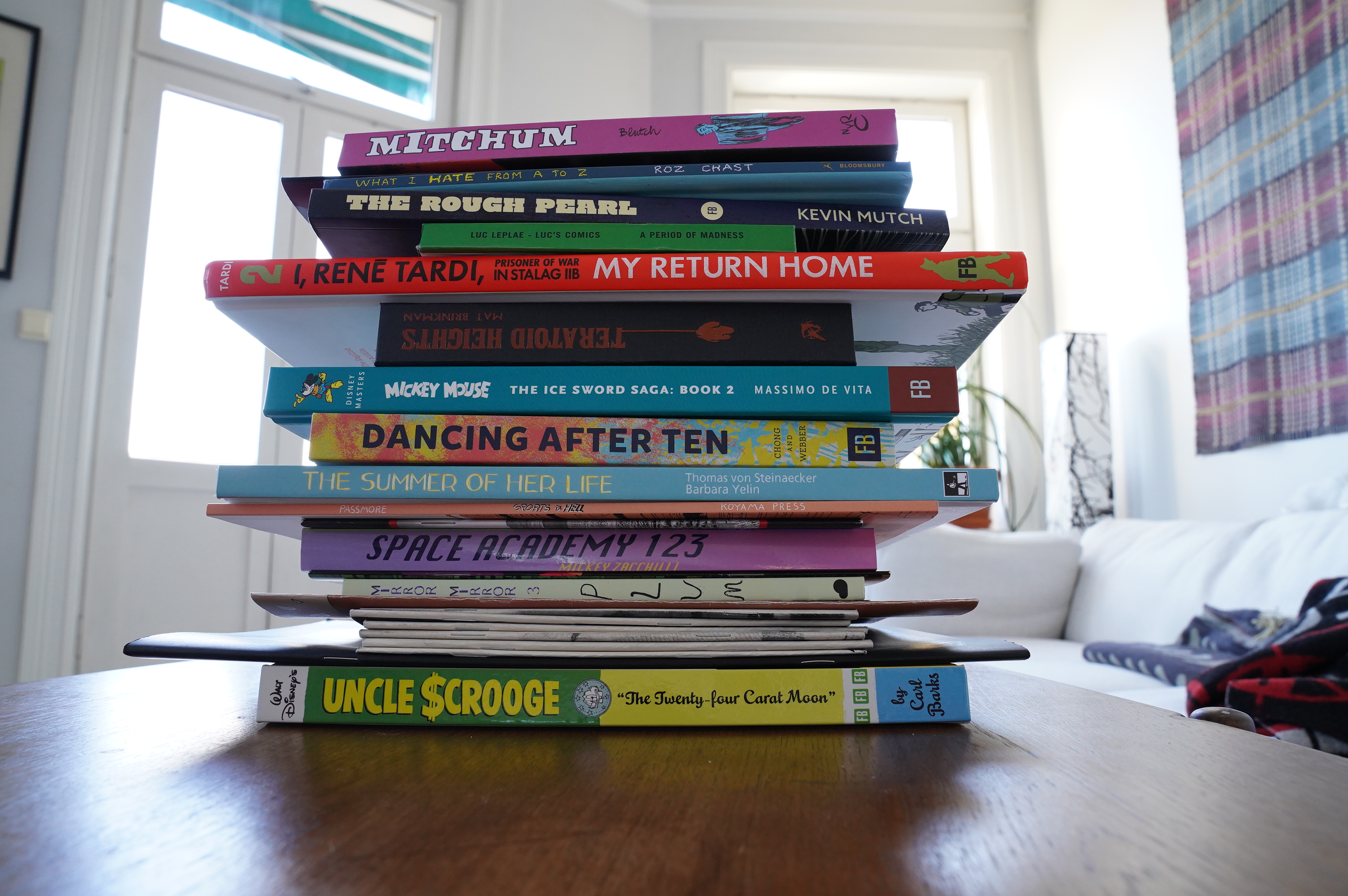
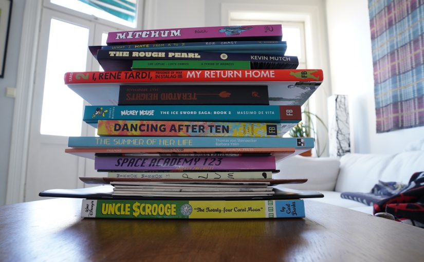
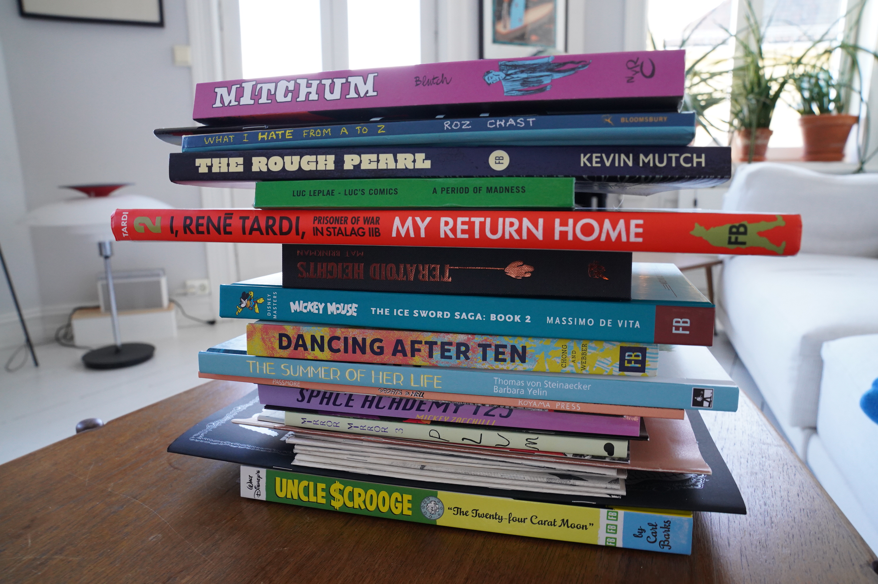
The other week I spent all day doing absolutely nothing but read comics (and eat takeout pizza) and writing a couple words about each book, and today I’ve got an open schedule again, so here goes.
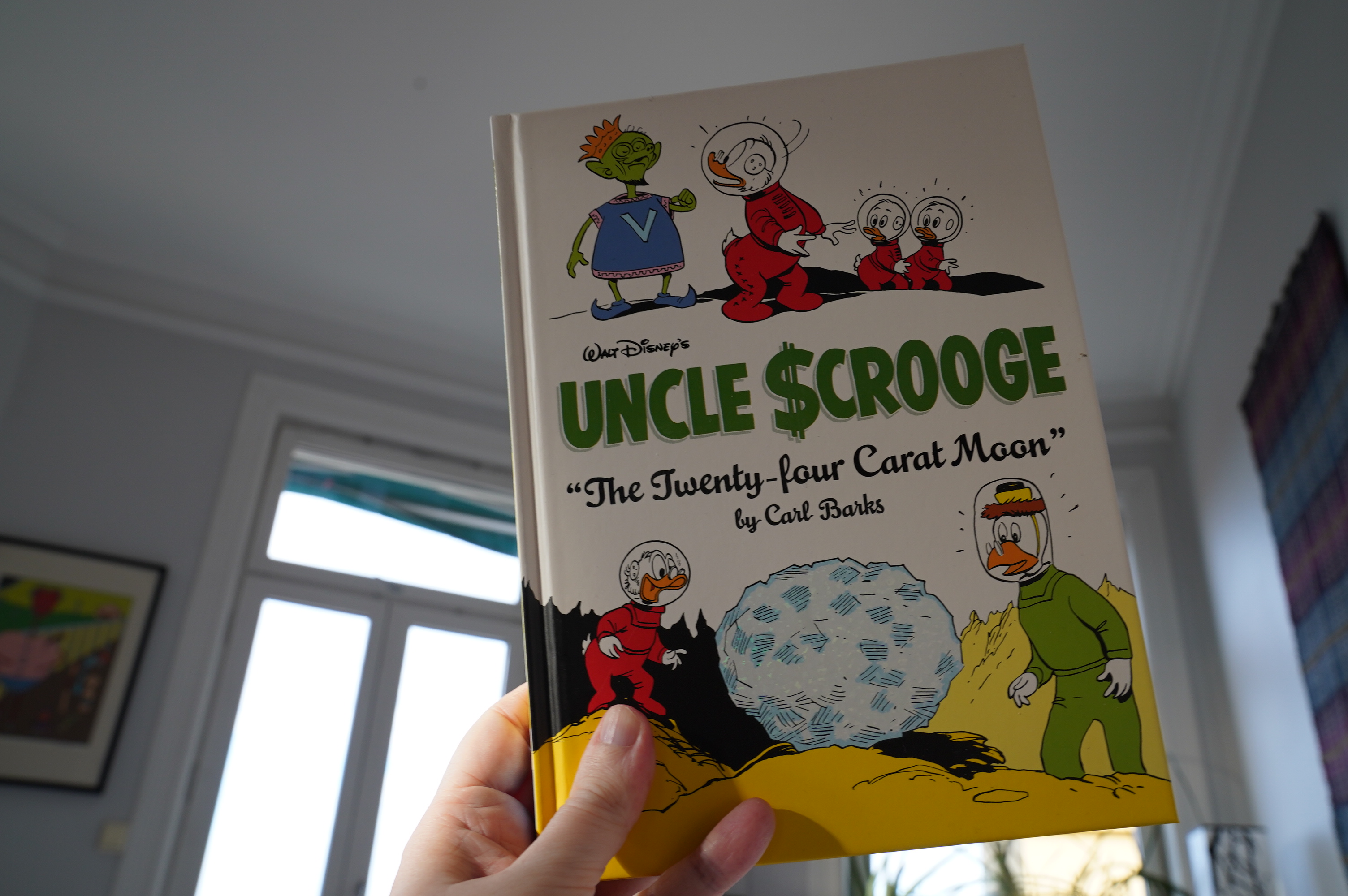
06:23: Uncle Scrooge: The Twenty-four Carat Moon by Carl Barks (Fantagraphics)
It’s been too long since I’ve read one of these. This volume has stories from 58-61, so it’s pretty prime Barks. One notable thing about many of the stories here are how centred they are on literally incredible inventions — bordering on magic. I mean, Barks loves his gadgets, but in a couple of the stories, they seem kinda… beyond… where he’d normally take those gags (including the title story).
And it seems like Rich Tommaso has stopped doing the colouring? That’s a shame — he’s the best Barks colourist I’ve seen. Not that these are awful or anything, but Tomasso had a way of making everything look just perfectly … right.
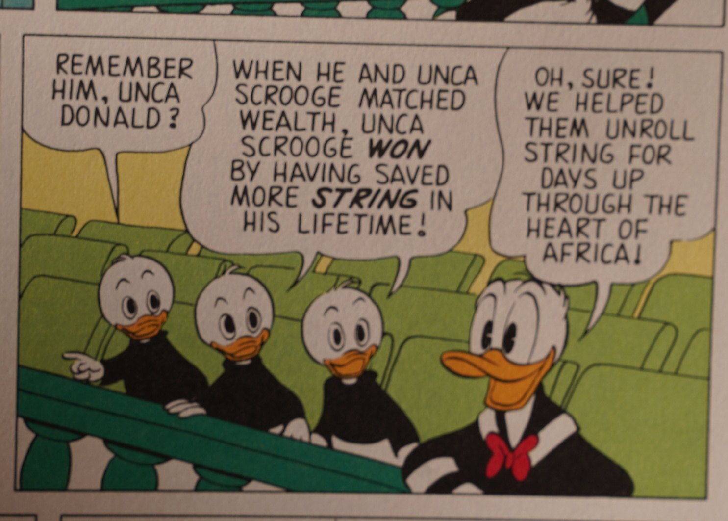
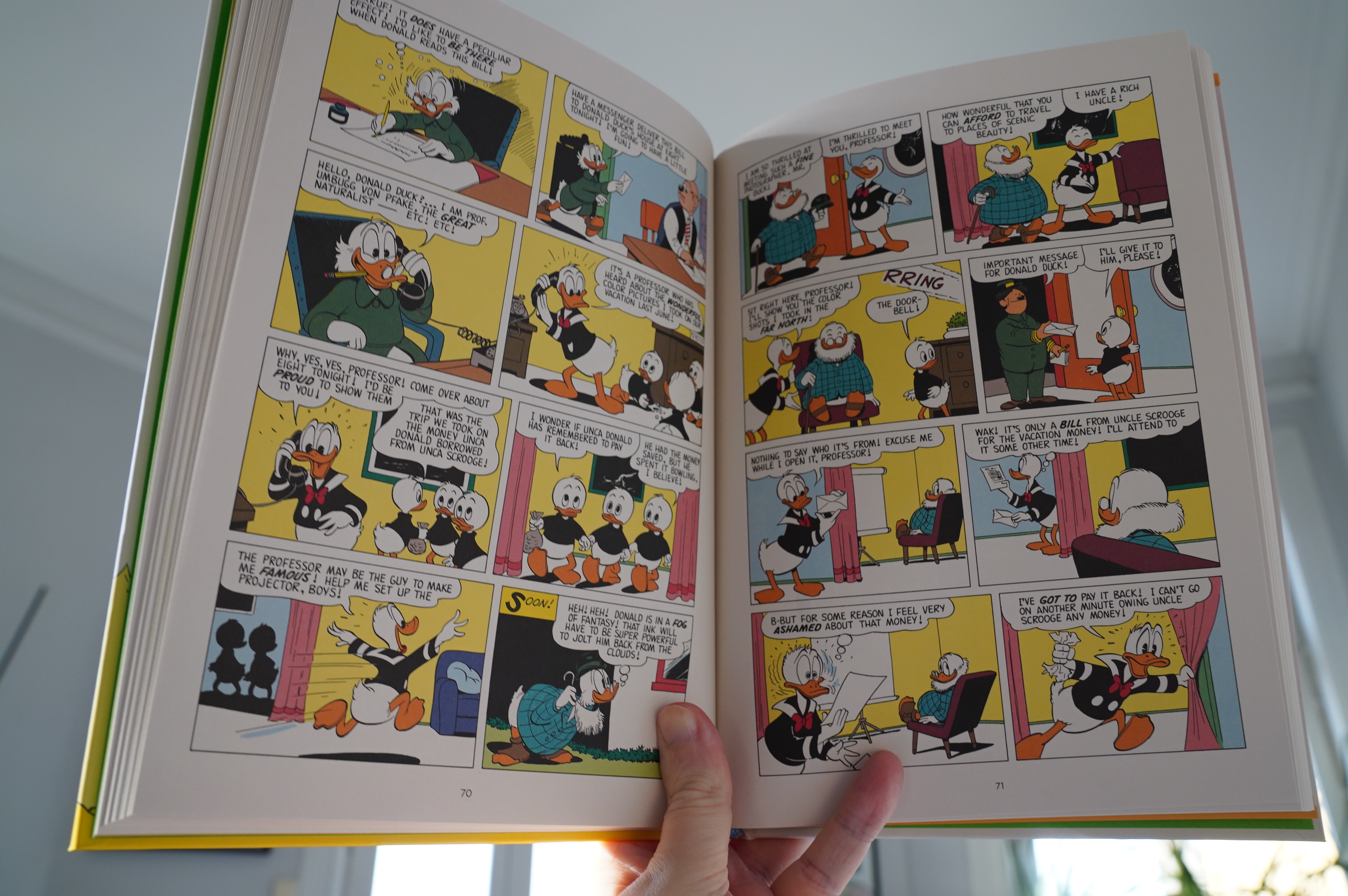
Oh oh oh! This story is etched into my brain from my childhood, and I think one of the reasons was this panel: It’s one of the few (perhaps the only?) places where Barks makes an explicit reference to an earlier story. Barks’ stories happen in a universe where everything is reset at the end of each story, really, so this sorta blew my little child mind.
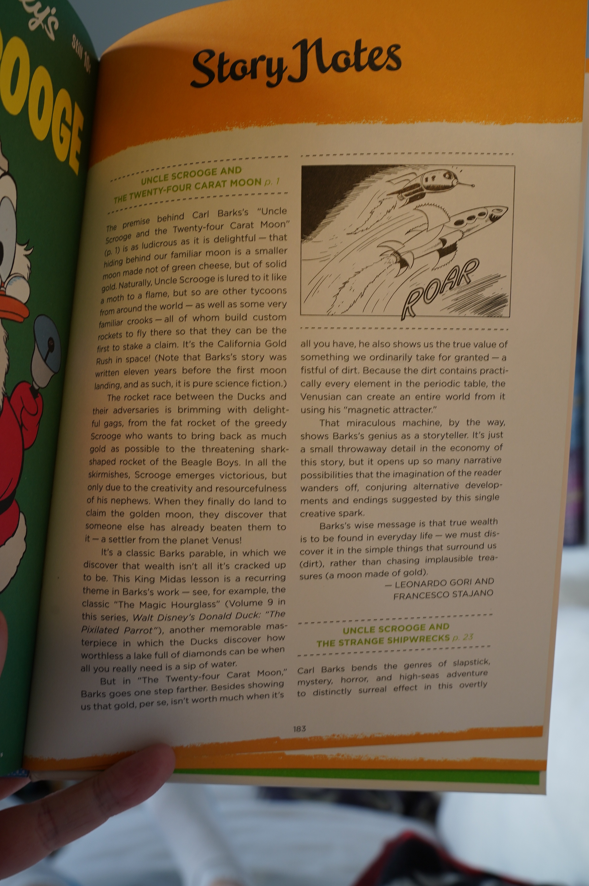
The backmatter is pretty dire, as usual: Plot recaps (WHY!) and endless exhortations about what a genius Barks is. The latter is true, of course, but insisting on it on the backmatter just feels like a hard sell.
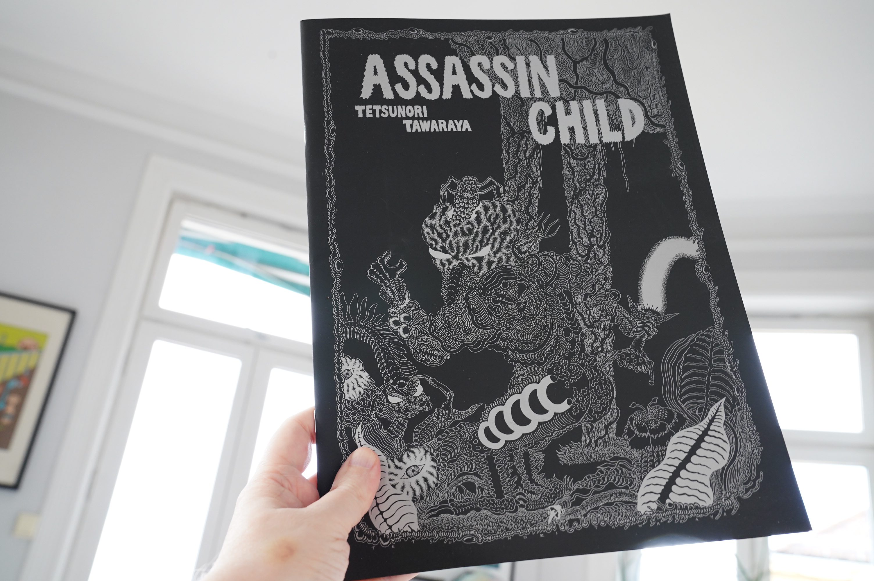
08:00: Assasin Child by Tetsunori Tawaraya (Hollow Press)

I saw Domino Comics talking about these books from Hollow Press, which turns out to be an Italian publisher publishing stuff mostly in English. So I ordered a bunch of books from them.
This is a pretty wild and gorgeous thing — it’s an oversized magazine with silver printing on black paper. Fantastic! The story is fun in a stonerish way.
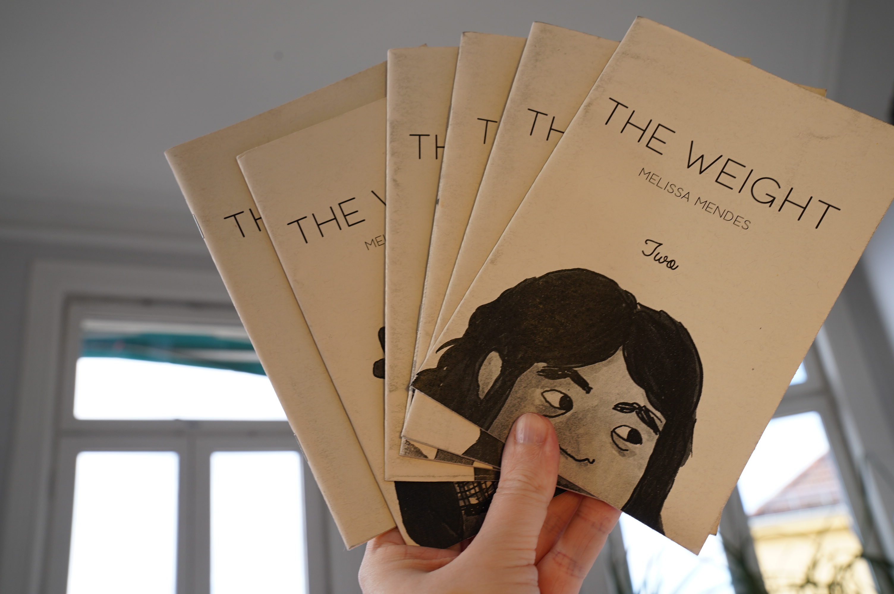
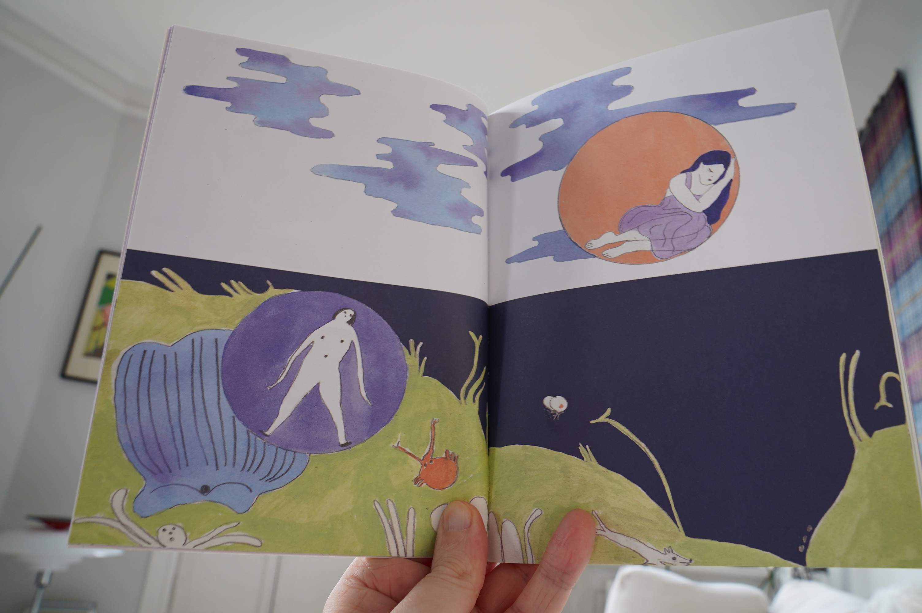
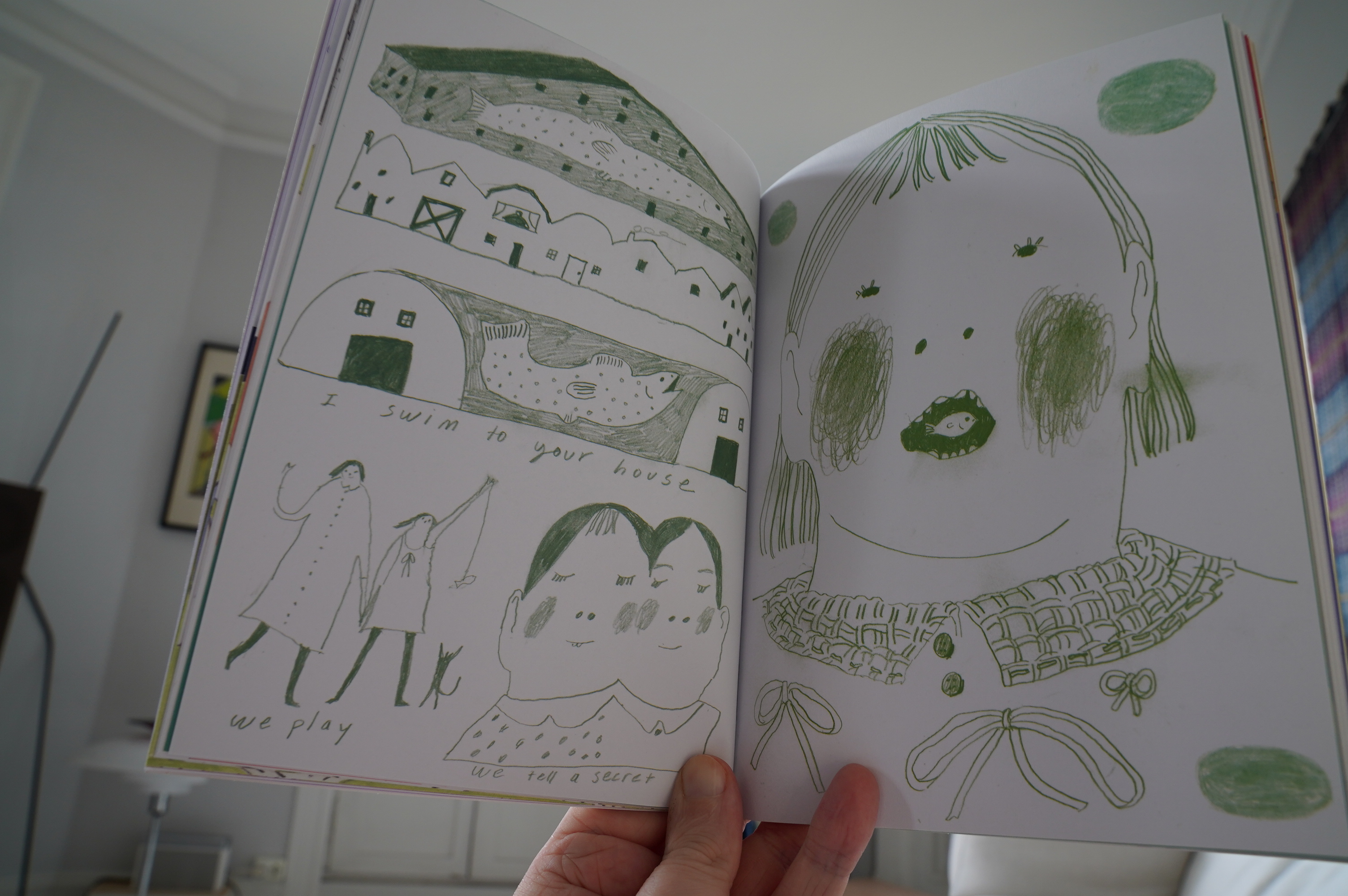
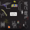
08:12: The Weight #2-7 by Melissa Mendes
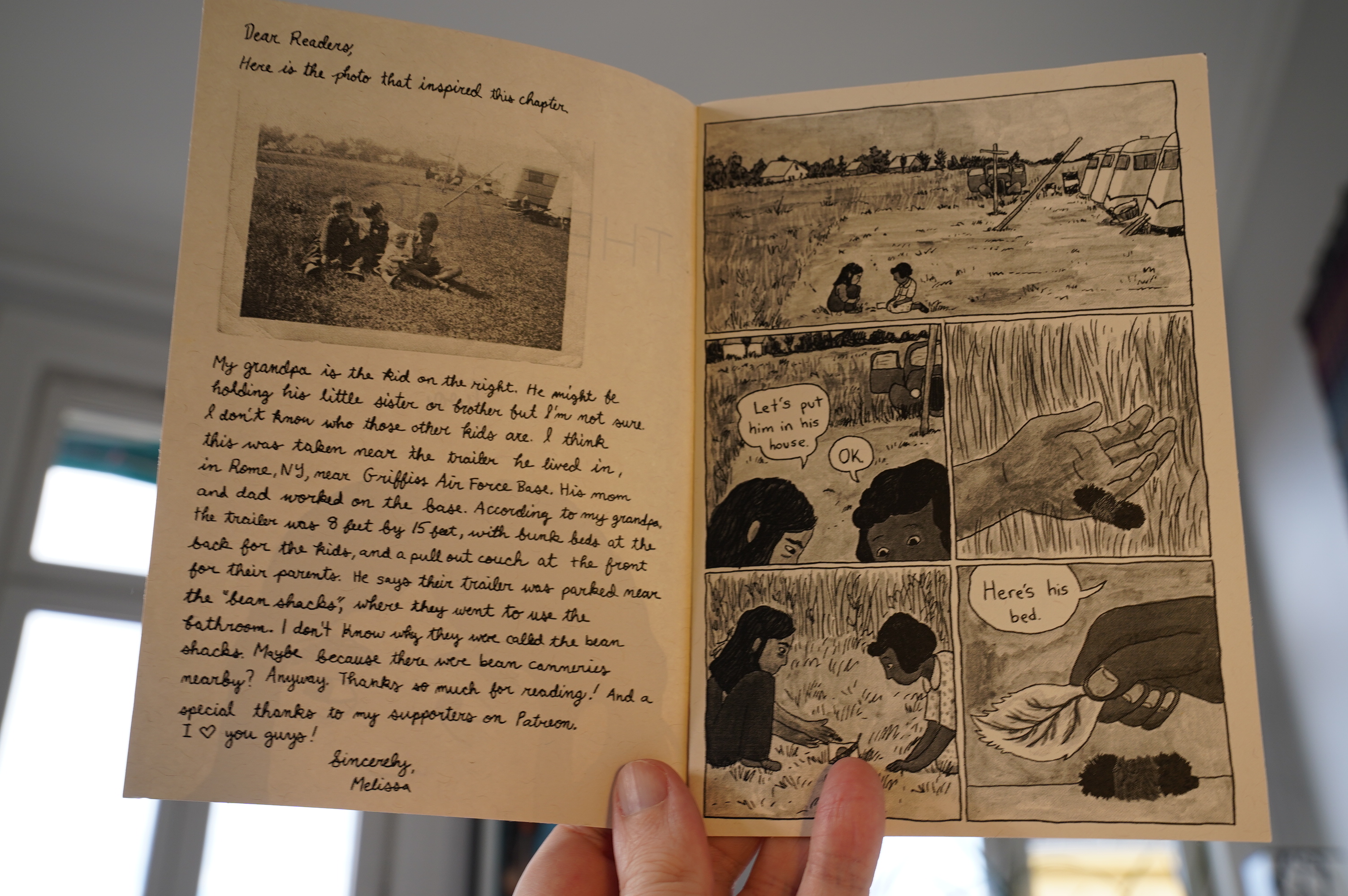
So this series is based on a document Mendes’ grandfather wrote about his childhood? Cool. I love the artwork, but compared to the excerpts we get from the document:
… the comic doesn’t seem quite… real. It’s very movie-like, and not in a good way.
It’s quite moving, though.
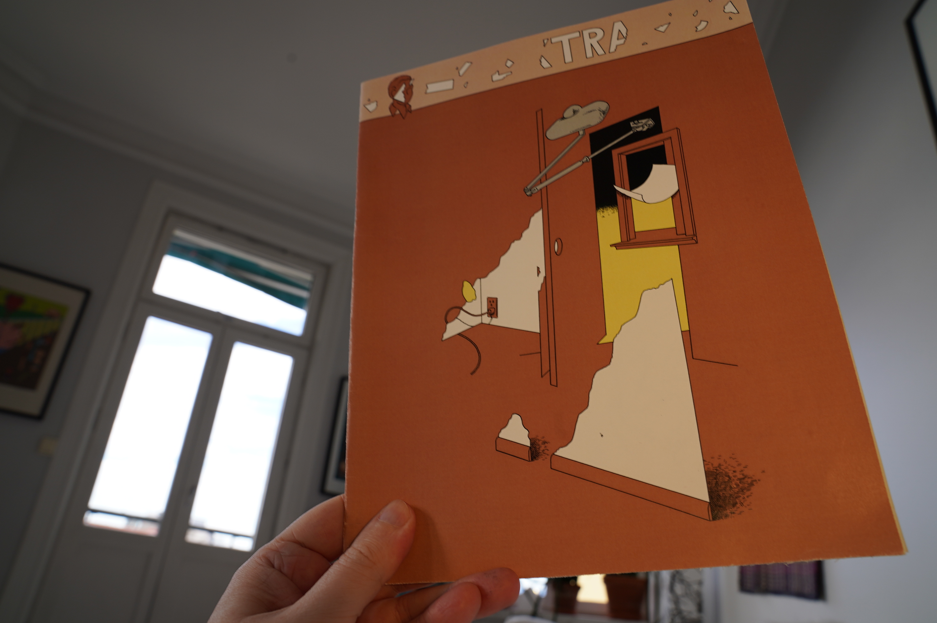
08:42: Extract by Walker Tate
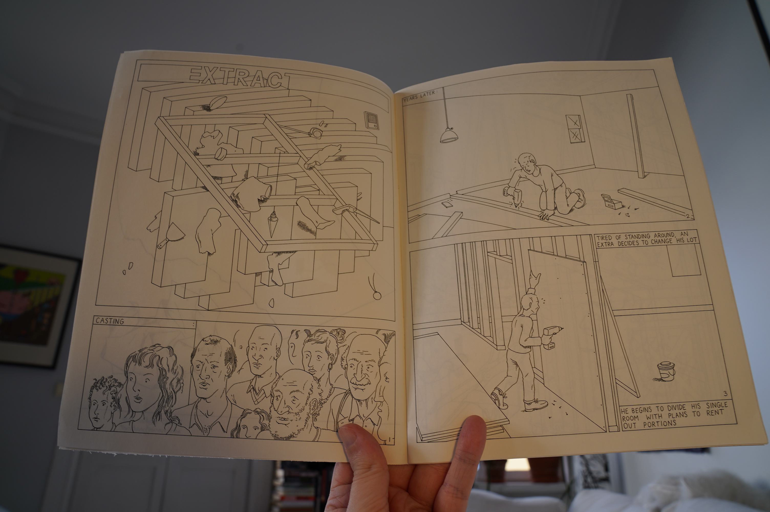
*gasp*
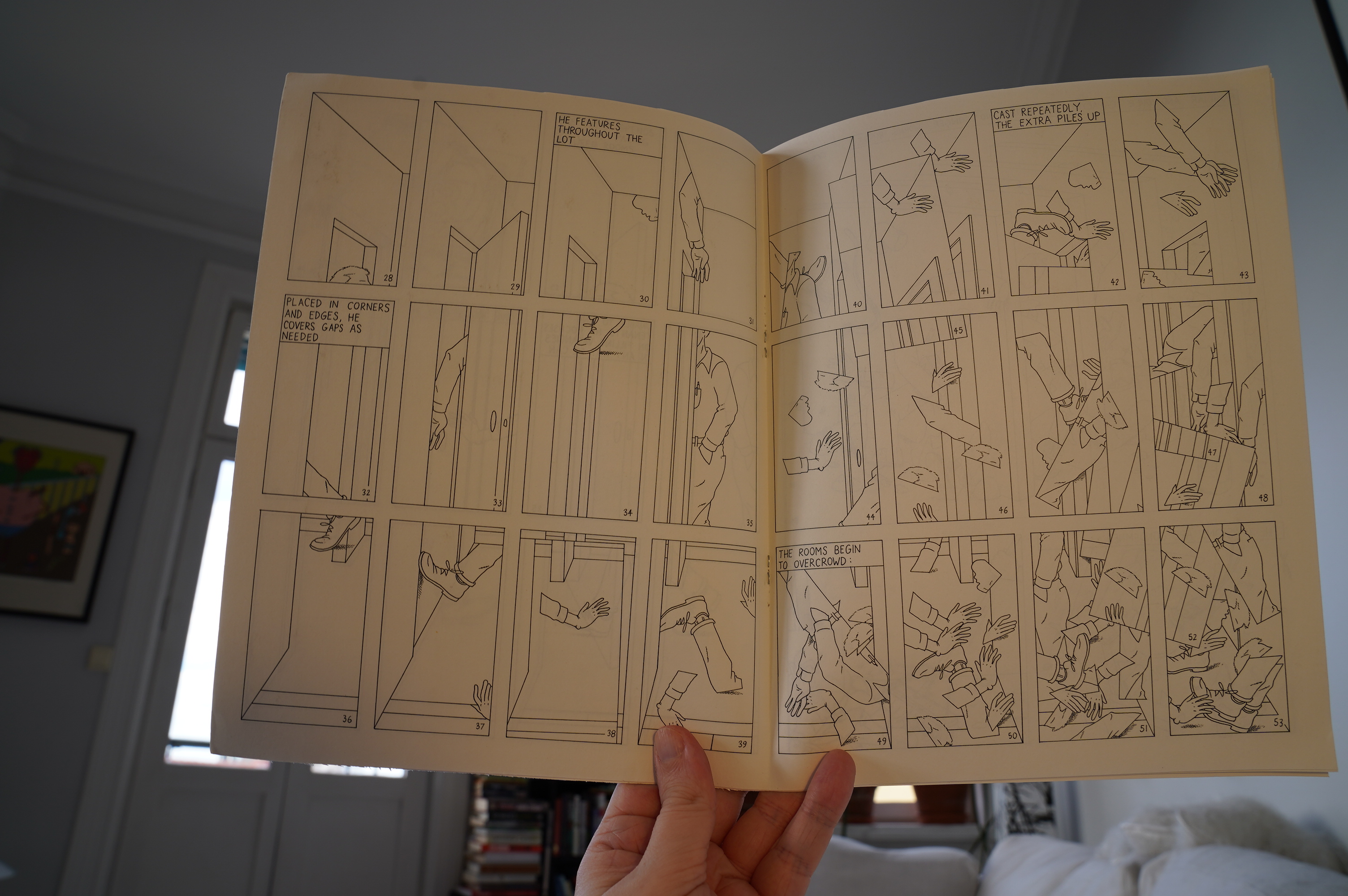
This is absolutely fabulous! Stunning!
Echoes of Mark Newgarden?
Now I have to buy everything Walter Tate has made, but a quick googling seems to say that there’s not a lot? Only a story in Now #4? Boo!
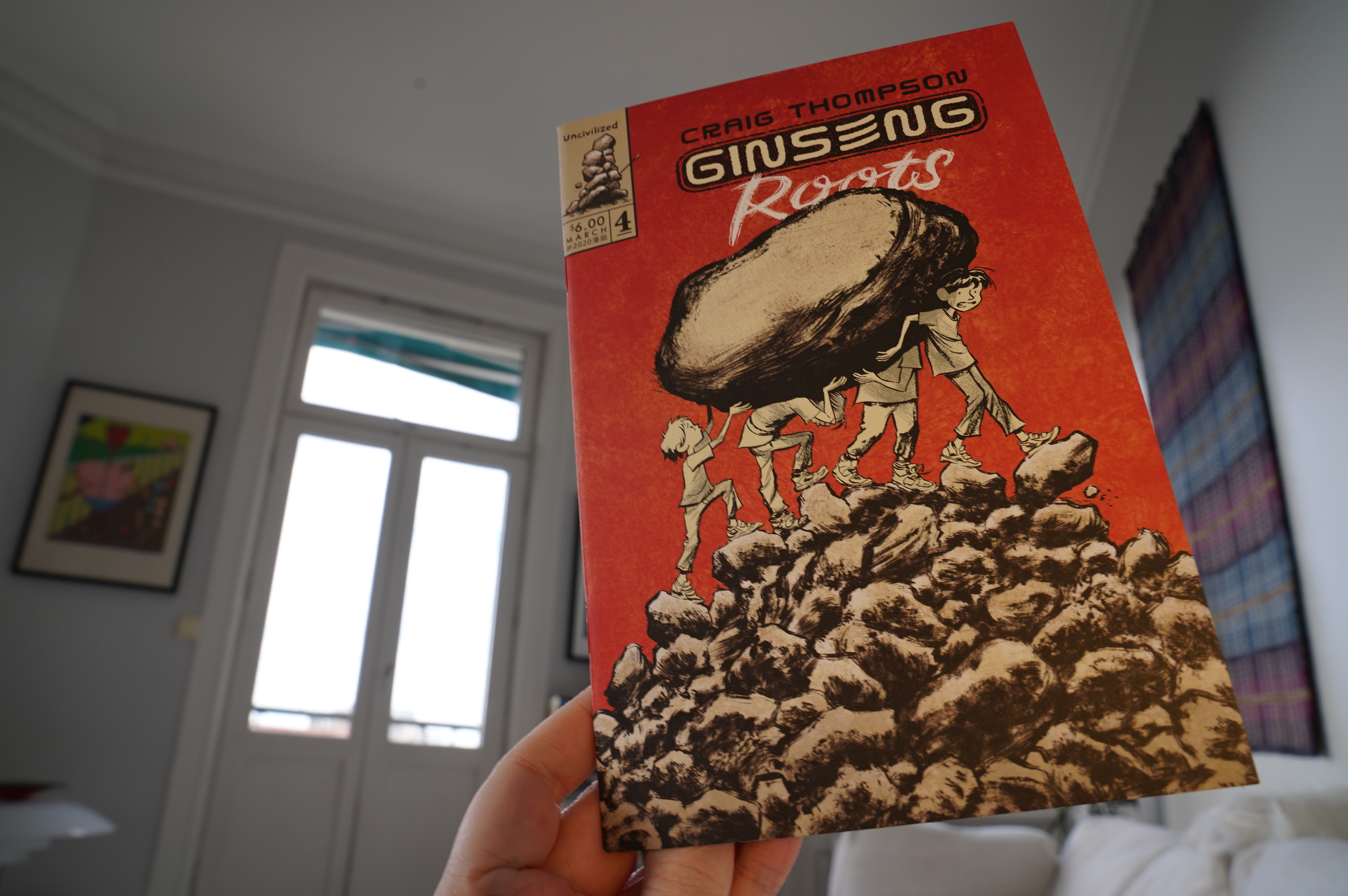
08:49: Ginseng Roots #4 by Craig Thompson (Uncivilized)
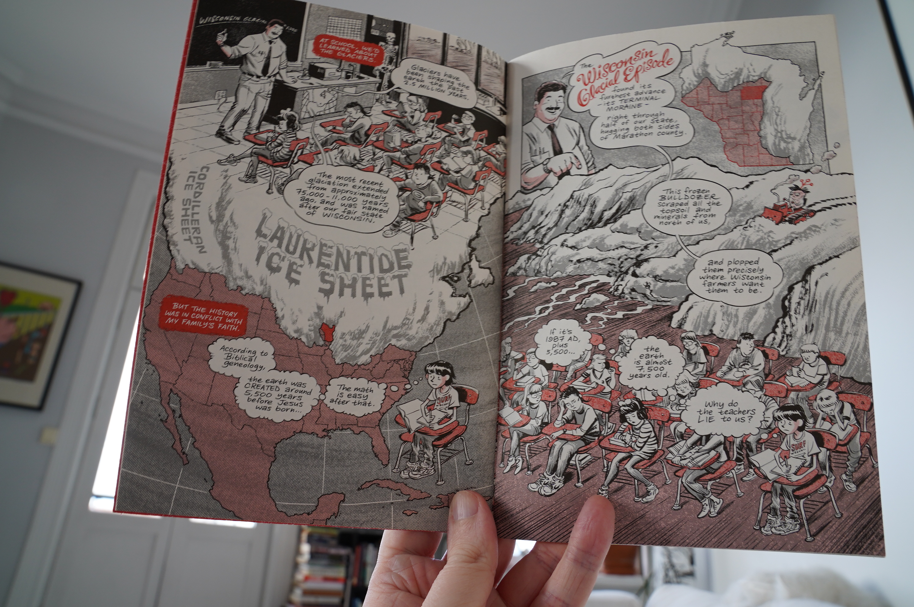
I’ve always liked Thompson’s artwork, but I… OK, I hate Blankets and Habibi. Fortunately, Ginseng Roots isn’t anything like that. Sure, we get a bit about religious damage, but here it’s funny.
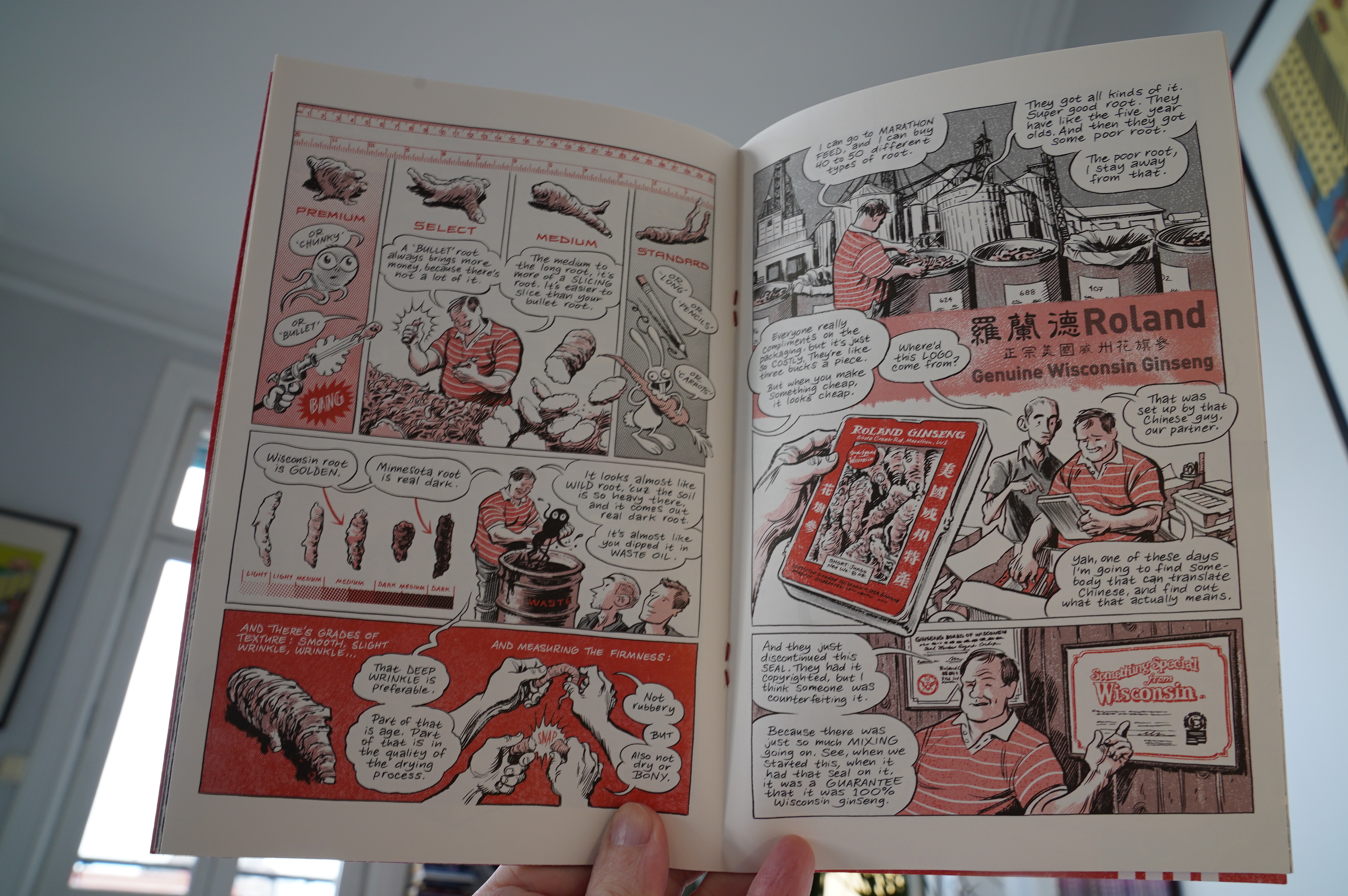
But the most interesting bits are the bits that aren’t directly about Thompson himself, really. This series is turning out to be, like, an actually good thing: The artwork is better than before (the duo colour thing is perfect for his artwork), and the non-structure of it all is just fascinating.
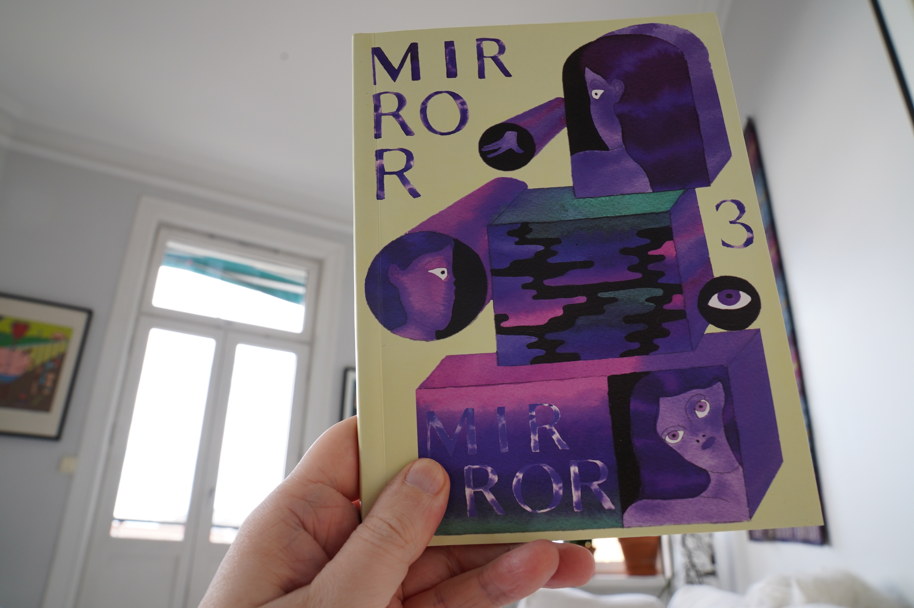
09:10: Mirror Mirror 3 by Paige Mehrer, Sophie Page and Haejin Park (2d cloud)
*gasp* A book from 2d cloud! Those are becoming rare events indeed, which is sad. 2d cloud was the most important comics publisher in the previous decade.
So this is their anthology title, and it’s all from a collective called Plum.

It’s wonderful!
I hope 2d cloud make a comeback, because there’s nobody with as good an eye for interesting comics.
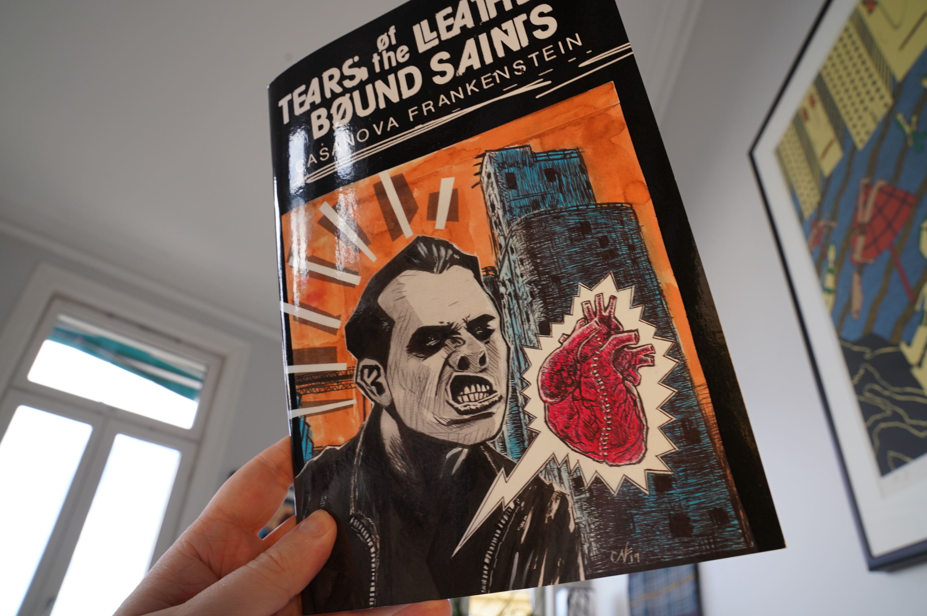
09:24: Tears of the Leather-Bound Saints by Casanova Frankenstein (Fantagraphics/F.U.)
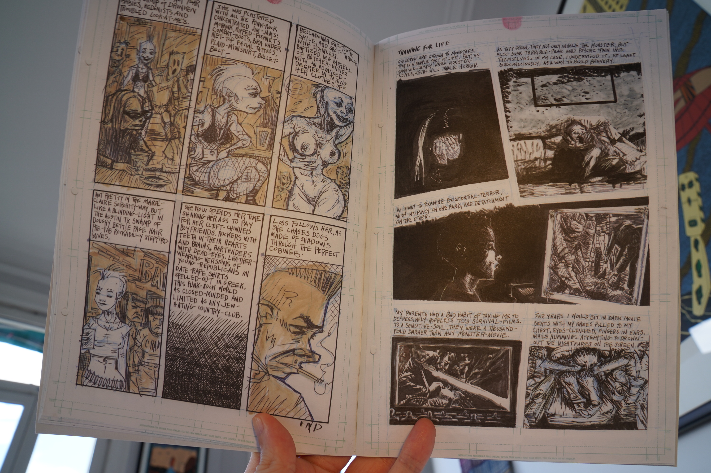
Wow! It took me a few pages to get into the storytelling rhythms here, but once it clicked it was like whoa.
Fantastic book.
And the choice to reproduce the non-reproducing blue line is interesting.
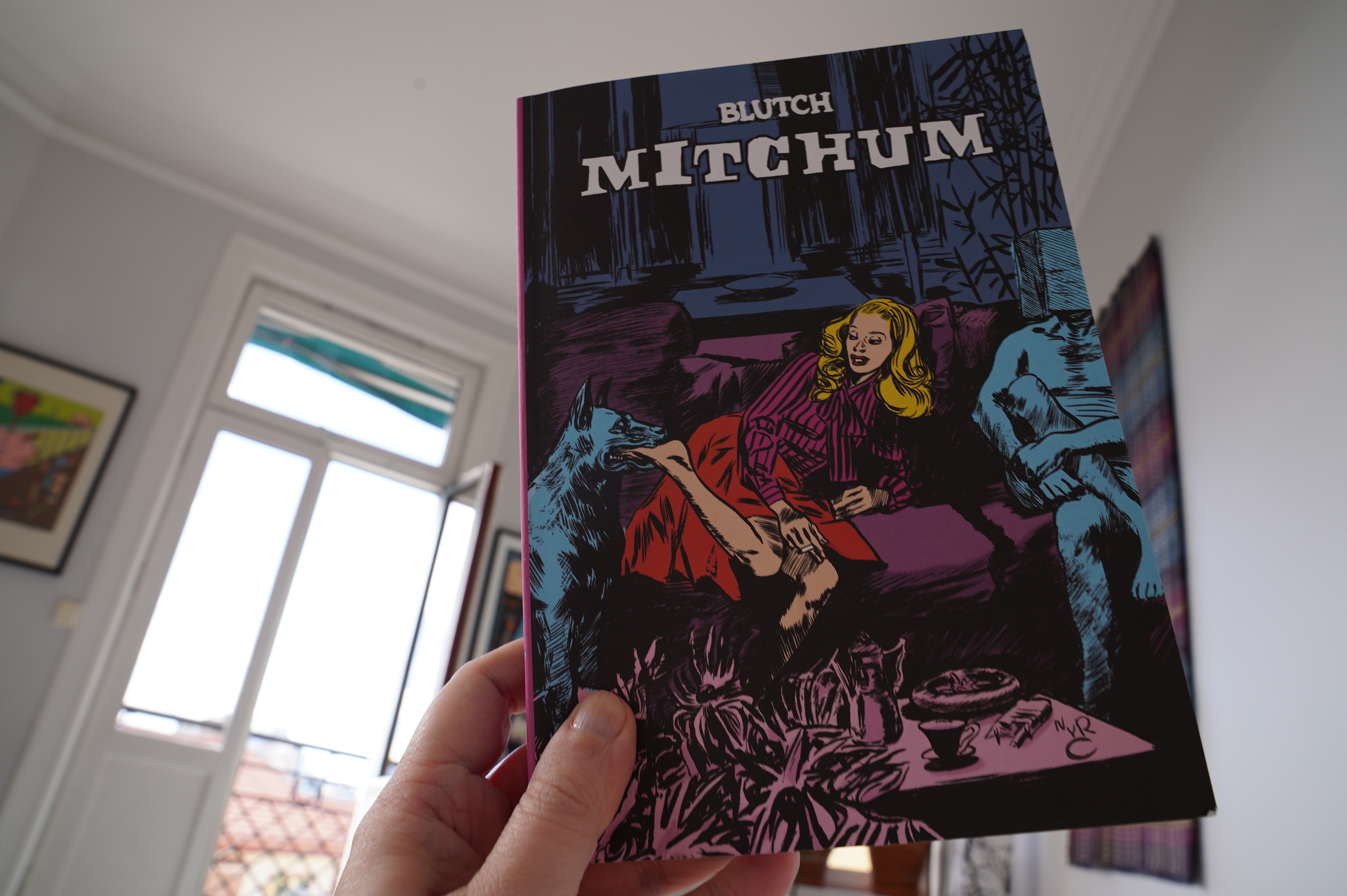
09:55: Mitchum by Blutch (New York Review Comics)
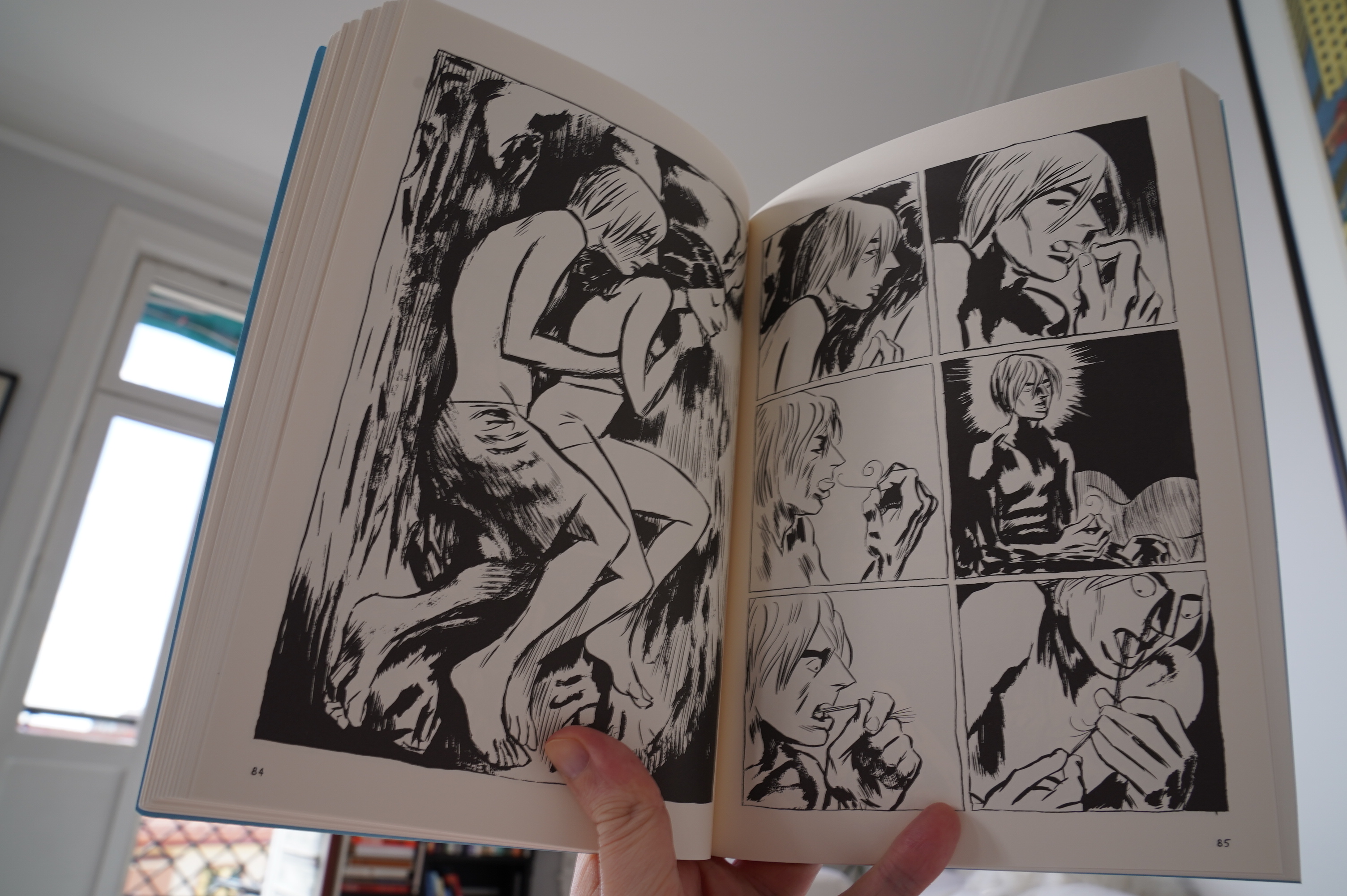
I’m so over comics biographies that I almost didn’t buy this. But it’s published by New York Review Comics, so I got it anyway.
And it’s not a biography! Whoho! What it is is a collection of slightly abstruse shorter pieces, and they’re mostly fabulous. I mean, the artwork is consistently amazeballs, but a couple of the stories were a bit “eh”. But still: Mostly incredibly good.
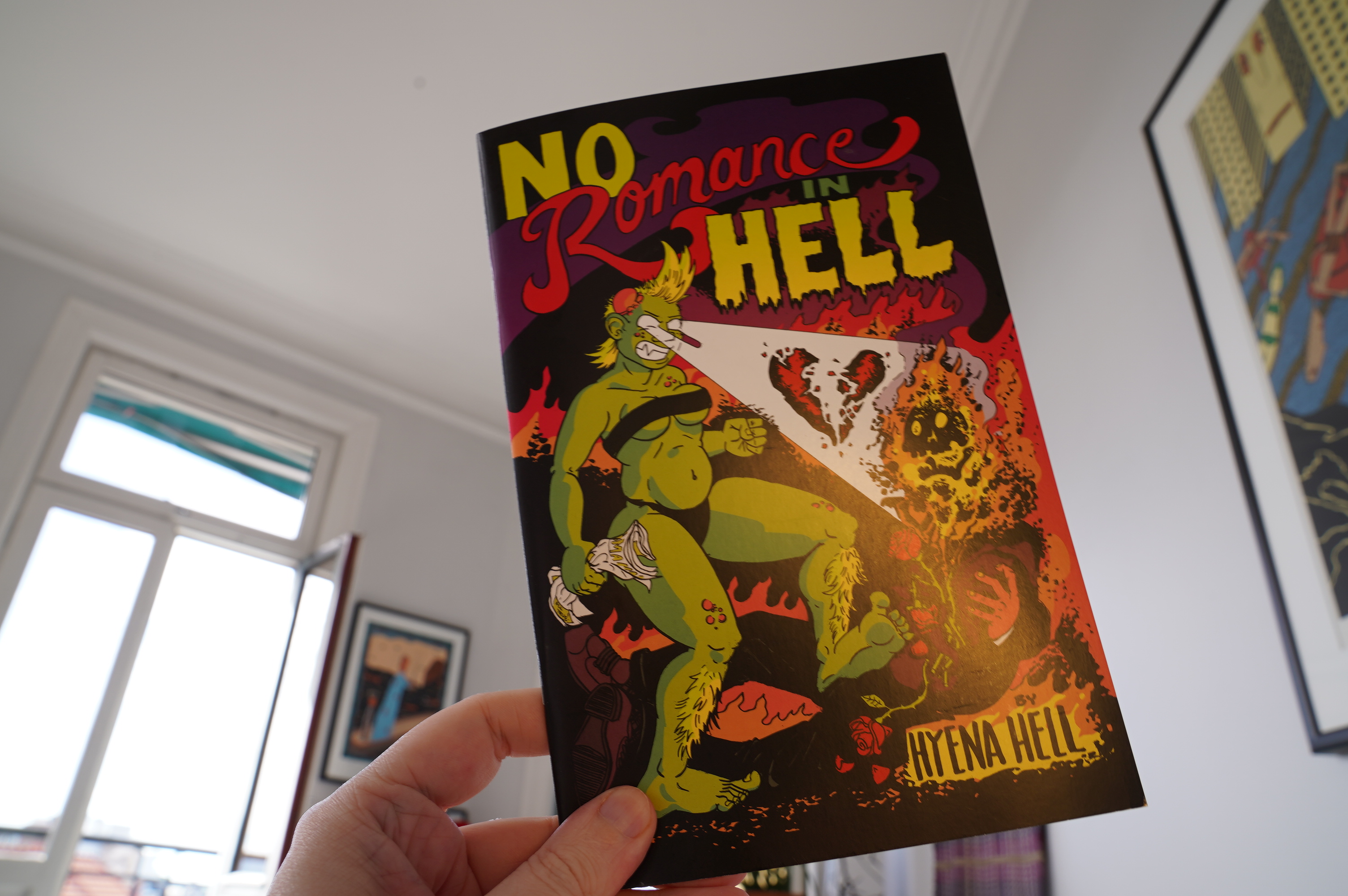
10:45: No Romance in Hell by Hyena Hell (Silver Sprocket)
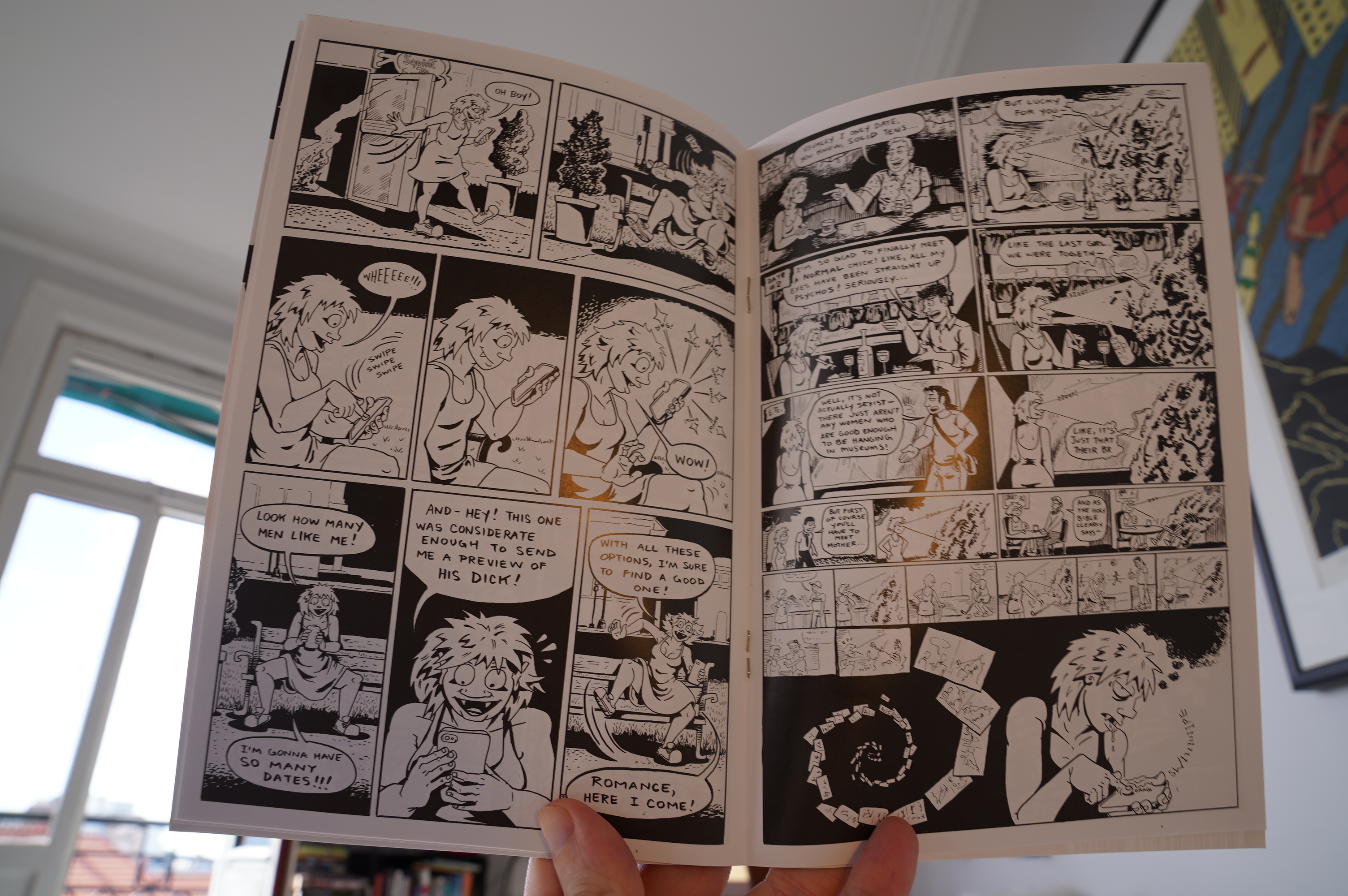
Very funny.

10:53: Space Acedemy 123 by Mickey Zacchilli (Komaya)
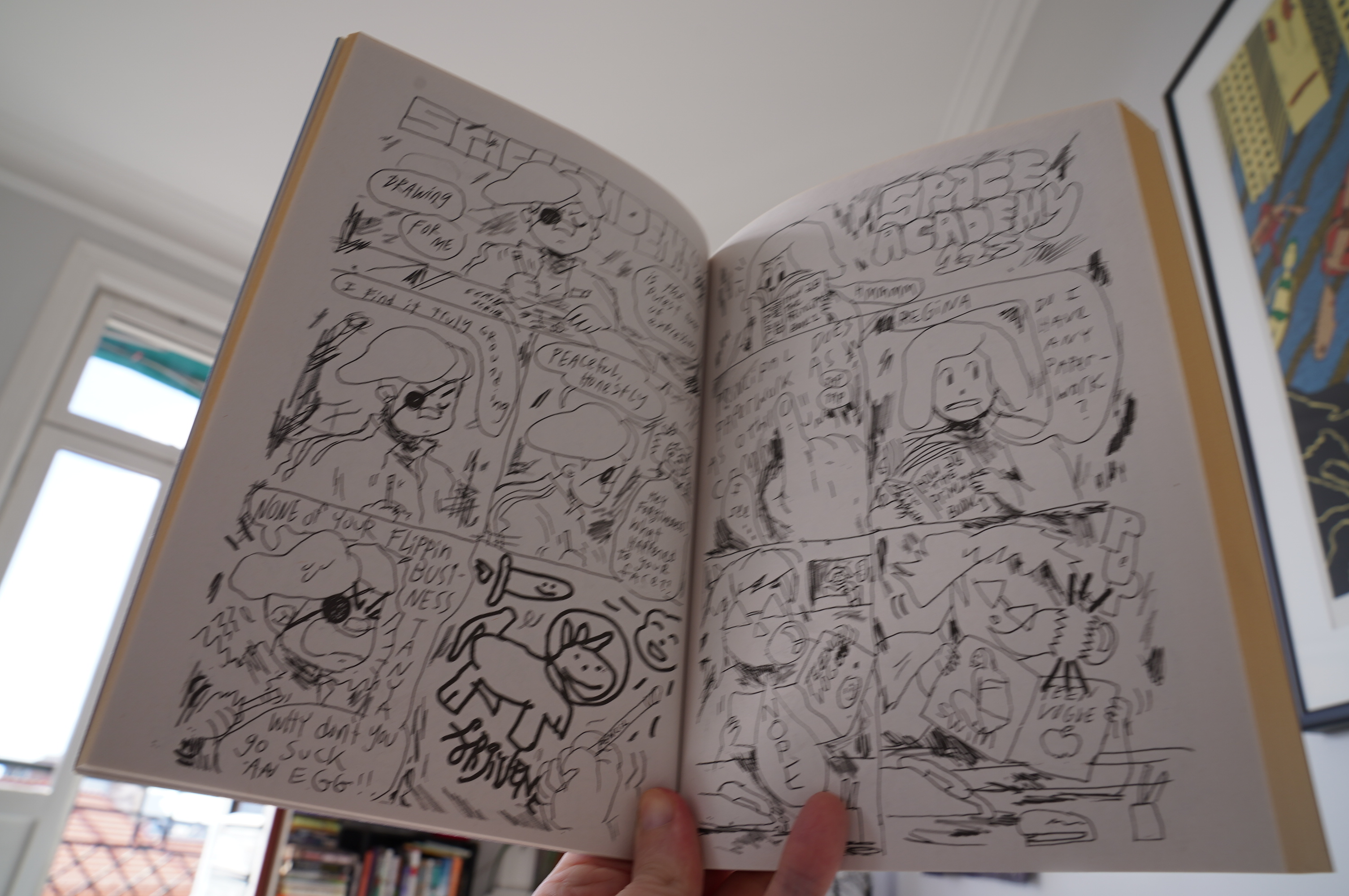
Picking this up, I didn’t really have much confidence in it…
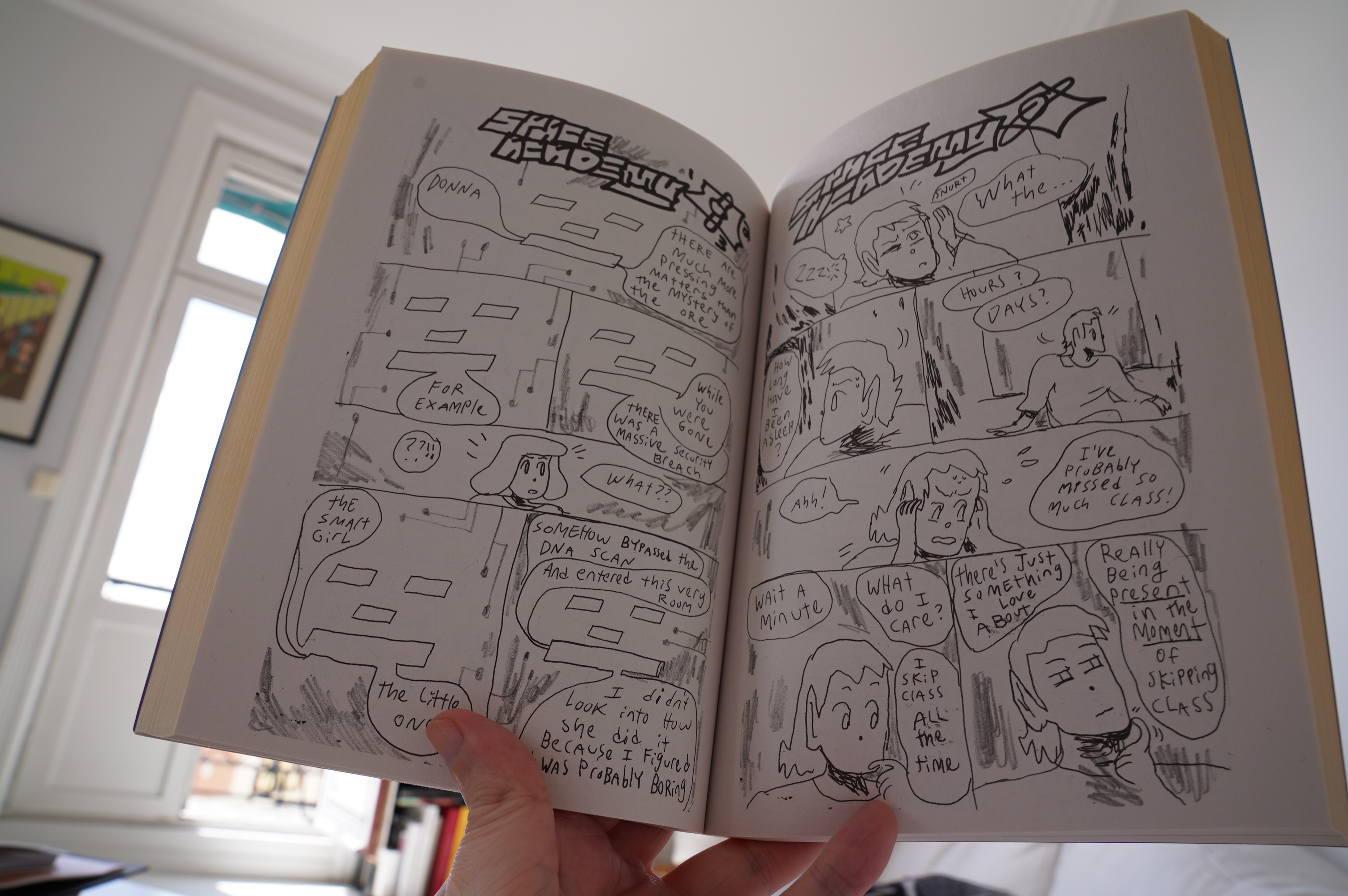
… but it’s really funny, and the storytelling chops are amazing: Every page brings develops the plot, but there’s still room for a joke or two. I’m not very confident that the narrative is actually going anywhere, but it’s great being along for the ride. Also: I love how distinct the characters are (not just graphically, but as personalities).

11:52: Badlands by Liz Suburbia (Silver Sprocket)
Fun.
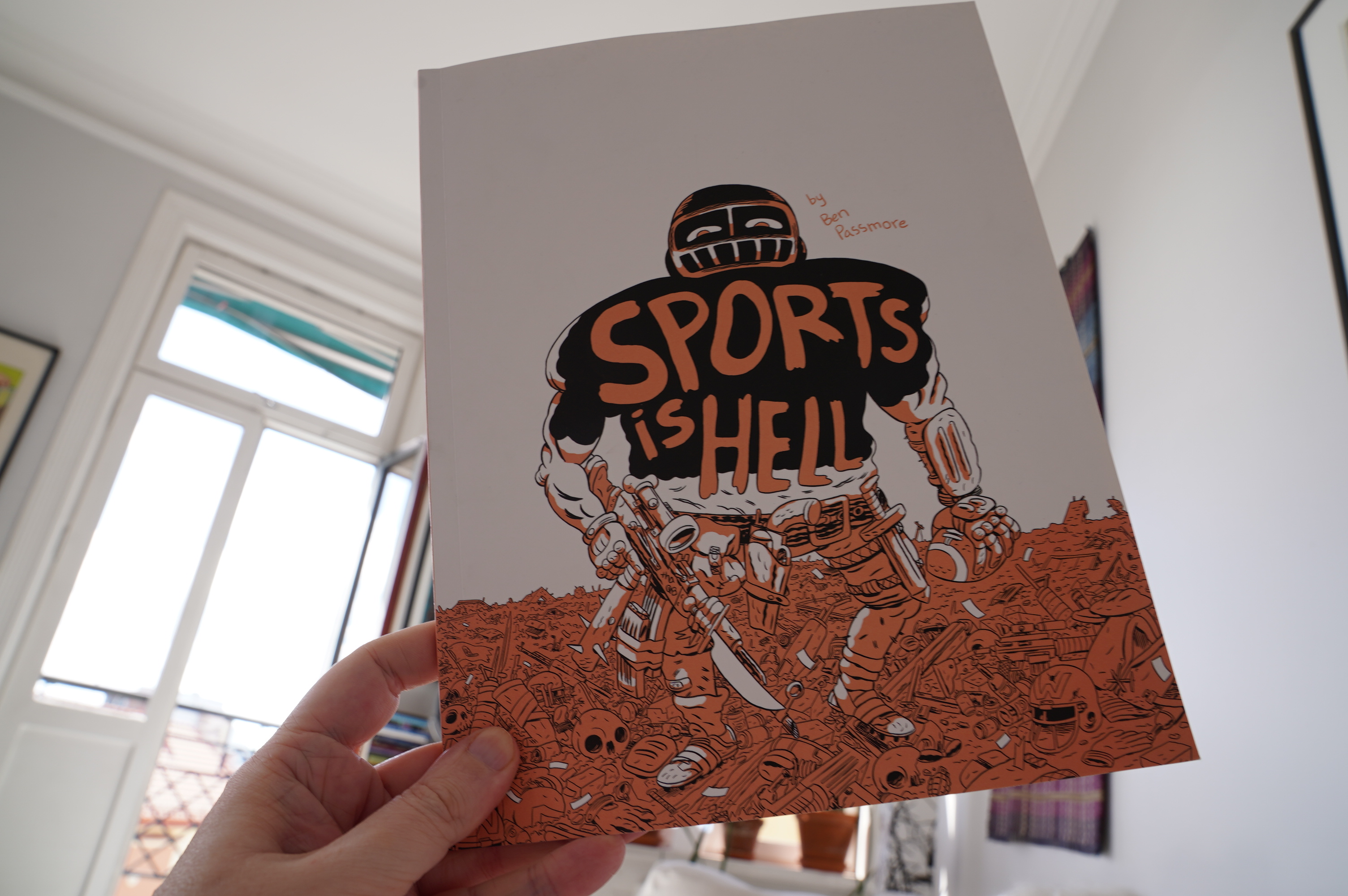
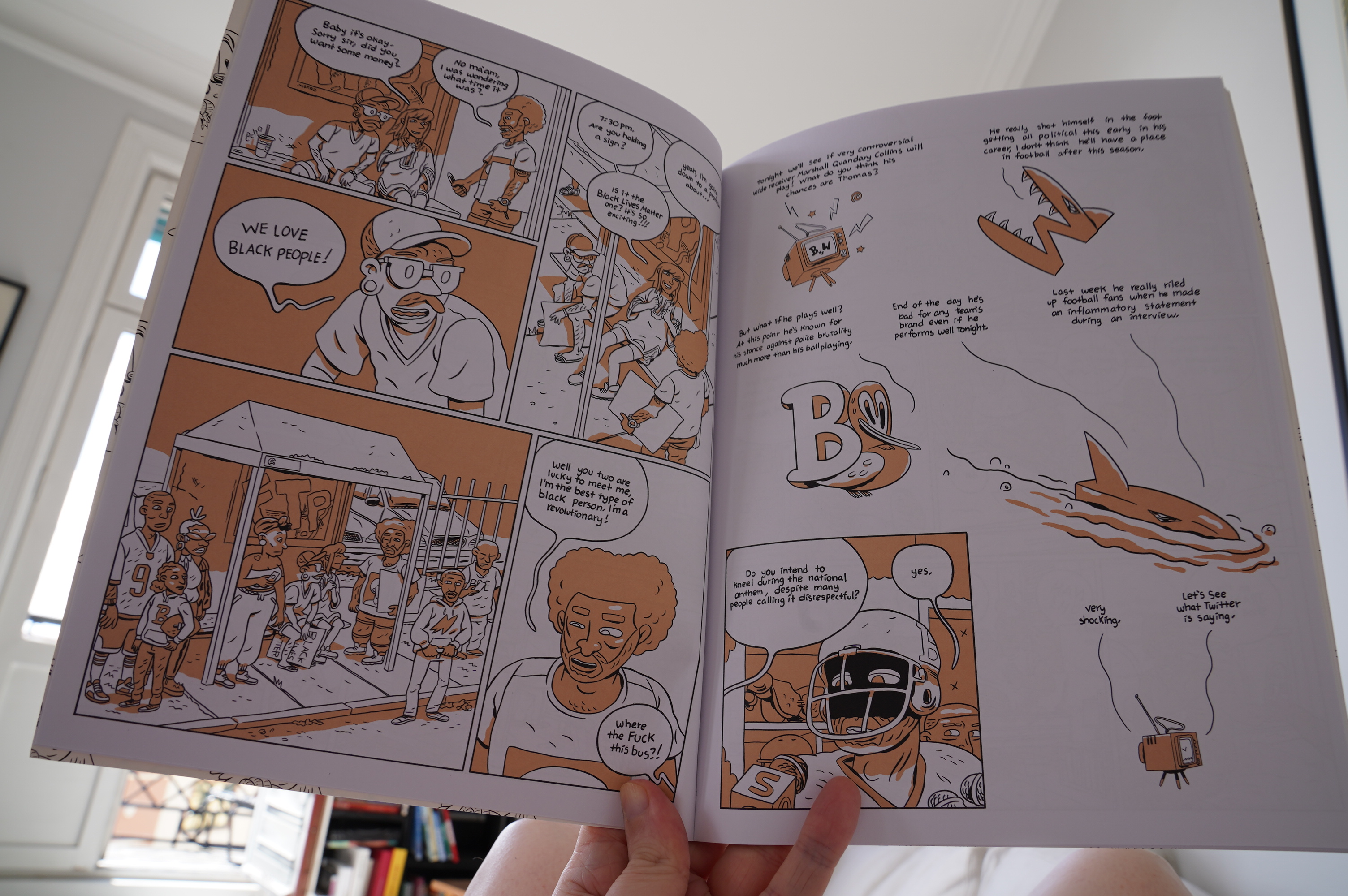
11:53: Sports is Hell by Ben Passmore (Komaya)
Very odd. Whatever you’re expecting this book to be: It’s not that.

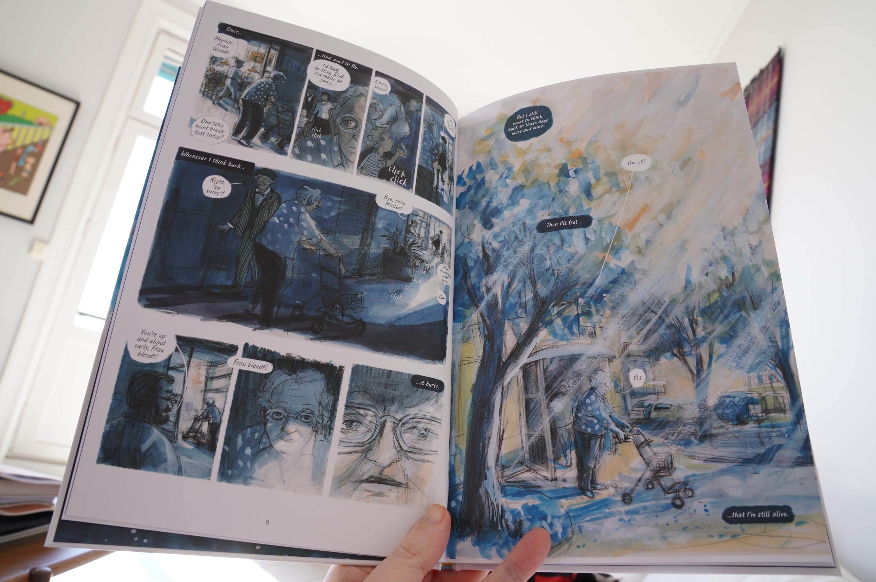
12:19: The Summer of Her Life by Thomas von Steinaecker and Barbara Yelin (Self Made Hero)
Tries really hard.
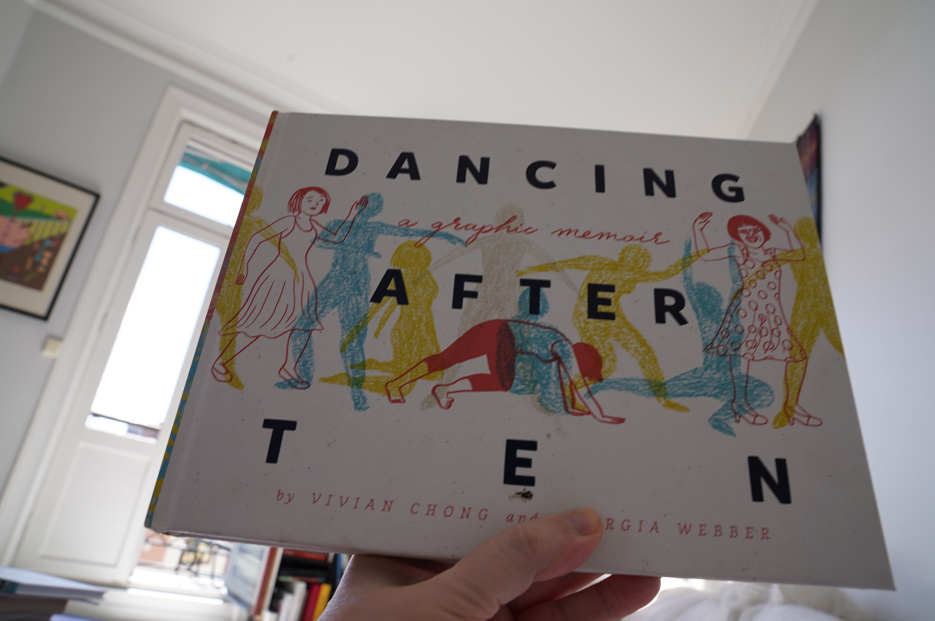
12:35: Dancing After TEN by Vivian Chong and Georgina Webber (Fantagraphics)
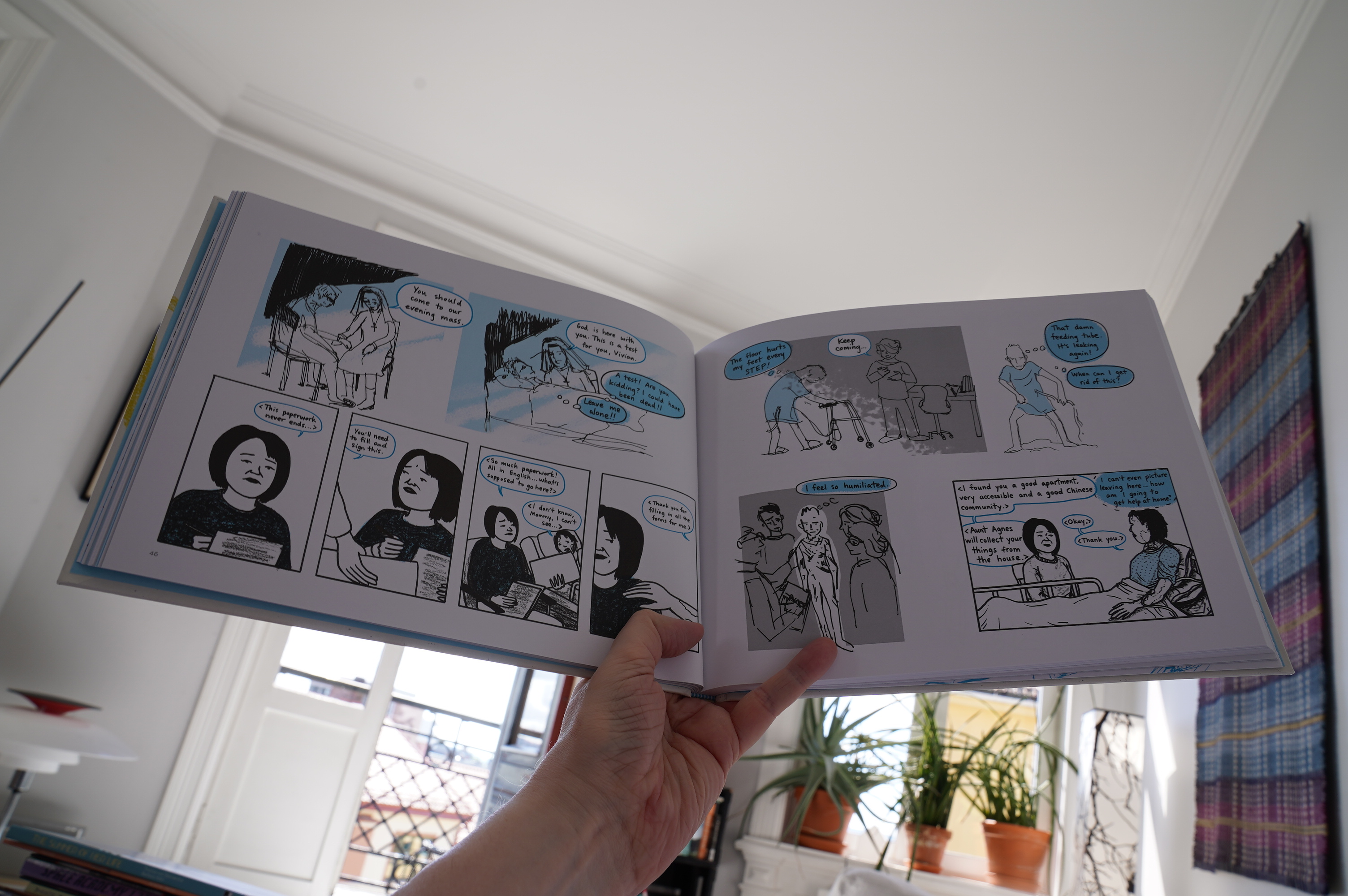
Harrowing story. Choppy storytelling.
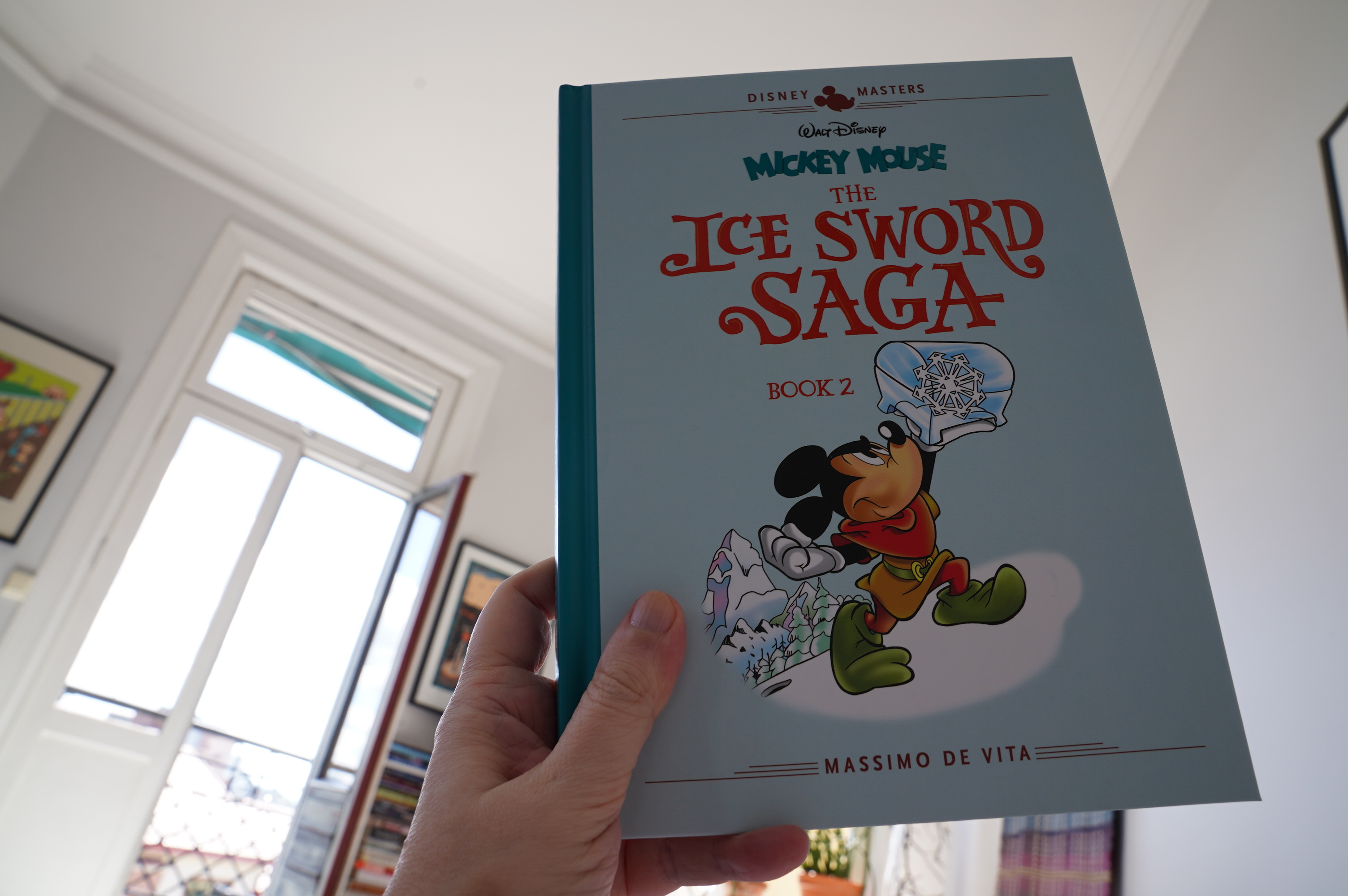
13:23: Mickey Mouse: The Ice Sword Saga book 2 by Massimo de Vita (Fantagraphics)
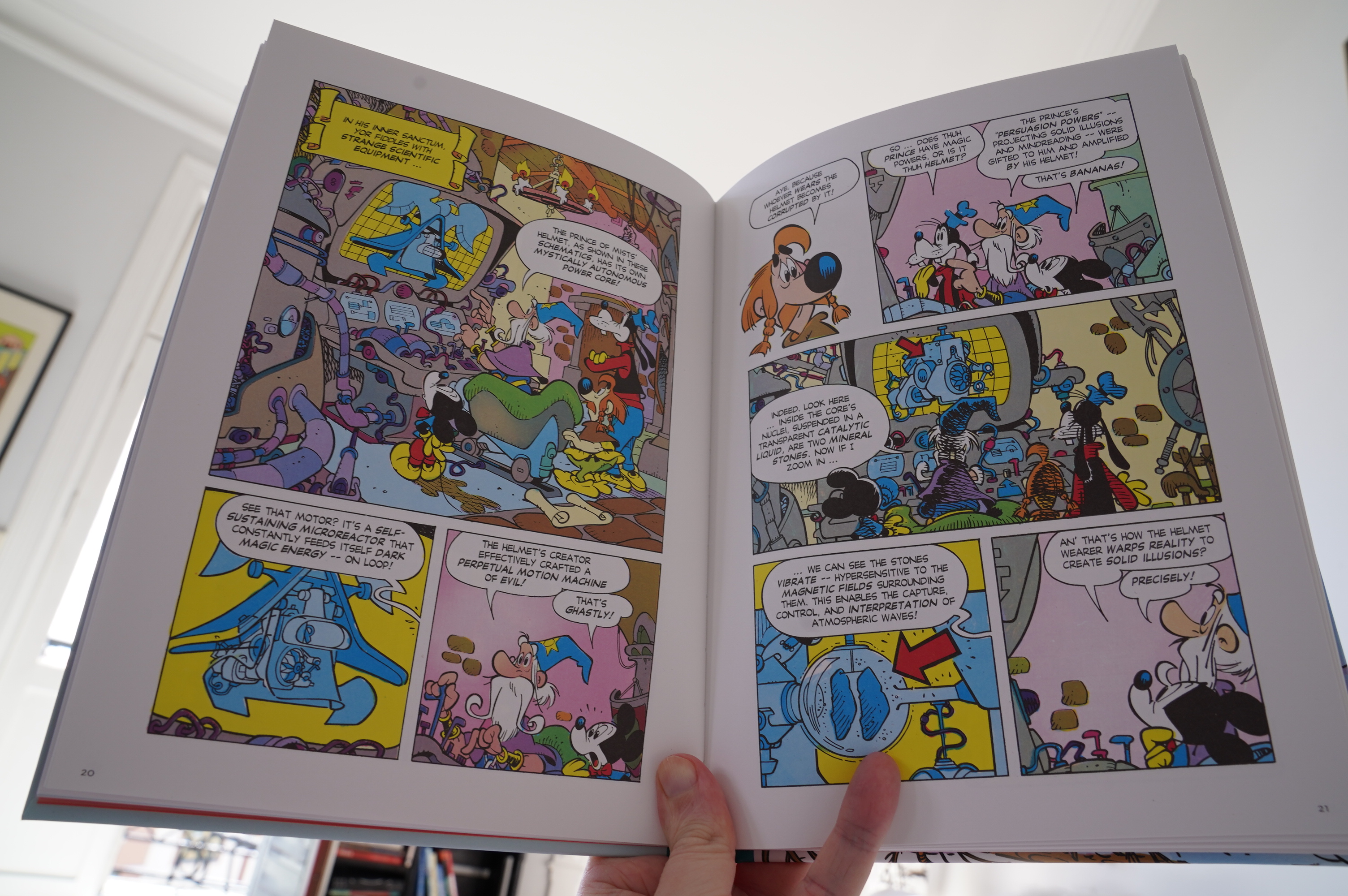
I’ve been sampling these Italian Disney comics Fantagraphics are publishing, and… well… they’re OK. This one took an extraordinary number of pages to get started (20 pages to explain the concept), but once the exposition finally let up, there’s some OK gags. And the meta stuff in the second part is pretty unique for Mickey Mouse.
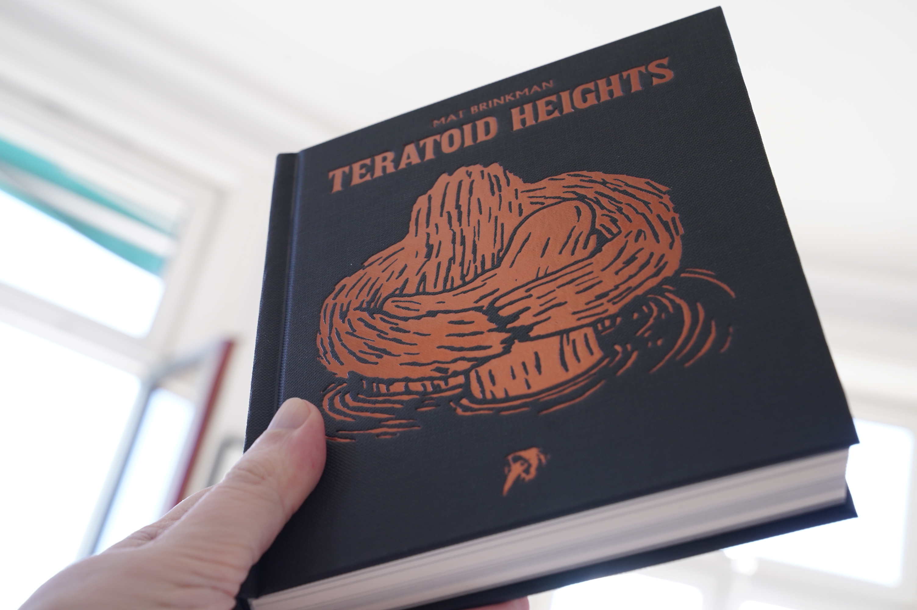
14:23: Teratoid Heights by Mat Brinkman (Hollow Press)

Relentless.
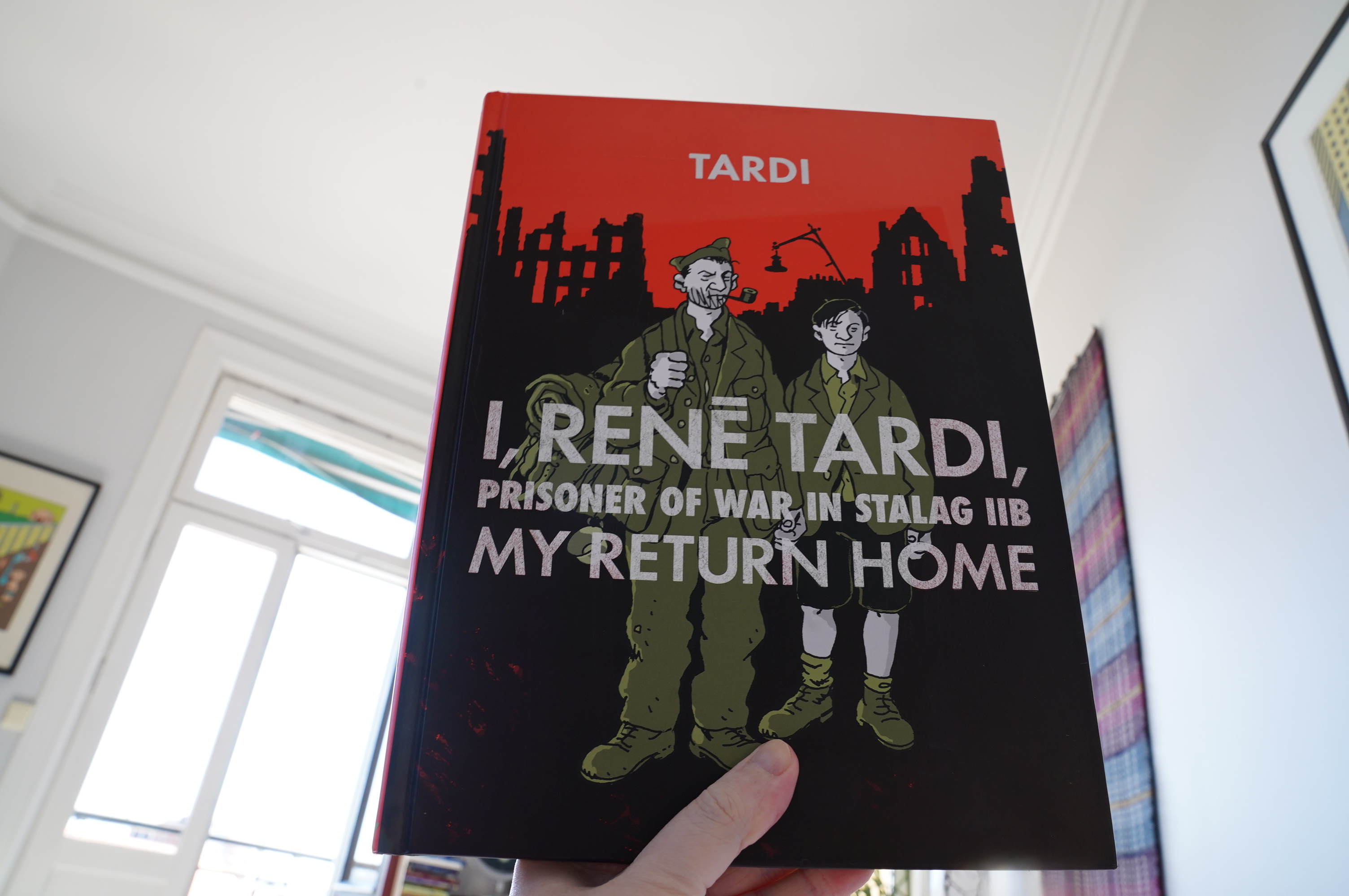
14:46: I, René Tardi, Prisoner of War in Stalag IIB: My Return Home by Tardi (Fantagraphics)
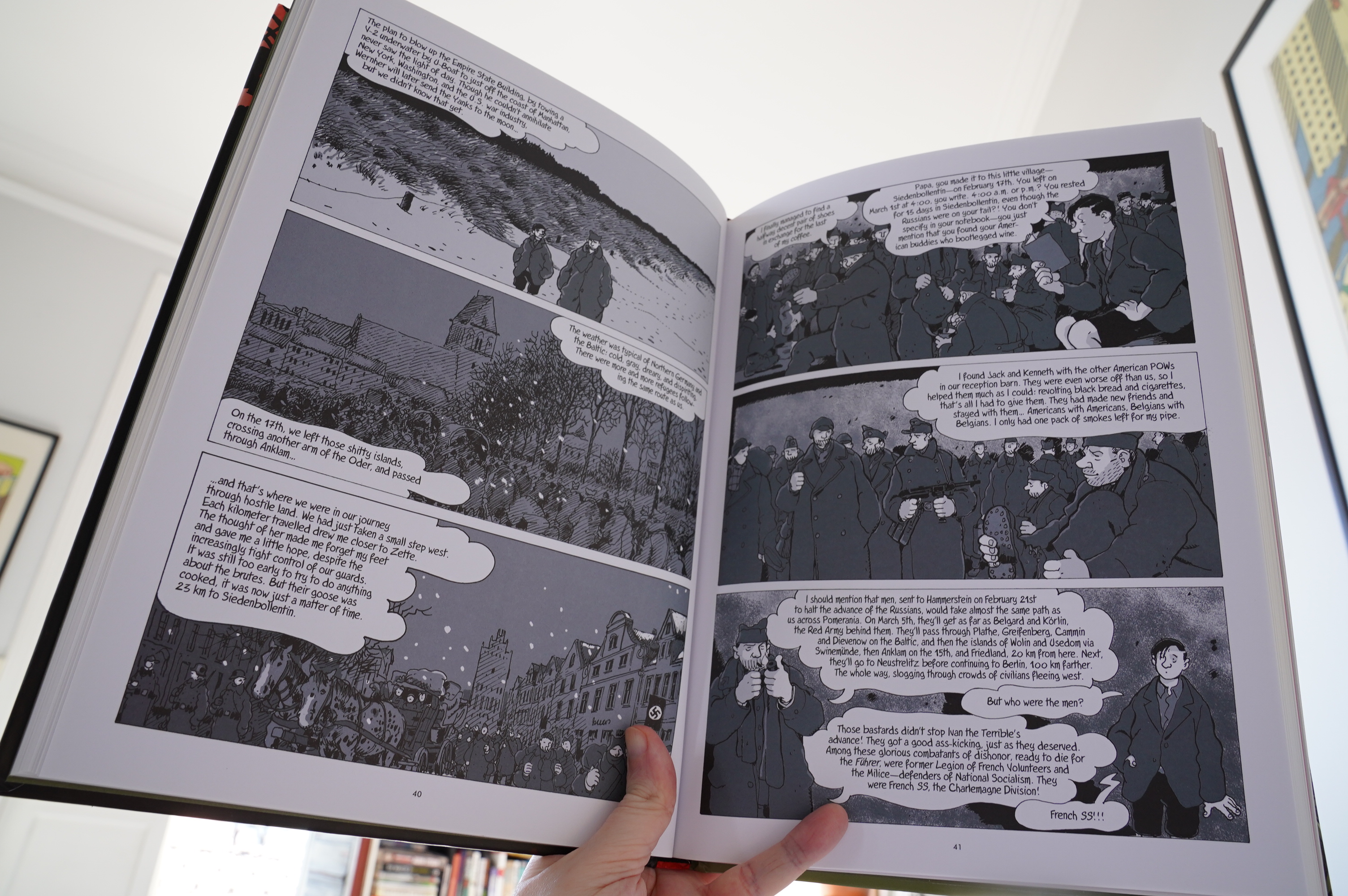
This volume starts where the previous volume left off, with no introduction or anything, so it took me a couple of minutes to remember that that boy was the author as a child, carrying on an imaginary conversation with his father.
The entire volume is just René Tardi on a march back from the Stalag in the last weeks before Germany capitulated, and … it’s pretty monotonous, and not as interesting as the first volume. Instead we get really extensive infodumps from Tardi (as the child) about what was going on in the war.
I found this rather tiresome for the first fifty pages or so, but then I was sort of pummelled into submission and found myself interested.
The artwork is wonderful as always.
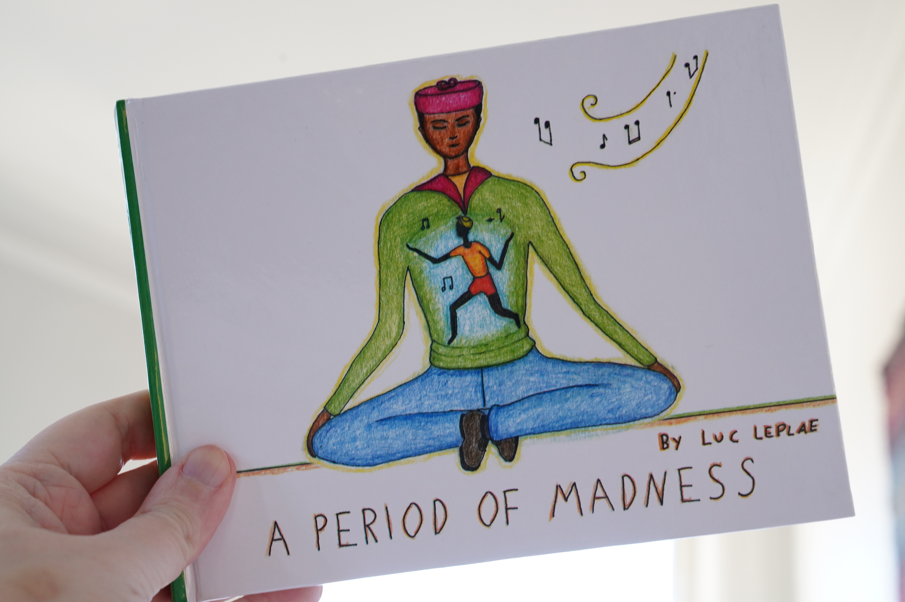
16:59: A Period of Madness by Luc Leplae
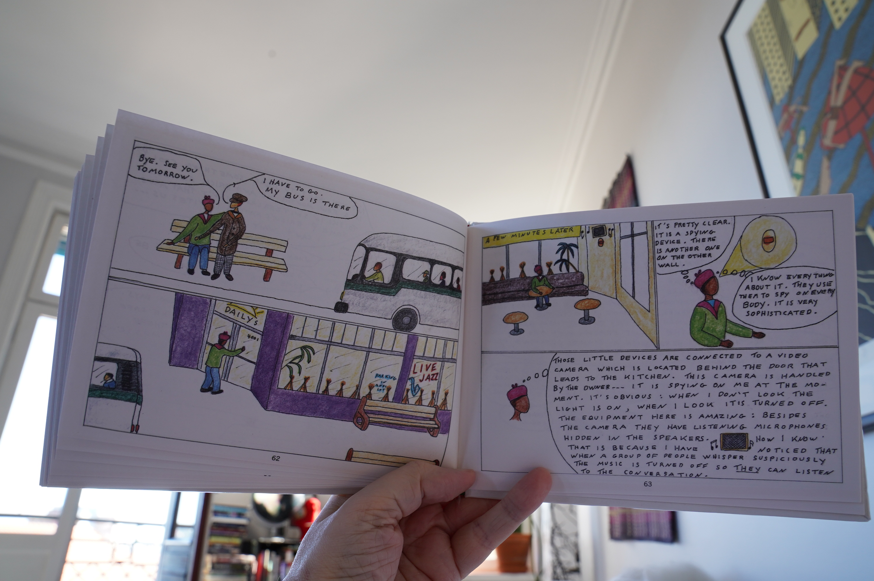
An absolutely fascinating book.
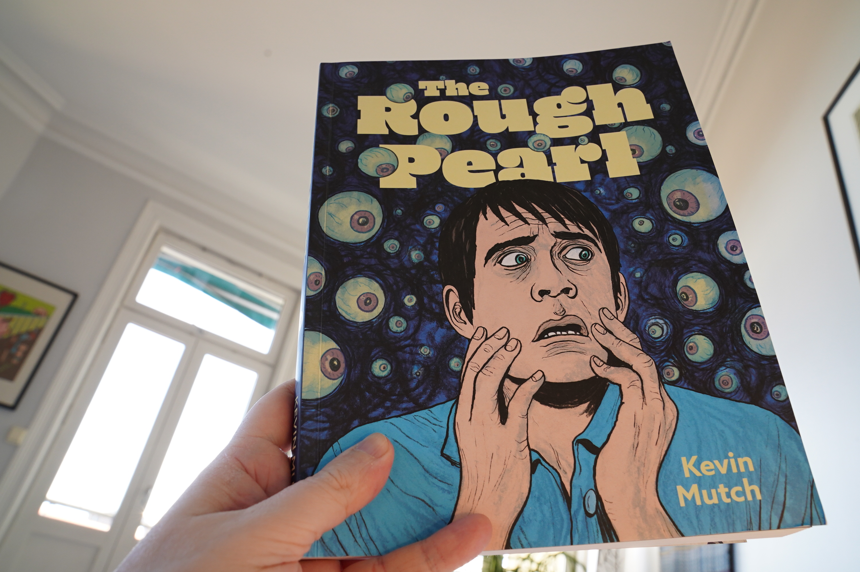
17:52: The Rough Pearl by Kevin Mutch (Fantagraphics)
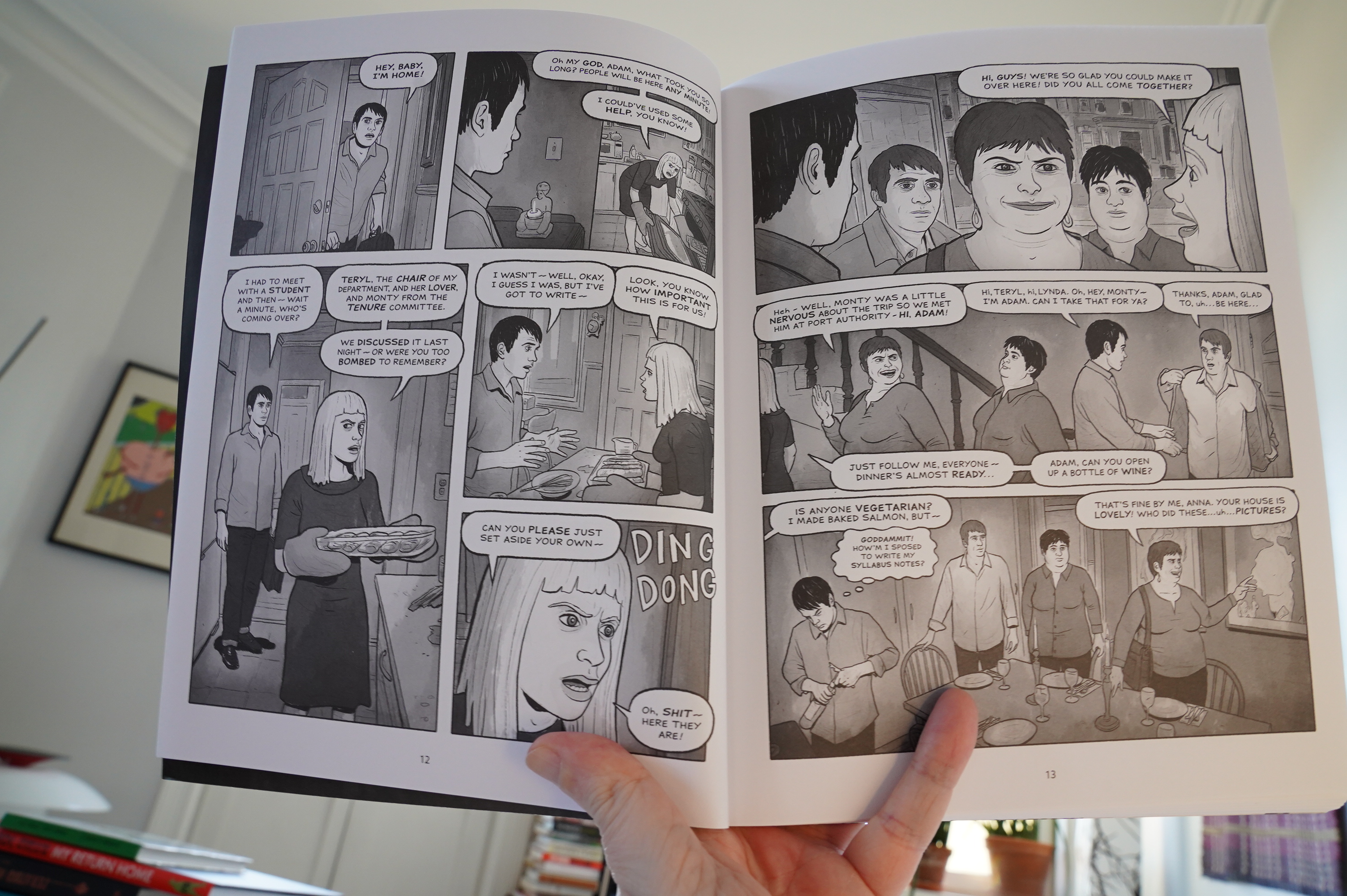
Oh deer. This reads like an indie movie where everybody’s bitching at each other relentlessly. I got a sympathy headache from just imagining them shouting all the time. It’s like the author has read that “How to write a damn good book” book, that explains how all scenes have to have at least two conflicts going all the time, and adhered to that religiously. The relentlessly ugly Photoshop-assisted artwork doesn’t help, either, nor does that 90’s “I just read Like A Velvet Glove” plot, replete with all the trimmings, including a strip joint. It was a struggle to get through this.
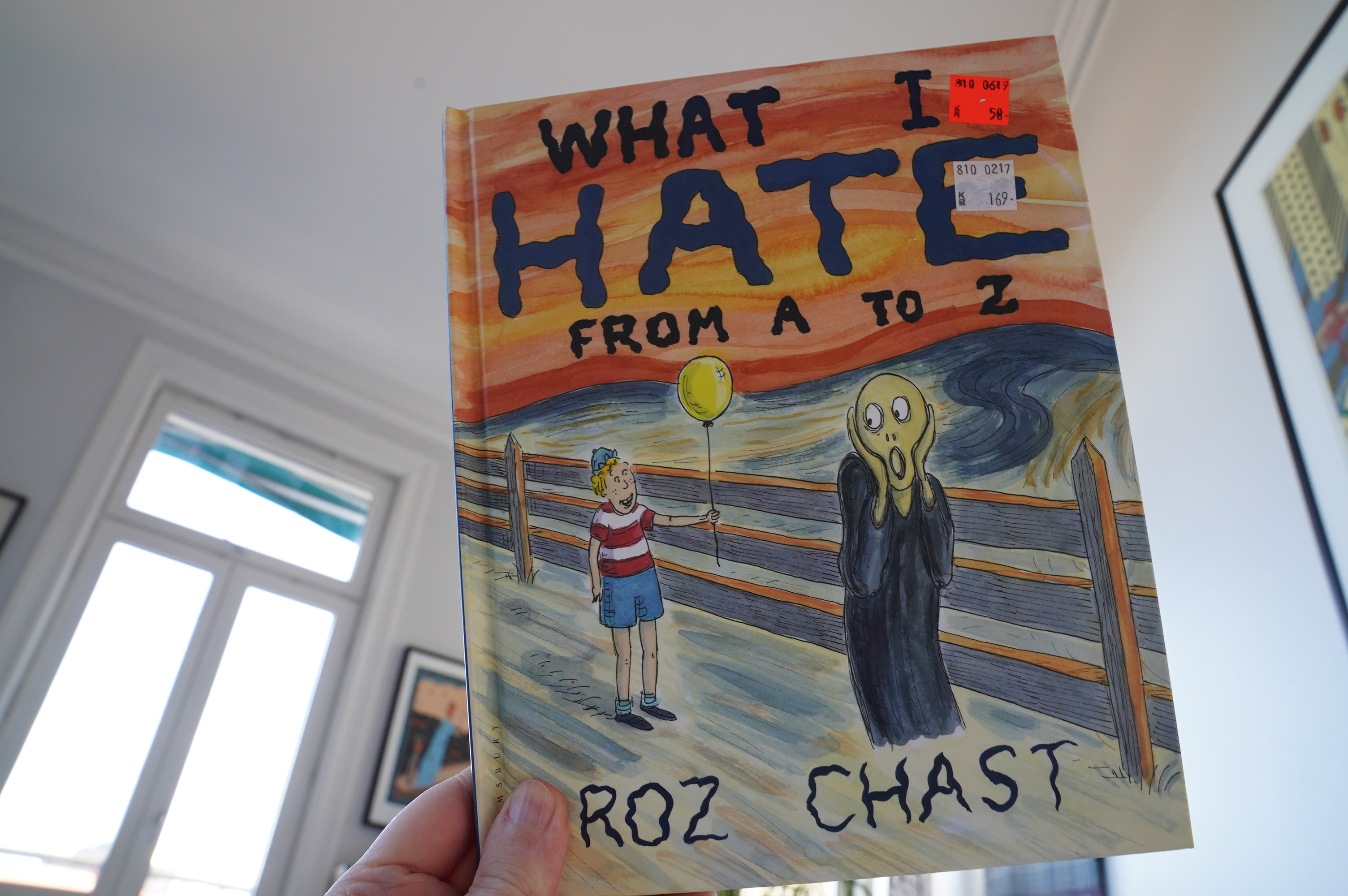
19:00: What I Hate From A to Z by Roz Chast (Bloomsbury)
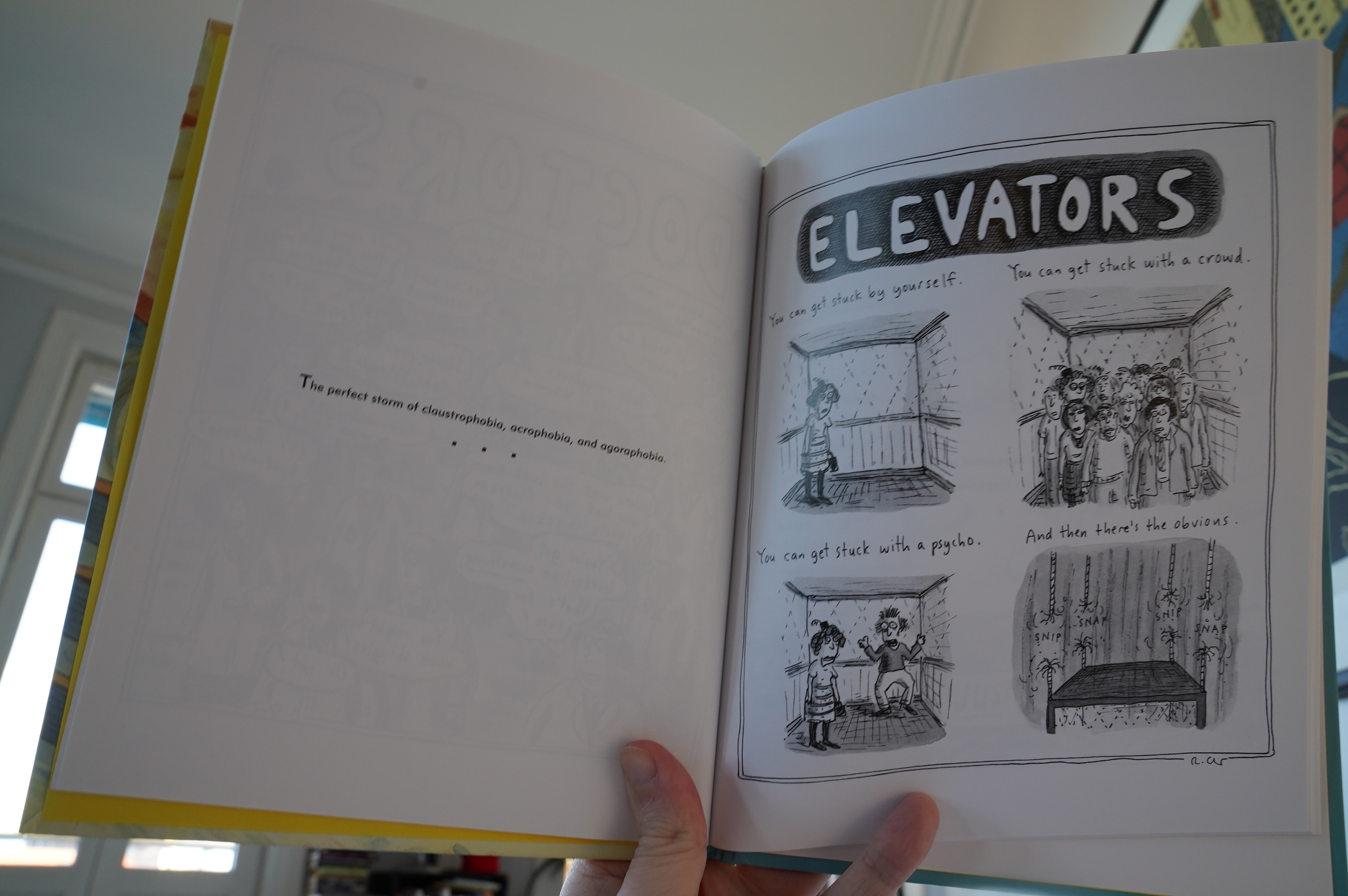
It’s amusing…
19:16: The End
I think it’s time for me to go to bed. (Yes, my sleeping patterns are all fucked up at the moment.)
That’s… 13 hours of continuous comics reading? My head is aswarm with imagery, and I feel kinda punch drunk. Reading comics in this stupid way is fun!
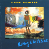
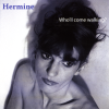
Music I’ve bought in July.

) | ) |  |  |  |
 |  | %3A+The+Smiths) | %3A+Hatful+of+Hollow) | %3A+Meat+Is+Murder) |
%3A+The+Queen+is+Dead) | %3A+The+World+Won't+Listen) | %3A+Strangeways%2C+Here+We+Come) | %3A+Rank) | %3A+Louder+Than+Bombs) |
 |  |  |  |  |
) |  |  | %3A+Process) |  |
 | ) |  |  |  |
 |  |  |  |  |
 |  |  |  |