V1986: Yummy Fur

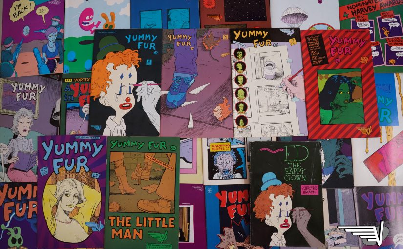
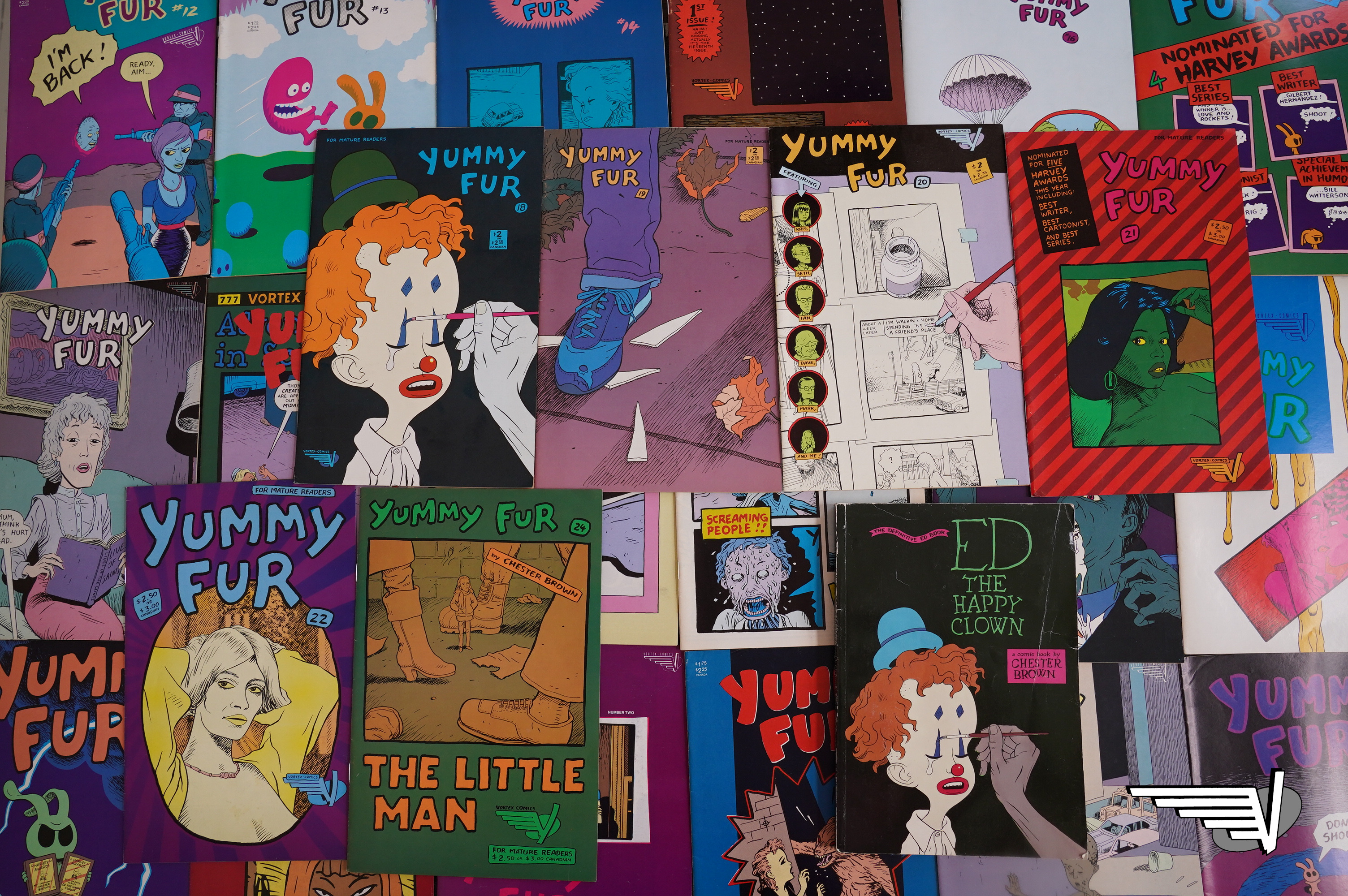
Yummy Fur (1986) #1-24,
Ed the Happy Clown: The Definitive Ed Book (1992)
by Chester Brown

*gasp* In this blog series, today we’ve come to Vortex’ second claim to fame: Chester Brown’s Yummy Fur.

This was at the height of the black and white boom, and you could publish anything (as long as it was in black and white), and “collectors” would snap it up. That meant an avalanche of shit, of course, but it also meant that it was feasible to publish something as odd as Yummy Fur, too.

Brown is, of course, one of the most written-about comics artists in the world now, but did you know that his first series was at Vortex? You did? Why are you reading this, then!?

Some people!

Now, Yummy Fur was one of the things that made most of an impression on me while I was in high school (second-most: Throwing Muses), so I have an enthusiasm for the series that is perhaps not quite rational. But Yummy Fur is a series that has is, quite simply, gruesome; it’s drenched in violence (including sexual violence) and I’m including some of that imagery in this blog post (but not the most horrific stuff). So:

Unless you want to subject yourself to some pretty nauseating stuff. OK?

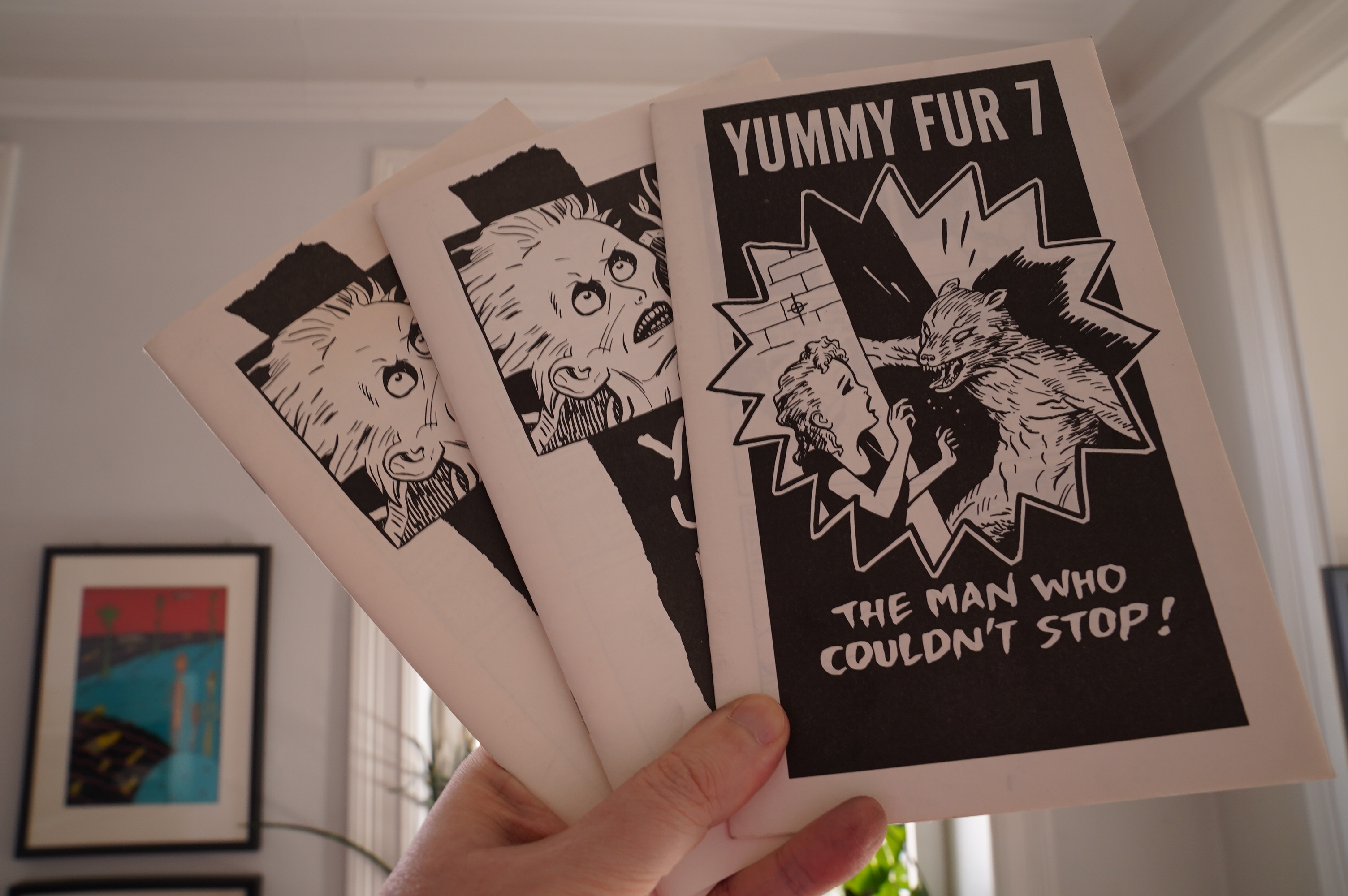
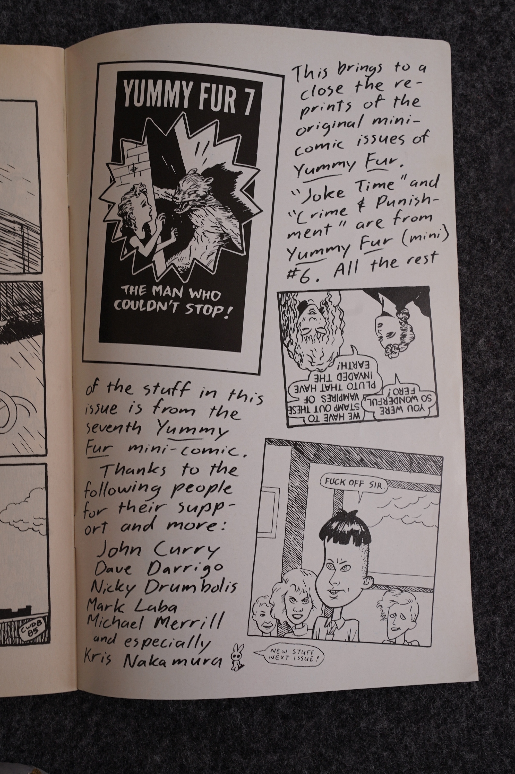
I actually read Yummy Fur before Vortex picked it up. Brown published seven issues of the series in mini-comic form. Well, not that mini, really — it’s not in twice-folded letter format, just once-folded. So it is, funnily enough, in just the same format that the collected Ed book would later be, and just about all of Brown’s books.

(Somehow I have two copies of the collection of the first six mini-comic issues. I could probably be a millionaire if I sold one, right?)

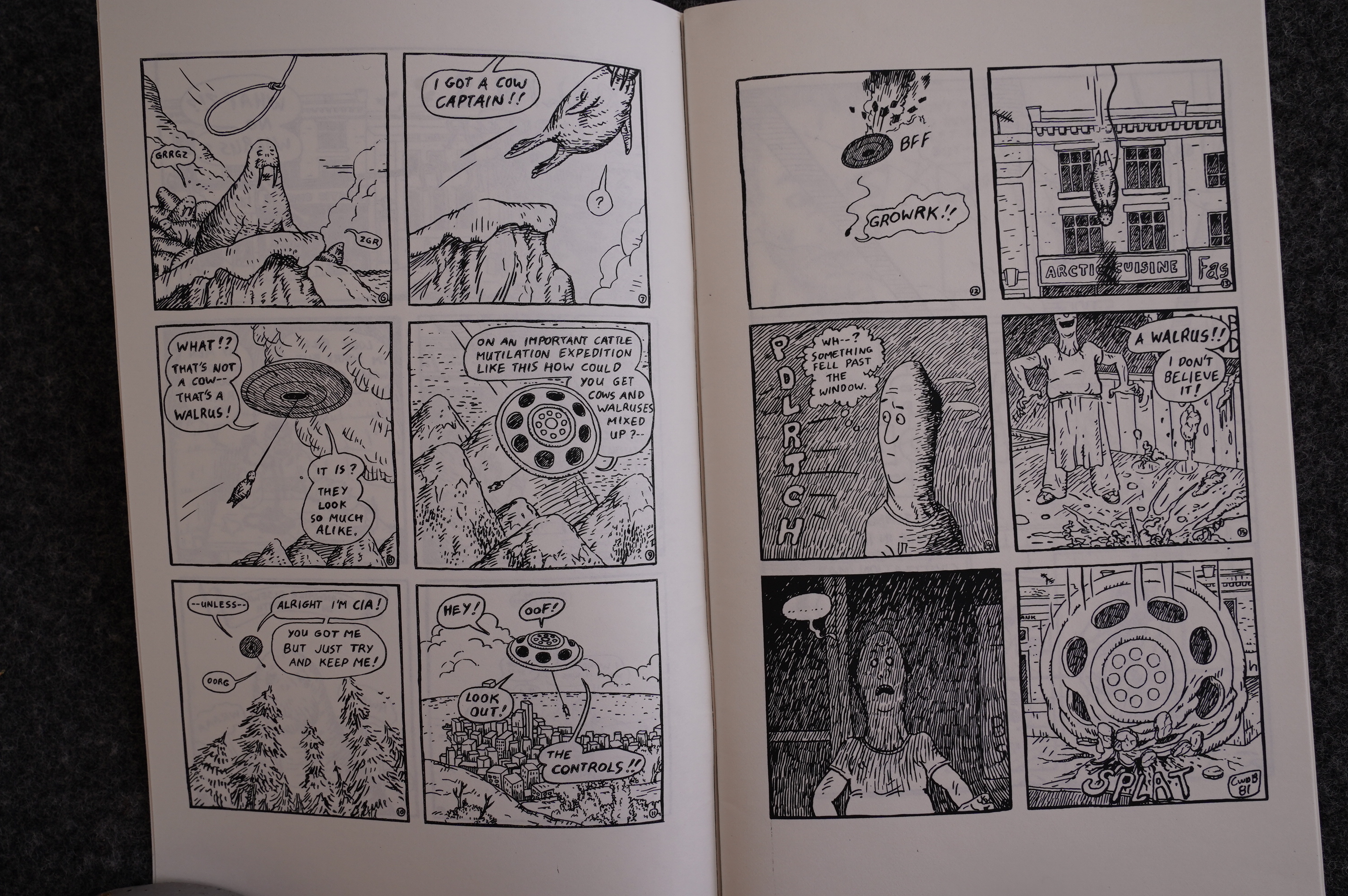
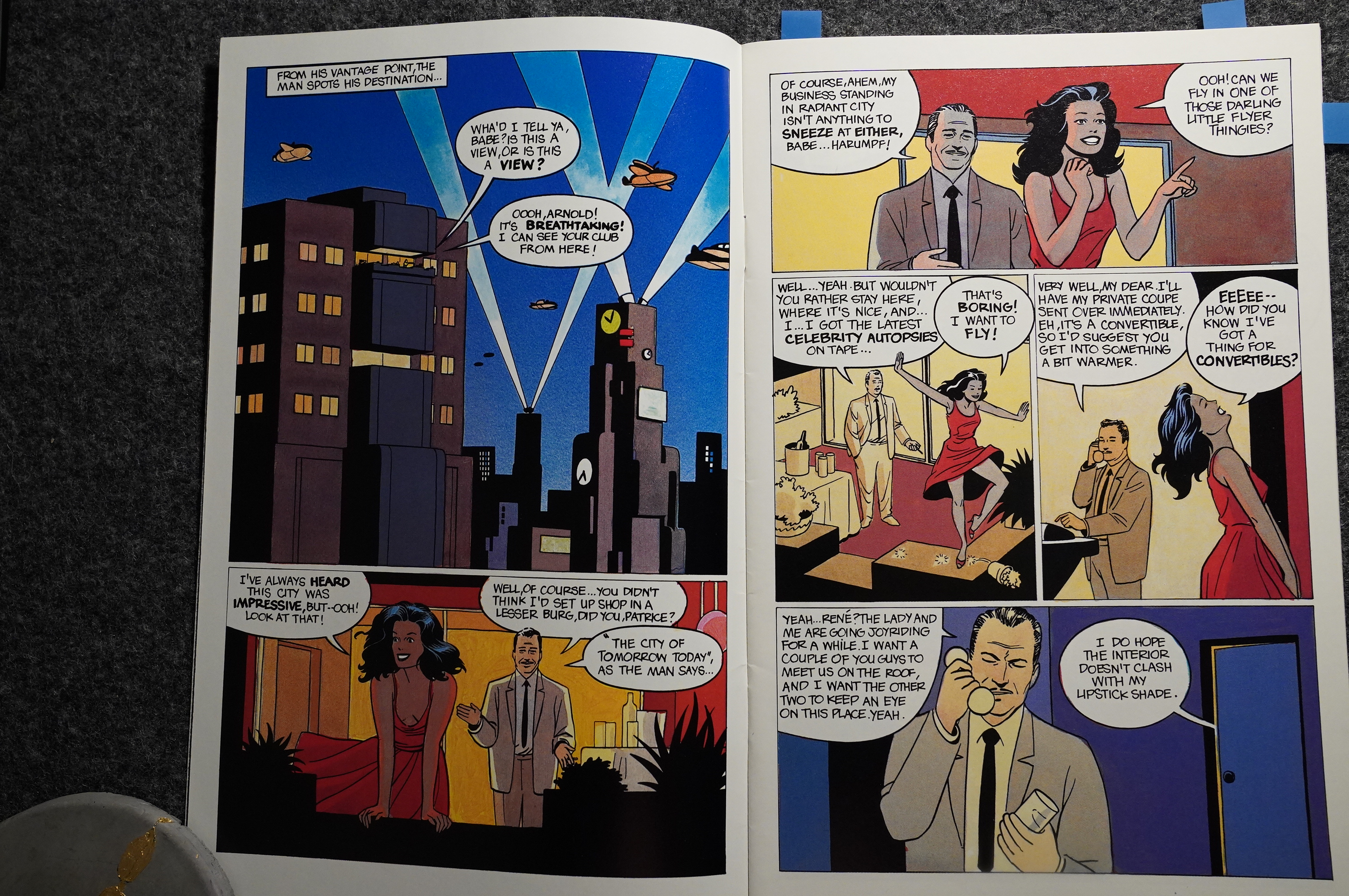
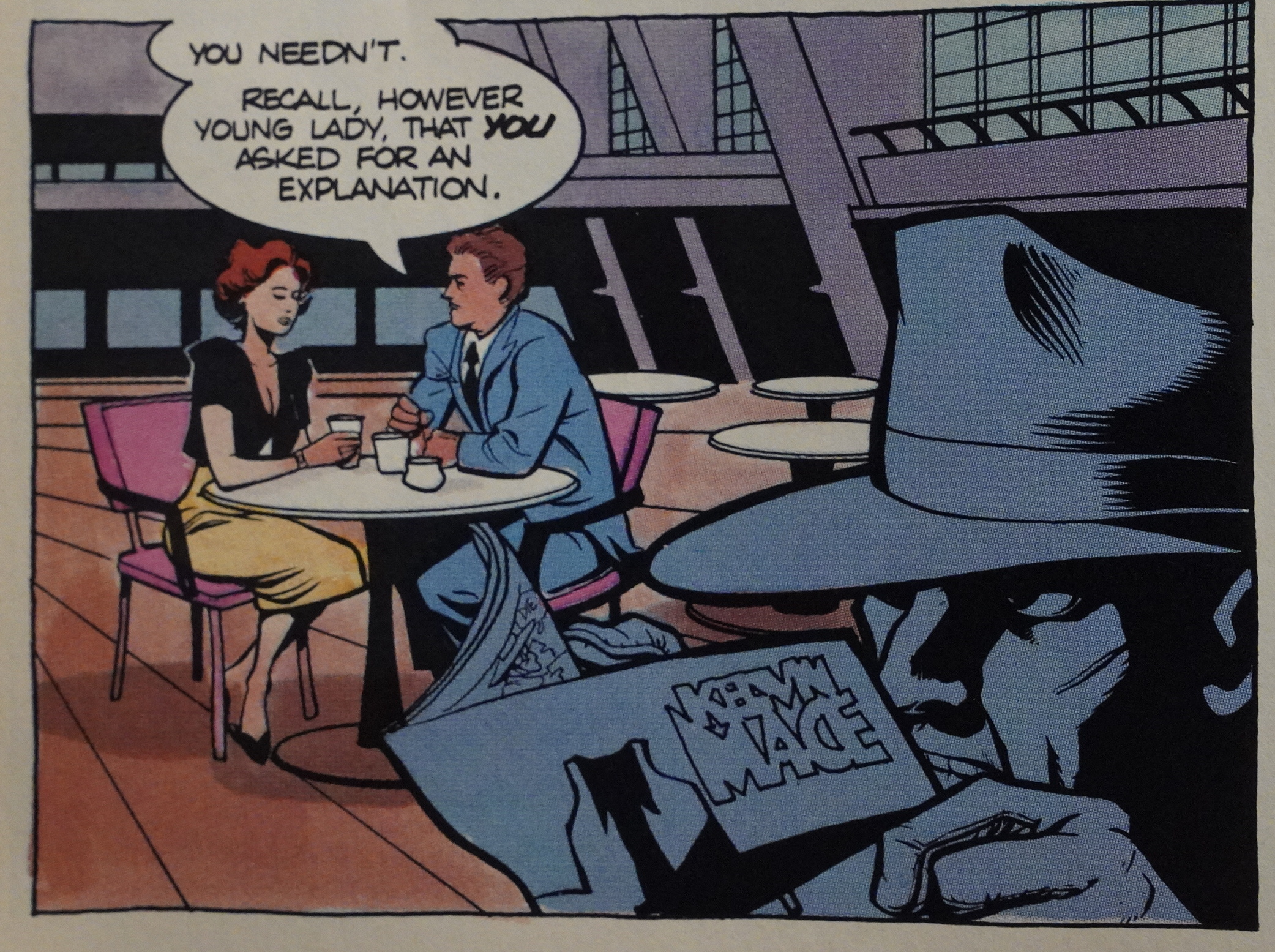
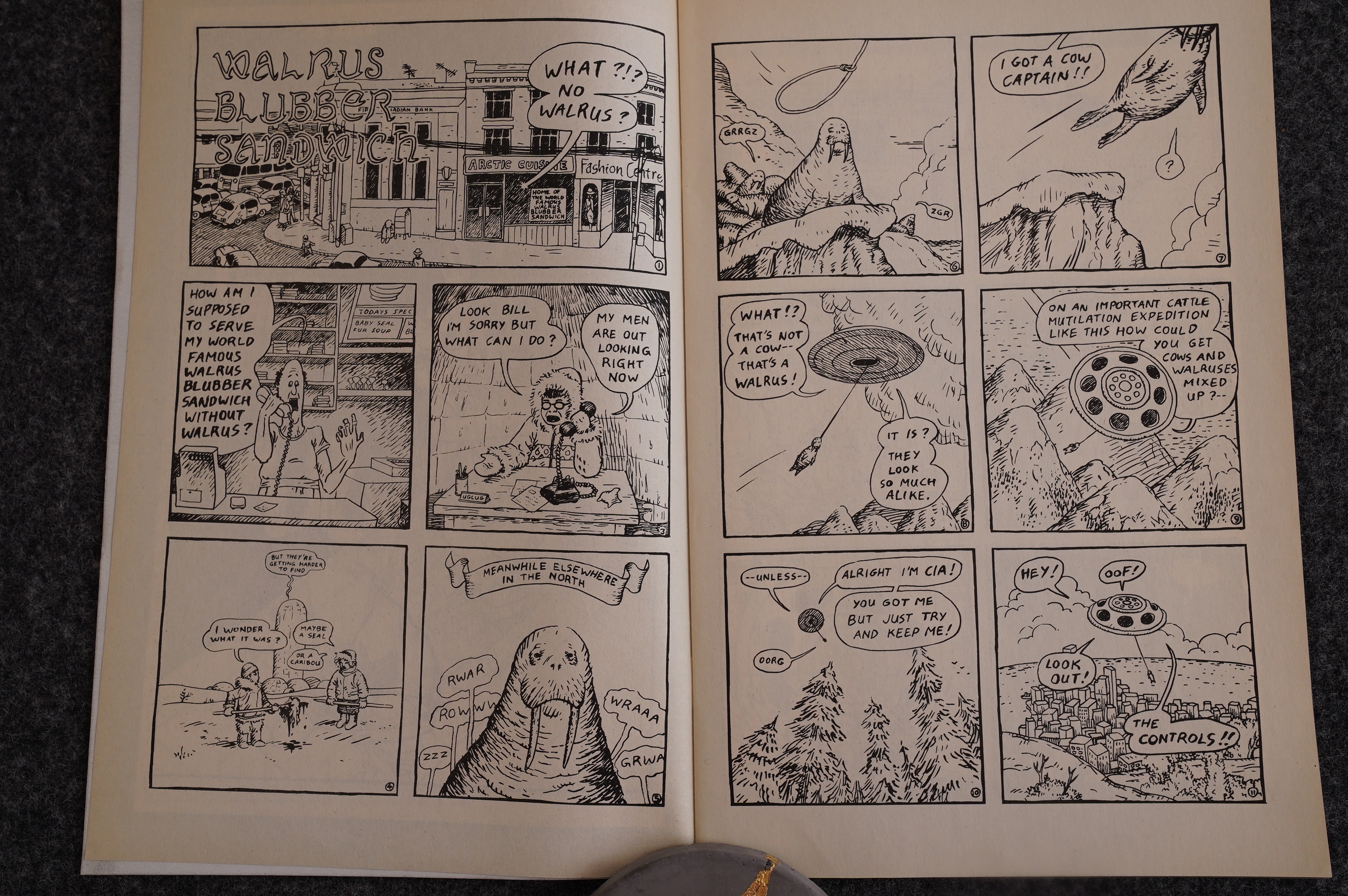
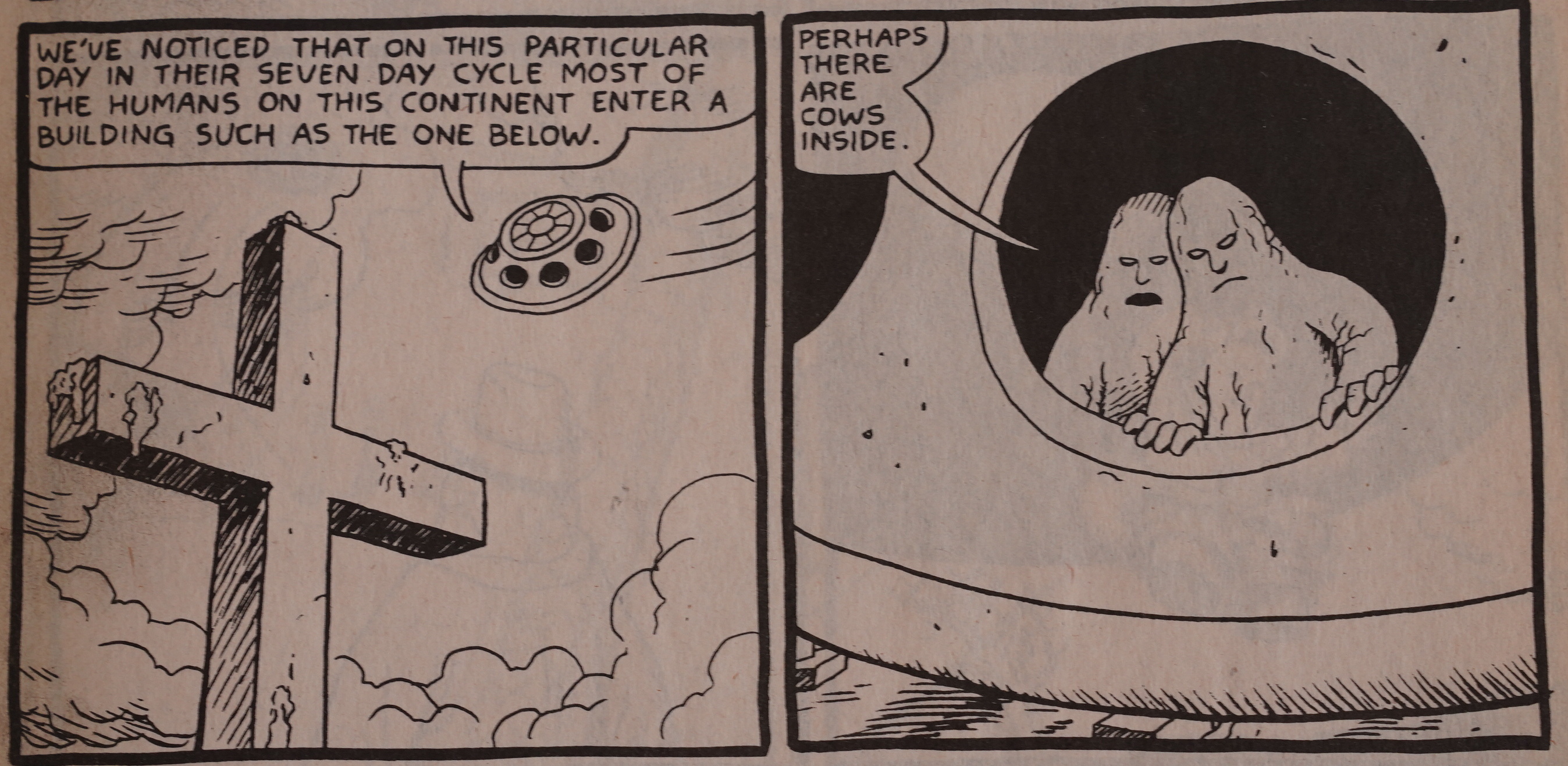
But that means we can do a comparative reading! The minis vs. the first three pages of the Vortex book. Here we have the first two pages in the first issue of the mini. It’s pretty rough stuff, but even we have those aliens here that would feature in the denouement of the Ed saga.

The Vortex series starts with a self-portrait of Brown (with his friend Kris) explaining that this is a reprint.

It looks pretty complete, as reprints go: We get the covers and everything.

Aaaand… Yes, it’s identical? I was wondering whether Brown had changed much between editions, because he’s a notorious tinkerer.

That’s the mini…

… and that’s Vortex. Here he has changed stuff up; not only has he added black margins, but also a inked in the title and the borders of that inset panel. Looks a lot more… solid.

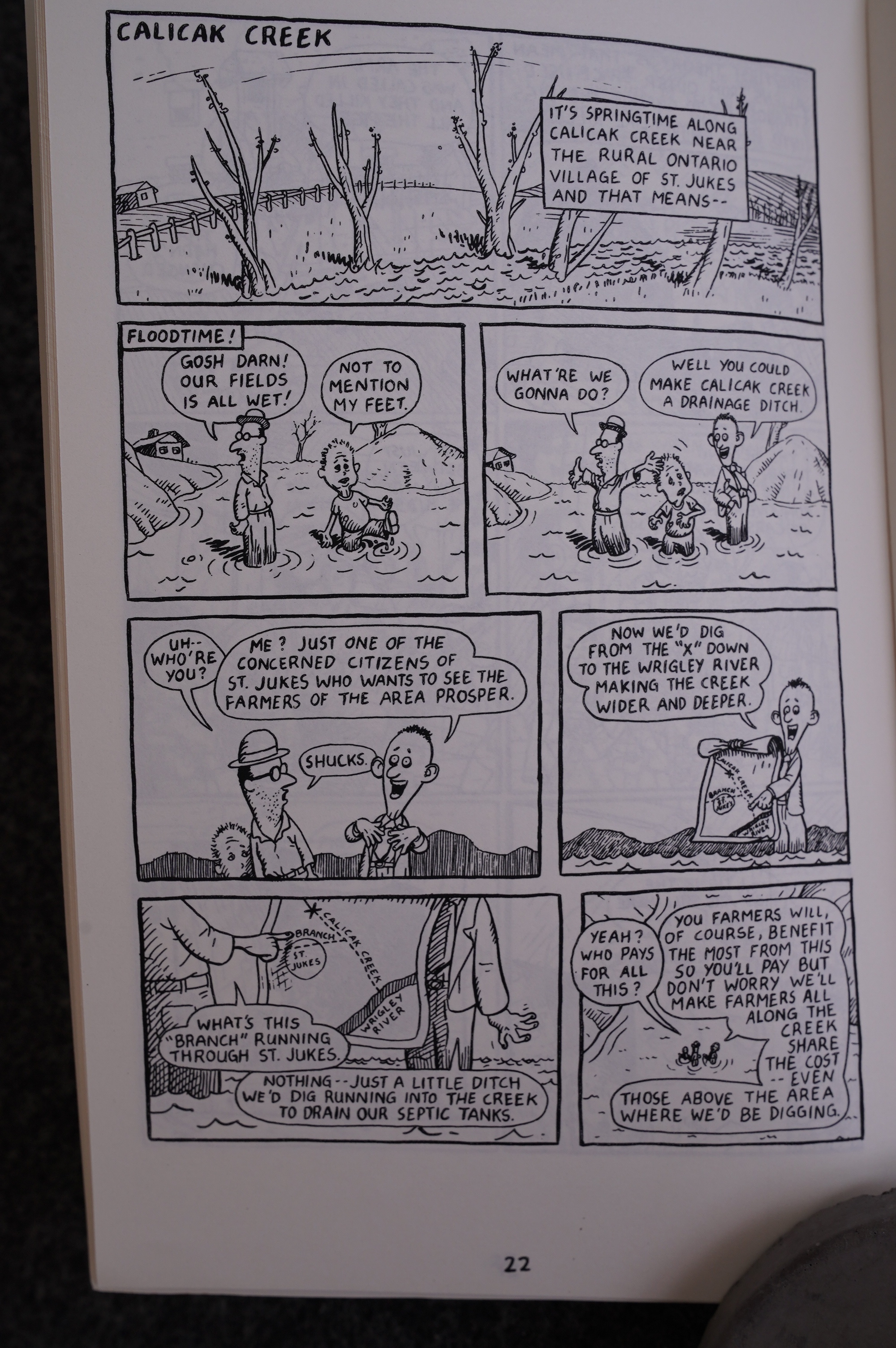
The other changes are pretty minor, too. Like changing Calicak Creek to…

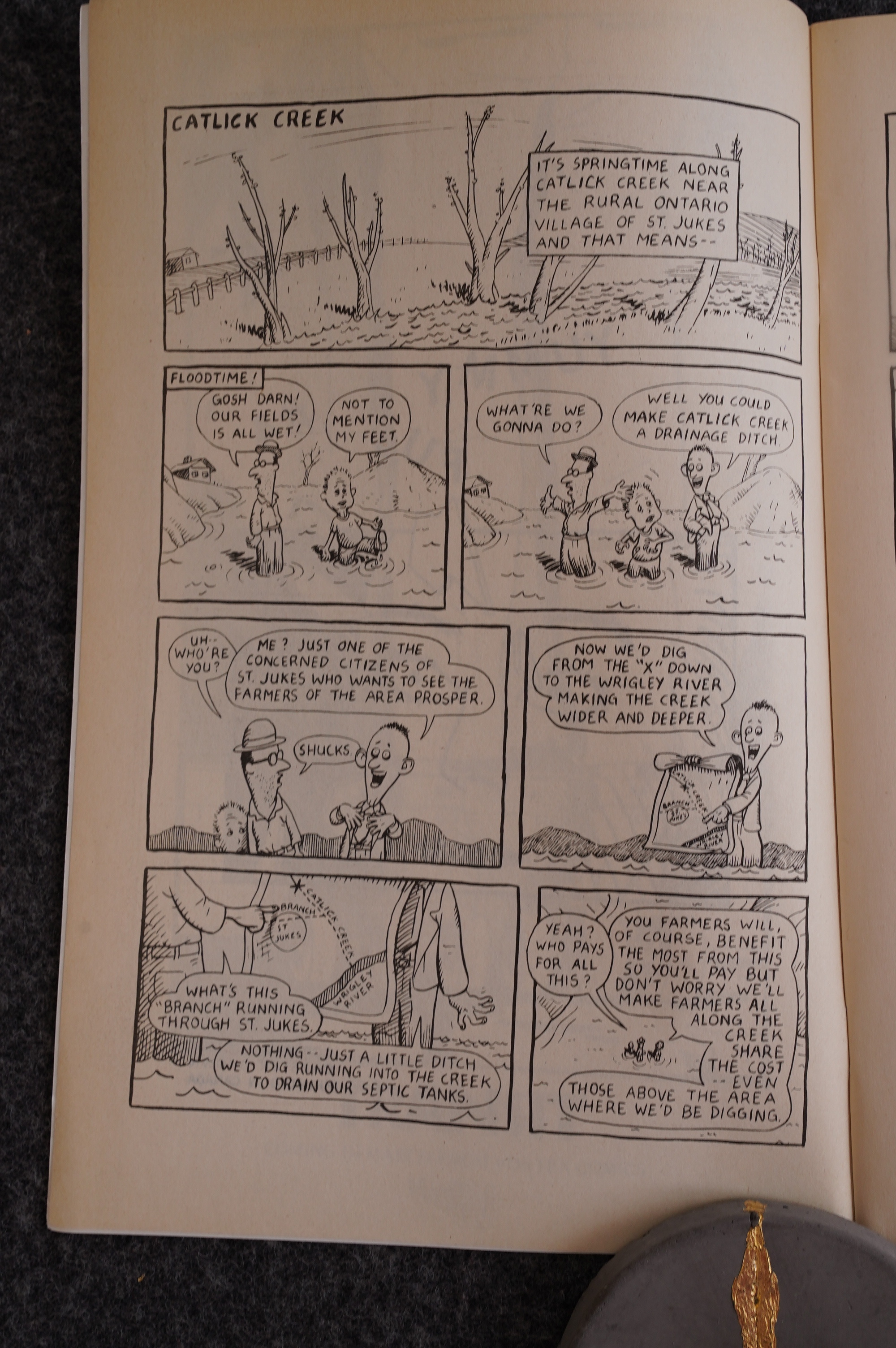
… Catick Creek. This seems like a rare instance of Brown doing reportage (it’s about how some city slickers tricked some farmers into paying for their sewage systems), and I wondered whether he changed the name to avoid, like, getting sued (or beaten up), but apparently neither name actually exists?

There is the occasional rejiggering of panels, like this one from the mini…

… and this one from Vortex.

Most comics artists (at least in the before-digital era) don’t shuffle panels around like this, but Brown draws each panel separately on a piece of paper, and then sticky-tapes them down on the final page. This means that he’s free to rearrange and replace panels at will, which he does. That also means that he doesn’t really design pages as a whole, often, which probably contributes to the unnerving pacing.

Mini…

Vortex with panels shifted one row.

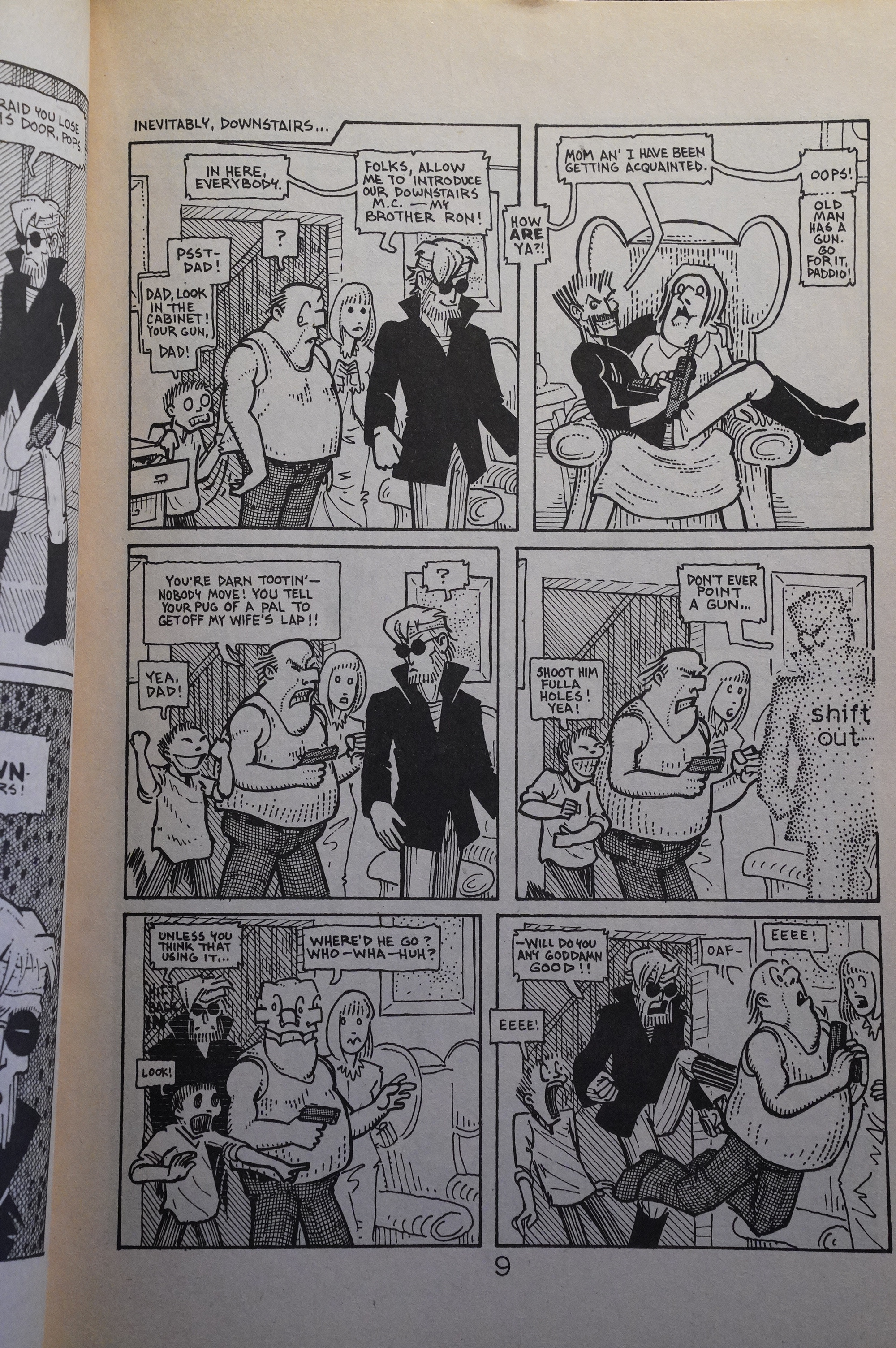
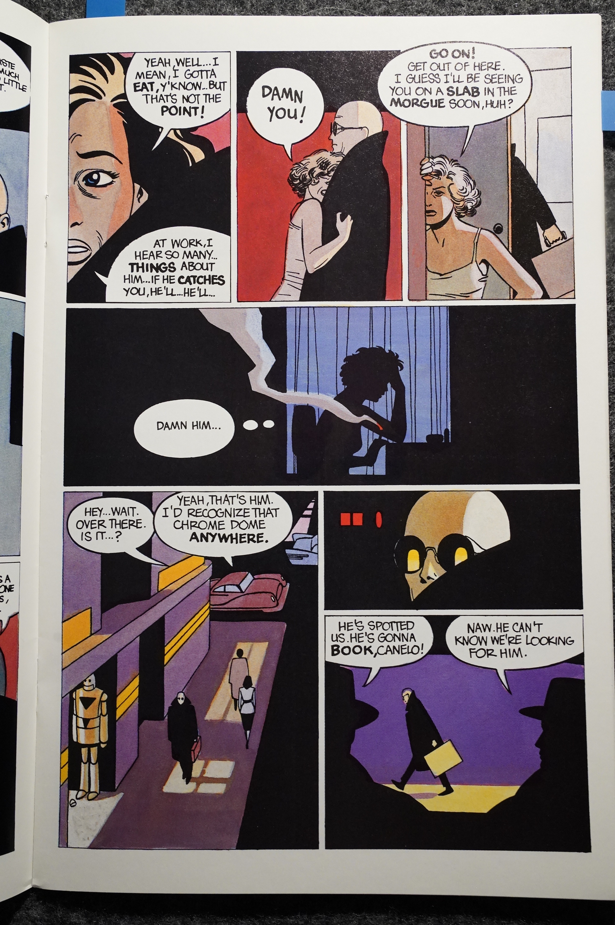
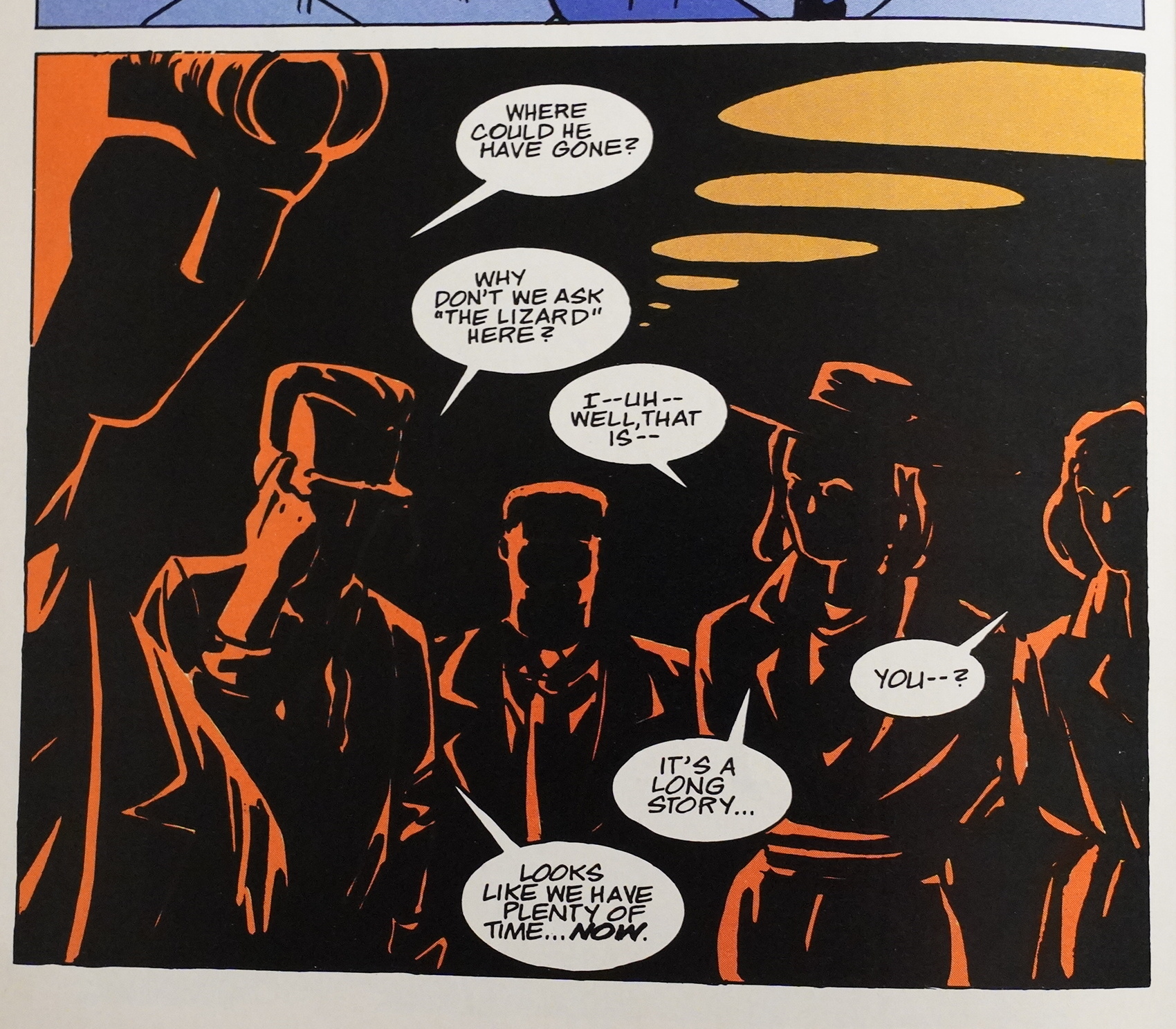
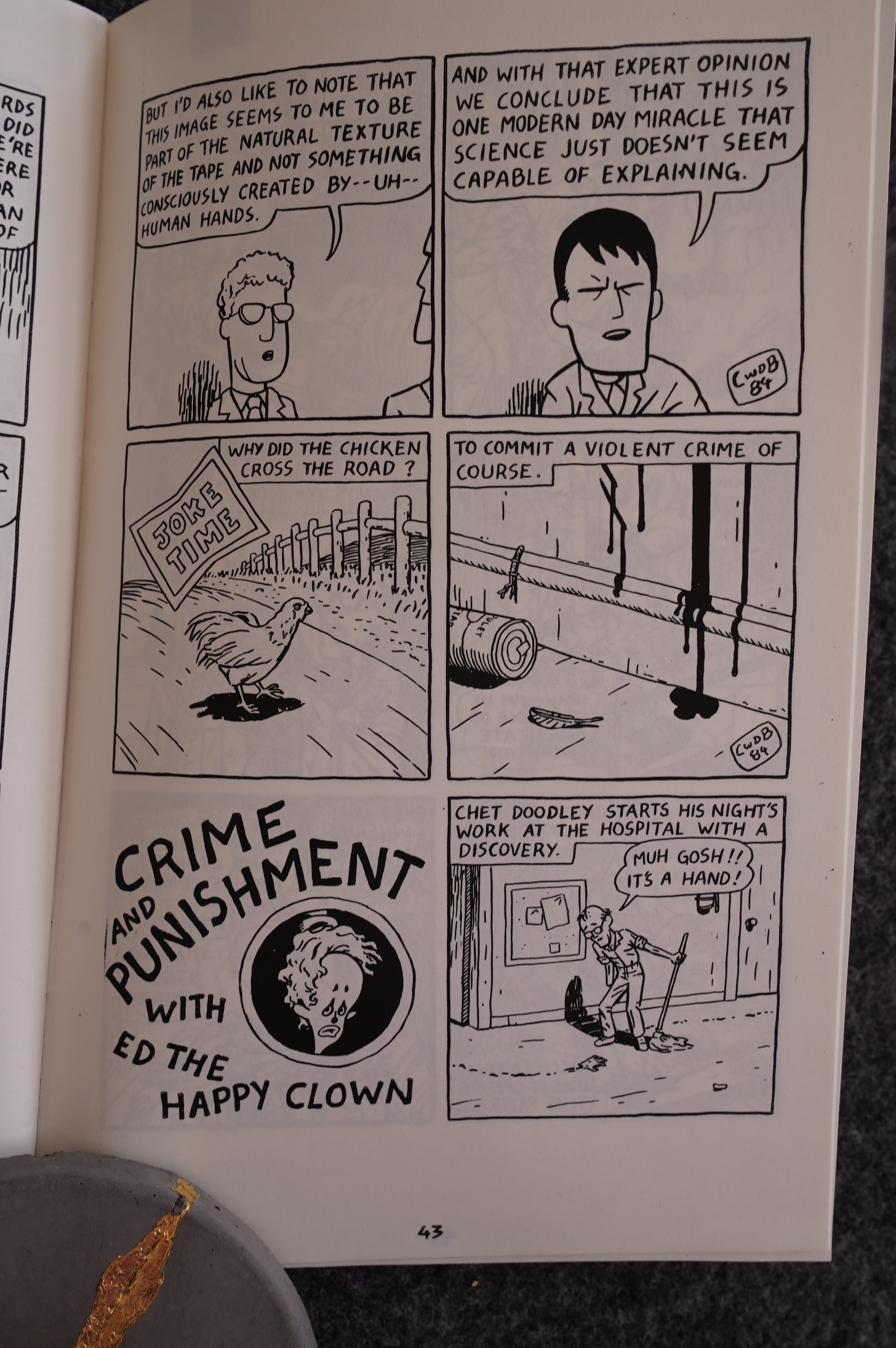
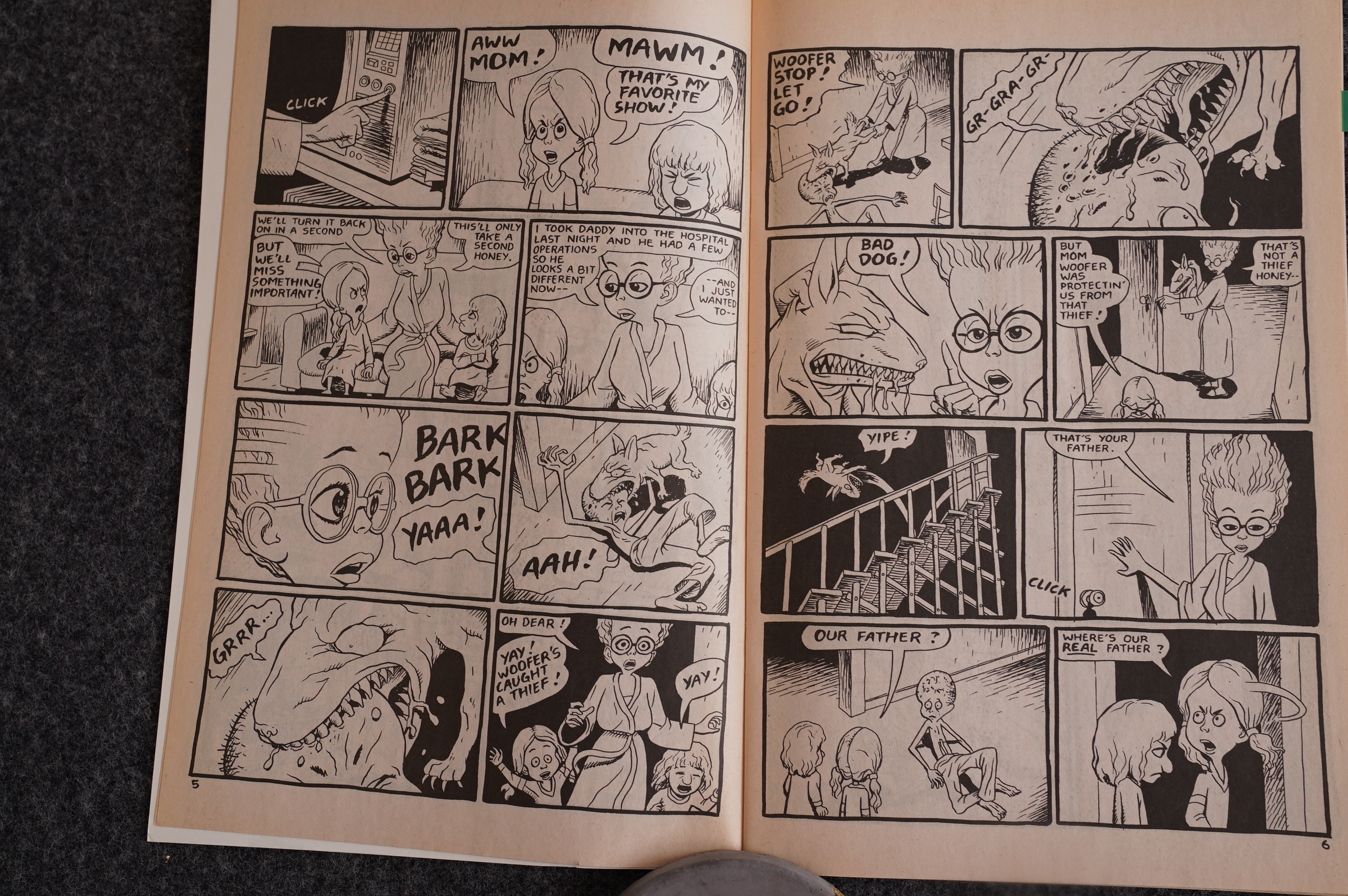
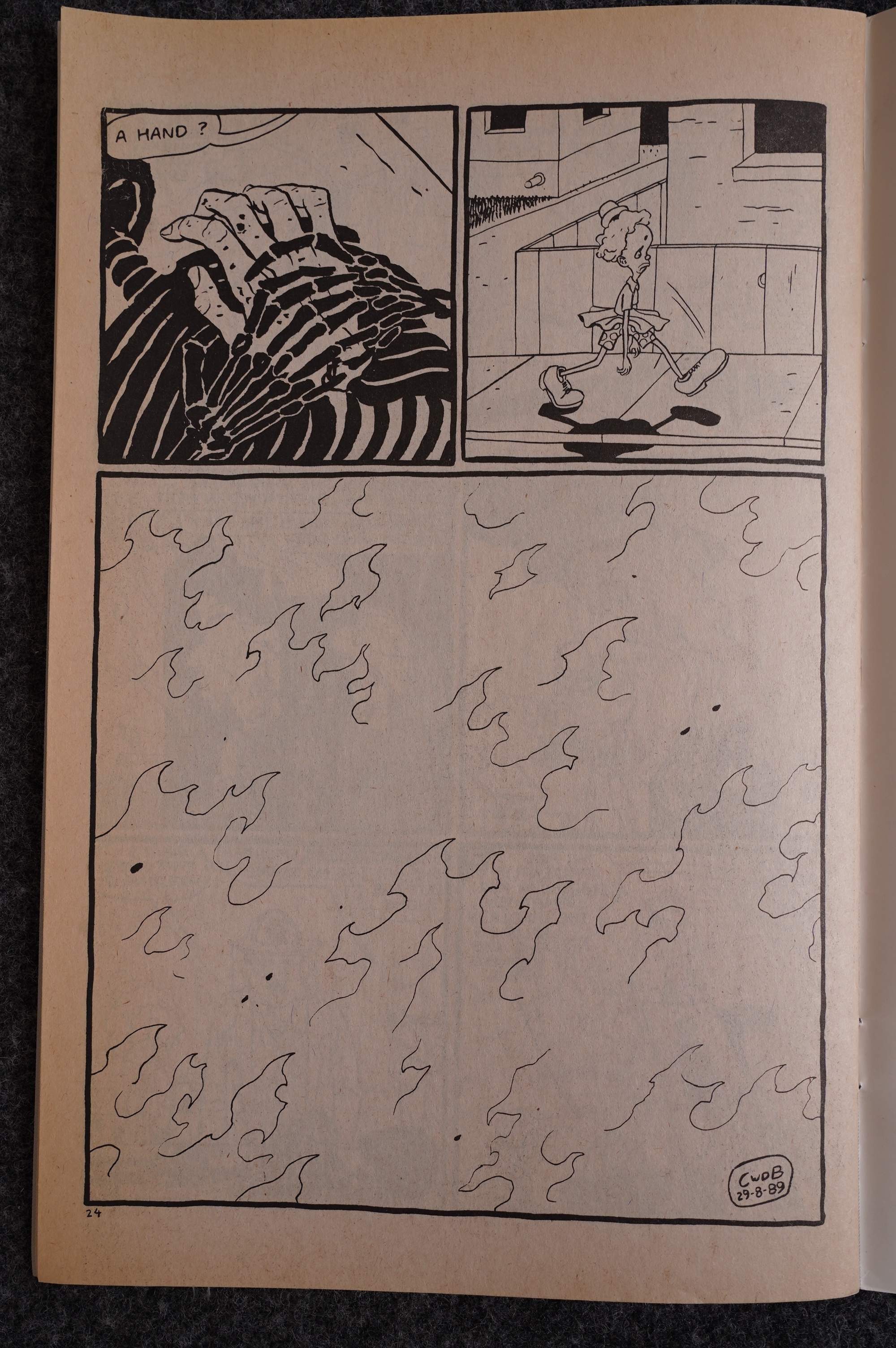
Anyway! The main serial in Yummy Fur is about Ed the Happy Clown, and it’s a storyline that’s improvised. Things happen at random (like that janitor, Chet, losing his hand all of a sudden). But anything, no matter how much of a non-sequitur is later revisited and made, somehow, logical. The Ed series continues over the first 18 issues of Yummy Fur, so you’d think it’d cover a lot of territory, but it constantly folds back, giving more and more information about what’s previously happened, before lurching ahead a bit, and then looping back again. Everything seems random, but everything is connected.

I don’t know what methodology Brown is using, but I’m guessing he’s re-reading himself a lot and going “hm, that’s something that could be expanded upon”…

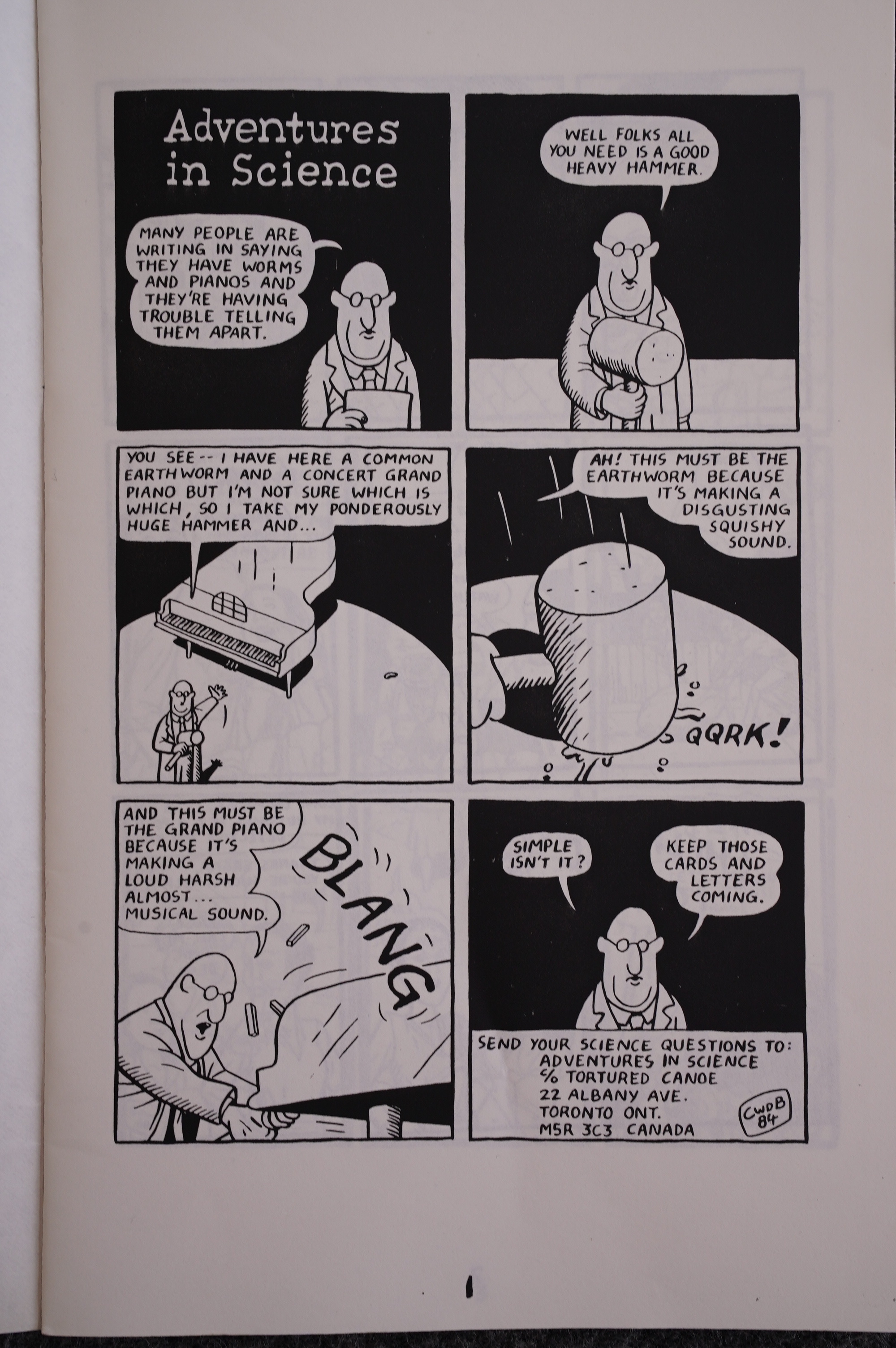
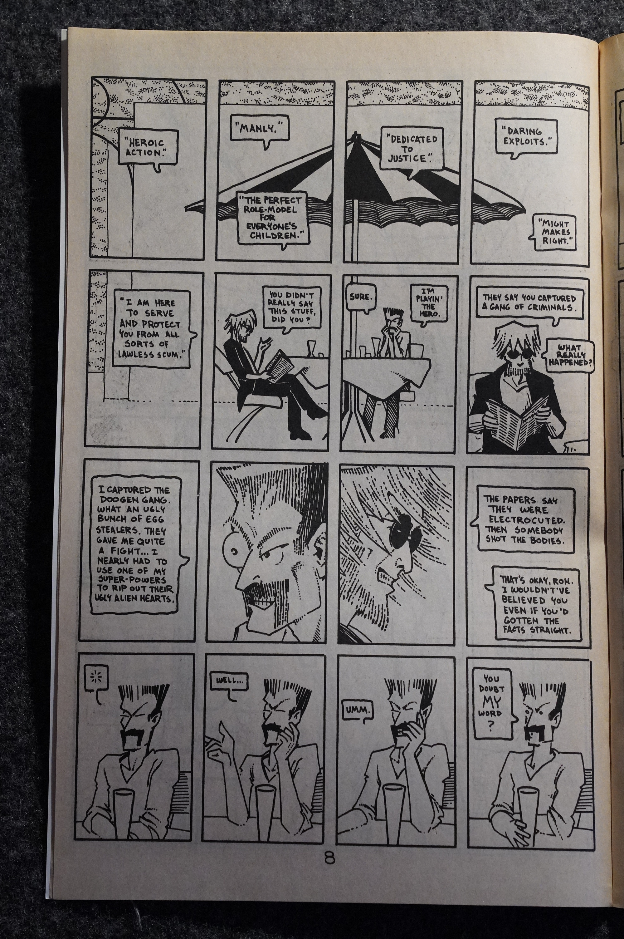
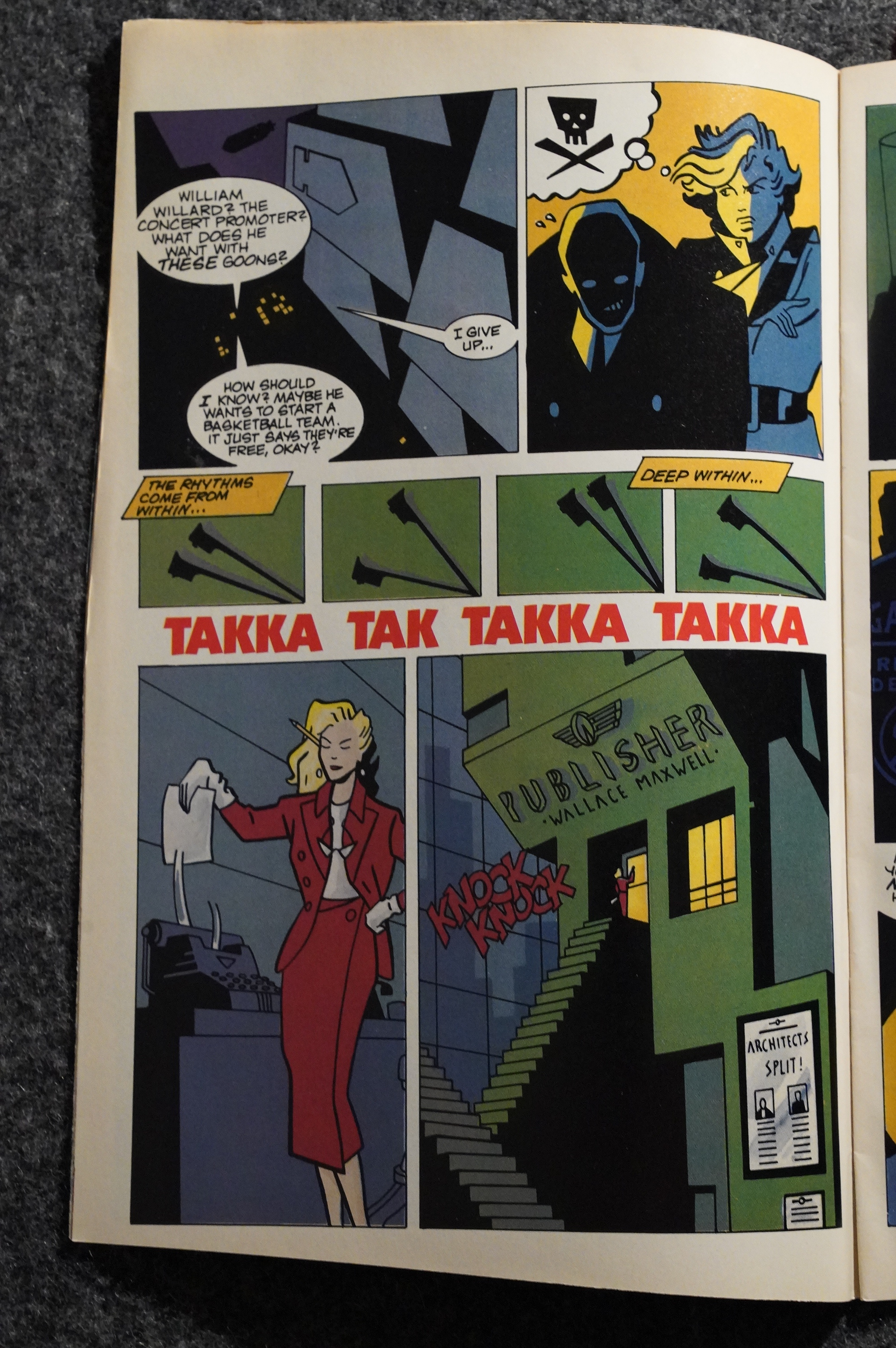
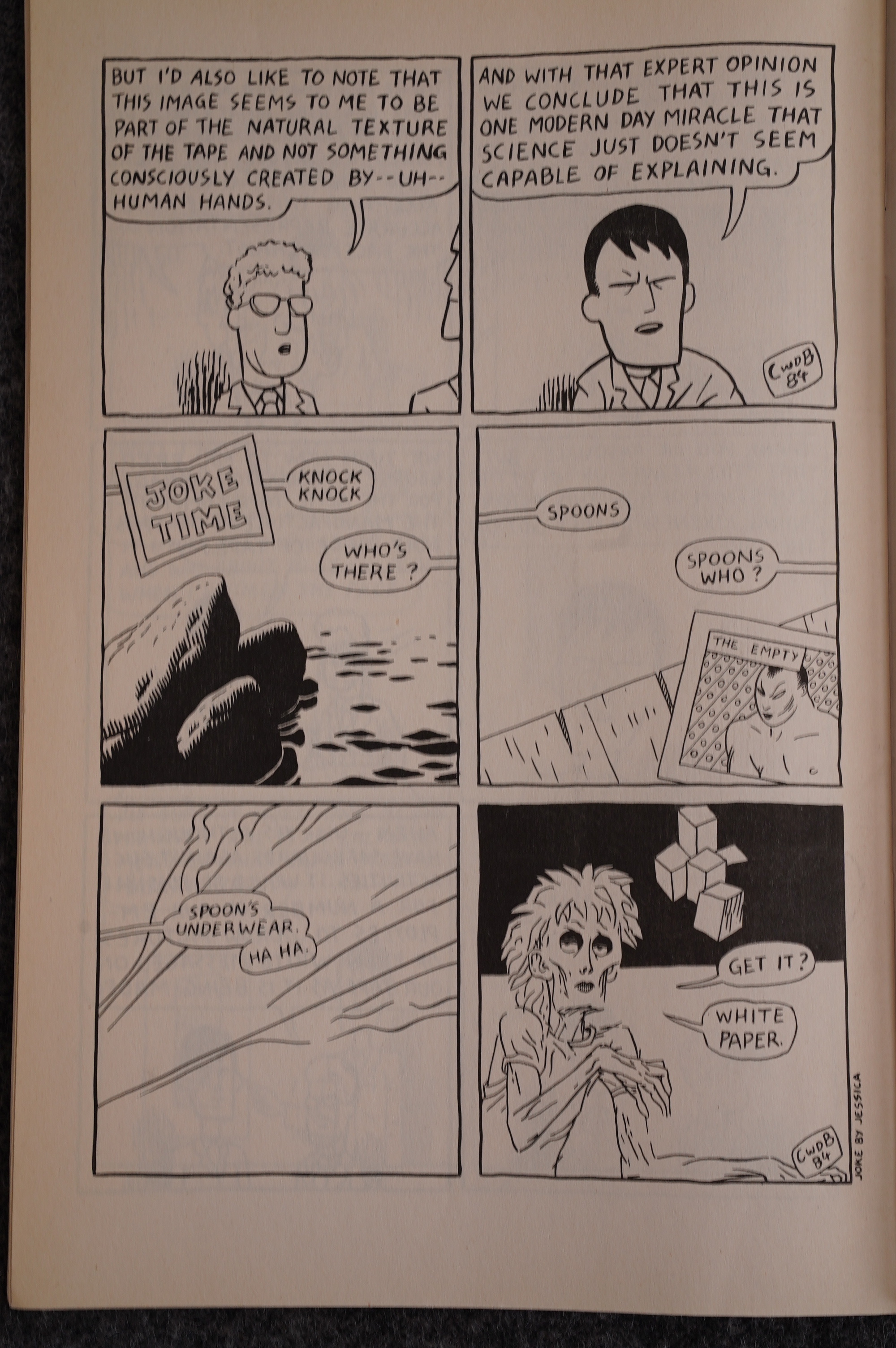
This page is really why I became a Yummy Fur fan boy. I couldn’t stop showing it around to, well, everybody I knew, because I found it to be the height of humour. I even defaced my high school by gluing a copy of it to the wall.

HAH! Statute of limitations! Can’t catch me now, copper!

It’s a classic piece of absurd humour, sure. Perfect in execution: “A loud, harsh, almost…. musical sound”. But it’s also somehow… unnerving? It seems to hint at something being awfully wrong somewhere.

This is funny, too, of course. And doesn’t it remind you of Crumb’s short history of America?

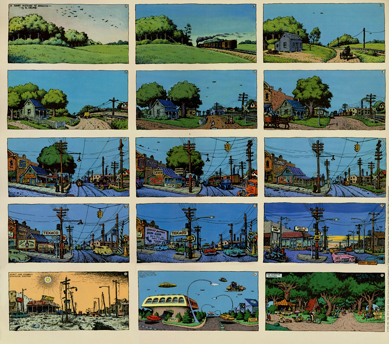
No? Oh well. Anyway, let’s look at how the Ed saga starts:

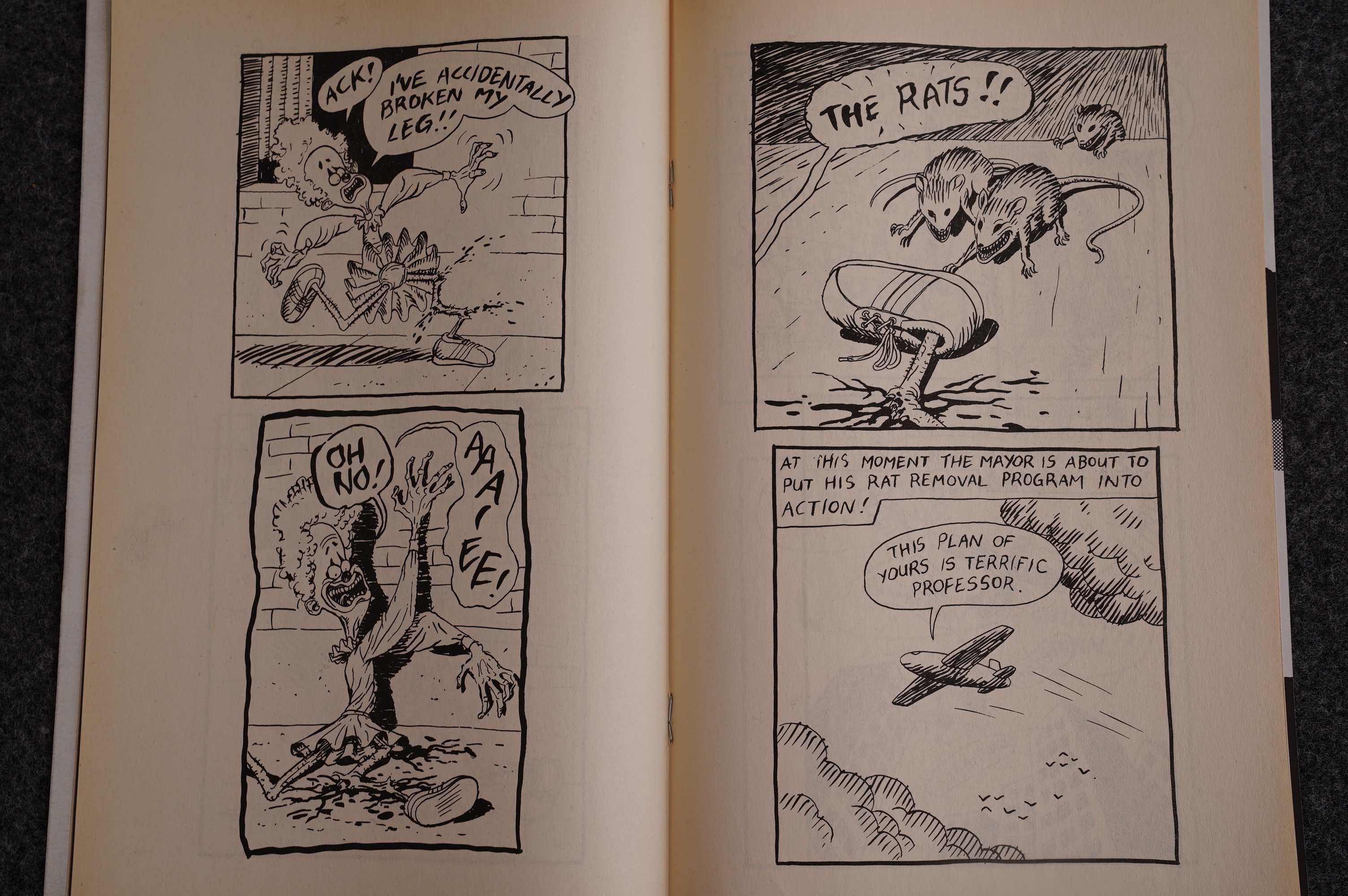
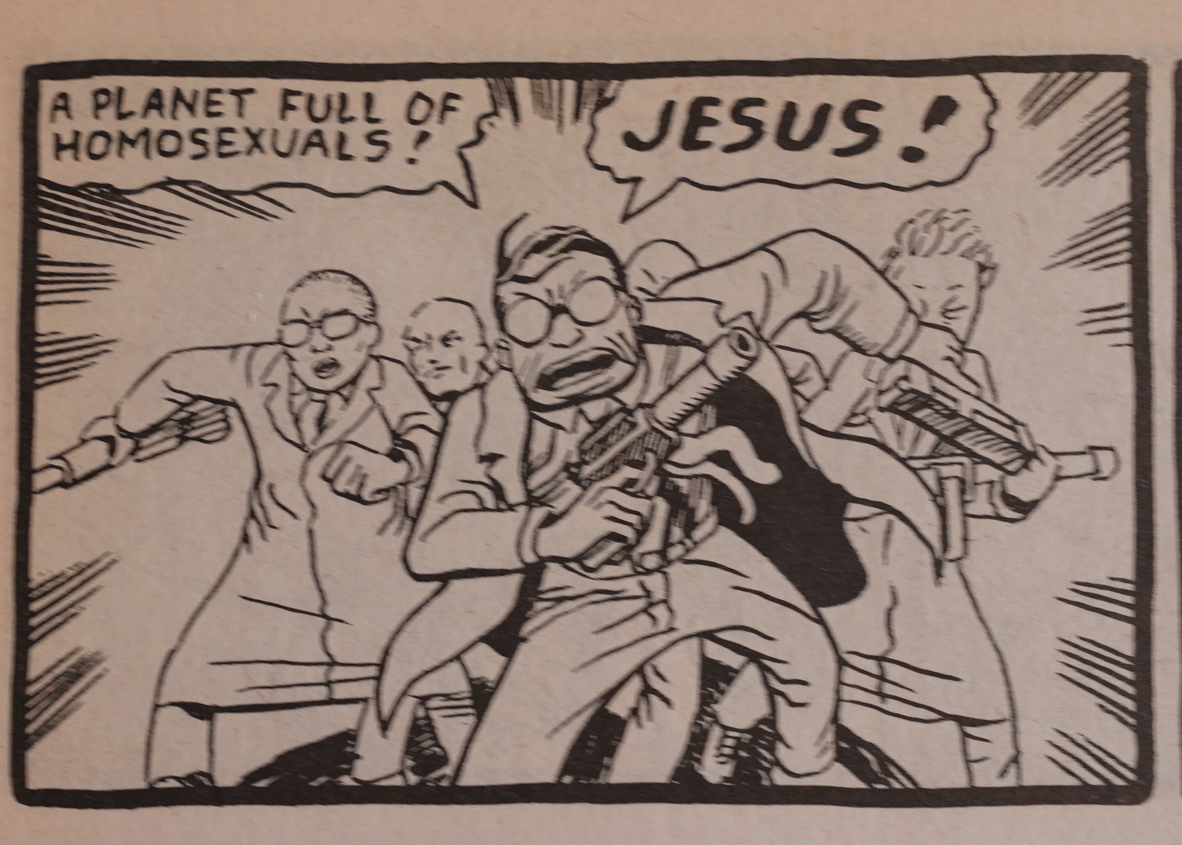
It’s so… it’s so… it’s ineffably horrifying. The panel of Ed breaking his leg is cartoon violence, but over the top, so we’re going “ha ha eww?”, and then a panel of real pain which makes us go “oof” and then “the rats!!” which is a horrifying escalation that draws us back into it being funny (but horrifying) again, and then a cut to somebody else.

It’s so… deranged. Masterfully deranged.

Brown was trying out a lot of different things at this time. It’s mostly the same kind of absurd humour, and it mostly works. (And that painting in the final panel ends up as the cover of the next issue, making another connection between things.)

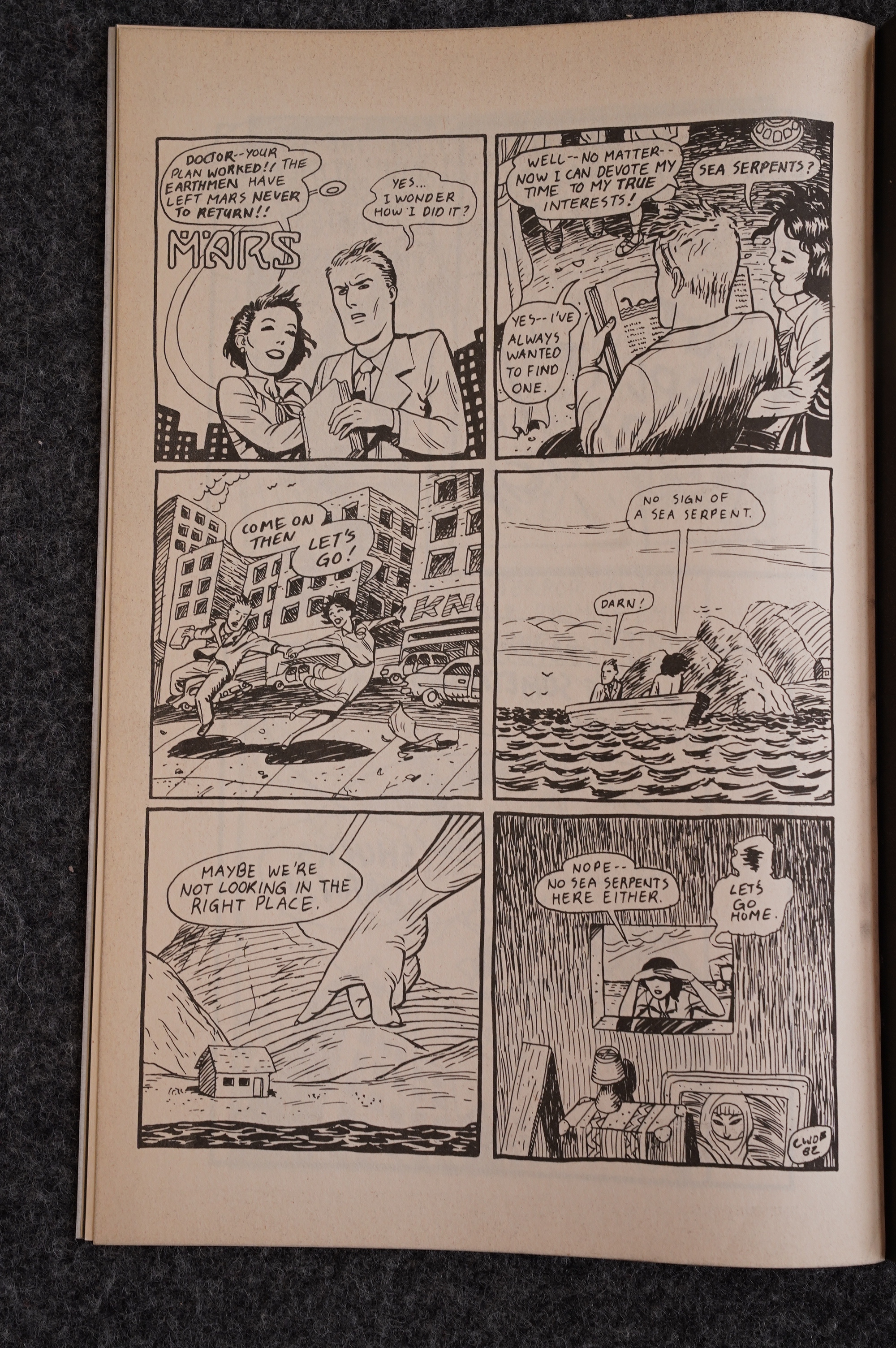
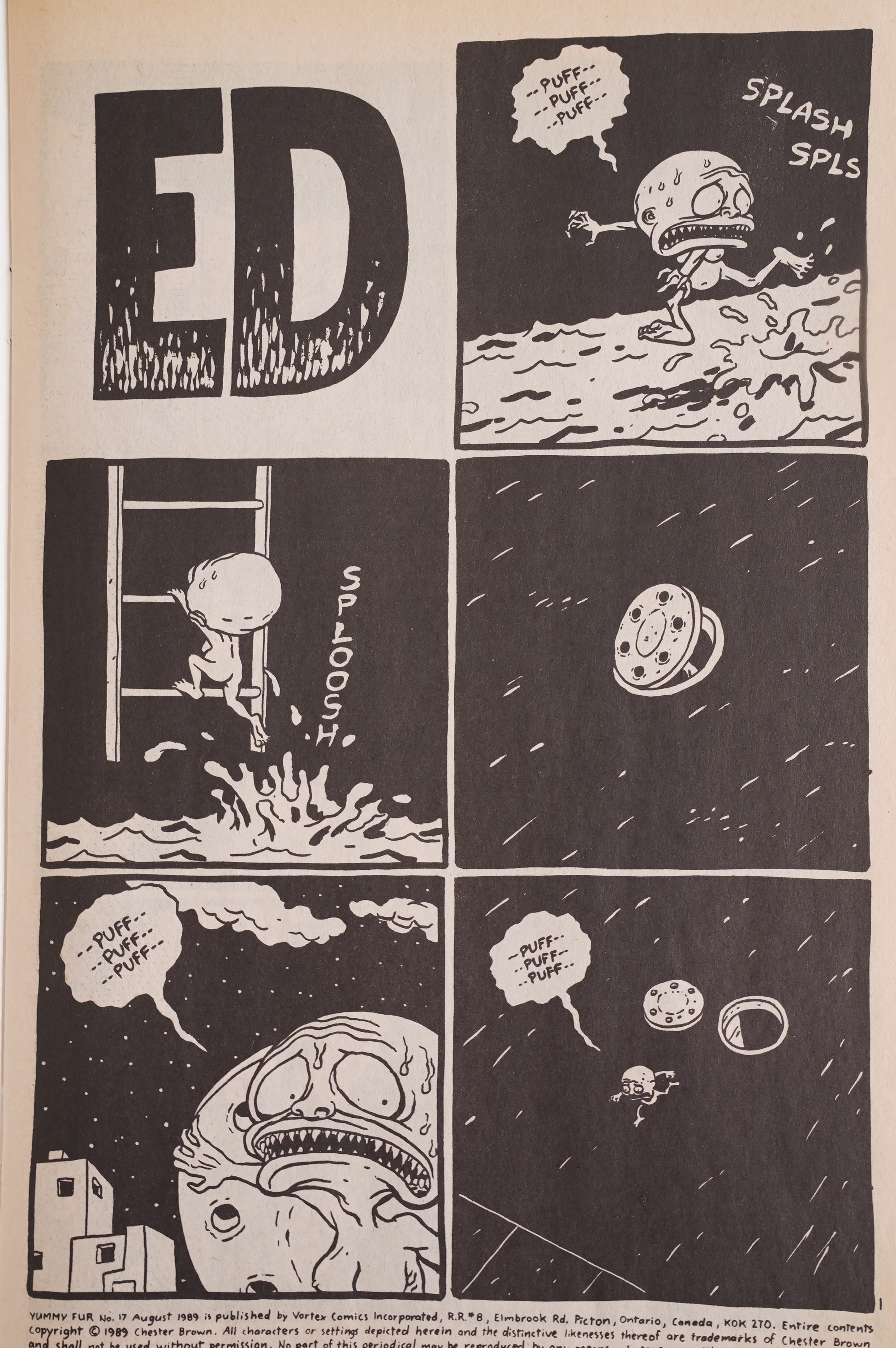
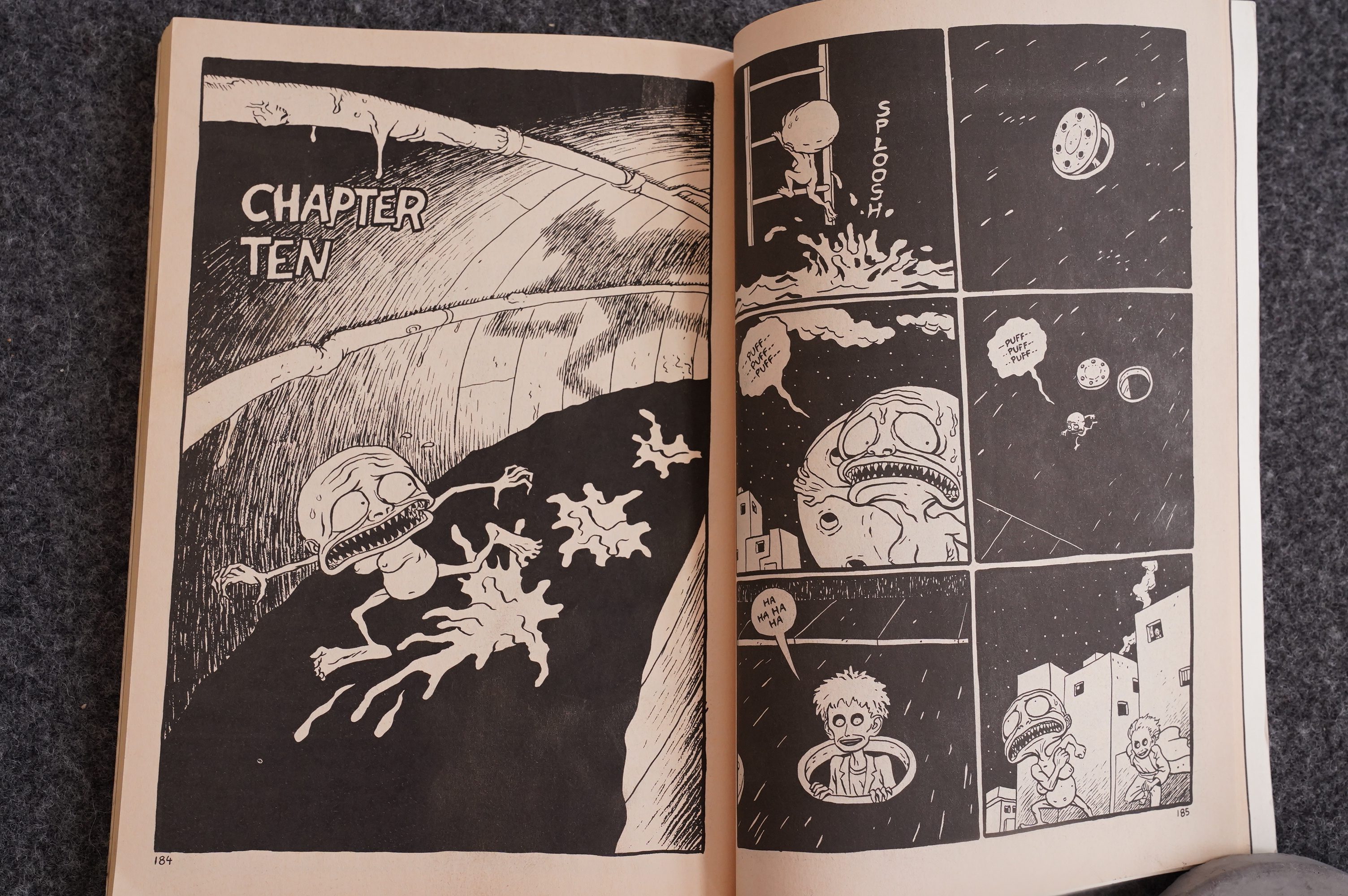
Everything connects! Here the aliens from the first page of the first issue reappears, still looking for cows to mutilate.

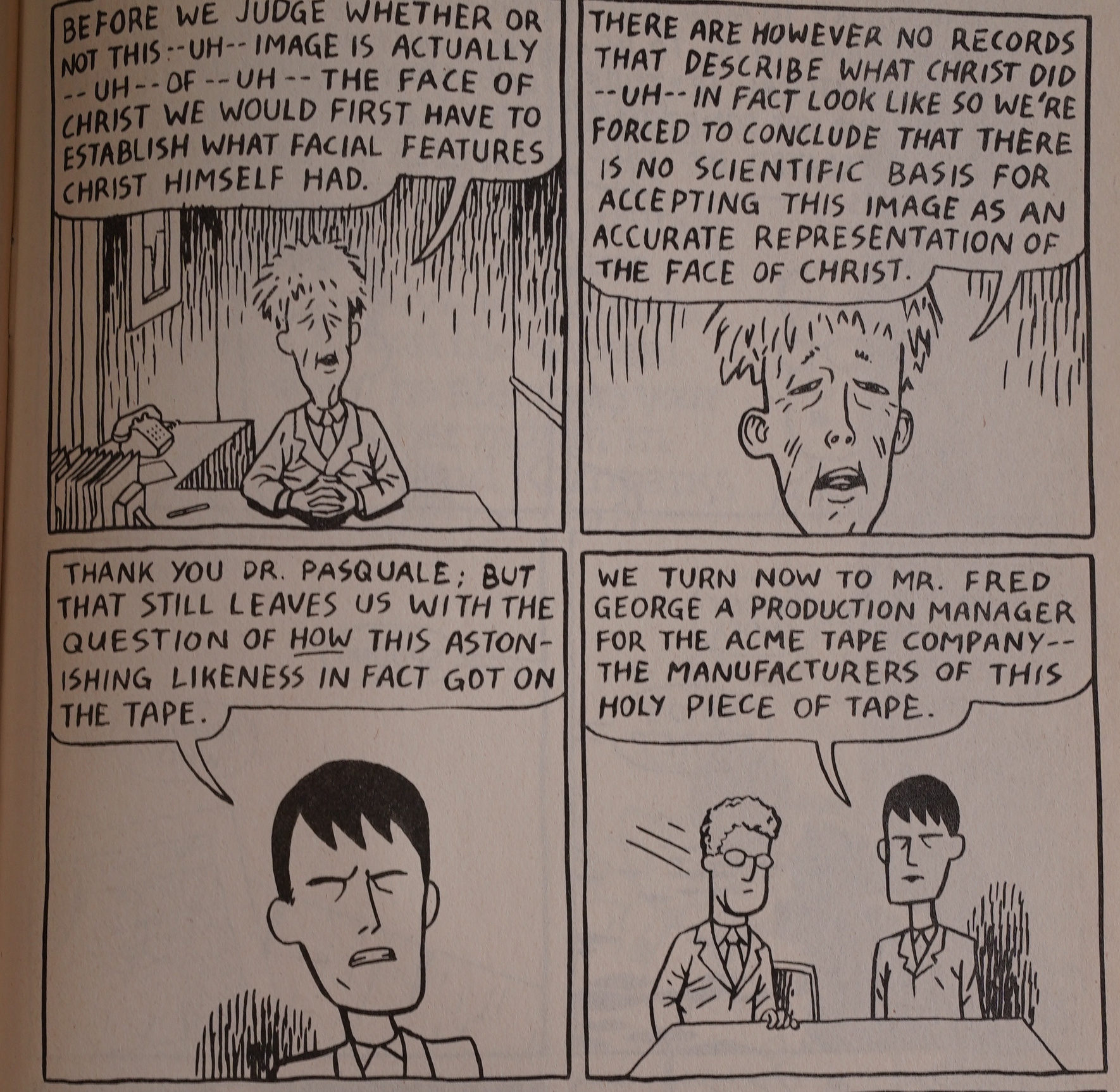
That’s a pretty good summary of all the news stories about Jesus appearing on things.

And then the reprints are over.

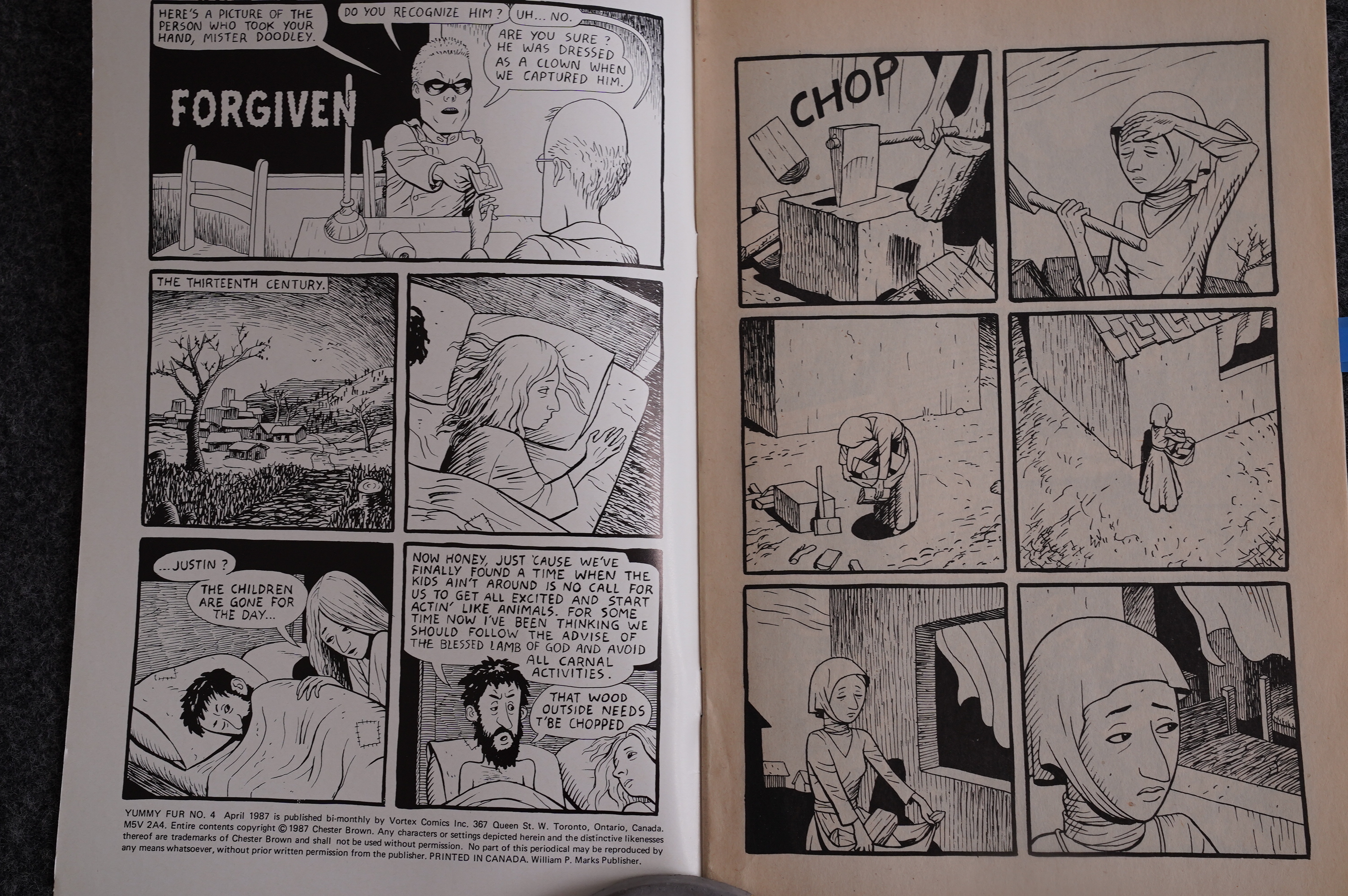
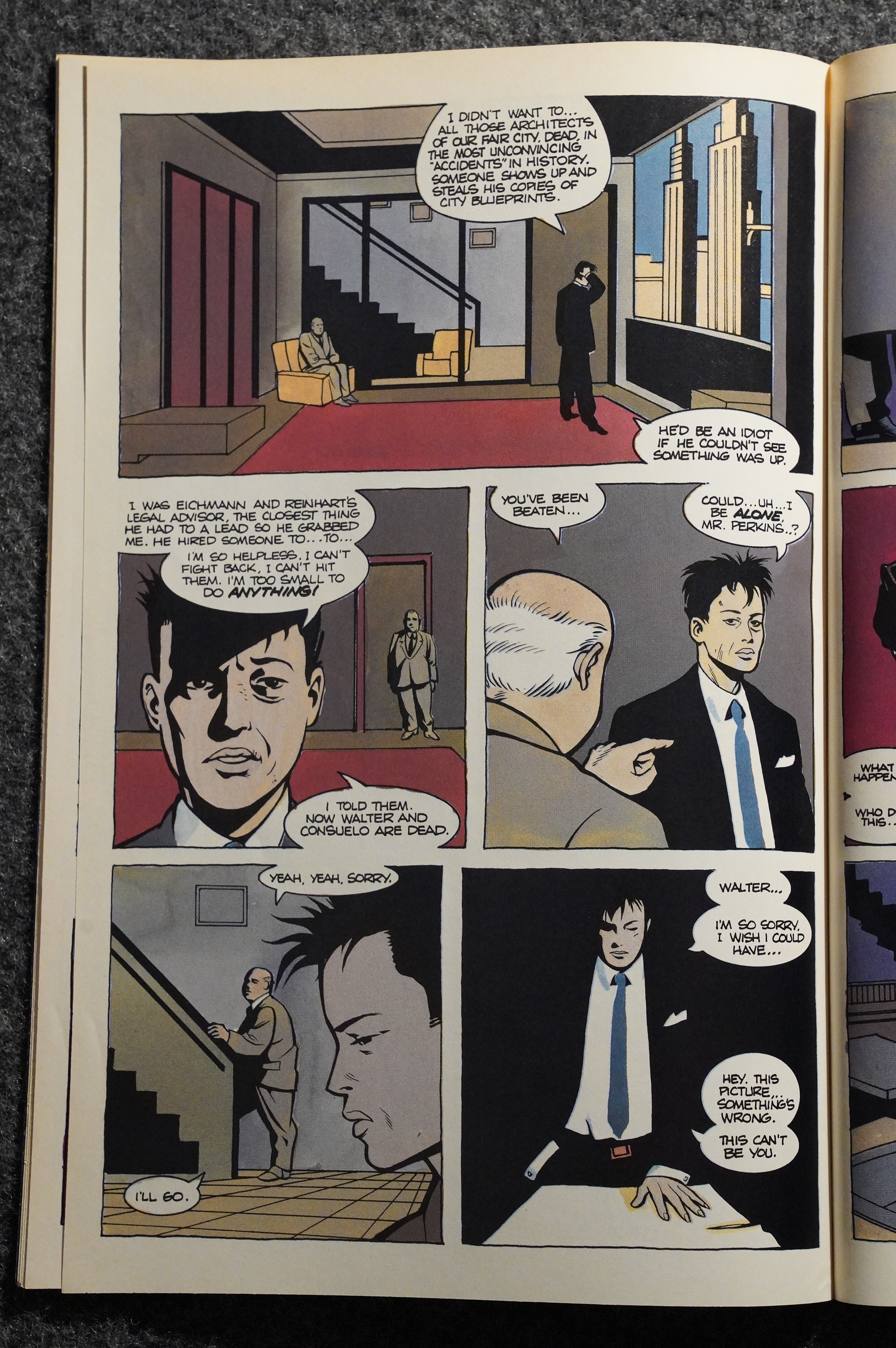
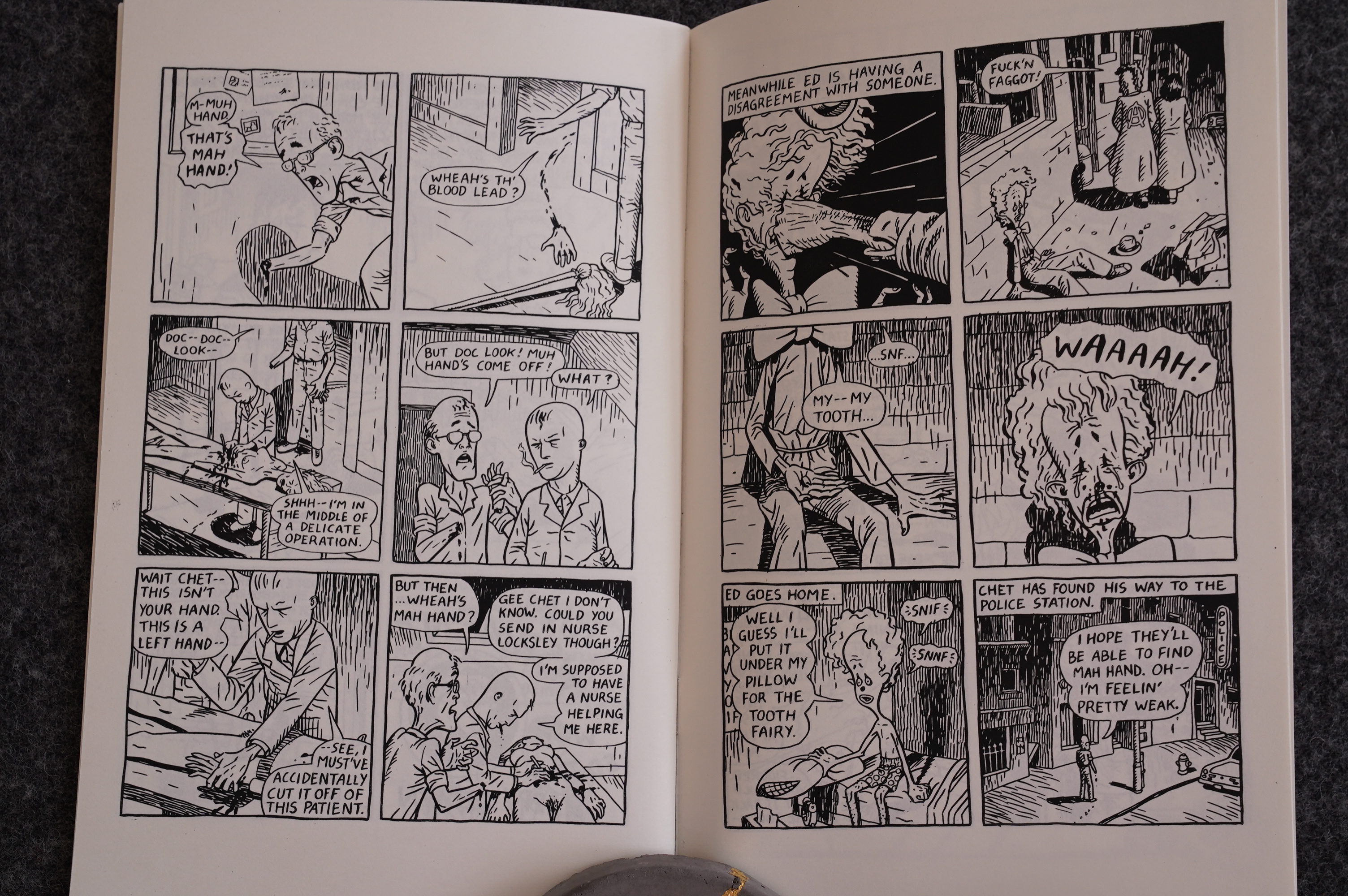
Brown becomes more ambitious immediately: The artwork in the fourth issue is more confident and considered, and the storytelling becomes even better. The Ed story takes a detour into a story of the story of that saint who cut off his hand to not be tempted.

Although in Brown’s version, it was his wife that cut his hand off because he preferred masturbating to having sex with her.

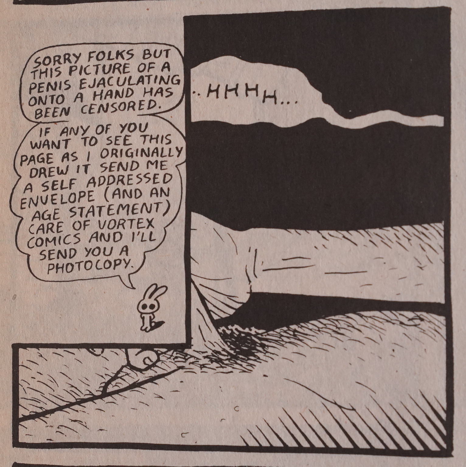
And this is the only instance of Bill Marks censoring Yummy Fur (or anything else, I think?)

He put the panel back in the collected version of Yummy Fur.

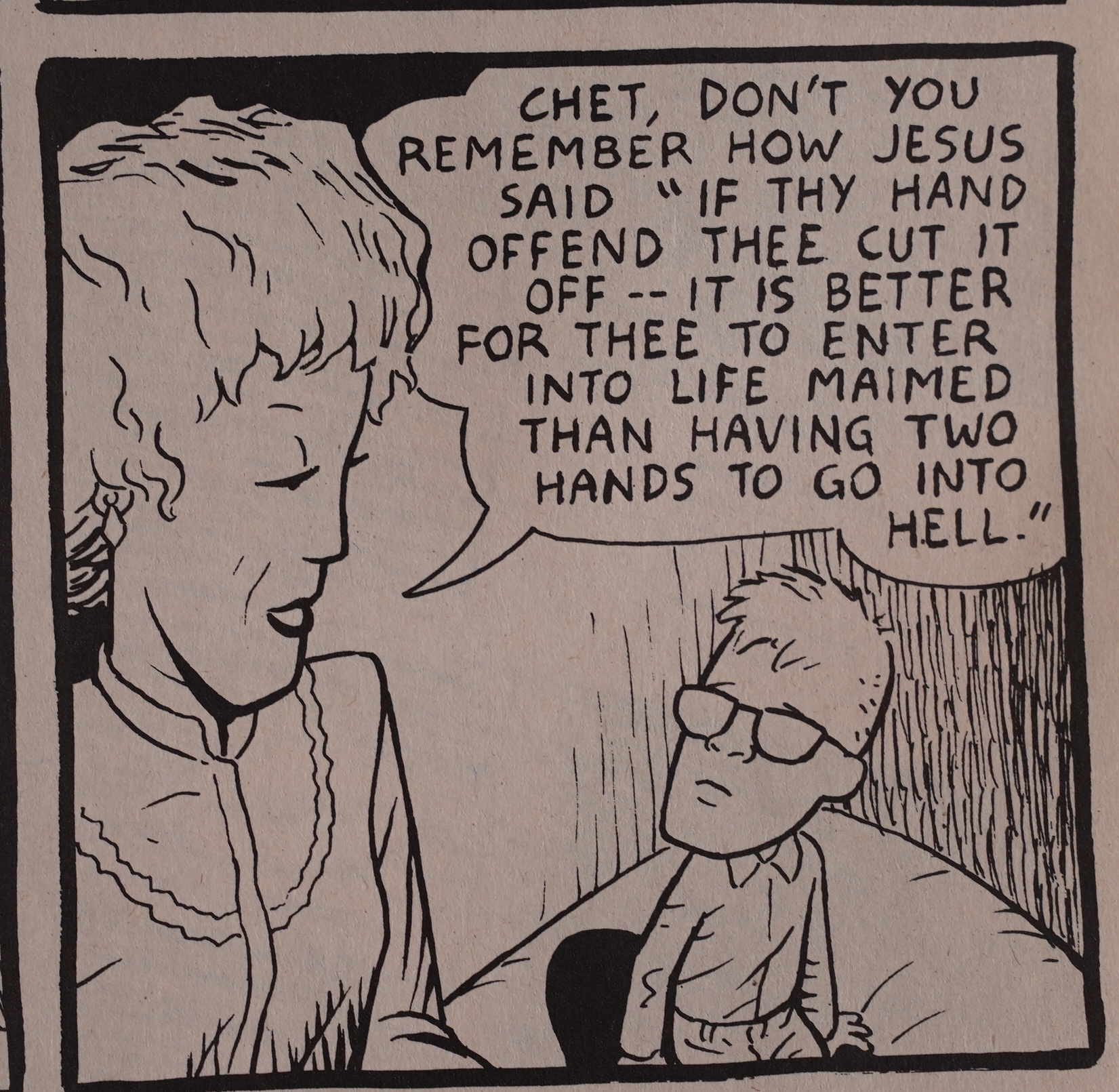
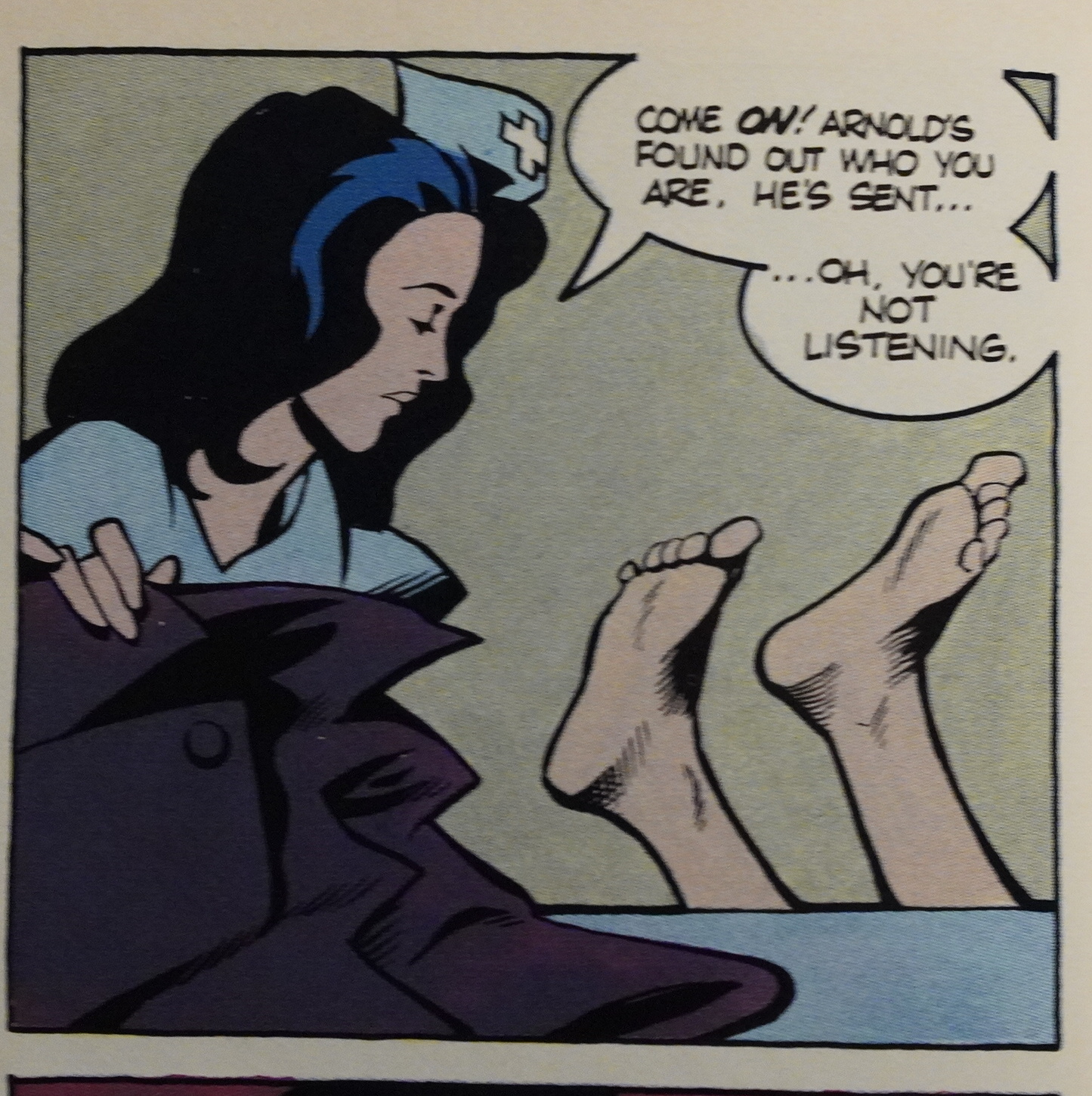
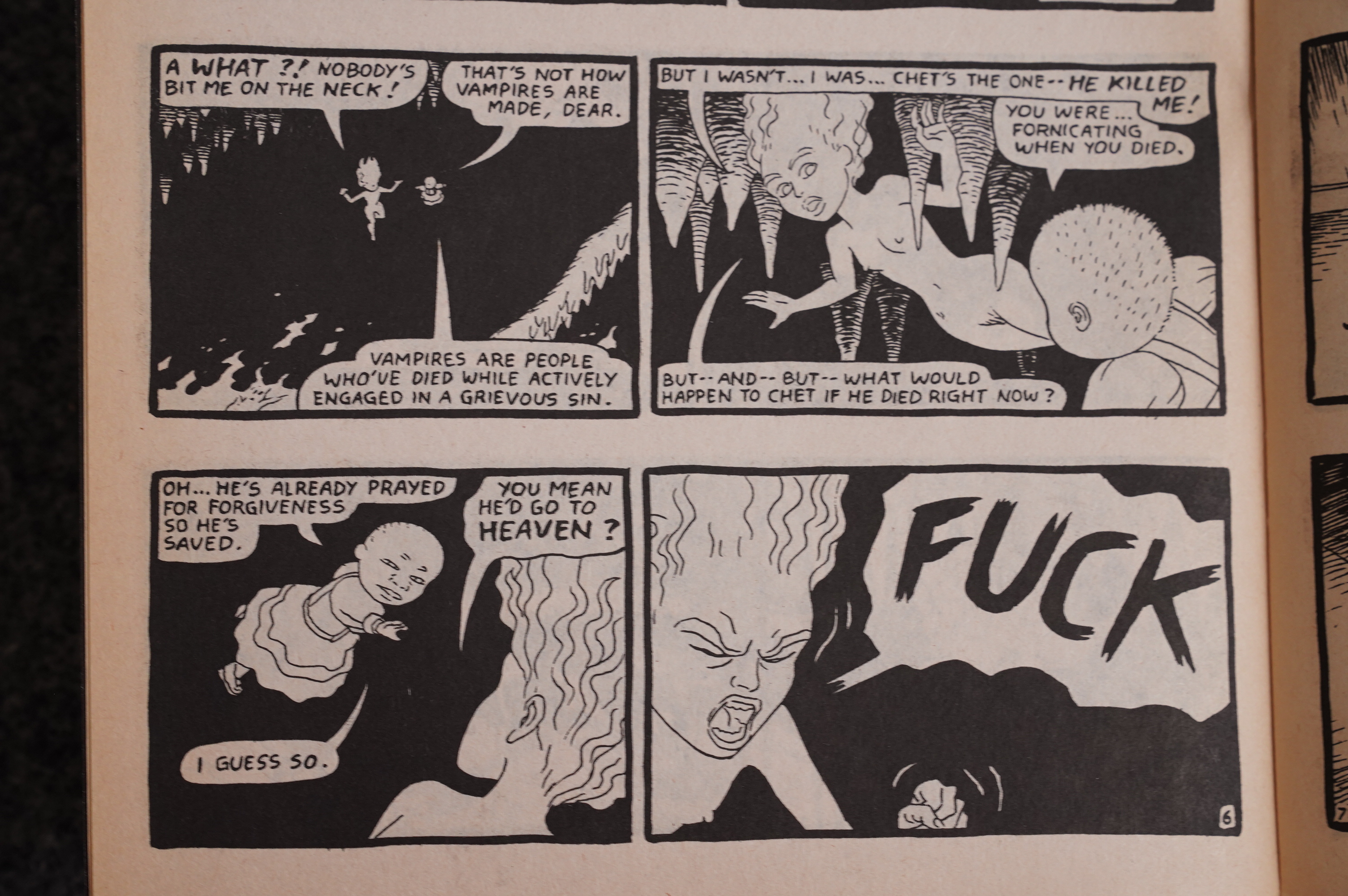
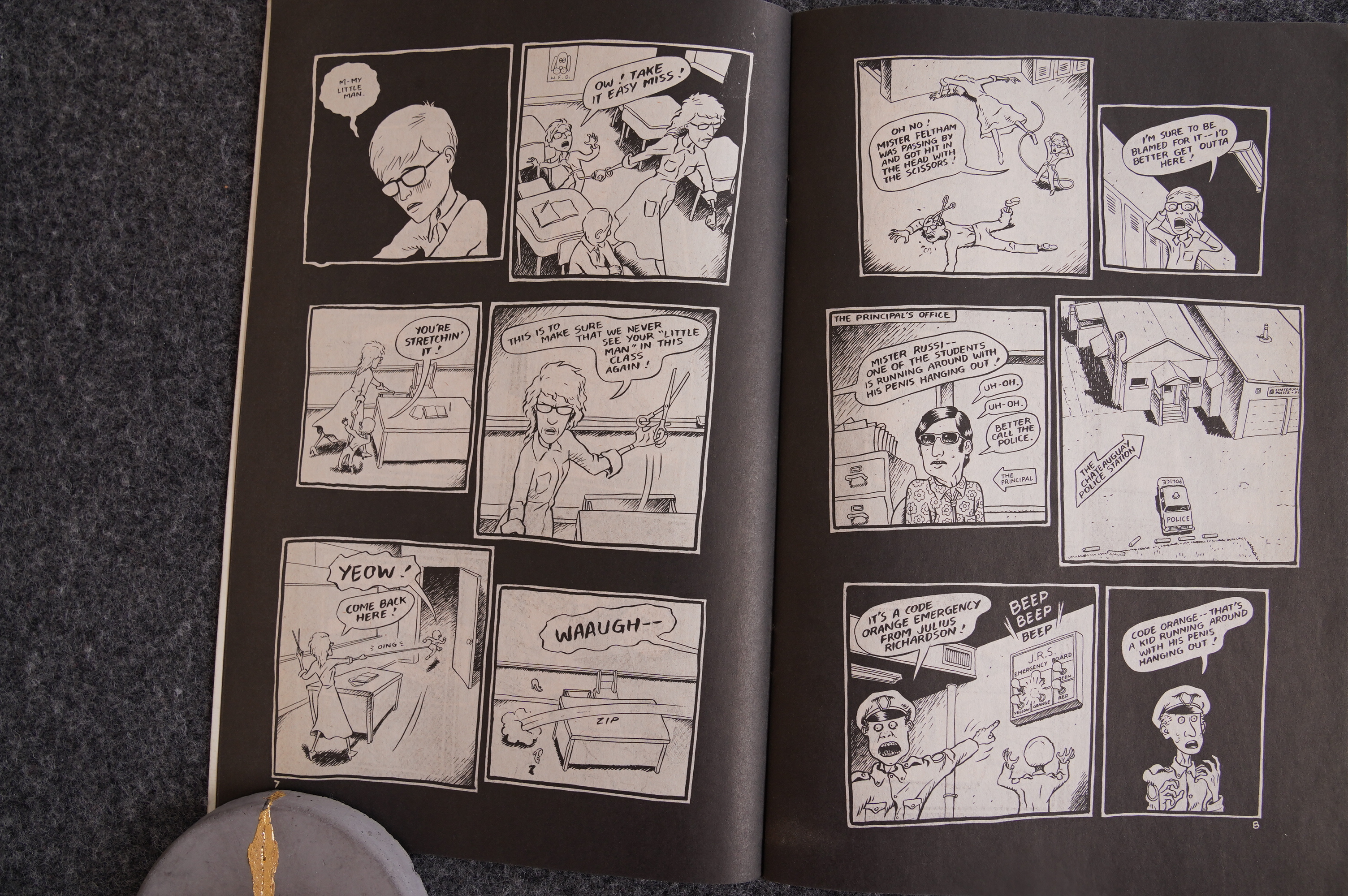
Chet’s mom gives him some bad advice.

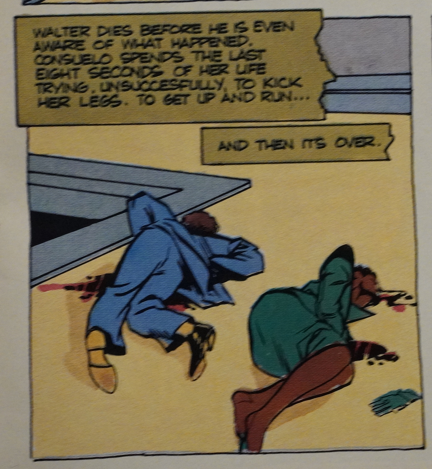
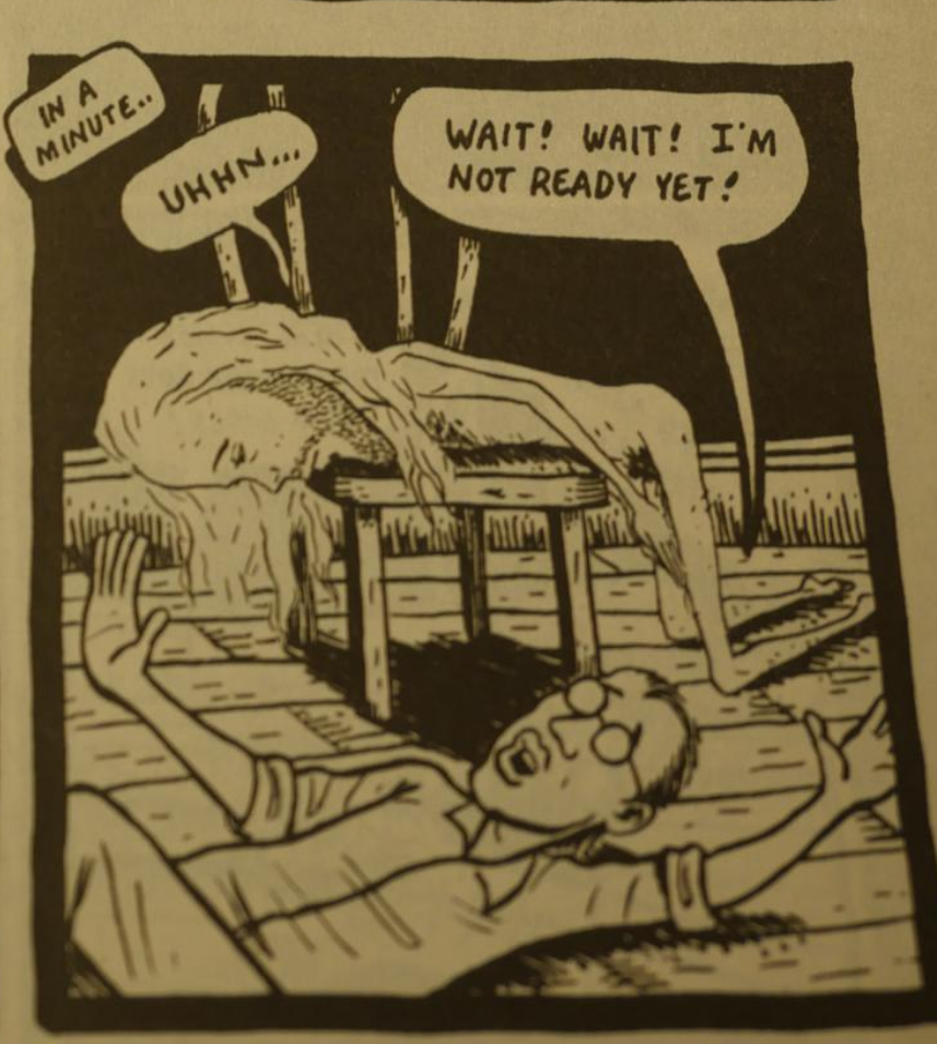
There’s a lot of body parts falling off and bodies breaking here, but more horrifying is the casual, normalised violence (like those two doctors beating that guy with some tubes). This could so easily have felt like all this is just for shock value; to make bros go “dude! bro!”, but instead if feels unsettling and unnerving. It’s in the little things, like the look the doctors give each other after one asks “shouldn’t that thing be in a splint?” (They don’t then do so, of course.)

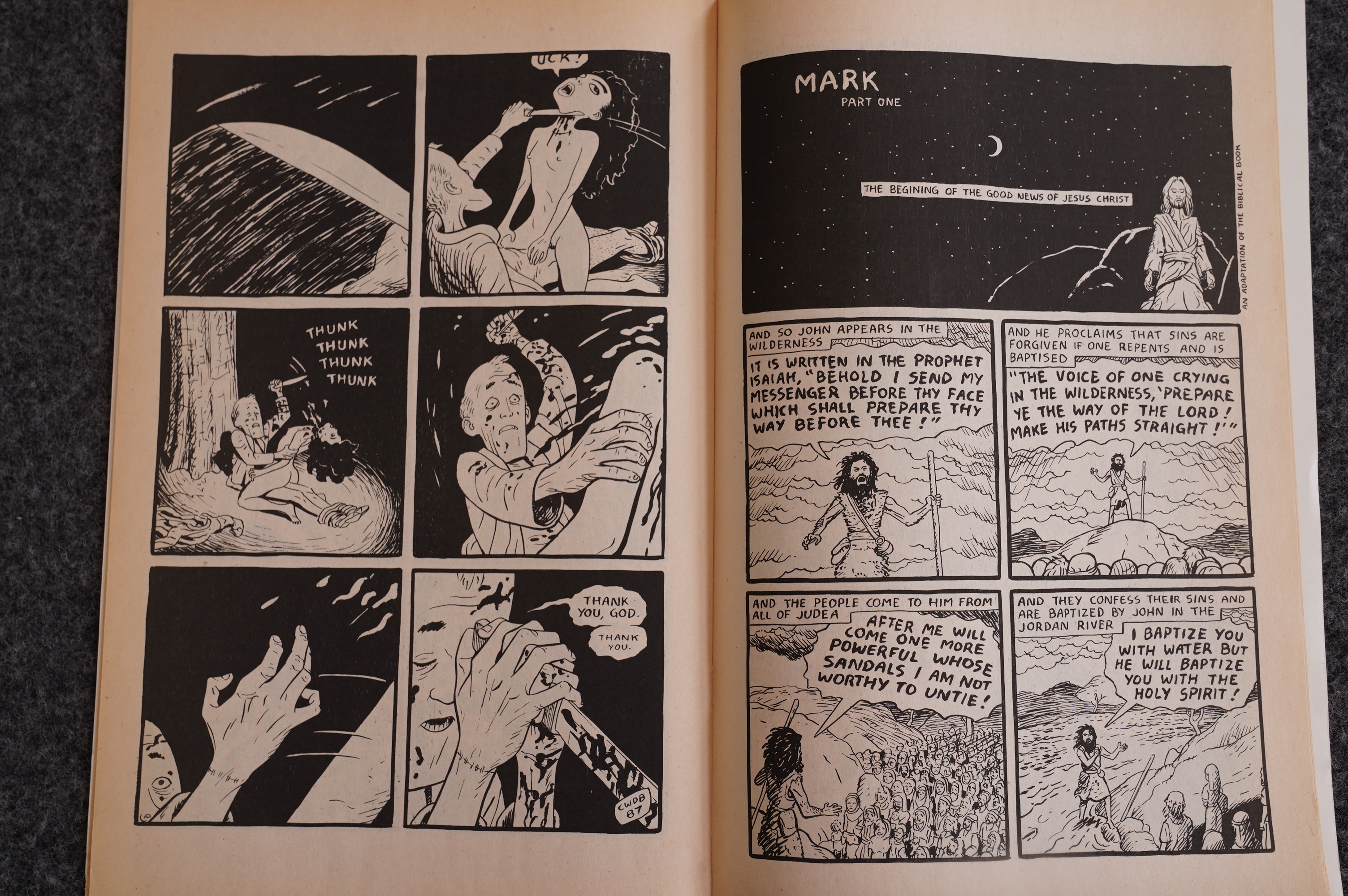
Chet learned well: He cuts off that which offends him (i.e., he kills his lover while they’re having sex). Next page: Part one of the adaptation of the Gospel of Mark.

And it’s done seemingly totally straight, without any humour or criticism of religion in mind. (The bible adaptations continue to run for a couple dozen issues.) This juxtaposition, perhaps nowhere else as jarring as here, creates an additional depth to reading experience: You can’t help wonder whether Brown is trying to say something here?

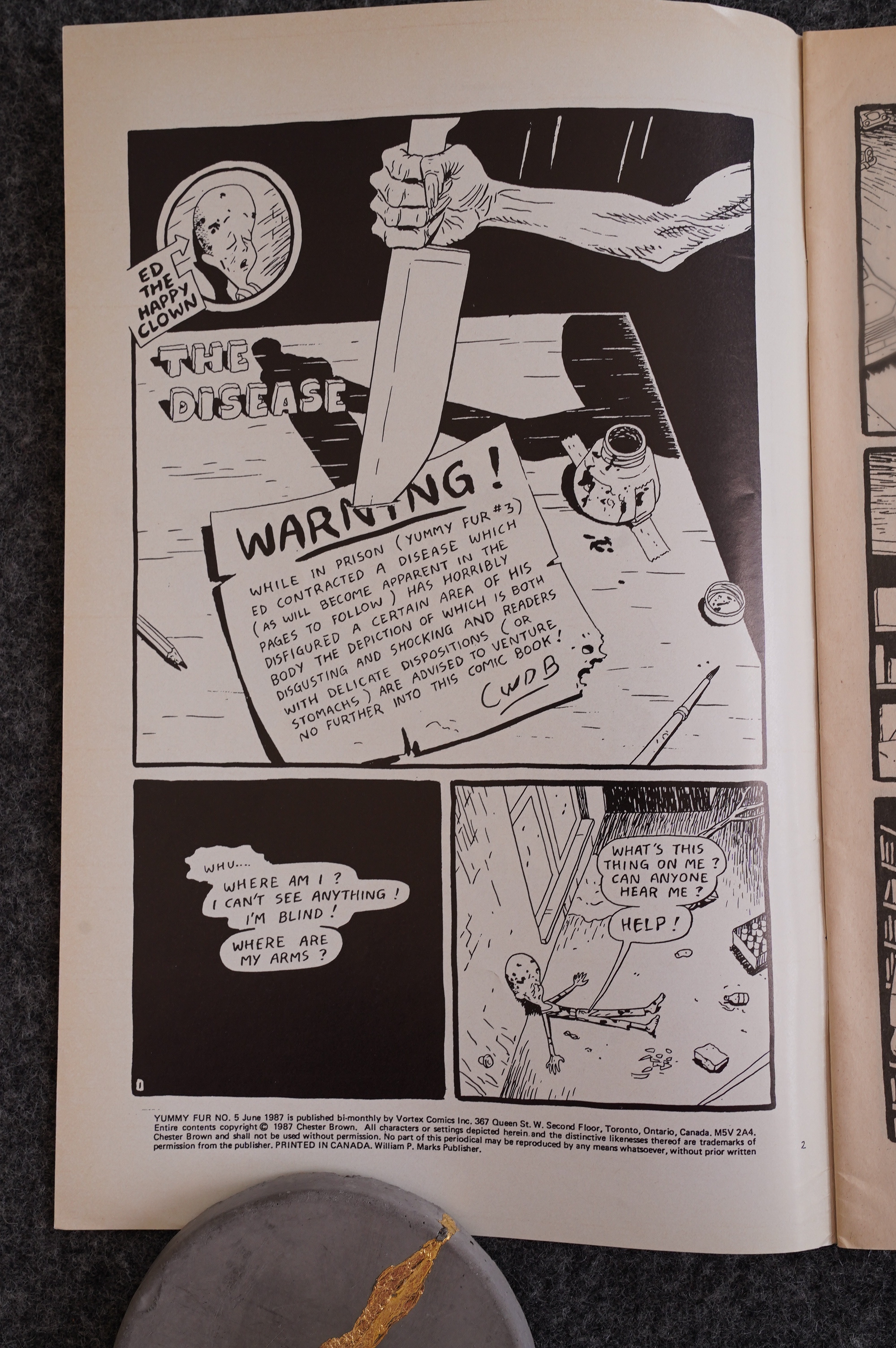
Brown warns us that things are going to become really disgusting now.

Here’s the same page from the collected “definitive” edition: Makes sense to drop the warning here, I guess.

But what’s that whiter tab in the blackness? Yes! It’s where I put post-it tab! This is so badly printed that the post-it lifted some ink off the page! Now it’s not Near Mint any more! My pension! It’s worthless now! Noooo!

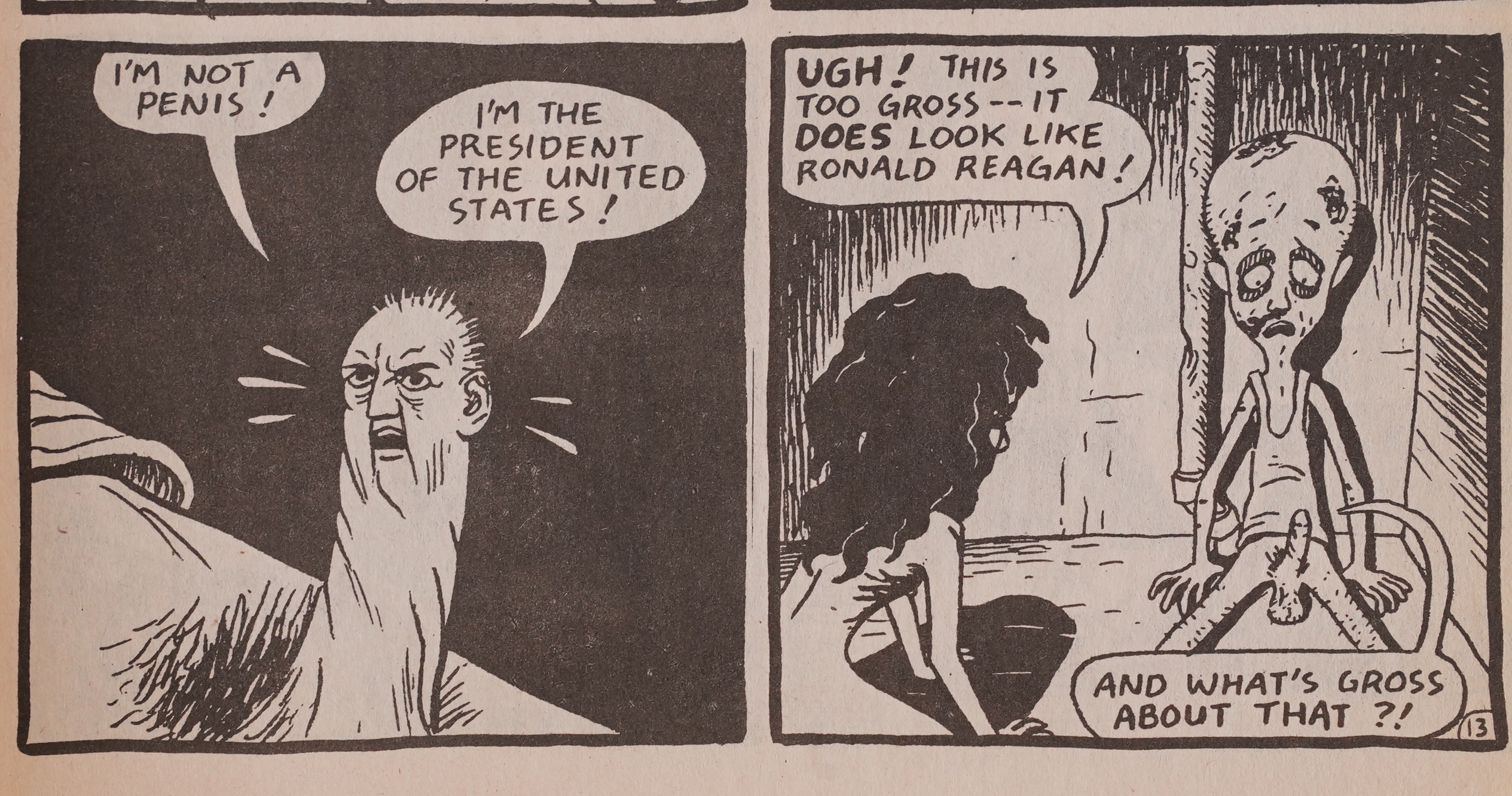
Anyway, it turns out that Ronald Reagan’s miniature head has become attached to Ed’s penis. (That’s what the warning was about.)

(No, he doesn’t look like our Ronald Reagan, but this takes place in a different universe, he said in Comic Book Guy’s voice.)

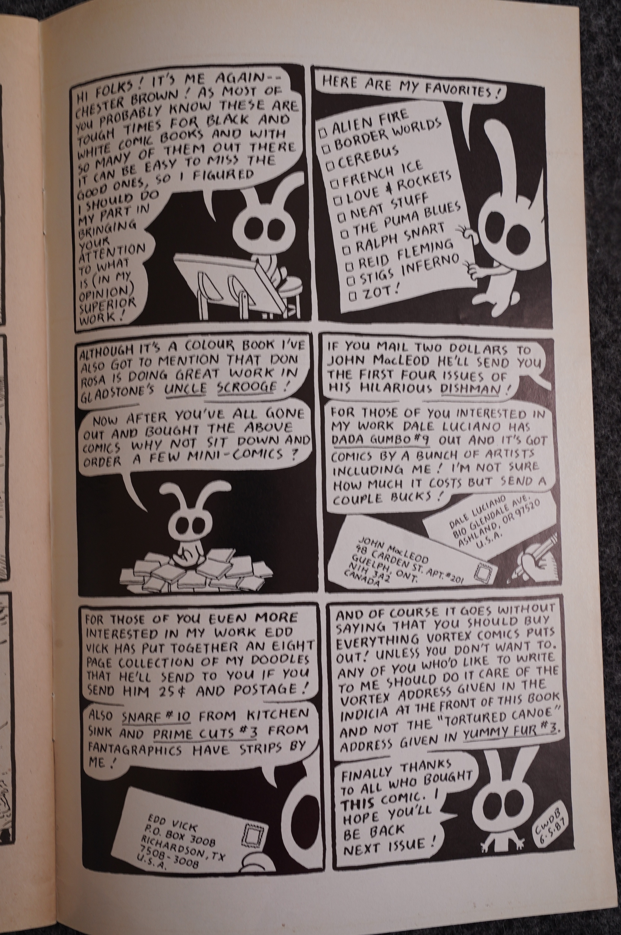
Brown recommends Donald Duck.

Heh heh.

I like the “maybe”.

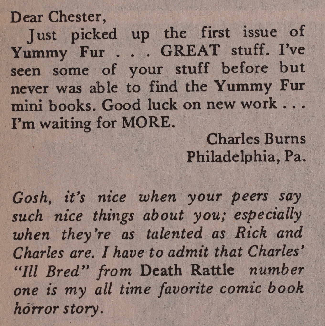
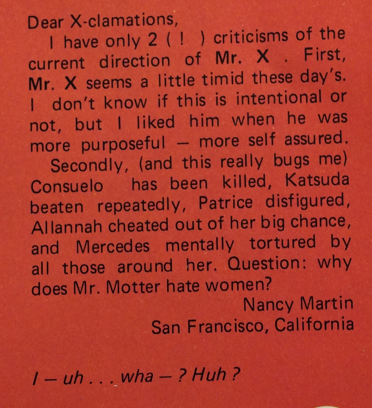
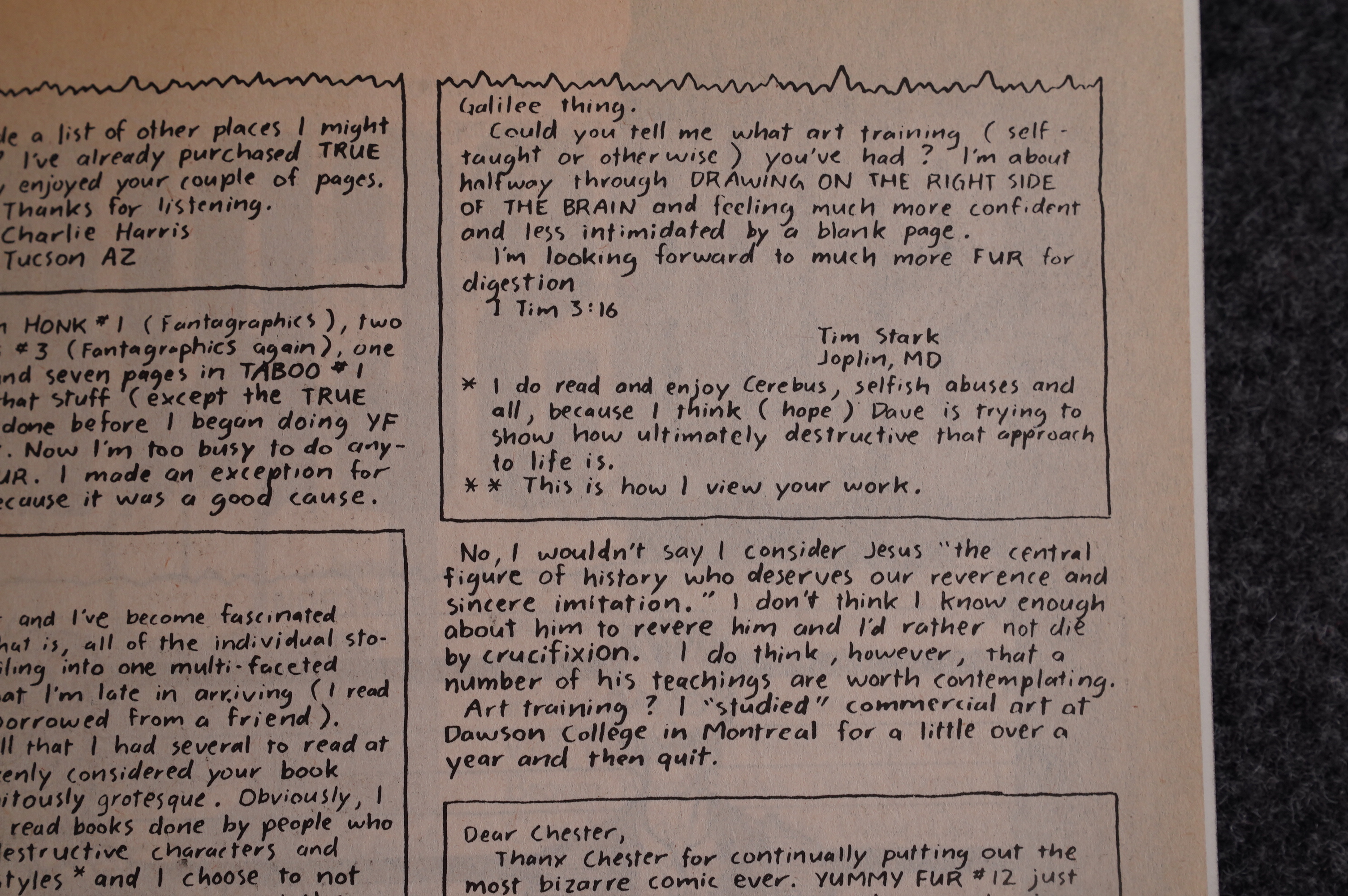
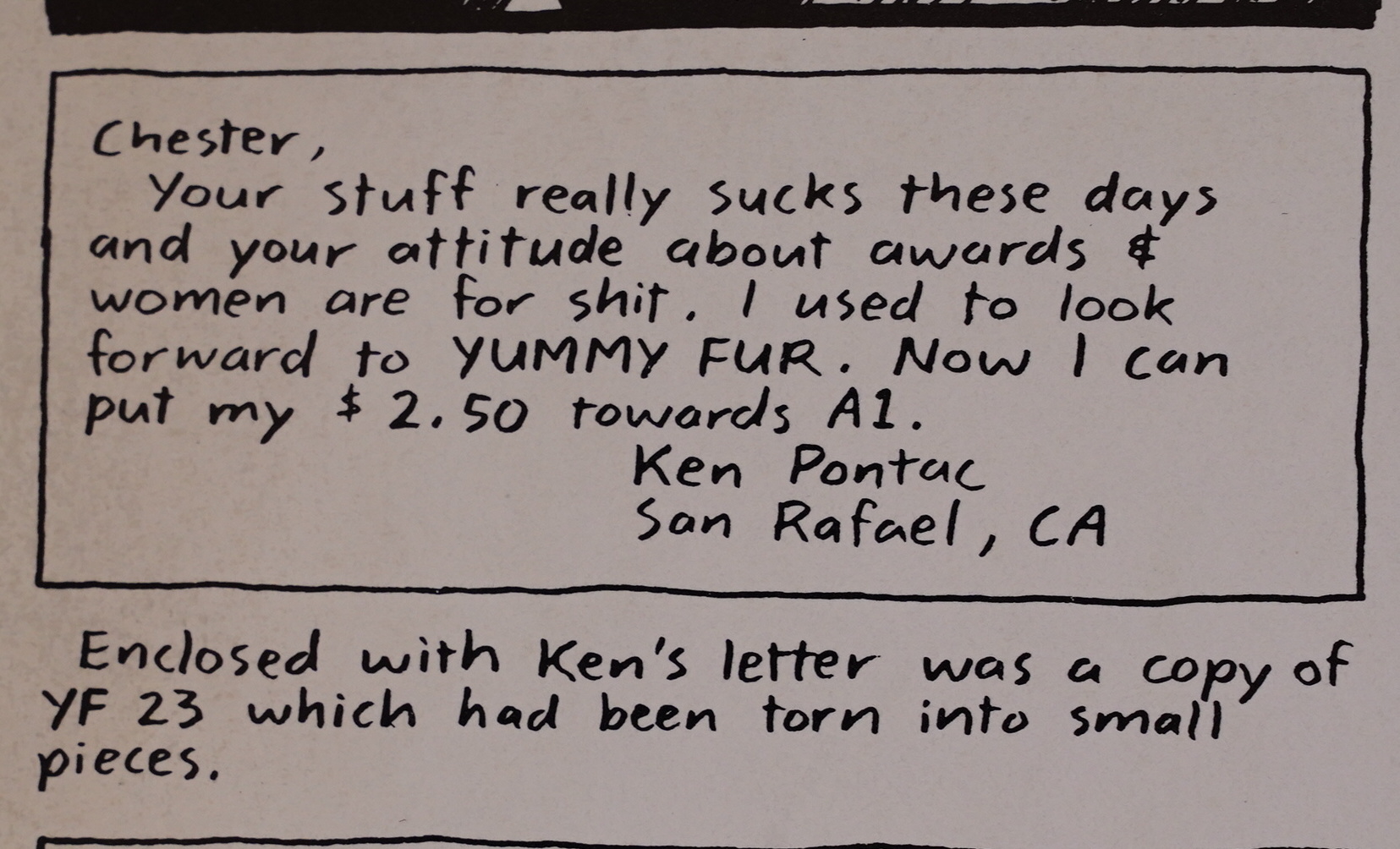
Yummy Fur also gets a letters column. It’s got a lot of famous people saying nice things about Yummy Fur. This is a rare issue that has a typeset column; all the other ones are hand-lettered.

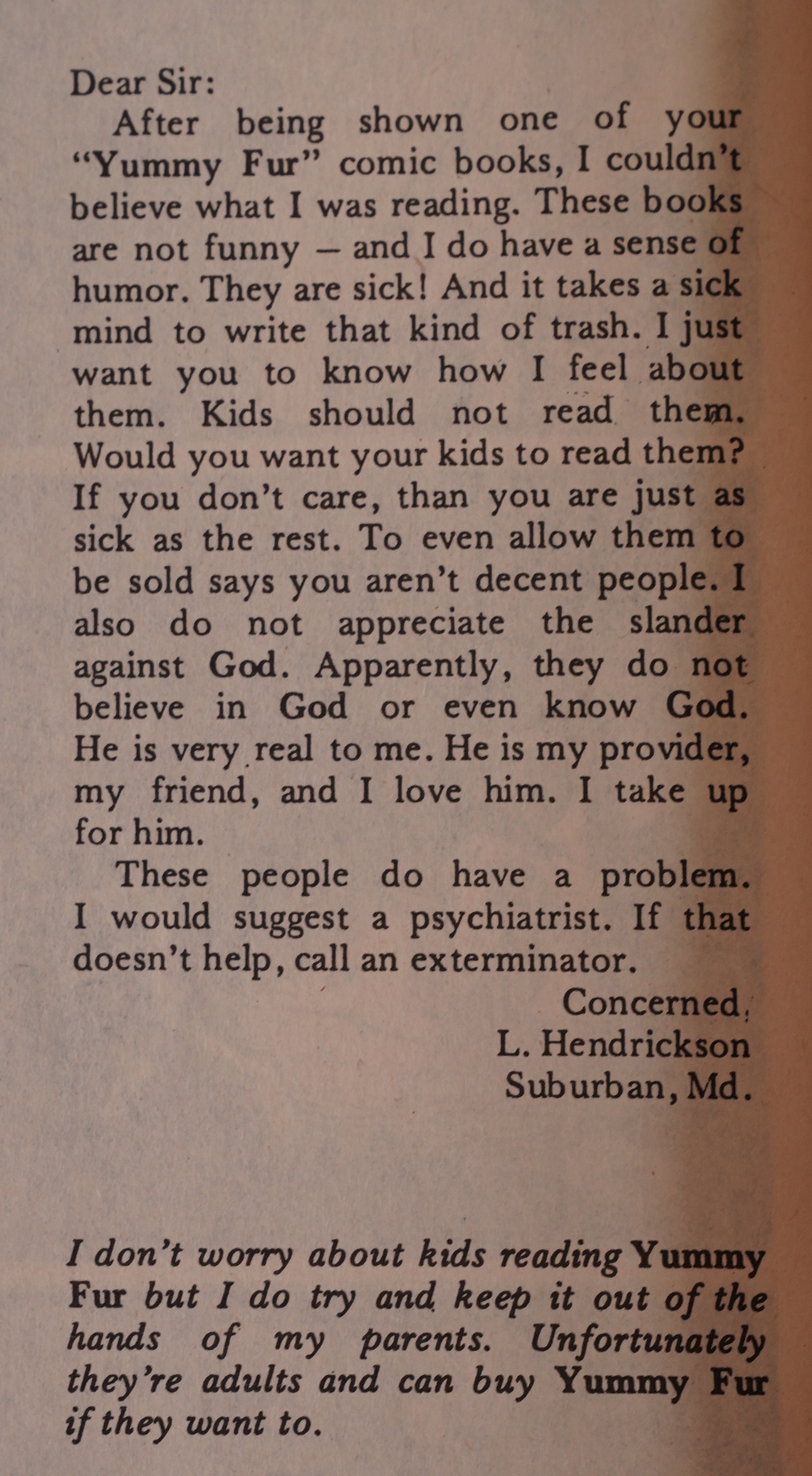
There’s also some odd-balls writing in.

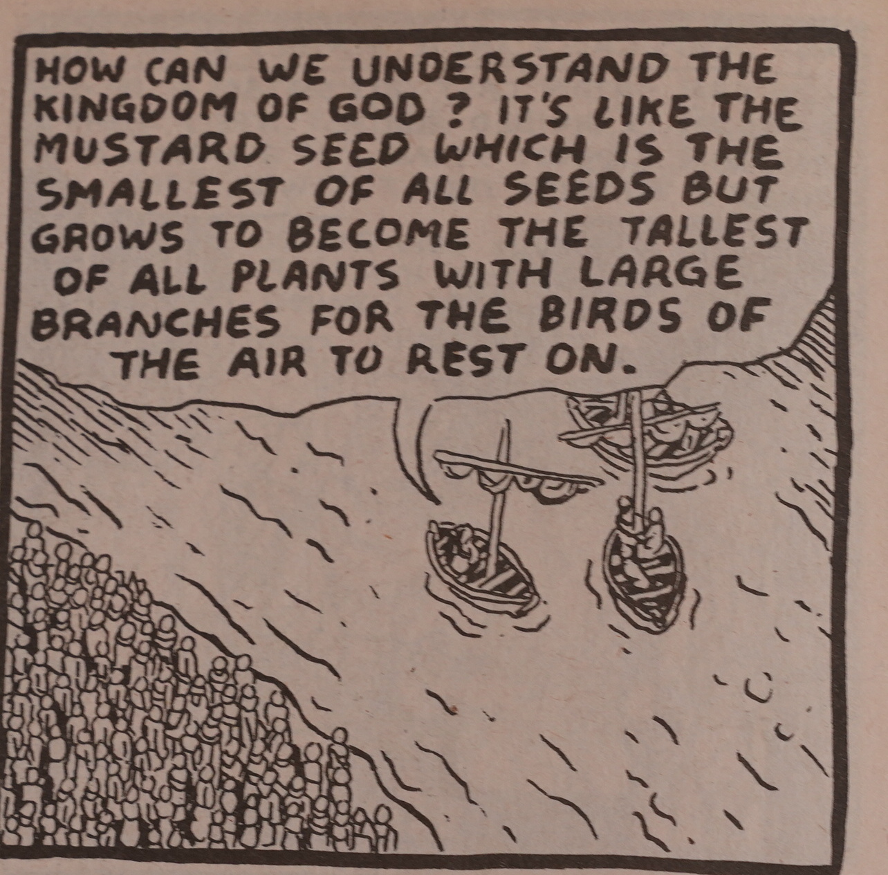
What? Is that a different kind of mustard plant?

I thought they looked like this…

Hm, I googled, and (some) christians seem to interpret this a Jesus making a joke?

Well, whatever.

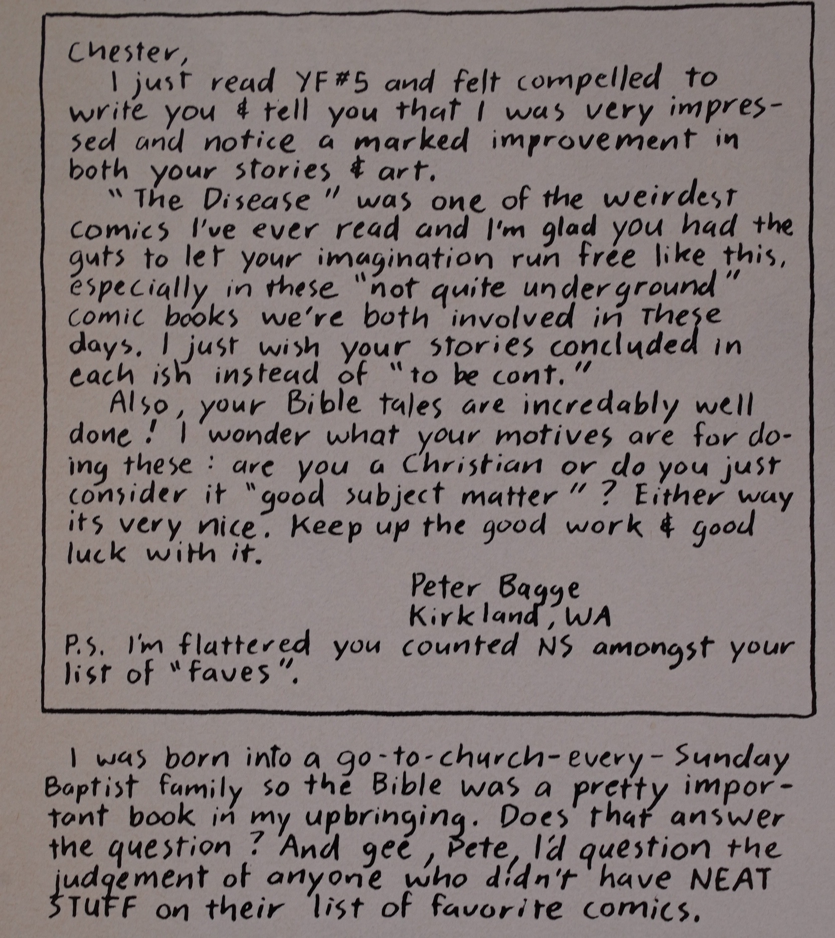
I think it does answer the question. Religious damage.

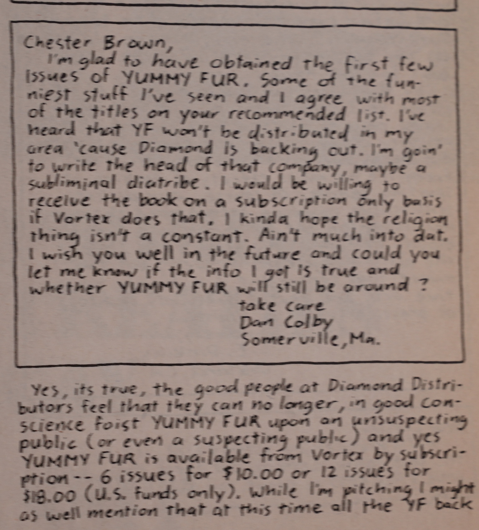
So what did the comics world think of all these penises, mutilations and Jesus? Well, the biggest comics distributor, Diamond Comics (now the monopolist in the US) refused to carry it.

CM (?) writes in The Comics Journal #121, page 9:

DIAMOND BACKS DOWN

Diamond Comics Distributors is now
willing to carry Puma Blues, and is
also willing to discuss distributing
Vortex Comics’ Yummv Fur, which it
had not carried since last August,
according to Diamond’s national
account representative Bill Schanes.

[…]

Yummy Fur: [William] Schanes also told the
Joumal that Diamond is now willing
to discuss resuming distribution of
Yummy Fur. although publisher Bill
Marks told the Journal he had not been
notified Of that as Of early March.
Diamond stopped carrying Yummy
Fur last August and. according to
Marks, cited low sales as the reason.
However, Diamond continued to Carl)’
two other Vortex titles with even lower
sales leading Marks to believe that
Yummy Fur was singled out because
of the book’s adult content. Marks said
he would not have objected if the deci-
Sion was based on content, but he was
offended that Diamond wasn’t more
forthright in stating that reason.
Schanes said he did not remember
how Yummy Fur ‘s sales compared to
other Vortex titles at the time of the
books discontinuation. But he said
Yummy Fur sales were very low, ”
and “There was stronger material we
could put on the order form.” in Yum-
my Fur’s place.
Schanes said the books content did
enter into Diamond’s decision not to
carry the book. “l think it was a milwr
issue, yes. ”
Beginning with the next issue.
Marks said, he will be publishing
Yummy Fur under a new imprint, Fab
Comics, in order to divert distributors’
prejudice away from Vortex. Marks
will own Fab Comics wholly, distinct
from the partnership Vortex Comics
recently entered with the Canadian
retail store Silver Snail.
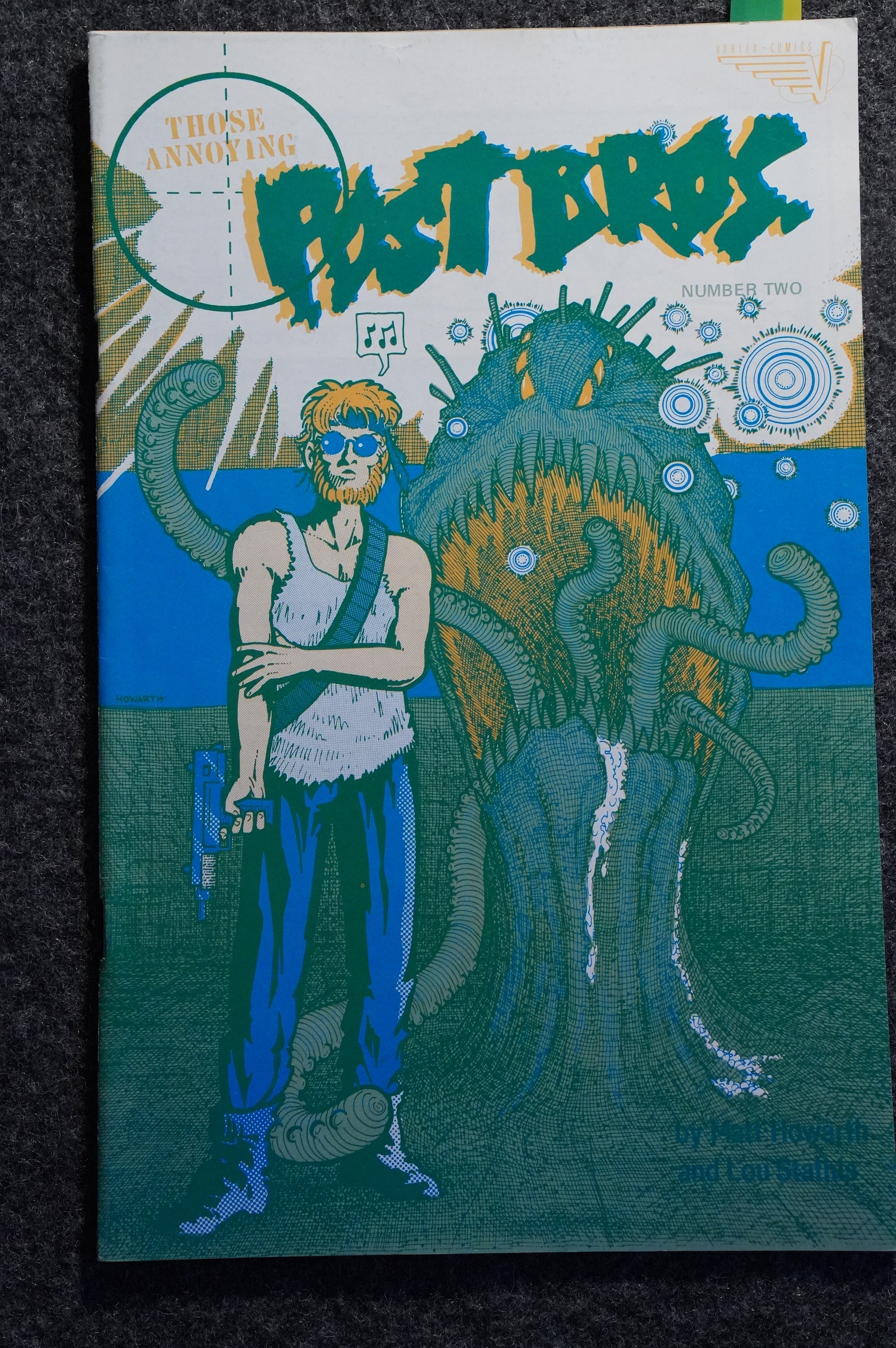
Three years ago, Marks said, he had
a similar problem with Diamond when
they would not distribute Matt
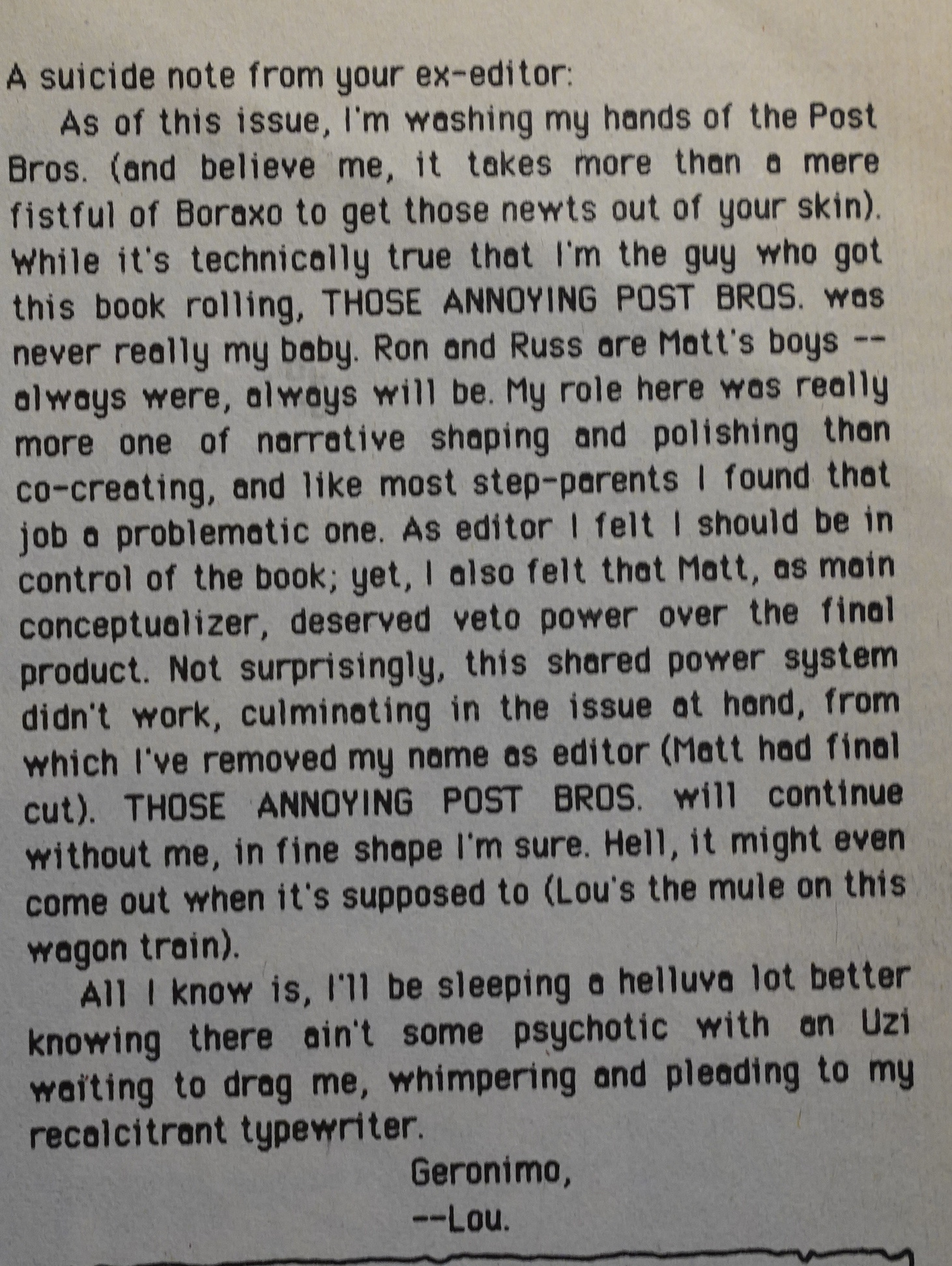
Howarth’s Those Annoying Post
Brothers. Diamond also recently
indicated to him that they might not
distribute Howard Chaykin’s upcom-
ing Black Kiss, after he described to
them the book’s erotic-horror
contents.
In order to restrict Black Kiss to
mature readers, Vortex is labeling and
pre-bagging it. Schanes told the
Journal, that Diamond would be
taking the comic book.

So Diamond claims that the contents had nothing to do with it; the sales were too low. Riiight.

Marks’ plans to create an imprint just for Yummy Fur didn’t happen, but it’s pretty amazing of Marks to keep the book on under these conditions.

An interview in The Comics Journal #135, page 90:

GRAMMEL: One thing I haven ‘t touched on is your om
particular experience with what some would call censor-
ship by Diamond Comics Distributors. I know it ‘s been
resolved, bur could you tell me how that affected you ?
BROWN: Hmm… well, on the one hand, 1 did feel he
was within his rights. If Yummy Fur was genuinely of-
book that he didn’t like? But it certainly was annoying
for me. I lost a lot of money.
GRAMMEL: He was carrying it and then he stopped,
so you saw sales drop from what they had been.
BROWN: Yeah, dropped quite dramatically. I mean, I
think he was like a third of our sales.

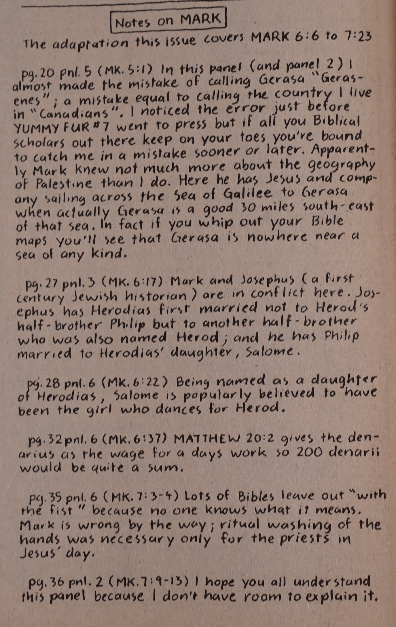
Brown starts his notorious tradition of doing notes to his pages. I think his most recent book had more pages of notes than of comics?

That is a good question.

Heh. Very Kirby panel.

She’s that woman that was killed way up there, and she’s explained how the world works.

Fuck, indeed.

Oh, that’s what that drawing was about: The thing about Yummy Fur possibly not being a Vortex comic any more was about that separate company that Marks was supposed to create. That’s less dramatic than I thought.

Bill Marks also weighs in. For a publisher (of his era), he doesn’t show up a lot in the comics he publishes.

And then we’re at issue 12: This is how the Ed story ends in the collected editions. In the comic book, it doesn’t end until issue 18, which I guess means that Brown felt that those issues were weak?

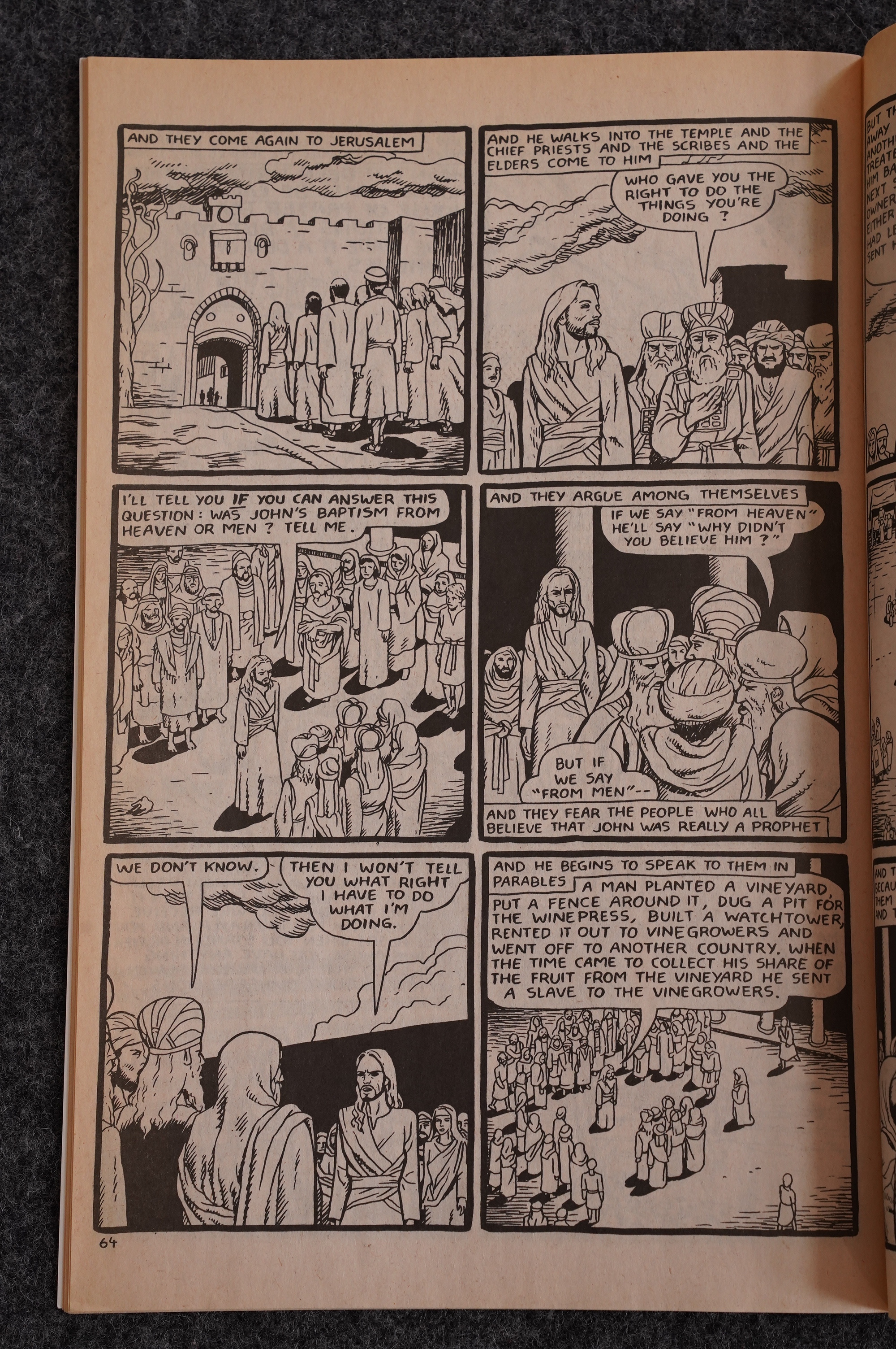
I thought the Mark adaptation was a fun read for the first few chapters — it zips along. As we get further and further in, Brown seems to want to keep more and more of the verbiage, and it becomes a bit tedious sometimes.

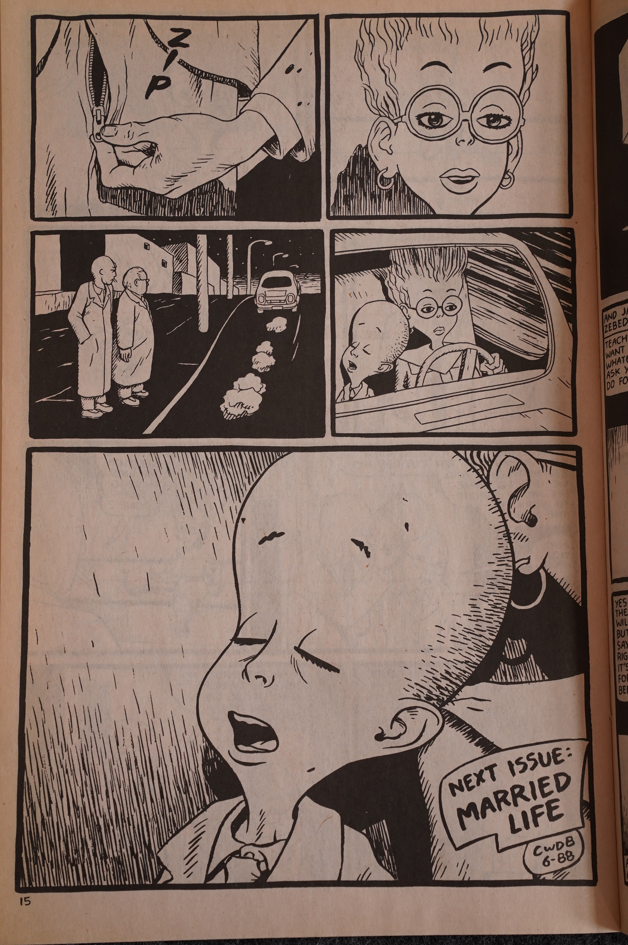
So these are The Forbidden Ed Stories: Pure domestic bliss. Or, er, not.

But I do kinda see why Brown wouldn’t want to include this in the collections: It’s something of an anticlimax after the sheer terror of the first dozen issues.

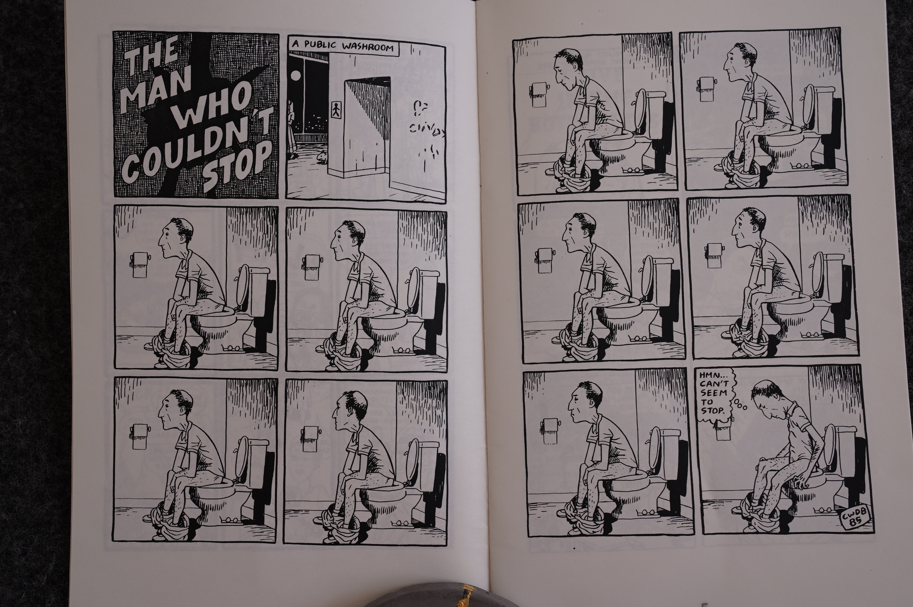
Practical! I should try that.

I think the Ed serial continues to be pretty funny, but you can see that Brown isn’t that into it. In one issue, we only get nine pages before Mark takes over.

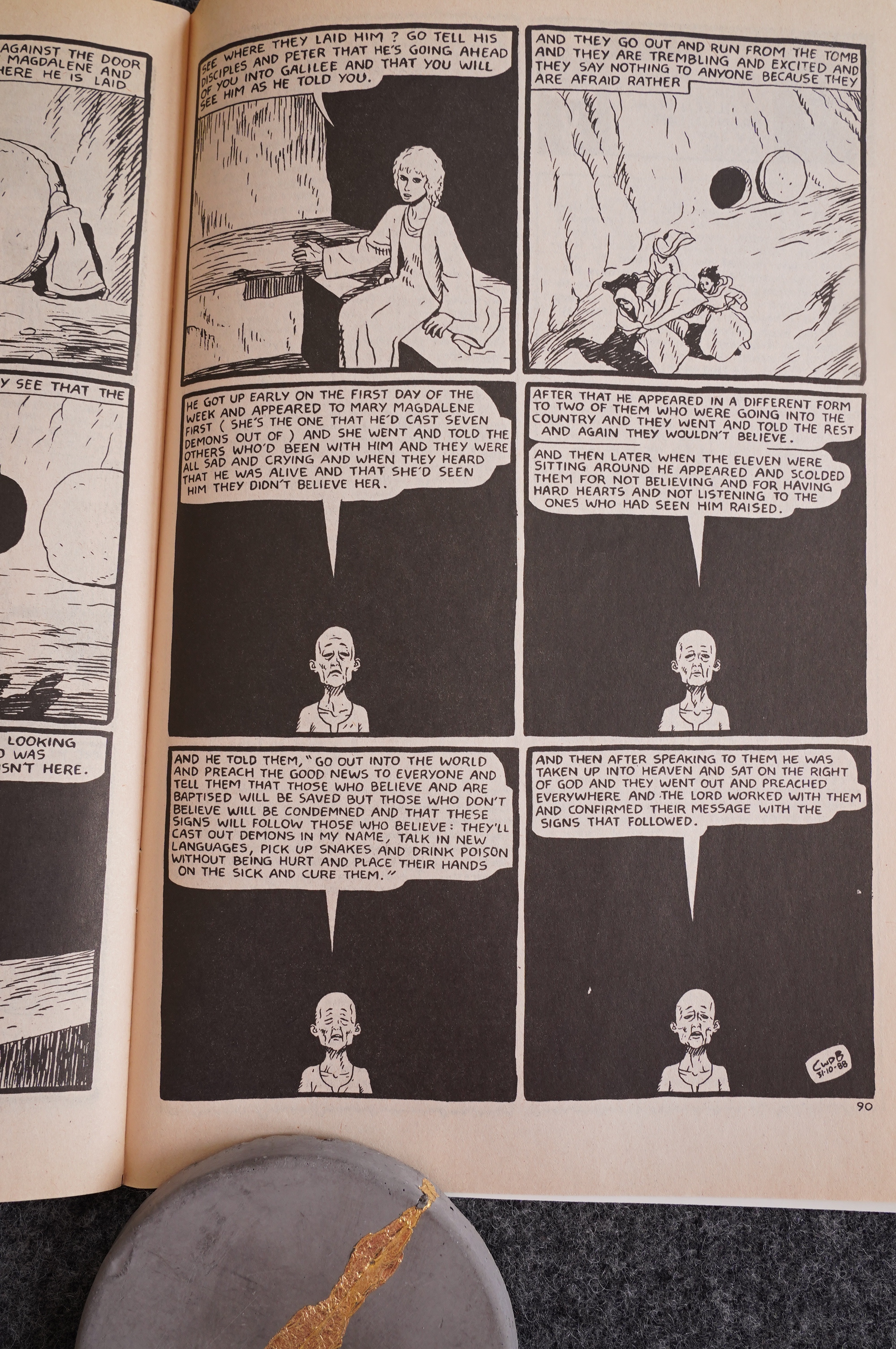
And this is how Mark ends. OOPS SPOILERS Jesus dies and is resurrected… But Brown doesn’t show the latter, which either means 1) that’s the point, og 2) he was pretty fed up with his approach to adapting the bible, too.

Yeah, I don’t think you’re supposed to imitate all parts of Jesus’ life.

We can only hope!

Their hopes are dashed! No cows!

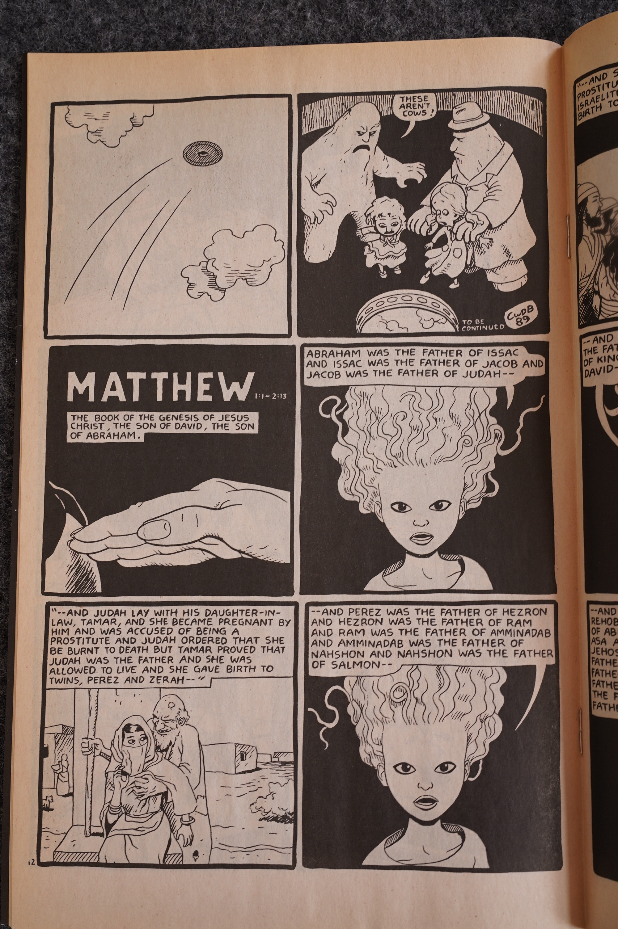
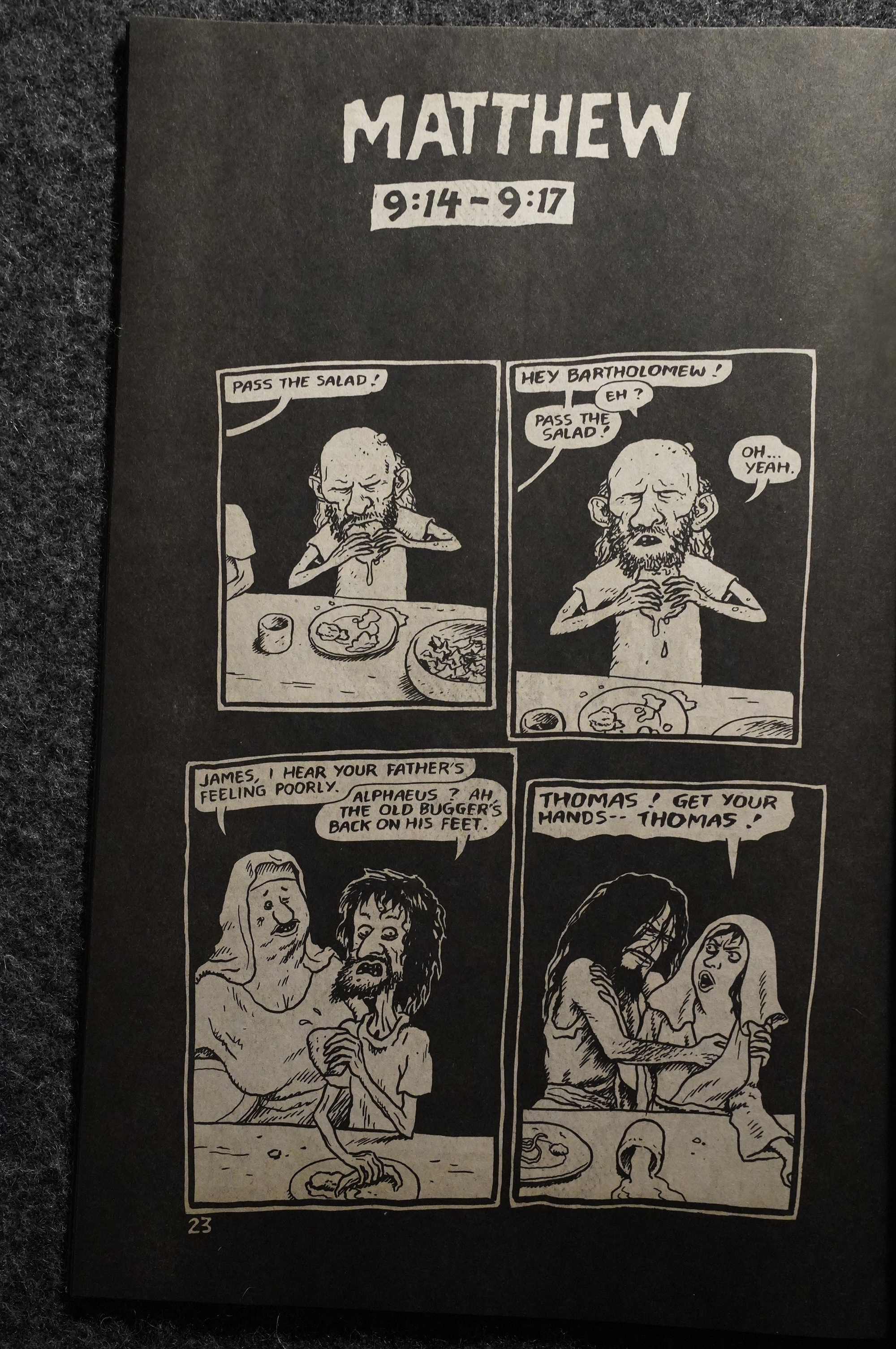
But more importantly, after Mark is over, Brown starts adapting Matthew. Has a certain logic to it, I guess?

The style is completely different: More of a loose interpretation with scenes like this that aren’t, strictly speaking, in the bible. Everybody get bigger noses, too.

So I can see why Brown rushed through the Mark ending (if he did): This is much more fun to read, and (I imagine) fun to make.

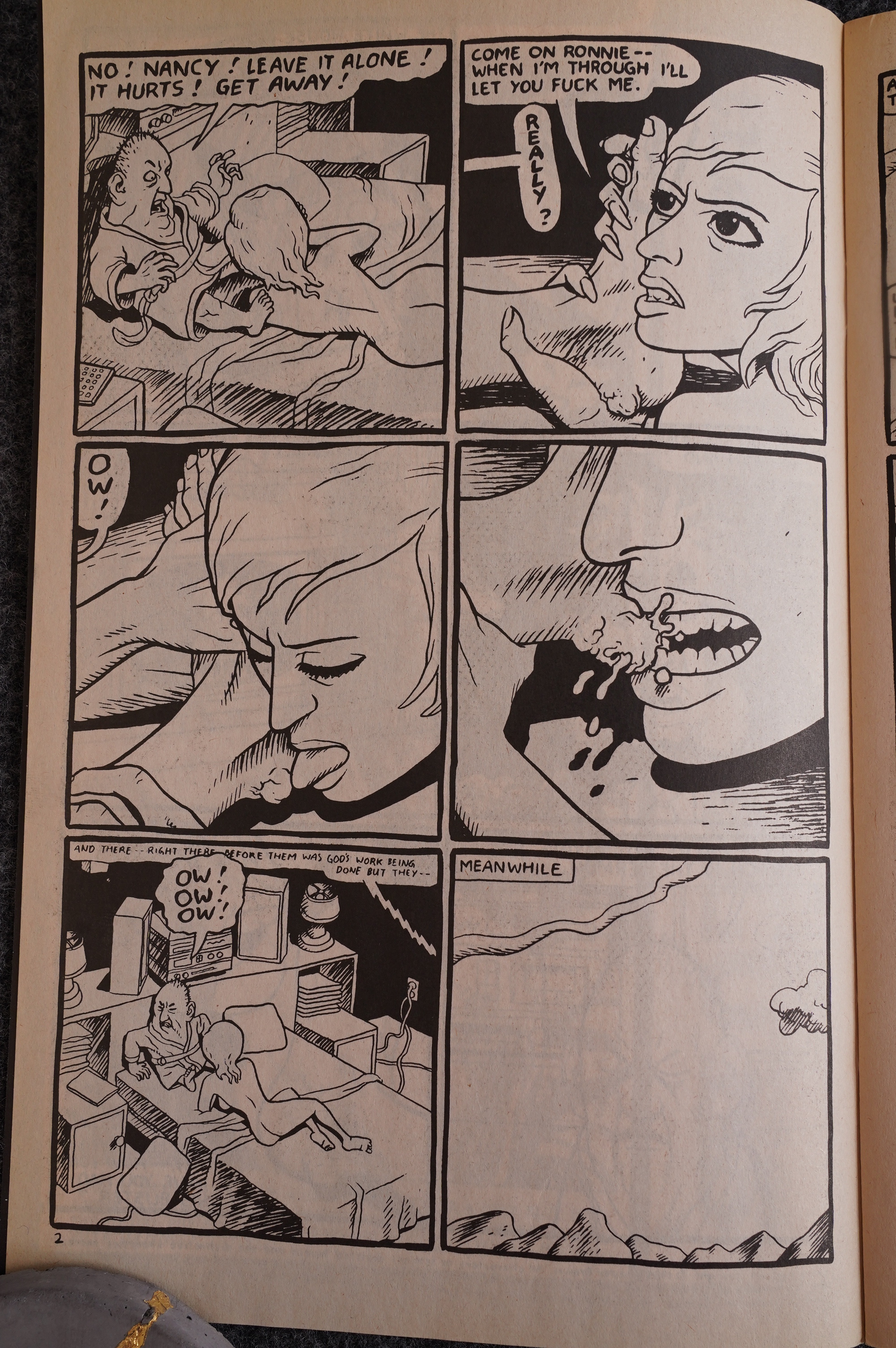
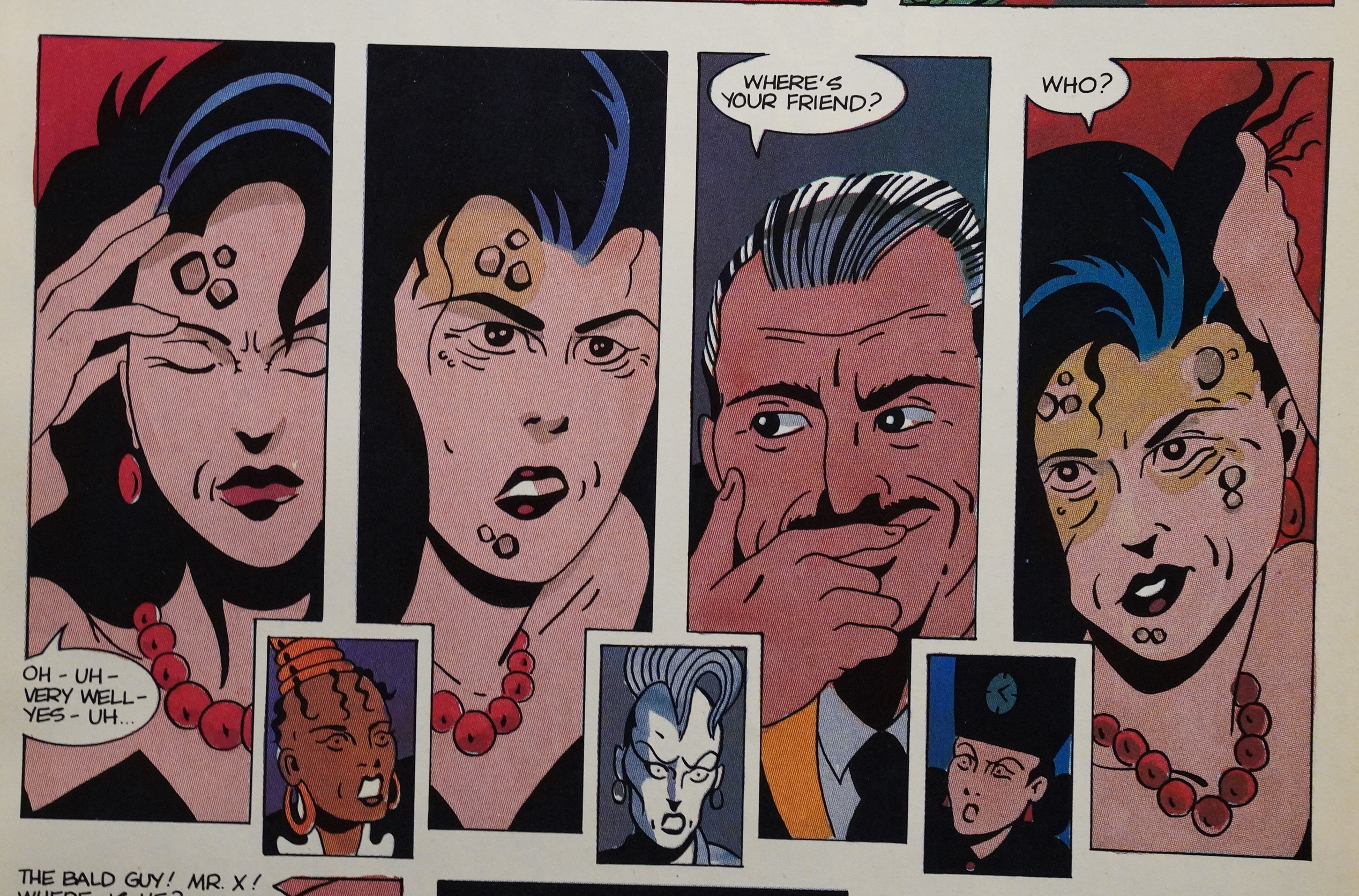
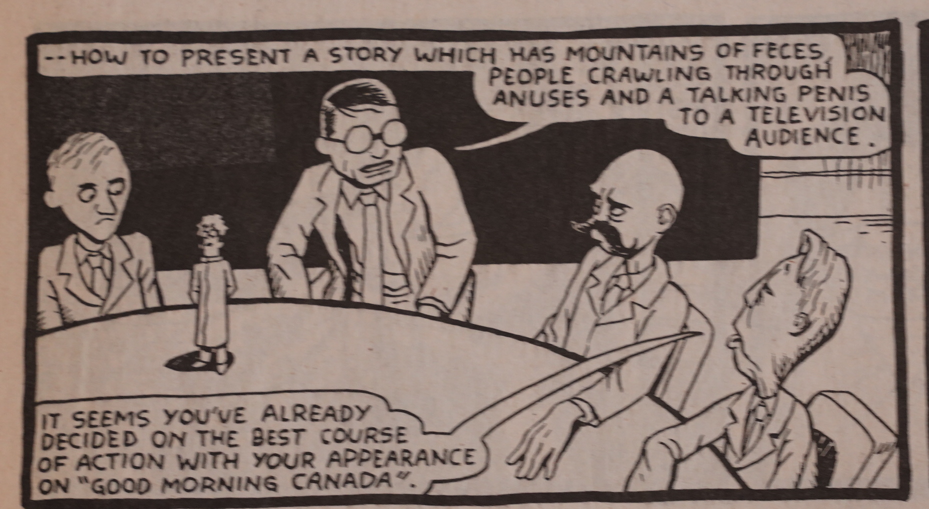
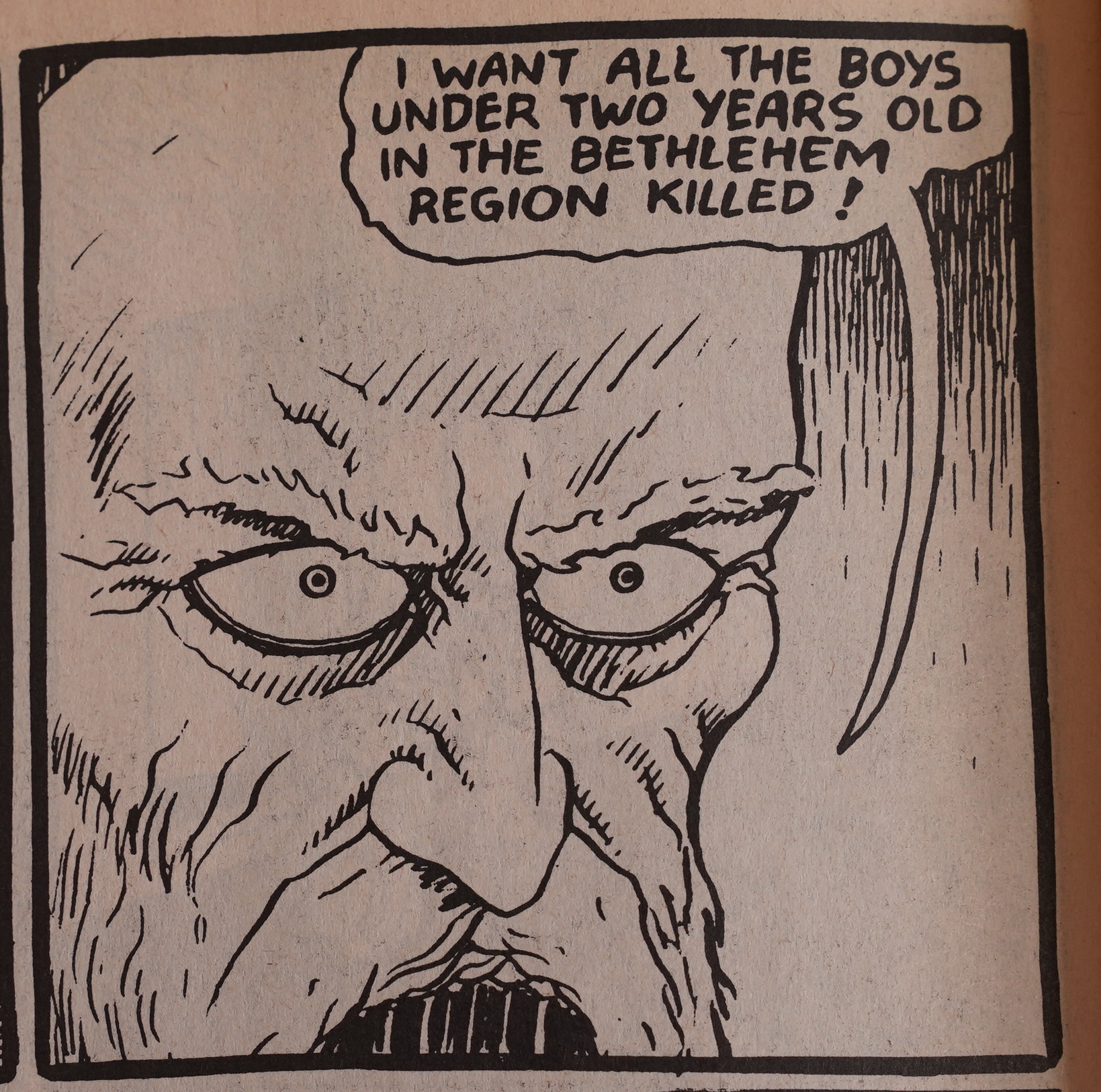
After a couple of… “softer”… issues, Brown throws down the gauntlet in the 16th issue. Here’s Nancy Reagan and her husband in bed, performing sex acts that I don’t think will take off in popularity. (It gets more disgusting later in the book, when she meets the little Reagan.)

Likewise, the Matthew adaptation becomes super-icky, so I wonder what Brown was going through at the time. (I’m not showing you the wish being carried out.)

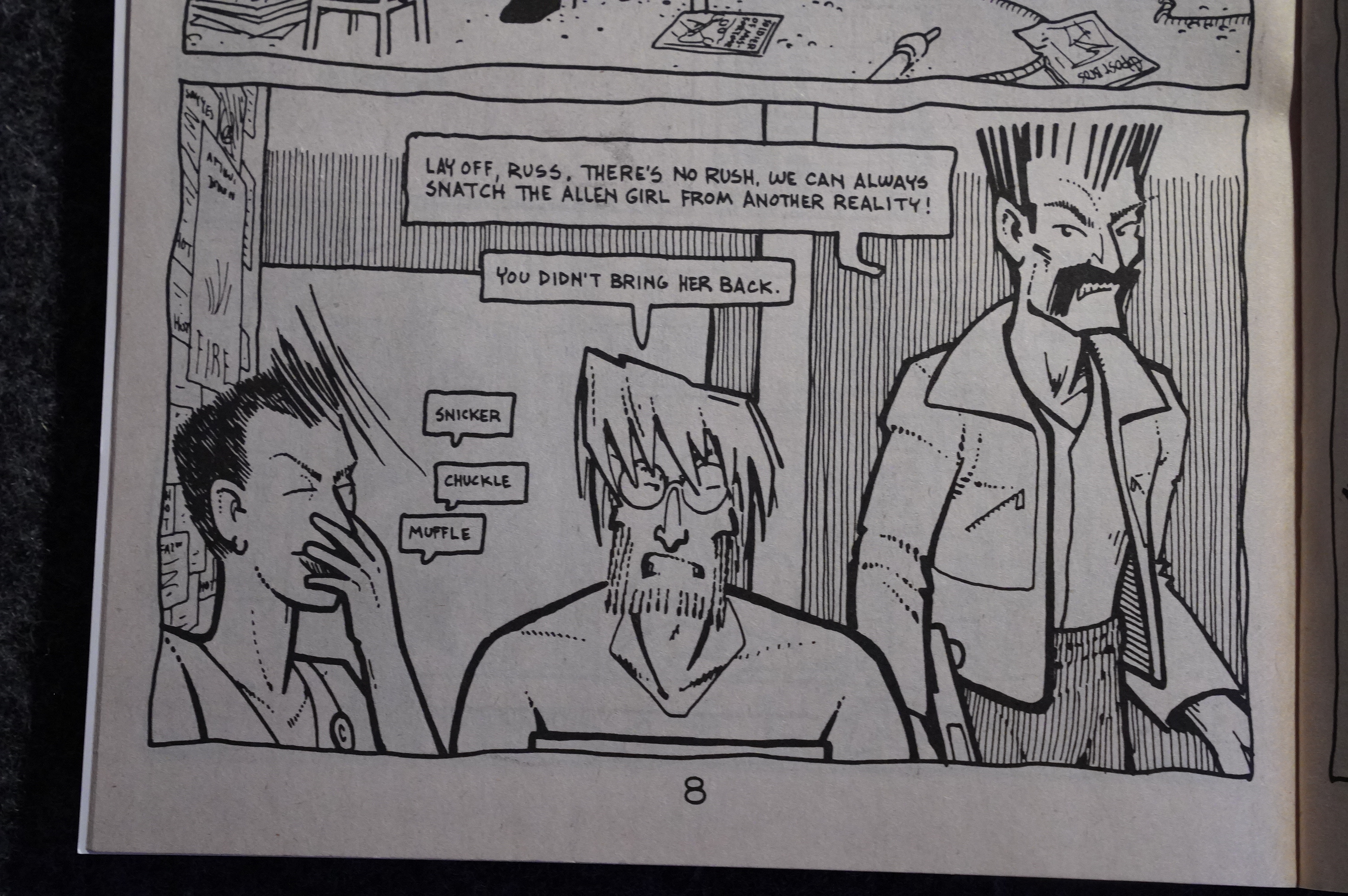
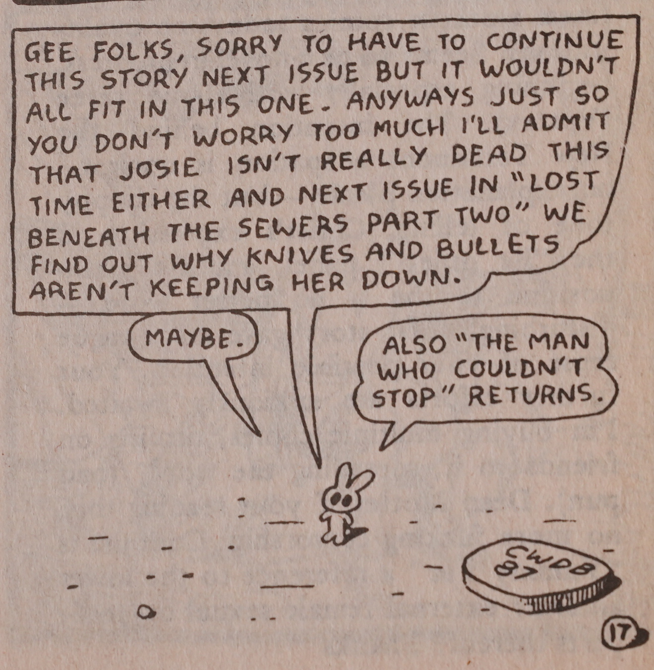
Then, in issue 18, we get an all-Ed issue, and Brown brings the serial to an end. He’d meant for Ed to go on for quite a while, so Vortex published a collection of 1-12 recently, but then, while Brown was doing issue 17, he decided to end it. I mean, end Ed. The serial. You know what I mean.

Which was kinda odd, because you can’t really publish a collection of something as brief as the Ed from #13-18 in a collection. I guess thems are just the breaks when you’re improvising…

Heh, heh. Cute.

This was all… solved… by Brown refusing to have the issues in question reprinted at all. Instead Vortex published a “definitive” edition a couple years later, which reprints the Ed stories from the first twelve issues with little editing, but added a different ending than the one we got in issue 18. But they have a lot in common.

In the collected edition, Josie (the woman who was murdered while having sex) goes to hell, joining her killer there, while crying.

In #18, the ending takes a bit of a different turn: It seems that both Josie and Ed are ending up in a good place (after some further mishaps)…

But then Josie dies anyway, and this is the final page. Not very ambiguous, but slightly less sad, perhaps.

“Je pense”, the creator poses.

Some readers were a bit dense, but took offence to issue #16, as they should.

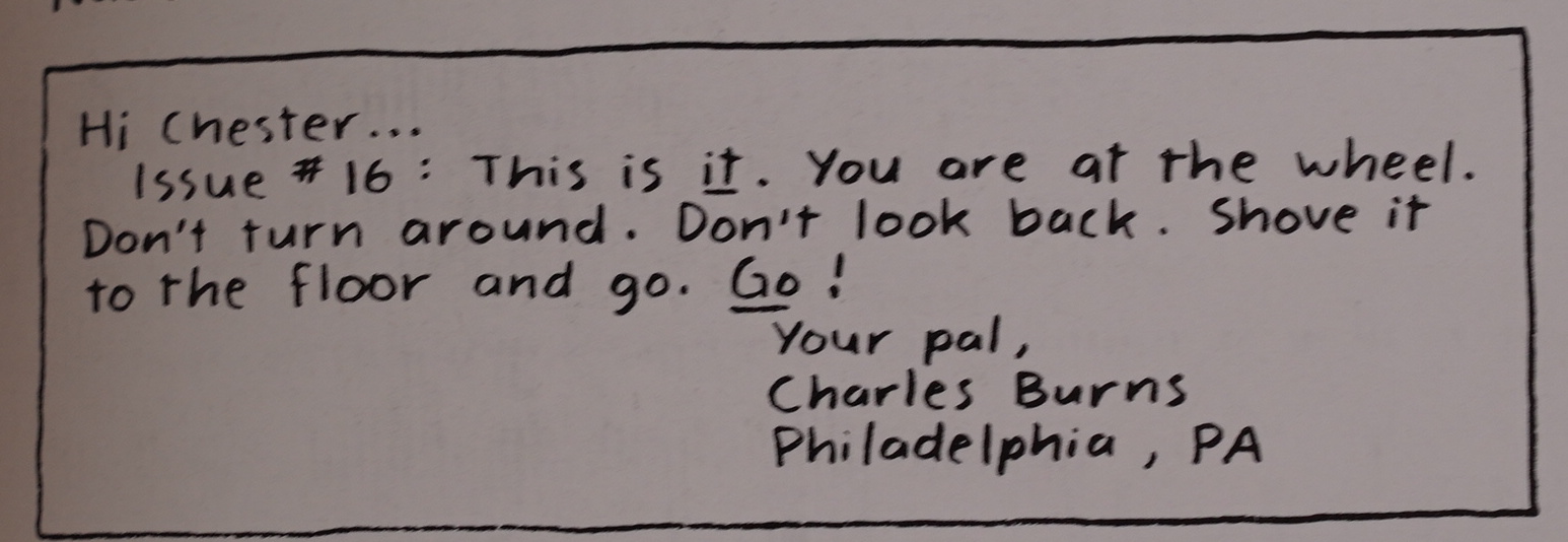
Charles Burns was really impressed, though.

I do wonder whether the reaction to #16 had any influence in Brown’s decision to never reprint those issues, though.

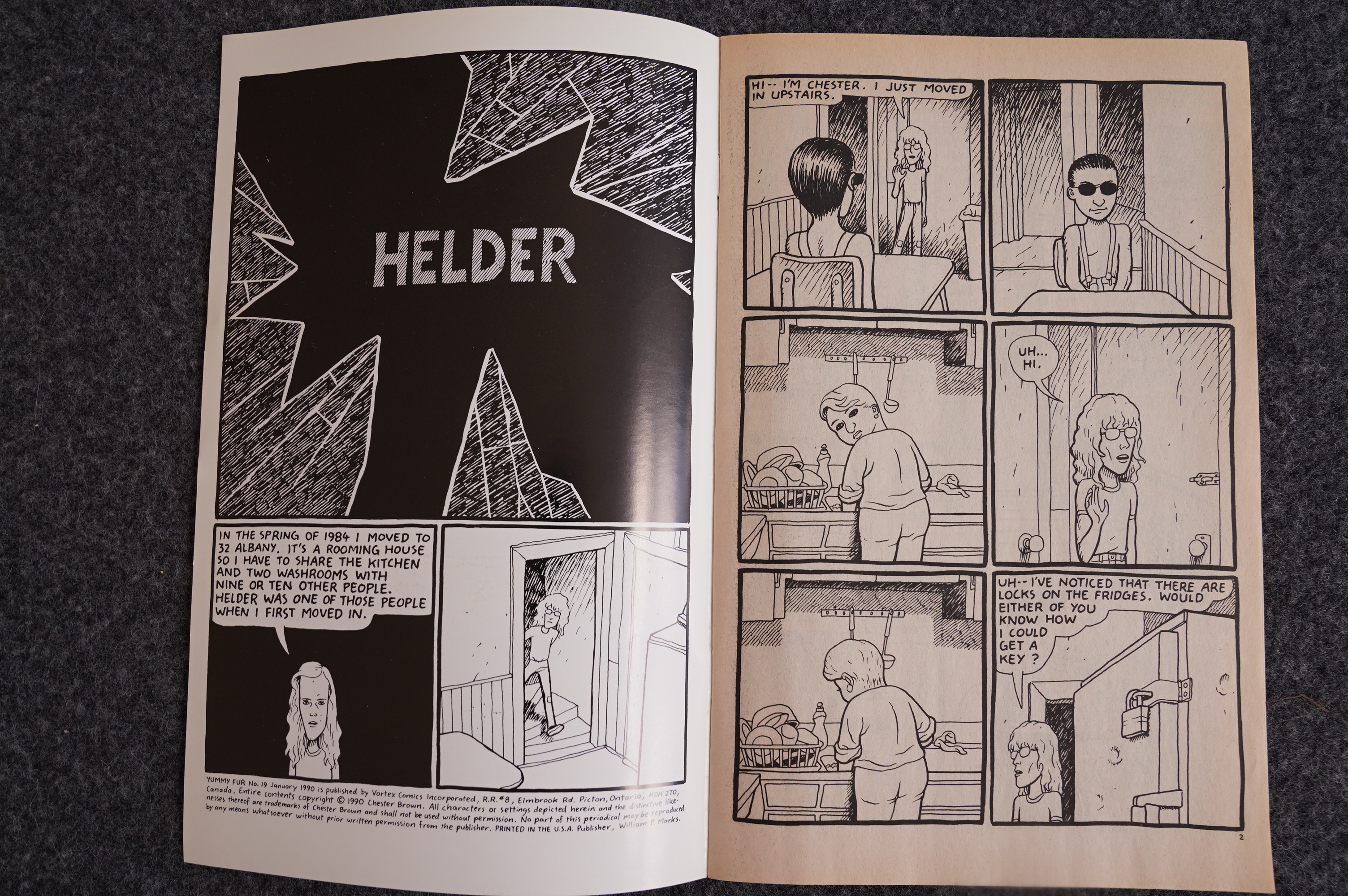
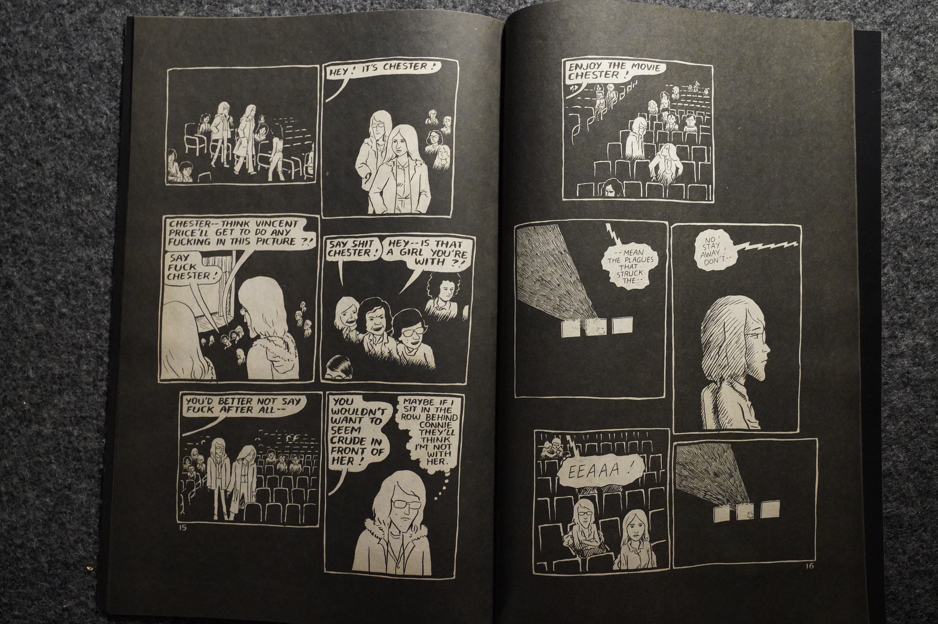
So… Ed’s over: What next? Autobio, of course. It was all the rage at the time, and Brown’s first foray into the genre isn’t quite successful.

I don’t think I’ve read these issues since that time (I read the first dozen issues dozens of times, I think), but I remember really liking them. I’m not so impressed this time over: The Helder story seems pretty anaemic and tentative.

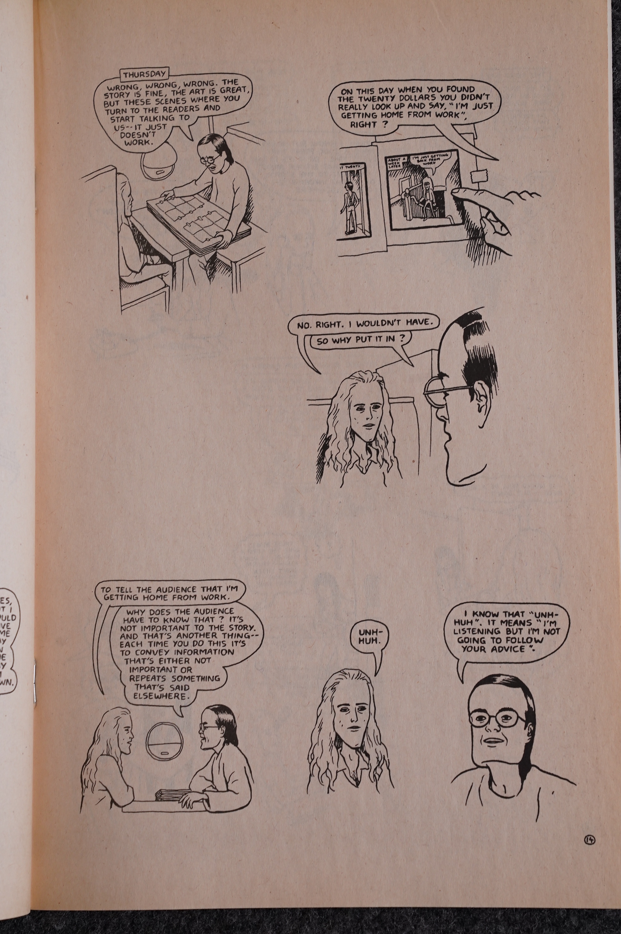
The next issue has the infamous Showing Helder story, which is about Brown drawing the Helder story, and showing it to people to get their reactions to it. I remember this story being held up as the prime example of why autobio comics was a crime against humanity: “Could you be any more self-centred and dull?”

I absolutely loved the story at the time: It felt like a real peek behind the scenes. Here we have Brown showing the story to Kris and Seth. Thrilling!

But again, this time over, I thought the story felt a bit weak… perhaps the critics back then were correct?

I think it’s the borderless panels that bothers me.

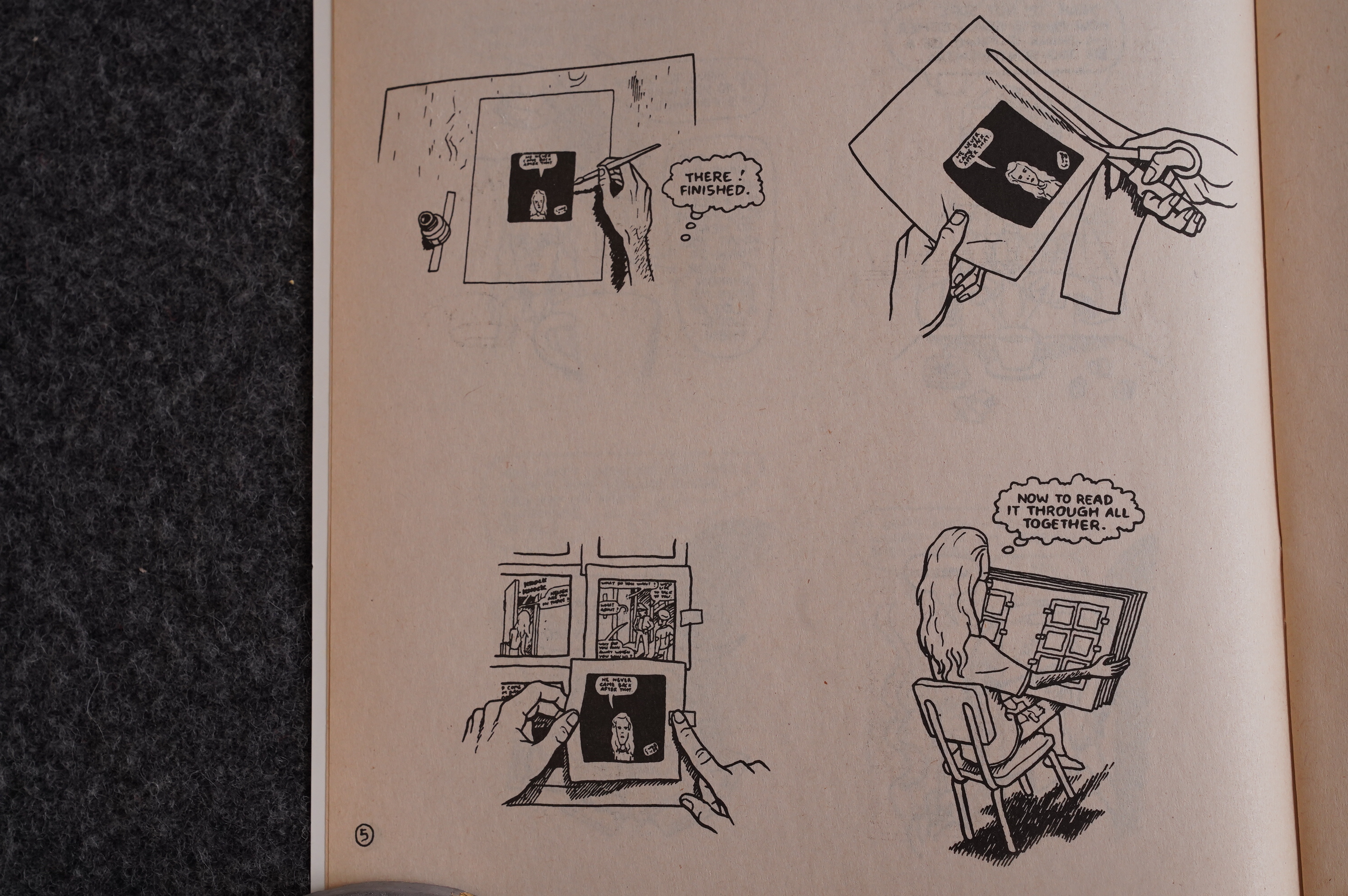
Here’s a look at Brown’s unique technique.

Huh. Is that how Bill Marks looks? I imagined him more… er… rakish.

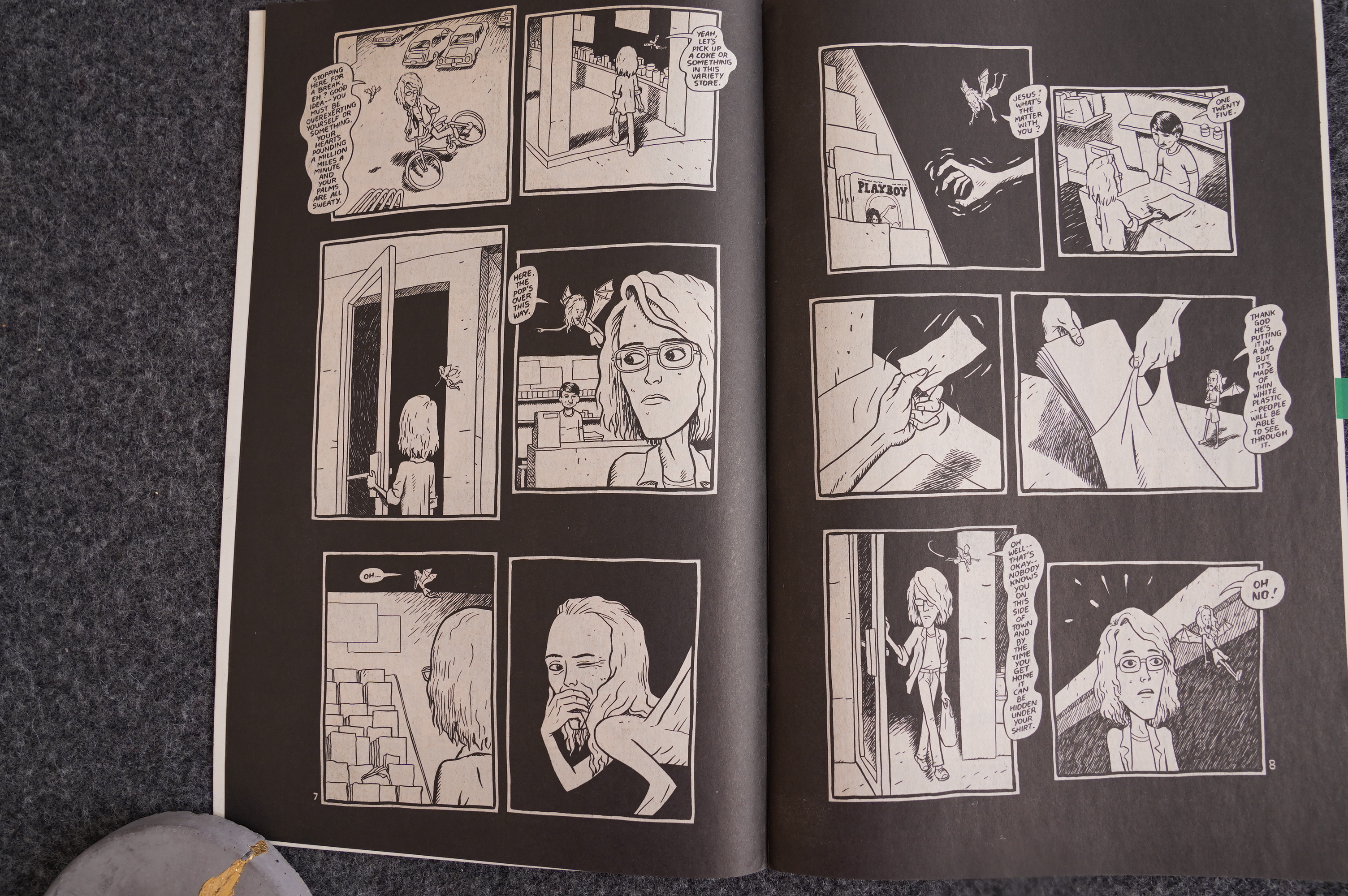
We then get a three-part autobio story from Brown’s teenage years: The Playboy Stories. It’s about Brown buying and throwing away and re-buying Playboy magazines.

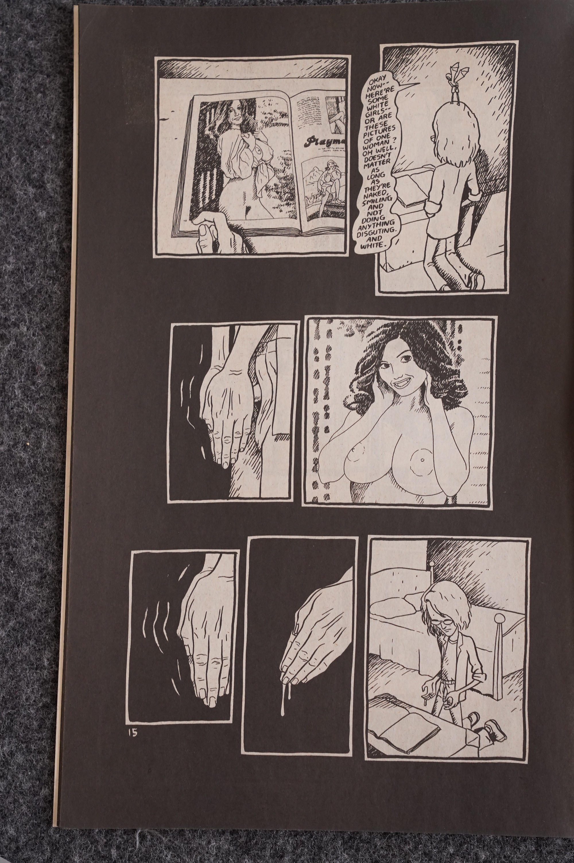
And it includes this scene, which illustrates Brown’s masturbation technique. It was parodied a lot, like in this Jeff Wong/Scott Russo strip:

So, yeah, Brown takes autobio to new heights, or depths. I mean, you can’t say that it’s not memorable… but again, I find that reading these stories now, they feel slight and not particularly well-structured.

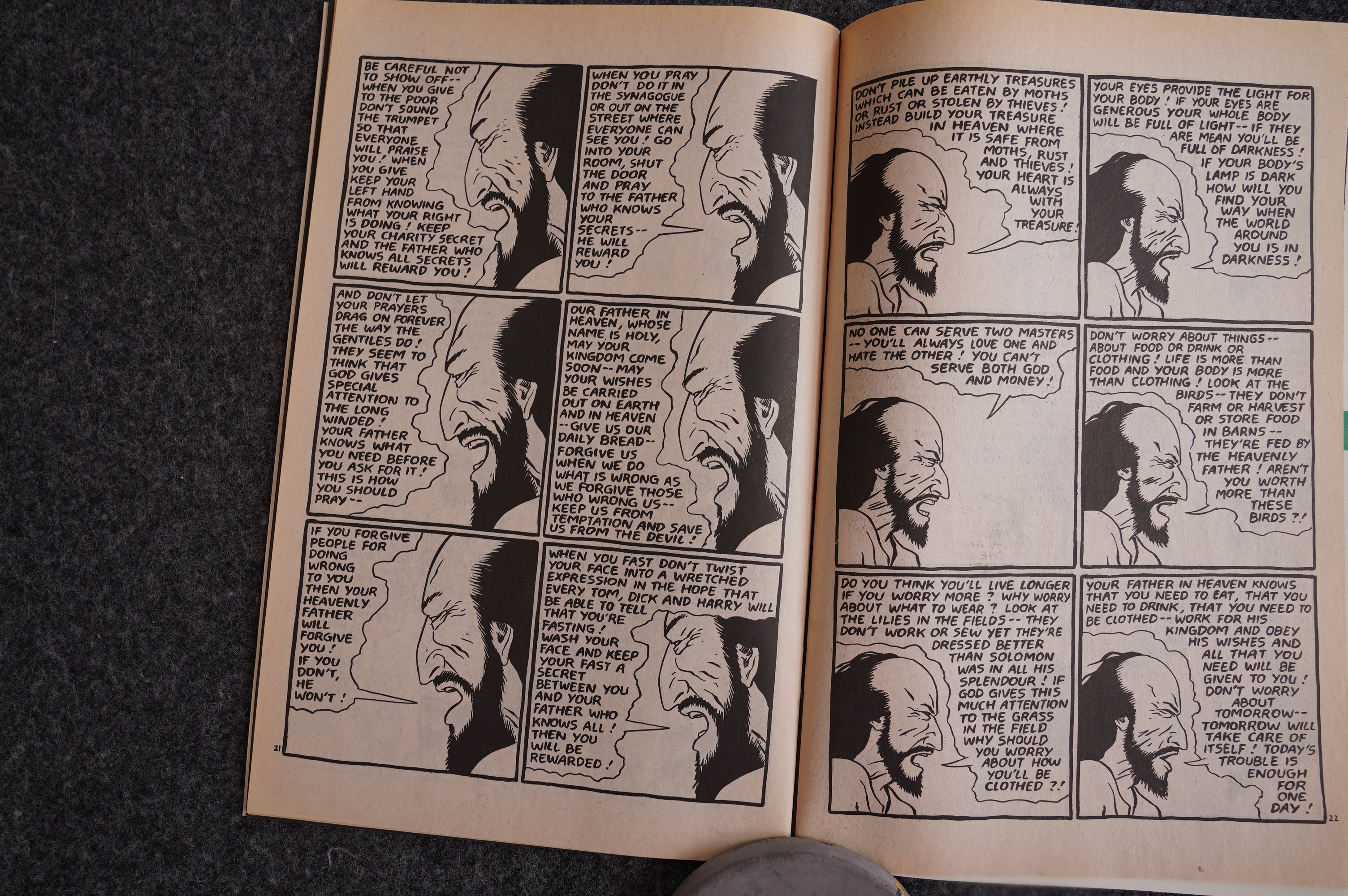
Matthew also has its ups and downs: Brown mostly keeps things moving along, but for that speech on that mount, he keeps a lot of text.

Brown was interviewed in the Comics Journal at the time…

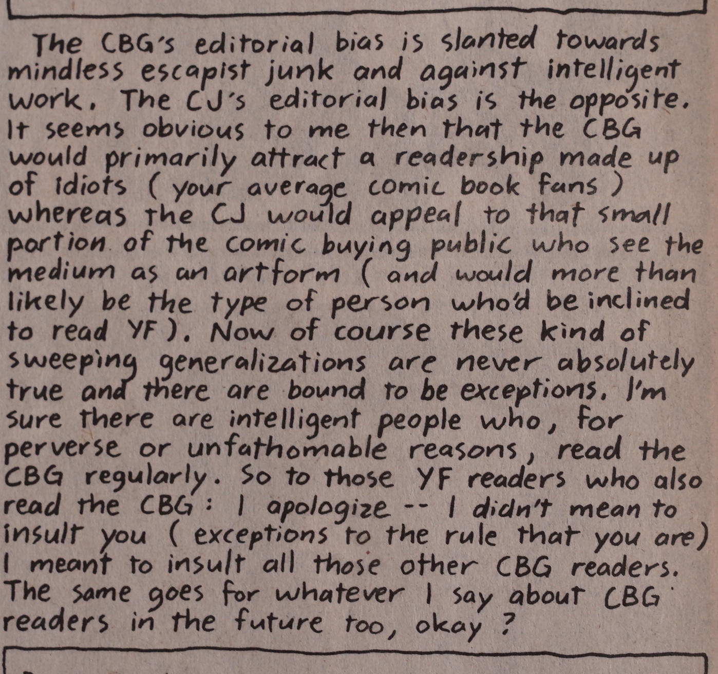
… where he said some derogatory things about Comics Buyers Guide (and their readers). Here he clarifies.

Oh, the pains of doing autobio comics.

Who could disagree with Kris?

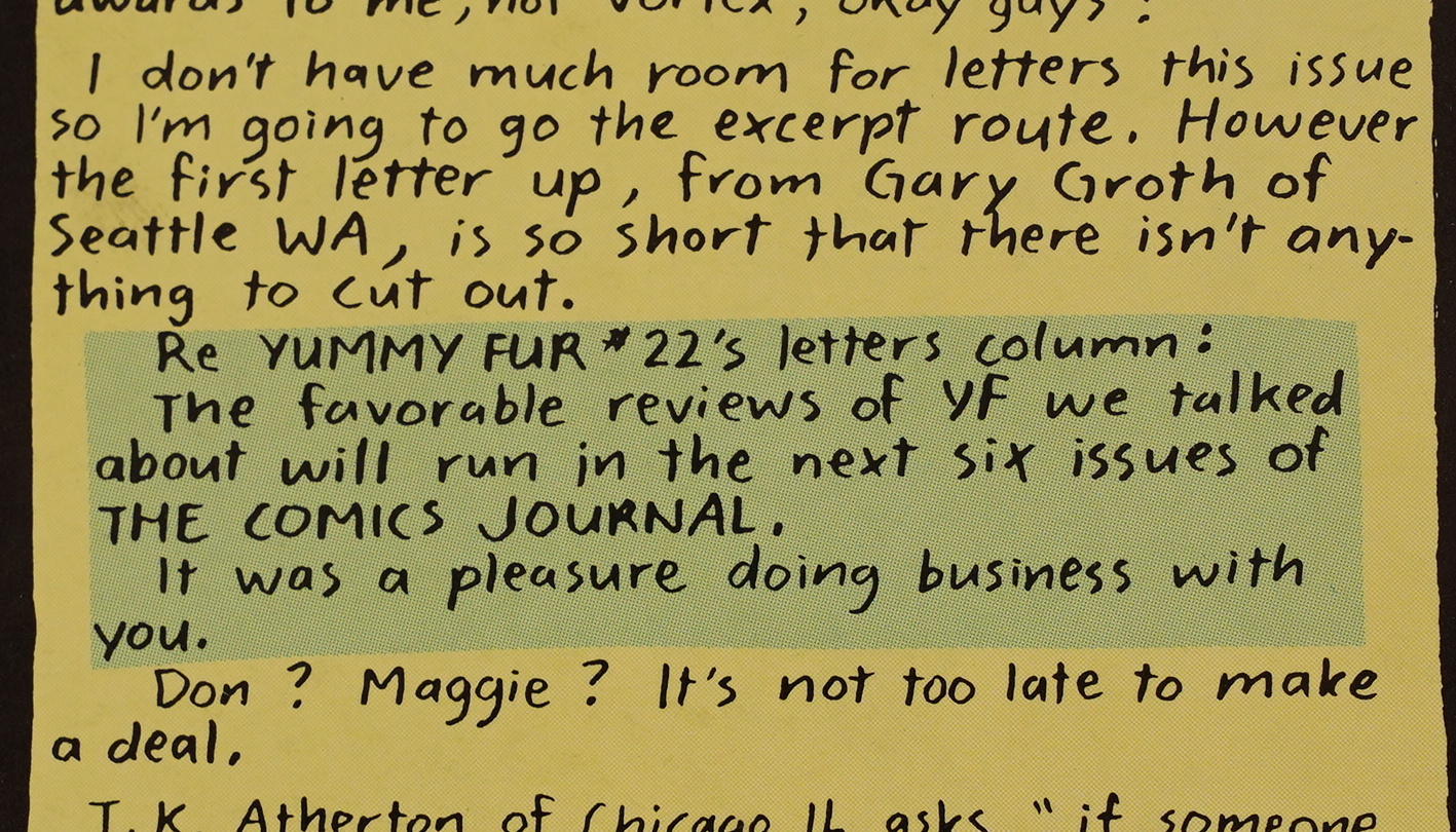
Gary Groth writes in to comment on Brown’s comment about CBG and the Comics Journal.

This is pretty much the general feeling on the letters pages: People don’t really like the new autobio direction Yummy Fur is taking.

Perhaps in response, Brown does autobio… but about a shaggy dog story he told to a friend when he was like twelve. It’s funny.

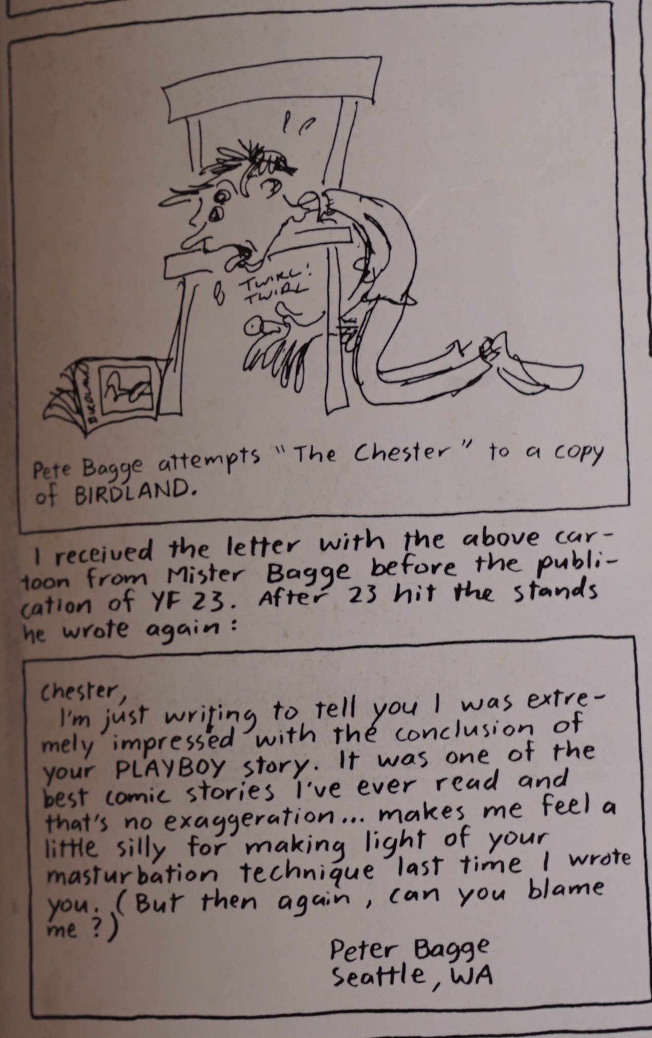
Those masturbation scenes sure made an impact!

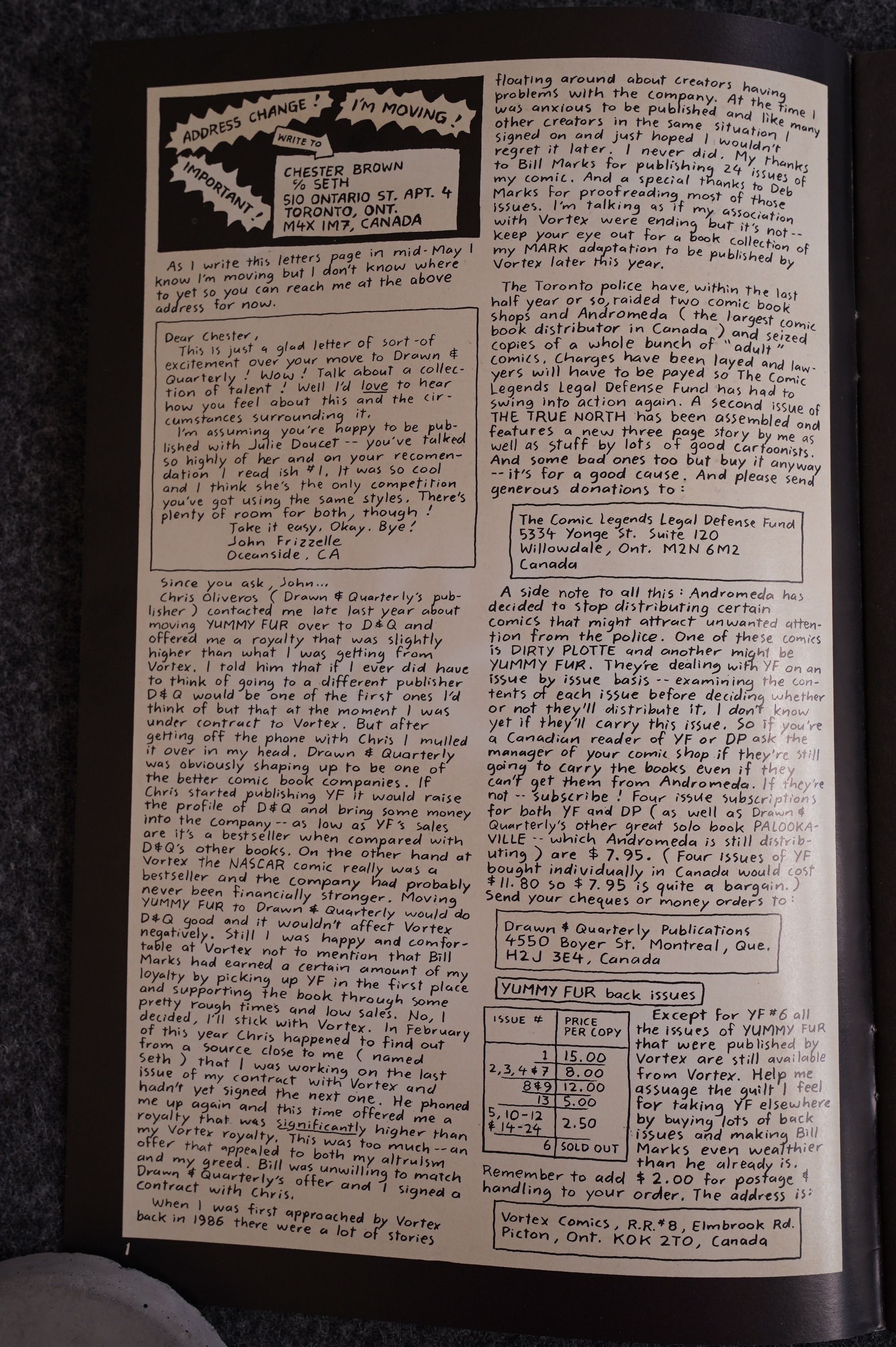
And then it’s over: Yummy Fur moved to Drawn and Quarterly, so here’s where I stop my coverage of the series. In the first D&Q issue he explains why he moved: They promised more money, and he thought he’d be doing D&Q a favour (since Yummy Fur would be the biggest-selling thing there instead of the lowest-selling thing at Vortex).

He also expresses gratitude towards Marks for sticking by Yummy Fur all these years.

There would be just eight issues of Yummy Fur at D&Q before Brown ditched the name and went on to publish Underwater and Louis Riel and other things, before becoming a best seller later with books like Paying For It.

The Matthew adaptation continued to run in the book, but didn’t finish. With his style of adaptation, it would have taken many hundreds of pages, I think…

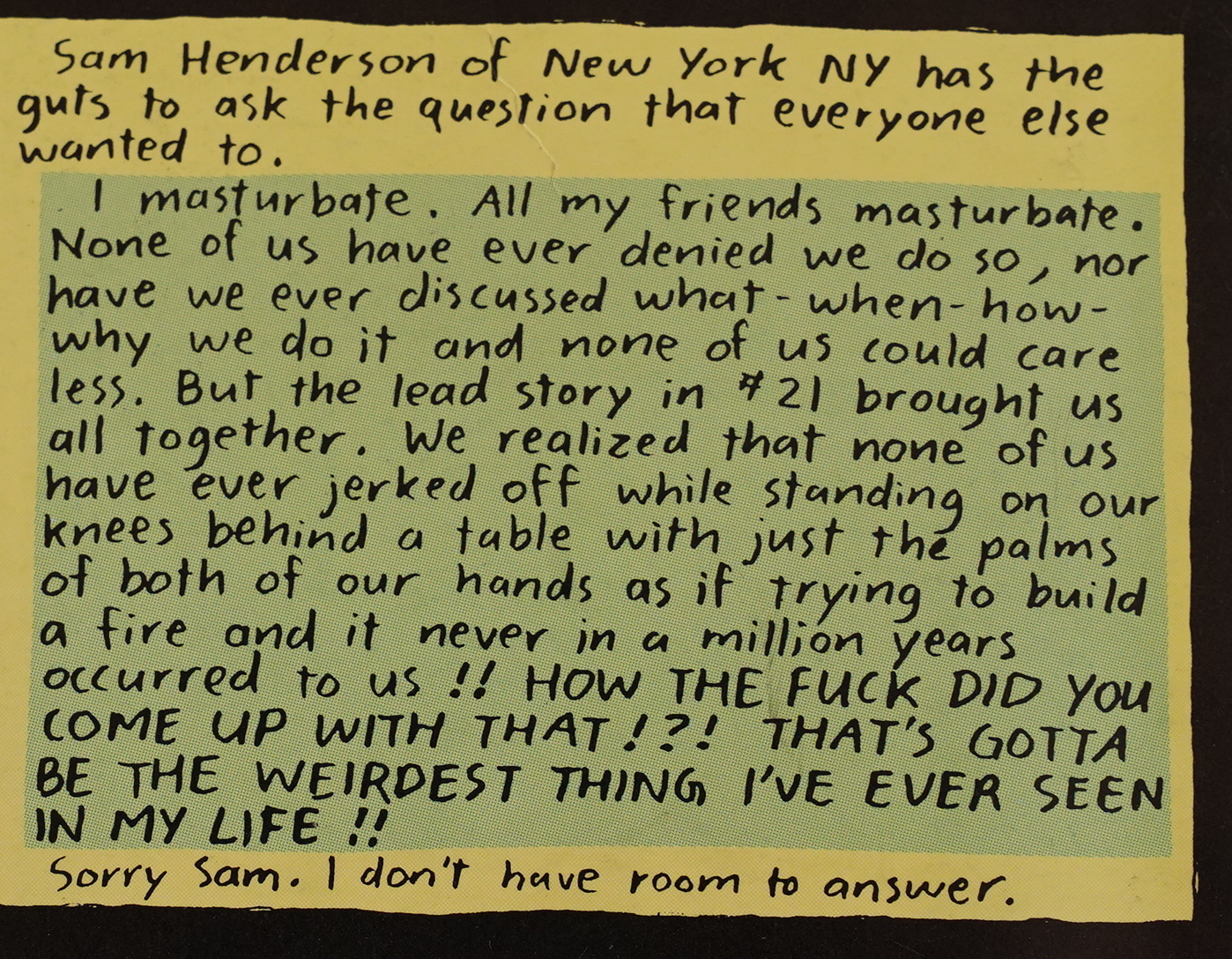
So: One last remark about masturbation, and we’re through.

But! Hang on! I forgot to check what the critics had to say about Yummy Fur at the time.

Dale Luciano (I think) writes in The Comics Journal #96, page 60:

During the summer of 1983, Chester
Brown of Toronto began publishing Yum-
my Fur, an eight-page digest-size comiö, at
the insistence of his poet-girlfriend.
Brown’s comix are a funny admixture of
genre parody and social satire, with each of
the six issues of Yummy Fur spinning off in
Ed the Happy Clown, from Yummy Fur #2, by
some new and frequently absurdist direc-
tion. In the now out-of-print Yummy Fur
Brown’s explanation Of mysterious
cattle mutilations, “Walrus Blubber Sand-
wich,” has CIA operatives piloting a flying
saucer and mistaking walruses for cows.
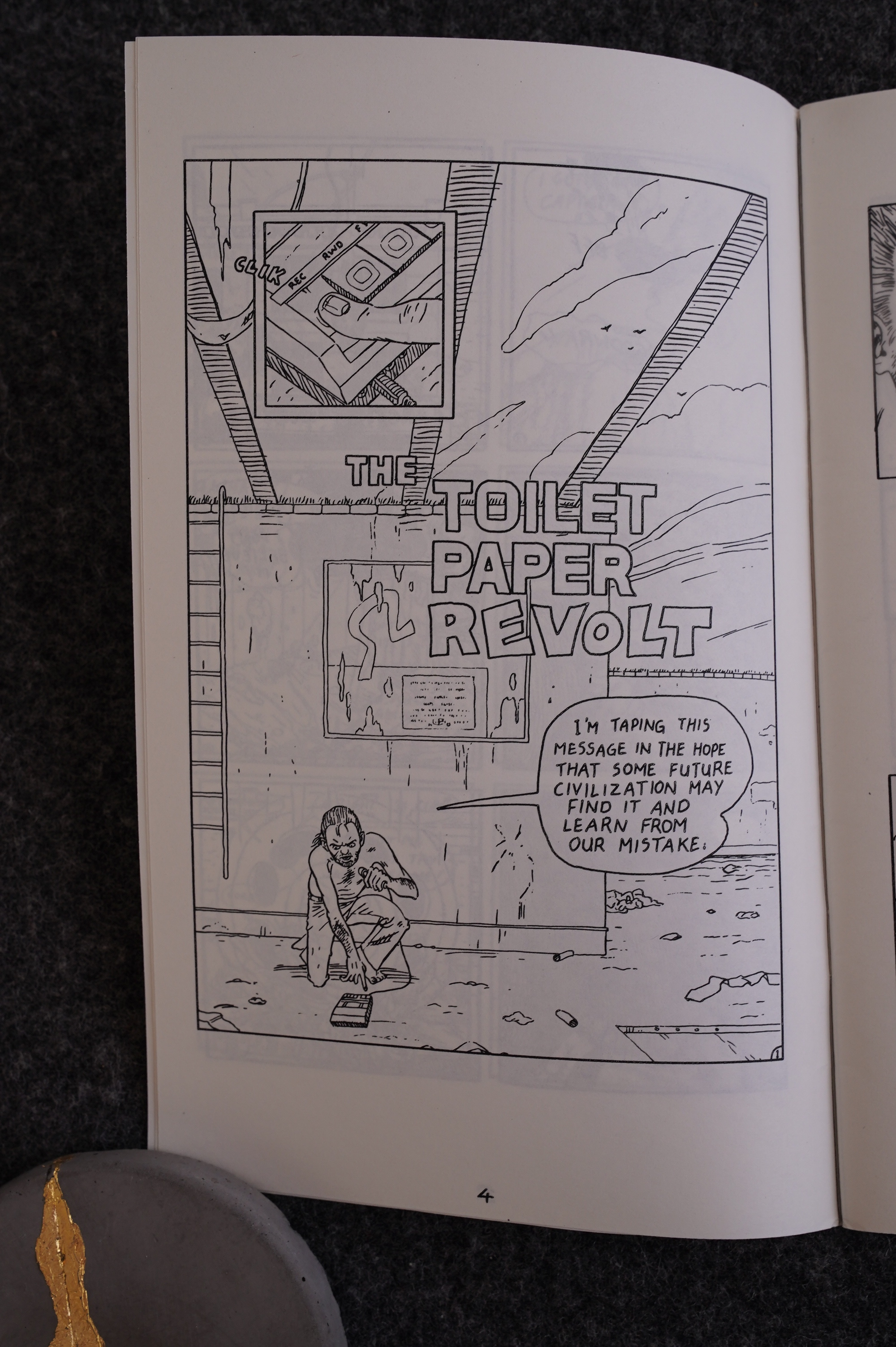
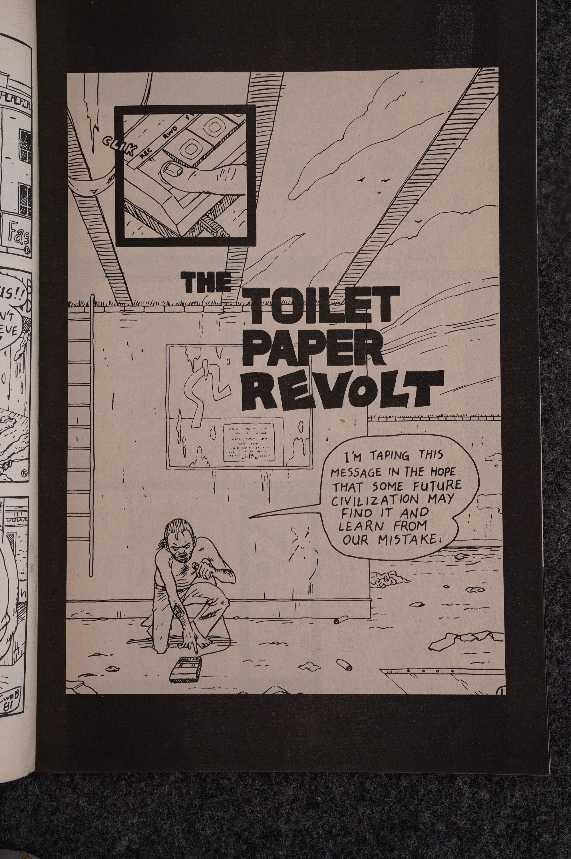
‘ ‘The Toilet paper in the same issue
patodies schlocky science fiction by offer-
ing the spectacle of rolls of toilet paper con-
quering the world. “Bob Crosby and His
Electric in Yummy Fur is astUte
satire, presenting the surreal situation of a
TV set which controls and manipulates the
behavior of its weak-willed owner. (The
TV sends Bob Out on various right-wing
seal-hunt project is a lot of
nonsense,” the TV commands, ‘Go to the
zoo and club a few when Bob
destroys the set in a rage, he’s utterly lost
and immediately seeks another, identical
model.) In few other stories, Brown
satirizes such contemporary phenomena as
imagined religious visions (“Adventures In
Science,” YF ‘6) and urban paranoia
(“City Swine,” YF #4).

[…]

The only disap-
pointing issue of Yummy Fur has been ‘4
(Brown has let it remain out-of-print),
which features a disjointed and ultimately
incoherent nightmare-story about a man
asked by a government agency to pose as a
notorious criminal. (There’* also a bizarre
comics Story about a professor studying a
giant squid’s masturbation techniques that
scores points for sheer oddness of concept.)
In sum, Brown’s is an unpredictable dada
world in which absurdism the grotesque
frequently commingle, to simultaneously
amusing and disturbing effect. Brown pro-
duces Yummy Fur under the publishing
banner “Tortured Canoe,” which in itself
says something. “l was totally unaware of
the ‘newave movement,’ and my only
models were the Toronto small press
poetry publishers,” comments Brown.
“Then I saw Peter Dako’s Casual Casual
Comics and Kat Cruickshank’s NO Name
Comix and quickly found out all about the
folks all over the continent who were doing
more or less the same thing.”

Steve Monaco writes in The Comics Journal #107, page 56:

[…]
Brown’s dark car-
tooning style coupled with his fine, fresh
humorous approach to horror and paranoia
makes the book one of the most accomp-
lished titles in the burgeoning small-press
movement.
Like most self-published affairs, Yummy
Fur’s history is an erratic one, with small
print runs for the early issues and a schedul-
ing that hints at both the joys and difficul-
ties Of this wonderful format. At the begin-
ning, Brown’s output was prolific (as it often
is with.artists publishing their own work for
their own satisfaction): issue ‘s I and 2 were
both published in July 1983, with issue
appearing the following month and issue
the month after that. Issue 5 and 6 both
followed fairly soon after January and
March 1984, respectively), but then there
was nothing more until issue finally
appeared in September of last year. The
nearly year-and-a-half gap in Browp’s out.
put of new material indicates how hard it
can be for today’s comix artists to find the
time to continue to do their own personal
work (a near-universal problem), but in
Brown’s case, judging from his most recent
published work, this silent period has
brought forth work even better than his
previous collections.

[…]

Brown himself seems to be one of the
smartest minds in comix today. (On the
back page of this reissue collection, he lists
among his main creative influences both
Carl Barks and Nikolai Gogol; he’s one of
the few comix artists who can make a state-
ment like that and have me believe he really
means it.) The blend of his writing and art-
work is nicely complementary, with his
sometimes murky drawings lending an
added sinister quality to his deliberately
light and silly dialogue. To his credit, Brown
does not weight his satire with the kind Of
injoke fan humor that mars too many of the
funny small-press titles, and when he does
lean toward pop-media mockery, he focuses
his parody on the more universal bad influ-
ences that permeate everybody’s lives, not
just the insular comics community.

An interview in The Comics Journal #135, page 82:

GRAMMEL: How many copies of Yummy Fur were
selling by the end Of its life as a mini-comic?
BROWN: I’d print a couple hundred at a time, but I’d
reprint as often as necessary. So I guess for some issues
it got up over 1,000.
GRANM_EL: Tell me about how you made the junp from
your mini-comics Status to haying your own comic book,
Was that a big thrill for you?
BROWN: Oh, yeah. It was a big thrill. I was doing Yum-
my Fur, but it was getting to the point where I was
wonderine, “Am I going to be doing Yummy Fur as a
mini-comuc for the rest of my life?” I wasn’t sure. At
a couple points I’d said, “No, I’m giving up doing mini-
comics. ” Because at this point I was also starting to get
people like Fantagraphics and Kitchen Sink asking me
for submissions to their anthology magazines like Honk!
and Prime Cuts and Snarf, whatever. So I was kind of
wondering, you know, “This is great, but I’m not going
to make money off of this. ” So one day early in ’86 Bill
Marks phoned me up out of the blue. I was out late do-
ing something, and right when I get home the telephone’s
ringing. So I answer it, and it’s Bill Marks apologizing
for calling so late and hoping he hadn’t woken me up,
but would I like to do Yummy Fur as a comic book for
Vortex. And so I said, “Well, it sounds good. Let’s get

together and talk. so we did. He convinced me to go
with him. It wasn’t all that hard to convince me, actual-
ly. Well, I did have some reservations — hearing about
the Hernandez brothers and other rumors and stuff about
Bill that I’d heard. I’d met him a couple of times before,
and he always seemed like a nice guy. I always got along
fine with him. So I was taking what I was reading in The
Comics Journal with a grain Of salt, not being sure how
much… You know, thinking, there’s always two sides
to ev story.
GR”fEL: Did he naturally assume that you ‘d have
ownership of the comic book?
BROWN: Oh, yeah. That was never a question.
GRAMMEL: IA me ask you this. Do you work with
a contract?
BROWN: Yes, 1 do. [laughter]
GRAMMEL: I’m guessing that your Contract is for a
limited time. Have you received any Offers to transfer
Yummy Fur to another company?
BROWN: Oh, I’ve definitely gotten offers.
GRAMMEL: Do you feel loyalty to Bill Marks because
he was the one who made the effort when no one was
knocking on your door?
BROWN: Precisely. I do feel some measure of loyalty
to Bill, and I’m not going to leave Vortex just for no
reason, and I get on with him fine. I have no problems
with him. He lets me do whatever I want.
GRAMMEL: You don’t want to be in color, so that’s
not a problem.
BROWN: No, I am happy with black-and-white. So I
don’t foresee changing companies in the near future. I
don’t foresee changing companies at all unless I have to
for some reason. And also it’s just easy working with
Bill. I was going to say he’s here in town, actually he’s
just about to move out. Vortex is moving to Picton. Pic-
ton, Ontario.

Robert Levin writes in The Comics Journal #162, page 49:

That the series is on-going enriches the experience.
The continuity, the development, the regularity of the
issues appearing Over time, under a single title, product of
a solitary consciousness, makes it like scheduled visits
from a strange but evolving friend. Yummy Fur becomes
one unified, wondrous work, familiar and cohesive, not
some fragmented series, distanced, strange. Reading it
continually enriches and surprises.

Robert Rodi writes in The Comics Journal #123, page 45:

Yummy Fur brilliantly achieves
everything that Blood so vainly gmpes
for. It has the disturbing imagery; it
has the Oddly repellent beauty; it has
the passion and the poetry and the
perversity. And best of all, it’s the
work of an honest-to-God cartoonist:
Chester Brown, the most exciting new
talent this medium has afforded us
since Los Bros Hernandez. His work
is of that caliber; it’s fresh, confident,
fully-realized, and ambitious.
Brown initally published Yummy
Fur himself, as a 25 cent mini-comic.
Vortex Comics reprinted those
remarkable early issues (covers and
all) in the first three numbers of this
new run, and subsequently they have
allowed Bro,vn to really cut loose. The
result is a comic of surpassing critical
acclaim and almost no popular
reputation—a true succes d ‘estime.
Perhaps even more so than Inve &
Rockers—which at this juncture is a
known quality, however excellent—
Yummy Fur is the most adventurous
and important continuously published
series now in the shops. Yet the public
remains either ignorant or unmoved.
(At a recent convention I found Yum-
my Fur back issues stuffed away in a
“10 cents each” box, along with
doomed-at-birth copies of Aircel and
Solson comics; an appalling state of
affairs.)

[…]

It’s an audacious move, however; as
upsetting as “Lost in the Sewers”
must be to some readers, I have a feel-
ing “Mark” might upset others even
more, for several reasons—first,
bcause of its proximity to something
as powerfully irreverent as the lead
feature; second, by its lack of senti-
ment, either mocking or worshipful.
Brown, being an artist, has no concept
of packaging; the two features in
Yummy Fur are representative of the
hilly terrain that makes up his own
fertile mindscape; they’re the two
sides Of his ideological battle, and
each, in its own way, is winning. And
if that’s not enough to draw readers,
well—then it’s not. I can’t imagine him
changing the book to make it more
marketable, or even more accessible.
For which we may be thankful. As
it is, this is such a rich experience.
all means, do read Yummy Fur.

R. Fiore writes in The Comics Journal #118, page 47:

The first all-new issues Of Chester
Brown’s no-longer-mini comic are the
best exploration of Christian mythology
since Justin Green’s Binky Brown. They
combine a disturbing, phantasmagori-
cal comedy Of excessive Christian guilt
with a quiet, moving, almost childlike
retelling Of the Book Of Mark. Together
they form a bemused commentary on
how ideas become distorted. It’s as if to
say that “the beginning of the gcxxl rwws
of Jesus Christ” was quickly followed
by the beginning of the bad news of
human beings. Brown’s humor is simul-
taneously cool, sardonic, and deeply
sympathetic. Yummy Fur is another
example of how a larger format can
stimulate artistic growth. The main Story
begins in Yummy Fur #3, but if you don’t
have them, you want the whole set.

Chris McGubbin writes in Amazing Heroes #181, page 85:

In Yummy Fur #s 19 and 2(), Brown
has abandoned the hellishly famili-
ar alternate world of Ed the Happy
Clown and turned his artistic eye on
himself. He seems to be coming toe
grips with the fact that Yummy Fur has
carried him to a pinnacle of artistic
acclaim (if not financial success) that
must have seemed the remotest of pipe
dreams when he began.
This issue, in an audacious act of
self-reflexivity, is an autobiographical
piece about the making of last issue,
another autobiographical story.
There seems to be a trend among
really great cartoonists to begin their
careers doing fantasy and eventually
gravitate toward realism. This can be
seen in the work of superior artists as
disparate as Will Eisner, R. Crumb,
and Jaime Hernandez. Usually this
change is marked by a period of
uncertainty, follmved by an even high-
er plateau of the artist’s genius.
Nonetheless, I hope that’s not what
Brown’s doing here. His dark and
intensely personal fantasy world is not
like the generic trappings Eisner and
Hernandez put aside, or even the
drug-induced in-jokes of Crumb’s
early uork. Brown’s worldview is rich
and complex—it can best be compared
to the novels of William Burroughs—
and deserves years more development.
I’m encouraged that while Brown’s
lead stories in YFhave lightened, his
back-up features have darkened almost
to the soul-shakingly stygian level of
the Ed stories. This tells me that the
fire still burns.
This issue is also an artistic depar-
ture for Brown. The art is minimal—
mostly figures with few or no back-
grounds, done in a free-floating,
borderless layout reminiscent of some
of the more evocative work of Eisner
and William Messner-Loebs. It’s
talking heads, truth to tell, but that’s
O.K. when the ‘heads are. saying
something.
This issue is not the height of
Brown’s genius. U’s a respite, for both
artist and reader. I do believe the
savage brilliance will return when
Brown and his demons are ready. In
the meantime, this is a necessary step
in Brown’s ongoing artistic develop-
ment, and fascinating reading for that
reason and more.
GRADE: ! ! ! ! 1/2

You get the idea. Yummy Fur was written about… a lot. Which isn’t surprising.

Oh, yeah, there was a book written about it recentlyish:

It does not intend to catalog every change between Yummy Fur’s Ed and the 2012 Ed edition, but it will examine different types of changes that occur, consider what these changes mean as Ed moves from mini-comic through comic-book series to graphic-novel, and ultimately try to give a sense of how the graphic novel differs from the Yummy Fur material that gave birth to it.

I’ve even got that book, but I was waiting to read it until I’ve re-read Yummy Fur, which I now how, so… I guess I should?

Huh. People want a lot of money for the Yummy Fur issues there days? Well, I guess that makes sense, since there’s bits of it that has never been reprinted.

Anyway. There you go. And I guess the warning at the top there was superfluous, since I didn’t include any of the really horrifying violence in this blog post anyway.

You’re welcome.

Edit:

OH, OK! I wasn’t going to write anything about the Drawn & Quarterly issues, but they were *right here*, so I ended up reading them now anyway. So:

You’d think Brown couldn’t get any more personal in the autobio stuff… you were wrong.

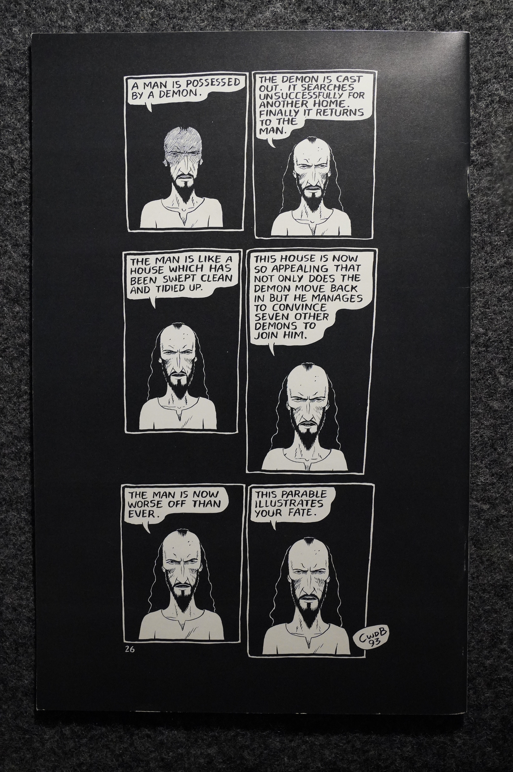
Now that’s a way to resolve a conflict.

The Matthew adaptation continues, and it’s pretty funny in places.

I guess some people wondered: I didn’t.

A reader asks whether the missing Ed chapters will be collected, and Brown says n, but not why he doesn’t want to have them reprinted.

Brown’s now reached his “mature” style: A random number of panels floating around the page, which he uses to this day. A reader complained that this style leaves a lot of blank space, but Brown says that cramming a lot of stuff onto the pages just looks wrong to him now.

And this is part of the four-issue “Fuck” serial, which is from Brown’s teenage years, and… ouch. It’s downright painful to read. In a good way, of course.

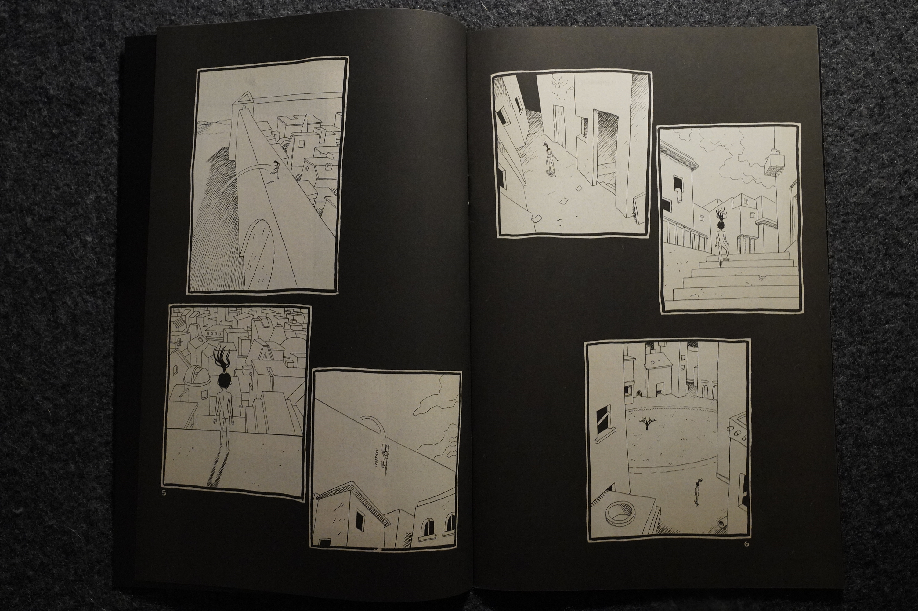
I wonder whether there’s any symbolism in this penultimate issue, where a woman scales a forbidding wall and enters the city. In presumbaly totally unrelated news: Brown’s met Sook-Yin Lee.

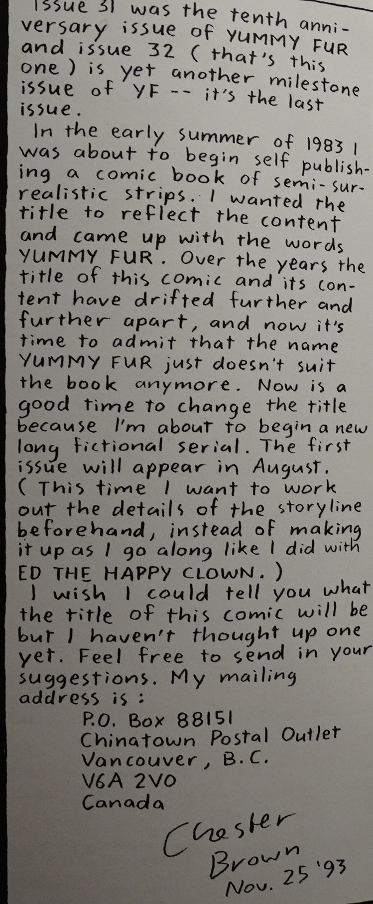
Brown announces that he’s ending the series, because the contents and the name doesn’t suit each other any more.

And the final issue is all Matthew, and it’s not… all that interesting.

The adaptation continued in his next series, though, which was called Underwater. He said up there that he wanted to have it plotted out before he started, but apparently that didn’t help much: He made 11 issues and then abandoned the project.

Edit some weeks later:

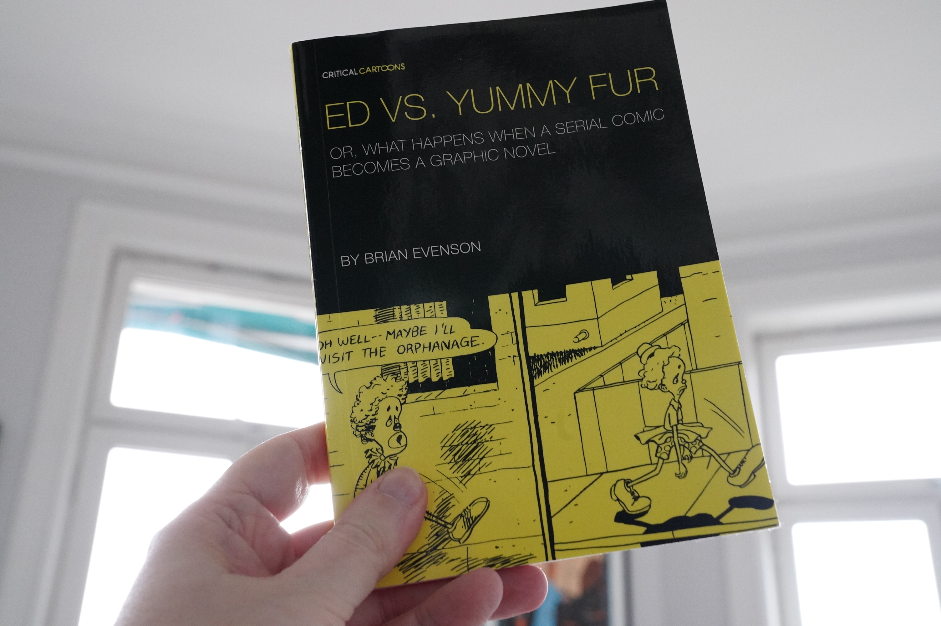
I finally read Brian Evenson’s little book “Ed vs. Yummy Fur”, published by Uncivilized. It mainly examines the differences between the comic book series and the final Drawn & Quarterly version of Ed. It’s somewhat interesting, and it’s perhaps inadvertently funny in the way that Evenson speculates about what the various differences mean, while Brown consistently says stuff like along the lines of “I left out the bits that sucks” and “I just had to create comics faster for the bi-monthly book, so that’s why it’s so sloppy” (I’m paraphrasing).

And I know I shouldn’t find stuff like this irritating; let all the different readings bloom, but I just found some of Evenson’s takes so … bone-headed. And much of it perhaps stems from him being religious? I’m just guessing. Like:

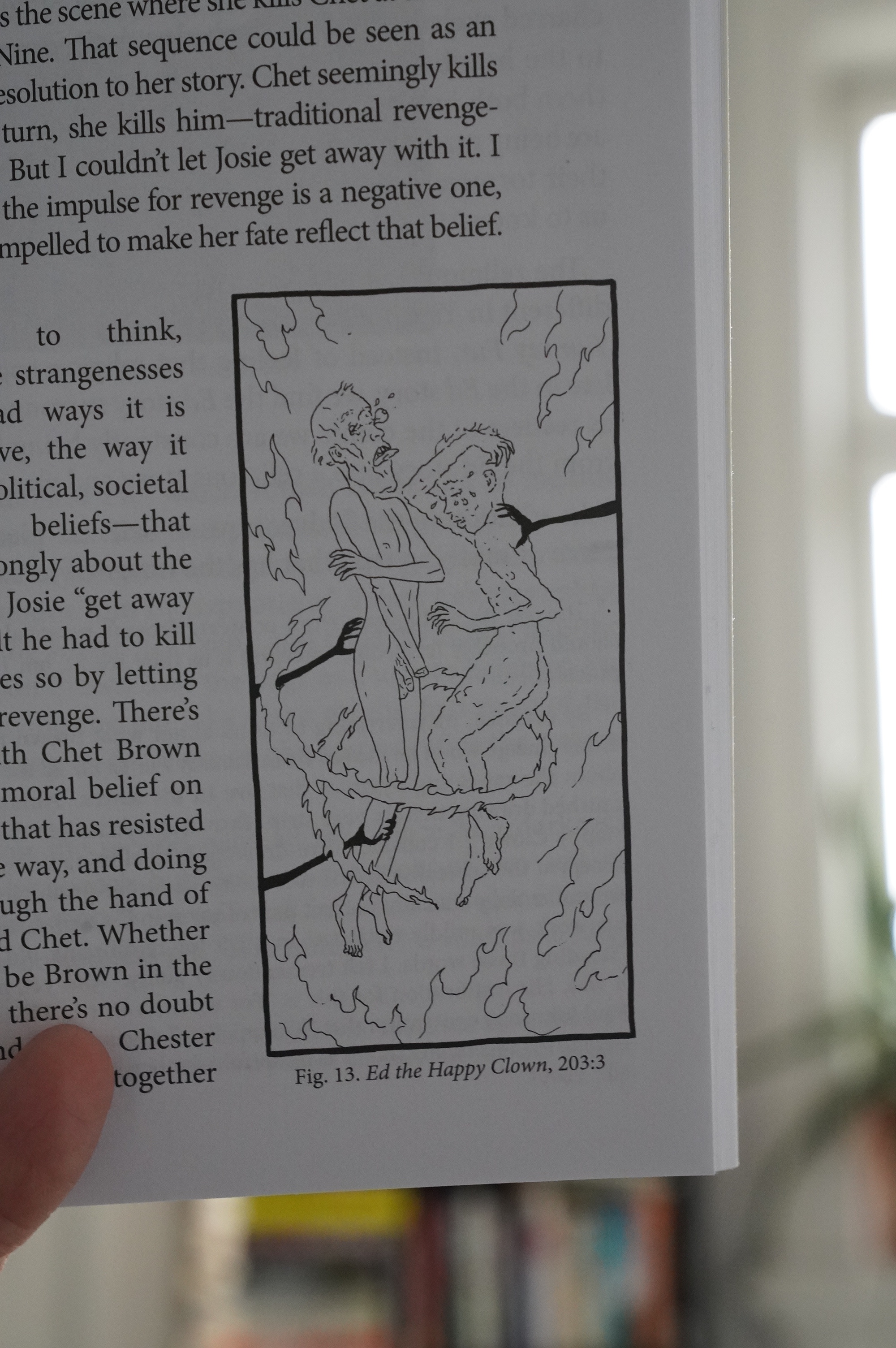
Here we see Chet (without his hand, because the hand is still alive, most likely with Baby Jesus in heaven) and Josie, the woman he deliberately killed while having sex so that she’d be doomed to eternal agony in Hell (and who then became a vampire and Chet’s hand then extra-killed her so that she’s finally in Hell), being pushed together by demonic arms, in eternal agony. So not only does Josie have to suffer for eternity, but is pushed together with the man that gave her that fate. And here’s Evenson’s take:

“Is this togetherness a way of easing their torment or increasing it? It’s hard, from these final panels for us to know.”

NO IT FUCKING ISN”T. Get a grip: Josie’s being super-extra tortured, because the Ed world is a sucky place with horrible, horrible moronic and arbitrary rules; basically world where a satire of Catholic dogma is how the universe actually works.

Oh, and that’s another thing: Evenson calls Ed’s world “our world” and the other dimension is… not? While they’re both obviously not our world, so that’s just another bizarre reading. And this book is full of them; Evenson sees ambiguity so many places, and then gives a take that’s just… “wat”.

This is where you’re supposed to say “great art is open for interpretations, and we all bring our own selves to the table when reading and blah blah blah”, but sometimes a reading is just wrong. There. I said it.

Oh, yeah, and the discussion of the differences between an album and a graphic novel? Really?

ANYWAY.

This blog post is part of the Into the Vortex series.

V1986: Kaptain Keen and Kompany

Kaptain Keen and Kompany (1986) #1-6
by Bill White and Gary Fields

This is one of the Vortex series that’s most unfamiliar to me. I think I picked up one issue over the years, but I’m reading the rest for the first time today.

And why is that, if I was such a Vortex fanboy as a teenager? Because it’s from late 1986, when the Black and White Boom was in full swing: “Investor” hysteria had everybody buying any comic, as long as it was in black and white… for a few months. This meant that a shitload of shitty comics were pumped out by unscrupulous hustlers and hucksters, and I (naturally assumed that this was one of those).

On the other hand, these “investors” weren’t actually reading what they bought, so the same phenomena allowed talented people to publish some odd and worthwhile comics for a while.

So what part of that quality gamut does this land on? Let’s read the first three pages:

OK… this is definitely not shat out to land in the nearest Mylar poly bag, but displays some talent. It’s a pretty fun way to start a series.

But while it looks charming in a kinda standard way, the skills are sometimes a bit lacking. I’ve looked at these pages several times now, and I still don’t know exactly what Moose Boy is throwing at that robot guy. I mean, not that it matters, and the abruptness is the gag, but it’s still just not… quite… there.

The name on the cover is Kaptain Keen, but there’s probably more Superswine pages in here. As each issue is just 24 pages long, that doesn’t leave a lot of Keenity.

Hey! That sounds like a comics promo device that somebody should try!

Cool ad for Transit, but… “Decay”? As a selling point? Well I guess.

So speaking of overreach… here’s Superswine slapping himself because he’s getting hysterical, which is a good gag, but… can you actually tell that that’s what he’s doing, or do you just deduce it from the narrative of the scene?

There’s some meta humour in here, but less than you’d expect.

*gasp* Daniel Clowes draws Kaptain Keen for a pin-up page. That’s something.

In the sixth and final issue, the creators complain about not getting any letters. I’m guessing the reason was that few who bought the series read it…

And we end the series with the traditional way of saying the series has been cancelled: A “next time” panel.

I wonder whether anybody reviewed it at the time…

Somebody writes a preview in Amazing Heroes #133, page 99:

Kaptain Keen will continue to toss adult-
level satire from behind the seemingly
innocuous facade. The big news here is
that KK has been optioned for a possible
Saturday morning animated program.
Should this actually happen, there is a
possibility that the book might change
somewhat, in order to be consistent with
the TV show.

Adult-level satire? Uhm…

I don’t think that animated TV program happened.

Somebody writes in Amazing Heroes Preview Special #5, page 68:

According to Vortex publi9her Bill Marks,
Kaptain Keen and Kompany will change
slightly in the next few issues, as there will
be more of an emphasis on continued
storytlines. He also says the book will try
to maintain its juvenile-look/adult-appeal.
“Like Rocky and Bullwinkle, this book will
continue to toss adult-level satire from
behind the seemingly innocuous facade”

And… that’s it. Not a single review in Amazing Heroes or The Comics Journal.

Kaptain Keen did not continue after being cancelled, but Superswine has been published by several companies over the years. But apparently the only person who’s written anything about it is me.

This blog post is part of the Into the Vortex series.

V1985: Kelvin Mace

Kelvin Mace (1985) #1-2
by Klaus Schönefeld, Ty Templeton and others

Ty Templeton introduced Schönefeld in Stig’s Inferno as a young guy mainly working in the commercial illustration business, and was therefore swimming in money… But after the Templeton lured Schönefeld back to the comics business, and they collaborated on several things, and Schönefeld also coloured books like Mister X.

So let’s read the first four pages:

Schönefeld does the artwork here, and Templeton wrote the words? I would have guessed that Templeton did some of the artwork, too, but Schönefeld seems like an incredibly talented chameleon: Some of those lines look very Templeton, while others (like the guy in the hat) don’t at all.

The humour is definitely more bratty than Stig’s Inferno — the main gag is that Mace is a super-violent, stupid buffoon, which is a tried and true character, but can easily tip over into sheer edge lord tedium. I think they manage to make it work here: The baby-out-the-window gag is suitably outrageous, but it turns out that he’s not really hurt (on the next page; he’s actually Mace’s trusty side kick).

The sheer manic absurdity really works here, I think, with suitable insane escalation over these four panels. I love the juxtaposition in the first panel between the guy trying to escape out of the panel (and away from Mace) while keeping up the pleasant conversation, to Mace putting him into some kind of… torture apparatus in the third panel (still with the polite conversation), and… what’s even going on in the fourth panel?

The printing on this issue is really awful, though. Sure, it’s newsprint and you can’t expect miracles, but it’s pretty horrendous, especially what with Schönefeld doing these absurdly intricate panels, and zip-a-tone all over the place.

And we end on a cliffhanger.

And then there’s a backup story written by Templeton with artwork by Mike Dringenberg? It’s a story with a very different tone than the main feature, so it’s an odd choice.

Schönefeld (and Templeton) get some words in.

So that’s the first issue: It’s totally jam-packed. It’s got so many gags going on each and every page that the cumulative effect starts getting to you after a while: Everything becomes really funny even if any single joke isn’t that brilliant.

So… thumbs up! A really solid start.

And then the second issue arrives some time later, and it’s in colour, and Schönefeld apparently did it (without any Templeton involvement) while Schönefeld was on holiday in Europe? I wonder whether he got any inspiration from being in Europe… Let’s read the first three pages.

YOWZA! Schönefeld discovered Moebius!

This is the most perfect Moebius pastiche I’ve ever seen, I think. Not the content, but the line work and the character/city design. He explained in the intro that he didn’t find any shops that sold mechanical tone in Europe — I don’t know whether that’s a tongue in cheek explanation for the shift in style or not.

The story in the second issue has no connection what-so-ever with the story in the first issue (which ended on that cliffhanger), and it’s a lot less funny. Templeton crammed thirty jokes into every page, while Schönefeld is more economical. It’s still very funny, and it’s perhaps… a more well-constructed story? The plot is a bit of a cliché, but it’s performed with elan.

And it looks gorgeous.

Oh, Schönefeld was supposed to do a Mister X mini-series with Dean Motter (about the Mercedes character)? Again, a very different art style than the first two Kelvin Mace issues.

Schönefeld was obviously super talented.

And then he died at age 24.

Kim Thompson writes in The Comics Journal #109, page 26:

Klaus Schoenefeld. a young
Canadian artist best known in the
comics field for his work on
Vortex Comics’ Kelvin Mace
(which he created) and Mister X.
died Of a heart attack on May
8th. 1986. The heart attack
occurred as the 24-year-old
Schoenefeld was jogging to the
grocery store.
Schoenefeld. a native Candian
of Austrian origins, made his
living as a commercial storyboard
artist and drew comics on the
side. His collaborator and
roommate Ty Templeton (creator
Of Stigl Inferno). told the Journal
that Schoenefeld’s death came as
a “massive surprise” to everyone
who knew him.
“The real pity.” Templeton
said. “is that Of his really
good comics work hasn’t been
seen by anyone. If he had been
putting the kind of effort into
comics that he Was into his Story-
boards. I’m sure he would have
been a really big name within a
few years. Now. of course. we’ll
never know.”

*sigh*

“KF” writes in The Comics Journal #111, page 24:

Vortex sponsors art scholarship

The Toronto-based Vortex Comics
is sponsoring the Klaus
Schoenefeld Memorial Scholar-
ship at the Ontario College of
Art. Klaus Schoenefeld, who died
of a heart attack in May, was
artist and co-creator with Ty
Templeton Of Kelvin Mace,
producing two issues for Vortex
before his death.

According to Bill Marks, pub-
lisher of vortex, all profits from
the Sales of the reprints of the
first t’.vo issues will fund the
scholarship. • ‘It (the scholarship)
will be awarded for excellence in
comic artwork,” said Marks.
Although the Ontario College of
Art does not offer a degree in
comics, “it is the largest art
school in Canada,” said Marks.
Both Schoenefeld and Templeton
graduated from the college.
Vortex is currently negotiating
with the Schoenefeld estate for
the right to continue publishing
the series, according to Marks.
“We’re looking for a suitable atist
now,” said Marks. “But if you’ve
seen Kelvin Mace, you know that
we’re looking to fill pretty big
shoes.”
Issue #2 Of Kelvin Mace is
currently available, and issue #1
will be available in November.
Both reprints are bla$ and white
and retail for $1.75.

Hm.

From the 2011/2012 scholarship results from the OCAD university:

So it’s still going? That’s amazing.

But financed by the Leo Burnett ad giant? So I’m guessing he was working for them when he died?

From a Templeton interview in Amazing Heroes #111, page 24:

So we were going to do Stig’s In-
ferno for the college paper. We sat
around and did ideas and sketches
and doodles for weeks and weeks
and, because we were essentially
lazy bastards, we never actually
finished it until Klaus got this job
doing the storyboards for this art
studio and making unbelievable
amounts of money. (In the interim,
by the way, I quit college.) And that’s
when Bill Marks and I got together
and he said “Do you want to do your
mvn strip?” and I went “Yeah! I want
to do Stig’s Inferno.” Klaus didn’t
have time so that’s why I did it by
myself—although if he were around
to tell you he’d tell you a different
story.
So I did it by myself which got
him a little mad because he wanted
to do it but he realized he couldn’t.
That’s where Kelvin Mace came
from: we decided to come up with
a series that he could do the draw-
ings for, and since at the time the
Vortex schedule was to put out a
book every time there was a full
moon or an eclipse, we figured we’d
have lots of time to put one together
on the same schedule. Kelvin Mace
was kind of not-like-Stig’s, but just
as much fun. Unfortunately,. only
one issue of it ever came out..
AH: I thought there were two.
TEMPLETON: Well, yeah, there
were, but the second one doesn’t
count in iny mind because Klaus
drew it in Europe as an attempt to
get me angry. He went off to Europe
on vacation and came back with a
full issue of Kelvin Mace that he’d
written by himself and handed it to
Bill to publish; they published it
without mentioning my name on it
anywhere even though I co-owned
the copyright on the character and
he uns supposed to be my character
and I was suprx)sed to write it. Klaus
told me later that he did it entirely
because I’d done the first issue of
Stig’s on my own, so he did it to piss
me off. Sadly, it was the last one he
did, because then he went and had
a heart attack on Queen Street atx»ut
two weeks later.
I don’t know if I should really go
on and on about him. I could go on
and on because I’ve known him so
many years…
AH: Well, it’s not like anyone else
is going toe..
TEMPLETON: Yeah, 1 guess not.
Someone should. In print then:
Klaus was the most talented artist
who ever lived, absolutely, bar none.
He could draw better than anyone
who ever picked up a pen. It was
stunning. I looked at sketches he did
when he was seven years old and
they’re better than what I do now.
He had this one problem with in-
credible laziness and he was always
very satisfied with what he did. He
never pushed himself to get better,
so he have drawings that were
not as great as, they could be but he
would publish them—and then he
would doodle and the drawings
uould be absolutely magnificent and
no one would ever see them. There
is a huge stack of drawings sitting
at his dad’s house right now that his
parents uouldn’t let anyone look
through, which is really sad. I tried
to talk them into letting me publish
a book of his drawings. They’re
actually interested in it now but at
the time they didn’t want to talk
about it, and unfortunately, I don’t
really know if anyone would be
interested in publishing a book like
that. Other than someone who has
taste, someone who’d be interested
in seeing the drawings of an incred-
ible talent. Fantagraphics, mavbeo
AH: It’s a possibility…
TEMPLETON: Is it, seriously?
Because I love to edit together
a book full of his drawings. Actu-
ally, you’re going to see some of
them anyway because you asked me
to put together stuff from when Stig
was being invented and I pulled out
some of the sketches he did. Since
he was originally supposed to draw
it most of the character sketches
were his and you’ll see the way he
drew. I mean, the stuff he put out
in Kelvin Mace, compared to what
he could do, was just dreck. The
second one actually is closer to what
he was able to do, but that’s the one
where he traced Moebius drawings
all the time.
It really is a bit ofa drag, because
not only was he a magnificent art-
ist. he was also an incredibly intel-
ligent person and a terrific singer
and all that crape We were roomies
for about four years; I miss him
dreadfully. In 1986, somebody de-
sided they were going to mess with
my life: Klaus died on my birthday,
the day my fiancee moved out of the
house: BOOM! “Welcome to reali-
ty, Ty!” BOOM! This also put a
damper on me drawing Stig ‘s Infer-
no, which is probably why the first
[newl issue is not as funny as I want
it to be. I think it could be funnier.
It was the first time I’d ever drawn
a Stig’s Inferno that I knew Klaus
wasn’t going to see, which was really
odd. I mean, even though he and I
didn’t uork on it that much together,
I’d still go over and talk about the
stories and plots with him and he’d
always look at the final issues and
say, “You creep, why are you doing
this by yourself?” But his name went
on every one of them, he was still
part of every issue because he cre-
ated the character. He named him
Stig. I was originally going to call
him Bob.
AH: I assumed it was a pun on
“Styx.”
TEMPLETON: You did? It’s not.
I’m much cleverer than you think–
no, I got that backwards: I’m not as
clever as you think. It’s from Monty
Python.

I looked for reviews of Kelvin Mace on the interwebs, but couldn’t find anything.

This blog post is part of the Into the Vortex series.

V1985: Those Annoying Post Bros.

Those Annoying Post Bros. (1985) #1-18
by Matt Howarth and others

As a teenager, I read first few issues of this series, but found the nihilistic over-the-top violence off-putting, so I stopped buying it. I have, however, continued to pick up issues now and then, and over the years I seem to have accrued a pretty complete run (and I then bought the remaining few issues for this blog series).

But this is the first time I’m reading Post Bros in sequence… Perhaps I’ll like it more now that I’m all hardened and cynical and oh so world weary? Let’s read the first three pages together:

Yeah, it’s still a lot.

The Post Bros concept is exhilarating and offensively stupid at the same time: There’s this infinite city, Bugtown, where people who die regenerate after a couple of days. The Post Bros live in this city, and they’re able to skip between a number of realities (usually described as mind-bogglingly infinite, but as the story needs dictate, sometimes not so infinite).

The titular Bros are totally psychopathic, and will kill and torture (but apparently not rape?) at the drop of a hat. Here’s the moronic part (and read this in Comic Guy’s voice): The series is basically a number of capers where the Bros go off looking for stuff to steal, because… they need… money? Yes, it’s as stupid as that: These guys can teleport and shift between an infinite number of realities, but they spend most of their time trying to steal things so they can make money.

If Howarth had tweaked this a little bit, saying that the Bros’ motivation is just, like, that they like going on capers, that’d be no problem, but he doesn’t, so…

It’s just a head-scratcher.

The reason I’ve kept on picking up issues of Post Bros even if it’s all a bit hard to take (both the “fun” edge lord torture bits and the base premise) is that Howarth has a few things going for him: His artwork is so much fun to look at. His endless supply of plausible-seeming but odd aliens is wonderful. Howarth is also pretty funny, and some of the plots are genuinely fun and interesting (but the Keif Llama stories are better).

And then there’s the artwork, which I absolutely love. It’s so organic and obsessive — especially in this period. His artwork in the early 80s was a bit rough, and later he cut down on the details a lot, but here everything is just meticulous.

Remember that reality-shifting thing? It’s not just that they can travel to other realities, but they can “shift in” other versions of themselves. Yes, that makes no sense, but you get a lot of cute gags out of it. The problem with this is that there’s then really no… consequence to anything much: If there’s a problem, they can just shift into whatever.

Howarth works around this by just not mentioning it as a possibility unless they’re actually shifting. It’s the “SHHH! DON”T THINK!” method of storytelling.

But I mean… you get gags like this, so…

Howarth does the colouring on the covers consistently in this time-consuming manner: Instead of, say, colouring with watercolours or whatever and then scanning and separating, he draws four “layers” (or three, as in this case, since there’s no black here), one for each of CMYK, I guess. And then he just had to imagine how the colours would end up looking when printing, because all the layers are done in black on white, of course.

An insanely time-consuming and error-prone method, but it looks striking and it’s cheap: You don’t need to do the colour separations; they’re ready to be sent to the printer as is.

Howarth is into experimental electronic music, and several of the characters are in a band, so we get fun stuff like the liner notes from their latest album.

Howarth has also made a bunch of covers to a series of imaginary 7″ singles. I really, really wanted to buy these as a teenager, but I couldn’t really justify spending ALL THAT MONEY on something so frivolous.

Stupid me!

Heh. That’s a cool Coil EP.

So, yeah, there’s a lot of music references in here. Here we have The Walking Heads.

But, OK, the violence. The endless references to “cool” mass murderers and torture and stuff. Here we have Ron Post at the Ed Gein restaurant.

With all these realities going around, if you guessed that Howarth would just cop out sometimes instead of writing a proper end, you’d be correct… but he doesn’t really do it a lot.

… but it’s like Howarth is saying “ok, that was fun and bratty, but a bit lame”, so he then adds a new ending. It’s fun.

Oh, I didn’t mention that the first four issues were co-written by Lou Stathis.

Patricia Jeres joins as an editor, and… here’s a picture she’s taken?

I wondered whether the book would take a radically different direction once Stathis was out, but not really. But the fifth issue has a fun structure at least: We get two storylines running in parallel.

And I like these tiny meta touches.

You have to admire Howarth’s (or Jeres’) absolute refusal to discuss whether the atrocities in Post Bros are appropriate, or whether Howarth is trying to like say anything with them, or… well… anything. “Bad boys do bad things.”

Wow, that’s blurry. Anyway, Seth writes in to tell Howarth how much he likes the baby drop-kicking scene.

But if you were to discuss the violence on display here, perhaps this issue is a good one to try to say something. The brothers are looking for “fun”.

So they basically stage a pre-enactment of Funny Games.

They don’t really torture anybody that much — they scare the shit out of them, beat some of them up a bit, and then watch a nuclear war start. (That’s the reason for the home invasion: The house had the best seats to watch the bombs fall.)

Is this hilarious? Is it “outrageous”? Do bros fist pump and go “dude! it’s so brutal!” Is it a commentary on today’s brutal late-stage capitalist society? Are we meant to loathe the bros or find them kinda fascinating?

Cosey Fanni Tutti writes in to say that she’s a fan.

After a half dozen 32 page issues, Howarth slims down the page count to 24, and uses just 18-20 pages per issue on the main storyline. His artwork also becomes more sloppy; not as obsessive, with plenty of panels where the main characters float in a white void.

He also experiments with using zip-a-tone for one issue (I’m guessing this is also as a labour saving device), and it looks pretty bad: His artwork is so organic that the mechanical tone sits oddly on the page.

The cover colouring is still spiffy, though: Look at all those details in the blue layer. So distinctive.

We also get backup features written by Howarth, but with artwork by others (here’s Dan Steffan). The characters just don’t look… right…

“Intrinsically cruel”.

Howarth also drops in some shorter bits reprinted from elsewhere (here’s a Subgenius thing). It’s fun to see these pieces, but few of them are, like, actually good.

*sigh* Intrinsically cruel? Or just sophomoric?

Probably more the latter.

The thing is: I wasn’t bored while reading these comics. They are inventive, and you genuinely don’t know where they’re going. Sure, a few of them are shaggy dog stories, going nowhere (endings are a problem for Howarth), but they have a wild-eyed … charm … going that’s hard to deny.

But then again, there’s stories like this, where the Bros try to kidnap the same woman from several different realities, and end up accidentally (or not) killing her a lot. As Ron almost says — the stakes get really low when you have an infinite number of tries to get things right. Howarth seems to realise his mistake, because in this story one of the characters says that there’s a limited number of world where this woman exists… which is understandable, but lazy of Howarth.

(I love the Caroline’s hair up there. I mean, it makes no sense if you try to envision it as a real hairstyle, but on paper, in these pages, it’s so natural.)

The gag here is that they’re not kidnapping (and killing) this woman a lot because she’s of any particular interest: She’s just a friend of the daughter of a guy they want to blackmail… so they kidnap her, torture her on tape, and show the tape to that guy as a way of saying “if you don’t do what we want, we’ll torture your daughter like we tortured this woman” (with cattle prods and a chainsaw and cannibalism, apparently). So it’s a fridging twice removed, and the sheer tastelessness of this all is…

I think I was right to ditch this series as a teenager?

Howarth start including his comic strip form music reviews here — they were a staple in the sister Savage Henry title, which I’ll be re-reading in a few days.

The final two Vortex issues feature what was supposed to be the opening issues of the Vortex series, but were held back because Stathis and Howarth didn’t think it was a good place to start. And reading these, I think they were right: They’re pretty weak issues.

But I do love that explosion.

Howarth usually doesn’t do much with formal comics play, but this is a pretty fun page… even though it doesn’t quite work: The segue from one-image-divided-into-panels to a normal panel-as-time thing isn’t completely satisfying.

And then the series is over… at Vortex. Howarth took the series to Rip Off, and then it went to Aeon, and possibly other publishers. There’s over 60 issues available, and I’ve got about two thirds of the remaining ones.

If I remember correctly, the Bros mellow out a bit? I may be totally off on that, though; I haven’t read the issues since the 90s.

Howarth has continued the series since, and you can buy a bewildering quantity of stuff from Howarth’s site. A lot of it is available as PDFs only — I am tempted to buy it all, really.

But what did the critics think, if anything? Let’s search a bit…

Lou Stathis writes a letter to The Comics Journal #111, page 30:

[…]
Then there’s the bit on Bill Marks and
Vortex Comics in #101 begging me to stuff my
two cents in. First, regarding the business that
seems to have it all—the Hernandezes
and others seem to have read the editorial in
Mr. X to mean that they were unprofes-
sional. Hunh? The gist I got from the thing
was that they were too busy. I guess that can
interpreted to mean that “they were unable
to meet their professional commitments” (as
you guys put it), which can then be stretched
to imply some level of unprofessionalism, but
that requires an awful lot of in-reading to draw
that inference. Ain’t nothing wrong with being
unable to churn out material fast enough to
meet a publisher’s needs (happens all the time
in the comics biz, and pretty frequently around
this house as well), and no reason for anybody
to raise their hackles over such a characteriza-
tion. Touchy, touchy.
The bigger issue here, though, is the allega-
tion Of Wrtex’s payment problems. Such prob-
lems do exist all right, as they do throughout
the independent publishing realm—comics,
magazines, books, recordings, all of it. I’ve
known Bill Marks for a bit over two years, and
have been doing business with him for about
half that time, and I haven’t had any real
“problems” With him. Yeah, sometimes
haven’t been paid When I hoped to be, but late
payment is something a freelancer learns to
expect, and I have eventually collected
everything Owed me Without much trouble
(more than I can say about some publishers
I’ve worked for). Part of the reason for that
is, I urote the contract that Matt Howarth and
I have With Vortex for Those Annoying Post
Bros., and so “r it has been That the
Hernandezes’ Mr. X contract had no payment
schedule in it is absurd to me—that’s precisely
what a contract is all about (and if they’d
followed Bill’s advice and consulted a lawyer,
they would’ve been told that right away). Con-
tracts exist to spell but specifically the Obliga-
tions and compensations agreed to by all sign.
ing parties. It is a worst case scenario that
prepares for the total breakdown Of civilized
discourse Extween the docurnents’s signatories.
As they admit, the Herna deaes were naive
and had no experience wit contracts. hap-
pen to have lots Of experience—from my time
as an editorial assistant at Dell Books, through
a brief fling at agenting, my years at HM,
numerous self-numerous self-negotiated deals
for my own novels, articles, stories, and scripts,
as well as consultations with friends in the
comics, bmk, magazine, and recording indus-
ries. They are boring and tedious things, but
an integral part of the business Of art, and if
you care at all.about what happens to your
work and whether you’re going to be ade-
quately compensated, you’ve got to pay close
attention (or else pay someone with expertise
to pay attention for you). TO stumble into
something blind and then cry “foul” when it
doesn’t go the way you though it would strikes
me as more than naive—it’s foolish.

This is in reference to Bill Marks not paying the Hernandez brothers for their work on Mister X. Stathis seems like a total douchecanoe, doesn’t he?

Gary Groth replies in The Comics Journal #111, page 31:

What is this, Ethics in the Publishing profes-
Sion According to Rambo? In other words, accor•
ding to Stathis, any artist young or naive or trusting
enough to let an unethical, greed-crazed publisher
take advantage of him gets what he deserves, and
if the artist has the audacity to whine about it
later, he’s a sap and a loser. It’s a dog-eat-dog world
out there, after all, and publishers have a moral
prerogative to screw artists, and if artists have the
audacity to complain about it, by Gr_kå, they’ll hear
from Lou Stathis. There are two kinds of factions
in this world, the strong and the weak, and the
weak can just bloody well sit back and take it
like men.

Perhaps that’s a better way to put it.

(Stathis didn’t last long at Vortex, but I guess he wrote this letter during the months he was there.)

Richard S. McEnroe writes in Amazing Heroes #144, page 21:

Ron and Russell Post, the infamous
Annoying Post Brose, remain consis-
tently and respectively an unfortunate-
ly impulsive twelv?-year-old sadist
trapped in the body of a thirty-year-
old Doberman pinscher and a laid-
back sociopath convinced of his
intellectual superiority over little
brother Ron because he doesn’t drool
when he giggles with malicious glee.
Cerebus the Aardvark would be con-
sidered backward in their company
(throwing babies into crowds is
something they got over when they
were six years old the second time
around) and Wolverine would be con-
sidered needlessly intellectual—
‘violence is fun and easy,’ would be
the Post Bros. credo; at least it would
if they thought that far ahead before
opening fire—and they react to every-
thing the world(s) can throw at them
with the same cheerful, unflinching
psychopathology. They are the comic-
book fascination with violent excess
taken to its illogical extreme, and
rendered surreal in the process.

Is it, though? Is it?

When reality can change at the
literal drop of a hat, the trick becomes
how well you can juggle them—and
Matt Howarth keeps them spinning in
all three rings. I can’t recommend
them enough.

I googled a bit to see if I could find any reviews of Post Bros, and… nope? That’s just weird. You’d think there’d be several rabid fans with their own web sites, but if so, they’re not turning up on the first three pages of Google.

This blog post is part of the Into the Vortex series.

V1984: Mister X

Mister X (1984) #1-14
by Dean Motter, Jaime & Mario & Jaime Hernandez, Seth, and a whole bunch of other people

Mister X is an interesting book: Not really for the contents, which are uneven, but for its publishing history. Well… Its history of… not being published.

In 1982 (I think it was), Vortex announced that they’re publishing this fantastic new series, and took the unprecedented step of sending four (count em four) posters to comics shops:

People thought the posters were really cool and mysterious: They’re done by Paul Rivoche, and look all retro-futuristic as shit.

The comic itself was announced in the press… and then announced again… and then the ads for Mister X by Dean Motter and Paul Rivoche started happening (in 1983?), and then…

Reading between the lines (and the er comic à clef in Vortex, where somebody looking suspiciously like Rivoche is described as being more into comics theoretically than practically), it sounds like Rivoche just didn’t, like… want actually do the comic itself.

The posters and the covers were really stylish, but drawing an entire (supposedly) bi-monthly series is a lot of work.

So:

In 1984, the book finally happens, and it’s a super duper stylish cover, and it’s printed with really vibrant colours on shiny, white paper. It’s in a format that I think Vortex may actually have pioneered (or, more probably, Dean Motter, who’s a designer): The “self covered” comic book. (Comics usually have an interior paper stock, and then a cover with a better paper stock.) Mister X uses the same paper on the cover as on the interior, and is therefore just two 16 page “signatures” (I think the term is). This, of course, means that the book is four pages shorter than a 32 page comic normally would be, which is economically… advantageous.

(These days, I think Marvel is only using the “self covered” format?)

So, the book is here, and it looks and feels like nothing else on the stands, but… Rivoche is off the book (except some covers), and instead it’s drawn by Jaime Hernandez, and written by Mario and Gilbert Hernandez (all of Love and Rockets fame).

If there’s one thing they’re not famous for, it’s doing retro-futuristic art decoish comics.

So let’s read the first three pages:

It looks amazeballs! J. Hernandez’ figures are as fun to watch as ever as they gambol across the pages, and the city (of sleeps and of nightmares) looks awesome! Not exactly art deco, but very retro-futuristic in a way that makes sense, but also looks kinda insane.

Rivoche does the colouring on the first issue, and it all looks just… right. The heavy, inky spotted black silhouettes really pop, and the plot in the first issue is satisfyingly confusing as it seems to hint at so many things going on. We’re introduced to a large cast of interesting characters (most of them women, of course), and there’s a general feeling of mystery and intrigue.

That’s a rare drawing of Luba by Jaime… no, hang on. Those lines on her abdomen look more like Beto?

Speaking of which, he does a couple of short, mysterious backups with scenes from Radiant City.

Yes. Perfection.

Klaus Schönefeld takes over as the colourist on the second issue and does a swell job, too. Slighly less futuristic than Rivoche, though.

But look at that cityscape in the first panel. Just look at it!

The Hernandezes (is that the correct plural?) have the characters do the recaps in the second issue, which is cute.

Oh, yeah. The plot. It’s about… a crime lord… stealing a MacGuffin and then Mister X has to get it back, because otherwise… stuff. It’s pretty basic.

Or rather, Mister X steals the MacGuffin from the crime lord… god, it’s an hour since I read this, and I already forgot. That’s how important the plot is.

Instead, what kept my attention were the characters and all these little bits from the city in the background. There’s always something going on in the background, and it always looks great.

I had really expected the crime lord plot to last several issues, but they wrap it up so fast that it’s kinda disappointing.

It’s very neat, but perhaps a bit too neat?

Mario and Beto team up on a couple of back-up stories, and they’re all kinds of fun. Beto draws in a style that’s a bit different from what he did at the time. More… arty.

It seems like the trio had a lot of fun doing these issues.

But then the third and fourth issues happen, and I’m all confused. Because I’m not confused any more.

See, the first two issues hinted at a bunch of mysteries and stories and backstories… and the next two issues just tell us everything, straight up. We get the entire Mister X backstory in excruciating detail, and learn how everything connects to everything else. It’s like… they could have spent years on this stuff, but instead it’s just an infodump, and it’s really disappointing.

In the fourth issue, Motter tells us that the Hernandez brothers are leaving the series because they’re just too busy. But he hints at two Mister X specials coming from them later.

Them being busy may have been a factor, certainly, but more important was probably that Bill Marks wasn’t paying them for their work.

Thom Heintjes (I think?) writes in The Comics Journal #101, page 19:

Hernandez Brothers leave
Mister X over payment dispute

Although the editorial in Vortex’s
Mister X #4 said Los Bros.
Hernandez left the book because
they were unable to meet their
professional commitments,
according to the Hernandezes.
they actually left the book
because they were owed over
S8.O00 for writing and drawing
Mister X #2-4.

Signing on: Ken Steacy. who was
originally the editor Of Mister X.
convinced•-Jaime, Gilbert. and
Mario Hernandez to take over the
art and script chores.on the book.
Los Bros.. as the three are
commonly known. first came into
prominence through Love and
Rockets published by
Fantagraphics Books. “Ken Steacy
called us up. and liked our stuff.”
Jaime Hernandez said. He added
that Vortex had been running into
snags with the book. and had
been publicizing it without a
finished product to print. Los
Bros. took up the offer simply
“to pay the bills,” Gilbert
Hernandez said. with the contract
stating that they uould get S165
per page. to be split among the
three brothers.

Los Bros. eventually did sign a
contract that committed them to
Mister X for six issues. although
they signed with the knowledge
that they wouldn’t be paid upon
completion of the first two issues.

• •He told us he had cash now
problems. so he couldn’t afford uto
pay us for the first two issues.”
Gilbert Hernandez said. “We told
him it was all right.” It was after
the first two issues. though. that
the trouble started.
Los Bros. said that although
they were doing the work. “the
book was coming out faster than
the checks were coming in.”
according to Gilbert Hernandez.
After four issues Of Mister X. LOS
Bros had been paid 9,445, while
they were still owed S8,255.

Puzzlement: Both Jaime and
Gilbert said they realize that
Vortex Publisher Bill Marks and
VOrtex have cash flow problems.
but they also say they are
perplexed by Marks’s inability to
pay them. even over a period Of
time. ‘ •l don’t know Why he can’t
pay us—he’s got a graphics studio
he boasts about,” Jaime
Hernandez said. Marks said that”
while the graphics studio does
make money for him. it only
subsidizes Vortex Publications to
a small extent.

Jaime Hernandez told a story of
when he and Marks attended the
Lucca Comics Festival in Italy
last Fall. “During the whole trip.
he was always talking about
money. almost bragging about
how much money he could make
and save,” he said. “Then he
goes out shopping for luggage and
other things. showing it off right
in front of me.”

Marks explained that he could
afford to go to Italyu while he
couldn’t afford to pay three of his
creators by saying that his flight
cost to and from Italy was paid
for by the Canadian government.
under an export market
development program. He said
the government would haye paid
for one-third the cost of a hotel
room. but he chose to stay With
Jaime Hernandez. “It’s easier for
free than for two-thirds the cost.”
he said. “But my meals were
paid for by my personal money—
and my personal finances and the
finances Of Vortex are separate.”

Gilbert Hernandez told of an
incident that happened When
Marks was visiting Los Bros. in
California. “We were talking
about the money he owed us. and
he reached inside his pocket,” he
said. “He tossed a quarter at me
and said, “Here, here’s your
money.’ ” Marks said that while
he couldn’t recall that particular
incident. he said it could have
happened. “But you have to look
at it in -context.” he said. “If I’d
just sucked down a Couple Of
cases of Stroh’s. I might have just
done it as a joke—I didn’t mean
to hurt Gilbert’s feelings.'”

Short on capital: Marks said
there were several reasons for the
delay in paying creators. Marks
said he lost more than $6,000 to
Seu Gate Distribution and
Longhorn Book Distributors, two
distributors that recently went
bankrupt. Also, he said he lost
money to Pacific Comic Distribu-
tors. which went bankrupt last
September. “It caused a basic
cash-now problem,” he said.

Beyond this. though. Marks
said that sales on Mister X are
not strong enough to turn a
sufficient profit to pay the
Hernandezes. According to Marks
and the Hernandezes, sales Of
Misrer X hover around the 22000
mark. “Mister X hasn’t put any
money in my pocket, but it•s put
a lot in the Bros.’ pockets.”
Marks said. He added that
although the graphics firm he co-
owns. Modern Image works
Design. Ltd.. turns a consistent
profit. it doesn’t subsidize the
comics arm to the extent that he
could pay the creators. preferring
a cleaner corporate division.
“Eventually the comics will be
making money, and then I’ll be
able to pay people right away.”
Marks said. • ‘I’m just not always
in a position to do that right
Marks added that he realizes
his failure to pay the Hernandezes
is causing them trouble. adding
that he’s not holding the money
back for himself. I’ve seen how
they live—five Of them living
With their mother in a slum in
California.” he said. I’m
living in a tenement in Toronto.
and I have roaches.. . at least they
don’t have roaches.”

Jaime Hernandez said that
when Marks was visiting them in
California. he stayed at their
home. “He invited himself to stay
at our house.” he said. “He
wouldn’t Stay in a hotel.
“He can say what he wants
about us—we just want to get
paid.” he added.

Holding out: Since LOS felt
that Marks was taking overly long
to pay them for their work. they
resorted to a new strategy with
issue #s 3, and 4, in an effort to
get money sent more quickly:
they began withholding art until
money was sent to pay for
previous work. There was limited
success with this tactic, they said.
Marks sent S2000 when the art
for Mister X #3 was withheld.
and more when Los Bros
held back the art for issue #4.
“The contract never said When he
would pay us—but it never said
When we would send in the art.
either,” Gilbert Hernandez said.
The contract that LOS Bros.
signed does not stipulate any sort
of payment schedule, and they
said they regret having signed the
contract so quickly. “When we
signed it, that was when we were
trusting everyone,” Jaime
Hernandez said. “In fact. when
Bill was giving us the contract to
sign. he said. •Spend $50 to have
a lawyer look it over:
“But we didn’t do it, and we’re
not getting our money: • he added.

In fairness to Marks. Los Bros.
said that he has been sending
money from time to time. such as
a check for $1.000 that came on
May 26. “He does pay us. it just
takes so Iohg. and he owes us so
much.” Jaime Hernandez said.
“That’s the main reason we left
the book. It just got to be too
much.”

Why four issues?: Los Bros. said
that they stayed on the book as
long as they did because they had
created most the characters save
the title one and two supporting
characters. and felt strongly about
them. “We wanted to finish the
six issues that our contract said
we would, but we had to draw
the line.” Gilbert Hernandez said.
The editorial in issue #4 said
Los Bros. would return at an
unspecified time to do the two
remaining issues that their
contract specified. “Sure. we’ll do
them if we’re paid up front for
them,” Gilbert Hernandez said.
“Which means ‘no,’ ‘

Earlier pmblems:originally, Paul
Rivoche was commissioned to
color Mister X. He colored the
first issue, and a portion of the
second one. “The reason I left
the book is because I wasn•t
paid,” Rivoche said. He didn’t
specify the amount of money
involved. “but it was substantial
enough to warrant my leaving.”
he said.

Rivoche said he considered
suing Marks. but declined to do
so. knew I’d end up wasting a
few years. and probably not even
get all the money back.” he said.
Finally, after a few months. he
and Marks settled privately.
leaving Rivoche content, but
determined not to work for Vortex
in the future. “I’ve just chalked it
up to experience,” he said. “I’m
uninvolved. and that’s where it
stands.”

Yeah… the Hernandez brother were just too darn busy.

Does that Bill Marks guy start to sound like a douchecanoe to you too? “I’ve seen how they live—five of them living with their mother in a slum in California” That’s really charming, dude.

But all this makes me wonder whether this situation also explains the really odd storytelling in their last two issues: They basically tie up all the loose ends, so that any continuation would be pretty… difficult? Where do you go from here? I mean, they didn’t burn down the universe: There’s at least half a dozen interesting characters that have been established, and the city is fascinating, so there’s all kinds of things you can do, but the basic mystery of the setting has been scotched.

So in the fifth issue, for some reason Lou Stathis does this… charming introduction of the new people on the series (it’s now written by Dean Motter himself, with artwork by Ty Templeton and Klaus Schönefeld).

Hm… Oh yeah. Rock Hudson had just died of AIDS.

Charming, I’m sure.

It’s a confusing issue. Somehow Mister X is back in hospital, and then… Motter tries to unwind everything that happened in the previous two issues, by explaining that the backstory we got was er like wrong fer shure, dude.

Crossover! Kelvin Mace was Schönefeld’s main book at the time.

Yeah, you can see that the artwork is going off into territories that aren’t well suited for Motter’s mysterious, paranoid setting.

Did I mention that the Hernandi (is that the correct pluralisation?) introduced a bunch of female characters? Well, Motter kills off one (without any reason, plot wise)…

… has one kidnapped and beat up several times…

… and one is given a leprosy drug.

It’s very subtle! It’s almost like Motter was resentful or something.

But it might just be the normal reaction of a male writer finding himself with all these womenfolk: Better kill them off, otherwise who knows; you might even have to write scenes where they talk to each other! EWWW! COOTIES!!!1!

A weird tic in these books (after Motter took over) is that every issue is told in two parts: One half before the letters column and one after. I’m not sure it makes much sense, but… it’s a thing.

So, of course, Templeton and Schönefeld leave the book, because they’re… too busy. Which might not be a lie this time — who knows?

Seth and William Diamond take over the artwork. Instead of a retro-futuristic look, we instead just get a retro look: Everything looks like it’s happening in the 30s, all of a sudden.

I mean, there’s still odd-looking buildings in the backgrounds, but they don’t make any sense and look like after-thoughts instead of being the point, like they were in the first four issues.

Jay Kennedy writes in to express concern with the book after Los Bros left, and Motter writes (and I’m paraphrasing very, very slightly) HOW DARE YOU! EVERYTHING EVER IN MISTER X IS MY IDEA! ME ME ME I DID IT ALL!

Motter seems to think that it’s a riveting mystery to find out what Mister X’s real name is, but in his two issues (so far) he’s given us no reason to care, because there’s no personality behind any of those names. IS HIS NAME JOE! OR JOHN! YOU MUST BE SO EXITED TO FIND OUT! Er, no?

But that’s a nice sequence, and, yes, that’s the fourth female Hernandez character that he’s almost killing off there, but… instead he kills off the mobster (that we thought was in prison in issue two already).

Seth does a page all on his own. Cute.

And speaking of cute: The design on these comics is great. Publisher Bill Marks also owns a design firm, and it looks like they know what they’re doing. It’s very… of its time.

Klaus Schönefeld, 23, died of a heart attack after completing the colouring of this issue, and we get a very very brief eulogy.

Wow. That’s a very different style from Seth (and Diamond) on this dream sequence. Very… Peter Kuper? I like it.

I don’t much like Seth’s storytelling or layouts in general here, though. They’re just clumsy. This page tries to hard to be clever with the repeating panel layouts (and reverse), but it just looks odd: Everything’s out of balance and nothing really flows.

A person writes in to tell us he wasn’t charmed by the Lou Stathis introduction a couple of issues ago. But Hudson died after the issue was published? What was the “joke” in reference to then? Was it general knowledge that he was HIV-positive before he died?

Jay Kennedy writes in again and apologises for assuming that Motter didn’t create the Hernandez issues all on his own, and Motter explains that perhaps they had some slight input after all? “The scripts were largely Gilbert’s, derived from my stories. Of course characters and dimensions were added”. Dimensions. But it’s all “derived” from his “stories”.

This is perhaps as good a place as any to mention the Dave Sim/Bill Marks feud! Behold! Cerebus #92:

That’s Bill Marks and Seth on the background of the cover.

Sim explains that he met Marks and Seth at a dinner, and Marks came off (to him) like a shameless, charming hustler. (And that Seth didn’t say a lot, so in the following excerpts from Cerebus, he’s talking with Diana Schultz’ voice (I think Sim meant that to be funny; he’s the kind of person to find that just hilarious.))

Let’s read:

So, to recap: Marks shows up at Cerebus’ doorstep and offers to paint a painting of him. However, it turns out that Marks is such a cheapskate that he hasn’t bought Seth a sufficient number of tubes of paint, so with the tools available to him, the resulting painting wouldn’t be very striking (a grey Cerebus against a purple background), and so would lose money.

They then make a retreat, leaving Cerebus painting-less (and it turns out they distracted Cerebus so much that he didn’t … ascend or whatever it was that he was in the middle of doing (it’s been a while since I read this issue)).

(Cerebus by Dave Sim, Gerhard, and a Xerox machine.)

I wonder whether Marks ever reacted to this in public? Let’s see whether there’s anything on the intertubes…

Well there’s this, but that’s not very informative.

Oh, I found this on Google Books, from an interview book with Seth (called Conversations). Here’s a couple of semi-relevant excerpts:

But otherwise, I can’t find much on the websies.

OK, back to Mister X:

Hey! That’s a stylish ad for Paradax! But… in the middle of the story? Very odd. But it turns out that there’s just seventeen story pages in this issue, so perhaps they wanted to confuse us all by dropping in some ads.

It is fun, I must say, to watch Seth’s artwork evolve over the issues. He’s doing his own inking now, and things have improved noticeably. We’re not at his mature style yet by any means, but it’s… pretty good?

He gets (un)steadily more cartoonish, too. That’s a good fight scene, right?

But I mean… this is getting good. Is he aping Yves Chaland here? His line is getting more French…

Aha! Some of the readers read the article in The Comics Journal about Los Bros not getting paid. It’s not specified who’s doing the answering here, but circumstantially, it looks like it’s Dean Motter? Anyway, they didn’t want to “dignify” the “rumours” (i.e., the news report) with an answer: It’s just so preposterous! Hah! So preposterous I tells ya! “The Brothers have been and are being paid for all their efforts for Vortex.” They were “released from their contracts” because they were too late handing in their work, and “for their own piece of mind” (!). And… they have never denied that they owe “a great deal more than money” to Los Bros.

No, of course not. It’s those “dimensions”. They owe some of the “dimensions” to them.

Hey — somebody else also noticed the violence to the female characters created by the Hernandezes. Motter responds cogently.

Paul Rivoche contributes artwork to a backup story… Perhaps this is what Mister X would have ended up looking like if Marks had paid him on time?

That’s a nice, moody page by Seth…

Oh? Should I say something about the plot in this er arc? Please. Please!

OK, I have to admit to not having the faintest idea what’s going on. There’s a bewildering number of characterless characters in here, all looking kinda vaguely the same, and they’re… doing stuff… and… then stuff… happens…

I love vague storytelling, but if there isn’t enough there to give you confidence that it’s worth trying to grok what’s really going on, it all starts turning into white noise. And I have zero confidence in there being anything worth puzzling out here.

People are still fascinated by the Somnopolis concept: Dave McKean contributes a three-page story that he apparently did without talking to Vortex first.

Nice and very unusual ad for Transit, the Ted McKeever series. I mean, it’s unusual, because it doesn’t look much like a McKeever design at all…

In the final Seth issue, he’s gone 100% Franco-Belgian ligne claire… Looks just like… oh what’s the name of that guy… How annoying; I just can’t remember the name of the guy. It’s not Serge Clerc, not Ted Benoit… gah! Branes! Why u so stoopid.

And that’s the final Seth page.

Deborah Marks did the colouring on the last half dozen issues, by the way, and probably does the best job of them all. Very moody.

Rodney Dunn takes over for the final issue of the first Mister X series, and… it’s pretty basic?

And I have absolutely no idea whether the plot(s) were resolved or not; I’m as confused as these people are.

So! That’s it! Done with the first Mister X series. There’s another to follow, and a special, but I’ll do those in a separate posts.

This series was reprinted in this edition, I think?

Doesn’t sound like these people actually read it:

With nods to historical design styles known as Brutalist, Bauhaus, and even German eExpressionism, the artists of the Mister X series were—and are still—hugely influential; the Hernandez brothers and Seth going on to create, respectively, Love and Rockets and Palookaville.

Oh!:

Again, it’s really the art that drives it. Which is why the very last chapter disappoints, newly redrawn by Motter himself, after being unhappy with the issue that was published so long ago. The man can draw, obviously, but it’s not up to the caliber of the rest of the series, which came to life under the sure hand of Seth (DRAWN AND QUARTERLY) and the Hernandez Brothers of LOVE AND ROCKETS fame.

Motter was so unhappy with the artwork in the final issue that he redrew it himself for the collection? Makes sense.

Somebody writes in The Comics Journal #105, page 97:

[…]
Maybe I should clarify myself. I like the
book. Or, at least, I’m intrigued by it.
The pleasant surprise of the early issues
was that Los Brothers Hernandez brought
style and satirical Nerve—a leavening Of the
same sensibility that infuses the more eccen-
tric elements of Love and Rockets—to the tell-
ing of what could easily have lapsed into
gloomy portentousness. Jaime Hernandez’s
clean, stylized images brought the book an
appealing lightness of touch. Visually, Mister
X is never as gloomy as its premise might
and in the use of space and arrange
ment Of figures within the panel, the visual
approach is extremely deft. (On the basis
of the fifth issue, Schonenfeld arid Temple-
ton will be attempting to provide continui-
ty with the Hernandez look; it’s a facsimile.)
In the first four issues, Gilbert Hernandez
concocted several distinctive characteriza-
tiOnS that were rgalized in a more complex
manner than one might have expected from
this sort of material. (As might be expected
from the creator? of Love and Rockets, the
yomen are particularly interesting and
appealing as peoplg). There were also minor
details in throwaw:ay bits—an irate taxpayer
bellowing in impotent rage at the ineffi-
ciency Of a government robot, the FX)pu•
larity Of “celebrity autopsies” on videotape
among the classes—which amusing-
ly revealed fagets of life in this future
metropolis.

Neil Gaiman interviews Gilbert Hernandez in The Comics Journal #178, page 111:

GAIMAN: You did thefamous Mister X thing where you got
badly ripped off.
GILBERT: I think we just got ripped off the way people
normally get ripped off. I don’t think it was that big an
issue. We just took umbrage with Bill Marks himself. We
just didn’t like him after a while, you know what I mean?
There are just some people you don’t forgive.
GAIMAN: The thing about Bill is, when you meet Bill and
he says, “Hi. I’m ascumbagandlrippeopleoff ” you go,
“What endearing honesty this guy has!” [laughter] It
comes across kind Of sweet, it’s really fun! He tells you
upfront he’s a scumbag, and you think, “Everyone else
here is saying, •I’m a great guy, and he’s saying ‘I’m a
scumbag, ‘ ” well… cool! Actually, just the action Of
saying “I’m a scumbag” doesn’t make one any less a
scumbag! [laughs/
GILBERT: He had to do that after the fact of Mister X
though because he wasn’t that way before. He was the
smiling scumbag who did not admit he was a scumbag.
GAIMAN: Oh. By the time I met him.
GILBERT: Yeah. See now he’s saying, “Oh, it’s all very
funny, it’s all very cute,” and he can be as cute to people
as he wants, but there’ s some shit you just scrape off your
shoe and just keep it off.

Heidi MacDonald writes in Amazing Heroes #119, page 66:

MISTER X Written and designed by
I)ean Motter, pencilled by Seth; inked by
William Diamond; M)rtex Comics; $1.75.
Yet despite tuy whiney dissatisfac-
tion, a new issue of Mister X is
always worth running down to the
comics shop for. Only 9 issues of
Mister X have been publßhed in the
nearly three years of its existence.
There ain’t much, but what there is
is cherce. Honestly. you couldn’t ask
for a less promising scenario: crea-
tor comes up with a dynamite con-
cept, but for various reasons is
unable to actually pmduce the story,
and has to pass it on to hired hands
to work on, with his minimal super-
vision. Except that the hired hands
in this case happened to be the Her-
nandez Brothers. It’s hard to imagine
more diametrically opposed styles
than the rounded fluidity of Jaime
Hernandez and the angular, highly
designed Dean Motter look. but the
unlikely marriage of warm natural-
ism and cold expressionist symbol-
ism has produced a decadent treat
of a comic, something wickedly,
delightfully twisted. The Hernandez
foundation saves Motter’s frigid
mannerism from being mere self-in-
dulgent priggishness.
In the mysterious, chameleon-like
penciller Seth, Motter has found a
remarkable artist, one who com-
bines the best of the Hernandez
characters and their masterful use of
blacks with Motter’s abstract design
work. I mean it only as a compli-
ment when I say that Seth is in the
highest echelon of swipe-artists of
them all, leavening Motter with Her-
nandez earthiness. While Mister X
doesn’t cut deep, it’s a perfect enter-
tainment for those who like their
mysteries seasoned with arsenic and
Art Deco.
Of course plots and storylines are
distinctly of secondary importance
in Mister X. It’s all style, mood. But
what a perfectly mordant style.
Nothing is just business in Mister X,
it always has some sort of twist—
witness the Club of Sons in #9, and
Mercedes’ meeting with Whitney in
the bizarre aviary. What kind of
name is Club of Sons, anyway? The
ninth issue wraps up “The Secret,”
Motter’s first complete storyline
since taking the book back after
#4. Mr. X now has more changes
of identities than most people have
underwear. Is he Michael? Santos?
Myers? Reinhardt? Eichmann?
Pierre Radiquet, mad chemist?
Pelham Welles, black sheep heir?
Every time he adopts a new iden-
tity, the real person shows up, only
to be bumped off soon after. It’s all
frightfully byzantine, and I don’t
think anyone could care less about
solving the mysteries of the book—
the search is all, after all.
And who could want it to end
when the book is played out against
such a fascinating background?
Mister X is a shining example of
comics’ all-too-rarely-used ability to
create a milieu,a fashion—Radiant
City, which borrows from a zillion
pop and high culture sources, is as
finely drawn as the worlds of Blade
Runner or Brazil. More than any-
thing it reminds me of Gene Wolfe’s
Book of the New Sun nwels. Though
Wolfe’s books are clearly science
fiction, and Mister X is clearly a
mystery, both are irresistably sick
and perverse—strange hot* house
orchids that could never live in the
sunlight. Radiant City is a world of
huge empty spaces of searing spot-
lights, of gothic robots, and Seth and
Motter absolutely go to town with
this concept.
Besides all that, Mister X has got
to be the most consistently well col-
ored comic book that Lynn Varley
doesn’t work on—the coloring is
never less than superb, and it’s all
the more remarkable since it’s had
so many colorists—Paul Rivoche, Ty
Templeton, and now Deborah
Marks. Despite the financial prob-
lems that Vortex comics has had,
Mister X is also an excellent example
of a book with a look. The printing
and paper stock are first rate. The
graphics by Motter—the award-win-
ning designer of countless record
albums—are also as sharp as you’d
expect. The covers by Motter, Ri-
voche and guest stars like Hmvard
Chaykin, are outstanding. Every
issue, no matter how tardy, is cause
for pause. Mister X has been a cult
book from the very first ad, and few
creations could stand up to this
expectation, but the folks at Vortex,
and especially Dean Motter have
actually managed to live up to their
own pretension. Bravo.

SW writes in Amazing Heroes #157, page 150:

MISTER X
Witten by SETH. ÆFFREY MORGAN; percil}ed
by PAUL RIVæHE, SHANE OAKLEY; inked by
PAUL RIVOCHE. KEN HOLEWCÜNSKI;
direction by LOUIS FISHAUFF
28 full-color pages. $2.25, then $1.75; bi-montNy,
then monthtY (yean, fight) from VORTEX COMICS
Issues to 17 of Mister X will consist
of a mini-series within the series.
Entitled “The Radiant City Story,” the
series will explore the origins of the city
and its many denizens. Shock, surprise
and dismay may ensue,
One thing is certain, by the conclusion
of “The Radiant City Story,” we will
knmv the answers to some surprising and
intriguing questions concerning both the
city and its mysterious, bald, bespect-
acled little protagonist.
Following the completion of the three-
part “Radiant City Story,” the book will
undergo a complete revamping.
As a symbol of the restructuring of the
book, numbering will begin again with
Volume 2, #1.
Publisher Bill Marks assures us that
the book will be “completely different
and completely the same. Something you
could only say about Mister X!”
This new series will feature a much
more in-depth look into the character of
Mister X gets yet another new artist (Shane Oakley),
as well as a new writer, a
new inker, a new frequency, and a new #1.
Mister X and will show us pans of
Radiant City we’ve never seen before
(and may not want to see again).
Marks says that new scripter Jeffrey
Morgan has a wealth of great ideas for
the book and everyone involved is real-
ly excited by the new direction.
Marks also adds that the proposed
monthly schedule for Mister X is no
joke. He feels thit he has a team that can
produce the book on a monthly basis and
that this can only be good for the book.
“It’s not that people don’t love the
book,” he says, “it’s just that they hard-
ly ever see it on their racks. We want to
change that.”

That’s interesting — this item from the Preview Special says that Seth was supposed to write #15-17, but that never happened, obviously…

Heidi MacDonald writes in Amazing Heroes #48, page 30:

“Mister X had a lot of
sources,”
says Motter. “Some
of it came from the experiences I
had working in design and
marketing. I had also become
very interested in the themes of
sleep and sleeplessness.” He
also mentions two parodies of
the detective genre, Dreams of
Babylon by Richard Brautigan,
and Who is Teddy Villanova? by
Thomas Berger, as books that
he read/ around this time. The
result of these various influences
was the basic premise of Mr. X,
the sleepless detective.’
“I’d created the premise of the
series,” Motter continues, “but
because of my other commit-
ments, I realized I wouldn’t have
the time to do it myself, and
would have to collaborate.”

It’s at this point, in 1982, that
artist Paul Rivoche enters the
picture. Rivoche has worked
mostly in animation and illus-
tration, although his work ap-
peared in Andromeda a while
back. He was sharing a studio
with Motter, Steacy, and some
others, and there he . saw the
painting of Mr. X.
“Dean’s idea was unfleshed,”
says Rivoche. “We just started
talking about this character, who
he was, and so forth, and it just
evolved from there.”
“Paul was instrumental in the
shape •it took,” Motter explains,
“both by criticizing it and in
visualizing it.” Both of them had
a very strong interest in design
and architecture—particularly
from the ’20s and ’30s—and this
was the springboard from which
their enthusiasm was launched.
They had bounced a lot of ideas
around, but by the end of 1982,
it was uncertain where or even if
they would be doing the project.
“Up to that time, we’d both
been busy just making a living,”
says Rivoche. “We could only
devote so much time to some-
thing that was just a hobby.”
Bill Marks, publisher of
Vortex Comics, picks up the
story. “Vortex magazine was
just starting, and I wanted to
publish something ,more sub-
stantive, something that would
take the market by storm. My
original idea was to approach
Ken Steacy, but he had too
many commitments. But he
knew that Dean and Paul had
an absolutely wonderful idea,
and he steered me in their direc-
tion.”

[…]

Creators Motter and Rivoche
remain on, the book in pivotal
roles. “I’m remaining as a con-
sultant,”
says Motter.
supplying plot ideas, which they
can do with as they wish. As
Design Director, I’ll be in charge
of the entire design of the book,
the format, the typography. I’m
trying for a more mature attitude
in design. If you took Vanity
Fair, Face magazine, and Rus-
Sian Constructionist paintings,
you might have something like
it. My basic principles are based
in the ’30s however. I want it to
look quite different from other
comics—something more adult,
more sophisticated.”

Fred Patten writes in Amazing Heroes #162, page 55:

Mister X has a deserved reputation as
one of the most daring, cryptic comics
currently being published. All that is
known for sure after 14 issues is that
Radiant City, which was built to be the
dream city of the future, has turned
into a city of madness and death; and
that the mysterious Mister X is appar-
ently the architect who designed the
city and who is now trying to undo
the harm that he unwittingly created.
Issue #15 begins “The Radiant City
Story,” a three-issue serial which fea-
tures a more straightforward plot than
usual.

[…]

The last several issues have shown
a Radiant City that is far gone in de-
cay, its streets almost deserted. Issue
#15 swings to the opposite extreme,
showing a city whose streets are
packed with frenetic, hyperactive rev-
ellers who are on the verge of a
psychotic explosion. This powerful
imagery matches the tempo of the
plot. Both seem to be rapidly building
to new intensities of pressure and
tension. If you have not been follmving
Mister X, this first issue of the new
story is largely self-explanatory and
is a good point at which to start.
GRADE: PRISTINE MINT

What? But there is no #15? Was this based on a preview copy that was never actually printed?

This is even more mysterious than the plot lines in the book!

R A Jones writes in Amazing Heroes #115, page 77:

[…]

The premiere issue of Mister X
firmly gripped me, and it has yet to
release its grasp. There is no ques-
tion that the book lost a bit of its
edge when the Hernandez Brothers
departed, but it has still managed to
maintain that air of somnambulistic
surrealism that makes it unique
among comics.
Part of this is due no doubt to the
fact that current scripter Dean Mot-
ter was the original conceptualizer
to the series. His vision of the strik-
ing yet seemingly heartless city of
Somnopolis remains intact. There is
about the book an aura of demen-
tia, as though it and everything
within it was nothing more than an
illusion.

[…]

Also working in the series’ favor
is its visual look, which is one of
the most striking in comics. Again,
there was a slight decline in quality
following the departure of Los Bros,
but replacement artist Seth (should
we call him Mr. S?) has done an ad-
mirable job of maintaining the flavor
of the original four issues. It is one
of the best examples of style fitting
substance. The Art Deco graphics
depict a city that seems to have been
regurgitated rather than built–
thrown upeby an architect hopeless-
ly addicted to drugs (as indeed it
may have been). There is almost no
sense of motion, as if everyone and
everything is frozen in amber.
Vibrant coloring also marks this as
one of the few comics deserving of
a slick paper format.
The interminable delays between
issues almost guarantees that Mister
X will never garner a large fan
following, but the haunting storyline
and striking visual sense make it
more than worthy of your attention.

And finally, Shane Oakley does a Swimsuit Special drawing of Mister X:

Sort of.

This blog post is part of the Into the Vortex series.