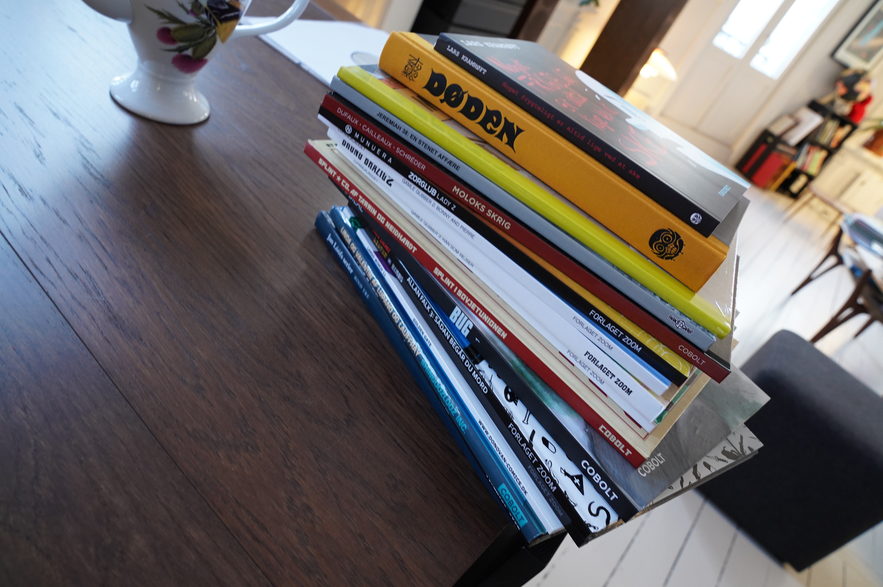
What? Another day of comics so soon after the last one?
Yes, I’m slacking off this week.
Let’s get readin’.
| Hilt: Stoneman |  |
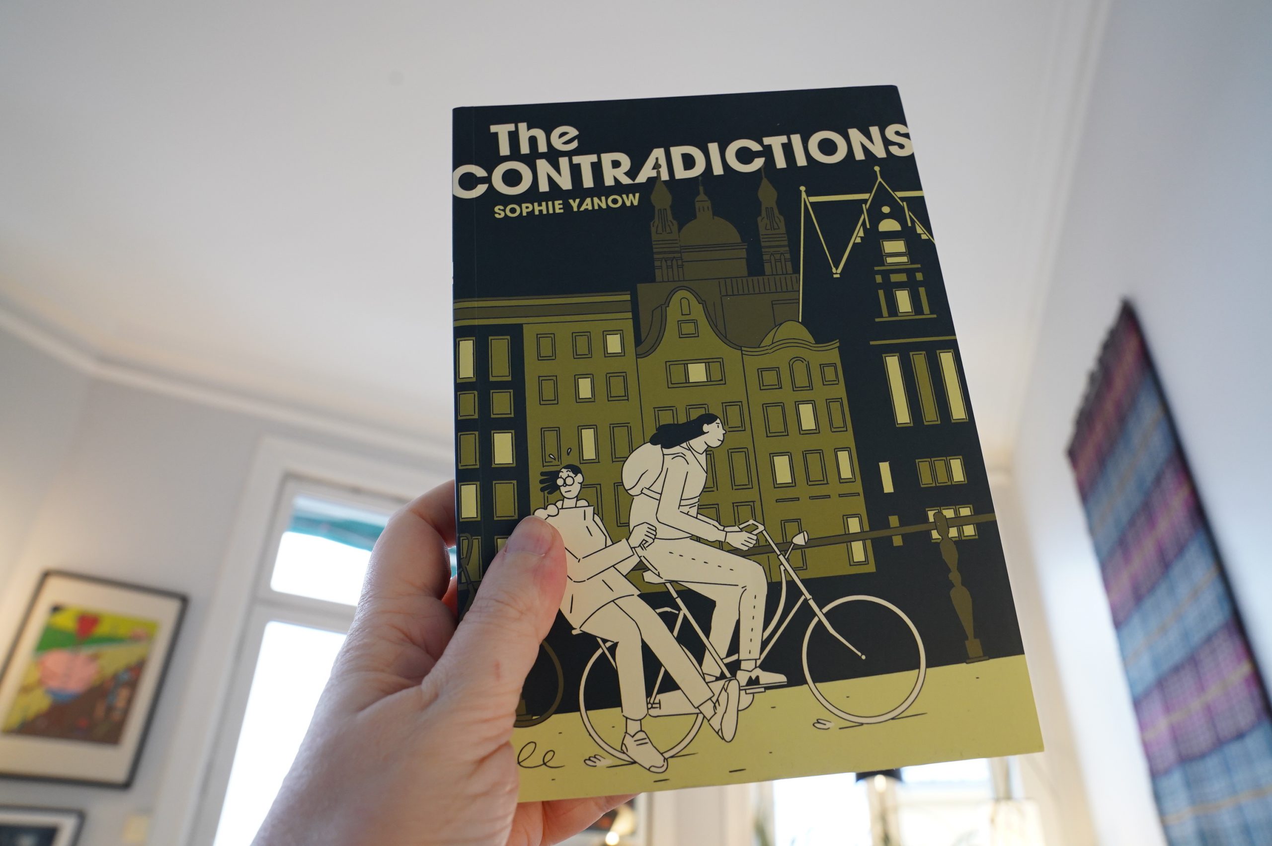
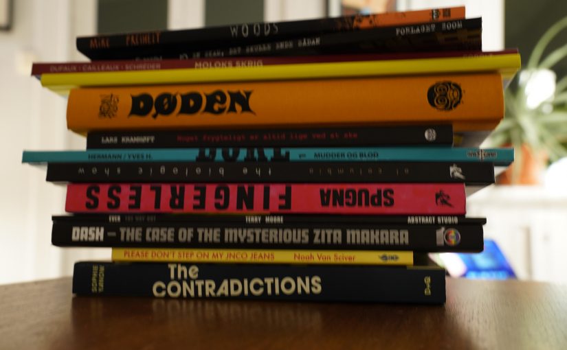
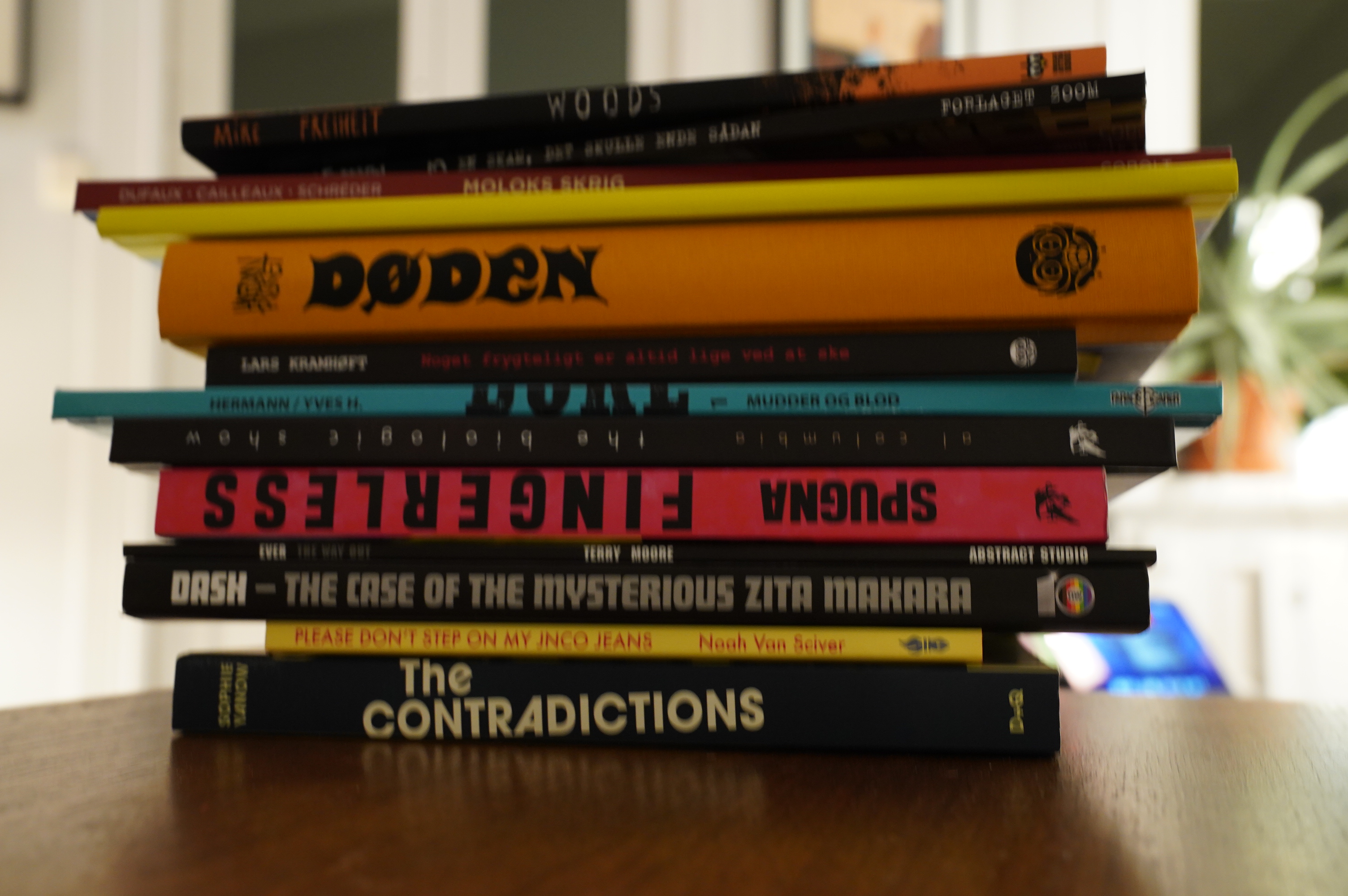
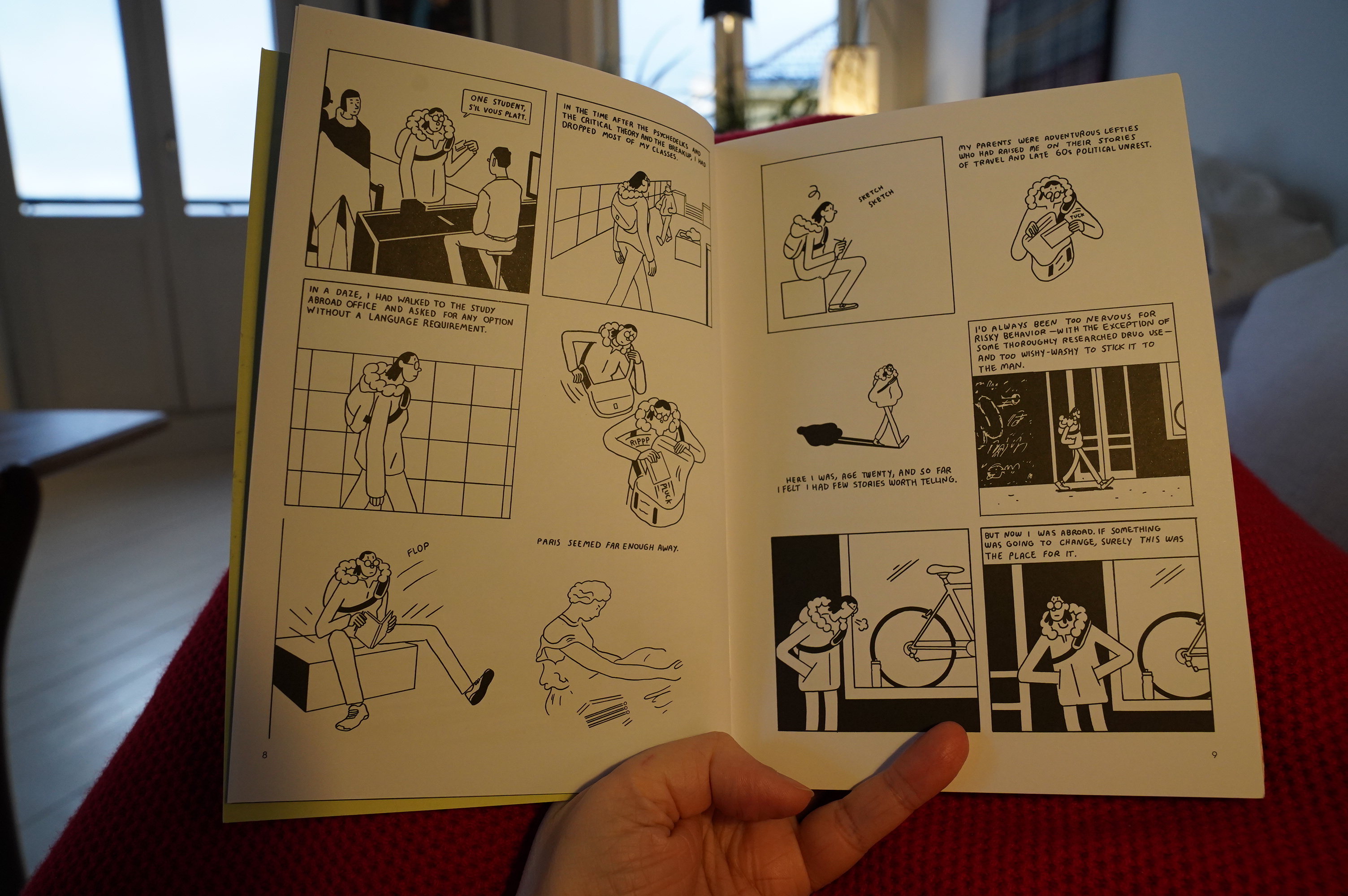
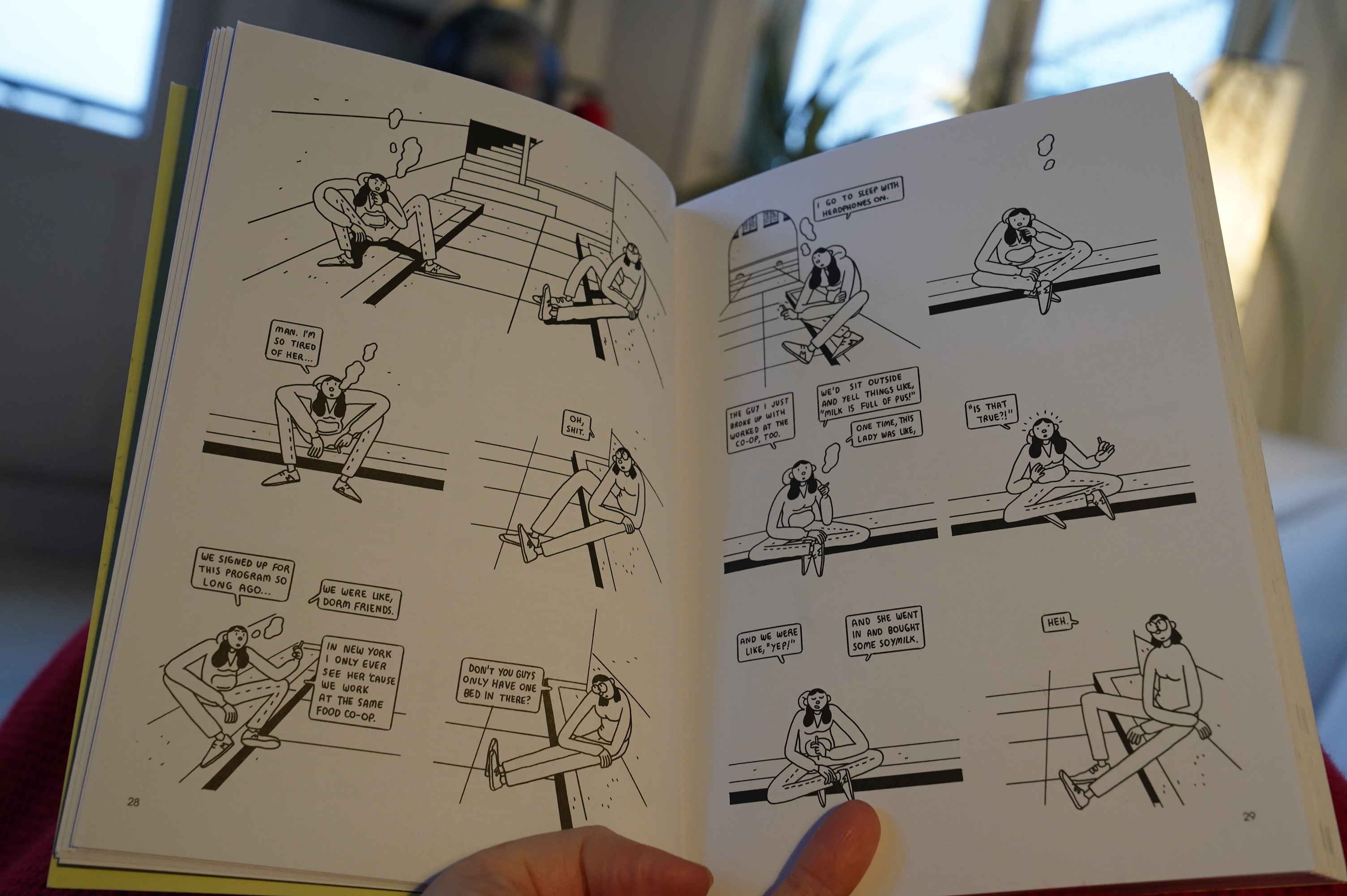
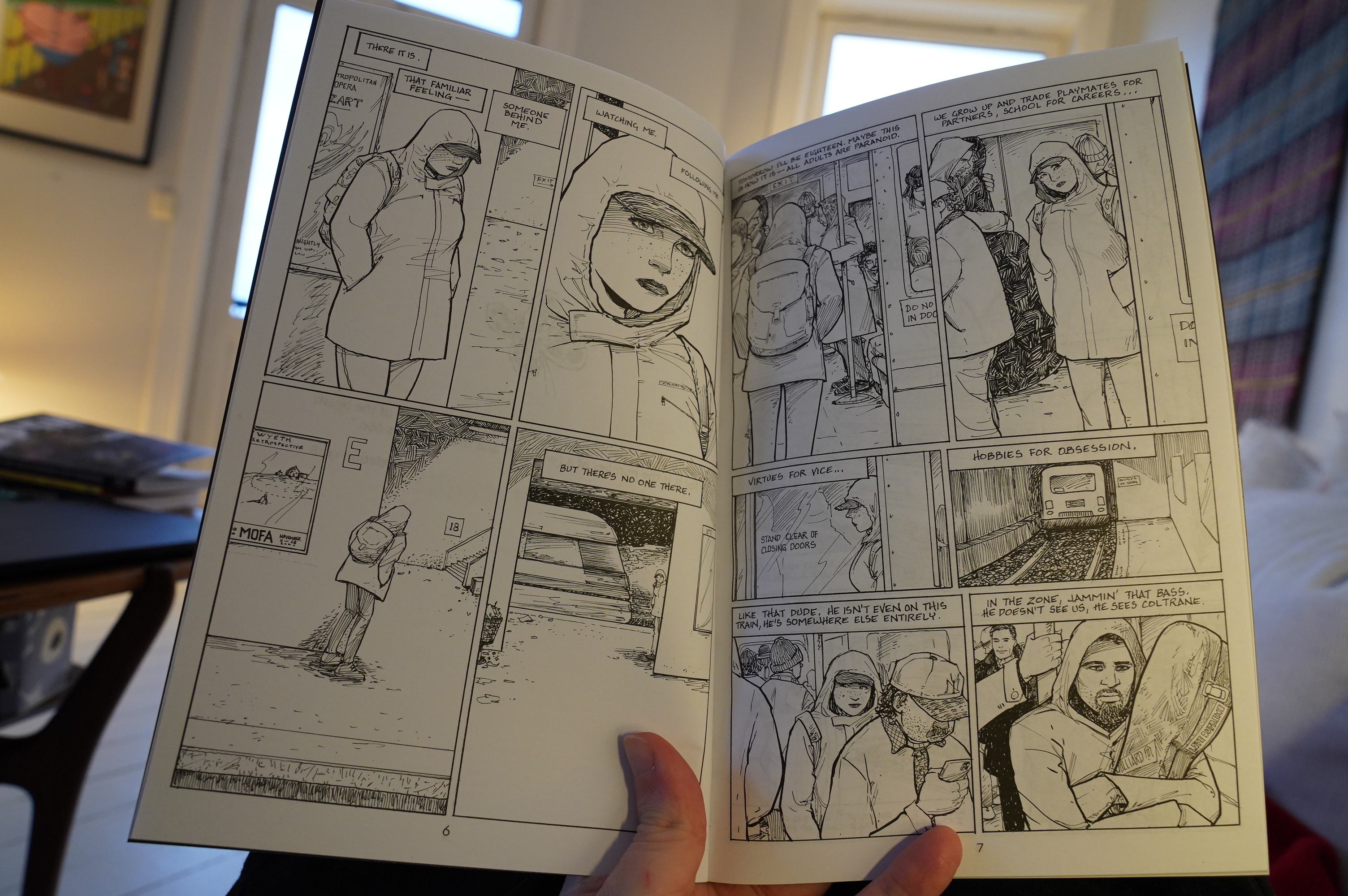
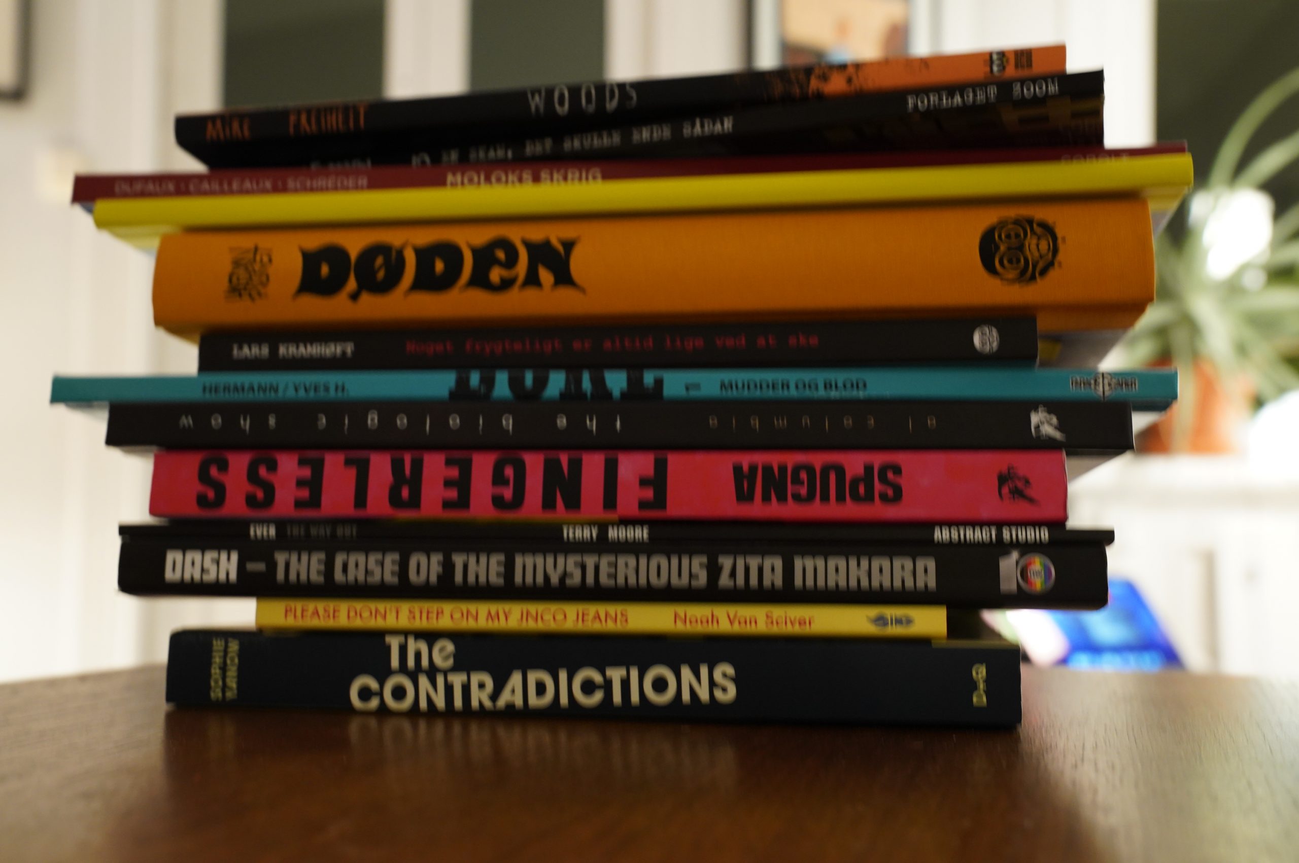
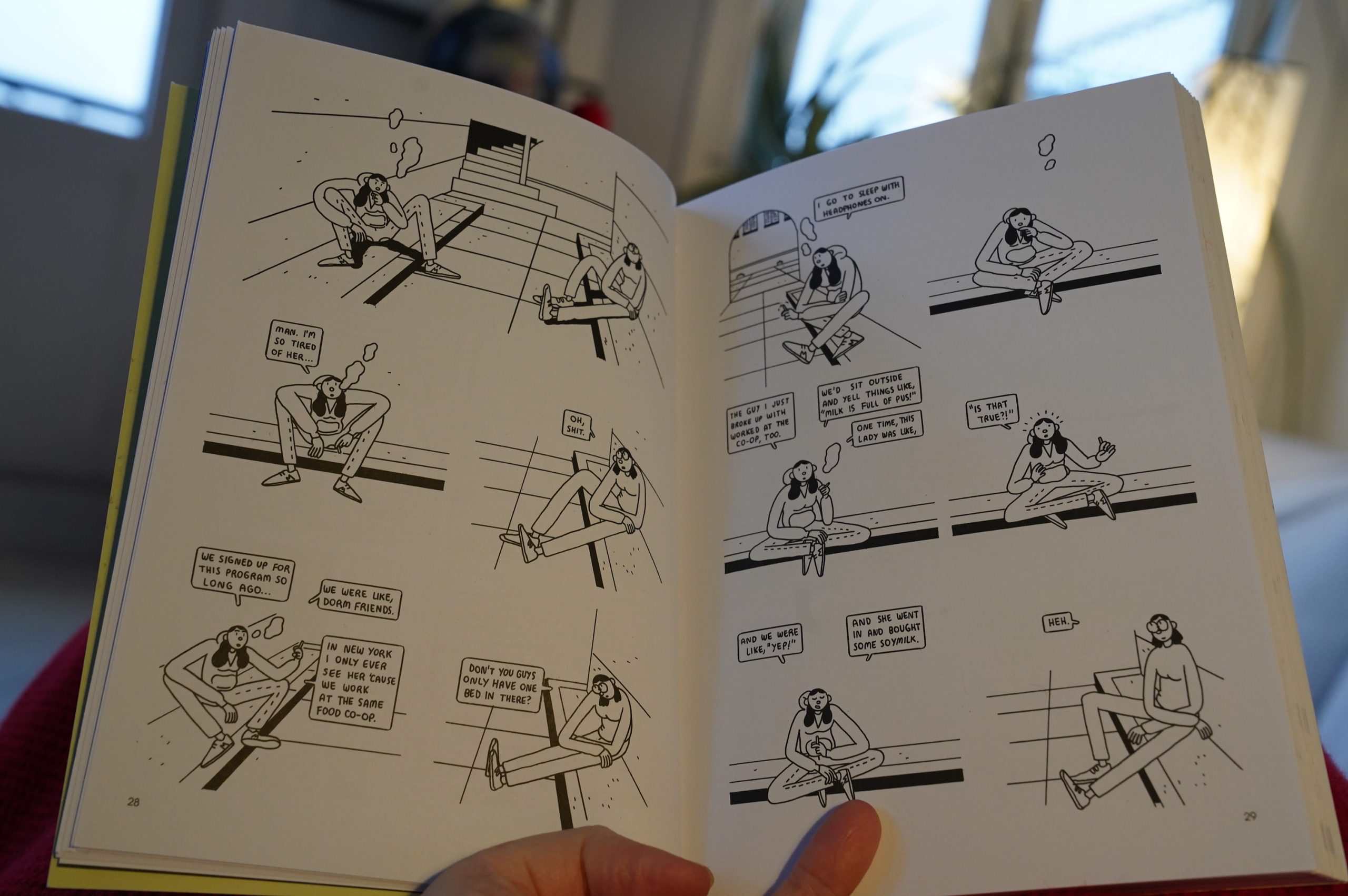
10:57: The Contradictions by Sophie Yanow (Drawn & Quarterly)
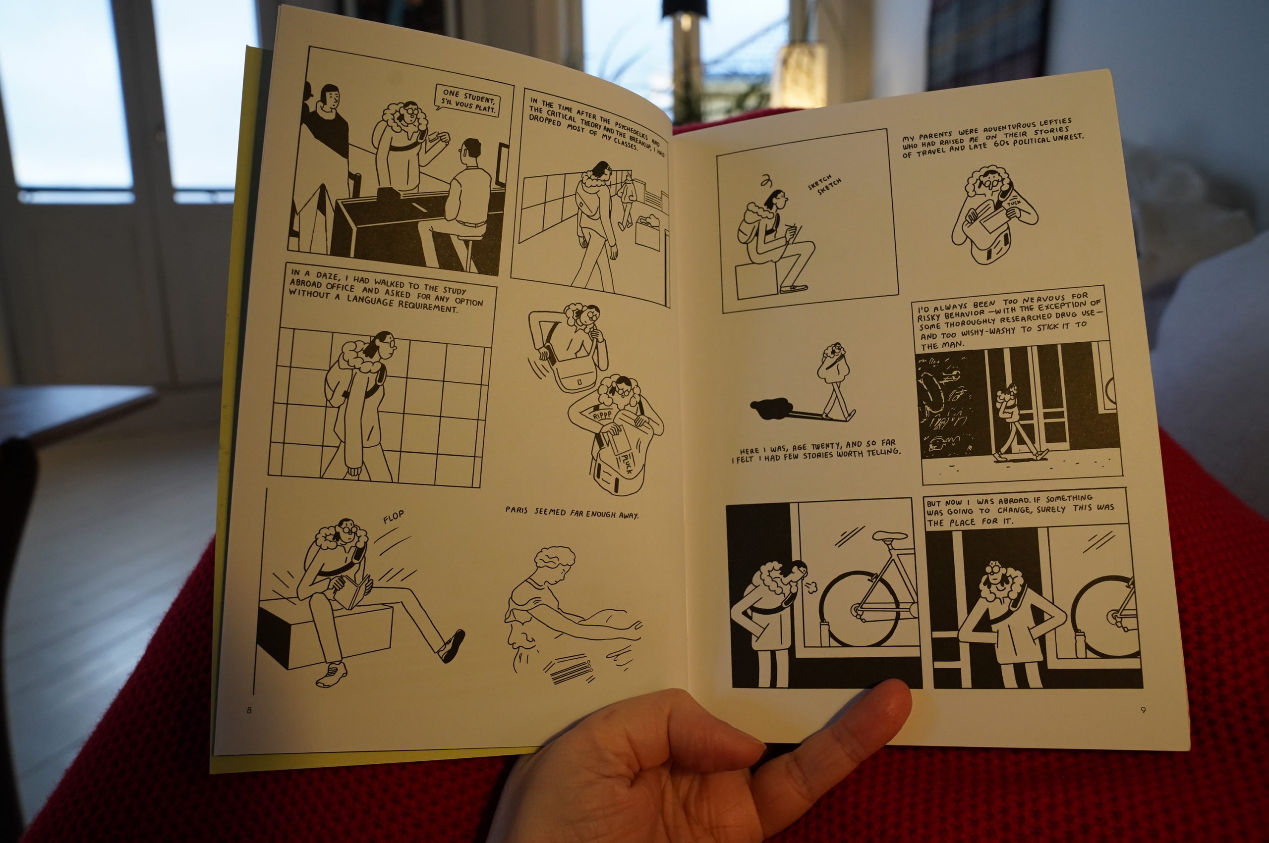
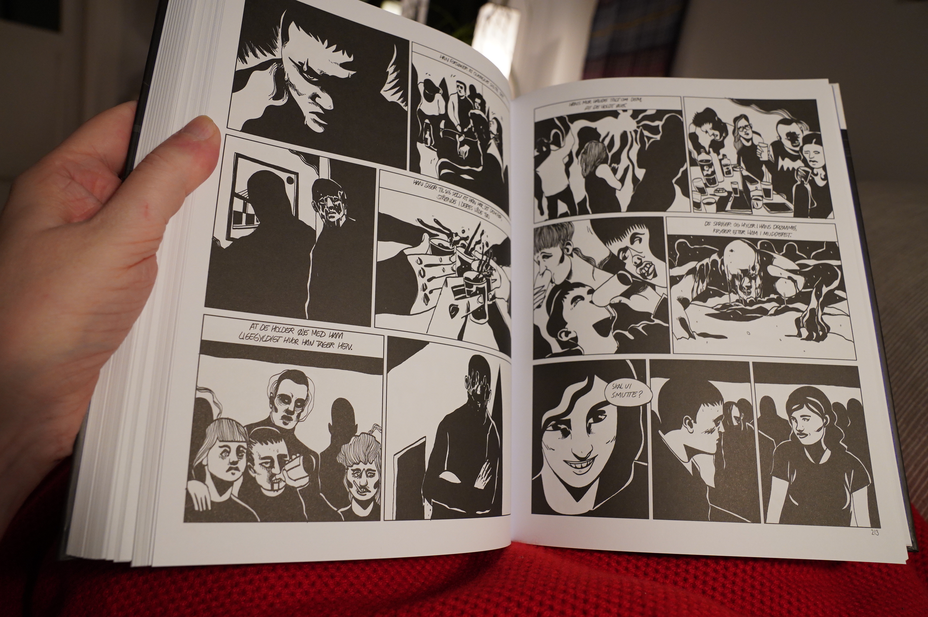
The way Yanow portrays awkwardness is absolutely amazing. On the other hand, the book is such a “oh look how stupid I was when I was twenty” feeling going on that’s a bit exasperating.
The book is basically “Yanow realises that Anarchy is bad”, which is a bore? I rolled my eyes so hard at the ending, where Yanow learned about the awesome rave in Berlin she missed because she was hitch-hiking because of vague principles.
Still, despite my the icky subtext, it’s a fun read. The style she’s chosen to use here doesn’t do much for me, but I wonder whether she’s chosen it deliberately to illustrate her general befuddlement. Some characters look so similar that you tell them apart by one having glasses, and the other not, and then she does stuff like the 180 on the spread above, and you have to decide whether the character has just taken the glasses off, or whether indeed it’s a 180.
Asking the reader to decode to this extent is perhaps a deliberate choice? Or just not… you know.
| Machinedrum: Room(s) |  |
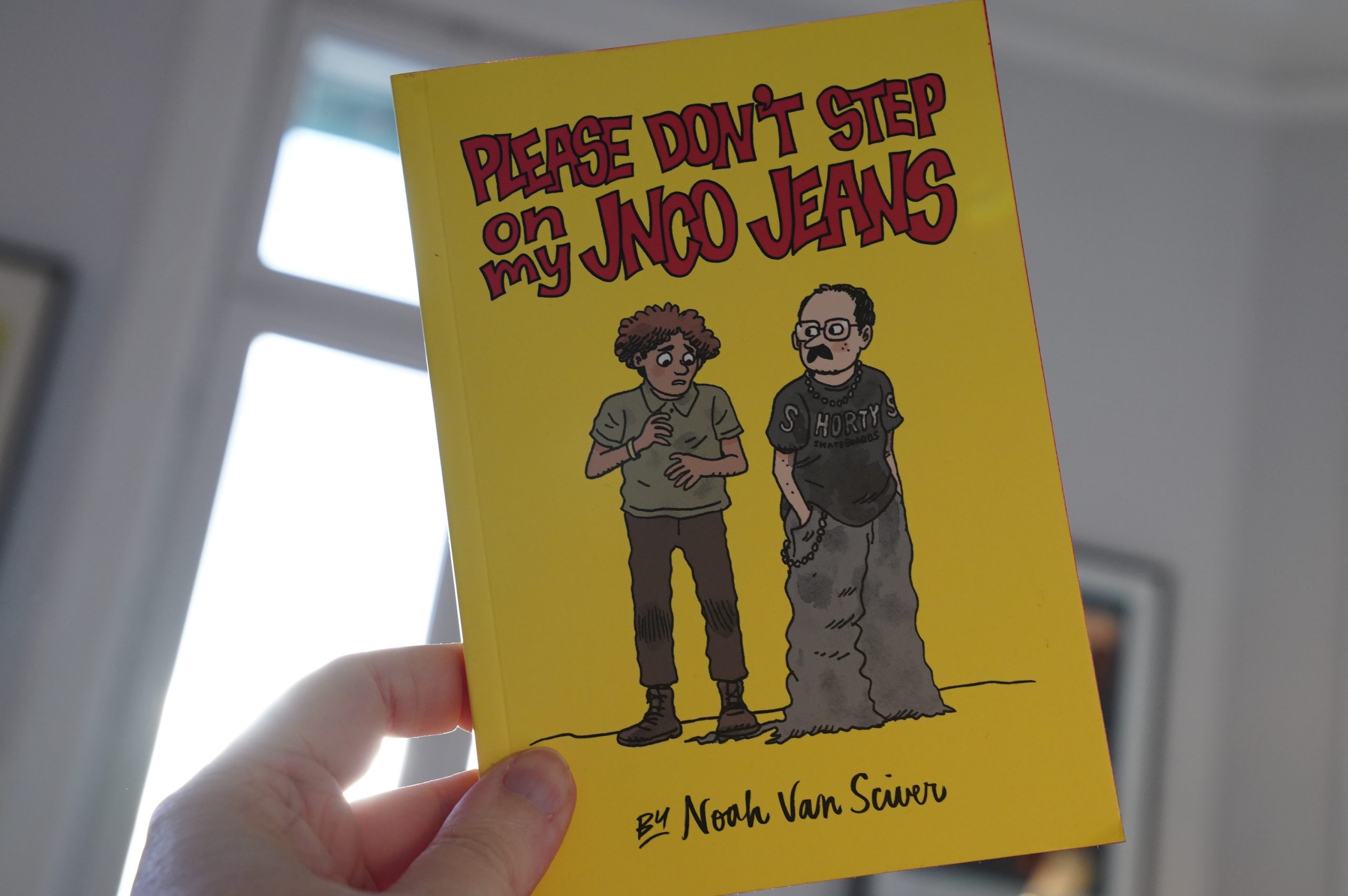
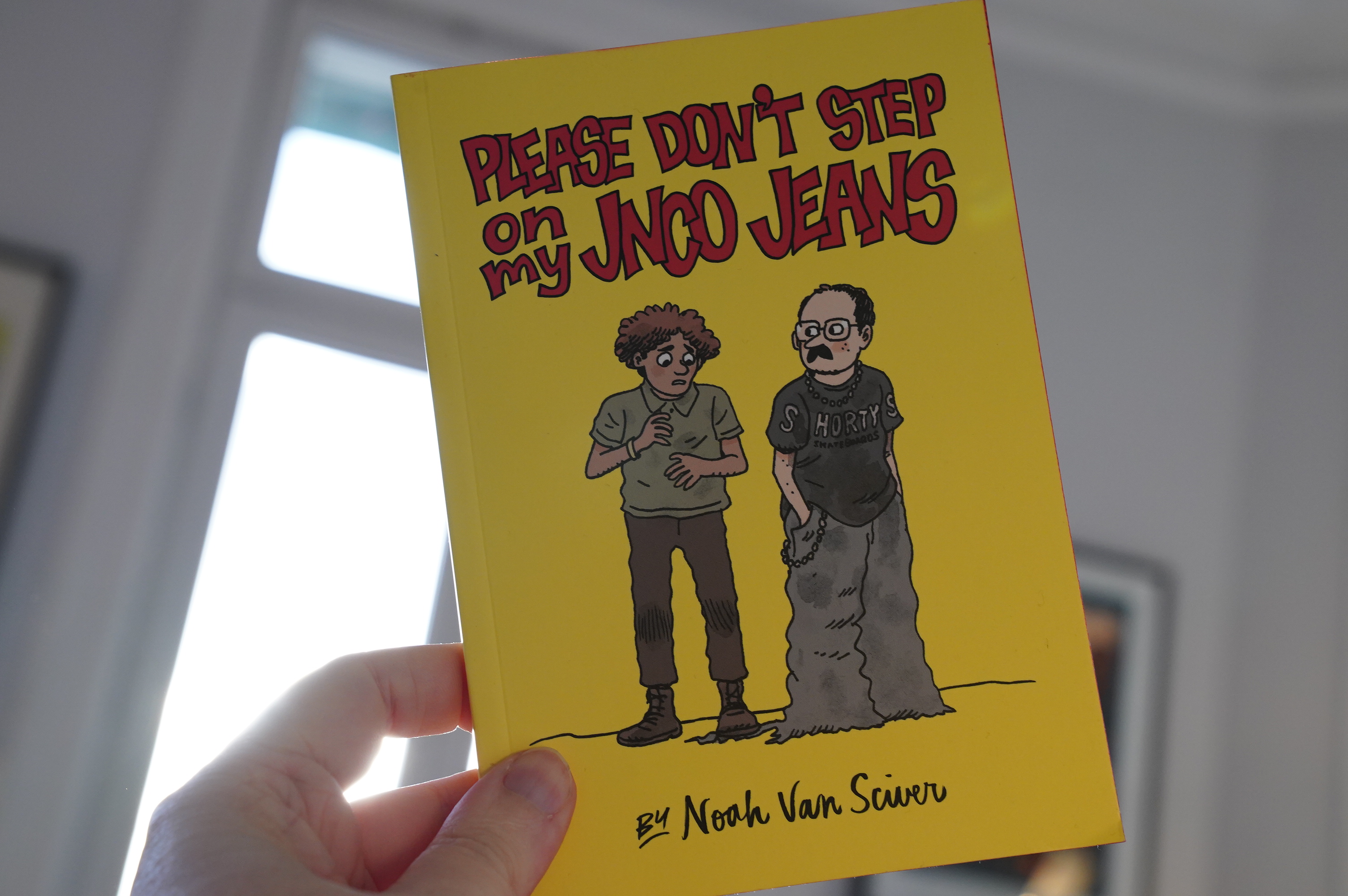
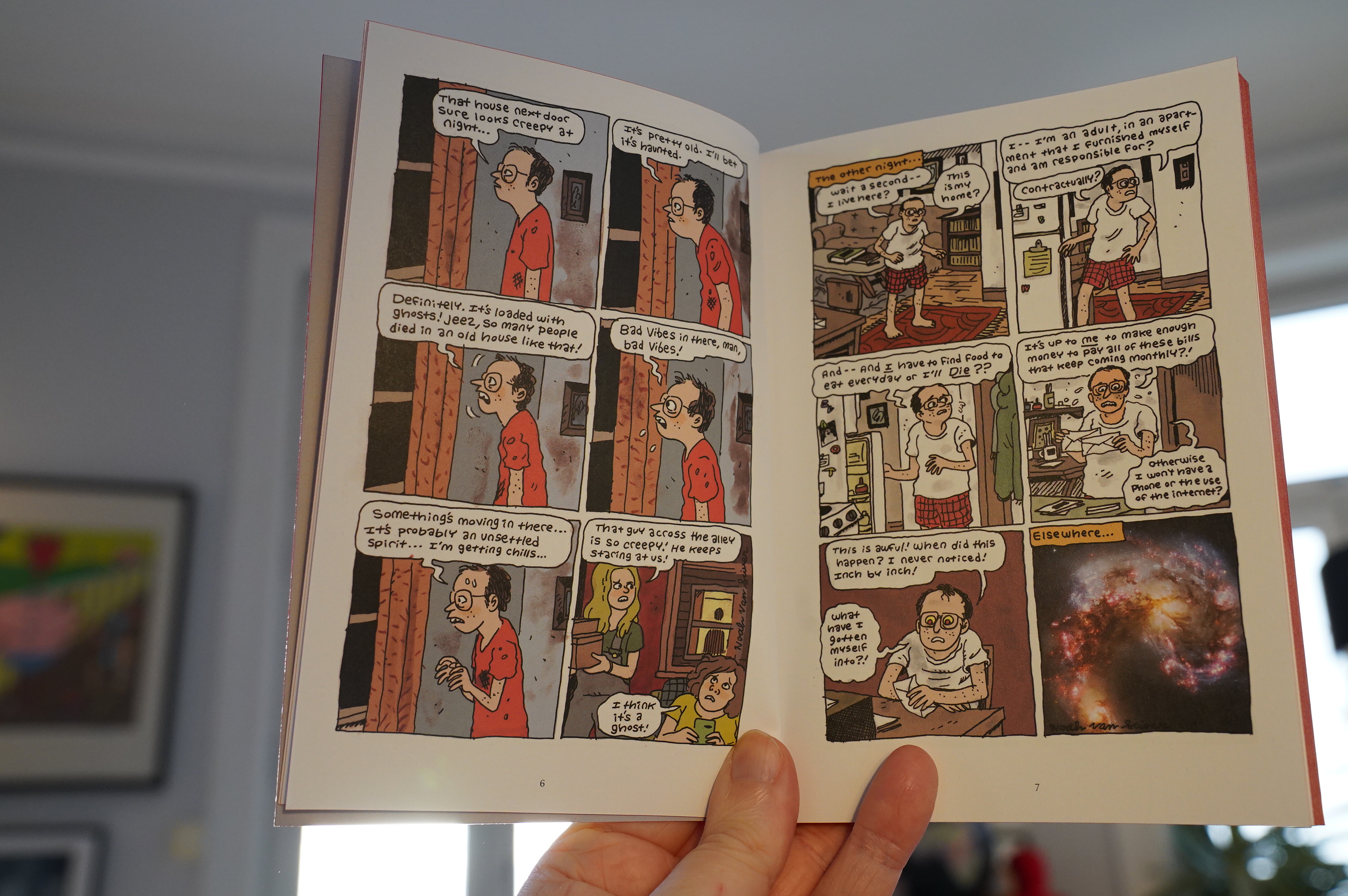
11:53: Please Don’t Step On My JNCO Jeans by Noah van Sciver (Fantagraphics)
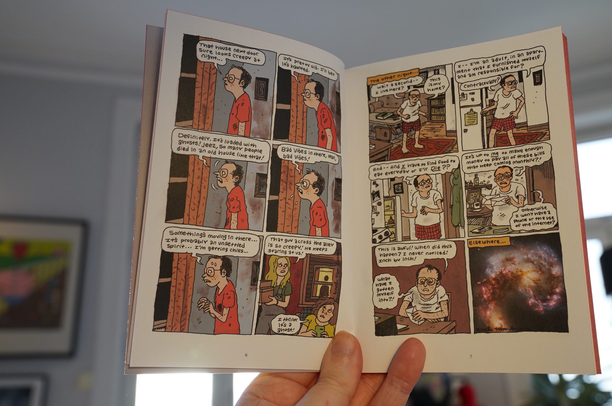
This is a collection of (mostly) single-page strips Van Sciver did for a newspaper…
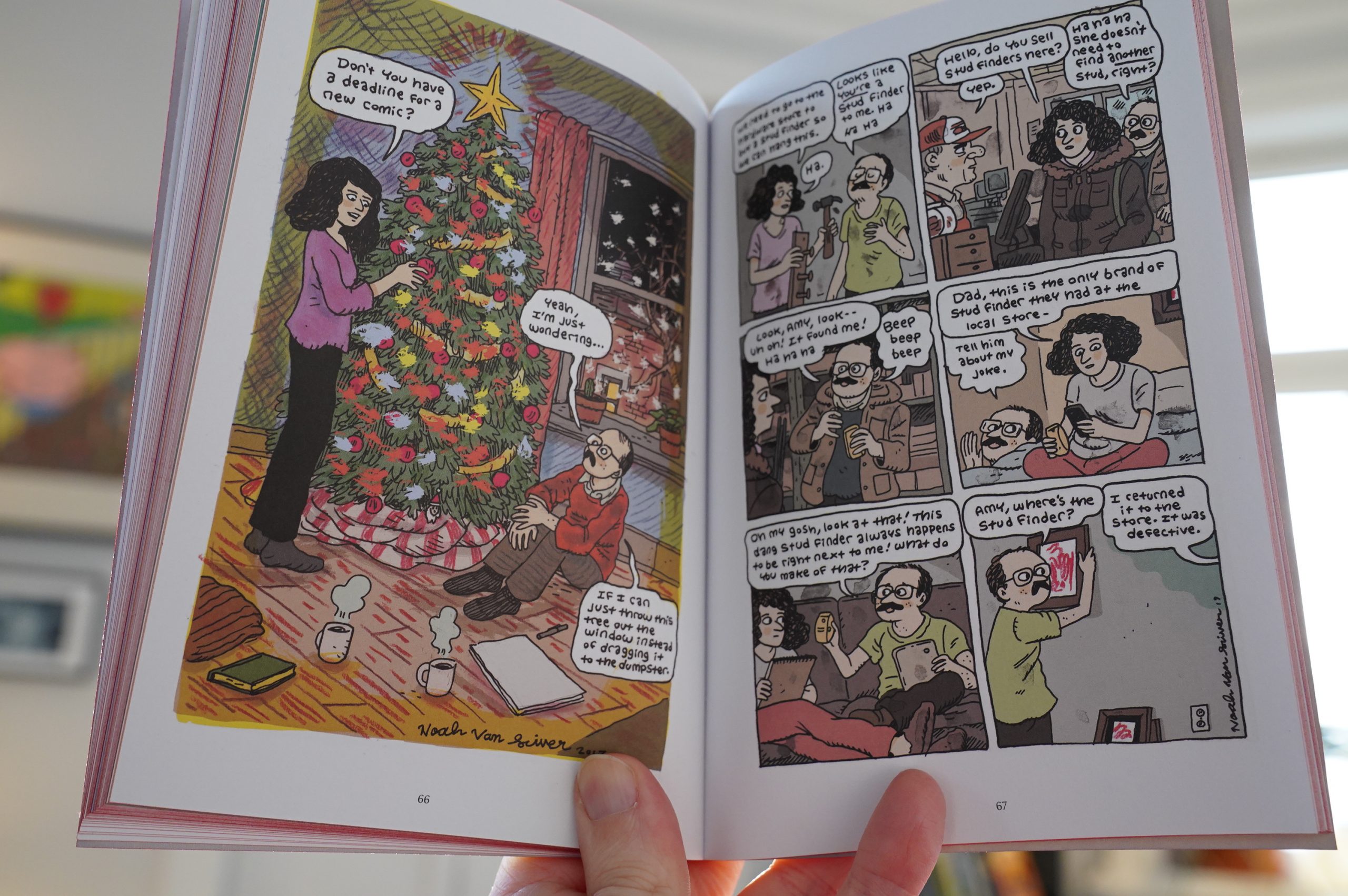
Sometimes collections like this are a bit of a chore to get through, even if the strips themselves are fine — meant for a different reading pace and all. This doesn’t have that problem. Instead things just become funnier and funnier cumulatively.
| Telebossa: Telebossa |  |

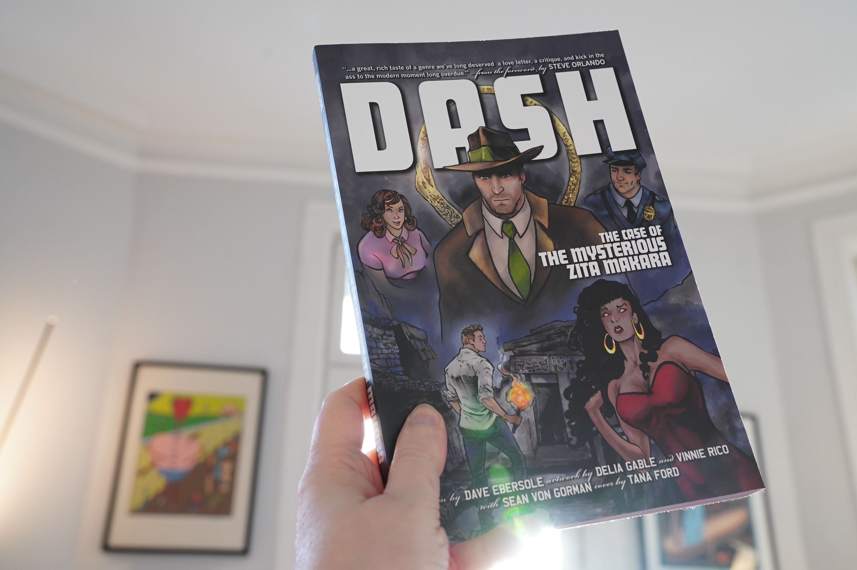
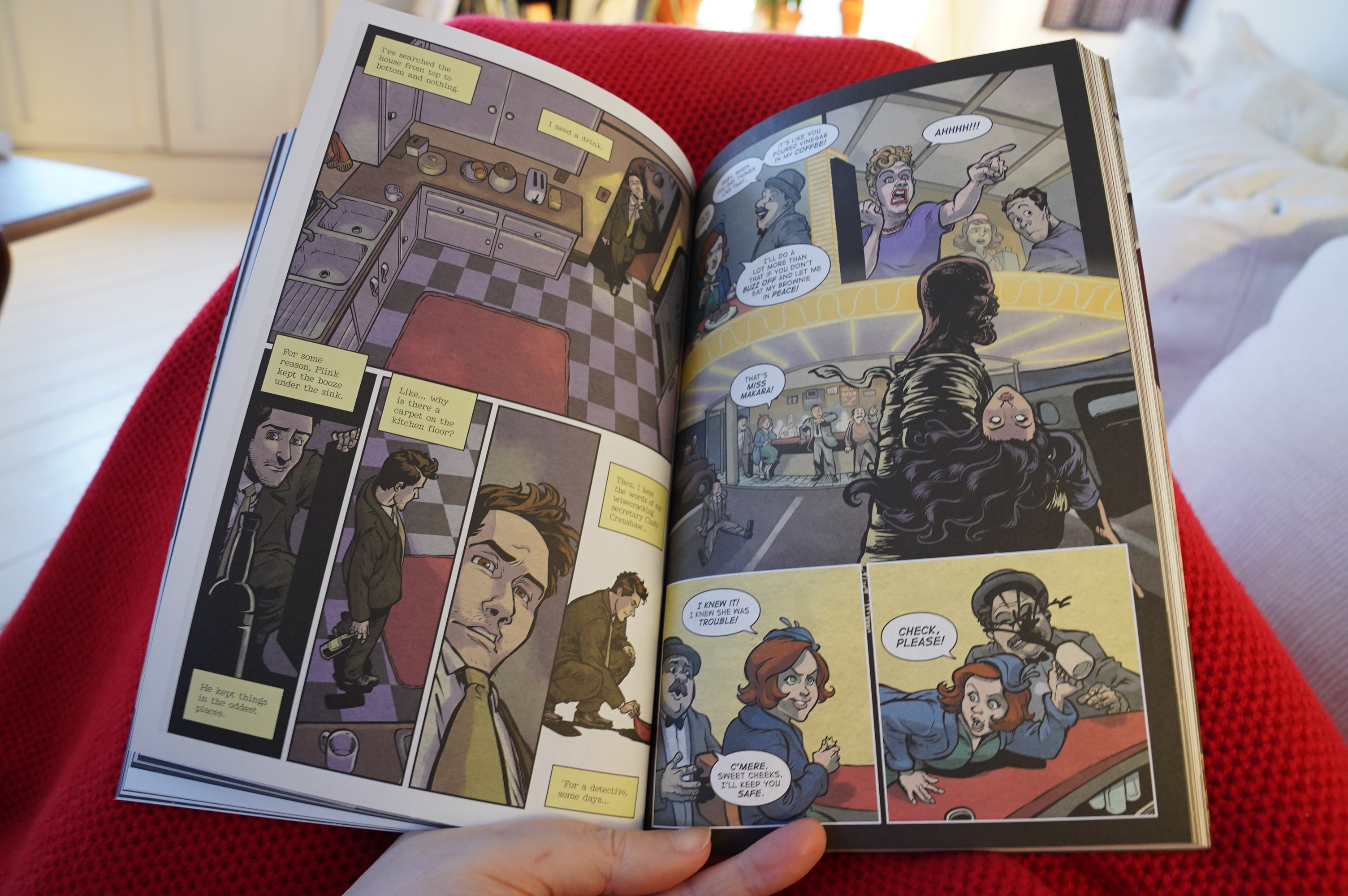
12:22: Dash: The Case of the Mysterious Zita Makara by Dave Ebersole, Delia Gable, Vinnie Rico and others (Northwest Press)
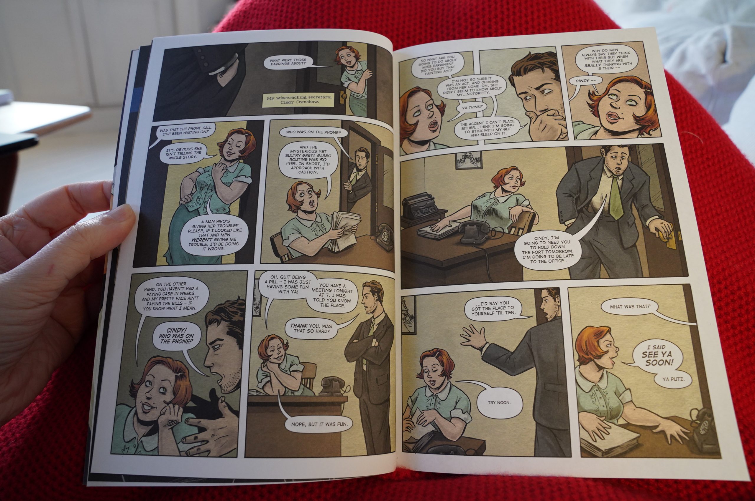
So this is a noir pastiche… Those are seldom any good, so I was dreading this a bit. But it’s fun! And I like Gable’s faces, although anything that’s not a human body seems to be an afterthought — the backgrounds are mostly not there, and that desk looks more like the idea of a desk than a real one. And why is her torso barely sticking out from the desk in the third panel?
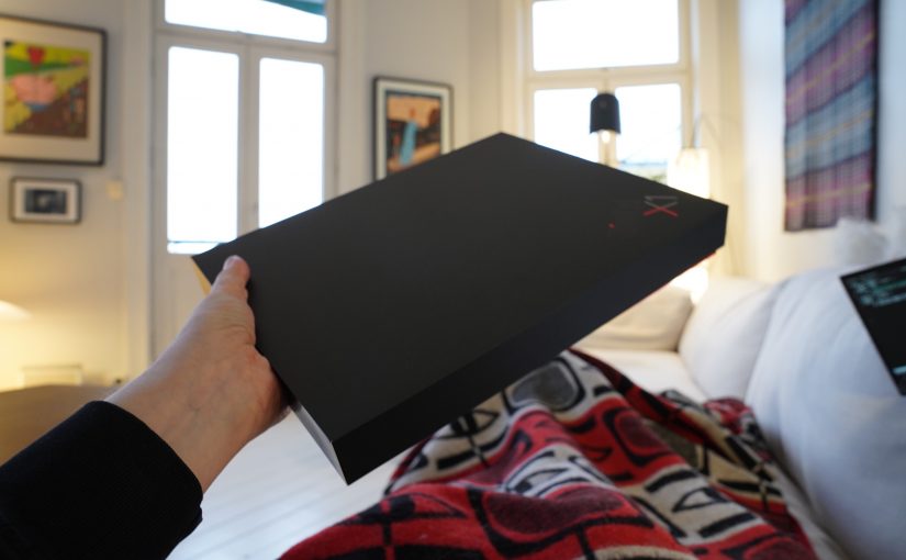
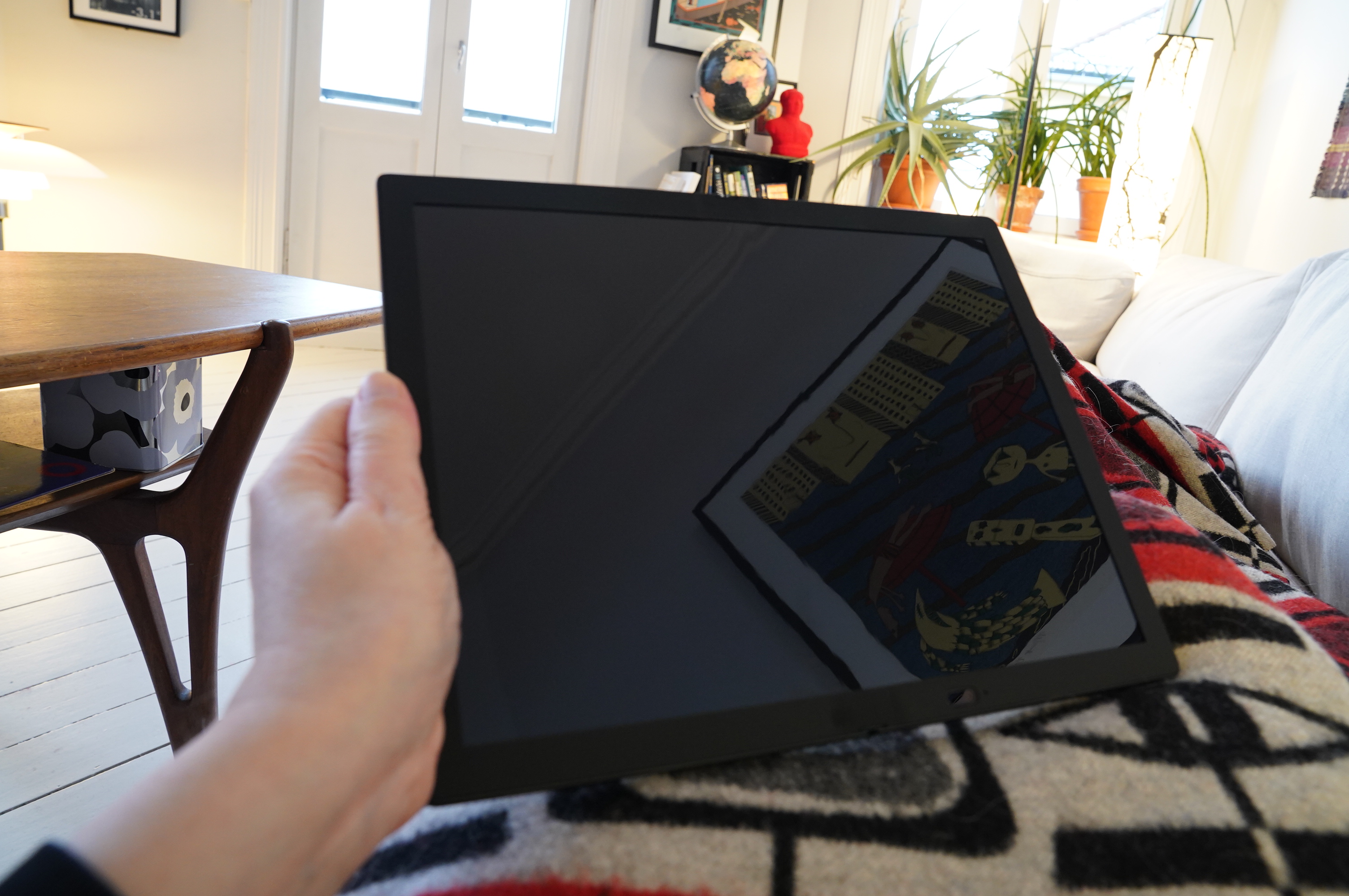
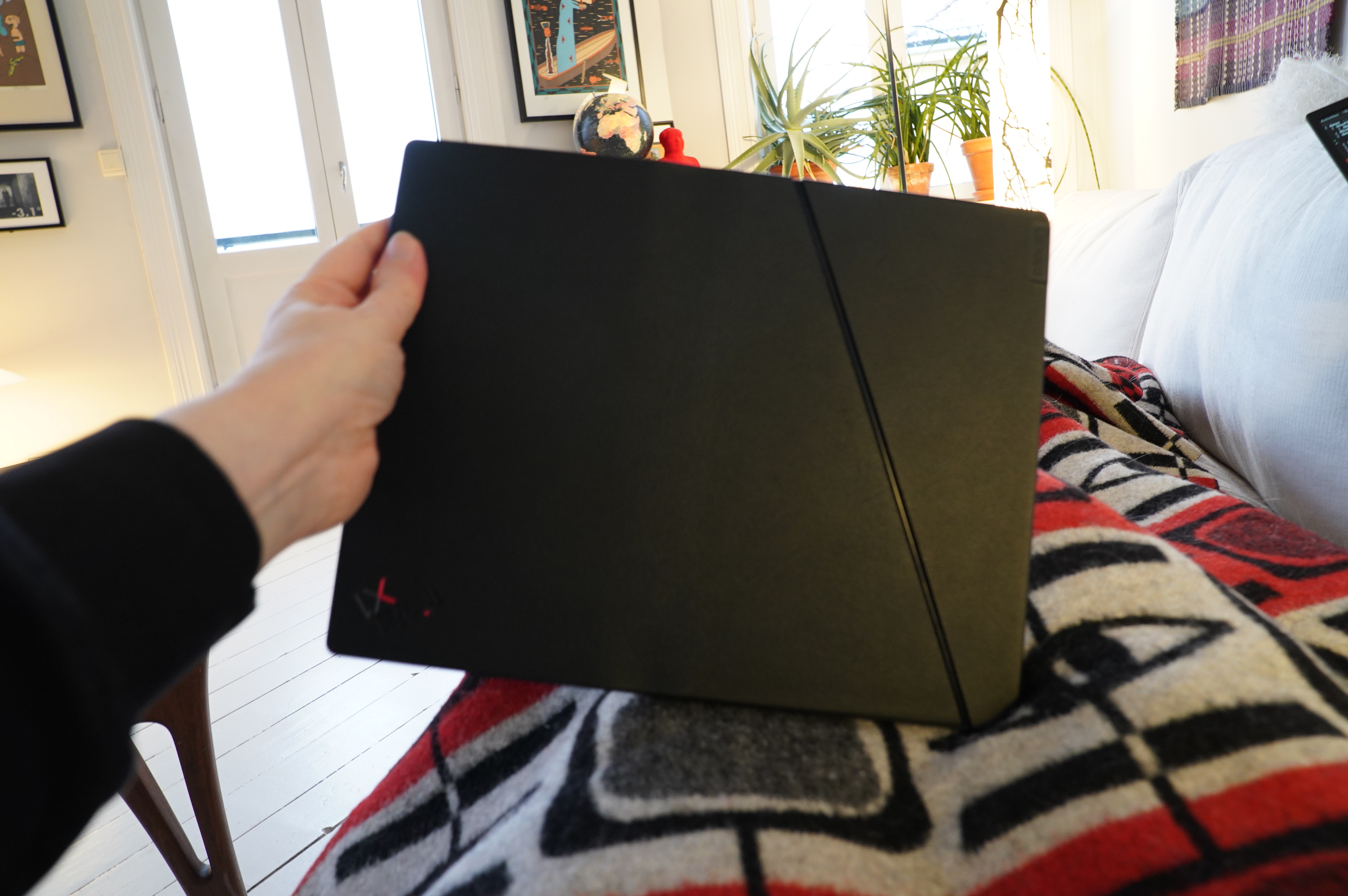
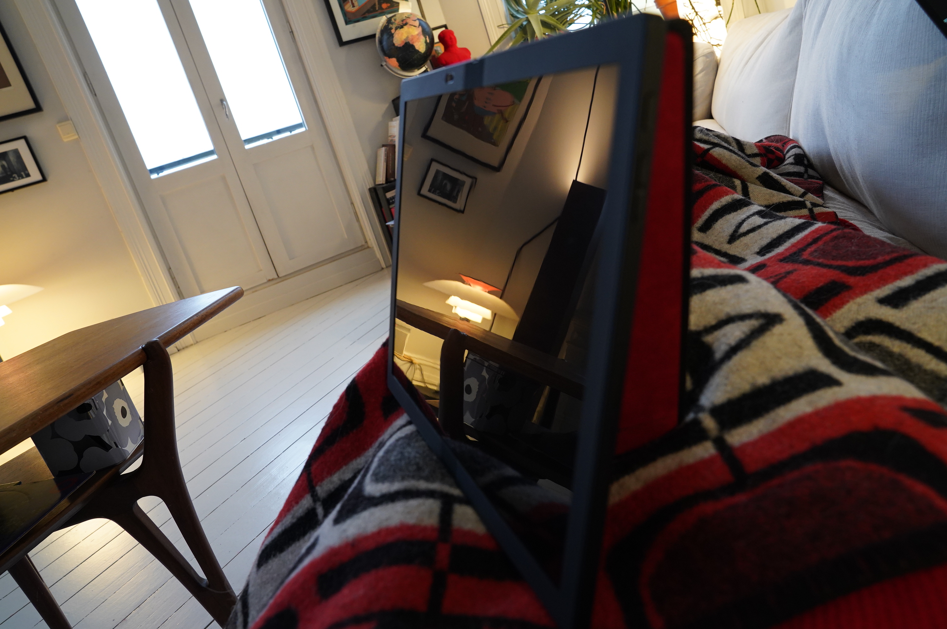
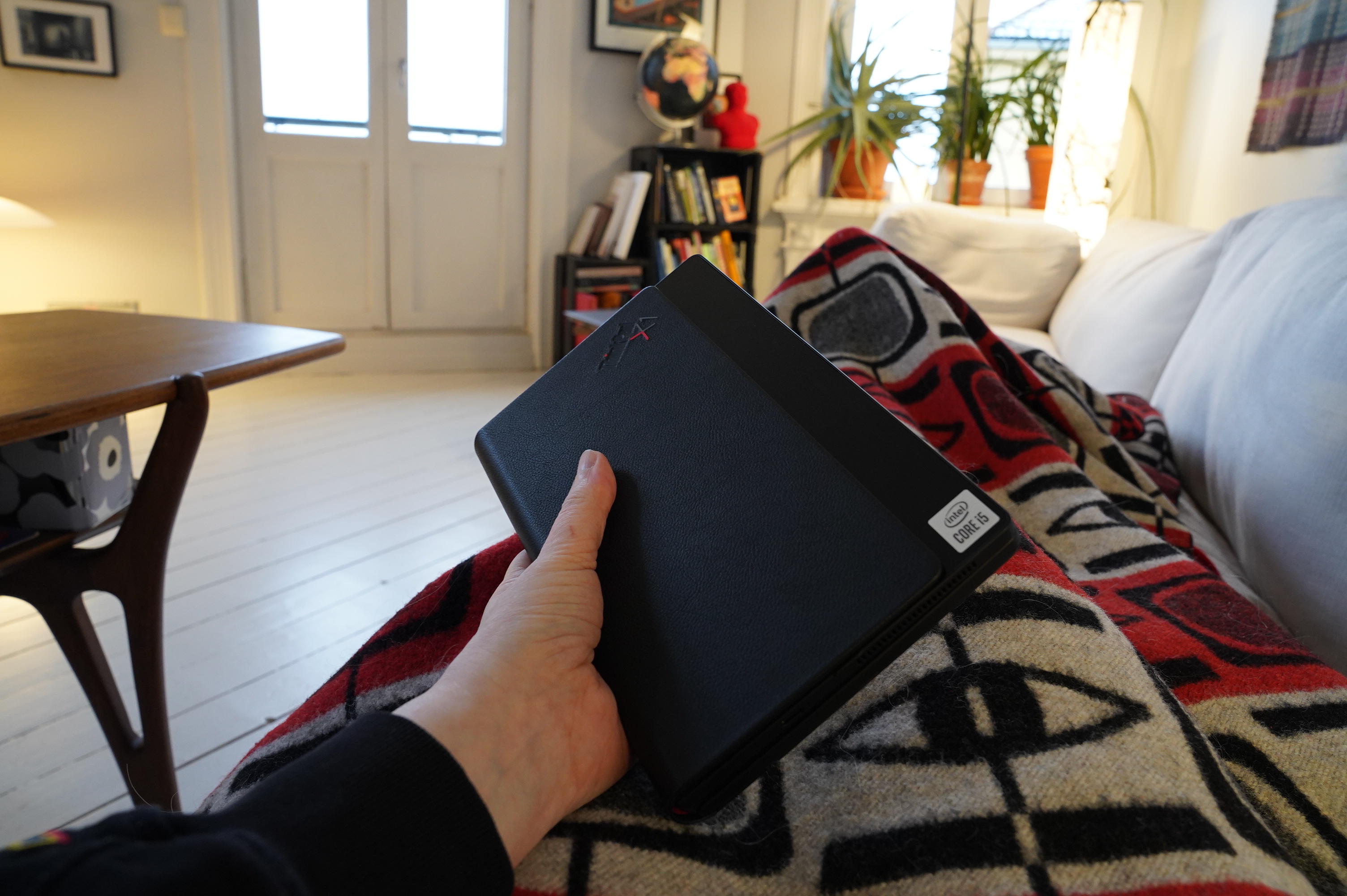
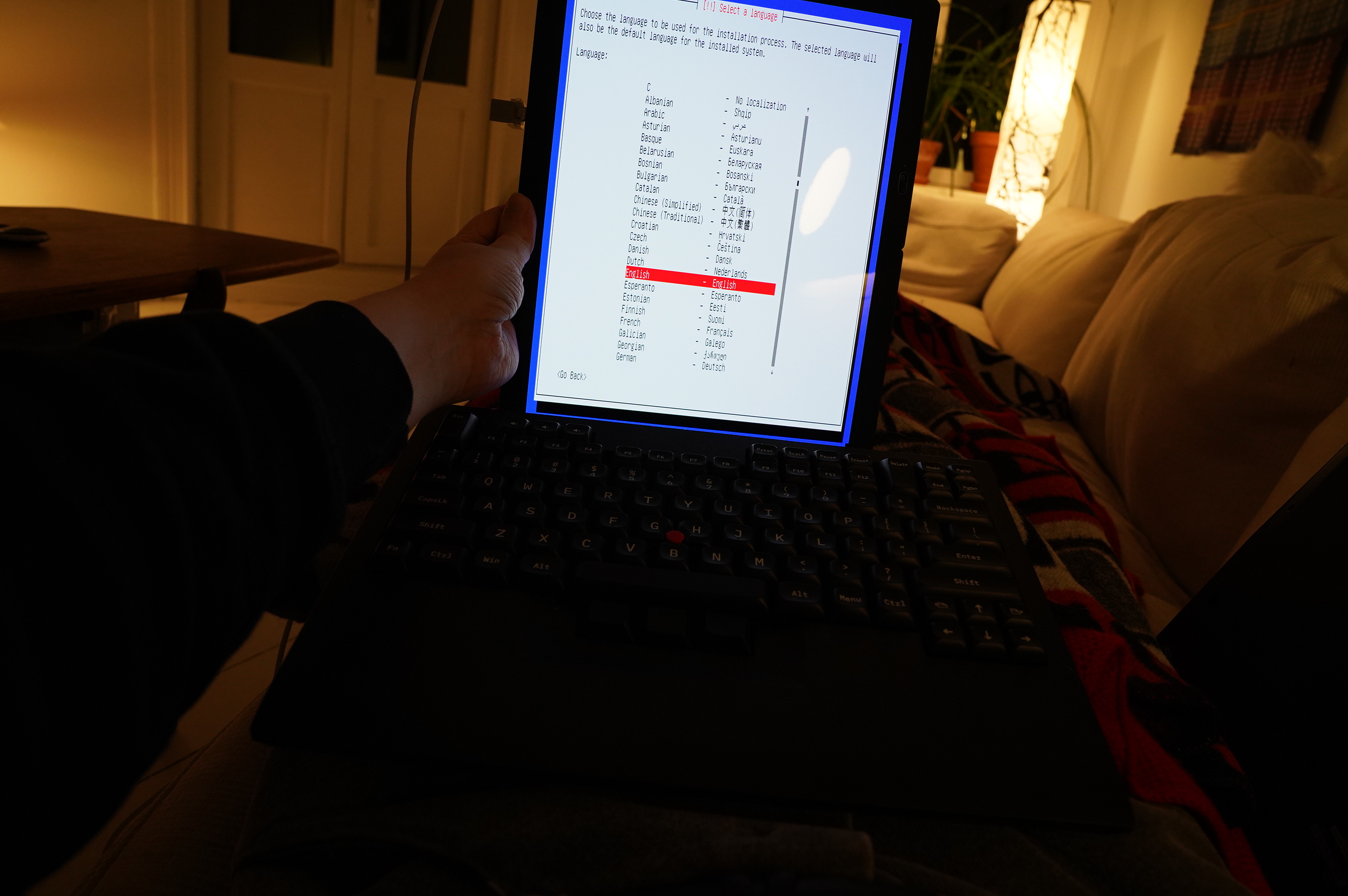
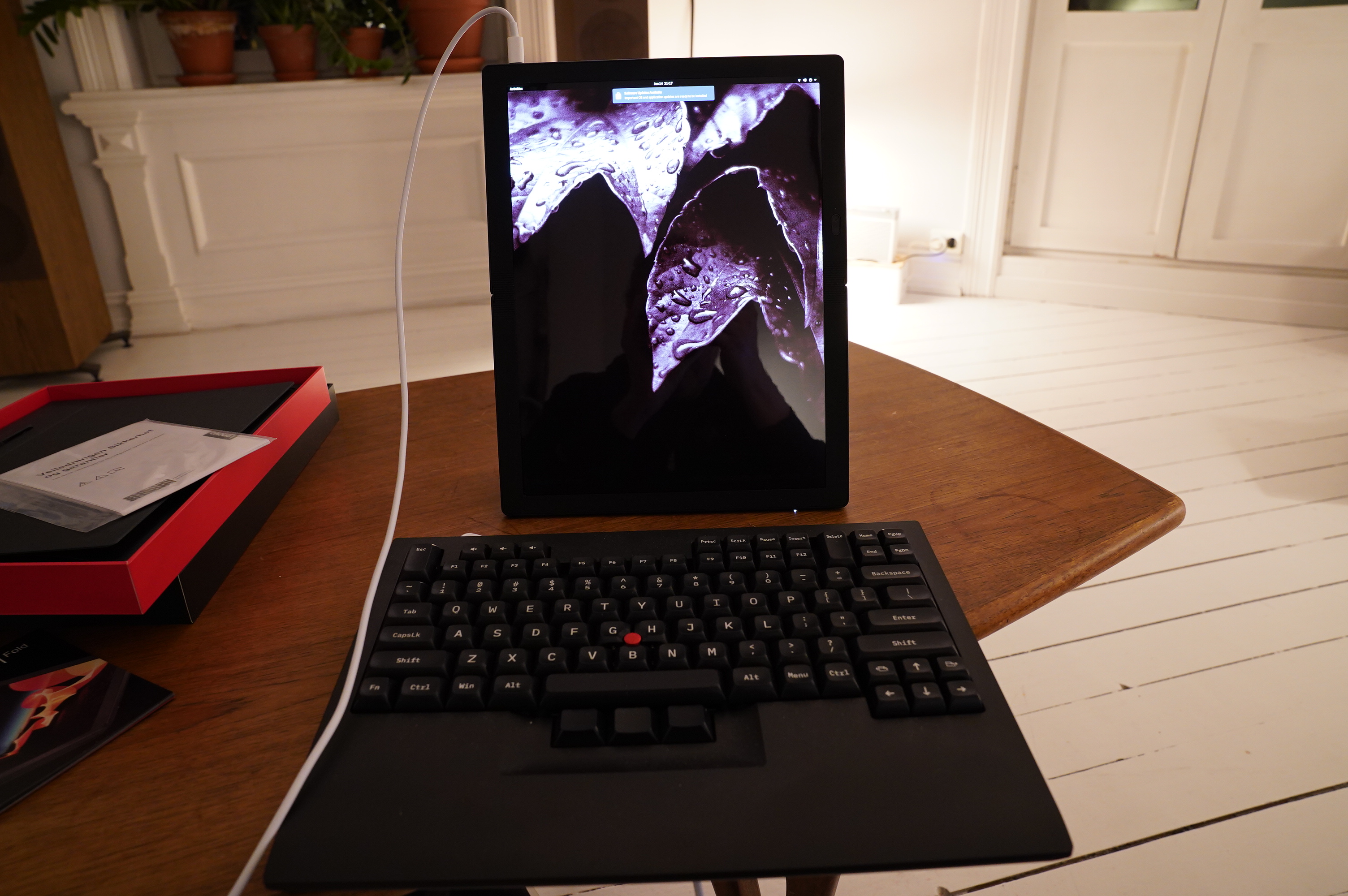
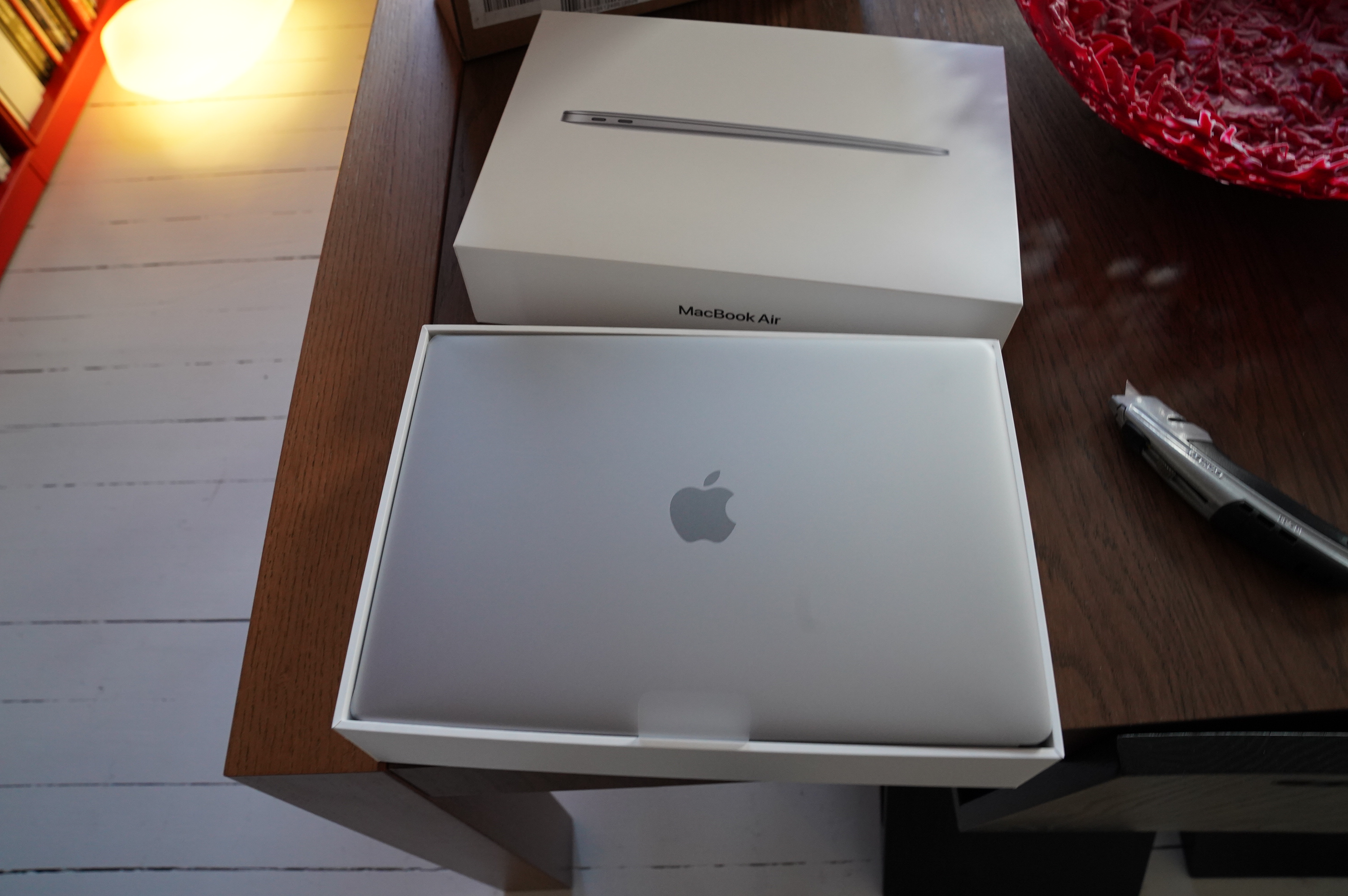
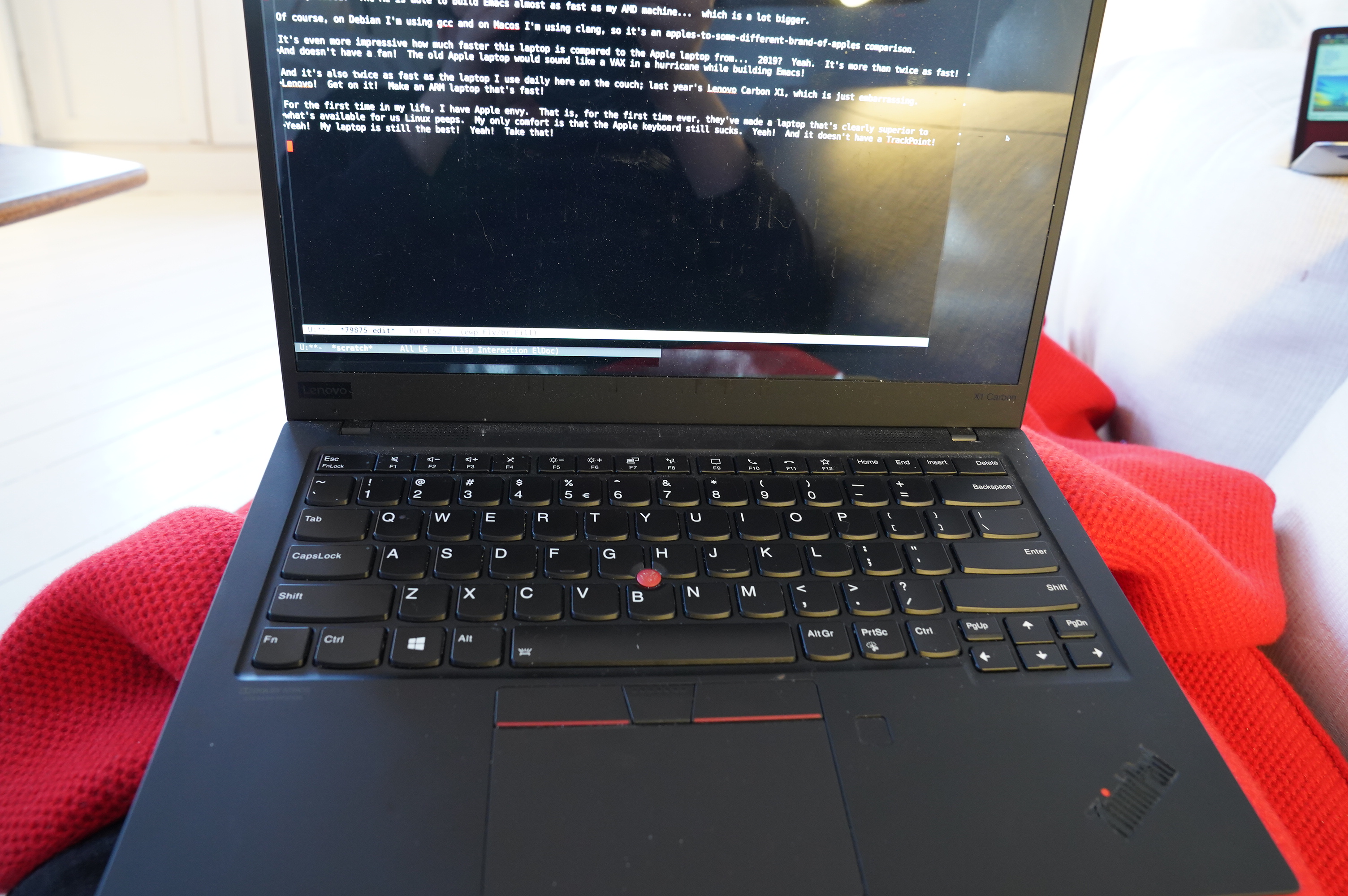
13:01: Unscheduled break! The mailman delivered a new laptop.
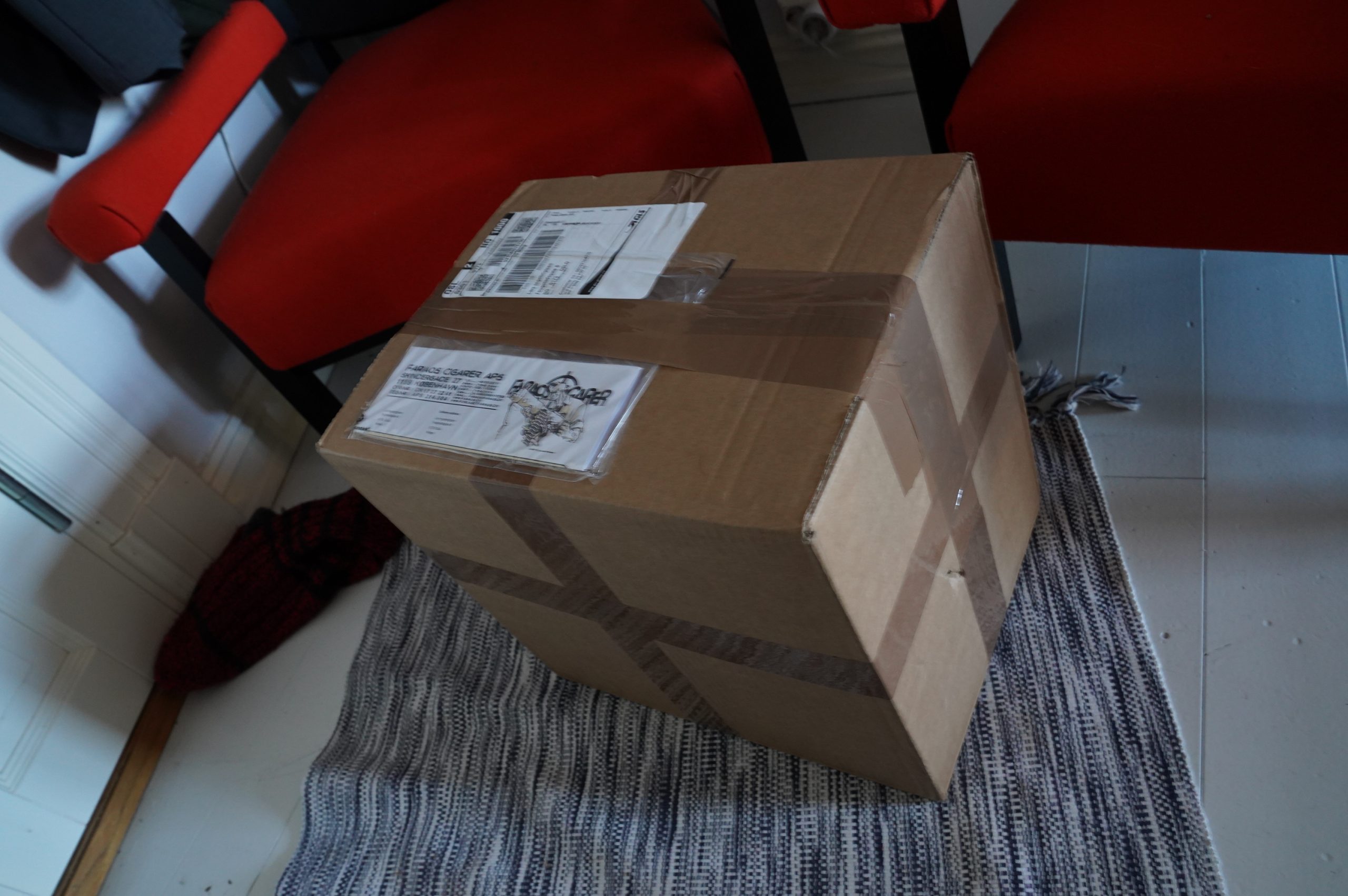
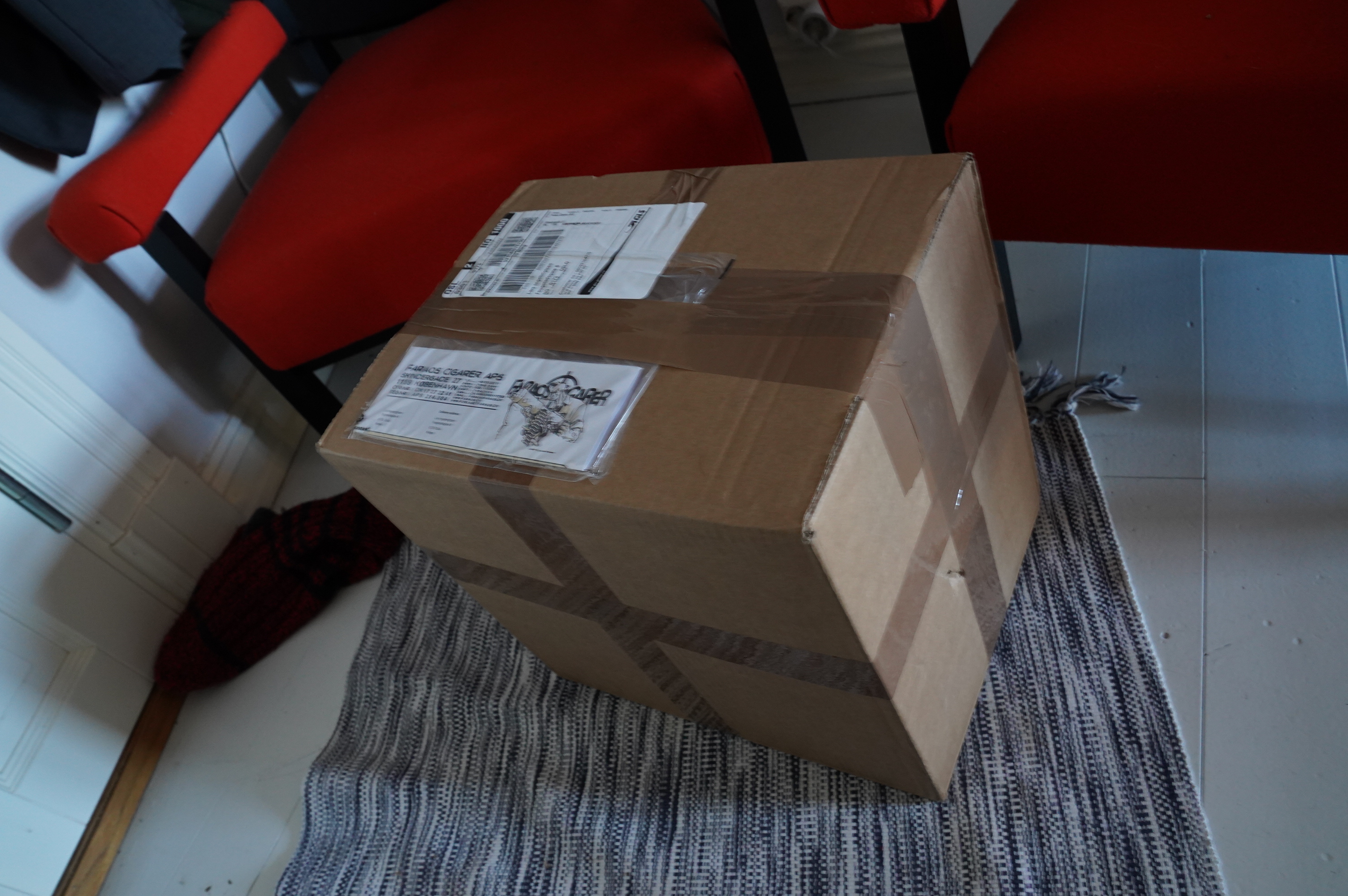
And more comics! From Denmark!

Dude.
| Scout Niblett: It’s Up To Emma |  |
14:16: Back to Reading Comics
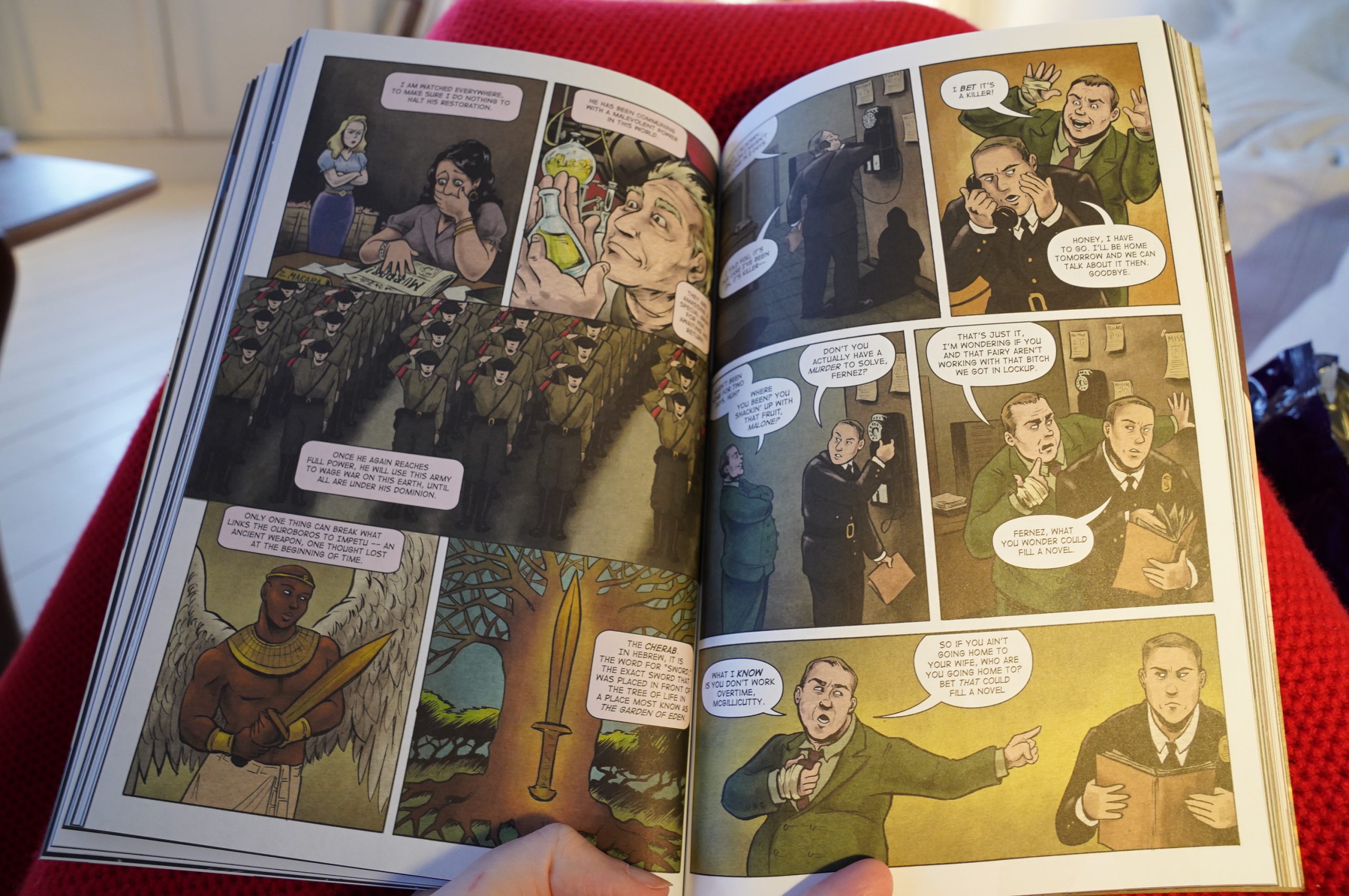
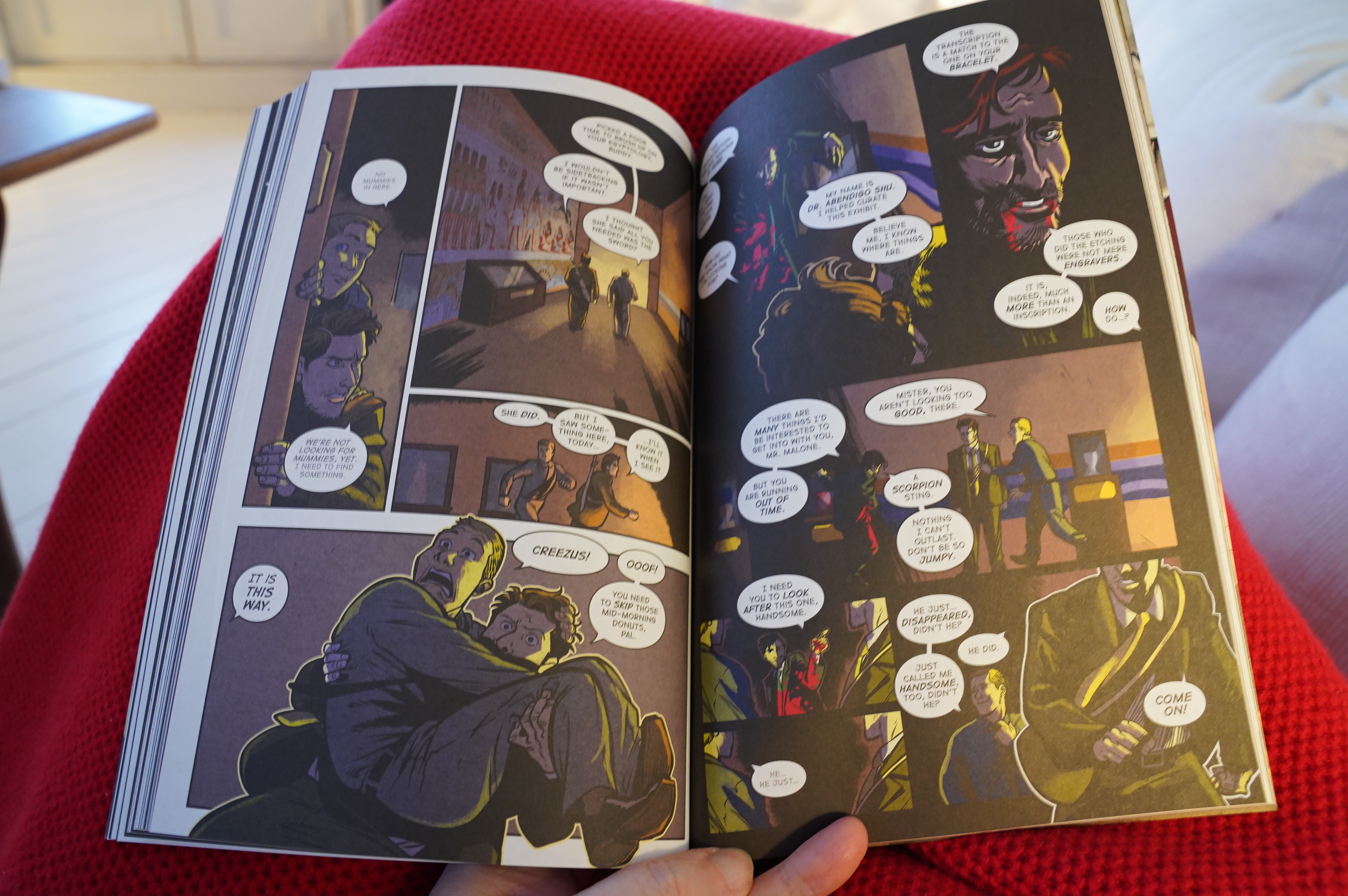
Oh, yeah, there’s mummies and stuff in this noir.


Halfway through, Vinnie Rico takes over on the artwork, and not only do we get backgrounds in the panels, but things get a lot goofier. It does suit this story, because it’s all kinds of weird. But entertaining.
To round off the package, there’s a bunch of shorter stories, fleshing out some of the characters. It’s all fun and entertaining, and I’m on board for more Dash in the future.
| Yoko Ono Plastic Ono Band: Take Me to the Land of Hell |  |
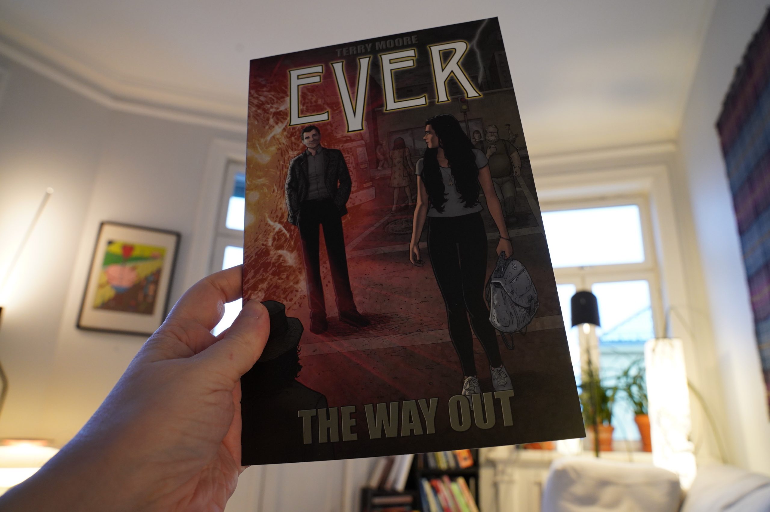
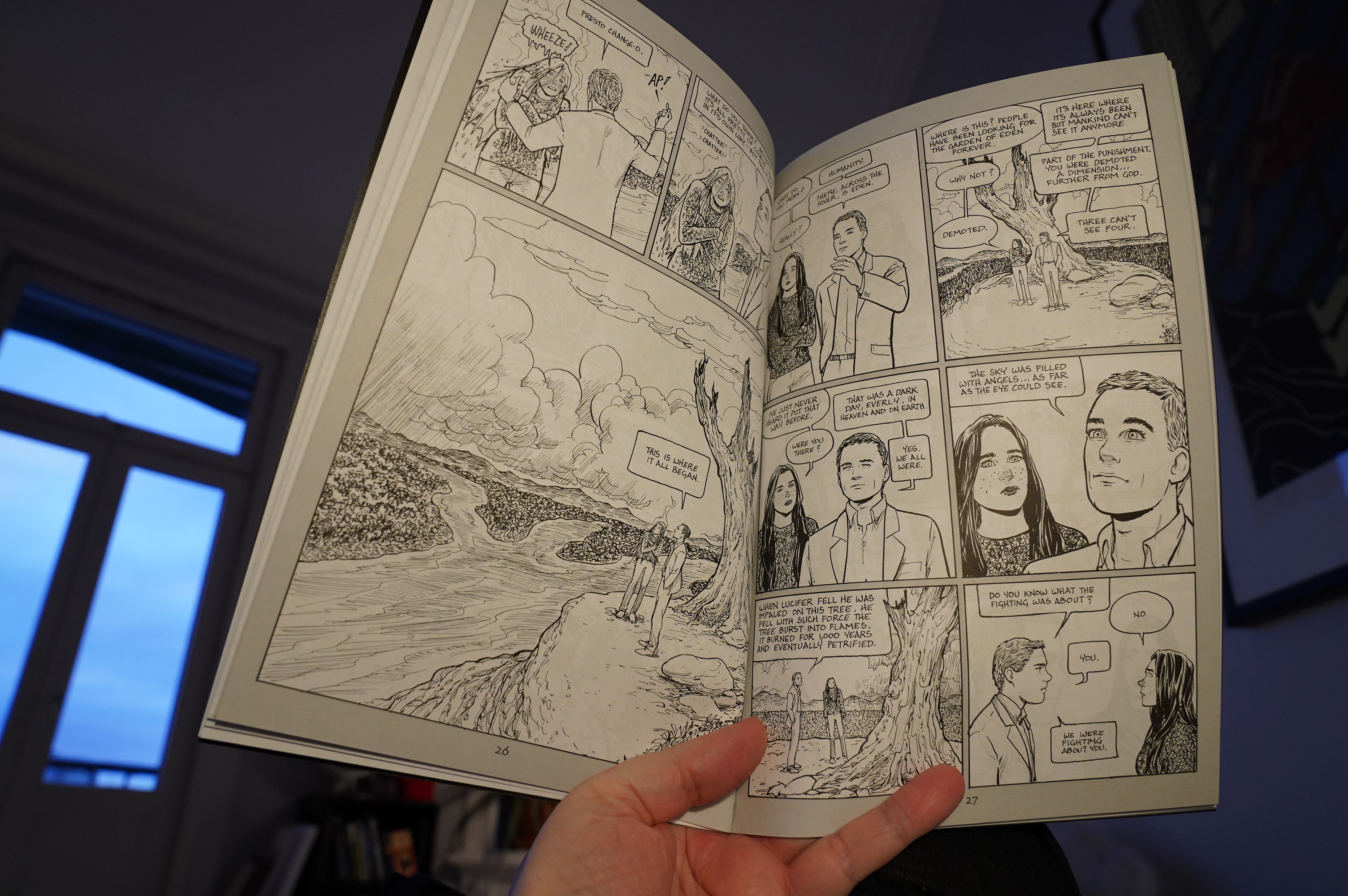
15:02: Ever by Terry Moore (Abstract)

So it starts off as some stalker thing… (Nice figure work by Moore; a more scratchy style than usual?)
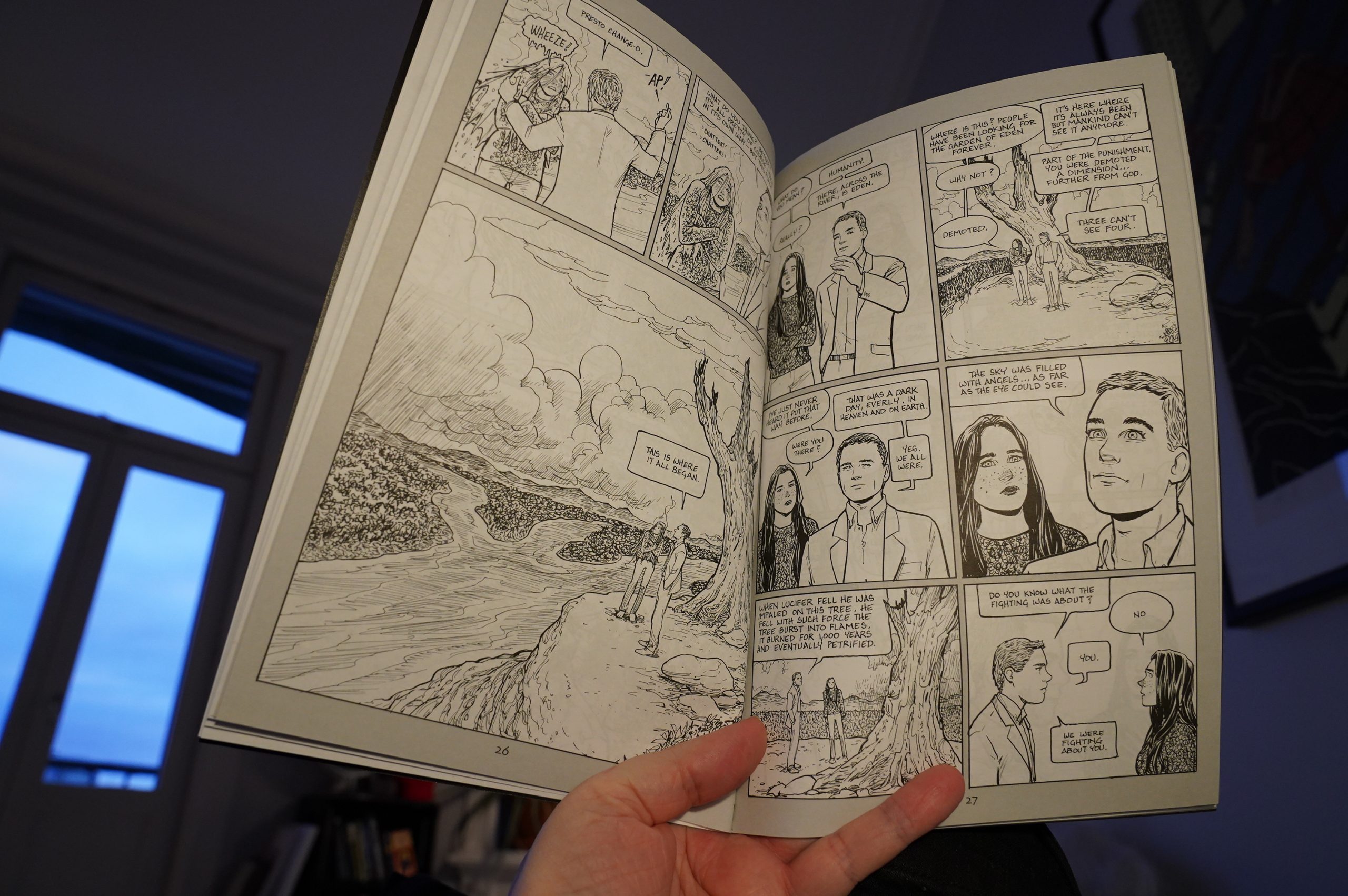
… and then there’s nine thousand pages of angels explaining theology at that poor woman.
And why does Moore use such crappy paper? It’s thin (see through) and feels nasty.

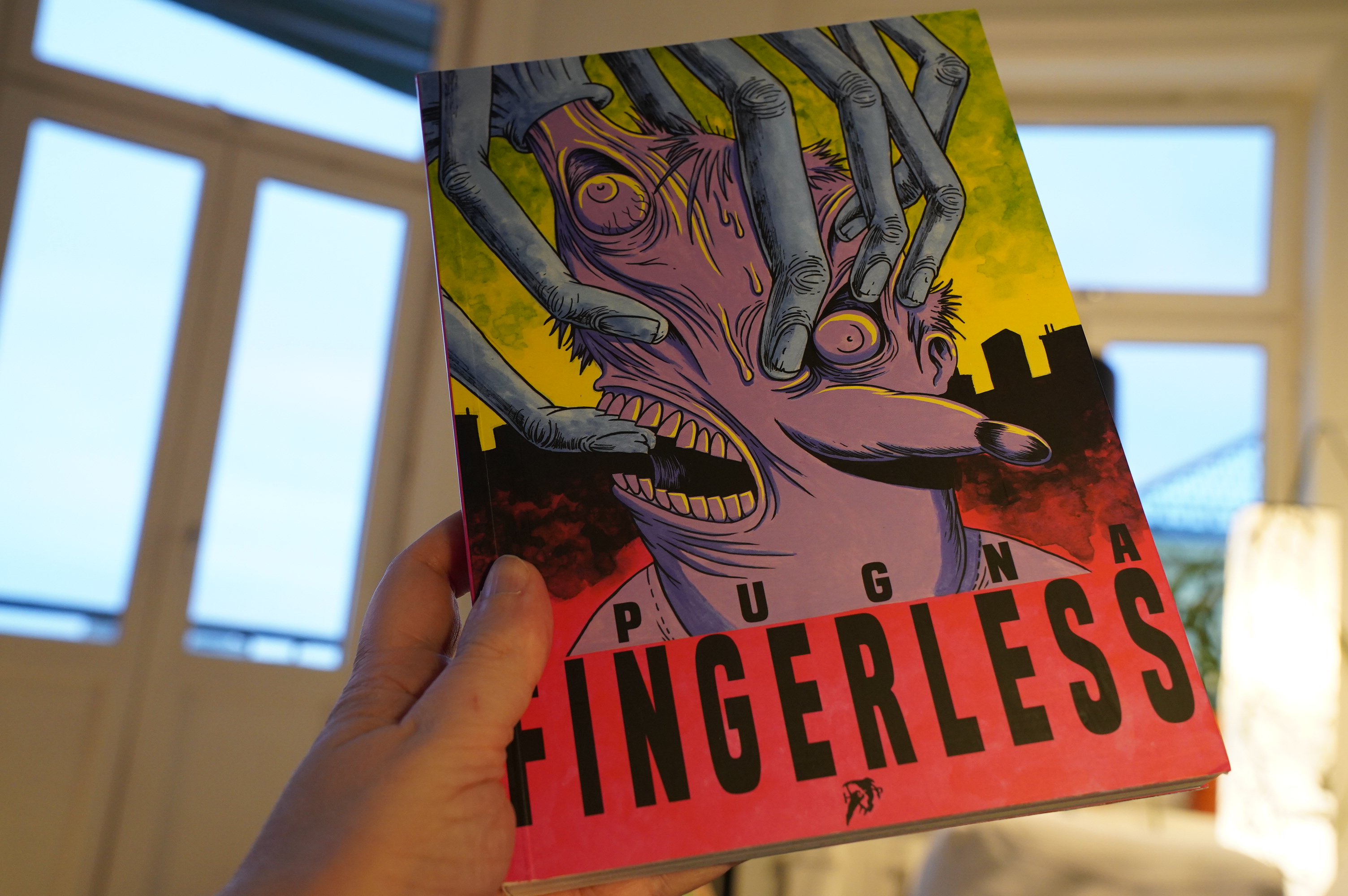
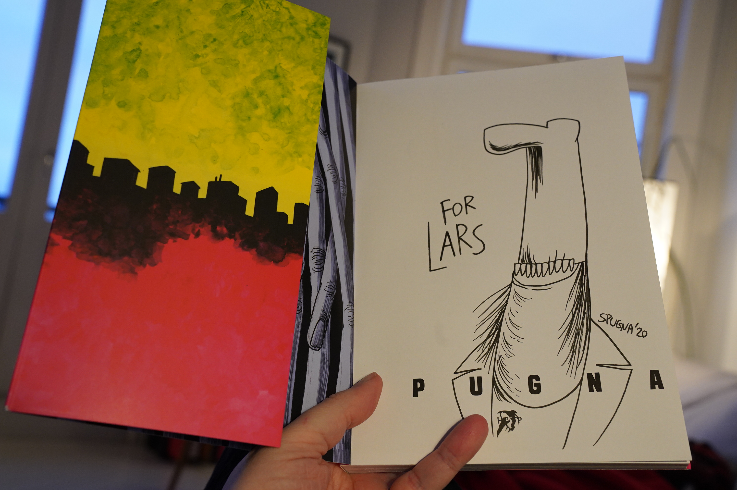
15:21: Fingerless by Spugna (Hollow Press)

Hey! It’s signed! And with a sketch. Nice.
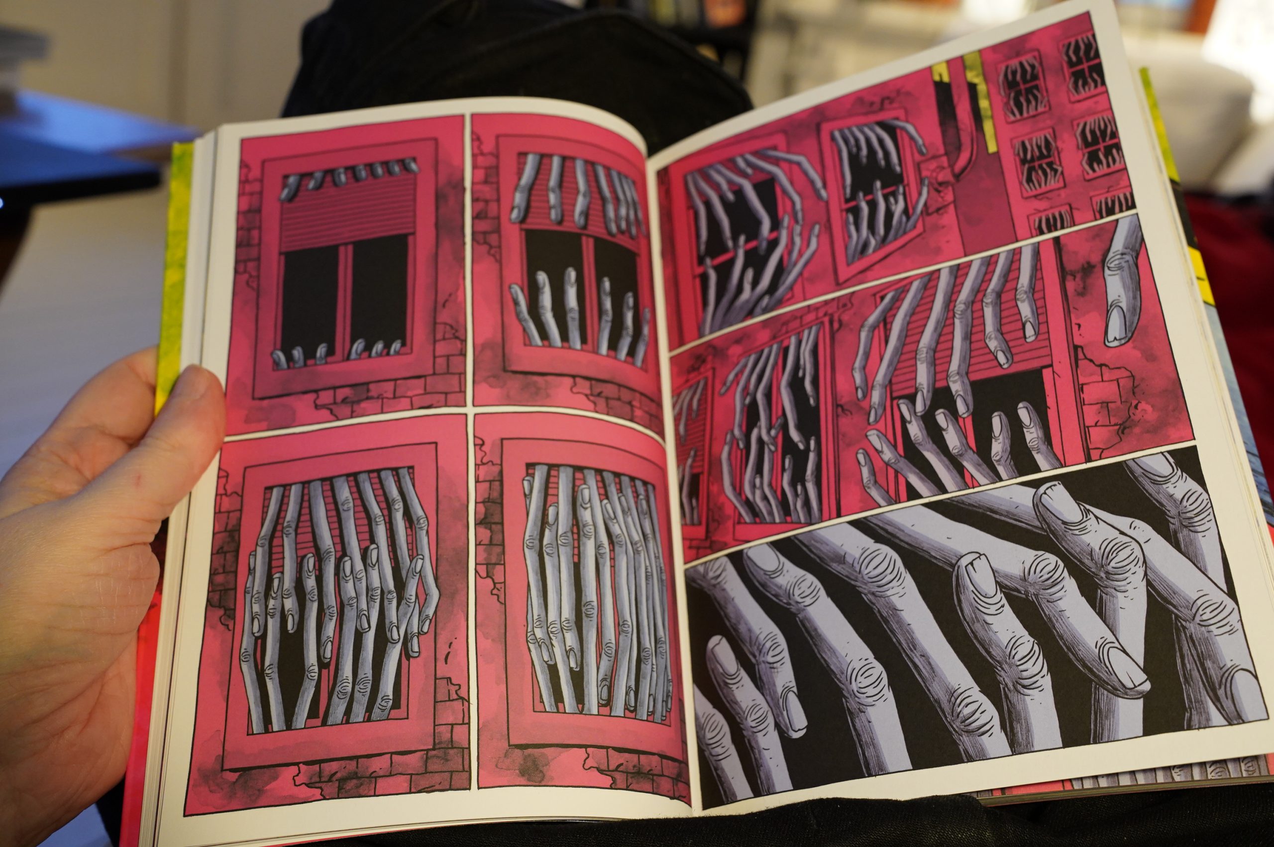
The story here is about an alien invasion, but the particulars here are really horrifying.
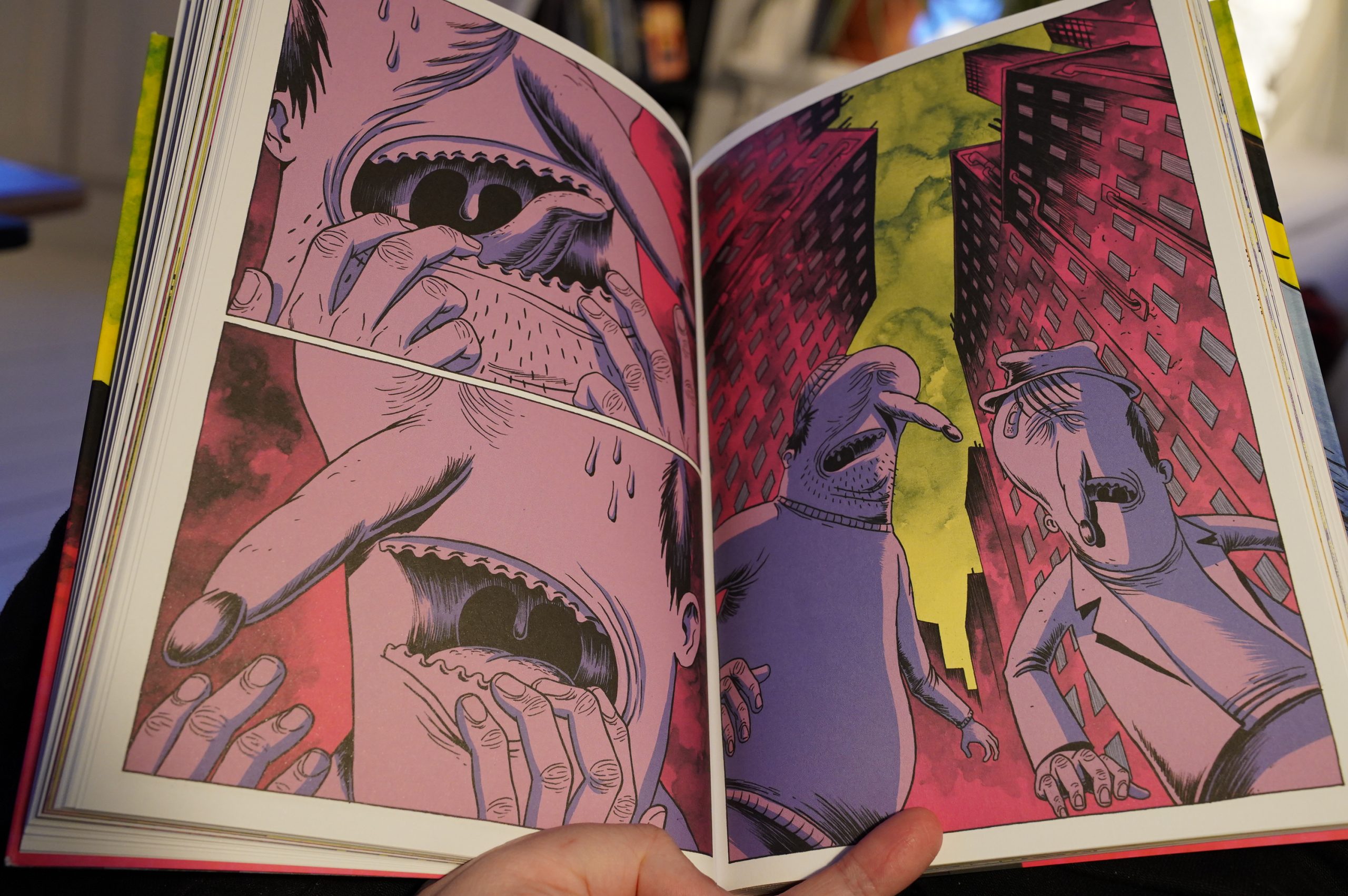
It’s a brisk, breathless read. It a total rush, and actually scary, which is rare.
| Oval: Ovalvoa |  |

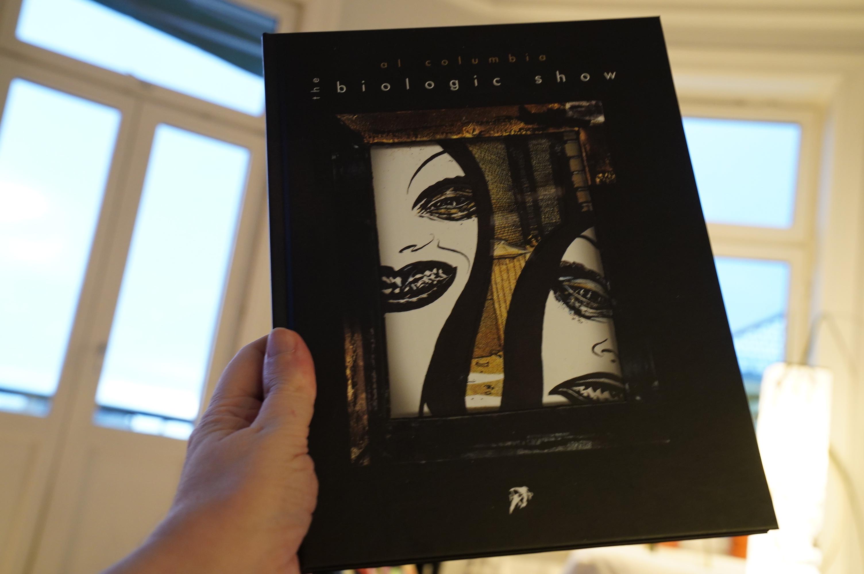
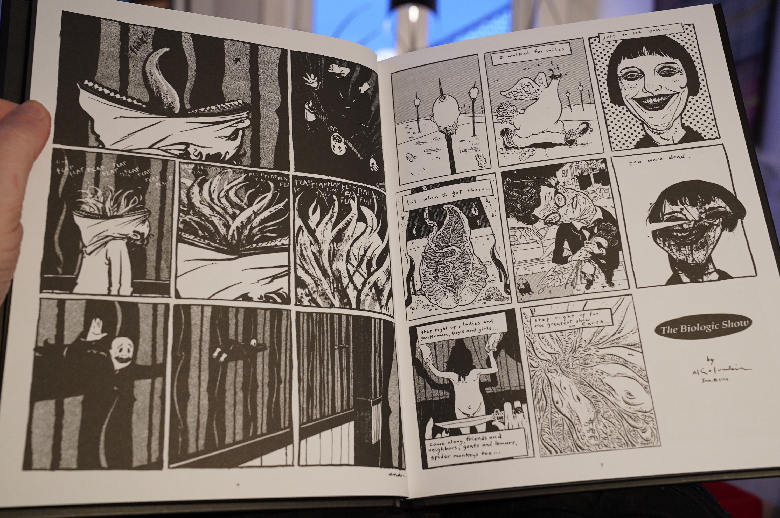
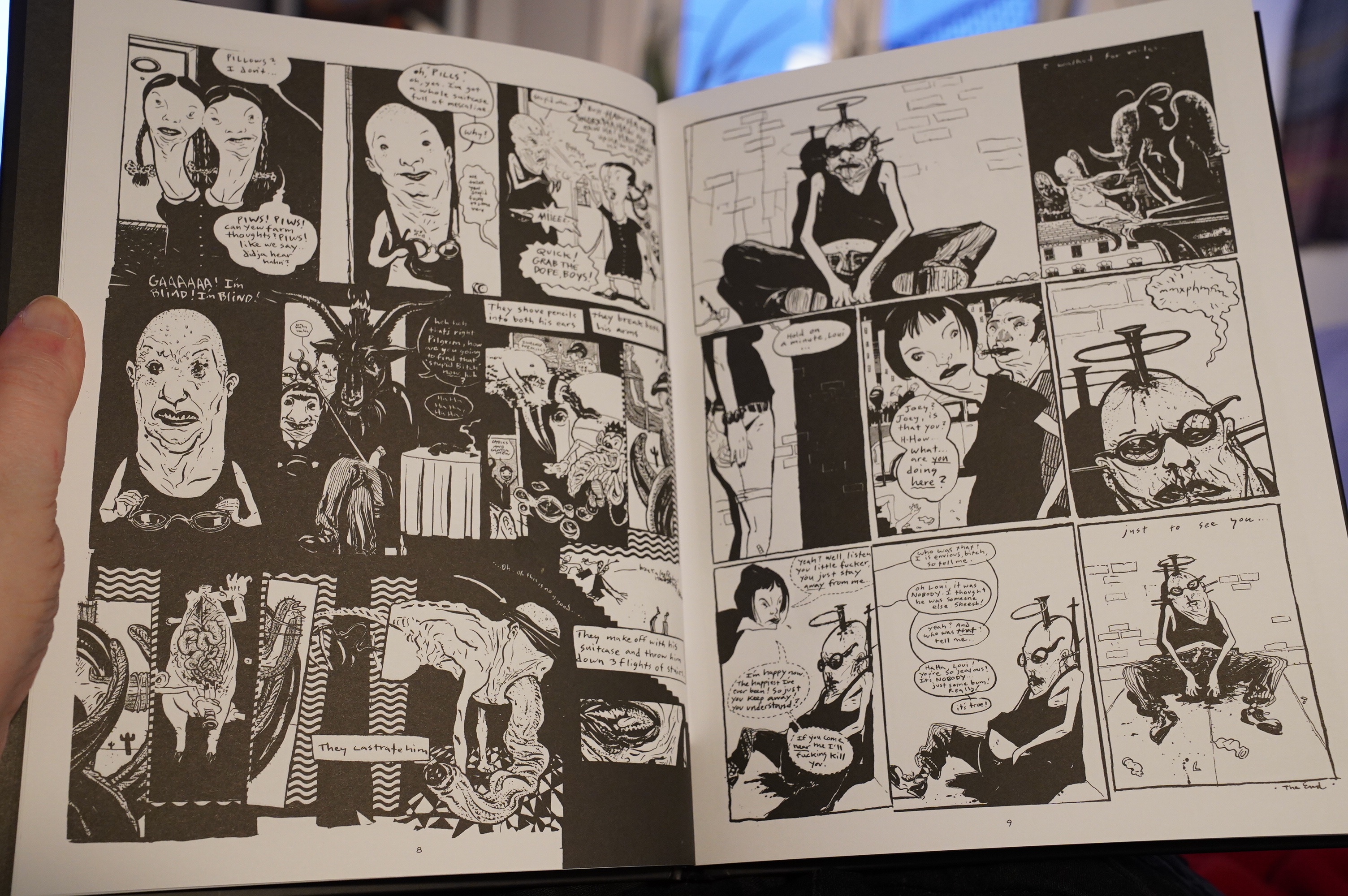
15:31: The Biologic Show by Al Columbia (Hollow Press)
Was there some controversy about this release? I think somebody who claimed to speak for Columbia started… in on Hollow Press after the release for reasons I didn’t quite catch?
Anyway, I’ve read these comics before, of course, since it’s a reprint of the Fantagraphics almost-kinda-series.

Er… All other Hollow Press releases I’ve seen have been exquisitely printed, but the reproduction here just looks… bad? Moire all over the place… has this been shot from published copies of The Biologic Show #0 and not been touched up?

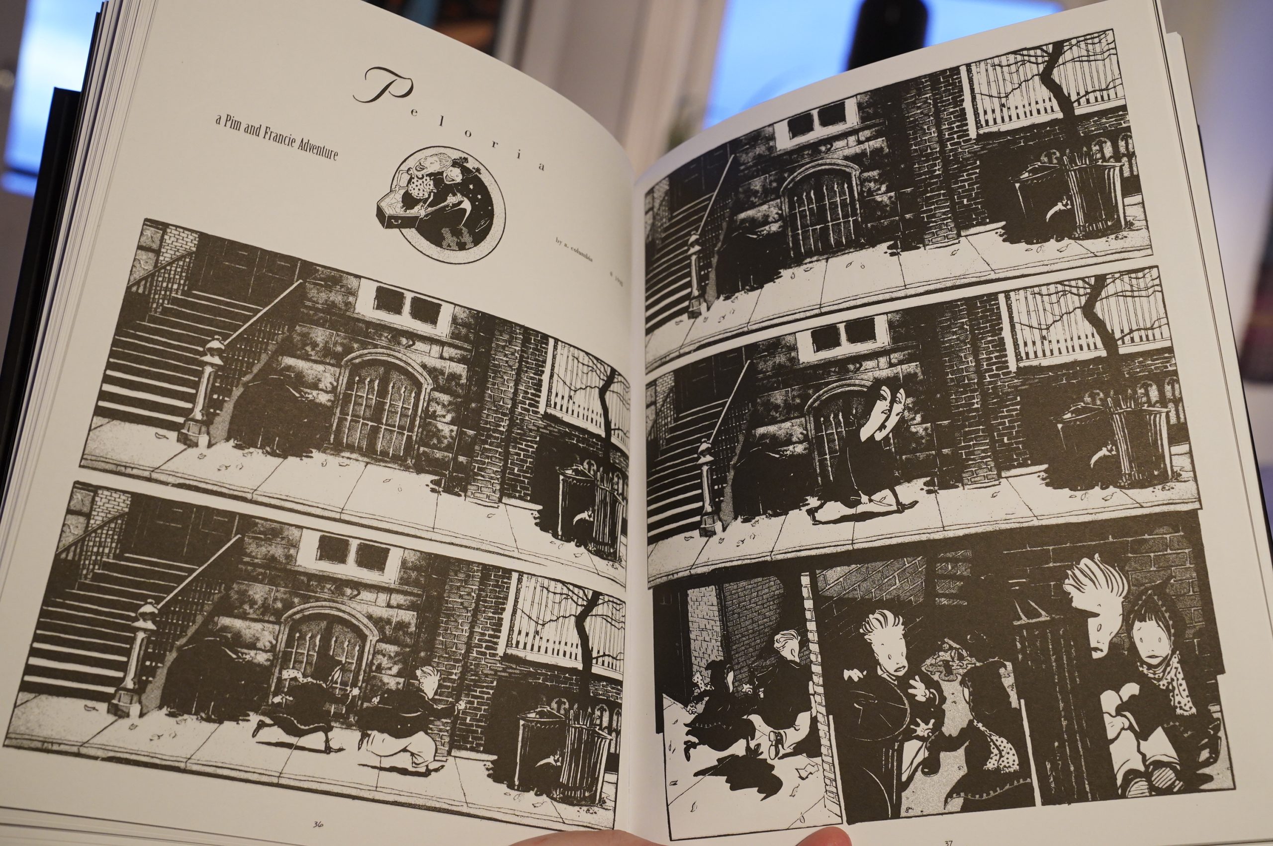
When there’s white-on-black lines, you almost can’t make out what’s going on. (Considering that this is a Columbia book, perhaps that for the best, though.)
Very disappointing.
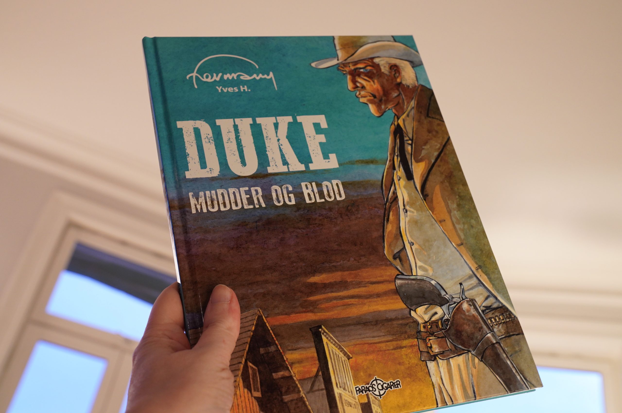
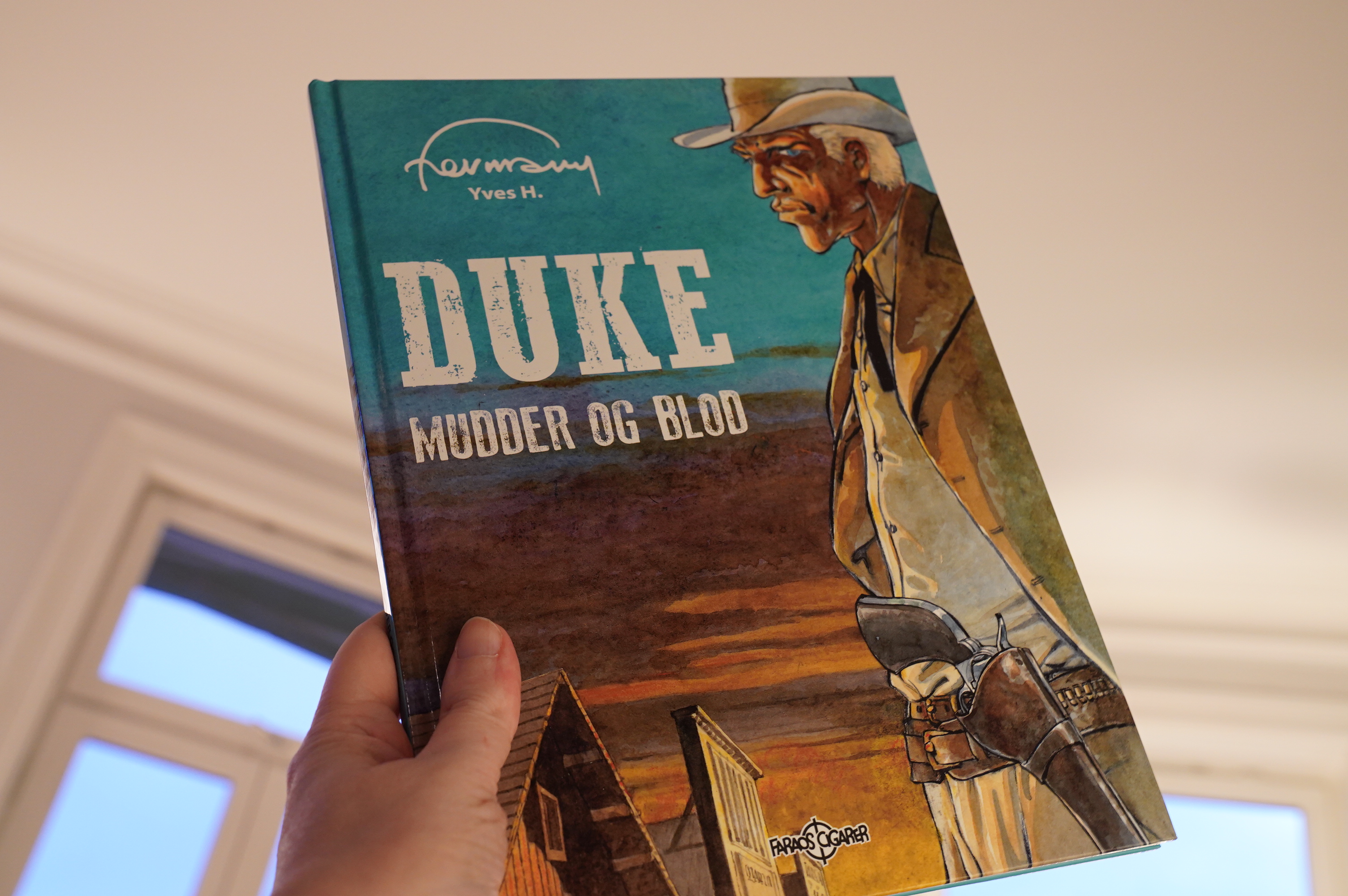
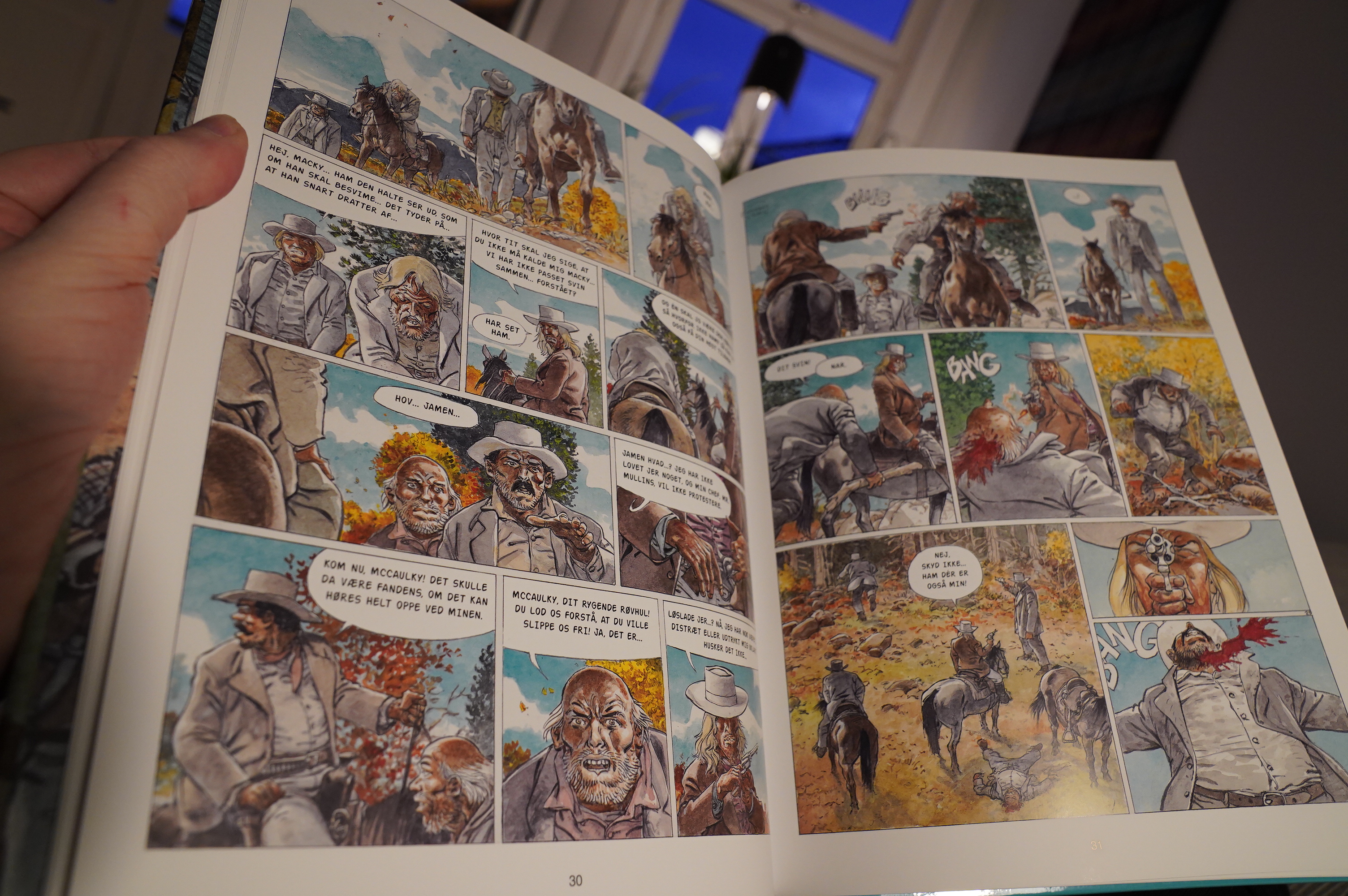
15:57: Duke by Hermann et Yves H. (Faraos Cigarer)
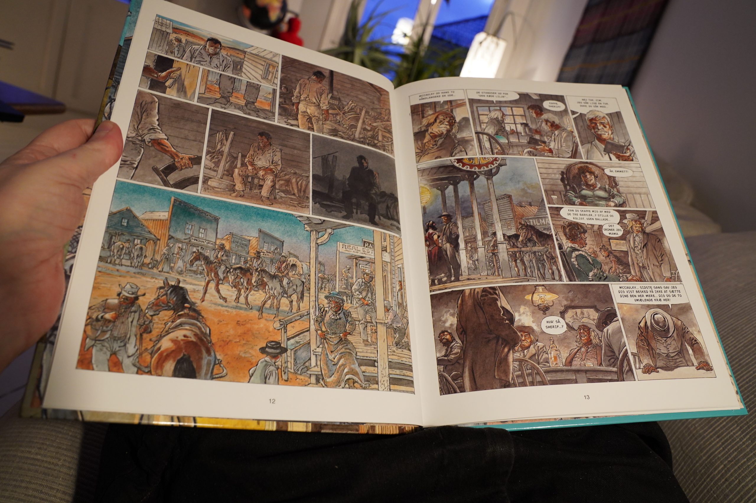
Oh, this one of those gritty westerns?

Yup.
There’s not much of a story here. Hermann’s artwork fits the gritty story, but the book is pretty much a parody of itself.
| Neneh Cherry: Blank Project |  |
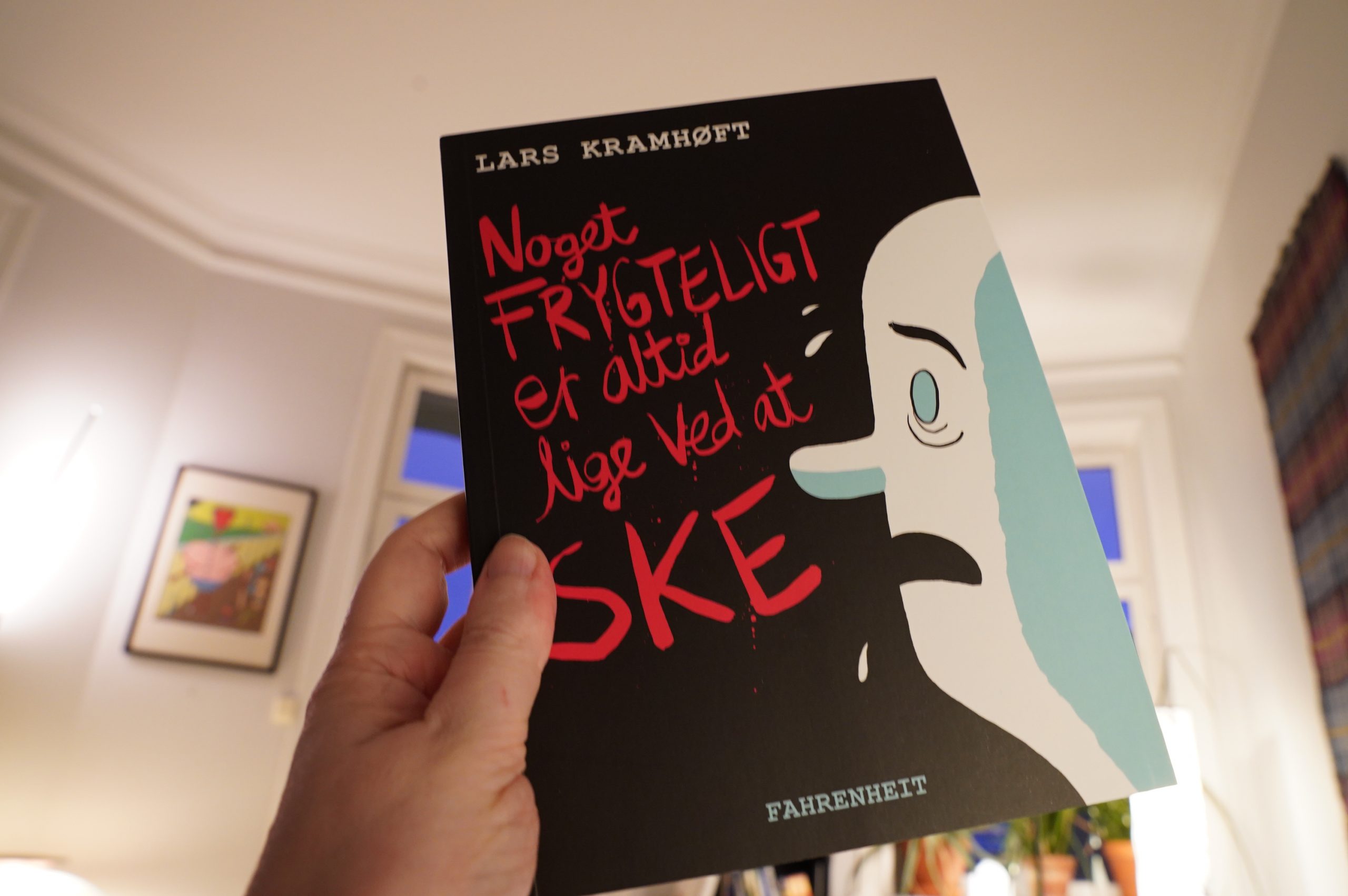
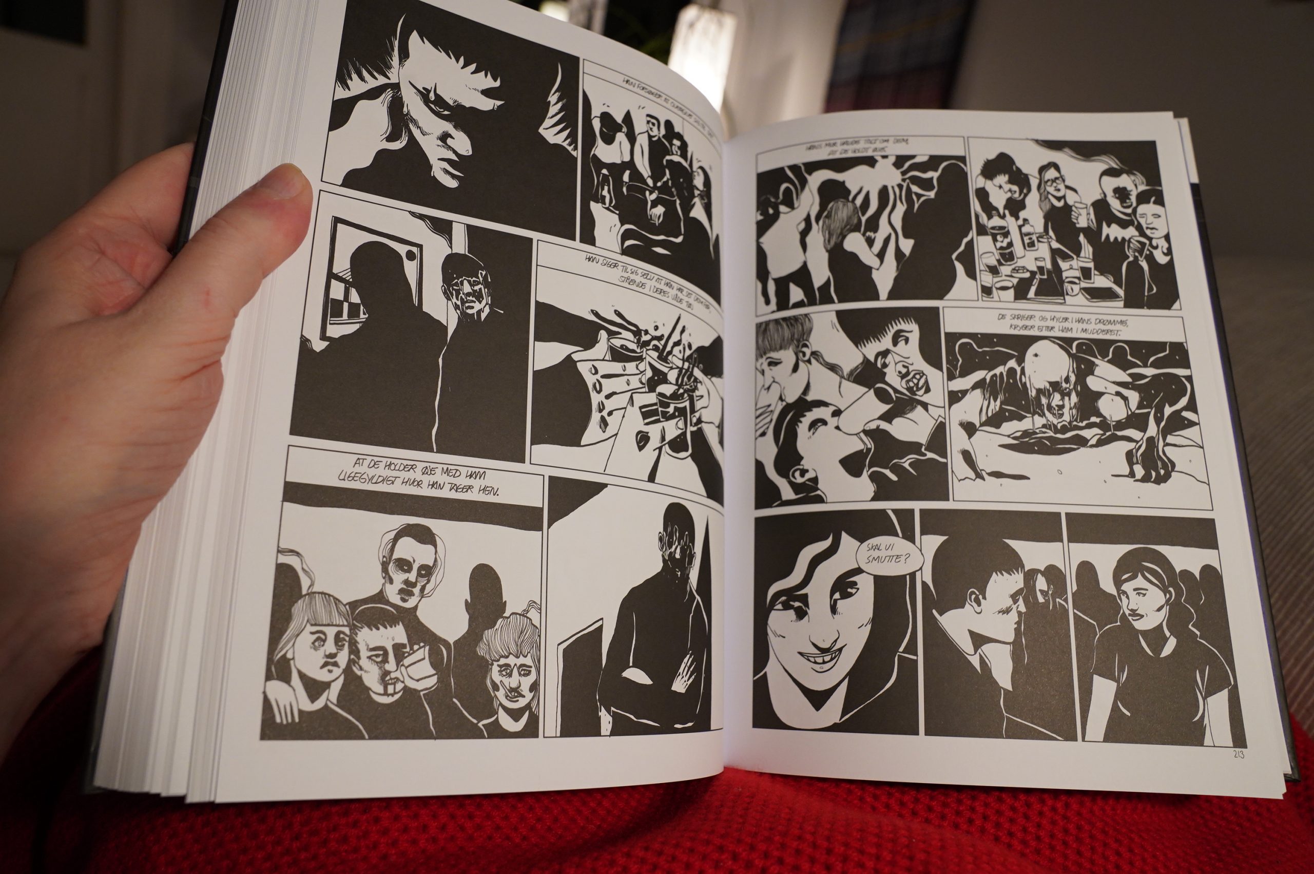
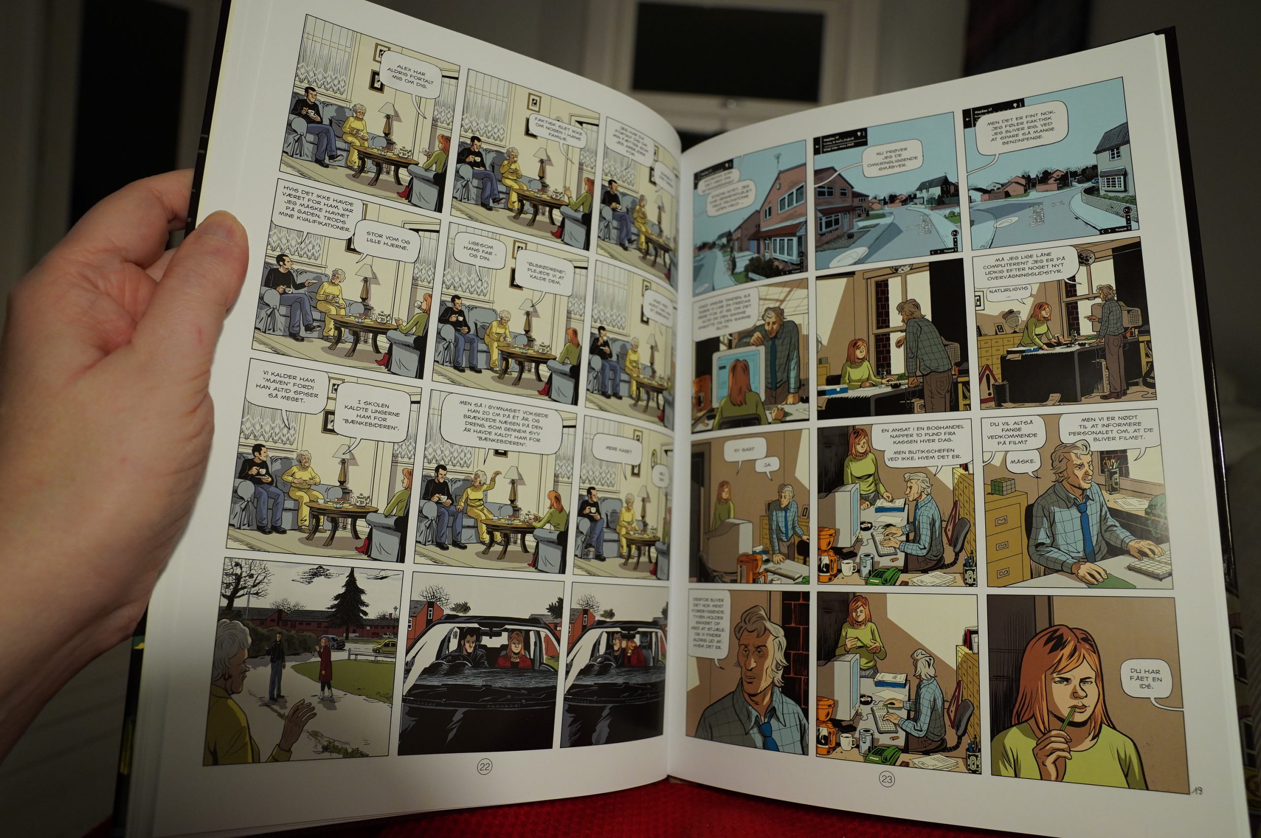
16:17: Noget frygteligt er altid lige ved at ske by Lars Kramhøft (Fahrenheit)
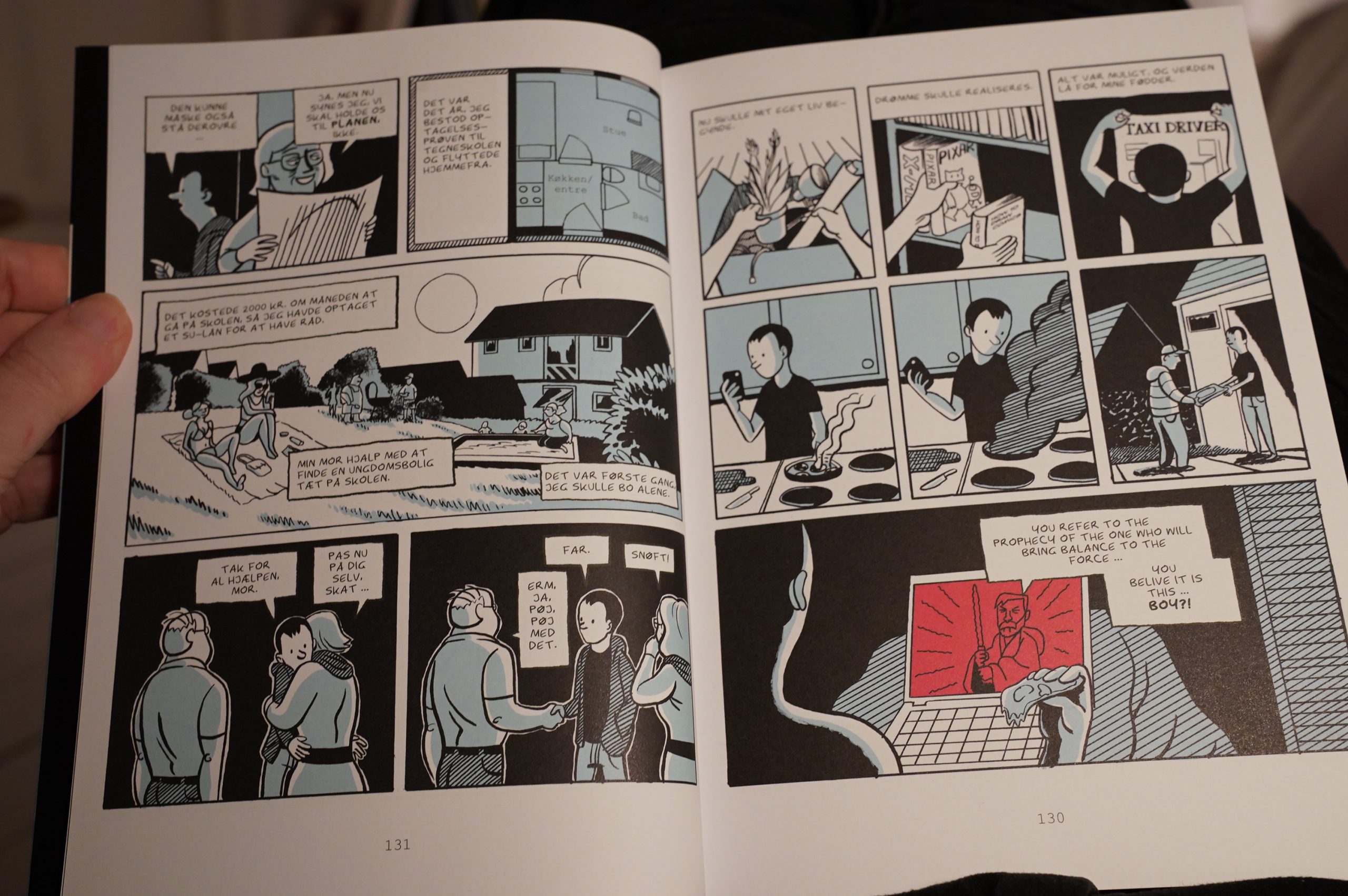
I almost didn’t buy this because the cover is so… I want to say Sethish, but I’m not quite sure? It reminds me of something…
Anyway, the interiors are better.
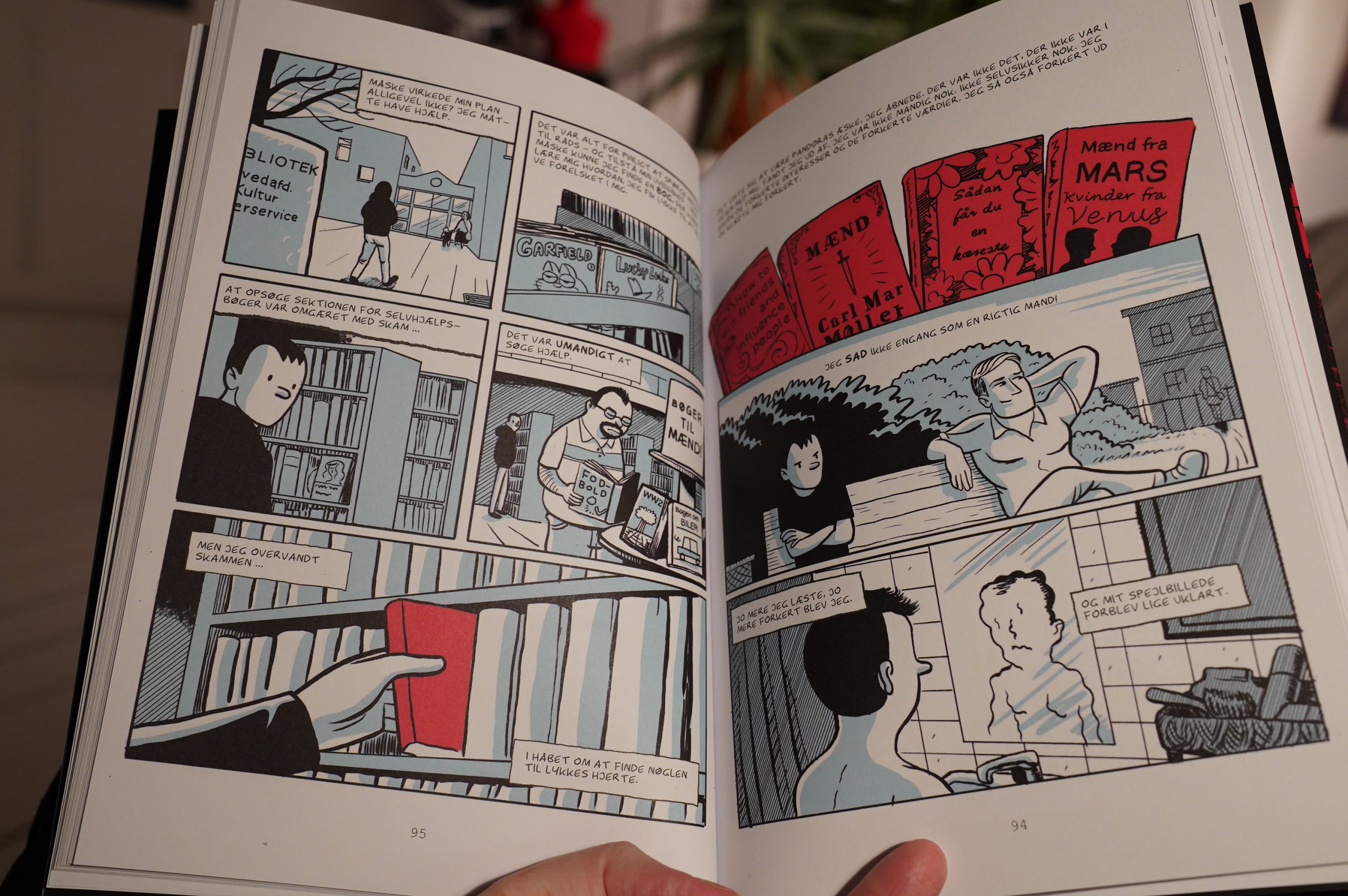
Unfortunately, it’s the story about a hapless, depressed kid who can’t get any dates and starts disappearing into the Manosphere, but he doesn’t quite take the red pill. It’s really hard to stay interested: He’s portrayed as somebody with absolutely no interesting qualities whatsoever. Oh, and the twist ending is totes cringe. (So it won the prize for best comic last year in Denmark? And it’s apparently “deeply touching and entertaining”.

Food arrived! Yay. I ordered… a bit too much? I’m gonna be eating half of that. *sigh* Oh, well, I can have the rest for breakfast. :-/
| Throwing Muses: Purgatory-Paradise |  |
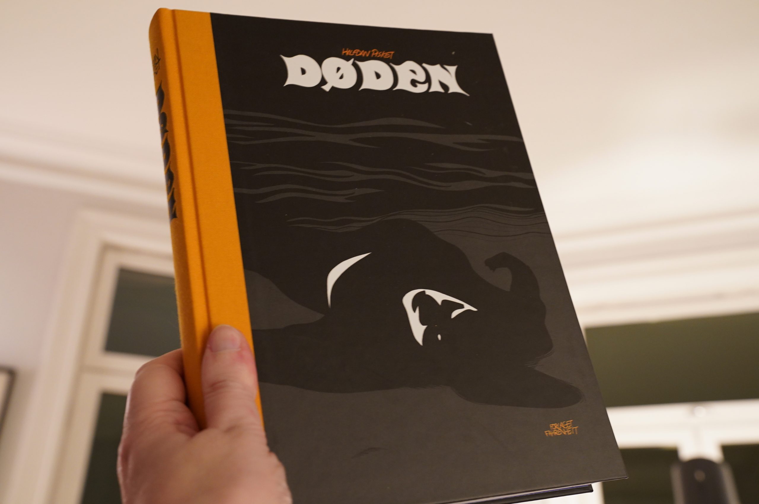
17:35: Døden by Halfdan Pisket (Fahrenheit)
Pisket made waves some years back with the biography of his father (sort of), called “Danish”. Or something. It was really good, so now this had better be good! Or else!
And it is!
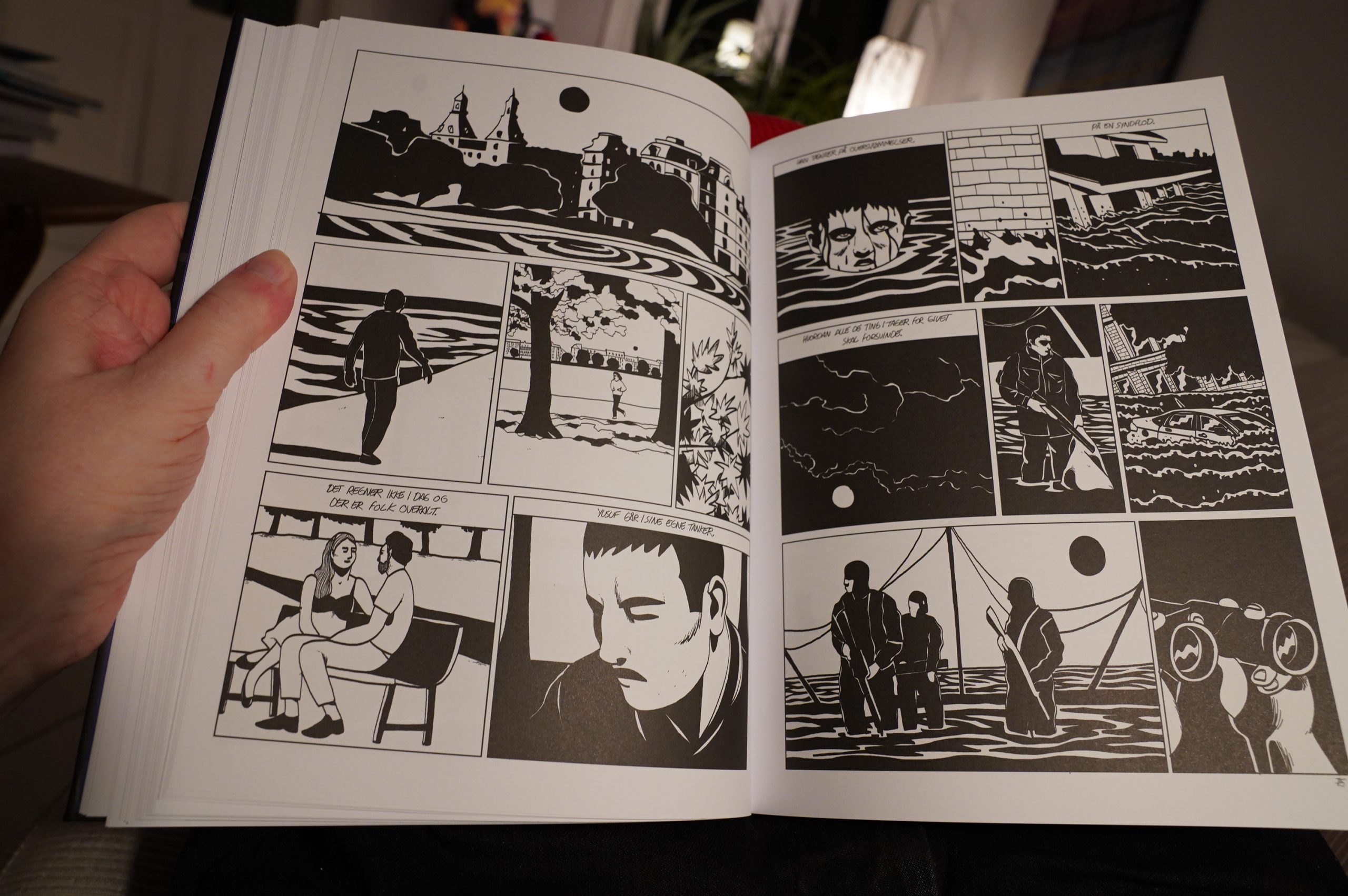
It’s nothing like his previous comics — this is more like late-70s Frenchey art comics (which is my favourite thing). The graphics are so sharp!
And the storyline is all about loss and losing yourself and gets progressively more symbolic as it goes along. It’s gripping and moving and gorgeous.
It’s even better than Dansker.
| Various: Music from the Mountain Provinces |  |
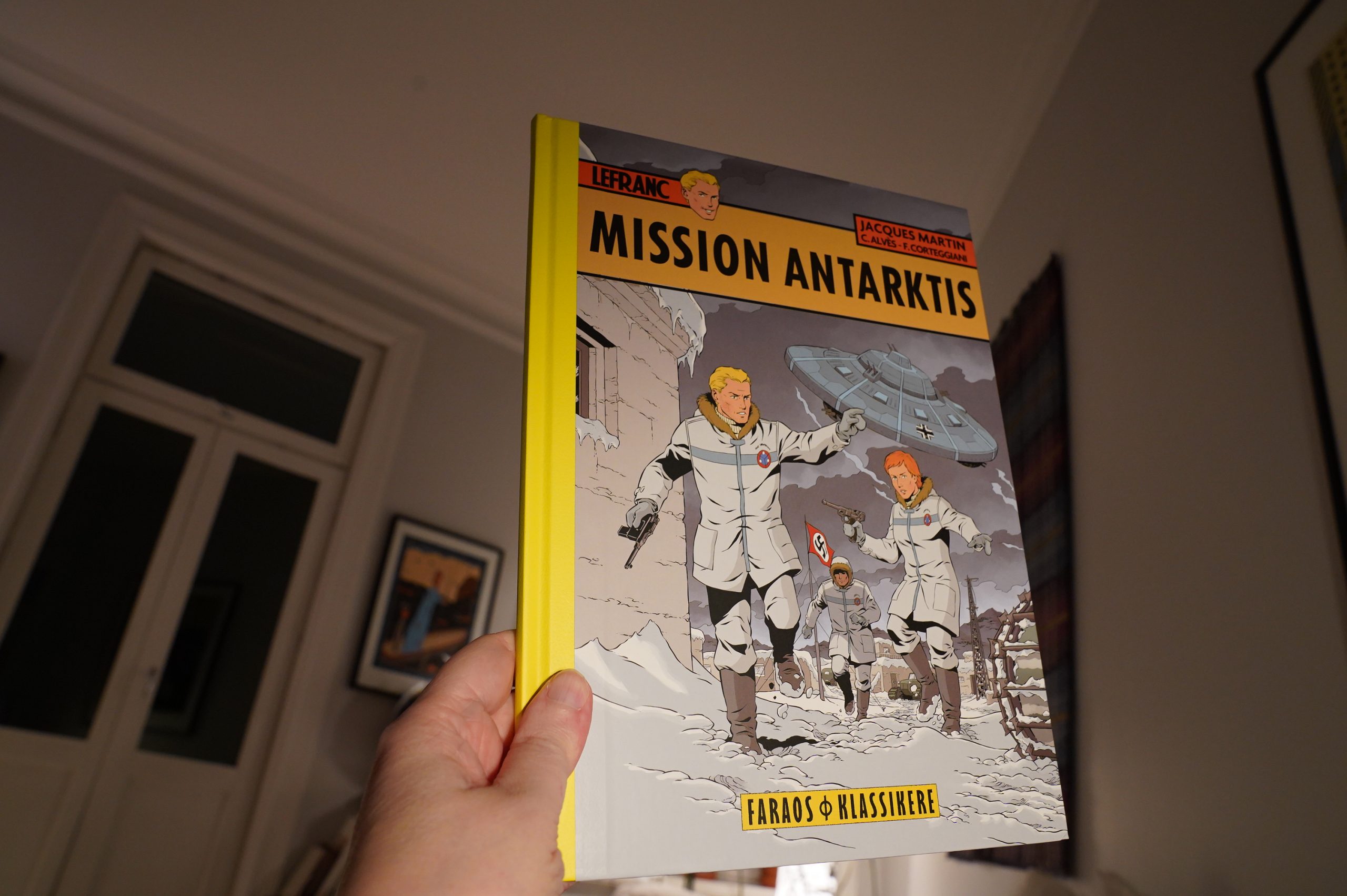
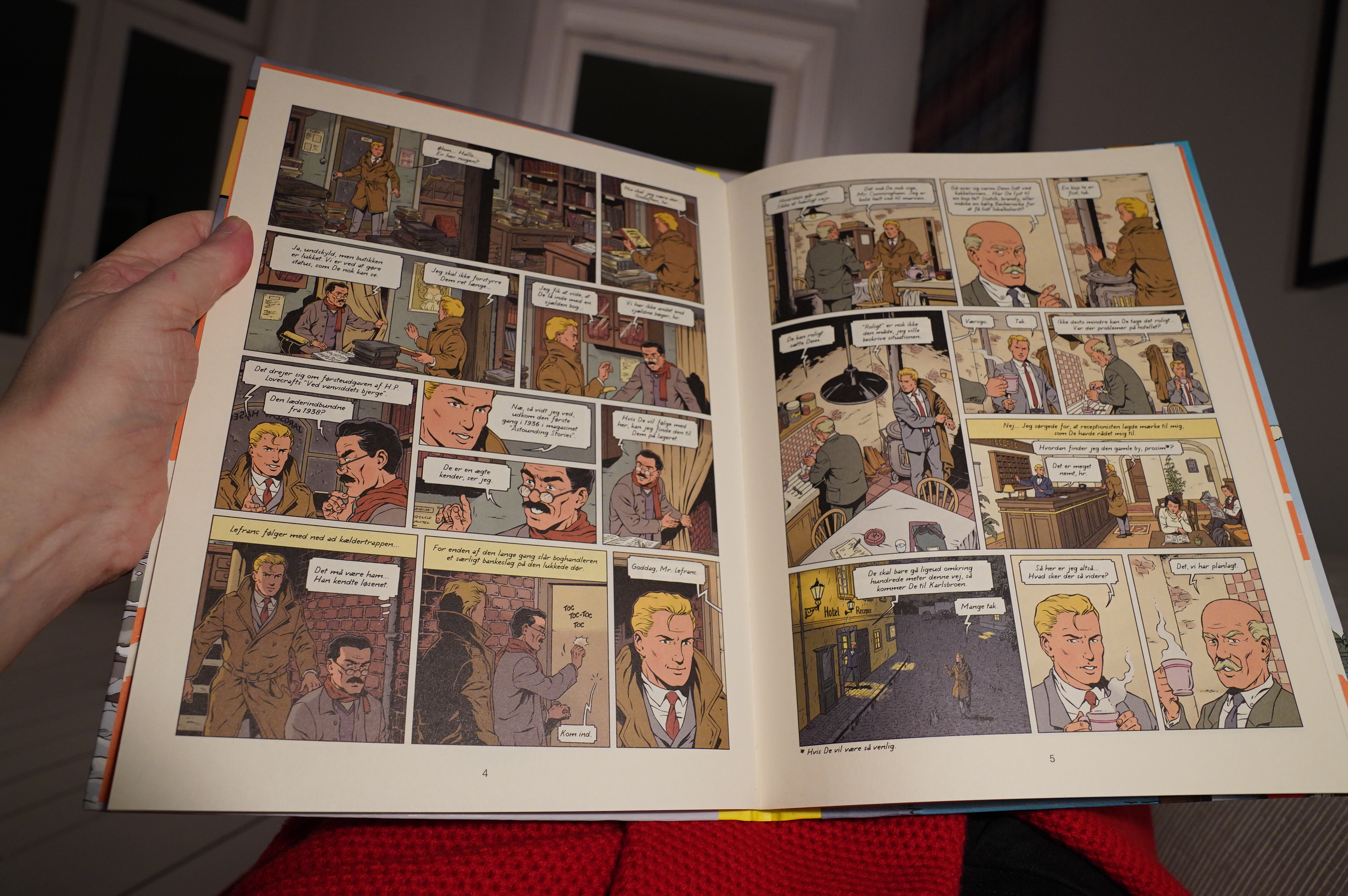
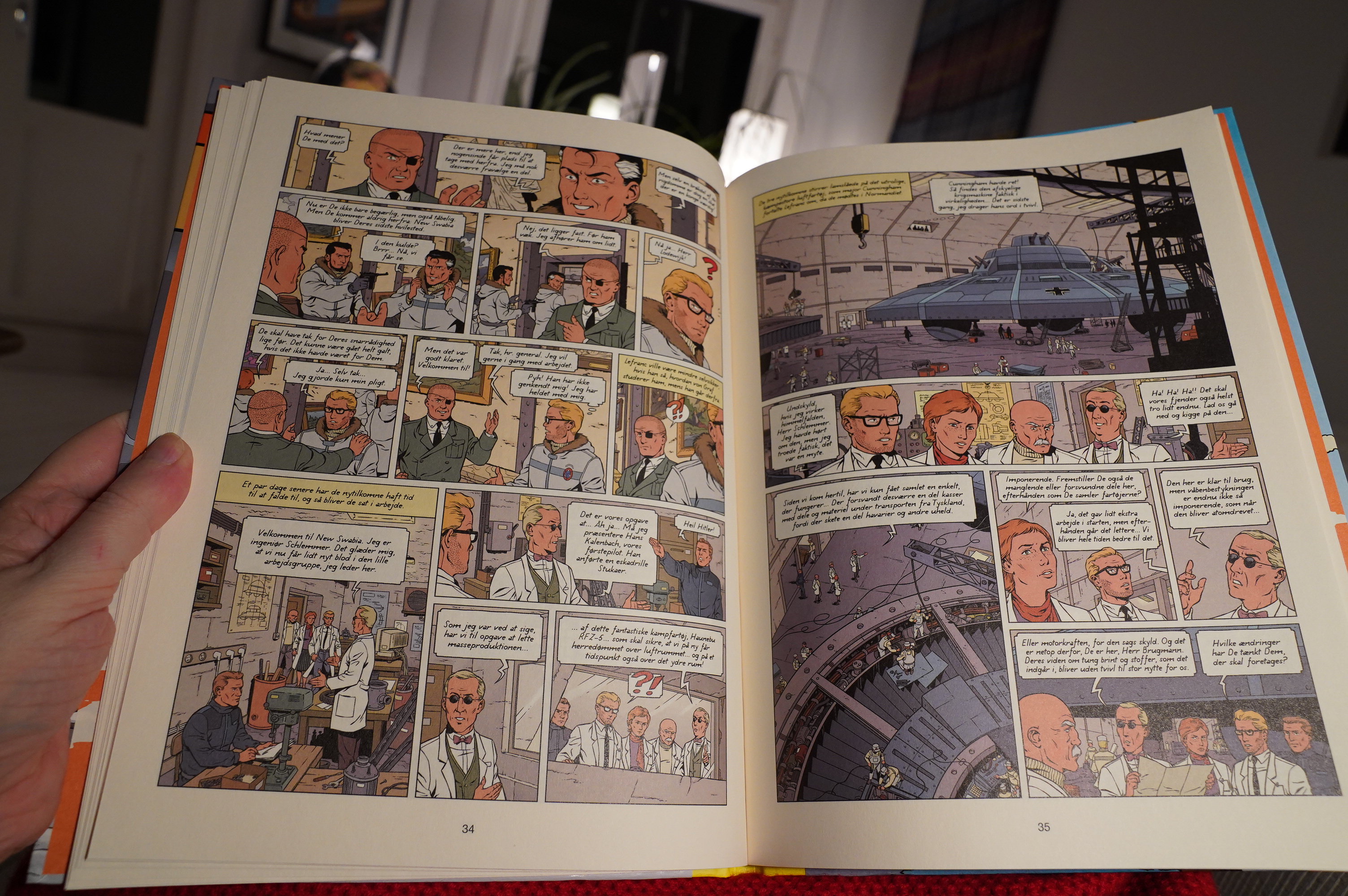
18:28: Lefranc tome 26: Mission Antarctique by C Alvès and F. Corteggiani (Faraos Cigarer)
Here’s my most controversial opinion ever: I can’t stand Jacques Martin. Of all the people who came from the Tintin camp, he’s the absolute worst. Oh… I forgot about Edgar P. Jacobs… he’s almost as bad… or even worse? I CAN”T MAKE MY MIND UP
I love all the rest of the Tintinish people, though. I like that stiff, awkward style.
But this isn’t by Martin — Lefranc is Martin’s series, but now new people have taken over, so I thought I’d give it a shot.

Wow, they’ve gone all in on this — it’s printed on cream, non-shiny paper, so that it looks oldee tymey. And the artwork is eerily similar to Martin’s, even if the proportions are sometimes a bit off (the characters tend toward bobble heads).

It’s even got as much exposition as Martin books usually have, but somehow it doesn’t annoy me here? It’s a fun book — it’s an entire, huge adventure, like a classic Frenchey children’s album. It’s an almost perfect pastiche of these adventures… and better than Martin even was.
There. I said it.
| Tujiko Noriko + Nobukazu Takemura: East Facing Balcony |  |

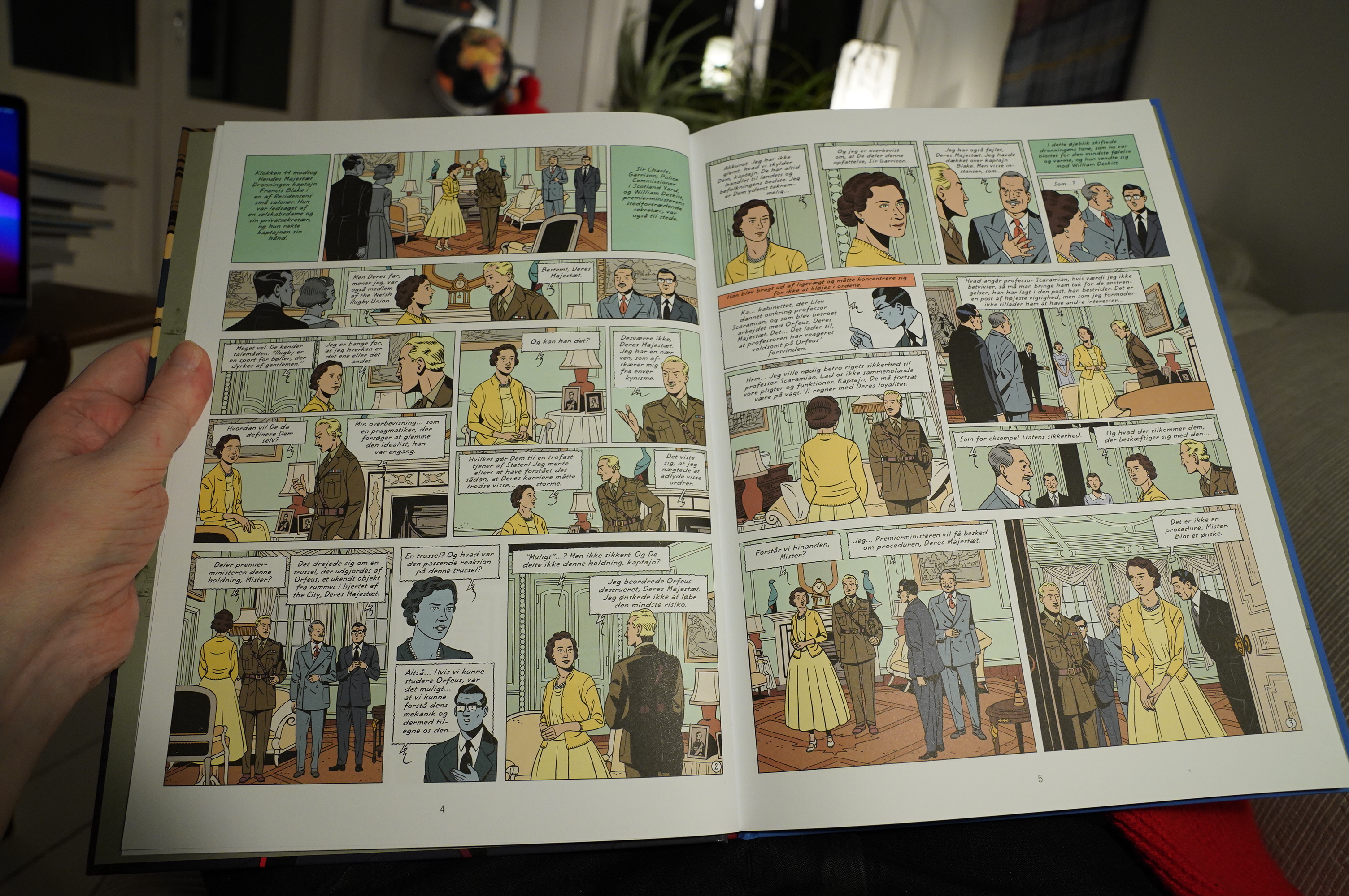
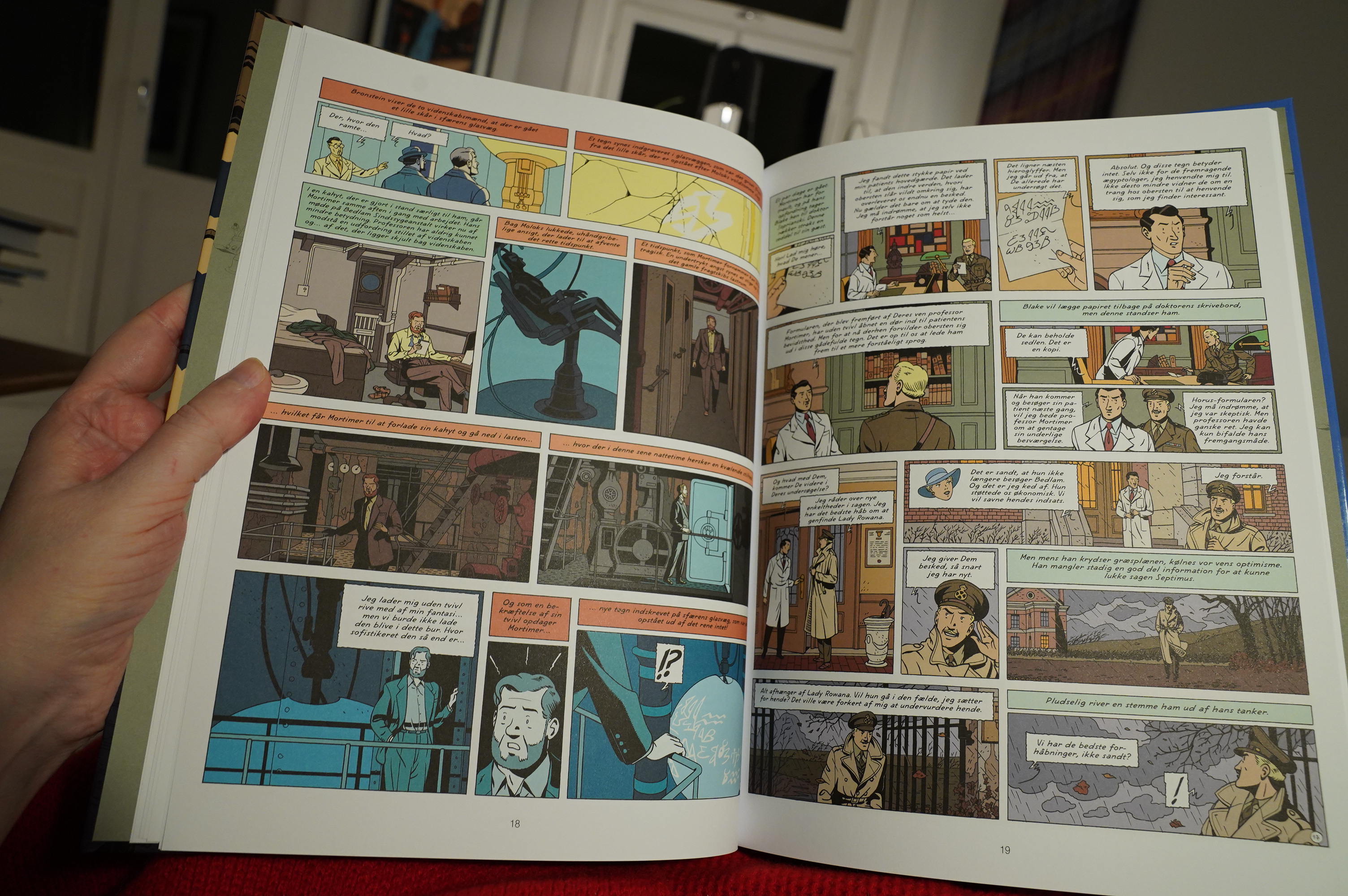
19:47: Blake et Mortimer: Le Cri du Moloch by Jean Dufaux, Christian Cailleaux, Étienne Schréder (Cobolt)
And speaking of Edgar P. Jacobs… here’s somebody doing a new Blake and Mortimer. I hope this one is as good as the Lefranc.
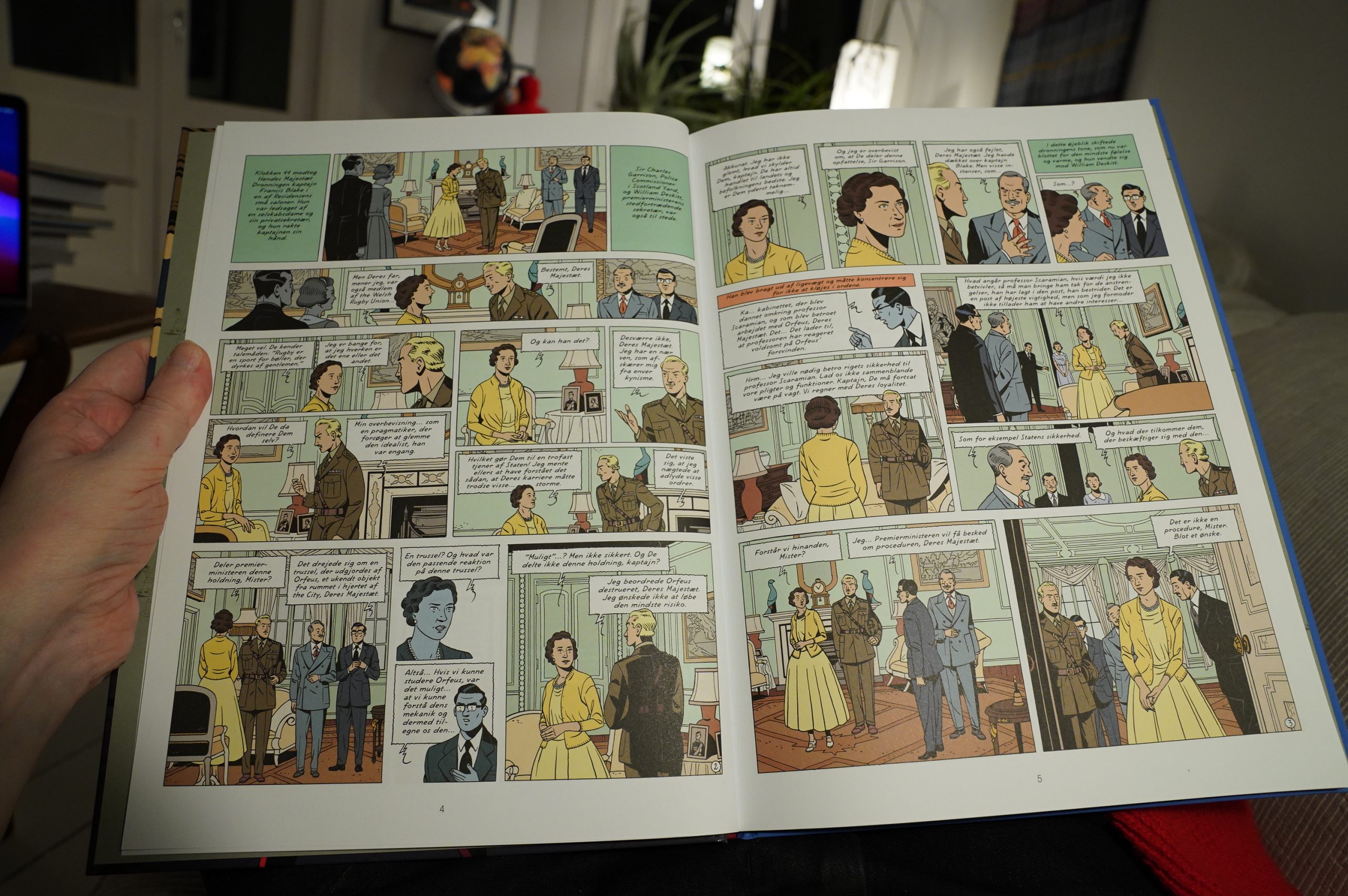
Well, it looks very P. Jacobs… in all the worst ways.

And it reads like P. Jacobs! Dude. The sheer tedium in incalculable, as one of these characters no doubt would say.
I couldn’t finish this crap.
| Vashti Bunyan: Heartleap |  |
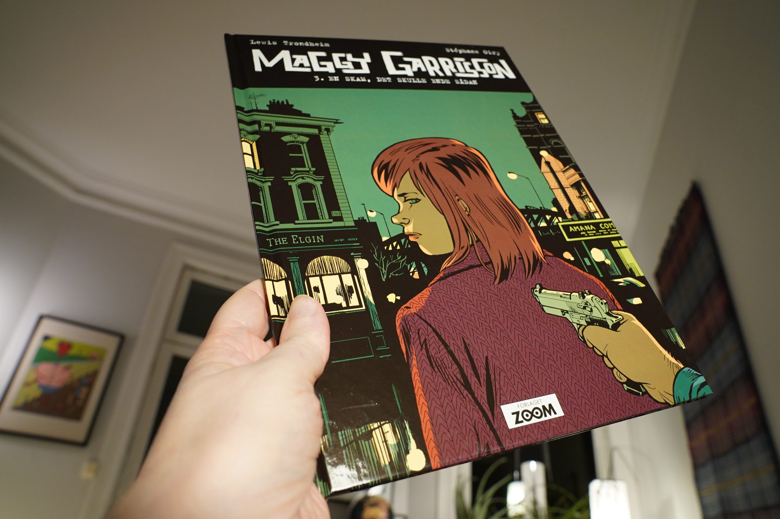
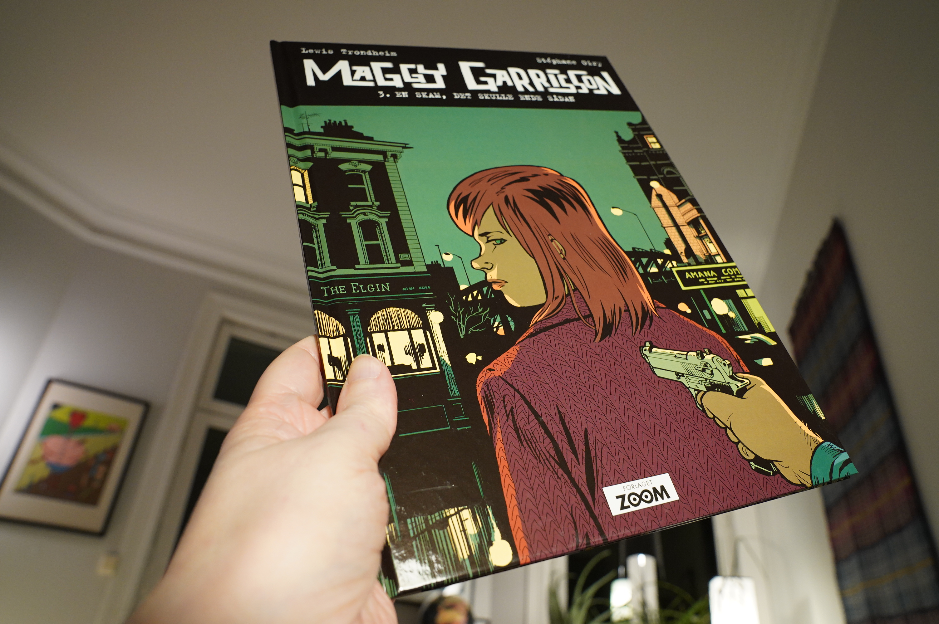
20:45: Maggy Garrison 3: Je ne voulais pas que ça finesse comme ça by Lewis Trondheim & Stéphane Oiry (Zoom)
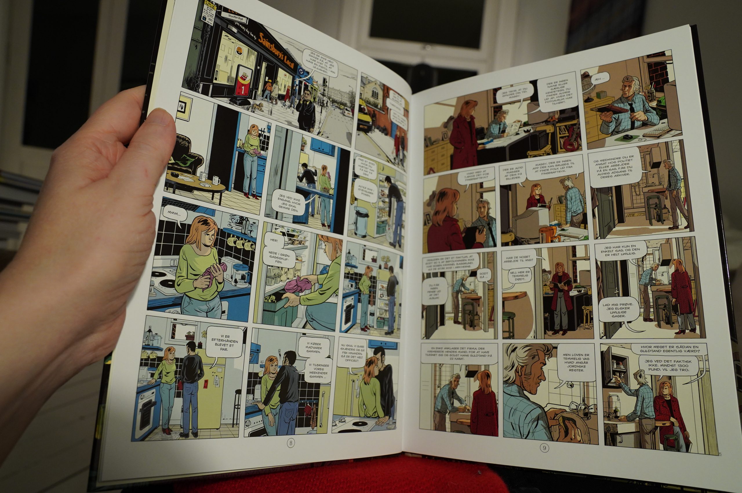
The pacing is very much like a modern detective drama series: Each album is a couple of cases, but advances the main soap story plotline forwards a bit. It’s neither big nor clever, but it really works: They’ve got the pacing down pat. It’s got a certain stillness about it that’s irresistible.
The artwork looks very computer-assisted, though… I mean, it’s attractive, and the uniform panels help with the mood they’re going for, but you never get the “now that’s an exciting page” thing. But, you know.
It’s a good read.
| Tujiko Noriko: My Ghost Comes Back |  |
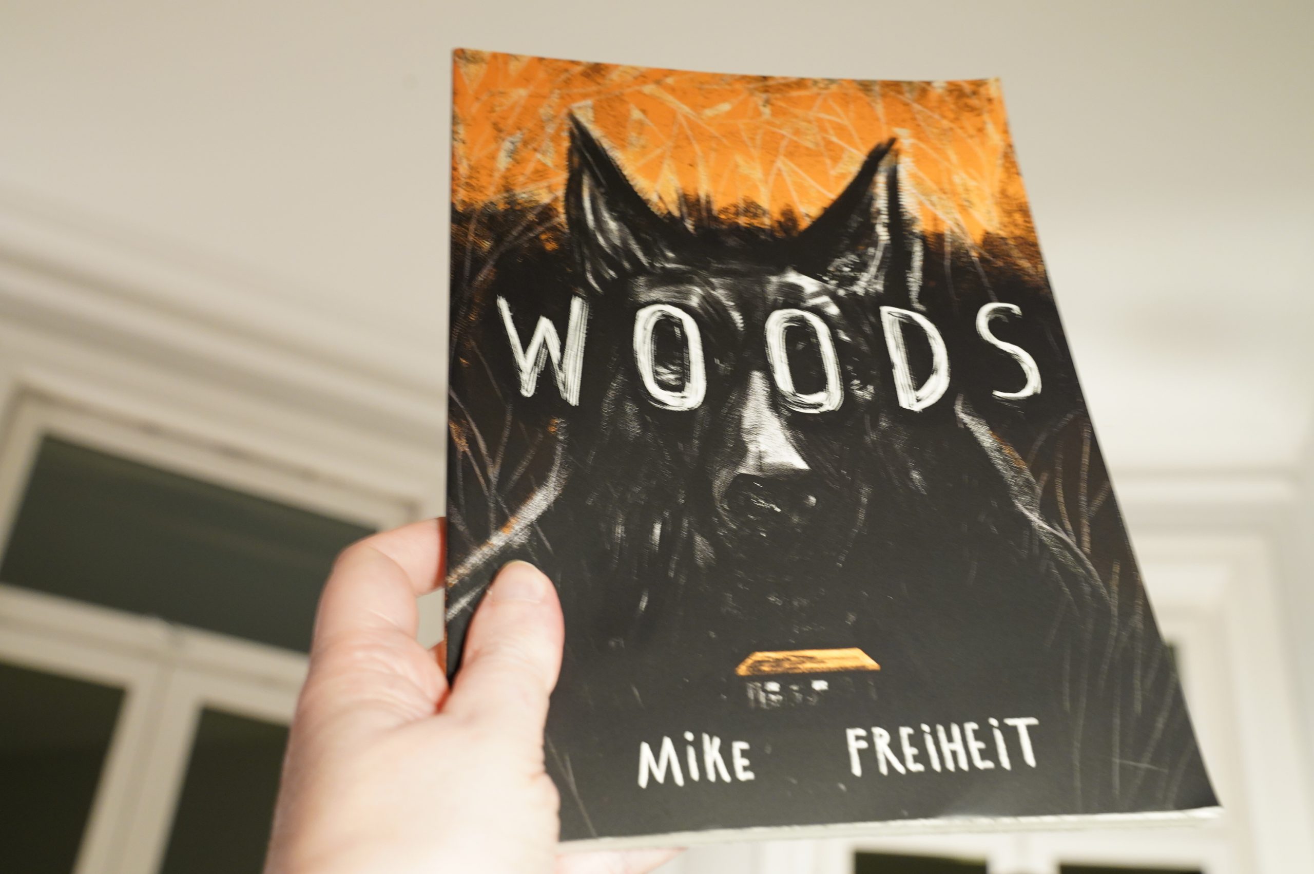
21:18: Woods by Mike Freiheit (Birdcage Bottom)
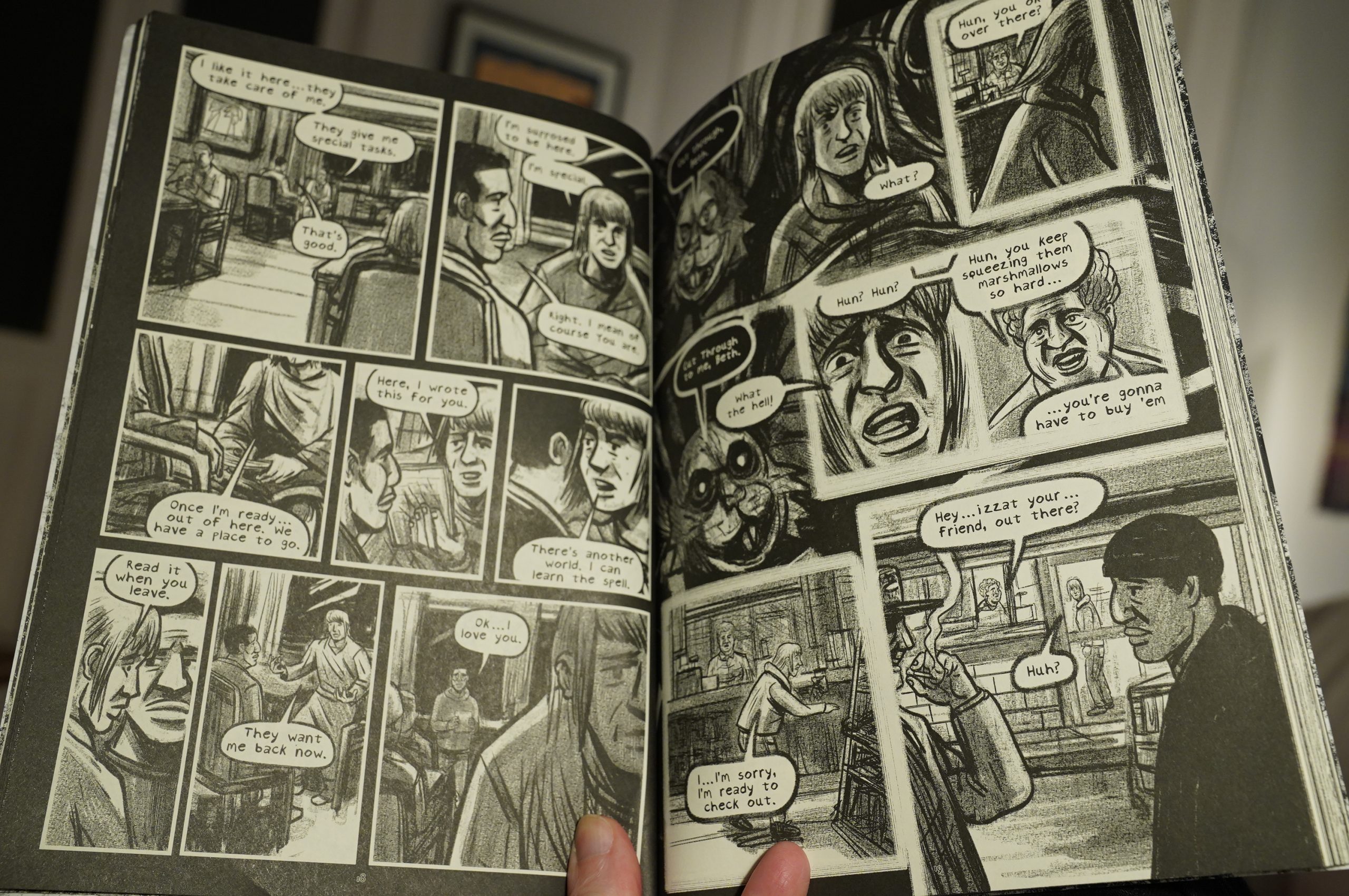
This has got some interesting storytelling choices in the first part… but then it turns into…
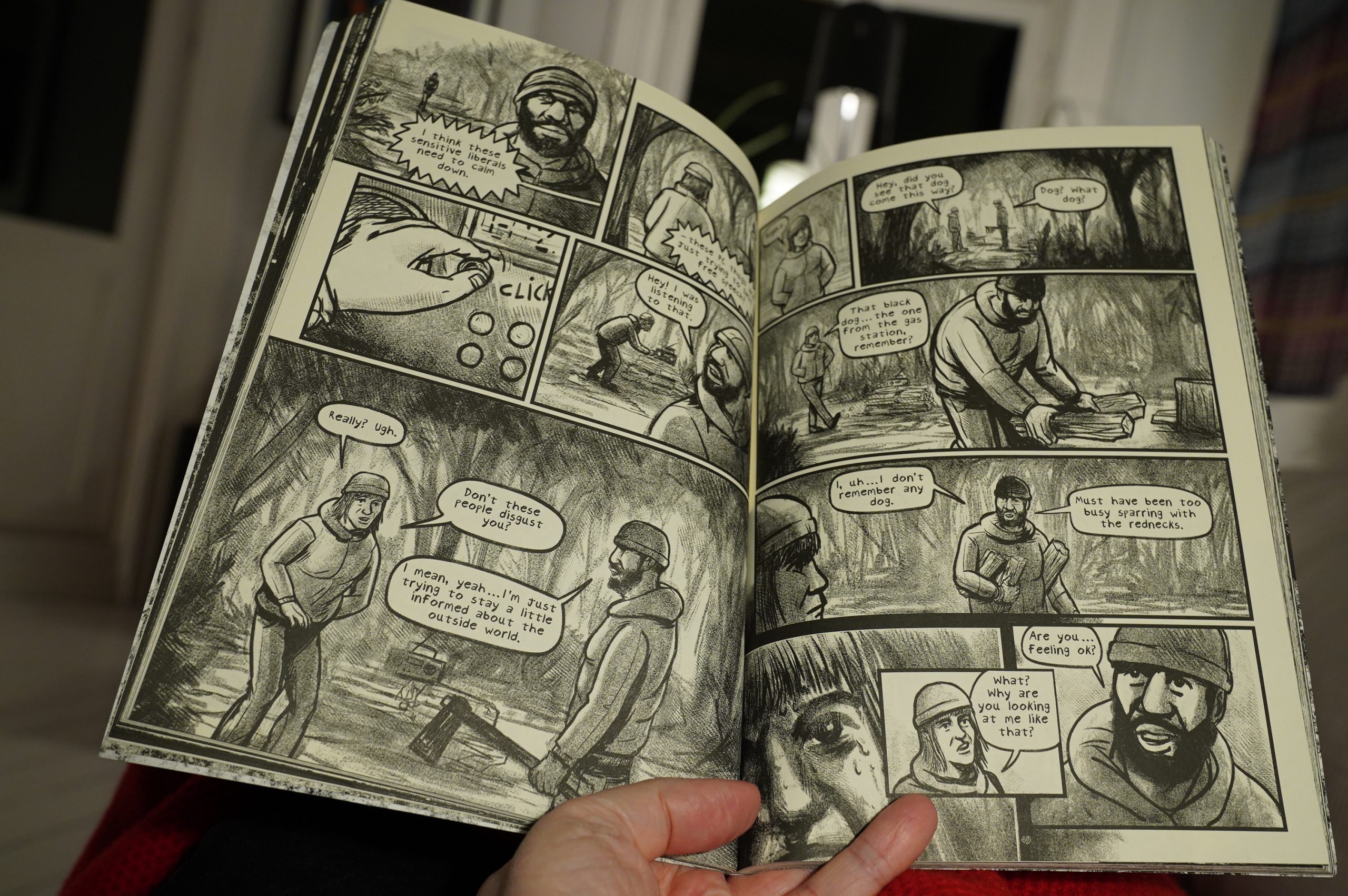
… “is she insane or is the horror real?”, and at that point it all just got rather boring.
And that ending… I hope twitter didn’t see this.
| Machinedrum: Vapor City Archives |  |
21:38: I think it’s time to go to sleep. I got up early.
But that was a solid batch of comics. The Pisket was outstanding, of course, but I think there was just one real clunker?