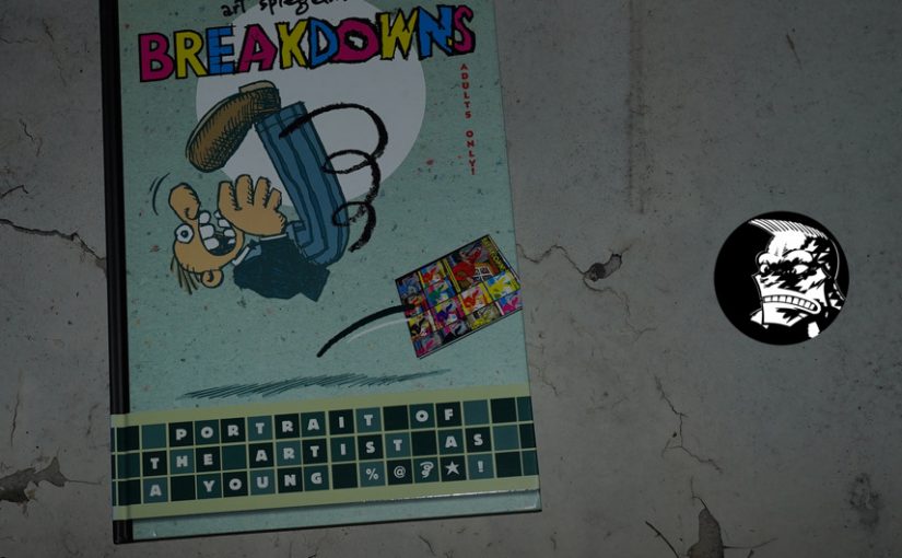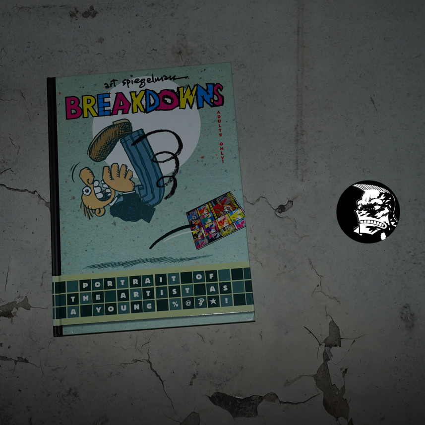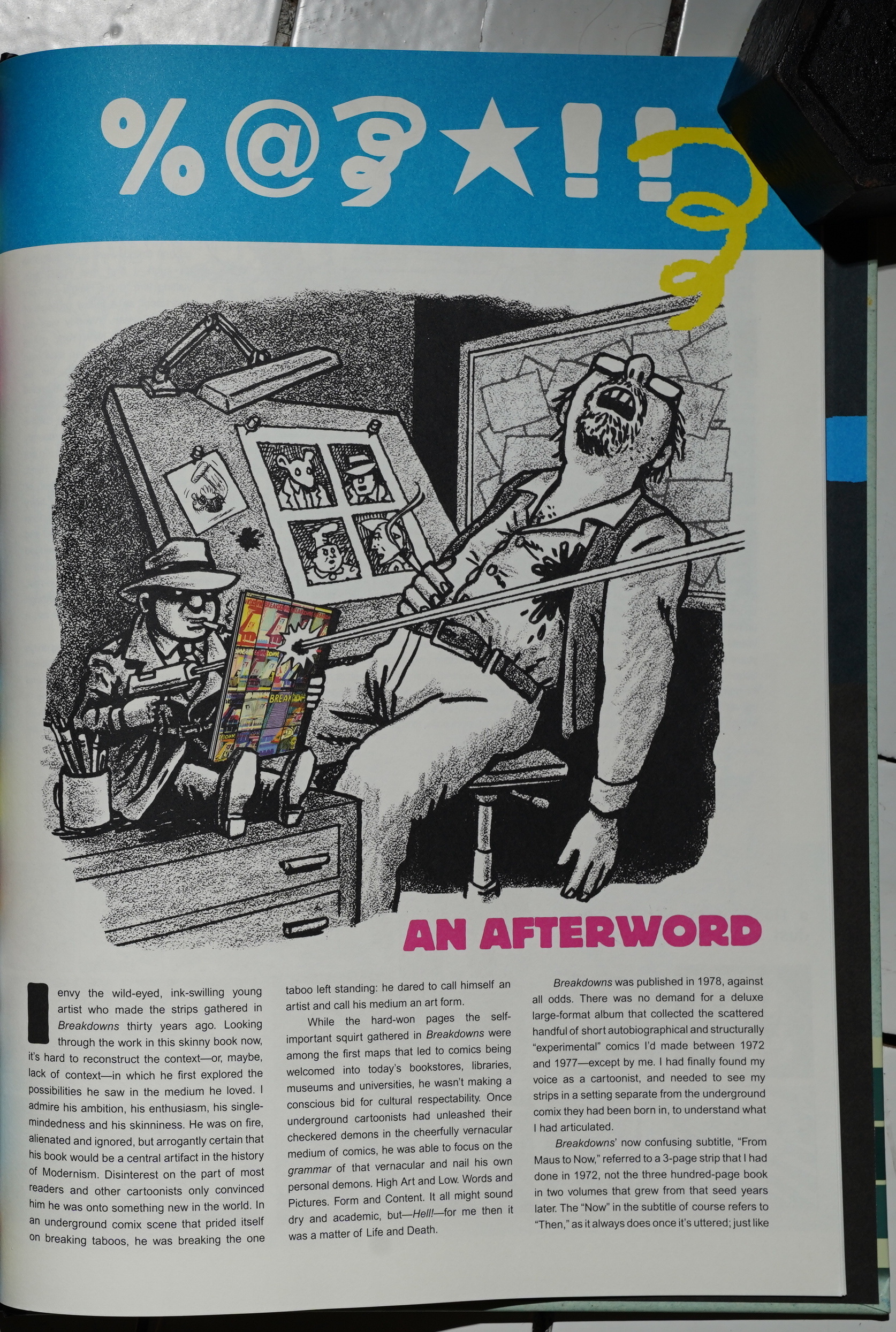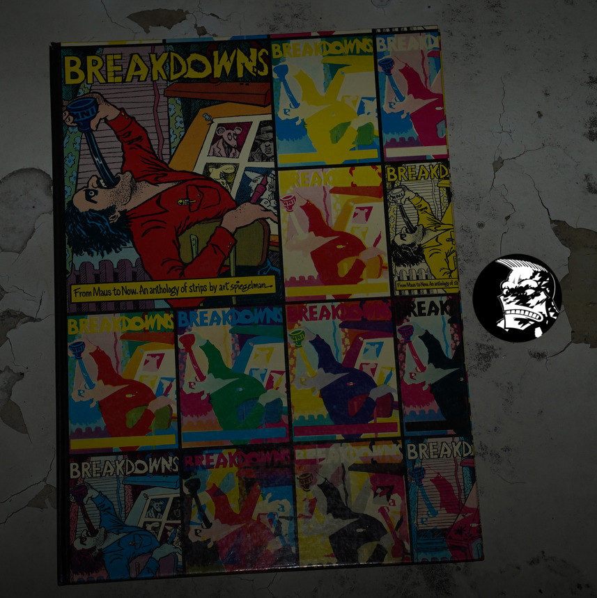
Breakdowns: From Maus to Now by Art Spiegelman (260x360mm)
I got this just a week ago, and I’m really excited to be fondling it now. I mean reading it! Reading it!

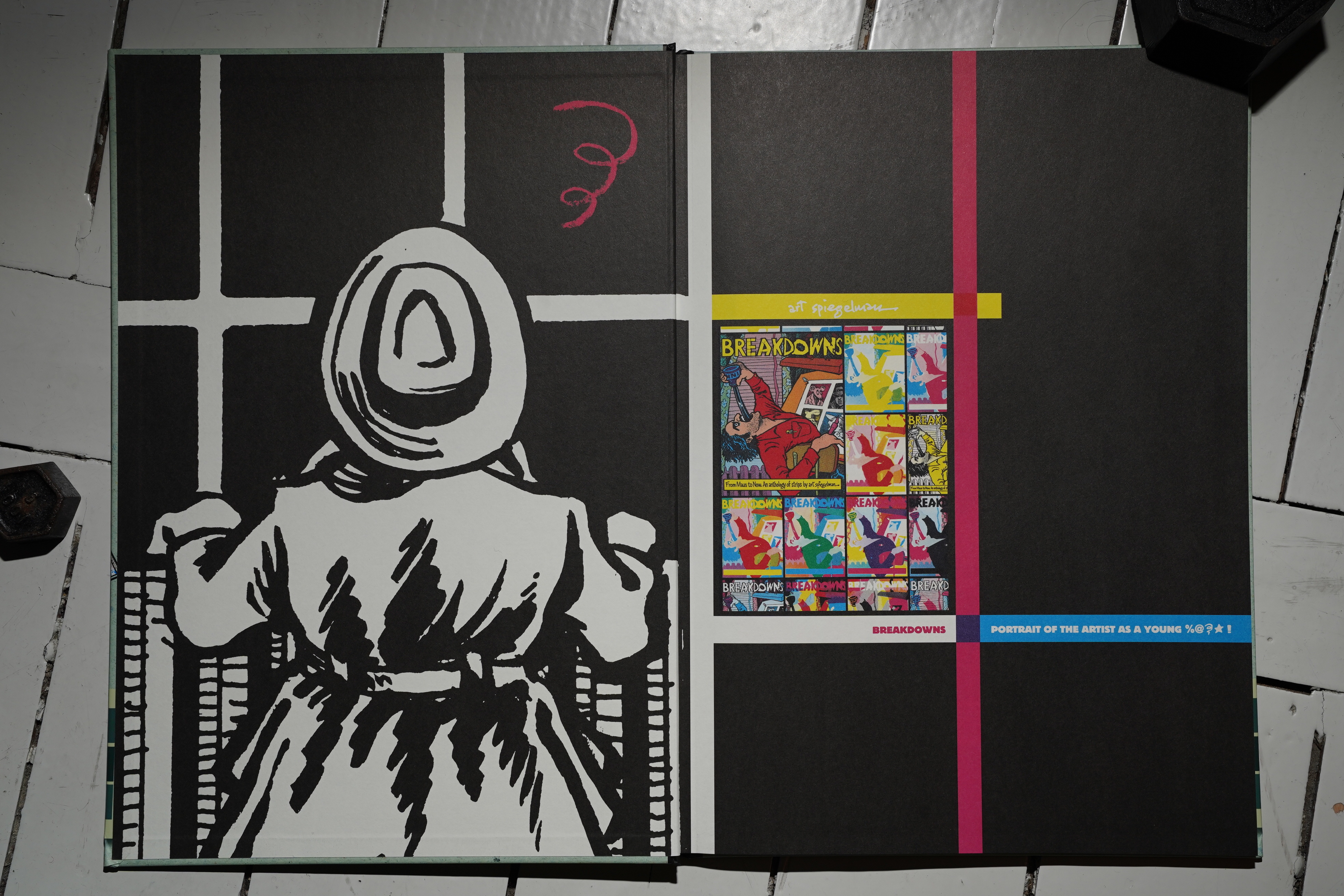
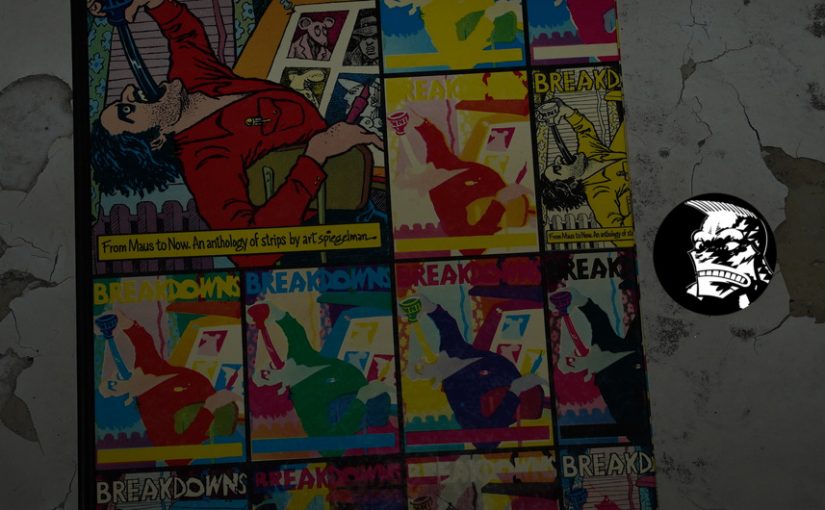
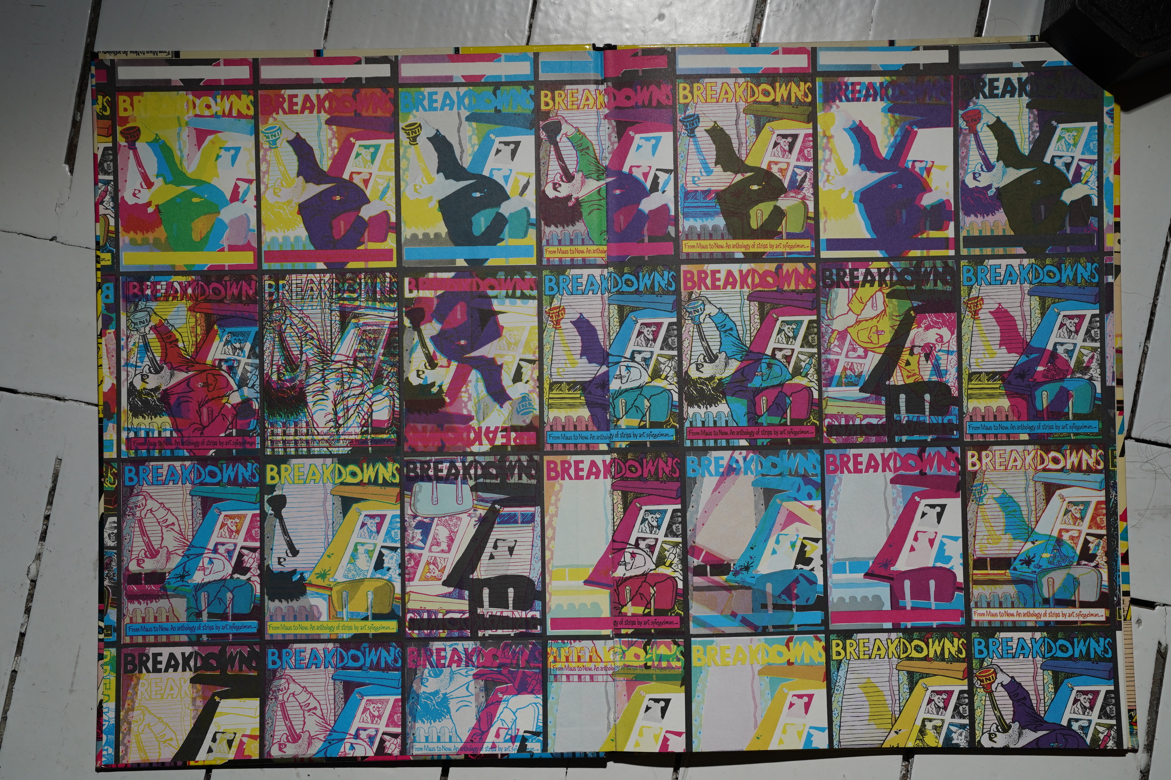
Wow, the colour separation thing continues over the front endpapers, too… must have been so much work to do.
Anyway, this is a collection of Spiegelman work from the early to mid 70s… most originally appeared in Arcade, I guess? But in a smaller format — this is basically in the Raw format, but with hardback covers and a spine. Must have been very expensive to do, and I wonder how Spiegelman convinced a publisher to do it.
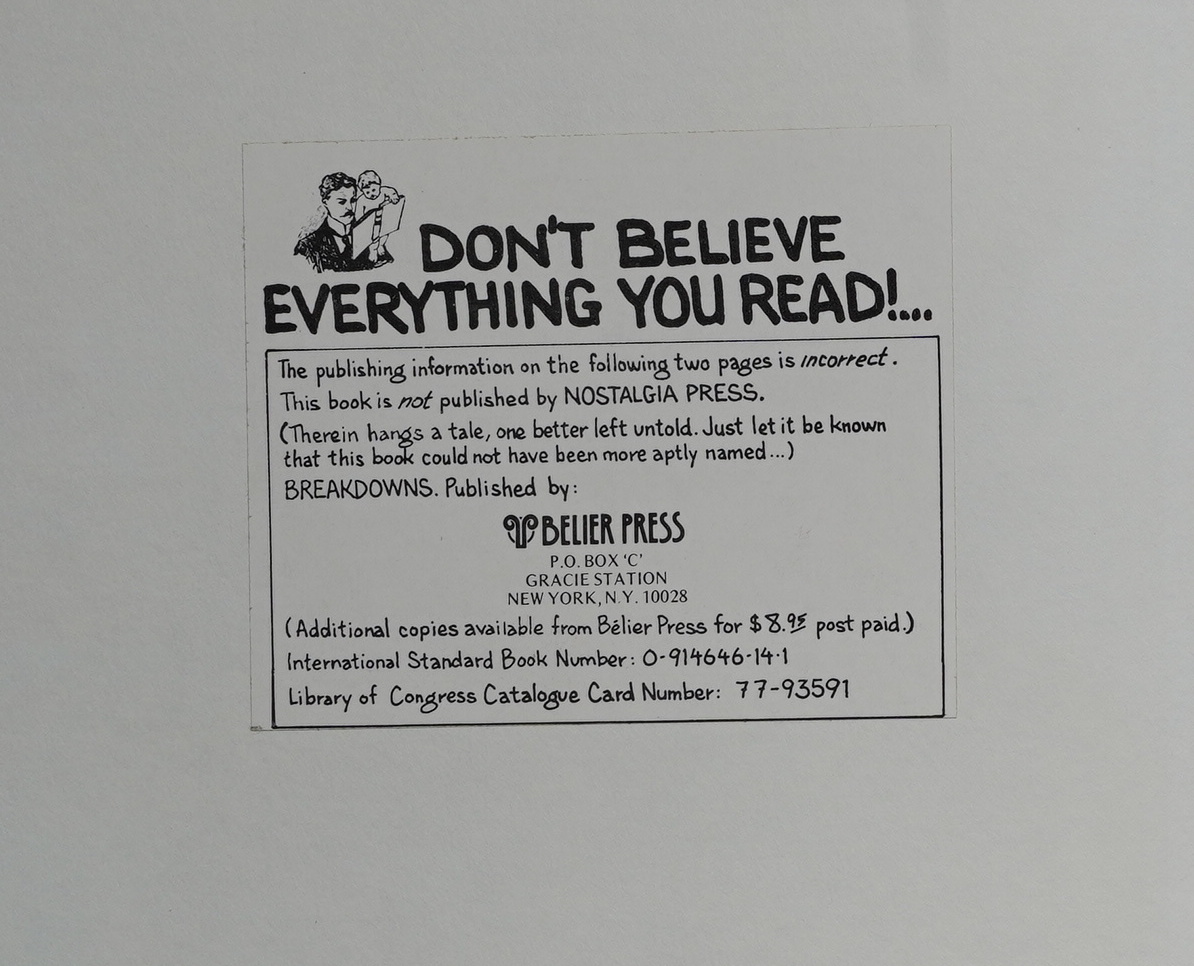
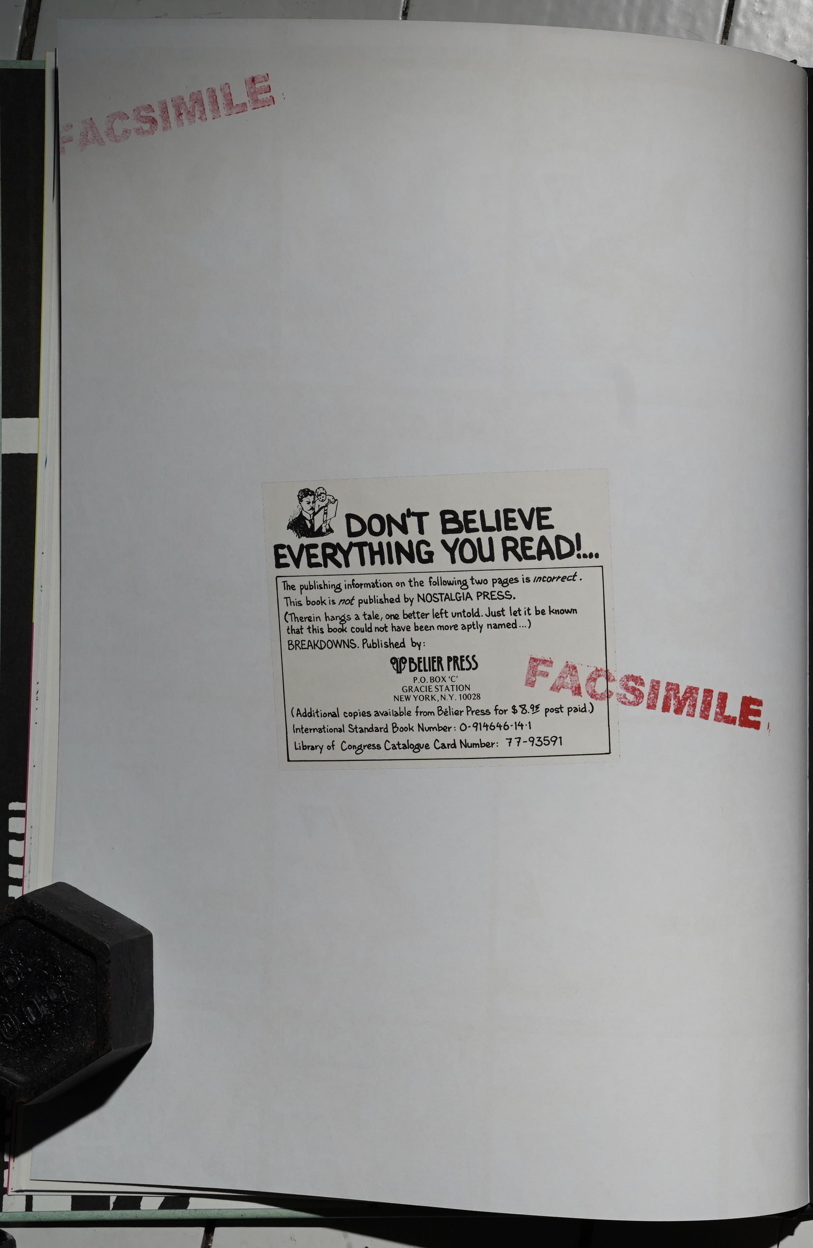
Or… two publishers? There’s a sticker on the pre-colophon page saying that this was supposed to be published by Nostalgia Press, but that they… er… flaked? So it’s published by Belier Press instead.
Hm… Heh:

That’s a good motto!
It’s hard to say whether they still exist based on the web page: They list two books, and they’re both porn? I mean art! I mean erotica!
Nostalgia Press is mostly known for publishing comic strip reprints in the 70s (Prince Valiant, etc). I haven’t seen those books myself, but I think they were also pretty big? Perhaps the same format as this book?
Perhaps this explains why Nostalgia dumped it?
Nostalgia Press continued publishing throughout the 1970s. Their last book came out in 1979, following the death of Gelman the preceding year.
It’s way off that publisher’s remit to publish something as arty as this (and there’s sex in it, too)…
(This mysterious mystery is cleared up in tomorrow’s post.)
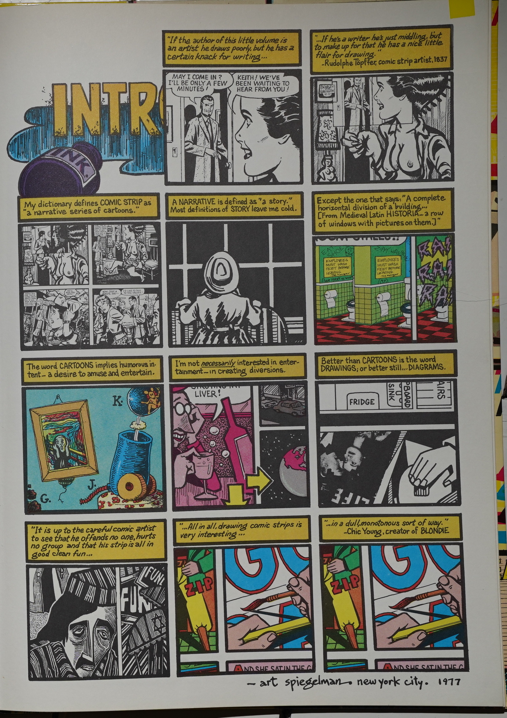
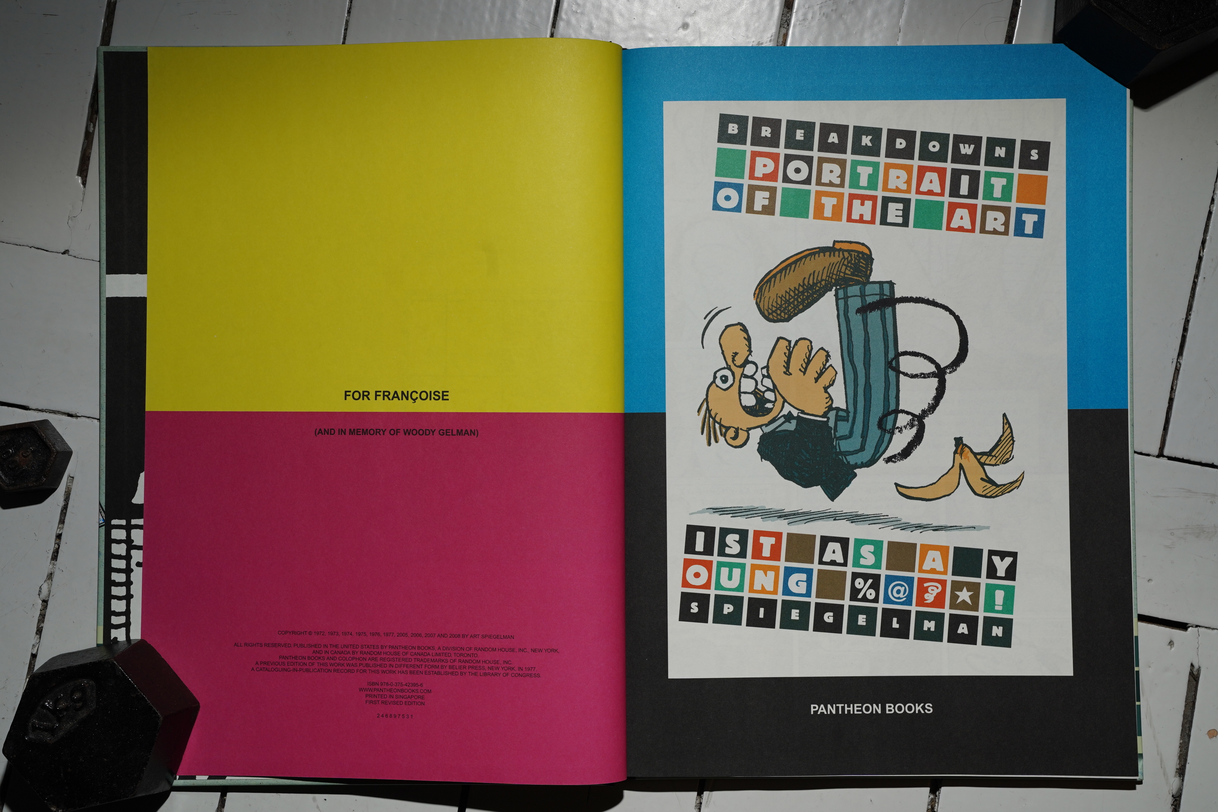
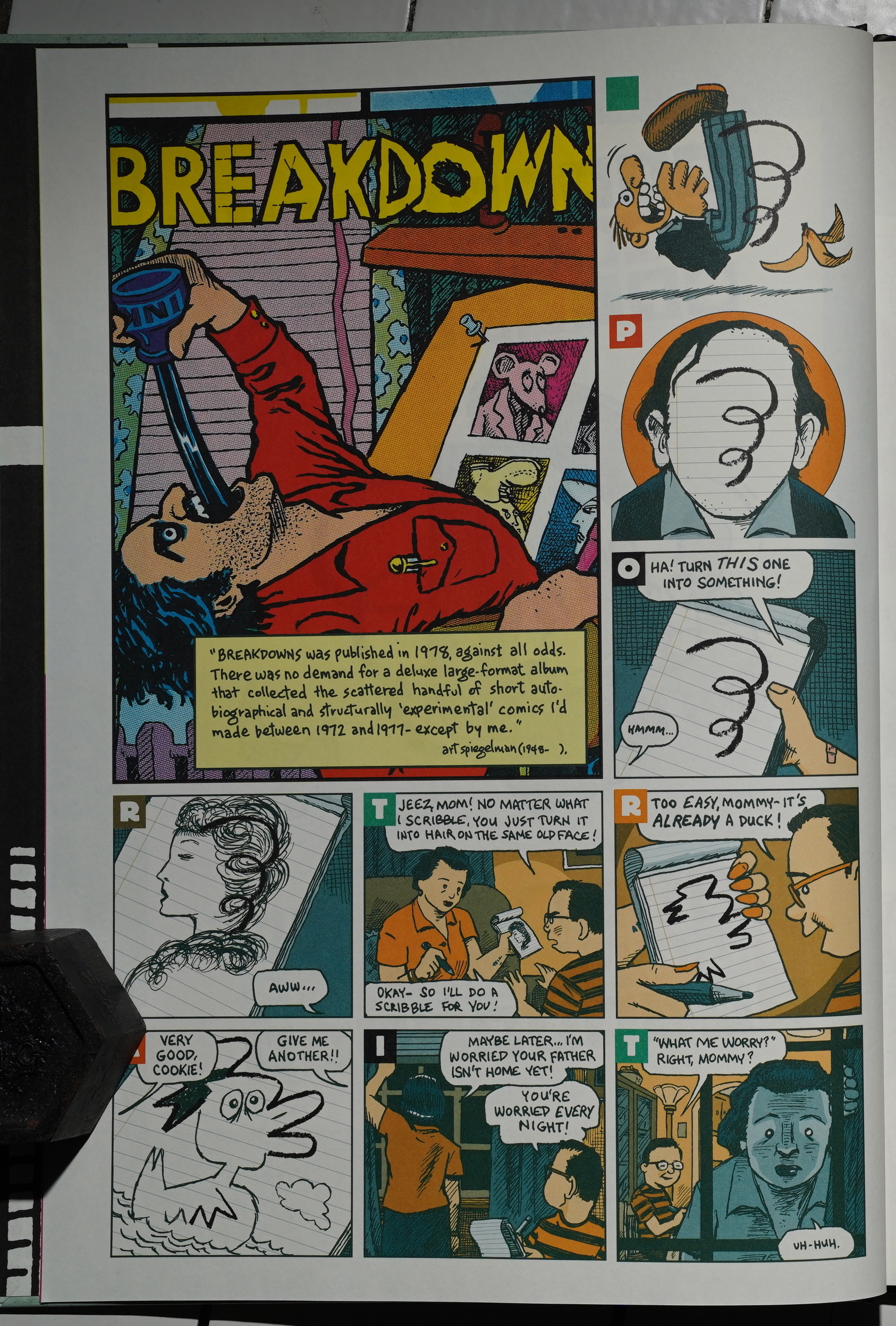
We get an introduction that’s composed of excerpts from the strips… and some wise words from the creator of Blondie.
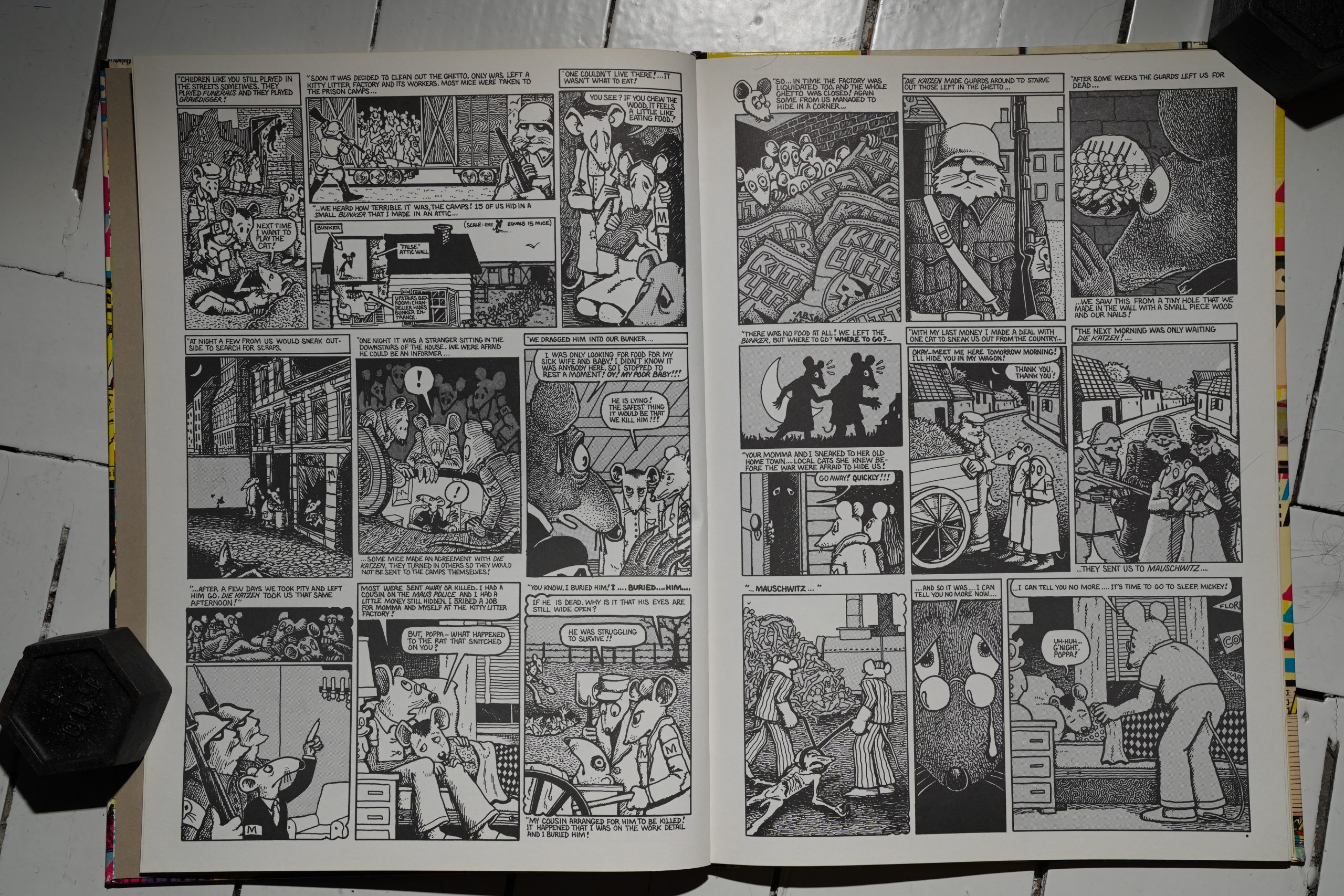
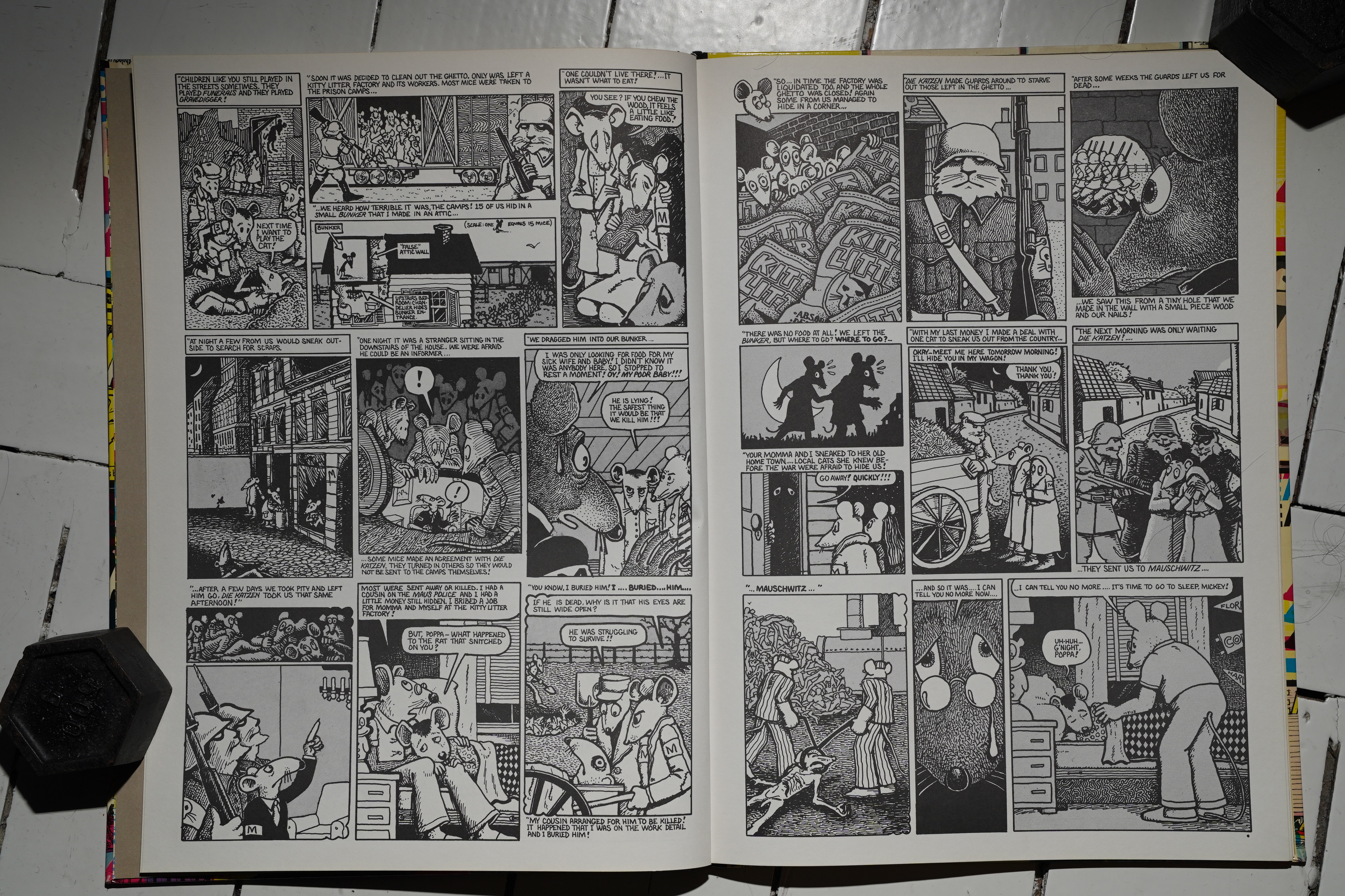
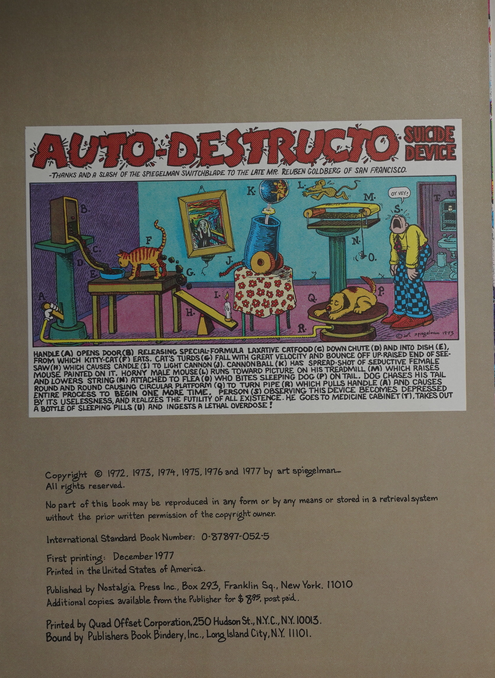
And then we’re straight off into two pretty heavy pieces: Spiegelman’s first attempt at doing Maus, and fortunately he didn’t continue doing it this way — with the mice working in kitty litter factories and… this level of cutesy is pretty hard to take. But perhaps Spiegelman still hadn’t decided to redo the strip at this point? The subtitle is “From Maus to Now”…
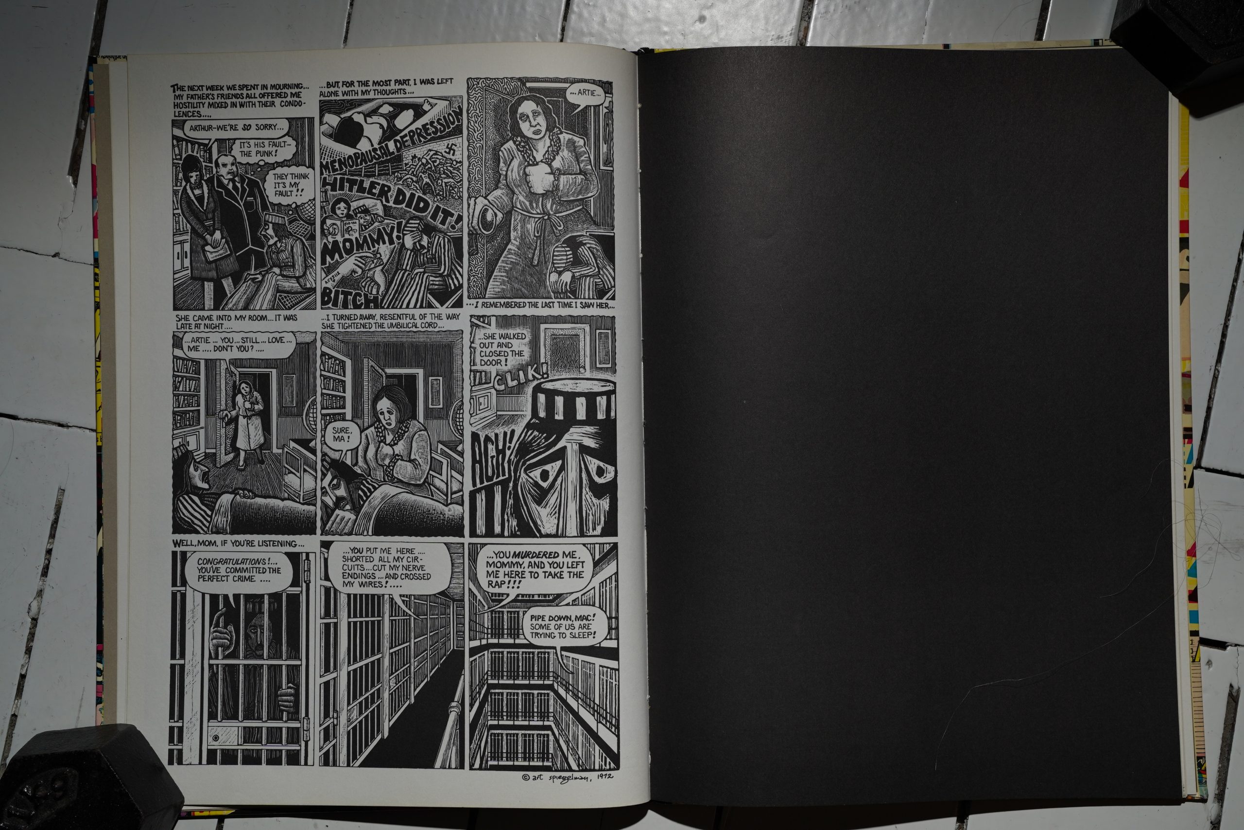
Then Prisoner on the Hell Planet, which I remember reading as a teenager and being utterly gripped by. I’m… a bit more critical now? It’s a howl that hasn’t quite been digested yet, and comes off pretty callous.
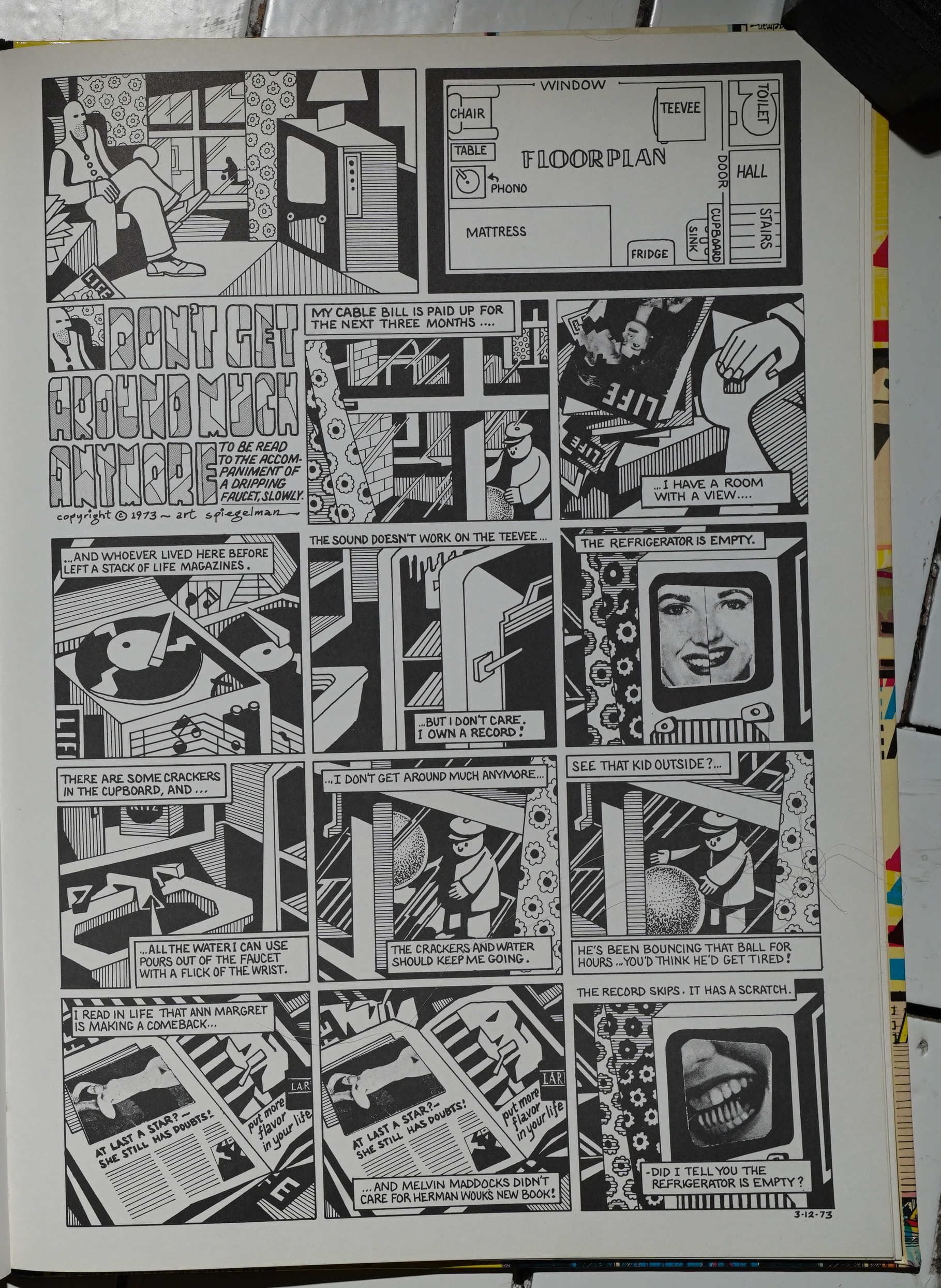
Most of the rest of the book is taken up by these formal exercises… that are just amazeballs. I guess they could come off as cold, but to me they’re just bristling with emotion.
And pretty funny, too.
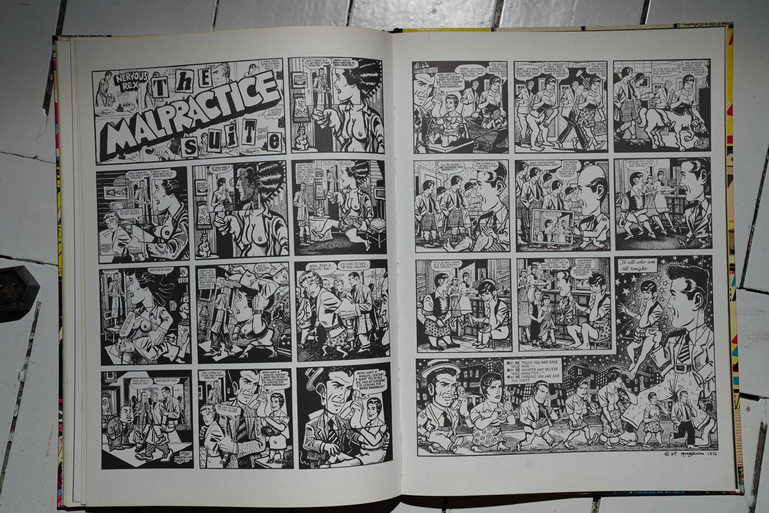
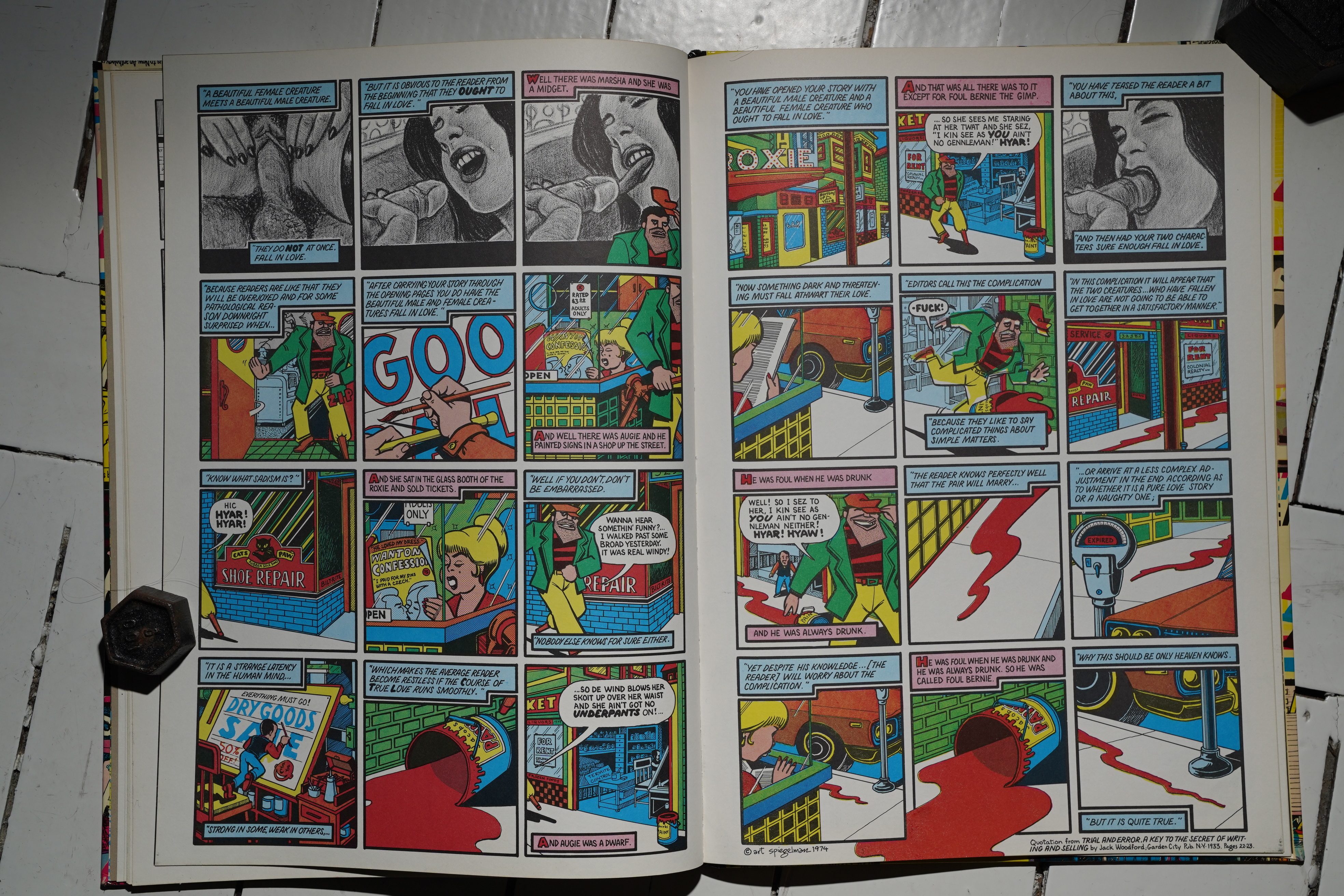
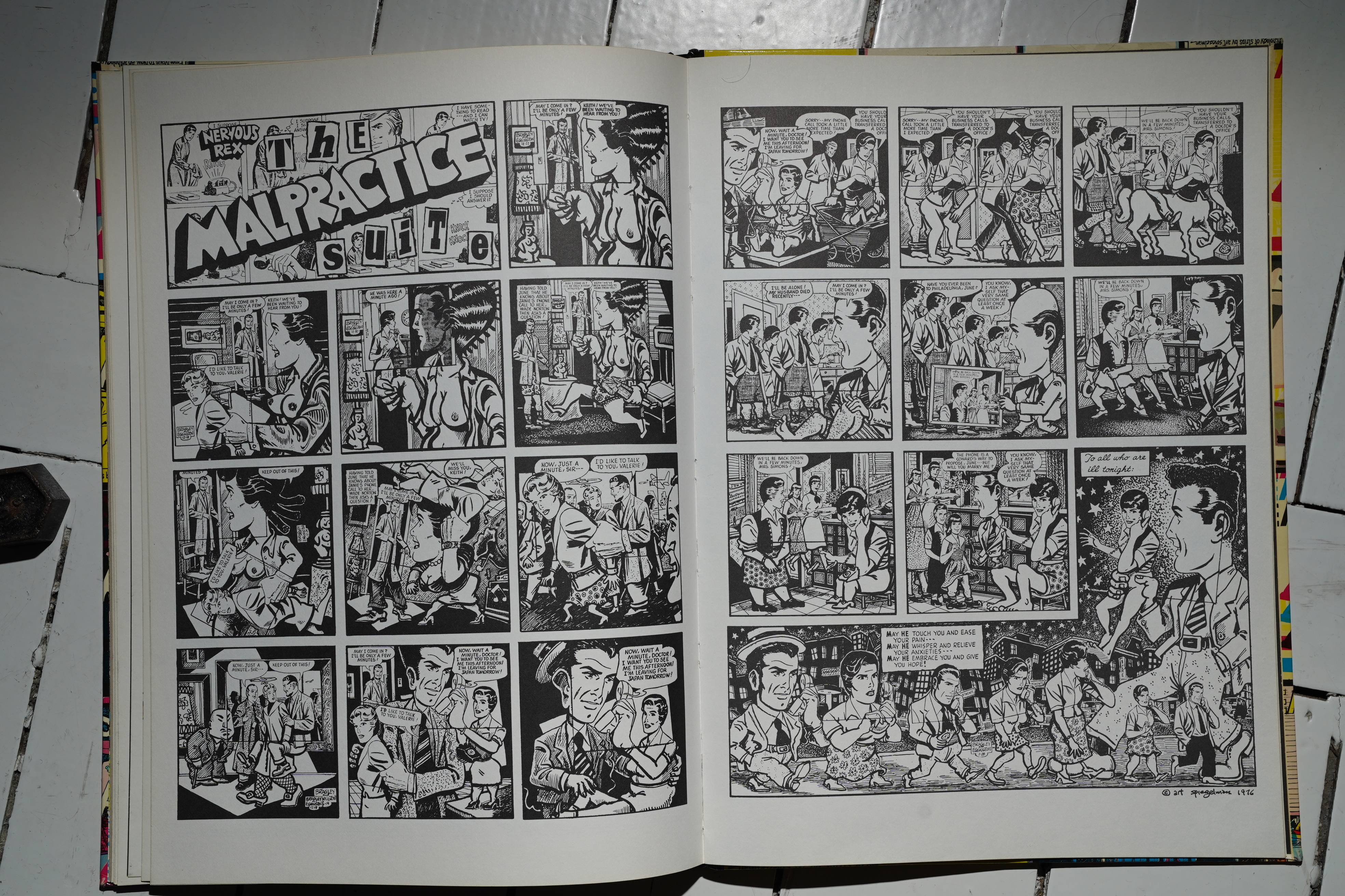
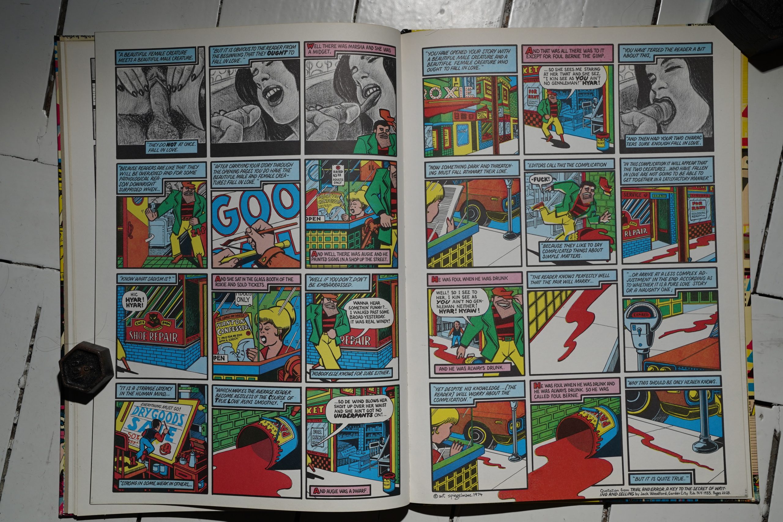
Oh! The Malpractice Suite! I think this was the one that blew everybody’s minds, and you can totally keep looking at this for… well, OK, not hours, but for a long time, finding new, funny bits in here. The expansion of a Rex Morgan, MD strip into… all this… It’s fantastic.
I can’t imagine what it must have felt like to stumble across this book in 1977, but reading it now, it’s absolutely thrilling. It’s not just the contents — but somehow the format just feels so right… as if they’re getting away with something somehow. I can’t really explain it: It’s a slim, large hardcover book… it feels like an object out of time.
John Benson writes in The Comics Journal #40, page 36:
Breakdowns is a very exciting and’ substantial
book of comic art; it is an anthology of Art
Spegelman’s work which, with little fanfare, has
just been brought out by Belier press, publisher
of last year’s Robert Crumb anthology, Carload
O’ Comics. Breakdowns contains 15 comics
pieces, all of Spiegelman’s major stories since
1972, including ‘iMaus,” “Prisoner on the Hell
Planet,” “Little Signs of Passion,” and “Ace
Hole.” The book has new covers and a special
introduction by Spiegelman.
Like the Crumb book, it is beautifully printed
on fine stock, but unlike that book, Breakdowns
is a 10 x 14 inch hardbound with a laminated
color cover. All the stories that originally ap-
peared in color are also reproduced in color in
this volume. Spiegelman’s art really demands
this larger page size. He rarely has less than ten
panels to a page, and often as many as 14 or 15;
when reduced to comic book size on newsprint
his work sometimes looked squeezed and
cluttered. In this respect the book is almost a new
work.
At some future time it may well become ap-
parent that Art Spiegelman is perhaps the most
innovative talent of the comics form in this
decade. If this isn’t generally recognized now,
it’s due to several factors.
Basically, Spiegelman’s work isn’t action
oriented. Most comics, good, bad and in-
different, are, and therefore so is the comics
audience. His work appears in underground
comics, popularly thought of as being a
respository for sex and violence, and what little
of these aspects his work has is not in the
slightest way titillating.
Spiegelman works very slowly, planning each
story carefully, and consequently has produced a
relatively small body of work, which tends to
become lost in the voluminous work of other
underground artists. While the time he spent co-
editing Arcade for the last two years was ex-
tremely important in helping to bring into focus
a whole new school of comic art. it also reduced
the amount of time he had available to create
strips.
A final factor contributing to Spiegelman’s
relatively unknown status is that he hasn’t
particularly sought fame or advertised himself.
Two of his watershed stories, “Hell Planet” and
“Ace Hole,” were buried in the back of two
issues of Short Order Comics, for example. He
rarely does covers, and has never appeared in a
comic or magazine where he was the major
contributor. One of Spiegelman’s concerns as an
artist is discovery; discovering relationships in
seemingly unrelated aspects of life and art.
Perhaps he has by design or acquiescence let the
discovery of his stories themselves be part of the
discoveries a reader can find within the stories.
I hope that Breakdowns will bring an end to
Spiegelman’s relative obscurity. Here are all his
great stories with an arresting cover in one
overwhelming package that just can’ t be ignored.
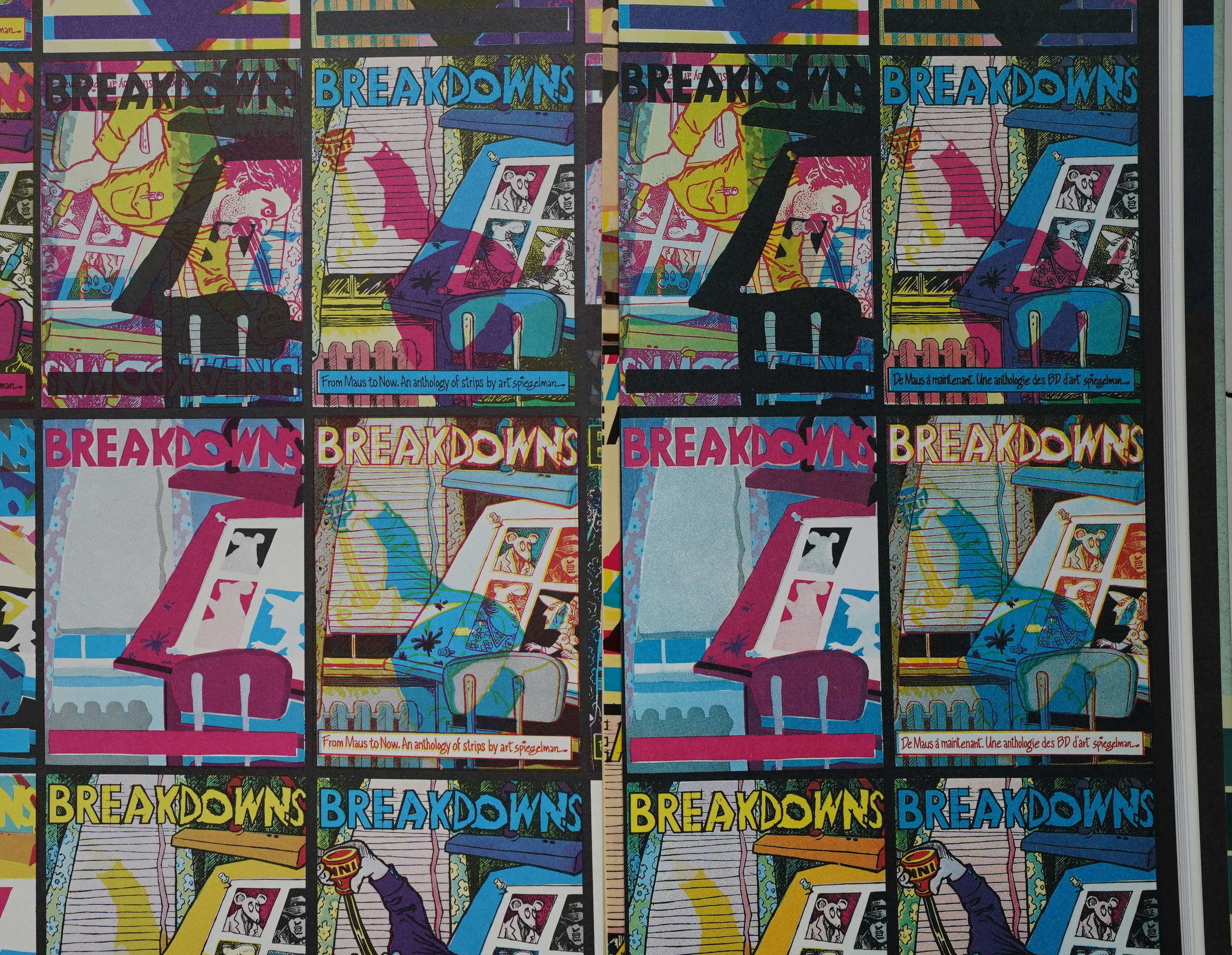
The new material in the book deserves special
comment. For the cover, Spiegelman has taken
his basic cover illustration, a scene of himself at
the drawing board madly drinking ink, and
repeated it With endless variations, switching the
color in the mechanical separations, positioning
them upside-down, reversing or dropping them
out, making hundreds of obvious and subtle
changes, causing a garish nightmare of apparent
printing errors. The effect is stunning and
illustrates at a glance the dual meaning inherent
in the title; to break down into component parts
as in a comic book breakdown, and to have a
nervous breakdown.
So Spiegelman has created an attractive. well
designed and expressive cover. This could have
been achieved with one tenth the number of
variations, but Spiegelman spent literally an
entire .summer painstakingly !orming this in-
tricate mosaic,” spilling the variations over into
the inside front cover endpapers. Why?
I’m not sure I can provide a simple or com-
plete answer—but somewhere in the answer lies
an important key to Spiegelman’s art. Anyone
who sits down with the book is bound to notice
soon enough that each repetition of the cover
image appears to be different. After awhile it’s
impossible not to begin studying and comparing,
and soon certain relationships, sequences and
atterns to the variations begin to emerge.
ometimes it takes a bit of concentration to see
just what the variations are and how they’re
formed. It eventually becomes difficult not to
become engrossed, to get further and further into
the subtleties of the differences perhaps the cover
prepares you in this way for the book as a whole.
Spiegelman’s one page introduction to the
book is an even better example of his work. It
takes but a moment to read, if a moment is what
you want to spend. And you can quite well
understand what he’s trying to get across in that
moment; Spiegelman never tries to be obscure or
set up roadblocks.
The a grid of equal sized
panels, each combining an epigrammatic caption
with a pictorial detail from one of the stories in
the book. The first and last captions are
quotations from Rudolphe Topffer and Chic
Young, two comics artists who are a hundred
years apart in time and temperament, very brief
quotes that nevertheless capture the essence of
how those artists looked at their art. The concise
meaty quotation is a Spiegelman specialty.
Nearly every one of his stories contains some
quotations, and he’s co-edited a book of
quotations, Whole Grains. A good quotation,
like a good Spiegelman Story, implies a world
more than it states.
The captions in between the quotes of the
other two artists laconically define in his own
words Spiegelman’s approach to his own art. He
plainly states what he’s not doing; he’s not just
creating diversions to amuse and entertain. He
doesn’t state explicitly what he is doing.
Paradoxically, if he did state it explicitly then he
would no longer be doing it. Instead, he
describes a little detective work he did with a
dictionary. He looked up “comic strip” and
found the definition • •a narrative series Of
cartoons.” He found “narrative” defined as
story, • • and under “story” he discovered the
definition “a complete horizontal division of a
building (from „Medieval Latin historia…a row
of windows with pictures on them.)”
This simple sequence Of etymological sleuthing
provides fresh connective associations that
enrich the words discussed. This is the business
of any writer worth his salt; Spiegelman attempts
the same type of discovery with his images.
Beyond that, Spiegelman’s comments are an
indirect invitation to the reader to enter into his
own investigation, to read Spiegelman’s stuff a
lot more slowly and carefully than most comic
art demands.
I really shouldn’t be quoting at this length, but this is a really insightful review. And… I can’t help finding it pretty amusing the way Benson says “he hasn’t particularly sought fame or advertised himself” — which is what Spiegelman would be viciously criticised for after Raw got going.
Maybe I’ve given the impression that
Breakdowns is coldly abstract or analytical. This
is certainly not the case atall. “Hell Planet,” a
story which more nearly achieves the potential of
the comics medium than any Other I can think of,
is a searing account of an autobiographical
experience with an almost shockin? emotional
intensity that recaps Allen Ginsberg s great play
Radish,
also about an emotional
autobiographical family experience. Like
Kadish, its revelation is unrelenting, and part Of
its power comes from one’s absolute conviction
that it is truthful in every detail.
The same conviction rings with Spiegelman’s
famous story “Maus,” which has often been
described as Jews and Nazis portrayed in funny-
animal terms. Actually, the Story is an
autobiographical recollection; “when I was .a
young mouse in Rego Park, New York, my
poppa used to tell me bedtime stories about life
in the old country during the war…”
• •Maus” originally appeared in a comic titled
Funny Aminals. so perhaps nobody thought
much about the story’s anthropomorphism. But
it’s important to the story, and it’s simple. Most
children hear Winnie the Pooh and such animal
stories at bedtime; Spiegelman heard another
type of tale, and he’s visualized it here in bedtime
story terms.
[…]
Despite Kurtzman’s constant use of new
subject matter and forms each issue was in-
stantly recognizable as his work. His very per-
sonal vision and writing style was like a skin that
could be stretched around any different shape of
subject.
In the same way, Spiegelman constantly
changes his approach, his subject matter, even
his concept of what a narrative is. Each job is a
tackling of something new, some kind of ex-
periment. Yet there is a unique overall style that
makes each story distinctly Spiegelman ‘s.
His range becomes that much more evident
when the stories are collected together in one
volume. Breakdowns really reveals a dimension
to Spiegelman’s Work that was perhaps not
obvious when the stories were published months
apart in different publications.
Perhaps the most important similarity between
Kurtzman and Spiegelman is that in their quite
different ways they constantly explore and
examine whatever subject they are writing about,
and attempt to communicate to their readers
their discoveries.
Spiegelman didn’t spell out his intent as an
artist in the introduction to Breakdowns, but
perhaps he was summing it up when he
responded to someone’s definition Of un-
derground comics on a panel at the 1975 New
York convention.
He said, “One thing that disturbs me about
the term underground comics is that I get lumped
together with artists who I have little in common
with, specifically the fantasy escape kind Of thing
that allows people to dream and fall asleep some
more. For me, when I use the word underground
comics mean work that will wake you up, work
that allows you to be able to see more, to become
more receptive, more alive.
This blog post is part of the Punk Comix series.