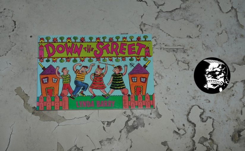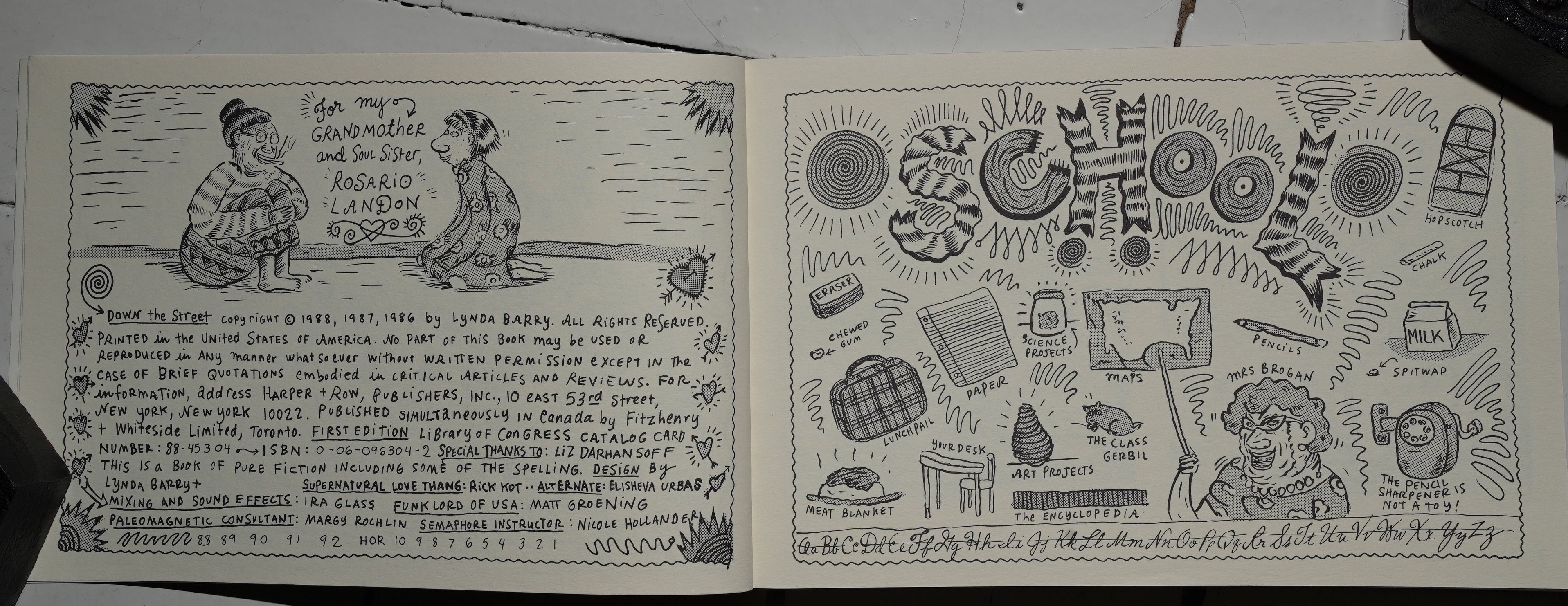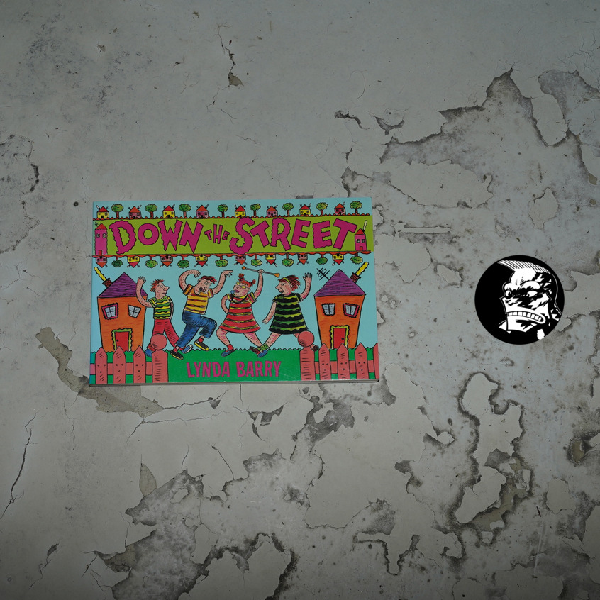
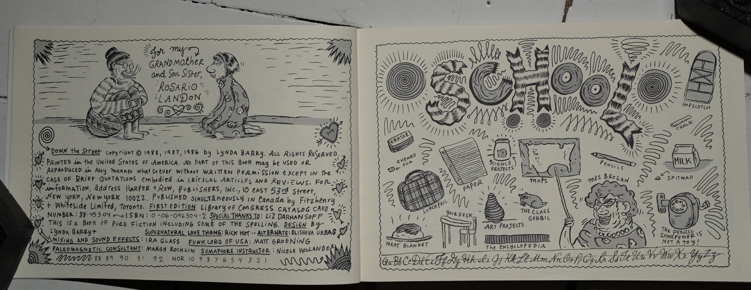
Down the Street by Lynda Barry (228x152mm)
In the previous Barry post in this blog series, I said that I was going to stop there — because Barry’s work has really moved away from the ostensible purported subject of the series. (And because I had nothing more to say than “mm-hm, look at that isn’t that nice”.)
But here’s the final final post about these Barry booklets.
In the previous book, two thirds of the strips were about the Arna/Marlys/Arnold characters, and with this book, the transformation of Ernie Pook’s Comeek is complete — it’s now all about them. (At least as far as what’s being reprinted goes — I have this sneaking suspicion that Barry’s not including all of her weekly strips in the collections.)
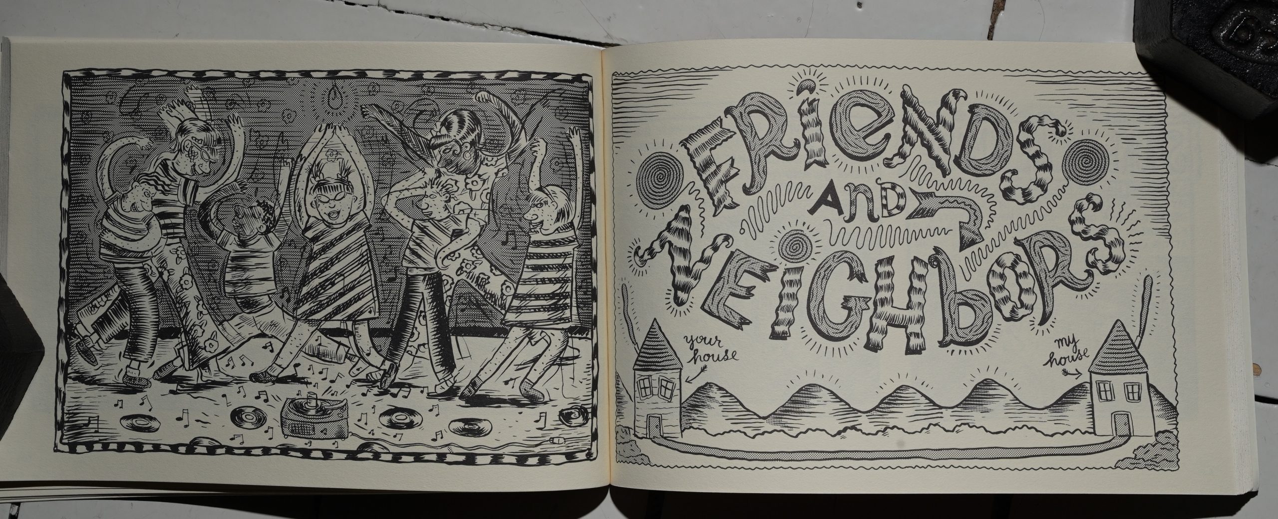
This one is still separated into themes, like “School”, but it seems pretty perfunctory now that it’s all about the same characters.
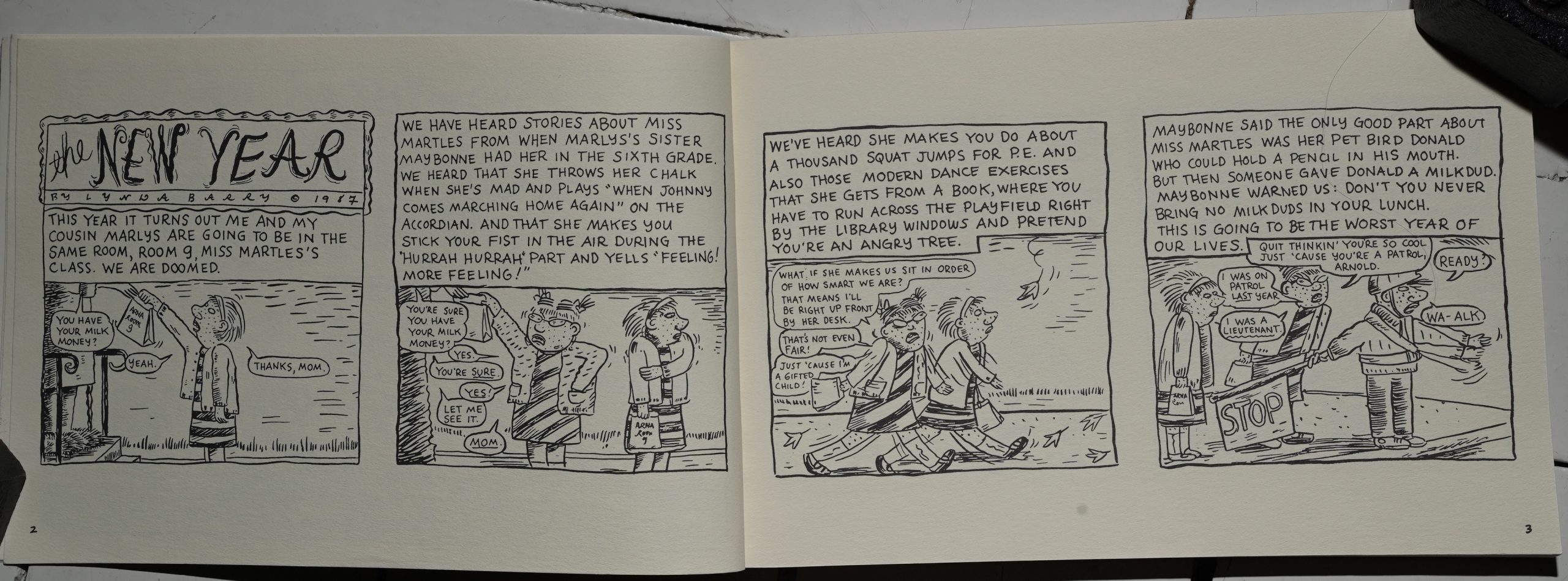
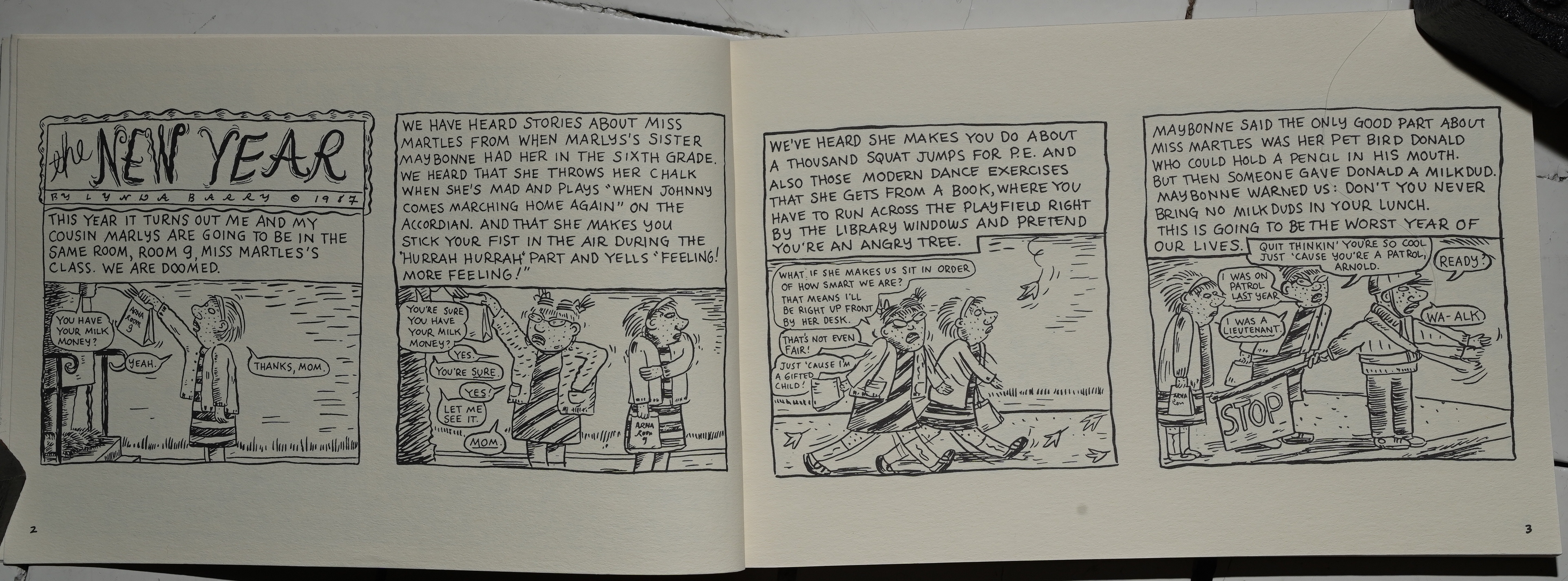
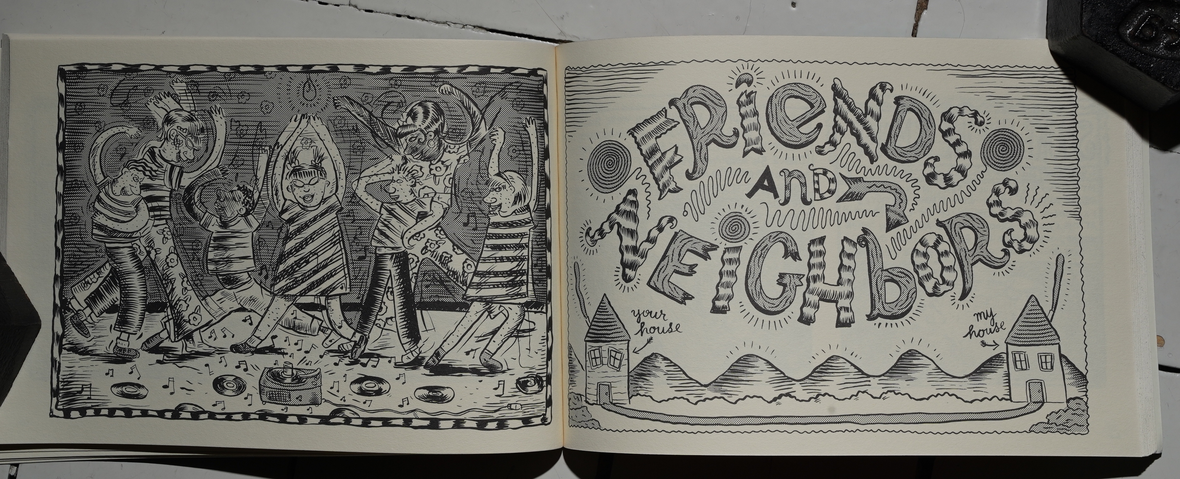
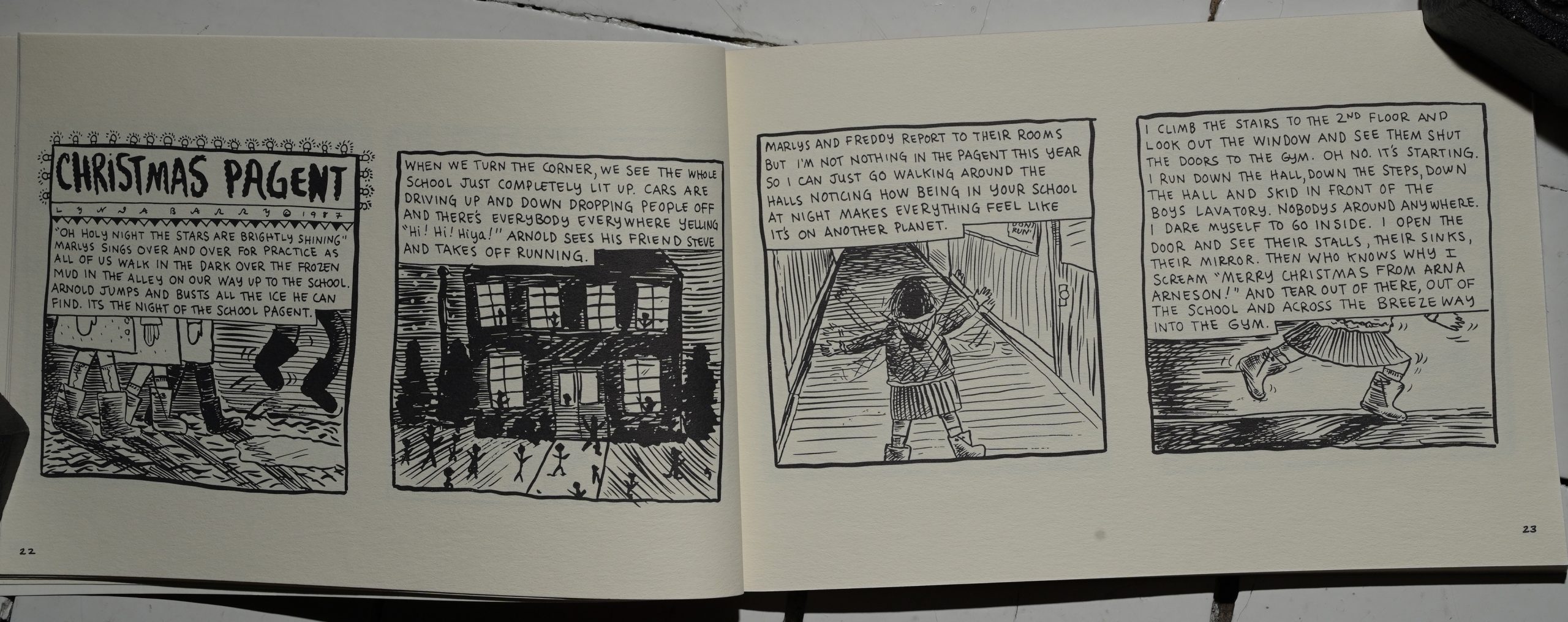
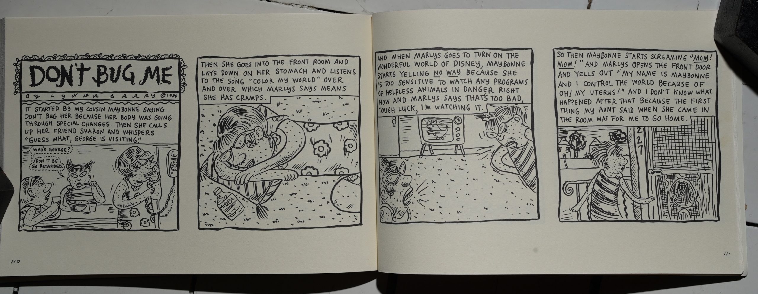
That’s a nice strip to get the book started — framing it all.
It’s true! I love how Barry’s not mellowing out Marlys (yet) — there’s a general tendency people have to make all characters more sympathetic and samey, and while Marlys does get more relatable, she’s still crotchety and unreasonable.
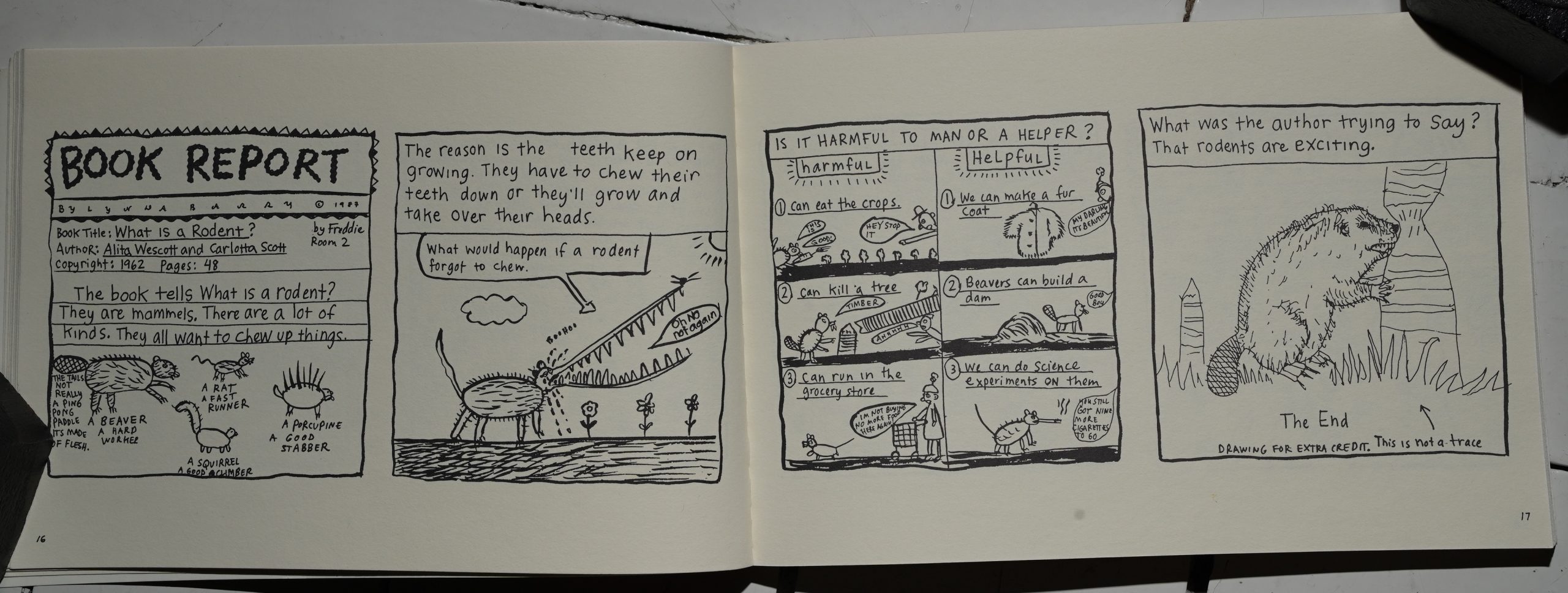
I love that drawing of the beaver. Very punk.
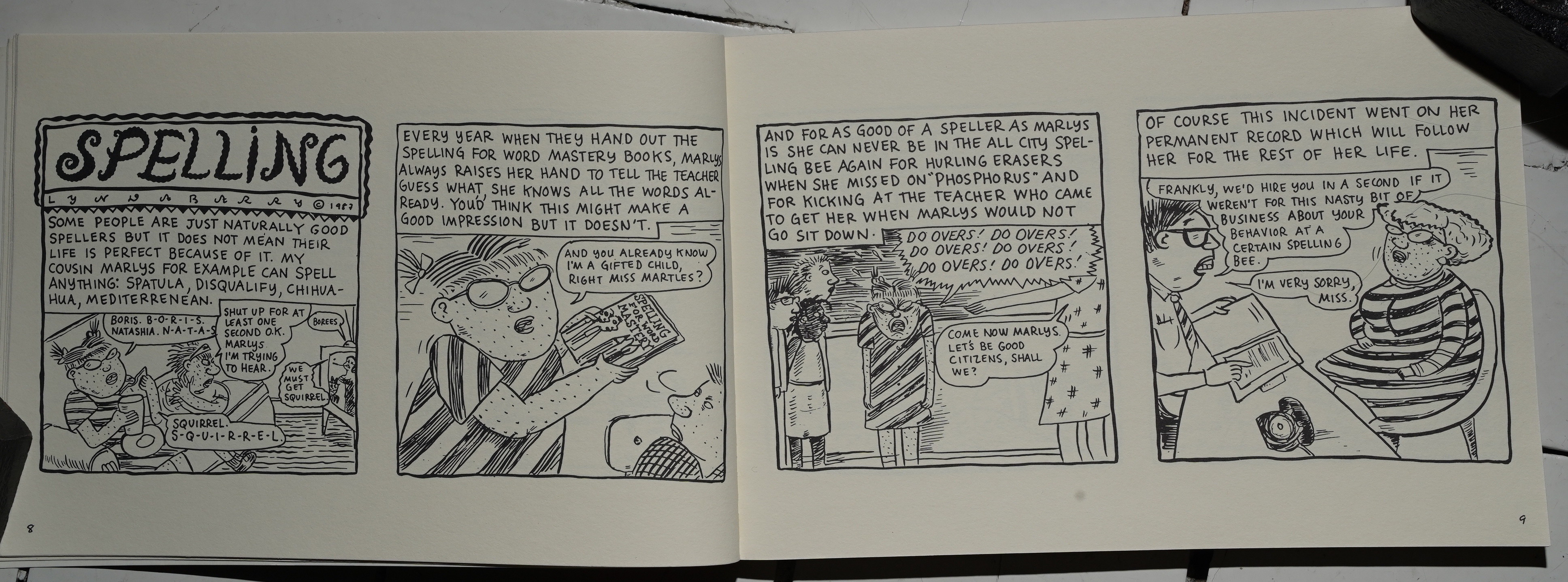
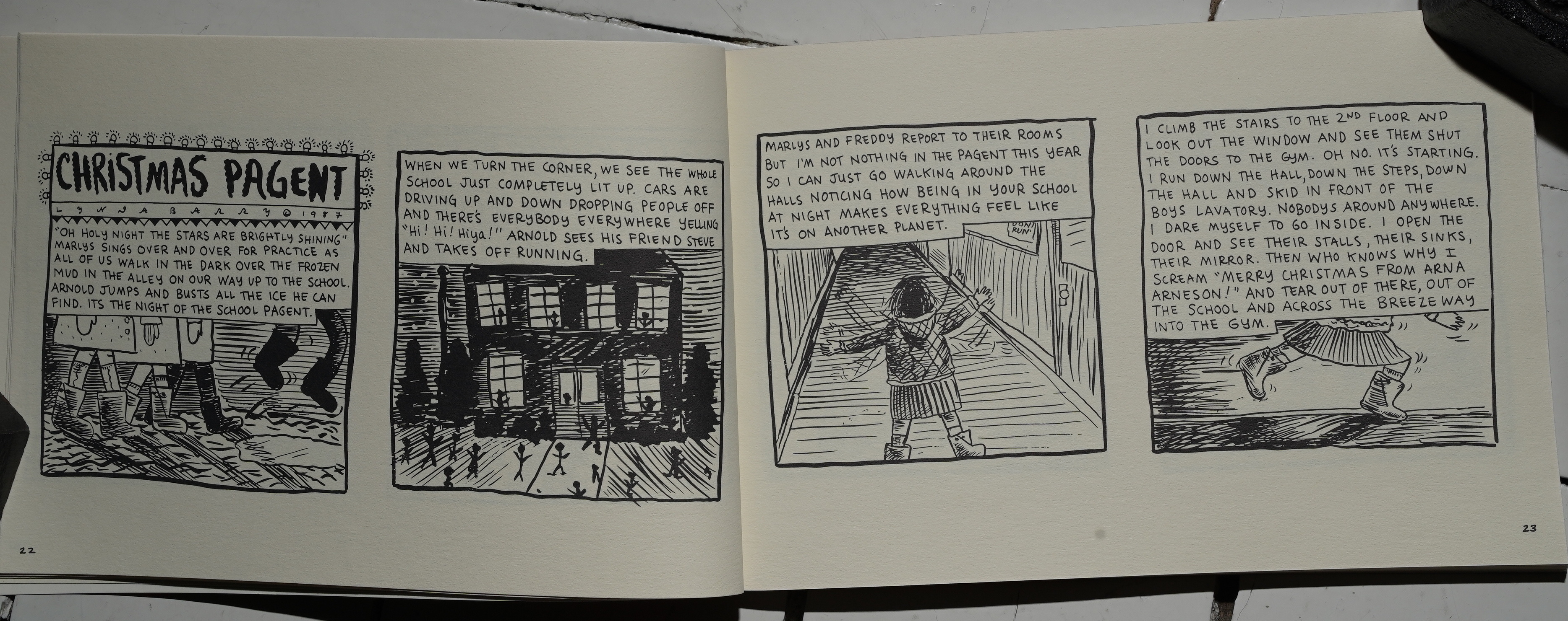
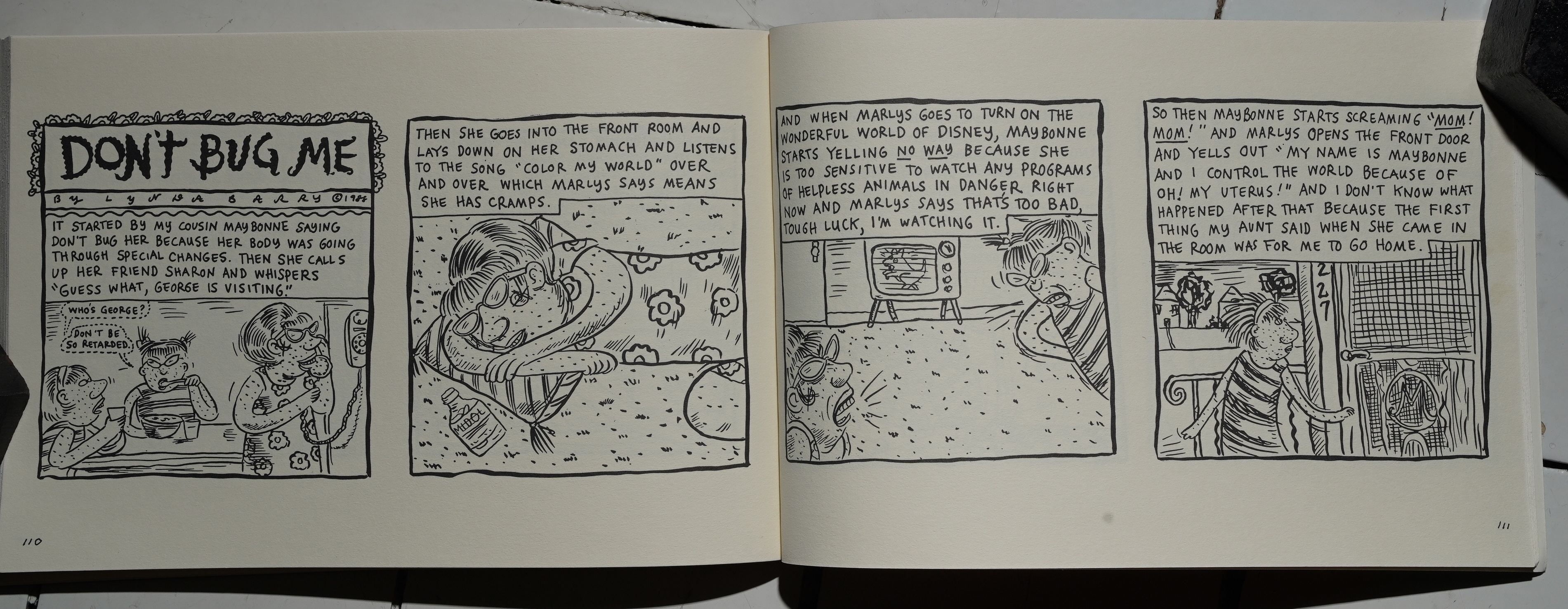
All the strips in this collection are four panels. Barry had previously mixed it up with six or even eight panels — but having each spread be a single strip is a very comfortable way to read this book.
The tone throughout the book is very consistent — a kind of wistful thing. Not nostalgic, but a feeling of mundane magic; of meaning in these things we’re remembering from our childhood.
The most interesting scene in Funny Ladies was when we got to watch Barry draw. She just does it straight in ink with a brush, which just seems awesome to me.
Here it’s downright lush.
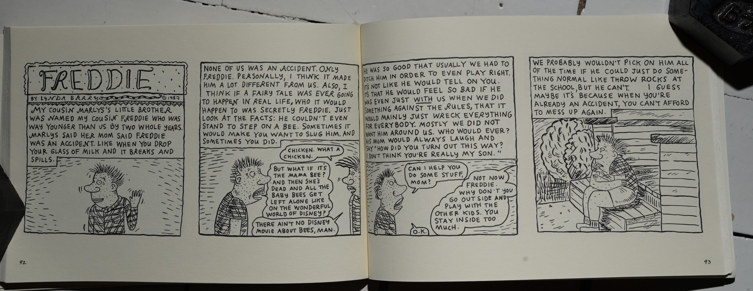
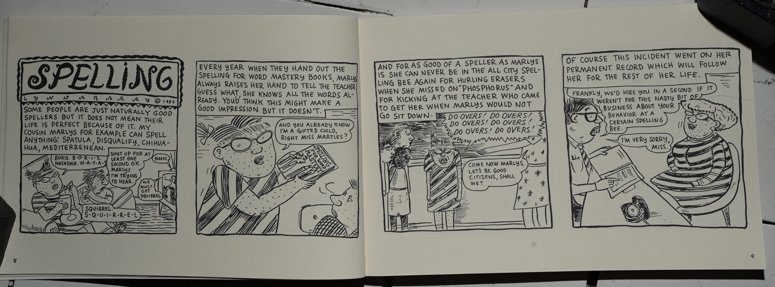
We get another recurring character — Marlys now has a brother called Freddie, who’s more sensitive than the rest.
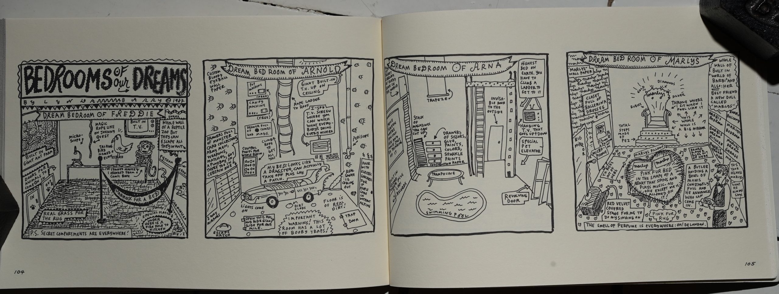
I totally wanted to have a lawn in my room when I was a child, too. I mean, not actually for real, but I remember thinking about how awesome that would be if it was possible.
And finally, Marlys gets an older sister — Maybonne — and the cast is complete.
Rob Rodi writes in The Comics Journal #127, page 54:
The last time I wrote about Lynda
Barry’s work (in Journal #114), I con-
eluded that “if there’s a last word on
childhood, it belongs to Lynda Barry.”
Since that time, the cartoonist has
released two collections of her strips
on childhckxi and its attendant joys and
traumas, the latest of which, Ihwn the
Street, has just been published. The
focus is almost exclusively on her
familiar group of characters: her alter
ego Arna Arneson, Arna’s brother Ar-
nold, and their cousins Marlys and
Freddie. As the minutiae Of their ju-
venile lives unfolds before us, Down
the Street takes on the rhythm (if not
the structure) of a novel. It reads less
like a collection of strips and more
like a sustained comics narrative; it’s
a completely-realized work of art.
Barry is at the height of her powers,
at her most potent and her most
poetic, and she only seems to be get-
ting better.
Indeed.
This blog post is part of the Punk Comix series.


+(Mixed+by+Terry+Francis))

)
%3A+Ouvrez+Le+Chien+(live+Dallas+'95))


)
)

)
)


%3A+Ikue+Mori)