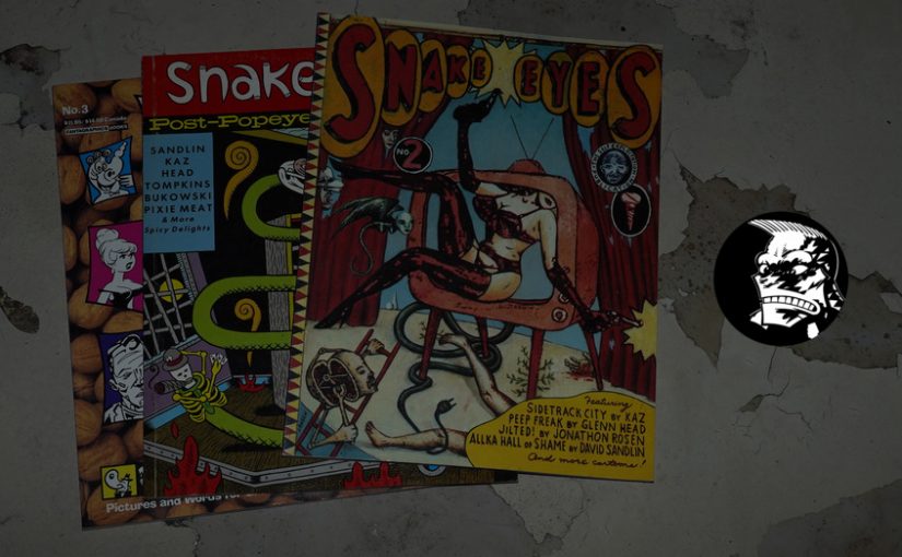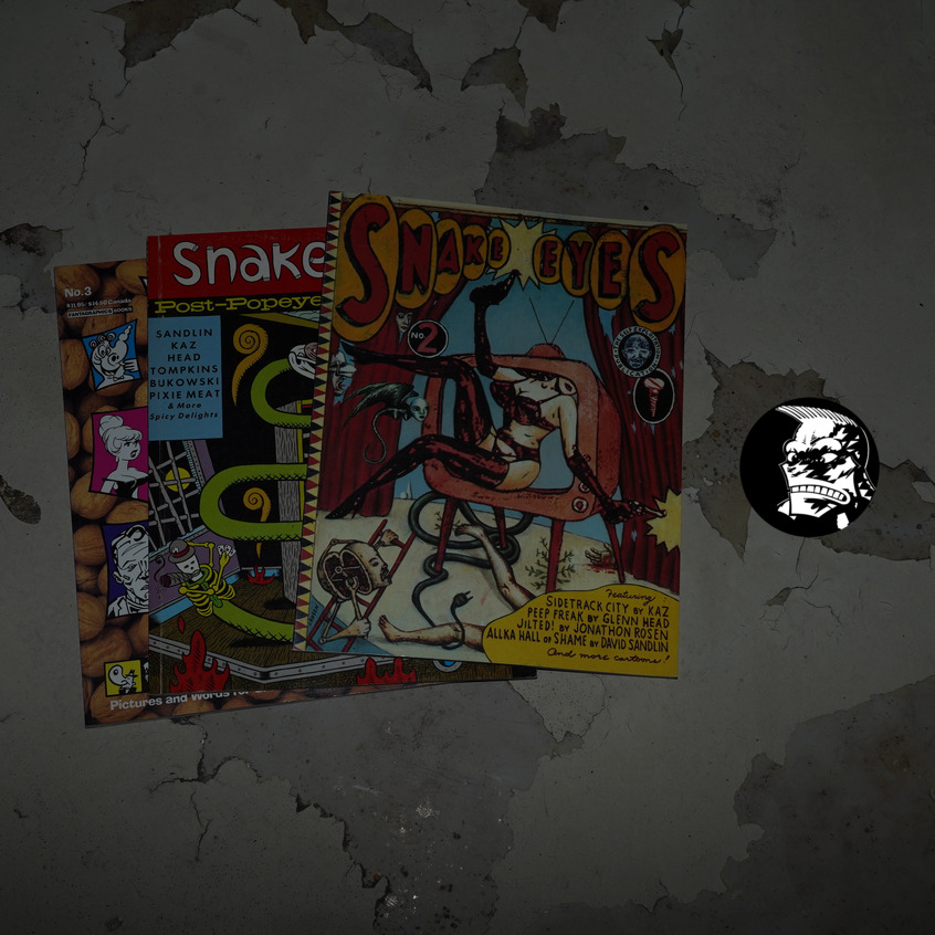
Snake Eyes #1-3 edited by Glenn Head and Kaz (213x273mm)
Three issues of Bad News were published in the 80s, as a sort of School for the Visual Arts anthology (but only sorta kinda).
Mark Newgarden is interviewed in The Comics Journal #161, page 84:
KELLY: It seems like Bad News somehow evolved into
Snake Eyes.
NEWGARDEN: Yeah. I think at a certain point Glenn Head
was lobbying for another Bad News and I said, “I don’t
want to have anything to do with it. Why don’t you be
editor?” And ultimately it was renamed Snake Eyes and he
and Kaz took over as editors, They’ve done a great job.
So it feels natural to include Snake Eyes in this blog series, even if I hadn’t originally planned on doing so.
I haven’t re-read these books since they were published, and I don’t remember anything about the contents. But I seem to remember them being… kinda good? But… not really Earth-shattering either. And I seem to remember them not getting much attention at the time?
Let’s get reading.

Looking at the list of contributors, it’s a bunch of the people you’d expect, but it’s also many people from the 90s indie scene (many of whom would do series with Fantagraphics later).
The indicia presents itself as being from the East New York Posse… er… Staten Island?
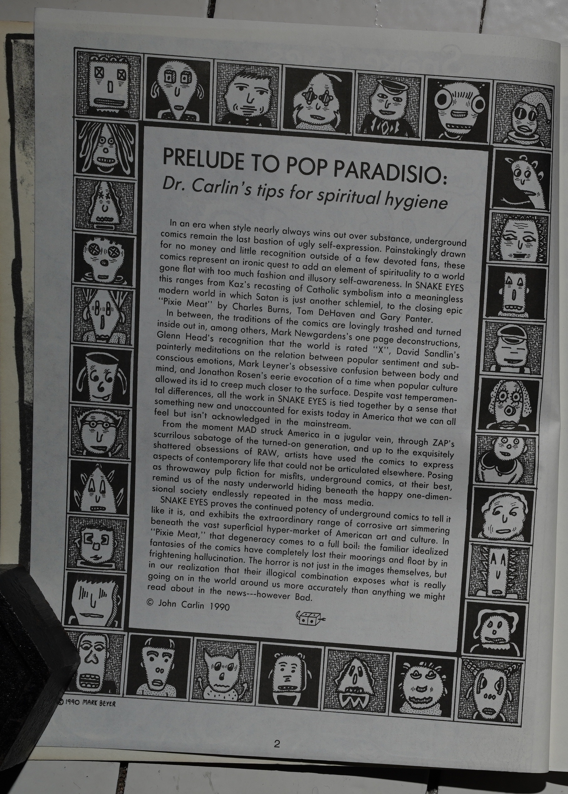
All three of the books start with a one-page introduction that explains to you, the stupid reader, what a great book you’re reading.
Glenn Head and Kaz are the editors, so I was wondering how much stuff we’d be seeing from them… and… there’s not that much in the first book, at least?
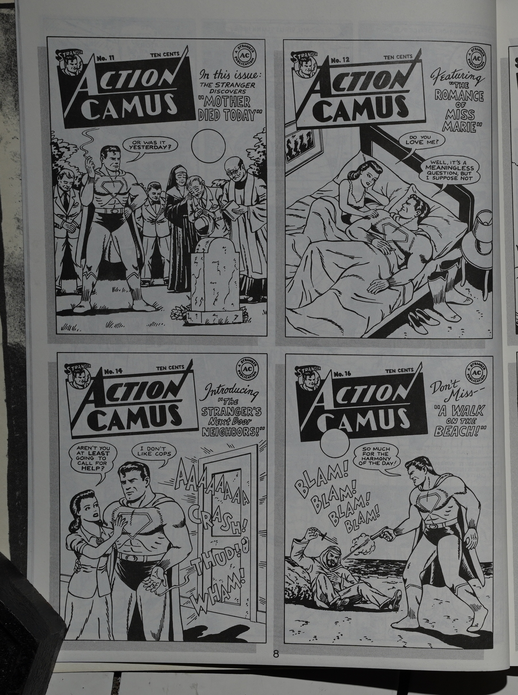
R. Sikoryak does one of these per issue, and the first one, Action Camus, is pure genius. It’s funny, and he does the style so well.
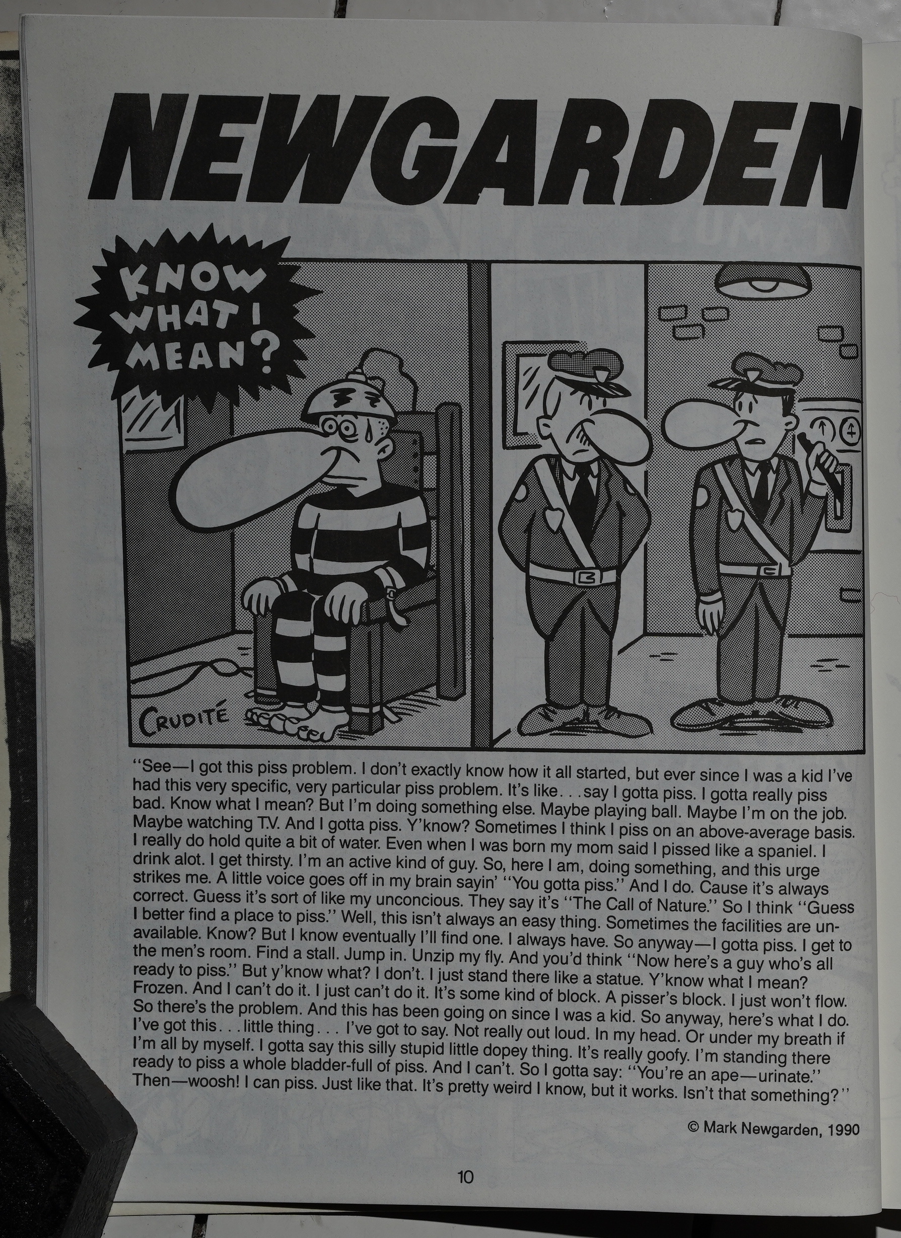
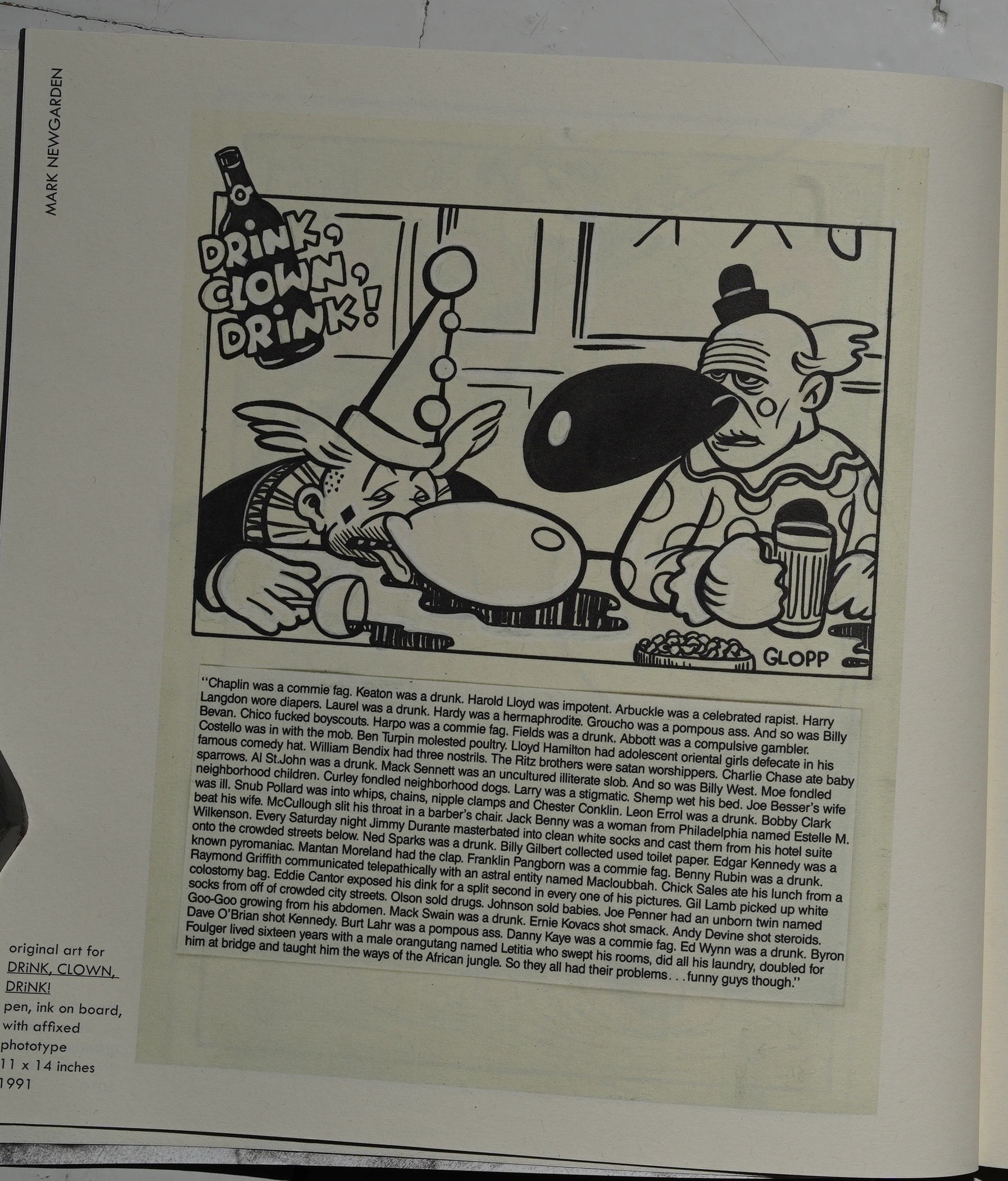
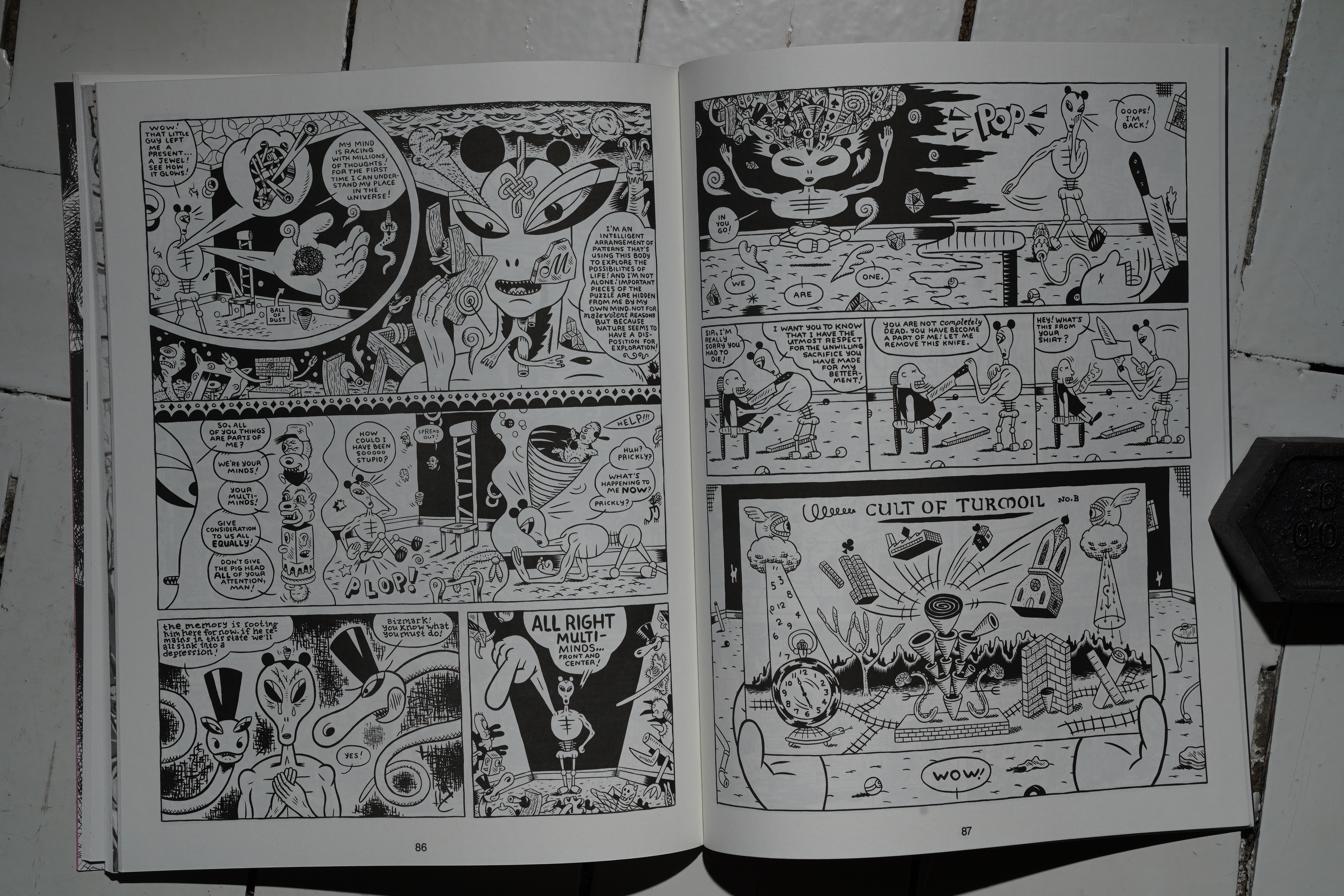
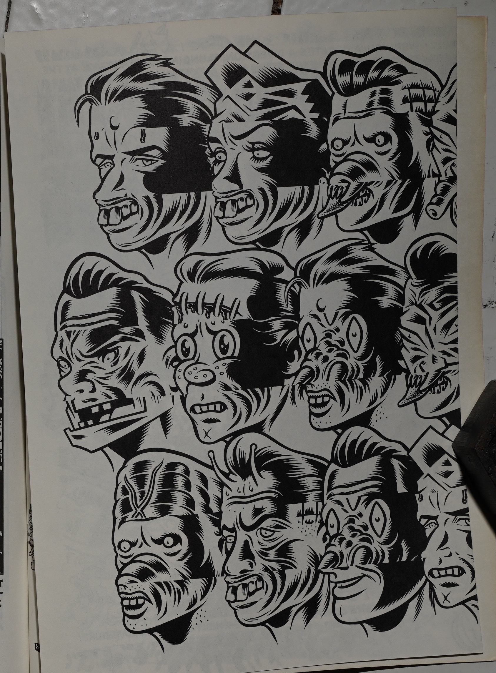
Mark Newgarden does a bunch of these in every issue — I think he’s the one with the most pages? Or perhaps it just seems that way, because they’re all like this. I guess it’s supposed to be funny because it’s anti-funny? Draw out the tedium so much that you have to laugh? Or is it just Newgarden’s hatred for big-nosed cartoons that makes him do these things? I mean, we all hate those, don’t we?
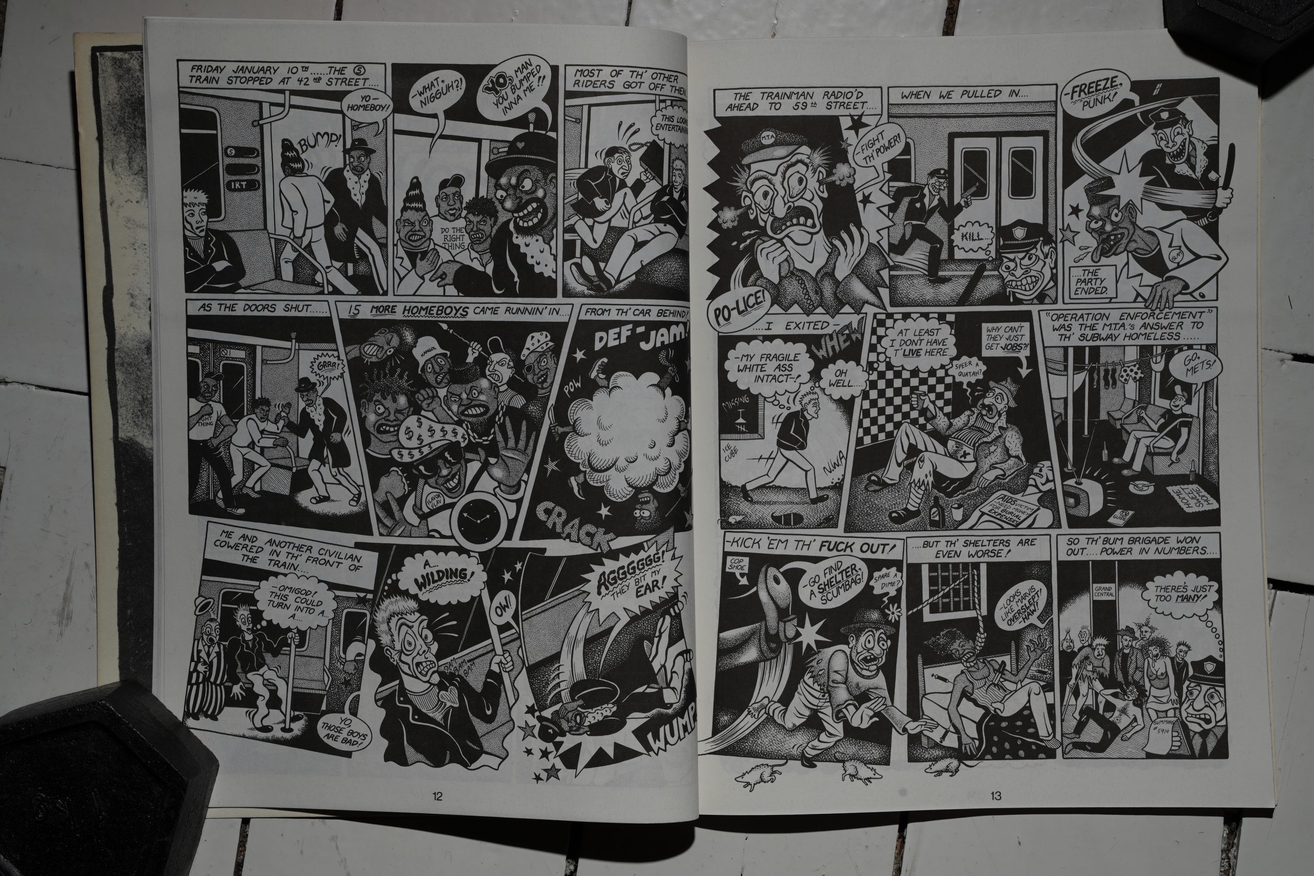
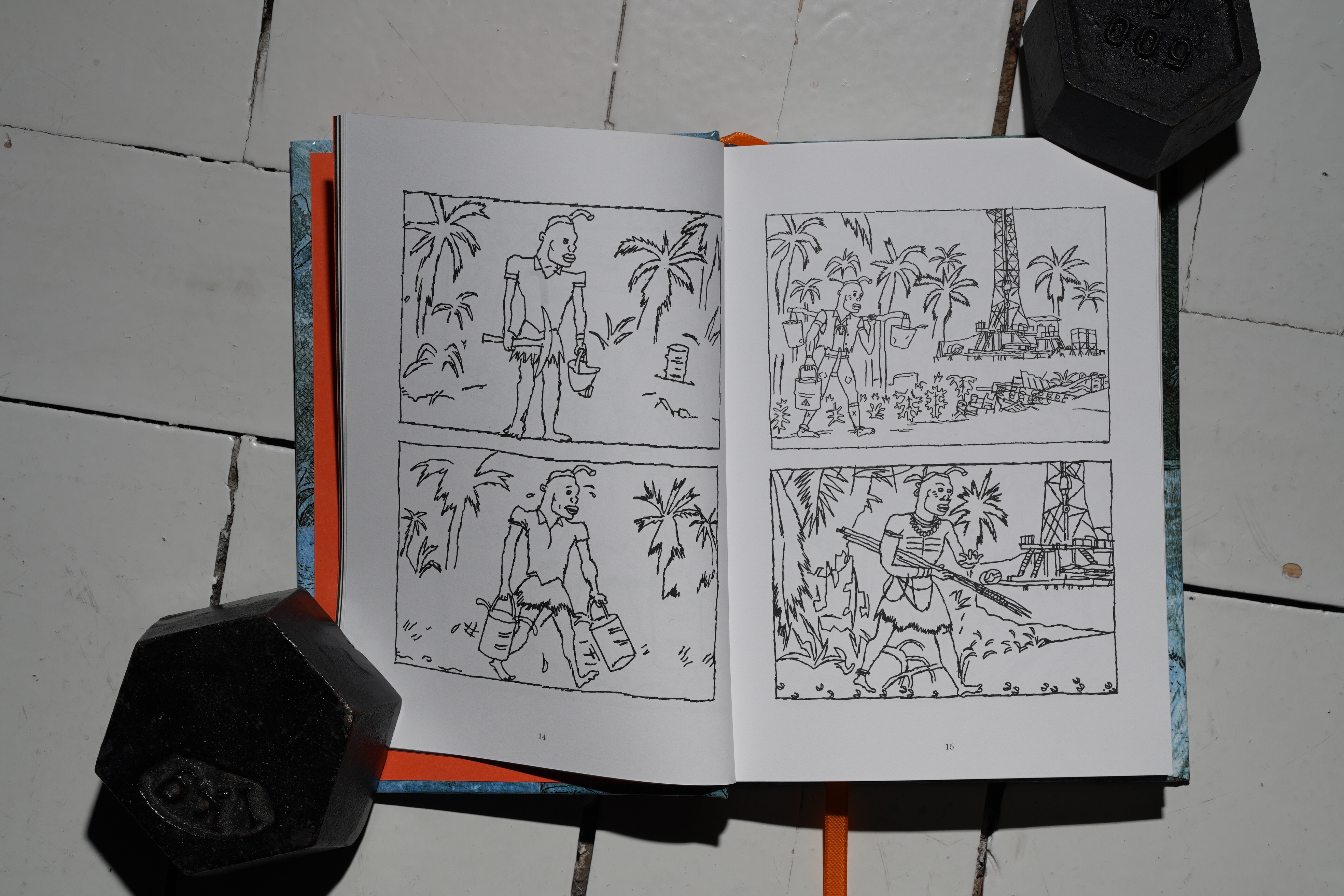
The first of Glenn Head’s pieces is all about the mean streets of New York. Well, the mean subway, where he… er… almost comes into contact with some unpleasant people… So much drama.
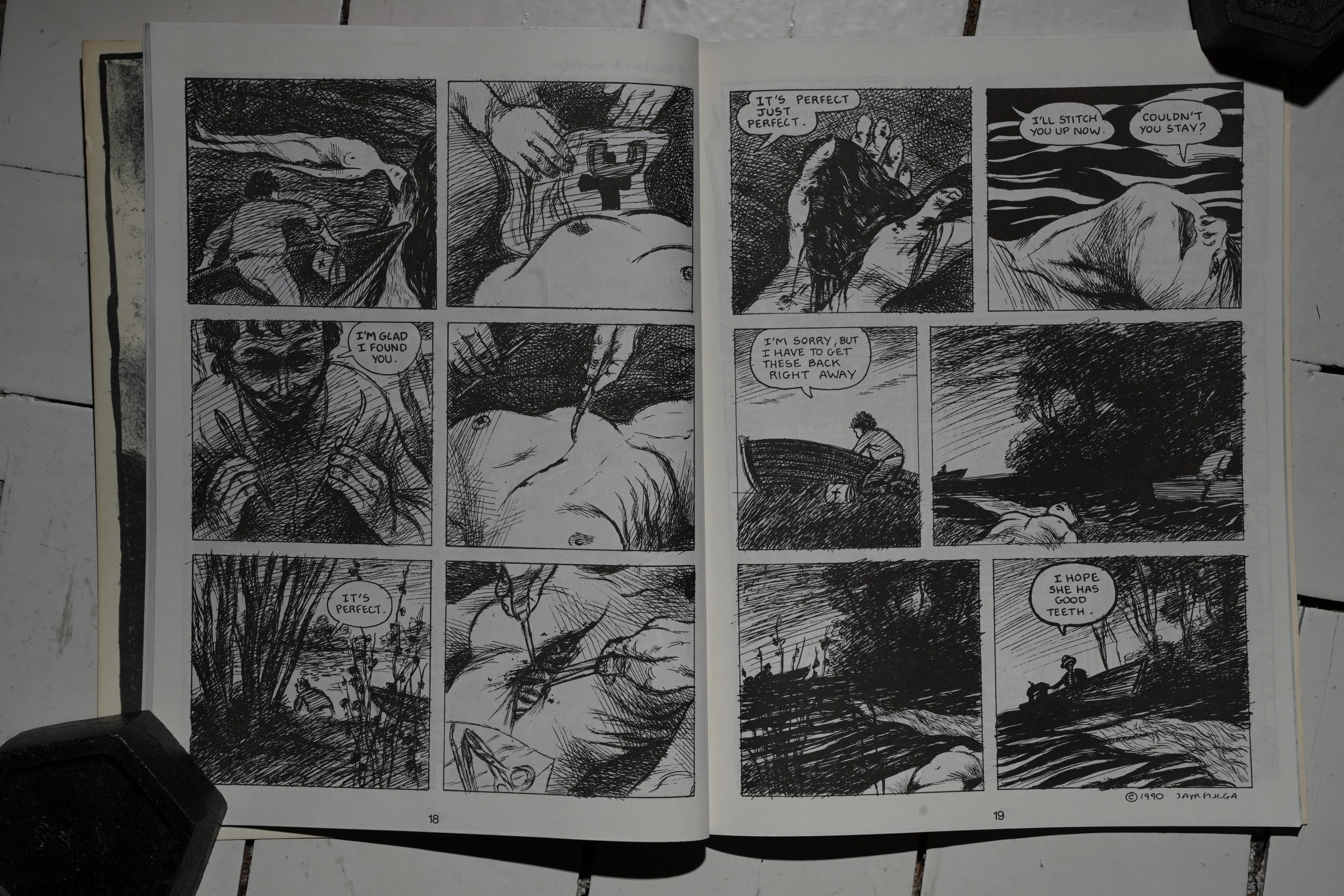
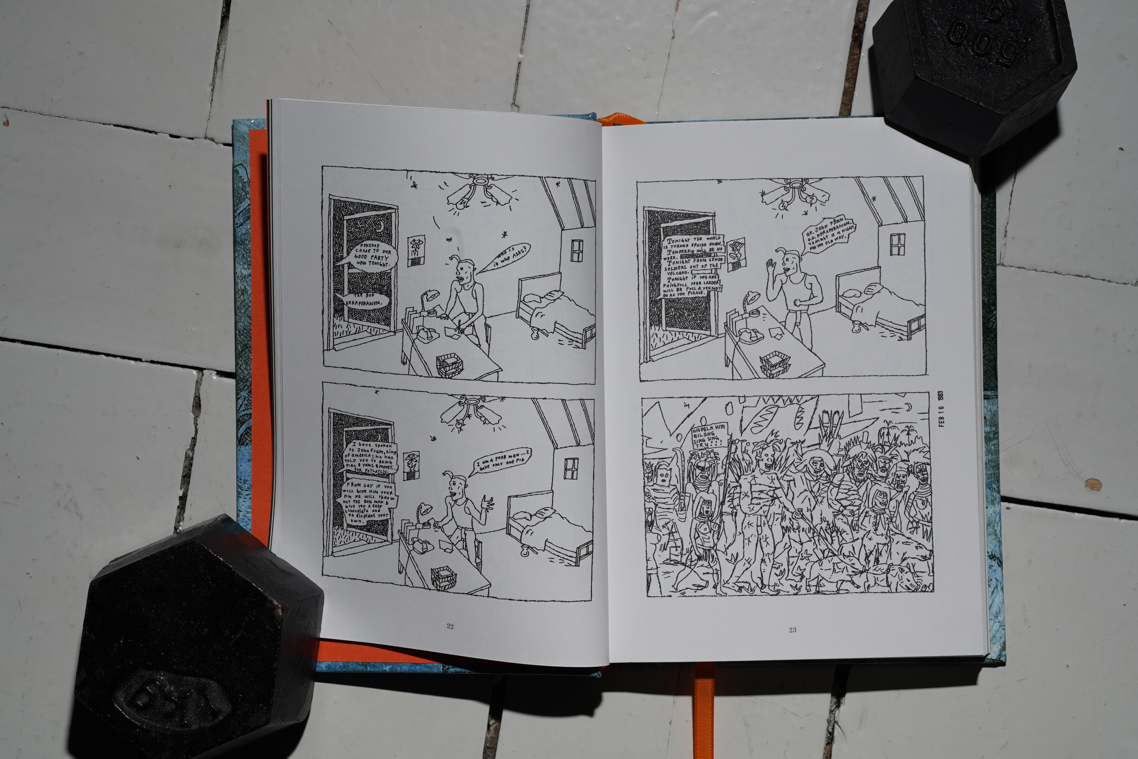
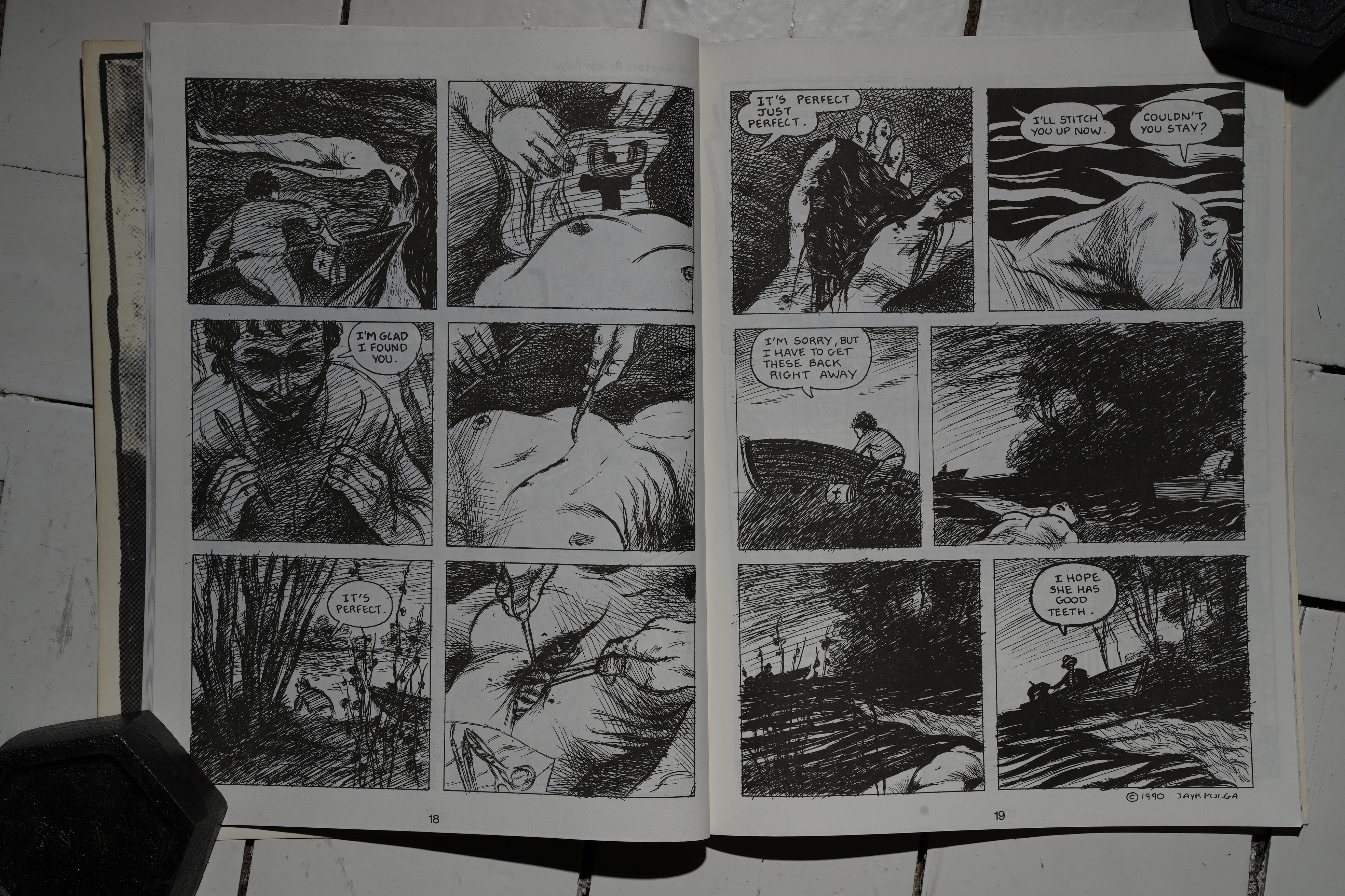
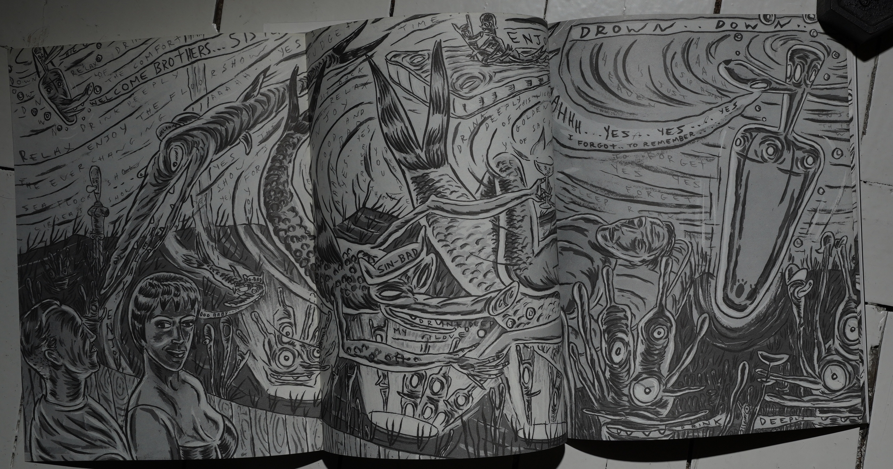
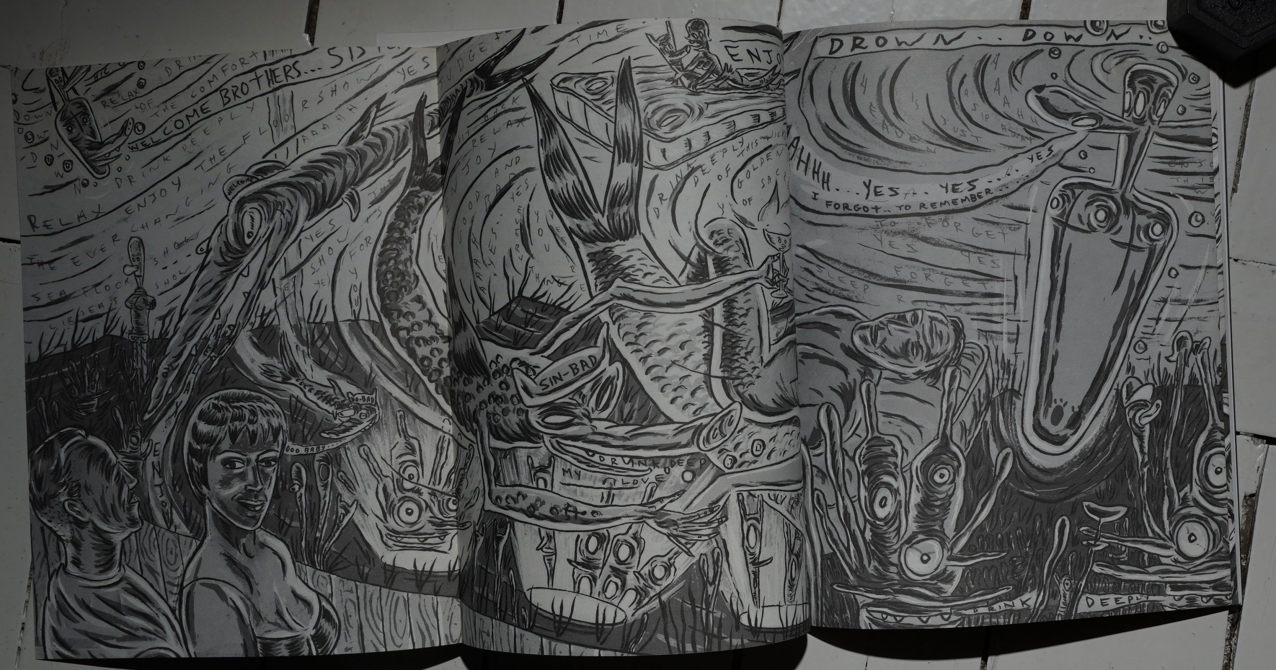
Oh! Jayr Pulga! He’s in all three of the issues, too, and does his deeply unnerving (and gorgeous) strips.
Chris Ware!
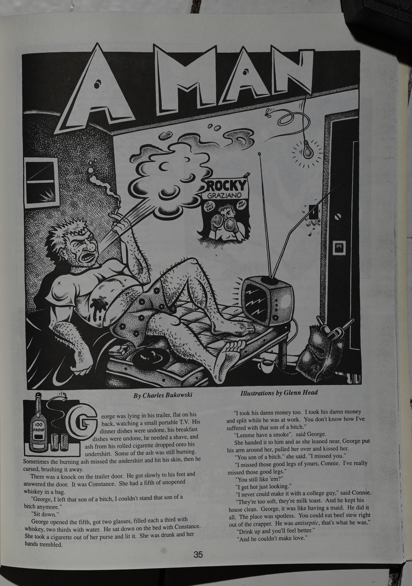
Head illustrates a short story by Charles Bukowski, and I had to jam my fingers into my eyeballs to stop them from rolling so much. It’s hard to imagine anything that’d be more of a cliché for Head to do.
Yay! Finally! Julie Doucet! Amazing. The reproduction is kinda bad, though — the attention to detail on many of these pages are lacking. (And it’s not the best paper stock, either.)
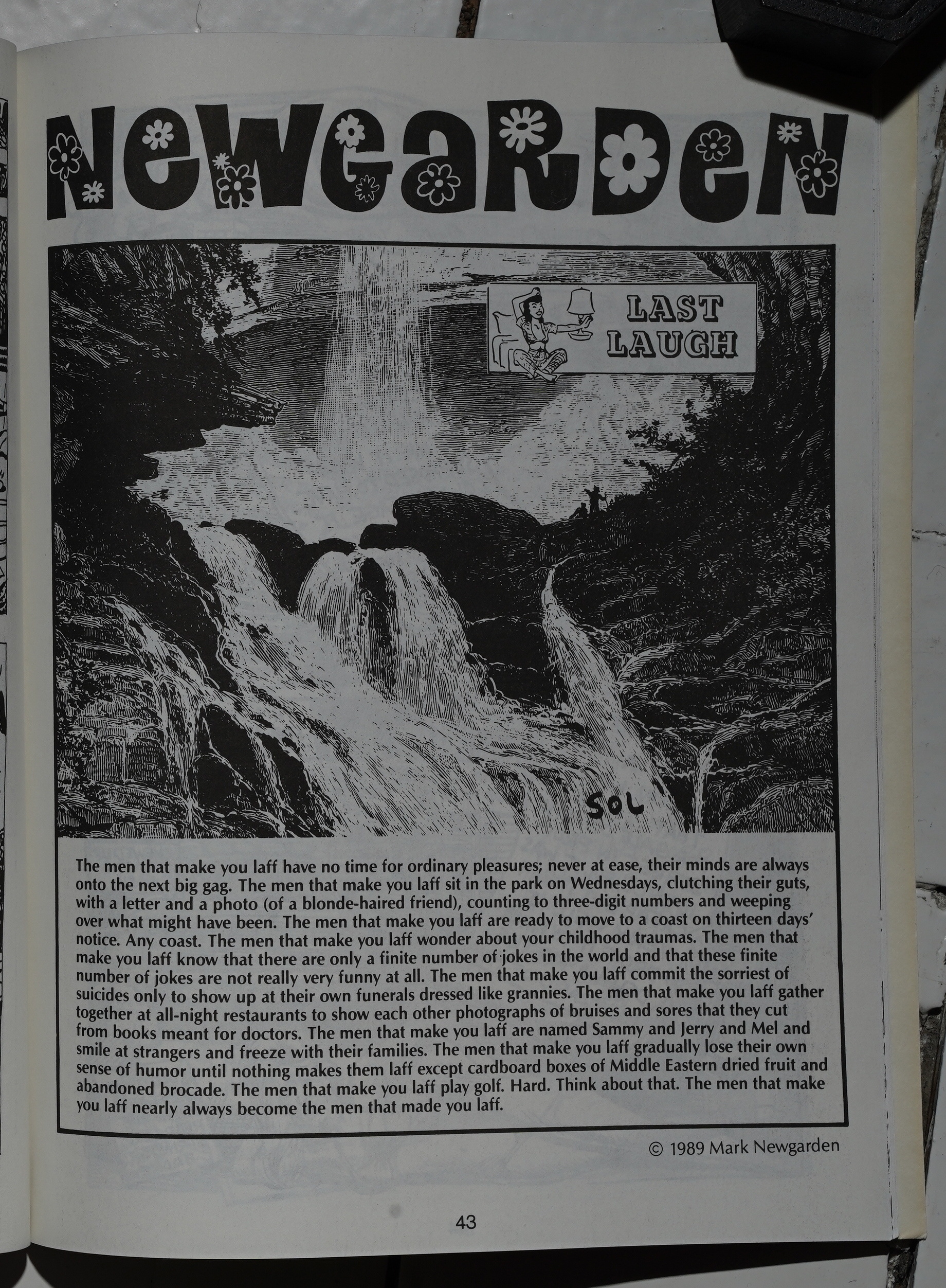
Is Newgarden’s point that clowns are sad? Is that it?
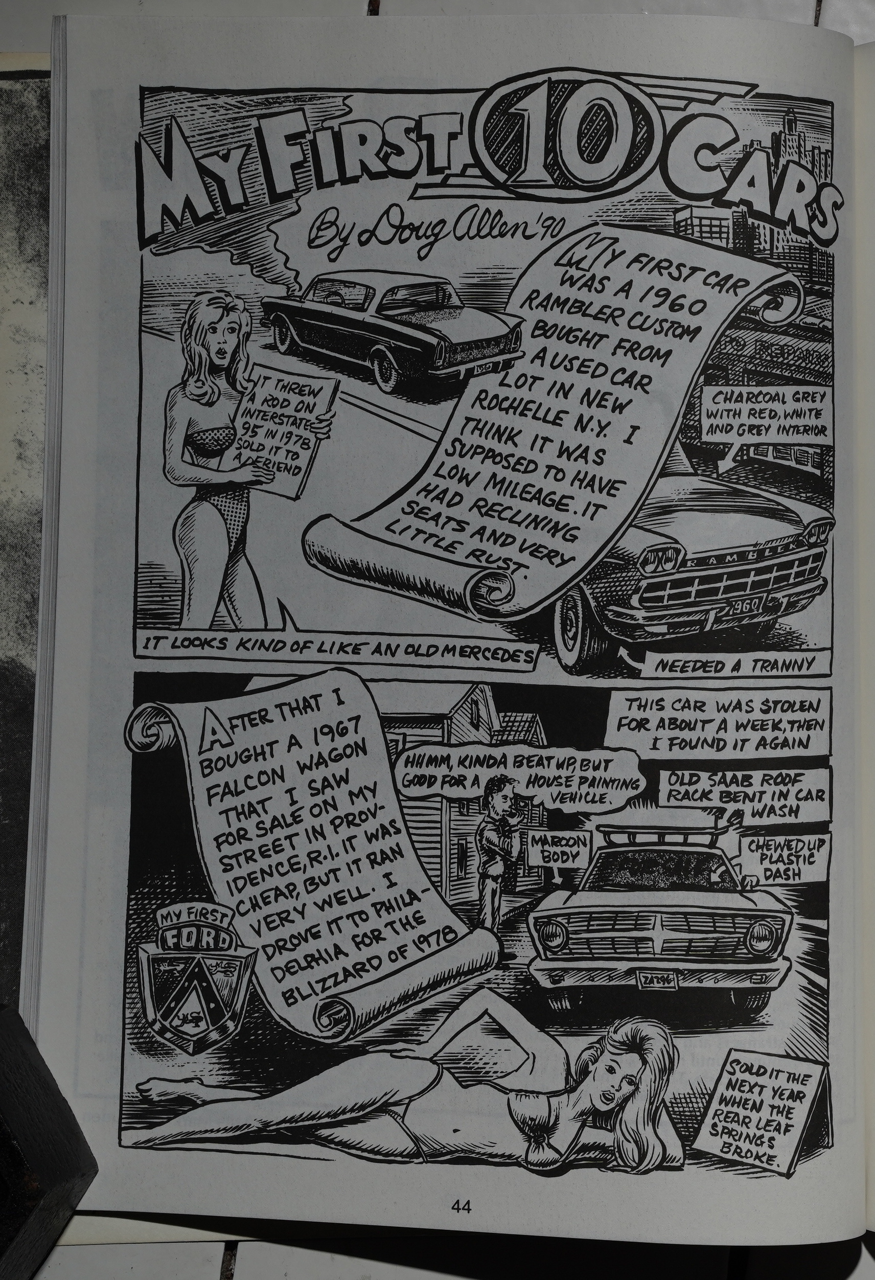
Doug Allen does a strip about… his first… ten… cars….
At this point, I was getting pretty fed up with reading Snake Eyes, and I wasn’t even through the first issue. It’s not that there aren’t good things in here — Doucet, Ware, Pulga, Sikoryak: that sounds like an amazing lineup, right? But in between, there’s just these amazingly tedious things, seemingly done without any ambition beyond being vaguely amusing or tediously outrageous…
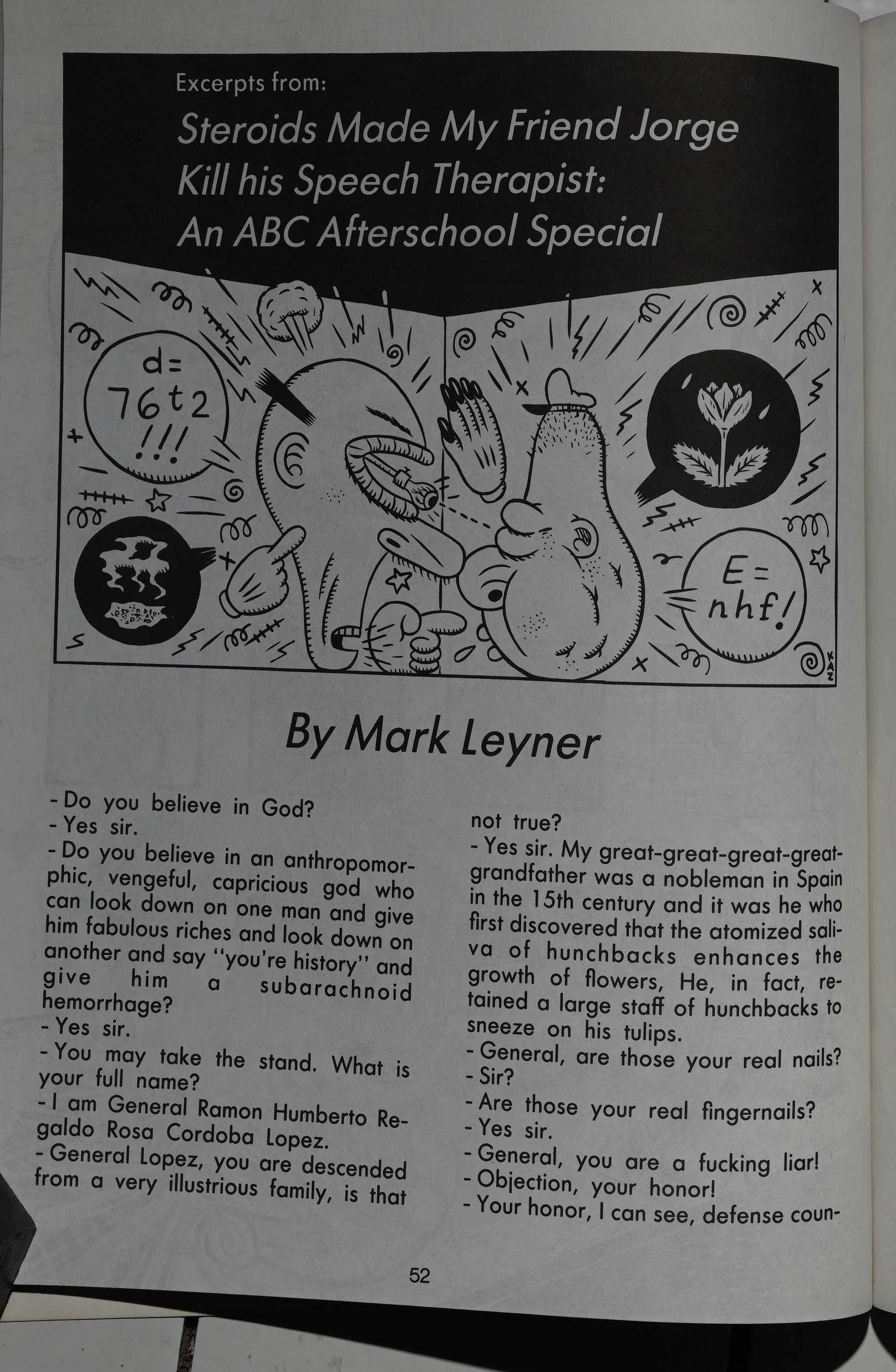
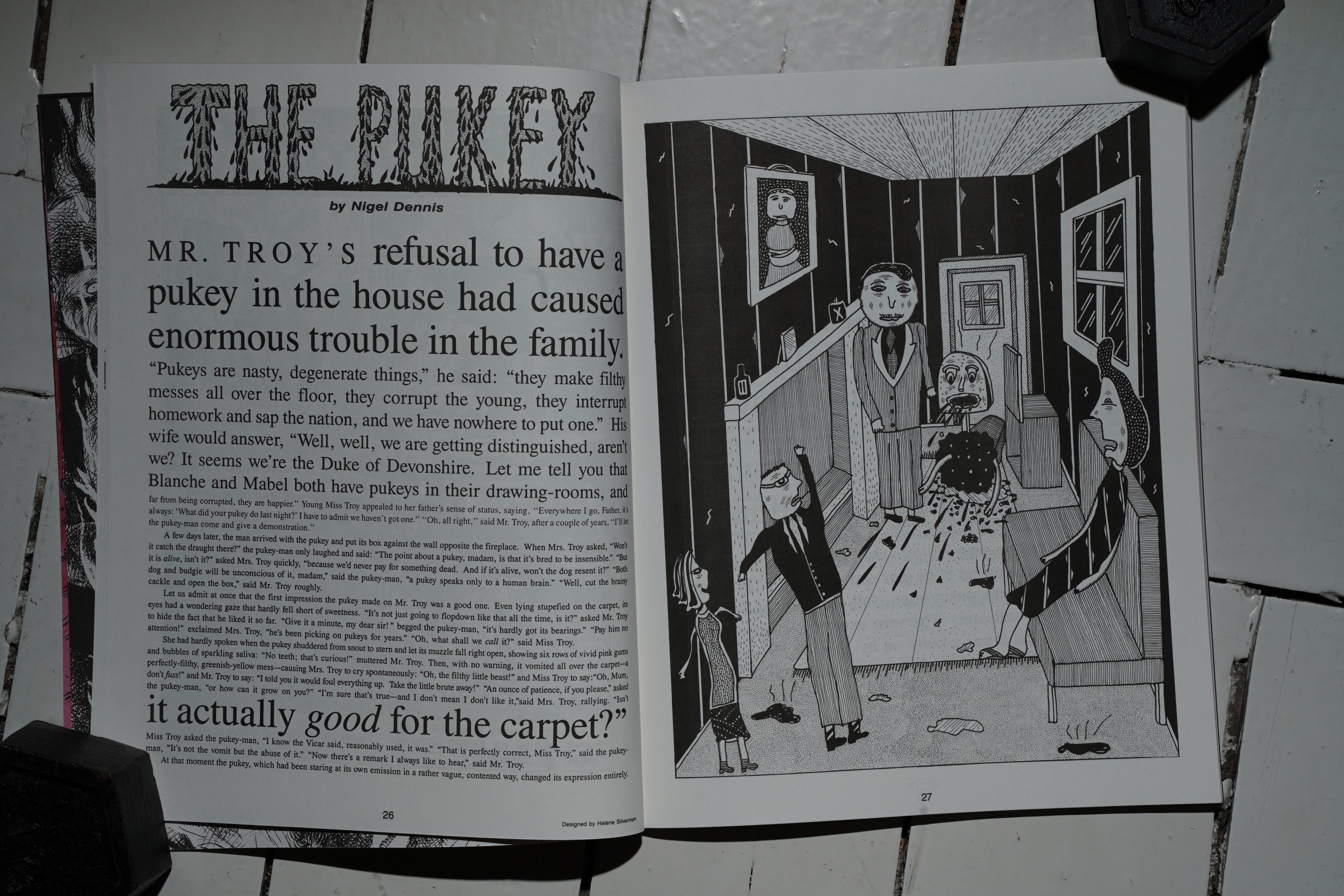
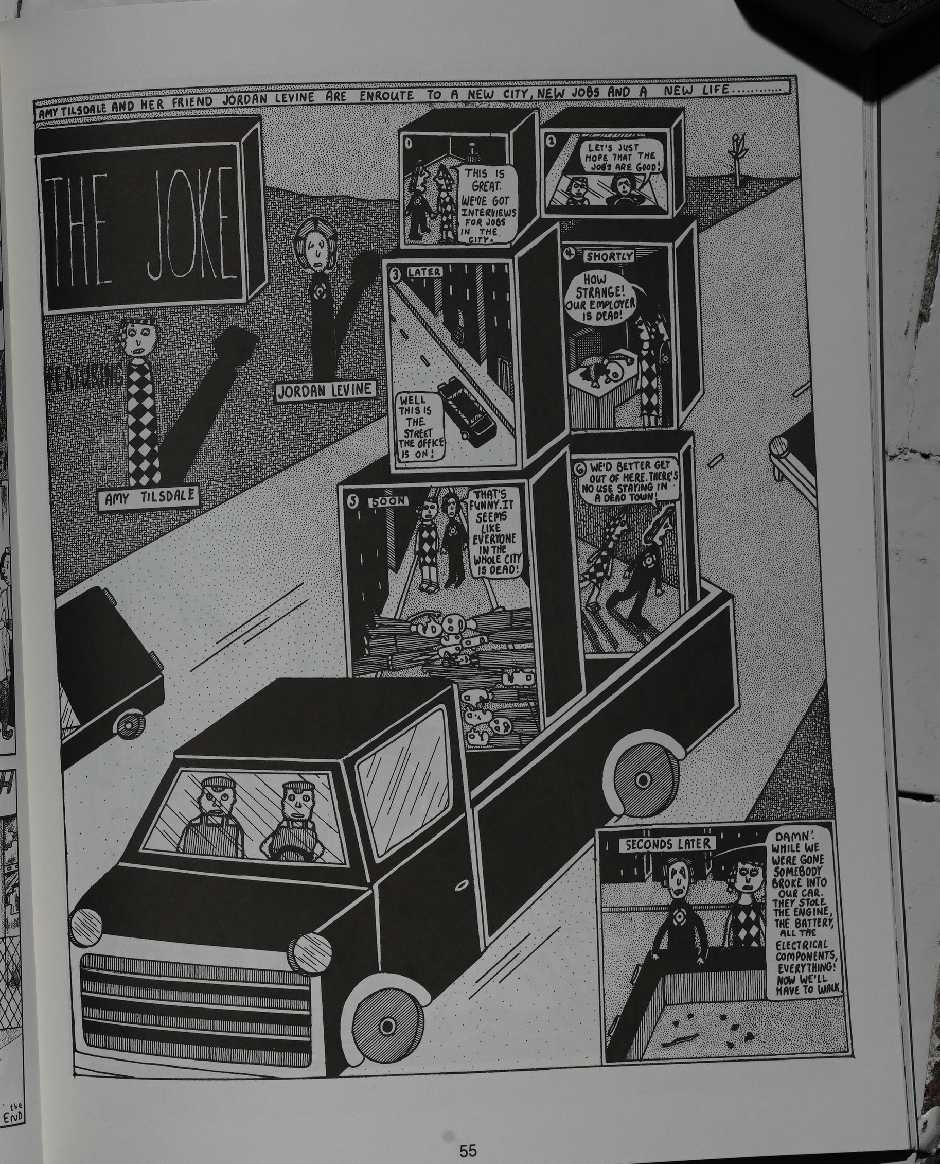
It’s not that this thing by Mark Leyner isn’t amusing, but it’s … what does this have to do with anything? I don’t think I’ve seen a less coherent anthology.
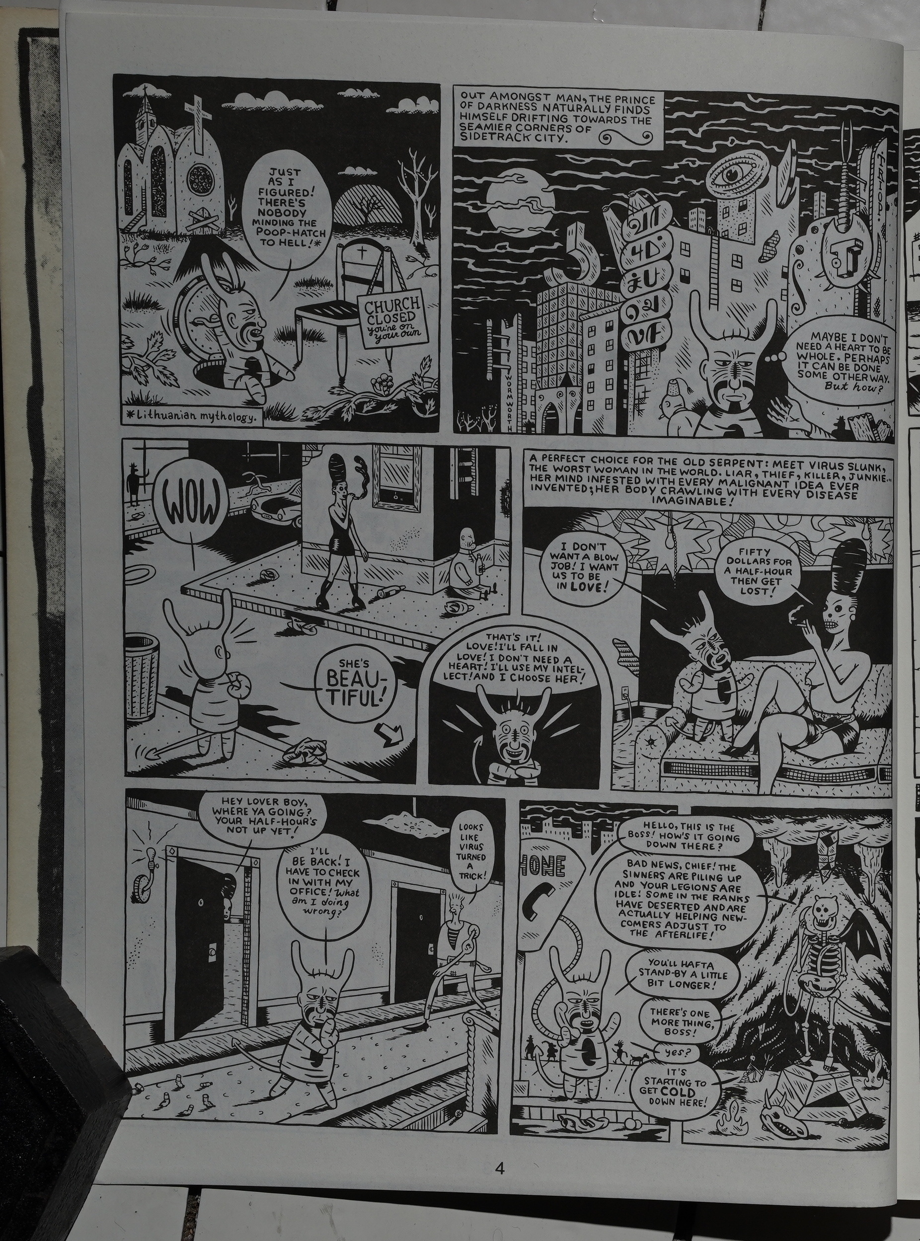
There’s too many things like Jonathon Rosen’s strip that feel totally hermetic — they feel like private projects; not like they’re meant for anybody else to get involved with.
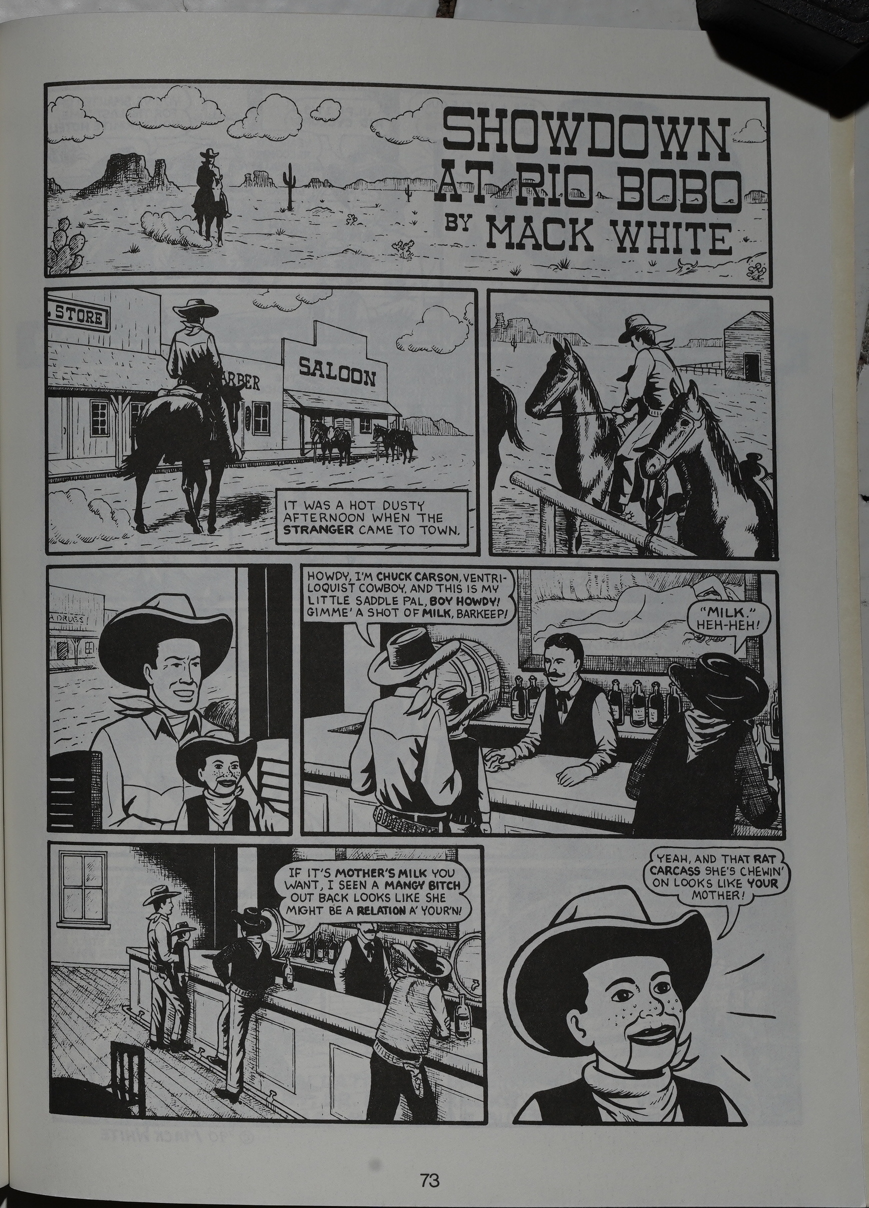
And after a few of those strips, it gets harder to invest any effort in getting into things that are pretty funny, like this Mack White thing. Losing all confidence in the editors makes each new piece a chore to read: Is this gonna be a waste of time too, or is it something worth reading?
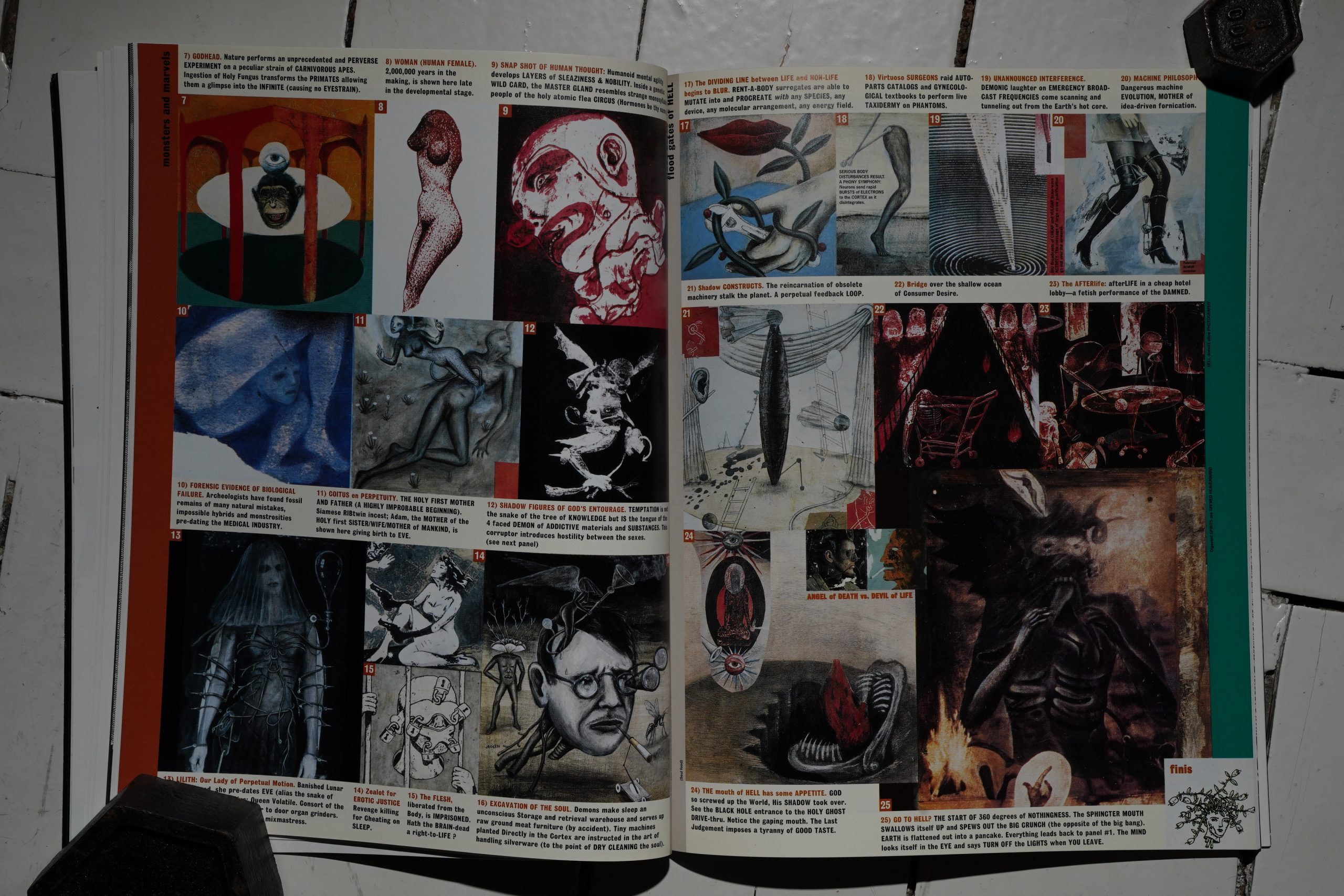
This Charles Burns/Gary Panter/Tom De Haven thing (“Pixie Meat”) is kinda spiffy, though.
Is this a precursor to the Facetasm book?
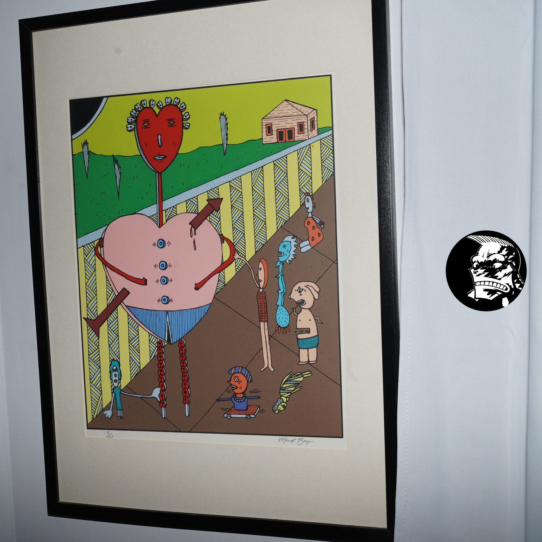
Are they going for a dada via New Jersey kinda vibe? At least Beyer’s artwork’s great, as usual, and the paper in the second issue is better (less bleed-though).
*sigh* (Roy Tompkins.)
Speaking of Beyer, he does some of his oddest work ever in these book — page after page of these weirdly laid-out strips. I love the normal strips, too, but it’s great seeing Beyer play around with the pages this much.
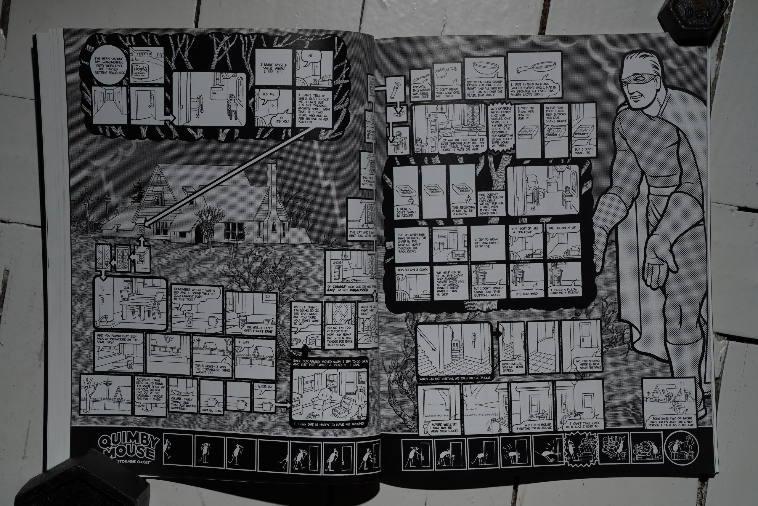
I feel I’ve seen David Sandlin fold-outs a few times before… does he have it in his contract that he has to fold out?
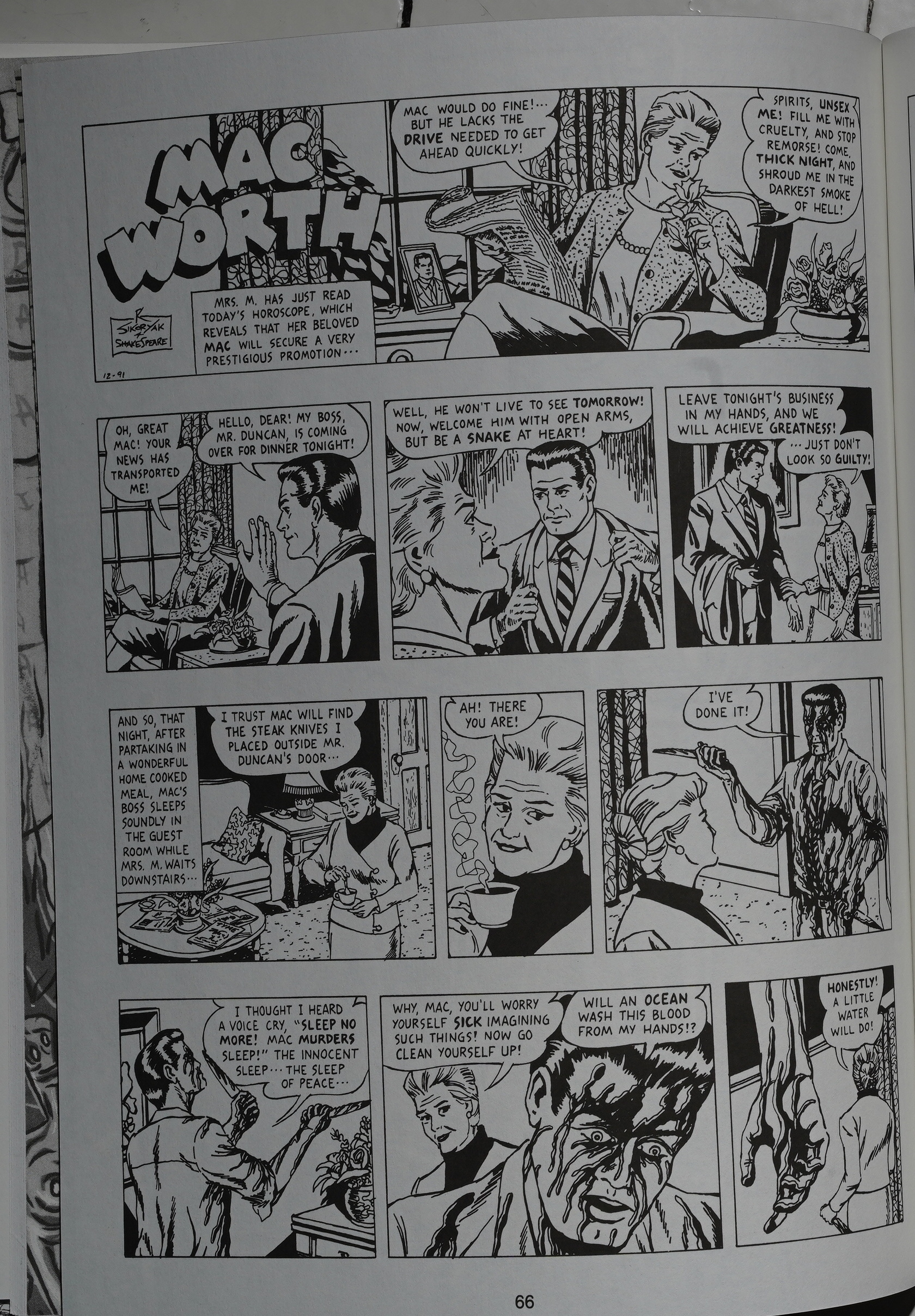
The second R. Sikoryak thing’s also good, but not as good as the Camus thing. The third one, Blondie as Adam and Eve, is pretty tedious, so perhaps it’s a good thing there were only three issues of Snake Eyes if Sikoryak felt compelled to follow the same format for every issue.
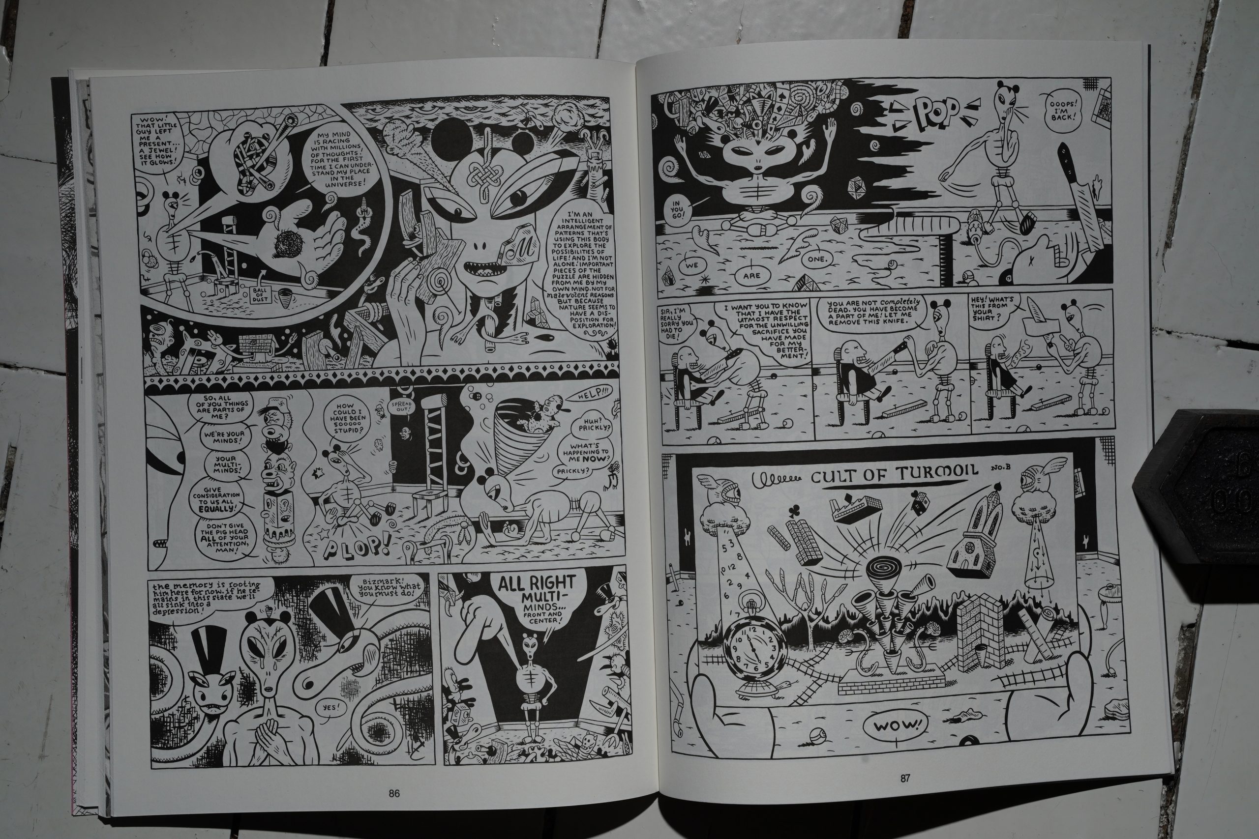
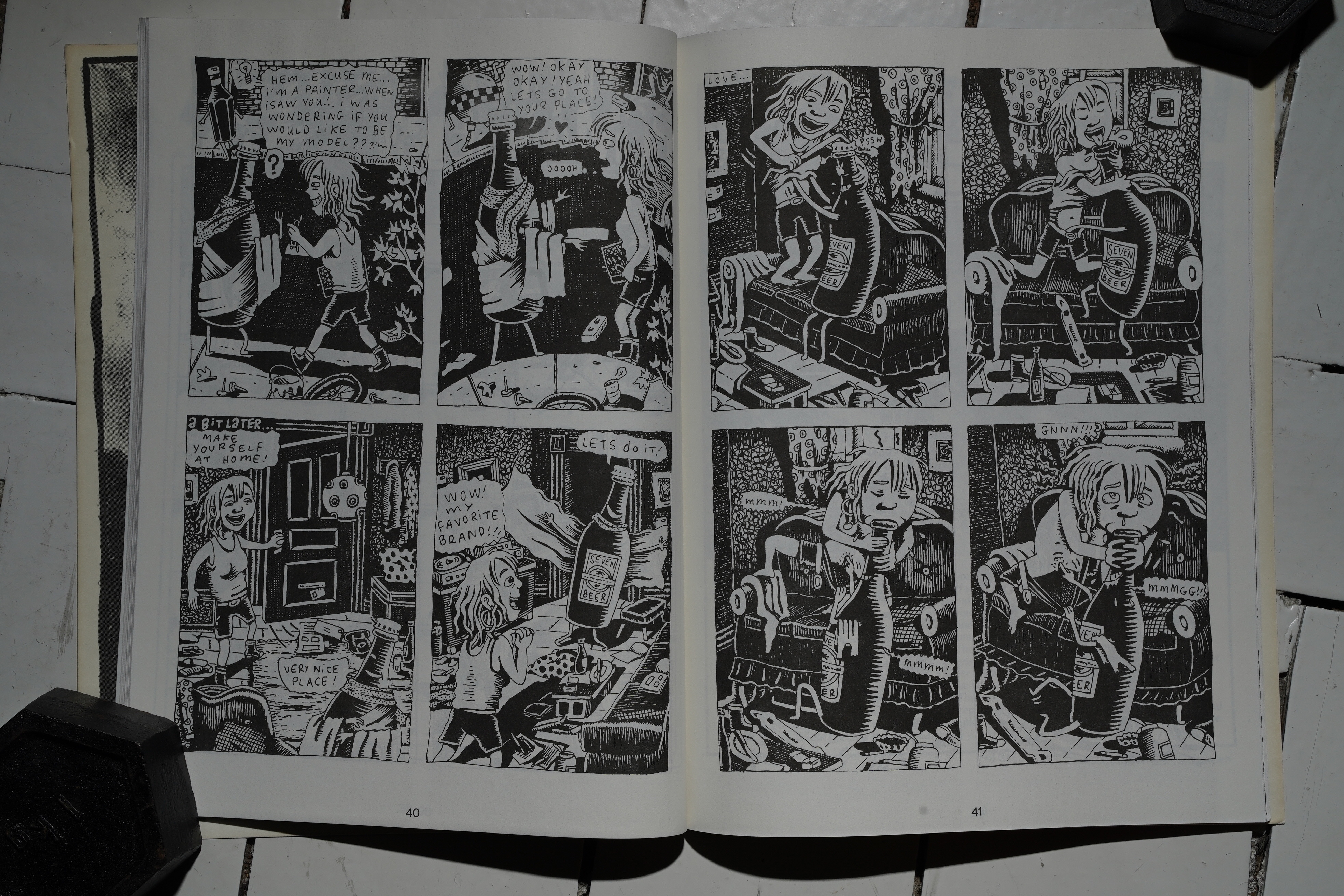
The second issue ends with almost thirty pages by Kaz, and it’s the most oblique work of his that I’ve read. “Read.” I zoned out after a few pages, because I just didn’t give a shit by this point. (My exasperation with Snake Eyes may seem out of place, because I’m doing snaps of the things that are kinda OK, right? I’ve left the complete twaddle out.)
Mark Newgarden branches out from his anti humour gag strips to an anti design front cover. Is he aiming for “so fugly that it’s good”? I have so many questions.
Newgarden’s 80s work was fantastic! Innovative and heartbreaking. What happened?
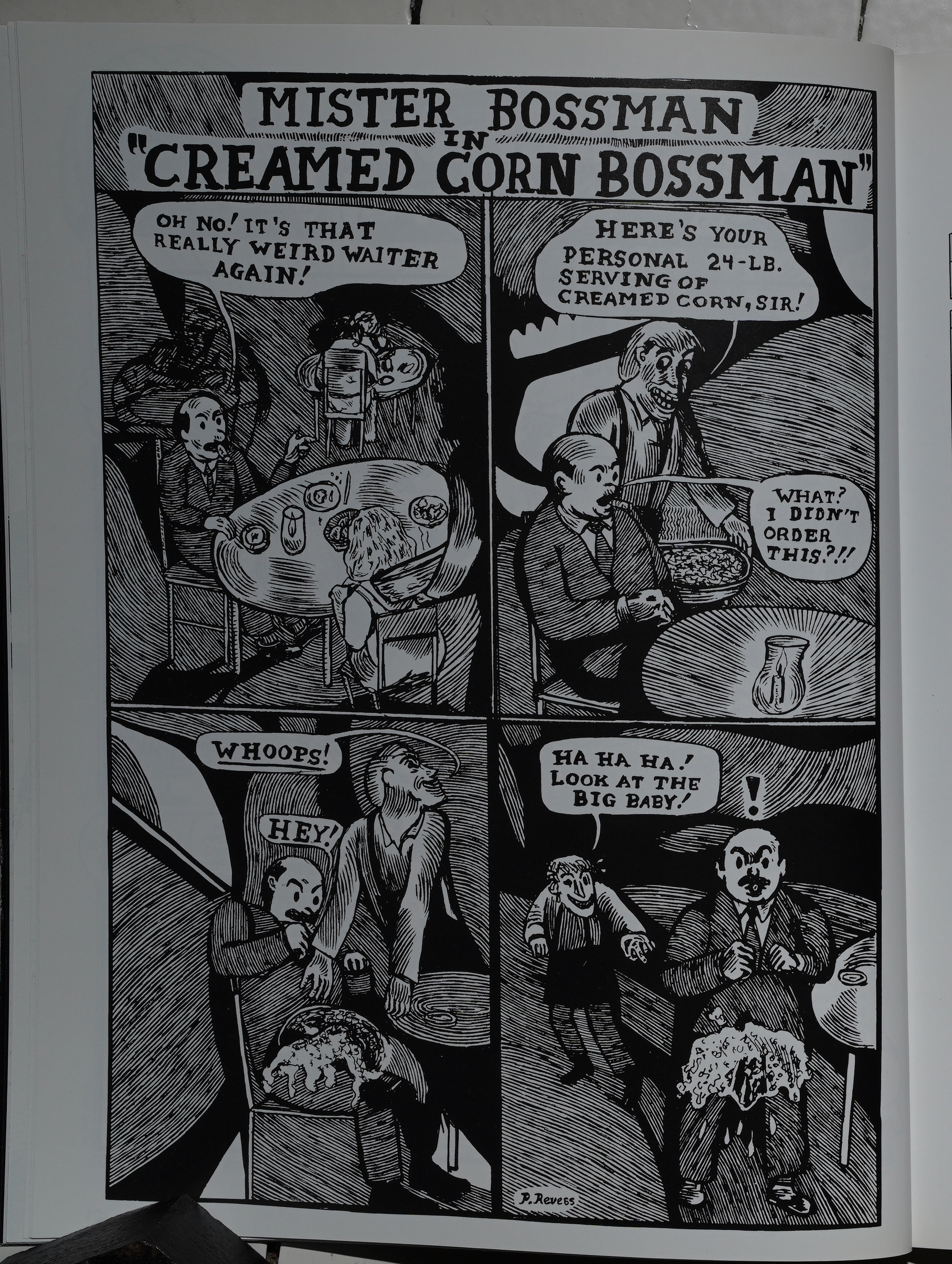
“P. Revess” (I think that’s Michael Kupperman?) contributes the funnest page in the series.
And this issue is on white, covered stock, which makes the black ink a lot blacker.
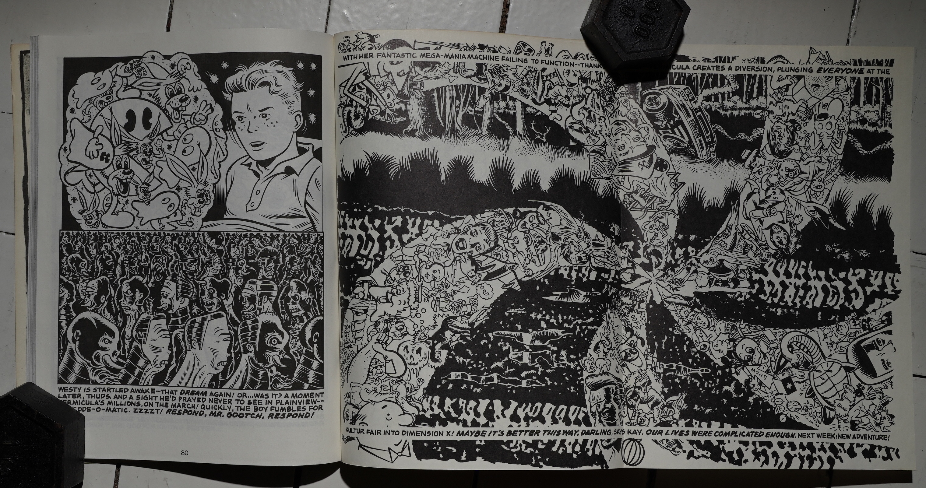
Chris Ware does the most heart rendering.
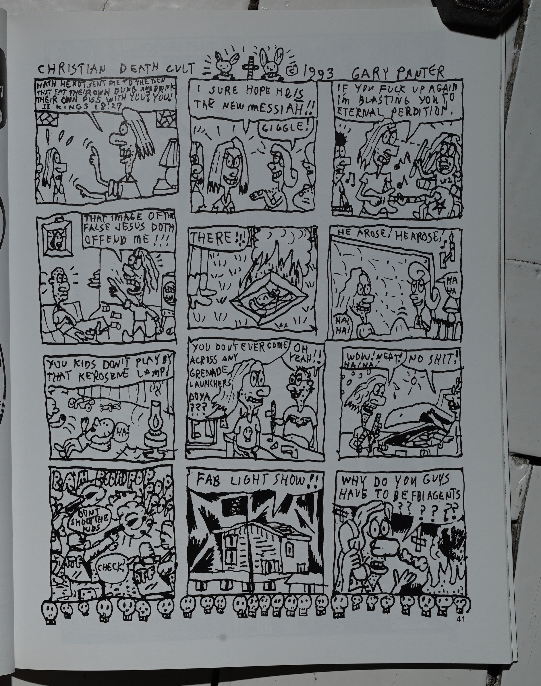
Is this about Waco? (Gary Panter.)
At this point, I’m just fuck this, fuck that, fuck this in particular… (Jonathon Rosen.)
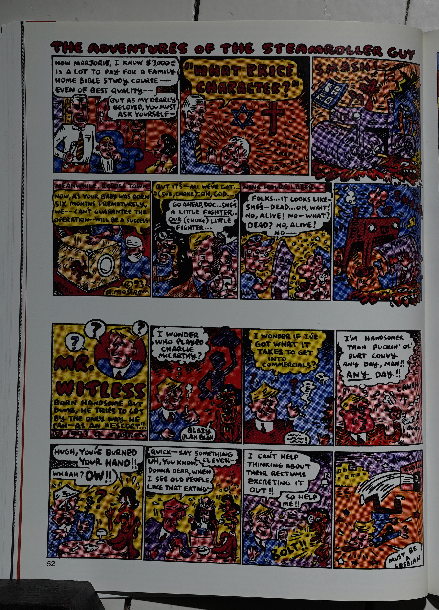
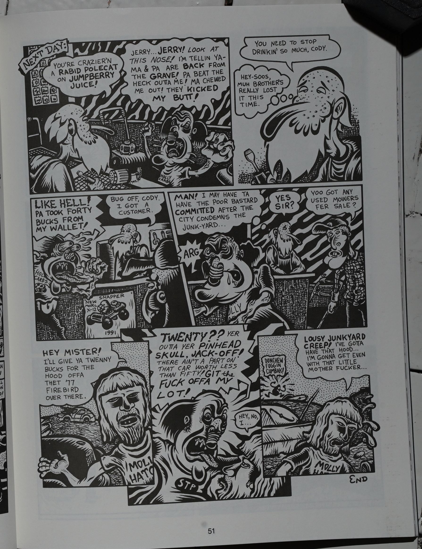
Tony Mostrom leans heavily into edge lord territory… but successfully!
David Mazzucchelli does a pretty amusing (and “outrageous”) strip… but it also feels so tossed-off. Did the editors call people and say “just give us stuff nobody else would buy”?
And speaking of lords of the edge — Mike Diana. (It ends the way you’re thinking.)
So that was a big disappointment.
I seem to recall reading an interview with some person that was involved (mind like a steel sieve, me), and he said that he thought that Snake Eyes was cancelled because Kim Thompson started Zero Zero, and he didn’t want two “competing” anthologies at Fantagraphics. Zero Zero started in 1995, so I guess it’s possible (if Thompson started soliciting work a year before that).
Or was it Pictopia? Can’t find it.
Kaz is interviewed in The Comics Journal #186, page 122:
KAZ Because I was cranking out more comics, I had to
reach deeper into my skull for ideas. Anything that seeped
out, I used. In the past, I would usually approach a strip as
if I was doing something important. I wanted the work to
be arty. Pretentious was not a dirty word to me. But now
I had more deadlines and funnier stuff slipped out. I was
staying up, working later and later. All those old gag
comics began to look tragic to me. One morning I woke up
and everything in my room and apartment had a black
outline around it, with crosshatching and color separation.
I had gotten cartoonal knowledge! I learned to relax and
allow my drawings to get cruder so that my comics could
get more organic. Closer to the way my brain worked.
Glenn Head was starting up the old Bad News comic book,
which became Snake Eyes. And I was excited to get
involved with that, because there were a lot of talented
cartoonists living in New York that did not have a regular
outlet. I envisioned a book that showcased the New York
style of cartooning that had come out of SVA and RA W.
KELLY: What was it like working with a co-editor?
KAZ: It was fun to sit around and plan the books and talk
about comics. We had a similar vision about comics. We
both love that gritty, urban wiseguy school of cartooning.
For me, the most rewarding aspect was contracting artists
whose work I admired and asking them to draw a few
pages. My hands would tremble as I opened the envelopes.
Since we weren’t paying much and didn’ t really crack the.
whip as far as deadlines went, the issues took forever to put
together. Some Of the strips were too weird for most
people. Jonathon Rosen, Jayr Pulga, and Brad Johnson —
their visions seemed too private for most readers. At first,
I had a hard time convincing Glenn to run Brad Johnson’ s
work.
KELLY: It looks like it’s drawn by a retarded 12-year-old.
Which is why I like it.
KAZ To be fair, Glenn tried to get me excited about certain
cartoonists that I couldn’ t see until much later. Dan Clowes
is one example. At first I thought he was too slick and
surface-oriented. But I was wrong. Now he’s one of my
favorite cartoonists. And he’s doing work with so much
depth, it’s astonishing. Now I see people on the streets and
I automatically think, “He’s a Clowes character!” I wasn’t
looking below the surface. But for the most part, Glenn
and I agreed. It’s just that we don’t seem to have any
be a dangerous thing playing with your consciousness.
Your concept of the world changes. It becomes organic
and infinite. I never did much drawing on hallucinogens.
My hands were too shaky and my mind was exploding
commercial instincts. I tend to gravitate to work
that looks wrong.
I can remember Alex Ross and myself try-
ing to draw like someone who was insane or
retarded. Instead of attempting, like everybody
else, to be really sophisticated or smalt, we got
into this idea of American dumbness, like Philip
Guston, whose work looks completely dumb on
the surface — big eyeballed guys , big giant feet
— but there’s a sensitivity there. Basically, he
was still doing Abstract Expressionist painting,
but he was using these really simple symbols
that looked wrong on the surface, like Mutt and
Jeff Philip Guston was called a stumblebum
painterby a critic once. sounds
like Guston paints. I think it’s a way of being
nostalgic for the things you liked as a kid, like
Popeye, but also being sophisticated at the same
time. That ‘ s sort of what I do with Underworld.
Some of the gags are really dumb, but they
make me laugh so I leave them in. If it wasn’t a
weekly strip, I’d bea little more thoughtful. But
because I have to put it out every week, parts of
my personality that would otherwise be guarded
pop out. So you see me as the dumb vaudevil-
lian guy, falling down for a laugh.
KELLY: So Snake Eyes is no more?
KAZ It was too difficult editing a comic book
and balancing an illustration career and doing
my own comics and having a social life. I was
also co-hosting a weekly radio show. Glenn Head did a
wonderful job on that book, but it was driving him batty
too. Fantagraphics was not paying us anything for editing
and designing it. We were only getting a page rate. And it
didn’t seem like anyone besides our fellow cartoonists
were interested in an anthology comic book with no theme
that only came out once a year. It kicked the shit out of us
after three issues.
Chris McCubbin writes in Amazing Heroes #193, page 77:
“Post Popeye Picto-Fiction” my shiny
white butt, boys. This is comics.. .got
it? Words and pikturs—comics.
Y ‘know, I’m all for comics grmving
and changing as an artistic medium,
but I’m more and more convinced that
this “comix as art” movement inspired
by RAW and earnestly embraced by
Snake Eyes is about as good for the
comics medium as pompous put-on
bands like Rush and Genesis were for
rock ‘n’ roll… in other words, not at
all.
Most of the stuff in Snake Eyes will
only appeal to a certain kind of
“artistic” audience, either the com-
plete artistic technician, who values
technique above all consideration of
content (because, make no mistake, all
the contributors to this book are bril-
liant visual artists), or the black-clad
art school nerd whose definition of
“great art” is whatever would upset
mom if she got a look at it. No real
human being can feel any sort of emo-
tional connection with gnomic pieces
like David Sandlin’s “Snakes Crawl at
Night” or Alex Rose’s pompously
“Untitled” piece. And still Gary will
whine over at the Journal that this
undigestible mess isn’t outselling
Aliens Vs. Predator.
Still, pile this much talent into 80
pages and you’re bound to come up
with something interesting. There’s a
typically brilliant and disturbing piece
from Julie Doucet, the young Cana-
dian cartoonist who everyone (includ-
ing me and Harvey Pekar) is touting
as the Next Big Artistic Thing. Kaz’s
lead-off story “The Tragedy of Saun”
has a genuinely perverse cuteness to
it. Doug Allen’s “History of Art” is
a dead-on cautionary tale about the art
world, and his “My First 10 Cars” is
a nice bit of no-nonsense, whineless
autobiography. Mark Newgarden’s
“The Little Nun” is a classic bit of
visual slapstick. The artistic heavy-
weight Tom DeHaven/Gary Panter/
Charles Burns collaboration, “Pixie
Meat.” almost overcomes its essential
Onanism with sheer visual fascina-
tion.
My personal favorite was Bob Sik-
oryak’s “Action Camus,” which retells
the story of the classic existential nwel
The Stranger as a series of Golden
Age comics cwers, and is virtually the
only piece in the book to have the
common courtesy to acknowledge its
origins A new Mack White story is
always au delight, and the primal
vindictiveness of Dennis Worden’s
“Mohammed, Jesus and Moses Go
for a Stroll” on the inside front cover
is like crossing a large, hot room full
of obese, flatulent, pipe-smoking
pontificating philosophy professors
and suddely coming to an open win-
dow with a breeze blowing through.
Final score for Snake Eyes, about
50/50 minor gems and wasted poten-
tial. If you’ve got the S8 you could do
worse, but expect to be annoyed.
That’s a fair review.
Drew Friedman is interviewed The Comics Journal #151, page 79:
KELLY: What do you think of the different anthologies that
have sprung up in Weirdo’s demise?
FRIEDMAN: Some of them are very good. News and
Snake Eyes… I look forward to every issue of Snake Eyes;
Glenn Head is doing a great job with that. It meets some-
where between Weirdo and RAW — where it should be.
RAW used to be a little artsy to some people’s taste, and
Wéirdo was just a little bit too funky and ratty to other
people’s taste.
I do see people mentioning Snake Eyes out of the blue on twitter and stuff… “wasn’t that a good anthology”… But perhaps they haven’t re-read it over the past three decades, either.
Fantagraphics would go on to publish Zero Zero to greater acclaim.
This blog post is part of the Punk Comix series.