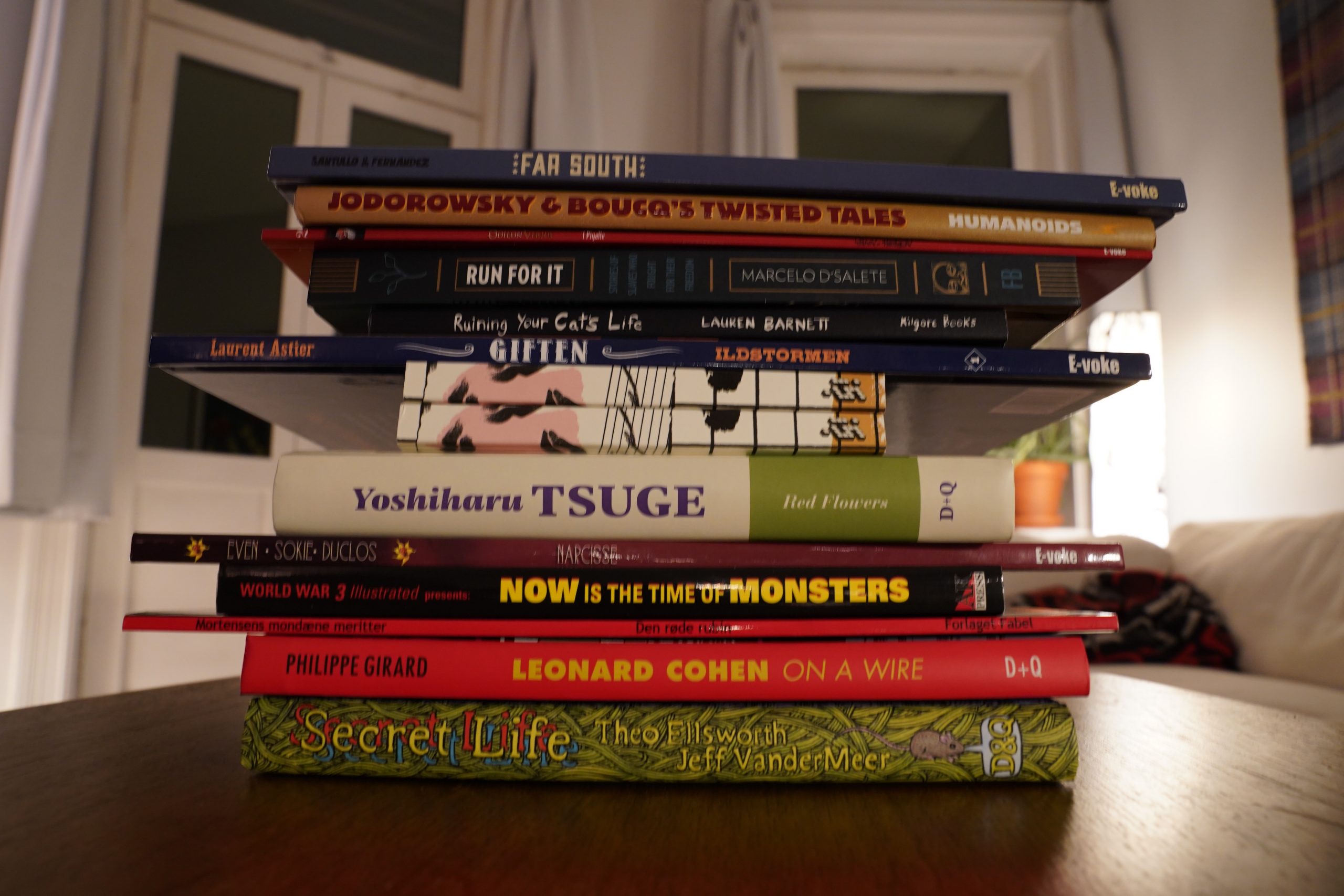
Brrr… it’s getting more winterey by the second. Perhaps this is a good day to stay on the couch all day and read comics? Yes? Yas.
| Irreversible Entanglements: Open The Gates |  |
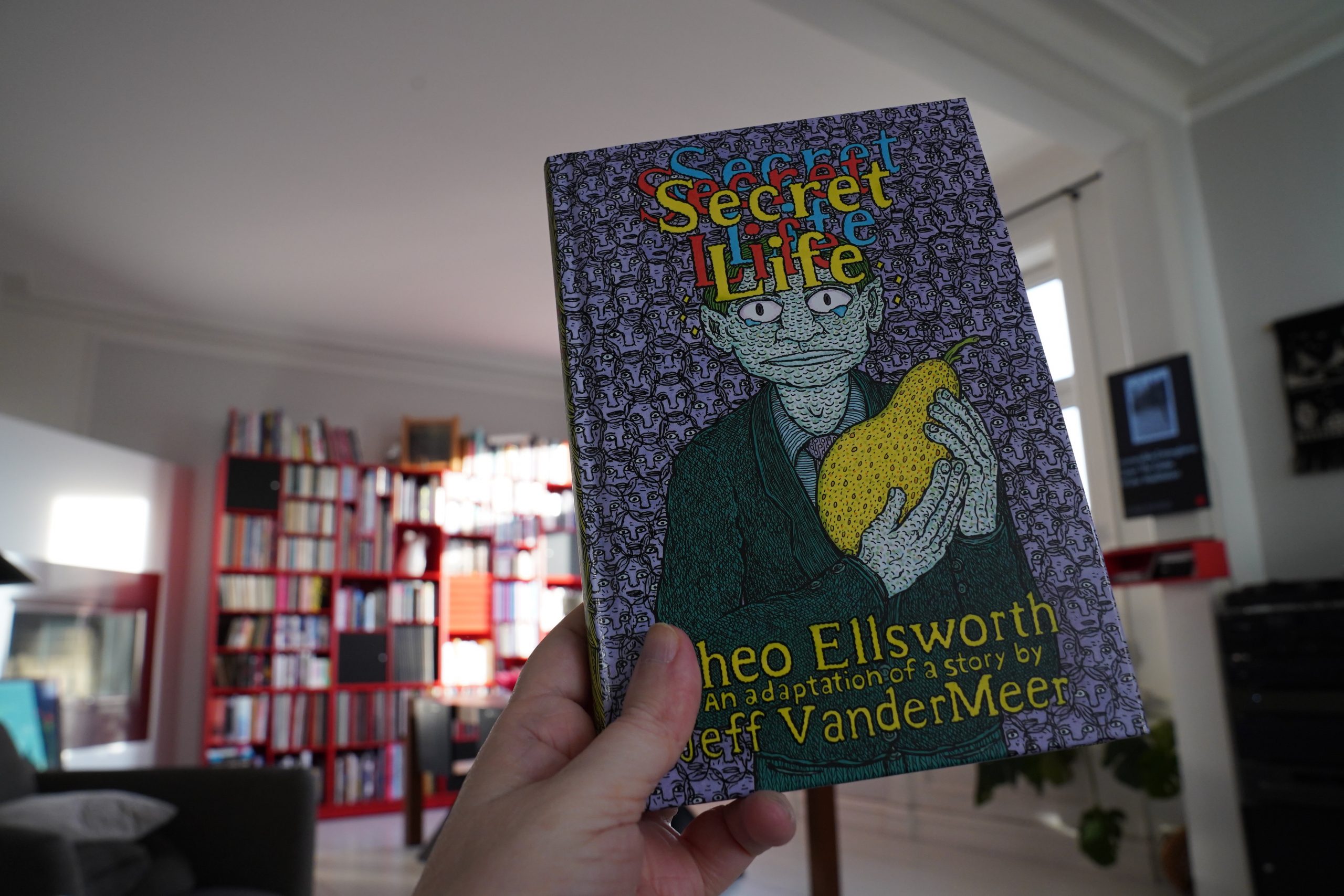
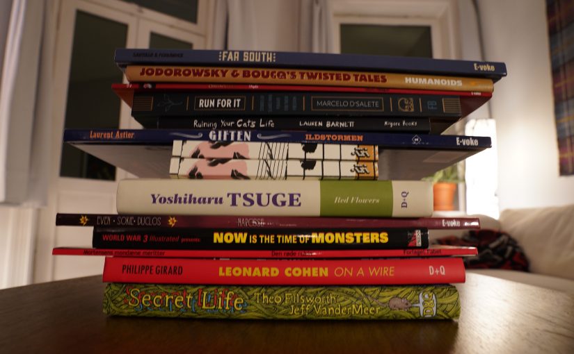
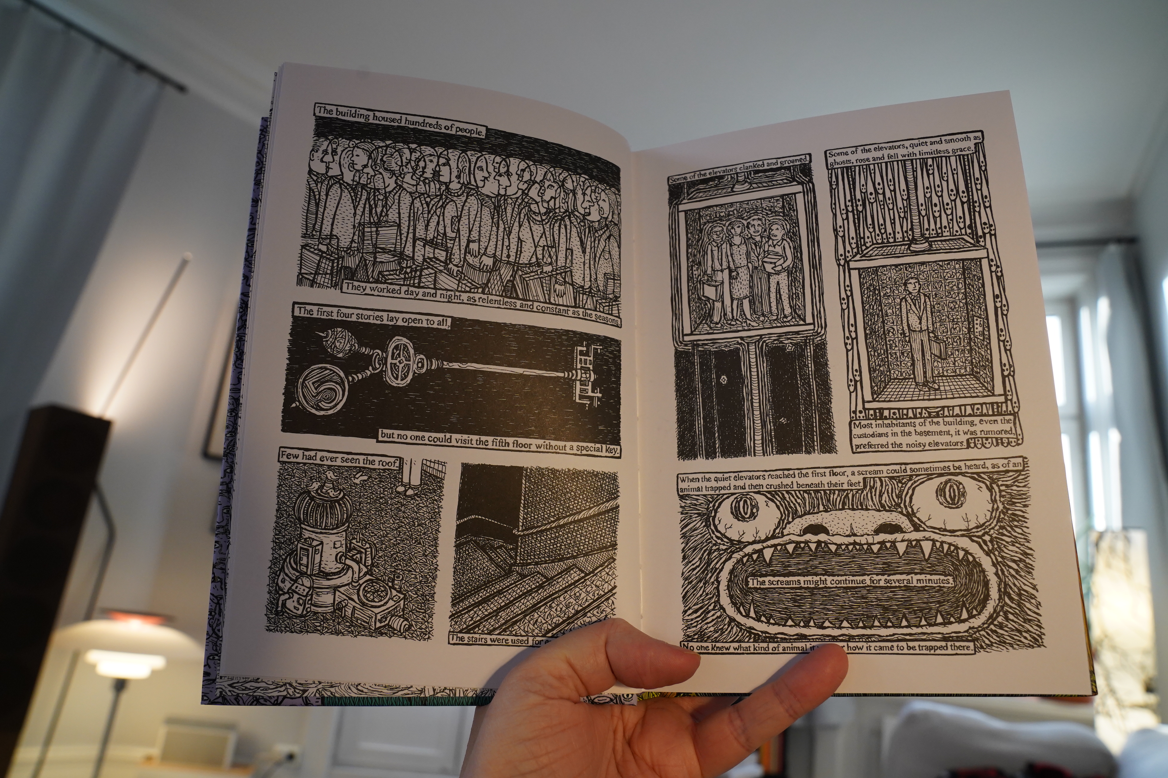
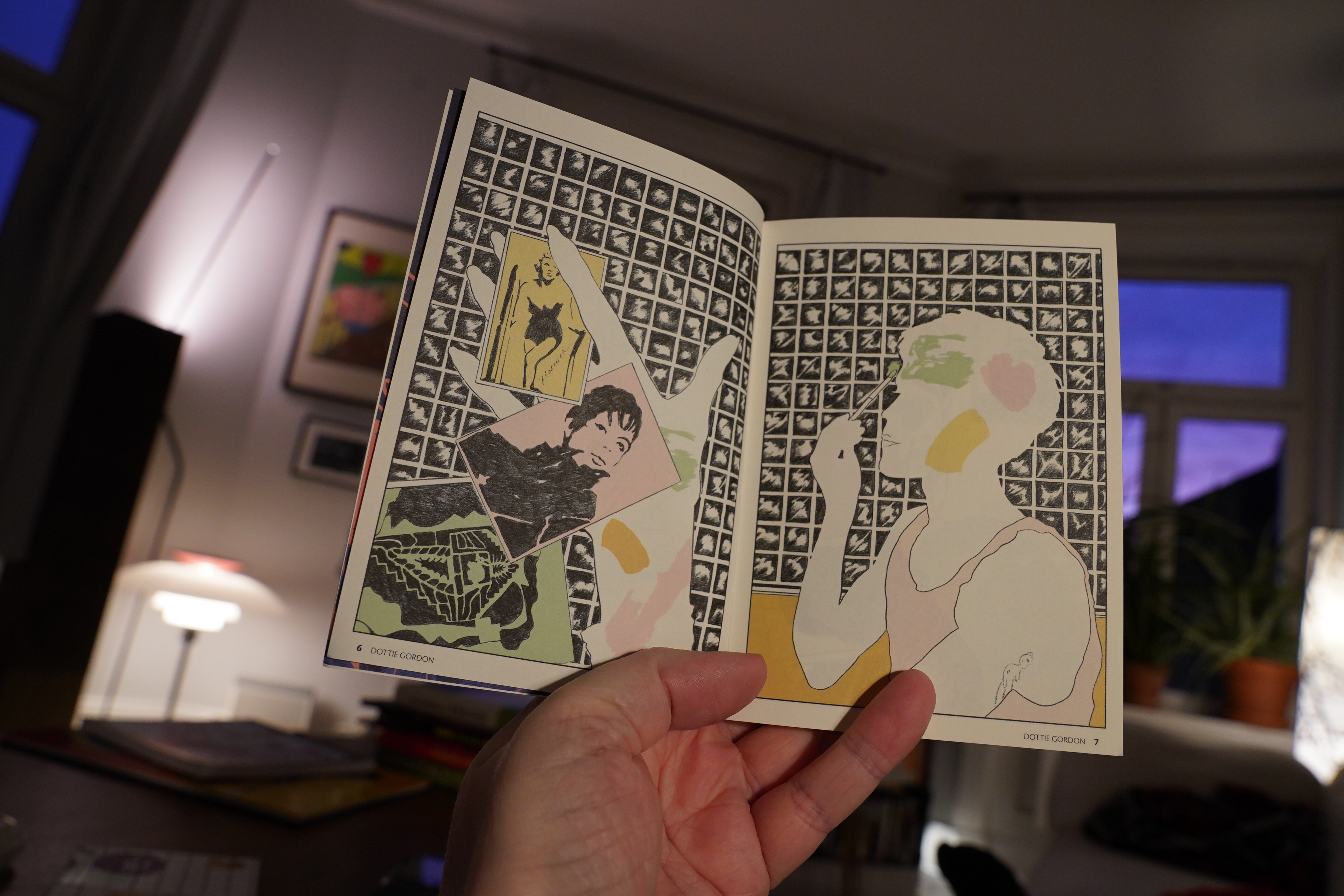
11:24: Secret Life by Theo Ellsworth from a story by Jeff VanderMeer (Drawn & Quarterly)

I like Ellsworth’s comics in general, so I was excited to read this book. And there’s indeed a lot of good stuff here: There’s some scenes that are pure magic, and the way the narrative lurches along is very satisfying.
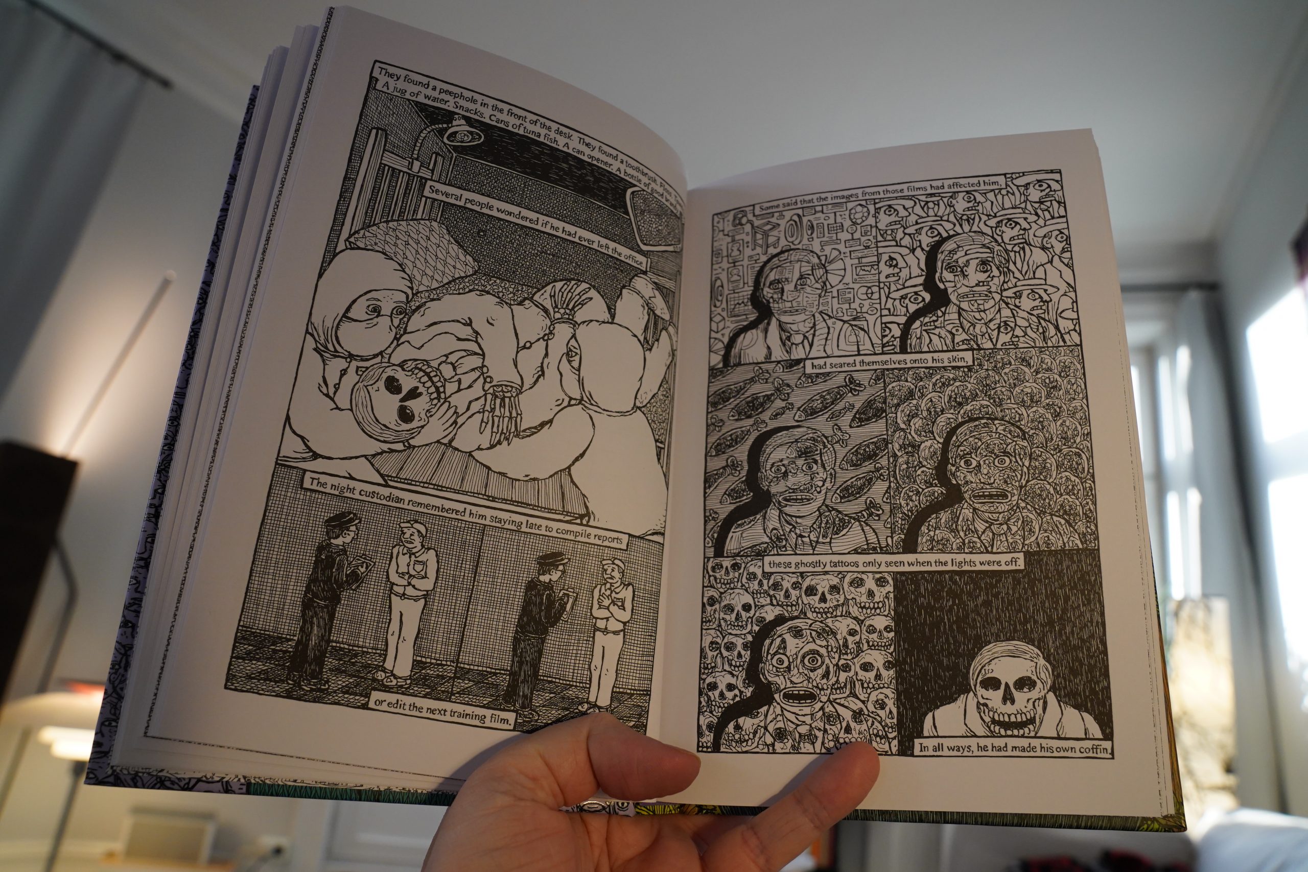
But I’m just not feeling it? This might be 100% just me, and this book might really be a work of genius, but something about it just rubbed me the wrong way. The office-building-as-a-mysterious-machine thing just feels so… done? The strange rituals of board meetings taken into symbolic absurdity… I was half going “oo, this is so well done” and half going “how cliché” all the time while reading this.
Perhaps the VanderMeer source material sucks and Ellsworth is brilliant, and that’s what’s this ambivalence is down to?
I don’t know. It might just be me!
| Jon Eberson & Sidsel Endresen: Pigs and Poetry | 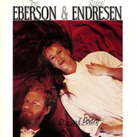 |
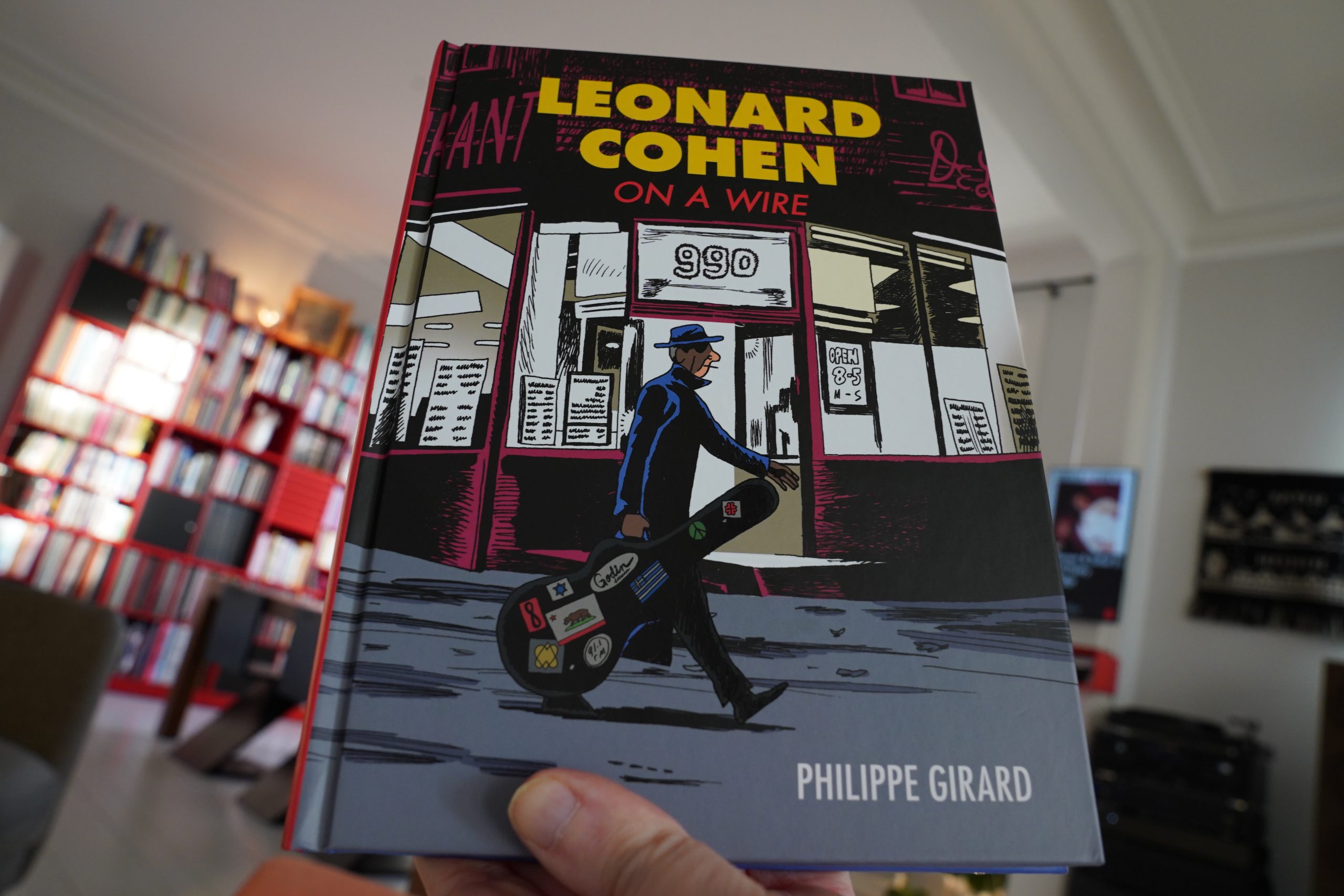
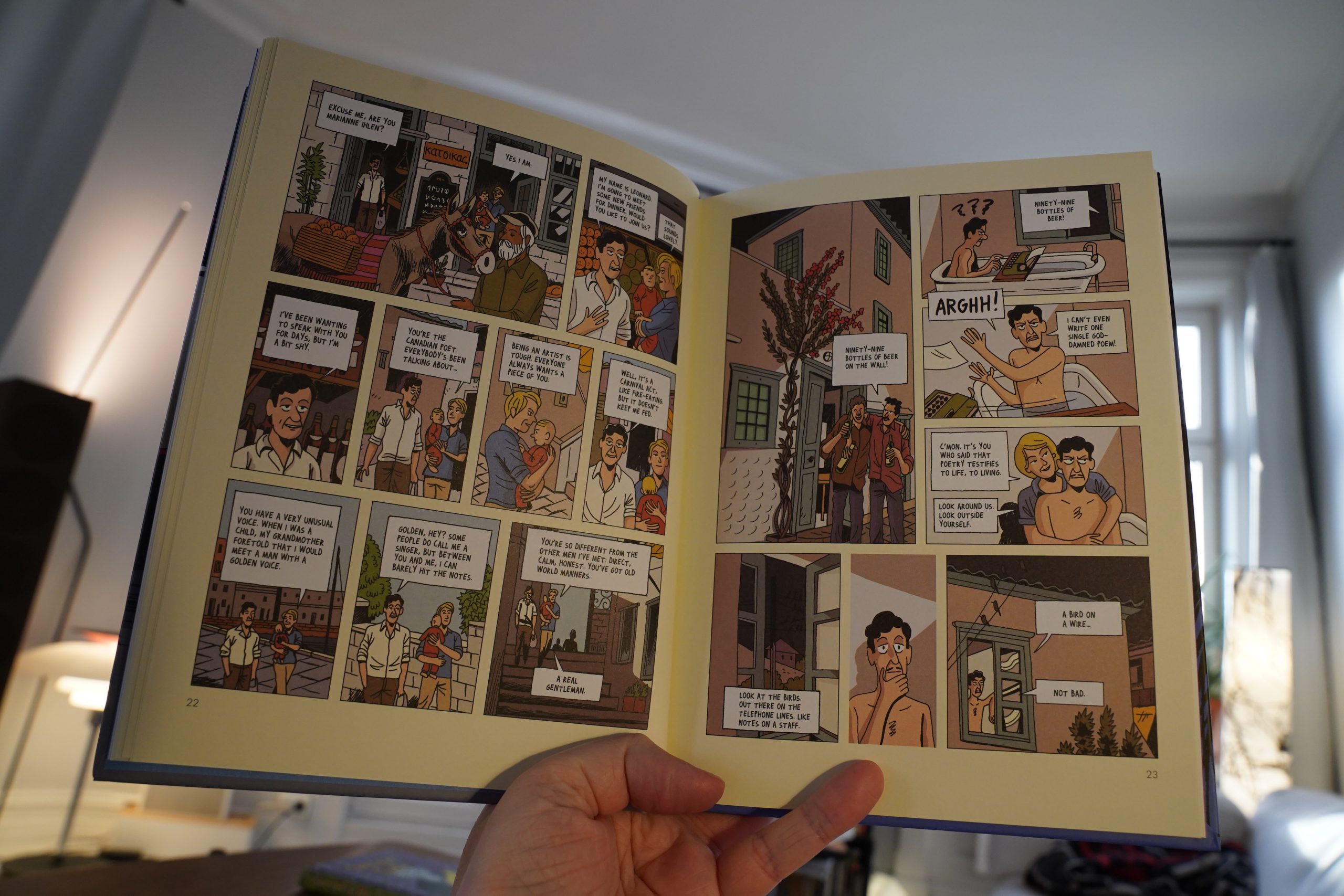
12:07: Leonard Cohen On A Wire by Philippe Girard (Drawn & Quarterly)
The biography-of-famous-people genre is still going strong in comics — it took off like a decade ago, but seems to have been slowing slightly lately. Perhaps because everybody, even the fans of these famous people, have caught on to these comics usually being a bit shit.
(I mean, it’s nice that comics people get a chance to earn some money and stuff, but nobody should have to read the results of these mostly uninspired money grabs.)
So I have no idea why I bought this — I must have done so by mistake?
Now, I’m not a Leonard Cohen fan, but even I can see that they’re getting at here.
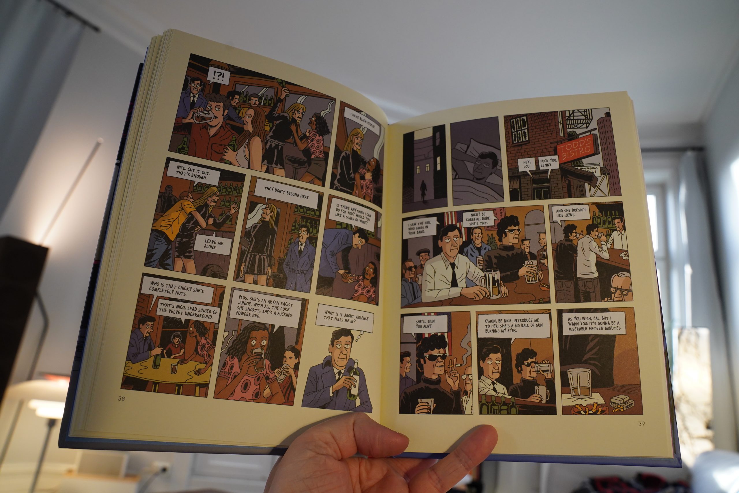
This is just the worst! It’s one anecdote about a famous person Cohen’s meeting after another. It doesn’t build to anything; it’s just one pointless scene after another. I guess if you’re a Cohen fan and you’ve read all the other biographies, you can read this and nod along going “ah, yes, this is that amusing anecdote about him meeting Nico” and “ah, here’s when he was with Joni Mitchell” and “isn’t that Phil Spector a character”.
It’s excruciating.
Even the fake cream-coloured paper (it’s printed, not real cream-coloured paper) gets on my tits.
The artwork’s OK, though.
| Golden Palominos: Pure |  |
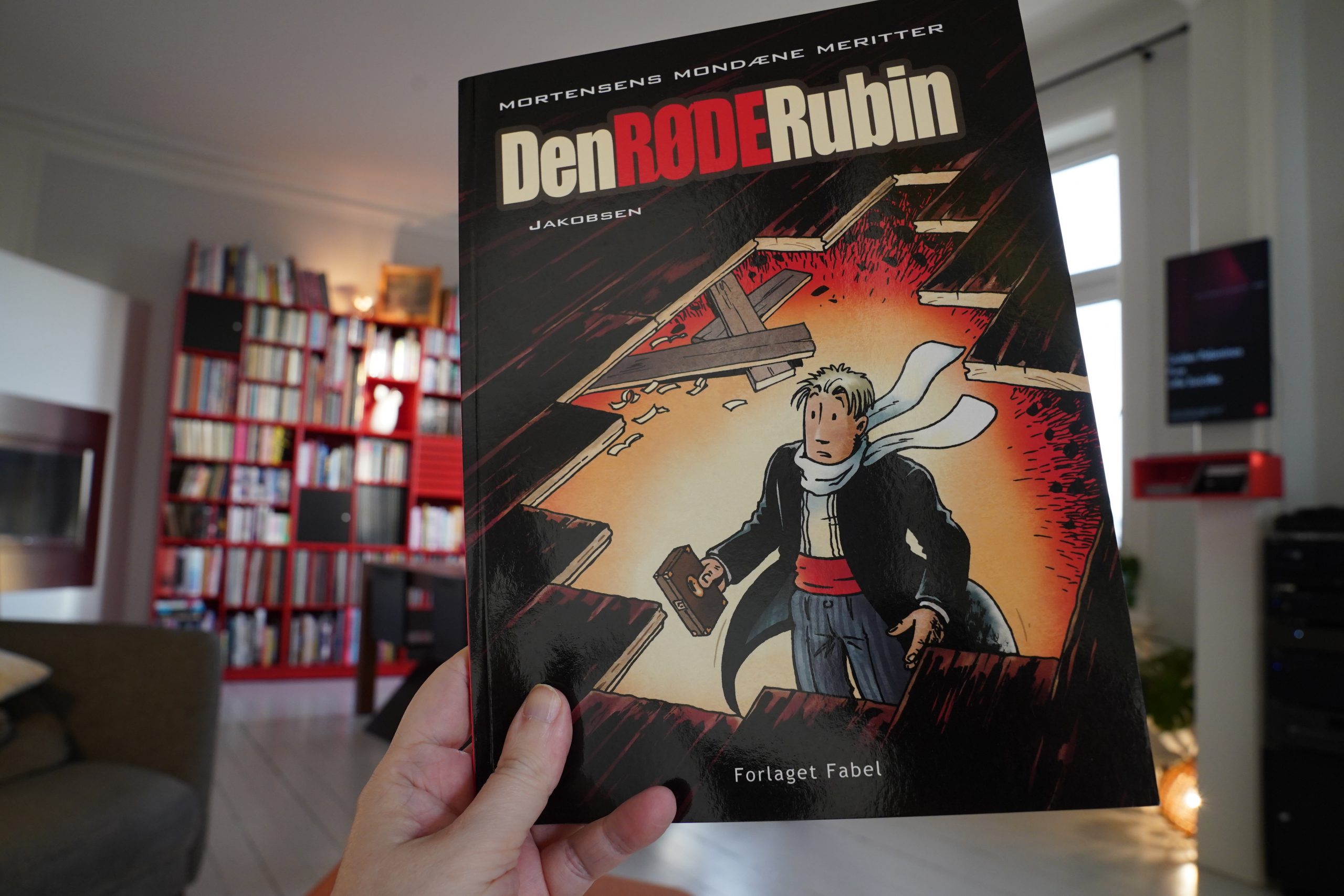
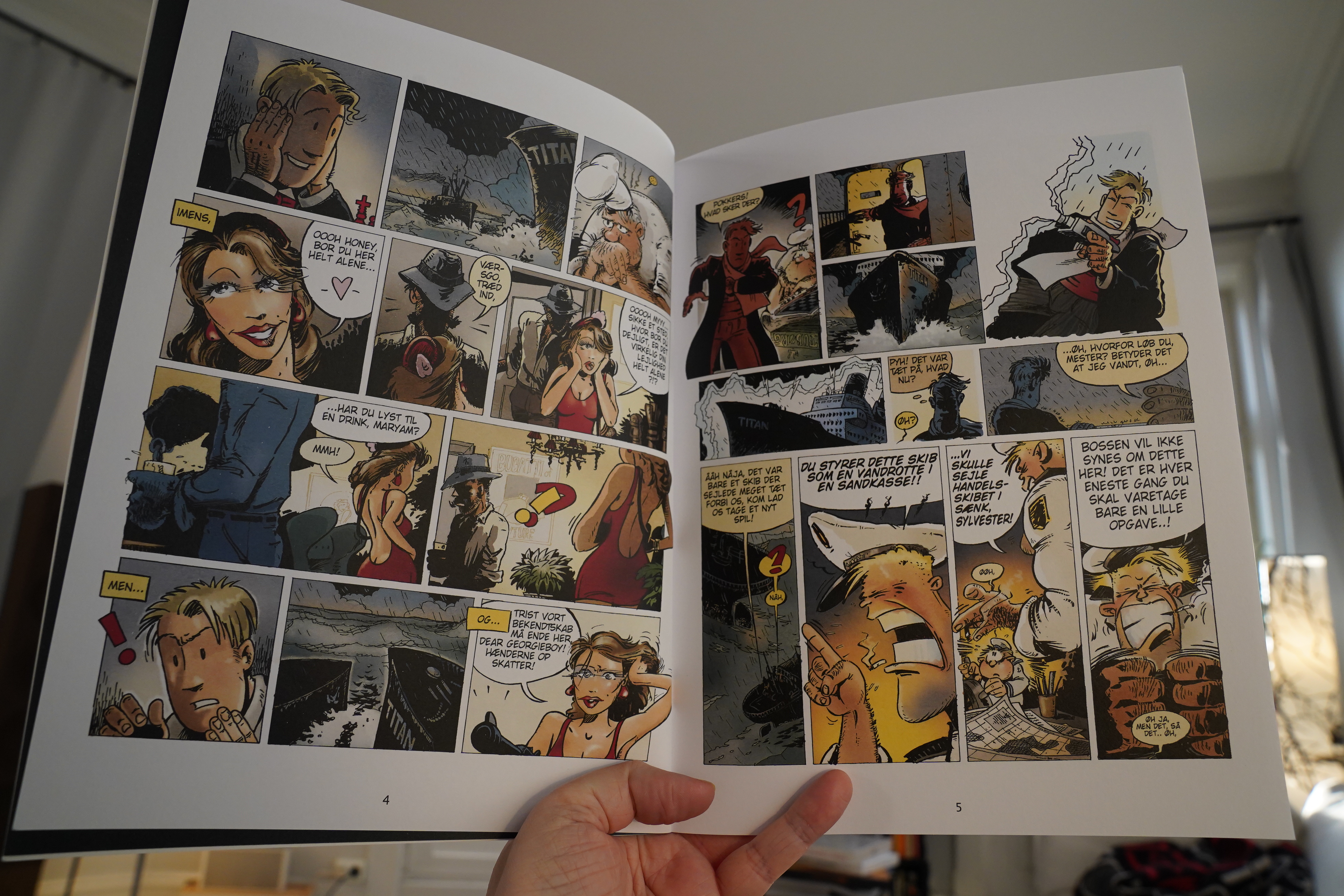
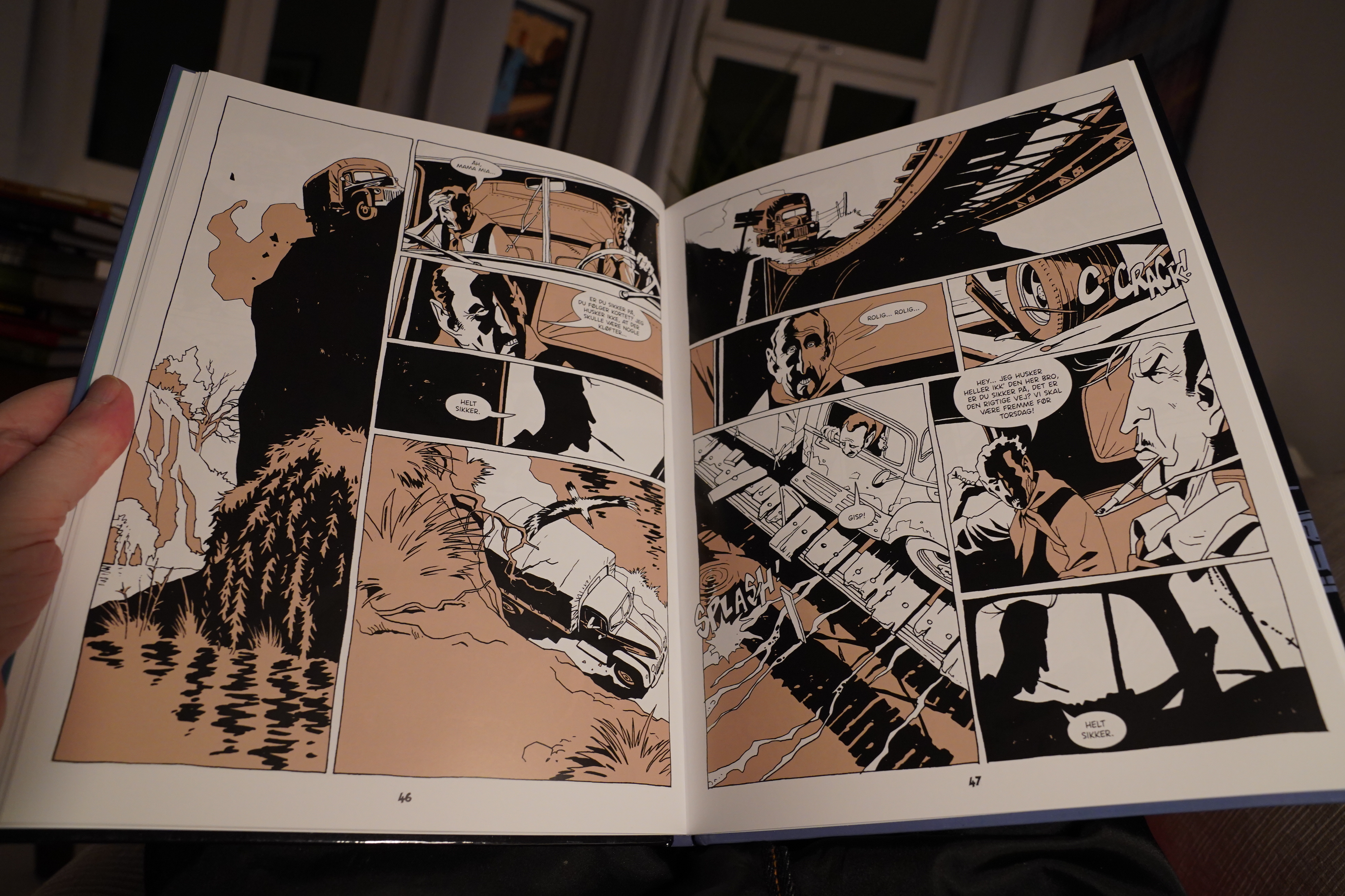
12:48: Mortensens mondæne meritter: Den røde rubin by Lars Jakobsen (Forlaget Fabel)

This is a Danish comic book about… about… if you held a gun to my head and tried to make me tell what this was about, I couldn’t. (I don’t see why you’d do that, but you do you!) It’s a time travel thing? But the storytelling, on a scene by scene basis, is so inept (or avant garde) that I have no idea what’s going on.
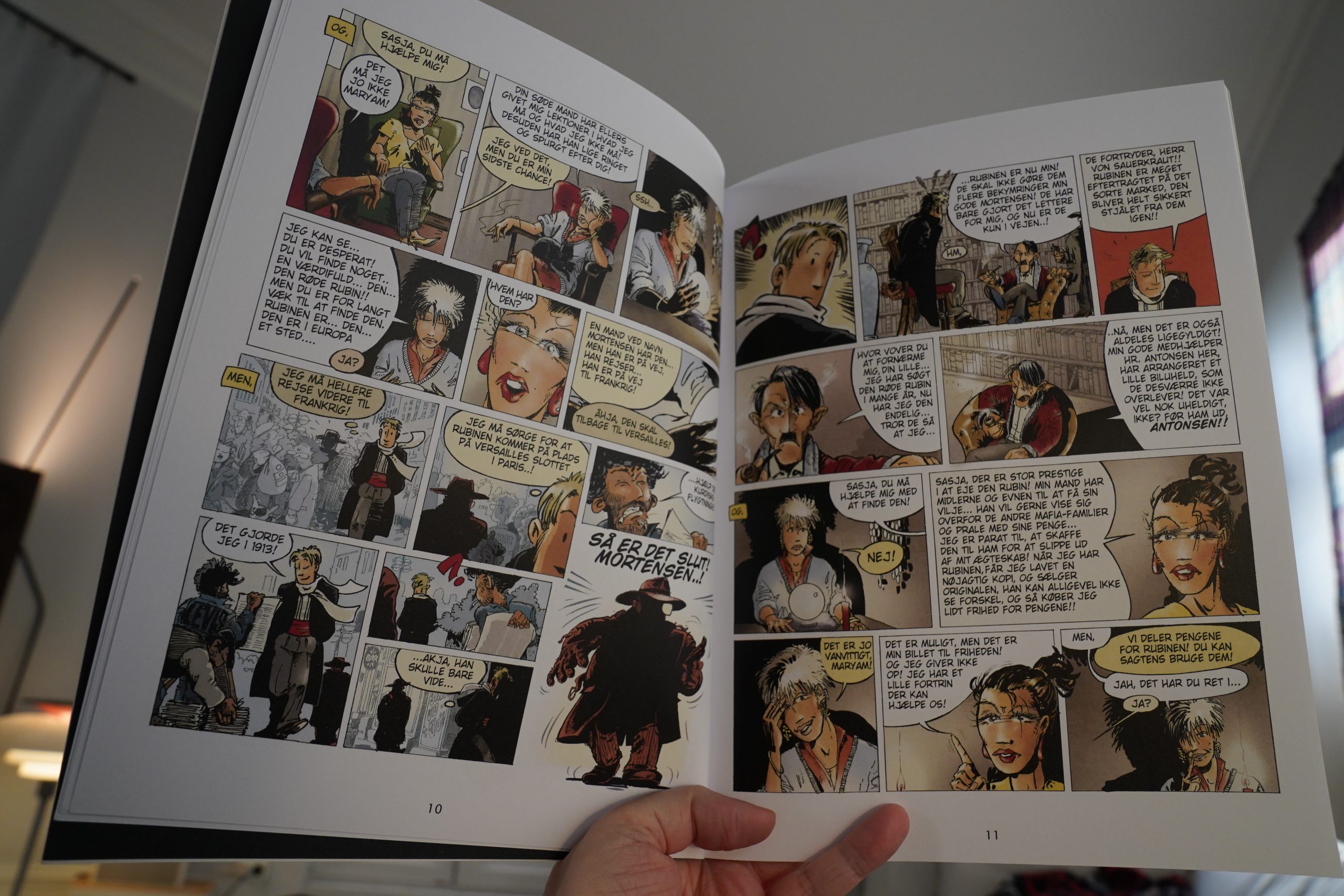
OK, once I got used to the rhythms, it got a bit easier to interpret what he’s trying to do here, but it’s… it’s…
Like hva’ba’?
Man, this comics reading day isn’t off to the best of starts.
| Golden Palominos: Pure |  |

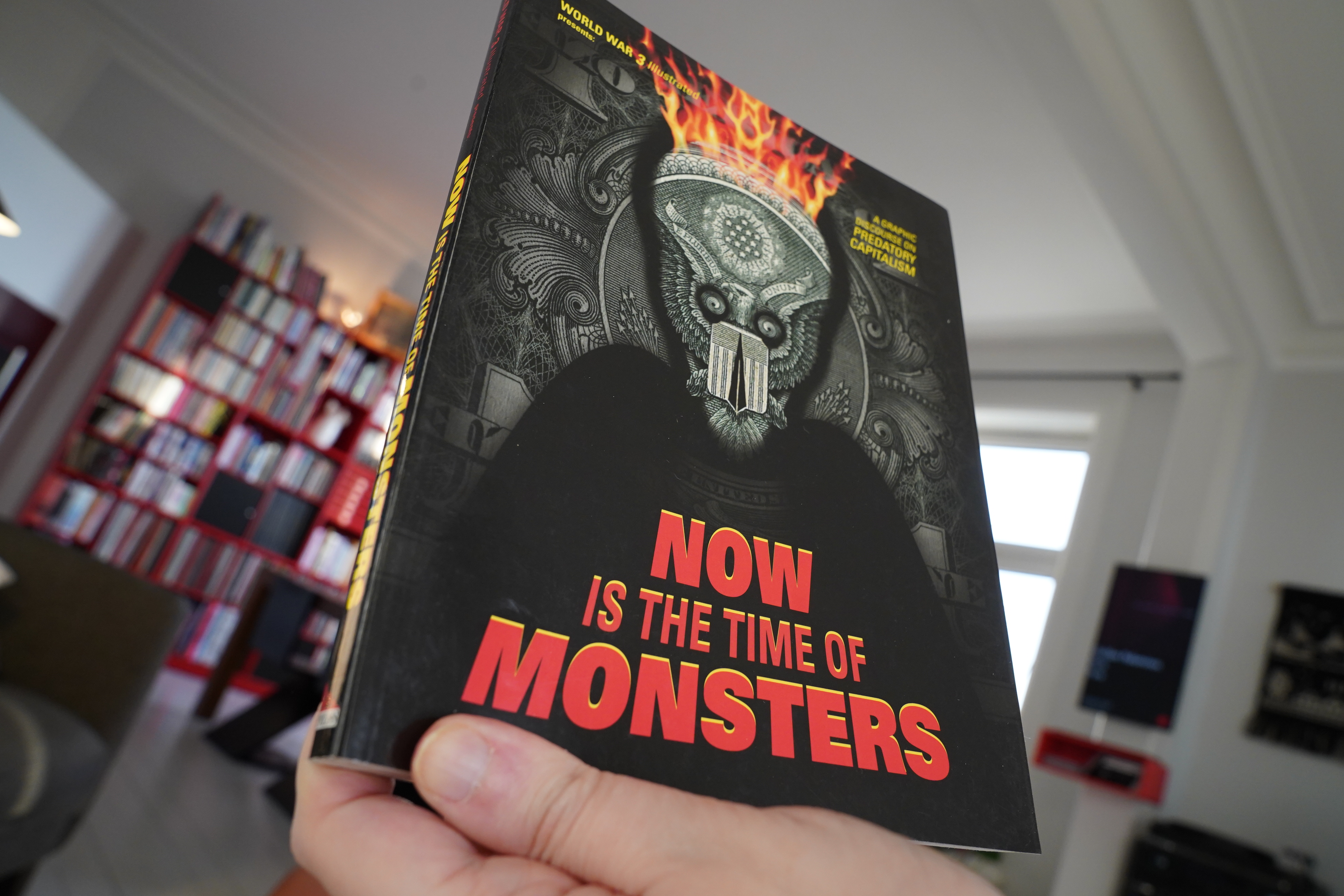
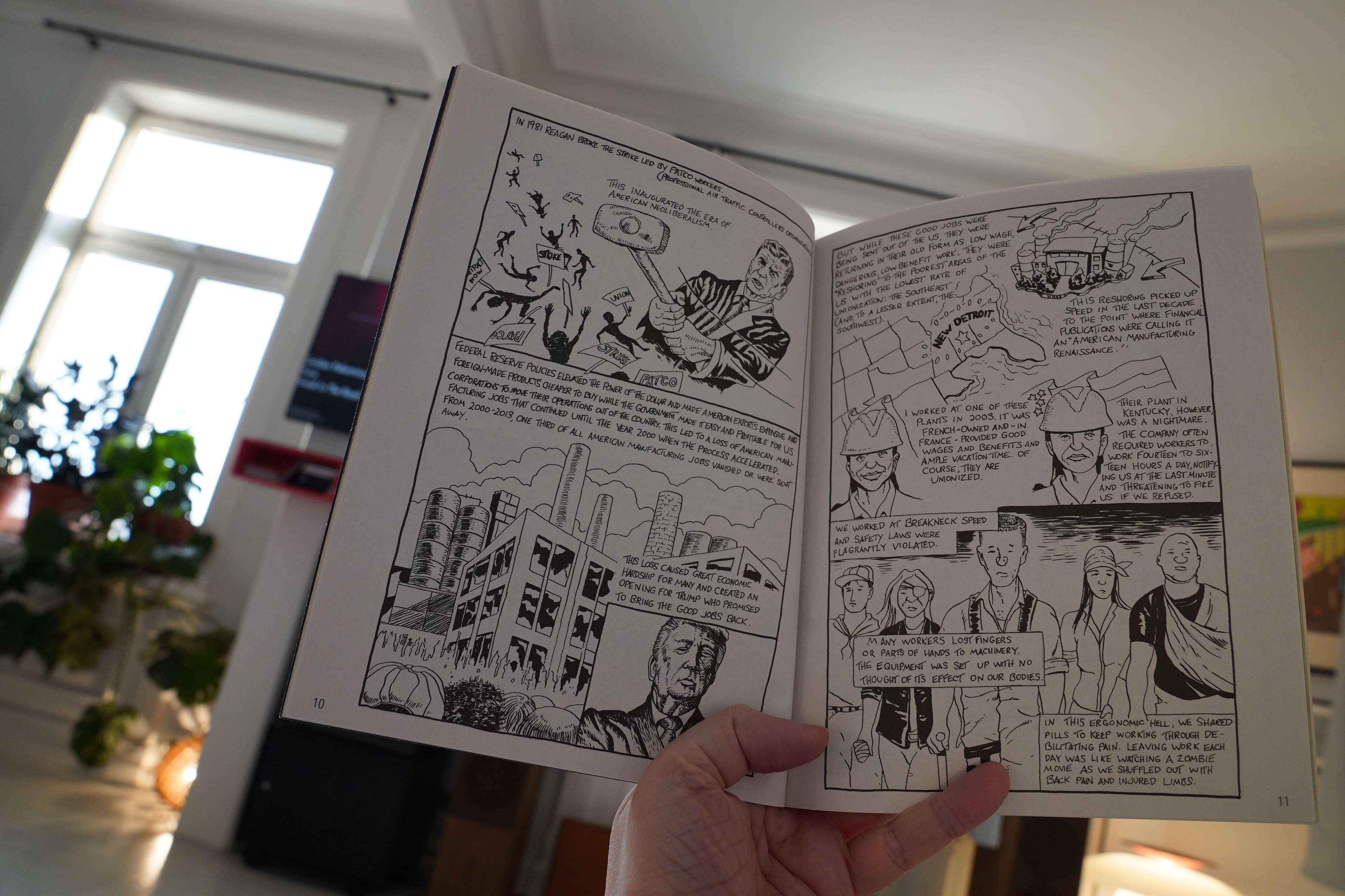
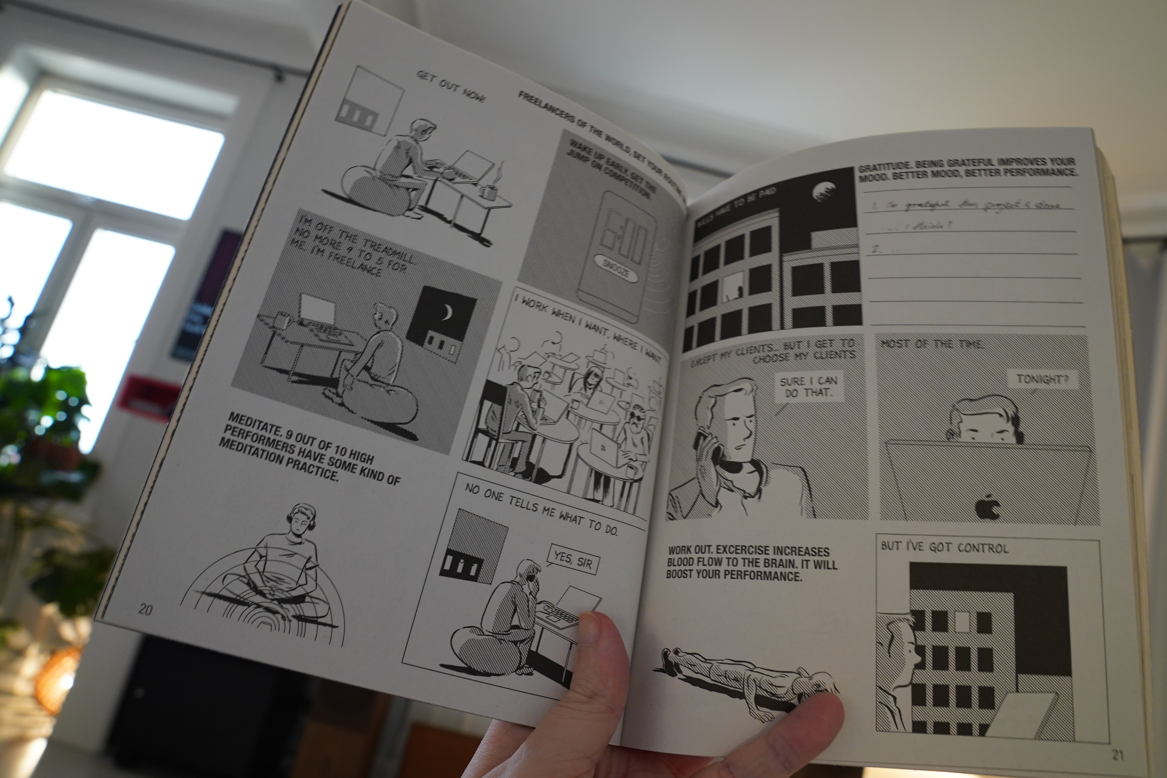
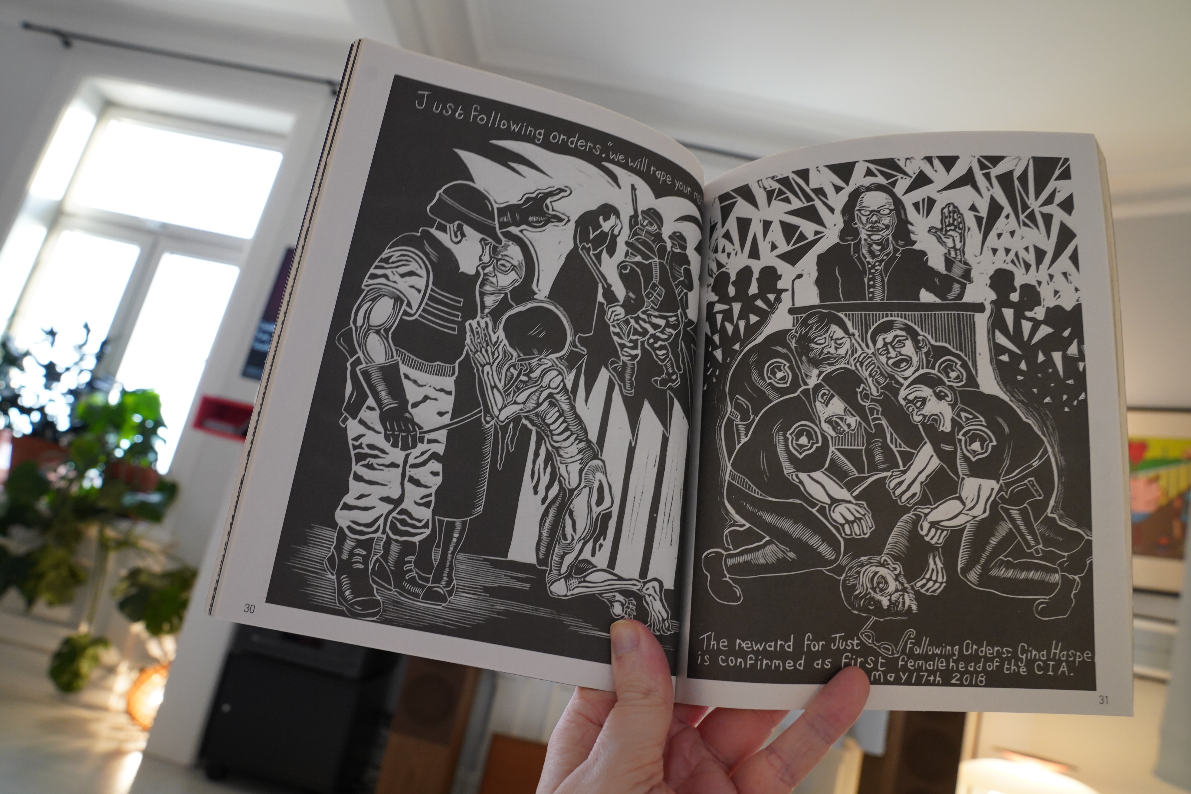
13:11: World War 3 Illustrated #49 (AK Press)

Biggest issue ever, I think — 180 pages? And it’s a strong issue, with a mixture of people I haven’t read before (Terry Tapp)…
… and people I haven’t seen in World War 3 Illustrated before (Tom Kaczynski)…
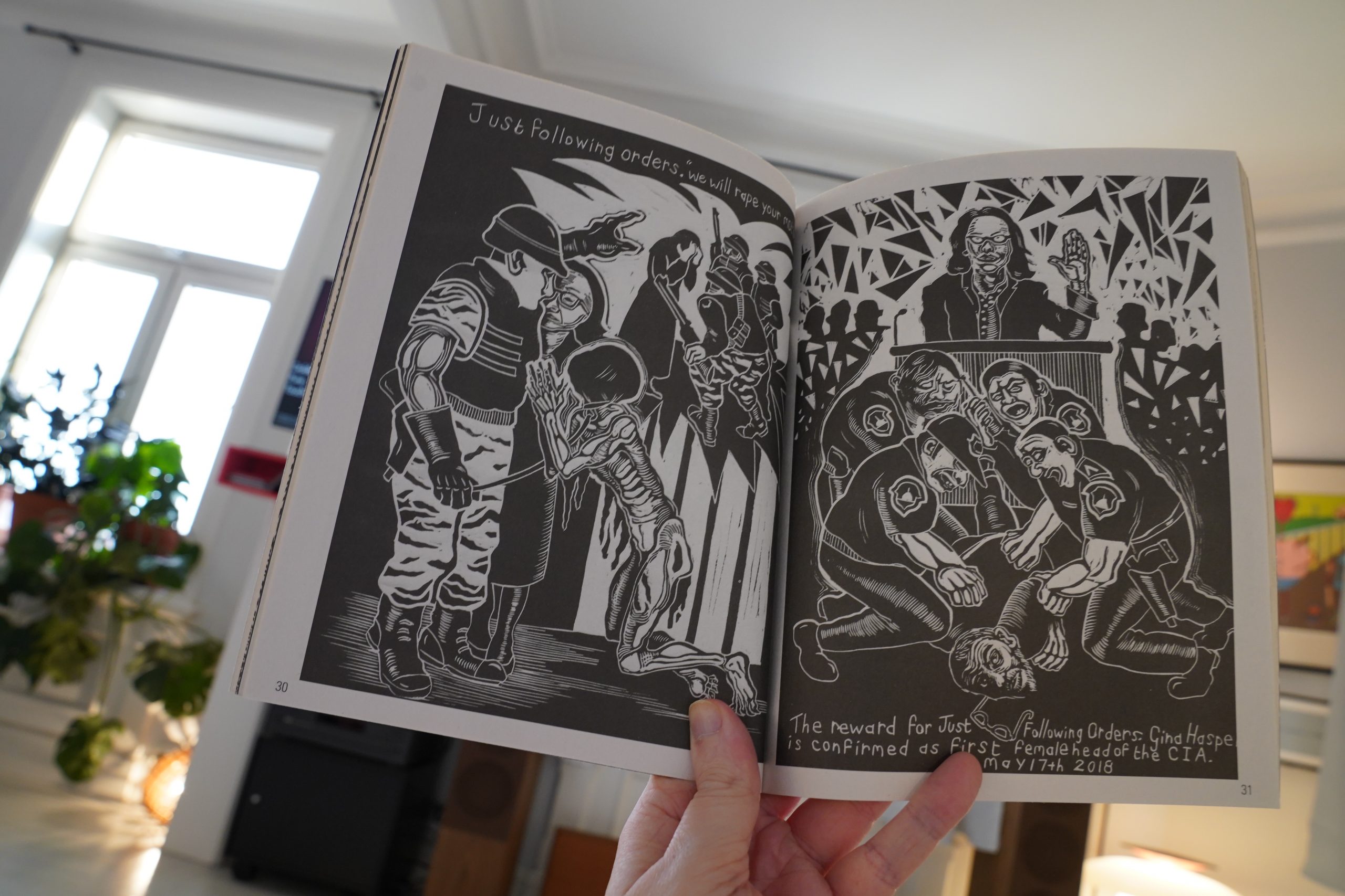
… with great artists that are in many issues — Sue Coe above, and Seth Tobocman and Peter Kuper, of course…
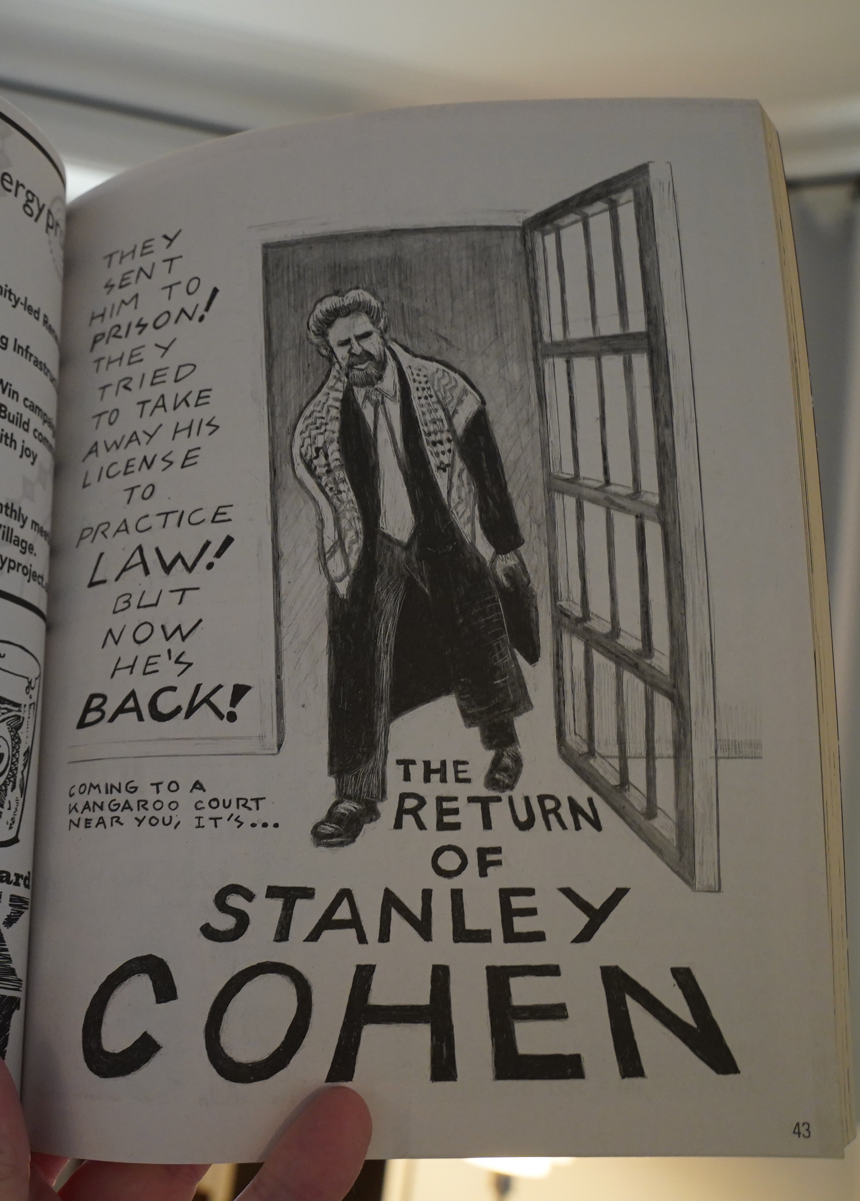
Heh. Stanley Cohen is still taking out ads.
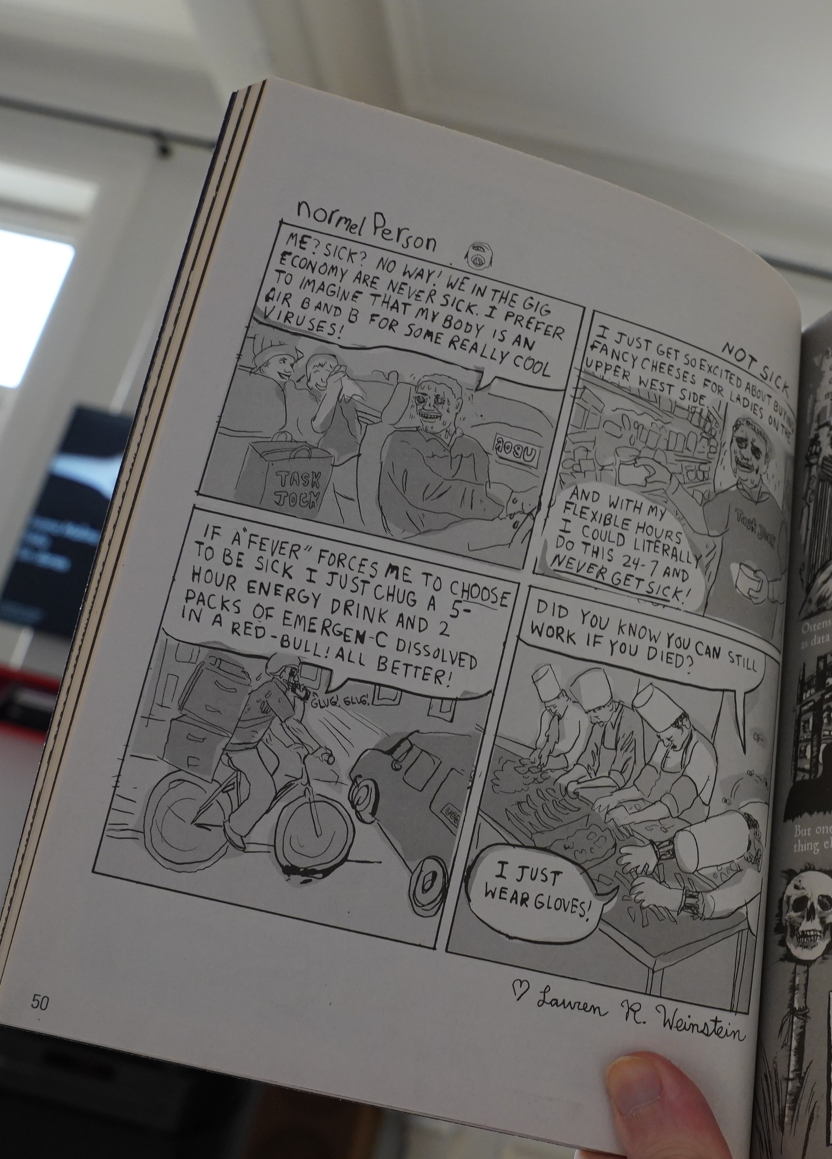
Hey! Lauren Weinstein!
Anyway, it’s a strong issue.
| Juana Molina: Halo |  |
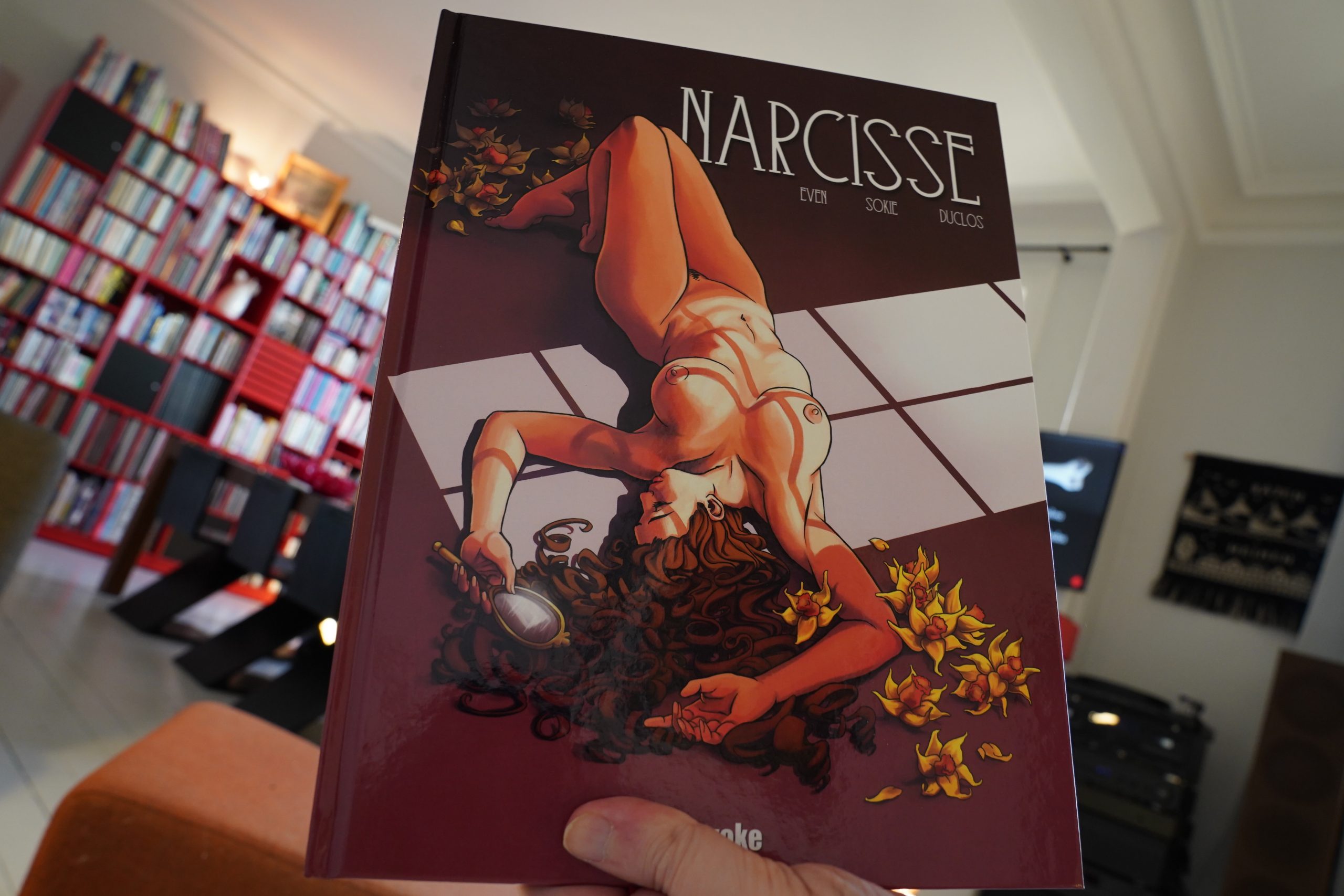
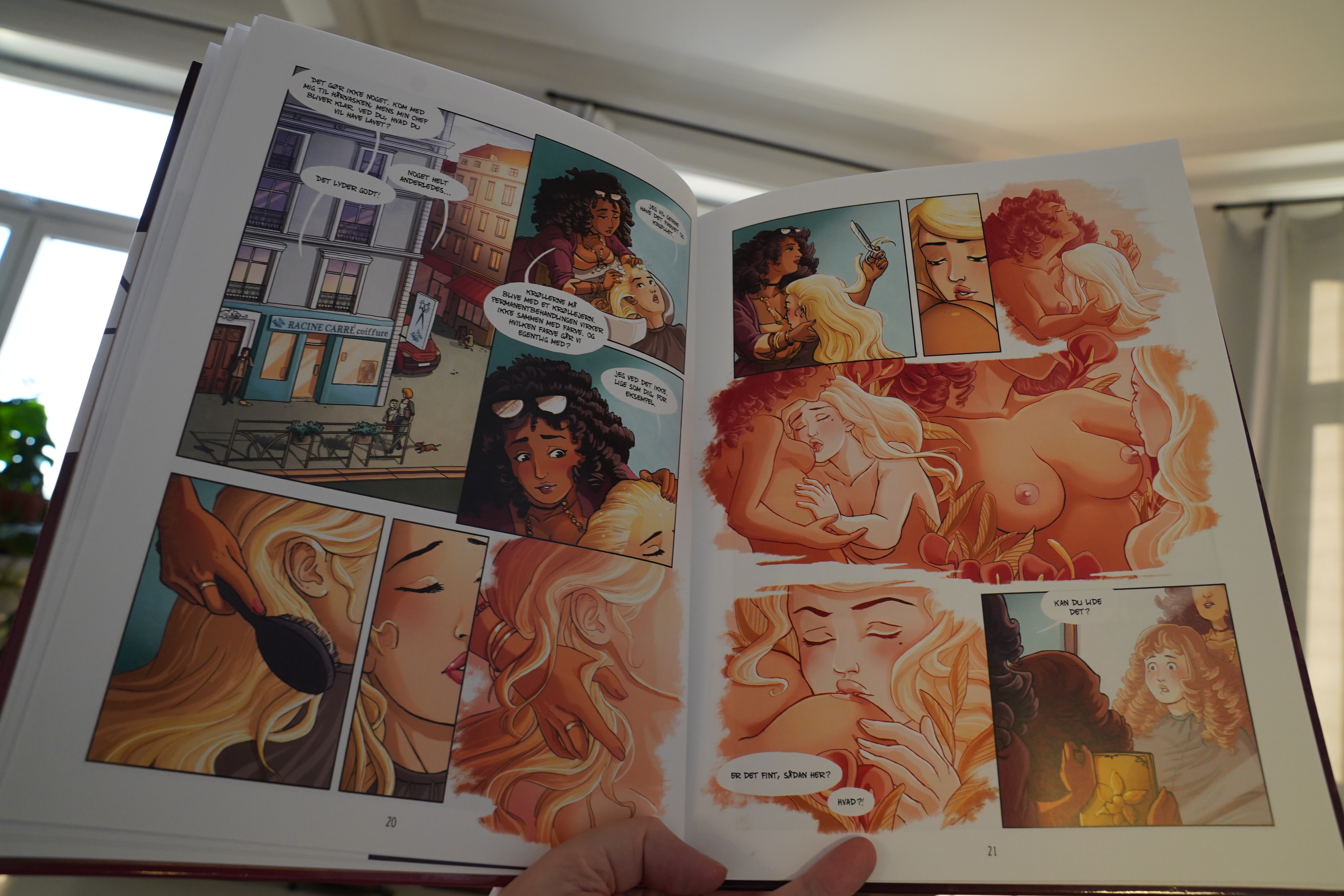
14:07: Narcisse by Even/Sokie/Duclos (E-voke)
Uhm… is this a porn comic? I bought a whole bunch of comics from E-voke, but without really… er… being selective.
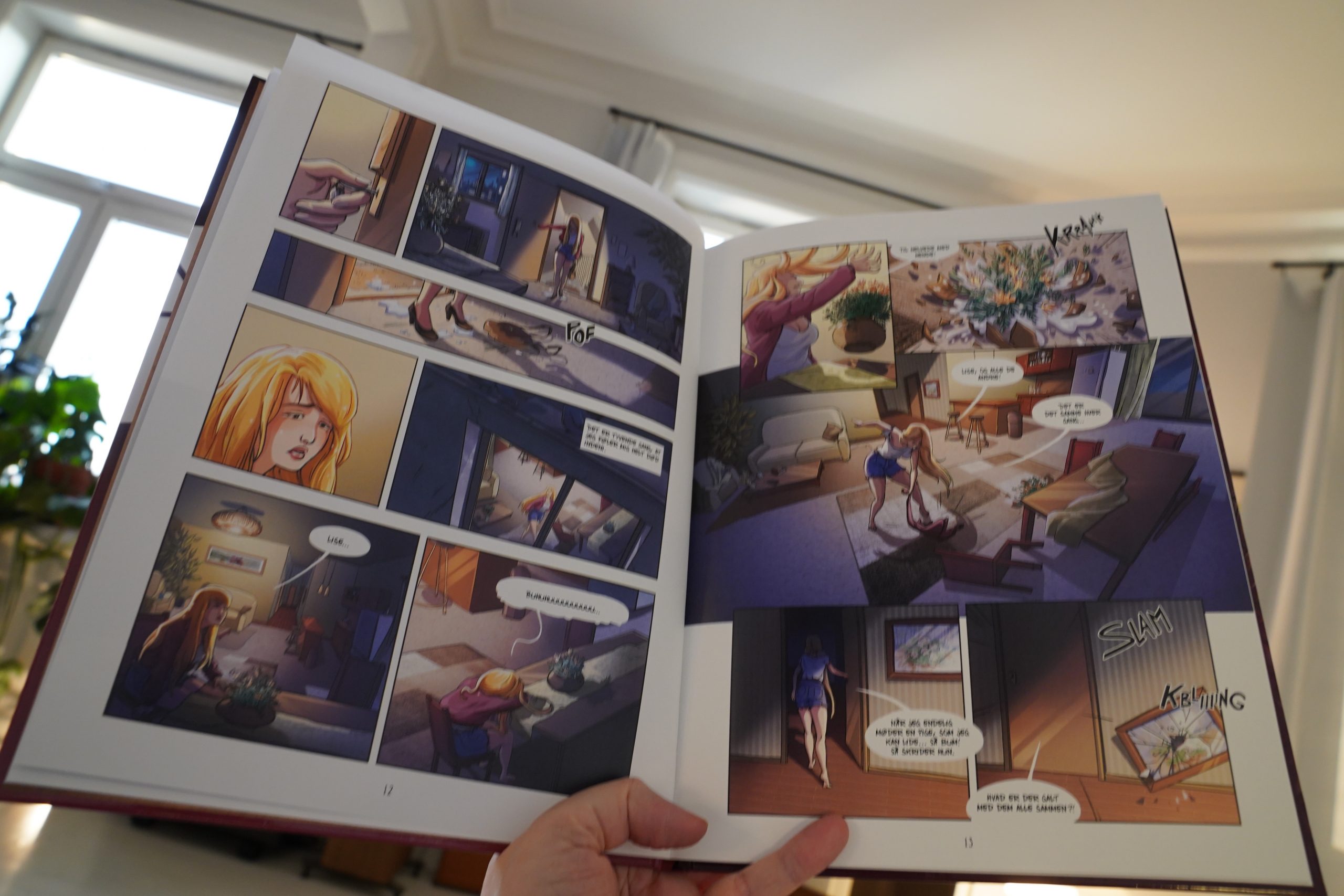
Well, it’s not that porny… The art style isn’t really my thing.
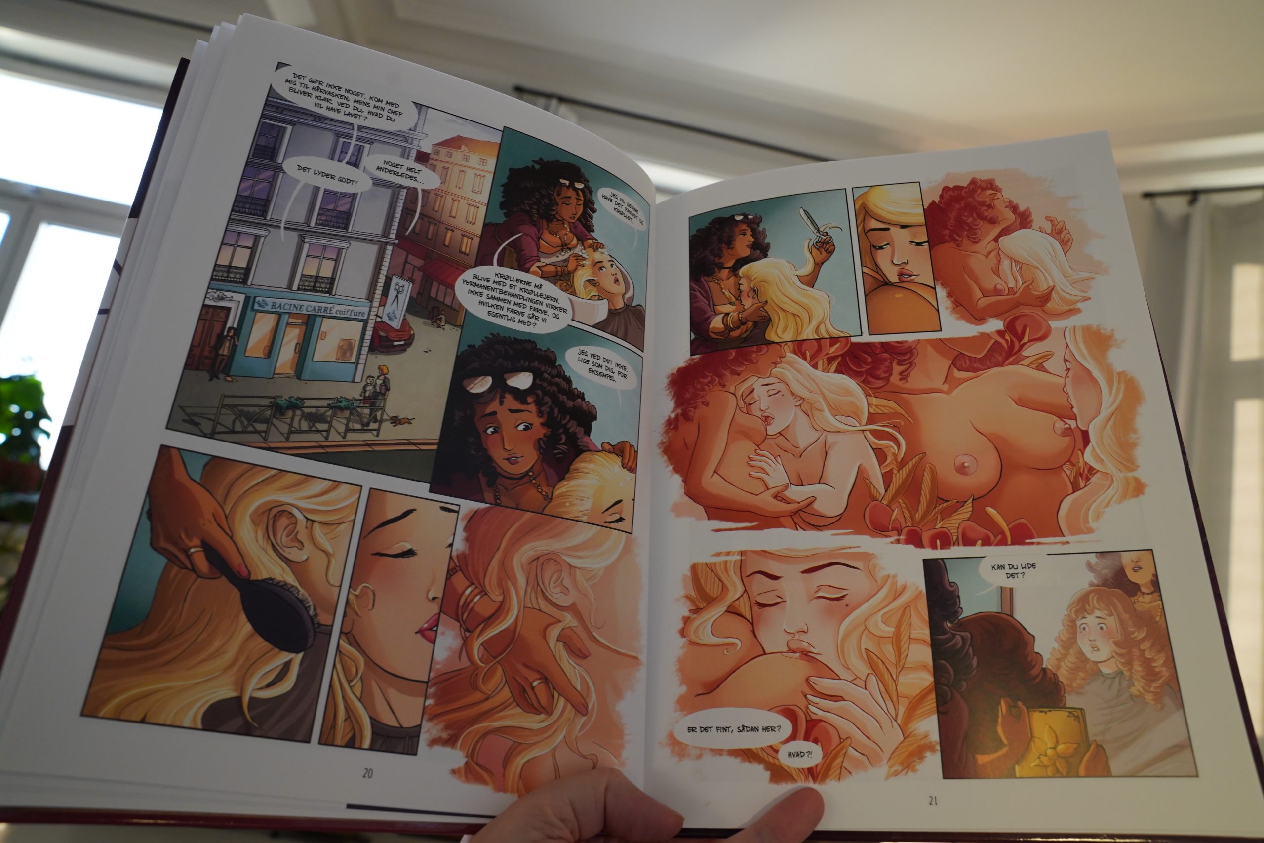
OK, then it gets more porny.
It’s a really odd book. I think it’s saying that being gay sucks because being gay is basically narcissism?
| Thurston Moore: Rock N Roll Consciousness |  |
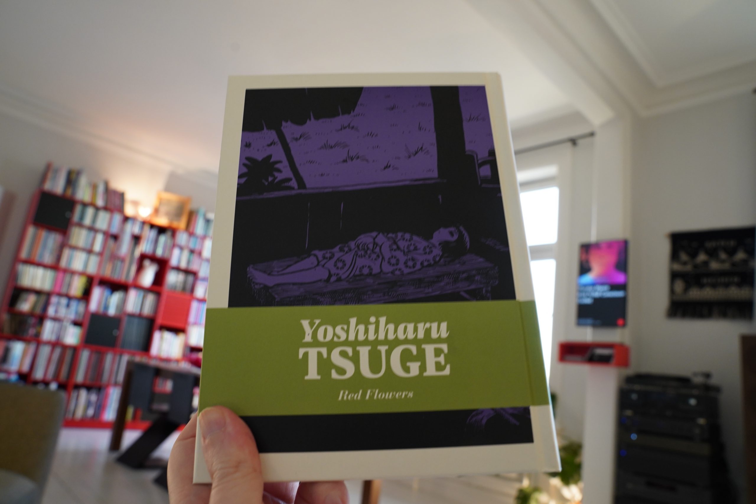
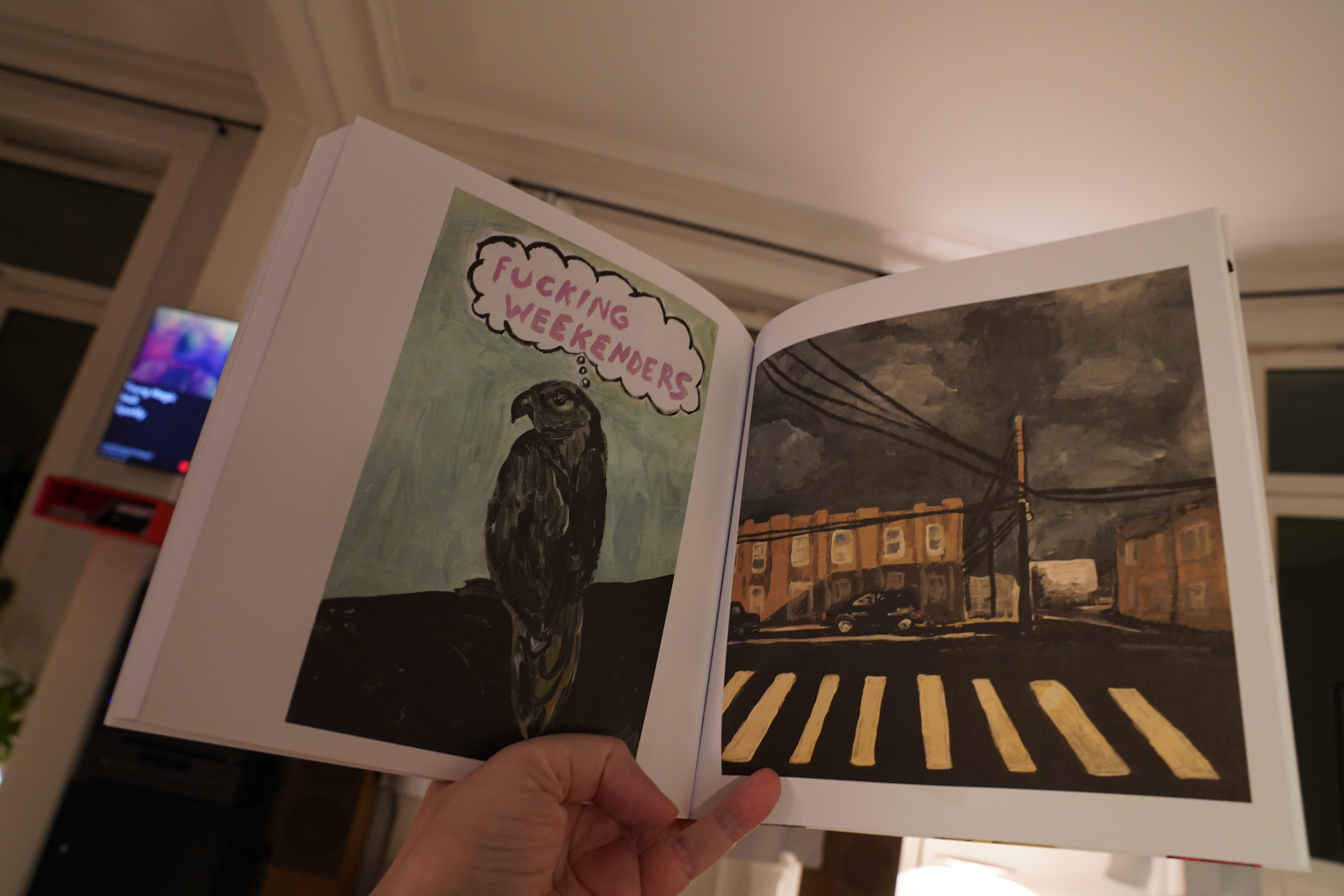
14:34: Red Flowers by Yoshiharu Tsuge (Drawn & Quarterly)
Lots of D&Q today…

Right, this is the second volume collecting Yoshiharu Tsuge’s Garo stories.
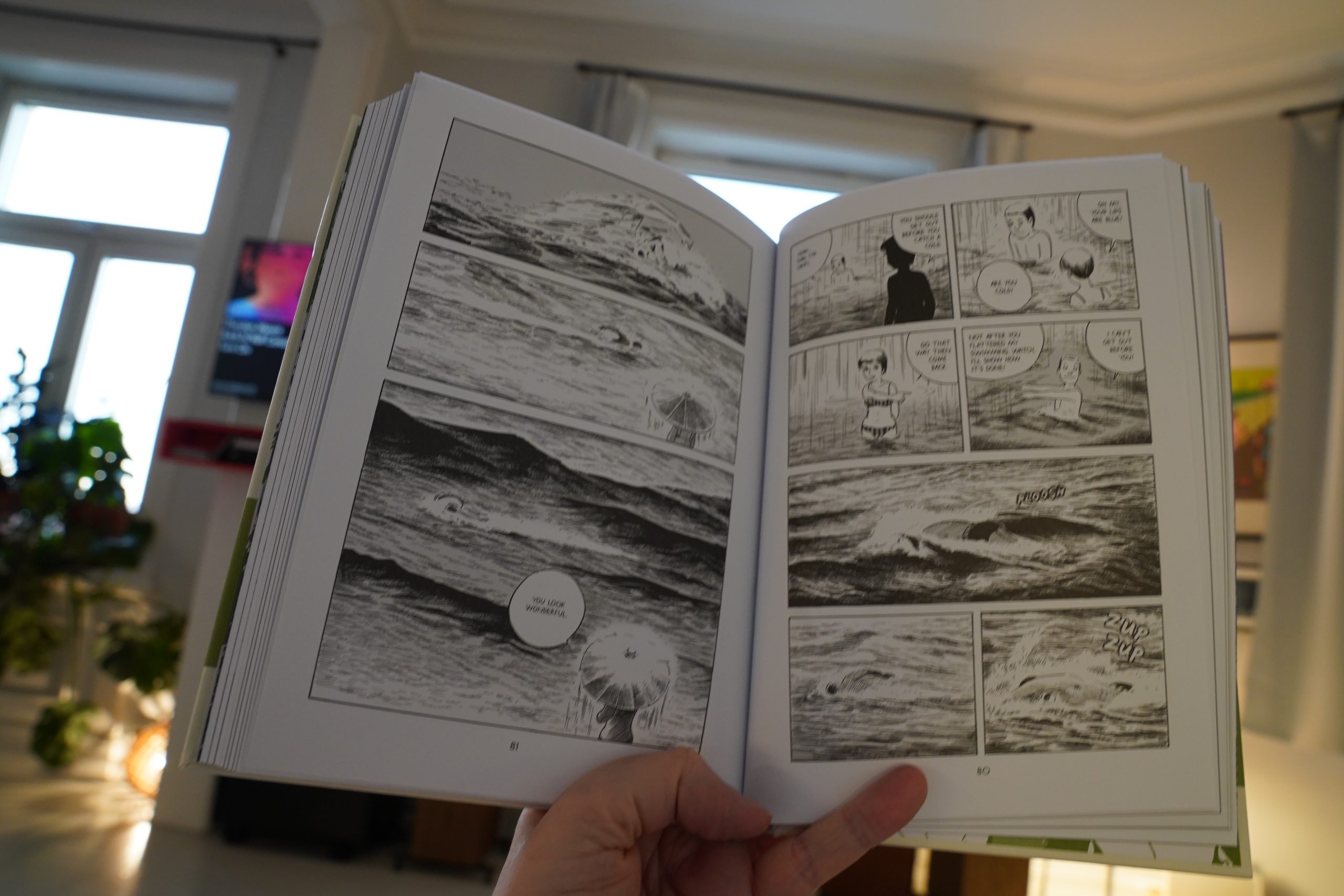
It’s… it’s lovely, really. Some of the stories are pretty naff, like the one that ends the book (the one with the oh-so-ironic sand pit), but most of them are just about Tsuge visiting various inns and the people he meets there, and they’re lovely.
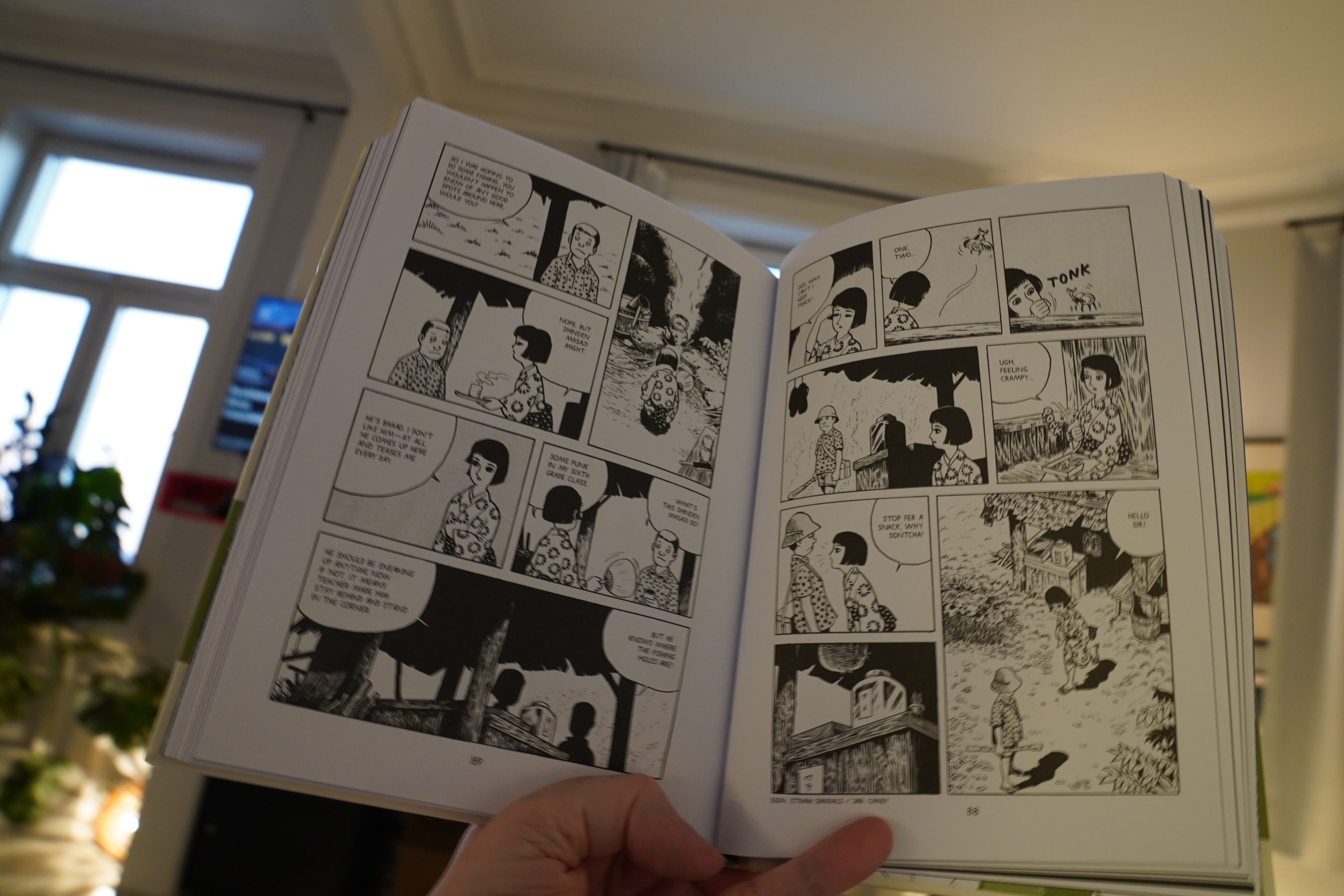
Hm… this one looks familiar…
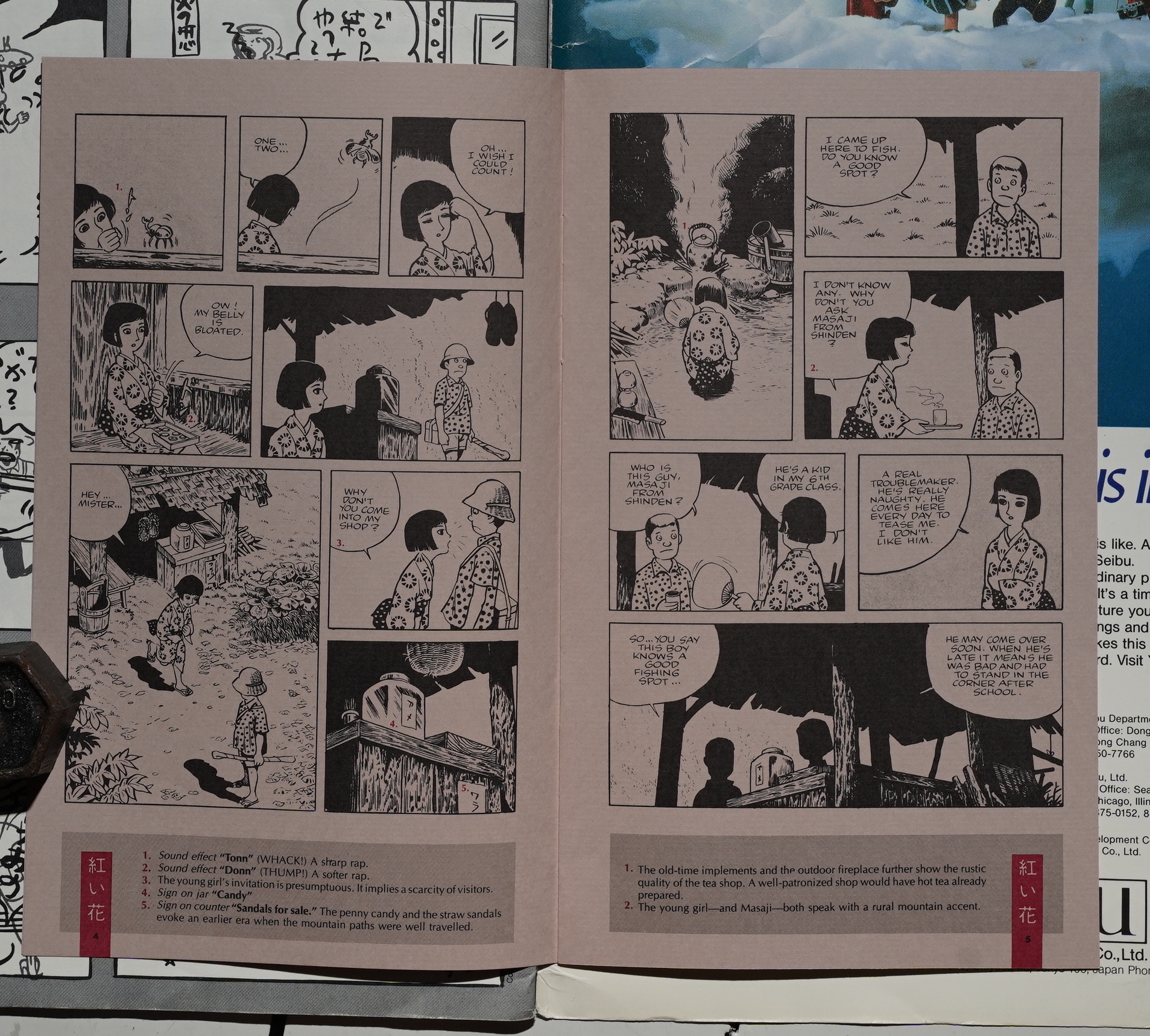
Oh, it’s the one that was reprinted in Raw #7. With copious notes under every page, splainin at us what it all means.
That patronising “ooh, Japanese comics are so strange” thing has subsided substantially, fortunately.
| Revolutionary Army of the Infant Jesus: Mirror | 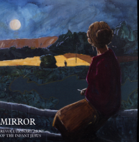 |
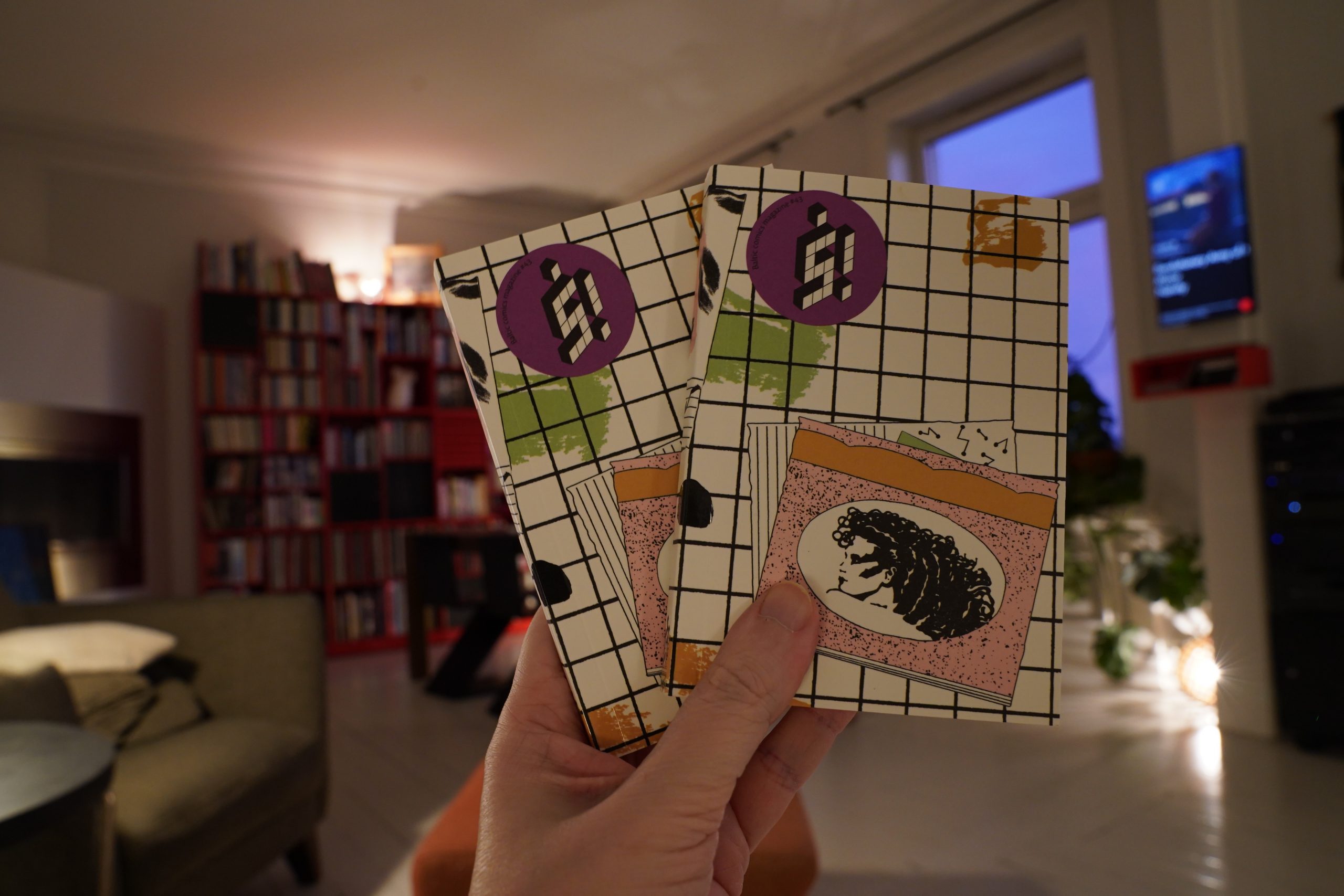
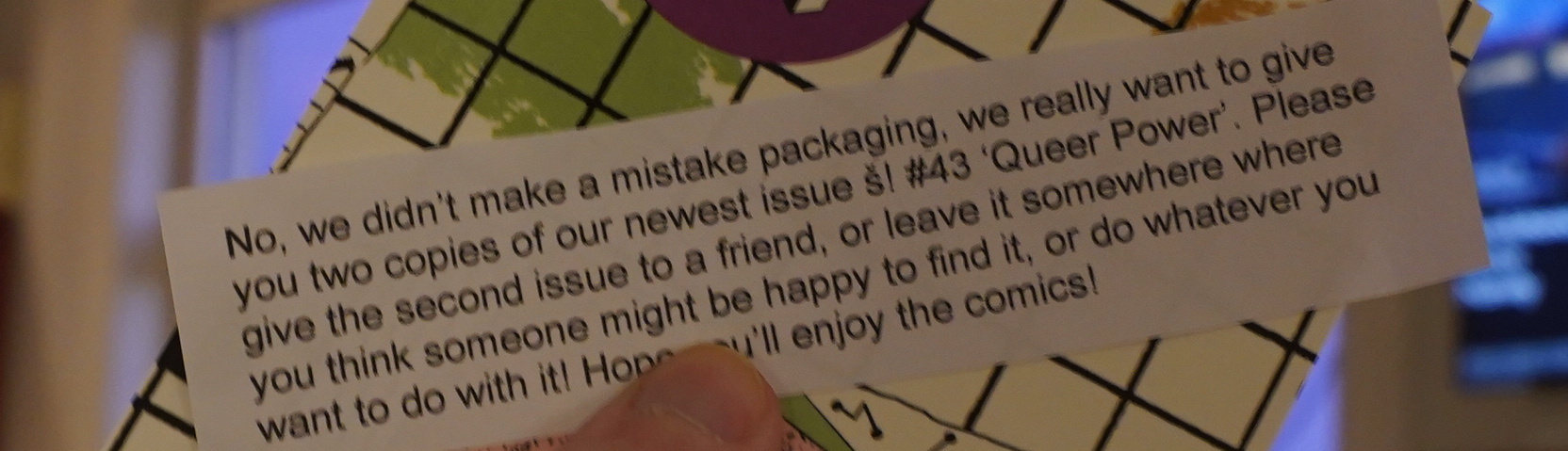
15:55: Ṡ! #43: Queer Power (Kuṡ)
Hei, I’ve got two of these?
Heh. Nice.
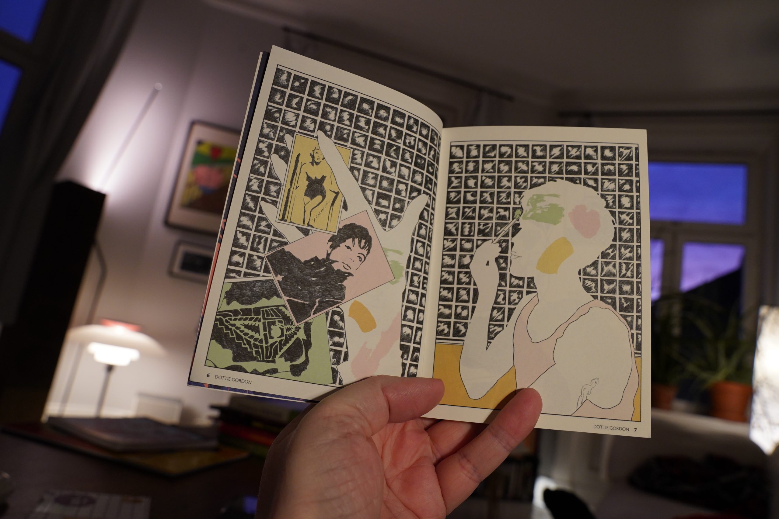
As usual with Ṡ!, there’s a wide variety of approaches… (Credits in pics.)
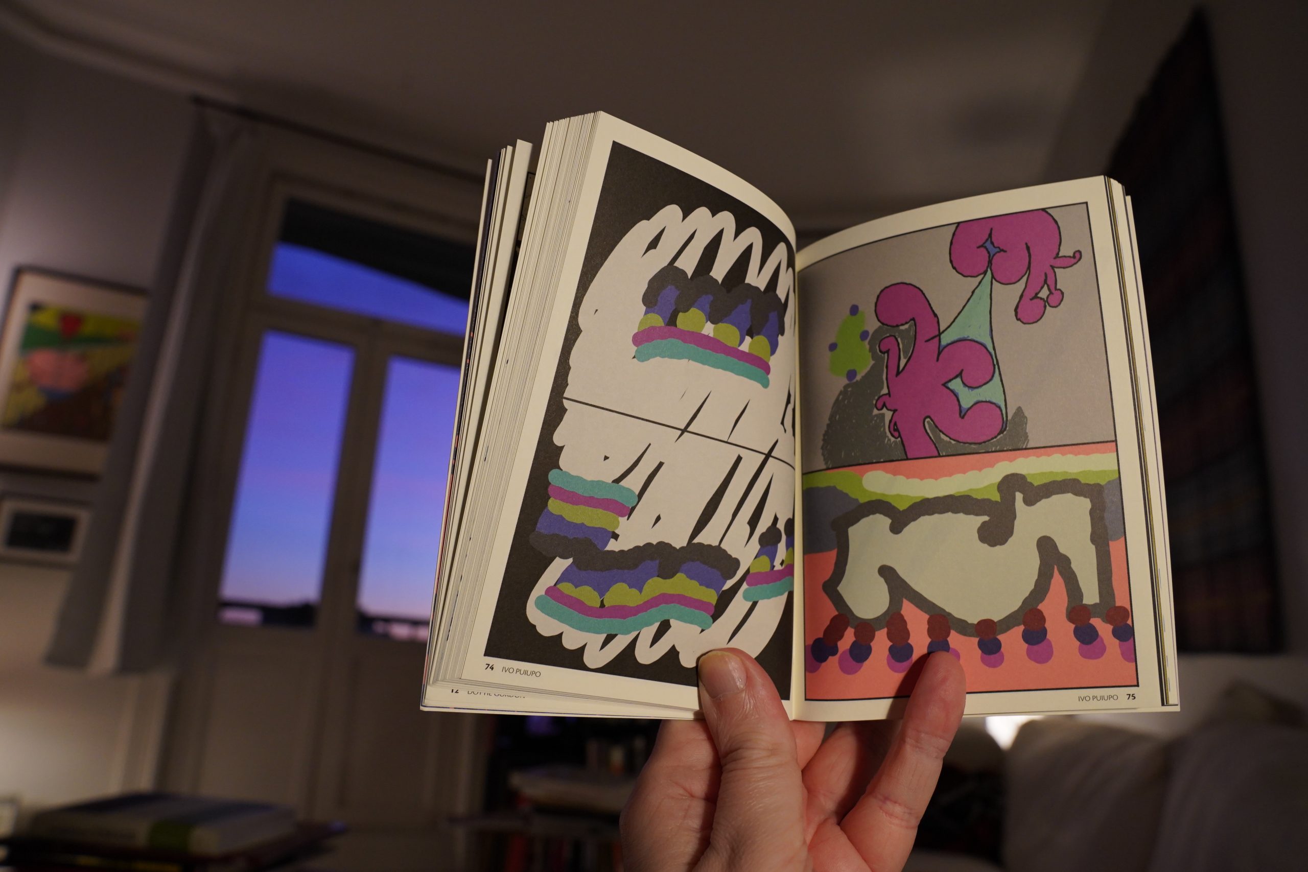
This one has more non-narrative bits than usual, perhaps?
But some bits that are more earnest than usual, too. It’s a good mix.
It’s a lovely read. (Have I been using that word a lot today?)

Lovely.
| Fis and Rob Thorne: Clear Stones |  |

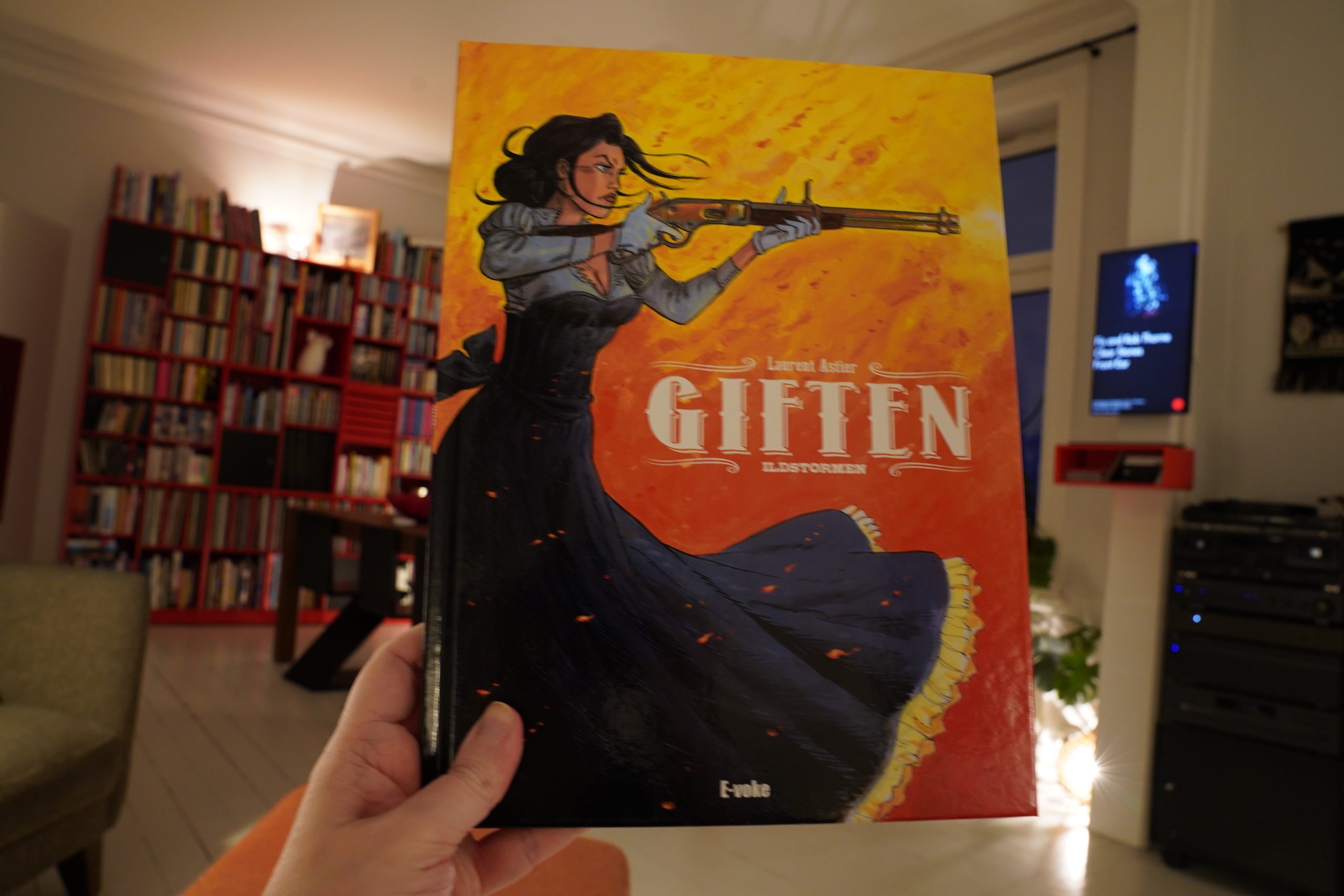
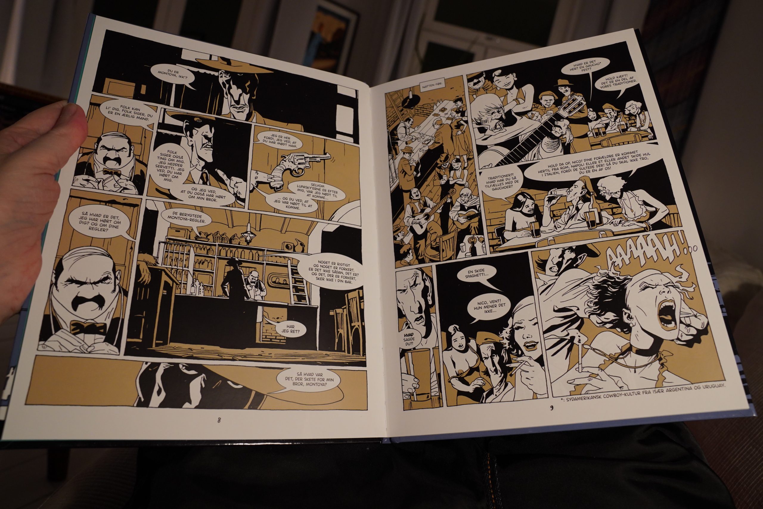
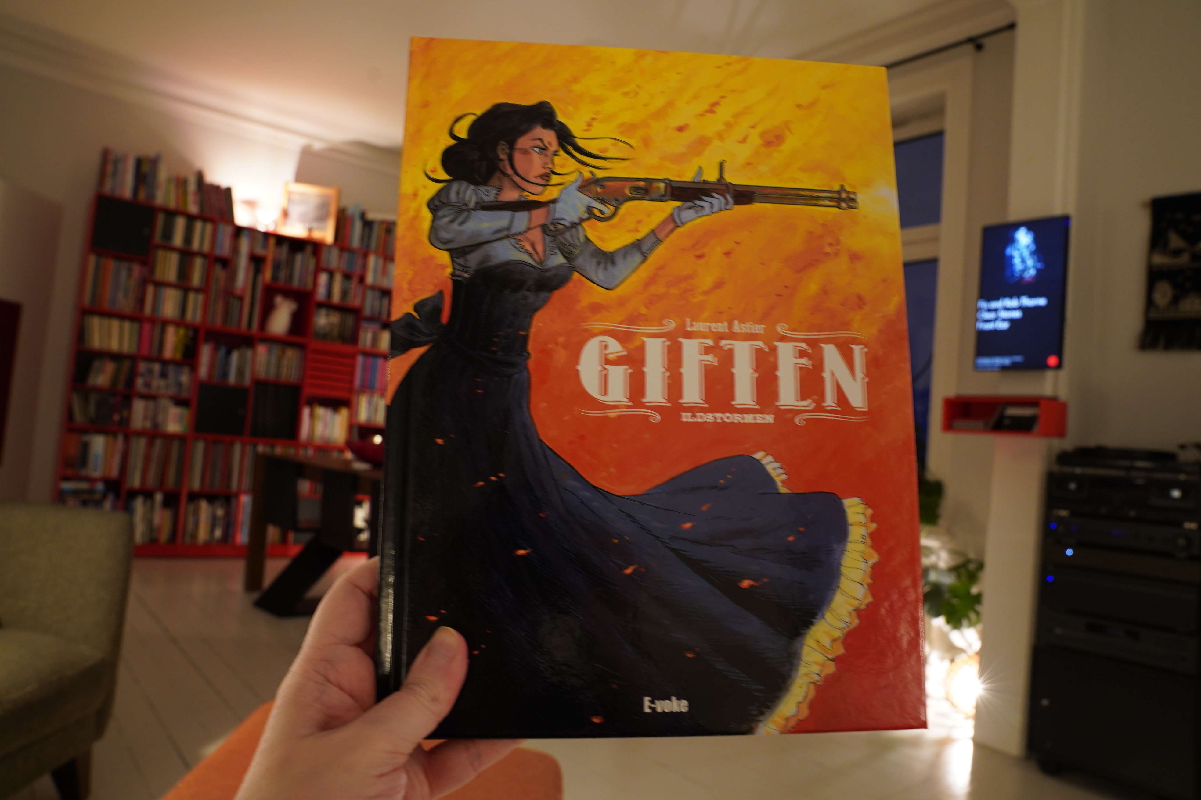
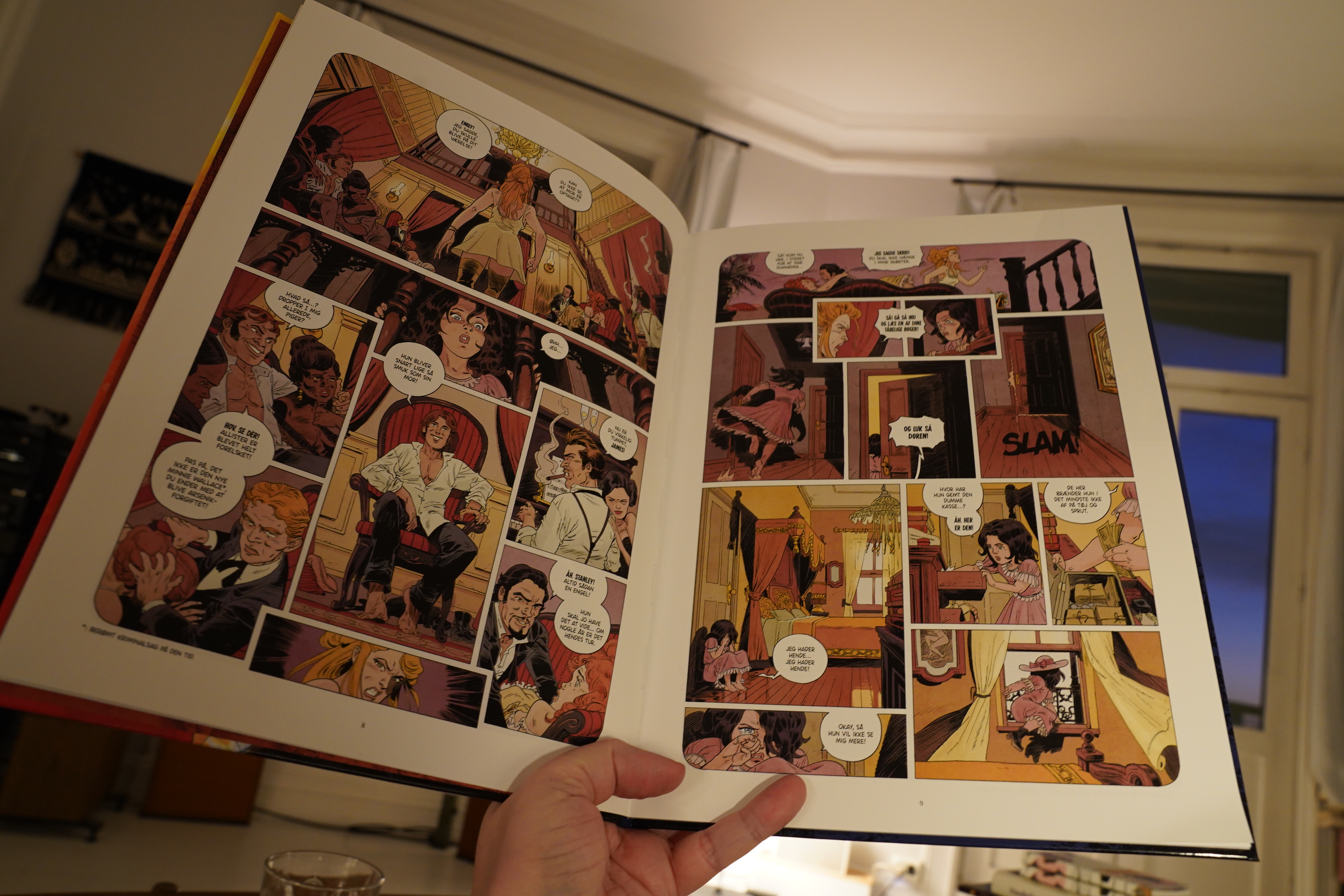
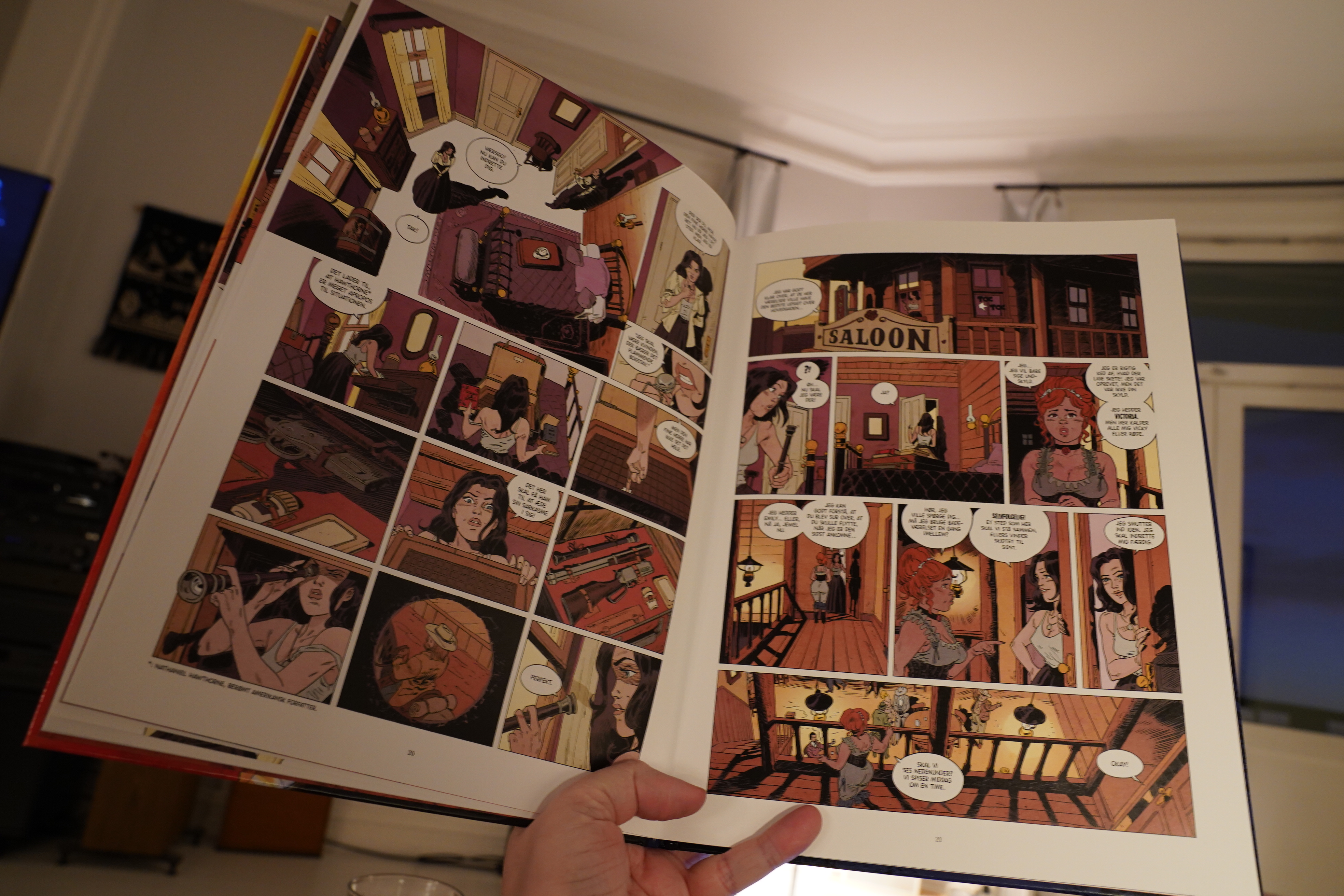
16:18: La venin tome 1: Déluge de feu by Laurent Astier (E-voke)

Hm… looks like a throwback to 70s French(ey) western comics?

Oh, sure, the prostitute is an assassin. The normal plot!
The artwork’s kinda nice — I mean, I like the interiors and the sence of place. But the figures sometimes look a bit odd — a too-high forehead here, a too-small chin there — but it’s fine. And it reads quite well for this sort of thing.
I mean, it’s not a masterpiece or anything, but it’s properly exciting with a surprising storyline.
| Jamez: Energy |  |
16:58: Dinner Time
Foood.
| Shy Child: Please Consider Our Time |  |
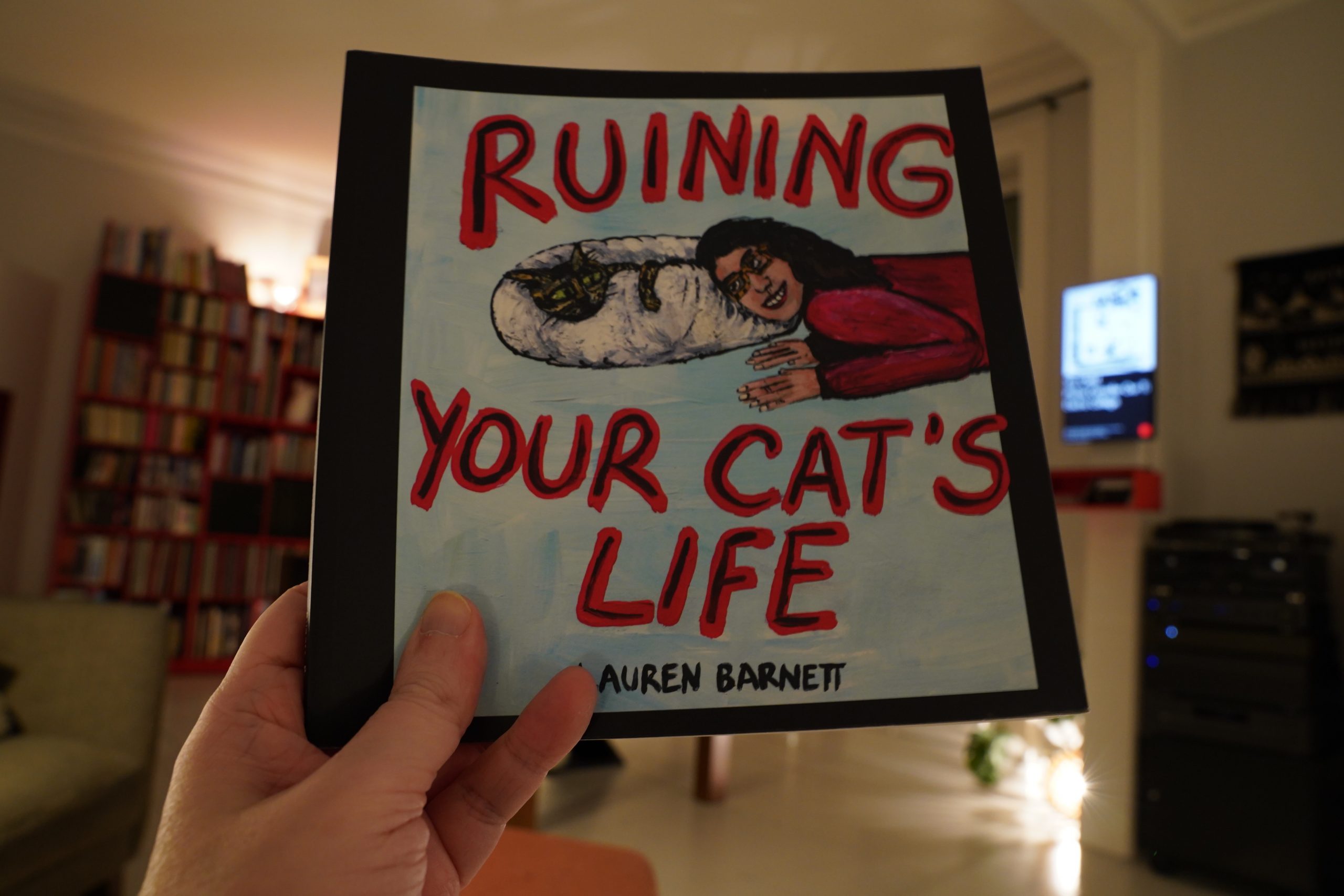
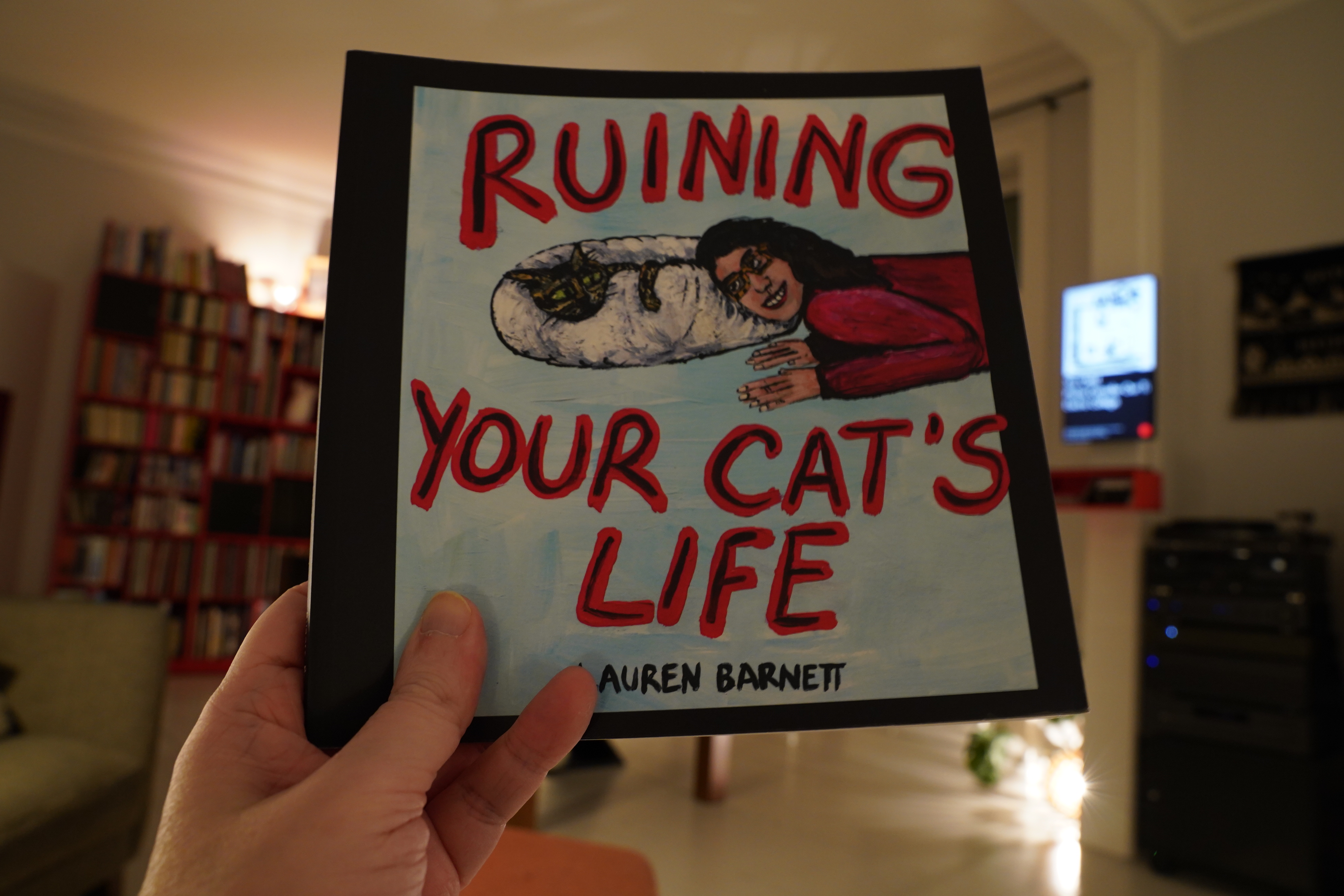
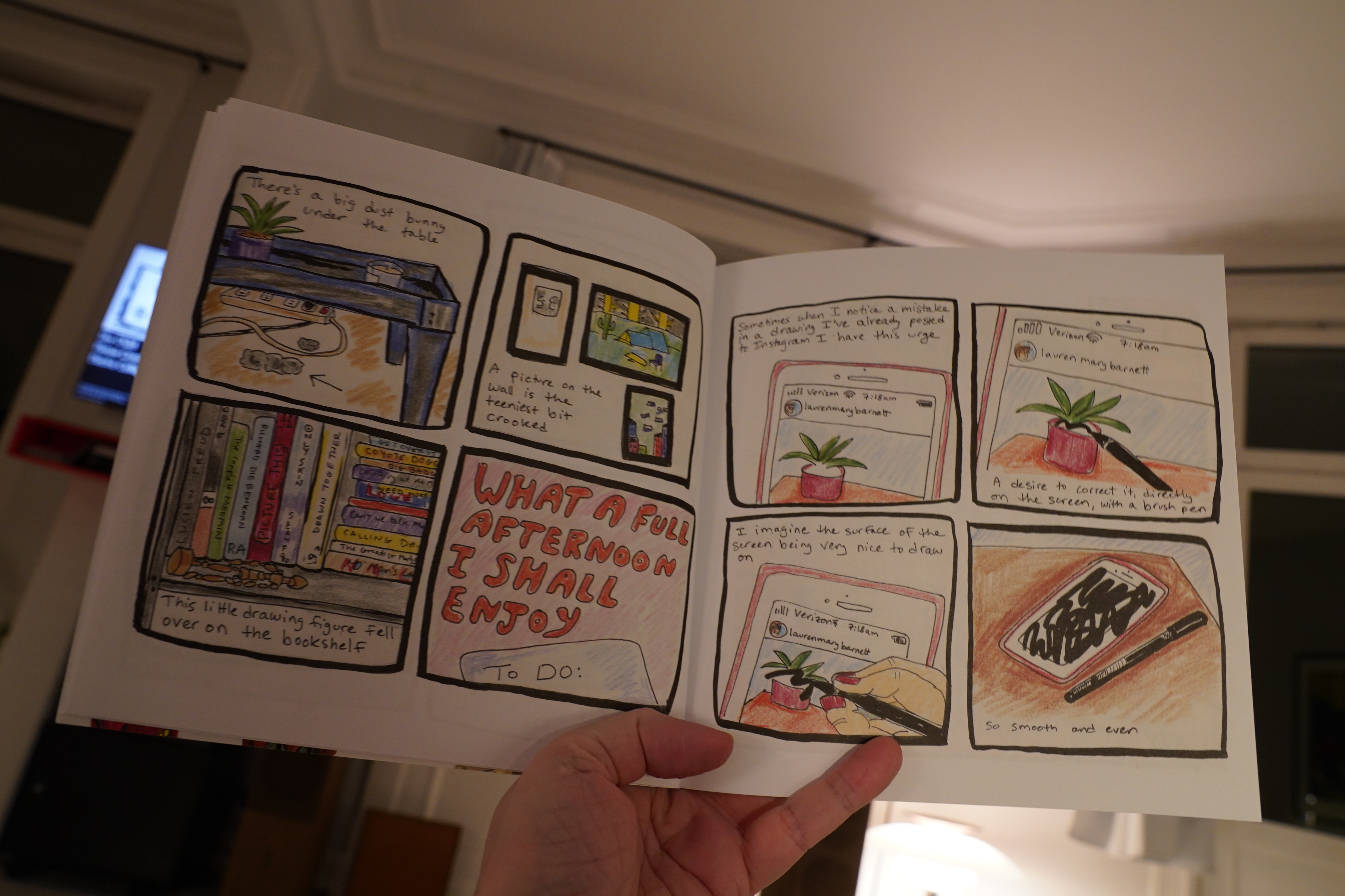
17:55: Ruining Your Cat’s Life by Lauren Barnett (Kilgore Books)
At first I was like NOOO NOT A COLLECTION OF INSTA CARTOONS…

… but then the quiet desperation of these strips started to make itself known. It’s funny and it’s well observed and it’s affecting.
It’s (dare I say it) lovely.
| Young Magic: Melt |  |

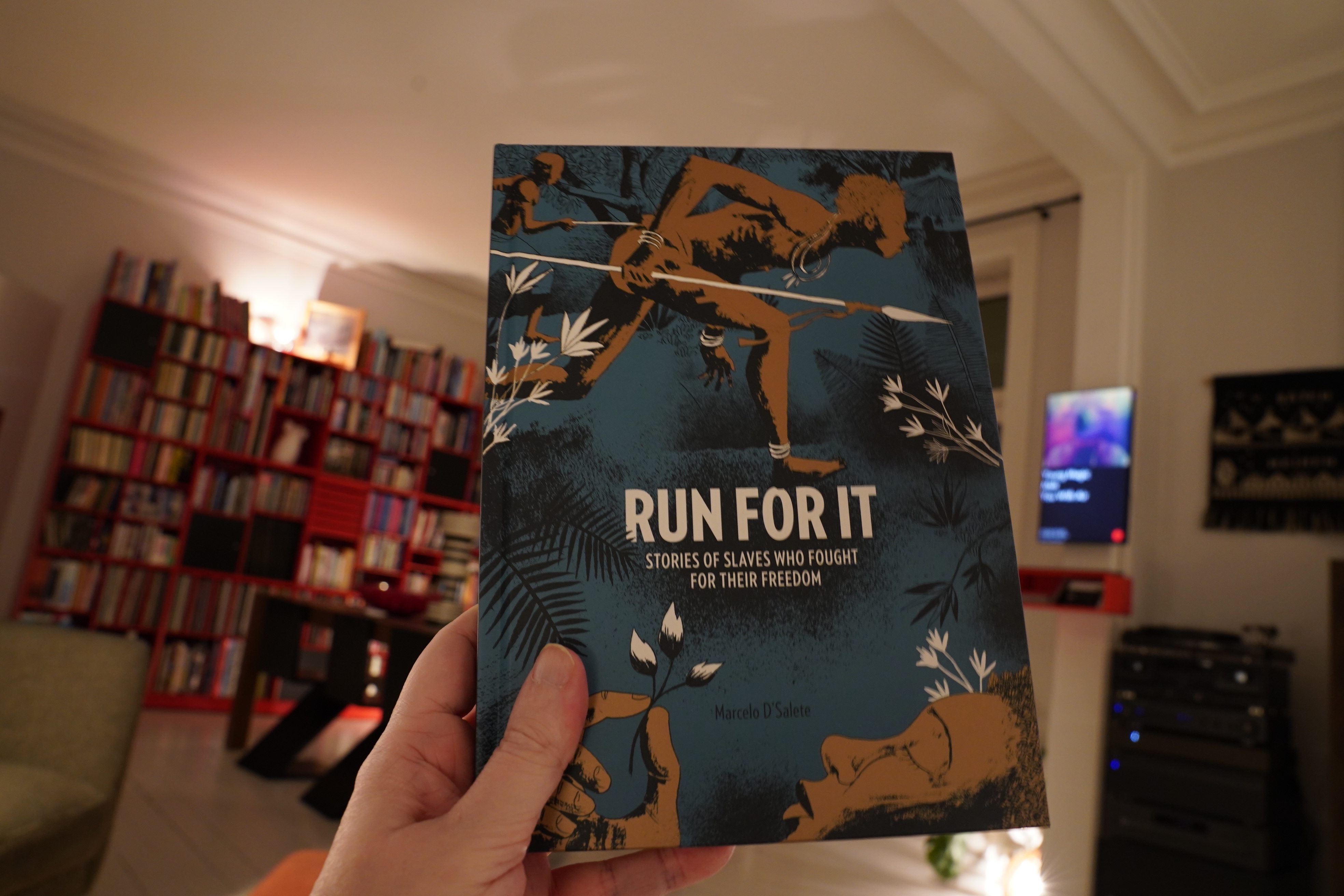
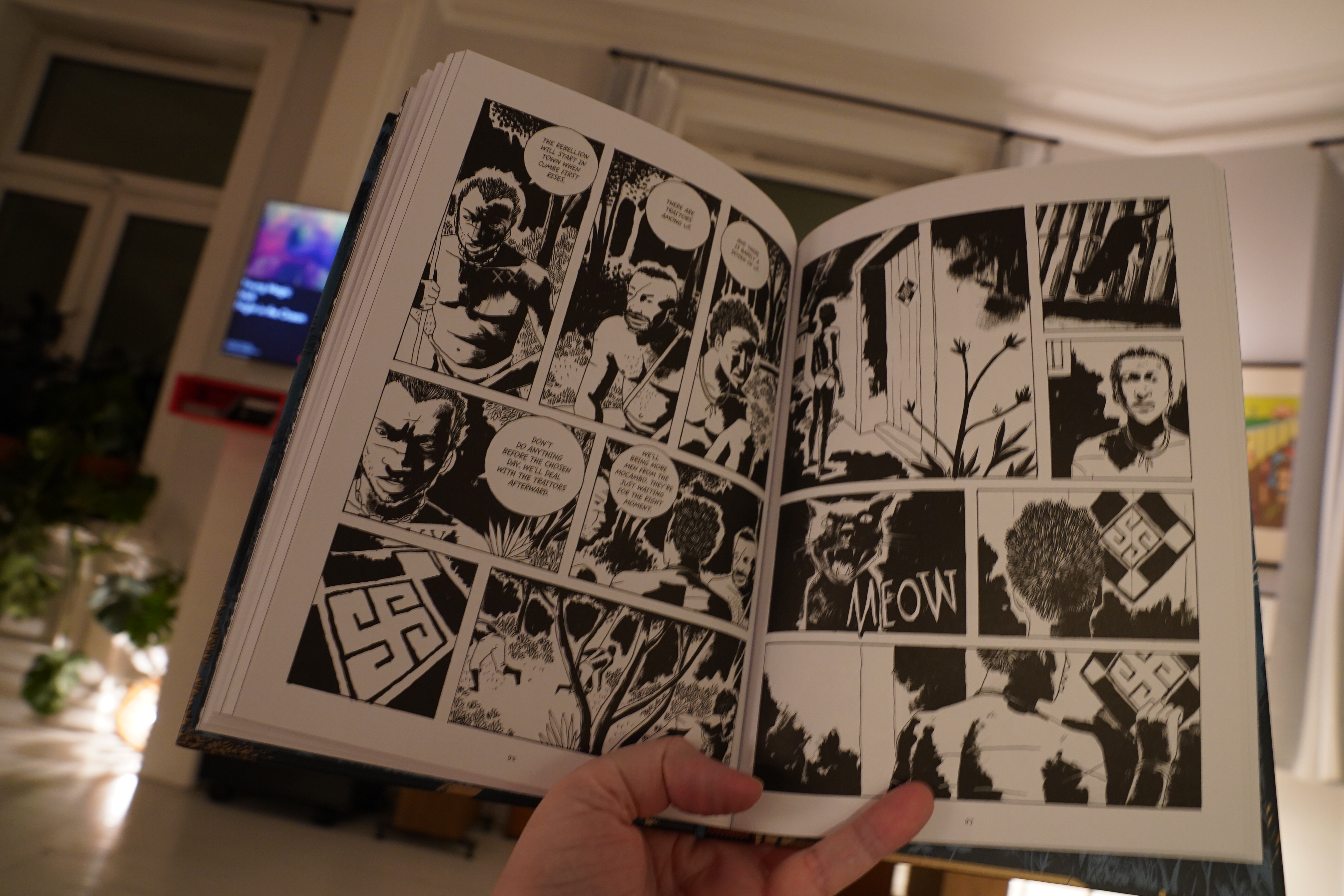
18:22: Run For It by Marcelo D’Salate (Fantagraphics)
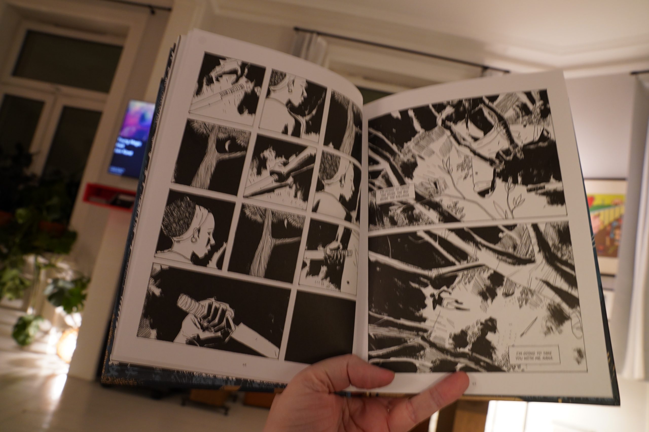
First of all the artwork is absolutely amazeballs. Super striking and gorgeous.
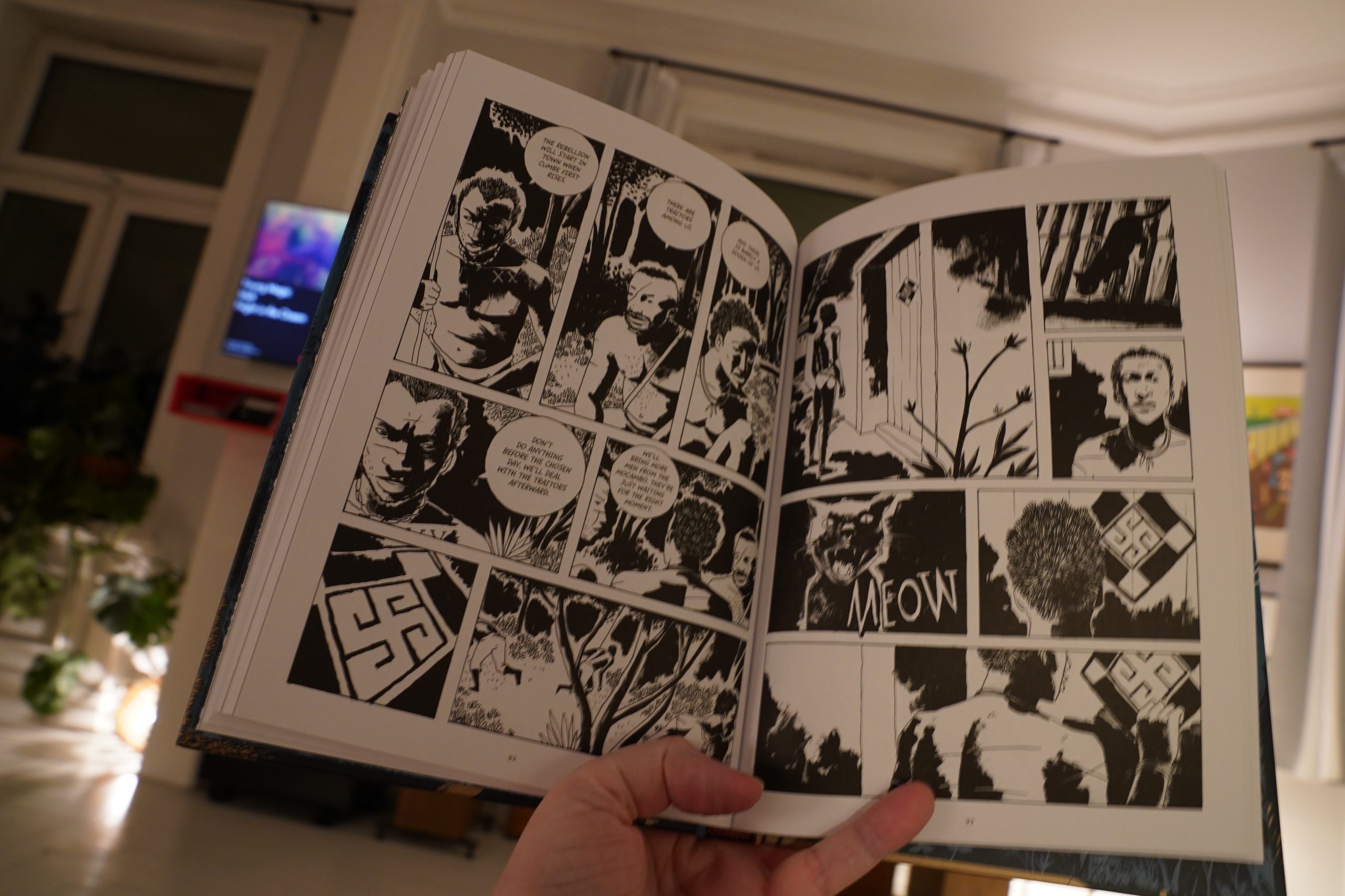
However, the storytelling rests on too many genre beats to be really gripping. It’s like it exist within a structure you could have put anything into — like a mobster story or a heist movie or whatever. It’s so… I found myself thinking “oh, yeah, that’s this scene, so the next scene is going to be…” And that’s never a good thing.
But I mean, it’s good? It’s just not as good as the artwork had me hoping it would be.
| Janka Nabay & The Bubu Gang: En yah say |  |

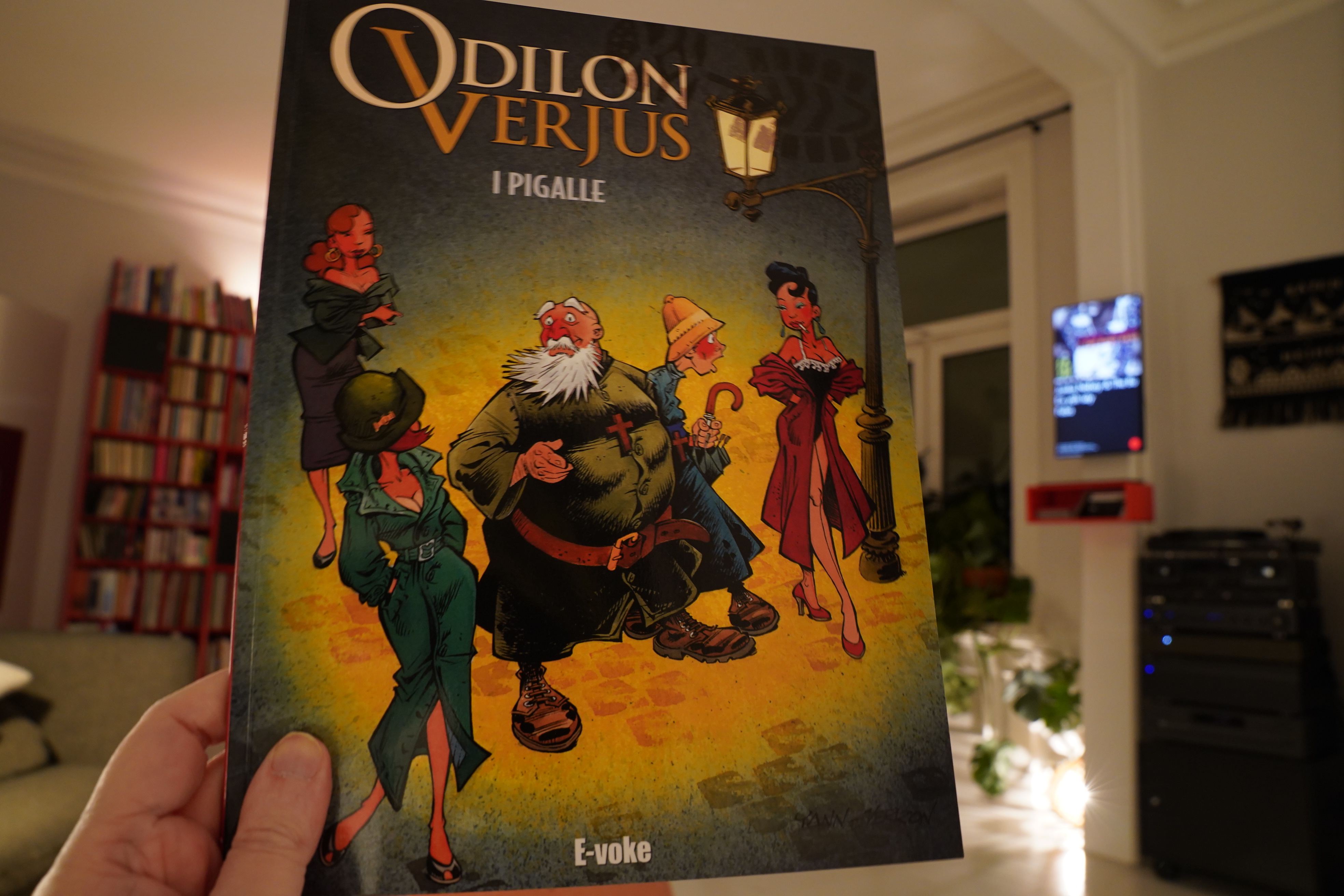
18:46: Les exploits d’Odilon Verjus 2: Pigalle by Yann/Verron (E-voke)
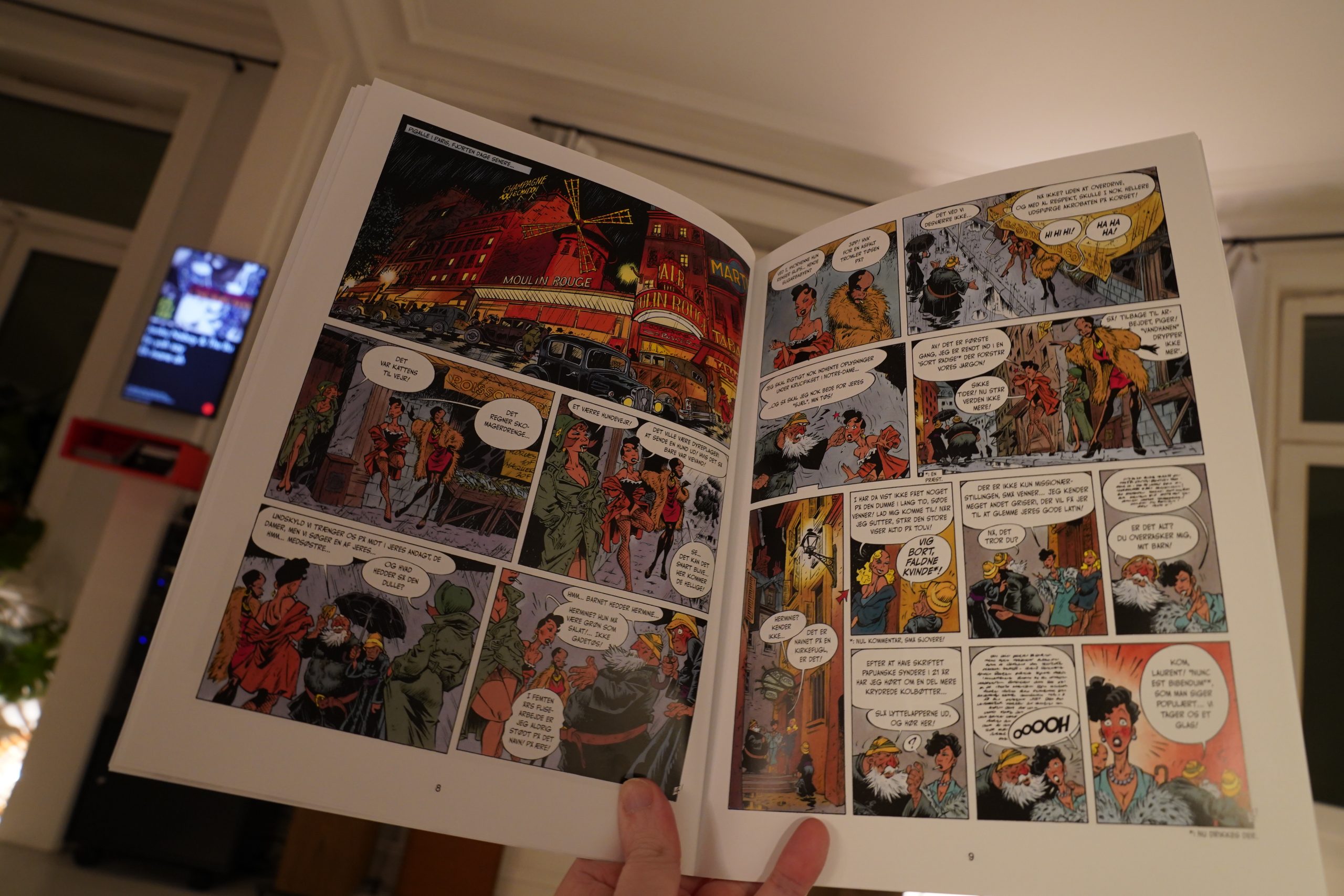
This is apparently from the late 90s, but this translation is from this year.
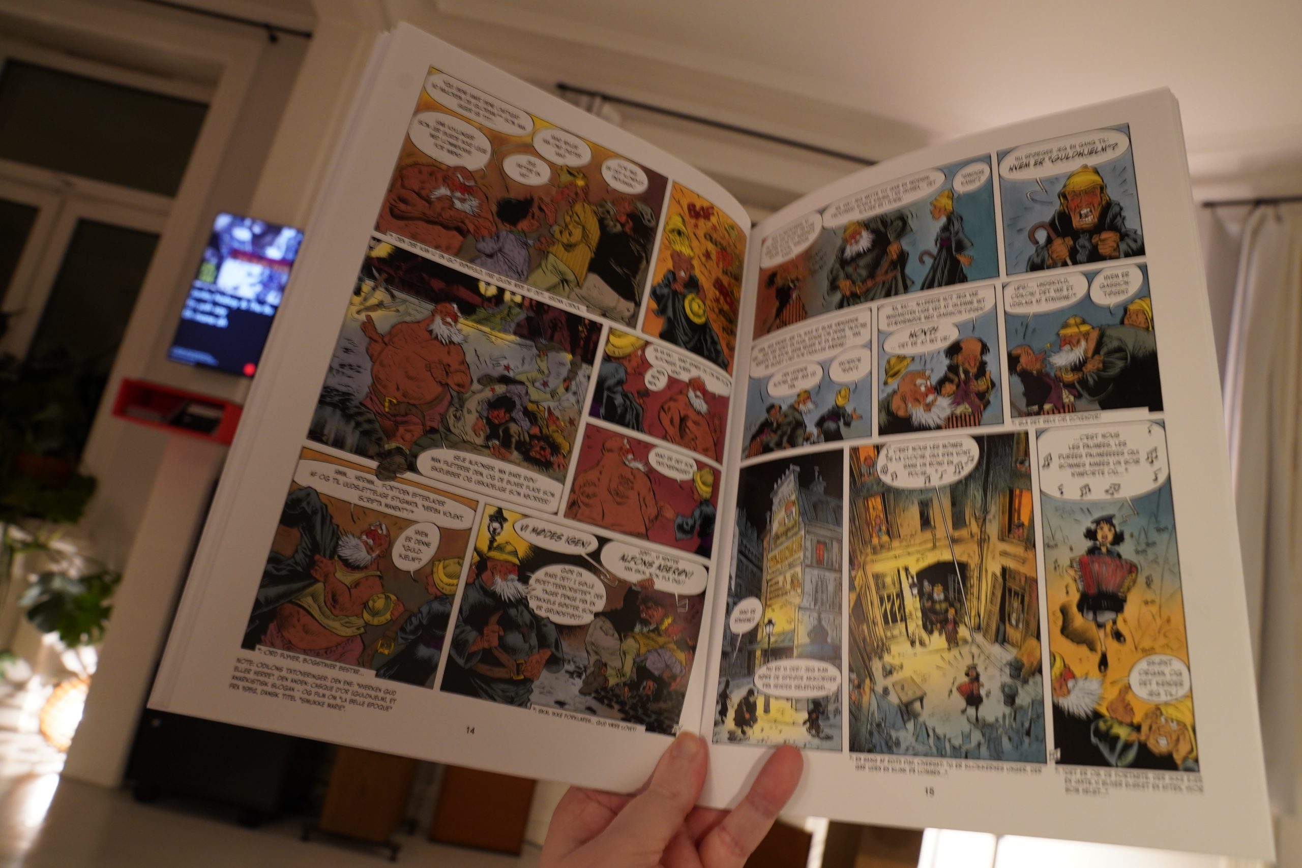
It’s an exhausting read, but in a good way. Look at all those litte digressions*! All the pages are basically like that, with latin quotation and somewhat humerous translations, and asides and a plot that defies description.
It’s fun.
But I’m not sure I want to read more of this — it’s a bit overwhelming, and the incessant jokes just aren’t funny enough.
The artwork’s classic Francobelgian and you can’t complain about that.
| Zeal & Ardor: Devil is Fine |  |
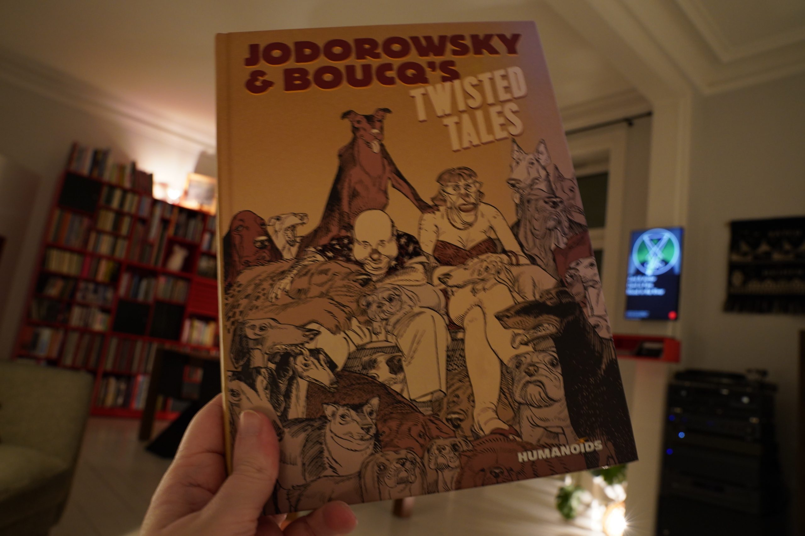
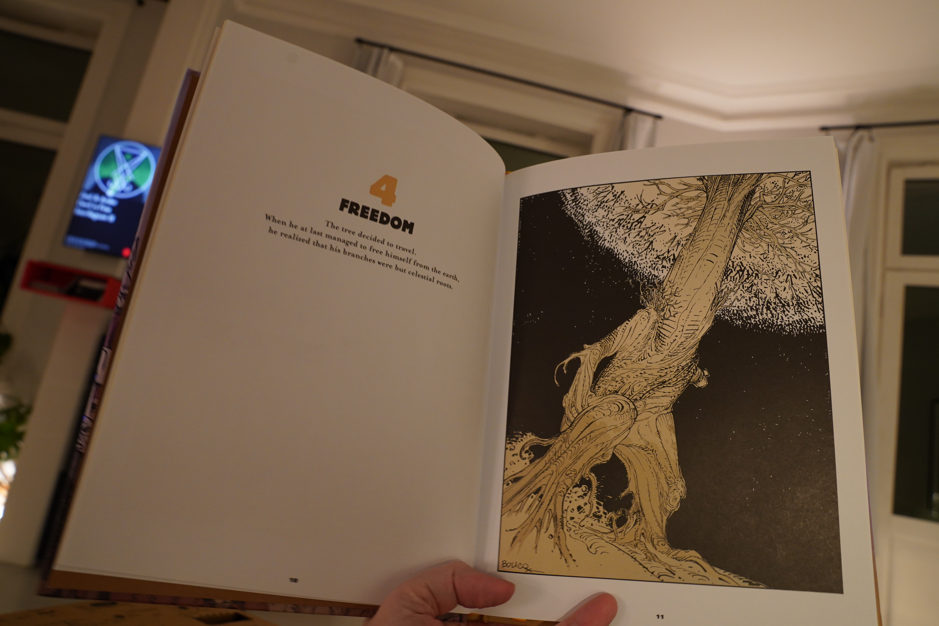
19:44: Jodorowsky and Boucq’s Twisted Tales by those guys⬅️ (Humanoids)
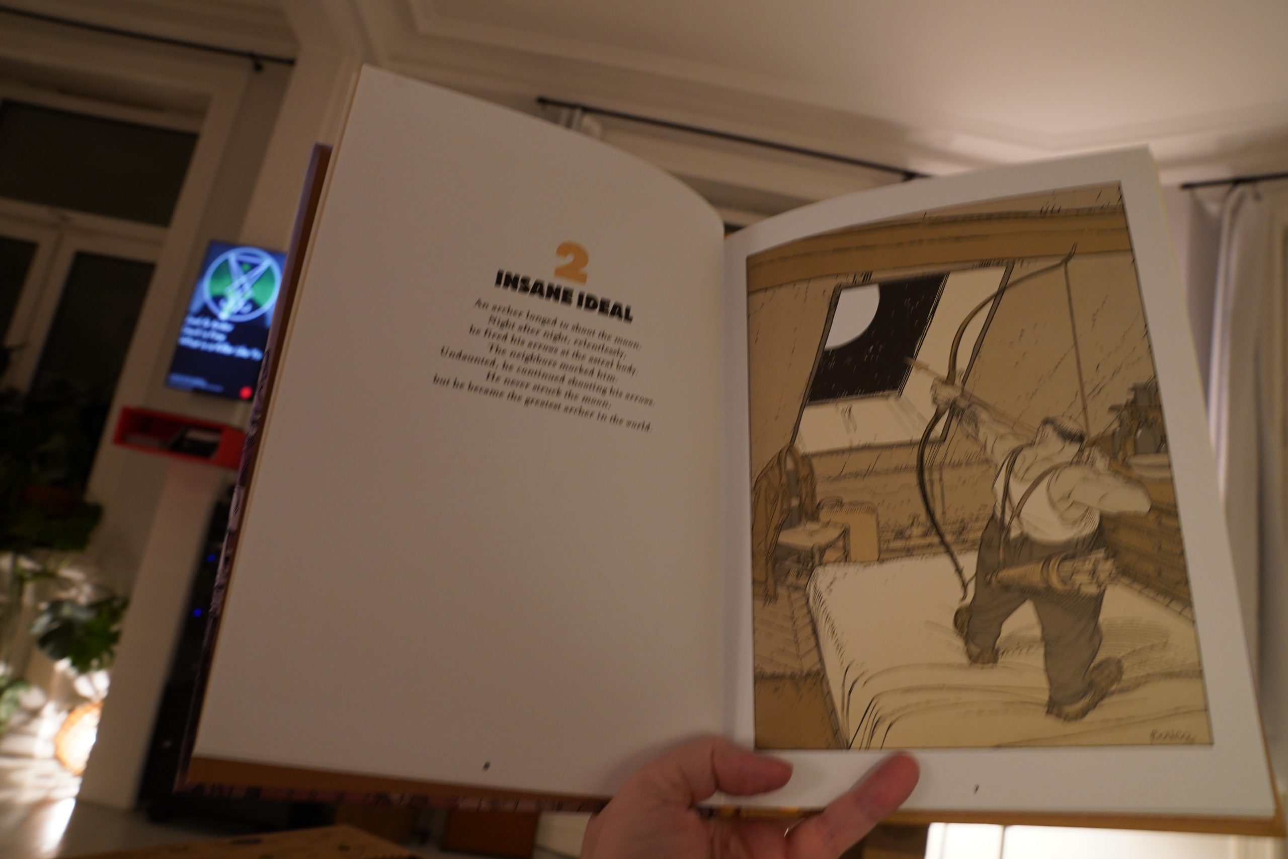
Oh.

I have no interest in this. Boucq’s artwork isn’t without qualities, but these little texts from Jodorowsky are pretty trite.
I ditched it half way through.
I think I’m fading… reading comics is exhausting.
Just one more, and then sleep.
| LCD Soundsystem: American Dream |  |
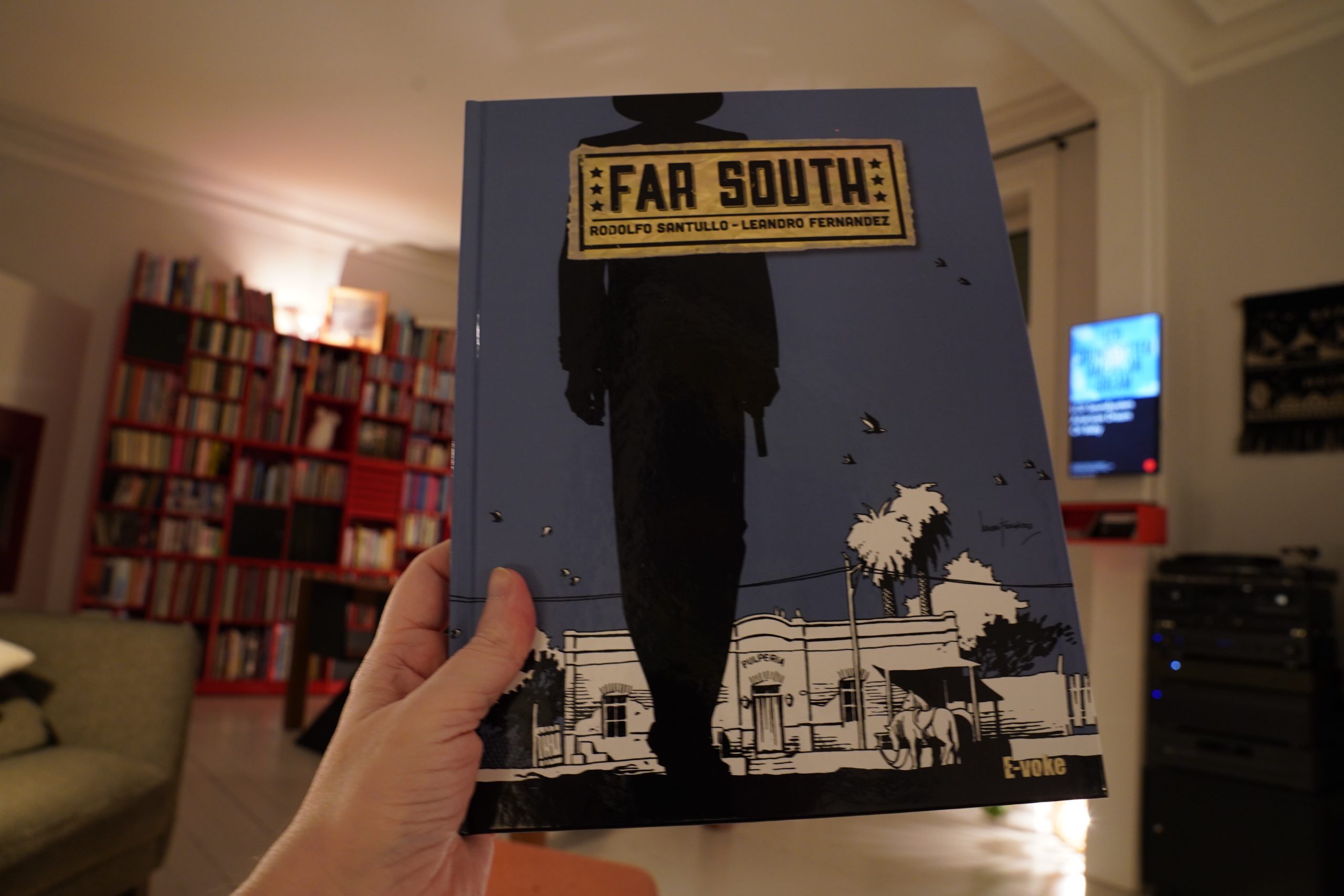
19:51: Far South by Rodolfo Santullo – Leandro Fernandez (E-voke)
This was written by that guy that did that 40 Coffins thing? It was really bad. This isn’t exactly … good, either, but the graphics are a lot more interesting.
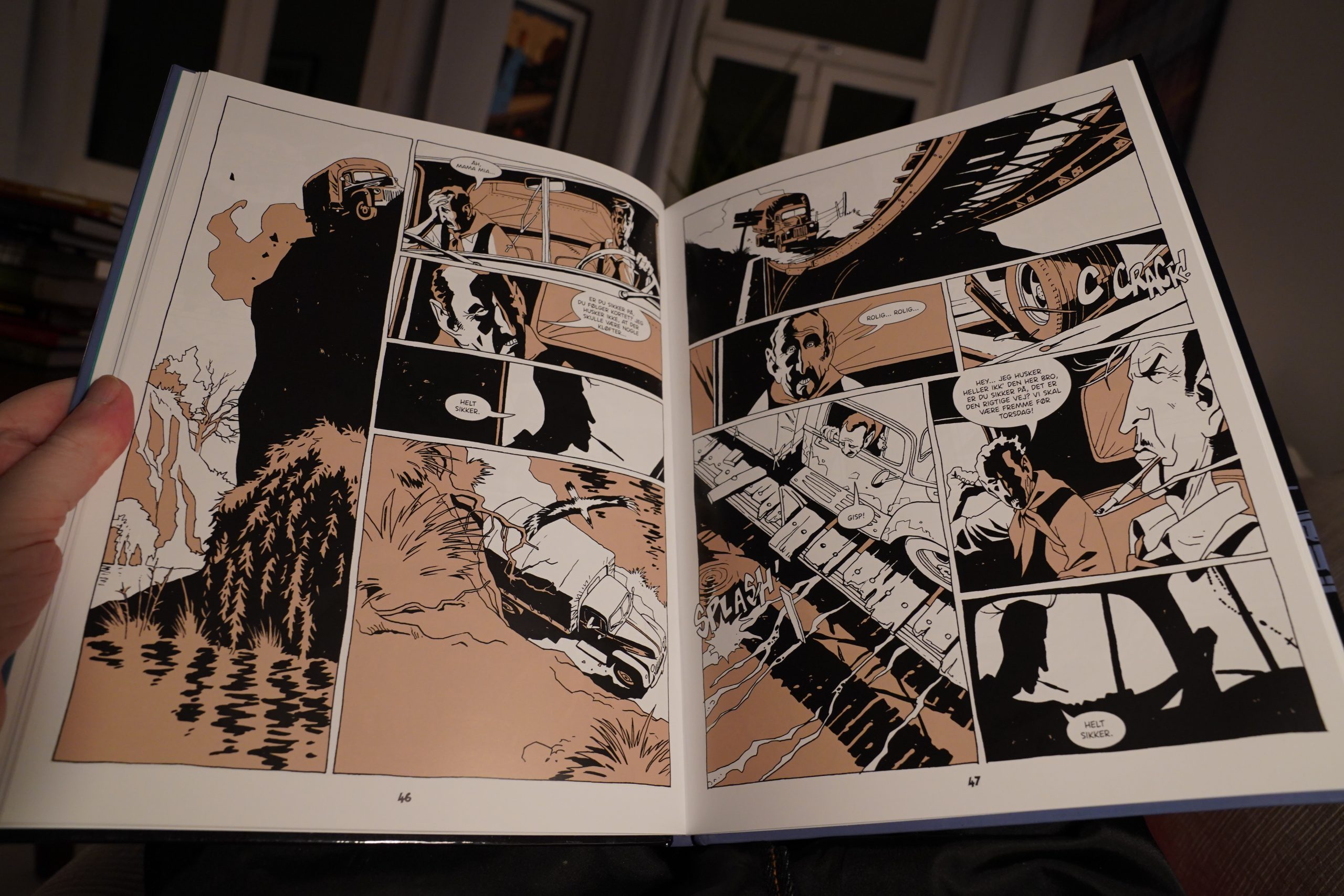
This is a series of vignettes, most of them with an “ironic” twist, that collectively tell a pretty cohesive story. It’s pretty entertaining as these genre excercises go?
| Zola Jesus: Okovi |  |
20:18: The End
And I think I’m gonna turn in early tonight, after just nine hours of comics reading. I got up way too early this morning.
Nighty.


")
")
")
")
")
")
")
")
")
")
")
")
")
")
")
")
")
")
")
")
")
")
")
")
")
")


")
")
")
")
")
")
")
")
")
")
")
")
")
")

")
")
")
")
")
")
")
")
")
")
")