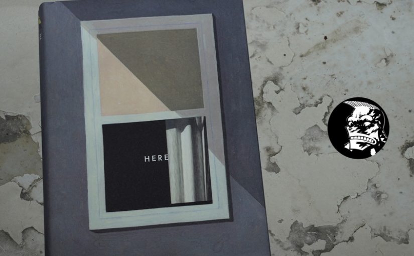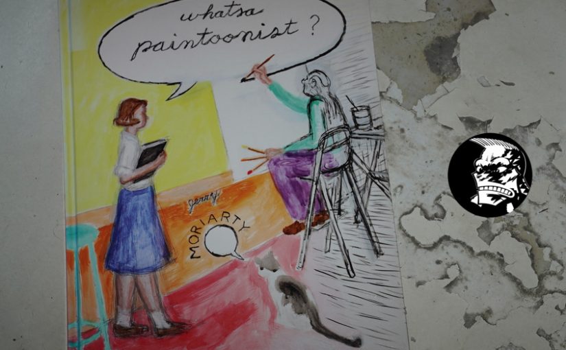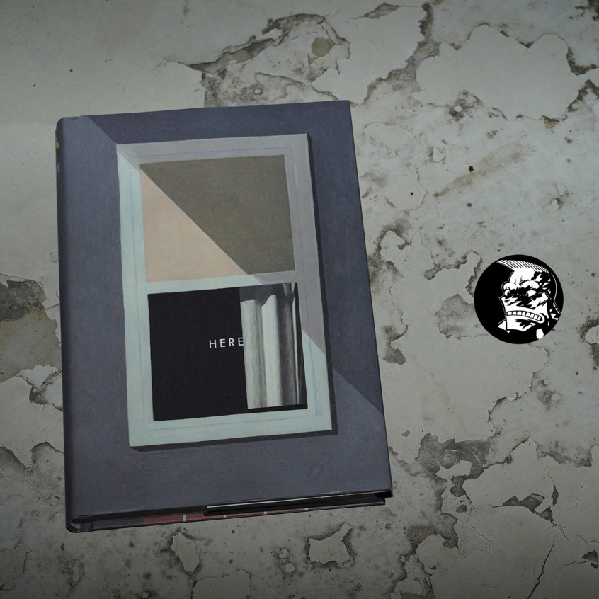
Here by Richard McGuire (173x242mm)
“Here” was originally a short piece printed in Raw Vol 2 #1, and was hugely influential: It was a brand new way to tell a story.
So — 25 years later, McGuire expanded it to a three hundred page graphic novel.
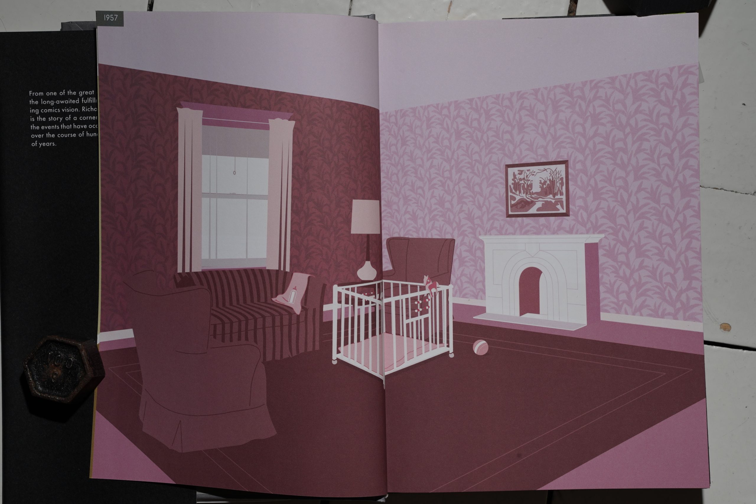
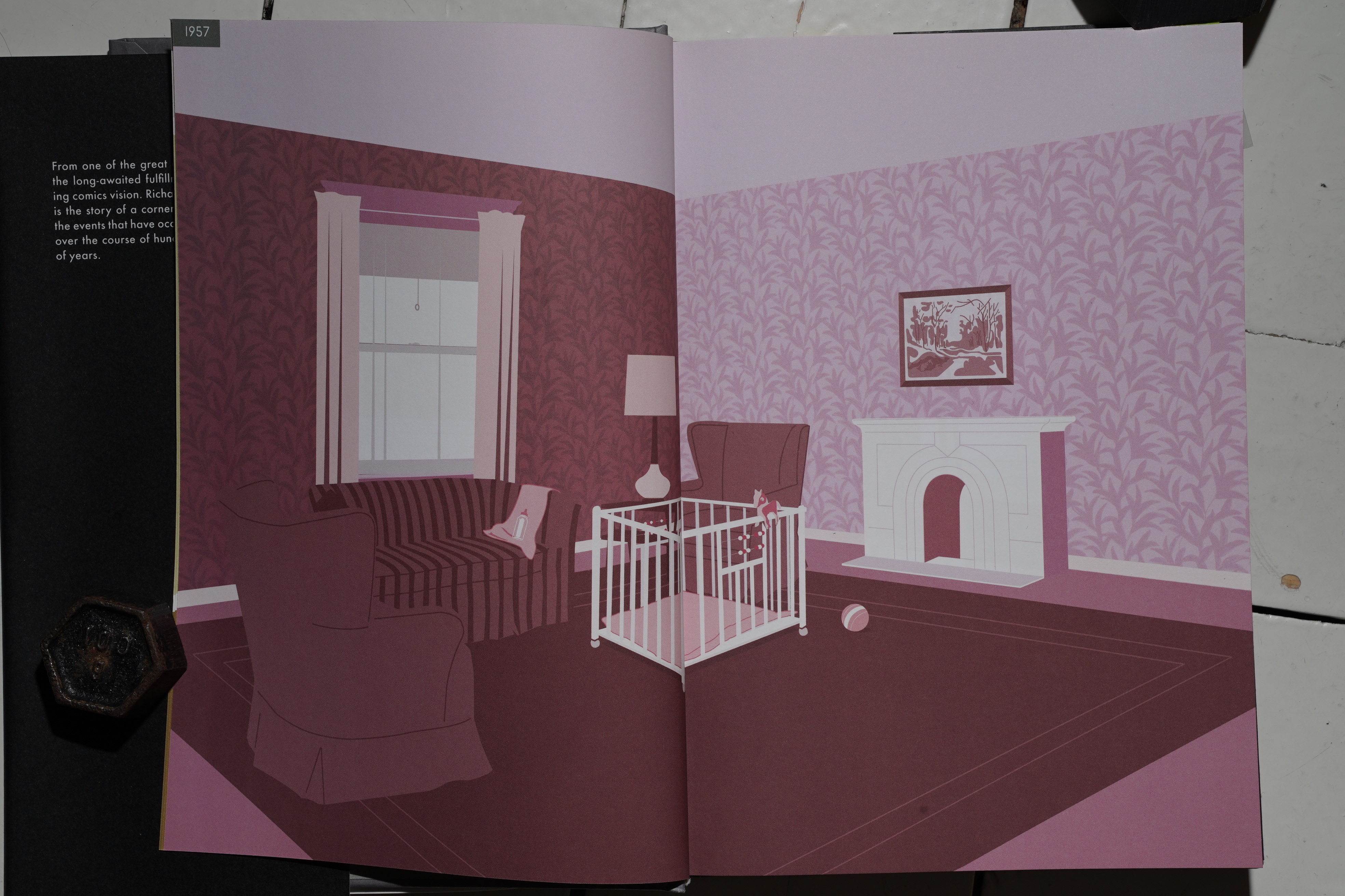
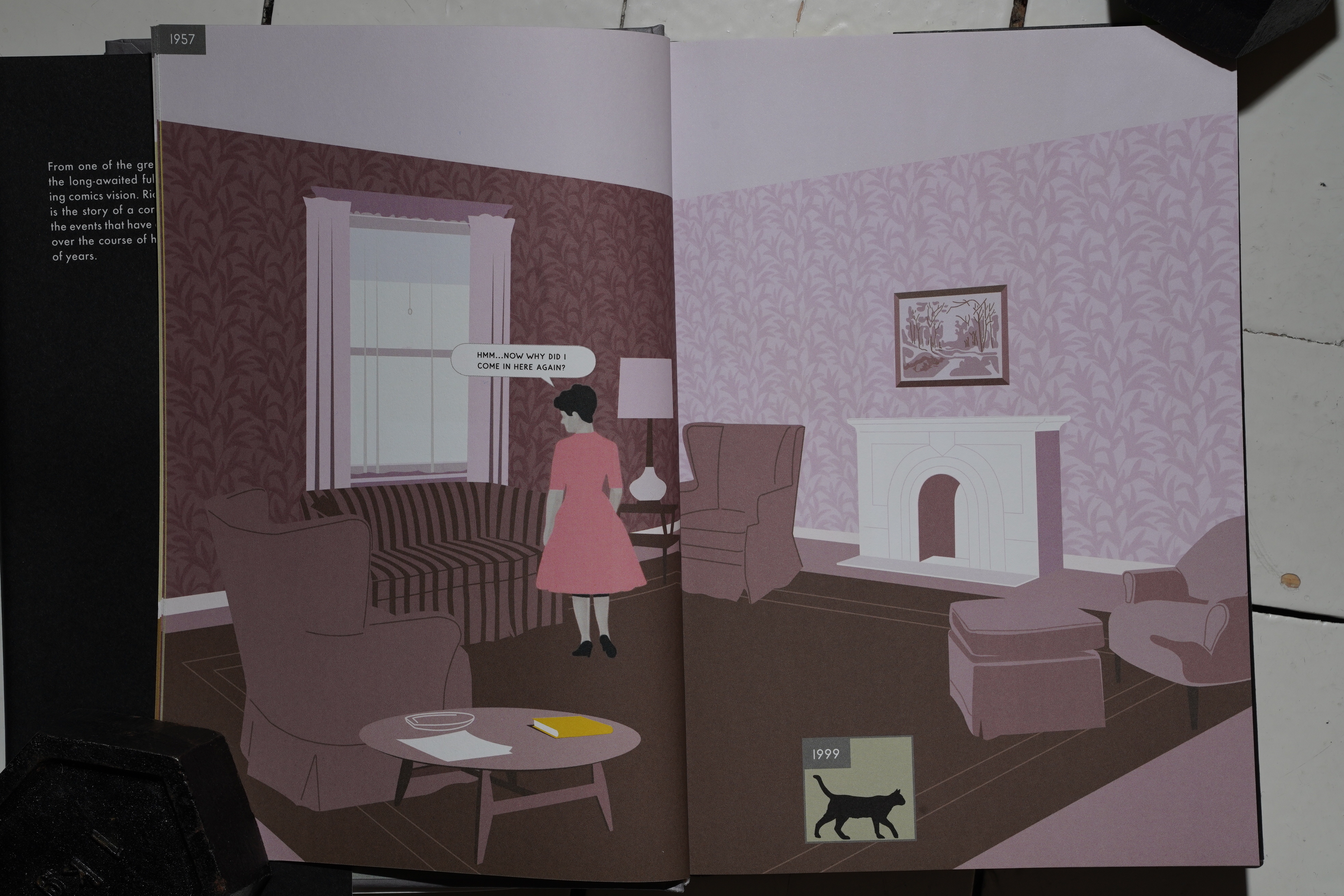
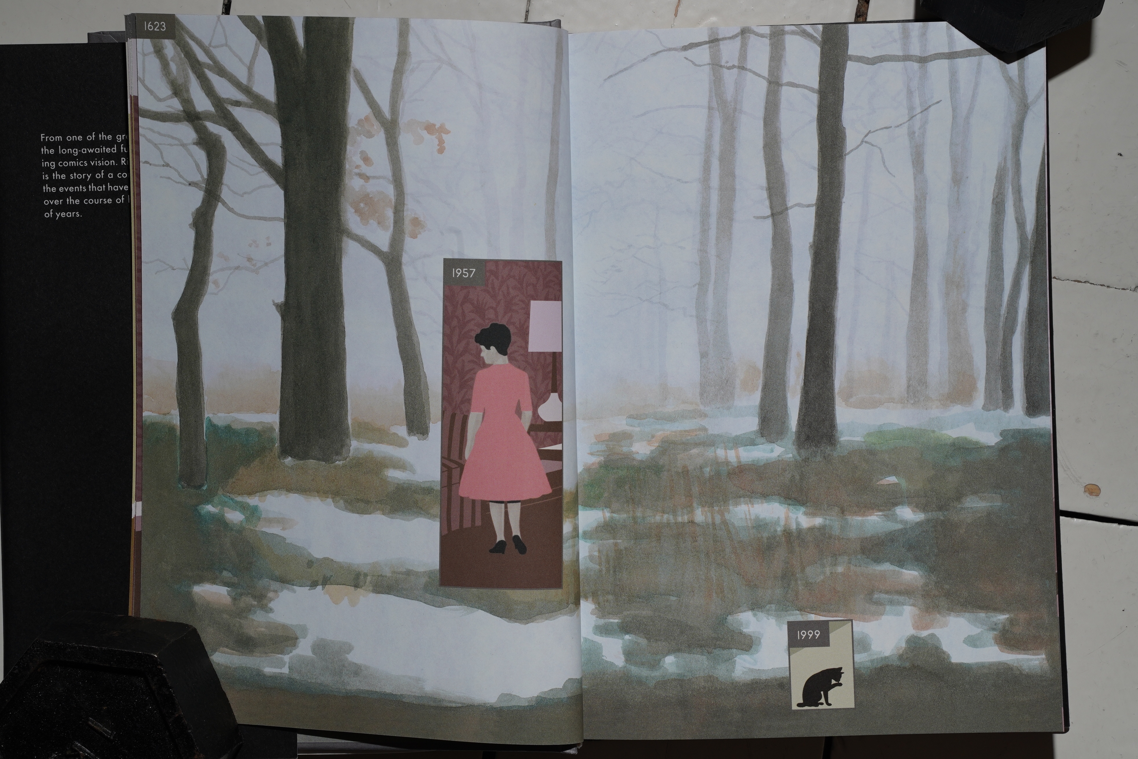
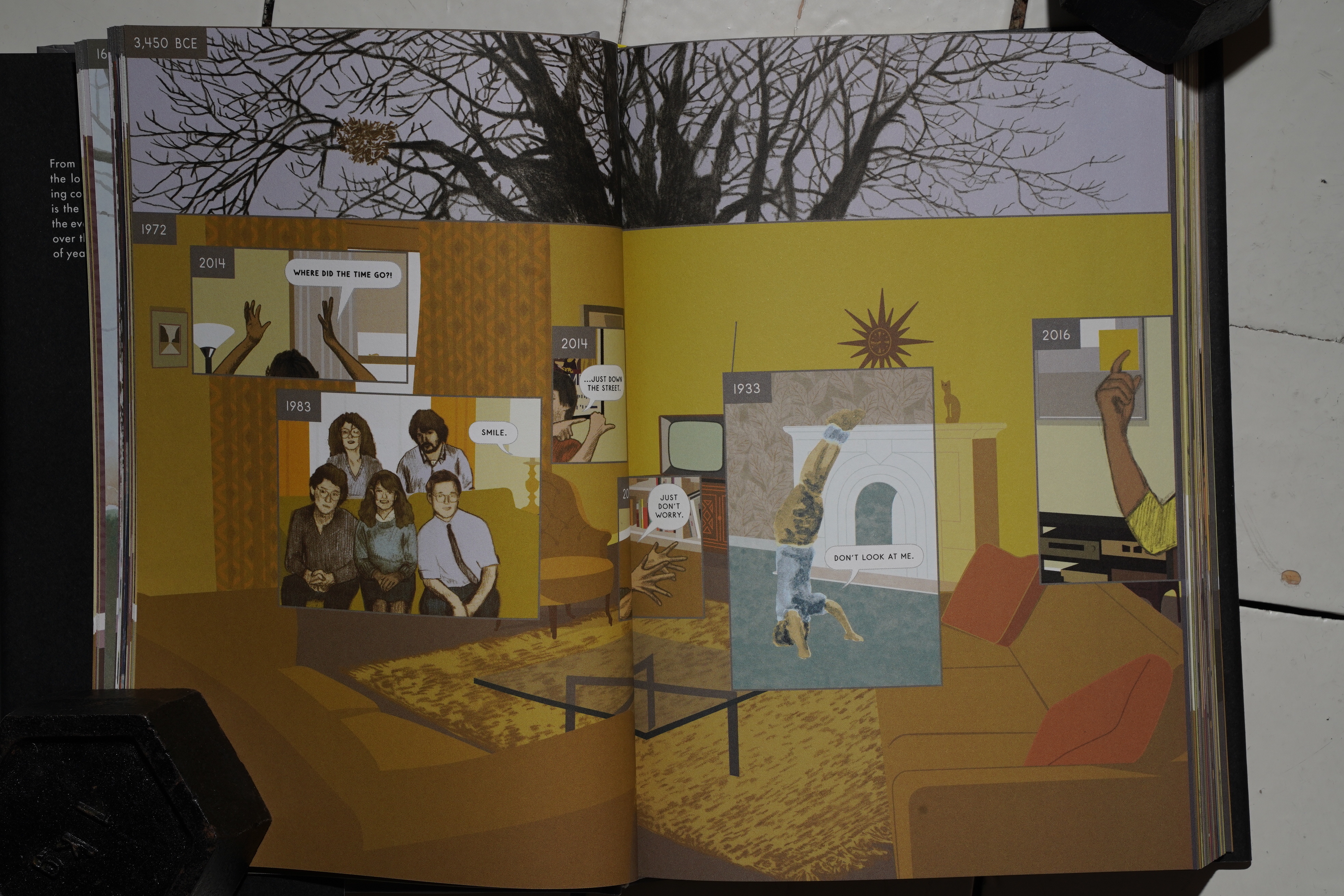
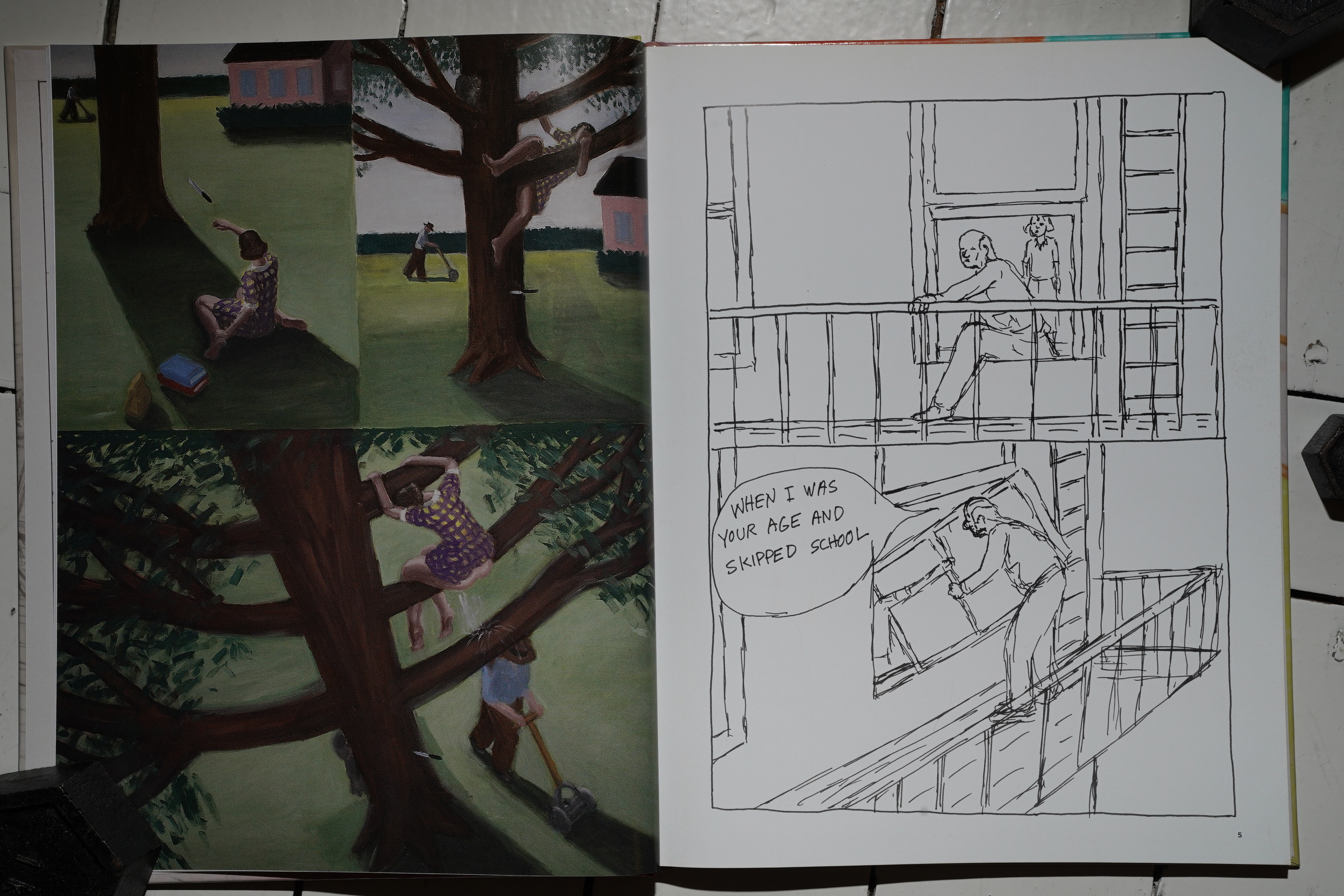
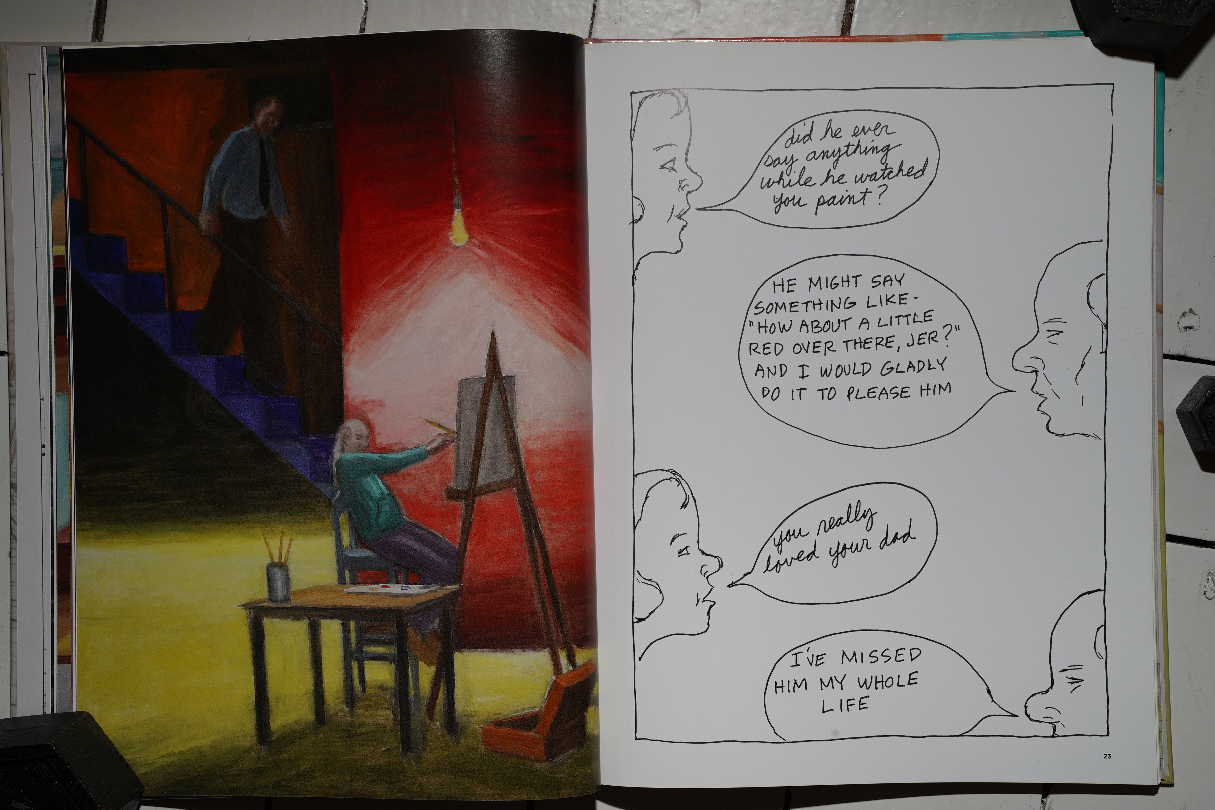
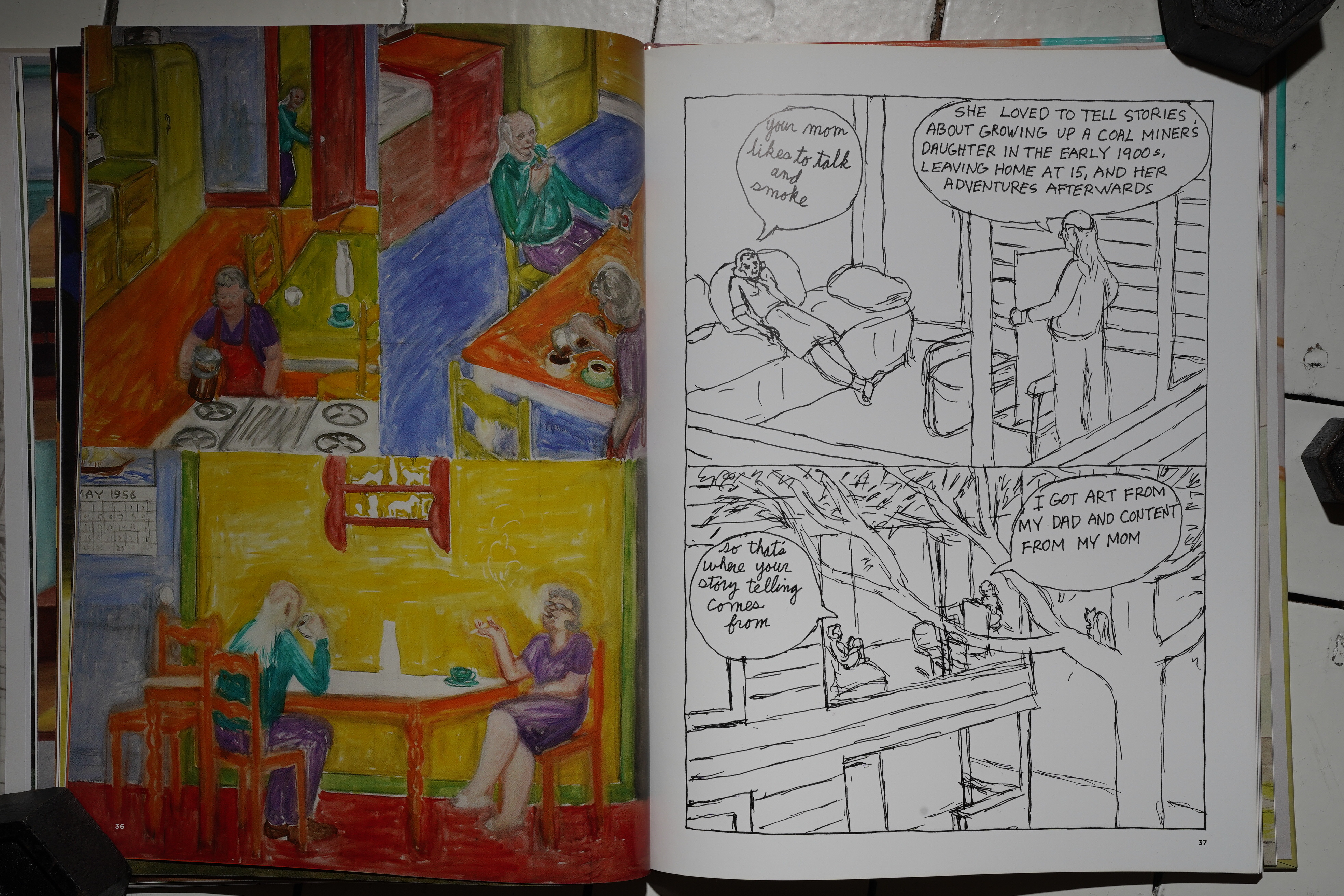
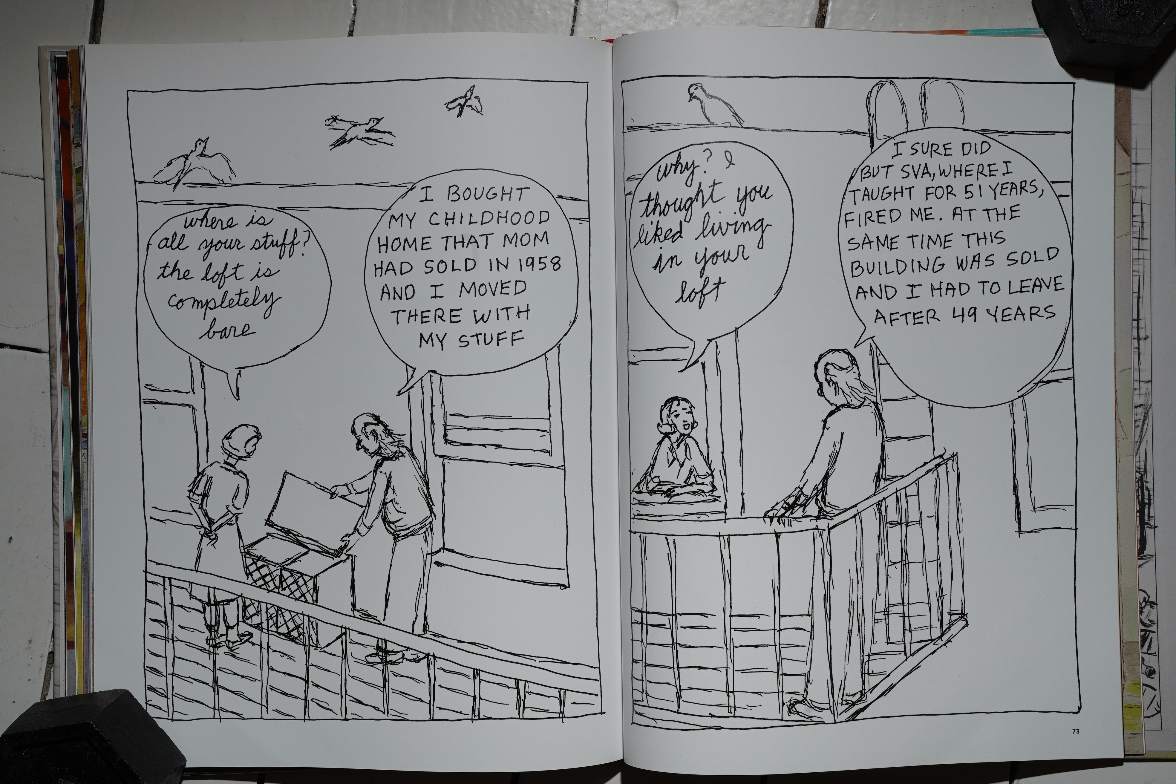
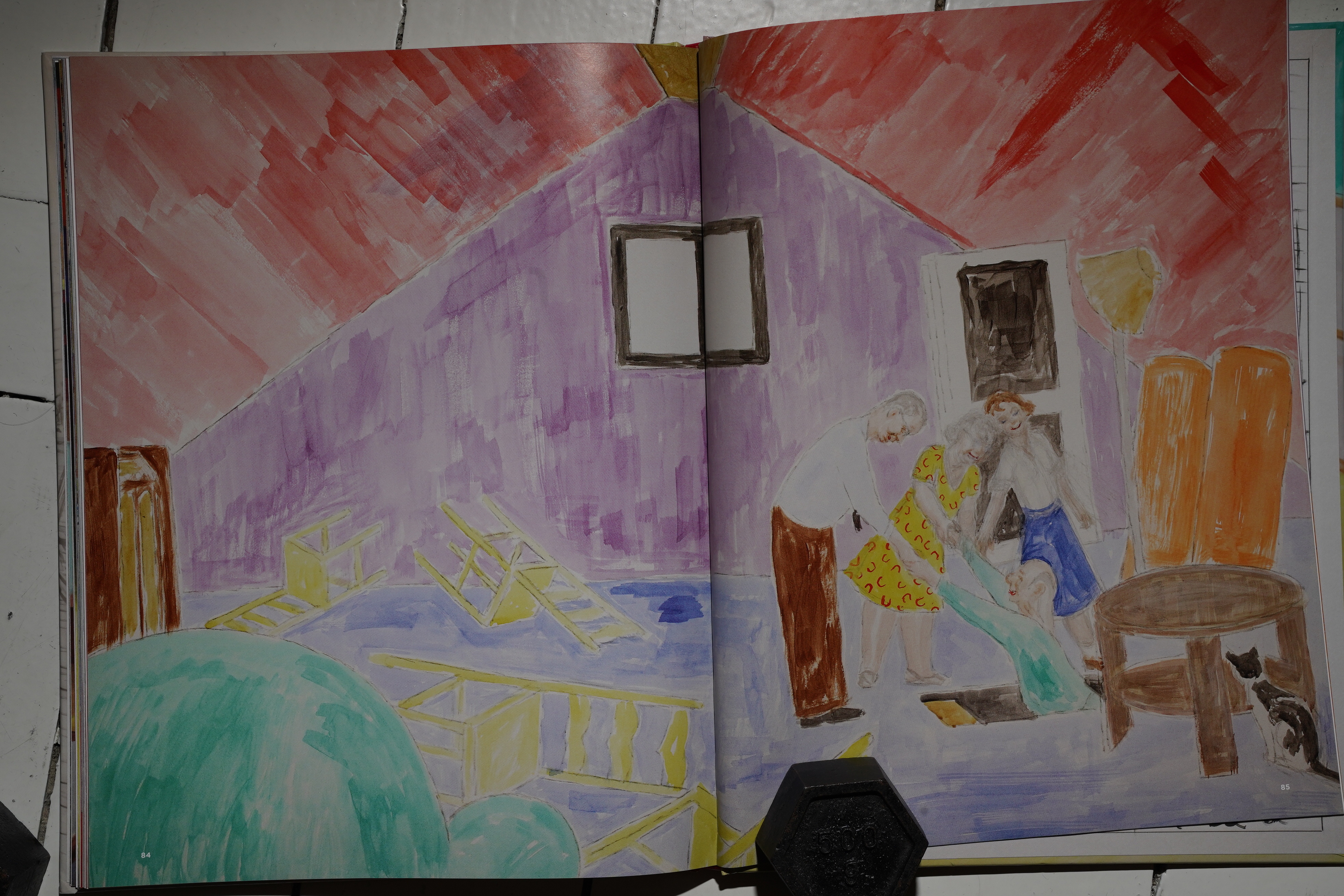
If you’ve been living under one of those them there rocks where they don’t have comics, “Here” told the story of a location — we skip back and forth through history, but all the drawings are made from the exact same angle.
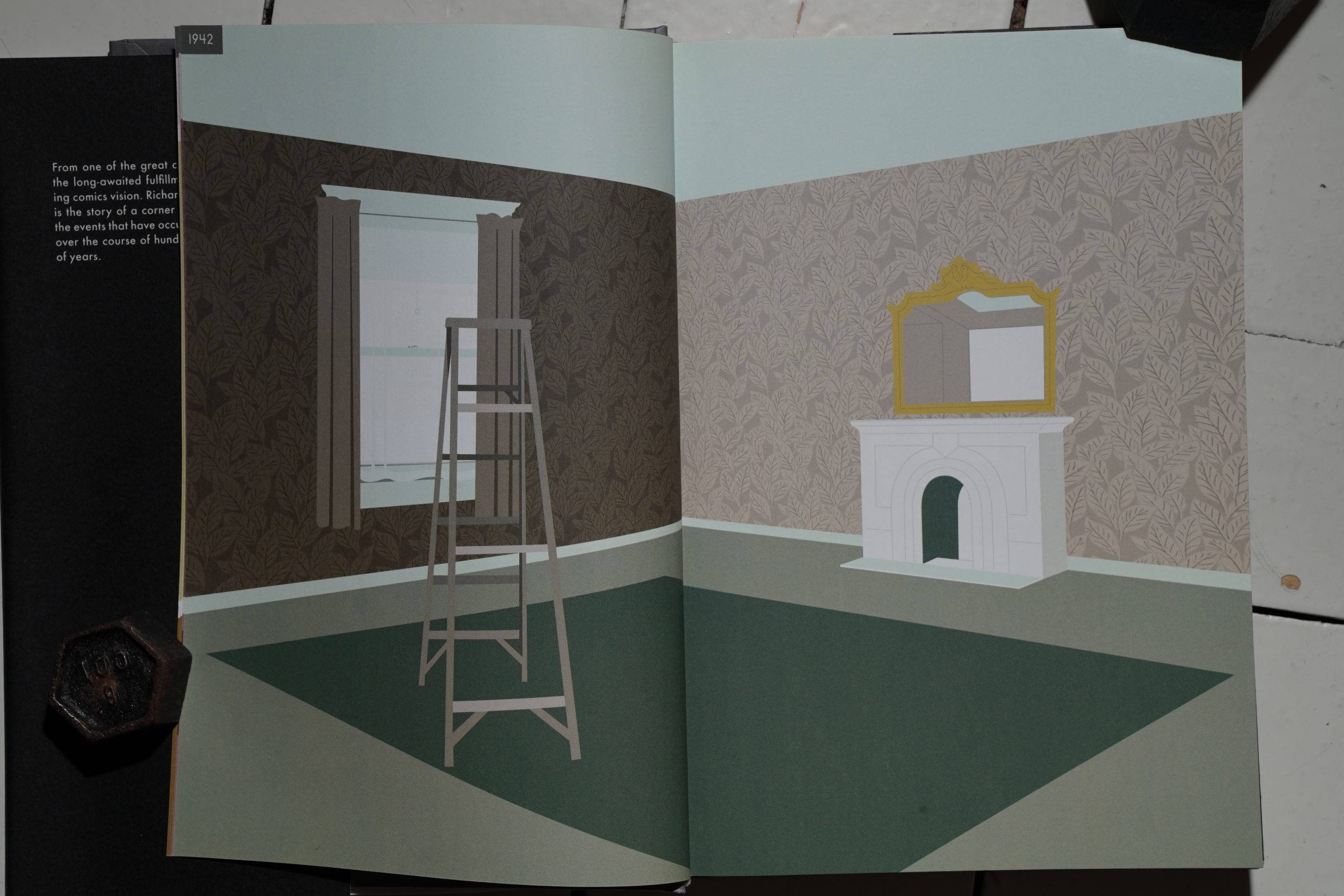
So the differences between pages may be small or large…

… and they sometimes tell little narratives.
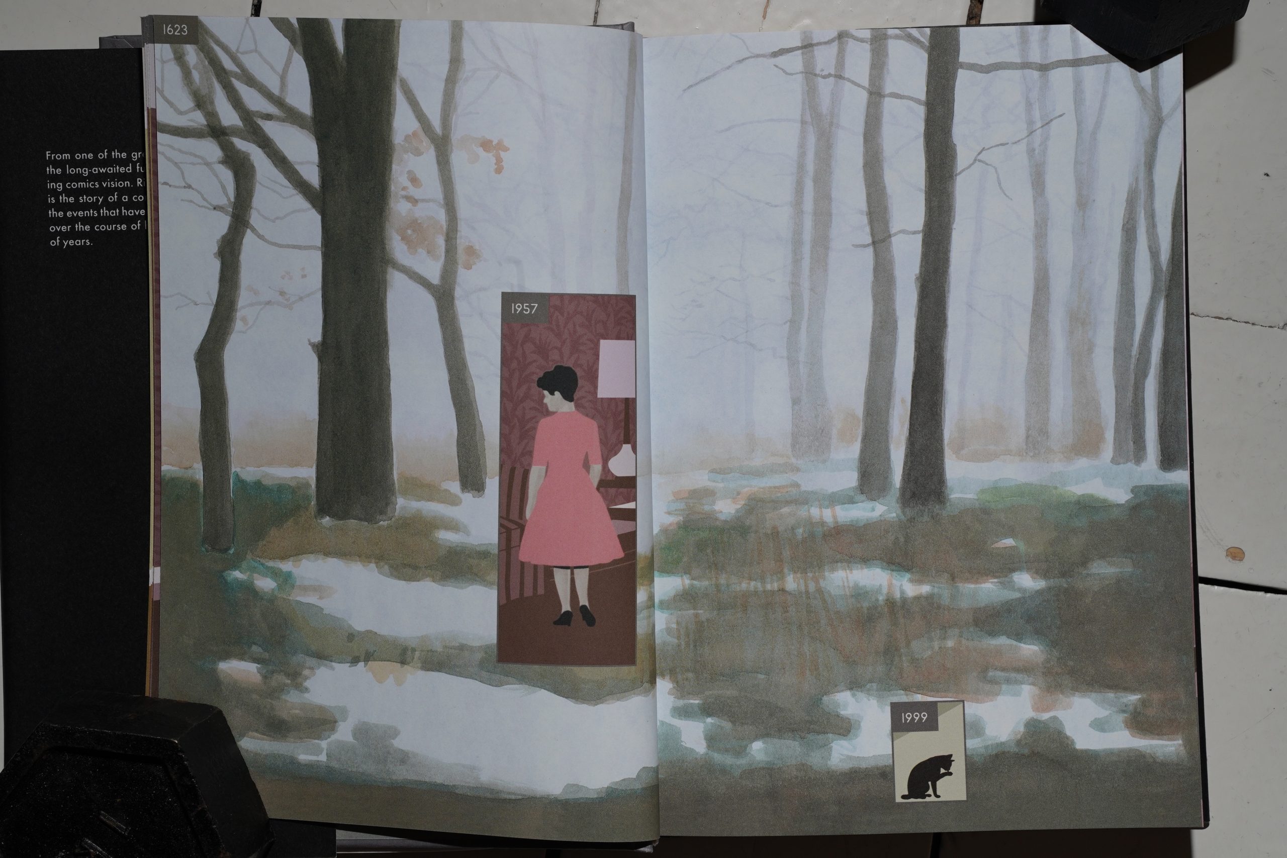
None of them were very extensive in the original strip, but here they get longer.

And the layout can get pretty convoluted — and you can follow the progression between the different ages and watch people grow up (and old). So — it’s like multi-narrative: There’s narrative between the images, and when turning the pages, too. It’s a fascinating reading experience.

But. While the original short story was “*gasp* it cannot be!”, this is more like… “hm; interesting”. I mean, there’s a lot to enjoy here: The artwork’s good; the colouring’s spot on, the bits are interesting. But it’s like… there’s stuff that annoys, too, like just the way it’s printed. It feels like I have to constantly fight the book not to lose so much in the gutters.

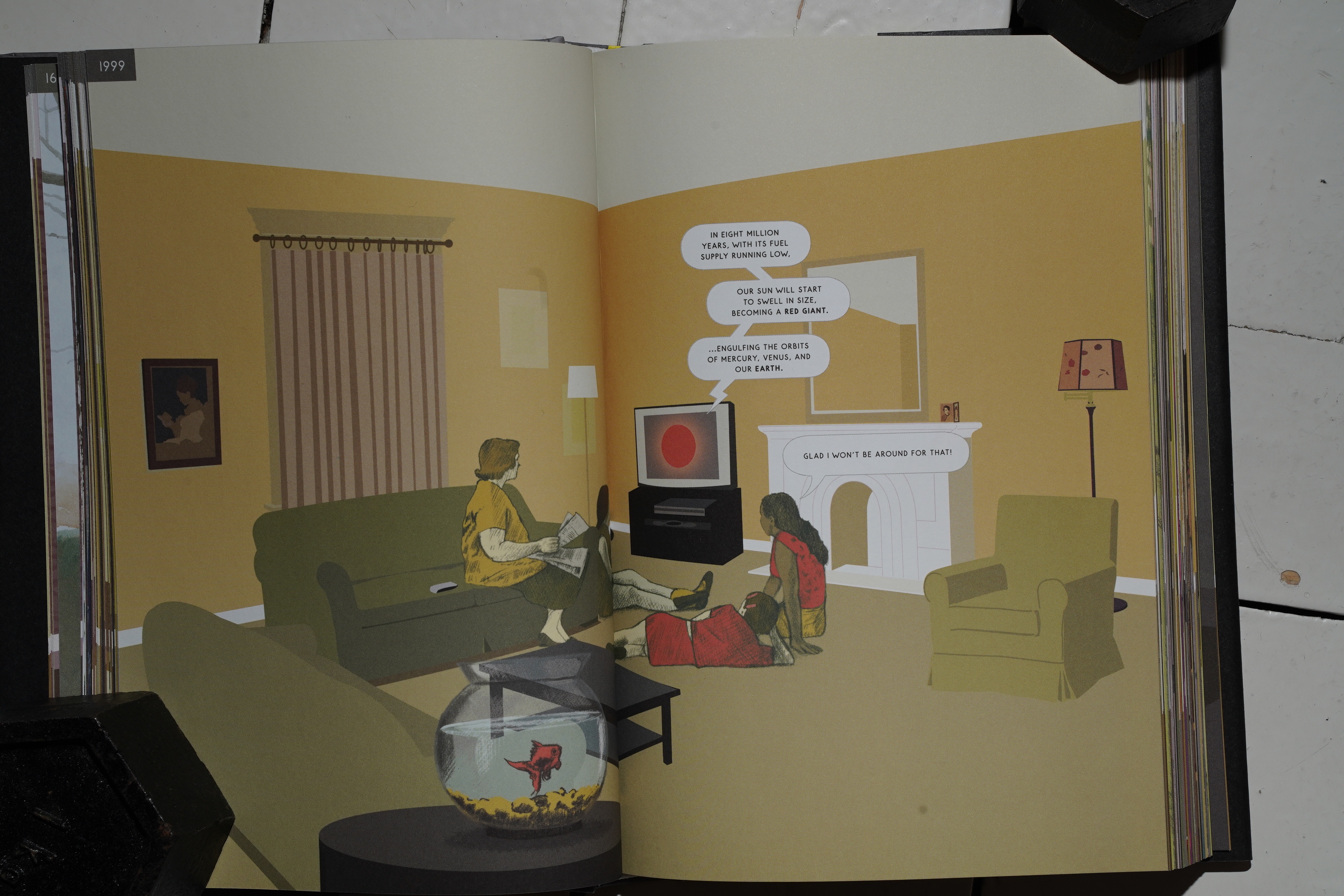
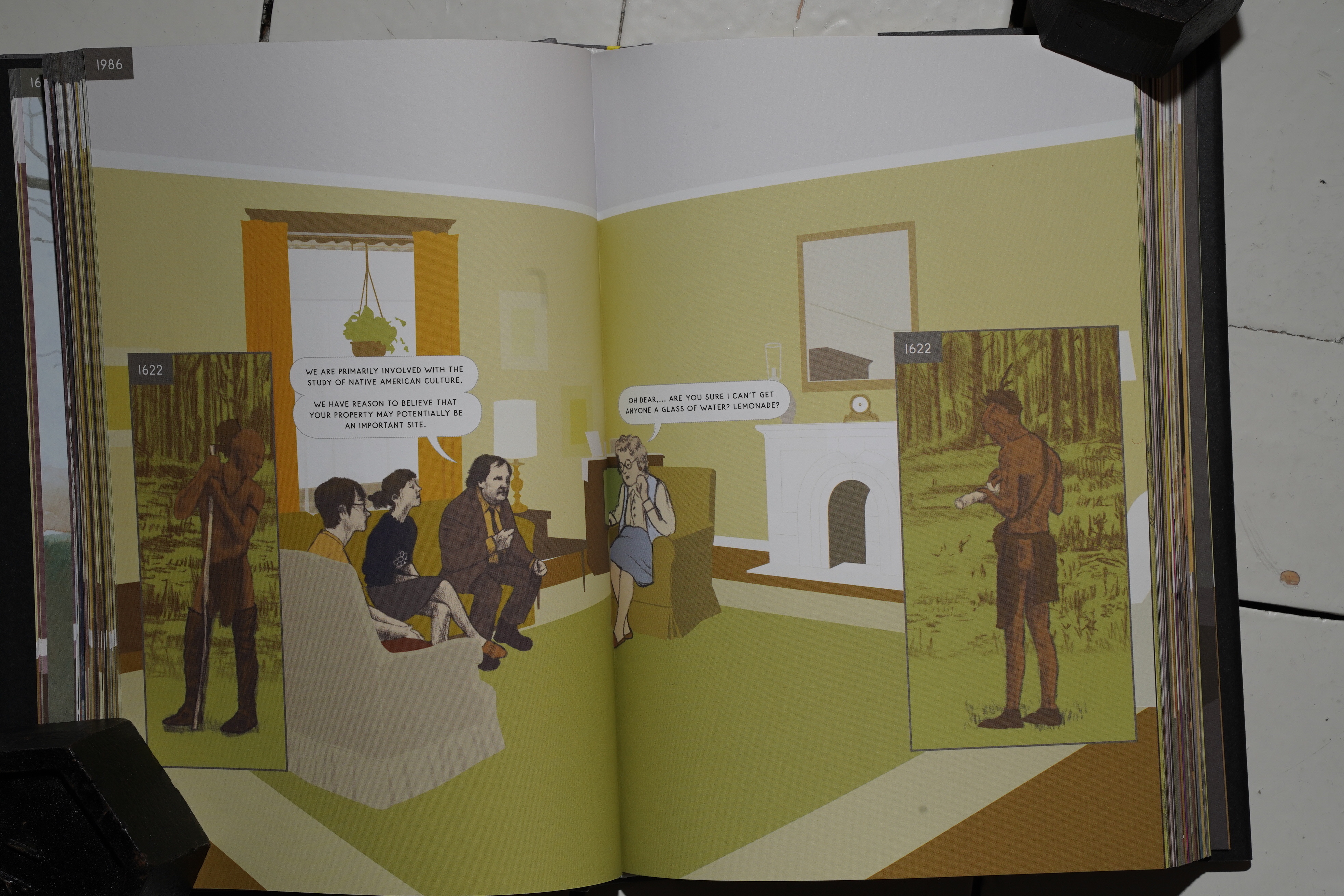
McGuire also makes everything so explicit: We’re being told, several times, that this is a book about history. He even drops in some historians, and he has Benjamin Franklin drop by… and then somebody actually naming him, as if he had no confidence that we’d already guessed that.
It just feels like he had people telling him he should make it more edumacational.
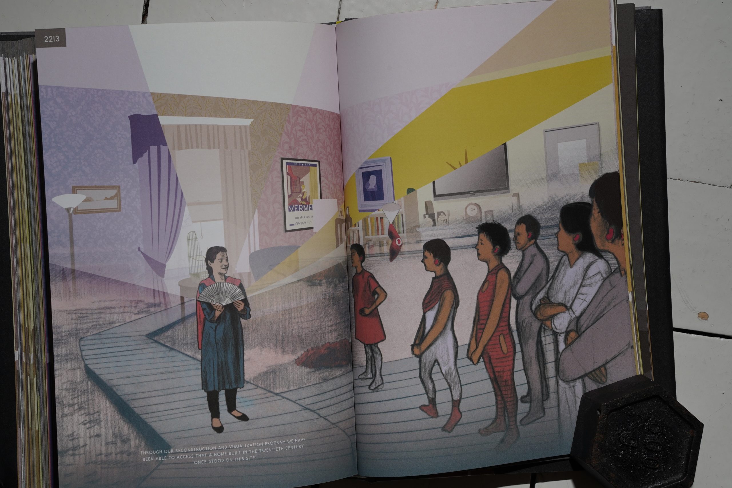
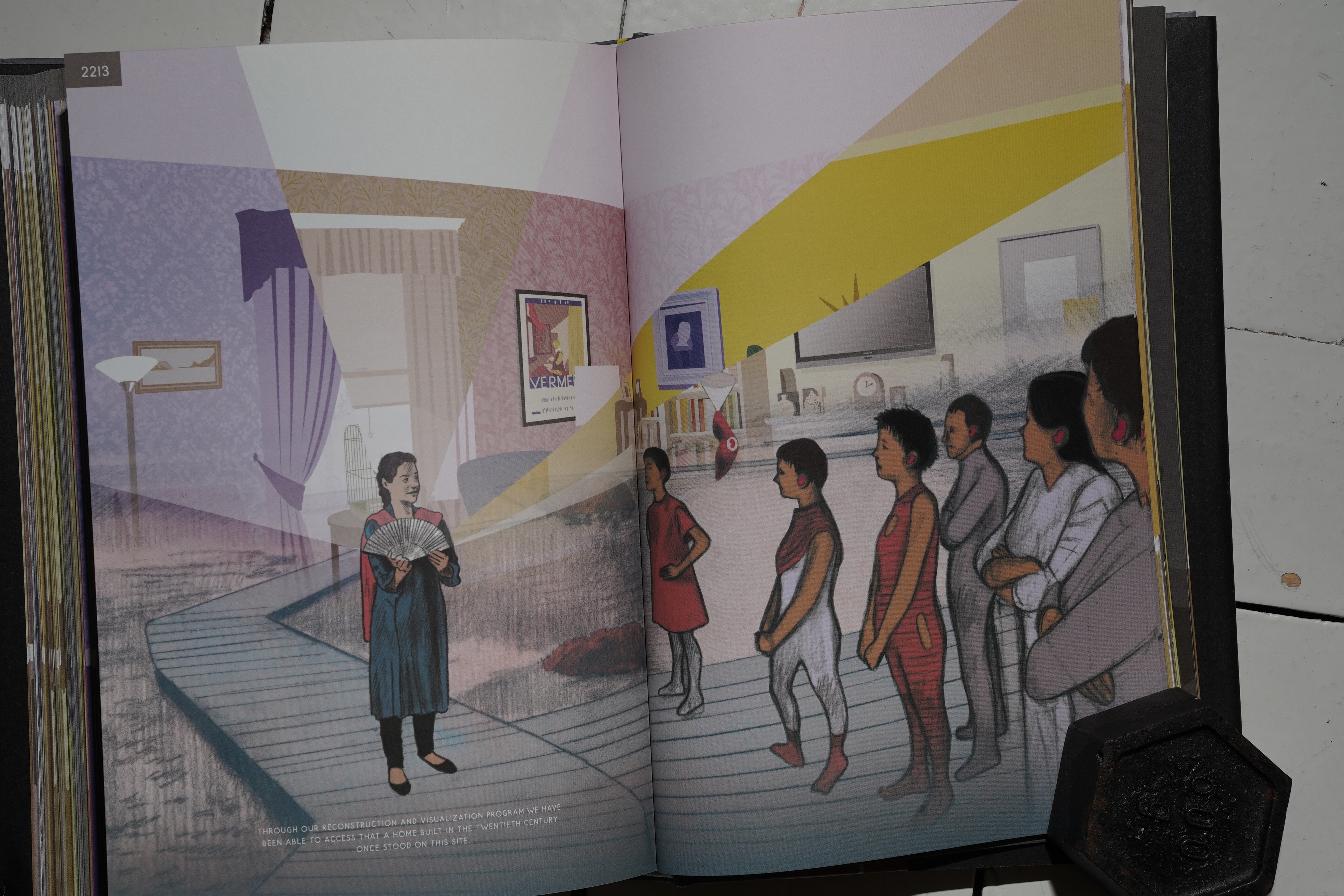
And then he seems to say that the entire book is basically a tour taken in 2213 with space age projectors, which just took all the fun out of it for me.
So, sorry: There’s so much to enjoy here, but that twist just makes it into a dumb sci-fi thing for me.
I can’t remember reading anything negative about the book, though:
Read, watch, or peruse Here in one mood, and you’ll discover a lyrical tribute to those attachments; read it in another, more fatalistic mood, and you might admire even more the varying textures of the lives—the many lives, in one place—that McGuire has made.
So it’s probably just me:
In “Here,” McGuire has introduced a third dimension to the flat page. He can poke holes in the space-time continuum simply by imposing frames that act as transtemporal windows into the larger frame that stands for the provisional now. “Here” is the comic-book equivalent of a scientific breakthrough. It is also a lovely evocation of the spirit of place, a family drama under the gaze of eternity and a ghost story in which all of us are enlisted to haunt and be haunted in turn.
I guess:
In Here, we are a particularly fascinating species of flourishing fauna, a force as elemental in our time as the sun or the ocean. We’ve never seemed so small or so big, so important or so meaningless. Neither have comics. The pink lady remembers why she came in here again, and picks up a small hardcover book.
This blog post is part of the Punk Comix series.