What? Already? It seems like I was doing a posting like this just the other week…
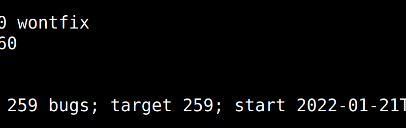
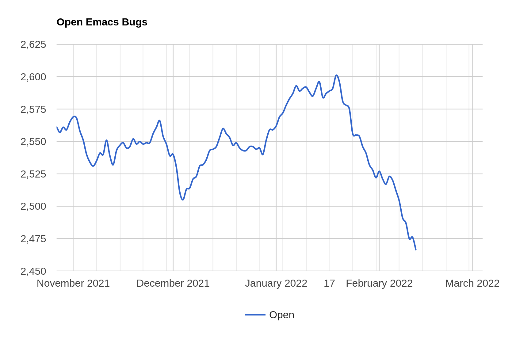
How time flies — it was three weeks ago. But this was a speedy stretch, and we actually decreased the numbers of open bugs, from 2590 to 2466, which, if my mathematics knowledge is correct, is … more than a hundred. Approx. Don’t take my word for it.
Oh, yeah, if you’re just joining the show, this is the blog post where I natter on a bit about Emacs development, through the lens of traversing the Emacs bug tracker.
To zoom out:
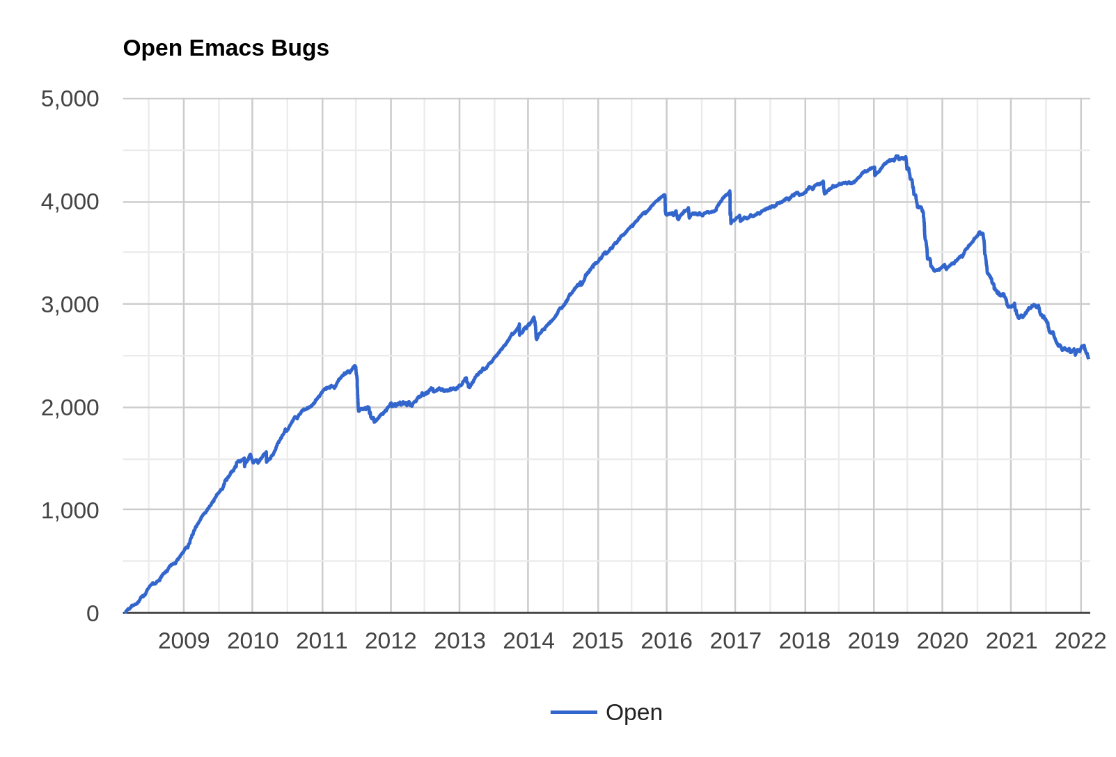
We’re on a downward trend, but I feel like it’s taking more effort recently. I didn’t implement a single significant new feature this cycle, but just concentrated on triage and fixing (small) stuff, and it still was… a lot of work.
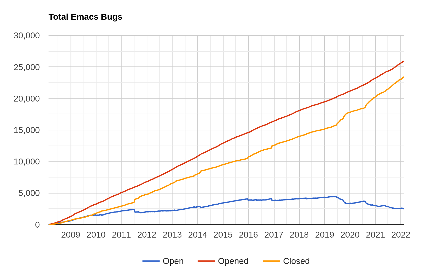
And it looks like the number of opened bugs is pretty flat? Or… is it? So I made a new chart:
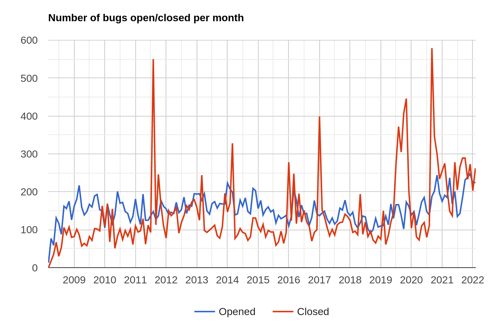
Aha! The number of bugs opened per month was in the 150 region from 2015 to 2020, but the last couple years, we’ve trended towards 200 per month. Which says something, but I’m not sure what.
How do you interpret a higher bug count? Is Emacs getting buggier, or are we just adding more new stuff (that then has bugs (everything does)), or is the number of users increasing, so we’re getting more reports? Difficult to say, but I think it’s mostly the second point. To take just one example (but a big one) — the pure Gtk branch was merged a couple months ago, and that led to a surge in bug reports from users trying that out.
Let’s see… did Emacs get anything new and exciting since the last blog post? Uhm… Oh, yeah:
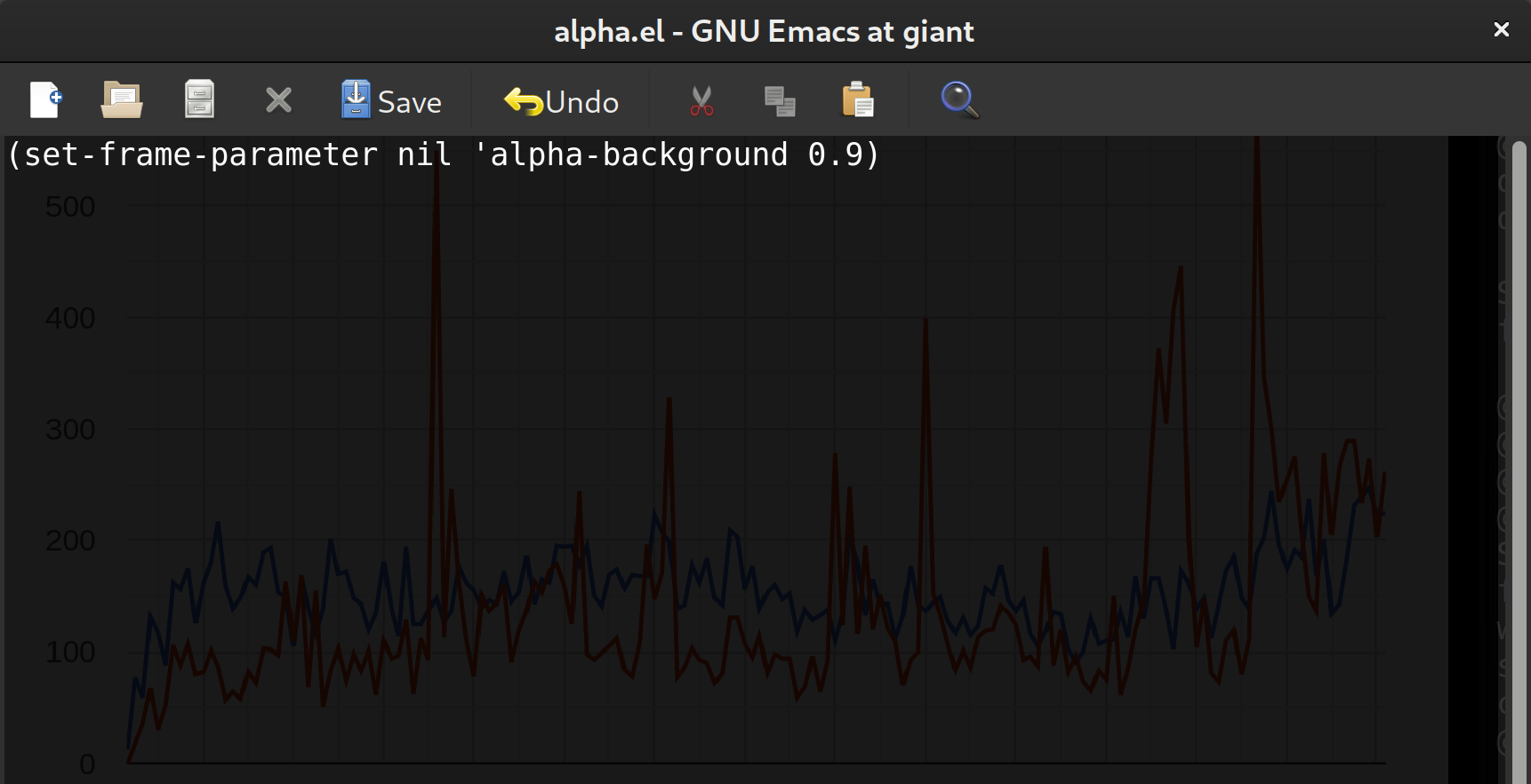
Emacs can now (courtesy of Håkon Flatval and Po Lu) use alpha backgrounds (i.e., let windows behind Emacs frames shine through).
In total, there’s been 610 commits, for an average of 28 per day. Ish.
Next stretch is just 246 bugs, but I think I’ll be concentrating on implementing things instead of looking at old bug reports, so it’ll probably take a whole lot longer until the next blog post in this series.
And I may be taking some time off, but whenever I say that, it never happens.