I was gonna be all productive today, but then my get up and go got up and left, so how about I just read comics until I plotz instead?

Besides, apparently Easter has arrived…
… and I have to eat all this stuff in this egg. And… I think I’ll only play records I had as a teenager? Yes. So let’s get started.
| Talking Heads: Remain In Light | 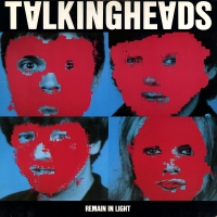 |
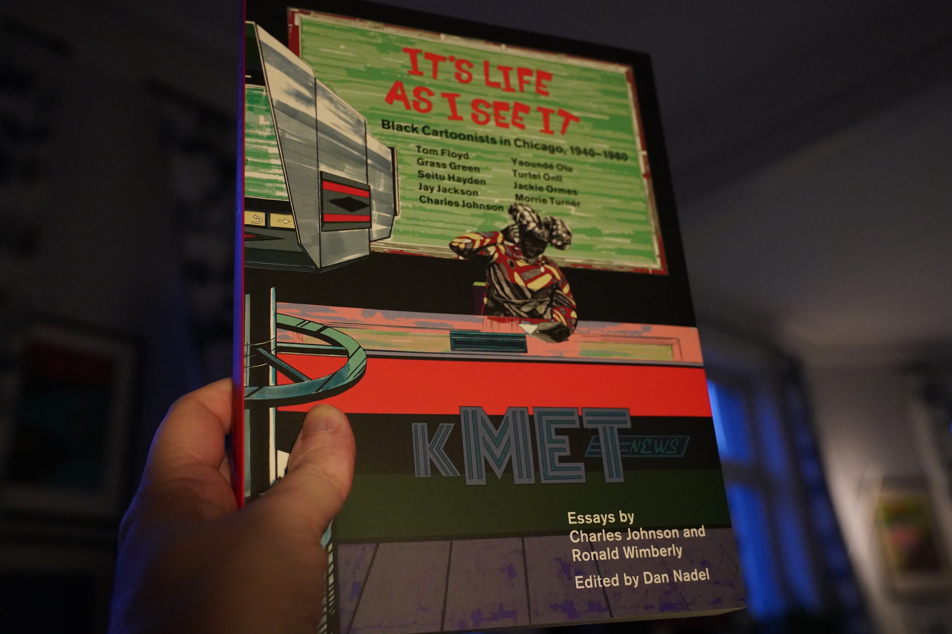
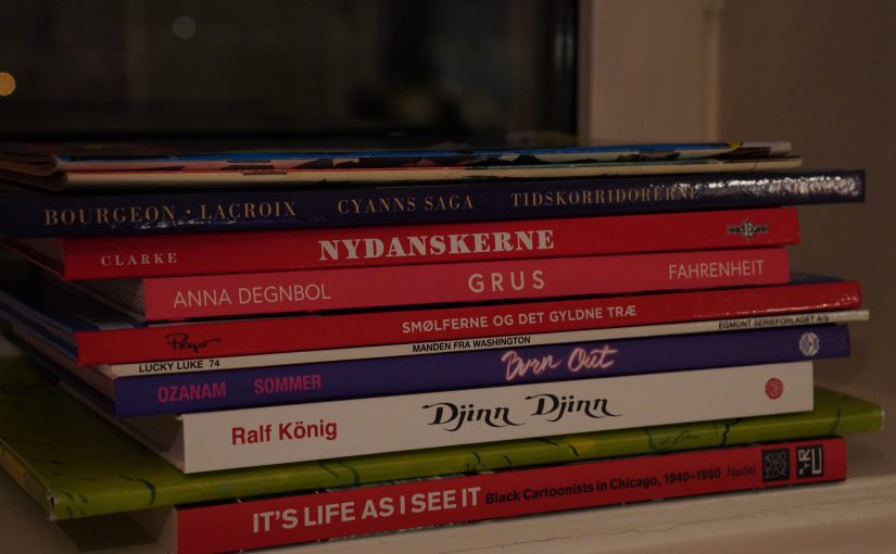
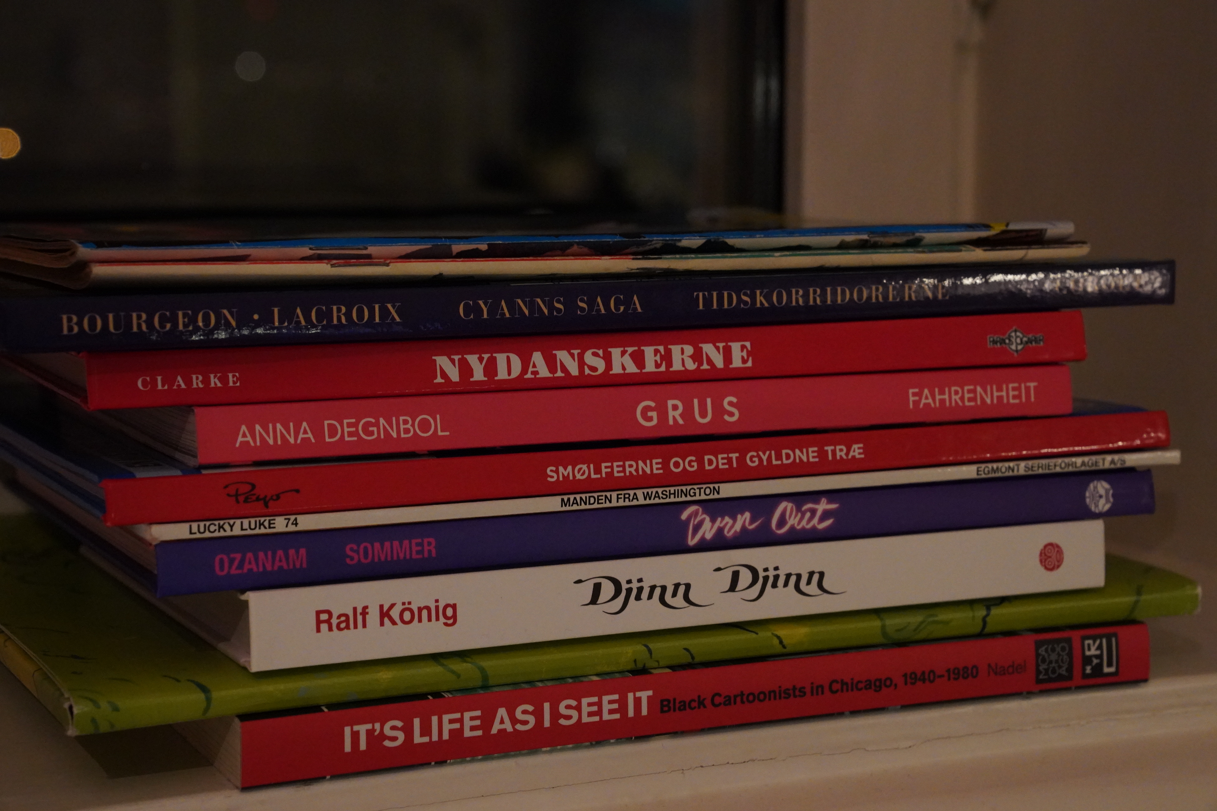
17:26: It’s Life As I See It edited by Dan Nadel (New York Review Comics)
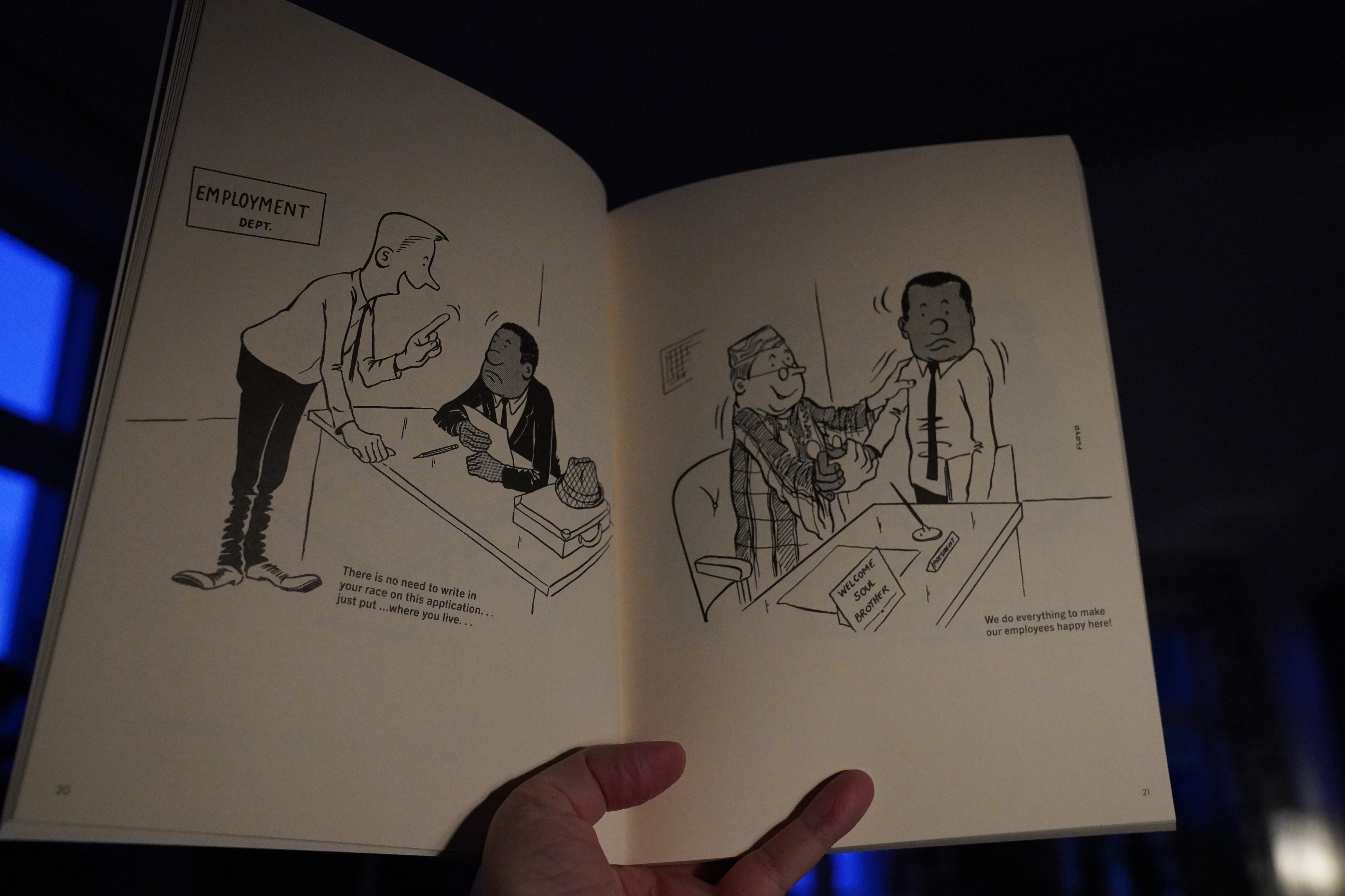
This collection is a bit uneven — there’s some good stuff and some kinda awkward stuff (Tom Floyd).
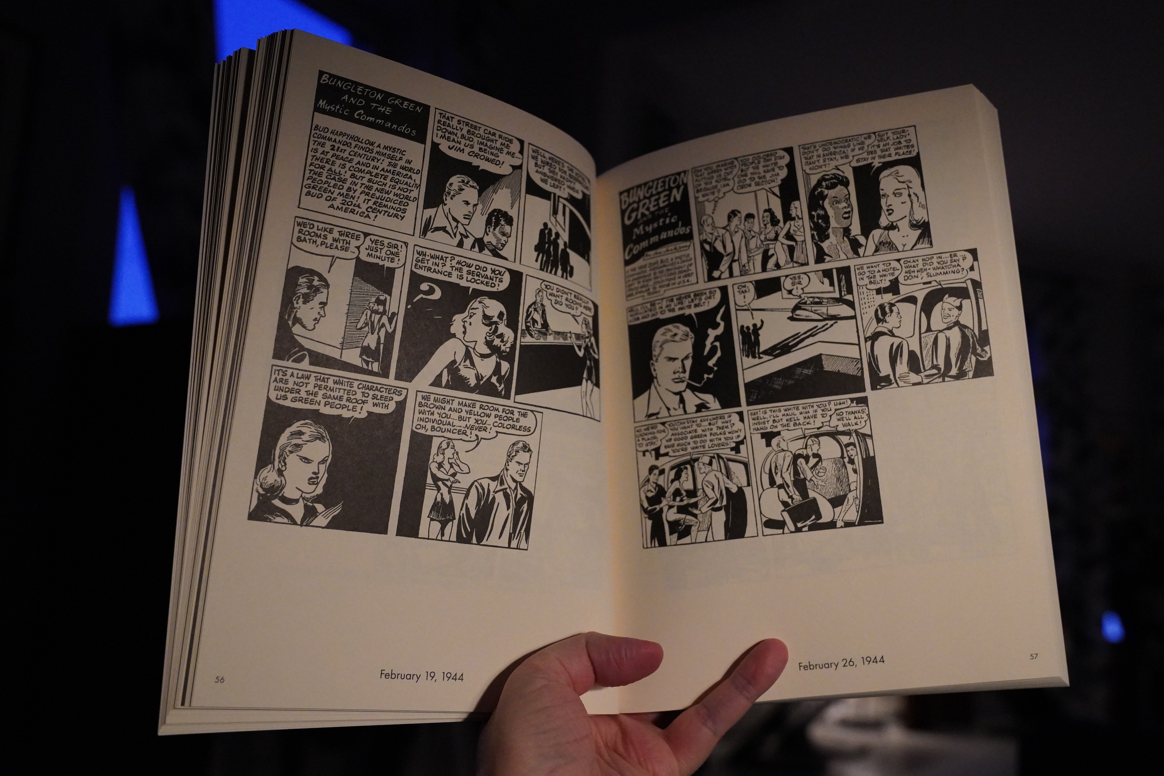
Jay Jackson’s strip (filling about a quarter of the book) is really interesting. But.
| Peter Gabriel: Peter Gabriel 3 |  |
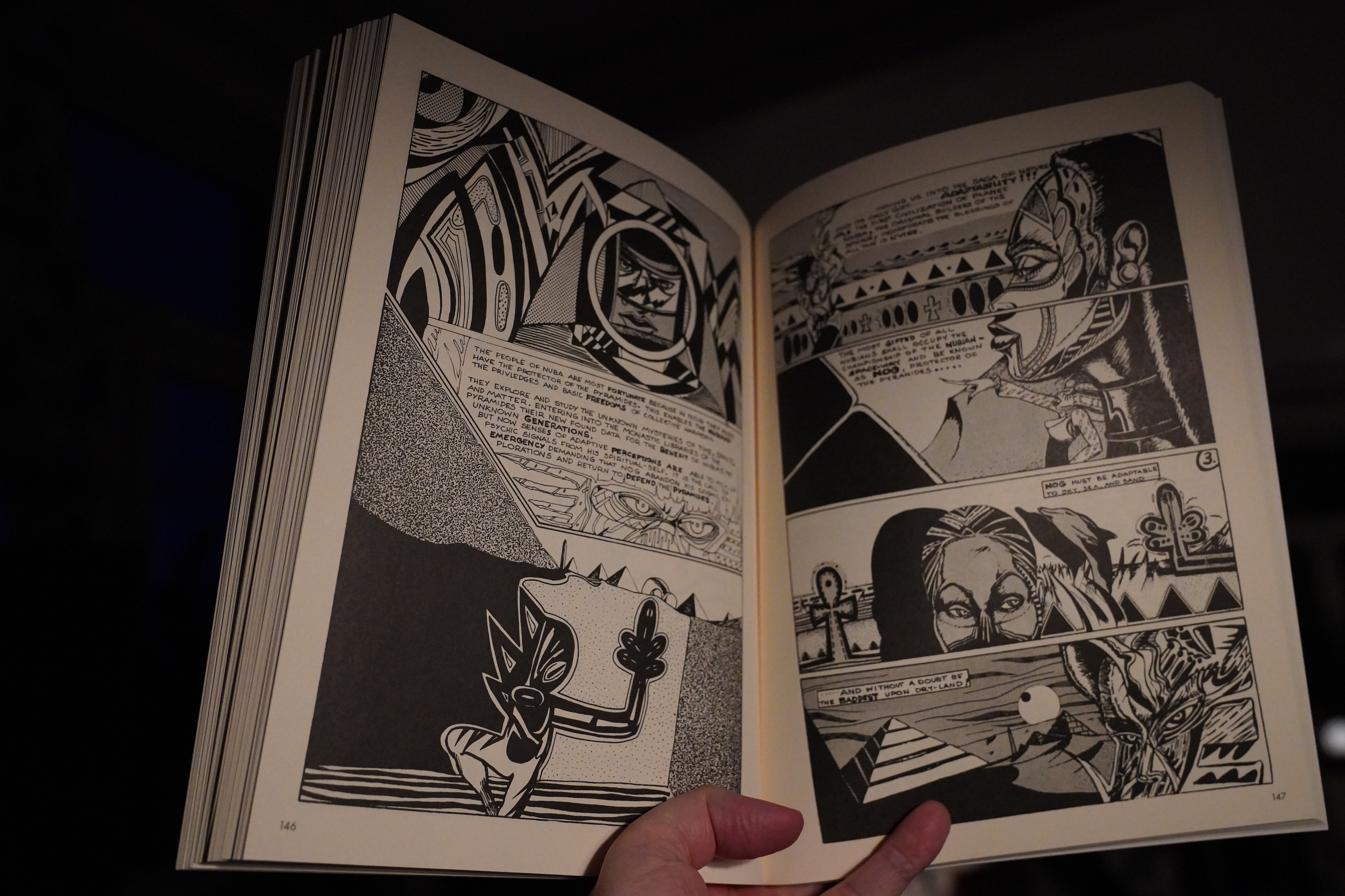
Wow. Far out. (Turtel Onli.)
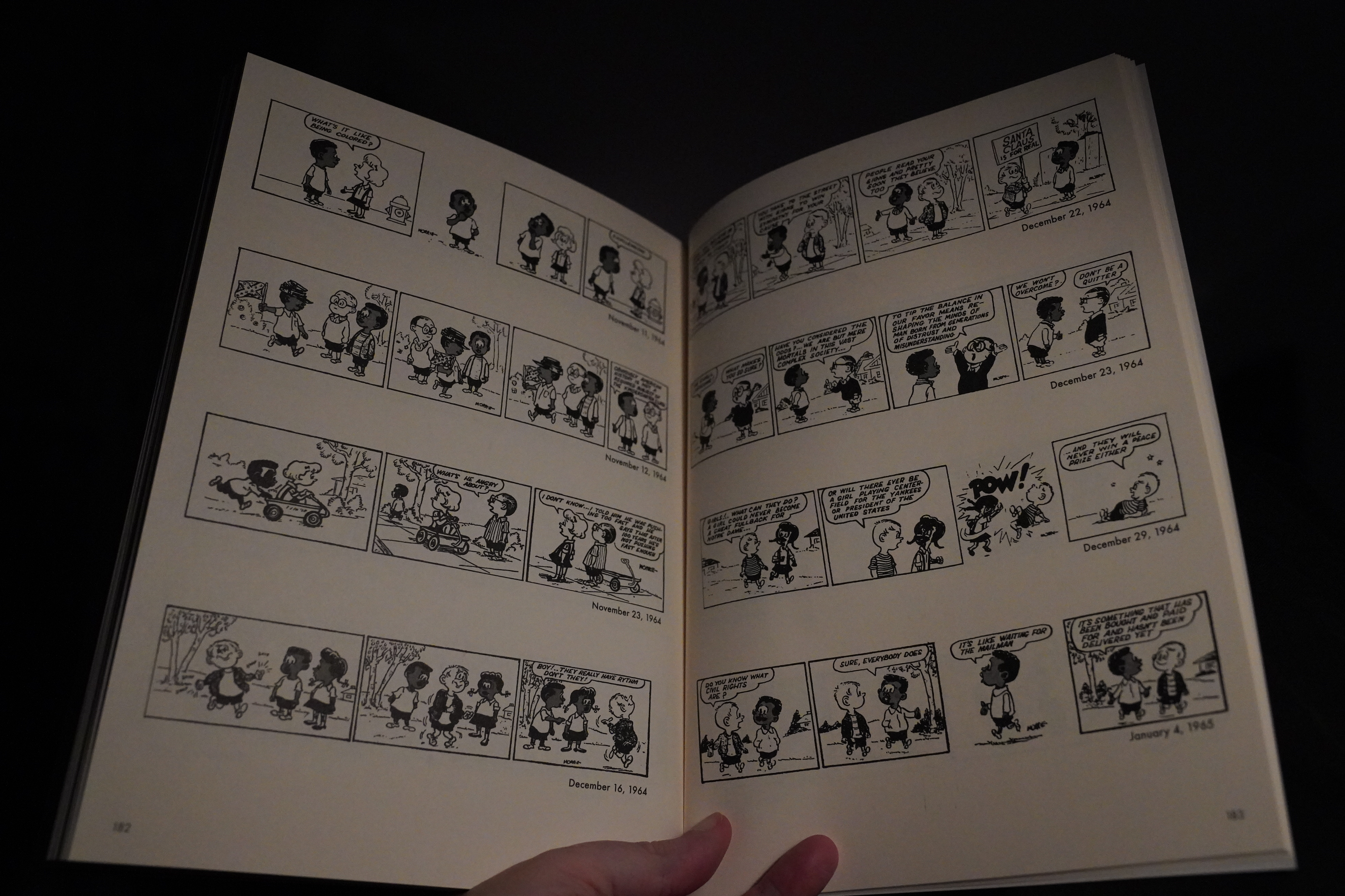
Morrie Turner’s strips are pretty amusing, though.
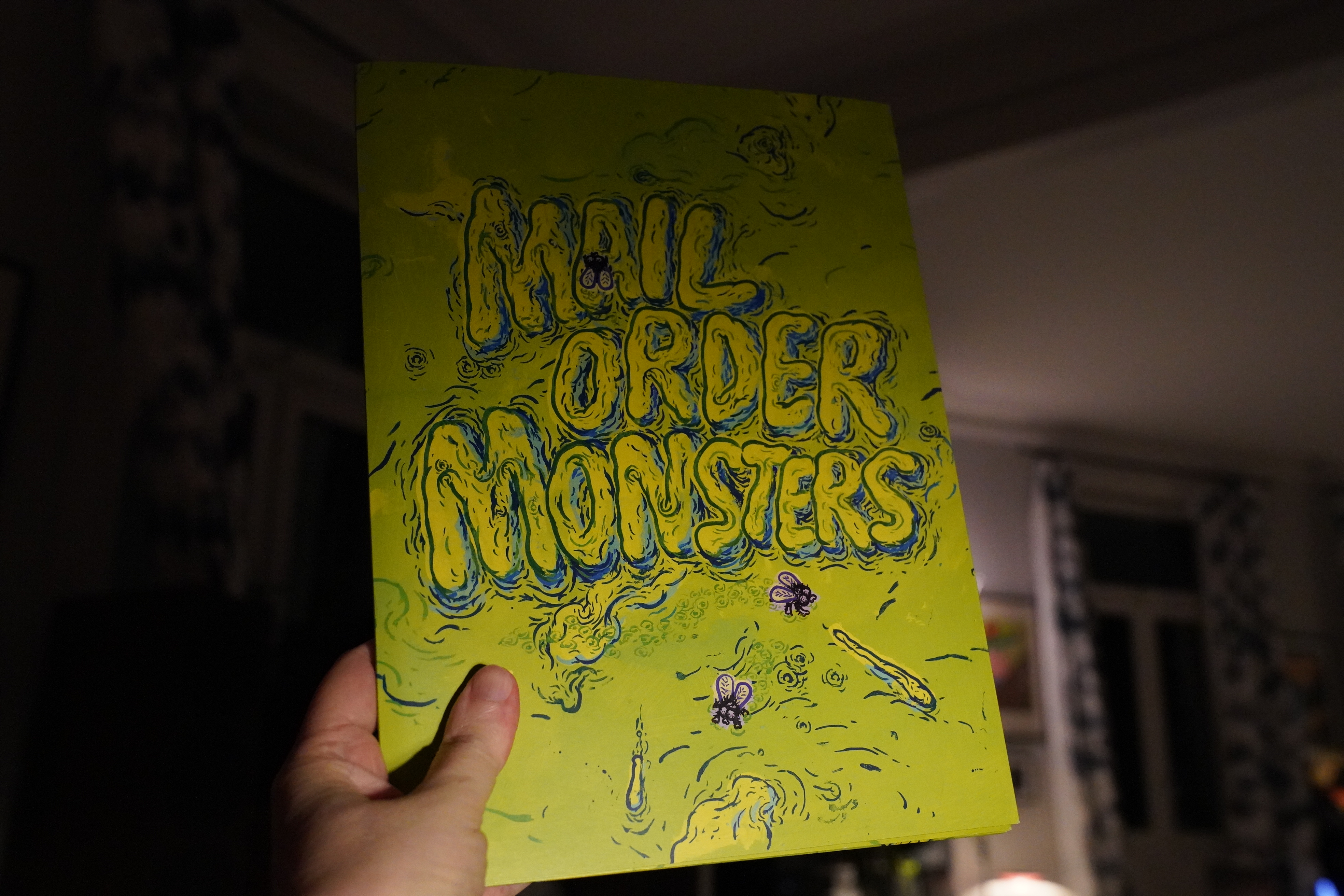
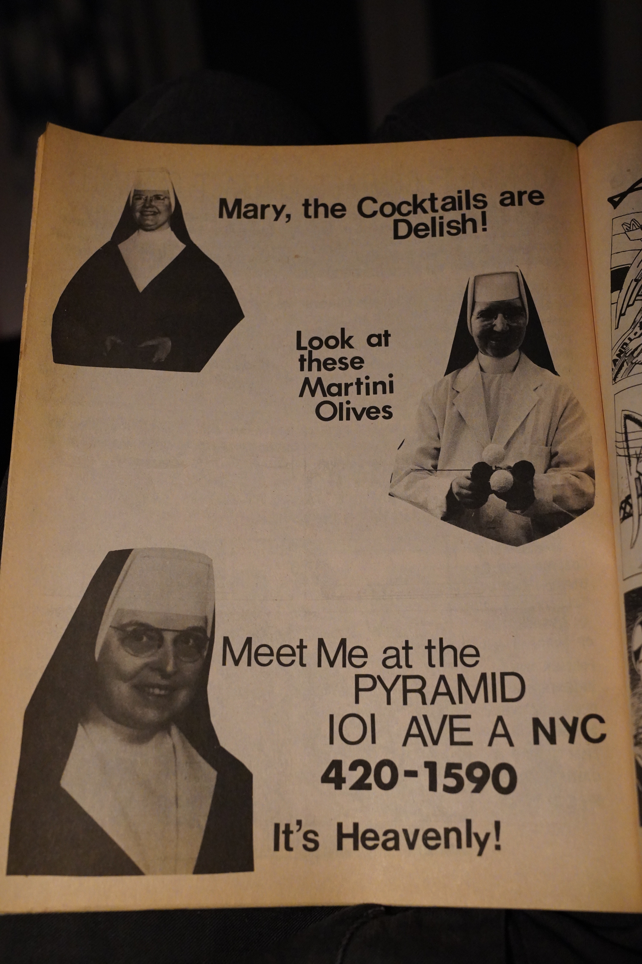
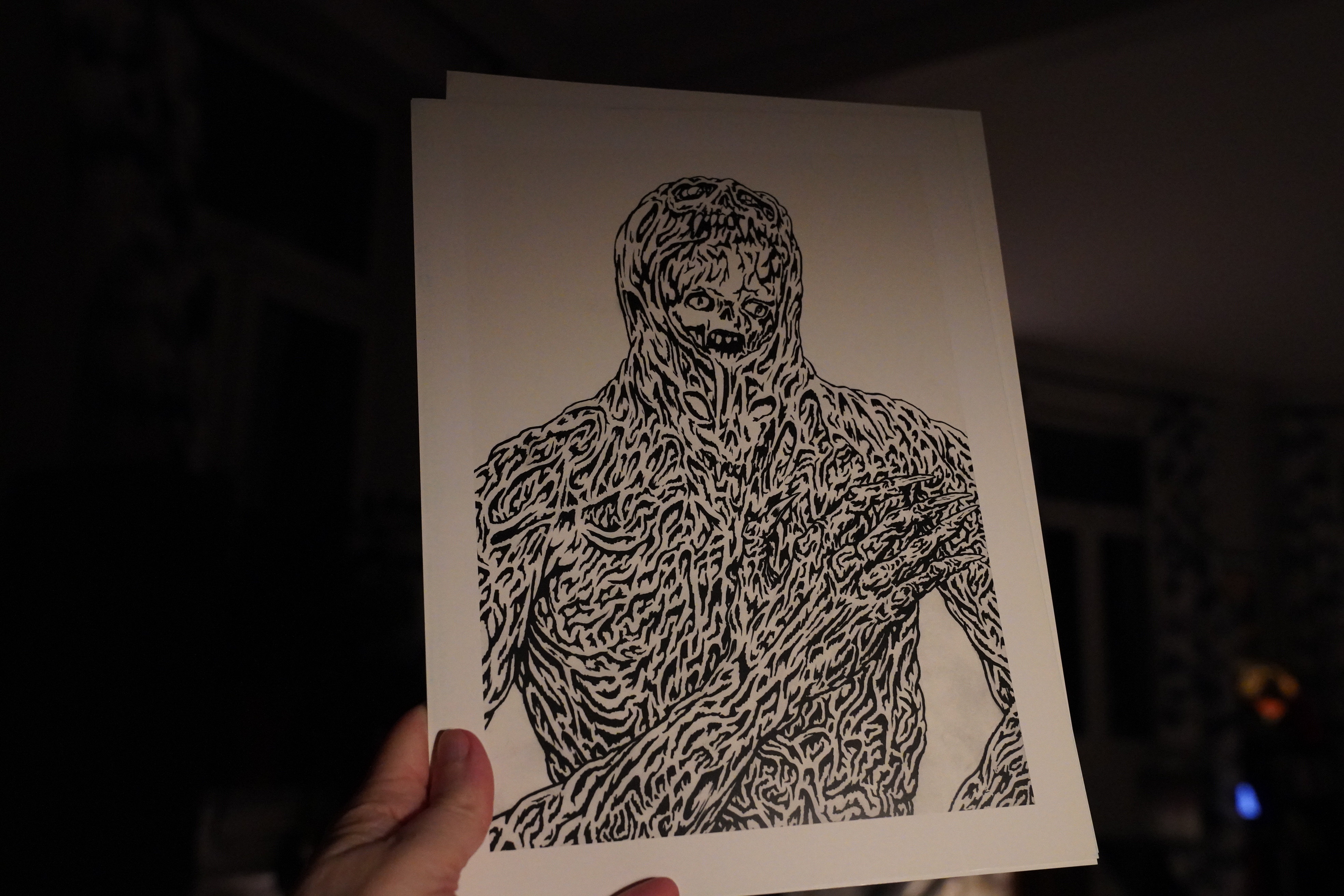
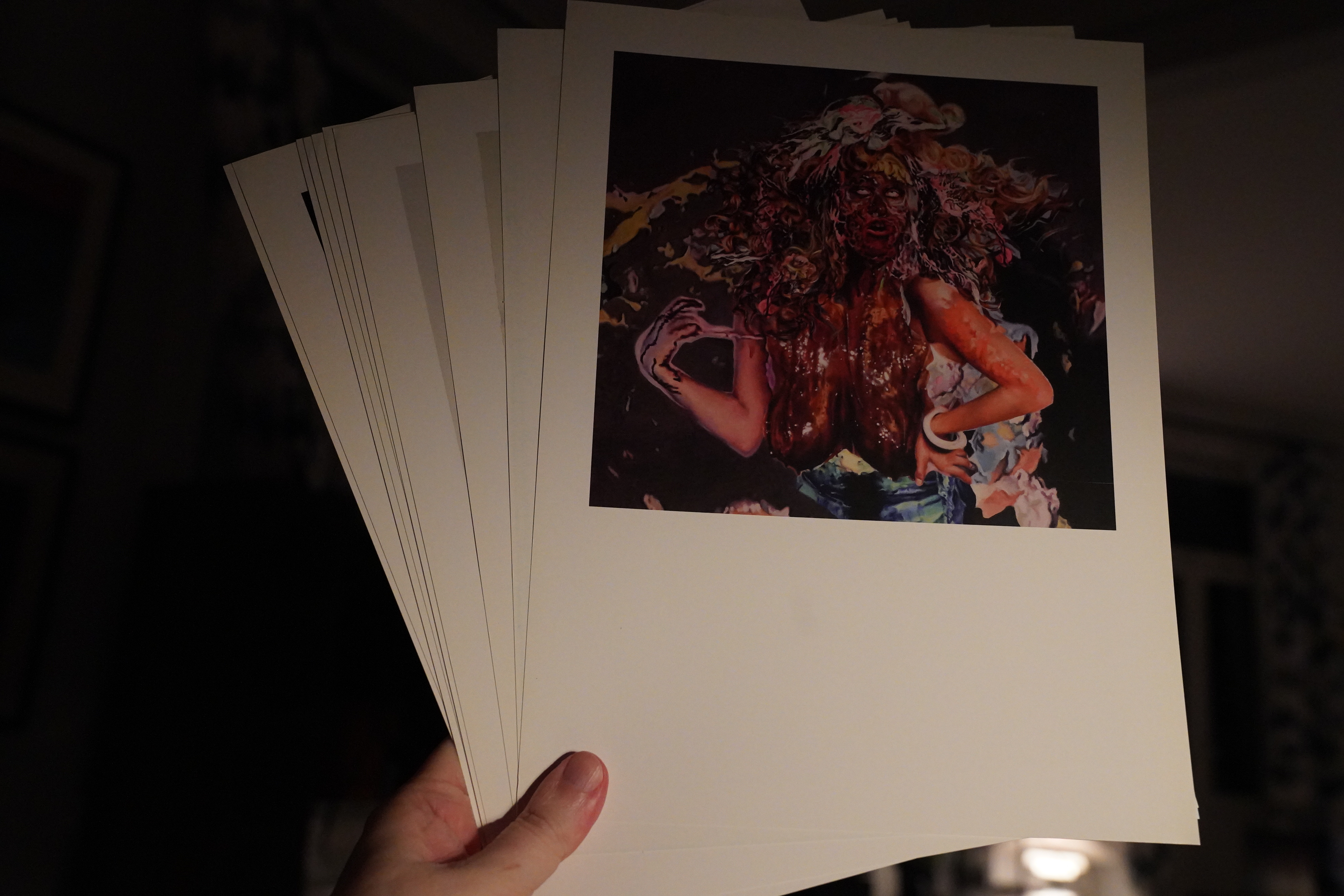
18:52: Mail Order Monsters curated by Kathy Grayson (Picturebox and others)
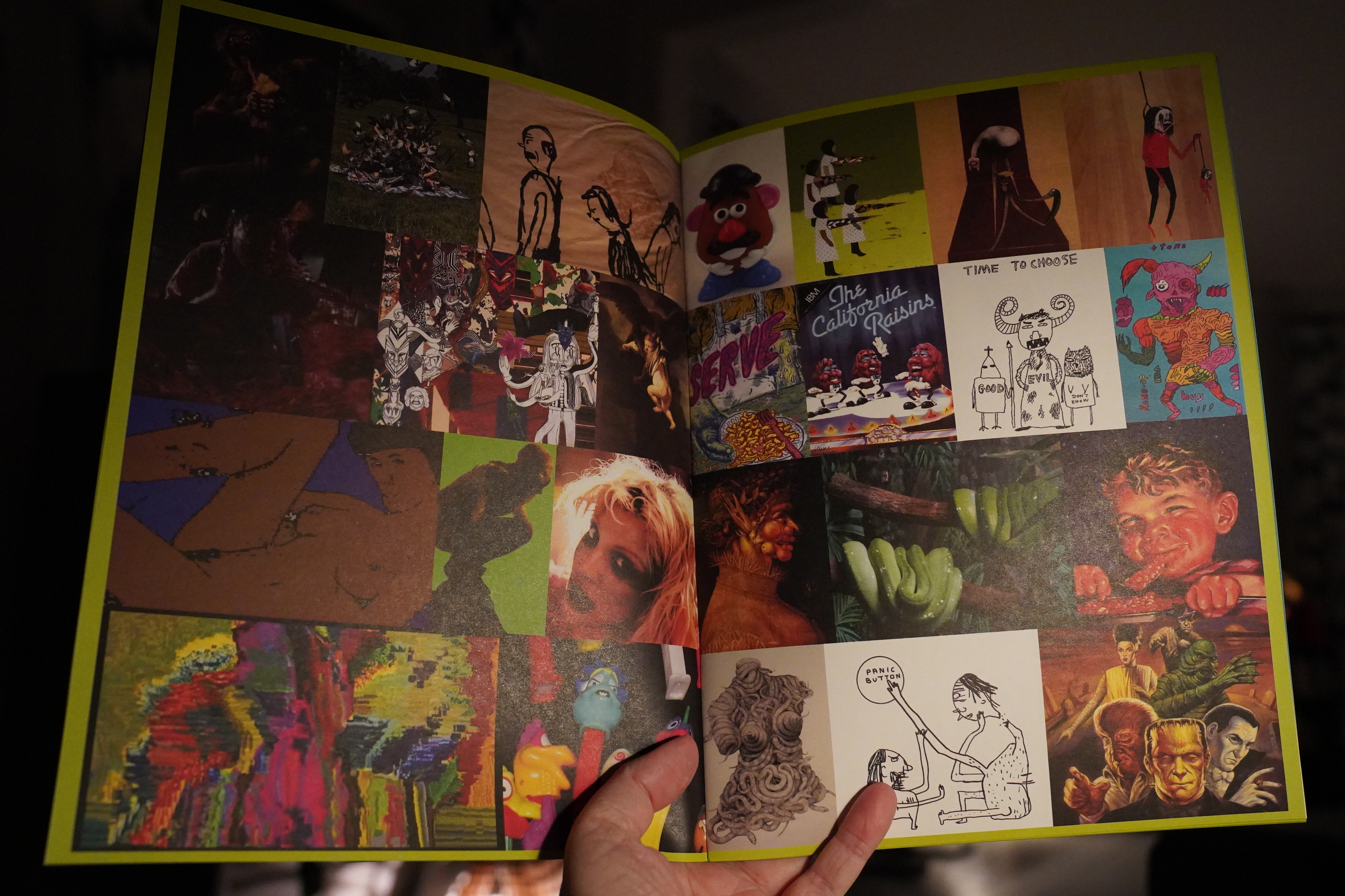
This is a catalogue of a (series of) exhibitions… It’s very 2008.
And there’s also a portfolio with a couple dozen plates. Here’s Mat Brinkman.
And Francine Spiegel.
It’s pretty neat.
| Joe Jackson: Beat Crazy |  |
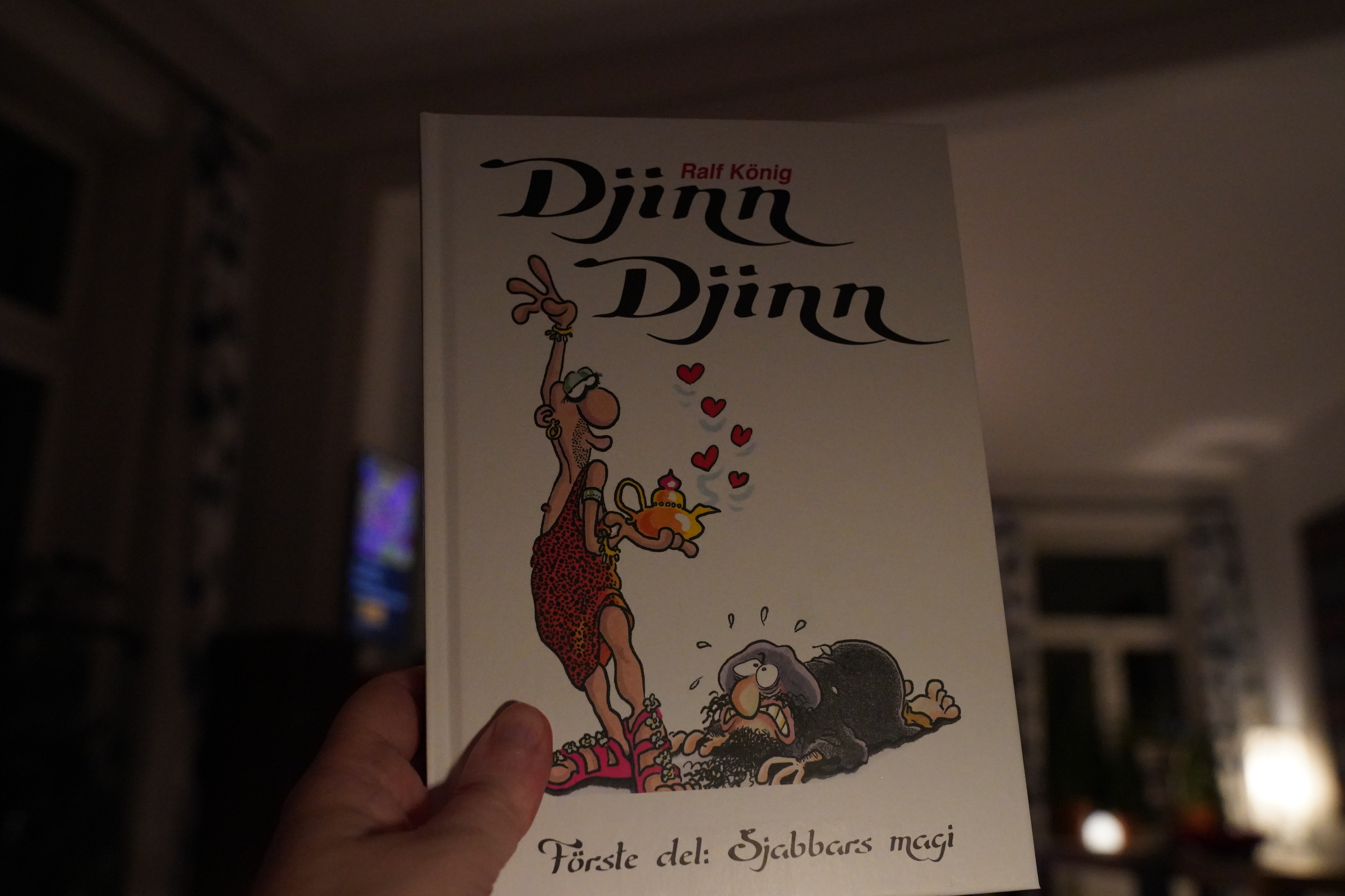
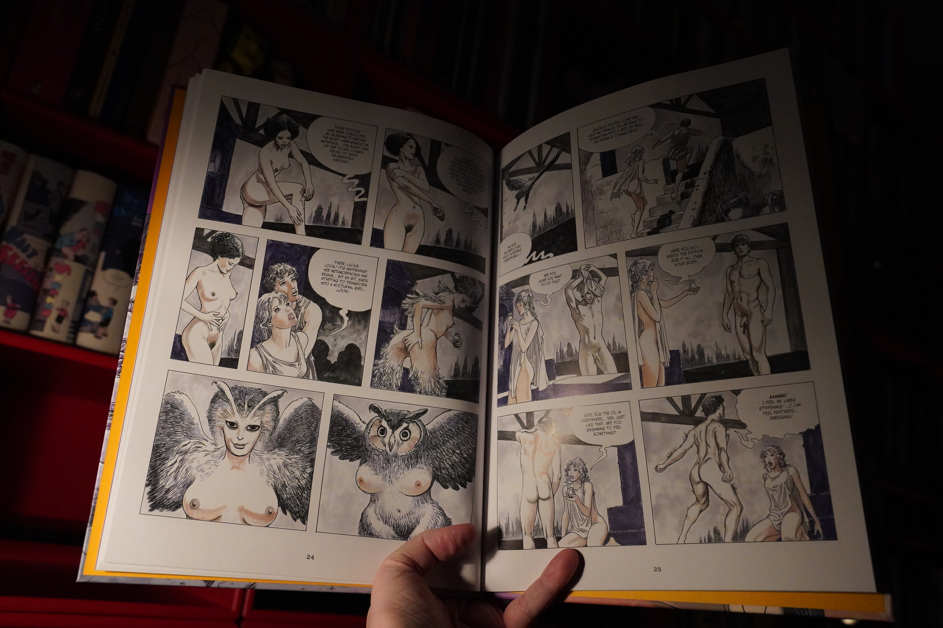
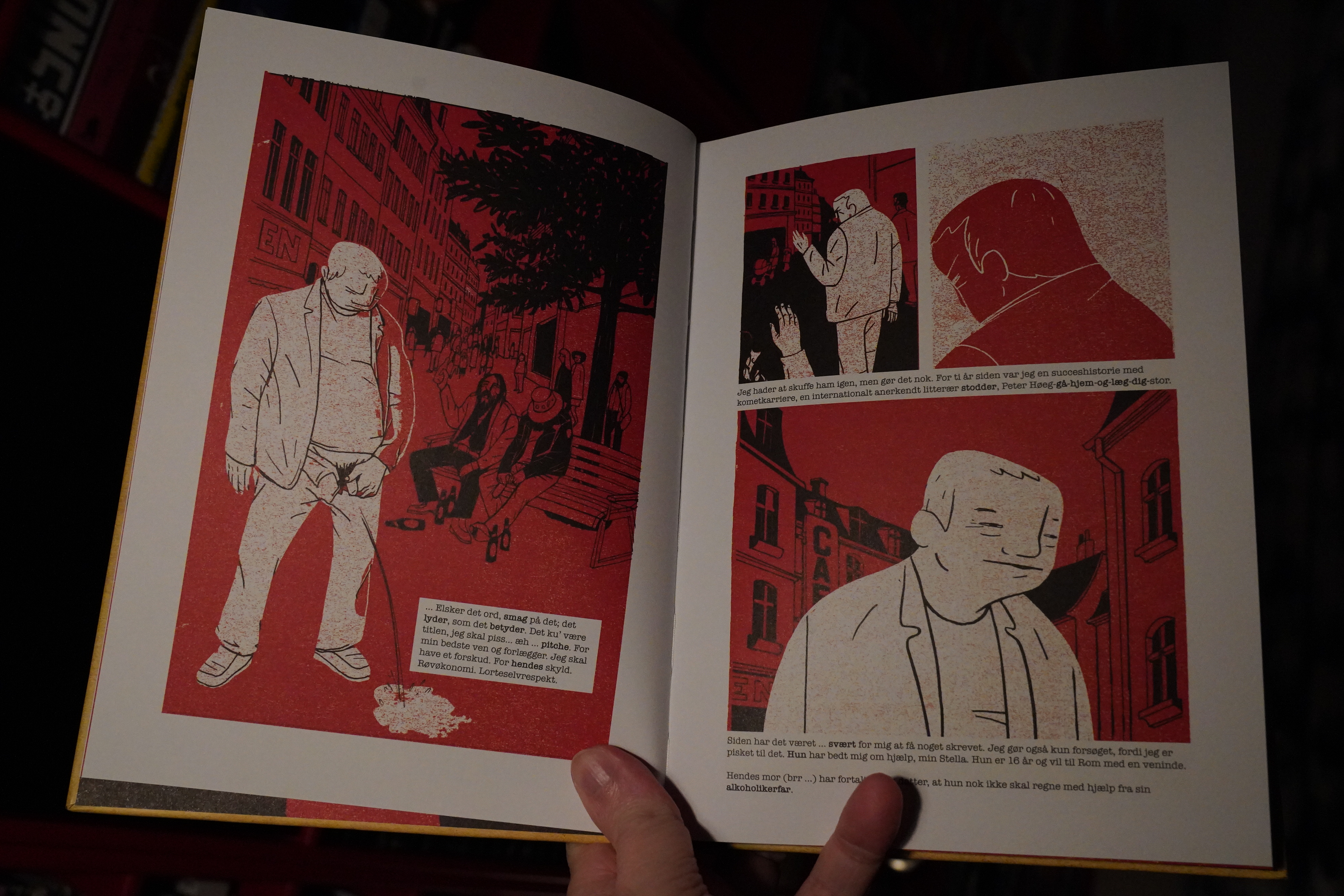
19:04: Dschinn Dschinn: Der zauber des Schabbar by Ralf König (Fahrenheit)
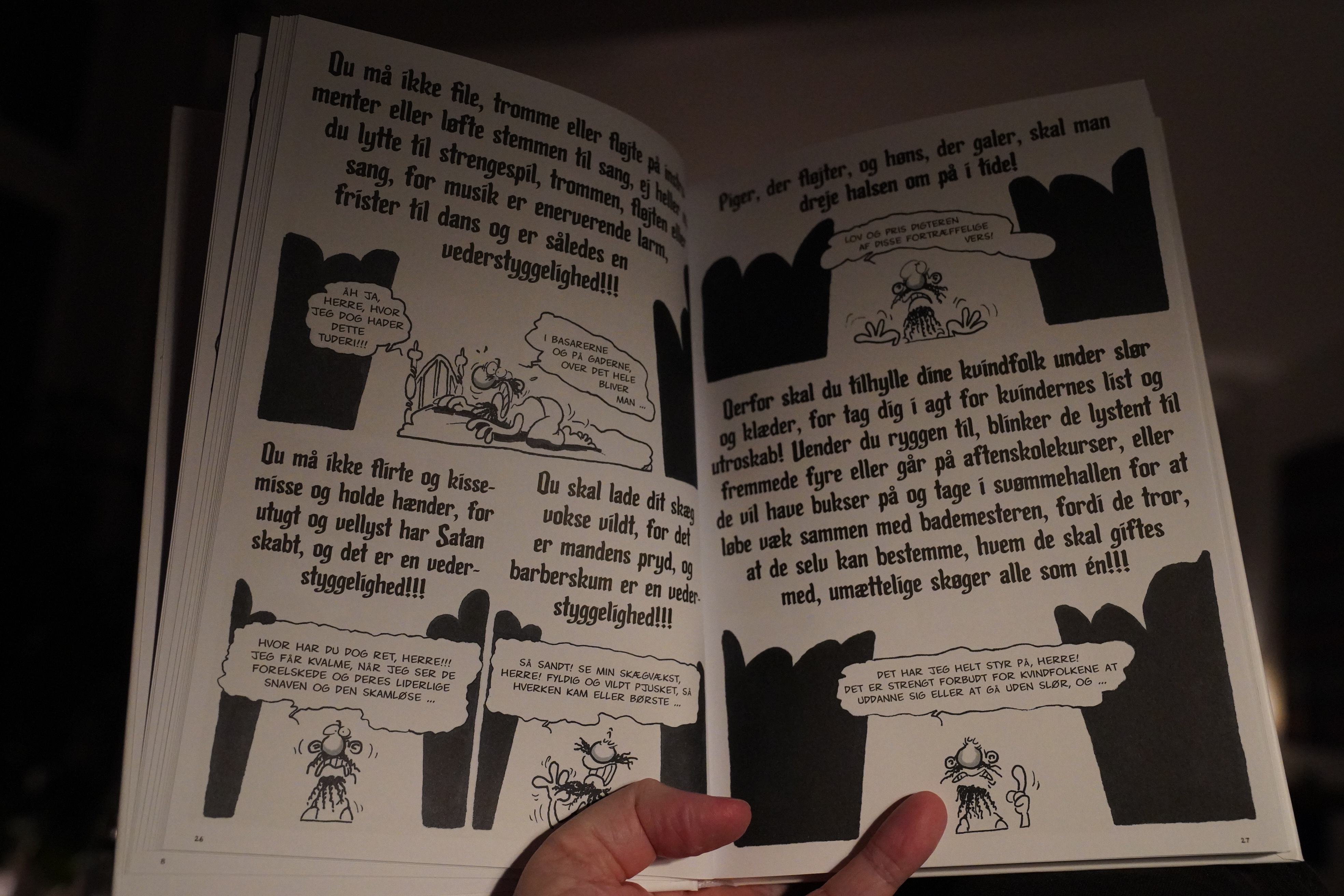
Heh. This is about a mullah that’s very similar to a more well-known one (I’ll mention no names), who gets instructions about women wearing burkas and stuff…

… who’s then magically turned into a sex djinn. Somehow König didn’t get a fatwa on his ass, but presumably because nobody in Saudi Arabia reads German comics.
| David Byrne and Brian Eno: My Life In The Bush Of Ghosts |  |
Anyway, it’s really funny, apart from the blasphemelicious bits. König’s comics are always mostly people sitting around talking, and he’s got the rhythms brilliantly down. The witty repartee keeps coming, and always takes surprising, funny turns.
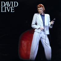
| David Bowie: Scary Monsters |  |
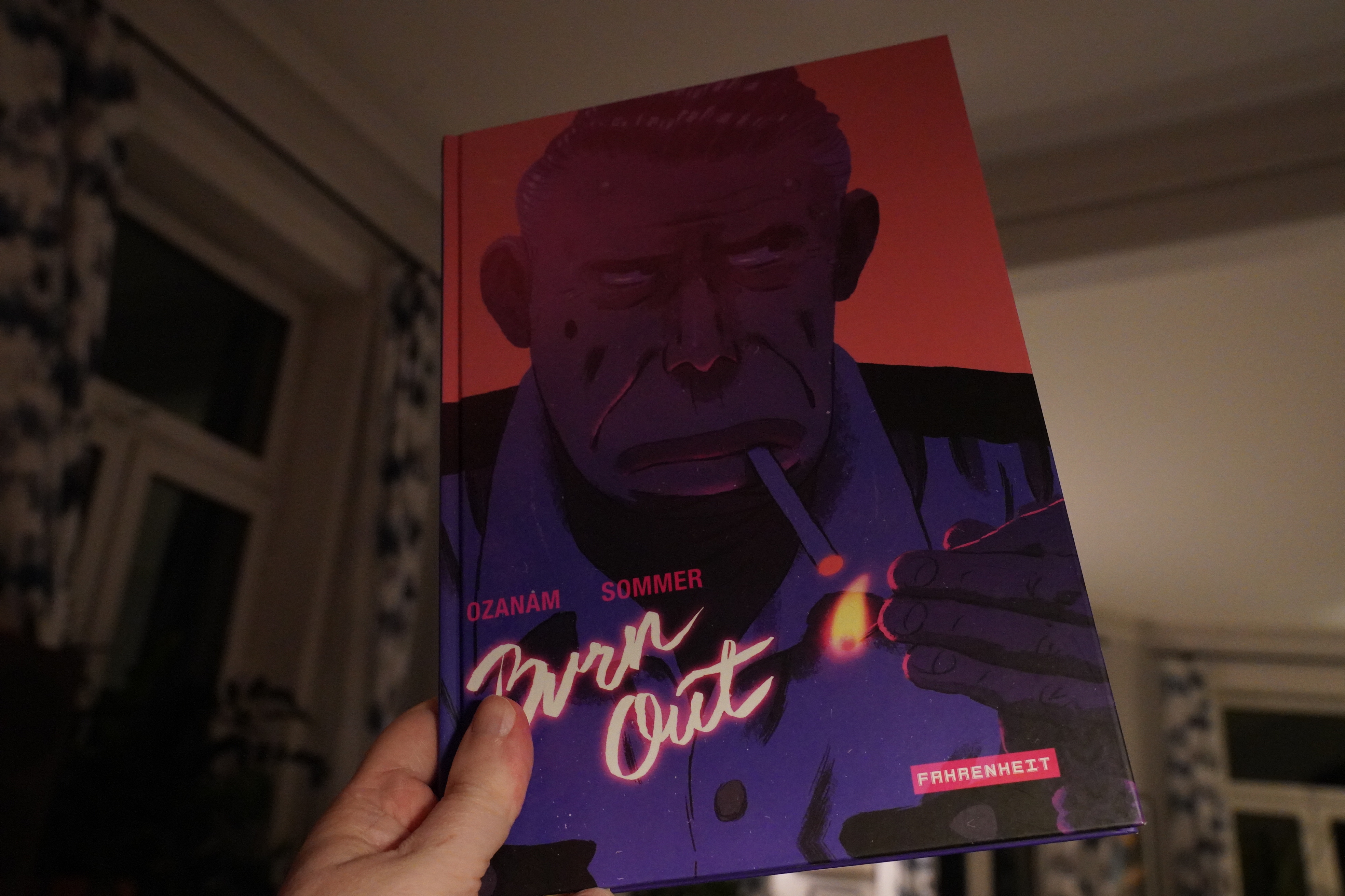
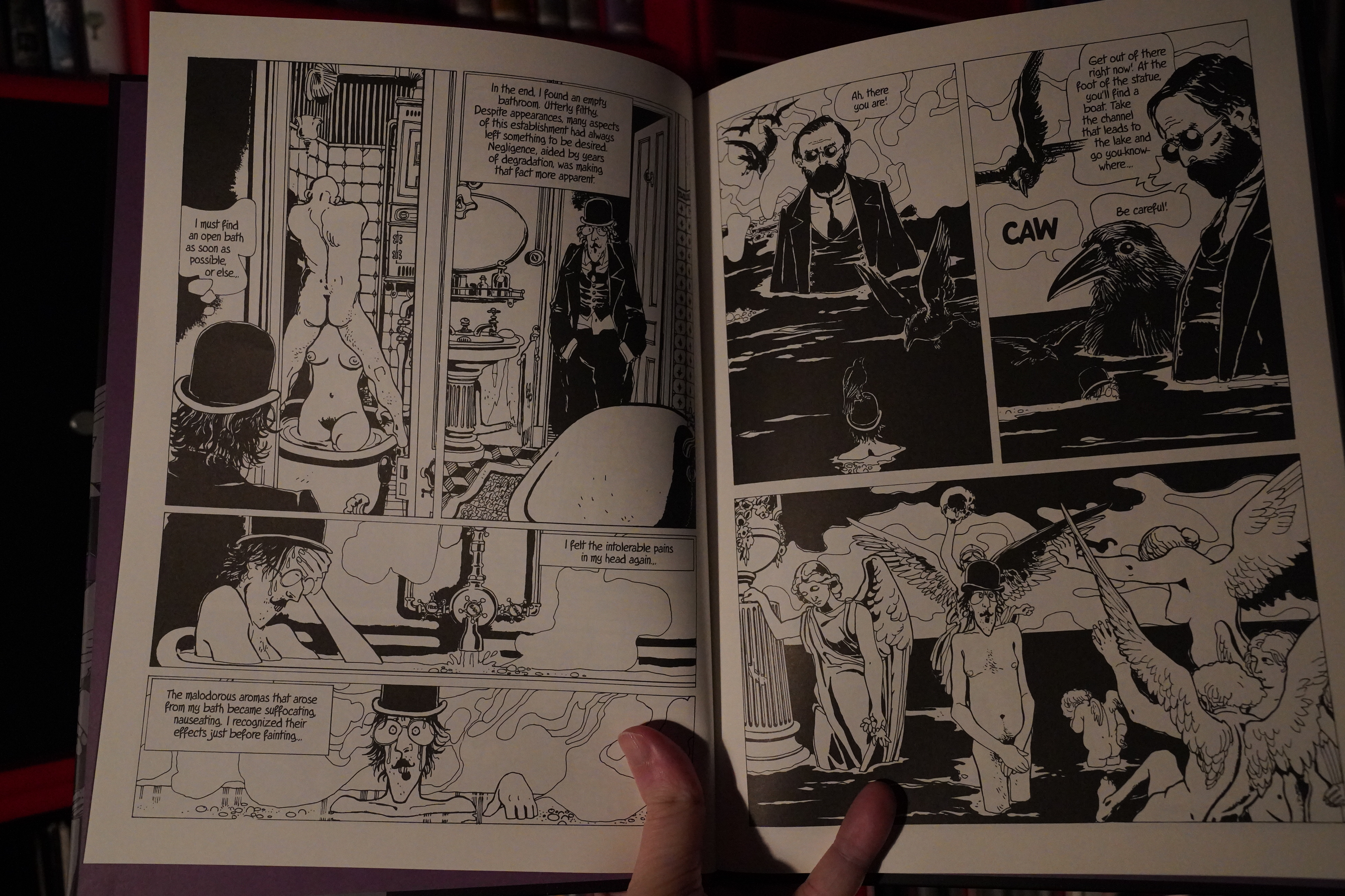
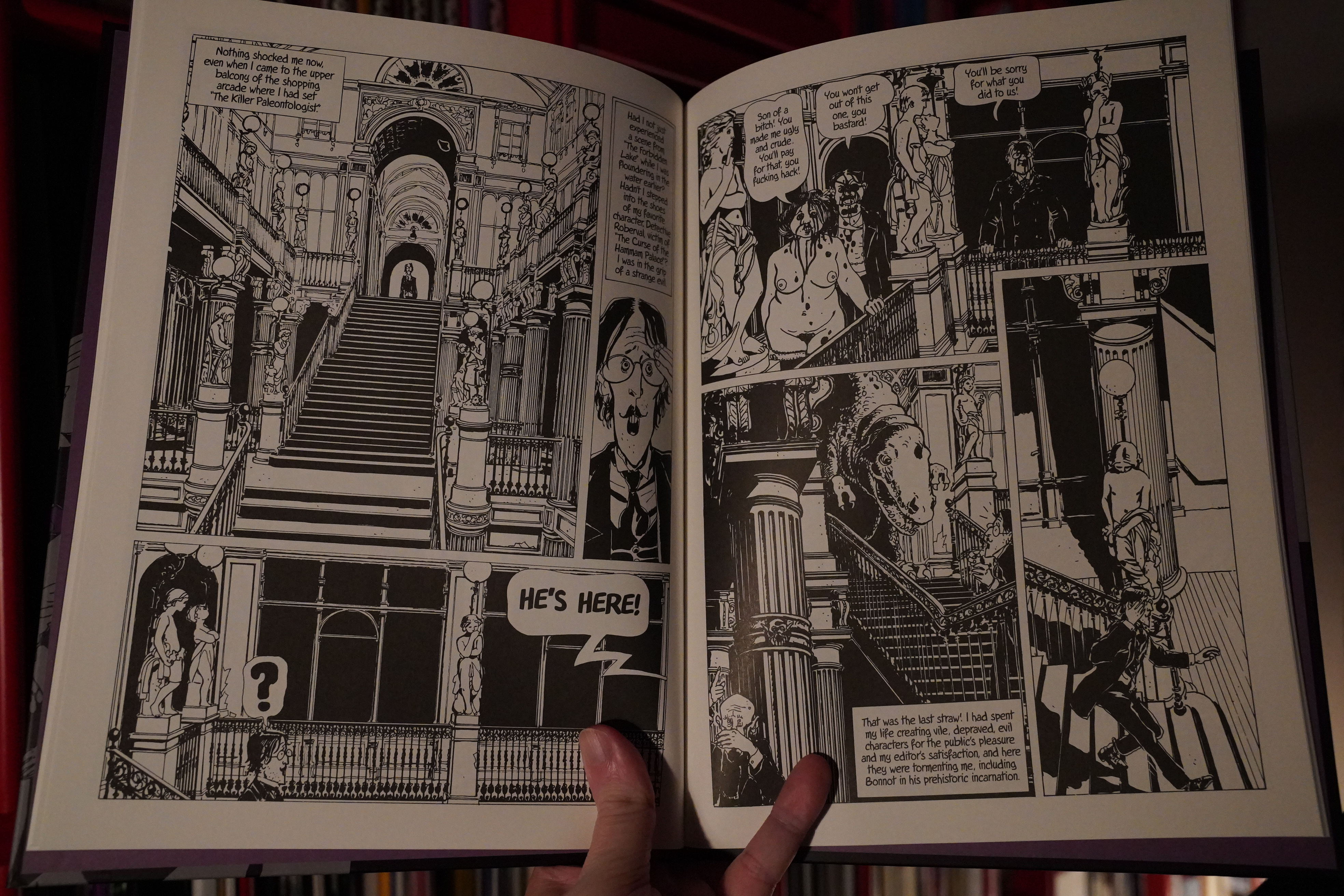
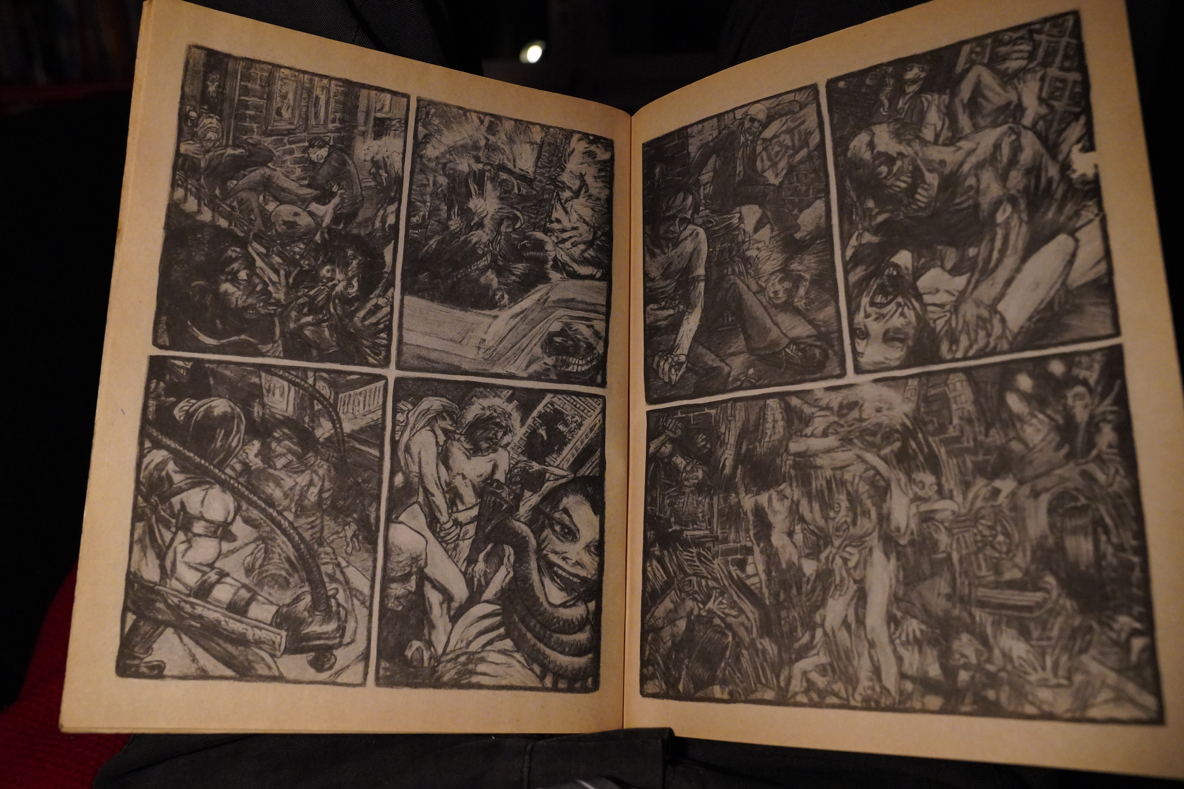
20:11: Burn Out by Ozanam/Sommer (Fahrenheit)
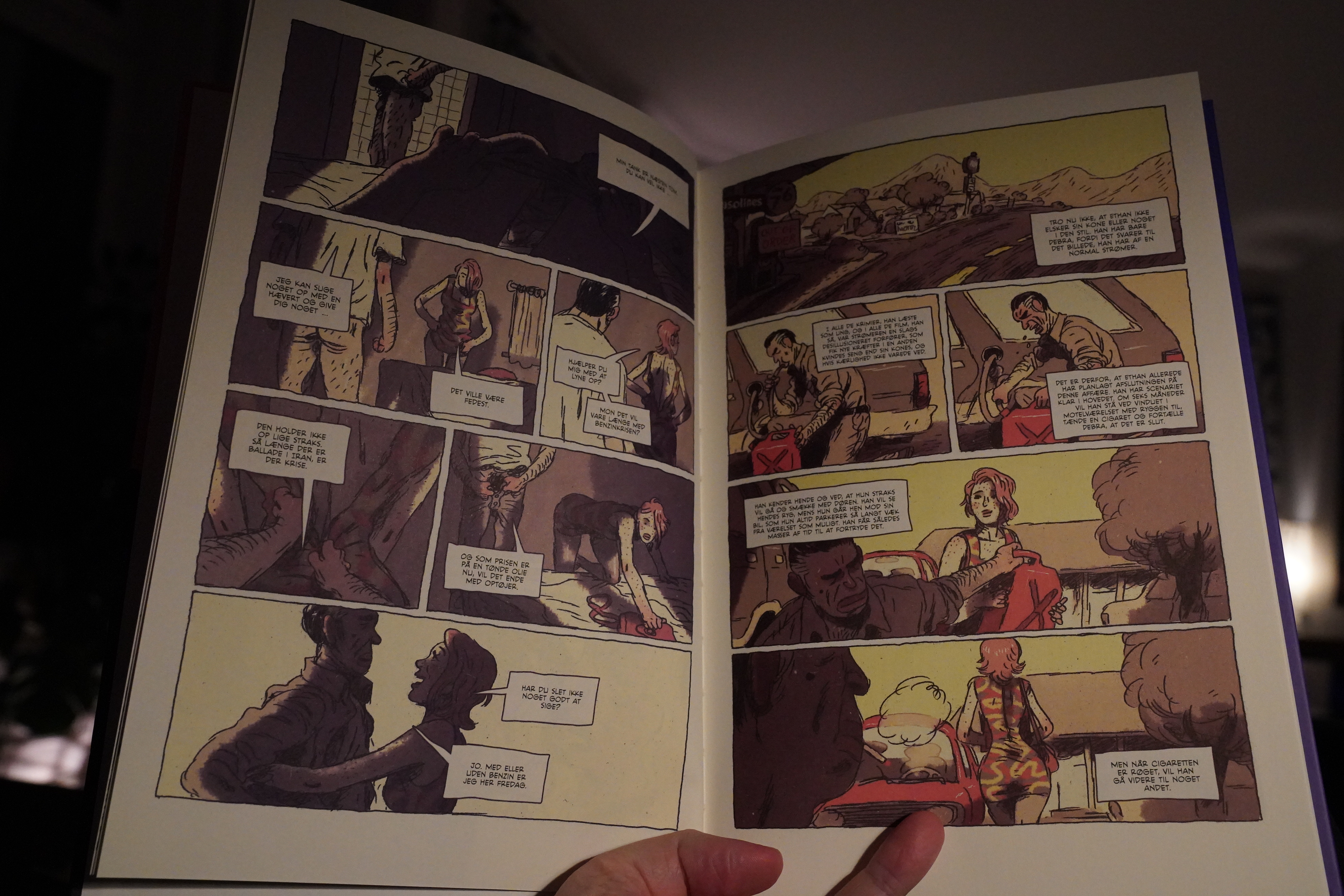
Interesting desaturated palette…

… and the artwork is somewhere between “almost really interesting” and “kinda ugly”.
This book is a genre exercise — it’s one of those hard boiled spirals into horror. But it’s really well done! It’s got all the required twists and stuff.
| The Cure: Seventeen Seconds (1) |  |
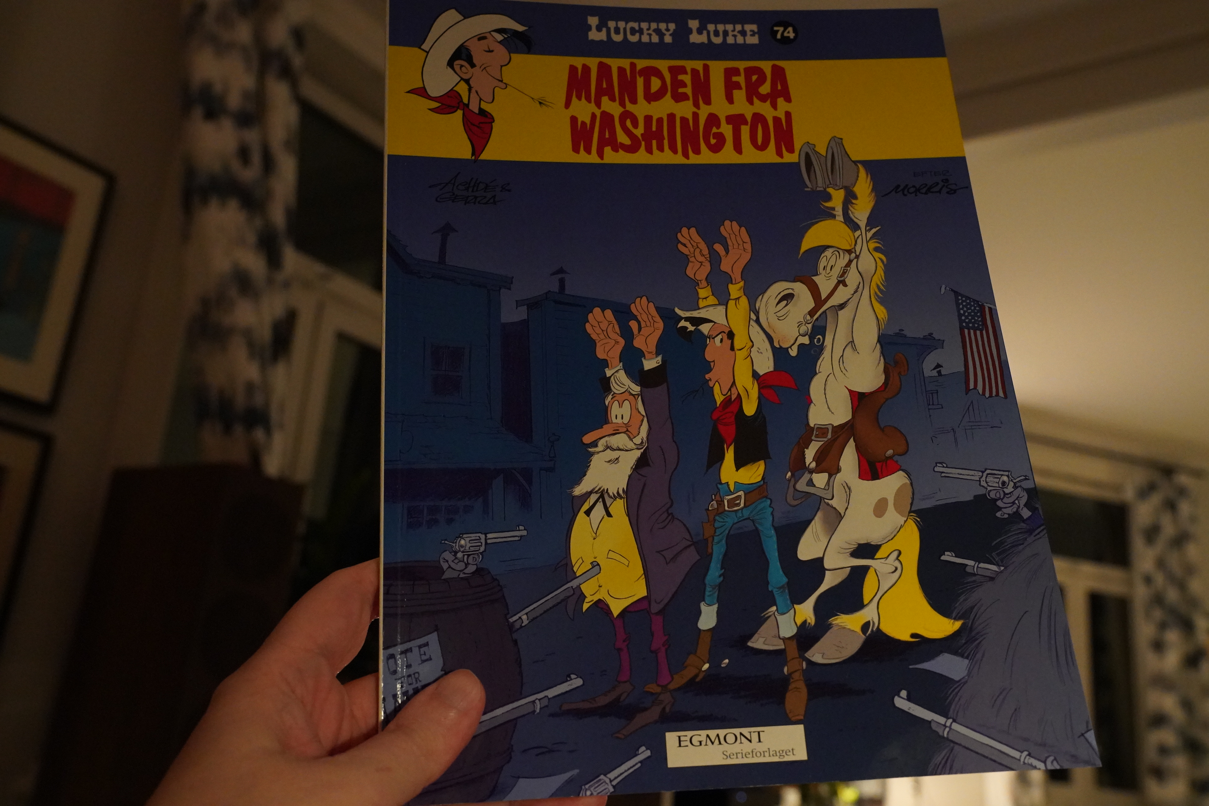
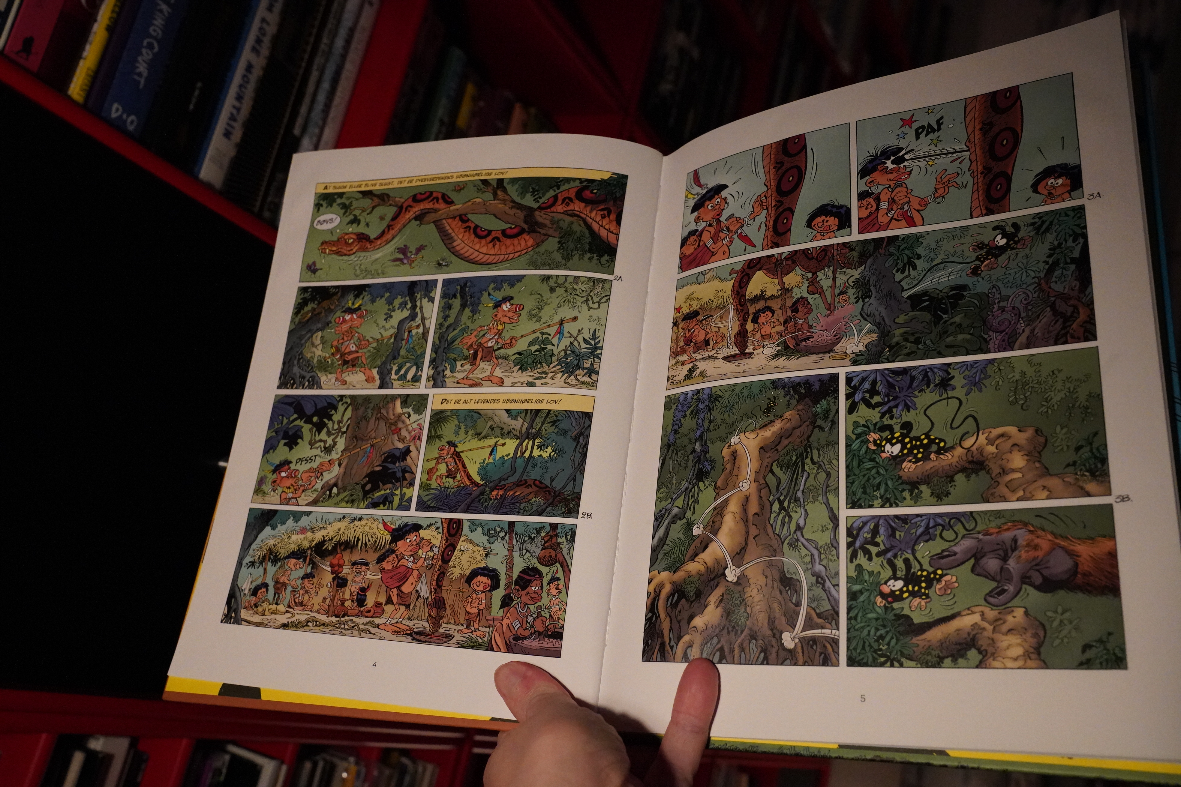
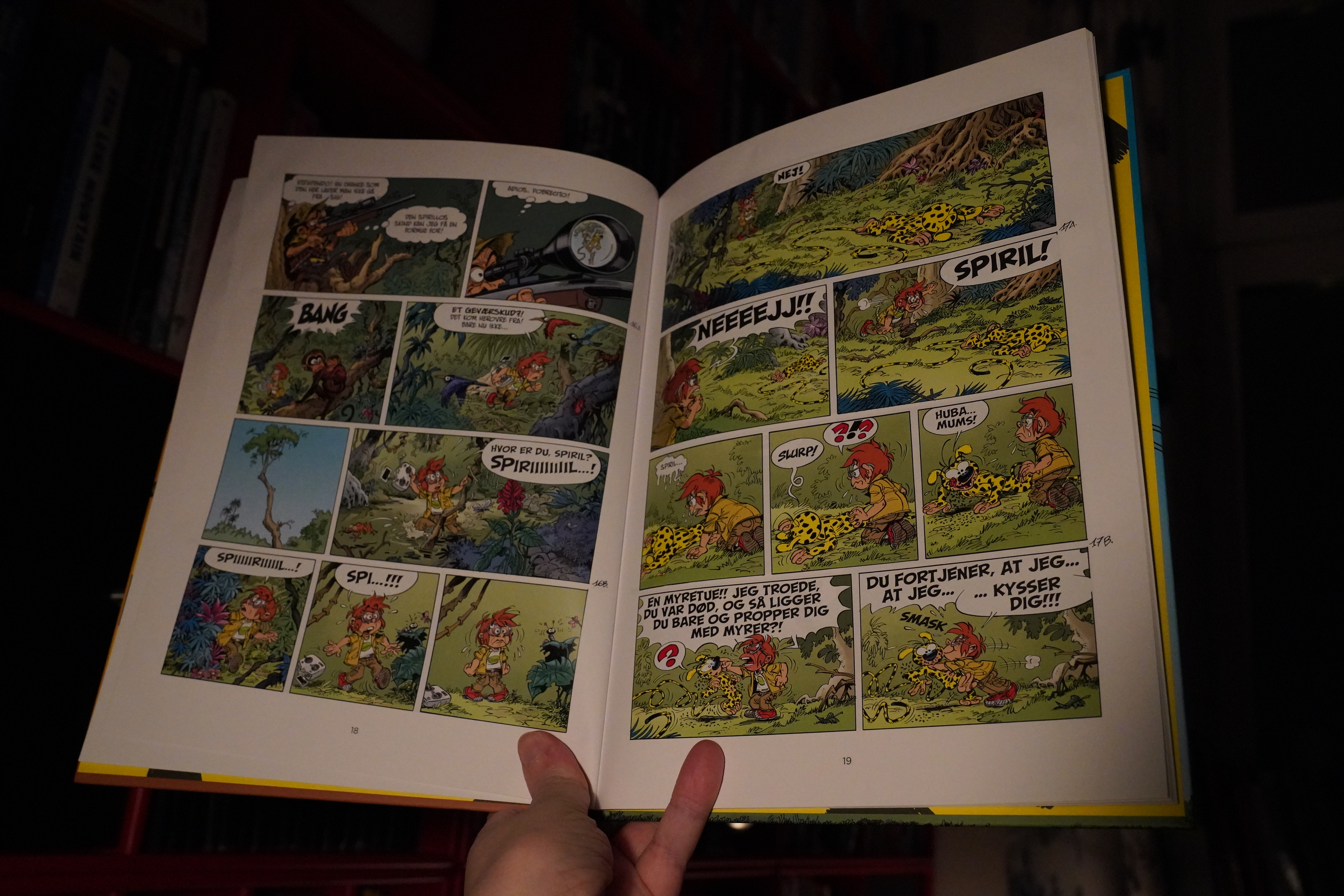
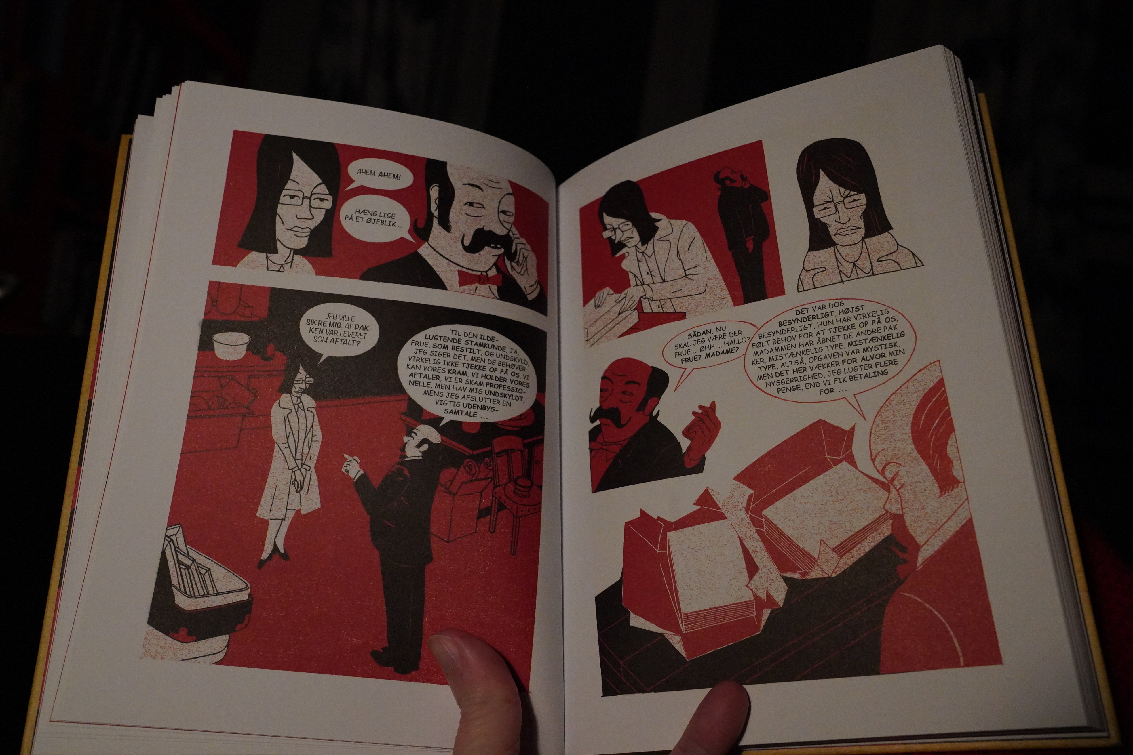
20:58: Lucky Luke: D’homme de Washington by Achdé & Gerra (Egmont)

I’ve only read a handful of the post-Morris Lucky Lukes, and they’re pretty hit or miss. The fun ones can be really entertaining, and the rest… aren’t. I found this one at a sale, though, so I thought what the hey.
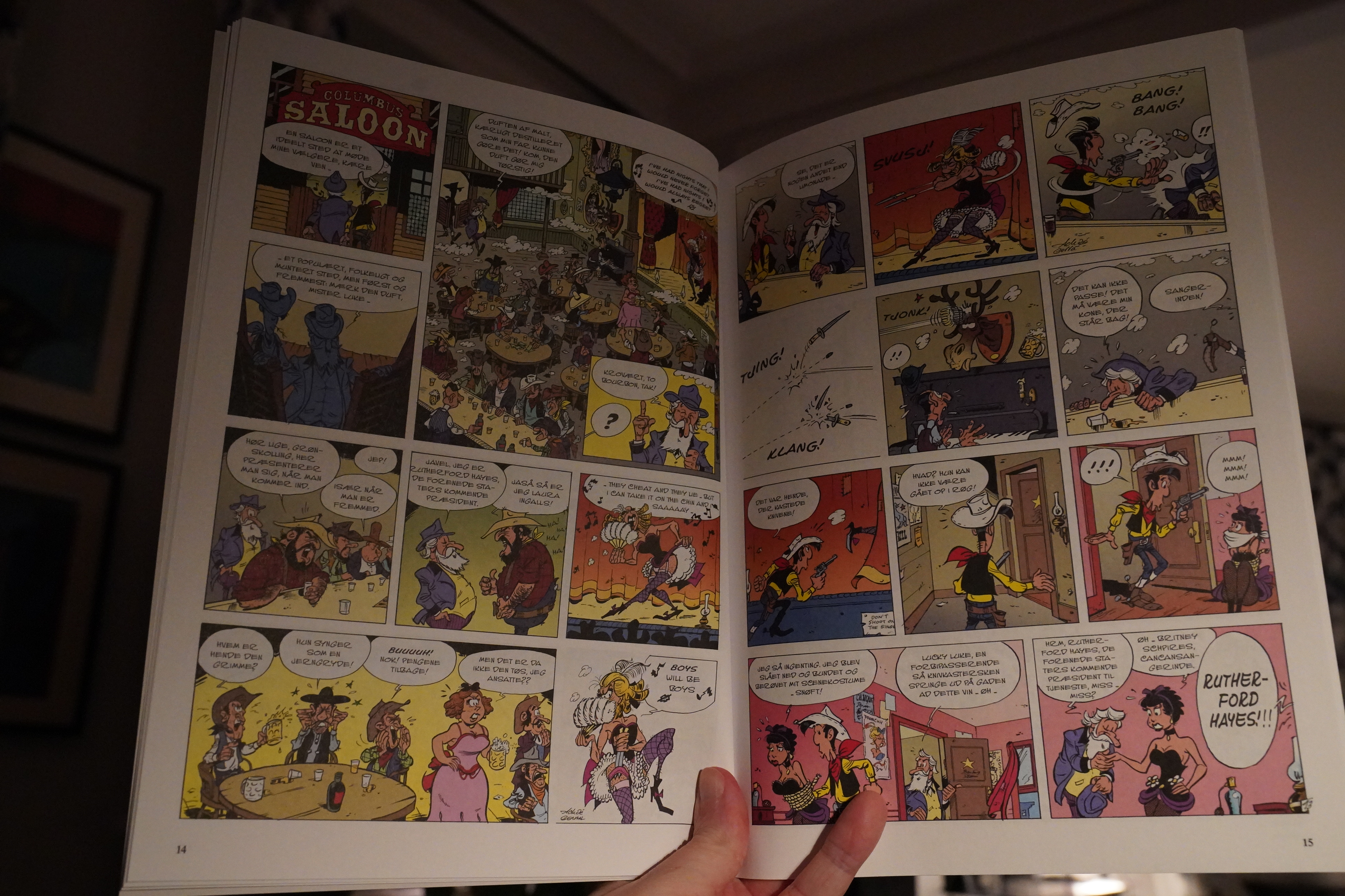
Gerra does Morris’ art style pretty much perfectly, but there’s a lack of clarity in the action — scenes that you can see would have been fun if done by Morris just feel… there.
And Achdé is no Goscinny if this is anything to go by. I mean, it’s fine, but it’s not very exciting.
| The Clash: Sandinista! |  |
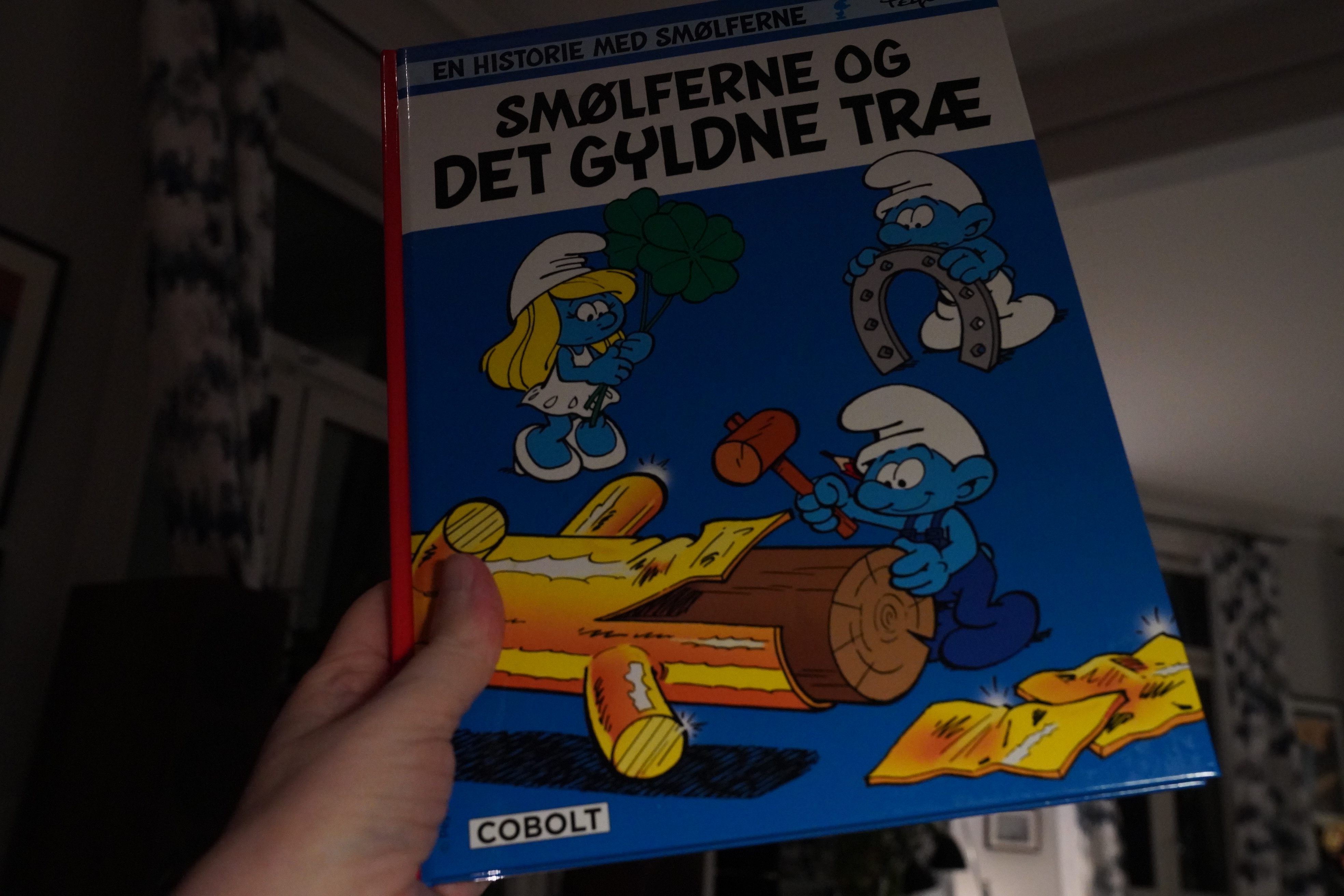
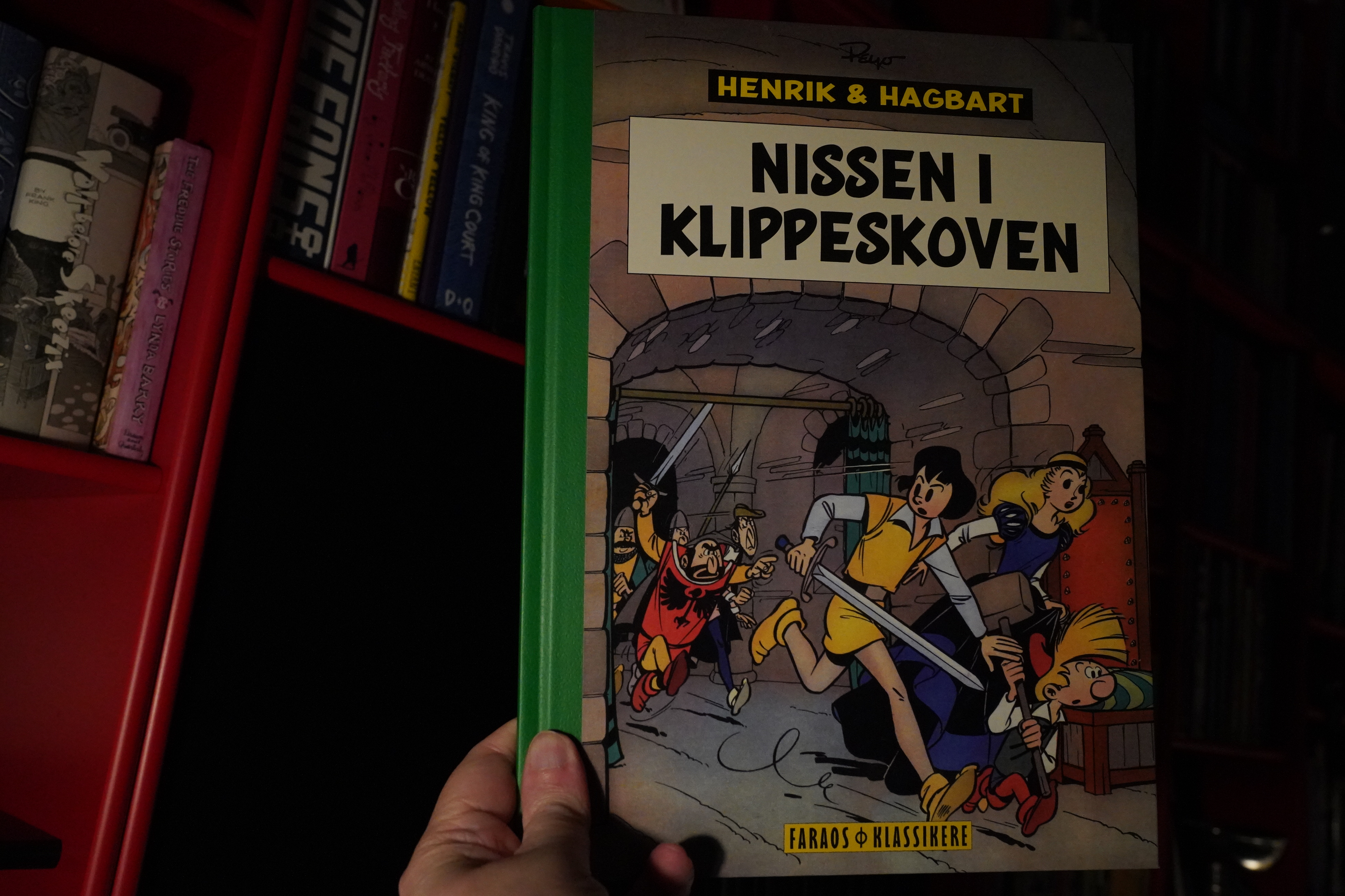
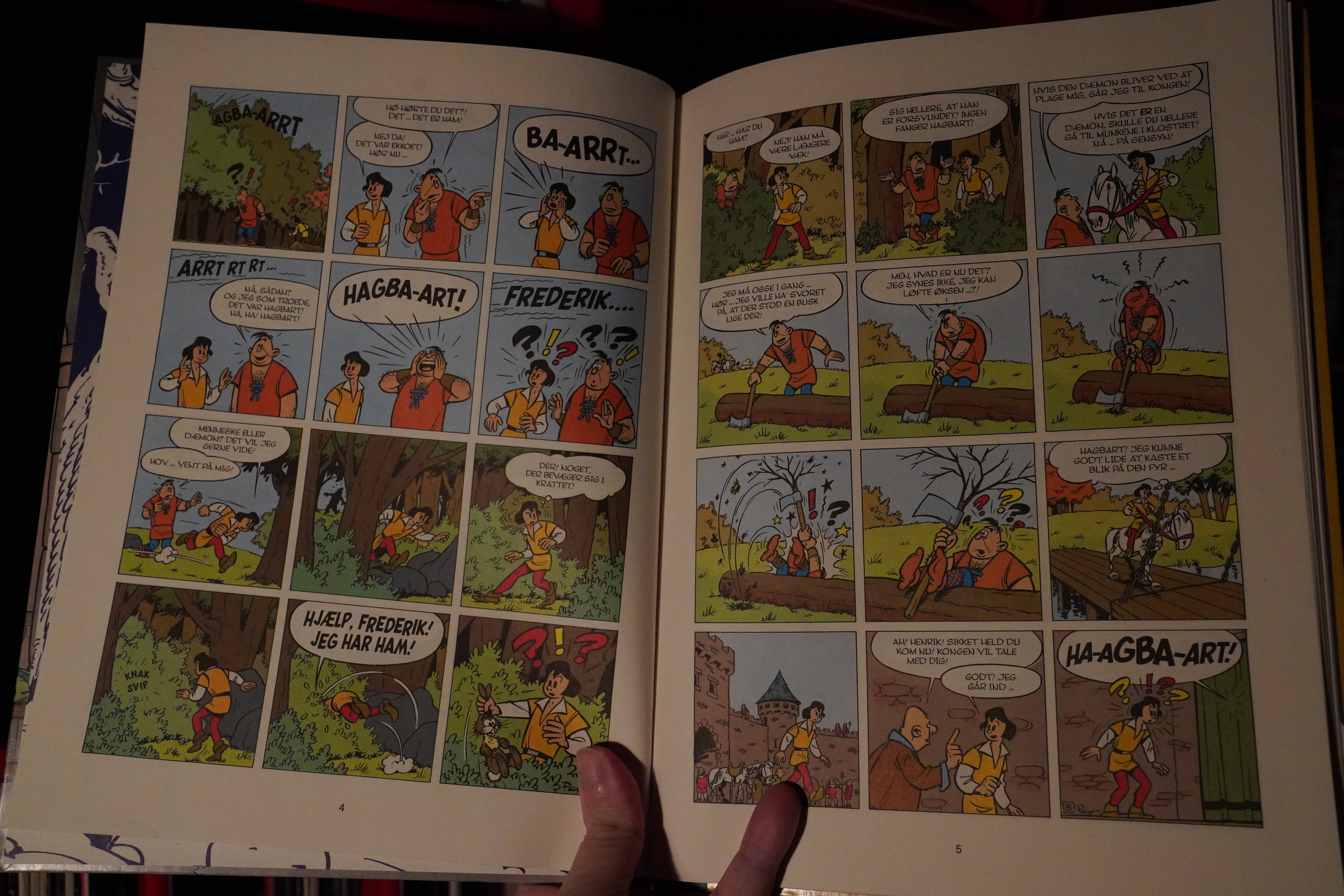
21:54: Les Schtroumpfs et l’arbre d’or by Alain Jost and Pascal Garray (Cobolt)
I’ve read less than a handful of the Smurfs albums. Even as a child I found these things to be a bit… er… annoying. But I found this cheaply, so I thought I’d give it a go. This is from 2011, so I was wondering whether they’d updated the concept any.
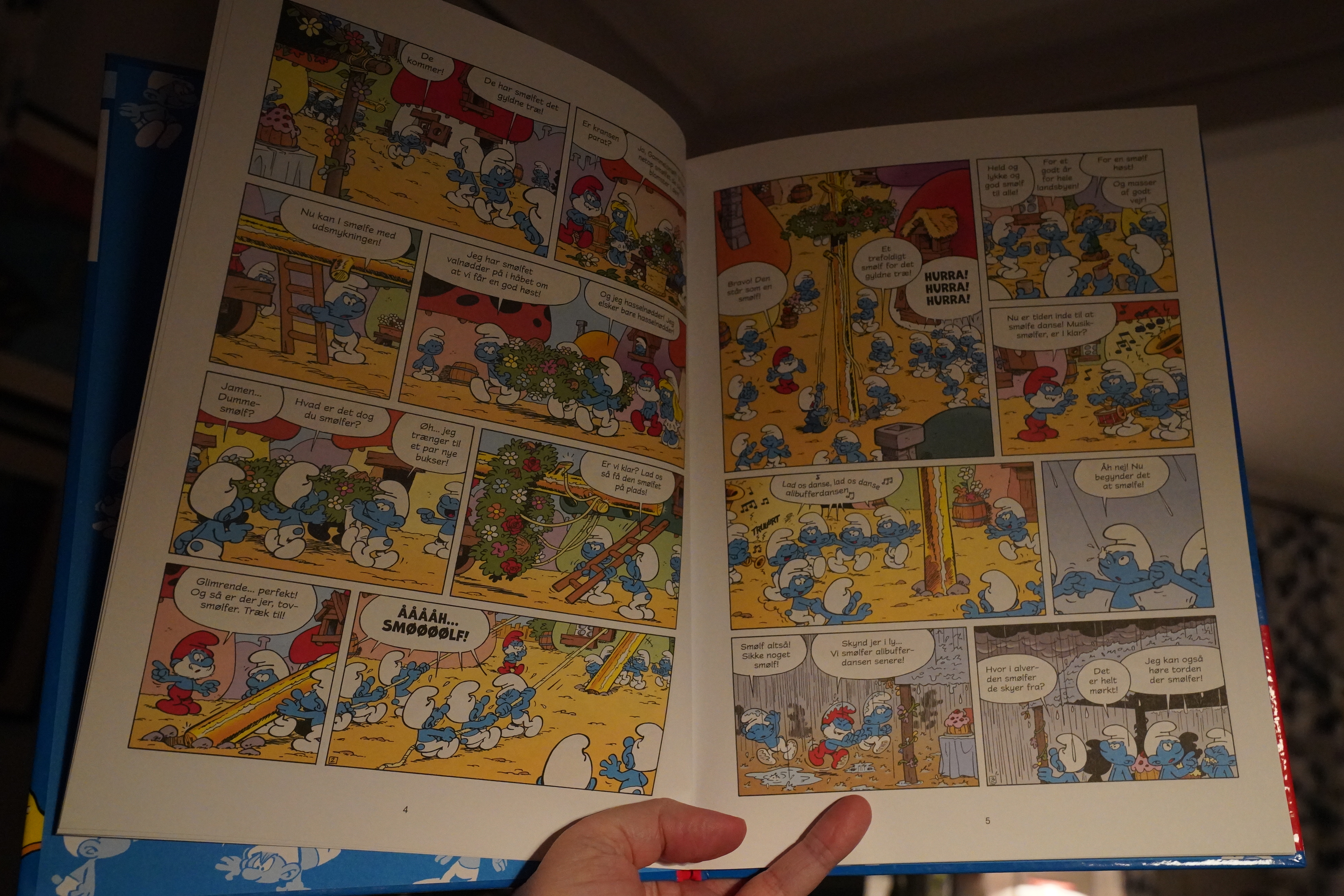
And… nope. But you know? This is fine.
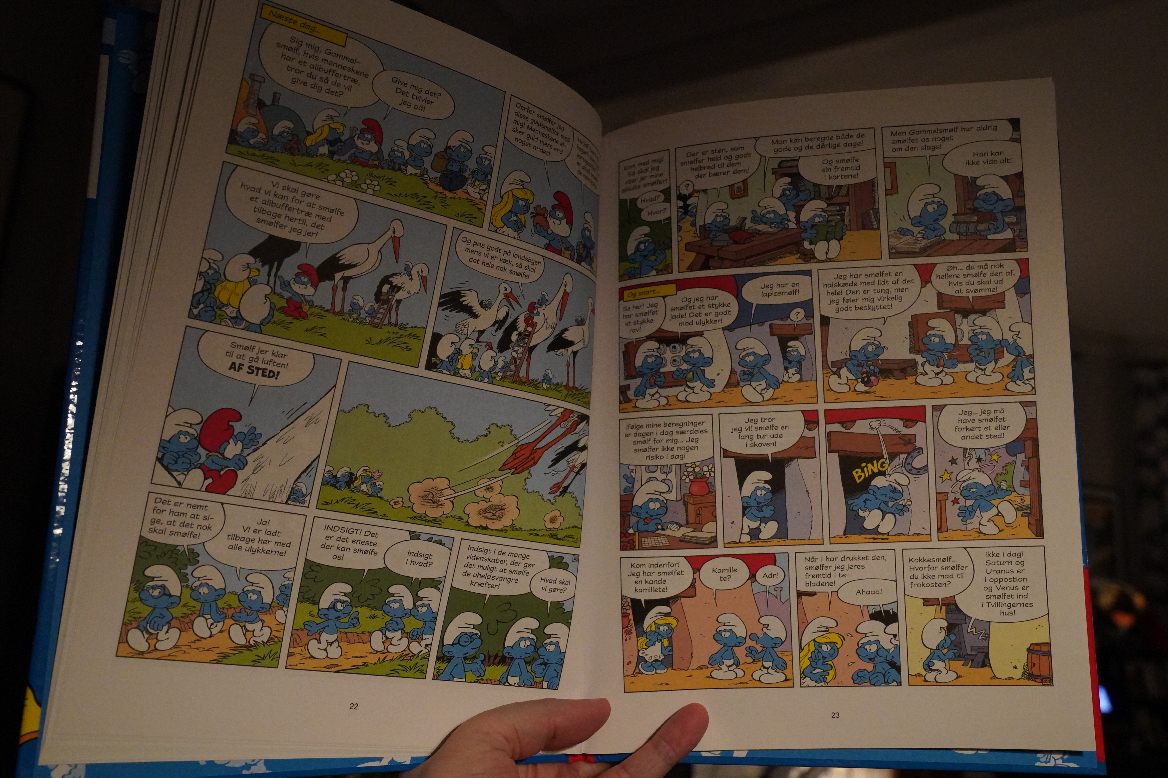
It’s moderately amusing throughout. I think I may have kinda liked this if I were like ten. I mean, more than I enjoyed Peyo’s original Smurf albums when I was ten.
| The Clash: Sandinista! |  |

23:01: Grus by Anna Degnbol (Fahrenheit)
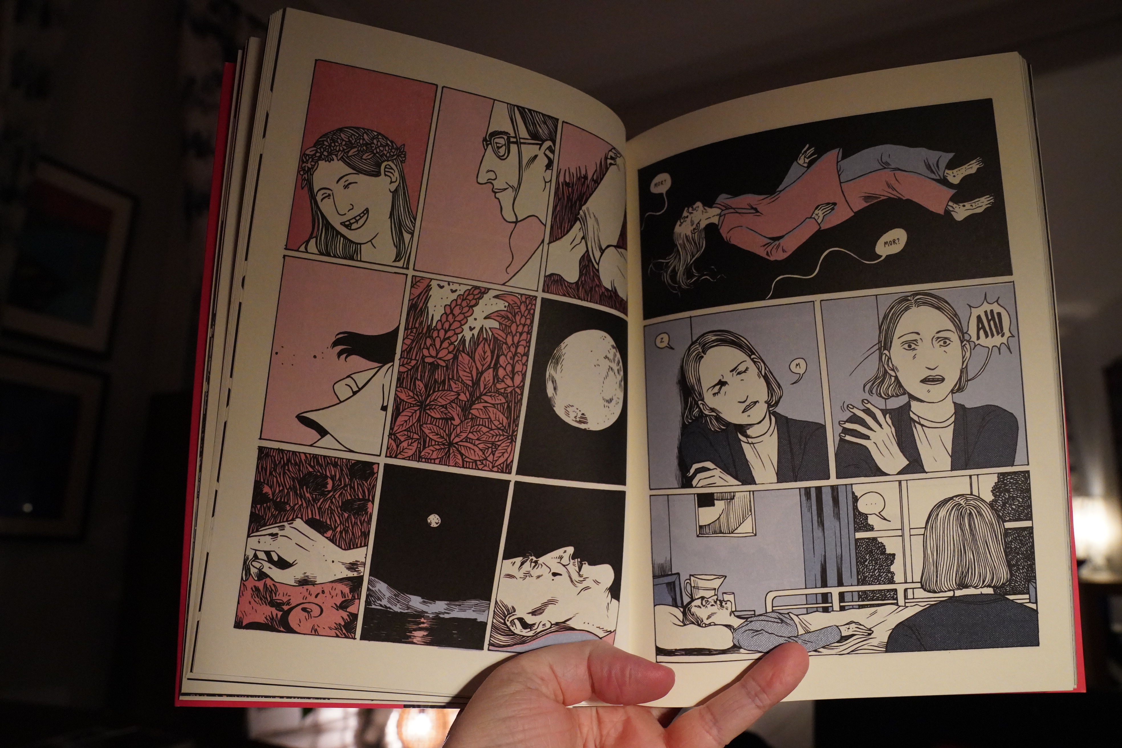
Hm… this seems awfully familiar… have I read it before? Yes indeed. I should start checking my blog before shopping…
Well, might as well read it again.
I was very annoyed by this book the last time I read it. Most of the storytelling beats are from film (or TV) and not from comics. That is, reading this is like watching a condensed version of a six episode Danish supernatural/thriller TV series, really.
And while the artwork is mostly attractive, everybody is bobble-headed, which isn’t really my thing.
But I wasn’t as annoyed when reading this as last time. It establishes the mood efficiently (by leaning on TV tropes; true, but still) and it’s a satisfying end.
| The Clash: Sandinista! |  |

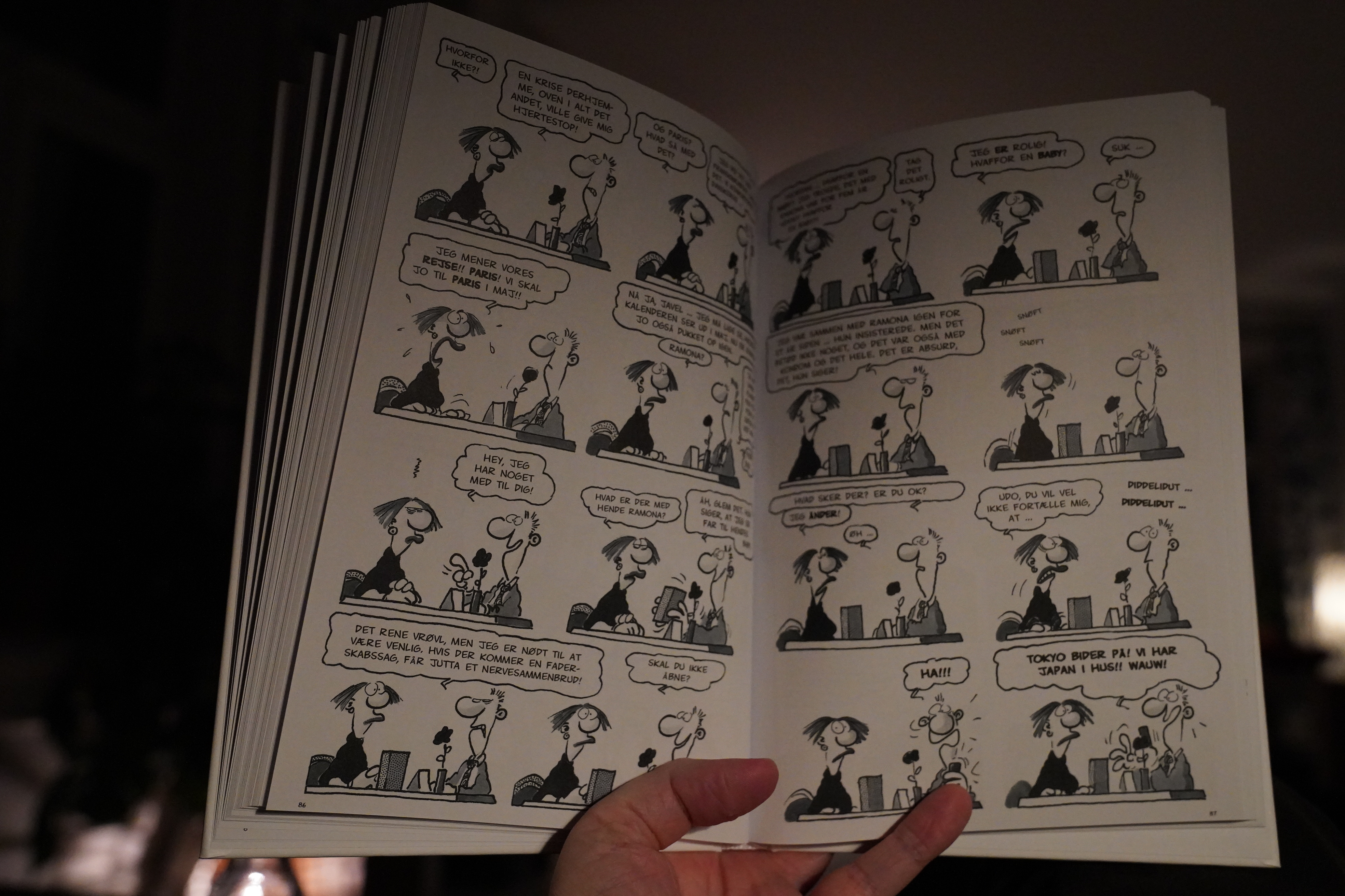
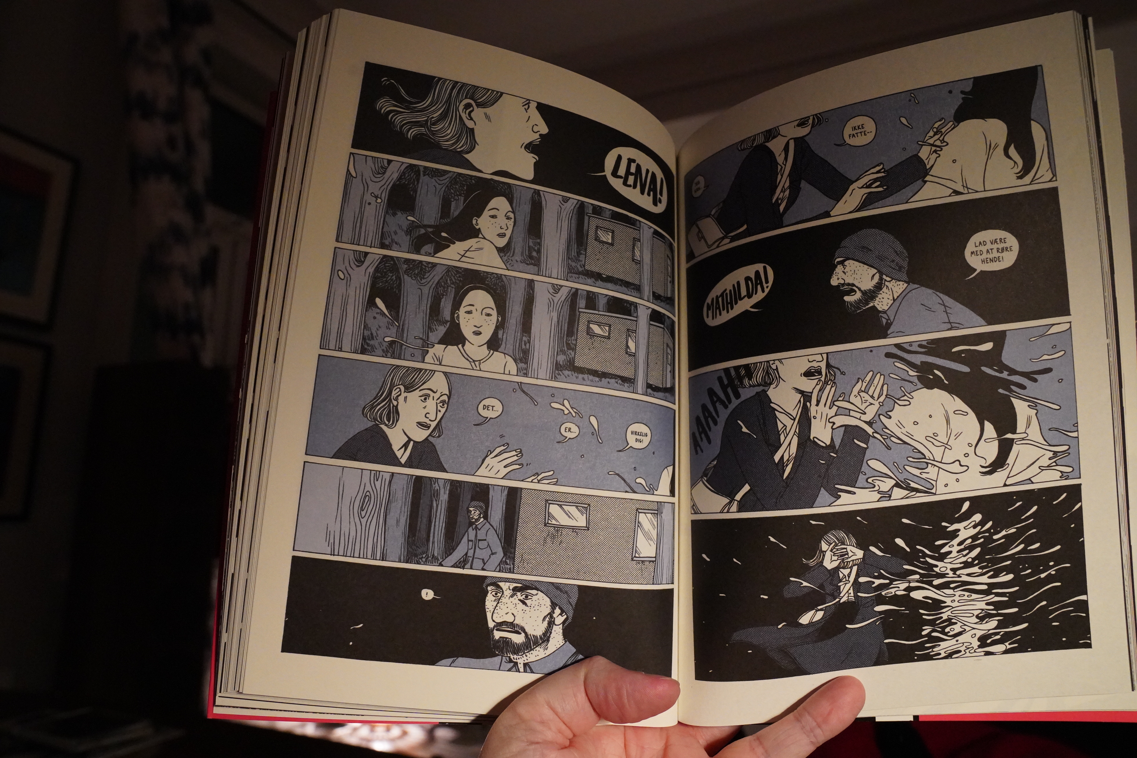
23:37: Les Danois by Clarke (Faraos Cigarer)

This is very high concept — apparently there’s a virus that makes all newborn children blond(e) and otherwise very Danish-looking (which explains the name of this book).
It’s either kind of offensive or … not, I guess, but what it definitely is is very choppily told. The storytelling is abstruse — and not as an aesthetic choice, I think, but because the author is pretty confused, is my guess.
It’s pretty entertaining, but it’s a bit of a head scratcher. I think I know what the plot was? But I’m not sure? How was that vaccine company involved, anyway?
| Yukihiro Takahashi: Neuromantic | 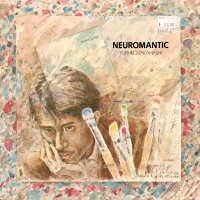 |
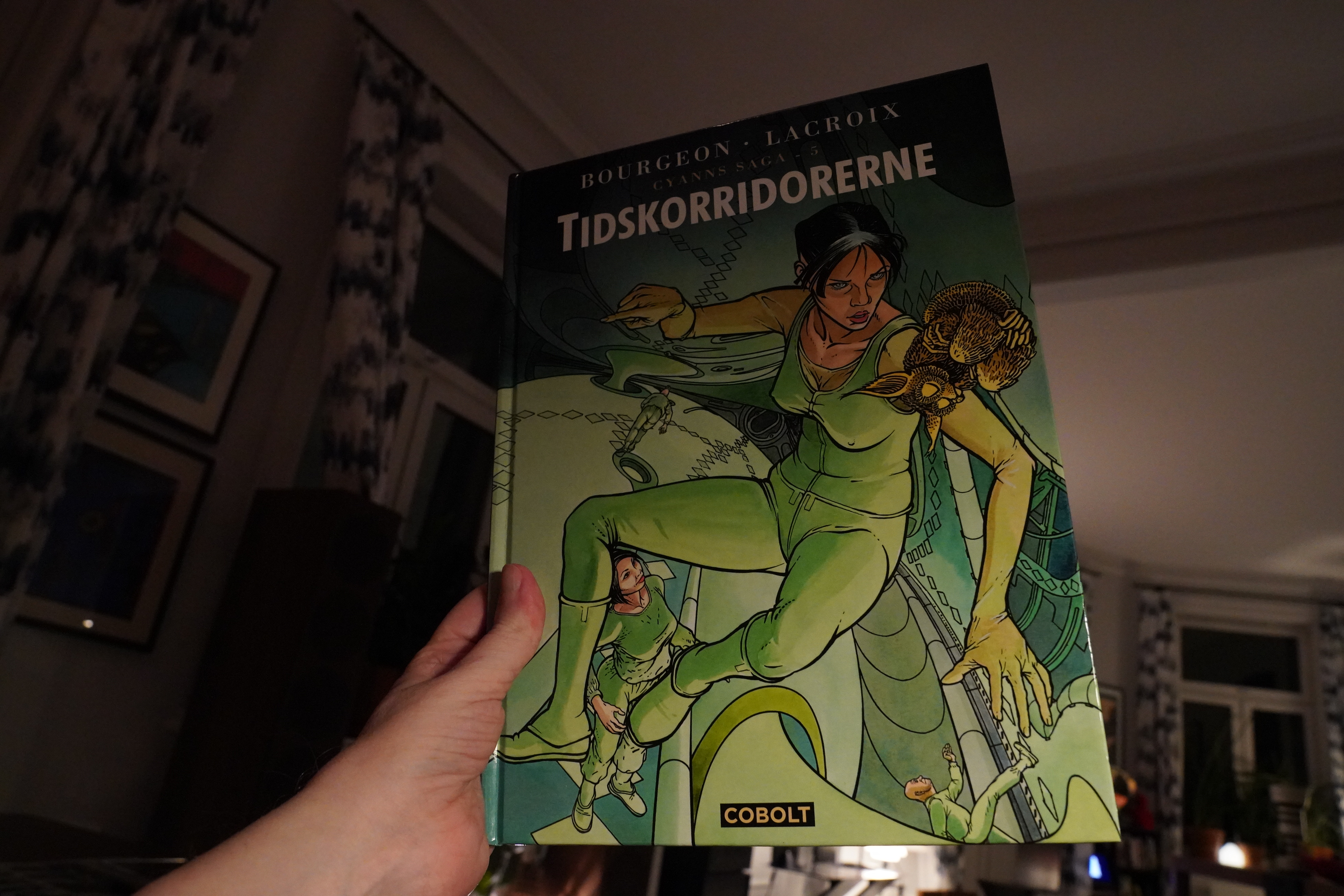
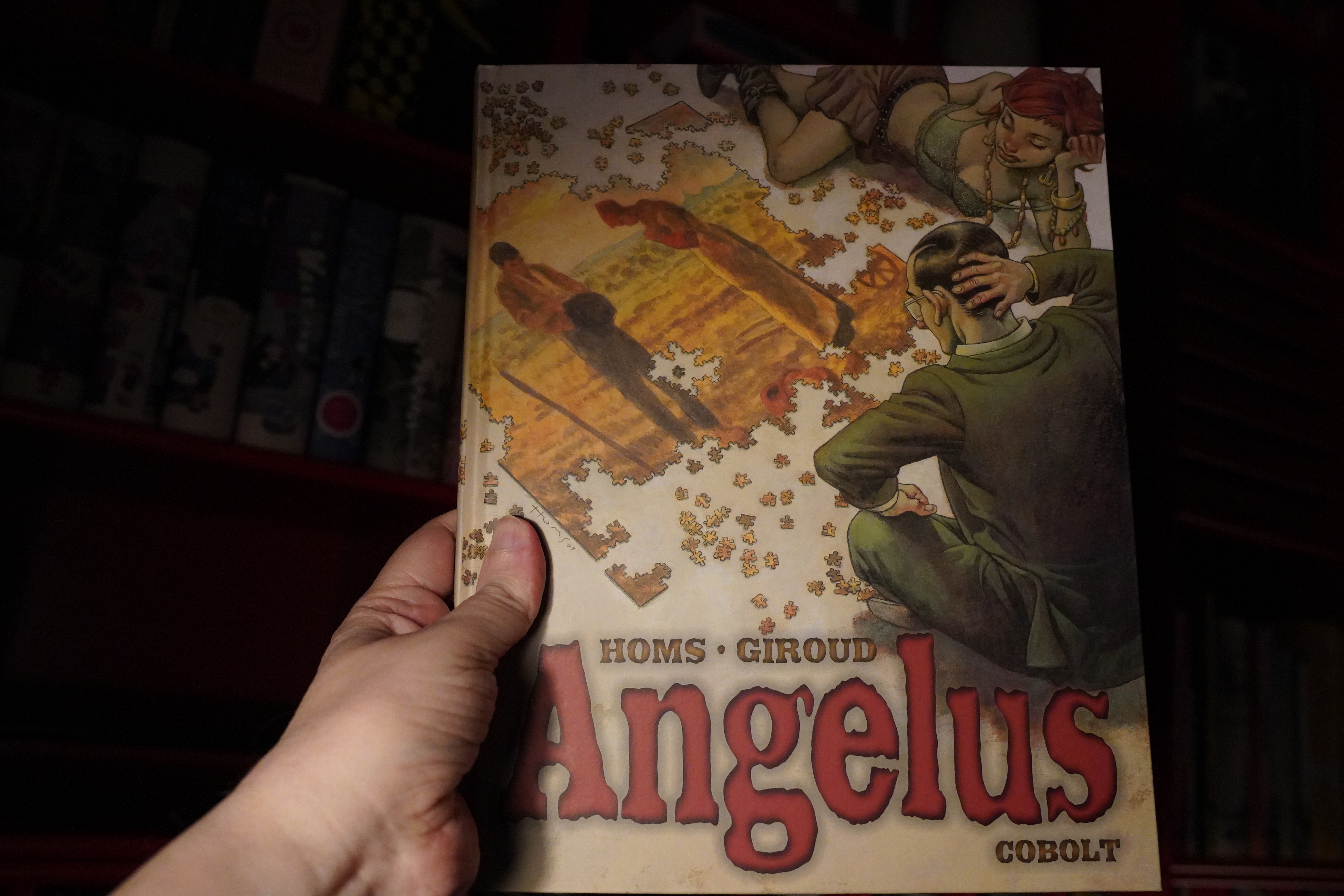
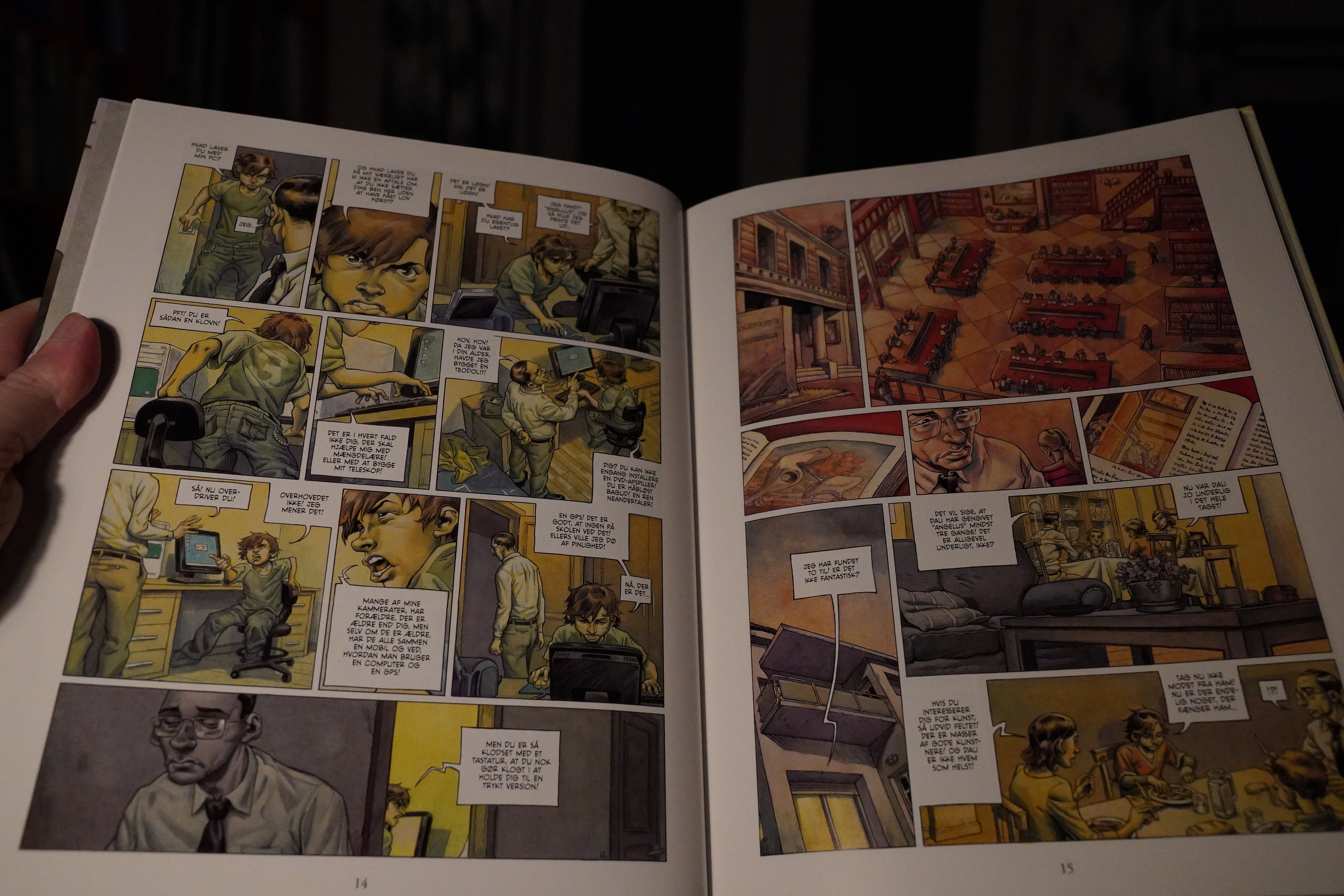
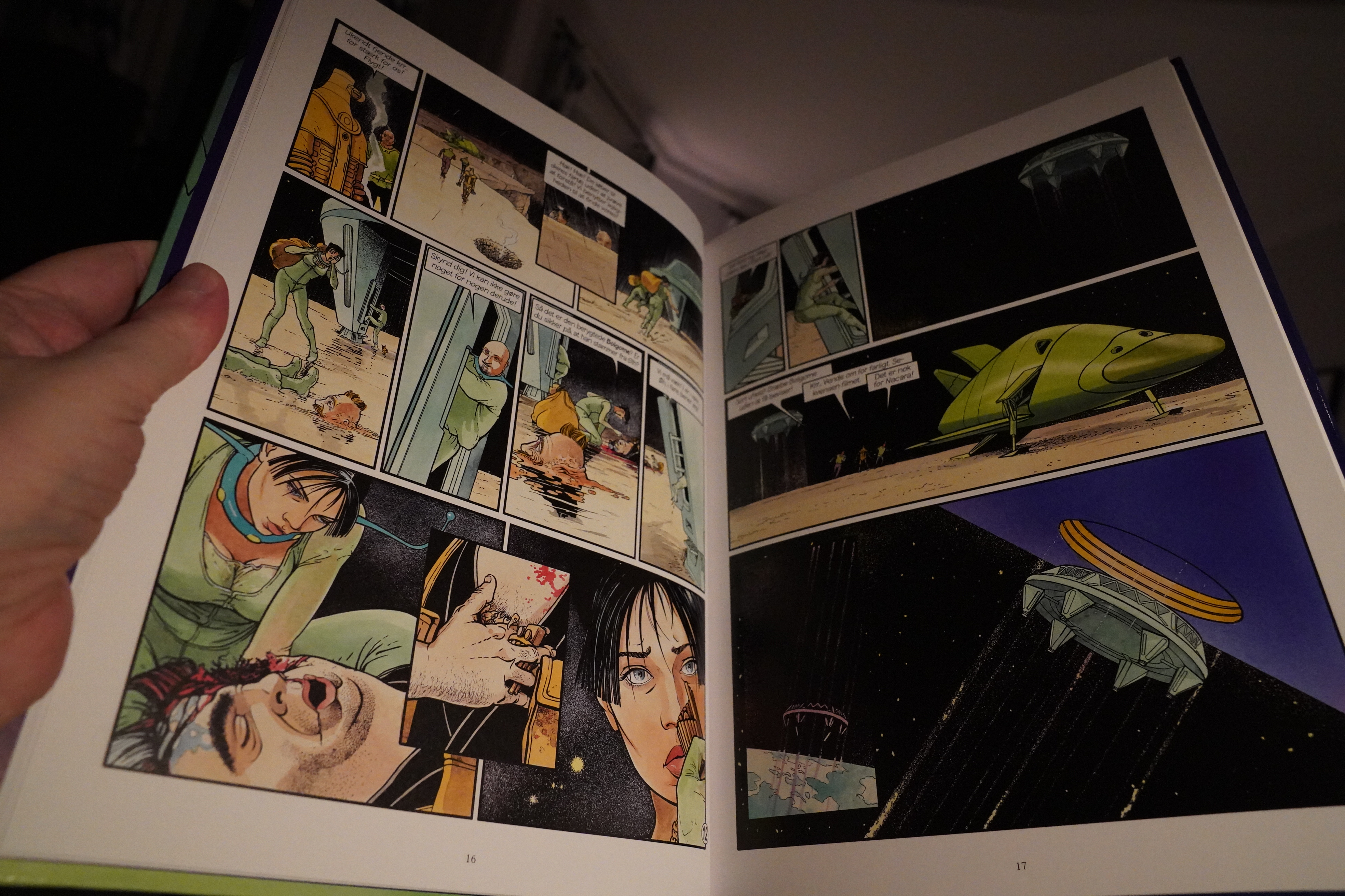
00:24: Le Cycle de Cyann 5: Les Couloirs de l’Entretemps by François Bourgeon and Claude Lacroix (Cobolt)
Er. This is the fifth album in this series? I don’t think I’ve read the first four… Oops.
Les passagers du vent was hot shit in the 80s — it was printed throughout Europe as part of the “comics aren’t for kids” wave after Maus — and I thought it was absolute twaddle. So I haven’t kept up with Bourgeon at all.
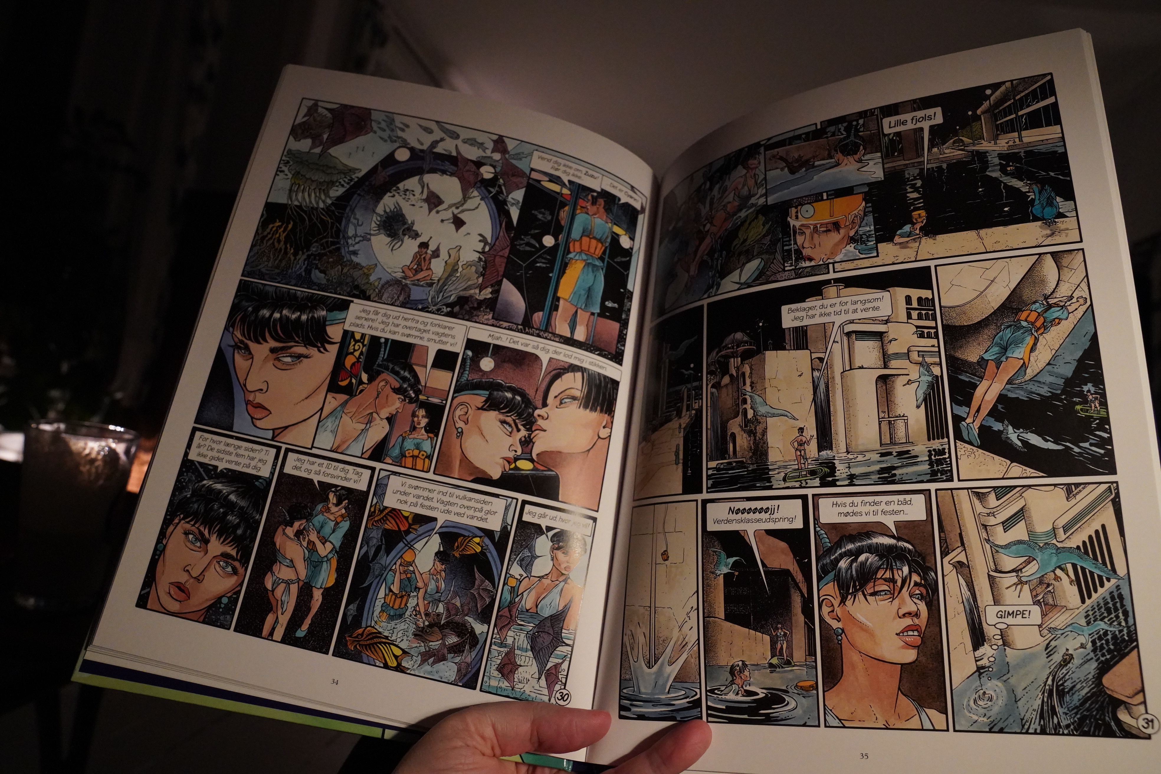
And I know that it’s unfair to even try to say something based on the fifth album in a six album series — but this is complete twaddle. Even on a panel by panel basis, it’s very hard to tell (or care) what’s going on.
I don’t think I’ll be looking for the other albums in this series.
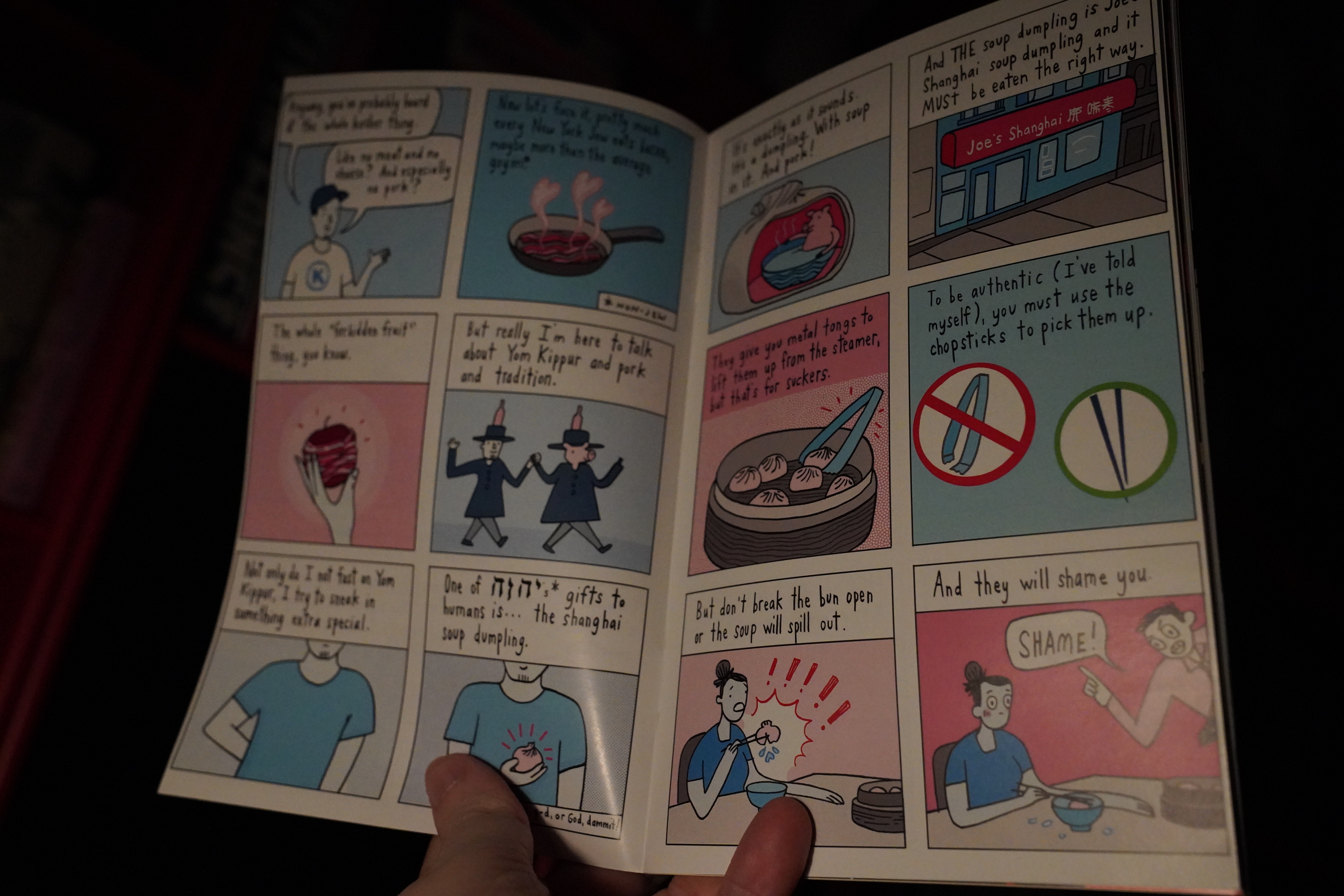
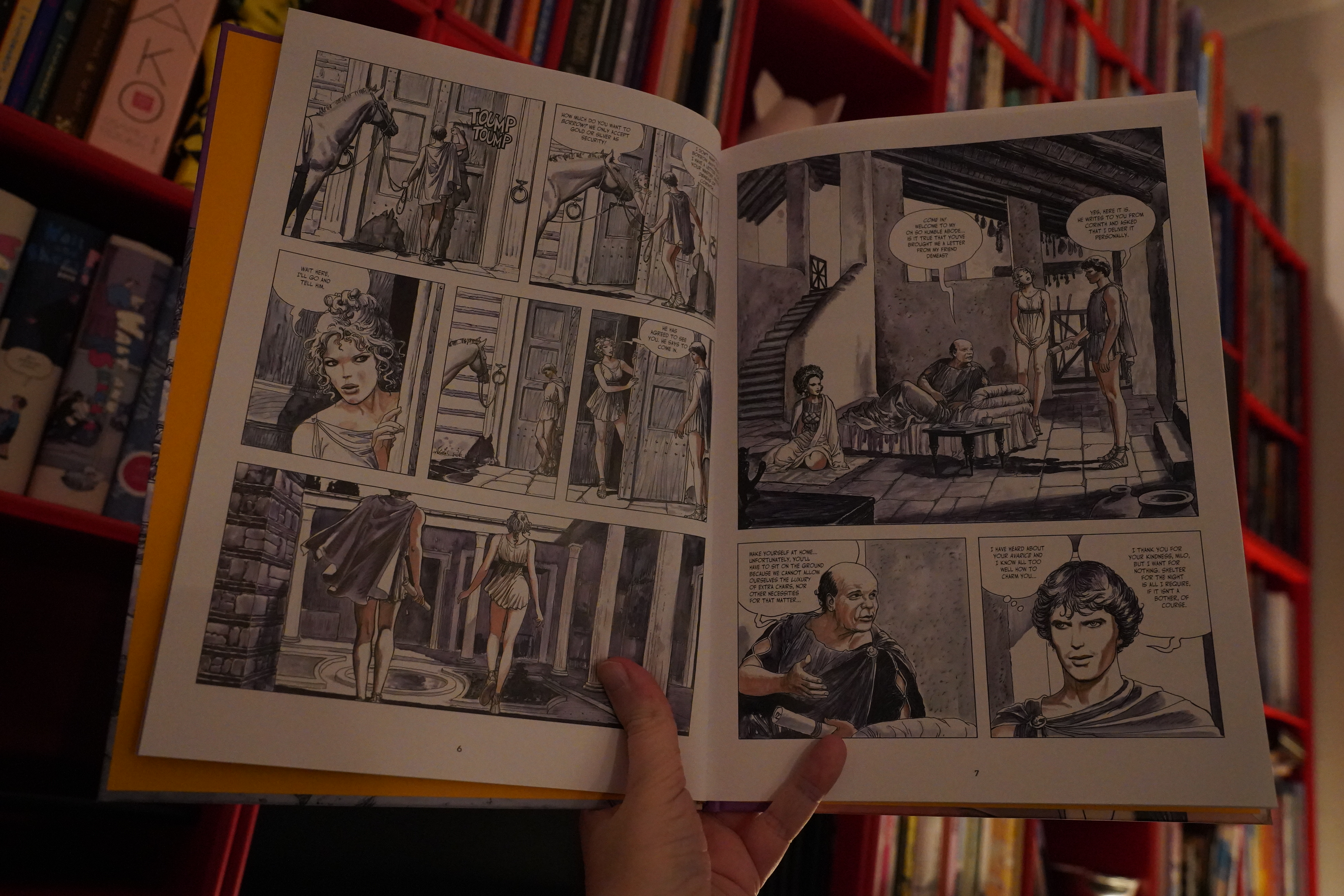
| Various: The Fruit of the Original Sin |  |
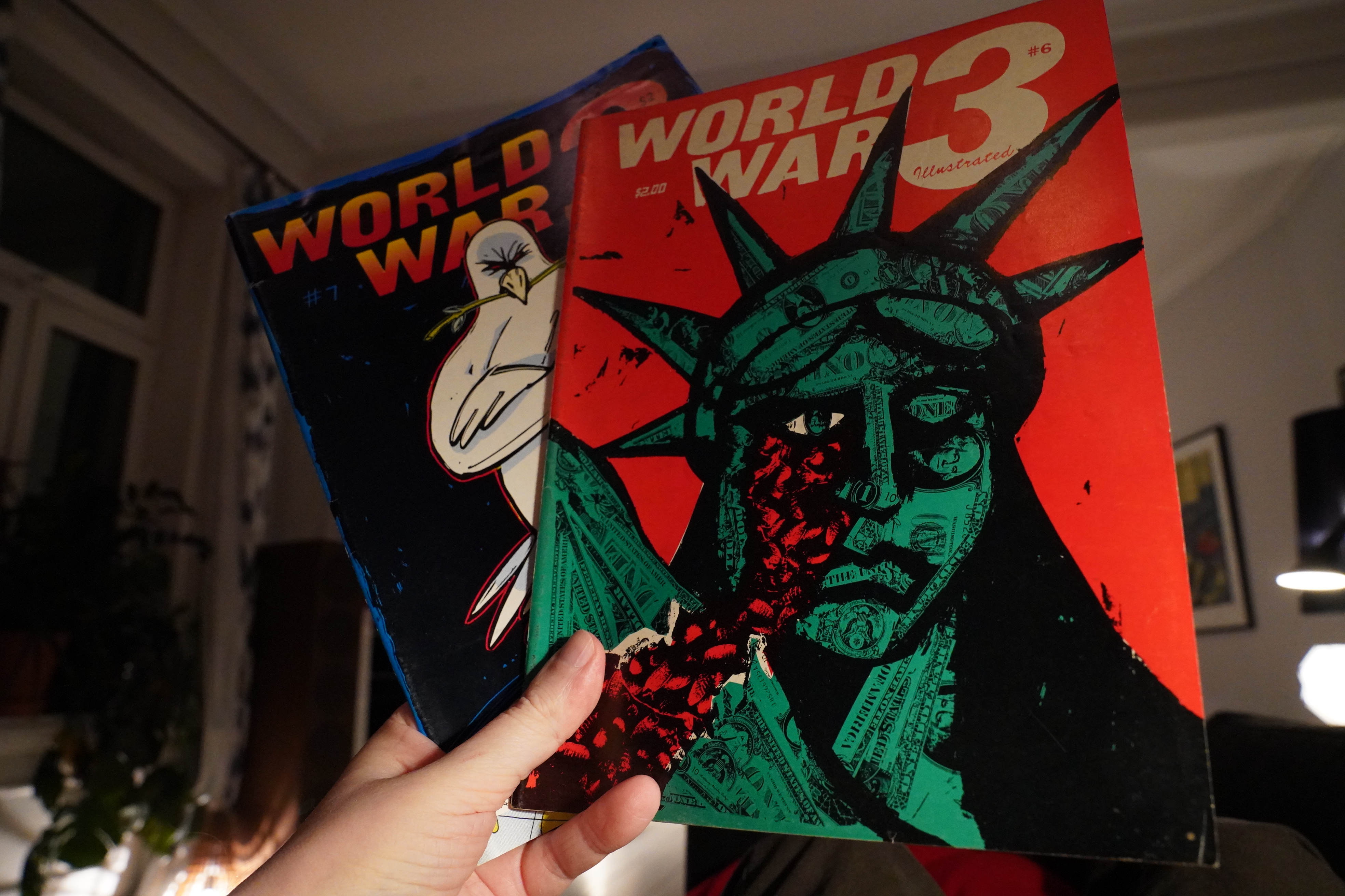
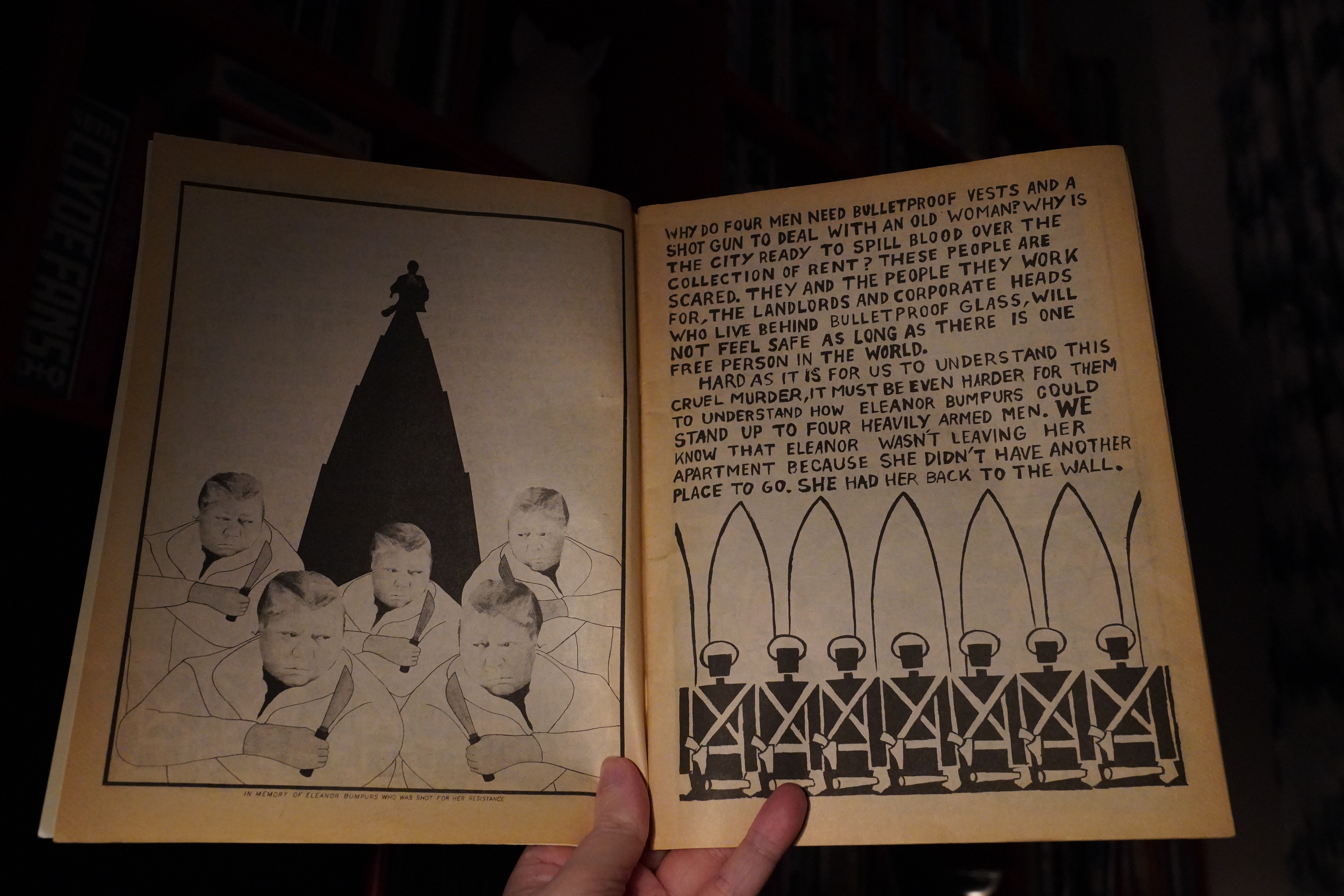
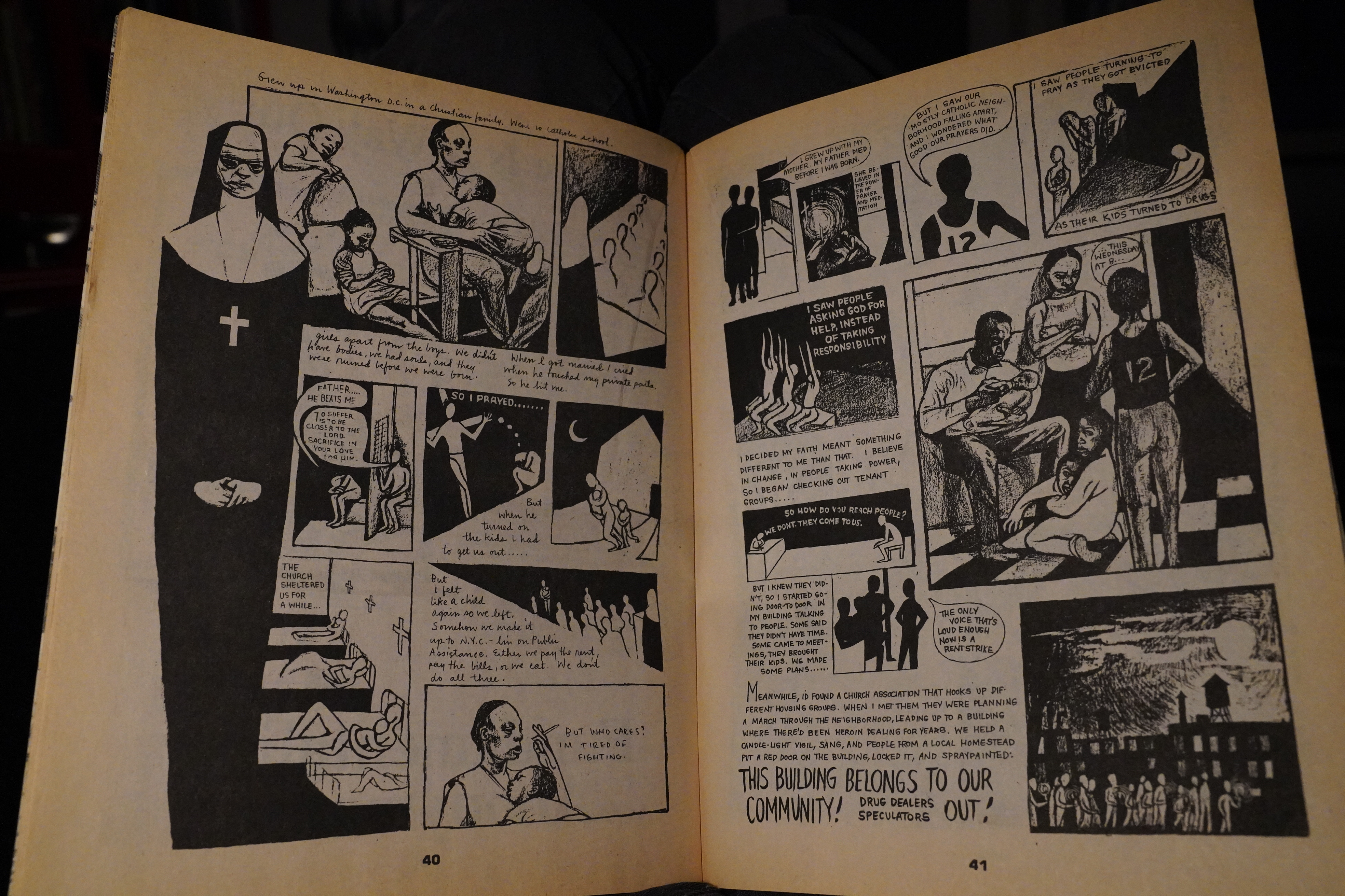
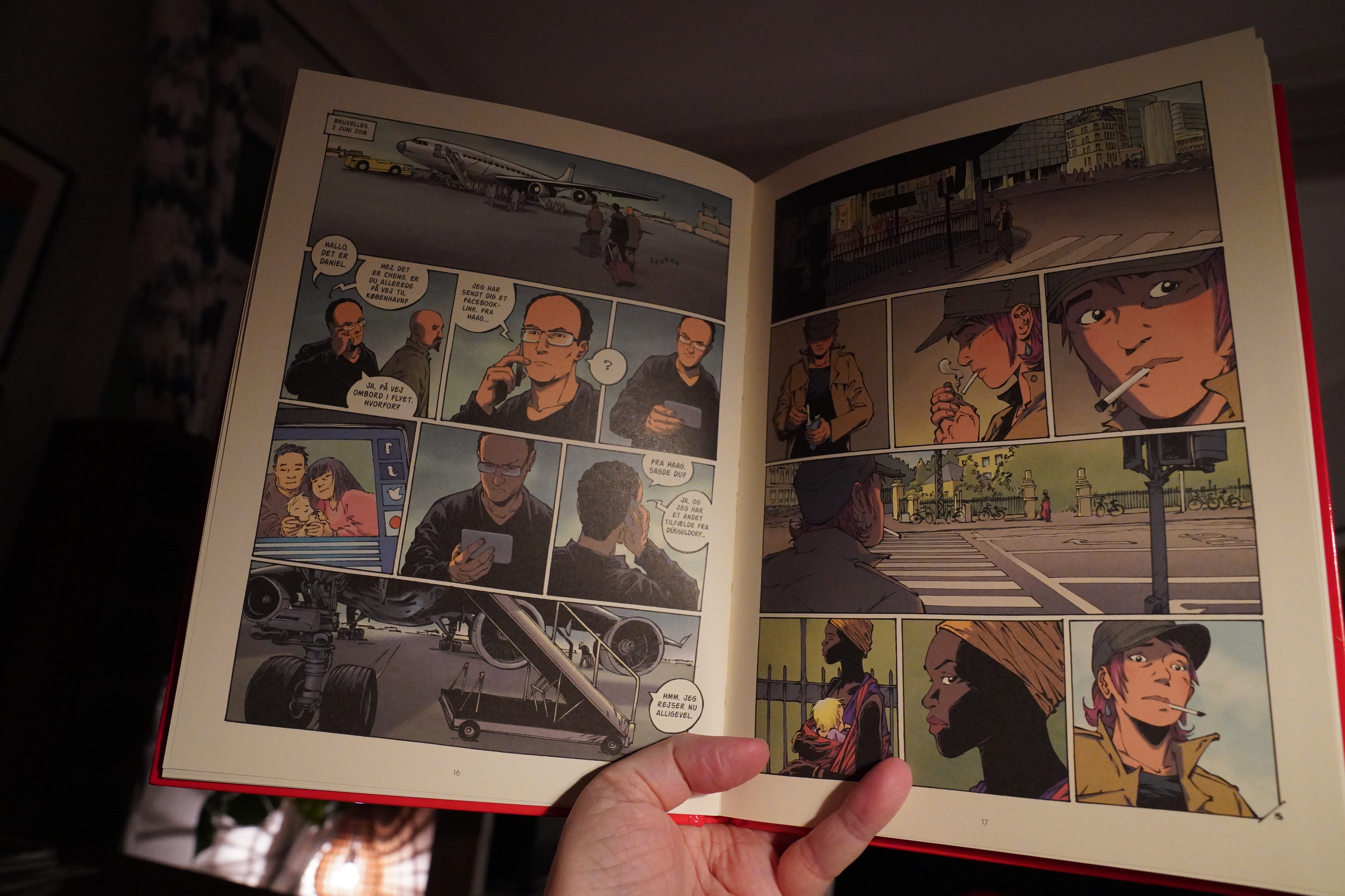
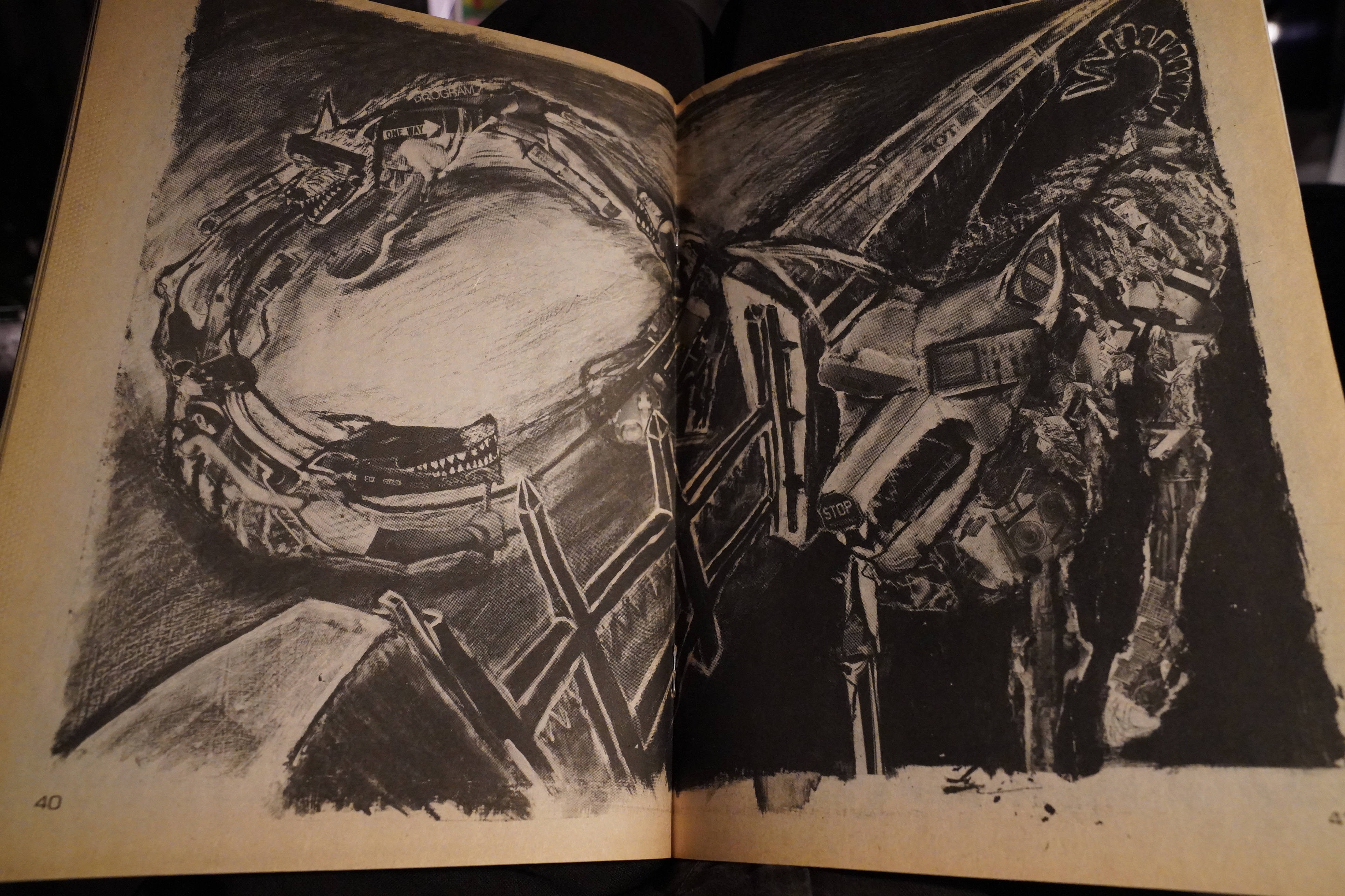
01:06: World War 3 Illustrated edited by Seth Tobocman and others
OK, I’m fading now, but just a couple more…

The previous few issues of this had been really strong, but the sixth issue is pretty spotty. There’s Eric Drooker, but much of the rest isn’t particularly inspiring.
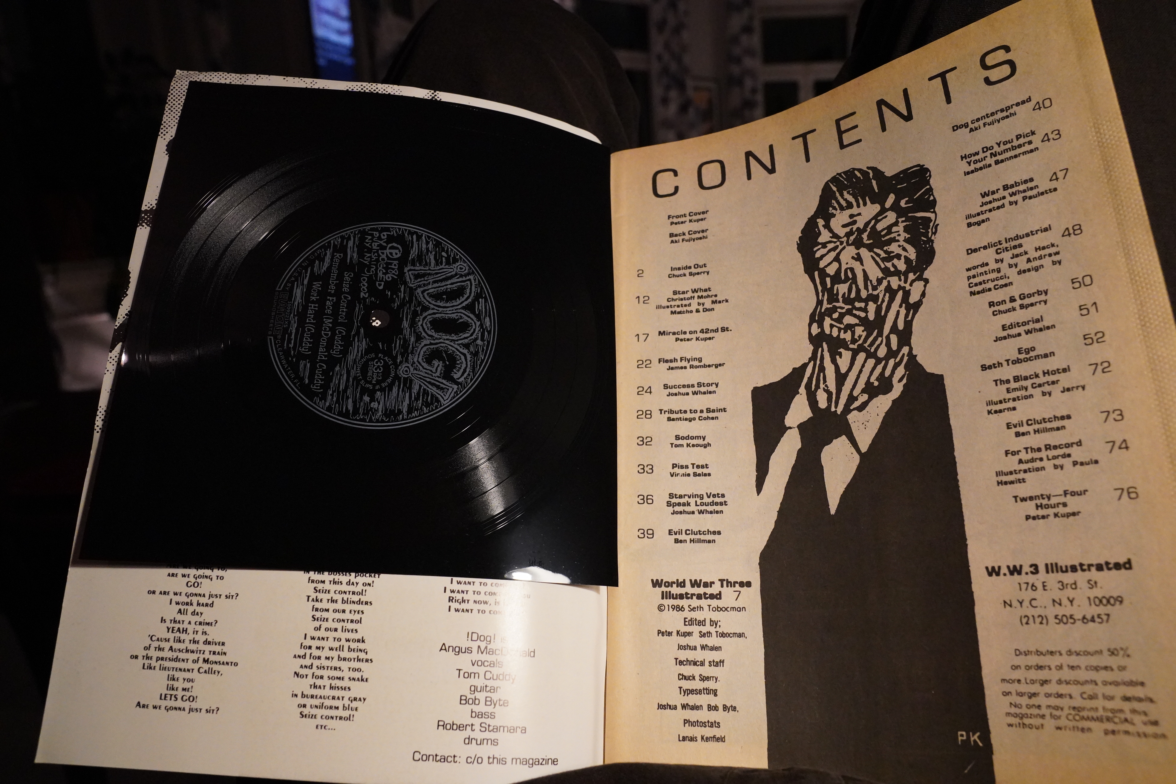
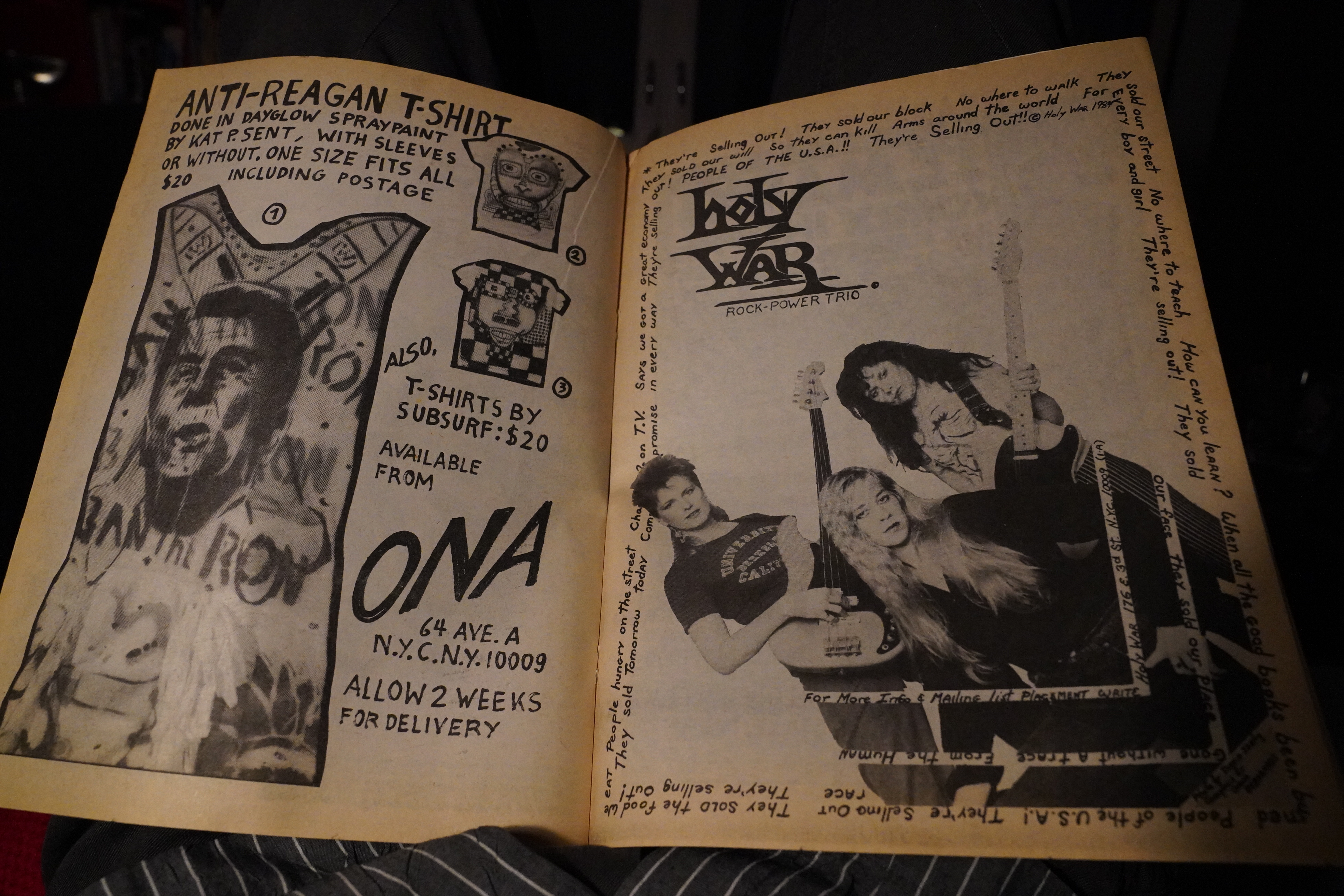
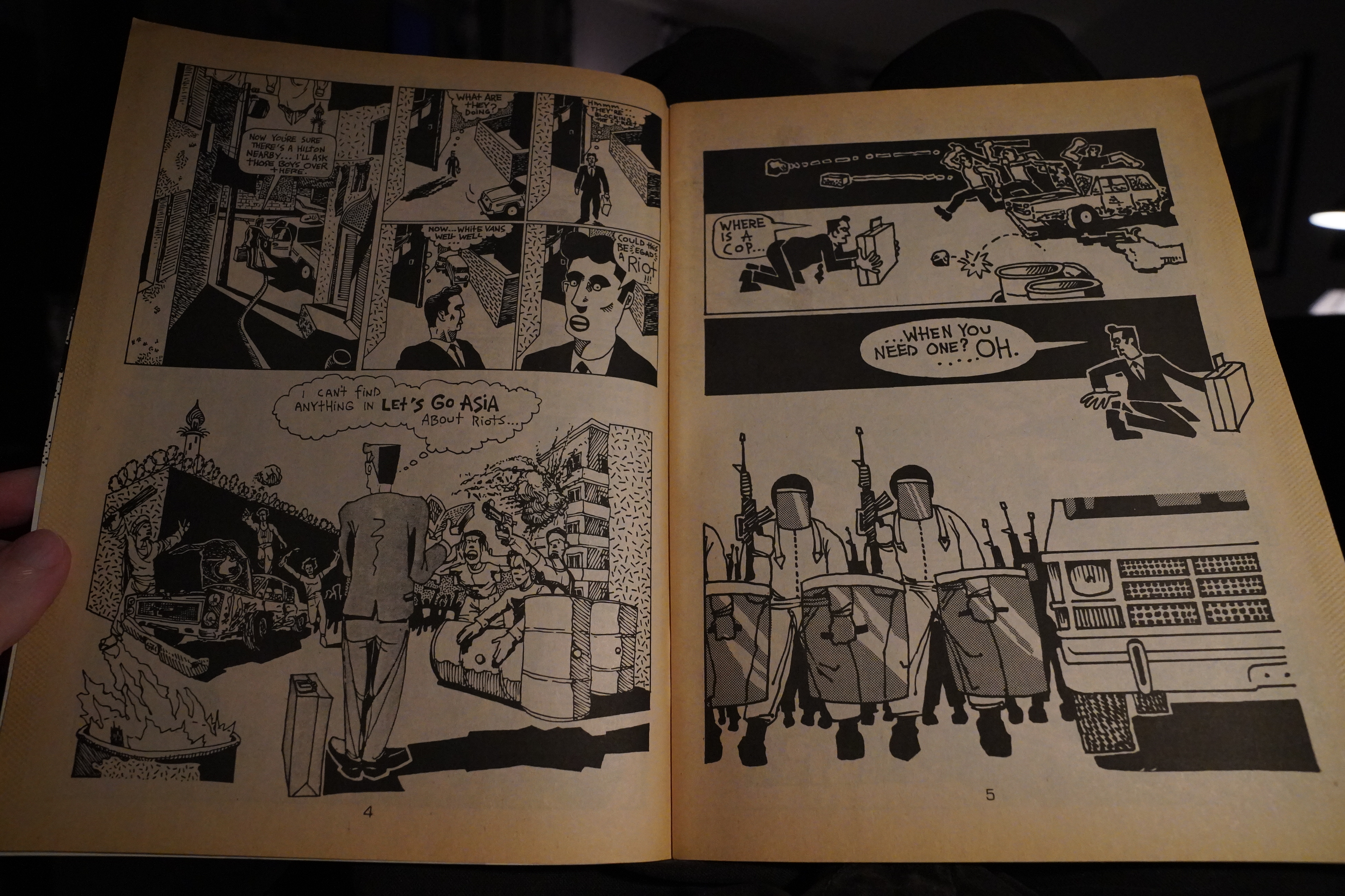
But things pick up again with the seventh issue. And… it has a flexi!? I tried playing it, but it sounded very, very, very soft. I wonder whether it’s somehow partially melted over the years? It looks a bit odd, especially on the back.
Chuck Sperry.
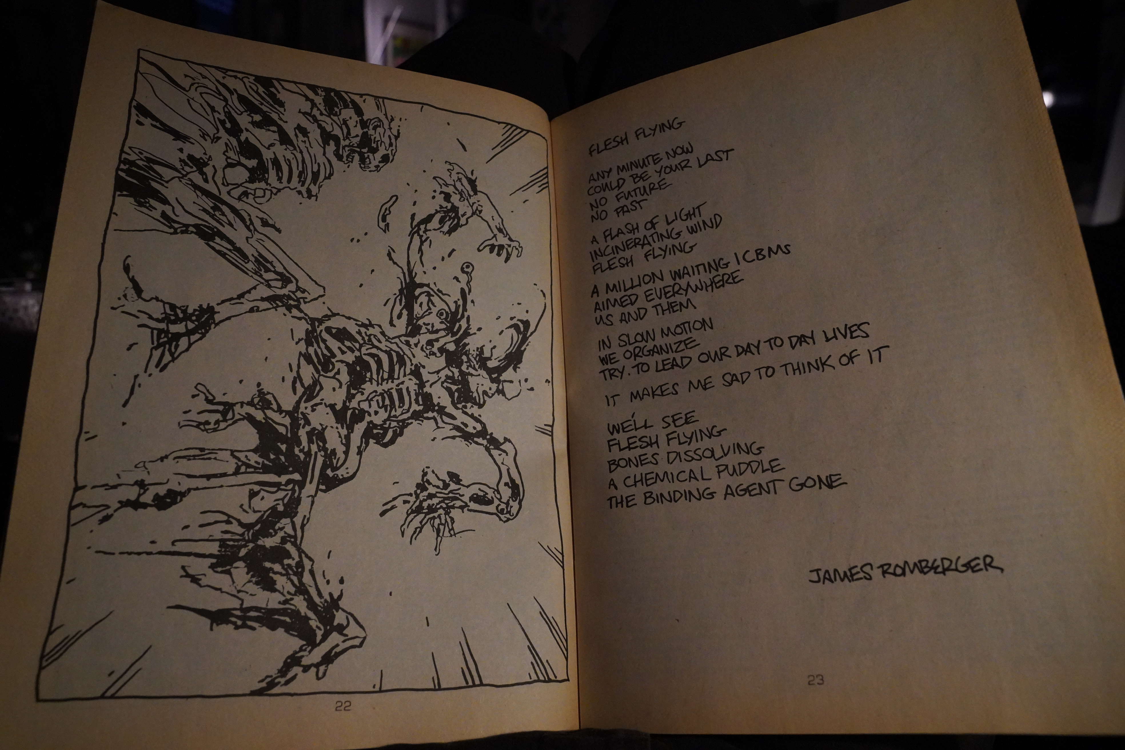
James Romberger.
Aki Fujiyoshi. Wowzers.
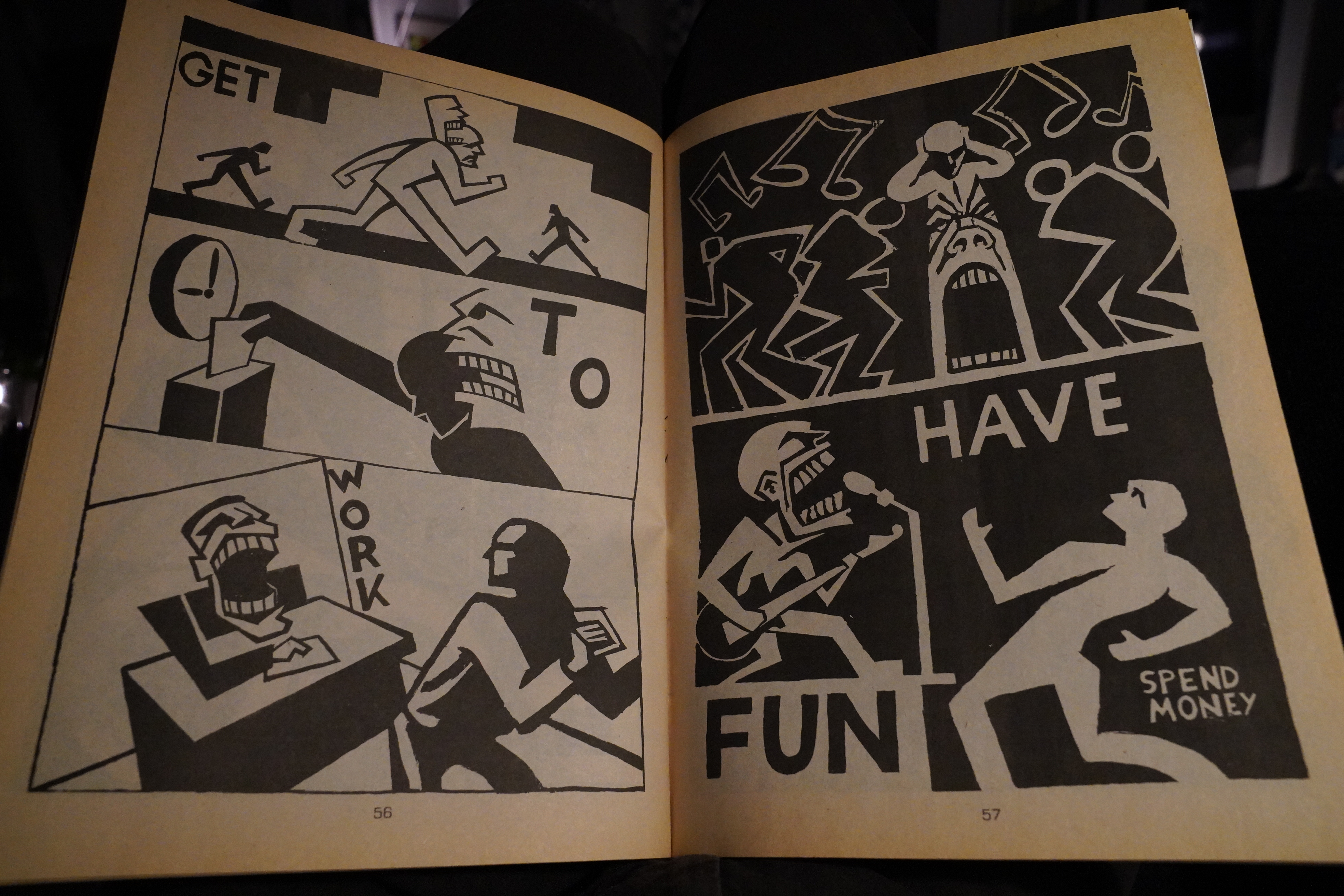
And Tobocman.
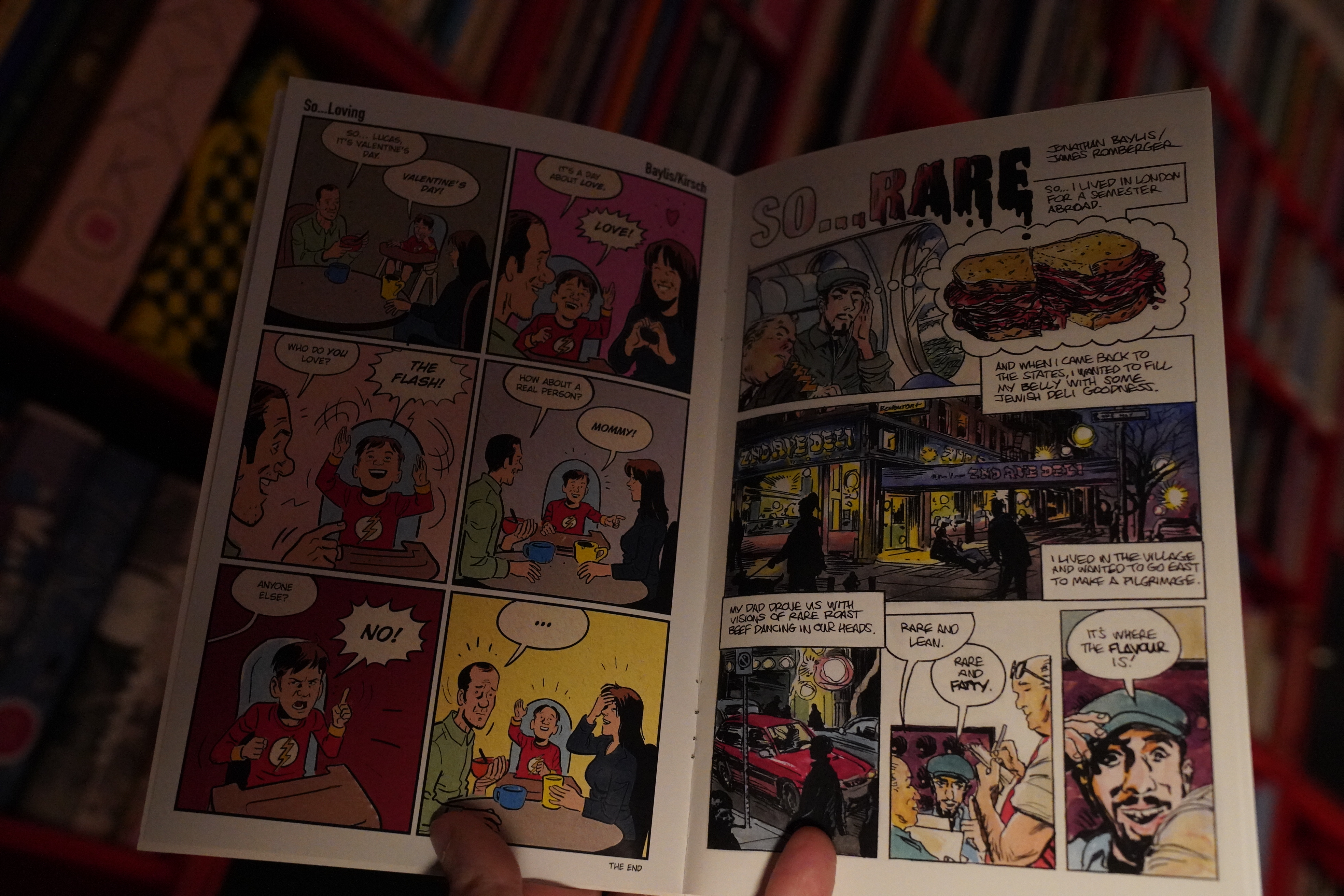
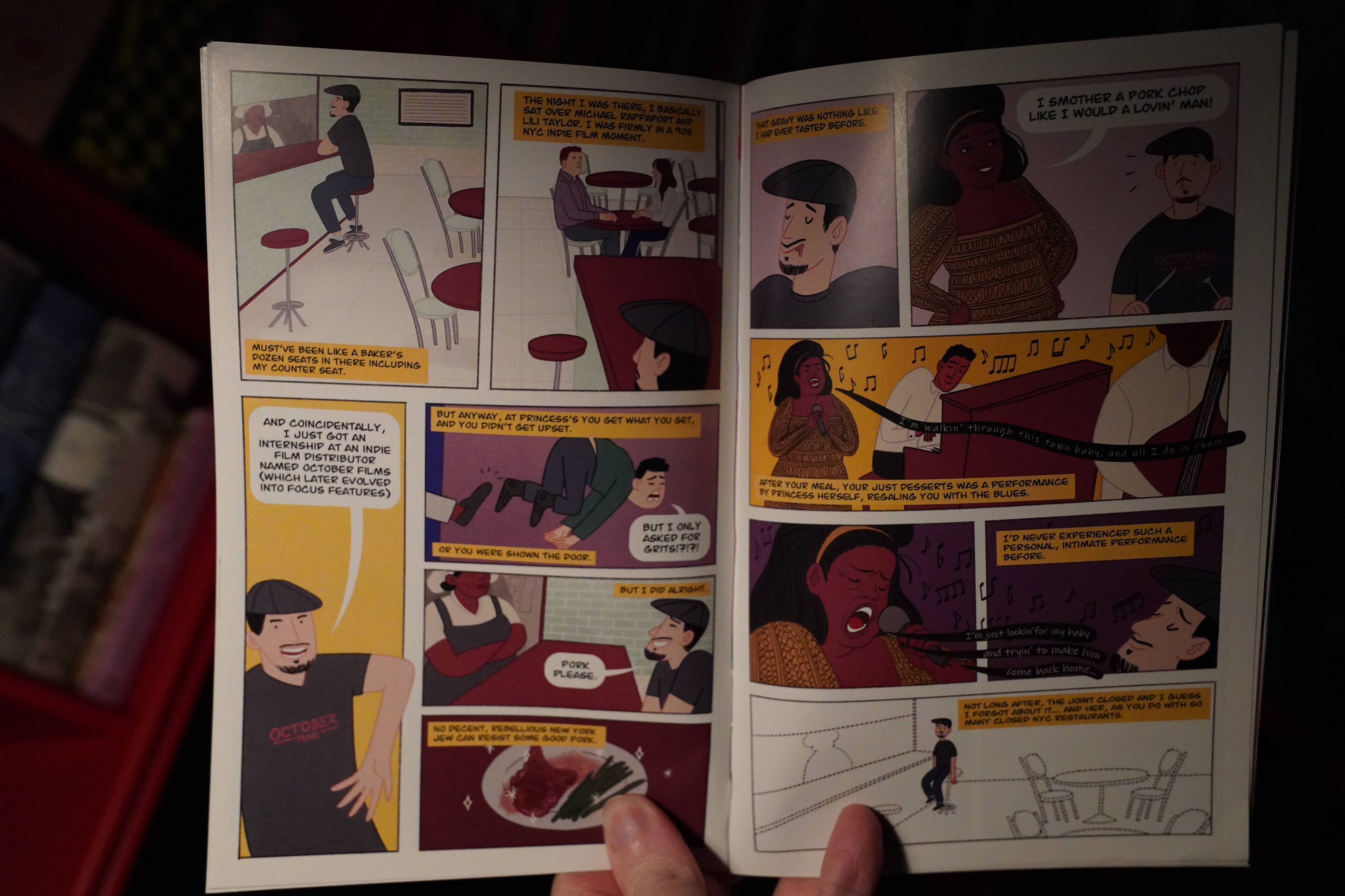
| Various: Methods of Dance (1) |  |
01:42: The End
OK, time to sleep.