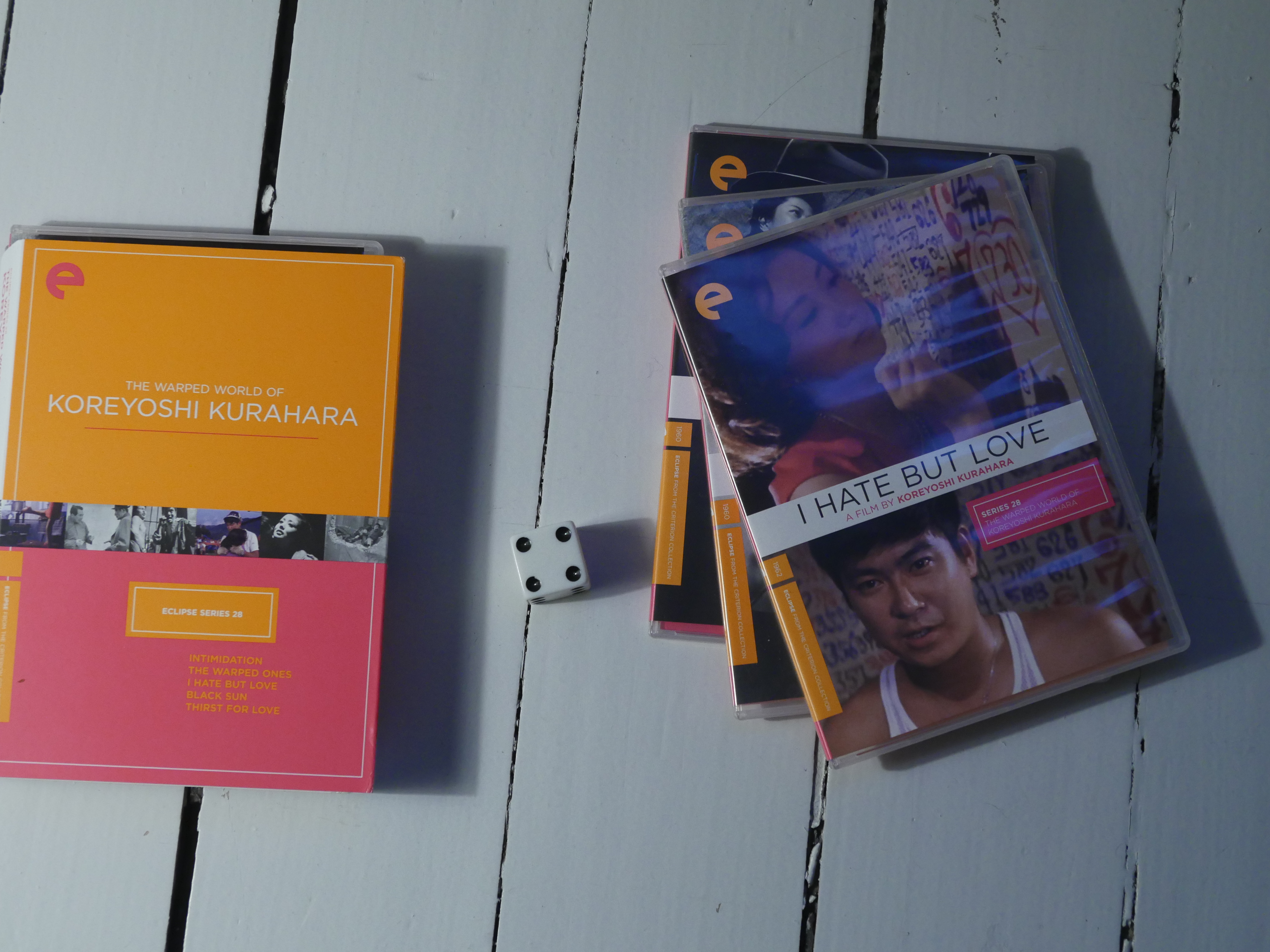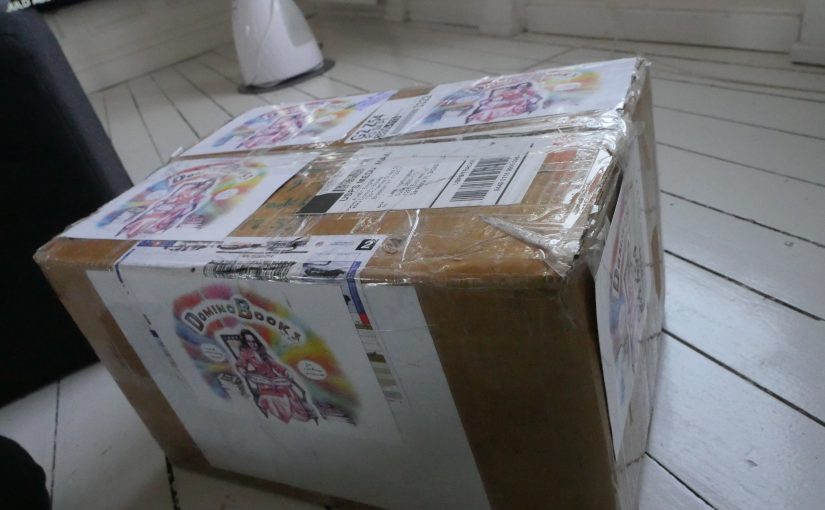
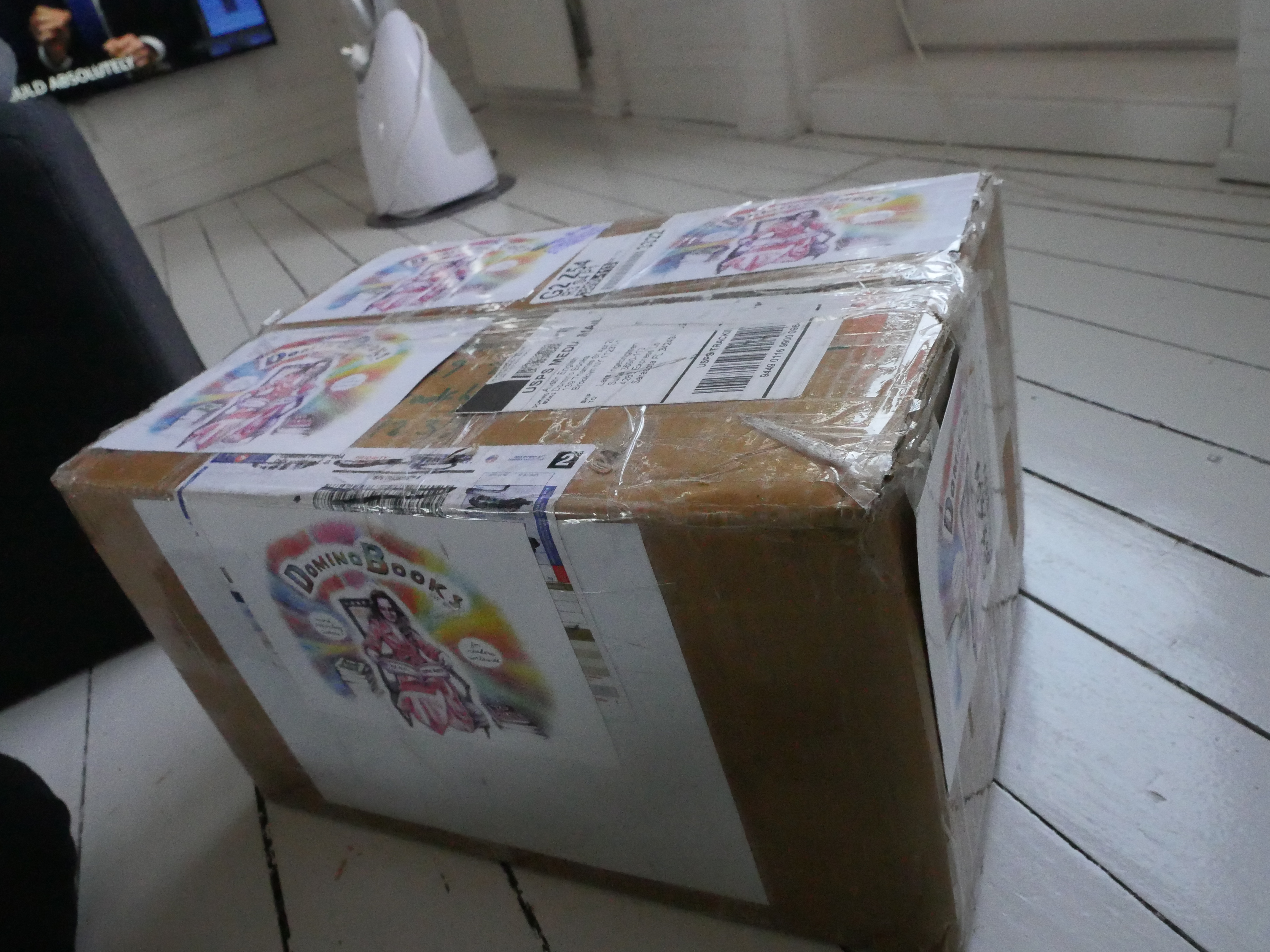
A month ago, I bought a buttload of comics from Domino Books, but I’ve been strangely busy with one thing or another and I just haven’t found time to do any comics reading.
But finally, today’s the day, and I’ll read until I plotz, or I run out of comics from Domino to read, whichever comes first. And as usual with these posts, don’t expect anything intelligible in the way of “reviews”; I’ll just be jotting down a line or two here and there, mm kay?
And… I’ll be listening only to late-80s music? Yeah, sure. New comics; old music. 🤩Conceptual🤩
| Pieter Nooten & Michael Brook: Sleeps With The Fishes |  |

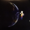
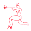
16:01: Francis Bacon by E. A. Bethea (Domino Books)
Most of the books I’m reading today aren’t actually published by Domino, just sold by them (because I’ve bought most of the books they’ve published already). But this one is newish, and I forgot to buy it last year. I think it ended up on quite a few “best of 2021” lists?
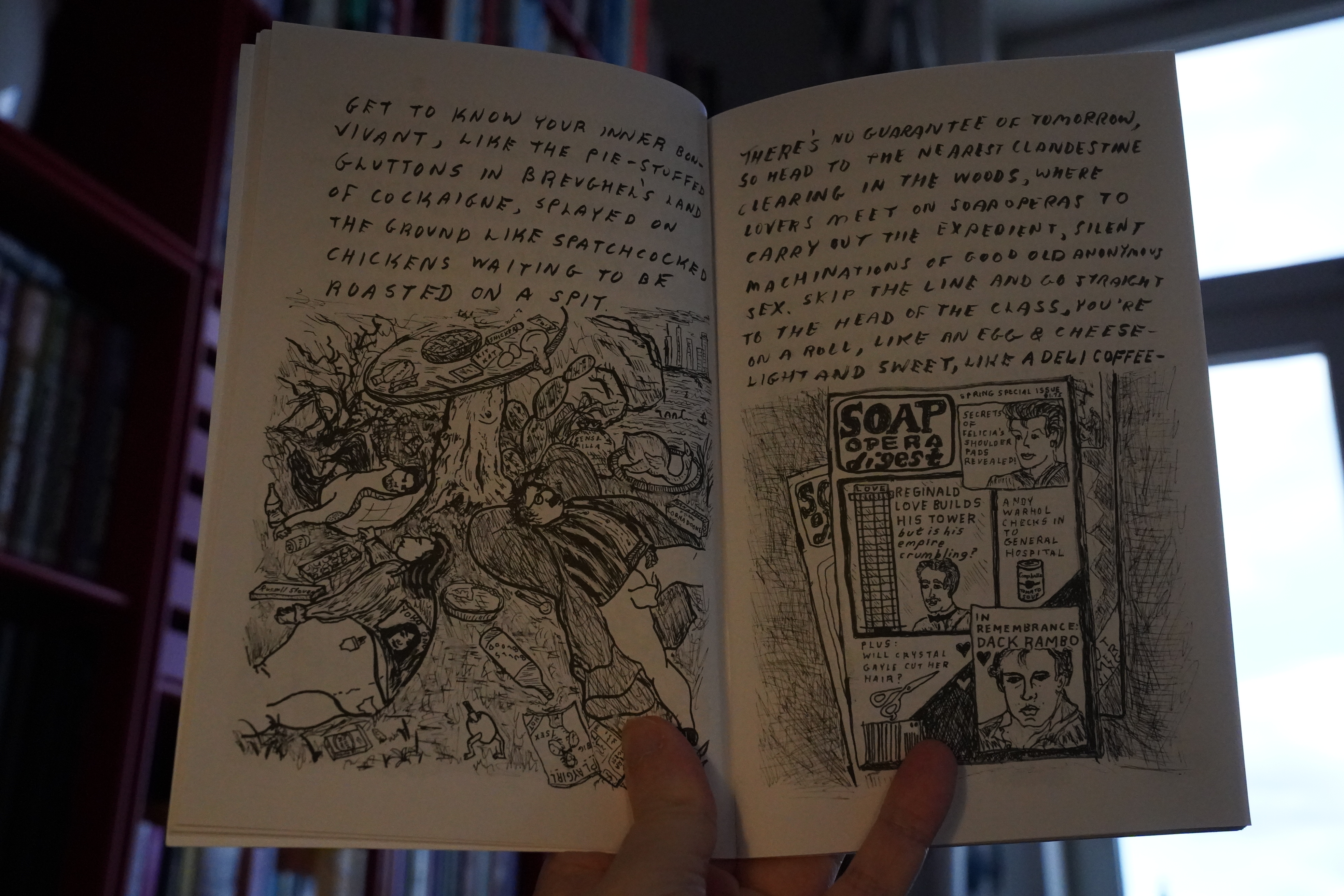
And… it’s great! It kinda reads like a prose poem, and I’m reminded of Eileen Myles (but perhaps just because I was reading a book of hers the other week). It’s got that mix of honesty and wistfulness and humour; lots of humour.
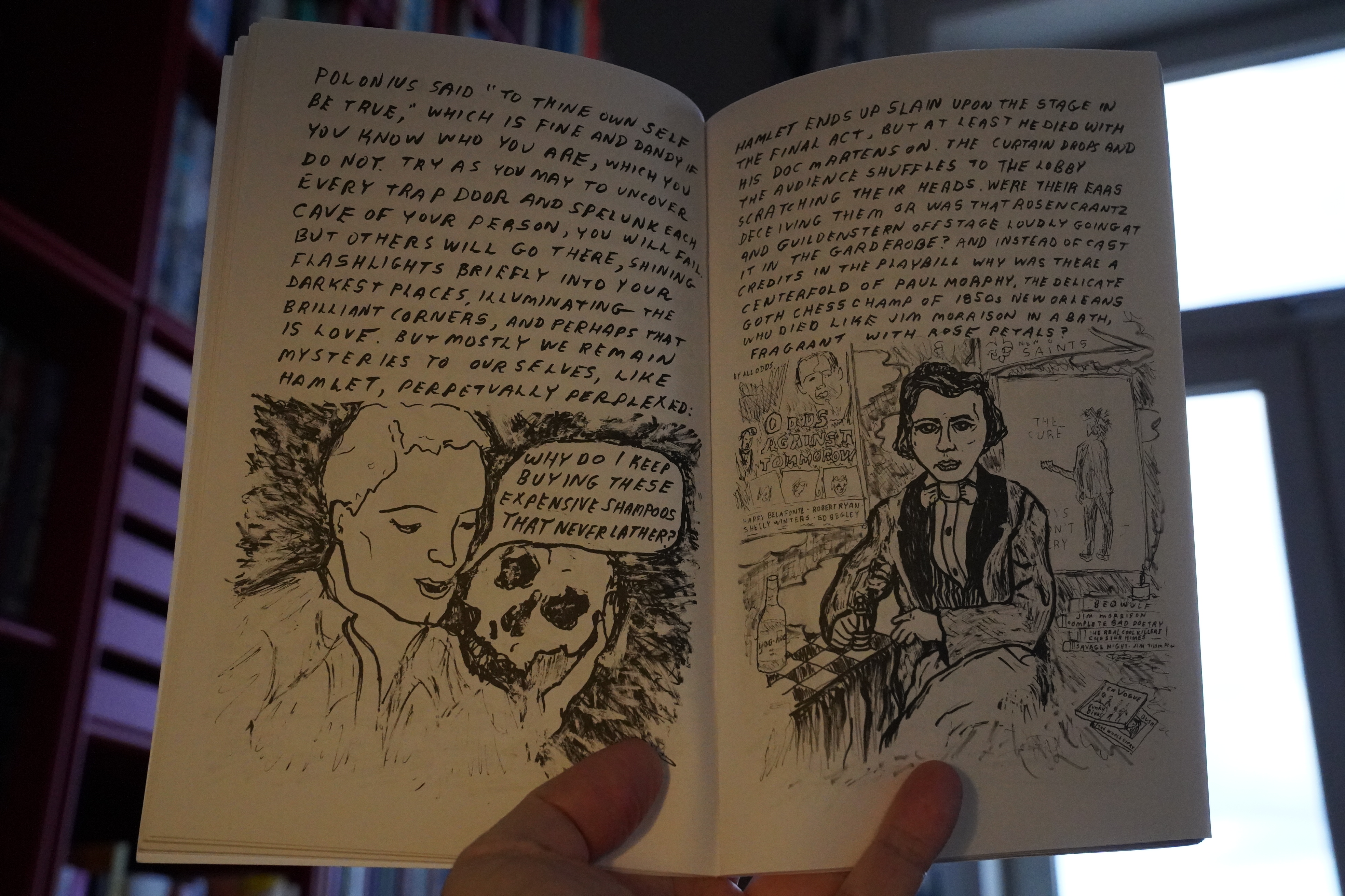
But it’s not just an illustrated poem — the expressive artwork does more than complement the text.
Nice one.
And… hey! She’s got more books that I haven’t read; but unfortunately just one that’s not sold out. (But I bought that one now.)
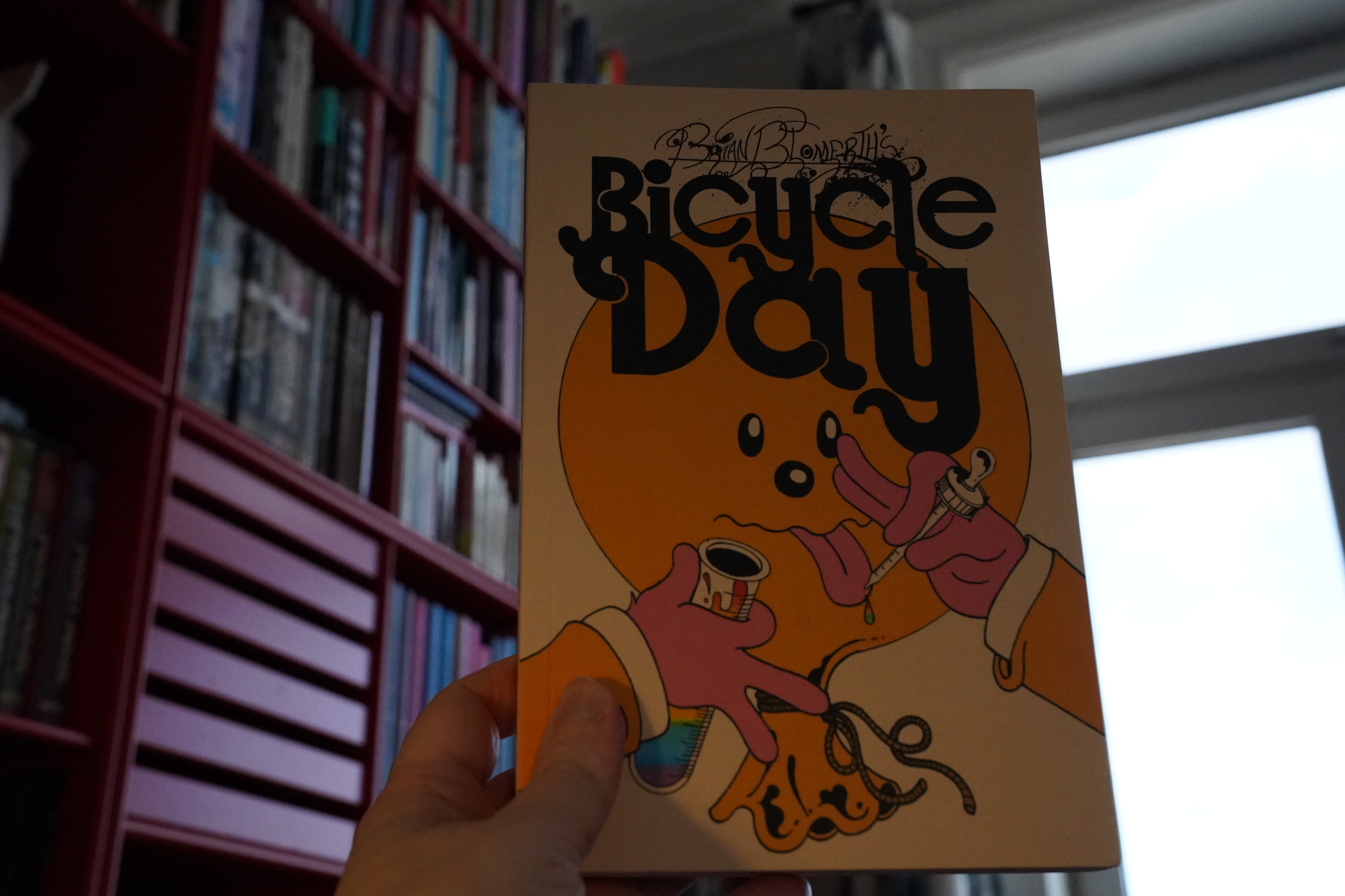
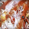
16:43: Bicycle Day by Brian Blomerth (Anthology Editions)
This is a book about how Albert Hoffman invented LSD, and the artwork’s kinda amazing.

And it’s obviously a heart-felt project for the artist, and it’s a fun read, but, uhm, I dunno.
I didn’t quite feel it.
| Happy Mondays: Squirrel and G-man Twenty Four Hour Party People Plastic Face Carnt Smile (White Out) |  |
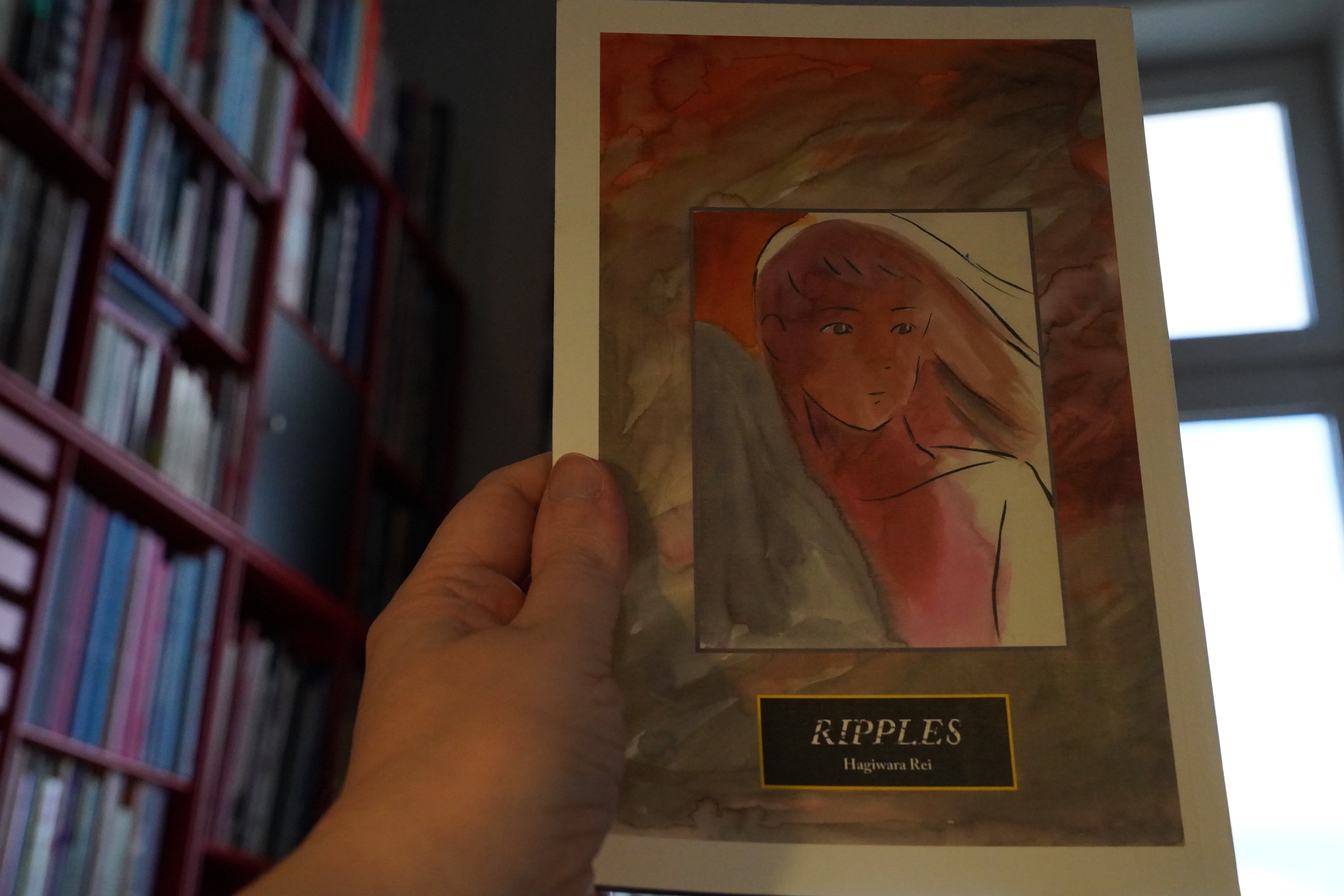
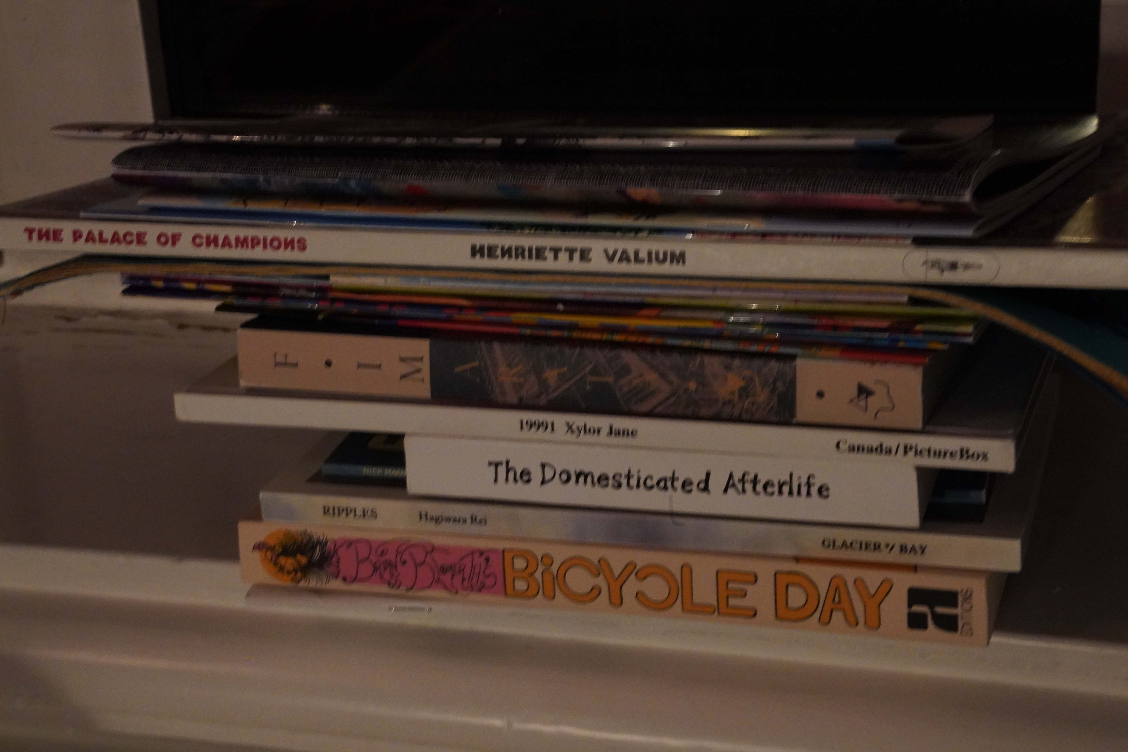
16:57: Ripples by Hagiwara Rei (Glacier Bay Books)
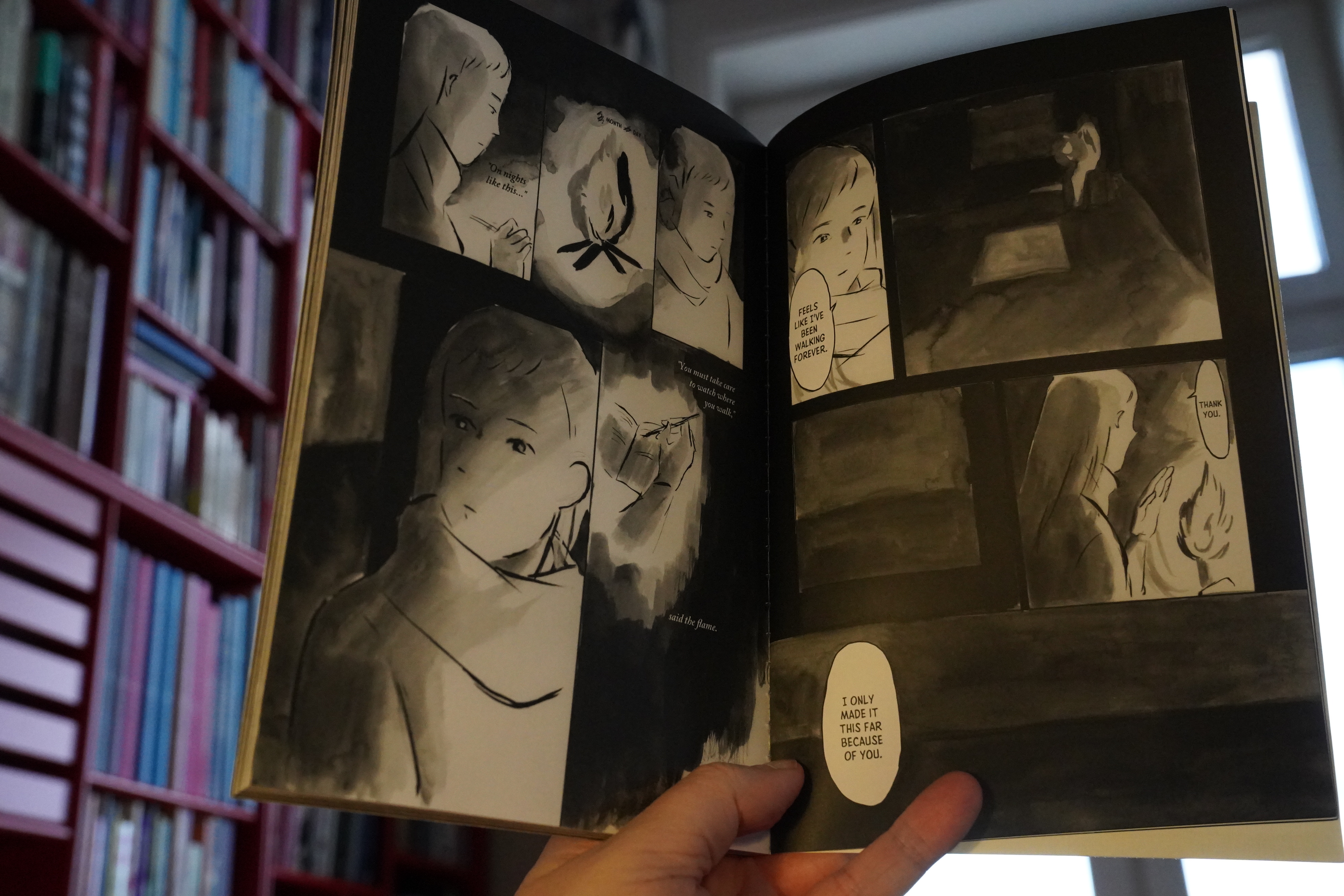
This book is about loss and remembrance and all that kind of good stuff.
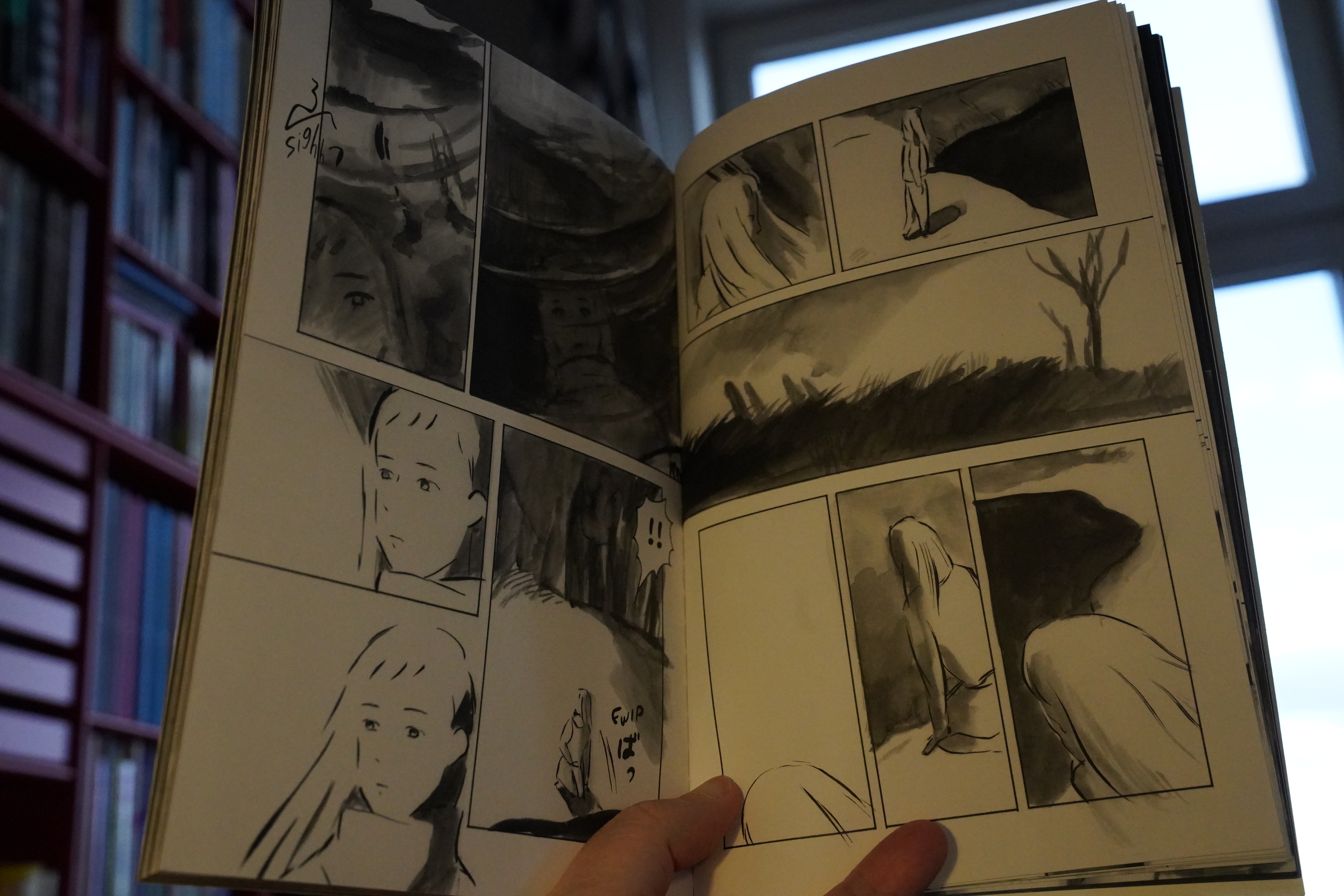
And the artwork’s really well suited for the story — things disappearing into the page and getting erased.
I was totally on board with this book until about halfway through, when I think it kinda tipped over into something more conventional in a way.
I mean, it’s a good book, but I found myself growing impatient with it towards the end, even though it’s a short, brisk read. It’s probably just me, though.
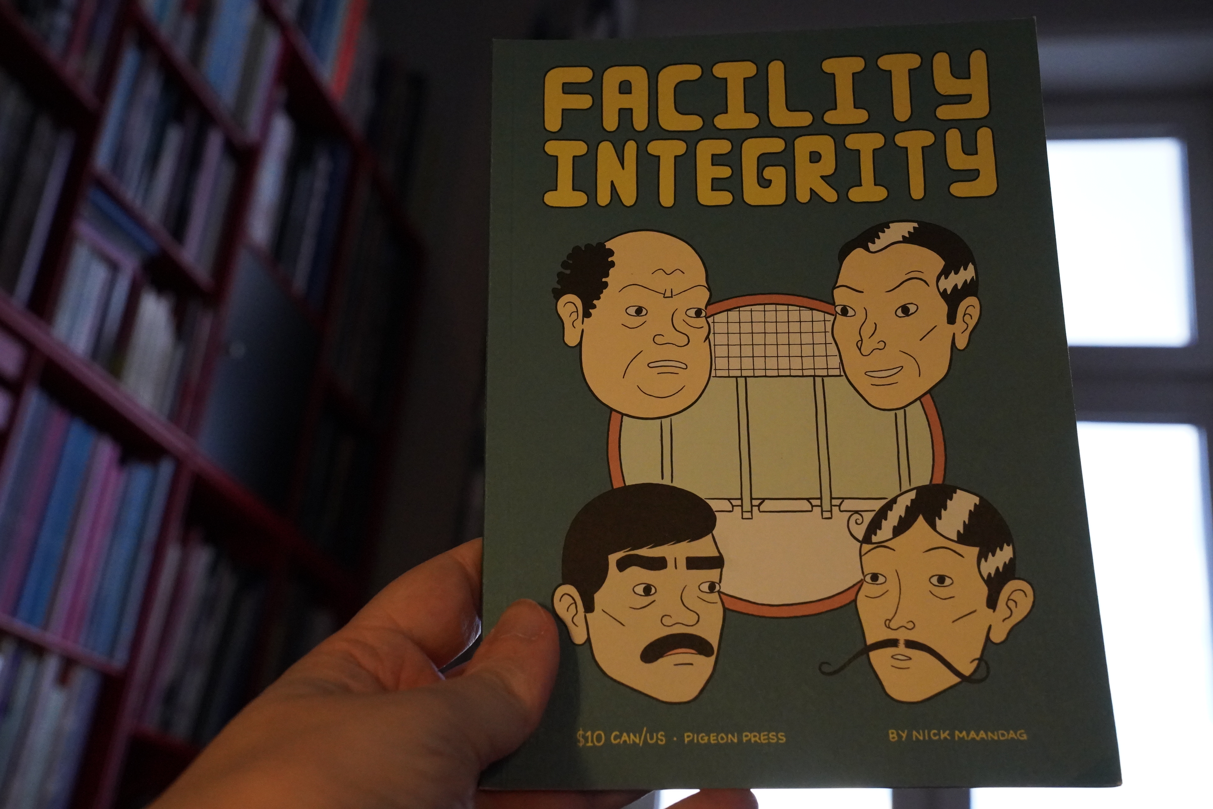
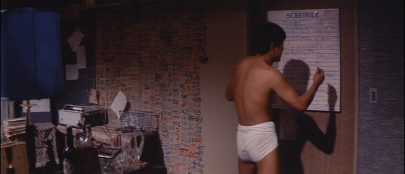
17:09: Facility Integrity by Nick Maandag (Pigeon Press)
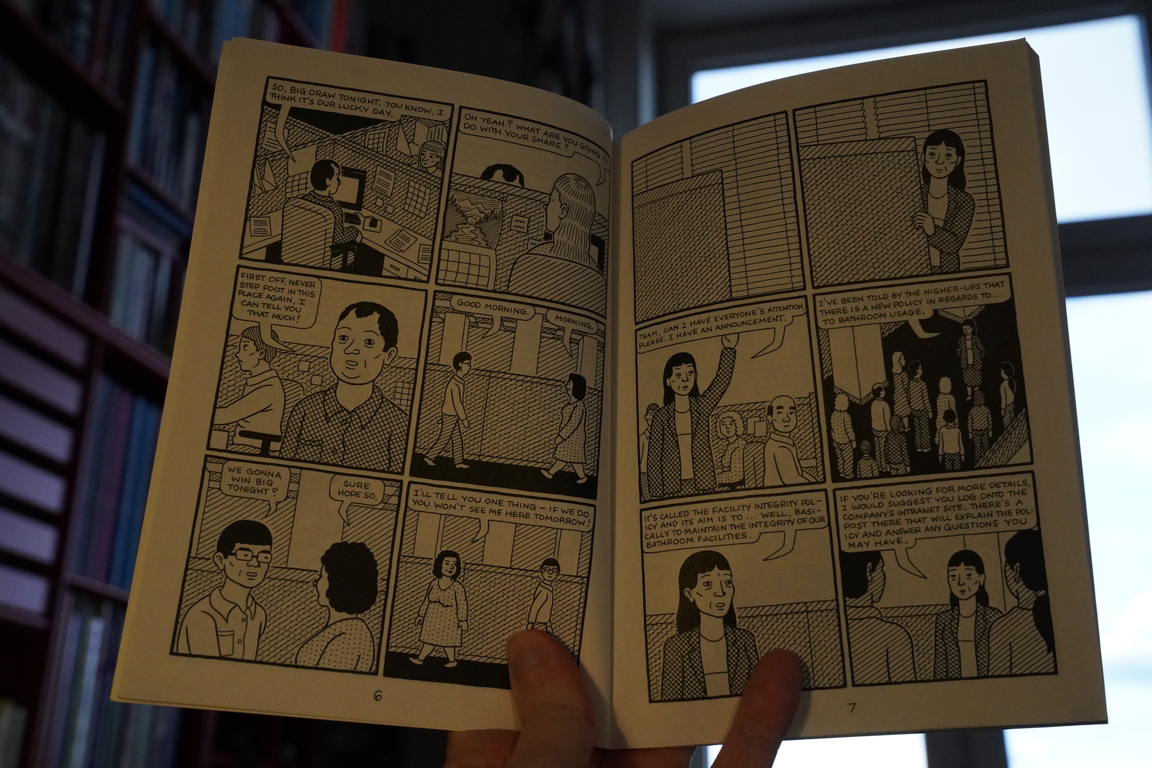
Don’t show this book to Jeff Bezos!
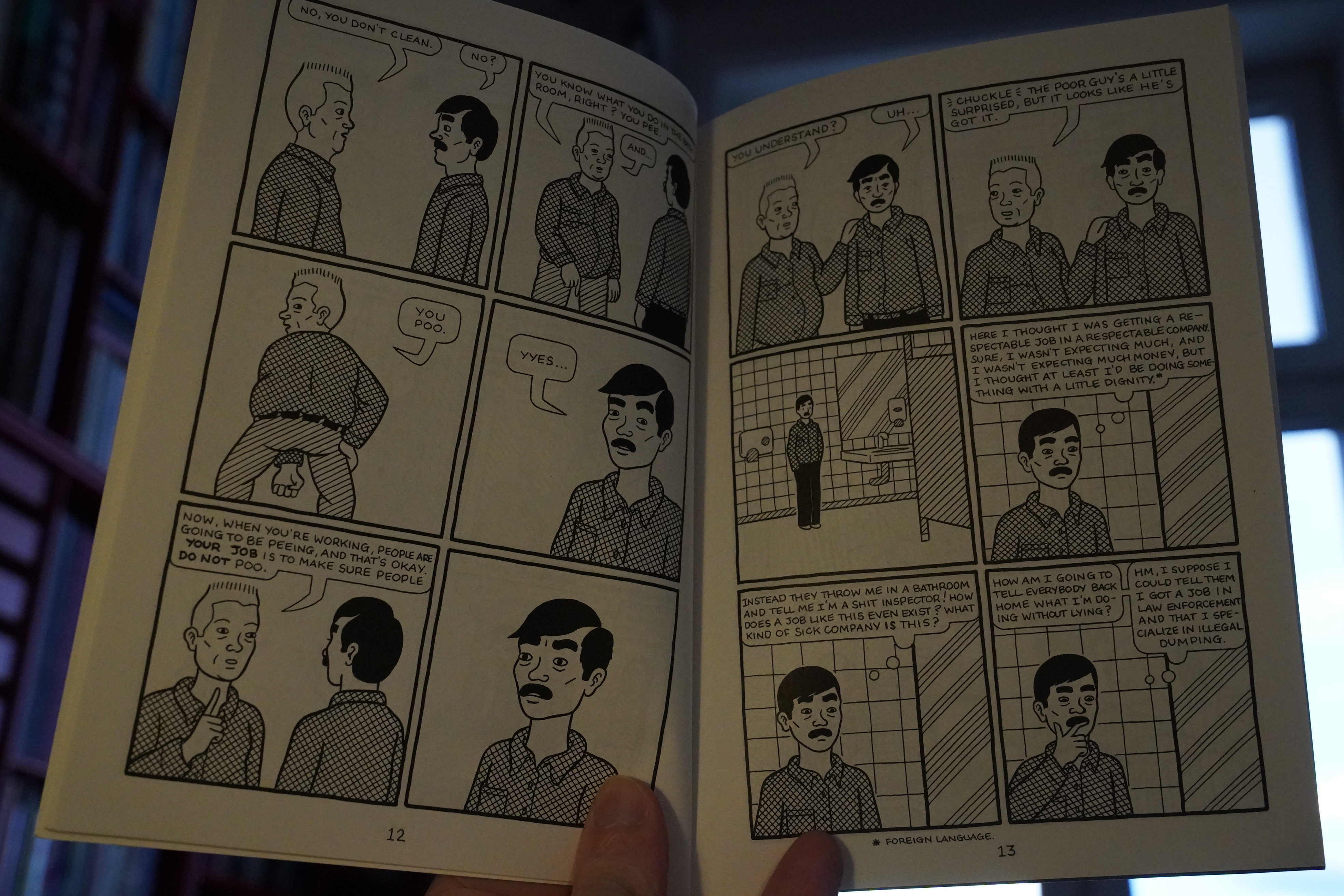
That’s the problem with this sort of satire — I think you can pretty much guarantee that this is the workplace reality at places like Amazon warehouses already.
The plot is that management institutes a policy where the employees can only poop between 12 and 13, and then a hero stages a successful revolt, which is the fantasy part of it all. So like most satire, it’s not actually that funny? But it’s good.
| Skinny Puppy: Cleanse Fold and Manipulate |  |
17:50: The Domesticated Afterlife by Scott Finch
This starts off really intriguing…
… but then it turns out that it’s about “spirituality” and stuff, which just isn’t my thing at all. But I’m guessing somebody’s that into this thing might enjoy it?

It’s a lot. It’s got a kind of outsider art vibe (which I usually like), but again, the philosophical discussions here just didn’t interest me.
| Throwing Muses: The Fat Skier |  |

18:35: 19991 by Xylor Jane (Picturebox)
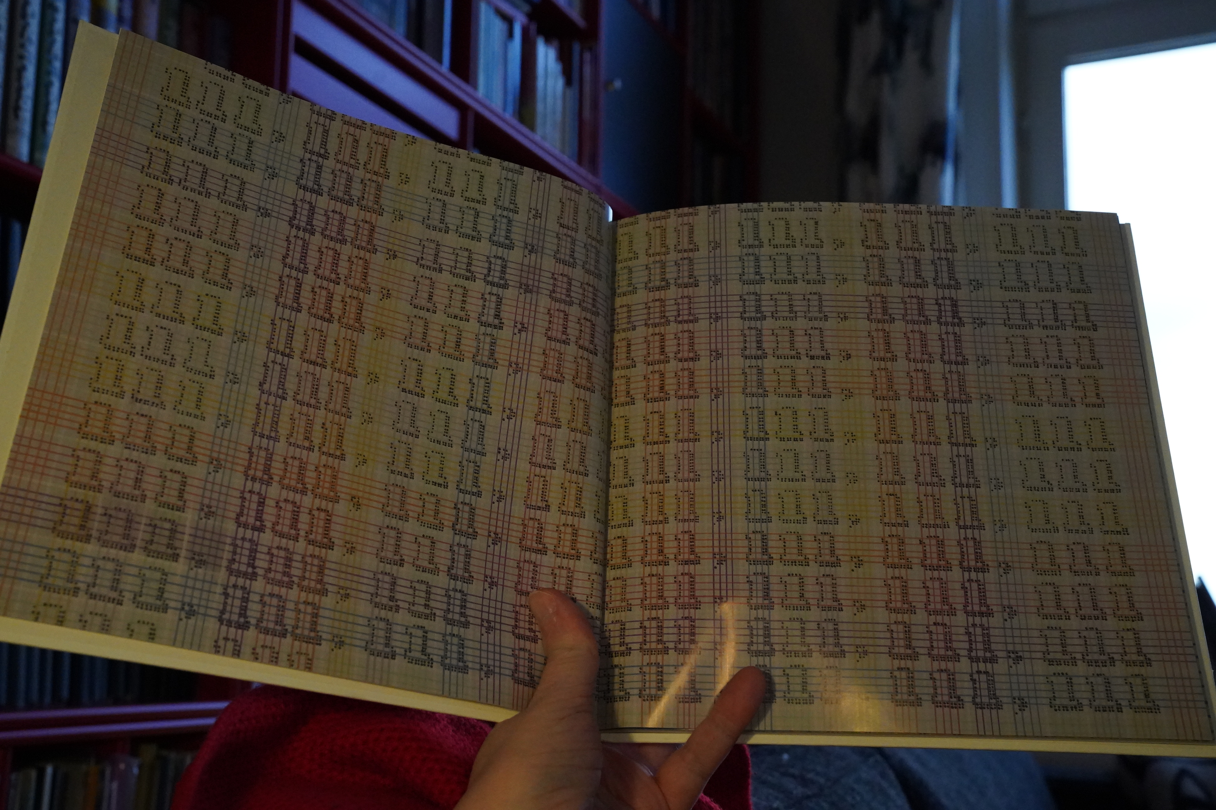
Oh, this is a catalogue of paintings.
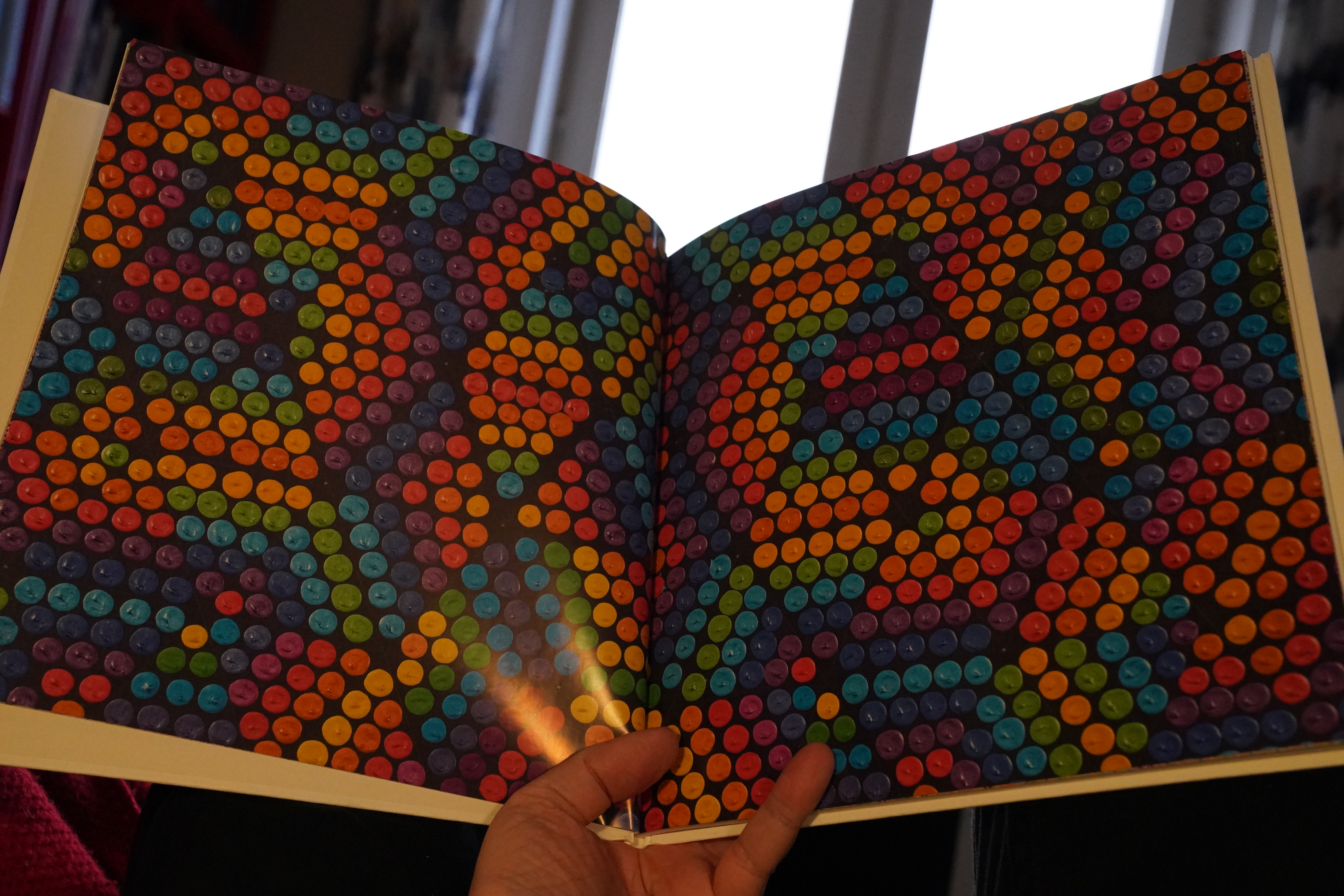
It’s pretty cool.
| Steve Reich: Works (2): Drumming |  |
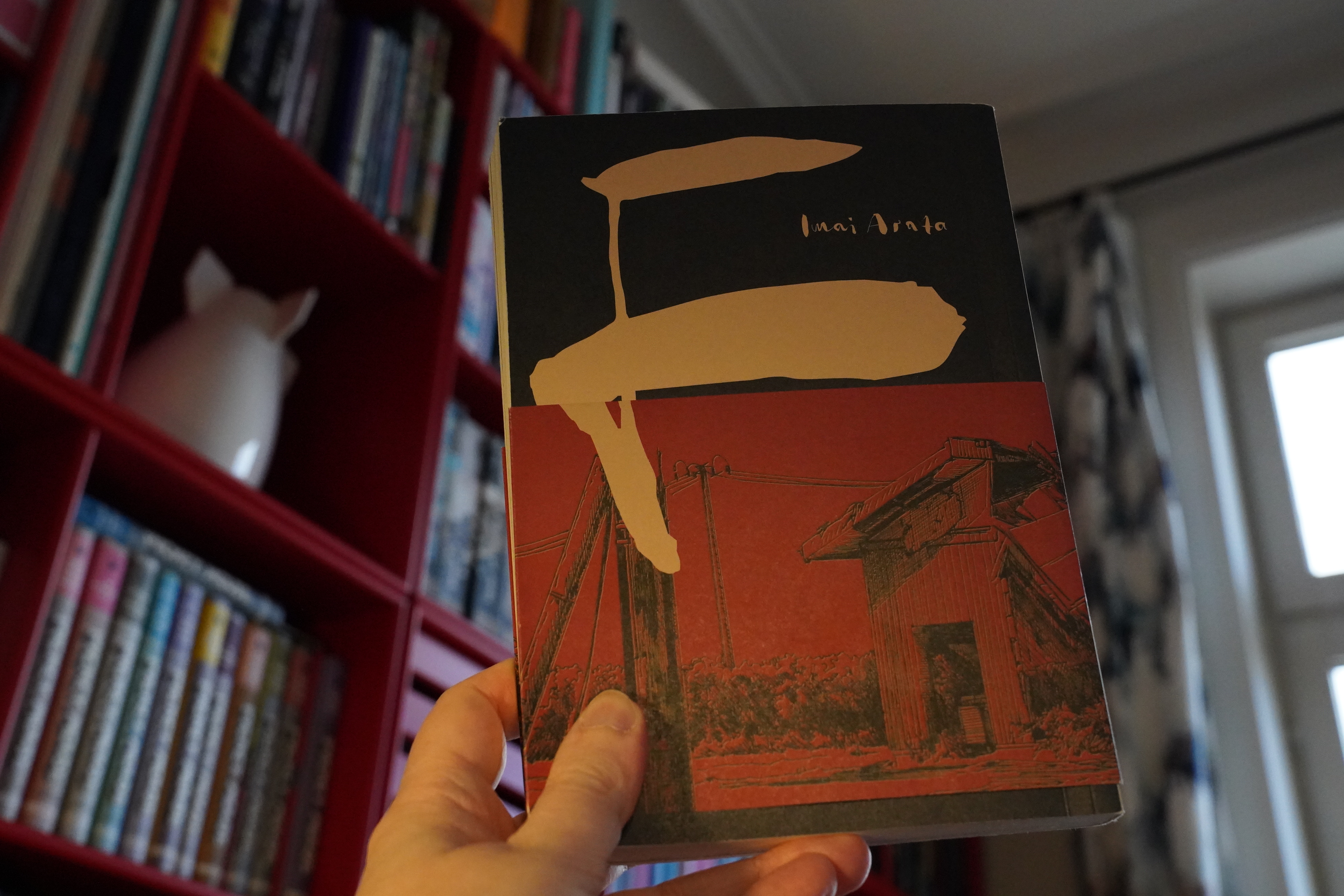
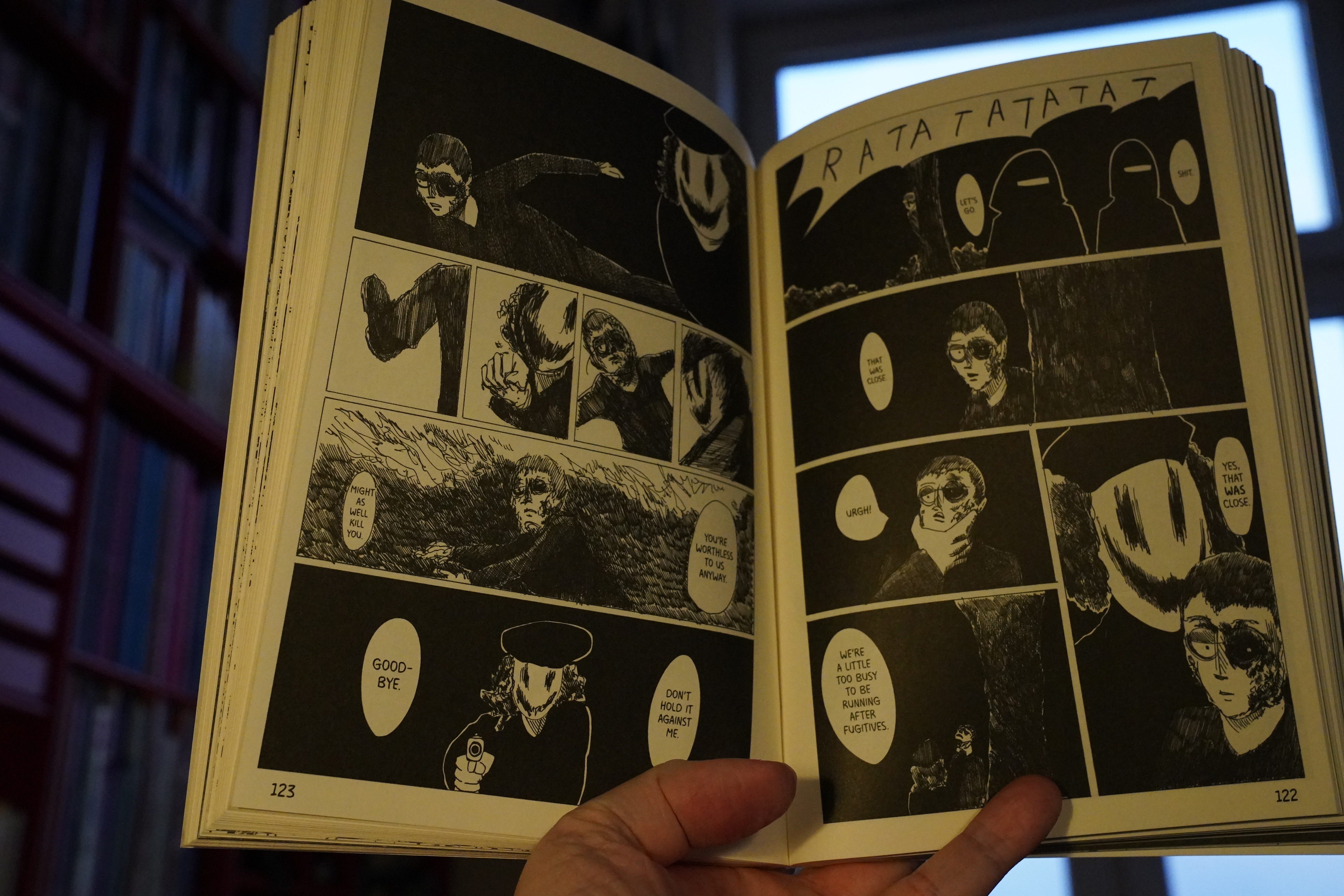
18:43: F by Imai Arata (Glacier Bay Books)

Very odd book. It’s drawn in a quite American indie fashion for a Japanese comic…

Although there are some lusher bits.
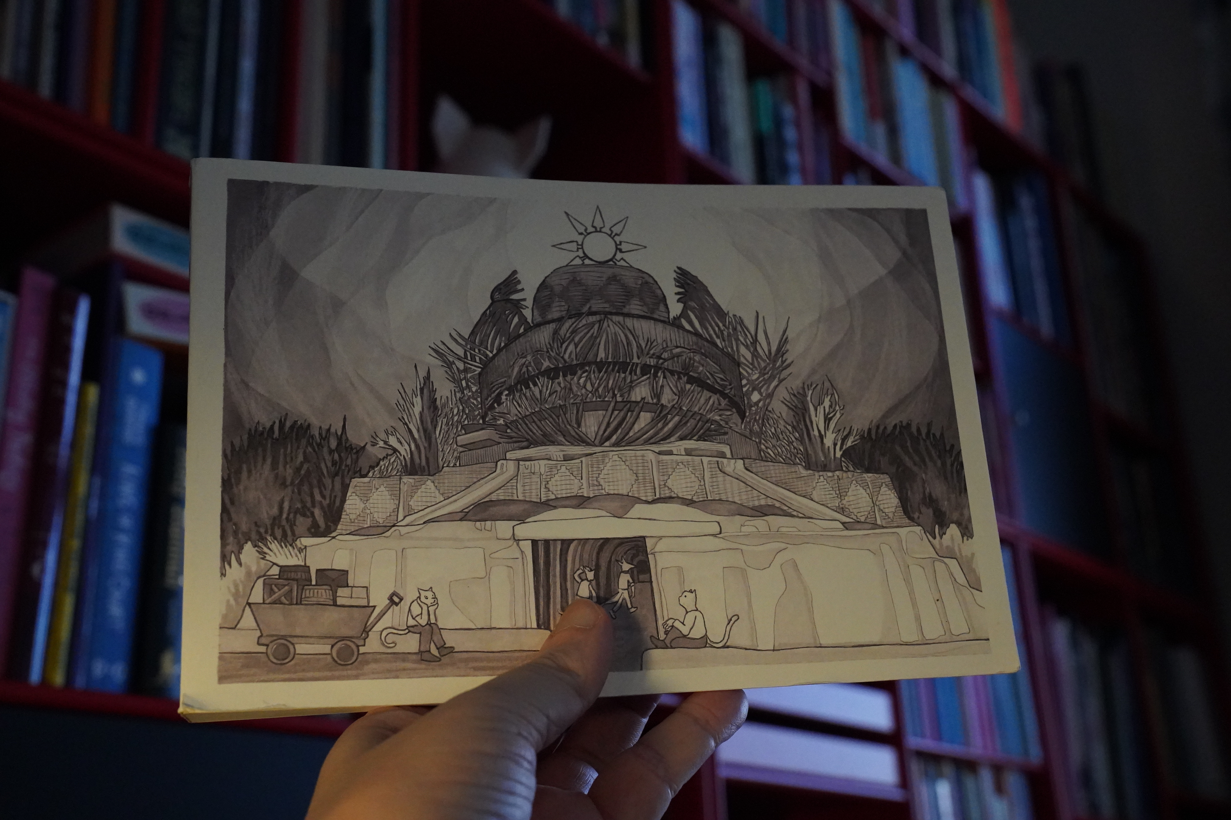
The story is about a terrorist group setting up a state in a breakaway part of Japan — so it’s an imagining of what could happen if the Islamic State happened in Japan, sort of, with all the religion and other distinguishing bits filed off, so the terrorists apparently have no ideology, and they’re being led by some guy right out of movies like Saw? And while Assad fucking Syria up was a major part of IS happening there, in this book the Japanese gummint is basically… doing nothing?
It’s a very confused book. My guess is that the artist wanted to make the audience care about the plight of people living under the horrors of the Islamic State by recontextualising it to “what if it happened here?”, but the weird non-specificity of what the State of F wants (beyond torturing people and posting clips of that to the internet) just…
I was sitting here reading it with one raised eyebrow the entire time.
But I mean, it’s well made — it’s got a good flow, storytelling wise.
| Jane Siberry: The Walking |  |
19:38: Pause
Oops! I forgot I had to run some errands. Be back in an hour.
20:55: Back
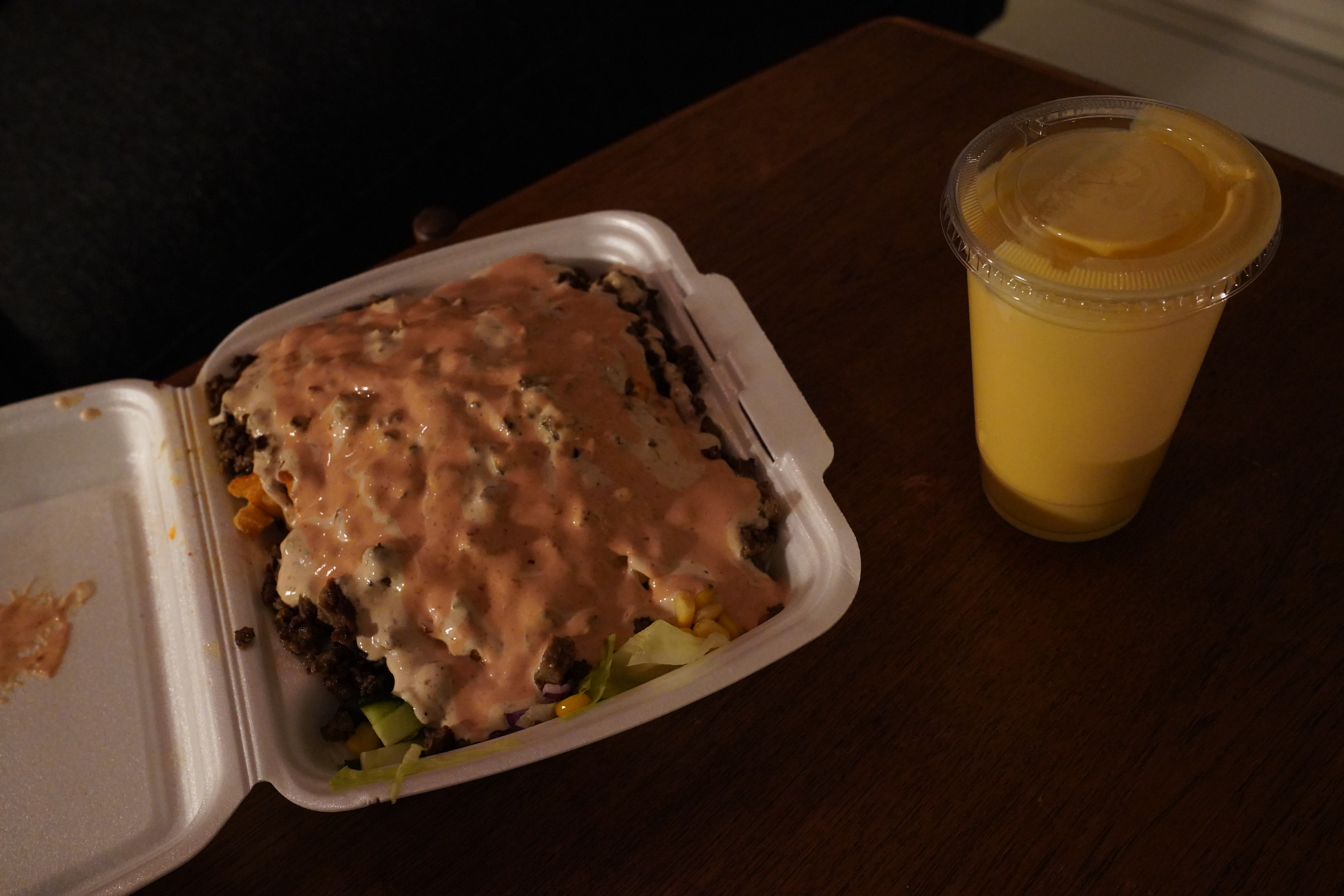
And I got some er delicious kebab on the way back… that place used to be totally dependable a couple years back — tons of nice veggies and stuff, but apparently they’ve gone the way of all kebab shops now: Just meat and french fries and sauce. (With a homeopathic amount of lettuce.) Oh well.
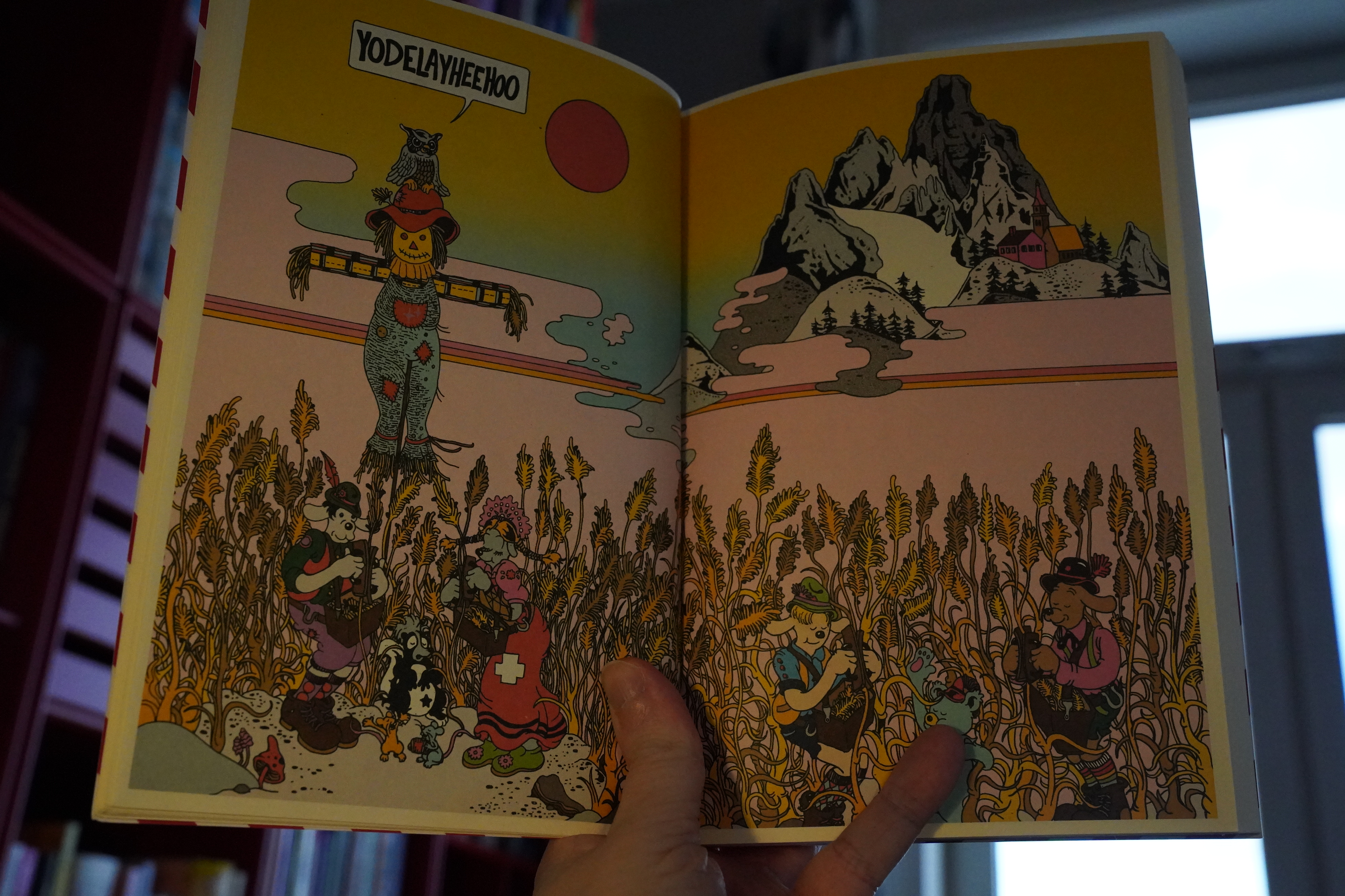
And I’m deviating from the Domino-only plan while I’m eating, and reading this instead.

It’s by Greg and Hermann, and it’s kinda fun?
As expected, the kebab was “eh” and the mango lassi was “mmmm”.
| The Residents: Discomo |  |
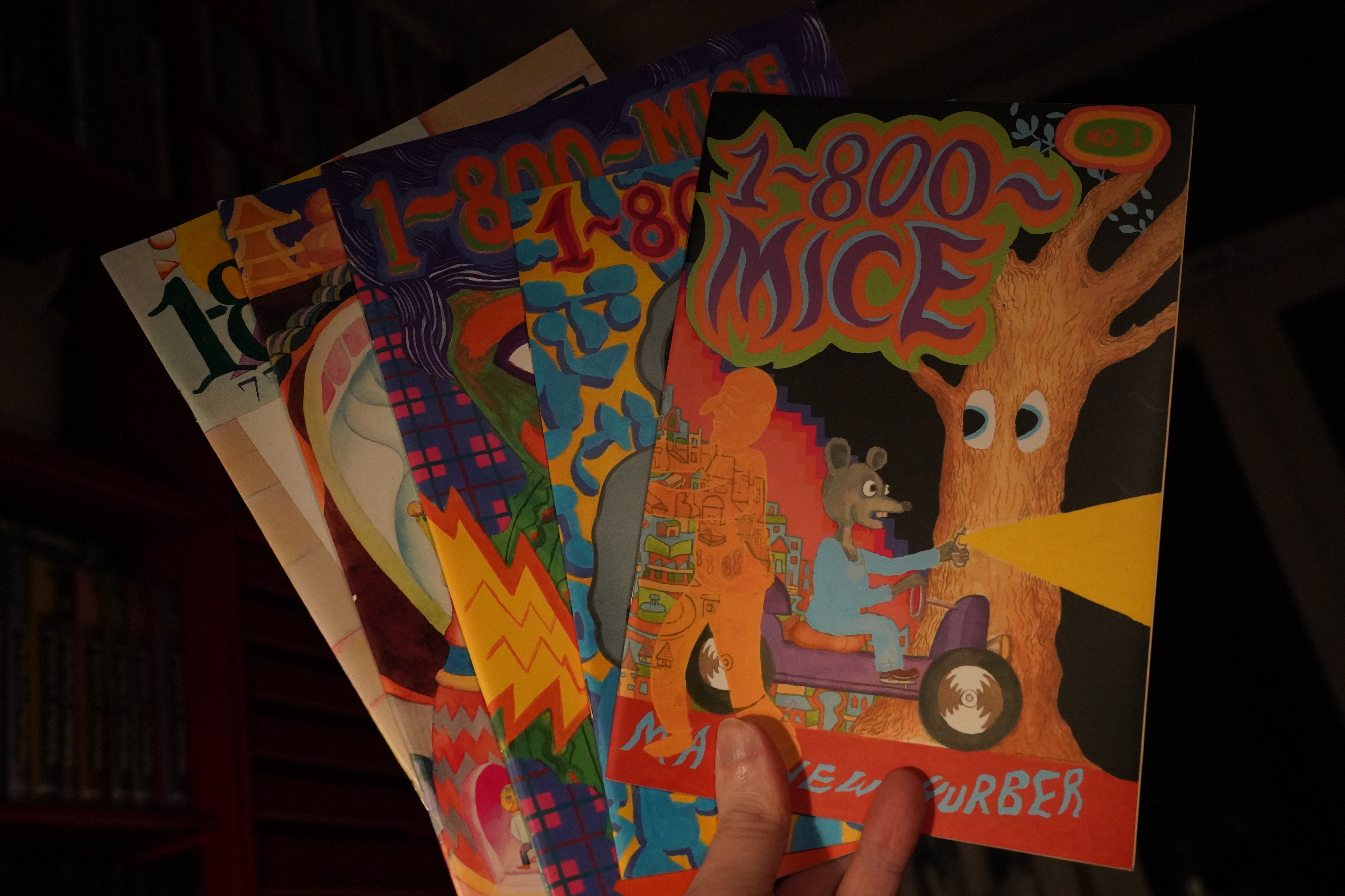
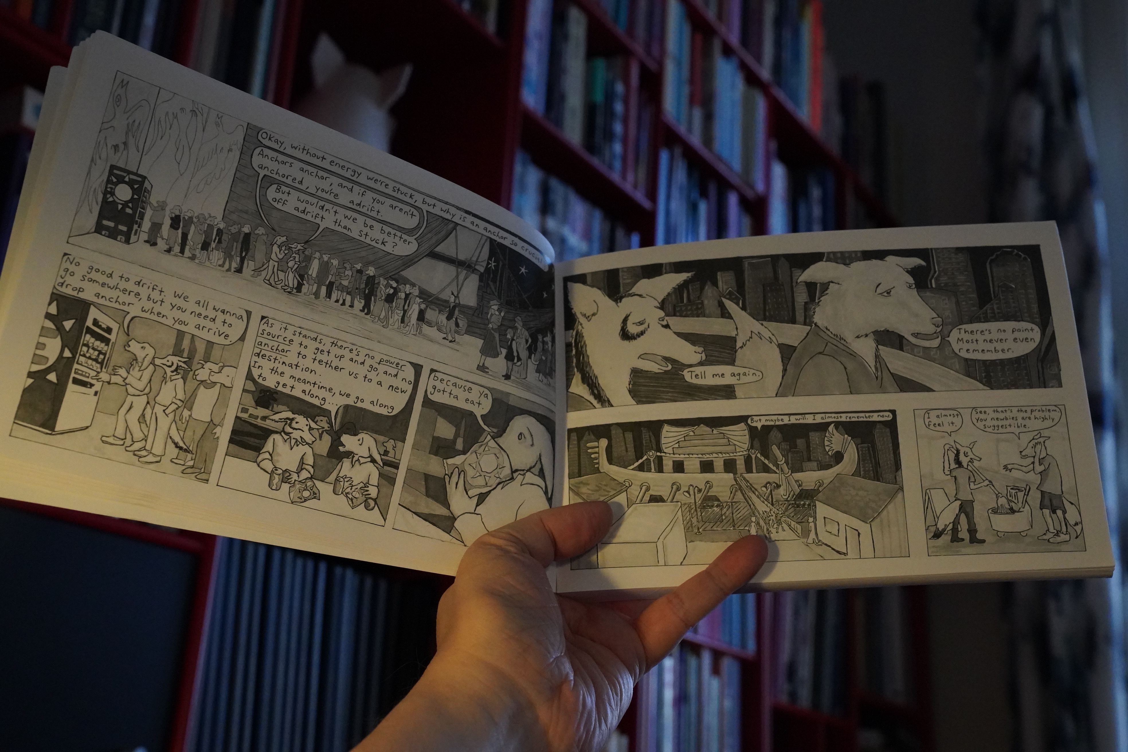
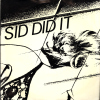
21:36: 1-800 Mice by Matthew Thurber (Picturebox & Ambergris)
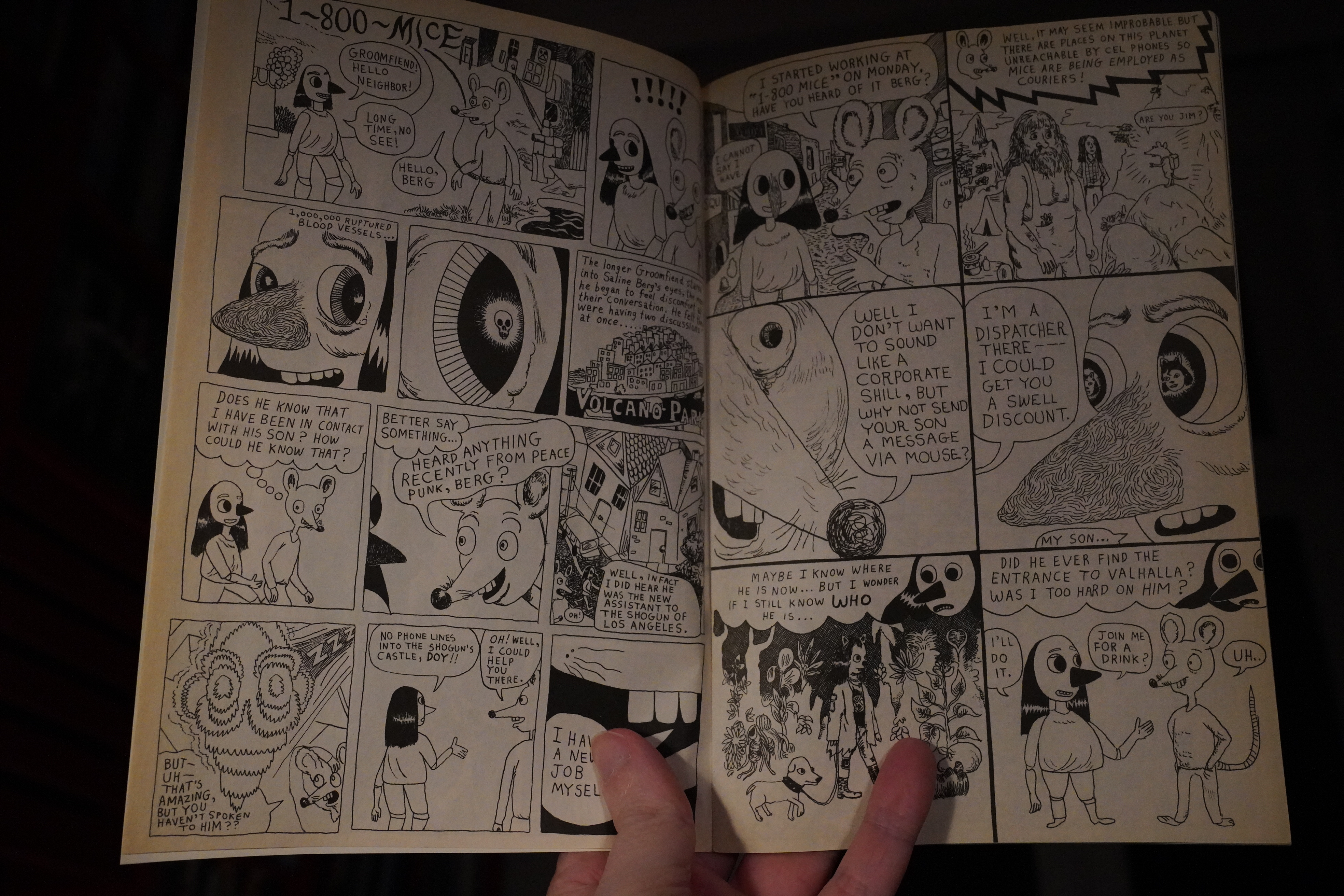
I’m pretty sure I have some issues of this, but not the earliest ones. Is Picturebox emptying its warehouse or something? I thought they’d completely shut down…
It’s a fascinating read — at the start, it’s not clear whether it’s all one narrative, or whether it’s a bunch of shorter pieces, or one longer narrative with shorter bits inserted. So you have to sort of make sense of things yourself, and it’s a lot of fun.
| The Smiths: Strangeways, Here We Come |  |
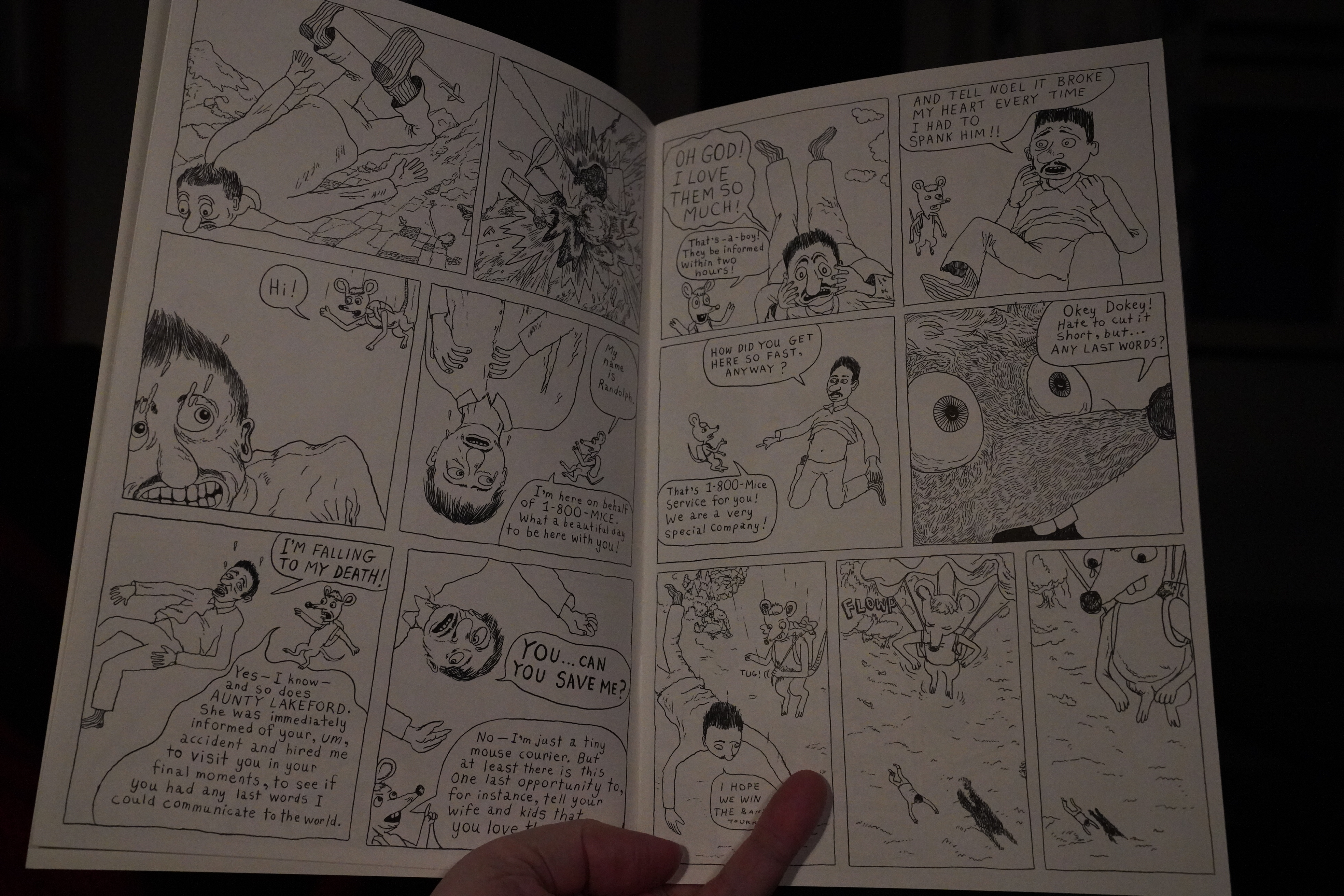
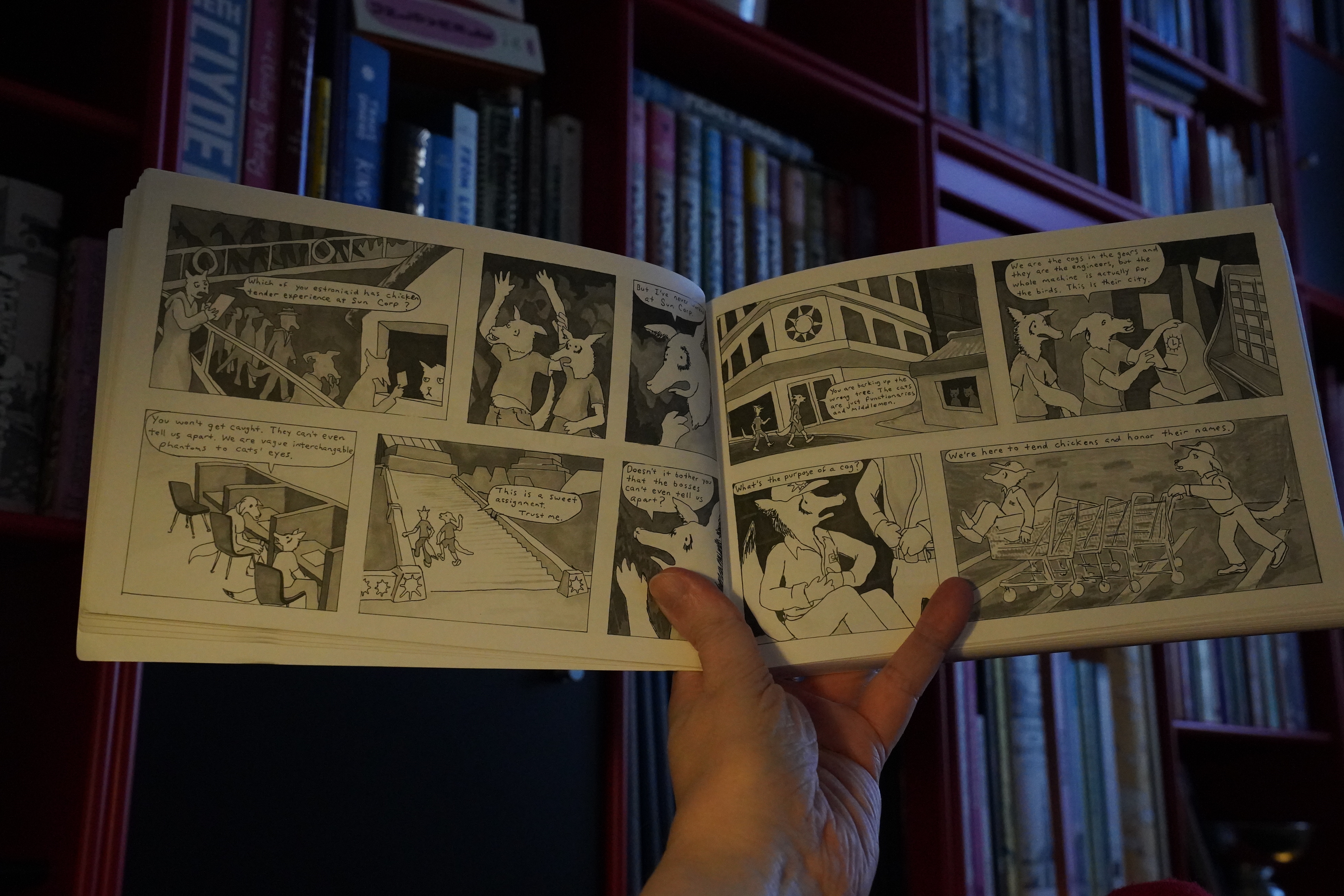
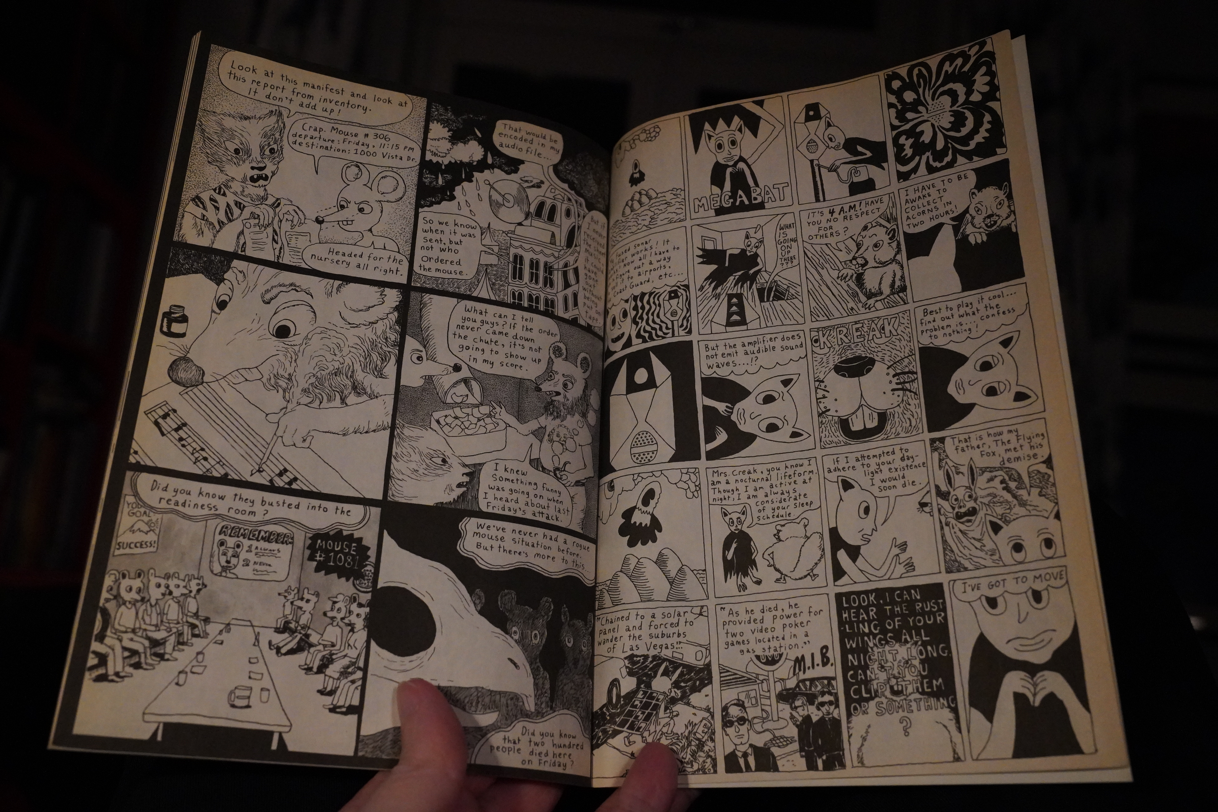
With the third issue, Picturebox is no longer publishing the book, and it goes to a larger format and white paper.
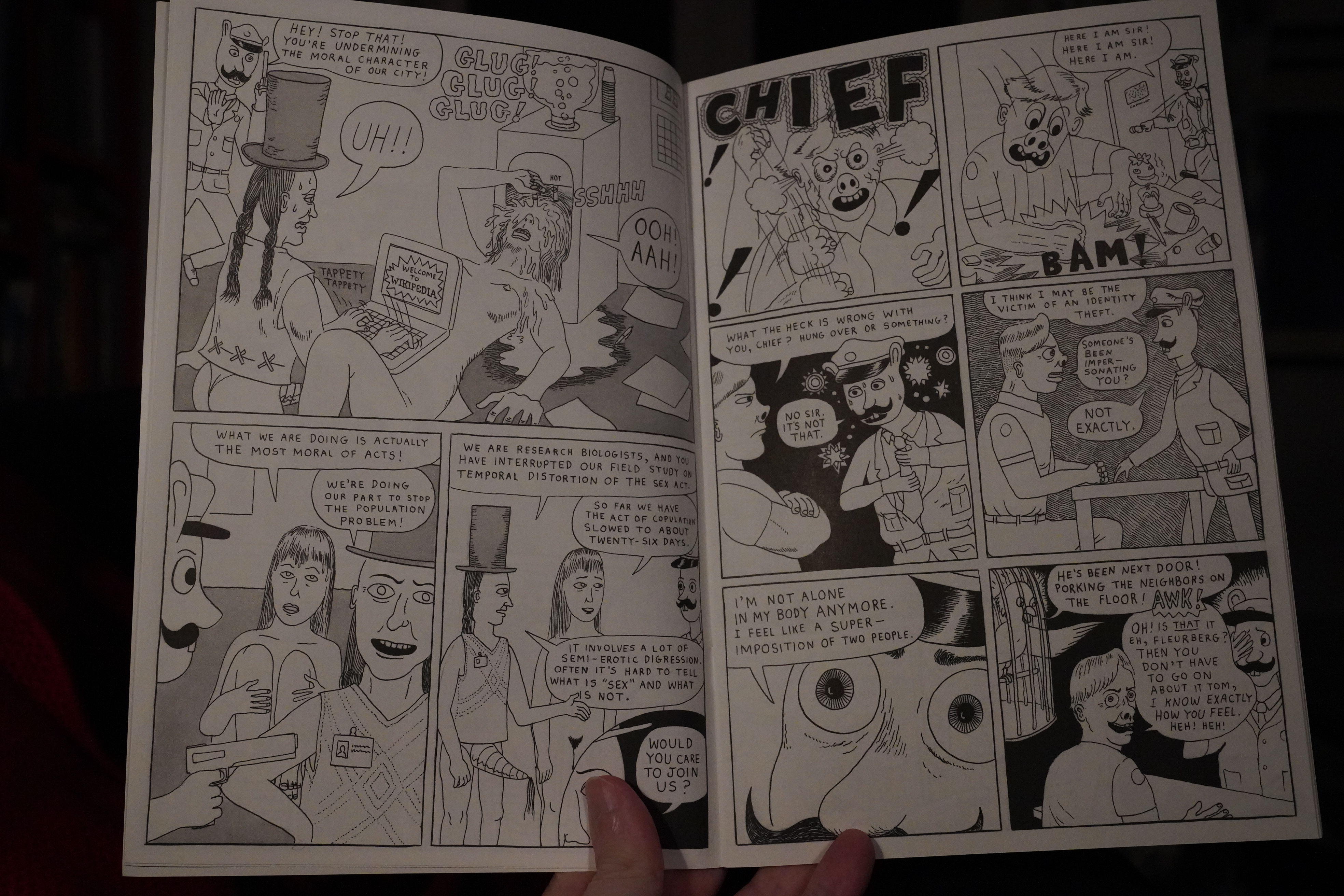
And… the plot sort of straightens out? A bit? And so does the artwork.
Still a lot of fun.
| Various: Lonely is an Eyesore |  |
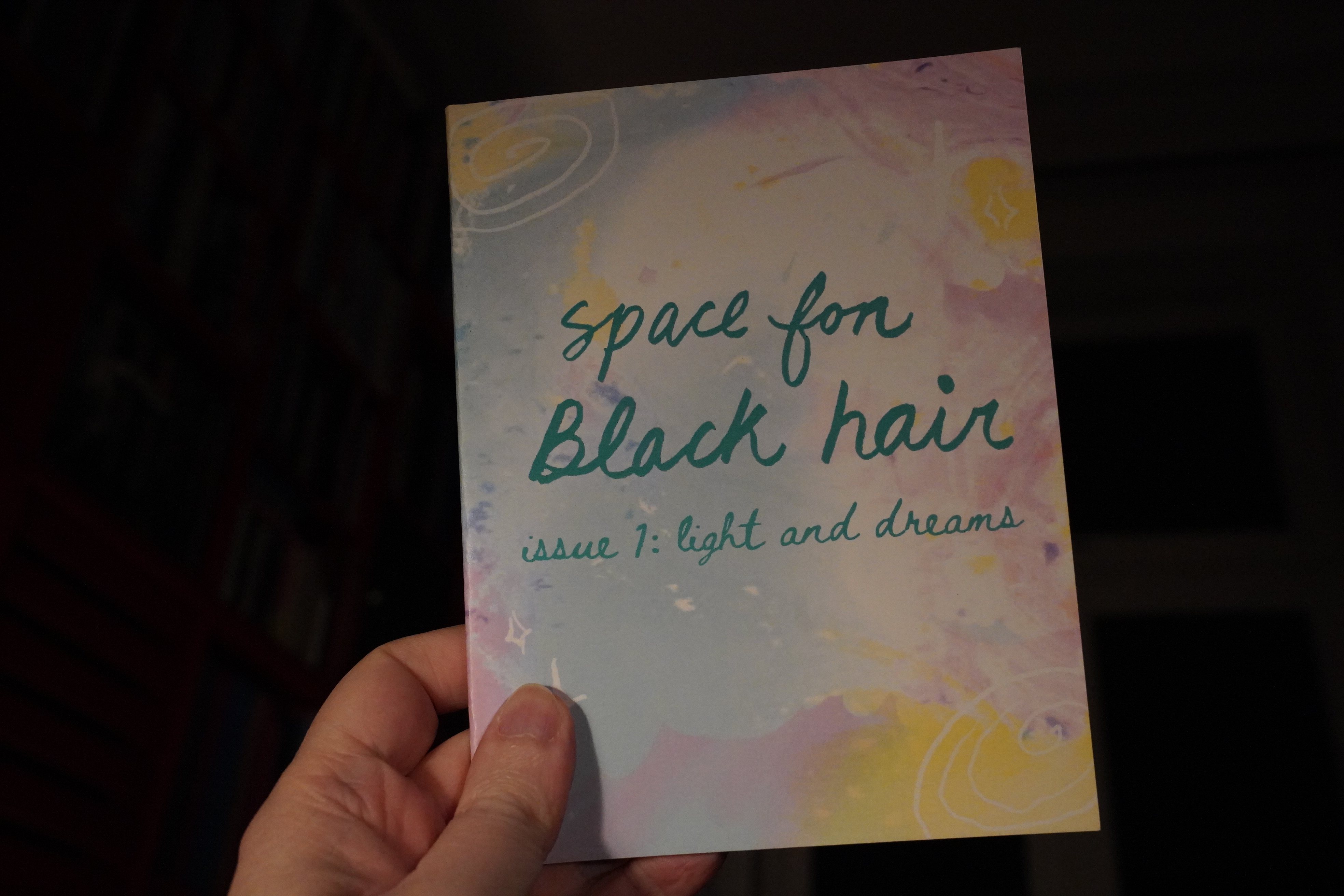
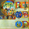
22:47: Space For Black Hair #1 edited by Sabrina Sims
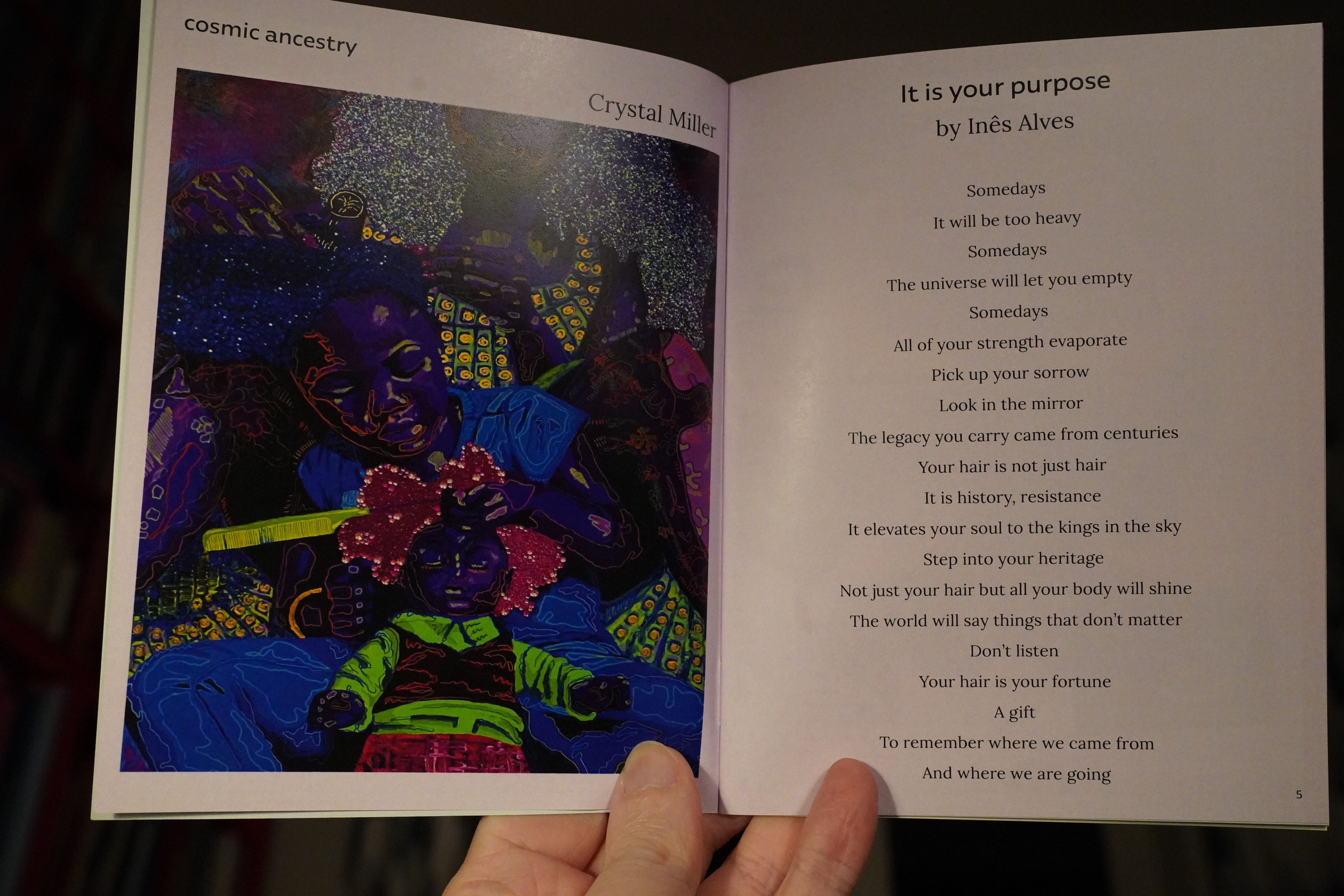
Hey, this isn’t a comic book…

Of course, I’m an expert on Black hair after reading Hot Comb by Ebony Flowers the other year, but this fanzine was still kinda fascinating.
| Tuxedomoon: Pinheads on the Move |  |
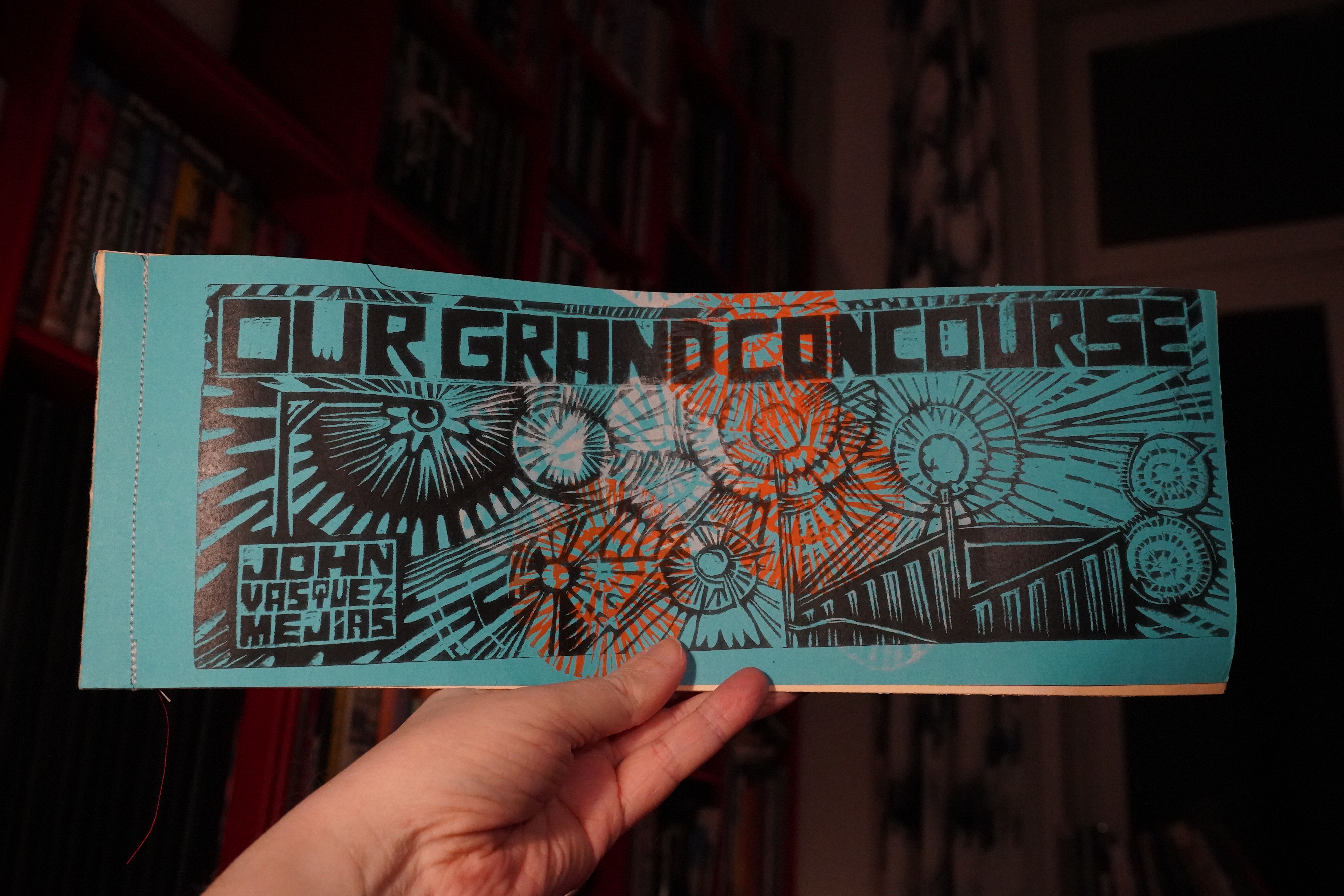
22:59: Our Grand Concourse by John Vasquez Mejias
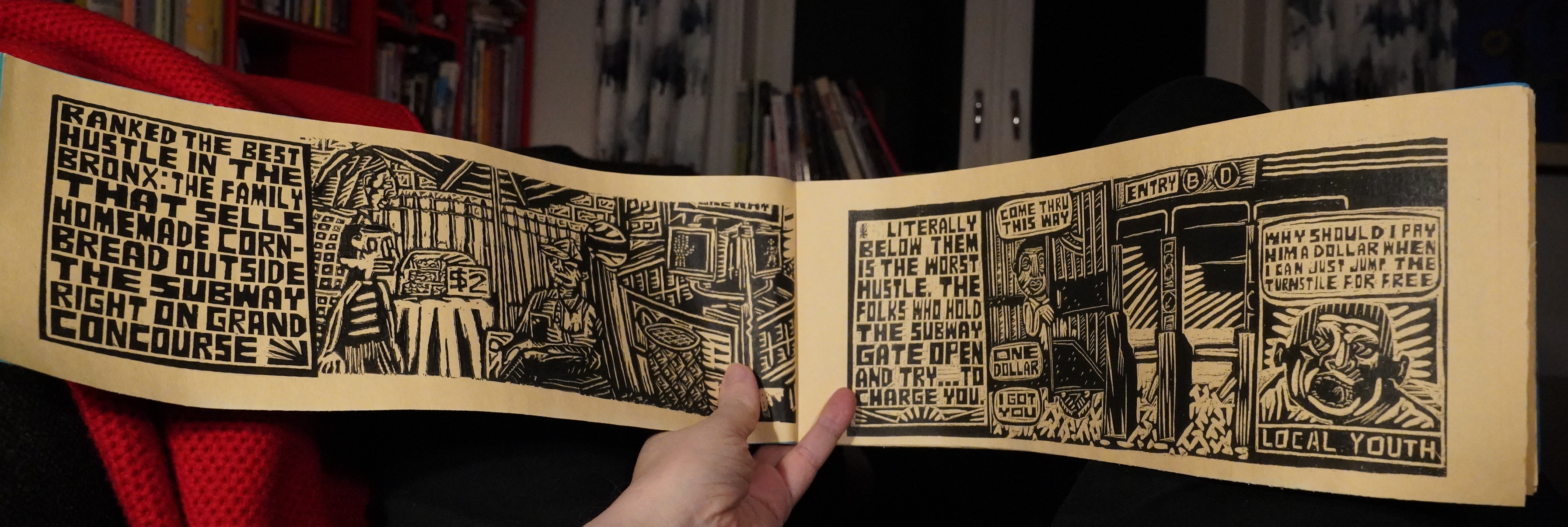
This is a very wide and narrow book, apparently printed from woodcuts?
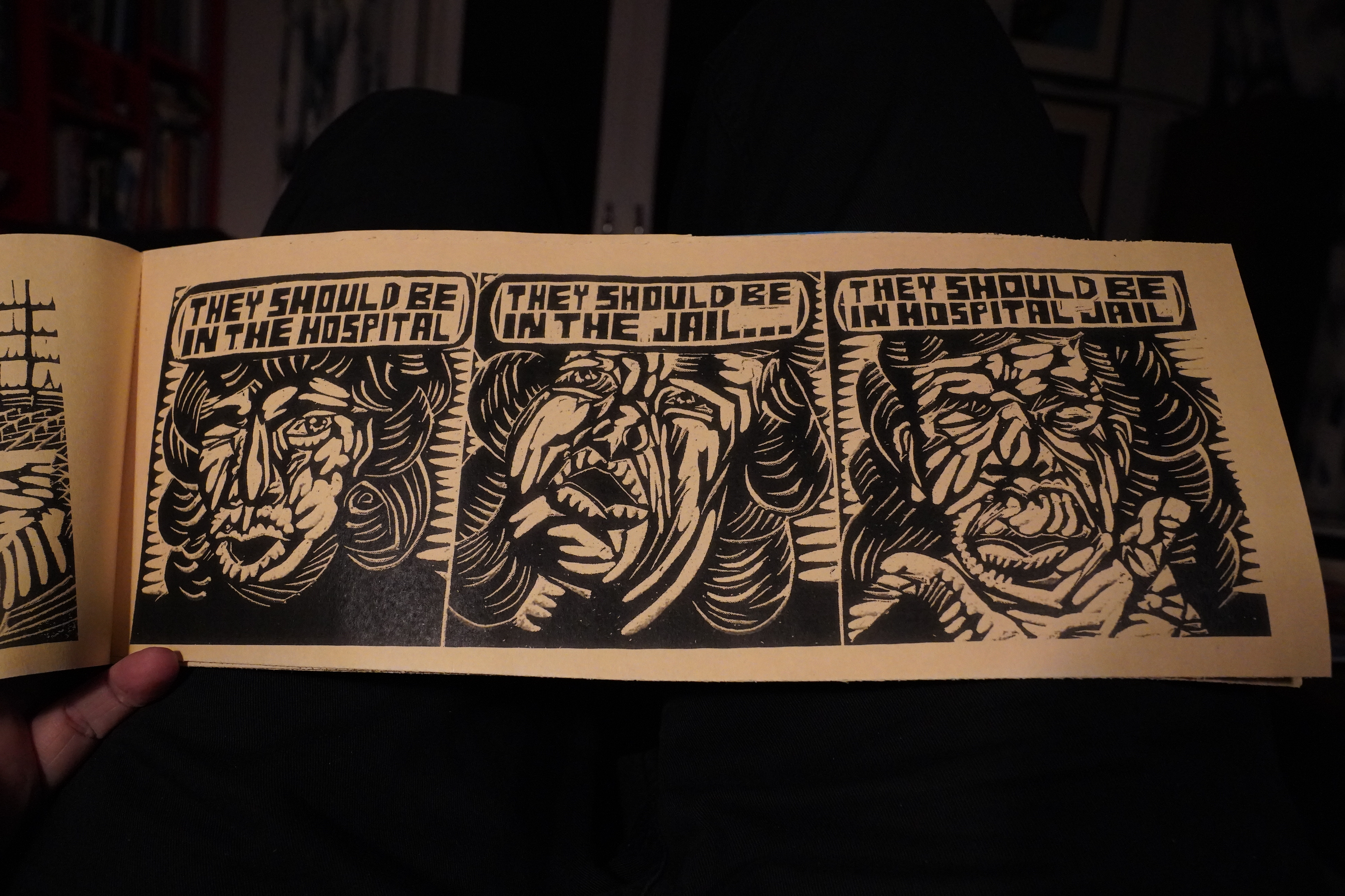
It’s totally and utterly brilliant.
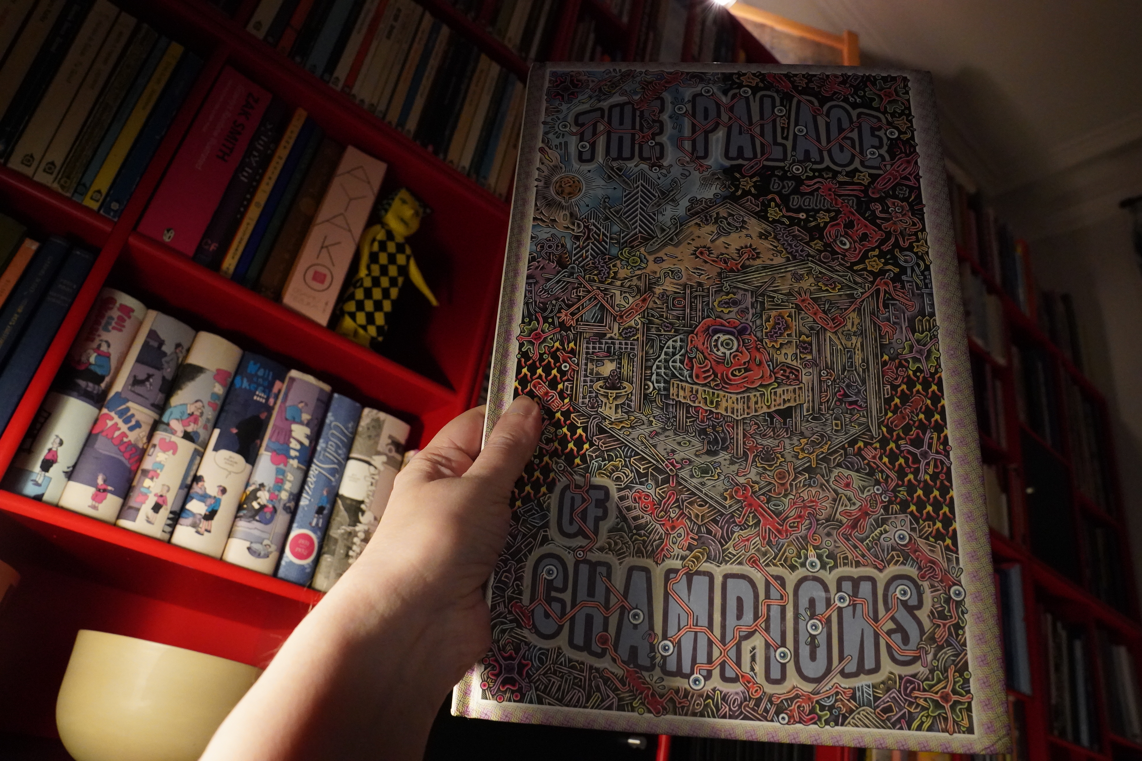
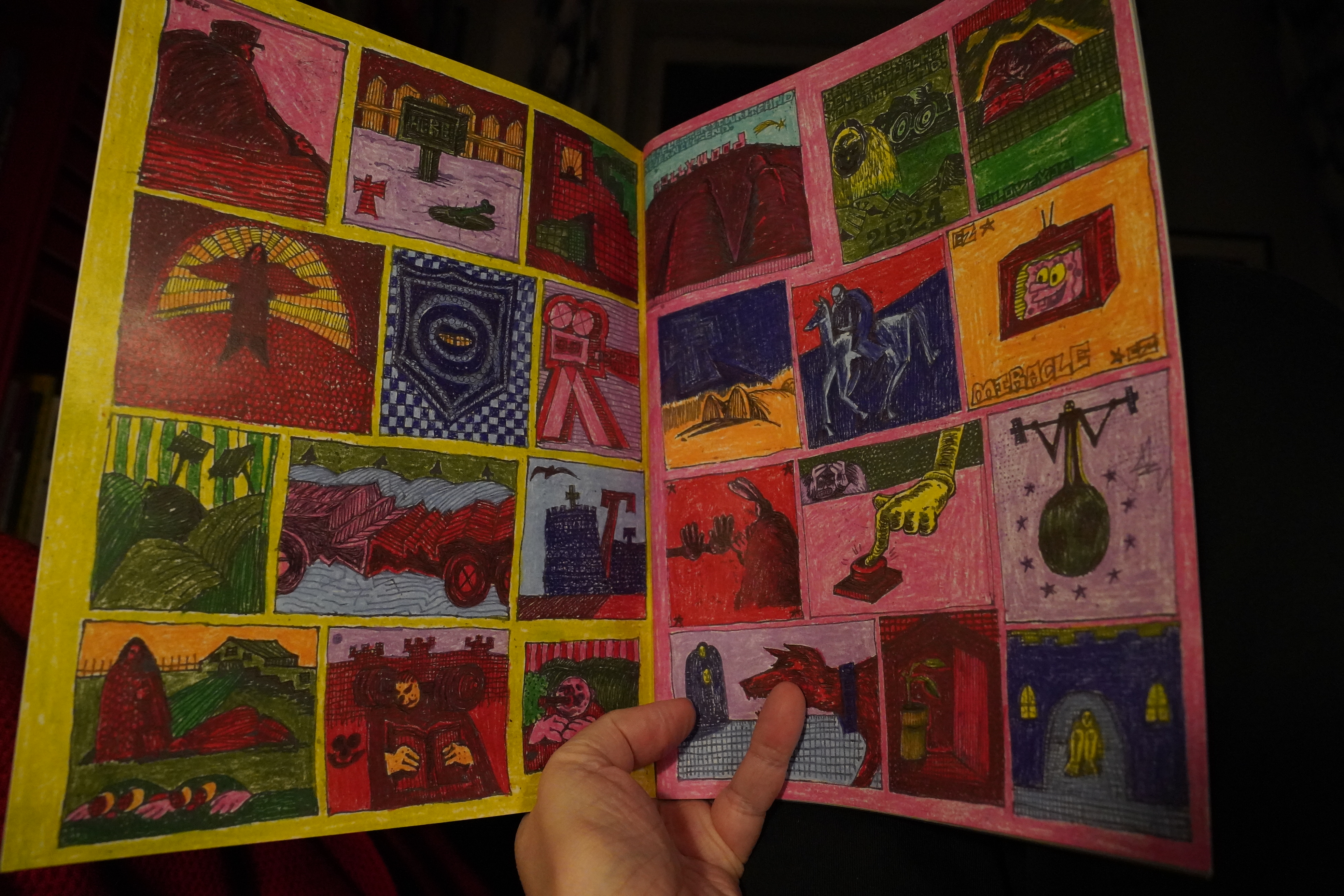
23:11: The Palace of Champions by Henriette Valium (Conundrum Press)
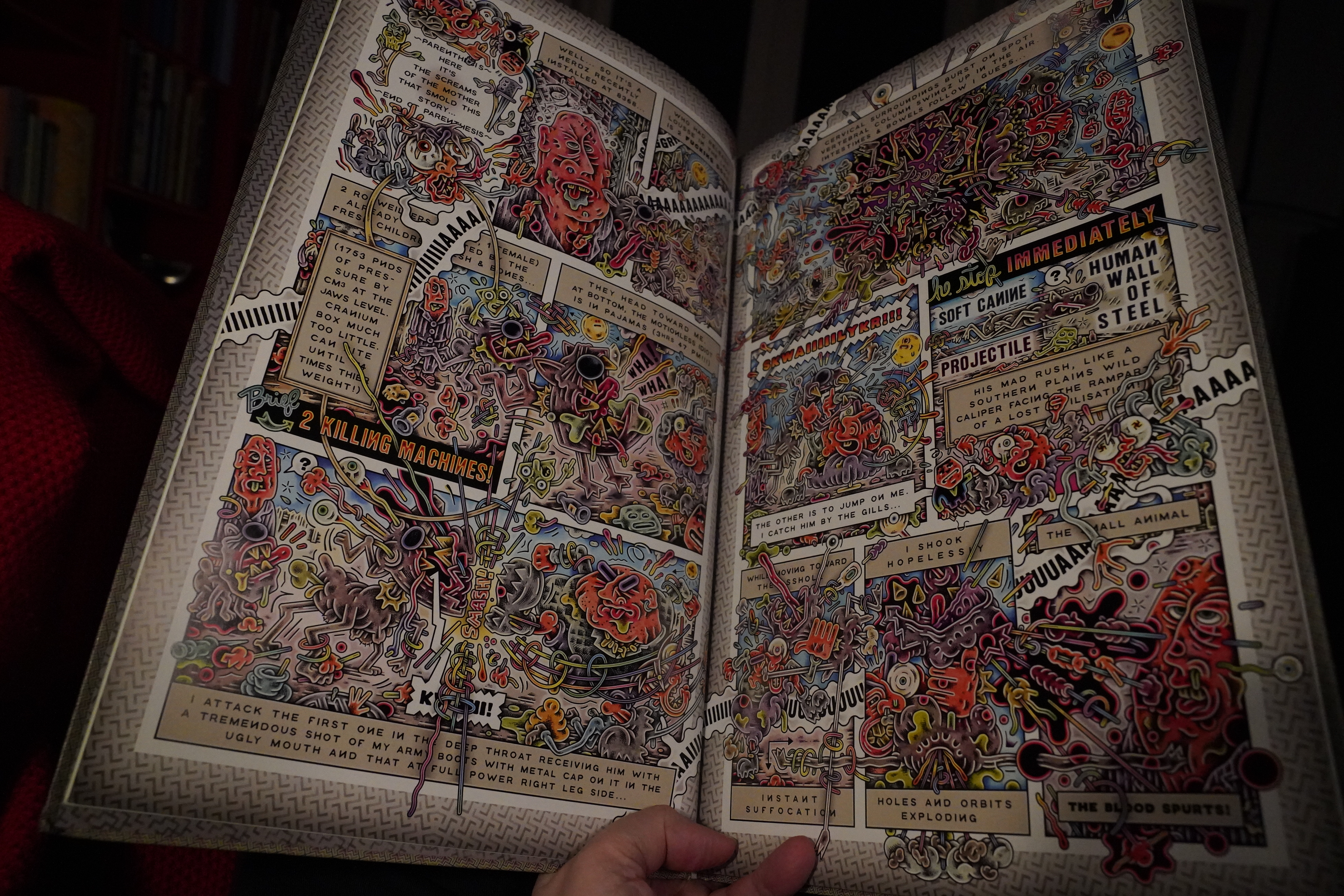
I kind of more admire Valium’s comics than I enjoy them? I mean, I like them fine, but I’m kinda flabbergasted at the sheer amount of work he puts into them, and then I’m otherwise not that interested, really?
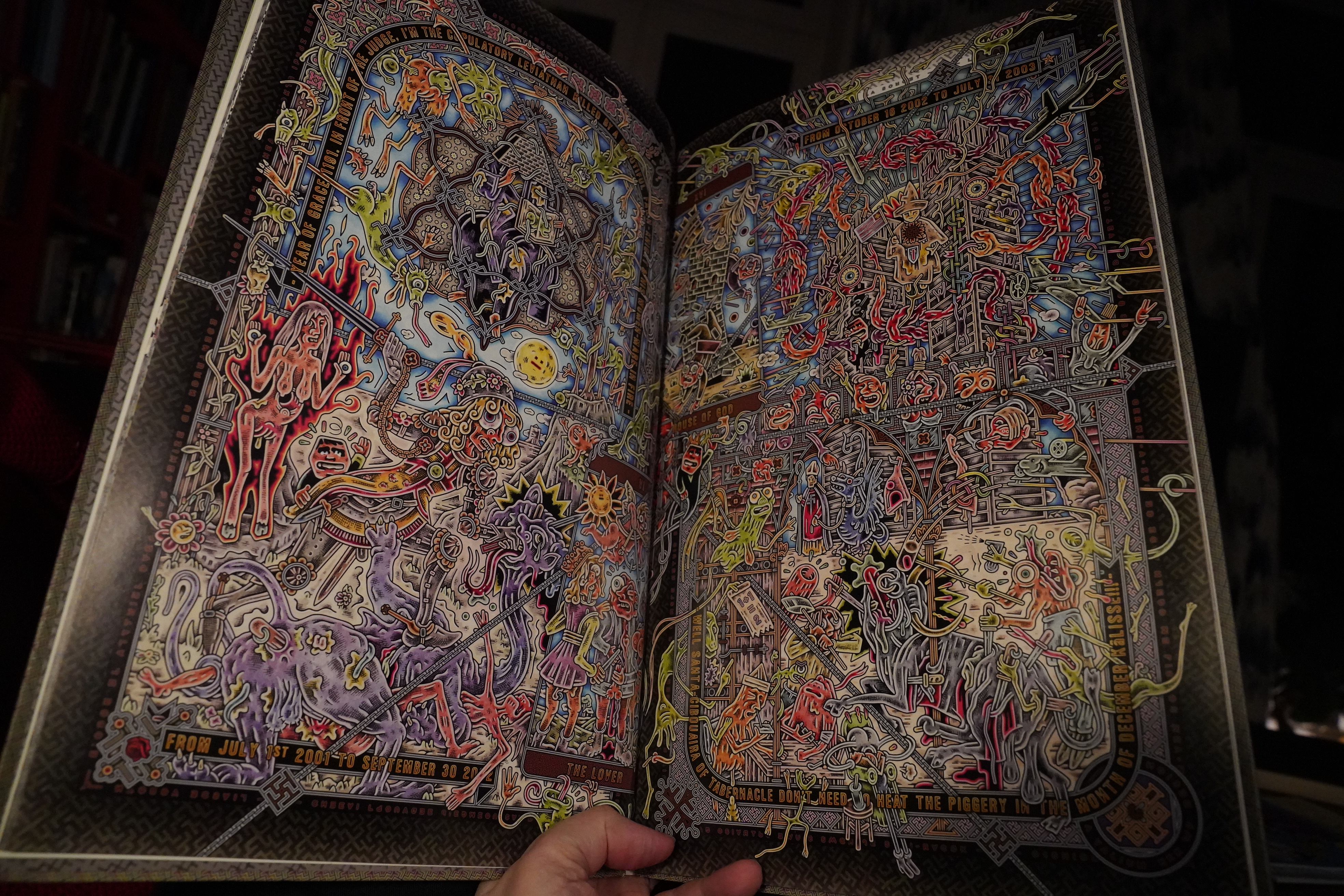
I can totally see people spending hours over these pages, teasing out all the details, but that’s not my thing.
And I guess these pages were mostly done in Photoshop? His 90s black and white stuff was more gnarly. (Gnarly’s good.)
| Tuxedomoon: Pinheads on the Move |  |

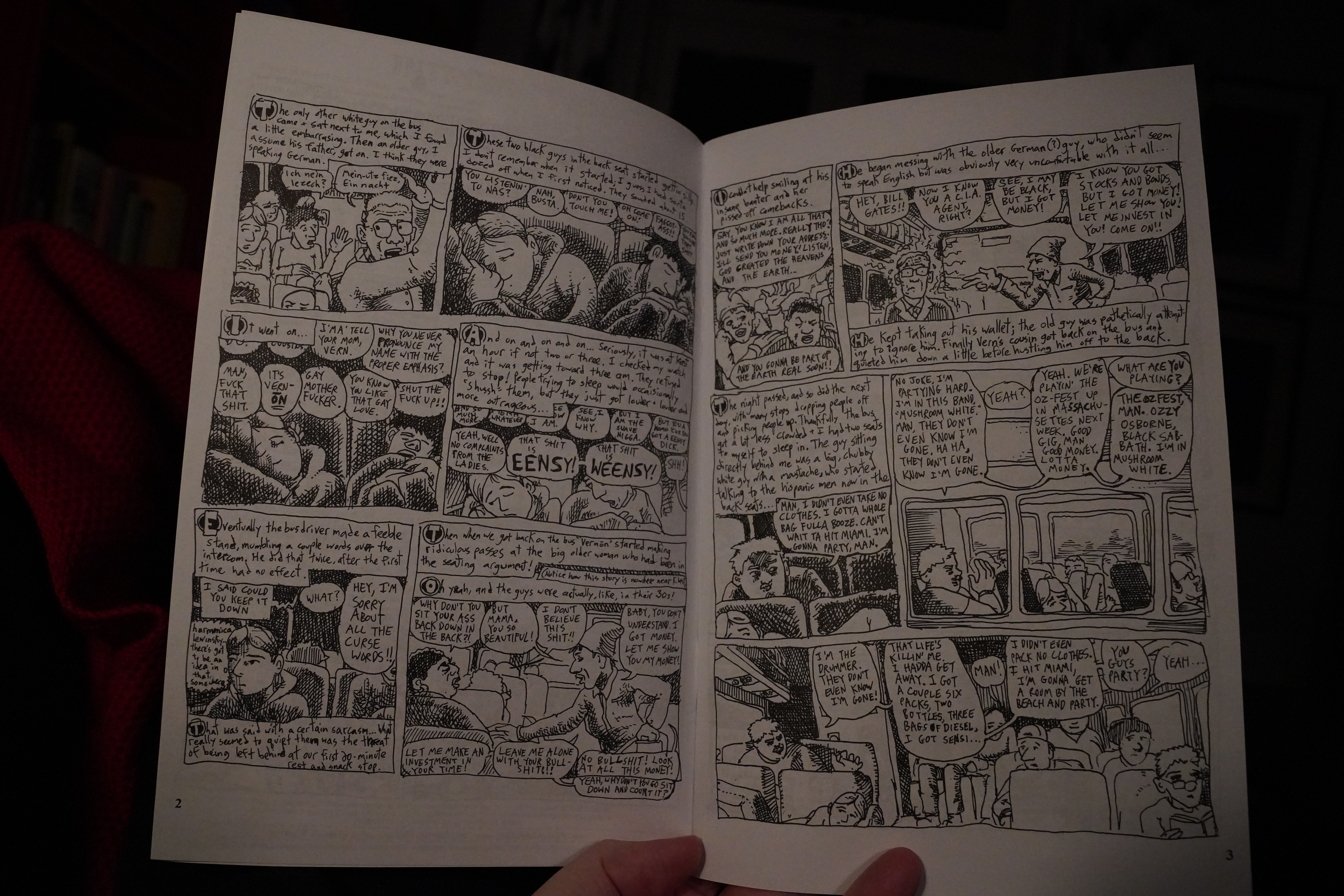
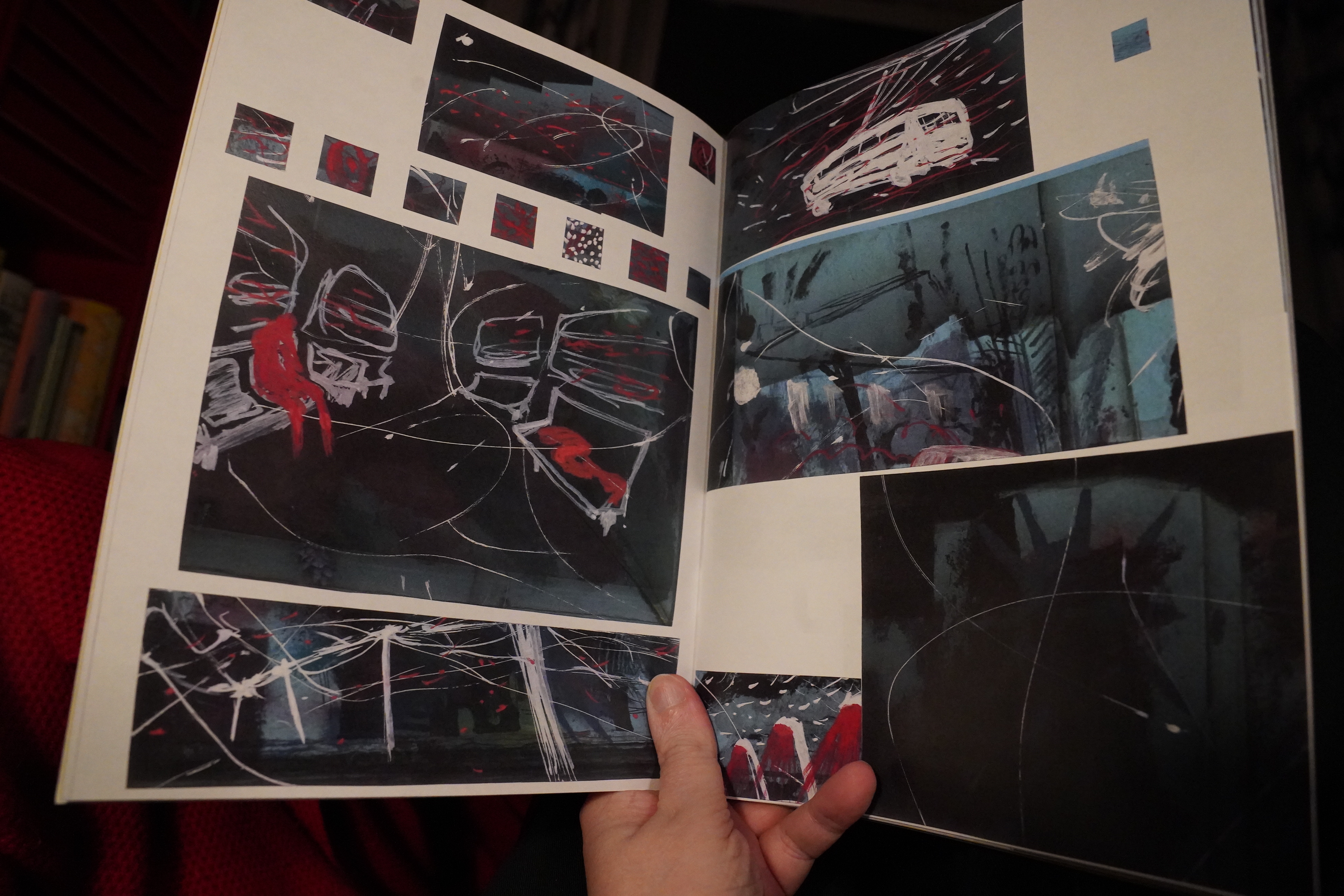
23:41: Fuff #1 & Trip To Key West (And Back) 1999 by Jeffrey Lewis
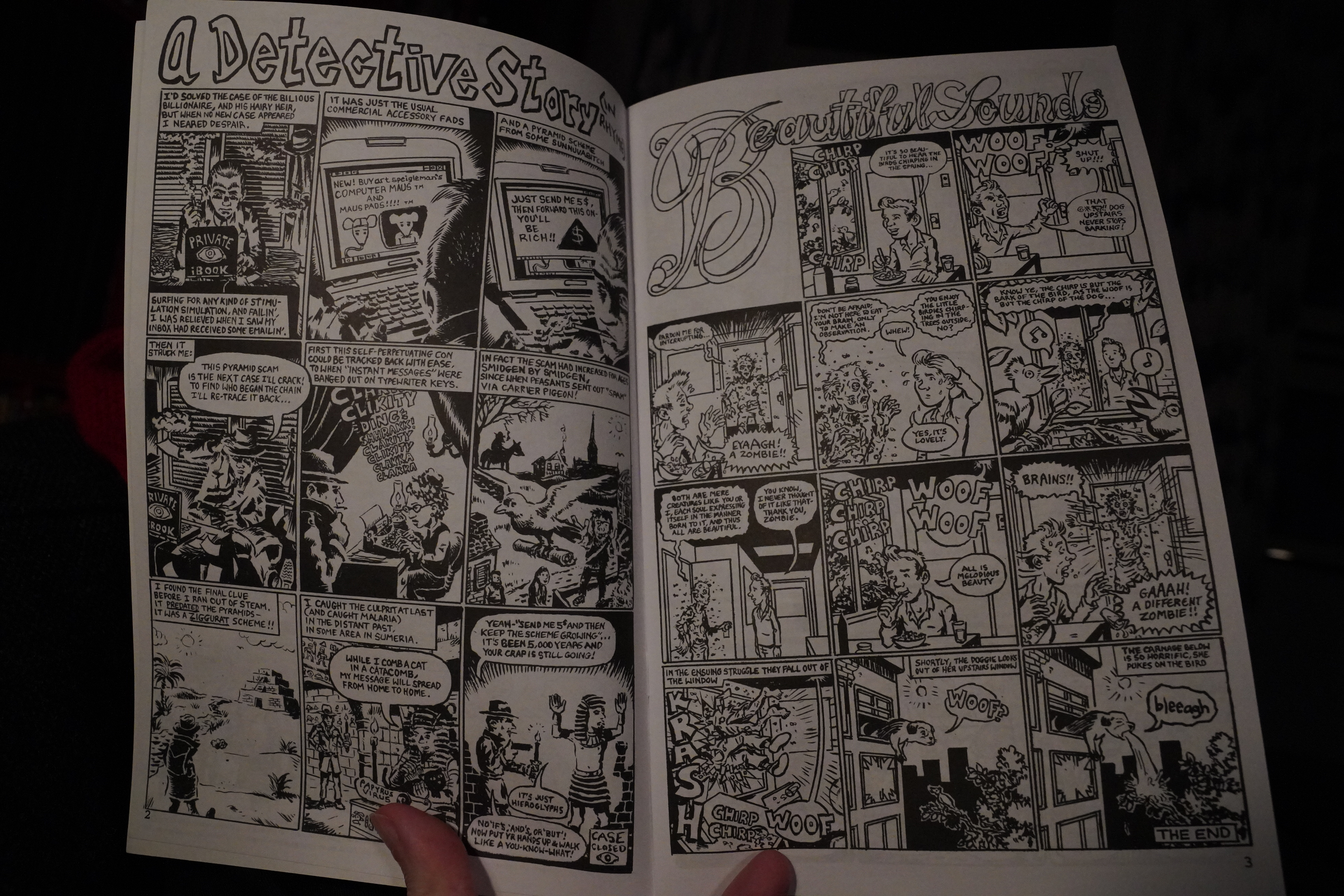
This is hilarious. So silly yet so well-timed.
And the autobio stuff is engrossing. Just looking at these pages, they look kind of impenetrable and messy, don’t they? But they read really well.
The inside front cover says that this is the fifth printing, and about 10K copies have been printed in total? That’s pretty unique for a self-published comic-book comics these days, but I can totally see why.
I’m getting the entire 13 issue run now. … There. Done.
| The Cure: Kiss Me, Kiss Me, Kiss Me |  |
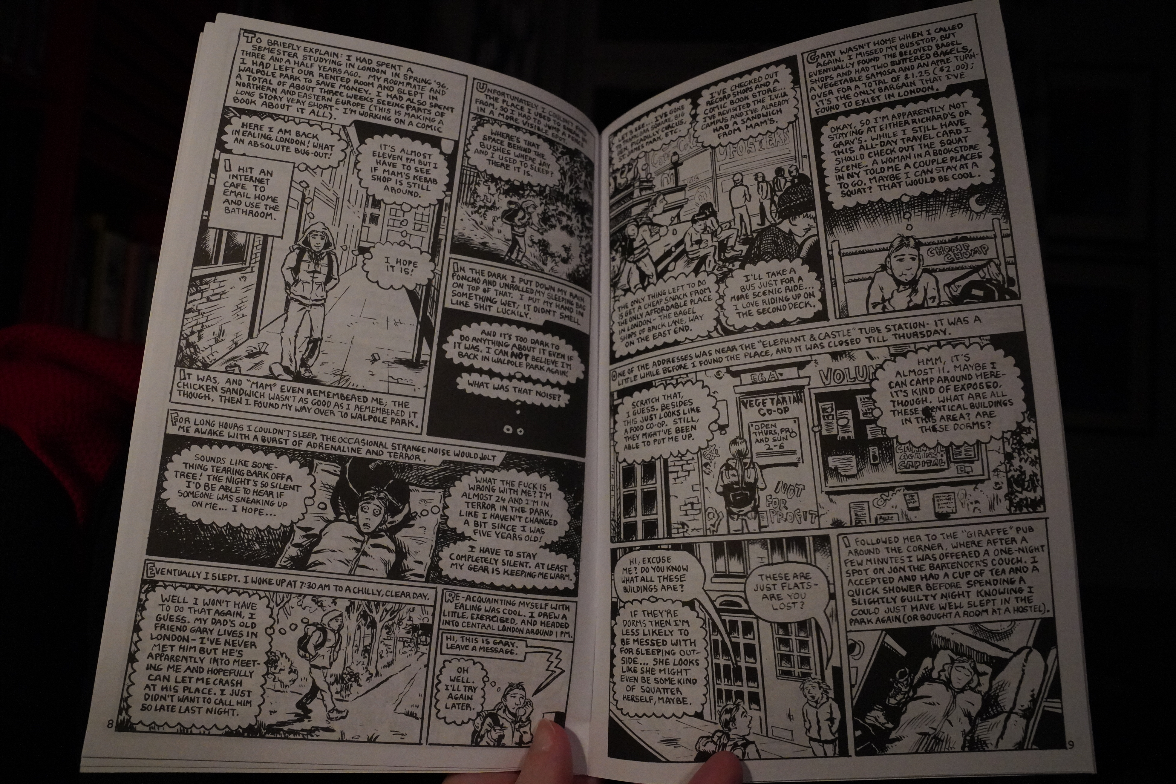
The Key West book is earlier work, and the artwork’s rougher, but still kinda charming? And it’s got an exciting unmediated feeling to it? As if it’s unfiltered and drawn as experienced? I mean, nothing ever is, but that’s how it reads. It’s really entertaining.
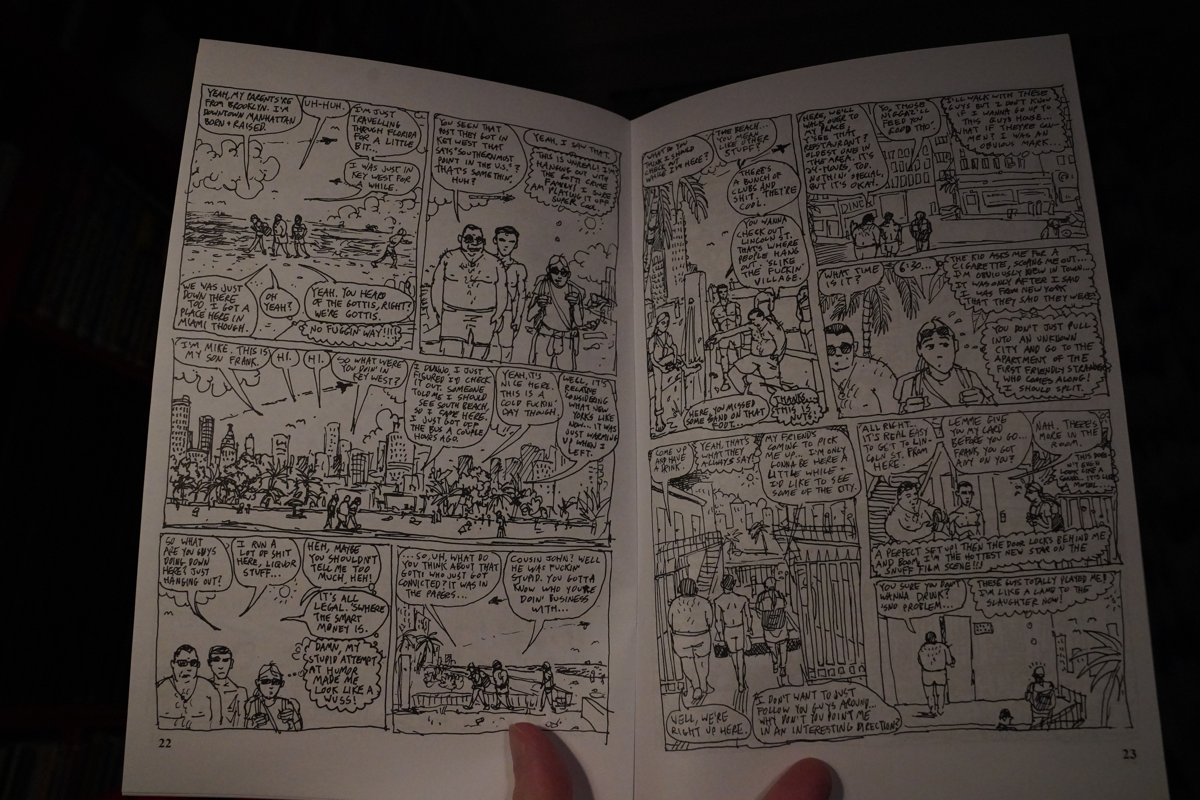
He sure does end up chatting with … interesting people.
Anyway, it feels like a fresh take on a straight-up autobio comic.
| Dead Can Dance: Within the Realm of a Dying Sun |  |
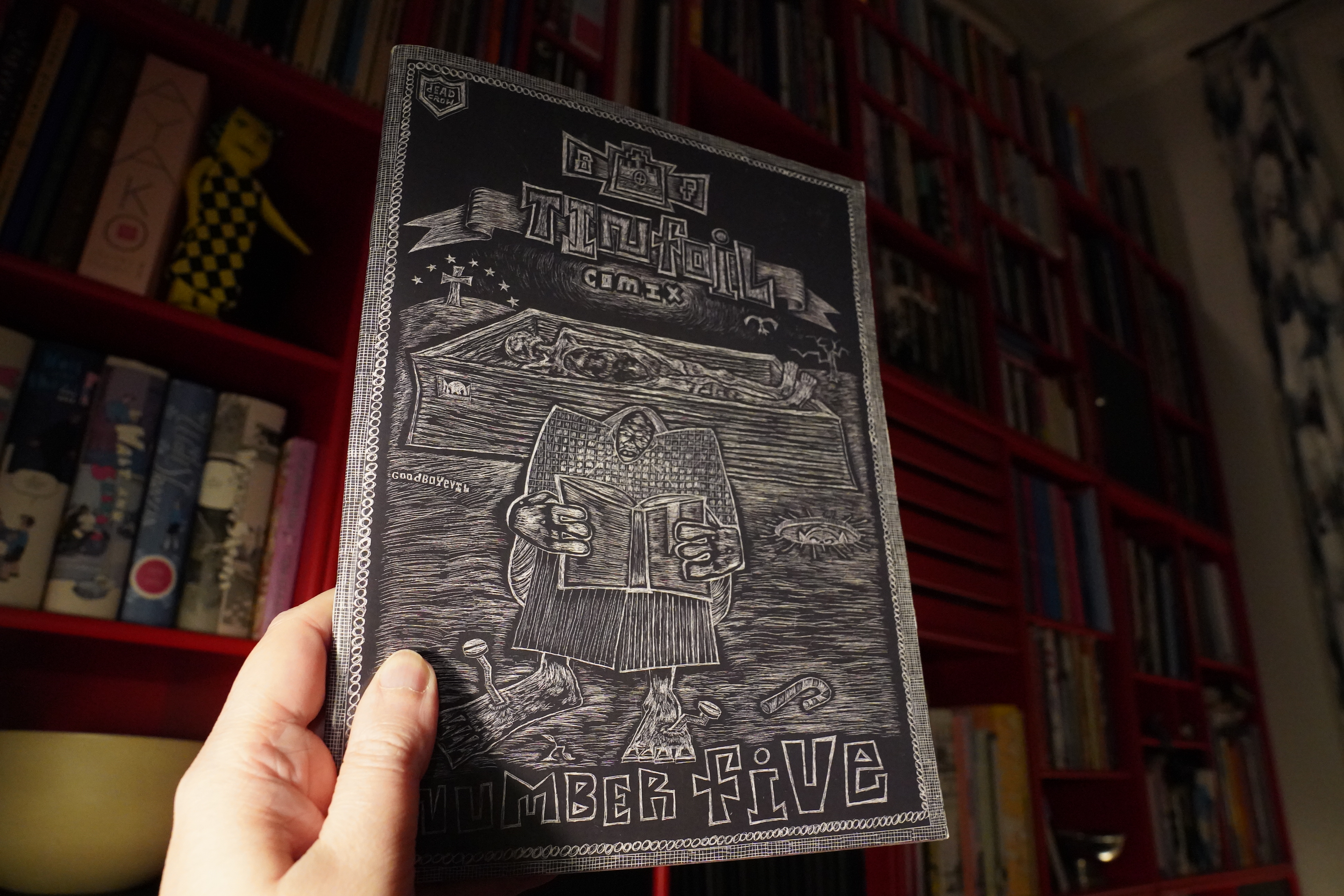
01:25: Tinfoil Comix #5 edited by Floyd Tangeman (Domino Books)
This anthology reads very nicely — it’s a mixture of non-narrative…
… and somewhat-narrative strips that all have gorgeous artwork. My one gripe is that the editor could have made it clearer who did what: The contributors are listed in order, but you have to be really good at maths to see who did what. (Three plus one is er herp derp I eat paste.)

This might be Sasha Cravis? Somehow unnverving as well as beautiful.
OK, I should be going to bed soon… I’m exhausted from all this comics reading…
| Dead Can Dance: Within the Realm of a Dying Sun |  |
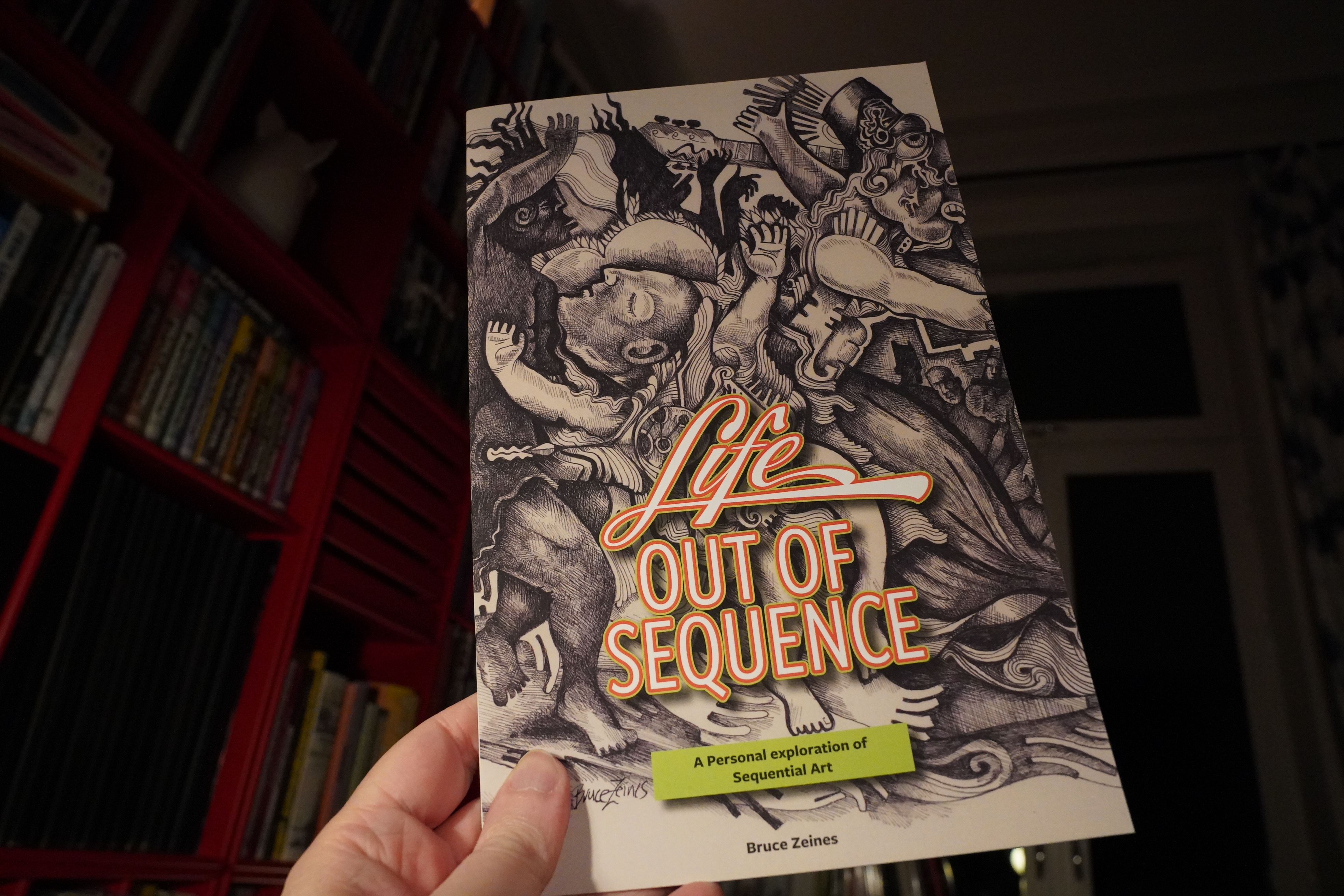
01:42: Life out of Sequence by Bruce Zeines
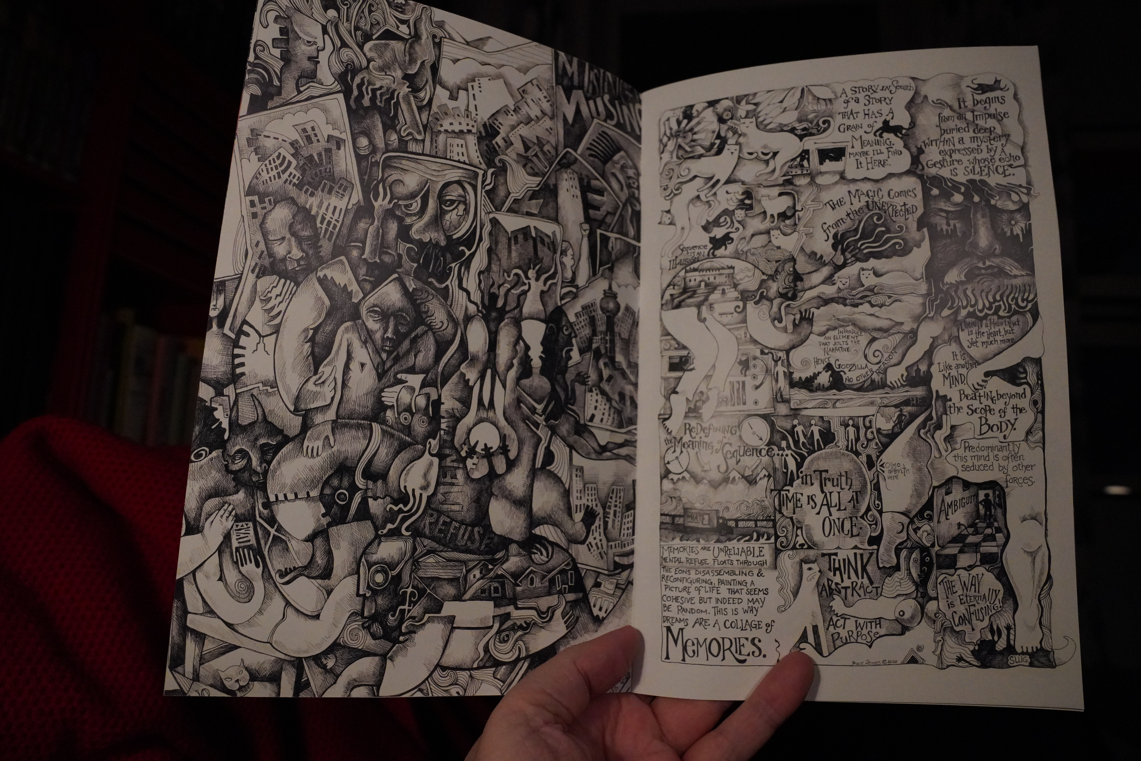
Wowzers.

Very intricate and appealing.
| Andrew Poppy: Alphabed |  |
01:51: The End
But now it’s definitely time for bed. And there’s like a third of the books from Domino left! *waugh*
Well, it was a good batch of books, eh?


%3A+The+'Mercury'+Demos)


+(Remixes))
)
)


+(1))
+(2))
)
)
)