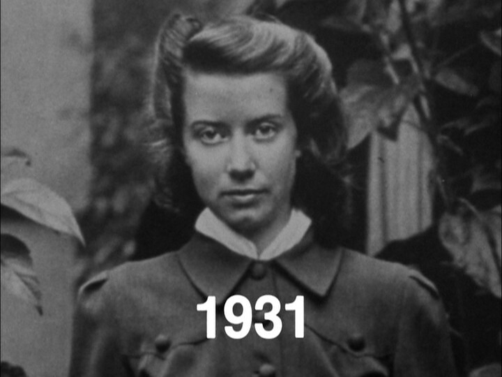
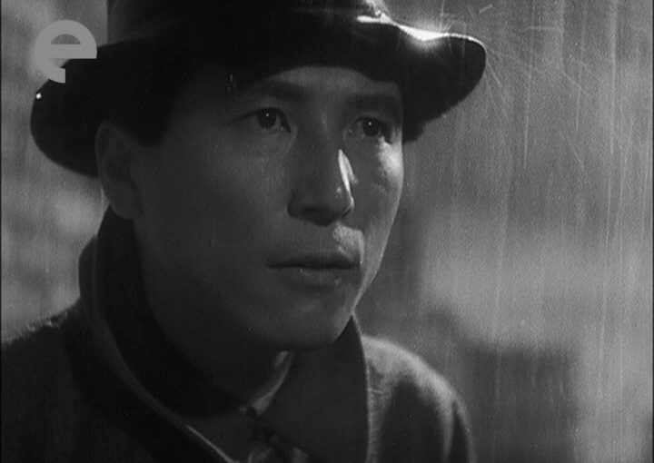
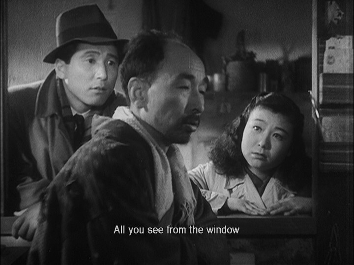
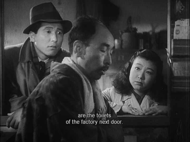
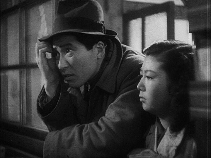
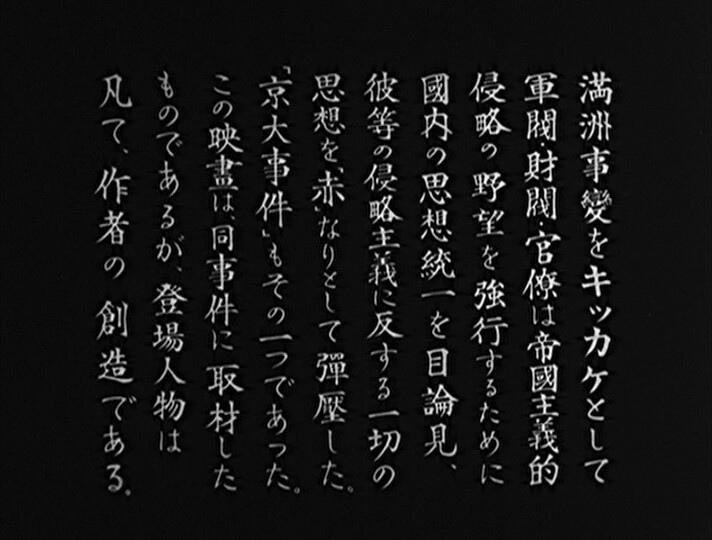
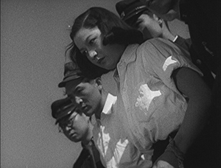
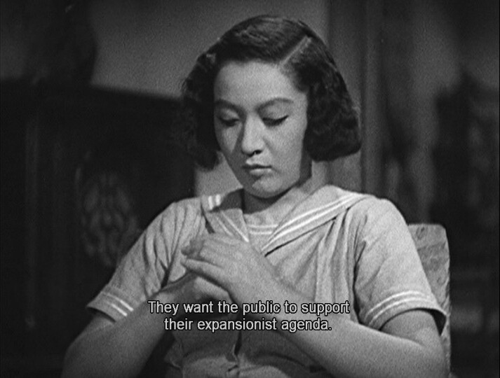
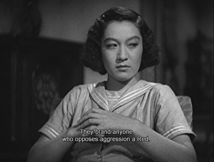
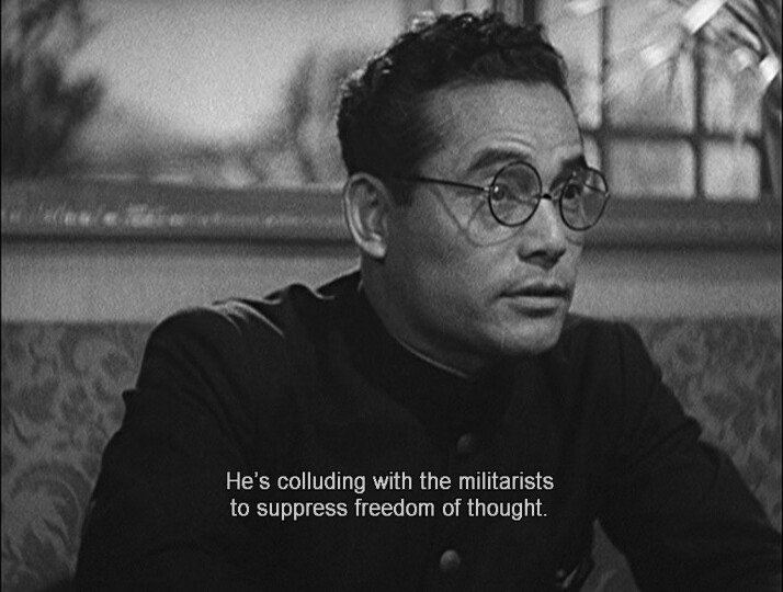
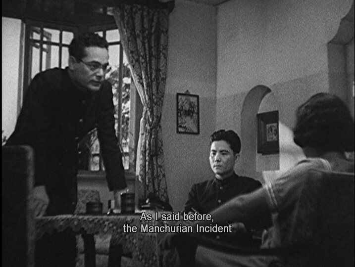
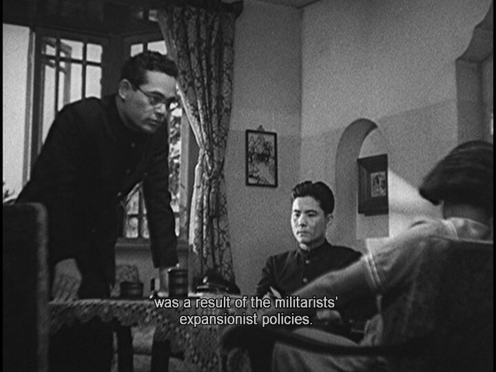
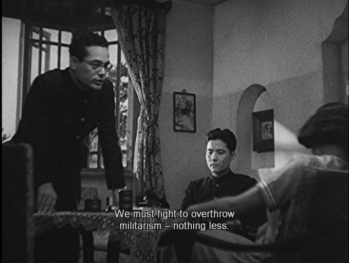
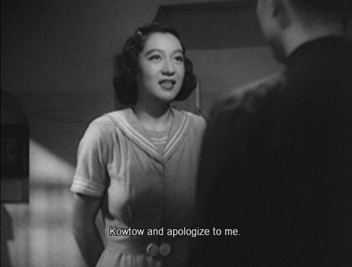
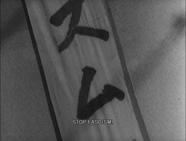
I guess I’m surprised that this is so… that this is didactically explaining that the previous Japanese gummint were cads and scoundrels and that the Japanese invasion in Manchuria was a crime.
I mean, was that something that would be a hug box office draw in Japan, a year after Nagasaki?
Or was this financed by the CIA? They financed a lot of cool stuff in the post war years, like The Paris Review. (A bit.)
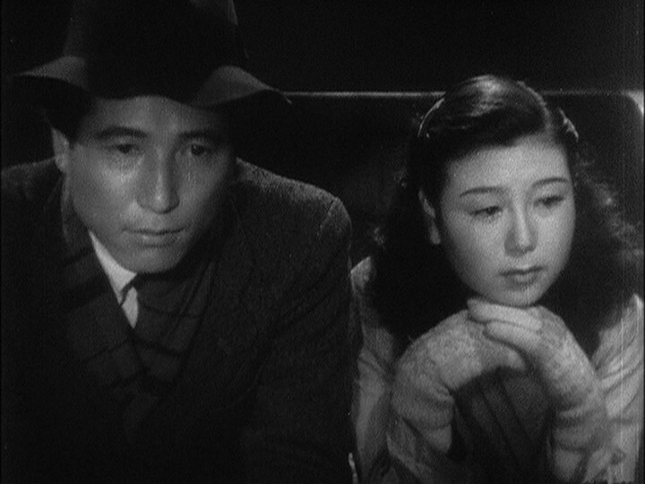
The lines are so naturalistic.
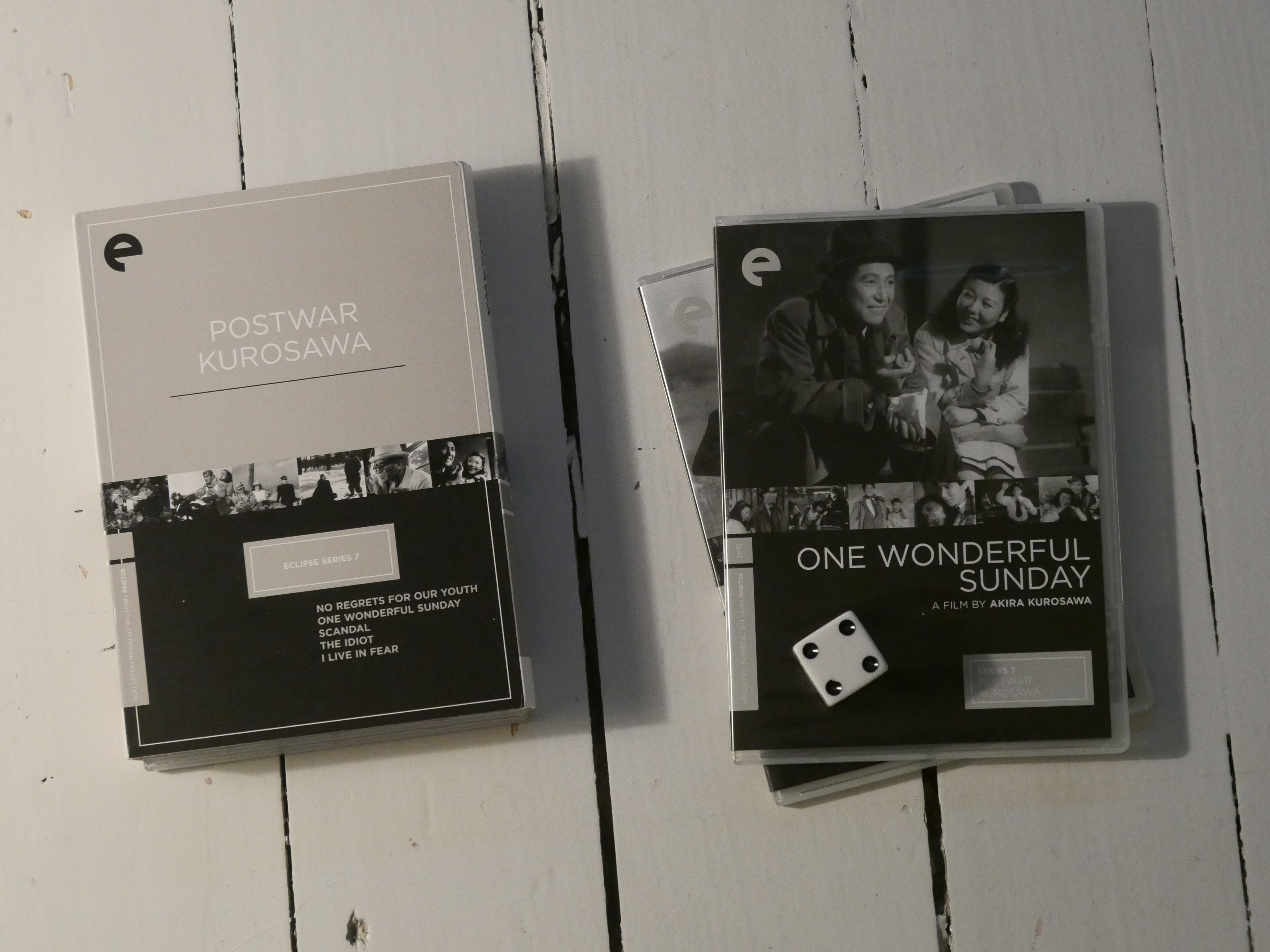
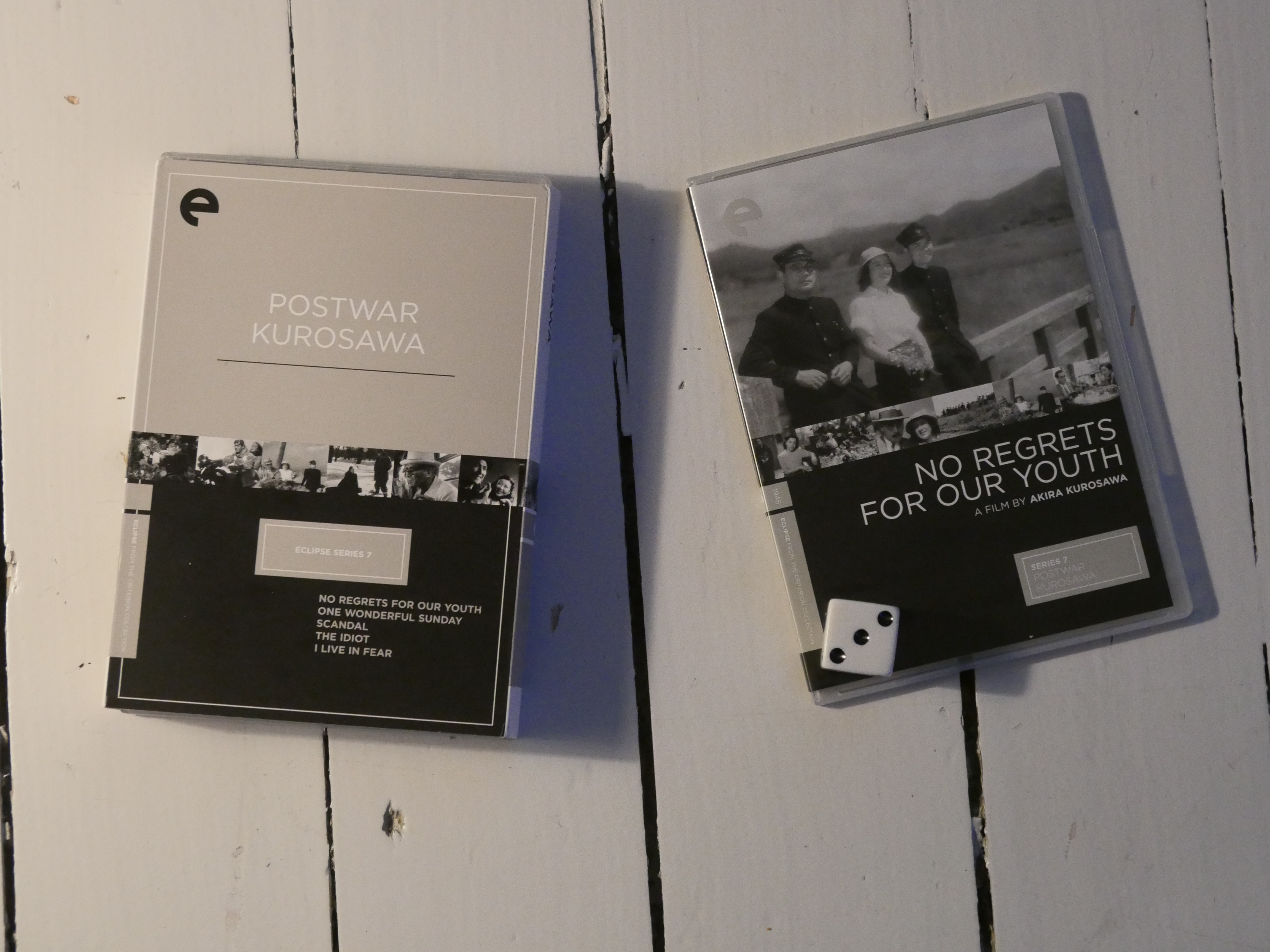
I was excited to start this box set, because I’d forgotten that there were Kurosawa box sets in the Eclipse series. (Yes — two!)
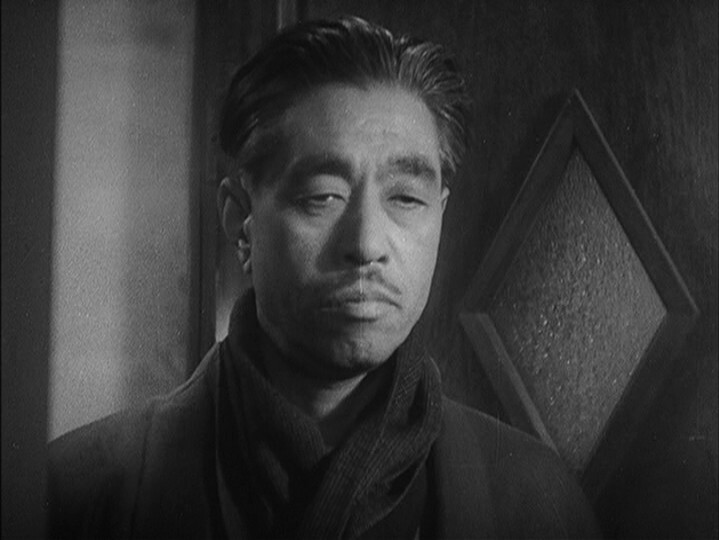
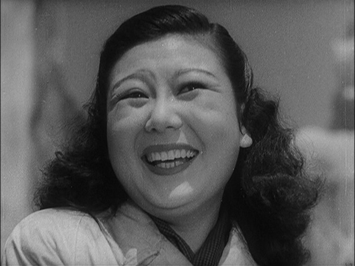
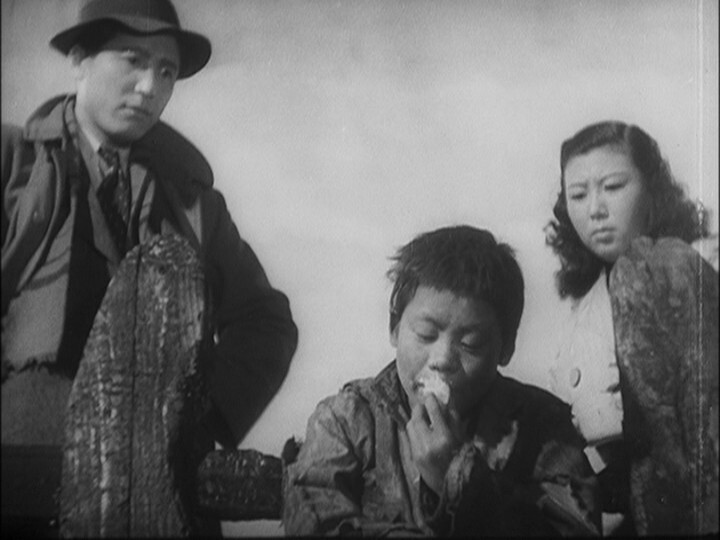
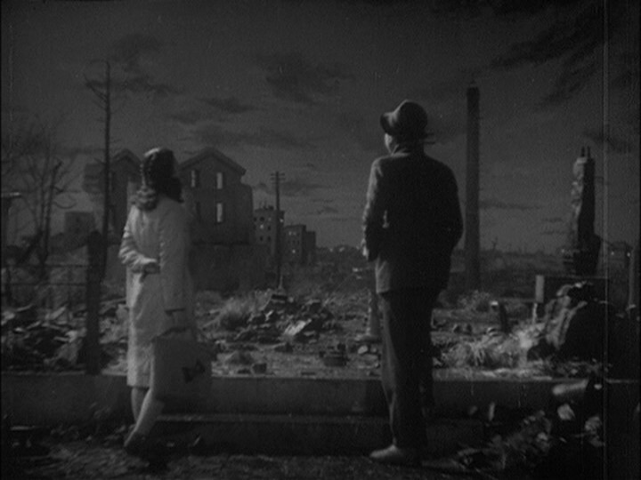
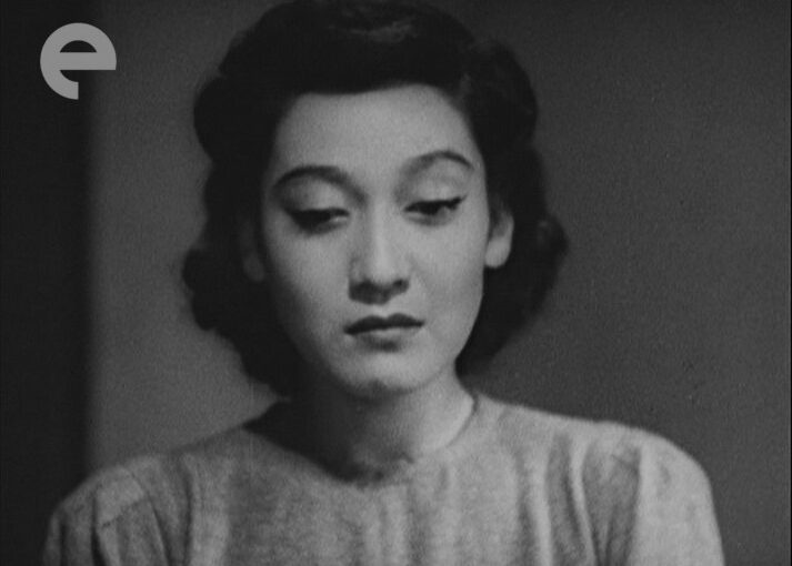
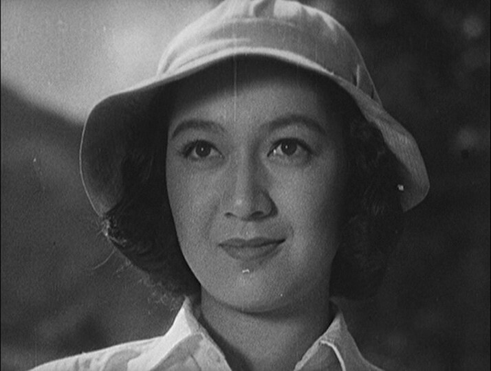
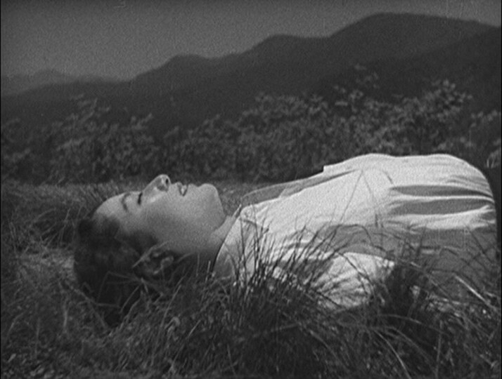
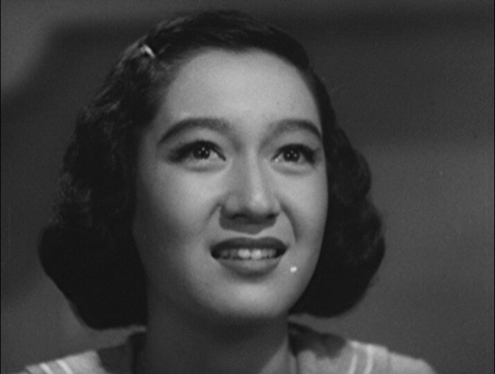
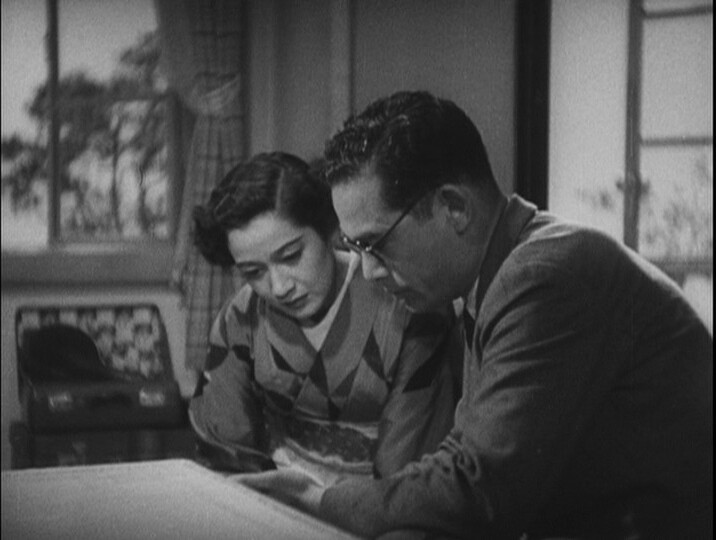
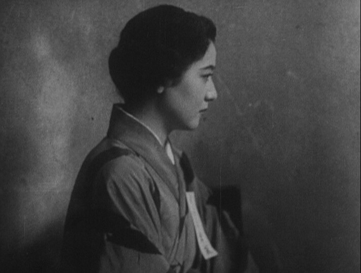
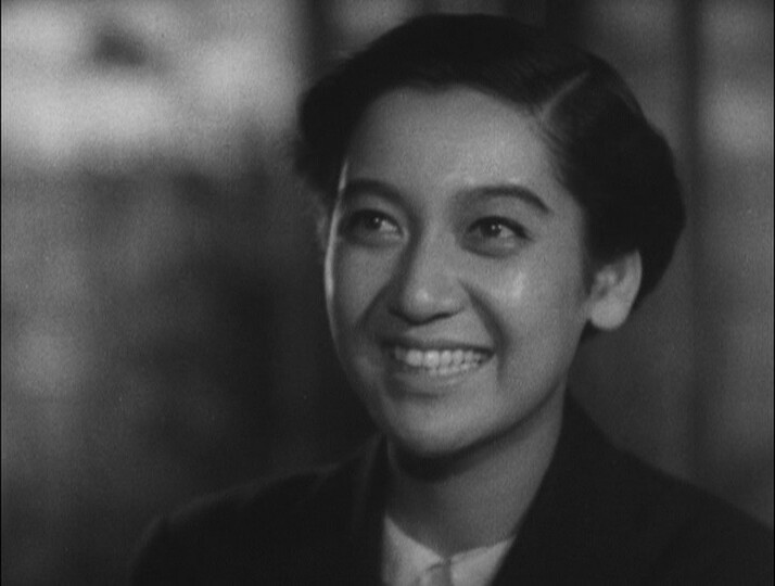
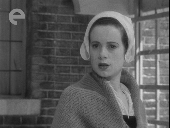
And this film does have fine scenes. And the lead, played by Setsuko Hara (star of Officially The Best Movie Ever, Tokyo Story) is fantastic.
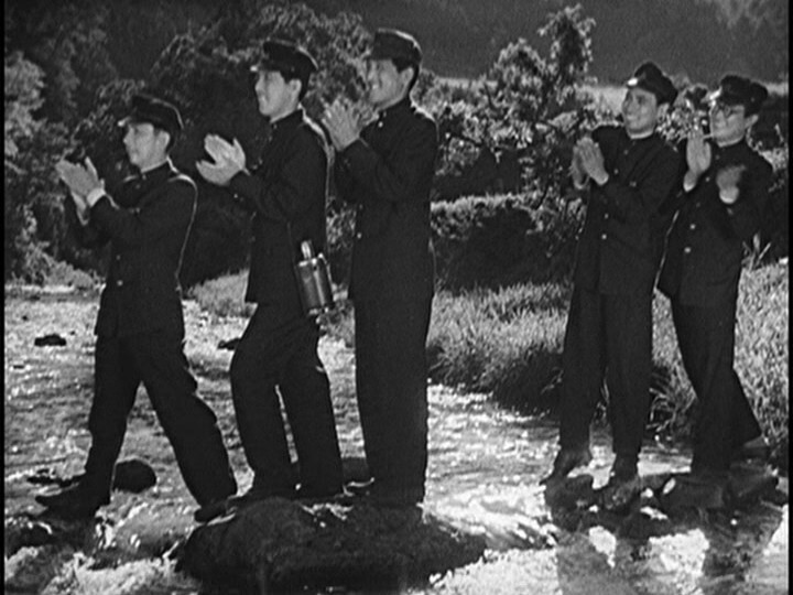
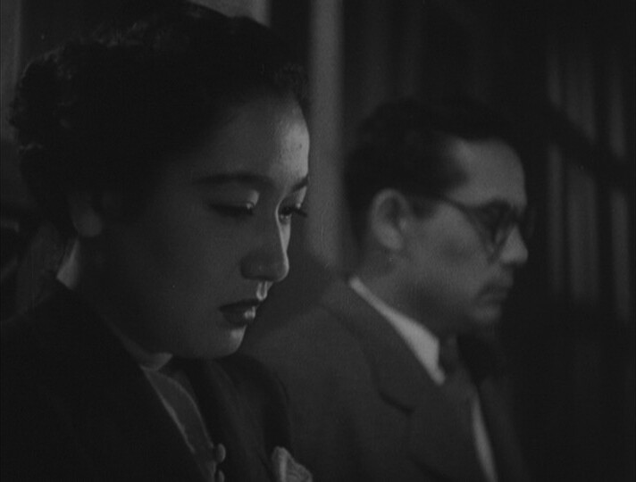
But this isn’t a good movie. It seems more like a sketch towards a movie. A demo tape of set pieces later to be stitched into a something. It is an early Kurosawa movie, though, and he got acclaimed later — for good reasons.
Is that true today, I wonder? (Substitute billionaire.)
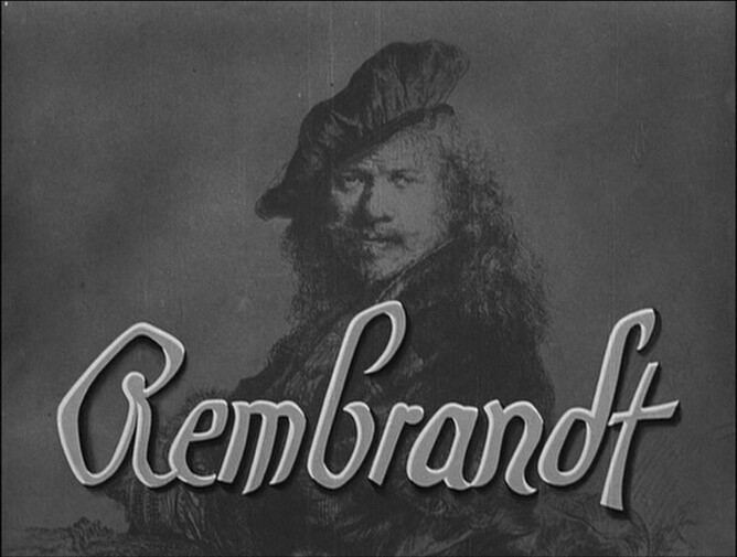
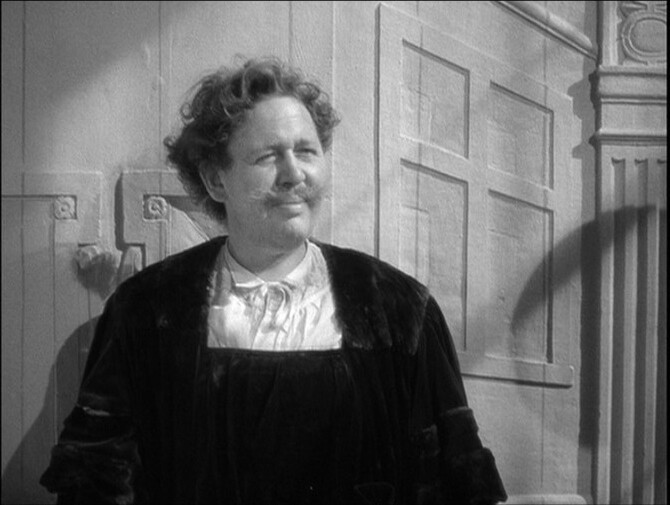
Well, that’s an original way to start one of these movies — with Rembrandt well established, rich and surrounded by fans.
Most amiable.
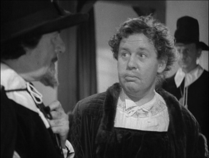
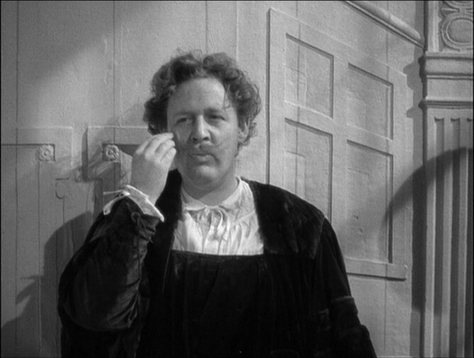
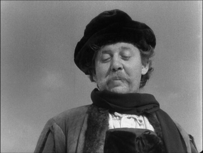
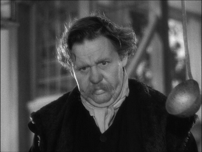
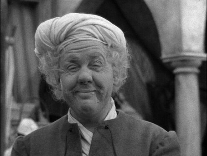
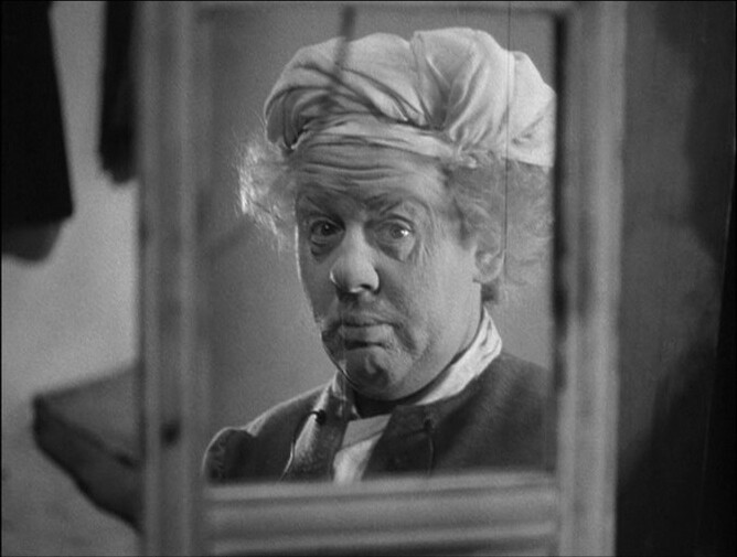
Laughton is wonderful in this. His mannerisms are so precise and fit with the character he’s playing perfectly.
And also fits the movie — this isn’t one of those high powered docu dramas. You know, one of those that tries to fit a narrative to a life? Instead, it sort of meanders? In a very pleasant way.
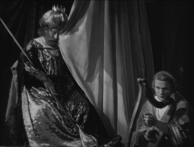
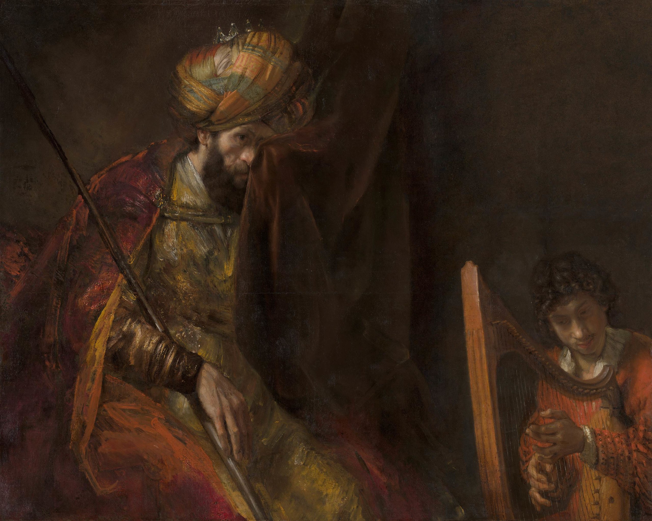
Some of the pacing reminds me a bit of Bergman’s lighter 50s movies, so I’m guessing he was a fan.
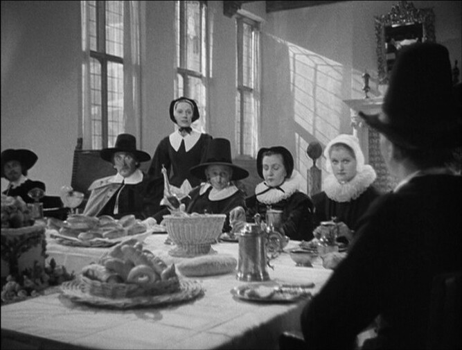
And they’re having great fun recreating the tableaux from Rembrandt’s paintings:
Tee hee.
This movie is great — easily the best of the four Korda-related movies in this box set.
Alexander Korda had an interesting career. It seems like about half his movies were box office smashes, and half bombed. (This was a bomb.) But it’s not like there’s a huge difference between the films. OK, the Henry VIII film had a built in attraction in being called “The Private Life of” and being about a scandalous king. But it’s not like it was a sex romp anyway.
This is a meandering, melancholic movie, so I can see why it wouldn’t be a good date film. But still… there’s a lot of fun in between the sad bits.