But what is this?

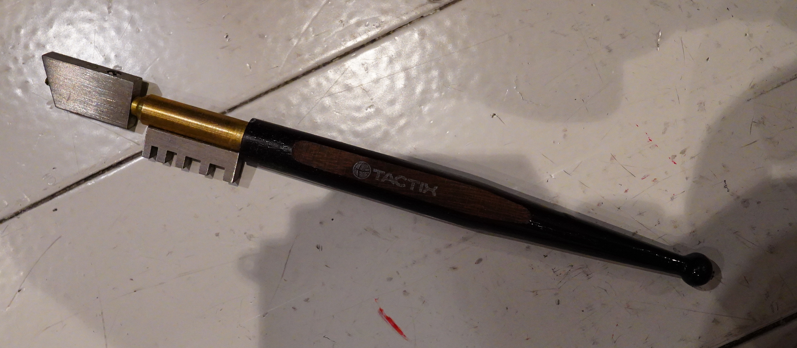
It’s mighty mysterious.

And this is an… electromagnetic radiation tester? Is that something I need?
(I’m tidying up the Cupboard of Tools and Mysteries.)
There seems to be an uptick in the number of articles about just how hard it is to watch movies these days? The story usually starts with the writer lethargically scrolling through the offerings on Netflix or HBO Max, either finding nothing that they want to see (in the Netflix case) or finding stuff that doesn’t seem to be too urgent to see (in the HBO Max case), but always ending in the writer just putting on another episode of Married With Children instead.
I mean Frasier. Never Married With Children. Sorry. Always Frasier. If only this keyboard had a delete key.
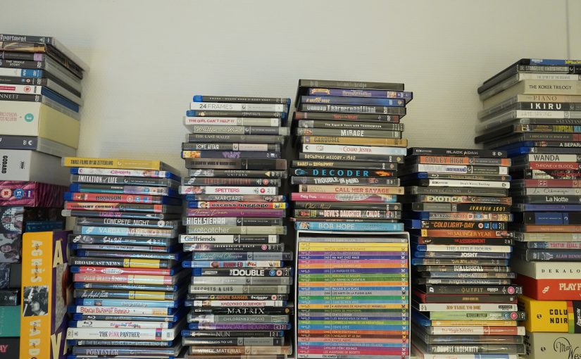
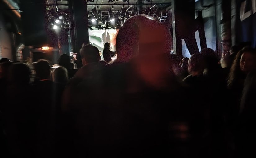
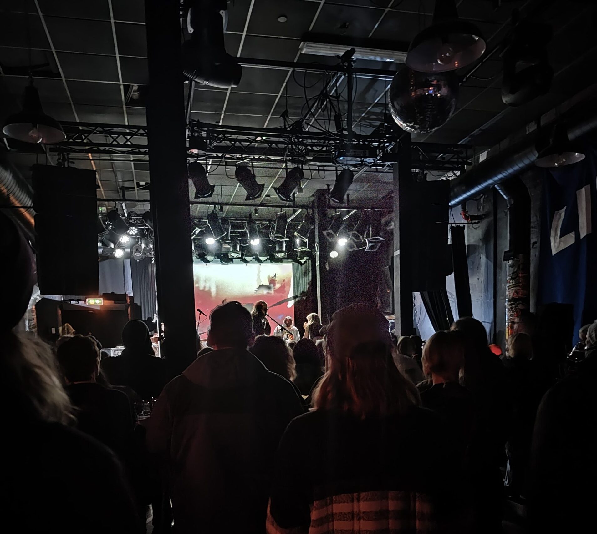
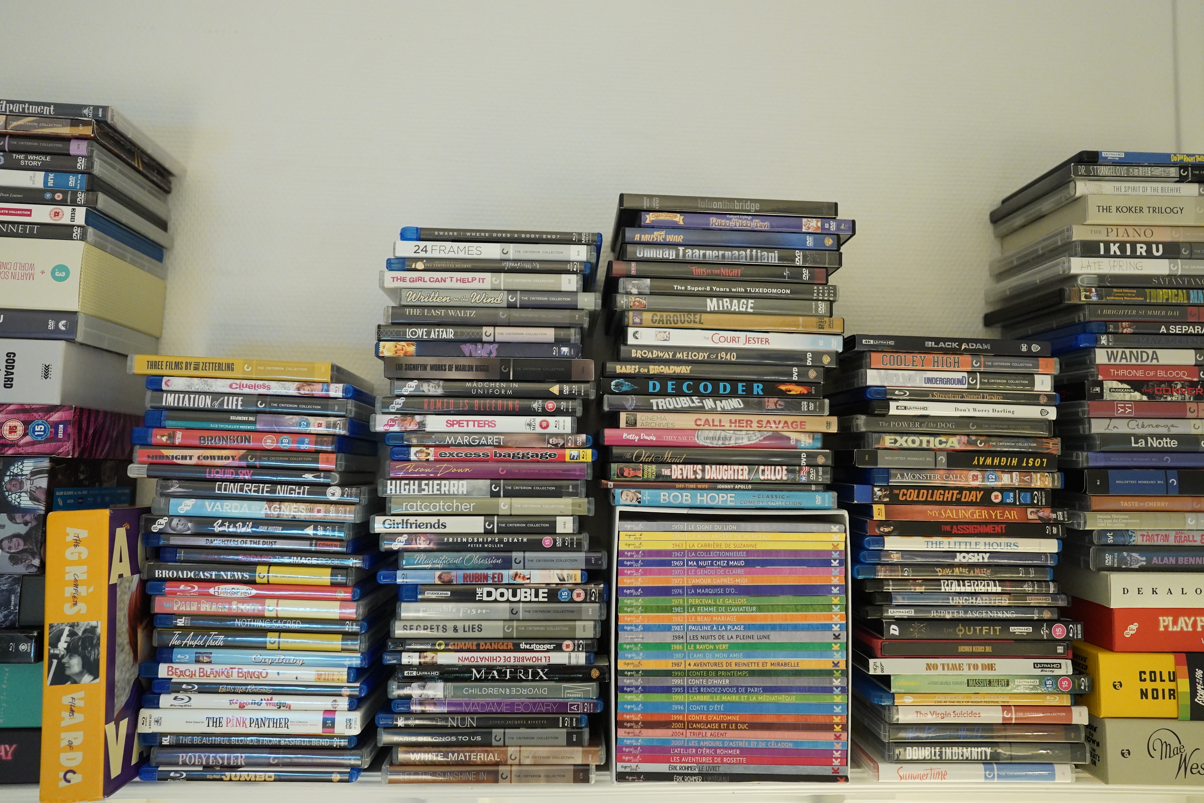
I sympathise with this conundrum, but as you may already have surmised from the picture that started this blog post, my approach to watching movies is somewhat different.
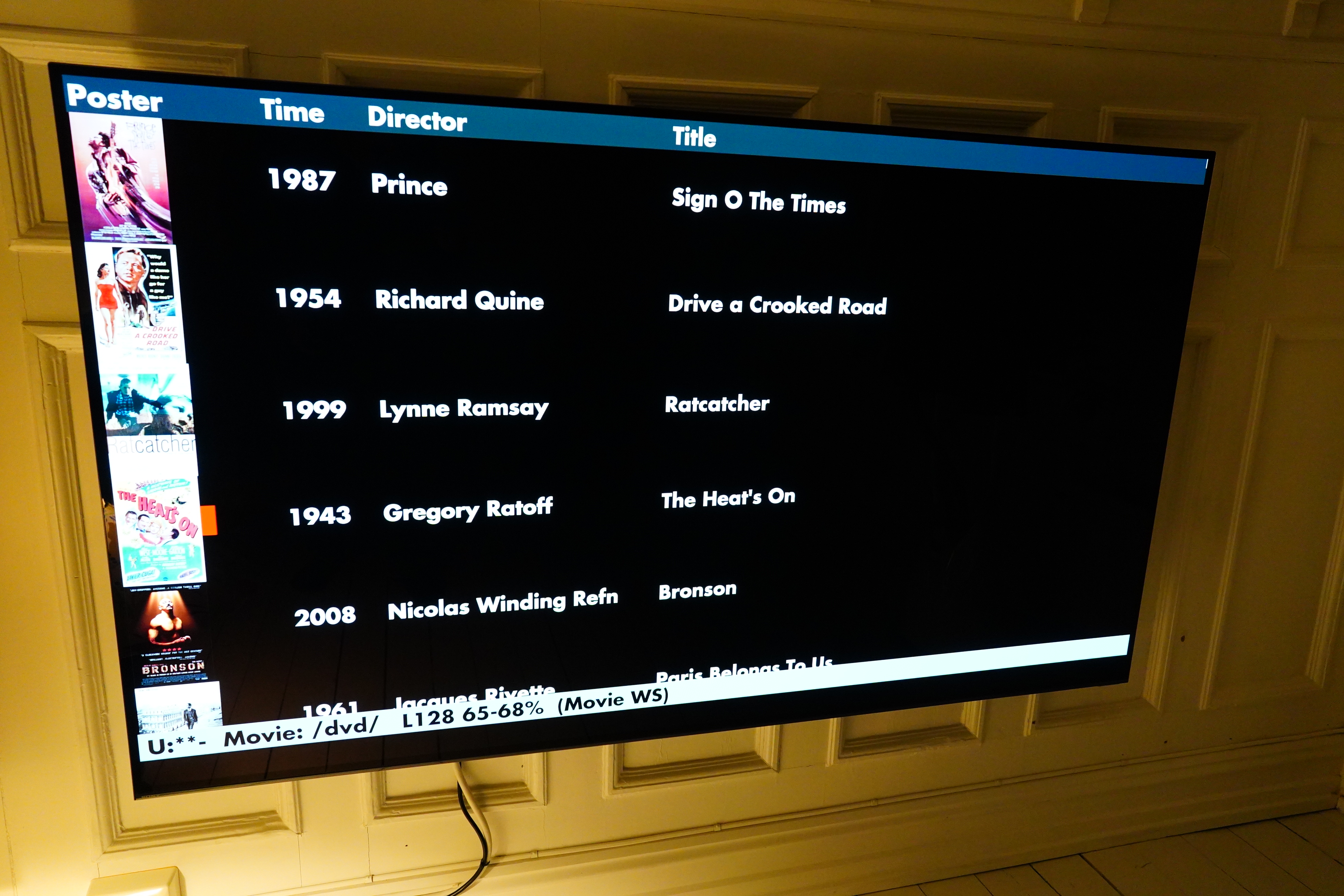
I’m oldes, so I buy virtually everything I watch on physical media. (I.e., DVD, 2K Blu Ray and 4K Blu Ray.) I’m not so oldes that I watch the disks directly, though — I rip them to disk, and then use an Emacs-based system to browse and play them. Which looks like this:
So basically, I have the same issue that the HBO Max-browsing person has: I have access to a whole bunch of films that are probably pretty good (in my case, I’ve already picked them, and in the HBO Max case, there’s the Criterion Collection), but scrolling through two hundred films, it’s just hard to decide whether, tonight, I want to watch Clueless by Amy Heckerling, the 1934 John M. Stahl version of Imitation of Life, or Éric Rohmer’s Conte d’Hiver.
I mean, I do want to watch all of them, but which one tonight? None of them seem that urgent to get to, which is the problem. So I guess I’ll just put on an episode of 2 Broke Girls, I mean Frasier…
But no! Here’s my genius system: I actually look at those stacks of unwatched movie boxes up there when deciding what movie to watch. Sometimes a random spine will call out to me and I think “Yes! I must watch Howard Hawks’ Scarface! Right now!” More often, though, nothing happens, and I avoid being paralysed by choice by choosing a film through this clever system: I choose a film from the bottom of the stacks.
This brings down my range of choices from 200 to (usually) 4. And that artificial constraint makes it much easier to choose a film (for me).
And it’s also oddly satisfying to see the stacks get shorter.
I’m just idly typing away here, and I have no real interest in using streaming services, but perhaps something along these lines might be helpful for somebody pondering how to make movie selection more fun? That is, instead of endlessly scrolling through choices, you make a list of stuff you want to watch, and then work your way through that, but in a more fun way than the current “upcoming queue” lists in the apps work today.
The problem with lists like this, though, is that you’ll feel tempted to put stuff on the list that you’re not really enthusiastic about watching, but put on there because you feel you “should” watch. Like a three hour documentary about bee-keeping in ancient Mesopotamia. (Actually, that does sound a bit interesting…) Uhm, like Shoah. This would soon turn the list from something that sparks joy into a home-work assignment list, and you’d be back to watching Full House, I mean Frasier.
So, like… an interface for your “want list” on streaming TV that has a kind of greater physical presence? So it’s not just a hopelessly yuge list of obligations?
Oh, I don’t know. People have probably done something fun like this already for all I know. SORRY FOR WASTING YOUR TIME
Oh, and speaking of yuge: Oh, bonus pics. Here’s what Emacs looks like on my yuge TV:
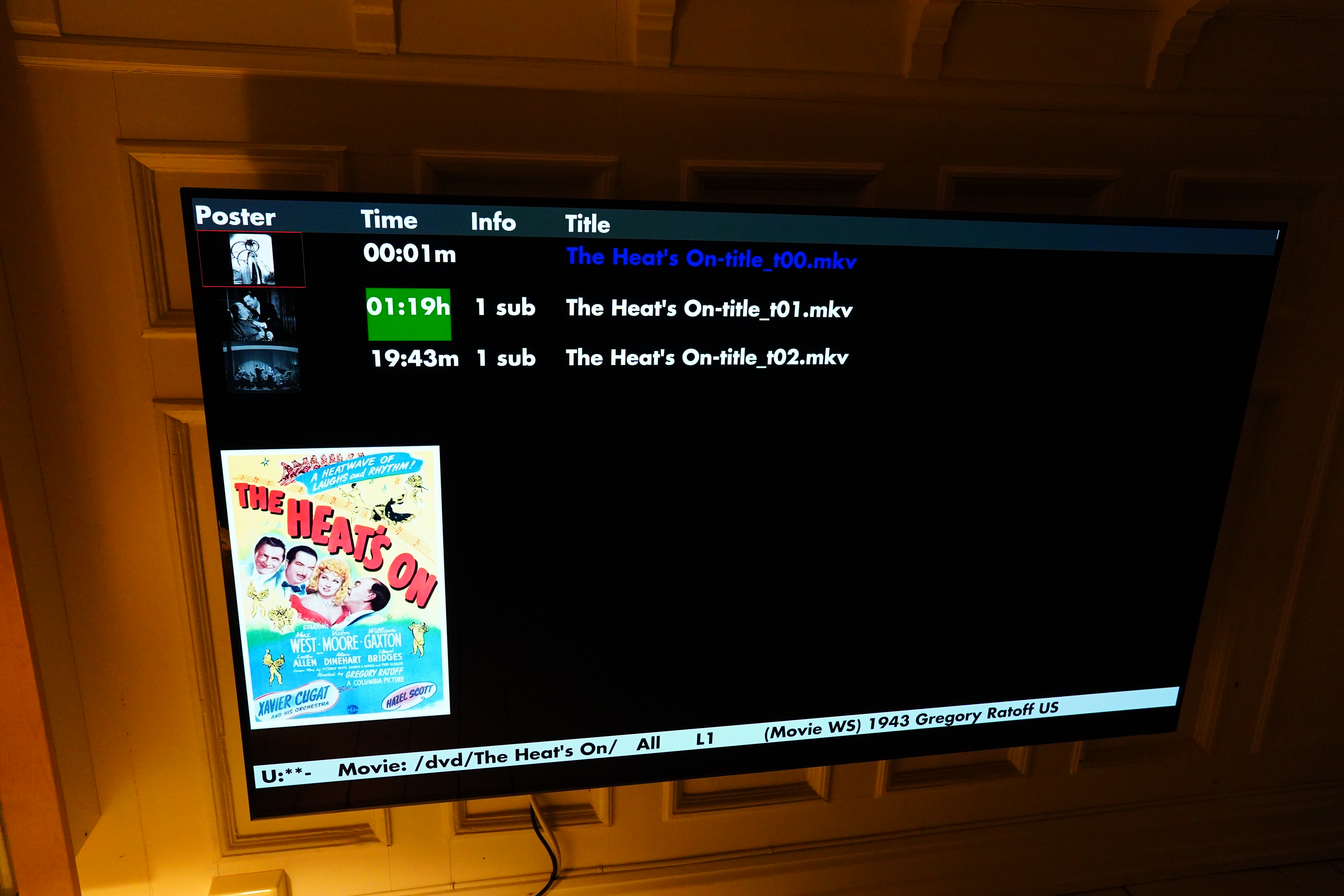
Gotta have some Futura.

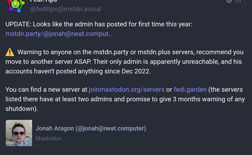
So — the notifications account for this blog was on mstdn.party and the movie account was on mstdn.plus, of course, for maximum fun. So I’ve moved those to other servers (that no doubt will also have problems soon). I guess the only way to cut down on this type of fun is to run your own instance? But I’m so fed up with sysadmining…
You can follow updates to this blog on @larsmagne23@masto.nu and the movie blog on @MovPic23@toot.community. I chose these servers the same way I chose the previous two: They were listed on joinmastodon.org as supposedly well-run servers that aren’t going to go away soon.
Perhaps I can just take this opportunity to do some unstructured kvetching about the whole Fediverse/Mastodon thing? Sure? Sure.
It’s like they’ve managed to replicate all the drawbacks of having a distributed system without any of the advantages. If a server just goes away like *snap*, all your account’s data is gone: People you’re following, who’s following you, etc, but most importantly: All your toots are basically gone. That is, they may be cached somewhere until the cache is gone, but basically gone, long term.
So: It’s not a distributed system. It’s just a system that maximises the number of single points of failure.
If your server hasn’t *snapped*, you can export some of the data. Look at this howto:

This is the official way to do this; it’s not the natterings of some know-nothing on the web somewhere, like this blog is. How is it possible for somebody to type that howto without going “hang on, this is insane. We’ve got computers. Computers are good at doing stuff like shovelling data from one computer to another. Can’t the computers do this?”
You have to do one thing on one account, then wait five minutes, then another thing on another account, then wait a bit, then download five CSV files, then upload five CSV files.
And… after doing all this, my old, so so valuable toots from the old account aren’t copied over to the new account, of course, because… because… I can’t even come up with a joke to explain this, because it’s just unfathomable to me how somebody could even come up with a system where you can’t replicate the fucking posts.
Perhaps it was just difficult? They couldn’t come up with a flag like “this is an old post; not need to re-replicate, just copy” so that it doesn’t get re-federated?
It’s just… it’s just…
And another thing! (I swear I haven’t had a drop of alcohol!) If I now go to an account on the old server, I can’t read anything there. I’m just redirected to the account settings:

To read any toots on mstdn.party, I have to open an incognito window.
It’s just… it’s just…
I conclusion: Elno has nothing to fear from Mastodon.
Oh, and speaking of Elno! Like I predicted in the previous post he’s now changed his mind about API access for posting, anyway. The fun thing about this isn’t that this reveals that he’s an asshat (we already knew that), but that he now has absolutely nobody around him that can give push-back on even the most trivial thing (“well, Mr. Musk, sir, Twitter has many fun automatic accounts — should we do a carve-out for those? Sir? Mr. Musk? Why are you calling security? Why did my access card suddenly explode? Sir? SIR?!”). They’re totally schtumm.
But perhaps it’s because they enjoy seeing him making an ass of himself, and not because they’re afraid to get fired. Sounds more likely.
ANYWAY.
New Mastodon accounts.
*sigh*
Now I’m getting a drink.
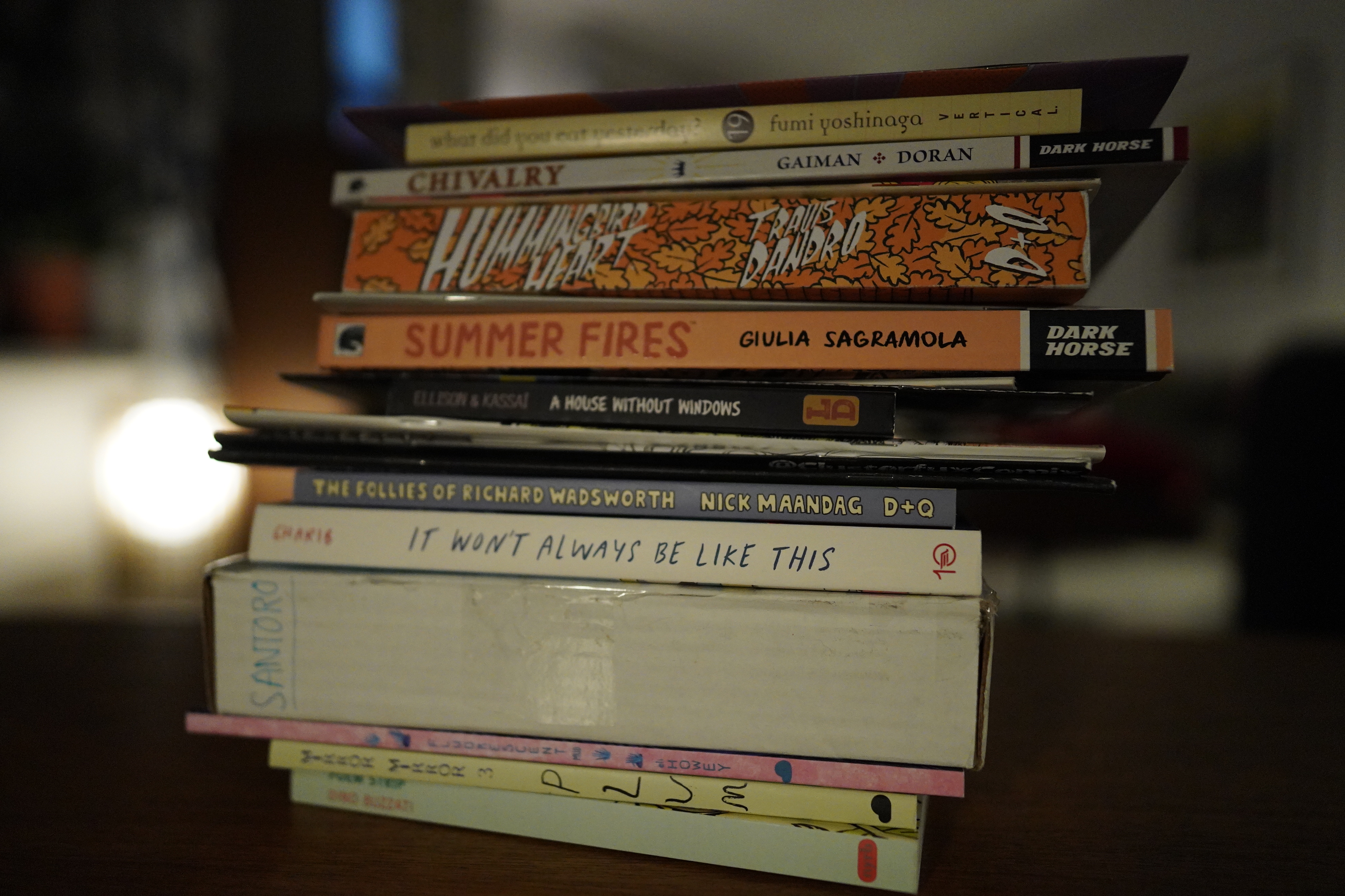

You won’t guess what happened — I got more comics in the mail, so I better start reading unless I’m going to suffer a comics avalanche in the window there soon…
And, again, my sleeping is all messed up (after too much paryting on Friday), so I want to listen to only old music. So… I’m choosing… 1981/82.
| Heaven 17: Penthouse And Pavement | 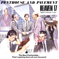 |
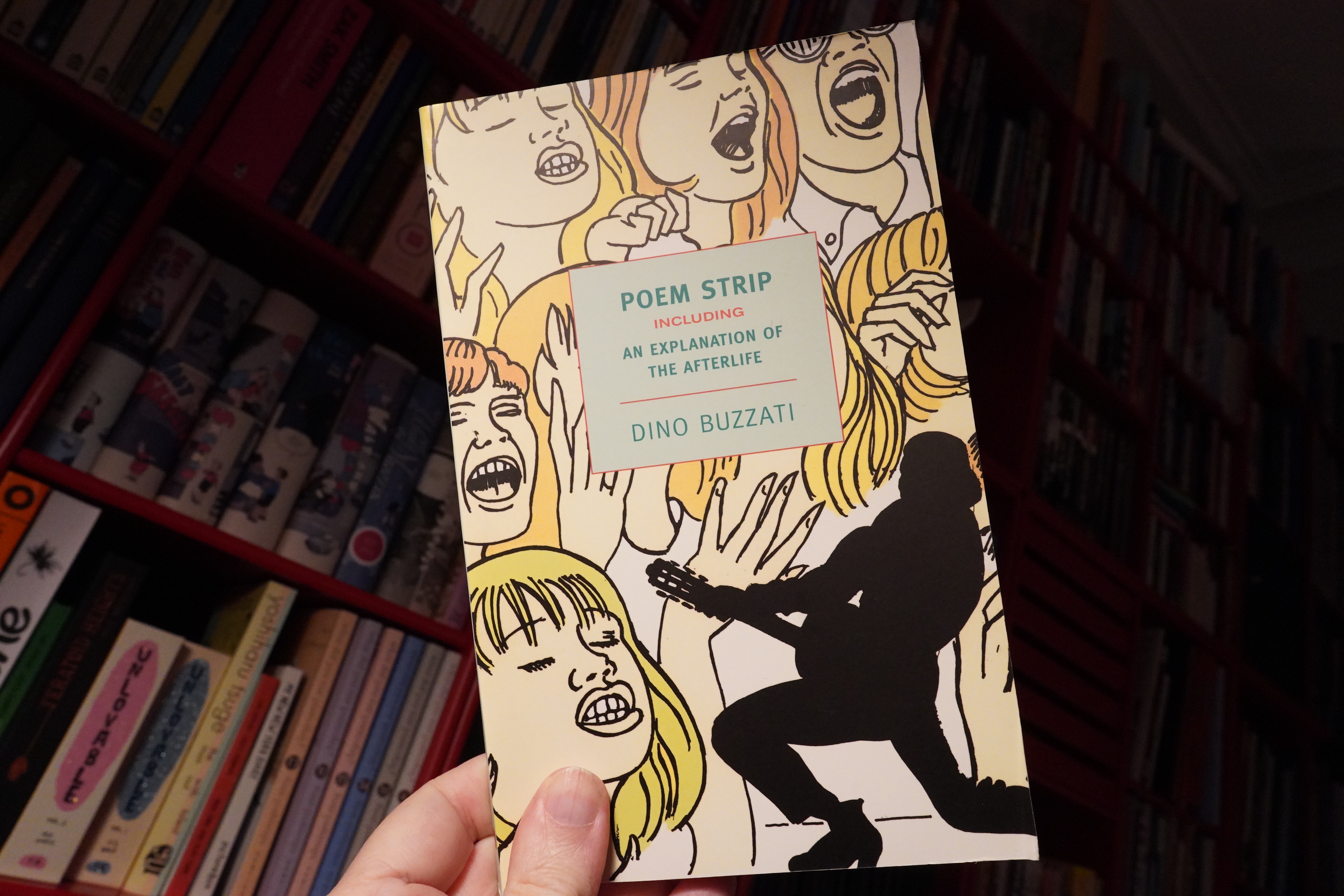
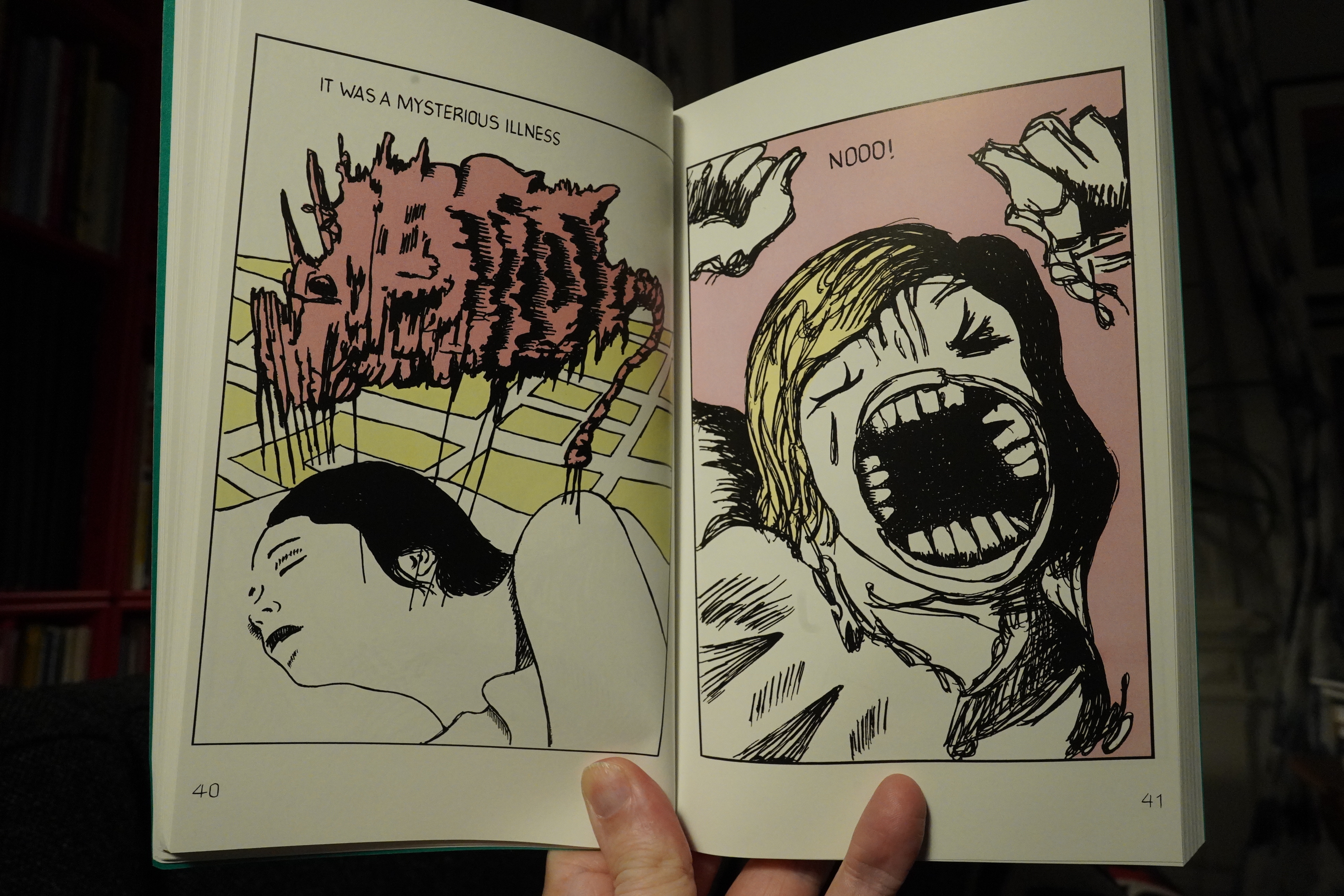
17:52: Poem Strip by Dino Buzzati (New York Review Books Classics)
What? This is published by the Book section, not the Comics section?
Anyway, this book is going to be something of a re-run of the last Comics Daze — I’m starting with the books from the Mystery Mail, and then seguing into books mentioned in this TCJ Best of 2022 article, but this time there’s also a bunch of random other books.
This is from the 60s, and the artwork is kinda pop-art-ey, but not as slick as it would get later. It’s interesting, and the book starts off in a quite intriguing way.
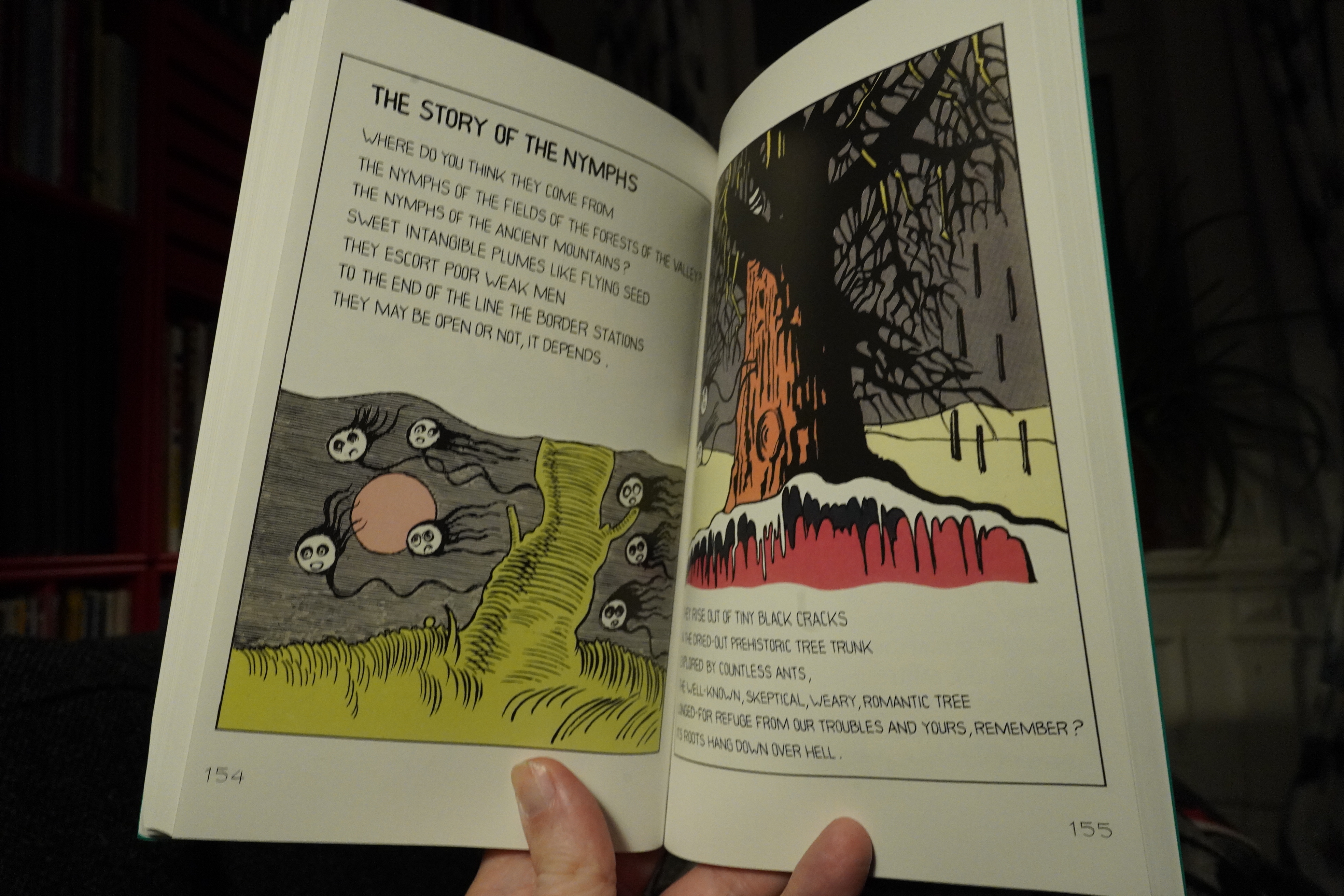
But… unfortunately for me, it’s like an amalgamation of All The Things In Which I Have No Interest, Because I’m A Philistine. The book is a riff on Orpheus, and retells the major plot points quite faithfully. It also references other myths and fairy tales, and grapples with God and the afterlife and and then I literally fell asleep, which means that I’m typing this while I’m sleeping now, literally.
| Grace Jones: Nightclubbing | 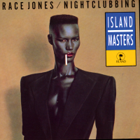 |
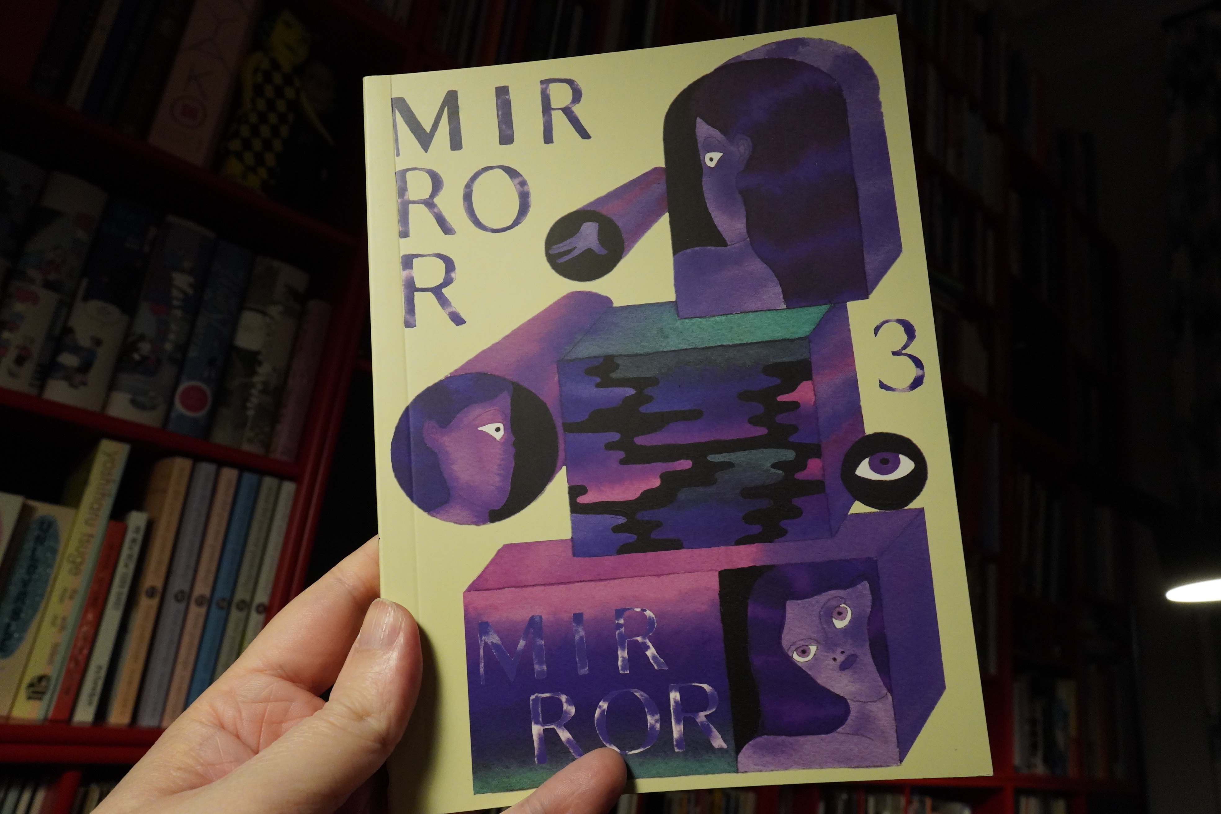
18:24: Mirror Mirror 3 by Plum (2d cloud)
Another quite old book — I got this a few years ago? When signing up for the Mystery Box thing, I was worried that it was going to be all books I already have, but they’ve been few and far between.
But I’ll just re-read this now, then.
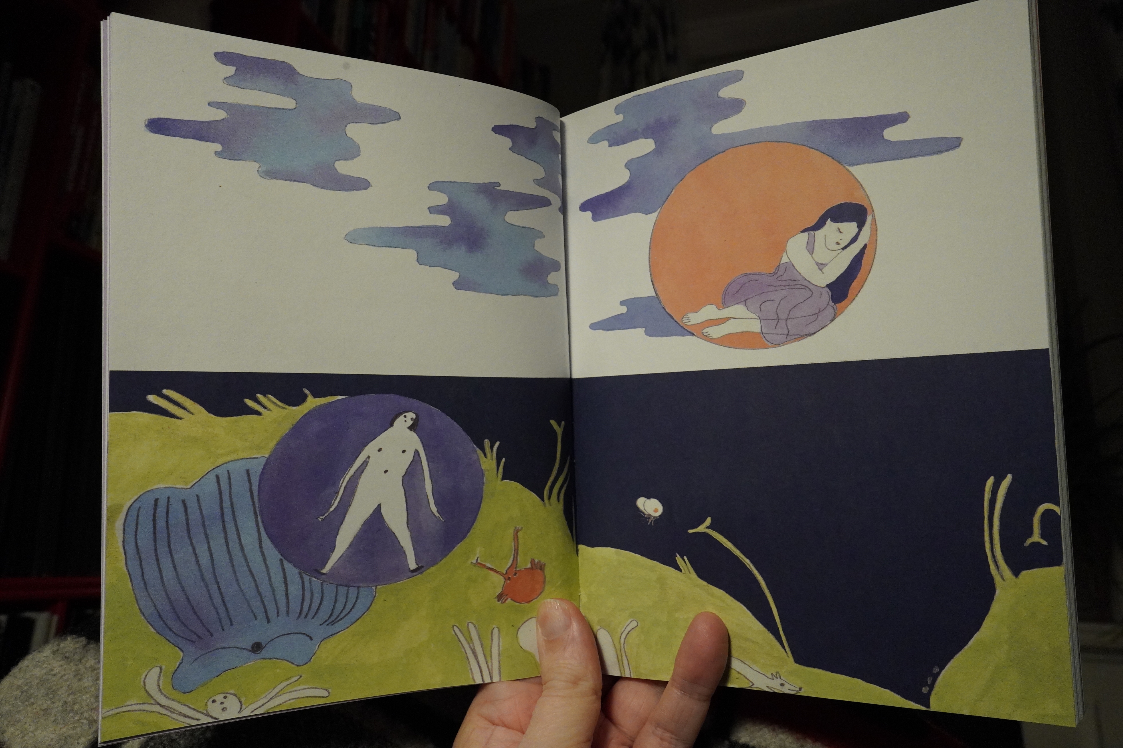
This is a collection of somewhat narrative pieces, all done with watercolour, I guess.
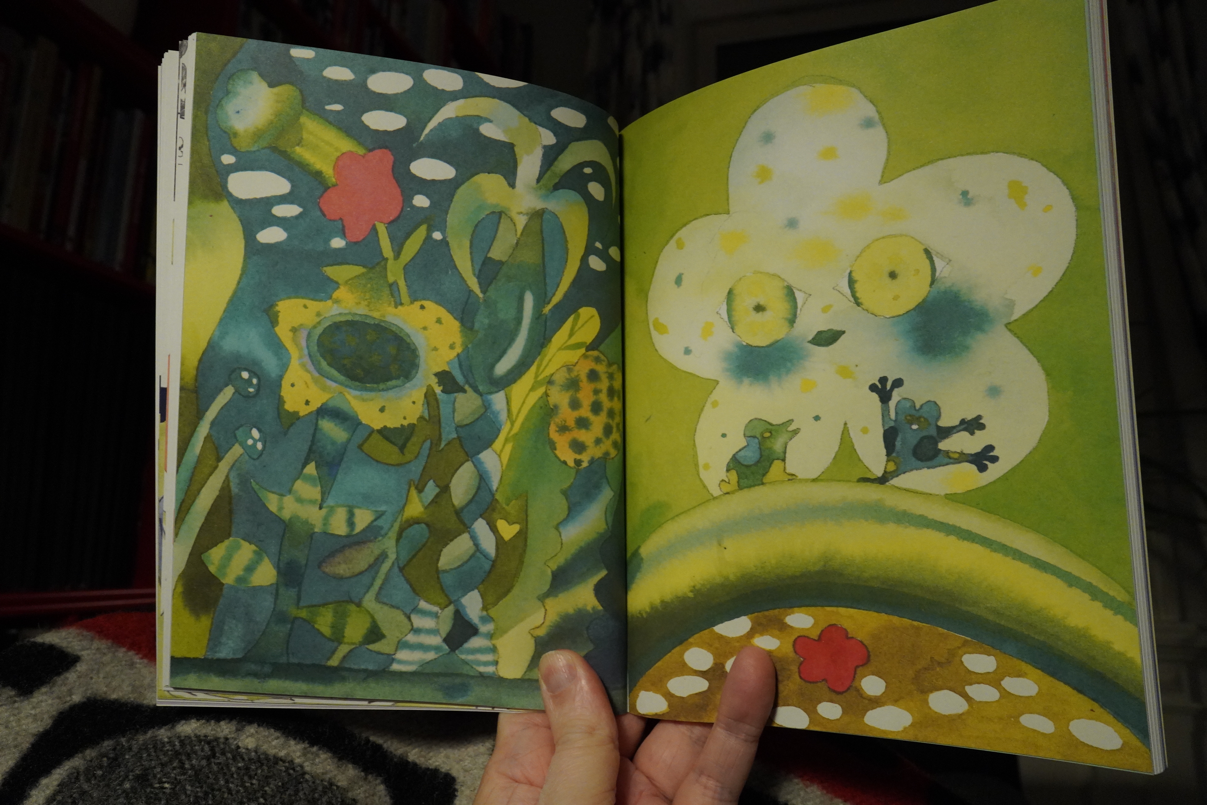
It’s lovely. The colours are gorgeous, and the stories move in mostly gentle, mysterious ways (but there’s some shocks along the way).
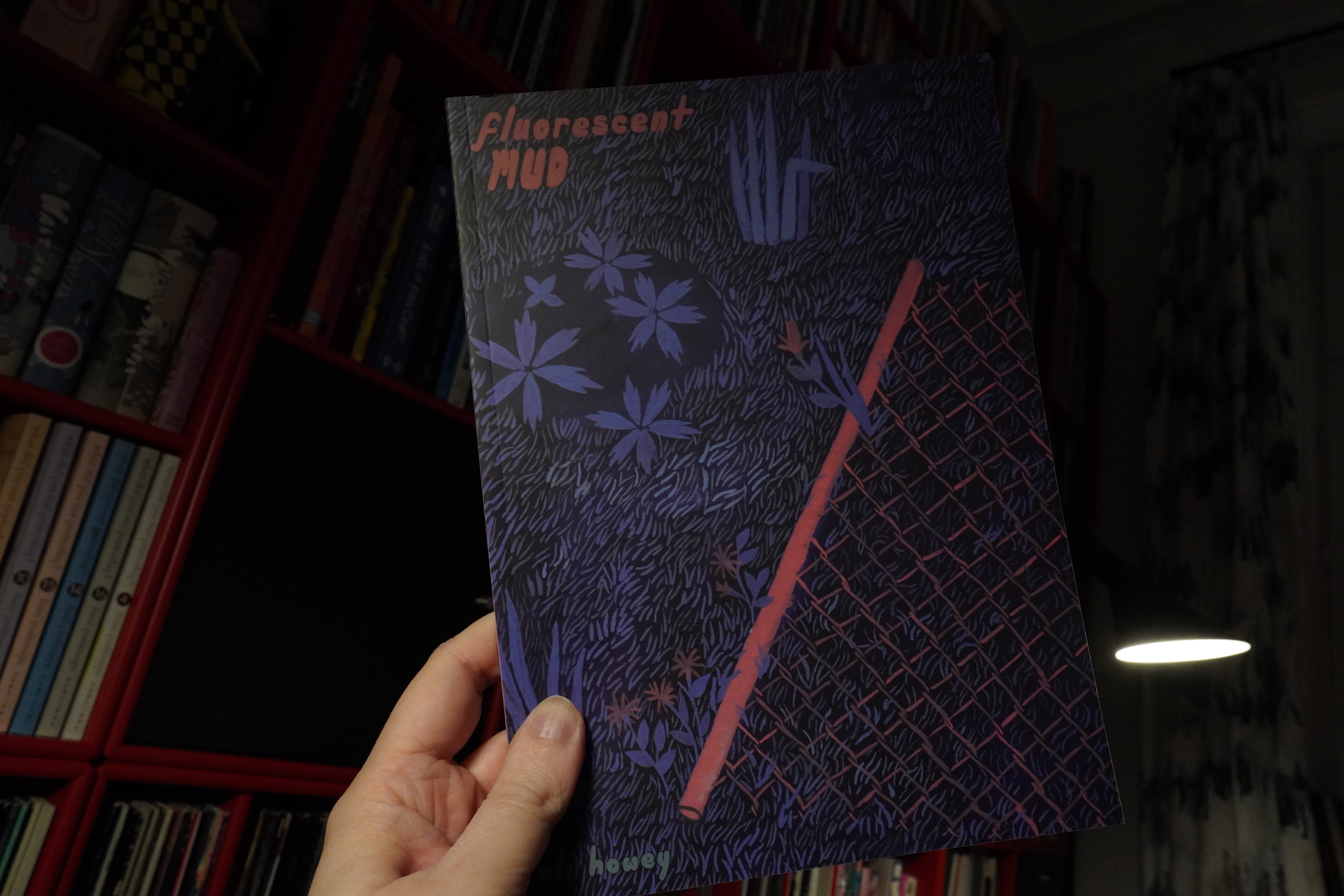
18:34: Fluorescent Mud by Eli Howey (2d cloud)
Oh, another old 2d cloud thing — this is from 2018. I’m not sure whether I have this one already — the cover looks familiar, and I thought I’d bought absolutely everything 2d cloud has published, but…
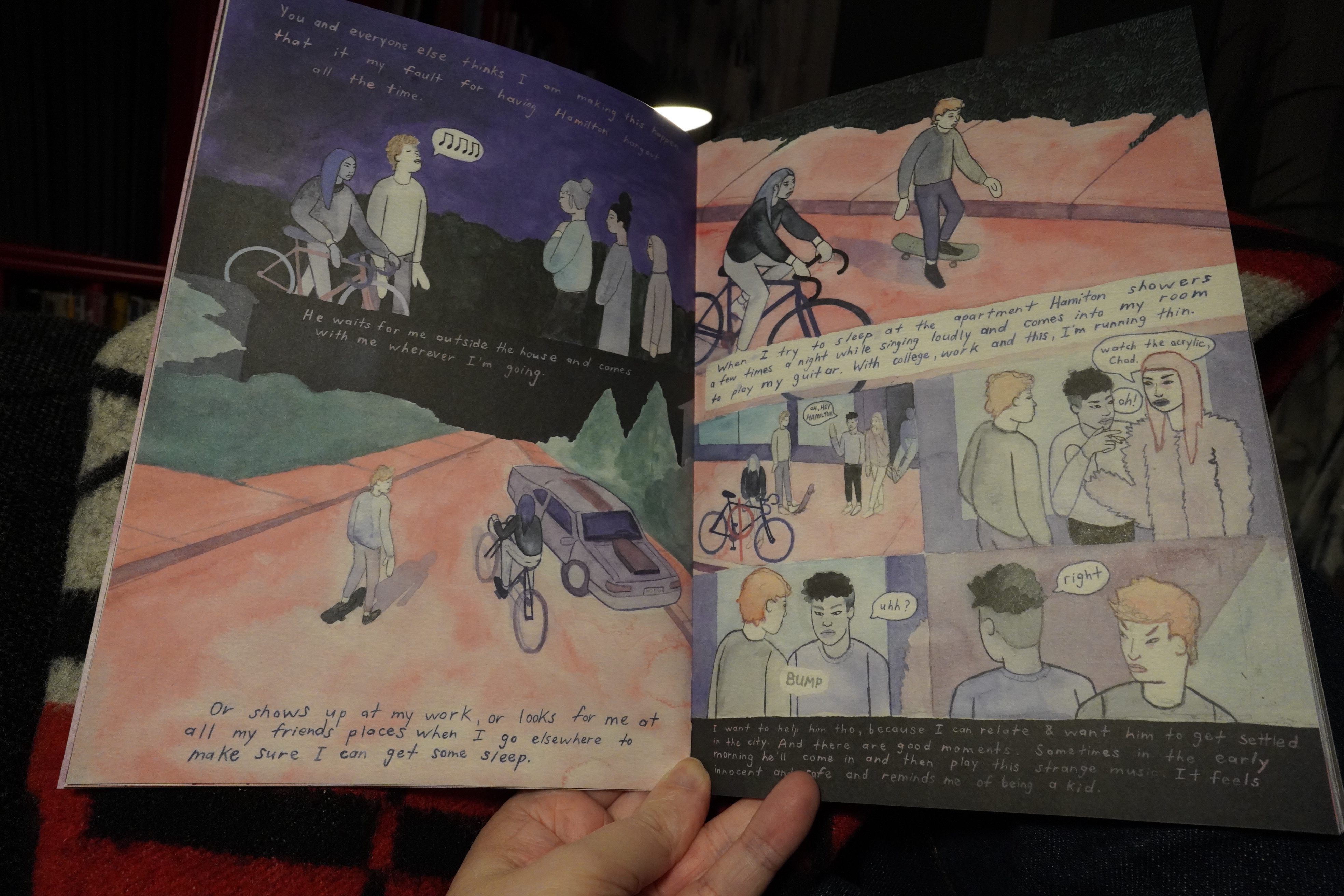
This is… It’s fantastic! The storytelling has a unique, but compelling flow. It sucks you in, and turns into the scariest horror story — I mean, not of the supernatural kind, but of the really scary kind, where the mind is going haywire.
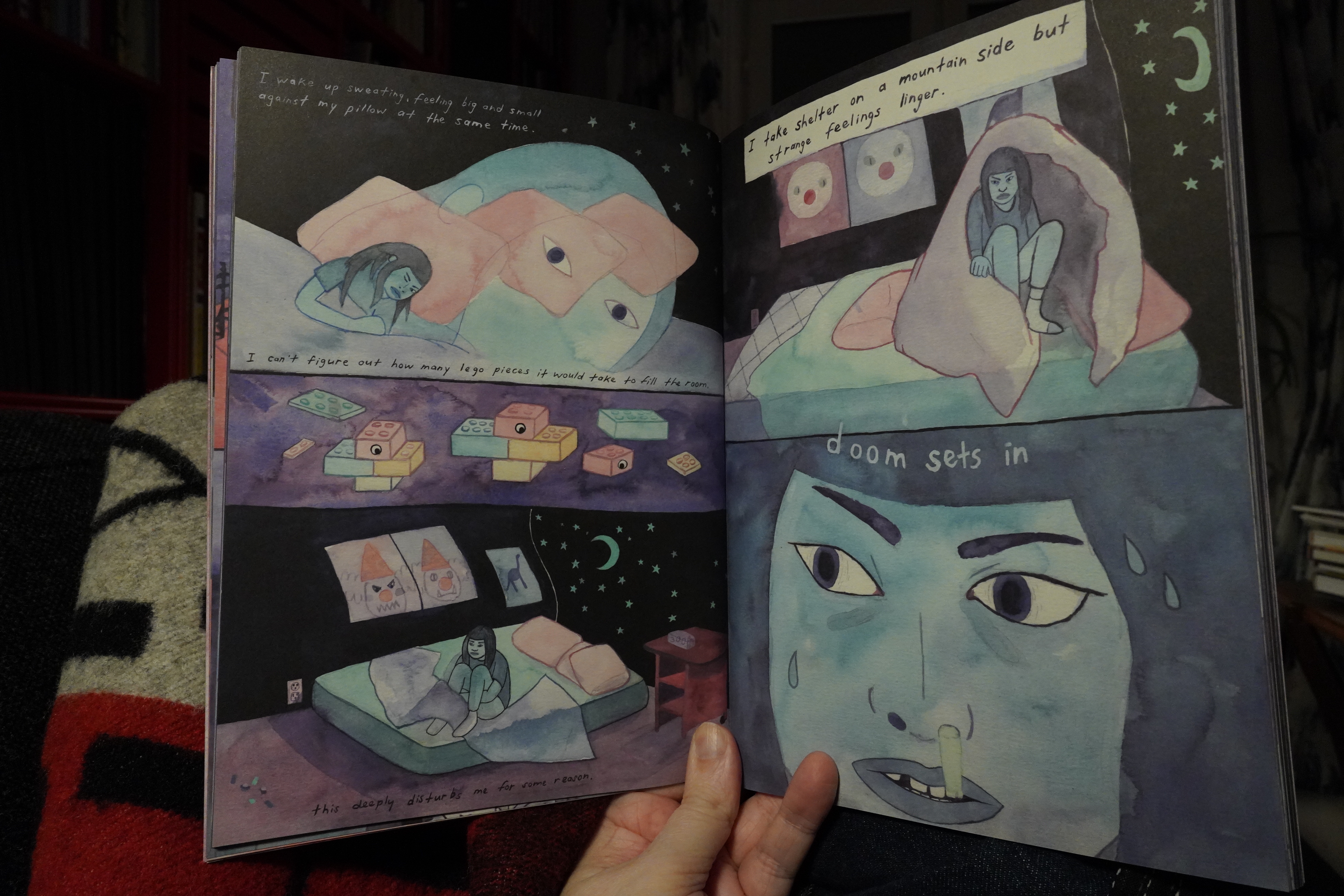
The artwork’s also great — it’s sometimes not trivial to follow along which character is which, but that only adds to the dissociative scary feeling.
Fantastic.
And that’s the final book in the Mystery Box, so onto other things…
| The Cure: Faith (1) |  |
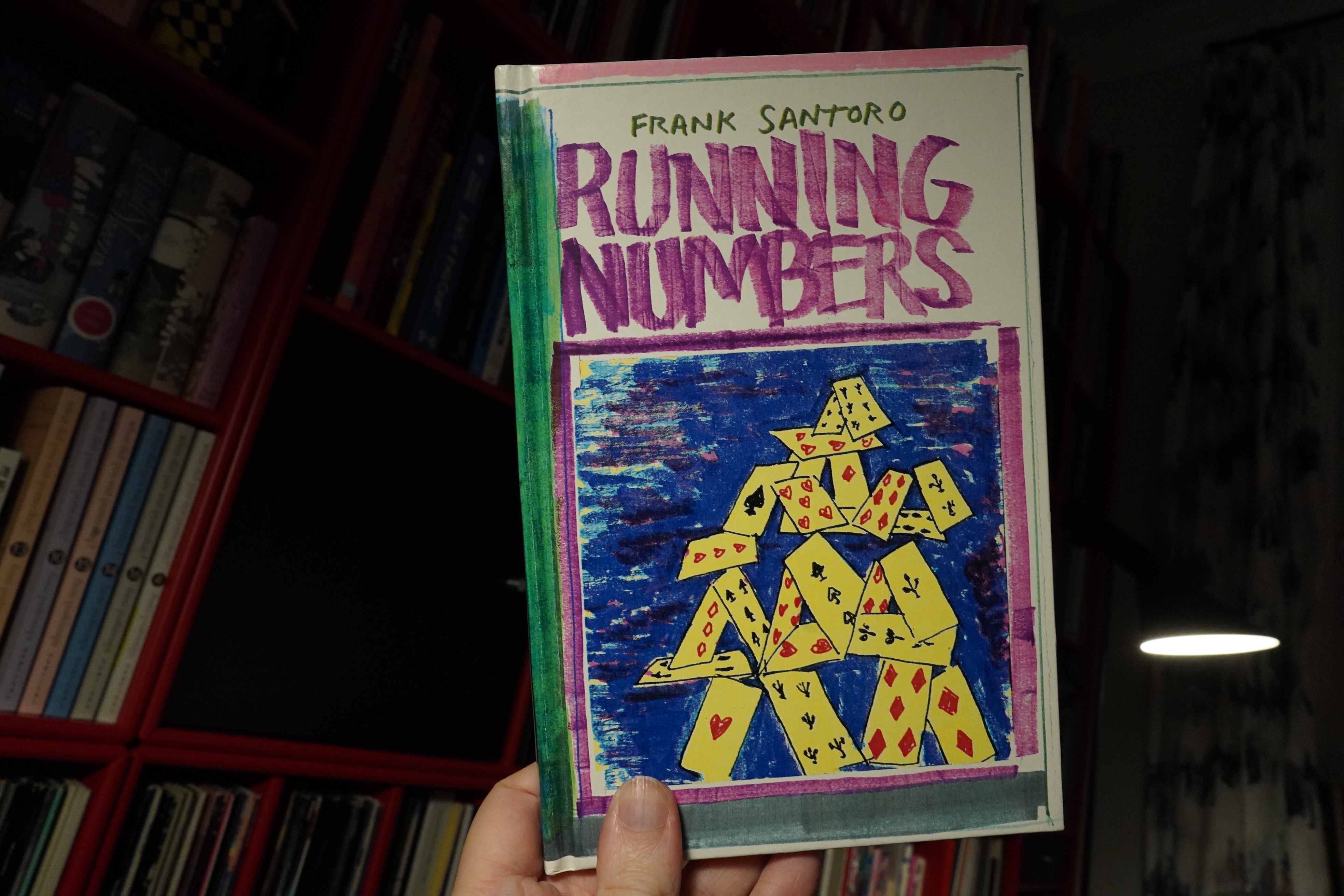
18:58: Running Numbers by Frank Santoro
But speaking of boxes:
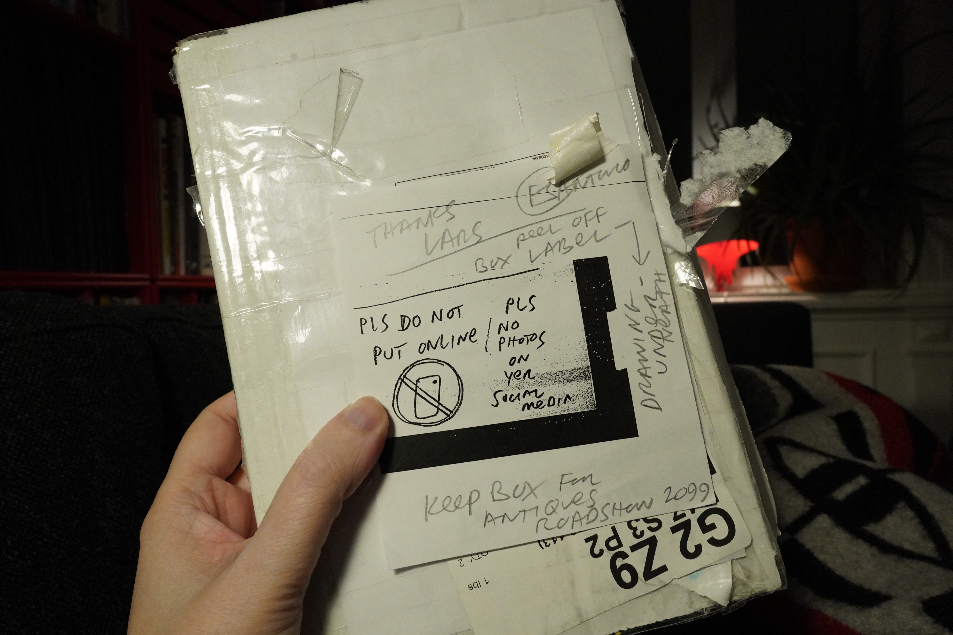
“Do not put online”?! But how can I read comics without snapping pics of comics? Is that even possible now? IS THAT EVEN ALLOWED NOW??!!?
But then I got what he meant here — underneath the shipping label, there was a drawing! It’s pretty! And I’m definitely saving it for the Antiques Roadshow 2099 embargo, so you’re not getting a peek at the drawing. Hah!
It’s not sold out yet as I’m typing this!!!
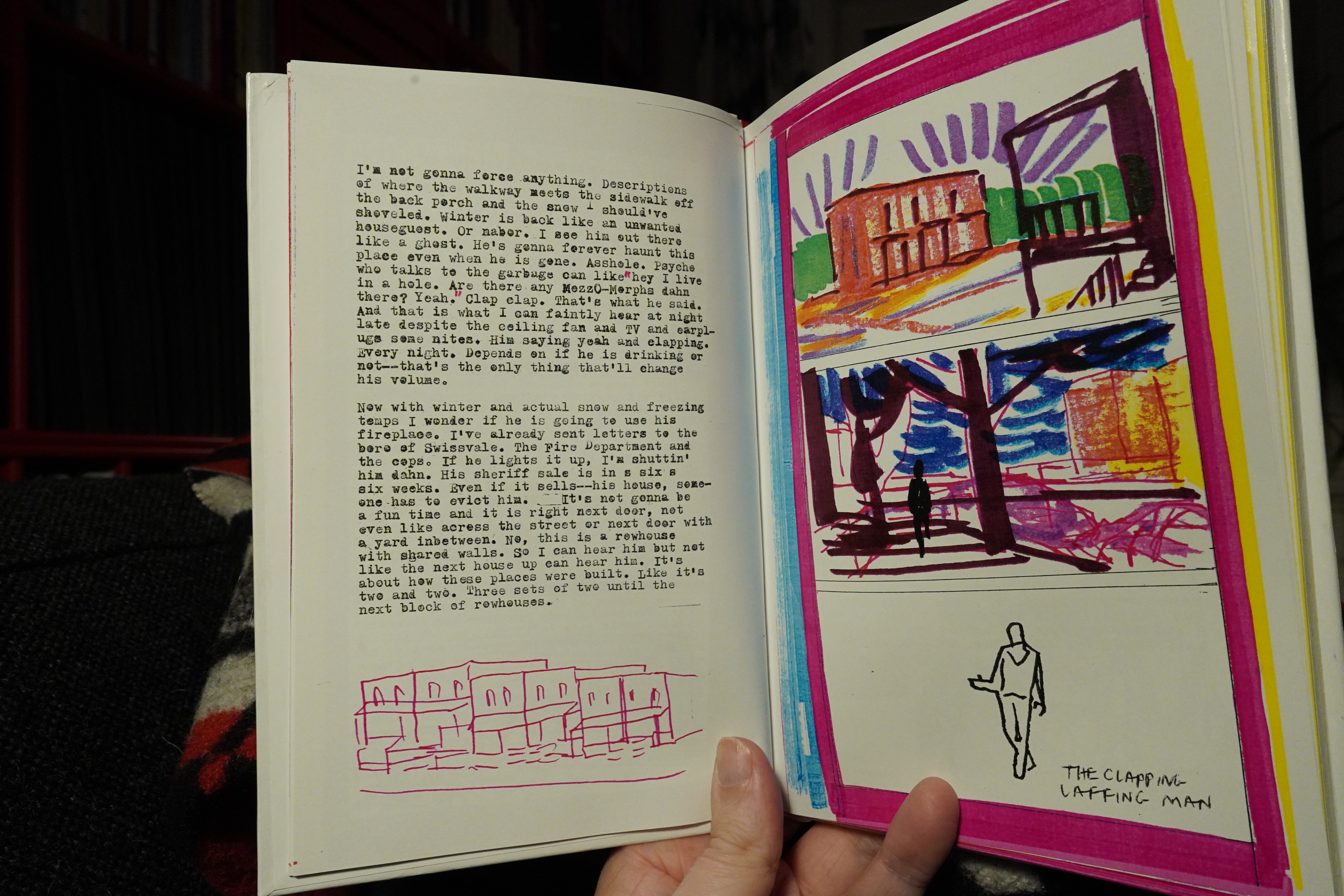
This book collects the first four issues, is a hand-bound hardback book — it’s very handsome. The contents are (almost) all organised like this: A text on the left-hand page, and then (usually) three panels on the right. The panels sometimes reference what’s written on the left, but not always, I think?
| Kjøtt: Op |  |
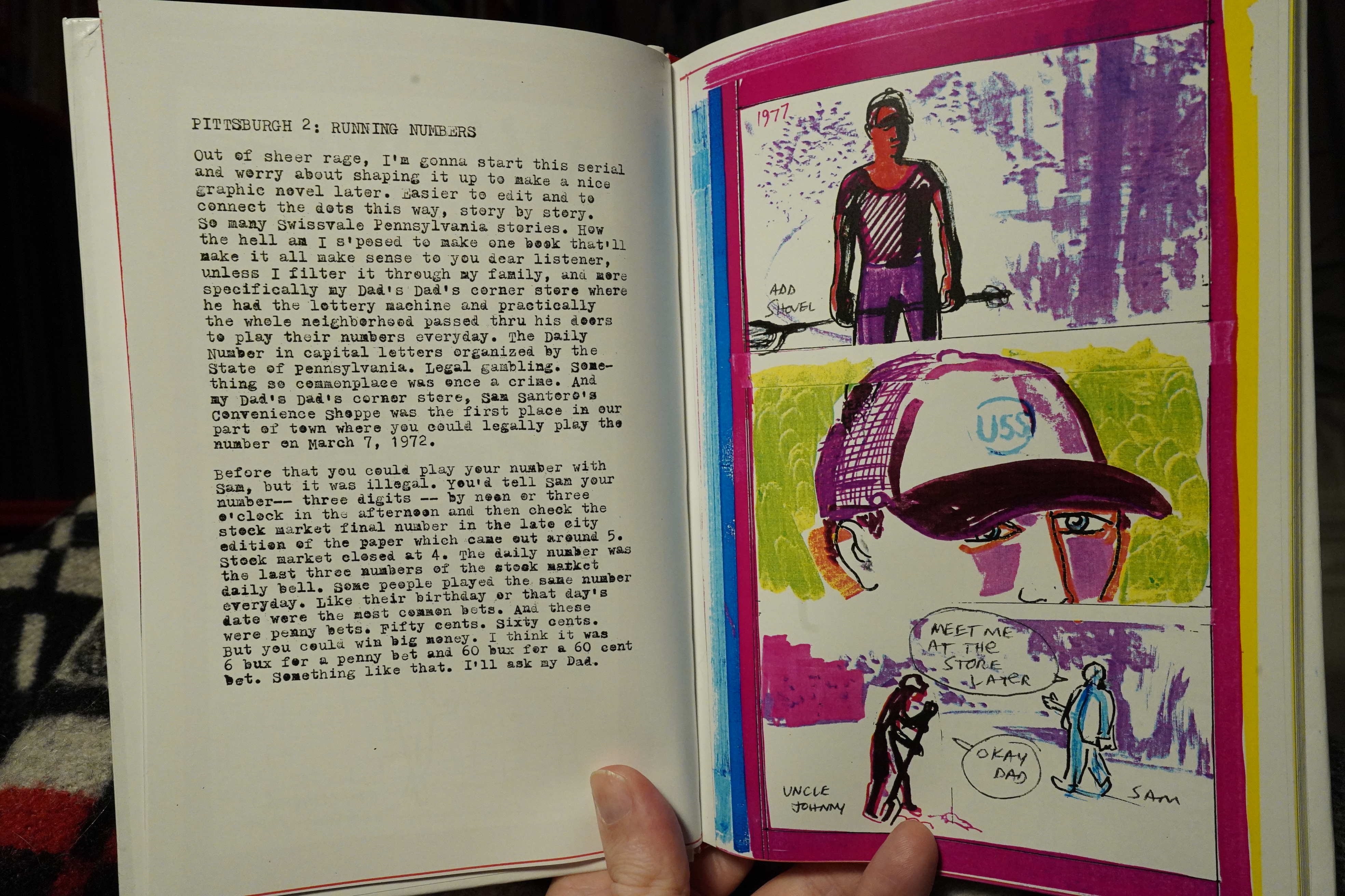
And I’m not quite sure whether this is a study for a more fully-drawn later book — notes taken for some longer narrative — but it’s riveting the way it is. It’s just so engrossing! I was at the edge of my couch seat here wondering how all the various plot threads were going to play out (even if it’s auto-biography). I have no idea how Santoro does this — his writing is quite direct, but sometimes slightly oblique, and that creates an extra engagement from the reader? It feels unmediated and uncalculated. It’s something that could so easily have felt private and irrelevant, but instead it’s deeply personal and irresistible.
I like everything Santoro’s done, but this may be his best book. Hm. Perhaps I should go back and re-read his earlier books now…
| Commando M. Pigg: Commando M. Pigg |  |
Oh, and I wondered about those numbers er numbers… He says that on a bet of 60 cents you could win 60 dollars? Now, I’m not a maths genius — I did pretty well in discrete maths at university, but this is more calculus, right, which I absolutely loathed. But using computers and calculators, 0.60 => 60 is 100x. And the numbers were three digits, so the chance to win is 1 in 1000. This means that the pay-out for this numbers game is 10%. I.e., the people running the numbers game had a 90% profit. That’s even more outrageous than I imagined! I think legit games have a 70% pay out rate or something!? I mean, I don’t play anything, but this itsy bitsy titbit here…
| De Press: Block to Block |  |
But there’s more in the box! It’s a bunch of sketches and drawings of the neighbourhood, and also what looks like pretty finished art for a comic book… perhaps it’s secret, too, so I’m not snapping anything. Hie thyself over to the web shop and get shopping.
| The Honeymoon Killers: Les tueurs de la lune de miel |  |
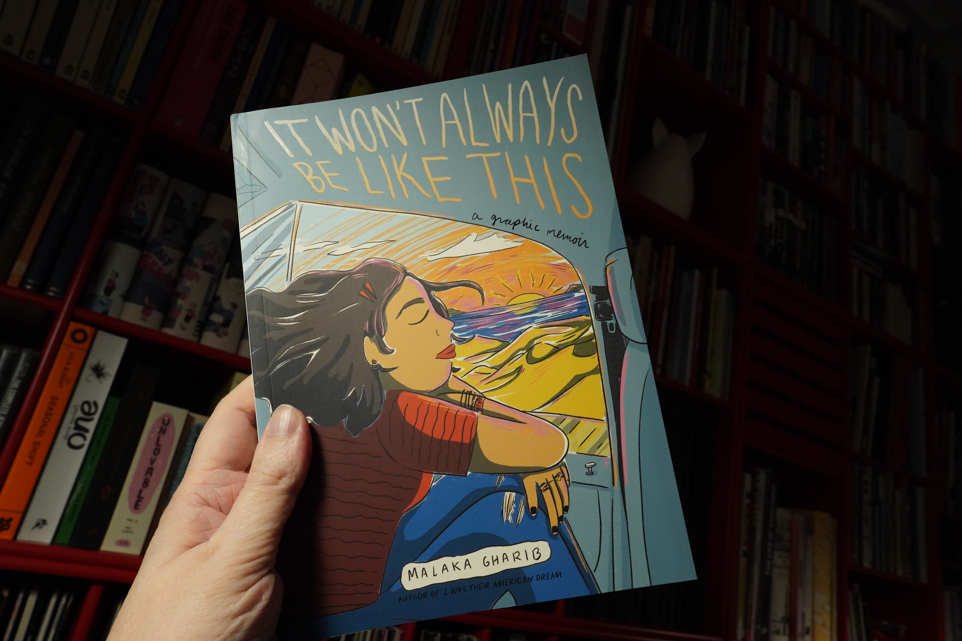
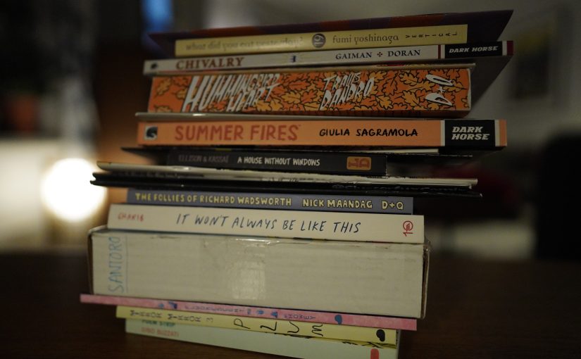
21:21: It Won’t Always Be Like This by Malaka Gharib (Ten Speed Press)
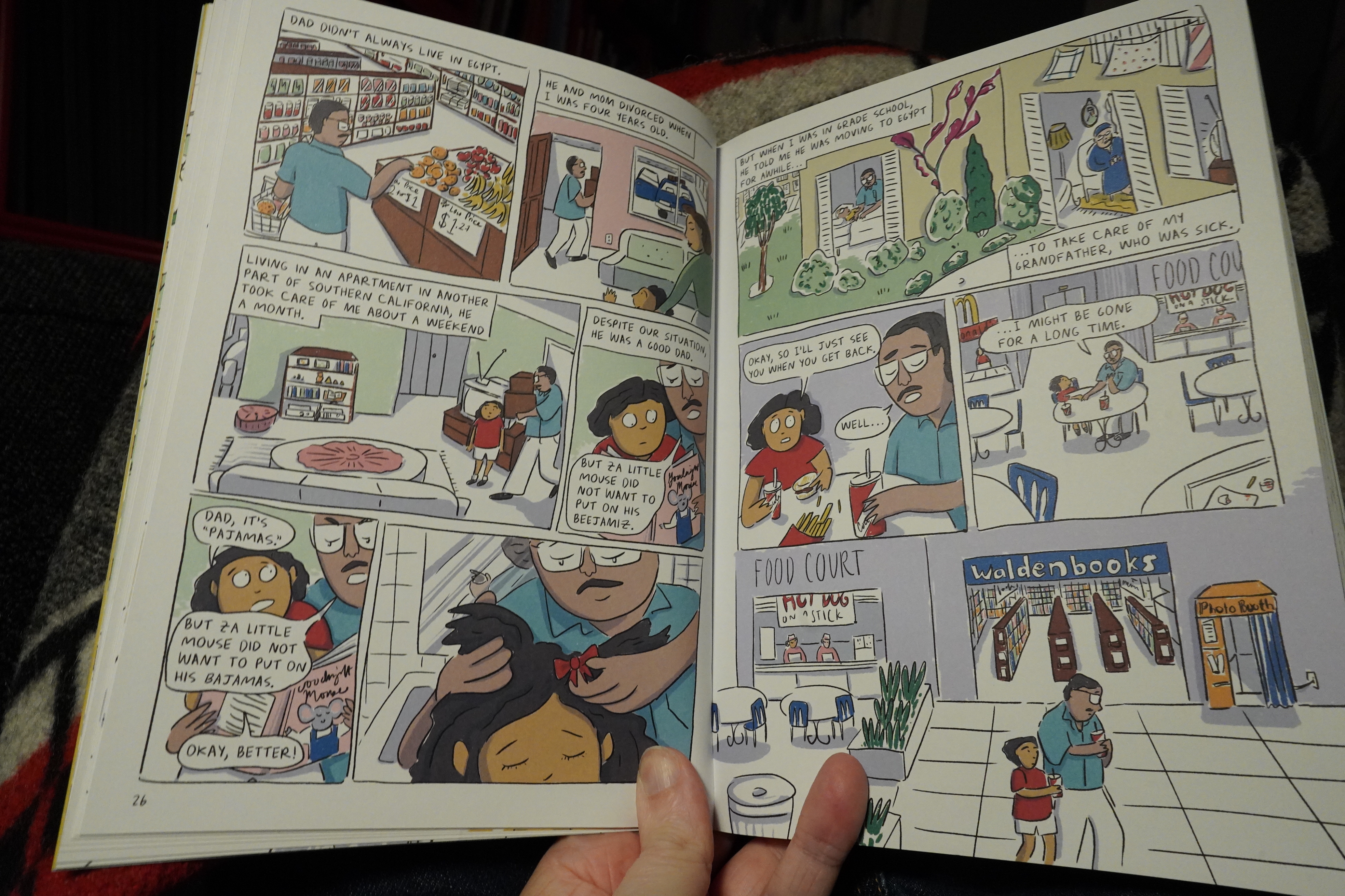
OK, this isn’t fair at all — this is a book for kids, I guess — but it’s just such a strikingly different approach to autobio than the Santoro book. (“No! Really!” I hear you all saying.) But I don’t mean the surface stuff, like the straightforward, clear storytelling here, or the very 2022 colouring…
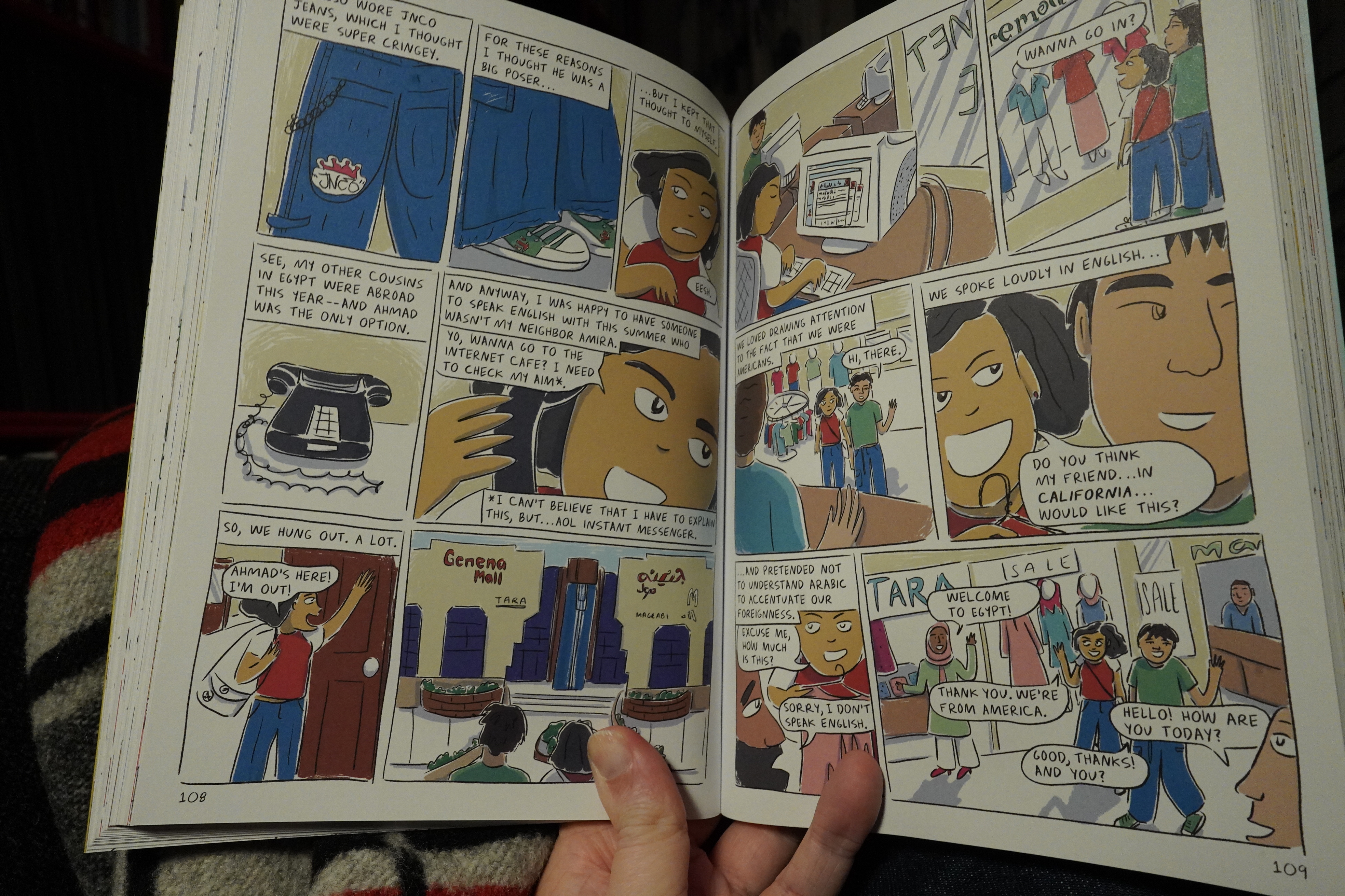
… it’s about how everything here is so digested; so worked through. It reads like there’s been twenty revisions, and she’s futzed and poked at it so that it conveys exactly, precisely what she wants. So we see her childhood from a quite distanced place, even if she’s letting us see all these annoying things about herself. But it’s like “oh, wasn’t I a pain, heh heh” asking us to answer “but you’re so honest it’s endearing”.
And it’s not.
The bits she doesn’t much mention, makes me go even more “uhm”, like how she spent months in Egypt each summer from early teens on, and she apparently didn’t even consider that it might be a good idea to learn more of the language than a few phrases.
The protagonist is offputting in ways not intended, is what I’m saying, and that’s not a good thing with autobio.
| New Musik: Anywhere |  |
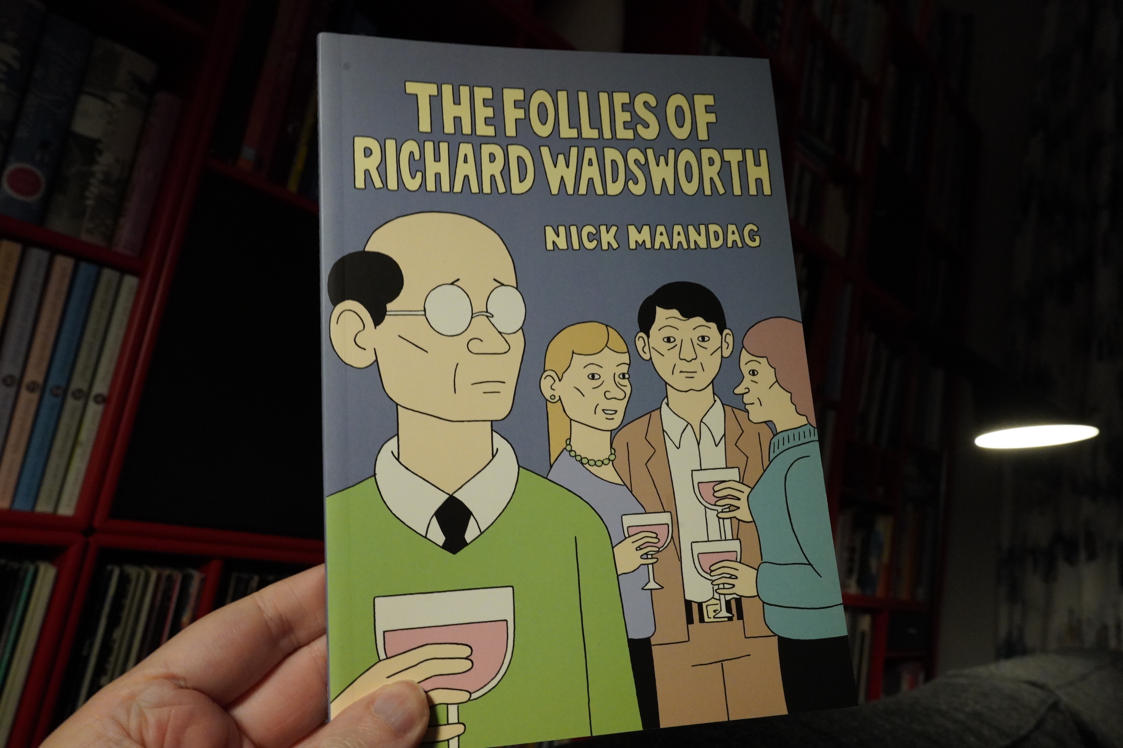
22:16: The Folloes of Richard Wadsworth by Nick Maandag (Drawn & Quarterly)
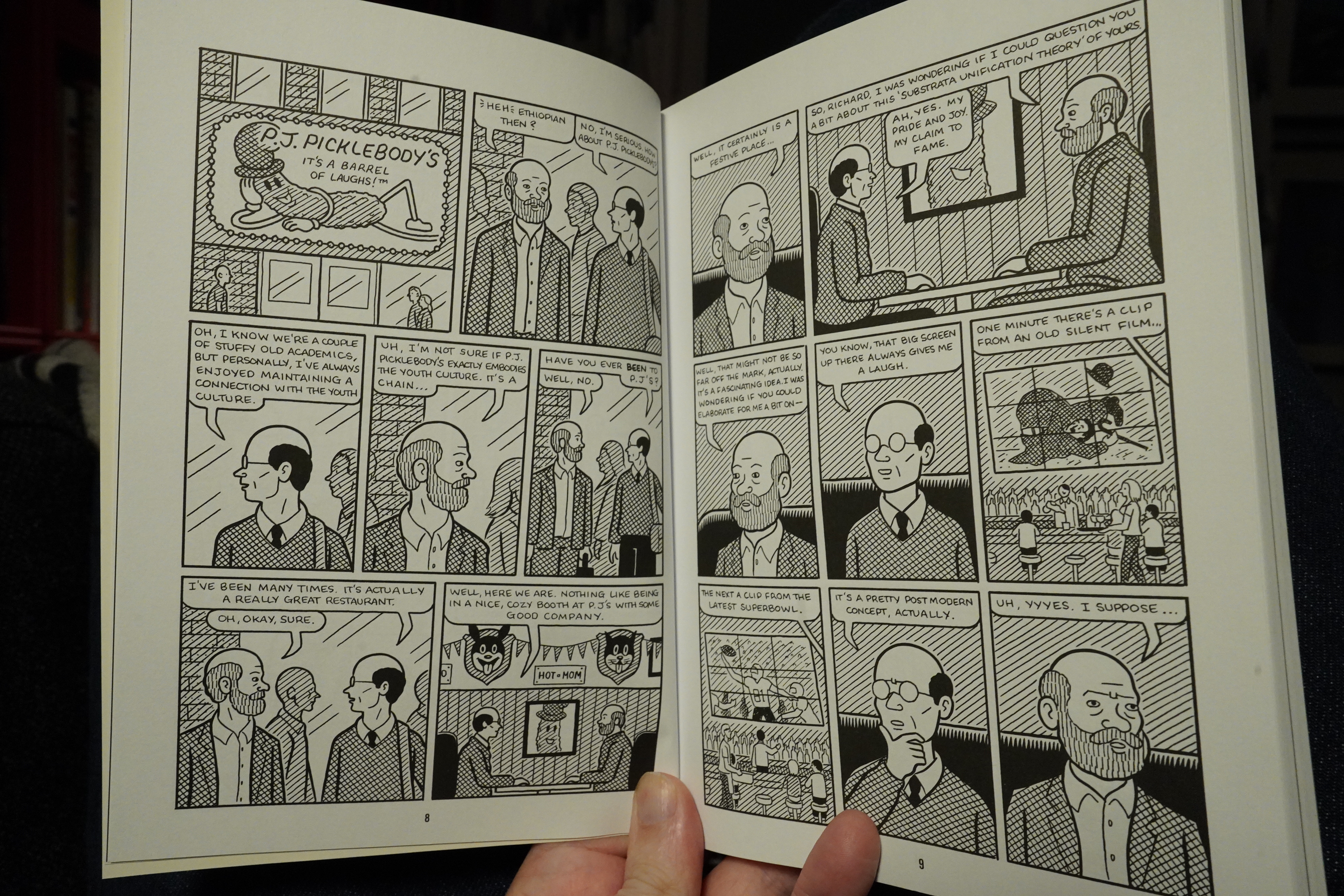
This book is a collection of three shorter pieces. I quite like Maandag’s work, but he seems to be taking things to an even cringier level here. Large parts of the first story, for instance, could be in any post-Seinfeld sitcom — you just need a laugh track. (Or not, since those often eschew laugh tracks these days.) And that’s not my kind of thing at all. But I wouldn’t be surprised if many people think that this is the funniest thing they’ve read all their lives.
The second story I assumed was a brutal take-down of Acting Class by Nick Drnaso. It just seems like a very accurate parody — and even the colours on the cover seem to ape Drnaso. But this was made in 2019! So nope.
| David Bowie: ChangesTwoBowie |  |
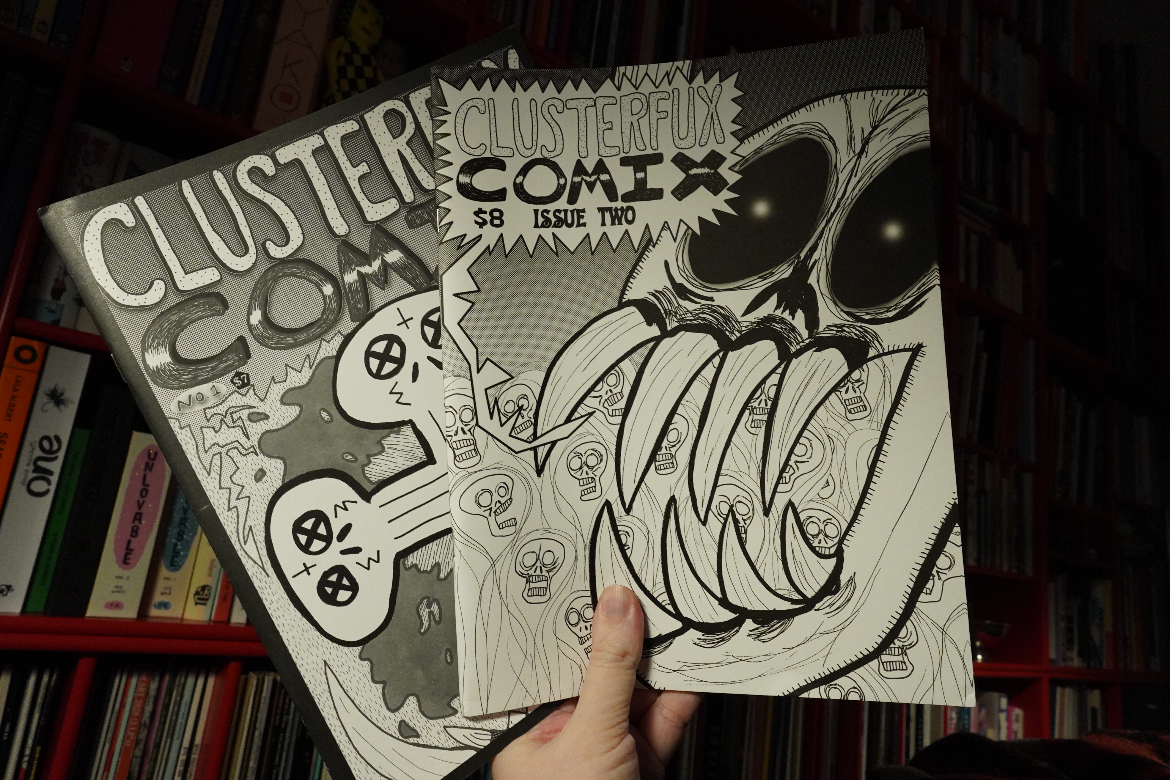
23:20: Clusterfux Comix #1-2 by Cameron Hatheway
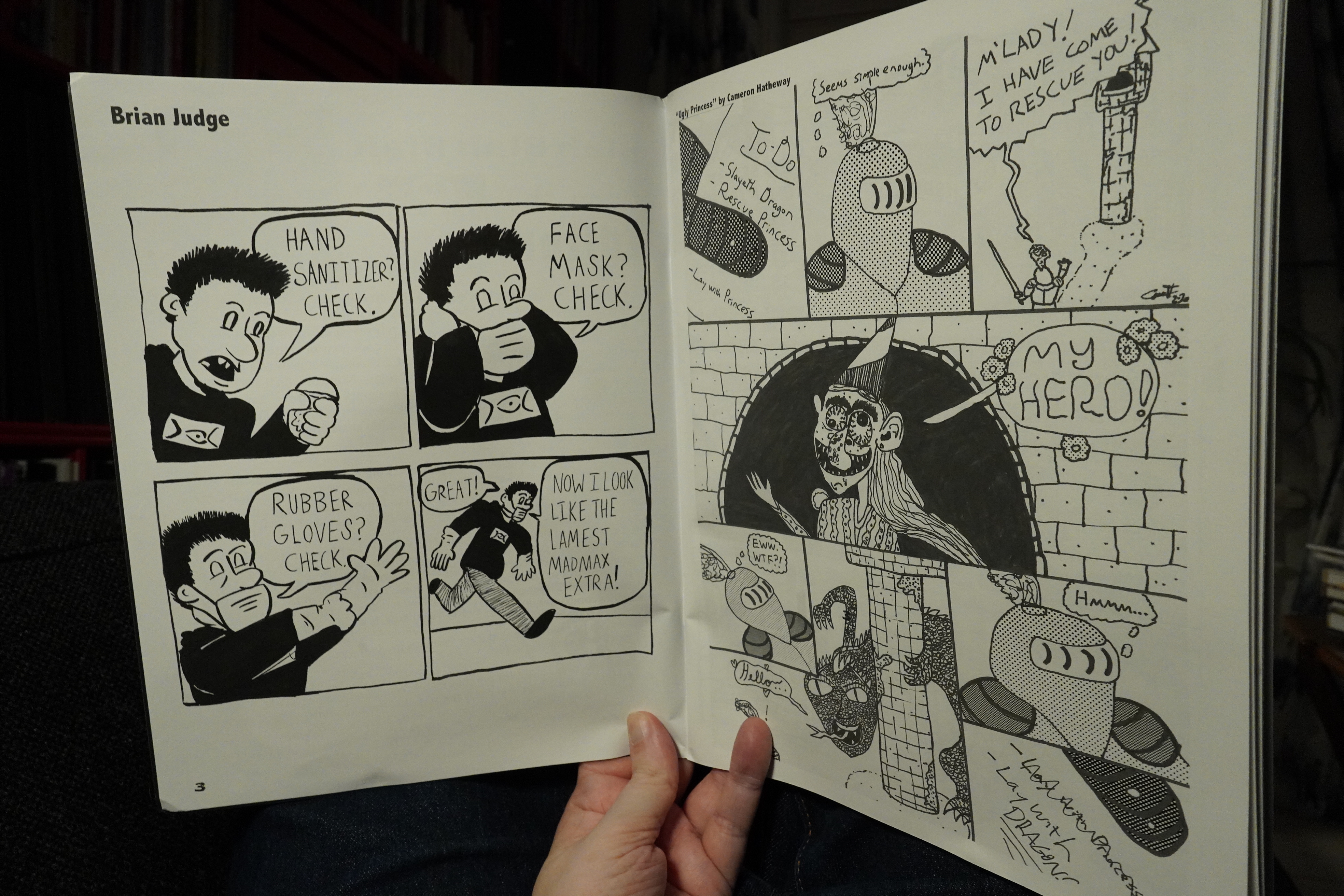
It seems like all the underground anthologies these days are magazine sized? I’m not complaining or anything, but it’s an unexpected shift (at least for me). OK, there were some classic anthologies like Arcade and Weirdo that were magazine-sized, but…
Anyway, the first issue of this isn’t very underground at all — it reads like a alternative anthology.
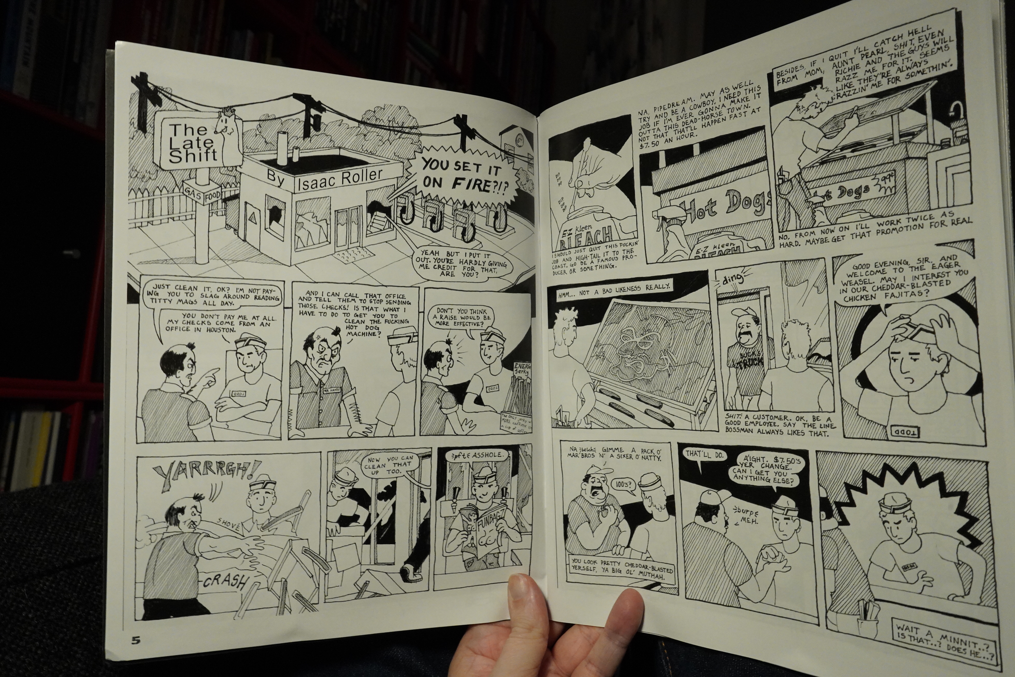
I’m not complaining — the first issue is a good read. It’s quite consistent — mostly quirky/funny bits, and this (by Isaac Roller) is the best one, I think. It’s pleasingly absurd.
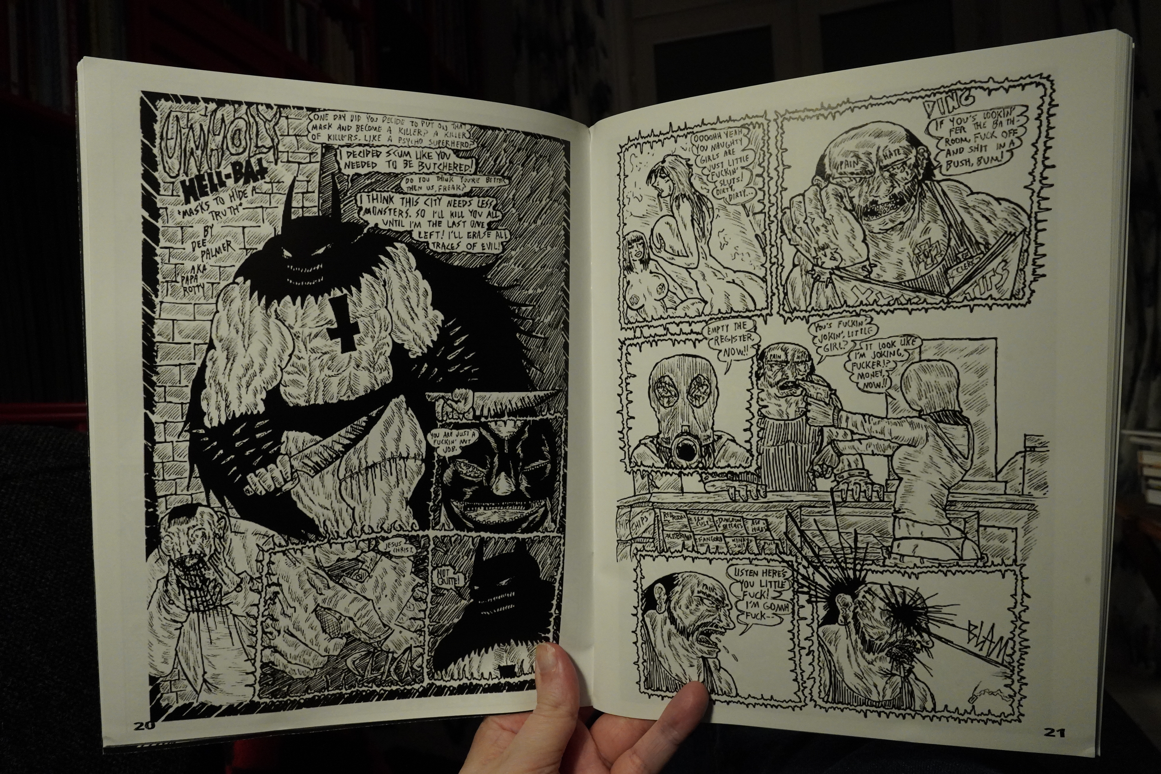
The second issue is a lot more underground… and more scattered? But the main problem is that half of the magazine seems to be printed from lo-res images. That’s uncomfortable to read.
| The Raincoats: Odyshape |  |
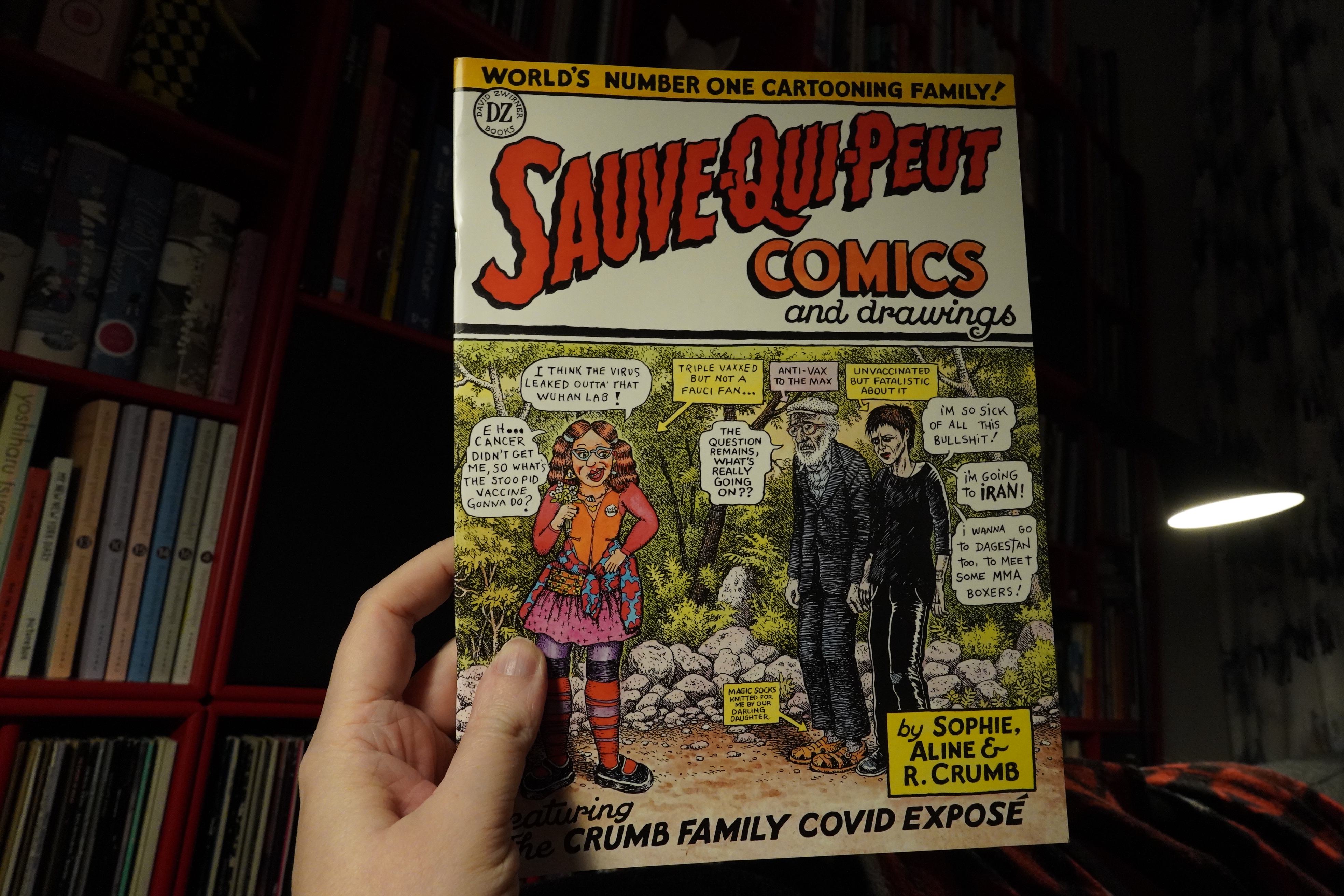
23:51: Sauve-Qui-Peut Comics and Drawings by Sophie, Aline and R. Crumb (David Zwirner Books)
The most depressing comics news last year was that Aline Kominsky died. I remember reading her Power-Pak Comix when I was, like, 12, and having my mind blown. I loved everything about it — the expressive art, the chatty/digressive flow, the hilarious bits and of course the outrageous subject matter.
*sigh*
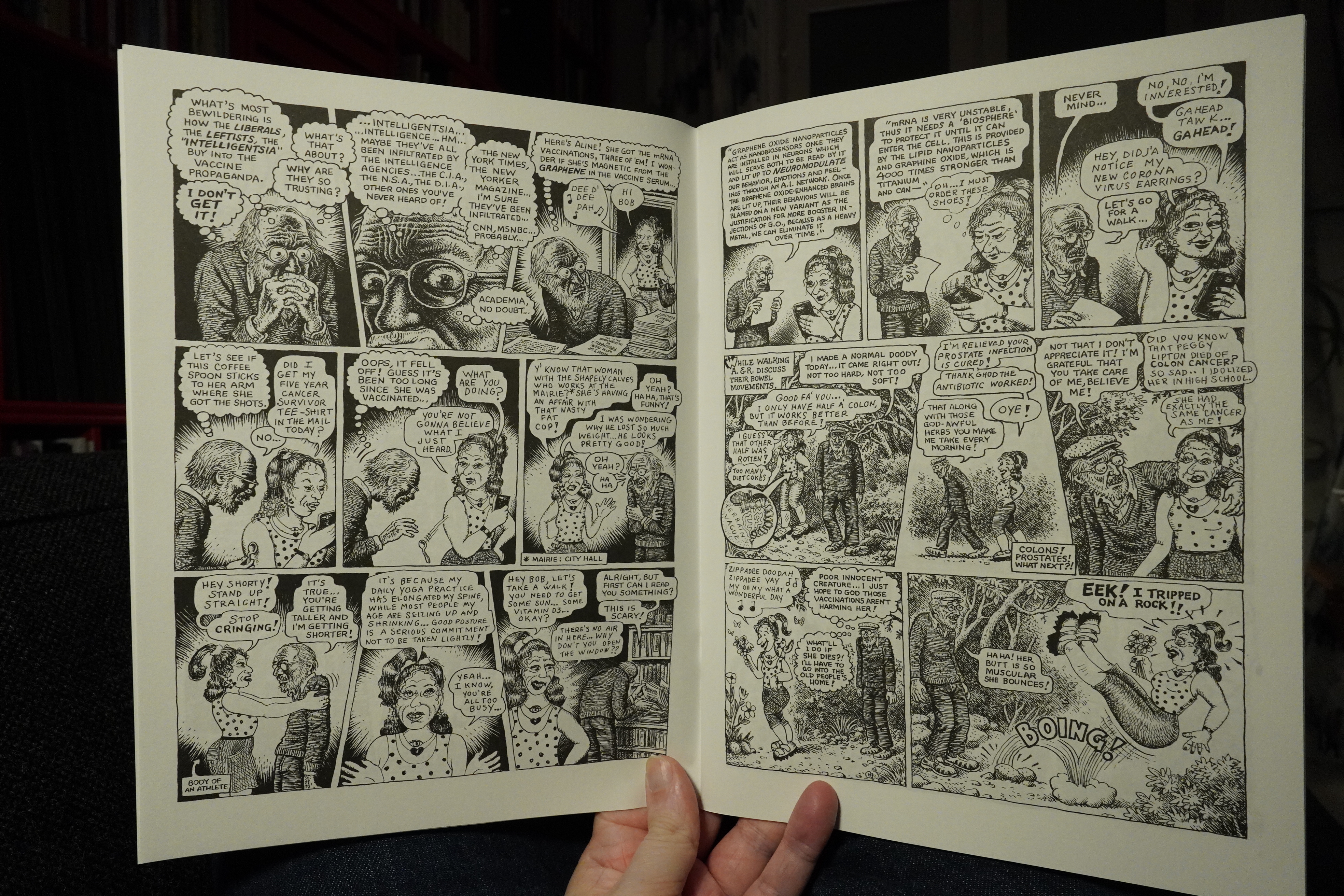
This is the latest (and I’m guessing last?) of their collaborative comics, and unfortunately most of it’s taken up by R. Crumbs loopy conspiracies about Corona and vaccines. (He’s rabidly anti-vaxx, of course. So I guess he’s consistent — he used to rant about AIDS much the same way.)
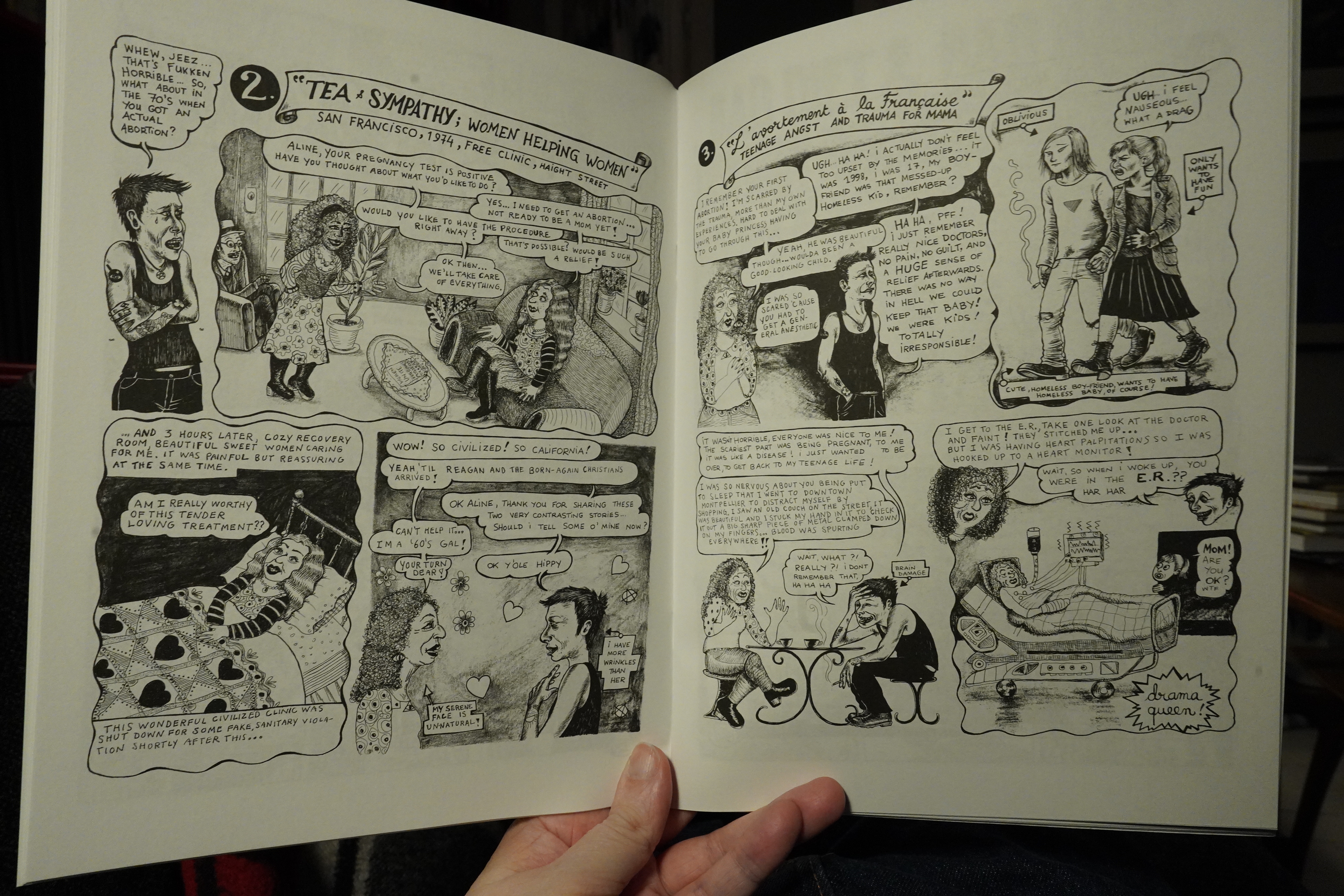
The rest of the book is a lot stronger. It collects strips from 2016-19, so pre-Fauci rants, which makes for much more entertaining reading. And there’s Sophie/Aline collaborative strip (about abortions and stuff).
| Sector 27: Sector 27 Complete |  |
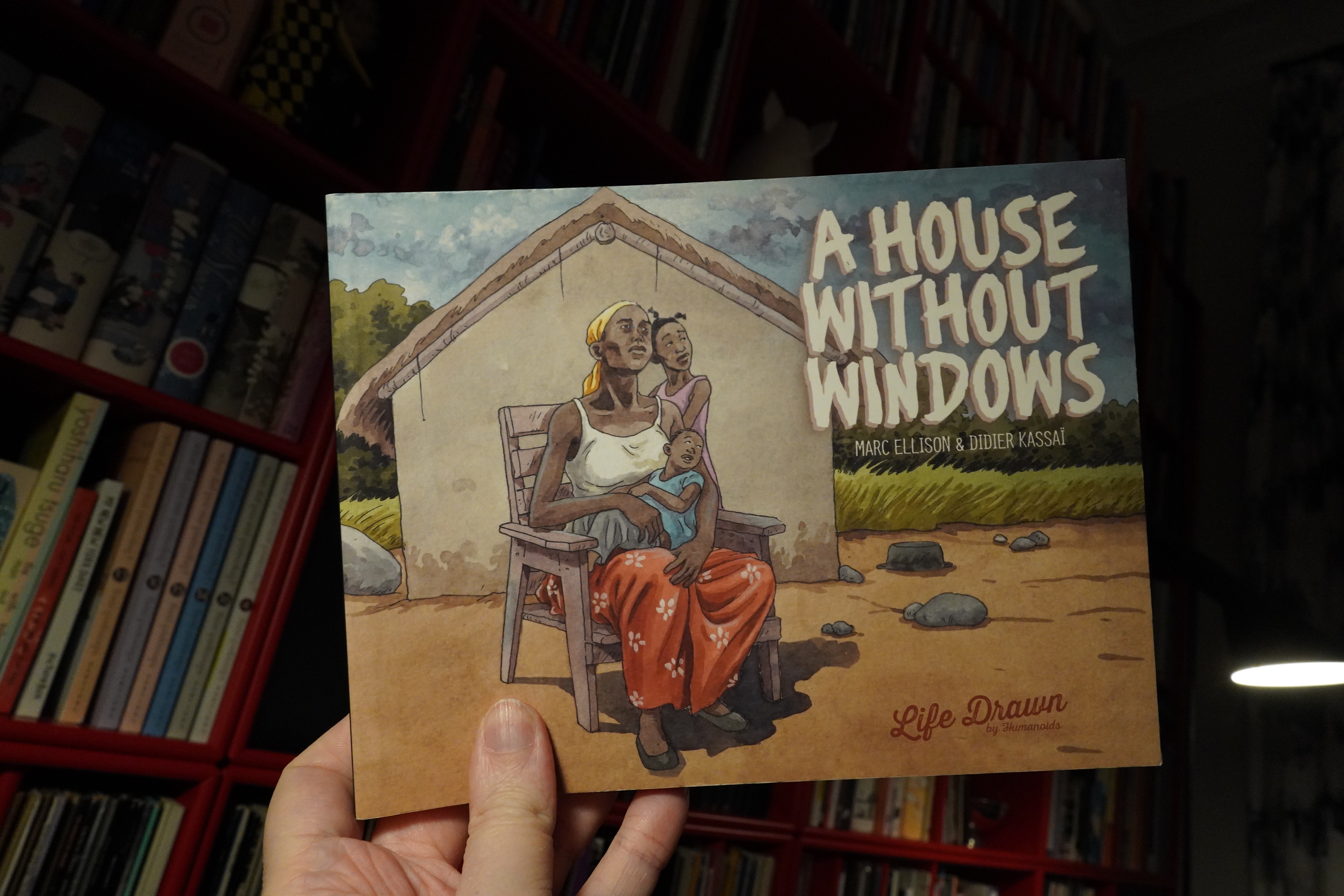
00:41: A House Without Windows by Marc Ellison & Didier Kassaï (Humanoids)
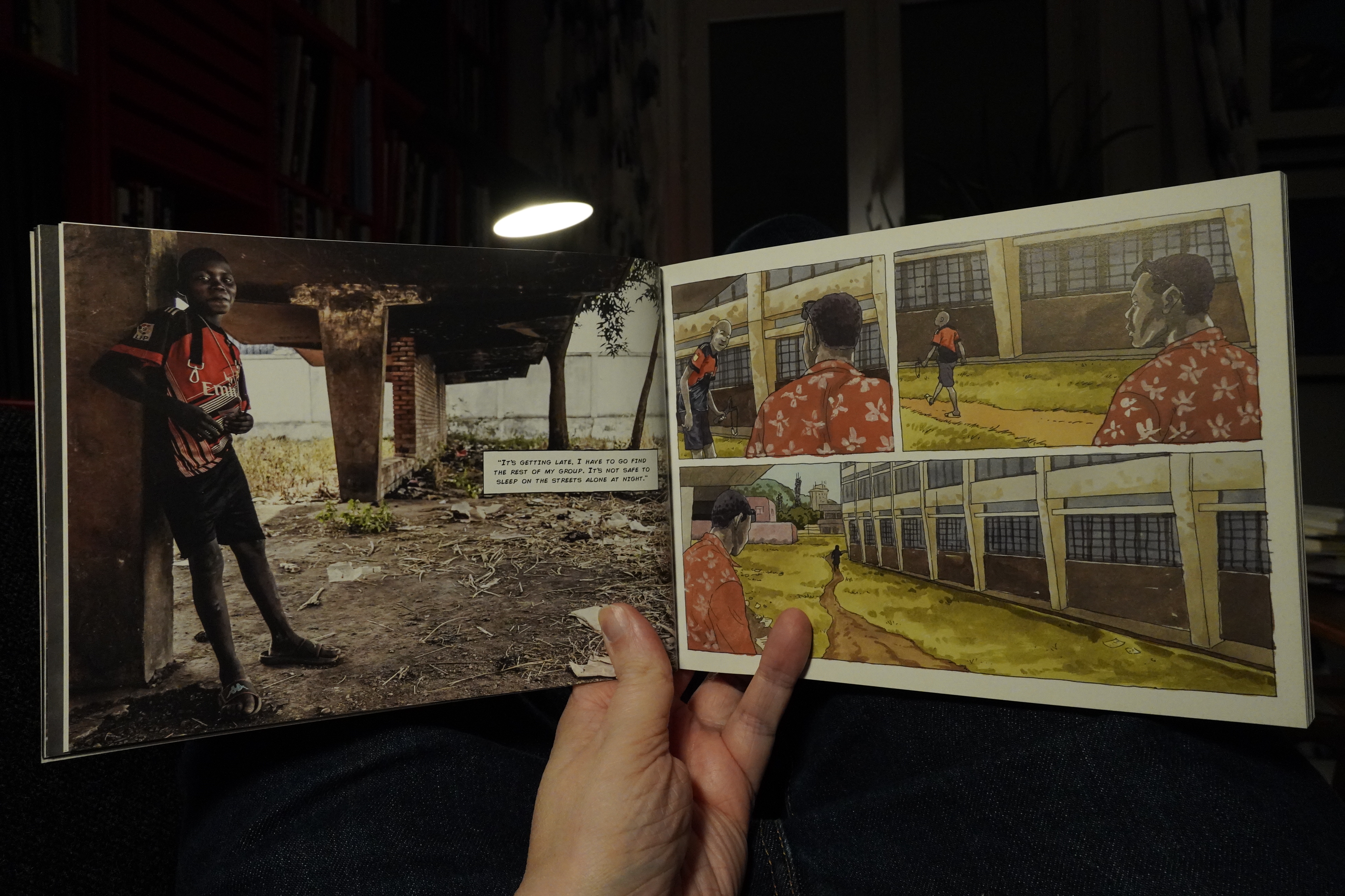
This book takes an unusual approach to doing reportage comics — they include a bunch of pictures of the people they speak with in addition to the comics bits.
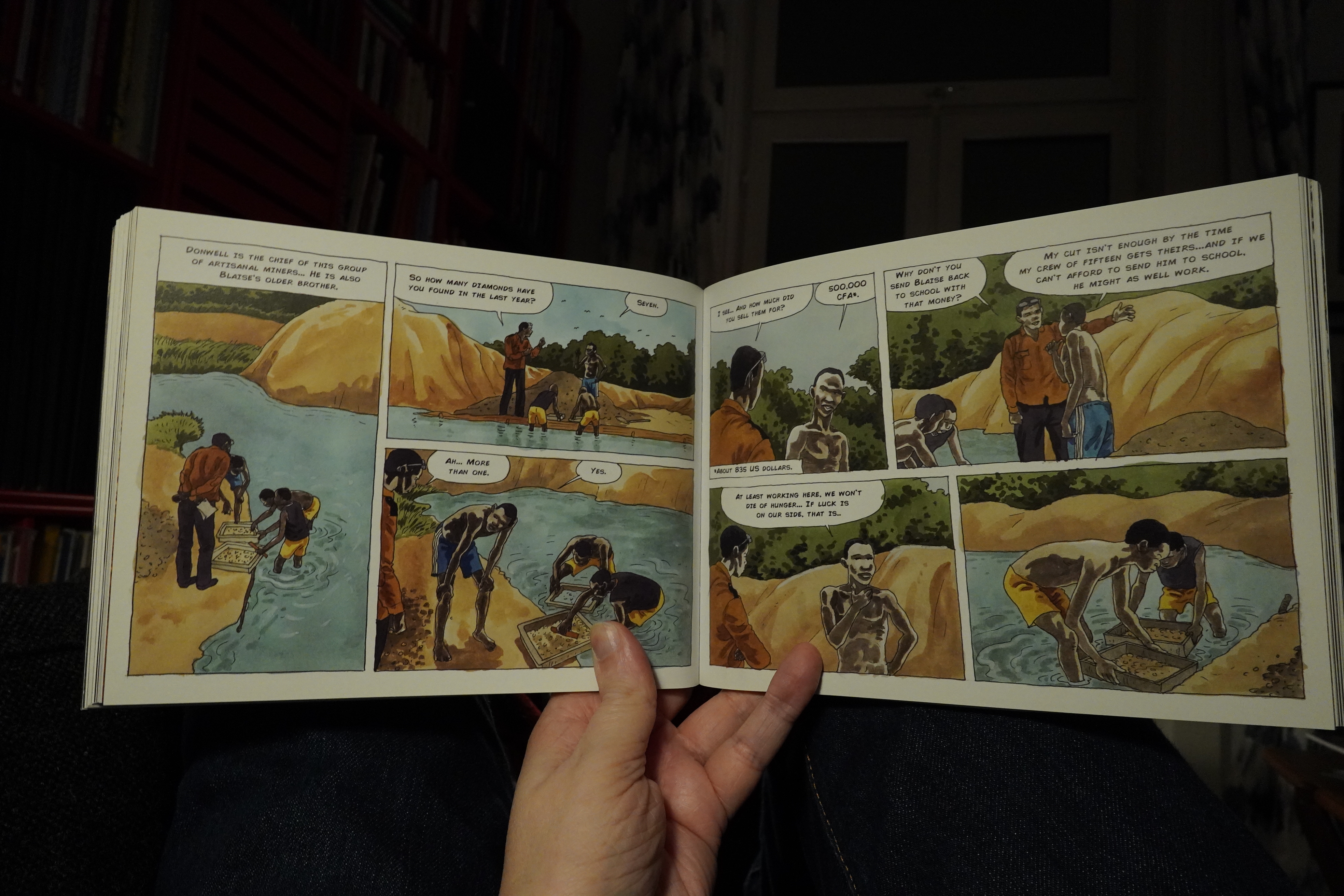
The artwork’s great — very sensitively coloured and convincing (if heavily photo-referenced) figures. And it’s about something I don’t know much about: The recent troubles in the Central African Republic (the name is a reference to that: it’s a somewhat closed country).
But unfortunately the book never builds to anything: It’s a few soundbytes from a new person every few pages, and that’s a type of documentary that I don’t really like much.
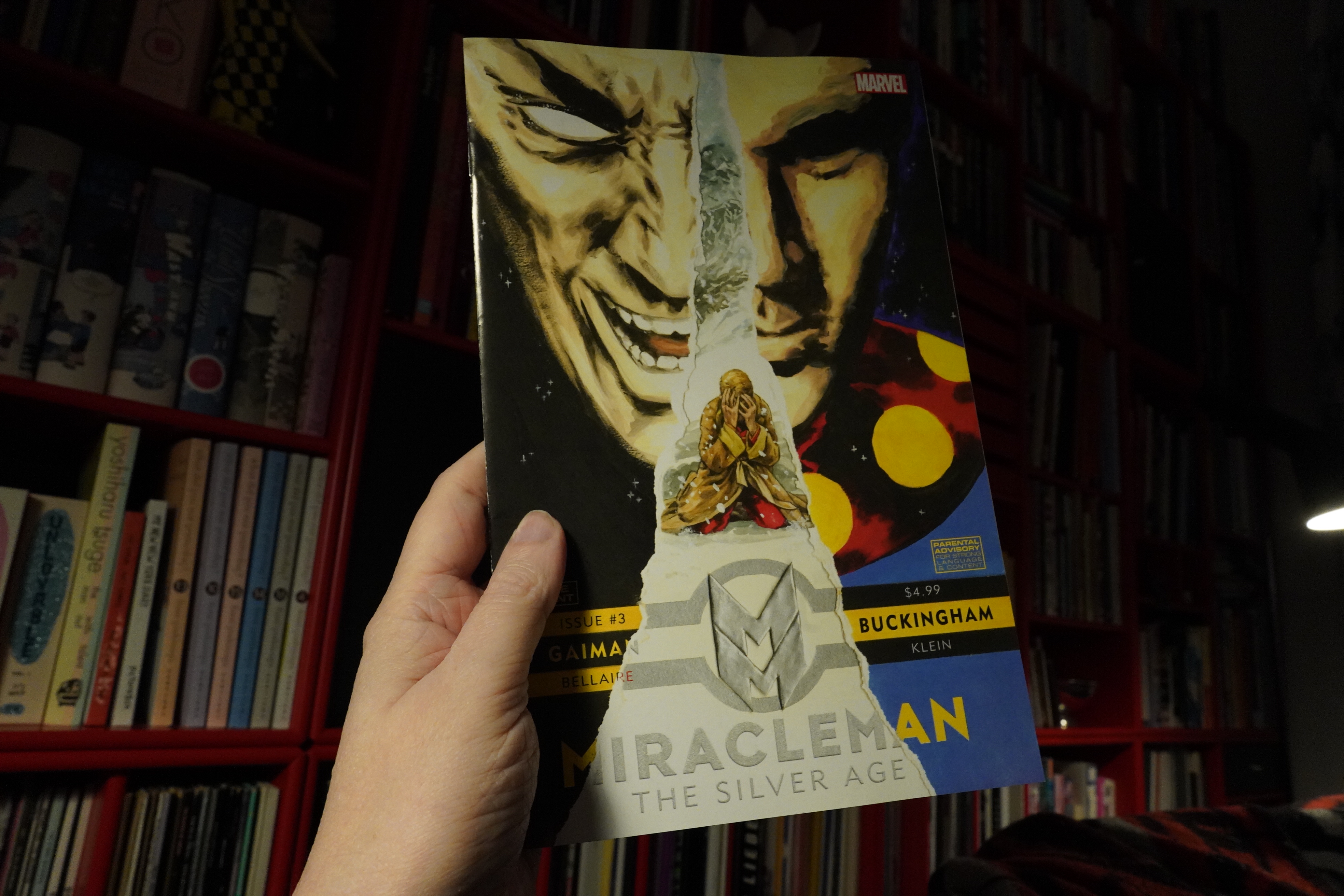
01:09: Miracleman: The Silver Age #3 by Neil Gaiman & Mark Buckingham (Marvel Comics)
Here it is: Finally a new issue of Miracleman, just thirty years after the previous one.
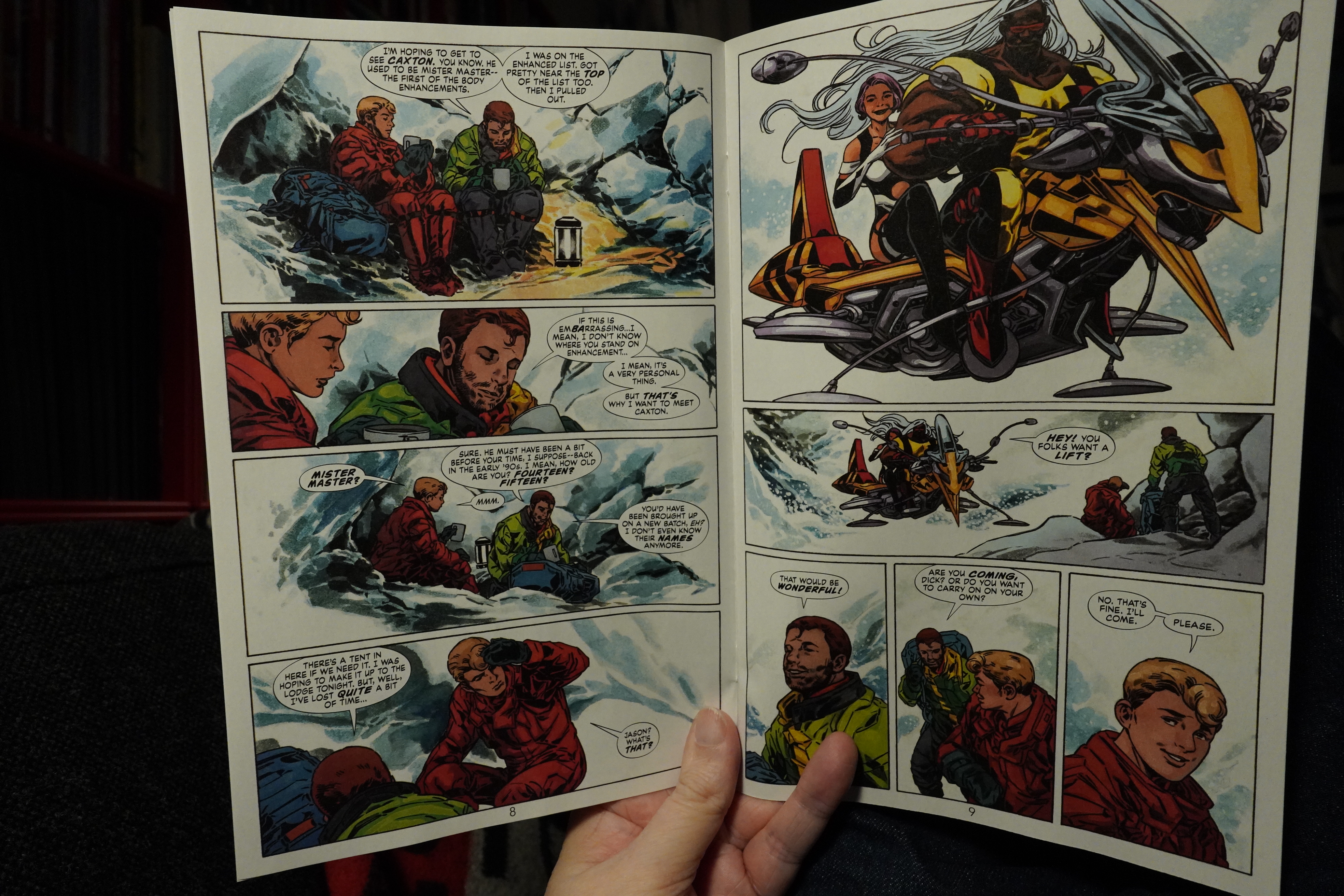
Oh, I’d forgotten that they’d actually finished Miracleman #25 back in the 90s, but they never handed in the artwork because Eclipse didn’t pay them, so it was never published. So it’s not until next issue we finally get new new stuff.
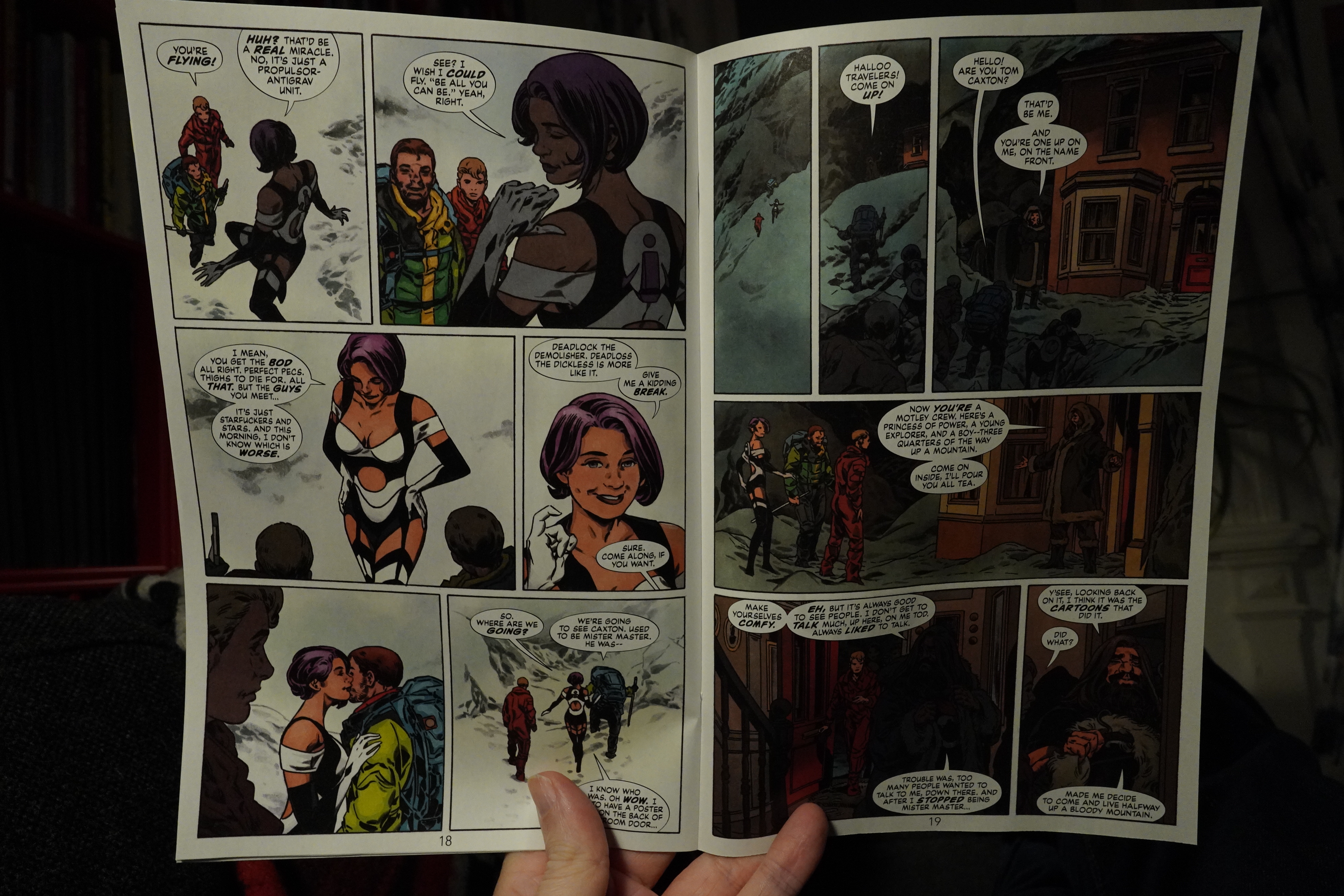
Is that Alan Moore they meet up on the mountain?
Anyway, pretty good issue.
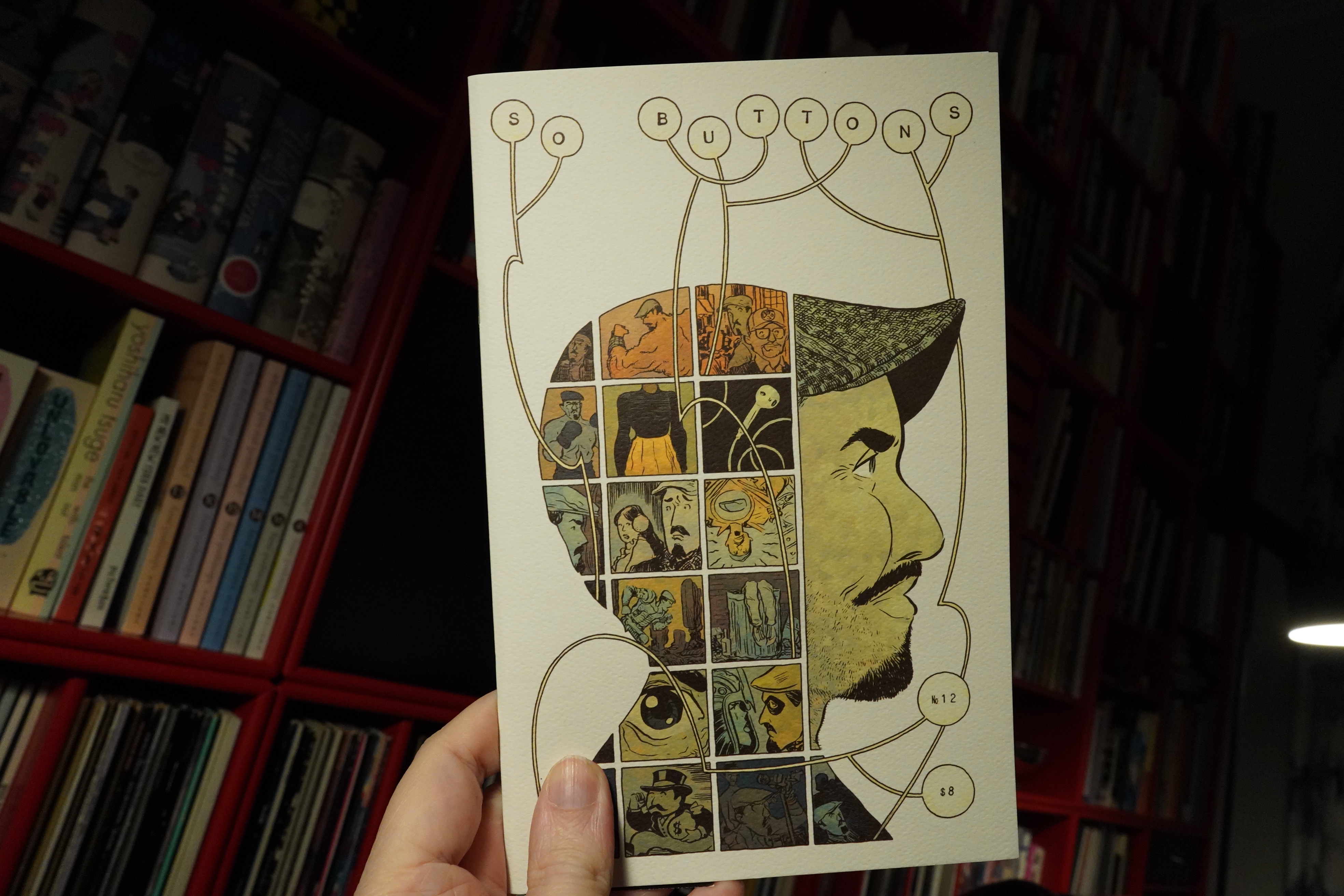
01:25: So Buttons #12 by Jonathan Baylis and others
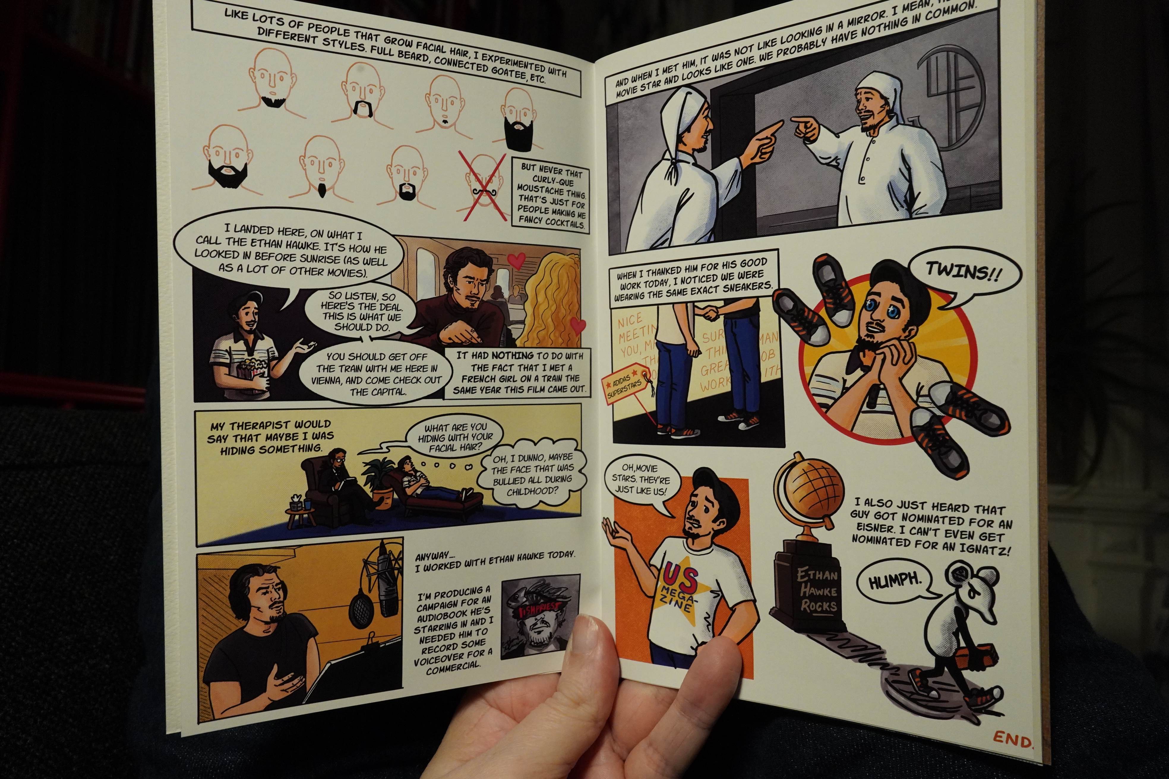
I think this issue is longer than most of them? And I like that — while it’s a collection of short pieces (many of them just a single page), it’s got a good flow and you want to live in this atmosphere for a while. (Art by Rachelle Meyer here.)
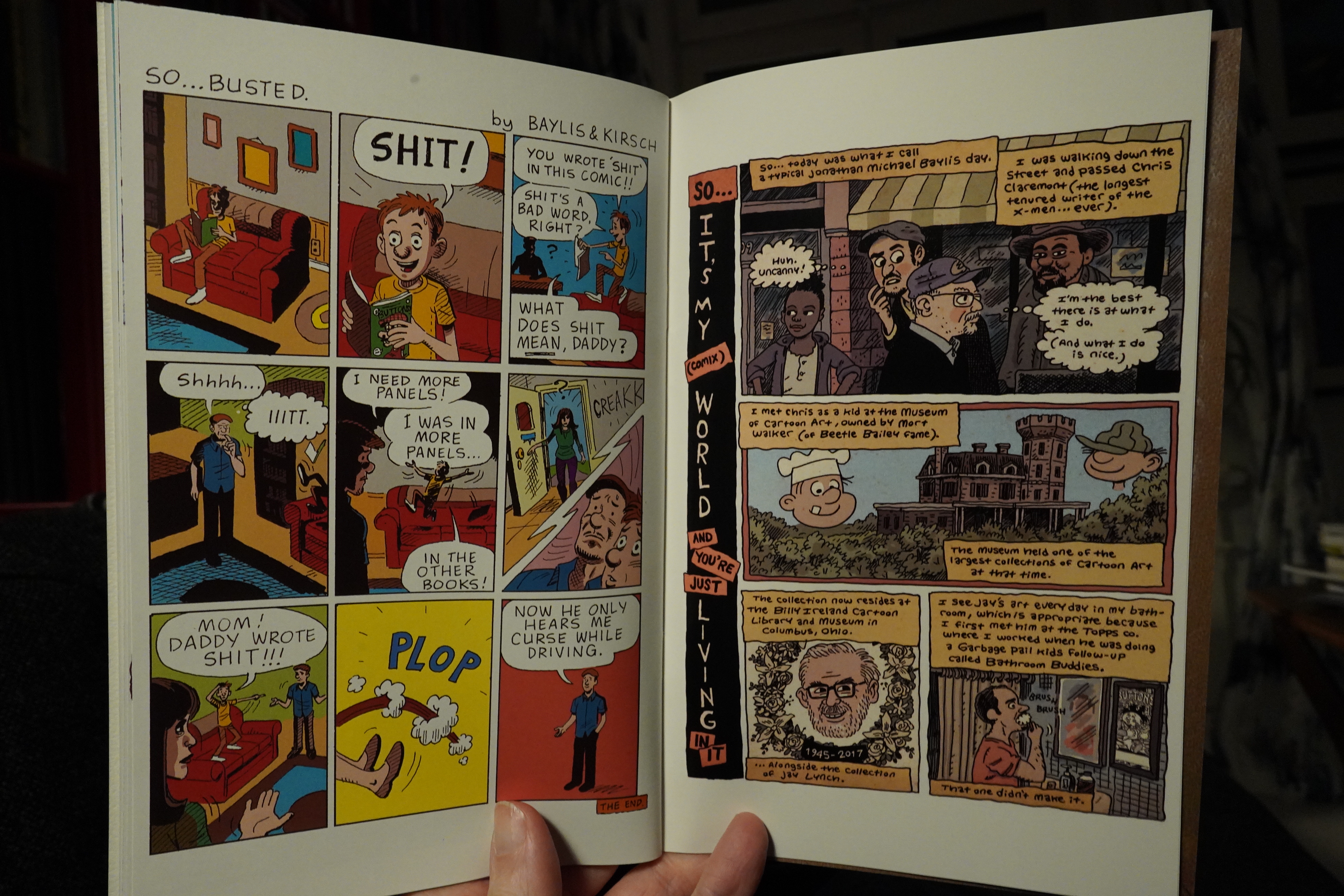
This issue has some longer pieces, too, which also helps with the flow. Solid, funny anecdotes and a couple stories with more emotional depth, so it’s another good issue. (Art by T. J. Kirsch and Noah van Sciver above.)
| Fad Gadget: Incontinent | 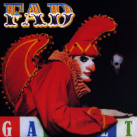 |
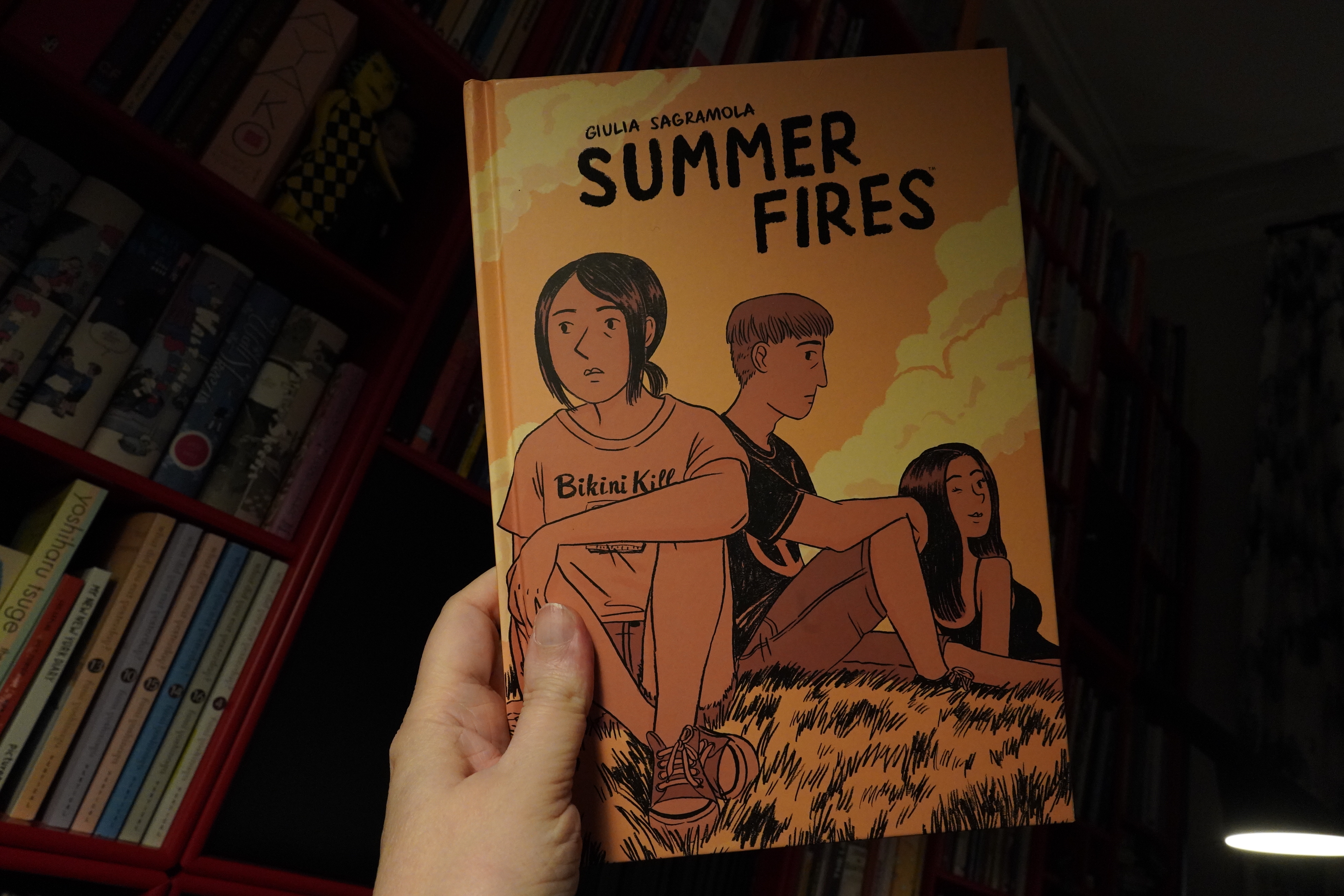
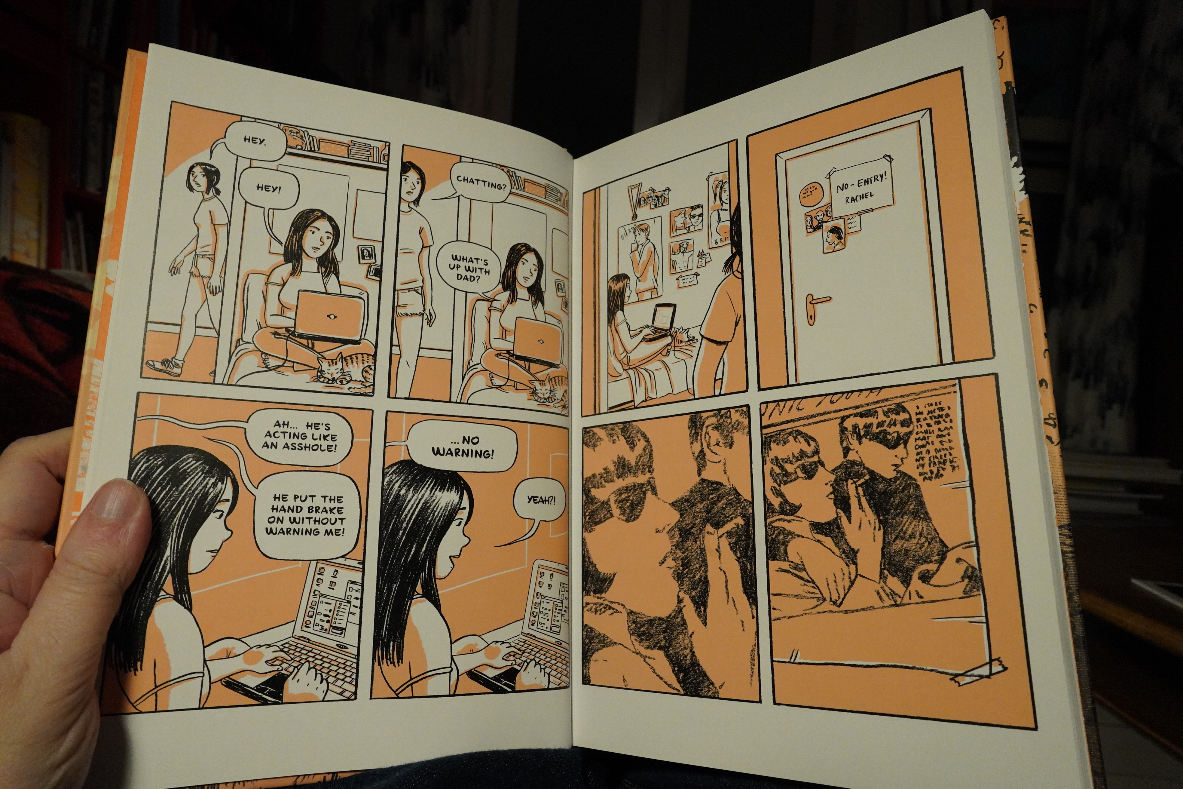
01:43: Summer Fires by Giulia Sagramola (Dark Horse)
Is Dark Horse trying to get into the YA bookstore market or something? Because this is a bit out of their wheelhouse… It was originally published in Italy in 2016, and is about growing up and stuff.
But the storytelling is so odd. It doesn’t flow easily from page to page, but seems to snag all the time. One problem is that many of the characters look very similar, but it’s also just difficult sometimes to comprehend what she’s trying to draw. I think he’s stamping out a fire in the woods in the third panel there? Did he stamp it out? Wat
But it’s OK. It’s fine — there’s some original twists and turns, and the mood is pretty good. I’m wondering whether the problem is the translation:
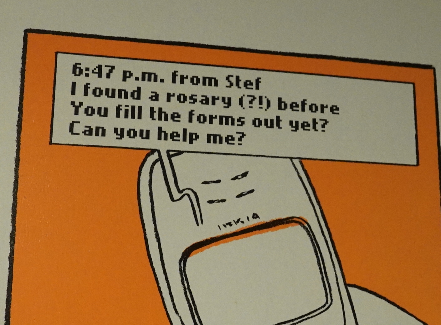
Rosary?
So I dunno.
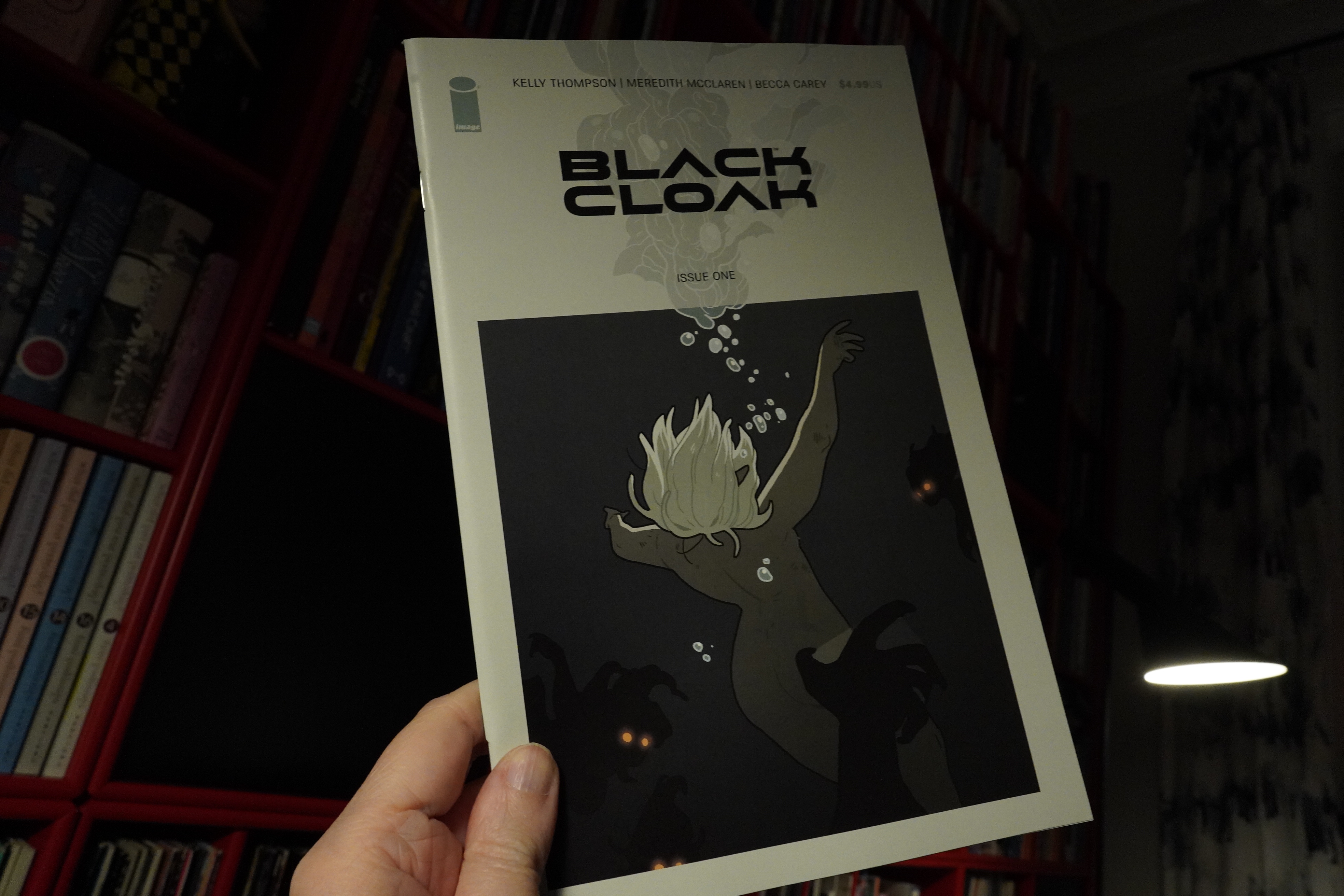
02:15: Black Cloack #1 by Kelly Thompson, Meredith McClaren and others (Image Comics)
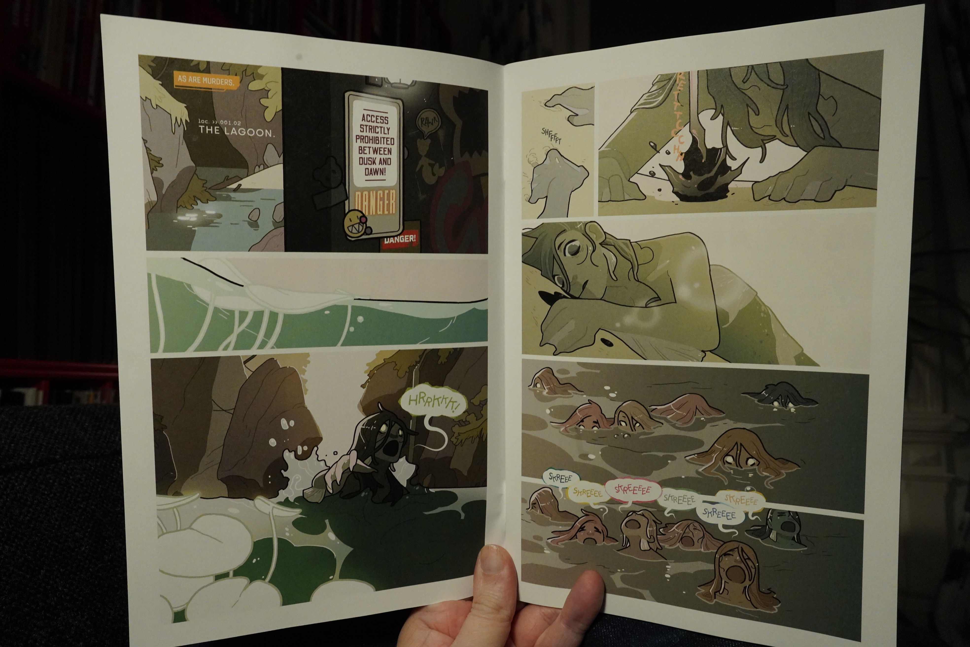
Oh, interesting art style. I mean, it looks animation-influenced, which isn’t a turn-on for me, but it’s… like… better. Influenced by Fiona Staples, perhaps?
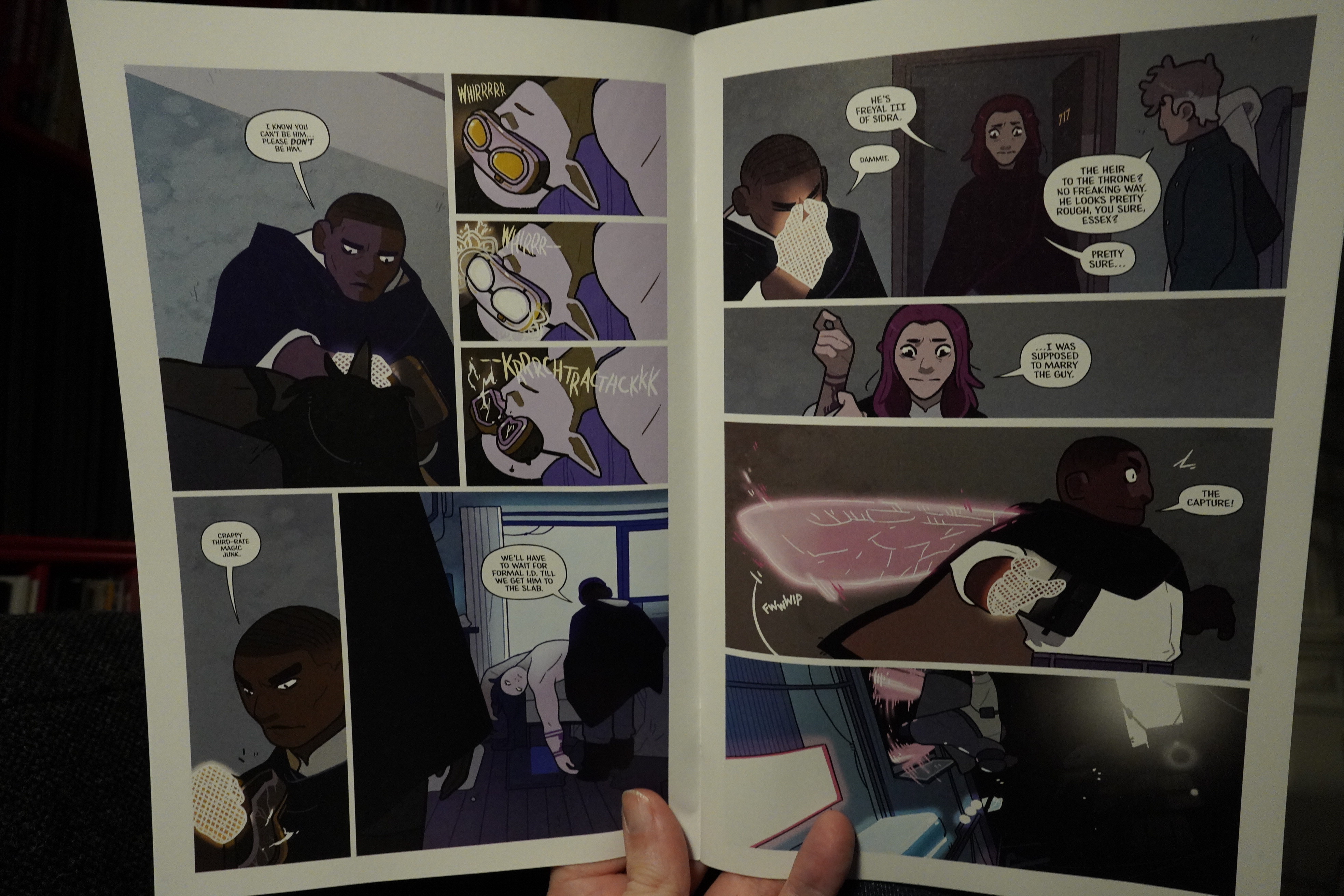
And the storytelling’s great. We get exactly as much information as we need to make sense of this bewildering world, and not a smidgen more. That’s exciting, and makes for snappy reading. The world consists of a bunch of familiar tropes, but it’s put together in an interesting, new way. It’s very entertaining. I’m guessing it won’t quite be a new Saga sales-wise, because it demands more attention than I think most people are willing to give, but I may be wrong. I mean, Monstress can get pretty convoluted, too, and that’s a major hit, so *crosses fingers*.
| Various: Special Club: Hiver 81-82 |  |
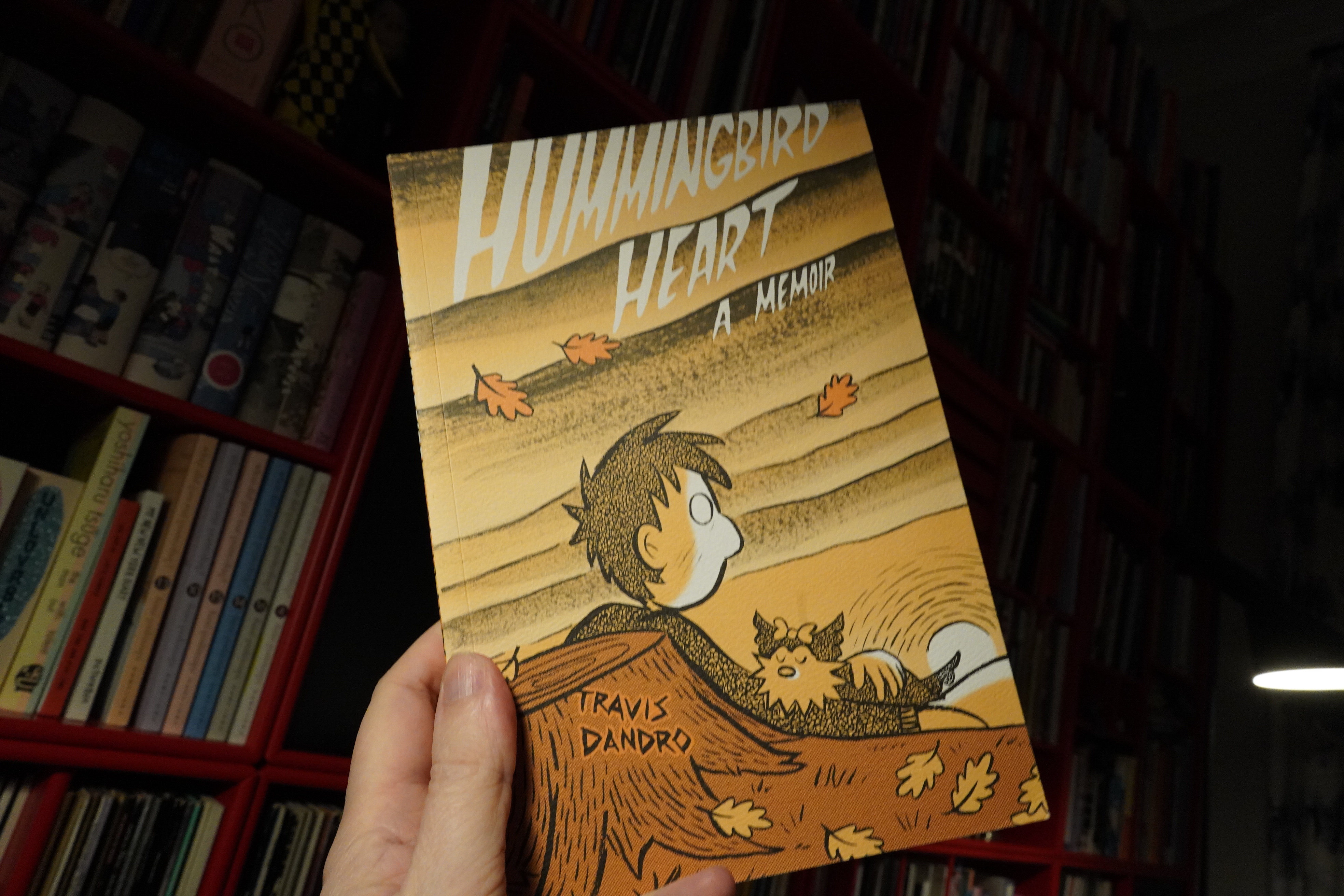
02:43: Hummingbird Heart by Travis Dandro (Drawn & Quarterly)
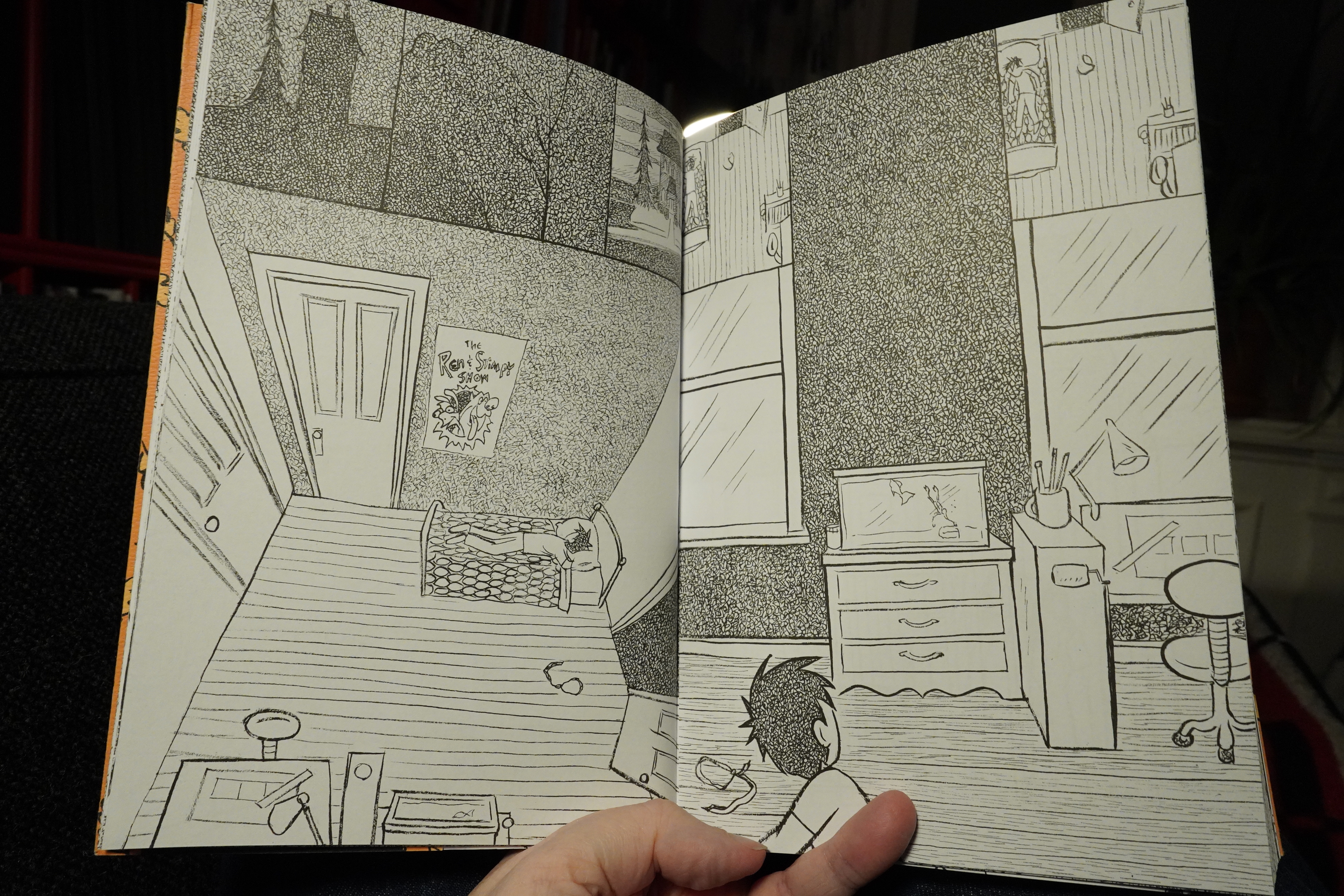
Oh, yeah, I remember this art style. I think I’ve read his previous graphic novel?
It’s so odd — it’s obsessive scribbling in various densities, but never actually any filled blacks. Nowhere for the eye to rest. The layouts are pretty bewildering, too: They seem to suggest reading the panels in other directions than normal, but that’s usually misleading. The two top panels on the right-hand page don’t immediately resolve as separate panels, either.
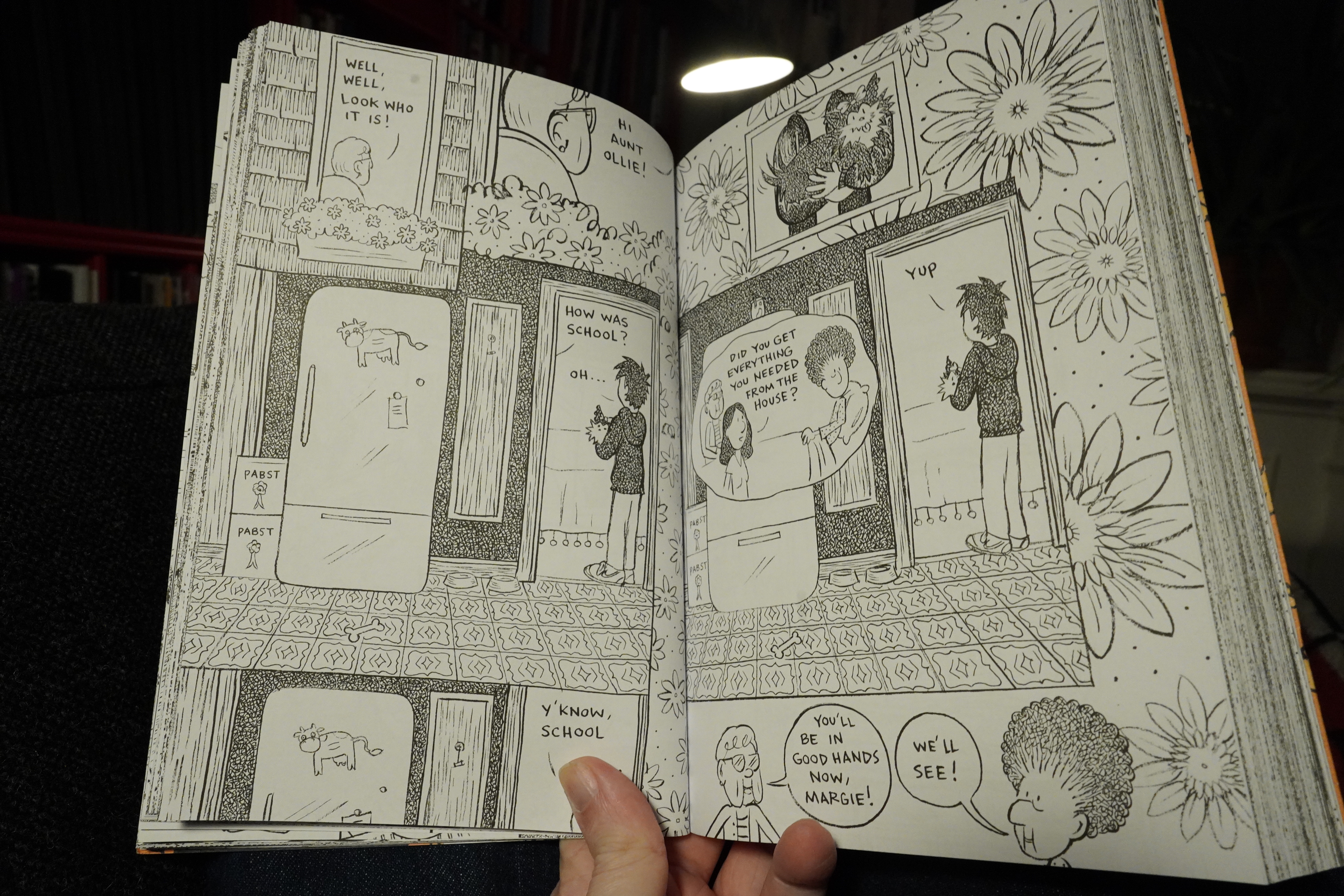
The layouts are kinda trippy sometimes.
This is another autobio about a teenager, but this time it’s not about the normal stuff. Instead the protagonist has to take care of his grandmother who’s dying from cancer, and also navigating last year of high school and all that stuff. It’s pretty good, but parts of it (his acting out when his grandmother dies, for instance) feels contrived. I mean, for all I know, it happened — clichés are clichés for a reason. But…
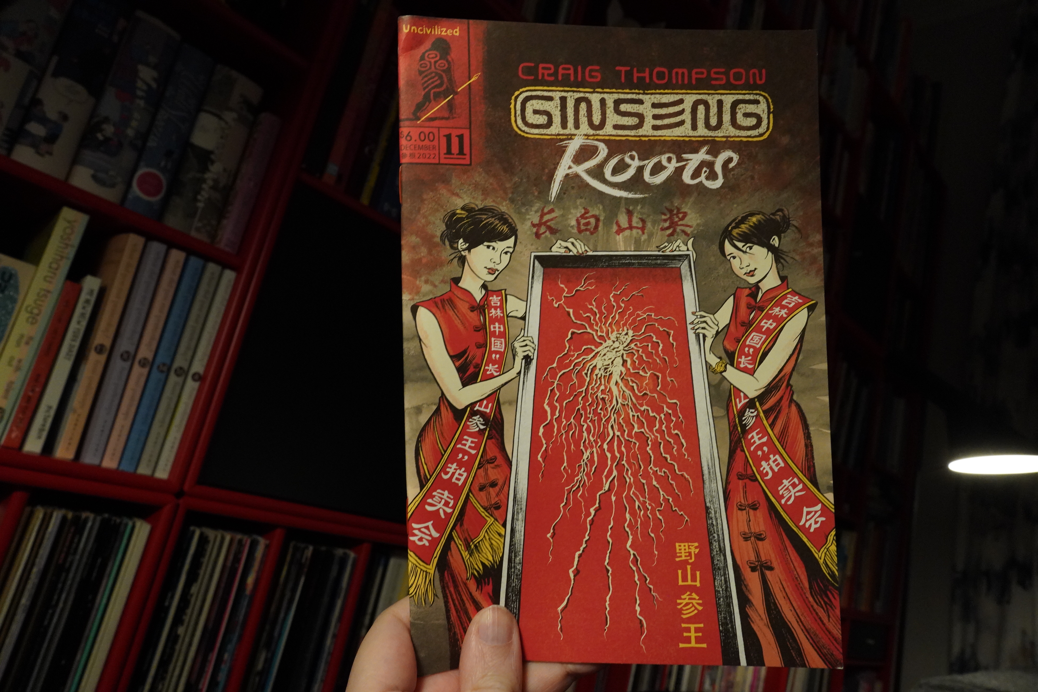
03:26: Ginseng Roots #11 by Craig Thompson (Uncivilized Books)
I’ve really been enjoying this series. There’s just one more issue to go, apparently, and it’s been a strange ride — the story never going where you’d expect. I’m not sure what people will make of the collected edition? How will it read as one big brick? Each issue has a natural narrative arc, but there doesn’t seem to be any big overall arc? But perhaps the final issue will tie everything together.
Thompson’s artwork keep getting lusher and lusher. I think he works more from photo reference now than before? At least it looks like that. But it’s not stiff or posed…
I should go to bed, shouldn’t I?
| Prince: 1999 |  |
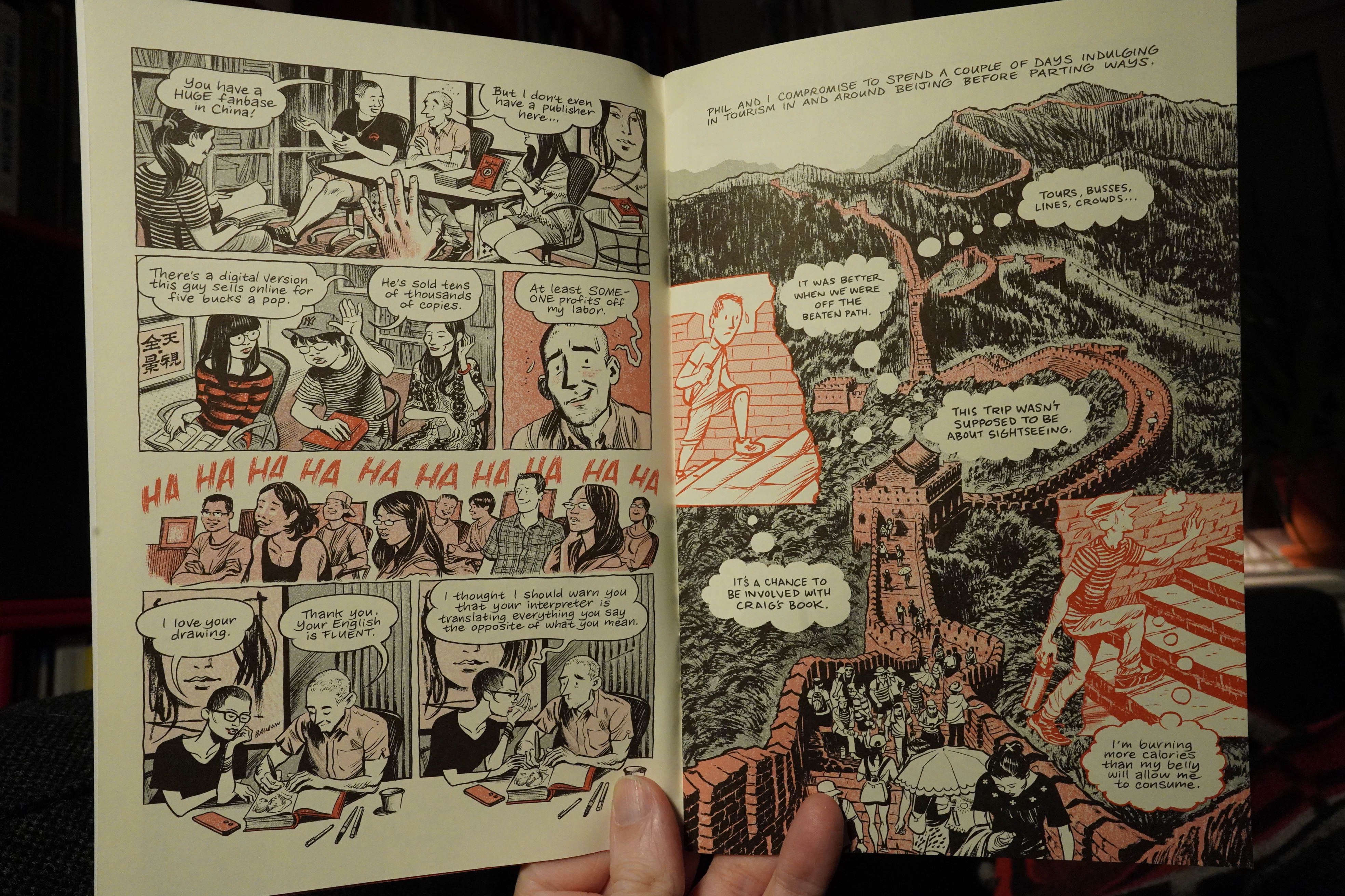
03:48: Chivalry by Neil Gaiman and Coleen Doran (Dark Horse)
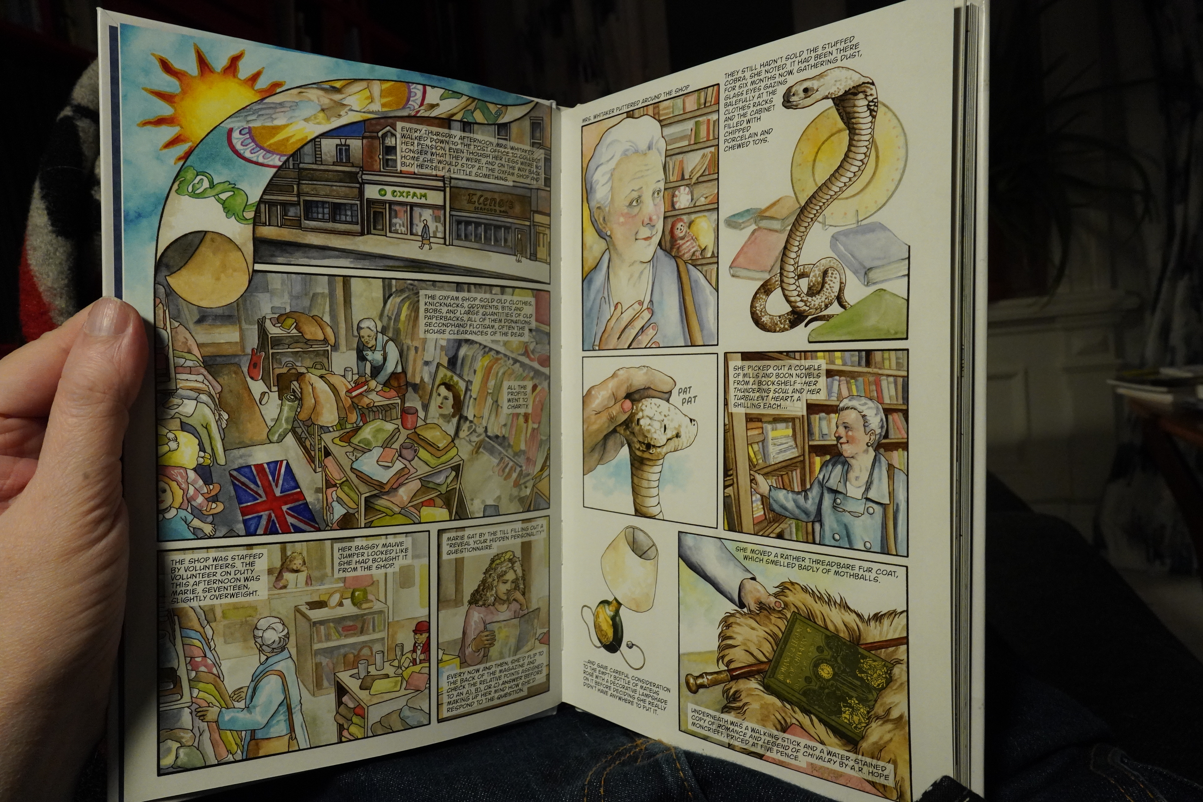
I’ve read a few Neil Gaiman adaptations before (when I’m interested in the artist), and… er… They’re usually not very good now are they?
But look at the artwork here. It’s distinctly Doran, but it looks absolutely nothing like her normal rendering. It reminds me of… of… like.. Oh yeah, Bo and Scott Hampton in the mid 80s! Yeah. Well, I think so. It’s really pretty.
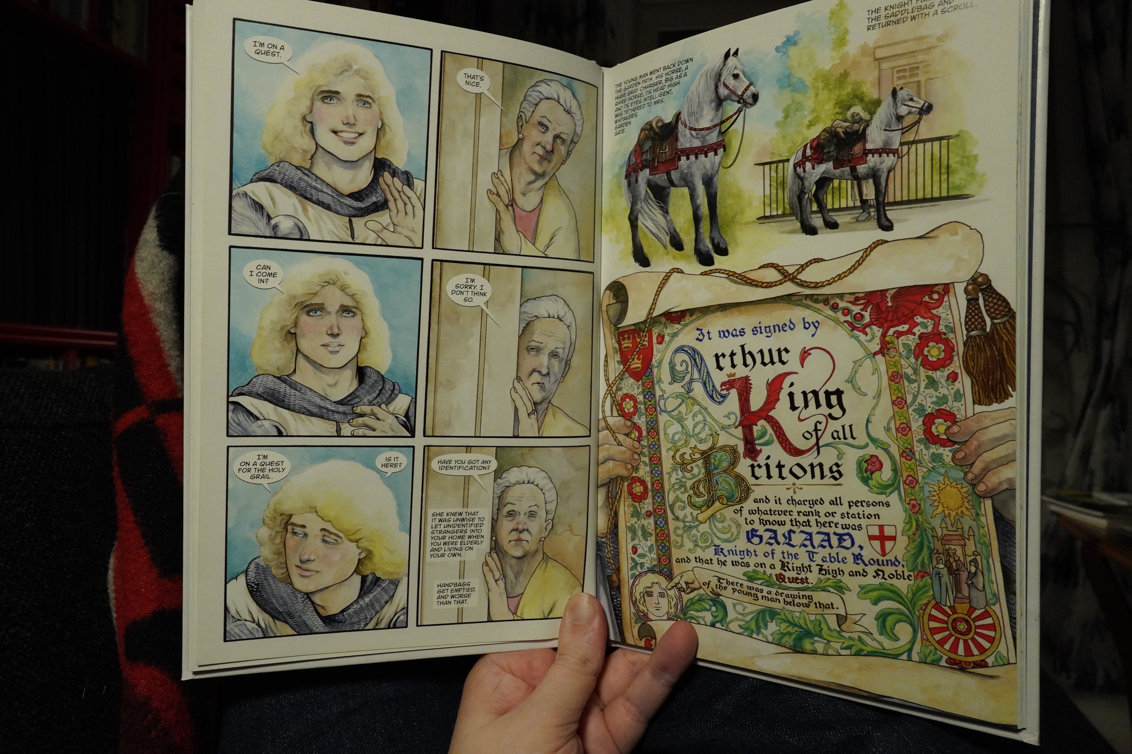
And this is a very, very sweet little story. It’s bordering on being too cutesy, but it hits the right balance. It’s a lot of fun.
Now I really should go to bed.
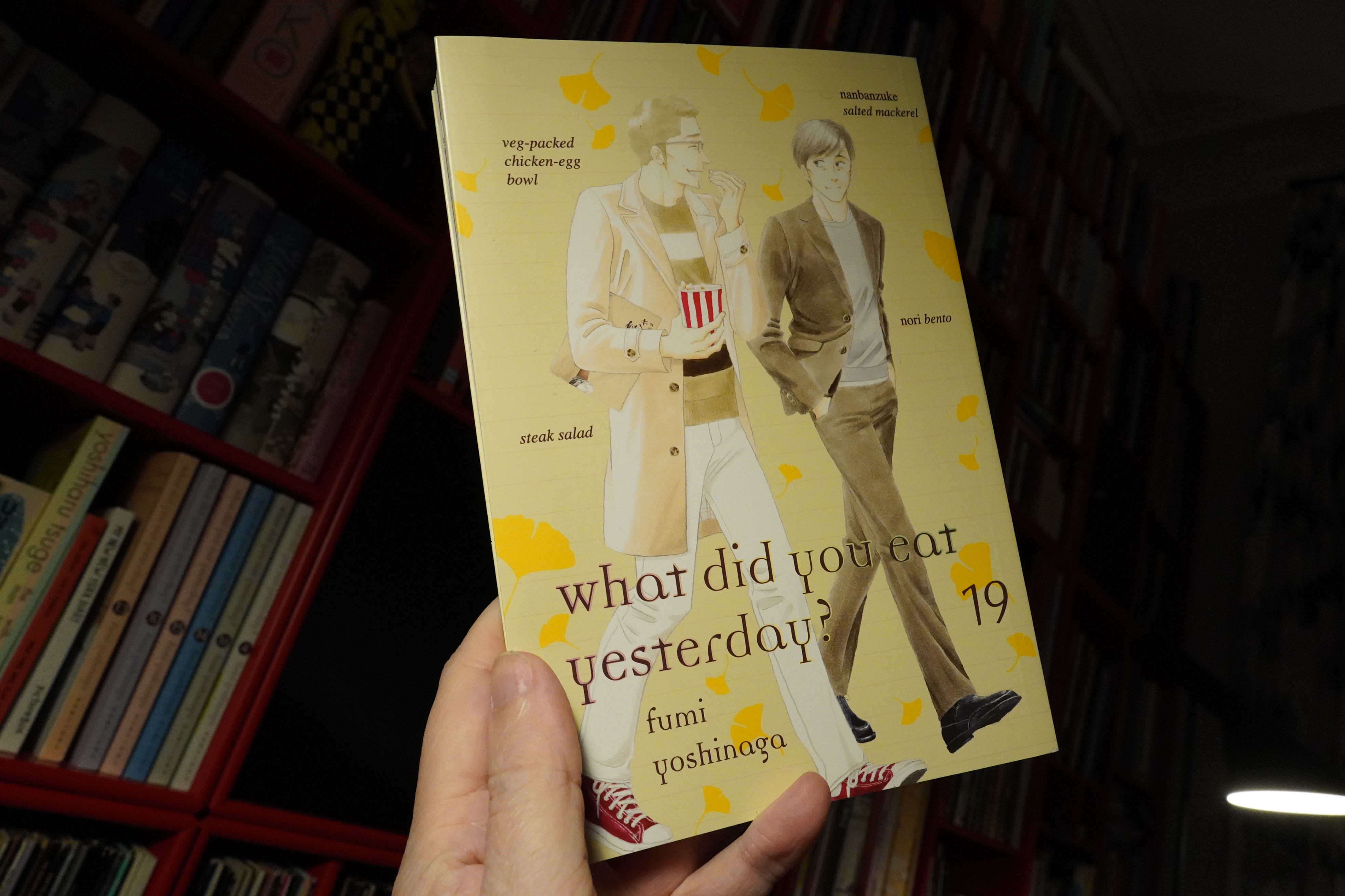
04:13: What Did You Eat Yesterday? 19 by Fumi Yoshinaga (Vertical)
How many years has this been going now? It’s such a pleasant read… everything’s so low stakes — this is the absolute height of the drama in this volume.
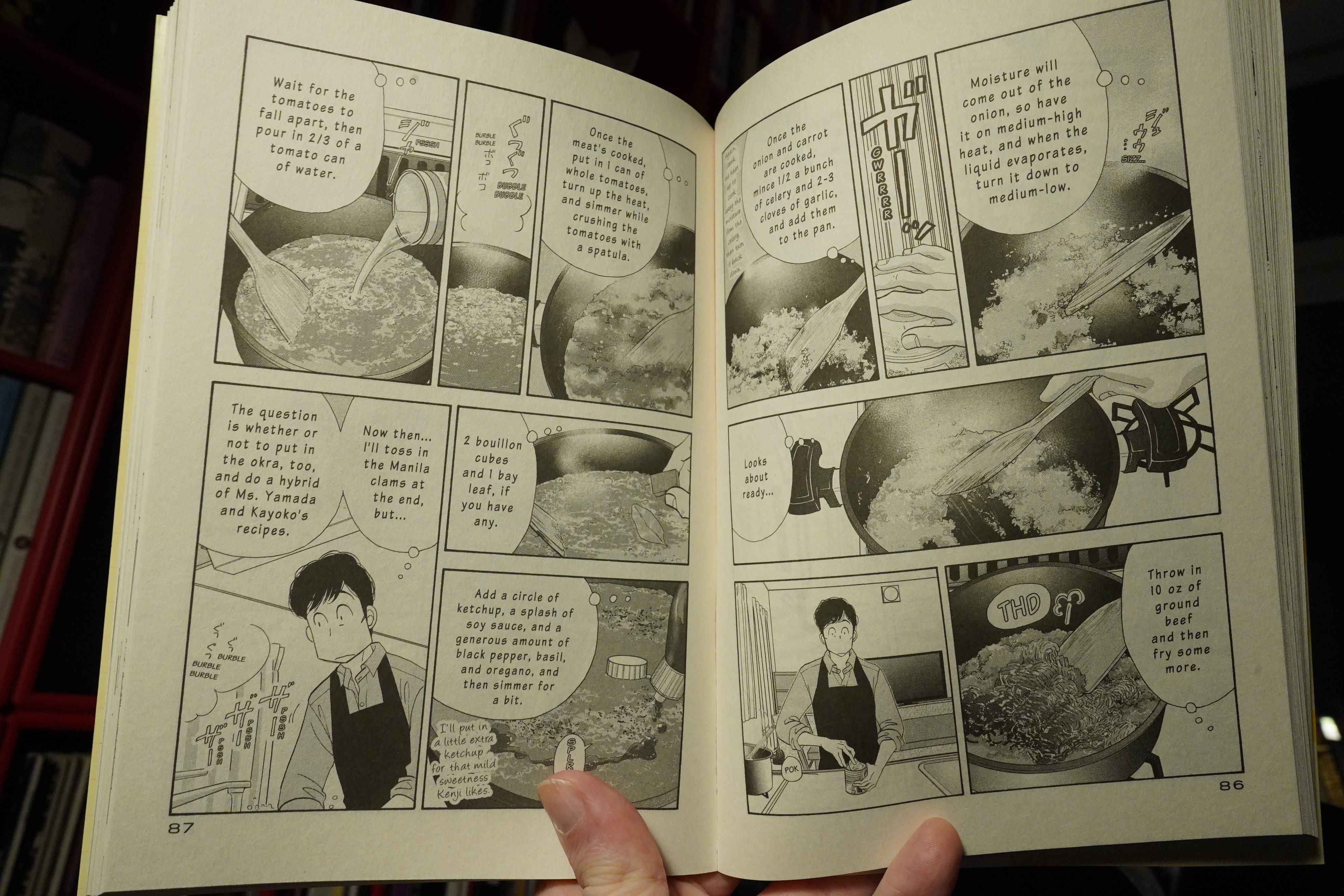
I don’t know anybody else that draws food like this, and I want to make everything they make. However, I’ve never actually done that yet, and I was thinking that it’d never happen, but this dinner is so simple that I have to try it. No obscure ingredients and not ten separate dishes to make up a meal. I’m putting this volume on the kitchen bench to remind myself.
And now I really, really should go to bed.
| Blaine L. Reininger & Alain Goutier: Paris en Autumne |  |
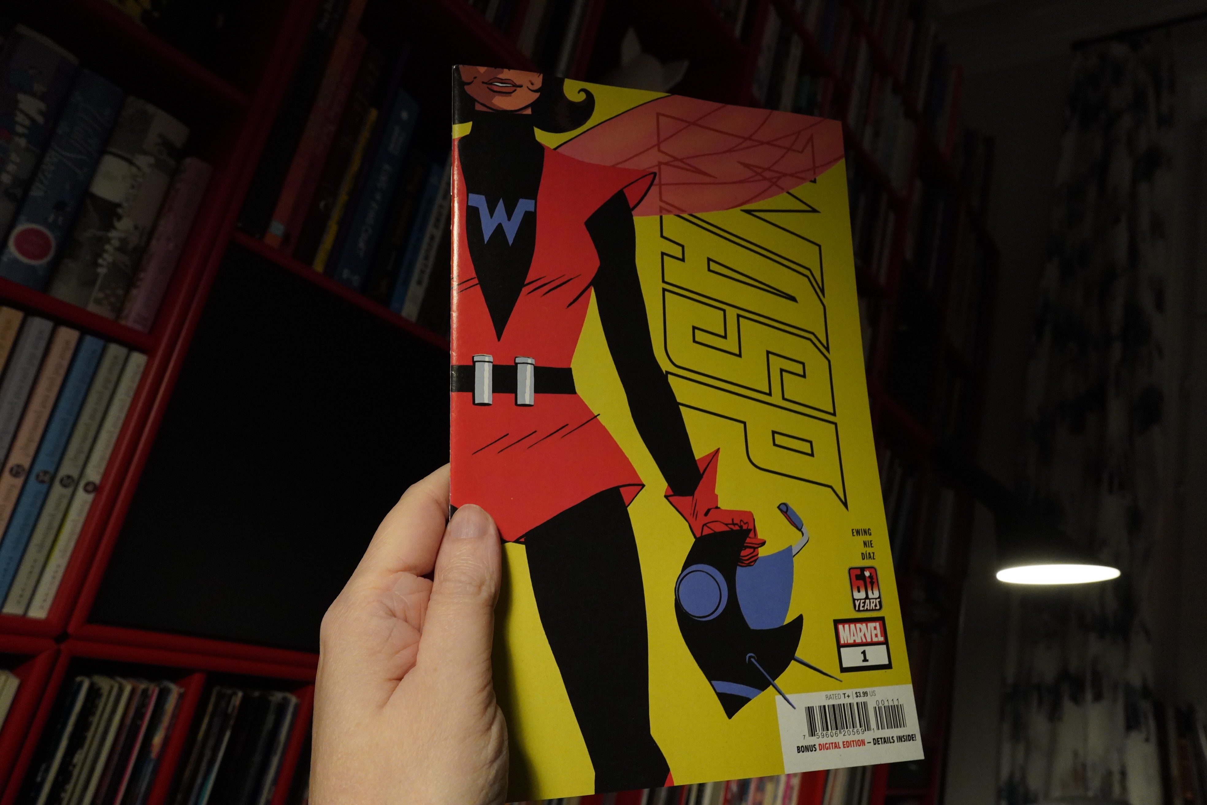
05:15: Wasp #1 by Ewing, Nie, Díaz (Marvel Comics)
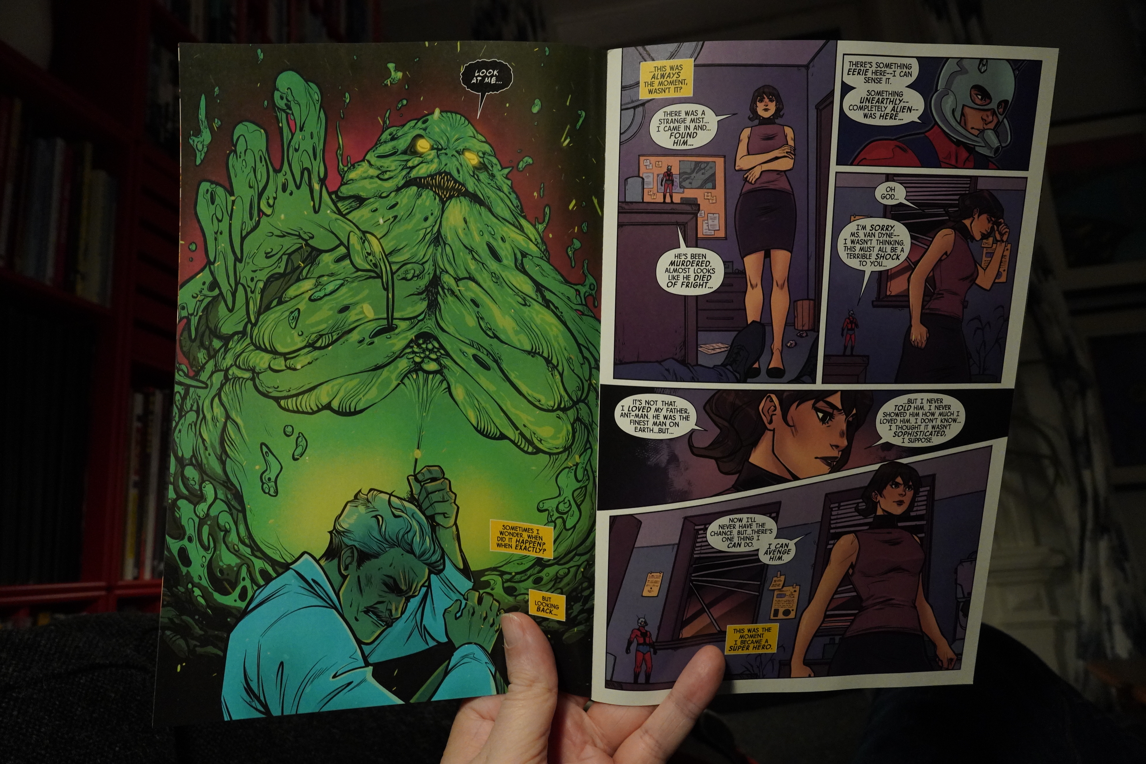
I keep trying to buy new super-hero comics — it’s mostly a wash. I’ve read some entertaining stuff from Al Ewing before, though.
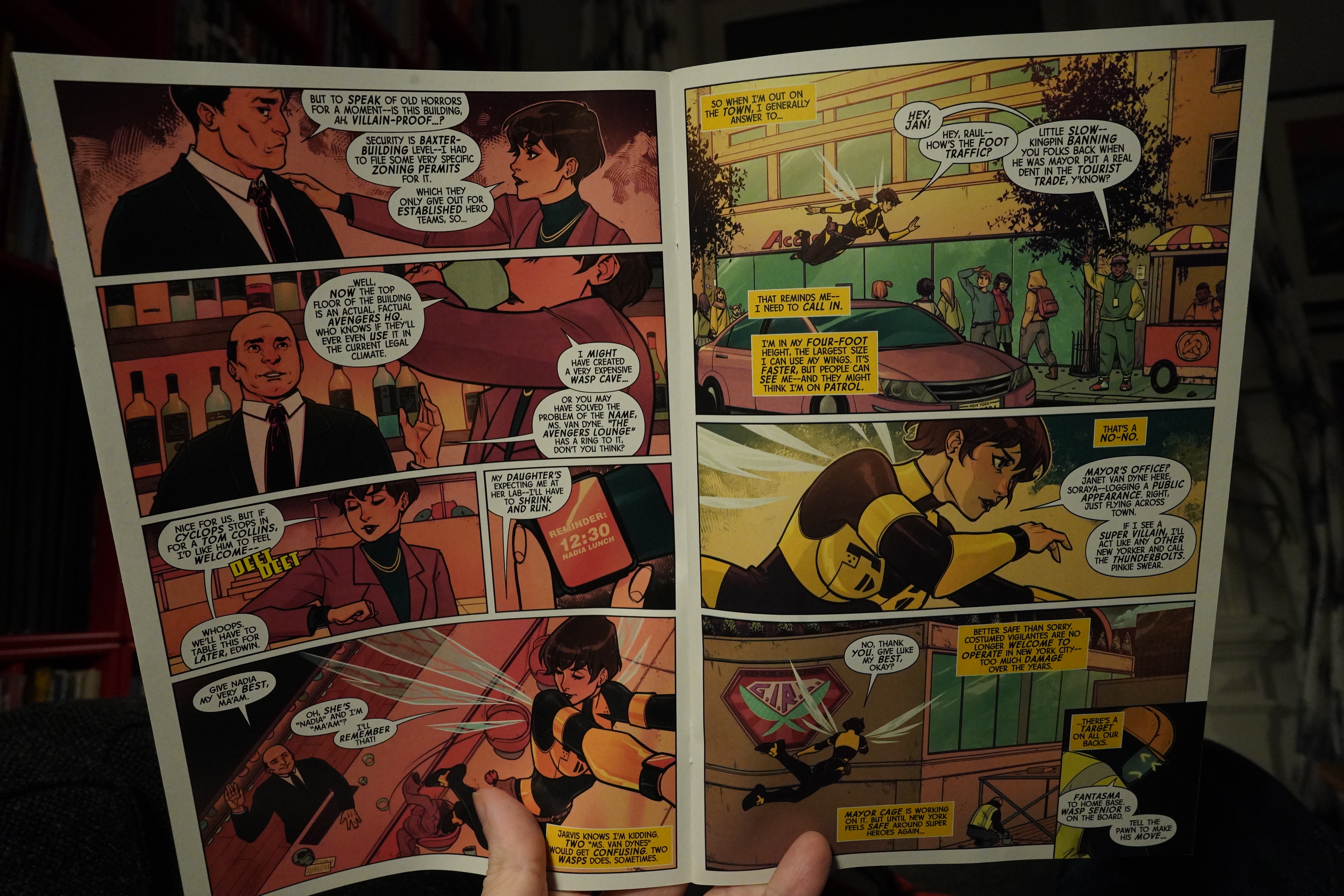
This is… well, for somebody who’s not into whatever the status quo of Marvel is these days, there’s always some of this nonsense to get past before the story can begin. So super-heroes are outlawed these days? Or is this set in the past when that was the case? Or is this an alternative universe? 🤷♂️
Once it gets going, it’s… uhm… I think I’ll give it a couple more issues. It seems mildly entertaining, but not as witty as I’d hoped.
| New Musik: Warp |  |
05:31: The End
And now I really should go to bed.