Oh, A24? And BBC?
This really does have a BBC vibe going on — as if this were a horror story from the 70s… And I mean that in the best way possible.
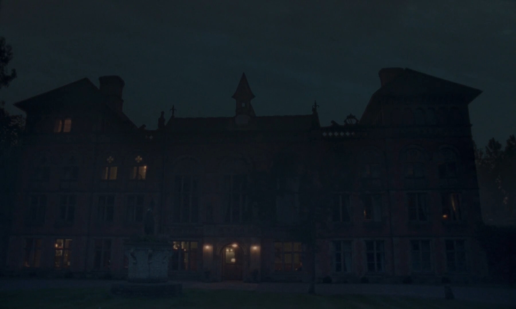
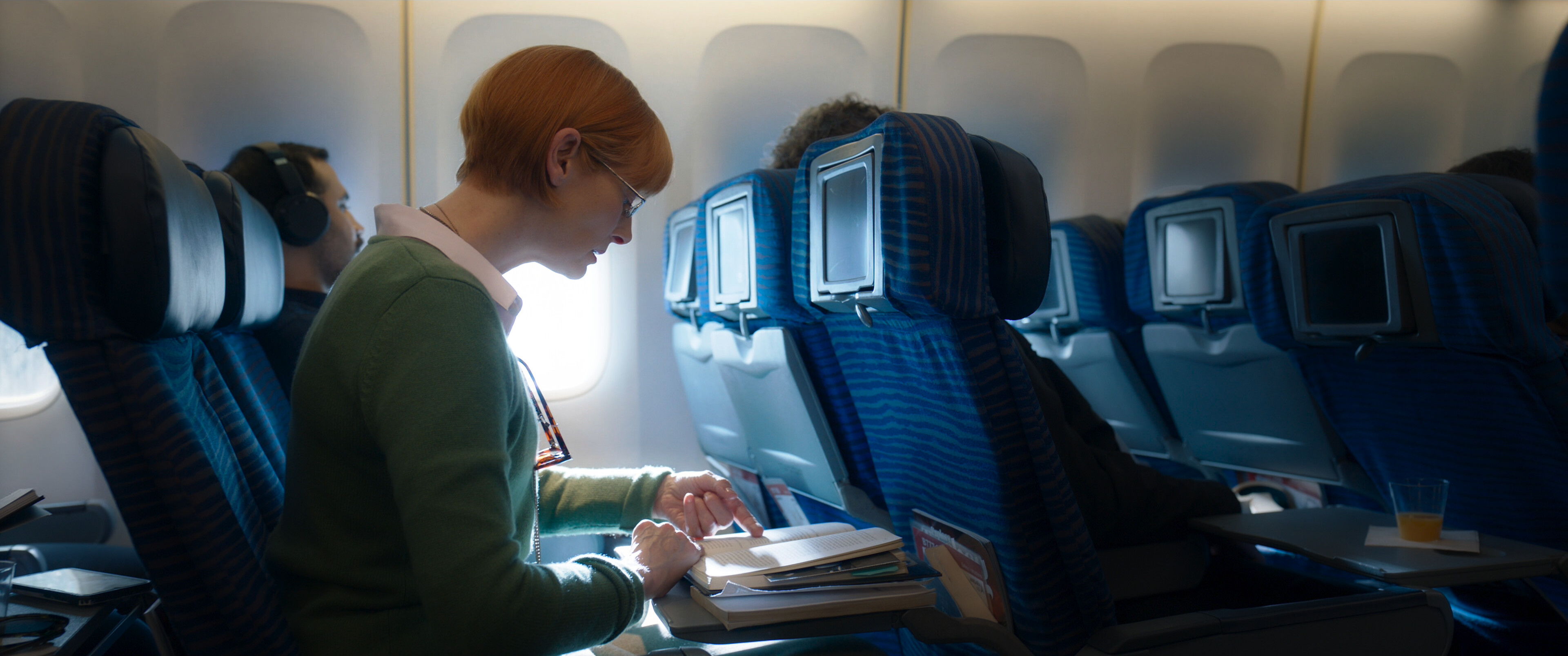
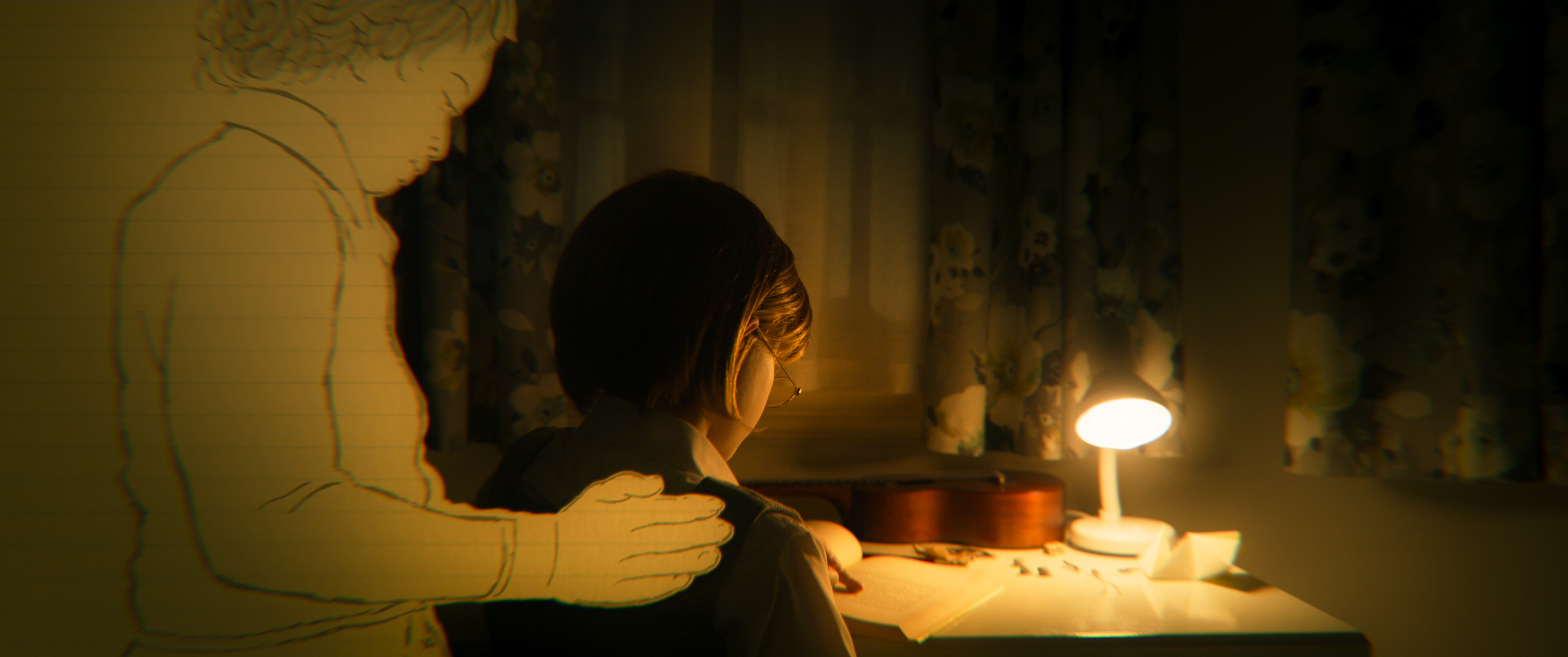
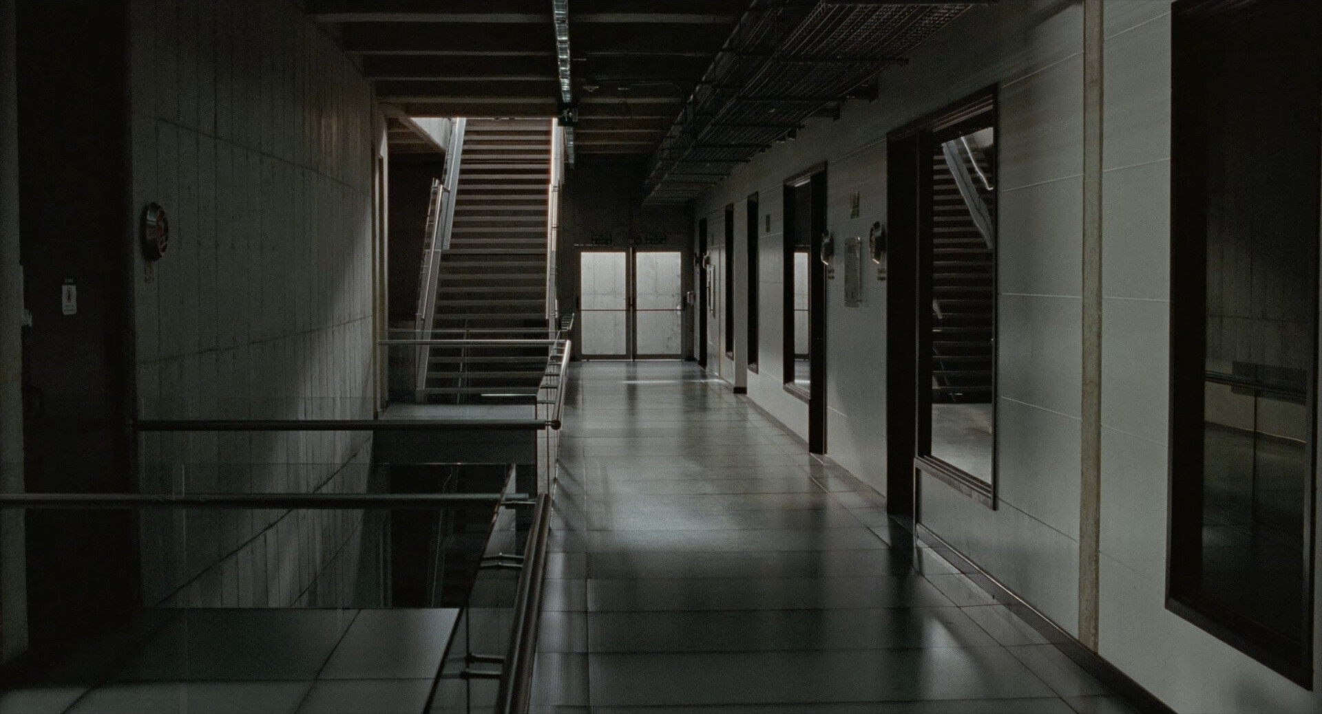
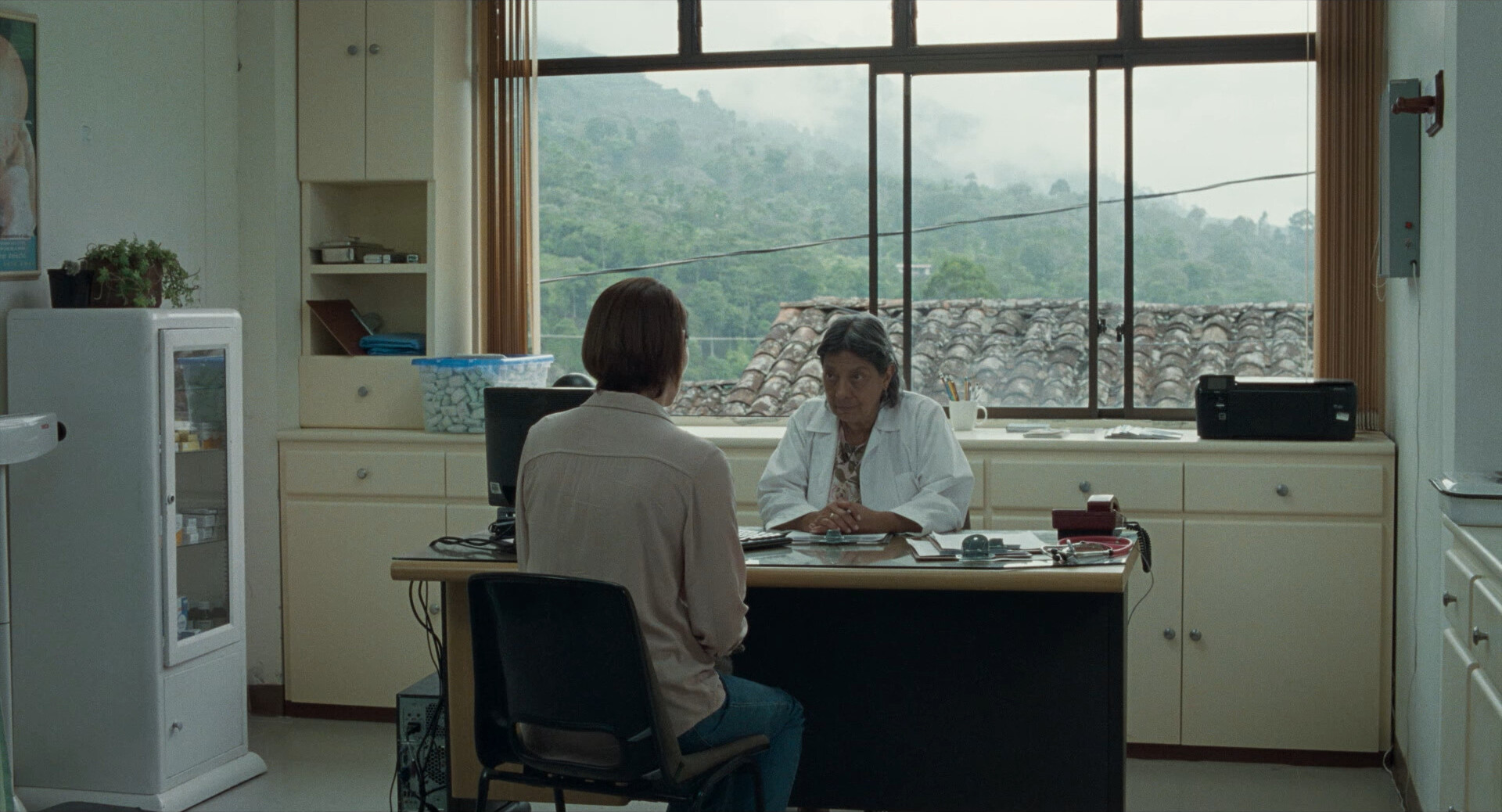
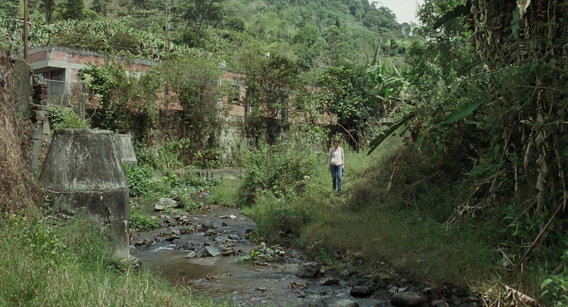
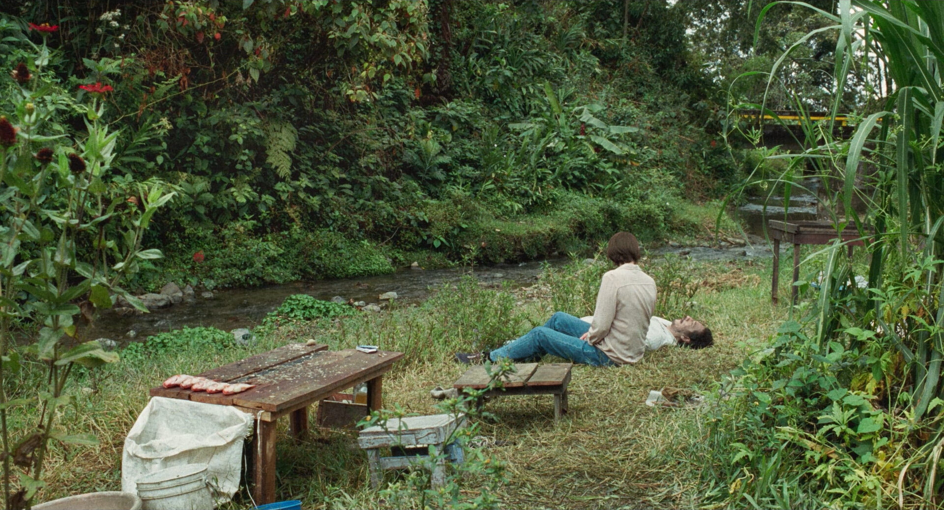
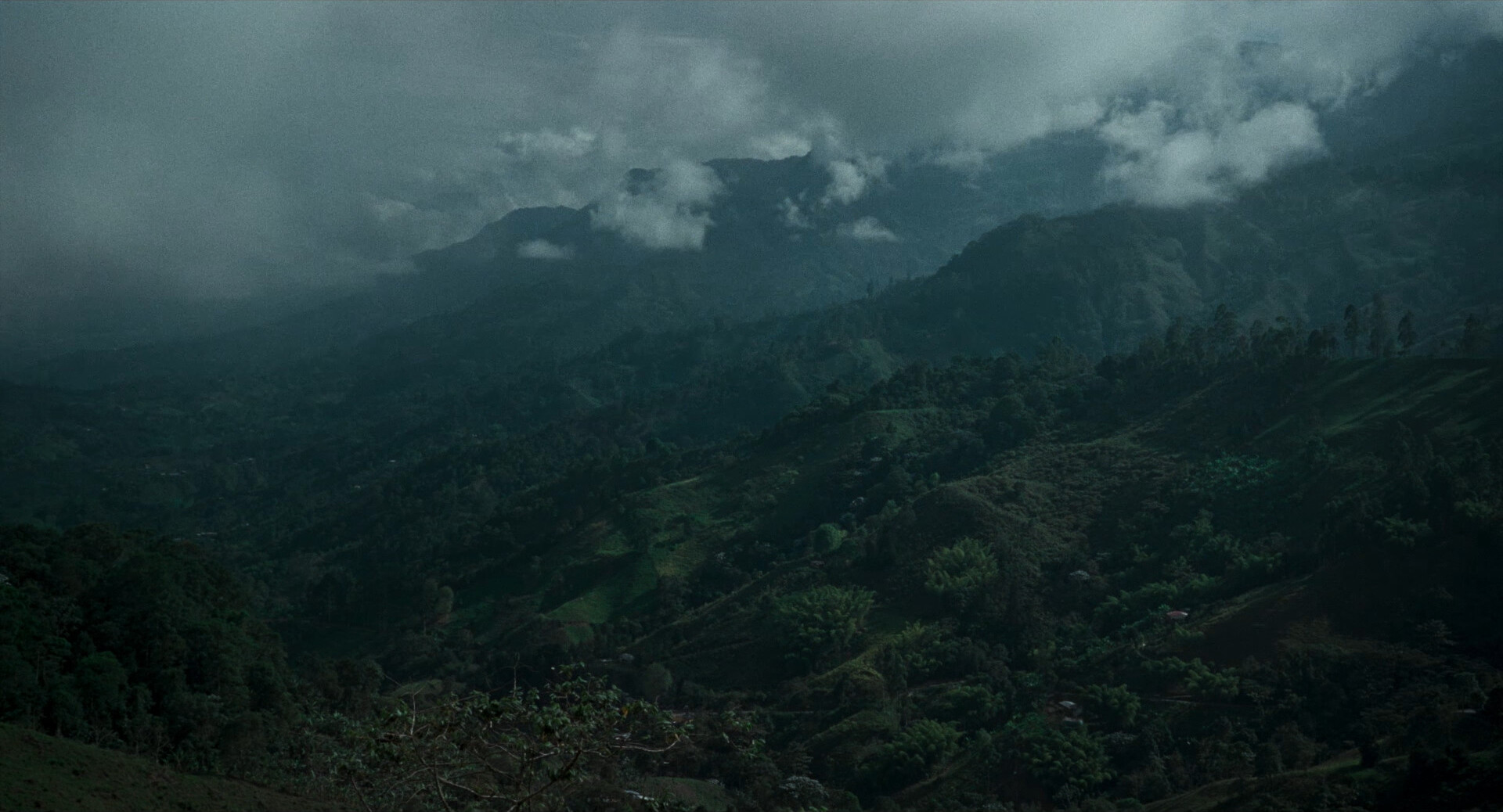
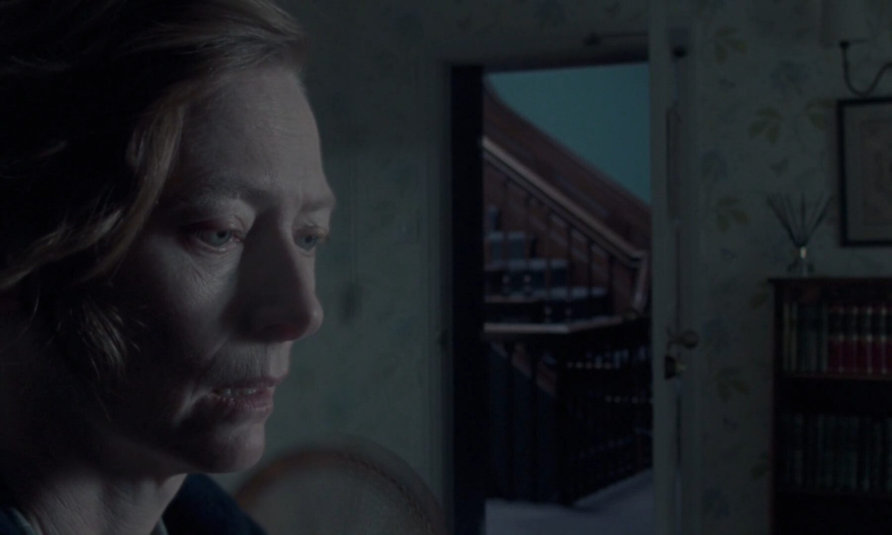
I’m totally into this. And I think it really is a horror story? I mean, it’s so well done — the creaky, strangely abandoned hotel, and the growing paranoia (when nothing tangibly horroriffic has happened)… it’s so… 60’s? British horror.
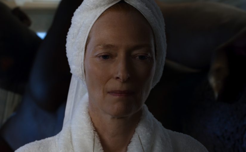
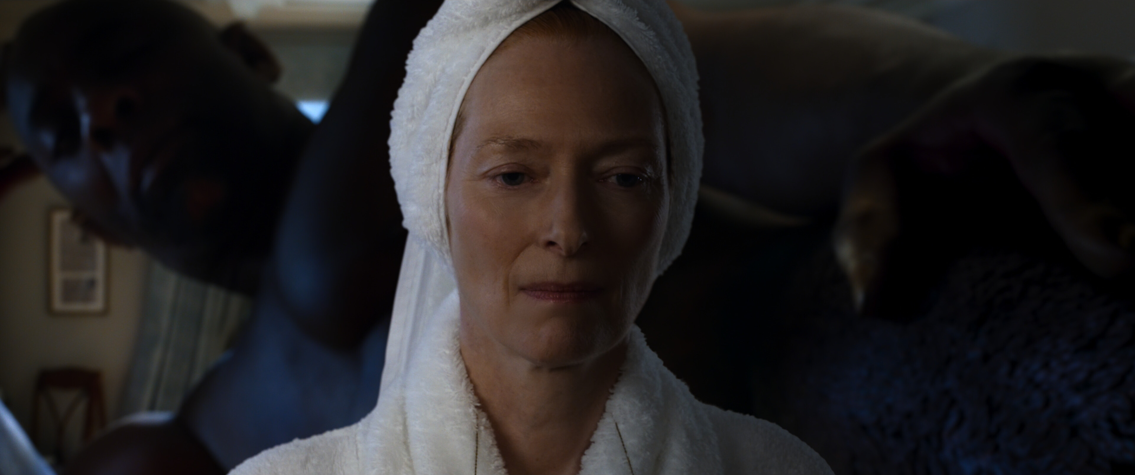
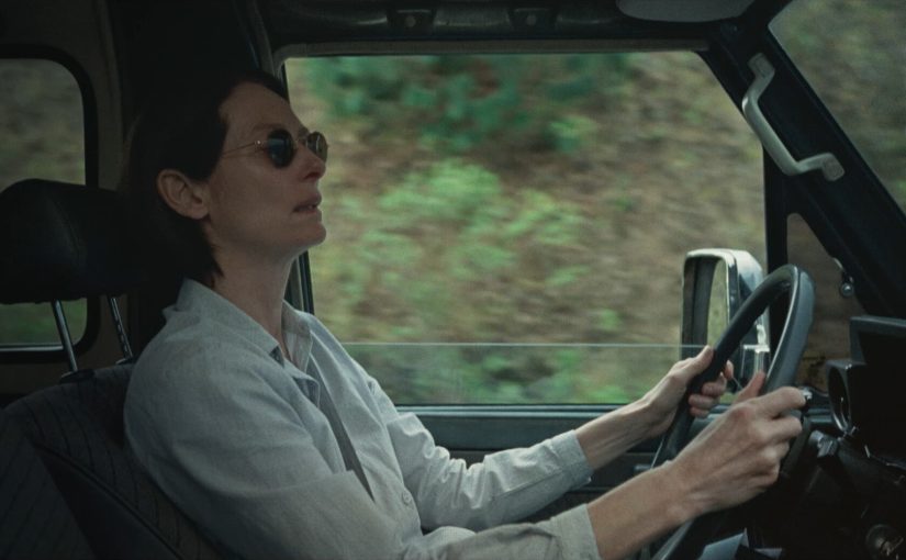
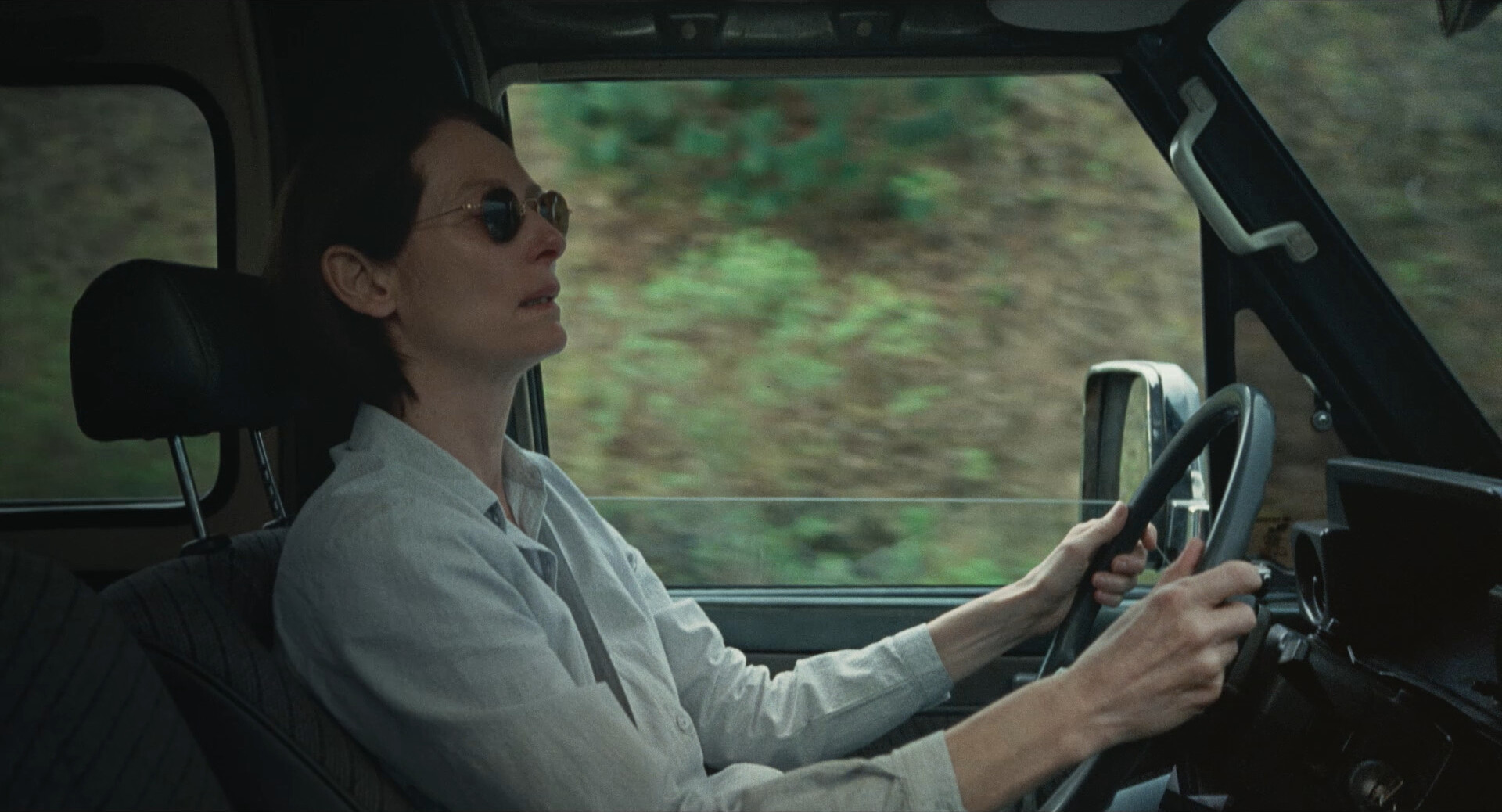
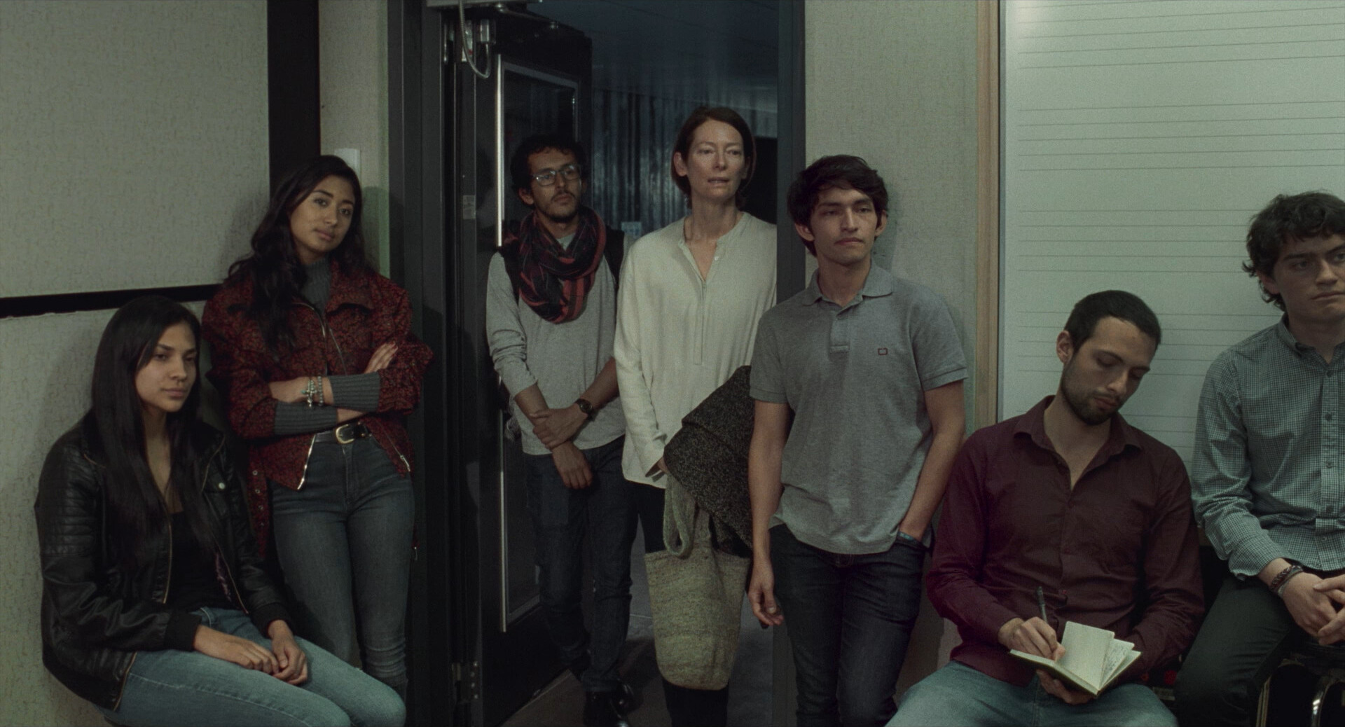
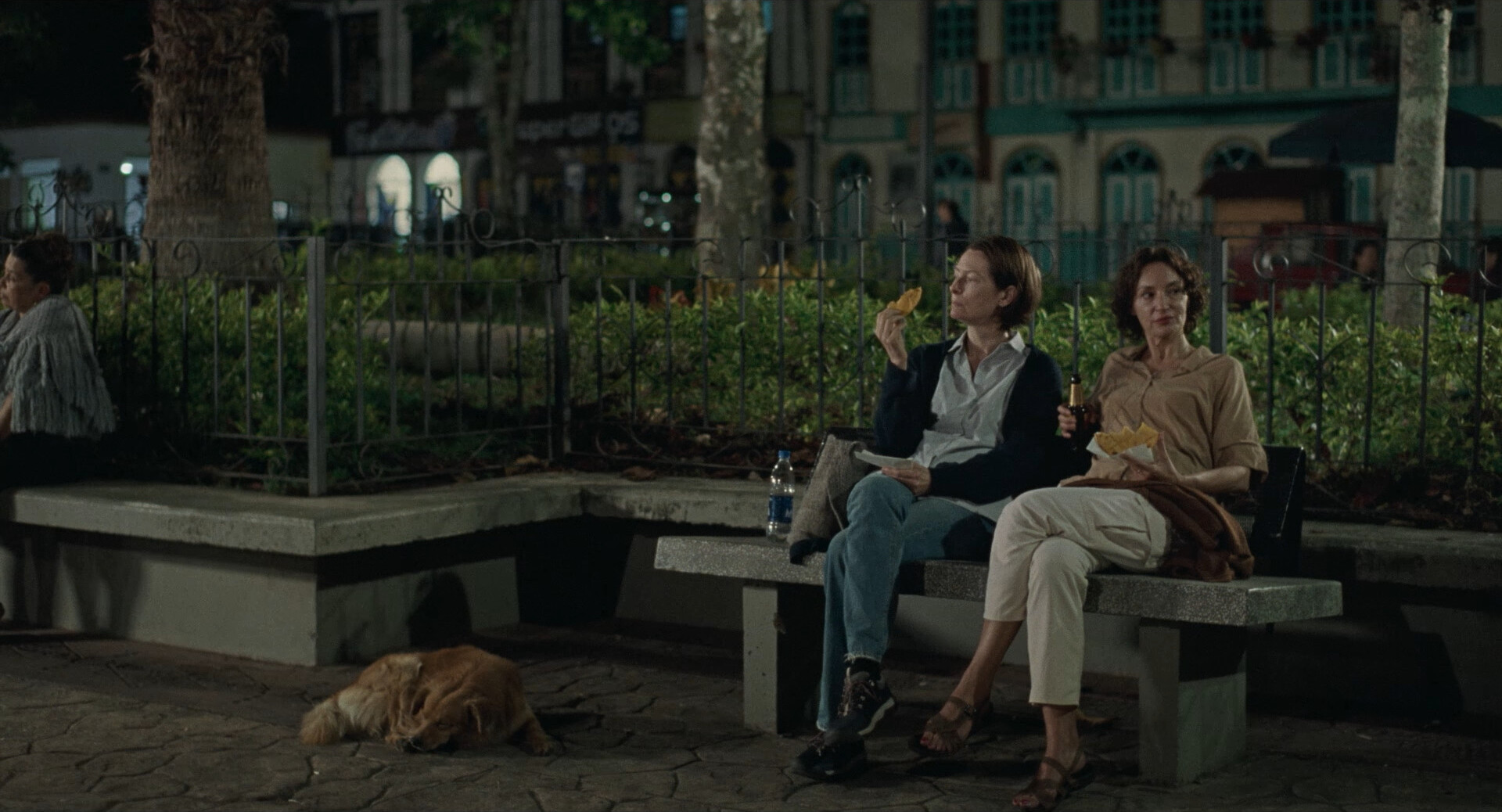
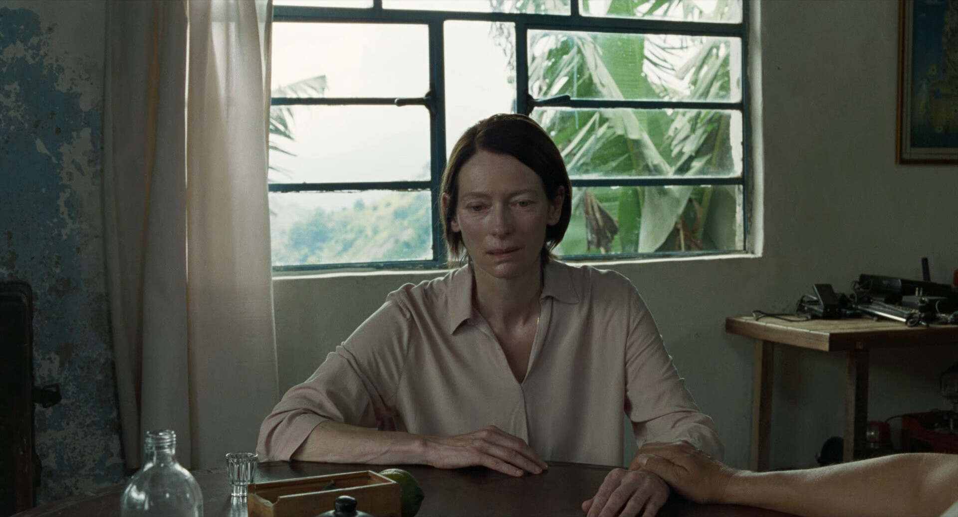
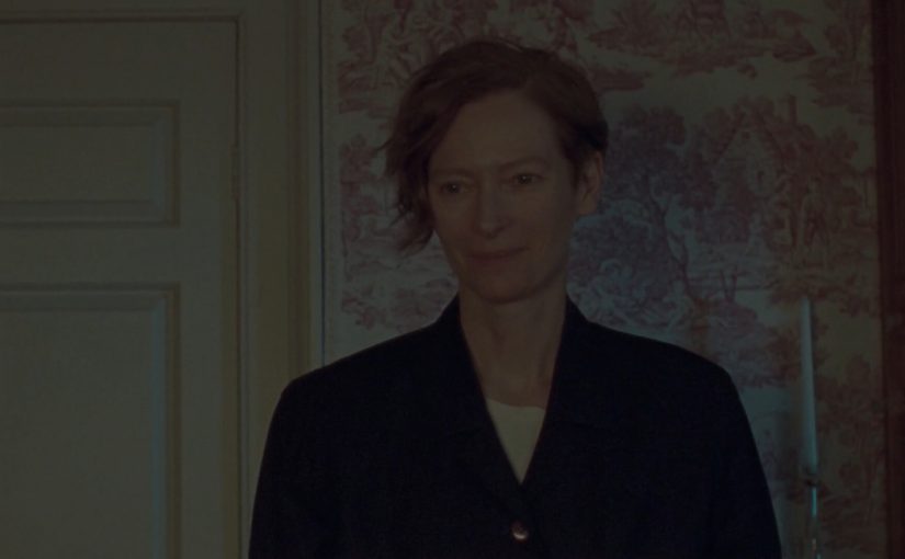
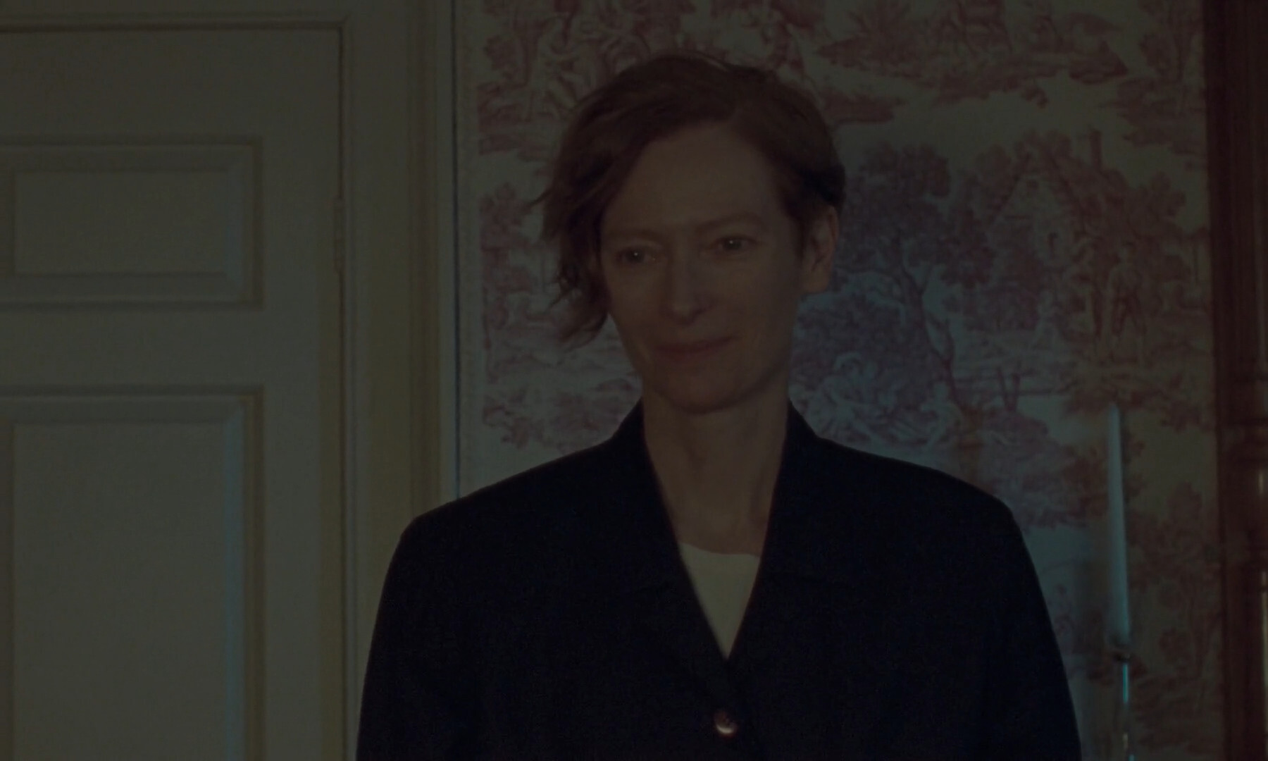
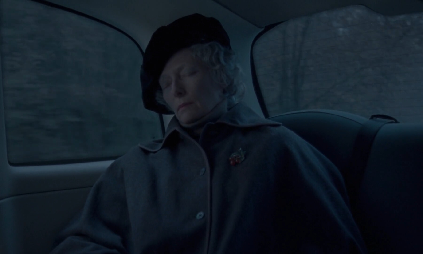
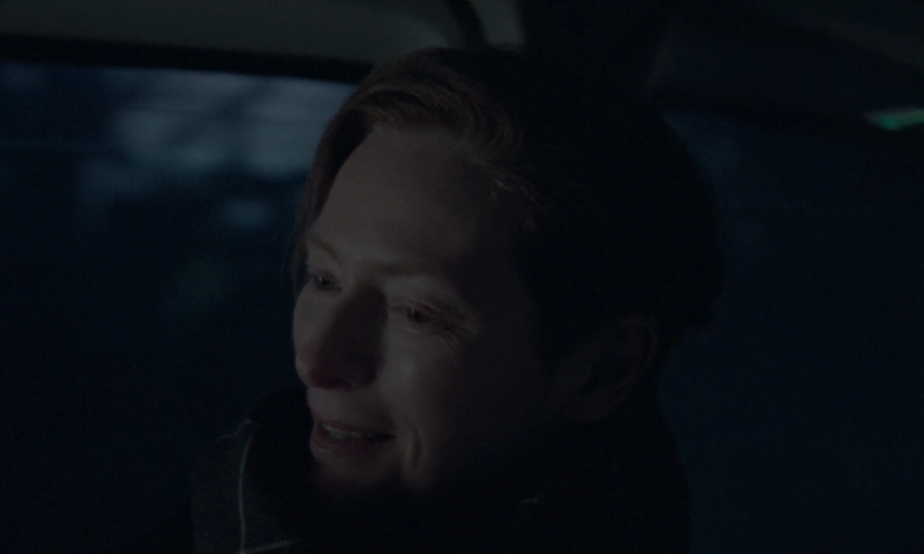
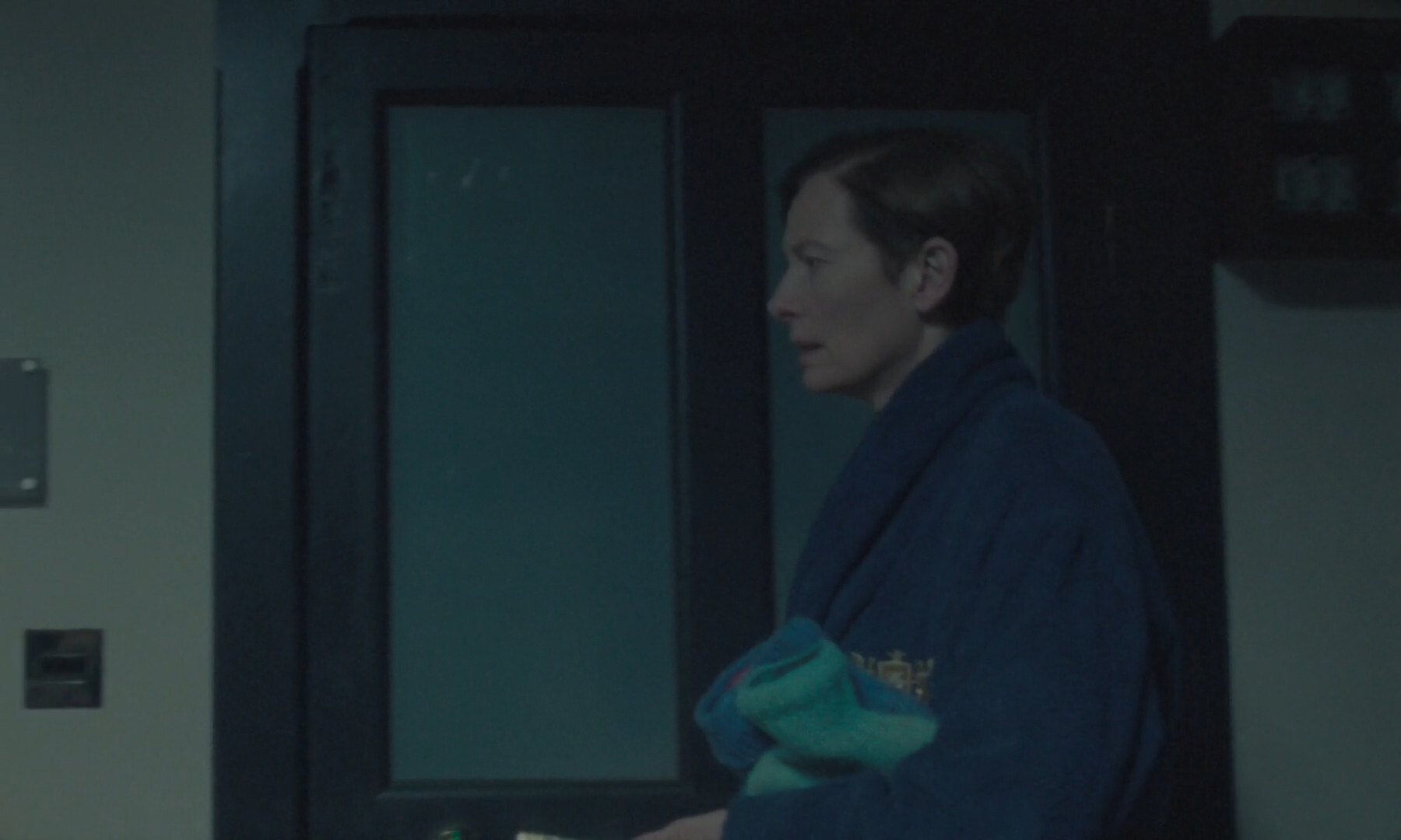
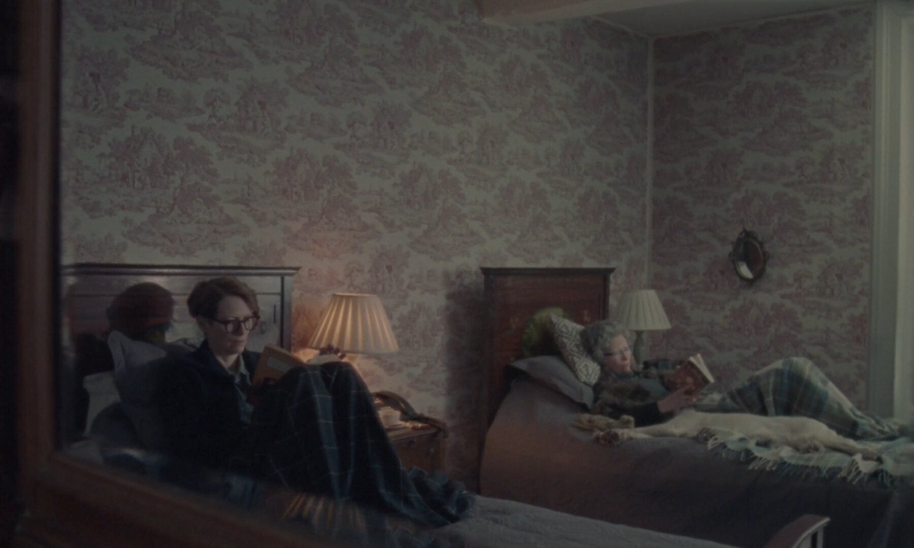
(And, yes — Tilda Swinton plays both the mother and the daughter.)
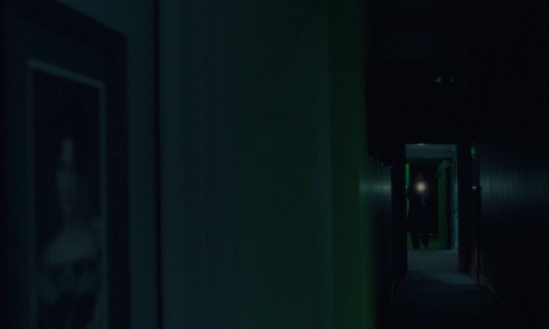
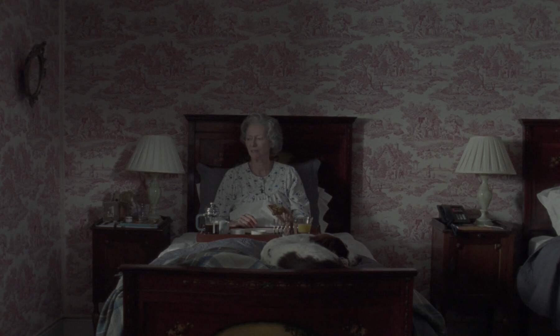
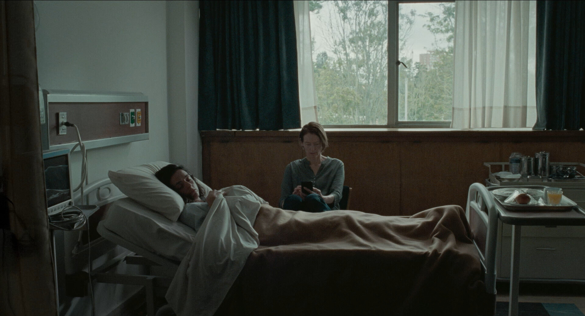
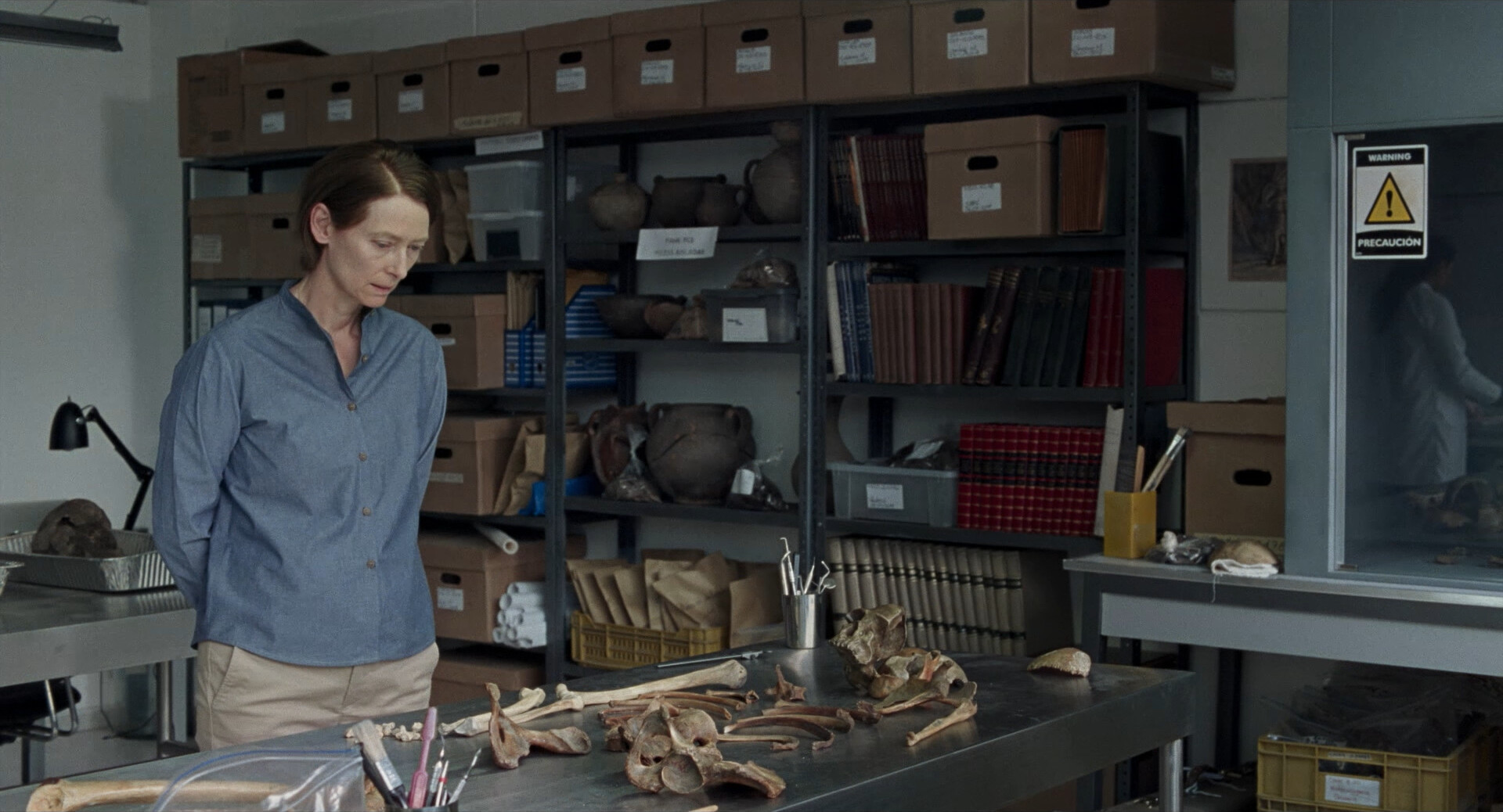
I don’t think we’ve seen the mother and the daughter in the same frame even once? I mean, I guess the reason for that might be that there’s zero budget for effects shots here, but I’m starting to wonder whether that’s because of… plot reasons. Are one of them not real or something!?
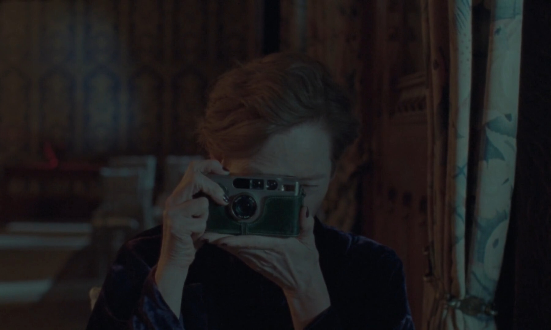
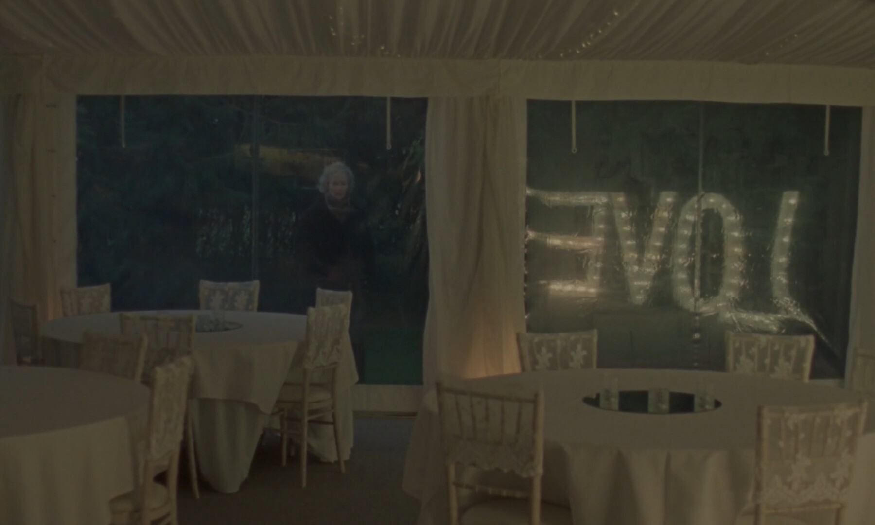
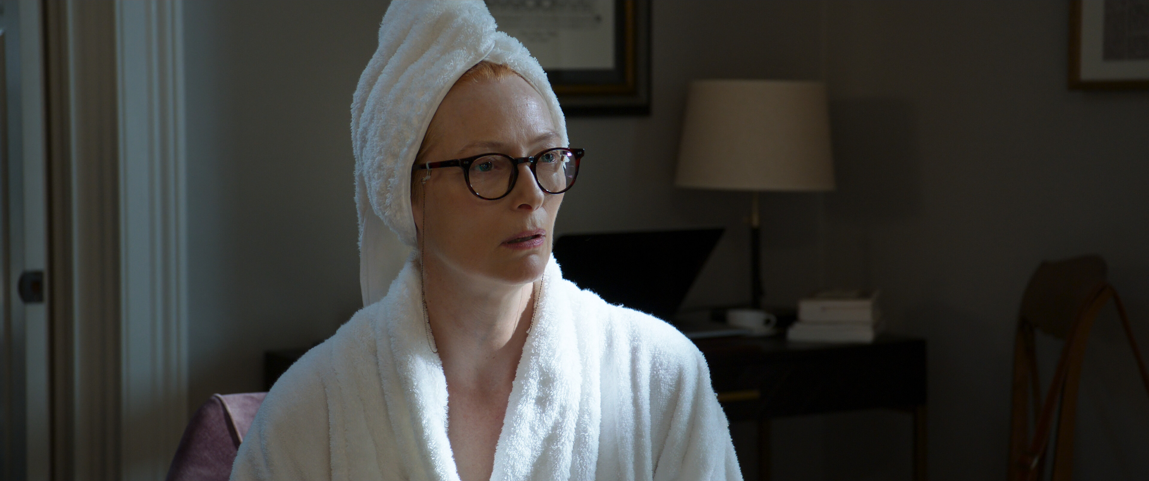
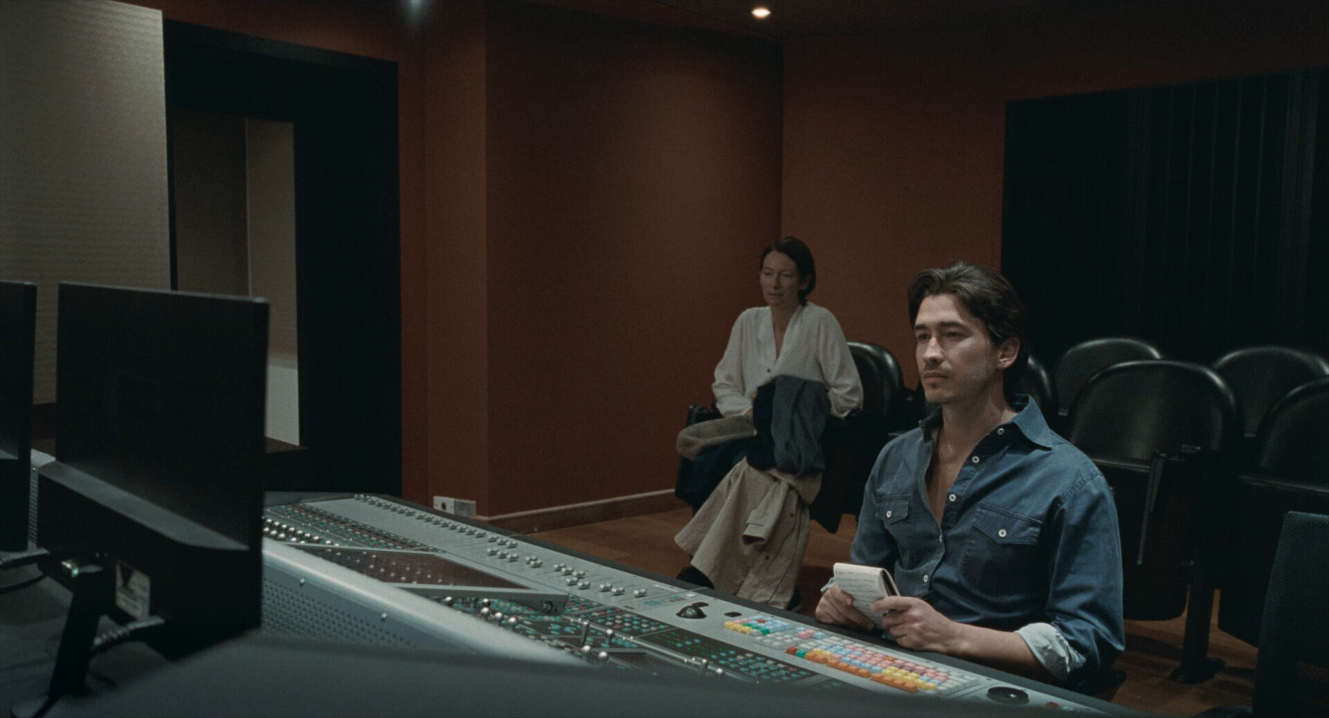
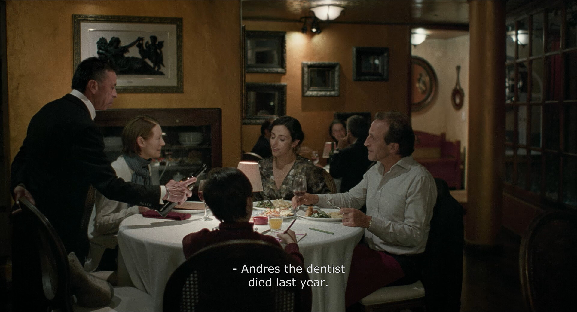
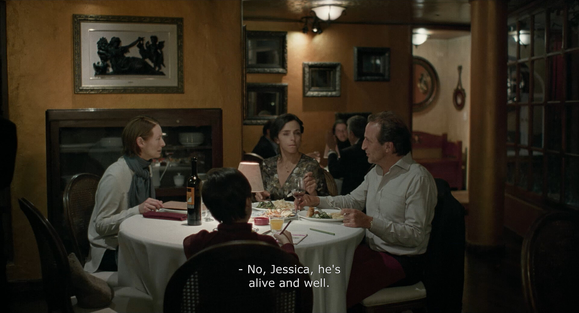
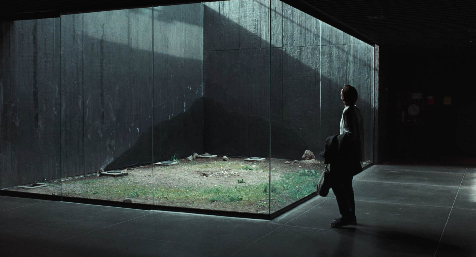
*gasp* Both in the same frame! But in a mirror!
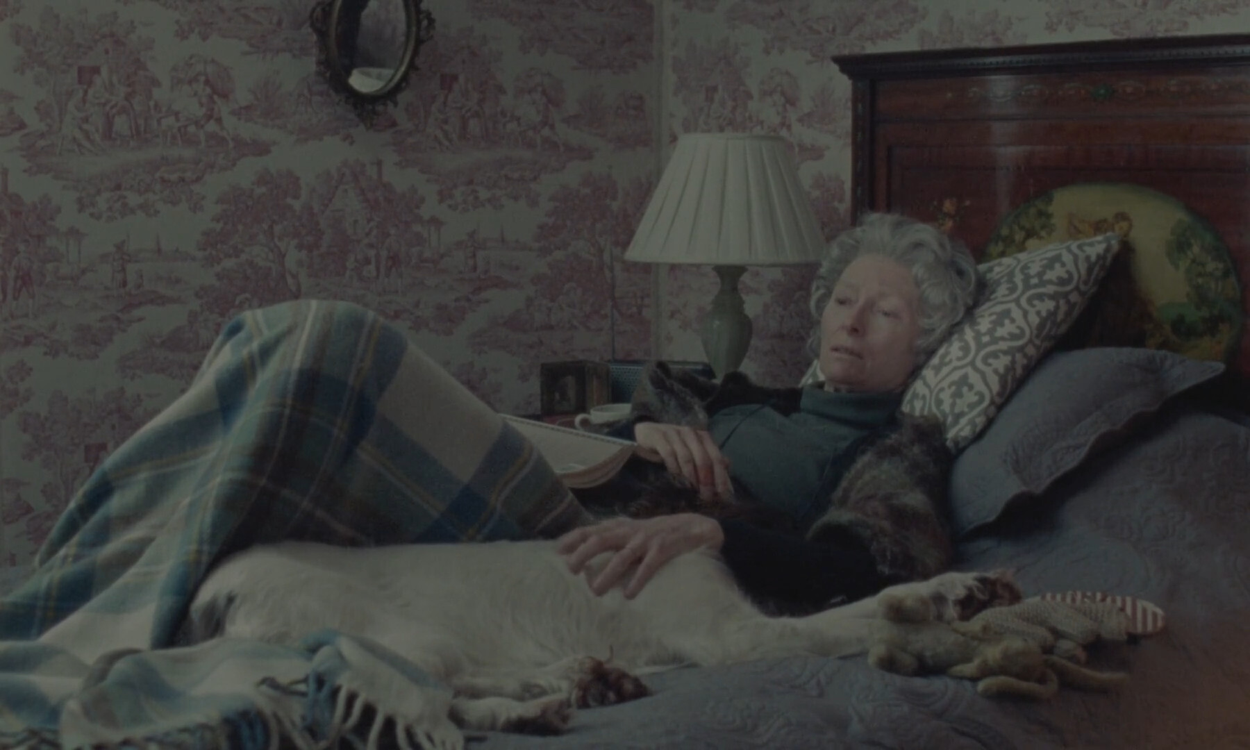
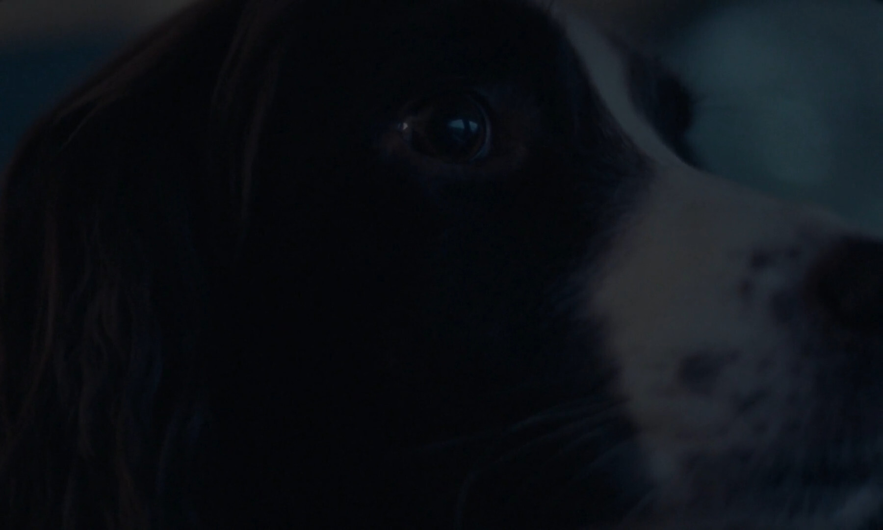
This is the sleepingest, snuggliest dog ever.
I really enjoyed this movie. Of course, when we got the resolution, it was a bit anticlimactic because, well, I don’t wanna spoil anything. But it was! Still, it’s such a lovely movie.
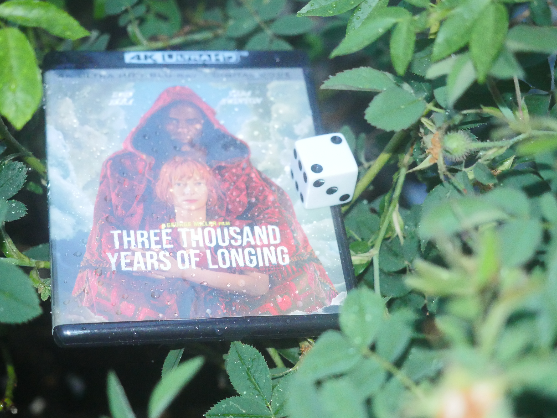
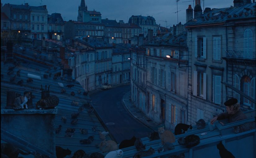
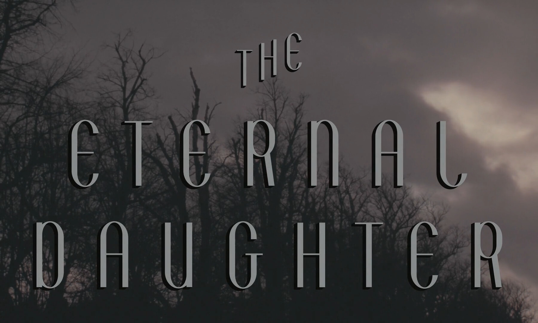
The Eternal Daughter. Joanna Hogg. 2022.
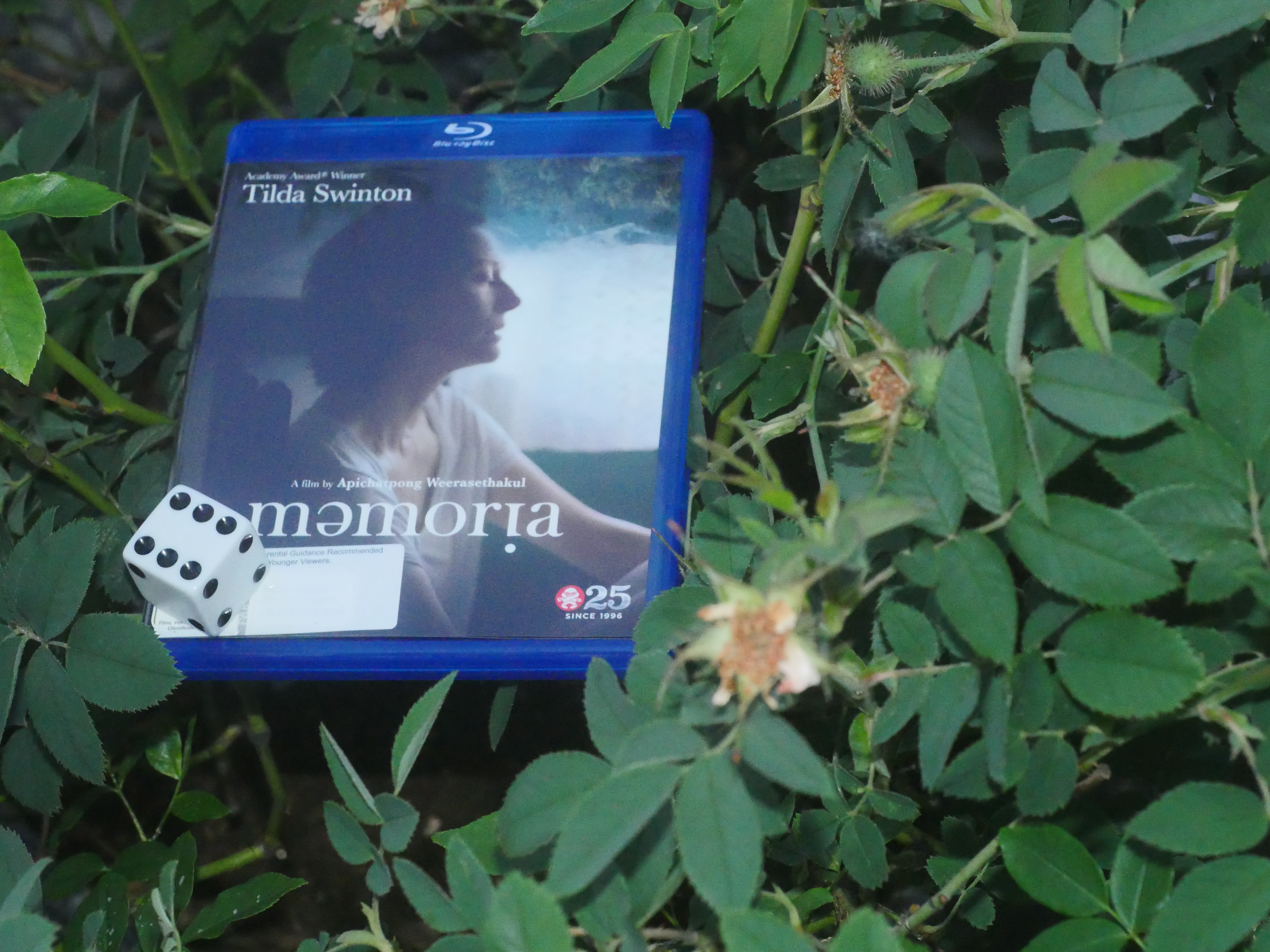
This post is part of The Tilda Swinton Project.