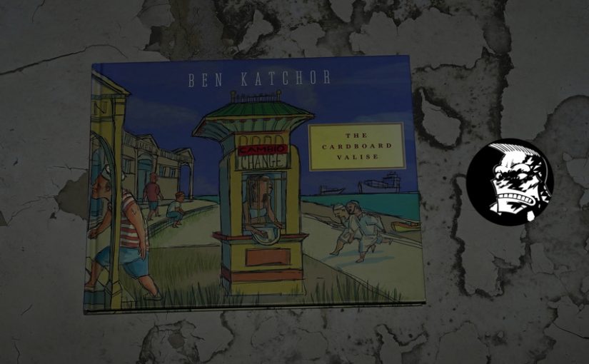
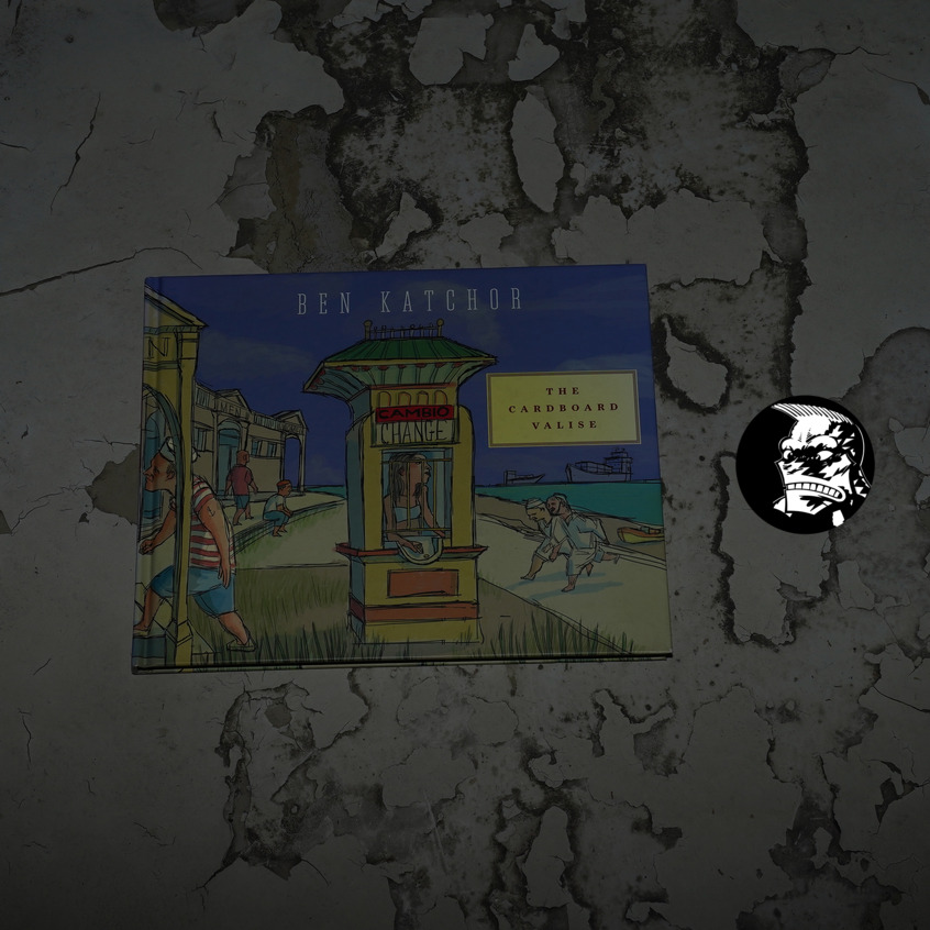
The Cardboard Valise by Ben Katchor (281x222mm)
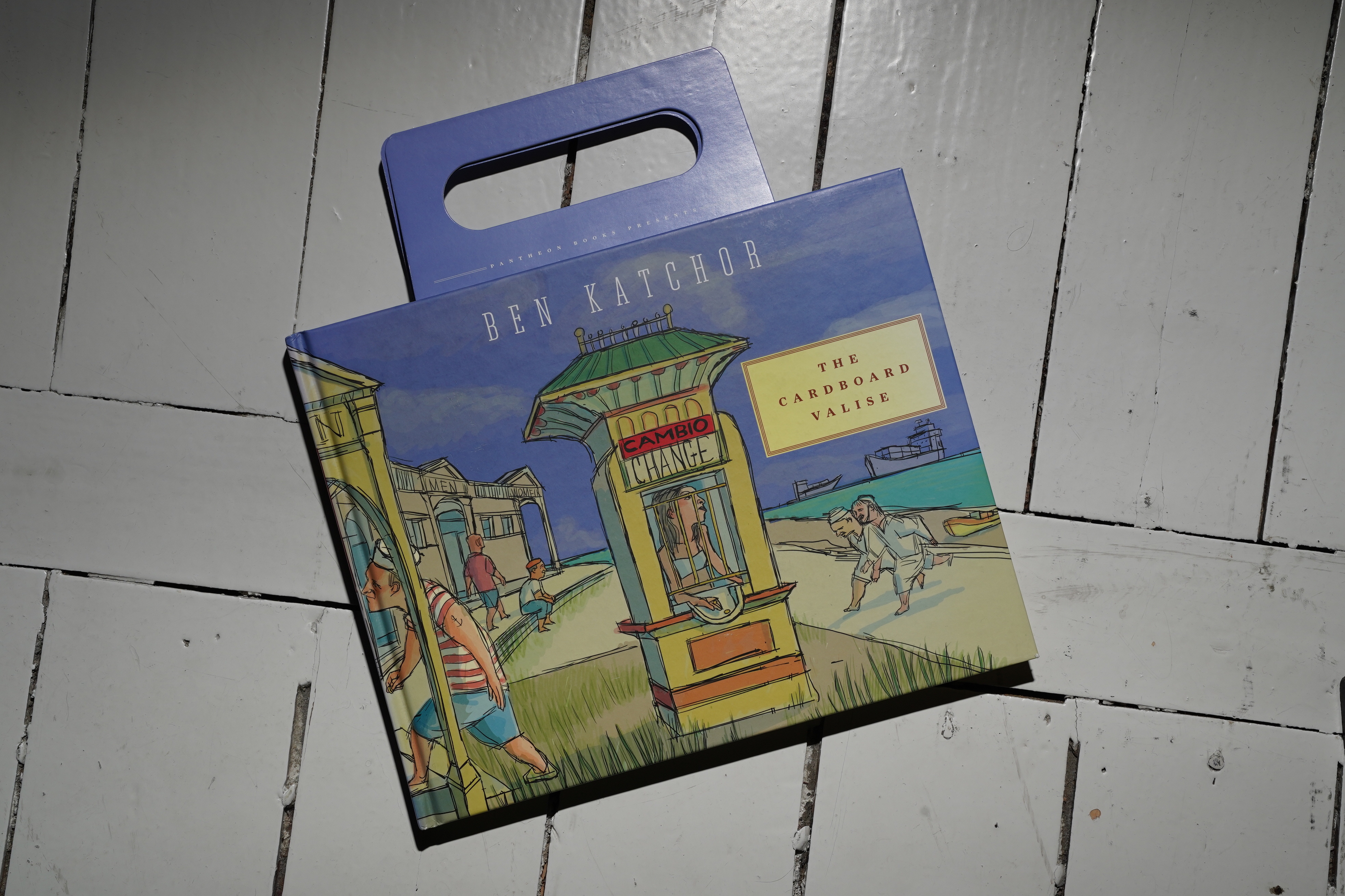
This one’s got a fun design flourish — it’s got these fold-out handles, which makes the book into a kind of cardboard… uhm… what’s the word… oh, yeah, suitcase.
Katchor had published just one book-length narrative before this — The Jew of New York. All his other collections had been episodic, mostly one-story-per-page kind of strips. (Although he’d often include a longer story to round the collections off.)
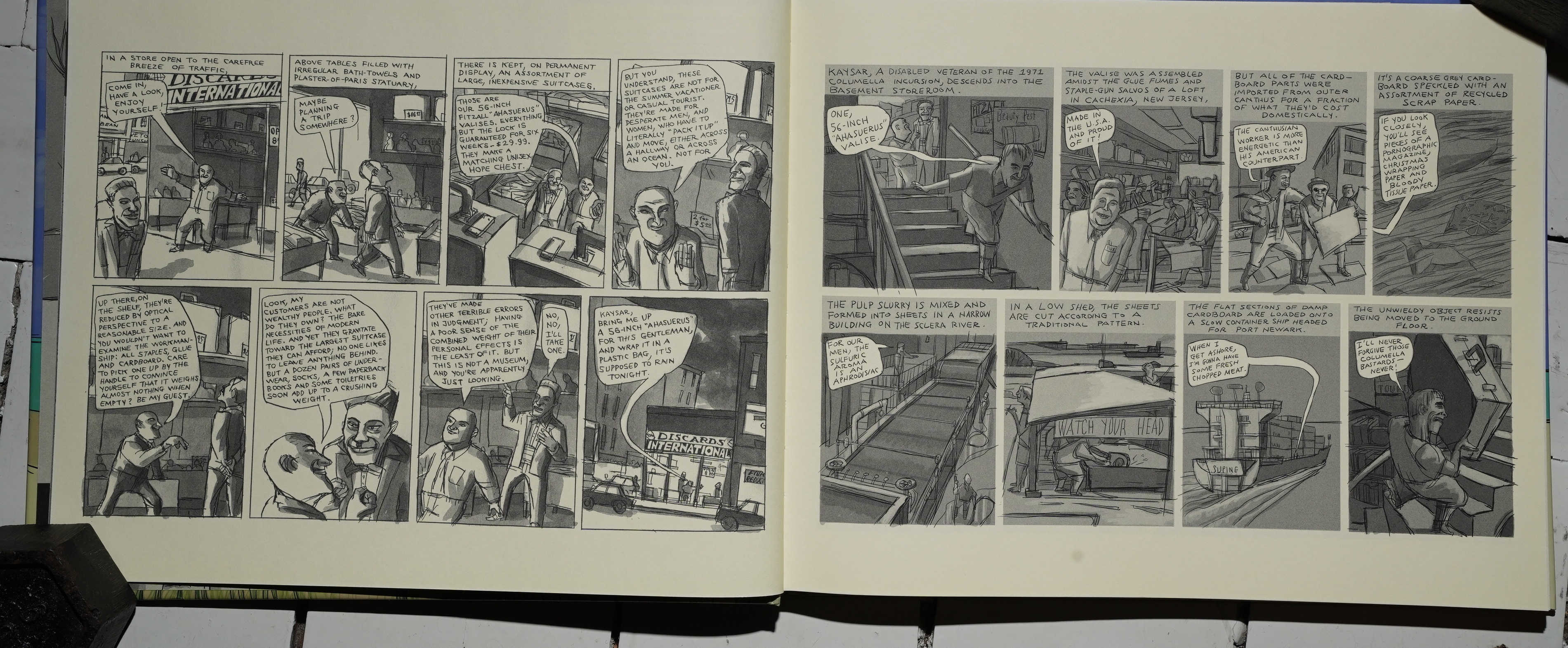
This is more of a hybrid collection: It is one long story, but it’s not really a structured narrative. It’s moves in a kind of associative way, almost — we start off learning a lot about Tensint Island, but that’s ditched after a while (Katchor makes the entire island evaporate), so we then go back to New Jersey and spend a lot of time there, but also on a different new island.
We follow two separate characters whose stories intersect at the end. So it’s slightly less dense than the Julius Knipl collections (since we follow a storyline, kind of), and it’s also less dense than The Jew of New York, which was so filled with references that it almost imploded.
But as usual with Katchor, it took me the entire day to read this book. My mind just skids around a lot when reading Katchor.
The book itself is very handsome, but … the paper? It’s so cream-coloured that it seems like a parody of cream-coloured paper. Is it actually white paper and then they just printed everything cream? Or did they just put a lot of cream dye into the paper pulp? It looks really fake and kind of unpleasant.
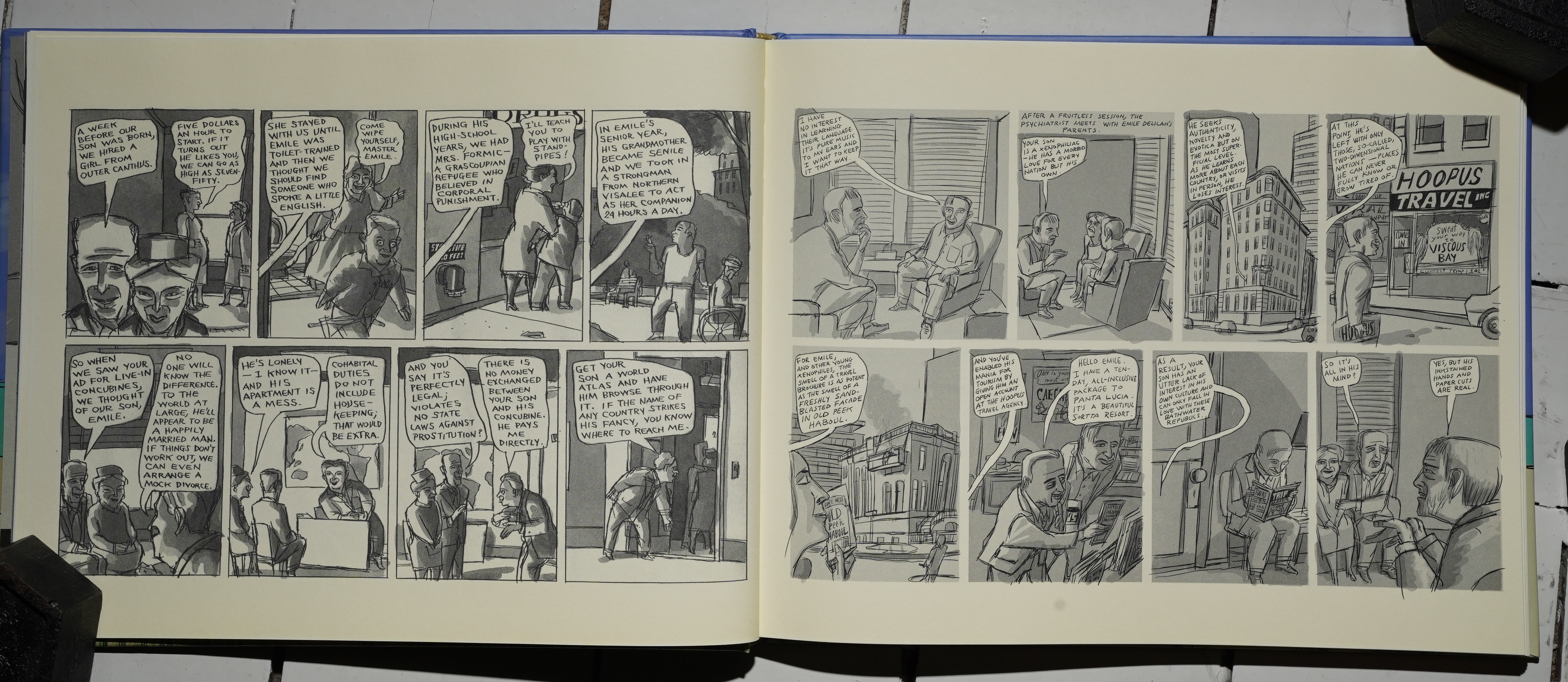
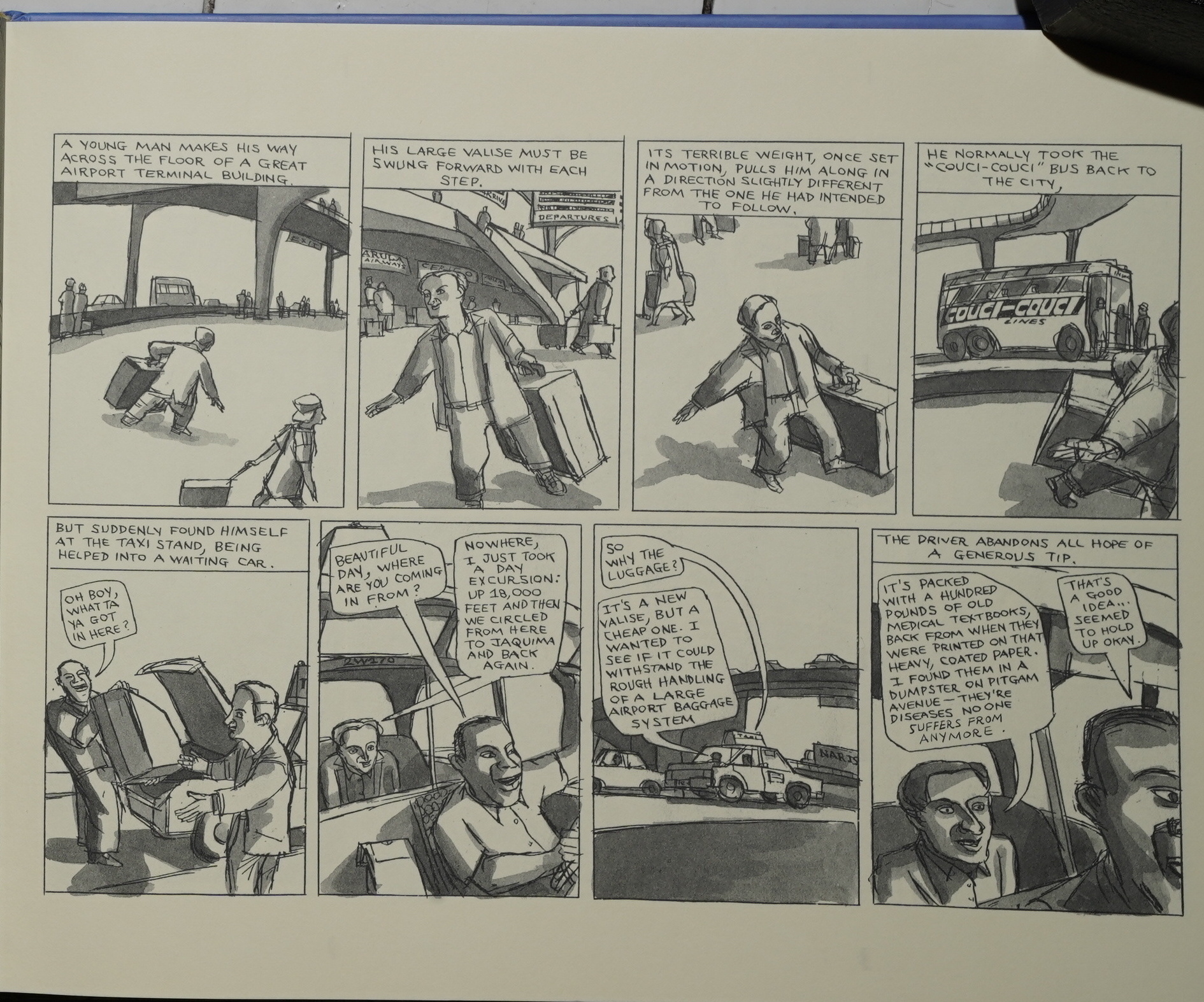
The other weird thing is that we flip back and forth between these two radically different styles. Well… ok… radically different for Katchor. The page to the left is the style I’m used to seeing — a variety of line weights, sculpted shading possibly done with grey water-colour washes, and a confident lettering style.
Then there’s the page to the right: The lines are really thin, everything looks grey without lot of weight to differentiate anything, the shading looks like it’s… er… something else? Is it Photoshop? I don’t know, but it looks weird. And the lettering looks so offhand. Is the lettering and shading done by somebody’s that not Katchor? Couldn’t see any credits for any assistants…
Were these published in different venues and Katchor used different techniques? The page to the left in a newspaper and the one on the right on the intertubes? It’s pretty odd, anyway.
And while I usually find Katchor’s weird, weird conceits charming, some of those things here just come off as… er… “will this do?”
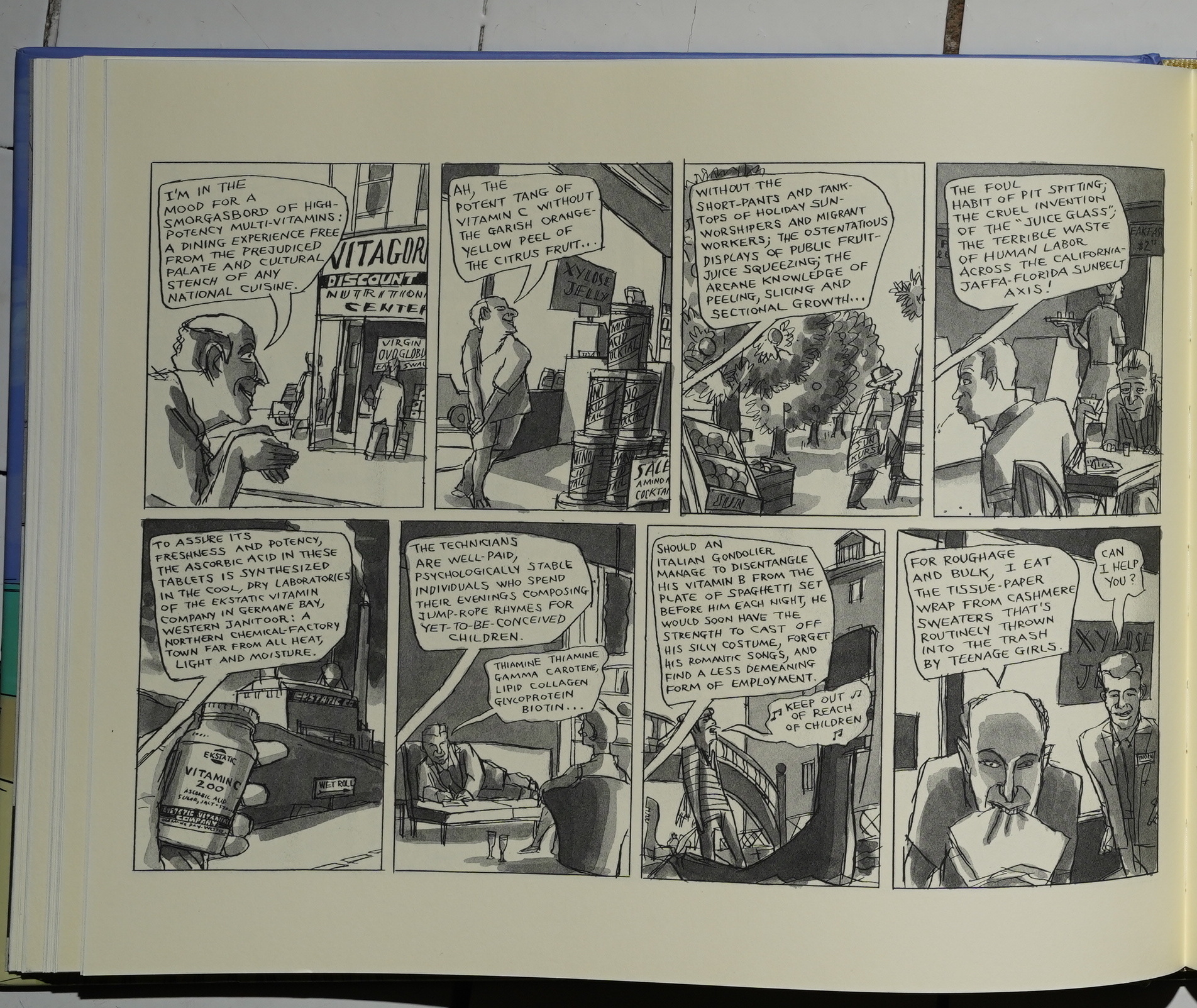
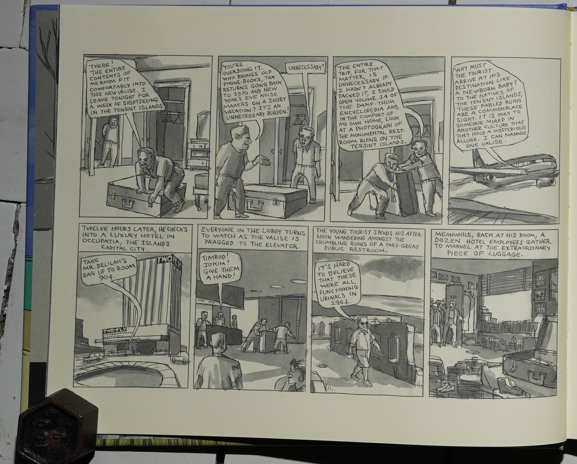
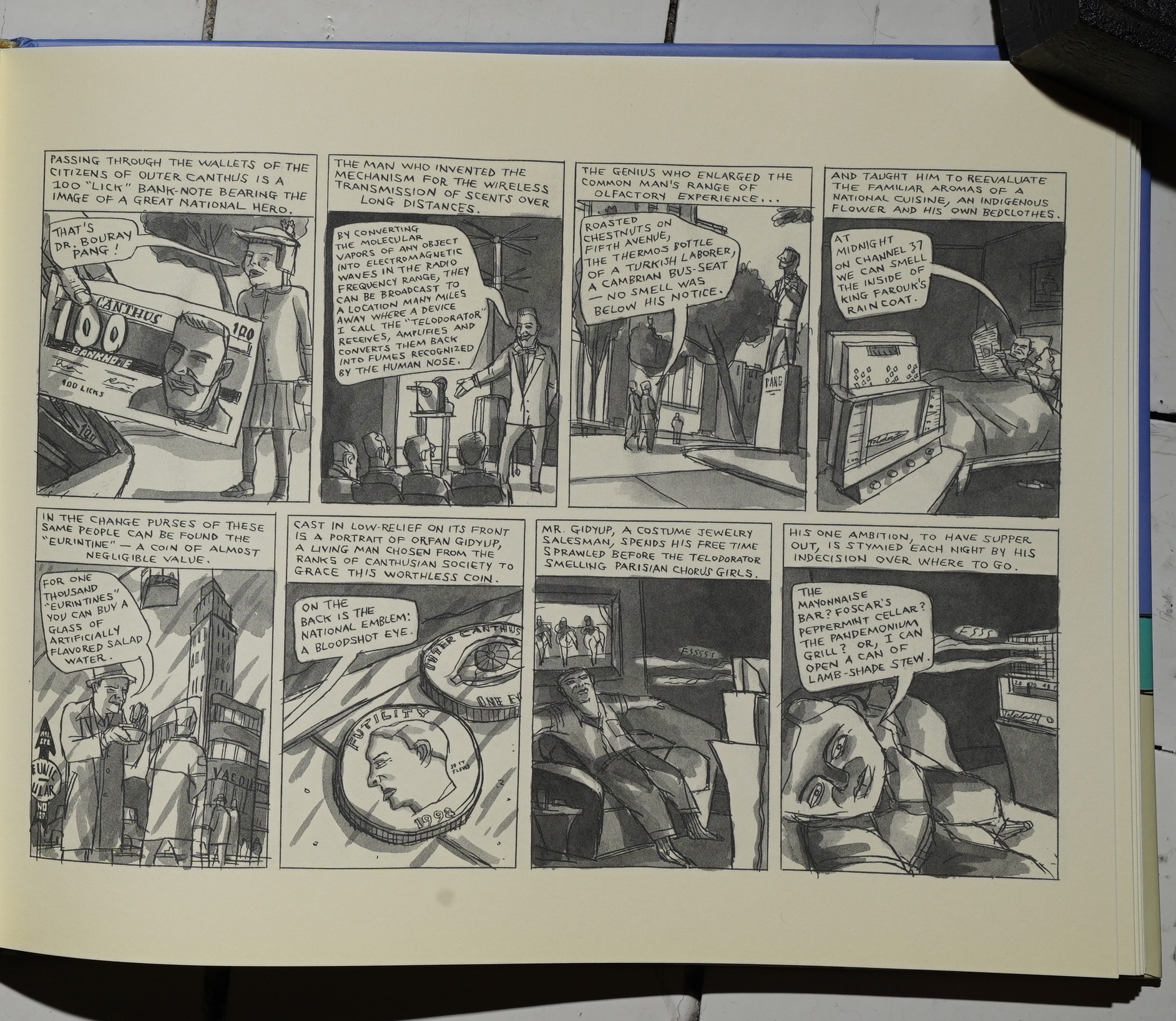
But, I mean, this is a good book. It’s great! Most of the pages are more like this: Really inspired, and new delights in every panel, like the pose the guy is doing in the second panel, and the “can I help you?” punchline in the final panel, as well as the whole spiel about how much better vitamins are than real food. Brilliant!
I’m also constantly charmed by the way Katchor conjures up these shops and buildings that totally say “New York”, but are also really odd if you just take a second to actually think about it: These windows going from ceiling to floor, and everybody being really close to them, and there’s no distance between the floors. It’s as if all buildings have walls and ceilings that are two dimensional — it’s an unreality that makes them seem more real.
Hm:
So perhaps some contextual research is in order for the reader coming fresh to Katchor to avoid being bewildered, if not overwhelmed, by the sheer verbiage, multi-sensory detail and lack of narrative continuity here.
[…]
Pages could be shuffled from beginning to end and the reader wouldn’t know the difference, because the book avoids all conventional notions of narrative momentum and character development.
That’s just not true — there’s a pretty strong narrative going on here, with Delilah and Elijah and all of that stuff. It’s just a bit distracted.
A parallel dimension that readers might find creatively charged or thematically exhausting.
That’s true. It is exhausting to read.
The story was originally serialized, as The Jew of New York and his Julius Knipl strips, in various alternative newspapers, and was originally completed in 2000. The collected edition, however, wasn’t released until March 15, 2011—Katchor’s first book in over ten years. In the collected edition, the original strips were left as is, but new material was added “to amplify the through-story”, Katchor said, and the new material can be spotted by careful readers. “I wanted the new pages to look like an annotation, a new kind of drawing”.
Yes:
He’s a brilliant artist but also a baffling one, supreme in his idiosyncratic creation of a baroquely dense fictional universe that has its own internal coherence while fitfully mirroring, in a fudged and misshapen way, the consensual reality we inhabit. As you read a Katchor strip, it is hard to ignore the tone of droll burlesque while being unsure about what, exactly, is being made fun of. This makes reading his work a heady experience, at times even surreal or psychedelic, since his strips induce a pleasant mental buzz even as they unmoor us from reality.
And like Herriman, Katchor is emphatically not a graphic novelist: his strips shouldn’t be read from beginning to end as a continuous narrative, but rather in small doses of about four or five pages a time. You can overdose on Katchor’s richness if you don’t pace your reading.
WEAK PEOPLE!
The tourist-trap kitsch and played-up local color Delilah encounters, The Cardboard Valise argues, are merely the most obviously icky manifestation, and logical endpoint, of all nationalism — an inflation of trivial distinctions and accidents of history and geography into matters of all-encompassing aesthetic and political importance. This gives the book’s climax, in which an encounter between Salamis and Delilah leads to the public debunking of a religious charlatan who argues that it’s not our ethics or imaginations or faiths that live on after our deaths, but our acquisitiveness, real pathos and real bite.
Well… I don’t think the book is as straightforward as that, but that’s certainly a valid interpretation. If somewhat reductionist, and if there’s something Katchor isn’t, it’s that.
This blog post is part of the Punk Comix series.