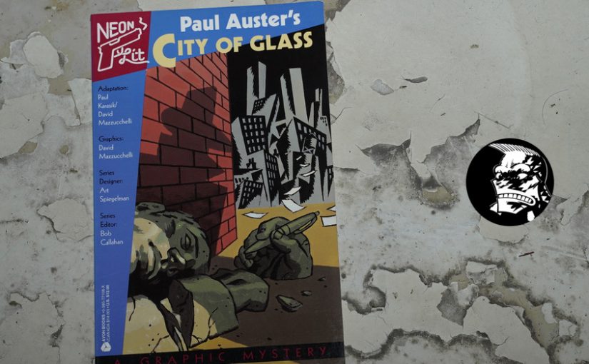
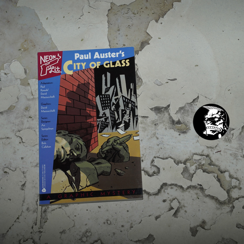
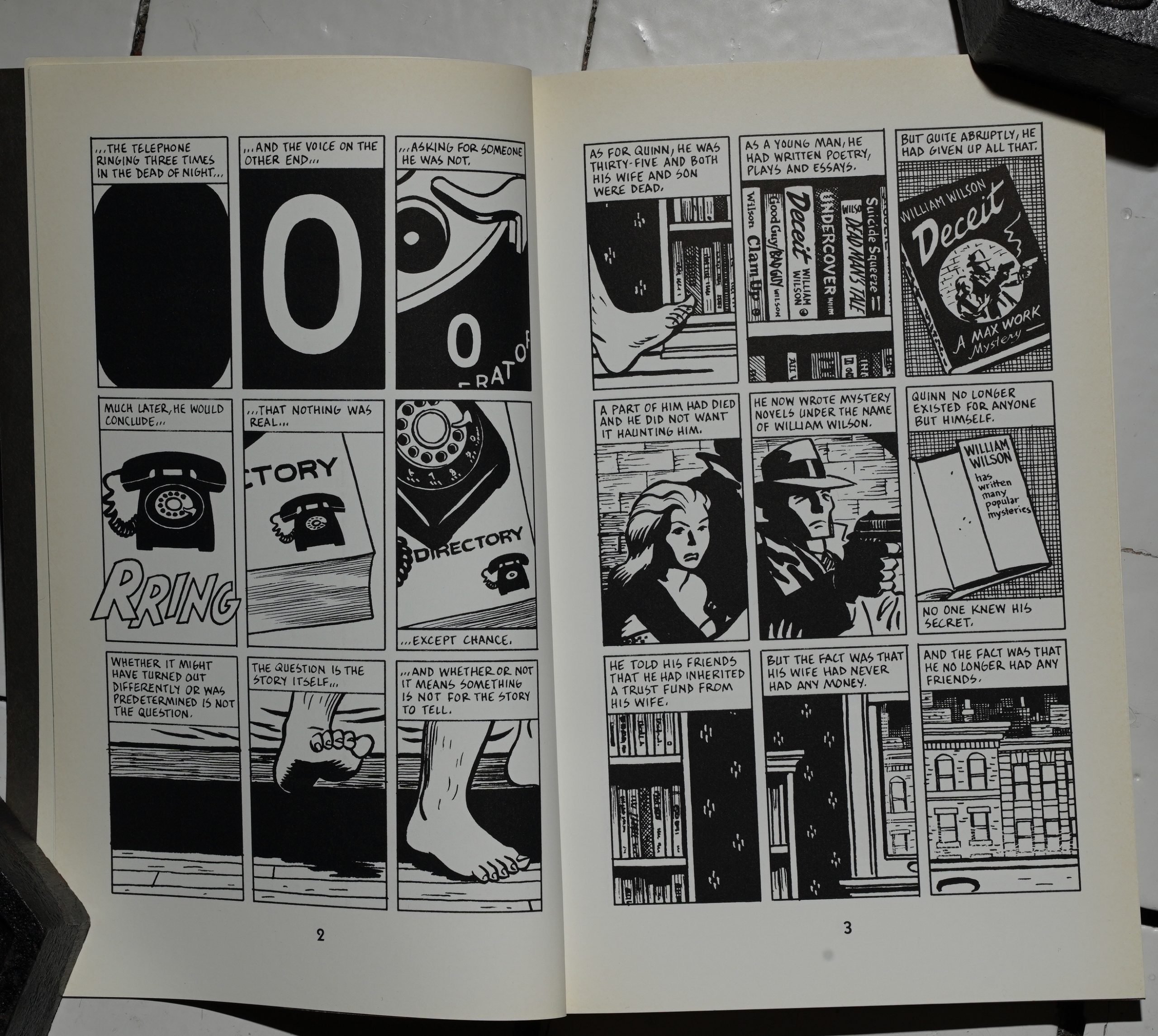
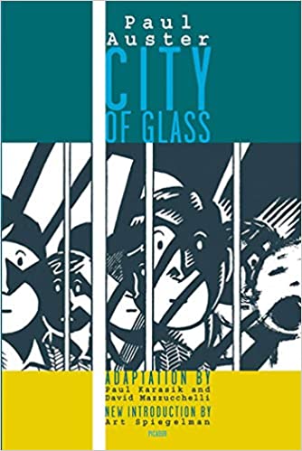
Paul Auster’s City of Glass by Paul Karasik and David Mazzucchelli (132x209mm)
I remember reading Auster’s New York Trilogy over a couple of days one summer — it was probably in 1988 and I was nineteen? I was absolutely flabbergasted! I thought it was the greatest thing ever, and I’ve continued to buy all of Auster’s books since (and have been disappointed just about every time).
This adaptation was dropped onto an unsuspecting audience in 1995 — by Avon Books, of all people. There’s a long (and, I think, interesting) story behind this, and I wrote about it here.
So I’m not going to repeat anything of that stuff here, but just talk about the actual book instead, OK? OK.
When I think about this book, it’s an 80s book in my head. And certainly the design shouts mid-80s, but there’s subtle tells — the font isn’t Futura, for instance.
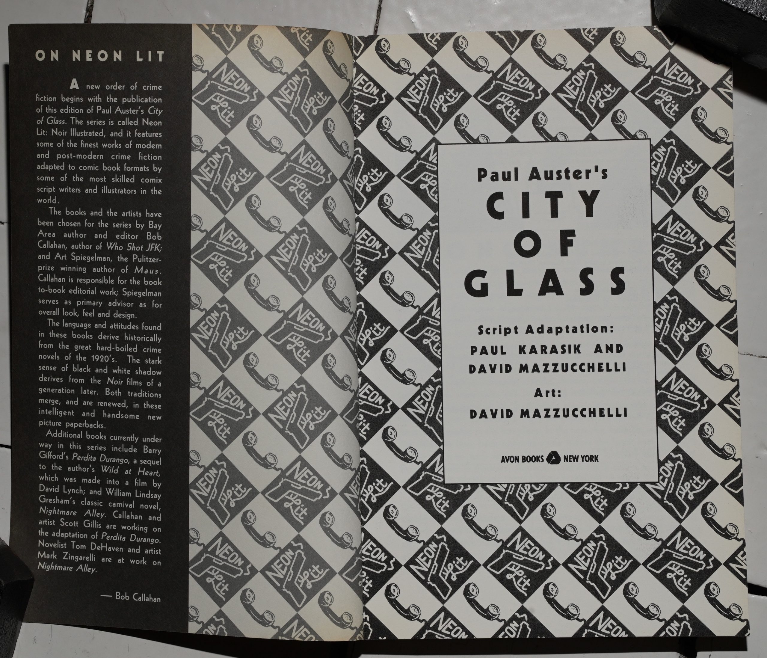
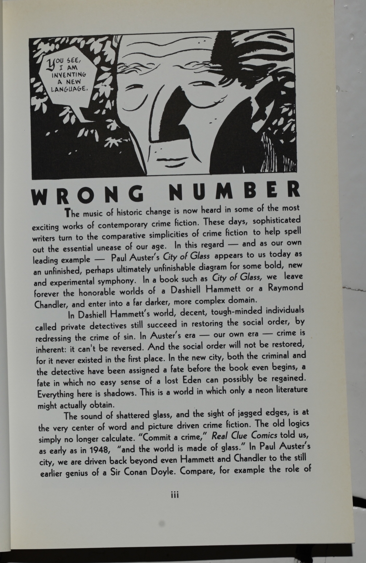
The book is very appealing as an object — it’s the perfect size, with a good design and printing. The one mis-step is the introduction by series editor Bob Callahan, which just feels unnecessary and removes something of the mystery from the book.
Because it’s all mystery here — it’s a post-modern mystery novel, with doubled identities, books within books, and a found manuscript. Why sabotage all of that with the insipid introduction? Who needs an introduction to Paul Auster?
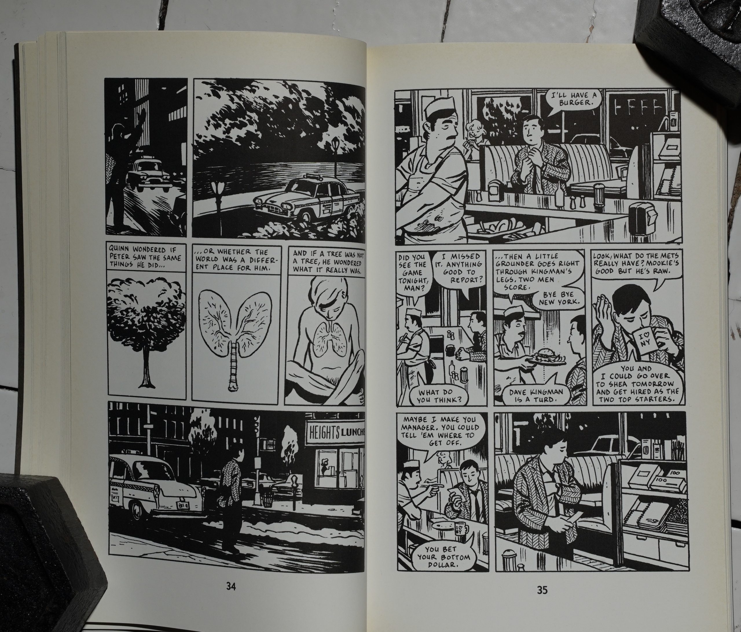
And for once, it’s a comics adaptation that works. Auster’s novel is pretty short, which helps, but Karasik/Mazzucchelli manage to bring something totally new to the work, without diminishing what makes that novel so exciting. None of what Mazzucchelli is drawing here was described in the novel, of course — but it’s perfect.
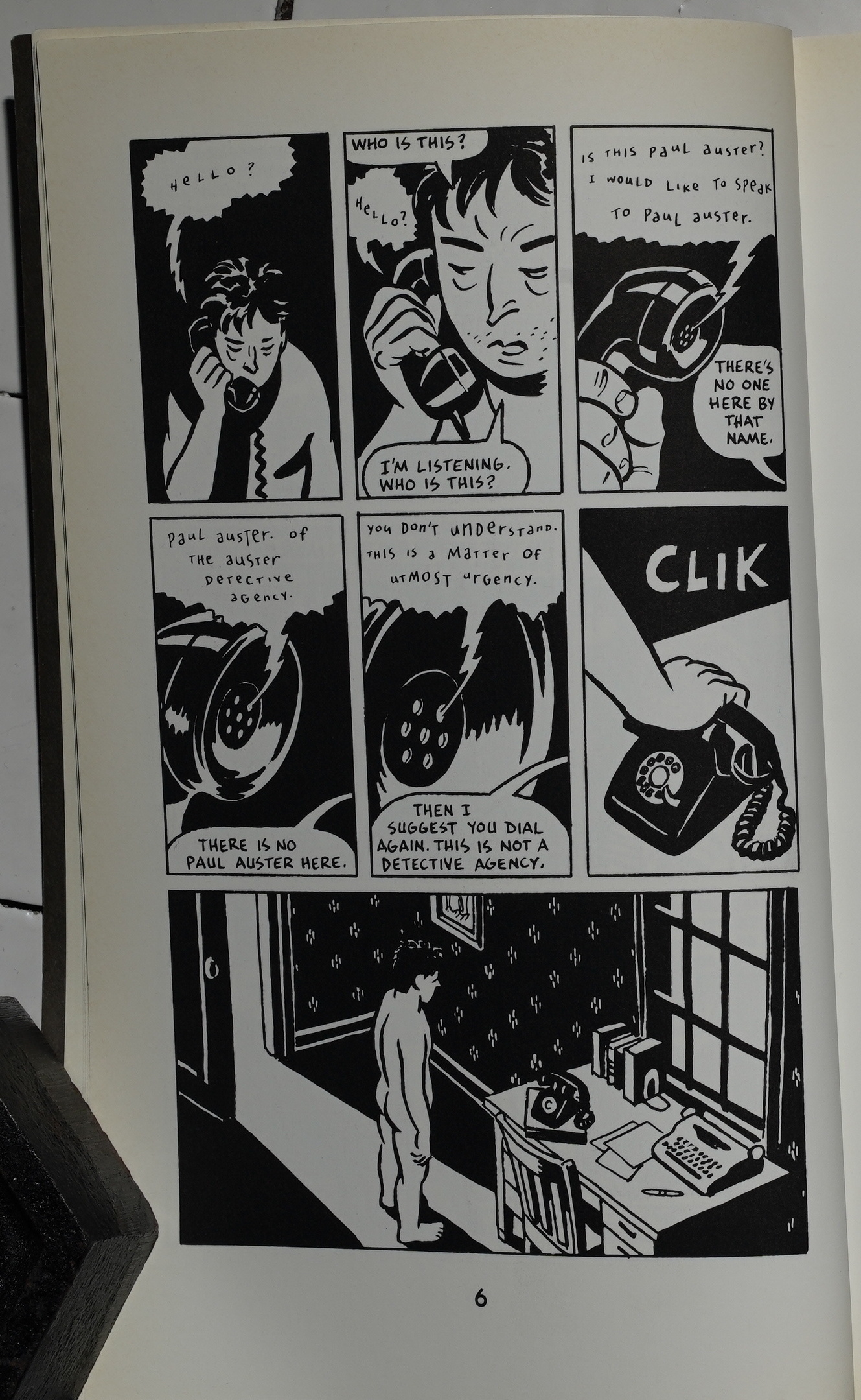
Having the protagonist being mistaken for the private eye Paul Auster (who doesn’t exist) is Post Modernism 101, but that’s because 1) it’s really fun, and 2) it’s inexplicably unnerving: The plot from the book leaking out into the real world. Or something.
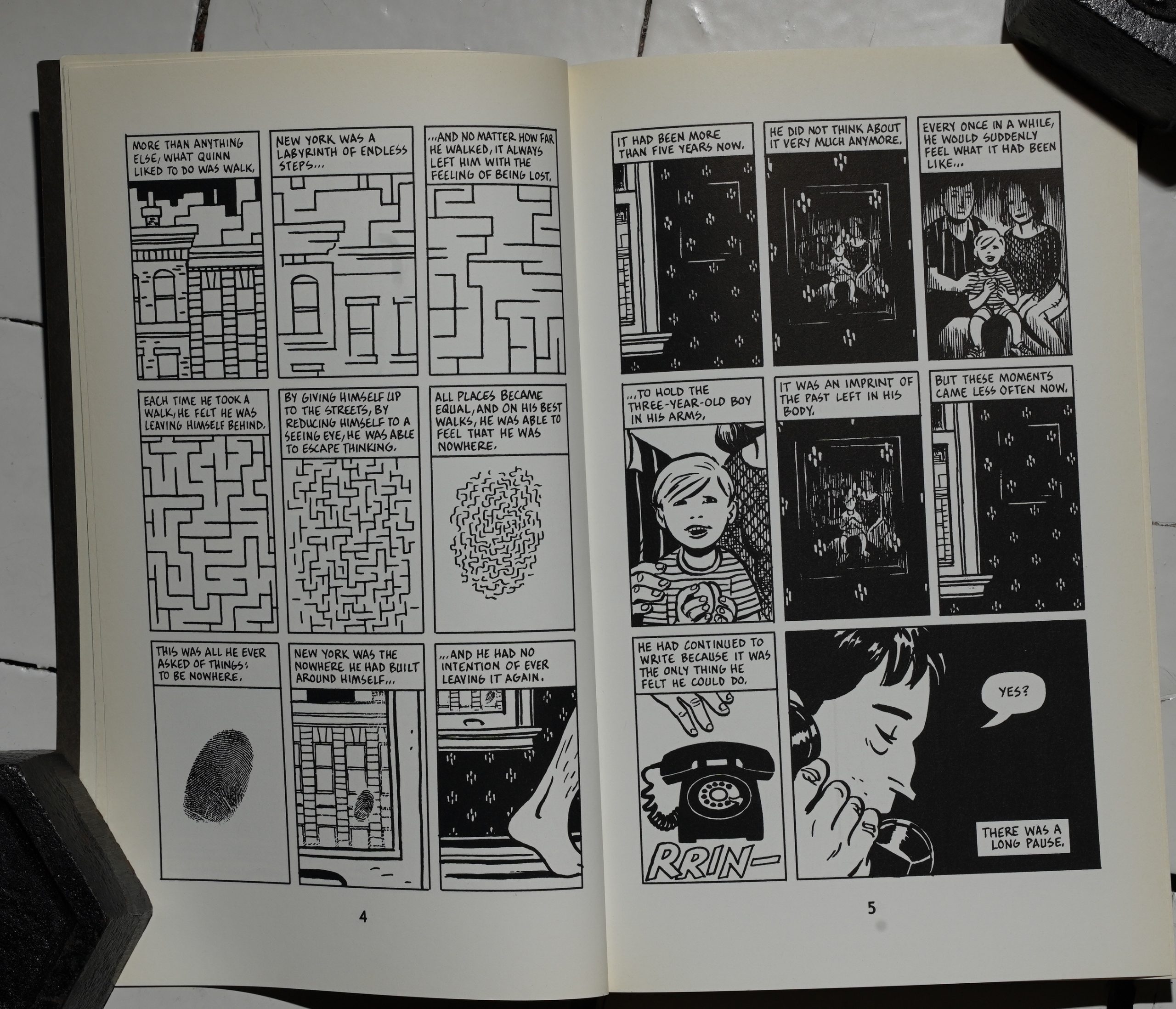
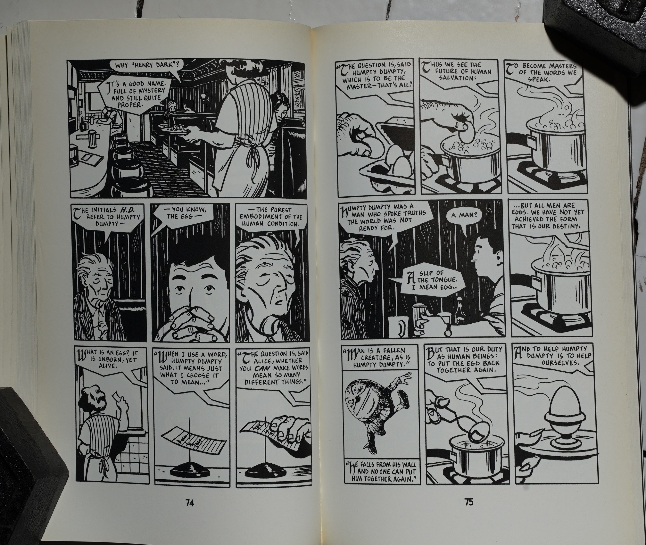
The sequence that starts here is probably the most famous one from the book? We get submerged into a symbolic journey, and it really works.
Mazzucchelli works on a nine panel grid, but merges adjacent panels into one as required. And then sometimes we get these pages that are kinda-sorta mirror images of each other, but not really.
I’ve read this book more than a few times — but not since the 90s, I think? It’s still as thrilling a reading experience. It’s amazing how everybody involved manage to make codswallop like the above feel important; like it means something — it’s really the mystery behind everything! It’s an amazing feat.
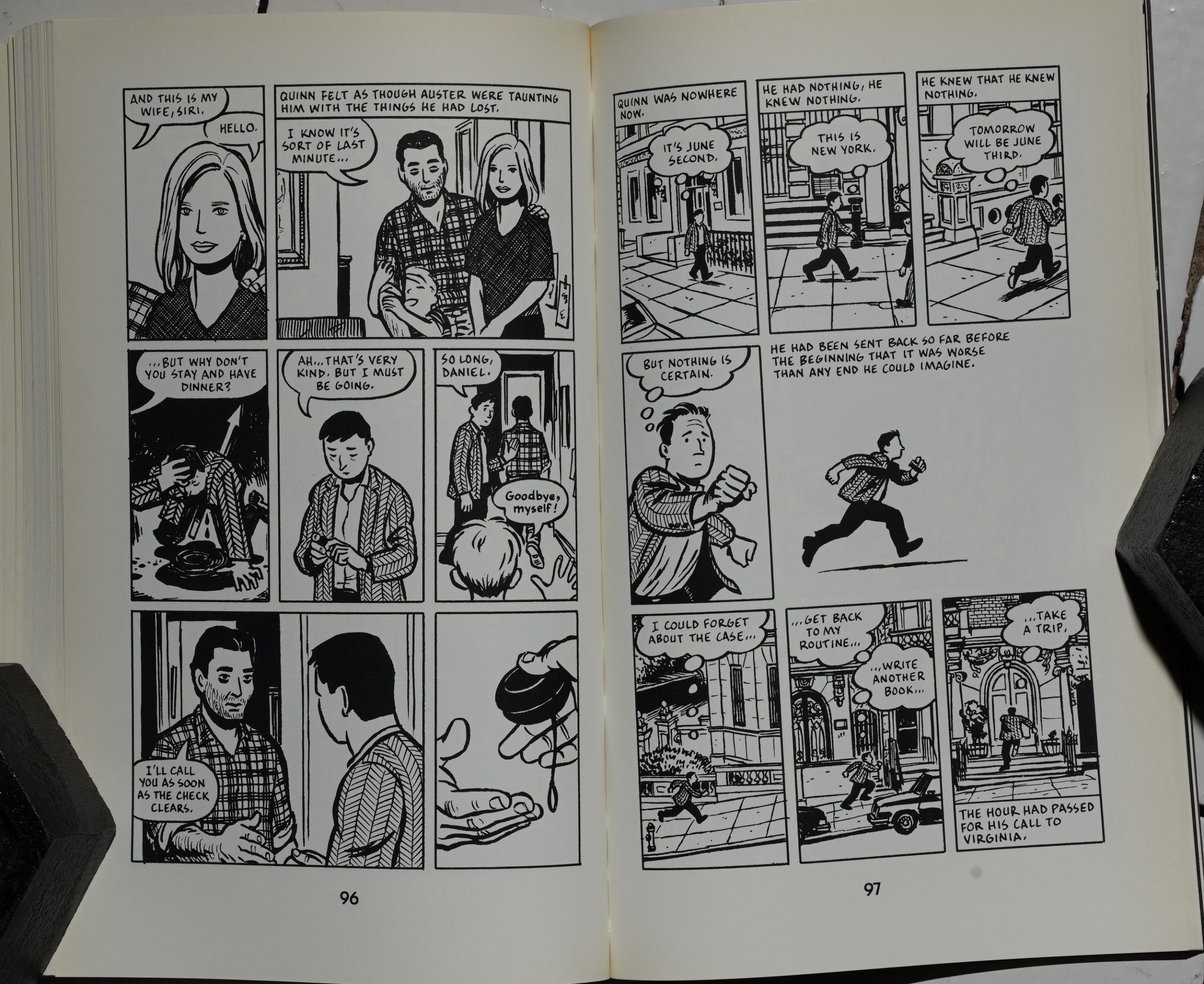
Auster, wife Siri Hustvedt (she’s also a really interesting writer) and son meet Quinn (the Auster whose name isn’t Auster) — it’s both cute and somehow shocking. You see people in comics trying to do the “fourth wall” thing to this day, and it’s usually pretty tedious and stupid (looking at you, Tom King). Here it actually works.
What can I say? Everybody involved are amazingly talented, and this was an inspired combination of people.
Christopher Brayshaw writes in The Comics Journal #173, page 53:
Auster’s New York Trilogy — City of Glass
(1985), Ghosts (1987), and The lwcked Room
( 1988) —deploy the conventions ofhard-boiled
American detective fiction in a complex critique
of the relationship between language and
objective reality. Paul Auster’s Ciry of Glass,
David Mazzuchelli and Paul Karasik’s comics
adaptation of the first book in the Trilogy, is
shorter and simpler than Auster’s novel: still,
the adaptation is so visually innovative that it is
impossible to think of it as anything but an art
work in its own right, which preserves the
Austernovel’s textual ambiguities by translating
them into visual form.[…]
David Mazzuchelli ‘ s artwork perfectly cap-
tures the sense of indeterminacy underlying
City ofGlass. Initially, his cartooning is realis-
tic and highly structured, built around permuta-
tions of a nine-panel page. The adaptation be-
gins with a tracking shot pulling back from a
small, dark oval: the hole in the middle of the 0
on the dial ofthe cartoon telephone on the cover
of the Manhattan white pages. As the camera
continues to pull back, we see Quinn’s phone
and the cartoon phone side-by-side: a subtle
foreshadowing of the discrepancy between
printed symbols and objective reality which
will plague Quinn as he investigates Peter’s
case. The shot then cuts to Quinn rolling out of
bed and walking toward the phone. But here, as
Quinn passes a bookshelf ofMax Work myster-
ies (Clam Up, Bad Guy/Good Guy, Suicide
Squeeze), Mazzuchelli punctuates the shot with
images whose locations are more indefinite:
Max Work books; a picture of Work; the dust
jacket of a William Wilson novel. Then, as
Quinn passes a window, the camera rushes
through the glass toward the brownstones across
the street, whose brick facades, seen in extreme
close-up, dissolve into a tangled web of lines
and shadows, which Mazzuchelli abstracts as a
maze, and then as a fingerprint on the glass. The
thumbprint symbolizes “Quinn,” whose com-
posite persona of fully-formed others (Wilson,
Work), dis-integrates over the course of the
story until he, like so many other protagonists
of post modernist fiction, finally disappears.
(Quinn’s literary siblings-in-absentia include
Thomas Pynchon’s Tyrone Slothrop, Carol
Shields’ Mary Swann and Daisy Goodwill, and
John Barth ‘ s Ambrose).[…]
The Auster novel ‘s rapid shifts between the
exterior and interior world are perfectly comple-
mented by David Mazzuchelli’s art, which os-
cillates between realistic cartooning and more
complex visual abstraction. One Of the plea-
sures of City ofGlass is its loving depiction of
New York; in particular, Mazzuchelli’s rendi-
tions of Upper Broadway, Grand Central Sta-
tion, and CentralPark. These pictures are largely
uninflected, literal instead of symbolic. We
relax from the abstract sequences’ highly
charged symbolism to appreciate Mazzuchelli’s
great skill as a draftsman, and in particular, the
roughly textured brushstrokes he uses to repre-
sent mass and shadow. This swift, confident
cartooning, which to me suggests the influence
of the German painter Georg Baselitz, is the
natural evolution ofthe realist style Mazzuchelli
first employed in Daredevil: BornAgain (Dare-
devil #226-#233) and Batman: Year One
(Batman Buteven in these strongly
realistic sequences, elements of abstraction
creep in. In one scene, Stillman and Quinn sit on
a boulder high above the Hudson River, looking
west to New Jersey. “One minute we’re one
thing, and another another,” says Stillman, and
Quinn replies “Exactly.” Light floods in from
across the river, dissolving both men’s features;
the image underscores how Quinn and Sti Ilman
have, in a sense, become “each other.” Later on,
Quinn huddles in the rain in a park on upper
Broadway, and Mazzuchelli reduces Quinn’s
features to a small pair of staring eyes dwarfed
by his umbrella, the dark masses oftrees behind
him, and the steady streams of cars passing by
on either side. This panel is almost unbearably
moving; it speaks, more plainly than anything
in Auster’s prose, of Quinn’s utter isolation and
self-absorption, as he moves, like Thomas
Pynchon’s Oedipa Maas, “[likel an alien,
unfurrowed, assumed full circle into some para-
nola.”
The book was no. 45 on the top 100 in The Comics Journal #210, page 65:
It’s rare that any adaptation of a
well-written novel lives up to the
standard set by the original and
comic books have not had a history
marked by stunning successes in this
arena. Except, perhaps, for one.
Paul Karasik and David
Mazzucchelli’s adaptation Of Paul
Auster’s short detective novel City
of Glass not only lives up to the
promise ofthe original text but also
asks to be taken seriously alongside
it. Paul Auster’s City Of Glass, as the
Avon-published comic is known,
does not merely render Auster’s
text Visually but actively brings new
metaphors to the suråce by plumb-
ing the novel’s depths to a degree
heretofore unheard of in a comic
book literary adaptation.
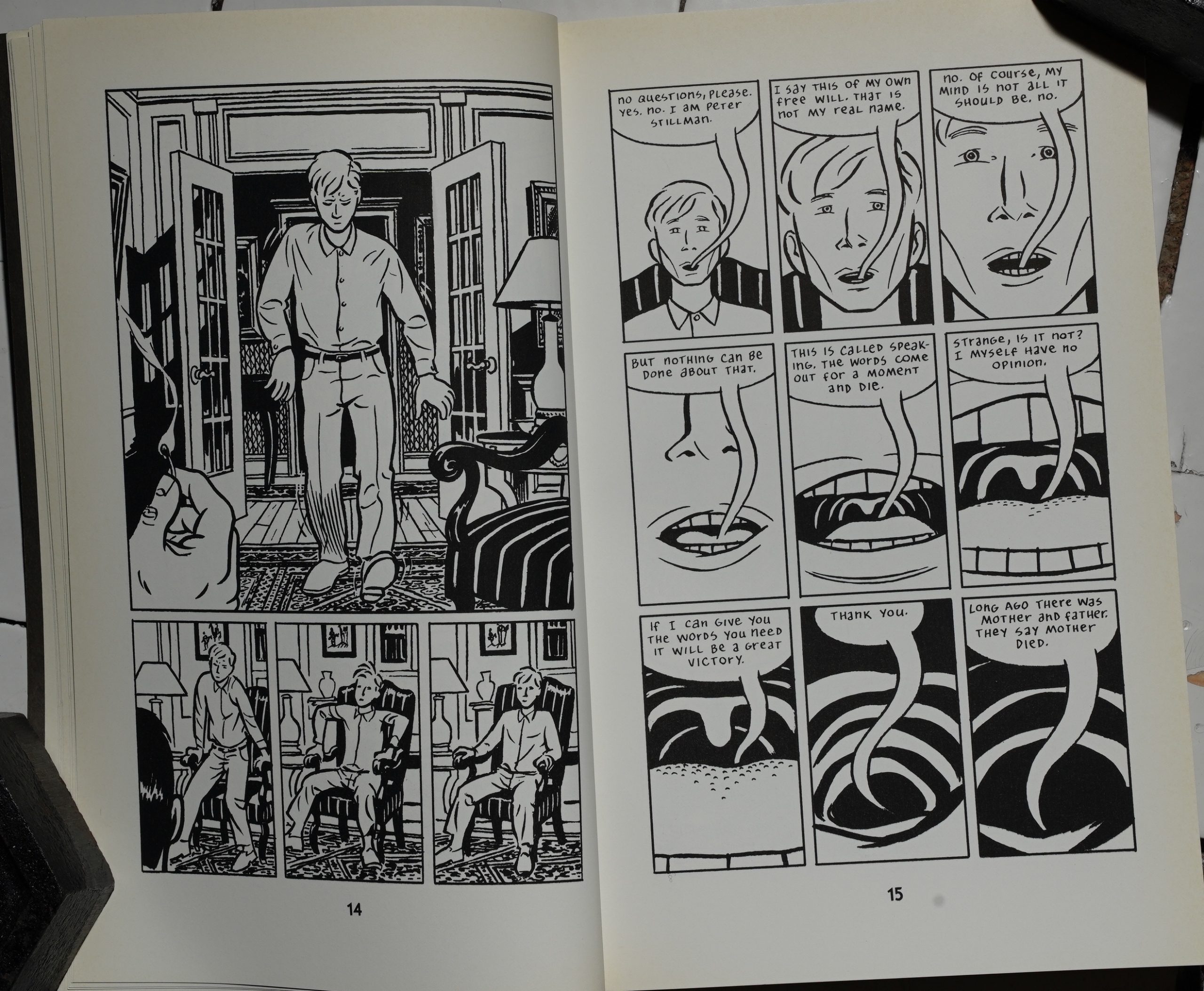
Take, for example, the lengthy
expository monologue in which
Peter Stillrnan tells his history to
the protagonist, Quinn. Reading
the text it is almost unimaginable
visually, yet Mazzucchelli dives
straight into Stillman’s mouth to
find mythic icons, reflections Of
primitive visual representations, and
a tour deforte presentation of sym-
bols (a guitar, ink, a television) that
are stand-ins for direc t face-to-face
communication. With these pages
Mazzucchelli suggests, in a fashion
more directthan Auster’s text alone,
the inability ofStillman and Quinn
to communicate one to one. The
discussion is always mediated, al-
ways partial because their
experiences of language (one a
writer, the other raised in absolute
solitude) are so totally at odds. In
every way Mazzucchelli has made
the copy in this instance superior
to the original.
If there is one drawback to
Paul Auster’s City of Glass it is that
the remaining par-B of the trilogy
(Ghosts and ne Locked Room)
haven’t received similar treatment.
Without them, the Story remains
incomplete. Nonetheless, if the
comic book gives up something for
its lack of successors, it gains much
more with the addition of David
Mazzucchelli ‘s skillful and thought-
provoking artwork.
Brayshow interviews Mazzucchelli in The Comics Journal #194, page 63:
A FORMAL VISIT TO THE
CITY OF GLASS
BRAYSHAW: You sent me two versions fCity Of Glass.
You sent me Paul [Karasik]’$ original breakdowns, and
your revision Of those. In your revision, there Was much
more what I would call rhythmic variation in the size of
the pages.
MAZZUCCHELU: Right.
BRAYSHAW: A sense of expansiveness whenever Quinn
uould step outside, and a more naturalistically rendered
Neu York uas that intentional?
MAZZUCCHELLI: What was intentional — there were a
lot Of intentional things in that book! One of Paul’s
initial ideas was to build the story on a 9-panel grid and
use that as an underlying structure that would allude to
the structure of the novel. And it was clear to me and
to Art right away that that an excellent idea, but
that it was probably not going to work at the size the
book was being published to have every panel in the
book be the same size, 119th of a page, just for reasons
of readability and legibility and creating something
that would invite the reader in. Sowhen I was working
on a second draft, based on Paul’s first draft, I kept the
nine-panel structure, but opened it up so that panels
were built within that grid. Larger panels were built
within that grid.
BRAYSHAW: I thought it was very telling thatyou kept the
one nine-panel page where the white space between the
panels comes to standfor cage bars.
MAQUCCHELLI: Oh well, I mean, it was perfect. [laughs]
Then again, it was that same… youll find that that
nine-paneled grid Or that structure Of a rectangle
broken into a grid Of nines appears throughout the
BRAYSHAW: What familiarity did you have with the
Auster trilogy?
MAZZUCCHELLI: None until Art recommended it. Art
asked me back in J anuaryof92 in Angouleme if I’d be
interested in working on this project that he and Bob
Callahan were putting together. His original proposal,
I can’t remember what the novel was now, but it was a
classic noir novel, and I told him I don’t read that stuff
And thinking about what he saw that I was doing with
my own work, he said, ‘Well, maybe ‘d be in ter-
ested in this book,” and suggested Alsutd
s City Of
Glass. I hadn’t heard ofAuster, I didn’t know the book,
but when I got home, I got a copyofit and I read it, and
immediately felt like, Yes, this is something I feel
sympathetic to.”
BRAYSHAW: Didyou read the other two books in the
trilogy as well?
MAZZUCCHELLI: Yes. I
read the whole trilogy at
once just to get a feel
where it was going, what
it was all about.
BRAYSHAW: There are
particularelements like the
real PaulAuster standing
in bis doorway with the pen in band — the image of the
writer with a pen in hand, standing in a doorway recurs
in some Of the Other bocks. appreciated the Way you were
able to, even in adapting a single ulume, keep elements
from the triloo present in the adaptation.
MAZZUCCHELLI: a veryinterestingproject fora lot
of reasons. I distinctly recall about halfivay through
working on it, maybe evenearlier, just looki ng at what
was in front of me, and thinking about how we were
trying to make sense out of this stuff and wondering,
why the hell did Bob and Art think that this would
make a good comic book? Because there was nothing
visual about the book itself. And after a little more
thought, realizing, well, that’s why they thought it
would make a good comic book. This is a test. [laughs]
This is a challenge. To take something complex and
rich and *adult” and show that you can handle material
like that in this form. That was one of the reasons I
wanted to work on it as well.
BRAYSHAW: Did you like Paul’s The Auster book
is concerned primarily with texts and with narratives.
And adaptation seemed to switch into the idea Of
iconography, period. The whole sequence when Stillman is
talking in those variousforms oftommunication are being
depicted one after the Other. That me as an interest—
ing step sideways.
MAZZUCCHELLI: Austeds book is so much about lan-
guage, and the structure oflanguage, and identity, and,
in fact, the structure ofidentity, the shifting nature and
layering of identity, that the visual metaphors that
Paul was coming up with were necessary and apropos.
That was really the challenge, to find a visual way of
expressing these things without having to keep all the
text. You can’t just add drawings to the novel and say,
“Look, ids an adaptation. ” Adaptation to me connotes
some kind of shortening or condensing.
BRAYSHAW•. A translation.
MAZZUCCHELLI: But shorter in physical terms, although
ours is about the same length. In fact, it may be even
more pages than the original
prose novel.
BRAYSHAW: Yes.[…]
BRAYSHAW: Had you discussed the novel at all with
Auster? Had he made himself available to the project?
MAZZuCCHELLl: Auster agreed to do it because he
trusted Art. And Art trusted Paul and me. So we were
pretty much left alone for months to come up with
something. Paul seemed to have such a clear idea about
it, We all agreed that he should be left alone to tackle it
first. And then he and Art I got together with that first
draft and went through it page by page and panel by
panel and determined what was good and what was
weak and what should be kept and what needed to be
worked on. And then I took it for a few months and
went back to the original novel with Paul’s first draft in
hand, and chiseled away, and reshaped a second draft
which is much closer to the final draft. And at that
point, Auster got a chance to look at it.
BRAYSHAW: And what was his reaction ?
MAZZUCCHELLI: Very positive. We had a meeting, the
four of us, after he had been given time to read it,
where, again, we went through it page by page and,
surprisingly, he had very few comments about things
he thought might be changed. It was really very funny
to see places where he’d say, “insert the word •the’
here,” or “take Out this comma,” that kind Of thing.
There were place where he felt we had chopped too
much text and lost some of the internal monologue
that he felt was important. There were other places
where, seeing the waywewere handling something, he
thought we could lose even more text.
BRAYSHAW: rm curious if,5e would have had comments
that didn’t relate to the text.
MAZZUCCHELLI: There were a couple of times I know,
and I wish I could remember exactly what it was, but
there were one or two places in the book where he felt
we’d taken something out that should have been left in,
Or hadn’t emphasized something enough. I wish I
could be more specific here. I remember Paul Karasik
and Art and I were all immediately of the same mind,
that “Well, you’re right from a literary point of view,
but comics don’t work that way.” And when we ex-
plained why we had done what we had done, then he
said, “Okay, I see why you did it that way.”
This story was originally published in 1994 as Neon Lit: Paul Auster’s City of Glass by Avon Books. This 2004 edition features an introduction by Art Spiegelman.
The cover on this edition by Picador is horrendous.
Some people find bits of it to be too clever:
The Don Quixote conversation is perhaps too overt, the sort of postmodern cleverness that I increasingly find a big turnoff, but it’s not clumsy or awkward. Still, there’s something mildly irritating about an author tipping his hand and then showing you how he’s tipping his hand.
There are many, many articles about the book:
In most of the book, Quinn functions as a “post-existential private-eye”, in the words of Dennis Drabelle quoted in (McCaffery, Gregory et Auster 2), and his surveillance of Stillman quickly leads him to semiotic and linguistic interrogations rather than to the down-to-earth investigation of a Philip Marlowe.
While the plot of City of Glass is excellent, the illustrations serve to both complement and deepen it. The black and white artwork begins as an apparent homage to film noir, but quickly creates its own presence.
Anyway.
This blog post is part of the Punk Comix series.
