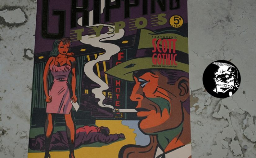
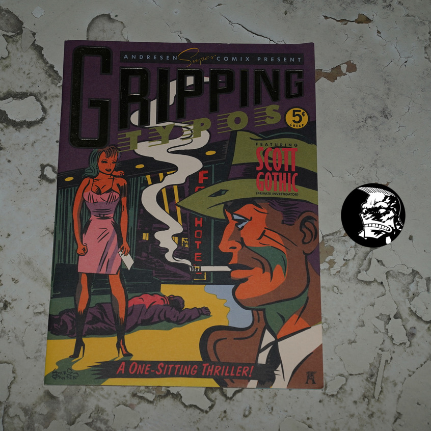
Gripping Typos by David Lees, Gary Panter and others (255x356mm)
This is an oddball publication — it seems like it’s basically an ad for Andresen Typographics in Los Angeles — but it doesn’t say so explicitly. It doesn’t say when it was published, either, but Printed Matter says that it’s from 1985, and they’re usually right about things like this.
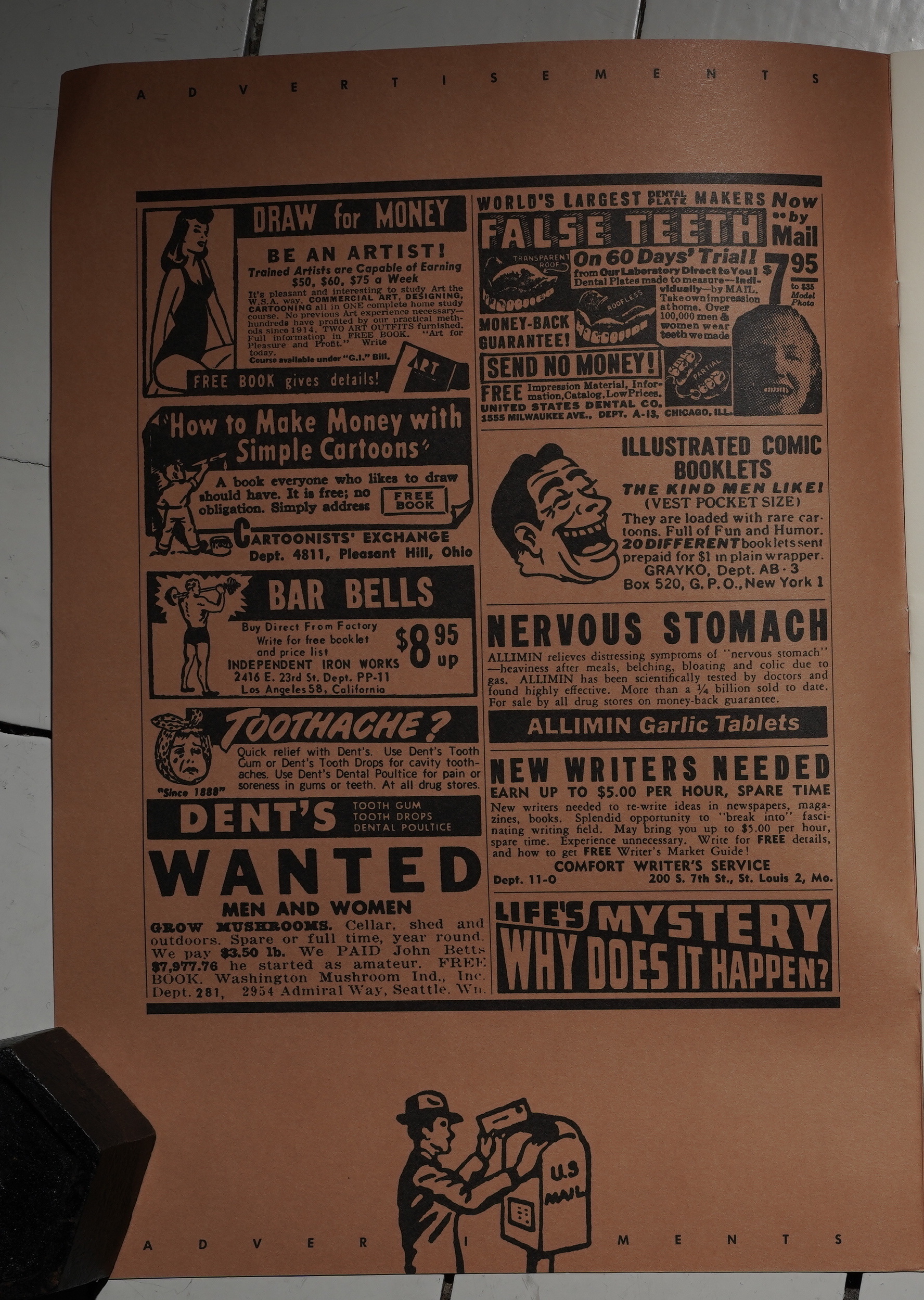
So we start with some jokey hokey oldee-tymee ads…
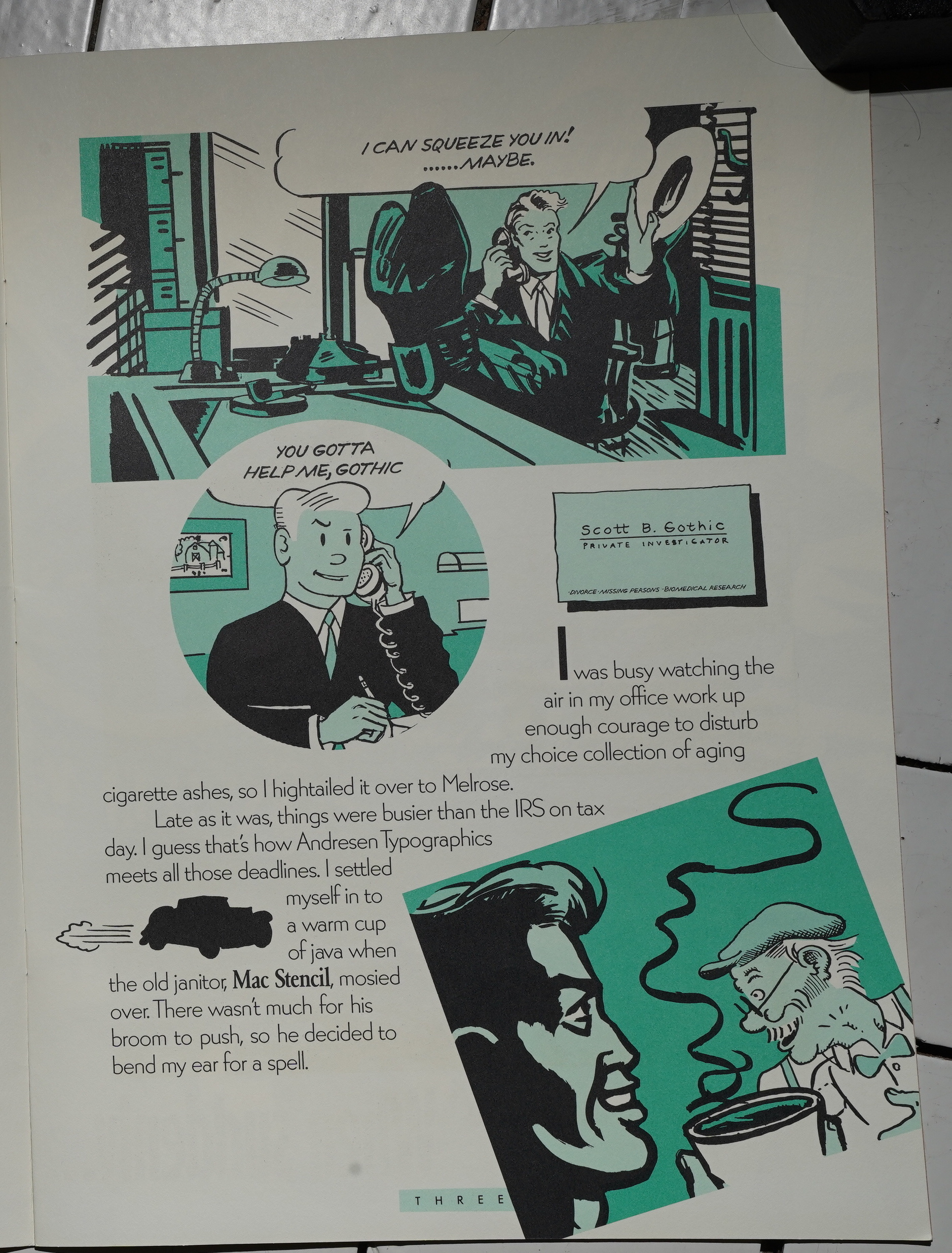
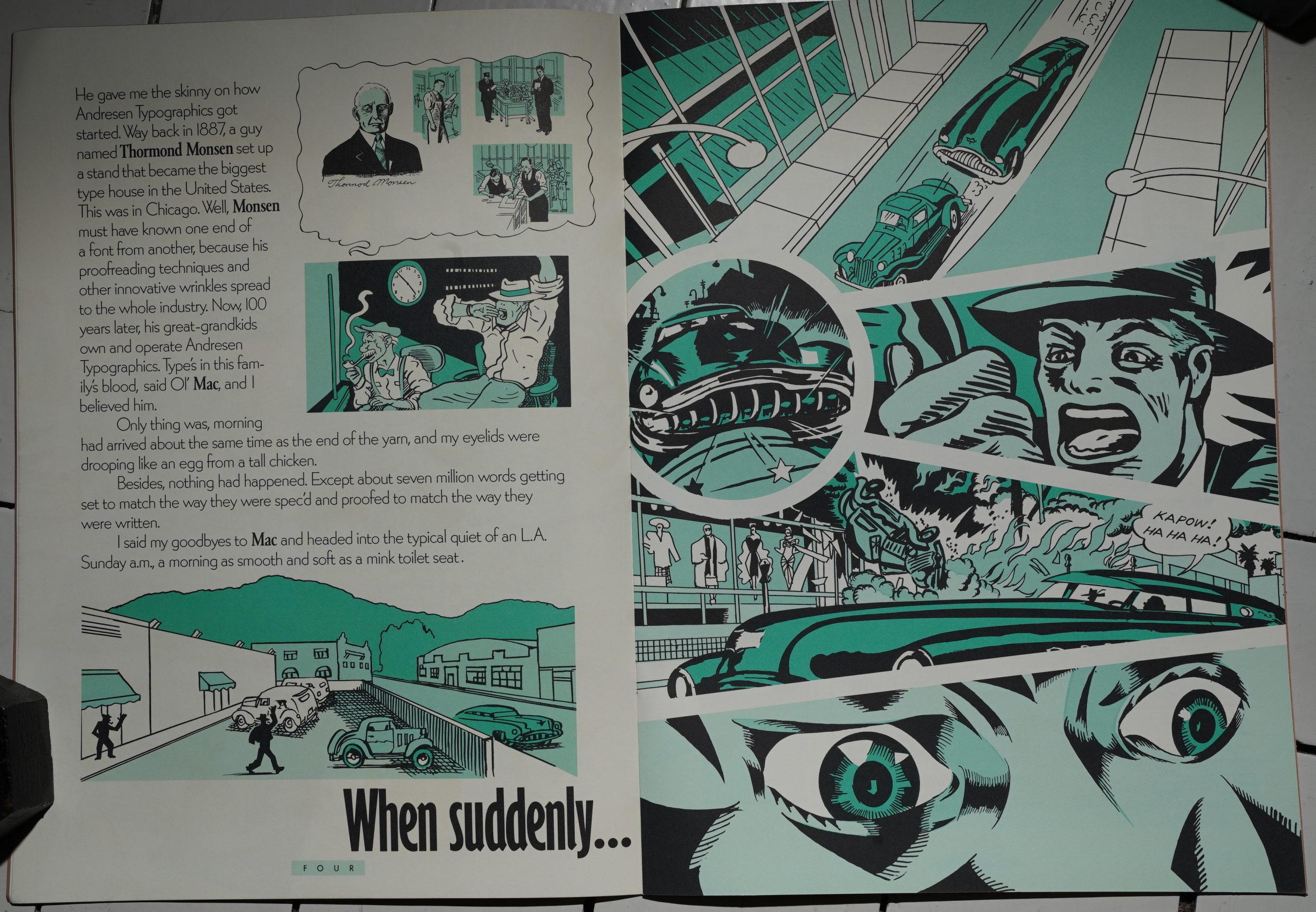
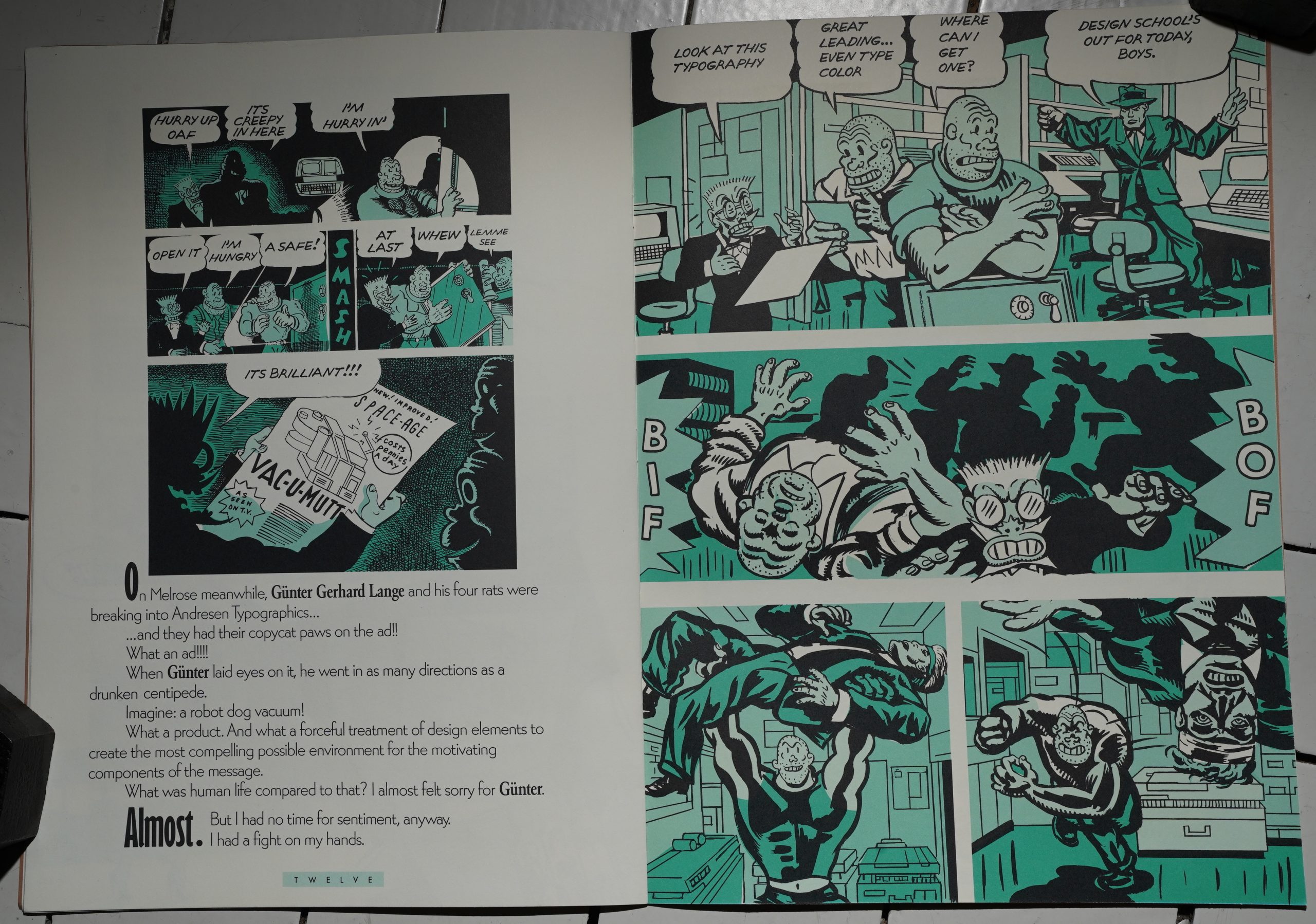
… and then launch into a short mystery involving a private dick and a secret ad (placed with Andresen Typographics). So I guess this artwork is by Gary Panter? It does look like it… vaguely… in some of the linework… but he’s certainly adapted his style a lot for this assignment.
This looks more like it. Pretty cool.
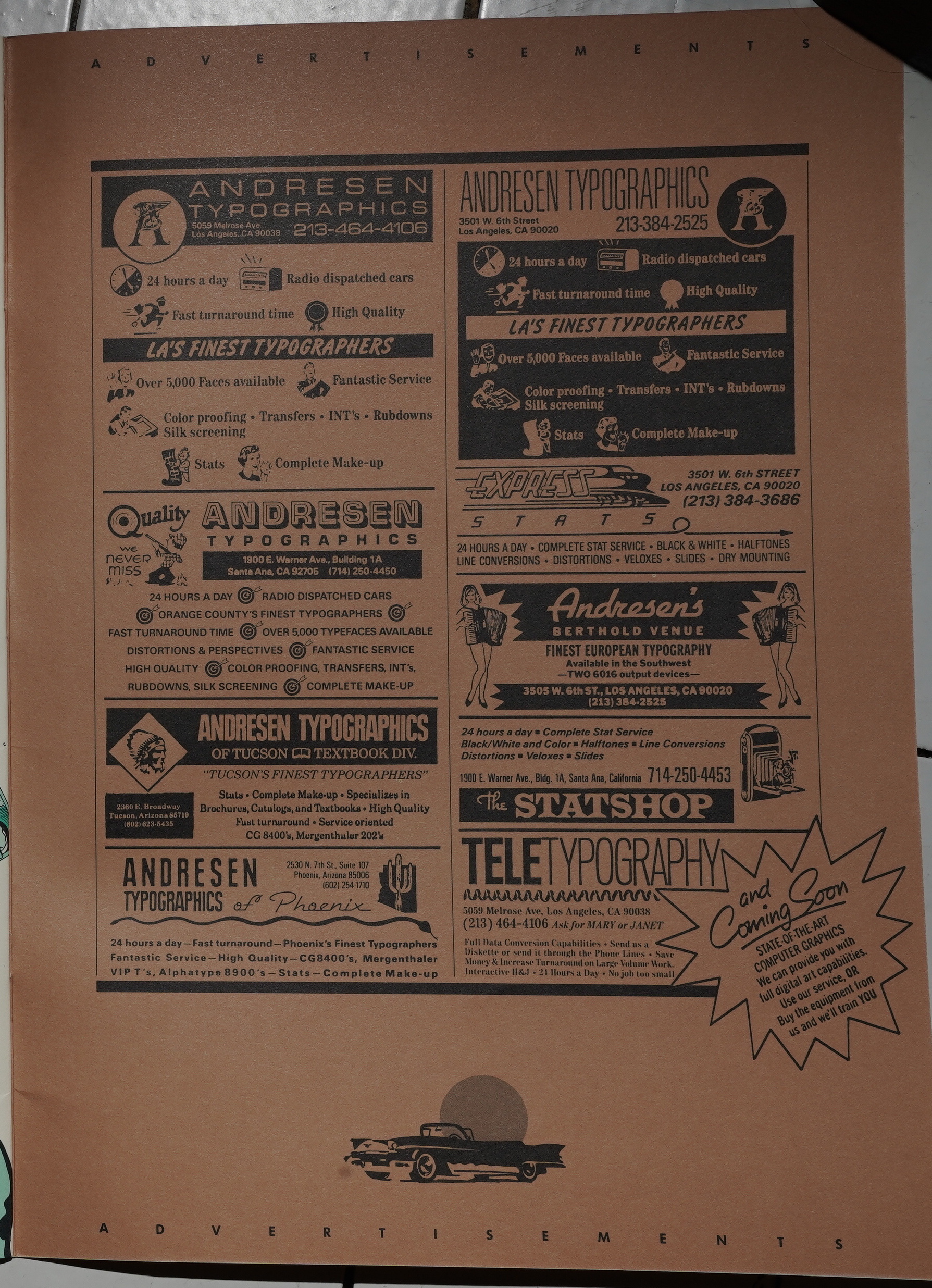
Apparently Andresen Typographics was open 24 hours a day? Three shifts. I guess they did typesetting and stuff?
And the reason for those jokey ads on the inside front cover becomes clear — here we get the same, but for Andresen. “Radio dispatched cars.” “Over 5,000 typefaces available”. Impressive.
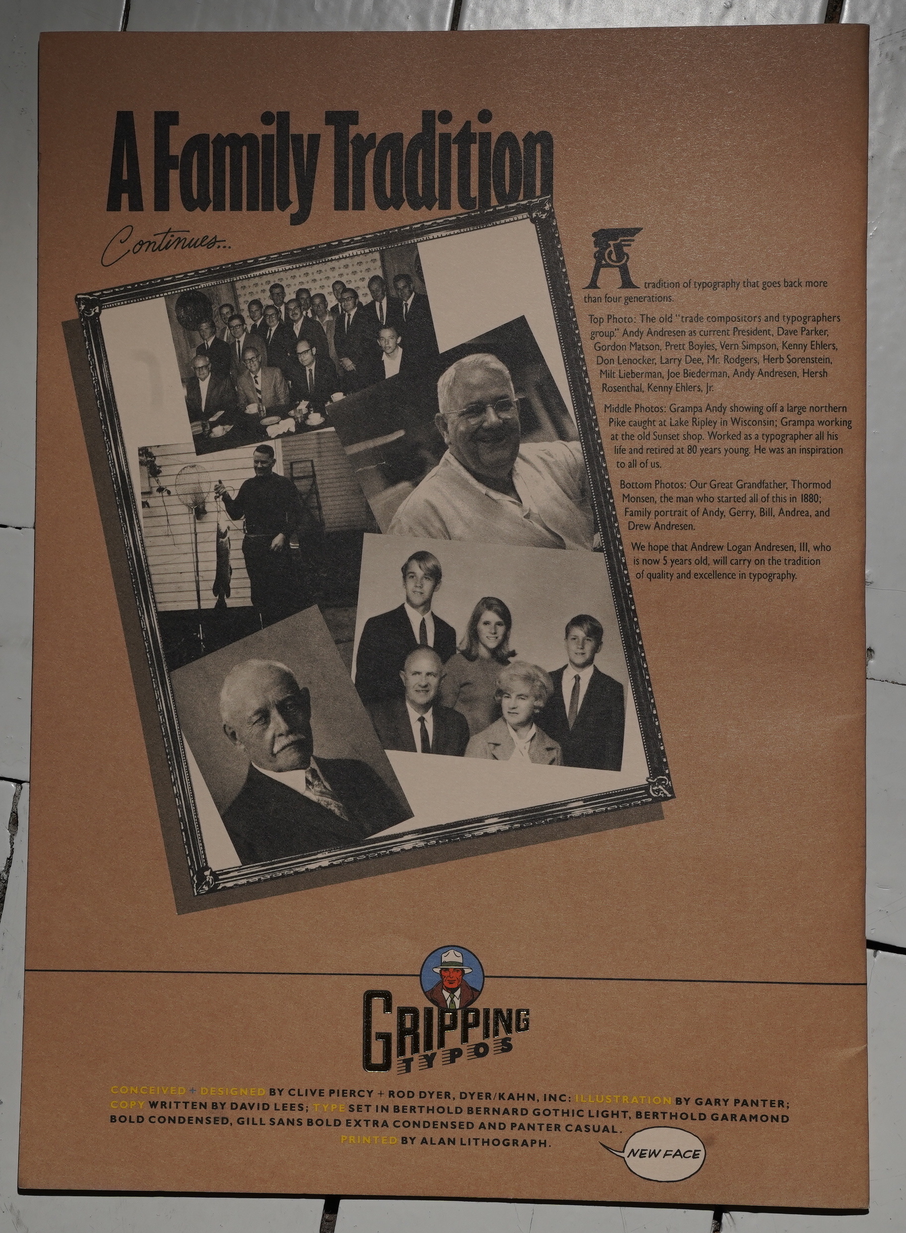
Designed by Clive Piercy and Rob Dyer. Oh, and they’ve done a typeface based on Panter’s lettering — “Panter Casual”.
So.
Is this something Andresen would hand out to (prospective) customers? I guess it’d make some kind of impression… and this was when computer typesetting was coming in, so they had to do… something…
They designed fonts themselves.
If typographers were kings, then the king of kings was Drew Andresen of Andresen Typographics. Mr. Andresen thought outside the box long before the term was coined. In doing so, Mr. Andresen brought his company and an entire industry to national prominence. Mr. Andresen’s combination of savvy business and marketing skills, long left out of the typography industry, carried the industry to new levels that others emulated.
And… it’s now Andresen Digital, and it seems to be basically the same company?
Well, that’s nice. It’s probably all because of… Gripping Typos!
This blog post is part of the Punk Comix series.
