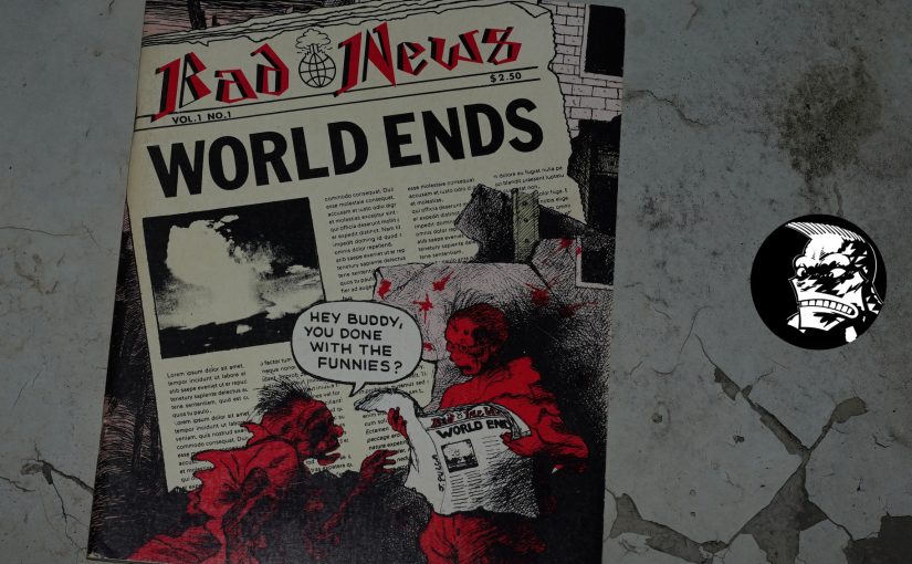
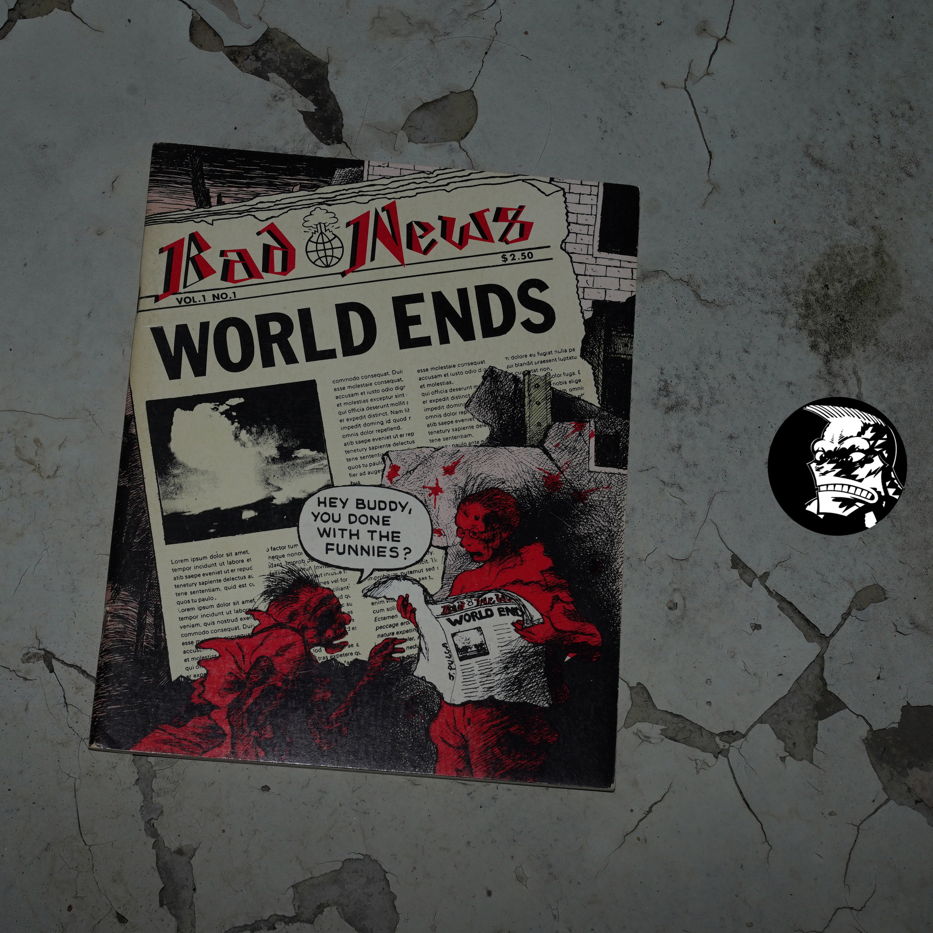
Bad News #1: World Ends possibly edited by Paul Karasik (210x260mm)
According to comics.org, Bad News was:
Started as a SVA class project assigned by Art Spiegelman in order to give his students some practical experience.
Mark Newgarden confirms in The Comics Journal #161, page 84:
KELLY; You used to edit a comic anthology, Bad News.
How did that come about?
NEWGARDEN: It started in Spiegelman’s class. It was after
I had graduated and he had a bunch of students doing this
magazine project which he asked me to get involved in.
The first issue I wasn’t too involved in. All I really
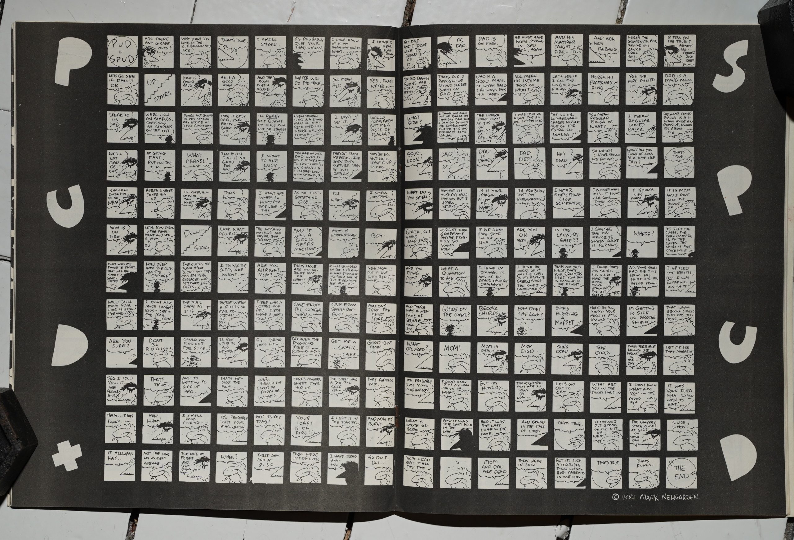
contributed was the Pud and Spud strip and I think I helped
put together the contents page. I didn’t edit it. On the
second one, Paul Karasik and I independently did it. We
published it, edited it, went out and got ads for it, got it
printed, the whole thing. A painful experience. We leamed
a lot, but I’d never want to go through it again.
The third issue happened years later when Paul and I
were teaching experimental comics at SVA We had some
good students’ work and we had been kind of collecting
some strips we liked and somehow we wound up with
enough material for a third issue and we did that through
Fantagraphics, which was a lot less painful.
KELLY: It seems like Bad News somehow evolved into
Snake Eyes.
NEWGARDEN: Yeah. I think at a certain point Glenn Head
was lobbying for another Bad News and I said, “I don’t
want to have anything to do with it. Why don’t you be
editor?” And ultimately it was renamed Snake Eyes and he
and Kaz took over as editors, They’ve done a great job.
Also RAW was kind of instrumental in killing Bad
News. When we were doing the second one, about to go
into a third one, suddenly Spiegelman got all paranoid
about our little comic book. Like we were muscling in on
his turf. I got into this big fight with him. At a certain point
he said, “I’m gonna bury you.” Just like Kruschev! And a
lot of stuffthat ended up in the very next RA Wwas actually
intended for a third issue of Bad News. My Nancy strip,
“Love’ s Savage Fury” was done for Bad News and Drew ‘ s
great illustrated piece using Leo Gorcey’ s poetry and that
strip that Richard McGuire did, “Here,” were all projects
initially done for Bad News. We kind of got muscled out
of business for a while. Eventually [Spiegelmanl I guess
got over it, but he saw it as some kind of threat to RA W’,
which was pretty ridiculous.
!!!
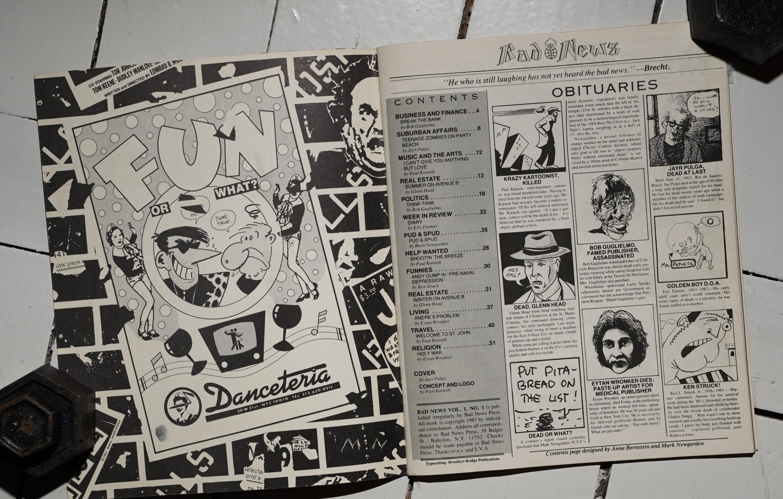
Anyway, that’s later, and what we have here is the first issue, which was published by the School of Visual Arts.
Heh. An ad for Danceteria?
Instead of an introduction to the creators featured, we get their obituaries. I’m surprised that there’s only eight contributors — it means that they get about eight pages each, which is more than I’d expect of a classroom project like this.
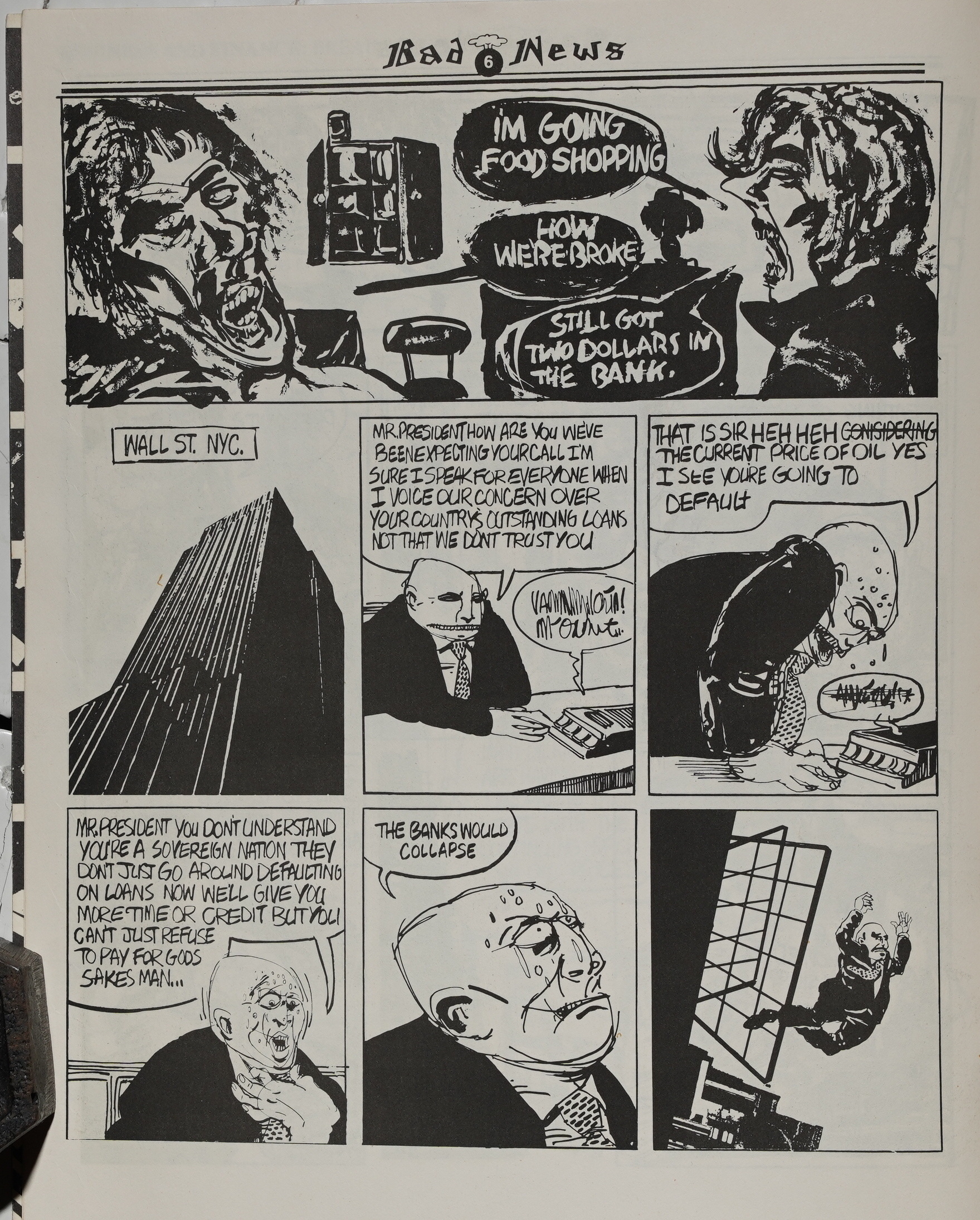
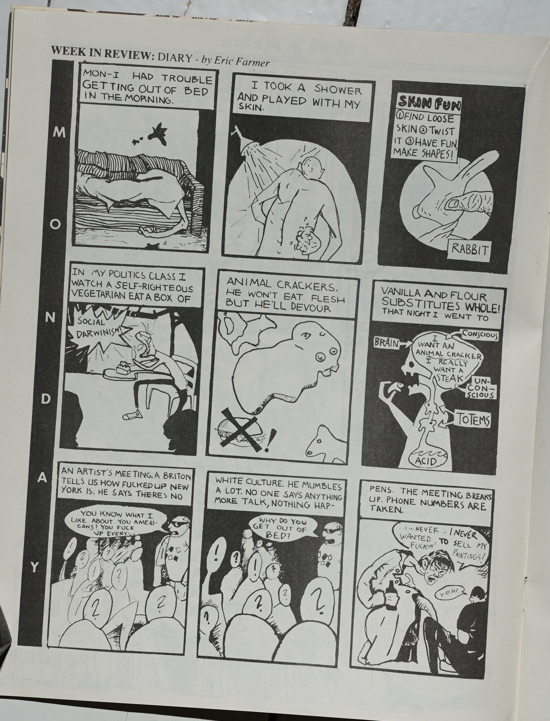
And it’s… it’s not very accomplished work. Bob Guglielmo’s work is pretty typical: The plot’s vaguely “political”, and the artwork seems to crib styles, sometimes several styles at once, from more established artists. I mean, it’s student work, so that’s what you’d expect.
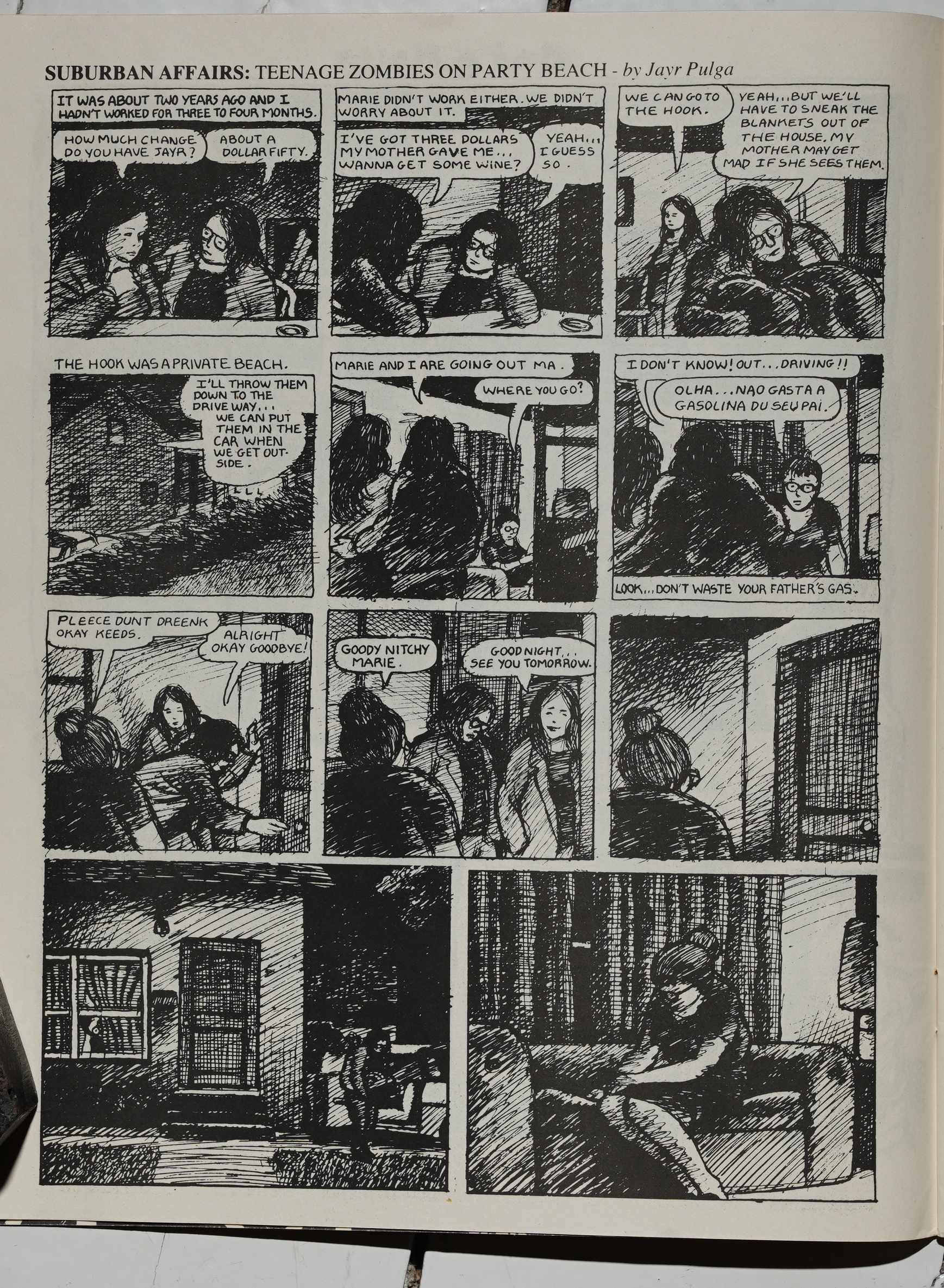
Jayr Pulga’s line is good — perhaps a bit overly influenced by Jerry Moriarty?
There doesn’t seem to be much inspiration behind many of these comics — they’re just kinda… there…
Perhaps predictably, the only thing in here that’s interesting is Newgarden’s Pud + Spud two pager. It’s not as good as the later Pud + Spud thing he did (which works along the same lines, but had more resonance), but it’s still something.
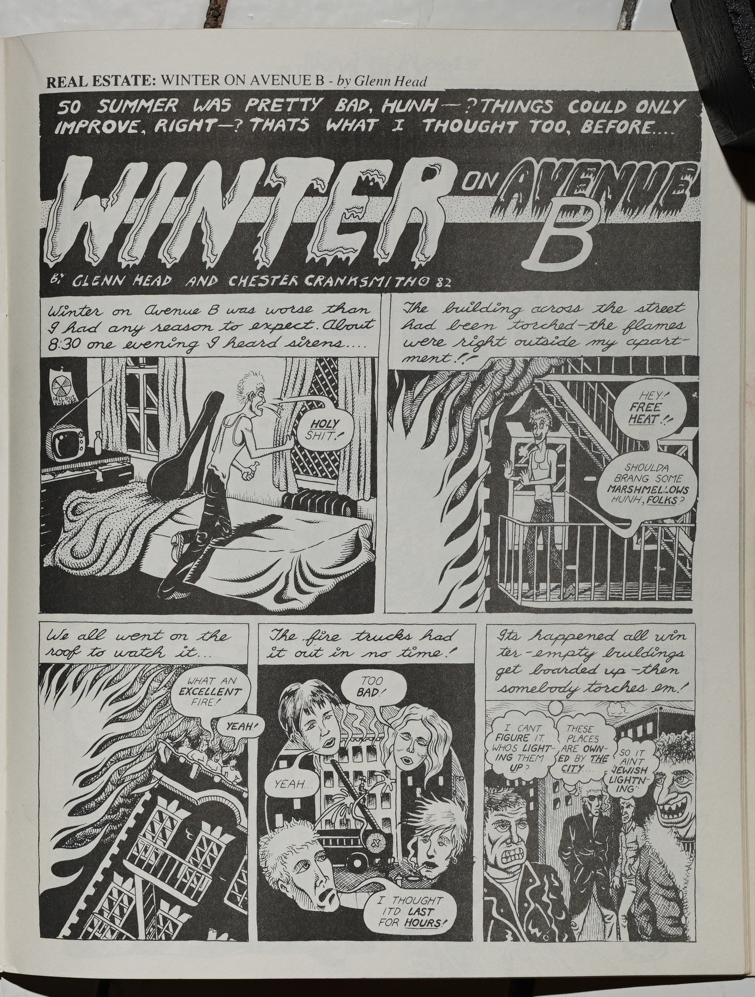
Glenn Head does a couple of autobio things (I assume), and as usual it’s about what a tough and hard life he’s living. But… “Jewish lightning”? Dude! I guess this just reminds me of sloppily anti-Semitic mid-70s undergrounds more than anything: It’s not really graphically interesting, and uses very traditional storytelling.
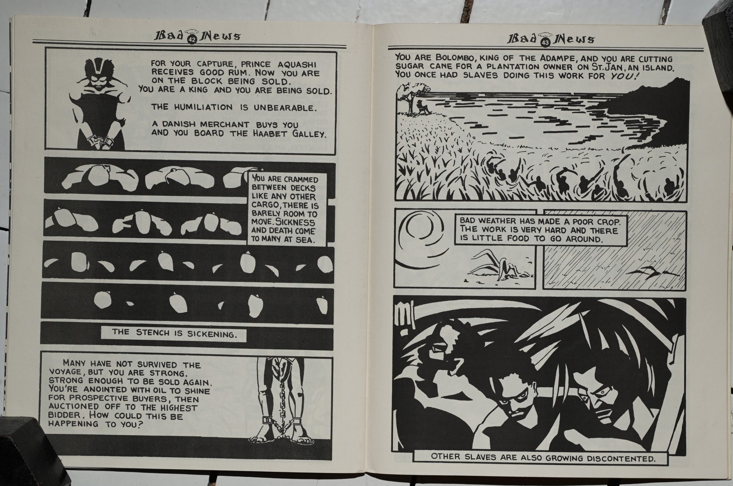
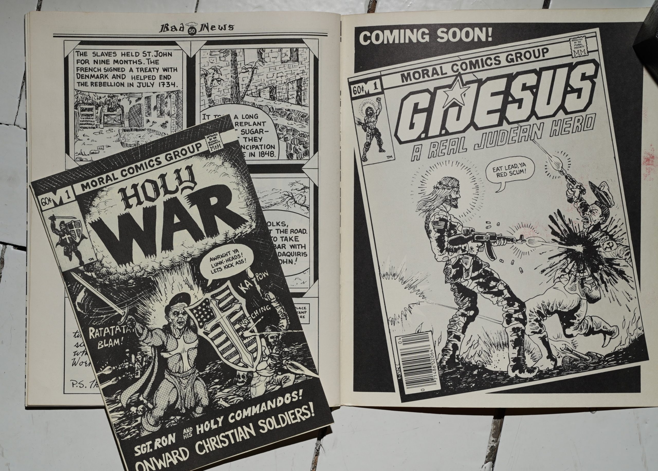
I guess Paul Karasik is more known as a writer and editor than an artist, but this story about a slavery uprising on St. John has some graphic interest. But it’s pretty sloppy.
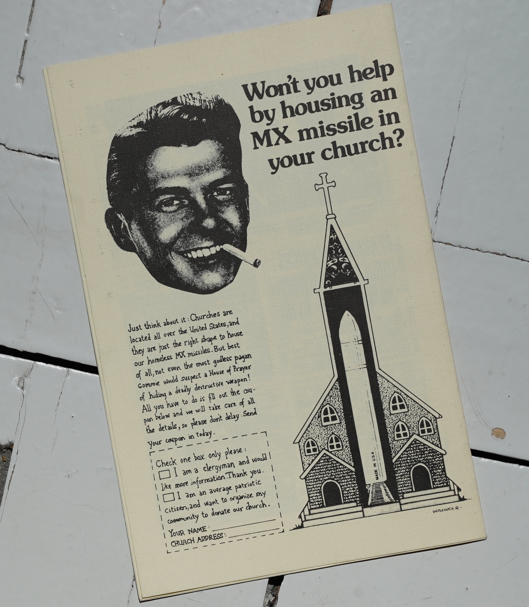
Finally, we have a an insert by Etyan Wronker…
It’s totally unreadable, but it does have this one gag.
Targeted advertising!
So… that was… pretty awful? And I’m also wondering whether there were no women at the SVA?
Bill Sherman writes in The Comics Journal #99, page 95:
Born Of Raw and the urban
art school experience, Bad
Neu’S is the 1980s’ answer to
such apocalyptic-themed
undergrounds as Hydrogen
Funnies Of 1970. Printed
on the heavy stock paper Of
today’s Seriously Artistic
Comix Book, Bad News offers
a sardonic series of takes on
Reagan’s America, much the
same as early undergrounders
like Shelton and Irons took
on the Nixon gang. That
there is a discernible dif-
ference, both in tone and
style, between these two
period titles says much about
the state of alternative comix
today and the way they differ
from their forebears.
[…]Harvey Pekar and his
cohorts may look at the
streets of Cleveland and see
Americap splendor, but to
the artists of Bad News the
Vista is nightmarish.
The Pekar comparison -is
apt, for most of News’s con-
tributors owe a debt to his
comix-scripted naturalism.
Jayr pulga’s “Teenage Zom-
bies on Party Beach” and
Glenn Head’s Avenue B
strips in particular follow the
Pekar mode: small vignettes
of life in the ‘burbs and East
Village respectively, with
lifelike dialogue and open-
ended structures. In Pulga’s
autobiographical strip, two
solemn suburban teenagers
drive to the beach to drink
and ineffectively comfort
(Shelton, Jaxon, Sturgeon, et al.).[…]
Bad News is paaaged like a small-scale
Raw, down to the inclusion Of an insert
comic, and opens with its own self-
characterizing epigram: ‘ ‘He who is still
laughing has hot yet heard the bad news.”
But where Raw’s contents reflect the rather
broadly inclusive vision Of editors Mouly
and Spiegelman, Bad News’s material is
more self-consciously restric-
tive. Darkly urban and fre-
quently just plain depressing,
the title reflects both the grim
relities of life in the new
Depression and on the city
streets. Harvey Pekar and his
cohorts may look at the
streets of Cleveland and see
Americap splendor, but to
the artists of Bad News the
Vista is nightmarish.[…]
Of all the Bad Netes artists, Karasik
immediately strikes the reader as the most
visually smooth.
I… guess…
This blog post is part of the Punk Comix series.
