Review of the printing of the Dover edition of The Puma Blues (by Stephen Murphy and Michael Zulli) printed by RR Donnelley in China. Paper stock unknown.
When Dover announced a collected edition of the 80s series The Puma Blues, we here at What Paper? anxiously examined the press release for phrases like “shot from the original artwork” or “shot from the original negatives” or even “restored”.
We couldn’t find any of those phrases, which usually means “we’ve scanned in a copy that the local library had available and then sent that to the printer”.
Would our fears turn out to be justified?
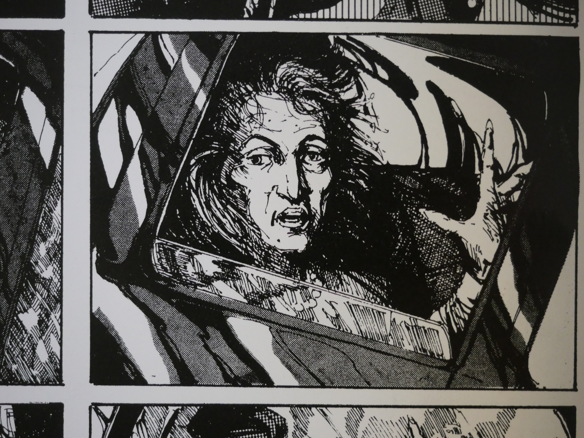
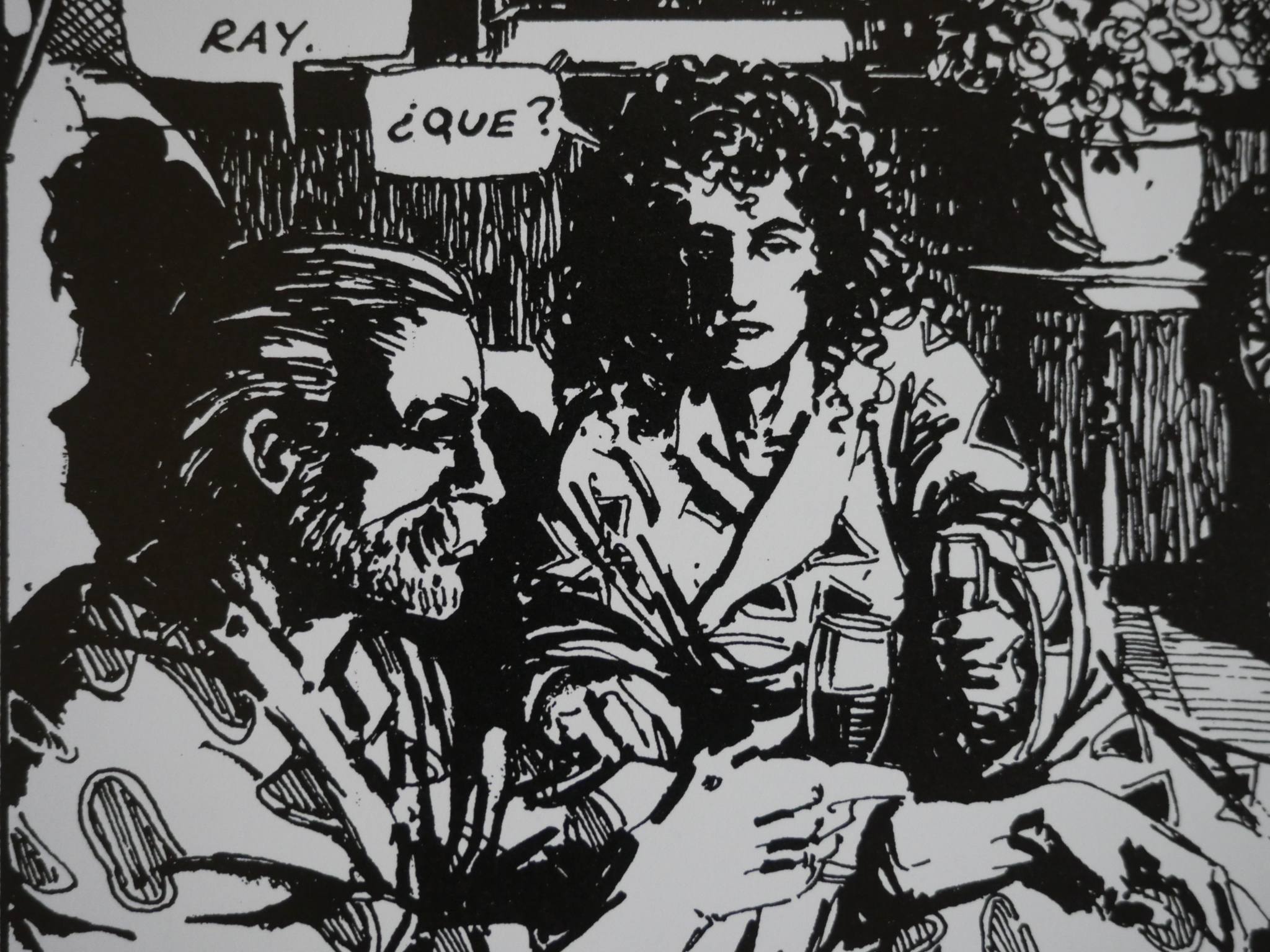
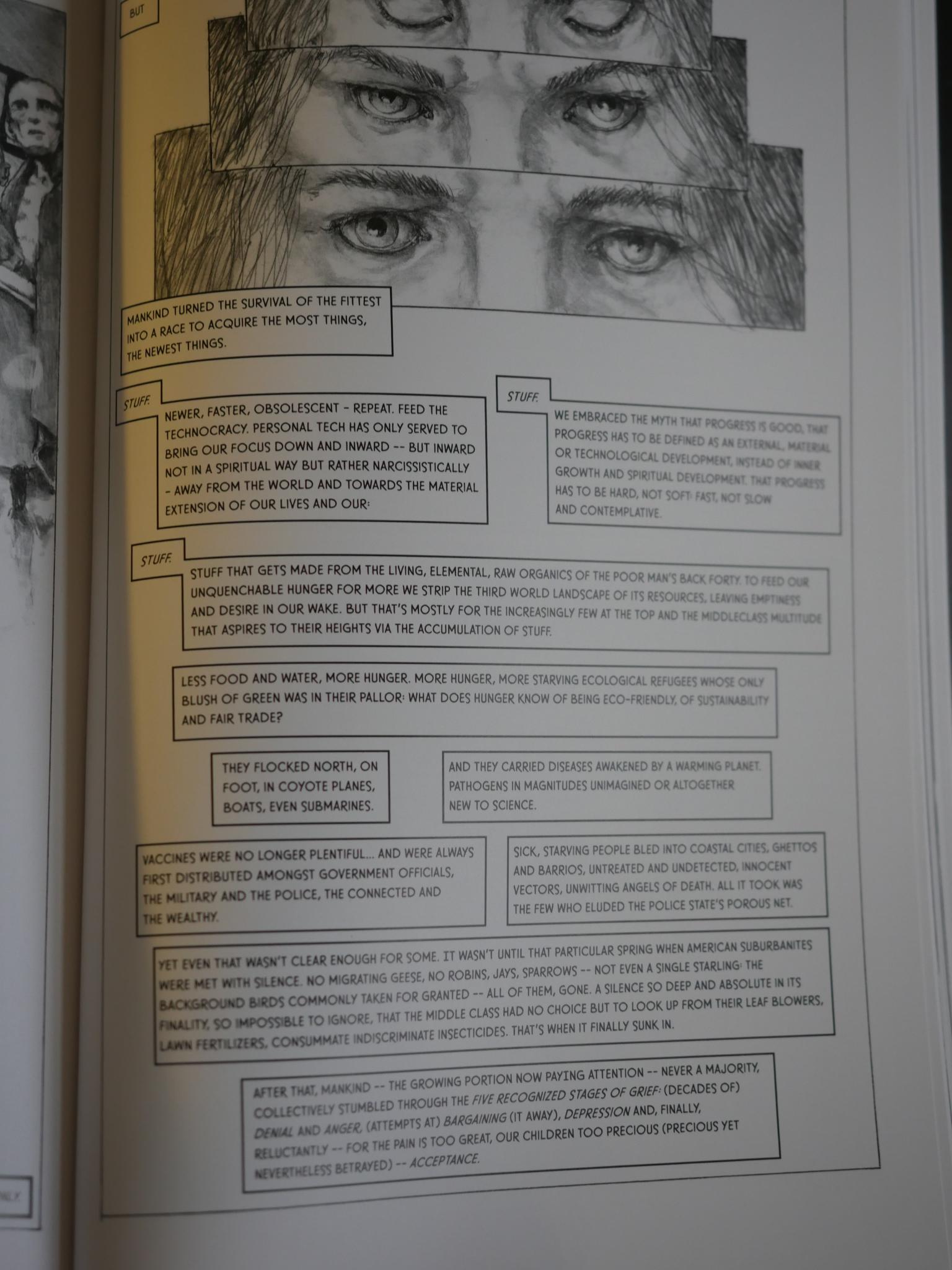
Above we see a panel from the new Dover edition. It’s printed on shiny, white, almost sarcastically heavy paper: When turning a page, it feels like you’re turning more than a single page, so you flip the page back again and confirm that you’ve only turned one page.
The lines seem crisp, but it looks like there’s been a lot of ink gain. The smudged zip-a-tone looks rather dirty.
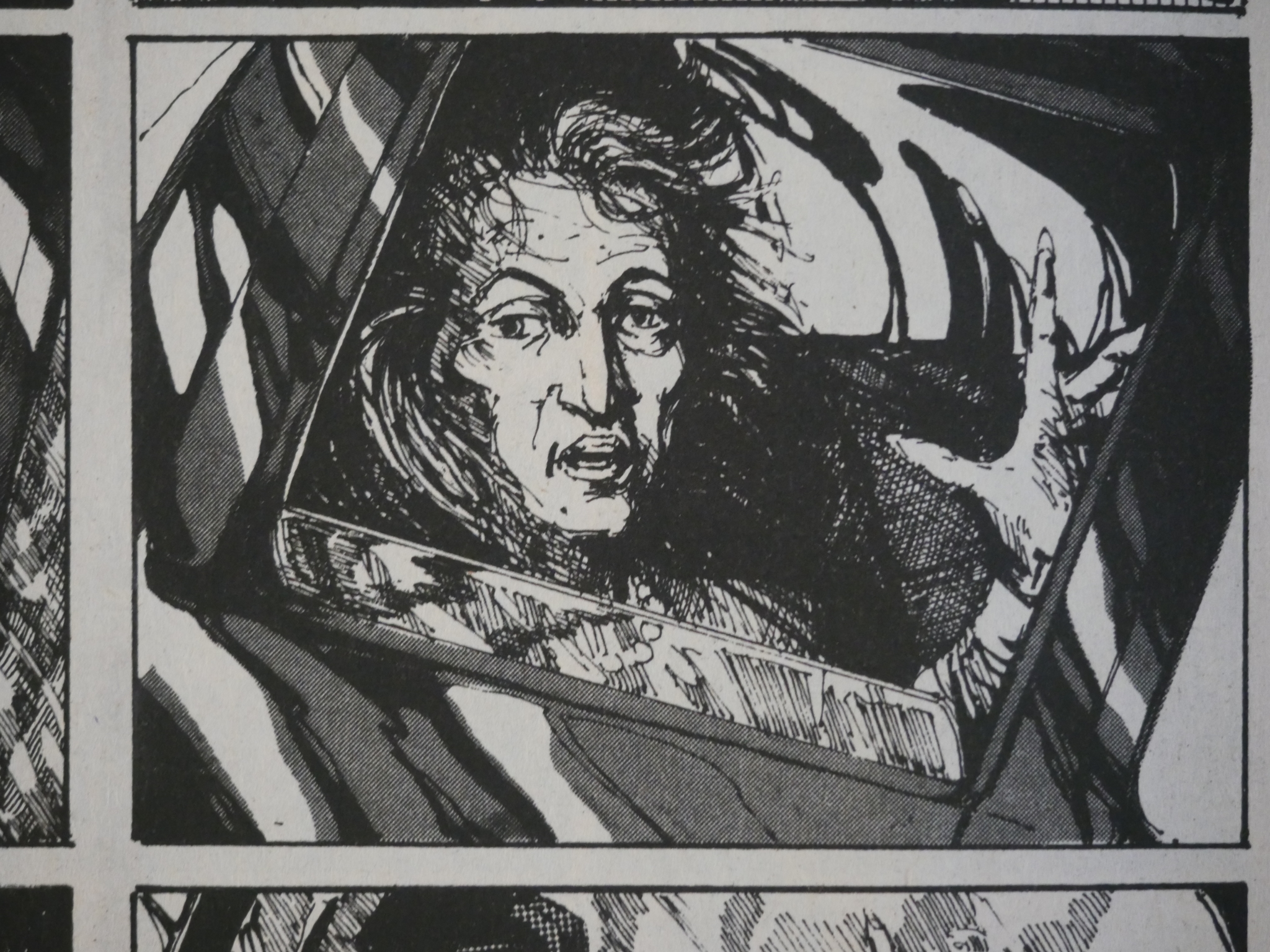
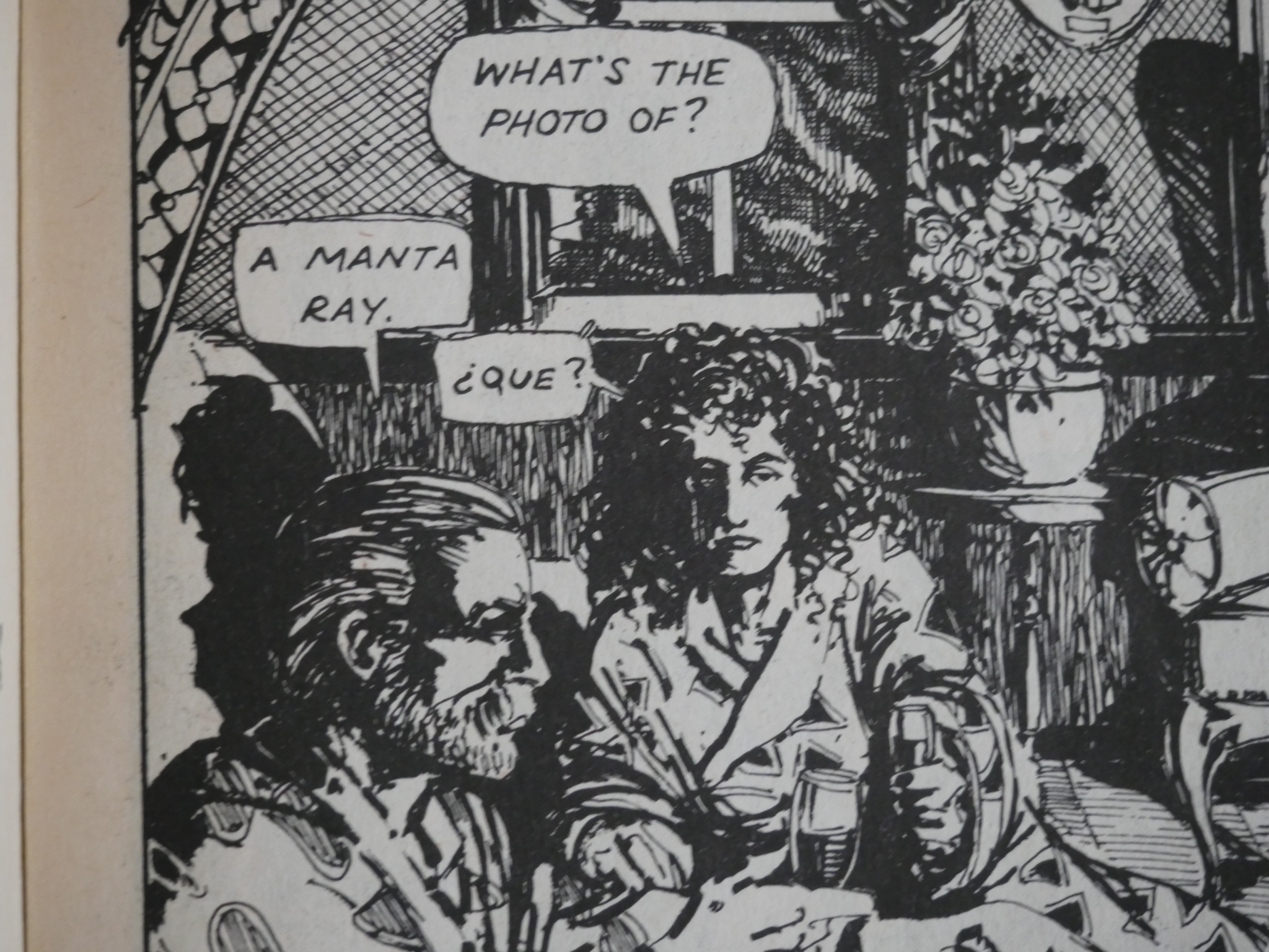
Here’s that panel from the original issue two. The linework looks virtually identical: There’s not a single line in the new edition that wasn’t already on the printed page originally. The tone is less smudged here than in the new edition.
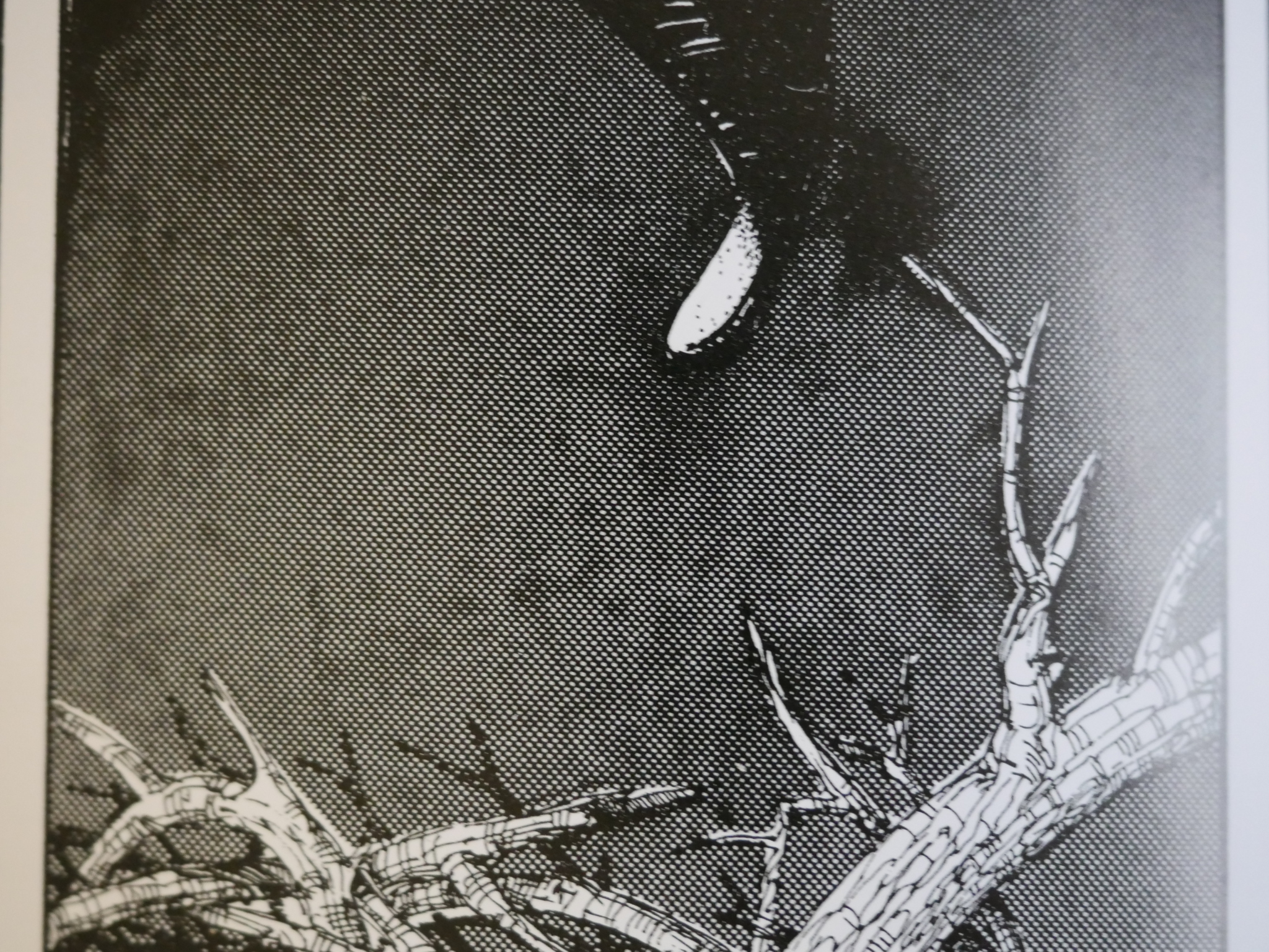
Severe ink gain on black background in the new edition above…
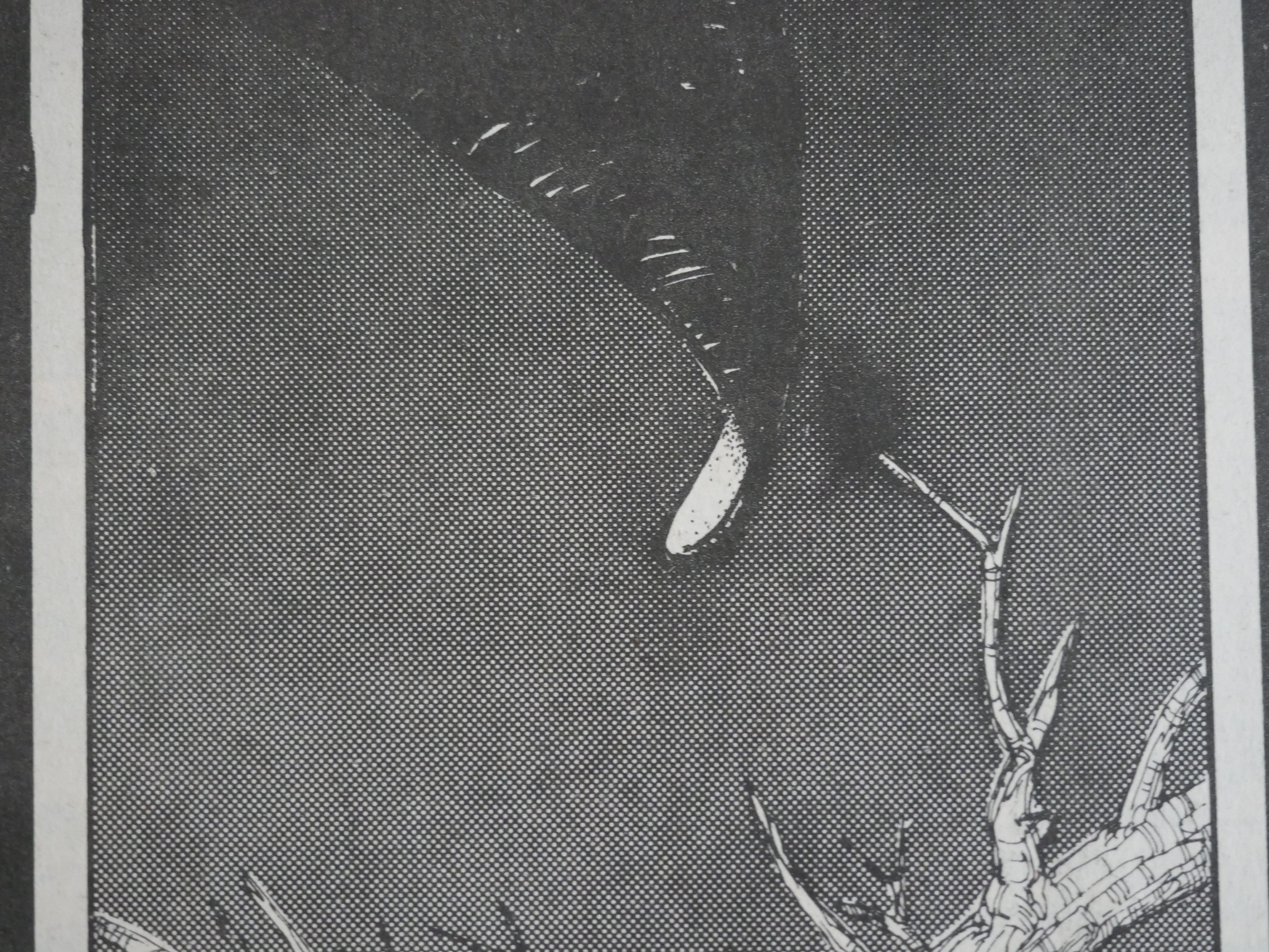
… and identical growth in the original comic book. The Dover edition looks like they’ve scanned the comic book and then run the results through a “sharpen” filter.
But the blacks look nicer and heavier, due to the non-absorbent smooth paper.
Another example where it seems like lines surely are coarser than they were drawn…
… and they’re identical to the version printed in issue four.
Zulli uses a lot of tone, and fortunately there’s no moire effects in the Dover edition (which is a thing that plagues new editions of old comics). However, it frequently looks rather ugly and smudged.
Here’s the original from issue four, which is also smudged, but isn’t dirty to the same extent.

The new artwork from the brief added conclusion to the book suffers no reproduction issues: It’s clear and even.
Of course, it’s mostly text (with computer lettering), so reproduction isn’t that difficult.
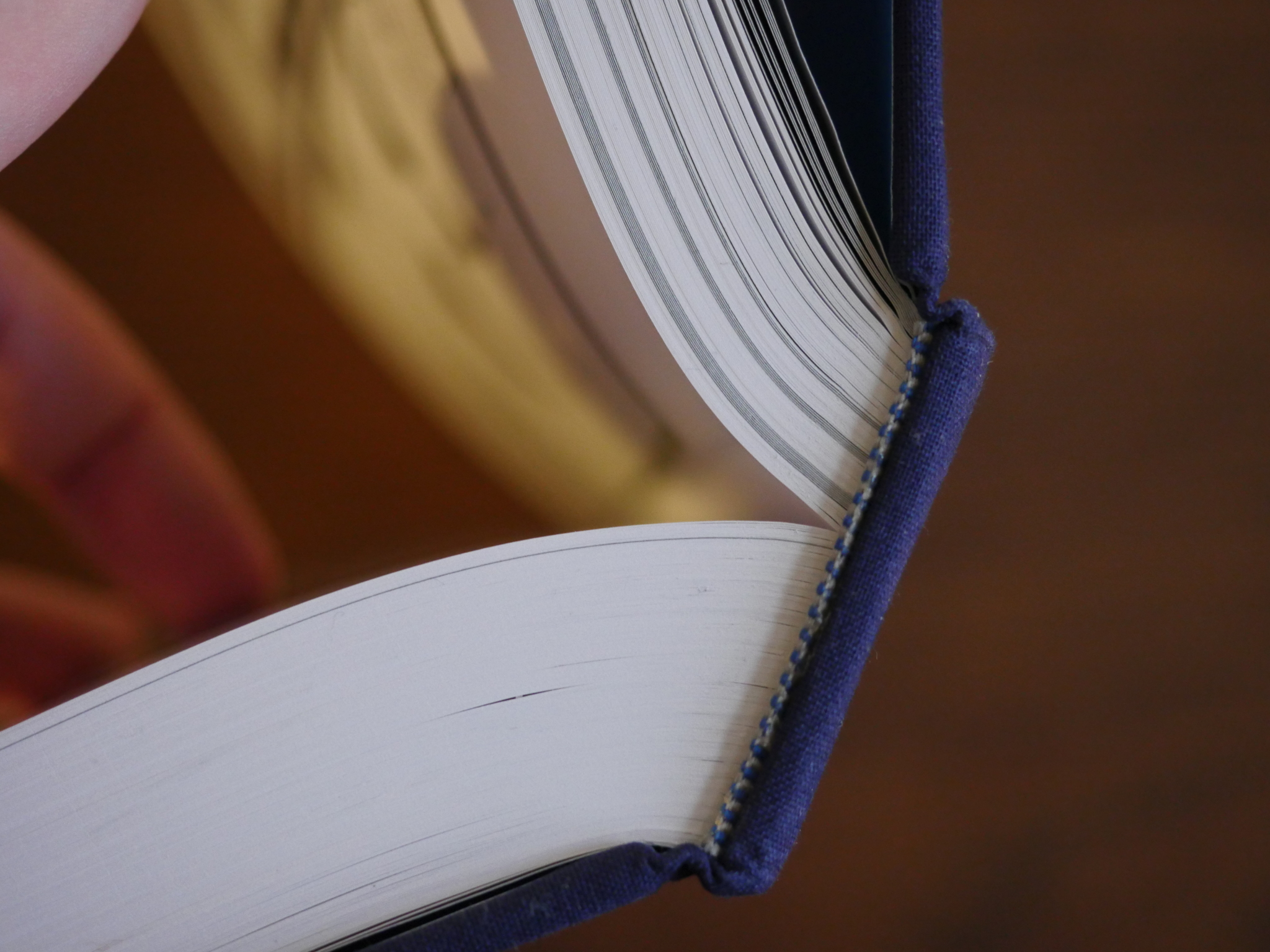
The binding is very tight: You have to really work at it to hold this massive tome open, and since the paper is so shiny, you have to move the book around a lot to be able to read it.
What Paper? Rating: Parchment.
One thought on “Excerpt from What Paper? The Printing Aficionado Magazine, Issue 15, Volume XXIV, 2015”