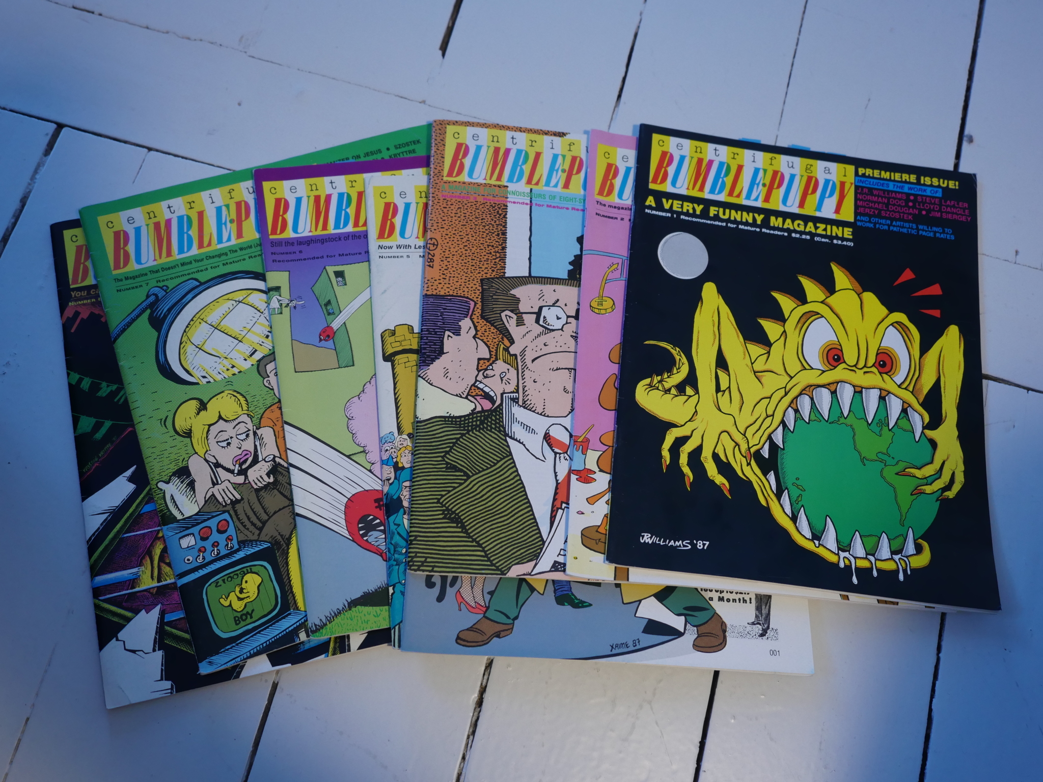
Centrifugal Bumble-Puppy #1-8 edited by Joe Sacco.
Sacco announced in the last issue of the Honk! magazine that it’d be changing its name to Centrifugal Bumble-Puppy, but it did more than that. The page count dropped from 48 to 32, the interviews disappeared and the text features mostly disappeared, and a new roster of regular artists were brought aboard.
So Centrifugal Bumble-Puppy (I’ve put the name into a register so that I don’t have to type it all the time, thereby saving an estimated 32% of the time it will take to write this blog article) is a quite different magazine than Honk! was.
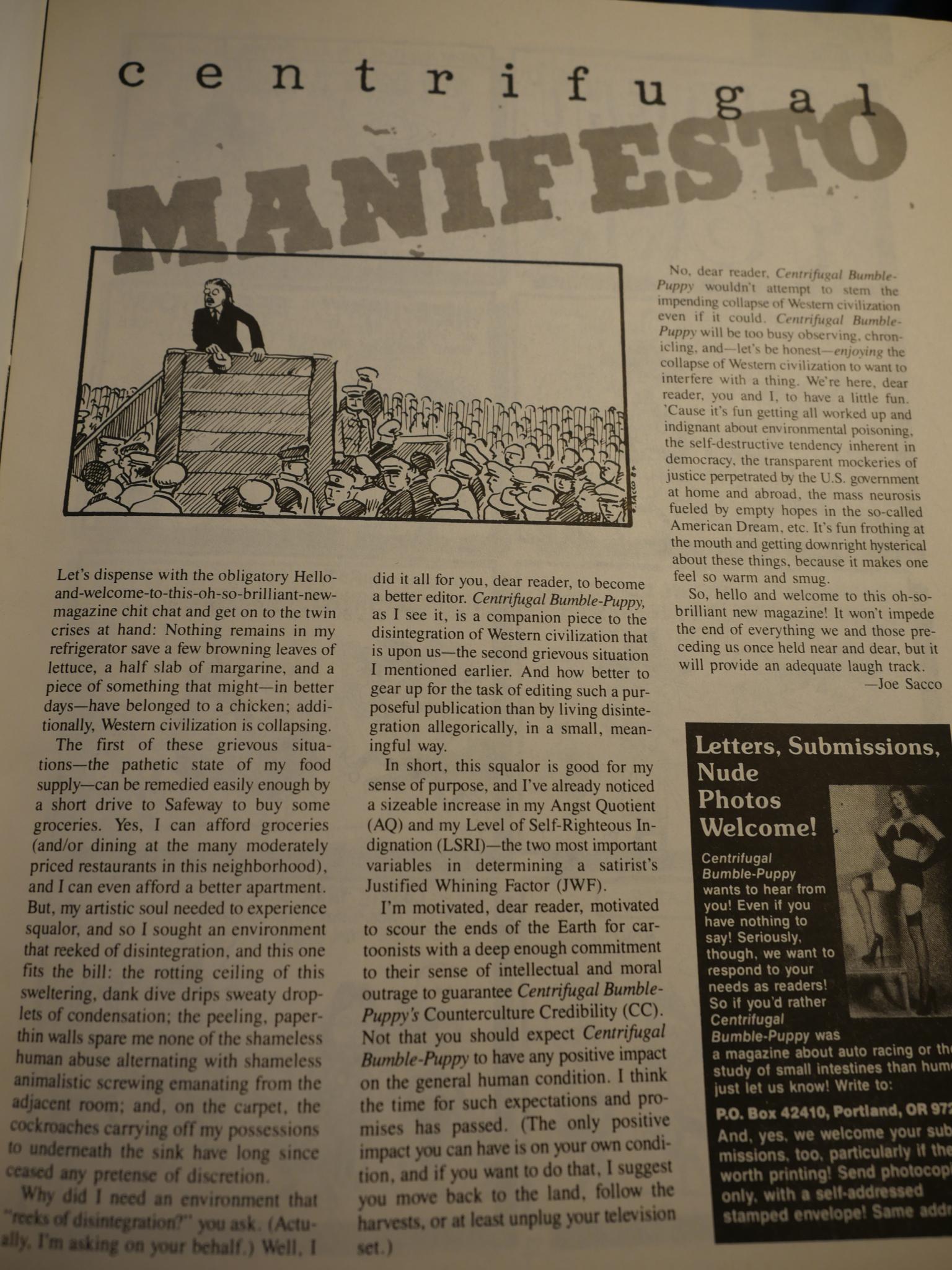
For one, Sacco has an editorial, I mean manifesto, in every magazine, with a clear political direction. Or possibly not. But the most important change is the tone:
It’s mostly very silly stuff. And I love silly stuff, so it’s right up my alley. (Gill girl by Matthew Finch.)
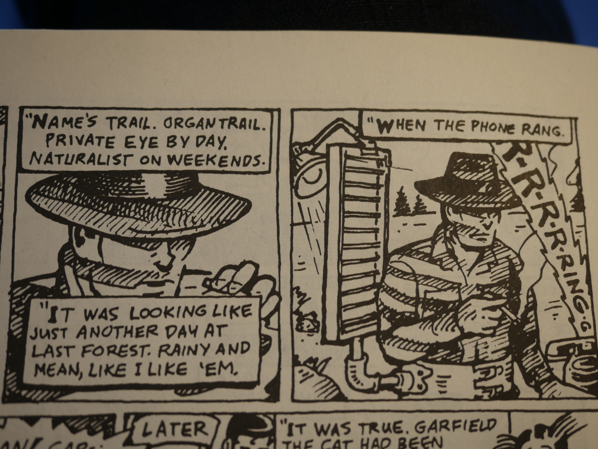
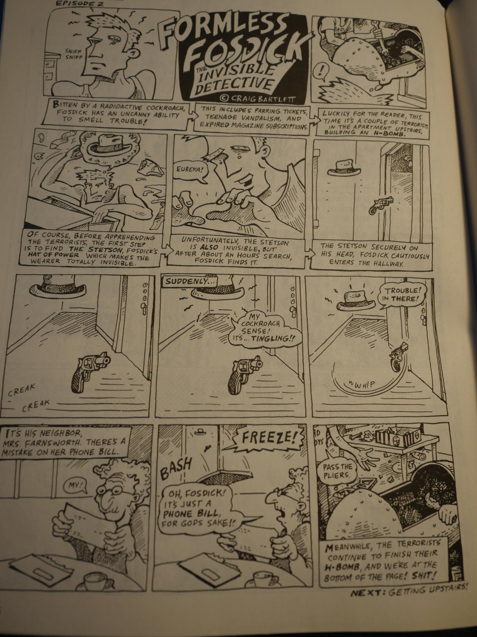
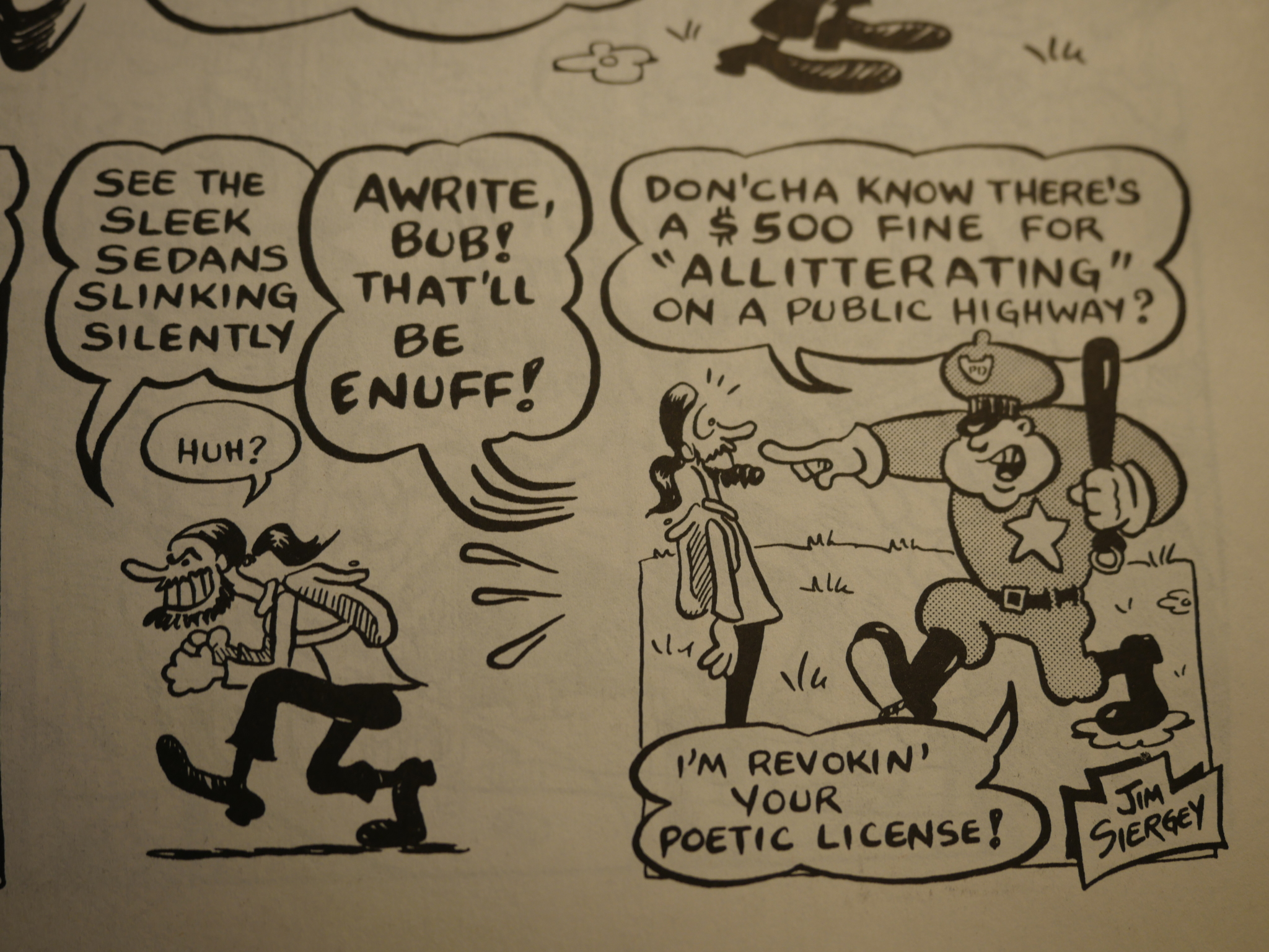
*snicker* That’s Organ Trail by Craig Bartlett. And that’s another thing: Centrifugal Bumble-Puppy has a handful of artists that appear in most of the issues, so it has an ensemble feel… Perhaps Sacco was going after a Mad Magazine kind of thing? JR Williams, Michael Dougan, William Clark, Jim Siergey and Jerzy Szostek have a couple of pages every month.
That’s a nice thing, because most of those people are pretty funny, but it means that there is less room for surprising wild appearances.
And it’s a very XY list of contributors.
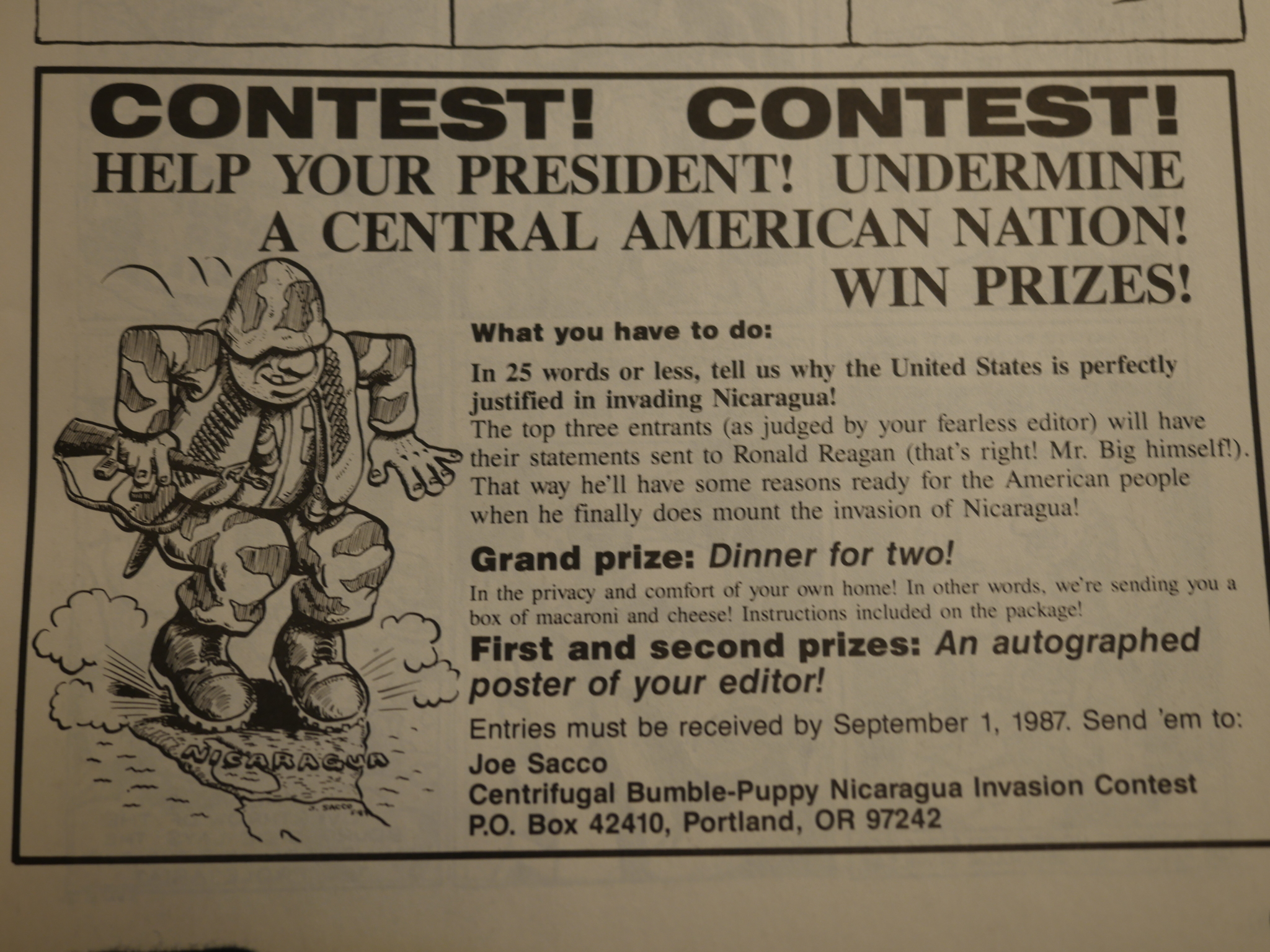
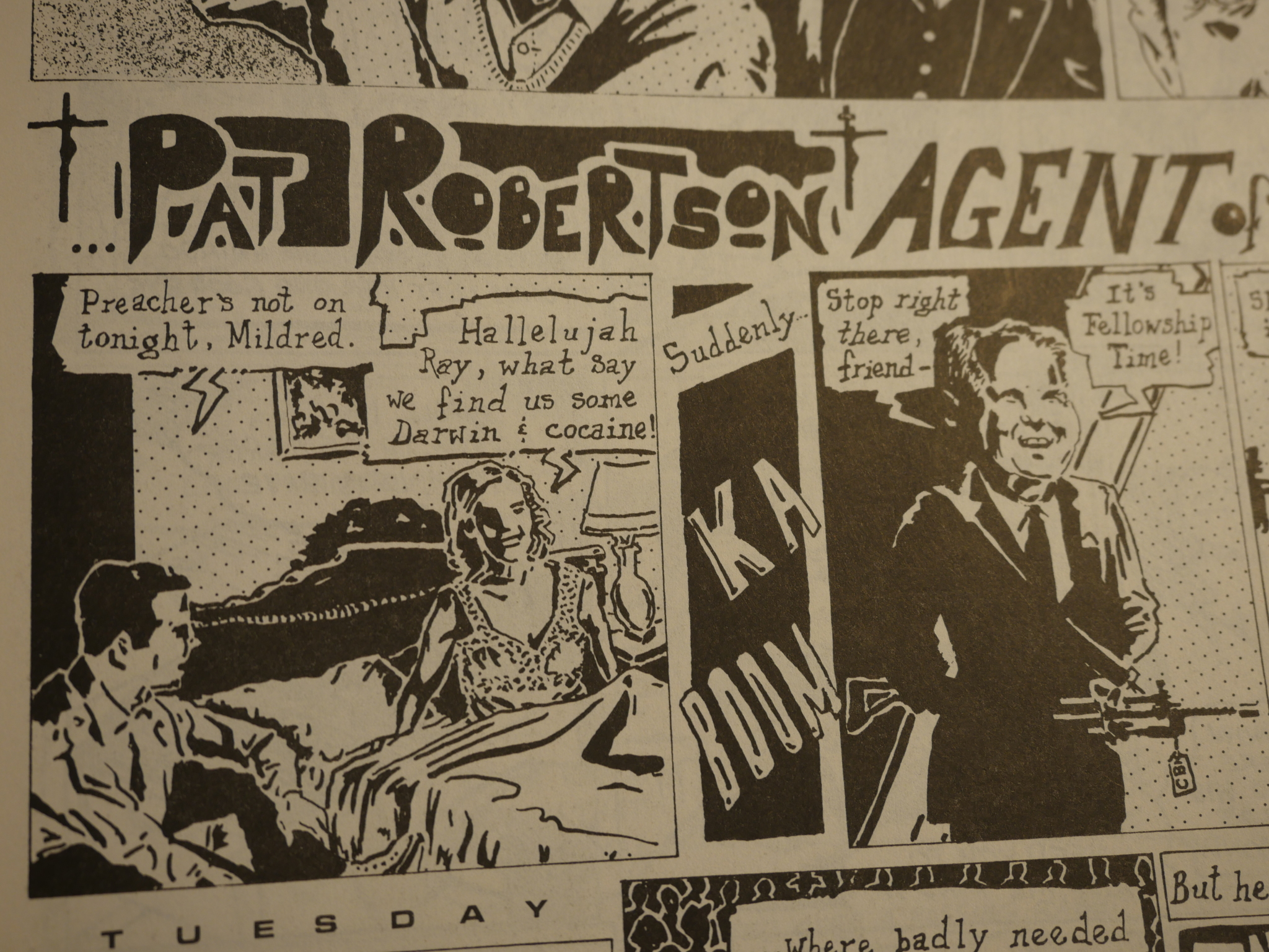
Oh, yeah: Politics. This is during the twilight years of the Reagan administration, so things are pretty dour.
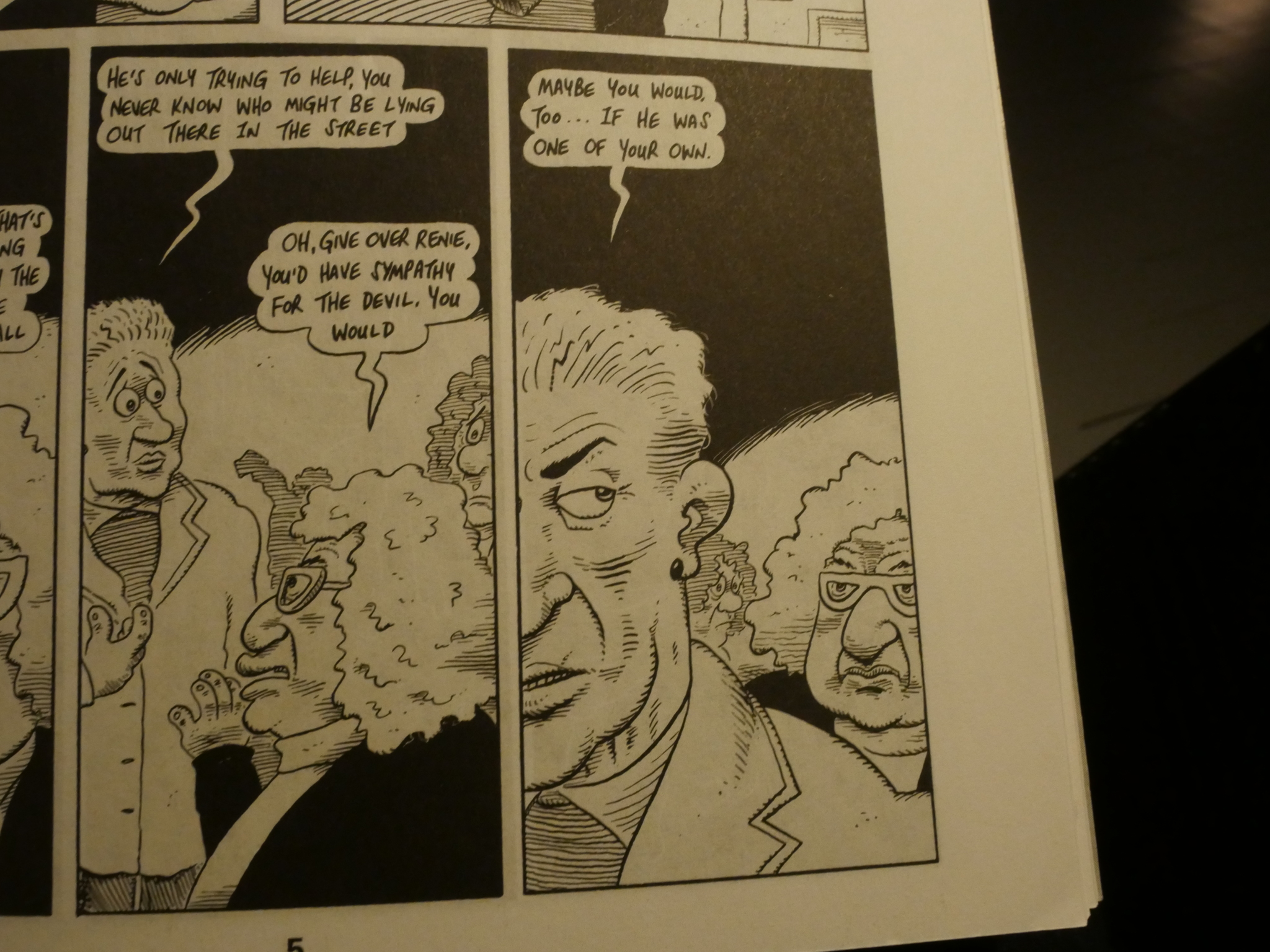
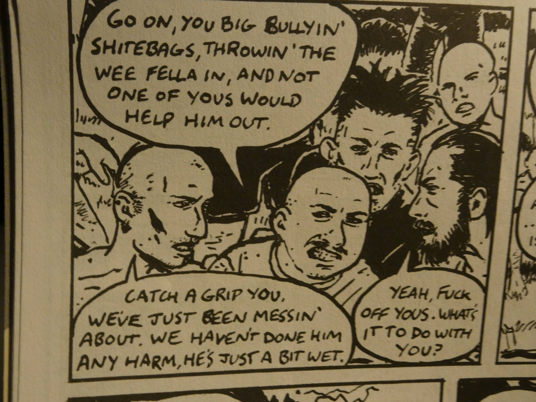
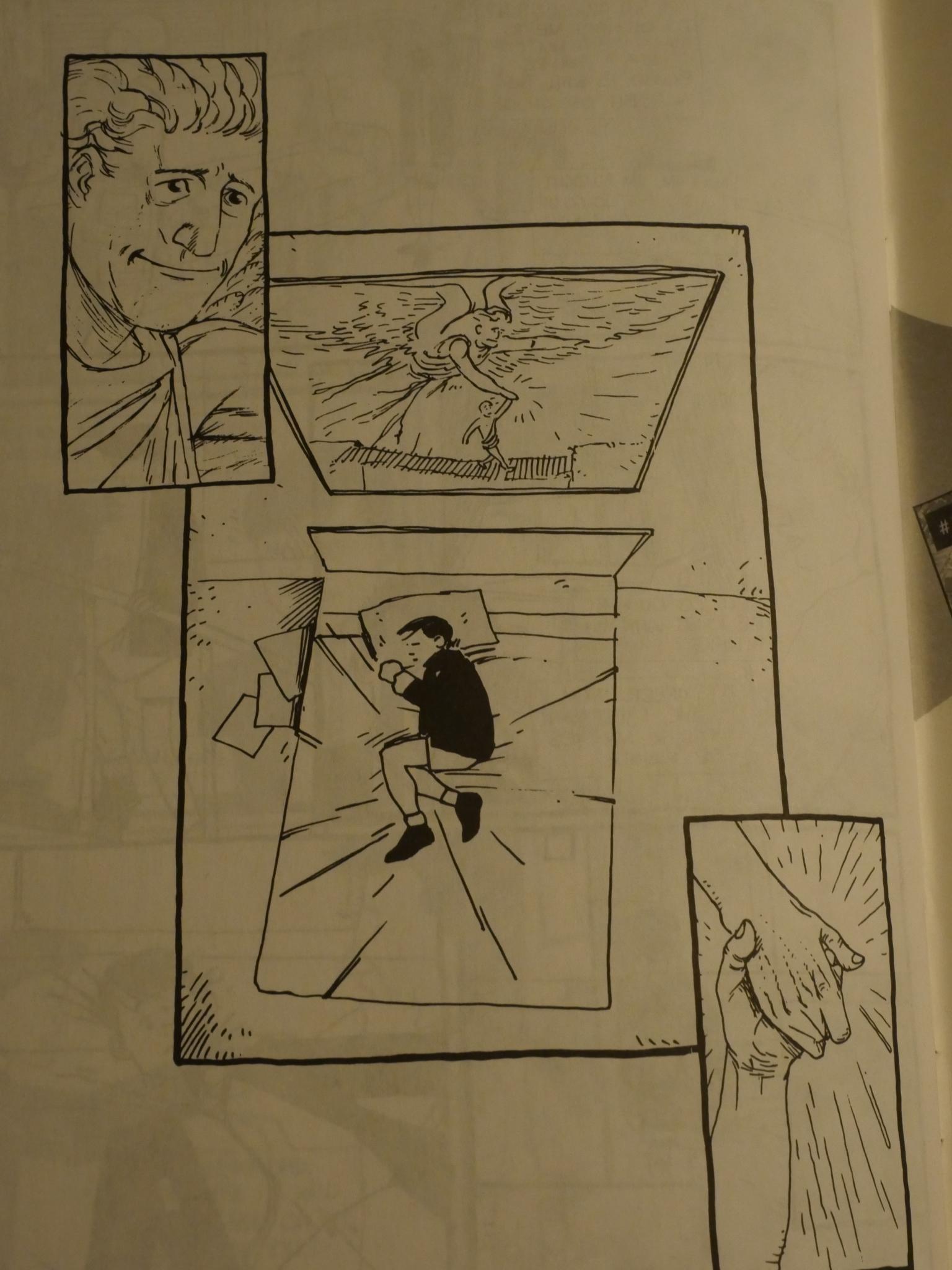
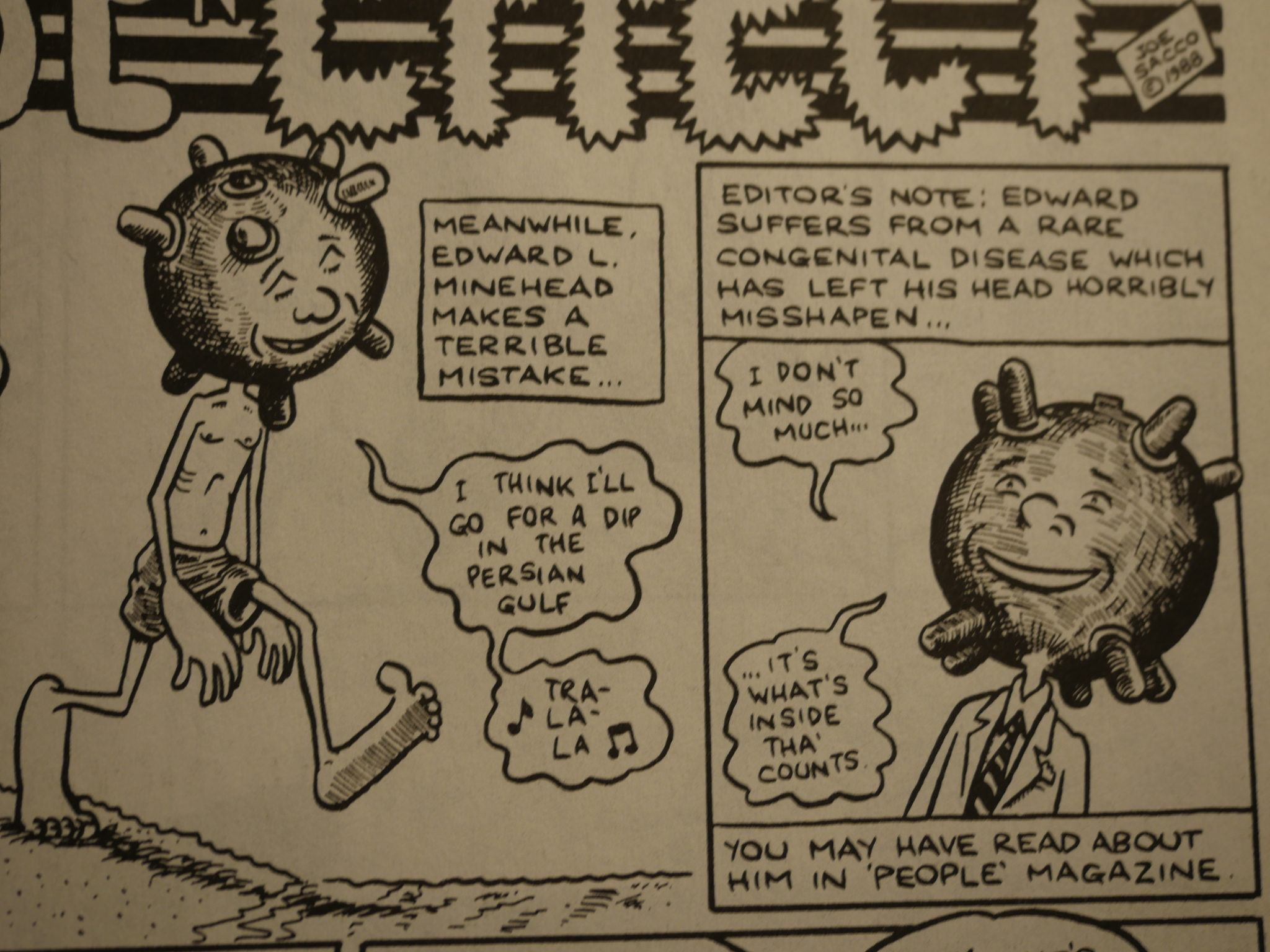
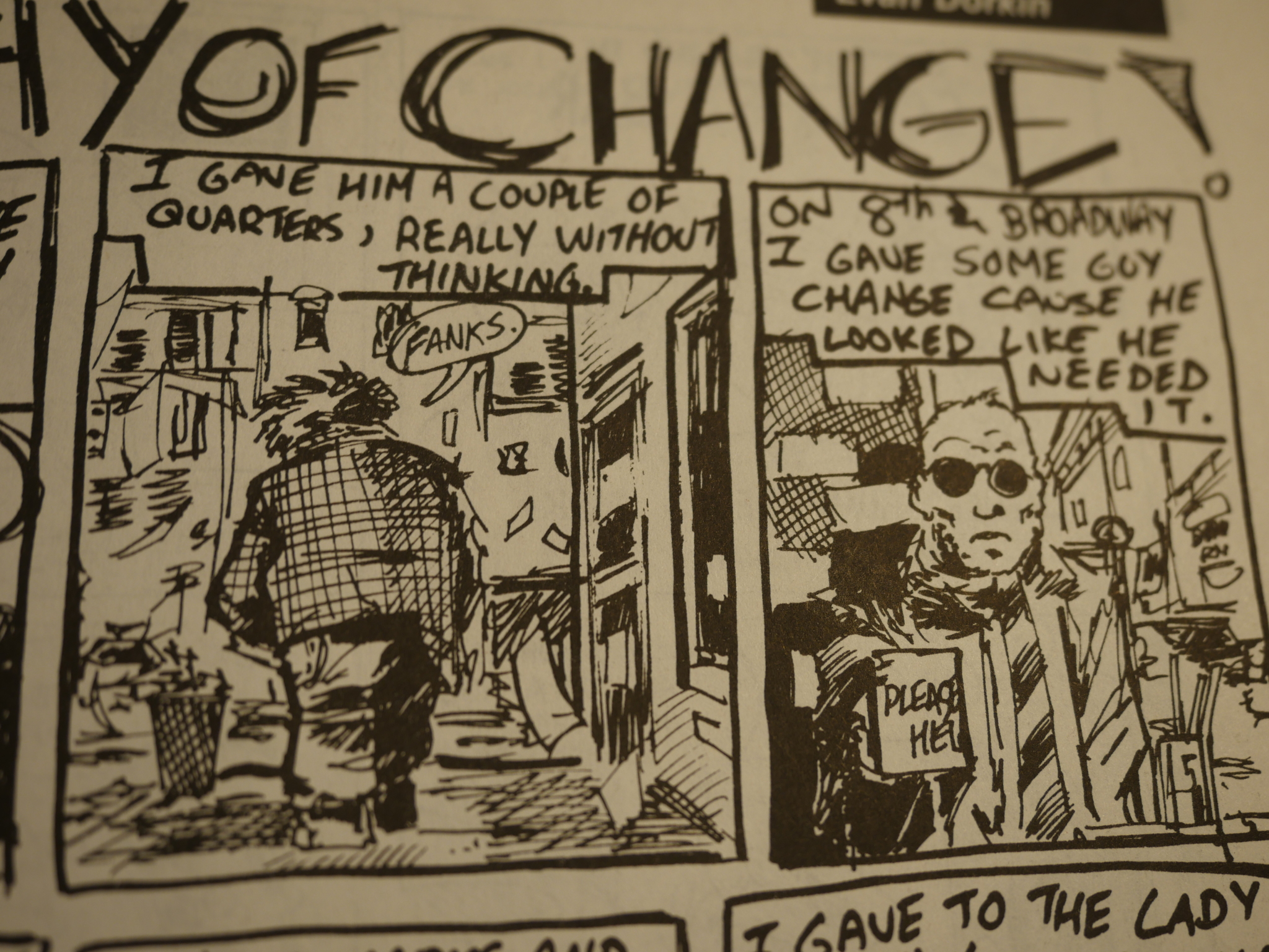
At least somebody tries to do something! (From a piece by Joe Sacco.)
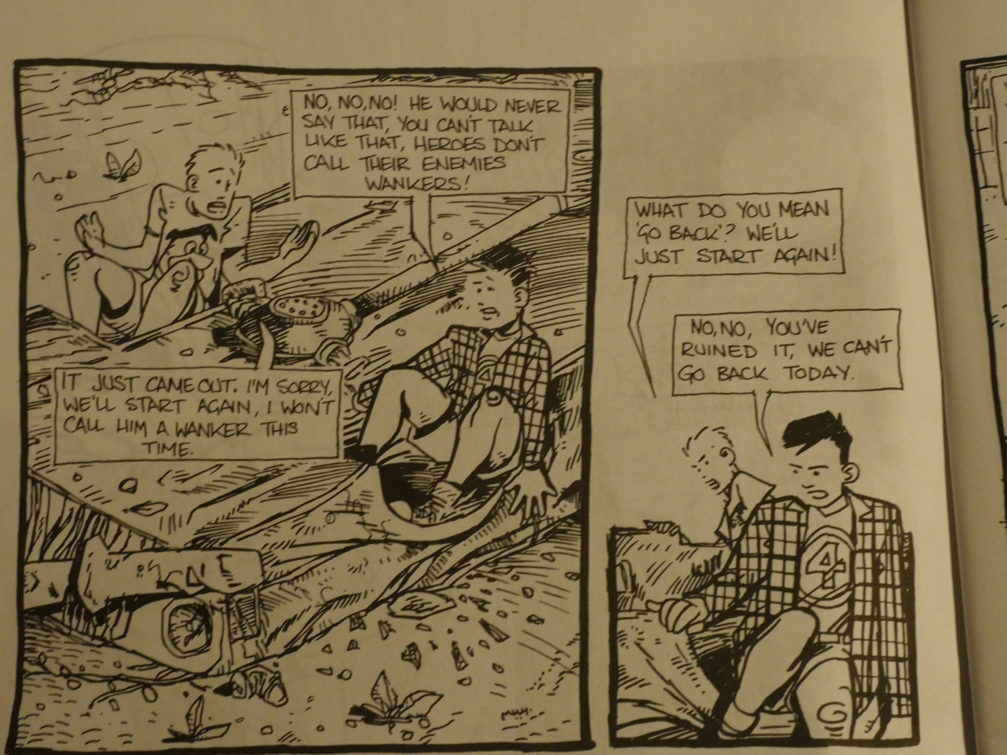
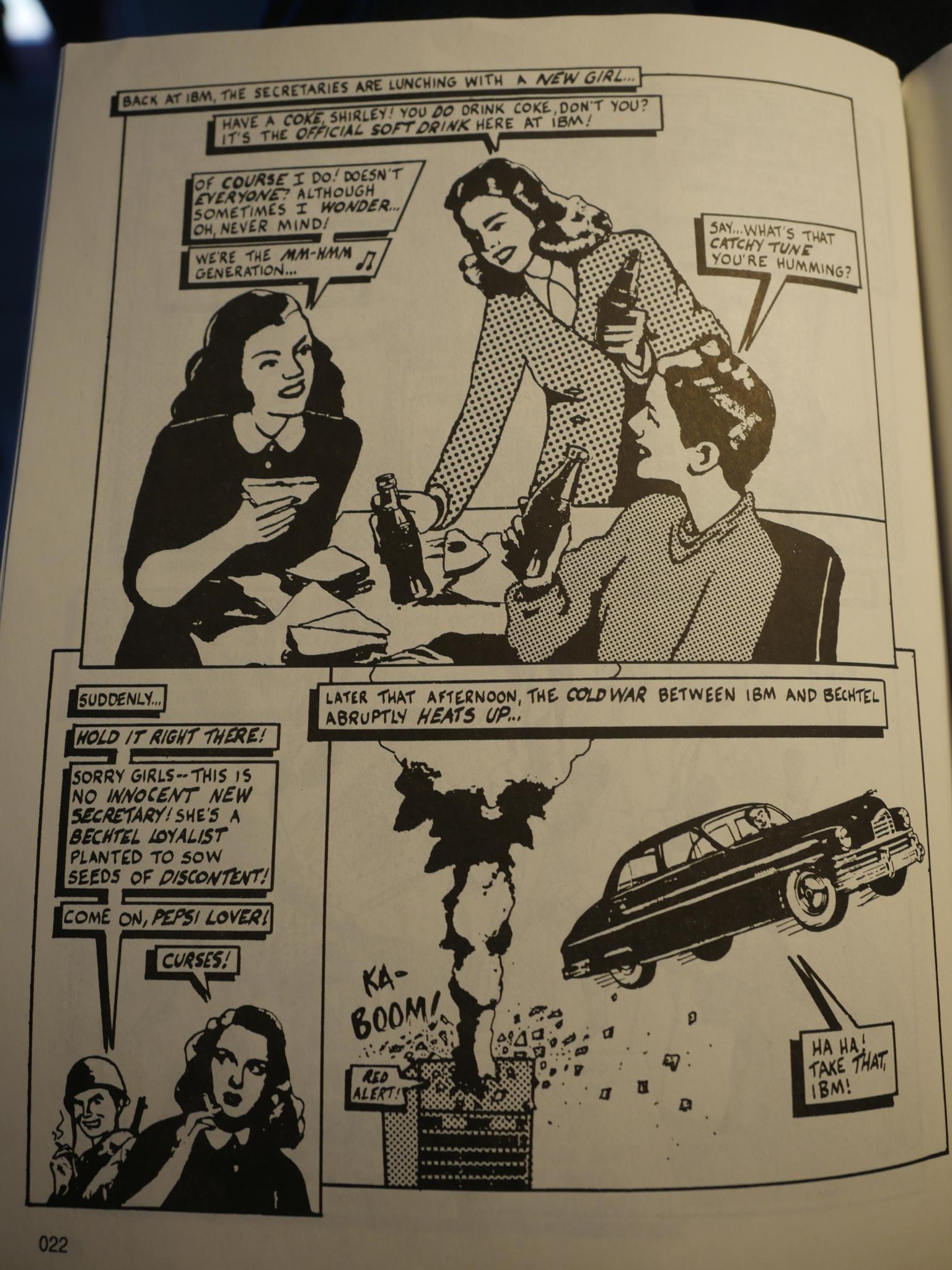
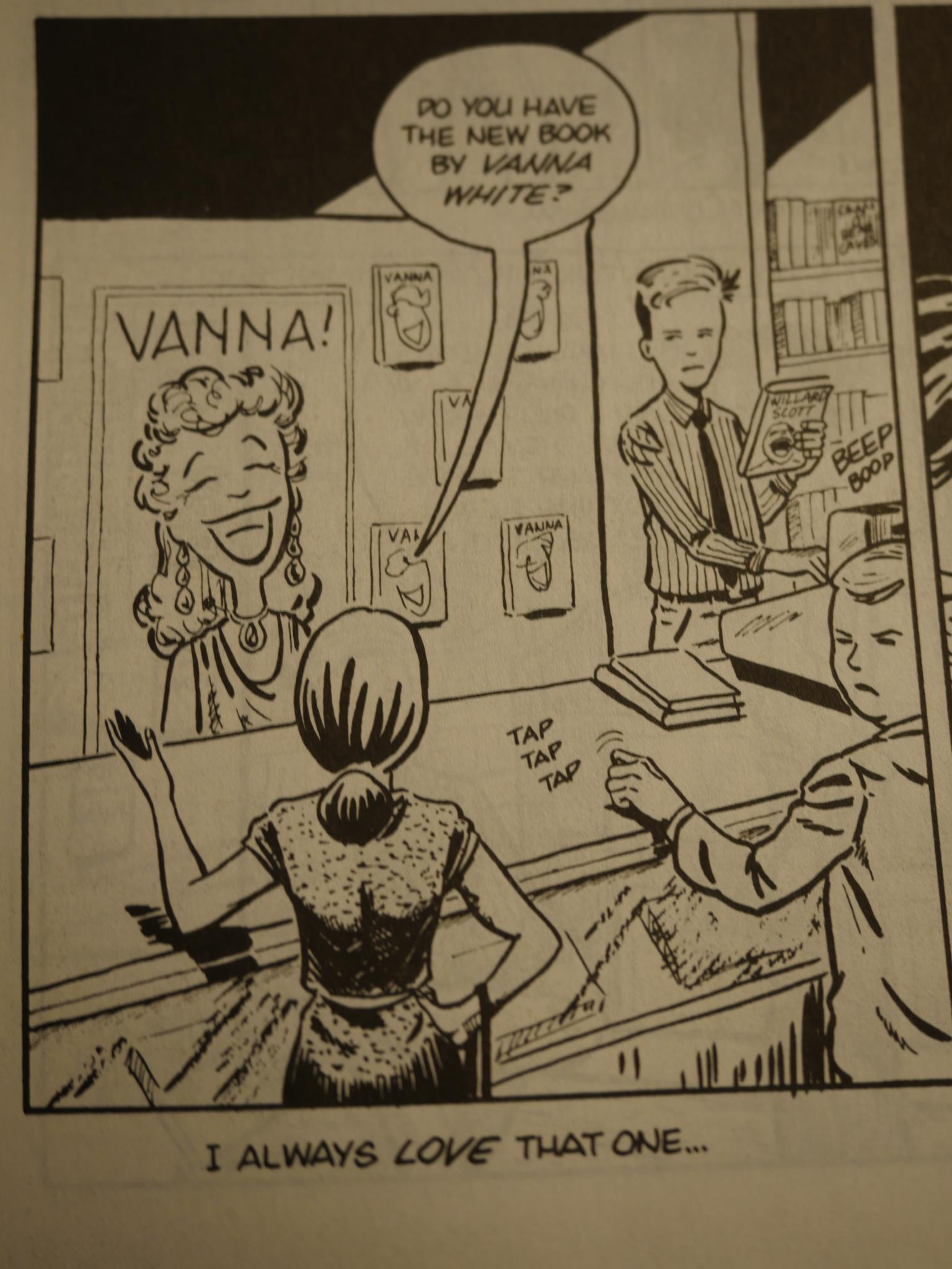
But it’s mostly pretty absurd.
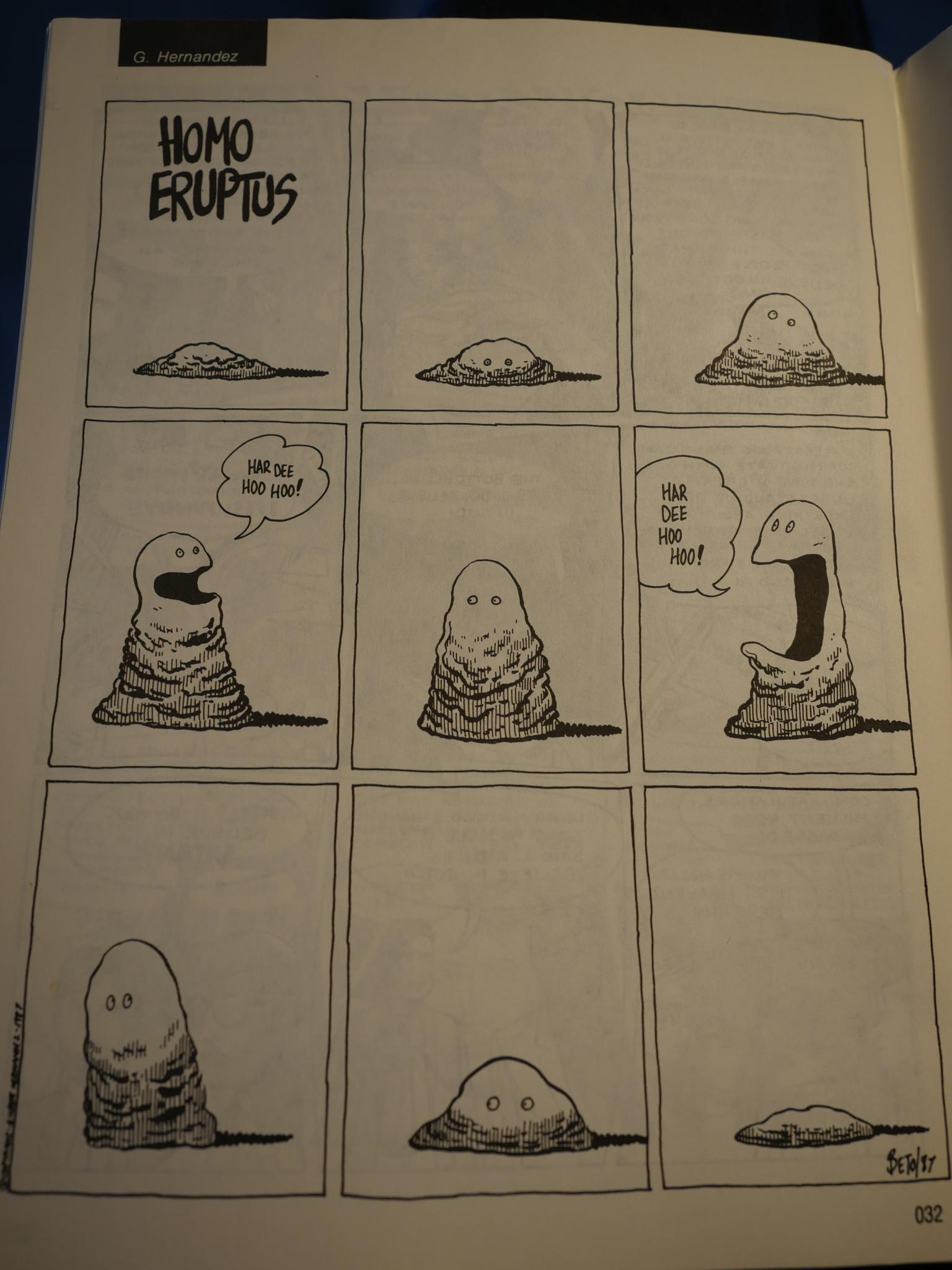
And then Beto Hernandez drops by for a page. (Jaime does a cover later in the series…)
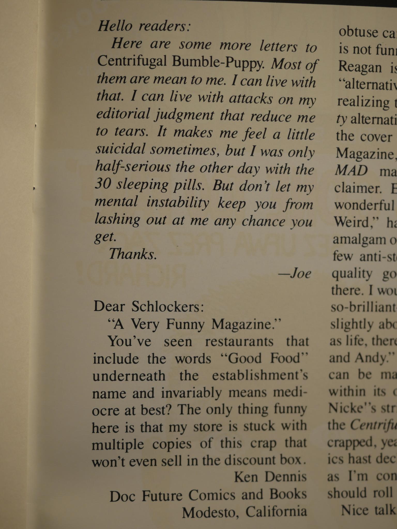
The letters page (for the first few issues) are dominated by people who hate the “Centrifugal Bumble-Puppy” name, and the other half just think it’s… not very good. That changes in later issues, as I assume the people who were expecting more Honk! gave up…
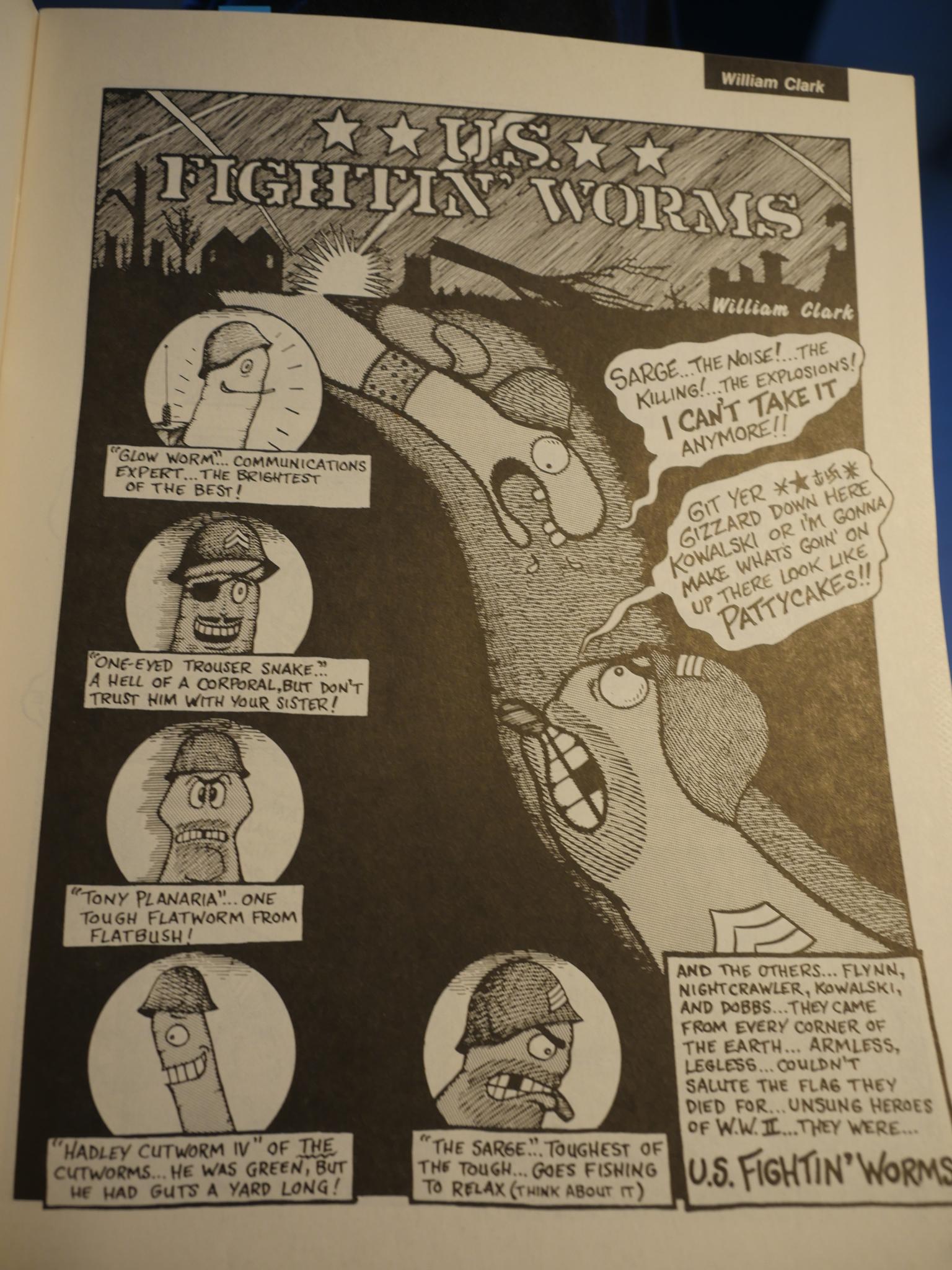
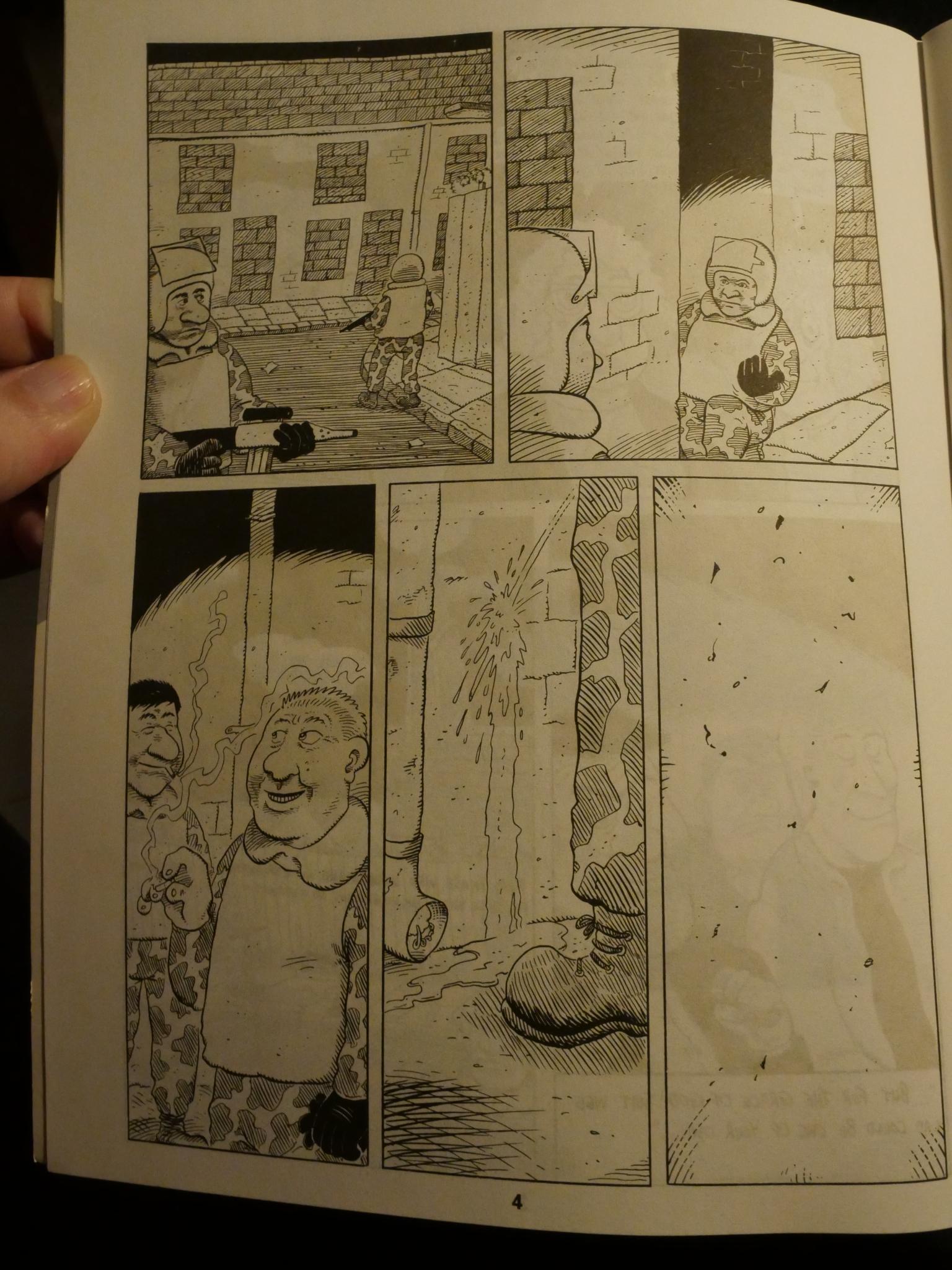
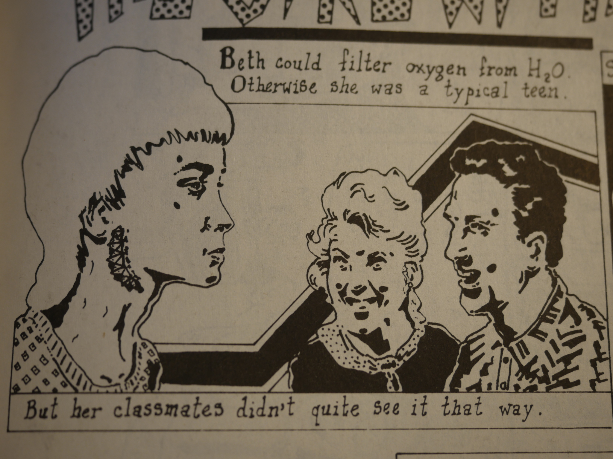
Not everything is hilarious, though. I think “US Fightin’ Worms” is a good idea, but the artwork is pretty basic.
I love Matthew Finch’s somewhat “deranged photocopier” look…
And speaking of the photocopier, there’s an early Tom Tomorrow piece that takes up half the space in number five, and is the longest piece to run in Centrifugal Bumble-Puppy. It’s called “The World of Tomorrow”, which is the name Tomorrow would use for his syndicated strip four years later (I think that’s the timeline). He would still use the xerox, but there would be less cut-outs from ads…
Oh, yeah, every issue comes with a spiffy motto.
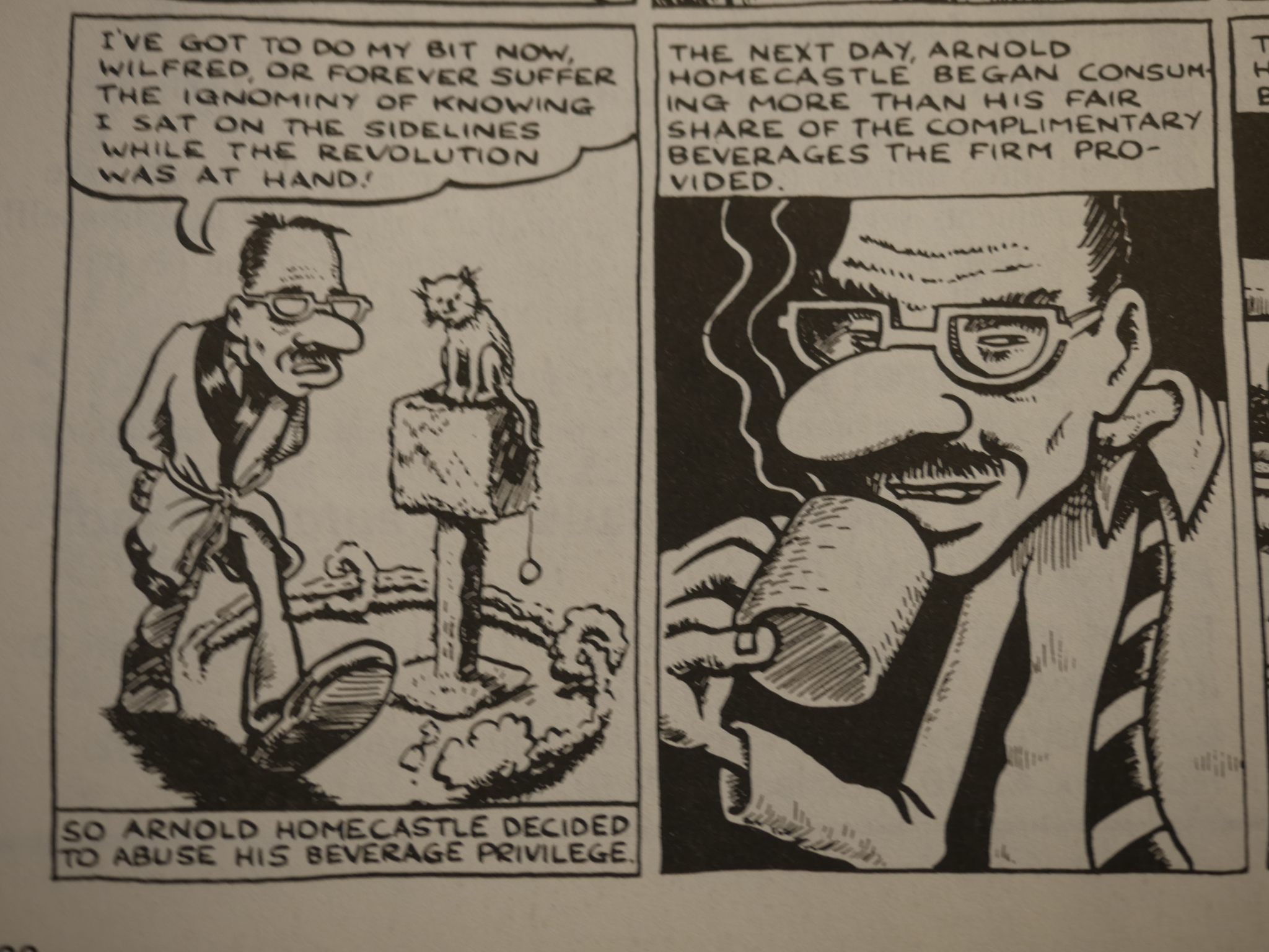
And, no, not all the jokes are winners.
But you have to love things like this. Yes, what happens afterwards is what you’d expect.
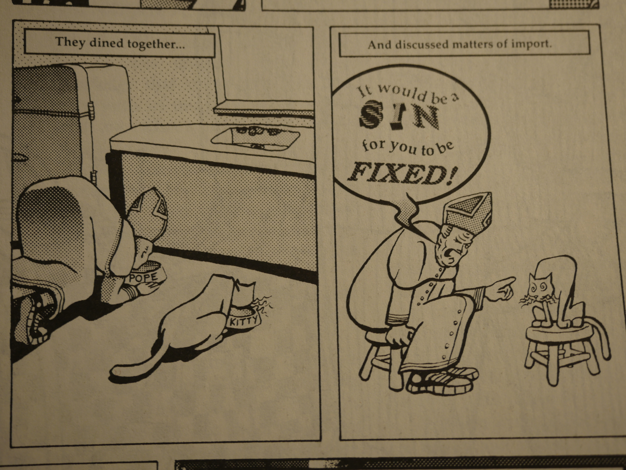
The pope comes to visit Mark Landman’s cat.
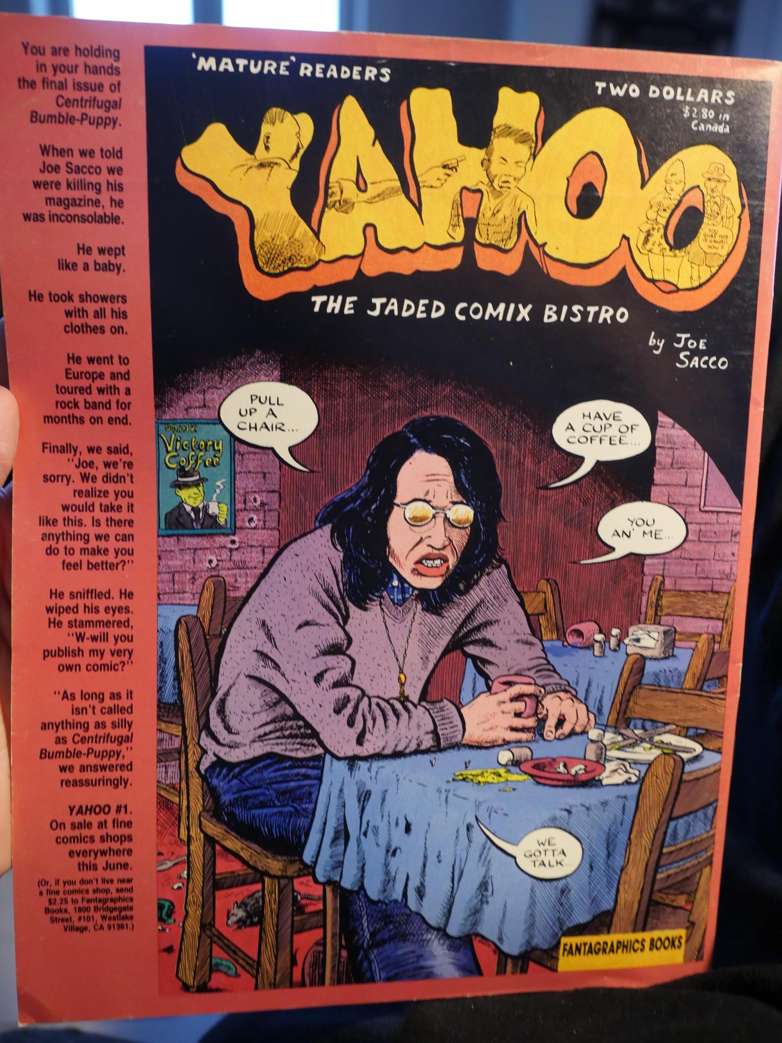
Hey! Krystine Kryttre! She also did the great cover to the final issue…
Yes, the final issue, because:
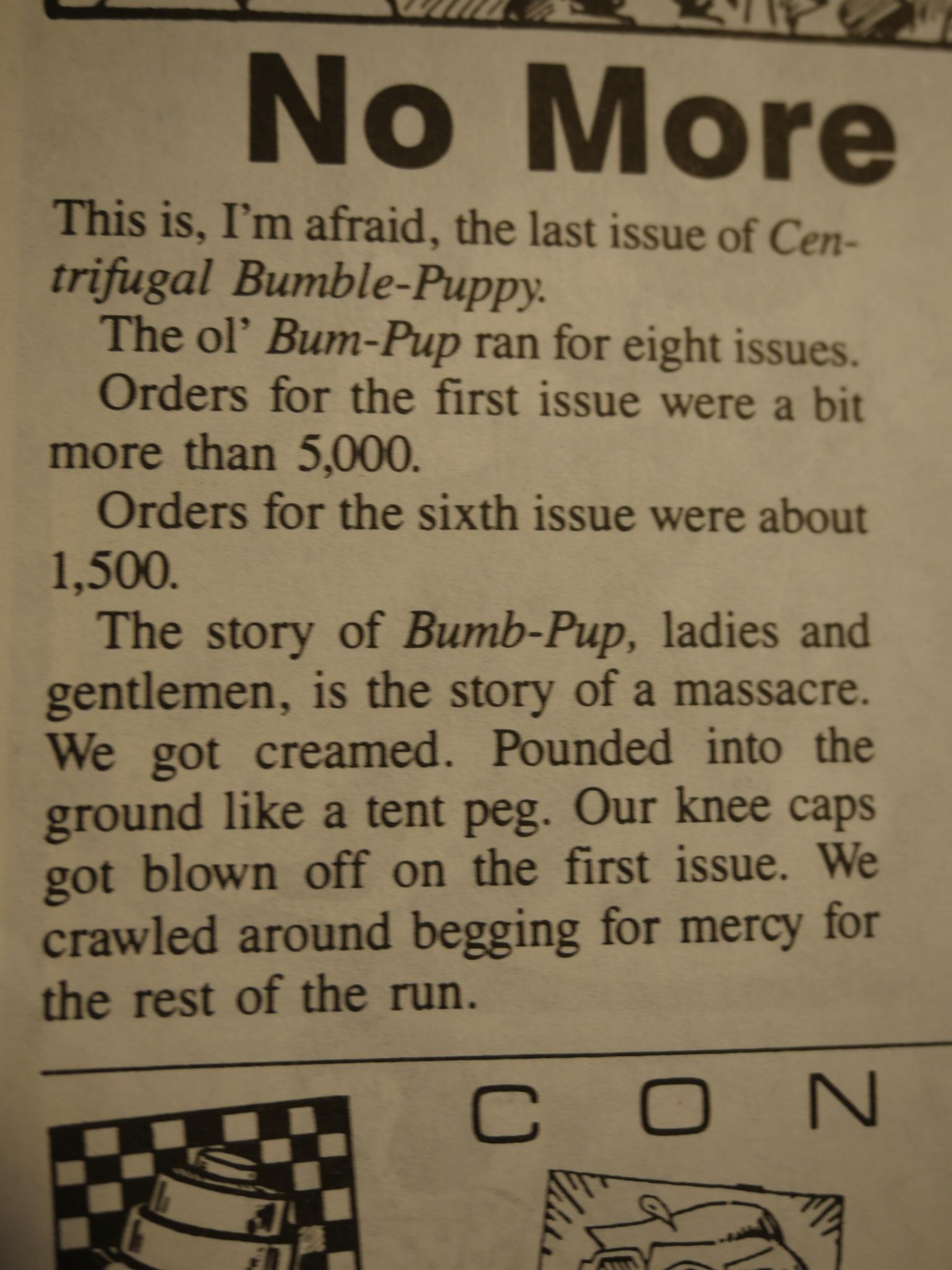
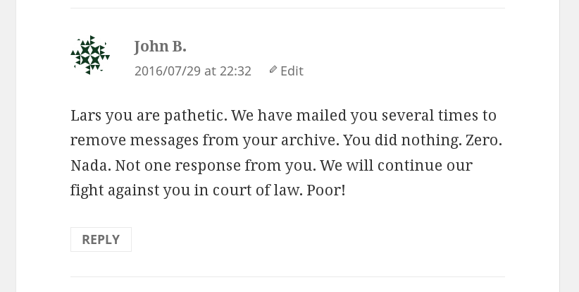
Ouch. That has to be pretty discouraging, but at least he didn’t just throw in the towel. The final issue is as good as any, and has a few surprises, like this early piece by Evan Dorkin, done in a style quite unlike what he’d get known for later:
He’s the world famous creator of Milk & Cheese, Dairy Products Gone Bad, of course.
And Craig Maynard drops by to whine about how horrible it is to work in retail. Yes, it’s so horrible to have customers that aren’t aware of where everything is.
But it’s over! Final issue! It was a quite successful run, I think. As an anthology it had cohesion and a vision (of sorts). Anthologies fail when they turn into a jumble of one-thing-after-another, and Centrifugal Bumble-Puppy avoided that.
On the back cover Fantagraphics announces Joe Sacco’s solo anthology which would soon follow. I remember it being very good, but I guess that a re-read later in this blog series will tell.
Of course, these days Sacco is a world-famous cartoonist journalist.
This post is part of the Fantagraphics Floppies series.