Blood Orange #1-4, Bête Noire: The International Comic Art Quarterly #1 edited by Chris Polkki.
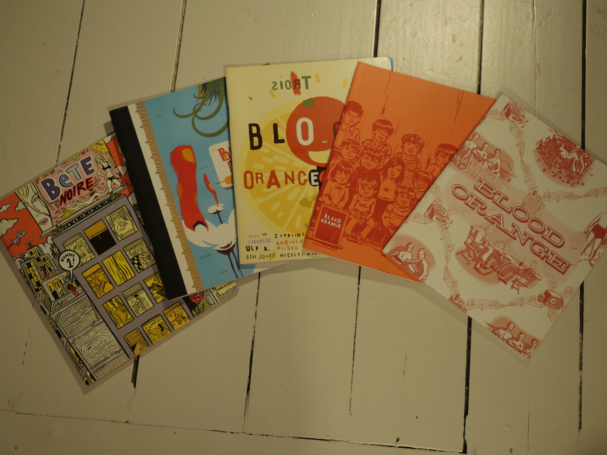
Since Bête Noire is termed an “international” quarterly, and Blood Orange isn’t, and they have the same format and editor, I assumed that Blood Orange would be an all-American feast.
But, nope, the Orange has got plenty of foreigners, too.
Anyway, this pair of anthologies were launched a year before Mome got started, and were axed at that point, so… er… perhaps Fantagraphics didn’t want to be publishing two “competing” anthologies?
Anyway anyway, since I’ve read Zero Zero quite recently, it’s tempting to compare these anthologies to that one. Zero Zero had a strict (ahem) no experimentation, no autobio, no erect penises policy going. Blood Orange seems to be diametrically the opposite: We have experimentation (Gary Baseman here)…
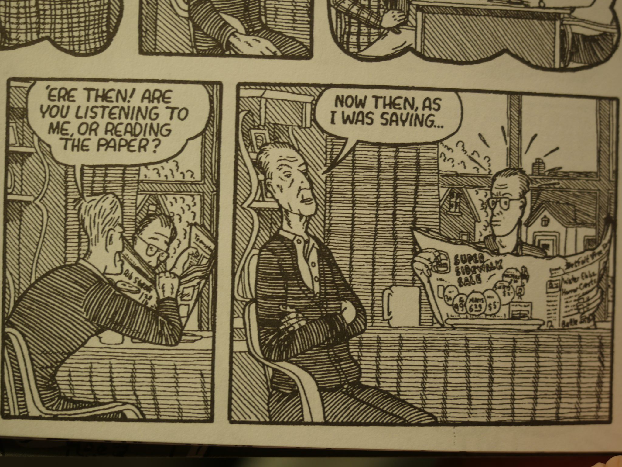
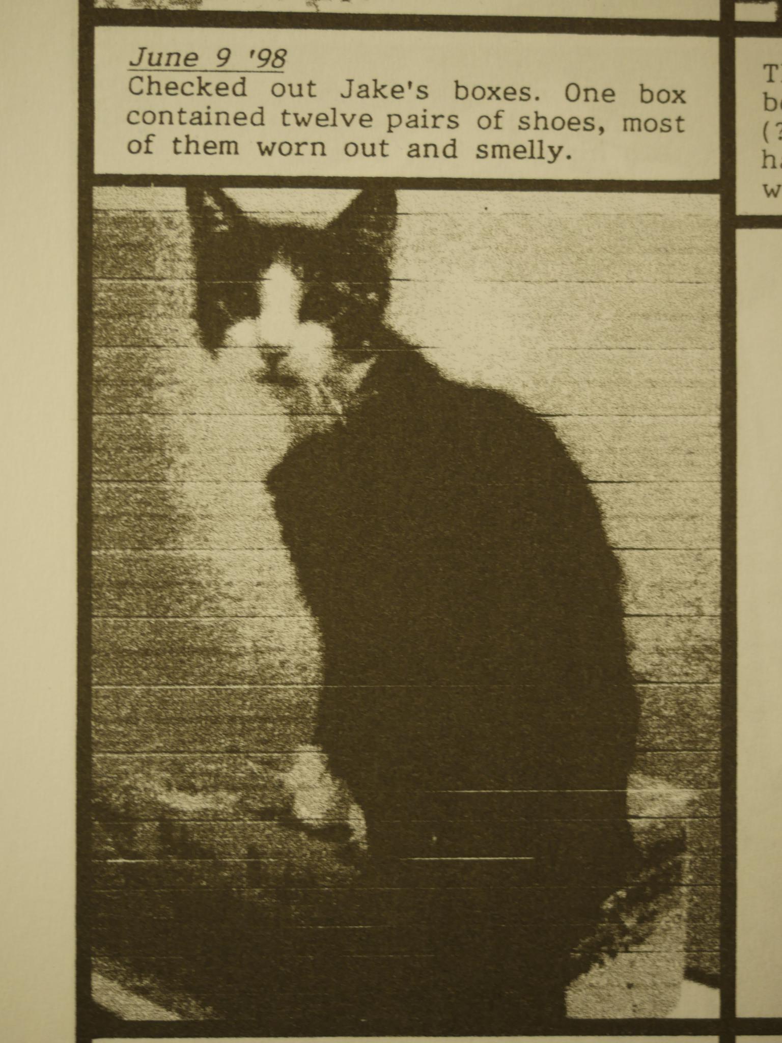
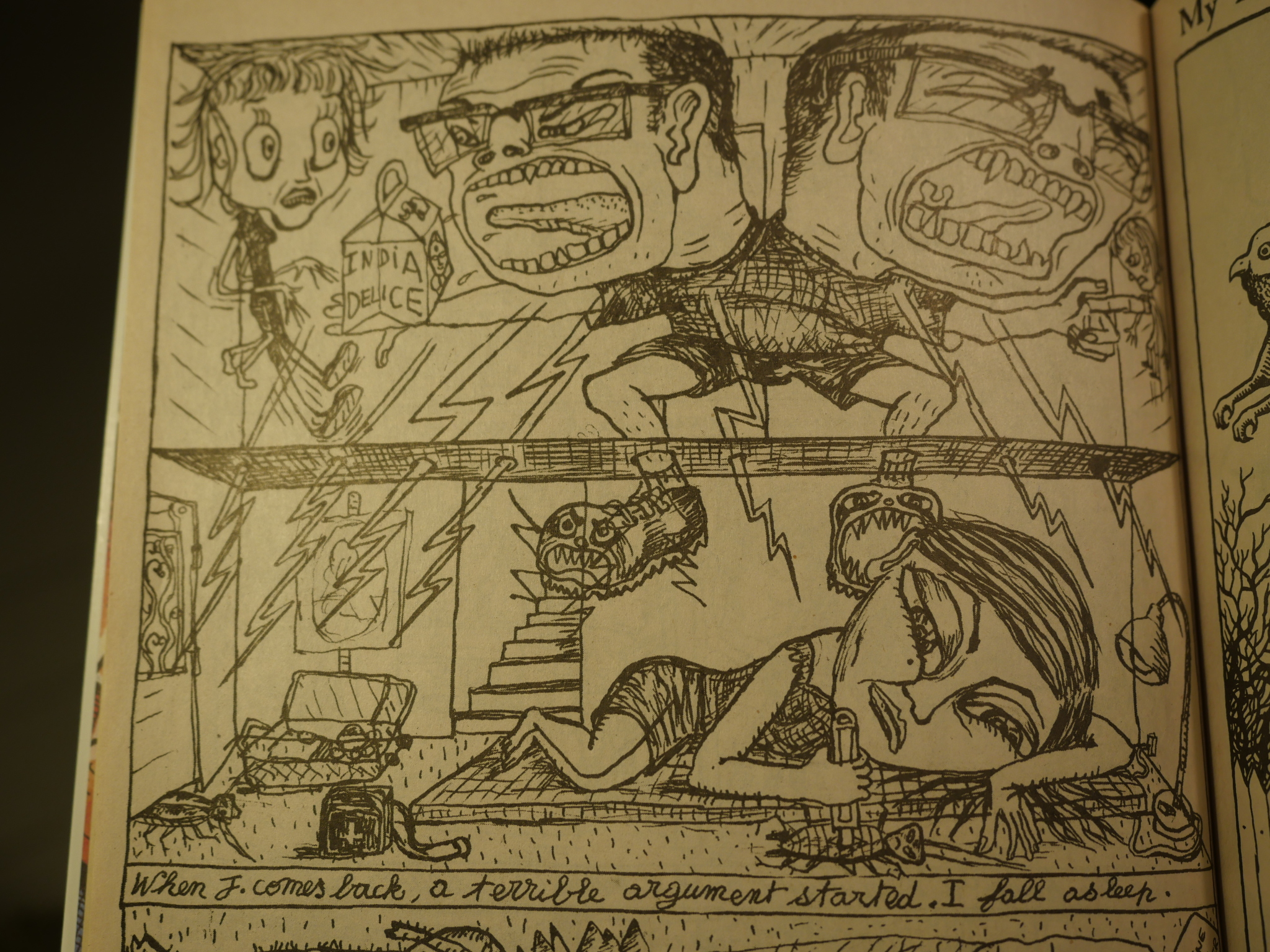
Autobio (David Collier here, who appeared in Zero Zero a lot, and therefore ruins my “diametric” thing in the second example, even)…
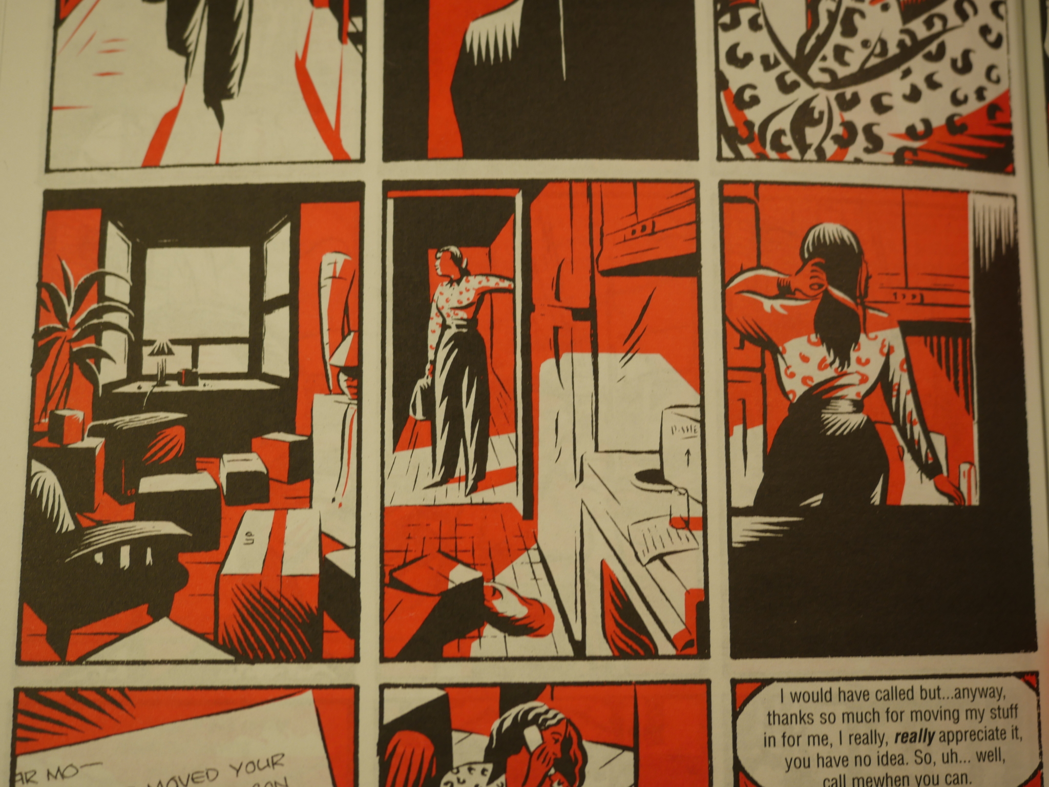
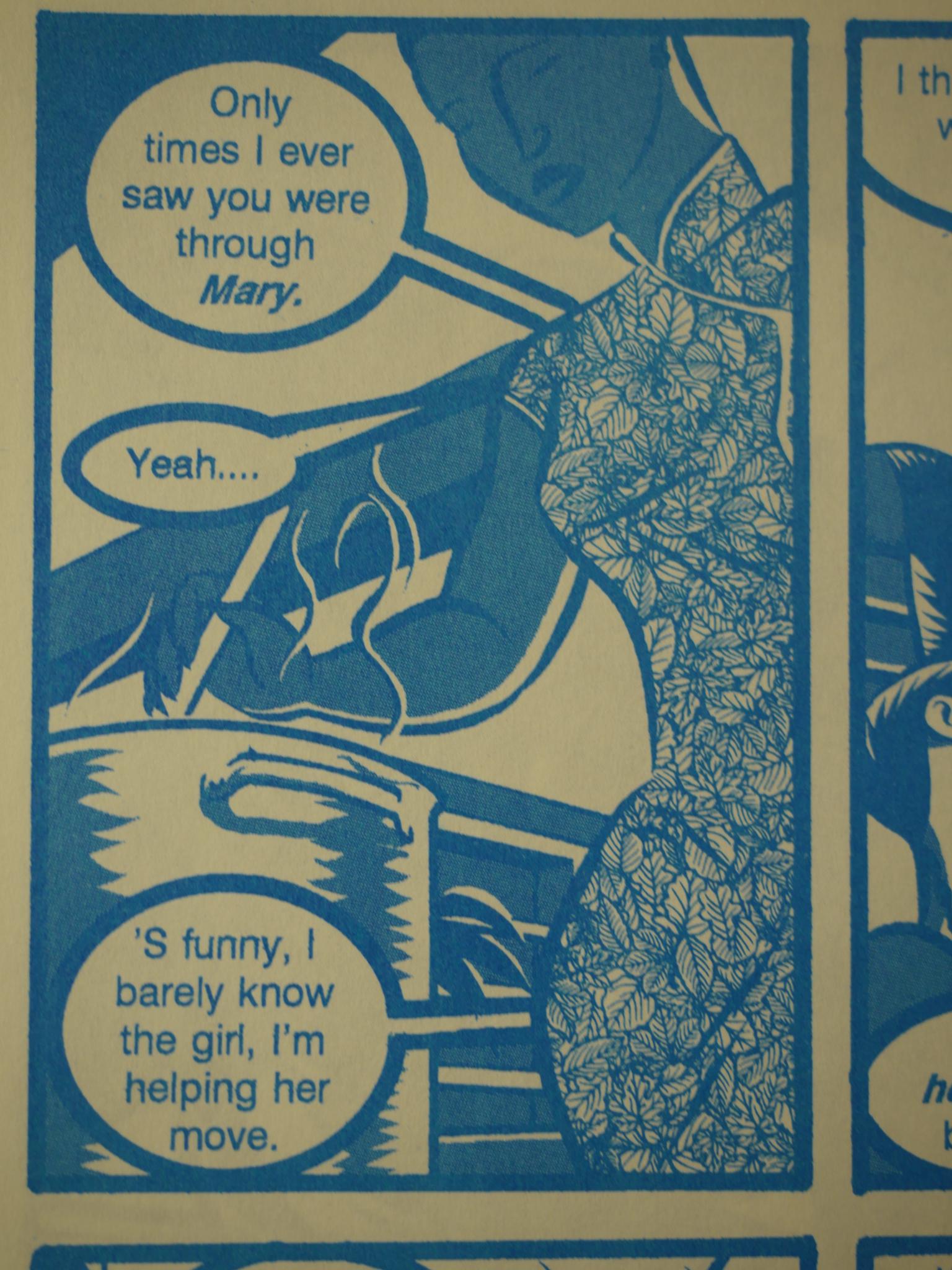
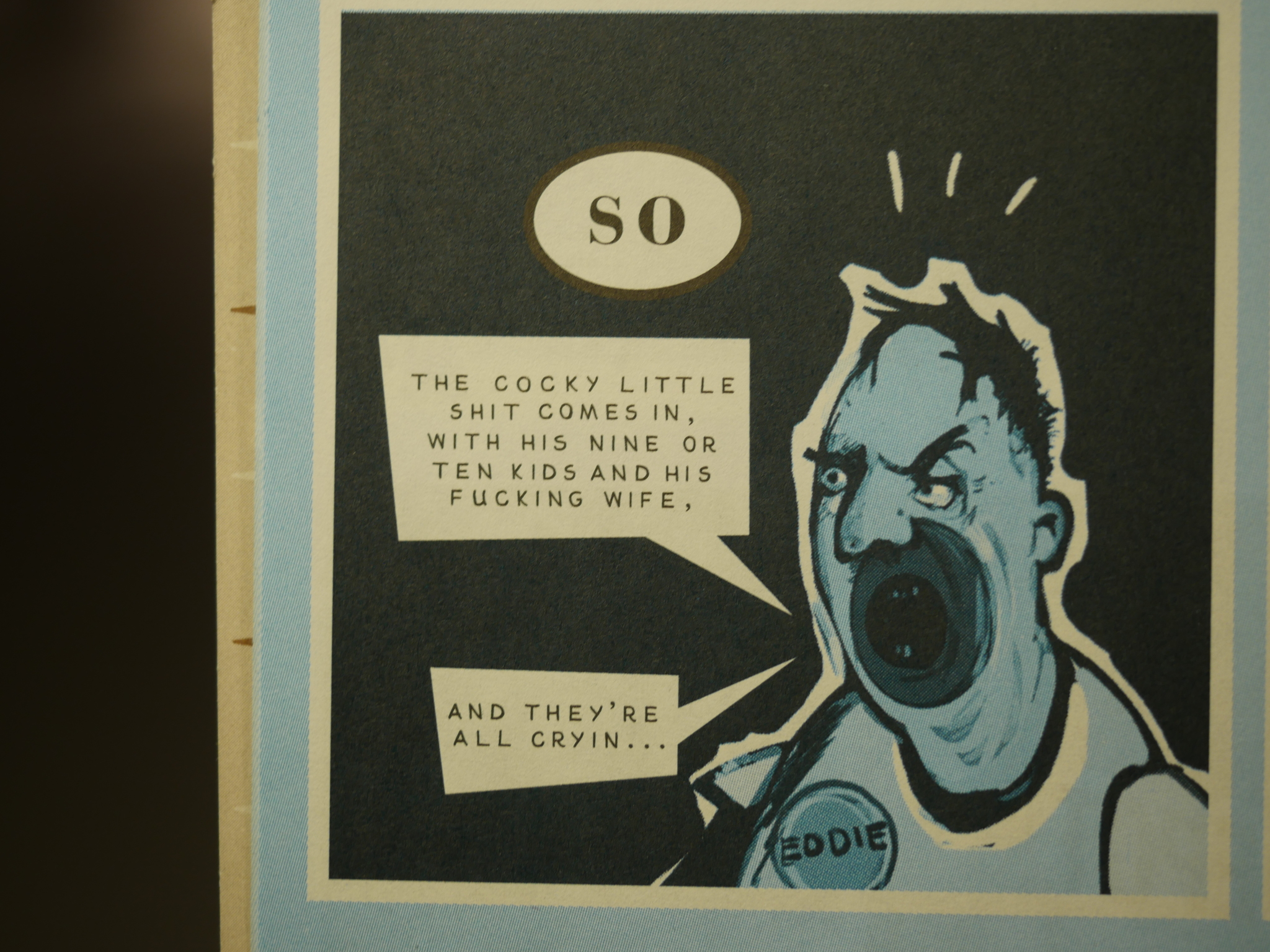
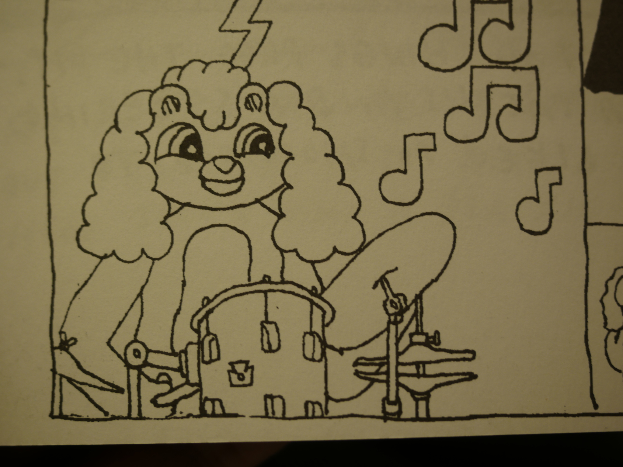
And erect penises. But not shown here, because this is a family oriented blog. Instead Allison Cole. And while narrative, as most of the pieces in Blood Orange are, it’s a bit on the vague side, even if what’s depicted is clear enough.
It’s hard to summarise the aesthetic of Blood Orange. While there’s a great variety of styles and approaches, it’s all perhaps a bit melancholy? Not lachrymose, but a bit thoughtful and quiet.
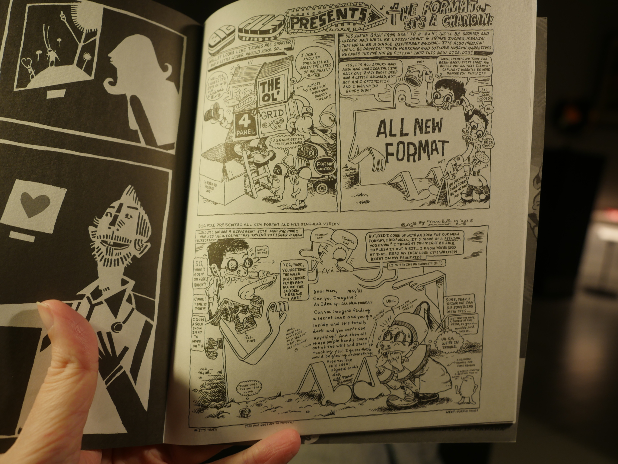
And then you have Marc Bell, who I thought was making a comment on the format of Blood Orange itself (it’s an almost square publication), but instead it’s an excerpt from something that looks like a newspaper strip? Or something? And he’s explaining how he’s gone from a 4×4 grid to a squat rectangle. But they’re printed one above the other in Blood Orange, so it’s square again! So meta!!!
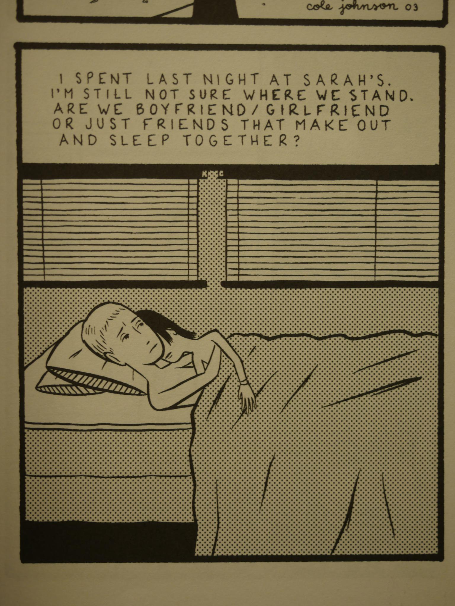
Cole Johnson from issue two.
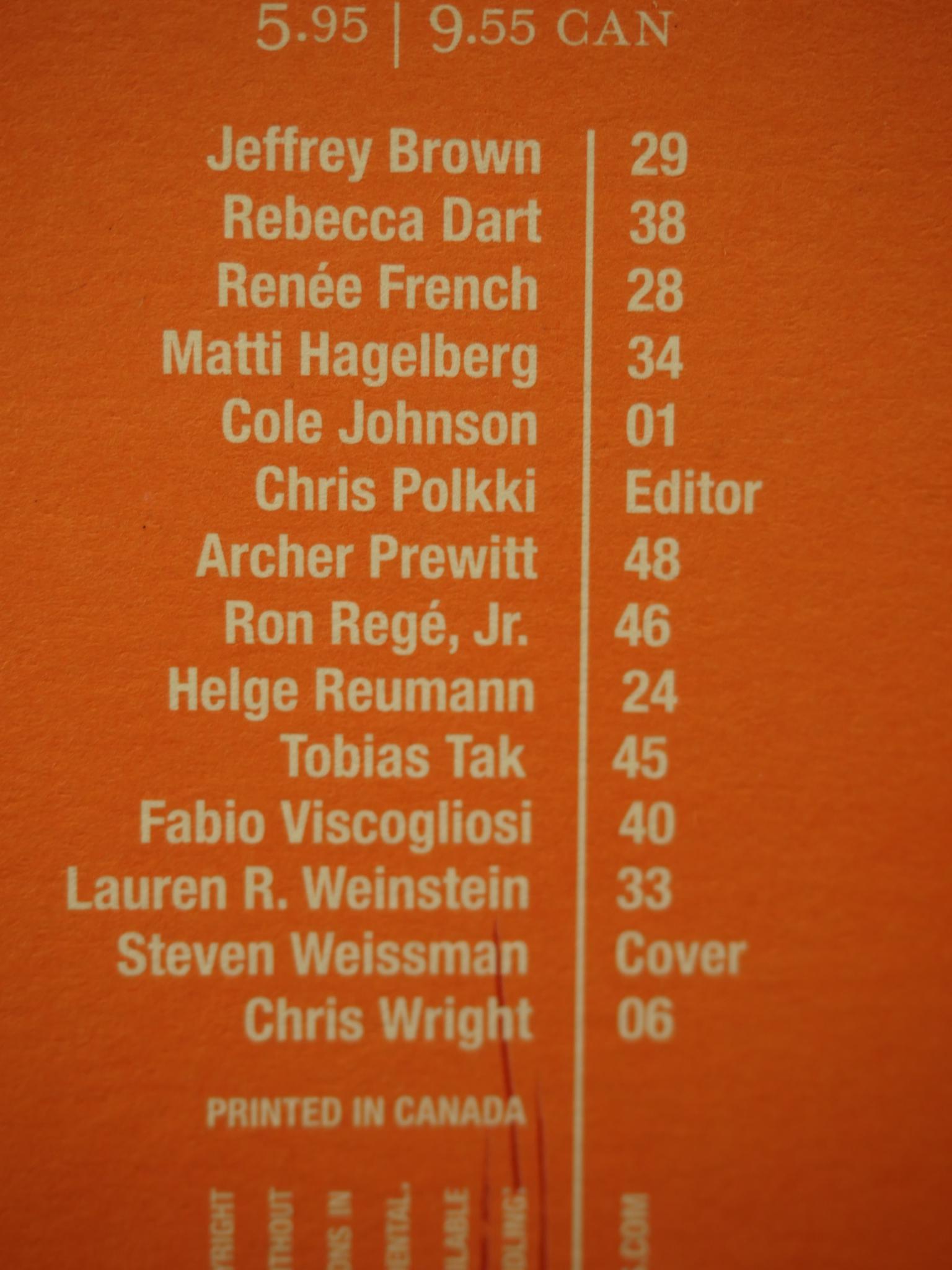
No page numbers are printed in any of these issues, and very few of them have names printed alongside the pieces themselves, so I found myself flipping back and forth between the contents page a lot. That was fine in the first issue, but in the second issue the list is arranged thusly. Gah. Triangulating who’s making what becomes a chore.
Blood Orange feels like a solid, cohesive anthology. There’s a great mix of shorter and longer pieces, experimental and narrative, but it doesn’t feel like a jumble of anything goes, either. Quite a few of the artists are associated with various Rhode Island things, like Paper Rad stuff (Ben Jones above).
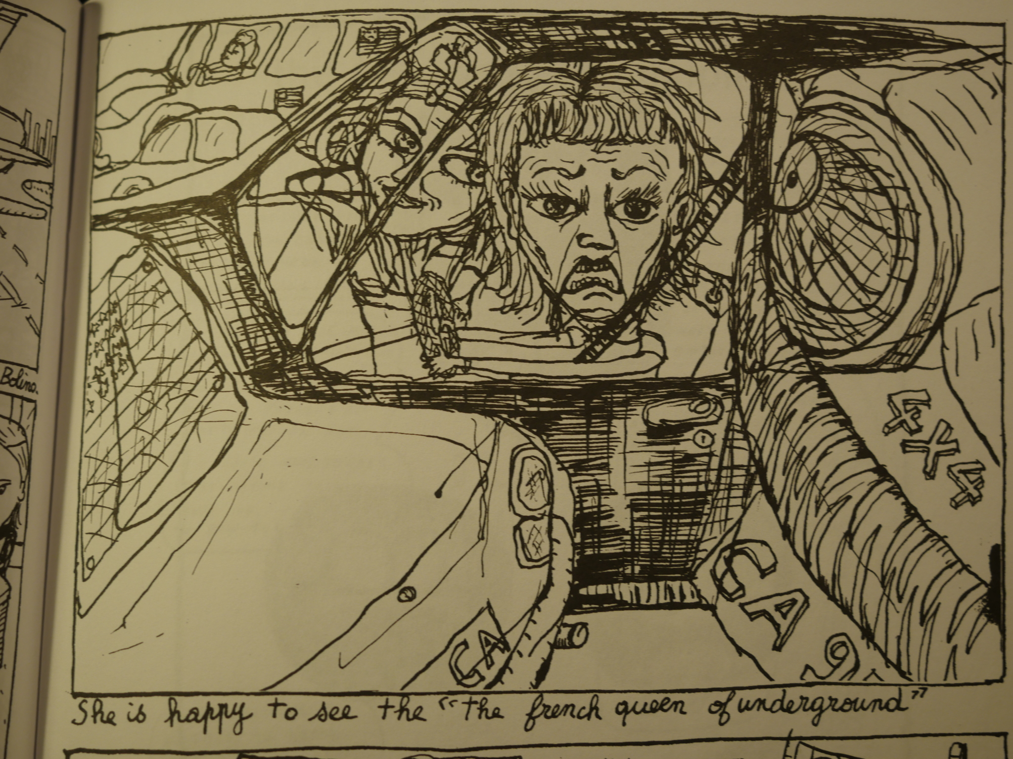
But there’s also Caroline Sury from France…
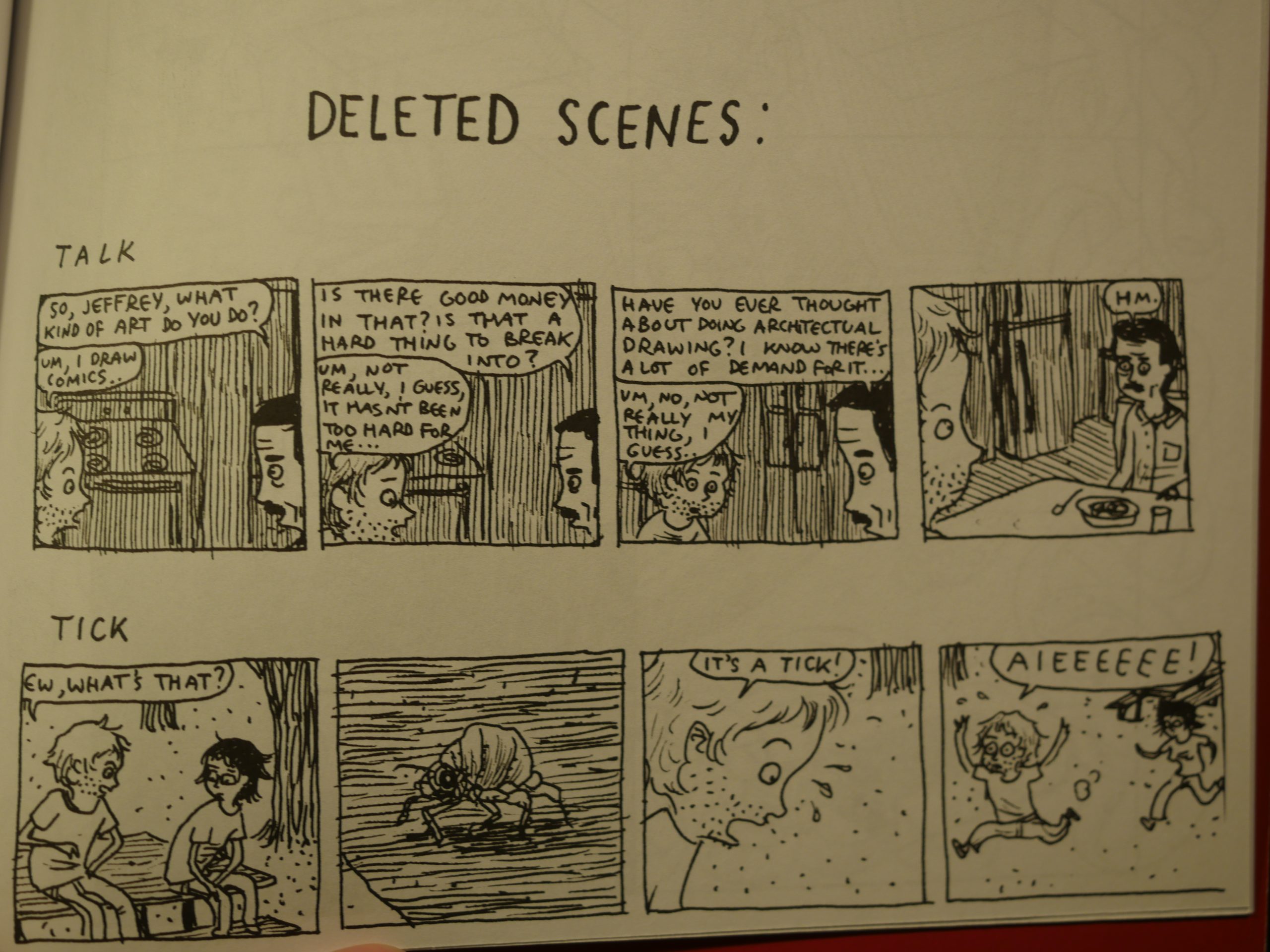
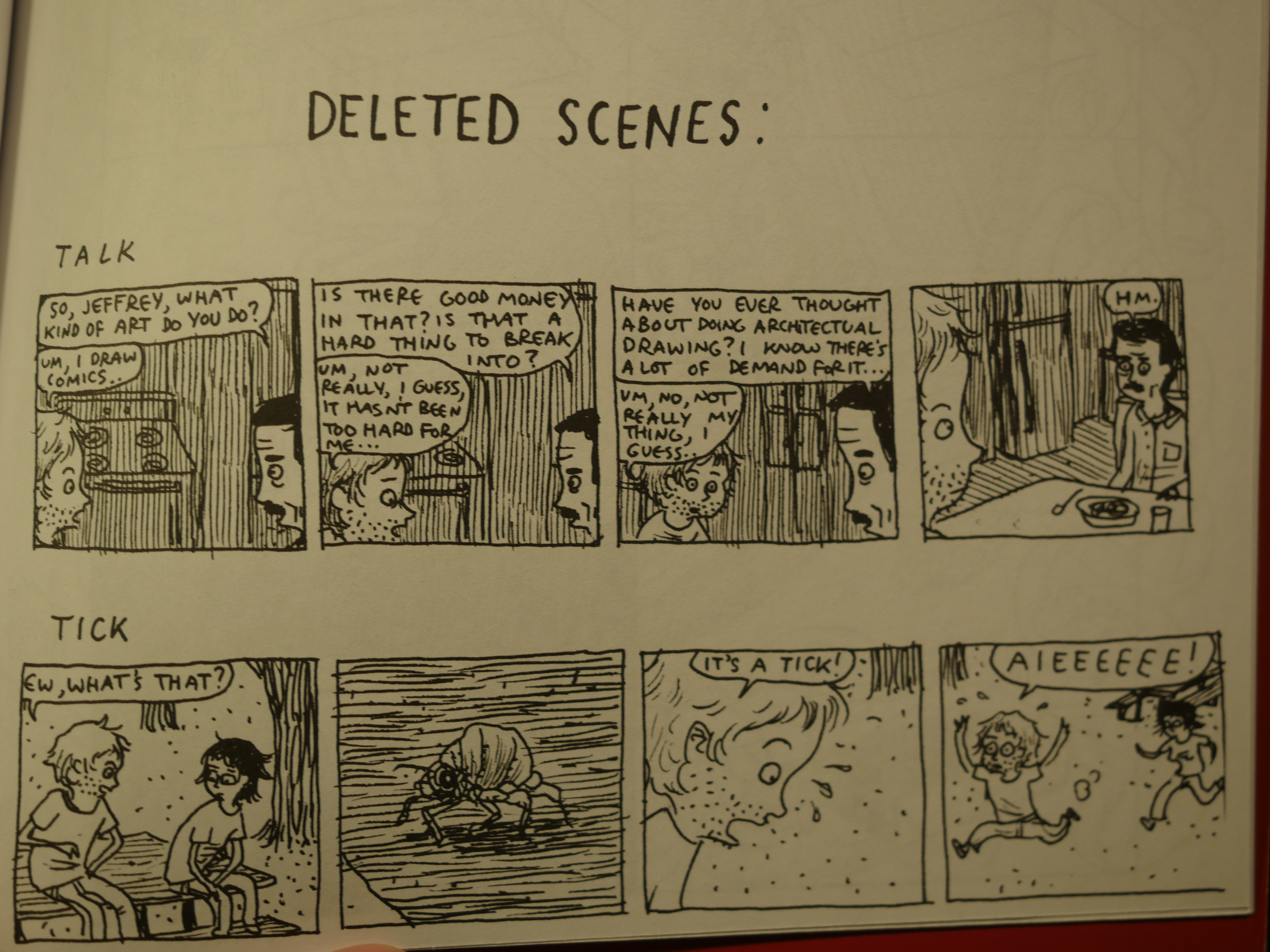
And Jeffrey Brown, who’s from Chicago, I guess.
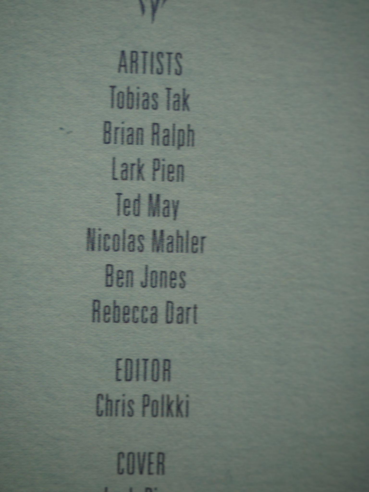
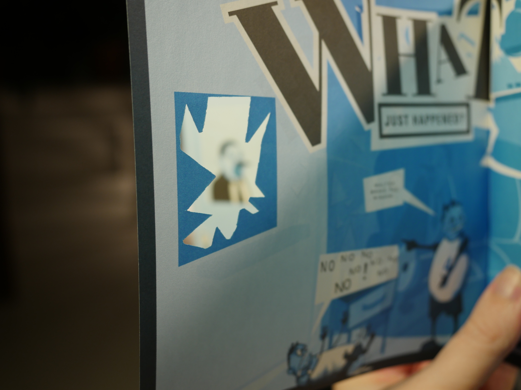
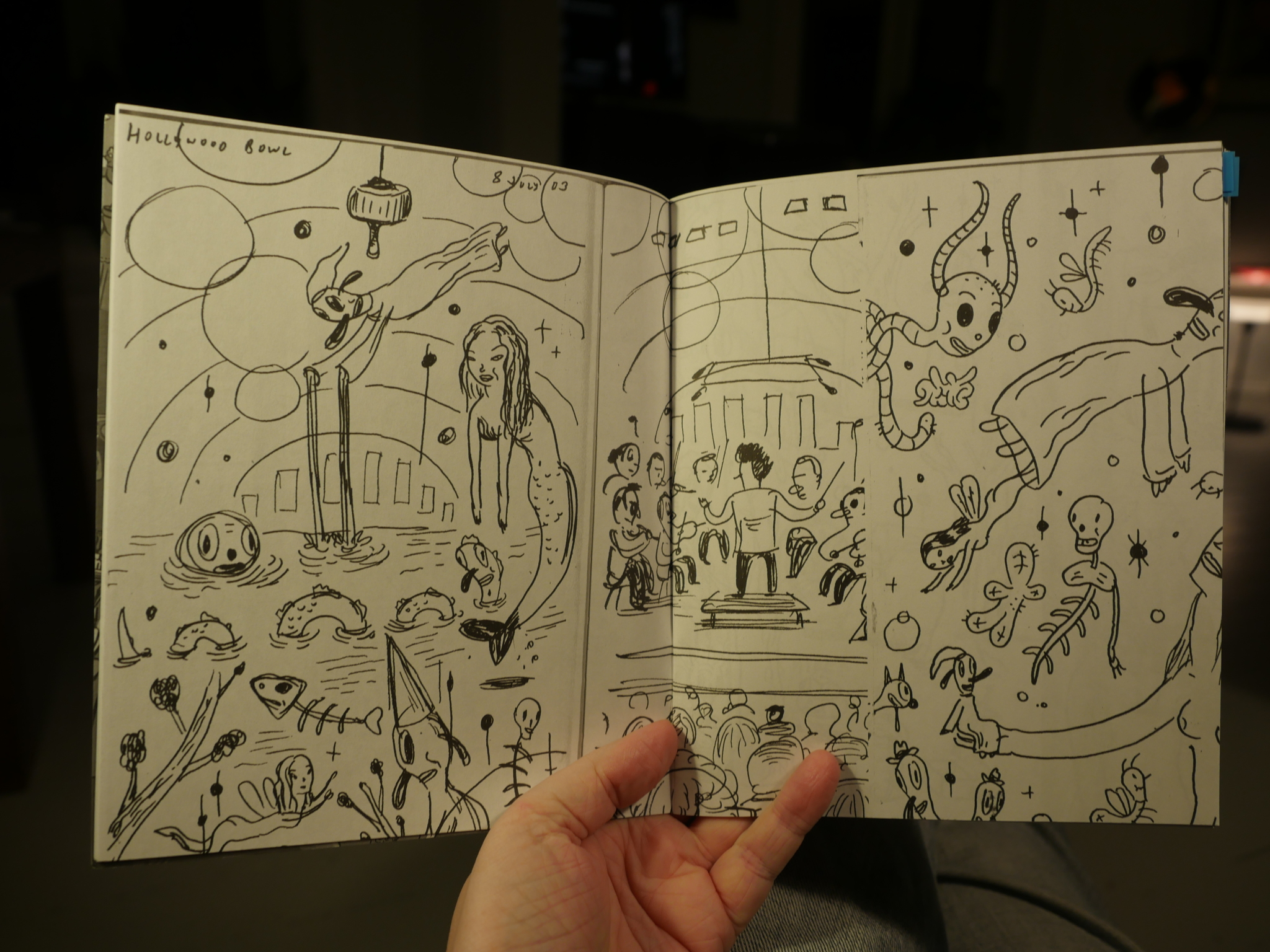
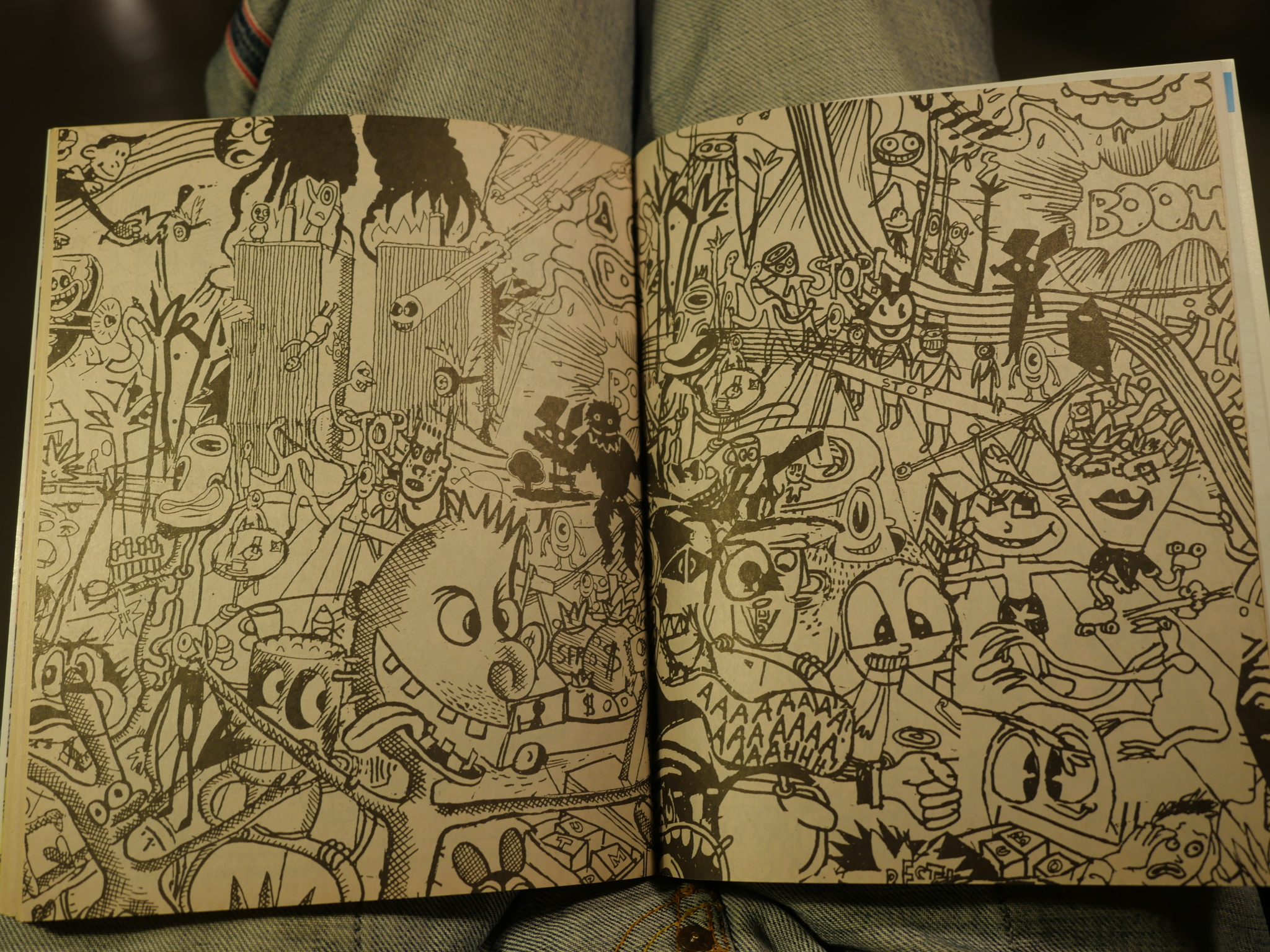
The list of contributors continues to get more and more useless. Here they are arranged in absolutely no order, so I have no idea who did this rather intriguing 16 page piece:
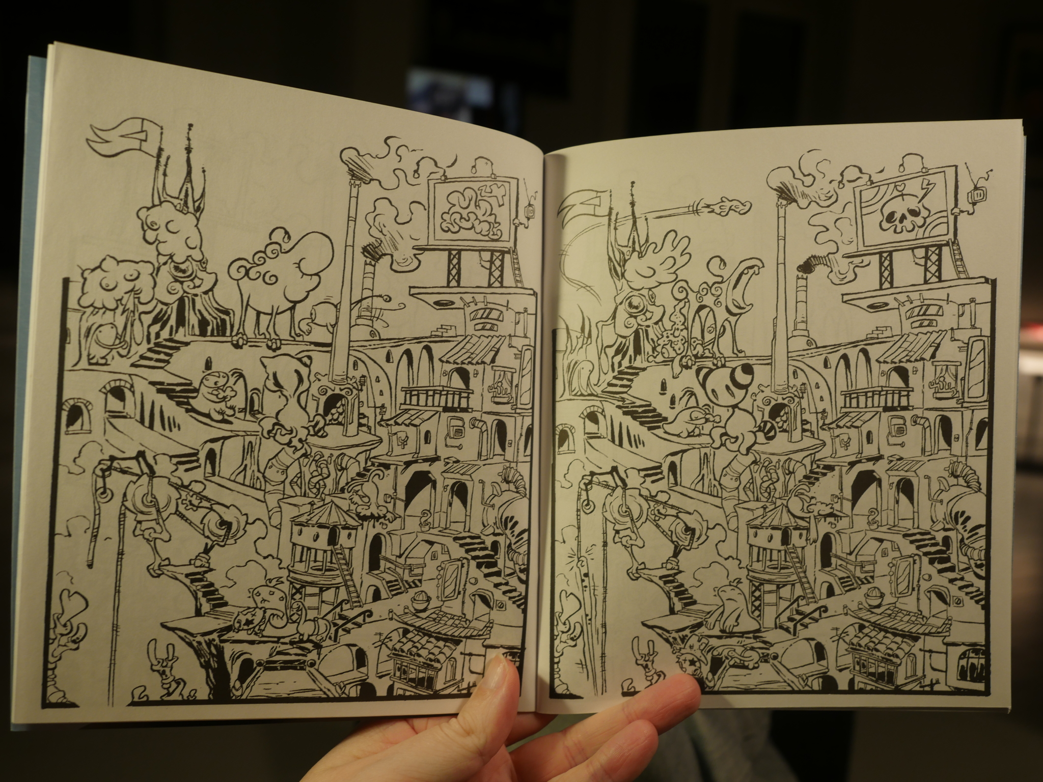
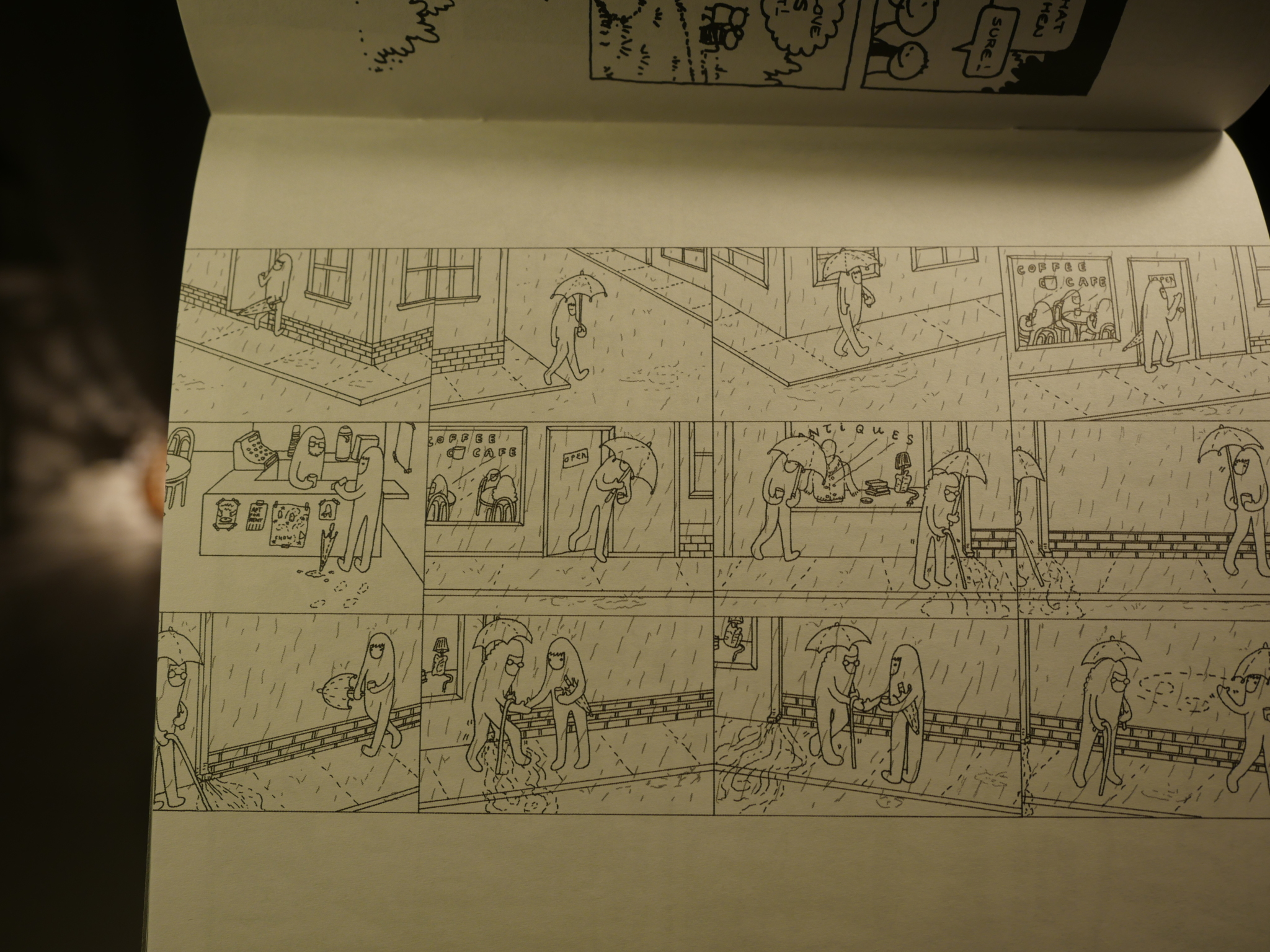
Every page is a “panel”, but there are, like, 20 different stories going on. You have to follow each little creature for 16 pages and see what happens to that fellow, and then flip back to the beginning, pick out another being, and repeat. It’s fun. Nothing Earth-shattering happens in any of the “storylines”, but nice.
Perhaps I can say who it is by eliminating the ones it can’t be… It’s not Tobias Bak or Brian Ralph… Or Ted May… Or Nicholas Mahler… So, Rebecca Dart or Lark Pien?
Is this why the editor makes the list of contributors so useless? To have reader participation? If so: Meh.
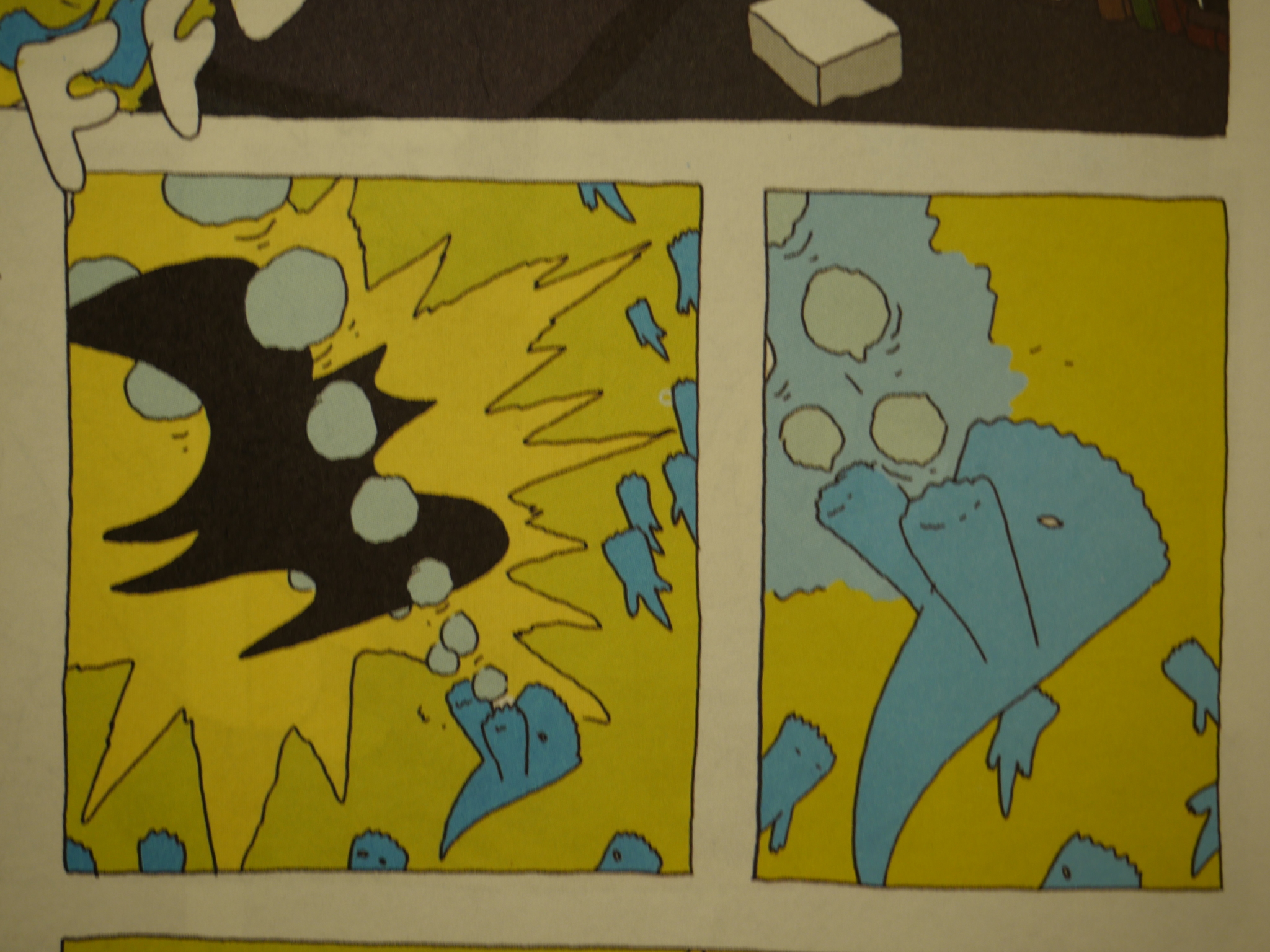
Bête Noire has twice as many pages as Blood Orange, and the first (and last) few are in colour. Morgan Navarro here, I think.
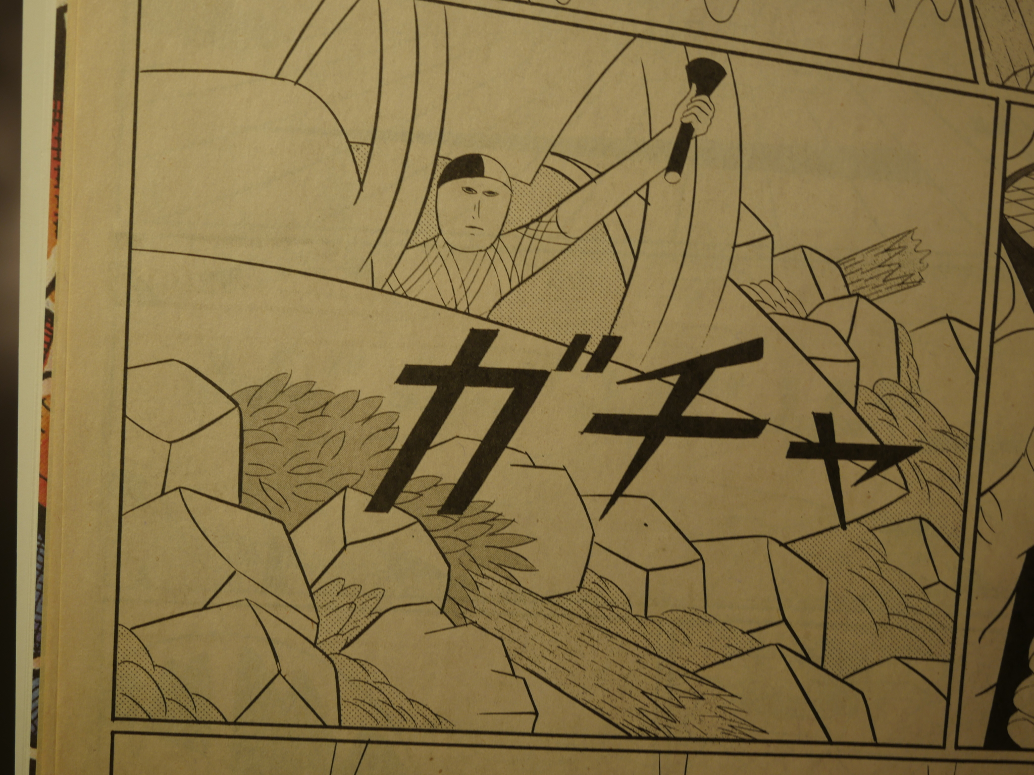
And that’s definitely the marvellous Yuichi Yokoyama. It’s a short piece, but it’s a blast of energy. I should re-read all his books more often.
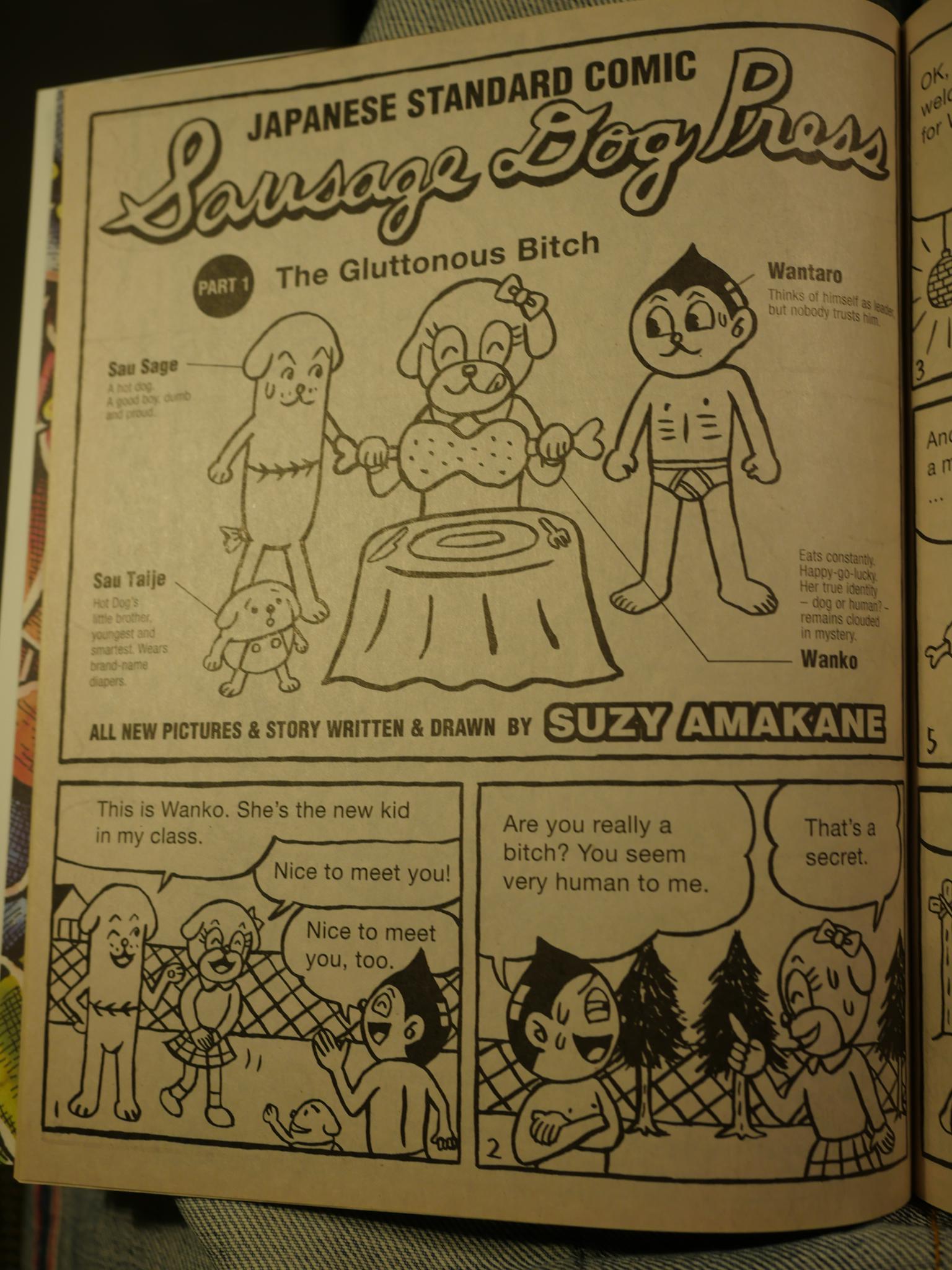
Bête Noire is a nice mix of famous artists and people I’ve never seen before, like Suzu Amakane above. Bête Noire has less of a unified tone than Blood Orange had, but it feels like a treasure trove of throwaway gems. The newsprint the bulk of the issue is printed on enhances that feeling.
Caroline Sury is the only artist that appears in both anthologies, I think, and her Bête Noire story is a direct continuation of the story in Blood Orange.
The country that has the most contributing cartoonists is Switzerland, which is a country that’s almost completely unknown to me. Comics-wise, that is. Here’s MS Bastian very New York-ish freakout.
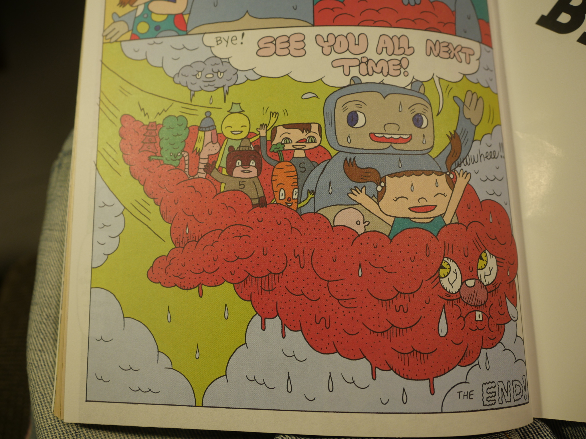
Kevin Scalzo bids us adieu, but there’s no next time.
I know absolutely nothing about the editor, and Blood Orange was never reviewed in The Comics Journal. I can’t remember seeing anybody mention these anthologies before, and I bought Bête Noire just now for this blog series.
Let’s do some research. The first hit on Google is this, which doesn’t help much. (And not putting a date on the page is even less helpful.)
Oh, this page explains that Bête Noire was a rebranding of Blood Orange, not a sister title, as I had assumed. That makes more sense.
Nothing else pops up. Oh, well. Very nice anthologies, but Mome would soon swoop in, and that was a big success, and featured a lot of the same artists.
This post is part of the Fantagraphics Floppies series.