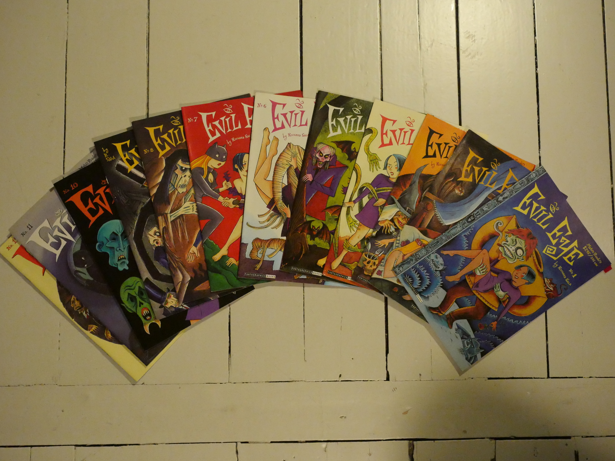
Evil Eye #1-12 by Richard Sala.
Sala is one of the more distinctive stylists in American comics. Like Charles Burns, he appeared on the scene in the early 80s, fully formed, with an art style like nobody else, and with a narrow range of subjects for his comics. Burns was mostly about growing up and sexual horror, while Sala has always been interested in monsters, conspiracies and 60s hipsters.
Evil Eye is, incredibly enough, Sala’s first solo comic book. I think, basically, all his previous comics were published in anthologies: Most prominently Raw and Blab!, and most recently the long Chuckling Whatsis serial in Zero Zero.
Evil Eye seems designed to be designed as a classic single author anthology, where Sala would put whatever he wanted to. In the end, though, the book was dominated by one long serial, Reflections in a Glass Scorpion.
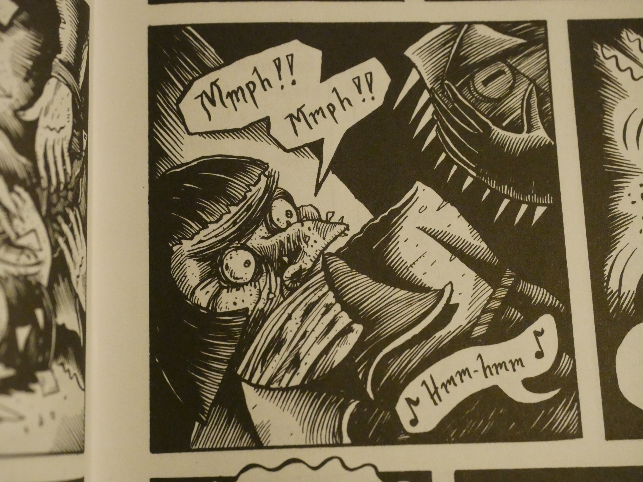
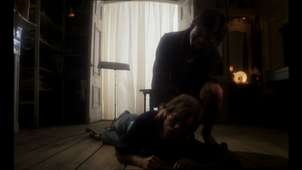
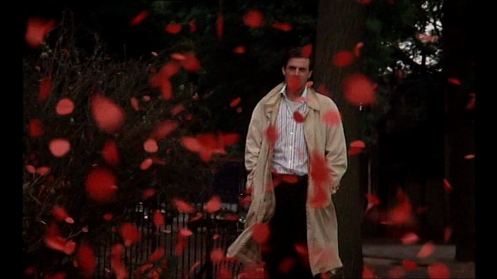
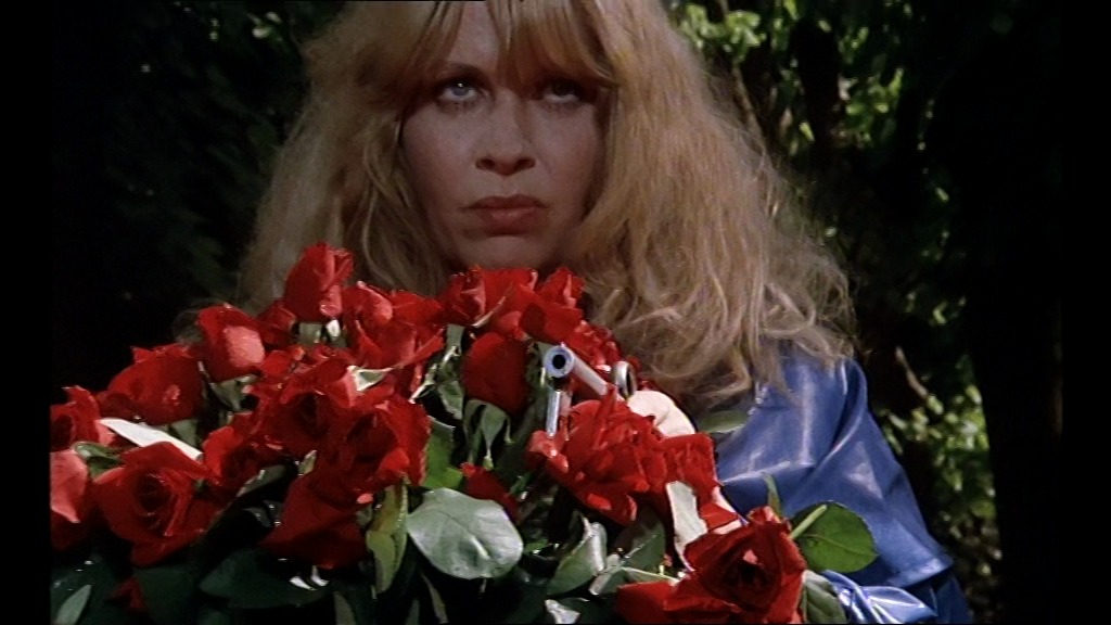
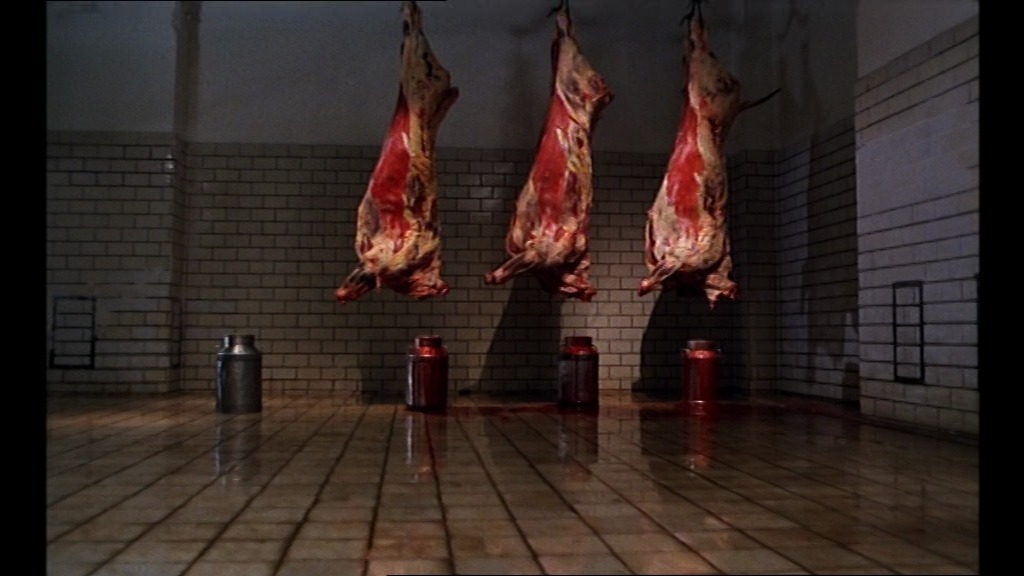
And it’s exactly what you’d expect: Monsters, mad scientists, conspiracies, young heroes and lots and lots and lots of gruesome murders.
All in good fun, of course.
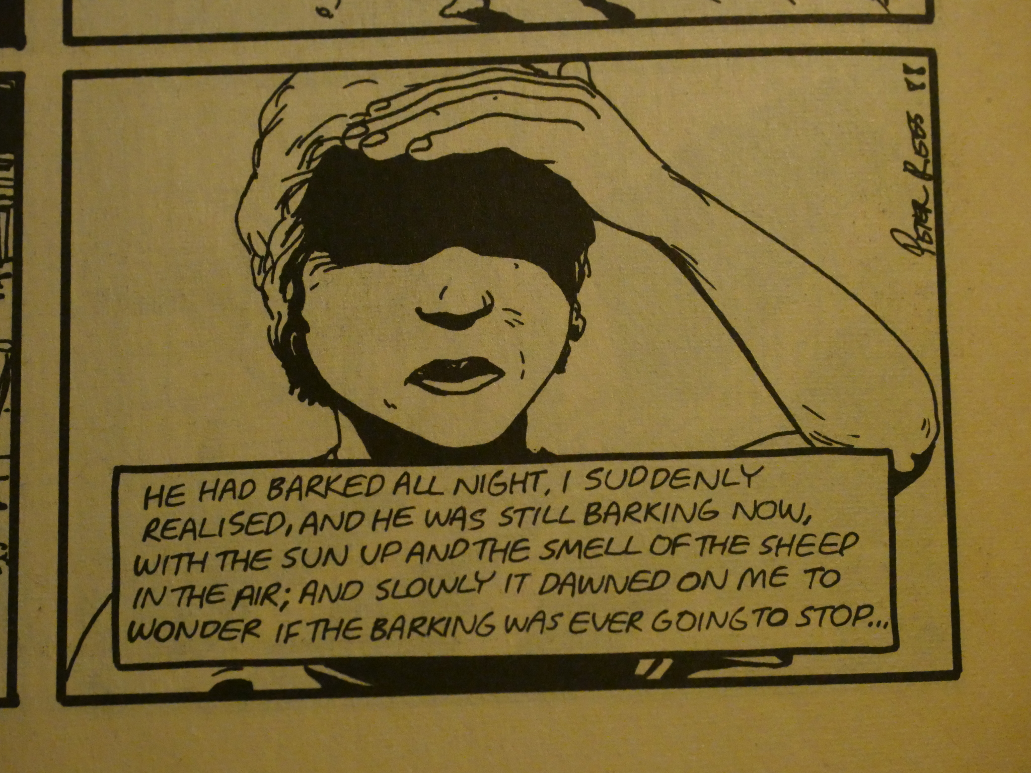
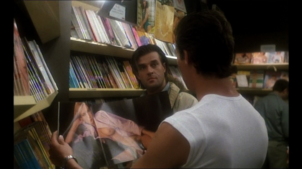
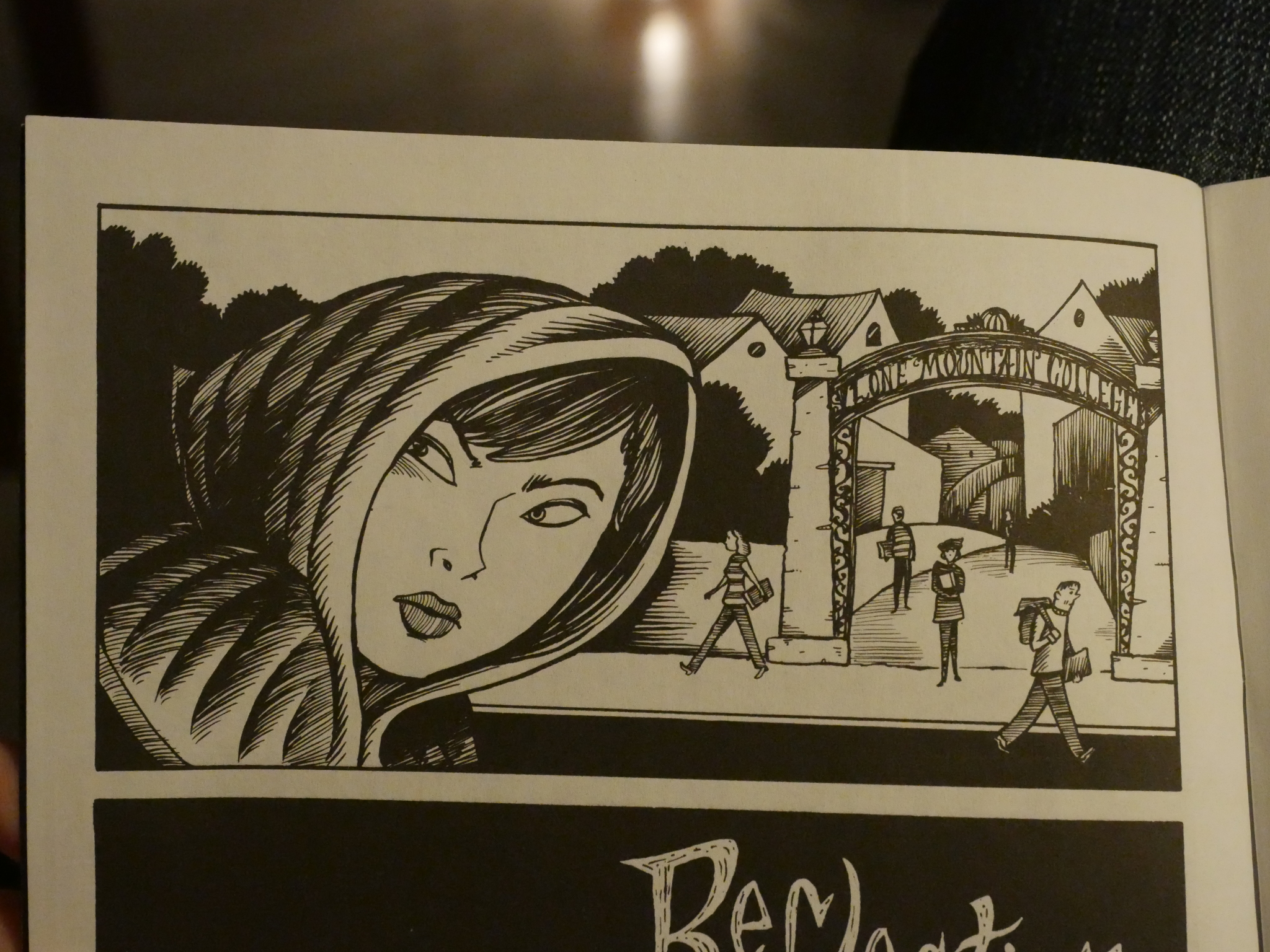
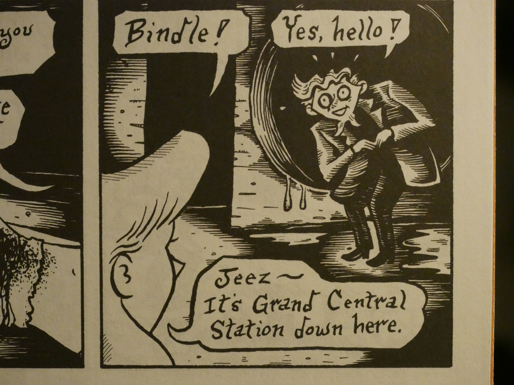
While the Scorpion serial takes up around two thirds of each issue, and seems like an unusually well-planned-out and plotted story (for Sala), the backup feature is a series of short stories about Peculia and her friends and foes. It’s a rather vague setup, and these stories have an improvised feeling about them: Peculia will leave her home for a walk, and then things happen, and then she returns home.
Strangely enough, all the covers on Evil Eye depict scenes from Peculia, not from the main serial.
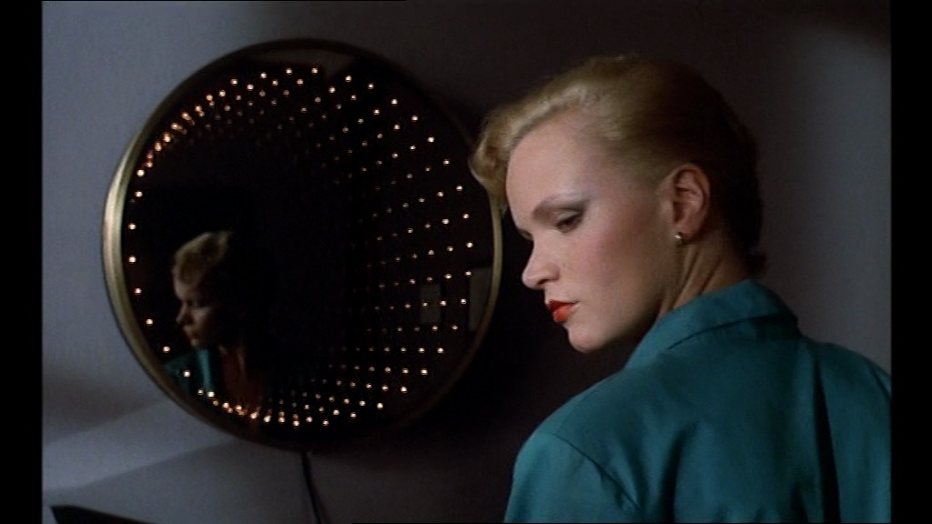
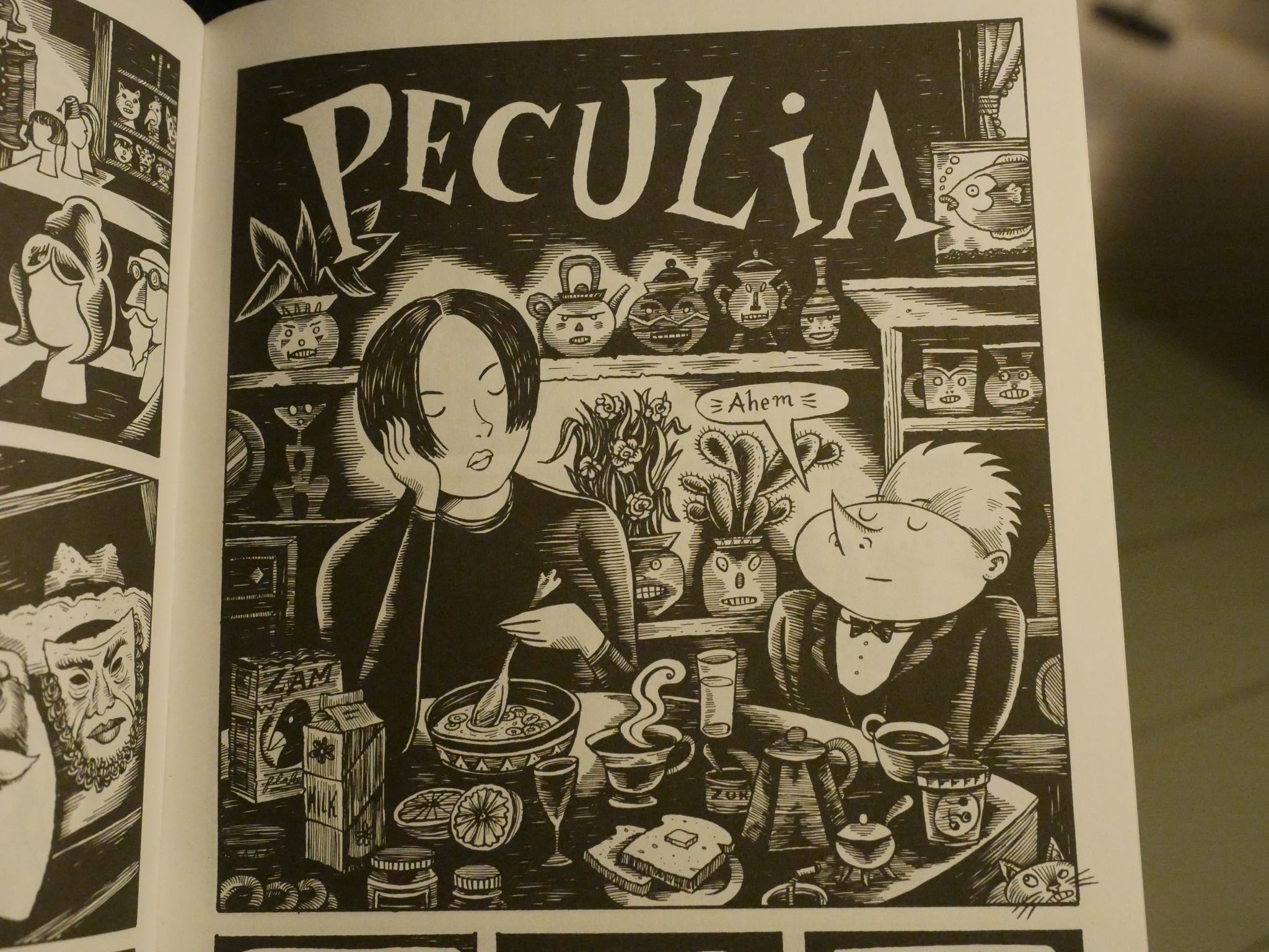
Sala’s artwork used to be quite a lot more intricate than it is in Evil Eye, but I would say that it essentially looks the same as it did in the 80s, and it’s still beautiful. Look at those items on the shelf. Peculia’s posture. The discreet butler. It’s all so perfect. Those weird angles makes up a convincing milieu even if everything is so strange.
Sometimes I think he’s just fucking with us, though; challenging us to accept ever-weirder cranial shapes.
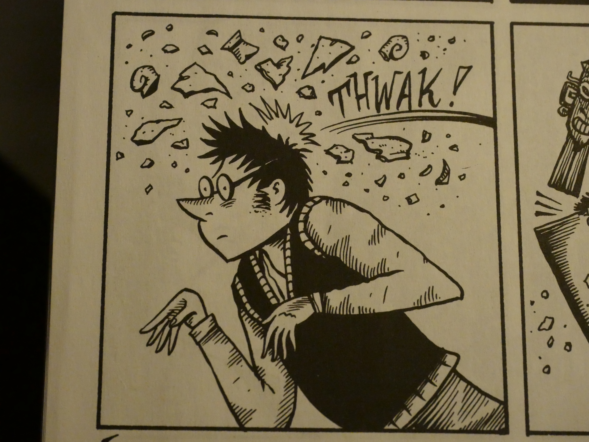
While the figure work looks nothing like actual human beings, it’s just so endearing without going full “cartoon”. I read images like the one above as being naturalistic in context, and it’s just when you look at it separately you start to really think about how very, very odd the figures are.
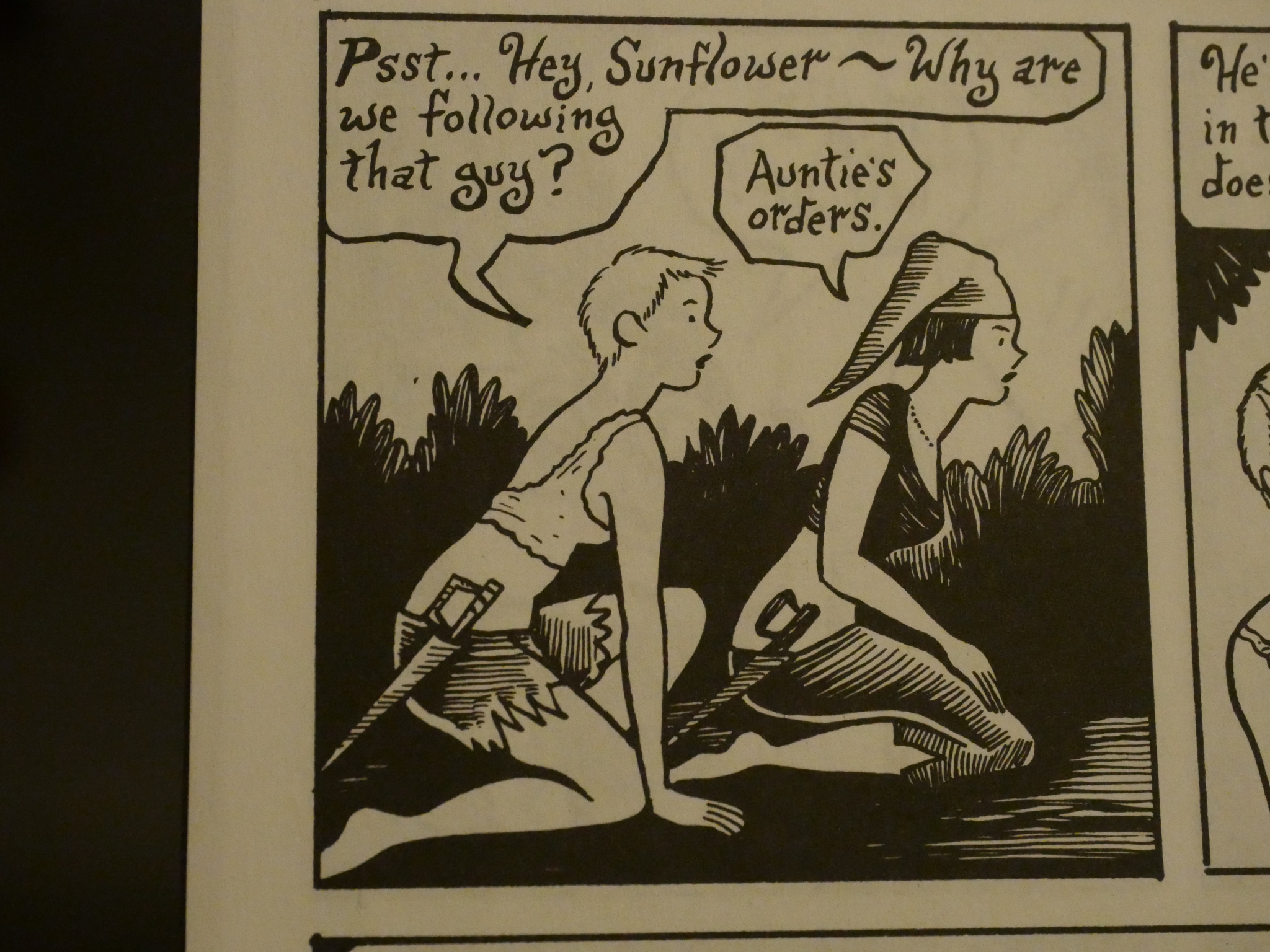
His female characters look incongruously straighforwardly pretty. Sometimes there’s a slight jarring effect going between these glamorous women and the freaky monsters, but… it’s very slight.
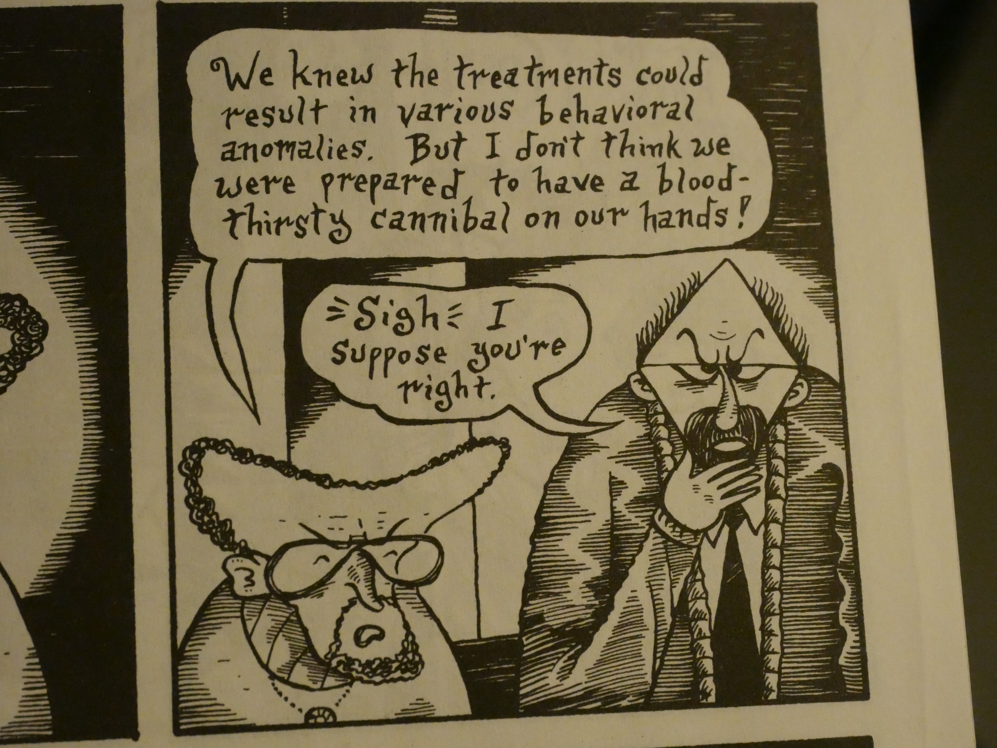
My suspicions that the Glass Scorpion storyline had been plotted in advance seems to be confirmed here, when Sala says that issue six is the midpoint. And it’s probably the most tightly plotted story I’ve read from him: All the characters are connected, and clues are dropped that are picked up fifty pages later.
Perhaps everything is slightly too tightly wound, though, when the characters starts commenting on how everybody seems to happen to be in the same place at pivotal moments.
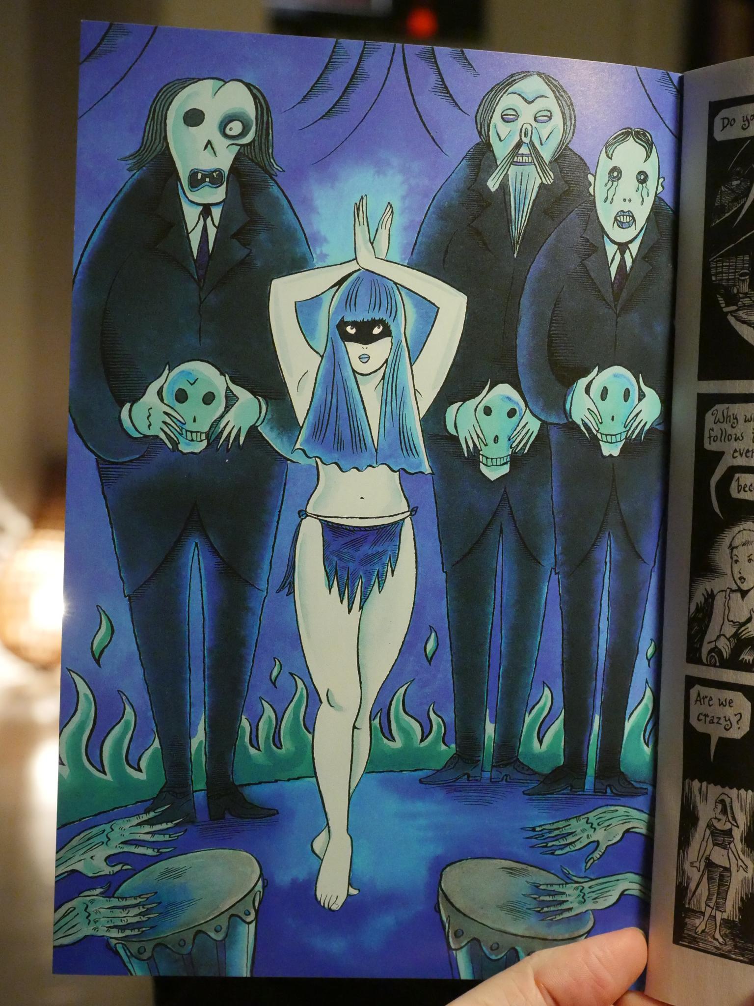
In issue 8, Evil Eye switches to better paper, stiff cover stocks and starts featuring these colour illustrations on the inside front and back covers. They’re not connected with any of the other contents, but they’re pretty spiffy.
The Glass Scorpion serial ends, and then Sala announces a next issue that never happened.
After this comic book ended, Sala has continued to create comics in pretty much the same vein, mostly with Fantagraphics but also First Second.
This post is part of the Fantagraphics Floppies series.