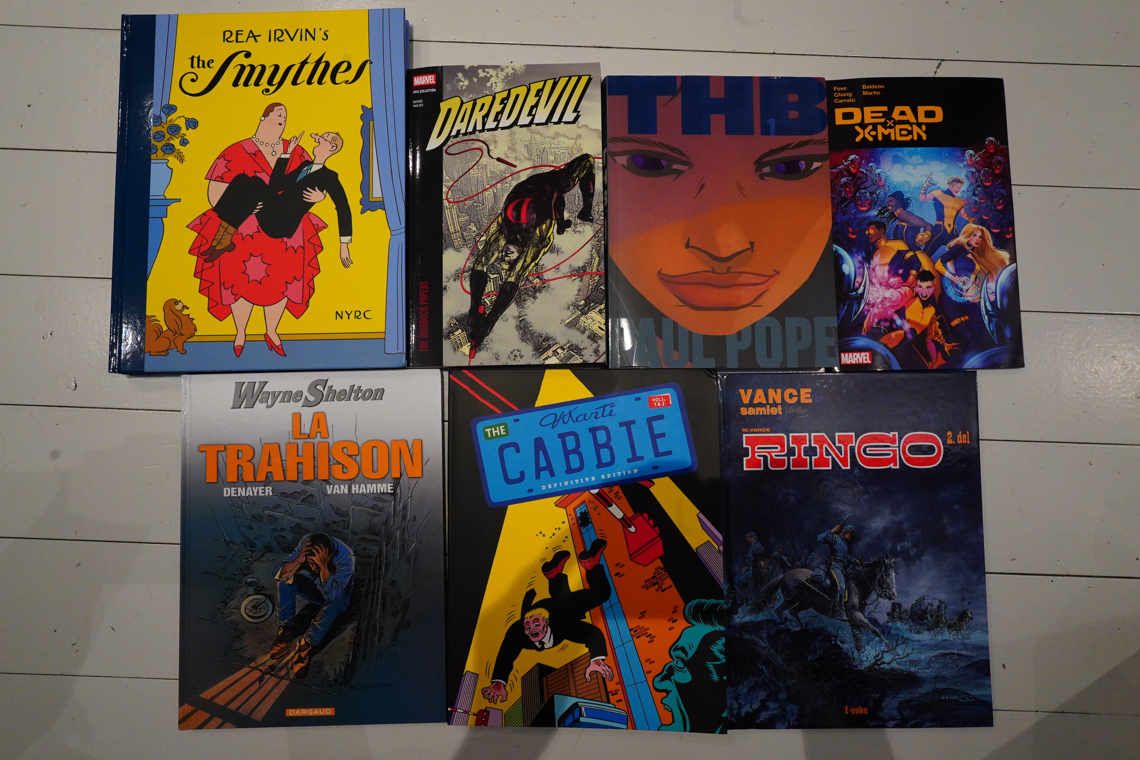
I read some more comics over the last week.

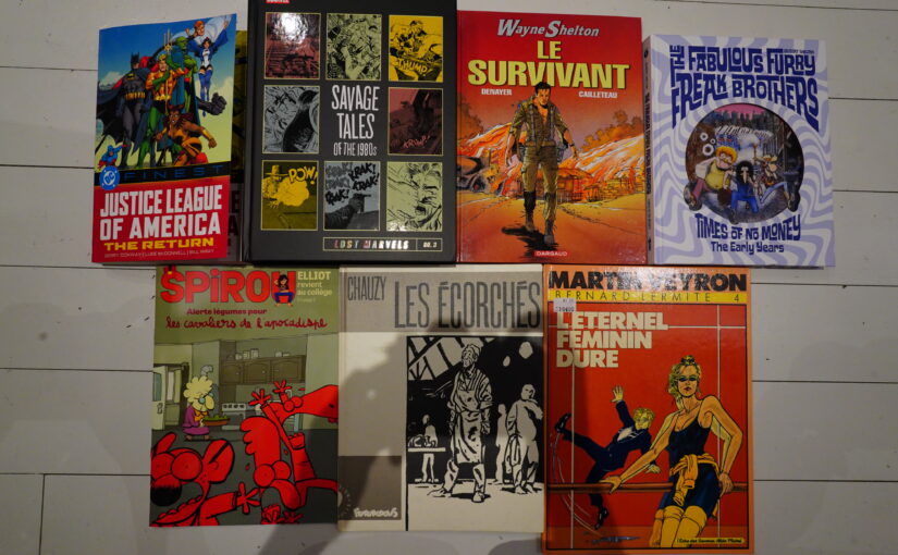
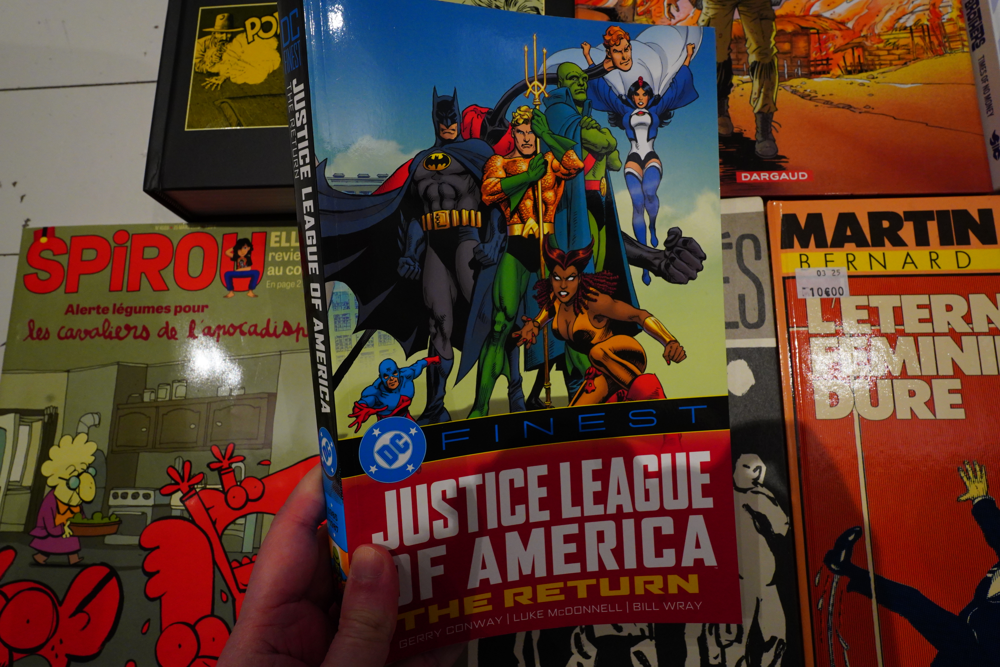
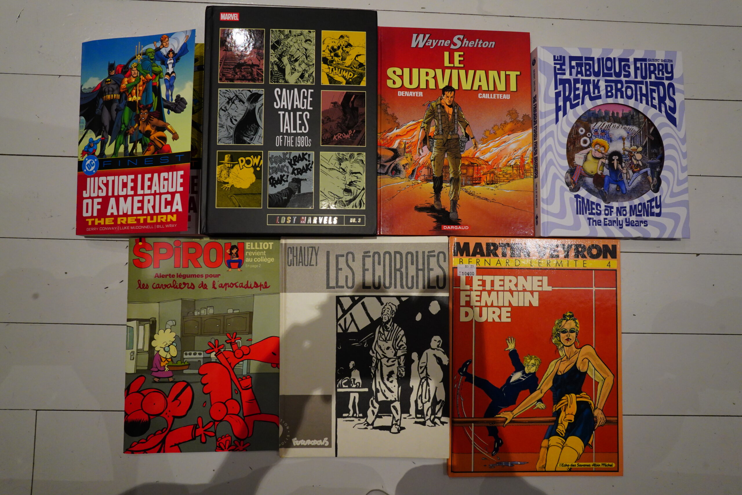
I don’t quite remember why I bought this Justice League book — I probably thought it was a collection of 70s stuff? But it’s not — it’s from 85-87, so we’re in an era that’s totally unfamiliar to me.

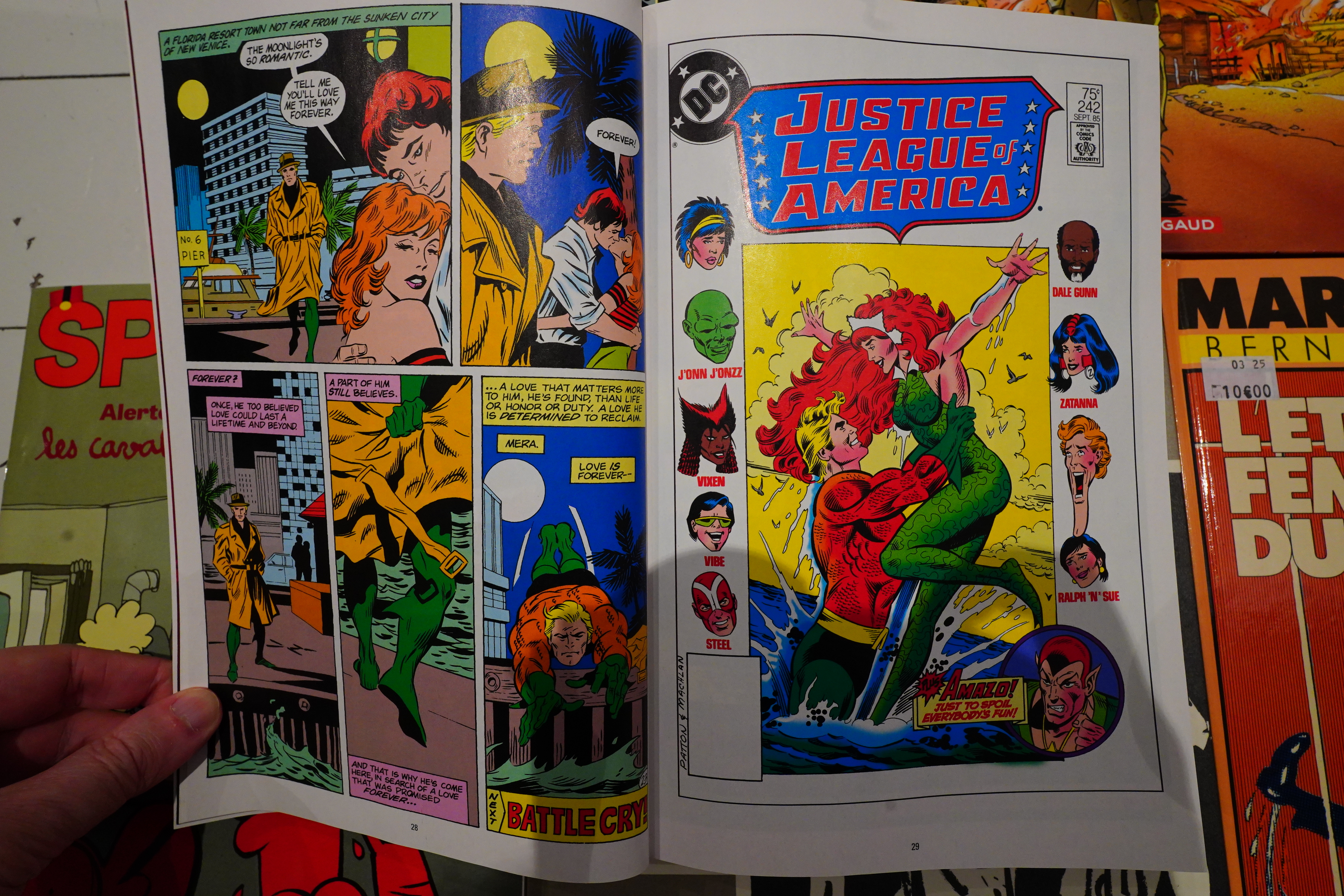
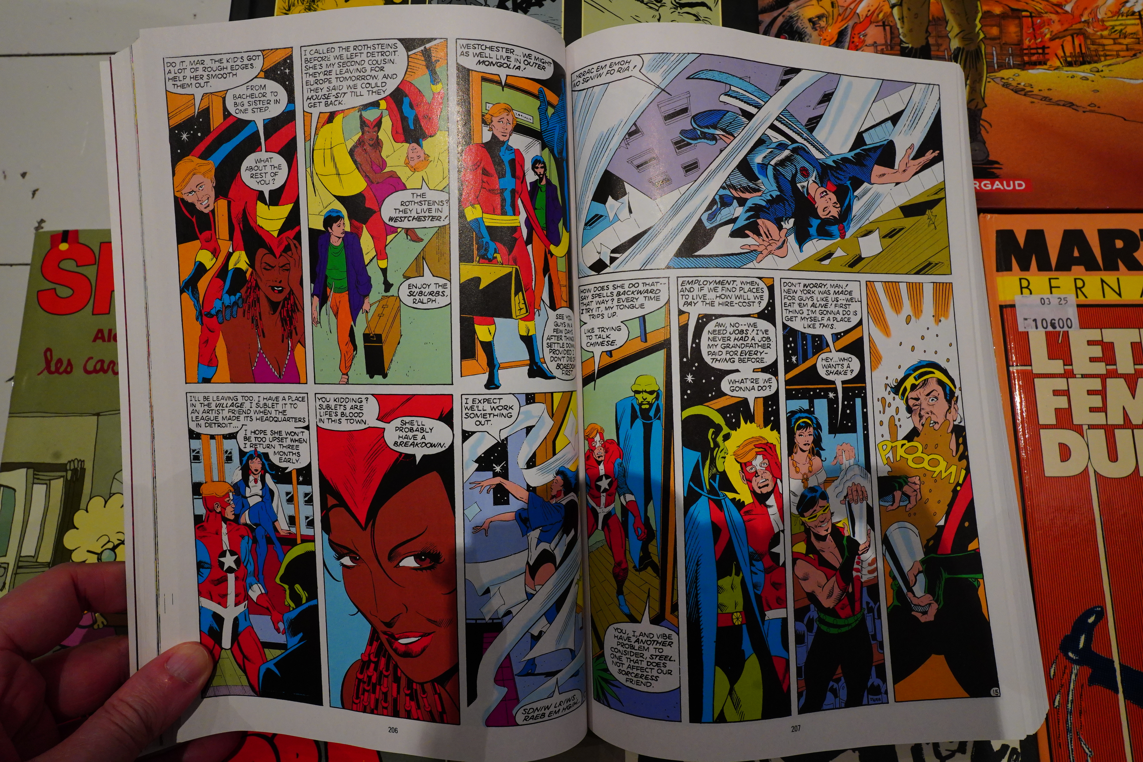
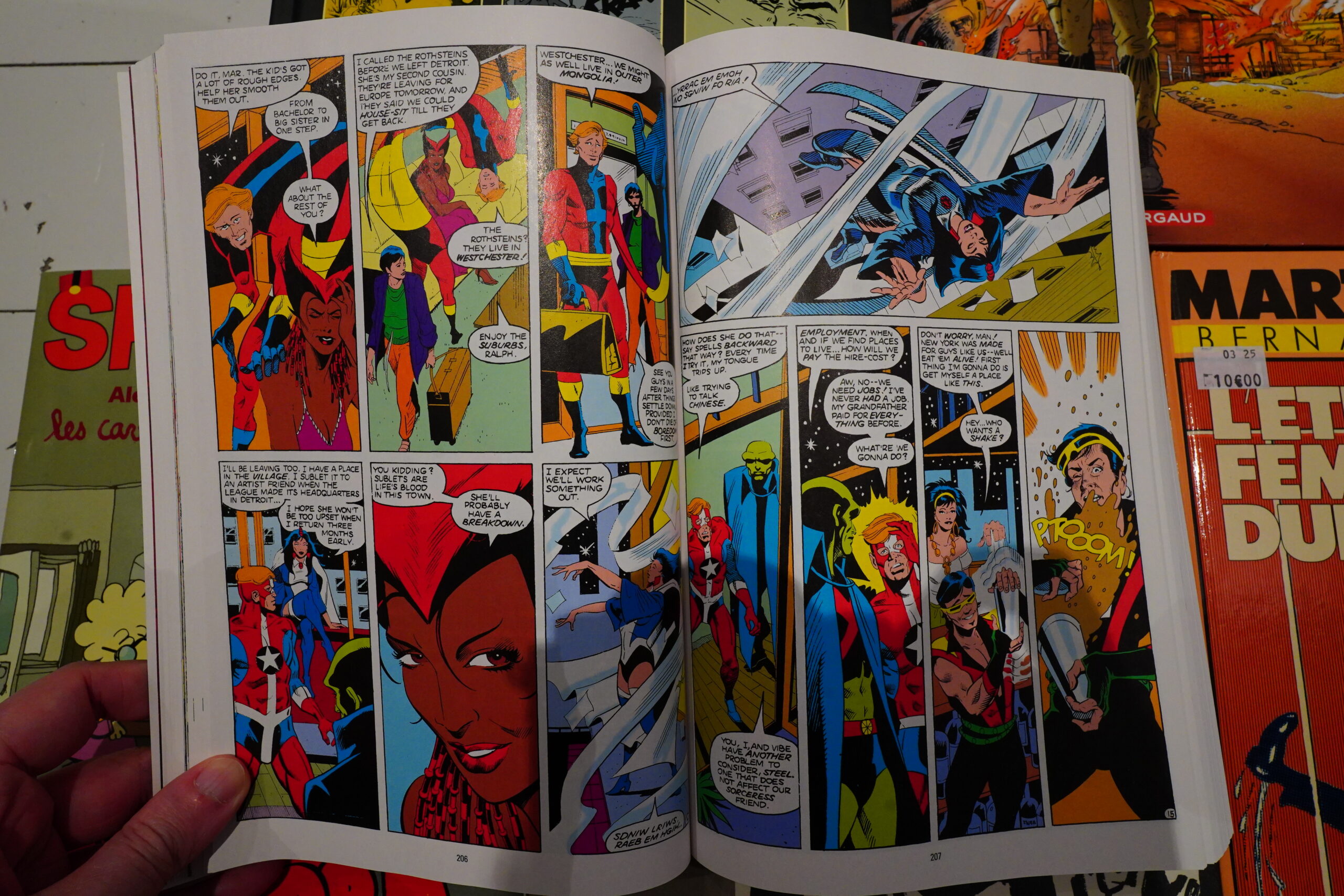
So when this book starts out, the League lives in Detroit (!), and has members like… Vixen… Vibe… Gypsy… and Dale…
I guess Vibe made a return (well somebody with the same name returned), but it’s amusing how little success DC has had with introducing new super-heroes since, like, the 1940s? Sure, they go through a lot of names behind the various masks (how many Flashes have there been now?), but, you know, neither Vixen nor Gypsy have become household names.

We’re in 1985, so it’s during Crisis on Infinite Earths, so there’s crossovers. So we get an issue of Infinity Inc that reads like a headache on paper, and has artwork by Todd McFarlane.
As usual with “DC Finest” books, it’s not quite clear what the rationale behind why this section of the Justice League’s story has been collected here. We start off in Detroit, but after a handful of issues, we go to New York and then there’s a new penciller. And it’s all written by Gerry Conway, except the final handful of issues, which are by J M DeMatteis. But at least the end point is kinda logical — it’s where the series was cancelled (to be replaced by Justice League International), so perhaps the issue selection was just “the final 20-ish issues”?
Anyway, I was surprised at how readable this series is. I wasn’t expecting to actually read it, but I spent all night reading it and finished it in one day! It just flows very well, even though I can’t really say that it’s… good? It’s not actually good, but it’s not annoying in any way.
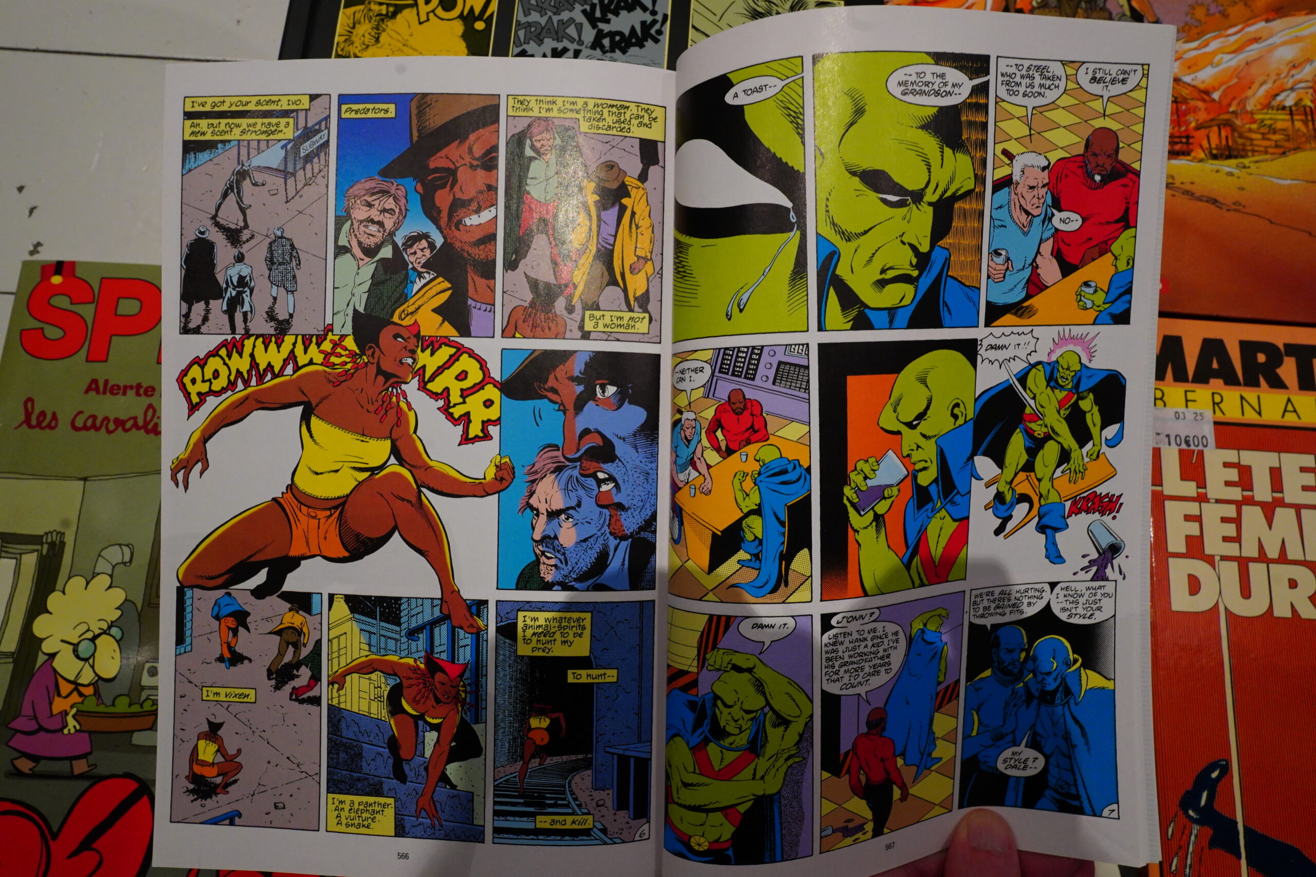
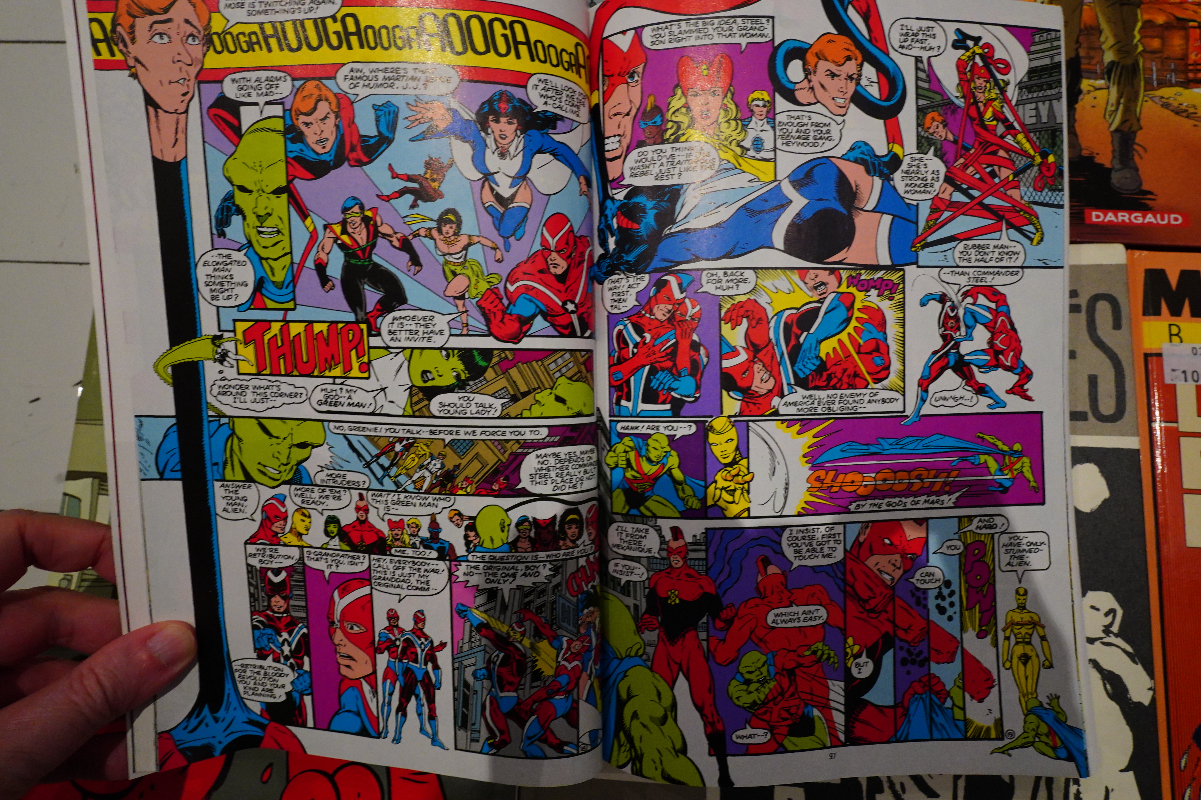
Like I said, DeMatteis took over at the end, and wrapped up Conway’s storylines over two issues, and then killed off two characters, and shut down the Justice League. The end!
I wonder what happened… Conway’s final issue had just him plotting, with somebody else doing the scripting, so he left in the middle of doing an issue, apparently. Since they cancelled the series shortly afterwards, I guess his run wasn’t a huge seller? Perhaps?
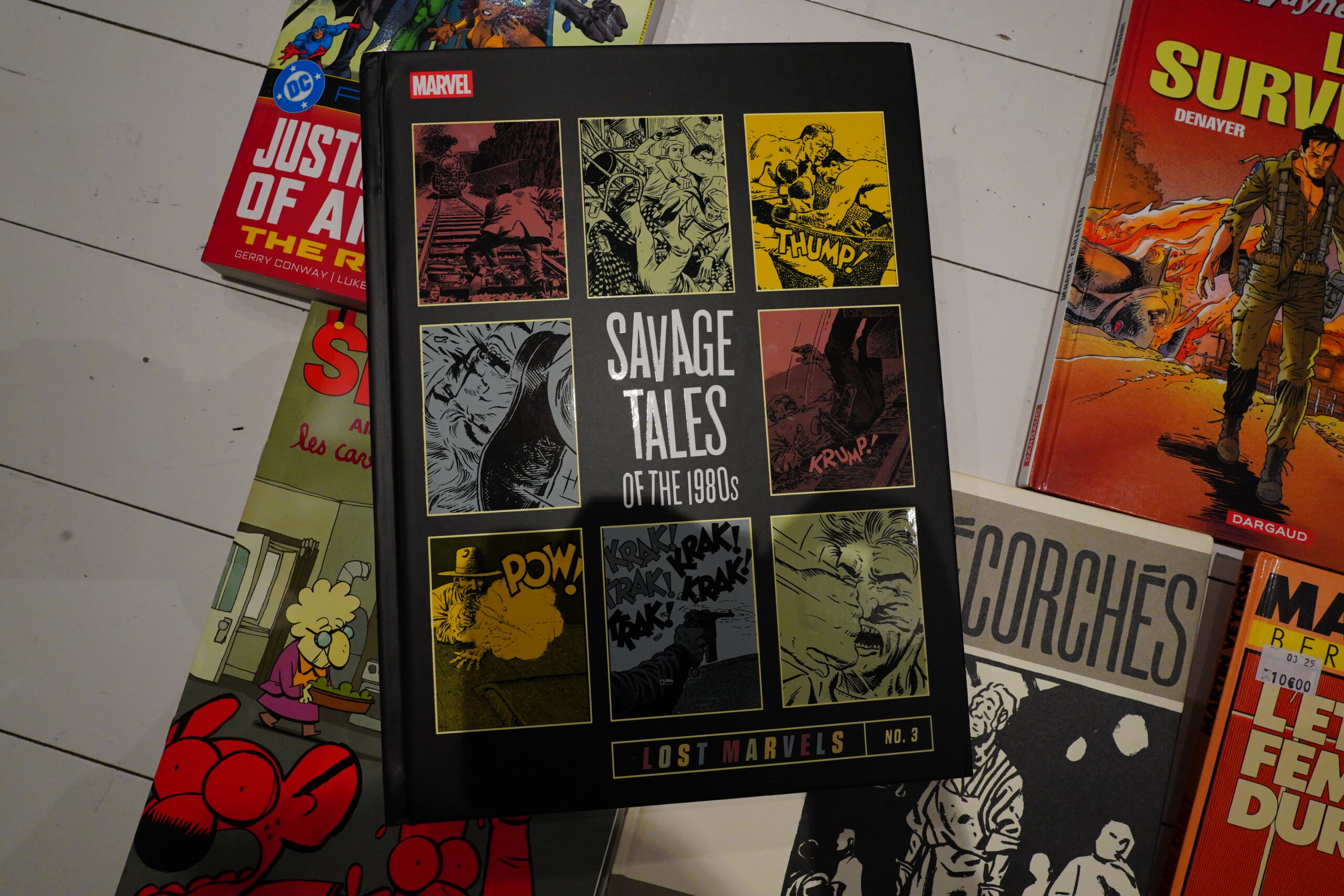
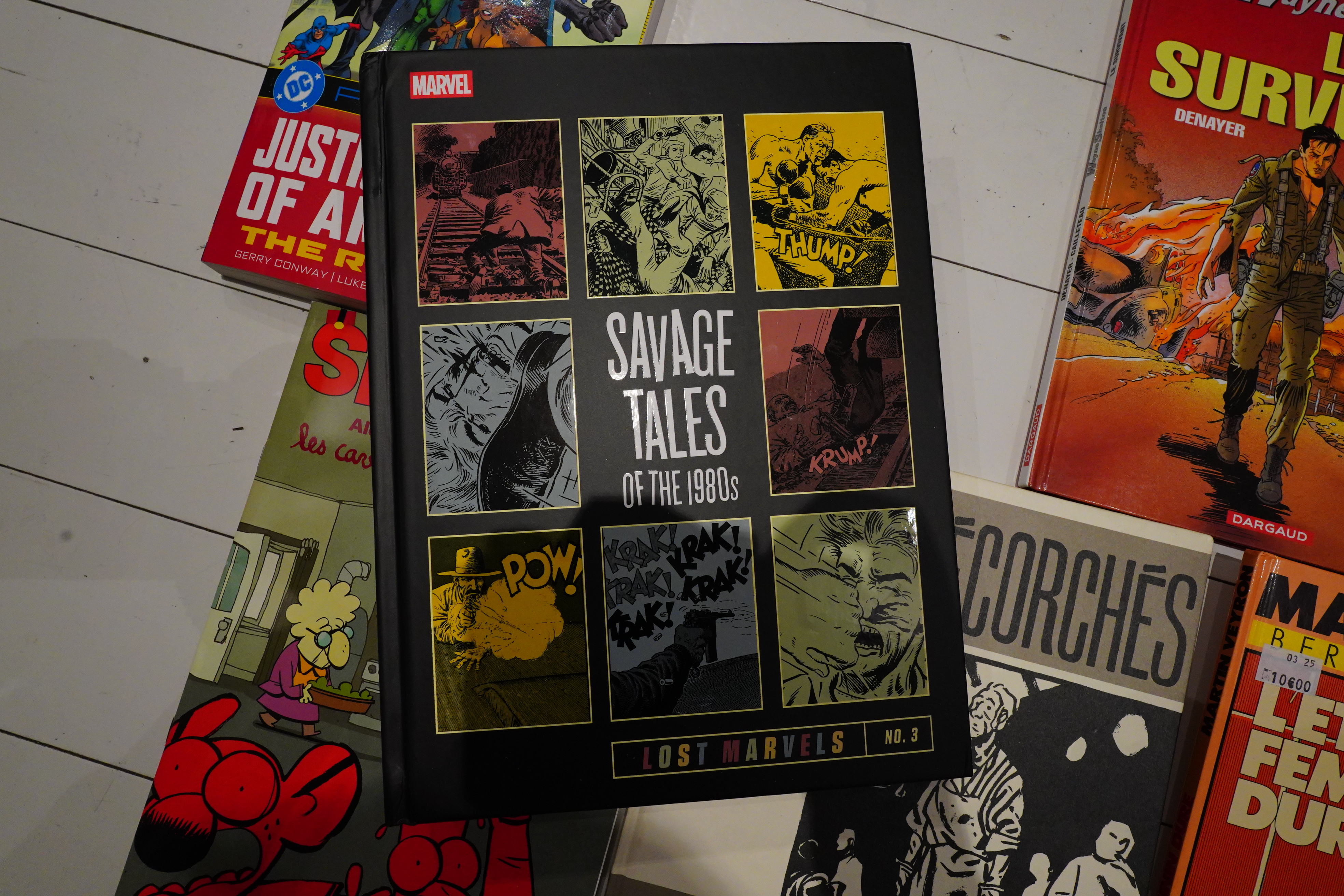
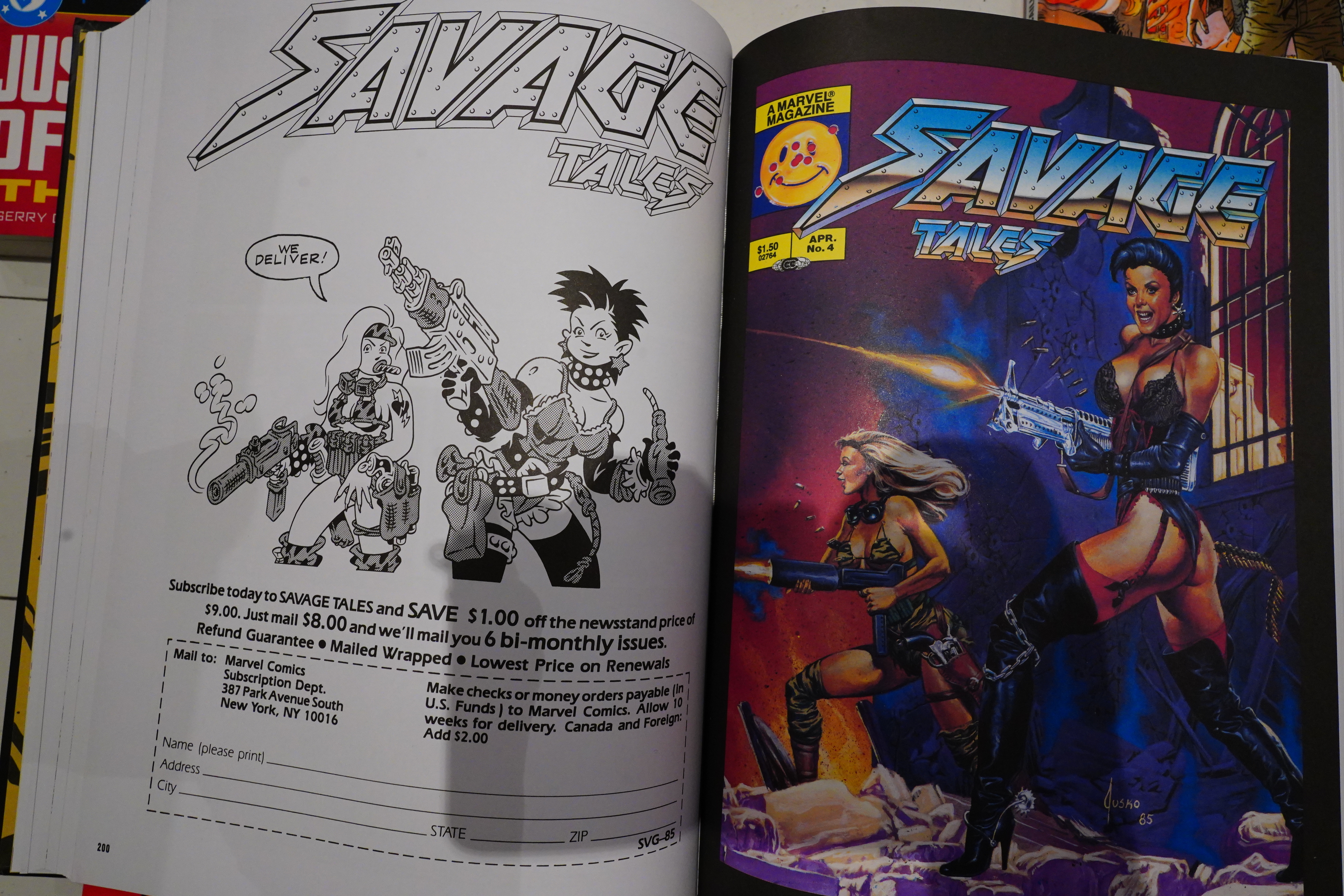
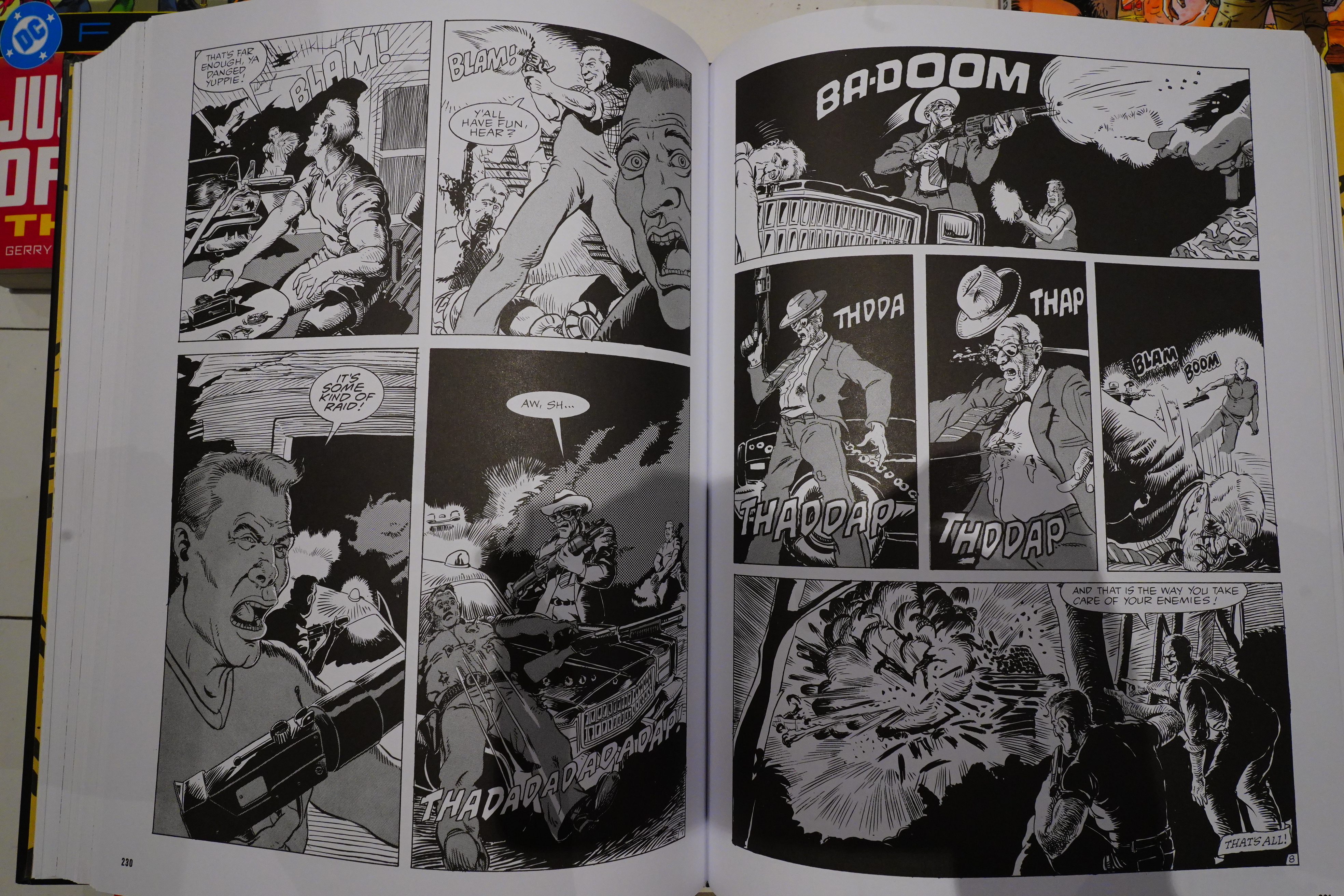
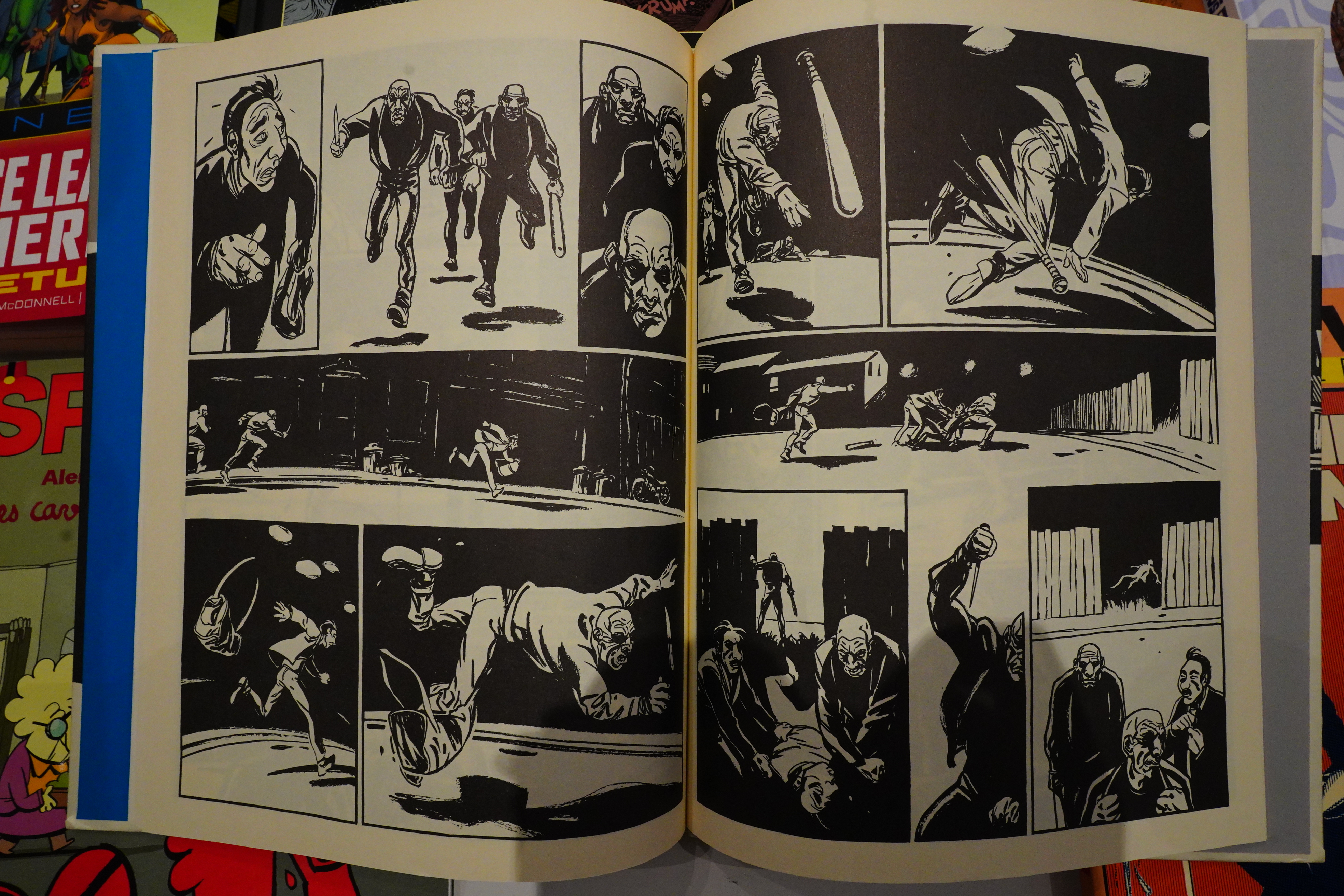
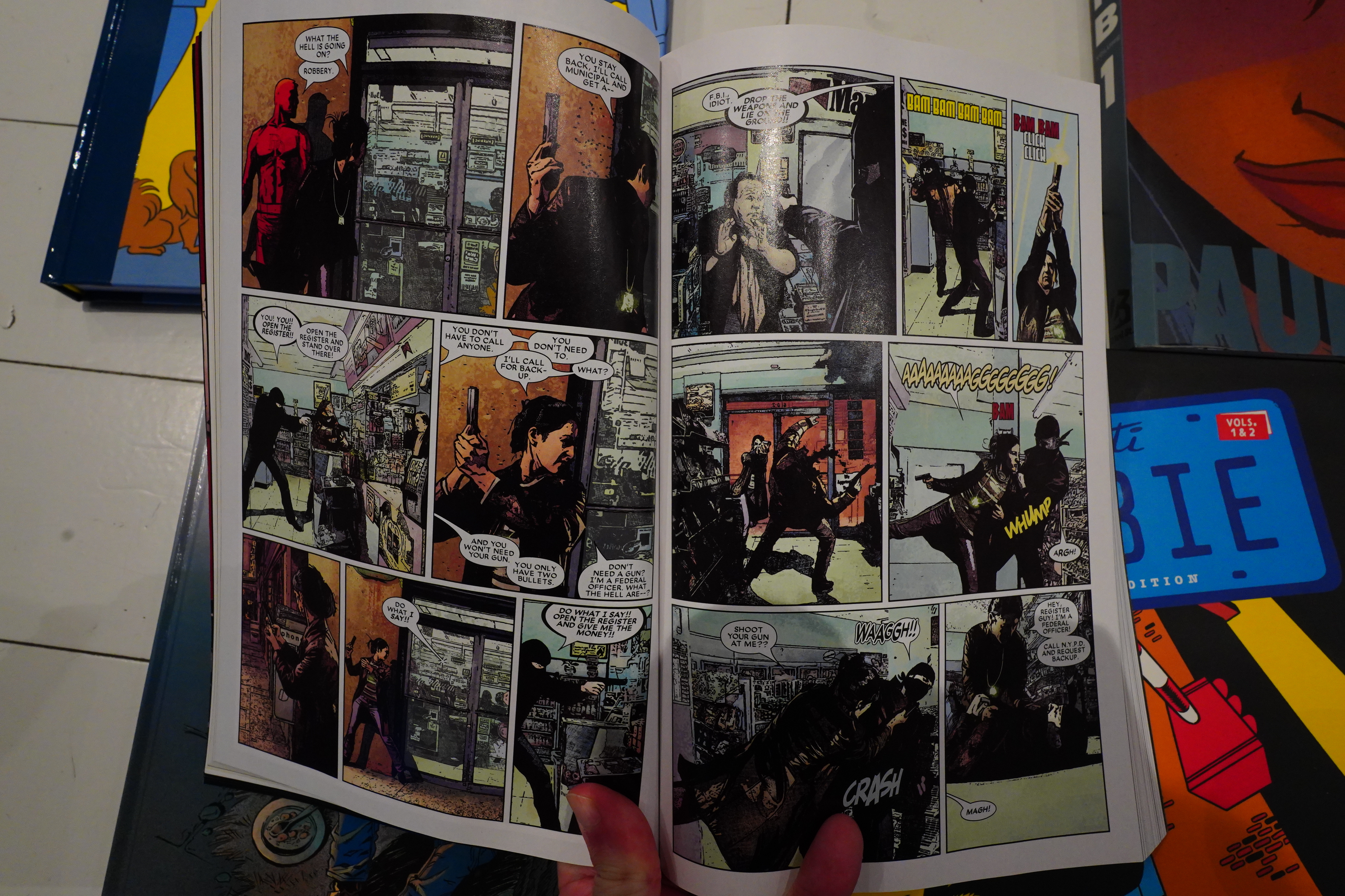
Speaking of “not a big seller”, here’s another “Lost Marvels” book from Fantagraphics. And this time around, it’s a whopper — this book is hefty.

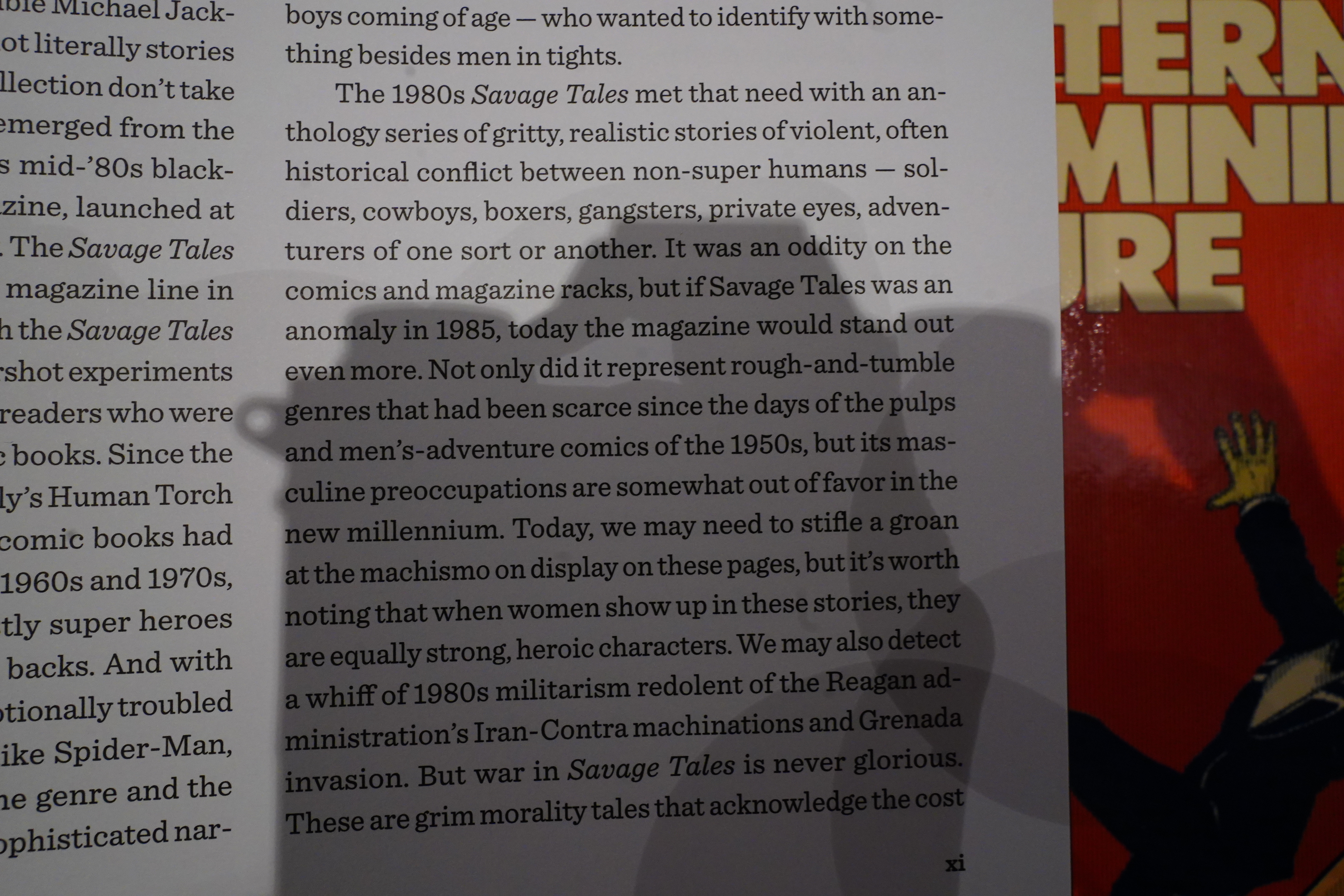
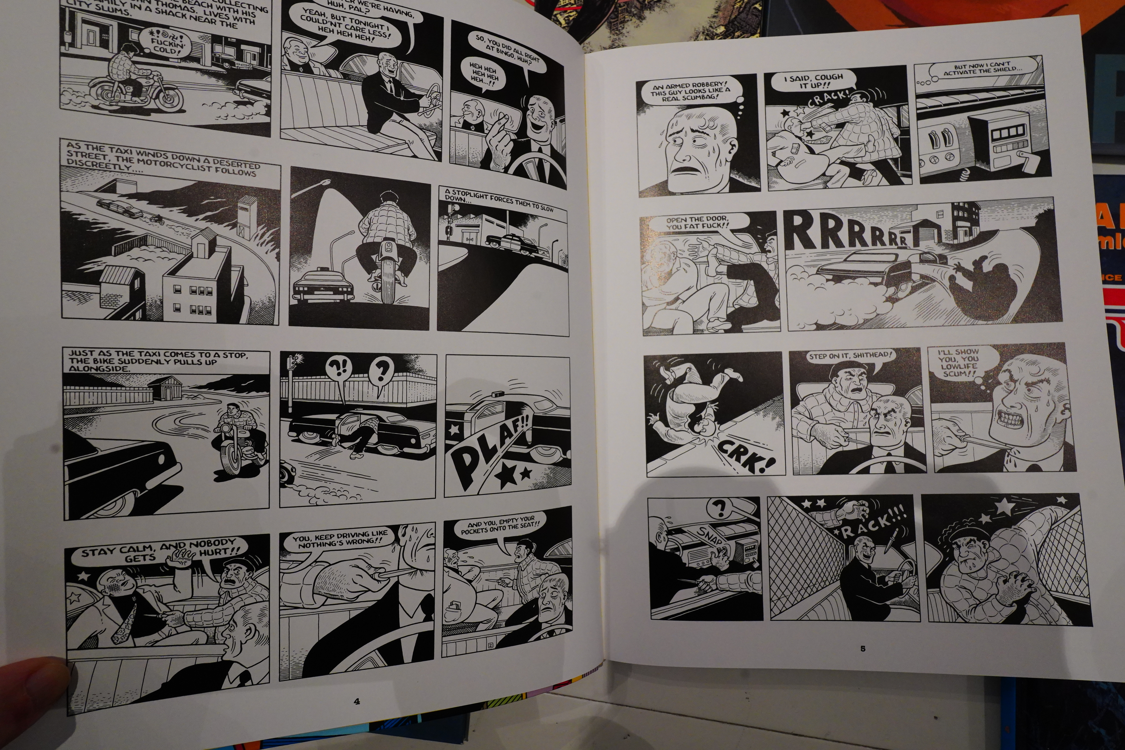
Michael Dean writes in the introduction that Savage Tales was “gritty, realistic”, and that we may “groan at the machismo”, and that it has a “whiff of 1980s militarism”… but of course, the women are just as kick ass, and the war isn’t glorified, oh no! Which makes me wonder whether he’s actually read the book, because as a letter writer said, “[t]o put it bluntly, I like blood and guts, and you put them right in the palm of my hand”.

Dean says that editor Larry Hama jokingly said that the audience was guys in the military and guys in prison… but I don’t think that was a joke.
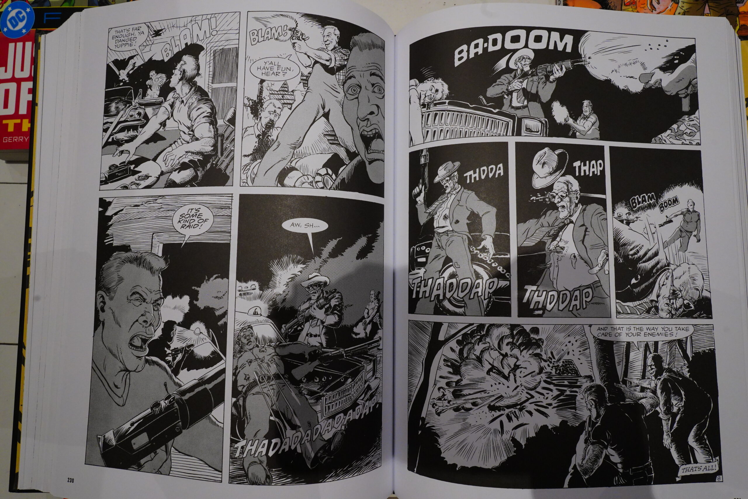
This book is almost all about how awesome violence is.
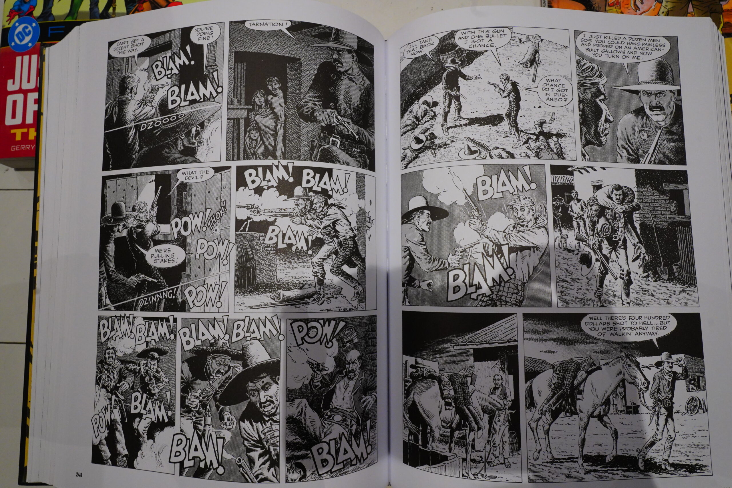
It’s almost all about awesome violence, and then some bits about how awesome the military is.
Sure, since this is an anthology with stories that are about ten pages long, and this book is almost 600 pages long, a couple of stories about other things is in here, too, but the majority are just about depicting violence. Which makes the book rather interesting — you avoid the trite O. Henry endings that have been done to death ever since EC Comics.
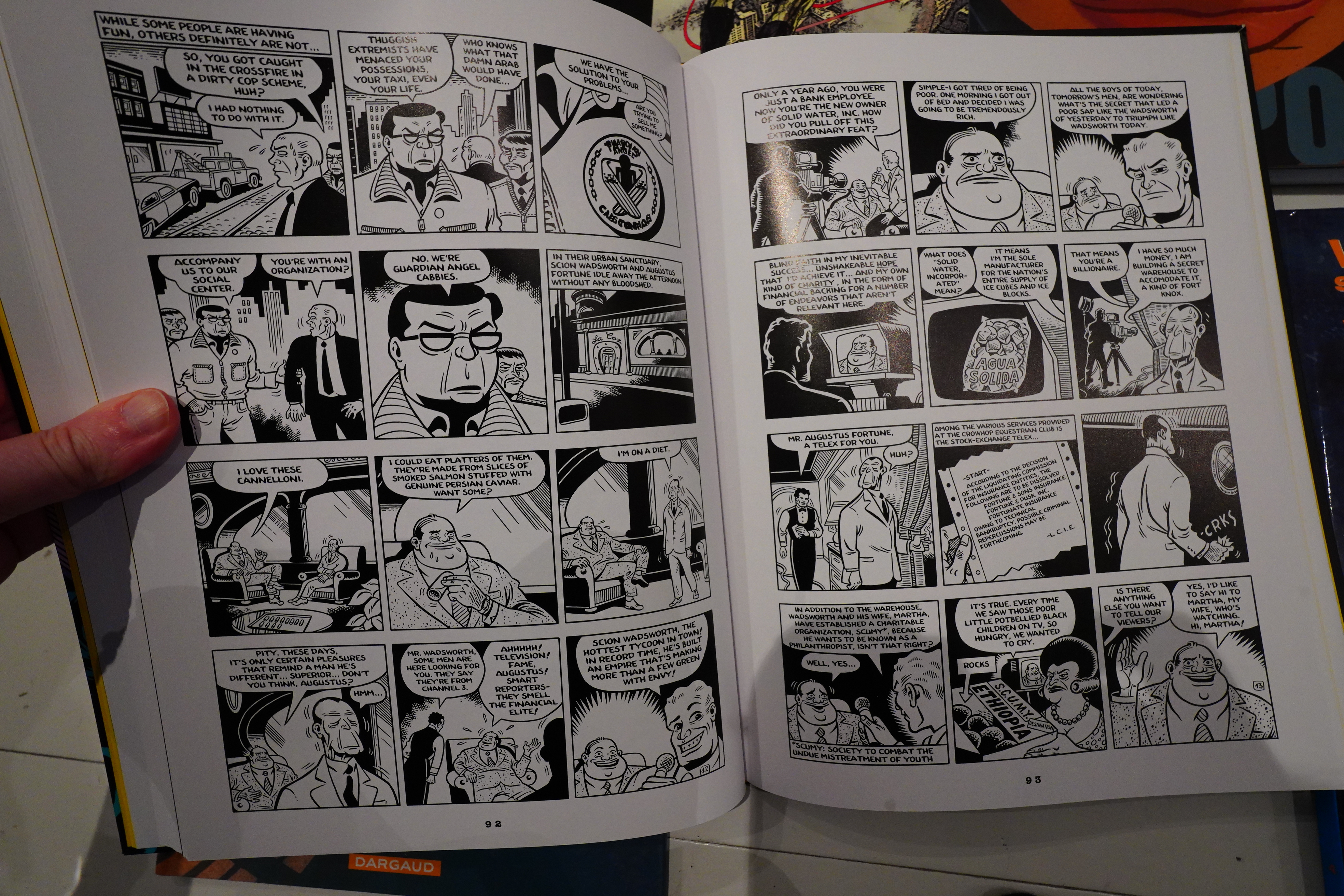
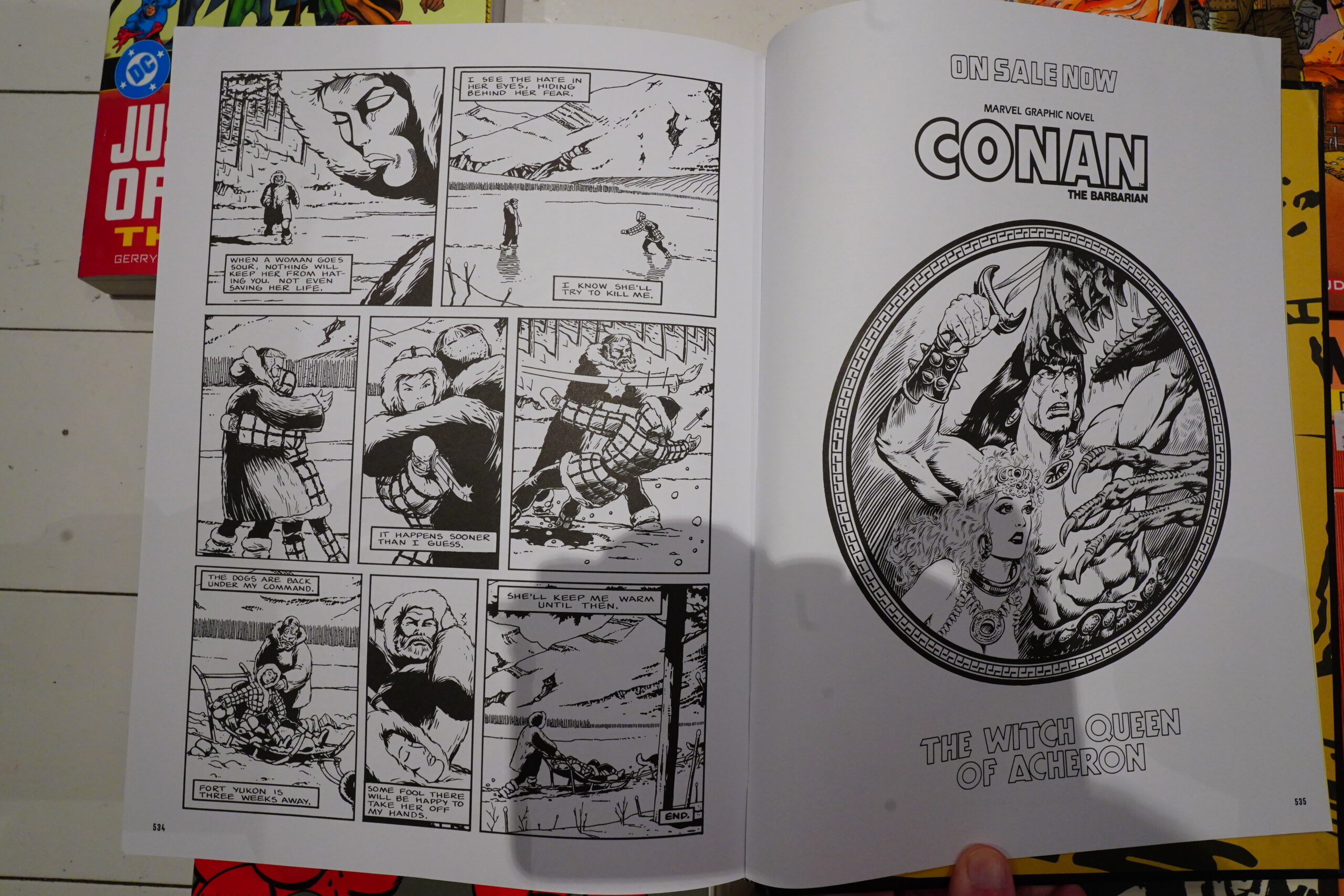
So while it’s an interesting book, about a quarter is basically unreadable (as a writer, Herb Trimpe makes a good artist), a fifth is pretty good, and the rest is… there. Story wise. But there’s a lot of really good artwork in here, if you’re into this sort of stuff.
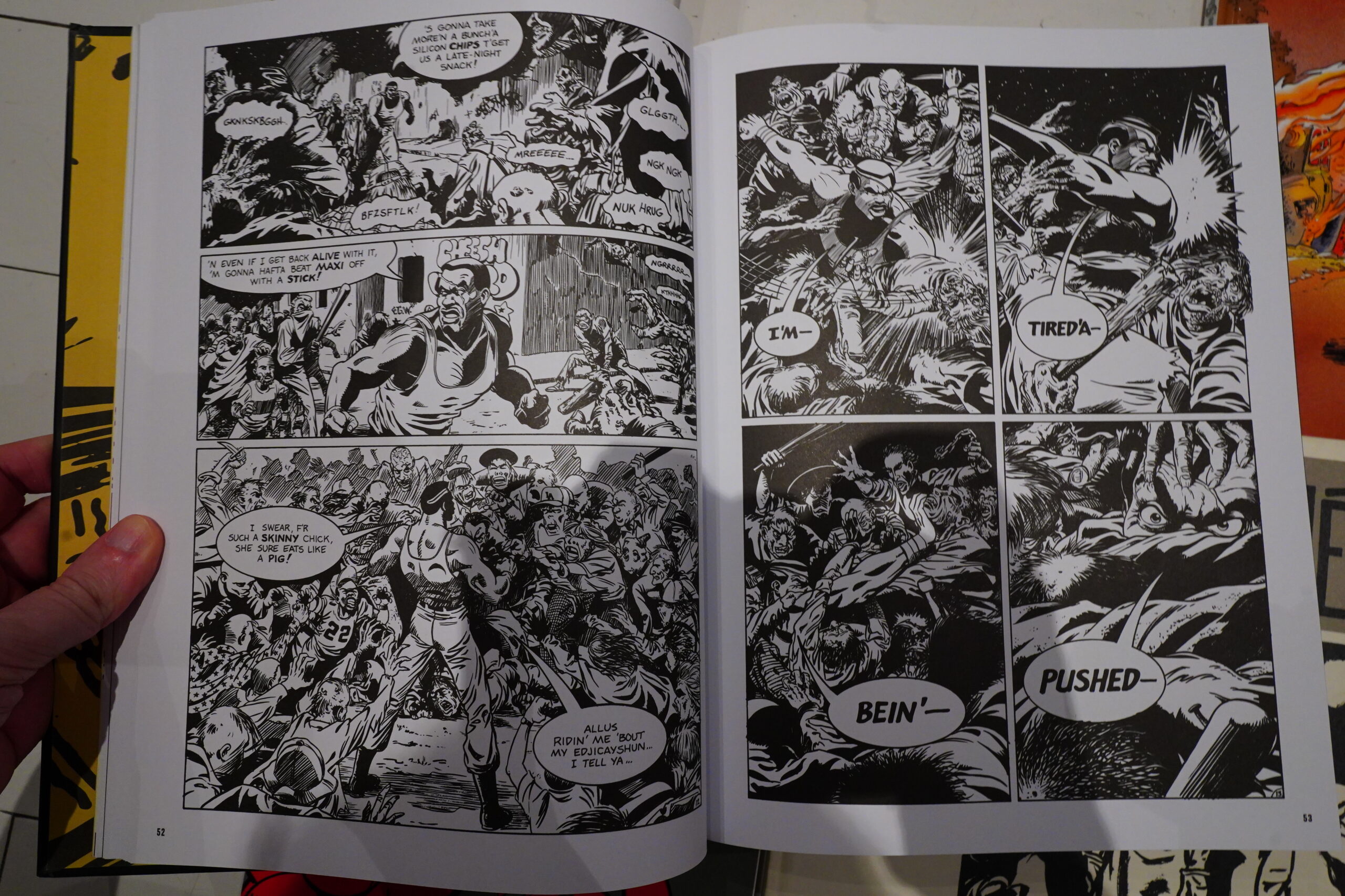
Will Jungkunz’s serial stood out as something different — he went more for humour. (He died before finishing the series.)
Hama says that when the magazine was cancelled, they managed to use up all the stuff they had as inventory in the final issue, and… you can perhaps sense that they’d sat on the above story for a while.
Again, the only explanation I can find for Dean’s introduction is that he didn’t actually read the magazine — is that one of those strong, heroic women characters he was talking about?
I don’t know what you’d call the phenomenon exemplified by the introduction — “humane-washing?” “Booshwa-splaining?”
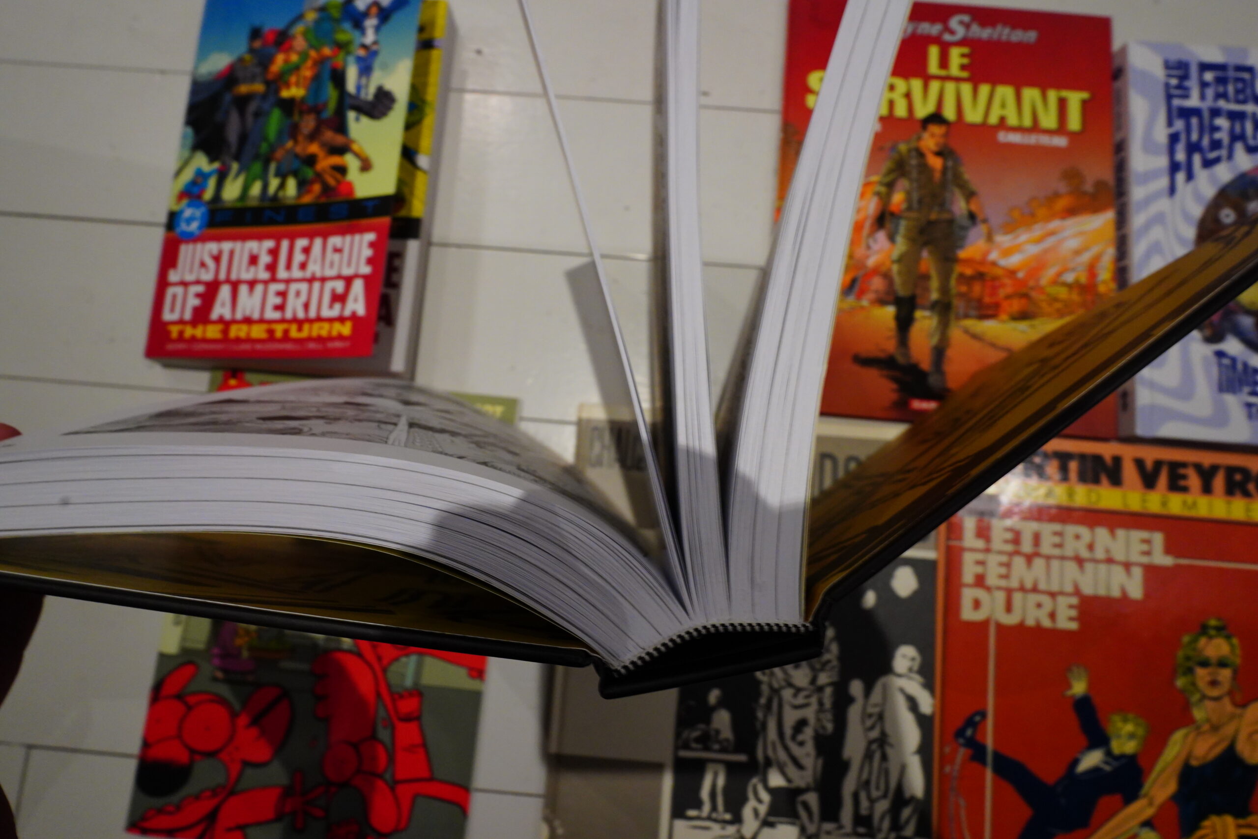
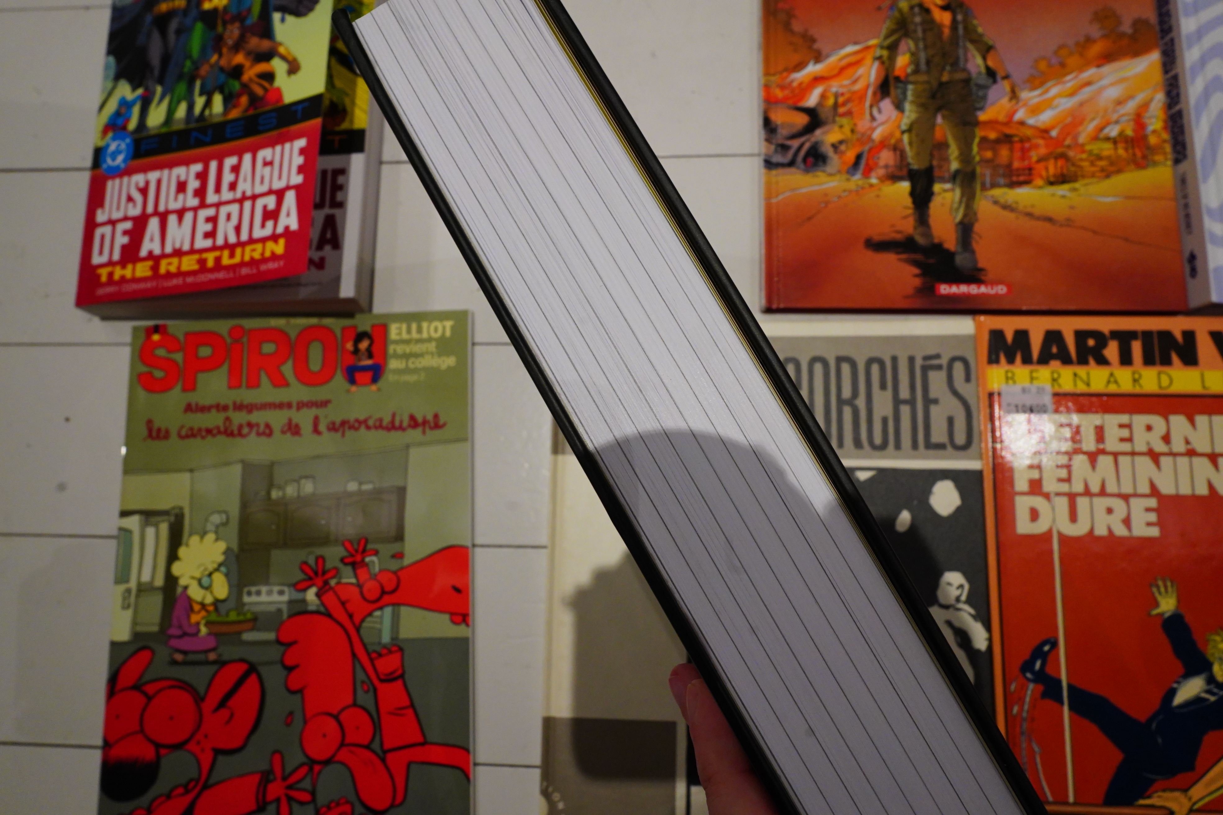
But! The quality of the physical book! Man! It’s perfect. It’s printed on thick, white, matte paper, and the reproduction of the artwork is just about perfect. There’s, like, no annoyances — the binding is even done so that the book stays open without you having to exert yourself.
And the issues are clearly marked so that you can find the issue you’re looking for by just looking at the side of the book.
If somebody wants to reprint some magazines, just give them a copy of this and say “do it like this”. Total class.
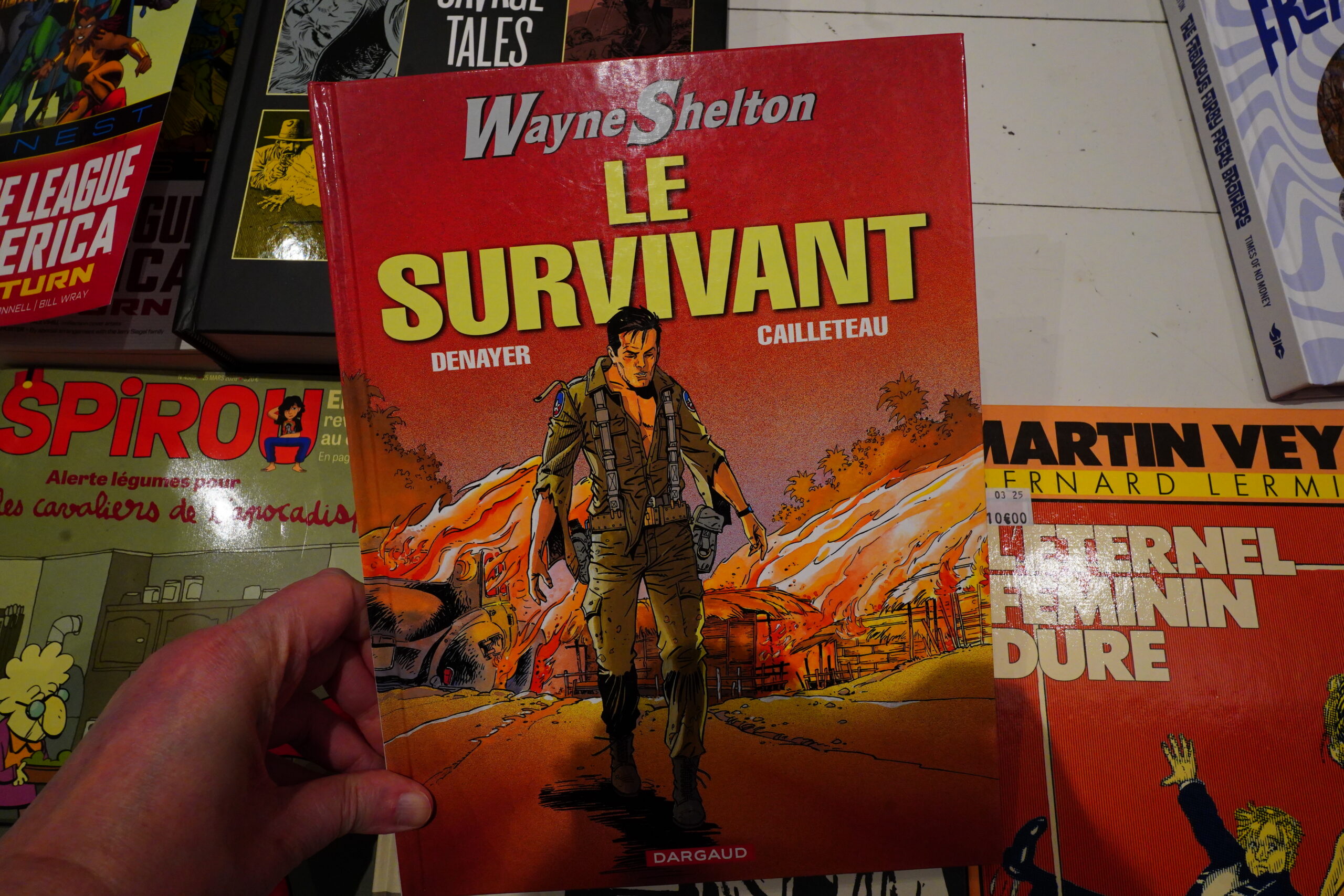
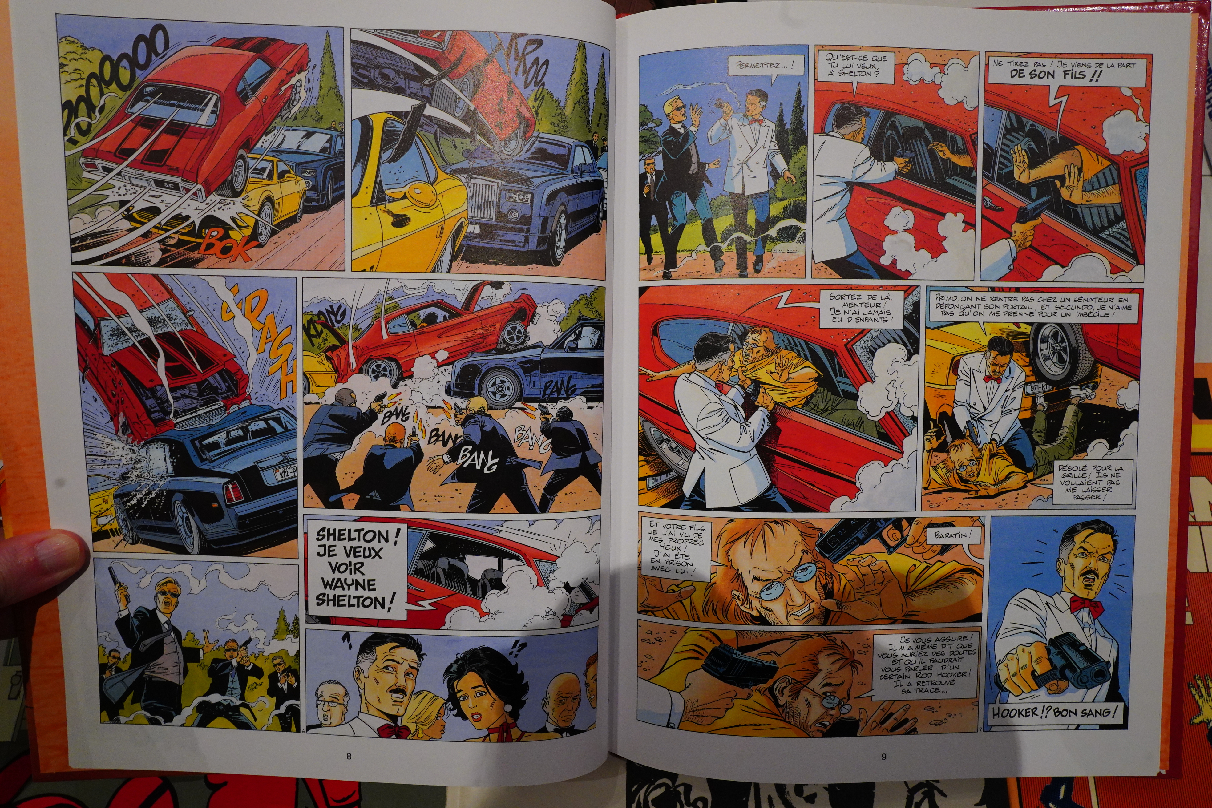
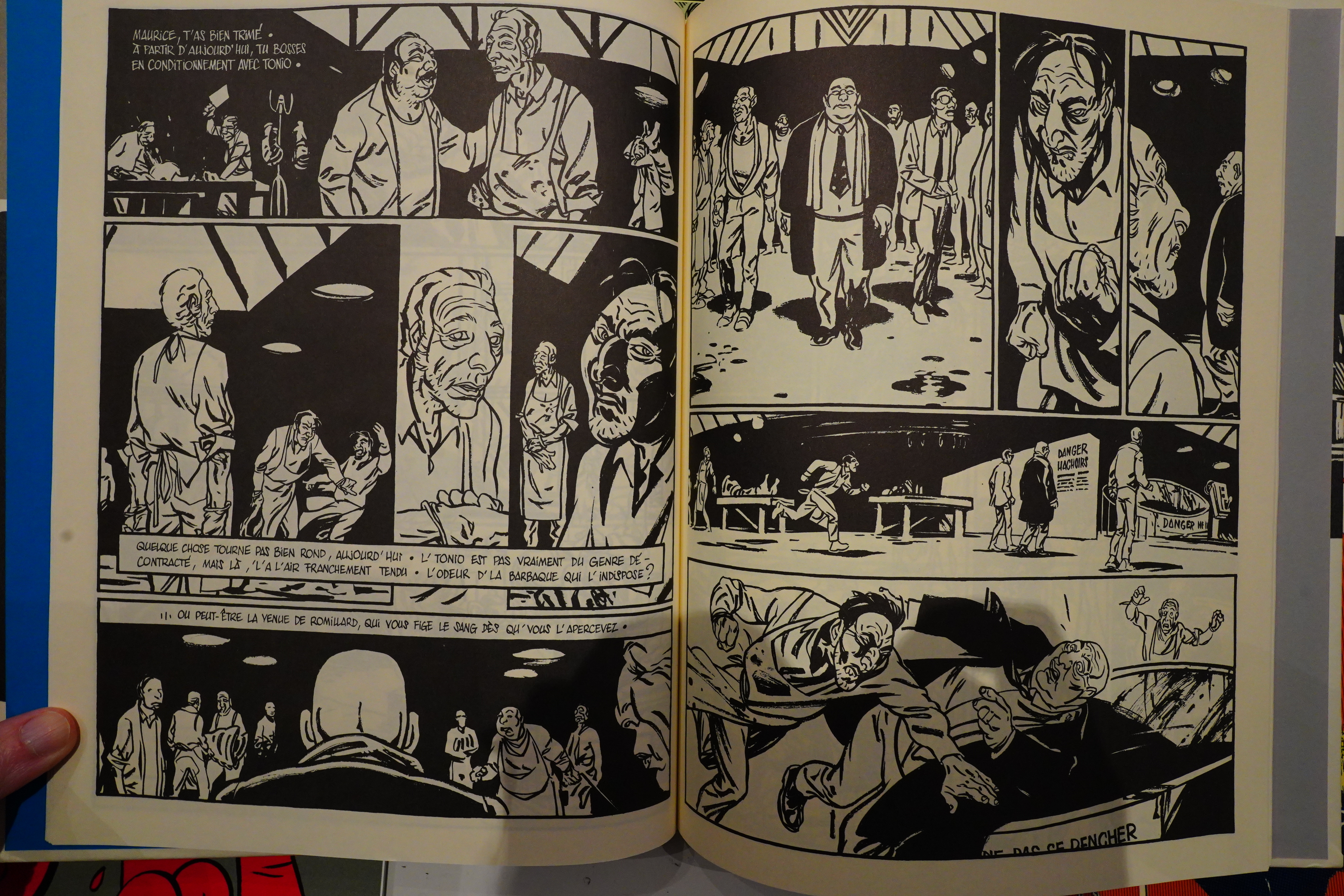
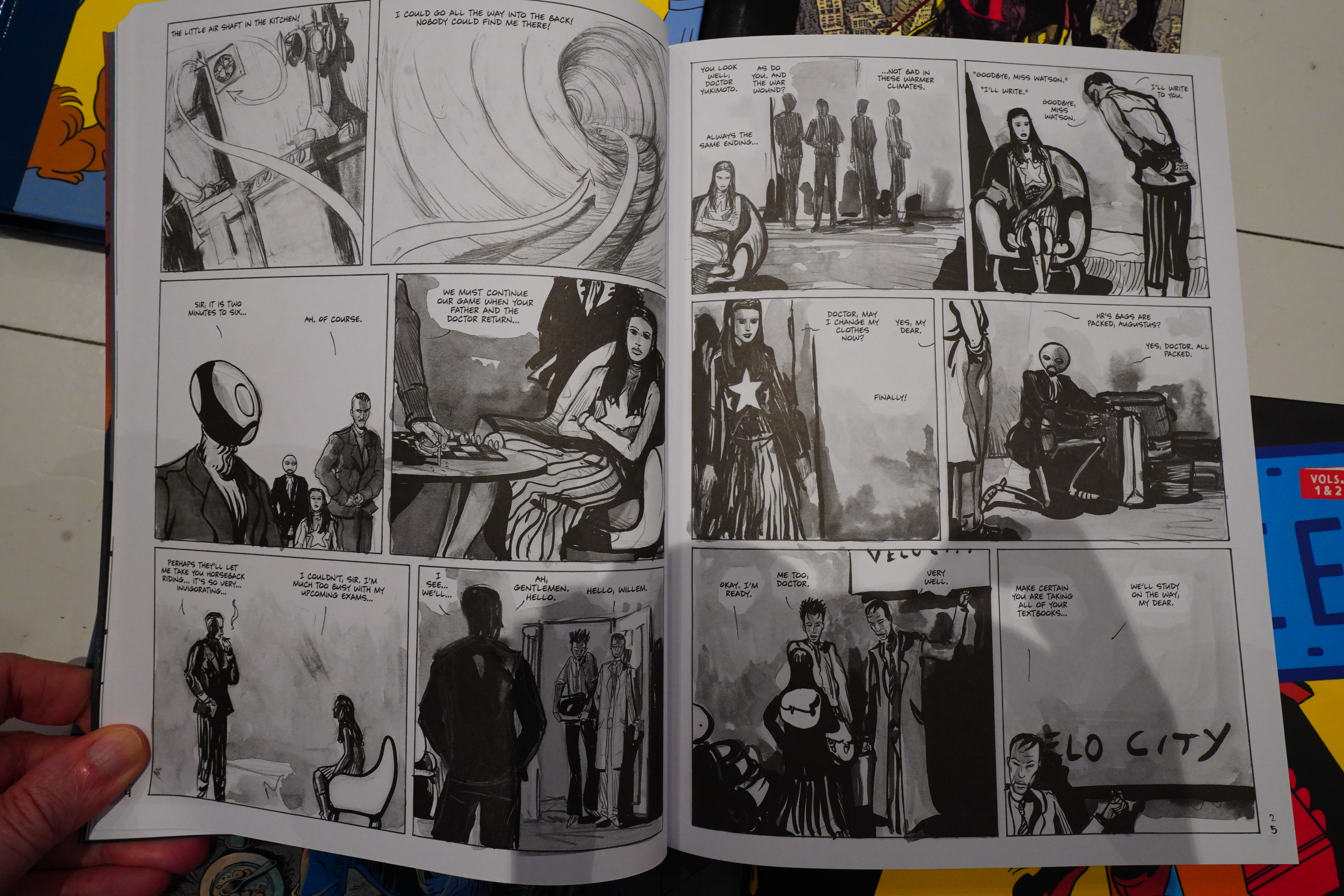
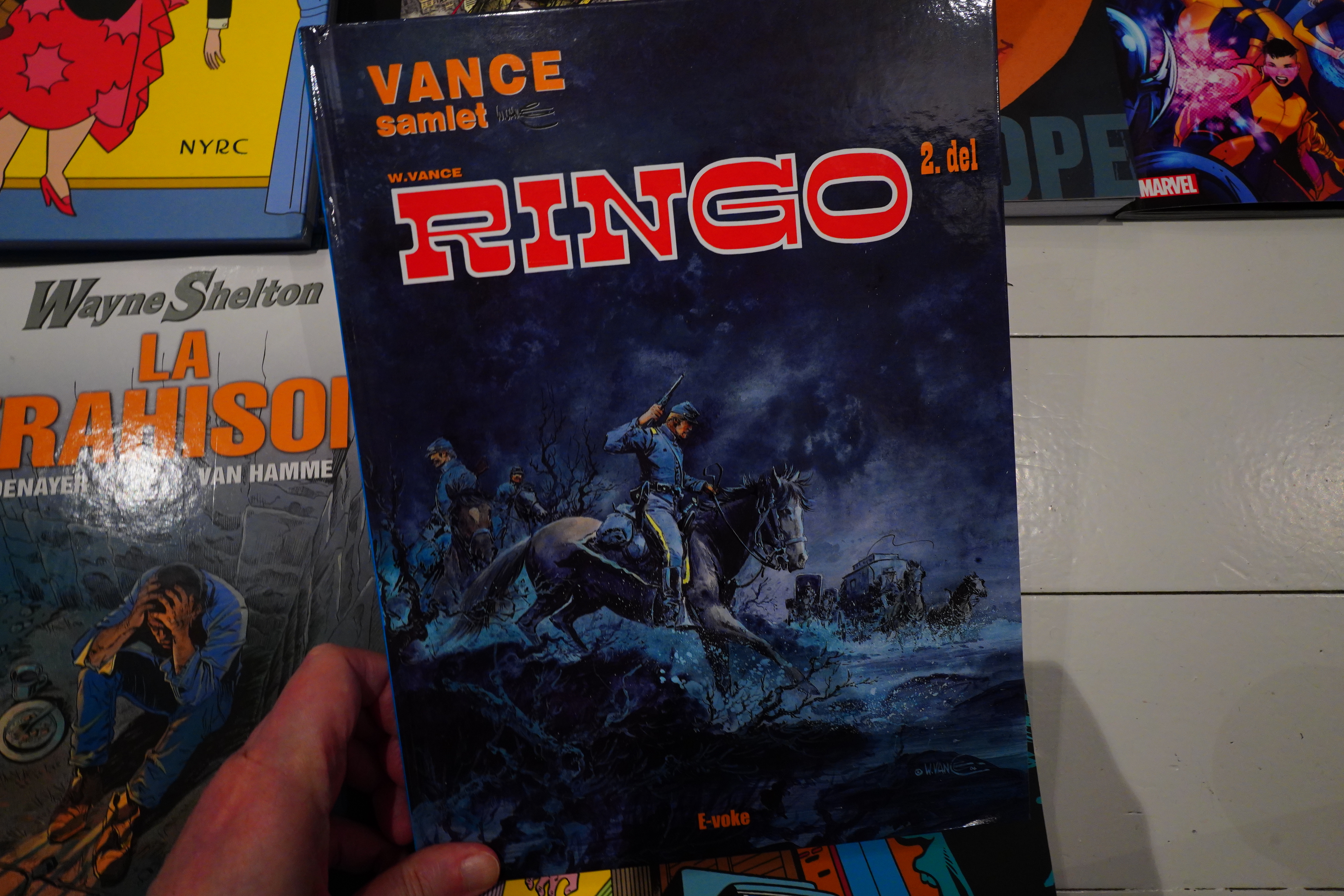
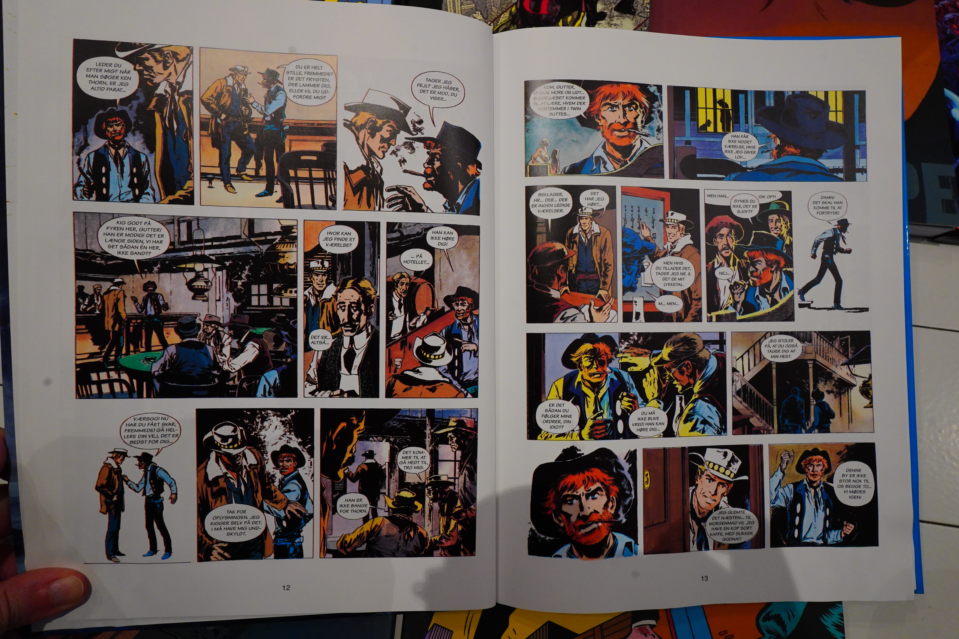
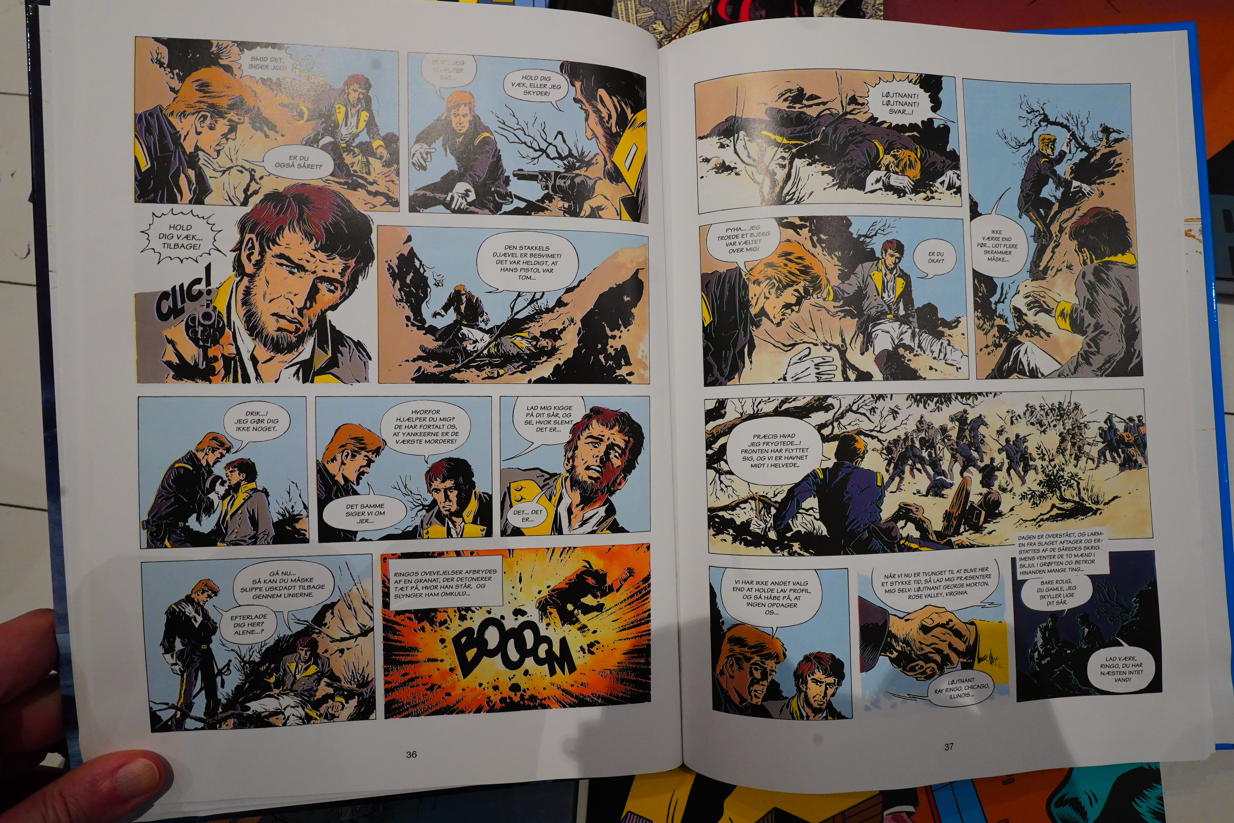
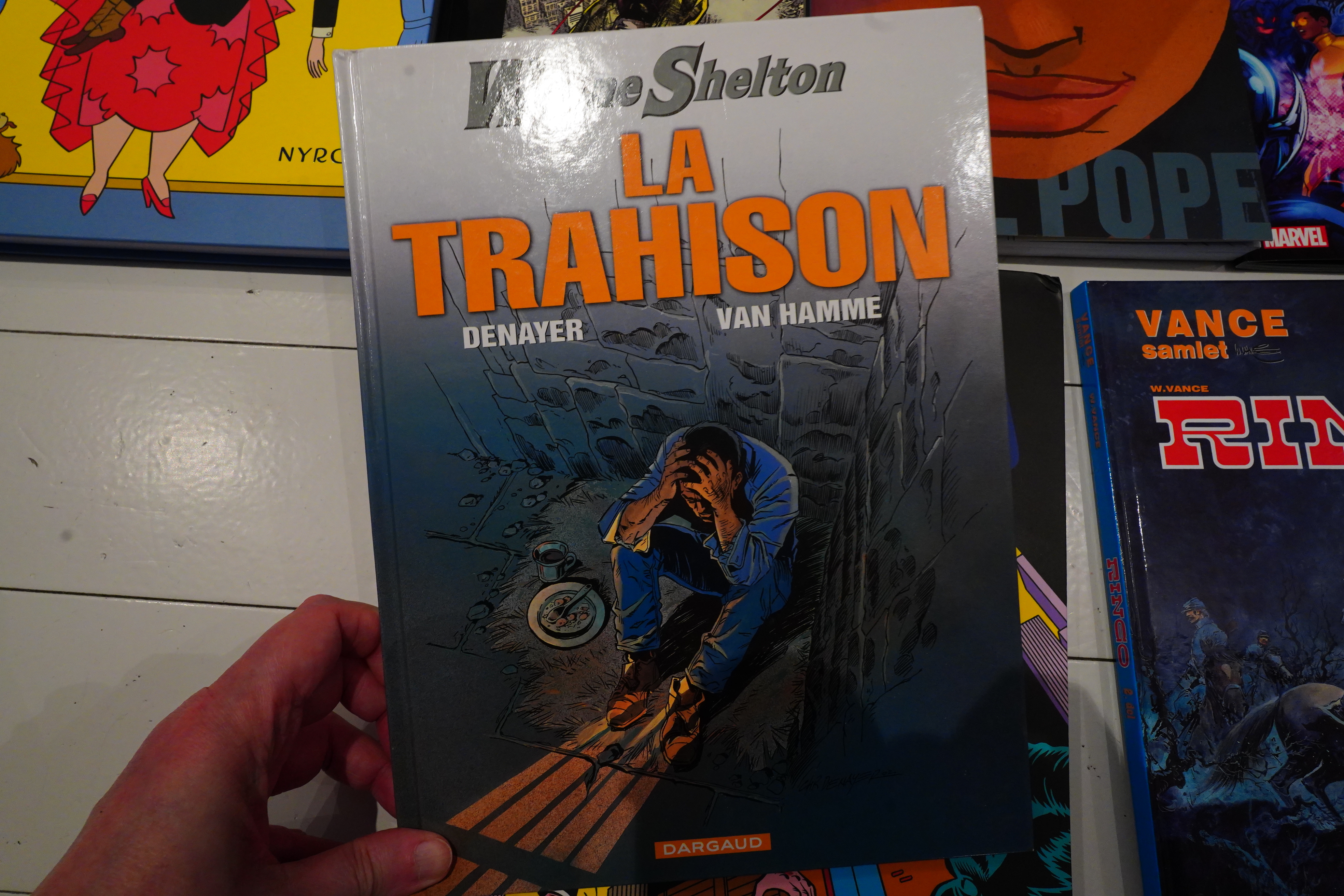
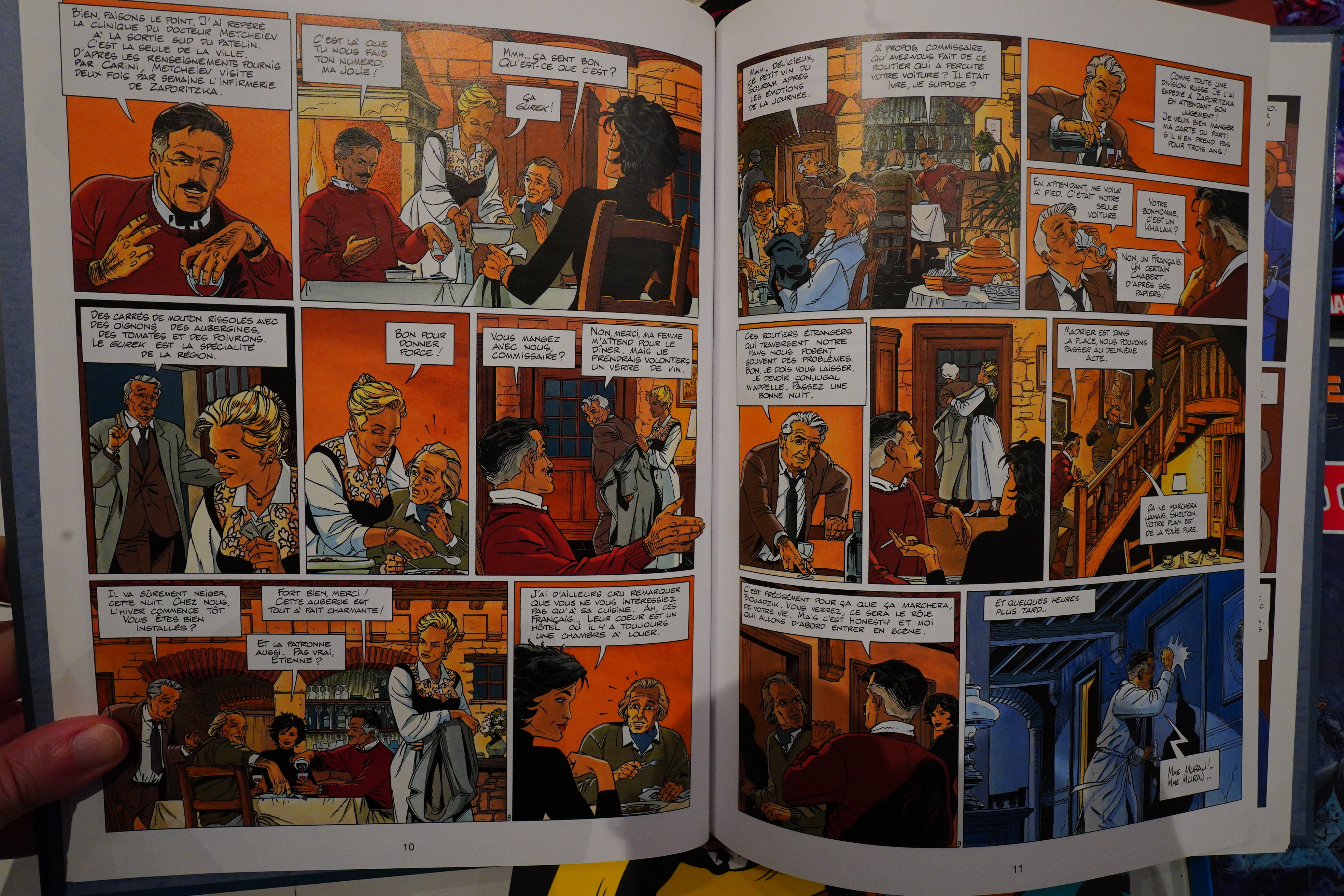
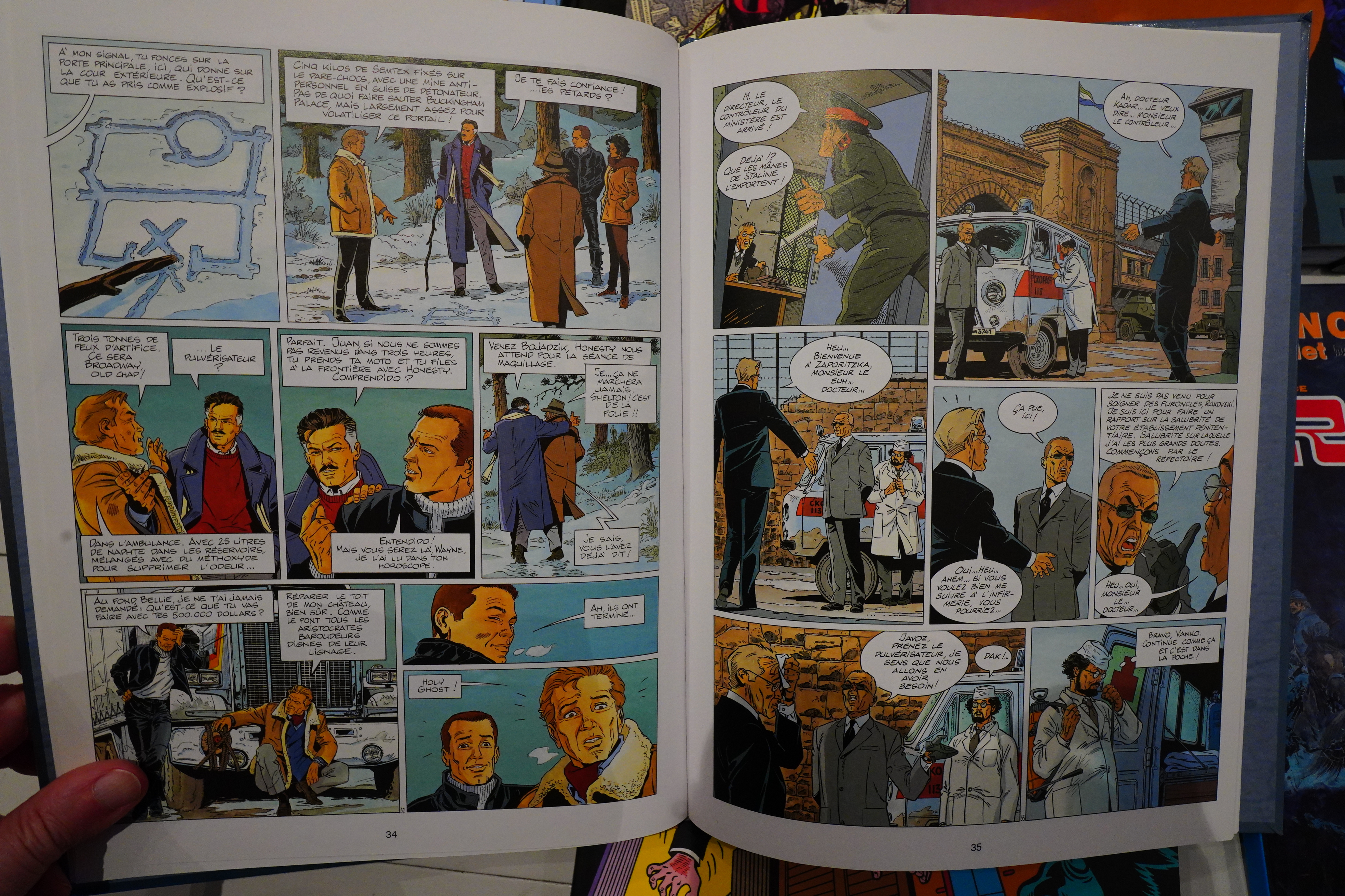
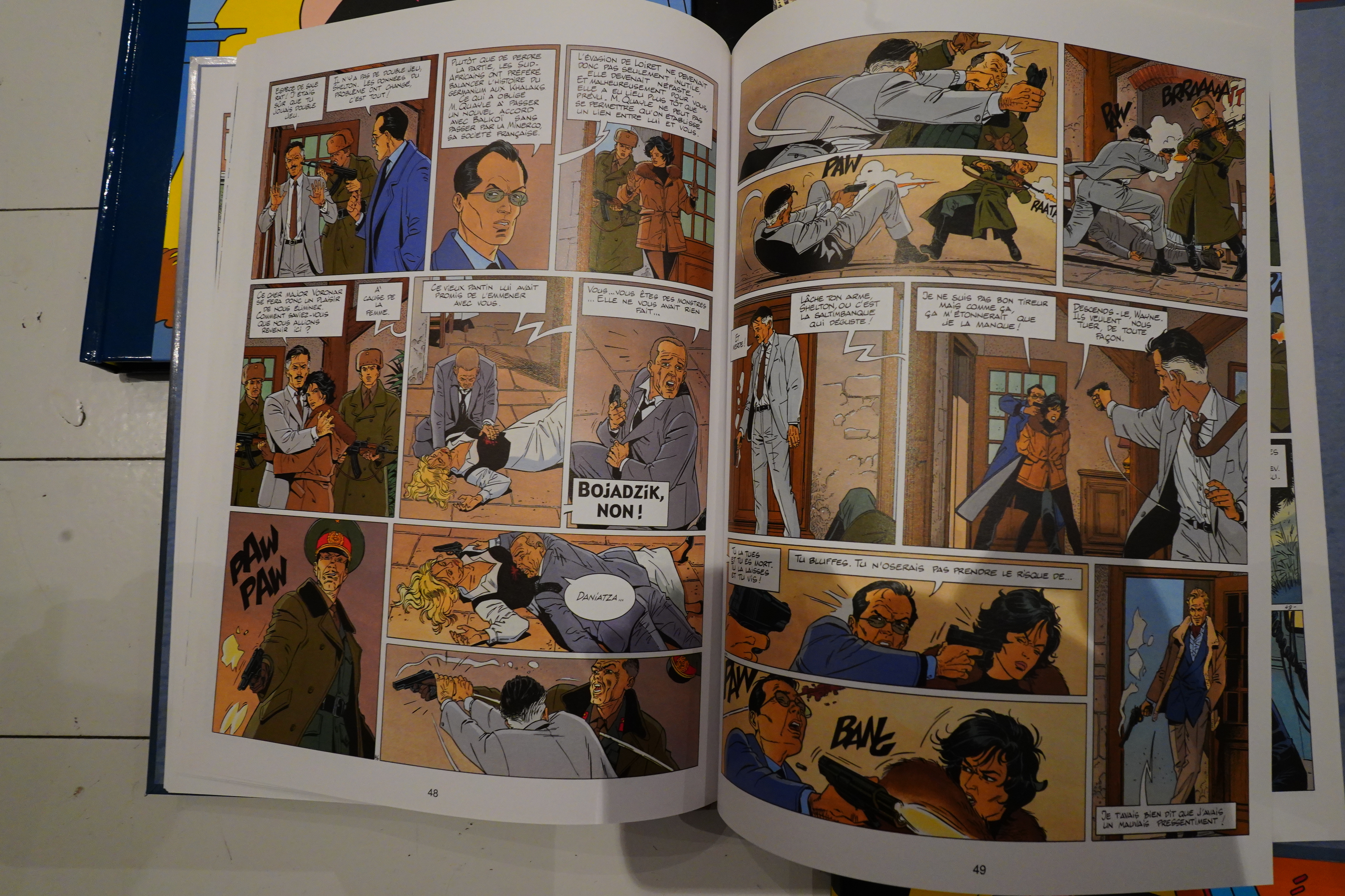
This is an early-80s French action book.
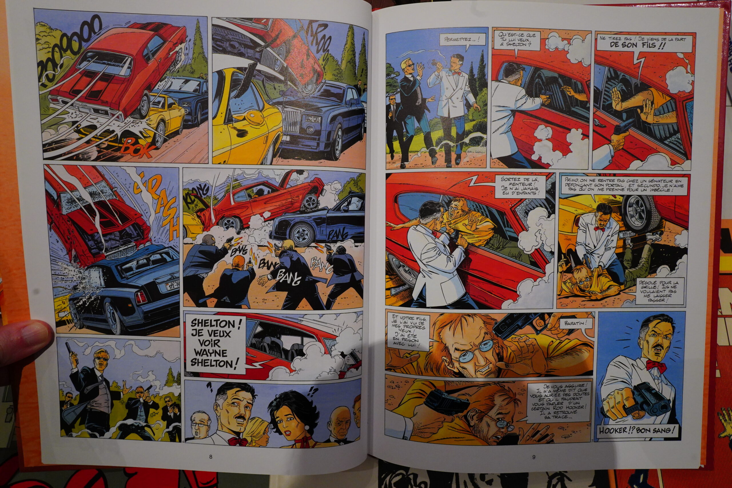
Previous albums were written by Van Hamme, but this one is better.
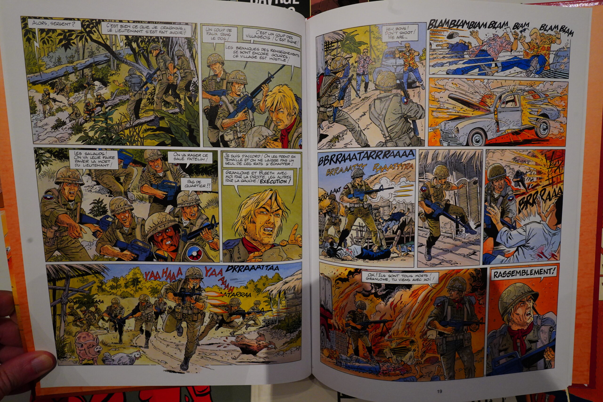
I mean, it’s standard fare, but it’s well done.
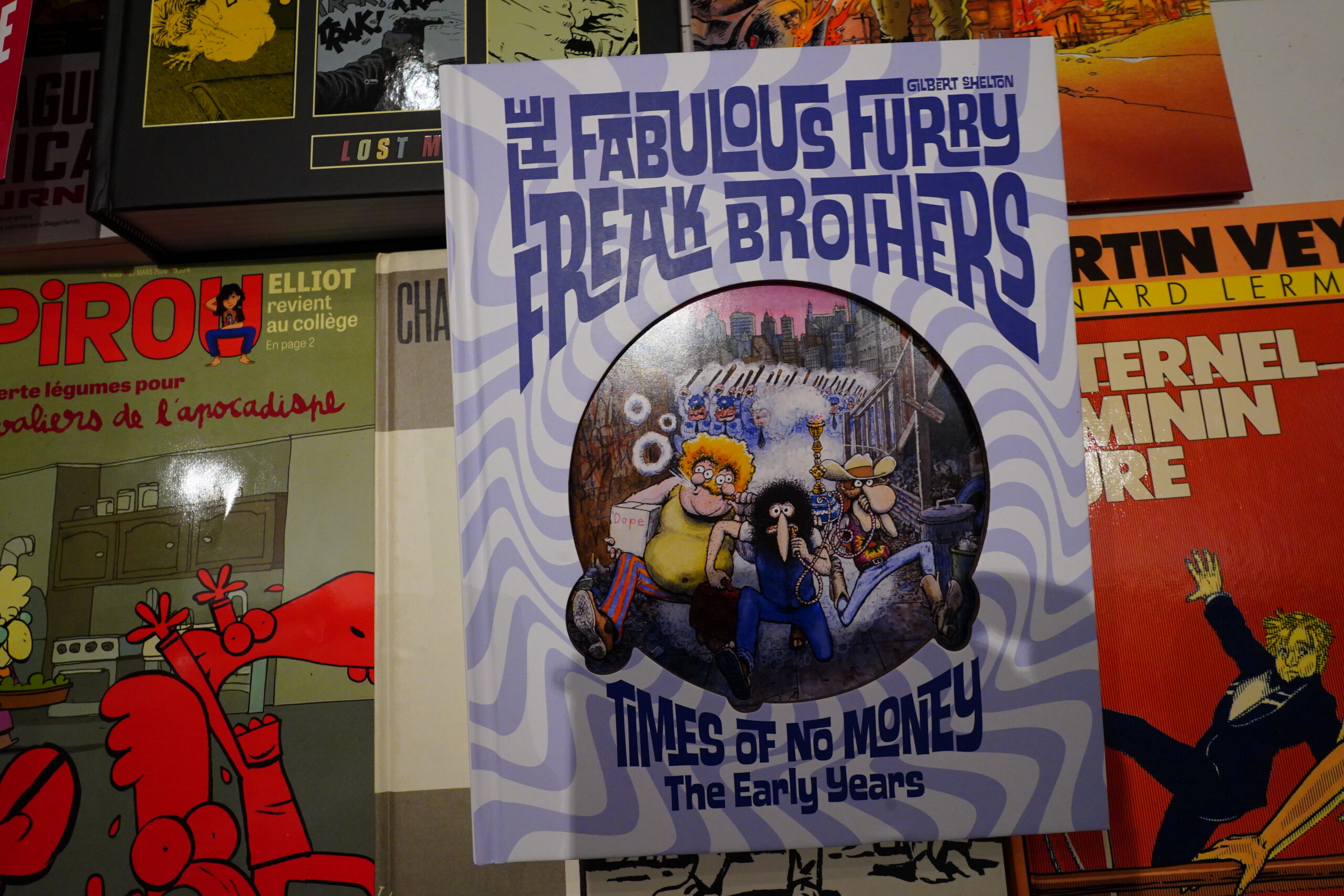
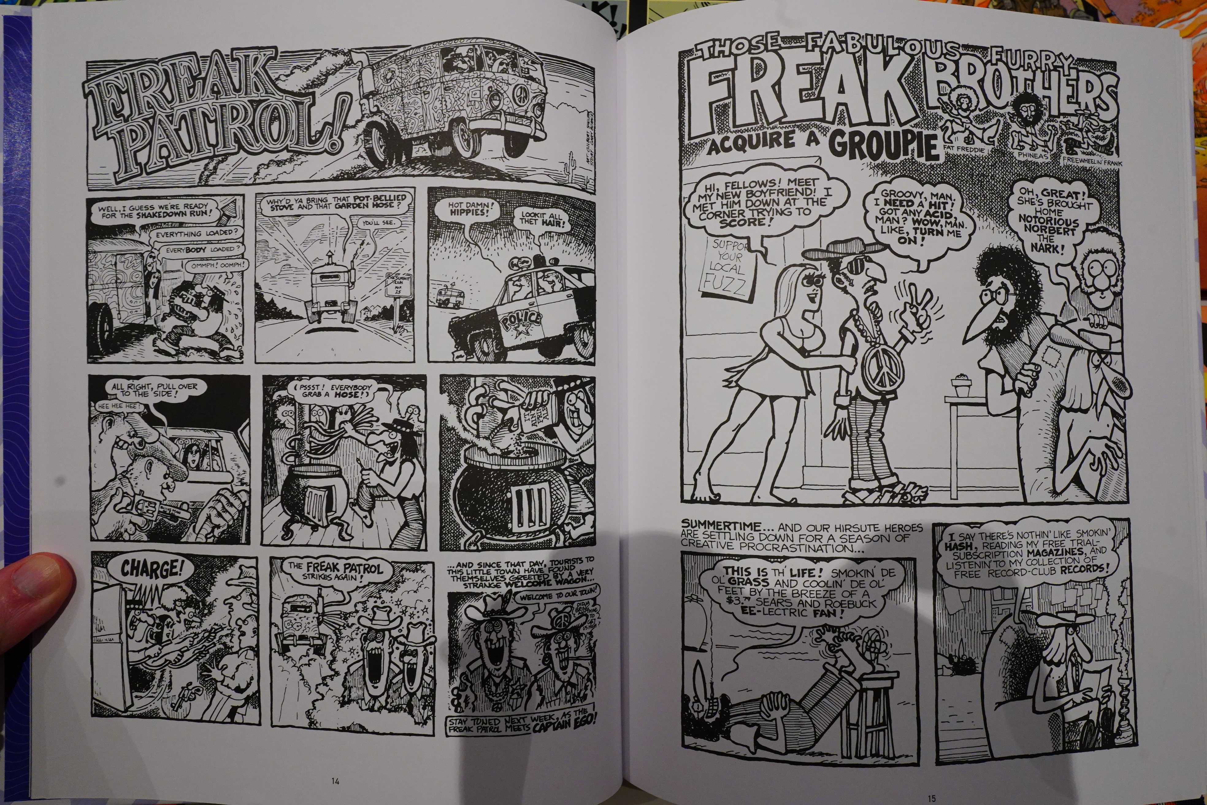
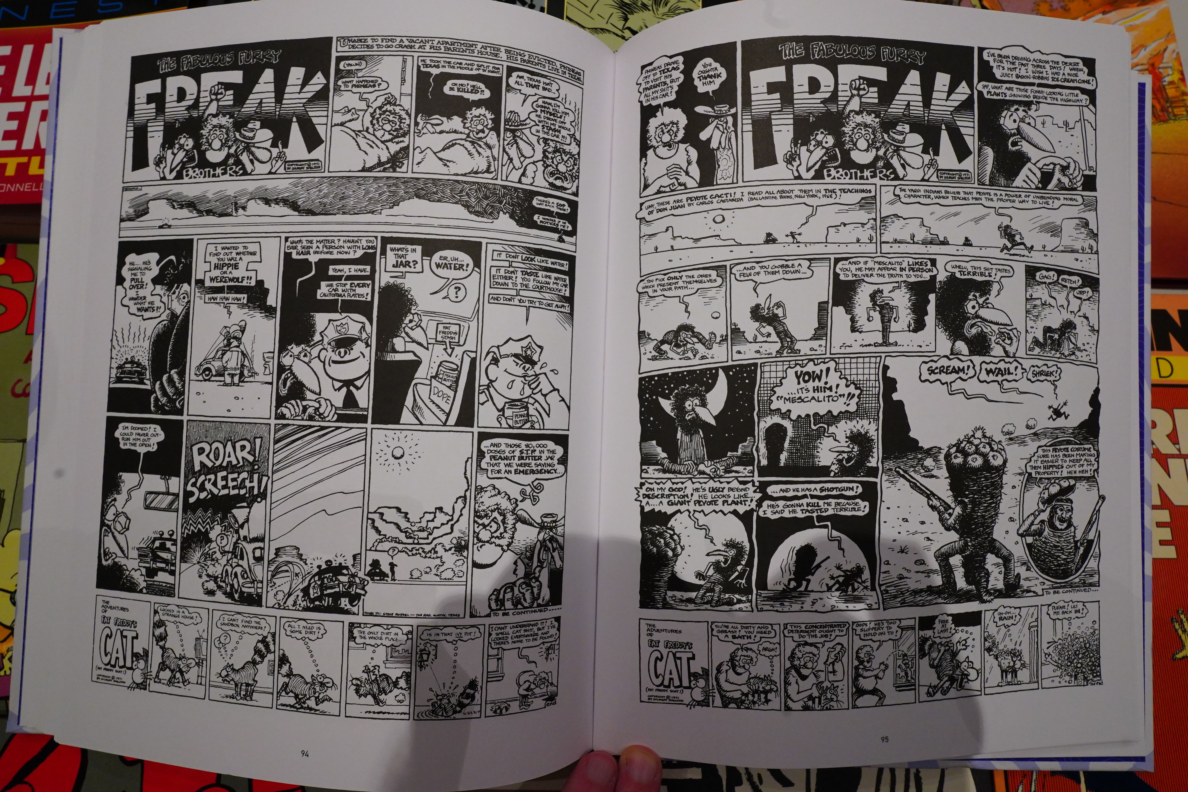
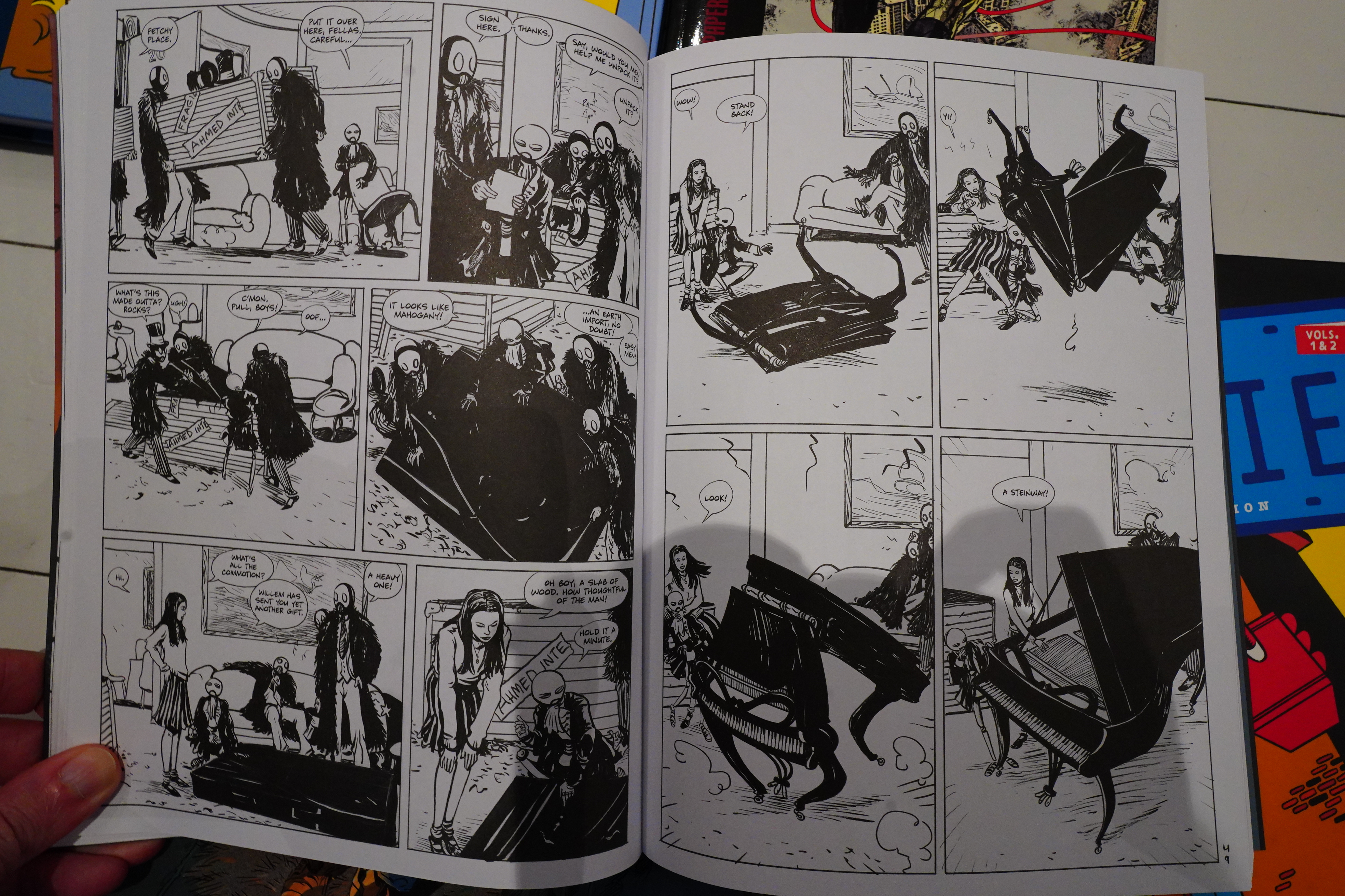
I have read most Freak Brothers stuff before, and many times, but I’ve been buying these collections anyway.
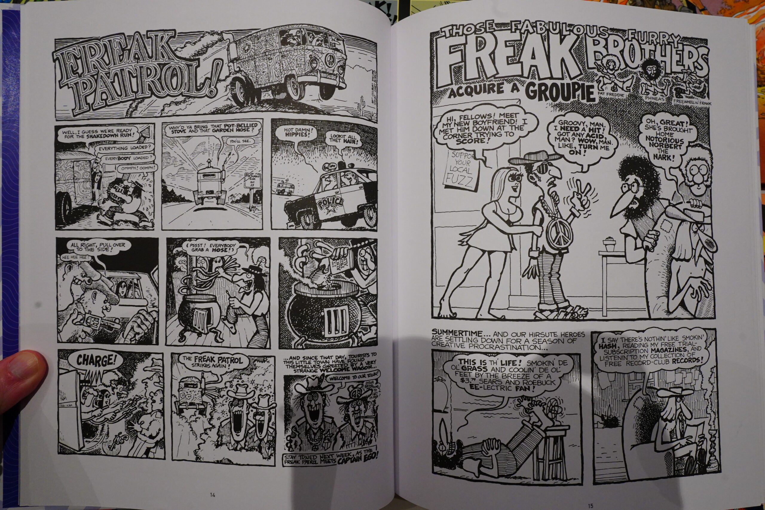
This is, I guess, the final collection? But it’s chronologically the first, which makes sense — the earlier collections collected later, longer epic stories, while this is early stuff, and mostly single page gags.
Which is fine, but it’s a bit wearying reading these one after another… I mean, I really like these strips — Gilbert Sheldon really has something very appealing going on here.
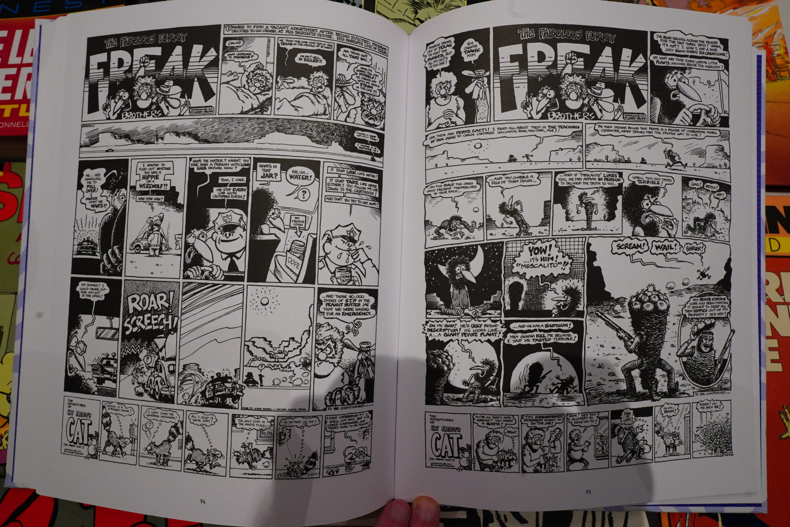
This edition, though, it’s… well, it’s a compromise, isn’t it? Some of this material was published in magazines, and some as comic strips, and some in newspapers, which means that it was originally printed in many different sizes. This book is smaller than magazine size, which means that (among other pieces), the one long storyline is printed much smaller than it originally was, which makes it a bit hard to read sometimes.
But… still a very pleasant way to spend an evening.
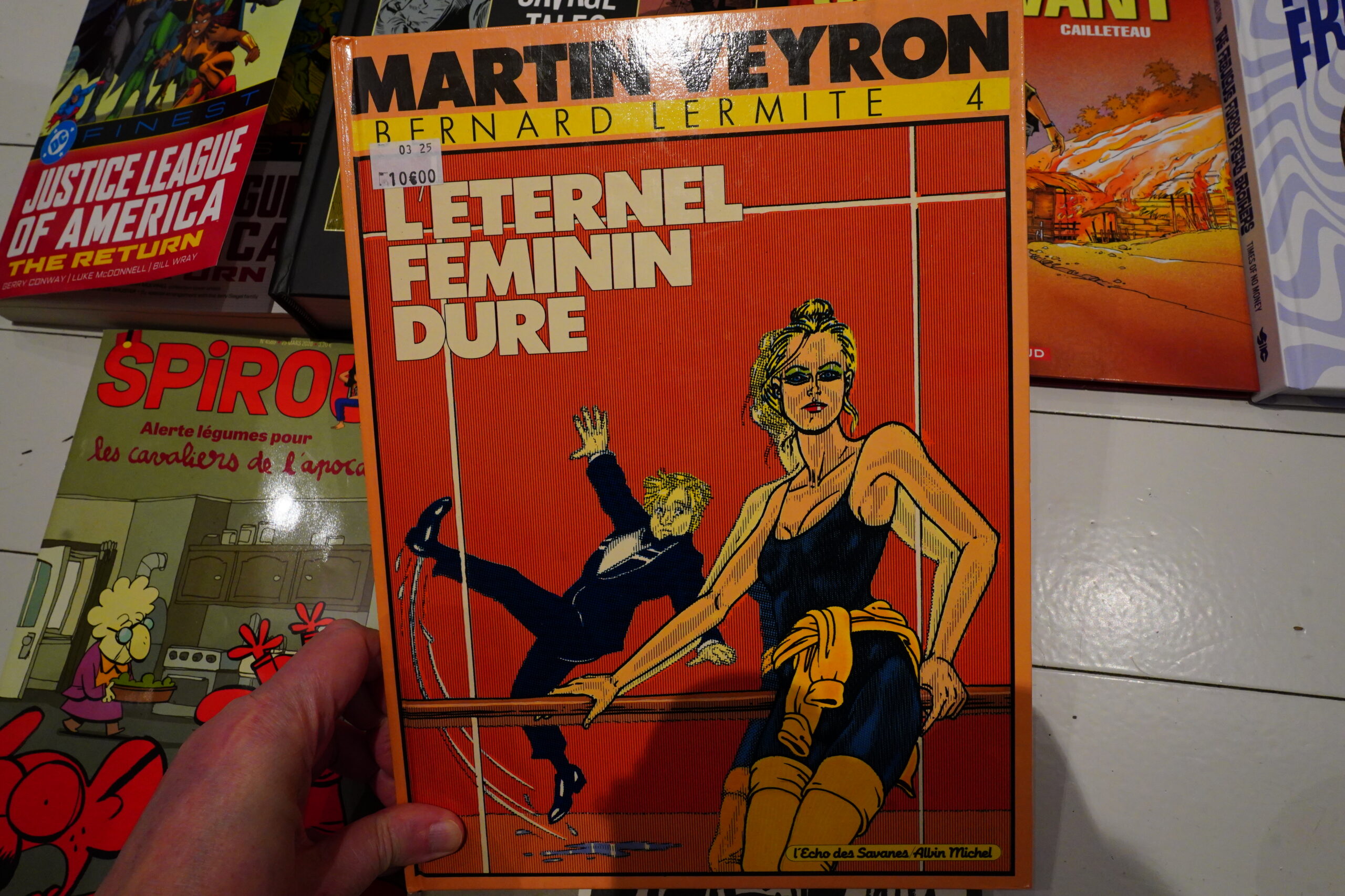
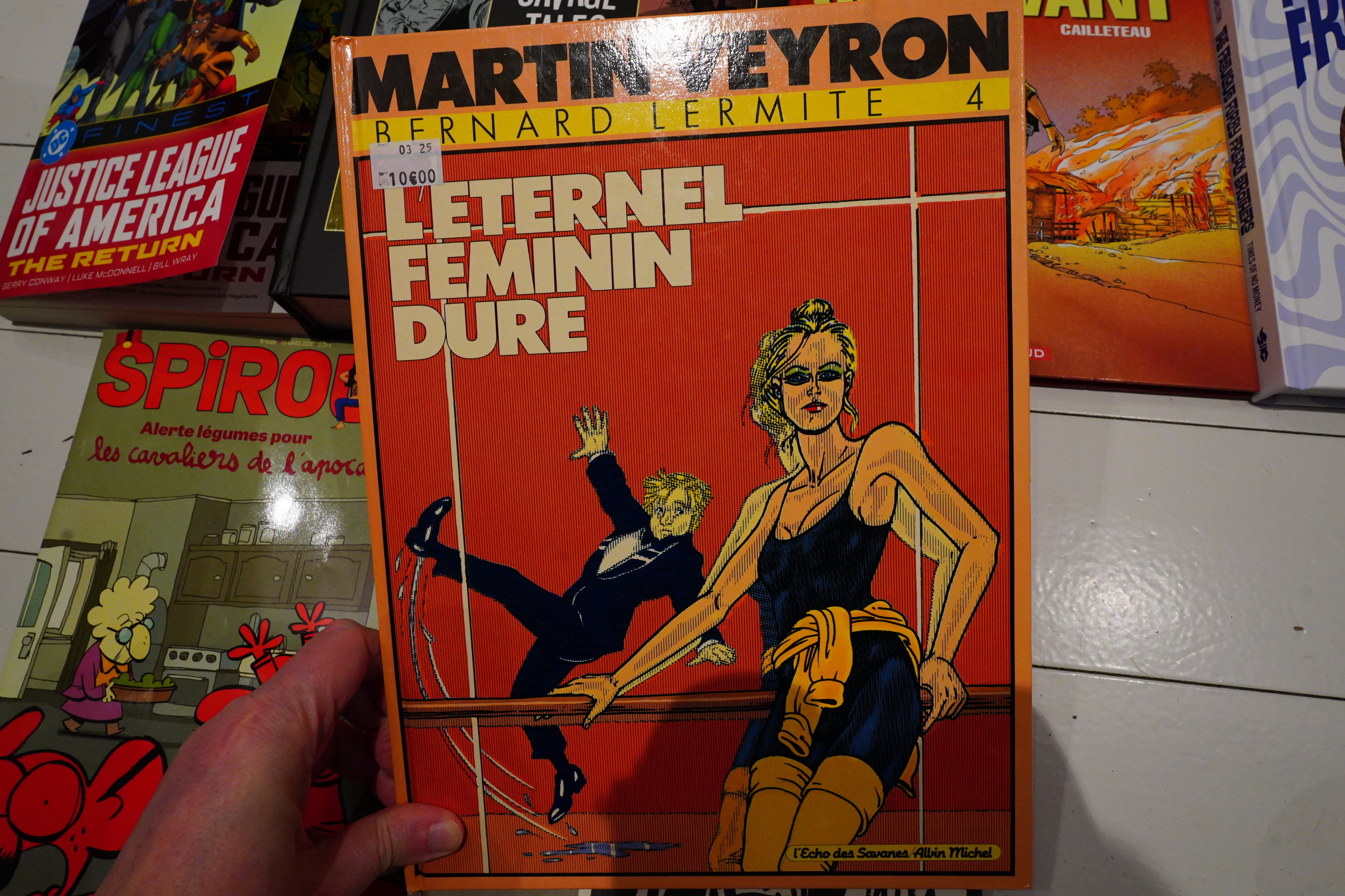
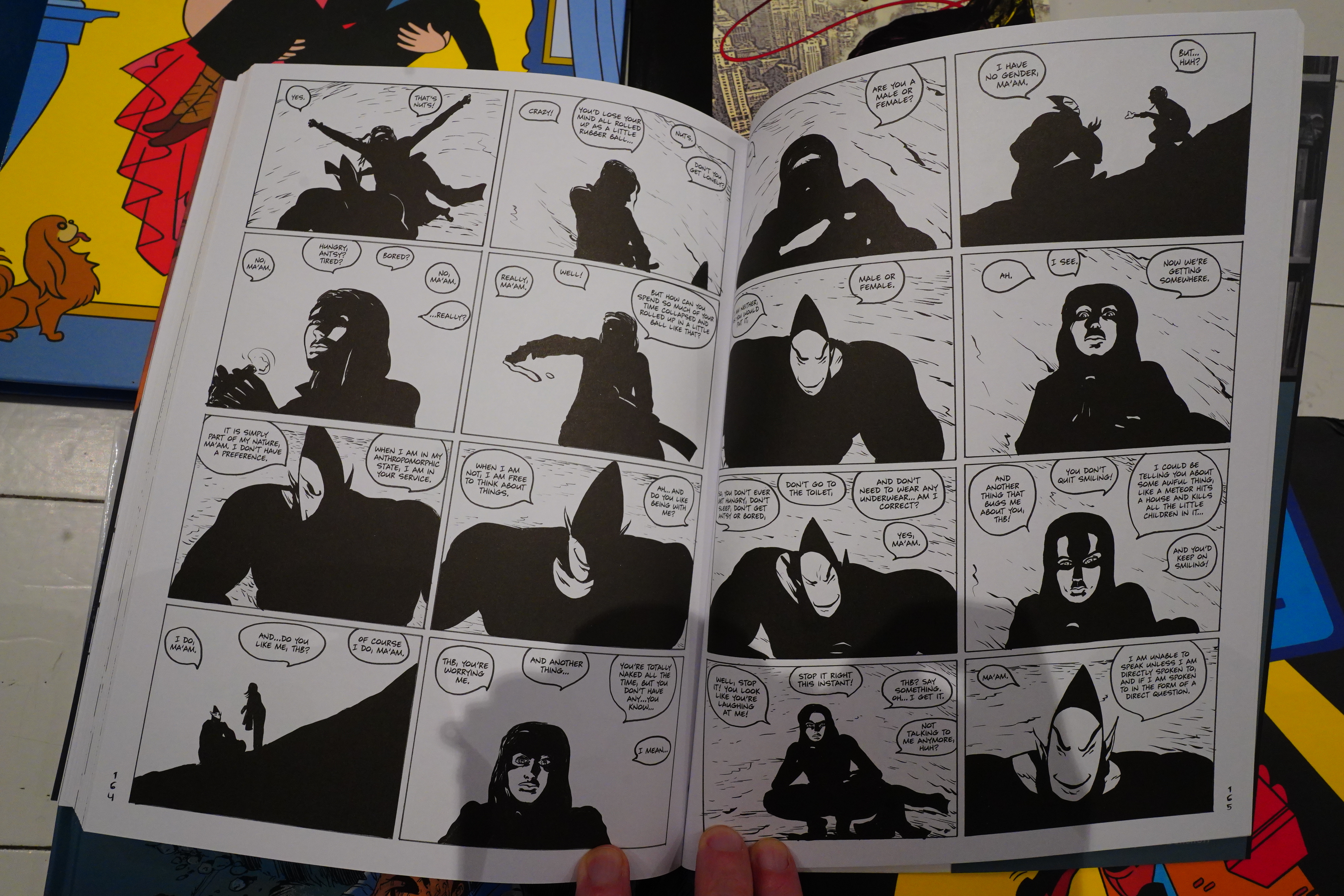
I picked this up at Un regard moderne last year, and I’ve been waiting for my French to improve enough that I can actually read it.
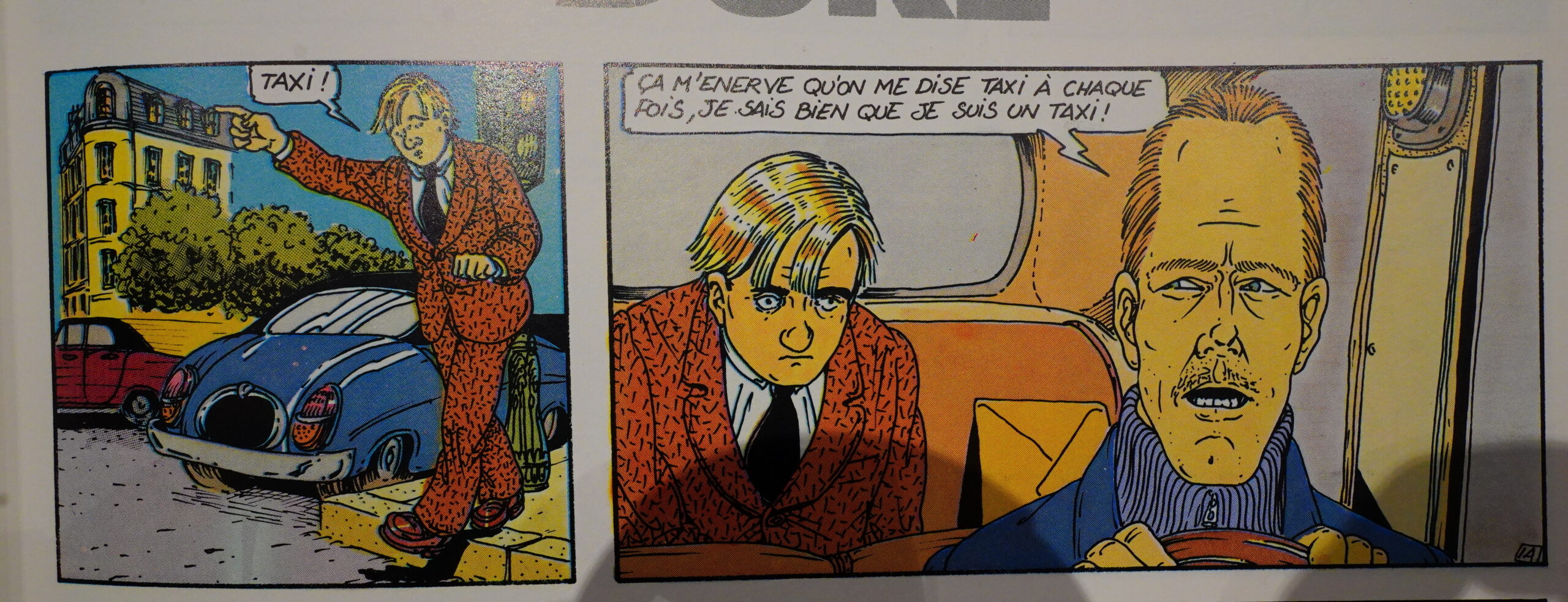
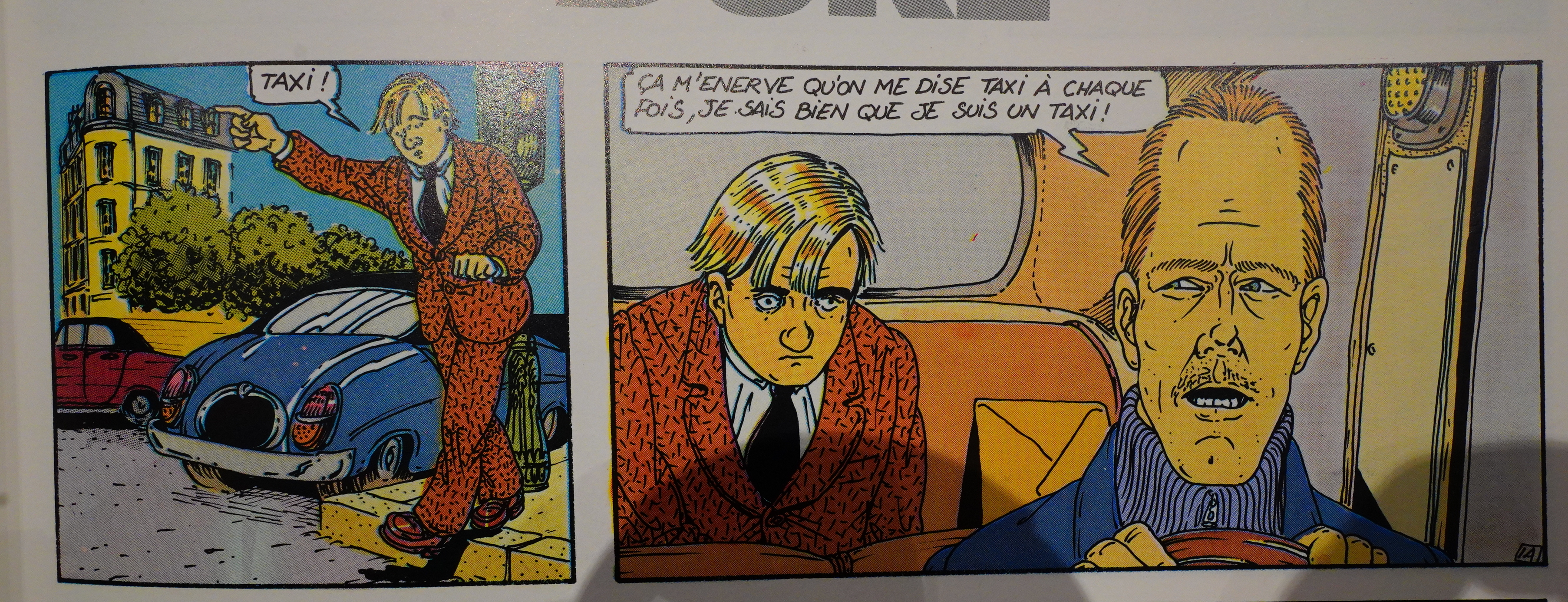
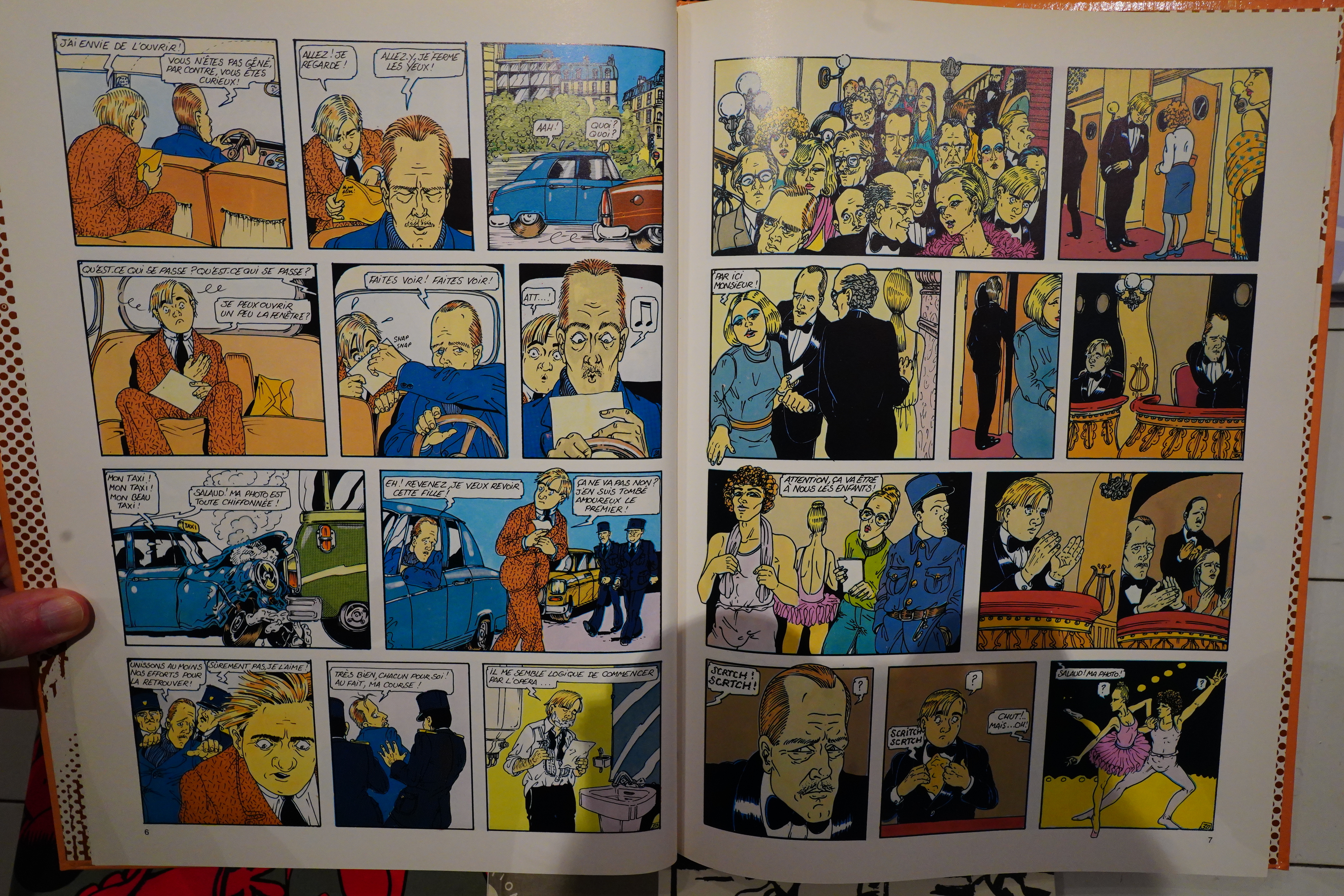
I’ve heard of Martin Veyron before, but I don’t think I’ve read much of his stuff before? In any case, it’s hilarious.
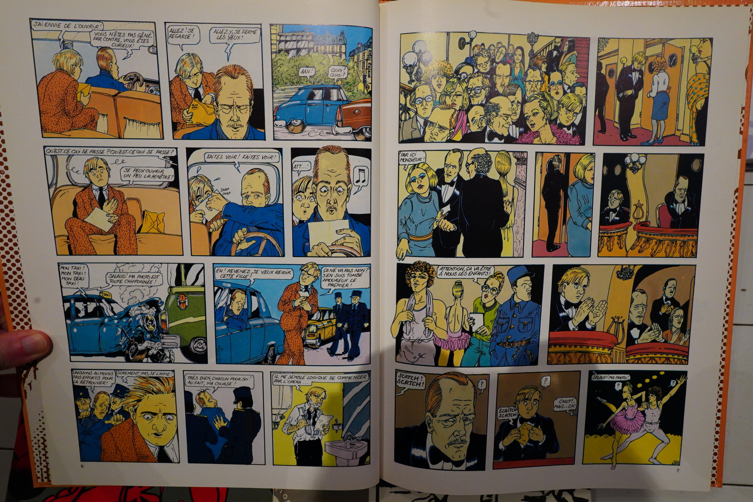
This was published in the early 80s, and it’s got that French late-70s surreal thing going on. It’s a kind of shaggy dog story, I guess, where the supposed point-of-view character gets involved with all these absurd characters.
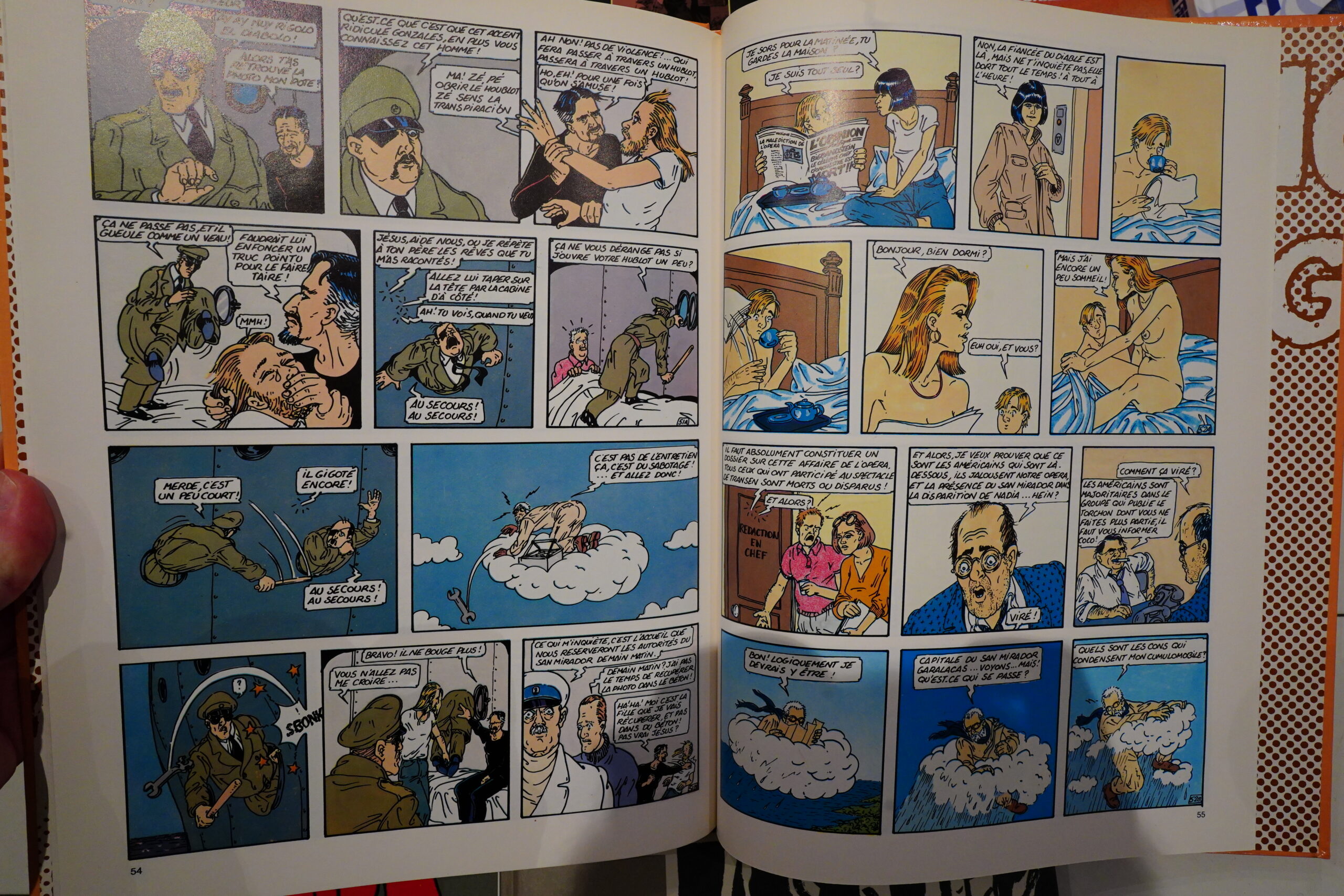
Like the military of a South American country, and God, and L’eternel feminin… which I guess sounds like total chaos, but it’s not! That’s what’s so amazing about it — on a panel by panel basis, it reads like it’s improvised, with one gag after another, but Veyron juggles at least half a dozen separate storyline strands perfectly.
Very funny and oddly engrossing.
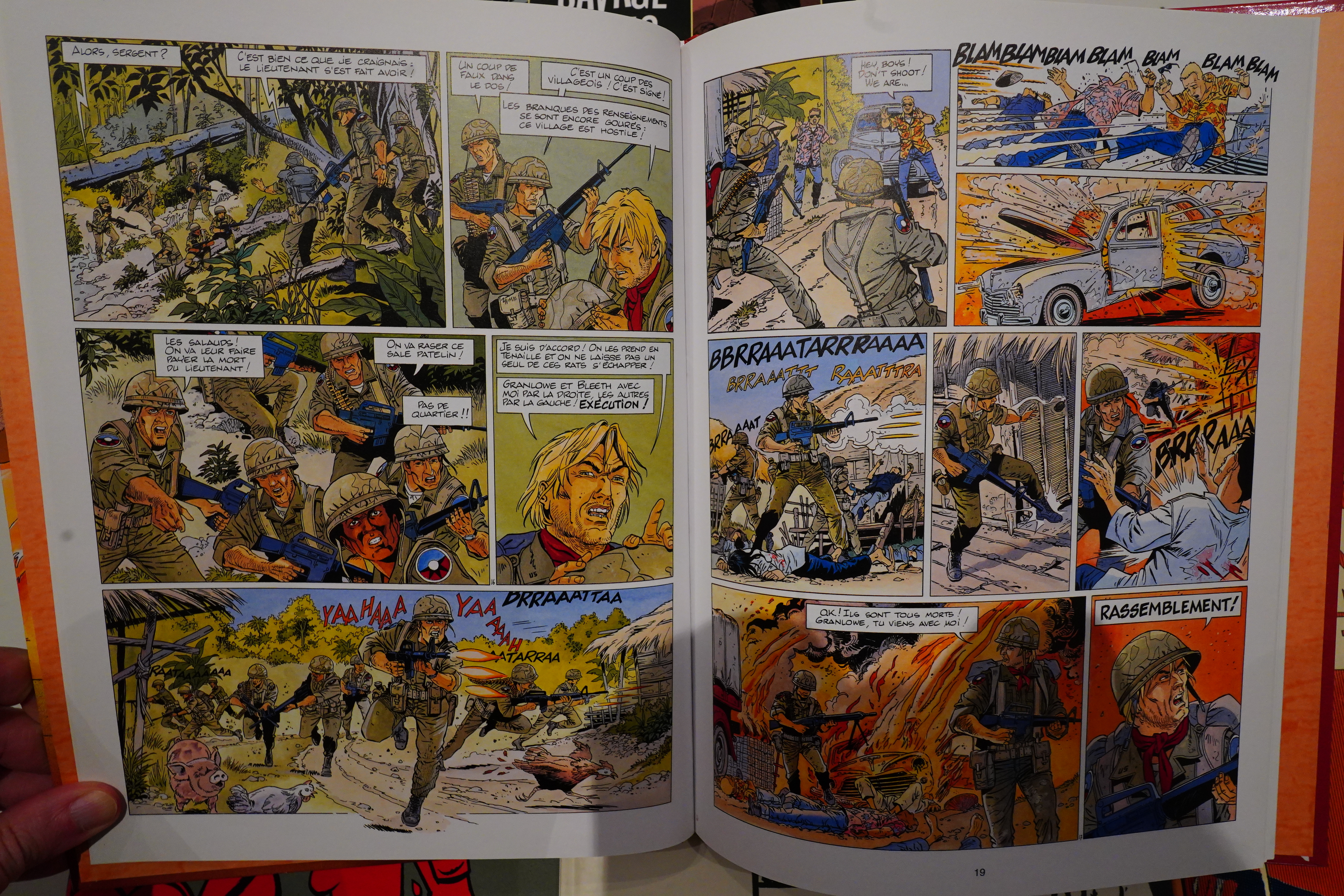
I think I may have picked this one up there, too? But I’m not sure.

This is early 90s stuff, and it’s very earnest. A bit silly, even, but a likeable album.

And with striking graphics.
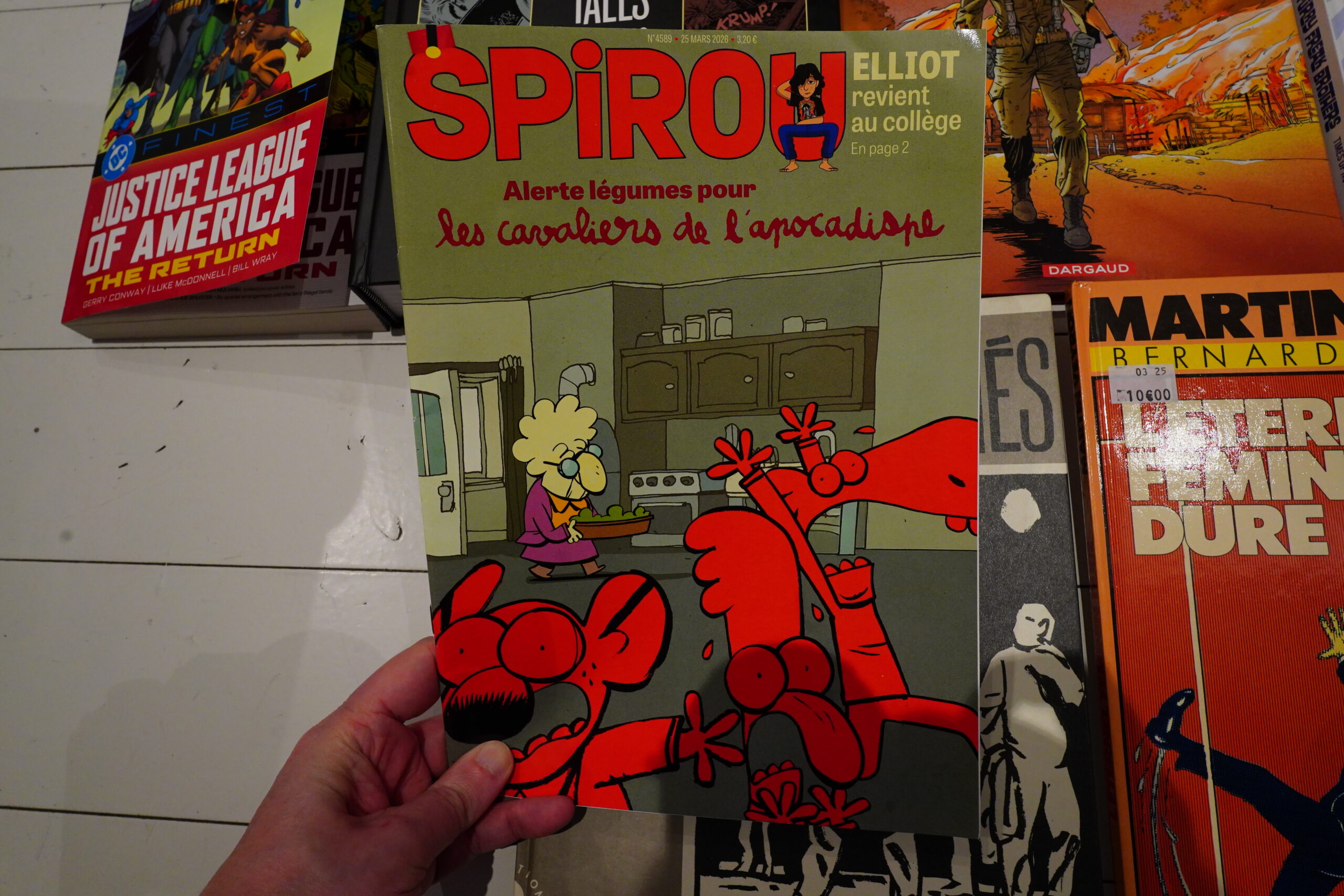
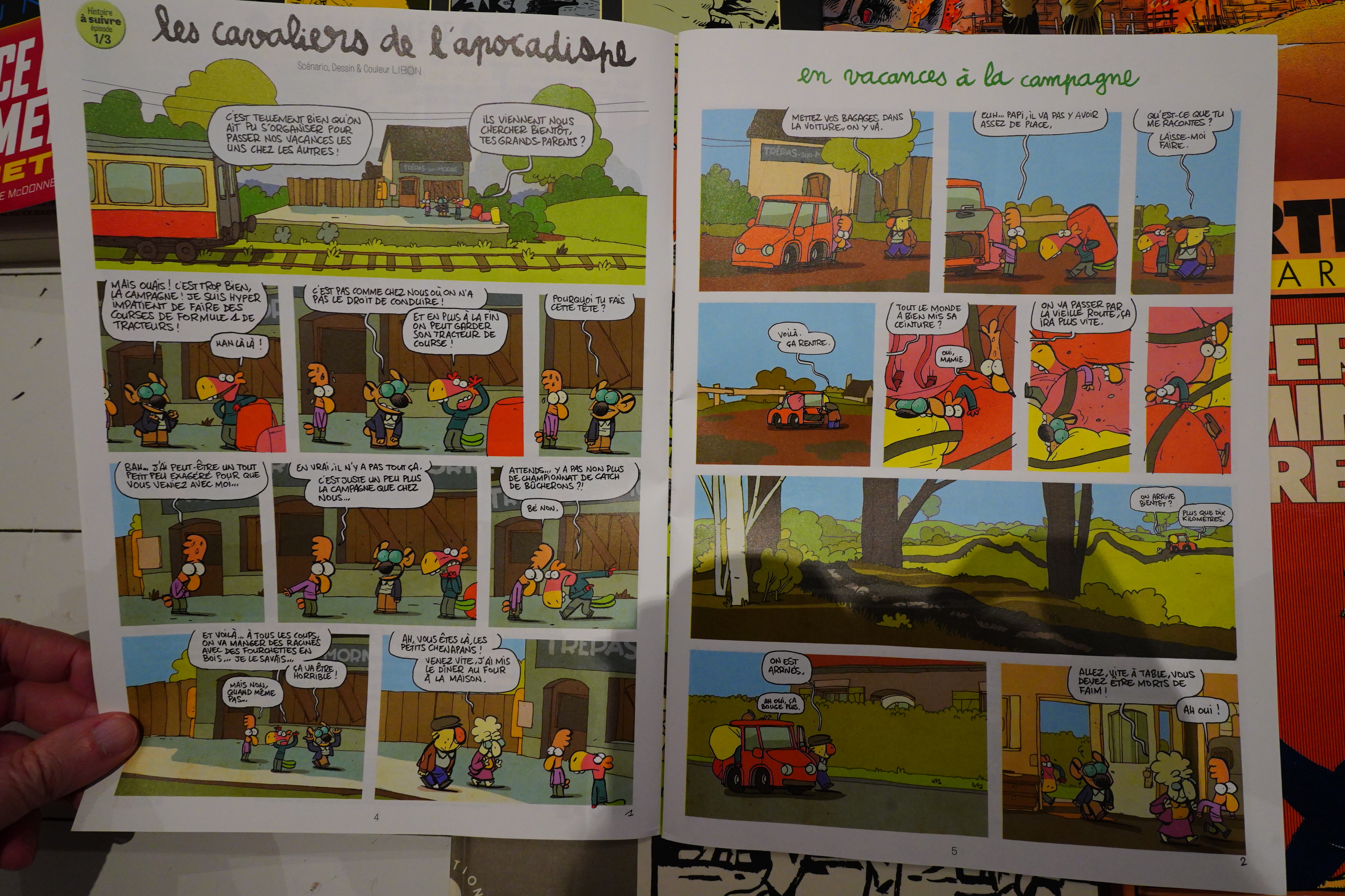
I’m up-to-date with my Spirou subscription, so just read one issue this week.

A new Les cavaliers de l’apocadispe serial has started up, so that’s fantastic.
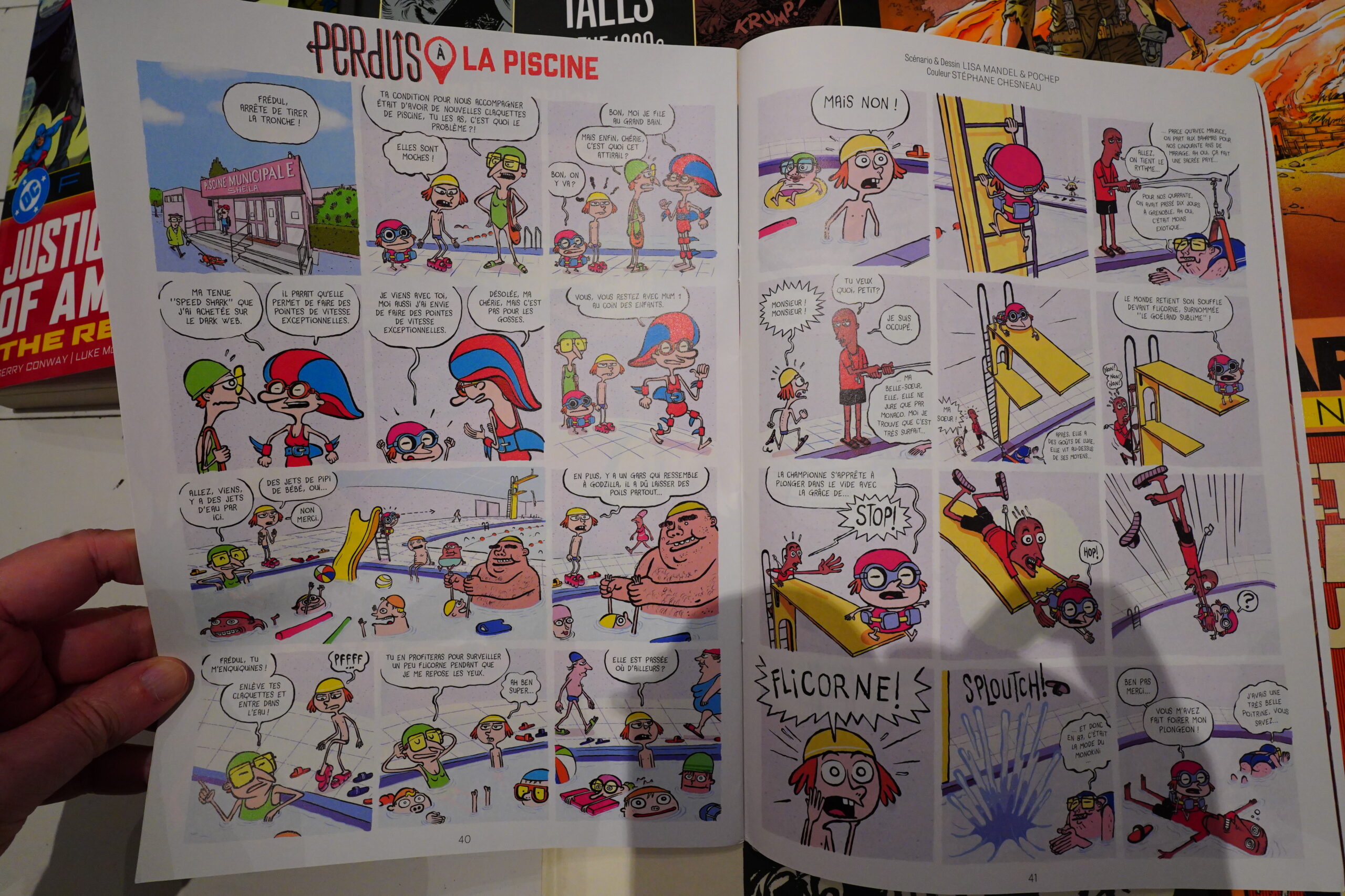
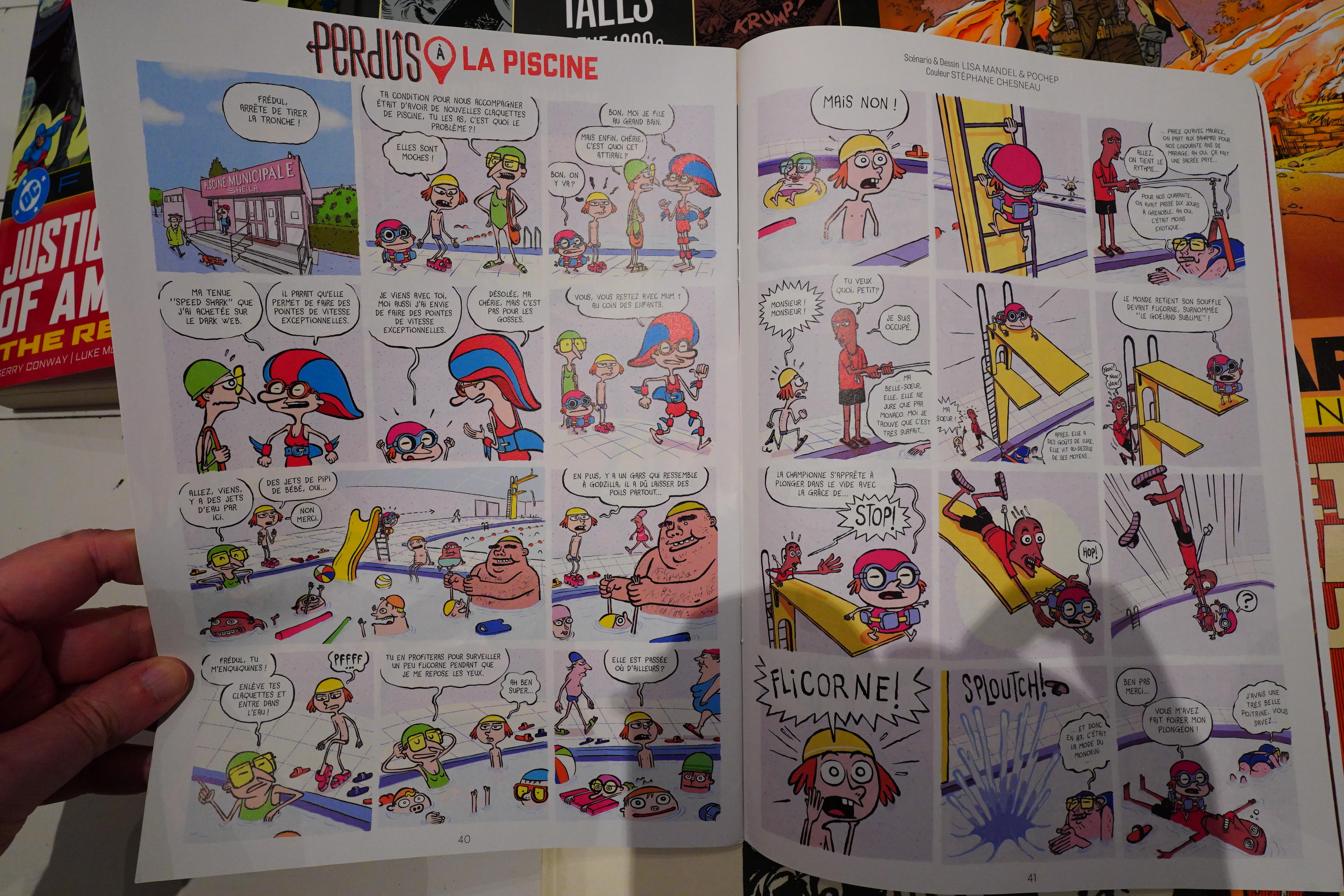
And a new Perdus appearance, so that’s great.
And… that’s it.