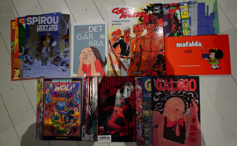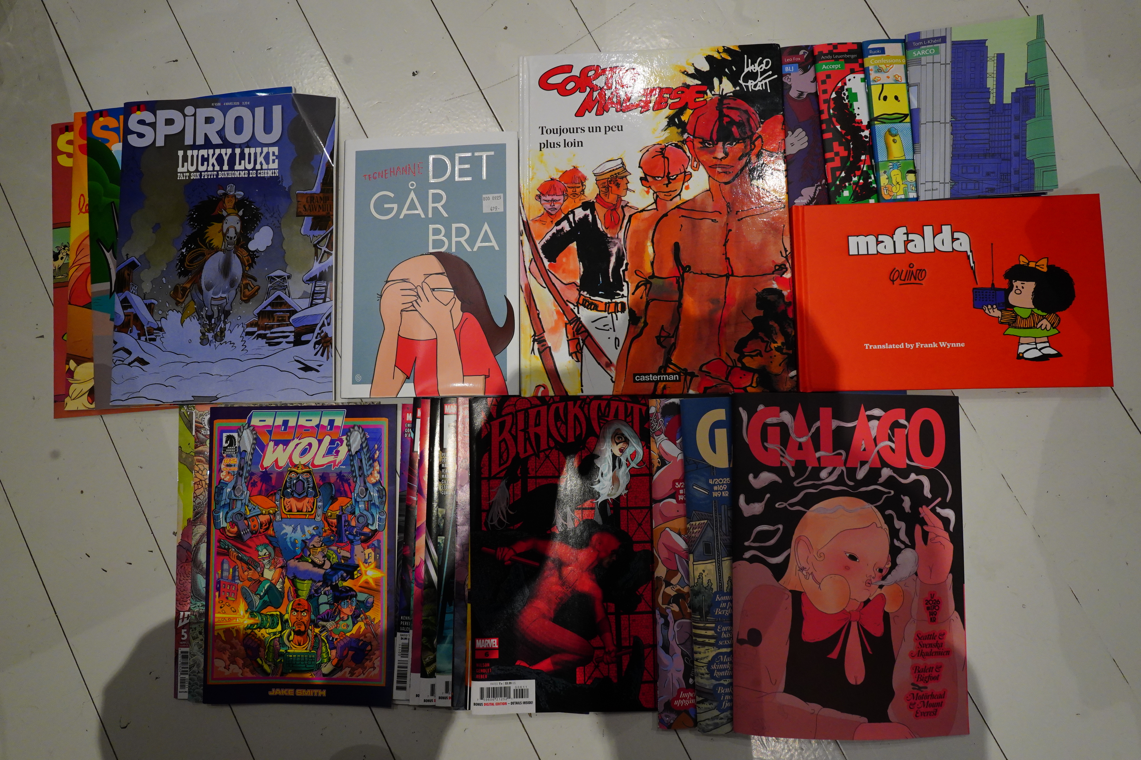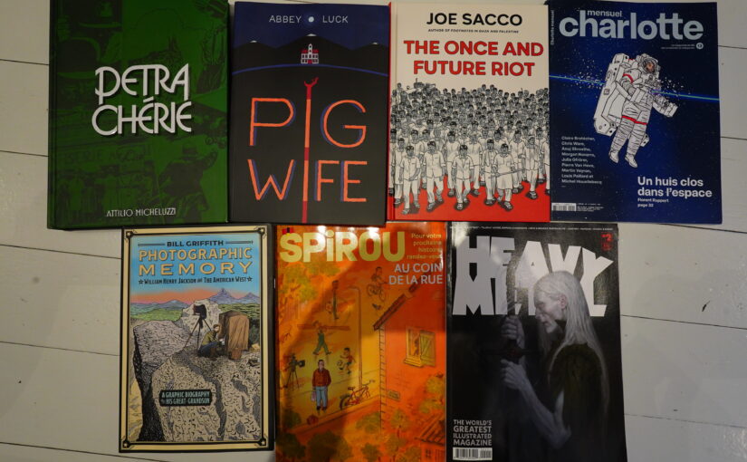
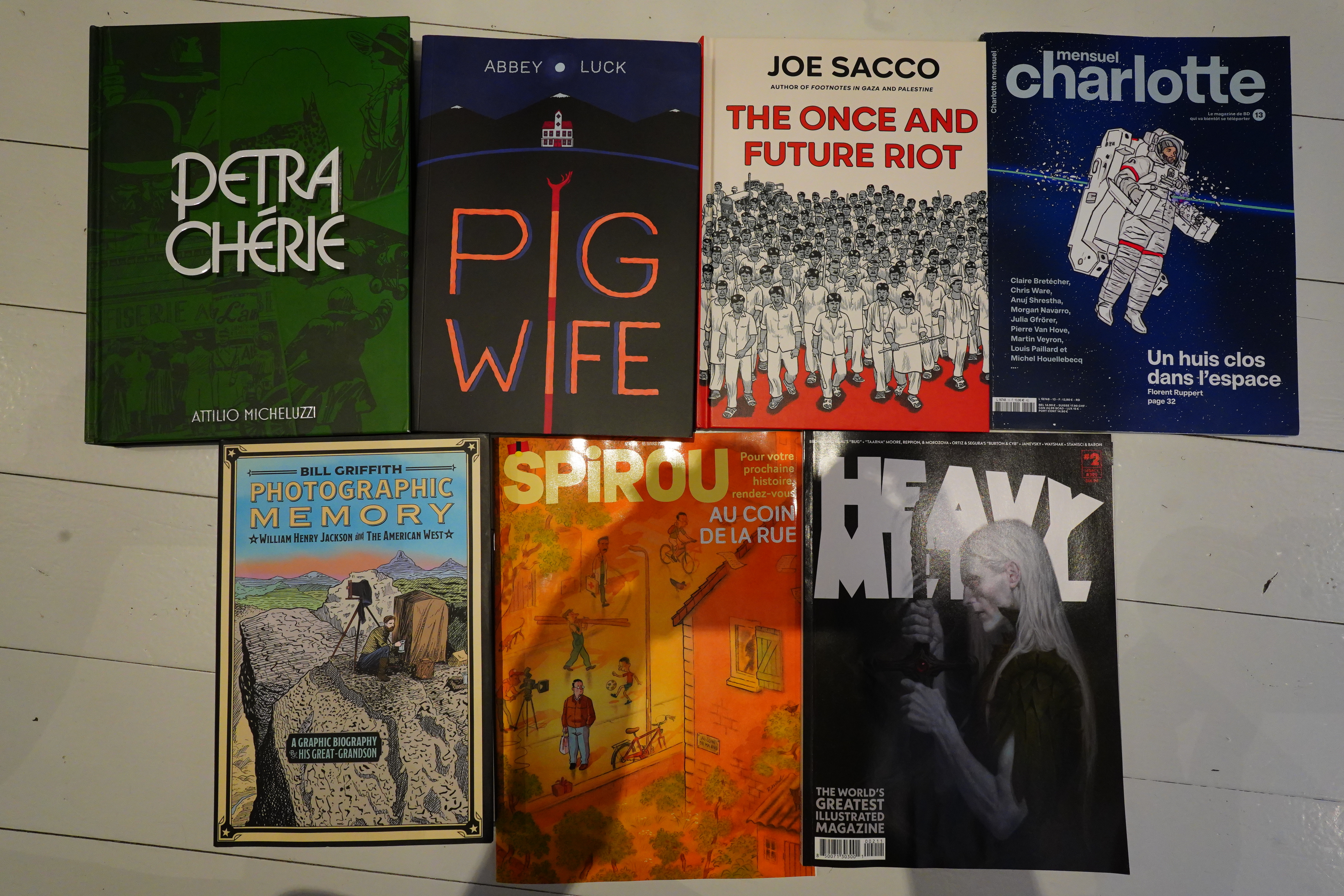
Hey, I read some comics over the past few days.
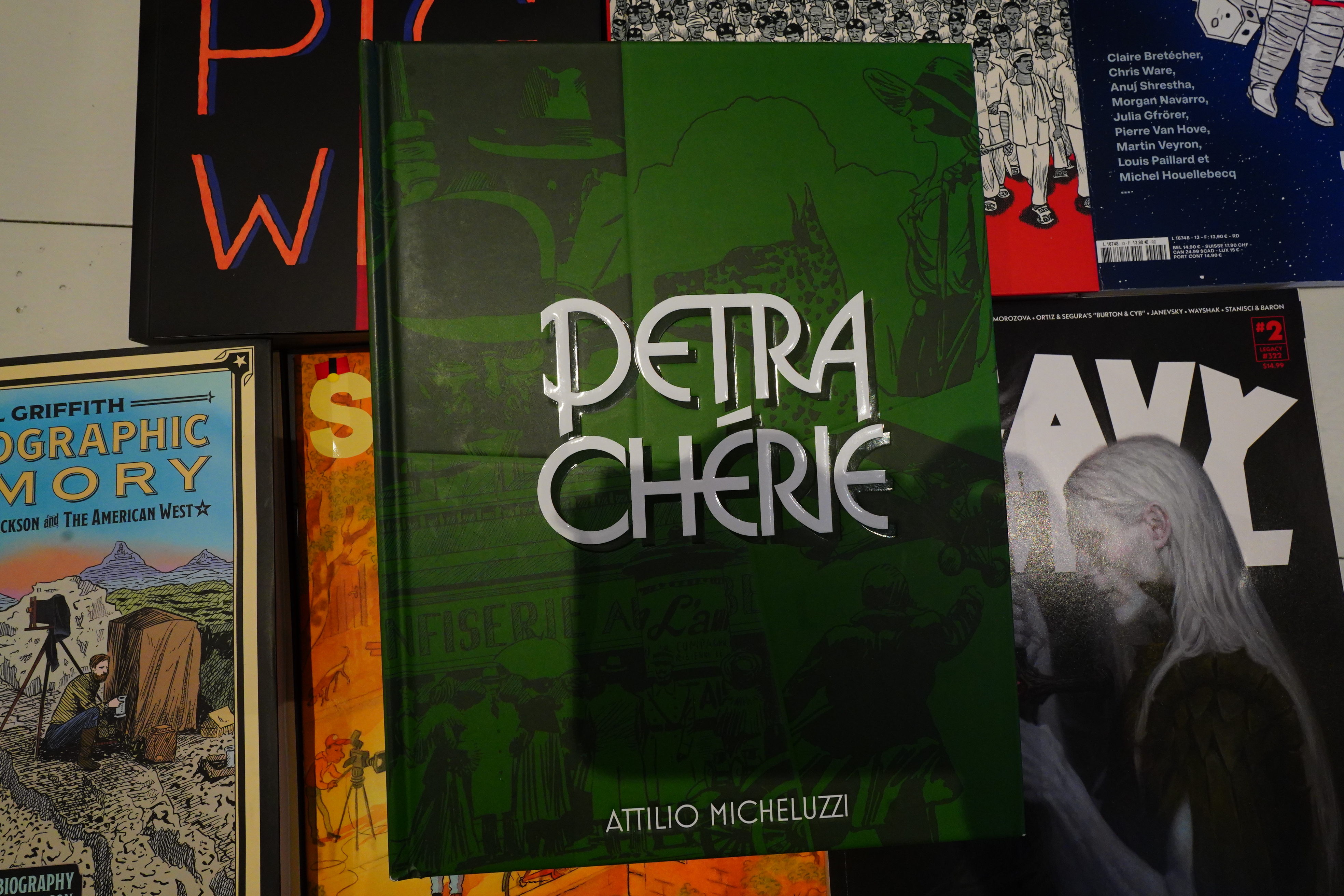
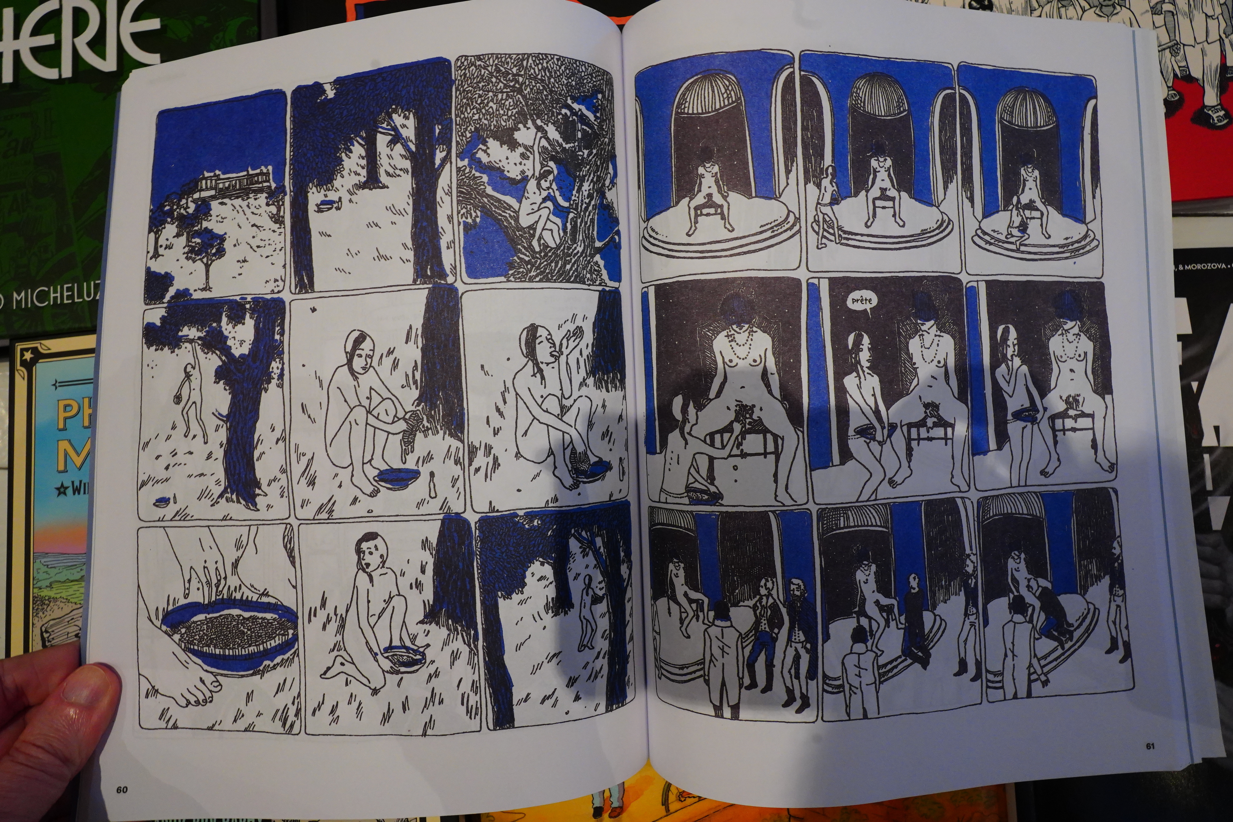
I bought the previous Attilio Micheluzzi collection from Fantagraphics last year, but I bounced hard — I abandoned it after reading a few stories. But I still bought Petra Chérie, because I really like Micheluzzi’s artwork.
And I found this one to be a lot more readable than the other collection. I forget what it was called… That one was more of a straightforward Guy On Adventure strip, while this is, er, Gal On Adventure strip, which apparently makes a difference? Anyway, this is an almost 300 page long book that collects stories that are mostly 12 pages (or less) long, so there’s plenty of opportunity to get really repetetive.
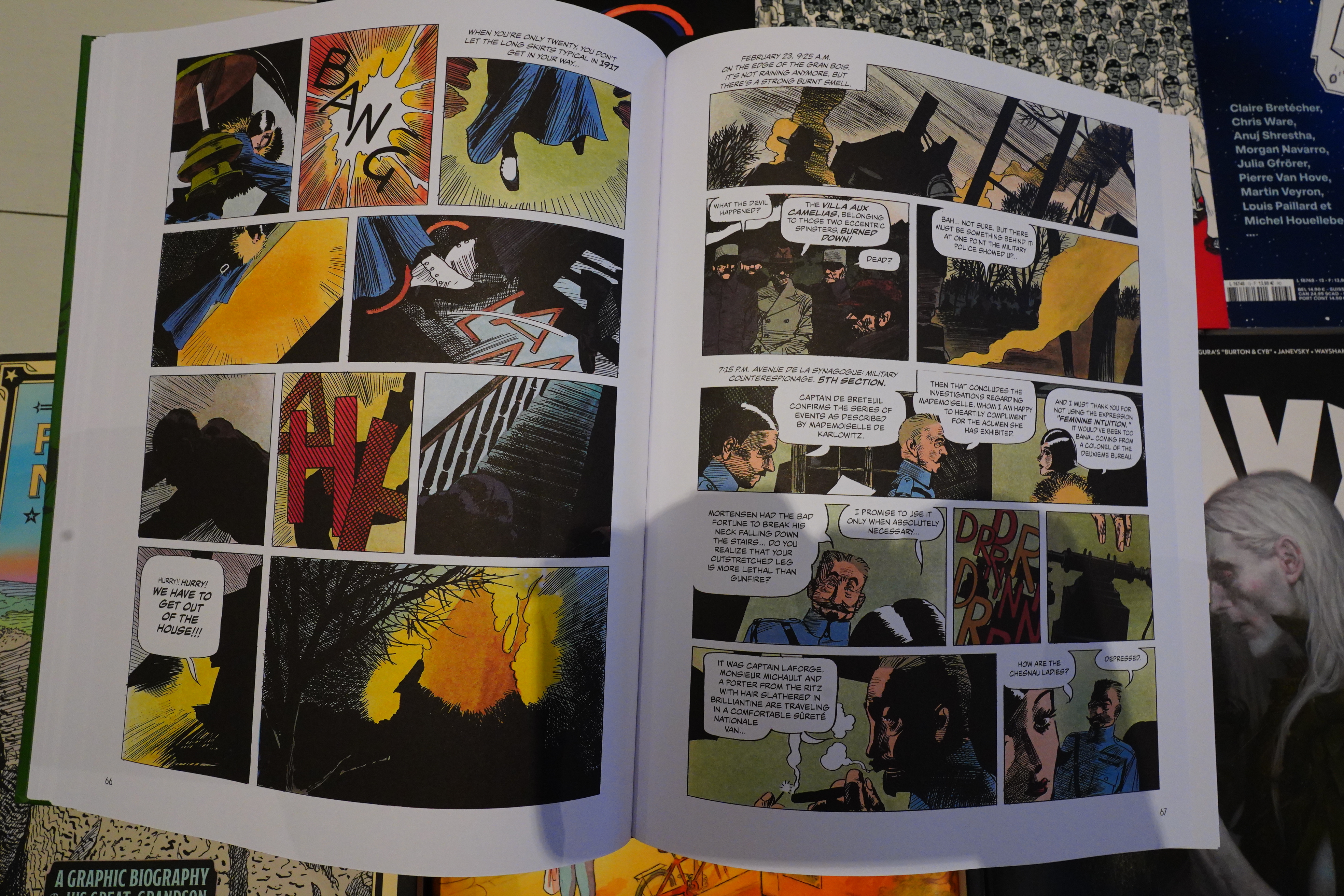
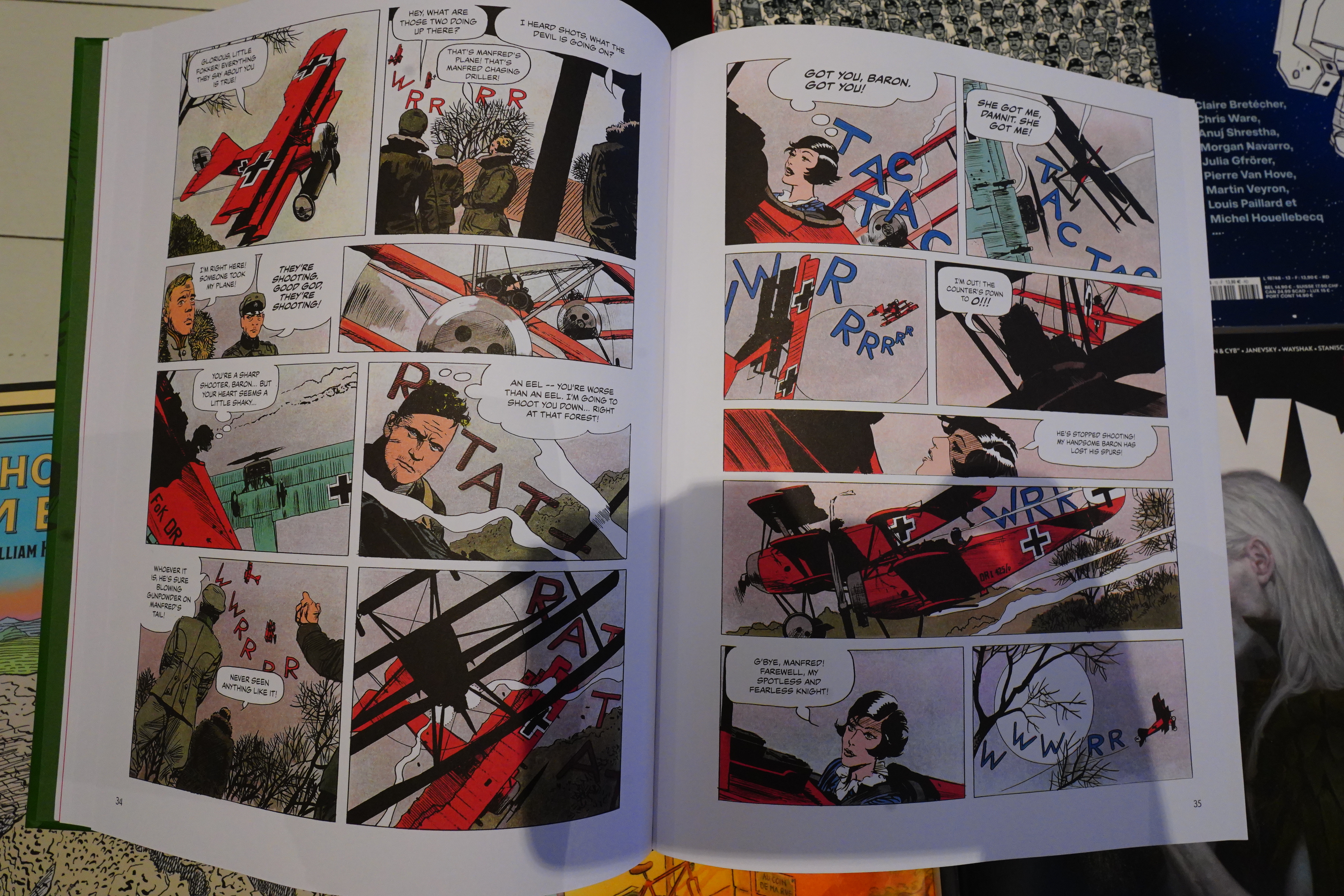
But Micheluzzi somehow avoids this, although some of the stories tend towards being vignettes more than actual stories. And then, halfway through, he goes for continuity, ditches the sidekick character, and has the heroine go from being captive by one force to being captive of another force, all throughout the Balkans.
She still gets to do heroic stuff, but she stops flying her plane and stuff. It’s an odd turn.
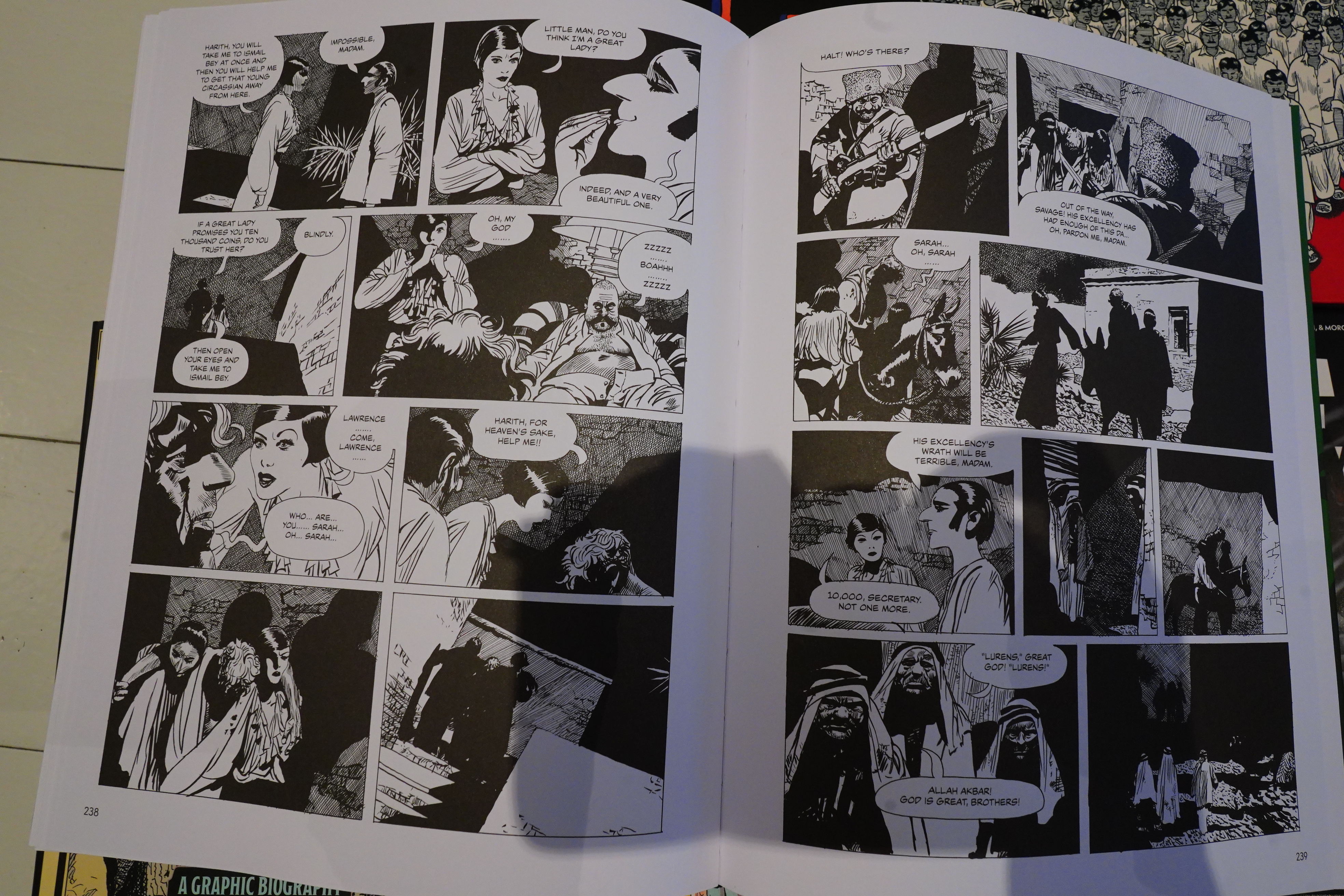
And then there was a one year break, and Micheluzzi continued the series (in black and white now) with a different magazine, and the stories are totally different in tone — and in one of them, he has her encountering Lawrence of Arabia. And after a couple more chapters, the story just ends, and not in a good place, really.
So — this doesn’t really work as “a book”, but it’s very entertaining to read on a story by story basis. And man, the artwork and the storytelling… With twelve page stories you’d think there wasn’t much place for character development and stuff, and you’d be right, but Micheluzzi has more character in one silent panel than most people have in a hundred pages of dialogue.
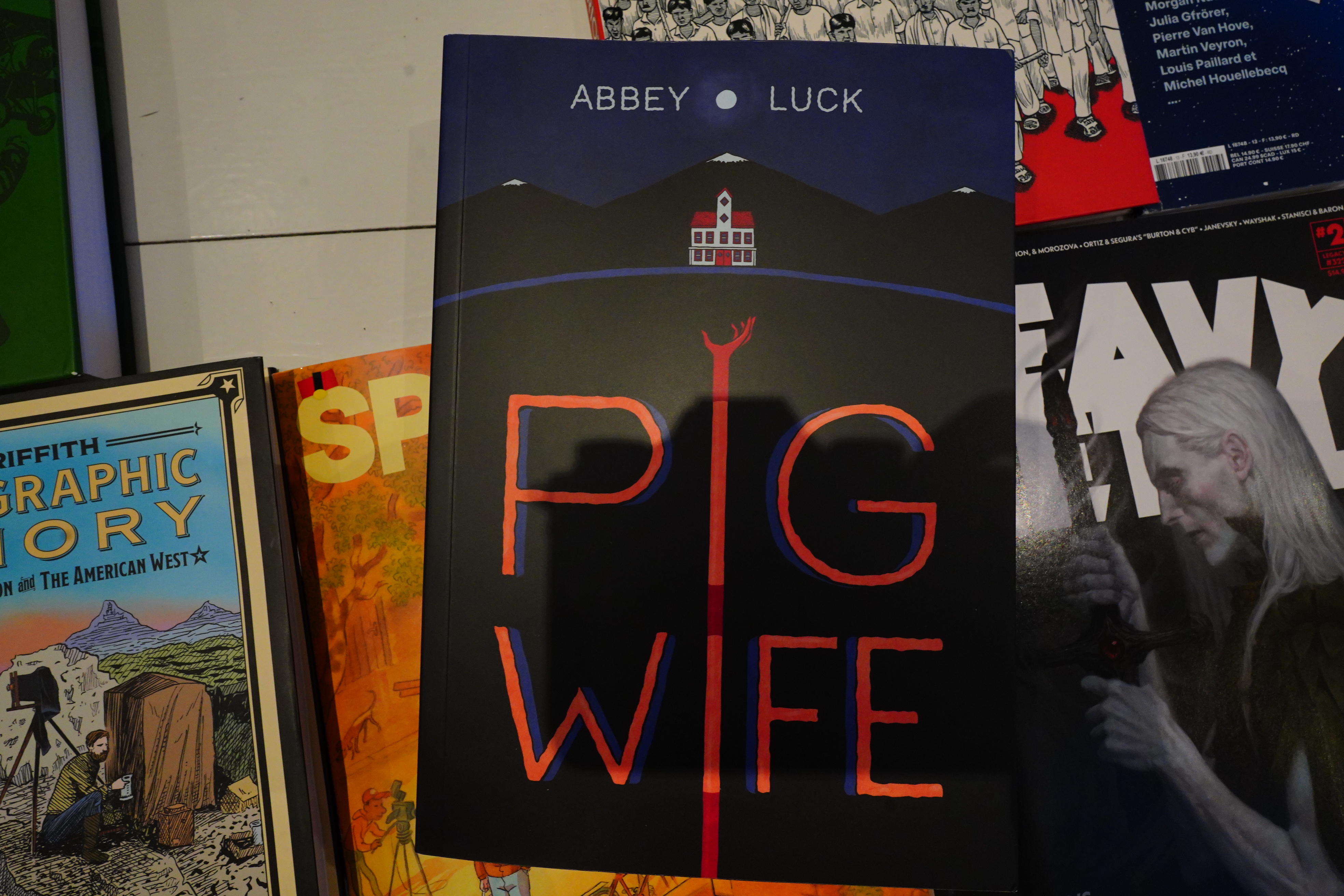
Top Shelf is kinda hit or miss, right?
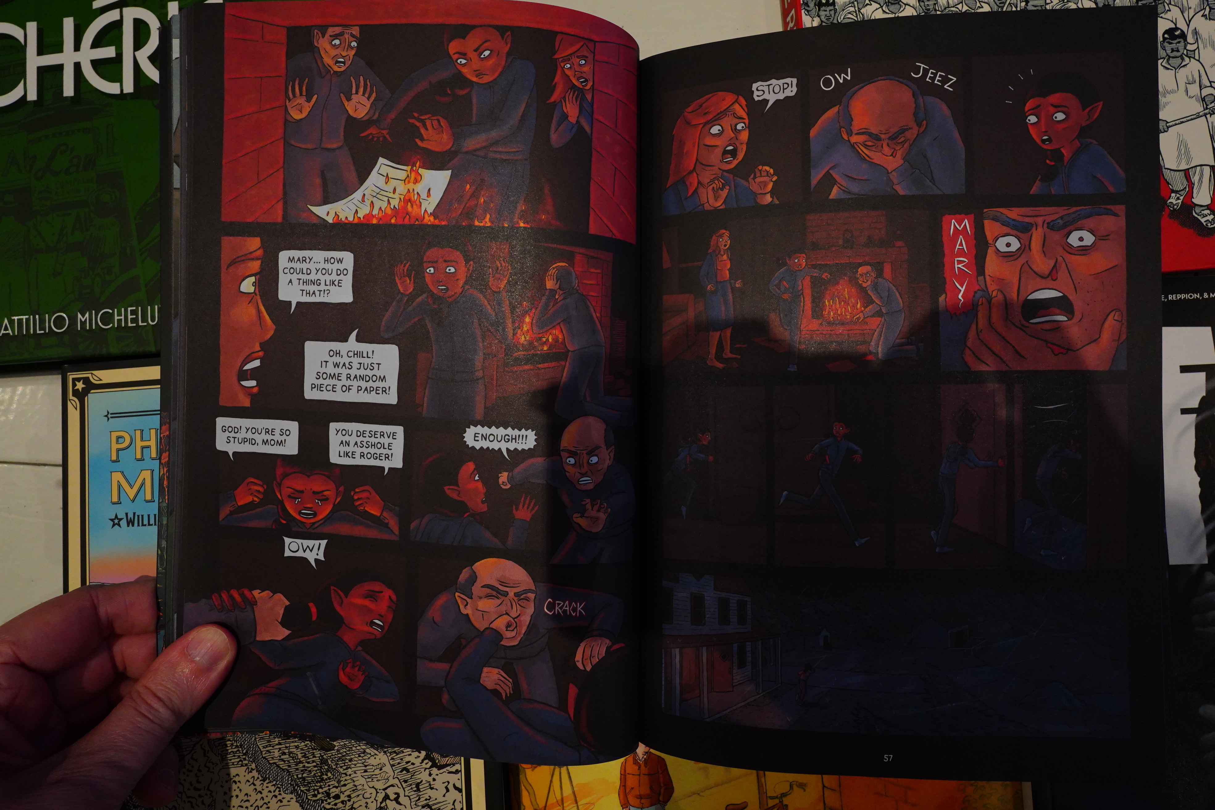
I just couldn’t get into this. It’s all the stuff I don’t like — fake drama and clichéd storytelling.
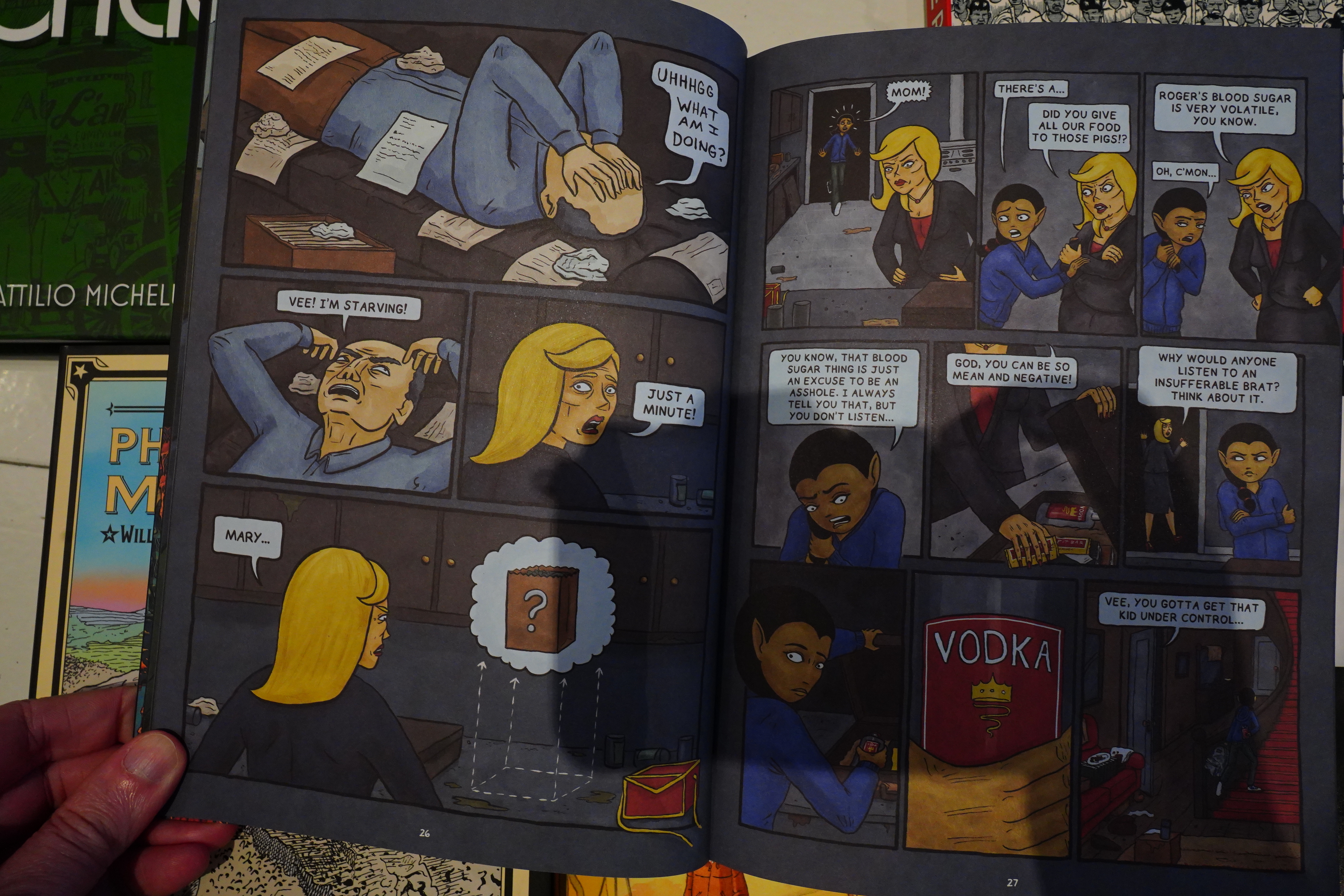
I ditched it after fifty pages or so.
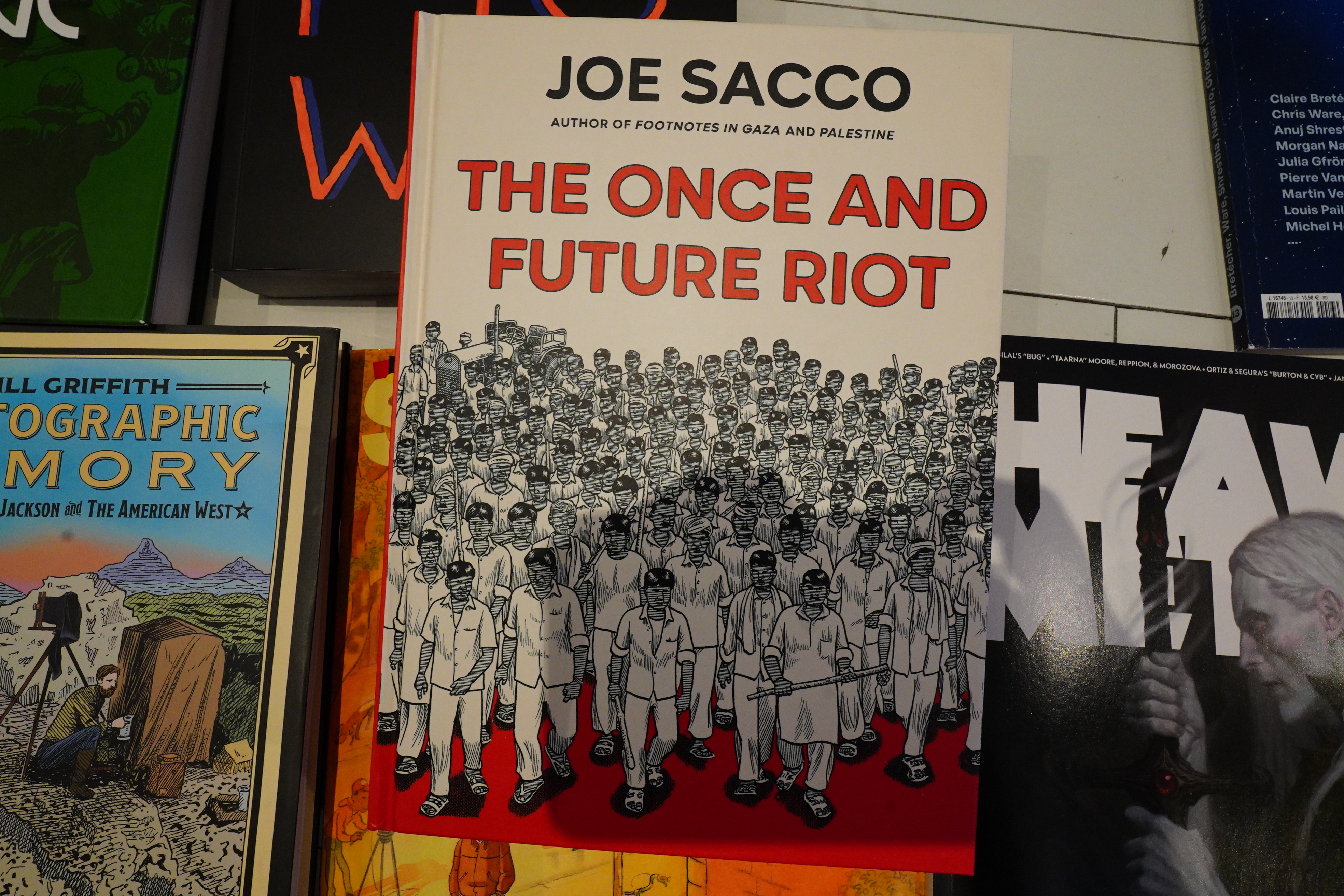
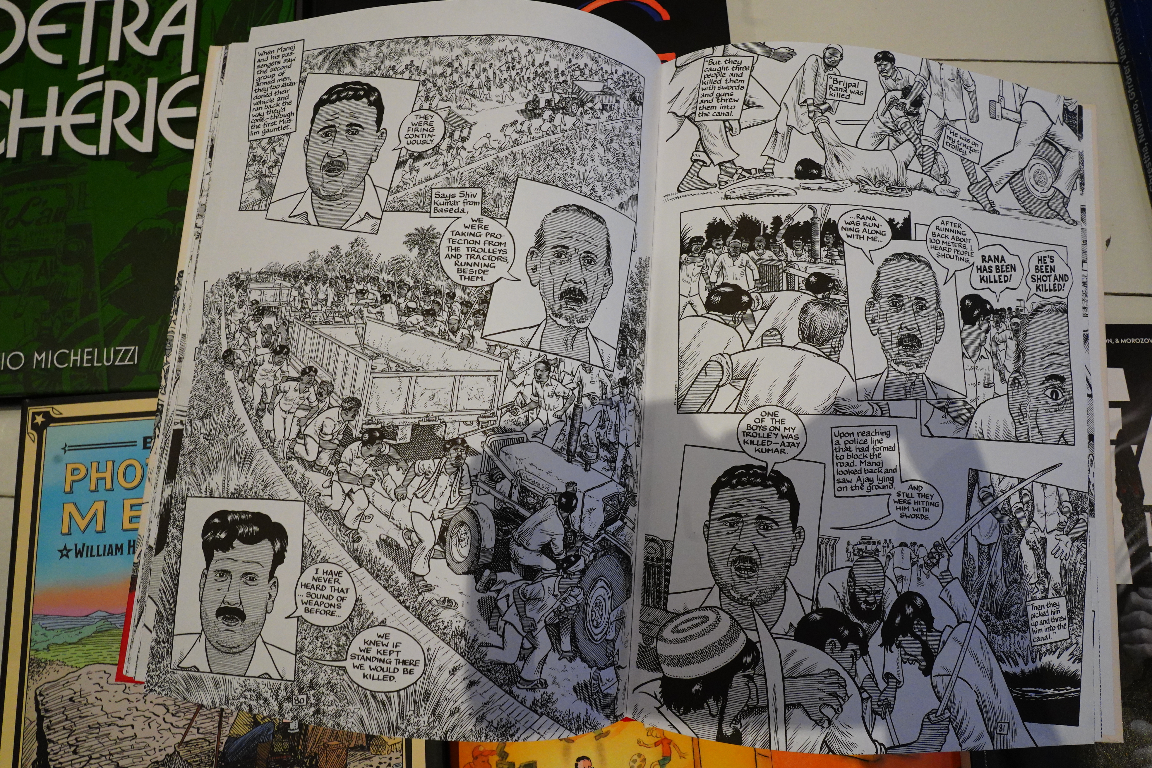
I’ve been a fan of Joe Sacco since the 80s, and I’ve liked all of his books, even the heaviest of the “reportage” books.
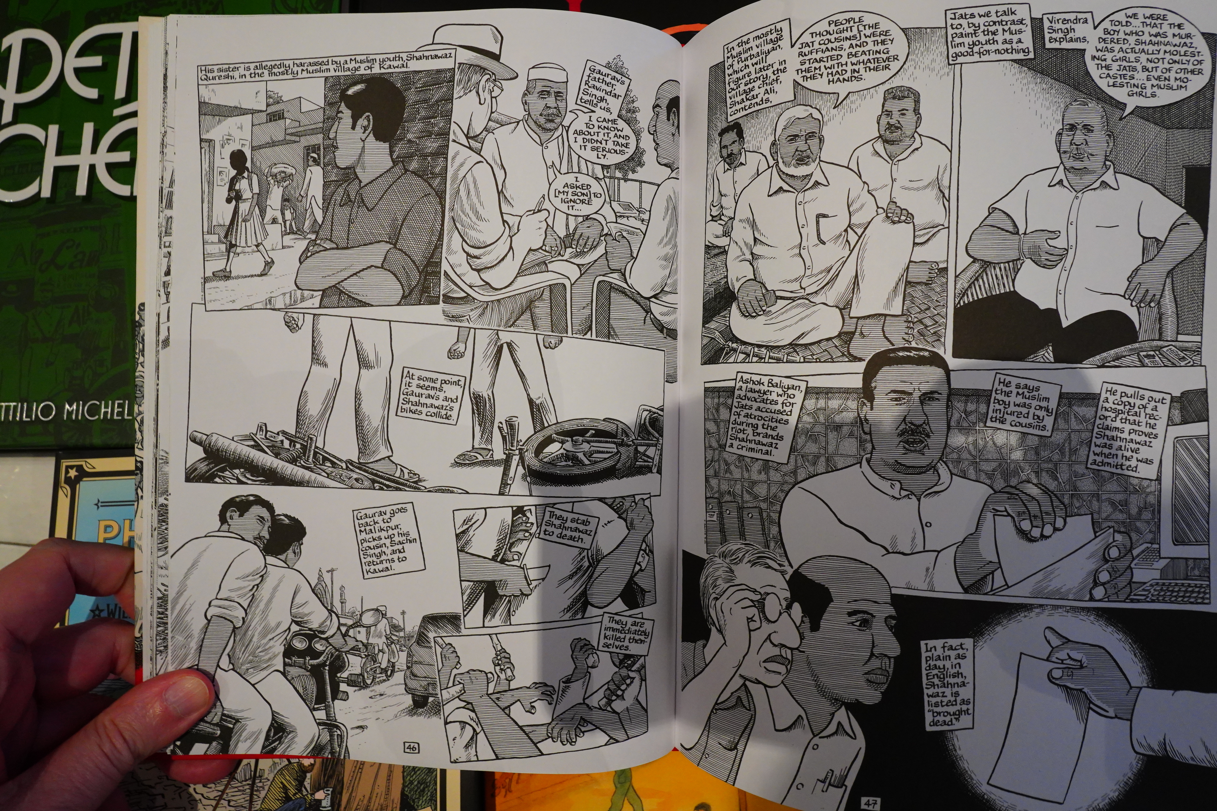
This one is about a massacre in India, and it’s really good. It’s structured around being an investigation into what actually happened, and Sacco encounters one official after another that just lie them straight to their faces, no matter how ridiculous the lies are.
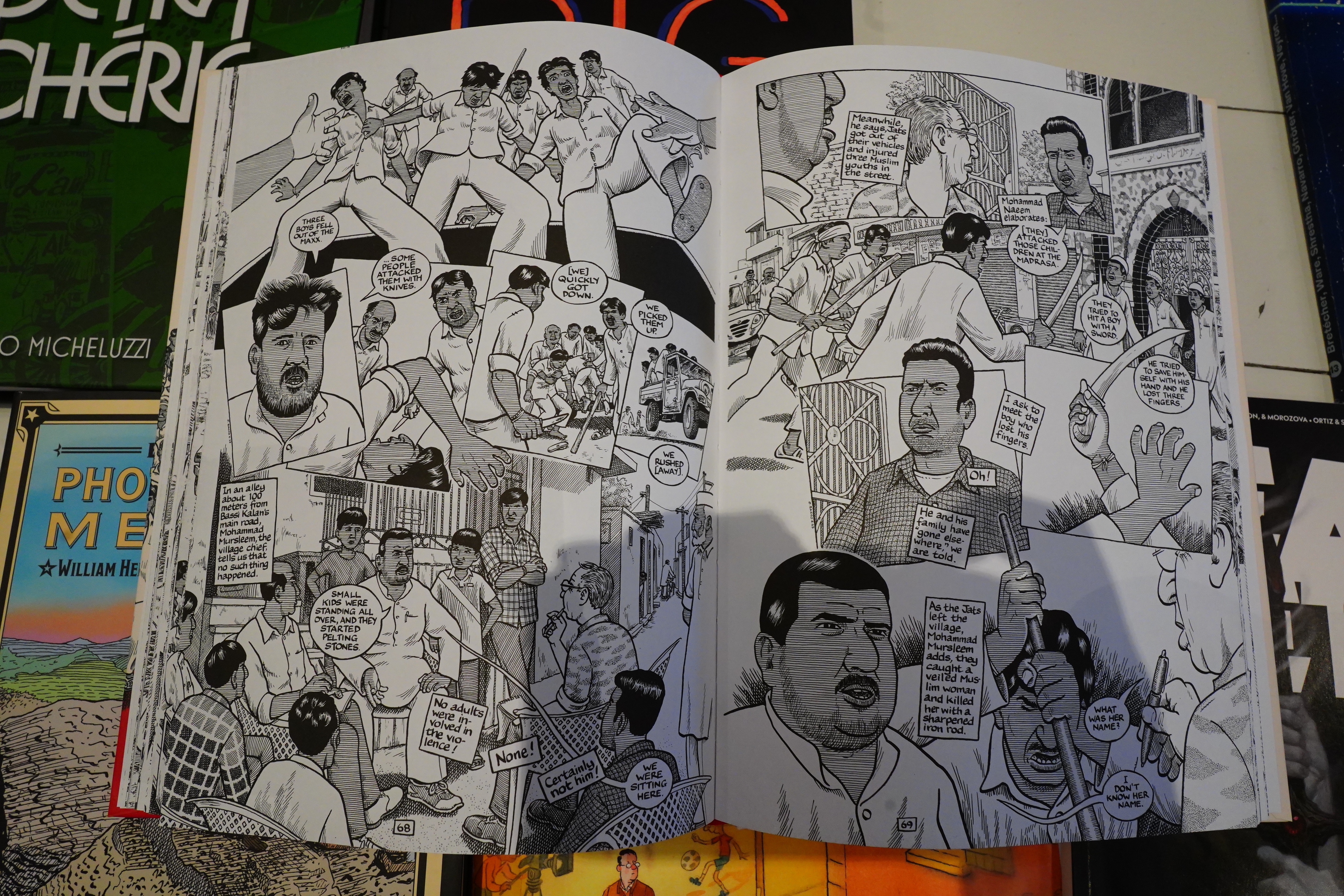
It really works — you get involved as a reader in their righteous indignation toward being lied to this way.
(Apropos India and the legal system there — I was apparently part of a farce of a lawsuit along with Google and Yahoo, and I’m assuming I’ll be arrested if I go there. Darn! Seems like such a lovely country.)
Anyway, this is a good book, and Sacco has even continued to get even better (artwork wise) while still sticking to his very distinctive style.
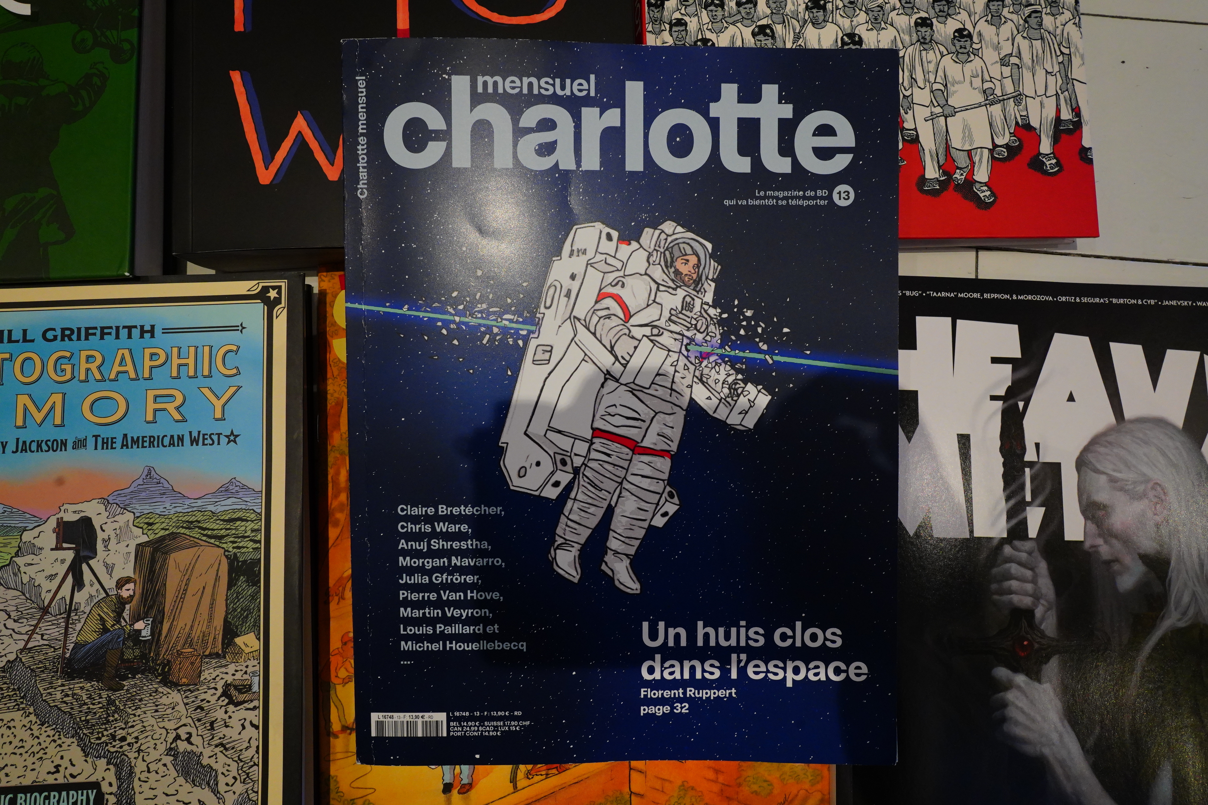
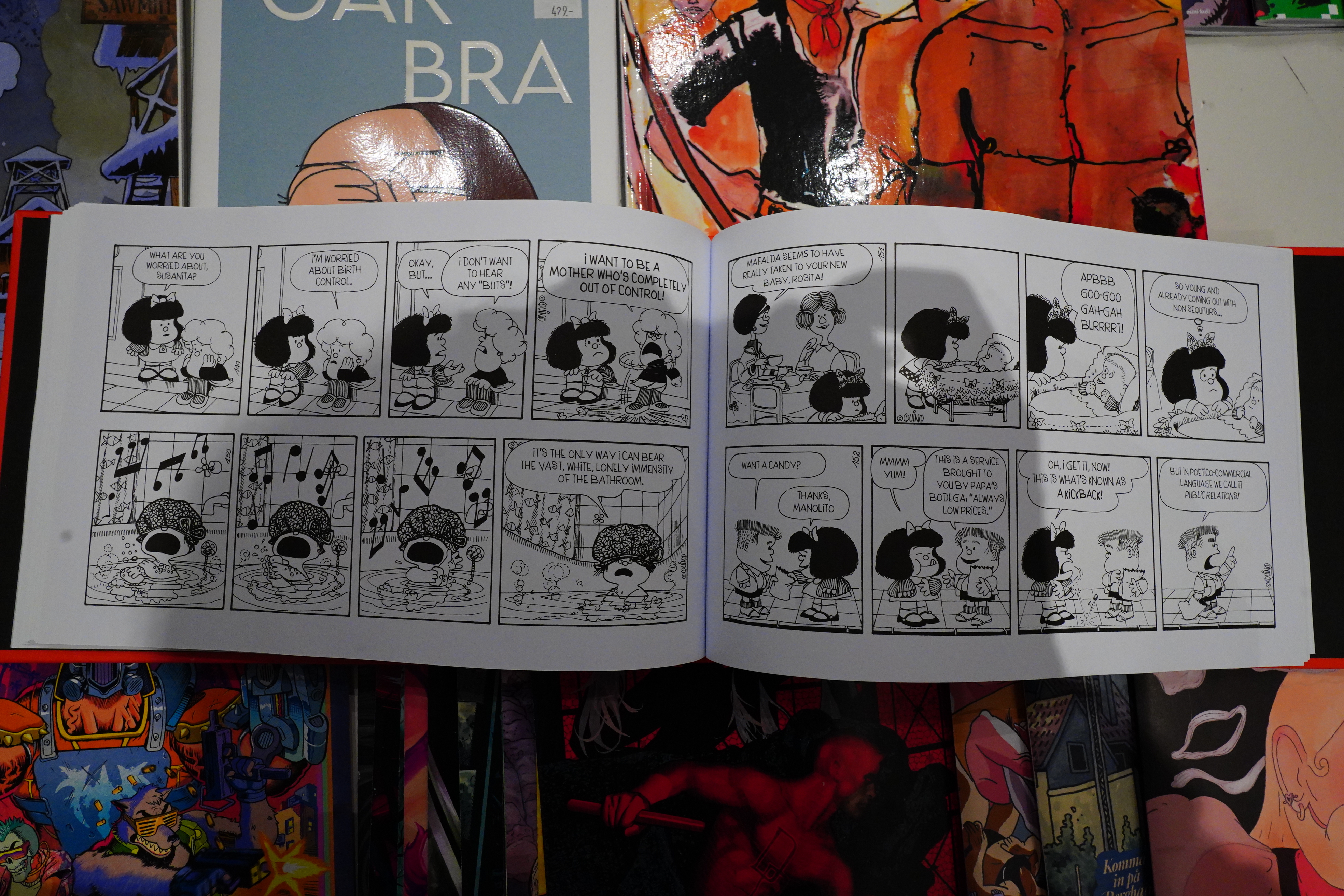
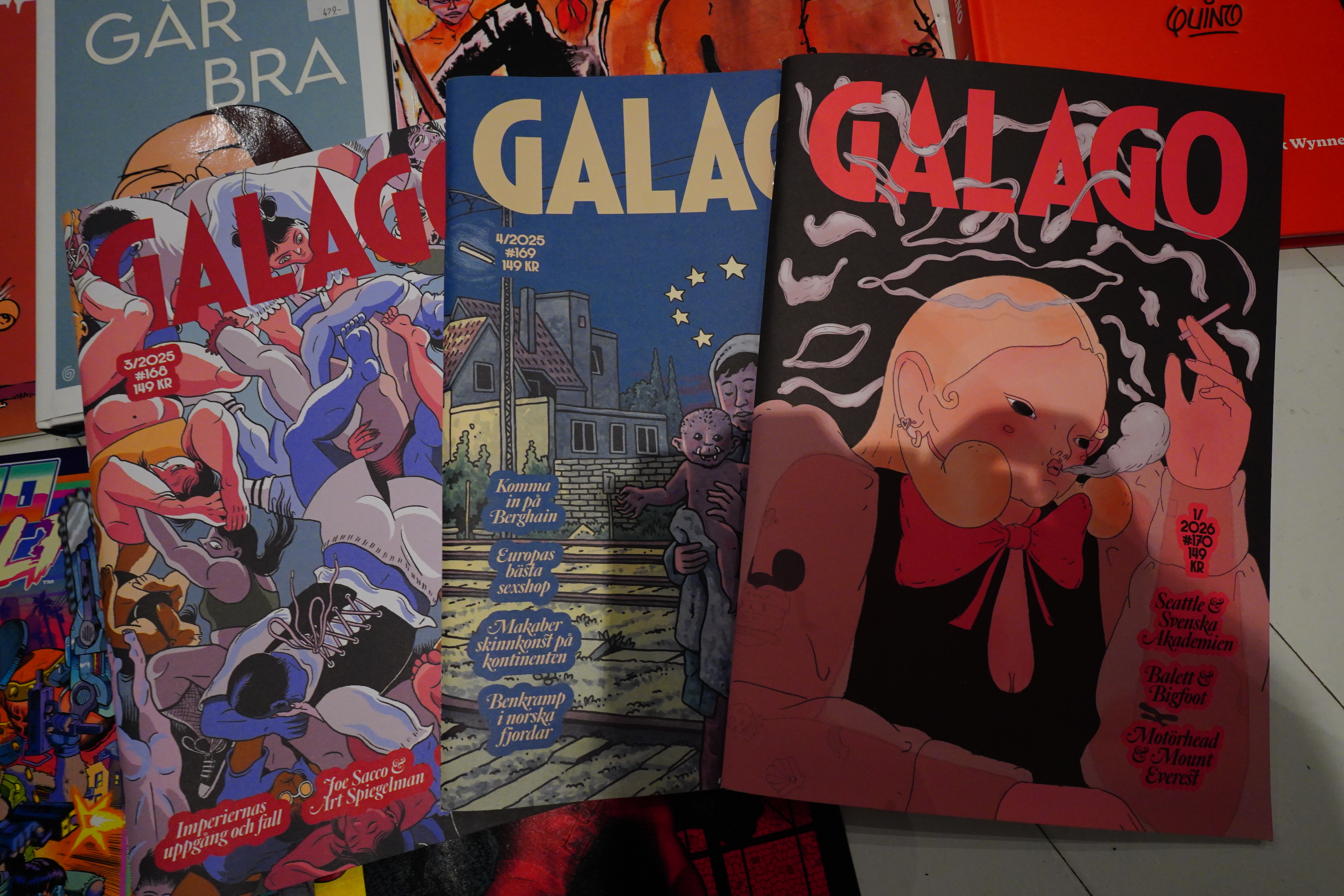
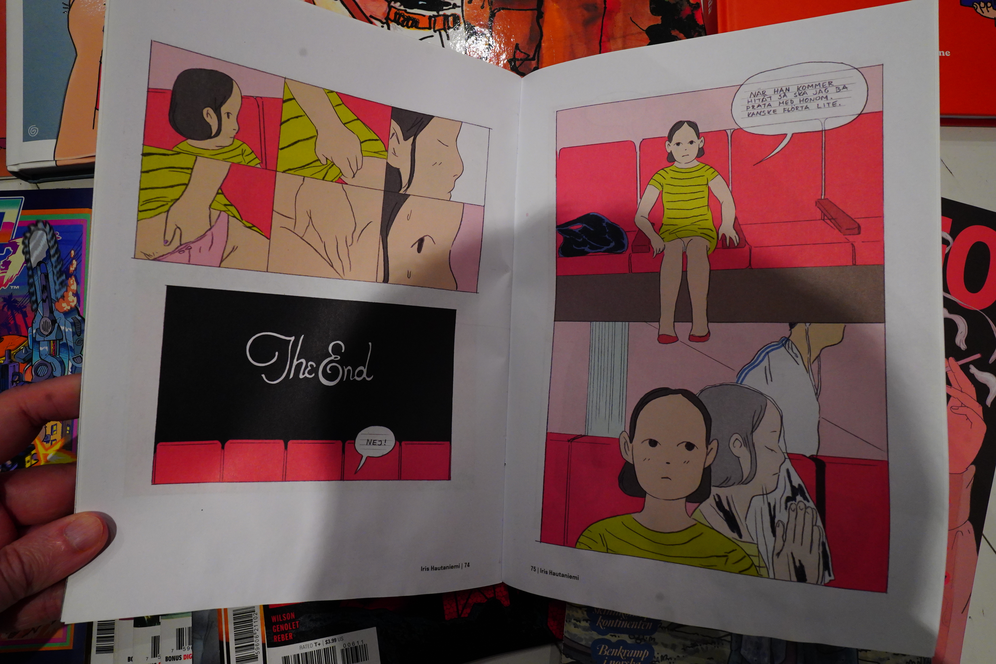
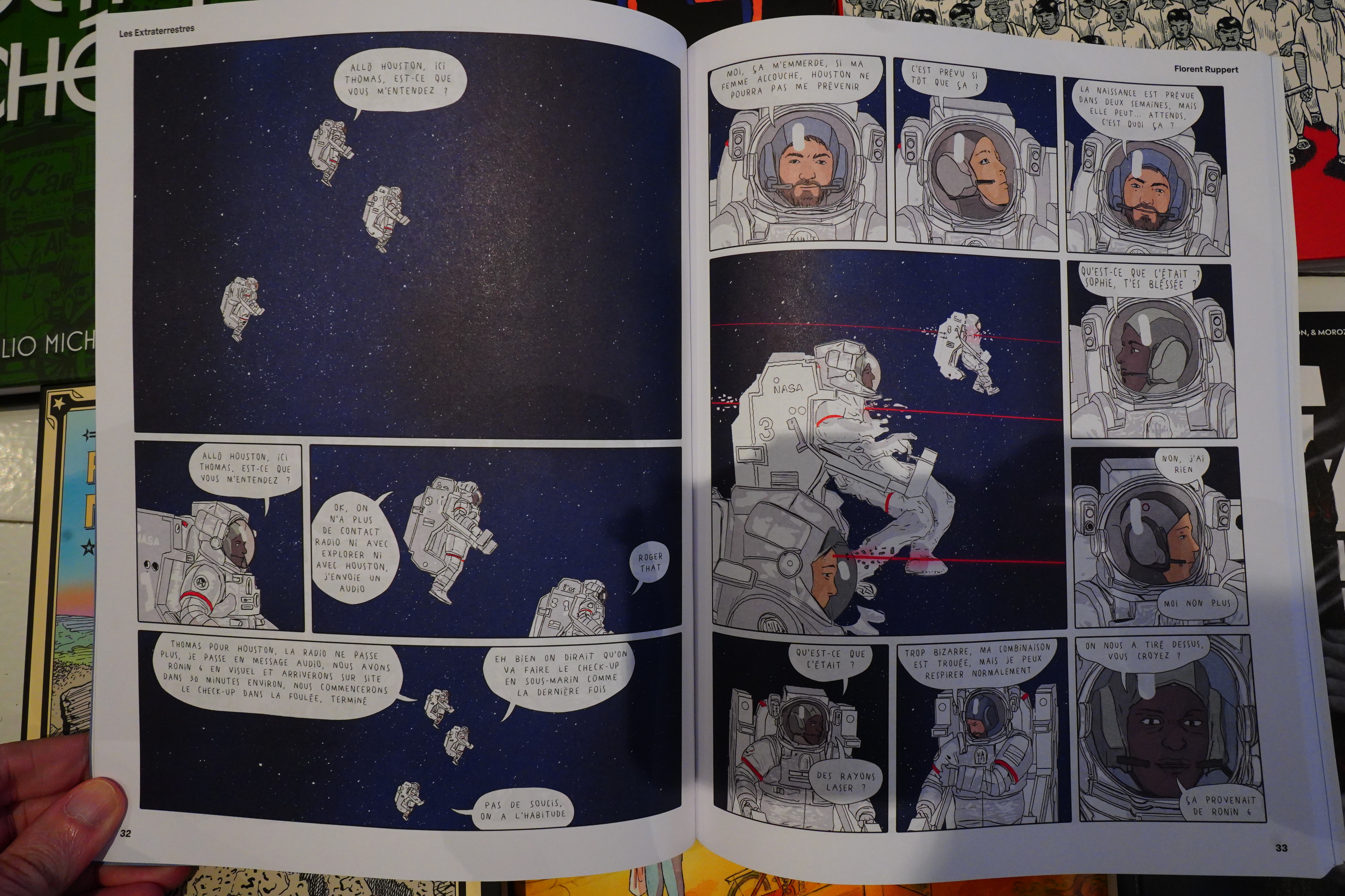
I saw a recommendation for Charlotte mensuel in a Norwegian magazine, so I popped off a subscription order, and I got my first issue this week.
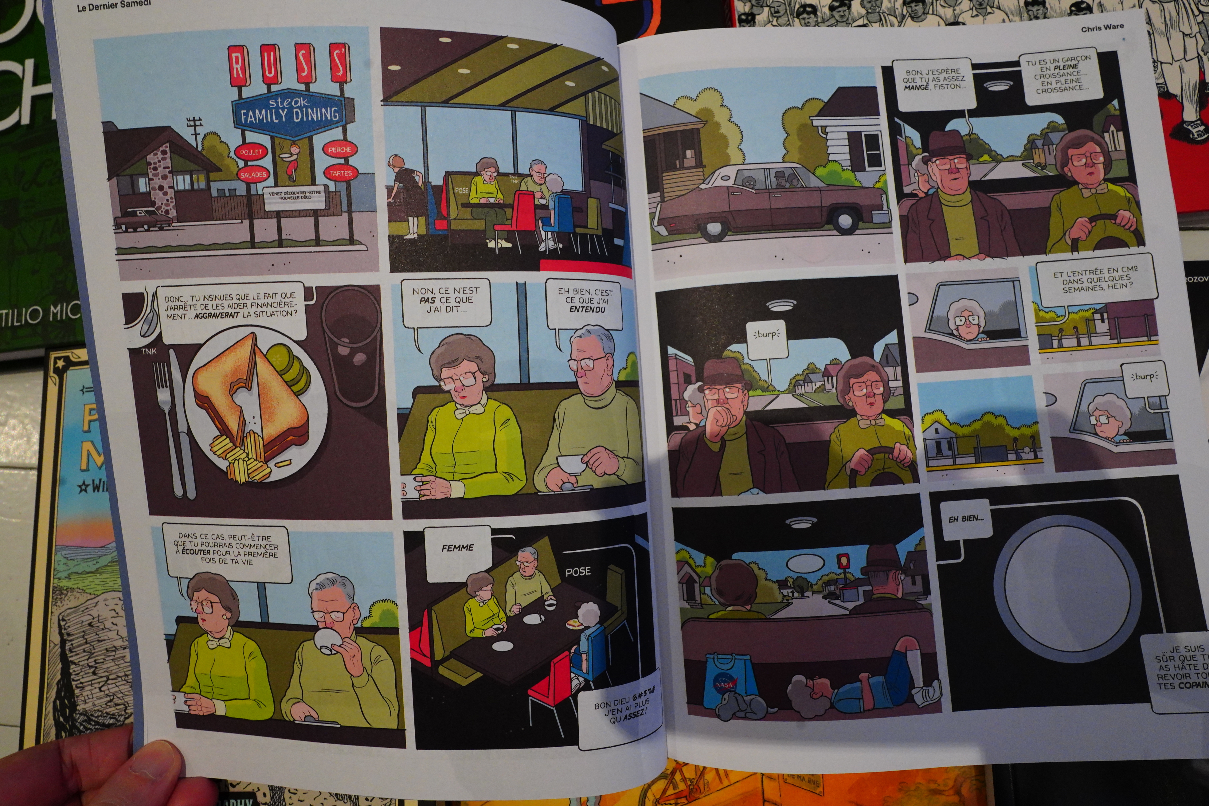
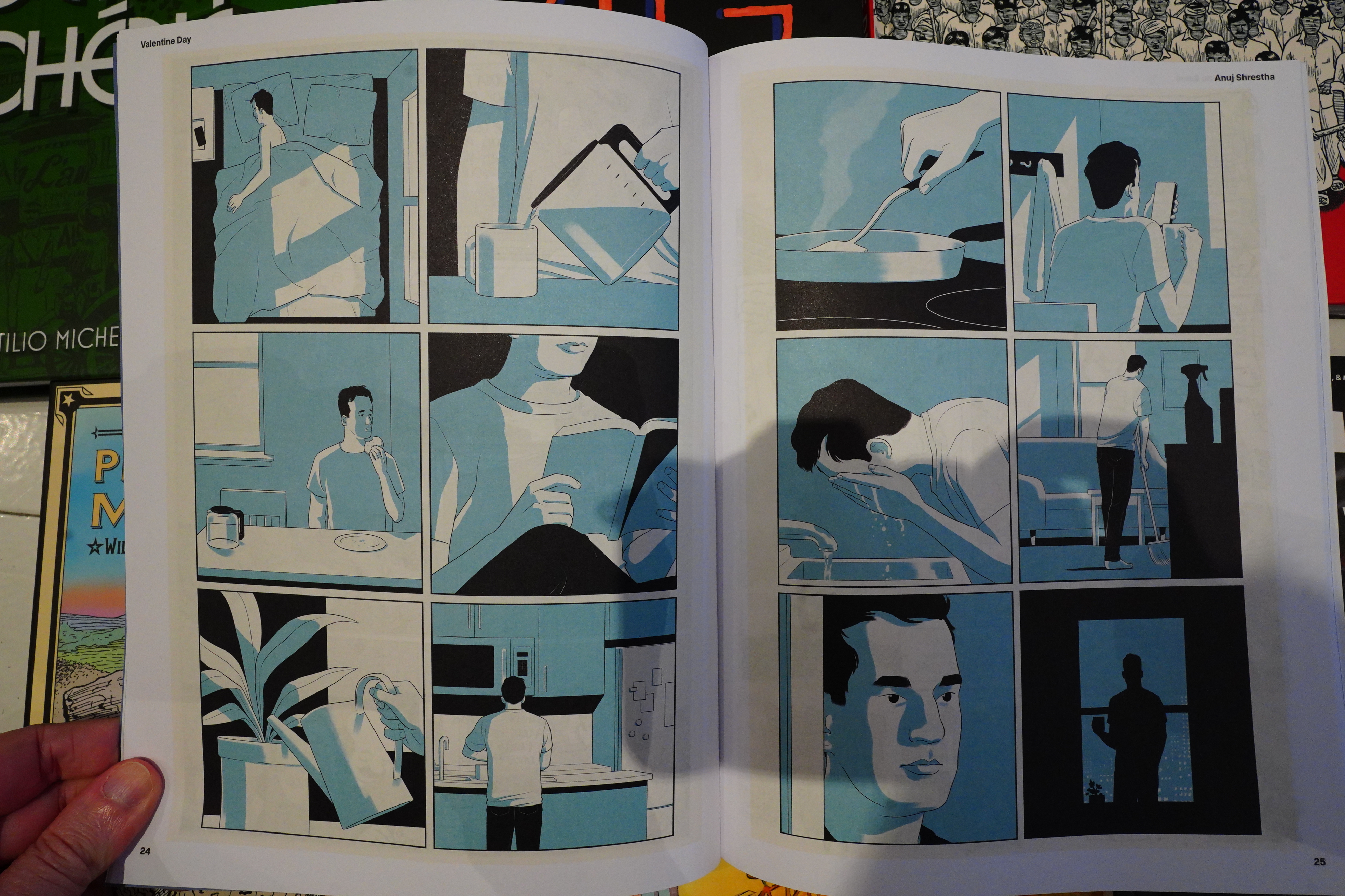
And what a surprise! Based on the title I assumed that it would be a humour magazine, but it’s not at all. Instead it’s something that I think you could compare with Mome or Now? That is, it’s a 120 page collection of shorter post-indie comics from France and the US. That is, narrative and depressing comics (i.e., not “art comics”) in a 90s tradition. Like the Chris Ware piece above, which I haven’t read before.
But mostly French stuff, and mostly newer stuff, even if they drop in older stuff, too.
Mostly serious things, but even the “funny” stuff is emotionally wrenching.
So of course there’s also some Julia Gförer here, too.
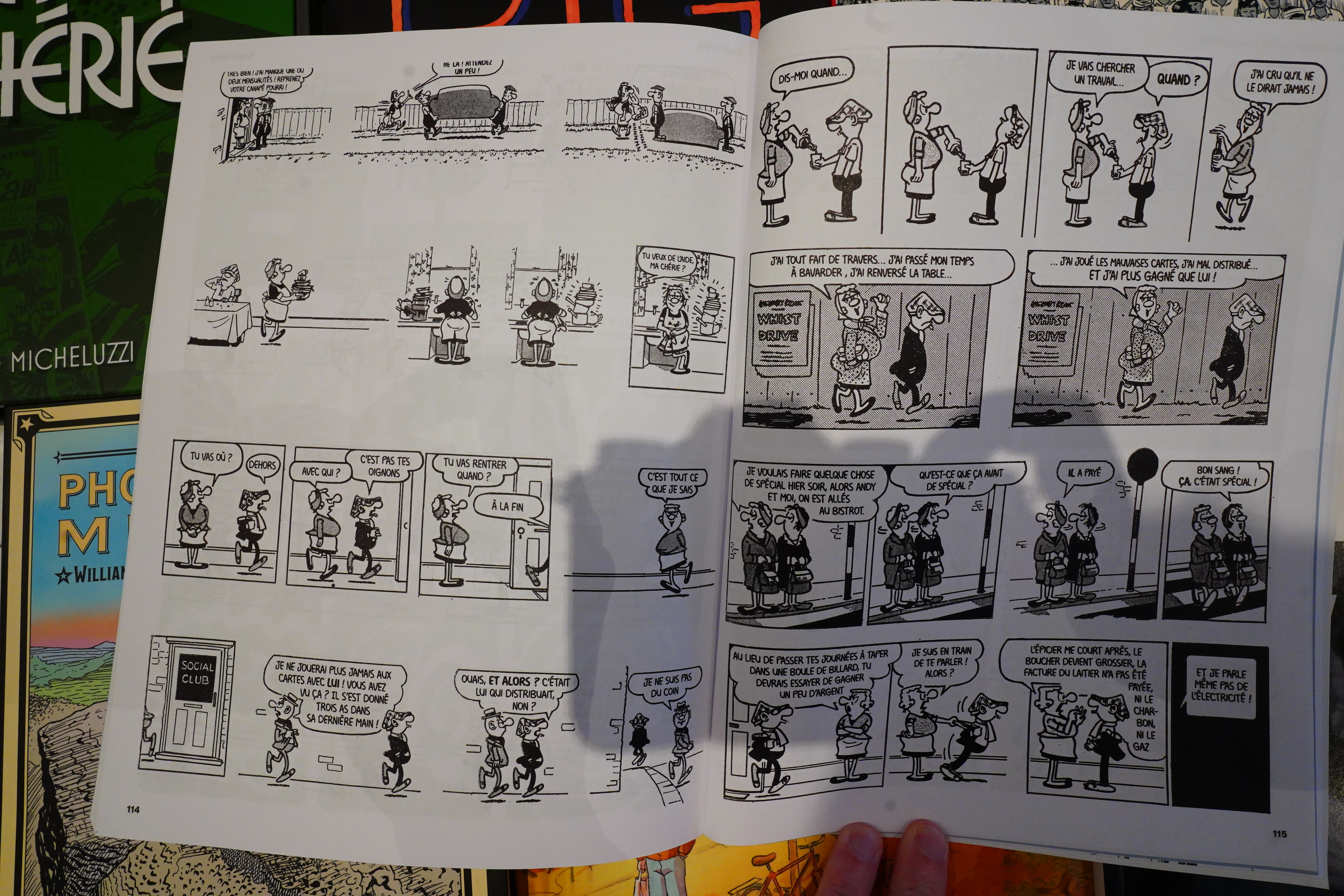
And… Andy Capp!? Oh those French people! But putting Andy Capp (and Hagar the Horrible) in this context seems to make a lot of sense — there’s a slight whiff of edgelordism about the magazine (I didn’t snap any of the worst offenders here), but it’s a tonally coherent magazine that’s really impressive.
You can get a subscription here.
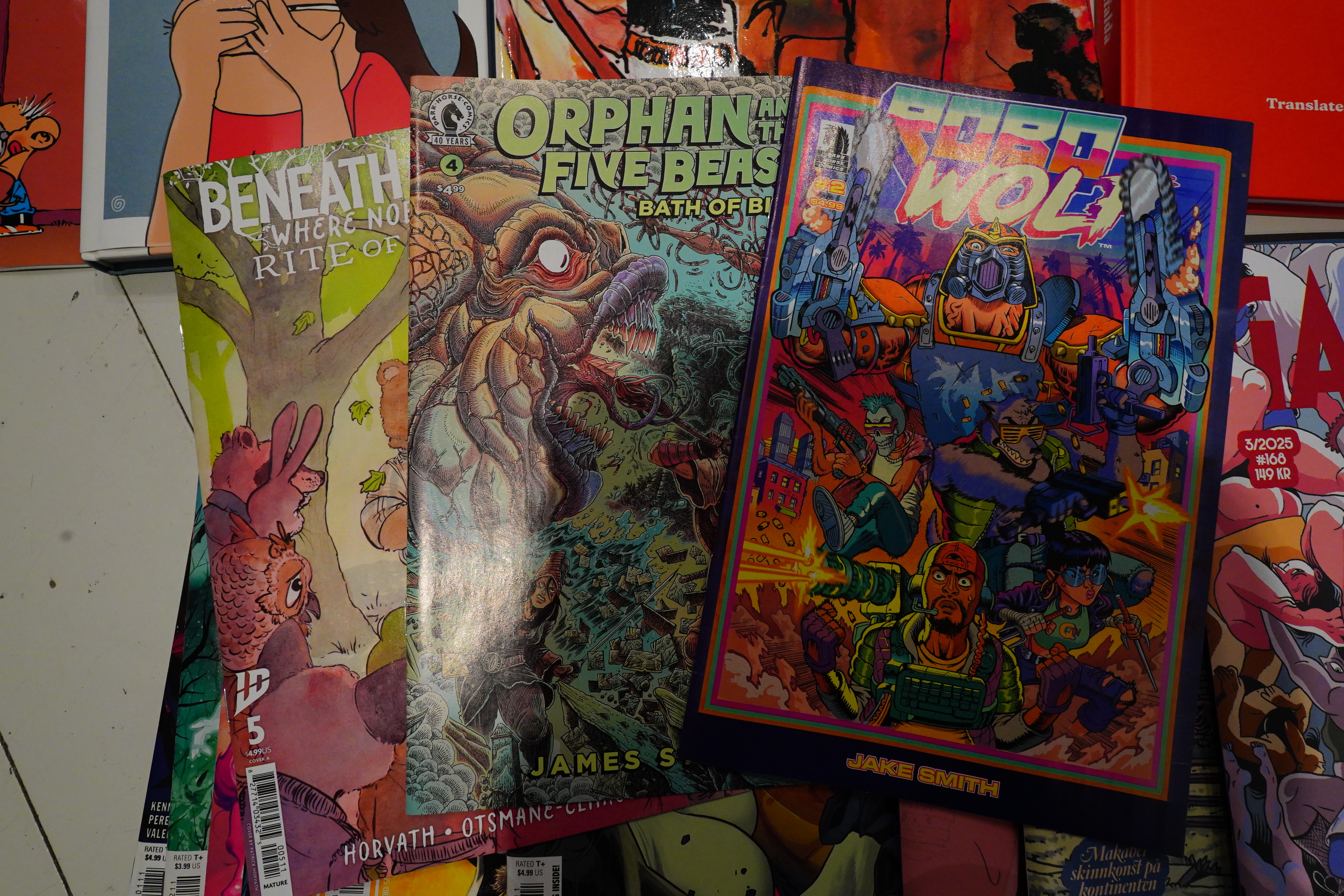
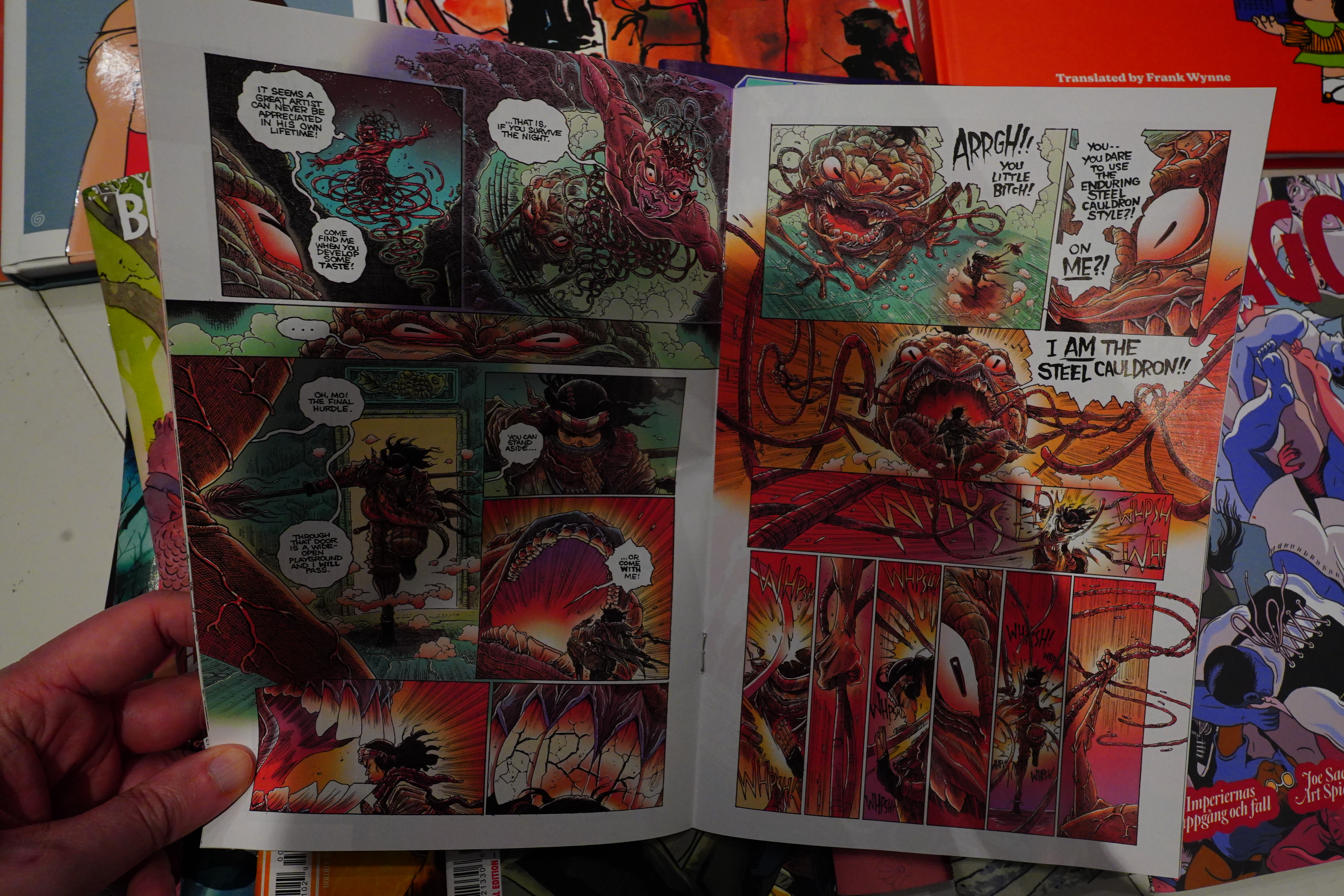
Speaking of anthologies…
The new Heavy Metal is a successful Heavy Metal iteration. The enthusiasm of the editor is palpable — he’s willing this project to succeed.
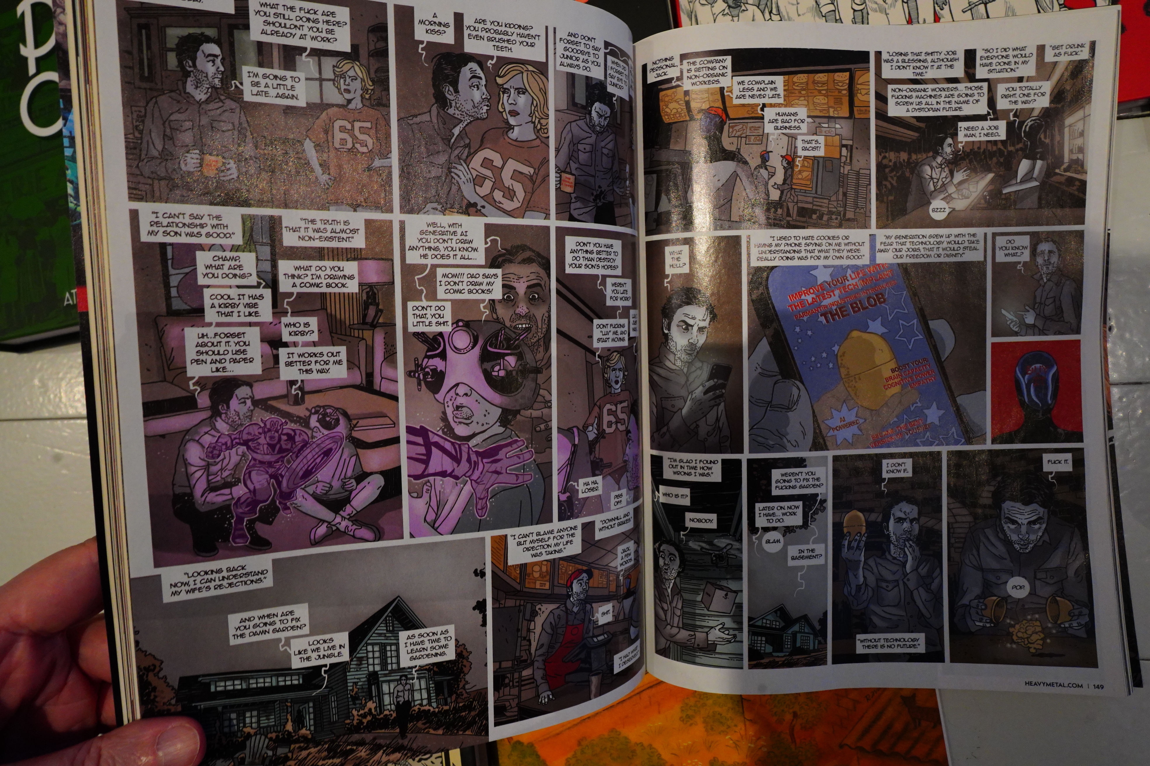
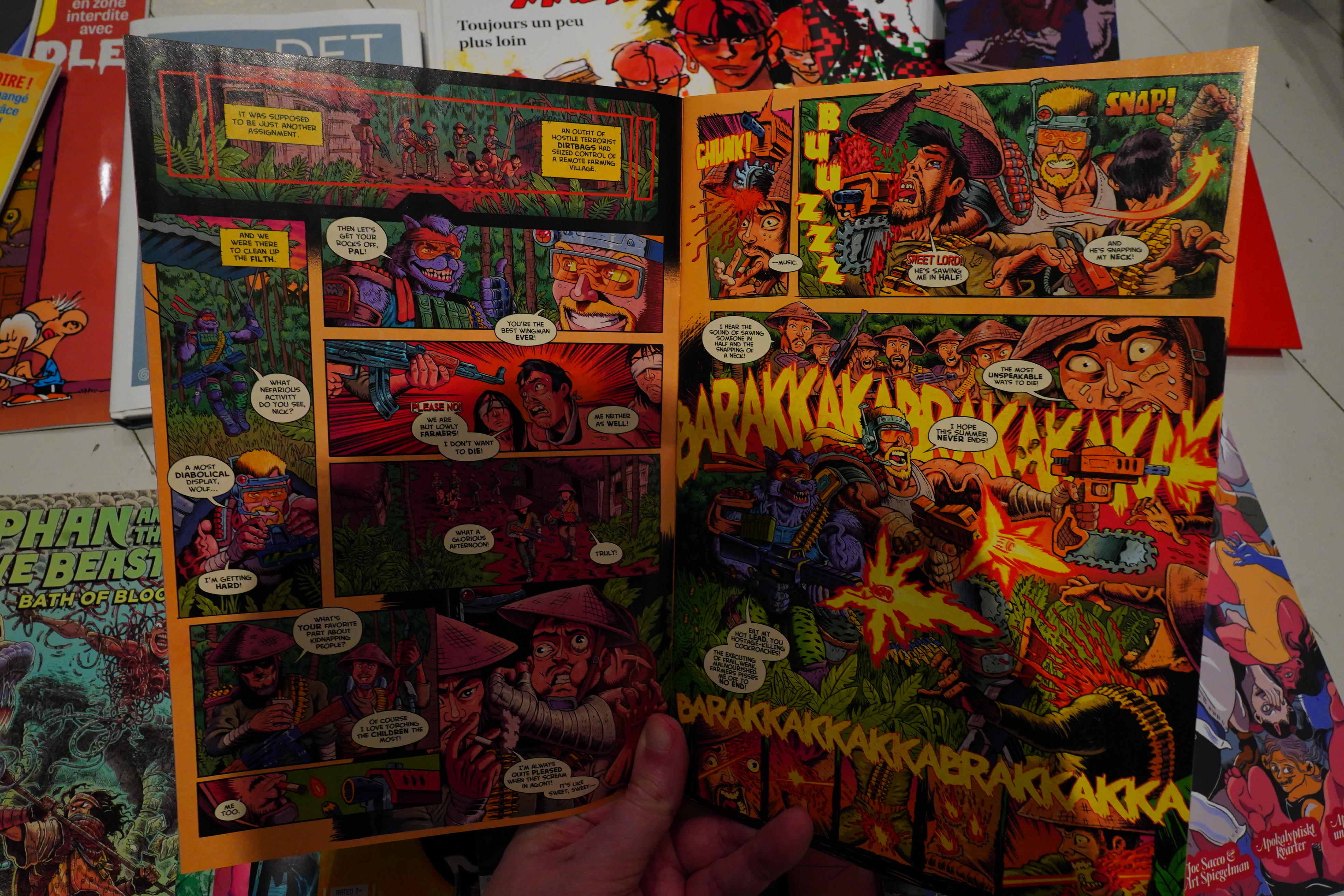
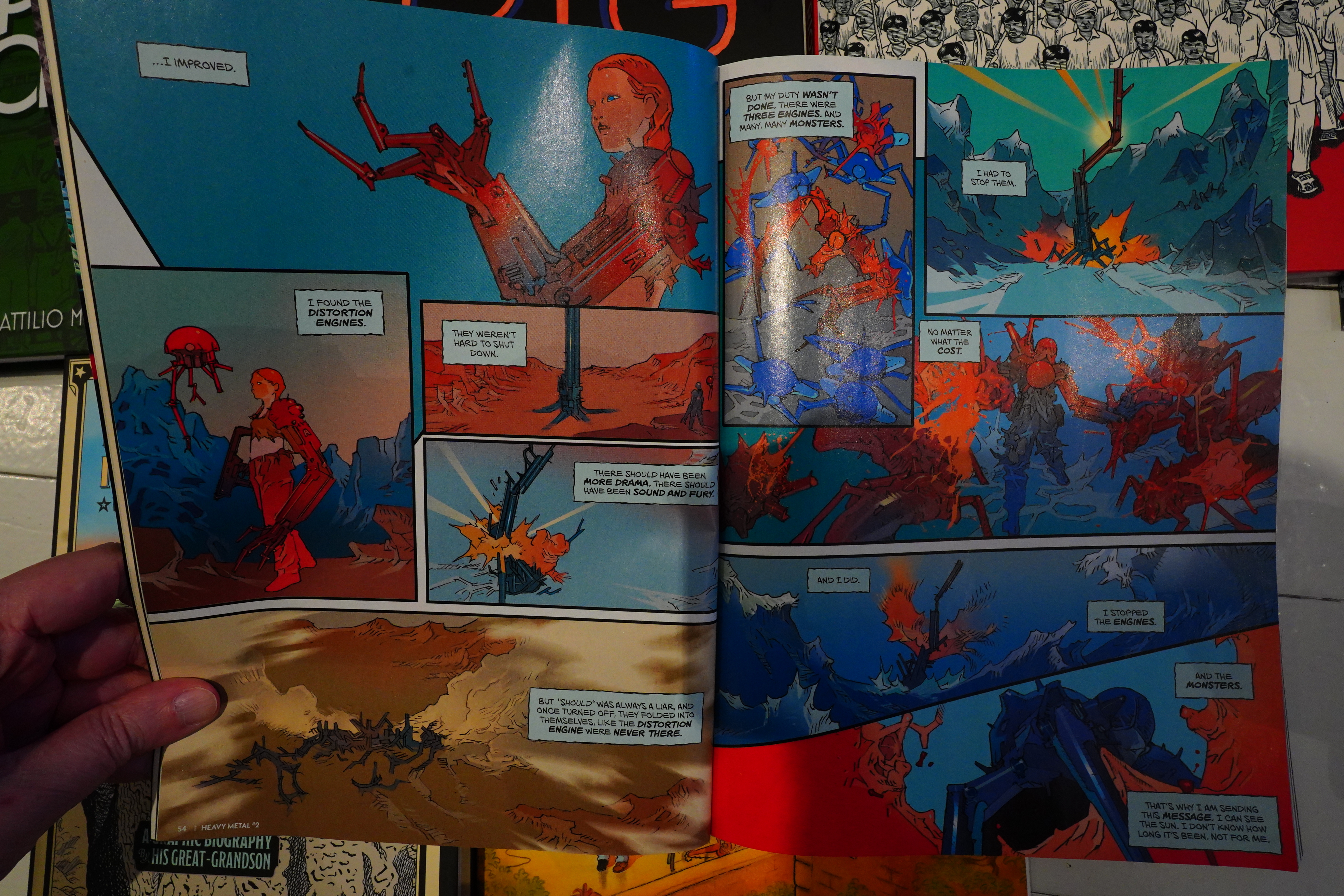
It’s a good mixture of French and American stuff, too, and while there’s many stories that are a bit naff, there’s as many that’s solid (like the anti-AI story above). My only complaint is structural, really — it’s 230 pages long, and almost all the stories are between five and twenty pages long, which isn’t ideal. With that length, you could drop in a sixty page story at least, and sprinkle some one-pagers here and there for more variety.
But it’s a surprisingly good Heavy Metal, if you like Heavy Metal.
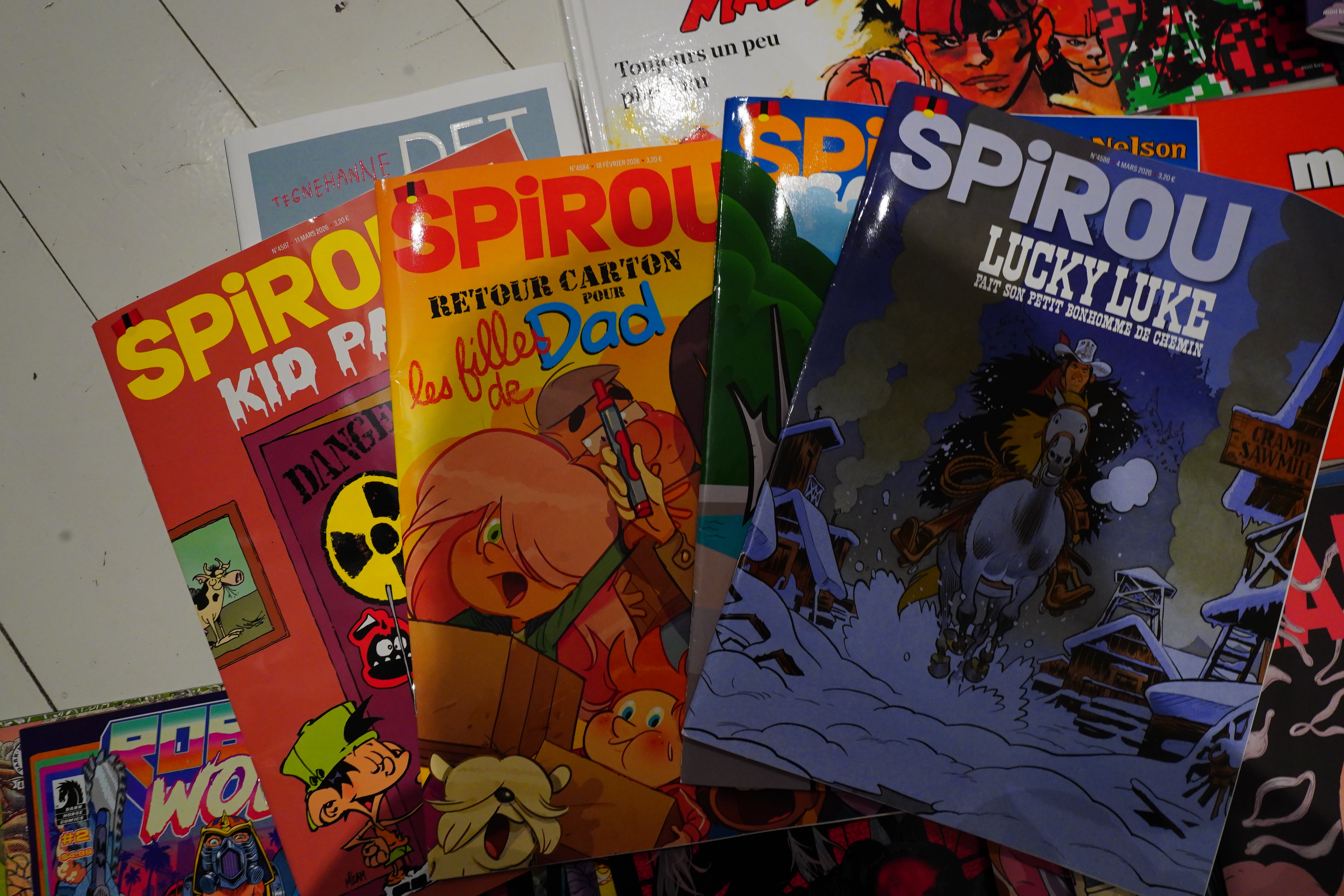
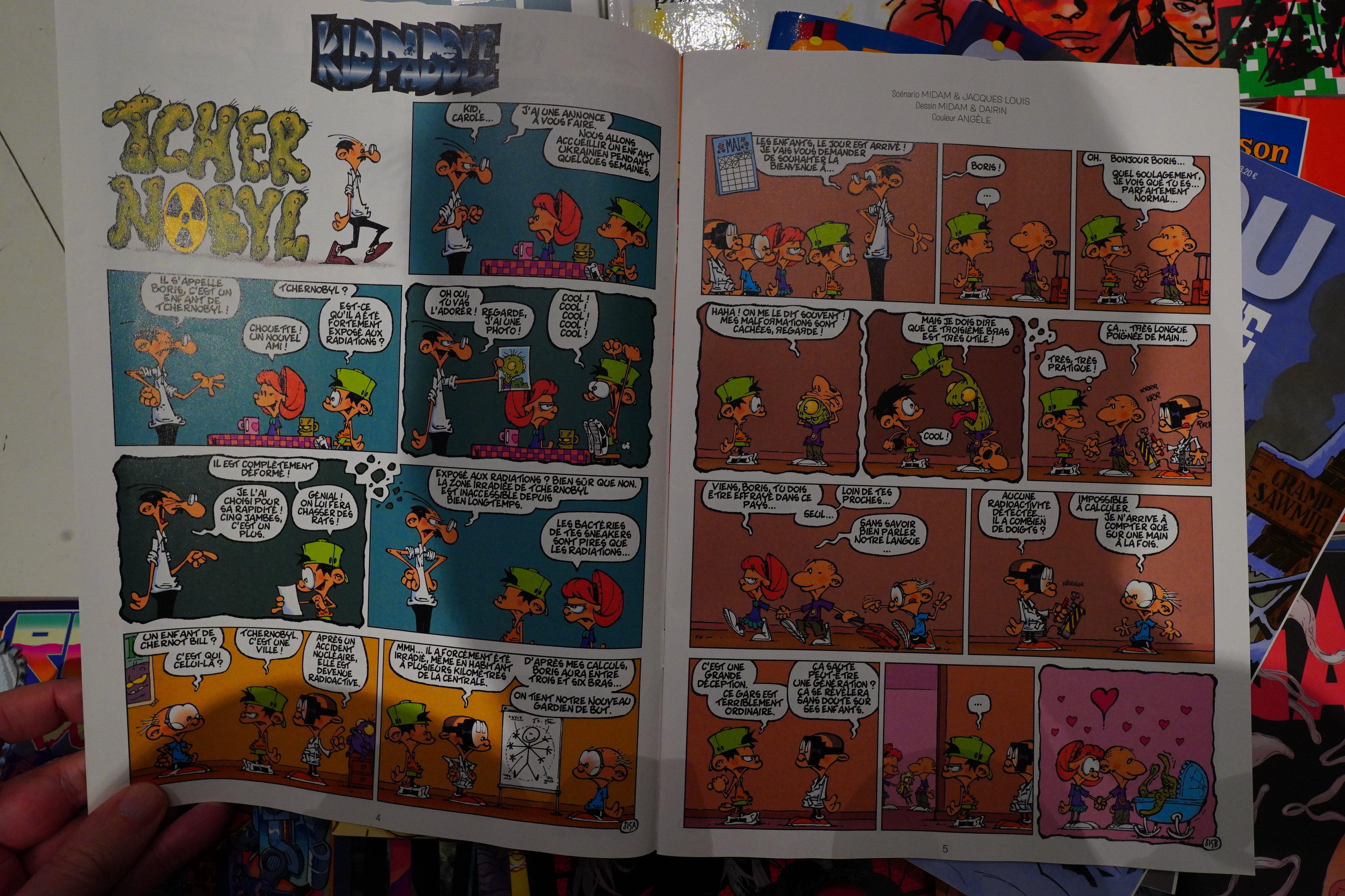
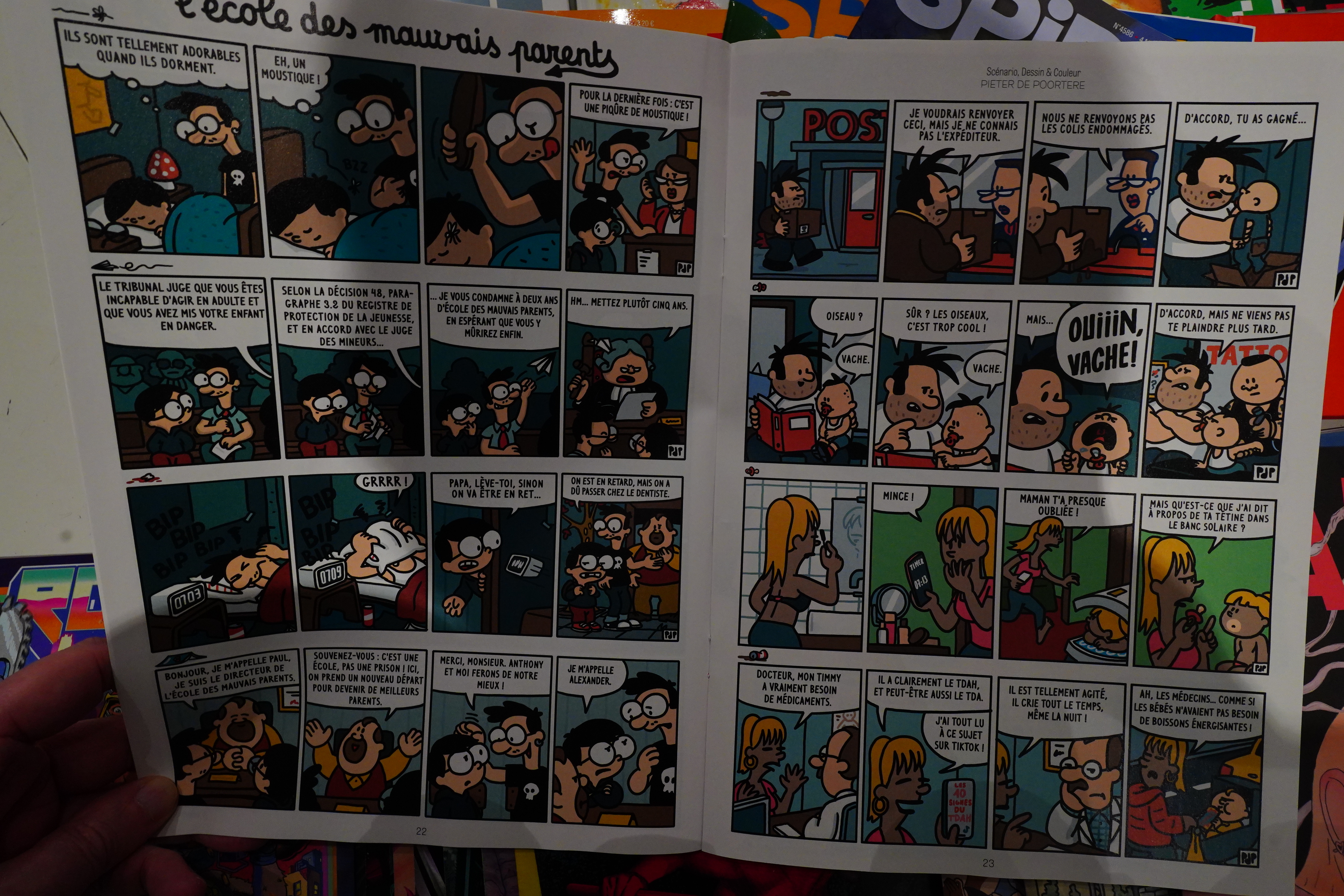
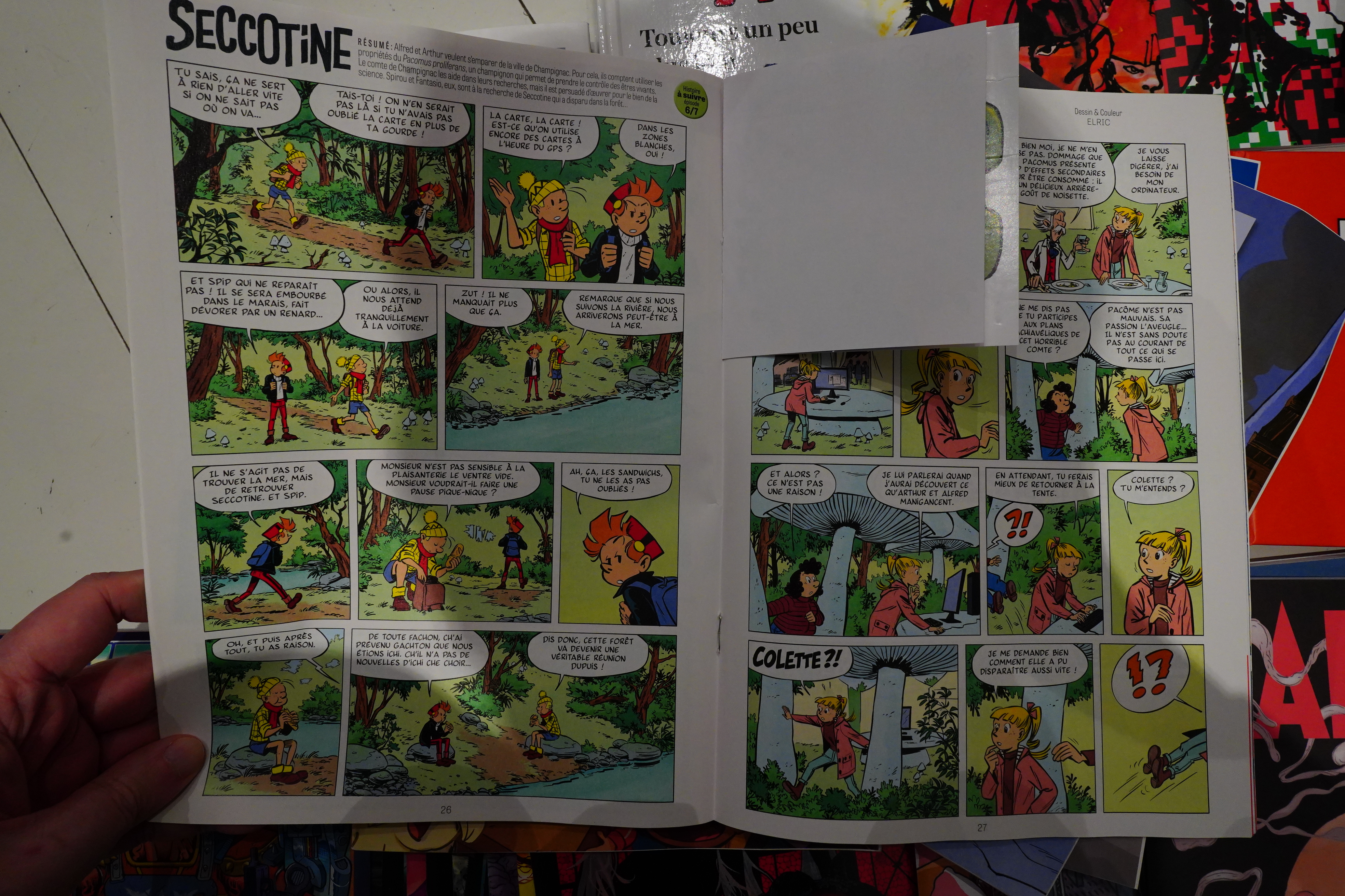
Speaking of anthologies…
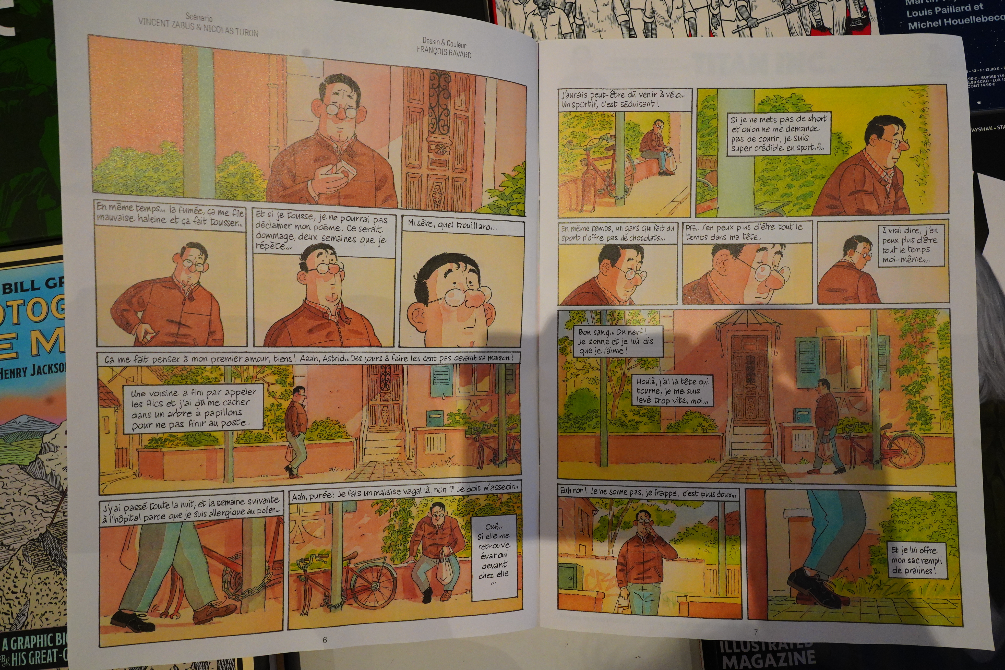
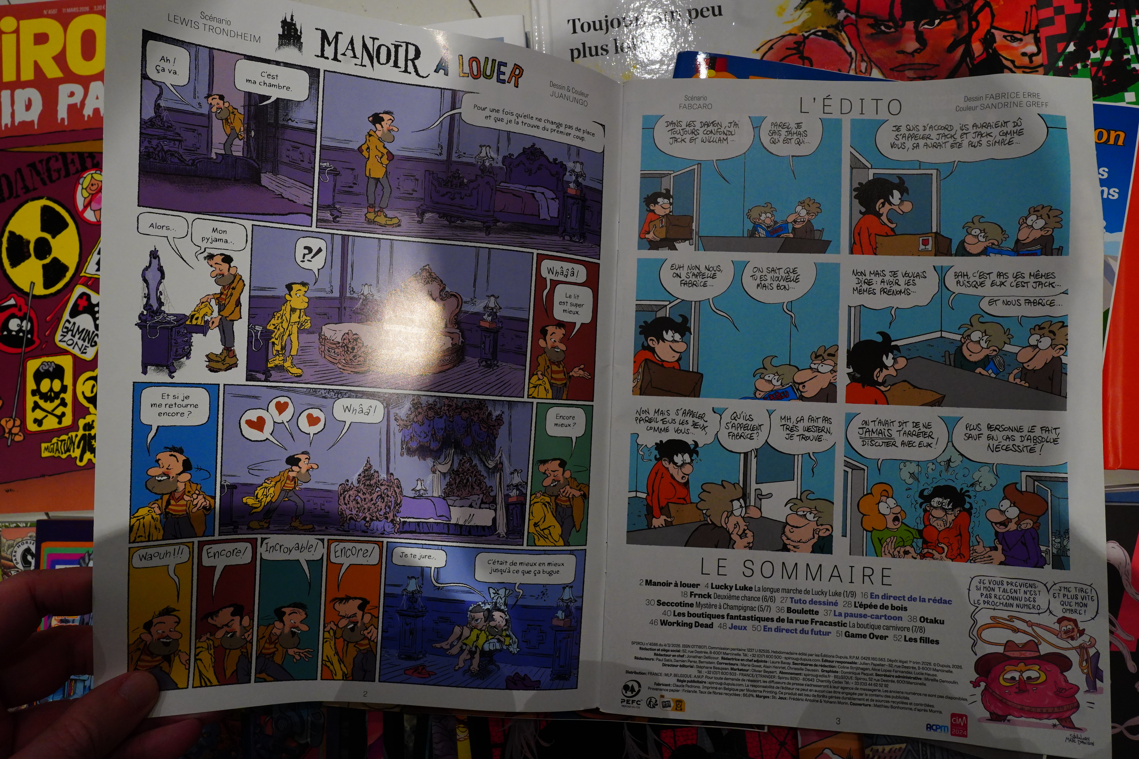
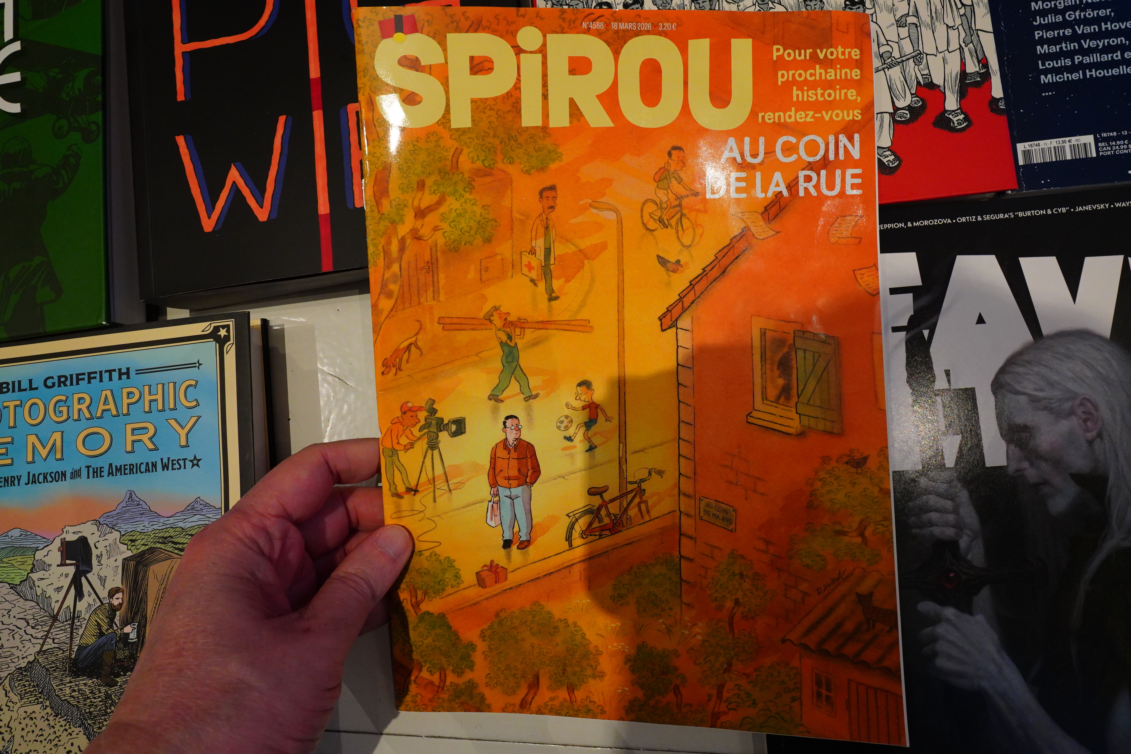
This Spirou issue is special. It has three Au coin de la rue, and apparently the concept here is that you have three different creators (or teams) presented with the same setup.
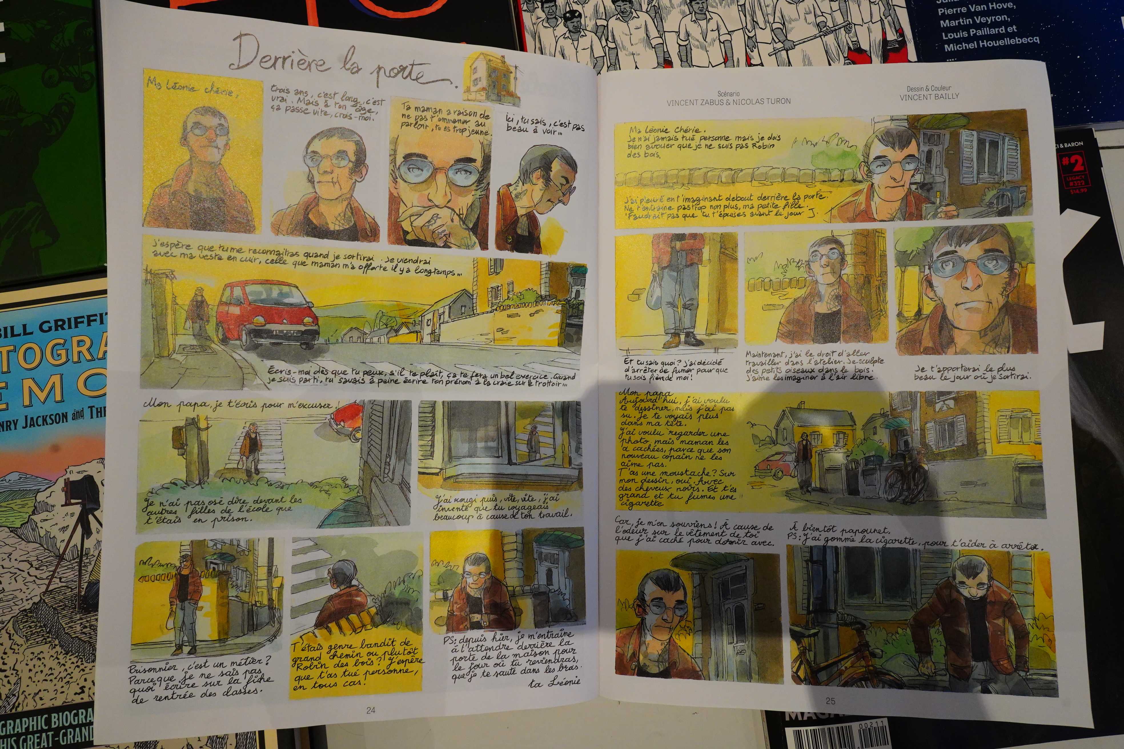
So here you have three different men that have different reasons for not ringing the bell at a house.
It works. But it makes for a very odd issue of Spirou, especially since none of these stories are funny — mostly kinda depressing. But good.
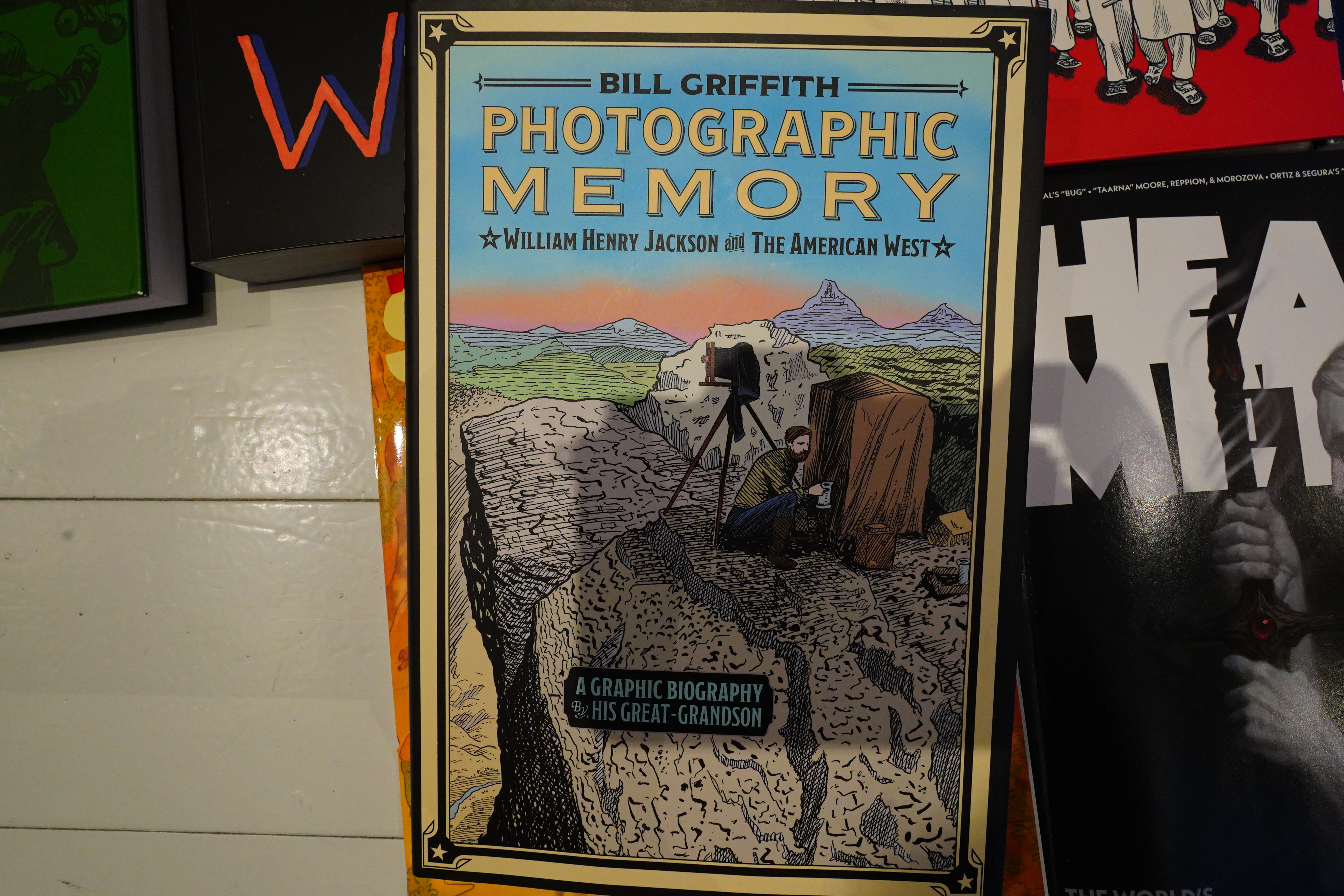
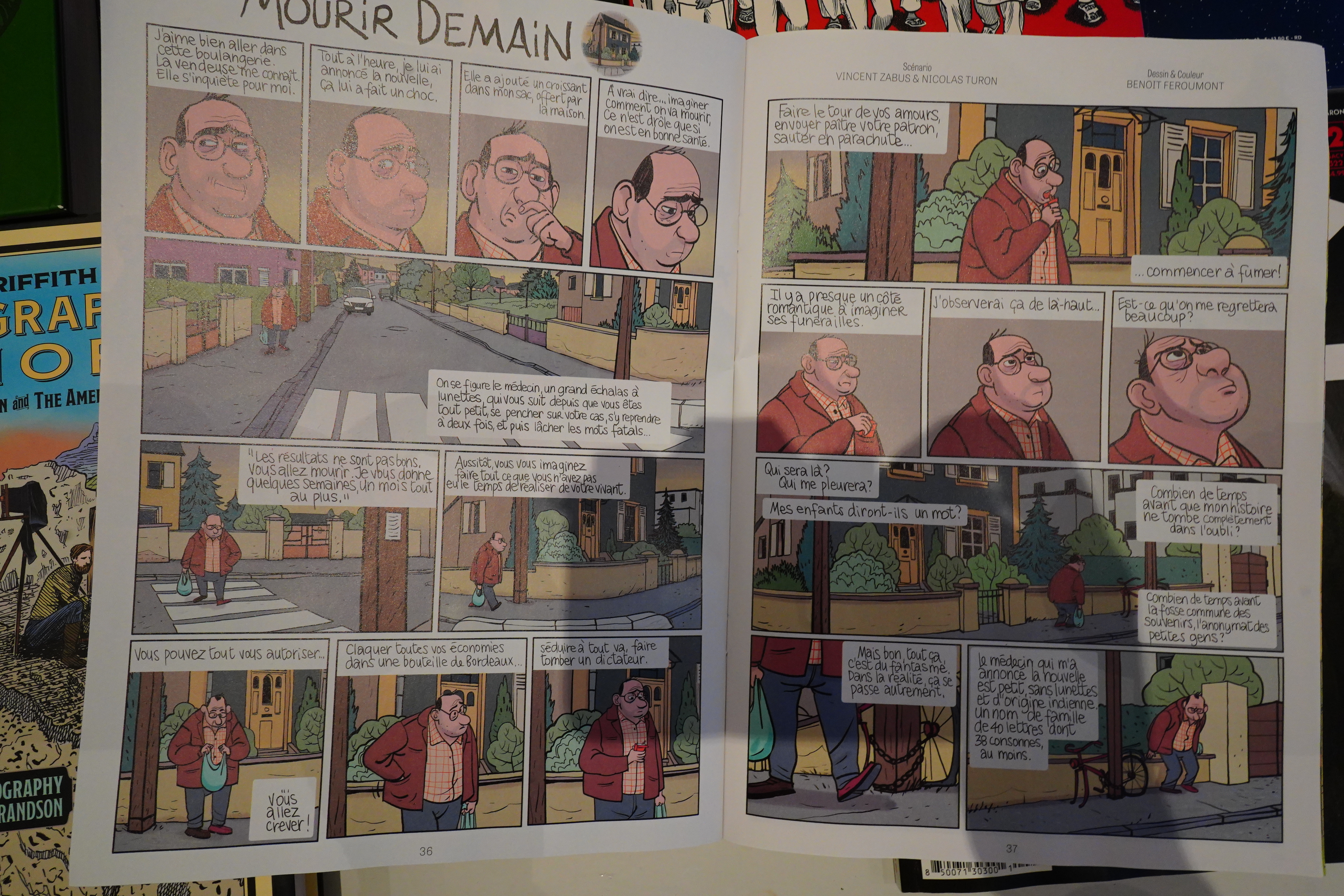
I love me some Bill Griffith, so even though I’m not into biographies, I got this book.
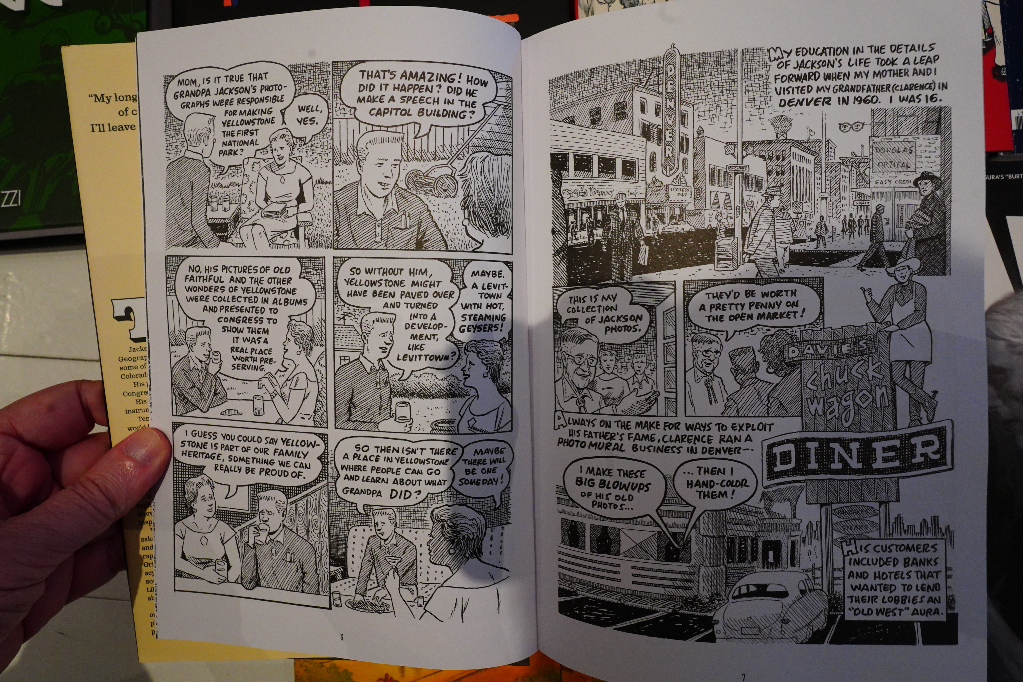
And it starts off delightfully — Griffith’s artwork is so on point here, and the storytelling flows in a most pleasant way.
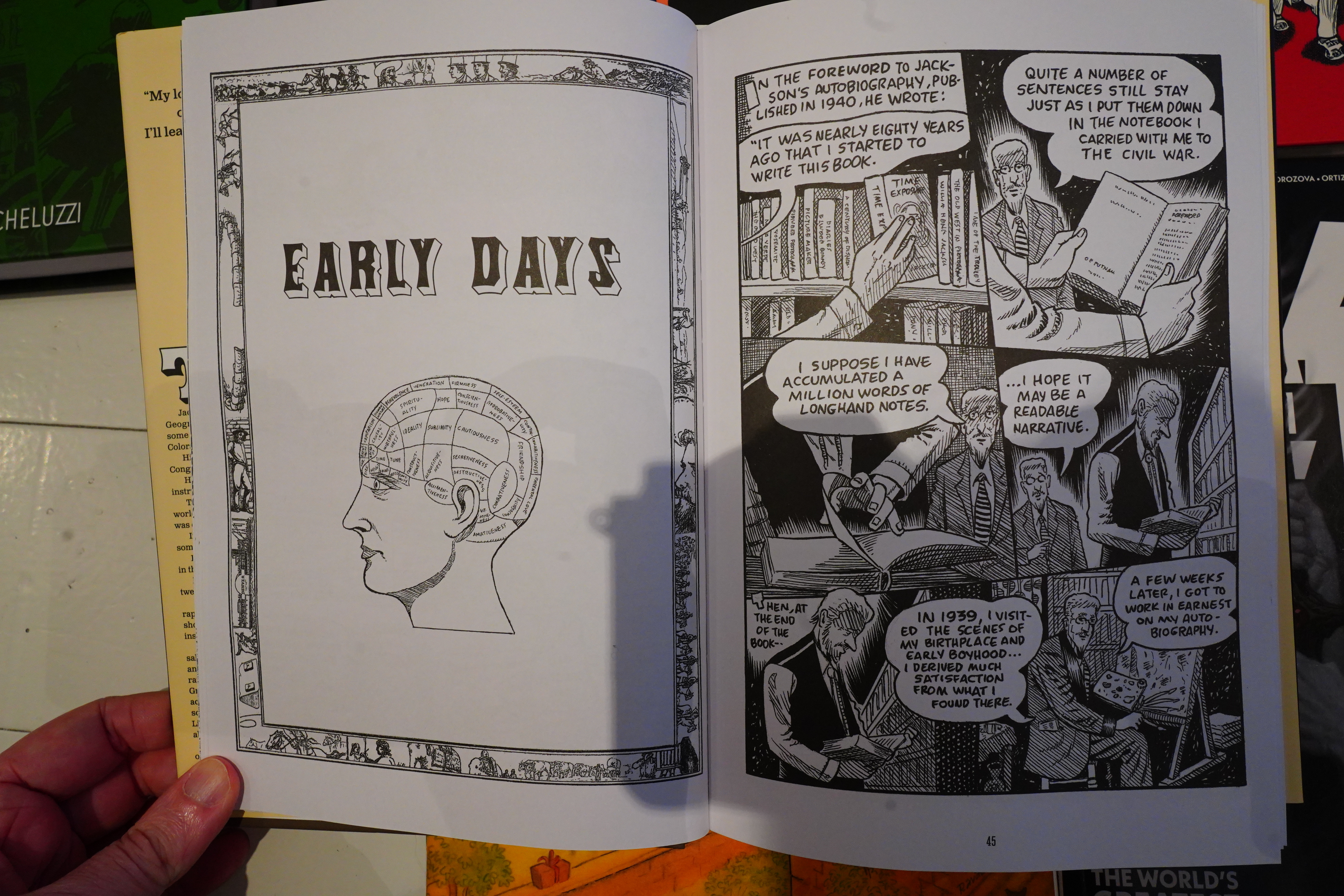
But then! After 43 pages, we get “Early Days” because it turns out that the first bit was just the introduction.
And then the rest of the book is apparently mostly an adaptation of the autobiography of the subject of the book (a photographer and painter who was Griffith’s arrière-grand-père), and… I’m sorry to say that I just lost interest. Sorry! I think if you’re into this sort of thing, this book is probably awesome? But I’m not, so I started zoning out.
Hm… it wasn’t on many people’s best of 2025 lists? That surprises me…
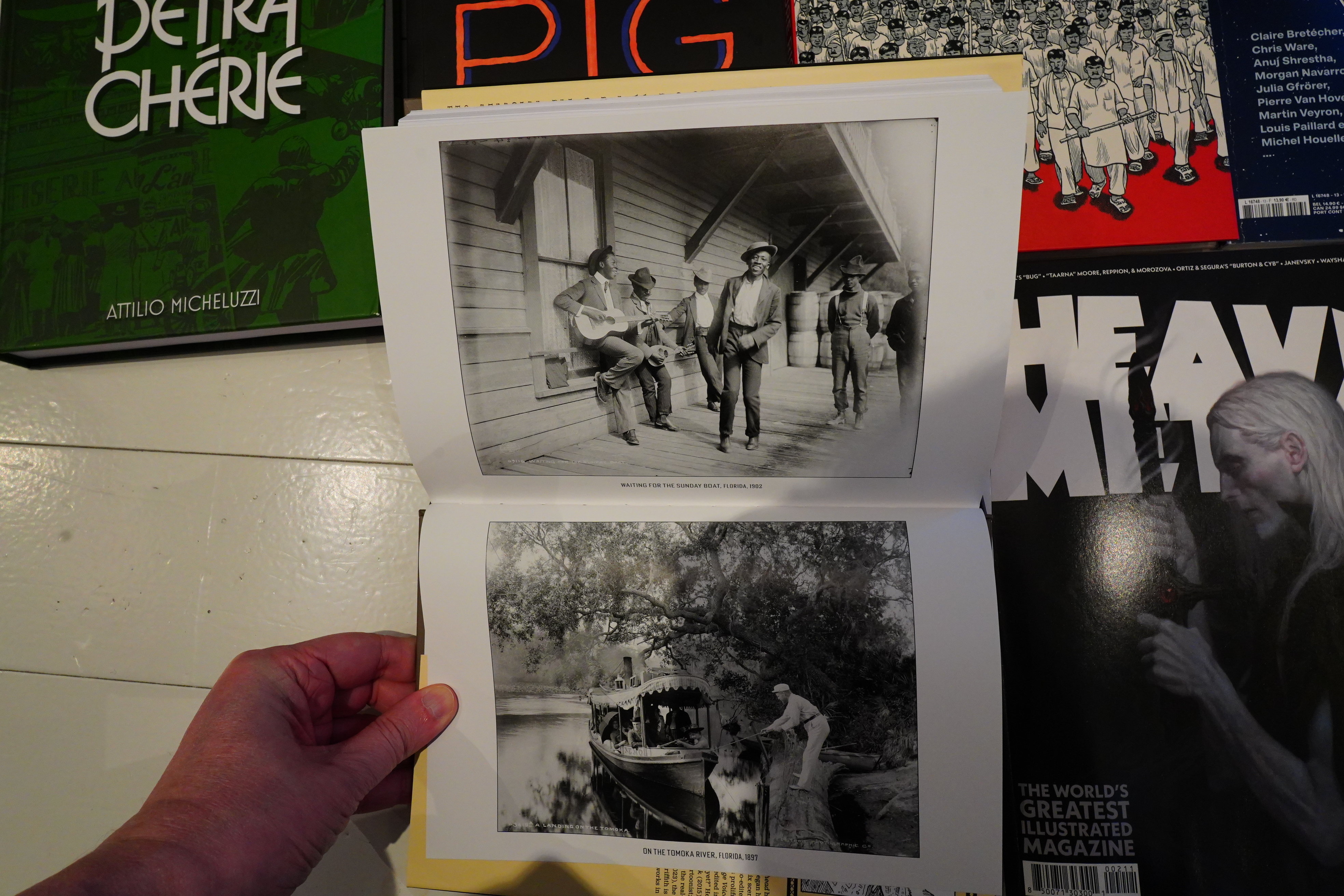
And there’s reproductions of some of his photos at the end (on glossy paper).
OK, that’s it.