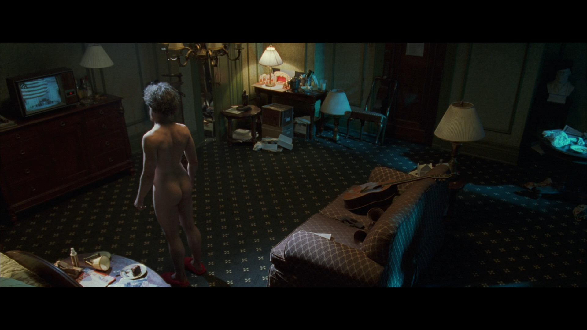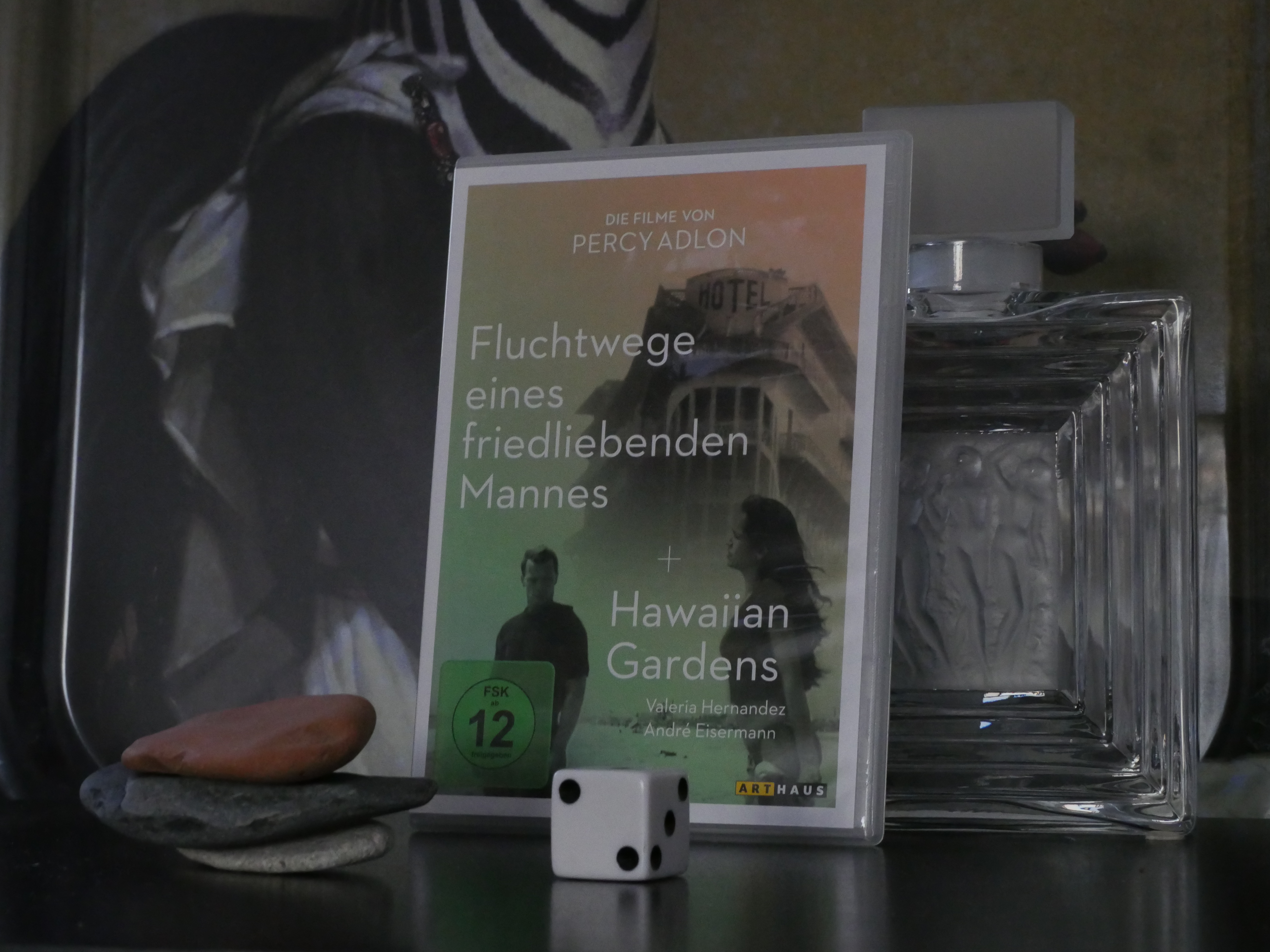


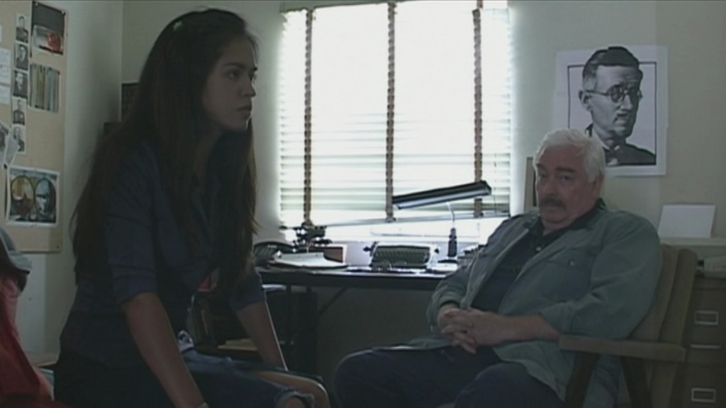


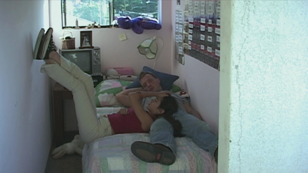

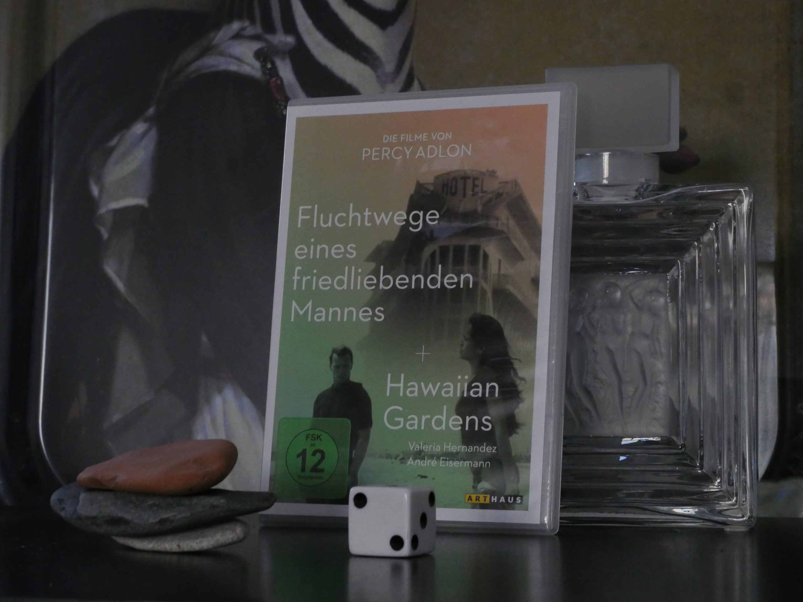
Hawaiian Gardens. Percy Adlon. 2001.
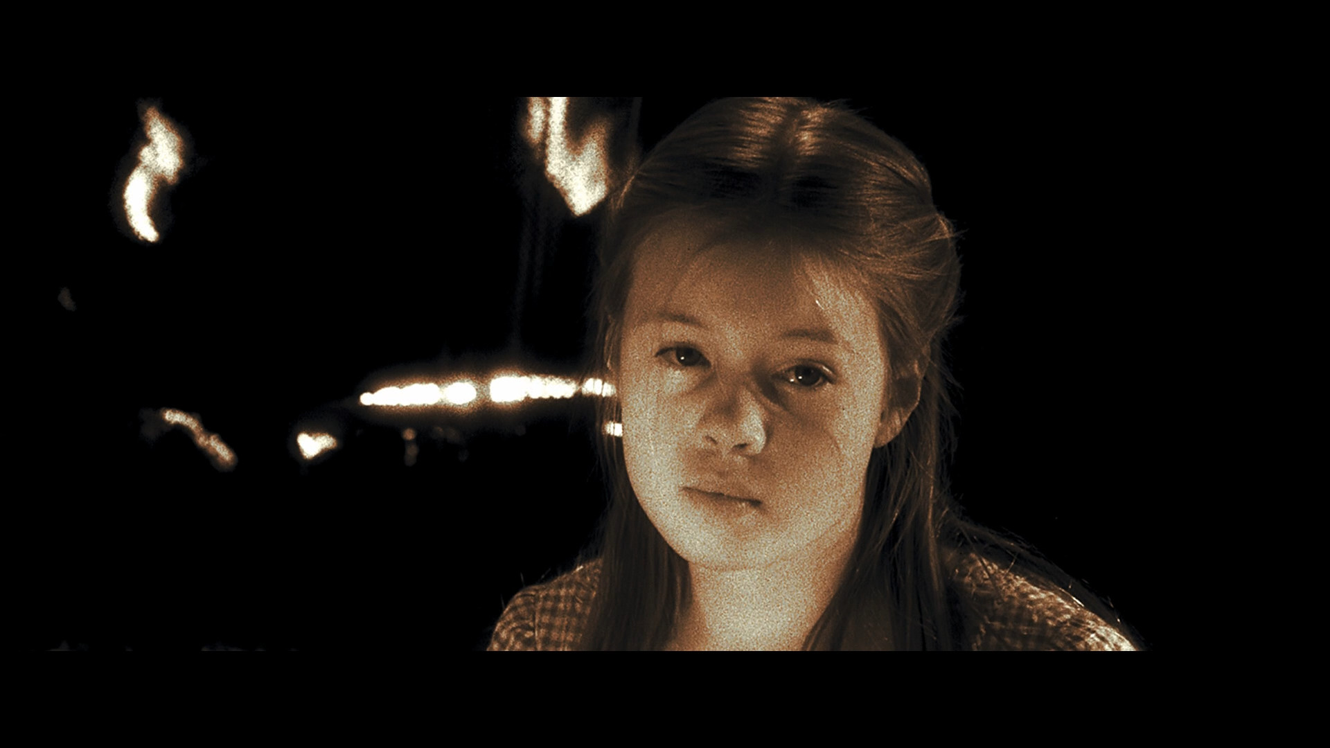
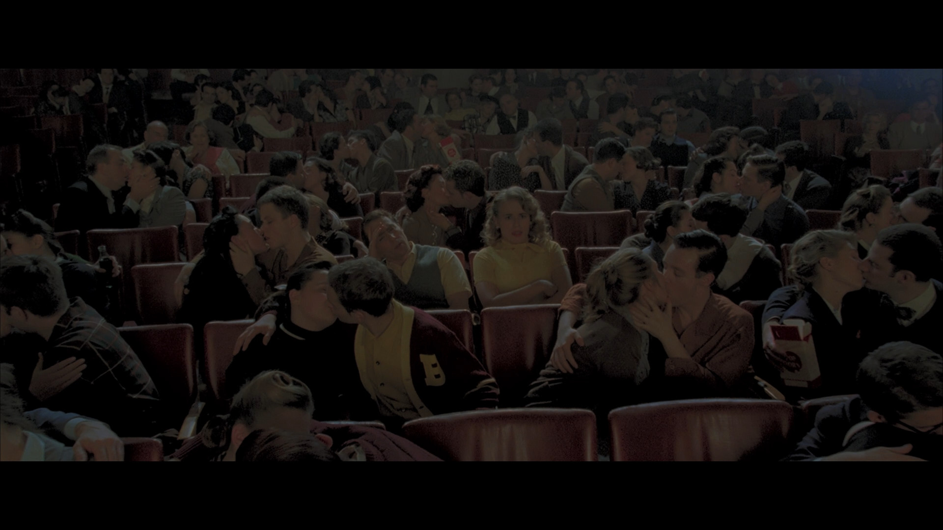
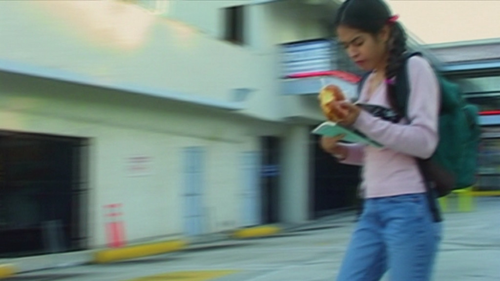
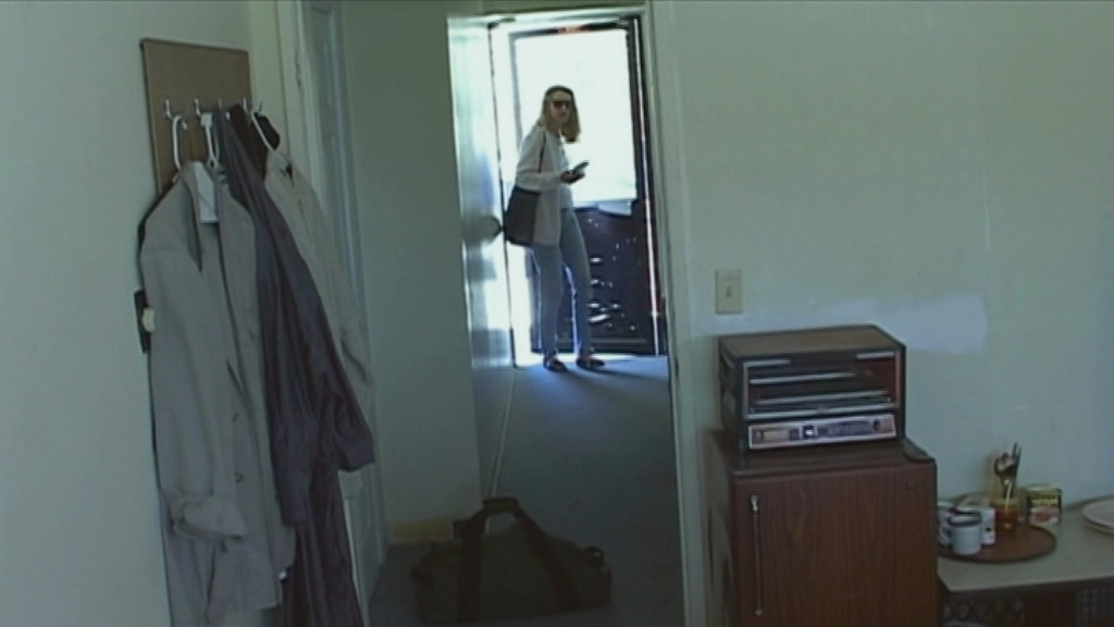
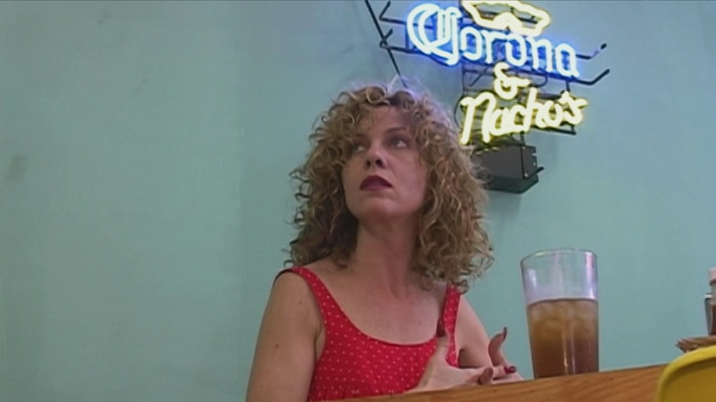
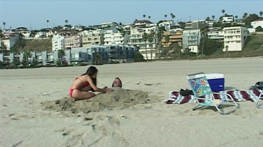
Well, this is a different aesthetic from Percy Adlon. Instead of super-saturated colours a sound stage and nice film stock, this looks like it’s been filmed on an early-generation digital camera, and it’s all on location with natural lighting.
It’s got a rating of 4.1 on imdb, which is the lowest possible for a real movie, I think, and Adlon wouldn’t do another cinematic release until 2010 (Mahler on the Couch, which is OK, but not as good as his earlier, funnier movies).
Adlon had an interesting career arc if you peek at imdb. I haven’t seen his earliest films, but he won the world over with the iconic Zuckerbaby, and followed it up by leaving Germany and doing three more films in basically the same mode (Bagdad Cafe, Rosalie Goes Shopping and Salmonberries), and they’re all great.
Then you get Younger and Younger, which I remember being… er… not that good? (I should rewatch.) That’s in 1993, and then he apparently couldn’t get financing for any US films any more. Or any financing whatsoever, based on this film.
But I think it’s fair to say that everybody was pretty disappointed by Hawaiian Gardens? (According to imdb the working title was “DogShit”.)
This DVD has an English audio track… which means, I found I just now, that when anybody who’s talking English are talking, they’re not dubbed into German. But when a German person is talking, we get German on the audio track, and the German subtitles disappear. I mean, I understand German vaguely if they talk slow or I’m reading the German subtitles s-l-o-w-l-y. But I basically didn’t really understand a lot of what’s going on here.
So perhaps it’s really brilliant and I just didn’t understand! It’s possible! But it looks like shit and the acting is shocking. Adlon has never exactly gone for naturalistic actors, but there’s a wide gulf between stylised poses and uninteresting acting.
I like the Adlon flourishes in the soundtrack, though.
This blog post is part of the Century series.