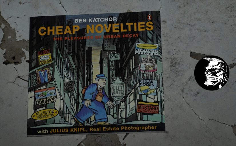
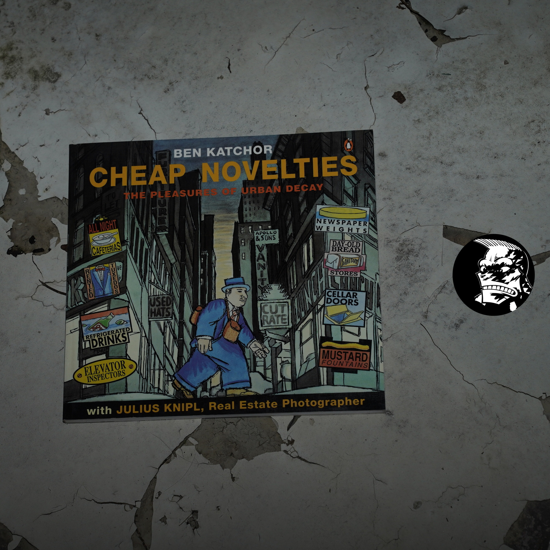
Cheap Novelties: The Pleasures of Urban Decay by Ben Katchor (202x193mm)
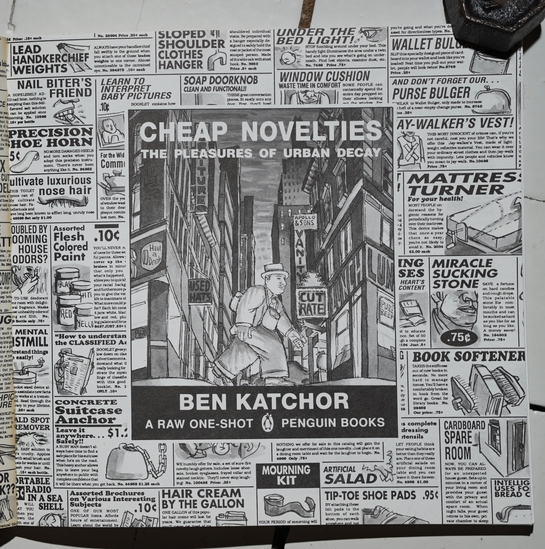
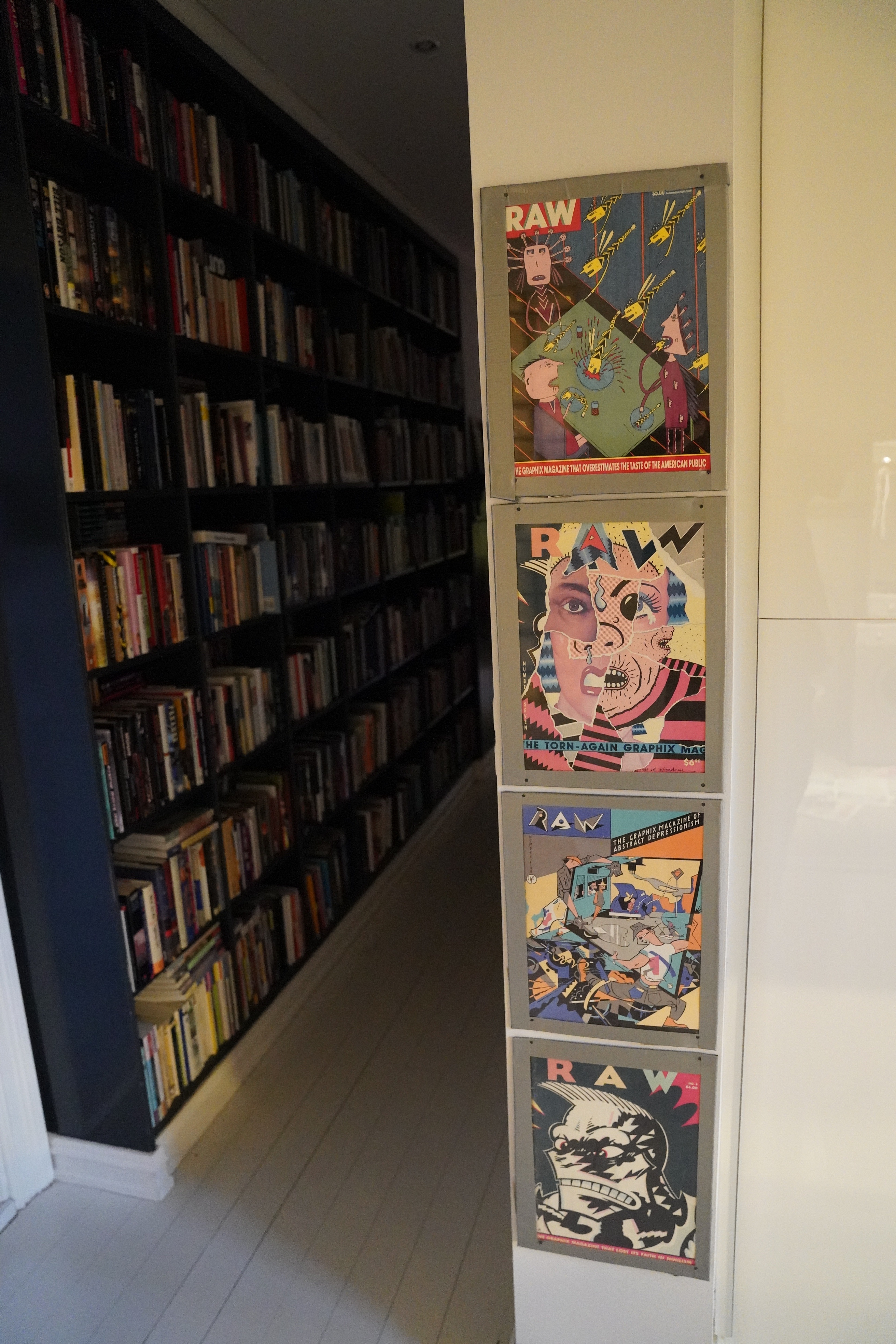
By this point, Penguin had taken over publishing Raw, so this is a kinda stealthy Raw One-Shot — it’s not presented as such on the front cover.
This is a collection of Katchor’s alt-weekly comic strip Julius Knipl, Real Estate Photographer. (Which isn’t mentioned on the front cover, either.)
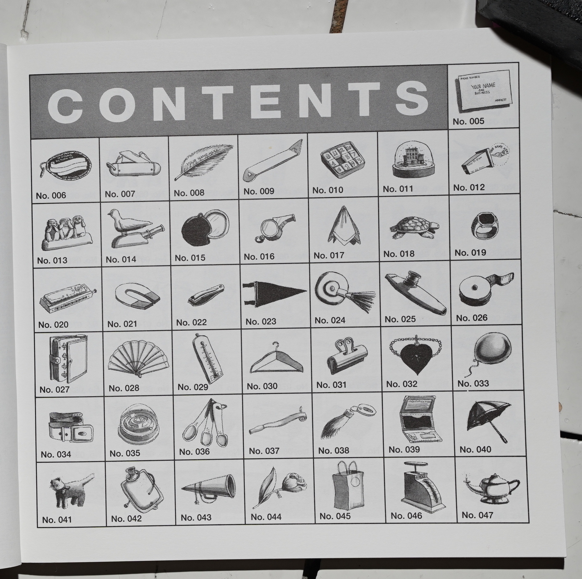
The contents page is mysterious…
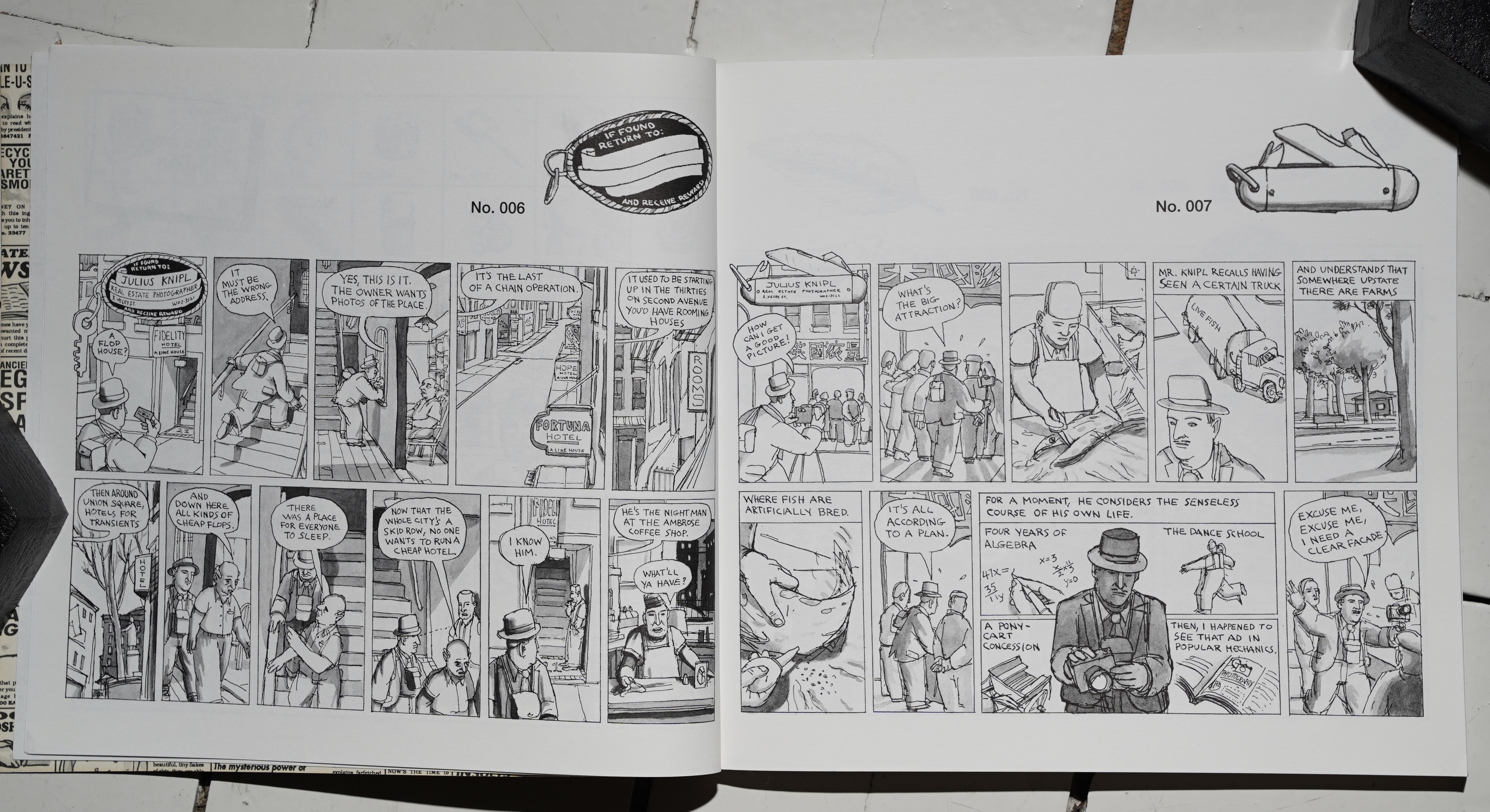
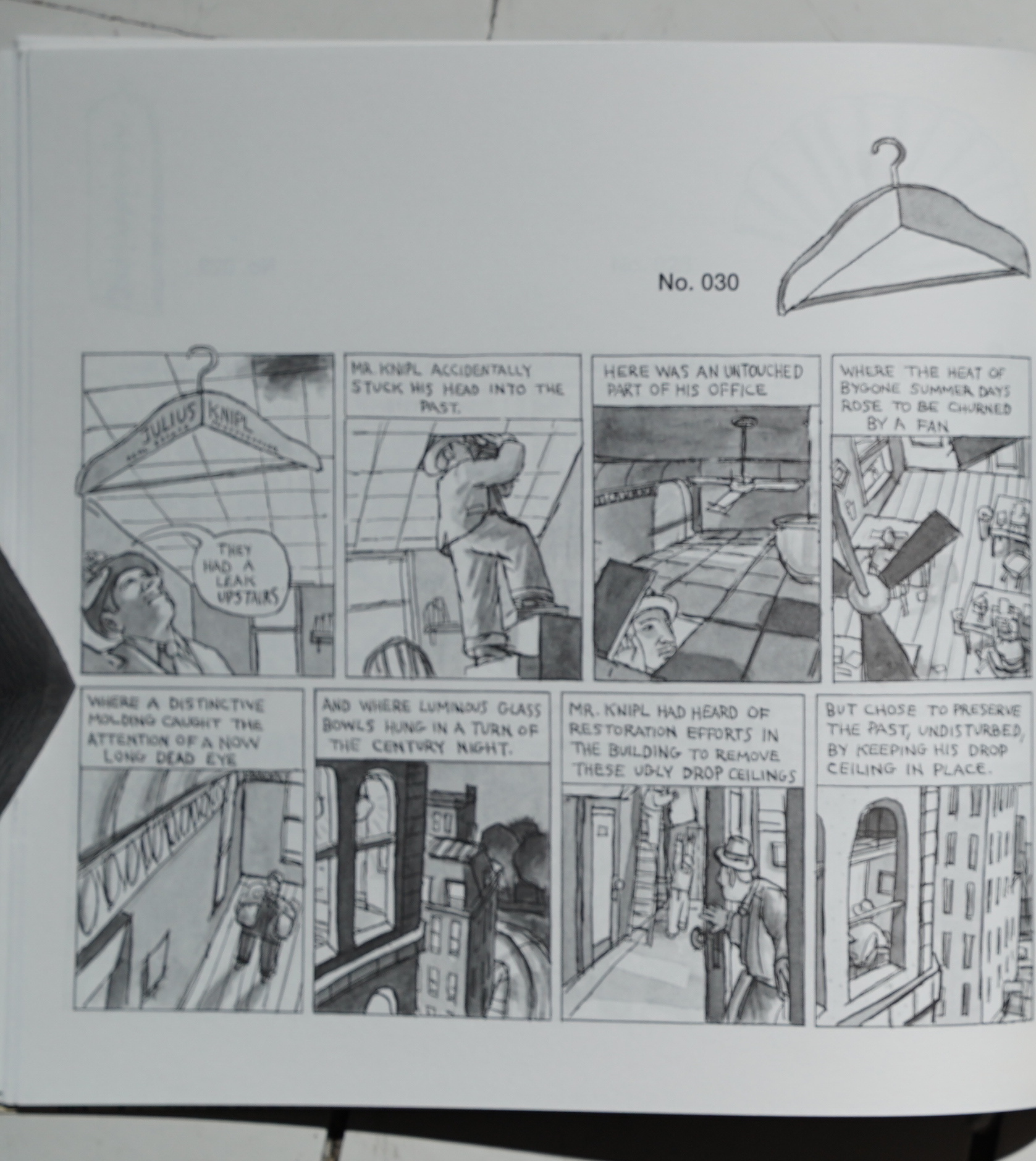
… but it all becomes er clear: Each strip is headed by some cheap novelty (also presented in the first panel of each strip with Knipl’s name on it). So these are trinkets Knipl give out to people to publicise his business.
So this all makes sense, but it makes me wonder whether those trinkets were also present in the original strip? I’m guessing so, but they eerily become part of the plot in the last section of the book.
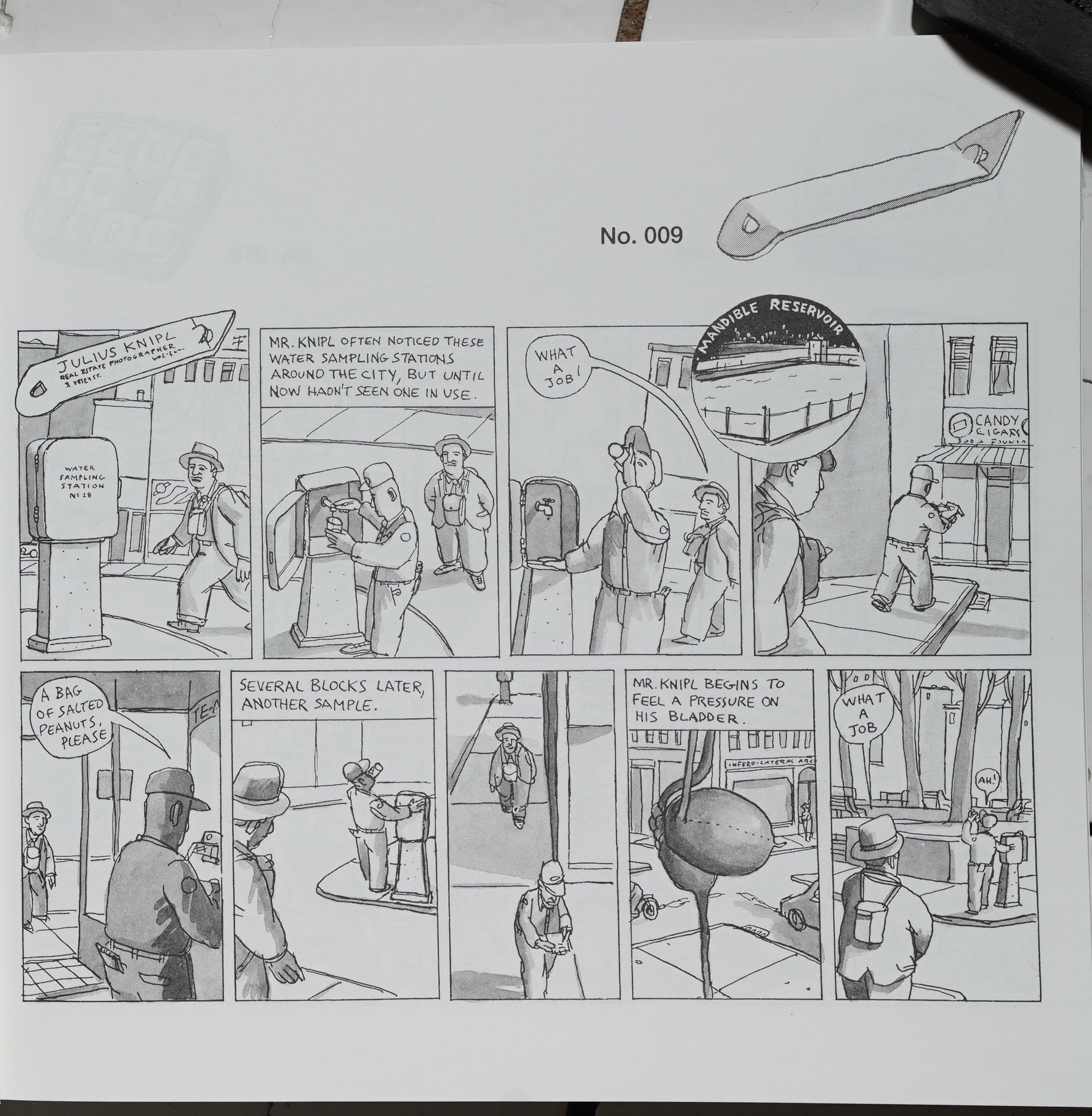
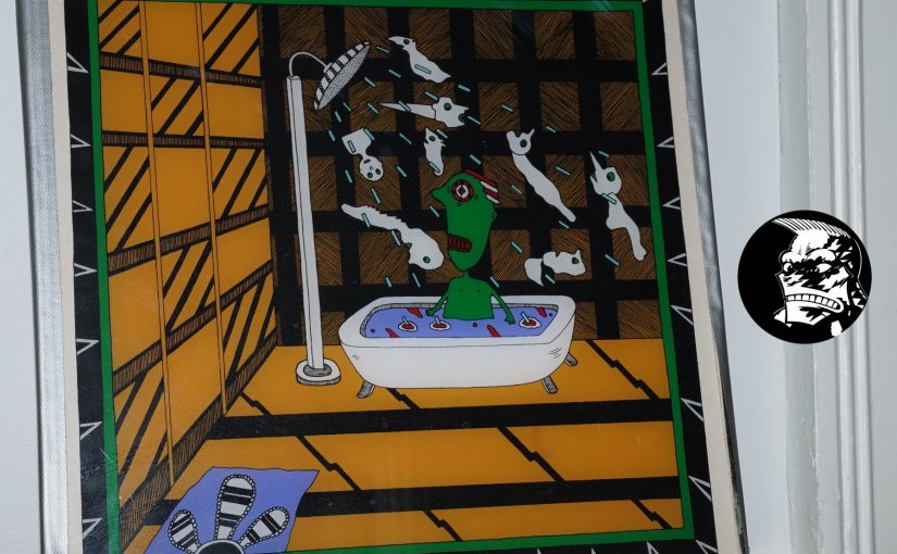
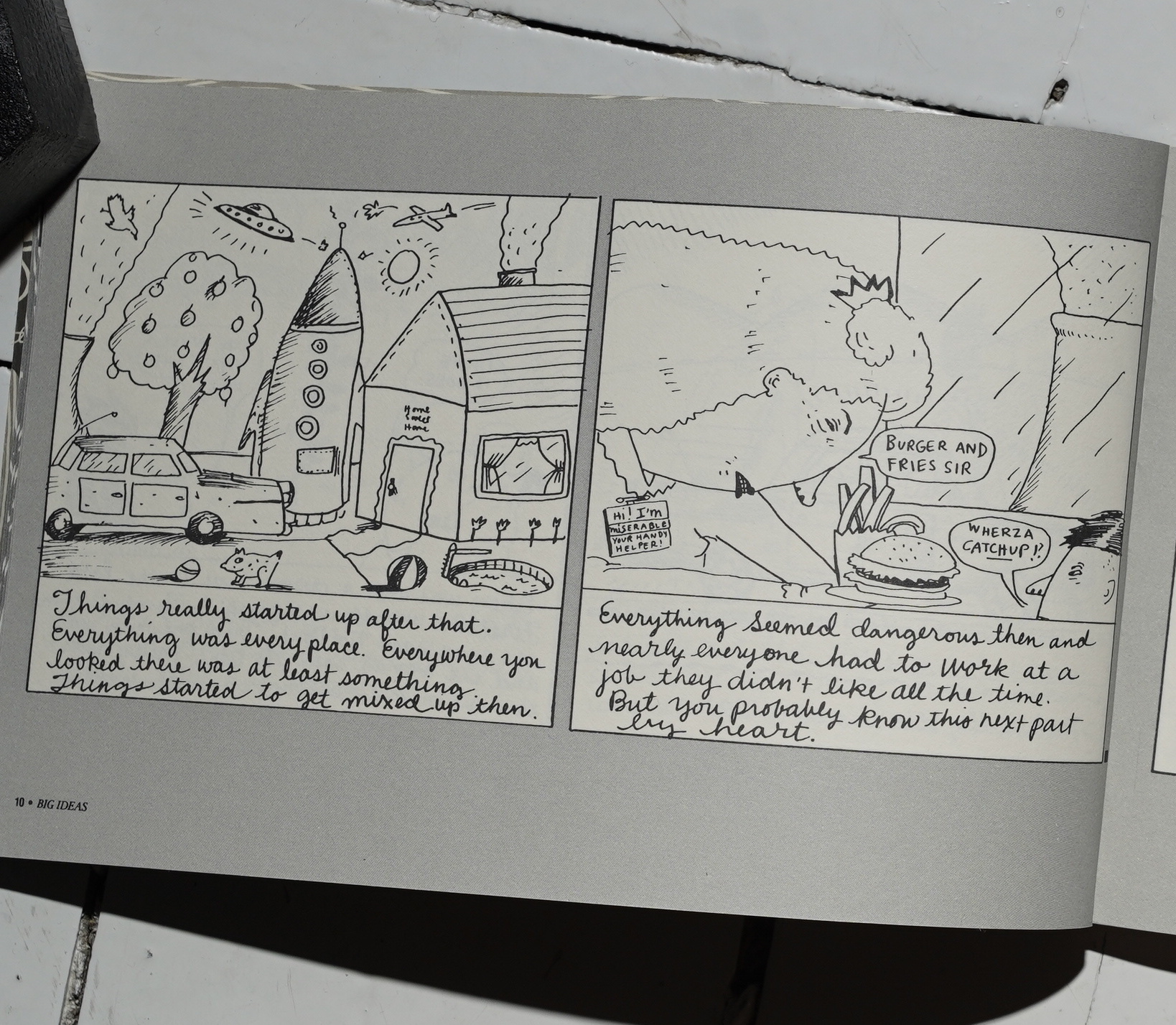
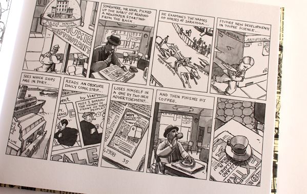
But the bulk of the book are these one-pagers that have a certain calmness about them, and a sense of the absurd.
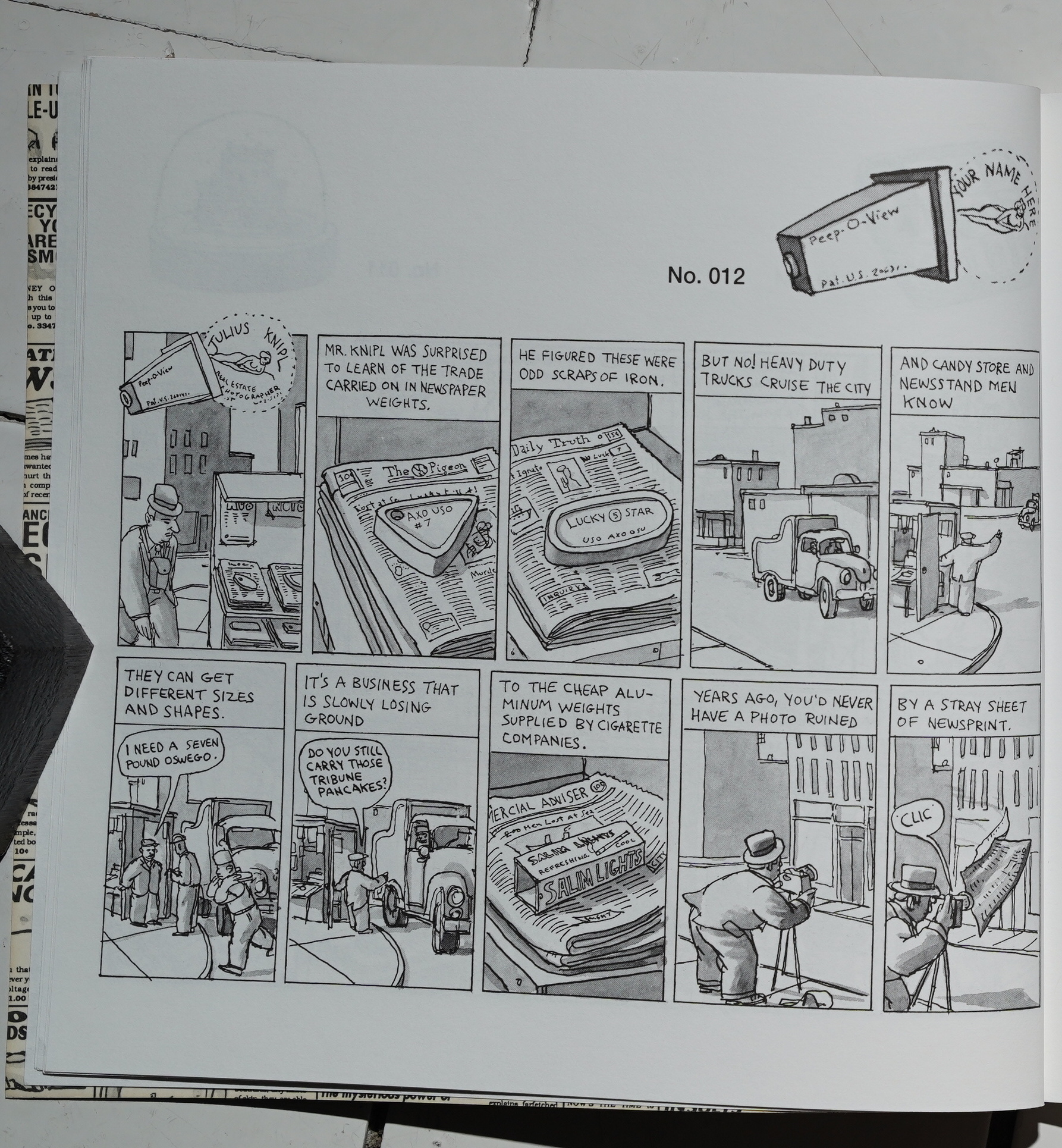
I mean… just imagining a newspaper weight industry…
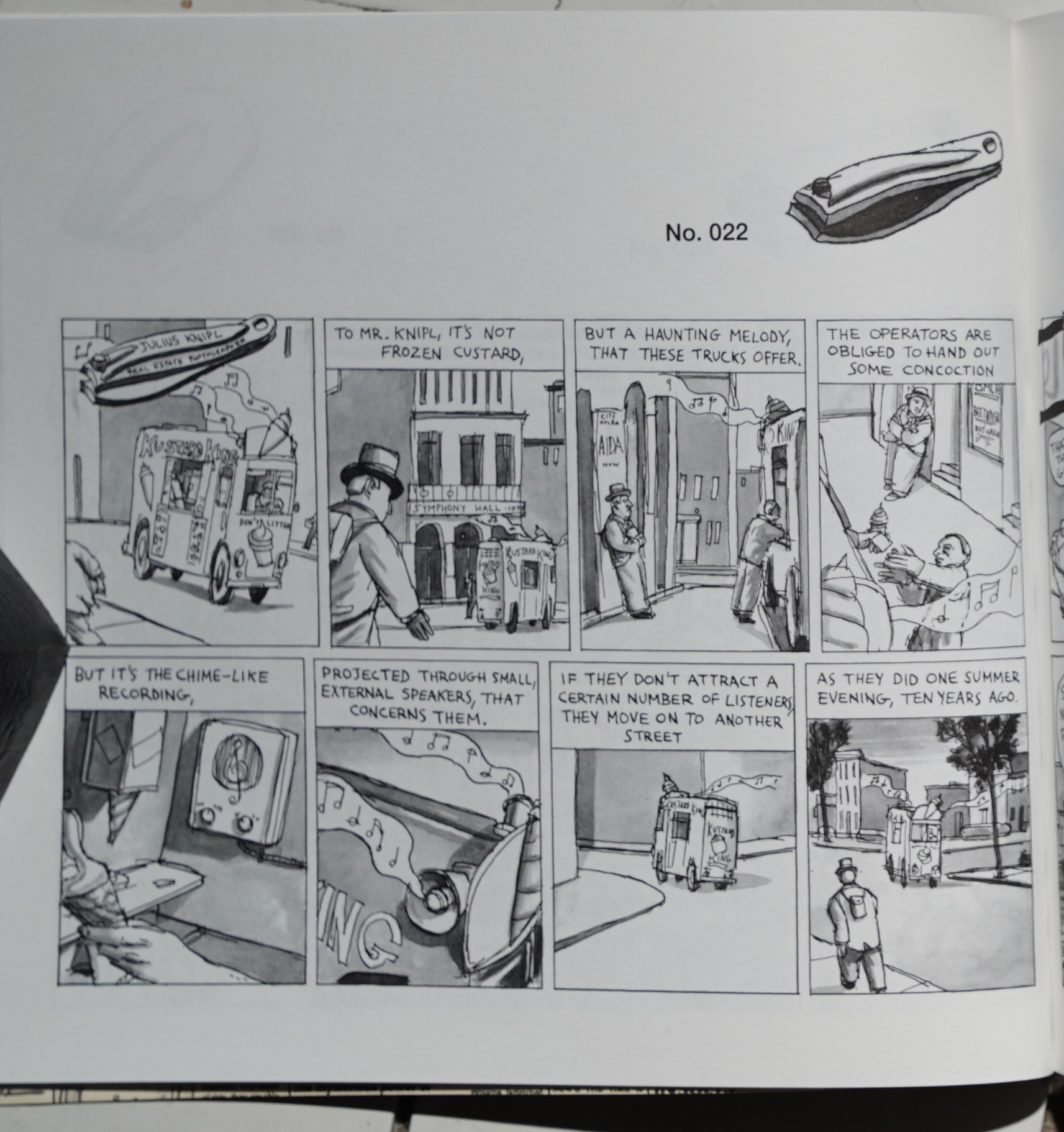
Many of the strips have a kind of vague punchline of sorts — I mean, they’re funny. Others are more simply evocative.
Katchor’s artwork melds perfectly with the subject matter… kinda nostalgic for an imaginary age, with Knipl frequently striding forth in that determined manner.
Some of the strips are just beyond fabulous.
But as usual when reading these Knipl stories, it takes me a surprising amount of time. I find myself zoning out, and I have to re-read each strip several times to understand what’s happening. And I can’t read this entire book in one sitting: It’s like poetry; it takes a lot out of you.

The final section in this book is new stuff made specially for this book, I think? We finally get to visit the Cheap Novelty District, and we follow Knipl on a (thwarted) job, as well as a Venetian blind salesman. Their stories intertwine in oblique ways, and it’s all rather thrilling.
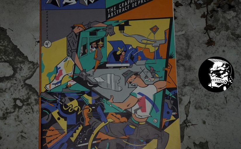
The Comics Journal #156, page 17:
Penguin Ceases Publication of
comics AlbumsPenguin Books, one Of the few mainstream
American book publishers to print comics al-
bums. has decided to temporarily stop pub-
lishing them, according to Senior Editor David
Stanford. Penguin, which published such books
as From A to Zippy by Bill Griffith, Skin Deep
by Charles Burns, “tarts and All by Drew and
Josh Alan Friedman, Cheap Novelties by Ben
Katchor, and the anthologies Thisted Sisters and
RAW, will publish only tuo more comics col-
lections in 1993. Twisted Sisters II, originally
intended for publication by Penguin, will now
be published elsewhere.
Stanford, who has been with Penguin for
four-and-one-half years, edited the company’s
more avant garde comics projects (previously,
he worked at Henry Holt and Company, where
he edited books by Garry Trudeau, Charles
Schulz, Jeff MacNelly, Skip Morrow and Other
cartoonists). He cited a energy crisis”
as one of the main reasons Penguin is discon-
tinuing the publication Of comics collections,
although modest sales was also a factor.
Yeah, the first “Biff bang pow! Comics aren’t for kids any more!” wave of comics for adults from mainstream publishers (spurred on by Art Spiegelman’s Maus (especially Part II in 1991) from Pantheon) fizzled very quickly — I think by 1993, they’d all lost interest when they saw how little this stuff sold, and it wouldn’t be until Fun Home and Persepolis hit over a decade later that they realised they should get back in on the game again. (But less Avant Garde this time and more (auto-)biography.)
Drawn & Quarterly published a new version of it recentlyis:
In 1991, the original Cheap Novelties appeared in an unassuming paperback from the RAW contributor; it would become one of the first graphic novels of the contemporary graphic novel golden age and set the stage for Katchor as he is now regarded– a modern day cartooning genius.
They’re selling it short!
Drawn & Quarterly’s 25th anniversary edition will be a deluxe hardcover reformatted to Katchor’s original vision.
Oh, that’s interesting… Katchor didn’t like the design of the Penguin book?
Right, the new version doesn’t have the big novelties on each page, and everything’s reproduced in a larger size. Yay. I should get a copy of this, too…
The staccato vignettes, where narration and dialogue noisily intermix with one another like the cacophony of a busy street, are about pure pleasure.
Katchor reminds readers of the ever-presence of a past: no matter where — or when — you are, there is always something missing. But if you look closely, and wait for the newspapers to fly by, and for the new concrete to set, you might be able to bask, bittersweetly, in its former, fleeting glory.
This blog post is part of the Punk Comix series.