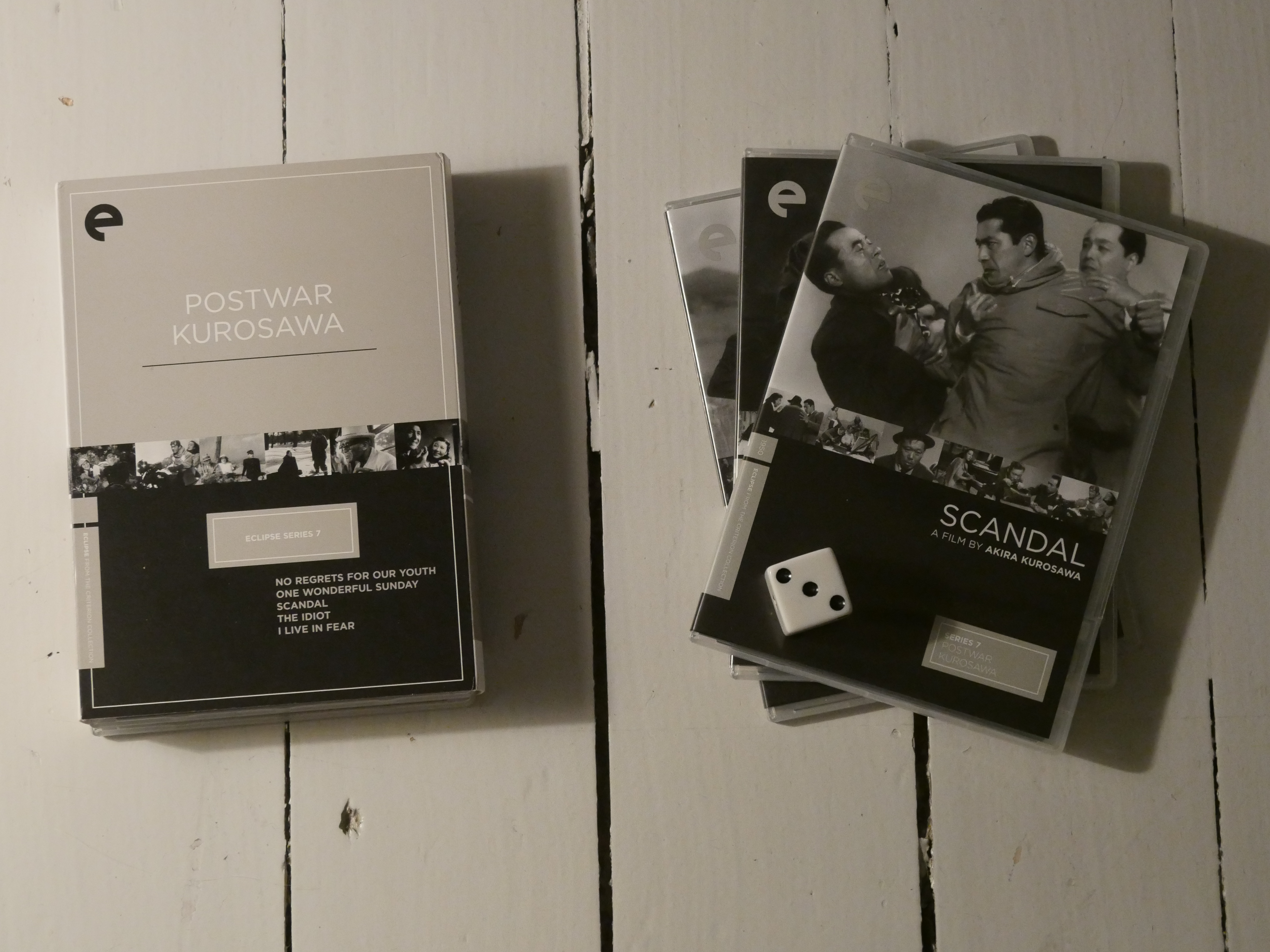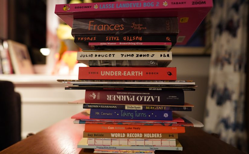
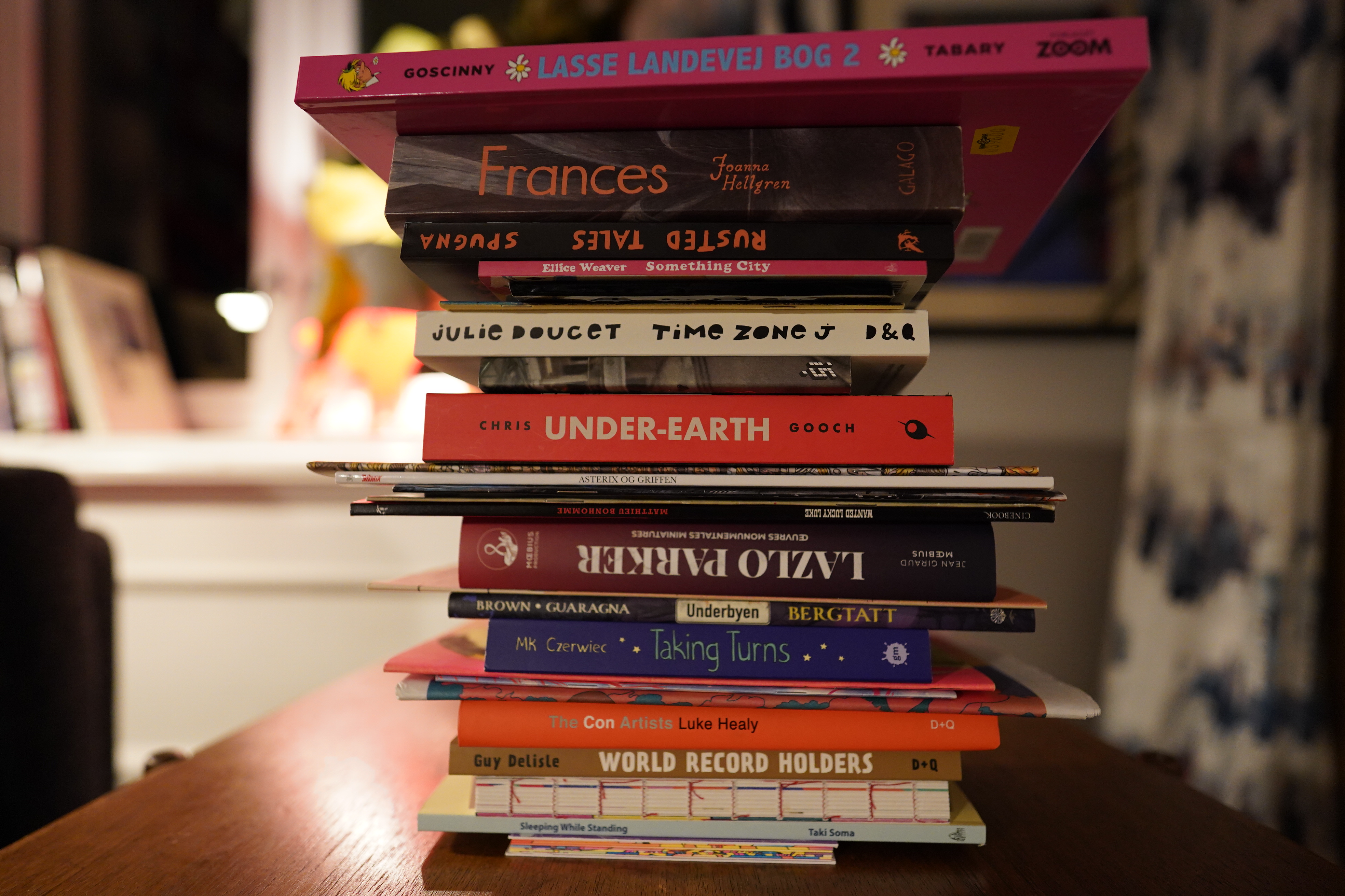
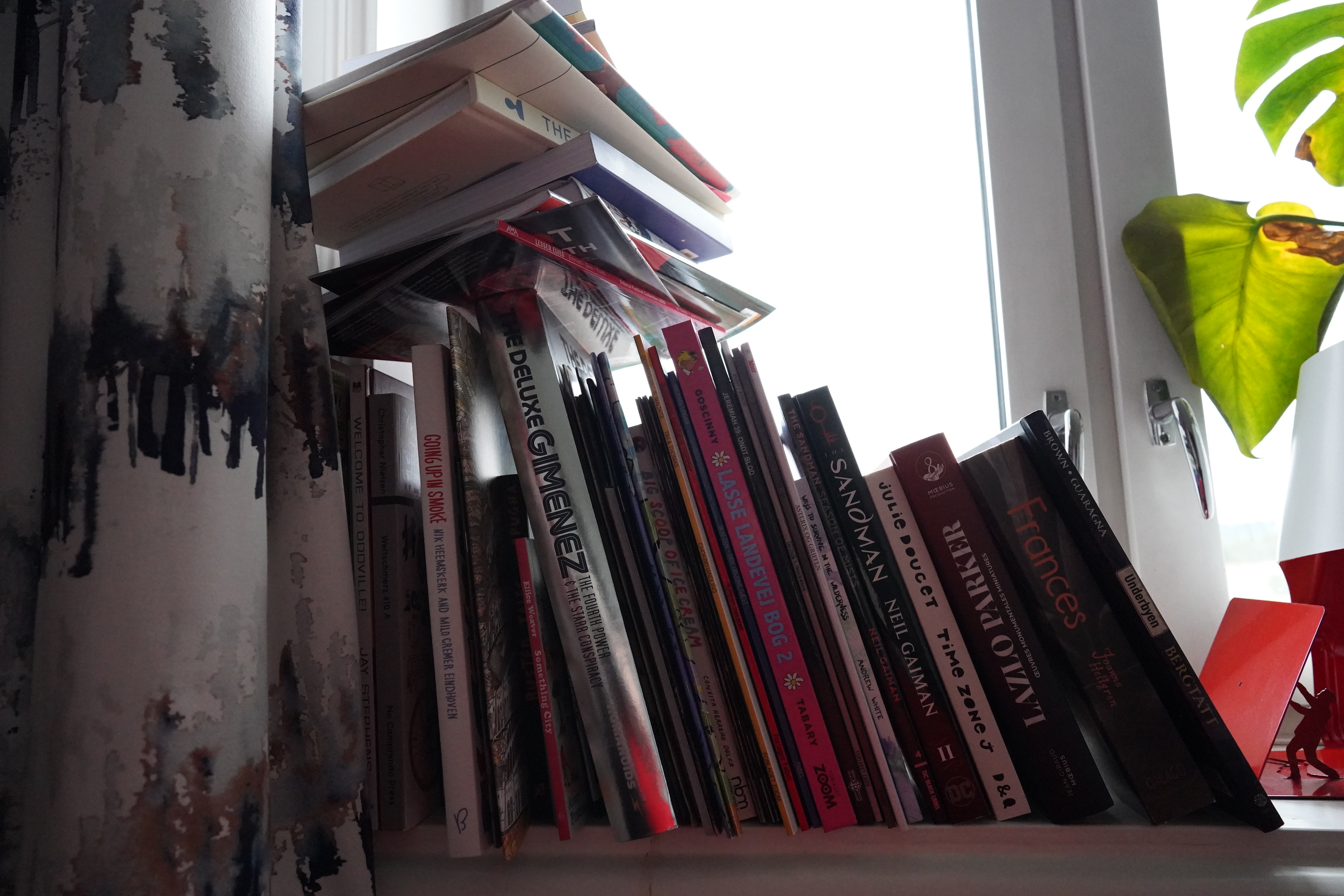
I don’t know quite how it happens, but I suddenly have a whole bunch of new comics to read. Darn?
Comics from all the usual suppliers, but I’ve also discovered a new place to shop: 50 Watt Books. Look at that selection of comics. Just look at it! The also have a lot of cool non-comic books.
Err… what’s that then… mystery picture in my camera… Oh, yeah.
Let’s get started.
| Hexting: Post Post Rock Rock |  |
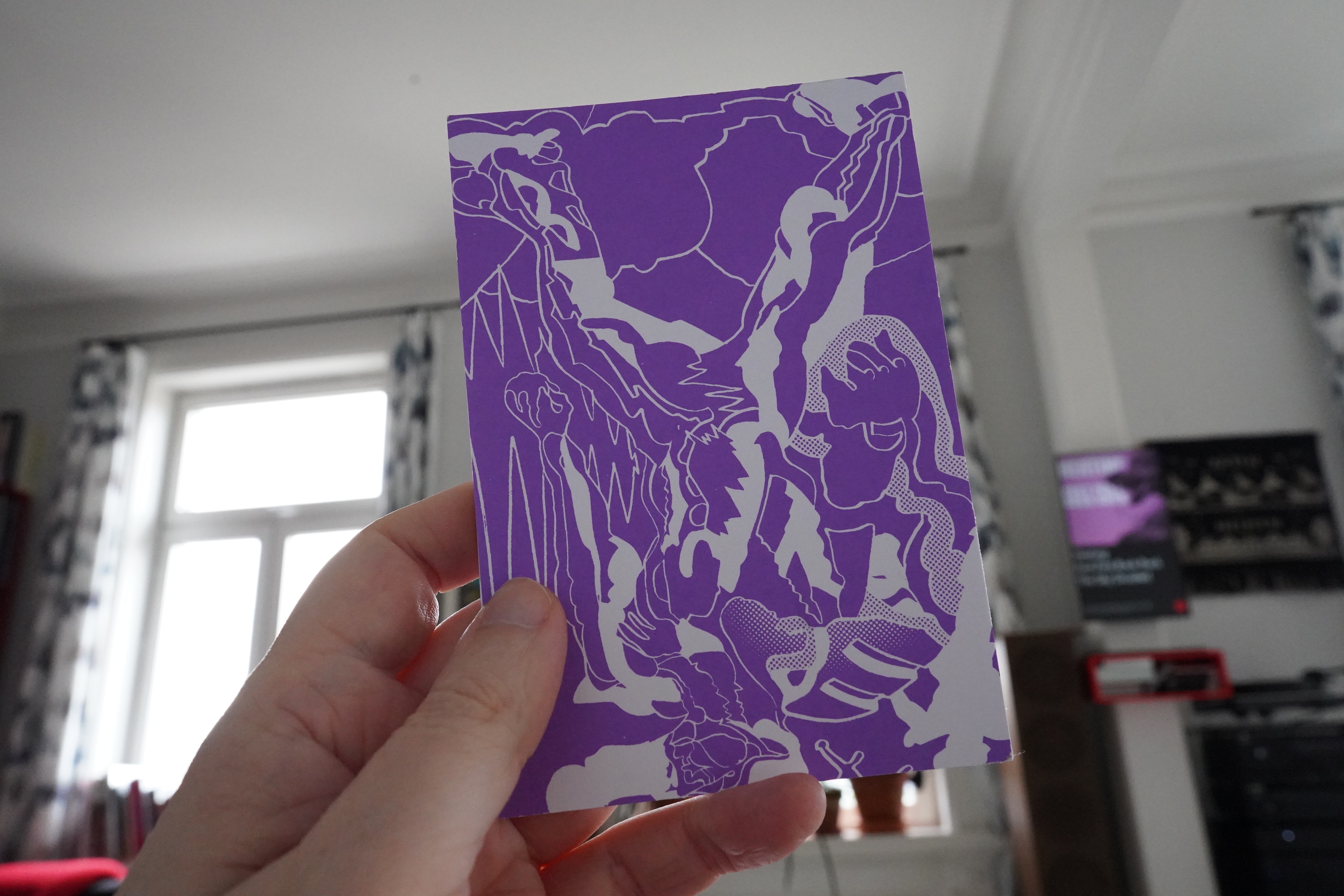
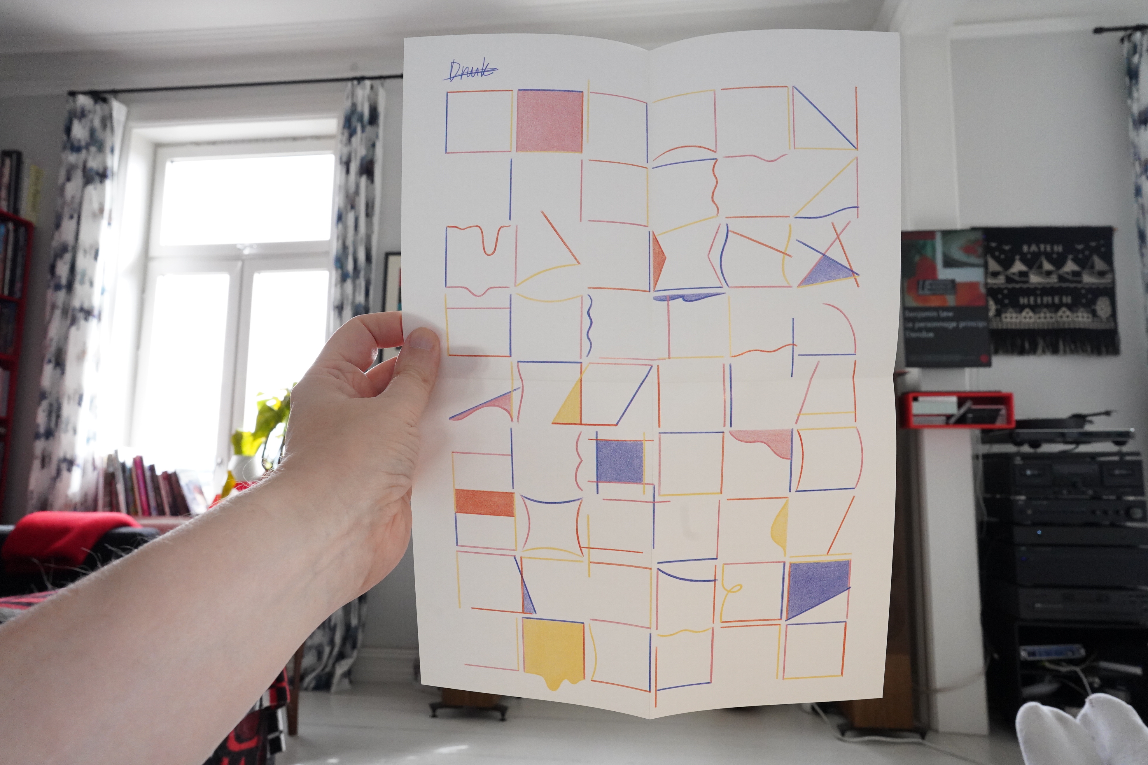
12:14: Flesh Movements by Lale Westwind (Editions 3)
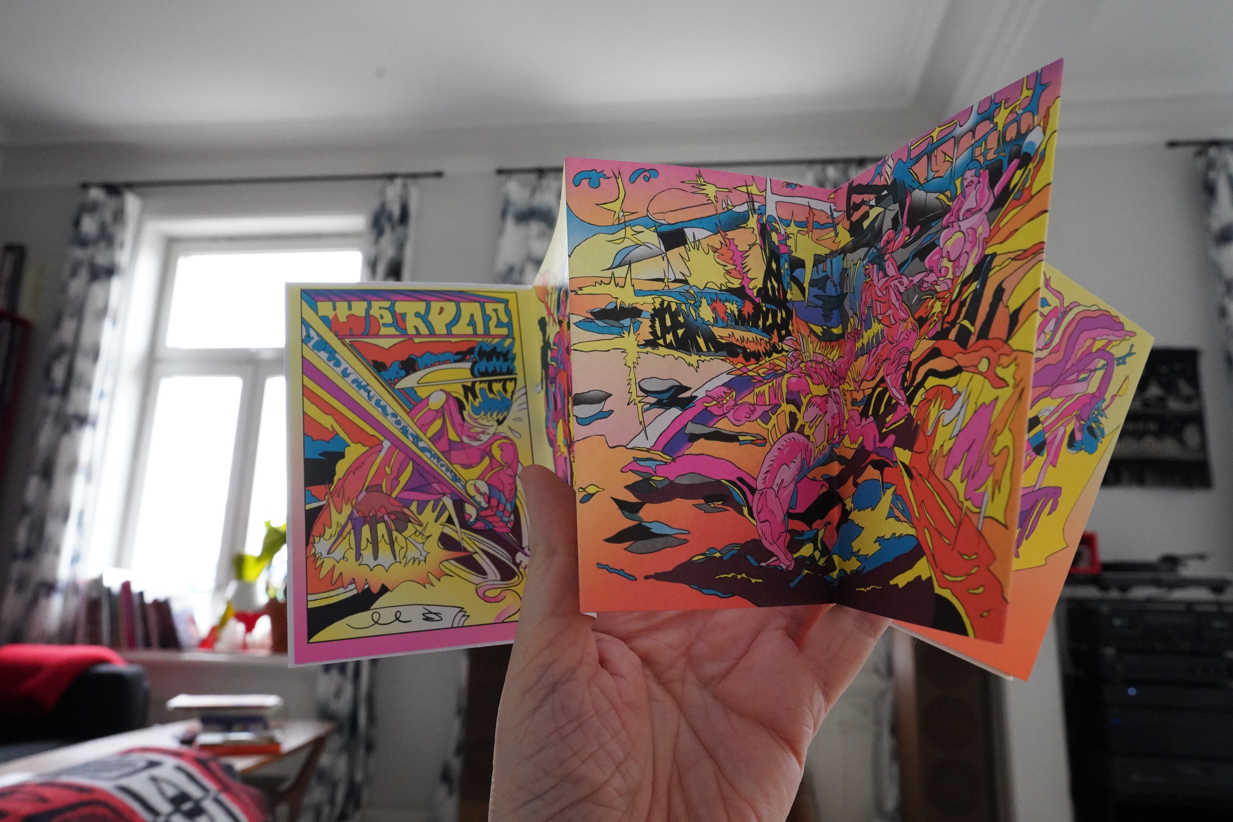
It’s one of them there accordion books. Trey cool. I’m not quite sure whether it’s a narrative work or not, but it looks awesome.
And then I remembered that I was gonna make a banana and strawberry milk shake, so I did that now. Nom nom. (And I should be finishing prepping the new stereo computer in the background there, but who has time for that when there’s comics.)
| Hexting: Post Post Rock Rock |  |
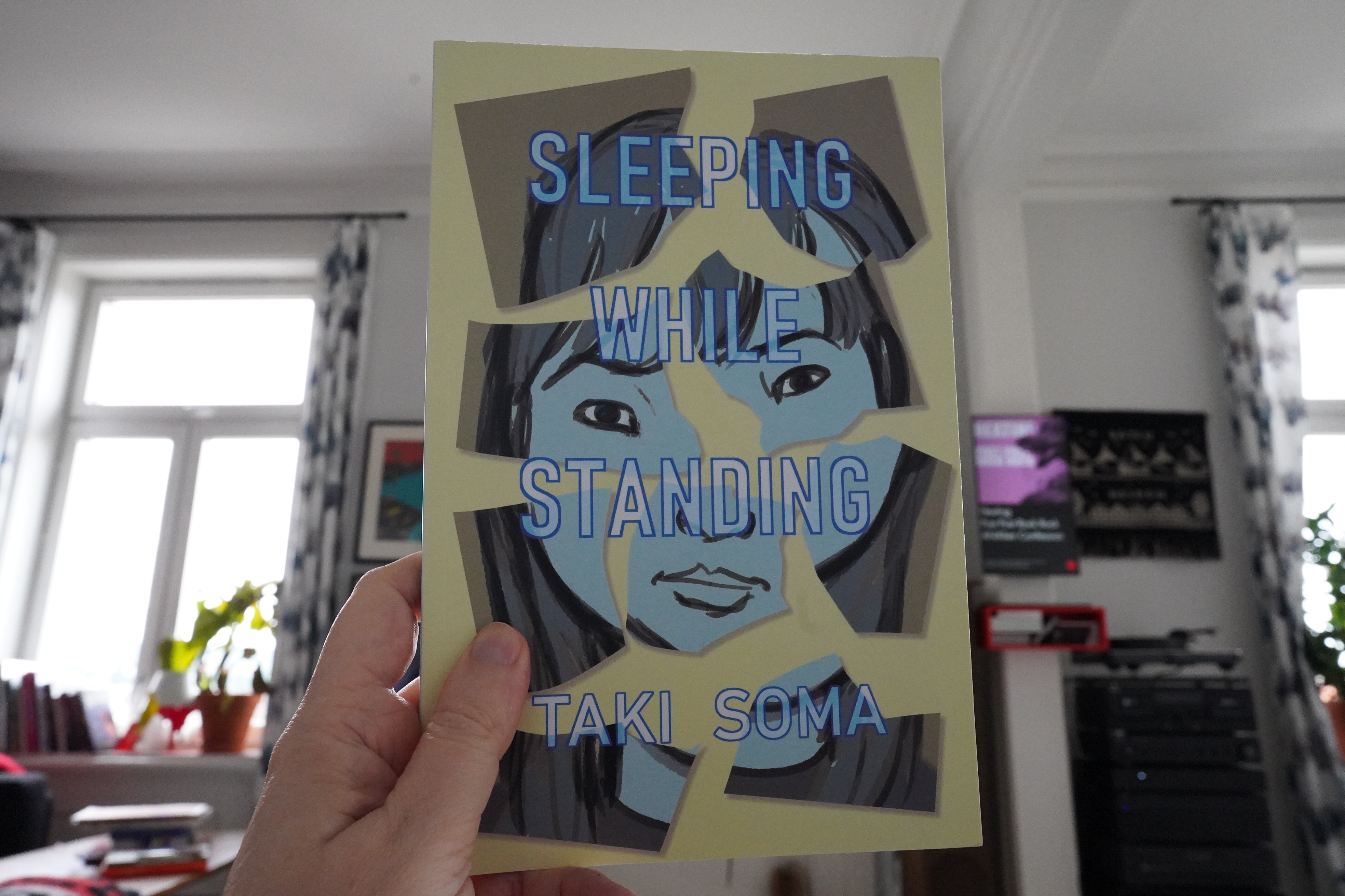
12:27: Sleeping While Standing by Taki Soma (Avery Hill)
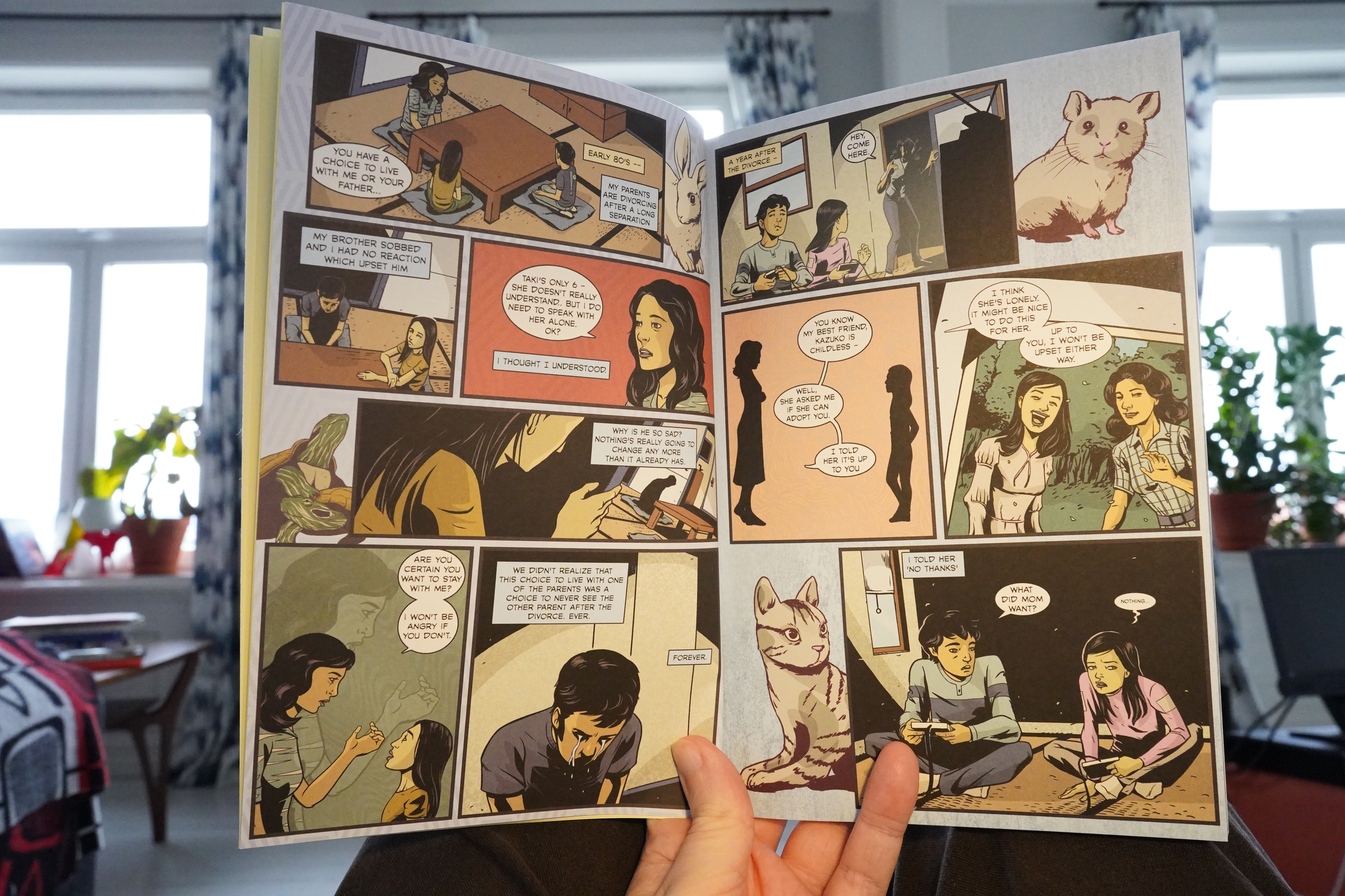
This art style doesn’t really do that much for me, but it’s fine.
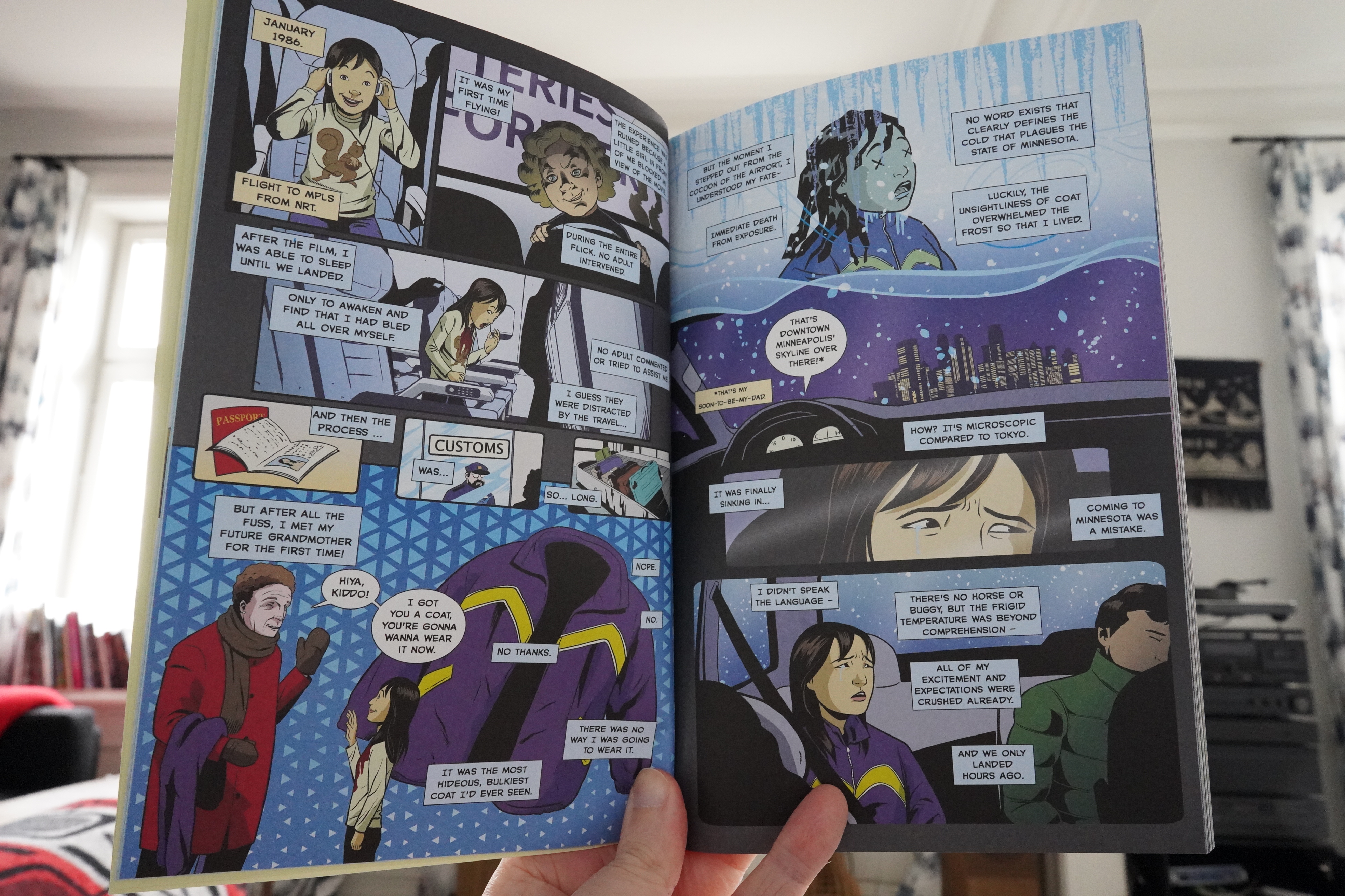
While these (short) stories are sometimes heart-breaking, they don’t really feel worked through in a way that takes them from private to personal.
| Benjamin Lew: Le personnage principal est un peuple isolé |  |
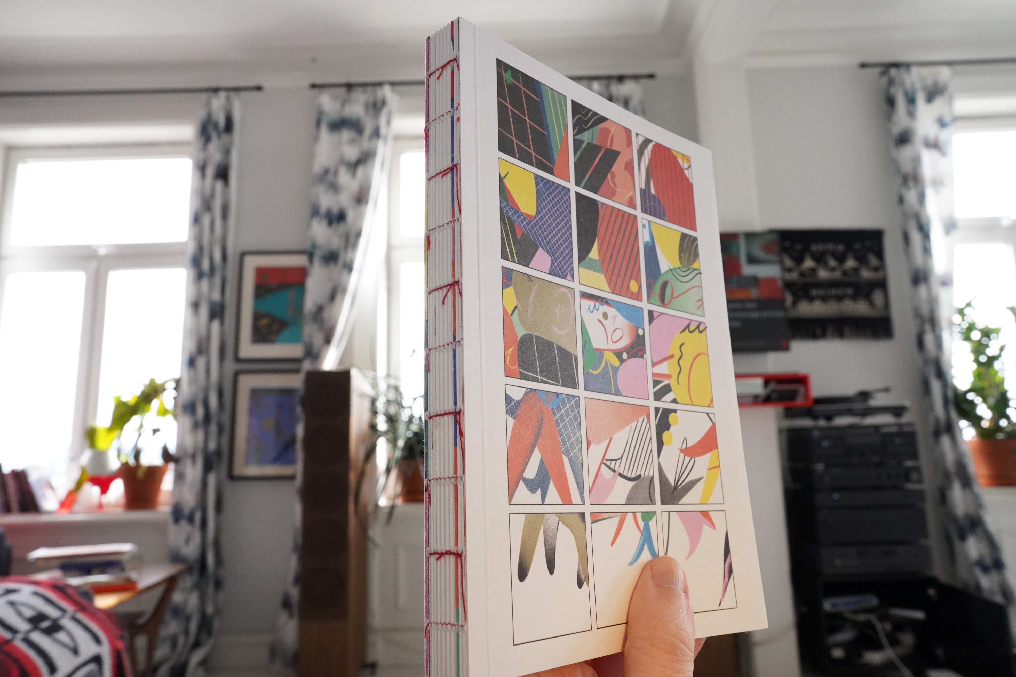
12:59: Comic Collection Book 2022 by Gizem Vural
This is a delightful book. I mean, as an object.
And it comes with a poster.
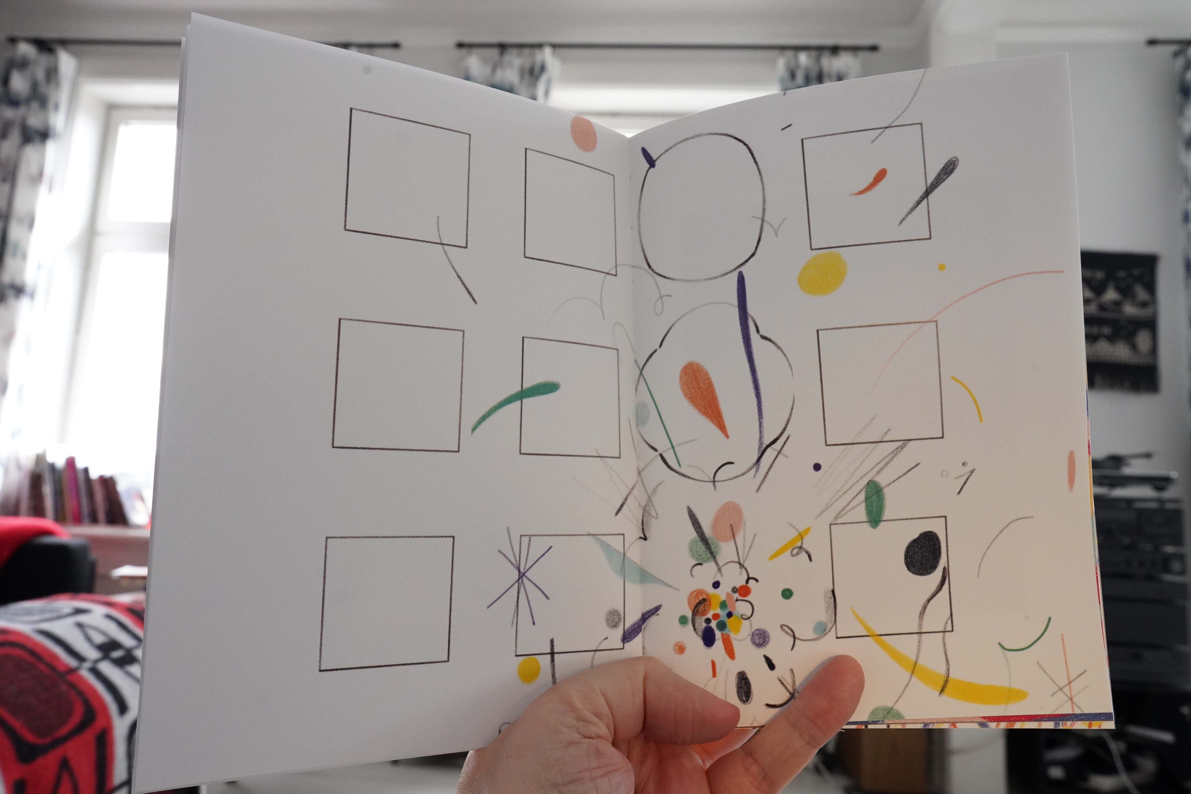
The comics are sometimes somewhat abstract, but most of them hint at narrative, and it’s great fun to read. And the pages are gorgeous.
And there’s fold-out stuff, too.
Some of the strips tend towards being visual puns. I mean, it’s fun, but it reminds me a bit of French 70s visual satire, which is kinda… er… done?
| Lost Girls: Menneskekollektivet |  |
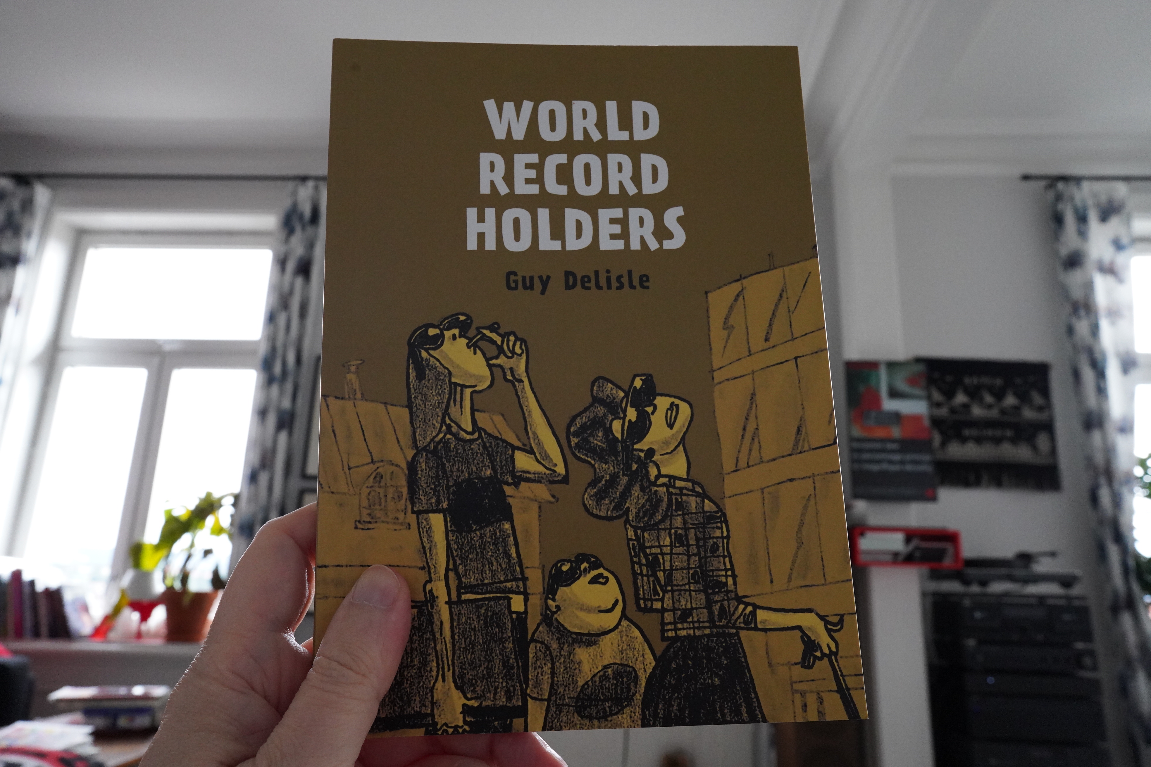
13:15: World Record Holders by Guy DeLisle (Drawn & Quarterly)

This is a collection of shorter pieces — mostly from the 90s, and in a variety of styles.
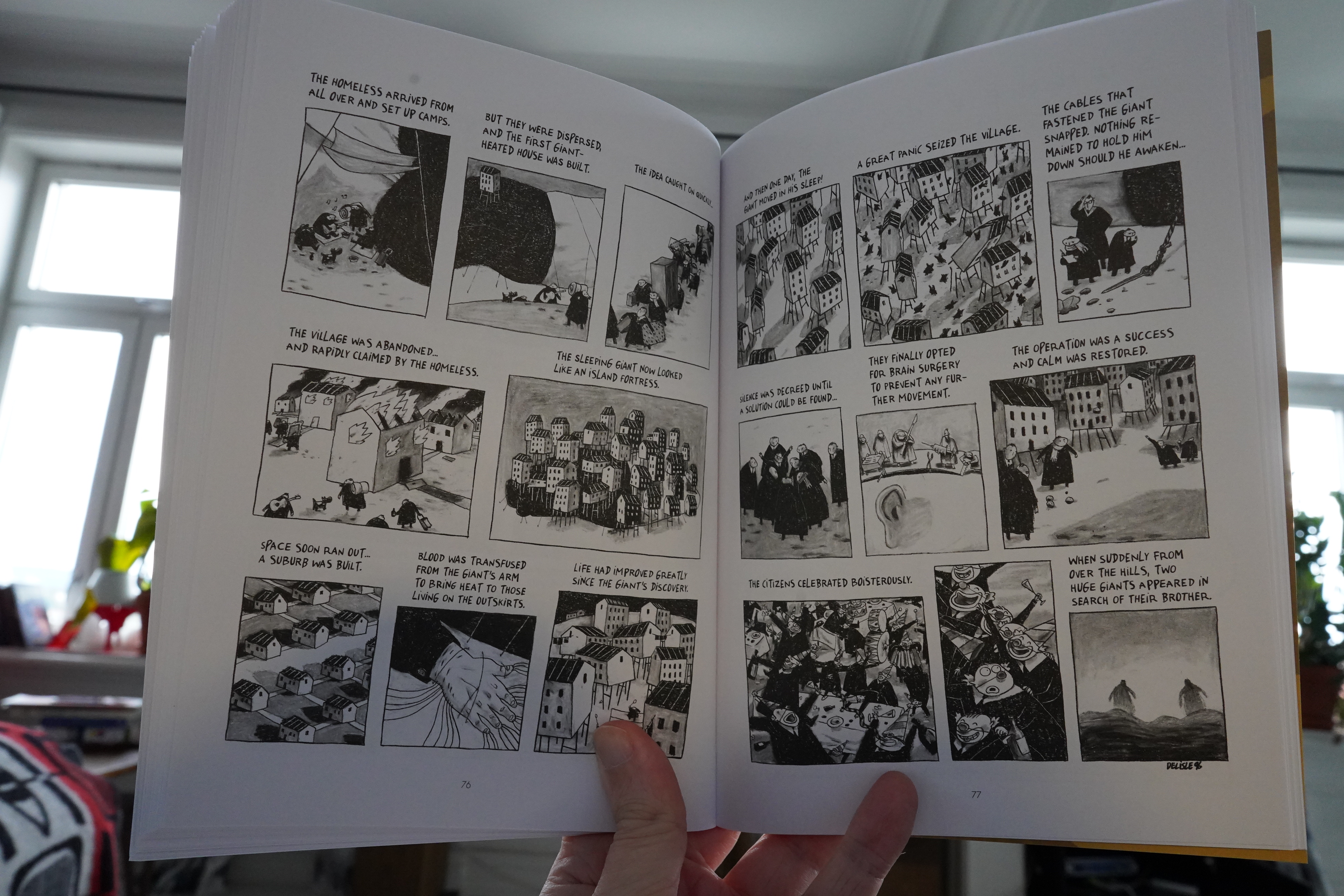
It’s pretty amusing? Some of the pieces are pretty much of the “I don’t really have an idea but I must draw something” kind, but there’s some solid pieces in here, and it’s amiable throughout.
| DJ Escrow: Pattern VIP (feat. dean blunt) |  |

13:53: The Con Artists by Luke Healey (Drawn & Quarterly)
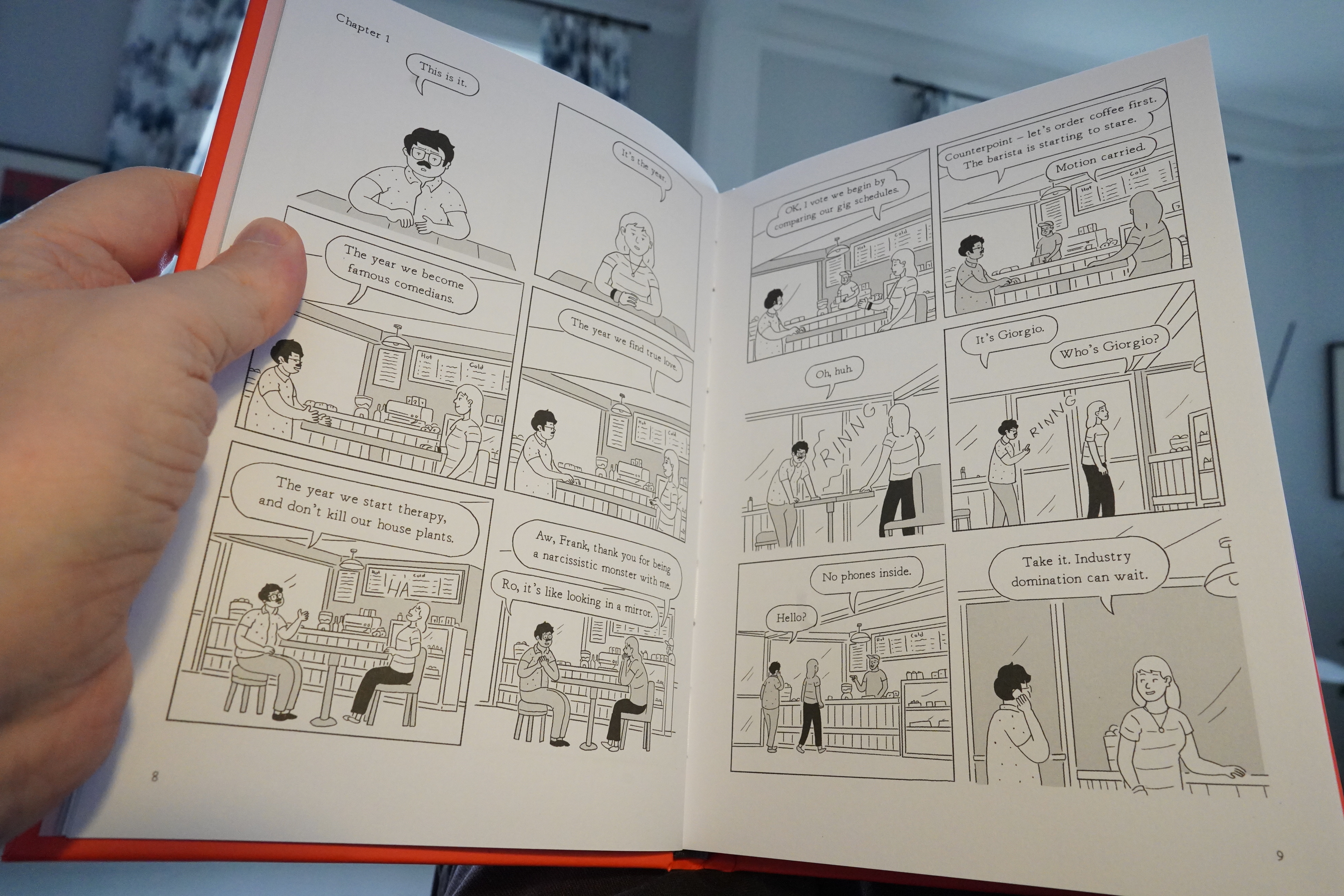
According to a recent survey, I’m the only person in the world that dislikes all stand-up comedy. And this is about a stand-up comic, so I had no hopes for this book (bits of which seems familiar — has parts of this been published before)?
But it’s kinda brilliant? I love the on/off-stache thing in the introduction/afterword(ish) thing, and the story absolutely goes nowhere near where I thought it was going to go.
It does seem a bit ready-for-TV-series-adaptation, but that’s OK.
| Boris: Absolutego Studio Session 2018 |  |
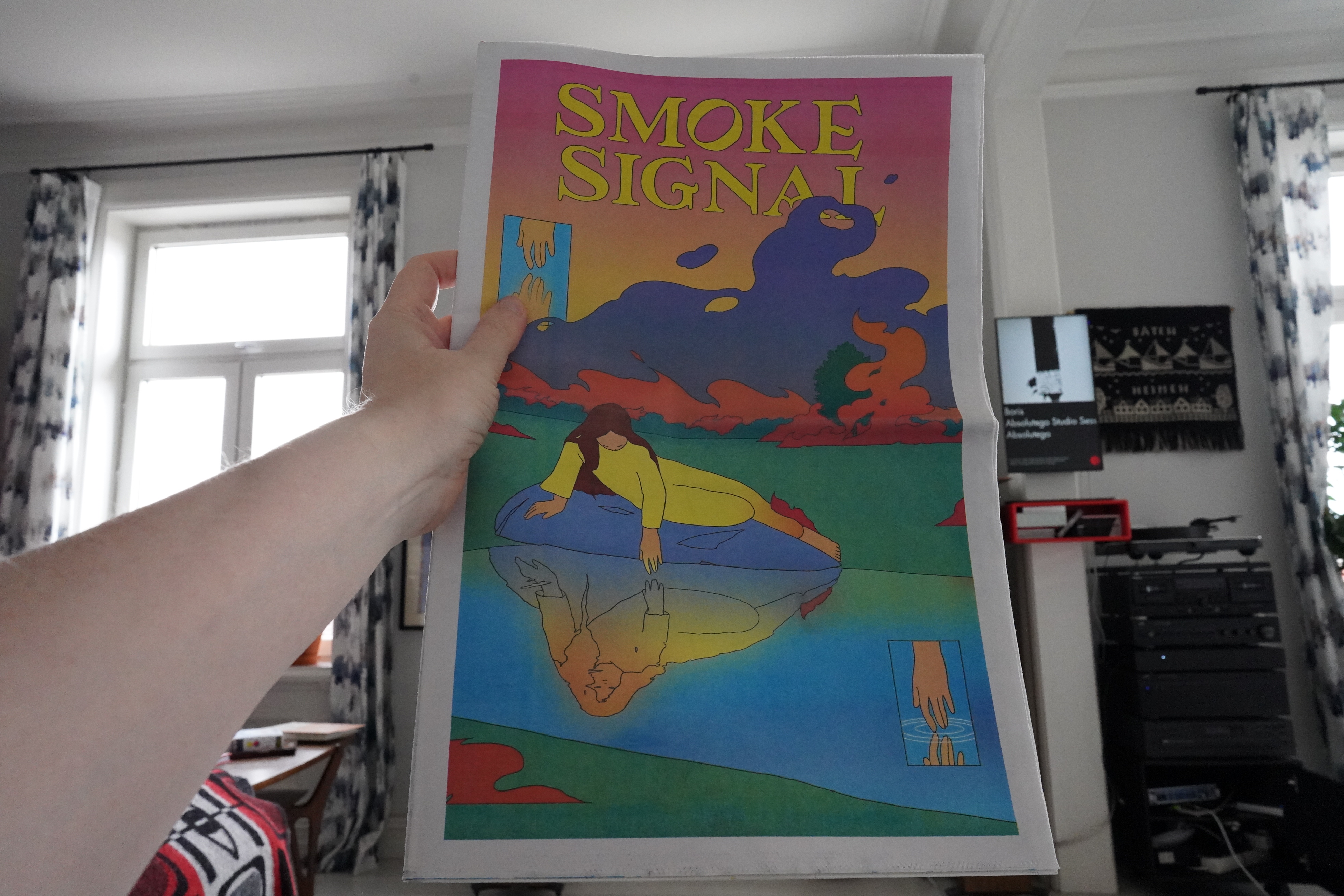
14:25: Smoke Signal 38 by Maria Medem (Desert Island)

Newspaper size and on newsprint, this is absolutely gorgeous.
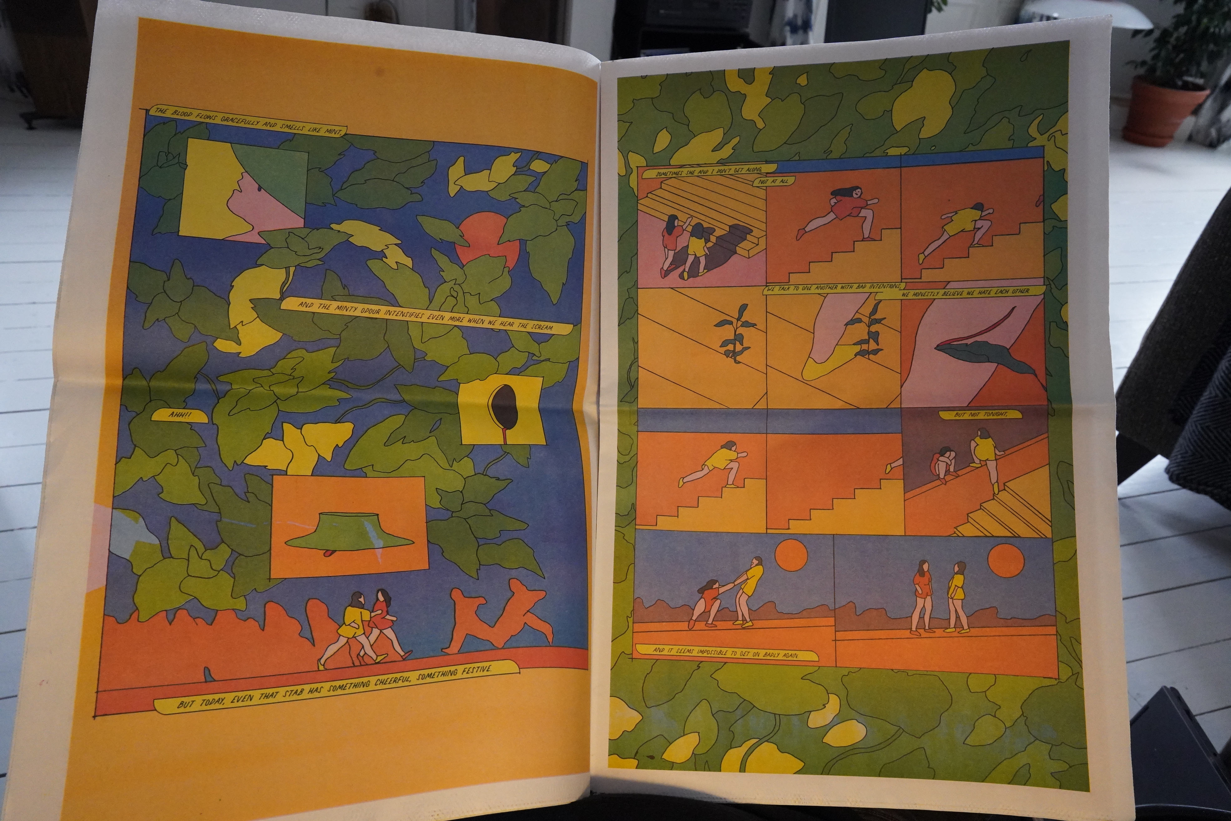
Fabulous artwork and moving stories.
Hm… I wonder whether I should take up a Mystery Mail subscription, or whether I’ll just get a bunch of stuff I already have…
I’ll give it a go.

14:43: Ellipsis & Only by Diane Zhou (Paradise Systems)

Both of these are really powerful. Intense and mysterious.
Really interesting graphically, too. Gripping.
| Stephen Hero: Deciduous Eccentric |  |
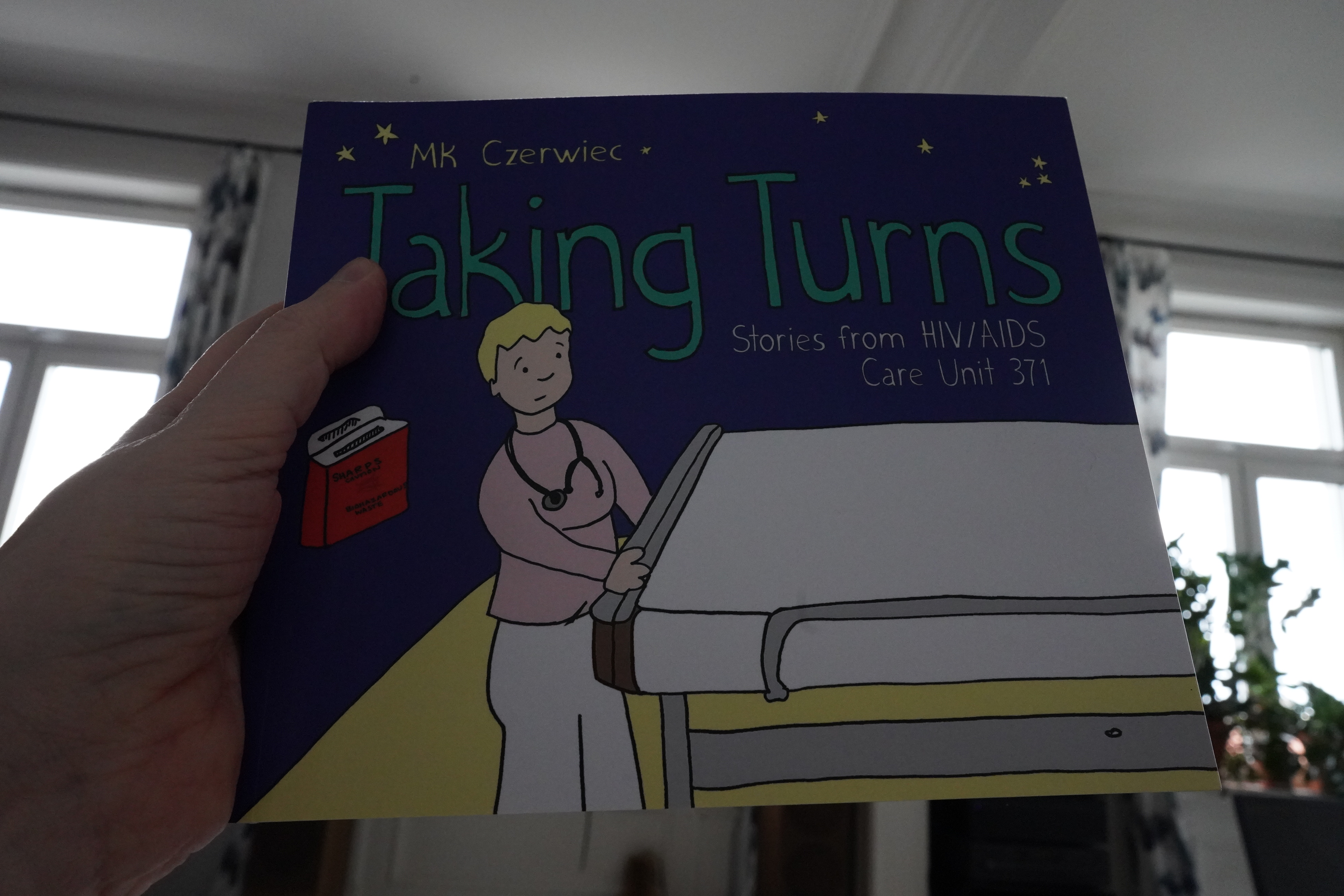
14:51: Taking Turns by MK Czerwiec (Graphic Mundi)
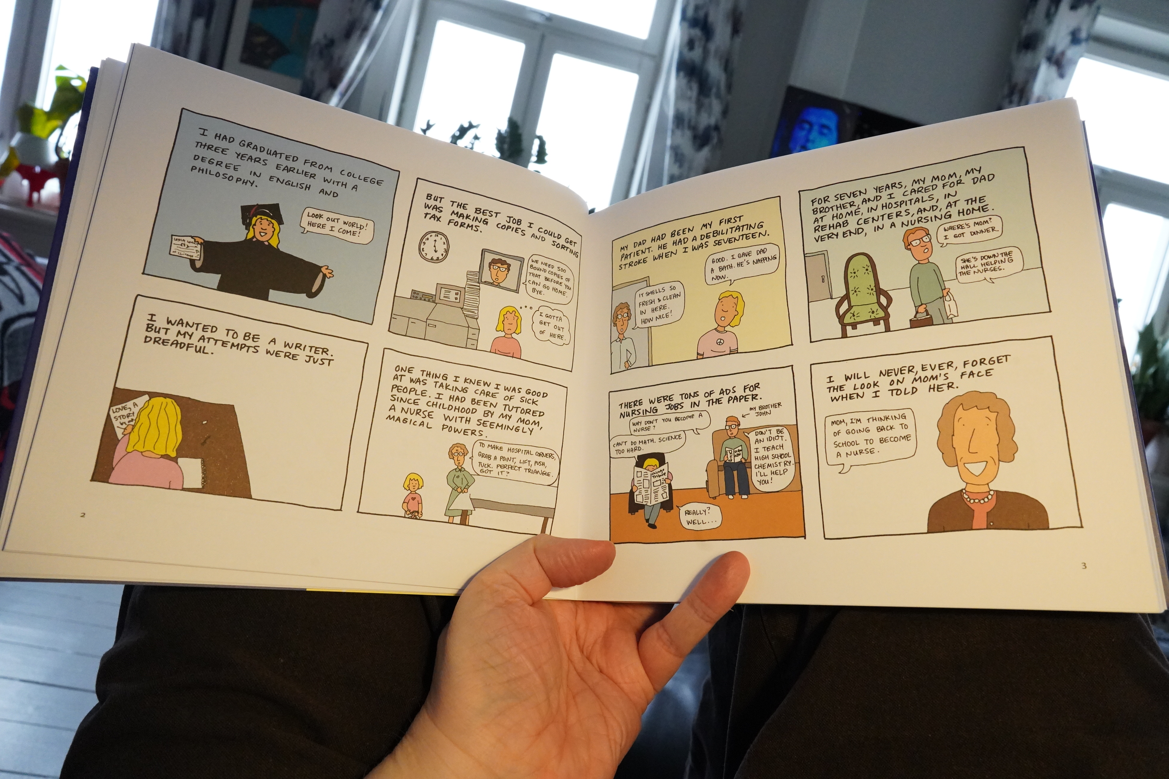
I approached this book with some trepidation, because my initial impression was that this looked kinda basic? I’ve read far too many worthy comics that are basically a barely illustrated essays, and would have been better if they remained that way.
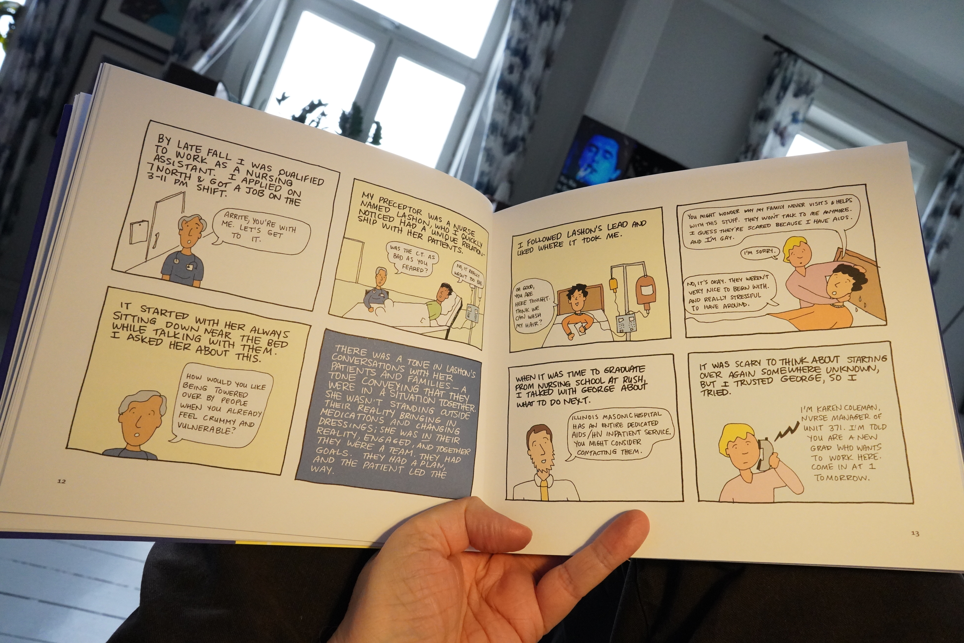
But this is great! It’s really interesting — it’s about working in AIDS ward in the 90s, told in a refreshingly straightforward way. No, it’s not all facts and stuff (it gets really emotional after a while), but it avoids all the common pitfalls when doing this sort of thing. Where it could so easily have descended into pathos, it’s instead quietly devastating.
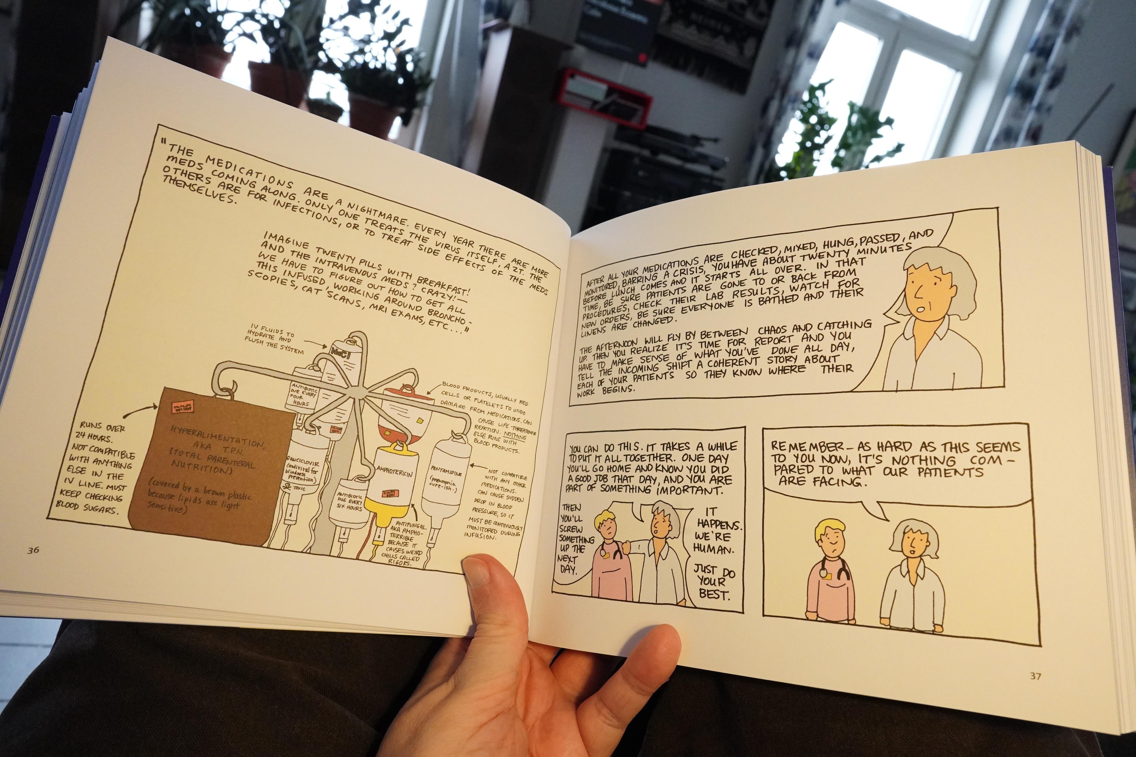
That said, there were a handful of sequences with excessive infodumping, where I guess the author solicited texts from the people she depicts, and these come off as rather flat.
Still, it’s a solid book.
| Shearwater: Shearwater plays Bowie’s Berlin Trilogy: Part 1: Low |  |
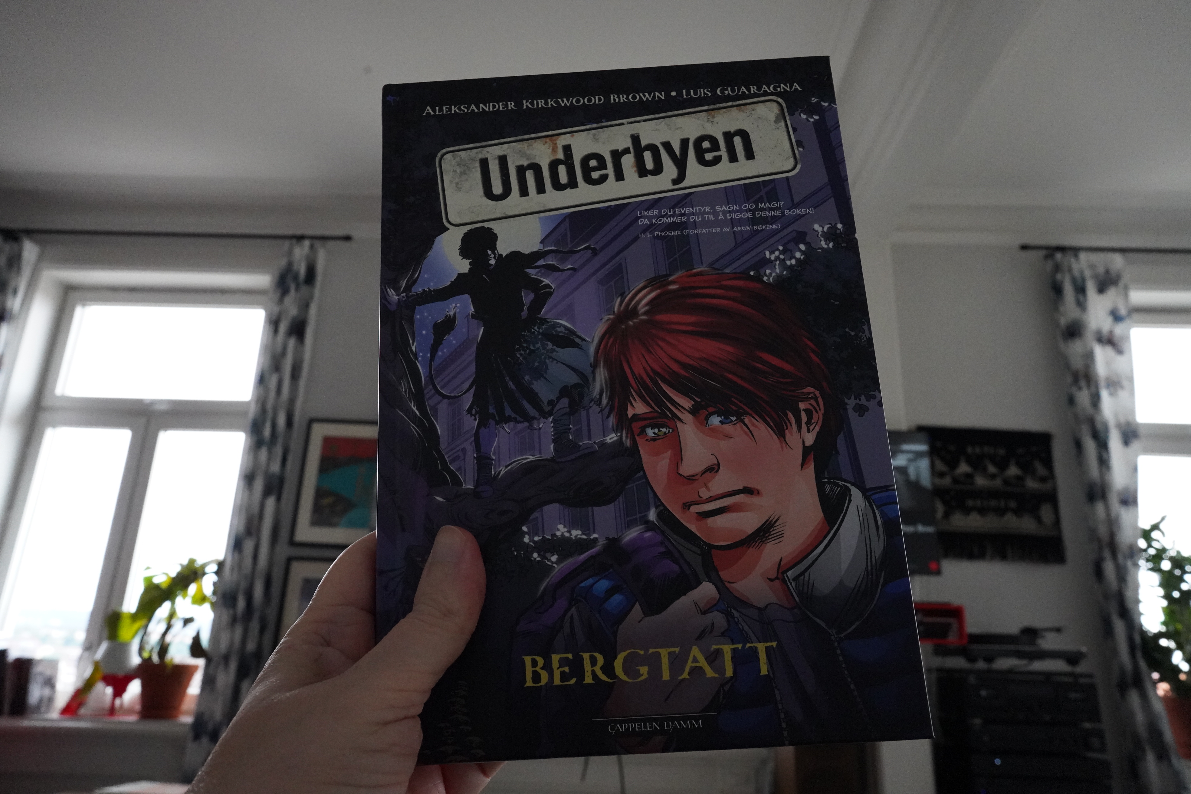
16:02: Underbyen: Bergtatt by Aleksander Kirkwood Brown & Luis Guaragna (Cappelen Damm)
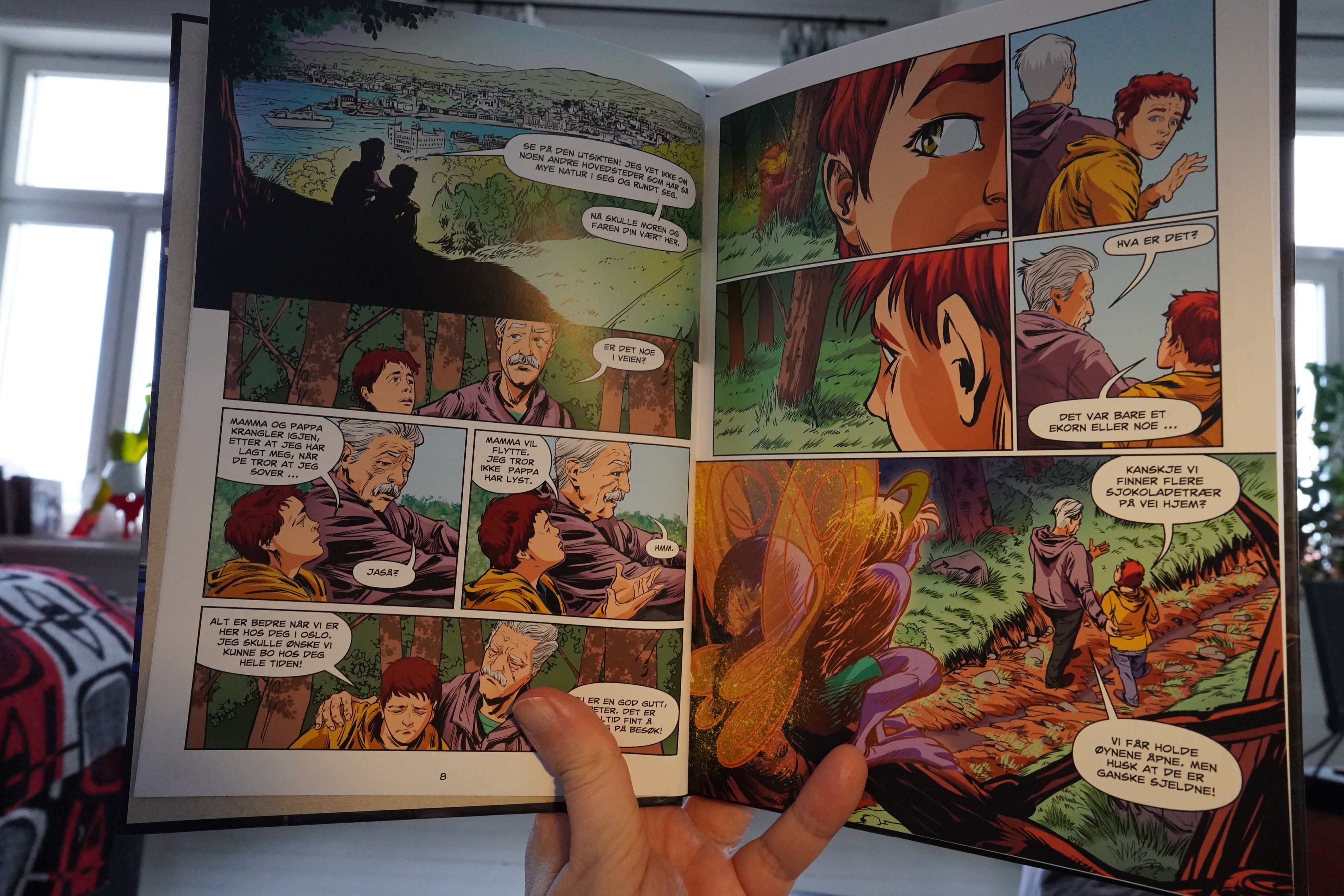
There’s a publishing bonanza for fantasy comics for children going on in Norway now, and I haven’t read any of these books. So I thought I’d give this one a go.
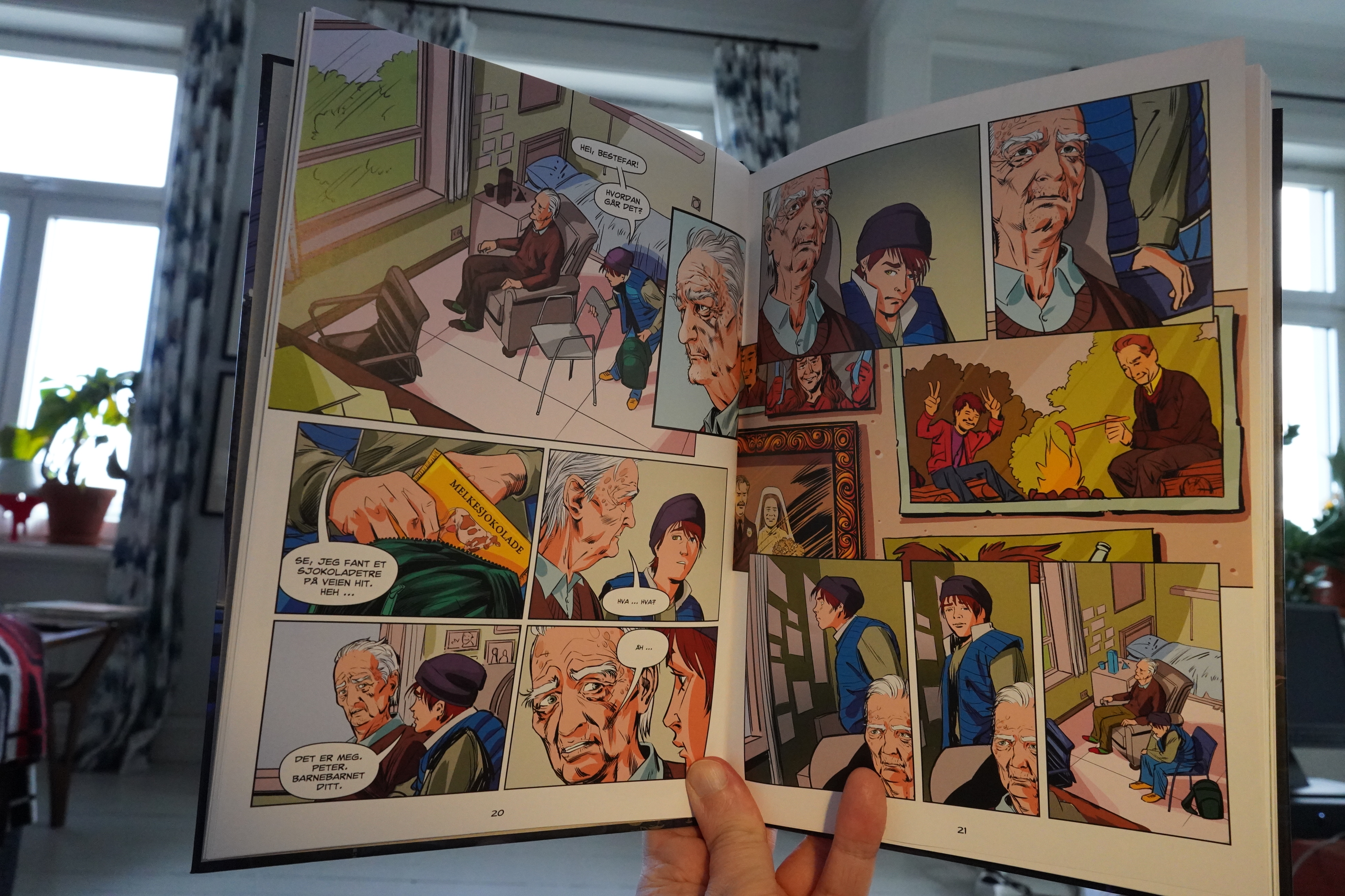
And it’s… really solid? Structure wise, it does all the things that a story like this is supposed to: It’s very professional. But there’s plenty of originality in the elements the book uses (instead of just copying monsters from Tolkien and Sandman, it uses Norwegian supernatural beings), and it’s surprisingly moving.
Well done.
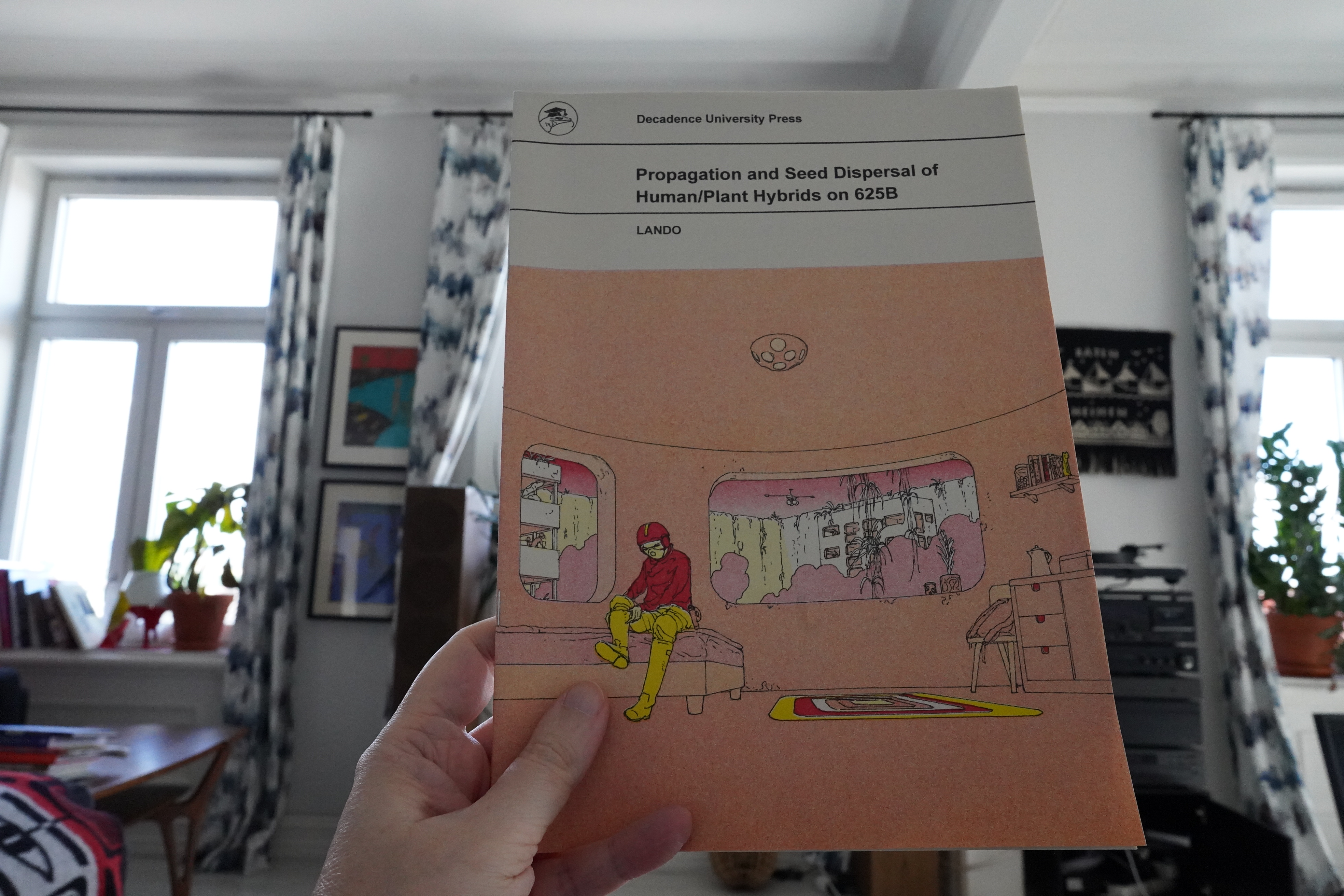
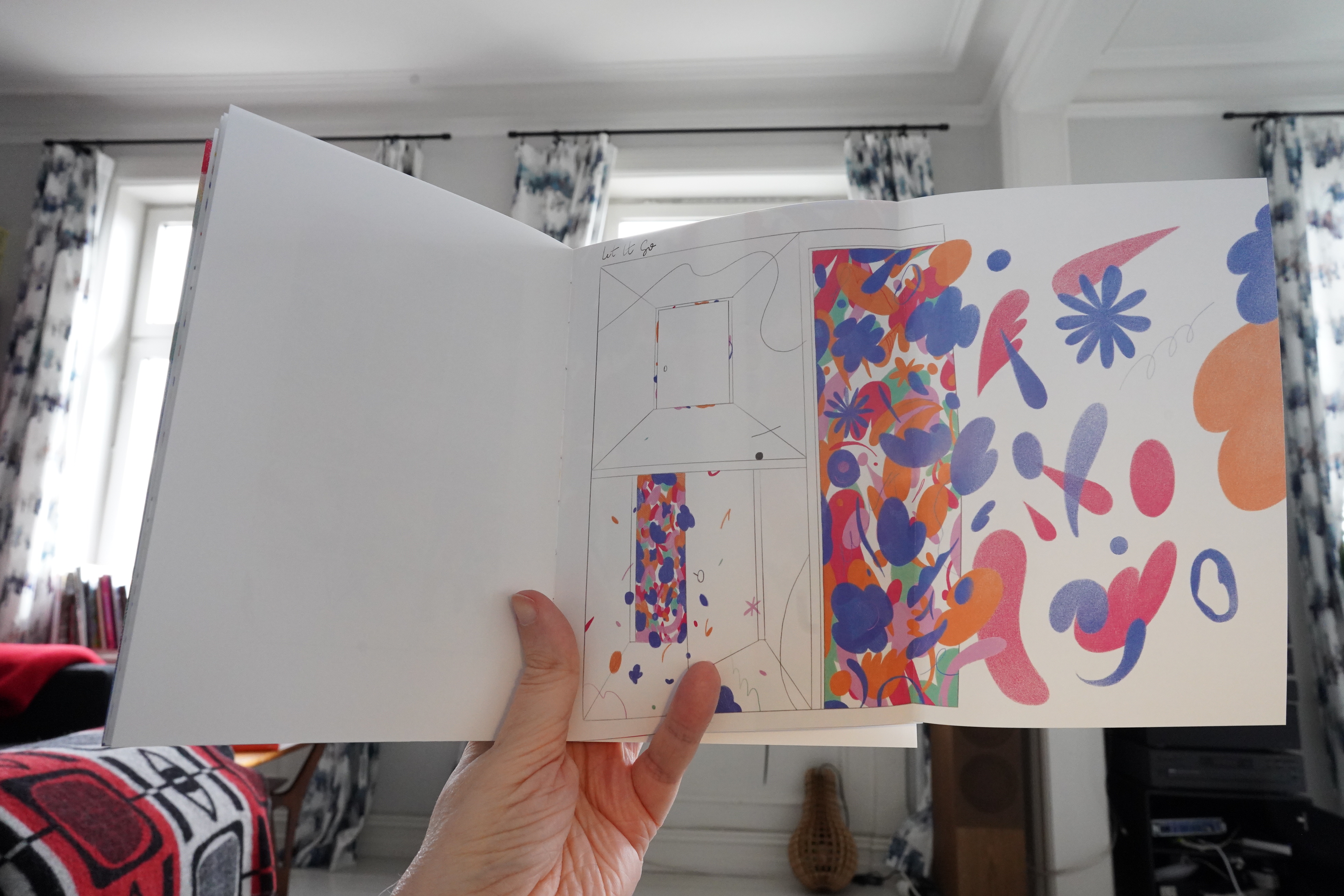
16:20: Propagation and Seed Dispersal of Human/Plant Hybrids on 625B by Lando (Decadence University Press)
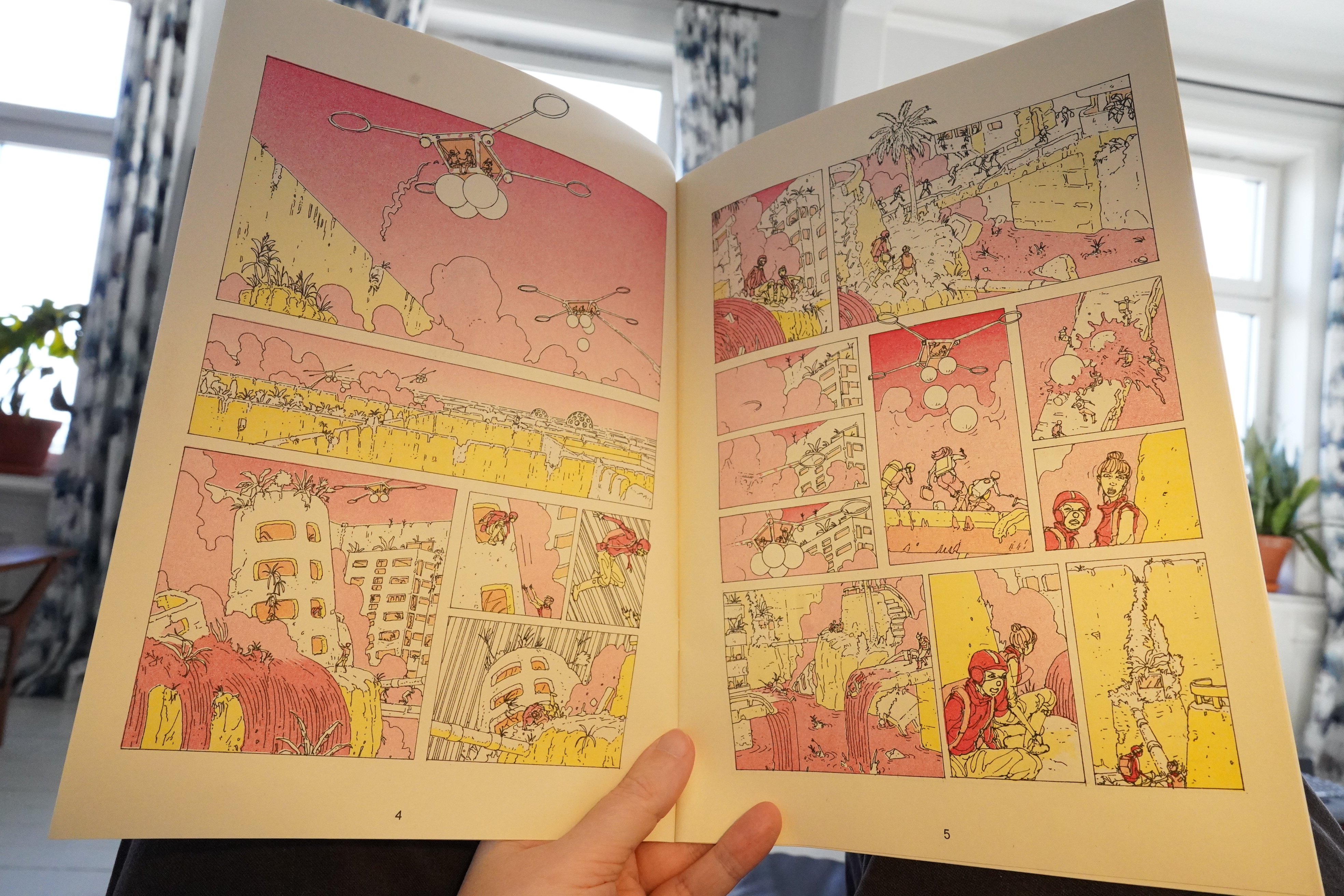
This was originally published in the Mould Map anthology, but here it’s represented as a slim standalone publication.
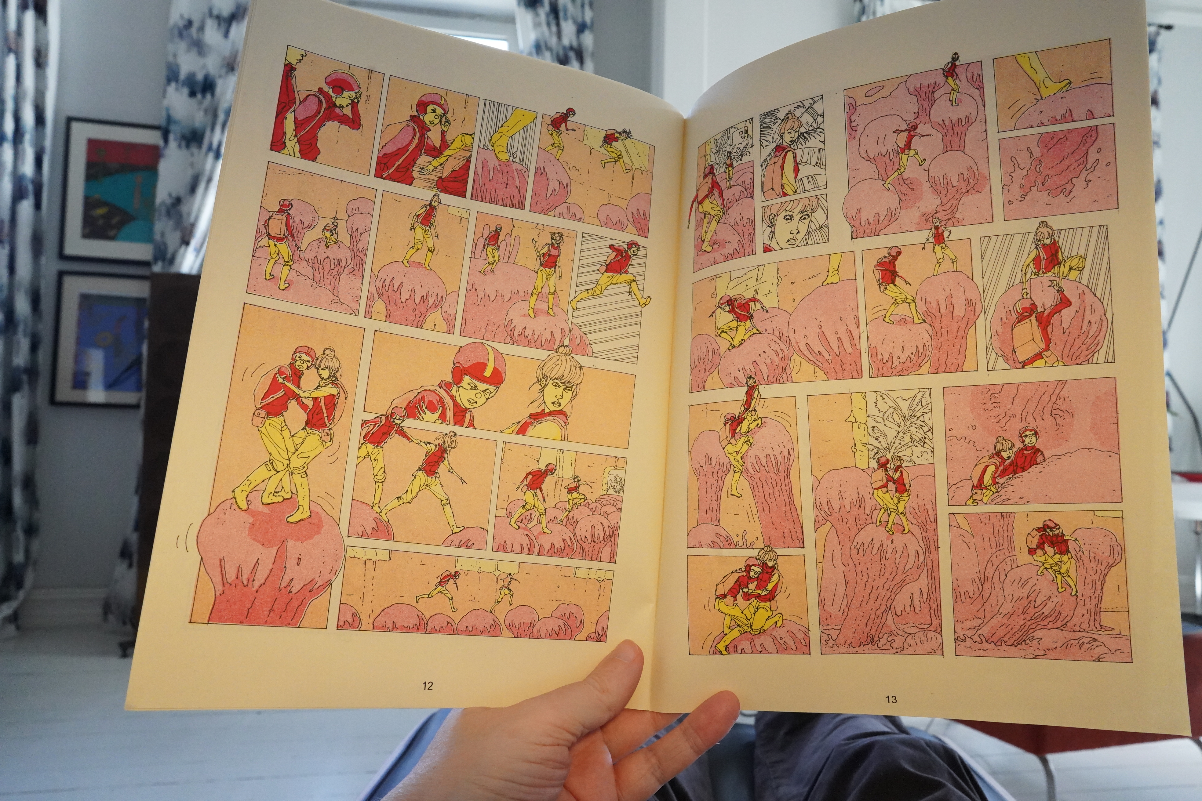
And it’s stunning? Really cool.
| Shearwater: Shearwater plays Bowie’s Berlin Trilogy: Part 1: Low |  |
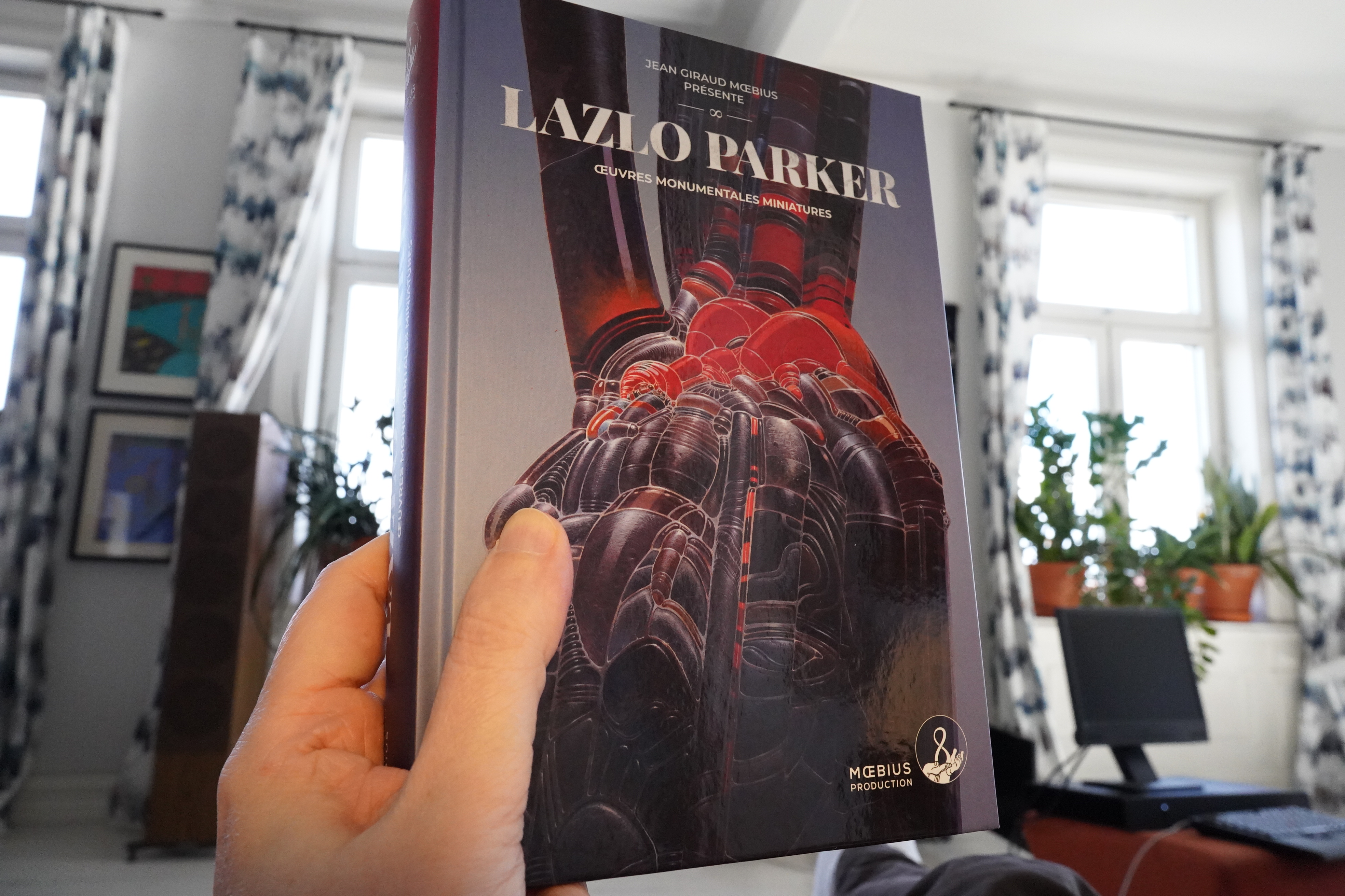
16:26: Lazlo Parker by Moebius (Moebius Production)
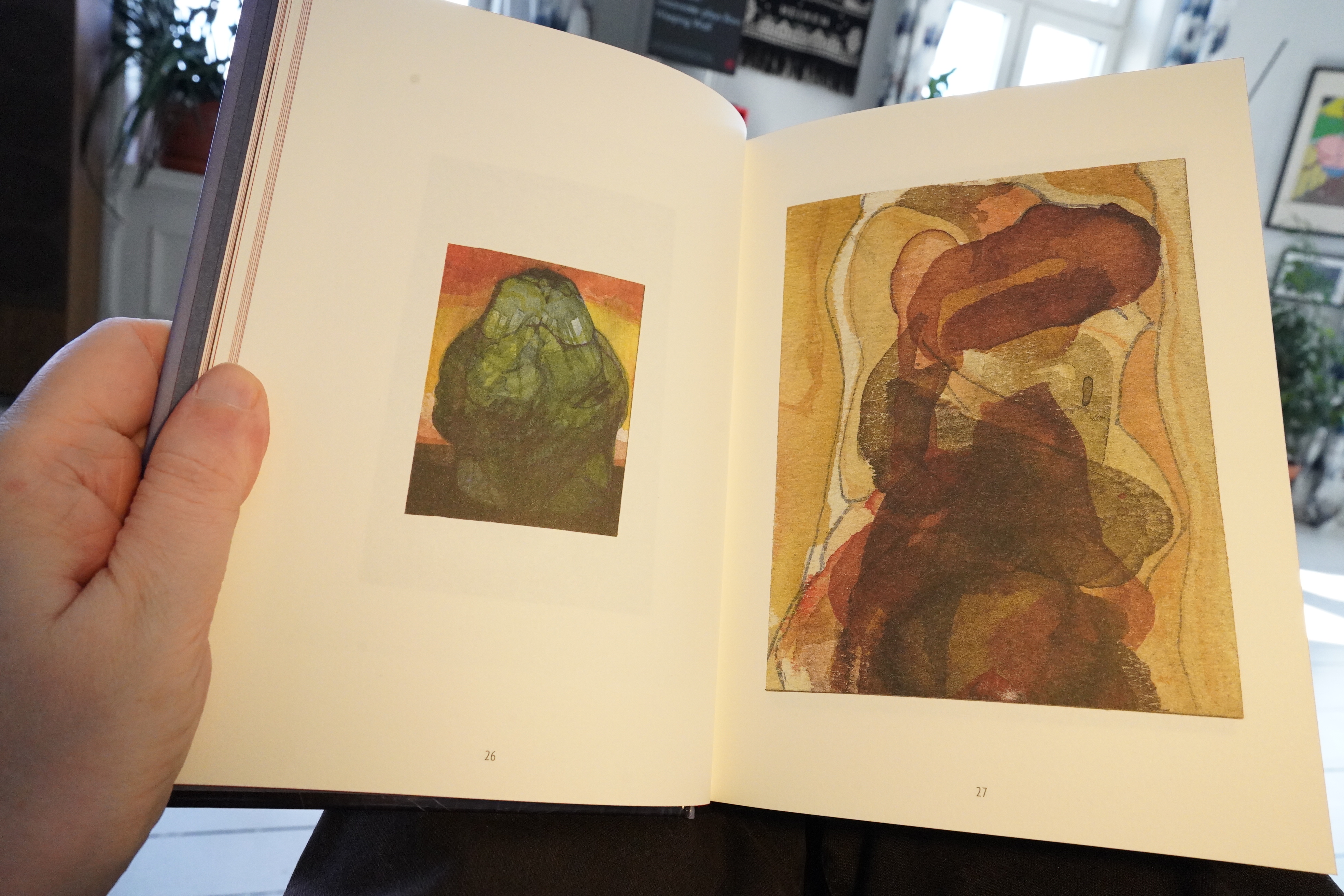
This is presented as being by an artist called Lazlo Parker, I think. (The introductory text is in French, and I don’t know French, but I think I was able to glean that.)
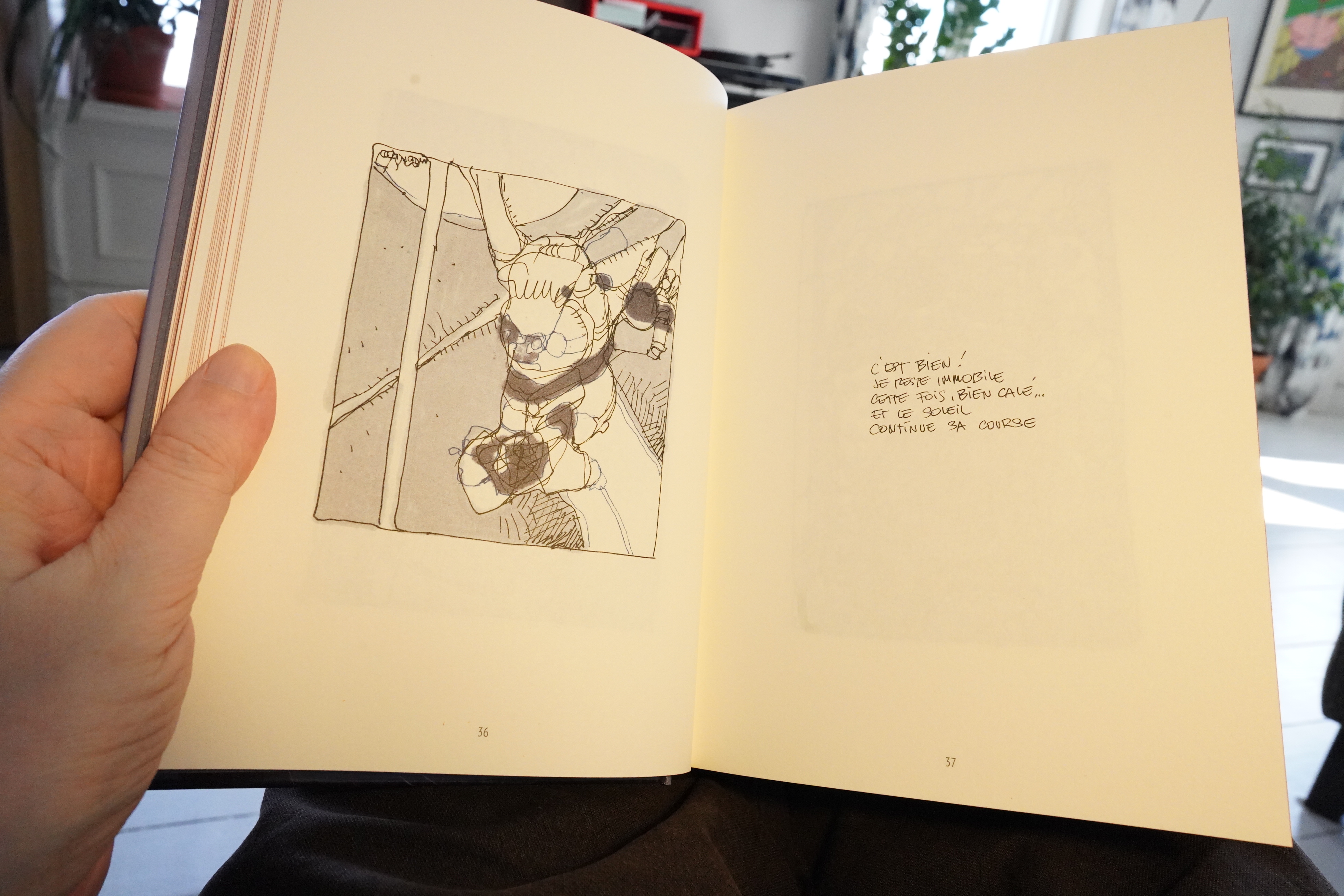
But, master sleuth as I am, I think this is basically just a collection of stuff from Moebius’ sketchbooks.
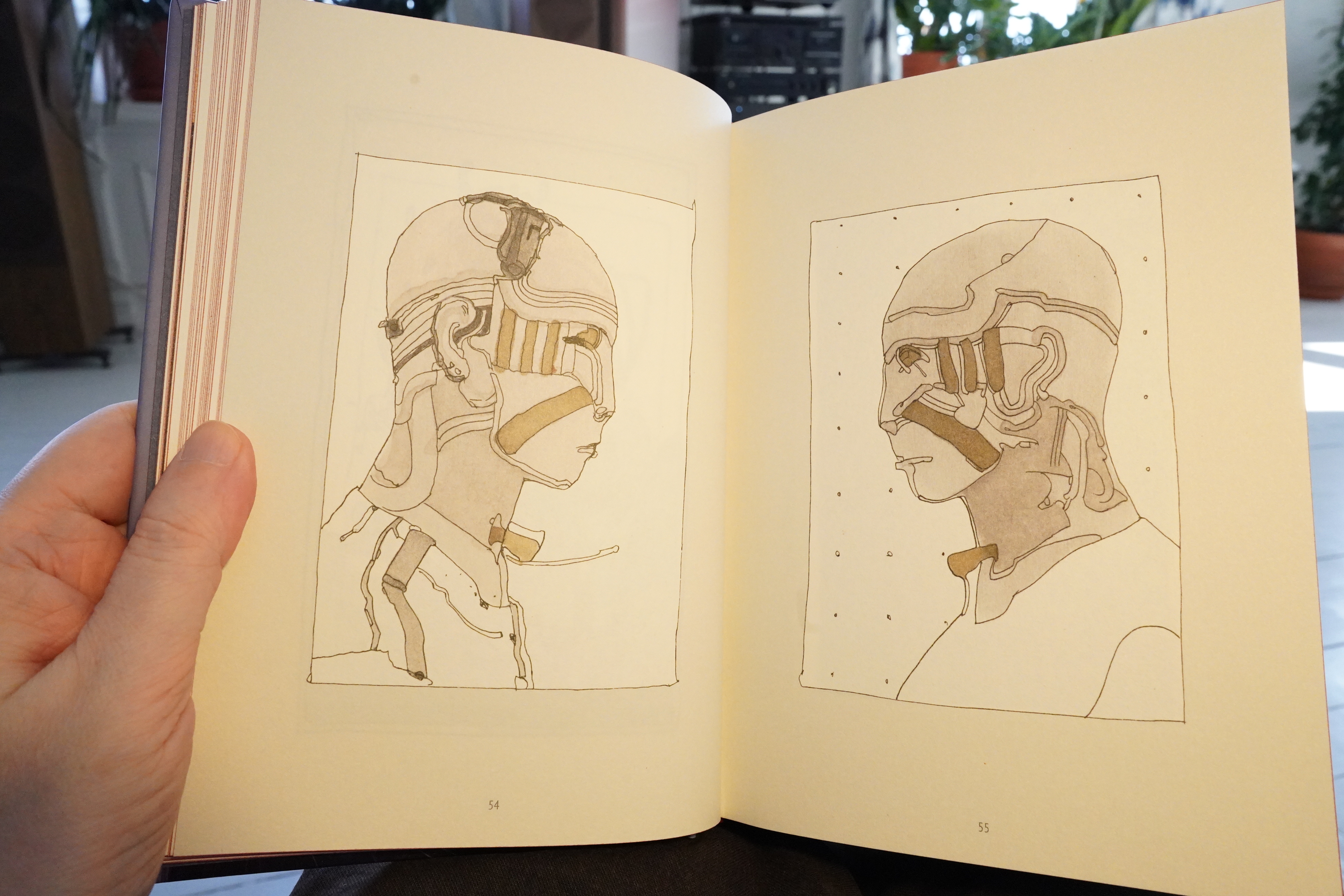
It’s a wide variety of stuff, spanning the 70s to the naughties (that’s what we called that decade, right?).

But it focuses mainly on Moebius’ more mechanic/organic drawings (and scrupulously avoids all of his famous characters).
Which is a fun approach, I guess? And these are, indeed, lovely drawings and paintings. But…
| Shearwater: The Dissolving Room |  |
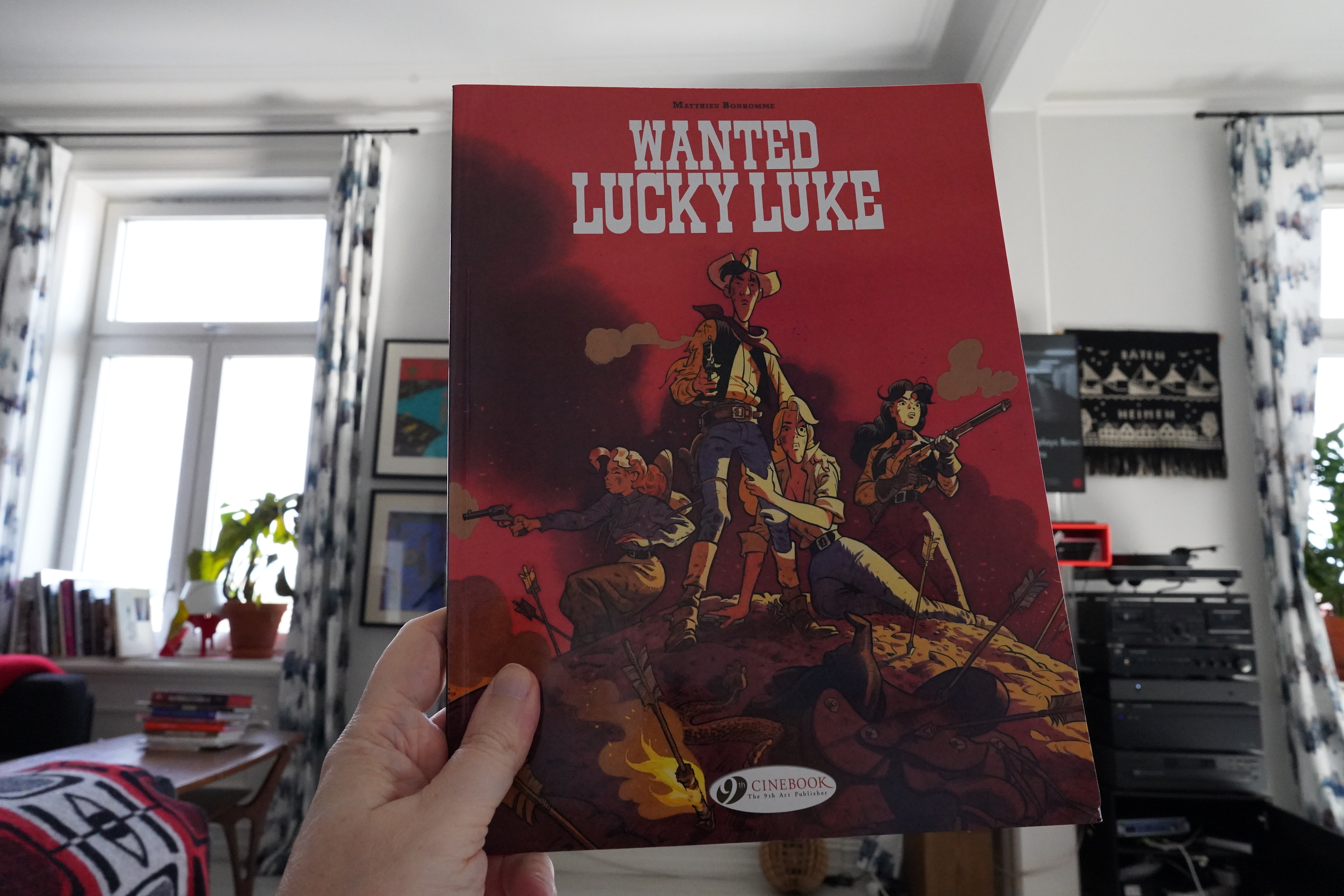
16:42: Wanted Lucky Luke by Matthieu Bonhomme (Cinebook)
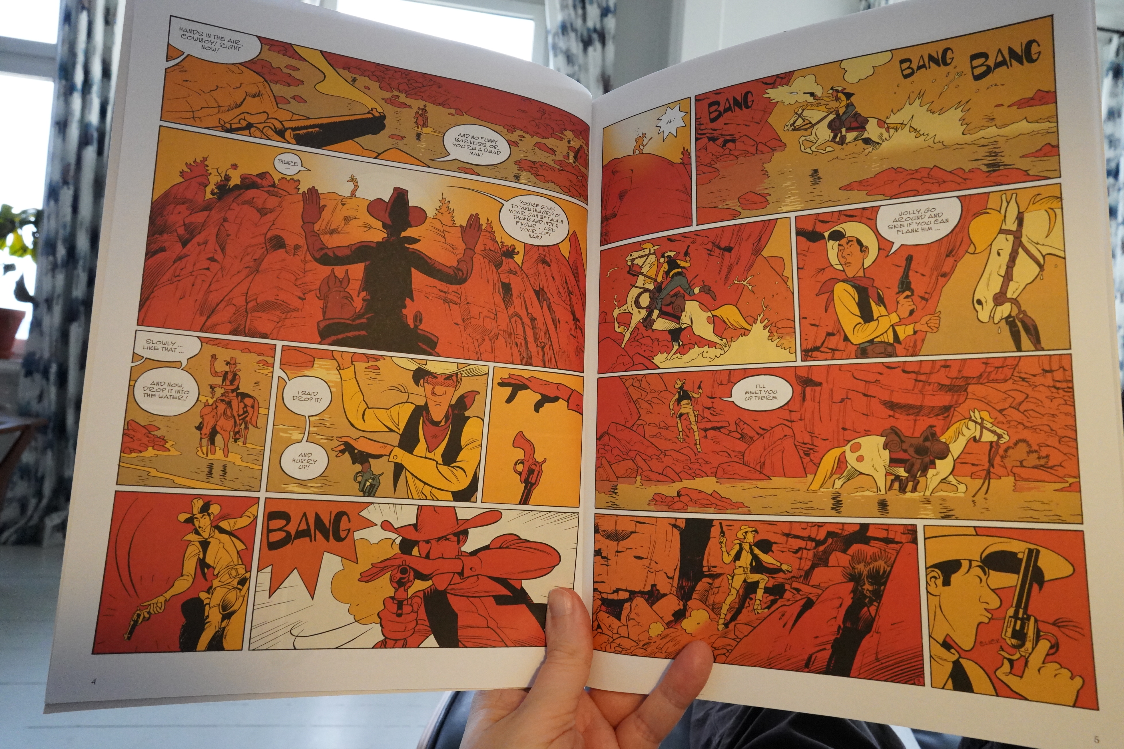
So this is one of those revisionist Lucky Luke albums…
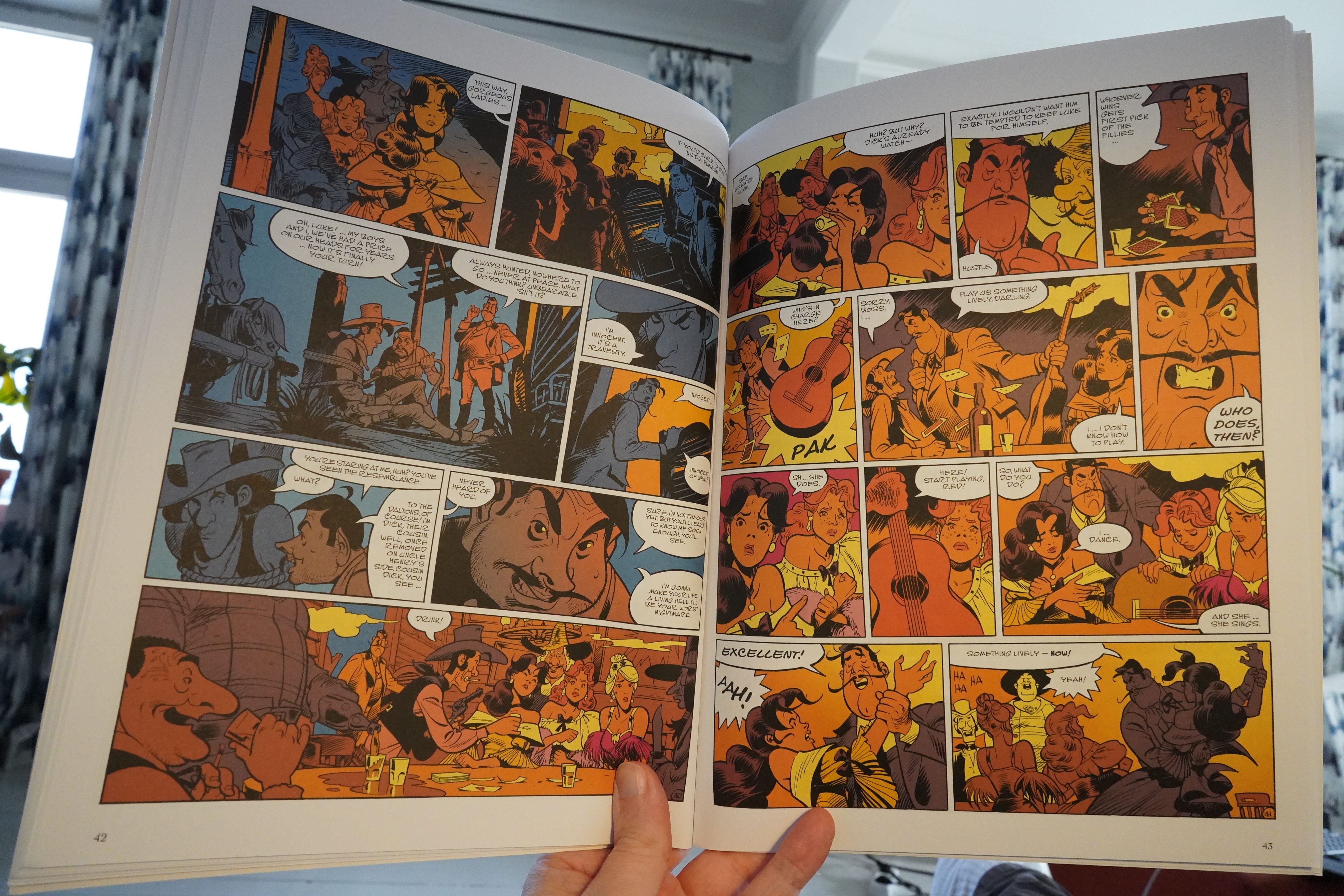
And I understand the impulse to take a children’s comic book and fuck with it (US comics does the same, like with that risible Tom King Adam Strange series the other year), and sometimes it works. But most of the time it’s like this one: Pretty tedious.
| Shearwater: The Dissolving Room | 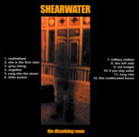 |
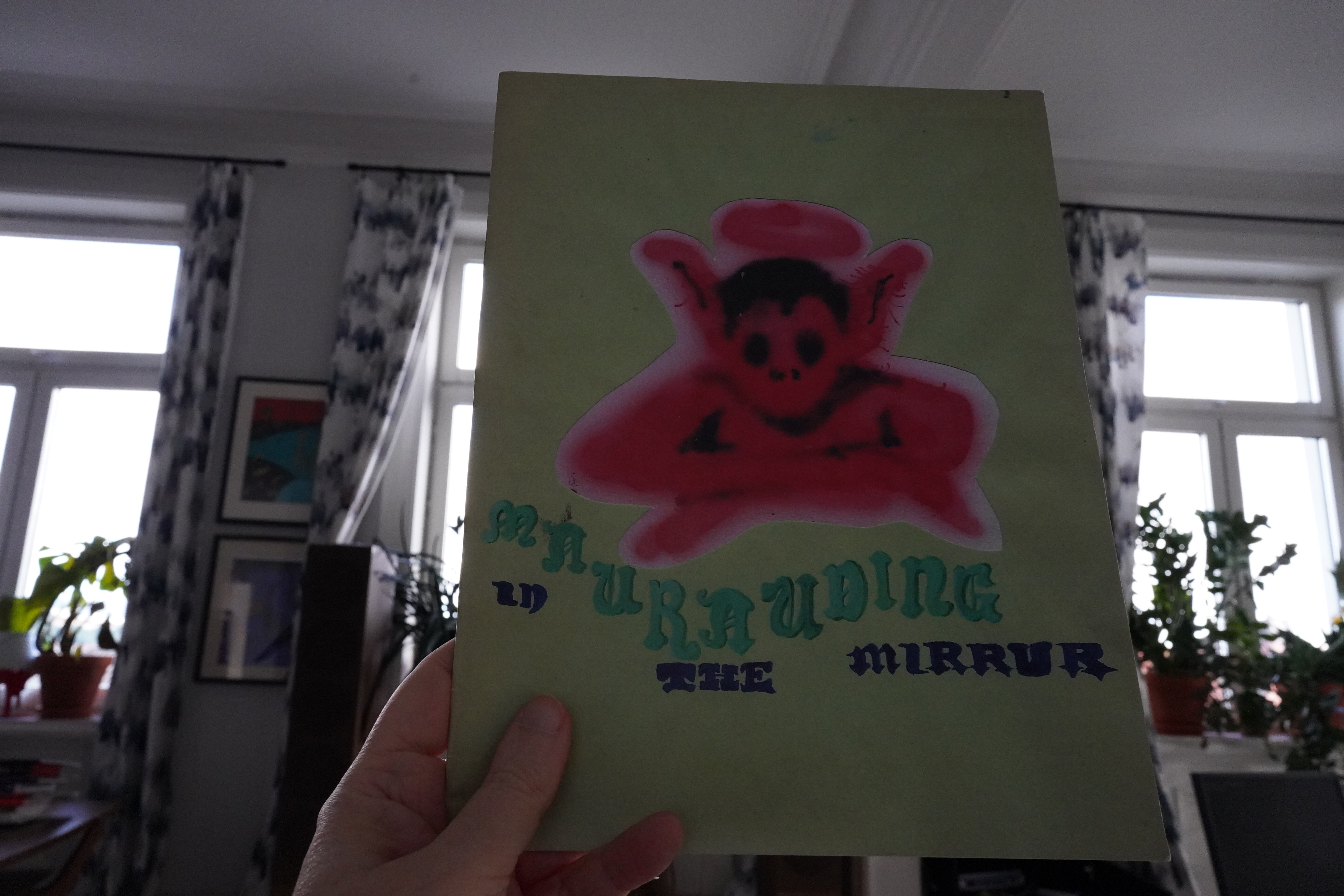
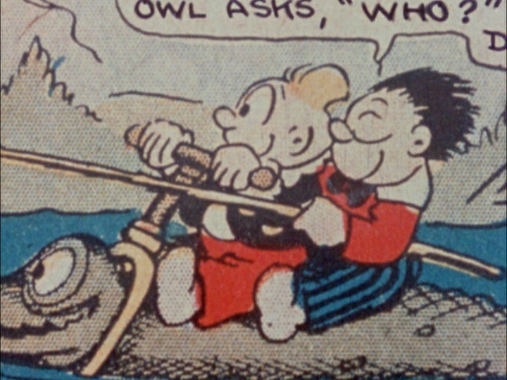
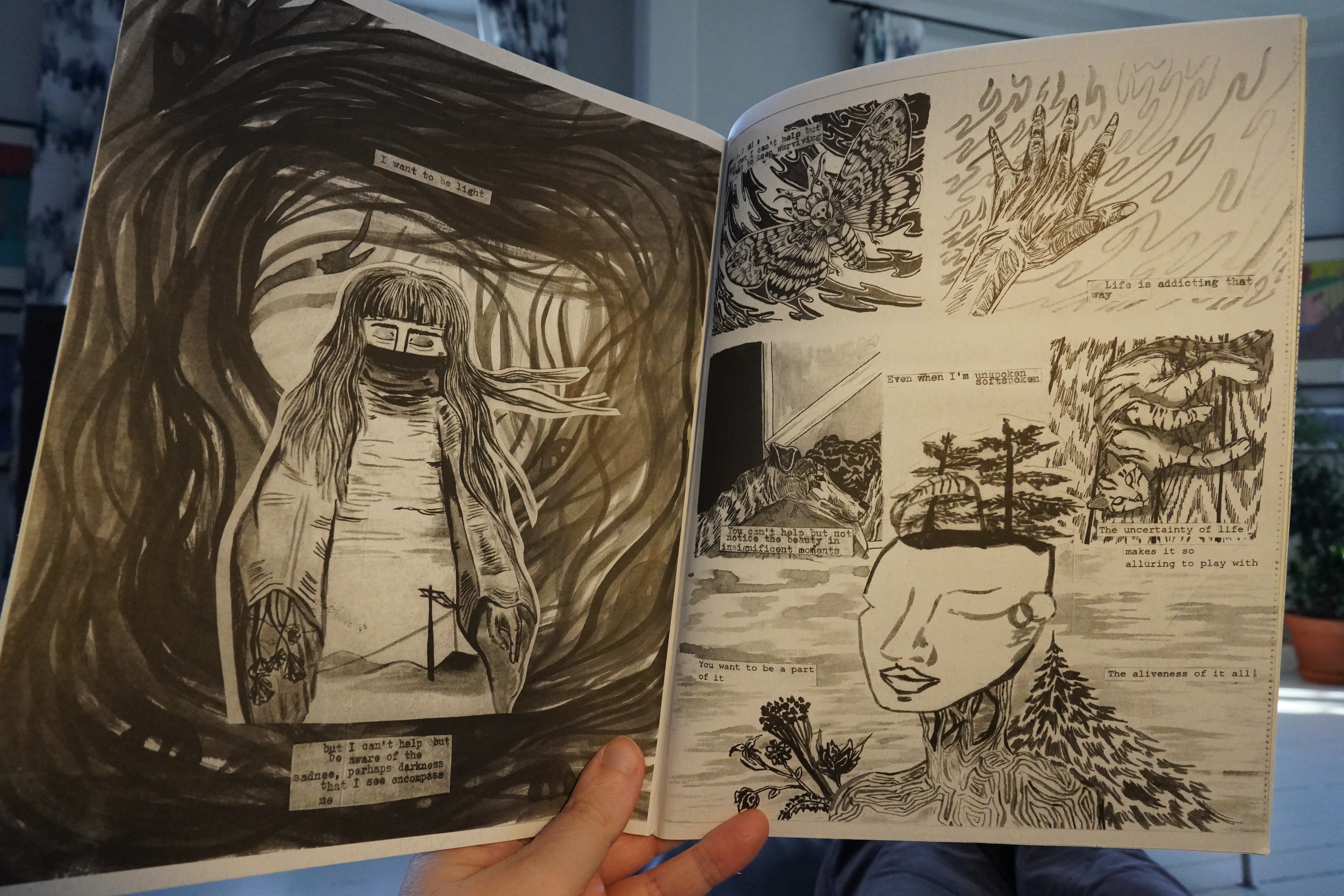
17:07: Mnurauding in the Mirrur by Sophia Warden
At least that’s what I think it says?
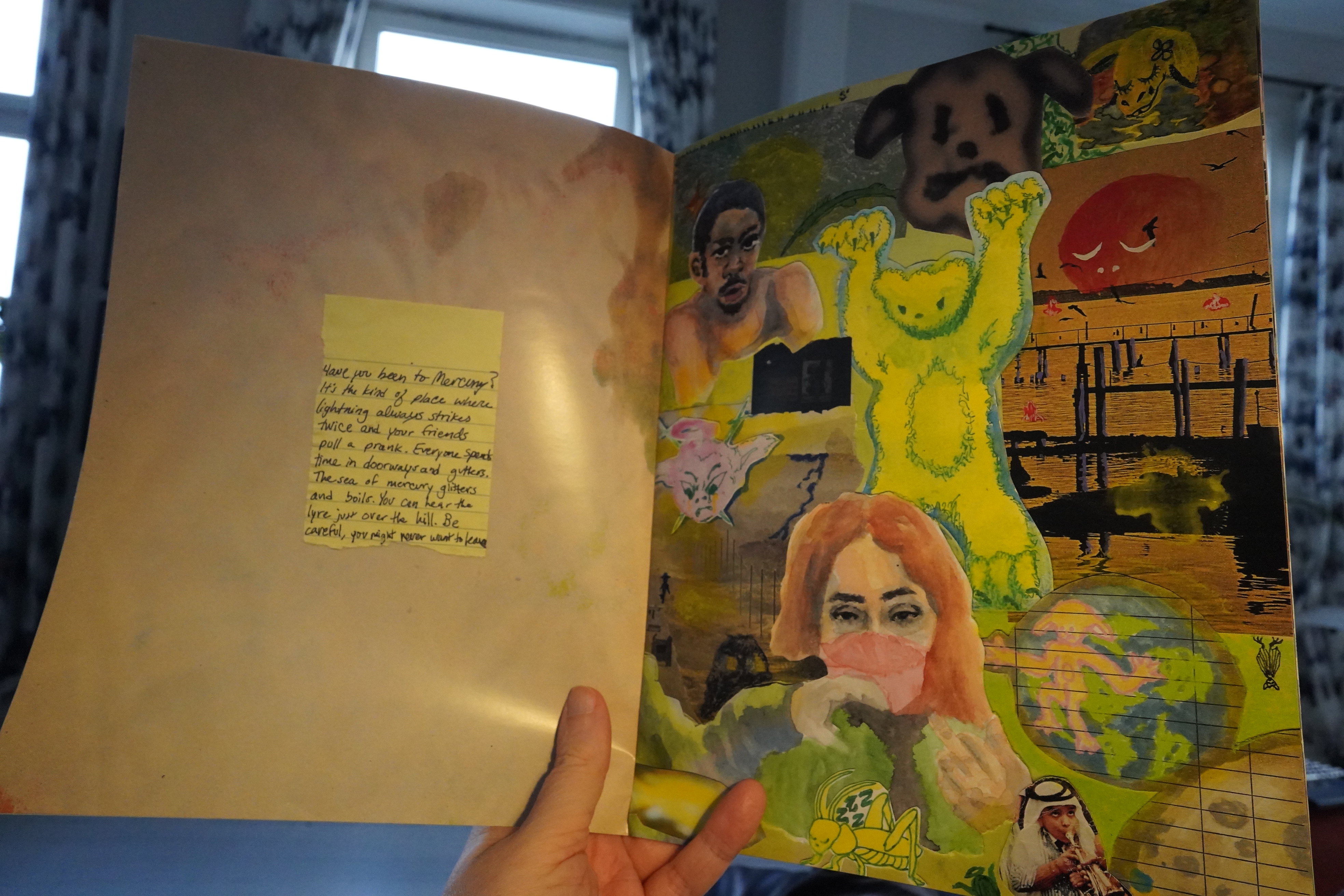
This is really cool. But very brief. Love the collages.
| Team Shadetek: Burnerism |  |
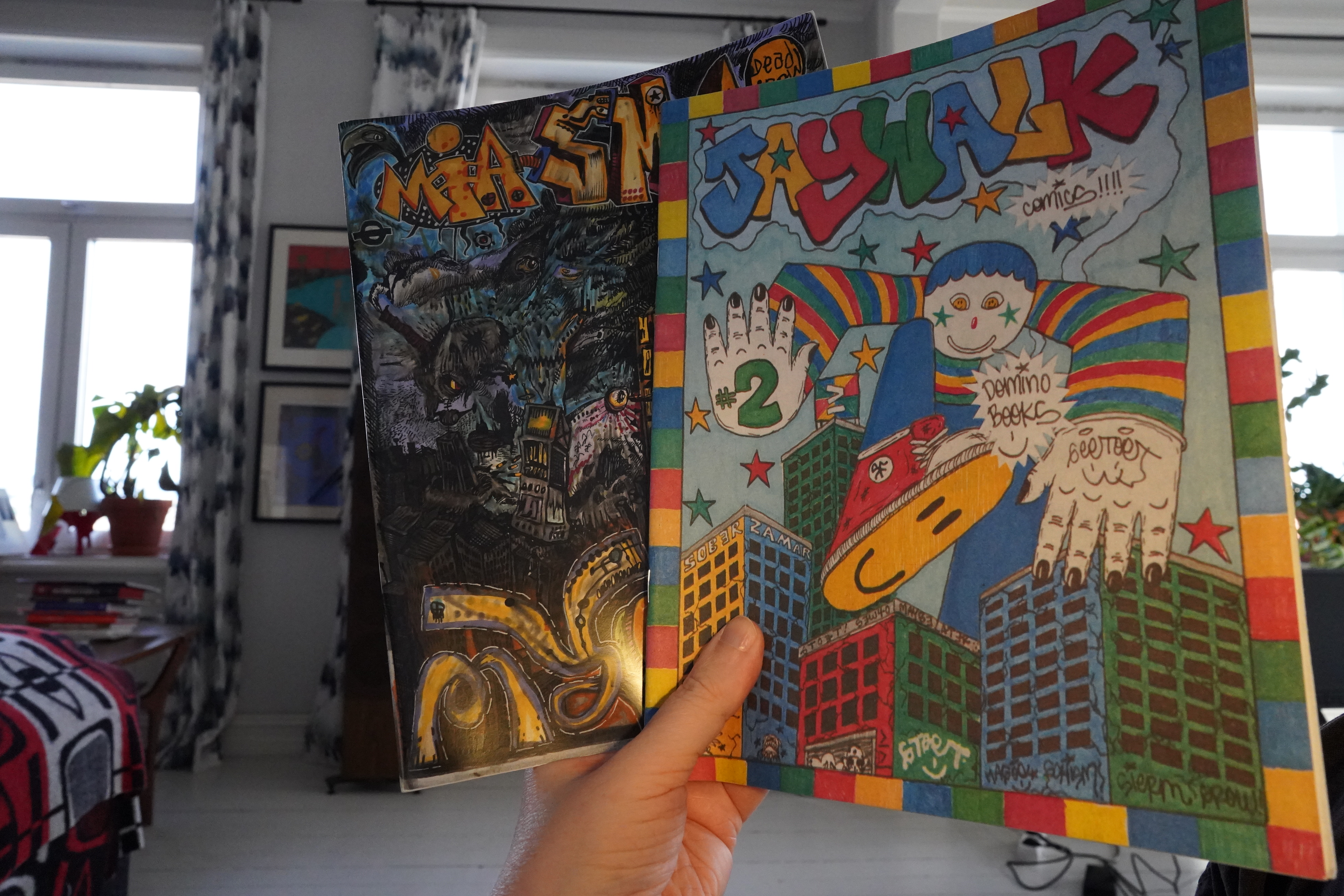
17:15: Miasma & Jaywalk #2 edited by Floyd Tangeman (Deadcrow/Domino)
Oh, this is a Tangeman solo book. Is it his first?

It’s wonderful — it’s mysterious and teetering on the edge of consciousness.
The Jaywalk anthology features longer stories (that are more narrative than most Deadcrow anthologies). But, as usual, it’s all good stuff. The above is, if I’m reading the contents page right, by Good Boy Evil.
*gasp* Jesse McManus?
The (perhaps) strongest piece in the book is by Theresa Panyawai, but it’s all good.
Oh, and I’d forgotten how wild this Team Shadetek track is.
| Boris: Hope: Japan Tour 2011 |  |
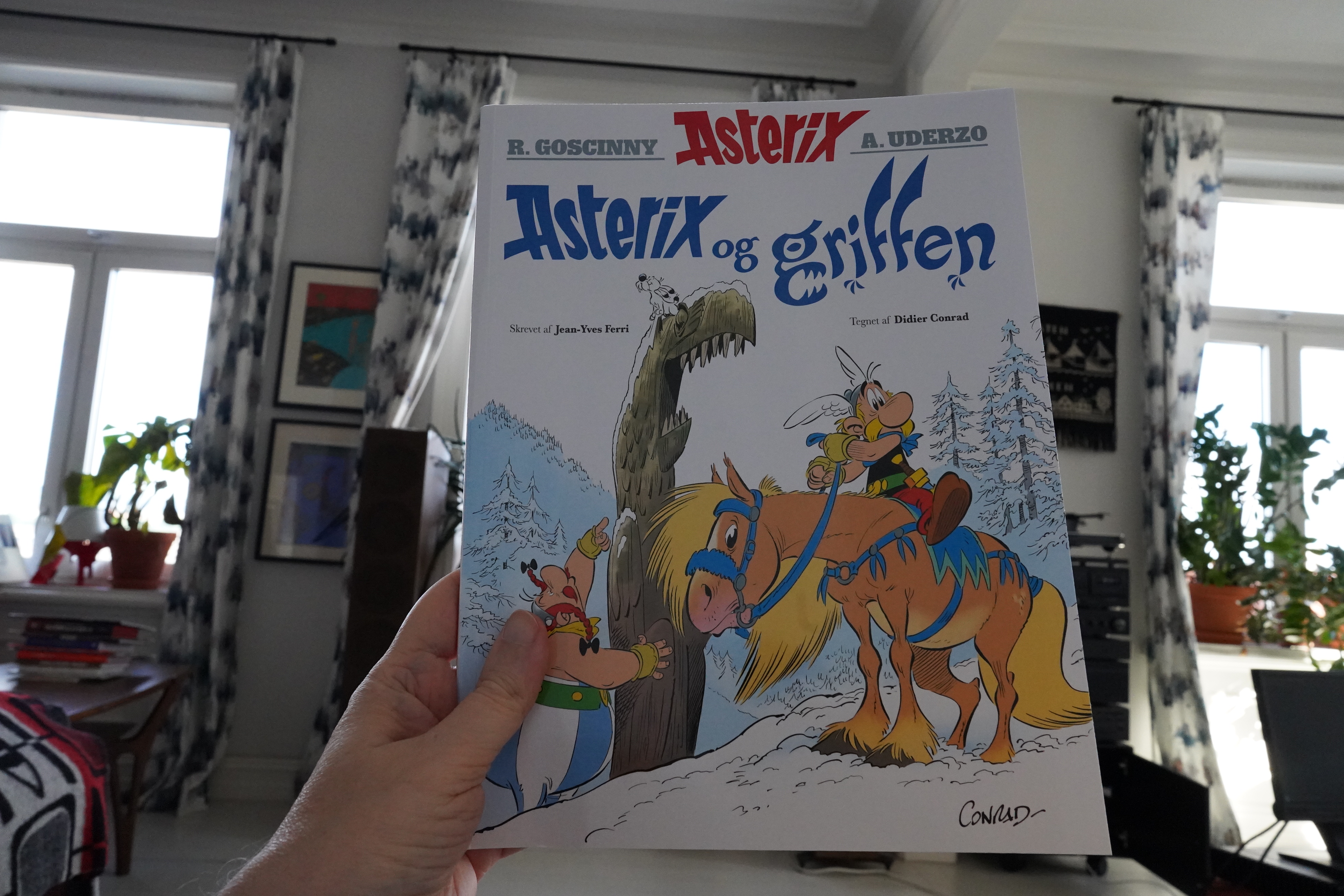
17:36: Astérix et le Griffon by Ferri & Conrad (Cobolt)
On the other end of the scale from that Lucky Luke up there, we have the latest Asterix album — a very official one, in the tradition of Goscinny and Uderzo. (Having their names much much larger than the actual creators on the cover feels a bit like a cheat, though.)
(To digress a bit — I stopped buying European children’s comics when I went to university, and I’d stopped buying American children’s comics (i.e., super-hero comics from Marvel and DC) some years before that. It wasn’t until I finally got organised back in… er… 2016? and sorted the comics that I started buying the European children’s comics again, after a… 25? year pause. Because I started re-reading the old Spirou, Tintin and Asterix comics I had as a child and I kinda went “I should get the ones I’m missing” and then I started buying newer stuff as well. And… quite a few of them turned out to be surprisingly entertaining? But it’s a slightly weird feeling getting a new Asterix — it feels illicit somehow.)
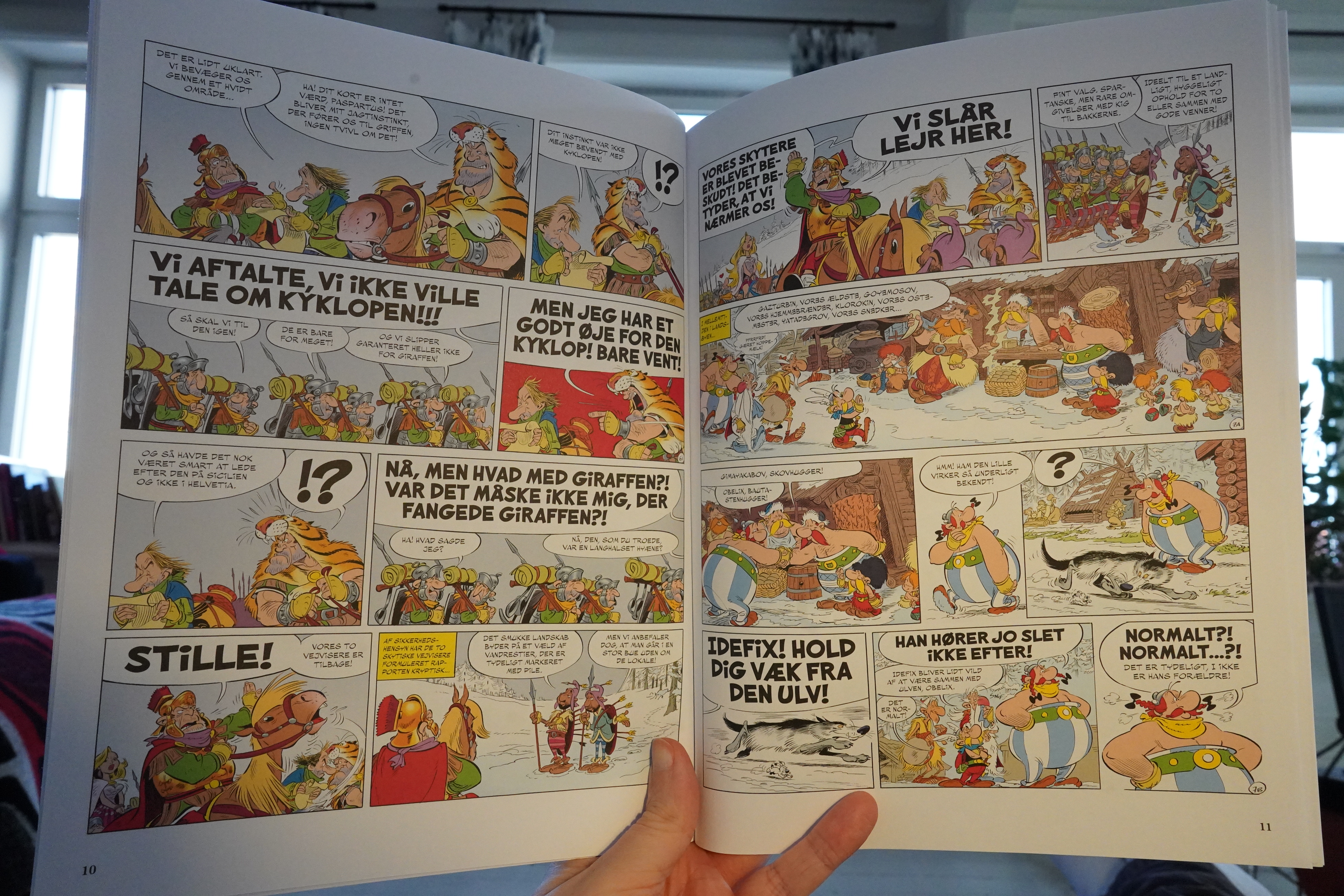
This is fine — it’s pretty amusing, and it’s got a nicely escalating storyline.
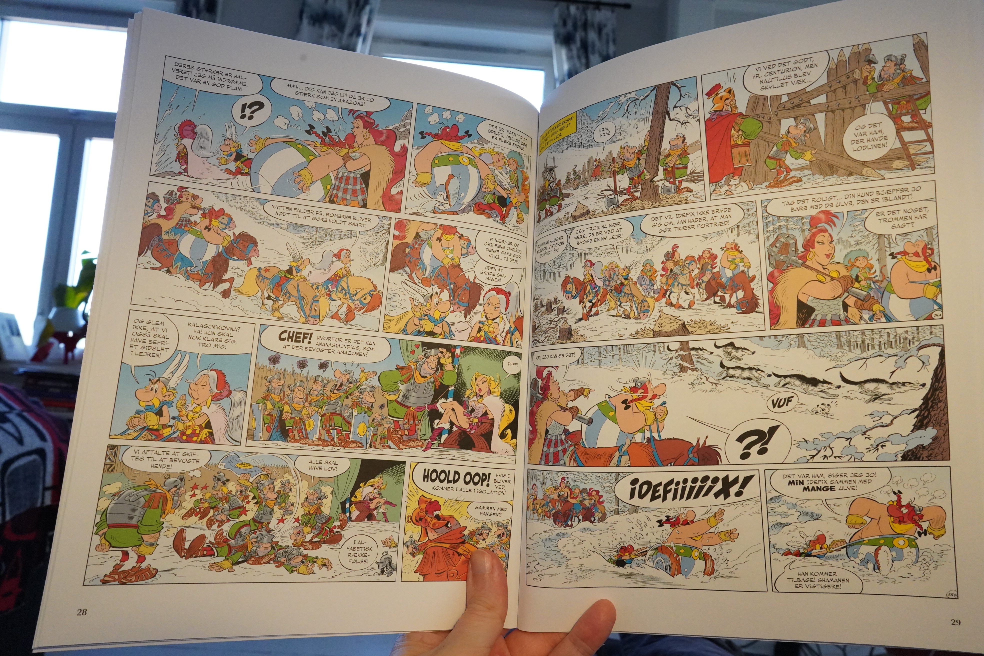
The artwork’s fine, too, but there’s something slightly off about it all. I mean, they put so much work into aping Uderzo and Goscinny that it feels slightly necrophiliac?
But it’s fine.
| Boris: Hope: Japan Tour 2011 |  |
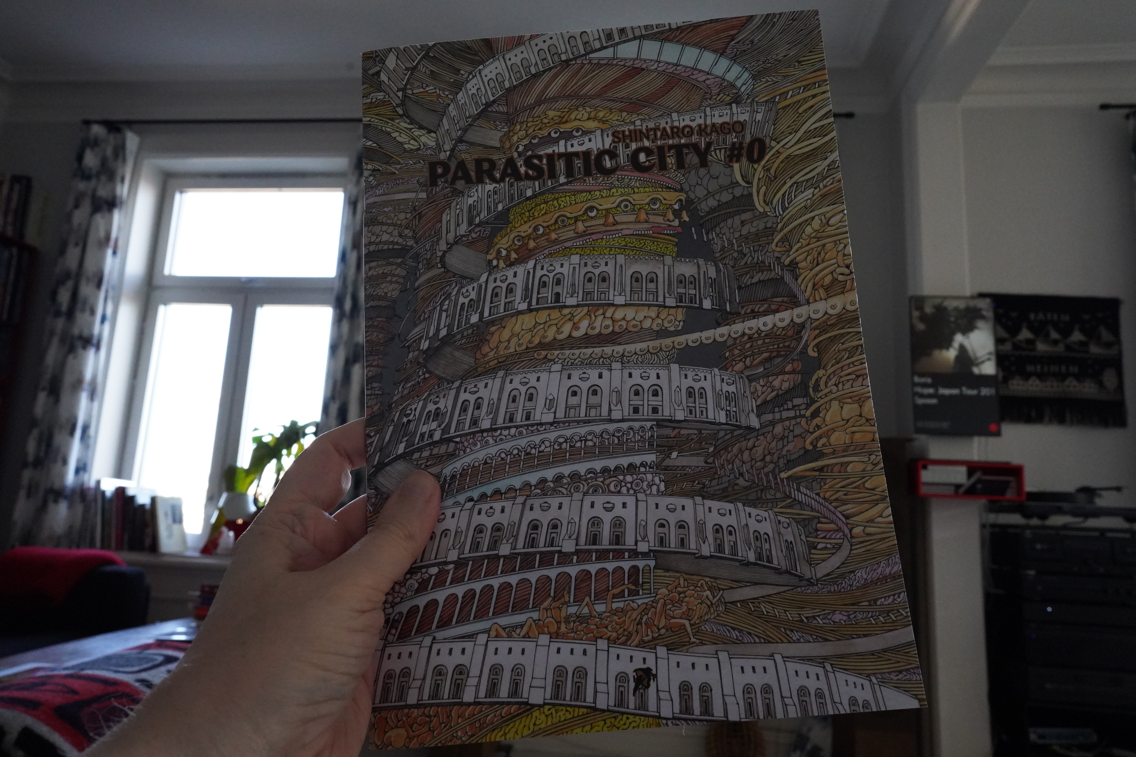
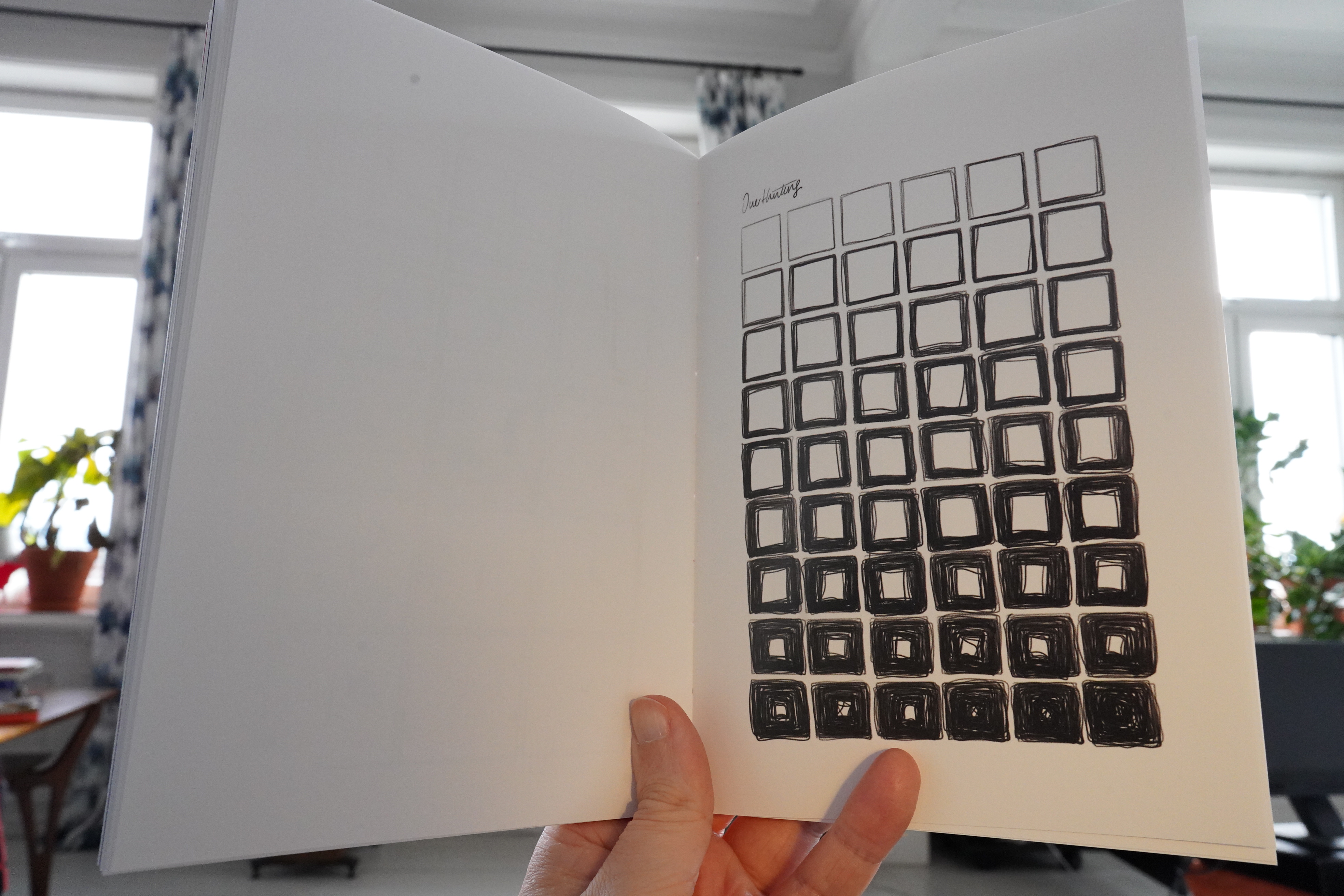
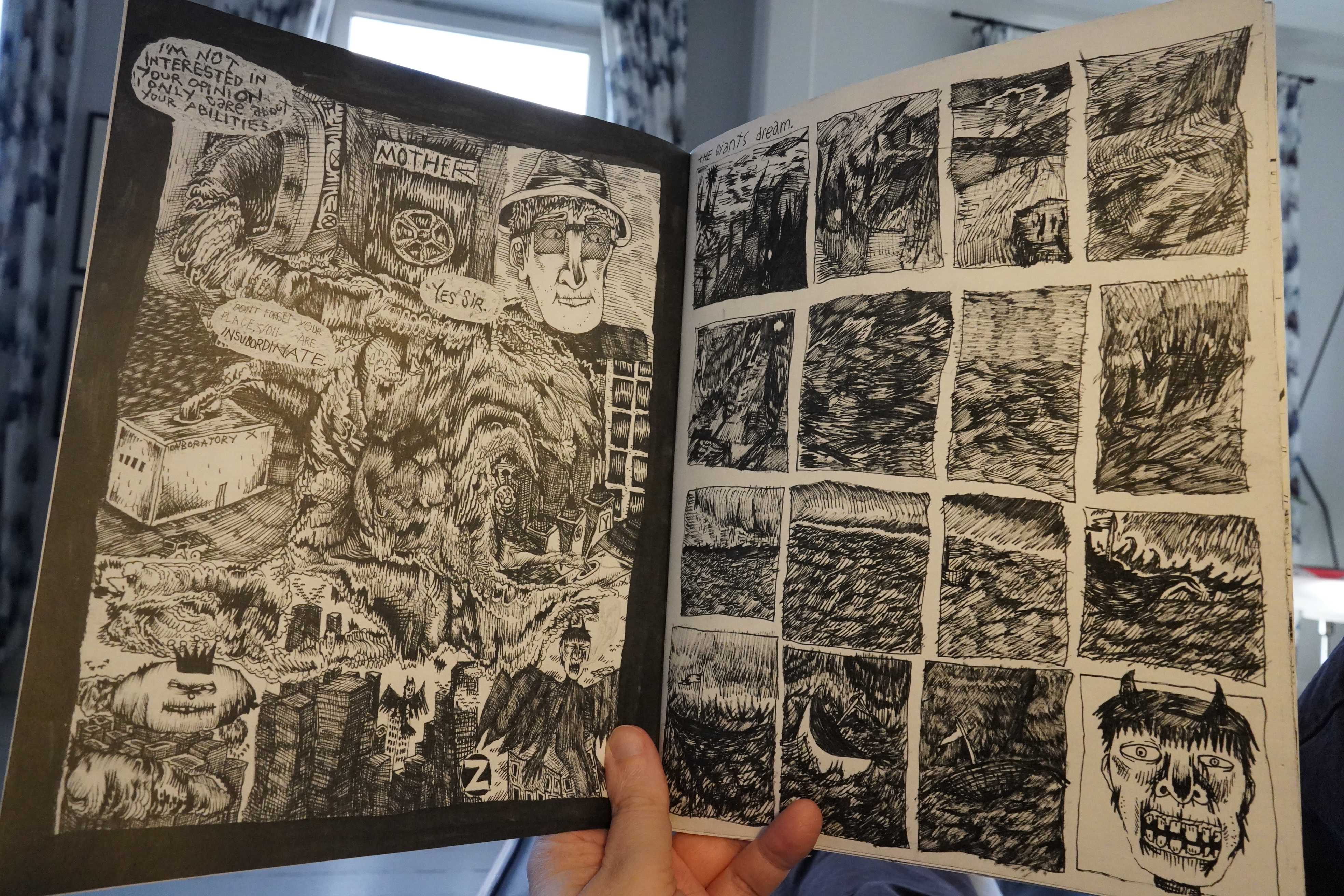
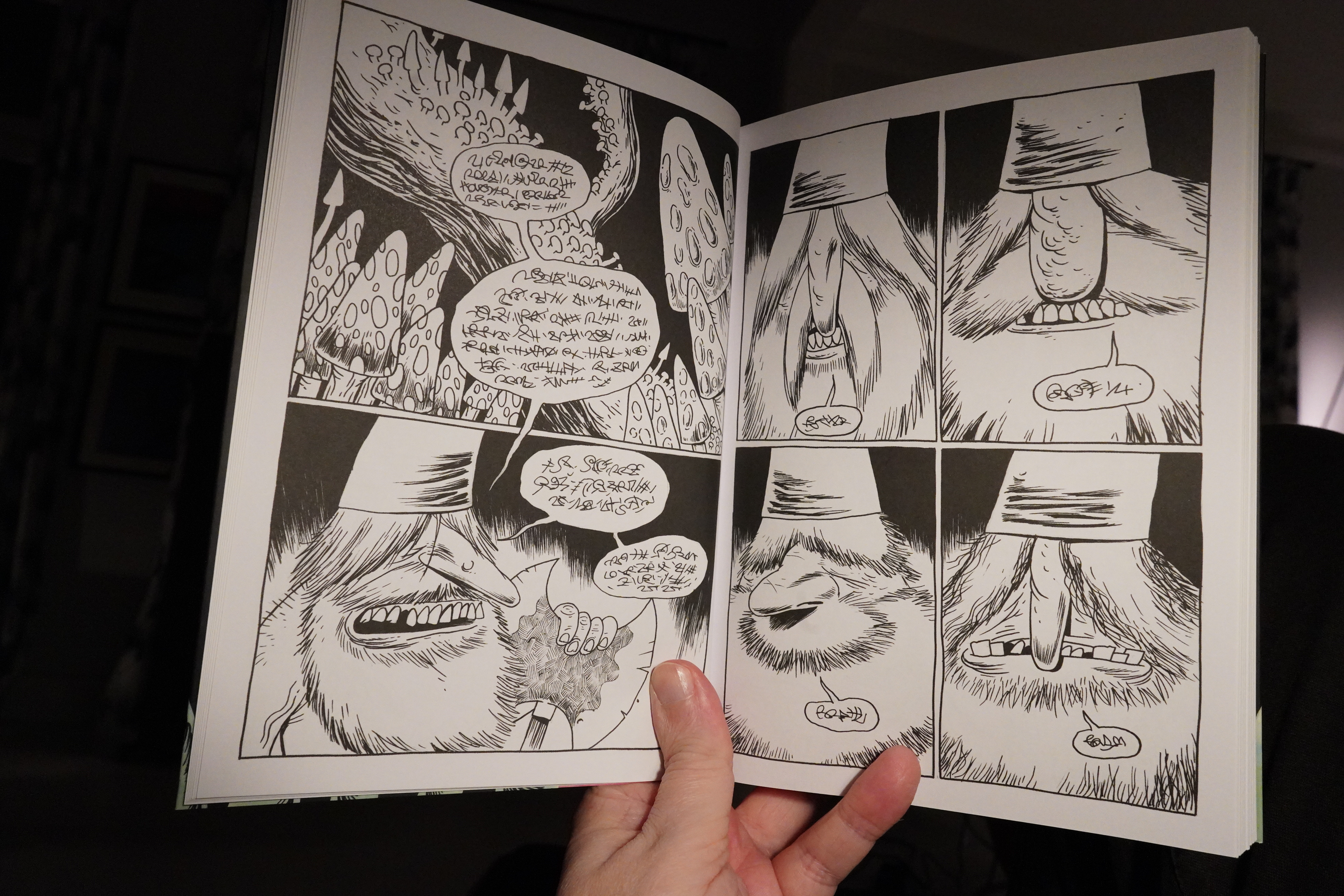
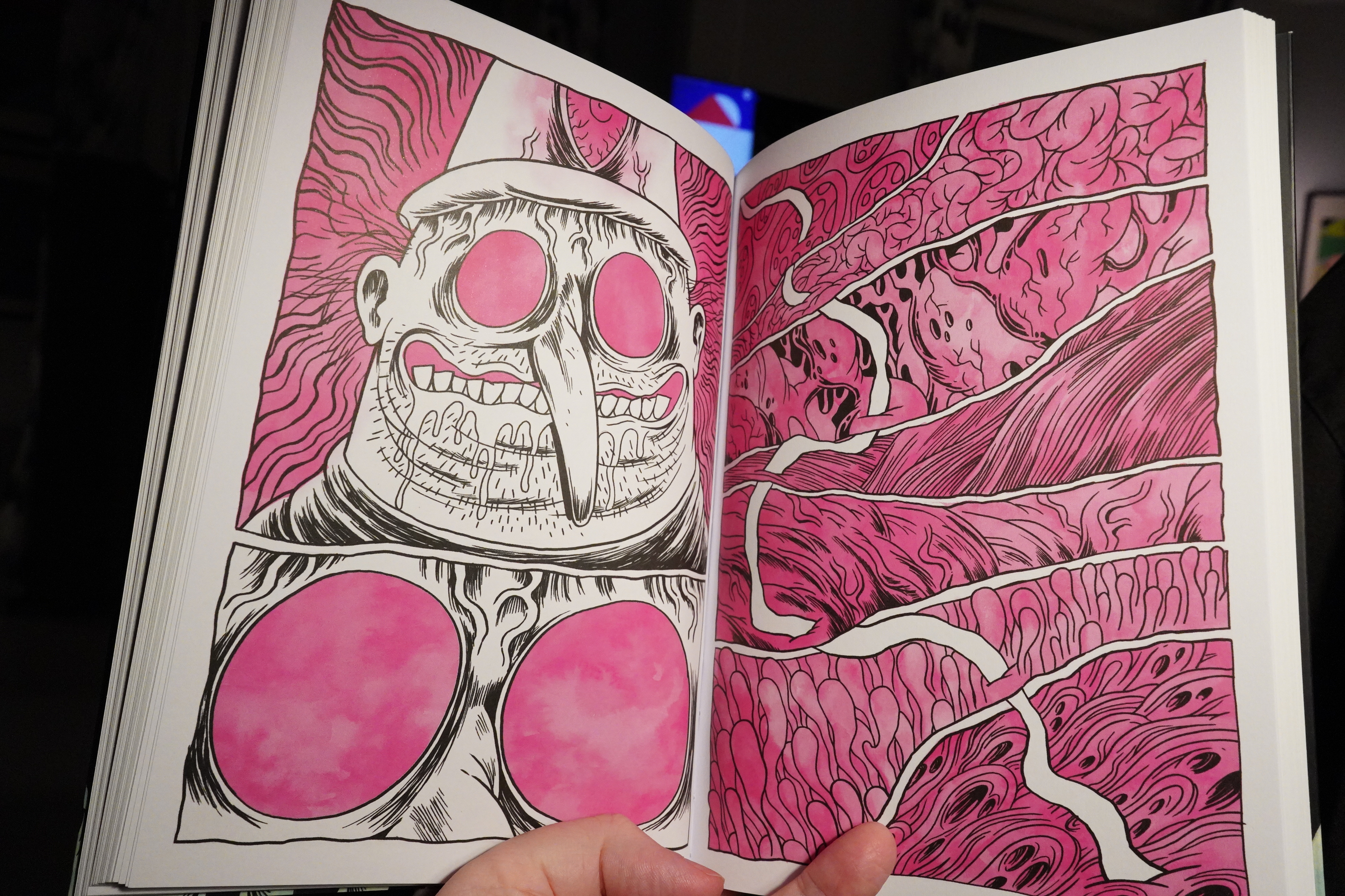
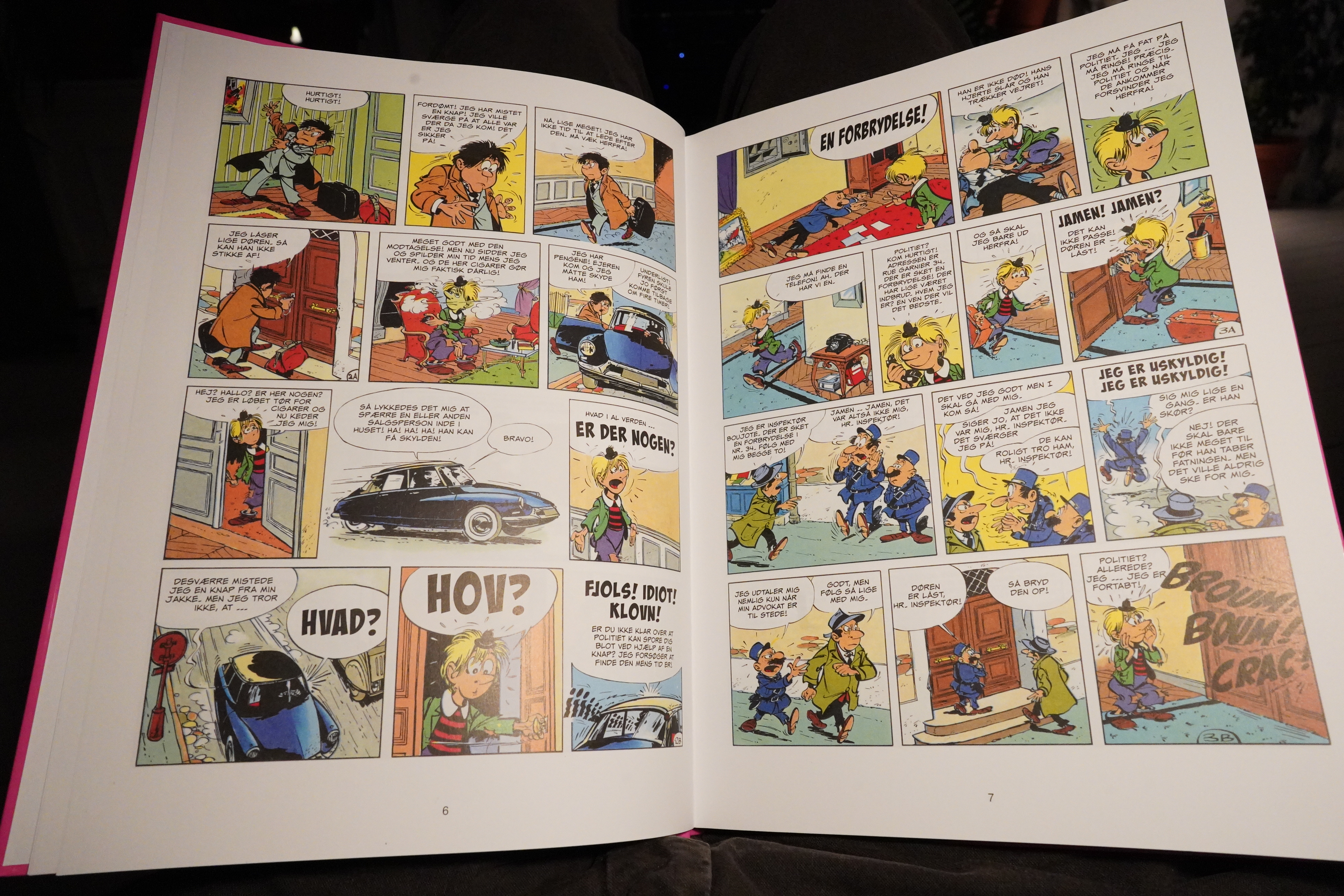
18:24: Parasitic City #0 by Shintaro Kago (Hollow Press)
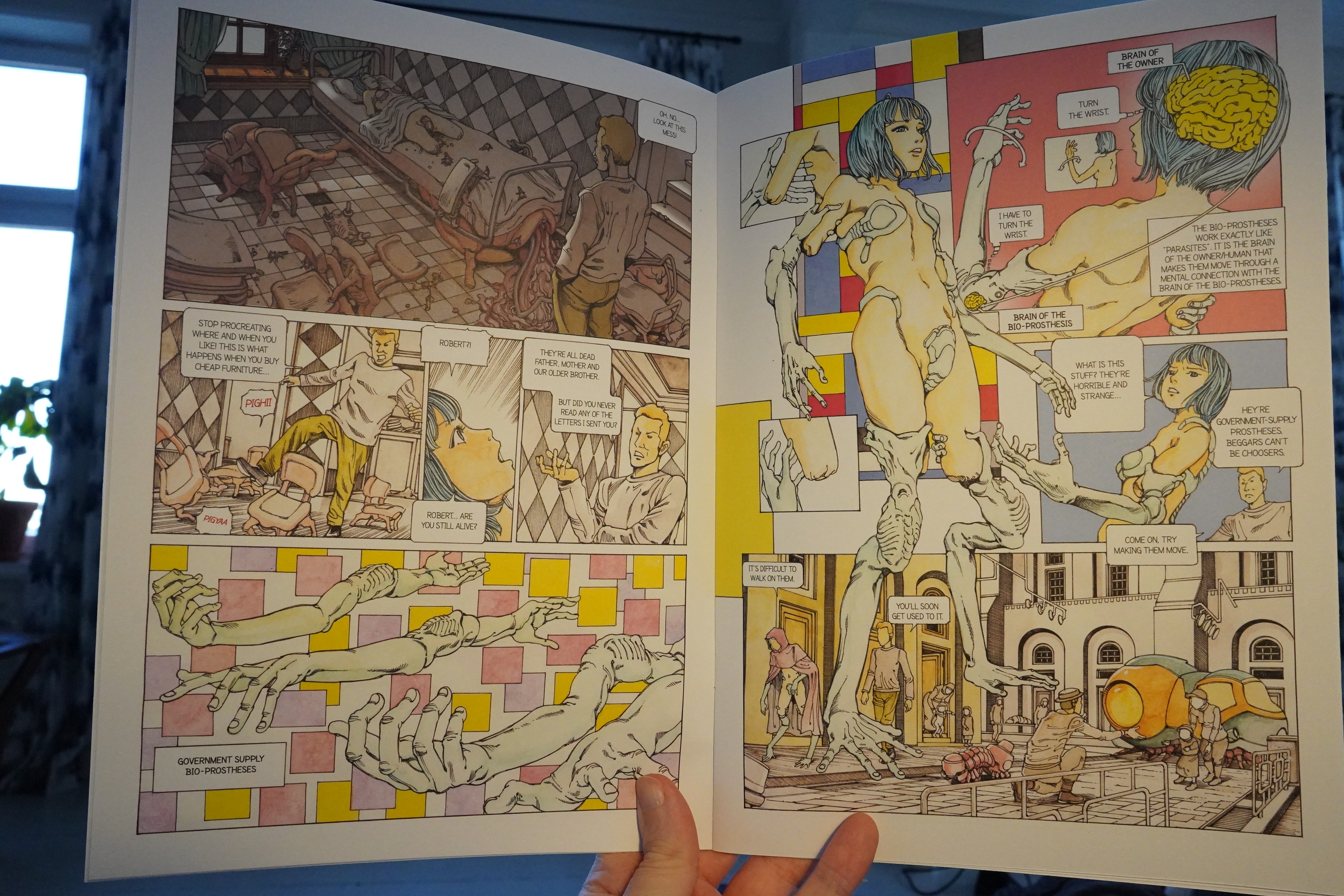
Err… I think this is the only spread I can post a snap of here, since this is a family oriented blog. All the rest of the pages are basically explicit paraplegic porn and torture. There’s some gesture at a plot in here, but it really just mostly looks like the artist wants to draw mutilated people fucking and being eaten by crustaceans living in human organs.
Oh, and chairs fucking, too, but that looked more like Moebius-inspired.
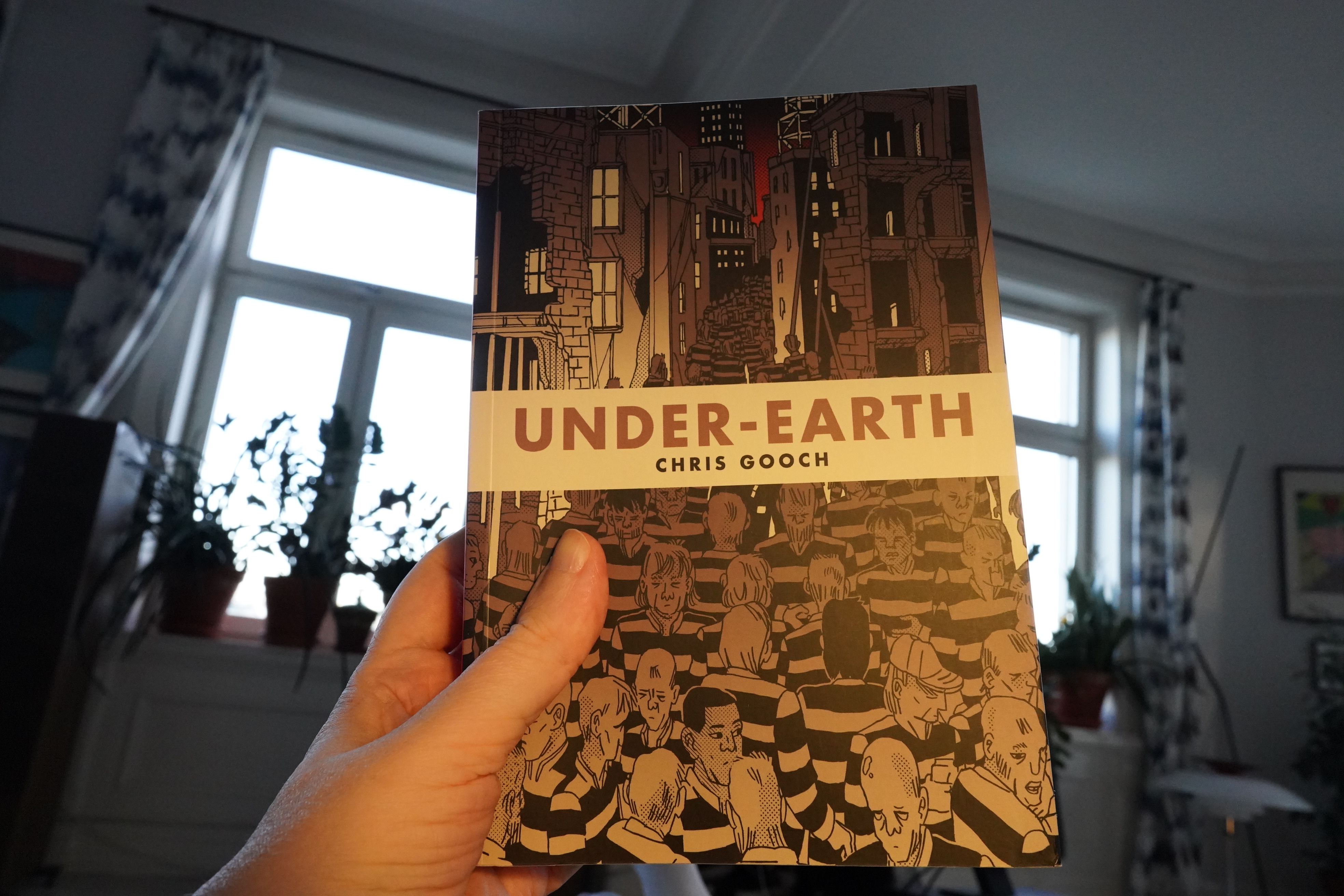
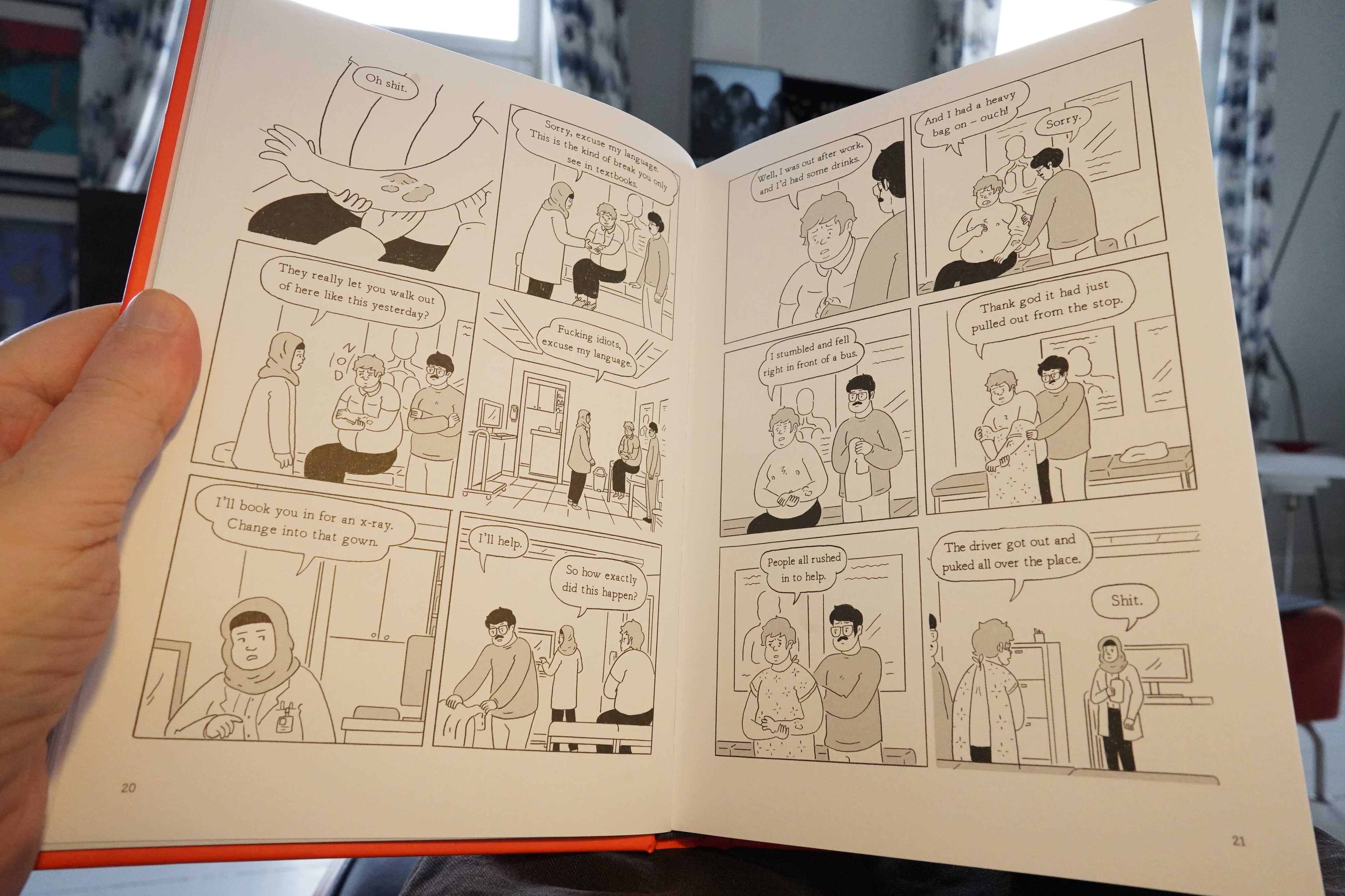
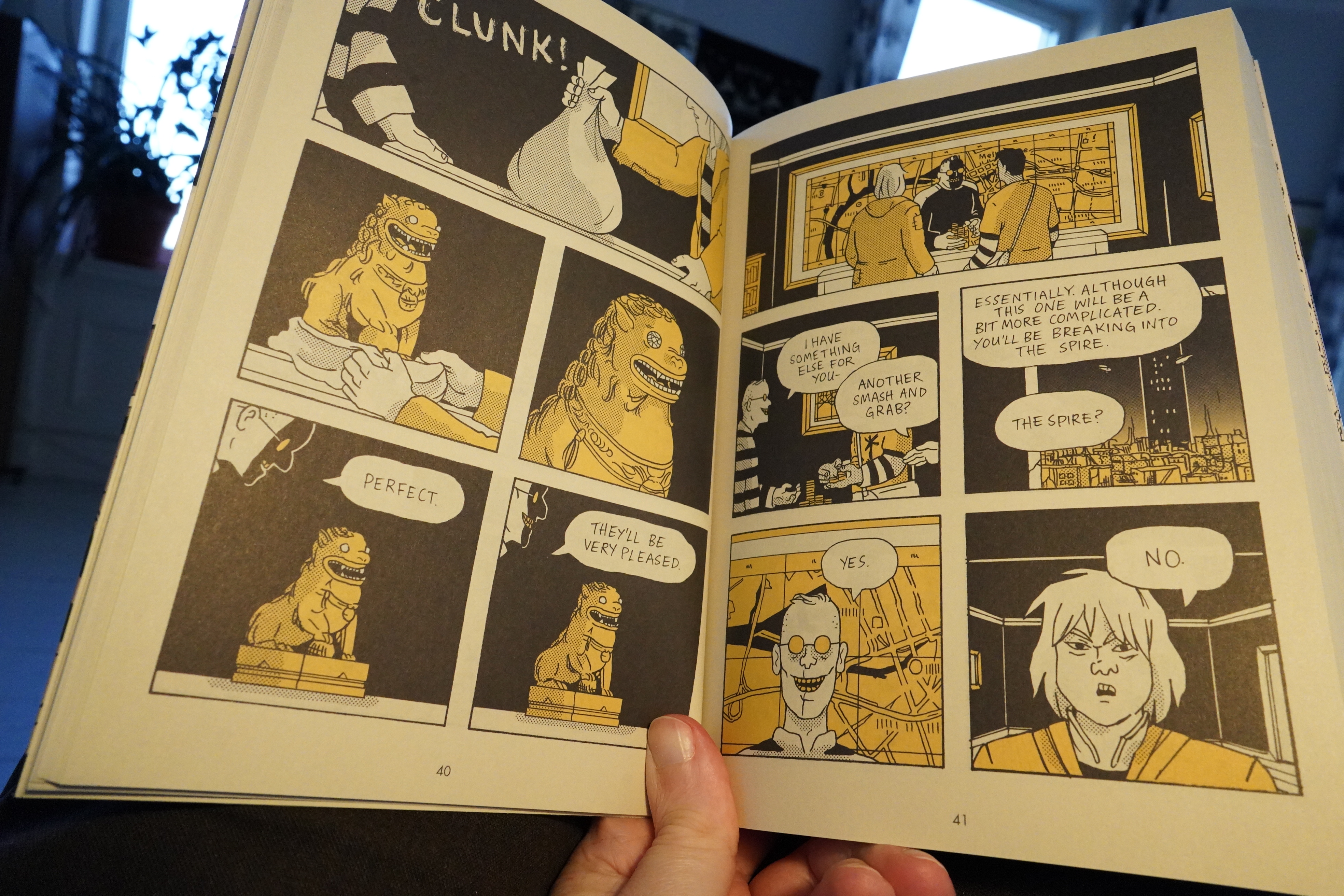
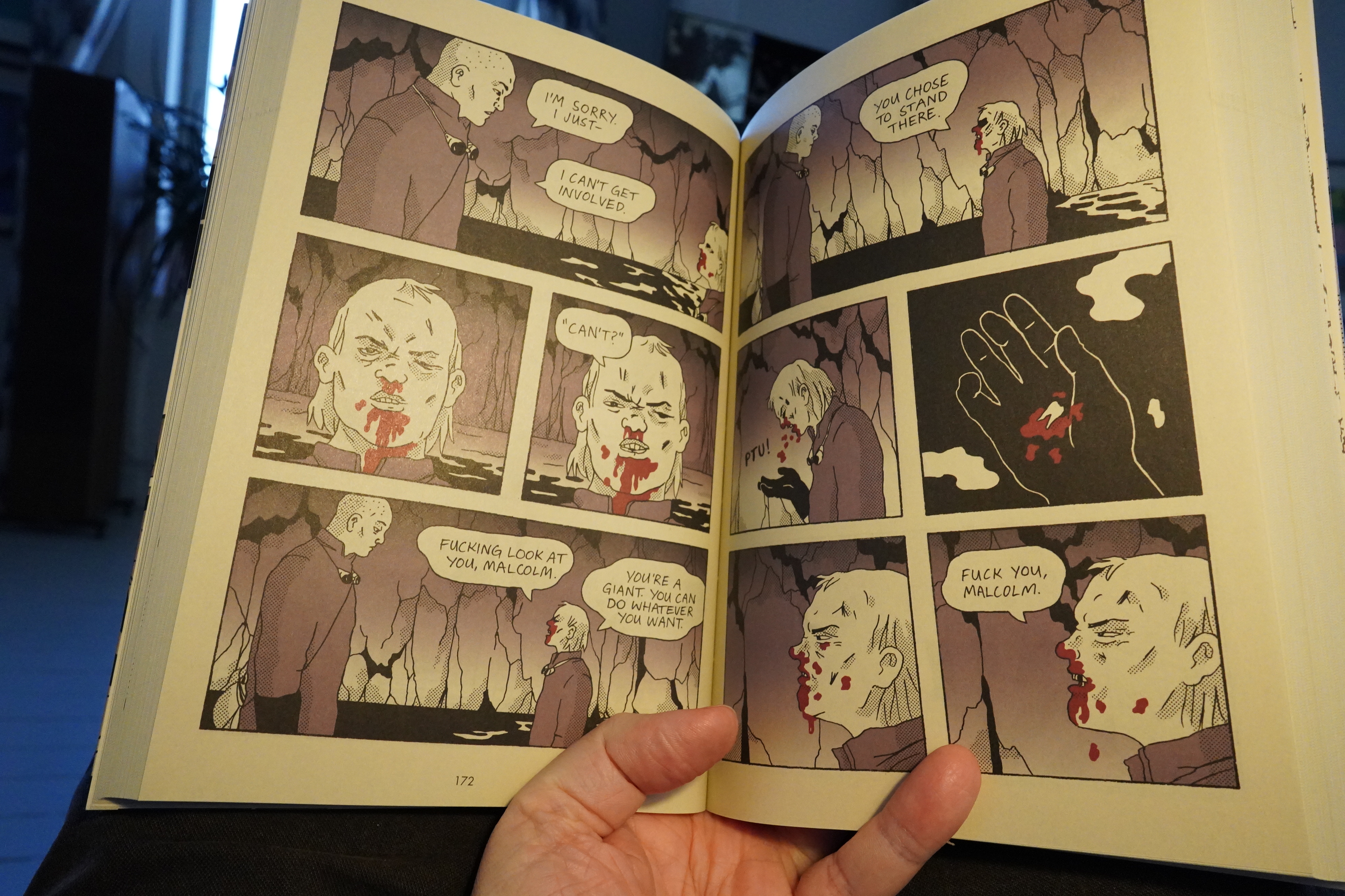
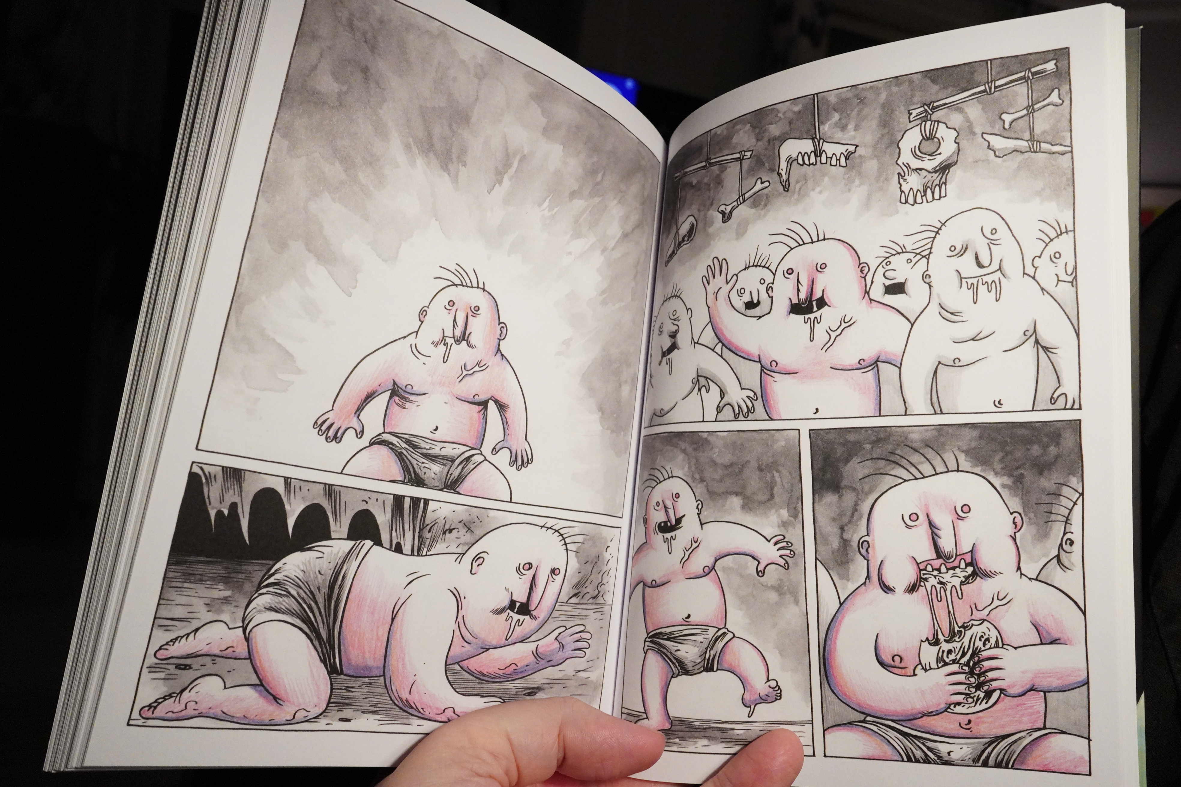
18:37: Under-Earth by Chris Gooch (Top Shelf)
I used to buy tons of Top Shelf stuff, but after IDW bought them, I just never see it? Perhaps because it’s buried in the IDW section of Previews? But I happened unto this in the bookstore this week, and I love the artwork. It’s like a Mister X Seth + Chester Brown done by a Japanese person kinda vibe?

And it’s a physically impressive object — it’s 560 fricking pages long. How come comics artists are so fast these days? Don’t they realise that the only reason Japanese comics are so long is because they have an entire studio hiding behind every Japanese artist name?
And this makes good use of those 560 pages: It’s a propulsive, quick read.
But as I was reading, first one eyebrow lifted, and then the other, and then I started scratching my head… because it’s a really stupid book. The motivations of the characters makes no sense, and the actions seem to happen purely because the storyline demands that the actions happen. For instance — why did the gang of hoodlums need to be told where to find Malcolm? Surely that can’t be difficult in such a small society? And I can understand the guy there being miffed with Malcolm, but selling him out in the (obviously misguided) hopes that the hoodlums would be… nice? to him? Surely there had to be a better way to send the second letter to the warden than to break into the same atrium once again? It’s… It’s… And why did the Crime King’s gang set fire to the women’s house? Which was full of extremely valuable stuff they could have flogged at the market instead? And why did the Crime King invite people into his office who then proceed to beat him up? Again and again? Why not have some guards? Why why why
The answer: Because otherwise none of the fun action in the book would have happened.
I wonder what the cultural background of the artist is. Video games? Where he skipped over the cut scenes?
So disappointing, because the storytelling is amazing, and the artwork is perfect.
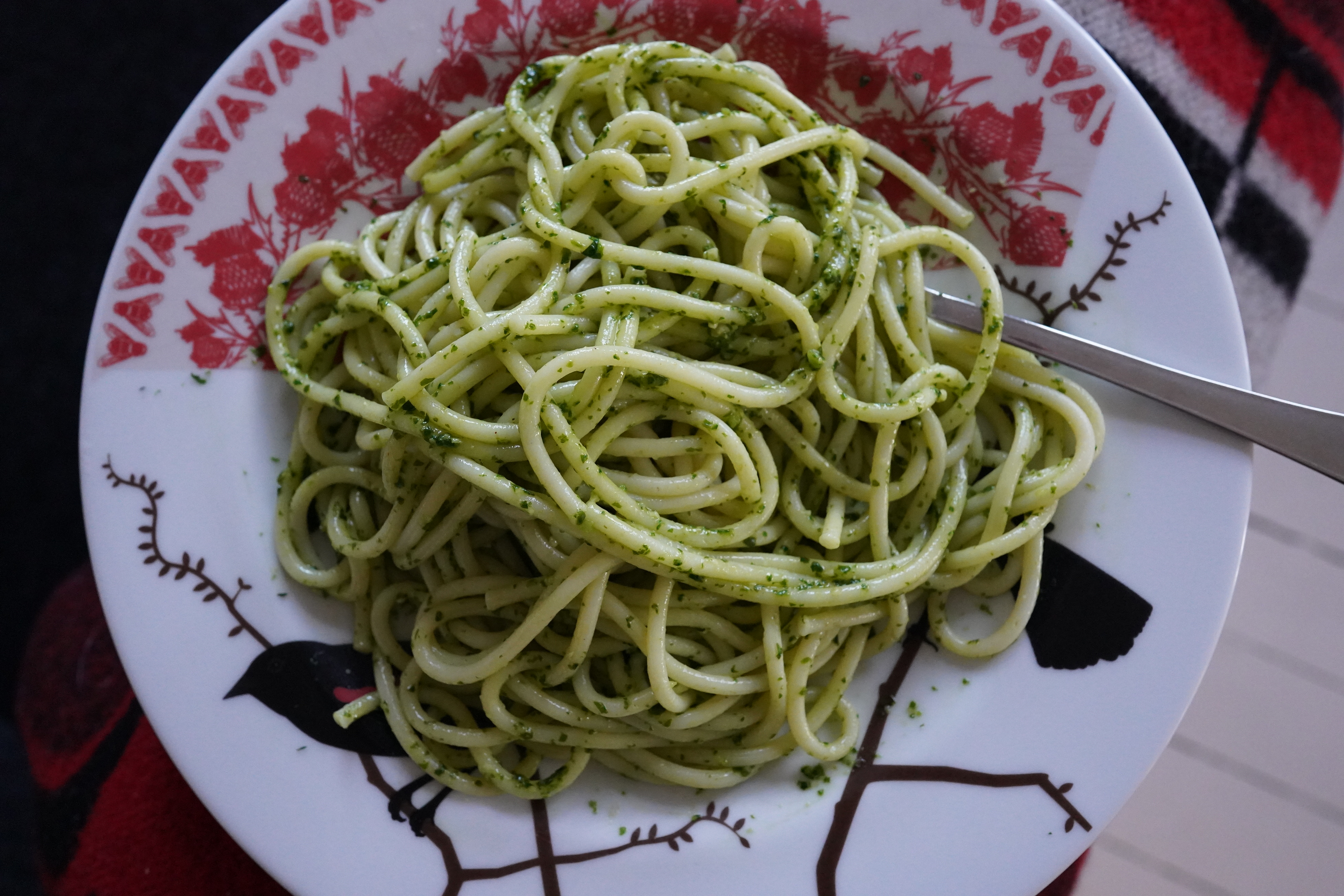
So I had to make pesto to eat my way through the plot convolutions.
| Roomful of Teeth: Roomful of Teeth |  |
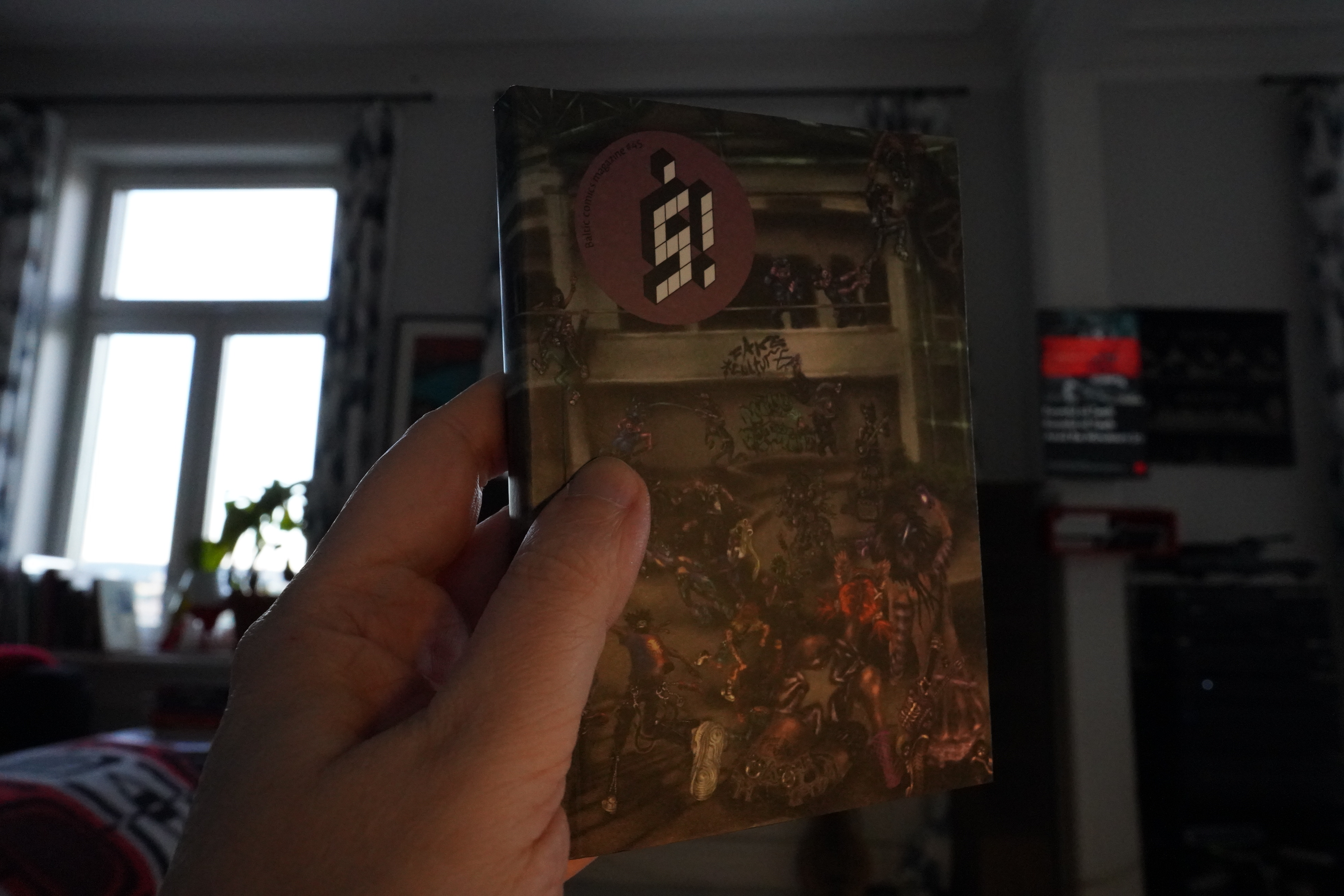
19:49: Š! #45 (Kuš)

This is the fifteenth anniversary of this Latvian anthology, and it’s still going strong.

The theme of the issue is rebelliousness.

*sigh*
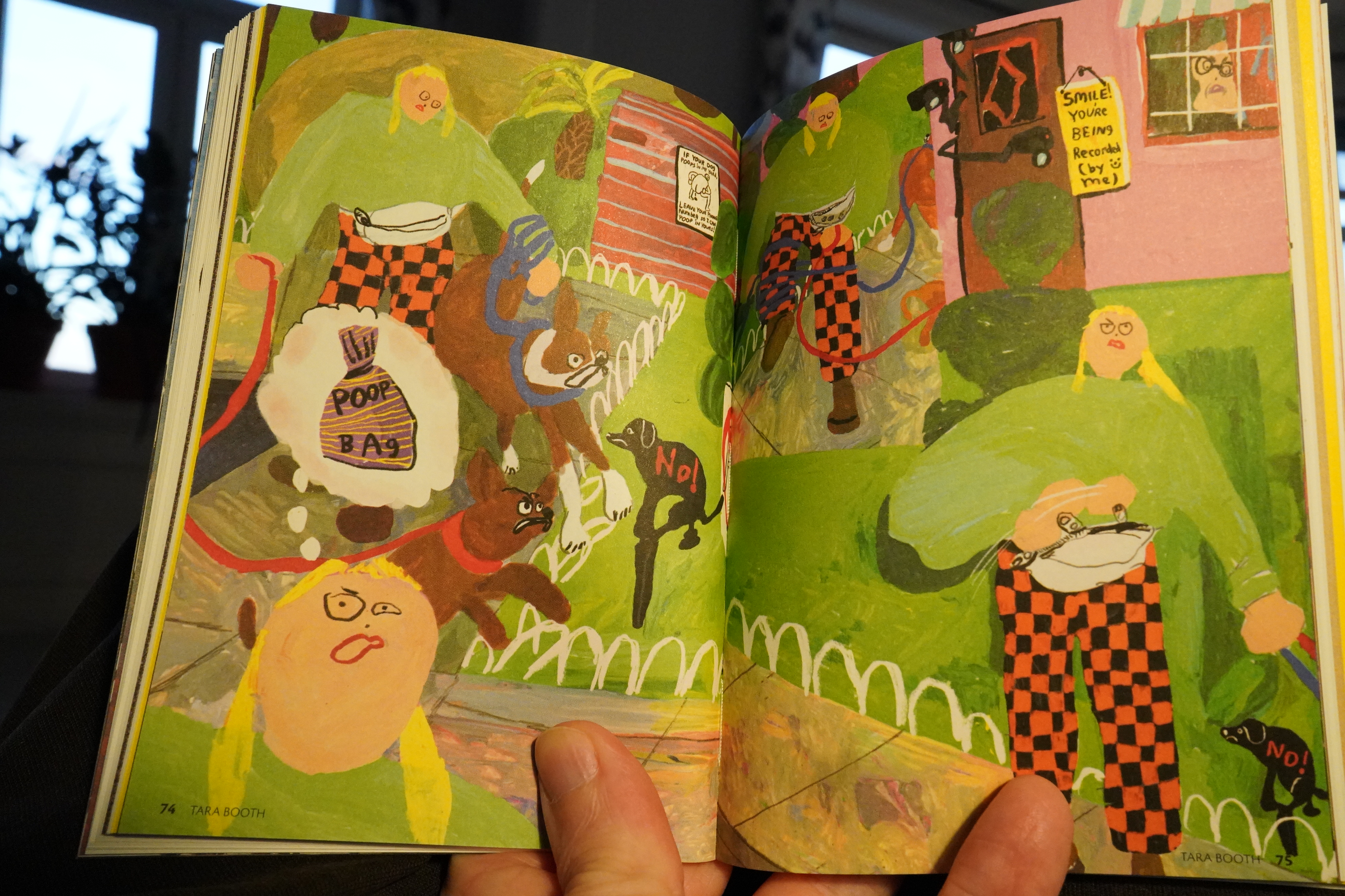
Tara Booth takes a rare pro dog pooping stand in this gorgeous strip.
| My Brightest Diamond: Bring Me The Workhorse |  |
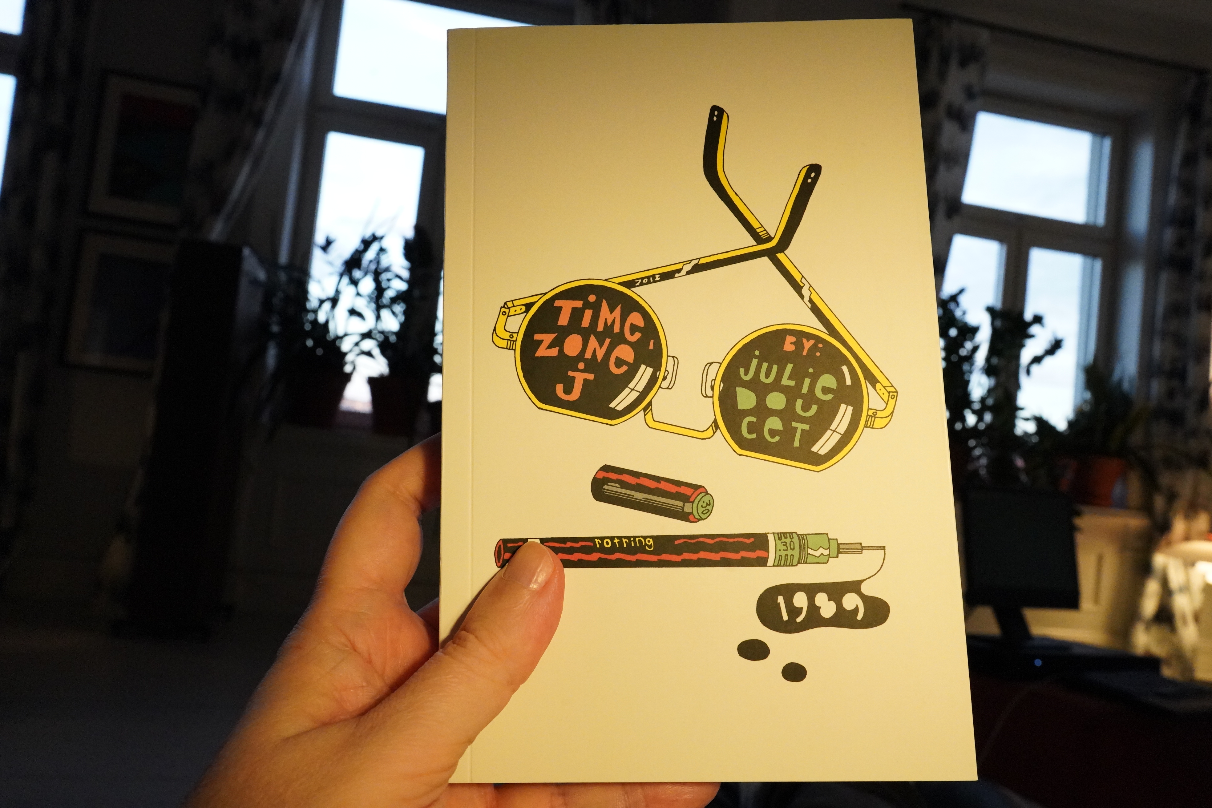
20:15: Time Zone J by Julie Doucet (Drawn & Quarterly)
Eep! This was hiding in between all the rest of the books… If I’d known it was there I would have started with this book, which has to be the most hotly anticipated book of the decade.
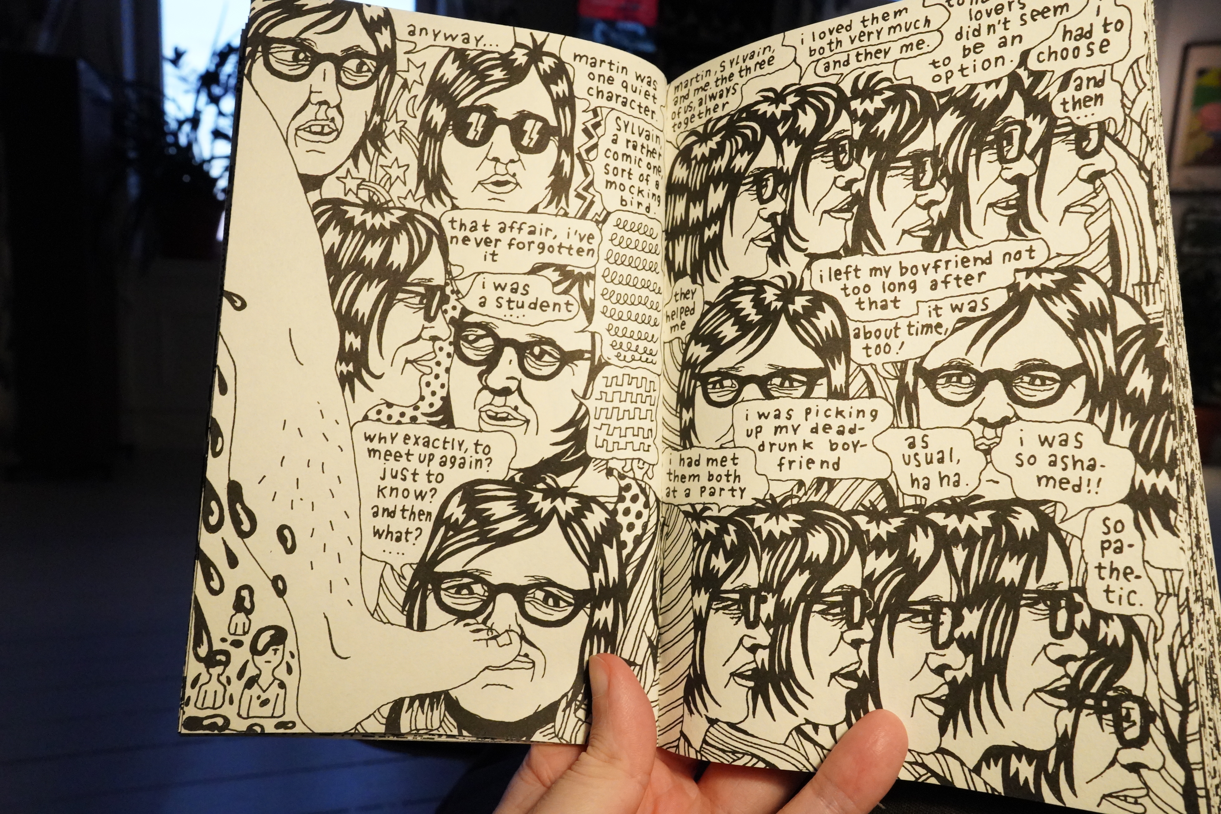
Wow, this is amazing. Doucet was probably the most influential cartoonist of the 90s, but here she’s totally reinvented her style.
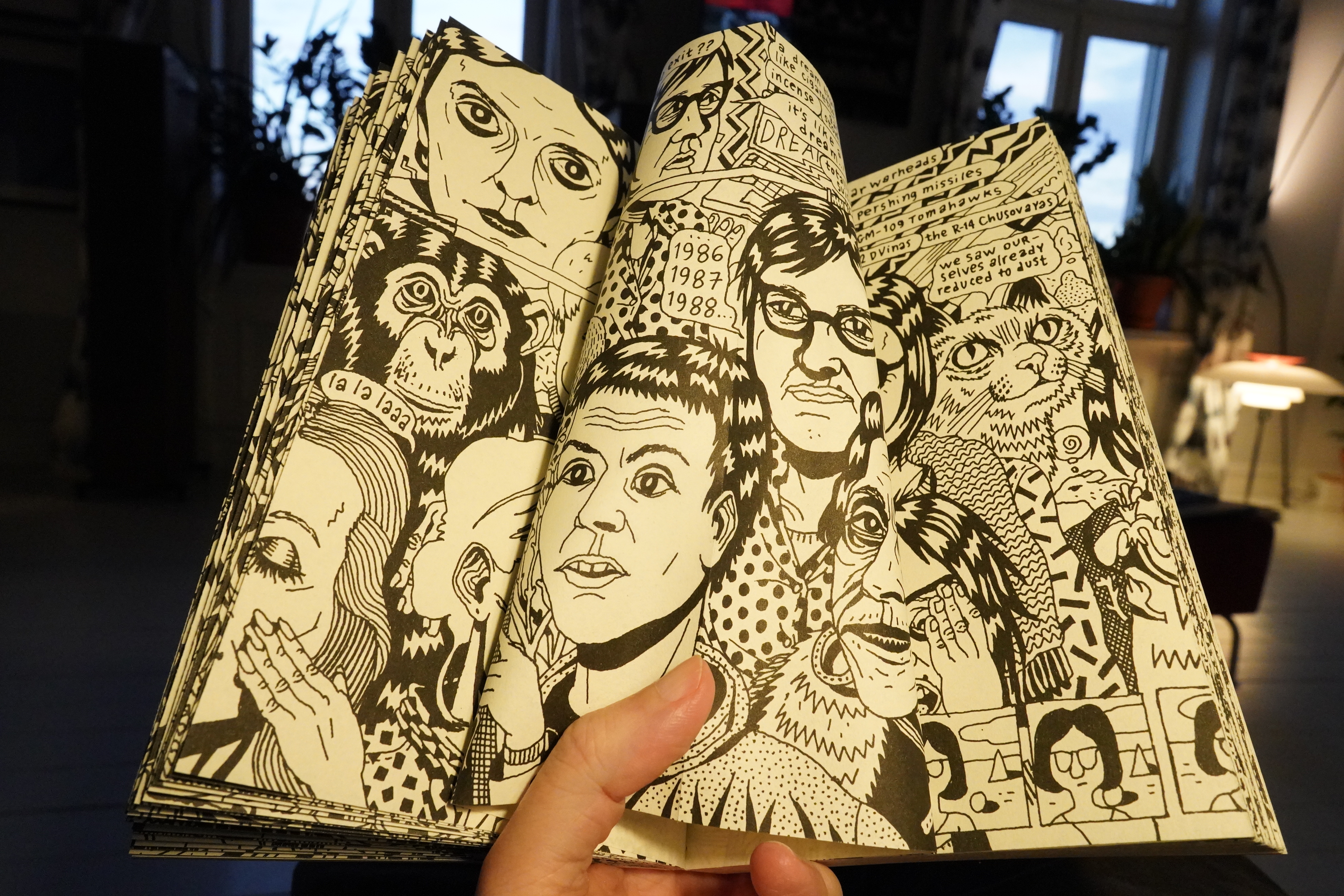
I guess this was all drawn on a continuous scroll? It’s printed with uncut pages, so you can squish them a bit to see the image on the fold.
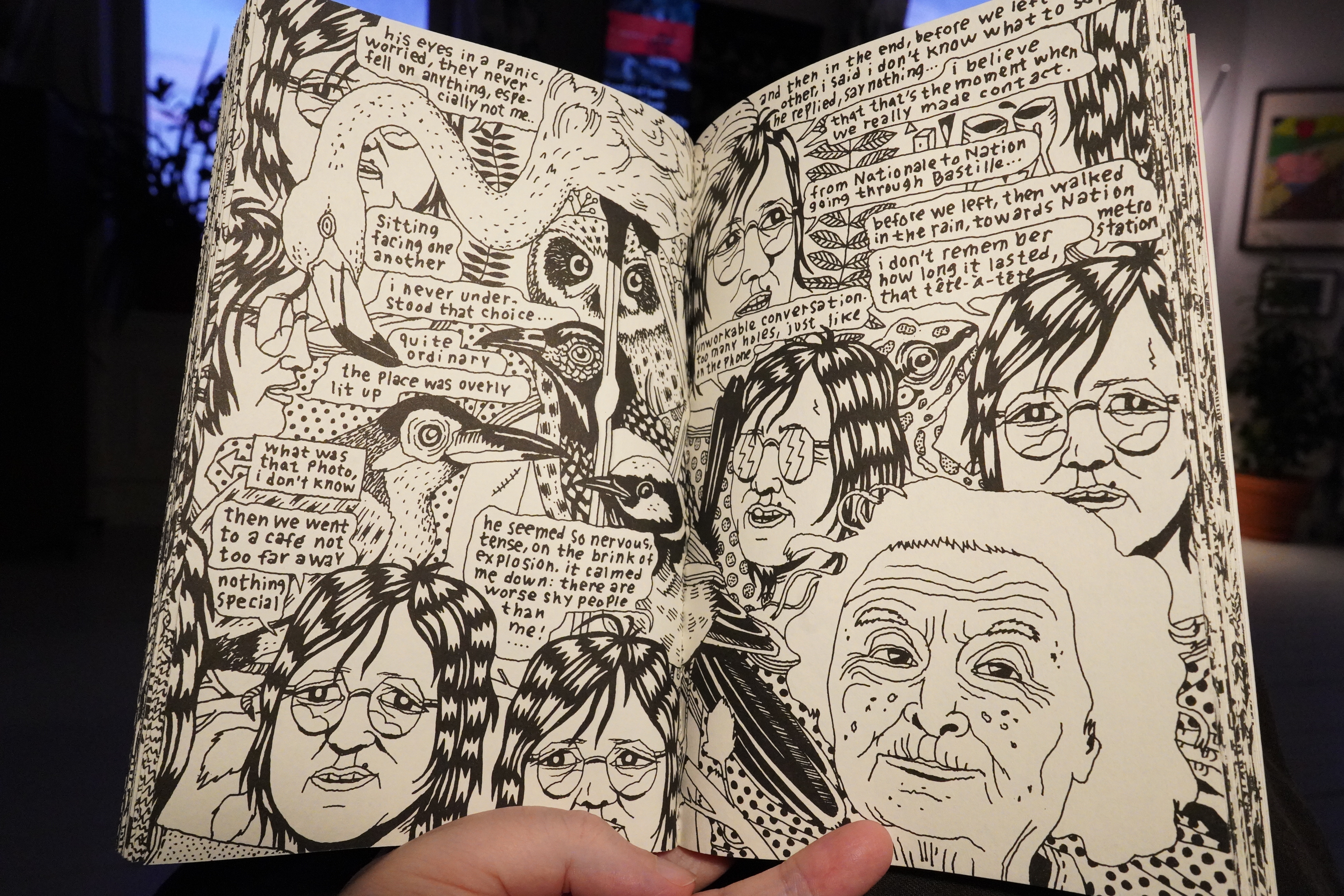
It’s an amazing book. Most comics have some ambiguity in how they’re to be read, but here you have to involve yourself a lot in deciding reading order. This isn’t annoying or work as a distancing effect, but instead somehow makes the reading even more intimate.
It’s like reading cacophony. Nothing like it. It’s wonderful.
Comic book of the year for sure.
| My Brightest Diamond: Bring Me The Workhorse |  |
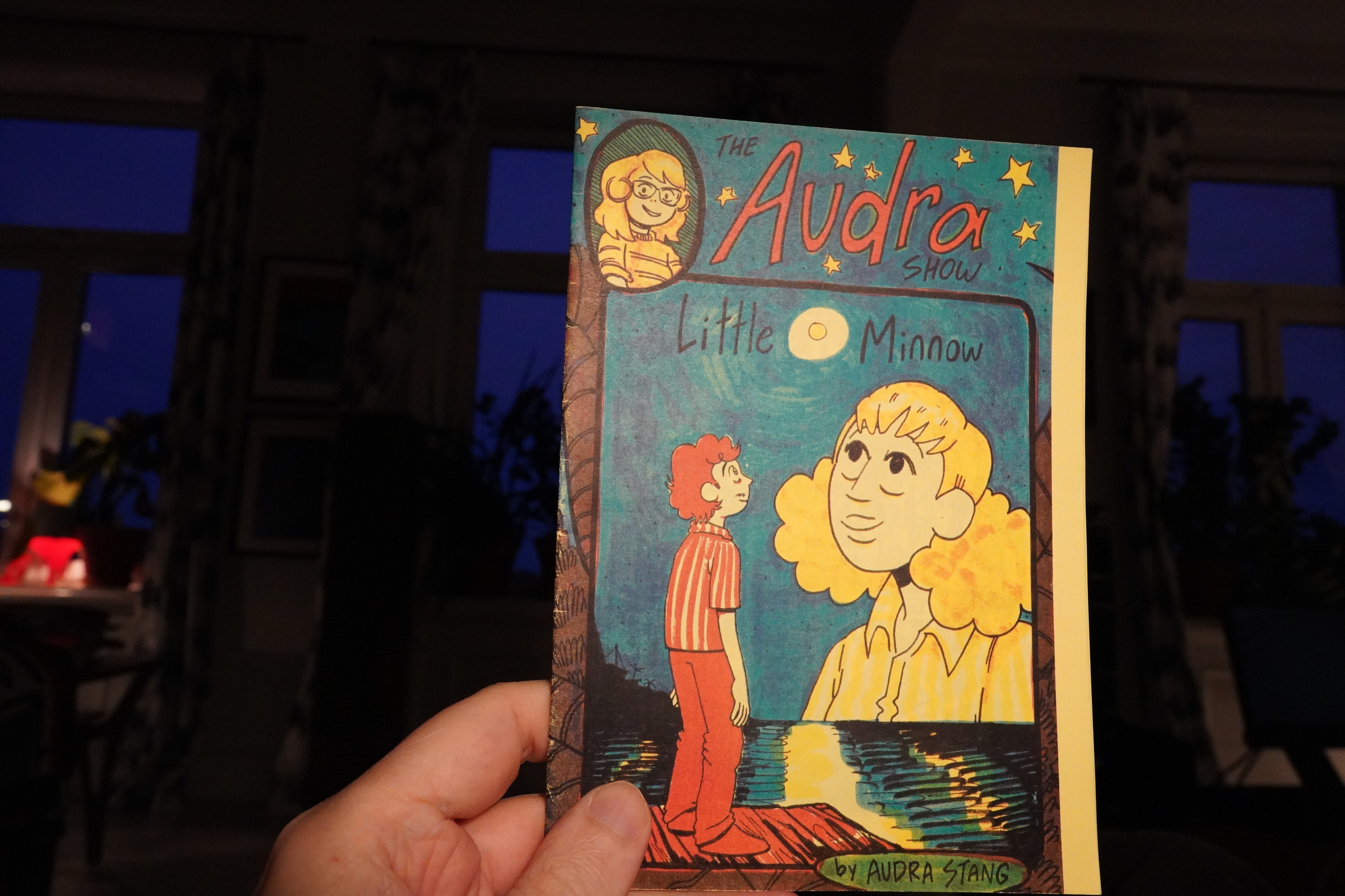
21:12: The Audra Show by Audra Stang (Comics Workbook)


This is pretty sweet, and then it goes off in directions you wouldn’t expect. Nice.
| My Brightest Diamond: Bring Me The Workhorse |  |
21:17: Unknown by Unknown (Unknown)
What I’m trying to say here is that I don’t know who made this book.

Or indeed whether that was the cover, because it’s not quite obvious whether this is upside down…
… or this is?
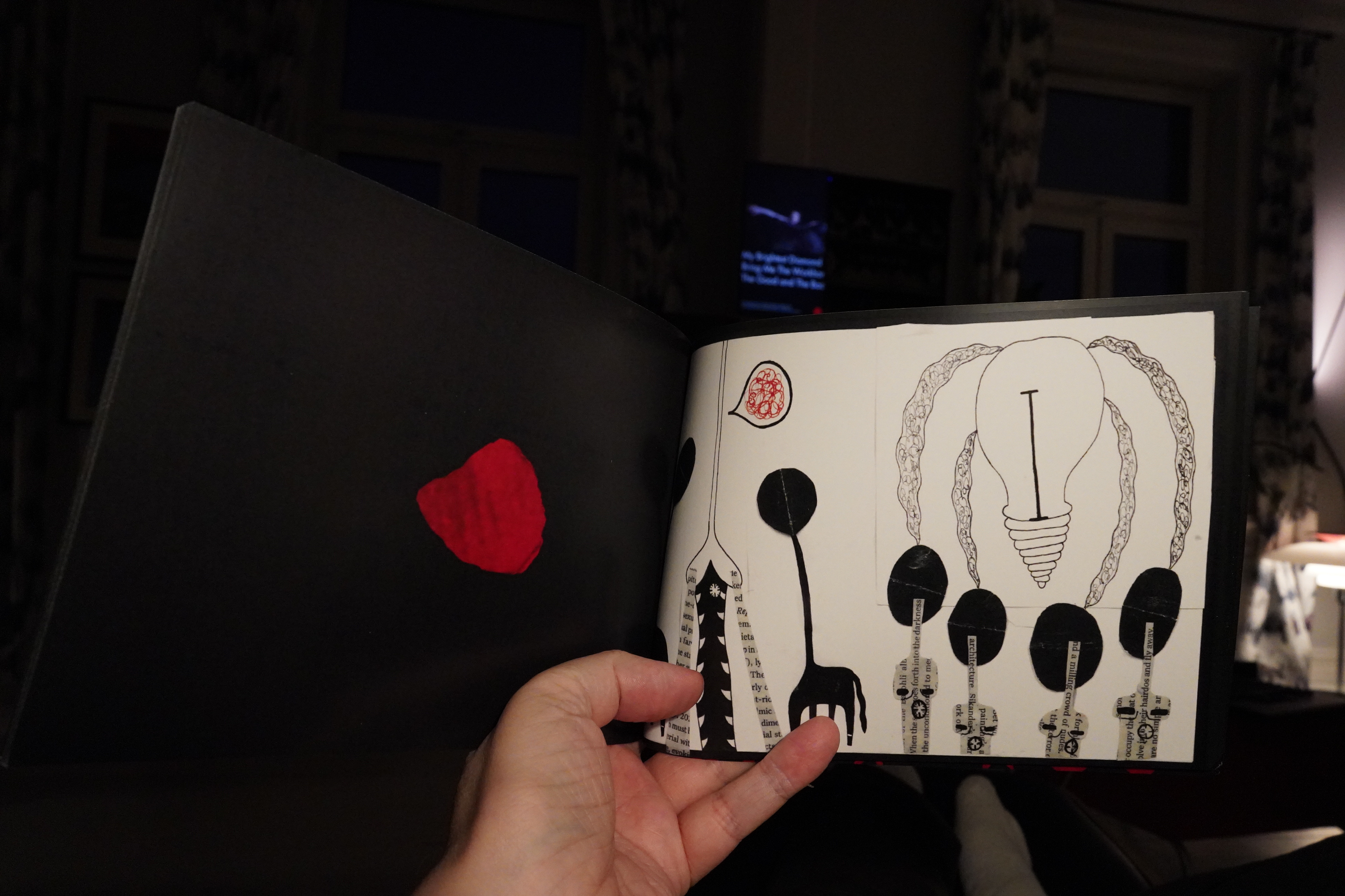
This is probably the right side up?
Anyway, very mysterious, and I like that.
| Various: Fire Comp 2020 |  |
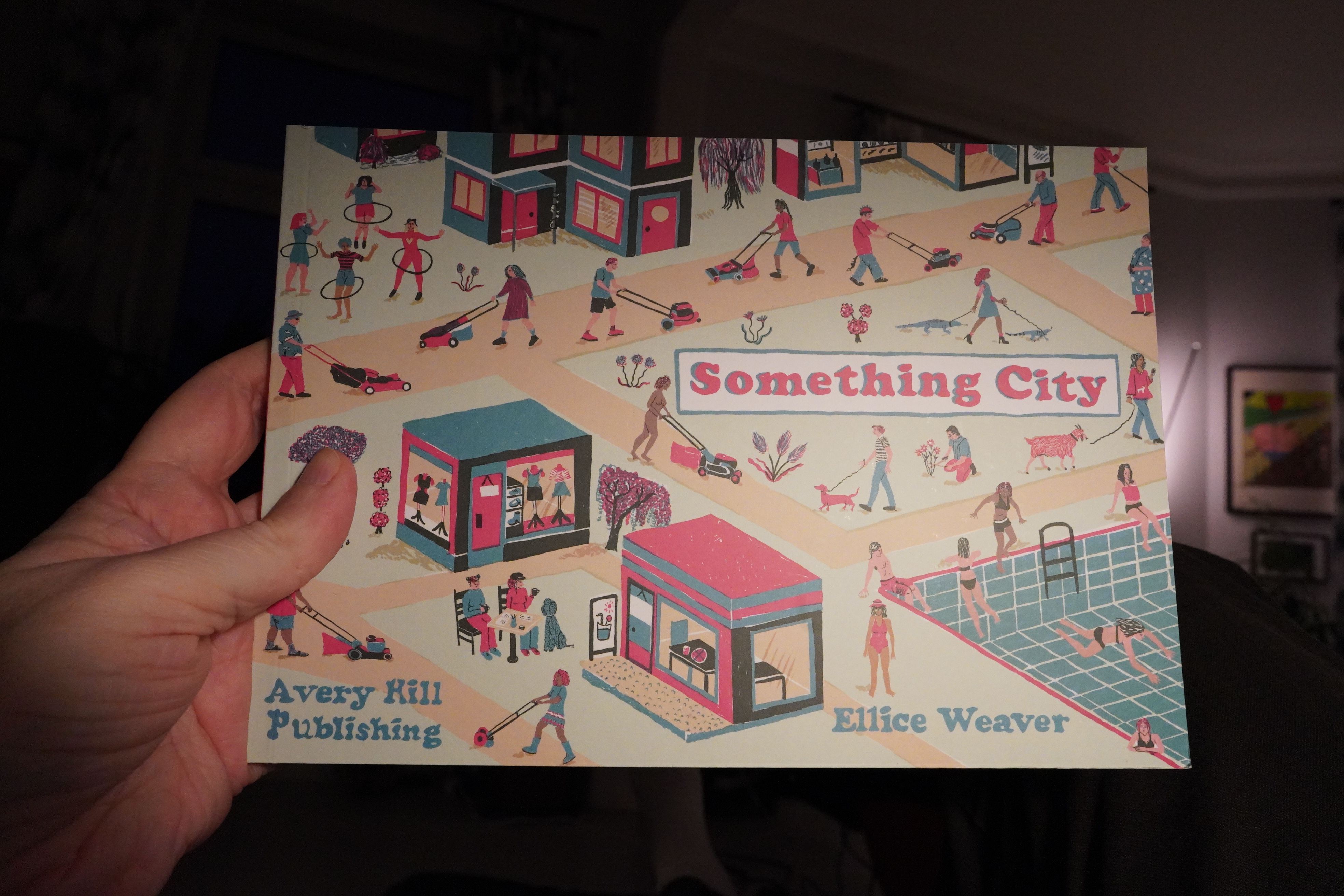
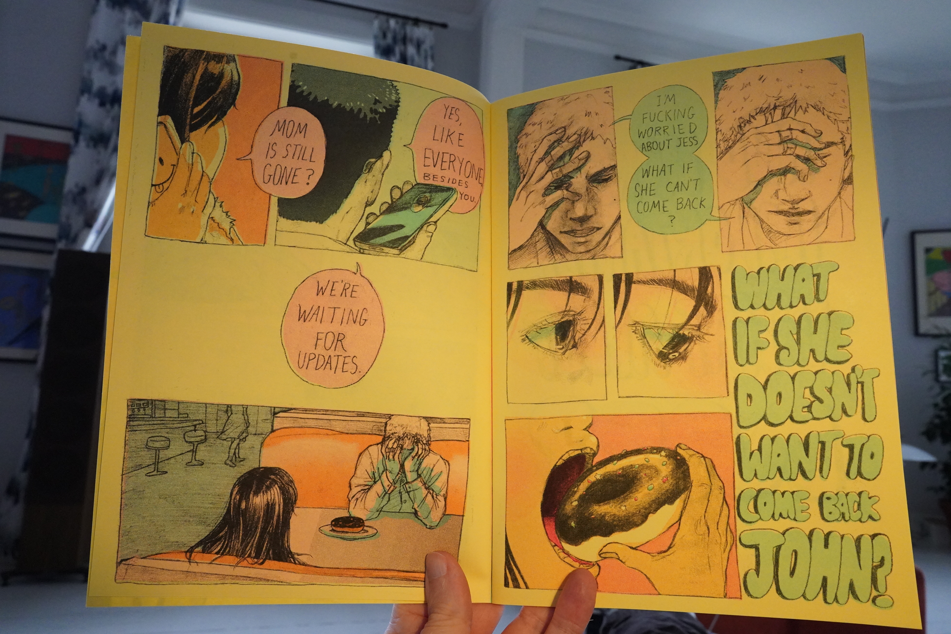
21:22: Something City by Ellice Weaver (Avery Hill)
Is this the final book from that hoard of comics I got from Avery Hill some weeks back? It might be.
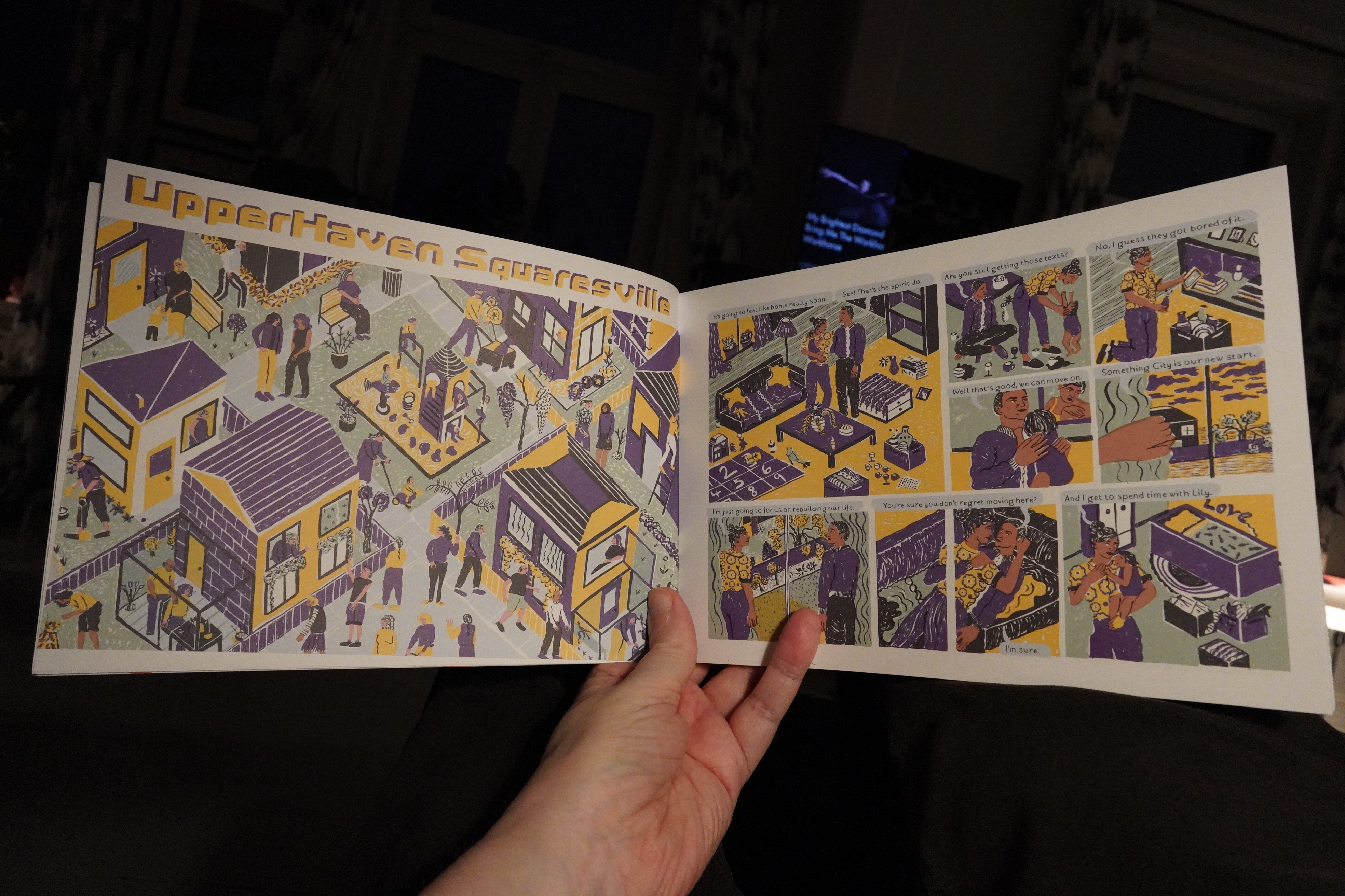
Looking at this opening spread I thought “oh no — it’s a book based on The Sims”?
But… no, it isn’t. The strange affectless figures pulls a sneaky on ya — this is most bizarre and very amusing. It’s a series of interconnected vignettes, and they connect in very satisfying ways, making you go “ooh, aah”. And there’s some really solid gags in here, too.
It’s a very original book, and a very satisfying read. Good stuff.

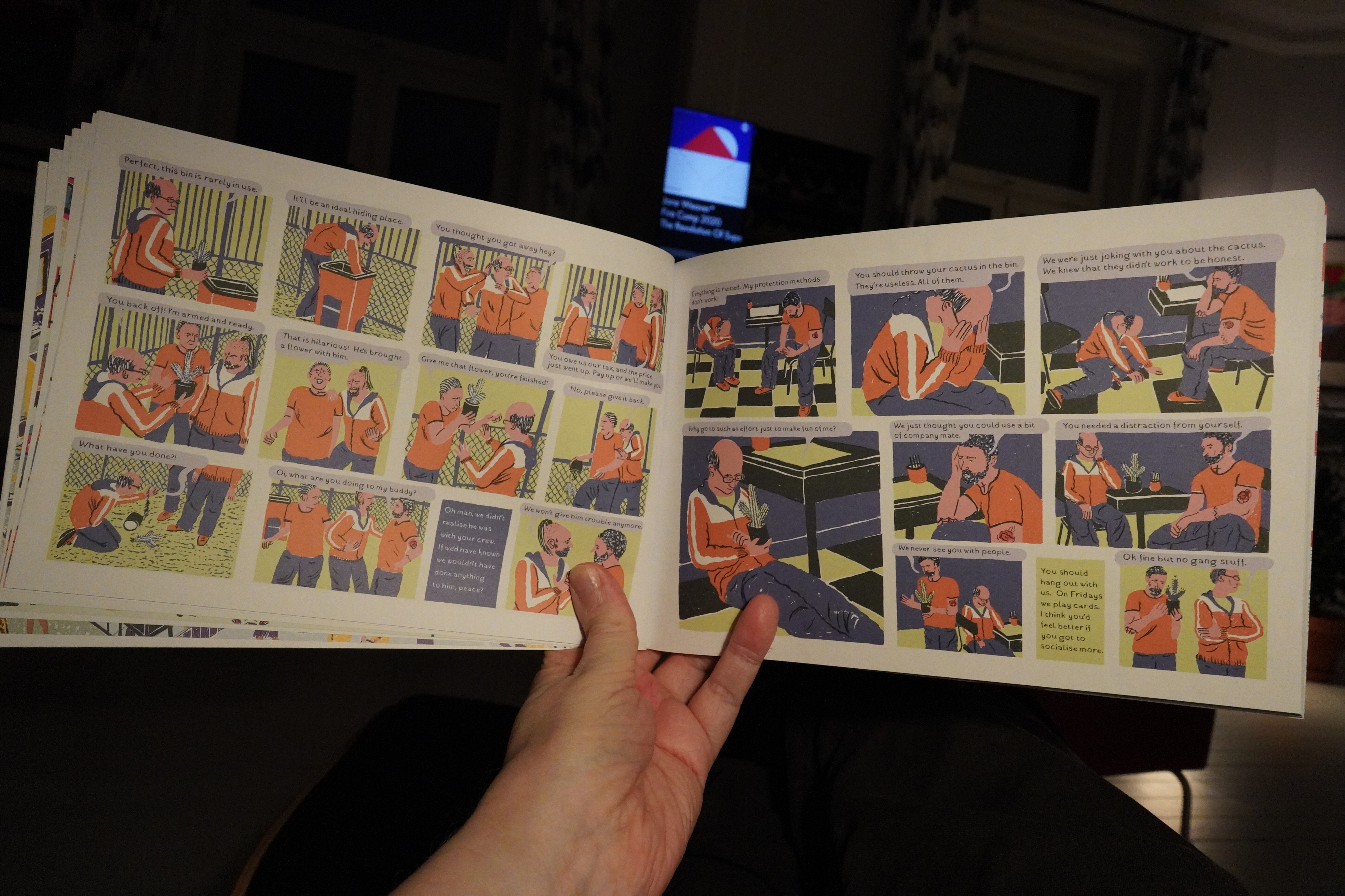
21:51: Rusted Tales by Spugna (Hollow Press)
Some comics are easier to produce bilingual versions of than others.
This book collect three stories of brutality and mayhem.
And… I’m pretty sure I’ve read this last one before? So perhaps all of them have been published earlier?
Anyway, they’re well done if you like this sort of thing; i.e., video game influenced wild action. Which I don’t really.
| In The Nursery: Twins |  |

22:08: Frances by Joanna Hellgren (Galago)
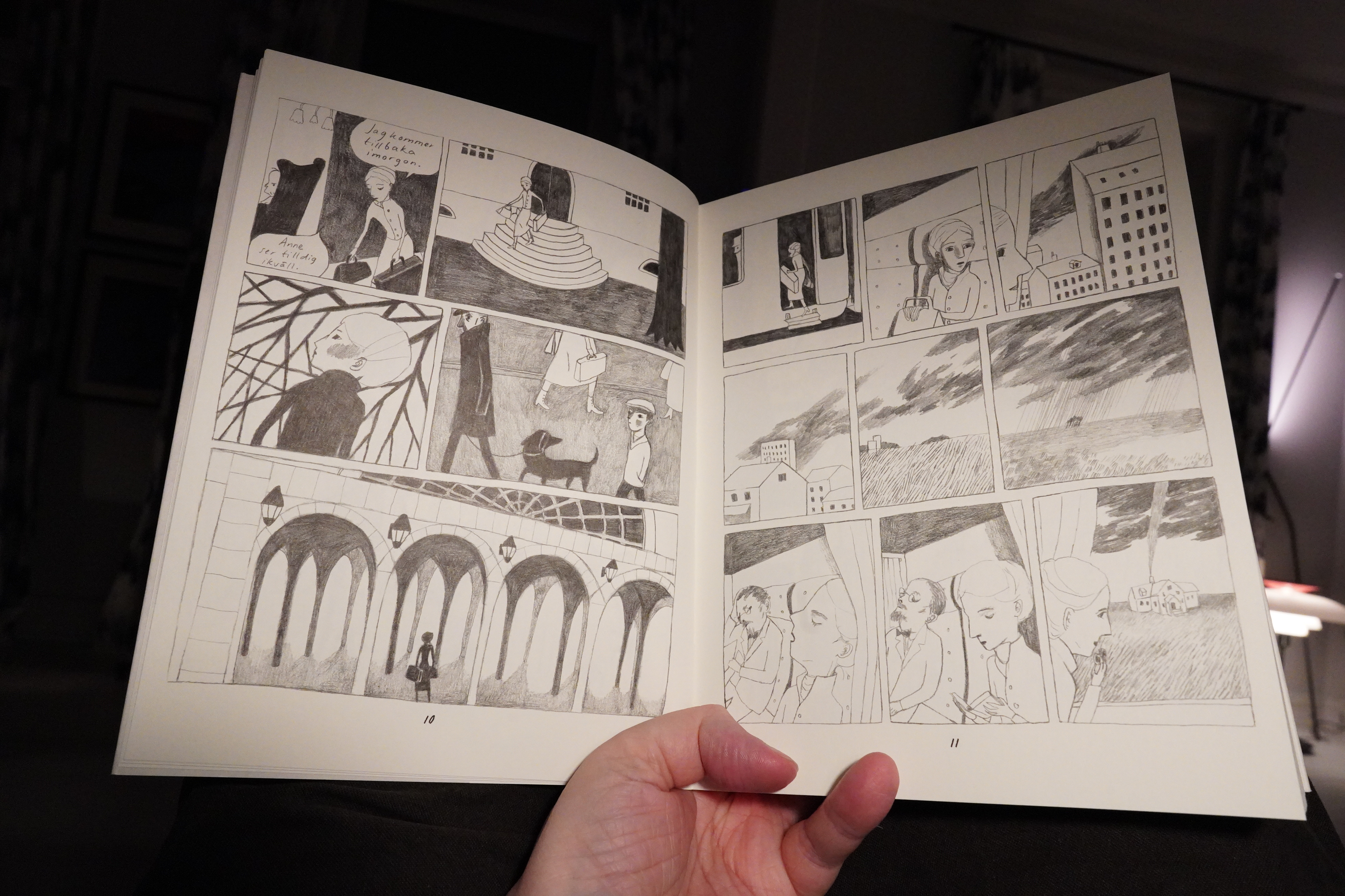
This reads a bit choppy — and I didn’t quite understand where the author was going with this book, or whether she was going anywhere at all.

After about a hundred pages, I was ready to ditch it, even though the artwork is quite appealing and I like the general mood.
| The Raincoats: Moving | 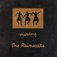 |
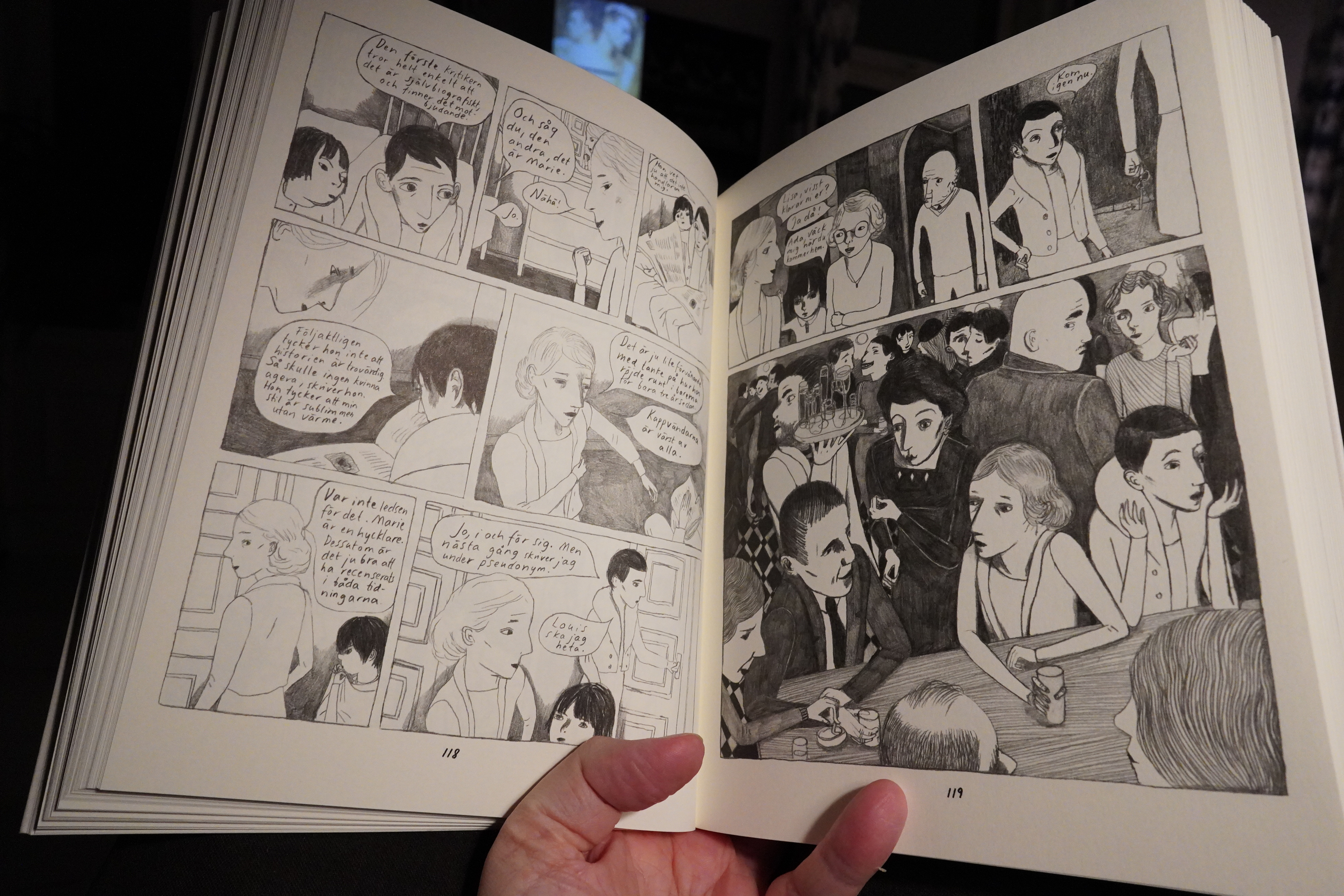
But then it all changed, and we’re presented with a possible novel-within-the-novel, and we’re either seeing that novel or we’re getting flashbacks to the character’s pasts. This (possible) doubling along with the way the characters are drawn, which makes it hard to tell them apart, leads to an interesting frisson, and then things come together in the last third, it’s breathtaking.
On the other hand, I may just have been misreading the entire book and everything is totally straightforward? ¯\_(ツ)_/¯ It’s been a long day, and I should go to sleep, but:
| Django Django: Glowing In The Dark |  |
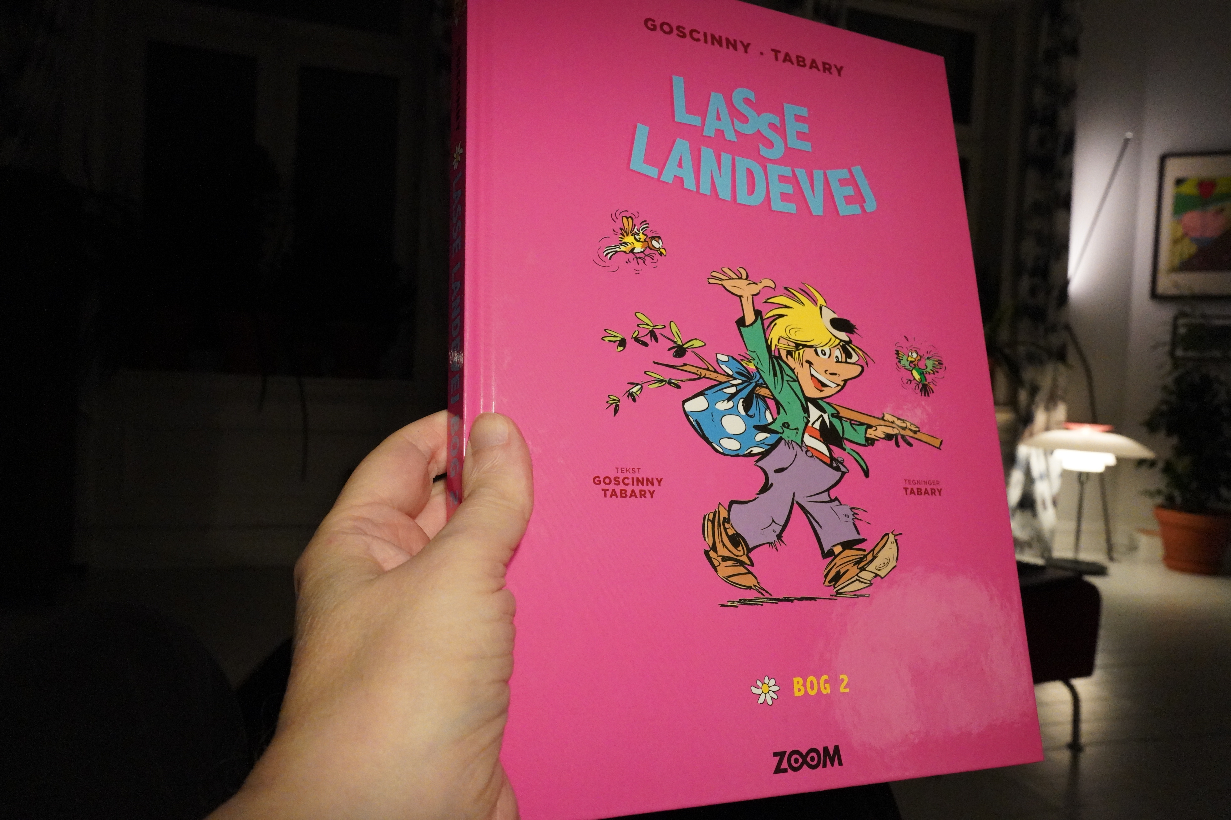
00:55: Valentin le vagabond — integrale 2 by Goscinny & Tabary (Zoom)
We had some ersatz Goscinny up there, but here’s the real thing, from a series that was er not as big a success as Asterix.
Uhm… Bamboozled! There’s no Goscinny in this book — all the stories are written by Tabary or Fred! Tsk.

And these collections of older classics usually have supplemental texts and are restored, but there’s nothing here — there’s not even anything to indicate when these pieces were created except for an occasional year scribbled on some of the pages. And they’re even reproducing some of the pages in red halftones, which is the way they were originally printed in the anthologies (to save on money back then).
So I guess that this series has so few fans that it’s not worth spending even a bit of money on restoration and re-colouring… and after reading a couple dozen pages, I can see why: Tabary is a lively artist, but the gags are pretty weak. He goes for zany all the time, and the plots and characters feel really anaemic.
I think I’ll finish reading this book at some later date, because it’s lulling me to sleep.
| The Body: I’ve Seen All I Need To See |  |
01:14: The End
Is anything as exhausting as reading comics? Working in a coal mine you say? Pshaw!
Sleepytime.