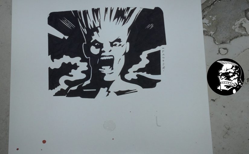
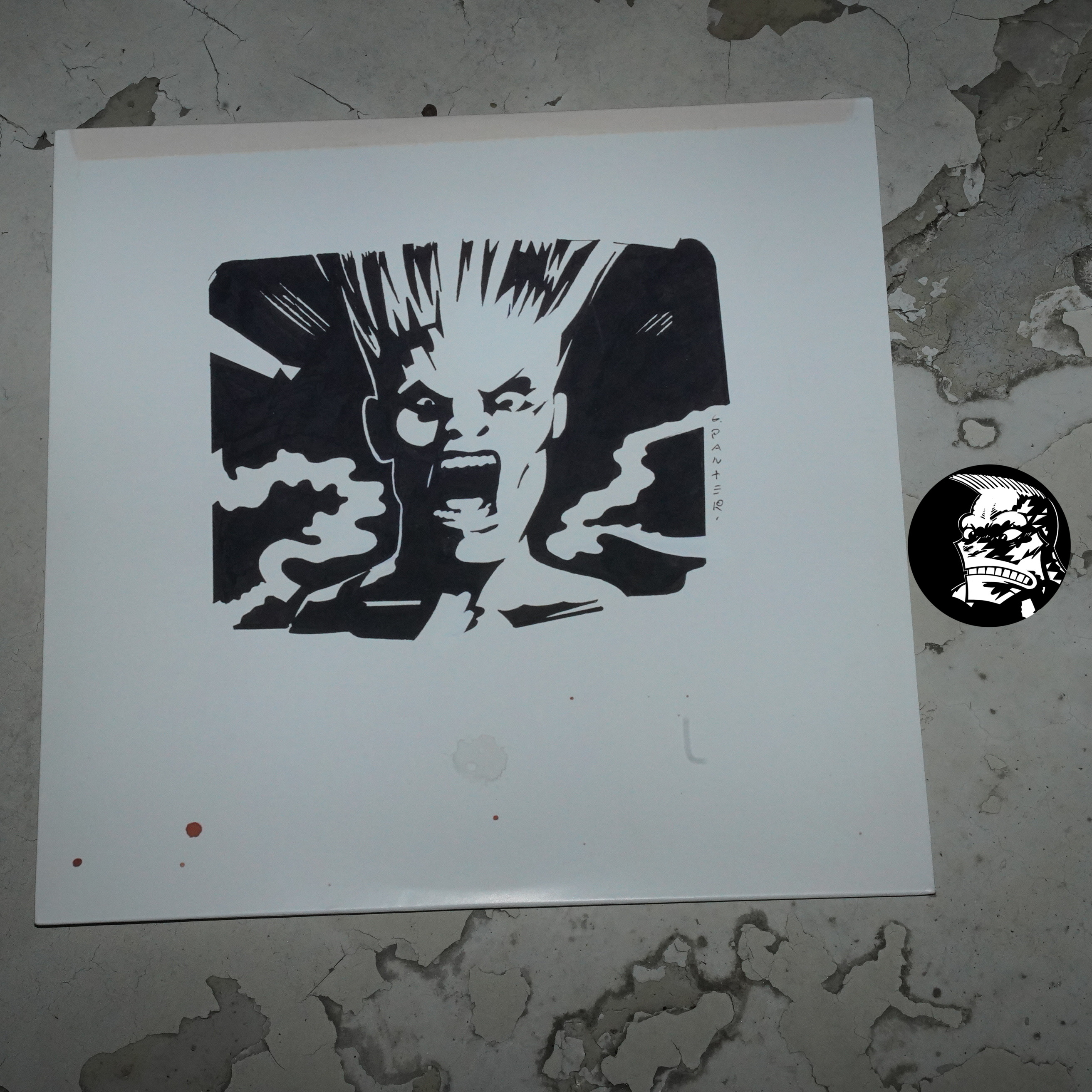
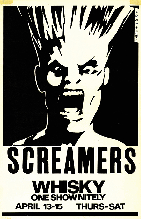
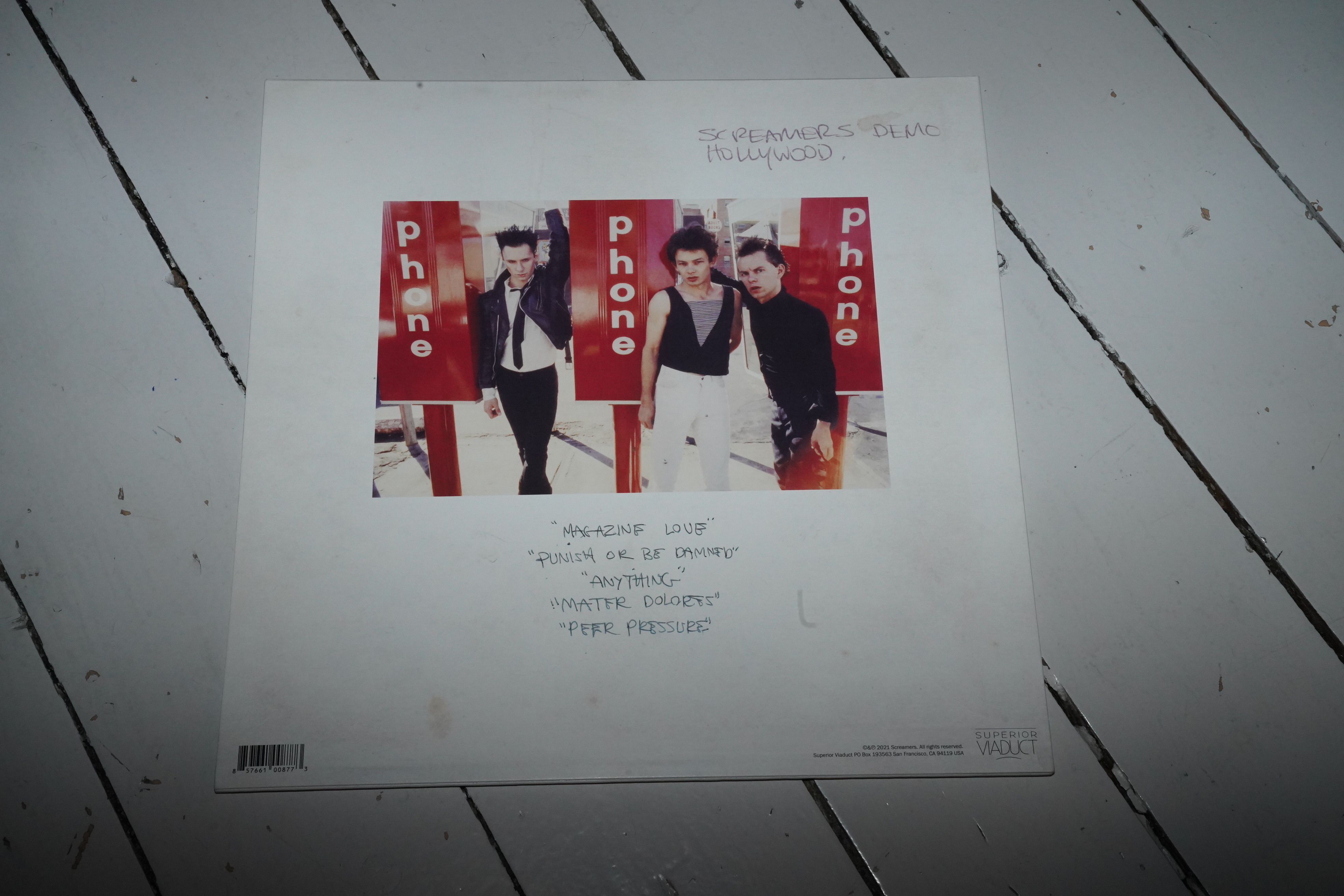
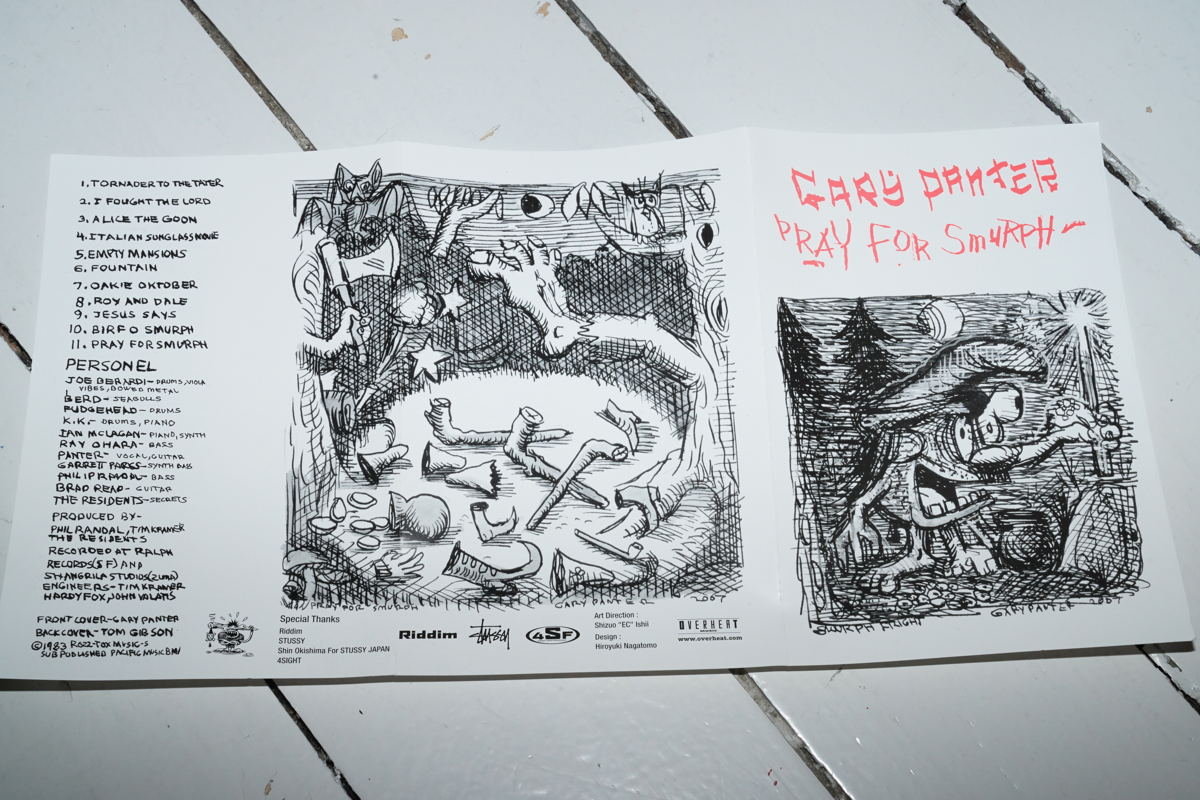
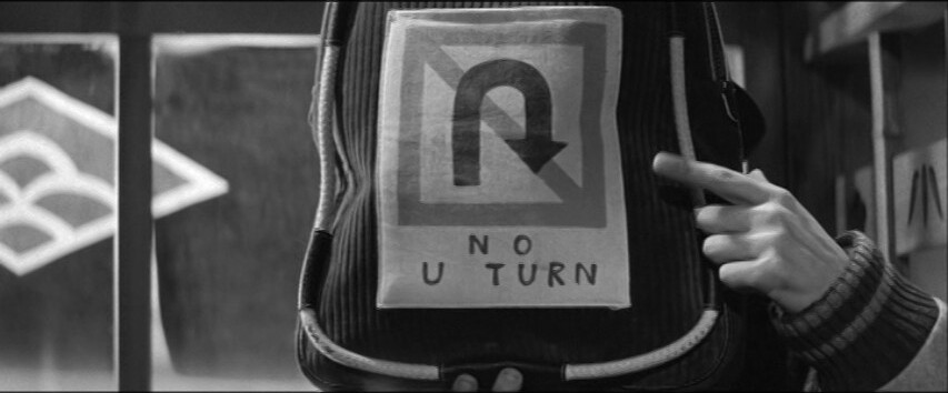
Screamers: Demo Hollywood 1977 (with a cover by Gary Panter).
This illustration for Screamers was probably Panter’s most famous single image for a decade there in the 80s?
Screamers used it for a series of posters at the time… and they’d be insane not to. That’s the best poster ever. I want one on my walls.
The Screamers - Anything (Demo Hollywood 1977)
Anyway, they never released any albums while they existed, but this record was released last year, and it’s pretty good? It’s kinda right in the middle of the punk/post punk schism?
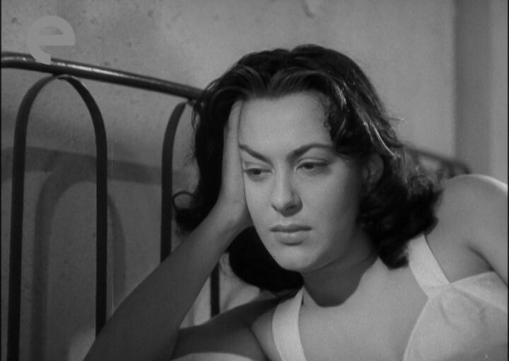
Well, the Matarazzo flick I saw the other day was kinda insanely entertaining. So I’m getting my hopes up way too high for this one, which has
virtually no viewers.
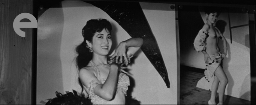
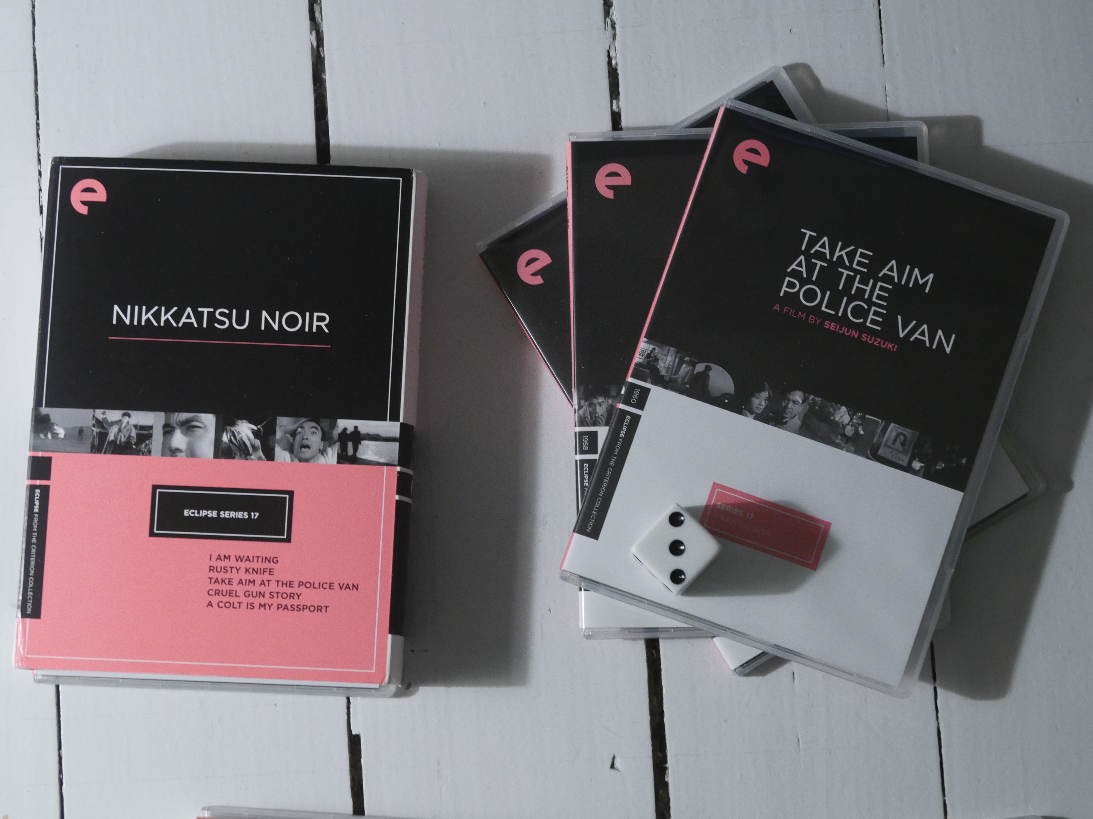
So this is one of those really lost movies in the Criterion Eclipse series.
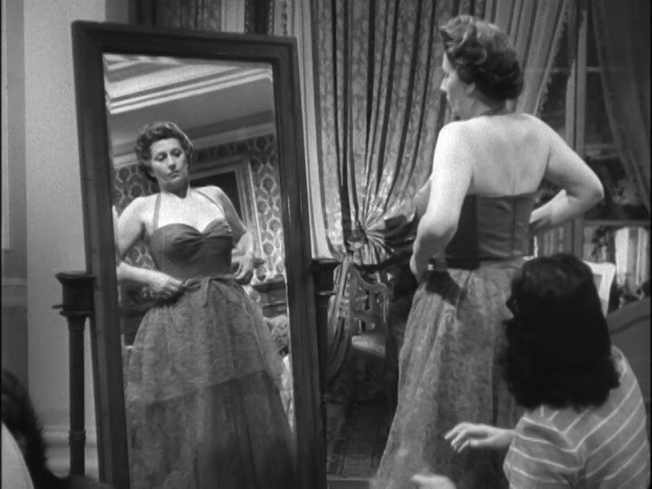
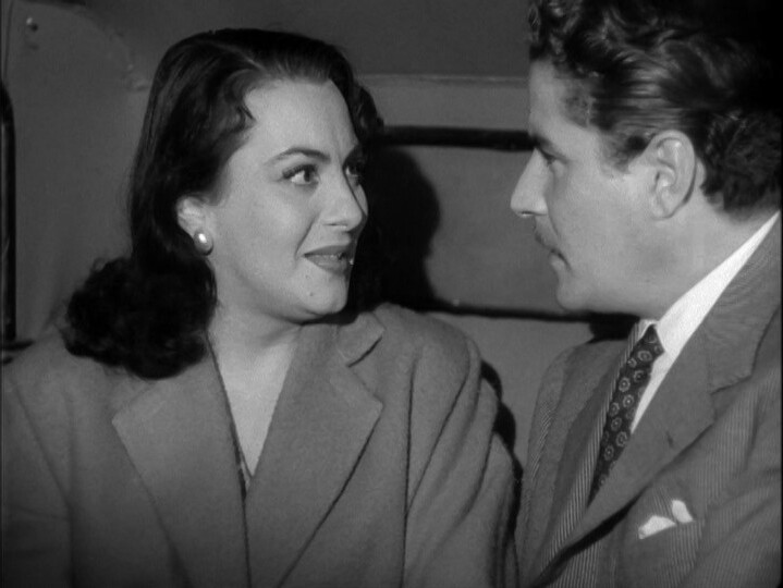
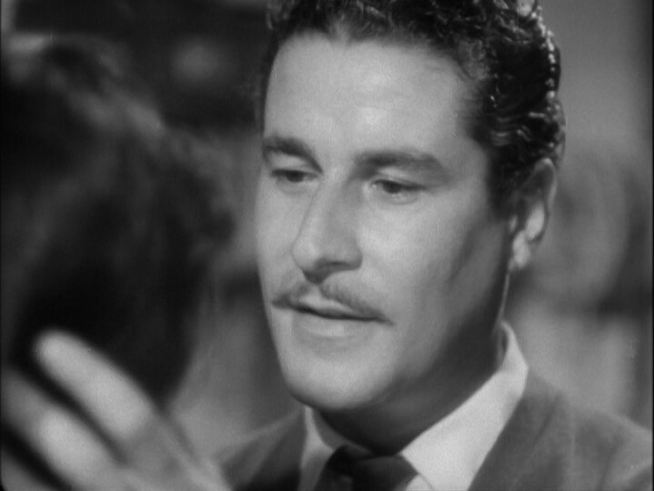
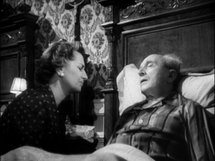
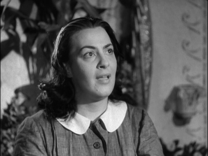
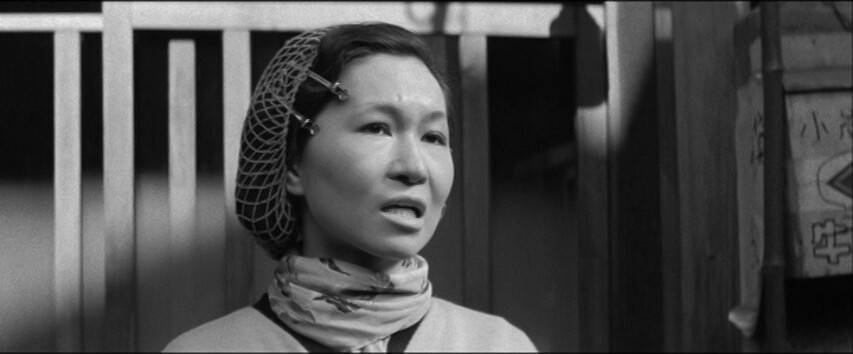
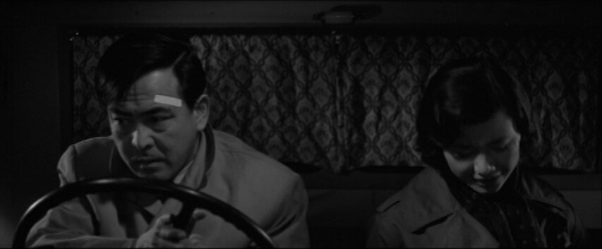
Oh, she’s back from the previous movie. Cool.
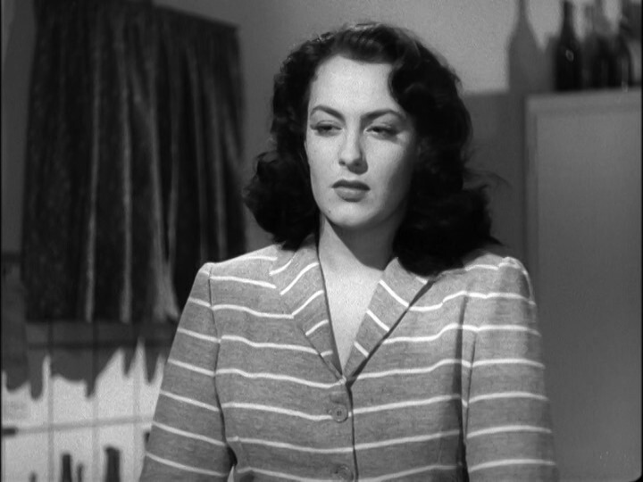
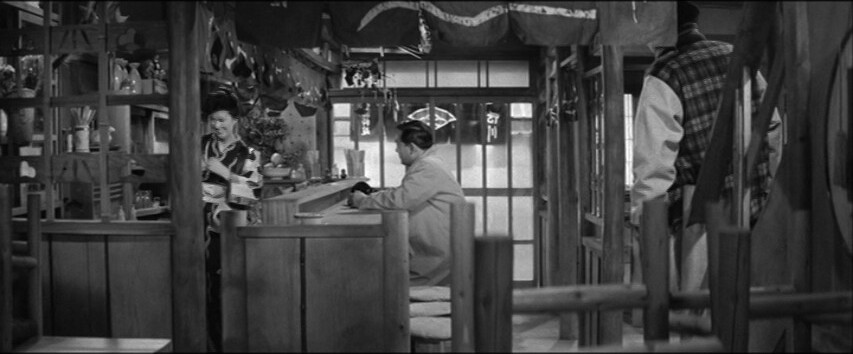
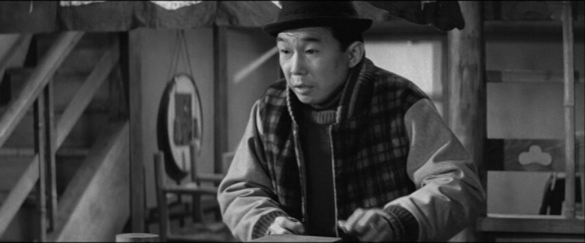
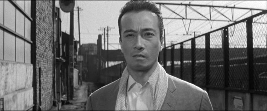
And that guy is back, too! Cool. They’re both really engaging actors.
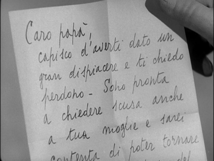
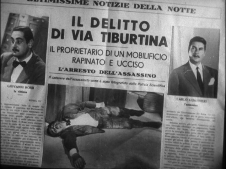
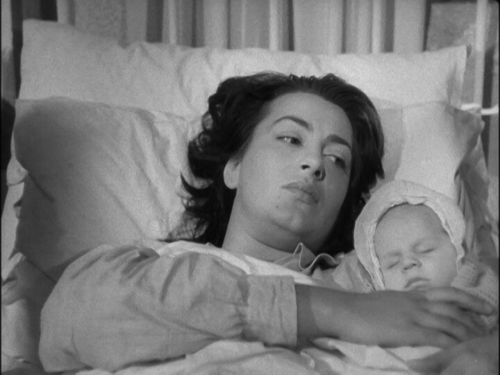
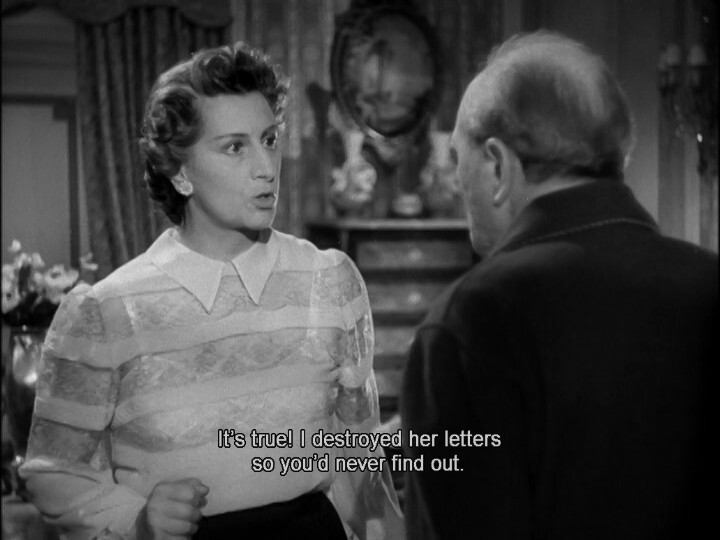
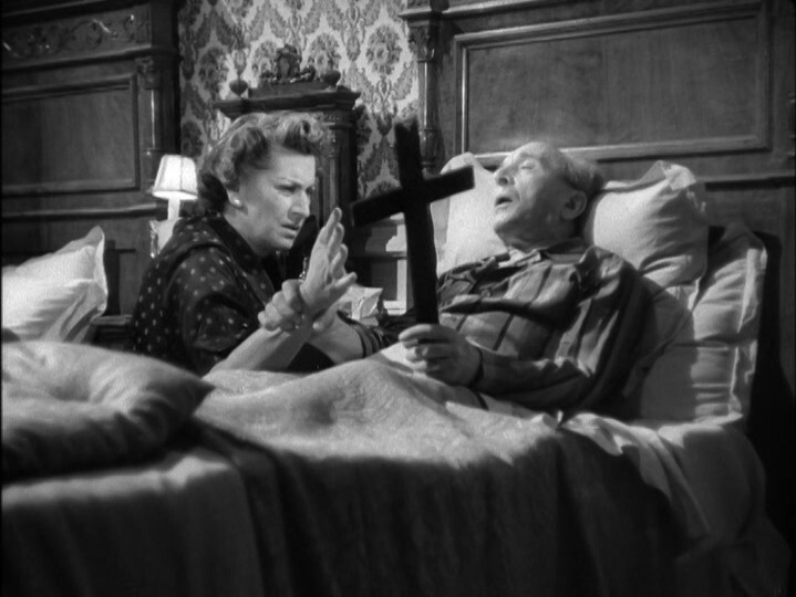
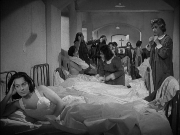
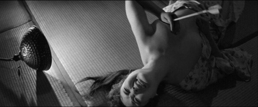
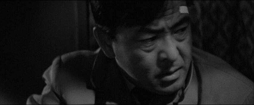
The plot is deliciously melodramatic.
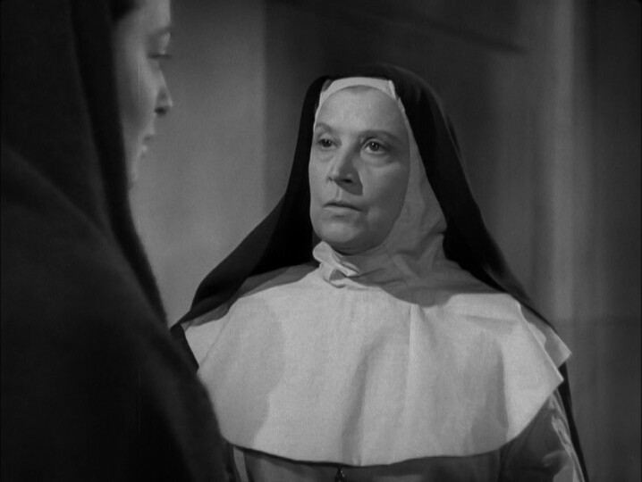
And then the father gets a heart attack because of course he does.
So evil!!!1!
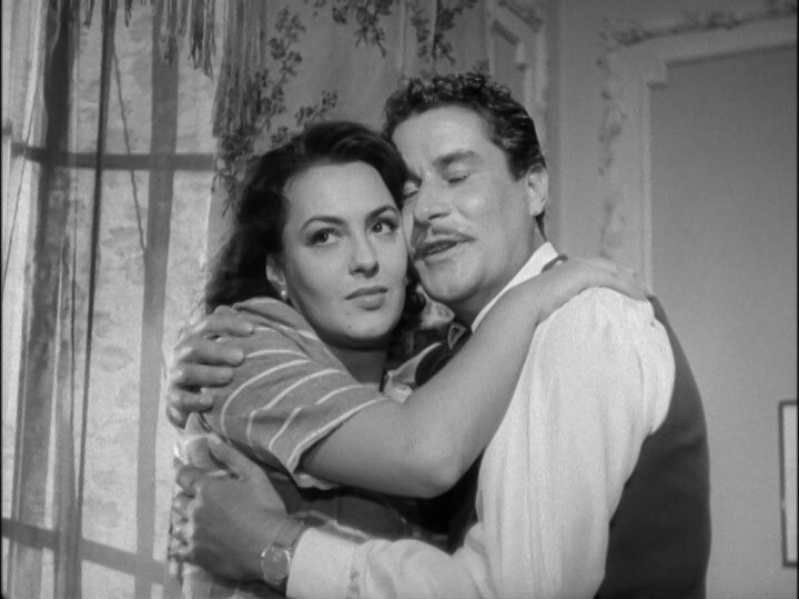
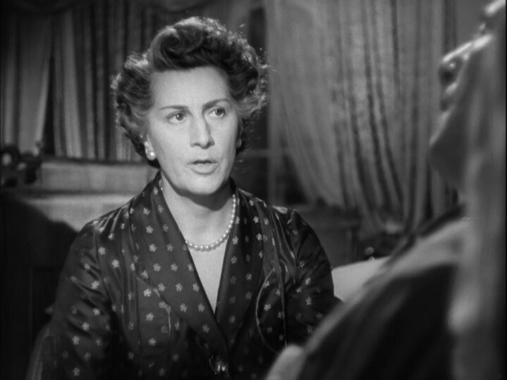
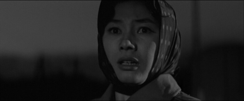
It’s a totally shameless movie, and I love that.
This was released only four months after the previous movie, Chains, and it was another smash hit at the box office (and another critical failure, apparently).
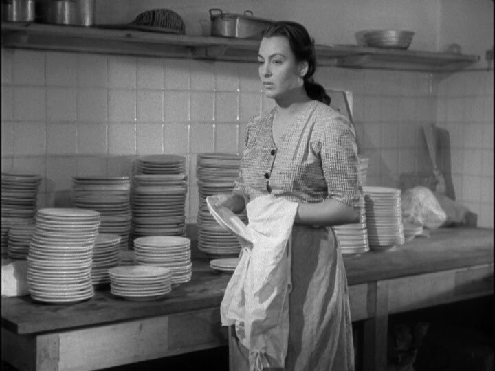
That’s a lot of dishes!
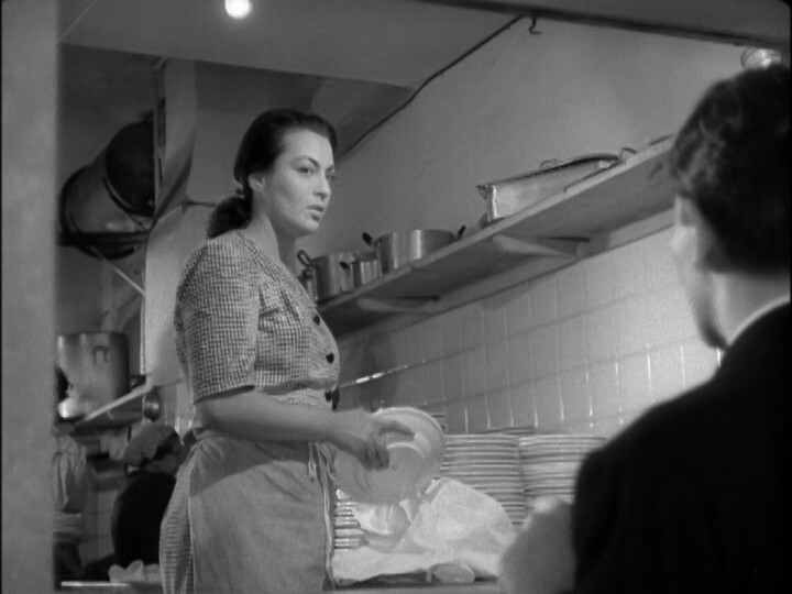
Awkward! Of course all dishwashing stations have a huge window out into the audience. I mean corridor.
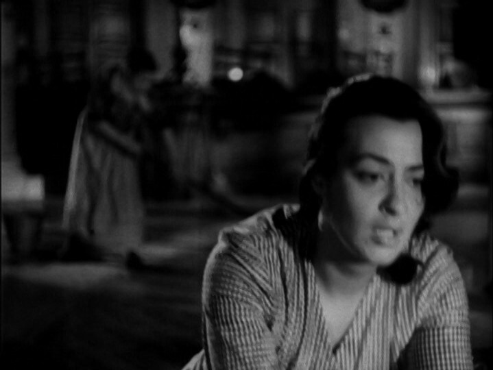
It’s like the movie just goes all in on making the scenes as melodramatic as possible, without any regard for logistics.
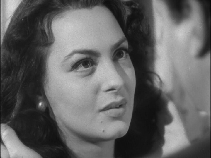
And I’d be hard pressed to explain what the plot actually is, but I’m all in anyway.
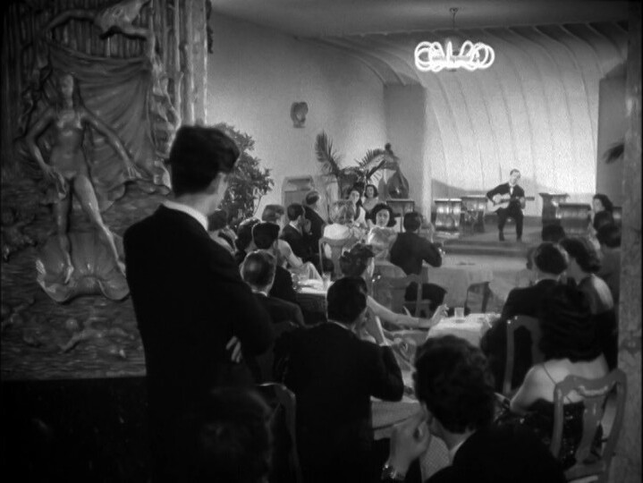
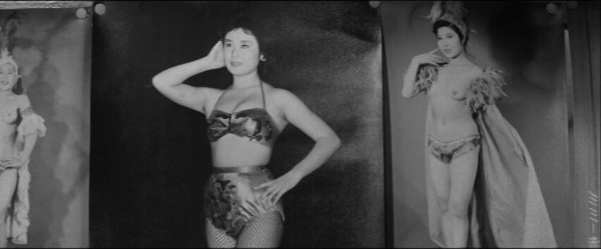
Then we get a little concert. I love it.
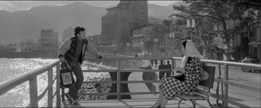
It’s amazing how Matarazzo is pulling this off. He’s just letting the actors and the preposterous plot points do their thing, and sort of keeping out of the way? I mean, all shots are framed nicely and everything, but the camera is just capturing it all without any flourishes.
This is all well and good, but the movie doesn’t quite feel fully baked. It’s like they had a couple of ideas, and a crew that kicks ass, and then they went out filming.
That is, every scene looks great, but it’s hard to keep being interested?
This movie looks so great that I kinda hate not loving it.