Skip to content
Random Thoughts
The Sky Won't Fall?
Menu and widgets
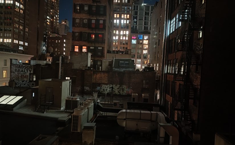
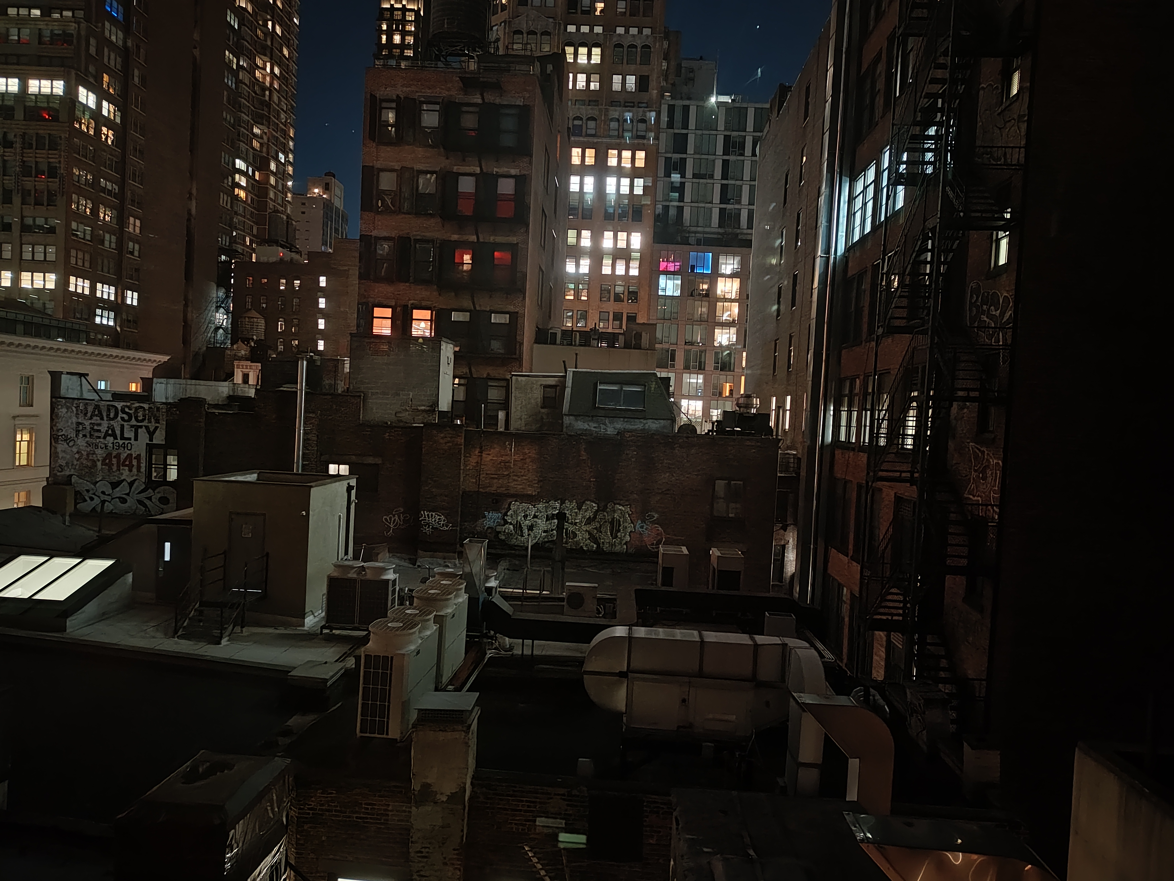
Room With A View
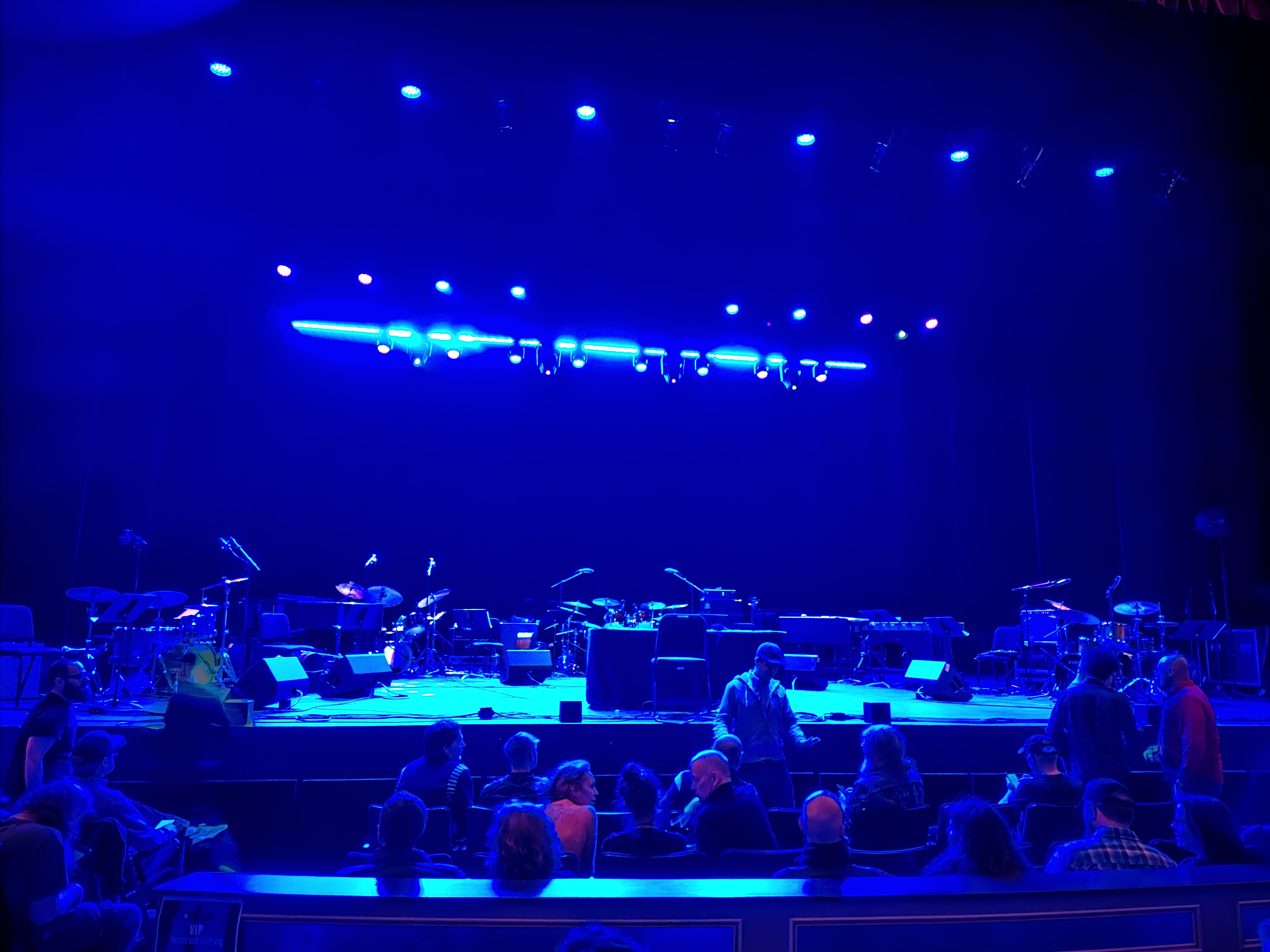
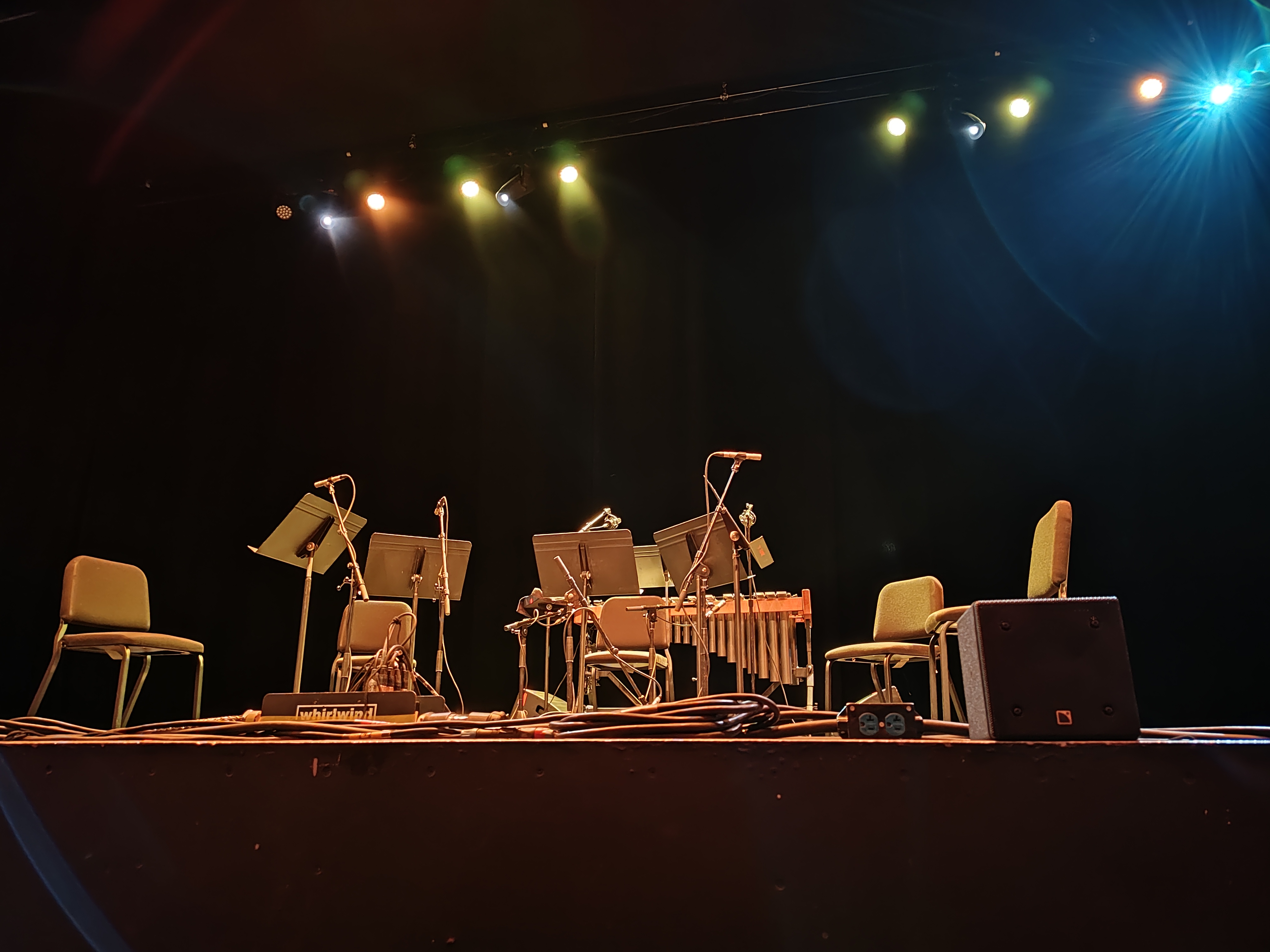
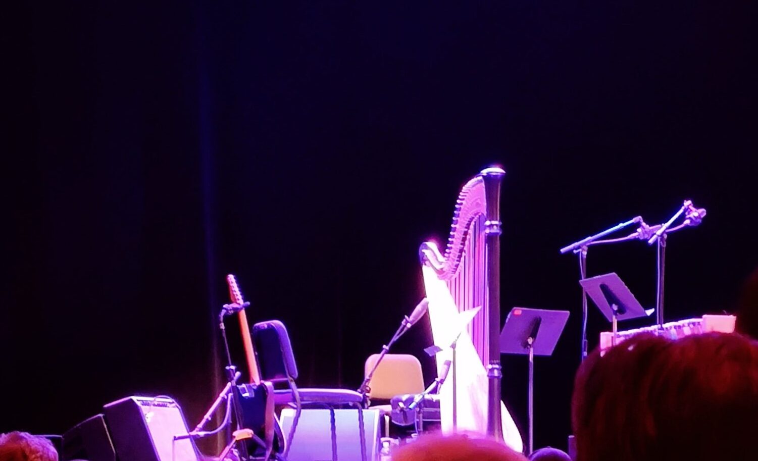
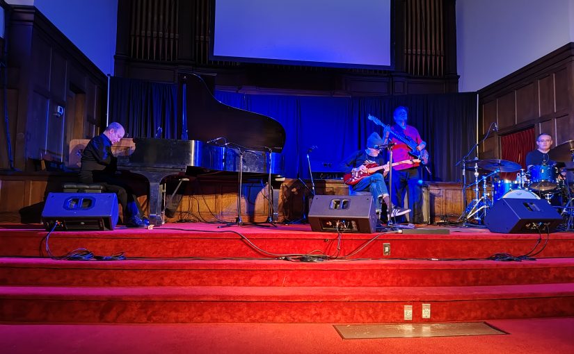
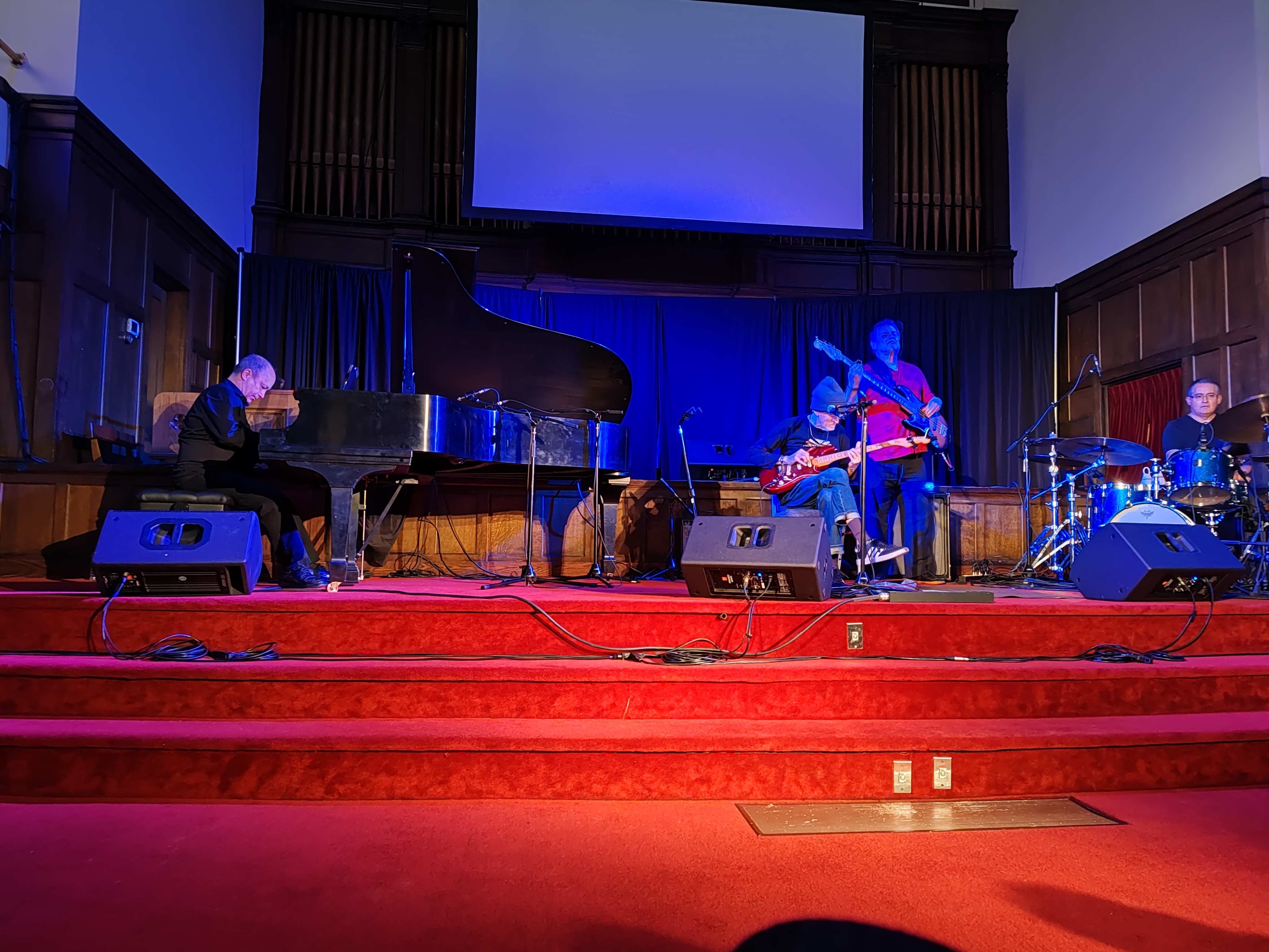
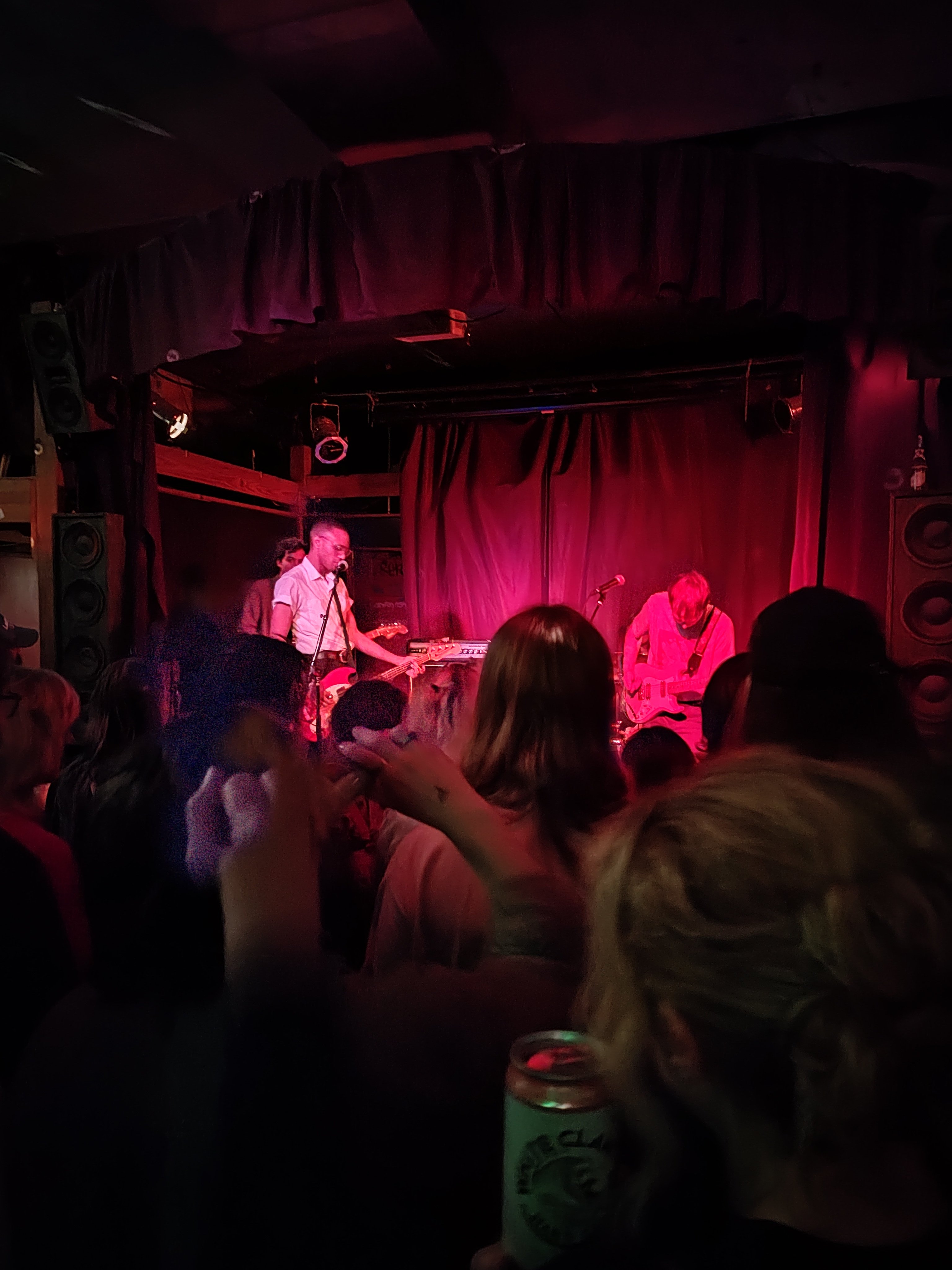
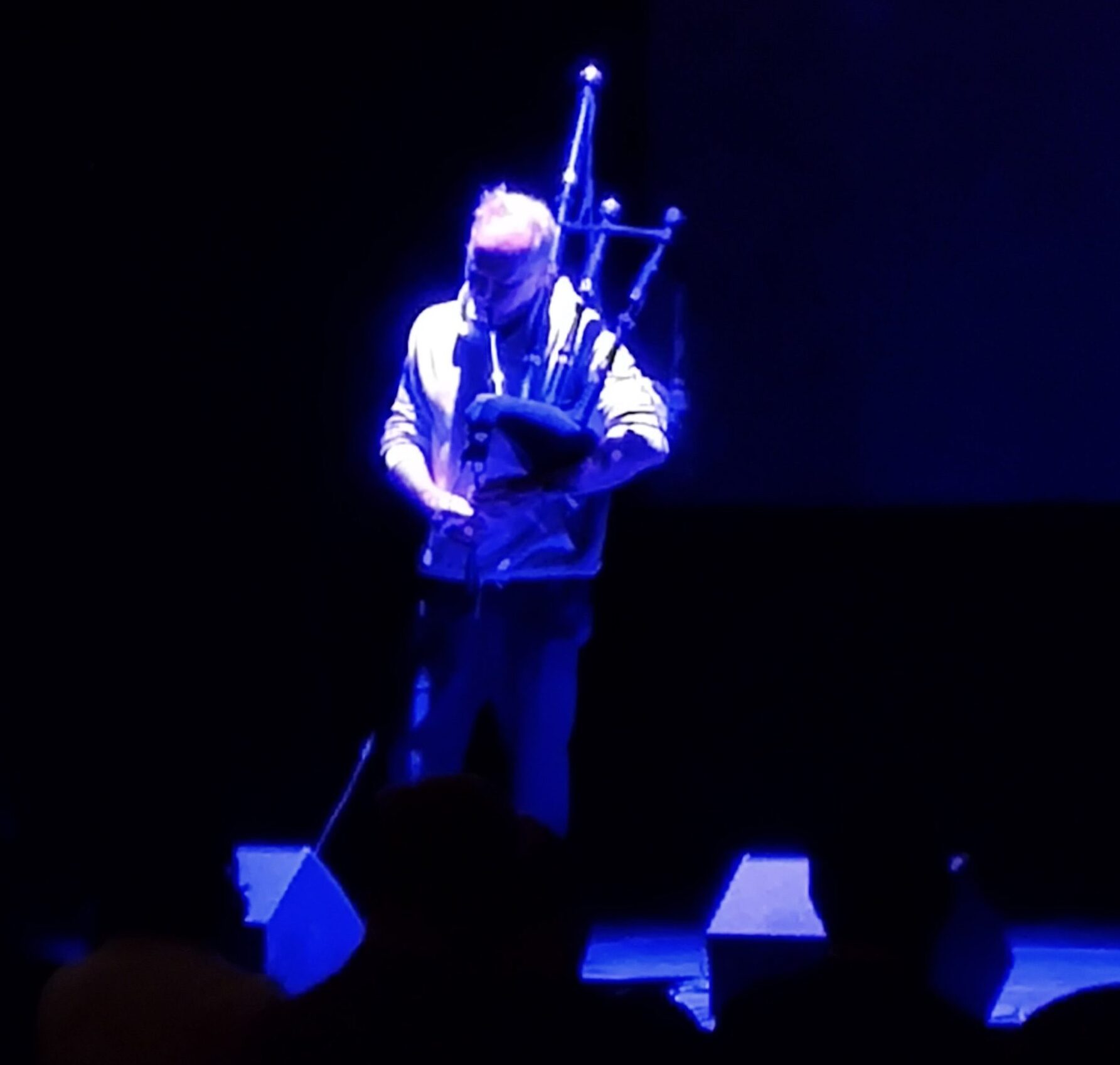
Yet Even More Music Festival
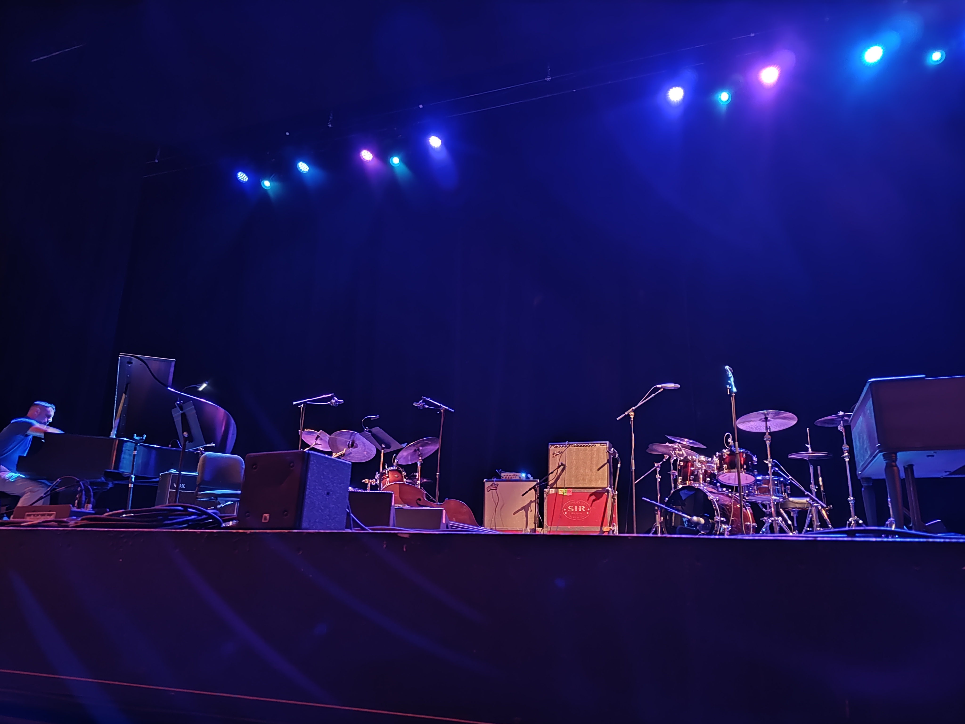
Even More Music Festival
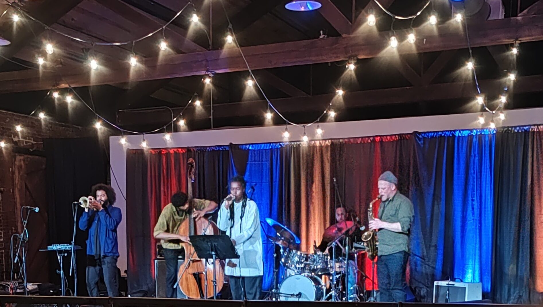
More Music Festival
Music Festival
Posts pagination
Previous page
Page
1
…
Page
212
Page
213
Page
214
…
Page
804
Next page