This is really good — razor sharp characters, fantastic set design, and a promising storyline.
Uhm uhm… this isn’t going as well as I’d hoped. I mean, it’s a nice movie and all, and I like the languorous pacing, but it’s just not that interesting?
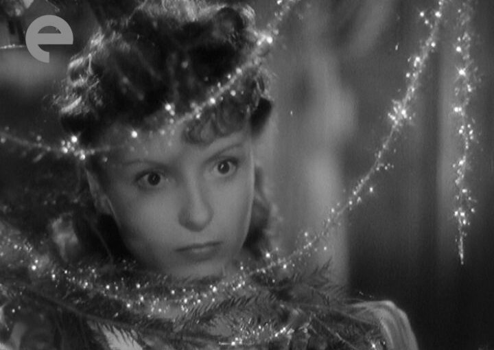
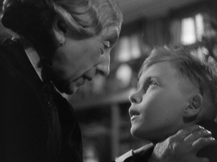
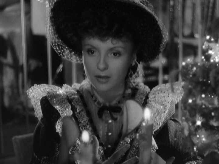
If Truffaut could have written even one line half as good as these two cats he’d be well on the way to earning Amateur status. The fact is that next to these two Truffaut is illiterate. Put it this way, they’re still showing ‘Douce’ sixty years after it was made. Will time be so good to The Four Hundred Yawns. In your dreams, Francois.
Yeah… people have totally forgotten The 400 Blows now, and are only watching Douce. (Imdb has the ratings count at 119K vs 365. Without the K.)
OK, now the movie is downright tedious. And it started so well!
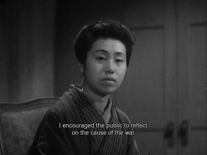
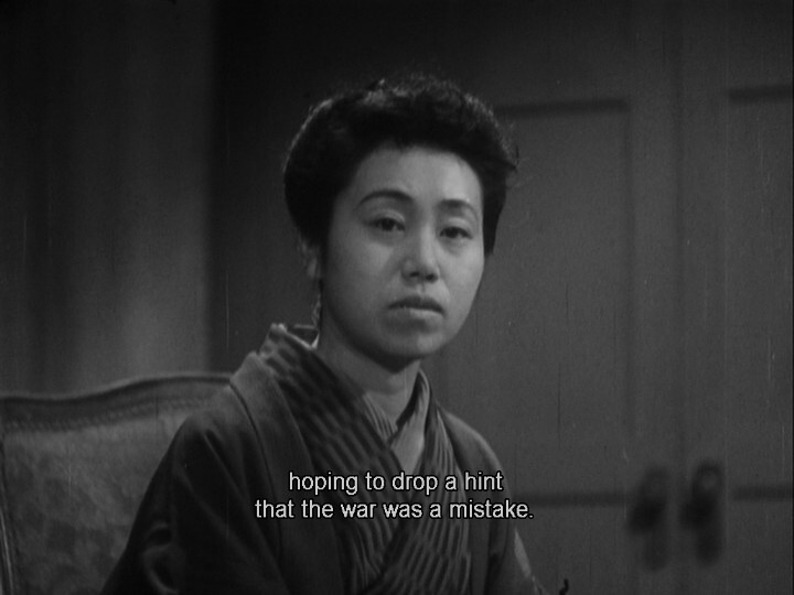
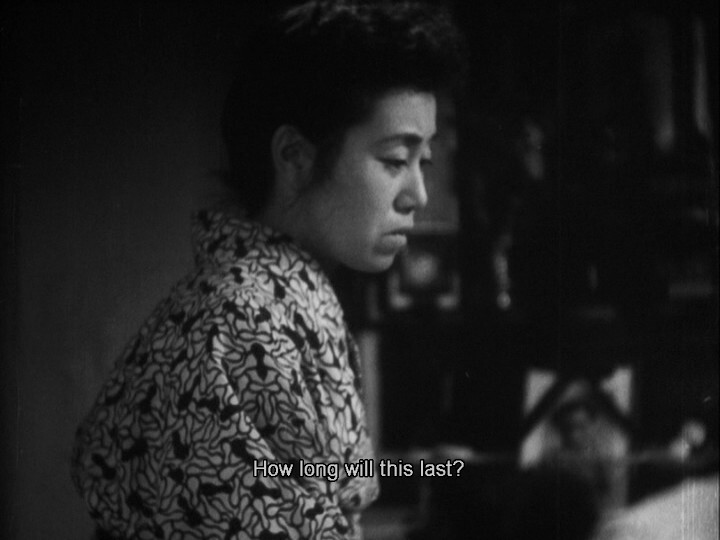
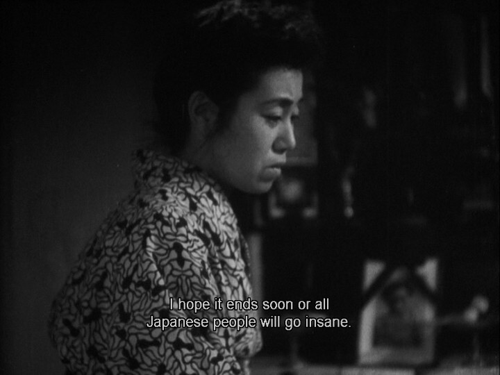
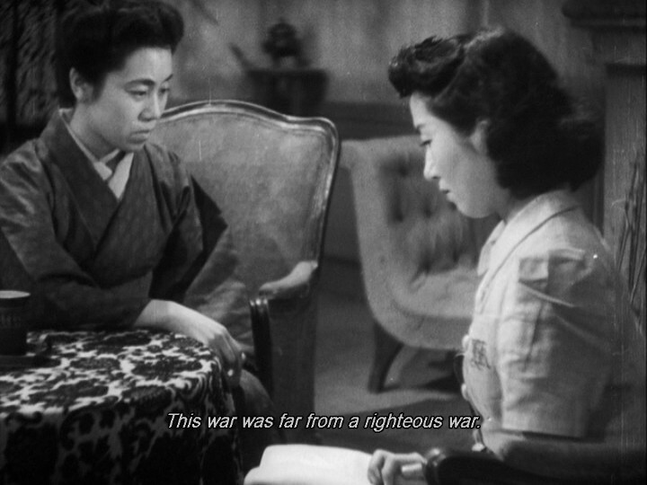
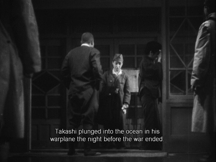
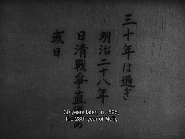
OK, so we’re now in 1946, and Keisuke Kinoshita is working under American censors now instead of the Japanese ones from two years earlier.
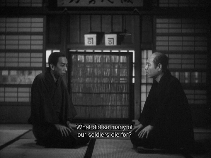
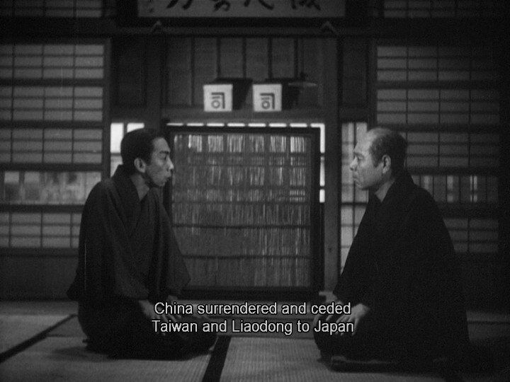
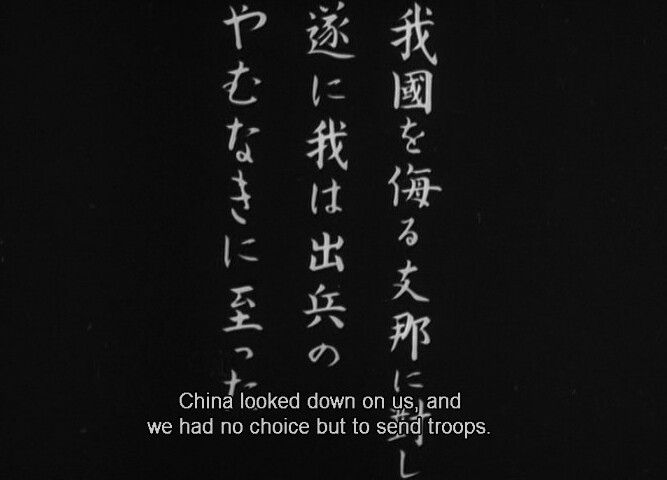
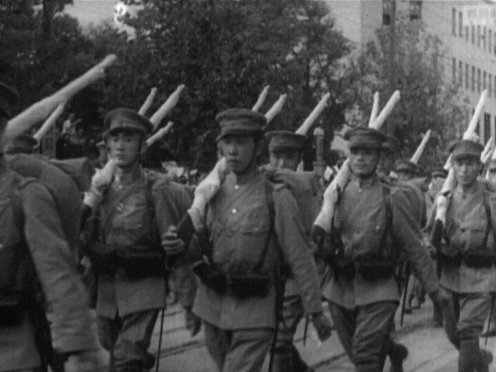
It turns out that the Japanese were the villains all along!
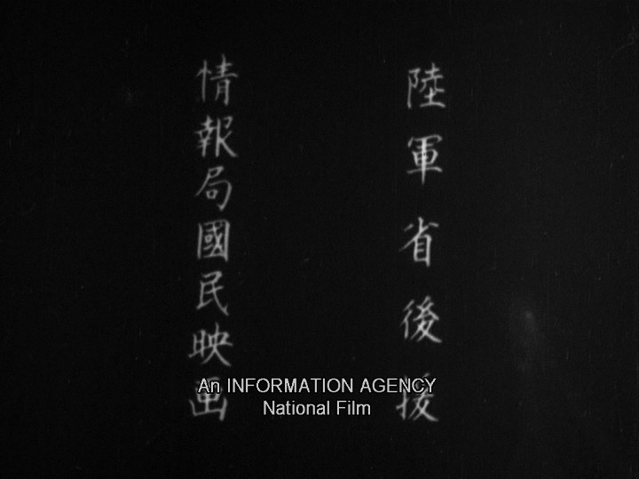
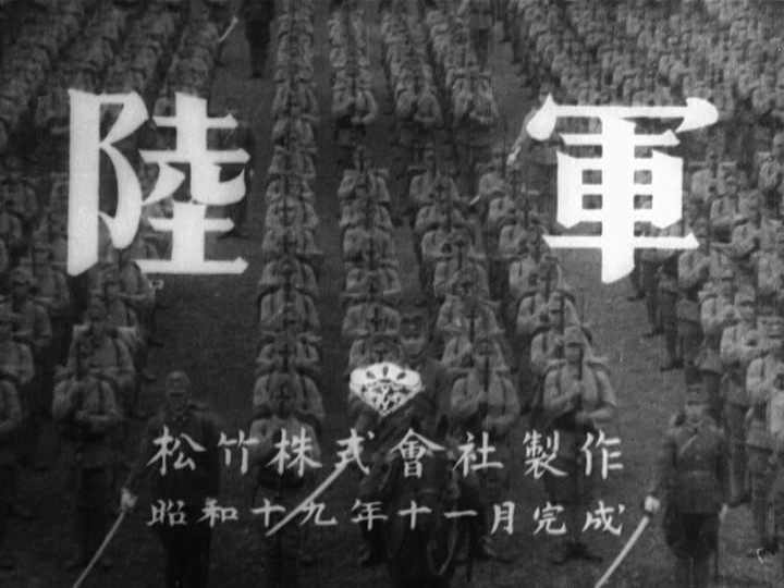
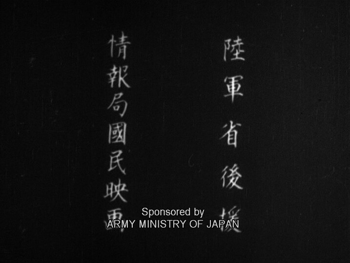
His previous movie, Army, was brilliant, so I went into this with high hopes (which, of course, one shouldn’t do). And… it’s kinda crap? How’s that for insightful critique.
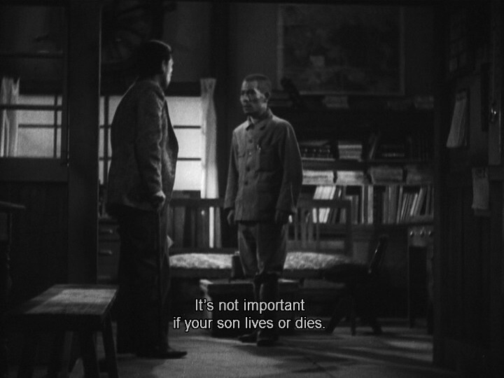
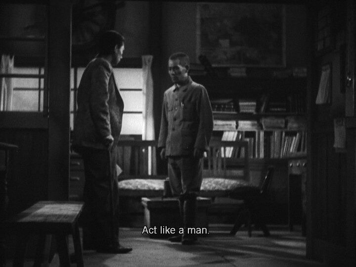
I’m guessing it was made on a very small budget? It’s all filmed in a couple of rooms, with a limited cast. But it doesn’t feel like a filmed play, either — it’s too sloppy for that. Instead it’s just these characters prattling on about how bad war is, with some of them being arrested at random points for being against the war.
Of course. Then again, we’ve really been given no reason to care one way or the other, so…
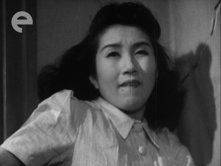
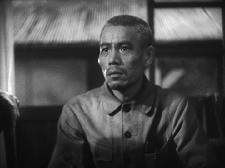
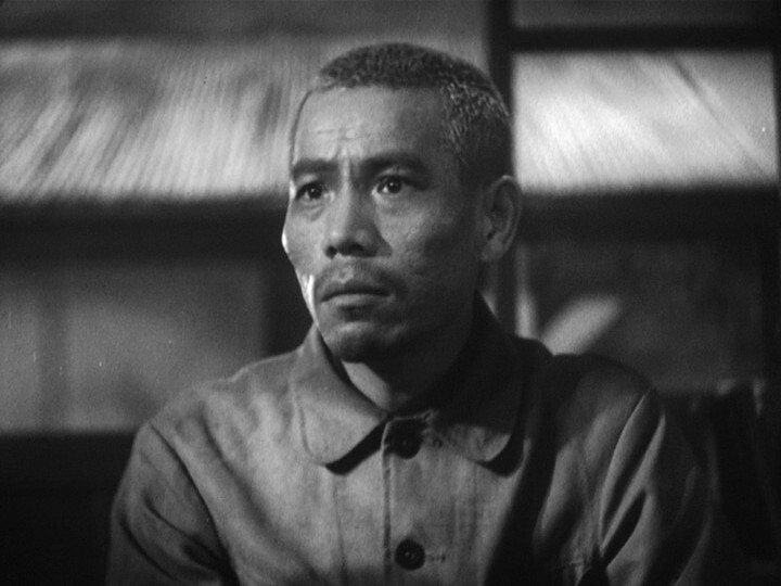
Man, this is a bad movie.
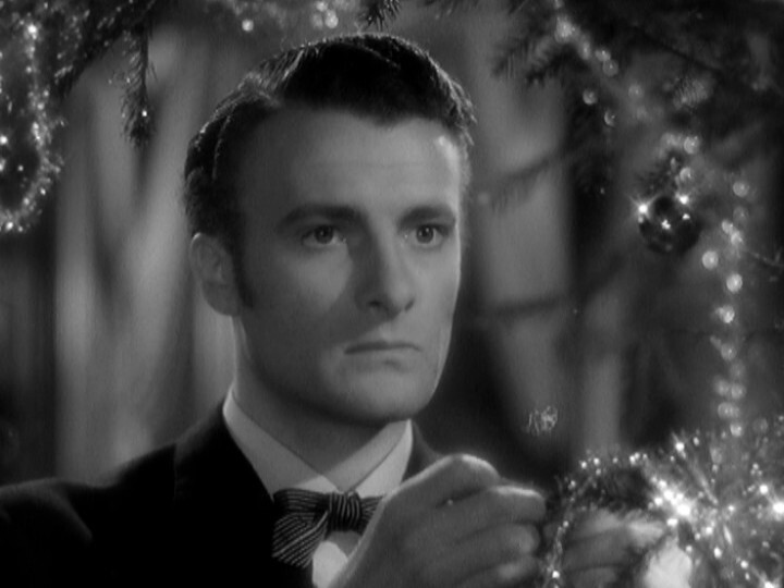
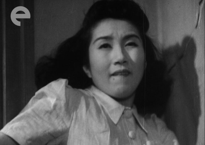
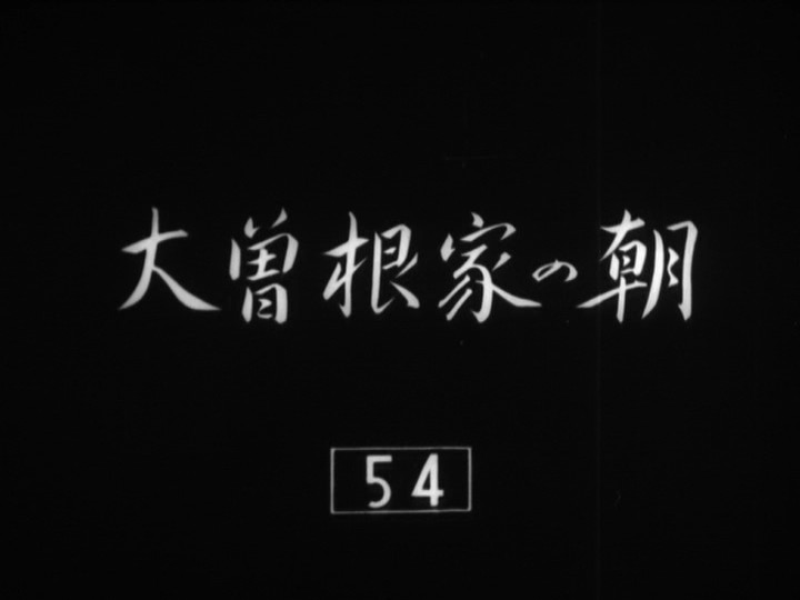
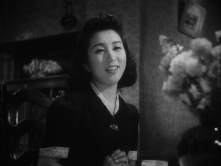
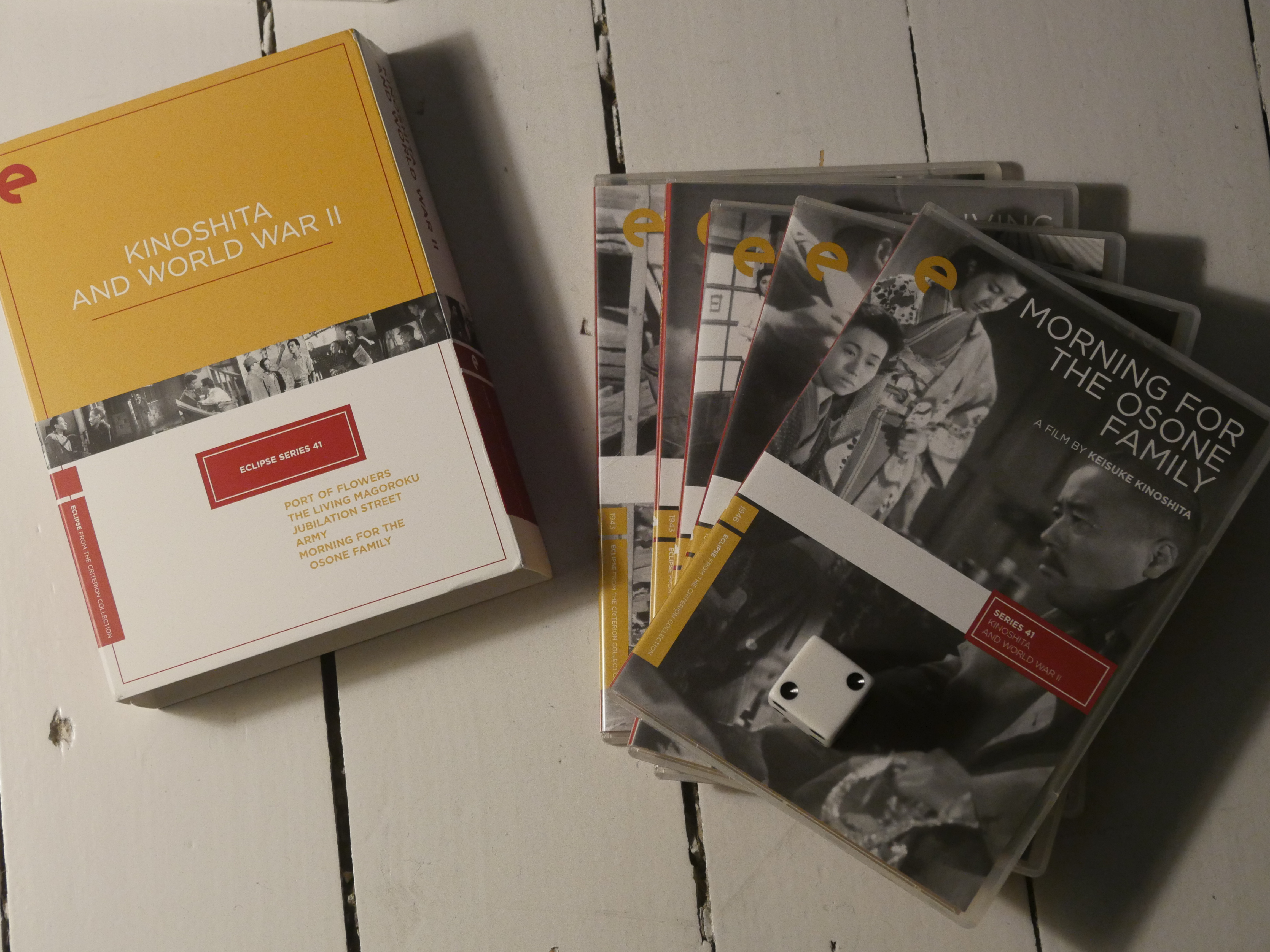
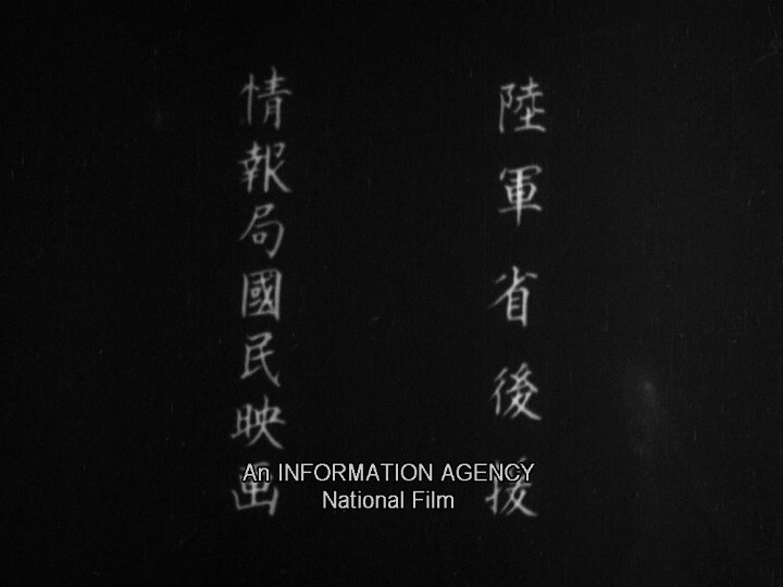
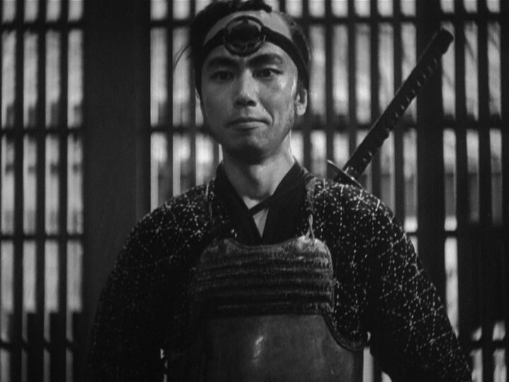
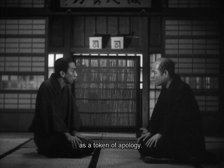
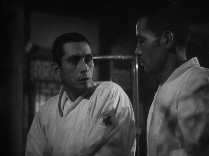
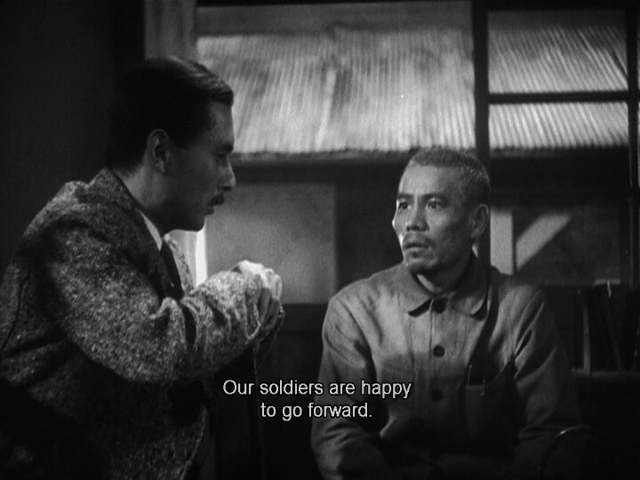
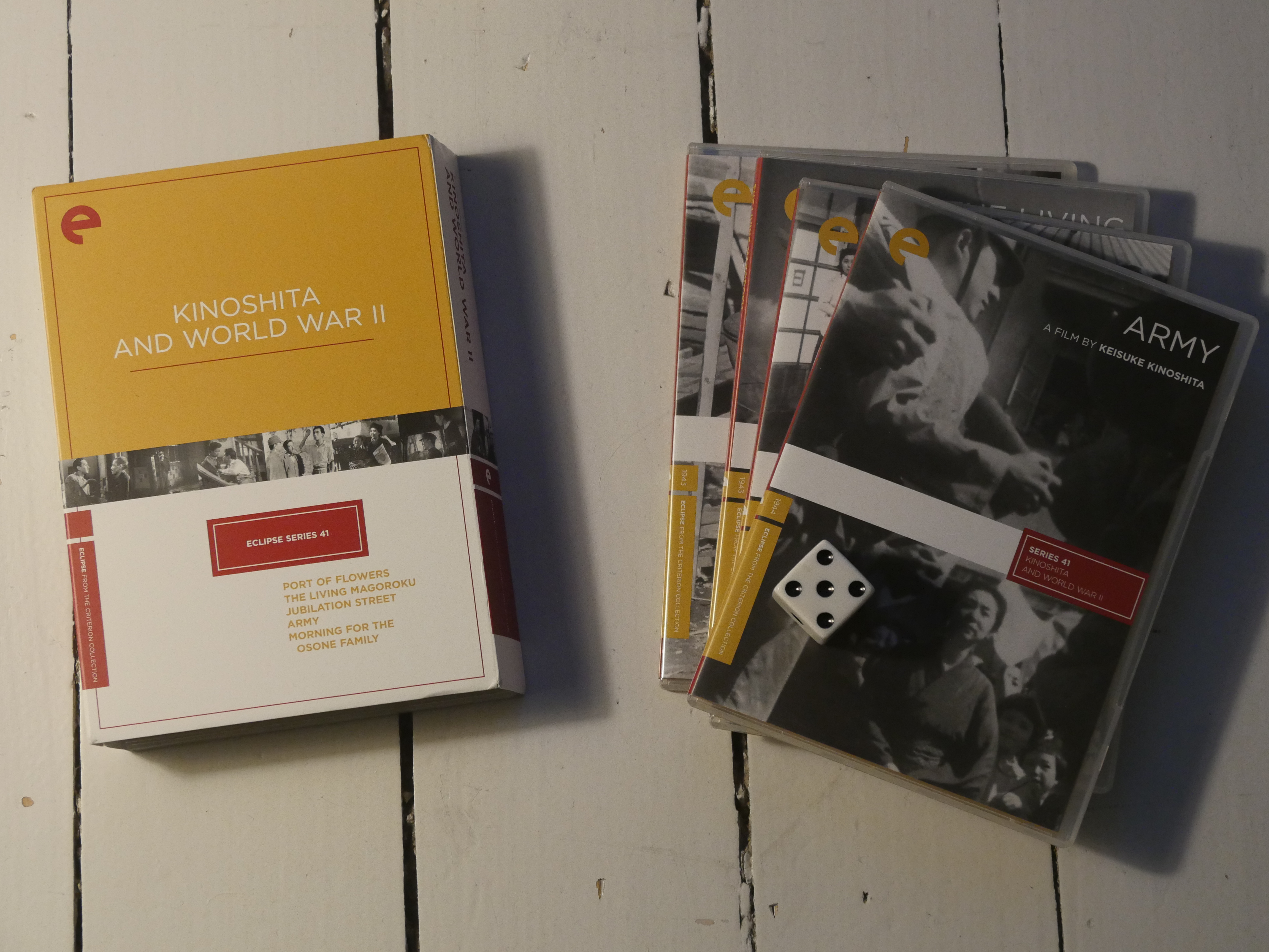
Morning for the Osone Family. Keisuke Kinoshita. 1946.
Yes, this is another Japanese wartime movie. The previous two films in this box set have been pretty dire, but perhaps this will be more interesting, now that the war isn’t going as well as in 1942…
Yes indeed.
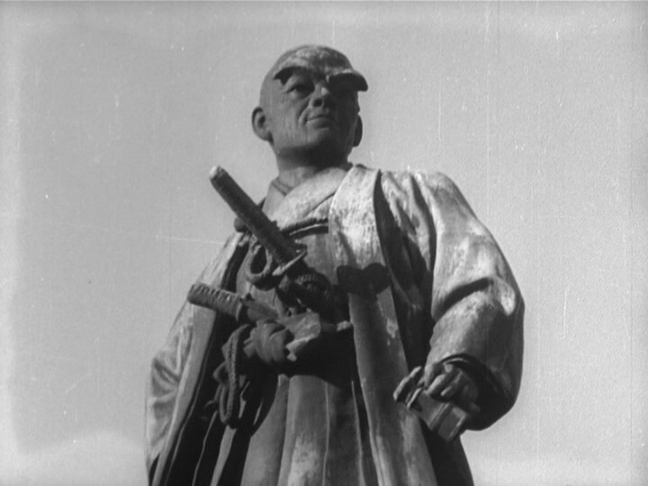
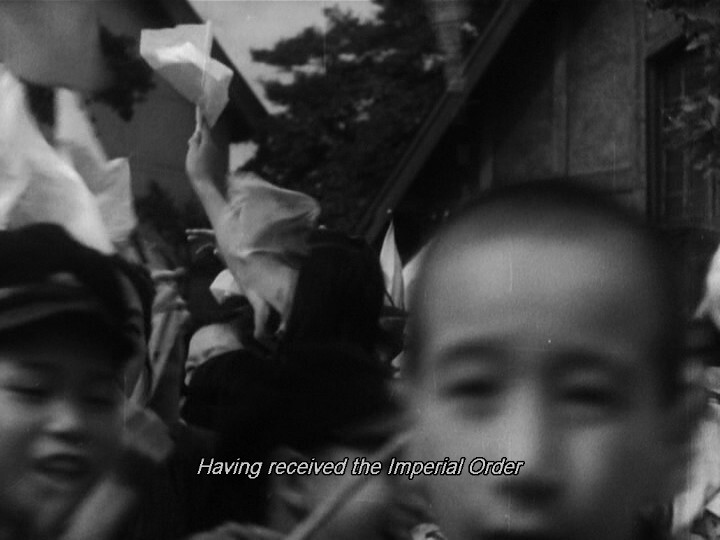
Oh, but we start off in Olden Times… Is this gonna be about how the Japanese army is eternal or something?
Well, that was abrupt… perhaps we’re gonna switch between time periods throughout the movie?
In any case, this is a lot more interesting than the first two films in this box set already.
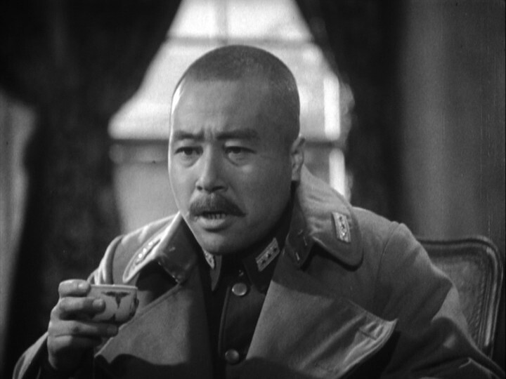
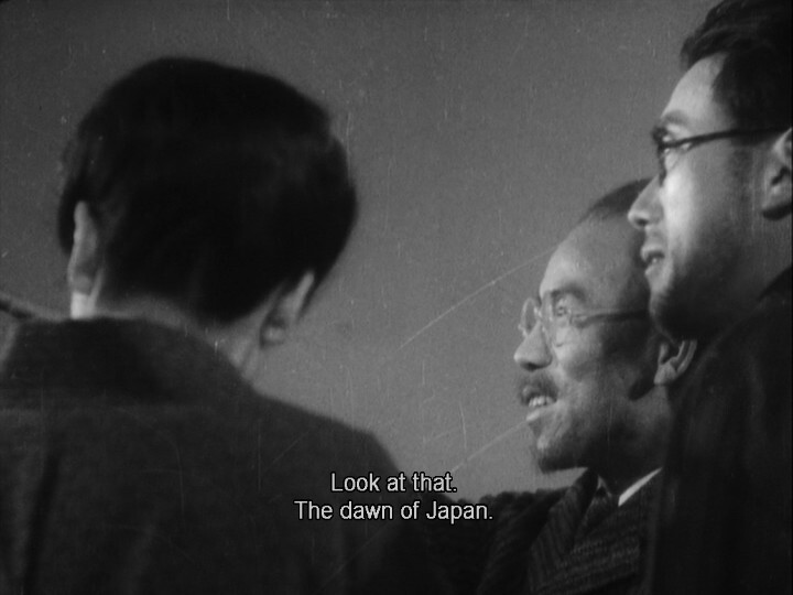
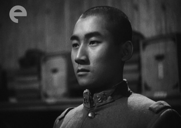
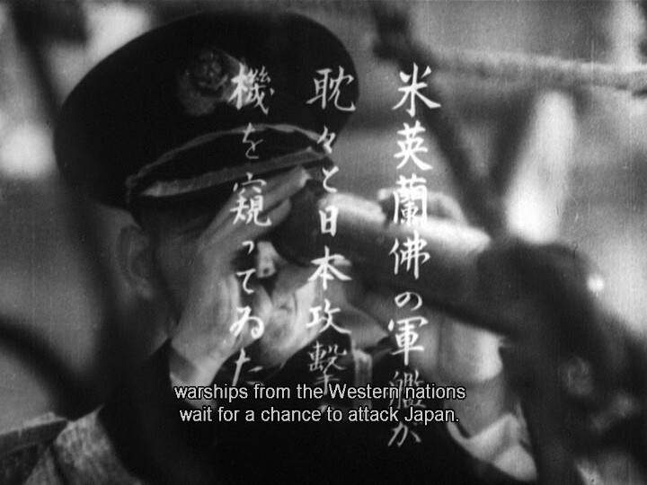
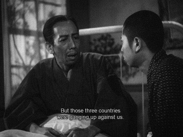
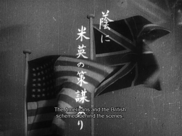
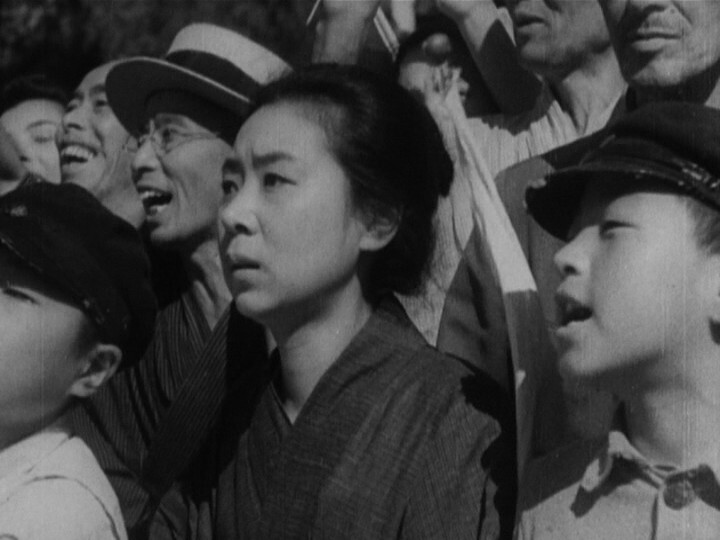
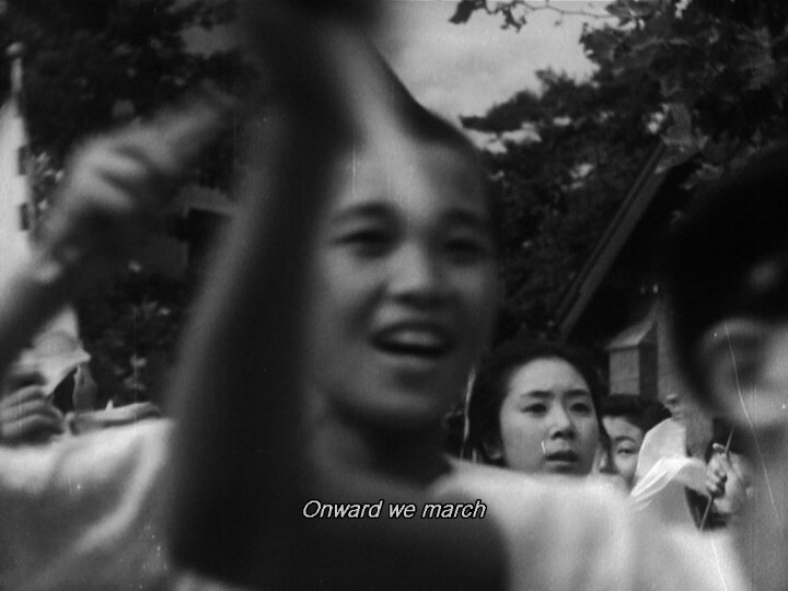
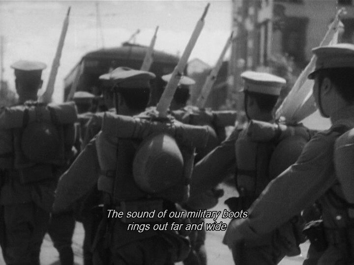
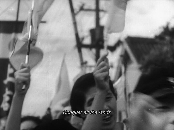
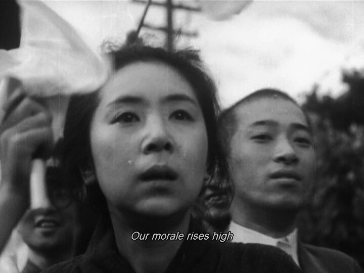
This movie makes a really good case for the Japanese! The Japanese were right to attack Pearl Harbour after all!
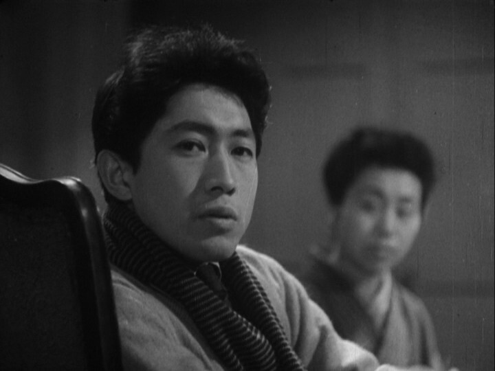
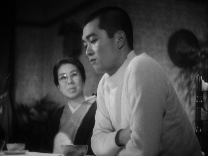
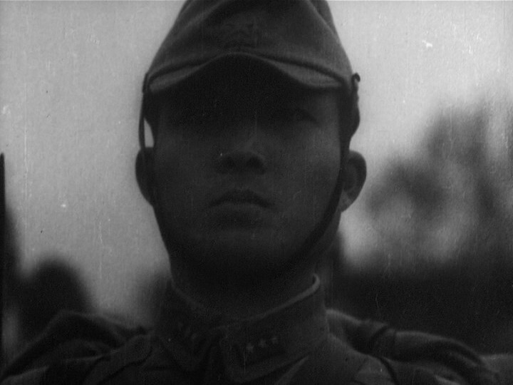
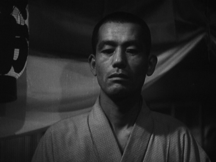
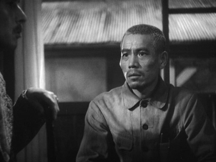
Impressive brows.
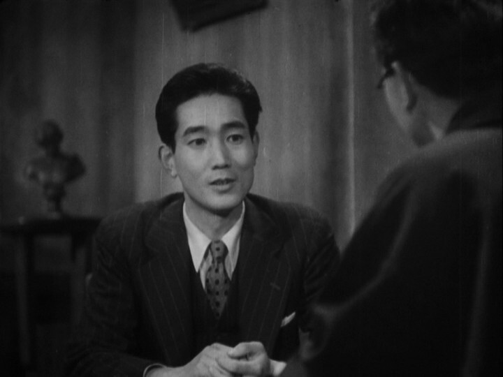
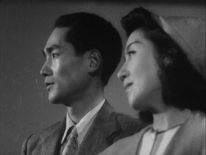
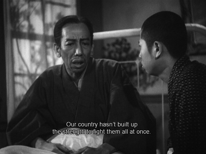
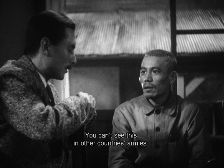
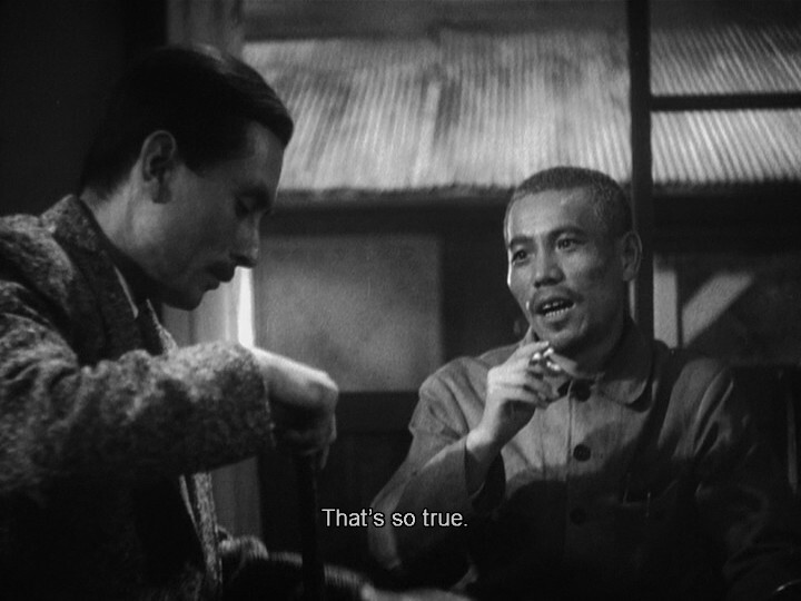
This is an odd movie. They’ve built up these really compelling and interesting characters, and use them brilliantly in both emotional and goofy scenes, and it all works so well. But it’s meant to be a pro-war propaganda movie, right? So there’s these somewhat incongruous tiny things in between to emphasise that, and the tension between these scenes makes things… even more interesting?
That is, I was expecting this movie to suck, and instead it’s kinda wonderful.
Right, right. And then…
Were the censors asleep when OK-ing the script to this movie?
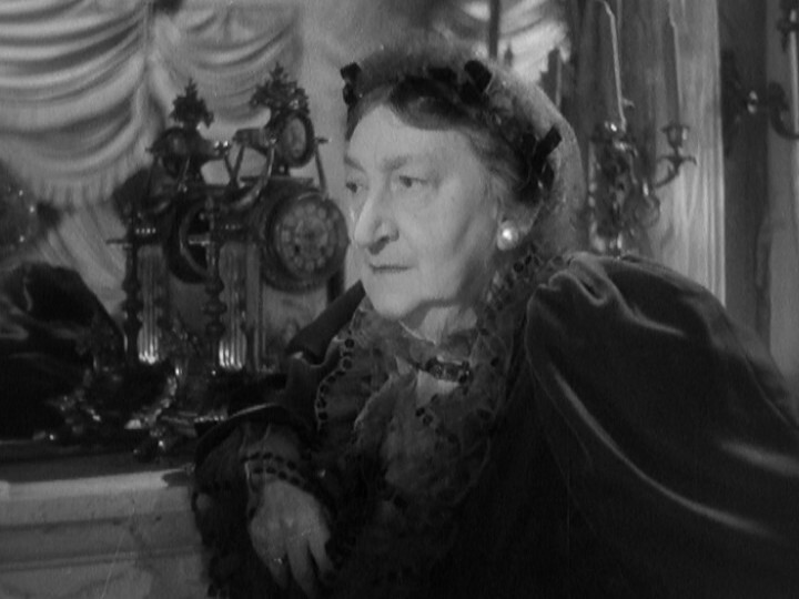
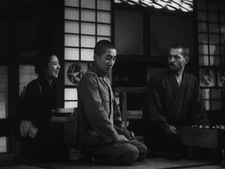
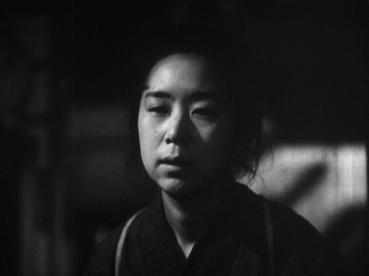
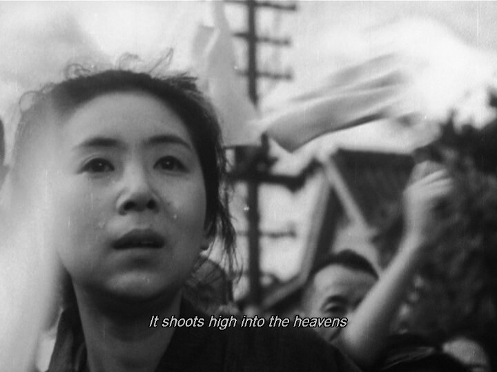
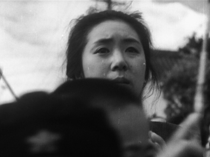
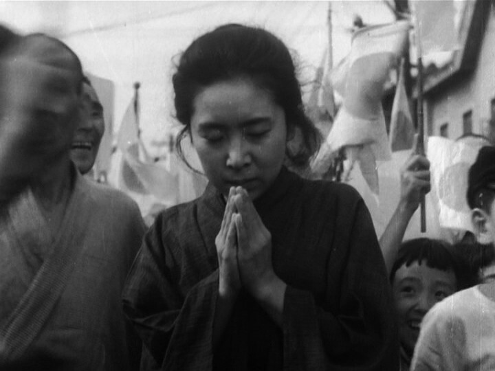
This movie is absolutely brilliant. The dialogue-free long final sequence is fantastic — the mother, who’d previously been a character that’s been sidelined somewhat, carries it all through to a three hanky ending. It’s amazing.
But how did he get away with doing basically an anti-war movie? In 1944?! I have to read the liner notes on the DVD…
Oh! The entire final long scene was just one sentence in the script: “The mother sees the son off at the station.” Which… er… was a bit of a fib? But the censors didn’t have anything to censor, so they filmed what ended up in the film. There was an outrage when the movie was shown, and a general showed up at Shochiku and accused the director of treason. He was not allowed to direct any further movies during the war.
*cough* *cough* I’ve got a cold, but perhaps watching some more movies from the Eclipse Criterion collection is the answer…
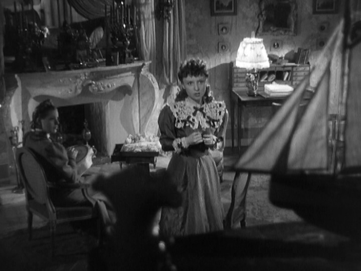
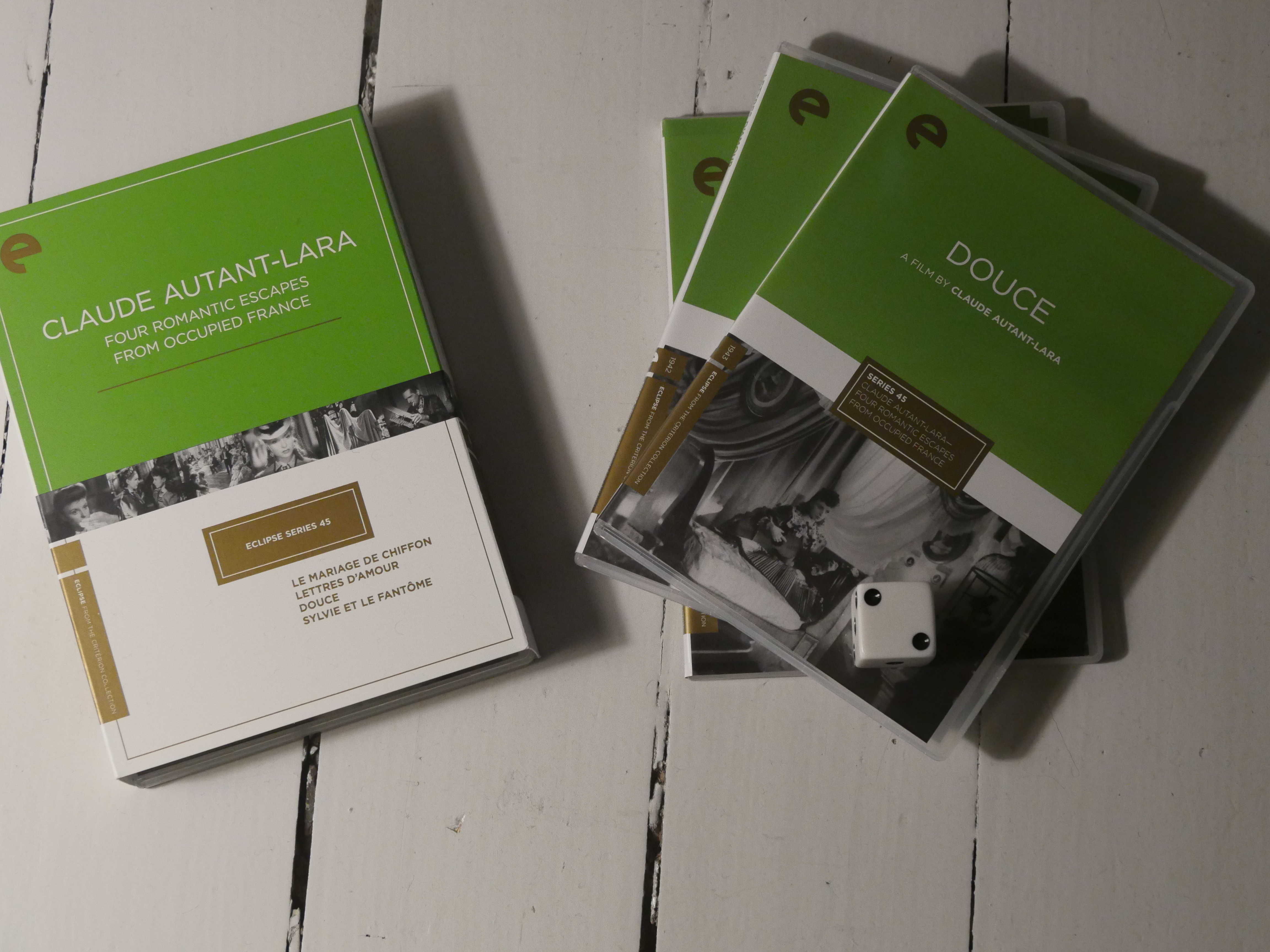
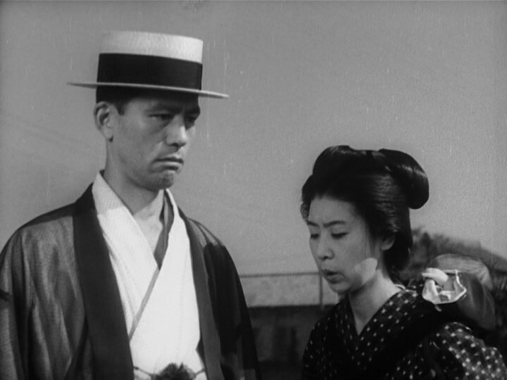
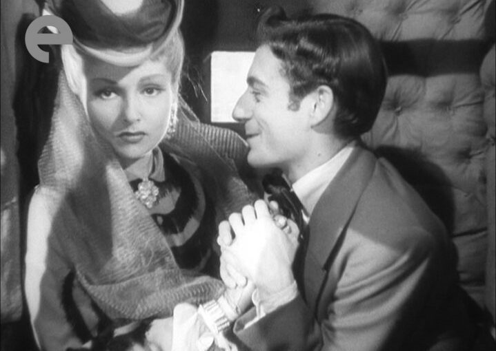
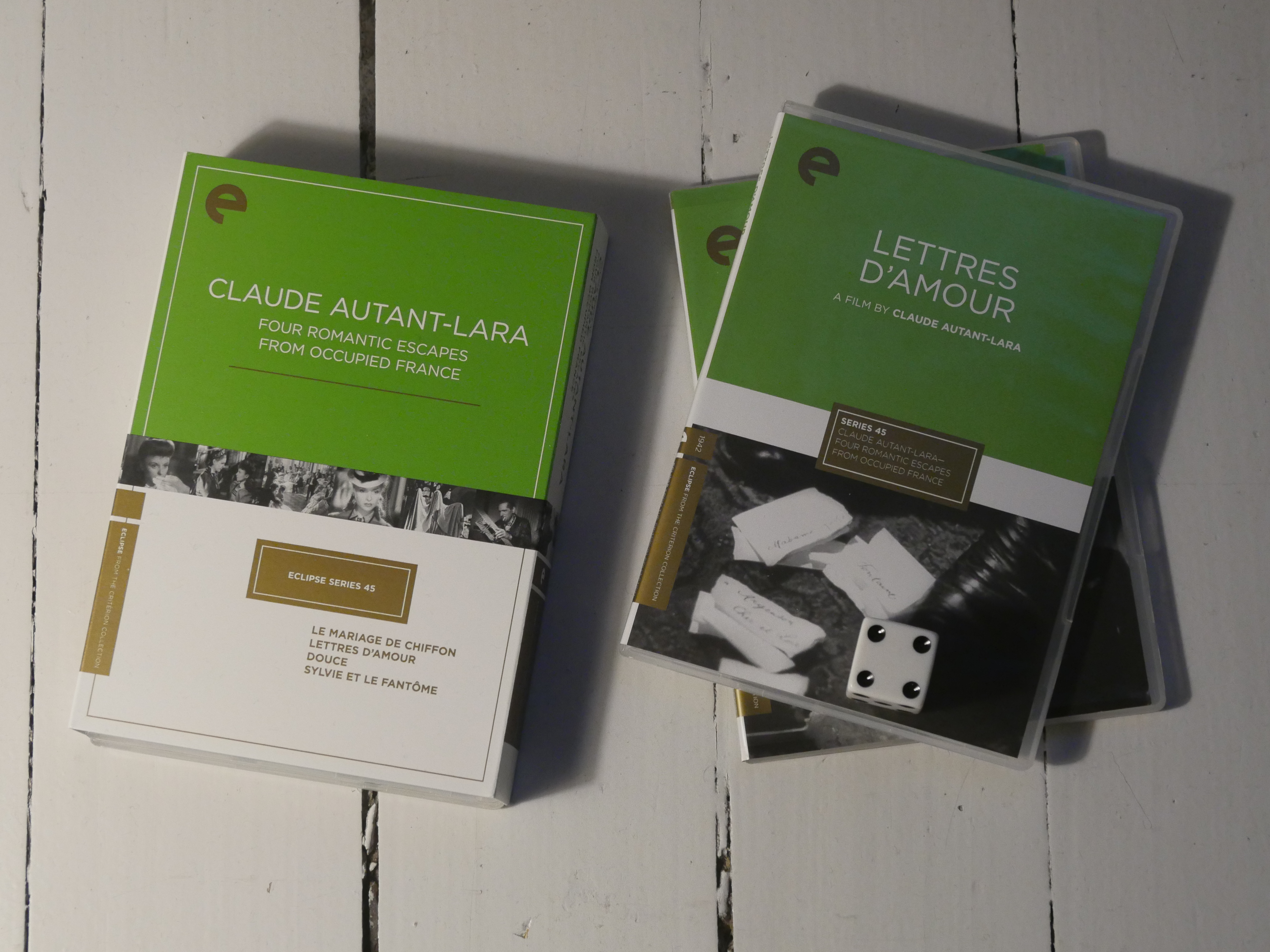
I started this box set (made in Occupied France) a while ago, but then er got busy with other things, and I don’t remember the first movie at all.
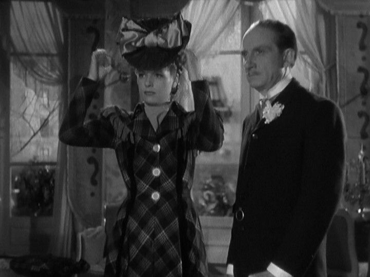
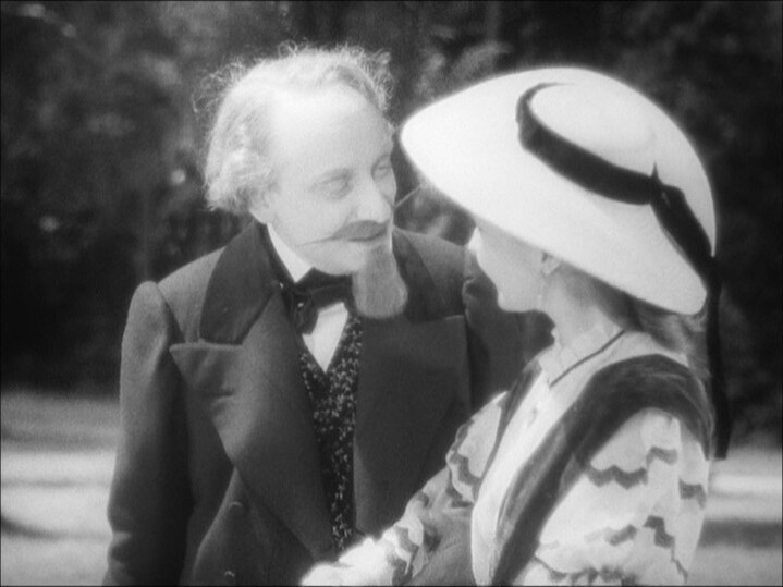
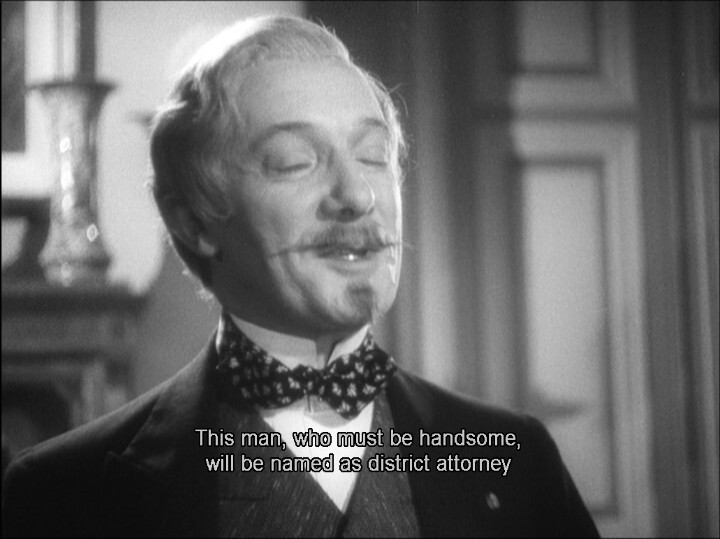
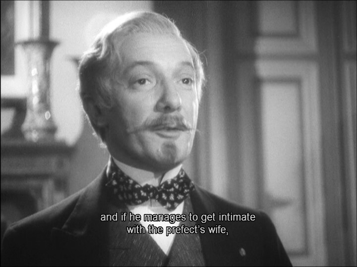
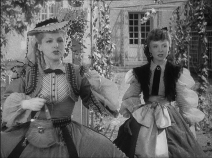
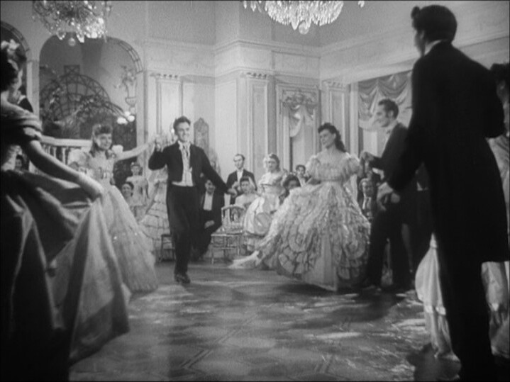
This looks quite amusing — it’s a historical farce?
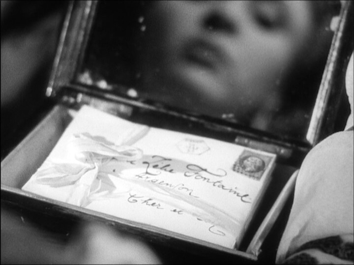
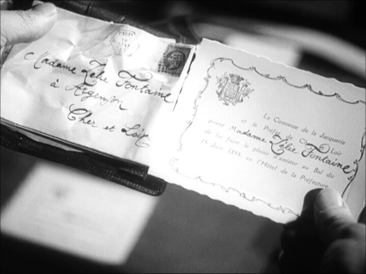
This putters along quite nicely. It’s got a lot of plot going on — I’m guessing the secret love letters are going to lead to a bunch of hi-jinx? They’re mostly setting the scene, so far…
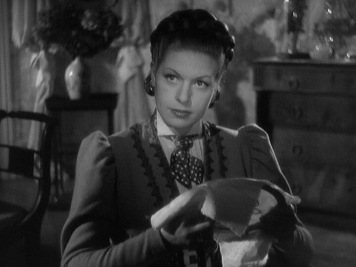
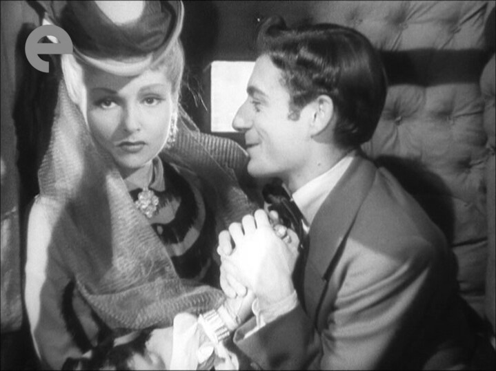
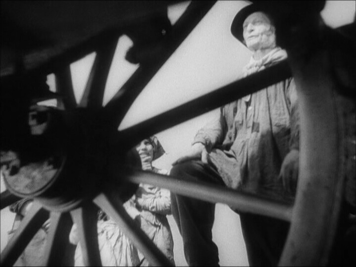
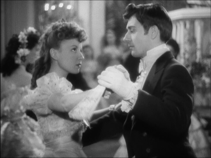
Heh heh. That’s a good shot.
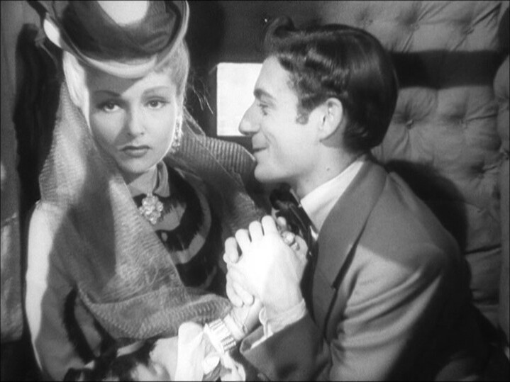
Anyway, I’m already having a lot of problems keeping the characters separate (because several of the actors look kinda similar), which is an extra complication in a comedy of errors like this…
*gasp*
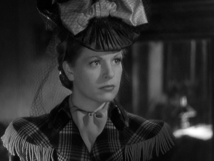
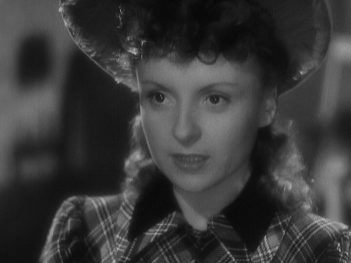
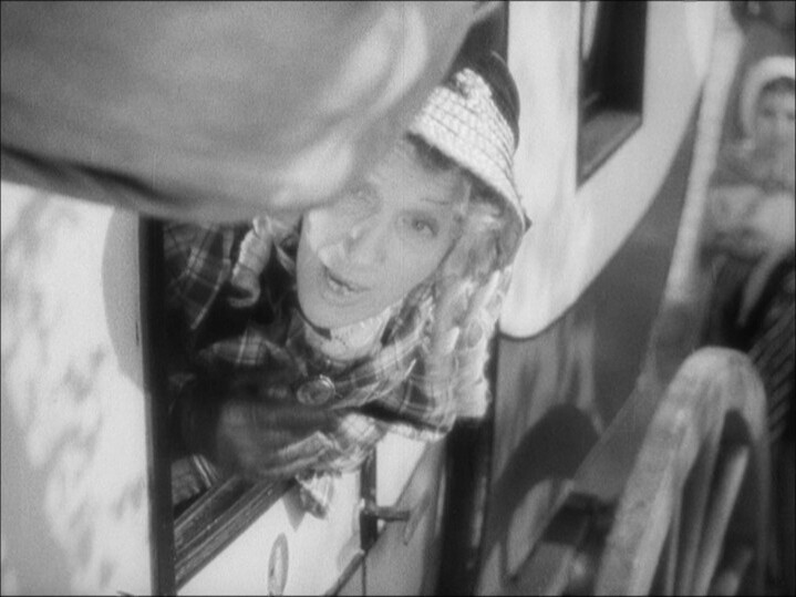
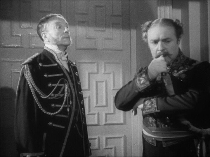
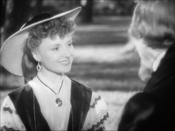
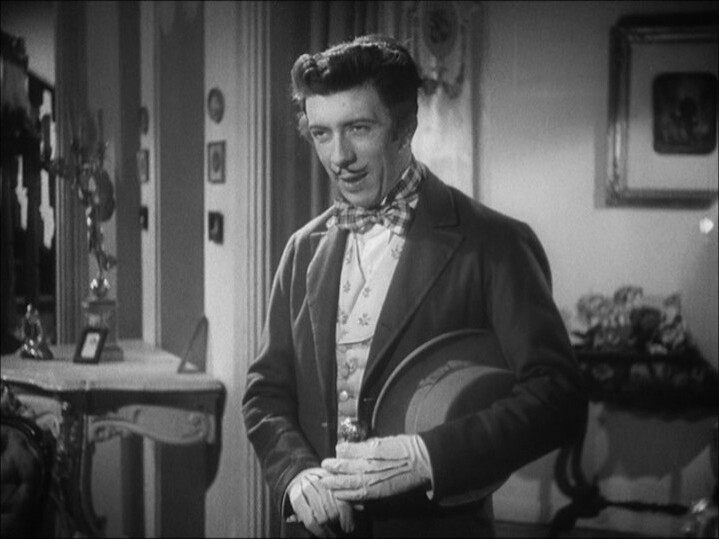
This is a quite charming movie, with great sets and costumes, better-than-average cinematography, a quite snappy plot with good lines from a well-known director, and…
… and, basically nobody’s seen it, and I understand why. There’s just now that anything much compelling about it. I can see people settling down to watch a movie, and then going “of amongst the approx nine hundred thousand movies that exist, should I watch Lettres d’amour, an occupation-era perfectly nice but not remarkable farce tonight? Well, I think not”.
*gasp*
And there isn’t any reason to watch this movie, really — but it’s fun and charming.