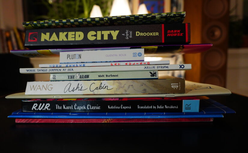
I went on a short trip to London and I bought a bunch of comics. But I also have a bunch of other comics I haven’t read yet, so let’s mix things up.
And for today’s music… perhaps just David Bowie? With the albums played in the other I used to play as a teenager while reading comics, if I can remember what that was… Hm, I think I used to start with Diamond Dogs and ended up with some of the live albums, at least. Let’s see…
Ah, yes: “This ain’t rock’n’roll, this is genocide” means that it’s time to read comics.
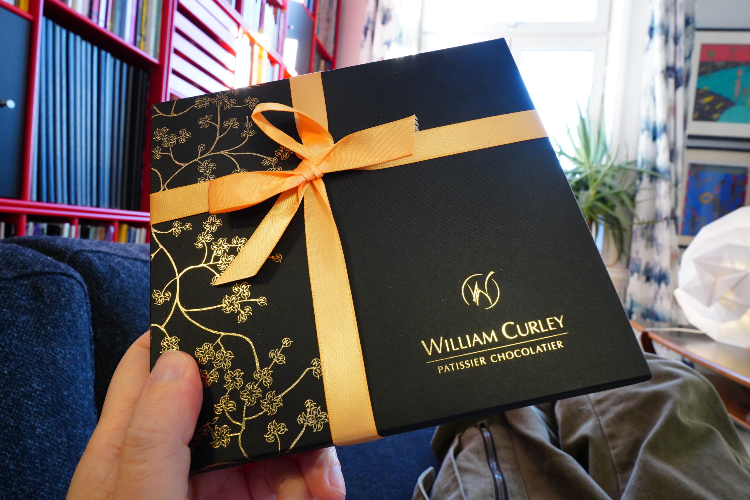
And I also have chocolates.
| David Bowie: Diamond Dogs |  |

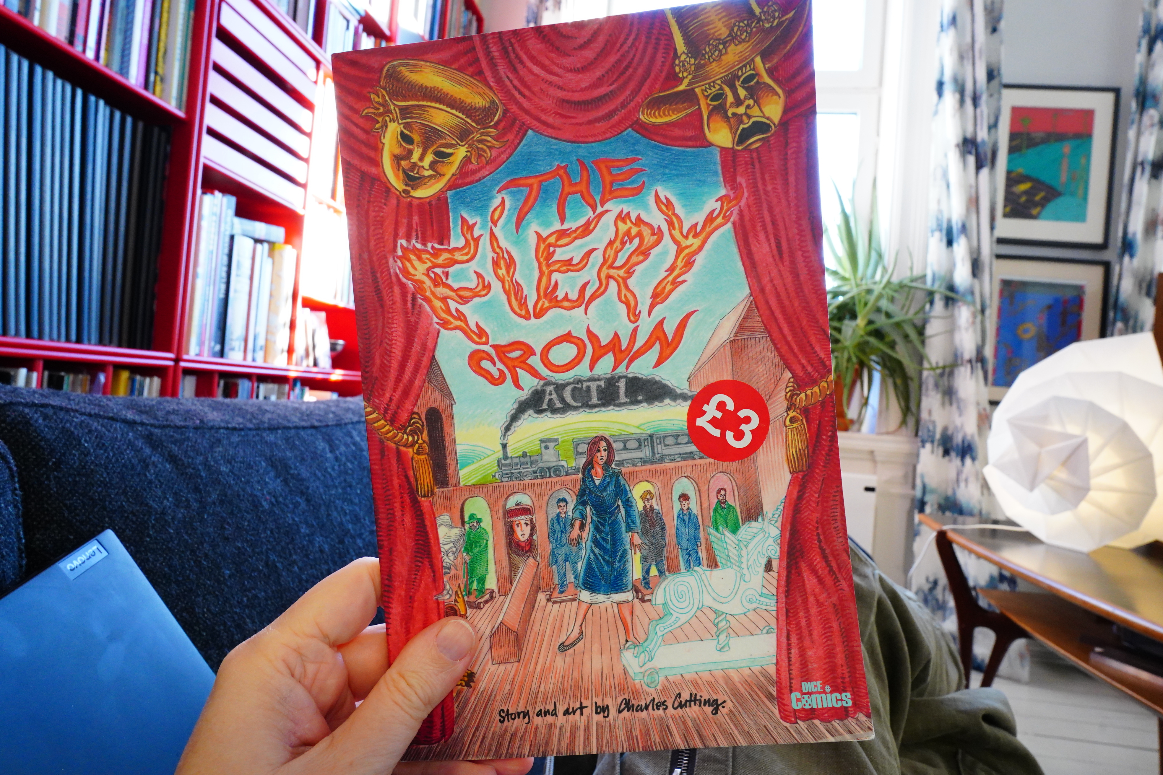
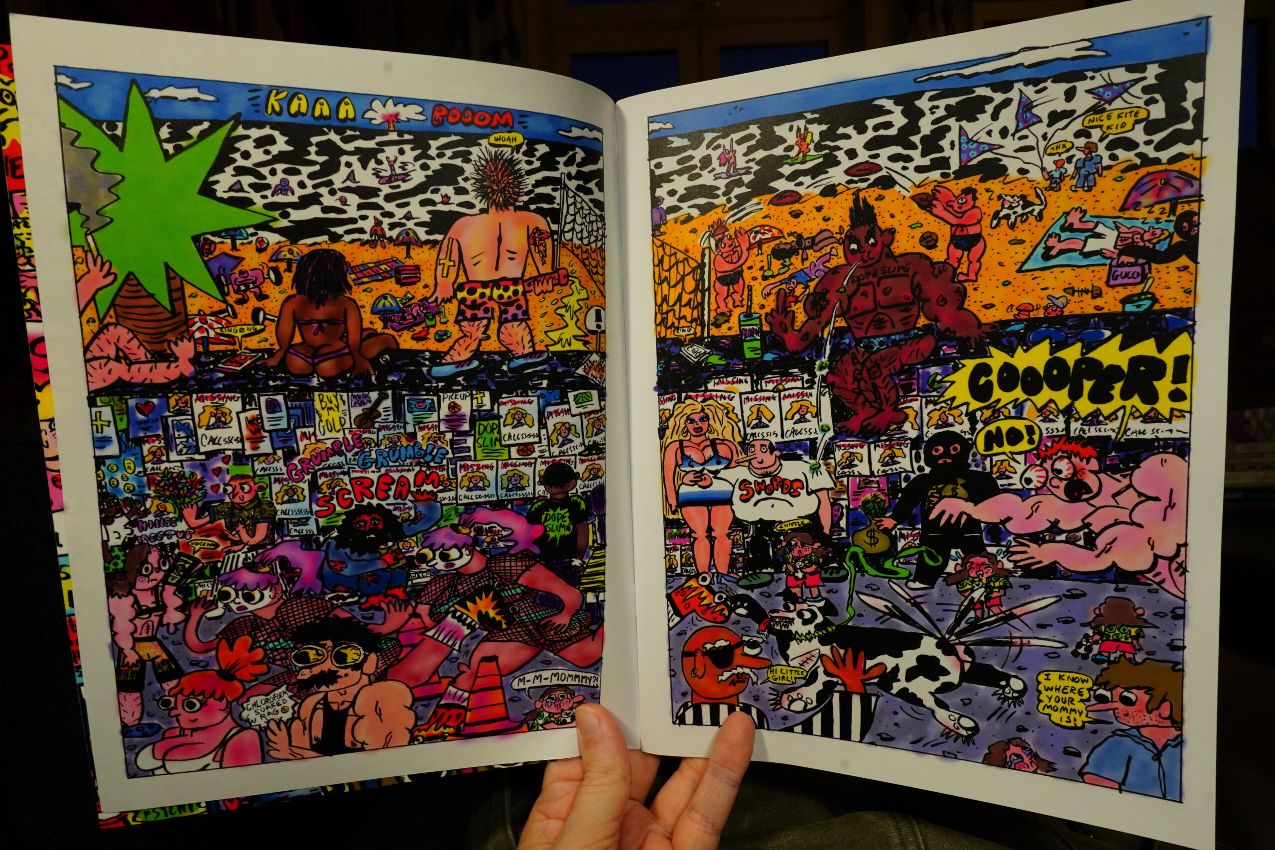
12:16: The Fiery Crown by Charles Cutting (Dice Comics)
Gosh Comics has a sale going on now. Lots of interesting stuff at extremely low prices.
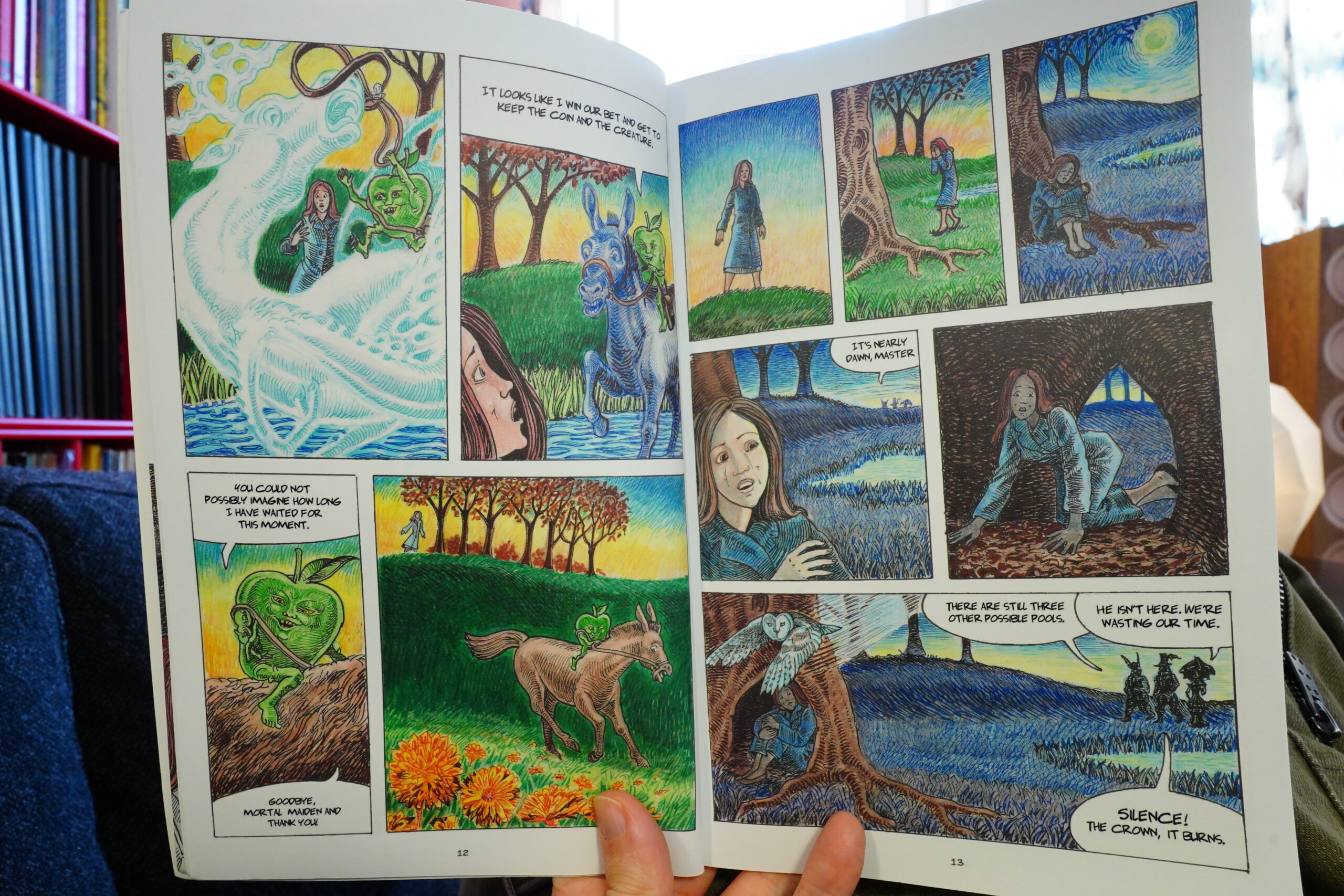
I really like the way this is drawn. Is it coloured pencils and crayons? It’s extremely attractive.
The story is quite exciting, too, but the dialogue is a bit… They’re bickering all the time, and that gets on my nerves quickly.
And unfortunately, the book is only the first chapter in the story — I hope there’s more coming.
| David Bowie: Aladdin Sane |  |

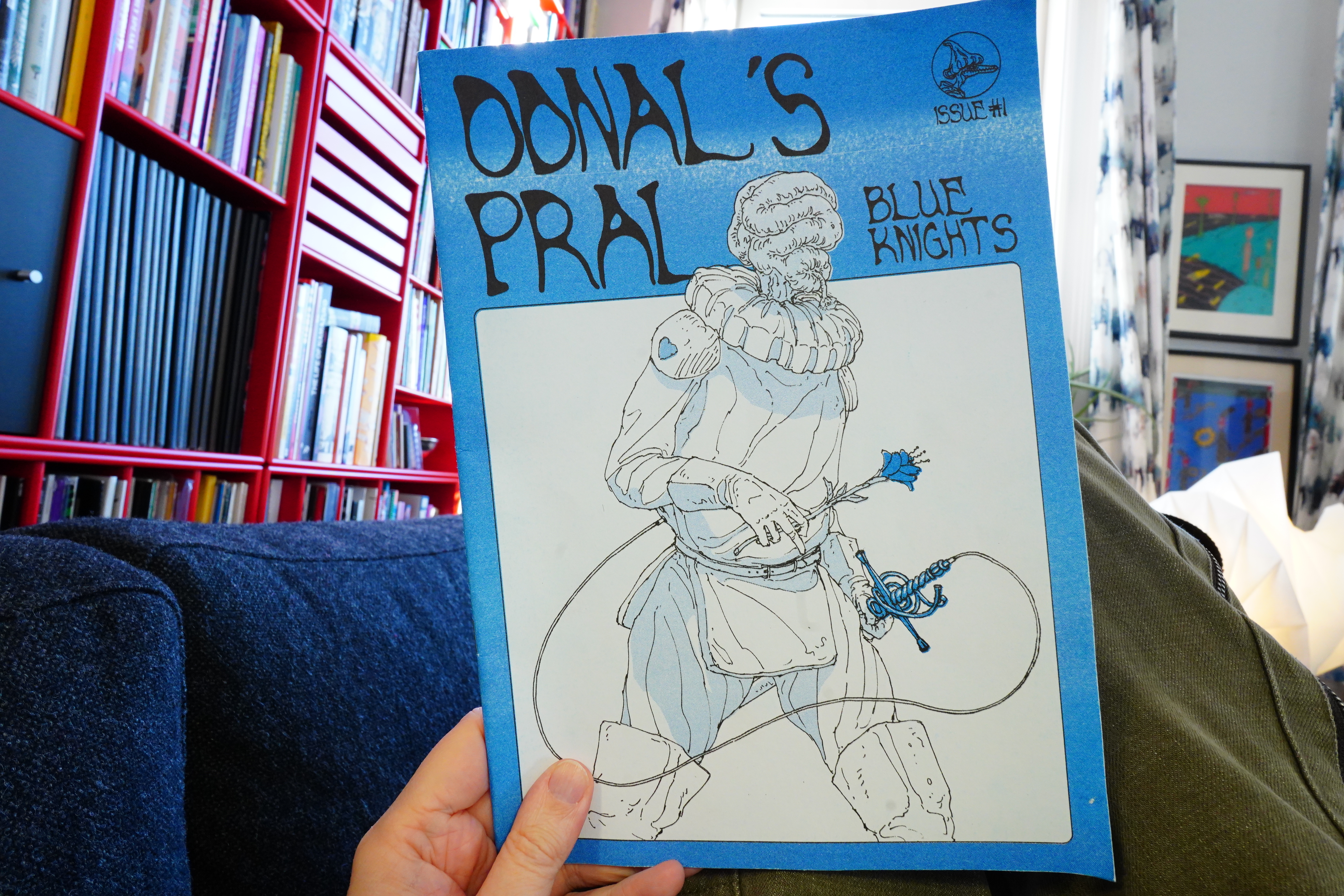
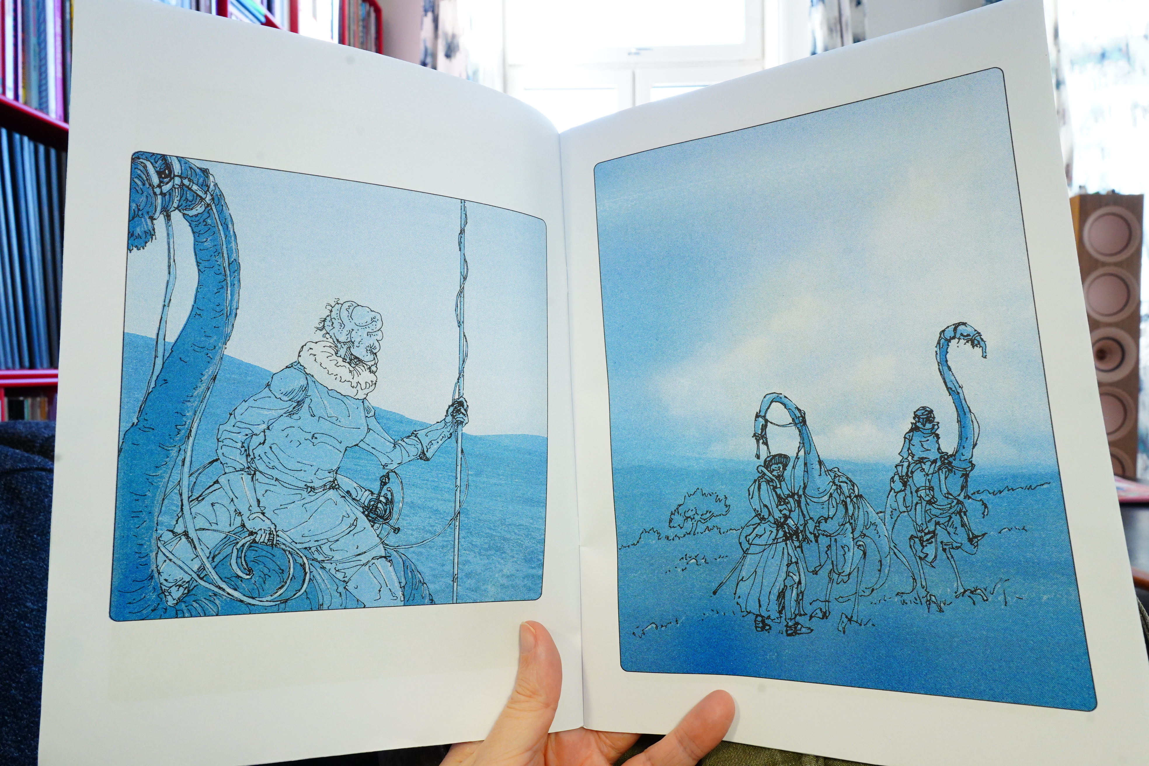
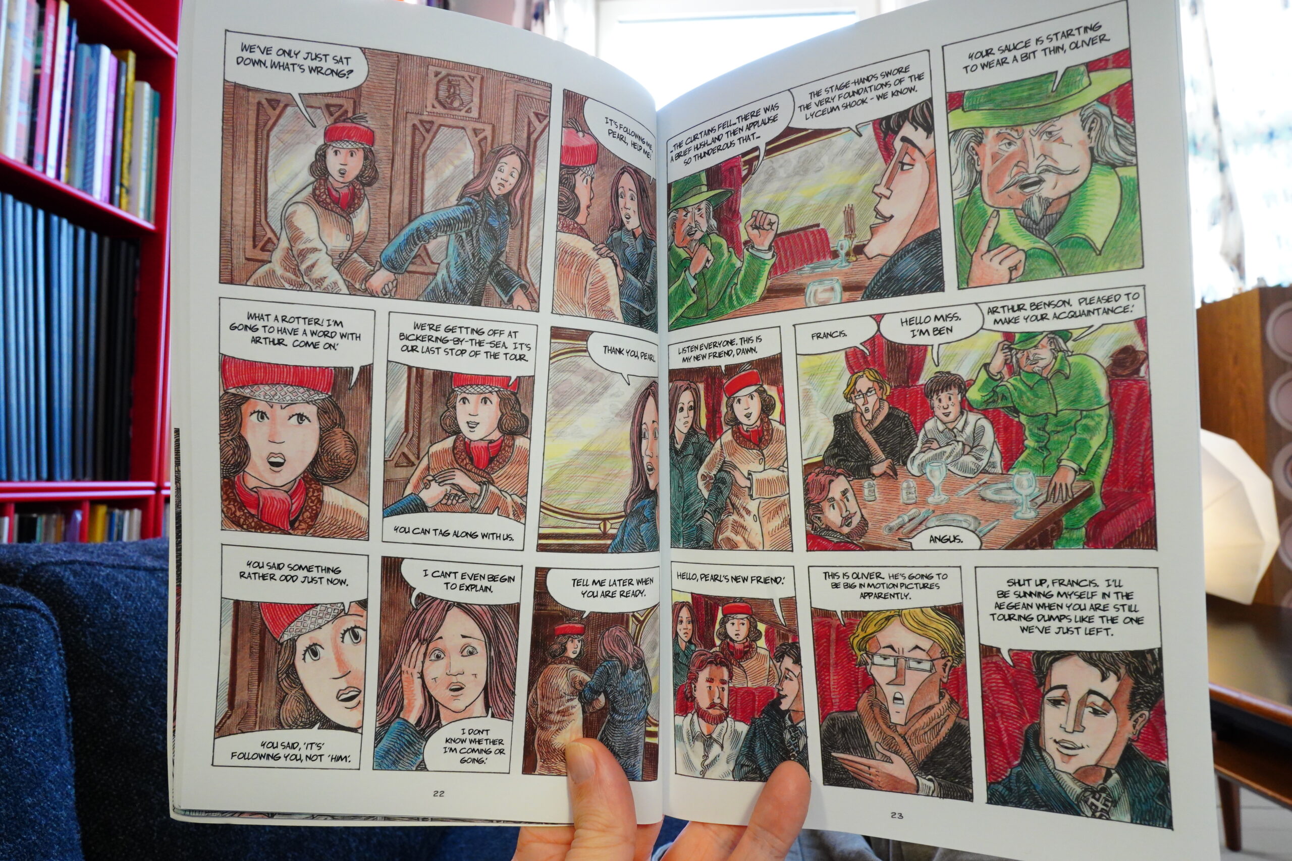
12:44: Odnal’s Pral: Blue Knights (Decadence Comics)
I didn’t just buy stuff that was on sale at Gosh, though.
I don’t think this is narrative…
I think it’s a bunch of drawings? I’m not sure, though! I like the drawings, anyway.
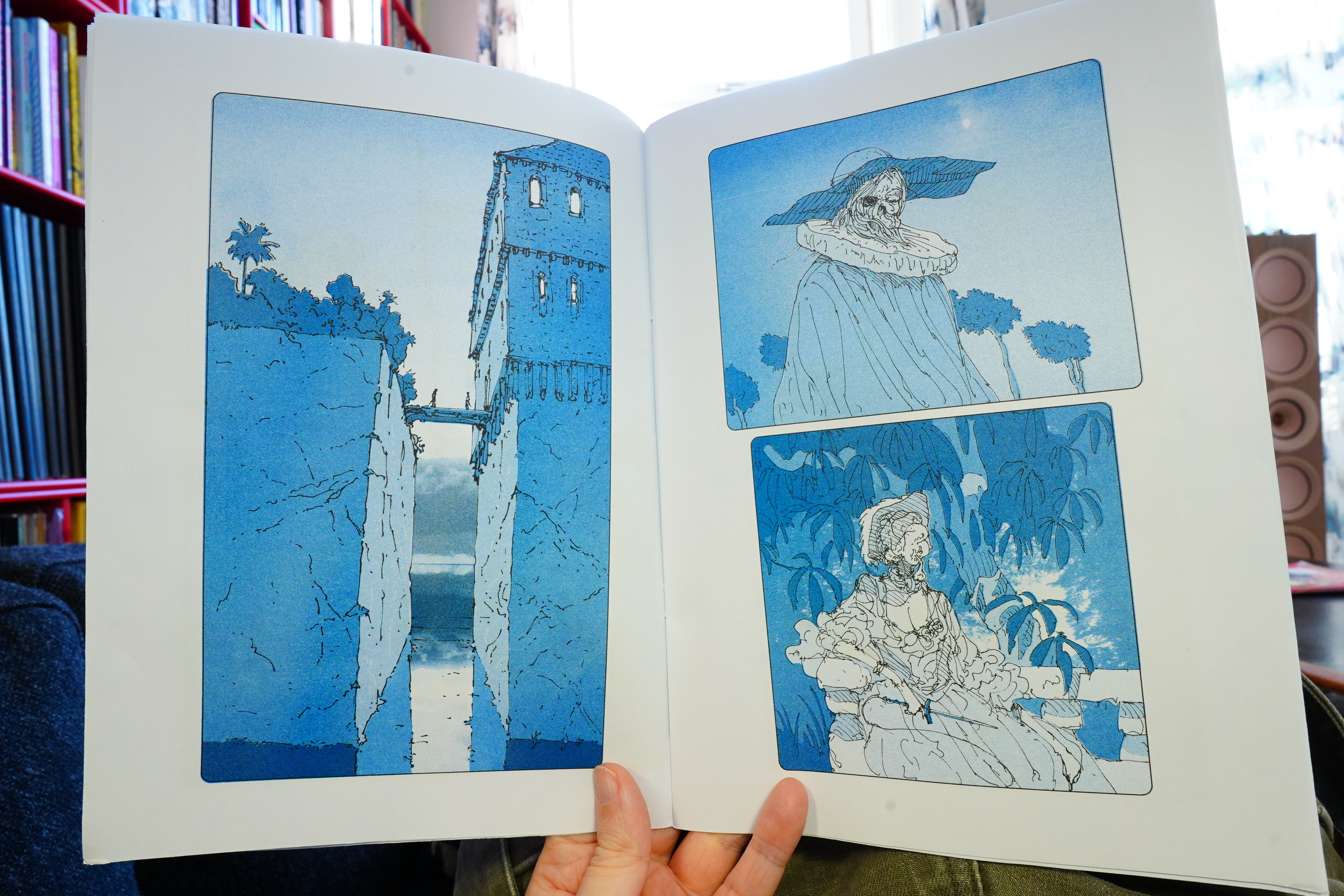
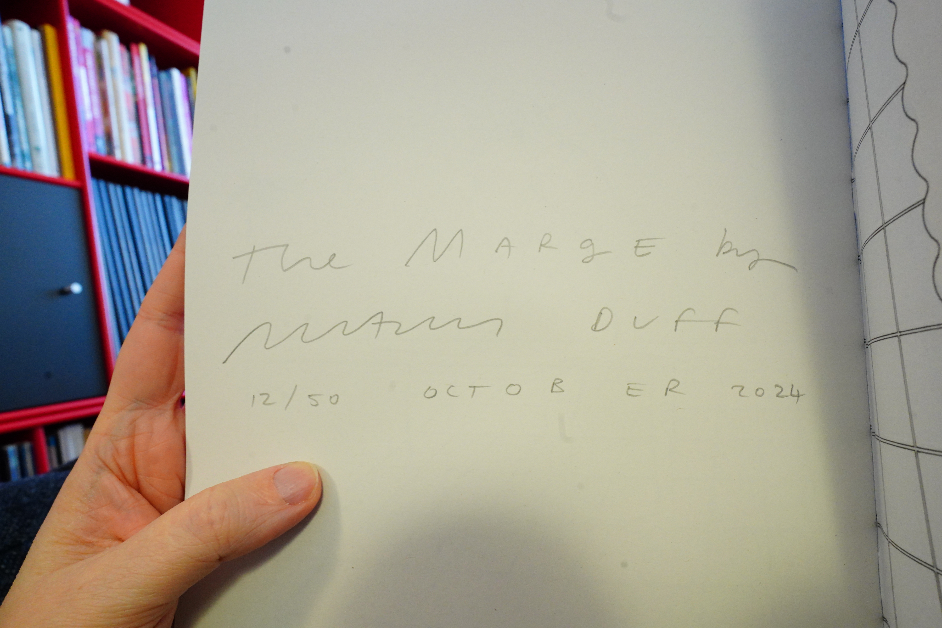
12:51: The Marge by … Duff

Mama Duff? Nathan Duff? Mamn Duff? Unaun Duff?

This is narrative…
… but very mysterious. It’s kinda hypnotic? It seems to make sense on an instinctive level? I like it.
| David Bowie: Hunky Dory |  |
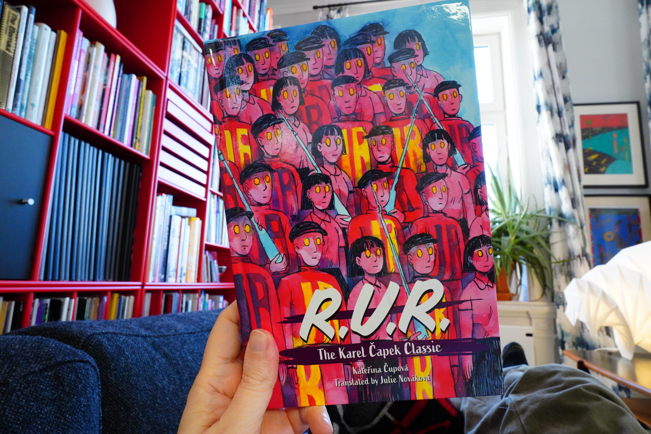
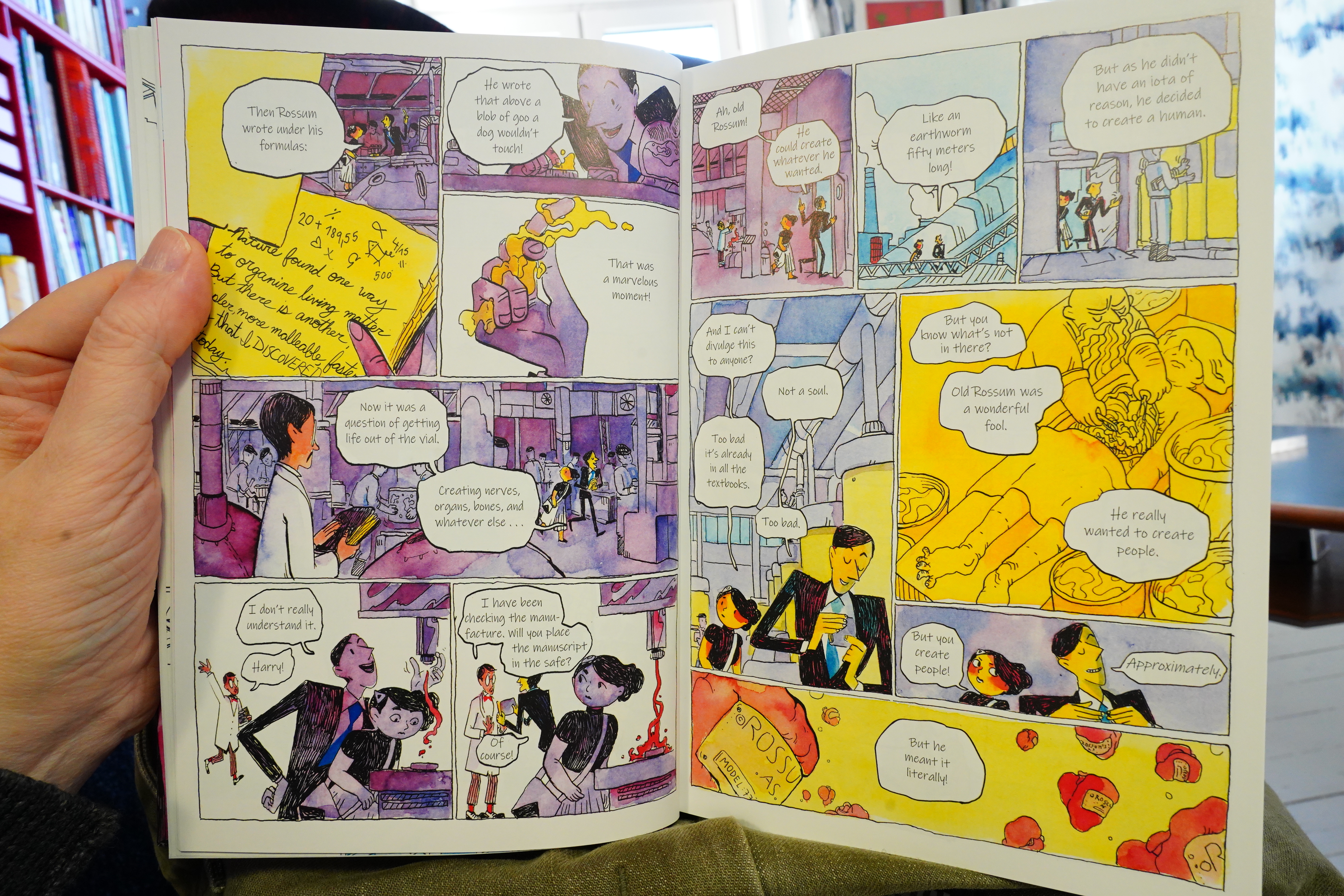
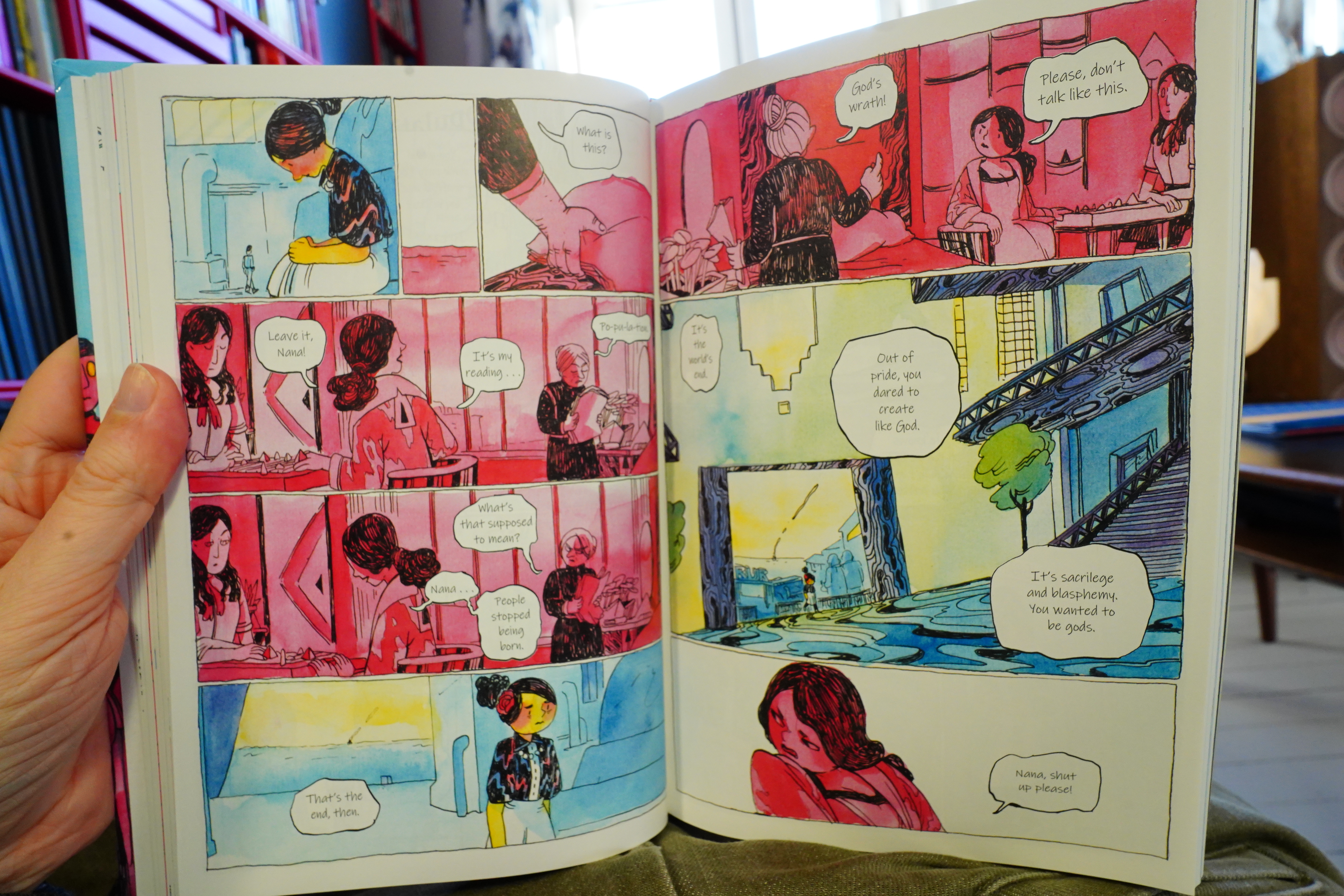
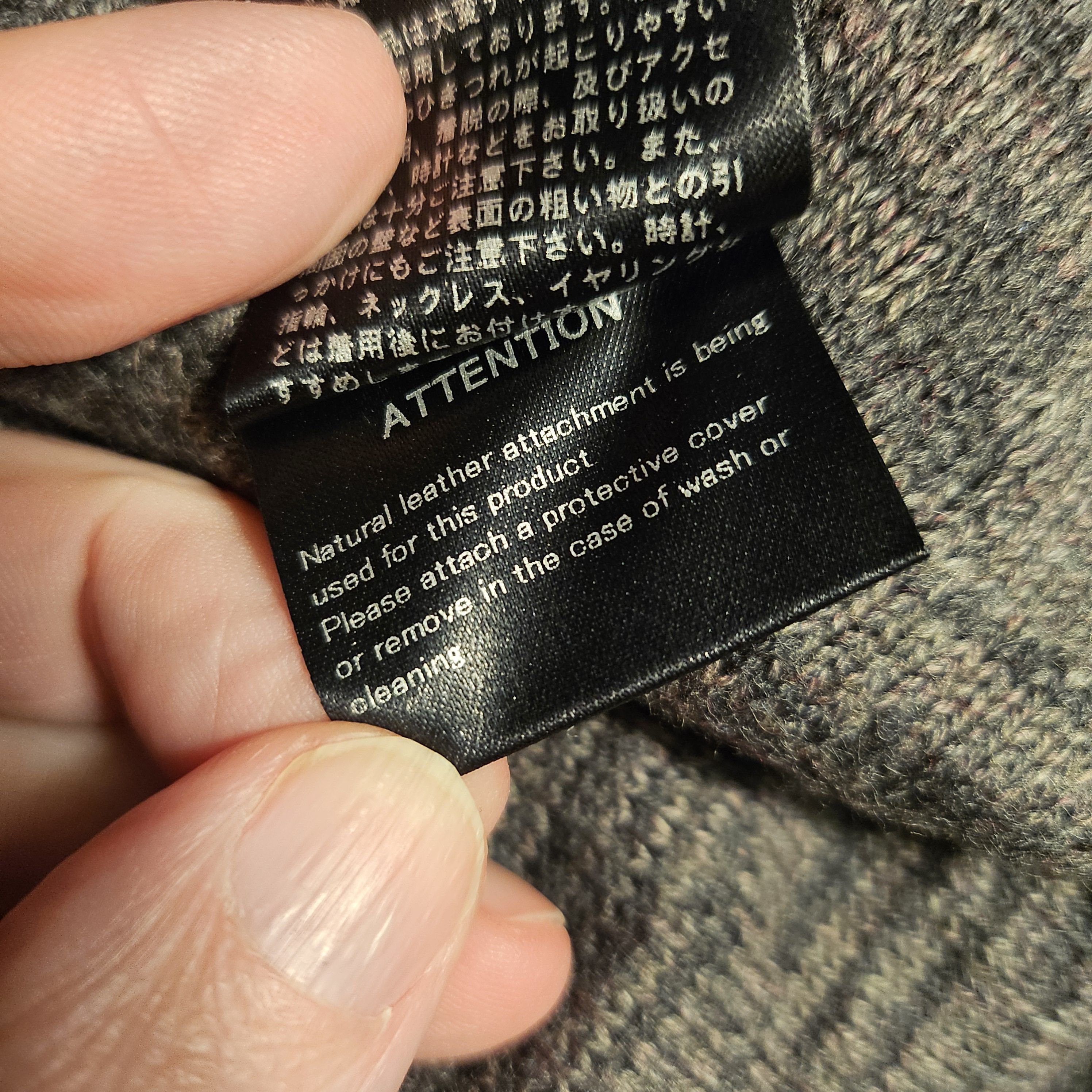
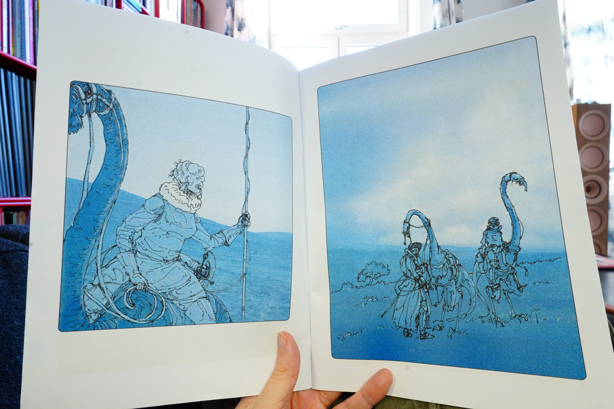
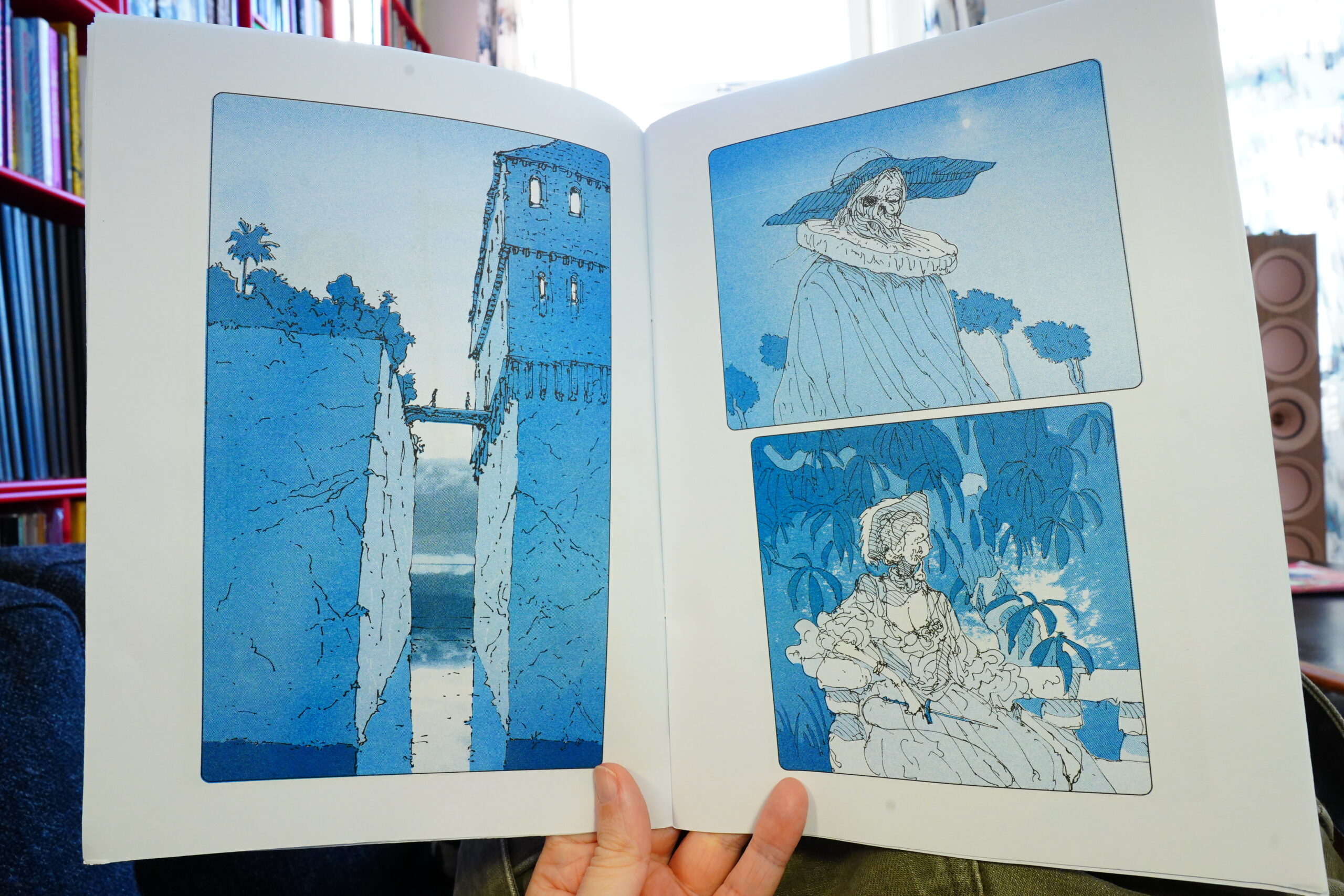
12:55: R.U.R. by Karel Čapek/Kateřina Čupová (Rosario Publishing)
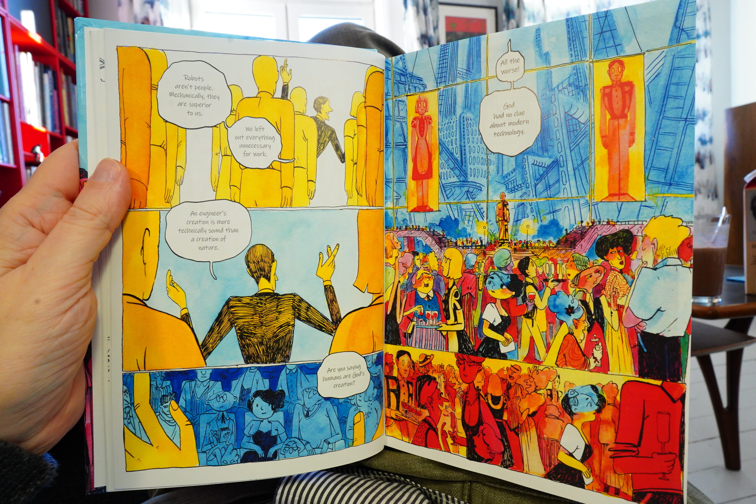
I really like the artwork…
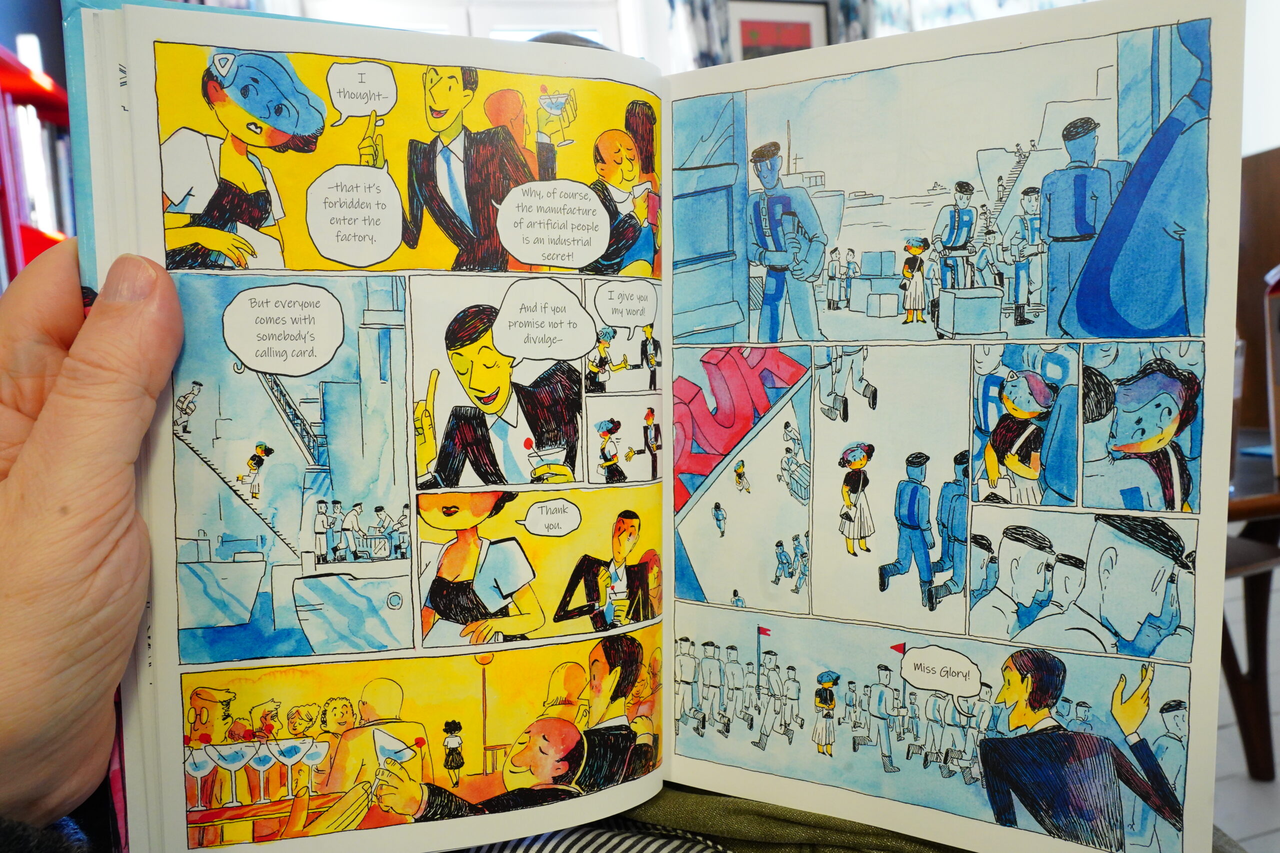
But uh uh
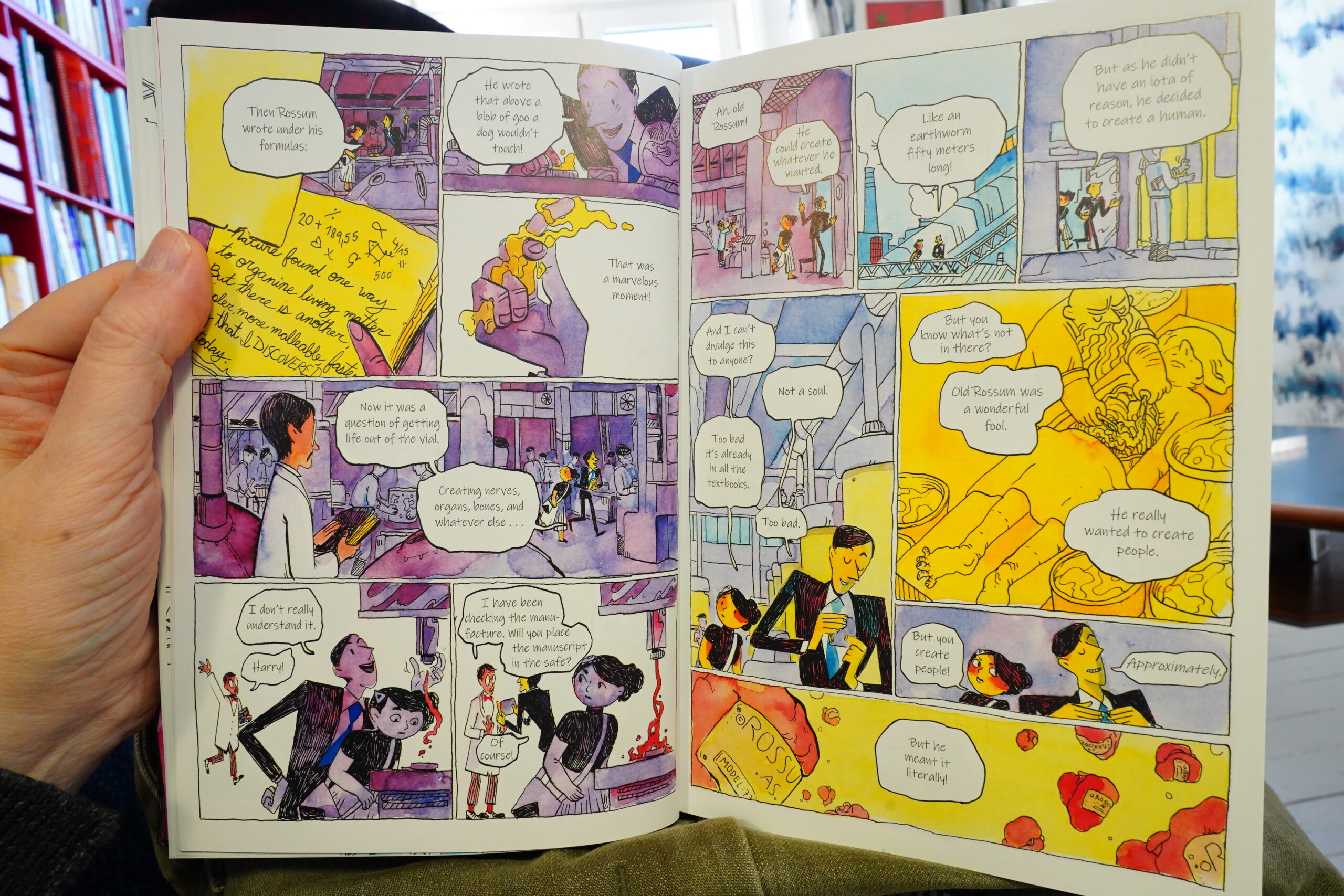
The storytelling and the writing is so awful I felt like I was having a mini stroke, so I did something I never do: I flipped to the introduction and read that. And now I understand things slightly better: This is an adaptation of the “classic” 1921 play that coined the word “robot”. I say ‘”classic”‘ because I think it’s commonly regarded as codswallop? I may be misremembering! I just remember this play usually being mentioned in overviews of science fiction for coining the term, and then they go on to say “but it’s pretty bad”.

It may also be the translation — the dialogue is so staggered and awkward. Sometimes it’s obvious that they’ve retained the original word order from the original language, and that results in that sentences little in English sense make.
I had to bail after reading one third of this. It’s a shame, because the artwork’s nice.
| David Bowie: Space Oddity |  |
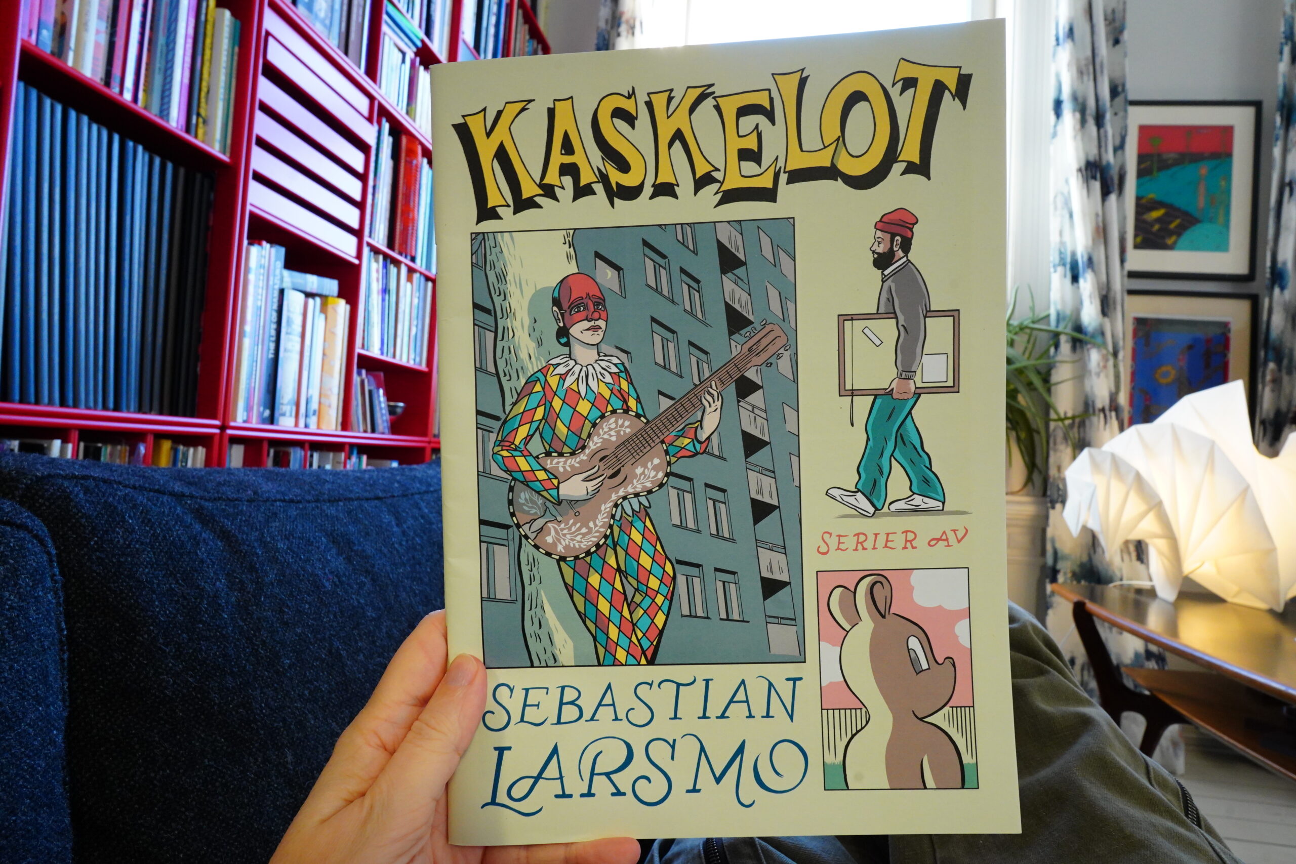
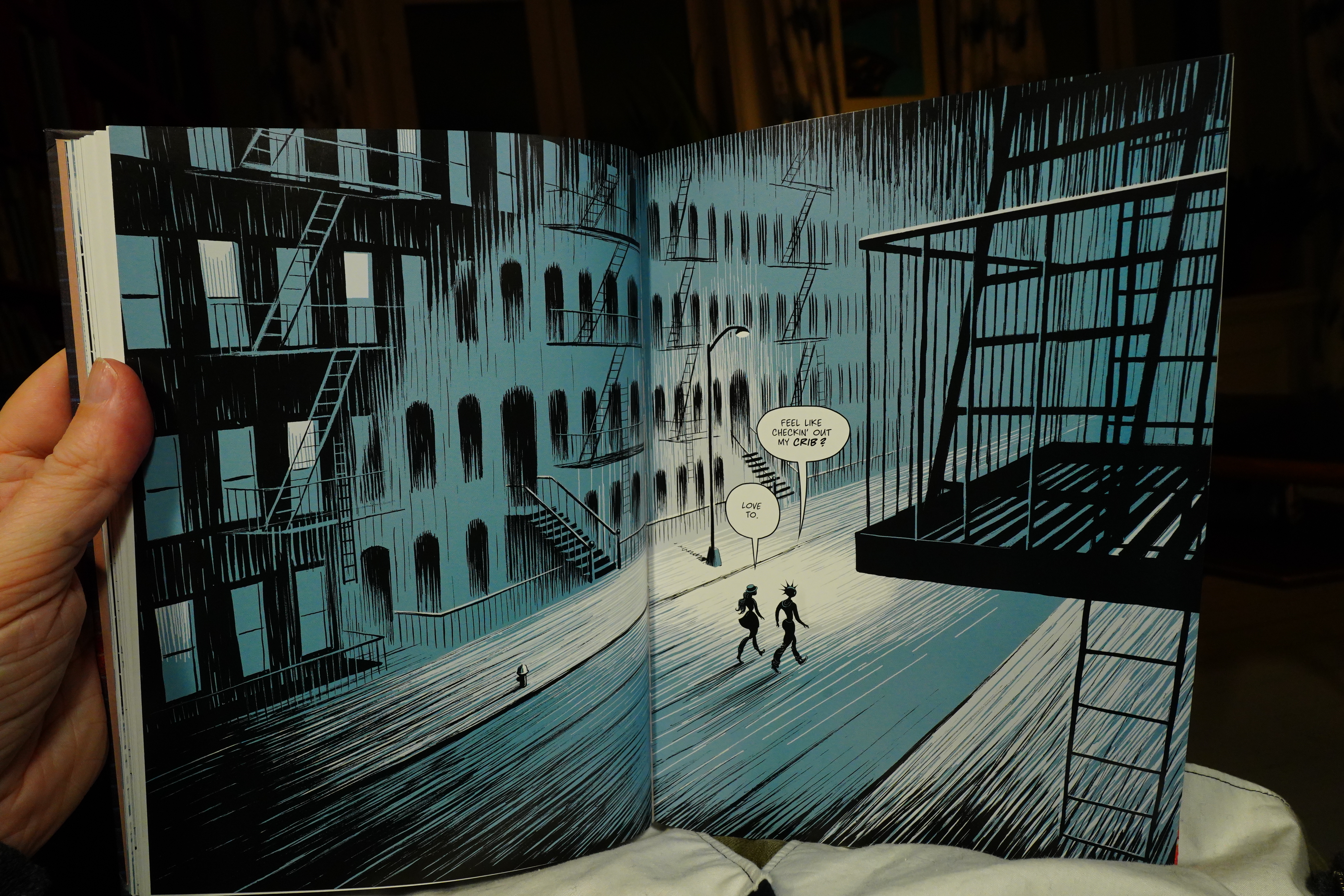
13:32: Kaskelot by Sebastian Larsmo
Well, the influences here should be pretty obvious.

Heh heh.

Oh my god, this book is so good. It’s a classic one person anthology thing — very 90s in form. It’s brilliant! Larsmo (good name, too) manages to squeeze so much emotion, humour and story into these pages.
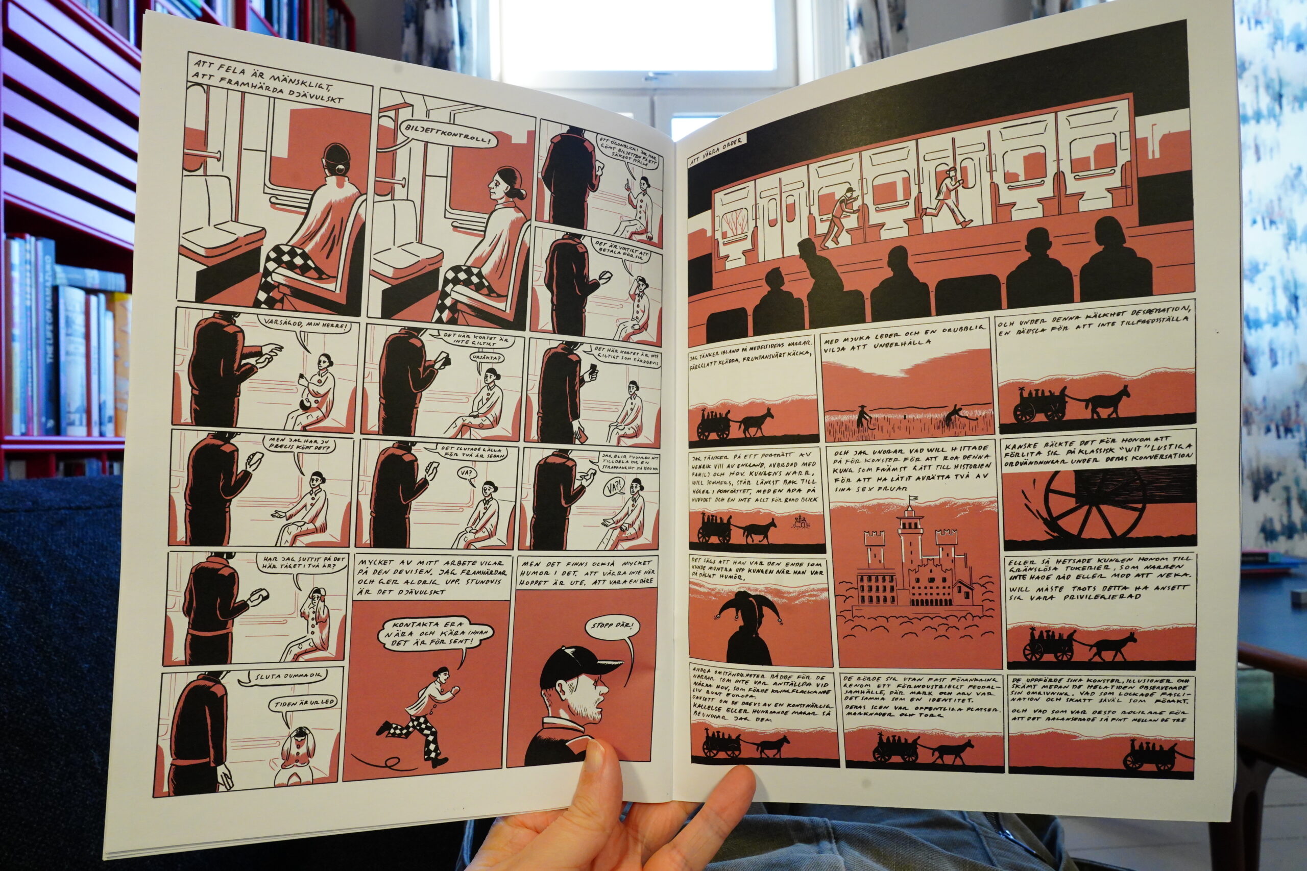
This book is sheer genius. It feels so rich and smart… and also somewhat unnerving? Publishers should license this book for publishing in All The Languages, because more people should have a chance to read this. It’s just that good.
| David Bowie: The Rise and Fall of Ziggy Stardust and the Spiders From Mars |  |

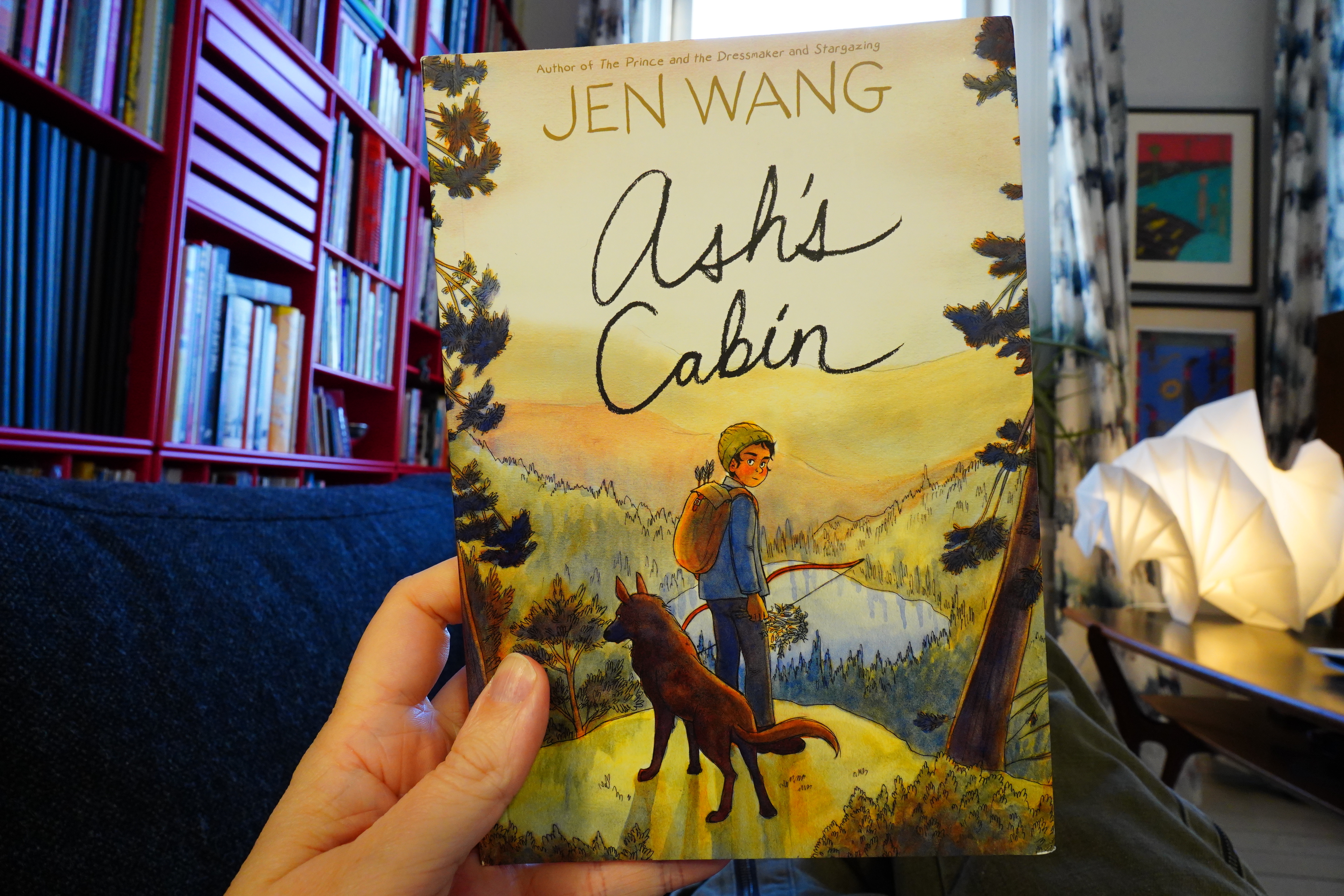
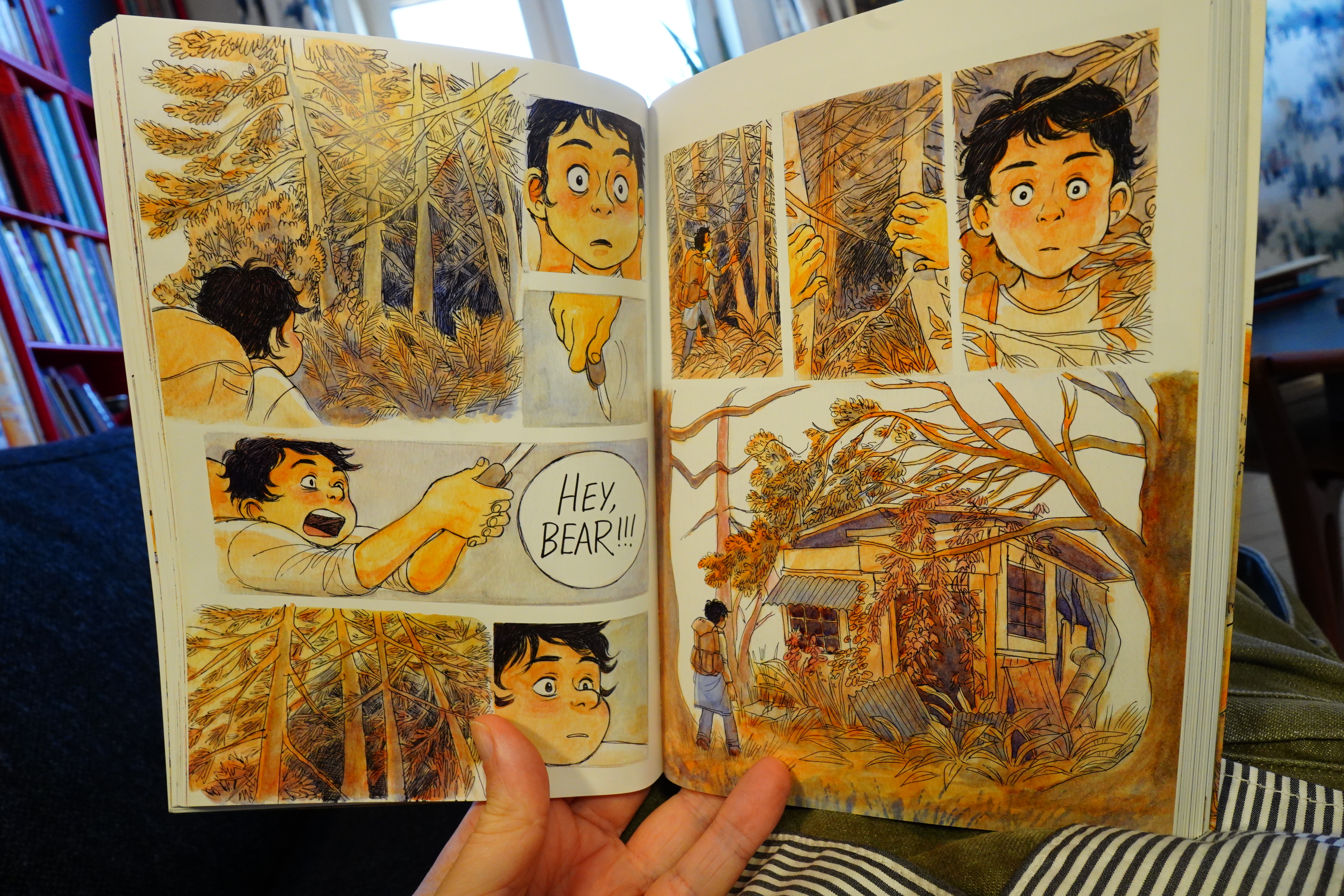
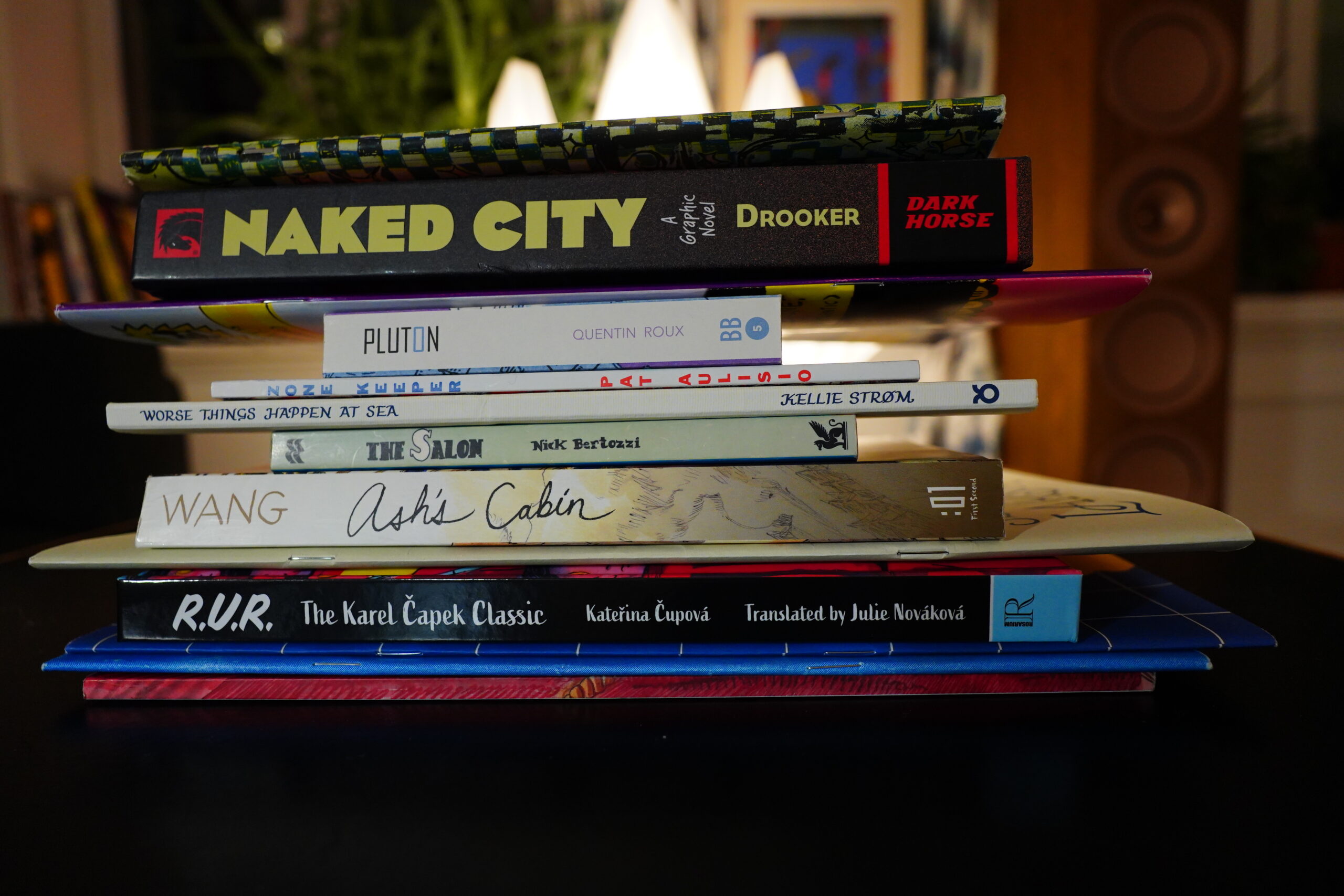
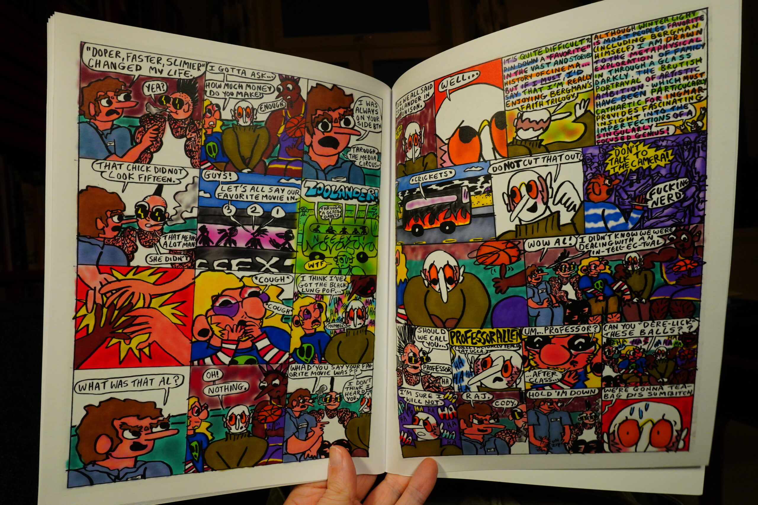
14:18: Ash’s Cabin by Jen Wang (First Second)

Oh, right, I bought this because it was on the TCJ 2024 Round Up. I usually avoid books from First Second — they have a tendency to feel like they’ve had all life edited out of them.
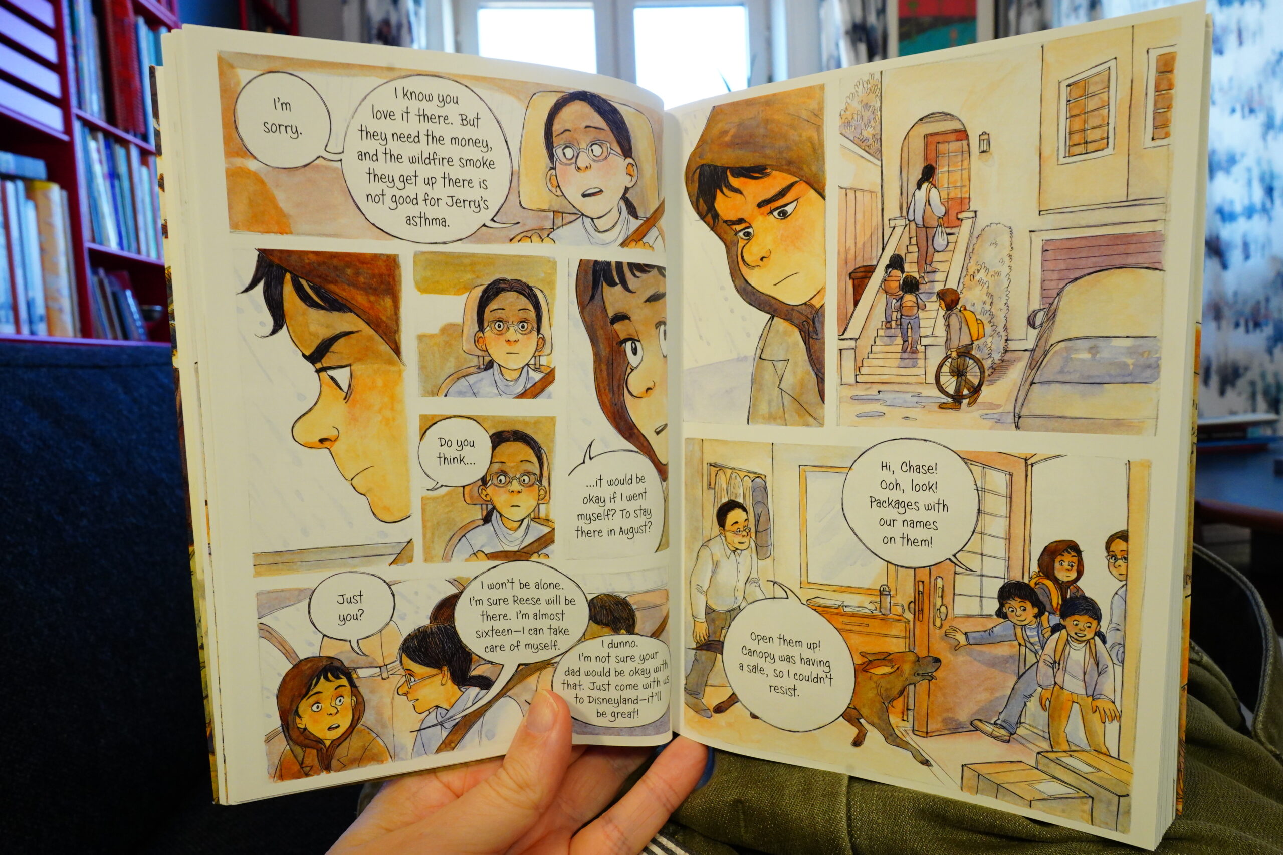
It flows pretty well… the artwork’s cute, but that’s almost a problem here: I thought the kid was supposed to be seven years old or something, but nope: Fifteen.
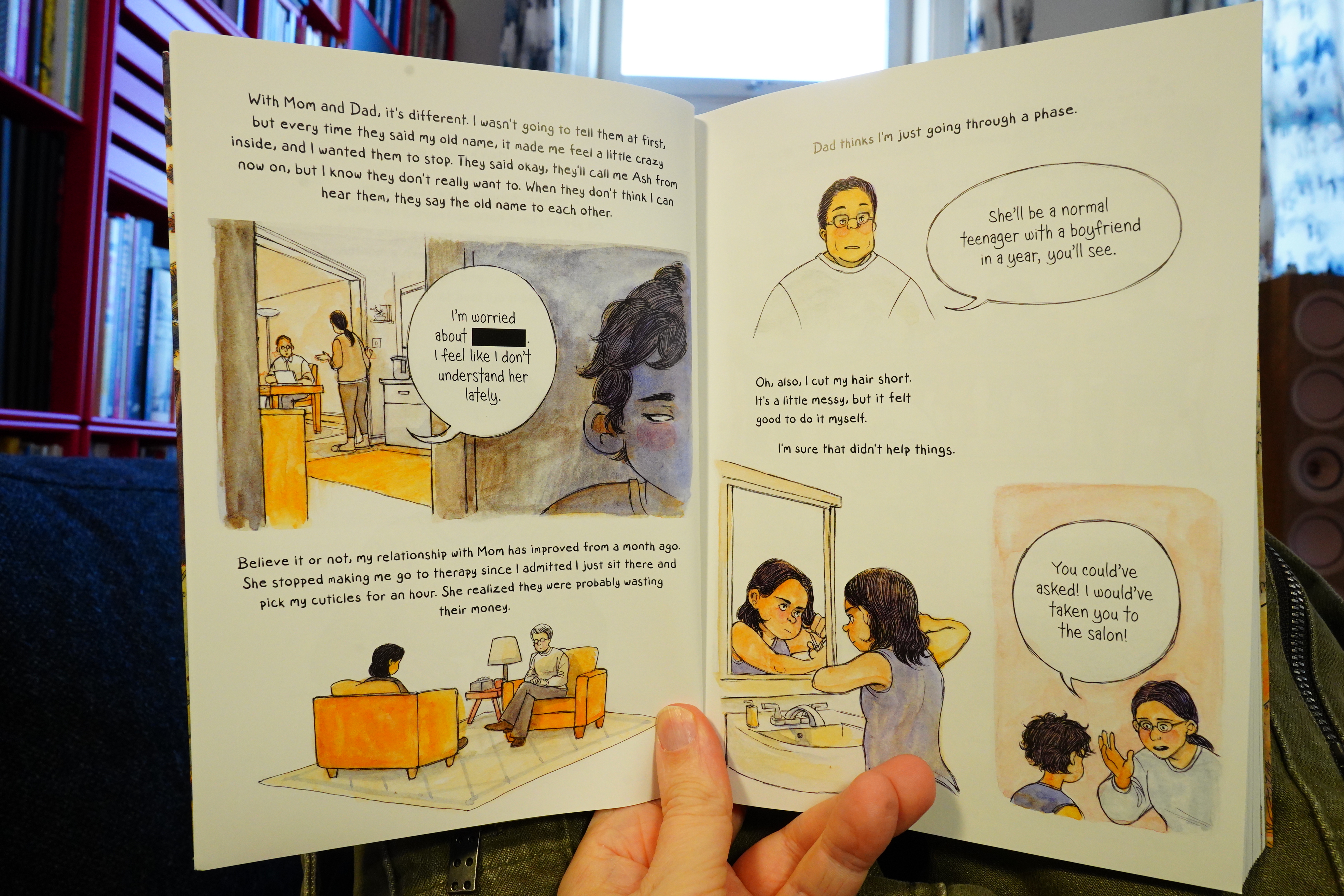
The more text-based sections aren’t all that exciting.
And the limited colour palette is a major problem. I know, I know, if you want to signal that you’re doing a Serious Graphic Novel, you have to restrict the colours you use these days. But the choices here are just bizarre: Blues to oranges? It makes even the salads look like poison.
Oh, and I didn’t mention that most of this takes place in the woods? That are all orange, because Green Ist Verboten? It’s all very symbolic I’m sure.
Anyway, it’s a pretty good read on the whole, but you do want to strangle the kid. So inconsiderate!
| David Bowie: The Rise and Fall of Ziggy Stardust and the Spiders From Mars |  |

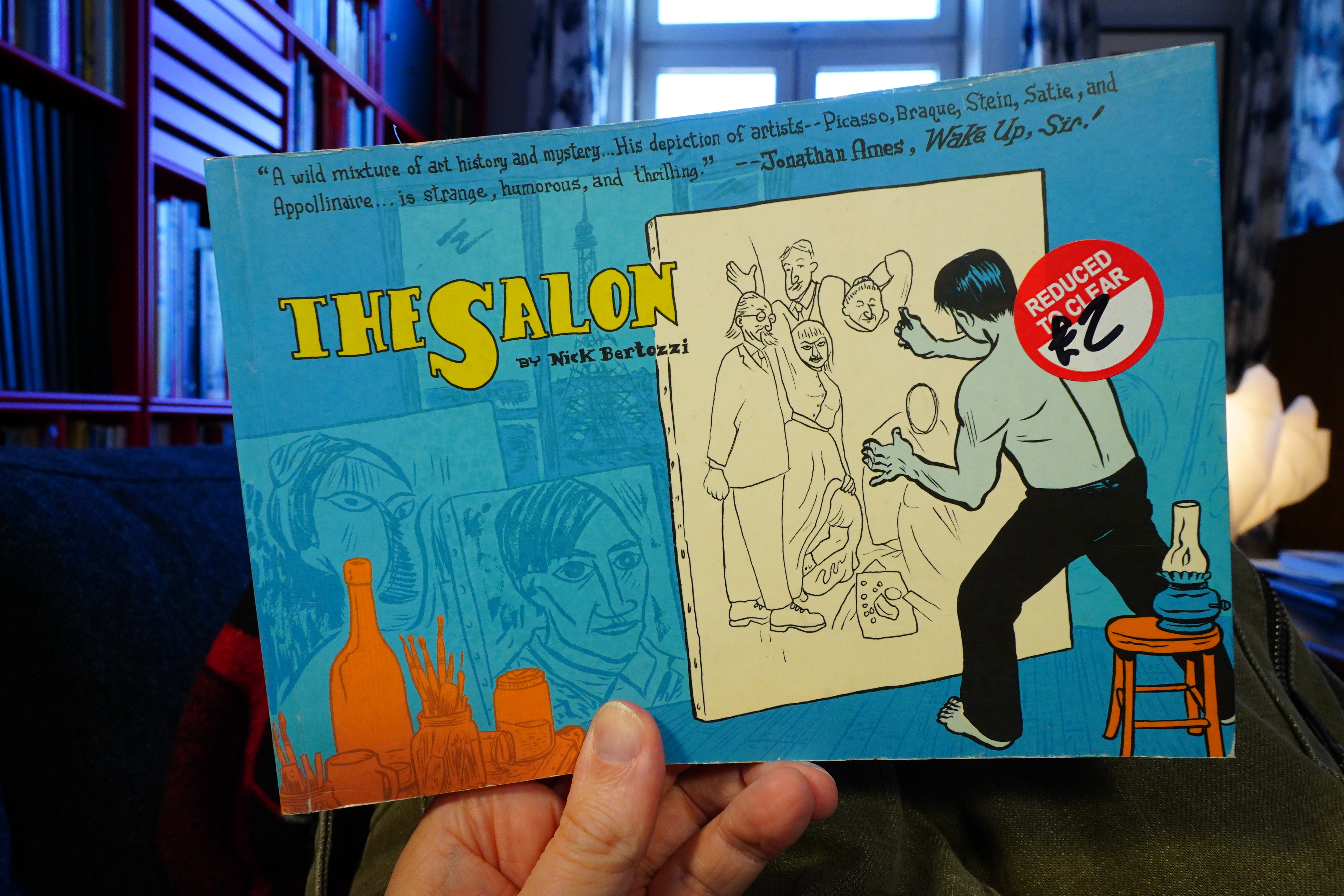
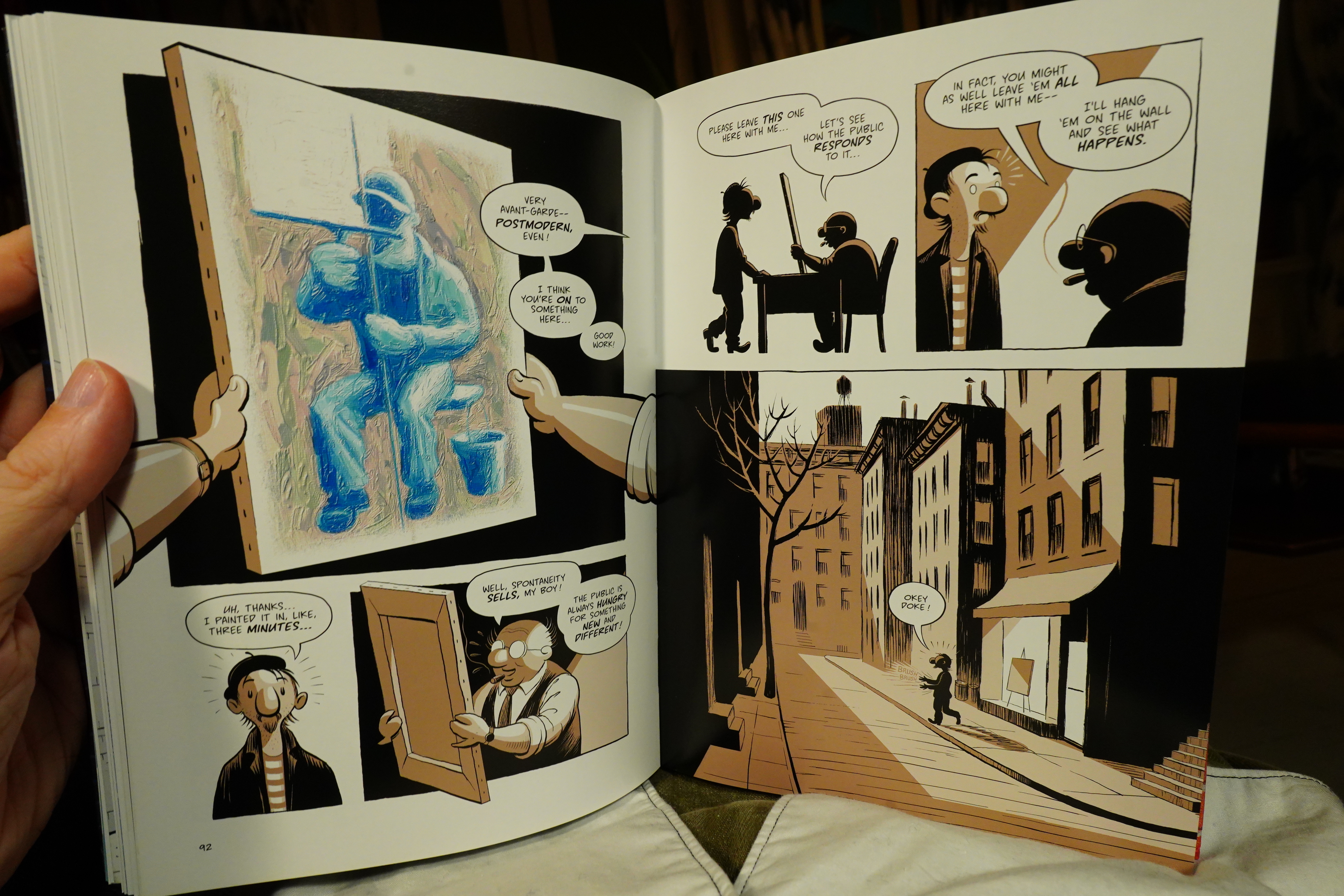
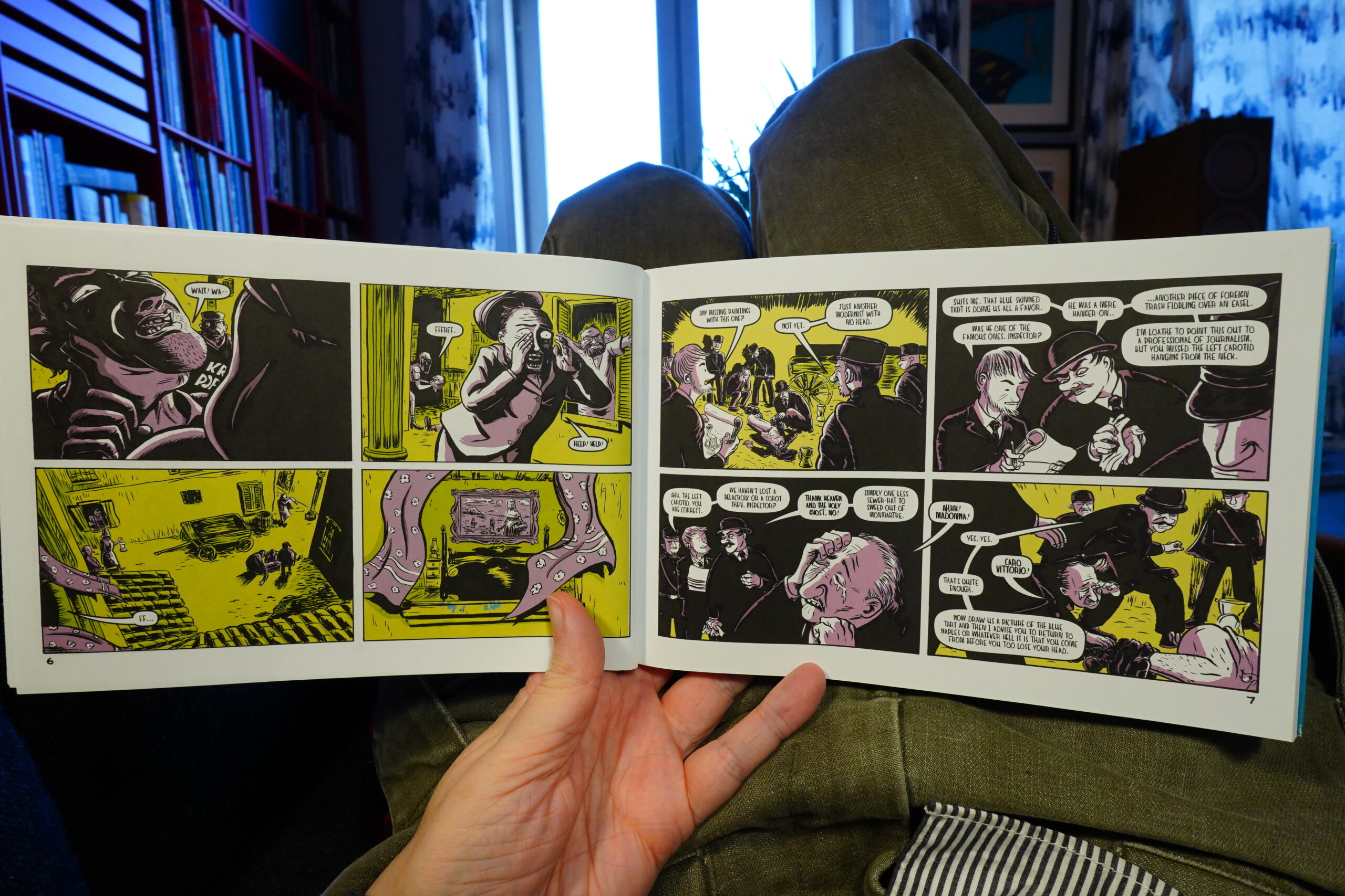
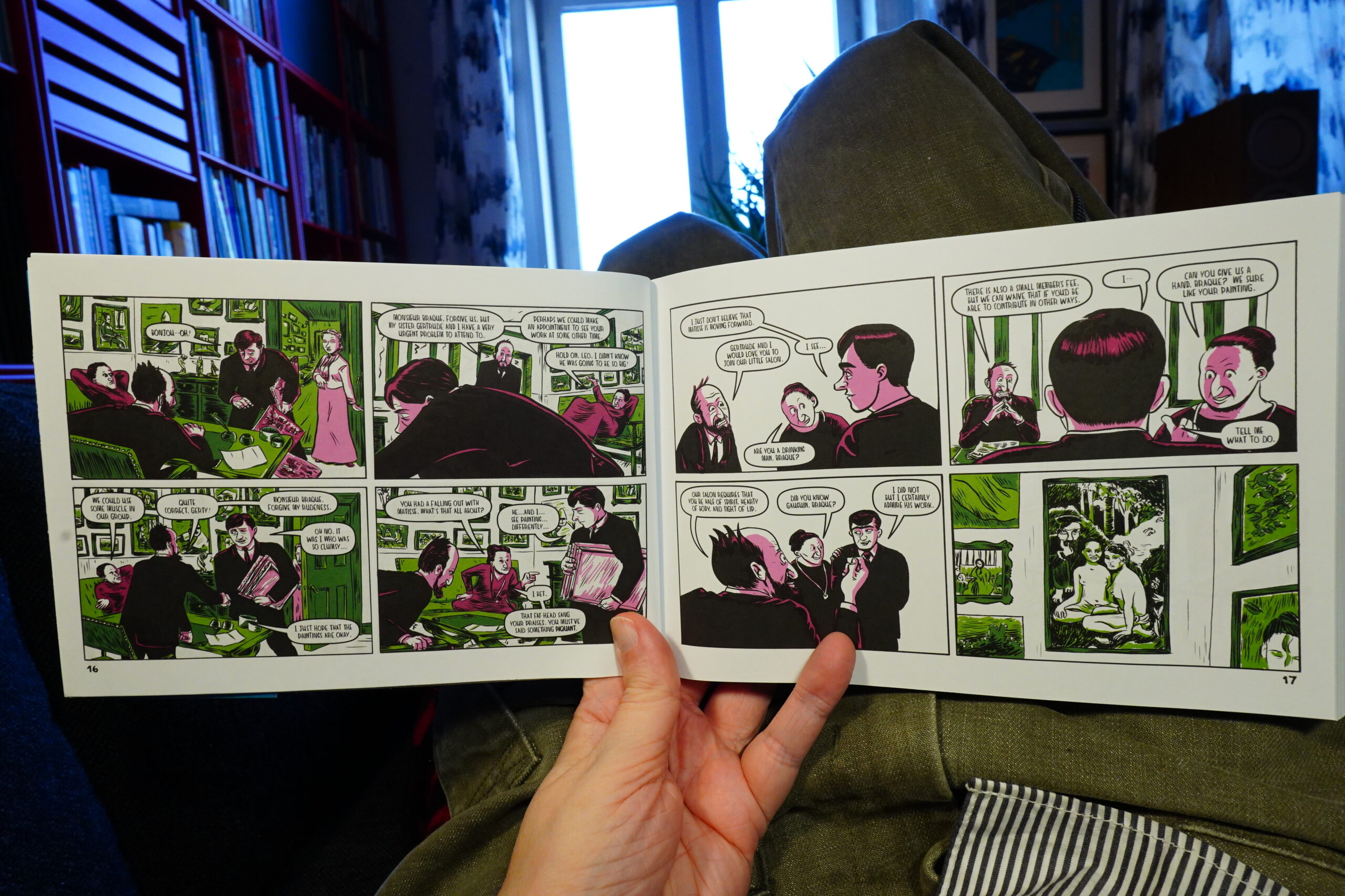
15:08: The Salon by Nick Bertozzi (St. Martin’s)
I may have read this book from 2007 before? But I don’t think so? I feel like perhaps the first part of this was published in an anthology, or perhaps as a floppy, or something… Anyway, look at that price! I couldn’t resist.
But now that on my couch and not standing in Gosh Comics, lemme do some research… Oh yeah, it was serialised in one of those anthologies? Superior Showcase or Triple Dare? No!
The Comics Journal #286, page #95:
Nick Bertozzi’s The Salon — a fantasy/
comedy/mystery starring the likes of
Pablo Picasso, Gertrude Stein and Georges
Braque — was a noteworthy work long be-
fore being published this spring by St. Mar-
tin’s Press. A brief sequence from Bertozzi’s
graphic novel that featured a naked, ranting
Picasso was included in a freebie anthol-
ogy published by Alternative Comics; while
the scene was hardly erotic, the nudity was
enough to send an outraged parent to the au-
thorities when his son received the comic in
a Georgia shop as a leftover giveaway from a
Free Comic Book Day promotion. The Owner
of the shop, Gordon Lee, has been defended
by the Comic Book Legal Defense Fund ever
since being charged by the state with seven
counts of distributing materials harmful to a
minor.
Oh, wow.
Still don’t know whether I’ve read this before, but I’m going to read it now, anyway.
No! I have not read this before! Weird… I mean, you’d think this would have popped up somewhere during the past two decades before.
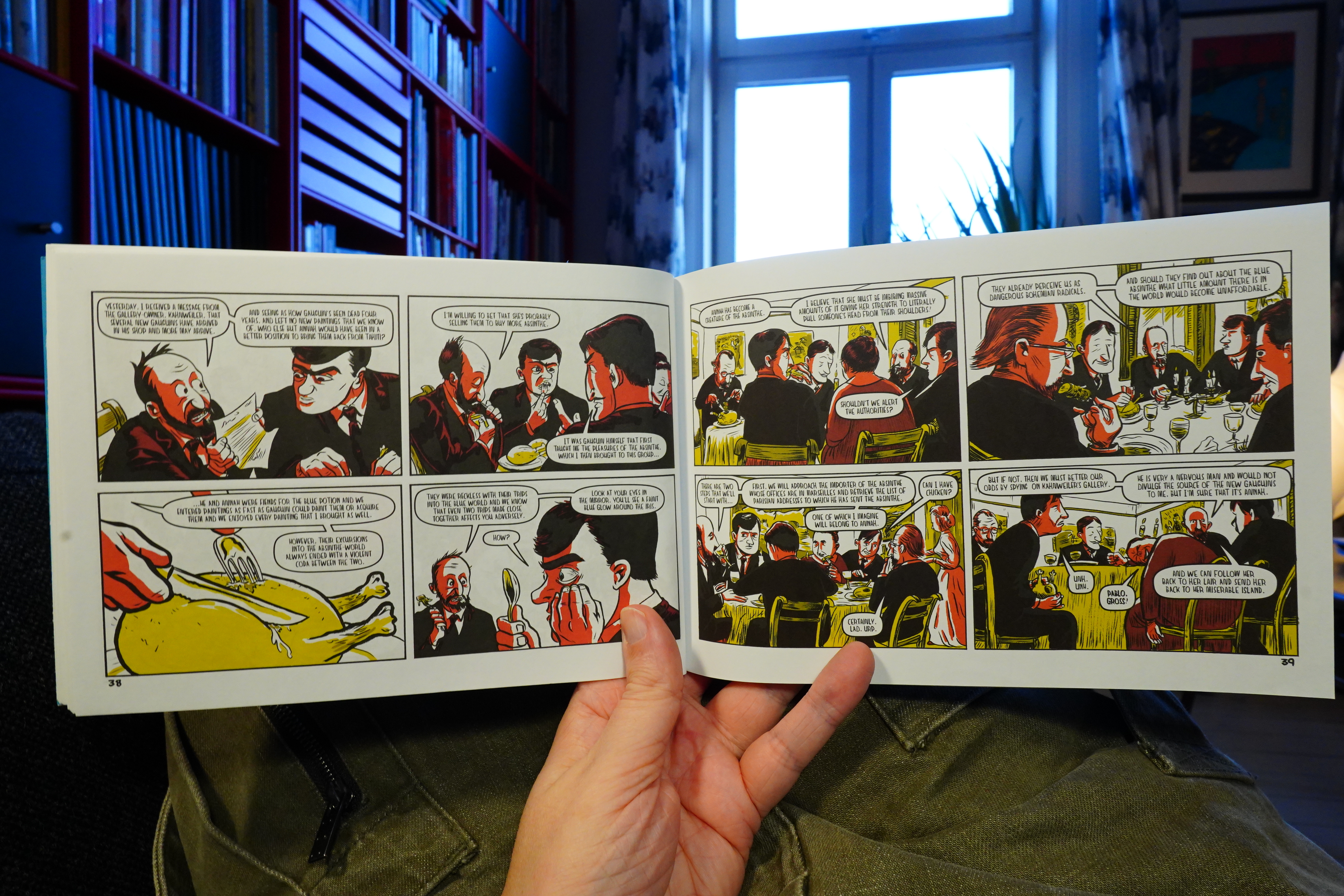
Or perhaps not. This is wild — it tries to do such a lot, and I’m not sure it’s completely successful?
| David Bowie: Station to Station |  |

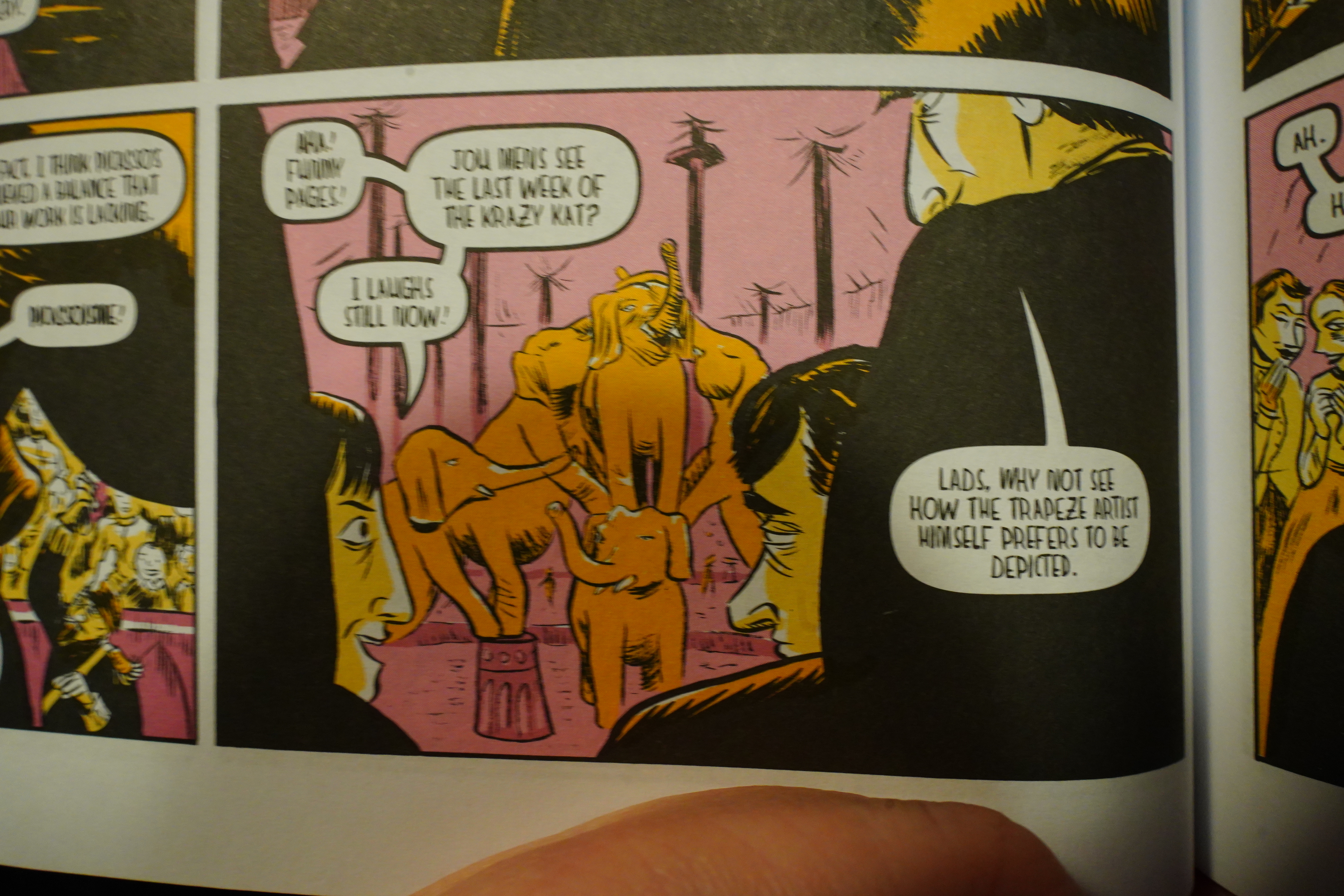
I mean, the artwork’s class as always with Bertozzi — very lively and engaging. But this book is mainly about a supernatural absinthe that allows you to enter paintings, and then there’s a murderous monster that’s been created from the absinthe paint, and there’s an investigation and a heist or two, and that’s all fun and stuff. But at the same time this is all going on, we also get a very, very didactic introduction to how Cubism came to be, and we follow Braque and Picasso during their discussions. And we also get to see Gertrude Stein’s salons, and her spat with her brother, and Alice B. Toklas is sort of a villain, and what I’m saying is that it’s just a lot. It’s a lot. It’s a mess.
| David Bowie: Young Americans |  |

And there’s also special pleading for comics as inspiration, because why not.
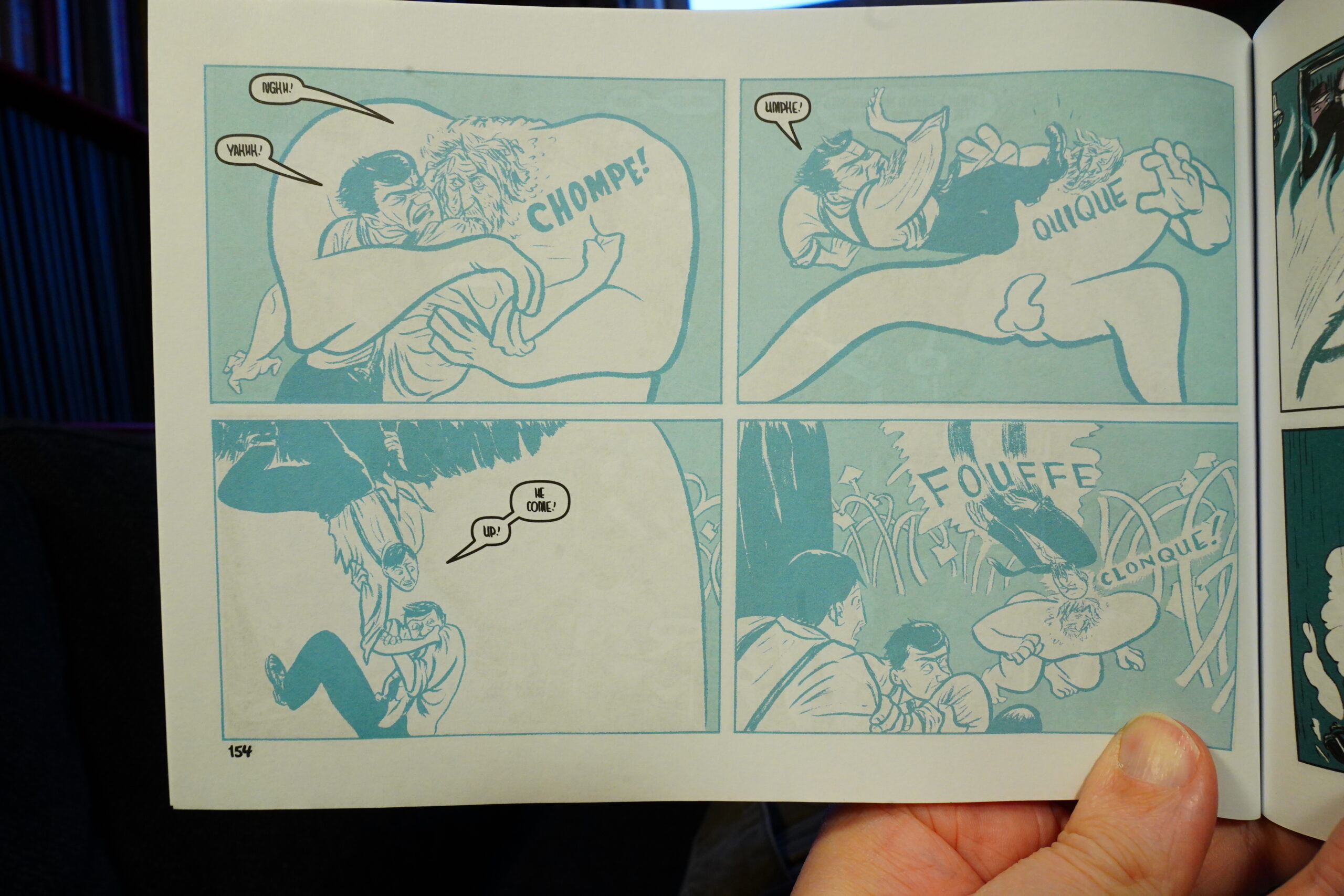
And of course all the sound effects are spelled in “French”, because why not.
It goes for both zany and didactic at the same time, but it ends up just being exhausting.
This seems to be the last book Bertozzi has written? But he’s illustrated a number of books that have names like “Becoming Andy Warhol”, “Shackleton: Antarctic Odyssey”, “Jerusalem: A Family Portrait” and “Lewis & Clark” (I’ve read that one).
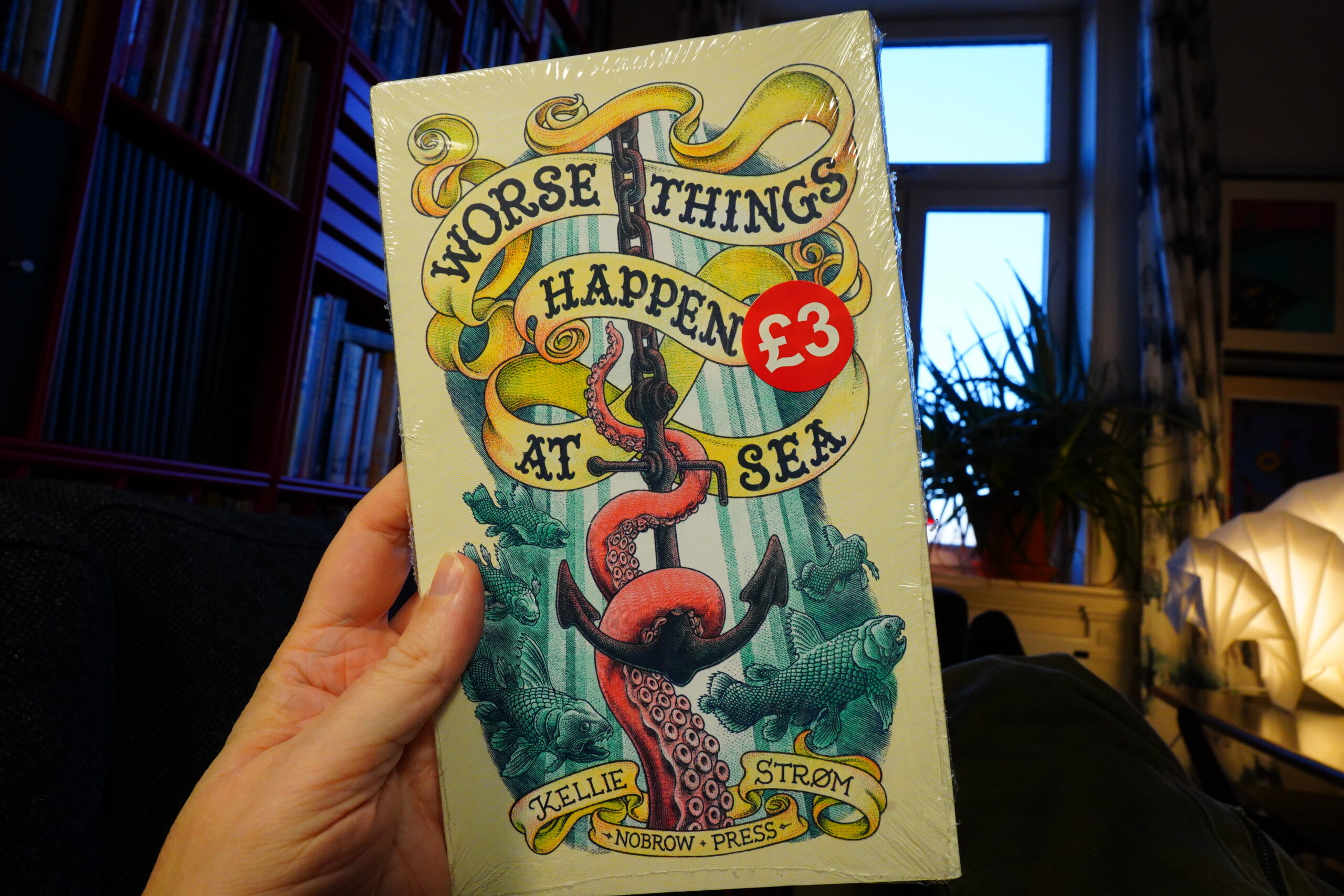
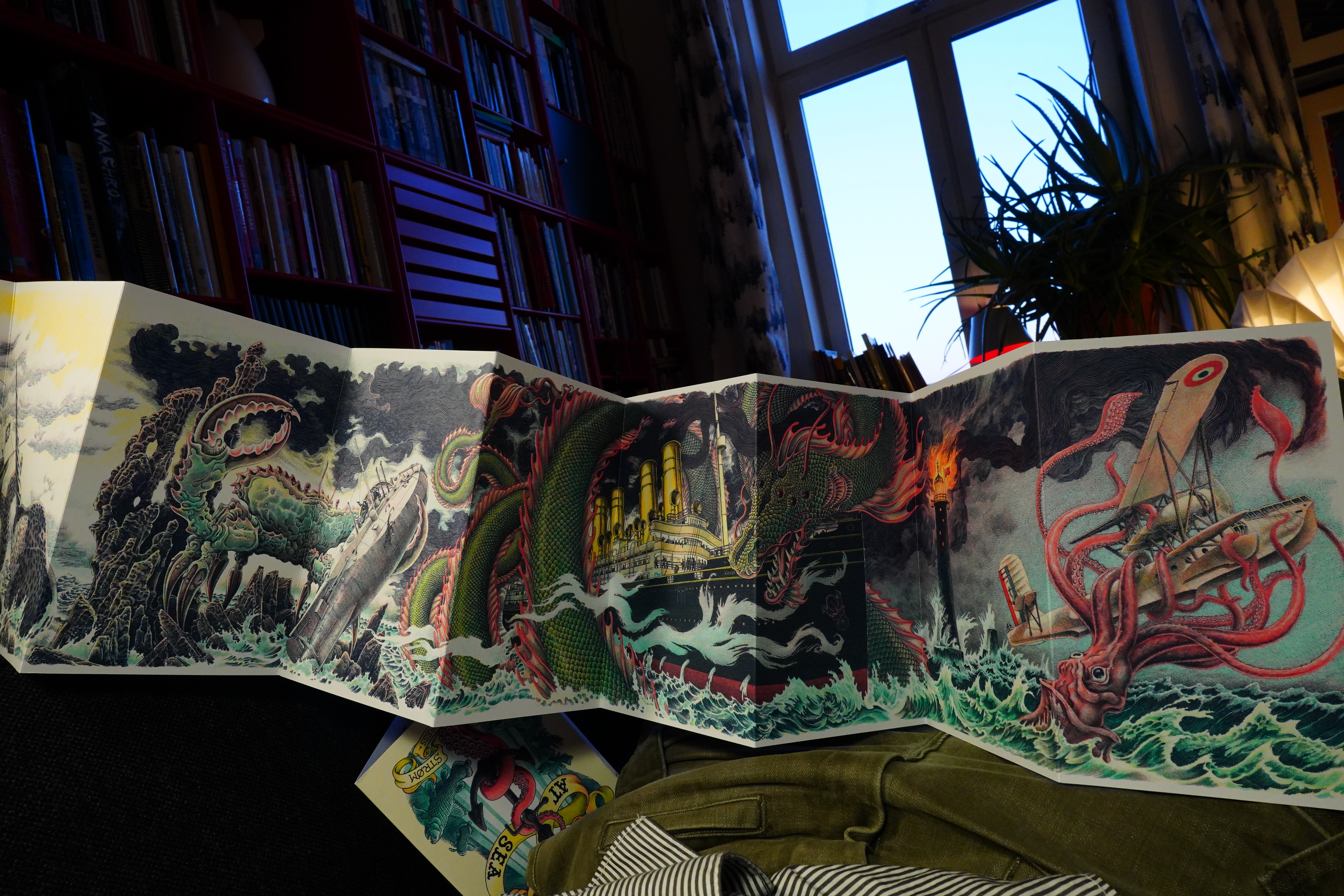
16:42: Worse Things Happen At Sea by Kellie Strøm (Nobrow Press)

Heh, that’s cool.
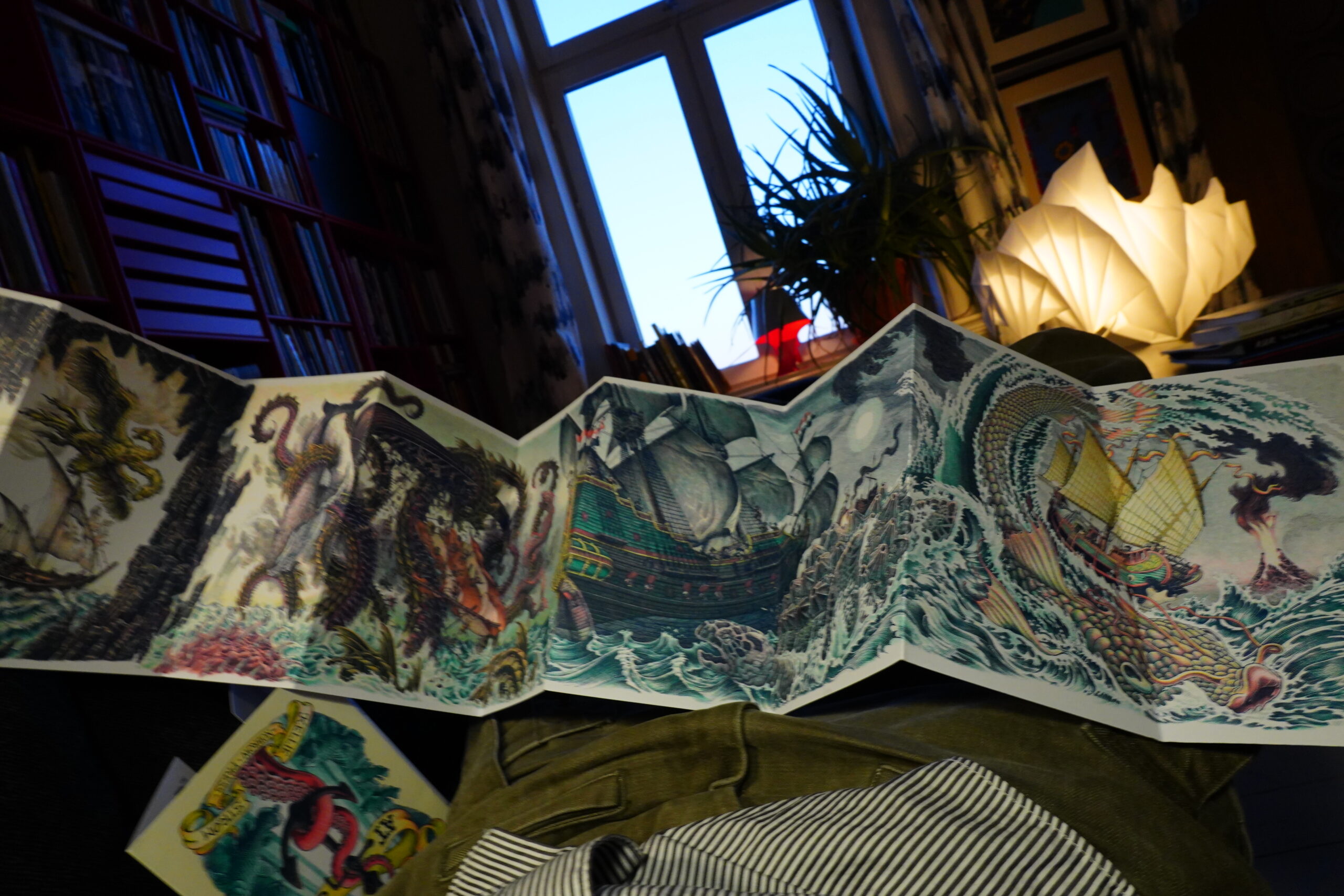
Lovely.
| David Bowie: Low |  |
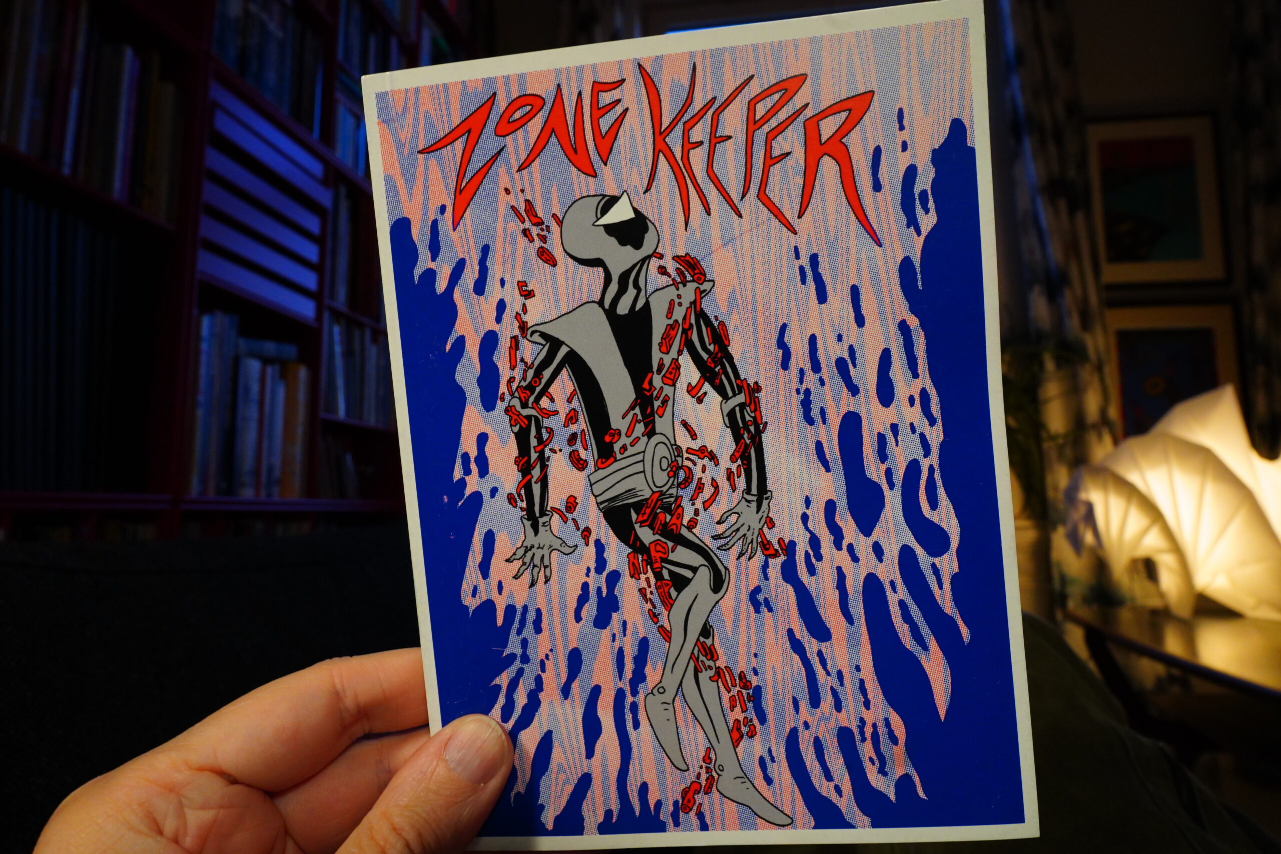
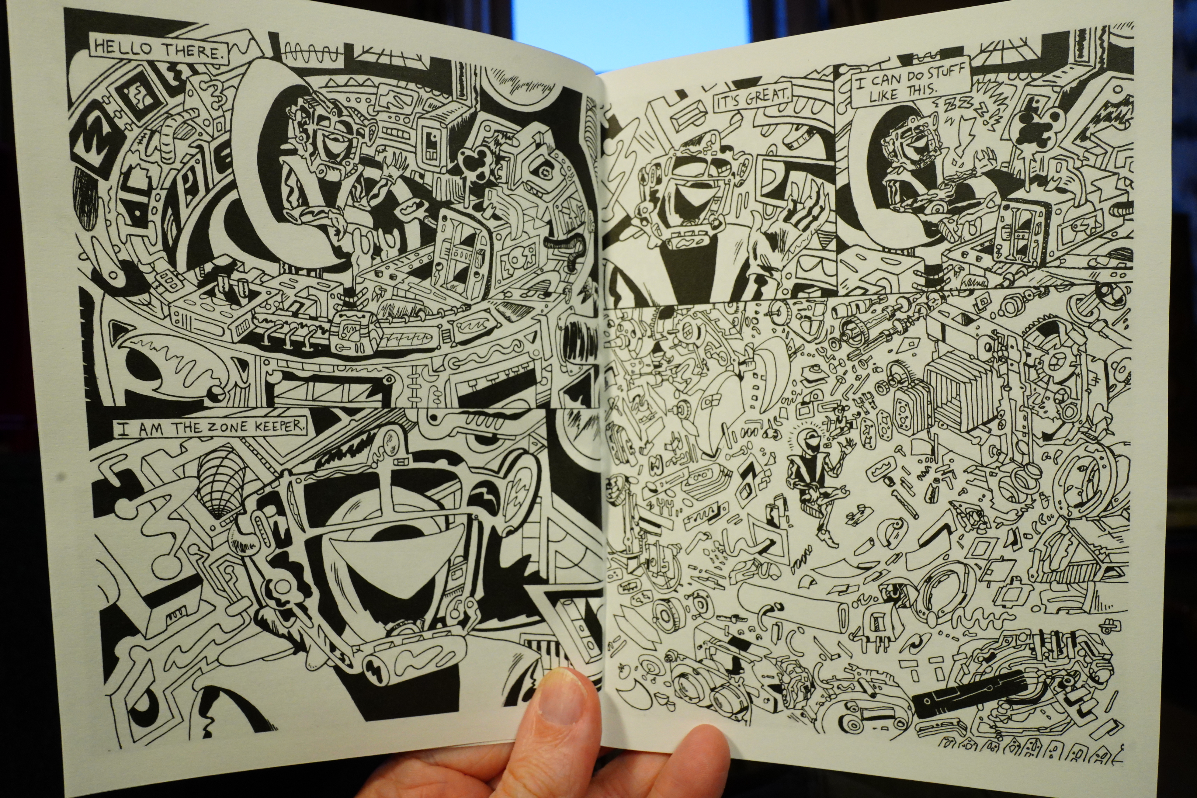
16:47: Zone Keeper by Pat Aulistio

Wow! Wild!

This is a lot of fun. Ace!
Hm, perhaps I should make late lunch or early dinner now… I forgot to eat. I mean, except for some of the chocolates.

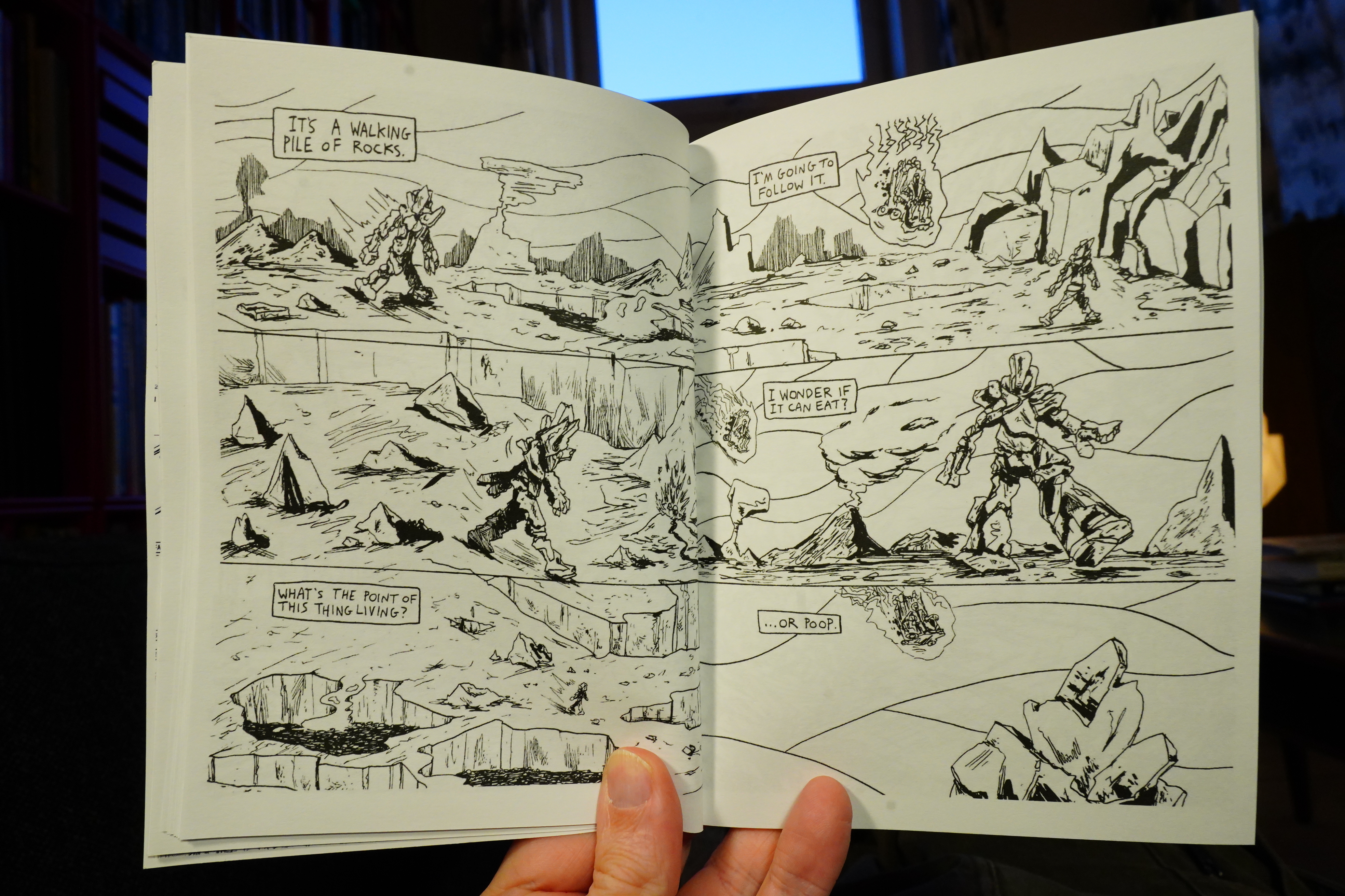
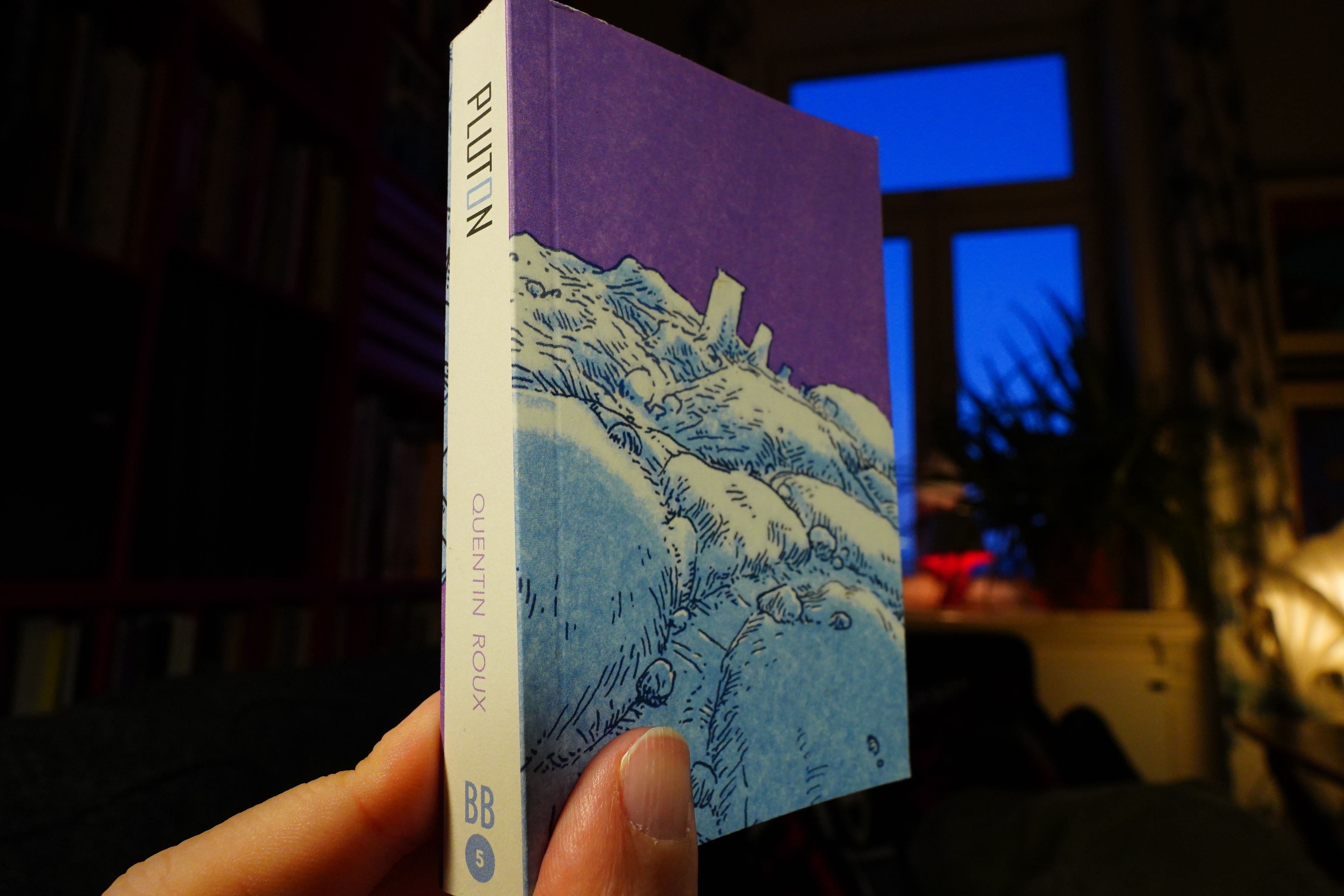
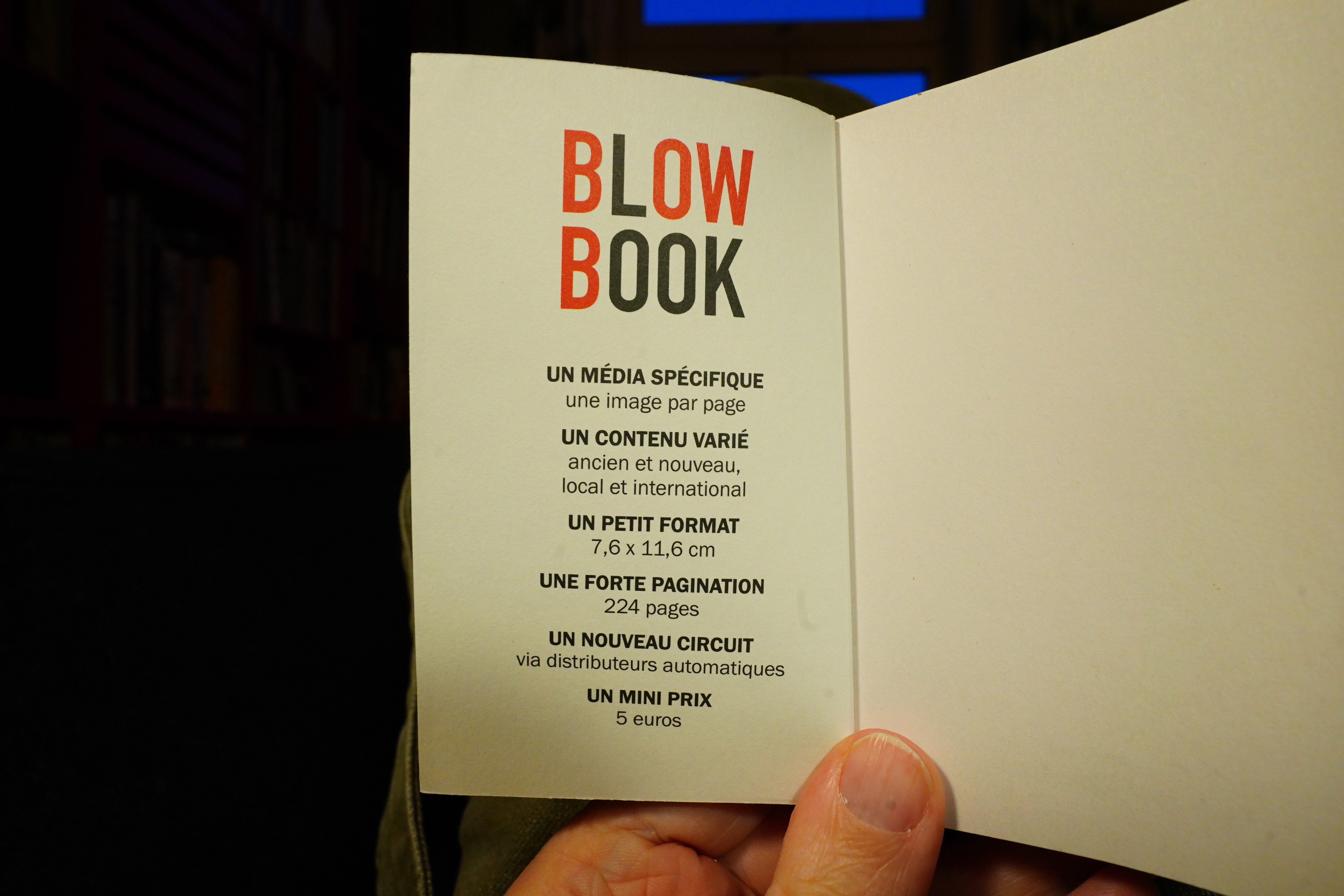
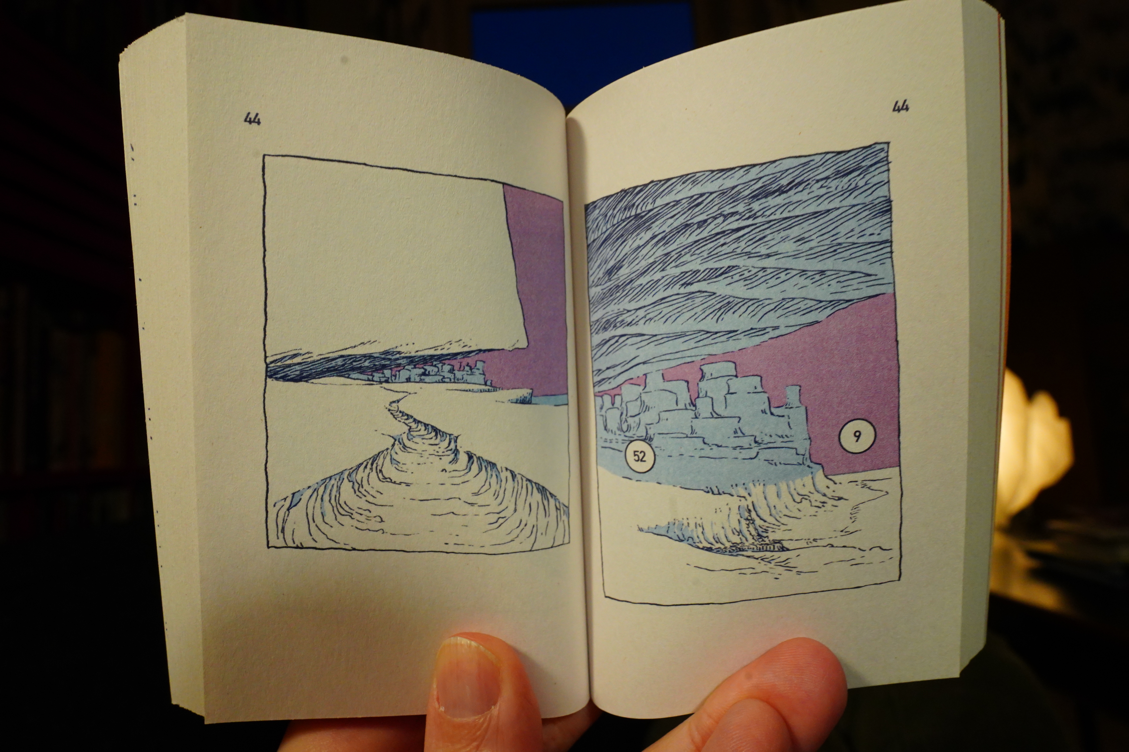
17:11: Pluton by Quentin Roux (Blow Book)
Nah, couldn’t be bothered to make food, so I put a frozen pizza in the oven.
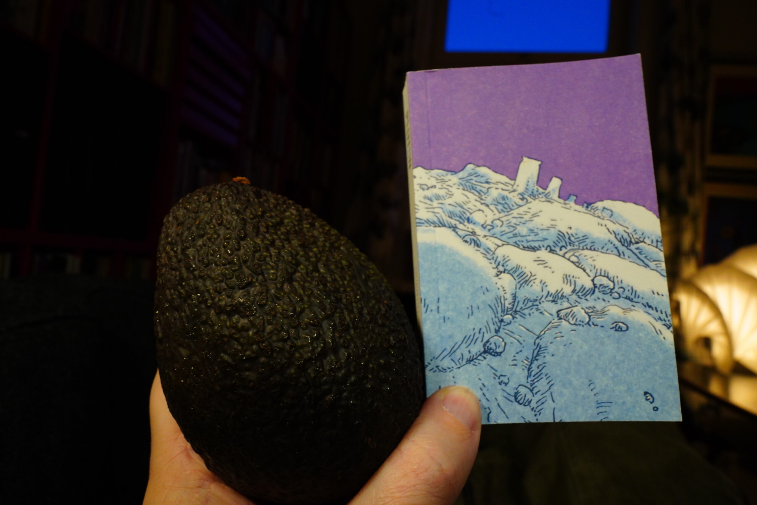
This book is very small and cute. (Avocado for scale.)

Oh, the have the specifications here. One image per page, old and new, local and international, high page count, and apparently sold via vending machines? Do I understand that last point correctly? *checks with google translate* Yup. I bought this at Gosh, so I guess they don’t just sell them via vending machines.
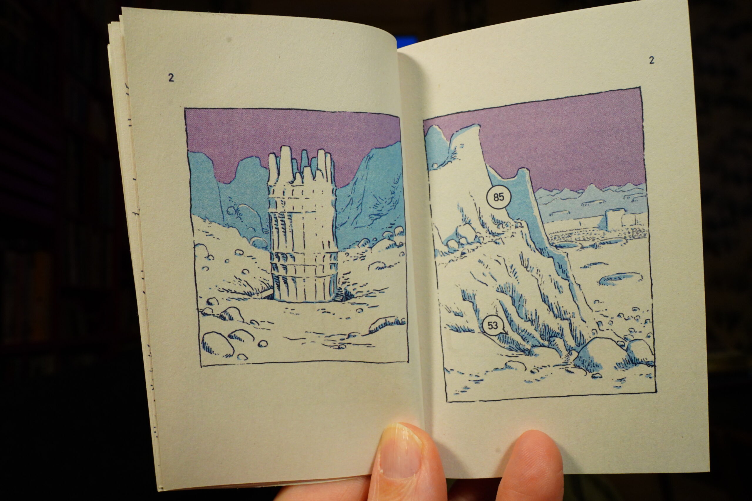
I like the artwork (I feel like I’ve said that many times today).
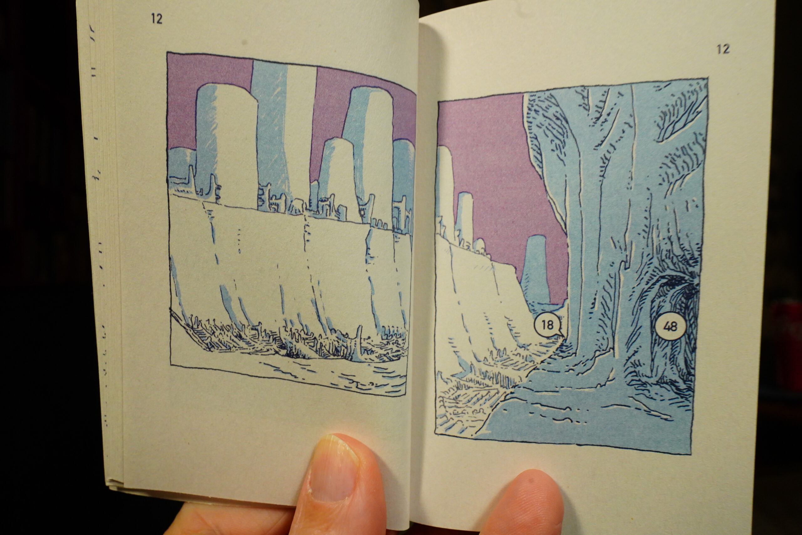
Hm… Oh, I get it. The left hand page is a new location, and then we move on from it, or zoom in?

And then the numbers say what page we came from, or where we could go? So the book is like an exploratory video game, where you can follow the directions and explore this place? It’s cool.
I didn’t play the game, though, because I’m not a gamer.
| David Bowie: “Heroes” |  |

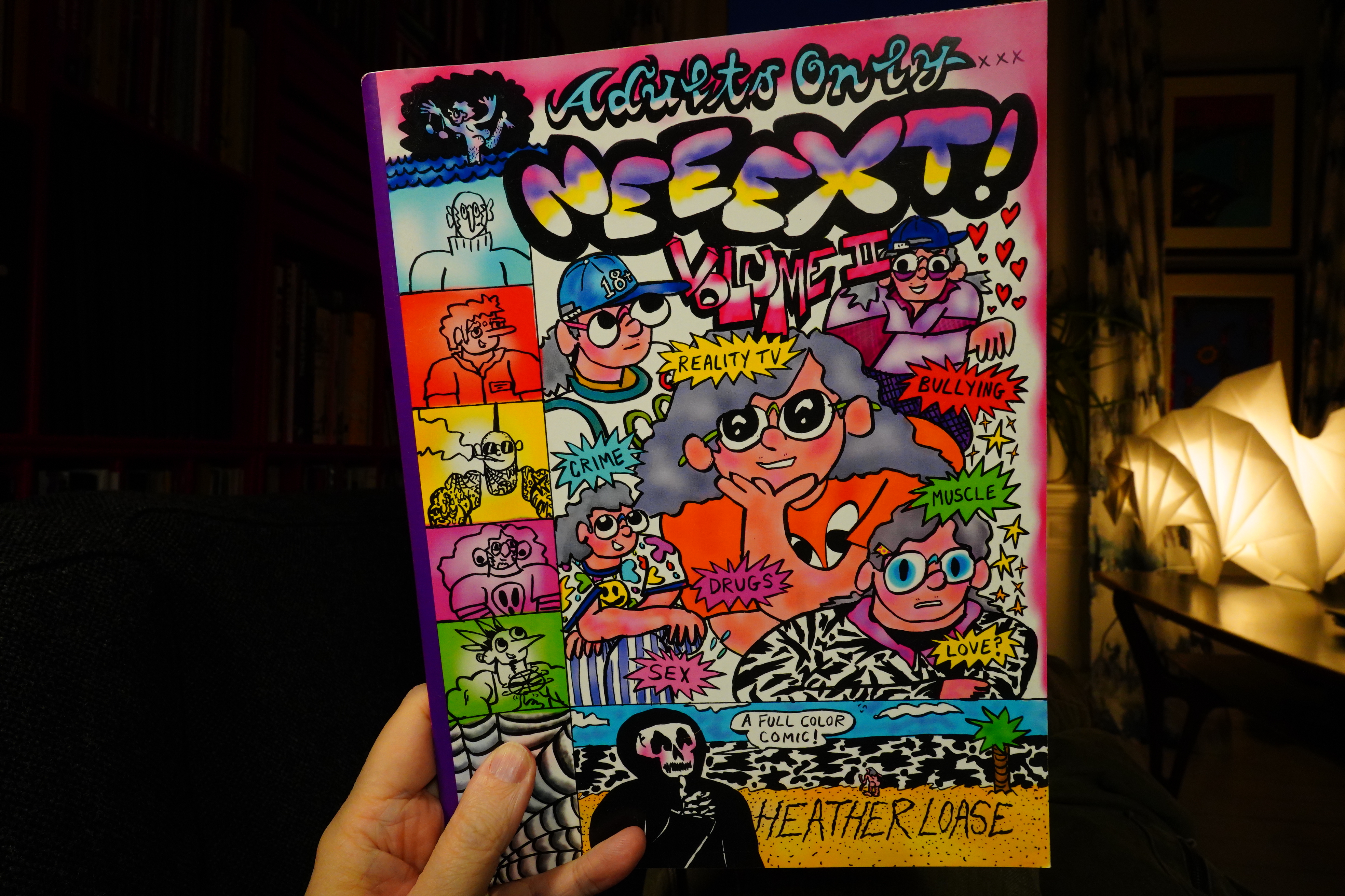
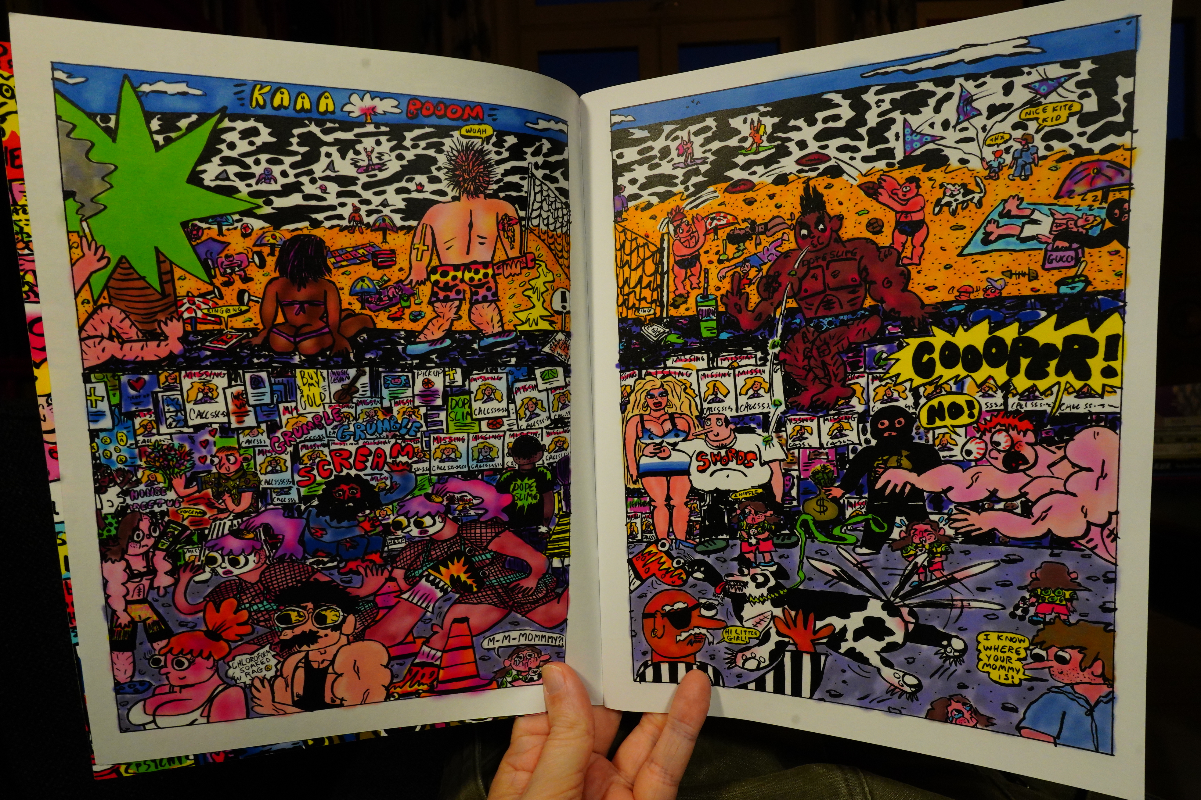
17:29: Neeext! Volume II by Heather Loase
Ooh, wow. I love this. So inventive.
And funny! Great book.

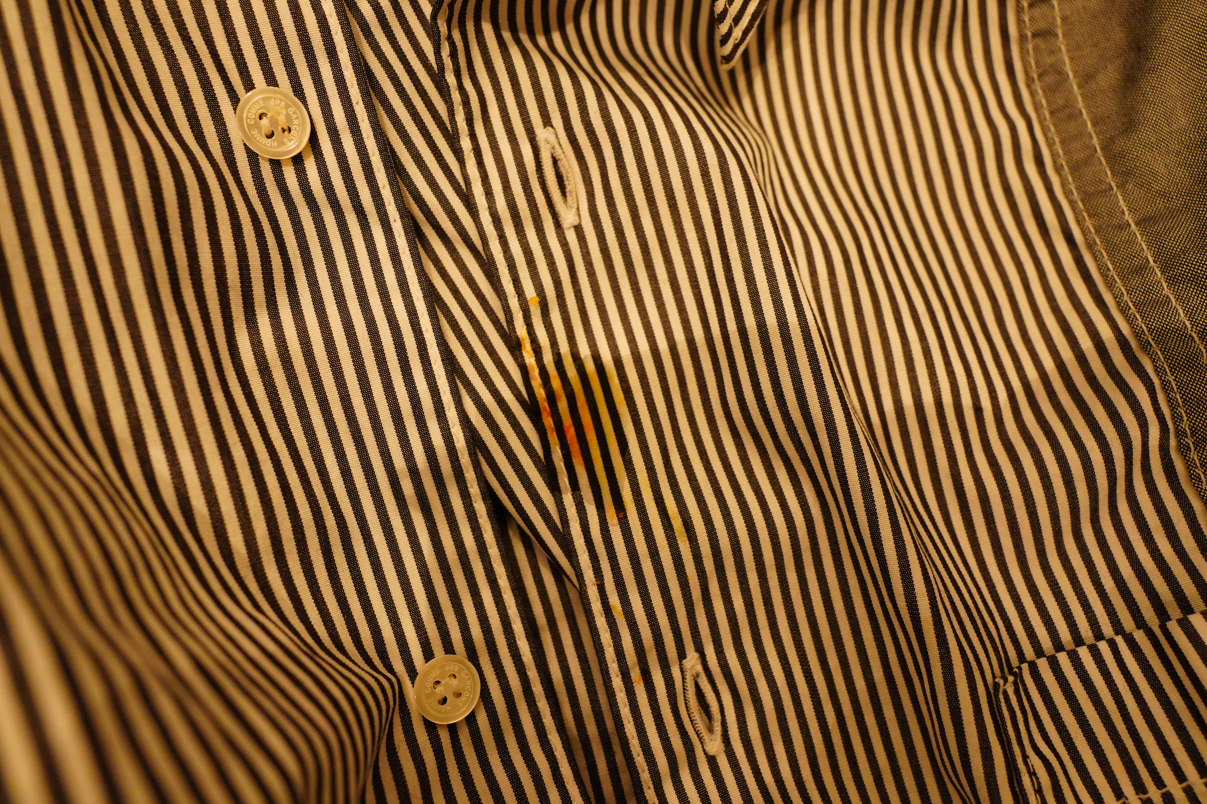
Aaargh! I got pizza on my shirt. OK, laundry and costume change time.
| David Bowie: Lodger |  |
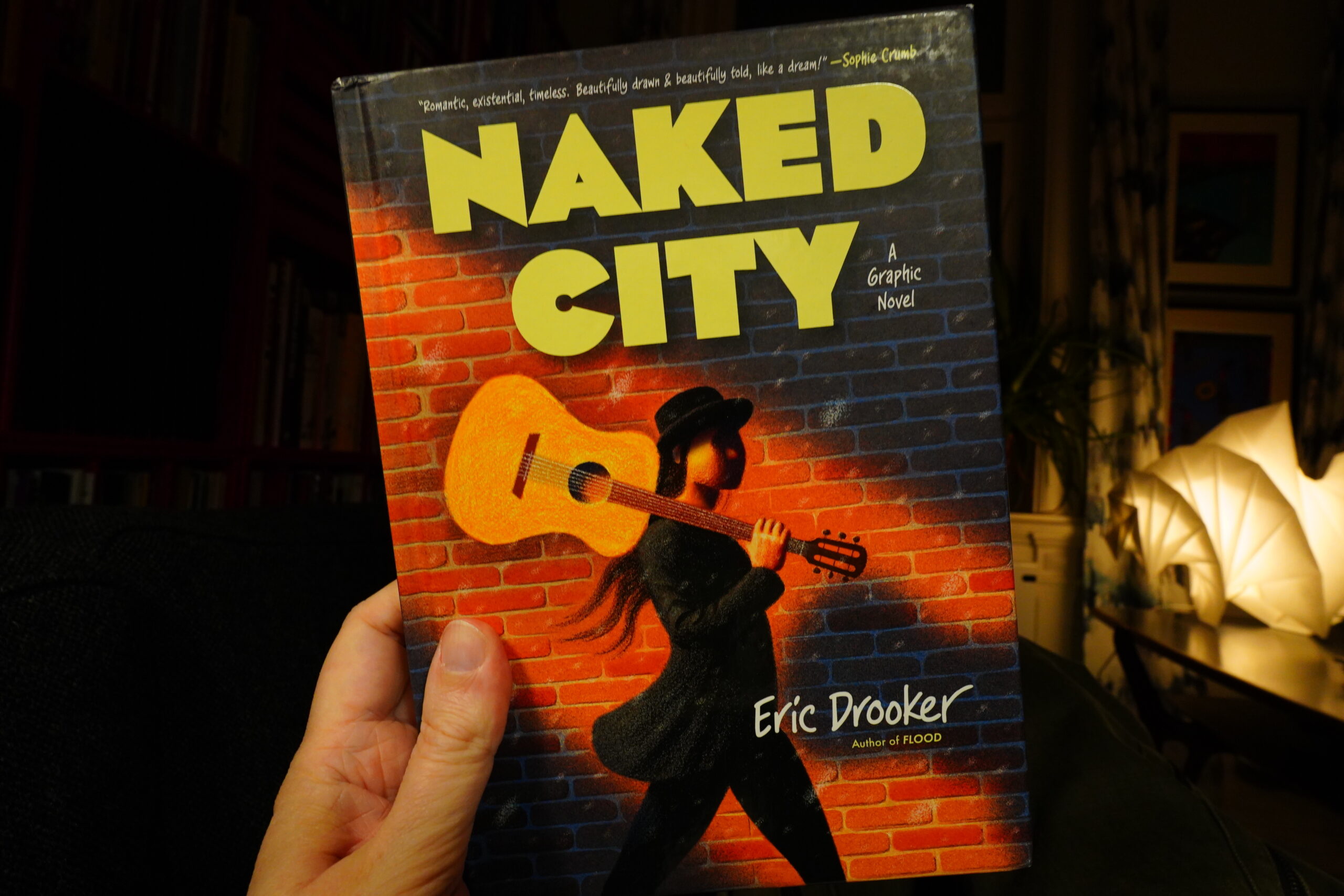
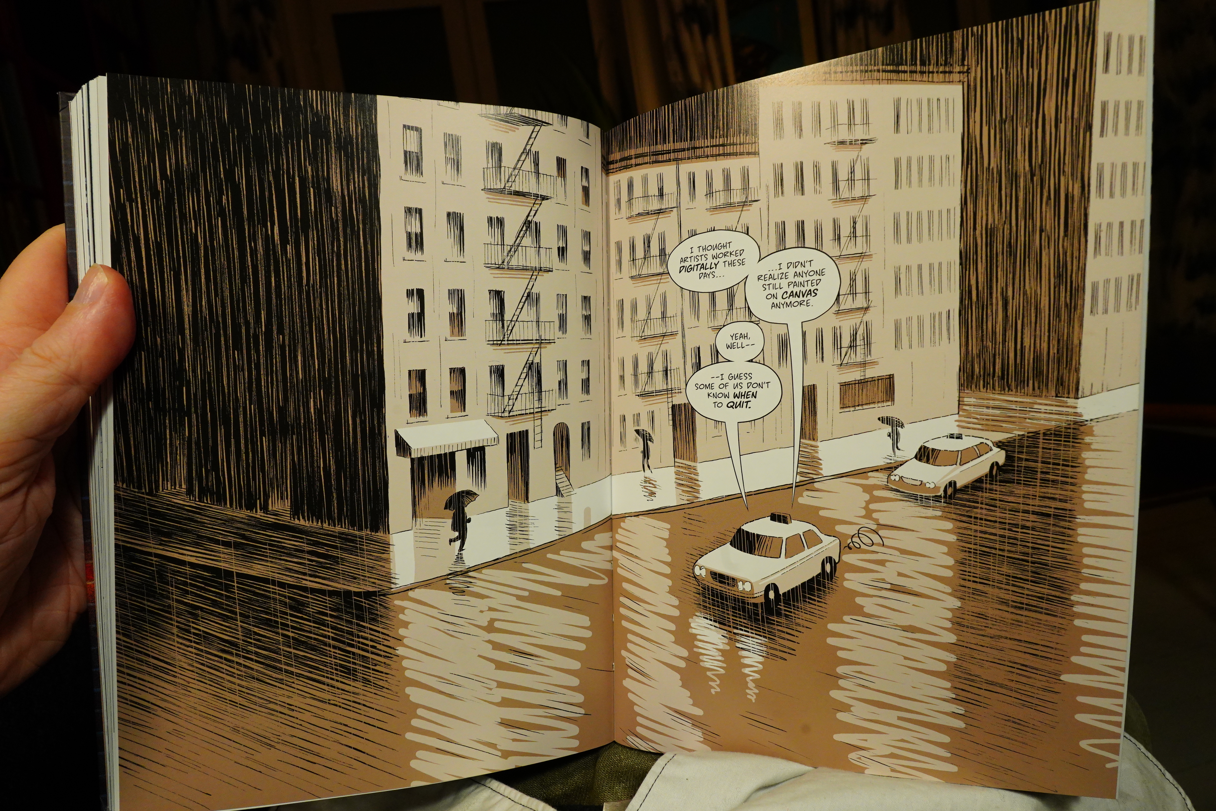
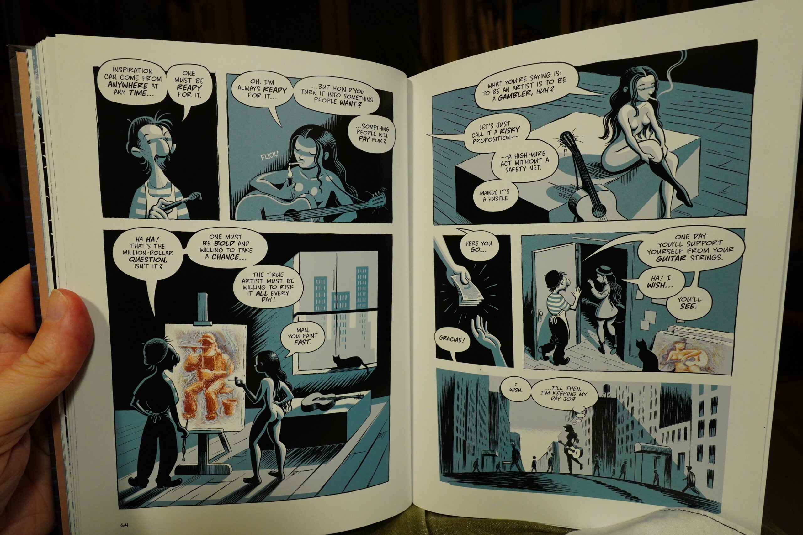
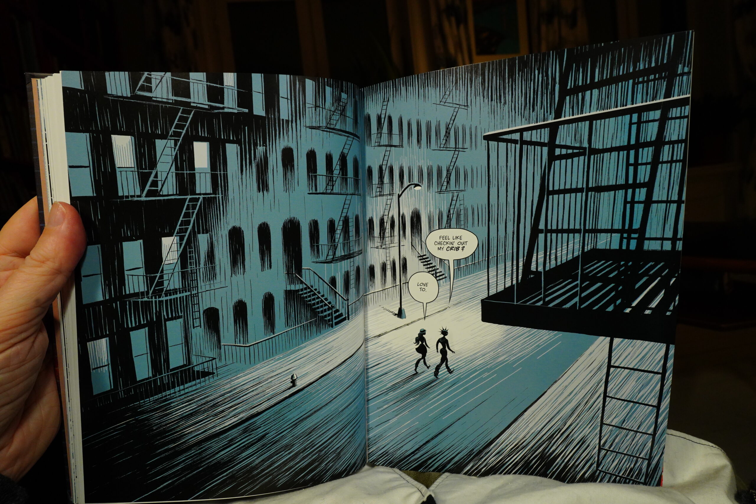
17:52: Naked City by Eric Drooker (Dark Horse)
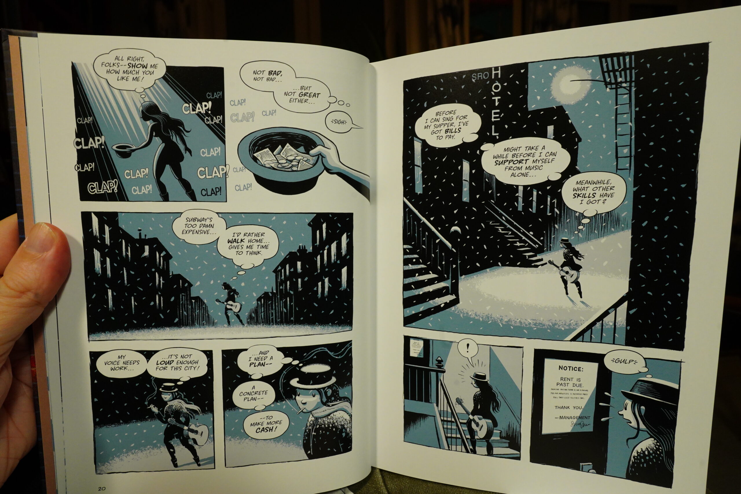
Oh… this doesn’t quite look like I was expecting? Didn’t Drooker draw in an elaborate woodcut-like style? Or did I mix him up with somebody else? *googles*
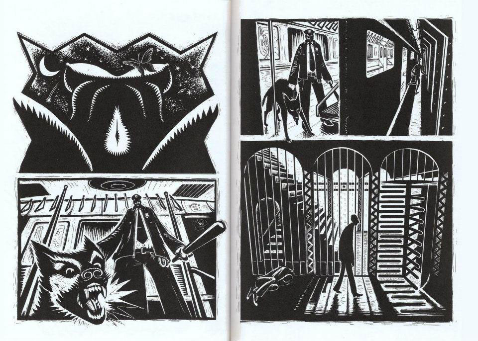
No, it’s him. Isn’t that gorgeous…
So… he’s moved from woodcuts to drawing on the computer, I guess. Well, that certainly sounds less labour intensive, so I can’t blame him, but did he have to go all cutesy and round at the same time?
Anyway, this book has that unfortunate whiff of comics books about art often has — think of The Sculptor by Scott McCloud.
It’s very current!
Well, that’s a nice drawing…

Ah yeah, this is totally The Sculptor II: We get a lot of moaning about how fake the fine art world is.
But that thing up there on the top left — does Photoshop have a “make it oil paintery” filter? Or is it AI? It certainly doesn’t look like oil painting.
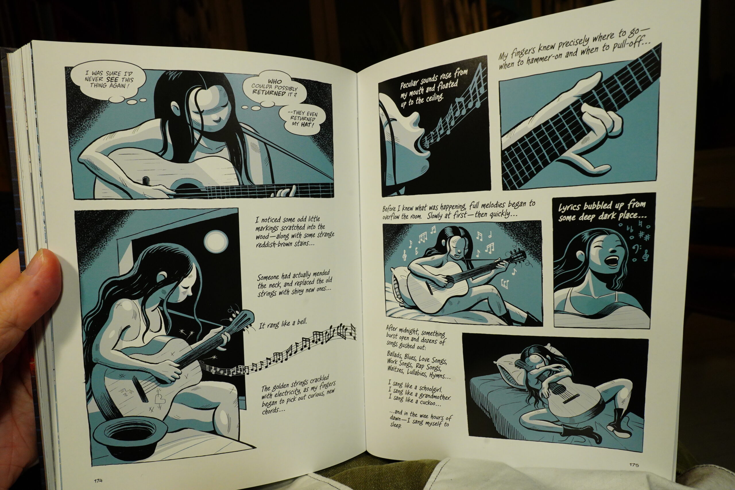
And yes, of course the poor woman gets a magical guitar from the ghost of her dead father (or something). This is The Sculptor all over again! I was almost just kinda joking when I wrote that up there, but…

Is Drooker critiquing himself here? Talking about how some people still stick to using traditional materials while he himself is making the most obnoxiously obvious Paint Tool squiggles on the asphalt?
Eh, I guess the book is fine? It’s another book that was featured on the TCJ 2024 roundup.
*checks laundry* Gah! The pizza stain didn’t come out of the shirt. I guess I should squirt it with some anti spot magical potion and give it another whirl…
| David Bowie: Stage (1) |  |
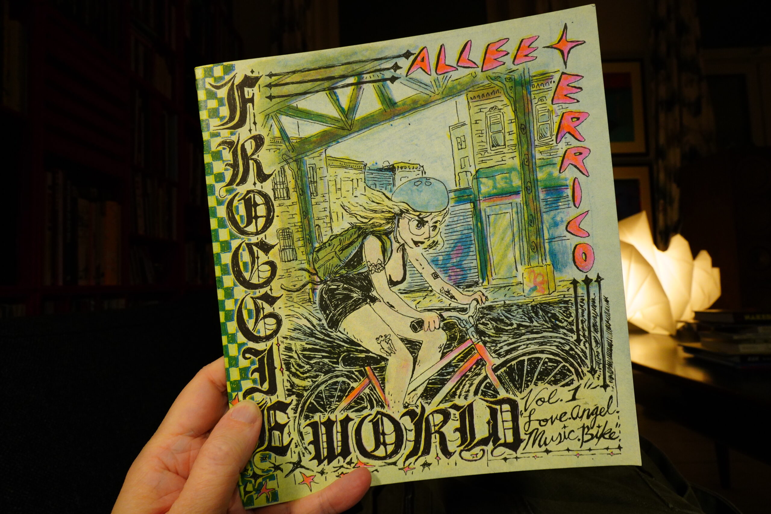
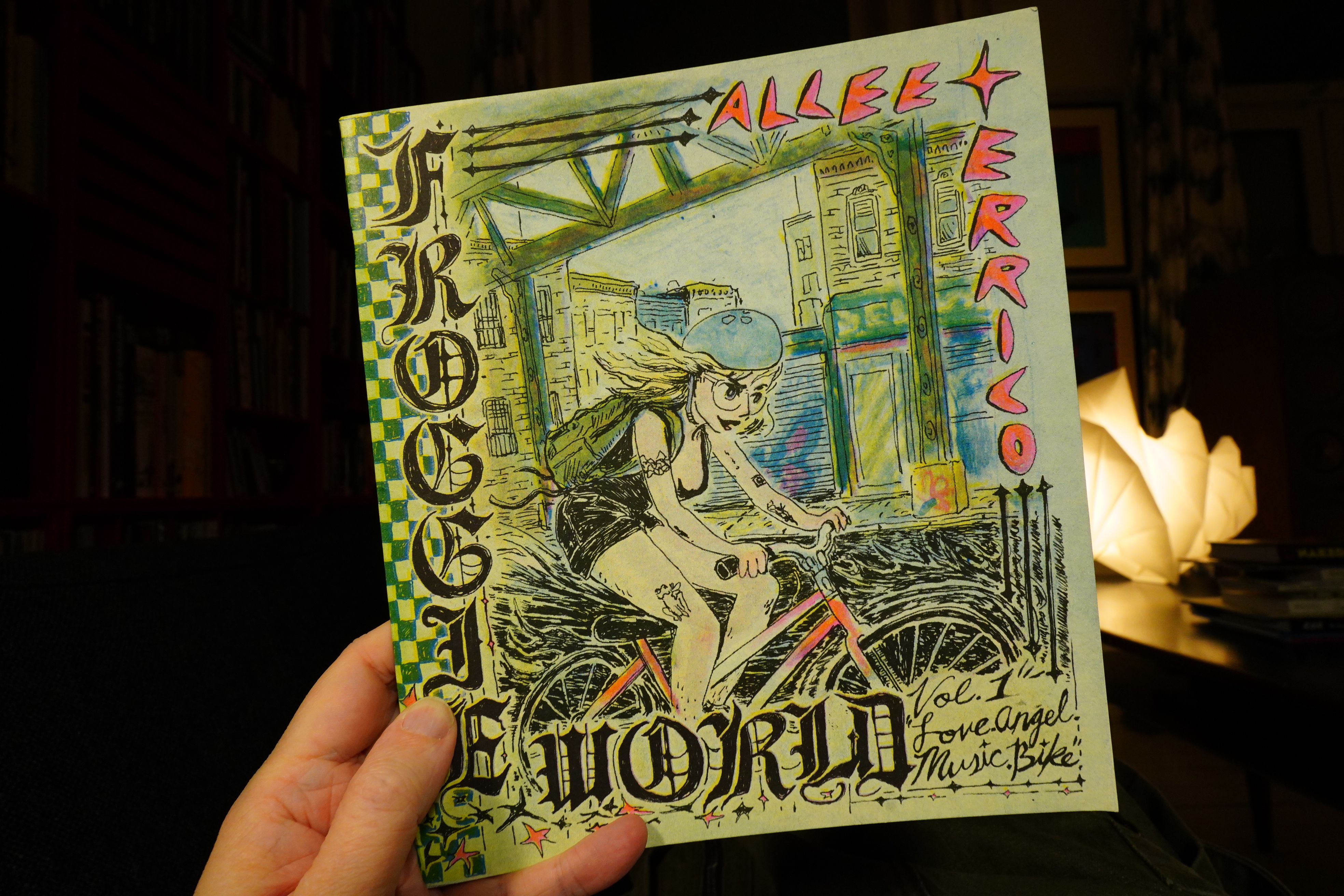
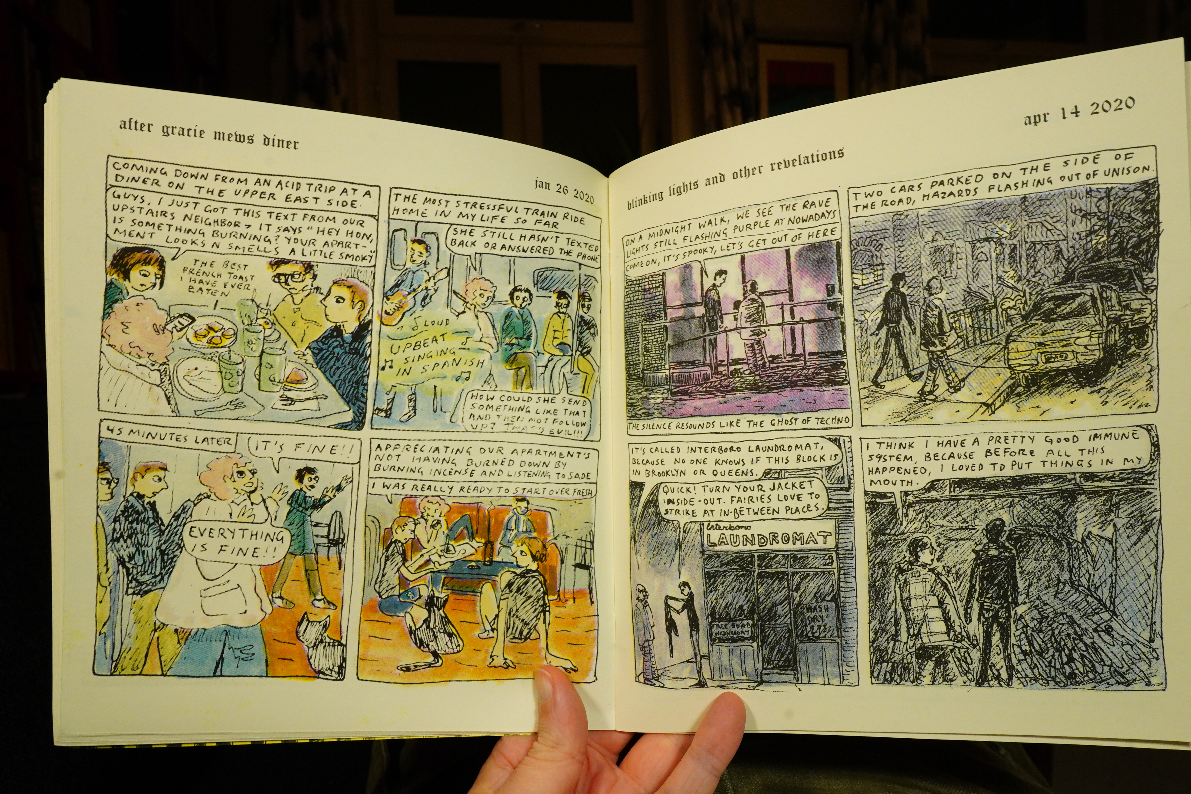
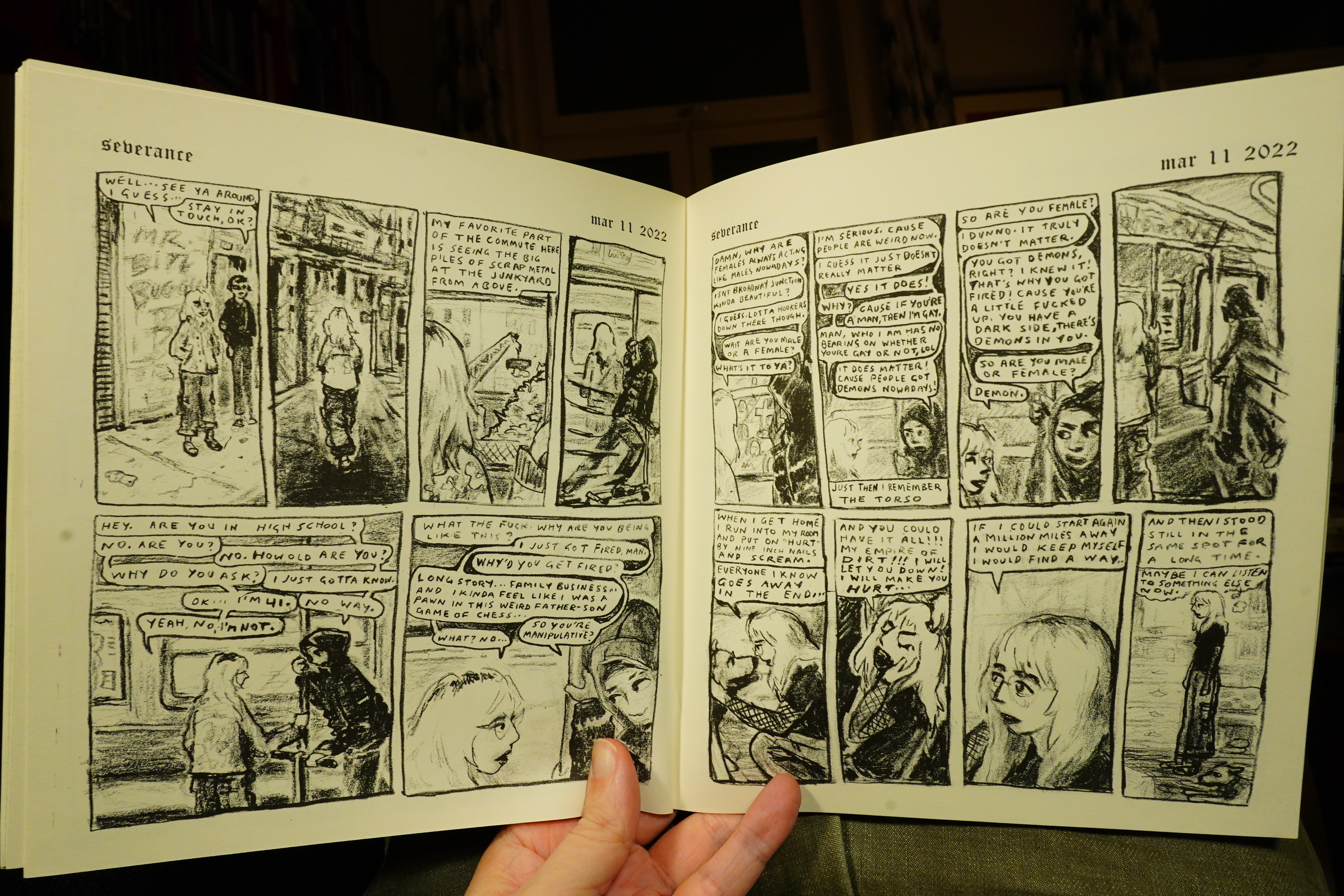
18:44: Froggie World by Allee Errico (Cram Books)

This is autobio comics from somebody with an interesting life.
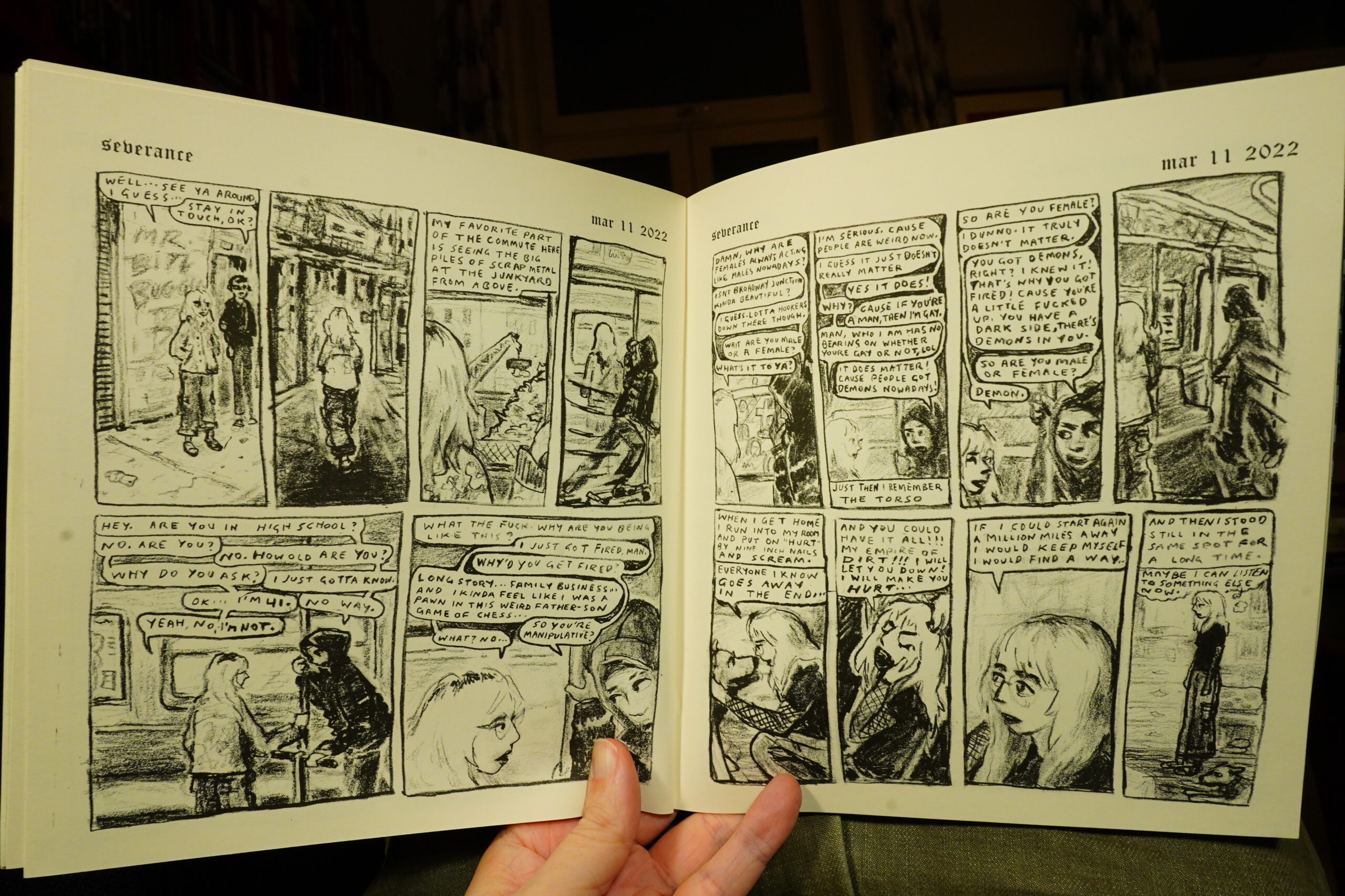
And it’s fantastic! I really loved this book. It’s not printed chronologically, but by some other strange logic, and it has this interesting flow.. I was gripped! At the edge of the couch! Etc!
But was it scanned at a kinda low resolution? Some of the pages look grodier than they should, I think, because of the pixilation. But I quibble; it’s really good.
| David Bowie: Stage (2) |  |
19:41: The End
And I think I’ll call it a day on that high note — and I’m exhausted from all this comics reading.
I don’t think I managed to replicate the David Bowie album order I had as a child — I think Young Americans went before Station to Station and Scary Monsters before Stage? I should make a playlist and try to see if I can recreate the perfect sequencing again…
I know, I know.