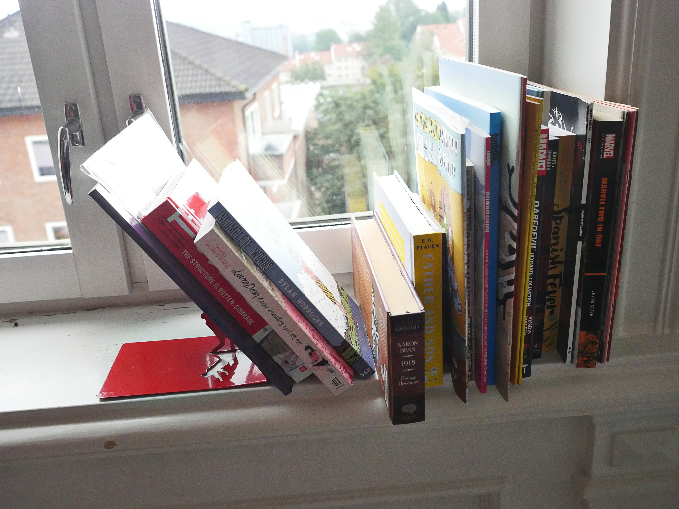
OK, the number of unread comics on the window sill has definitely decreased, so this blog series is working! And, as usual, I’ll just be reading comics and write some uninformed notes, because there’s just no time for reviews.
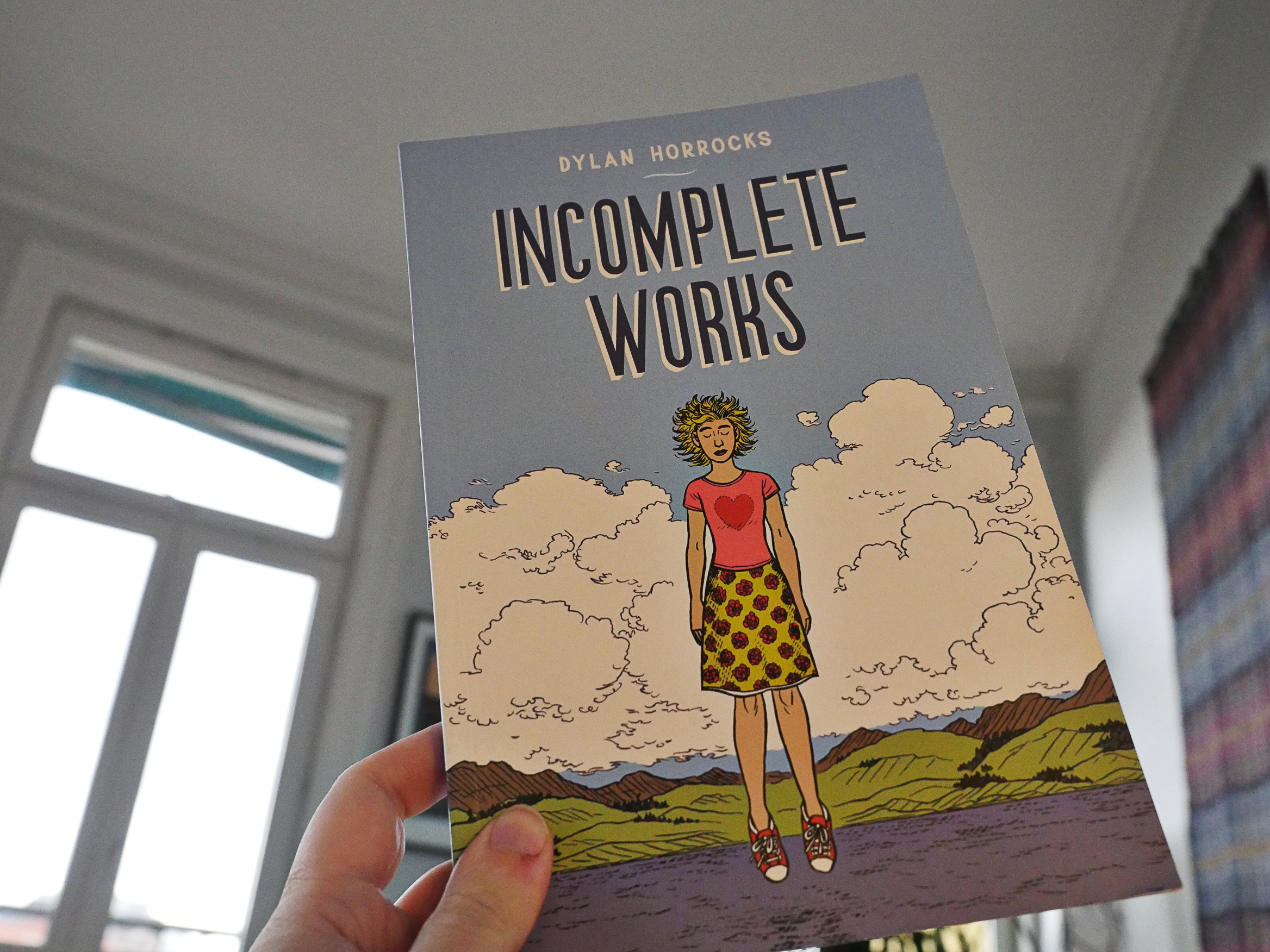
Incomplete Works by Dylan Horrocks (Victoria University Press)
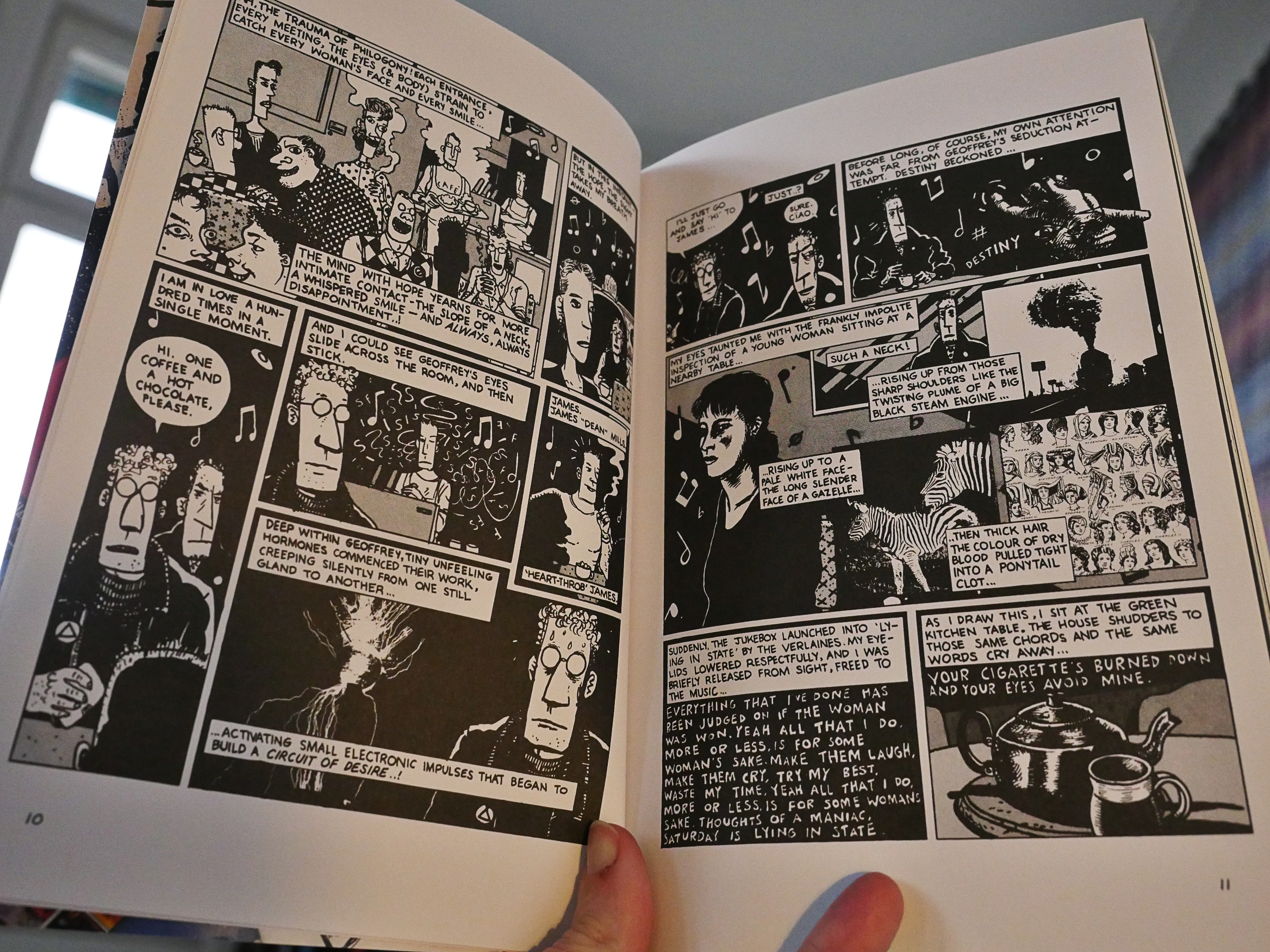
This is a collection of short pieces from various anthologies and stuff. I think I’ve read most of these before, but it’s fun to follow Horrocks’ evolution: It’s presented chronologically, which I think is nice.
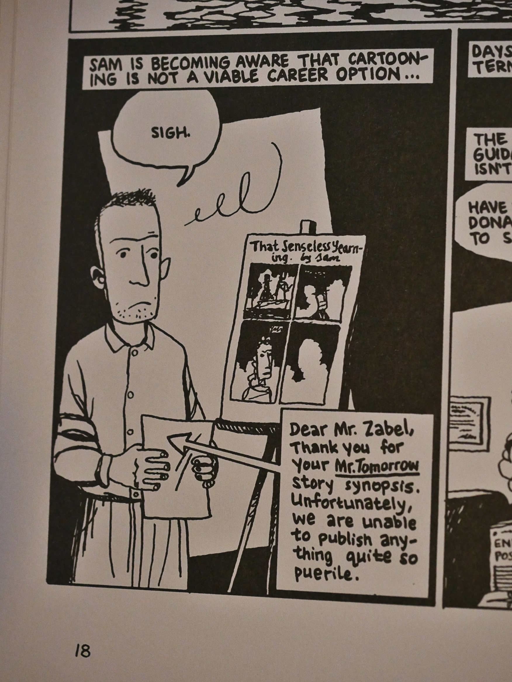
I had forgotten that Horrocks used the “Sam Zabel” name from almost the very start of his career.
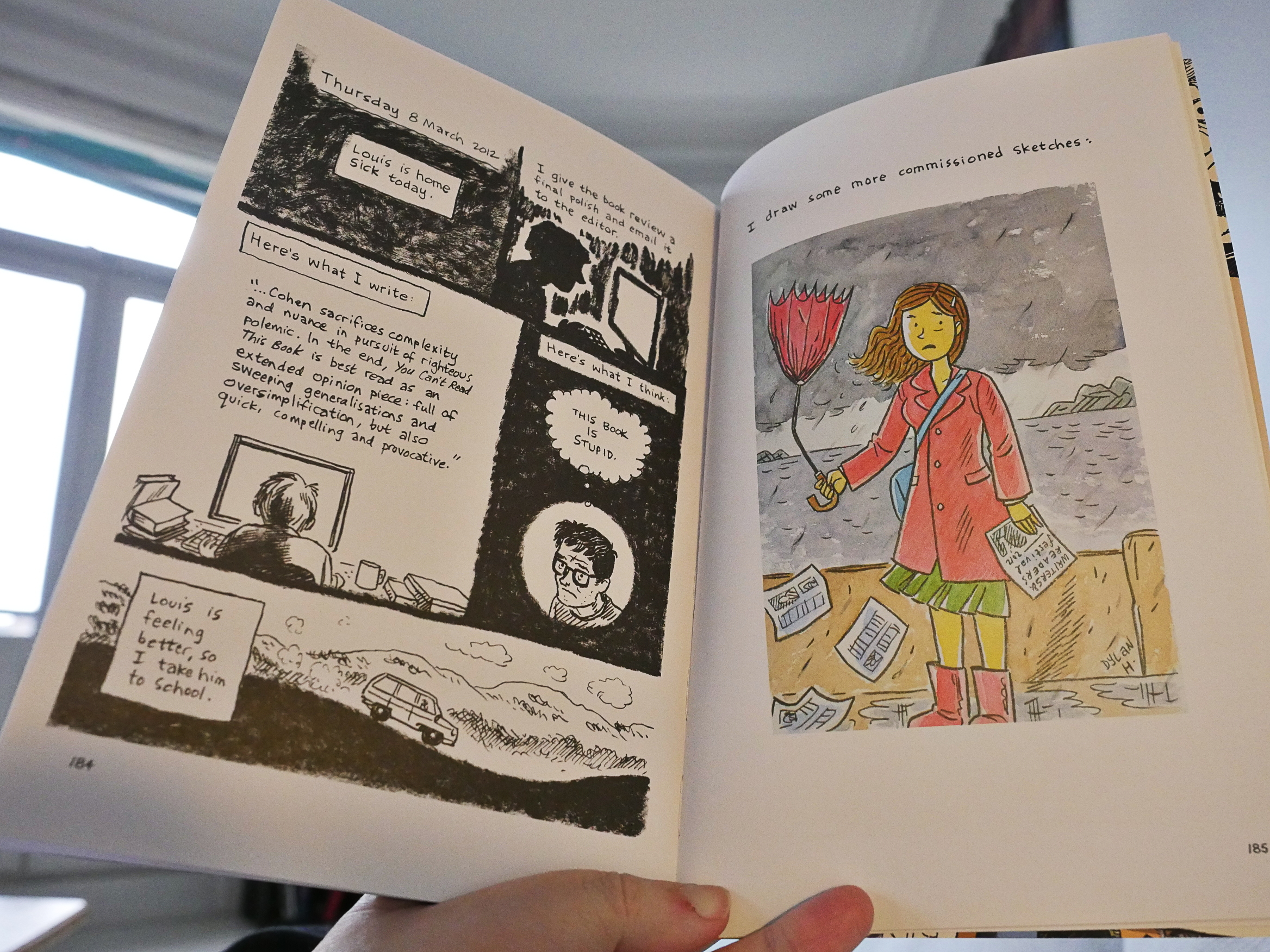
It’s a nice read, but many of these pieces are pretty… non-essential. Of the newer stuff, I did like these diary comics.
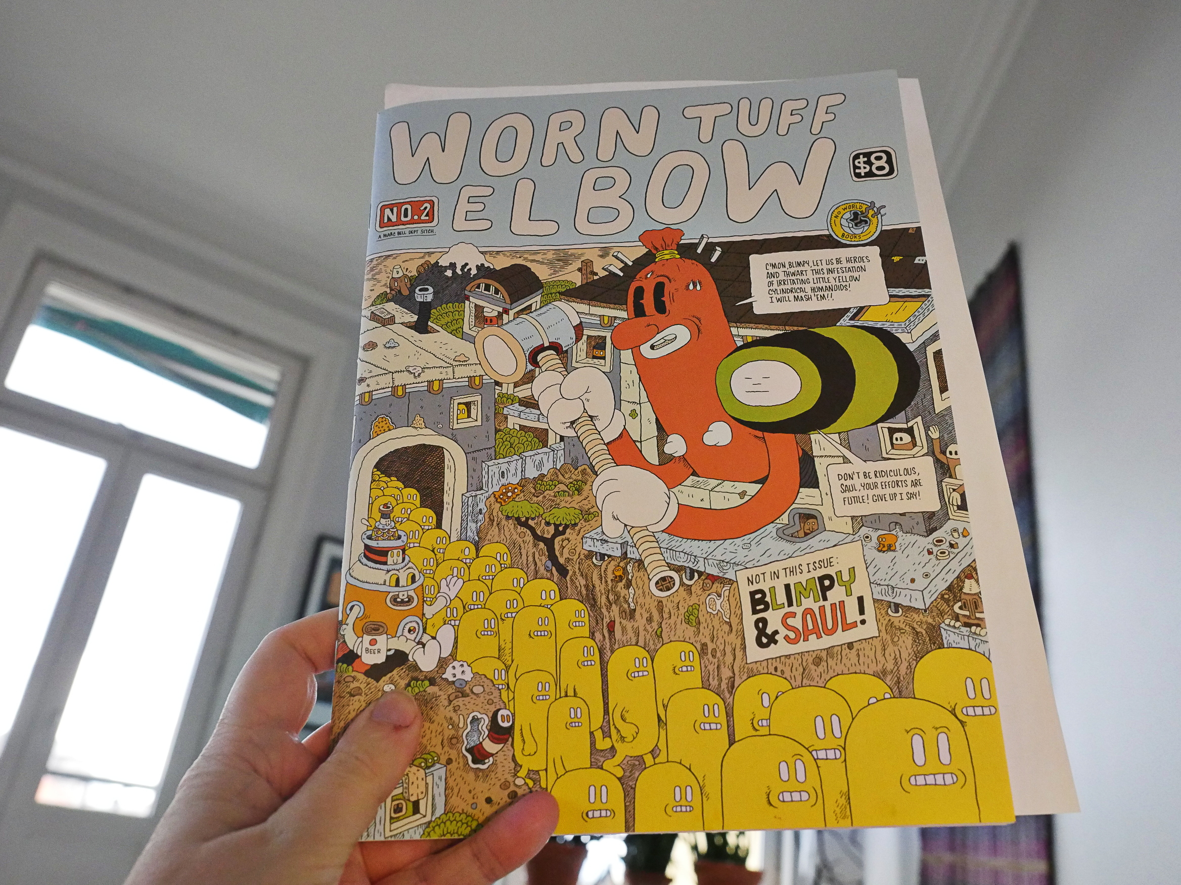
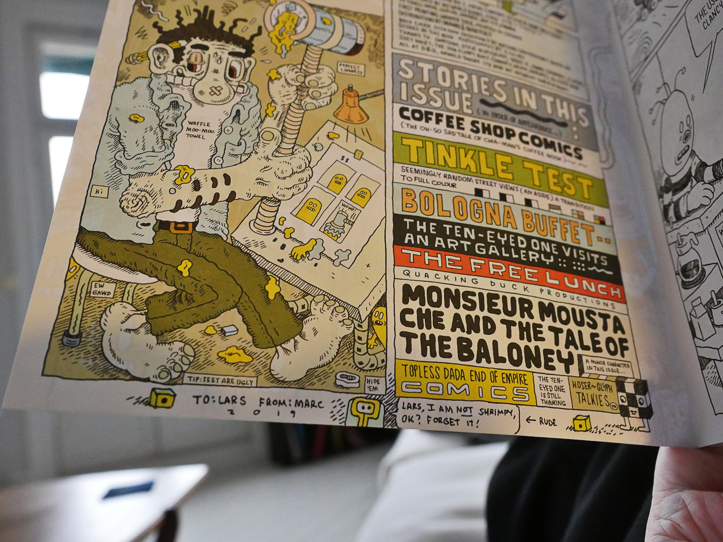
Worn Tuff Elbow by Marc Bell (No World Books)
Oh, yeah, this was kickstartererd… That’s nice…
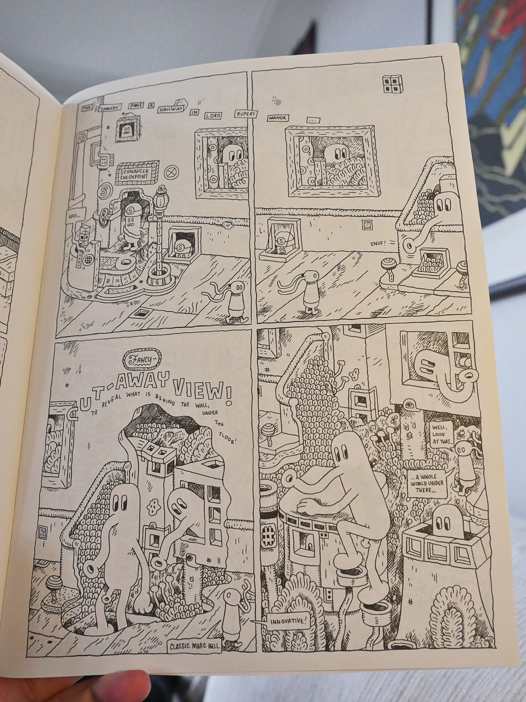
Anyway, this is the usual Marc Bell stuff, which means: It’s amazing. There’s something about Bell’s narratives that are absolutely totally engrossing. It’s not dream logic or anything like that, but things seem to make sense on a different plane altogether. This time out, it all revolves around bologna, and it’s perfect.
A huge attraction here is the artwork, too. It’s just so… right.
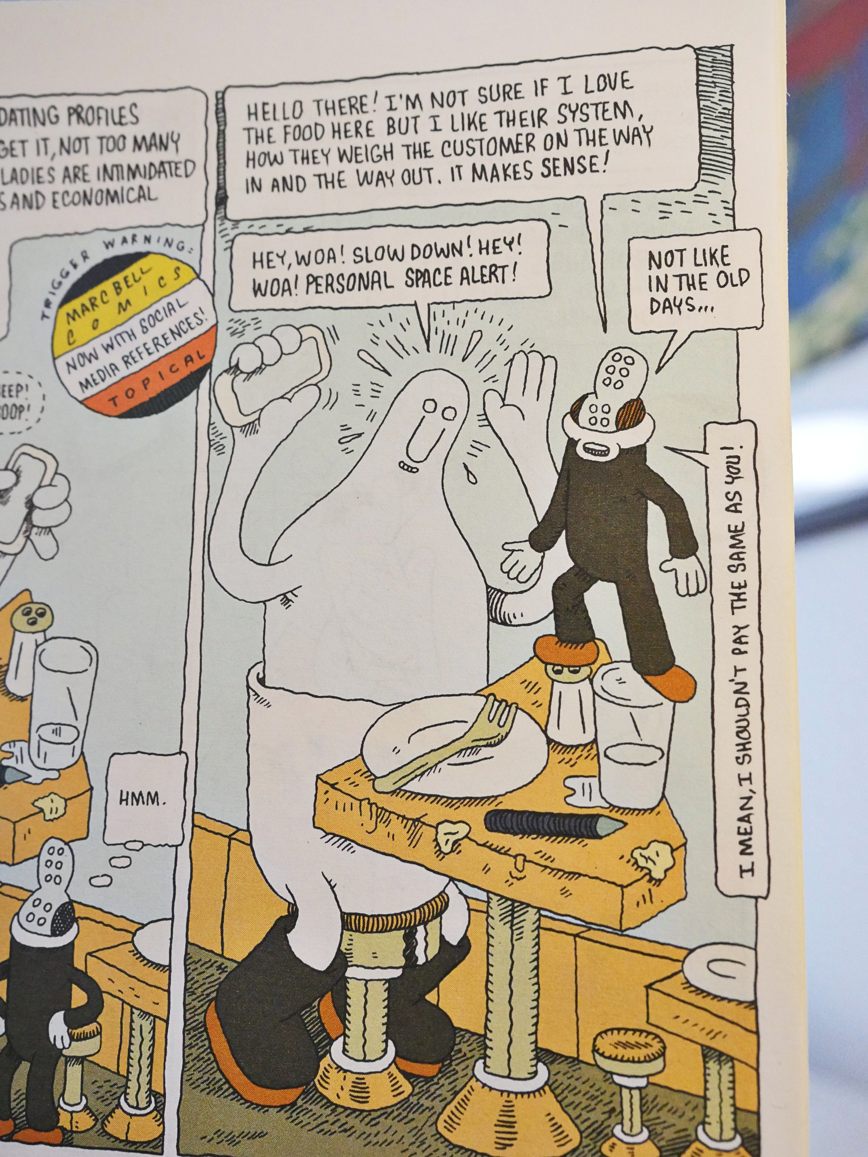
That system does make sense!
Read Write Right Reed by Hugh Frost (Landfill Editions?)
I’m guessing this is Landfill, because it has that feel… and didn’t I order a bunch of stuff from them?
This is basically a collection of er paintings and stuff.
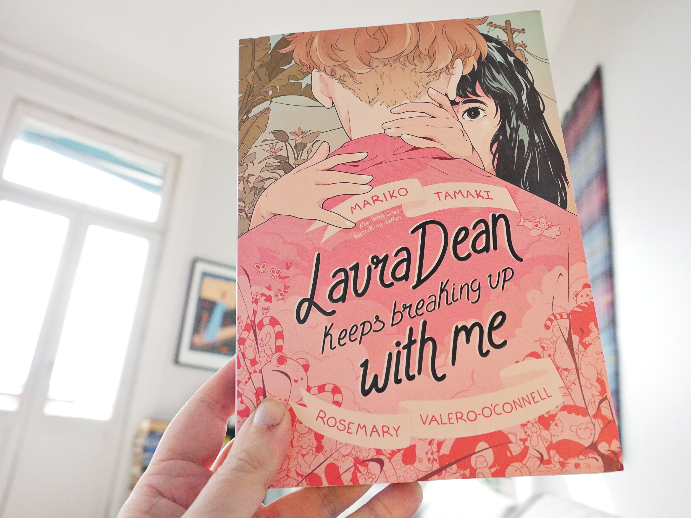
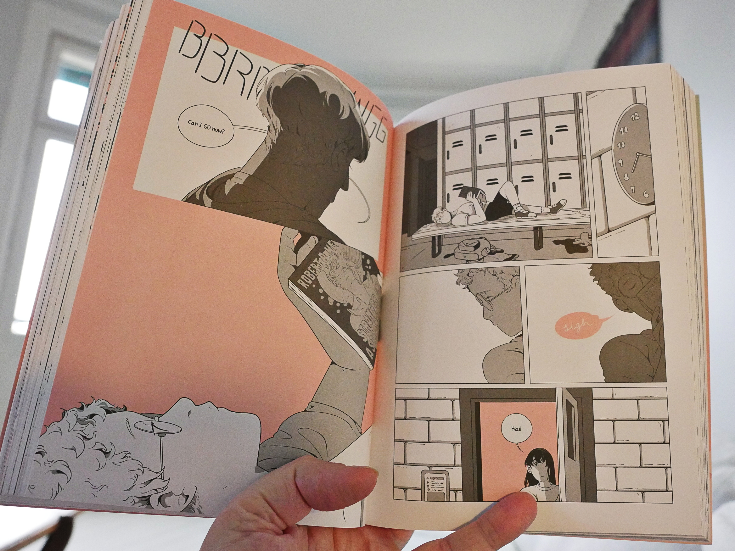
Laura Dean Kepps Breaking Up With Me by Mariko Tamaki and Rosemary Valero-O’Connell (First Second)
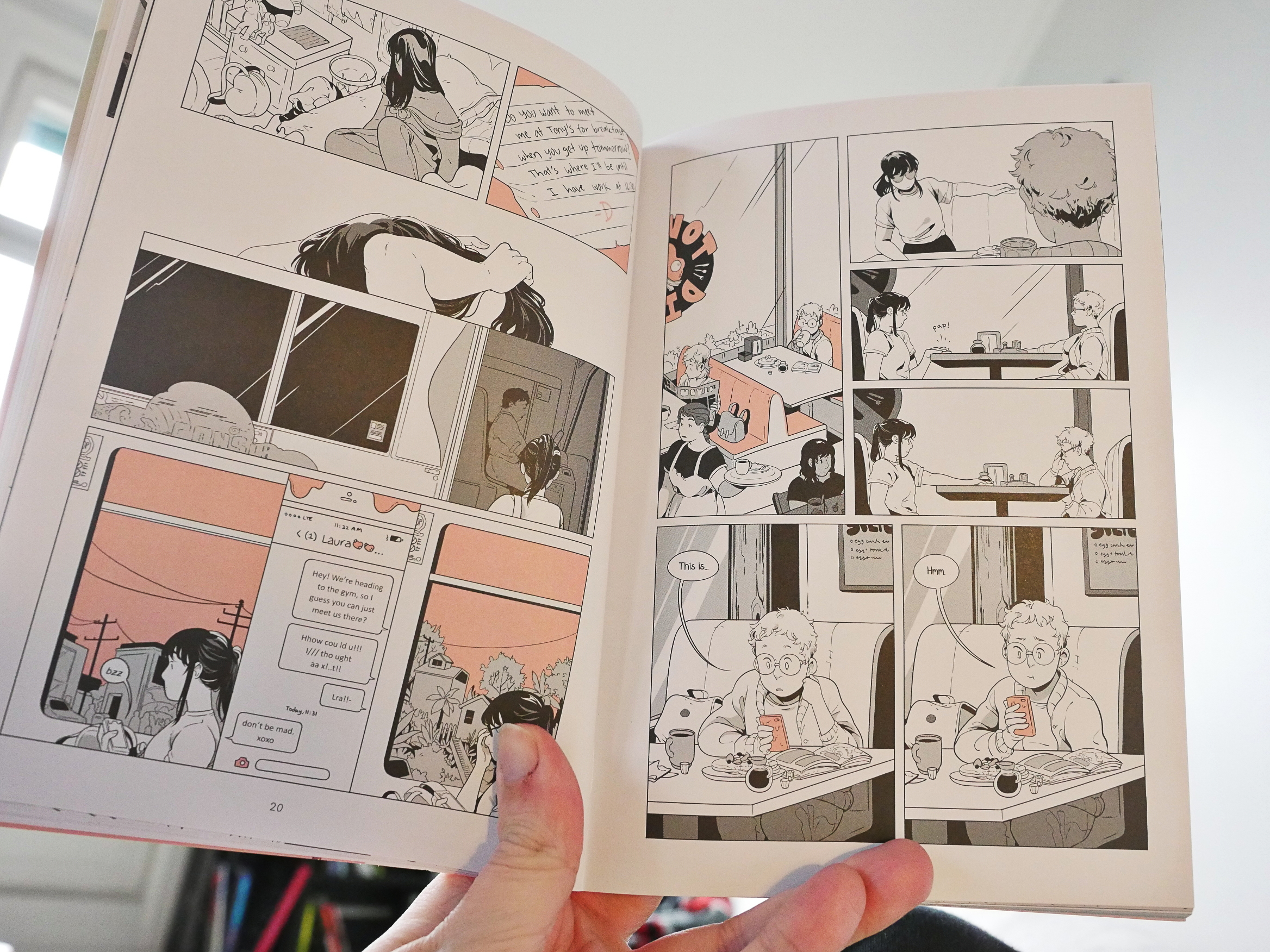
Oh, deer: Another First Second book. Well, even though virtually everything they publish suck, there’s also This One Summer, which was rather spiffy. But was that due to Mariko Tamaki or Jillian Tamaki?
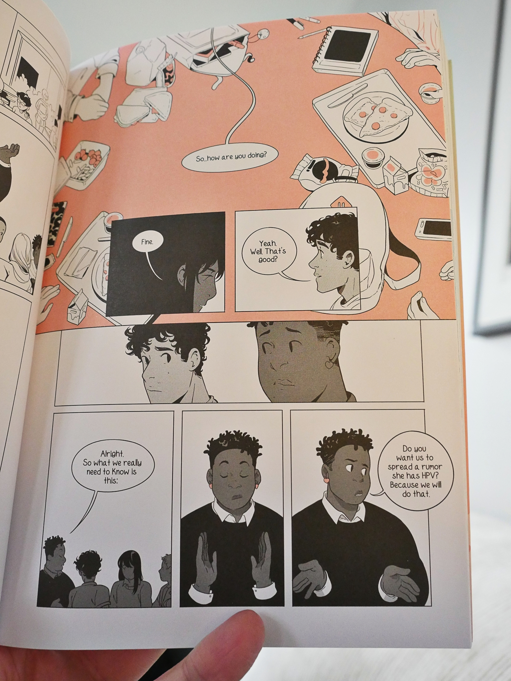
Based on this book, it was the latter. Without that beautiful artwork, this is a pretty perfunctory book. It’s about a really, really shitty girlfriend and how that toxic relationship makes the protagonist into a shitty friend. It goes exactly how you expect, with all the dramatic notes happening right on queue, and it ends exactly how you’d predict.
Which leaves the artwork to take up the slack, and Valero-O’Connell isn’t really up to it. I mean, it’s nice and all, and she does have a real knack for conveying information, emotion and personal ticks through her drawings, but the Japanese/American hybrid style she uses doesn’t really click. And the lack of backgrounds feels more lazy than stylish.
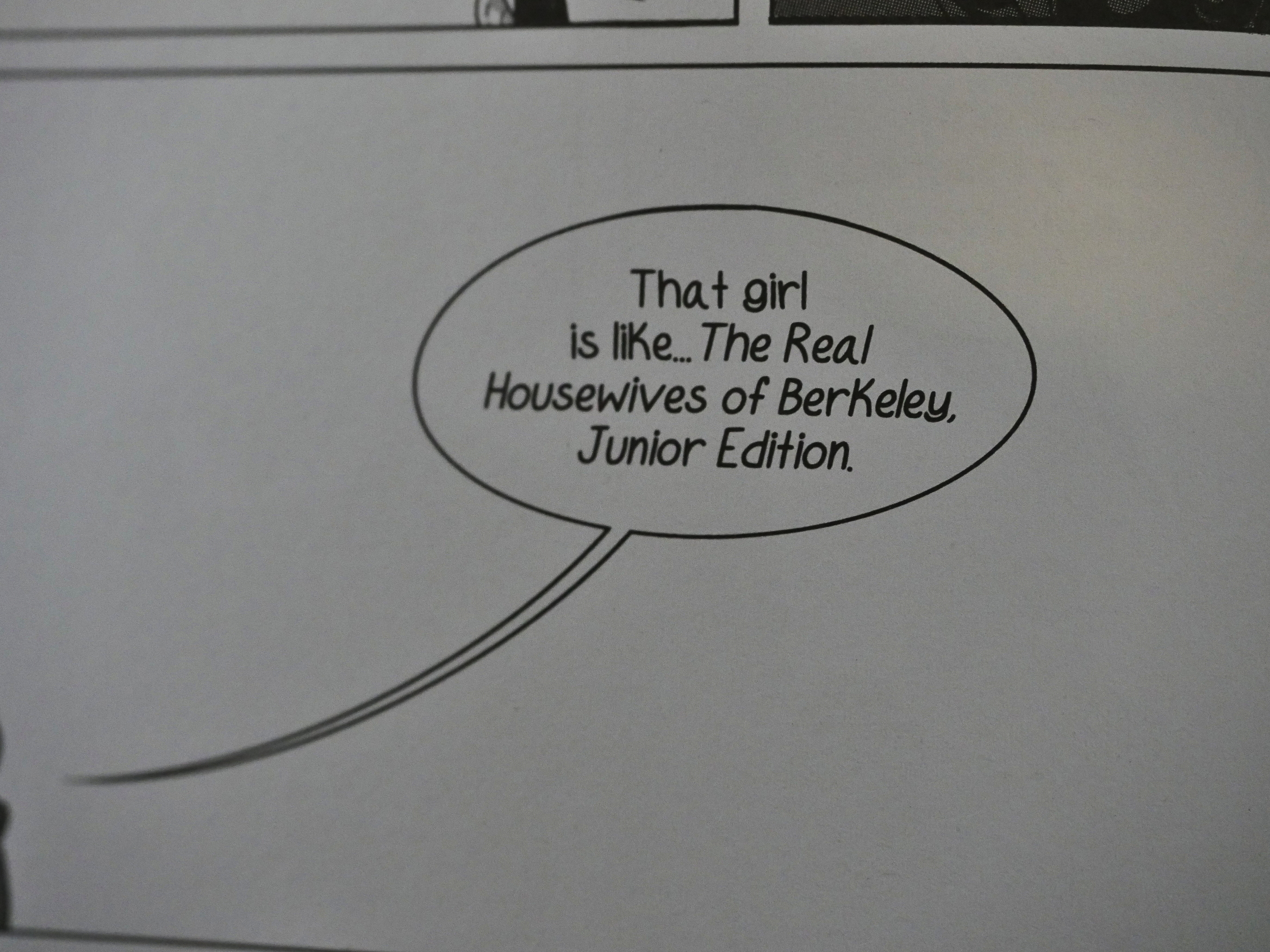
So, sitting here being kinda bored with the entire thing (and I’m totally in the target audience) I just got annoyed with all these crappy production issues, like using a font that has a way huge lower case k, which means that I’m stopping all the time wondering “what is BerKeley? oh it’s just that fucking font”.
As well as other general sloppinesses (that’s a word) like having the cover of the novel on the back, and kvetch kvetch kvetch.
So to sum up: This is going to be on at least a quarter of all Best Of lists this December.
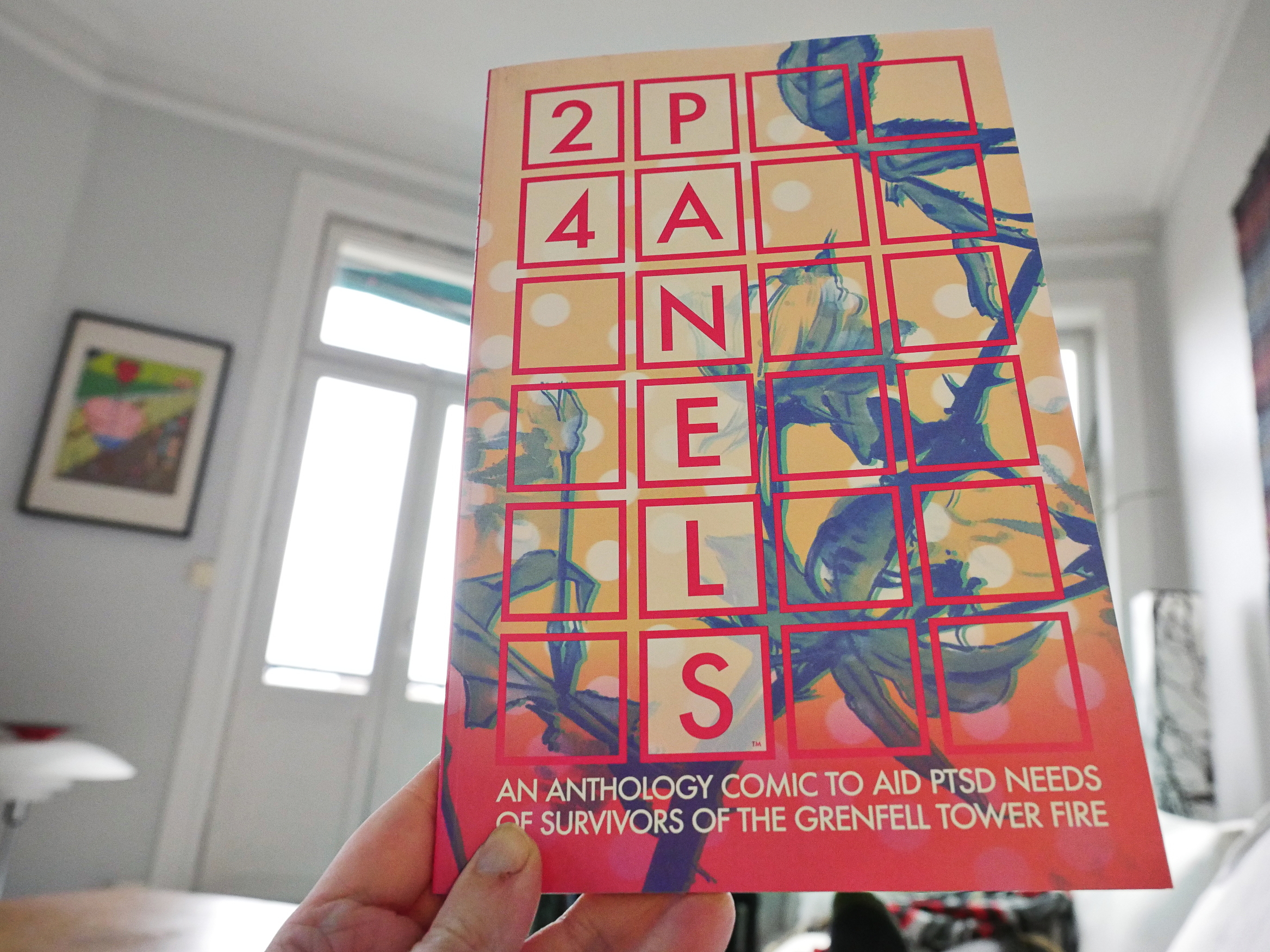
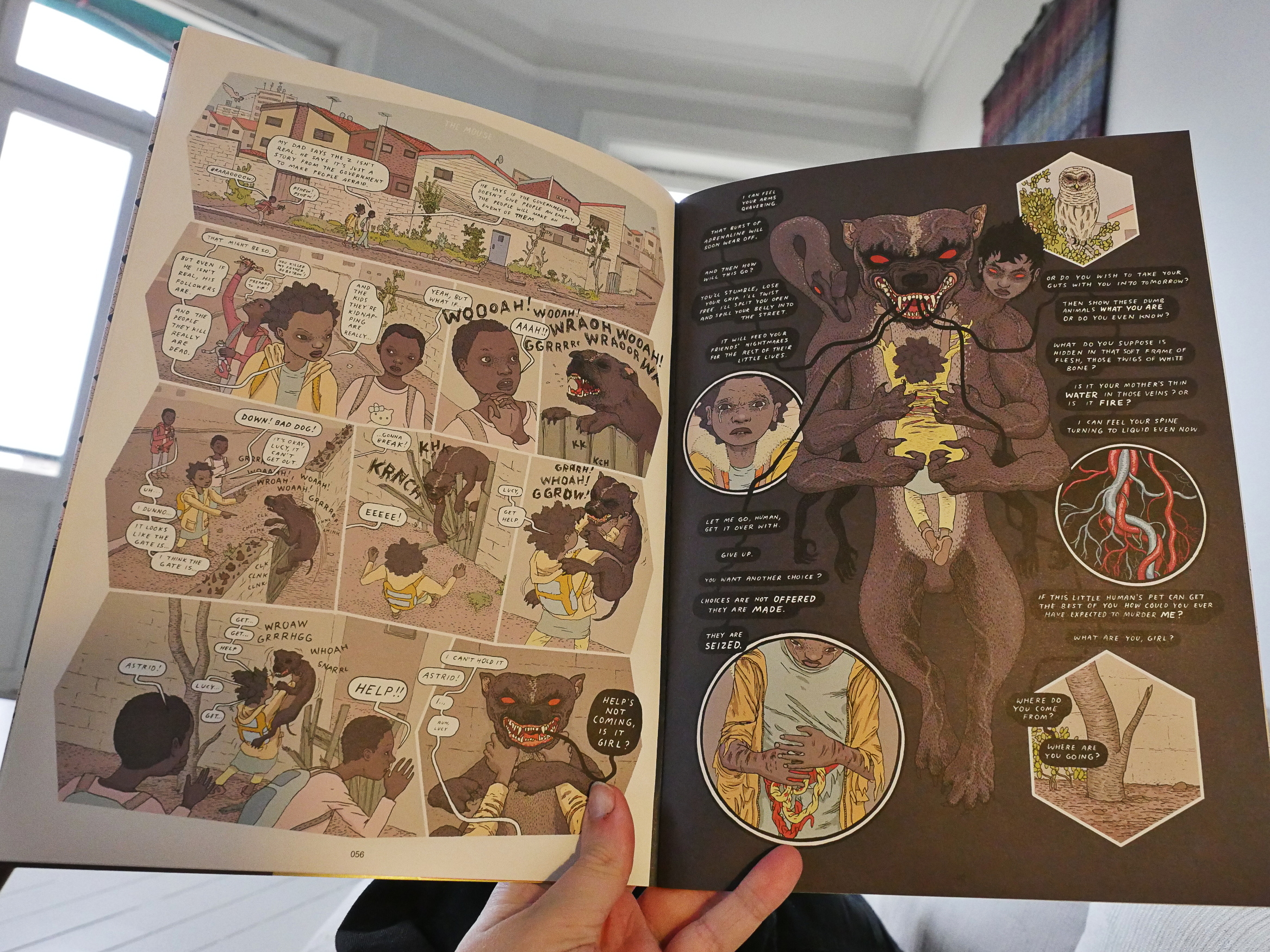
24 Panels (Image)
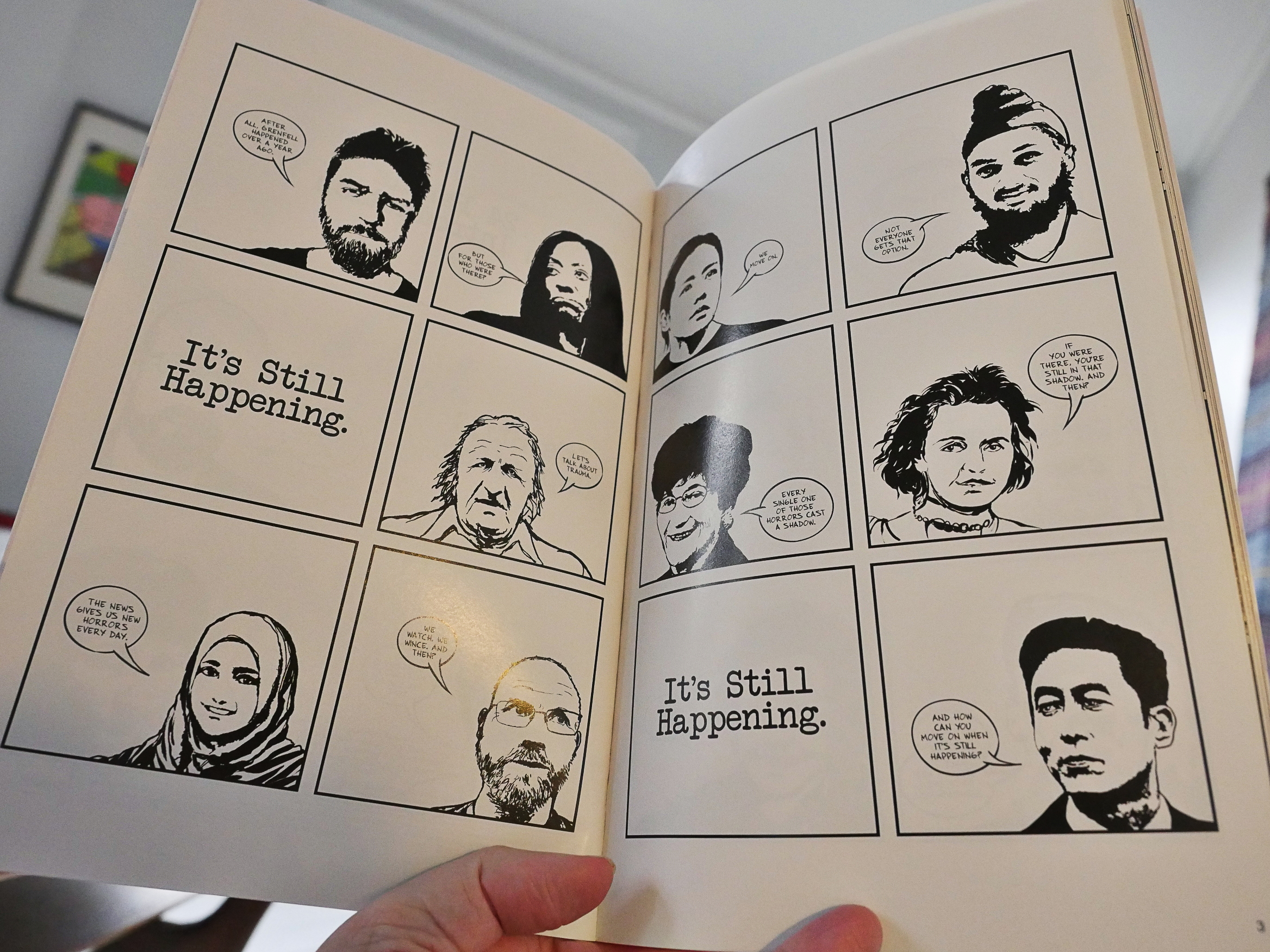
This is an anthology where the proceeds go to the survivors of the Grenfell Tower fire… and the name of the anthology stems from none of the stories (except the introduction, weirdly enough) has more than 24 panels. So I was expecting that to be a strong structural guide to the pieces, but:
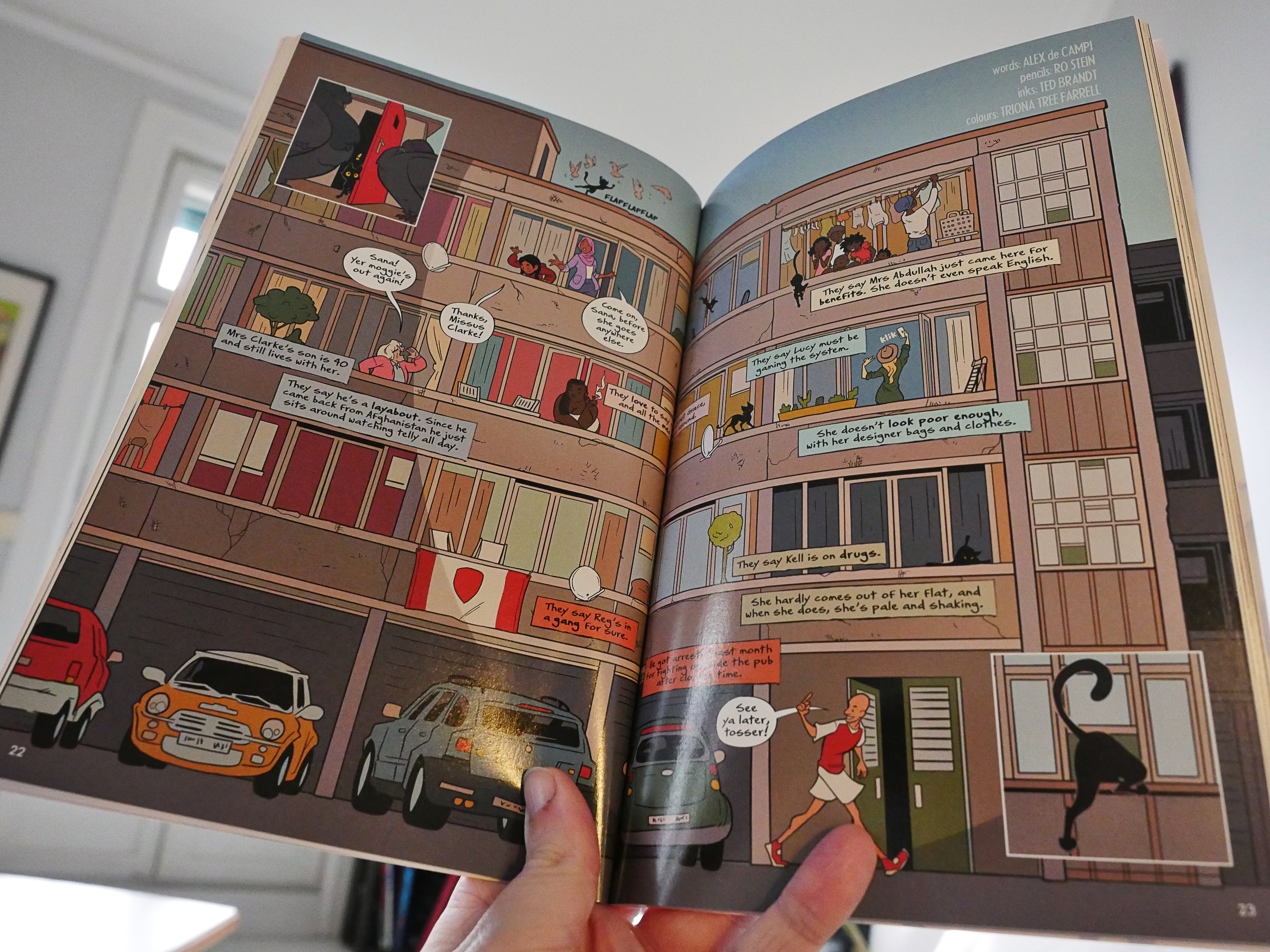
These are just normal anthology pieces: Some have panels, some don’t, and there’s really nothing either formally or thematically linking the pieces.
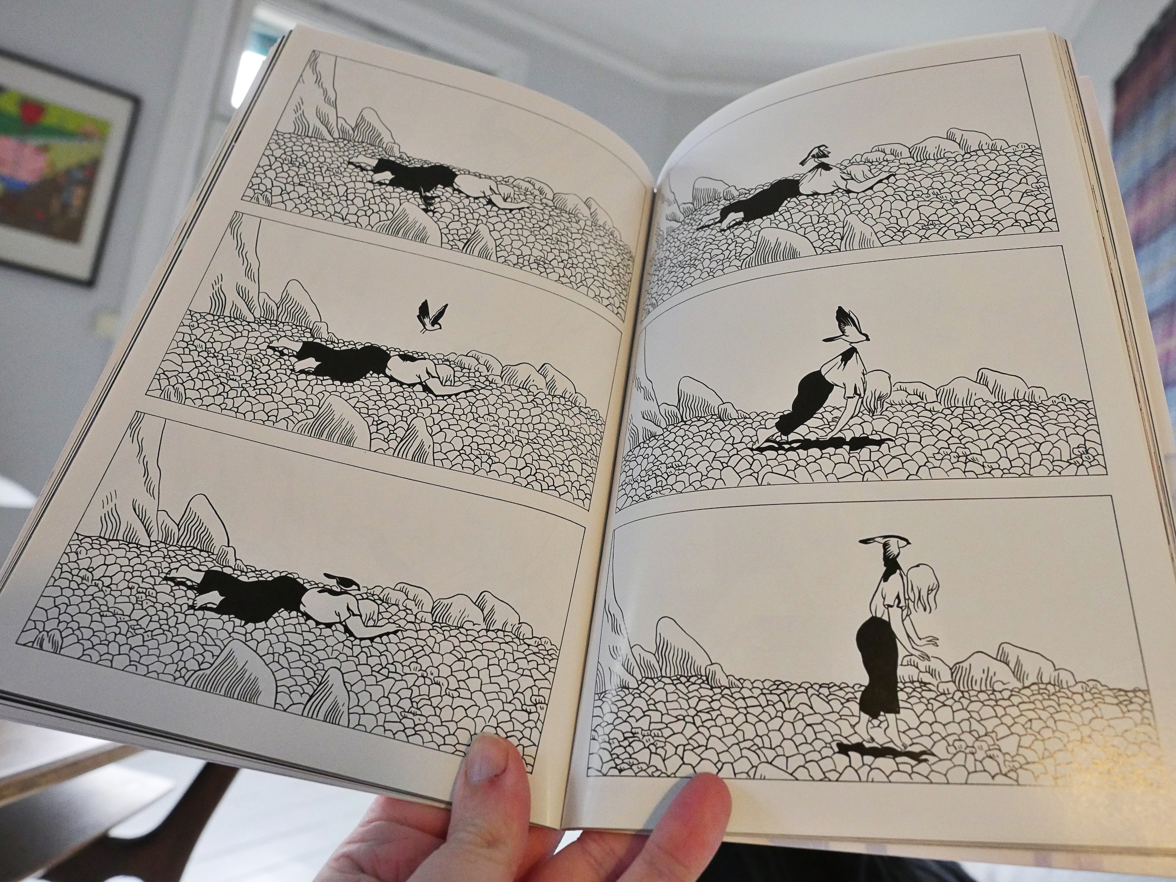
So we get a hodge-podge of work, but, surprisingly enough for this kind of thing, most of the pieces are pretty good.

It works a whole lot better than I was expecting.
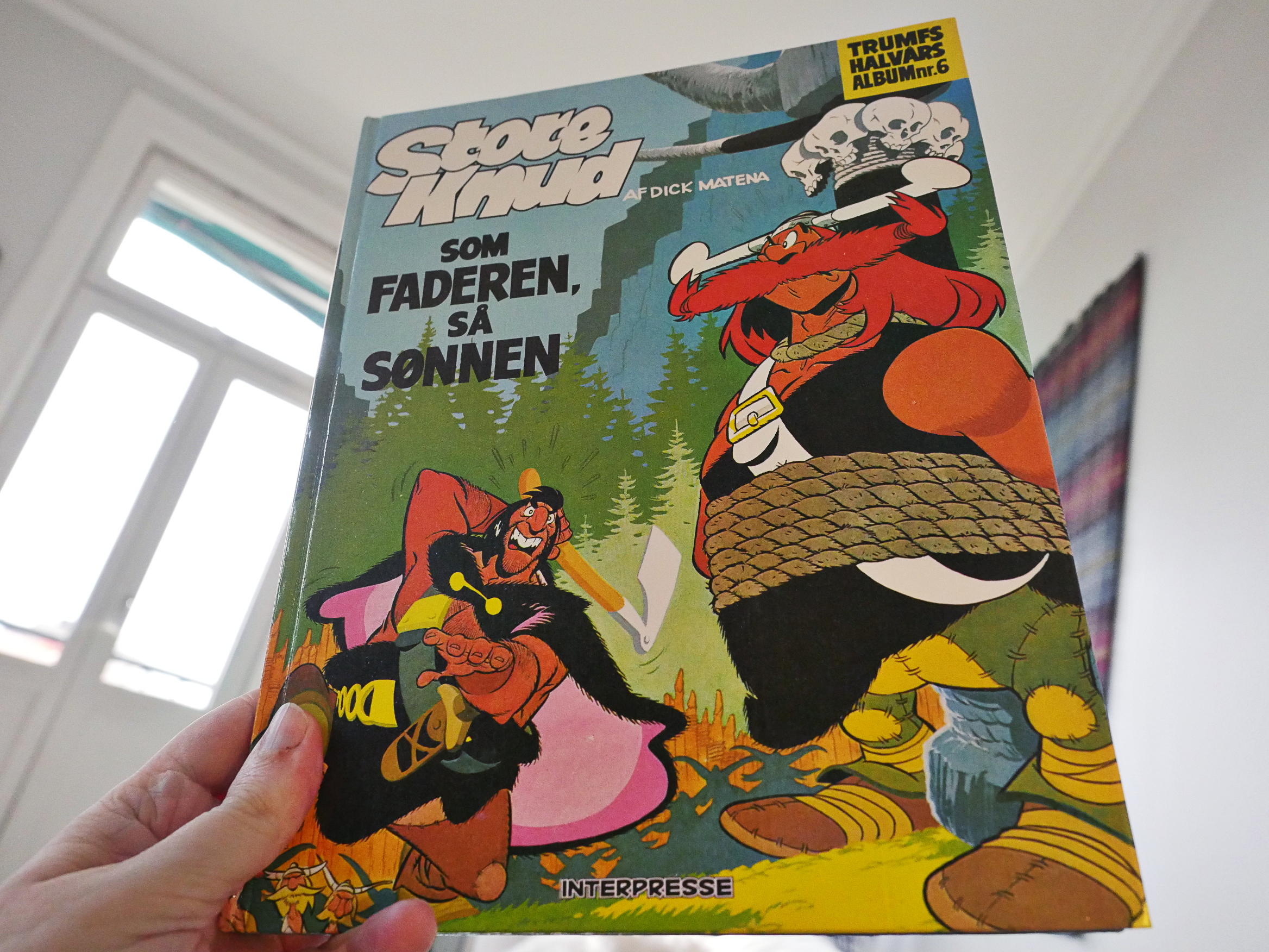
Grote Pyr 1 by Dick Matena (Interpresse)
I found this at a used bookstore, and I was intrigued because I’ve never heard of the author or the series before. It was published in the mid-80s, and Matena is apparently Dutch…
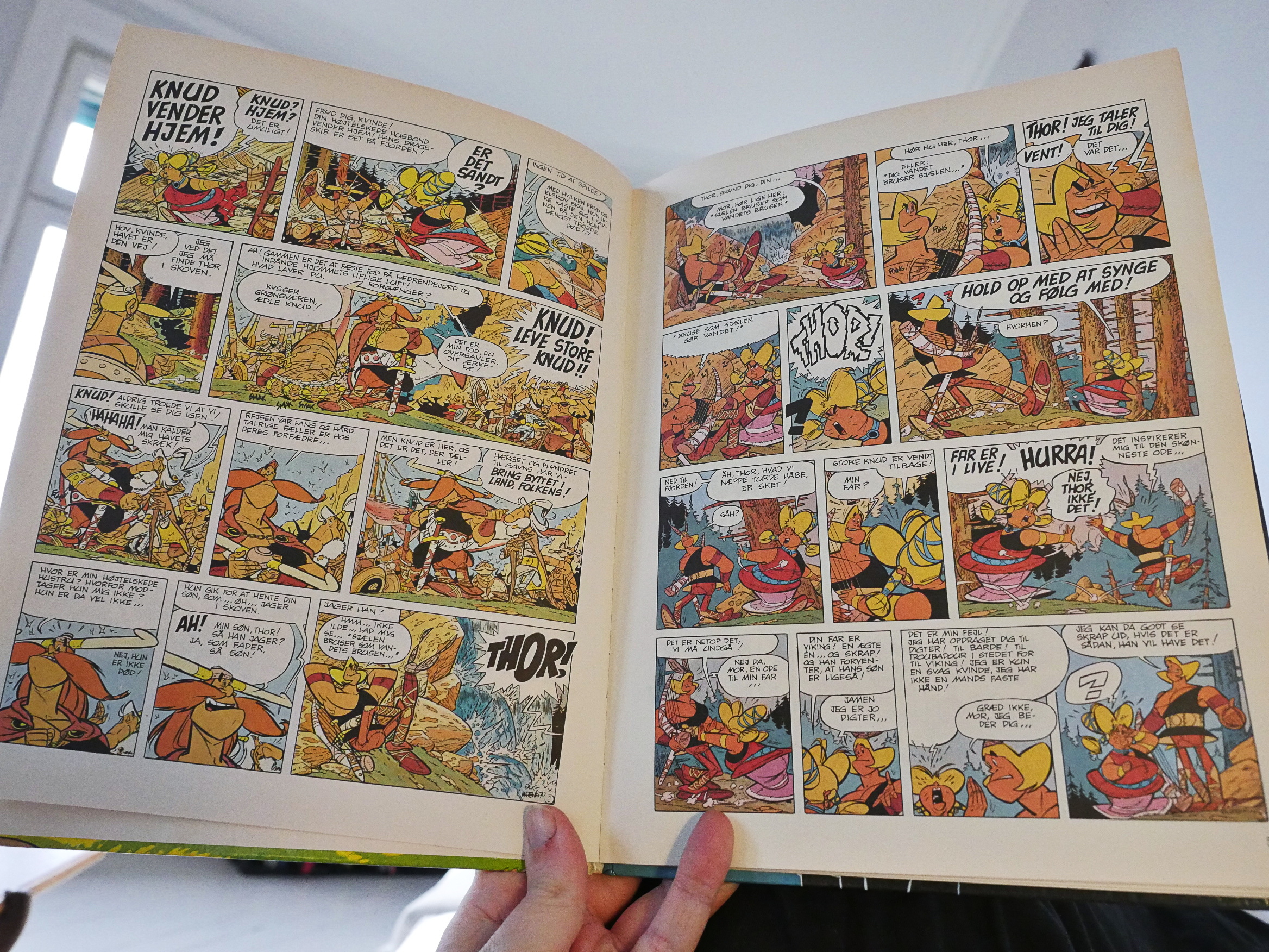
But opening this album now, my initial reaction was WTF? The artwork is so super-cluttered and busy that it makes my eyes swim, and that the character designs are so obviously crabbed from Albert Uderzo (while on acid) didn’t raise my confidence. The colouring doesn’t help, either, but perhaps it’s faded over the years.
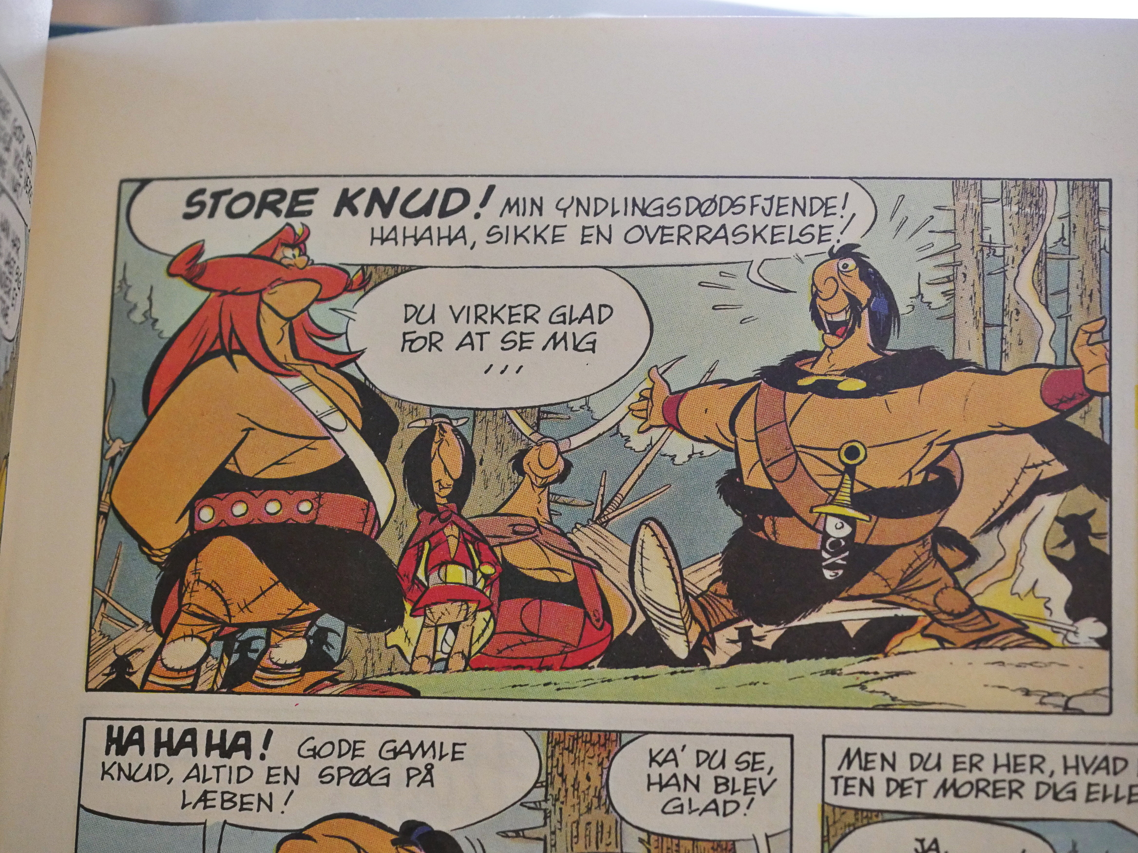
I mean… look at those characters: Straight out of Asterix, but with the settings on 11.
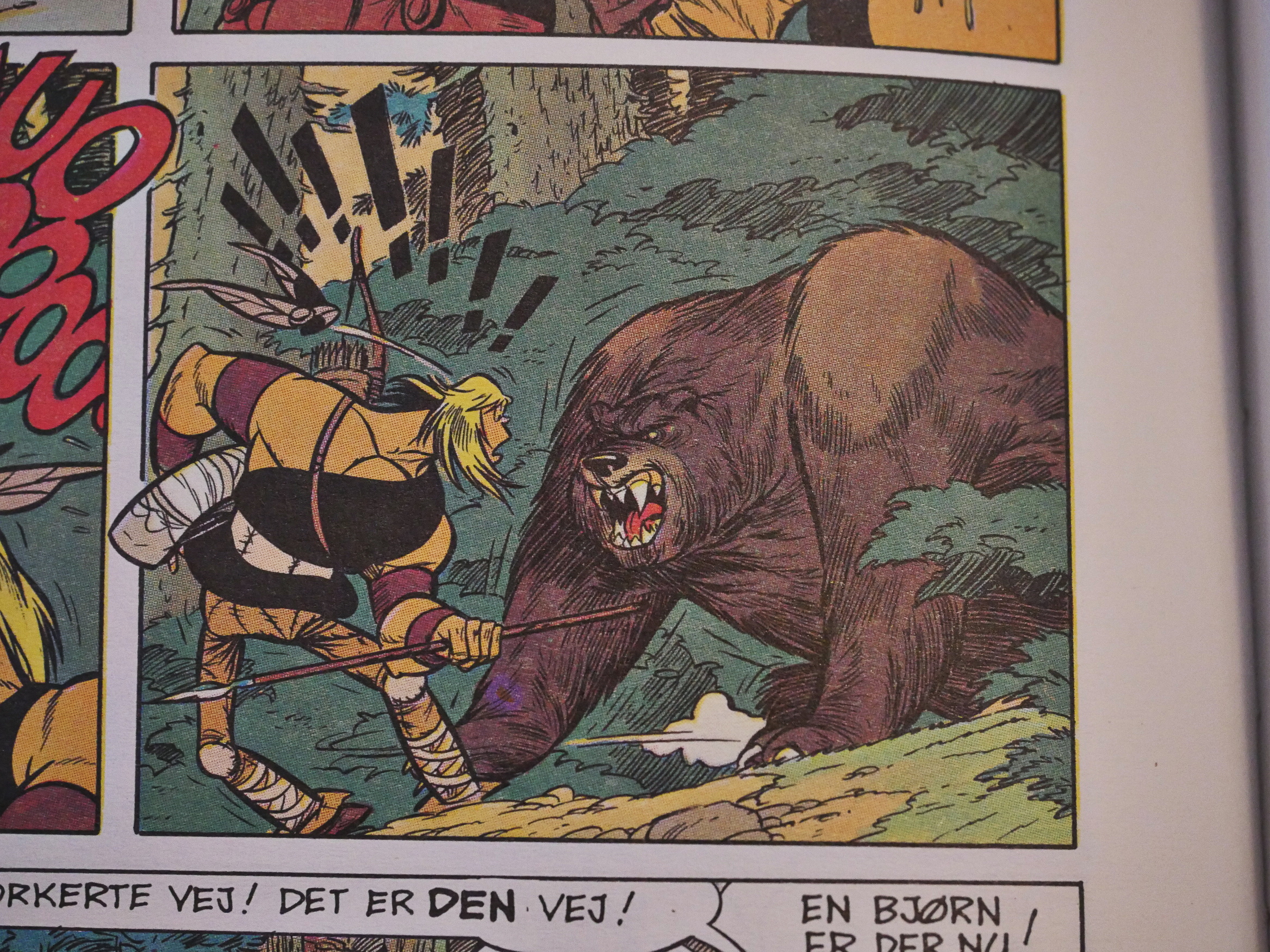
Sometimes it does kinda really work, like with that awesome bear.
So does it suck? No, it doesn’t. It’s very lively and quite funny and I would have loved it as a child.
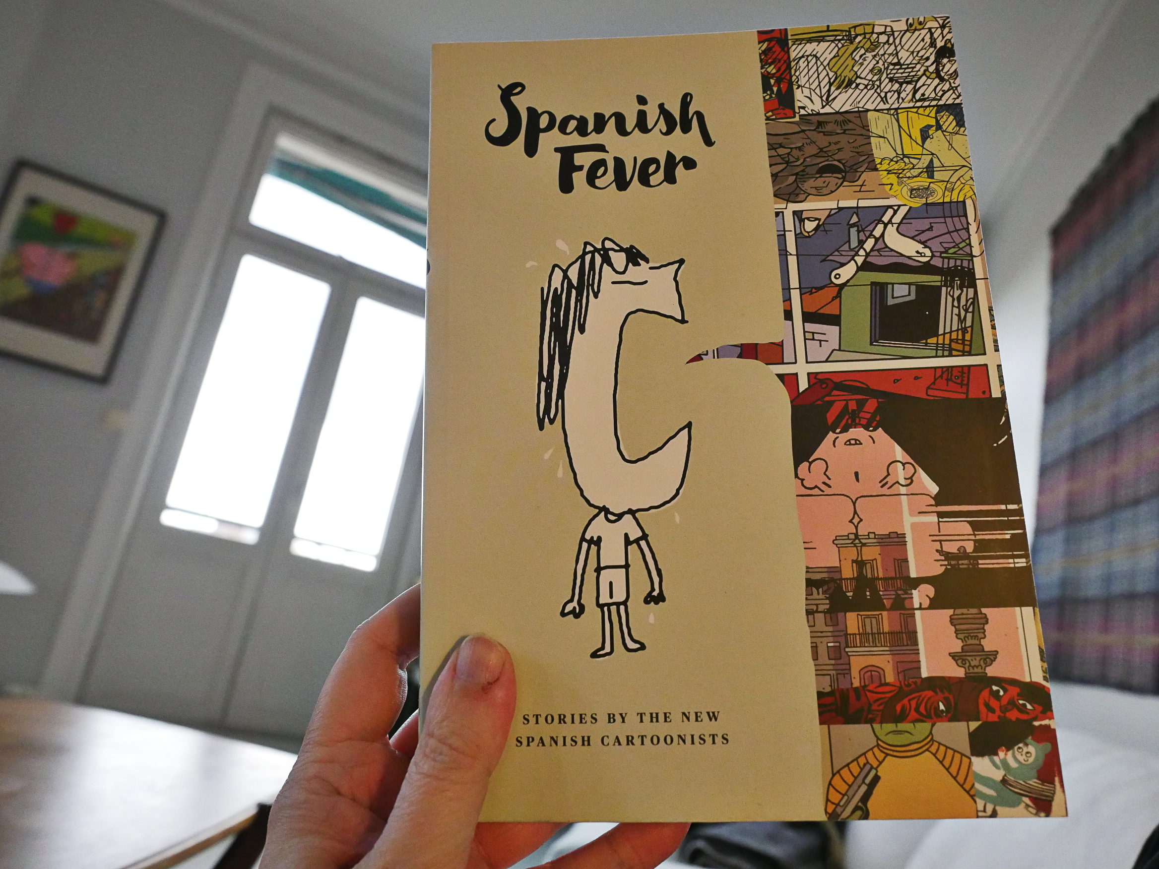
Spanish Fever edited by Santiago García (Fantagraphics)
This is an anthology from 2013 of Spanish comics. In the introduction, the editor lays it on heavily about how Spanish comics are the bees knees these days, so I was all set for a collection of masterpieces.
And… it’s not. They range from totally boring to quite OK, but the emphasis on conventionally narrative works really works against the anthology. It feels so stodgy, and some bits (like this one where the cartoonist lionises himself) is a bit on the embarrassing side.
Hey! Dramatic clouds.
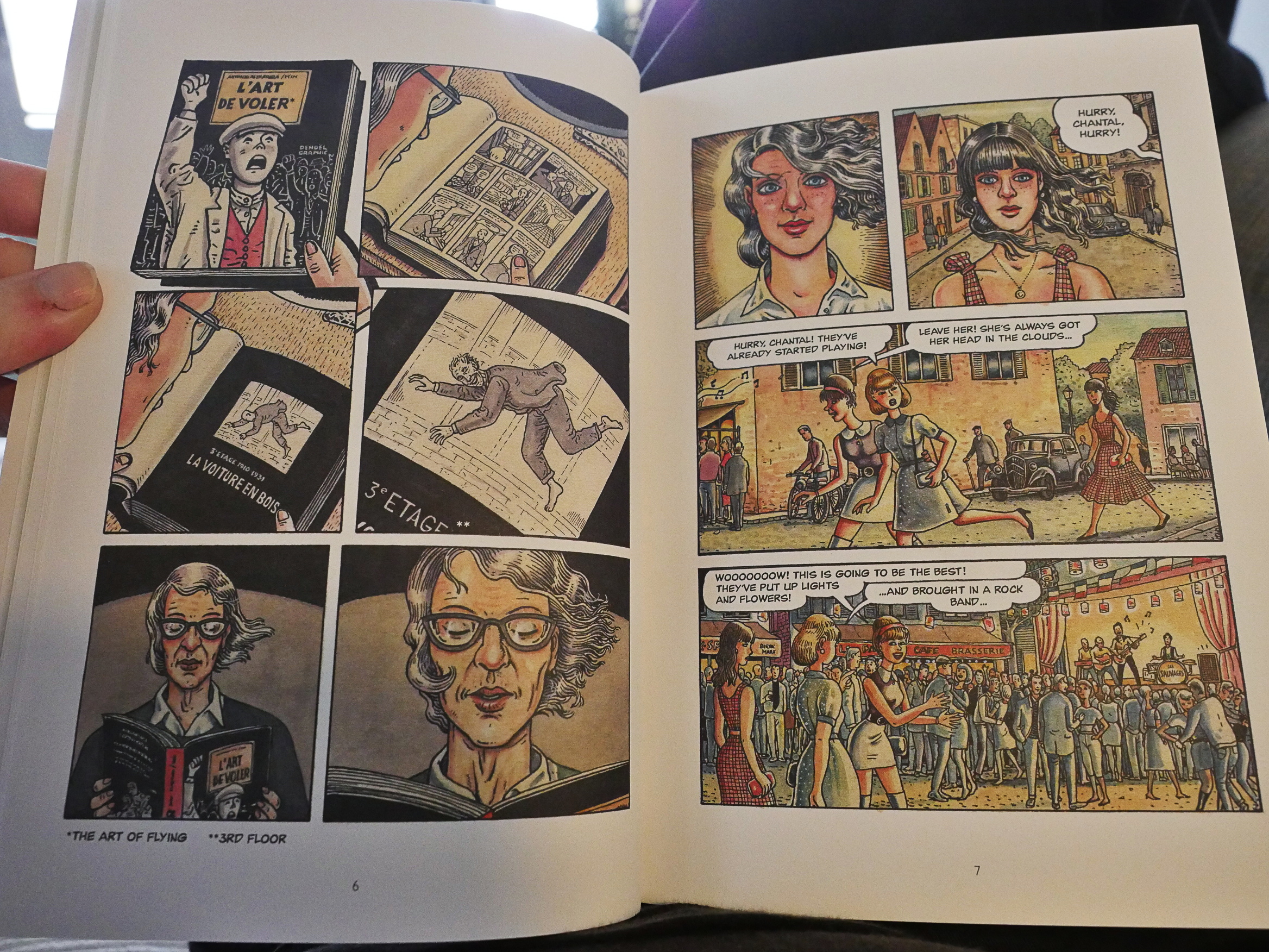
OK, there’s some good stuff in here, like this thing by Ana Galvañ.
Javier Olivares impresses too, with the super-expressive artwork and harrowing storyline.
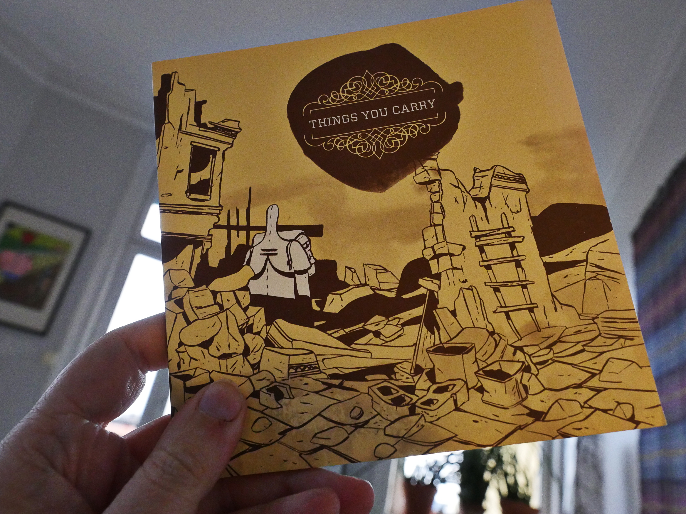
Things You Carry by Vincent Stall (2d cloud)
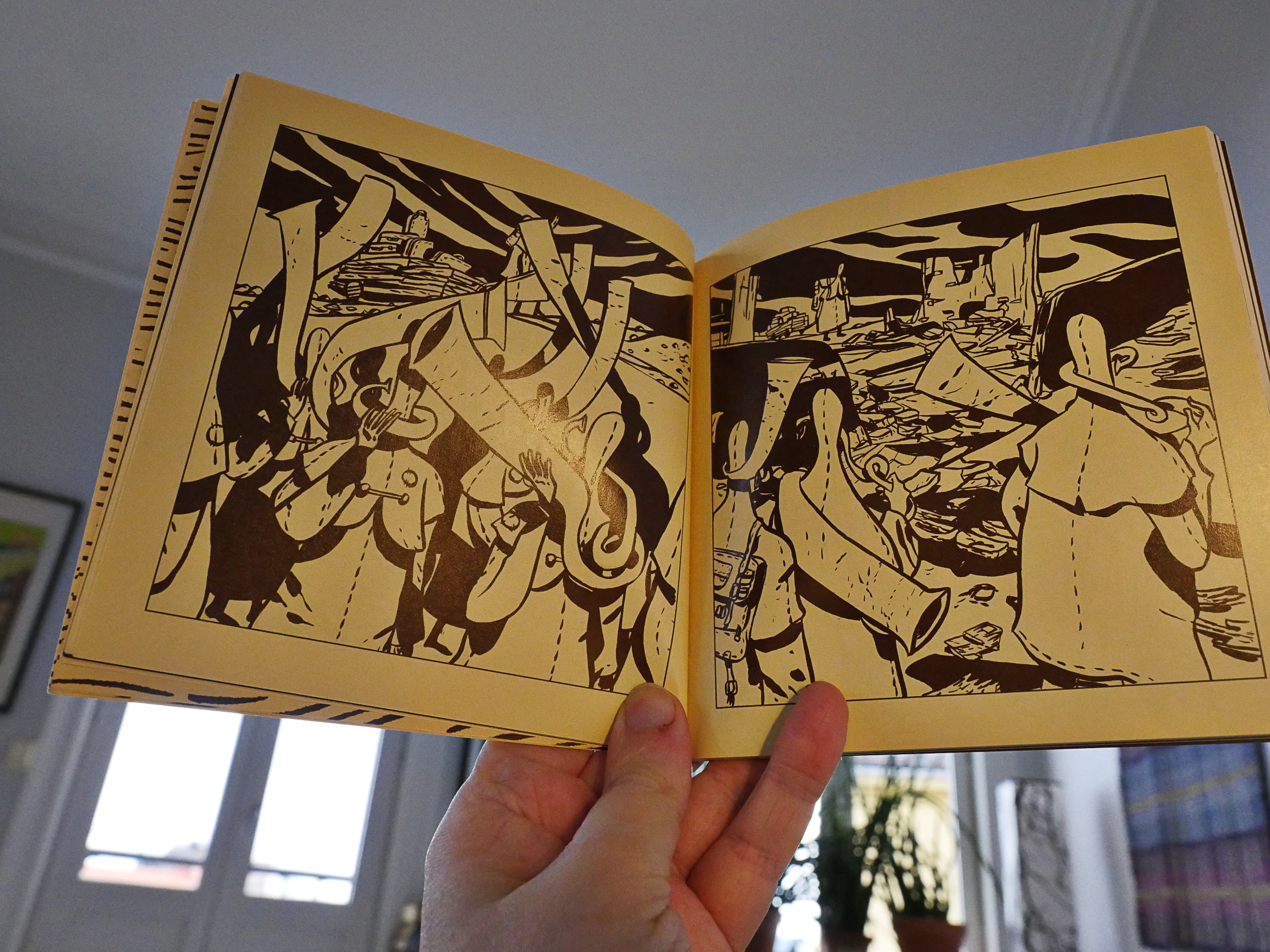
Well, this is an odd little book. I kinda like the artwork, but the storyline has something video gameish about it… I think. I don’t quite know why, but it just has that feeling to me.
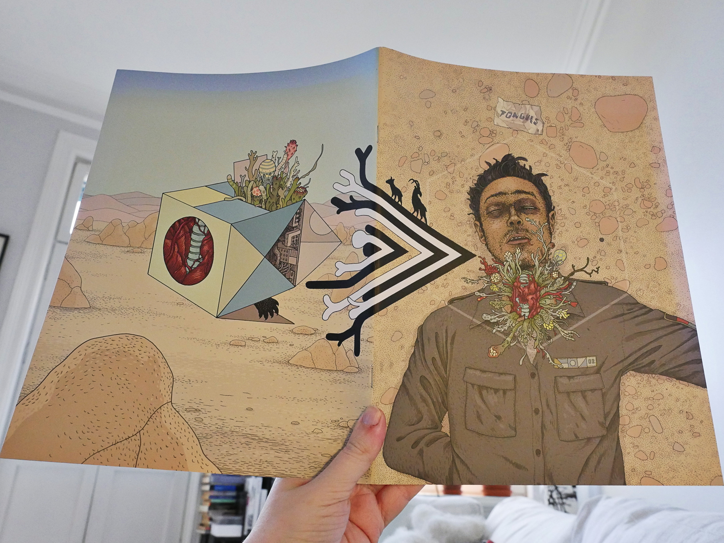
Tongues #2 by Anders Nilsen
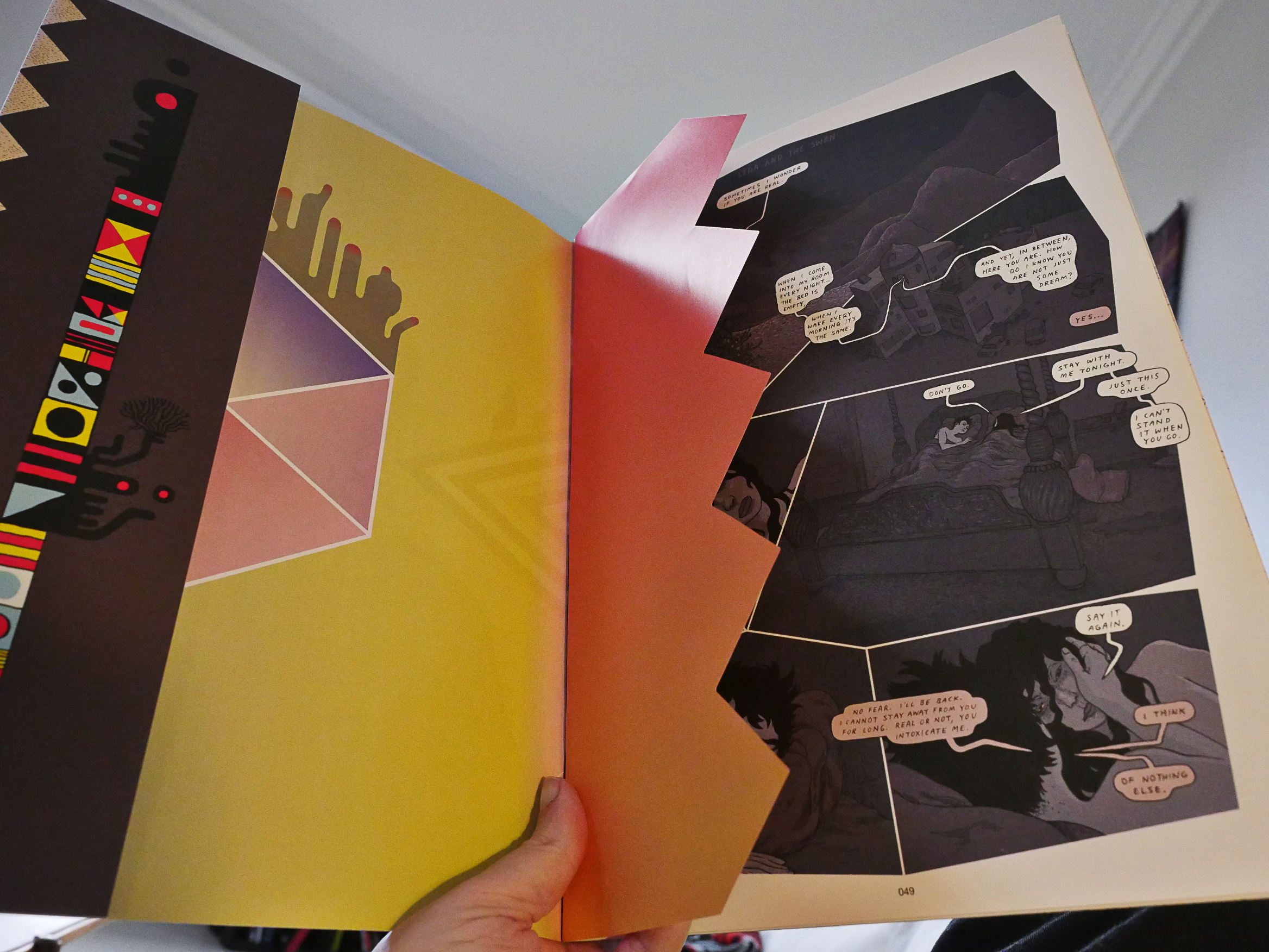
Huh; I had totally forgotten that I hadn’t read this yet. And look at the fancy printing!
This is very much an in-progress kind of book, and I’ve totally forgotten what the first issue was about, but it’s completely riveting anyway. The confusion perhaps makes it even more compelling: It’s creepy, tense and vital.
And so beautifully presented in these oversized pages.
Can’t wait for the next issue, which is apparently going to be published by Fantagraphics and released in a couple of months?
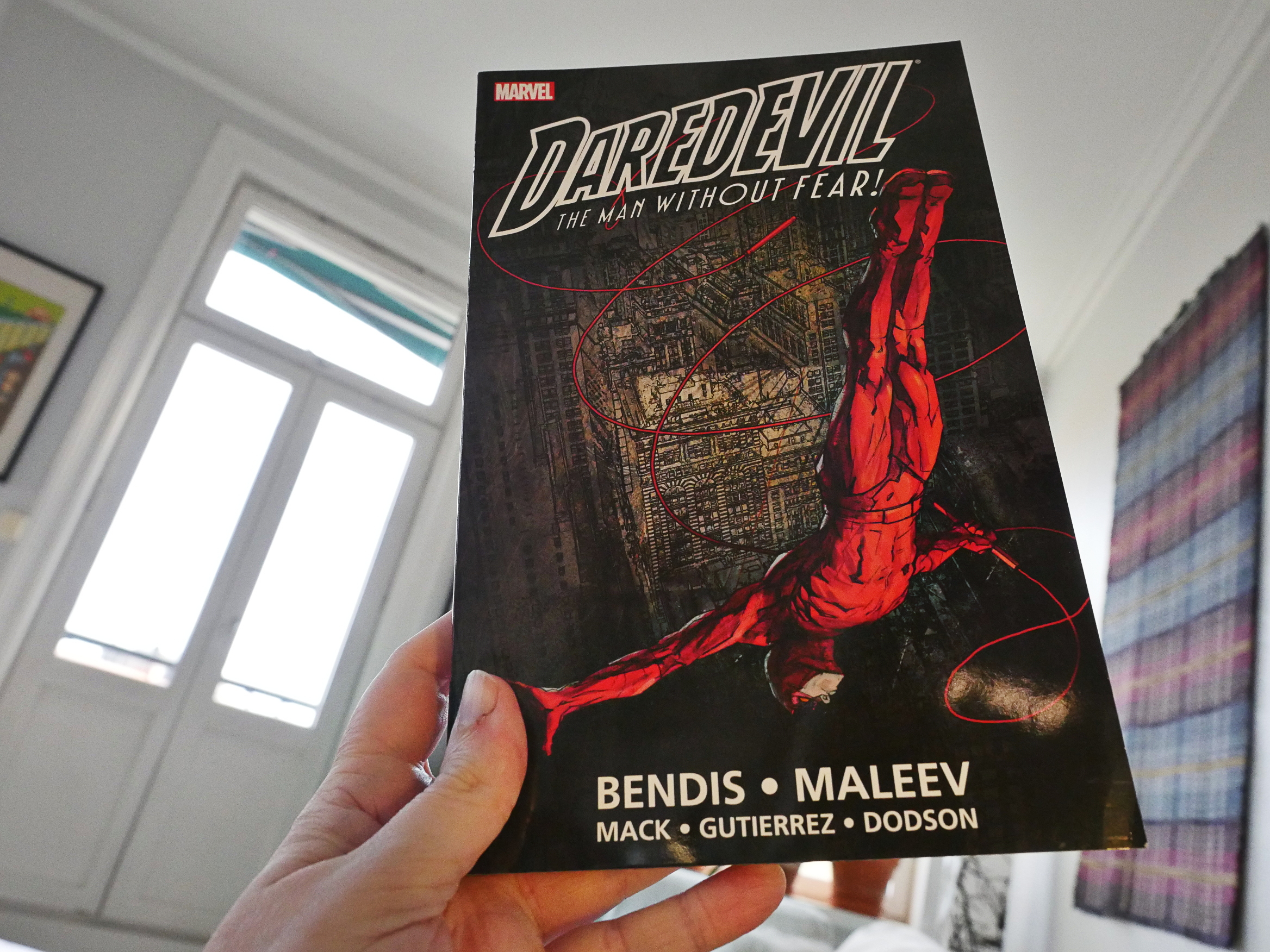
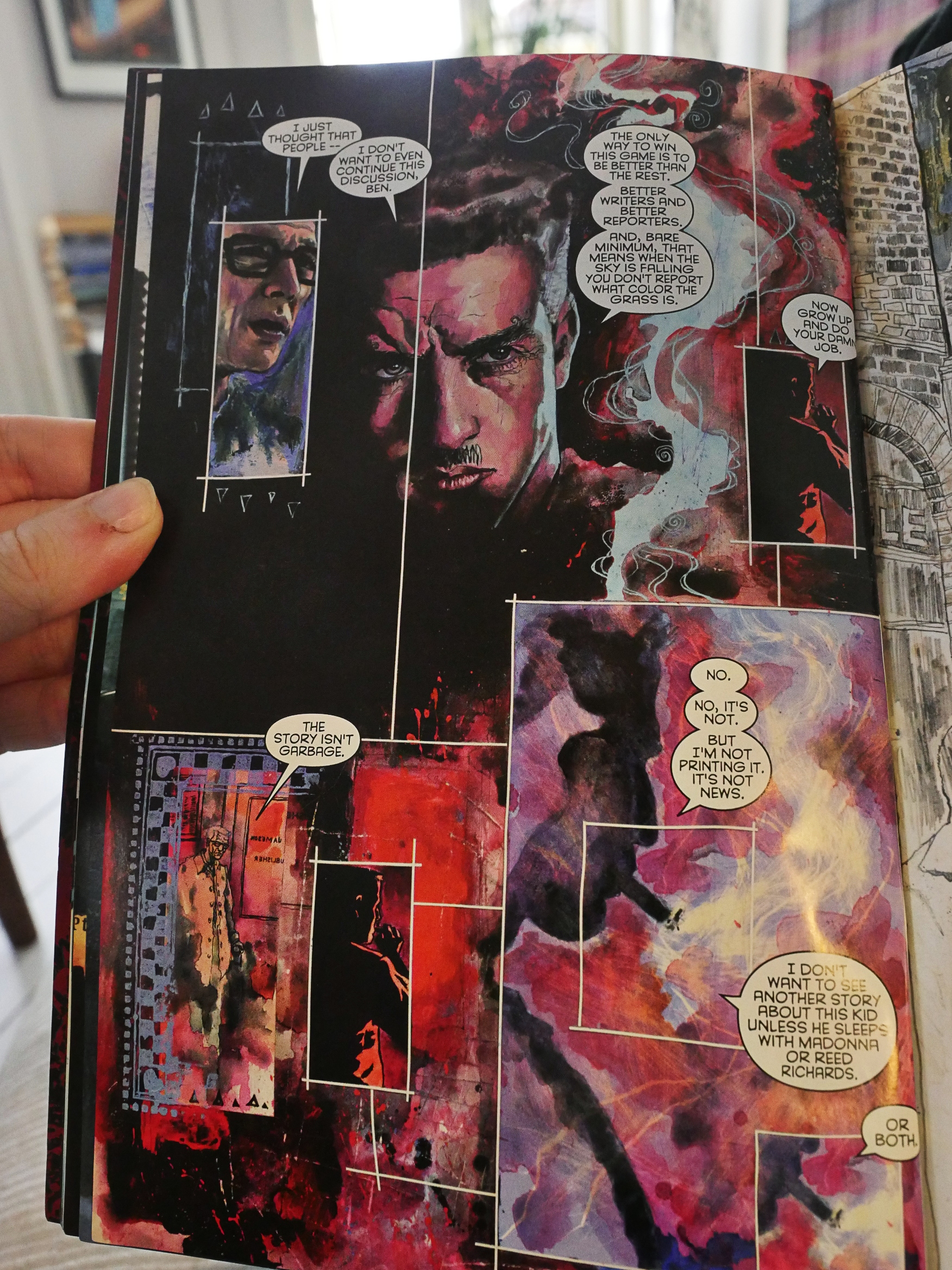
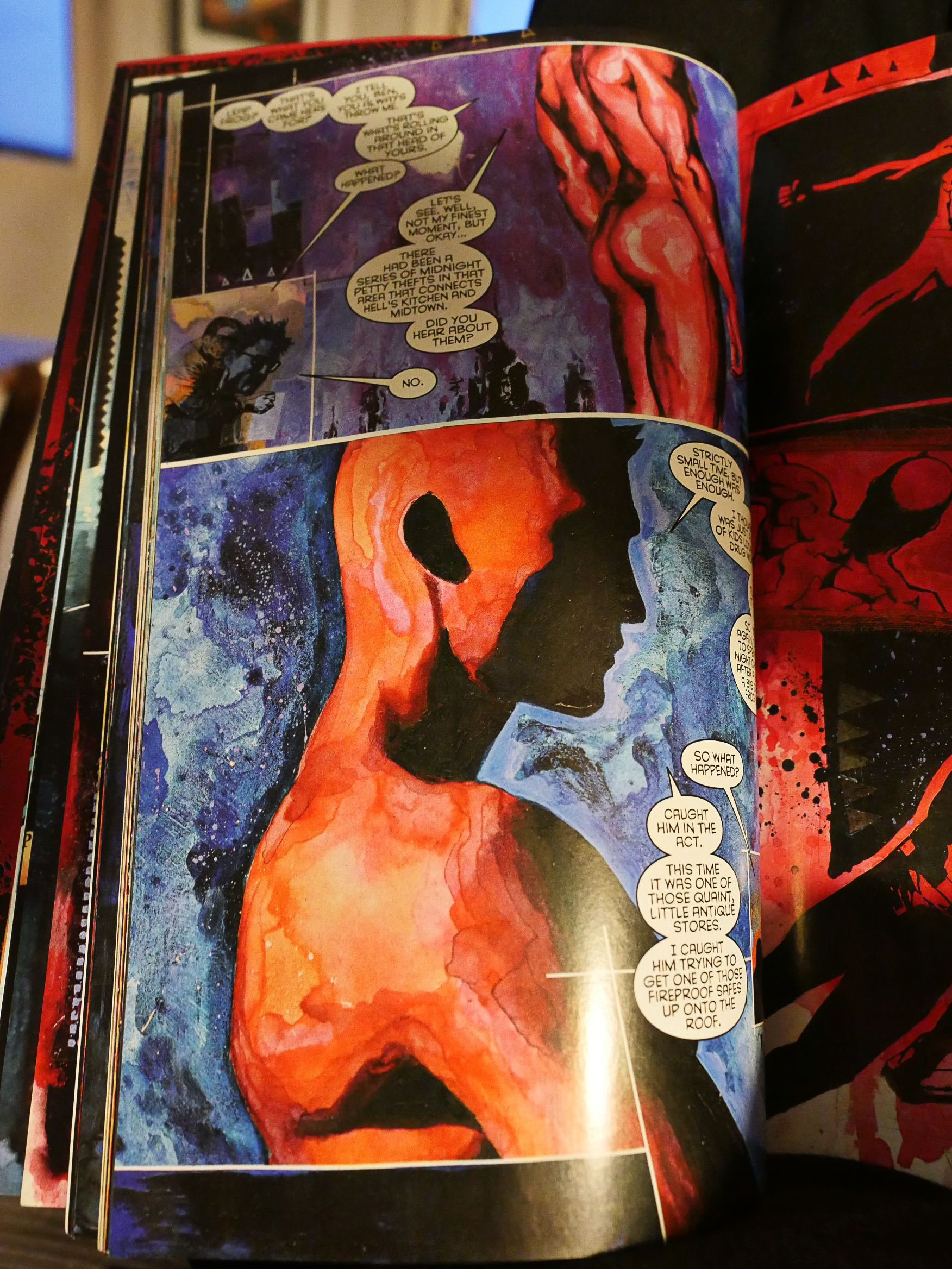
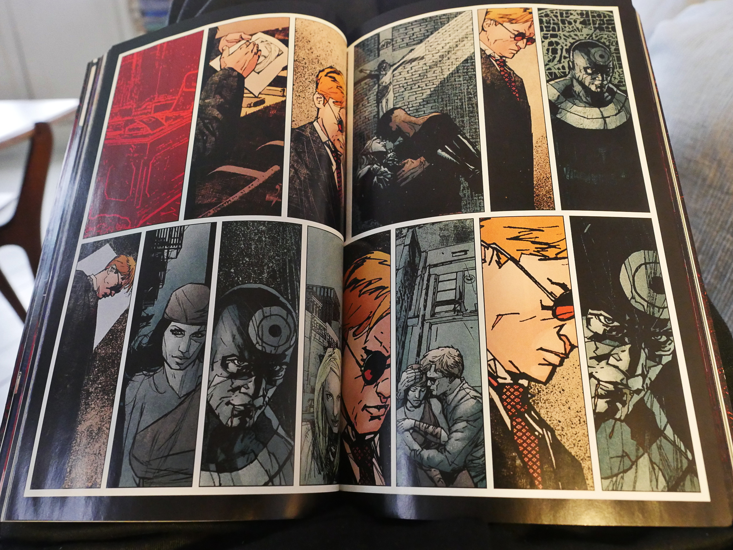
Daredevil vol 1 (!?!) by the people above there (Marvel)
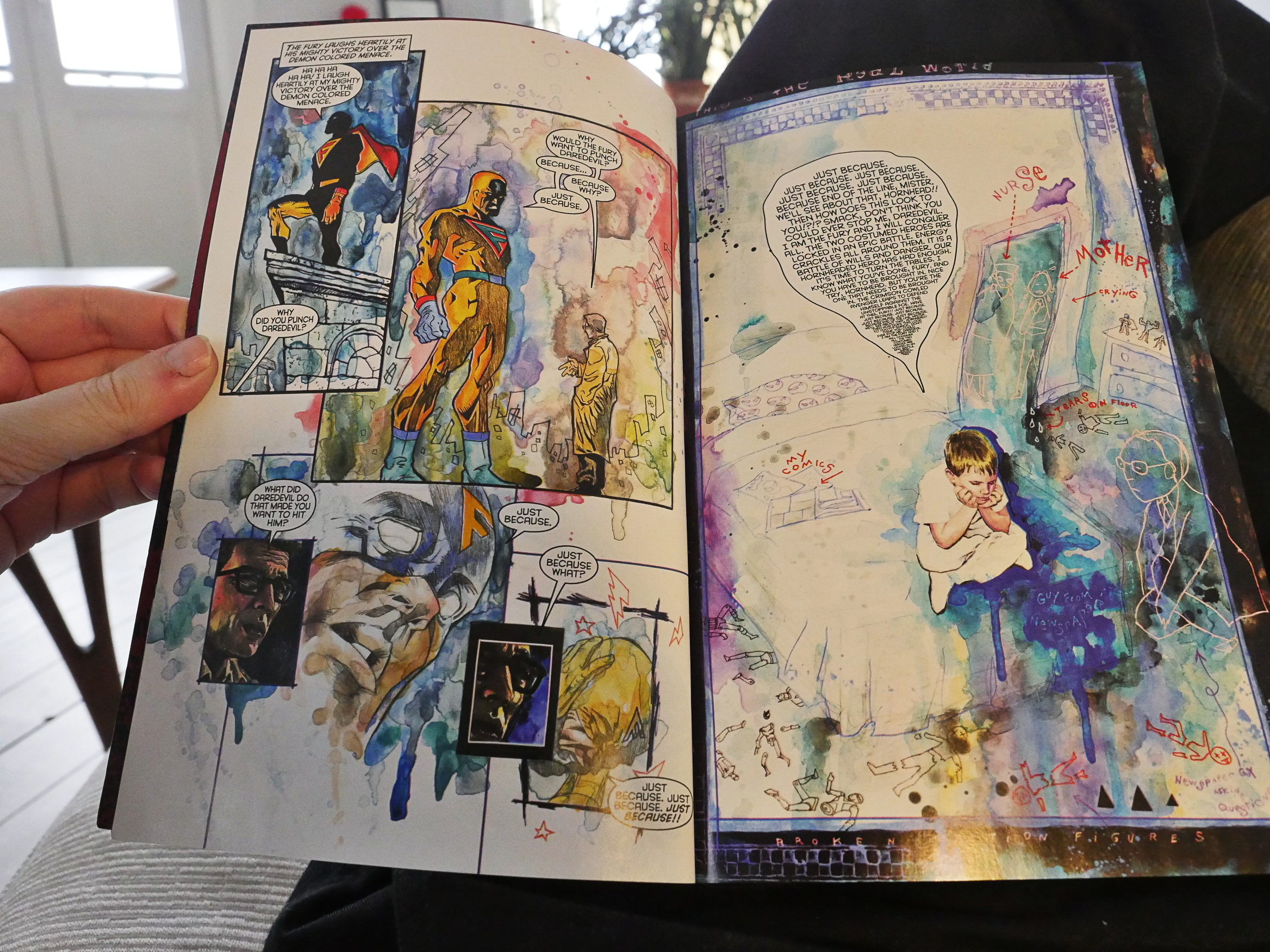
I bought this because somebody wrote somewhere that this was supposed to be pretty entertaining as super-hero comics go… And I guess it is. I mean, it’s standard TV superhero drama stuff, and I wouldn’t have watched it on TV, but the artwork’s pretty nice.
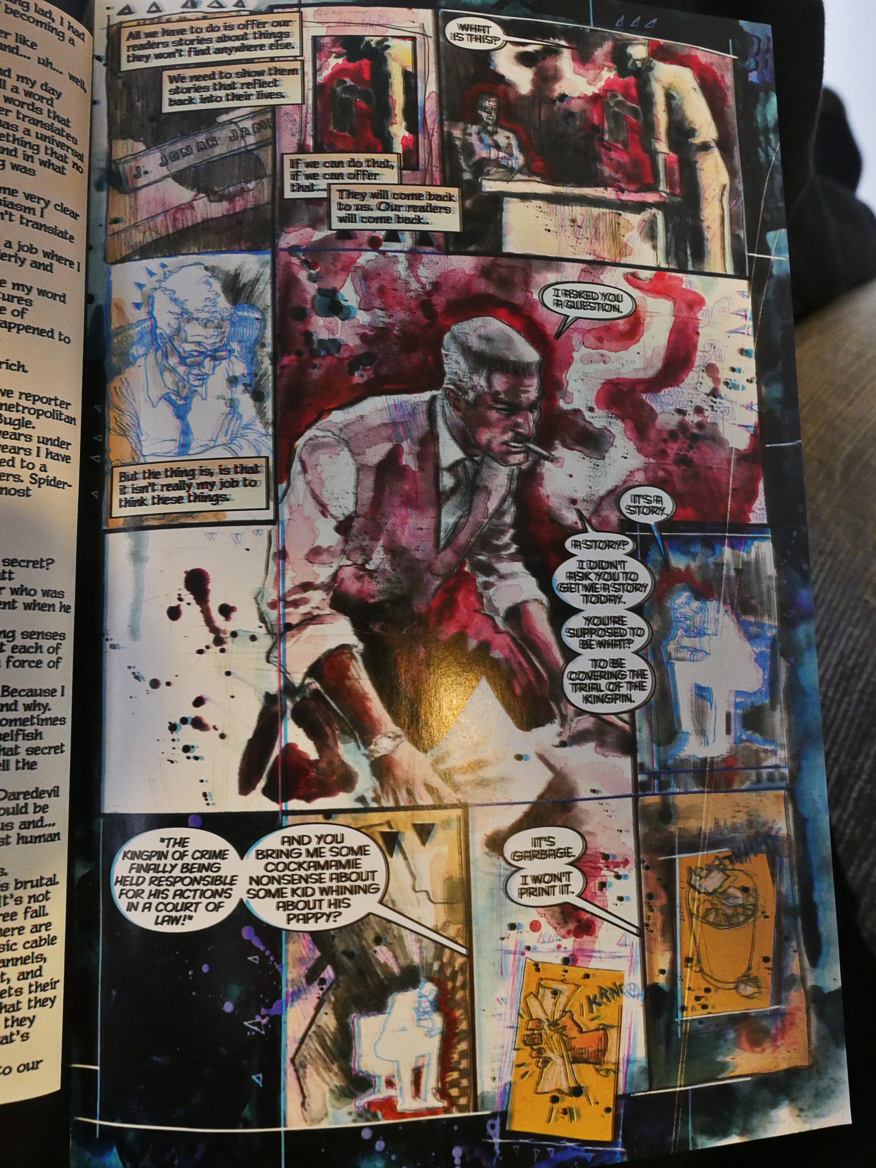
The printing on some of the pages is atrocious, though.
Hm… is this what Maleev’s art looks like? I thought it looked scratchier… Oh! This is by David Mack, which makes more sense. I like the little Bill Sienkiewicz quotations he puts in there, what with the patterned borders and little triangles floating around. It’s fun.
And, uh, and…
Anyway, this is Maleev. It’s nice.
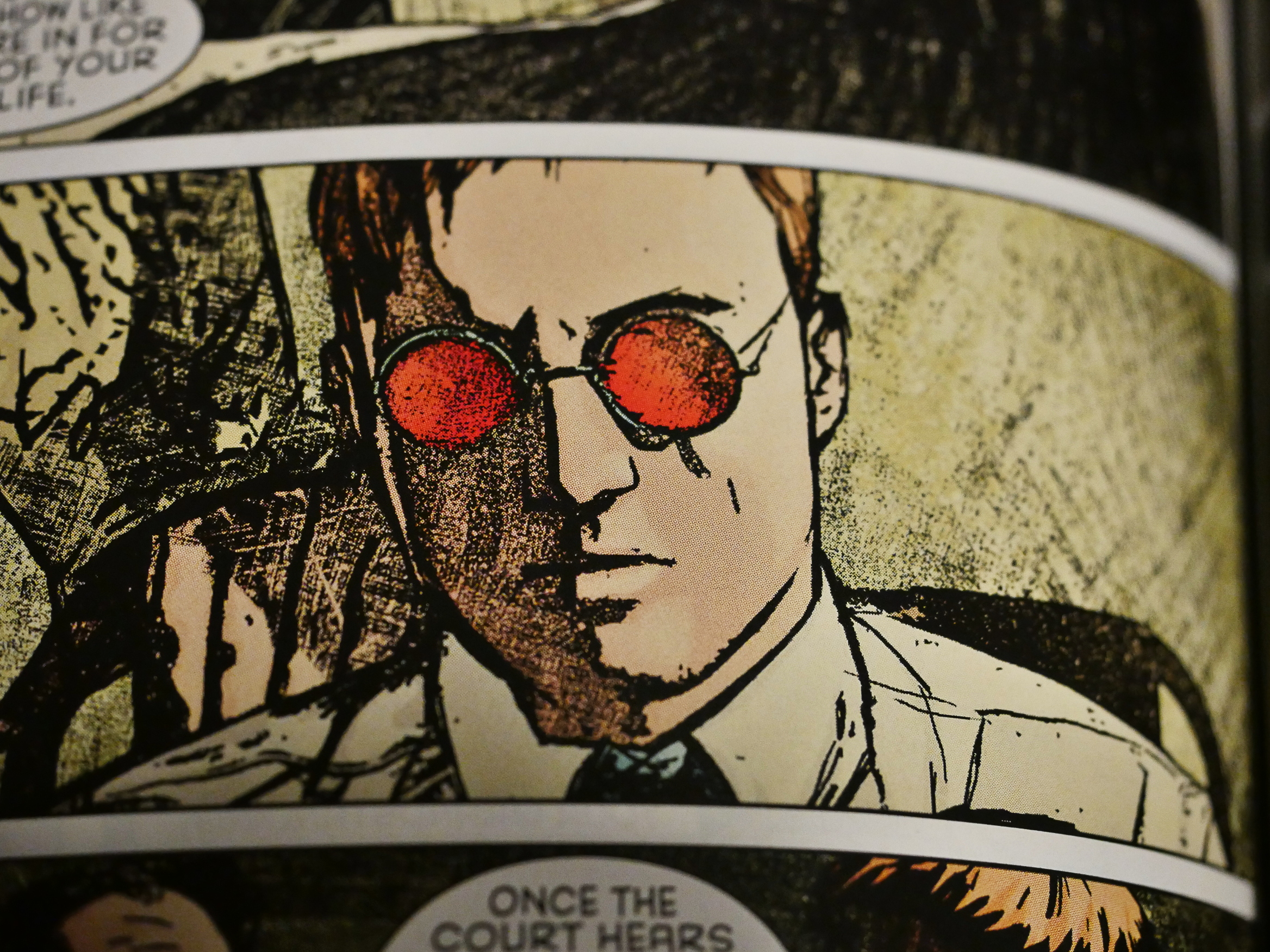
But when he goes for that picture-through-a-xerox look it gets pretty stiff.
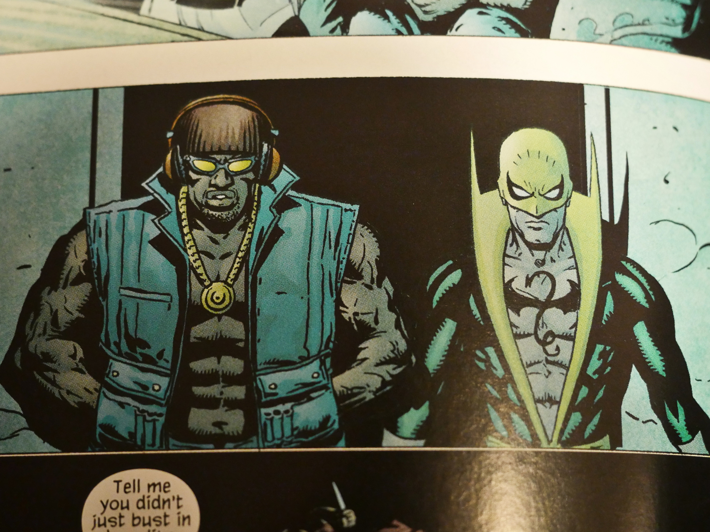
But at least it’s better that the people who took over on the last few issues reprinted in this issue.
Dude.
Anyway, this collection is not horrible or anything, but it’s not… like… worth reading.
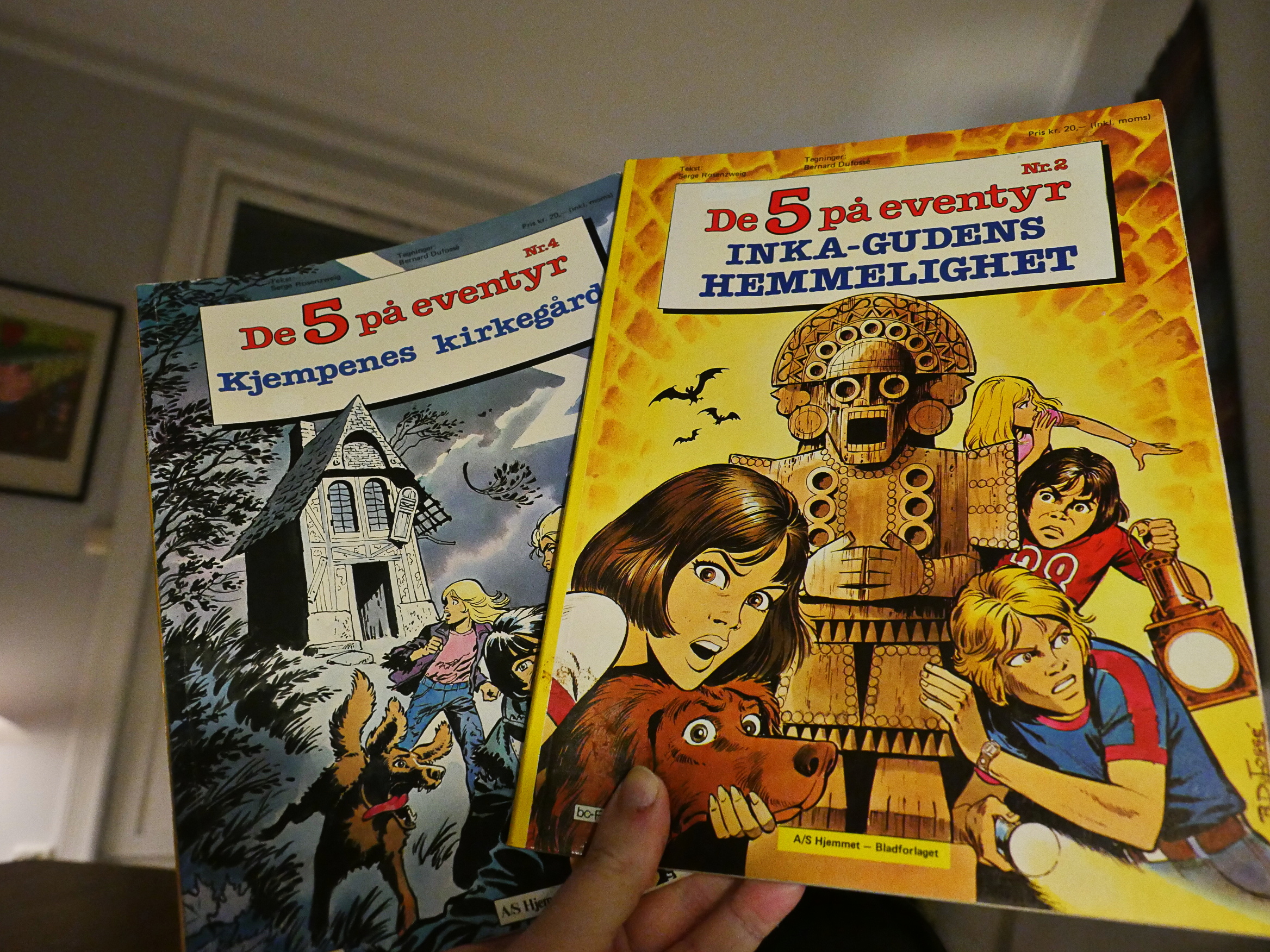
Les Cinq 2 & 4 by Serge Rosenzweig and Bernard Dufossé (Hjemmet)
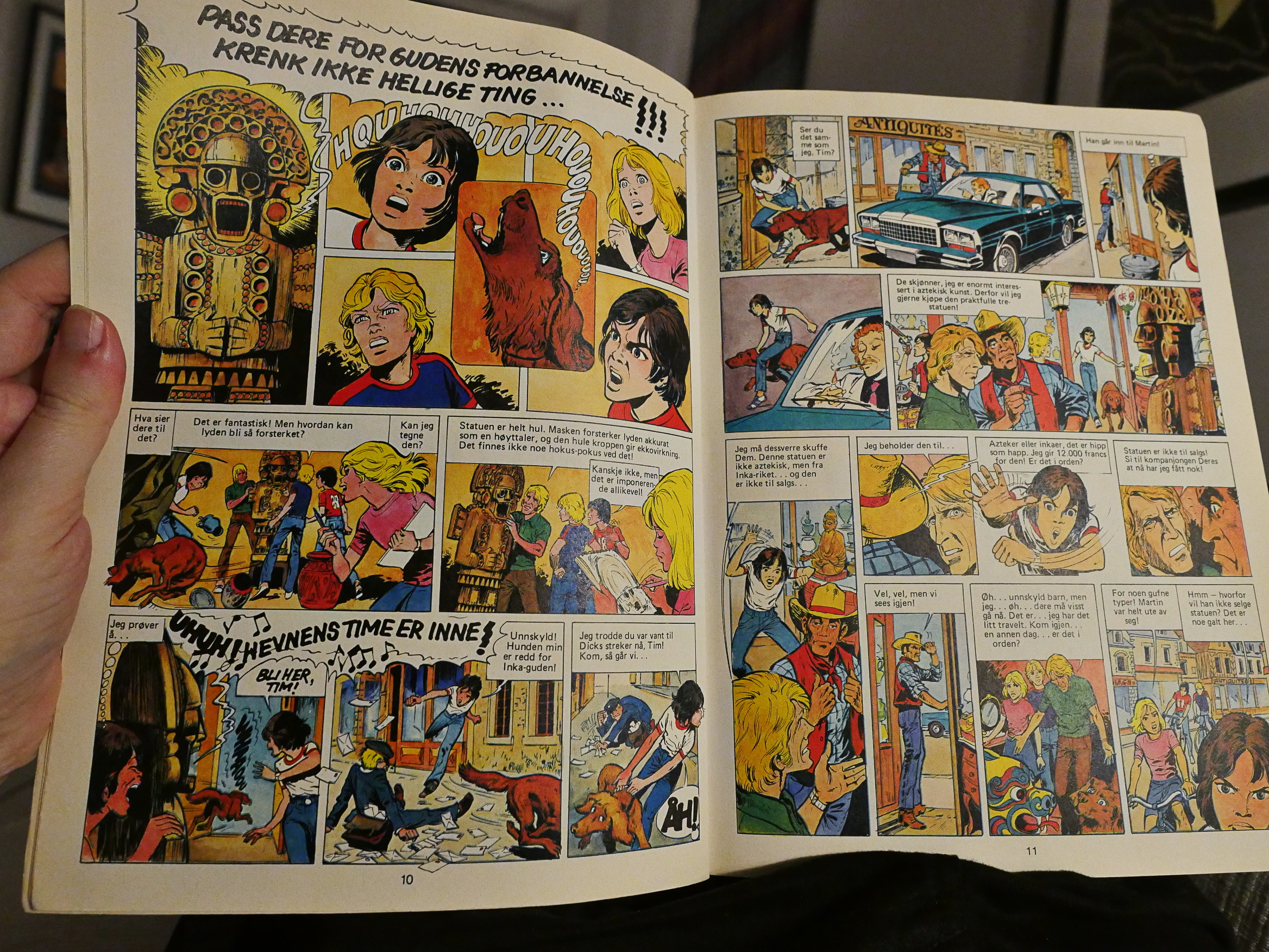
This is another pair of albums I picked up at the used bookstore, and which I know nothing about. Or perhaps I’ve just repressed the memory and I did read these once as a child? It’s possible, because they’re not very memorable. Not horrible, not good, just sort of… there. I could see somebody who is ten reading these and finding them entertaining enough.
They’re inspired by the Enid Blyton book series, but set in France.
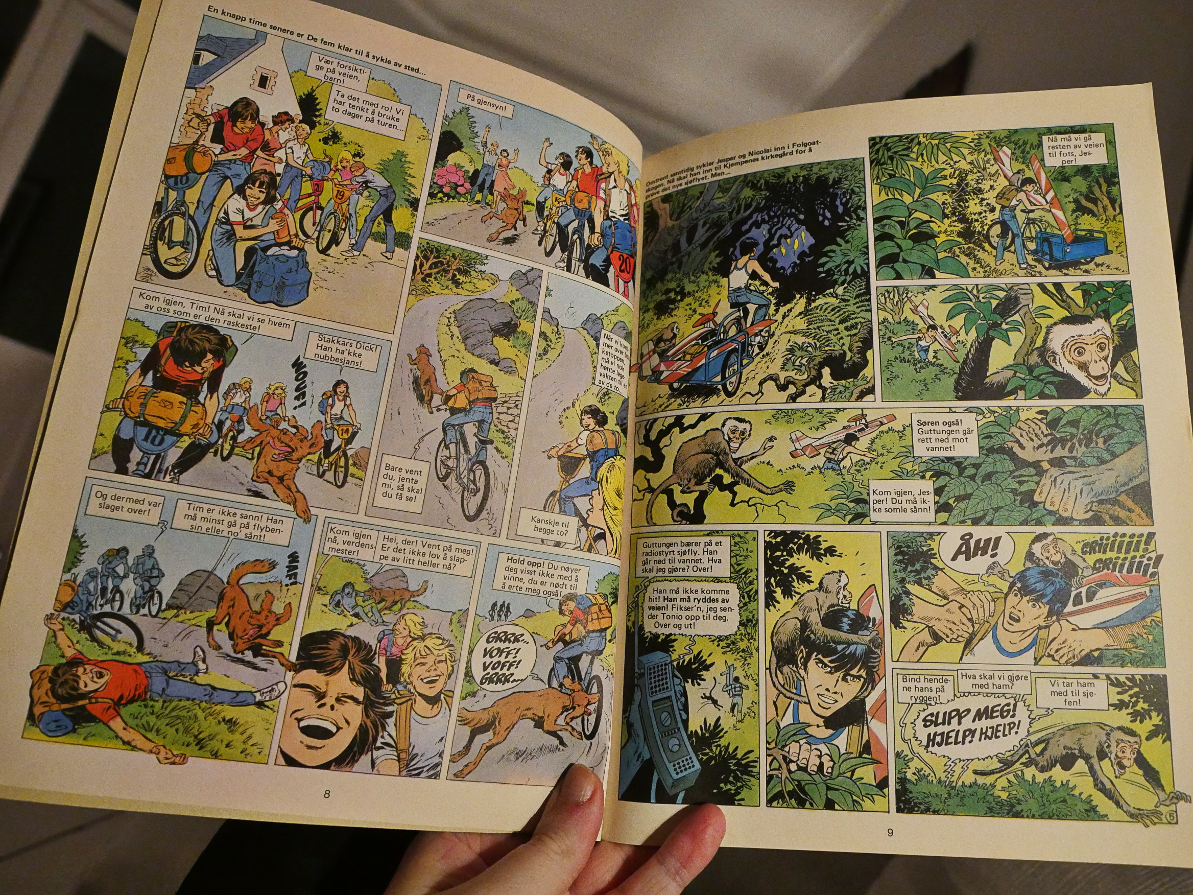
I think I’ll… re-gift them. (I didn’t make it all the way through the second album.)
OK, perhaps it’s time to call it a day and hope I’ll make it through the remaining comics in the next instalment of this blog series.