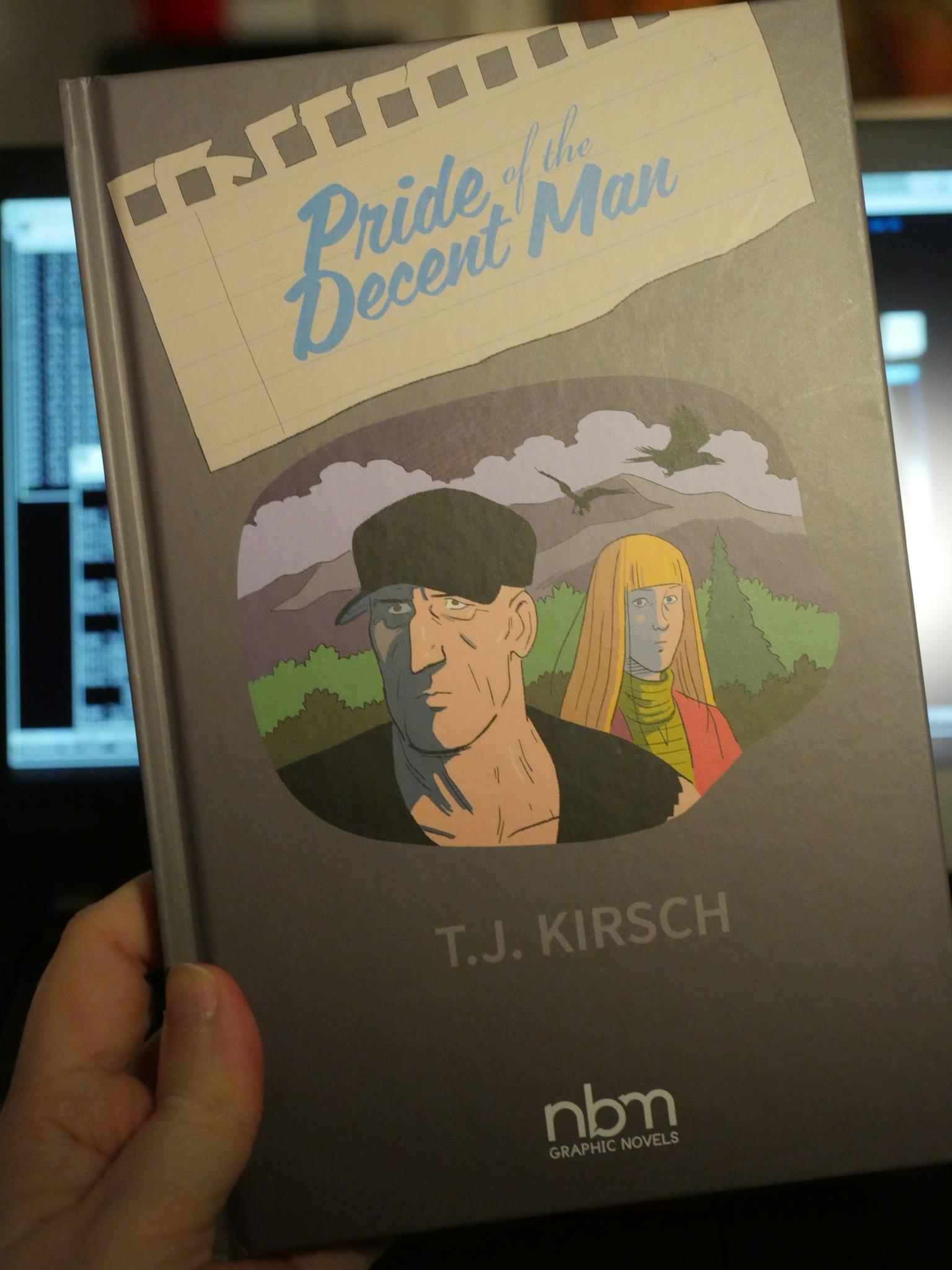
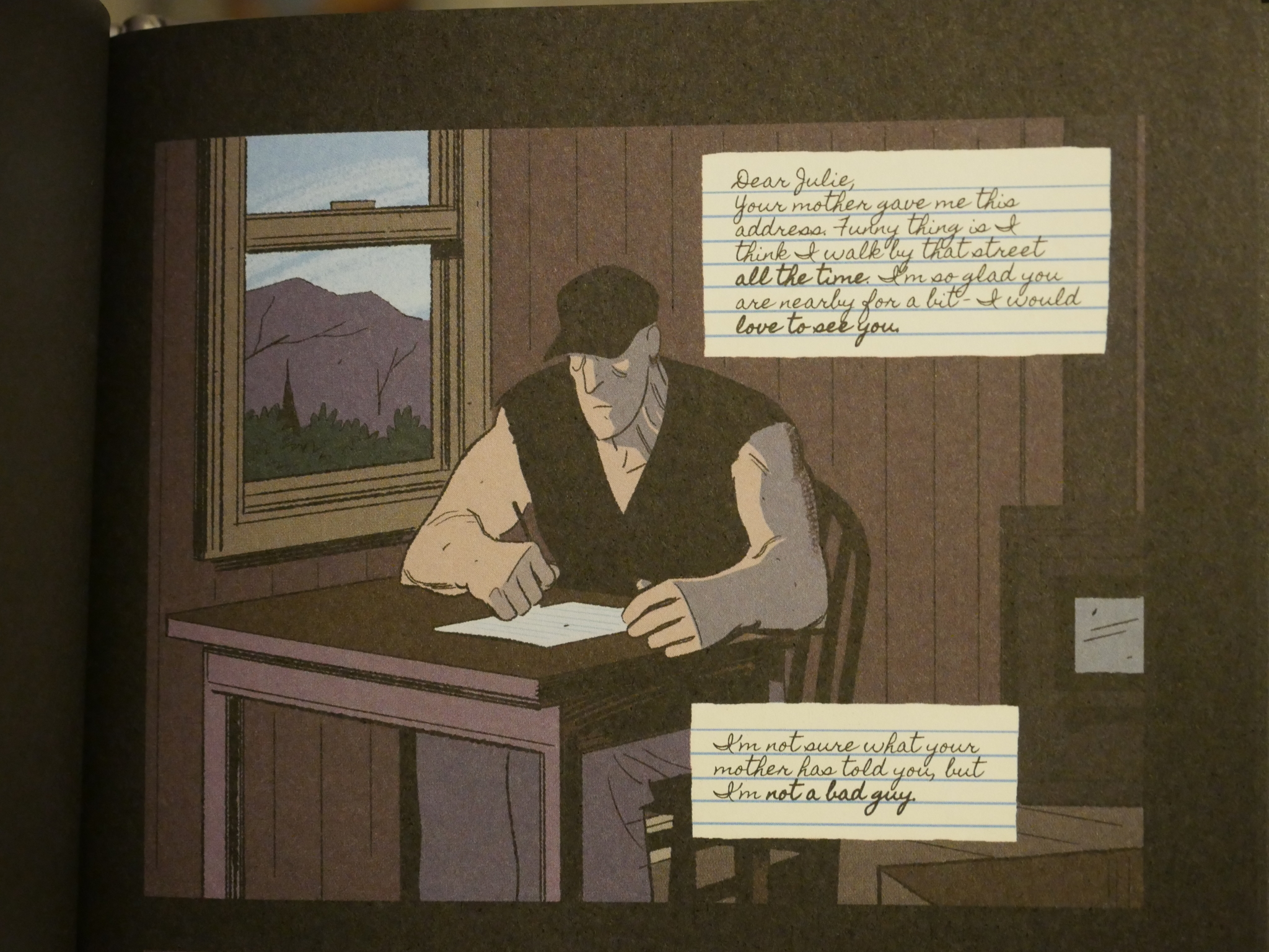
I was reading Pride of the Decent Man by T. J. Kirsch, published by NBM. It’s OK, but I found myself sort of vaguely annoyed by the diary/letter parts. They look like this:
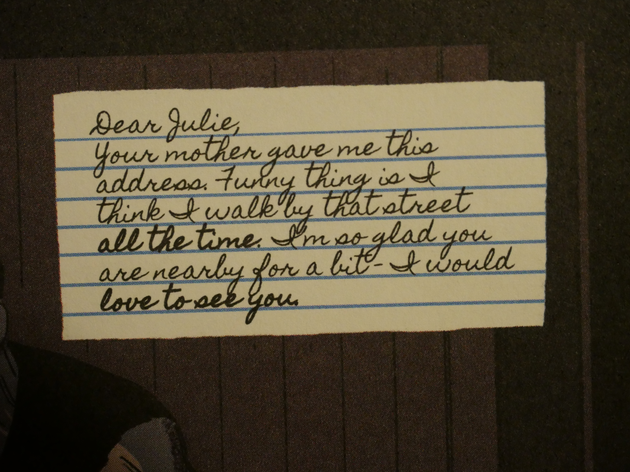
And then I started really staring at the diary (and letter) snippets.
And then it hit me: There’s really no other way to get bold handwritten text other than to have two pens: One thin pen and one thick pen.
Which then suddenly changes the image of the person writing these diary pages from the grizzled old man seen above to a 14-year-old boy, lying on his bed with a pop song on the stereo, writing his diary with different pens and dotting the i’s with hearts and glitter.
Fam.
I mean, in my mind.
So, hot tip for people working with computer lettering and “hand-written” fonts (which this is): Don’t use bold. Use underlining if you want to get that insane grizzled random insistent vibe going on.
This has been a public service announcement.


