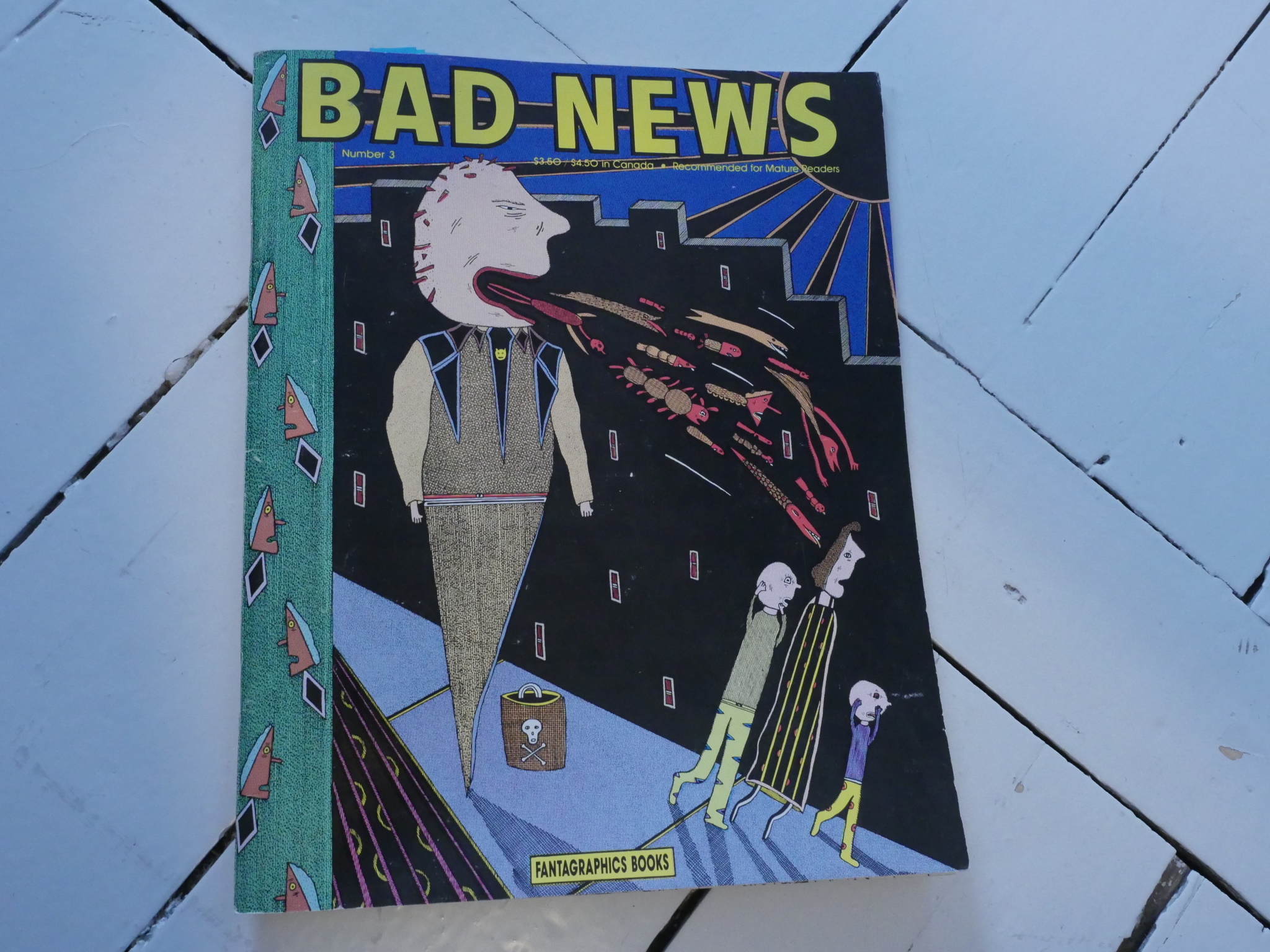
Bad News #3 edited by Paul Karasik.
The Bad News anthology series was conceived as a class exercise for the students at the School of Visual Arts (SVA) in New York. This first issue was edited by Art Spiegelman (I think; I haven’t been able to locate a copy or find any reliable info on it. The two subsequent issues don’t seem like class exercises at all, though, and features a roster of super-star (or soon to be super-star) New York art comics people.
The second issue (which I have here… somewhere) is on newsprint and is vaguely tabloid-like in format (i.e., quite Raw-like, but on cheaper paper). And that’s kinda exactly what the vibe is like, too: It’s like Raw, but it’s less precious.
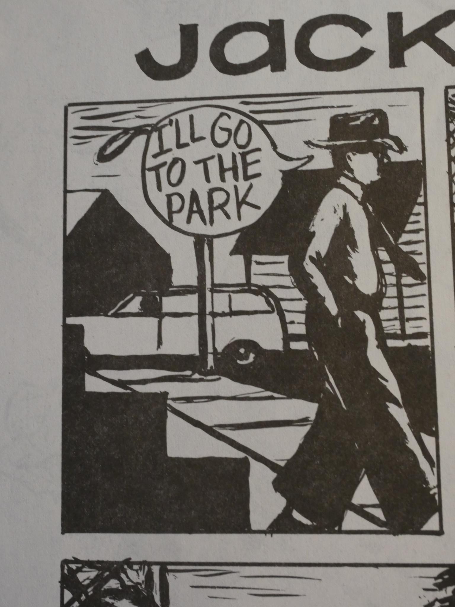
And you also get all the contributors to Raw. Above we have a panel from a very pretty page by Jerry Moriarty…
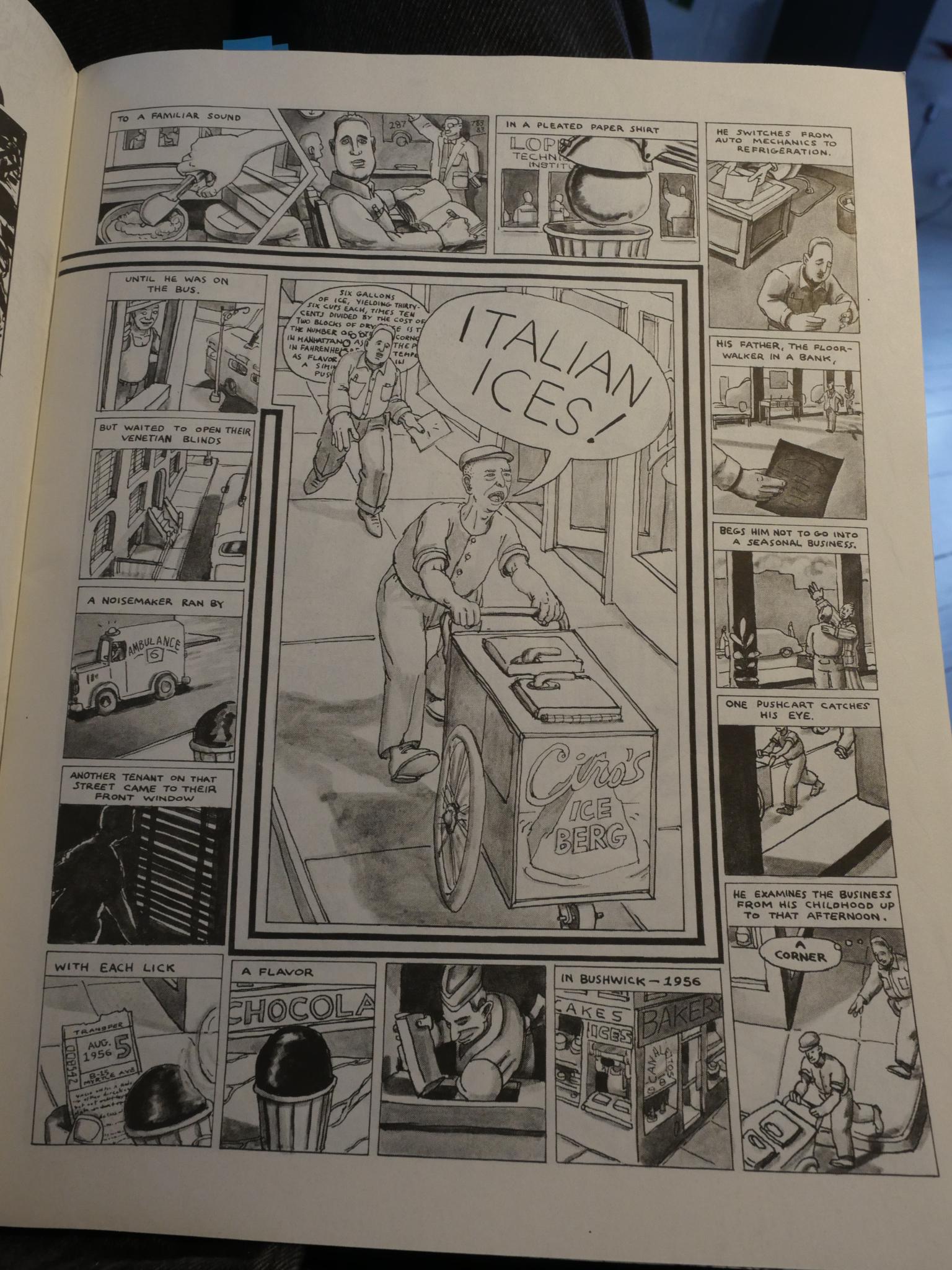
A wistful four page piece by Ben Katchor which is notable for being more formally experimental than he usually is. The above page is read from the outside in instead of row by row. The other three pages are more straightforward. I can’t remember seeing this piece reprinted anywhere else, but it’s really nice.
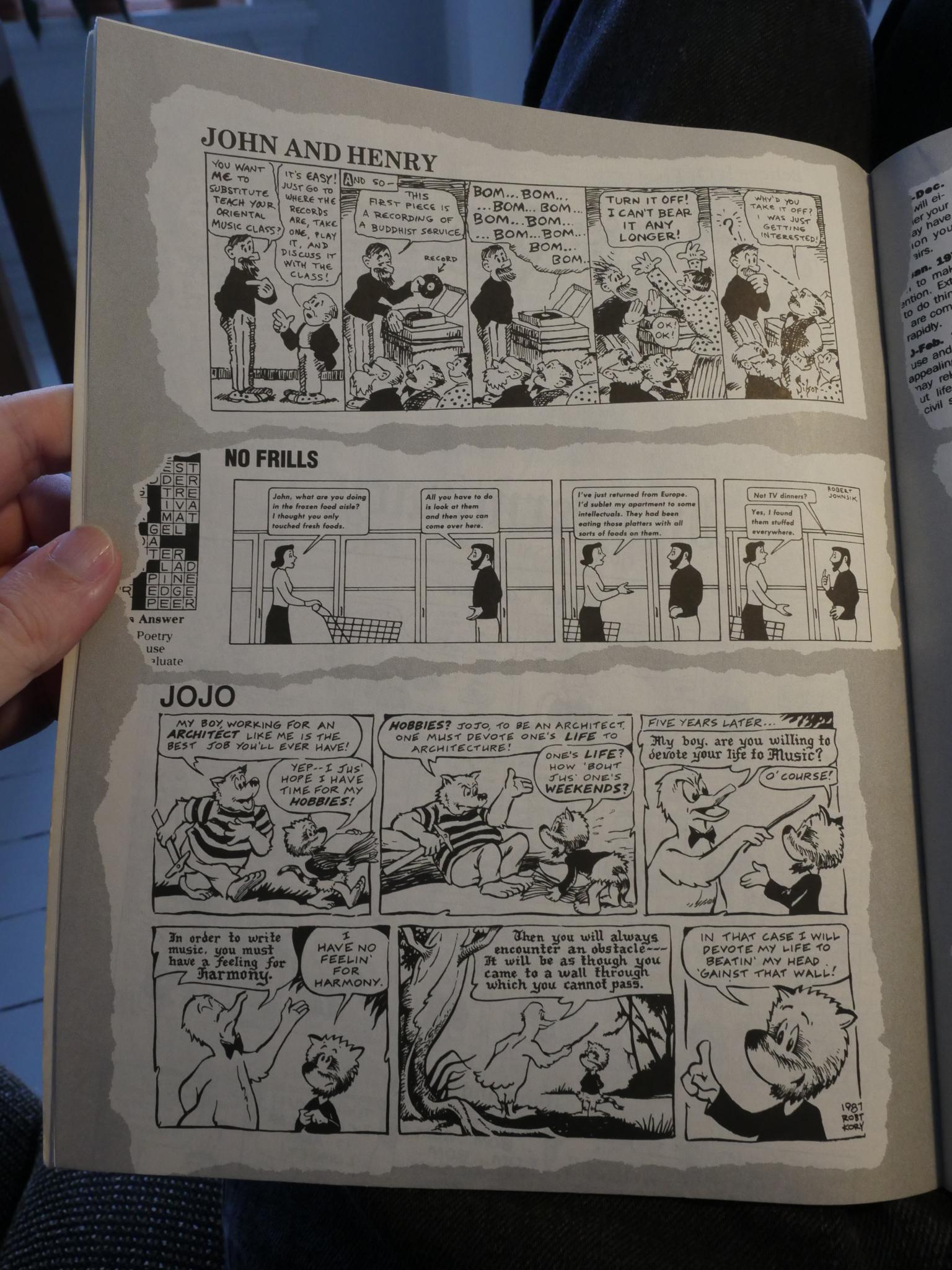
R. Sikoryak retelling anecdotes about John Cage in the style of various cartoonists. Which is his normal mode, and this is a particularly nice example.
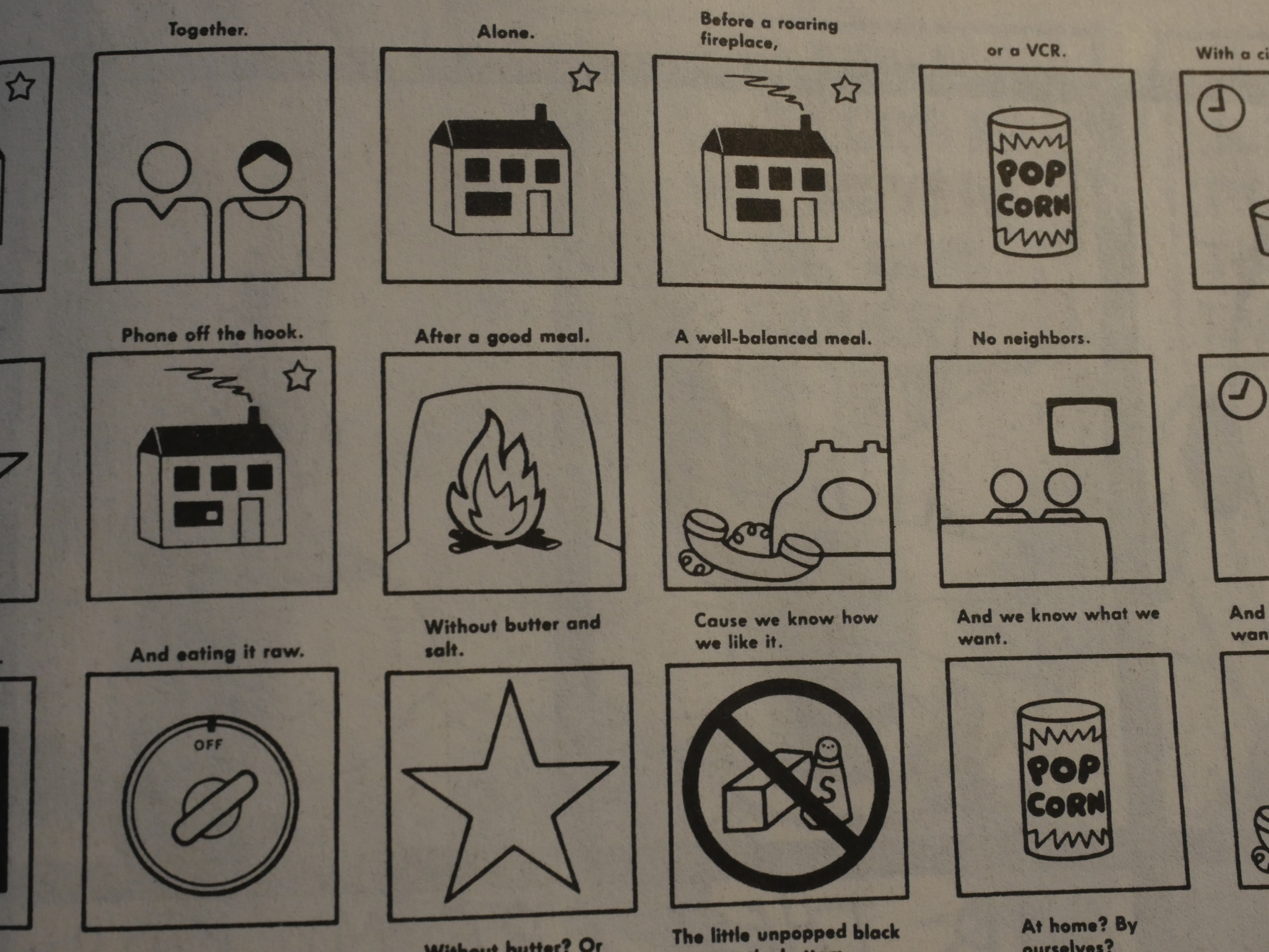
Let’s see… when this was originally published I was 18, I think? I remember obsessing about this Mark Newgarden strip (“What We Like”), and I kinda adapted it as a demo for the Amiga. My friends were puzzled. But it’s just so… weird.
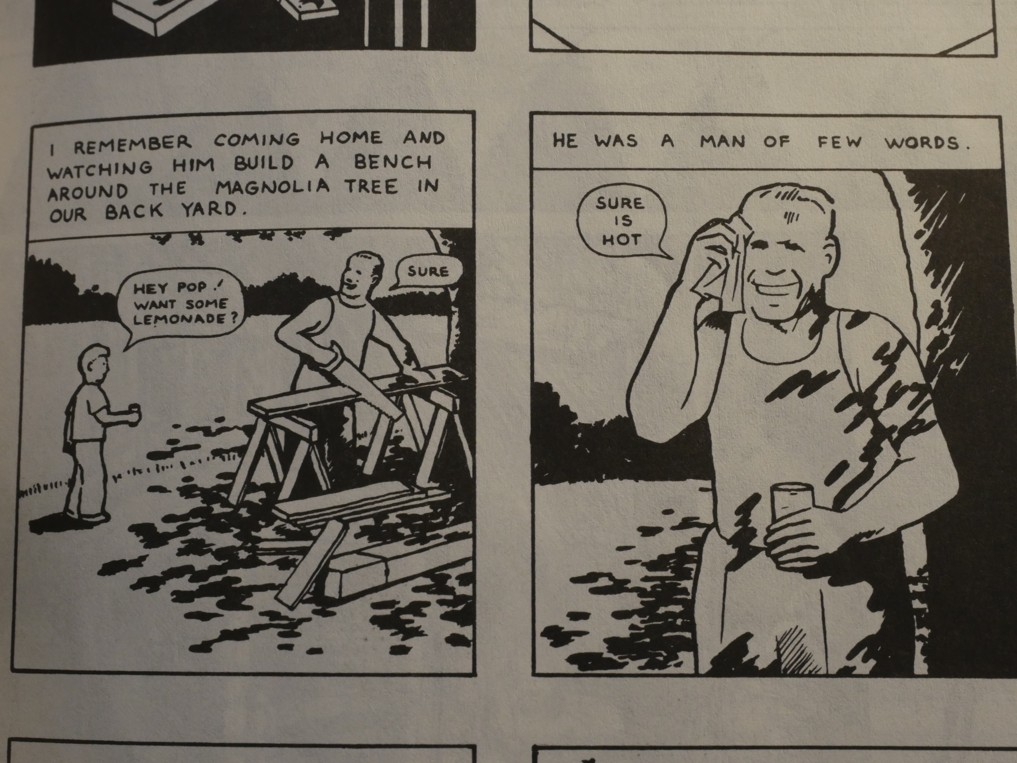
Richard McGuire (later to become famous for the “Here” piece in Raw) does an unusually non-experimental straight-forward story about his, er, grandfather. I think. “Pop.” I love how it centers around a bad joke, but manages to utilise that awkwardness to give an emotional punch.
This is a terrific anthology. Not a single piece here is bad, and some are really outstanding.
And unusually for Fantagraphics floppies, it’s not in any standard format. Fantagraphics don’t seem to be into weird formats for their saddle-stitched books: Virtually all of them are either standard American comic book size, or standard magazine size. (There are some exceptions, like Acme Novelty Library, but it’s like 97.3% standard.) This is unlike their peers like Alternative Comics or Drawn & Quarterly, who publish any which way.
But perhaps this magazine (it’s slightly shorter than normal, and has a cardboard cover) came fully formed from the editor, and the SVA crowd are really interested in formal matters, so perhaps this unusual (for Fantagraphics) decision was made elsewhere…
This post is part of the Fantagraphics Floppies series.
