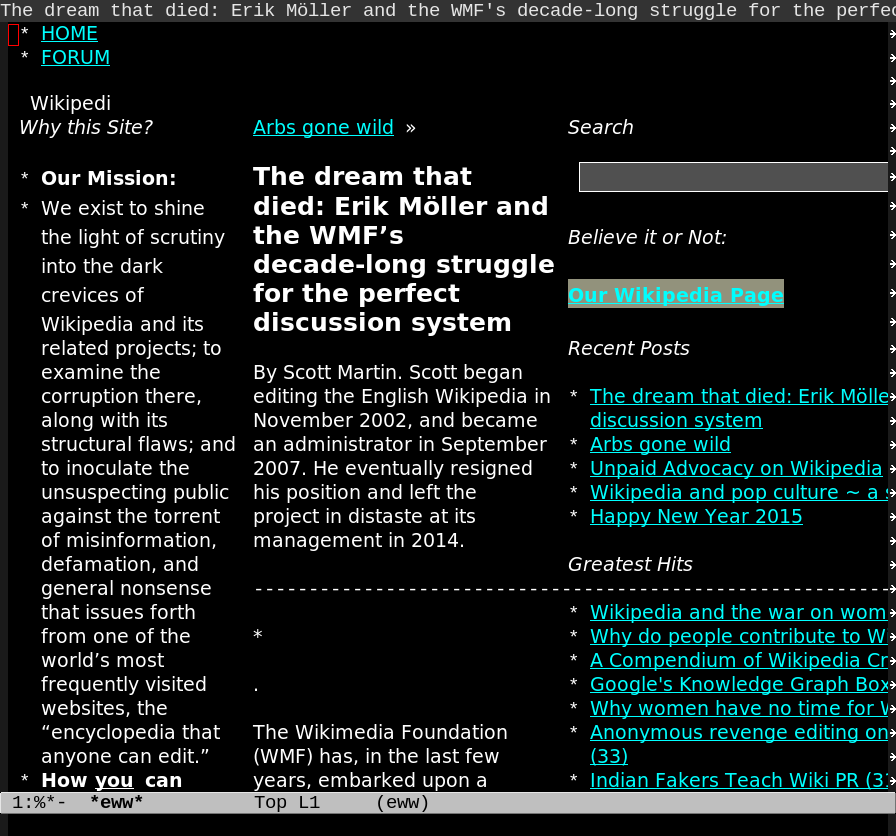
The version of eww with variable-width fonts is basically usable now, but here’s the problem:
Notice the weird line heights in the column to the left where it says “We commit to shine the light on our obsessive stalking of Wikimedia employees”? That’s because there’s a <h1> in the middle column, and those characters are taller. And there’s apparently only possible to have one line hight per, er, line.
That’s kinda ugly, especially if you throw really line heights (like images) into the mix. So I dunno about mixing differently-sized fonts like this…
Opinions?

Doesn’t look too bad to me (hey, our visual aesthetic judgement is probably measured by the fact we use emacs at all). Maybe cap the line height at a fairly small value?