One of the items on my todo list was:
![]()
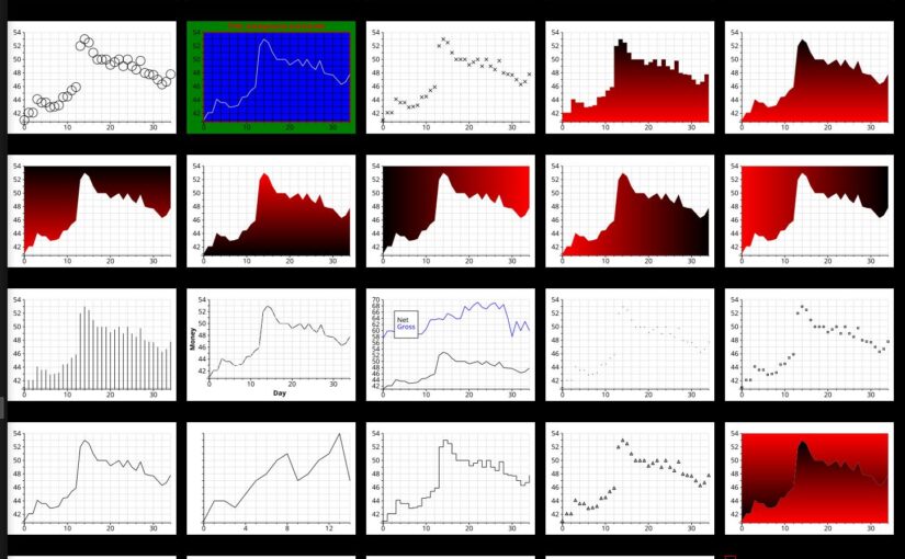
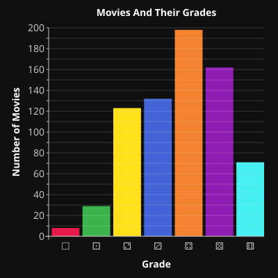
And that’s because I’ve been looking for an easy way to do simple plots for yonks. When I did a post about movie ratings, I tried chart.el:
It’s a built-in thing in Emacs that has its origins as a testing tool for eieio, and as such, it is pretty limited. But it basically did what I needed? Except for… man, look at that Y axis. This cannot stand!
Bad axes marking is a personal bugaboo — I hate them sooo much! But it’s easy to understand how they end up that way, because it’s a genuinely tricky problem.
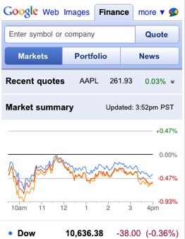
For instance, for decades Google Finance had charts looking like this, with totally nonsensical axes.
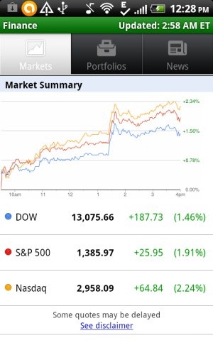
They basically just use the largest number as the highest Y marking, and then add a couple lines equidistant towards origo, and then go off and collect their paychecks.
These useless charts were there until, I think, 2021? I used to check them irregularly for years to see whether they’d gotten sufficiently embarrassed by this shameful thing, but nope. But then they reimplemented the entire site, and they finally got proper axes.
I was particularly interested because I worked for a stock broker, and one of the first things I did (back in 1997-ish) was implementing a chart library:
And the problem isn’t exactly “hard” in a “solve for Eulers dilemma” maths way, but it just requires some thought about what “pleasing numbers” are (basically 1, 2 and 5 in various scales), and thoughtful handling of the many border cases you get when plotting stock charts (a range can be between $0.00001 and $0.00002, or between 1e9 and 1e10 etc etc), and how do to time periods (years, sure, but then half years and then quarters and months and weeks? and then possibly divide months into weeks? so many details).
So why didn’t I just use this PHP thing for my charts? Well, while it’s really convenient to generate stuff on a web server — that’s not really very convenient when you’re futzing around in Emacs with some numbers. There’s a reason Excel and Jiputer Notebooks are so popular, after all — interactively massaging the data until it shows what you want it to show is where it’s at. I mean, giving others an optimal experience of the data.
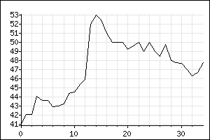
Now, of course Org has functions for doing plots, but… it uses Gnuplot as the backend, and I’ve never enjoyed how Gnuplot does anything:
Again, look at that Y axis and roll your eyes. I mean, it’s chosen nice numbers for the axis, but the formatting?
I mean, Gnuplot is perfectly OK, but…
But mainly, I had a stomach bug thing, so I didn’t really have anything to do, so I decided to type up this thing anyway. So:
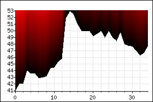
Look! The Y axis! It has numbers that make sense!
And… I wasn’t really going to implement everything from chart.php, but when I got started, it was just irresistible to do everything.
But also more, like “dark mode”.
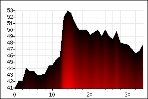
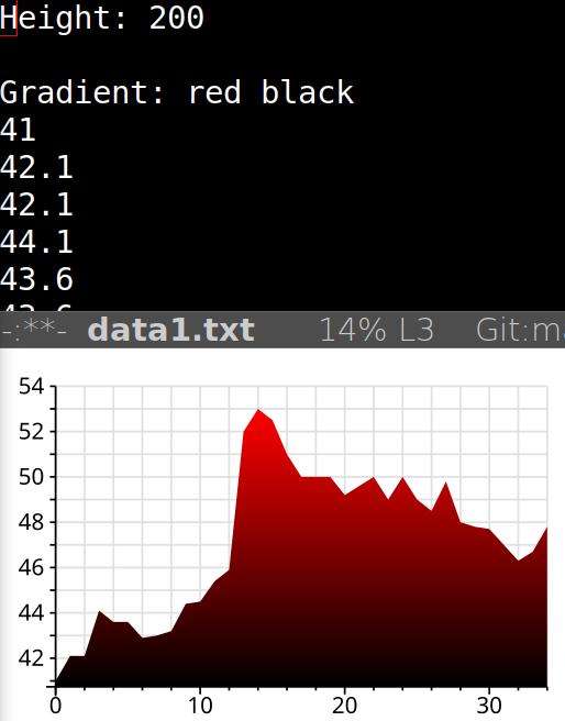
One fun thing in the PHP library are the gradients, which were painstakingly written by hand (including a GIF colour map resource thing, if I remember correctly). So they were painted pixel by pixel, I think? But in the Emacs Lisp version, I just use SVG, and SVG has support for gradients. So I just make a polygon and gradient that (as shown above).
And here’s the PHP original. Looks pretty similar?
Just about the only thing I didn’t implement was this other, weird gradient, because… er… well, it would be hard! I’d have to re-implement the pixel by pixel thing… or at least line by line thing, and that would involve math and stuff.
But it’s not like anybody would use that…
But it does look nice in the backgrounds? *sigh* Nah, not gonna implement it.
So what does the Emacs user interface for this look like?
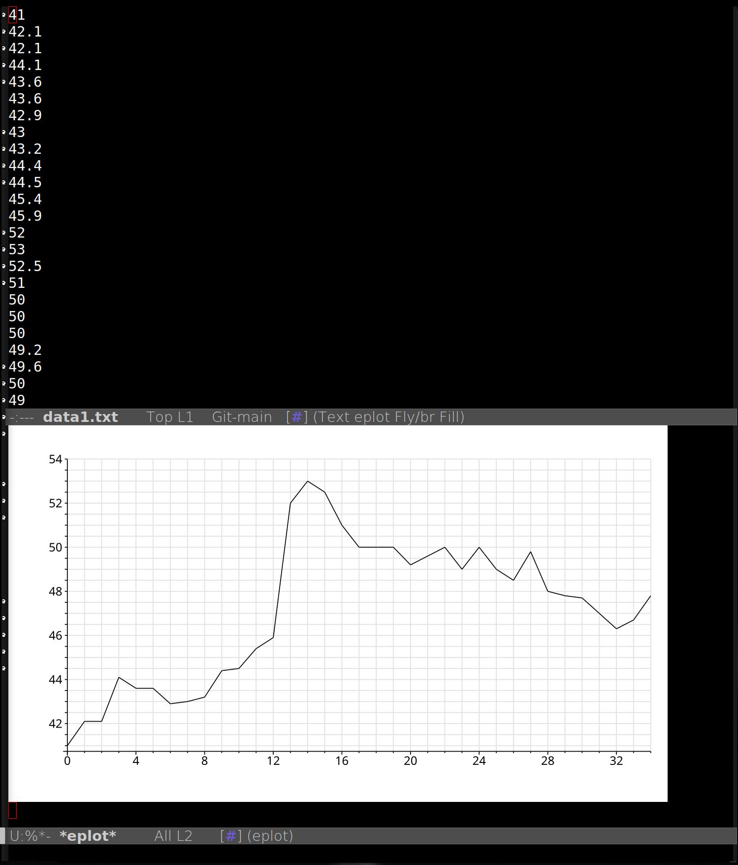
You go to a buffer with a lot of numbers in, and you type M-x eplot. (Yes, I had to call the thing eplot, since chart was taken.)
It’ll then pop up a buffer and show the plot.
But how do you then adjust the plot? After all, the point of all this is that it should be easy to tweak plots until you get what you want, so…
To digress a bit — sometimes I happen upon what seems to be nice libraries (or frameworks, as they often call themselves), and the selling point is often “we do all the boring stuff for you! Things just work!” And then they present a minimal example, like I’ve done here, and then they sort of leave it hanging how you do the rest.
So when you google that, you discover that if you want to change any of the defaults, you have to write a depth-first traversal algorithm (in Haskell), and then override all of the stuff everywhere, and then you end up with 4x as much code as if you’d just written the darn thing yourself the way you wanted it.
That is: Many frameworks seem to actually have the motto “we make the simple things trivial, and then the slightly more difficult things almost impossible”.
So — I hope I haven’t landed there myself?
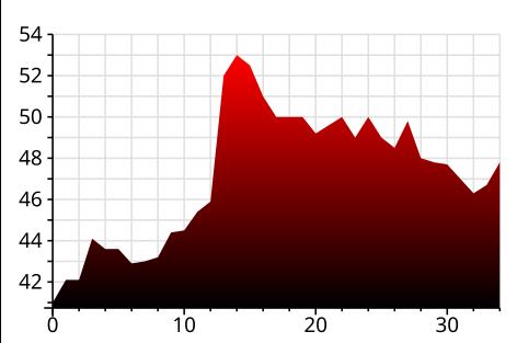
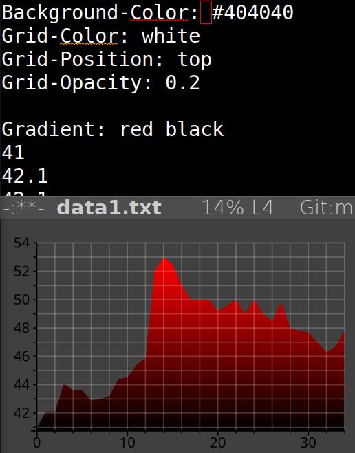
OK, the first “extra” thing I did was introduce the concept of “headers”, like this:
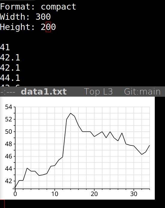
I’m using a compact format with a small chart, just as a demonstration here — don’t need all that scrolling on the blog here.
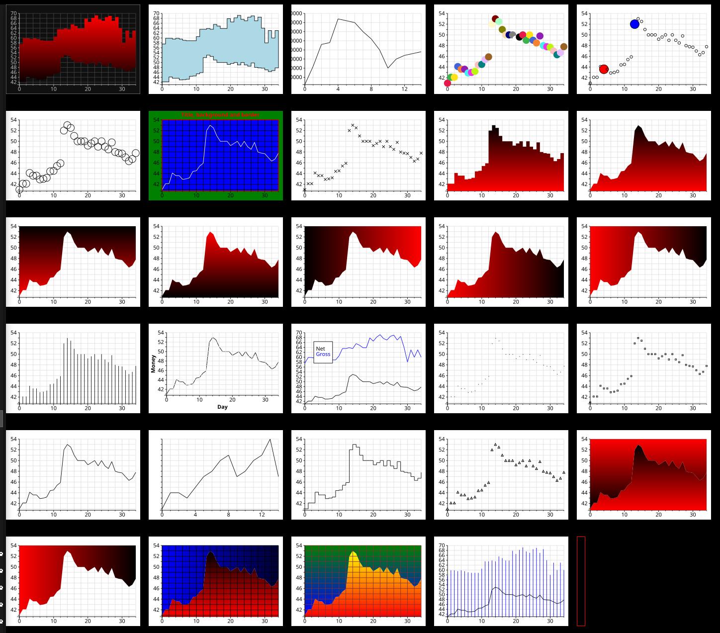
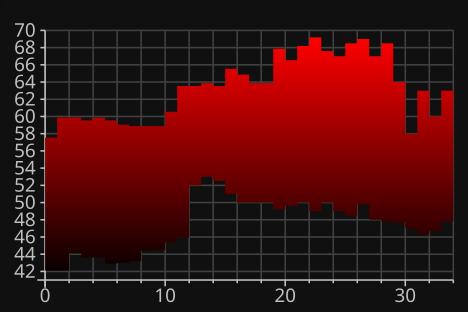
And that’s basically it — most of the different variations you see in the very first image on this blog post are by these simple headers thingies.
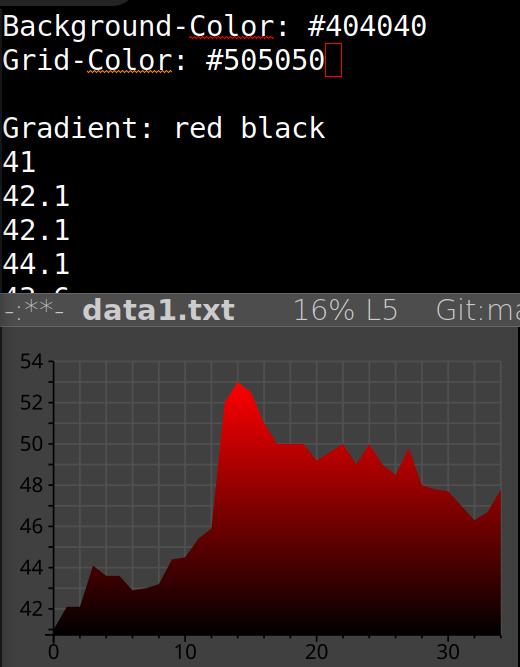
All the useful things can be controlled by these headers, so iterating through this stuff is fast — just add some headers and C-c C-c and then you immediately see the results. (Yes, there’s an eplot mode to make this easier.)
Yada yada. I’ve even written a README.md file that documents all the various possibilities.
This is still very much a work in progress, but I’ve put it on Microsoft Github. I think it should basically be somewhat useful now, but I’ve been hacking away at this for a week now, and I keep redoing everything, so perhaps not? In any case, the code is a complete mess now as I’ve been programming it test case by test case, in the least efficient way possible, and I need to consolidate a lot of code paths, and make the code more readable.
But I feel like taking a break now, so I just pushed it. So there. Caveat end userage.
I like that you write how “bad” the google finance and gnuplot charts are, without actually explaining what is so bad about it — except for claiming that the numbers on the gnuplot chart are “badly” formatted, without pointing out what’s so bad about it and how this particular chart could be improved.
I think we can agree that 0.47 or 0.78 are not y-axis step sizes a human would pick. In the first google chart example a full 1/3 of the area isn’t used for anything at all.